Embed Size (px)
Citation preview

WEB SITE DESIGN & DEVELOPMENT
Chapter 2
Content:1. Interaction Between Users, Tasks and
Design
2. Disorientation and Cognitive Overload
3. Page versus Site Design
4. Design and Structure of Pages
5. Site Design and Structure
6. Production and Checking the Site
7. Design Checklists
Interaction Between Users, Tasks and Design
Any discussion of design must consider the features of:
the users who will be using the site;
the tasks they want to do; and
the aims of the developers of the site
For example, there is a world of difference between the casual user who browses into the site and the regular user who visits the site over a period of time.

Interaction Between Users, Tasks and Design…continue
Interaction with the casual user has the following features: need to immediately "grab" interest and stop user leaving the site; must quickly present overview of the site highlighting relevant information; the user won't spend time trying to work out how to use the site unless they are "hooked"; the user won't understand site specific icons for navigation; require graphics and professional design to grab attention; and site must be very responsive and the casual user will not tolerate long download time for text or graphics.

Interaction Between Users, Tasks and Design…continue
On the other hand the "regular" user is committed to using the site for some reason (e.g. paid a subscription, employer Intranet, or studying a unit) and:
is prepared to spend time to learn site specific information; has used the site enough to understand site specific icons, conventions and navigation; is more interested in content than surface design; and will tolerate longer download times.

Interaction Between Users, Tasks and Design…continue
In the same way that there are different types of users so too are there different tasks which they will perform when using the site and different designs will be appropriate to each. For example:
if the goal is to train the user in the procedure for assembling a piece of equipment (training) then a linear series of web pages would be appropriate; while if the goal is to facilitate learning about ethical issues then a more interconnected web allowing the student control over navigation would be appropriate.

Interaction Between Users, Tasks and Design…continue
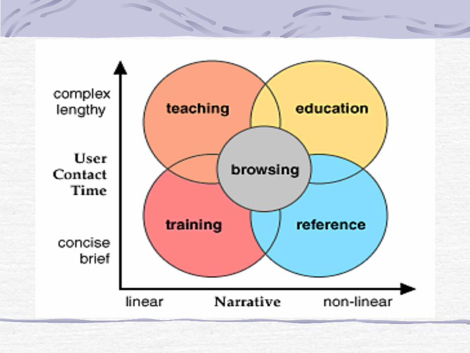
Lynch & Horton (1997) suggest that the organization of web sites differs on a number of continuums, two of which are:
linearity of the site ranging from linear to non-linear; and
length and complexity of user interaction from casual and brief and simple to regular and complex.
They then suggest the following web applications: training: linear navigation (previous and next) with few digressions, generally short sessions over a period of time; reference: no single core narrative to the site but focuses on providing fast access to a large number of discrete chunks of information with links to other nodes; teaching: build around a core of materials and narrative which everyone should follow but with more opportunities for digression; education: catering for more self-directed learners who will tolerate "denser" information and designs. Must allow user controlled and flexible access to a large amount of information; browsing: the casual user who has found the site on the web and may have any goal when using the site.
Interaction Between Users, Tasks and Design…continue

Disorientation and Cognitive Overload
Conklin (1987) identified the most powerful feature of hypertext systems as the ability to produce complex and highly interconnected information spaces allowing readers and authors finger tip access to vast amounts of information. He also identified the two most serious problems with the use of hypertext as:
disorientation experienced by users not knowing where they are within hypertext documents and not knowing how to move to the desired location (commonly know as "lost in hyperspace"); and cognitive overload which was imposed on users as they navigated through the hypertext
Disorientation and Cognitive Overload… continue
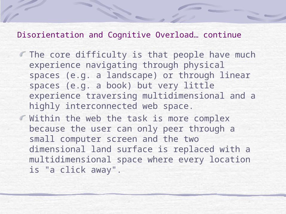
The core difficulty is that people have much experience navigating through physical spaces (e.g. a landscape) or through linear spaces (e.g. a book) but very little experience traversing multidimensional and a highly interconnected web space.
Within the web the task is more complex because the user can only peer through a small computer screen and the two dimensional land surface is replaced with a multidimensional space where every location is "a click away".

Disorientation and Cognitive Overload… continue
A recent study of disorientation and cognitive overload (McDonald & Stevenson, 1996) compared the ability of people to use information which was organized in the following ways (each more complex than the previous): 1. a linear sequence allowing the user to page
backwards and forwards; 2. a hierarch allowing the user to move between
sections and subsections; and 3. a fully connected network allowing the user to
follow links to relevant information.

Designing a web site occurs on at least two levels: designing individual pages; and designing the way these pages work together in the overall site.
At each of these levels we must also distinguish between: the core functionality: e.g. the way users navigate between pages, the tools which are provided (search, indexes), and the presented information; and the presentation interface: e.g. the graphics used within the site, the way in which media elements are presented, or backgrounds or music.
Page vs Site Design

Design and Structure of Pages
This section contains a list of suggestions and guides related to the following aspects of page design:
1. Page Size 2. Functional Structure of the Page 3. Web Page Templates 4. Writing Style 5. The Text of Link Anchors 6. Frames 7. Typography and Backgrounds 8. Images 9. Authoring HTML for Multiple Platforms

Page SizeDividing the web space into many small pages has the following advantages:
short download time for each page;
reduce need to the user to scroll up and down;
easily digestible one idea per page; and
allow user to go directly to the information rather than having to go to the top of a page and then have to scroll to the information.
Page Size…continue
Using longer pages has the following features:
less difficult for the user to navigate within a page rather than between pages; easier for the developer to maintain the pages; can print the pages as a whole and use away from the computer; and easier to make a coherent presentation of several ideas.
Functional Structure of the Page
Identify the current location
Navigation tools
Content of the page
Authenticity of the pages

Web Page TemplatesAs with traditional publishing web publishing requires the use of templates and design grids to ensure consistency across the site.
The "design grid" pages of Lynch & Horton (1997) contains a rationale for the use of design grids.
The use of templates also reduces the developmental cost of the site.
Writing Stylewrite short, sharp and point based text rather than long slabs of text. Point based text is much easier to read on the screen and to scan to find relevant information; don't assume that people have read other pages. If people don't understand something in a book they have the expectation that they will be able to flip backwards to find the prerequisite information -- where is backwards in the web? if prerequisite information exists on other pages then make clickable references to this information; and speed of reading on screen is approximately 25% of that of reading on paper (Nielson, 1996) and thus we need to ensure that onscreen writing is as brief and as well designed as possible.
The Text of Link Anchorsensure that the link text is relatively short (< 5 words) but unique and meaningfully describes the destination node or function. ensure that the link text fits into the surrounding text without destroying the flow of the surrounding text. One way to do this is to read the sentence aloud and see it if makes sense; ensure that the link does not distract the reader from the text. not put too many links on a single page because the links overpower the remainder of the page. Often people do not read the supporting text and only click the links (point and click browsing).

Framessome browsers do not move correctly between frames when using the "back" button some users may not be aware of how to print the text of a specific frame (click on the frame and then select "print"); if frames are not used correctly it is possible to get stuck in a frame when going to another site (selecting "Open URL in new window") ensures the new URL uses the entire window); using a frame based display when one of the frames contains the content will mean that the history list in Go menu will not be updated allowing the user to return to a previously visited location; and the user may not be able to bookmark a specific location within your site but will always return to the URL that defined the frame (generally the top level or home page).

Typography and Backgrounds
When selecting fonts you should: avoid italics (problems with pixilisation of sloped lines and bad kerning or spacing between the letters);
don't use underlying or blue text because it may conflict with the display of links; and
be aware that different browsers will use different fonts for presenting text.
When using background textures or graphics: make sure that text is readable (ensure that there is a large difference between foreground and background on both saturated/unsaturated and different sides of the colour wheel); don't use unless the text can easily be read on the texture. Often a texture which works well with text on a 16 bit or 24 bit display will not be effective on a 8 bit display; don't change the colours used to display active or visited links unless there is a very good reason. People are familiar with these colours and changing them (especially within a site) can be confusing
Typography and Backgrounds…continue

Authoring HTML for Multiple Platforms
The most important suggestions are: to test your pages on a variety of delivery platforms typical of those of your users; clearly state what functionality will be delivered in what environment; ensure that pages will display some information even if the page can't be fully displayed (e.g. use text alternatives for images); and provide parallel versions of pages optimised for different environments (e.g. frame based and non-frame based).

Site Design and StructureIt is necessary to construct a blueprint or storyboard for the entire site before site construction beginsa welcome page which is the first seen by the user and contains a clear statement of the scope and intended audience for the site; a printable version of sections a complete table of contents with an entry for every page possibly a list of resources used an index for the site containing major keywords linked to pages; and a search engine for that site.

Below are some guidelines on structuring sites. organize the site in a way that helps people to understand its structure and form a mental model of the site. A hierarchy is relatively easy for users to visualize and navigate; if using a hierarchy it should be as flat as possible without having too many options on each menu page ensure that even if someone jumps directly to a page within the site (there is a link to the page or a search engine has indexed the page) there is a link to the home page for the site; use folders and sub folders to keep number of files in a folder to a manageable number; don't use a back button because people could have arrived at any page in a number of ways (the browser "back" button does this); and links to resources outside the site should be annotated and presented in a consistent way. If the site is an educational site it should use the same referencing conventions as students are expected to use.

Production and Checking the Site
it is important that we can develop a web site for a comparable cost to that for developing a comparable book
In addition to the cost of development it is also critical that the site can be maintained and modified in a cost effective way.
Most developers strive to ensure that their materials (or at least a subset of the materials) can be used or delivered in a number of different formats (e.g. HTML, print, Acrobat).
Design ChecklistWaller (1997) Sixty Ticks for a Good Website; "Sucky to Savvy" by Glover (1997) Standard problems with checklist evaluation instruments are:
tendency to evaluate items that can be clearly explained and objectively measured; treating the site as the sum of many unrelated features ignoring the interactions between features of the site treating all uses as the same; and producing a safe but predictable site.