Embed Size (px)
Citation preview
Web design - Zero hunger
Sumanth
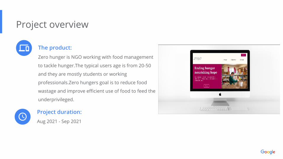
The product:
Zero hunger is NGO working with food management
to tackle hunger.The typical users age is from 20-50
and they are mostly students or working
professionals.Zero hungers goal is to reduce food
wastage and improve efficient use of food to feed the
underprivileged.
Project overview
Project duration:
Aug 2021 - Sep 2021
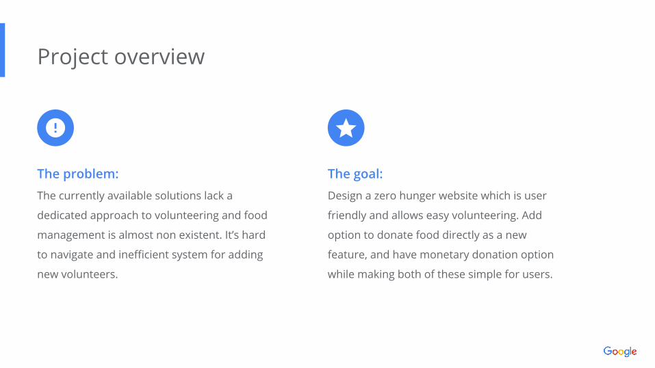
The problem:
The currently available solutions lack a
dedicated approach to volunteering and food
management is almost non existent. It’s hard
to navigate and inefficient system for adding
new volunteers.
Project overview
The goal:
Design a zero hunger website which is user
friendly and allows easy volunteering. Add
option to donate food directly as a new
feature, and have monetary donation option
while making both of these simple for users.
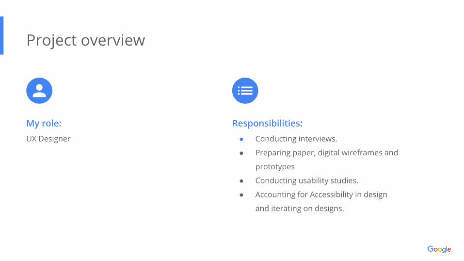
My role:
UX Designer
Project overview
Responsibilities:
● Conducting interviews.
● Preparing paper, digital wireframes and
prototypes
● Conducting usability studies.
● Accounting for Accessibility in design
and iterating on designs.
Understandingthe user
● User research
● Personas
● Problem statements
● User journey maps
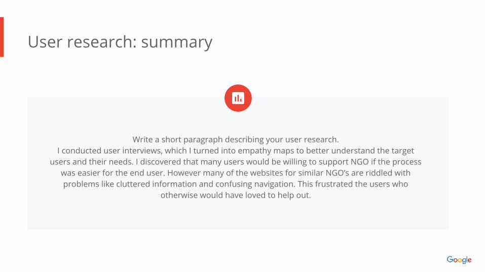
User research: summary
Write a short paragraph describing your user research. I conducted user interviews, which I turned into empathy maps to better understand the target
users and their needs. I discovered that many users would be willing to support NGO if the process was easier for the end user. However many of the websites for similar NGO’s are riddled with problems like cluttered information and confusing navigation. This frustrated the users who
otherwise would have loved to help out.
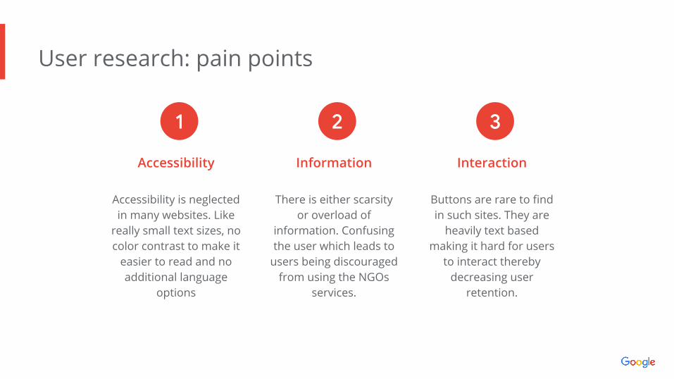
User research: pain points
Accessibility
Accessibility is neglected in many websites. Like
really small text sizes, no color contrast to make it
easier to read and no additional language
options
Information
There is either scarsity or overload of
information. Confusing the user which leads to
users being discouraged from using the NGOs
services.
Interaction
Buttons are rare to find in such sites. They are
heavily text based making it hard for users
to interact thereby decreasing user
retention.
1 2 3
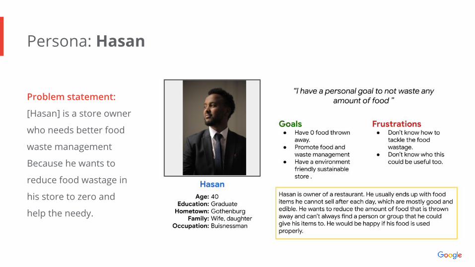
Persona: Hasan
Problem statement:
[Hasan] is a store owner
who needs better food
waste management
Because he wants to
reduce food wastage in
his store to zero and
help the needy.
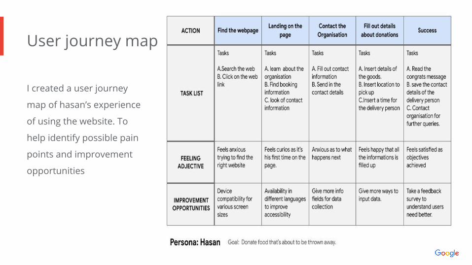
User journey map
Image of user journey map
I created a user journey
map of hasan’s experience
of using the website. To
help identify possible pain
points and improvement
opportunities
● Sitemap
● Paper wireframes
● Digital wireframes
● Low-fidelity prototype
● Usability studies
Startingthe design
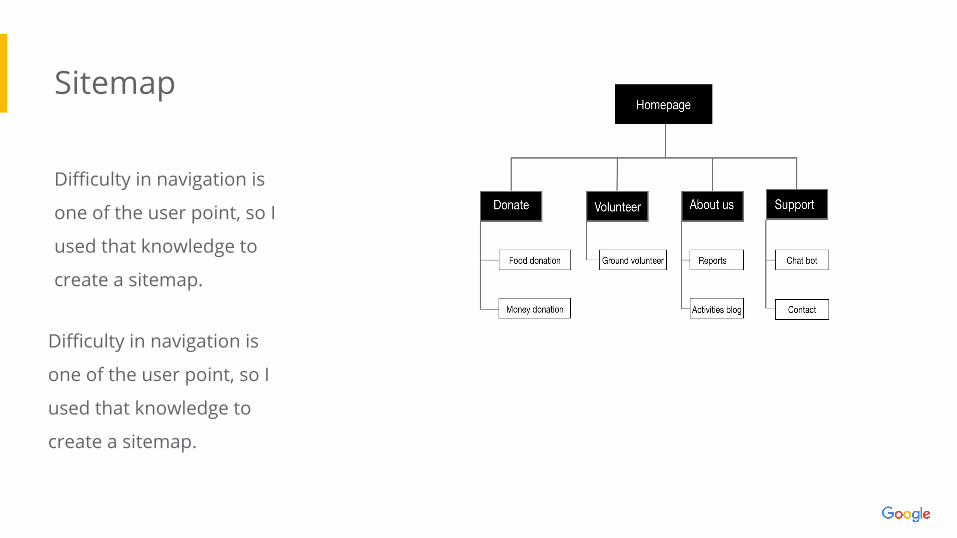
Sitemap
Difficulty in navigation is
one of the user point, so I
used that knowledge to
create a sitemap.Image of
sitemap/IA
Difficulty in navigation is
one of the user point, so I
used that knowledge to
create a sitemap.
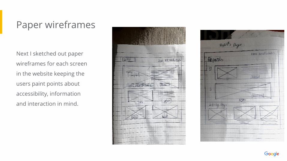
Paper wireframes
Next I sketched out paper
wireframes for each screen
in the website keeping the
users paint points about
accessibility, information
and interaction in mind.
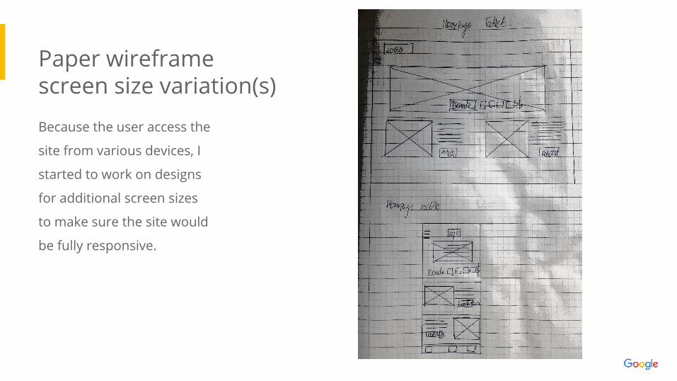
Paper wireframe screen size variation(s)
Because the user access the
site from various devices, I
started to work on designs
for additional screen sizes
to make sure the site would
be fully responsive.
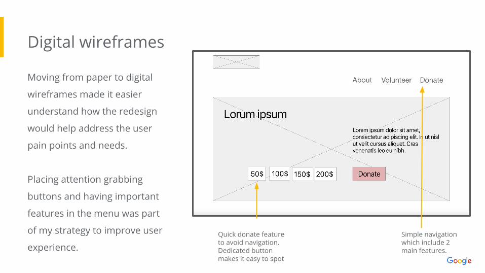
Digital wireframes
Moving from paper to digital
wireframes made it easier
understand how the redesign
would help address the user
pain points and needs.
Placing attention grabbing
buttons and having important
features in the menu was part
of my strategy to improve user
experience.
Insert first wireframe example that
demonstrates design thinking aligned with
user research
Simple navigation which include 2 main features.
Quick donate feature to avoid navigation. Dedicated button makes it easy to spot
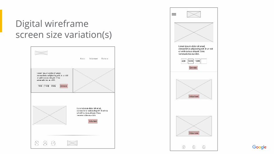
Digital wireframe screen size variation(s)
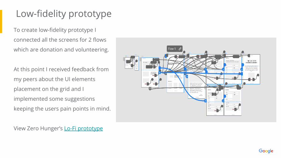
Low-fidelity prototypeTo create low-fidelity prototype I
connected all the screens for 2 flows
which are donation and volunteering.
At this point I received feedback from
my peers about the UI elements
placement on the grid and I
implemented some suggestions
keeping the users pain points in mind.
View Zero Hunger’s Lo-Fi prototype
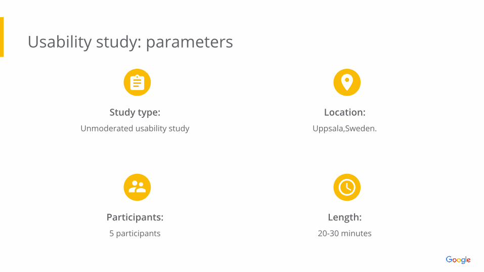
Usability study: parameters
Study type:
Unmoderated usability study
Location:
Uppsala,Sweden.
Participants:
5 participants
Length:
20-30 minutes
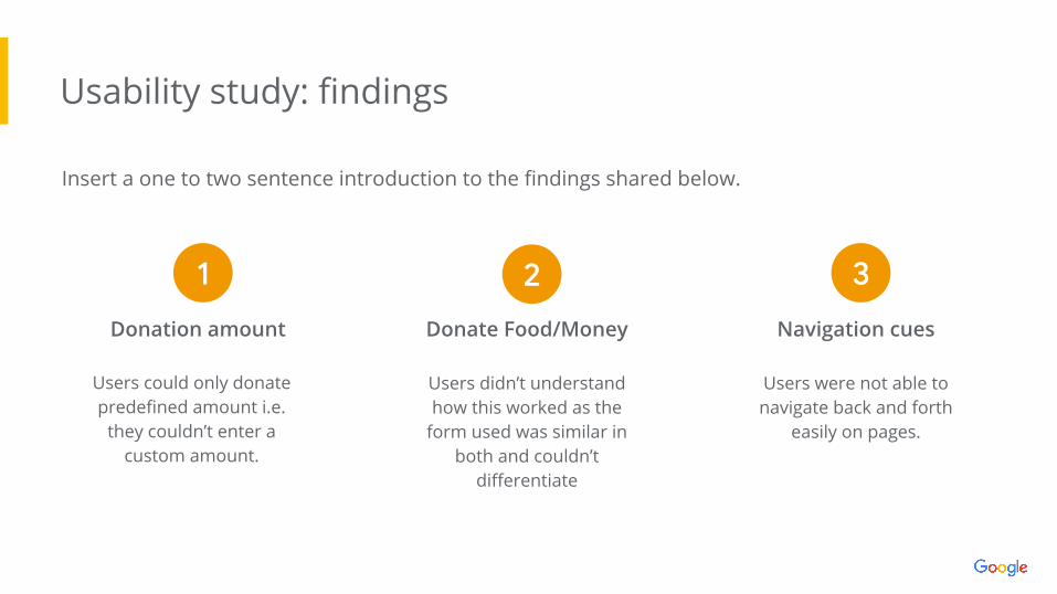
Usability study: findings
Insert a one to two sentence introduction to the findings shared below.
Users could only donate predefined amount i.e.
they couldn’t enter a custom amount.
Donation amount Donate Food/Money Navigation cues
Users didn’t understand how this worked as the
form used was similar in both and couldn’t
differentiate
Users were not able to navigate back and forth
easily on pages.
1 2 3
● Mockups
● High-fidelity prototype
● Accessibility
Refiningthe design
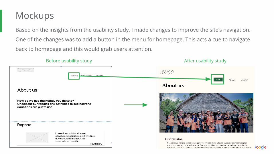
MockupsBased on the insights from the usability study, I made changes to improve the site’s navigation.
One of the changes was to add a button in the menu for homepage. This acts a cue to navigate
back to homepage and this would grab users attention.
Before usability study After usability study
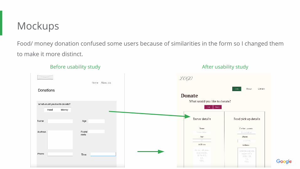
MockupsFood/ money donation confused some users because of similarities in the form so I changed them
to make it more distinct.
Before usability study After usability study
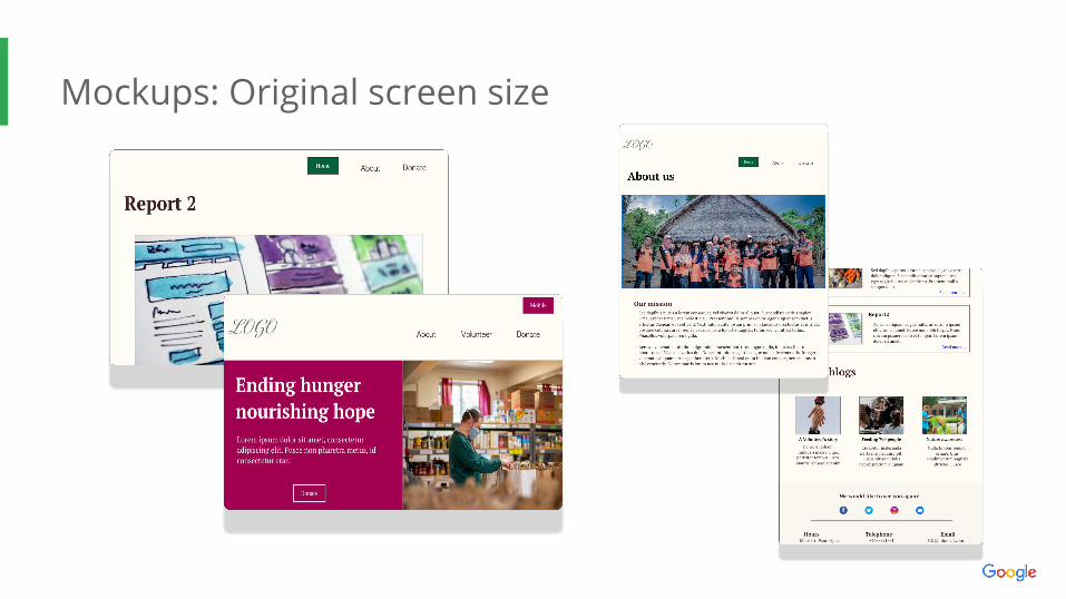
Mockups: Original screen size
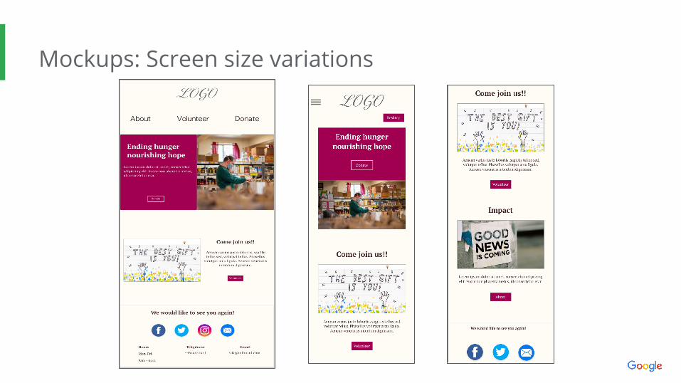
Mockups: Screen size variations
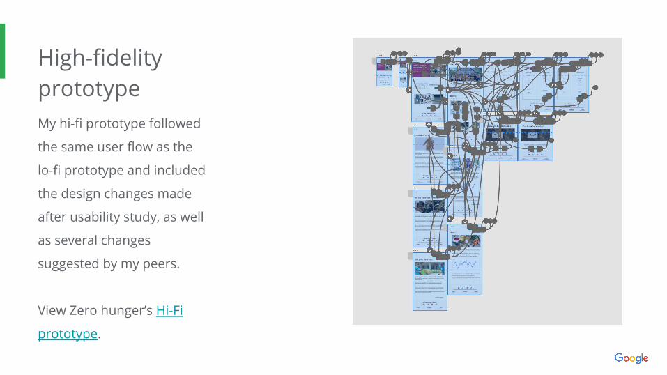
High-fidelityprototypeMy hi-fi prototype followed
the same user flow as the
lo-fi prototype and included
the design changes made
after usability study, as well
as several changes
suggested by my peers.
View Zero hunger’s Hi-Fi
prototype.
Accessibility considerations
I used heading with different sized for clear
visual hierarchy.
Added alt-text to images to improve screen reading
functions.
Used landmarks to improve navigation.
1 2 3
● Takeaways
● Next stepsGoing forward
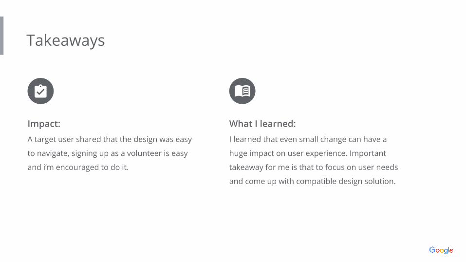
Takeaways
Impact:
A target user shared that the design was easy
to navigate, signing up as a volunteer is easy
and i’m encouraged to do it.
What I learned:
I learned that even small change can have a
huge impact on user experience. Important
takeaway for me is that to focus on user needs
and come up with compatible design solution.
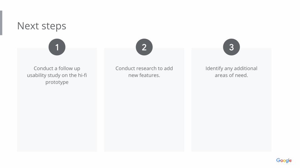
Next steps
Conduct a follow up usability study on the hi-fi
prototype
Conduct research to add new features.
Identify any additional areas of need.
1 2 3
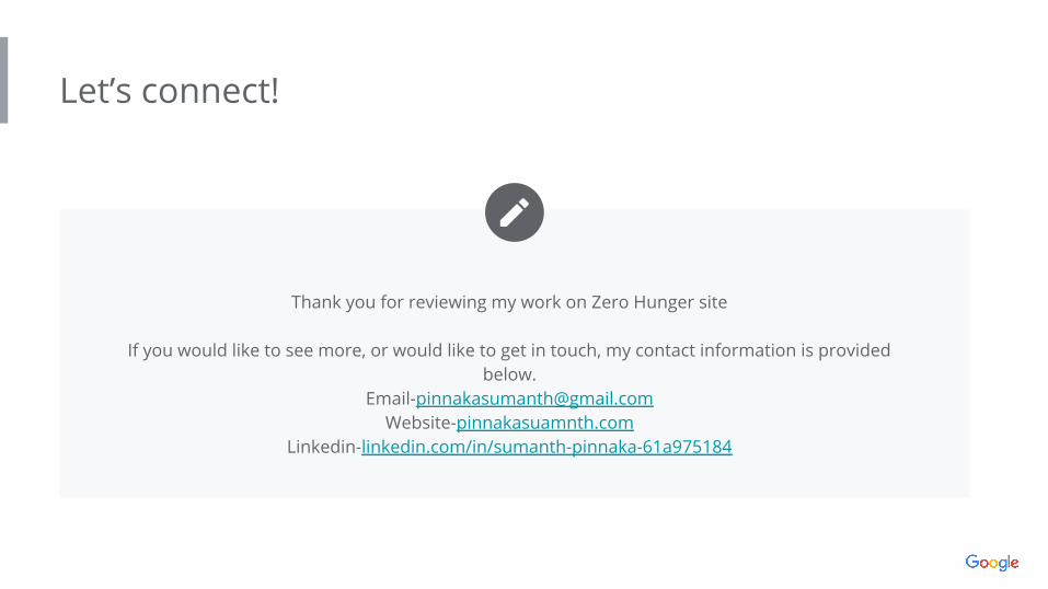
Let’s connect!
Insert a few sentences summarizing the next steps you would take with this
project and why. Feel free to organize next steps in a bullet point list.
Thank you for reviewing my work on Zero Hunger site
If you would like to see more, or would like to get in touch, my contact information is provided below.
[email protected] Website-pinnakasuamnth.com
Linkedin-linkedin.com/in/sumanth-pinnaka-61a975184