Embed Size (px)
Citation preview
Web Design for the User Experience:Important Issues
Angela D’Auria Stanton, Ph.D.

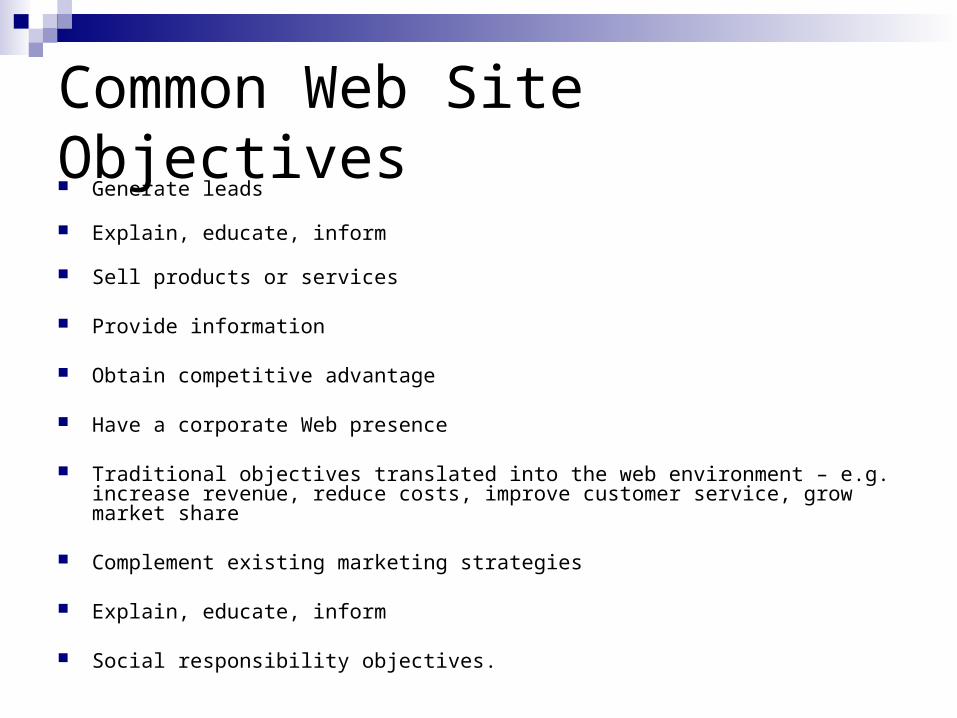
Common Web Site Objectives Generate leads
Explain, educate, inform
Sell products or services
Provide information
Obtain competitive advantage
Have a corporate Web presence
Traditional objectives translated into the web environment – e.g. increase revenue, reduce costs, improve customer service, grow market share
Complement existing marketing strategies
Explain, educate, inform
Social responsibility objectives.
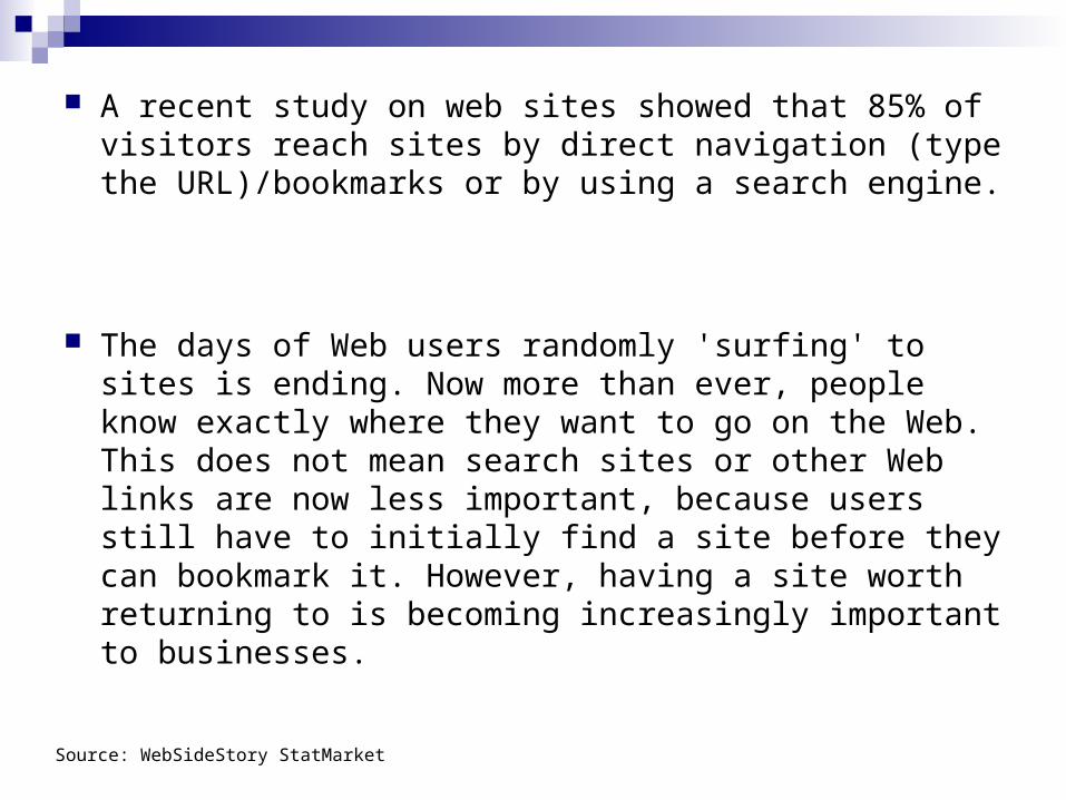
A recent study on web sites showed that 85% of visitors reach sites by direct navigation (type the URL)/bookmarks or by using a search engine.
The days of Web users randomly 'surfing' to sites is ending. Now more than ever, people know exactly where they want to go on the Web. This does not mean search sites or other Web links are now less important, because users still have to initially find a site before they can bookmark it. However, having a site worth returning to is becoming increasingly important to businesses.
Source: WebSideStory StatMarket
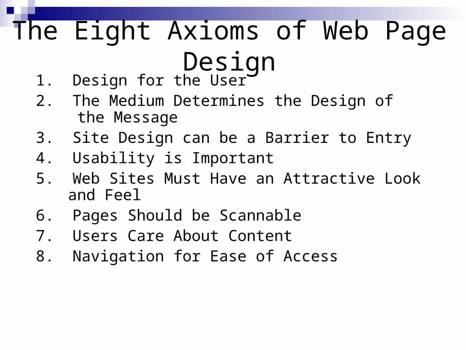
The Eight Axioms of Web Page Design1. Design for the User2. The Medium Determines the Design of
the Message3. Site Design can be a Barrier to Entry4. Usability is Important5. Web Sites Must Have an Attractive Look
and Feel6. Pages Should be Scannable7. Users Care About Content8. Navigation for Ease of Access
Axiom 1: Design for the User Design strategy is NOT based solely on
A corporate organizational chart The marketer’s campaign The IT department’s enthusiasm for efficiency and easy maintenance The website designer’s need for self-expression.
You must determine the primary purpose of your web site. Build your brand Provide information to generate response offline Provide customer service and support Sell products and services directly over the Internet Save money Keep up with the competition
At the same time, you must design for the user with a customer-centric approach.
The bottom line: think and act like the average user; then design (http://www.useit.com)
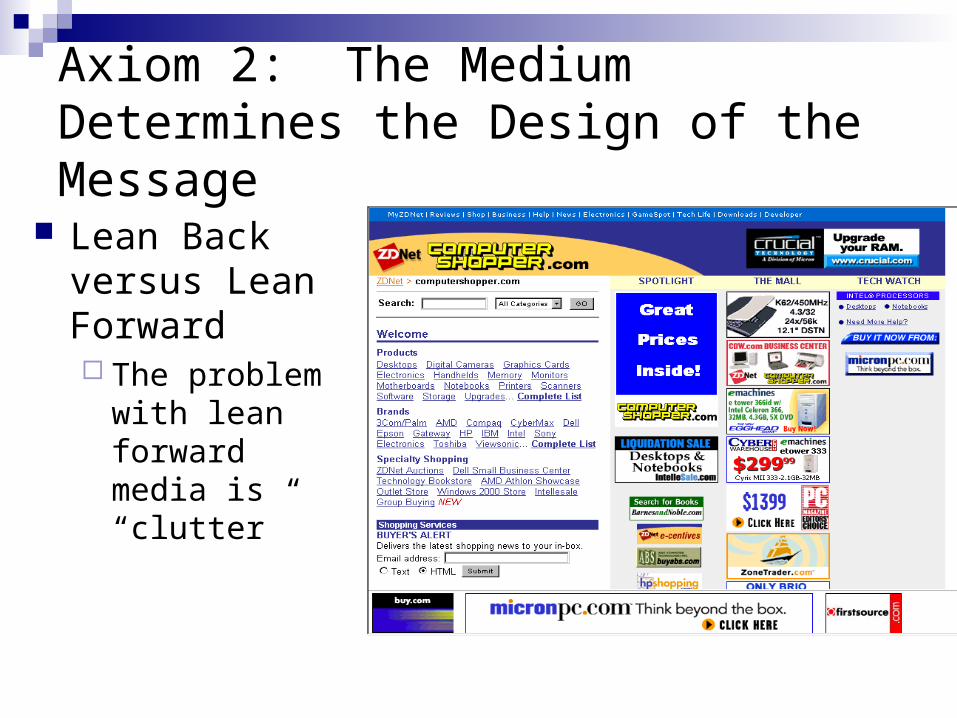
Axiom 2: The Medium Determines the Design of the Message
Lean Back versus Lean Forward The problem with
lean forward media is “clutter”
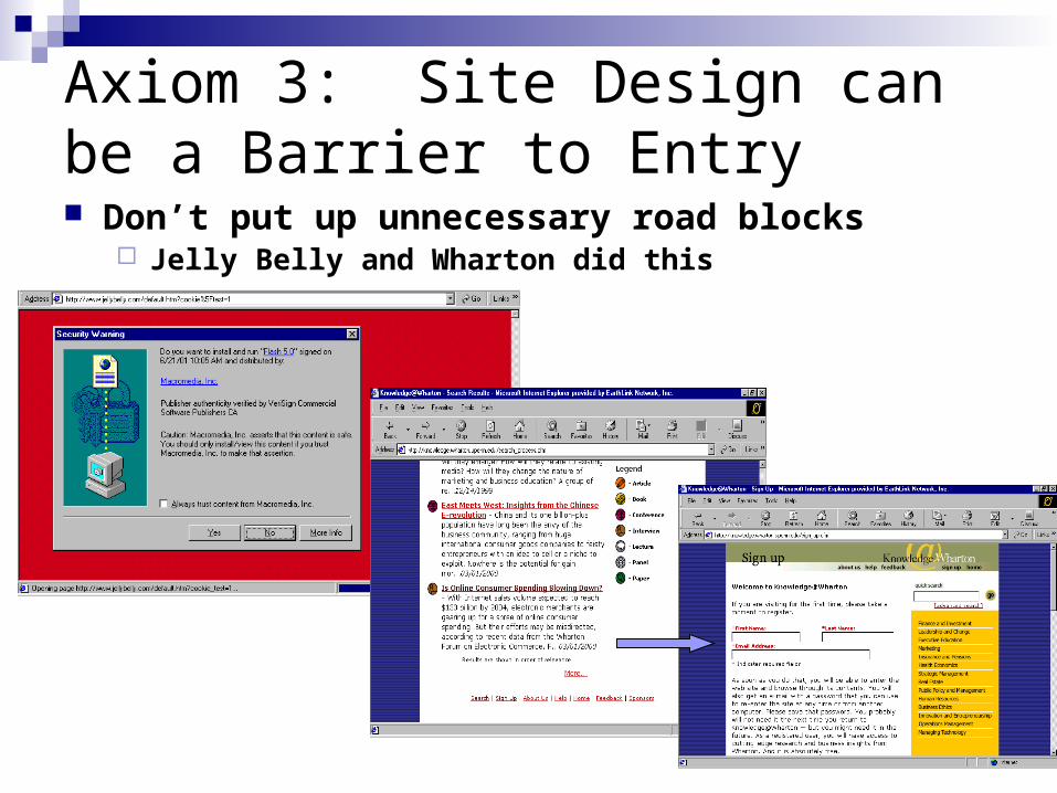
Axiom 3: Site Design can be a Barrier to Entry Don’t put up unnecessary road blocks
Jelly Belly and Wharton did this
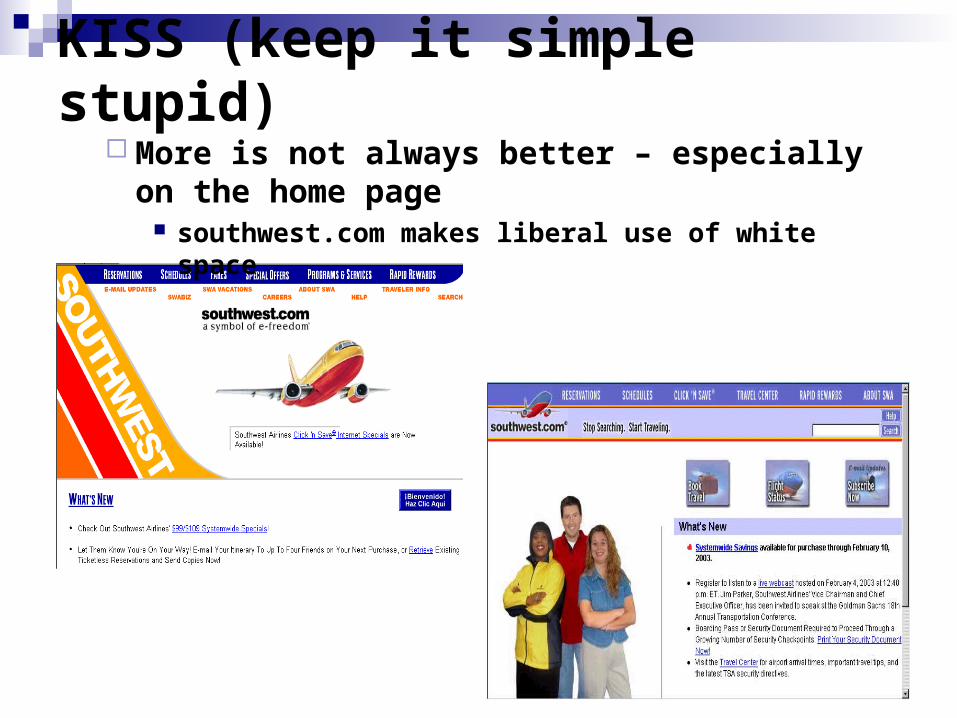
KISS (keep it simple stupid) More is not always better – especially on the
home page southwest.com makes liberal use of white space
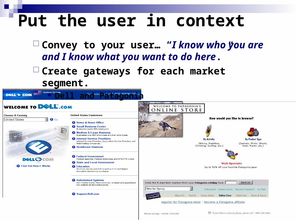
Put the user in context Convey to your user… “I know who you are and I
know what you want to do here.” Create gateways for each market segment.
Dell and Patagonia
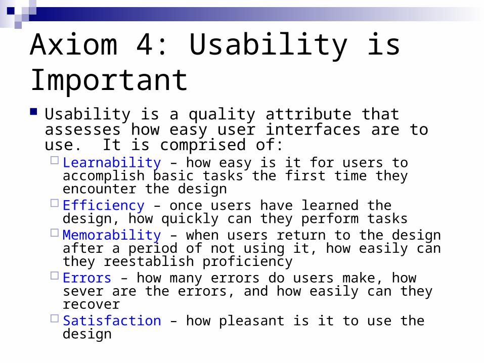
Axiom 4: Usability is Important
Usability is a quality attribute that assesses how easy user interfaces are to use. It is comprised of: Learnability – how easy is it for users to accomplish
basic tasks the first time they encounter the design Efficiency – once users have learned the design, how
quickly can they perform tasks Memorability – when users return to the design after a
period of not using it, how easily can they reestablish proficiency
Errors – how many errors do users make, how sever are the errors, and how easily can they recover
Satisfaction – how pleasant is it to use the design
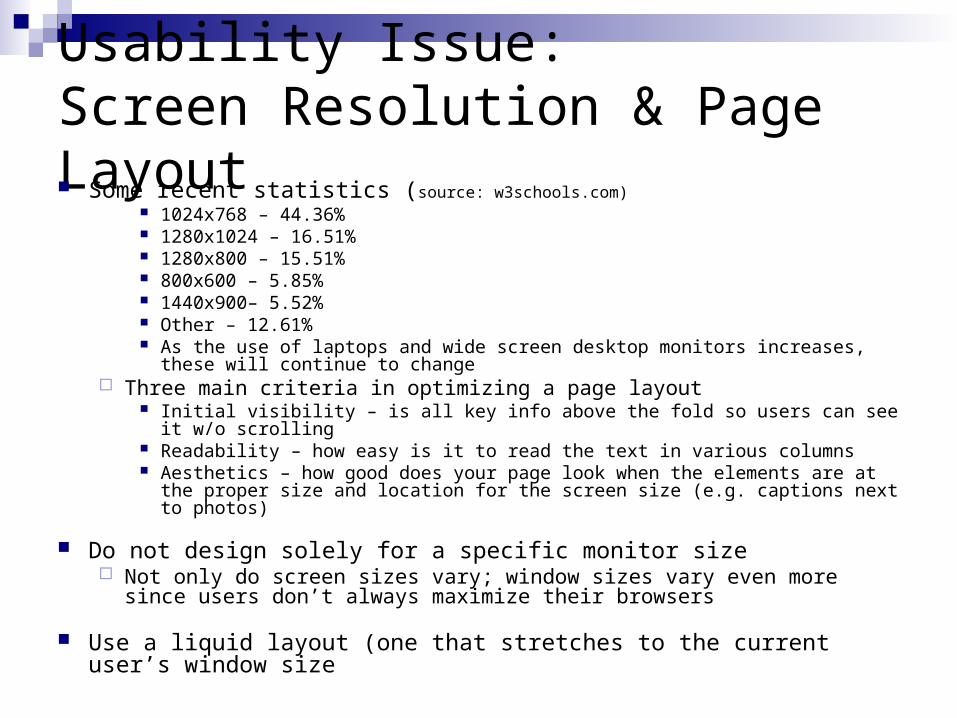
Usability Issue: Screen Resolution & Page Layout Some recent statistics (source: w3schools.com)
1024x768 – 44.36% 1280x1024 – 16.51% 1280x800 – 15.51% 800x600 – 5.85% 1440x900– 5.52% Other – 12.61% As the use of laptops and wide screen desktop monitors increases, these will
continue to change Three main criteria in optimizing a page layout
Initial visibility – is all key info above the fold so users can see it w/o scrolling Readability – how easy is it to read the text in various columns Aesthetics – how good does your page look when the elements are at the
proper size and location for the screen size (e.g. captions next to photos)
Do not design solely for a specific monitor size Not only do screen sizes vary; window sizes vary even more since users
don’t always maximize their browsers
Use a liquid layout (one that stretches to the current user’s window size
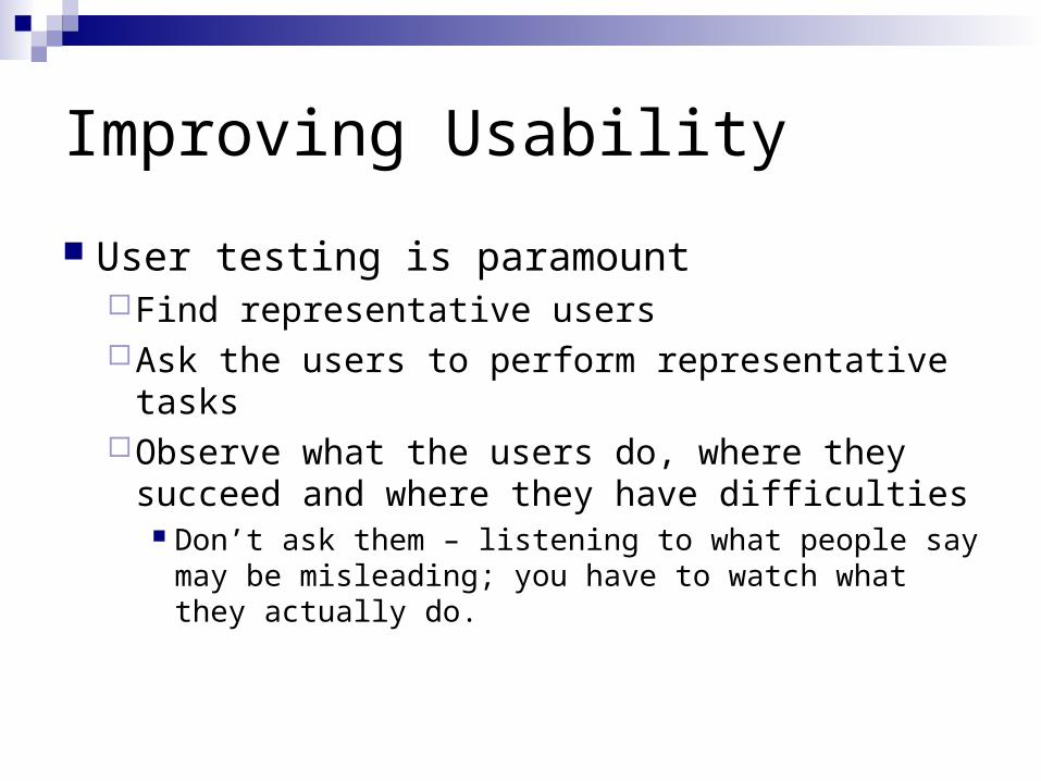
Improving Usability
User testing is paramountFind representative usersAsk the users to perform representative tasksObserve what the users do, where they
succeed and where they have difficulties Don’t ask them – listening to what people say may
be misleading; you have to watch what they actually do.
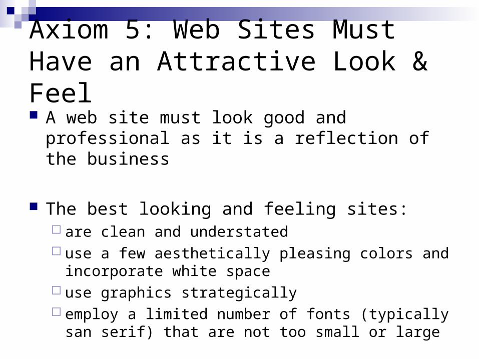
Axiom 5: Web Sites Must Have an Attractive Look & Feel A web site must look good and professional as it
is a reflection of the business
The best looking and feeling sites: are clean and understated use a few aesthetically pleasing colors and
incorporate white space use graphics strategically employ a limited number of fonts (typically san serif)
that are not too small or large
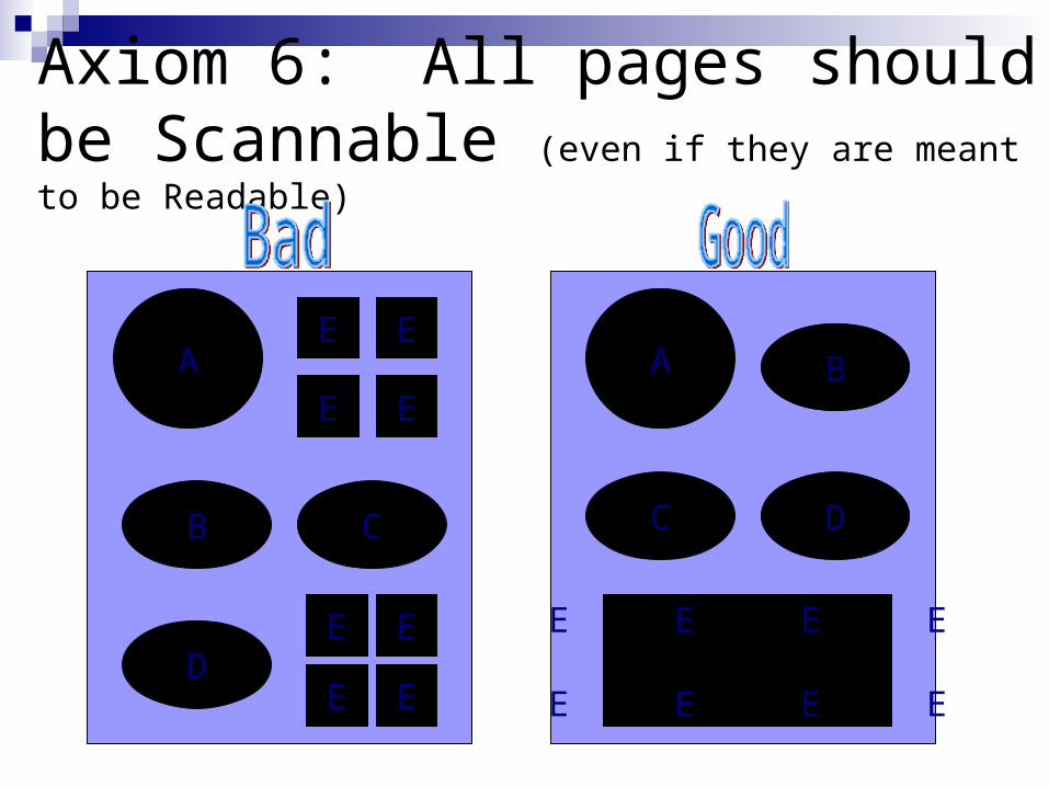
Axiom 6: All pages should be Scannable (even if they are meant to be Readable)
B C
D
C D
BA A
E E E E
E E E E
E E
E E
E E
E E
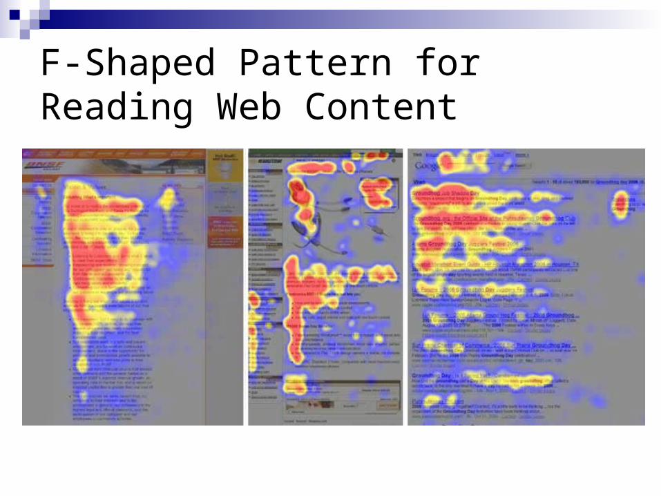
F-Shaped Pattern for Reading Web Content
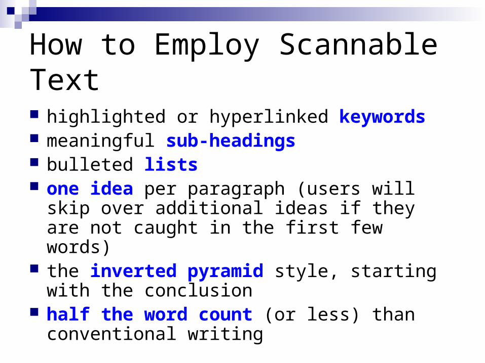
How to Employ Scannable Text
highlighted or hyperlinked keywords meaningful sub-headings bulleted lists one idea per paragraph (users will skip over
additional ideas if they are not caught in the first few words)
the inverted pyramid style, starting with the conclusion
half the word count (or less) than conventional writing
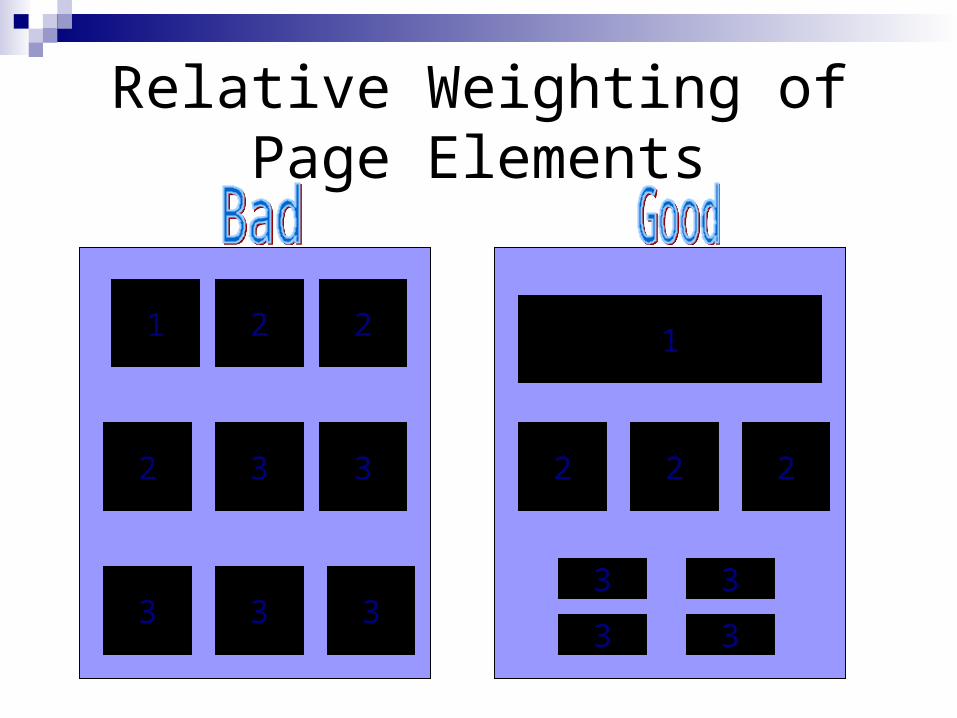
Relative Weighting ofPage Elements
1 22
2 33
333
222
1
3
3 3
3
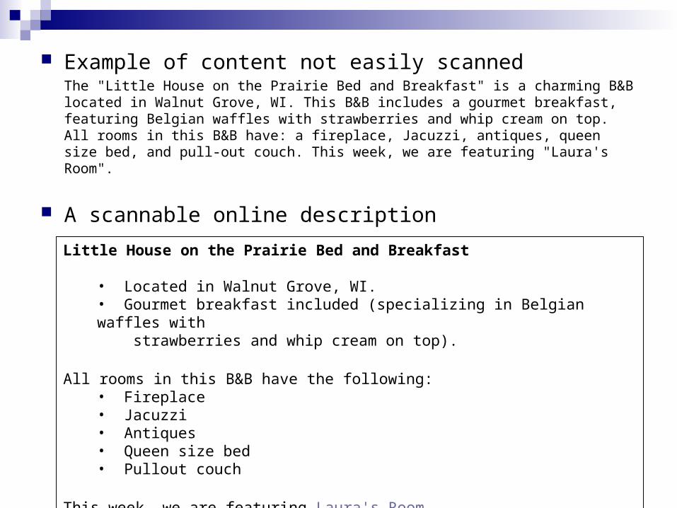
Example of content not easily scannedThe "Little House on the Prairie Bed and Breakfast" is a charming B&B located in Walnut Grove, WI. This B&B includes a gourmet breakfast, featuring Belgian waffles with strawberries and whip cream on top. All rooms in this B&B have: a fireplace, Jacuzzi, antiques, queen size bed, and pull-out couch. This week, we are featuring "Laura's Room".
A scannable online description
Little House on the Prairie Bed and Breakfast
• Located in Walnut Grove, WI. • Gourmet breakfast included (specializing in Belgian waffles with strawberries and whip cream on top).
All rooms in this B&B have the following:• Fireplace • Jacuzzi • Antiques • Queen size bed • Pullout couch
This week, we are featuring Laura's Room
What is the 7 +/-2 Rule?
Should this be followed in web design?
Question for Discussion
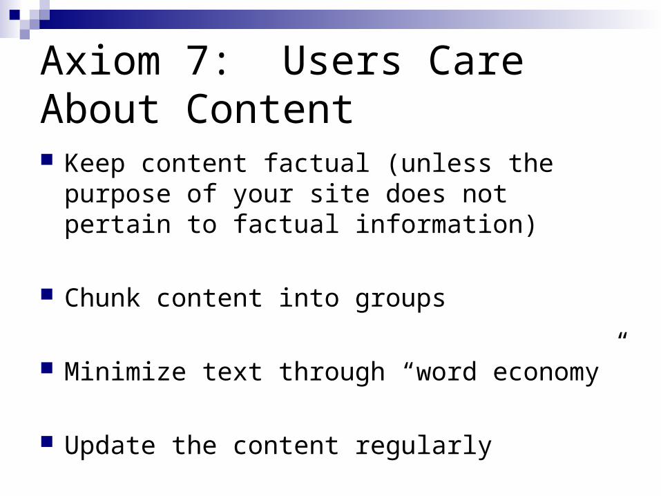
Axiom 7: Users Care About Content Keep content factual (unless the purpose of your
site does not pertain to factual information)
Chunk content into groups
Minimize text through “word economy”
Update the content regularly
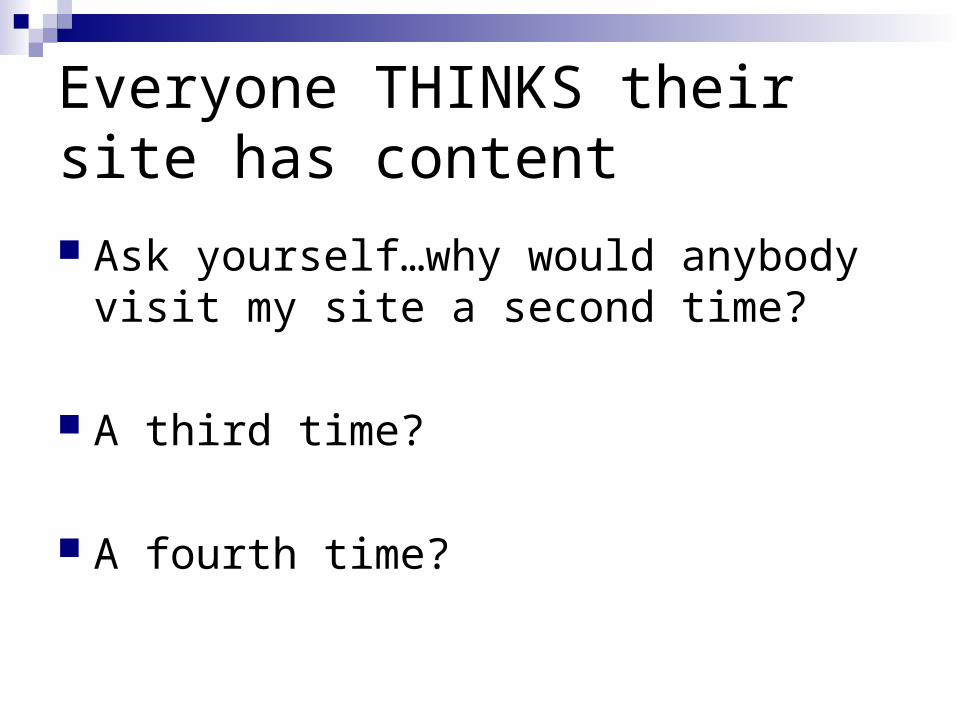
Everyone THINKS their site has content
Ask yourself…why would anybody visit my site a second time?
A third time?
A fourth time?
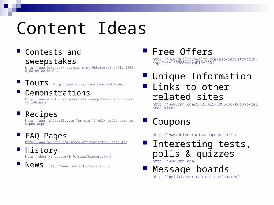
Content Ideas Contests and sweepstakes
http://www.hgtv.com/hgtv/pac_ctnt_988/text/0,,HGTV_22056_66109,00.html /
Tours http://www.elvis.com/graceland/vtour/
Demonstrations http://www.webct.com/products/viewpage?name=products_demo_webinars
Recipes http://www.jellybelly.com/fun_stuff/jelly_belly_bean_recipes.aspx
FAQ Pages http://www.myspace.com/index.cfm?fuseaction=misc.faq
History http://docs.yahoo.com/info/misc/history.html
News http://www.radford.edu/NewsPub/
Free Offers http://www.qualityhealth.com/psp/registration.jspa?rf=15970&hydraPID=2901
Unique Information Links to other related
sites http://www.cnn.com/SPECIALS/1998/10/kosovo/related.sites
Coupons http://www.4electronicscoupons.com/ / Interesting tests, polls &
quizzes http://www.cnn.com/
Message boards http://myidol.americanidol.com/boards/
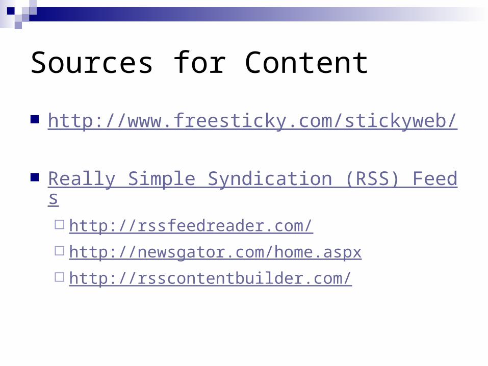
Sources for Content
http://www.freesticky.com/stickyweb/
Really Simple Syndication (RSS) Feeds http://rssfeedreader.com/ http://newsgator.com/home.aspx http://rsscontentbuilder.com/
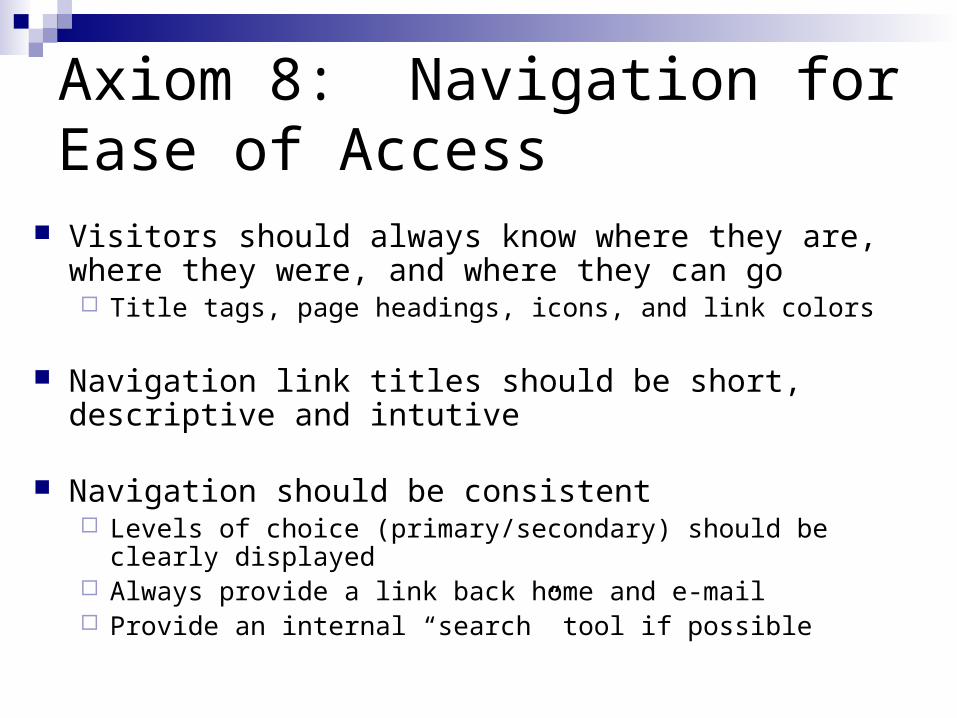
Axiom 8: Navigation for Ease of Access
Visitors should always know where they are, where they were, and where they can go Title tags, page headings, icons, and link colors
Navigation link titles should be short, descriptive and intutive
Navigation should be consistent Levels of choice (primary/secondary) should be clearly displayed Always provide a link back home and e-mail Provide an internal “search” tool if possible
Primary Navigation
Primary Navigation Should consist of the 6 – 8 most important links These links should stand out without being too
graphically intense
Alternatives Left navigation – most common because in most
cultures people start reading from left Top navigation – advantage is that it leaves more
room below for content (provided it clearly looks like navigation)
Secondary Navigation
Links that do not belong in the primary navigation such as Contact Us, About Us, Privacy Policy, Terms of Use, Site Map, etc.
Should be distinguished from primary navigation (separated from primary, smaller fonts, alternative placements
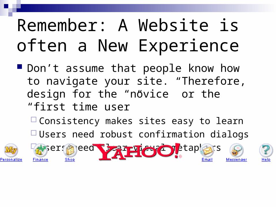
Remember: A Website is often a New Experience Don’t assume that people know how to
navigate your site. Therefore, design for the “novice” or the “first time user” Consistency makes sites easy to learn Users need robust confirmation dialogs Users need clear visual metaphors
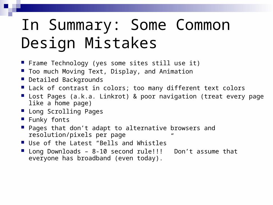
In Summary: Some Common Design Mistakes Frame Technology (yes some sites still use it) Too much Moving Text, Display, and Animation Detailed Backgrounds Lack of contrast in colors; too many different text colors Lost Pages (a.k.a. Linkrot) & poor navigation (treat every page like a home
page) Long Scrolling Pages Funky fonts Pages that don’t adapt to alternative browsers and resolution/pixels per page Use of the Latest “Bells and Whistles” Long Downloads – 8-10 second rule!!! Don’t assume that everyone has
broadband (even today).
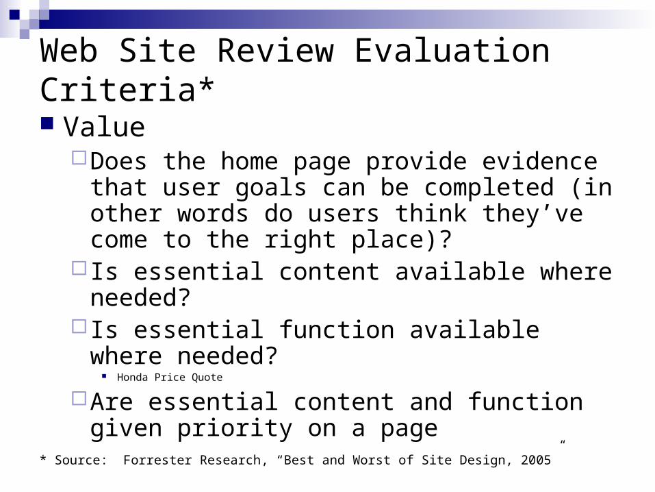
Web Site Review Evaluation Criteria*
ValueDoes the home page provide evidence that
user goals can be completed (in other words do users think they’ve come to the right place)?
Is essential content available where needed? Is essential function available where needed?
Honda Price Quote
Are essential content and function given priority on a page
* Source: Forrester Research, “Best and Worst of Site Design, 2005”
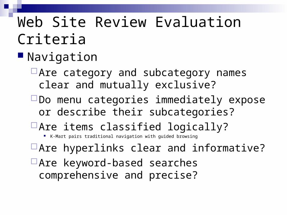
Web Site Review Evaluation Criteria
NavigationAre category and subcategory names clear
and mutually exclusive?Do menu categories immediately expose or
describe their subcategories?Are items classified logically?
K-Mart pairs traditional navigation with guided browsing
Are hyperlinks clear and informative?Are keyword-based searches comprehensive
and precise?
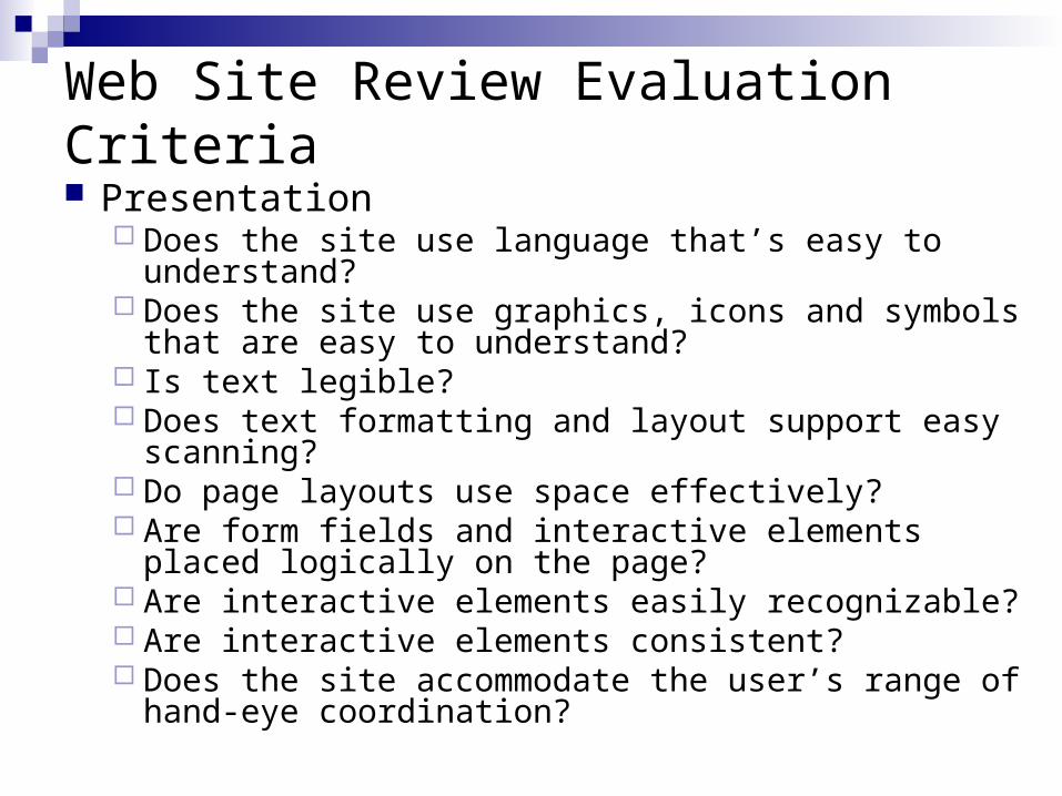
Web Site Review Evaluation Criteria Presentation
Does the site use language that’s easy to understand? Does the site use graphics, icons and symbols that are
easy to understand? Is text legible? Does text formatting and layout support easy scanning? Do page layouts use space effectively? Are form fields and interactive elements placed logically
on the page? Are interactive elements easily recognizable? Are interactive elements consistent? Does the site accommodate the user’s range of hand-
eye coordination?
Web Site Review Evaluation Criteria
TrustDoes the site present privacy and security
policies in context?Do pages provide location cues?Does site functionality provide feedback in
response to user actions? Is contextual help available at key points?Does the site help users recover from
errors?Does the site perform well?
Web Design for the User Experience:Home Pages
Angela D’Auria Stanton, Ph.D.
Homepages are Key!
The most valuable real estate in the world
Your company’s faces to the world
The most important page on most websites
Gets more page views than any other page
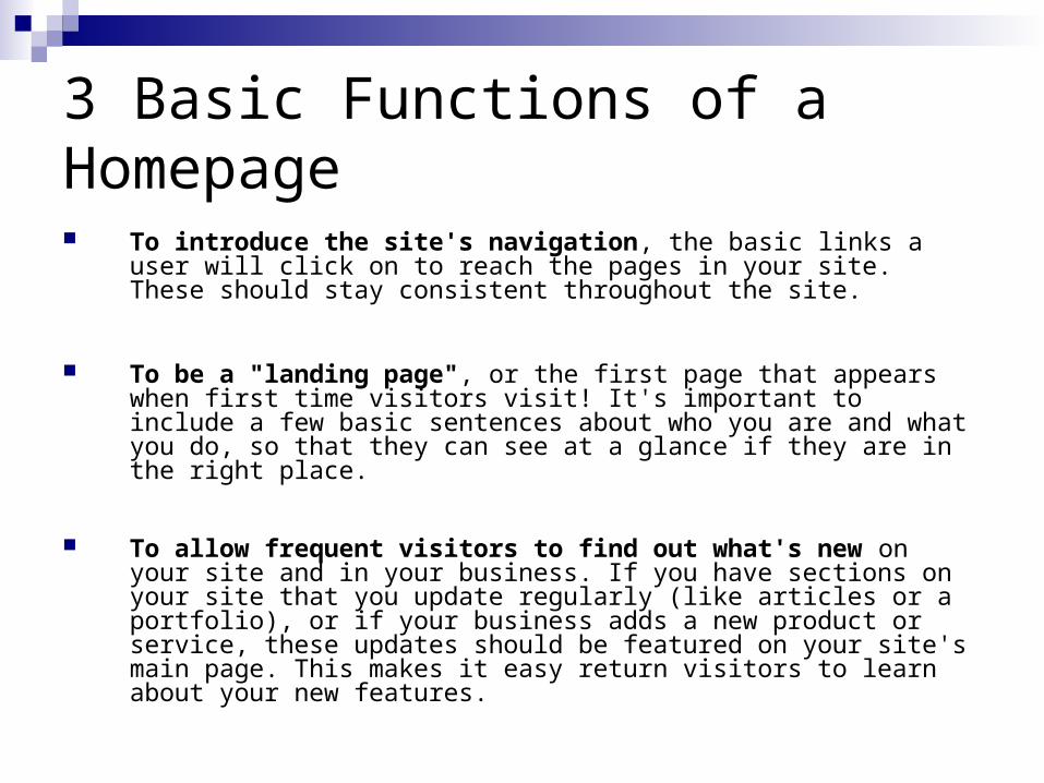
3 Basic Functions of a Homepage
To introduce the site's navigation, the basic links a user will click on to reach the pages in your site. These should stay consistent throughout the site.
To be a "landing page", or the first page that appears when first time visitors visit! It's important to include a few basic sentences about who you are and what you do, so that they can see at a glance if they are in the right place.
To allow frequent visitors to find out what's new on your site and in your business. If you have sections on your site that you update regularly (like articles or a portfolio), or if your business adds a new product or service, these updates should be featured on your site's main page. This makes it easy return visitors to learn about your new features.
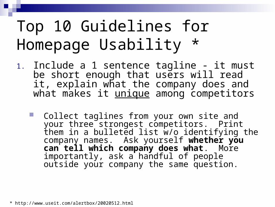
Top 10 Guidelines for Homepage Usability *1. Include a 1 sentence tagline - it must be short
enough that users will read it, explain what the company does and what makes it unique among competitors
Collect taglines from your own site and your three strongest competitors. Print them in a bulleted list w/o identifying the company names. Ask yourself whether you can tell which company does what. More importantly, ask a handful of people outside your company the same question.
* http://www.useit.com/alertbox/20020512.html
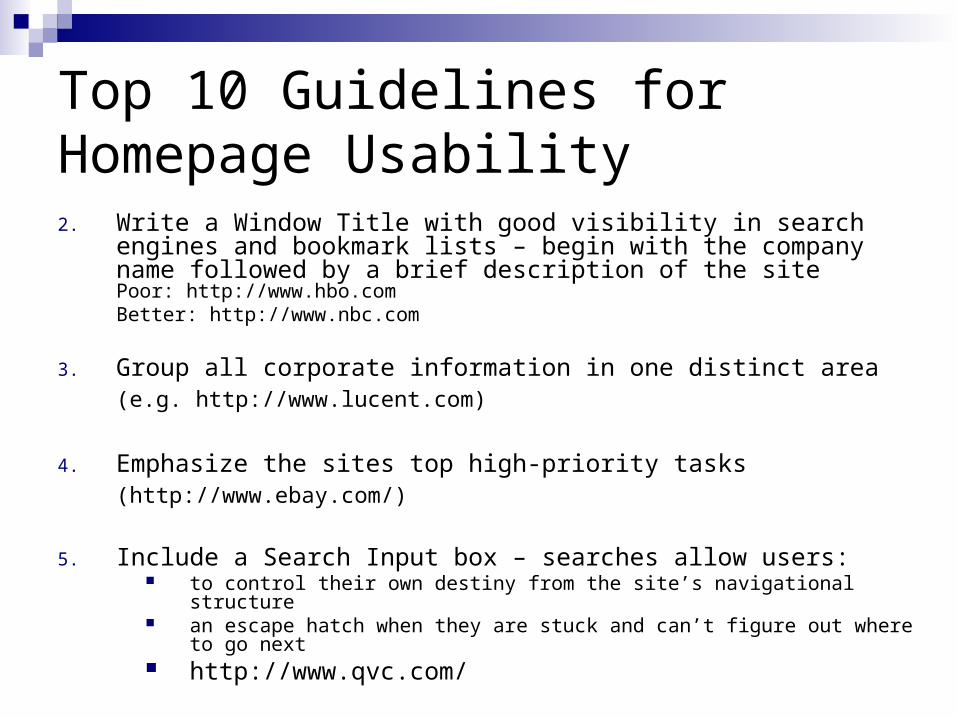
Top 10 Guidelines for Homepage Usability2. Write a Window Title with good visibility in search engines and
bookmark lists – begin with the company name followed by a brief description of the sitePoor: http://www.hbo.com Better: http://www.nbc.com
3. Group all corporate information in one distinct area(e.g. http://www.lucent.com)
4. Emphasize the sites top high-priority tasks (http://www.ebay.com/)
5. Include a Search Input box – searches allow users: to control their own destiny from the site’s navigational structure an escape hatch when they are stuck and can’t figure out where to go next http://www.qvc.com/
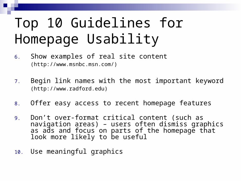
Top 10 Guidelines for Homepage Usability6. Show examples of real site content
(http://www.msnbc.msn.com/)
7. Begin link names with the most important keyword (http://www.radford.edu)
8. Offer easy access to recent homepage features
9. Don’t over-format critical content (such as navigation areas) – users often dismiss graphics as ads and focus on parts of the homepage that look more likely to be useful
10. Use meaningful graphics
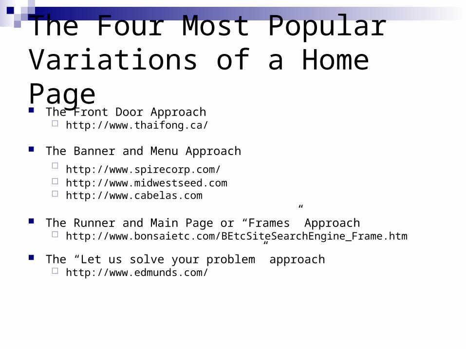
The Four Most Popular Variations of a Home Page The Front Door Approach
http://www.thaifong.ca/
The Banner and Menu Approach http://www.spirecorp.com/ http://www.midwestseed.com http://www.cabelas.com
The Runner and Main Page or “Frames” Approach http://www.bonsaietc.com/BEtcSiteSearchEngine_Frame.htm
The “Let us solve your problem” approach http://www.edmunds.com/