Embed Size (px)
Citation preview

Stephen Vermette Department of Geography & Planning, SUNY Buffalo State [email protected]
1
Weathering Change in WNY: Climatic Trend Analysis (1965-2016)
Stephen Vermette
Department of Geography & Planning SUNY Buffalo State
A report prepared for Designing to Live Sustainably (d2ls). Funding was provided
by the Buffalo State SUNY Research Foundation.
December 2017

Stephen Vermette Department of Geography & Planning, SUNY Buffalo State [email protected]
2
Executive Summary
Weathering Change in WNY: Climatic Trend Analysis (1965-2016)
Stephen Vermette Department of Geography & Planning
SUNY Buffalo State
This report was prepared for the Western New York nonprofit ‘Designing to Live Sustainably’ [d2ls] (http://d2ls.org/).
The objective of this temporal trend analysis is to understand Western New York’s (WNY’s) climatic responses, and non-
responses, to a warming world. Understanding regional climatic responses, and nonresponses, is critical in considering
adaptation strategies, building resiliencies, and taking advantage of potential opportunities for the WNY region.
WNY is defined here as the eight most western counties of New York State (NYS). The climate data was subjected to
averaging (seasonal and annual) and graphed to show temporal and spatial patterns. The most common type of
graph shown in this report is a time series plot showing three trend references: the raw data, a simple (arithmetic)
moving average (5-year) filter that smoothed year-to-year variability, and a linear trend line. The validity of a trend
− ‘significant trend’ vs. ‘no trend’ − was determined using the non-parametric Mann-Kendall test, where only slope
values significantly different from zero at the 95% confidence level (p < 0.05) were labelled as a significant trend
(unless otherwise indicated).
An examination of WNY’s climate data (1965-2016) clearly indicates that the region is impacted by climate change – a climatic response chiefly characterized by a significant rise in air temperature. Based on the data and indices studied in this report, WNY’s response to a warming world appears to be chiefly seen as a rise in regional air temperatures and related indices. Precipitation and severe weather indices, for the most part, show no response. Temperatures in WNY are increasing at a rate (0.4°F per decade) that is slightly less than the U.S. average. This warming can be seen in both the annual maximum and minimum temperatures, although the rate of increase for year-on-year minimum temperatures appears to exceed that of maximum temperatures. In line with the rise in temperatures, daily temperature records show a significant decrease in the number of ‘low’ records and an increase in ‘high ’records over time, a significant lengthening of the growing season (by about 2 weeks over the past 52 years), a significant decrease in heating degree days (HDD) and increase in cooling degree days (CDD), creating a need for less heating and greater cooling of buildings, a significant warming of Lake Erie’s waters, less lake ice coverage, and significantly earlier ice-out dates. A form of severe weather that may be on the rise in WNY is strong thunderstorm winds, which display a significant increase over time. Non-responses (absence of a significant trend) to increasing temperatures include the absence of any significant increase in the number of days > 90°F, heat waves, and drought conditions. Other non-responses include precipitation and severe weather. With the possible exception of Southern Tier snowfall rates, total precipitation and snowfall temporal trends, as well as daily precipitation and snowfall records, appear unchanged over the years. With regard to severe weather, other than thunderstorm winds, no significant increase was found for either the intensity or frequency of heavy downpours, or the frequency of thunderstorms, hail, tornadoes, and lake effect snow (LES). While this report focused on WNY as a single region, results suggests that climate responses and nonresponses may be dependent on, and thus vary between, climate controlled zones − not political boundaries. Five climate-controlled zones have been identified in WNY. Future research should be directed toward a more detailed temporal trend analysis for each of these five zones. Furthermore, this response-variability reinforces the need for climate modeling on a fine scale (1 km x 1 km), which models the influence of Lake Erie and Ontario, and the historic response of individual zones to a changing climate, as compared to the statewide assessment by the New York Energy Research and Development Authority (NYSERDA) https://www.nyserda.ny.gov/climaid with interpretations that rely on a much coarser model grid and which assumes that modeled-projected changes apply uniformly to weather stations across the state.

Stephen Vermette Department of Geography & Planning, SUNY Buffalo State [email protected]
3
Weathering Change in WNY: Climatic Trend Analysis (1965-2016)
Stephen Vermette Department of Geography & Planning
SUNY Buffalo State
INTRODUCTION
Designing to Live Sustainably [d2ls] (http://d2ls.org/) is a Western New York (WNY) nonprofit which moves
to nurture a culture of social, economic, and environmental responsibility within the Buffalo Niagara
community. D2ls is leading an initiative – under the banner ‘Weathering Change in WNY’ – contemplating
that “…our responsibility to future generations is our responsibility to both prevent what global warming
can still be prevented, and to prepare for the effects that are certain to impact us.” Two climate-related
products have been produced as a first step in preparing for the local effects of climate change. The first
product, ‘WNY’s 5 Climate Zones’, defined and described five WNY climate zones within the eight county
WNY region. The second product, reported here, is a climatological trend analysis − a look at how the WNY
climate has evolved and where it may take us in future. Both reports are linked here http://d2ls.org/.
There is a canon of science supporting both global climate change and the environmental responses to these changes http://www.ipcc.ch/report/ar5/wg1/ . Global climate change is an aggregate of regional and local climate responses thus, in addition to a global analysis, climate change is a local phenomenon that requires local analysis. It should not be taken as a matter of course that regions will respond to global warming equally or with similar intensity or that portions of regions (e.g., the northeast United States) will respond in the same way to global trends. The objective of this temporal trend analysis is to understand our regional (local) climatic responses, and non-responses, to a warming world. Understanding regional climatic responses, and nonresponses, is critical in considering adaptation strategies, building resiliencies, and taking advantage of potential opportunities for the WNY region.
WNY’s environmental-human (non-climatic) response to climate change is not addressed here, nor is the environmental-human response within our region that spills over from climate change occurring outside of our region (bird migration, disease vectors, economics, etc.). These are directions proposed for future products of ‘Weathering Change in WNY’.
METHODOLOGY
Western New York (WNY) is defined here as the eight western counties of New York State (NYS): Niagara, Erie, Chautauqua, Cattaraugus, Allegany, Wyoming, Genesee, and Orleans (Figure 1). The period 1965 to 2016 (52 years) was chosen for this study based on three considerations. First, while the Buffalo, NY record includes weather data going back to the late 1800’s, prior to 1943 it was monitored at multiple high rise sites in downtown Buffalo, as compared to ground-level measurements at the current airport site (KBUF). The urban setting prior to 1943, and the questionable citing of monitoring equipment, renders weather data prior to 1943 useless for purposes of understanding trends. In addition, these downtown sites were located along the Lake Erie shoreline and thus subjected to the greater influence of seasonal lake effect influences on temperature and other weather elements, as compared to its present location at (https://gammathetaupsilon.org/the-geographical-bulletin/2000s/volume48-2/article4.pdf).

Stephen Vermette Department of Geography & Planning, SUNY Buffalo State [email protected]
4
Figure 1: The Eight Counties of Western New York (WNY).
Second, it is during the years 1965 to 2016 that the Northern Hemisphere, U.S., and Buffalo’s (as measured at KBUF) annual air temperature anomalies (departures from the mean of each data set) appear to align – temperature increases that can be attributed to the climate forcing associated with the rapid atmospheric buildup of greenhouse gases (Figure 2). Prior to 1965, the Buffalo air temperatures, as measured at the airport (KBUF), exhibit a number of short-lived departures from that of the U.S. and Northern Hemispheric anomalies, suggestive of a pattern-lock of several years (e.g. a period of abnormally warm or cool summers) that may be attributed to local variability, as opposed to longer term climate change. Third, the choice of a longer climate record would have severely limited the number of National Weather Service Cooperative (COOP) observing sites available to this study, thus limiting the regional representativeness of this study.
Figure 2: Temperature anomalies were calculated as the difference of yearly means from that of the mean of each data set. Plotted are 5-year moving averages for the Northern Hemisphere (N.H.), United States, and Buffalo, NY. The vertical line marks the year 1965. Shown in parentheses is the time line for Buffalo’s two monitoring sites.

Stephen Vermette Department of Geography & Planning, SUNY Buffalo State [email protected]
5
The climate data was subjected to averaging (seasonal and annual) and graphed to show temporal and spatial patterns – as a measure of WNY’s response to a changing global climate. The most common type of graph shown in this report is a time series, showing three trend references: plotting of the raw data, plotting a simple (arithmetic) moving average (5-year) filter that smoothed year-to-year variability, and plotting a linear trend line. The validity of a trend − ‘significant trend’ vs. ‘no trend’ − was determined using the non-parametric Mann-Kendall test (http://en.ilmatieteenlaitos.fi/makesens), where only slope values significantly different from zero at the 95% confidence level (p < 0.05) were labelled as a significant trend (unless otherwise indicated). On many graphics the text in red means an insignificant temperature trend whereas blue text indicates a significant trend. Climate change in WNY was examined using station climate data obtained from the National Centers for Environmental Information at https://www.ncdc.noaa.gov/, and the National Weather Service (NWS) Buffalo Site (KBUF) located at the Buffalo Niagara International Airport at http://www.weather.gov/buf/ . In addition, climatic data were obtained through the National Weather Service (NWS) Cooperative Observer Program (COOP) at http://xmacis.rcc-acis.org/ and Lake Effect Snow (LES) data were obtained from the LES archive at http://www.weather.gov/buf/lesEventArchive. Historical Palmer Drought Indices were obtained from the National Oceanic and Atmospheric Administration (NOAA) at https://www.ncdc.noaa.gov/temp-and-precip/drought/historical-palmers/. Lake Erie water temperature data were obtained from the NWS http://www.weather.gov/buf/LakeTemp. Ice cover data were obtained from the Great Lakes Environmental Research Lab (GLERL) at https://www.glerl.noaa.gov/data/ice/#historical, and ice-out dates for Lake Erie’s eastern basin were obtained from the International Joint Commission (IJC) at http://www.ijc.org/files/tinymce/uploaded/INBC/Ice%20Boom%202016.pdf.
TEMPERATURE RESULTS
Air Temperature Temperature, and most indices related to it, exhibits a significant warming trend in WNY. Annual average air temperatures for Buffalo, NY (KBUF) show a statistically significant warming trend (0.4oF per decade) for the years 1965-2016, a rate of warming that is slightly below that of the U.S. average (Figure 3). This warming trend is significant in all seasons, with the exception of winter (although the winter trend is significant at the 90% confidence level). Annual mean temperature trends from the NWS COOP stations, with four exceptions (Little Valley, James town, Allegany State Park, and Angelica), are consistent with Buffalo’s data, suggesting a regional warming (Figure 4). The four COOP sites not showing a significant temporal trend are clustered in the Southern Tier. This clustering of stations suggests that the temperature response found elsewhere in WNY may be muted in the Southern Tier. A limitation with the use of COOP data was their varying start dates, missing data, and length of record. Most station records used here began between 1965 and 1975; the two exceptions are North Tonawanda and Allegany State Park with records which begin in 1984 and 1987, respectively. Similar to that of mean temperature, a significant trend is apparent for Buffalo’s annual mean maximum and minimum temperatures (Figures 5 and 6), though the seasonal significance does vary. Seasonal mean maximum temperature increases are statistically significant for the spring and autumn seasons only,

Stephen Vermette Department of Geography & Planning, SUNY Buffalo State [email protected]
6
whereas mean minimum temperature increases are significant for three of the four seasons (winter, summer and autumn), while significant at the lesser 90% confidence level for spring.
Figure 3. Annual mean average temperature trend for Buffalo, NY (1965-2016). Text in red means an insignificant temperature trend whereas blue text indicates a significant trend (p < 0.05).
Figure 4. Significance of annual mean temperature trends for NWS COOP stations in WNY (circa 1965-2016). WNY‘s Five climate zones are shown.

Stephen Vermette Department of Geography & Planning, SUNY Buffalo State [email protected]
7
Figure 5. Annual mean maximum temperature trend for Buffalo, NY (1965-2016). Text in red means an insignificant temperature trend whereas blue text indicates a significant trend (p < 0.05).
Figure 6. Annual mean minimum temperature trend for Buffalo, NY (1965-2016) (p < 0.05).
Stephen Vermette Department of Geography & Planning, SUNY Buffalo State [email protected]
8
In general, increases in annual minimum temperatures appear to exceed increases in maximum temperatures across WNY. This trend is consistent with what other researchers are finding http://climatechange.vermont.gov/our-changing-climate/dashboard/increasing-max-min-temperature. An examination of Buffalo’s data (Figure 7) shows the dominance of increasing minimum temperatures over that of maximum temperatures, and the seasonal trends highlight why the number of hot summer nights in Buffalo might increase at a faster rate than higher daytime maximum temperatures. The dominance of the minimum temperature increase is also apparent for a number of NWS COOP stations, including Batavia, NY and Fredonia, NY (Figures 8 and 9), although there are exceptions.
Figure 7. Season decadal temperature increases for Buffalo, NY (1965-2016).
Figure 8. Season decadal temperature increases for Batavia, NY (1965-2016).

Stephen Vermette Department of Geography & Planning, SUNY Buffalo State [email protected]
9
Figure 9. Season decadal temperature increases for Fredonia, NY (1965-2016).
Daily Temperature Records While the frequency of new records should be expected to fall over time as temperature records accumulate, the ratio of new minimum to maximum records would not be expected to show any trend in the absence of climate change. The increase in global concentrations of greenhouse gases and the subsequent warming (including warming in WNY) increases the probability of record-breaking high temperatures in any given period of time. During the 1965 to 2016 period, the total number of high temperature records outpaced that of low temperature records 337 (61%) to 219 (39%), respectively; resulting in a rising ratio of record high to record low temperatures. ‘High temperature records’ include daily high maximum and daily high minimum record temperatures; whereas ‘low temperature records’ include daily low minimum and daily low maximum temperatures. Over time, the frequency of low temperature records shows a significant decrease. The number of high temperature records shows an increase over time, but the trend is not significant, although barely so, as it is significant at the 90% confidence level (Figure 10). An illustrative example of this trend is to compare records for the first 10 years (1965-1974) of the data with those of the ten most recent (2007-2016). As shown in Figure 11, the number of ‘high temperature records’ has doubled, from 41 to 82, whereas the number of ‘low temperature records’ has been cut in half, from 63 to 34. These finding are consistent with a warming region.

Stephen Vermette Department of Geography & Planning, SUNY Buffalo State [email protected]
10
Figure 10. Frequency of high and low daily temperature records for Buffalo, NY (1965-2016).
Figure 11. Comparison of temperature records of both the first and the most recent decade for Buffalo, NY (1965-2016).
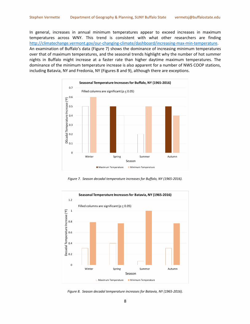
Growing Season The length of the WNY growing season is measured by the number of days between last and first < 32°F daily minimum temperature recorded at the Buffalo Airport (KBUF). While there is substantial year-to-
Stephen Vermette Department of Geography & Planning, SUNY Buffalo State [email protected]
11
year variability, the length of the growing season shows a significant increase between the years 1965 and 2016, with an extension of one week in each of the spring and fall seasons (Figure 12). Projection of the trend line suggests a future increase in the growing season of 2.7 days per decade. This increase in the length of the WNY growing season is consistent with recent studies that have reported a similar lengthening of the growing season for the contiguous 48 states (https://www.epa.gov/climate-indicators/climate-change-indicators-length-growing-season).
Figure 12. Trending length of the growing season for Buffalo, NY (1965-2016).
Heating and Cooling Degrees Days Heating Degree Days (HDDs) and Cooling Degree Days (CDDs) are indices used by the utility industry to predict energy consumption, as well as the price of weather derivatives which is based on an index made up of monthly degree day values (a form of industry insurance). The ‘degree day’ simply compares a day's average temperature to that of a base temperature of 65°F. A daily mean temperature less than 65°F indicates that buildings need to be heated, whereas a daily mean temperature greater than 65°F indicates that buildings need to be cooled (air conditioning). The difference between the daily mean temperature and 65°F provides the ‘degree day’ value. For example, a day with an average temperature of 75°F accumulates 10 CDDs. Degree days are accumulated daily throughout the year, providing an annual total. Trends in degree days are used here as an indicator of changing temperatures for WNY, but also can be used locally to assess change in energy demand and human comfort. Comparing the two graphs (Figures 13 and 14), the HDD requirements are generally ten times greater than CDD requirements. This is

Stephen Vermette Department of Geography & Planning, SUNY Buffalo State [email protected]
12
reflective of WNY’s northern climate. The number of annual HDDs in the years since 1965 shows a significant decline, while the number of CDDs shows a significant increase. Both WNY’s HDD and CDD values indicate a warming over time, with the CDDs (air conditioning) showing the greatest percent increase.
Figure 13. Trending Heating Degree Days (HDDs) for Buffalo, NY (1965-2016).
Figure 14. Trending Cooling Degree Days (CDDs) for Buffalo, NY (1965-2016).

Stephen Vermette Department of Geography & Planning, SUNY Buffalo State [email protected]
13
Extreme Temperatures and Heat Waves
An oft-cited climate change indicator is an increase in the frequency and intensity of heat waves, which in turn are associated with heat-related illness and death, reduced crop yields, and the instability of food supplies, among other things. On a sliding scale of certainty, the Union of Concerned Scientists lists ‘heat waves’ (defined by the NWS as three consecutive days with temperatures > 90°F) as providing the “strongest evidence” of human-caused climate change https://www.ucsusa.org/global-warming/science-and-impacts/impacts/extreme-weather-climate-change.html#.WmFXP2aWzIU. The scientific underpinning is straightforward: a warming world will result in a greater number of high temperature records. The mean number of days in Buffalo, NY with extreme air temperatures > 90°F is 2.9 (mostly confined to the months of June, July, and August). Never has an air temperature > 100°F officially been recorded at Buffalo Airport (KBUF). An analysis of the number of days of > 90°F between 1965 and 2016 (Figure 15) does not show a significant increase over time, as one might expect with the documented increase in Buffalo’s annual mean maximum temperatures (Figure 3). In addition, the number of NWS-defined heat waves also does not appear to increase over time. A possible explanation for this paradox is that while Buffalo’s annual mean maximum temperatures do show a significant increase over time, the mean maximum temperatures specifically for the summer do not (Figure 7).
Figure 15. Number of days with maximum temperatures > 90°F and frequency of heat waves for Buffalo, NY (1965-2016).
Stephen Vermette Department of Geography & Planning, SUNY Buffalo State [email protected]
14
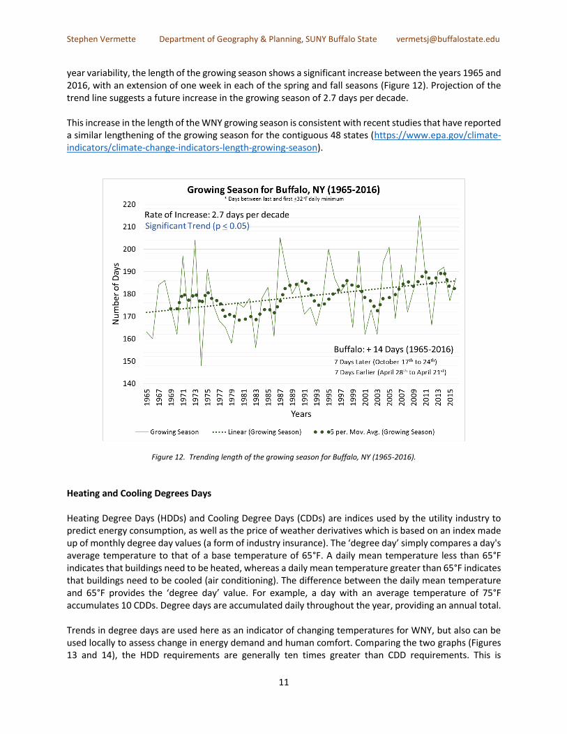
Severe or Extreme Droughts Strong scientific evidence links extreme droughts to a warming world https://www.ucsusa.org/global-warming/science-and-impacts/impacts/extreme-weather-climate-change.html#.WmFXP2aWzIU. Monthly maps of drought conditions in the contiguous U.S., as measured by the Palmer Drought Severity Index (PDSI), were used to determine the frequency of drought occurrence in WNY. The PDSI measures short-term drought on a monthly timescale, with memory of conditions in previous months. ‘Severe’ and ‘extreme’ drought refers to areas where crop losses and water shortages are likely. Monthly severe and extreme drought occurrences were tallied for WNY (counted even if they only occurred in a single county), and summed to provide an annual total. An examination of Figure 16 shows that, as with heat waves, there does not appear to be a temporal trend in the occurrence of severe or extreme drought between the years 1965 and 2016. In fact, the frequency of drought months in the 52 years prior to 1965 are more than double that for the 52 years (1965-2016) used in this study.
Figure 16. Number of months exhibiting severe or extreme drought conditions in WNY (1965-2016).

Stephen Vermette Department of Geography & Planning, SUNY Buffalo State [email protected]
15
Winter’s Freeze-Thaw Cycle An oft-heard comment related to WNY’s winter season is that our winters are ‘not the same’ as in the past. The emphasis of this comment is usually that contemporary winter temperatures are not consistently cold; that there is greater variability – freezes are followed by more frequent thaws. There is less predictability, less consistency. To address this comment, the longest number of consecutive winter days (run of days) with reported temperatures at or below freezing (32°F) was tallied and averaged for each year’s winter months (December through February). The graphing of the average ‘longest run of days’ < 32°F shows that the length of these runs is decreasing over time by about half a day per decade. However, this trend is not statistically significant (Figure 17). This pattern is consistent with the winter warming and the absence of a significant temporal trend of Buffalo’s average winter temperatures (Figure 3).
Figure 17. Average longest run of days with temperatures < 32°F for Buffalo, NY (1965-2016).

Stephen Vermette Department of Geography & Planning, SUNY Buffalo State [email protected]
16
Lake Erie Water Temperatures and Ice Conditions Lake Erie is positioned on the western border of WNY (Chautauqua and Erie Counties), while Lake Ontario is positioned on the region’s northern boundary (Niagara and Orleans Counties). Both lakes influence their respective nearshore air temperatures – cooling the air in spring and early summer and warming the air in late summer and autumn, relative to sites located inland http://gammathetaupsilon.org/the-geographical-bulletin/2000s/volume48-2/article4.pdf. The lakes also influence precipitation (including lake-generated snow events, referred to as ‘Lake Effect Snow’ (LES), sometimes well inland from the lake shores. Lake Erie water temperature measurements are taken at the Buffalo Water Treatment Plant at a depth of 30 feet, while Lake Ontario water temperature is taken at the Monroe County Water Treatment Plant near Greece, N.Y., measured at an approximate depth of 35 feet. While the Lake Erie temperatures at 30 feet are reflective of its surface temperatures, Lake Ontario temperatures occasionally may not be representative of its surface temperatures due to upwelling of deeper, colder waters. For this reason, only the Lake Erie temperatures are reported here. Lake Erie’s water temperature serves as a regional climatic response indicator, similarly influenced by, but separate from, air temperature measurements. Aside from the potential aquatic impacts, a warming lake (along with continued cold waves in the winter) is often cited as a possible reason for increases in future LES. Furthermore, the rate at which lake surface temperatures change – whether more or less than that of land measurements over time – may provide a greater or lesser influence on nearshore air temperatures. Lake Erie’s annual average water temperature shows a significant increase, trending from 49°F in 1965 to 51.6°F in 2016. This trend is significant in all seasons except winter (Figure 18). Water temperature data has been available since 1927. It is interesting to note that the period 1927 to 1964 shows no significant temporal trend in water temperature but the 1965 to 2016 trend neatly aligns with climate forcing attributed to the rapid atmospheric buildup of greenhouse gases, as discussed previously. A comparison of seasonal Lake Erie water temperature (1965-2016) with air temperature at Buffalo, NY (KBUF) shows that the rate of increase of Lake Erie’s water temperature is greater in the spring and summer than the rate of increase in air temperature at KBUF in the same seasons. A possible implication of this difference in the water/air temperature rates, is a lessening, over time, of the nearshore cooling influence of Lake Erie. Annual maximum ice cover data for Lake Erie shows that substantial ice cover is typical for the lake, with 30 of the last 45 years (1973 to 2017), experiencing a maximum ice cover of > 90% (Figure 19). The exceptions (ice cover as low as 5%) appear more frequent in recent years. A trend analysis (p< 0.05) showed no trend, although a trend of decreasing ice cover is suggested at the 90% confidence level.

Stephen Vermette Department of Geography & Planning, SUNY Buffalo State [email protected]
17
Figure 18. Lake Erie water temperatures as measured at the Buffalo Water Treatment Plant at a depth of 30 feet (1965-2016).
Figure 19. Lake Erie annual maximum ice cover (1973-2017). Graph source: NOAA/GLERL.
Ice-out dates (operationally defined as when there is less than 250 square miles of ice in the eastern basin of Lake Erie), while showing year-to-year variability, show a significant change over time – occurring about 16 days earlier, trending from April 27th in 1965 to April 11th in 2016. In addition, a number of ice-free years (eastern basin of Lake Erie) occurred in the latter part of the record. Ice-out measurements are available since 1905 and, as with water temperature, the early period of the record (1905 to 1964) shows no temporal trend with ice-out dates. The 1965 to 2016 trend of earlier ice-out dates is consistent with a warming lake, especially with a warming spring season (Figure 20)

Stephen Vermette Department of Geography & Planning, SUNY Buffalo State [email protected]
18
Figure 20. Lake Erie ‘Last Ice’ dates (1965-2016). Operationally defined as less than 250 square miles of ice remaining in the eastern basin of Lake Erie.
PRECIPITATION RESULTS
Annual Precipitation and Snowfall While temperature, and most indices related to it, exhibits a significant warming in WNY between the years 1965 and 2016, precipitation data, for the most part, shows no response (no trend) to warming. Mean total precipitation (Figure 21) exhibits a slight increase in annual and seasonal precipitation amounts from 1965 to 2016, but the increase is not significant at the 95% confidence level (though winter precipitation shows a significant increase at the 90% confidence level). Similarly, precipitation records show a slight increase over time, but this increase is not significant (Figure 22). Snowfall amounts (Figure 23) exhibit a slight decrease over time. This slight decrease in snowfall may be consistent with what one might expect in a warming world – warming temperatures leading to less snow – but given the annual variability over the years, a significant trend is not apparent at this time, nor is a trend in snowfall records (Figure 24).

Stephen Vermette Department of Geography & Planning, SUNY Buffalo State [email protected]
19
Figure 21. Mean total precipitation for Buffalo, NY (1965-2016).
Figure 22. Number of precipitation record days for Buffalo, NY (1965-2016).

Stephen Vermette Department of Geography & Planning, SUNY Buffalo State [email protected]
20
Figure 23. Total snowfall for Buffalo, NY (1965-2016).
Figure 24. Number of snowfall record days for Buffalo, NY (1965-2016).

Stephen Vermette Department of Geography & Planning, SUNY Buffalo State [email protected]
21
An examination of WNY COOP stations provided an opportunity to determine if the Buffalo, NY data (KBUF) was representative of the WNY region for precipitation and snowfall. A limitation with the use of COOP data was their varying start dates, missing data, and length of the data record. Most COOP station data began between 1965 and 1975; the two exceptions are North Tonawanda and Allegany State Park with data records which begin in 1984 and 1987, respectively. Annual precipitation trends from the NWS COOP stations, with few exceptions, are consistent with Buffalo’s data showing the absence of a temporal trend (Figure 25). Similarly, annual snowfall totals, with one exception (Warsaw, NY), are consistent with Buffalo’s data showing the absence of a temporal trend (Figure 26A). Having said this, there is an apparent trend revealed in an examination of snowfall data after 1980 (Figure 26B). Restricting snowfall data to the years between 1980 and 2016 reveals that NWS COOP stations in the Southern Tier (Angelica, Jamestown, Little Valley, and Warsaw) show a statistically significant increase in snowfall over time (Allegany and Franklinville show the same trend but at a lesser 90% confidence level). Like Buffalo, stations to the north and east of the Southern Tier do not show a trend. There appears to be a geographical divide with snowfall increasing only in the Southern Tier.
Figure 25. Significance of annual total precipitation trends for NWS COOP stations in WNY (circa 1965-2016). WNY‘s Five climate zones are shown.
Figure 26. Significance of annual total snowfall trends for NWS COOP stations in WNY (circa 1965-2016) [A], and (circa 1980-2016). Allegany and Franklinville are shown in [B] as significant, although they are significant only at the 90% confidence level.
WNY‘s Five climate zones are shown.

Stephen Vermette Department of Geography & Planning, SUNY Buffalo State [email protected]
22
SEVERE WEATHER RESULTS Heavy Precipitation Events An oft-cited climate change indicator is the increase in the frequency and intensity of heavy downpours, based on the fact that warm air holds more water vapor, and storm clouds are efficient at producing rain. The most commonly reported statistic for the Northeast U.S. (which includes WNY) is a 71% increase in heavy precipitation (defined as the heaviest 1% of all daily events) from 1958 to 2012. https://nca2014.globalchange.gov/report/our-changing-climate/heavy-downpours-increasing#graphic-16693. A review of daily precipitation data for Buffalo, NY included the heaviest 1% of daily events (Figure 27), the annual average of monthly extremes in precipitation (Figure 28), and the frequency of > 1 inch precipitation events (Figure 29). No significant increase was indicated for either the intensity, or frequency of heavy downpours.
Figure 27. Extreme precipitation events (heaviest 1% of all daily events) for Buffalo, NY (1965-2016).

Stephen Vermette Department of Geography & Planning, SUNY Buffalo State [email protected]
23
Figure 28. Yearly average of monthly 24-hour greatest precipitation events for Buffalo, NY (1965-2016).
Figure 29. Frequency of extreme precipitation events (> 1 inch) for Buffalo, NY (1965-2016).

Stephen Vermette Department of Geography & Planning, SUNY Buffalo State [email protected]
24
Thunderstorms, Tornadoes, and Hail Data obtained from NOAA's Storm Events Database were used to examine temporal trends in the
frequency of severe weather across WNY: 1) ‘thunderstorm winds’ (defined as winds arising from
convection (occurring within 30 minutes of observed or detected lightning) with speeds of at least 58
mph, or winds of any speed producing a fatality, injury, or damage); 2) ‘hail’ (defined as 3/4" or larger in
diameter, or smaller sizes which results in fatalities, injuries, or significant damage; and 3) tornadoes. Data
were obtained for each of WNY’s counties, and then summed to represent all of WNY.
A question to address is whether the frequency of these severe weather types is attributable to a changing
climate, or to improvements in reporting over time. When a significant trend was found with the 1965-
2016 data, the trend was re-examined with a more contemporary data set (1996-2016), recognizing that
the installation of Doppler radar at KBUF (December 1995) provided a more accurate reporting criteria.
The frequency of thunderstorms as reported at Buffalo, NY (1965-2016), while decreasing over time, does not show a significant downward trend (Figure 30). The frequency of ‘thunderstorm winds’, as reported for WNY, appears to be increasing over time, both with the larger data set (1965-2016), and again with the more contemporary data set (1996-2016) (Figure 31).
Figure 30. Frequency of thunderstorm days reported for Buffalo, NY (1965-2016).

Stephen Vermette Department of Geography & Planning, SUNY Buffalo State [email protected]
25
Figure 31. Frequency of thunderstorm wind events reported for WNY (1996-2016).
Tornado frequency as reported across WNY shows no trend in either the larger (1965-2016), or the contemporary (1996-2016) data sets (Figure 32).
Figure 32. Frequency of tornadoes across WNY (1965-2017).
Stephen Vermette Department of Geography & Planning, SUNY Buffalo State [email protected]
26
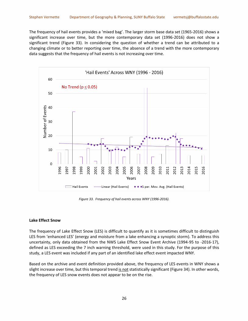
The frequency of hail events provides a ‘mixed bag’. The larger storm base data set (1965-2016) shows a significant increase over time, but the more contemporary data set (1996-2016) does not show a significant trend (Figure 33). In considering the question of whether a trend can be attributed to a changing climate or to better reporting over time, the absence of a trend with the more contemporary data suggests that the frequency of hail events is not increasing over time.
Figure 33. Frequency of hail events across WNY (1996-2016).
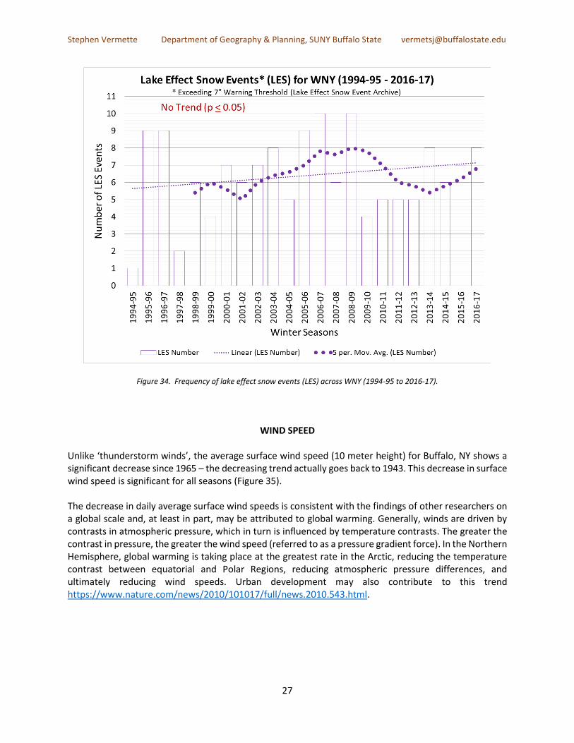
Lake Effect Snow The frequency of Lake Effect Snow (LES) is difficult to quantify as it is sometimes difficult to distinguish LES from ‘enhanced LES’ (energy and moisture from a lake enhancing a synoptic storm). To address this uncertainty, only data obtained from the NWS Lake Effect Snow Event Archive (1994-95 to -2016-17), defined as LES exceeding the 7 inch warning threshold, were used in this study. For the purpose of this study, a LES event was included if any part of an identified lake effect event impacted WNY. Based on the archive and event definition provided above, the frequency of LES events in WNY shows a slight increase over time, but this temporal trend is not statistically significant (Figure 34). In other words, the frequency of LES snow events does not appear to be on the rise.
Stephen Vermette Department of Geography & Planning, SUNY Buffalo State [email protected]
27
Figure 34. Frequency of lake effect snow events (LES) across WNY (1994-95 to 2016-17).
WIND SPEED Unlike ‘thunderstorm winds’, the average surface wind speed (10 meter height) for Buffalo, NY shows a significant decrease since 1965 – the decreasing trend actually goes back to 1943. This decrease in surface wind speed is significant for all seasons (Figure 35). The decrease in daily average surface wind speeds is consistent with the findings of other researchers on a global scale and, at least in part, may be attributed to global warming. Generally, winds are driven by contrasts in atmospheric pressure, which in turn is influenced by temperature contrasts. The greater the contrast in pressure, the greater the wind speed (referred to as a pressure gradient force). In the Northern Hemisphere, global warming is taking place at the greatest rate in the Arctic, reducing the temperature contrast between equatorial and Polar Regions, reducing atmospheric pressure differences, and ultimately reducing wind speeds. Urban development may also contribute to this trend https://www.nature.com/news/2010/101017/full/news.2010.543.html.

Stephen Vermette Department of Geography & Planning, SUNY Buffalo State [email protected]
28
Figure 35. Average annual wind speed for Buffalo, NY (1965-2016). Text in red means an insignificant temperature trend whereas blue text indicates a significant trend (p < 0.05).
CONCLUSION
An examination of WNY’s climate data (1965-2016) clearly indicates that the region is impacted by climate change – a climatic response chiefly characterized by a significant rise in air temperature. Based on the data and indices studied in this report, WNY’s response to a warming world appears to be chiefly seen as a rise in regional air temperatures and related indices. Precipitation and severe weather indices, for the most part, show no response. Temperatures in WNY are increasing at a rate (0.4°F per decade) that is slightly less than the U.S. average. This warming can be seen in both the annual maximum and minimum temperatures, although the rate of increase for year-on-year minimum temperatures appears to exceed that of maximum temperatures. In line with the rise in temperatures, daily temperature records show a significant decrease in the number of ‘low’ records and an increase in ‘high ’records over time, a significant lengthening of the growing season (by about 2 weeks over the past 52 years), a significant decrease in heating degree days (HDD) and increase in cooling degree days (CDD), creating a need for less heating and greater cooling of buildings, a significant warming of Lake Erie’s waters, less lake ice coverage, and significantly earlier ice-out dates. A form of severe weather that may be on the rise in WNY is strong thunderstorm winds, which display a significant increase over time.

Stephen Vermette Department of Geography & Planning, SUNY Buffalo State [email protected]
29
Non-responses (absence of a significant trend) to increasing temperatures include the absence of any significant increase in the number of days > 90°F, heat waves, and drought conditions. Other non-responses include precipitation and severe weather. With the possible exception of Southern Tier snowfall rates, total precipitation and snowfall temporal trends, as well as daily precipitation and snowfall records, appear unchanged over the years. With regard to severe weather, other than thunderstorm winds, no significant increase was found for either the intensity or frequency of heavy downpours, or the frequency of thunderstorms, hail, tornadoes, and lake effect snow (LES). While this report focused on WNY as a single region, results suggests that climate responses and nonresponses may be dependent on, and thus vary between, climate controlled zones − not political boundaries. Five climate-controlled zones have been identified in WNY. Future research should be directed toward a more detailed temporal trend analysis for each of these five zones. Furthermore, this response-variability reinforces the need for climate modeling on a fine scale (1 km x 1 km), which models the influence of Lake Erie and Ontario, and the historic response of individual zones to a changing climate, as compared to the statewide assessment by the New York Energy Research and Development Authority (NYSERDA) https://www.nyserda.ny.gov/climaid with interpretations that rely on a much coarser model grid and which assumes that modeled-projected changes apply uniformly to weather stations across the state.
ACKNOWLEDGEMENTS
My appreciation to Zachary Neudeck, a Buffalo State geography major, who provided the initial database computations necessary to produce a number of graphs used in this report, as well as to Mary Perrelli (Department of Geography & Planning at SUNY Buffalo State) who provided additional maps and technical guidance. Additional guidance and technical advice was provided by George Besch, Michael Shelly, and Allison Leet of d2ls. I am appreciative of the insight provided by numerous individuals present at early presentations of this research − thank you. Funding was provided by the Buffalo State SUNY Research Foundation.