Embed Size (px)
Citation preview

VMware AirWatchBrand GuidelinesUpdated December 2015

Introduction ...............................................................................................................................3
VMware AirWatch Logo ................................................................................................. 4 VMware AirWatch Logo ......................................................................................................5 Primary and Secondary Usage .........................................................................................6 Logo Colors .............................................................................................................................7 Logo Backgrounds ................................................................................................................8 Logo Clear Space and Placement ....................................................................................9 Size and Registration Marks ...............................................................................................10 Incorrect Logo Usage ..........................................................................................................11 Cobranding .............................................................................................................................12
VMware AirWatch Colors .............................................................................................. 13 Logo, Primary and Accent Palettes .................................................................................14 Specifications ........................................................................................................................15
Typography ..................................................................................................................... 16 Font Family .............................................................................................................................17 Alternate Fonts and International Fonts ........................................................................18 Hierarchy ..............................................................................................................................................................................................................19 Typography Don'ts .................................................................................................................................................................................23
Table of Contents
VMware AirWatch Brand Guidelines Updated December 2015 2

Introduction
This document serves as an addendum to the VMware Corporate brand guidelines and is specific to the use of the VMware AirWatch logo, color pallet and typography. For a comprehensive overview of the VMware corporate brand identity, templates and branded assets, please refer to the VMware Corporate brand guidelines.
For questions regarding VMware AirWatch logo and color palette usage, contact [email protected].
VMware AirWatch Brand Guidelines Updated December 2015 3

VMware AirWatchLogo
VMware AirWatch Brand Guidelines Updated December 2015 44

VMware AirWatch Logo
The VMware AirWatch logo should be used in place of the AirWatch by VMware logo. The word mark should be used in materials that are specific to the AirWatch product line and when the audience is EMM focused.
• The logo should be treated as one unit and should never be divided.
• The logo should be considered a picture, not a word.
• The logo should never be used in a communication title, headline, or sentence.
• The logo should never be locked up to make another logo that is not part of a broader logo structure.
• The logo must not be redrawn or modified in any way and should include the registration mark in all instances. The exceptions are as follows: if the logo is smaller than the minimum size (see page 9 for size parameters), or if the logo is embossed/debossed; embroidered; engraved; or foil-stamped in white, silver, or clear.
VMware AirWatch Brand Guidelines Updated December 2015 5

PRIMARY LOGO
SECONDARY LOGO
Primary Logo: Horizontal The horizontal lockup of the VMware AirWatch logo should be used whenever possible. Secondary Logo: Vertical The vertical lockup of the VMware AirWatch logo should only be used when layout restrictions cause the horizontal version to appear too small.
VMware AirWatch LogoPrimary and Secondary Usage
VMware AirWatch Brand Guidelines Updated December 2015 6

PRIMARY COLOR OPTION
Pantone®Cool Gray 11
C0:M2:Y0:K68R113:G112:B116#717074 #FFFFFF
C0:M0:Y0:K0R255:G255:B255
Pantone®White
41% or greater
SECONDARY COLOR OPTIONS
Pantone®7461
C78:M28:Y0:K0R0:G149:B211#0095D3
C0:M0:Y0:K100R0:G0:B0#000000
Pantone®Hexachrome Black
COLOR DONT’S
Logo Usage: Color Whenever possible, use the VMware AirWatch logo in white on the blue background (PMS 7461 or CMYK/RGB/Hex equivalent) in order to maintain consistency and connection to the original AirWatch brand. When it is not possible to use the logo on blue, use the gray or black. In addition, the logo may be produced as a blind emboss/deboss; embroidered; engraved; or foil-stamped in white, silver, or clear. Logo Usage: Color Don'ts The primary VMware AirWatch blue (PMS 7461 or CMYK/RGB/Hex equivalent) should never to be applied to the VMware AirWatch logo itself as the VMware corporate logo can only be represented in gray, black or white. Logo Usage: Special Applications Contact [email protected] regarding special logo use on applications such as fabrics, carpet, and so on.
VMware AirWatch LogoLogo Colors
VMware AirWatch Brand Guidelines Updated December 2015 7

WHITE
41% or greater 40% or less
WHITE LOGO FOR 41% BLACK OR GREATER BLACK LOGO FOR 40% BLACK OR LESS
WHITE LOGO ON PHOTOGRAPHY
Logo Usage: On Backgrounds and Photography To preserve legibility, the gray logo should only be placed on a white or off-white background. When positioning the logo on a colored background, the value of the background determines if the logo should appear in black or white. The logo may be used on photography, but it must be placed at an area of high contrast to the background. Place the logo in the most visually clear area of the photograph. Logo Usage: Special Applications Contact [email protected] regarding special logo use on applications such as fabrics, carpet, and so on.
VMware AirWatch LogoLogo Backgrounds
VMware AirWatch Brand Guidelines Updated December 2015 8
x
xx
x
x
CLEAR SPACE
LOGO PLACEMENT
1
1
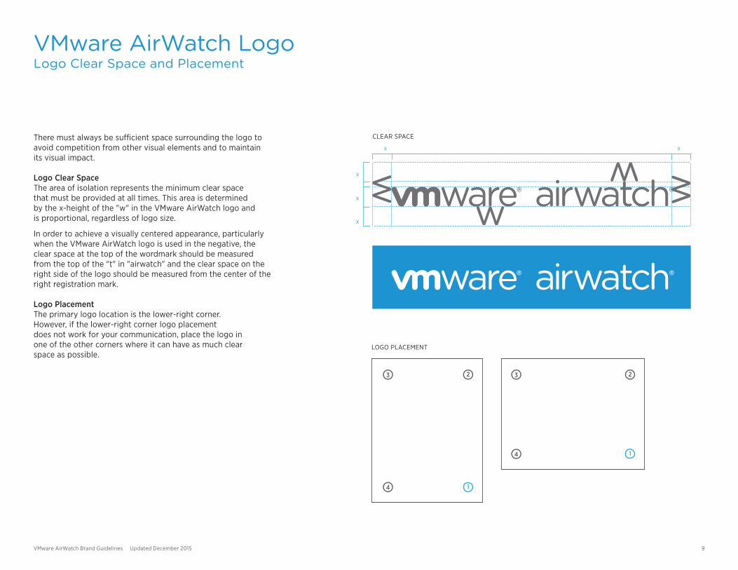
There must always be sufficient space surrounding the logo to avoid competition from other visual elements and to maintain its visual impact. Logo Clear Space The area of isolation represents the minimum clear space that must be provided at all times. This area is determined by the x-height of the "w" in the VMware AirWatch logo and is proportional, regardless of logo size.
In order to achieve a visually centered appearance, particularly when the VMware AirWatch logo is used in the negative, the clear space at the top of the wordmark should be measured from the top of the "t" in "airwatch" and the clear space on the right side of the logo should be measured from the center of the right registration mark. Logo Placement The primary logo location is the lower-right corner. However, if the lower-right corner logo placement does not work for your communication, place the logo in one of the other corners where it can have as much clear space as possible.
VMware AirWatch LogoLogo Clear Space and Placement
VMware AirWatch Brand Guidelines Updated December 2015 9

HORIZONTAL LOCKUP MINIMUM SIZE: 1.25-INCH (32mm) WIDTH
1.6” (40mm, 115px)
VERTICAL LOCKUP MINIMUM SIZE: .75-INCH (19.05mm) WIDTH
.75” (19.05mm, 54px)
The following minimum logo sizes ensure that the logo reproduces with optimal legibility. Minimum Size: Horizontal Lockup The minimum logo size for the horizontal version of the VMware AirWatch logo has a width of 1.25 inches (32mm/115px). Minimum Size: Vertical Lockup The minimum logo size for the vertical version of the VMware AirWatch logo has a width of .75 inches (19.05mm/54px).
Extreme Size Logos applied larger than 12 feet wide may be used without a registered trademark symbol. Registered Trademark Symbol The ® symbol must be included on all logo applications (some exceptions may apply to promotional materials, apparel, and large-scale logos).
The ® symbol may be removed if the logo is embossed/debossed; embroidered; engraved; or foil-stamped in white, silver, or clear.
VMware AirWatch LogoSize and Registration Marks
VMware AirWatch Brand Guidelines Updated December 2015 10

1
3
5
87
2
4
6
9 10
Get certified on the latest product
releases.
vmware airwatch
Inconsistent use of the VMware AirWatch logo detracts from our brand equity and recognition. Altering or recreating the logo in any way negates the consistency we strive to achieve. These examples illustrate some incorrect uses of the VMware AirWatch logo.
1. Incorrect Color SplitDo not split colors in the VMware AirWatch logo.
2. Incorrect BackgroundDo not position the logo on or near other elements, shapes, textures,or patterns and avoid backgrounds that are busy or cluttered.
3. Incorrect BackgroundDo not place the logo over a gradation of any kind.
4. Incorrect ContrastDo not apply the logo to a background where lack of contrastdiminishes legibility.
5. Incorrect ColorDo not reproduce the logo in an unapproved color.
6. Incorrect ColorDo not reproduce the logo as a screen or tint of VMware Gray(Pantone Cool Gray 11).
7. Incorrect PlacementDo not skew or rotate the logo. Position the logo onlyon a 0° horizontal axis.
8. Incorrect FontDo not redraw or use another font to create the VMware logo.
9. VMware Logo PatternDo not use the VMware logo to create any type of pattern or mosaic.
10. In a SentenceDo not use the VMware logo in a sentence.
VMware AirWatch LogoIncorrect Logo Uses
VMware AirWatch Brand Guidelines Updated December 2015 11

BRAND
BRAND
X X
.85 X
X
X
X
.75 X
.75 X
BRAND BRAND
COBRANDED LOGO BUILD (HORIZONTAL)
COBRANDED LOGO BUILD (VERTICAL)
MULTIPLE COBRANDED LOGO BUILD
Cobranding may appear on marketing materials that are developed with an official business partner. All logo standards and guidelines apply. Cobranding with Integrated Logos Certain layouts require a cobranding solution.
• Make all of the logos visually equal in size.
• Center-align the VMware AirWatch logo horizontally or vertically with other company logos.
• Make sure that there is sufficient clear space (as previously defined on page 8) and equal distance between the logos.
• Create a 1-pt Cool Gray 11 or CMYK equivalent stroke divider between the logos with the spacing guidelines shown. A vertical stroke should be the height of the logo clear space. A horizontal line should be the length of the VMware AirWatch logo.
Tagline You may use a tagline used under a cobranded lockup if it is a specialized tagline that has been prescribed and approved for the partnership. Color Standards Cobranded logos can appear in full color, black, or reversed white. Guidelines for background colors are the same as for the VMware corporate logo. However, a partner’s corporate color may be used as the background color, if appropriate.
VMware AirWatch LogoCobranding
VMware AirWatch Brand Guidelines Updated December 2015 12

VMware AirWatch Colors
VMware AirWatch Brand Guidelines Updated December 2015 1313

PRIMARY PALETTE
CORPORATE PALETTE
ACCENT PALETTE
PMS 654
PMS 364
WhitePMSCool Gray 11
Black
PMS 369 PMS 2290
PMS 7470 PMS 7461 PMS 7458 PMSCool Gray 8
PMSCool Gray 3
ColorLogo, Primary, and Accent Palettes
Corporate Palette Whenever possible, use the VMware AirWatch logo in white on the blue background (PMS 7461 or CMYK/RGB/Hex equivalent) in order to maintain consistency and connection to the original AirWatch brand. However, the primary VMware AirWatch blue (PMS 7461 or CMYK/RGB/Hex equivalent) should never to be applied to the VMware AirWatch logo itself as the VMware corporate logo can only be represented in gray, black or white. Primary Palette Use the primary palette as a first-line solution when making color decisions. The primary palette consists of cool hues and can be used for typography, color floods, dynamic versions of our graphic elements, typographic accents, illustration fills, charts, graphs, and tables. Accent Palette Use the accent palette to help highlight, define a hierarchy, or add depth to content as necessary. The accent palette is composed of cool green hues and can be used for typographic accents, illustration fills, charts, graphs, and tables. Tints It is acceptable to use tints of our colors for illustrations, charts, graphs, and tables. Tinted text is used only for tone-on-tone color such as an 85% tint of green over 100% green. Be mindful when using tints—our color palette should not look pastel or become too light. Tinted text should never be used below 75%.
Graphic Pattern Colors To create our graphic patterns, we have selected colors that complement the VMware primary color palette. Use of these colors is restricted to the graphic patterns only.
VMware AirWatch Brand Guidelines Updated December 2015 14

CORPORATE PALETTE
SPOT COLORCOLOR CMYK RGB HEX
PRIMARY PALETTE
ACCENT PALETTE
PMS 654
PMS 7470
PMS 7461
PMS 7458
PMS Cool Gray 8
PMS Cool Gray 3
100/67/0/38
80/15/0/45
78/28/0/0
40/0/5/6
23/17/13/41
8/5/6/13
0/61/121
0/105/144
0/149/211
137/203/223
139/141/142
201/202/200
#003D79
#006990
#0095D3
#89CBDF
#8B8D8E
#C9CAC8
PMS 364
PMS 369
PMS 2290
65/0/100/42
59/0/100/7
39/0/100/0
56/124/44
109/179/63
170/219/30
#387C2C
#6DB33F
#AADB1E
PMS Cool Gray 11
N/A
N/A
0/2/0/68
0/0/0/100
0/0/0/0
113/112/116
0/0/0
255/255/255
#717074
#000000
#FFFFFF
ColorSpecifications
All colors in the VMware palettes have precise color references, shown in the specification charts on this page. Always use the exact color values listed, which correspond to the medium being employed.
Do not use color references or values from documents that have been converted automatically between color modes. Some software programs do not make color conversions that are equal to the specific color values listed in the palette specifications. Slight variances in color might occur when printed through different processes or reproduced in different media.
PANTONE Colors In lieu of the colors listed on this page, you may use the PANTONE® colors cited, the standards for which can be found in the current edition of the PANTONE® formula guide. The colors shown throughout the VMware Corporate Design Guidelines have not been evaluated by Pantone, Inc. for accuracy and might not match the PANTONE® Color Standards. Consult current PANTONE® publications for accurate color. PANTONE® is the property of Pantone, Inc.
VMware AirWatch Brand Guidelines Updated December 2015 15

VMware AirWatchTypography
VMware AirWatch Brand Guidelines Updated December 2015 1616

Gotham Rounded LightGotham Rounded Book
Gotham Narrow LightGotham Narrow BookGotham Narrow Book ItalicGotham Narrow Medium
Gotham LightGotham BookGotham Medium
The Gotham font family is the VMware corporate standard. Gotham Rounded, Gotham Narrow, and Gotham are used in most marketing deliverables. An example of the recommended type style hierarchy for most layouts is included in this section. Typography usage requires a license for the typeface being used.
Gotham Rounded Gotham Rounded is available in two styles: Light and Book. Gotham Rounded is the font style used for headlines and subheads.
Gotham Narrow Gotham Narrow is available in four styles: Light, Book, Book Italic and Medium. Gotham Narrow is the font style used for subheads and body text.
Gotham Gotham is available in three styles: Light, Book and Medium. Gotham is the font style used for captions and in signage.
TypographyFont Family
VMware AirWatch Brand Guidelines Updated December 2015 17

Arial RegularArial ItalicArial BoldArial Bold Italic
ALTERNATIVE
NON-ROMAN
JAPANESE
Print/text in images: KozGoProWeb: Arial
SIMPLIFIED CHINESE
Print/text in images: HY(汉仪)Web: SimHei/SimSun/宋体
TRADITIONAL CHINESE
Print/text in images: DFP Hei, DFP LiHWeb: PMingLiU/新細明體
RUSSIAN
Print/text in images: Myriad ProWeb: Arial
KOREAN
Print/text in images: HYGothic/HY 고딕, SMGothic/SM 고딕(HYGothic is main font)Web: Gulim/굴림
Typography
For non-typeset applications such as presentations, Web sites, and email, use Arial in place of Gotham. Non-roman, regional fonts used in localized marketing materials are also indicated below. Arial Arial is available in four styles: Regular, Italic, Bold, and Bold Italic. These typefaces come standard with any computer and do not require a license.
Alternate Fonts and International Fonts
VMware AirWatch Brand Guidelines Updated December 2015 18

LEVEL 1 - GOTHAM NARROW MEDIUM
LEVEL 1 - GOTHAM ROUNDED BOOK OR GOTHAM ROUNDED LIGHT
TITLE
BODY COPY
LEVEL 2 - GOTHAM NARROW MEDIUM
LEVEL 2 - GOTHAM ROUNDED BOOK OR GOTHAM REGULAR
LEVEL 3 - GOTHAM NARROW MEDIUM
LEVEL 5 - GOTHAM NARROW LIGHT
VMware AirWatch Video VMware AirWatch Video
VMware AirWatch® Video™ allows IT to deliver videos toany size audience, both internally and externally.Smart groups enable IT to assign and distribute videosby group, user or device across the enterprise.
• Intuitive User ExperienceAirWatch Video provides users with a presentation-readyuser interface across all platforms, intuitively designedto engage users with a familiar video-sharing experience.
A Simplified Video Platformfor Your Enterprise
Scalable Video Distribution
Gotham font styles should be used in appropriate marketing deliverables according to a specified hierarchy. Following the hierarchy standard detailed at right will ensure that any new marketing deliverable has a consistent typographic structure that represents the VMware brand.
TypographyHierarchy
VMware AirWatch Brand Guidelines Updated December 2015 19

Modernize the classroomModernize
the classroom Obiscimi, volent aut est, quos eos eum et aut reicil molo oditae qui ntemquatas es voluptur maxime voloreium ut as mod quiditatem.
Modernize the classroomObiscimi, volent aut est, quos eos eum et aut reicil molo oditae qui ntemquatas es voluptur maxime voloreium ut as mod quiditatem.
Obiscimi, volent aut est, quos eos eum et aut reicil molo oditae qui ntemquatas es voluptur maxime voloreium ut as mod quiditatem.
Modernize the classroomObiscimi, volent aut est, quos eos eum et aut reicil molo oditae qui ntemquatas es voluptur maxime voloreium ut as mod quiditatem.
Obiscimi, volent aut est, quos eos eum et aut reicil molo oditae qui ntemquatas es voluptur maxime voloreium ut as mod quiditatem.
MODERNIZEthe CLASSROOMObiscimi, volent aut est, quos eos eum et aut REICIL molo oditae qui NTEMQUATAS ES VOLUPTUR MAXIME VOLOREIUM ut as mod quiditatem.
M o d e r n i z e the classroomObiscimi, volent aut est, quos eos eum et aut reicil molo oditae qui ntemquatas es voluptur maxime voloreium ut as mod quiditatem.
MODERNIZETHE CLASSROOMObiscimi, volent aut est, quos eos eum et aut reicil molo oditae qui ntemquatas es voluptur maxime voloreium ut as mod quiditatem.
1 2 3 4
5 6 7 8
Obiscimi, volent aut est, quos eos eum et aut reicil molo oditae qui ntemquatas es voluptur maxime voloreium ut as mod quiditatem.
9
Our typography style complements other visual elements within our system and our key messages. The correct application is important in order for our communications to achieve a consistent look. Avoid the following incorrect uses of typography within our visual system.
1. Don’t use fonts outside of our design system.
2. Don’t stretch or distort text.
3. Don’t use multicolored text in a headline. Use no more than two colors, and the second color should only be used as a highlight color.
4. Don’t mix type weights within headlines.
5. Don't dimensionalize or use shadows or special effects.
6. Don’t mix lowercase and all uppercase.
7. Don’t use wide or tight tracking.
8. Don’t set headlines in collateral in all uppercase.
9. Don't create typefaces, text, or letterforms from the graphic elements such as the triangles from the Symmetrical Pattern.
TypographyDon’ts
VMware AirWatch Brand Guidelines Updated December 2015 20


![VMware AirWatch Mobile Device Management … · VMware AirWatch Mobile Device Management . Supplemental Administrative Guidance . ... and Syslog Guide [8] VMware AirWatch ... Installation](https://img.pdfslide.us/doc/110x75/5b04e5a37f8b9a2d518e4108/vmware-airwatch-mobile-device-management-airwatch-mobile-device-management-.jpg)