Embed Size (px)
Citation preview

VISUALIZING STRUCTURED TEXT: A PROTOTYPE GRAPHICAL TOOL FOR ANALYZING LARGE DOCUMENT COLLECTIONS
by Helen A. Hawkins
A Masters paper submitted to the faculty of the University of North Carolina at Chapel Hill in partial fulfillment of the requirements for the degree of Master of Science in
Information Science in the School of Information and Library Science.
Chapel Hill, North Carolina
November, 2005
Approved by
___________________________
Gary Marchionini
Helen A. Hawkins. Visualizing Structured Text: A Prototype Graphical Tool for
Analyzing Large Document Collections. A Master’s Paper for the M.S. in I.S degree.
December, 2005. 73 pages. Advisor: Gary Marchionini
In its early stages, the field of data visualization focused on representing data, which,
though it had physical characteristics, was difficult if not impossible to see. From internal
medicine to the ends of our reach into space, tools like magnetic resonance imagers and
high-powered telescopes have collected, colored, and differentiated data for us. Those
tools have changed the way we work with all kinds of data. But abstract ideas, by their
nature, do not have physical attributes, so it is difficult to know where to begin to create
representations of things like document structure. This project explores options for
providing document visualizations to assist authors and information architects in
analyzing their document collections. Though conduct of a user study falls outside the
scope of this project, this paper also outlines a proposed method for evaluating the
prototype.
Headings:
Information Navigation -- Visualization
Information Retrieval -- Thumbnails
Information Retrieval -- Document Interfaces
Information Retrieval -- Structural Analysis
1
CONTENTS
CONTENTS................................................................................................................1
LIST OF TABLES.......................................................................................................3
LIST OF FIGURES .....................................................................................................4
CHAPTER 1 INTRODUCTION..................................................................................5
CHAPTER 2 LITERATURE REVIEW.......................................................................8
CHAPTER 3 DESIGNING AND DEVELOPING THE PROTOTYPE......................11
User interface design..............................................................................................12
Developing a working prototype ............................................................................16
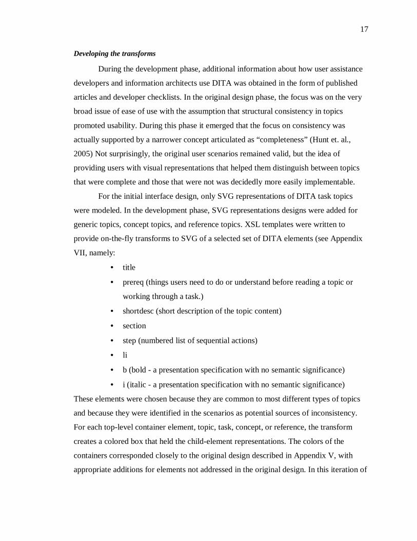
Developing the transforms .................................................................................17
Creating a publishing environment.....................................................................20
CHAPTER 4 FUTURE DIRECTIONS......................................................................22
Quantitative evaluation ..........................................................................................23
Qualitative evaluation ............................................................................................24
Considerations .......................................................................................................25
Significance of the work ........................................................................................25
CHAPTER 5 CONCLUSIONS..................................................................................27
Appendix I: Personas.................................................................................................29
Primary: Marion ....................................................................................................29
Secondary: Evelyn .................................................................................................30
Additional personas ...............................................................................................31
User Assistance Manager ...................................................................................31
User Assistance Developer – not interested in new tools ....................................31
Appendix II: User goals .............................................................................................33
Appendix III: User Assistance Developer scenarios for VISTAA...............................39
Identify inconsistencies in help topic structure .......................................................39
Examine metadata for adherence to guidelines .......................................................39
2
Appendix IV: Information Architect scenarios for VISTAA ......................................41
Identify inconsistencies in help topic structure .......................................................41
Compare topics by type across information components ........................................41
Visually verify structure according to guidelines....................................................42
Verify short description .........................................................................................42
Analyze topic metadata platform/product/audience/status/importance....................42
Appendix V: VISTAA Interface Design Decisions ....................................................44
Appendix VI: VISTAA Architecture..........................................................................55
Appendix VII: Items selected from the user assistance checklist ................................56
Appendix VIII: VISTAA DITA XML to SVG transform...........................................57
Appendix IX: Pipelines added to the sitemap.xmap....................................................68
REFERENCES..........................................................................................................70

3
LIST OF TABLES
Table 1. Example Test Data...........................................................................................19
4
LIST OF FIGURES
Figure 1. Initial VISTAA Screen ...................................................................................14
Figure 2. Help Screen ....................................................................................................14
Figure 3. Individual representation with metadata displayed on mouseover....................15
Figure 4. Individual topic tagging displayed after representation was clicked.................16
Figure 5. Working VISTAA prototype...........................................................................20
Figure 6. Example DITA code.......................................................................................47
Figure 7. Initial representation design ............................................................................48
Figure 8. Initial topic-type representations .....................................................................50
5
CHAPTER 1
INTRODUCTION
In an age where so many text documents are “born digital,” and the potential for
users to develop digital vertigo through sensory deprivation is great, it stands to reason
that enthusiasm for defining space and form in digital libraries ought to be as great as it is
for designing brick and mortar libraries. As we replace physical stacks with online article
databases and electronic books, it seems intuitive that we ought to include in their digital
form graphical representations. As we have learned from the gaming industry, it is
possible (and, by some reckonings, sometimes preferable) to substitute virtual objects for
physical objects. Thus, in constructing virtual libraries, it seems we would also want to
model interactions on associated physical behaviors and develop virtual analogs to
maintain and potentially enhance users’ experience with digital libraries.
Much of the exploratory and explanatory research in document visualization has
suggested that visual browsing aids such as document previews and overviews would
help readers retrieve relevant information more quickly. But many of the designs
informed by this research, though prototyped as much as 10 years ago, still have not seen
wide implementation. While some digital libraries have implemented collection-level
browsing systems, once users reach the individual document level, textual representations
seem to be all that is typically available. Most of the systems that have gone to the next
level seem to have been focused on surfacing meaning rather than structure. In other
words, the document surrogates represent the semiotic content of the document. Although
some interface design work that leverages document structure to improve users’
understanding of context and relationships within e-books has been favorably received, it
has been mostly focused on augmenting meaning in digital texts.
But for some purposes, streamlined interfaces that surface document structure
instead of meaning may be more effective. Consider the physical forms of documents on
shelves in traditional libraries or document repositories. They give us only a moderate
6
amount of information about the meaning they contain. The level of engagement with any
one document in such an environment is entirely under the control of the user. Even when
a user selects a document to flip through, individual paragraphs typically do not telegraph
their messages like street vendors or newspaper headlines. Introducing an interface layer
that enables users to engage document structure with minimal information about meaning
might help users focus on selecting the type of documents they want to browse.
A more precise question is whether graphical representations of large structured
document collections could be used to improve content developers’ ability to ensure
accuracy and completeness of individual documents in a collection. This paper proposes
a methodology for designing a prototype tool for visualizing individual documents in
large collections. It also documents an approach to developing such a tool and
recommends methods for testing such a tool.
Software documentation developers are known to be intensely interested in
consistent implementations of structure across large sets of electronic documents. Though
outside the scope of this study, the reason for their interest is the perception that
consistent use of structures within software help topics improves users’ ability to quickly
scan documents and locate relevant information. Assuming this notion is correct, we can
implement a system that provides document representations in the form of nested, color-
coded boxes to show element types and hierarchies within documents. The system could
display both collections and individual components of collections to help content
developers quickly and accurately identify documents that are incomplete, according to
accepted development guidelines.
Because the current method of checking consistency across large documentation
sets is so time-consuming and labor-intensive, it is typically only done across small
groups of documents and in quick “spot checks” across collections. Rarely are groups of
documents compared to each other to discover whether content developers are making
the same decisions about how to structure information about which the guidelines are not
specific.
A system that improves content developers’ ability to quickly and accurately
compare and identify help topics that are inconsistent or incomplete likely would be a
useful and time and labor-saving tool for authors, editors, and information architects. It
7
might also be used to improve the overall quality of the document collection. Because
such a tool would also provide these content developers with an easy way to move from
the graphical representations of the collection to focus on individual documents and
transition to tagged text where needed, an evaluation of the tool might inform the design
of graphical document representations that could provide for digital libraries the visual
structure and form cues users are accustomed to having in physical libraries.
The purpose of this project was to discover whether the current technologies and
supporting tooling were sufficient to support development of a visualization tool to aid
user assistance developers producing software documentation. This paper documents the
phases of design and development of VISTAA, Visualization Tool for Authors and
Architects and proposes methods for testing its effectiveness.
8
CHAPTER 2
LITERATURE REVIEW
That graphical representations can help users more quickly identify certain types
of documents is well attested in literature. As document collections grow, the importance
of speed and accuracy in locating and identifying them increases significantly. One way
to improve that speed may be to animate the representations. Just as controlled,
automated scrolling of documents on microfiche helps users locate documents, such a
feature that provides users with similar control over their visual experience of documents
in a collection might also be useful. Whether or not use of graphical representations of
document structure will help content developers perform quality assurance tasks across
collections of documents appears to be an open question, but there is sufficient evidence
in the literature to suggest that it should.
In his book on information seeking in electronic environments, Marchionini
alludes to the need for browsing support in digital libraries:
“It is important to note that in the case of books, those attributes that we browse first are well-established standards to aid browsing. Hildreth pointed out that these features of books both encourage and enhance browsing. Electronic environments are only beginning to build in systematic support for browsing.” (Marchionini 1995, 102).
Though written 10 years ago, this statement is arguably still true.
Even though, as Woodruff writes, users are able to gist content-rich images in
about the same amount of time it takes them to read one printed word, much of the
research on text-based document visualization systems focuses on facilitating extraction
of meaning from digital documents (Woodruff et al. 1998). Hearst’s work on the Tilebar
interface investigates how visualizations of search results affect usability of digital
documents (Hearst 1995, 59-66). Boguraev’s work on facilitating skimming (Boguraev et
al. 1998, 109-118) and Hornbaek’s work using a detail+overview interface to improve the
speed of skimming and subject matter comprehension (Hornbaek et al. 2004, 119-149)
9
focus on gleaning meaning rather than analyzing structure. Other systems involving
visualization of text-based documents that hybridize these approaches have also been
proposed, but all appear to focus on improving the speed with which readers assimilate
semantics.
In the last several years, however, researchers have begun to engage with the
question of how to deal with retrieval issues posed by large document collections. One
researcher finds that introduction of the graphical user interface in software has
significantly altered the number of digital documents users have to manage but notes that
the mechanisms for handling them have improved only marginally (Faichney 2001, 13).
Presumably the pervasiveness of software and the documentation it requires plays a role
in this emerging conundrum. Other researchers, acknowledging this problem, recommend
segmenting digital document collections to make them more manageable (Furnas 2003,
367-374). Compared with the process of opening each document separately, use of a set
of graphical document surrogates or structural summaries seems certain to improve
content developers’ ability to scan the structure of more documents in a shorter amount of
time. Adding animation to a collection of surrogates then would likely speed the process
of previewing and identifying incomplete documents even further (Wittenburg et al.
1998, 76, Wildemuth et al. 2003, 222).
Although most of the current research on document visualization focuses on
surfacing meaning to the intended readership, a few researchers have looked at issues
very close to the problems encountered by content developers. In an article on document
structure signatures, Behera acknowledges the importance of visual memory in users’
ability to retrieve documents they have read or used previously (Behera et al. 2004, 178 -
187). Content developers who are constantly updating software documentation often need
to retrieve the same document many times from a repository of hundreds of documents.
In an article on document visualization, Jelinek defines XML-based documents as being
of two types: message-oriented and data-oriented. He states that while tagging is essential
to data-oriented files, it is usually not needed for readers to “retrieve the important
message” in message-oriented files. (Jelinek et al., 2004 65 - 72). It is an interesting
assertion, but one that only seems valid if we assume that the “reader” is the intended
recipient of the document’s message. Other document users, such as writers and

10
architects who are focused on ensuring that the correct messages are sent, might well
benefit from structural visualizations much like those Jelinek recommends for data-
oriented files.
11
CHAPTER 3
DESIGNING AND DEVELOPING THE PROTOTYPE
Successful design of any useful tool begins with some level of understanding of
the people who will use it and what they will use it for. But when a project involves
visual representations of abstract concepts, it may be better to create a prototype first
based on anticipated use cases and then iterate between user testing, design and
development phases. In informal conversations with information professionals
developing software help topics, the idea of having a visual tool that would show them
the structure of individual topics in a larger group seemed to appeal, but many people
also expressed the need to see such a tool to really comment extensively on what it
should do or how it should look. While the concept of providing users with a visual
representation of a physical object that, for various reasons, a user cannot easily see is
relatively easy to accept (a digital brain scan, a digital topographic map, etc.), the idea of
graphically representing something as abstract as document structure seems to be more
difficult to apprehend. For these reasons, this project focused primarily on the design of a
user interface and development of a working prototype.
The initial design phase of this project included user analysis, task analysis,
literature review, and the development of early user interface mockups. An informal
walk-through of the user interface design was conducted to demonstrate to SILS user
interface design students at UNC what users would see and how they might use the tool.
The student’s feedback was then used to refine the initial interface design and prepare an
architectural drawing to illustrate the proposed working prototype.
The second phase of this project focused on the design and development of
backend logic to create a working prototype that scaled to meet the anticipated needs of
intended users.
12
User interface design
Technological developments often fuel inventions and this was the case for this
project. Development of the scalable vector graphic (SVG) markup language, a W3
specification for XML description of graphics, along with Adobe’s development of SVG
viewer plugin to Microsoft’s Internet Explorer significantly reduced impedance to the
mechanics of creating graphical representations from XML encoded documents.
Characteristics of the personas informed user goal definition, user scenario development
and various design decisions.
Fictional personas were developed based on extensive personal knowledge of
IBM user assistance developers (see Appendix I). The persona designated as the primary
intended user for the tool was identified as a developer who authors software help topics
in DITA XML using Arbor Tree’s Epic editor. The persona designated as the secondary
intended user was an information architect tasked with ensuring the overall quality and
usability of the help system. Additionally, two personas were created to help identify
types of user assistance developers who might not want to use the visualization tool. The
process of defining these users proved exceptionally useful in keeping the design on
track.
For the purposes of this initial UI design, user goals and user scenarios were
defined for the users who might want to use the tool. No goals were identified for users
who were considered unlikely to want or need to use the tool. The literature on gaming
describes use of an attract mode designed to draw in uninterested potential users and
surreptitiously teach them how to get started, but such an interface would be a design
project in and of itself and was judged outside the scope of this project.
For both the user assistance developer and the information architect roles, the
high-level goals were the same, namely, to evaluate product documentation for ease of
use. But how they might approach that goal was expected to be different (see Appendix
II). Scenarios were developed for both roles and the tasks they were likely to perform
(see Appendices III and IV). For example, an Information Architect might look across a
large number of topics for inconsistencies and send appropriate inquiries or directives to
individual user assistance developers addressing those issues. By contrast, user assistance
developers would be expected to look at smaller groups of topics and would have the
13
added responsibility of making any changes they (or their Information Architect) deemed
necessary. For example, in one scenario (see Appendix III), a user assistance developer
uses the visualization tool to locate the task topic that does not contain any numbered
steps. The likely scenario is that she started the topic, perhaps in a text editor, and coded
the steps as an unordered list. Because each step in the visualization is marked with a
pound or number sign, it is easy for her to identify the task that does not contain any
numbered steps.
With the scenarios defined, development of an SVG-based user interface that
would support those scenarios was begun. During development, a list of design questions
was developed. For each design question, a list of likely options was considered, decision
criteria were identified, and an option was selected. Each design decision was based on
careful analysis of the literature and decision rationale was documented (see Appendix
V). It is important to note that during the initial design phase (April 2004), probably
because the SVG specification and supporting tooling were so new, no clear
recommendation was found in the literature for how to visually represent structured
documents. However, only one month later, Jelinek’s paper on XML visualization
suggested a design for representing “data-oriented” documents that was remarkably
similar to the VISTAA representation design. His paper was considered in the
development of the fully working prototype.
In the proposed architecture for VISTAA(see Appendix VI), running a command
from the command prompt appeared to cause an XSL transform to run against all of the
DITA XML task topics in a directory. The resulting set of SVG representations would
then be displayed together in a browser. Note that the focus of this phase of development
was design of the interface, so the command actually ran a .bat file that displayed an
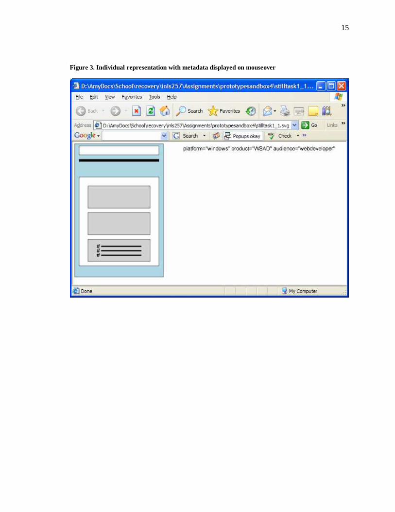
HTML file, which included a static set of SVG representations. The representations
provided basic mouseover functions (display of metadata, short descriptions and titles)
and appropriate link behavior (display of a help topic, an individual SVG representation
or the tagged DITA XML topic depending on the type of link).
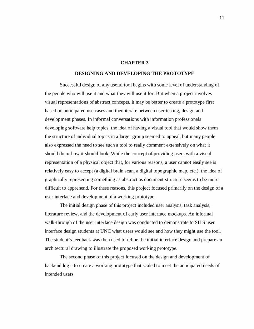
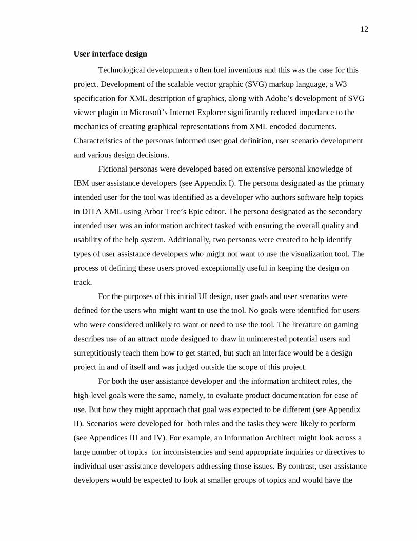
14
Figure 1. Initial VISTAA Screen
Figure 2. Help Screen
15
Figure 3. Individual representation with metadata displayed on mouseover
16
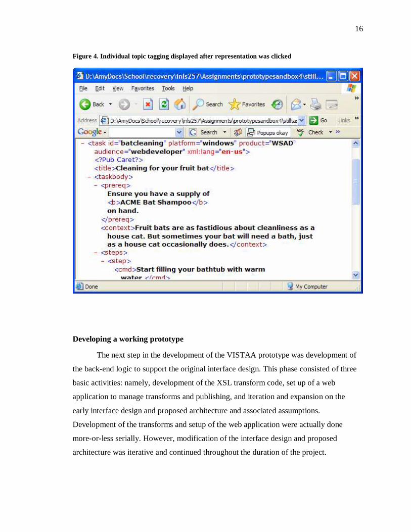
Figure 4. Individual topic tagging displayed after representation was clicked
Developing a working prototype
The next step in the development of the VISTAA prototype was development of
the back-end logic to support the original interface design. This phase consisted of three
basic activities: namely, development of the XSL transform code, set up of a web
application to manage transforms and publishing, and iteration and expansion on the
early interface design and proposed architecture and associated assumptions.
Development of the transforms and setup of the web application were actually done
more-or-less serially. However, modification of the interface design and proposed
architecture was iterative and continued throughout the duration of the project.
17
Developing the transforms
During the development phase, additional information about how user assistance
developers and information architects use DITA was obtained in the form of published
articles and developer checklists. In the original design phase, the focus was on the very
broad issue of ease of use with the assumption that structural consistency in topics
promoted usability. During this phase it emerged that the focus on consistency was
actually supported by a narrower concept articulated as “completeness” (Hunt et. al.,
2005) Not surprisingly, the original user scenarios remained valid, but the idea of
providing users with visual representations that helped them distinguish between topics
that were complete and those that were not was decidedly more easily implementable.
For the initial interface design, only SVG representations of DITA task topics
were modeled. In the development phase, SVG representations designs were added for
generic topics, concept topics, and reference topics. XSL templates were written to
provide on-the-fly transforms to SVG of a selected set of DITA elements (see Appendix
VII, namely:
• title
• prereq (things users need to do or understand before reading a topic or
working through a task.)
• shortdesc (short description of the topic content)
• section
• step (numbered list of sequential actions)
• li
• b (bold - a presentation specification with no semantic significance)
• i (italic - a presentation specification with no semantic significance)
These elements were chosen because they are common to most different types of topics
and because they were identified in the scenarios as potential sources of inconsistency.
For each top-level container element, topic, task, concept, or reference, the transform
creates a colored box that held the child-element representations. The colors of the
containers corresponded closely to the original design described in Appendix V, with
appropriate additions for elements not addressed in the original design. In this iteration of
18
the prototype, color representations are as follows (HEX HTML Color Codes)
(Campeseto 2004, 20-22):
• lightblue - task topics
• lightgreen - reference topics
• pink - concept topics
• 996699 (purple) - generic topics
• 009999 (blue green) - topic titles
• black - task prerequisites
• white - topic short descriptions
• CCCCCC (medium gray) - sections within topics
• darkgray - steps and list item text
• CC99CC - (lilac gray) - paragraphs
Several aspects of the original design were altered because it became evident that
strict adherence to some principles would not achieve the requisite goals. For example,
use of visual indicators that mapped to “screens” proved problematic. The thinking was
that number of screens would indicate topic length. Because writers sometimes “stub out”
topics, create placeholders that are very short, or draft very long topics that then need to
be broken up into multiple topics, extremes in lengths are potential indicators of
completeness, where the author considers the topic finished. When help topics were
authored in HTML, screens were a useful metric for getting at length and the associated
notion of completeness. But because different browsers, different operating systems, and
different user settings alter rendering of the information so radically that number of
screens proved impossible to calculate in a way that would be meaningful to the intended
users of the tool. Instead, a simple algorithm that calculated string length was applied to
each element for which individual or aggregated length was expected to be important.
Some variance was introduced because no effort was made to correct for elements that
might require more tagging or a larger set of attributes. However, relative length of text-
heavy elements was accurately represented so the user task of identifying long drafts of
topics and “stubbed-out” topics was well supported. Nested elements, those contained by
topic, concept, task or reference tags, were laid out vertically, superimposed on the topic
representation using a predefined constant added to the length of the preceding element.
19
The original design called for surfacing topic metadata such as keywords that
might be leveraged for information retrieval. However, in examining a check list used by
user assistance developers (see excerpts from the checklist in Appendix VII), the type of
topic metadata considered were topic prerequisites and short descriptions.
Several interactions recommended in the original design or modeled in the
original mockup were altered or omitted from the working prototype for various reasons.
The original design called for two modes of operation of the tool, one in which the user
scrolled through multiple browser screens of representations in two columns and one in
which the screens scrolled automatically. When the interface mockup was done, the
animation capabilities of the SVG language, though robust in some respects, were lacking
in some basic operations. Instead JavaScript was used to implement the autoscrolling
behavior for demonstration purposes, but it was somewhat unreliable and not expected to
perform well with large document collections. When the working prototype was
developed, the manual scrolling mode of the tool was prioritized over the automatic mode
of the tool because the automatic mode would reuse all of the code implemented for the
manual mode.
Finally, the mouseover and click actions were revised for related reasons. In the
original design, the user had to click a topic representation and display it in a separate
window in order to examine topic metadata. But given that the purpose of displaying
multiple representations in one window was for comparison, it seemed logical that
enabling the display of element text such as titles, topic prerequisites and so forth on
mouseover within the same browser would facilitate comparison of those types of
information as well. Enabling this feature obviated the need to open a separate browser
window, so in the working prototype users only need to click a representation if they
want to see the XML tagging and all textual content for the topic.
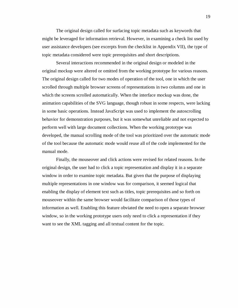
20
Figure 5. Working VISTAA prototype
Creating a publishing environment
Although Microsoft Internet Explorer will apply a single XSL transform to a
single XML document on the fly, the browser is not able to handle multiple nested calls
to multiple different kinds of files. Therefore, it was necessary to deploy the files to a
web application that could manage multiple transformations. It would have been possible
to write code to accomplish this task, but a cursory search of the web showed that Apache
Cocoon already enables this functionality (Apache Cocoon: XML Development
Framework. Apache Cocoon is an open source, web development framework that enables
serialized transformation using "pipelines" (Leung 2004, 213-284). For this prototype, I
extended the existing batik example, adding newly defined pipelines to the sitemap.
These pipelines specified how to handle each file, or in this case, file type. A number of
transforms, referred to as generators, and output handlers, called serializers were defined
21
in the sitemap file in the Cocoon root directory. In the local sitemap, several new
pipelines were defined to handle any SVG files that were not already specified (see
Appendix IX).
The new pipelines added the following features:
� Upon request of a file with a name matching *.svg, use the XML
generator, the file stylesheets/stilltasks1_1.xsl to transform the
XML file to SVG and use
� the svgxml serializer to create the output character stream.
� Upon request for a file with a name matching *.XML, use the
XML generator and use the XML serializer
� Upon request for a file with a name matching *.dtd, pass the
content through as text
� Upon request for a file with a name matching *.ent, pass the
content through as text
� Upon request for a file with a name matching *.mod, pass the
content through as text
� Upon request for list.html, serialize the output as HTML
To demonstrate the working prototype, a simple HTML file (list.html) was
created with a table that called a group of SVGs that matched the names of the sample
files. The sample XML files were modified to call local versions of the DTDs, MODs
(DTD modules), and ENTs (domain entities referenced by the DTDs). When the HTML
was opened in a browser, the SVGs were generated in real time from the DITA XML
files in the local directory
22
CHAPTER 4
FUTURE DIRECTIONS
The purpose of this project was to thoroughly explore the state of the necessary
technologies and supporting tooling to discover whether they were mature enough to
make development of a structured text visualization tool possible. Clearly, they are
mature enough, so the next step should be to evaluate the tool against its intended
purpose, namely, making it easy for software documentation writers to visually analyze
help topics coded in DITA XML.
Methodology for conducting this study must be drawn from two areas as there are
no established standards for this particular type of system: namely, research into
visualization of text-based documents as well as testing of participants working with
visualizations of non-text-based information such as music or biometric representations.
A list of tasks that should be facilitated by use of the tool should be developed.
Participants would then be asked to perform the tasks. Data collected in the study should
include the length of time it takes users to arrive at an answer as well as the accuracy of
their answers. Use of the think aloud protocol should help gain an understanding of
whether participants find the system to be easier to use than the alternative.
Participants should be screened to ensure that they have roughly the same level of
familiarity with general text encoding practices, DITA XML, and the ArborText Epic
editor. But to ensure baseline familiarity with both Epic and the VISTAA prototype, prior
to beginning this study, all participants should be trained on use of the two systems to
facilitate viewing document structure. They should also be shown how to use the tree
view of the ArborText Epic editor and the VISTAA prototype to complete basic
structural analysis tasks. Though the selected participants ought to be trained technical
writers, editors, and architects, familiar with general quality measures for software
documentation, pretest training should include a brief overview of common
23
“completeness” problems in DITA encoded topics (e.g. the topic contains no short
description, odd length topics, etc.).
The test should include quantitatively measured components such as time to task
completion and accurate problem identification as well as qualitative measures such as
satisfaction with features of the tools and their performance. Qualitative data might also
include recommendations from participants regarding improvements to existing features
or additions of features.
Quantitative evaluation
Each test should be carried out in the UNC Interaction Design Lab or a similar
facility and videotaped. Each participant should be given 2 very similar sets of tasks to
complete. Half of the participants should complete the first set of tasks using the Epic
editor and the other half should complete the first set using VISTAA. For the second set
of tasks, if users did the first set of tasks using Epic, they should use VISTAA to perform
the second set and vice versa. Each set of tasks should be provided to the user as a set of
questions. It would be best to have each participant read the question aloud before they
begin the task to ensure that they are performing the correct task and that they have read
the instruction correctly.
Participant results will be rated based on how quickly they are able to provide
correct answers. However, because tool support for analyzing topics structure across a
group of topics is currently minimal, few, if any, of the participants will be practiced at
the task. Therefore, they might find the features of the tool novel and interesting enough
that they feel inclined to “play” with them and actually spend more time on the task using
the new tool than they do using the current tools and methods. One way to correct for this
potential problem might be to try to identify any time when the user is off task and
subtract that from their over all time to completion.
Participants should be asked real-world questions that content developers would ask
themselves when evaluating a documentation set. Example questions are as follows:
1. In the set of documents in directory A, what are the names of the three files that contain unordered lists?
24
2. In the set of documents in directory A, what are the titles of the tree topics that contain only one paragraph?
3. In the set of documents in directory A, which file identified as a “task” contains no procedural steps?
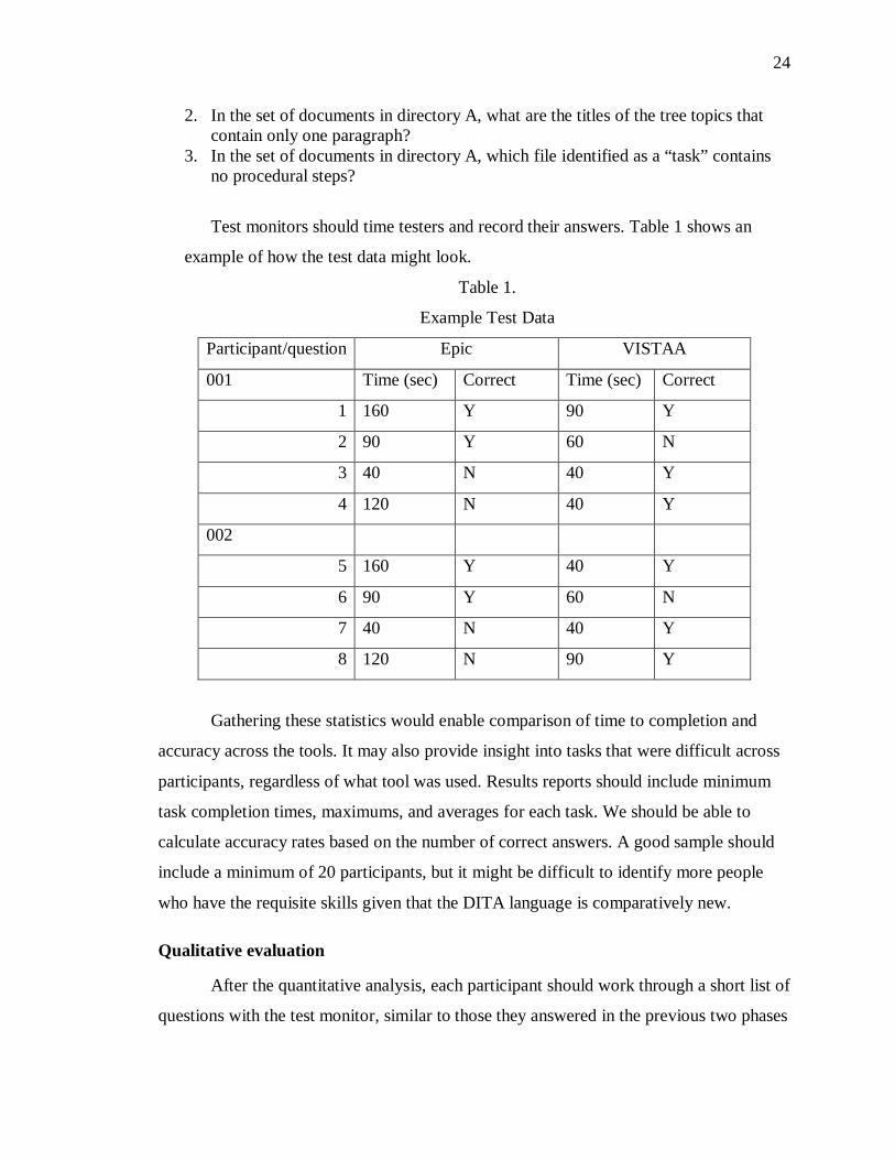
Test monitors should time testers and record their answers. Table 1 shows an
example of how the test data might look.
Table 1.
Example Test Data
Participant/question Epic VISTAA
001 Time (sec) Correct Time (sec) Correct
1 160 Y 90 Y
2 90 Y 60 N
3 40 N 40 Y
4 120 N 40 Y
002
5 160 Y 40 Y
6 90 Y 60 N
7 40 N 40 Y
8 120 N 90 Y
Gathering these statistics would enable comparison of time to completion and
accuracy across the tools. It may also provide insight into tasks that were difficult across
participants, regardless of what tool was used. Results reports should include minimum
task completion times, maximums, and averages for each task. We should be able to
calculate accuracy rates based on the number of correct answers. A good sample should
include a minimum of 20 participants, but it might be difficult to identify more people
who have the requisite skills given that the DITA language is comparatively new.
Qualitative evaluation
After the quantitative analysis, each participant should work through a short list of
questions with the test monitor, similar to those they answered in the previous two phases
25
of the test. Half of the group should participate in evaluation of each tool. Each
participant should be asked to “think aloud” as they work through the task. Each
participant should be asked to rate their satisfaction with the aspects of both systems they
are using. Though subjective, this information will provide some basis for determining
how the quantitative results were achieved. Additionally, this exercise may provide
insight into how content developers approach the tasks, which might inform future tool
enhancements and future test designs. A short follow-up interview might also be
conducted to get an understanding of each user’s conceptualization of document
structure. Different perspectives on document structure might also inform future designs.
After the test, the tapes should be evaluated to identify differences in the steps
users take to complete tasks within and between tools. Focus should be given to
indications of frustration with both tools, which might drive additional features into
future prototype iterations.
Considerations
Though measures have already been taken to ensure that contrast and saturation in
the representation should be sufficient to help colorblind participants distinguish between
different elements, it is possible that this problem could introduce some error into results.
If performance by gender is remarkably different, that information should be taken into
account for future and larger studies and incorporated into the online demographics
questionnaire.
It is remotely possible that some of the participants, in spite of the planned
training, will not fully understand what they are supposed to be doing until several tasks
into the test session. The number of tasks will need to be sufficient to ensure that enough
useful data is gathered even if performance on the first tasks varies widely.
Significance of the work
If the prototype improves the speed and accuracy with which content developers
can analyze the structure of topics across an information system, it is more likely that
they will perform this type of analysis and enlist peers in discussions of what they find.
Minimally, use of this type of tool will help content developers identify best practices.
26
They may be able to compare their own structural analysis with usability testing and user
input of their help topics to produce well-informed guidelines that lead to better end-user
experiences with software documentation.
More generally, this work builds on existing research to provide a starting point
from which special purpose structural document visualizations might be developed.
Developers of different kinds of content might be interested in different types of
structure, but the basic approach of generating nested boxes to indicate hierarchical
relationships, elements, and topic type, as used in VISTAA and in Jelinek’s study,
(Jelinek et al. 2004, 65 - 72) might be useful to them as well.
For example, government agencies and companies working with them often have
to prepare proposals and research reports in a specified format. Failure to structure
reports correctly can result in significant processing delays so severe that by the time a
report or proposal reaches its intended destination, the information is no longer relevant
or the requisite deadline has passed. Giving authors an easy way to analyze the structure
of their document could speed the process. Though potentially less important by world-
view standards, document visualization tools could change the way fiction writers write.
As more book-length fiction is “born digital,” writers may become more interested in
analyzing and trying out different structures. If the encoding language supports, for
example, temporal tagging, a writer could use a tool similar to VISTAA to analyze his
use of flashbacks.
27
CHAPTER 5
CONCLUSIONS
Digital vertigo is a broad concept and while most people understand it intuitively,
most would also agree that it has many and varied causes. One likely contributor, though,
is the difficulty people experience trying to gain some understanding of digital
information without reading it. Purists might make the case that people should just read,
but market pressures make a different case. Software users are demanding more and
higher quality documentation and product release cycles continue to grow shorter.
Therefore, it is essential to find ways to improve the quality of documentation AND
speed the documentation process. Providing content developers with the necessary tools
to routinely perform quality checks and to gain a full understanding of what constitutes
better structure is one way to do that.
Through design and development of this prototype, it is clear that the DITA
language, the SVG specification and browser support are sufficient to begin designing
visual tools to support analysis of structured documents. Further, applications like
Cocoon are already robust enough to support some of the essential functions such as
management of multiple different input file types, multiple different transforms and
serialization of output.
Although DITA users are rapidly developing checklists and tagging guidelines to
assist authors and information architects in achieving consistency in their tagging, there is
still no clear consensus on what constitutes a well structured help system or a well
structured help topic. Because there is no accepted standard, it is difficult to develop tools
that help enforce a standard. However, tools like VISTAA that help developers see the
structure of their topics and the overall system should in the short term help them
determine completeness individual topics (and by extrapolation that of the overall
collection). Ultimately, through iterative testing and design, visualization tools like

28
VISTAA may well help authors and information architects develop the standard that
defines well-structured collections of help topics.
29
Appendix I:
Personas
Primary: Marion
Marion is 27 and has been working as a technical writer/user assistance
developer for a large software company for 4 years. She is originally from
Westford, MA, but now lives in Cary, NC and works in the Research Triangle
Park.
Marion has a 2-year-old daughter and Marion’s husband is a professional
photographer. Both of their schedules are relatively flexible, so they are able to
work from home a few times a week and spend time with Sarah. Even so, their
home life, like their work life, is busy. As a family, they feel they have no time to
waste. “Working or playing, we try to get the most out of our time,” Marion says.
Marion has a home office, which she shares with her husband. At work,
she has a cubicle decorated with plants and photos of the family and the family
dog, Sparky. She splits her time about evenly between talking with programmers
and testers at work and writing at home.
Marion admits to having done a geeky thing with her grocery list. “I coded
it in XML and wrote an XSL transform so that I can customize the order of the
items for different grocery stores.” It saves her time and she says she is as
comfortable writing in the XML editor she uses at work as she is using a simple
word processor.
Marion usually tries to leave the office by 4:30 p.m. to beat the traffic.
After dinner, she tucks Sarah into bed around 7:30 p.m. and spends a few more
hours working.
Despite the long hours, Marion enjoys her job and looks forward to a
bright career. Her mix of technical and communication skills has served her well
and she has the respect of the programmers, testers and HCI engineers with whom
she works daily. Her only concern about her job is that there are many
inefficiencies. She doesn’t mind working long hours, but she wants her results to
be an easy-to-use product with good documentation. Efficiency at work is also
important to her because it allows her more time to spend with her family.
30
Secondary: Evelyn
Evelyn is a 37-year-old information architect with 10 years’ experience
designing and developing software documentation. She began her college
education as a pre-med, but after organic chemistry, decided Journalism might be
a better path for her. Having moved north from her ancestral home in
Chattanooga, TN to work at a large software company in Research Triangle Park
in North Carolina, Evelyn describes her feelings about her job as a “love/hate”
relationship. “I love what I do, but I hate how long it takes and the hoops
everyone has to jump through to get the product out the door,” she says.
Evelyn’s husband is an Information Technology Architect and travels
regularly leaving Evelyn time to put in the extra hours required to get her job
done. Although her job is theoretically information design, Evelyn ends up
spending many hours trying to keep her email under control. In a typical day, she
receives as many as 110 messages. Most messages contain TODOs for her and
some require her to do a few hours’ research before she can respond to them.
Consequently, Marion is very interested in productivity tools and efficiency.
Marion goes almost nowhere without her laptop. She has a wireless card
and is able to connect to her company’s intranet from the coffee shop where she
enjoys a Latte and does email most Saturday mornings before going to the
grocery store.
On a typical workday, Evelyn logs onto the company intranet at 5:00 a.m.,
coffee cup in hand and tries to tie up the loose ends of the previous day’s email
threads. Then she spends an hour or so, catching up on industry news in online
publications or in the journals she receives from several professional associations
of which she is a member. If her husband is in town, they share breakfast and
exchange ideas about “bleeding-edge” technologies. They are both enroute to the
gym or their respective offices by 7:30 a.m. Evelyn spends most of the rest of the
day in meetings, working on designs for parts of her software product’s user
assistance system. At about 5:00 p.m., she can dig into the meat of her work,
31
reading specifications written by other information architects and providing
feedback, analyzing help topics for consistency across the product and
establishing guidelines for the UA developers on her team.
Automation is a constant issue for Evelyn. She often writes custom tools
to automate her work or that of her team mates. Currently, analysis of existing
help topics for structure and text-density is the key aspect of Evelyn’s job that she
thinks needs automation.
Additional personas
User Assistance Manager
John a 42-year-old User Assistance Manager. He has a great deal of
experience developing online help and other kinds of user assistance. He is not as
familiar with XML as his employees. He spends most of his work hours on
personnel issues and making sure work goes smoothly. However, during crunch
times, John pitches in to help with a fresh set of eyes.
John has two teenagers at home and they keep him busy. Between soccer
practice, piano lessons and the charity he works with on weekends, John is really
busy. Any tool that saves him time or money is a good thing.
User Assistance Developer – not interested in new tools
Bruce’s life is complicated. He likes coding in HTML and thinks all of
this structured markup stuff is just an added annoyance. The unfortunate thing
about it is that just to get the stuff to transform properly requires Herculean effort.
He’s seen his productivity decline substantially in the last 5 years as he moved
from coding in HTML to SGML and ultimately to DITA XML.
Bruce is pretty sure that the structure of the information he produces really
isn’t the most important thing to users and that separation of content and
presentation is an artificial construct as is the idea of storing different types of
information in separate files. He just can’t see the benefit.
32
It’s particularly annoying to him because he considers his focus to be on
learning the software he’s documenting so he can explain it in ways that are clear
to users. All of this fiddling with structure takes time away from his real job as
well as time away from his wife and his 11-year-old. Seth is a chip off the old
block and the apple of his dad’s eye. He’s a good student and, like his dad,
personally invested in everything he does.
In his spare time, which he considers to be altogether too spare, he enjoys
spending time at his parent’s house in Manhattan. Bruce’s father is a successful
magazine writer (it runs in the family) and, since his recent retirement, is enjoying
having time to spend with his kids and grandchildren. Bruce and his family live
about 8 hours away, but as his parents are getting on in years he thinks about the
possibility of moving home.

33
Appendix II:
User goals
34
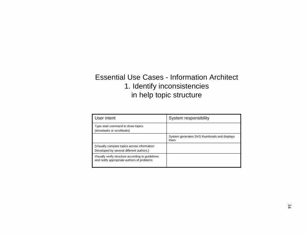
Essential Use Cases - Information Architect1. Identify inconsistencies
in help topic structure
System generates SVG thumbnails and displays them
Type start command to show topics (showtasks or scrolltasks)
Visually verify structure according to guidelines and notify appropriate authors of problems
{Visually compare topics across information Developed by several different authors.}
System responsibilityUser intent
35
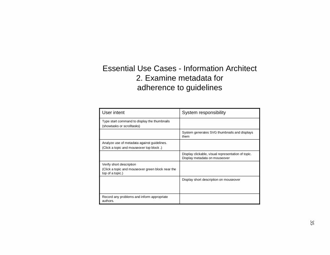
Essential Use Cases - Information Architect2. Examine metadata foradherence to guidelines
Record any problems and inform appropriate authors.
Type start command to display the thumbnails(showtasks or scrolltasks)
System generates SVG thumbnails and displays them
Analyze use of metadata against guidelines.(Click a topic and mouseover top block .)
Display clickable, visual representation of topic. Display metadata on mouseover
Display short description on mouseover
Verify short description(Click a topic and mouseover green block near the top of a topic.)
System responsibilityUser intent
36
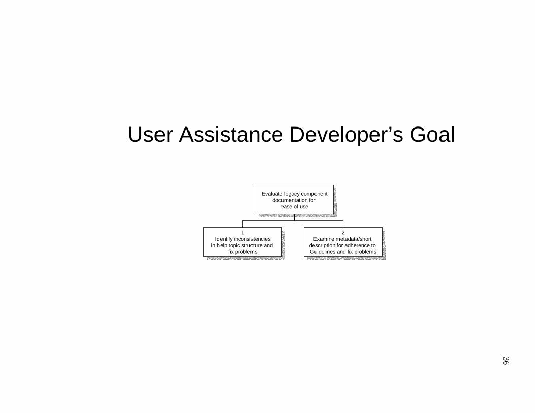
User Assistance Developer’s Goal
Evaluate legacy componentdocumentation for
ease of use
Evaluate legacy componentdocumentation for
ease of use
1Identify inconsistencies
in help topic structure and fix problems
1Identify inconsistencies
in help topic structure and fix problems
2Examine metadata/short
description for adherence to Guidelines and fix problems
2Examine metadata/short
description for adherence to Guidelines and fix problems
37
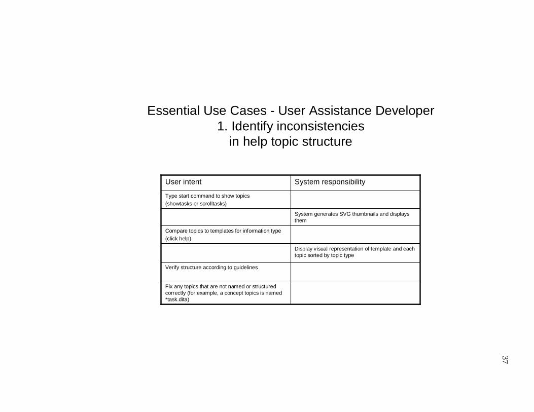
Essential Use Cases - User Assistance Developer1. Identify inconsistencies
in help topic structure
Fix any topics that are not named or structured correctly (for example, a concept topics is named *task.dita)
Type start command to show topics (showtasks or scrolltasks)
System generates SVG thumbnails and displays them
Verify structure according to guidelines
Display visual representation of template and each topic sorted by topic type
Compare topics to templates for information type(click help)
System responsibilityUser intent
38
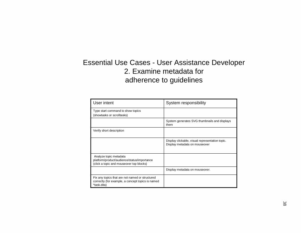
Essential Use Cases - User Assistance Developer2. Examine metadata foradherence to guidelines
Fix any topics that are not named or structured correctly (for example, a concept topics is named *task.dita)
Type start command to show topics (showtasks or scrolltasks)
System generates SVG thumbnails and displays them
Display metadata on mouseover.
Analyze topic metadata platform/product/audience/status/importance(click a topic and mouseover top blocks)
Display clickable, visual representation topic. Display metadata on mouseover
Verify short description
System responsibilityUser intent
39
Appendix III:
User Assistance Developer scenarios for VISTAA (Visualization Tool for Authors and Architects)
Identify inconsistencies in help topic structure
Marion’s day starts with a 9:00 a.m. meeting with one of several teams she is part
of, for example, User Assistance Development or the Web Tools Development team.
Afterwards, she grabs a sandwich at the cafeteria and spends about two hours on email.
She downloads a recent build of the product and starts playing with the most recently
added function, comparing it to her notes and trying to use it to build a web application as
she imagines a user would. Using an XML editor, she writes task instructions, documents
the concepts users need to understand to do those tasks and develops supporting reference
material (lists of options, icon definitions, etc.)
Her XML editor is DTD aware and the structure of her help topics is
automatically validated as she writers. However, there are no clear guidelines to
recommend how different kinds of information should be coded, so she finds herself
spending a lot of time transforming the XML to HTML to see how it will look and even
then it’s difficult for her to be sure she’s using similar encoding for similar information.
To do some visual comparisons between topics, she uses a tool that renders the
documents as graphical representations. To start the tool she types showtasks. Scrolling
through the tasks she finds one that is particularly short. She clicks that topic. There she
mouses over the title block. Marion remembers having started work on it Friday. Not
having done a lot of XML coding and not being familiar with the VISTAA tool, she
can’t remember exactly what the task should look like. She clicks Help, She realizes that
the task doesn’t have any numbered steps in it, so it must not be done yet. In the browser,
she clicks the thumbnail of the task she’d been working on and sees a note she left herself
indicating that it is just a placeholder. Marion opens the file in an editor and finishes
authoring the task topic.
Examine metadata for adherence to guidelines
Coming back from a coffee break, Marion stops by a friend’s desk. Jason is one
of the programmers she works closely with. He has a little boy about her daughter’s age.
40
They trade toddler stories. As she is about to leave, Jason mentions that one of the help
tasks on one of the features he’s been developing doesn’t seem to have any metadata
associated with it. Marion says she’ll check it out.
Back at her desk, Marion opens a command prompt and types showtasks. One of
the topics does seem to be missing its metadata. She clicks on the topic that doesn’t begin
with a white block at the top and mouses over the title and metadata blocks. She opens
the file in a text editor and adds the metadata.
41
Appendix IV:
Information Architect scenarios for VISTAA (Visualization Tool for Authors and Architects)
Identify inconsistencies in help topic structure
Evelyn relaxes into her chair at 5:00 pm on a Monday afternoon. Finally, the
meetings are over for the day. Now she can get some real work done. She opens a
command prompt window, switches to the directory where she extracted all of the Web
Tools help topics. She types scrolltasks.
A browser opens, displaying visual representations of each task topic. Evelyn
quickly scans the web page and identifies a task topic that is using am ordered lists. She
clicks the topic graphic to open it in a browser. By clicking the thumbnail again she
opens the XML file in IE. Instead of using step elements in her XML source file, one of
the UA developers, Marion, has used an ordered list. The generated HTML is similar, but
not quite the same. Evelyn drafts a quick note to Marion asking her to recode these two
topics, substituting steps for the ordered list elements.
Compare topics by type across information components
At 6:00 pm, Evelyn orders a pizza. It’s going to be a long night. She needs to
finish analyzing all of the topics this week, so that the UA developers can make changes
before the team sends all of its help topics for translation. In a command prompt window,
Evelyn switches to the directory where she extracted all of the Web Tools help topics and
all of the Java Tools topics. She types scrolltasks.
A browser opens, displaying visual representations of each task topic. One topic is
significantly longer than all of the others and both contain many section elements. Evelyn
clicks on one of the topic graphics to open it in separate browser window. By mousing
over the title she can see that it is probably a concept rather than a task. She clicks the
thumbnail. The tagging confirms that it is really a task. She sends a note to the UA
Developer, Susan, recommending that she create a task overview topic, break the sections
into separate task topics and link to each from the task overview.
42
Visually verify structure according to guidelines
At 7:00 pm, Evelyn packs up her laptop and heads for home. She stops off at the
coffee shop for a sugar-free, mocha latte. The barista is backed up, so, on a whim, Evelyn
unpacks her machine, inserts the wireless card and boots up. Settled with her coffee after
a few minutes, Evelyn switches to the directory where she extracted all of the Web Tools
help topics and all of the Java Tools topics. She types showtasks.
A browser opens, displaying visual representations of each task topic. Evelyn
scrolls past the topic graphics until she comes to a row with a very short task. She writes
a quick note to let the UA Developer, Gary, to let him know at least one of the tasks he
was working on doesn’t seem to be finished. She reminds him of the pending drop to
translation.
Verify short description
At 8:30 am on Tuesday, Evelyn settles into her cube. She only has a few minutes
before her first meeting, but decides she’ll try to squeeze in a little analysis before
heading out to the conference room. Evelyn switches to the directory where she extracted
all of the Web Tools help topics and all of the Java Tools topics. She types showtasks.
A browser opens, displaying visual representations of each topic. Some of the
topics have a short first paragraph, depicted by a thin green line, but many do have one.
When transformed to HTML, the short description paragraph becomes the alternate text
for any links to that topic. It’s not a huge amount of information, but it does enable users
to mouse over a link and get a little more information on the topic before they click the
link and wait to transit.
Evelyn dashes off a note to her team’s editor asking whether any style decision
had been made on whether or not to use the short description element.
Analyze topic metadata platform/product/audience/status/importance
After her 4:00 meeting, Evelyn sits down in her cube and presses the button for
her voice mail. She listens to it, taking notes as she waits for her machine to sort out a
connection with the network. When it seems to be working properly, Evelyn switches to
the directory where she extracted all of the Web Tools help topics and all of the Java
Tools topics. She types scrolltasks.
43
A browser opens, displaying visual representations of each topic. Evelyn mouses
over one of the tasks to stop the scrolling and clicks it. She mouses over the metadata
block at the top of the topic. Because the product showing only a few topics provides a
large subset of function to the other products, it seems unlikely that the “product”
metadata setting is correct. Evelyn schedules a meeting with the two UA team leads to
discuss how metadata is being implemented.
44
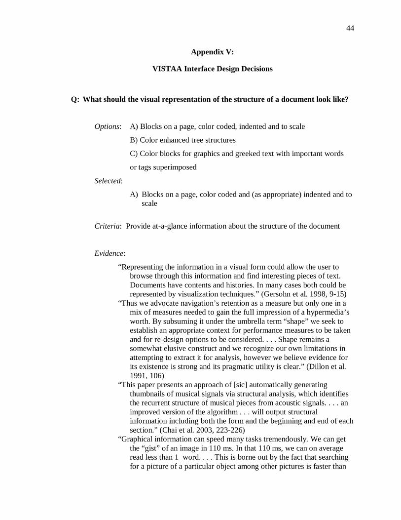
Appendix V:
VISTAA Interface Design Decisions
Q: What should the visual representation of the structure of a document look like?
Options: A) Blocks on a page, color coded, indented and to scale
B) Color enhanced tree structures
C) Color blocks for graphics and greeked text with important words
or tags superimposed
Selected:
A) Blocks on a page, color coded and (as appropriate) indented and to scale
Criteria: Provide at-a-glance information about the structure of the document
Evidence:
“Representing the information in a visual form could allow the user to browse through this information and find interesting pieces of text. Documents have contents and histories. In many cases both could be represented by visualization techniques.” (Gersohn et al. 1998, 9-15)
“Thus we advocate navigation’s retention as a measure but only one in a mix of measures needed to gain the full impression of a hypermedia’s worth. By subsuming it under the umbrella term “shape” we seek to establish an appropriate context for performance measures to be taken and for re-design options to be considered. . . . Shape remains a somewhat elusive construct and we recognize our own limitations in attempting to extract it for analysis, however we believe evidence for its existence is strong and its pragmatic utility is clear.” (Dillon et al. 1991, 106)
“This paper presents an approach of [sic] automatically generating thumbnails of musical signals via structural analysis, which identifies the recurrent structure of musical pieces from acoustic signals. . . . an improved version of the algorithm . . . will output structural information including both the form and the beginning and end of each section.” (Chai et al. 2003, 223-226)
“Graphical information can speed many tasks tremendously. We can get the “gist” of an image in 110 ms. In that 110 ms, we can on average read less than 1 word. . . . This is borne out by the fact that searching for a picture of a particular object among other pictures is faster than
45
searching for the name of that object among other words.” (Woodruff et al. 2001, 199)
“We have presented enhanced thumbnails that work to combine the advantages of both text summaries and plain thumbnails. We have conducted a study to compare performance of enhanced thumbnails with plain thumbnails and text summaries. Across the collection of question categories, we found that enhanced thumbnails yielded the best and most consistent performance.” (Woodruff et al. 2001, 198-205)
“It is important to note that in the case of books, those attributes that we browse first are well-established standards to aid browsing. Hildreth pointed out that these features of books both encourage and enhance browsing. Electronic environments are only beginning to build in systematic support for browsing. (Marchionini 1995, 102)
Discussion of evidence:
Recommendations for ways to represent “aboutness” for collections of documents and individual documents are well-attested in the literature. I find numerous articles on studies describing testing of visual representations of search results, but again the focus is on representing relevance to a query, so it is focused on semantic content rather than document structure. I find numerous articles about how to represent videos and images, but again the focus of most of these articles is “aboutness.” Some articles do focus on the structure in images and explore the possible utility of pattern matching across sets of “documents” (in this case, images). Research on pattern matching in finger prints and photographs of faces is well attested, but most of these focus on digital representations of things that have physical representations (pictures of people or fingerprints). In this case, we are considering documents that are “born digital,” that never had a visible existence to be graphically enhanced. However, because of the speed with which humans can scan graphical representations, (as well as their ability to quickly visually scan and find physical objects such as books on a shelf), it seems important to try to create graphical representations of digital documents. Because the user task we are trying to support is browsing and pattern matching among a set of documents as well as visual browsing of the structure of individual documents, we need to consider techniques applied to developing visual representations of non-visual documents, for example, music. The article on thumbnailing music focuses on analyzing the structure of a document (in this case a song) for similarities to other songs for retrieval and recommendation. Using some of the principles Chai and Vercoe applied in their structural analysis coupled with user data describing structural features they are interested in, we can develop document overviews that should assist users in shifting some of the cognitive load associated with document structural analysis to the system. We should also be able to assist them in
46
gaining an overview of individual document structure and provide them with support that helps them identify problems and develop strategies for identifying problems.
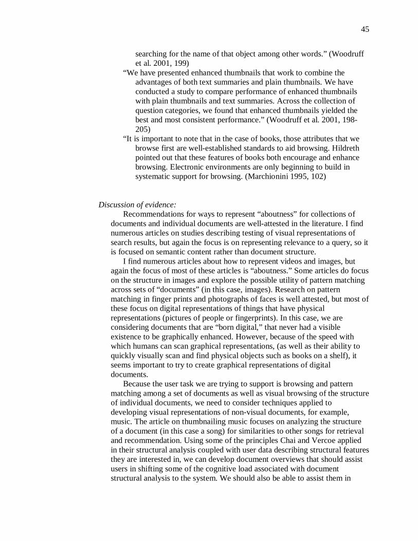
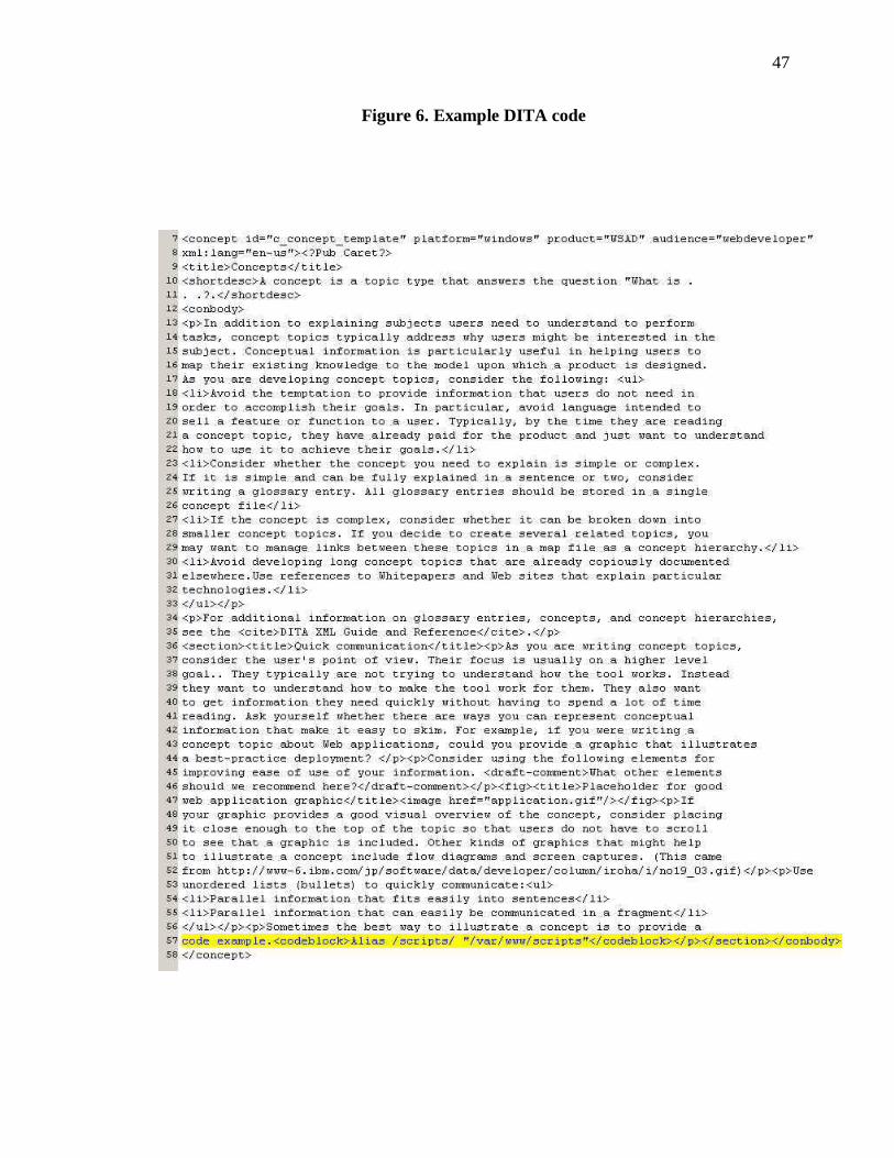
Decision: For this audience, document aboutness will not be the focus of their analysis, so we should try to represent the document structure. Because there seem to be no guidelines for how to do this, we should invent a representation, based on the familiar “document” or page metaphor and test it, making modifications based on user input. For example, Figure 6 might be visually represented as Figure 7.
47
Figure 6. Example DITA code
48
Figure 7. Initial representation design
49
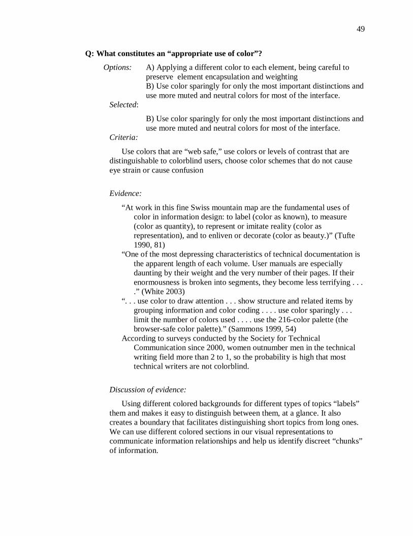
Q: What constitutes an “appropriate use of color”?
Options: A) Applying a different color to each element, being careful to preserve element encapsulation and weighting
B) Use color sparingly for only the most important distinctions and use more muted and neutral colors for most of the interface.
Selected:
B) Use color sparingly for only the most important distinctions and use more muted and neutral colors for most of the interface.
Criteria:
Use colors that are “web safe,” use colors or levels of contrast that are distinguishable to colorblind users, choose color schemes that do not cause eye strain or cause confusion
Evidence:
“At work in this fine Swiss mountain map are the fundamental uses of color in information design: to label (color as known), to measure (color as quantity), to represent or imitate reality (color as representation), and to enliven or decorate (color as beauty.)” (Tufte 1990, 81)
“One of the most depressing characteristics of technical documentation is the apparent length of each volume. User manuals are especially daunting by their weight and the very number of their pages. If their enormousness is broken into segments, they become less terrifying . . . .” (White 2003)
“. . . use color to draw attention . . . show structure and related items by grouping information and color coding . . . . use color sparingly . . . limit the number of colors used . . . . use the 216-color palette (the browser-safe color palette).” (Sammons 1999, 54)
According to surveys conducted by the Society for Technical Communication since 2000, women outnumber men in the technical writing field more than 2 to 1, so the probability is high that most technical writers are not colorblind.
Discussion of evidence:
Using different colored backgrounds for different types of topics “labels” them and makes it easy to distinguish between them, at a glance. It also creates a boundary that facilitates distinguishing short topics from long ones. We can use different colored sections in our visual representations to communicate information relationships and help us identify discreet “chunks” of information.
50
Decision: Almost all of our user scenarios center on the need to distinguish between documents and identify the presence or absence of important sections within those documents. Color will help most users do these tasks, but we will choose colors carefully to ensure that they are easily distinguishable even for those with varying degrees of color perception abilities. The use of color, especially in a document overview, may need to be less prominent than that shown in the above example. User testing is the only way to be sure what will work effectively and what will not, but here are some proposed designs:
Figure 8. Initial topic-type representations
These adhere to Tufte’s guidance regarding not using overly saturated or bright colors, but he recommends more muted colors. The 216-color palette is underserved in pastels. Earth tones might be considered instead. The rationale behind assigning these colors is that they, roughly, follow the “cool” end of the spectrum from left to right. Concepts (left), Tasks (middle) and Reference topics (right) are typically referred to by authors and architects as CTR. Tasks are developed first and are usually considered the simplest topic type. This scheme uses all “cool” colors and blue is the “coolest.” To understand and apply Concepts and Reference topics, users often need a higher level of experience or expertise, so the warmer colors are applied to them in the order in which they are usually write.
Q: What information retrieval mechanisms should the system provide?
Options: A) Searching, B) Browsing, C) Both
Selected: B) Browsing
Criteria:
The system should support the user in gaining a quick overview of the structure of individual documents as well as an easy way to move through the documents quickly. In the immediate future, most users are likely to be developing theories regarding optimum document structure and will be more
51
apt to look for things that are not in documents rather than things that are. Ultimately, this could lead to the addition of function that performs sorts or canned queries based on common structure problems. For this project, however a search engine and interface are out of scope.
Evidence:
“Will investing in search systems divert resources from navigation systems? Because may site developers see search engines as the solution t the problems users have when trying to find information in their sites, search engines become Band-Aids for sites with poorly des1gned navigation systems and other architectural weaknesses.” (Rosenfeld et al. 2002, 133)
Discussion of evidence:
Many different approaches to searching are attested in the literature, but for most of them to be effective, the querent needs to have already defined, to some degree, the problem. After this user group has had some more time to work with this technology, they will need a search mechanism.
Decision: Because DITA (the XML DTD being used) is very new and the concept of developing structured information is somewhat new, users likely would not know how to begin to use search to accomplish the task of analyzing the structure. Providing them with a good way to visually browse multiple documents should support their most urgent information need. At some point, it might be helpful to provide ways for them to filter or sort the documents they analyze by characteristics of the document’s type or structure.
Q: Should we provide different modes of viewing the same document or
document sets?
Options: A) User scrolls or pages down in browser B) Representations scroll automatically C) Both
Selected: C) Both
Criteria: Allow users to select the mode that best suits their work
environment.
52
Evidence:
“As reported by Hutchins and his sources, the notion of locomotion in these navigators’ mental model of travel is that the traveler remains stationary while the terrain moves.” (Wittenburg et al. 1998, 76-82)
“All user interface changes are animated using an accelerate-decelerate animation model. Animation durations were chosen to be long enough so that the user can understand what is happening but also fast enough so that the user doesn’t feel as though they are waiting. Animations are performed in separate threads, and multiple animations can occur simultaneously.” (Faichney et al. 2001, 16)
Discussion of evidence:
Given the user audience, it makes sense to provide both an animated and still views of multiple documents. Users may want to scroll through large numbers of documents and it may not be practical for them to hold down the mouse button and use the scroll bar or use the page down button to view many documents. However, if users want to view only a few documents at a time, they may be looking more closely at some than others. In such cases, it might not be possible to set the animation so that it fulfills their needs. Decision: Tentatively plan to have documents scroll automatically and stop on mouseover. Clicking once could display an individual document in a separate browser window. Clicking a document in that window would display the XML source.
Q: Should the visual browsing mechanism support both overview and detail
views?
Options: A) Detail view only B) Overview only C) Both Selected: C) Both
Criteria: Allow users to analyze the structure of groups of documents at a
high level of abstraction but then scrutinize individual ones with access to
more detail. Finally, users should be able to easily access the source XML file.
Evidence:
“. . . subjects use the overview interface for jumping directly to interesting parts of the document and to already-visited parts of the document.
53
However, subjects are slower at answering questions with the overview interface . . . . With the fisheye interface, reading patterns show that subjects use more time on gaining an overview of the document and less time on reading the details. Thus, they read faster, but afterwards made more errors in answering questions about the content of the document.” (Hornbaek et al. 2004, 11-12)
“Overview+detail interfaces present multiple, coordinated views of data. For documents, the overview can be used for orientation and navigation, while the detail view shows a portion of the full representation of the document . . . Conventional “find-in-page” or “find-in-document” interfaces do not include an overview; instead, users enter a keyword and the system automatically scrolls the document to the location of the next instance of that keyword. Because the system jumps to the new location without giving any context about that location, users often become disoriented. By contrast, a document overview+detail interface could allow search for words while preserving and understanding of their location within a document.”(Suh et al. 2002, 251-258)
“. . . a new representational paradigm, called TileBars, which provides a compact and informative Iconic representation of the documents’ contents with respect to query terms . . . . Each large rectangle indicates a document, and each square within the document represents a TextTile. The darker the tile, the more frequent the term . . . The Patterns in a column of TileBars can be quickly scanned and deciphered.” (Hearst 1995, 59-66 )
“Over the course of the studies, only half the documents were recognizable in the form version. However people tended to recognize the form version of a document if that type had been used frequently and/or recently.” (Toms 2001, 20-23)
“The plain and enhanced thumbnails were presented in two columns. We sized the thumbnails to match the size of a typical text summary displayed at a normal font so as to study the most efficient use of that space. (Woodruff et al. 2001, 203)
Discussion of evidence:
Overall the evidence suggests that while graphical overviews themselves may not give users a clear understanding of content meaning on first viewing, they provide good mechanisms for navigating to documents or parts of documents. Overviews are good substrates or launch points for layering on or moving to additional detail
Decision:
The initial view will be a set of documents that have been typed similarly by the author. The initial view will be two columns of thumbnails for this prototype, but this should be tested. Tufte suggests that a larger number of
54
small graphics shown together might make it easier for users to spot differences. Users will then be able to click on an individual thumbnail of a document and mouse over sections to see metadata, title, short description. Then users will be able to click the thumbnail to display the XML source file.
Q: Should some function for marking of individual documents be provided?
Options: A) Background color could be changed
B) Document could appear “dog-eared”
Selected: B) Dog-ear
Criteria: Allow users to mark documents they want to look at more closely.
Evidence:
In an article on the use of thumbnails and electronic dog-ears, Hoeben and
Stappers found that users found this type of bookmarking to be useful. In their
implementation, they used a click and drag motion to “dog-ear” thumbnails of
pages. (Hoeben et al. 2000, 191-192)
Discussion of evidence:
This feature would likely be helpful for authors and architects, especially when they are using the scrolling views of topics.
Decision:
This feature is out of scope for this project, but should be investigated further. Currently, the range of user interactions supported by the SVG viewer browser plugin is very limited and most of those that are supported are already being used to trigger other functions in the prototype.
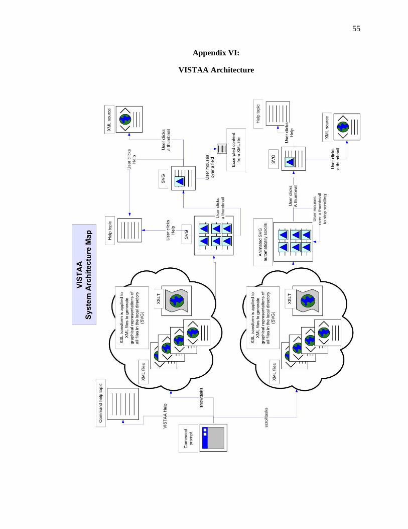
55
Appendix VI:
VISTAA Architecture
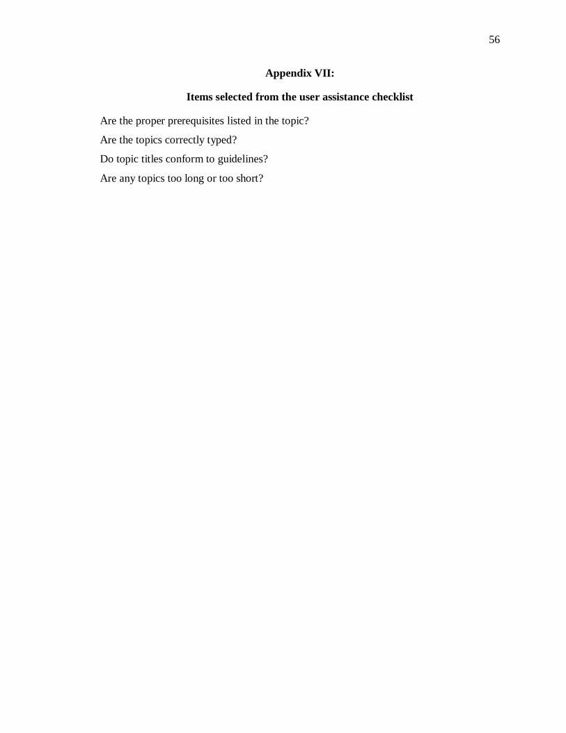
56
Appendix VII:
Items selected from the user assistance checklist
Are the proper prerequisites listed in the topic?
Are the topics correctly typed?
Do topic titles conform to guidelines?
Are any topics too long or too short?
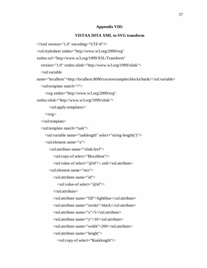
57
Appendix VIII:
VISTAA DITA XML to SVG transform
<?xml version="1.0" encoding="UTF-8"?>
<xsl:stylesheet xmlns="http://www.w3.org/2000/svg"
xmlns:xsl="http://www.w3.org/1999/XSL/Transform"
version="1.0" xmlns:xlink="http://www.w3.org/1999/xlink">
<xsl:variable
name="localhost">http://localhost:8080/cocoon/samples/blocks/batik/</xsl:variable>
<xsl:template match="/">
<svg xmlns="http://www.w3.org/2000/svg"
xmlns:xlink="http://www.w3.org/1999/xlink">
<xsl:apply-templates/>
</svg>
</xsl:template>
<xsl:template match="task">
<xsl:variable name="tasklength" select="string-length(/)"/>
<xsl:element name="a">
<xsl:attribute name="xlink:href">
<xsl:copy-of select="$localhost"/>
<xsl:value-of select="@id"/>.xml</xsl:attribute>
<xsl:element name="rect">
<xsl:attribute name="id">
<xsl:value-of select="@id"/>
</xsl:attribute>
<xsl:attribute name="fill">lightblue</xsl:attribute>
<xsl:attribute name="stroke">black</xsl:attribute>
<xsl:attribute name="x">5</xsl:attribute>
<xsl:attribute name="y">10</xsl:attribute>
<xsl:attribute name="width">200</xsl:attribute>
<xsl:attribute name="height">
<xsl:copy-of select="$tasklength"/>
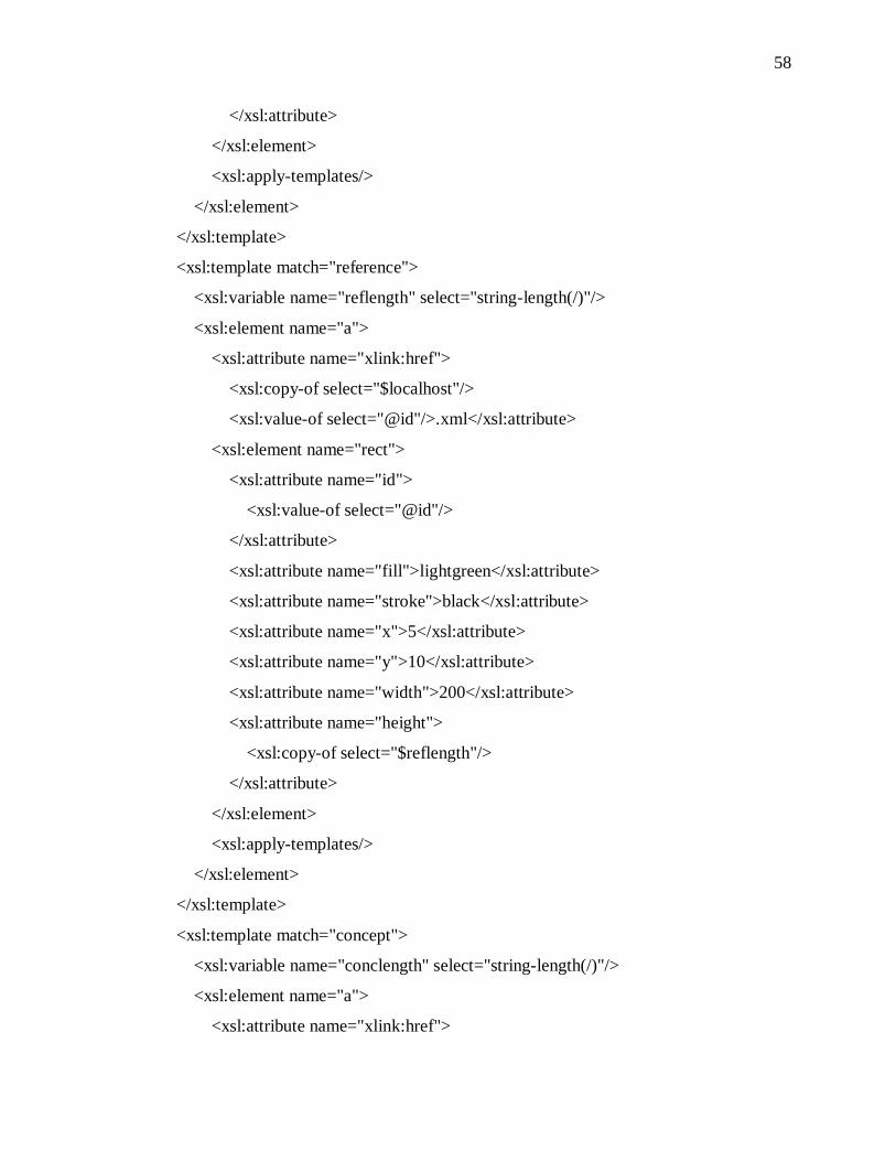
58
</xsl:attribute>
</xsl:element>
<xsl:apply-templates/>
</xsl:element>
</xsl:template>
<xsl:template match="reference">
<xsl:variable name="reflength" select="string-length(/)"/>
<xsl:element name="a">
<xsl:attribute name="xlink:href">
<xsl:copy-of select="$localhost"/>
<xsl:value-of select="@id"/>.xml</xsl:attribute>
<xsl:element name="rect">
<xsl:attribute name="id">
<xsl:value-of select="@id"/>
</xsl:attribute>
<xsl:attribute name="fill">lightgreen</xsl:attribute>
<xsl:attribute name="stroke">black</xsl:attribute>
<xsl:attribute name="x">5</xsl:attribute>
<xsl:attribute name="y">10</xsl:attribute>
<xsl:attribute name="width">200</xsl:attribute>
<xsl:attribute name="height">
<xsl:copy-of select="$reflength"/>
</xsl:attribute>
</xsl:element>
<xsl:apply-templates/>
</xsl:element>
</xsl:template>
<xsl:template match="concept">
<xsl:variable name="conclength" select="string-length(/)"/>
<xsl:element name="a">
<xsl:attribute name="xlink:href">
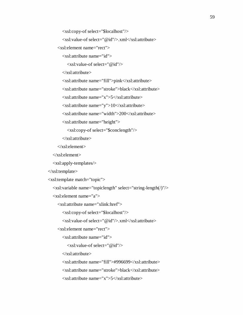
59
<xsl:copy-of select="$localhost"/>
<xsl:value-of select="@id"/>.xml</xsl:attribute>
<xsl:element name="rect">
<xsl:attribute name="id">
<xsl:value-of select="@id"/>
</xsl:attribute>
<xsl:attribute name="fill">pink</xsl:attribute>
<xsl:attribute name="stroke">black</xsl:attribute>
<xsl:attribute name="x">5</xsl:attribute>
<xsl:attribute name="y">10</xsl:attribute>
<xsl:attribute name="width">200</xsl:attribute>
<xsl:attribute name="height">
<xsl:copy-of select="$conclength"/>
</xsl:attribute>
</xsl:element>
</xsl:element>
<xsl:apply-templates/>
</xsl:template>
<xsl:template match="topic">
<xsl:variable name="topiclength" select="string-length(/)"/>
<xsl:element name="a">
<xsl:attribute name="xlink:href">
<xsl:copy-of select="$localhost"/>
<xsl:value-of select="@id"/>.xml</xsl:attribute>
<xsl:element name="rect">
<xsl:attribute name="id">
<xsl:value-of select="@id"/>
</xsl:attribute>
<xsl:attribute name="fill">#996699</xsl:attribute>
<xsl:attribute name="stroke">black</xsl:attribute>
<xsl:attribute name="x">5</xsl:attribute>
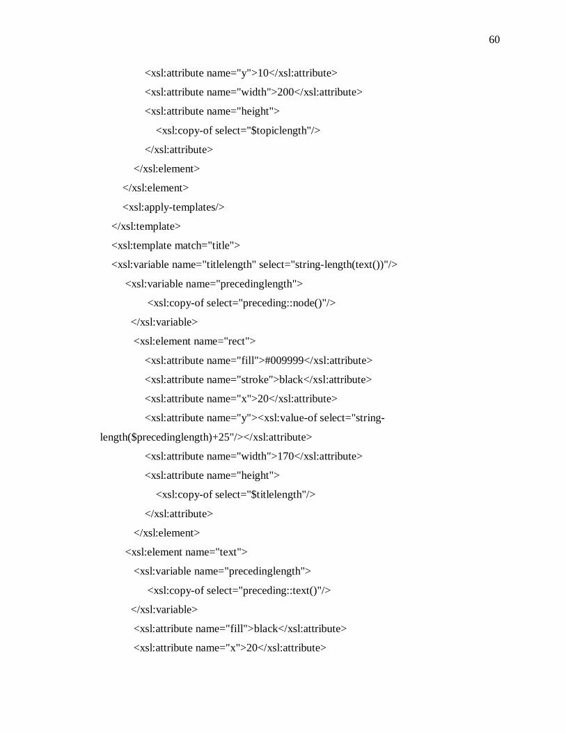
60
<xsl:attribute name="y">10</xsl:attribute>
<xsl:attribute name="width">200</xsl:attribute>
<xsl:attribute name="height">
<xsl:copy-of select="$topiclength"/>
</xsl:attribute>
</xsl:element>
</xsl:element>
<xsl:apply-templates/>
</xsl:template>
<xsl:template match="title">
<xsl:variable name="titlelength" select="string-length(text())"/>
<xsl:variable name="precedinglength">
<xsl:copy-of select="preceding::node()"/>
</xsl:variable>
<xsl:element name="rect">
<xsl:attribute name="fill">#009999</xsl:attribute>
<xsl:attribute name="stroke">black</xsl:attribute>
<xsl:attribute name="x">20</xsl:attribute>
<xsl:attribute name="y"><xsl:value-of select="string-
length($precedinglength)+25"/></xsl:attribute>
<xsl:attribute name="width">170</xsl:attribute>
<xsl:attribute name="height">
<xsl:copy-of select="$titlelength"/>
</xsl:attribute>
</xsl:element>
<xsl:element name="text">
<xsl:variable name="precedinglength">
<xsl:copy-of select="preceding::text()"/>
</xsl:variable>
<xsl:attribute name="fill">black</xsl:attribute>
<xsl:attribute name="x">20</xsl:attribute>
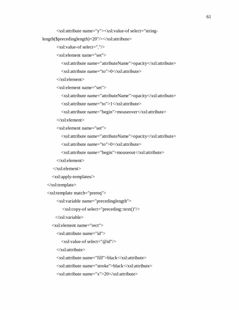
61
<xsl:attribute name="y"><xsl:value-of select="string-
length($precedinglength)+20"/></xsl:attribute>
<xsl:value-of select="."/>
<xsl:element name="set">
<xsl:attribute name="attributeName">opacity</xsl:attribute>
<xsl:attribute name="to">0</xsl:attribute>
</xsl:element>
<xsl:element name="set">
<xsl:attribute name="attributeName">opacity</xsl:attribute>
<xsl:attribute name="to">1</xsl:attribute>
<xsl:attribute name="begin">mouseover</xsl:attribute>
</xsl:element>
<xsl:element name="set">
<xsl:attribute name="attributeName">opacity</xsl:attribute>
<xsl:attribute name="to">0</xsl:attribute>
<xsl:attribute name="begin">mouseout</xsl:attribute>
</xsl:element>
</xsl:element>
<xsl:apply-templates/>
</xsl:template>
<xsl:template match="prereq">
<xsl:variable name="precedinglength">
<xsl:copy-of select="preceding::text()"/>
</xsl:variable>
<xsl:element name="rect">
<xsl:attribute name="id">
<xsl:value-of select="@id"/>
</xsl:attribute>
<xsl:attribute name="fill">black</xsl:attribute>
<xsl:attribute name="stroke">black</xsl:attribute>
<xsl:attribute name="x">20</xsl:attribute>
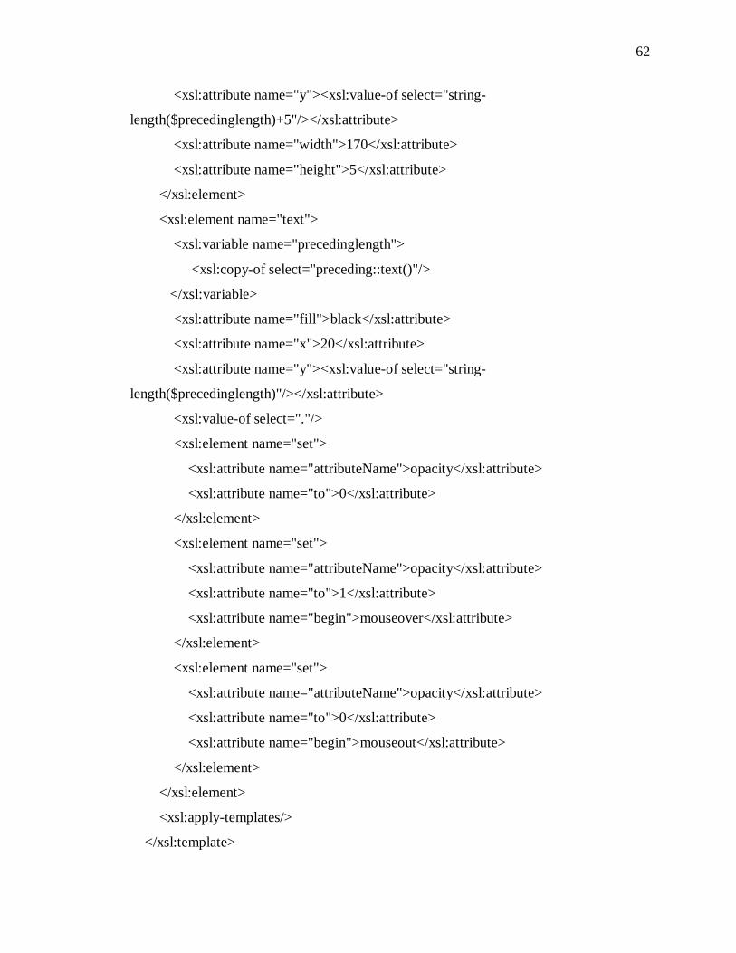
62
<xsl:attribute name="y"><xsl:value-of select="string-
length($precedinglength)+5"/></xsl:attribute>
<xsl:attribute name="width">170</xsl:attribute>
<xsl:attribute name="height">5</xsl:attribute>
</xsl:element>
<xsl:element name="text">
<xsl:variable name="precedinglength">
<xsl:copy-of select="preceding::text()"/>
</xsl:variable>
<xsl:attribute name="fill">black</xsl:attribute>
<xsl:attribute name="x">20</xsl:attribute>
<xsl:attribute name="y"><xsl:value-of select="string-
length($precedinglength)"/></xsl:attribute>
<xsl:value-of select="."/>
<xsl:element name="set">
<xsl:attribute name="attributeName">opacity</xsl:attribute>
<xsl:attribute name="to">0</xsl:attribute>
</xsl:element>
<xsl:element name="set">
<xsl:attribute name="attributeName">opacity</xsl:attribute>
<xsl:attribute name="to">1</xsl:attribute>
<xsl:attribute name="begin">mouseover</xsl:attribute>
</xsl:element>
<xsl:element name="set">
<xsl:attribute name="attributeName">opacity</xsl:attribute>
<xsl:attribute name="to">0</xsl:attribute>
<xsl:attribute name="begin">mouseout</xsl:attribute>
</xsl:element>
</xsl:element>
<xsl:apply-templates/>
</xsl:template>
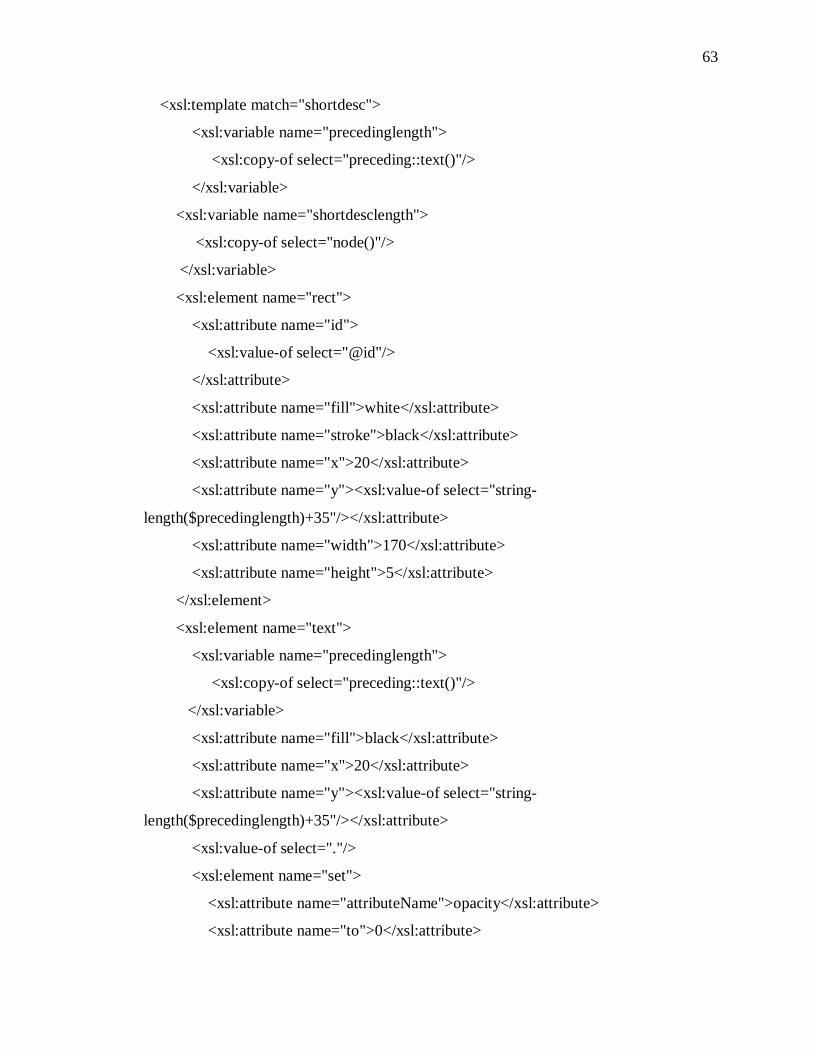
63
<xsl:template match="shortdesc">
<xsl:variable name="precedinglength">
<xsl:copy-of select="preceding::text()"/>
</xsl:variable>
<xsl:variable name="shortdesclength">
<xsl:copy-of select="node()"/>
</xsl:variable>
<xsl:element name="rect">
<xsl:attribute name="id">
<xsl:value-of select="@id"/>
</xsl:attribute>
<xsl:attribute name="fill">white</xsl:attribute>
<xsl:attribute name="stroke">black</xsl:attribute>
<xsl:attribute name="x">20</xsl:attribute>
<xsl:attribute name="y"><xsl:value-of select="string-
length($precedinglength)+35"/></xsl:attribute>
<xsl:attribute name="width">170</xsl:attribute>
<xsl:attribute name="height">5</xsl:attribute>
</xsl:element>
<xsl:element name="text">
<xsl:variable name="precedinglength">
<xsl:copy-of select="preceding::text()"/>
</xsl:variable>
<xsl:attribute name="fill">black</xsl:attribute>
<xsl:attribute name="x">20</xsl:attribute>
<xsl:attribute name="y"><xsl:value-of select="string-
length($precedinglength)+35"/></xsl:attribute>
<xsl:value-of select="."/>
<xsl:element name="set">
<xsl:attribute name="attributeName">opacity</xsl:attribute>
<xsl:attribute name="to">0</xsl:attribute>
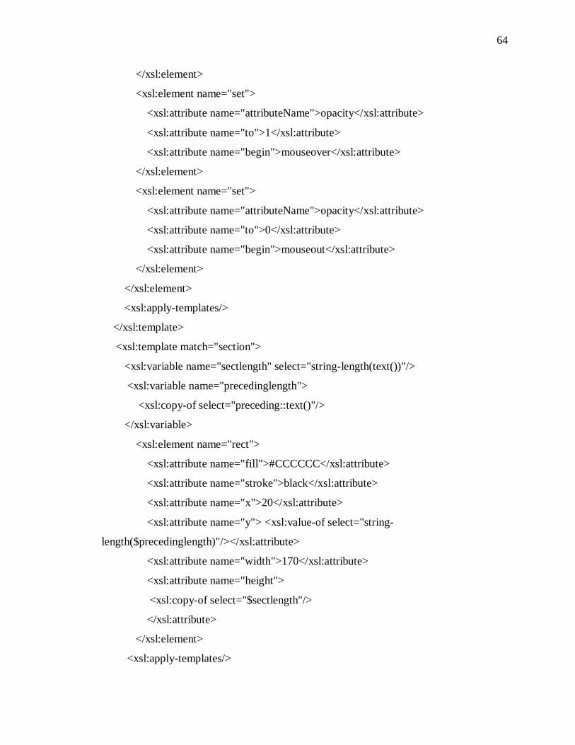
64
</xsl:element>
<xsl:element name="set">
<xsl:attribute name="attributeName">opacity</xsl:attribute>
<xsl:attribute name="to">1</xsl:attribute>
<xsl:attribute name="begin">mouseover</xsl:attribute>
</xsl:element>
<xsl:element name="set">
<xsl:attribute name="attributeName">opacity</xsl:attribute>
<xsl:attribute name="to">0</xsl:attribute>
<xsl:attribute name="begin">mouseout</xsl:attribute>
</xsl:element>
</xsl:element>
<xsl:apply-templates/>
</xsl:template>
<xsl:template match="section">
<xsl:variable name="sectlength" select="string-length(text())"/>
<xsl:variable name="precedinglength">
<xsl:copy-of select="preceding::text()"/>
</xsl:variable>
<xsl:element name="rect">
<xsl:attribute name="fill">#CCCCCC</xsl:attribute>
<xsl:attribute name="stroke">black</xsl:attribute>
<xsl:attribute name="x">20</xsl:attribute>
<xsl:attribute name="y"> <xsl:value-of select="string-
length($precedinglength)"/></xsl:attribute>
<xsl:attribute name="width">170</xsl:attribute>
<xsl:attribute name="height">
<xsl:copy-of select="$sectlength"/>
</xsl:attribute>
</xsl:element>
<xsl:apply-templates/>
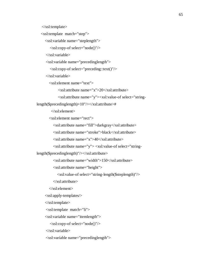
65
</xsl:template>
<xsl:template match="step">
<xsl:variable name="steplength">
<xsl:copy-of select="node()"/>
</xsl:variable>
<xsl:variable name="precedinglength">
<xsl:copy-of select="preceding::text()"/>
</xsl:variable>
<xsl:element name="text">
<xsl:attribute name="x">20</xsl:attribute>
<xsl:attribute name="y"><xsl:value-of select="string-
length($precedinglength)+10"/></xsl:attribute>#
</xsl:element>
<xsl:element name="rect">
<xsl:attribute name="fill">darkgray</xsl:attribute>
<xsl:attribute name="stroke">black</xsl:attribute>
<xsl:attribute name="x">40</xsl:attribute>
<xsl:attribute name="y"> <xsl:value-of select="string-
length($precedinglength)"/></xsl:attribute>
<xsl:attribute name="width">150</xsl:attribute>
<xsl:attribute name="height">
<xsl:value-of select="string-length($steplength)"/>
</xsl:attribute>
</xsl:element>
<xsl:apply-templates/>
</xsl:template>
<xsl:template match="li">
<xsl:variable name="itemlength">
<xsl:copy-of select="node()"/>
</xsl:variable>
<xsl:variable name="precedinglength">
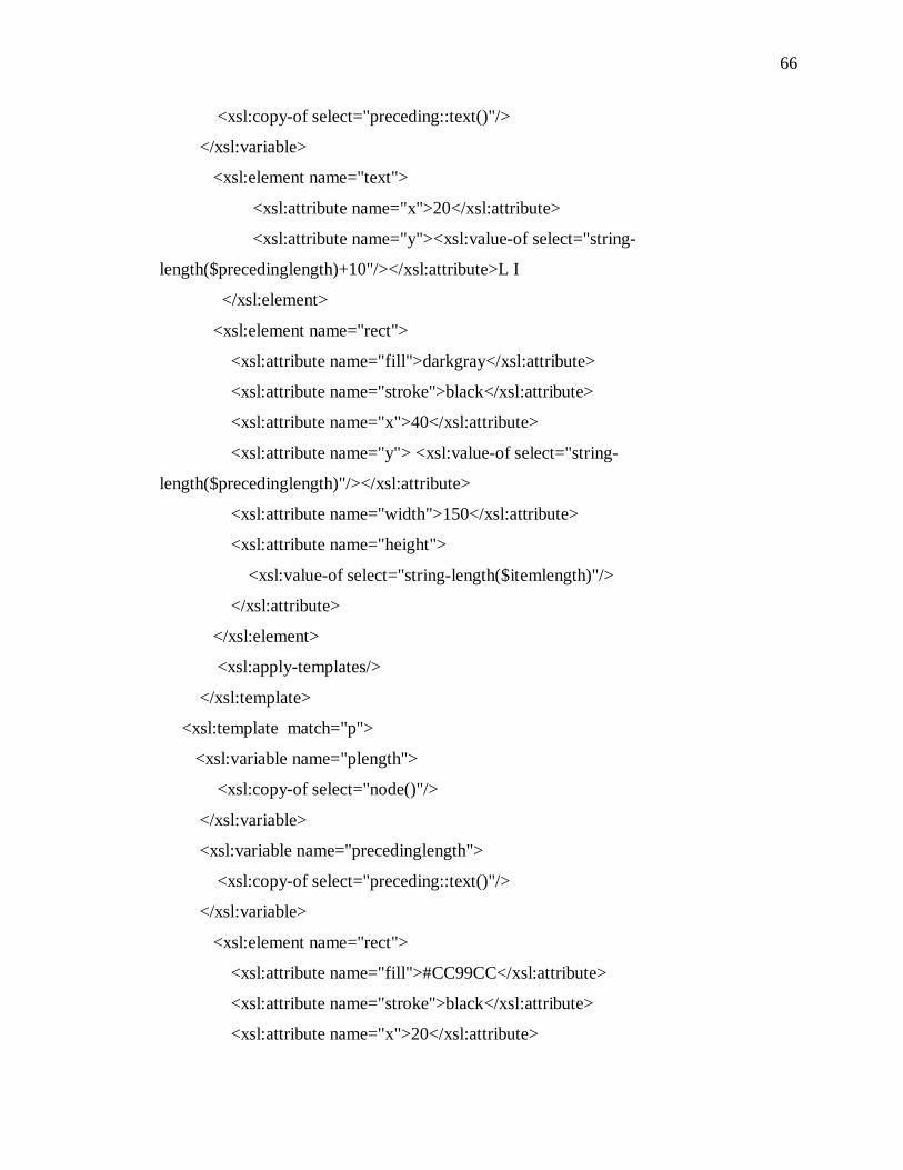
66
<xsl:copy-of select="preceding::text()"/>
</xsl:variable>
<xsl:element name="text">
<xsl:attribute name="x">20</xsl:attribute>
<xsl:attribute name="y"><xsl:value-of select="string-
length($precedinglength)+10"/></xsl:attribute>L I
</xsl:element>
<xsl:element name="rect">
<xsl:attribute name="fill">darkgray</xsl:attribute>
<xsl:attribute name="stroke">black</xsl:attribute>
<xsl:attribute name="x">40</xsl:attribute>
<xsl:attribute name="y"> <xsl:value-of select="string-
length($precedinglength)"/></xsl:attribute>
<xsl:attribute name="width">150</xsl:attribute>
<xsl:attribute name="height">
<xsl:value-of select="string-length($itemlength)"/>
</xsl:attribute>
</xsl:element>
<xsl:apply-templates/>
</xsl:template>
<xsl:template match="p">
<xsl:variable name="plength">
<xsl:copy-of select="node()"/>
</xsl:variable>
<xsl:variable name="precedinglength">
<xsl:copy-of select="preceding::text()"/>
</xsl:variable>
<xsl:element name="rect">
<xsl:attribute name="fill">#CC99CC</xsl:attribute>
<xsl:attribute name="stroke">black</xsl:attribute>
<xsl:attribute name="x">20</xsl:attribute>
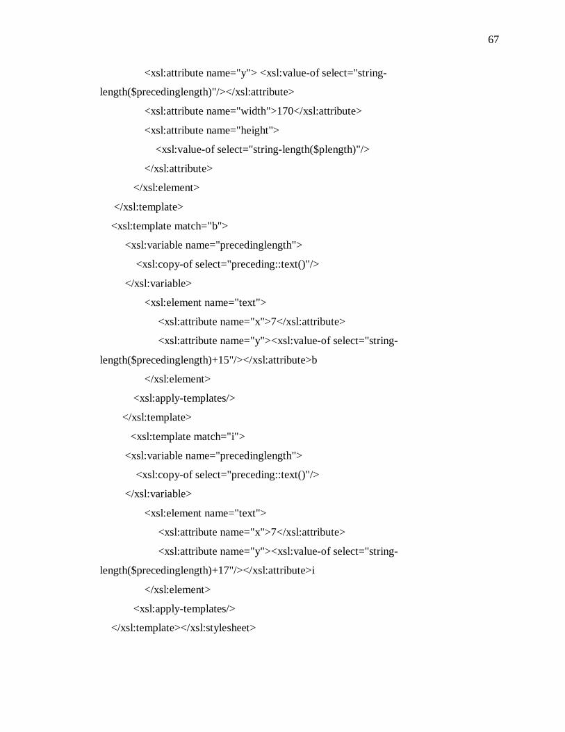
67
<xsl:attribute name="y"> <xsl:value-of select="string-
length($precedinglength)"/></xsl:attribute>
<xsl:attribute name="width">170</xsl:attribute>
<xsl:attribute name="height">
<xsl:value-of select="string-length($plength)"/>
</xsl:attribute>
</xsl:element>
</xsl:template>
<xsl:template match="b">
<xsl:variable name="precedinglength">
<xsl:copy-of select="preceding::text()"/>
</xsl:variable>
<xsl:element name="text">
<xsl:attribute name="x">7</xsl:attribute>
<xsl:attribute name="y"><xsl:value-of select="string-
length($precedinglength)+15"/></xsl:attribute>b
</xsl:element>
<xsl:apply-templates/>
</xsl:template>
<xsl:template match="i">
<xsl:variable name="precedinglength">
<xsl:copy-of select="preceding::text()"/>
</xsl:variable>
<xsl:element name="text">
<xsl:attribute name="x">7</xsl:attribute>
<xsl:attribute name="y"><xsl:value-of select="string-
length($precedinglength)+17"/></xsl:attribute>i
</xsl:element>
<xsl:apply-templates/>
</xsl:template></xsl:stylesheet>
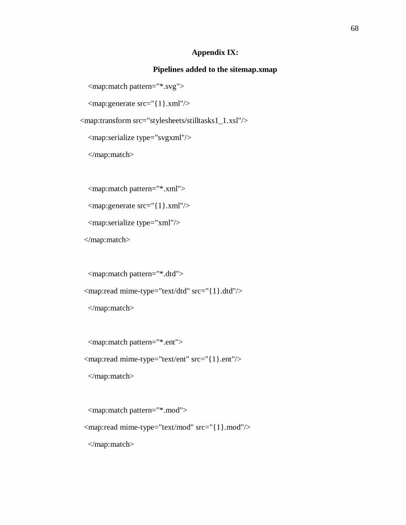
68
Appendix IX:
Pipelines added to the sitemap.xmap
<map:match pattern="*.svg">
<map:generate src="{1}.xml"/>
<map:transform src="stylesheets/stilltasks1_1.xsl"/>
<map:serialize type="svgxml"/>
</map:match>
<map:match pattern="*.xml">
<map:generate src="{1}.xml"/>
<map:serialize type="xml"/>
</map:match>
<map:match pattern="*.dtd">
<map:read mime-type="text/dtd" src="{1}.dtd"/>
</map:match>
<map:match pattern="*.ent">
<map:read mime-type="text/ent" src="{1}.ent"/>
</map:match>
<map:match pattern="*.mod">
<map:read mime-type="text/mod" src="{1}.mod"/>
</map:match>

69
<map:match pattern="list.html">
<map:generate src="list.html"/>
<map:serialize type="html"/>
</map:match>
70
REFERENCES
Behera, Ardhendu, Denis Lelanne, and Rolf Ingold. "Visual Signature based Identification of Low-resolution Document Images." Proceedings of the 2004 ACM symposium on Document Engineering (2004): 178 - 187.
Boguraev, B., Kennedy, C., Bellamy, R., Brawer, S., and Wong, Y. Y. 1998. “Dynamic presentation of document content for rapid on-line skimming.” AAAI Spring 1998 Symposium on Intelligent Text Summarization, E. HOVY and D. RADEV, Eds., AAAI Press, Stanford CA, 109–118.
Campeseto, Oswald. Fundamentals of SVG Programming: Concepts to Source Code. 1st ed. Hingham: Charles River Media, Inc., 2004.
Chai, Wei, and Barry Vercoe. "Music Thumbnailing via Structural Analysis." Proceedings of the eleventh ACM international conference on Multimedia (November 2003): 223-226.
Dillon, Andrew, and Misha Vaughan. "’It's the journey and the destination’: Shape and the emergent property of genre in evaluating digital documents." New Review of Multimedia and Hypermedia 1991: 91-106.
Faichney, Jolon, and Ruben Gonzalez. "Goldleaf Hierarchical Document Browser." Australian Computer Science Communications , Proceedings of the 2nd Australasian conference on User interface January 2001: 13-20.
Furnas, George. "Effective View Navigation." Proceedings of the SIGCHI Conference on Human factors in Computing Systems (1997): 367 - 374.
Gersohn, Nahum, Stephen Eick, and Stuart Card. "Information Visualization." Interactions March April 1998: 9-15.
Hearst, Marti. "TileBars: Visualization of Term Distribution Information in Full Text Information Access." Proceedings of the SIGCHI conference on Human factors in computing systems 1995: 59-66.
Hoeben, Aldo, and Pieter Jan Stappers. "Flicking through page-based documents with thumbnail sliders and electronic dog-ears." CHI '00 extended abstracts on Human factors in computing systems. April 2000: 191-192.
Hornbaek, Kasper, and Erik Frokjaer. "Reading Patterns and Usability in Visualizations of Electronic Documents." Interactions. January - February 2004: 11-12.
71
Hunt, John, Don Day, Eric Hennum, Michael Priestly, Dave Schell. "Why use DITA to produce HTML deliverables?" developerWorks (2005). 11 Oct 2005 <http://www-128.ibm.com/developerworks/xml/library/x-dita6/>.
Jeffries, Ronald. "What is extreme programming?" XProgramming.com. 11 2001. 25 Sep. 2005 <http://www.xprogramming.com/xpmag/whatisxp.htm#test>.
Jelinek, Josef, and P. Slavik. "XML visualization using tree rewriting." Proceedings of the 20th Spring Conference on Computer Graphics, May 2004: 65 - 72 .
Leung, Theodre. XML Development with Apache Tools. 1st ed. Indianapolis: Wiley Publishing, Inc., 2004.
Marchionini, Gary. Information Seeking in Electronic Environments. New York: Cambridge University Press, 1995.
Rosenfeld, Louis, and Peter Morville. Information Architecture for the World Wide Web. 2nd ed. Sabastopol: O'Reilly & Associates, 2002.
Sammons, Martha. The Internet Writer's Handbook. Needham Heights: Allyn and Bacon, 1999.
Scheffczyk, Jan, Peter Roedig, Uwe Borghoff, and Lothar Schmitz. "Managing Inconsistent Repositories via Prioritized Repairs." Proceedings of the 2004 ACM Symposium on Document Engineering (2004): 137 - 146.
Suh, Bongwon, Allison Woodruff, Ruth Roenholtz, and Alyssa Glass. "Focus and Context: Popout prism: adding perceptual principles to overview+detail document interfaces ." Proceedings of the SIGCHI conference on Human factors in computing systems: Changing our world, changing ourselves April 2002: 251-258.
Toms, Elaine. "Recognizing Digital Genre." Bulletin of the American Society for Informatin Science and Technology. January 2001: 20-23.
Tufte, Edward. Envisioning Information. Cheshire: Graphics Press, 1990.
Wildemuth, Barbara, Gary Marchionini, Meng Yang, and Gary Geisler, Todd Wilkens, Anthony Hughes, Richard Gruss. "How Fast Is Too Fast? Evaluating Fast Forward Surrogates for Digital Video." Proceedings of the 3rd ACM/IEEE-CS joint conference on Digital libraries (2003): 221 - 230.
Wittenburg, Kent. "Rapid-Fire Image Previews for Information Navigation." Proceedings of the working conference on Advanced Visual Interfaces (May 1998): 76-82.
White, Jan. "The Newest Tool for Technical Communicators." Technical Communication Online Vol. 50. No.3 (November 2003).

72
Woodruff, Alllison, et al. "Using Thumbnails to Search the Web." Proceedings of the SIGCHI conference on Human factors in computing systems (March-April 2001): 198-205.