Embed Size (px)
Citation preview
Visualizing Excitement of Individuals and GroupsKostiantyn KucherLinnaeus University
Vaxjo, [email protected]
Daniel CerneaAGT International
Darmstadt, [email protected]
Andreas KerrenLinnaeus University
Vaxjo, [email protected]
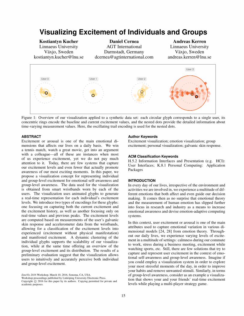
Figure 1: Overview of our visualization applied to a synthetic data set: each circular glyph corresponds to a single user, itsconcentric rings encode the baseline and current excitement values, and the nested dots provide the detailed information abouttime-varying measurement values. Here, the oscillating trail encoding is used for the nested dots.
ABSTRACTExcitement or arousal is one of the main emotional di-mensions that affects our lives on a daily basis. We wina tennis match, watch a great movie, get into an argumentwith a colleague—all of these are instances when mostof us experience excitement, yet we do not pay muchattention to it. Today, there are few systems that captureour excitement levels and even fewer that actually promoteawareness of our most exciting moments. In this paper, wepropose a visualization concept for representing individualand group-level excitement for emotional self-awareness andgroup-level awareness. The data used for the visualizationis obtained from smart wristbands worn by each of theusers. The visualization uses animated glyphs to generatea real-time representation for each individual’s excitementlevels. We introduce two types of encodings for these glyphs:one focusing on capturing both the current excitement andthe excitement history, as well as another focusing only onreal-time values and previous peaks. The excitement levelsare computed based on measurements of the user’s galvanicskin response and accelerometer data from the wristbands,allowing for a classification of the excitement levels intoexperienced (excitement without physical manifestation)and manifested excitement. A dynamic clustering of theindividual glyphs supports the scalability of our visualiza-tion, while at the same time offering an overview of thegroup-level excitement and its distribution. The results of apreliminary evaluation suggest that the visualization allowsusers to intuitively and accurately perceive both individualand group-level excitement.
EmoVis 2016 Workshop, March 10, 2016, Sonoma, CA, USA.Workshop proceedings published by Linkoping University Electronic Press.Copyright c© 2016 for this paper by its authors. Copying permitted for private andacademic purposes.
Author KeywordsExcitement visualization; emotion visualization; groupexcitement; personal visualization; galvanic skin response.
ACM Classification KeywordsH.5.2 Information Interfaces and Presentation (e.g. HCI):User Interfaces; K.8.1 Personal Computing: ApplicationPackages
INTRODUCTIONIn every day of our lives, irrespective of the environment andactivities we are involved in, we experience a multitude of dif-ferent emotions that both affect and even guide our decisionmaking. It comes then as no surprise that emotional theoryand the measurement of human emotion has slipped furtherinto focus in research and industry as a means to increaseemotional awareness and devise emotion-adaptive computingsystems.
In this context, user excitement or arousal is one of the mainattributes used to capture emotional variation in various di-mensional models [24, 28] from emotion theory. Through-out our daily lives, we experience varying levels of excite-ment in a multitude of settings: calmness during our commuteto work, stress during a business meeting, excitement whilewatching sports, etc. Still, there are few solutions that try tocapture and represent user excitement in the context of emo-tional self-awareness and group-level awareness. Imagine ifyou could employ a visualization system in order to exploreyour most stressful moments of the day, in order to improveyour habits and remove unwanted stimuli. Similarly, in termsof group-level awareness, consider as an example a visualiza-tion that shows your and your friends’ real-time excitementlevels while playing a multi-player strategy game.
15
In this paper, we introduce a novel concept for visualizing in-dividual and group-level excitement in real-time based on theinformation streamed from smart wristbands worn by eachmember of the group. The data is gathered from a set ofMicrosoft Band 2 wearables [25] that periodically measurethe galvanic skin response (GSR) and accelerometer (ACC)values for each user. We process this data and compute thelevels of experienced excitement (excitement that is detectedthrough the GSR measurements but is not manifested phys-ically) and manifested excitement (high GSR levels coupledwith sudden motion of the arms, e.g., cheering at a soccergame).
The visualization is based on animated glyphs that encodeeach person’s excitement levels and allow them to perceivethe overall excitement of the group. Figure 1 presents theexcitement levels for four individuals. We propose two vi-sual encodings for the glyph: on the one hand, focusing onthe representation of the current and previous levels of ex-citement for each individual, while on the other hand, withscalability in mind, employing animation to better convey thecurrent level of excitement for each person. A dynamic layoutenables glyphs with similar excitement levels to be groupedin order to better perceive the distribution of the excitementlevels in large groups.
In the following sections, we will initially discuss related re-search in terms of emotional theory, emotion measurement,and personal visualization. We continue by highlighting thedata acquisition and processing for the excitement levels ofthe individuals. Next, we detail the visualization design andits implementation, followed by a preliminary evaluation ofour concept. We conclude by presenting our final remarksand future steps.
RELATED WORKNowadays, there is a set of different techniques that are beingused for estimating user emotions, ranging from classifica-tion of facial expressions and voice tonality to neurologicalactivity and other physiological measurements. While thesetechniques all have their various estimation capabilities in thecontext of emotional theory, when focusing on the dimensionof arousal some of the most accurate predictors are based onbiosignals such as heart rate, respiration, electrodermal activ-ity, body temperature, pupil size variation, all affected by theautonomic nervous system (ANS) [31].
Throughout the decades, electrodermal activity (EDA) or gal-vanic skin response (GSR) has shown promising results interms of correlation with user excitement levels [26, 27, 32].In this technique, two electrode measure the skin conductiv-ity of a user. The conductivity is affected by the moisture thatis generated by the eccrine sweat glands, which can be foundin our hands and feet, and are mostly responsive to changesin emotional arousal. The activation of these sweat glands isnot under the conscious control of a person and can be tiedespecially to a heightened level of arousal [35] and cognitiveworkload [30].
Recently, smart wristbands were introduced on the marketfeaturing GSR sensors (e.g., Microsoft Band 2 [25], Empatica
E4 [13]), enabling a new dimension of personal data collec-tion and interpretation. Equipped with additional sensors likeaccelerometers, these wearables have the potential to bringemotion estimation to the real world by considering the con-text and the activity of the users when processing their phys-iological signals [17].
While many techniques based on physiological measureshave already been used to estimate excitement levels in indi-viduals, there are few systems that focused on raising aware-ness and visualizing these emotional states. Part of the area ofpersonal visualization [18, 33], emotion visualization is oneof the approaches used to inspect and interpret informationabout user and group affective states.
McDuff et al. [23] introduced AffectAura, a visualization forestimated emotional states for a single user over time usingdata from multiple sensors. Their work uses an aggregatedvisual representation for representing valence, arousal and en-gagement levels for a longer time span of one day. In contrast,our approach is focused on the real-time visualization of a sin-gle attribute (excitement) for short time spans, and supportsmeasurements from multiple users simultaneously.
In terms of real-time visualization of emotions, Cernea etal. [7] introduced Emotion-prints, a visualization system fortouch-enabled interfaces, where the current level of a user’svalence and arousal (estimated through EEG measurements)is represented in the shape of a animated halo around the vir-tual objects that the user touches. Saari et al. [29] introduceda mobile emotion visualization system devised for improv-ing group performance and awareness. One step further, theGAT visualization [5] enabled the representation of consis-tent affective experiences at a group level in real-time, thusenabling emotional awareness in teams and improving col-laboration. However, emotions have been visualized througha wide range of representations, ranging from expression-inspired approaches—avatars and icons [16, 19, 22]—and toabstract interface integrations [6, 16].
In the context of group psychology, emotional awareness hasbeen linked to decision making [15] and communication [8,12], while emotional engagement (including excitement) hasbeen shown to be closely linked to gamification [21].
Visualization of real-time measurements collected from mul-tiple wristband devices presents additional challenges and canbe interpreted as streaming data visualization. One of the ear-liest papers on this topic is a work by Wong et al. [36] whodefined the corresponding visualization challenges: the datamay arrive as an unpredictable and unbounded stream withoutany clear patterns. The authors proposed several techniquesto visualize streaming data with scatterplots using variationsof multidimensional scaling (MDS) [4]. Alsakran et al. [2]introduced STREAMIT, a scalable visualization system thatuses a force-direct dynamic system to lay out visual itemsrepresenting text documents. Huron et al. [20] discussed Vi-sual Sedimentation, a powerful metaphor that uses animationto represent aging and aggregation of incoming data entries.In contrast to these papers, our work does not focus specif-ically on the streaming nature of data (i.e., it is equally ap-
16
plicable to non-streaming data sets), but takes this aspect intoaccount when providing a personal visualization.
Liu et al. [22] described an emotion recognition and visual-ization technique based on EEG measurements. They sup-ported processing of real-time data at 128 Hz with a slidingwindow algorithm and used a 3D avatar for encoding of emo-tions for a single user. In the case of our approach, datameasurements are made at a much lower frequency and thesupported visual encodings are much more compact. Fur-thermore, our work supports visualization of excitement formultiple users simultaneously.
Finally, Cottam et al. [10] proposed a taxonomy for stream-ing data visualization techniques based on dynamics of spa-tial and retinal variables. They introduced design guidelinesbased on the comparison task, stability of the displayed itemsset, and effects of time-varying data attributes. In our case,a single design option based on their guidelines is not suffi-cient since we want to provide a visualization of streamingdata items grouped by user—i.e., there are two representa-tion levels—with support for fixed and dynamic layouts atthe inter-user level and two different visual encodings at theintra-user level.
DATAWe have used Microsoft Band 2 devices [25] to record gal-vanic skin response (GSR) and accelerometer (ACC) valuesfor several people engaged in common activities. The activi-ties involved three to four individuals and included: watchinga movie, an opera, and going to a museum. During these ac-tivities, each person was wearing a device that would provideGSR and ACC measurements at approximately 0.2 and 9–11Hz, respectively. This data from each Band 2 was streamedin real-time to an Android mobile phone through a bluetoothconnection, from where it was forwarded and stored in a se-cured database. Currently, our visualization system can ac-cess only text-based exports from this database, with futureversion being able to obtain information directly from theserver.
For our purposes, ACC values were sampled to synchronizethem with GSR values. For the GSR values, a normalizationwas applied based on the extracted normal and stressed states,as described in [3]. These states have been extracted eitheroffline, or based on a calibration stage where the intervals forthe normal and stressed states were estimated.
Furthermore, the GSR values can fluctuate due to user physi-cal activity or—as perceived in our measurements—a tight fitof the devices on the wrist leading to excessive sweating. Tocompensate for these events, the ACC values from the mo-bile device were compared with the ones from the Band 2s. Ifthe user was exerting physical activity as detected both by themobile device and the wristband, an increased level of excite-ment was not reported. Moreover, as slow constant sweatingcould increase the GSR values over time, a sliding windowwas applied that enables the detection of local increases inthe GSR values, thus capturing acute states of excitement.
The resulting data sets comprised timestamped recordings oftwo variables, normalized in range [0; 1] for a correspond-
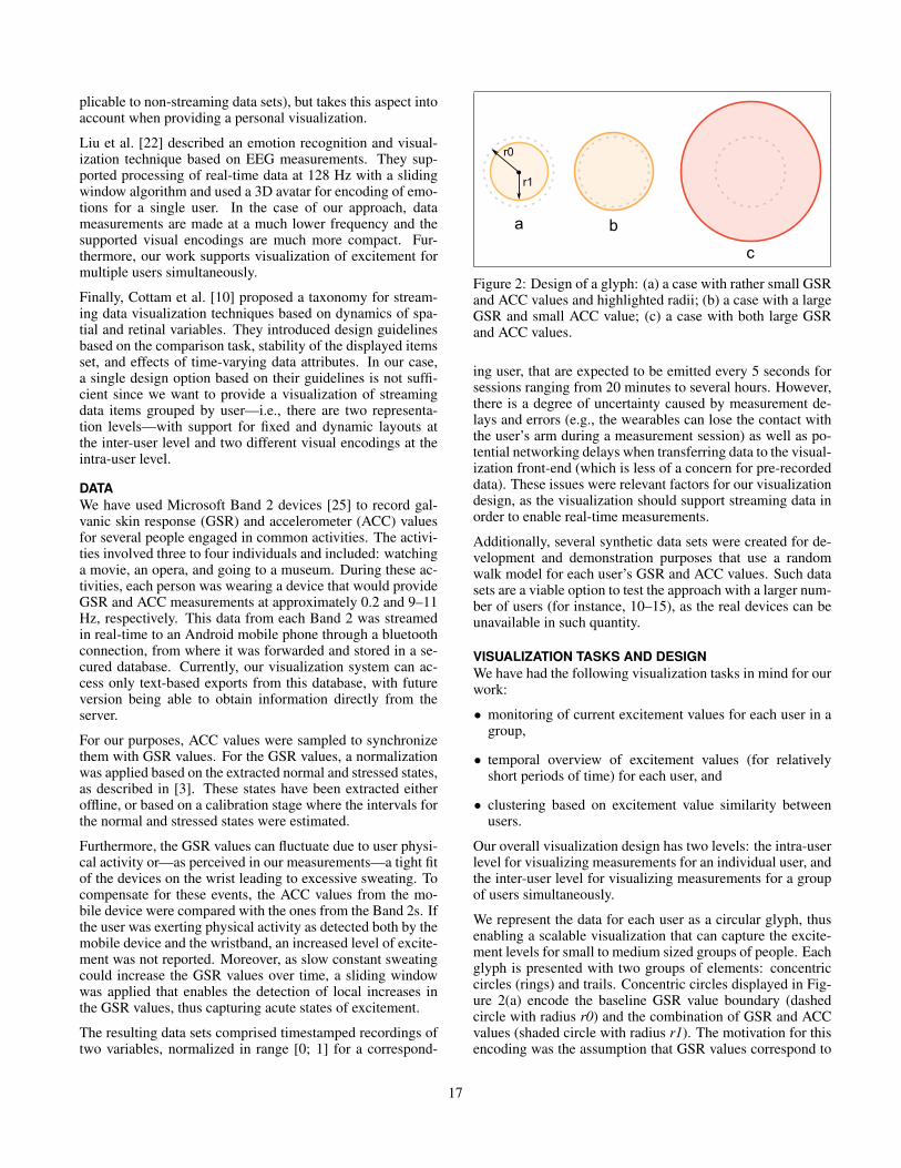
Figure 2: Design of a glyph: (a) a case with rather small GSRand ACC values and highlighted radii; (b) a case with a largeGSR and small ACC value; (c) a case with both large GSRand ACC values.
ing user, that are expected to be emitted every 5 seconds forsessions ranging from 20 minutes to several hours. However,there is a degree of uncertainty caused by measurement de-lays and errors (e.g., the wearables can lose the contact withthe user’s arm during a measurement session) as well as po-tential networking delays when transferring data to the visual-ization front-end (which is less of a concern for pre-recordeddata). These issues were relevant factors for our visualizationdesign, as the visualization should support streaming data inorder to enable real-time measurements.
Additionally, several synthetic data sets were created for de-velopment and demonstration purposes that use a randomwalk model for each user’s GSR and ACC values. Such datasets are a viable option to test the approach with a larger num-ber of users (for instance, 10–15), as the real devices can beunavailable in such quantity.
VISUALIZATION TASKS AND DESIGNWe have had the following visualization tasks in mind for ourwork:
• monitoring of current excitement values for each user in agroup,
• temporal overview of excitement values (for relativelyshort periods of time) for each user, and
• clustering based on excitement value similarity betweenusers.
Our overall visualization design has two levels: the intra-userlevel for visualizing measurements for an individual user, andthe inter-user level for visualizing measurements for a groupof users simultaneously.
We represent the data for each user as a circular glyph, thusenabling a scalable visualization that can capture the excite-ment levels for small to medium sized groups of people. Eachglyph is presented with two groups of elements: concentriccircles (rings) and trails. Concentric circles displayed in Fig-ure 2(a) encode the baseline GSR value boundary (dashedcircle with radius r0) and the combination of GSR and ACCvalues (shaded circle with radius r1). The motivation for thisencoding was the assumption that GSR values correspond to
17
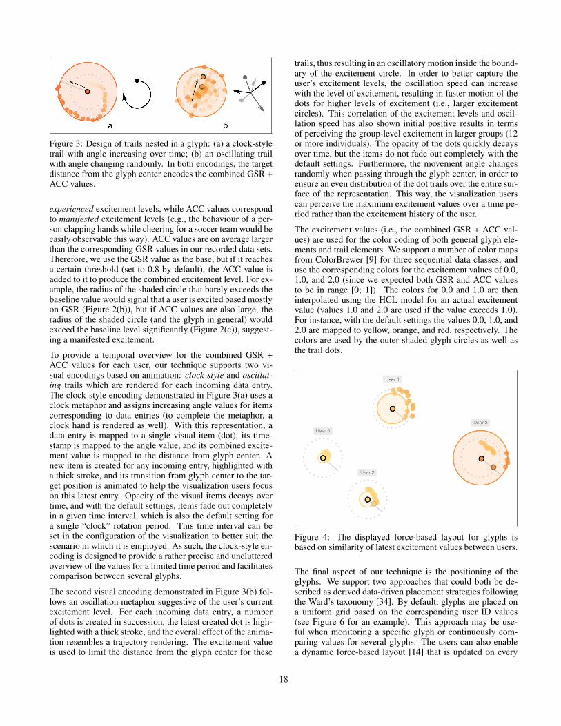
Figure 3: Design of trails nested in a glyph: (a) a clock-styletrail with angle increasing over time; (b) an oscillating trailwith angle changing randomly. In both encodings, the targetdistance from the glyph center encodes the combined GSR +ACC values.
experienced excitement levels, while ACC values correspondto manifested excitement levels (e.g., the behaviour of a per-son clapping hands while cheering for a soccer team would beeasily observable this way). ACC values are on average largerthan the corresponding GSR values in our recorded data sets.Therefore, we use the GSR value as the base, but if it reachesa certain threshold (set to 0.8 by default), the ACC value isadded to it to produce the combined excitement level. For ex-ample, the radius of the shaded circle that barely exceeds thebaseline value would signal that a user is excited based mostlyon GSR (Figure 2(b)), but if ACC values are also large, theradius of the shaded circle (and the glyph in general) wouldexceed the baseline level significantly (Figure 2(c)), suggest-ing a manifested excitement.
To provide a temporal overview for the combined GSR +ACC values for each user, our technique supports two vi-sual encodings based on animation: clock-style and oscillat-ing trails which are rendered for each incoming data entry.The clock-style encoding demonstrated in Figure 3(a) uses aclock metaphor and assigns increasing angle values for itemscorresponding to data entries (to complete the metaphor, aclock hand is rendered as well). With this representation, adata entry is mapped to a single visual item (dot), its time-stamp is mapped to the angle value, and its combined excite-ment value is mapped to the distance from glyph center. Anew item is created for any incoming entry, highlighted witha thick stroke, and its transition from glyph center to the tar-get position is animated to help the visualization users focuson this latest entry. Opacity of the visual items decays overtime, and with the default settings, items fade out completelyin a given time interval, which is also the default setting fora single “clock” rotation period. This time interval can beset in the configuration of the visualization to better suit thescenario in which it is employed. As such, the clock-style en-coding is designed to provide a rather precise and unclutteredoverview of the values for a limited time period and facilitatescomparison between several glyphs.
The second visual encoding demonstrated in Figure 3(b) fol-lows an oscillation metaphor suggestive of the user’s currentexcitement level. For each incoming data entry, a numberof dots is created in succession, the latest created dot is high-lighted with a thick stroke, and the overall effect of the anima-tion resembles a trajectory rendering. The excitement valueis used to limit the distance from the glyph center for these
trails, thus resulting in an oscillatory motion inside the bound-ary of the excitement circle. In order to better capture theuser’s excitement levels, the oscillation speed can increasewith the level of excitement, resulting in faster motion of thedots for higher levels of excitement (i.e., larger excitementcircles). This correlation of the excitement levels and oscil-lation speed has also shown initial positive results in termsof perceiving the group-level excitement in larger groups (12or more individuals). The opacity of the dots quickly decaysover time, but the items do not fade out completely with thedefault settings. Furthermore, the movement angle changesrandomly when passing through the glyph center, in order toensure an even distribution of the dot trails over the entire sur-face of the representation. This way, the visualization userscan perceive the maximum excitement values over a time pe-riod rather than the excitement history of the user.
The excitement values (i.e., the combined GSR + ACC val-ues) are used for the color coding of both general glyph ele-ments and trail elements. We support a number of color mapsfrom ColorBrewer [9] for three sequential data classes, anduse the corresponding colors for the excitement values of 0.0,1.0, and 2.0 (since we expected both GSR and ACC valuesto be in range [0; 1]). The colors for 0.0 and 1.0 are theninterpolated using the HCL model for an actual excitementvalue (values 1.0 and 2.0 are used if the value exceeds 1.0).For instance, with the default settings the values 0.0, 1.0, and2.0 are mapped to yellow, orange, and red, respectively. Thecolors are used by the outer shaded glyph circles as well asthe trail dots.
Figure 4: The displayed force-based layout for glyphs isbased on similarity of latest excitement values between users.
The final aspect of our technique is the positioning of theglyphs. We support two approaches that could both be de-scribed as derived data-driven placement strategies followingthe Ward’s taxonomy [34]. By default, glyphs are placed ona uniform grid based on the corresponding user ID values(see Figure 6 for an example). This approach may be use-ful when monitoring a specific glyph or continuously com-paring values for several glyphs. The users can also enablea dynamic force-based layout [14] that is updated on every
18
incoming data entry. In this case, the expected distances be-tween glyphs are set to be proportional to differences betweenthe latest corresponding GSR + ACC values. This approachfacilitates monitoring the group dynamics and identificationof clusters. Figure 4 demonstrates how users can be grouped,User 3 being overexcited while Users 0 and 2 experience lowexcitement.
IMPLEMENTATION DETAILSOur prototype is implemented as a static web page withJavaScript code that uses D3 [11] for layout and render-ing. The design and implementation of the prototype sup-port streaming data. Currently, we provide a choice of severalrecorded or synthetic data sets with multiple users. The im-plementation “replays” the selected data set and emits JSONentries for single measurements based on the recorded times-tamps.
The actual visualization code processes incoming entries in astreaming fashion. It is designed to handle data for user IDsnot encountered previously, to update the global layout, andto interrupt current animations at the intra-user level. Fig-ure 5 provides an overview of the update algorithm: a newglyph for a user is rendered if necessary, the layout is up-dated, and finally, the new data item is rendered with regardto the currently selected visual encoding for trails.
Figure 5: Diagram of the update algorithm for incoming dataentries.
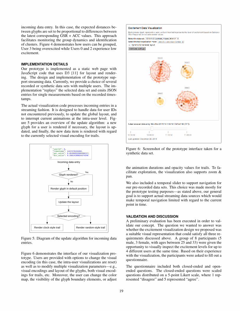
Figure 6 demonstrates the interface of our visualization pro-totype. Users are provided with options to change the visualencoding (in this case, the intra-user visualizations are reset)as well as to modify multiple visualization parameters—e.g.,visual encodings and layout of the glyphs, both visual encod-ings for trails, etc. Moreover, the user can change the colormap, the visibility of the glyph boundary elements, or adjust
Figure 6: Screenshot of the prototype interface taken for asynthetic data set.
the animation durations and opacity values for trails. To fa-cilitate exploration, the visualization also supports zoom &pan.
We also included a temporal slider to support navigation forour pre-recorded data sets. This choice was made mostly forthe prototype testing purposes—as stated above, our generalgoal is to support actual streaming data sources which wouldmake temporal navigation limited with regard to the currentpoint in time.
VALIDATION AND DISCUSSIONA preliminary evaluation has been executed in order to val-idate our concept. The question we wanted to answer waswhether the excitement visualization design we proposed wasa suitable visual representation that could satisfy all three re-quirements discussed above. A group of 8 participants (5male, 3 female, with ages between 25 and 33) were given theopportunity to visually inspect the excitement levels for up to4 different users at the same time. Based on their experiencewith the visualization, the participants were asked to fill out aquestionnaire.
The questionnaire included both closed-ended and open-ended questions. The closed-ended questions were scaledquestions distributed on a 5-point Likert scale, where 1 rep-resented “disagree” and 5 represented “agree”.
19
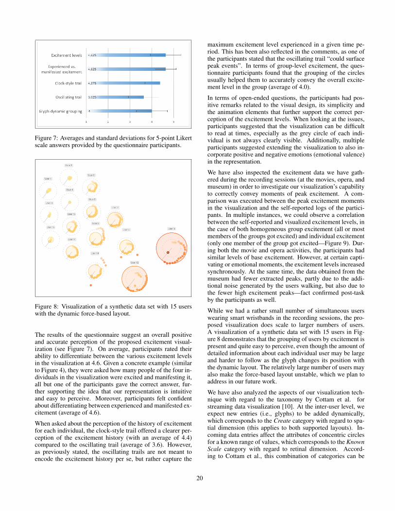
Figure 7: Averages and standard deviations for 5-point Likertscale answers provided by the questionnaire participants.
Figure 8: Visualization of a synthetic data set with 15 userswith the dynamic force-based layout.
The results of the questionnaire suggest an overall positiveand accurate perception of the proposed excitement visual-ization (see Figure 7). On average, participants rated theirability to differentiate between the various excitement levelsin the visualization at 4.6. Given a concrete example (similarto Figure 4), they were asked how many people of the four in-dividuals in the visualization were excited and manifesting it,all but one of the participants gave the correct answer, fur-ther supporting the idea that our representation is intuitiveand easy to perceive. Moreover, participants felt confidentabout differentiating between experienced and manifested ex-citement (average of 4.6).
When asked about the perception of the history of excitementfor each individual, the clock-style trail offered a clearer per-ception of the excitement history (with an average of 4.4)compared to the oscillating trail (average of 3.6). However,as previously stated, the oscillating trails are not meant toencode the excitement history per se, but rather capture the
maximum excitement level experienced in a given time pe-riod. This has been also reflected in the comments, as one ofthe participants stated that the oscillating trail “could surfacepeak events”. In terms of group-level excitement, the ques-tionnaire participants found that the grouping of the circlesusually helped them to accurately convey the overall excite-ment level in the group (average of 4.0).
In terms of open-ended questions, the participants had pos-itive remarks related to the visual design, its simplicity andthe animation elements that further support the correct per-ception of the excitement levels. When looking at the issues,participants suggested that the visualization can be difficultto read at times, especially as the grey circle of each indi-vidual is not always clearly visible. Additionally, multipleparticipants suggested extending the visualization to also in-corporate positive and negative emotions (emotional valence)in the representation.
We have also inspected the excitement data we have gath-ered during the recording sessions (at the movies, opera, andmuseum) in order to investigate our visualization’s capabilityto correctly convey moments of peak excitement. A com-parison was executed between the peak excitement momentsin the visualization and the self-reported logs of the partici-pants. In multiple instances, we could observe a correlationbetween the self-reported and visualized excitement levels, inthe case of both homogeneous group excitement (all or mostmembers of the groups got excited) and individual excitement(only one member of the group got excited—Figure 9). Dur-ing both the movie and opera activities, the participants hadsimilar levels of base excitement. However, at certain capti-vating or emotional moments, the excitement levels increasedsynchronously. At the same time, the data obtained from themuseum had fewer extracted peaks, partly due to the addi-tional noise generated by the users walking, but also due tothe fewer high excitement peaks—fact confirmed post-taskby the participants as well.
While we had a rather small number of simultaneous userswearing smart wristbands in the recording sessions, the pro-posed visualization does scale to larger numbers of users.A visualization of a synthetic data set with 15 users in Fig-ure 8 demonstrates that the grouping of users by excitement ispresent and quite easy to perceive, even though the amount ofdetailed information about each individual user may be largeand harder to follow as the glyph changes its position withthe dynamic layout. The relatively large number of users mayalso make the force-based layout unstable, which we plan toaddress in our future work.
We have also analyzed the aspects of our visualization tech-nique with regard to the taxonomy by Cottam et al. forstreaming data visualization [10]. At the inter-user level, weexpect new entries (i.e., glyphs) to be added dynamically,which corresponds to the Create category with regard to spa-tial dimension (this applies to both supported layouts). In-coming data entries affect the attributes of concentric circlesfor a known range of values, which corresponds to the KnownScale category with regard to retinal dimension. Accord-ing to Cottam et al., this combination of categories can be
20
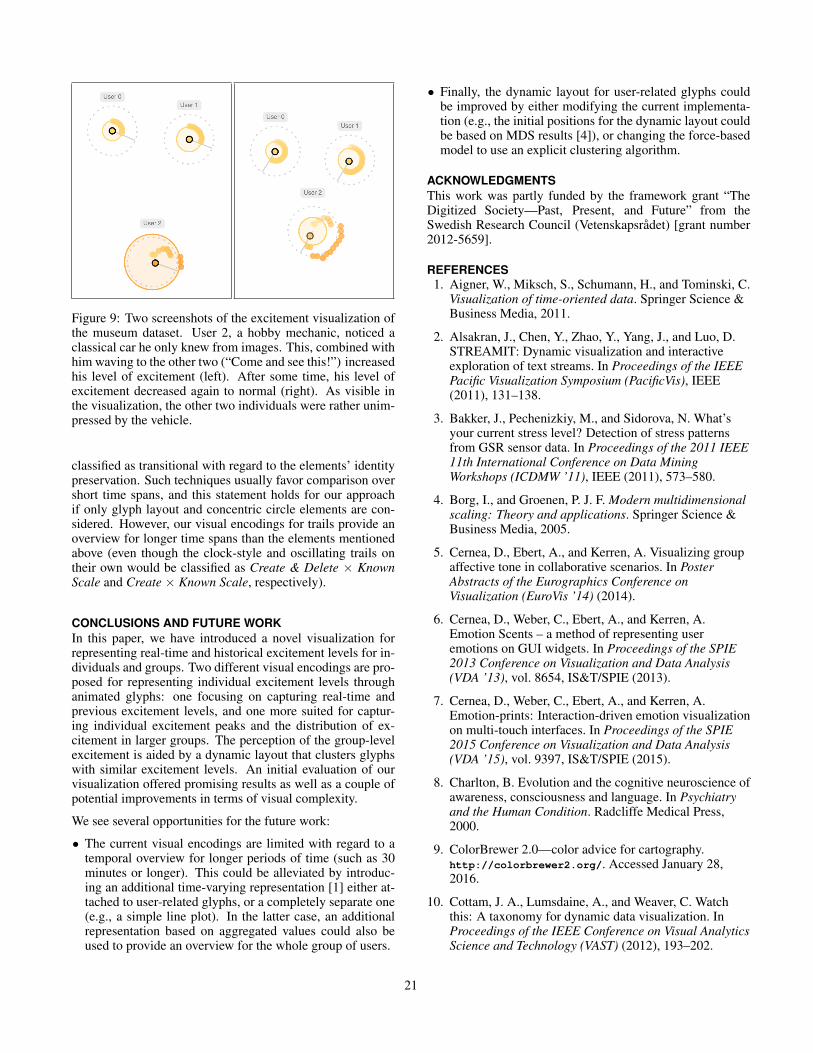
Figure 9: Two screenshots of the excitement visualization ofthe museum dataset. User 2, a hobby mechanic, noticed aclassical car he only knew from images. This, combined withhim waving to the other two (“Come and see this!”) increasedhis level of excitement (left). After some time, his level ofexcitement decreased again to normal (right). As visible inthe visualization, the other two individuals were rather unim-pressed by the vehicle.
classified as transitional with regard to the elements’ identitypreservation. Such techniques usually favor comparison overshort time spans, and this statement holds for our approachif only glyph layout and concentric circle elements are con-sidered. However, our visual encodings for trails provide anoverview for longer time spans than the elements mentionedabove (even though the clock-style and oscillating trails ontheir own would be classified as Create & Delete × KnownScale and Create × Known Scale, respectively).
CONCLUSIONS AND FUTURE WORKIn this paper, we have introduced a novel visualization forrepresenting real-time and historical excitement levels for in-dividuals and groups. Two different visual encodings are pro-posed for representing individual excitement levels throughanimated glyphs: one focusing on capturing real-time andprevious excitement levels, and one more suited for captur-ing individual excitement peaks and the distribution of ex-citement in larger groups. The perception of the group-levelexcitement is aided by a dynamic layout that clusters glyphswith similar excitement levels. An initial evaluation of ourvisualization offered promising results as well as a couple ofpotential improvements in terms of visual complexity.
We see several opportunities for the future work:
• The current visual encodings are limited with regard to atemporal overview for longer periods of time (such as 30minutes or longer). This could be alleviated by introduc-ing an additional time-varying representation [1] either at-tached to user-related glyphs, or a completely separate one(e.g., a simple line plot). In the latter case, an additionalrepresentation based on aggregated values could also beused to provide an overview for the whole group of users.
• Finally, the dynamic layout for user-related glyphs couldbe improved by either modifying the current implementa-tion (e.g., the initial positions for the dynamic layout couldbe based on MDS results [4]), or changing the force-basedmodel to use an explicit clustering algorithm.
ACKNOWLEDGMENTSThis work was partly funded by the framework grant “TheDigitized Society—Past, Present, and Future” from theSwedish Research Council (Vetenskapsradet) [grant number2012-5659].
REFERENCES1. Aigner, W., Miksch, S., Schumann, H., and Tominski, C.
Visualization of time-oriented data. Springer Science &Business Media, 2011.
2. Alsakran, J., Chen, Y., Zhao, Y., Yang, J., and Luo, D.STREAMIT: Dynamic visualization and interactiveexploration of text streams. In Proceedings of the IEEEPacific Visualization Symposium (PacificVis), IEEE(2011), 131–138.
3. Bakker, J., Pechenizkiy, M., and Sidorova, N. What’syour current stress level? Detection of stress patternsfrom GSR sensor data. In Proceedings of the 2011 IEEE11th International Conference on Data MiningWorkshops (ICDMW ’11), IEEE (2011), 573–580.
4. Borg, I., and Groenen, P. J. F. Modern multidimensionalscaling: Theory and applications. Springer Science &Business Media, 2005.
5. Cernea, D., Ebert, A., and Kerren, A. Visualizing groupaffective tone in collaborative scenarios. In PosterAbstracts of the Eurographics Conference onVisualization (EuroVis ’14) (2014).
6. Cernea, D., Weber, C., Ebert, A., and Kerren, A.Emotion Scents – a method of representing useremotions on GUI widgets. In Proceedings of the SPIE2013 Conference on Visualization and Data Analysis(VDA ’13), vol. 8654, IS&T/SPIE (2013).
7. Cernea, D., Weber, C., Ebert, A., and Kerren, A.Emotion-prints: Interaction-driven emotion visualizationon multi-touch interfaces. In Proceedings of the SPIE2015 Conference on Visualization and Data Analysis(VDA ’15), vol. 9397, IS&T/SPIE (2015).
8. Charlton, B. Evolution and the cognitive neuroscience ofawareness, consciousness and language. In Psychiatryand the Human Condition. Radcliffe Medical Press,2000.
9. ColorBrewer 2.0—color advice for cartography.http://colorbrewer2.org/. Accessed January 28,2016.
10. Cottam, J. A., Lumsdaine, A., and Weaver, C. Watchthis: A taxonomy for dynamic data visualization. InProceedings of the IEEE Conference on Visual AnalyticsScience and Technology (VAST) (2012), 193–202.
21
11. D3—data-driven documents. http://d3js.org/.Accessed January 28, 2016.
12. Druskat, V. U., and Wolff, S. B. Building the emotionalintelligence of groups. Harvard Business Review 79, 3(2001), 80–90.
13. Empatica E4 Wristband.https://www.empatica.com/e4-wristband. AccessedJanuary 28, 2016.
14. Fruchterman, T. M. J., and Reingold, E. M. Graphdrawing by force-directed placement. Software:Practice and Experience 21, 11 (1991), 1129–1164.
15. Garcıa, O., Favela, J., Licea, G., and Machorro, R.Extending a collaborative architecture to supportemotional awareness. In Proceedings of the Workshopon Emotion Based Agent Architectures (EBAA ’99)(1999), 46–52.
16. Garcıa, O., Favela, J., and Machorro, R. Emotionalawareness in collaborative systems. In Proceedings ofthe International Workshop on Groupware (CRIWG’99), IEEE (1999), 296–303.
17. Healey, J. A. Affect detection in the real world:Recording and processing physiological signals. InProceedings of the 3rd International Conference onAffective Computing and Intelligent Interaction andWorkshops (ACII) (2009).
18. Huang, D., Tory, M., Aseniero, B. A., Bartram, L.,Bateman, S., Carpendale, S., Tang, A., and Woodbury,R. Personal visualization and personal visual analytics.IEEE Transactions on Visualization and ComputerGraphics 21, 3 (2015), 420–433.
19. Huisman, G., van Hout, M., van Dijk, E., van der Geest,T., and Heylen, D. LEMtool: measuring emotions invisual interfaces. In Proceedings of the SIGCHIConference on Human Factors in Computing Systems(CHI ’13), ACM (2013), 351–360.
20. Huron, S., Vuillemot, R., and Fekete, J.-D. Visualsedimentation. IEEE Transactions on Visualization andComputer Graphics 19, 12 (2013), 2446–2455.
21. Kapp, K. M. The Gamification of Learning andInstruction: Game-based Methods and Strategies forTraining and Education. Pfeiffer, 2012.
22. Liu, Y., Sourina, O., and Nguyen, M. K. Real-timeEEG-based human emotion recognition andvisualization. In Proceedings of the InternationalConference on Cyberworlds (CW), IEEE (2010),262–269.
23. McDuff, D., Karlson, A., Kapoor, A., Roseway, A., andCzerwinski, M. AffectAura: An intelligent system foremotional memory. In Proceedings of the SIGCHIConference on Human Factors in Computing Systems(CHI ’12), ACM (2012), 849–858.
24. Mehrabian, A. Basic Dimensions for a GeneralPsychological Theory: Implications for Personality,
Social, Environmental, and Developmental Studies.Social Environmental and Developmental Studies.Oelgeschlager, Gunn & Hain, 1980.
25. Microsoft Band.https://www.microsoft.com/microsoft-band/en-us.Accessed January 28, 2016.
26. Nakasone, A., Prendinger, H., and Ishizuka, M. Emotionrecognition from electromyography and skinconductance. In Proceedings of the 5th InternationalWorkshop on Biosignal Interpretation (BSI-05) (2005),219–222.
27. Poh, M.-Z., Swenson, N. C., and Picard, R. W. Awearable sensor for unobtrusive, long-term assessmentof electrodermal activity. IEEE Transactions onBiomedical Engineering 57, 5 (2010), 1243–1252.
28. Russell, J. A. A circumplex model of affect. Journal ofPersonality and Social Psychology 39, 6 (1980), 1161.
29. Saari, T., Kallinen, K., Salminen, M., Ravaja, N., andYanev, K. A mobile system and application forfacilitating emotional awareness in knowledge workteams. In Proceedings of the 41st Annual HawaiiInternational Conference on System Sciences (HICSS’08) (2008), 44–53.
30. Shi, Y., Ruiz, N., Taib, R., Choi, E., and Chen, F.Galvanic skin response (GSR) as an index of cognitiveload. In CHI ’07 Extended Abstracts on Human Factorsin Computing Systems (CHI EA ’07), ACM (2007),2651–2656.
31. Valenza, G., and Scilingo, E. P. Autonomic NervousSystem Dynamics for Mood and Emotional-StateRecognition. Springer, 2014.
32. Villarejo, M. V., Zapirain, B. G., and Zorrilla, A. M. Astress sensor based on galvanic skin response (GSR)controlled by ZigBee. Sensors 12, 5 (2012), 6075–6101.
33. Wang, S., Tanahashi, Y., Leaf, N., and Ma, K.-L. Designand effects of personal visualizations. IEEE ComputerGraphics and Applications 35, 4 (2015), 82–93.
34. Ward, M. O. A taxonomy of glyph placement strategiesfor multidimensional data visualization. InformationVisualization 1, 3-4 (2002), 194–210.
35. Westerink, J. H. D. M., van den Broek, E. L., Schut,M. H., van Herk, J., and Tuinenbreijer, K. Computingemotion awareness through galvanic skin response andfacial electromyography. In Probing Experience, J. H.D. M. Westerink, M. Ouwerkerk, T. J. M. Overbeek,W. F. Pasveer, and B. de Ruyter, Eds., vol. 8 of PhilipsResearch. Springer, 2008, 149–162.
36. Wong, P. C., Foote, H., Adams, D., Cowley, W., andThomas, J. Dynamic visualization of transient datastreams. In Proceedings of the IEEE Symposium onInformation Visualization (INFOVIS ’03), IEEE (2003),97–104.
22