Embed Size (px)
Citation preview

25
IntroductIon
Much of modern political science is concerned with the analysis of data. Both the sheer mass of data and the variety of different data sources that are used to understand political processes have increased dramatically over the past years. Therefore, it should come as no surprise that political science has also developed a growing interest in data visualization. Indeed, few methods can match the utility of data visu-alization to explore, describe and communi-cate patterns in quantitative information.
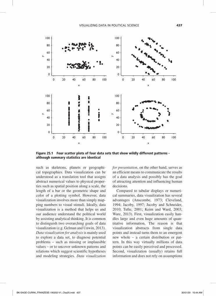
The power of data visualization is easy to demonstrate. Figure 25.1 displays the rela-tion between two variables in four different data sets. We can easily and almost instantly detect four very distinct data patterns: two well separated groups or clusters, different striped patterns that could indicate serial cor-relation and discrete variables, and a rather peculiar circular pattern.
Interestingly, these striking patterns would have been ignored had we summarized the
data using descriptive statistics that reduce the data points to fewer and more manage-able numbers. For instance, we could have calculated the means and find that they are X = 54.3 and Y = 47.8 in all four data sets. Looking at the standard deviations for each variable would have yielded exactly the same in all four data sets: σX = 16.7 and σY = 26.8, respectively. Looking at the correlation between X and Y gives ρYX = -0.1 in all cases and regressing Y on X in a simple lin-ear model would have given the same inter-cept α = 53.8, the same coefficient β = -0.1 and the same measure of fit R2 = .005. These data sets were generated by Matejka and Fitzmaurice (2017) and are a modern version of Anscombe’s (1973) quartet that for dec-ades has served scholars as a lesson to look at their data.
Data visualization is concerned with the visual representation of abstract variables and their relations. In this regard it differs from scientific visualization, which is used to visu-alize concrete physical objects or phenomena
Visualizing Data in Political Science
R i c h a r d Tr a u n m ü l l e r
BK-SAGE-CURINI_FRANZESE-190202-V1_Chp25.indd 436 30/01/20 10:44 AM
Visualizing Data in Political science 437
such as skeletons, planets or geographi-cal topographies. Data visualization can be understood as a translation tool that assigns abstract numerical values to physical proper-ties such as spatial position along a scale, the length of a bar or the geometric shape and color of a plotting symbol. However, data visualization involves more than simply map-ping numbers to visual stimuli. Ideally, data visualization is a method that helps us and our audience understand the political world by assisting analytical thinking. It is common to distinguish two overarching goals of data visualization (e.g. Gelman and Unwin, 2013). Data visualization for analysis is mainly used to explore a data set, to diagnose potential problems – such as missing or implausible values – or to uncover unknown patterns and relations which suggest scientific hypotheses and modeling strategies. Data visualization
for presentation, on the other hand, serves as an efficient means to communicate the results of a data analysis and possibly has the goal of attracting attention and influencing human decisions.
Compared to tabular displays or numeri-cal summaries, data visualization has several advantages (Anscombe, 1973; Cleveland, 1994; Jacoby, 1997; Jacoby and Schneider, 2010; Tufte, 2001; Keim and Ward, 2003; Ware, 2013). First, visualization easily han-dles large and even huge amounts of quan-titative information. The reason is that visualization abstracts from single data points and instead turns them to an emergent new whole – a certain distribution or pat-tern. In this way virtually millions of data points can be easily perceived and processed. Second, visualization (usually) retains full information and does not rely on assumptions
0 20 40 60 80 100
0
20
40
60
80
100
x
y
0 20 40 60 80 100
0
20
40
60
80
100
x
y
0 20 40 60 80 100
0
20
40
60
80
100
x
y
0 20 40 60 80 100
0
20
40
60
80
100
x
y
Figure 25.1 Four scatter plots of four data sets that show wildly different patterns - although summary statistics are identical
BK-SAGE-CURINI_FRANZESE-190202-V1_Chp25.indd 437 30/01/20 10:44 AM

The SAGe hAndbook of ReSeARch MeThodS in PoliTicAl Science And iR438
concerning the distributional nature of the data.1 Any parametric summary of data leads to a reduction and thus to a loss of potentially interesting information. They may also rely on explicit or implicit assumptions that are incompatible with the data or overly restric-tive. Visualization allows for the discovery of unexpected patterns that are either inter-esting in their own right and thus constitute the end point of an analysis, or, alternatively and crucially, motivate follow-up questions and new directions for exploration. The third advantage of visualization is exactly this: it encourages the search for the sources of observed patterns and the processes that gen-erated them. In this sense visualization can be viewed as an exploratory hypothesis generat-ing device.
In what follows I will provide a selective overview of the state of the art of modern data visualization from a political science perspective. I will begin with a brief empiri-cal analysis of graph use in current political science and then turn to data visualization as an exploratory tool for political science data. Next to table lens plots, I will introduce visual methods that were genuinely designed to display high-dimensional data structures: parallel coordinate plots and small multiple designs. I then turn to recent advances in data visualization that greatly expand the utility of visual methods: the visual exploratory model analysis and visual inference to protect against over-interpretation of random patterns.
For a related up-to-date review of data visualization from a statistical perspective, see Cook et al. (2016); for a sociological perspective, see Healy and Moody (2014). Classic contributions, design advice and sources of inspiration are Bertin (1983), Tufte (2001, 2006) and Cleveland (1994). The important distinction between statistical graphics and infovis is discussed in Gelman and Unwin (2013) and in the ensuing debate. Good introductions to data visualization as an analytical tool are provided by Few (2012) und Unwin (2015). For data visualization as a presentational tool for communication,
see Few (2009) and Kirk (2015). A seminal experiment on the perception of statistical graphs is Cleveland and McGill (1984). Heer and Bostock (2010) replicate and Talbot et al. (2014) extend the results based on crowd-sourced experiments. The best reference for the cognitive psychological foundations of data visualization is Ware (2013). Wilkinson (2005) provides a formalization of data visu-alization based on the grammar of graph-ics, which was implemented in the ggplot package by Wickham (2010). Arguably the number one tool for data visualization in political science is the statistical program-ming language R, for which Murrell (2018), Chang (2012) and Healy (2018) are excellent references. Those interested in producing graphs using STATA should take a look at Mitchell (2012).
Graph Use in Political Science
Counter to many other methodological devel-opments, data visualization is an invention of the social sciences. Historically, graphical methods have co-evolved with the advent of new social, political and economic data collections (Friendly, 2009). Many of the most widely used and successful graphical formats – such as the bar chart, the line chart and the pie chart (but not the scatterplot) – were developed by the Scottish political economist William Playfair to visualize polit-ical, economic and social data (Playfair, 1786, 1801). Several important milestones of data visualization – for instance, Minard’s map of Napoleon’s March to Russia or Nightingale’s visualization of the causes of death of British soldiers during the Crimean War – are not only based on social scientific data, but also served very specific political purposes such as influencing policy makers. Finally, the greatest icon of modern data visu-alization, Edward Tufte, began his career as a political science professor at Yale University.
The reliance on data visualization fell somewhat out of fashion in the 20th century,
BK-SAGE-CURINI_FRANZESE-190202-V1_Chp25.indd 438 30/01/20 10:44 AM

Visualizing Data in Political science 439
when ‘serious’ data analysis became associ-ated with significance testing (e.g. Best et al. 2001). Nowadays, and ironically, this domi-nant mode of conducting statistical inference is itself under attack (Gill, 1999) and data vis-ualization is experiencing a true renaissance. Based on an analysis of all articles published in the American Journal of Political Science between February 2003 and March 2018 and on the assumption that these are exemplary for the current state of the art in political sci-ence, Figure 25.2 demonstrates that graph use has dramatically increased over the past 15 years.2 Whereas the average political sci-ence article in the discipline’s flagship jour-nal contained roughly one (.92) figure in 2003, graph use has grown to an average of three and a half (3.58) figures per article in 2018. While I rely on figure count as a proxy for graph count, not every figure is necessar-ily a data visualization display of empirical data; there are also visual representations of mathematical functions, game theoretic deci-sion trees or even just flow charts of theoreti-cal arguments.
Among actual data visualizations, line charts are by far the most popular graphical format in political science: 35% of all graphs published in AJPS articles fall into this
category. The second most widely used format is some version of the dot plot (22%), poten-tially hinting at the influence of Cleveland (1993, 1994) on our discipline. Other com-mon formats are scatter plots (13%) and bar charts (12%). The classical tools for describ-ing continuous distributions – histograms, density plots and Tukey’s box plot – make up 7% of all data visualizations. Although polit-ical science has a strong reference to space and geography, maps make up only about 3% of all data visualizations. Finally, 7% fall into a residual category of other visualizations, including for instance visual representations of social networks, 3D wireframes and, yes, pie charts. Interestingly, 19% of all visualiza-tions published in the area of political science now make use of color instead of remaining in black and white.
A common visualization technique in polit-ical science is to combine several plots into an overall visualization. In fact, only 54% of all visualizations consist of a single plot, whereas 40% combine multiple plots of the same for-mat (in so-called small multiple designs, see further below) and 6% multiple plots of dif-ferent formats (so-called plot ensembles, see further below). The average number of plots in these combined visualizations is 4 plots,
Publication Year
Ave
rage
Fig
ure
Cou
nt P
er A
rtic
le
2003 2008 2013 2018
1.0
1.5
2.0
2.5
3.0
3.5
Box plot
Histogram
Density plot
Map
Other
Bar chart
Scatter plot
Dot plot
Line chart
Percentage
0 5 10 15 20 25 30 35
1
3
3
3
7
12
13
22
35
Figure 25.2 Left panel: average number of figures in all articles published in the AJPS, 2003–18. right panel: relative frequency of graphical formats
BK-SAGE-CURINI_FRANZESE-190202-V1_Chp25.indd 439 30/01/20 10:44 AM

The SAGe hAndbook of ReSeARch MeThodS in PoliTicAl Science And iR440
but in several instances many more plots are arranged together, with the maximum being no less than 36 tiny plots in one single visu-alization. Of all dot plots, 53% are used in the context of small multiples or plot ensembles, as are 50% of all scatter plots, 40% of all line charts and 35% of all bar charts.
To better understand the motivation behind graph use in political science, Kastellec and Leoni (2007) went through every article from five issues of three leading political sci-ence journals – the February and May 2006 issues of American Political Science Review, the July 2006 issue of American Journal of Political Science and the winter and spring 2006 issues of Political Analysis – and found that political scientists never use graphs to present regression results. This has certainly changed over the past ten years. In our own sample, no less than 90% of all dot plots are displayed with error bars or confidence intervals and therefore almost 20% of all visualizations in political science are used to display coefficient estimates or experimen-tal group means along with their associated inferential uncertainties. In addition, 32% of all line charts and therefore 11% of all graphs are marginal effect plots and predicted value plots. In this sense, political science uses graphical methods to visualize not only raw data, but also ‘cooked’ data. This is also an indication that data visualization and statisti-cal modeling and inference are best seen as complementary instead of opposites.
Overall, only a limited number of graphi-cal formats are currently used in political science and many of them are well-known standard types. As a result, these are also the graphical formats that, at least a priori, are likely to work best to convey your results to professional peers, conference audiences or reviewers and editors. This is so because they are part of a commonly shared ‘vocabulary’ and therefore incur low cognitive costs for the audience. According to cognitive psy-chologist and visualization expert Colin Ware (1998: 178), ‘Making radically new designs is more interesting for the designer and leads
to kudos from other designers. But radical designs, being novel, take more effort on the part of the consumer.’ Therefore, one should not underestimate the power of those simple and common graphical formats. At the same, and speaking from experience, one cannot overestimate editors’, reviewers’, and even co-authors’ reluctance to engage with inno-vative yet unusual data visualizations.
An interesting question concerns the impact of using graphs in one’s political scientific work. Echoing the late Stephen Hawking (1988), Barabasi (2010) quipped that there ‘is a theorem in publishing that each graph halves a book’s audience’. If this were true, urging political scientists to make heavy use of data visualization would be a rather difficult point to defend. The left panel of Figure X is a scatter plot of the (jittered) figure count versus the number of citations of the AJPS articles in our sample (citations counts are missing for the two most recent volumes). If anything, it seems to suggest that citations decrease with the number of figures included in an article. It also identifies two extreme cases: Taber and Lodge (2006) in terms of citations (747) and Roberts et al. (2014) in terms of number of figures. But clearly publication date confounds this rela-tionship. The right panel therefore shows the same relation net of the fact that more recent publications need a while to be cited (and in addition excludes the two extreme observations). In other words, it shows the residuals of a simple regression of citations on volume number versus the residuals of a simple regression of figure count on vol-ume number using an adjusted variable plot. The line thus corresponds to the regression line of the relation between citations and graph use, controlling for publication date. Each figure included in an AJPS article increases the citation count by 1.75 citations, and, with a p-value of .006, ‘significantly’ so (if one cared about this). Clearly, this is not a particularly strong relation, nor is it necessar-ily causal. Maybe more successful scholars just produce more graphs.
BK-SAGE-CURINI_FRANZESE-190202-V1_Chp25.indd 440 30/01/20 10:44 AM

Visualizing Data in Political science 441
Visually Exploring and Describing Structure in Political Science Data
Next to the compelling presentation of data summaries, statistical results and quantities of interest (Jacoby and Schneider, 2010; Kastellec and Leoni, 2007; King et al., 2001) statistical graphics can be used as analytic tools for various purposes and at various stages of the data analysis (Jacoby, 1997, 2000; Bowers, 2004; Bowers and Drake, 2005; Gelman, 2003; Gelman and Hill, 2007; Kerman et al., 2008). Data analysis in politi-cal science usually proceeds in several steps: a) checking, cleaning and pre-processing the data, b) exploring and describing structure in the data and c) statistical modeling of the data and making inferences. Data visualiza-tion can help in each step of this analytic process: a) to detect problems and anomalies in the data, b) to explore and familiarize one-self with the data and generate hypotheses, and c) to understand, check and diagnose models. Most of the visualizations produced in the process of data checking, initial data exploration and model evaluation won’t find their way into journal articles or book chap-ters. However, because it is increasingly common to provide lengthy appendices and supplemental information online, at least
some of these visualizations could be docu-mented for an interested audience.
A particular challenge in the visual explo-ration is that data sets in political science grow increasingly larger and more complex. Here largeness and complexity refer to both the number of observations N and the num-ber of variables K. Both dimensions bring their challenges to data visualization (Unwin et al., 2006), but dealing with multidimen-sionality is particularly tricky.
Table lens plotsTable lens plots are a visualization technique that allows the researcher to view a whole and possibly large data set at one glance (Tennekes et al., 2013). As such it gives a good initial overview and is useful for both checking the raw data for anomalies and exploring data to uncover structure. The basic idea of table lens plots is to first divide all N observations into h equally sized classes or bins. The distribu-tions of the k dimensions or variables are then shown within each of these bins. For continu-ous variables, the distribution is shown using a bar for the means (along with the standard deviation). For categorical variables, die dis-tribution of variable values is shown using stacked bar charts. Missing values are treated as their own category.
0 5 10 15
0
200
400
600
Figure Count
Num
ber
of C
itatio
nsTaber & Lodge (2006)
Roberts et al. (2014)
–4 –2 0 2 4 6 8 10
0
50
100
150
200
250
Figure Count (Net of Publication Date)
Num
ber
of C
itatio
ns (
Net
of P
ublic
atio
n D
ate)
–50
Figure 25.3 the relationship between graph use and citation counts of AJPS articles, 2003–17. Left panel: simple scatter plot with jitter along the x-axis. right panel: adjusted variable plot relat-ing residuals of figure count to residuals of citations eliminating the effect of publication date
BK-SAGE-CURINI_FRANZESE-190202-V1_Chp25.indd 441 30/01/20 10:44 AM

The SAGe hAndbook of ReSeARch MeThodS in PoliTicAl Science And iR442
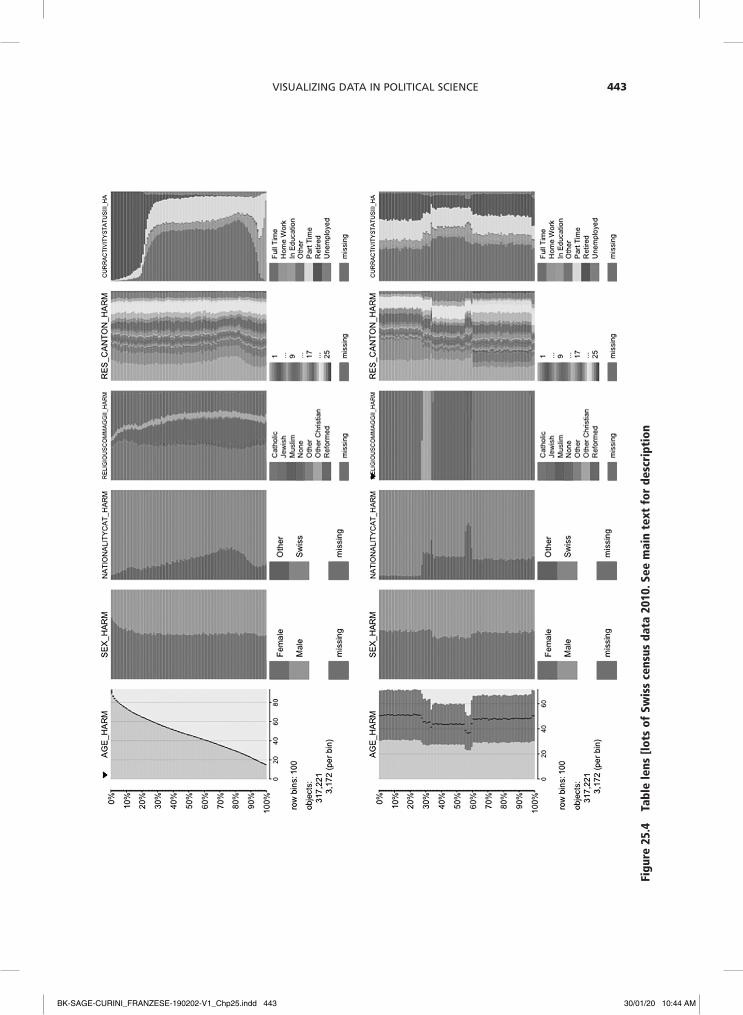
The example in Figure 25.4 visualizes data taken from the Swiss census 2010. The N=371.221 observations are first divided into h=100 row bins and then sorted by the continu-ous age variable (AGE_HARM). The young are at the bottom and the old at the top and we get an impression of the age distribution (panel A). We also immediately see several relations in the data. For instance, women (SEX_HARM) are slightly over-represented in the older age cohorts and the share of foreigners without citizenship (NATIONALITYCAT_HARM) is higher in younger cohorts. In addition, there is a clear age-specific pattern in employment sta-tus (CURRACTIVITYSTATUSII), where the young tend to be in education, the middle aged mostly in full-time employment and the elderly retired. Last, missing values seem to only occur in the religious affiliation variable (this infor-mation is voluntary in the Swiss census).
Sorting the observations in the table lens plot along the values of a categori-cal variable – in this case religious affiliation (RELIGIOUSCOMMAGGII_HARM) – reveals new patterns and relations (panel B). For instance, we now see that religious groups differ in their mean age. With a mean age of below 40, Muslims are the youngest religious group in Switzerland. Muslims also have the highest shares of non-citizens and the highest unemployment rates. Importantly, we are now also able to see how the missing values in the religious variable are related to missing values in other variables (which we missed in the pre-vious visualization): respondents who did not disclose their religious affiliation (the bright red segment at the bottom of the table plot for religious belonging) are also less likely to indicate their current employment status.
Decreasing the number of bins to h=10 gives a smoothed and possibly better, because simpler, impression, albeit at the cost of los-ing detail (panel C). More detail emerges when we increase the number of bins to h=300 and zoom in on the data to between 54% and 62%, focusing on an interesting part (panel D). This nicely separates the religious groups, in the sense of forming homogenous
bins, and we find that the Jewish community is regionally highly concentrated (RES_CANTON_HARM). Filtering out every reli-gious group (i.e. removing them from the visualization) to focus on Jews and order-ing by employment status reveals that in this religious group it is overwhelmingly women who stay at home.
Table lens plots illustrate an important point in visual data exploration which they share with more conventional graphical formats, such as histograms or density plots. Exploratory graphs are essentially a model in that the ‘objective is to construct an abstraction that highlights the salient aspects of the data without distorting any features or imposing undue assumptions’ (Jacoby, 1997: 13). By definition, a model is a simplified representation of the world. As such it is always an abstraction that ignores some details. But simplification should not result in misrepresentation. Because table lens plots – just as histograms – divide the data into a discrete number of bins, they are reducing and potentially distorting the information in the raw data. In particular, the choice of the number and widths of the bins, d, impacts the appearance of the visualization and thus the patterns that become visible.
Thus these data visualizations come with a typical variance–bias tradeoff (cf. Jacoby, 1997). Narrow bins or bandwidths produce high-variance, low-bias graphs. That is, the graph closely follows the data (low bias) and shows much detailed variation (high vari-ance). Broader bins of bandwidths produce low-variance, high-bias graphs. They give a smoother picture of the data that eliminates some of the details (low variance), but at the cost of deviating from the actual observed data (high bias). Since it is easy to change bin size and bandwidths it is advisable to always experiment with them to see how the visual pattern changes and what details emerge. A good general strategy is to start with narrow bins and bandwidths to see what the data have to say and then steadily increase them until a good representation which captures the most important features is found.
BK-SAGE-CURINI_FRANZESE-190202-V1_Chp25.indd 442 30/01/20 10:44 AM
Visualizing Data in Political science 443
Figu
re 2
5.4
tabl
e le
ns [
lots
of
Swis
s ce
nsus
dat
a 20
10. S
ee m
ain
text
for
des
crip
tion
BK-SAGE-CURINI_FRANZESE-190202-V1_Chp25.indd 443 30/01/20 10:44 AM

The SAGe hAndbook of ReSeARch MeThodS in PoliTicAl Science And iR444
Figu
re 2
5.4
cont
inue
d
BK-SAGE-CURINI_FRANZESE-190202-V1_Chp25.indd 444 30/01/20 10:44 AM

Visualizing Data in Political science 445
Figu
re 2
5.4
cont
inue
d
BK-SAGE-CURINI_FRANZESE-190202-V1_Chp25.indd 445 30/01/20 10:44 AM

The SAGe hAndbook of ReSeARch MeThodS in PoliTicAl Science And iR446
While table lens plots easily accommo-date large data sets with many observations, N, they are limited in terms of the number of variables, K, they are able to reasonably visu-alize. Visualization techniques to deal with this ‘curse of dimensionality’ fall broadly into two categories: a) complex visualiza-tion techniques that are explicitly designed to show a high number of dimensions or vari-ables (e.g. parallel coordinate plots), and b) visualization techniques that disaggregate high-dimensional data into a series of sim-pler, one- or two-dimensional graphics and arrange them in an effective way (e.g. small multiple designs).
Parallel coordinate plotsA visualization method that is well suited for the analysis of high-dimensional data struc-tures but rarely encountered in political sci-ence is the parallel coordinate plot (Inselberg, 2008; Wegman, 1990). A parallel coordinate plot solves the problem of the ‘curse of dimensionality’ by doing what its name implies: it maps k variables along k coordi-nates which are aligned in a parallel fashion, instead of orthogonally to each other. A single observation corresponds to a profile line that connects the variable values of the k variables. Next to overall variable distribu-tions, parallel coordinate plots help find cor-relations between many variables at the same time and identify high-dimensional clusters in a data set. Negative correlations are visible as crossing, positive correlations as parallel lines. Clusters are visible as separations along an axis and how they are propagated across the plot.
Using a parallel coordinates plot, the example in Figure 25.5 visualizes the pol-icy preferences of N=1.069 candidates for the state elections in Bavaria (2013), Hesse (2013) and Saxony (2014), comparing them across k=10 policy areas.3 Since the policy items were measured on a five-point Likert scale (higher values indicate higher support for a policy), this parallel coordinate relies
on two additional visualization techniques to deal with the common problem of overplot-ting – jittering, i.e. adding random noise to the variables’ values, and alpha blending, i.e. rendering the lines transparent.
At first glance this plot may look intimi-dating, but several patterns emerge rather quickly. For instance, there seems to be strong consensus among candidates concern-ing environmental protection (environ) and the rights of same-sex couples (samesex). The bulk of the lines is concentrated on the upper ends of the two axes. More contested policy areas are affirmative action for women (women) and the punishment of criminals (criminal). Here the lines are distributed more or less equally across the five item values. In addition, the crossing of the lines indicates a strong negative correlation. Candidates that favor affirmative action for women tend to be against tighter laws for criminals, and vice versa.
Since the identification of patterns in par-allel coordinate plots depends heavily on the sorting of the parallel axes, it is advisable to vary their order. For instance, a random re-resorting in Figure 25.6 shows that pref-erences for affirmative action for women is also negatively correlated to an immigration policy that stresses migrants’ assimilation (assimilation). Perhaps unsurprisingly, politi-cal candidates in favor of regulatory inter-vention in the economy (polecon, the item is reversed) also show strong support for social security (socsec).
Making use of color, we are able to iden-tify high-dimensional clusters in the parallel coordinate plot. Figure 25.7 colors all obser-vations according to their party affiliation, where the colors correspond to the familiar signature colors of the six most important parties in the German party system (CDU/CSU, SPD, Greens, AfD, FDP, Lefts). As one would expect, policy preferences tend to clus-ter along party lines. Quite visible are the dif-ferences along the classic economic left–right dimension: regulatory intervention in the
BK-SAGE-CURINI_FRANZESE-190202-V1_Chp25.indd 446 30/01/20 10:44 AM

Visualizing Data in Political science 447
economy (polecon), social security (socsec), and redistribution (redist). Ideological party differences are better visible if we reduce the complexity somewhat and concentrate on a comparison of two parties while filtering out the rest (figures 25.8-25.10). This idea of re-using the same graphic format on different
subsets of the data leads us directly to the next visualization technique.
Small multiple designsA particularly powerful visual strategy for multidimensional data is to repeatedly apply simple lower-dimensional graphical
Figure 25.5 Parallel coordinate plot of the policy preferences of over a thousand political candidates
Figure 25.6 Parallel coordinate plot of the policy preferences of over a thousand political candidates. Axes have been re-sorted
Figure 25.7 Parallel coordinate plot of the policy preferences of over a thousand political candidates. Lines are colored according to party affiliation
BK-SAGE-CURINI_FRANZESE-190202-V1_Chp25.indd 447 30/01/20 10:44 AM

The SAGe hAndbook of ReSeARch MeThodS in PoliTicAl Science And iR448
Figure 25.8 Parallel coordinate plot of the policy preferences of political candidates of the FdP and the Left
Figure 25.9 Parallel coordinate plot of the policy preferences of political candidates of the cdu and SPd
Figure 25.10 Parallel coordinate plot of the policy preferences of political candidates of the Afd and the Greens
formats to G different subsets of the data and to arrange these G subplots in a meta-visualization. The subsets are themselves defined in terms of variable values or com-binations of variable values. This technique has different names, such as small multiples (Tufte, 2001), trellis displays (Becker et al., 1996) or collections (Bertin, 1983). A
special case of this method is a scatter plot matrix that shows all G=K(K-1) bivariate scatter plots of K variables in one matrix. The key design feature of small multiples is that the single plots are shrunken in size, have the same appearance and size and also have constant axis scales. In other words, single displays differ only in the subsets of
BK-SAGE-CURINI_FRANZESE-190202-V1_Chp25.indd 448 30/01/20 10:44 AM

Visualizing Data in Political science 449
the data they present. In this way it is pos-sible to make very efficient subgroup com-parisons as well as to identify conditional patterns and relations. The efficiency of small multiples is further increased by thoughtful ordering and arrangement.
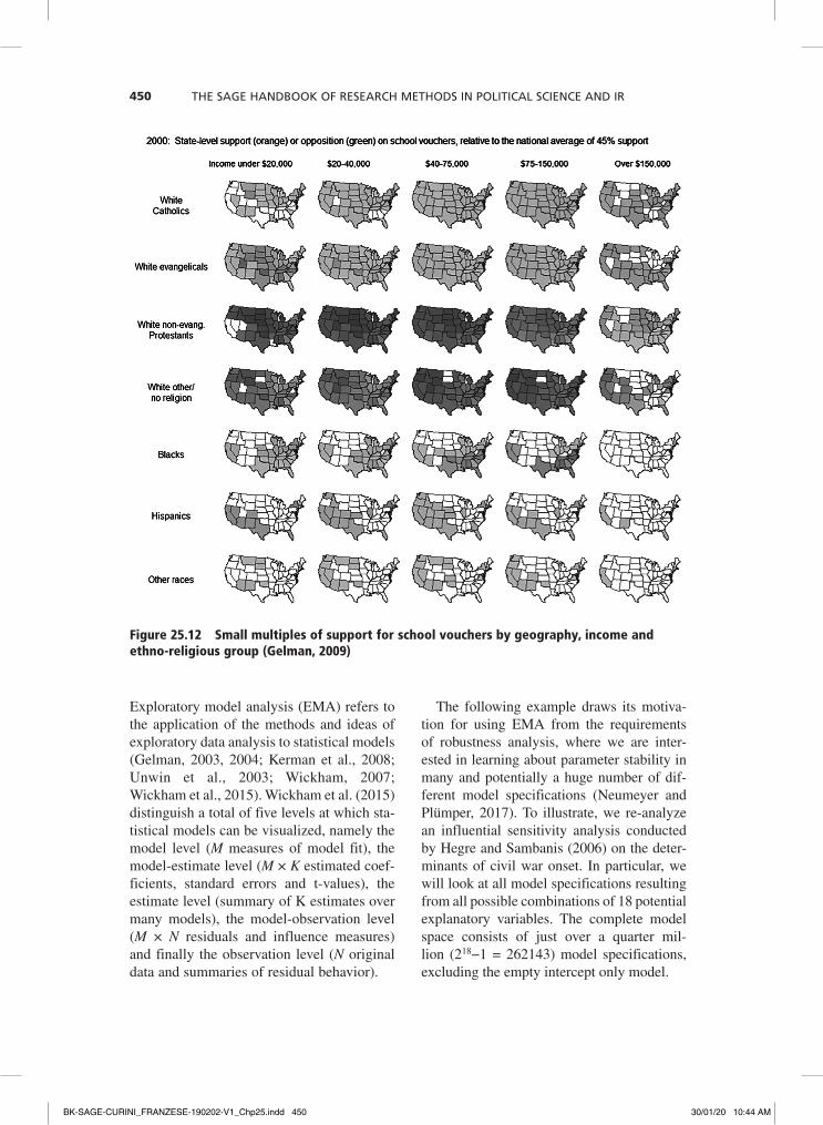
A well-known political science example of a small multiple design is the visualization of (modeled) survey data on a controver-sial policy: the support of school vouchers (Figure 25.11, Gelman, 2009). The chosen graphical format is a choropleth map where color shade is used to encode the average support across the US and to give a sense of the geographic variation. Somewhat un-intuitively, green regions show lower support and orange regions higher support for school vouchers. We should also note that this color scheme is unfortunate given the possibil-ity that there will be color-blind individuals in the audience. Be that as it may, the key design feature is the repeated application of the same map format to different subgroups of the data. In this case the subgroups are five different income groups, ranging from poor on the left to rich on the right. In this way it becomes clear that support for school vouch-ers increases with income in all states, with the exception of Wyoming and the Southwest. The small multiple design thus reveals that the relationship between income and policy preference depends on regional characteris-tics of the states.
We can expand this conditional analysis by bringing in a further variable, ethnic– religious group identity, and by arrang-ing the single graphics in a table or matrix cross-classified by seven identities times five
income groups (Figure 25.12). This shows that the idea of school vouchers is supported by rich white Catholics and Evangelicals and by poor Hispanics. Generally speaking, for whites the preference for school vouchers increases with income, whereas for blacks it decreases with income – a classic two-way interaction effect.
As in other visual displays, patterns are eas-ier to detect if we sort the small multiples in a meaningful way (Figure 25.13). Since income groups already exhibit a natural order, whereas this is not the case for ethnic–religious identi-ties, we can sort the rows of the small multiple design (roughly) according to their average political support for school vouchers. The sorting is done informally by eye (Bertin, 1983), but of course more advanced visualiza-tion methods could rely on a sorting algorithm to achieve the most efficient plot arrangement (e.g. Hurley, 2004). After sorting, a regional pattern for the policy preferences of the black population pops out. Blacks oppose school vouchers in the South and support them in other regions of the United States.
Recent Advances in Data Visualization
Exploratory model analysisExploratory data analysis (EDA) relies pri-marily on the visual display of data with the goal of discovering unknown structures and unexpected patterns in the data (Tukey, 1977). In a similar vein, visualization can be used to explore the unknown structures and unexpected implications of statistical models.
Figure 25.11 Small multiples of support for school vouchers by geography and income (Gelman, 2009)
BK-SAGE-CURINI_FRANZESE-190202-V1_Chp25.indd 449 30/01/20 10:44 AM
The SAGe hAndbook of ReSeARch MeThodS in PoliTicAl Science And iR450
Exploratory model analysis (EMA) refers to the application of the methods and ideas of exploratory data analysis to statistical models (Gelman, 2003, 2004; Kerman et al., 2008; Unwin et al., 2003; Wickham, 2007; Wickham et al., 2015). Wickham et al. (2015) distinguish a total of five levels at which sta-tistical models can be visualized, namely the model level (M measures of model fit), the model-estimate level (M × K estimated coef-ficients, standard errors and t-values), the estimate level (summary of K estimates over many models), the model-observation level (M × N residuals and influence measures) and finally the observation level (N original data and summaries of residual behavior).
The following example draws its motiva-tion for using EMA from the requirements of robustness analysis, where we are inter-ested in learning about parameter stability in many and potentially a huge number of dif-ferent model specifications (Neumeyer and Plümper, 2017). To illustrate, we re-analyze an influential sensitivity analysis conducted by Hegre and Sambanis (2006) on the deter-minants of civil war onset. In particular, we will look at all model specifications resulting from all possible combinations of 18 potential explanatory variables. The complete model space consists of just over a quarter mil-lion (218−1 = 262143) model specifications, excluding the empty intercept only model.
Figure 25.12 Small multiples of support for school vouchers by geography, income and ethno-religious group (Gelman, 2009)
BK-SAGE-CURINI_FRANZESE-190202-V1_Chp25.indd 450 30/01/20 10:44 AM

Visualizing Data in Political science 451
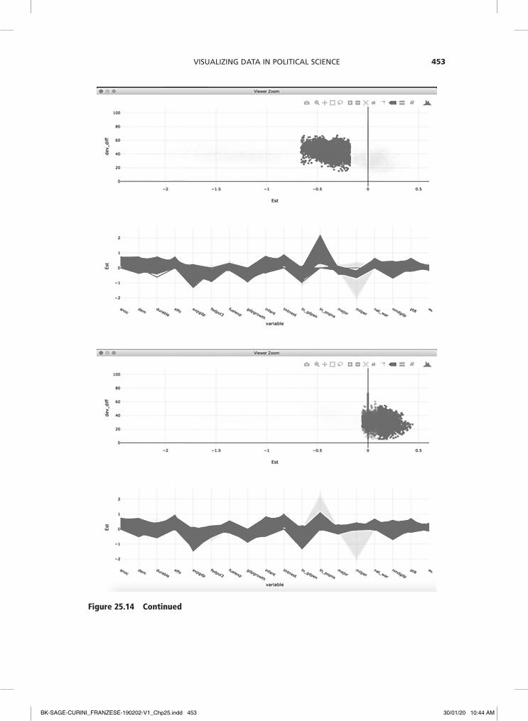
Figure 25.14 (upper left panel) shows a plot ensemble that combines different graphs of different aspects of the model specifications (cf. Unwin, 2015). This way, more informa-tion is revealed than in any single plot alone. The plot ensemble combines two plots: a) a scatter plot of the standardized coefficient estimates of the variable ‘military personnel’ (milper) across all models versus the models’ fit measured in terms of decrease in deviance, and b) a parallel coordinate plot showing the standardized coefficient estimates for all 18
explanatory variables across all models. As we can see, there seem to be three broad clusters of model specifications that produce quite different coefficient estimates of the relationship between army size and the pro-pensity for civil war.
To get a better understanding of which model specifications produce these three distinct clusters, we can rely on methods of interactive data visualization such as brush-ing and linking (Becker and Cleveland, 1987; Cook and Swayne, 2007; Theus and Urbanek,
Figure 25.13 Small multiples of support for school vouchers by geography, income and ethno-religious group (Gelman, 2009). rows have been resorted by support
BK-SAGE-CURINI_FRANZESE-190202-V1_Chp25.indd 451 30/01/20 10:44 AM

The SAGe hAndbook of ReSeARch MeThodS in PoliTicAl Science And iR452
Figure 25.14 Plot ensemble for exploratory model analysis of the determinants of civil war onset. Scatter plots of model fit versus coefficient estimates for army size in over 200,000 models are interactively linked to parallel coordinate plots of coefficient estimates of all 18 explanatory variables
BK-SAGE-CURINI_FRANZESE-190202-V1_Chp25.indd 452 30/01/20 10:44 AM
Visualizing Data in Political science 453
Figure 25.14 continued
BK-SAGE-CURINI_FRANZESE-190202-V1_Chp25.indd 453 30/01/20 10:44 AM

The SAGe hAndbook of ReSeARch MeThodS in PoliTicAl Science And iR454
2009). This technique refers to the selection and color highlighting of a subset of the data in one plot. This subset is then simultane-ously highlighted in another plot showing a different view of the same data. In this way a link between both views is established and the data is seen from different perspectives. In our EMA example, we find that the coef-ficient of army size is related to the behavior of log population. Models with large nega-tive coefficients for military personnel tend to also have large positive effects of log population on civil war onset (upper right panel). Conversely, models with no or even positive effects of military size also tend to show no or smaller effects for log popula-tion. Clearly, the model exploration should now look more deeply into each of these specifications.
Visual inferenceDespite the clear benefits of turning abstract data structures into visible patterns, a long-standing reservation against data visualiza-tion holds that it is merely an ‘informal’ approach to data analysis (cf. Best et al., 2001; Healy and Moody, 2014). The fear expressed in this view is that beautiful pic-tures may not correspond to any meaningful patterns of substantive scientific interest. Instead, it is argued, serious scientists should base their inferences on more ‘formal’ meth-ods of hypothesis testing to discern signal from noise. Indeed, exploratory data analysis, according to one of its founders, ‘is about looking at data to see what it seems to say. It concentrates on […] easy-to-draw pictures […] Its concern is with appearance, not with confirmation’ (Tukey, 1977: V). Consequently, a criticism that frequently arises is that graph-ical displays lead researchers to over-interpret patterns that are in fact due to mere randomness.
One approach to overcome these reserva-tions is visual inference, a new visual method that was only recently developed in statistics and information visualization (Buja et al., 2009; Wickham et al., 2010; Majumder et al.,
2013). The basic idea of visual inference is that graphical displays can be treated as ‘test statistics’ and compared to a ‘reference distri-bution’ of plots under the assumption of the null hypothesis. The null hypothesis usually posits that there is no systematic structure in the data and that any pattern is really the result of randomness. If the null hypothesis were indeed correct, the plot of the true observed data should not look any different from the plots showing random data. If, however, the plot of the true data clearly stands out from the rest, this could be taken as a rejection of the null hypothesis of no structure. In other words, visual inference brings the rigor of statistical testing to data visualization. To the best of my knowledge this approach has not yet been used in political science (although Bowers and Drake (2005) hint at it).
A so-called Line-up visual inference involves the simulation of m-1 null plots (for instance using variable permutations) and randomly placing the plot of the real observed data among them, resulting in a total of m plots. A human viewer is then asked to choose the plot that looks the most different from the rest. Ideally this human viewer is an impartial observer who has not yet seen the true plot, such as a colleague, student research assistant or crowd worker. If the test person succeeds and picks the plot showing the actual data, then this visual dis-covery can be assigned a p-value of 1/m. In other words, the probability of picking the true plot just by chance is 1/m. Setting m=20 and thus simulating m-1=19 null plots thus yields the conventional Type I error probabil-ity of α = .05. We can further decrease the probability of making Type I errors by either increasing the number of null plots, m-1, or by increasing the number of observers, Q. Figure 25.15 gives an example of how this inferential process works. Try it for yourself: which of the 20 histograms stands out from the rest, and why?
How about the histogram in the last row and the last column? In fact, none of the his-tograms is the true plot showing actual data.
BK-SAGE-CURINI_FRANZESE-190202-V1_Chp25.indd 454 30/01/20 10:44 AM

Visualizing Data in Political science 455
All 20 histograms show 100 random draws from a uniform distribution U(0, 1). Clearly, this demonstrates how easy it is to over-interpret patterns that are in fact due to mere randomness.
A real application follows Bowers and Drake (2005) and looks at the relation between education and political participa-tion in the US and how this individual-level relation is conditioned by state-level edu-cational context. A typical concern with this kind of analysis is that the number of contextual units is too small to rely on the asymptotic assumptions of classical statisti-cal inference. Therefore, Bowers and Drake (2005) suggest visual methods instead of formal tests. Yet their visual inference remains informal: ‘when we detect a feature with our eyes, we will try to only report it as a feature rather than noise if we feel that any reasonable political scientist in our field would also detect this feature’ (Bowers and Drake, 2005: 17). Applying visual infer-ence, we can swap assumptions concerning the reasonableness of political scientists for
a formal visual test. The null hypothesis in this example is that there is no relationship between the educational context in a state (i.e. the share of highly educated) and the effect of individual education on political participation. The ‘test statistic’ is a scat-ter plot version, where each dot is a state-specific individual-level effect of education on participation which is plotted along with vertical lines for the 95% confidence inter-vals. The size of this individual-level effect is on the y-axis. On the x-axis is the share of highly educated in the state. In addition, the plot includes a non-parametric scatter-plot smoother to help reveal any relation between state-level feature and individual-level effect. To construct a ‘reference distri-bution’ under the null, I randomly re-shuffle the state-level education variable and create 19 new data sets that will have no systematic relation between this variable and the coef-ficient by repeating this process 19 times. Figure 25.16 below shows the 19 null plots based on this simulated data along with the true plot. Which one stands out?
Figure 25.15 Line-up with 20 histograms. Which plot is the most different?
BK-SAGE-CURINI_FRANZESE-190202-V1_Chp25.indd 455 30/01/20 10:44 AM

The SAGe hAndbook of ReSeARch MeThodS in PoliTicAl Science And iR456
I asked nine political scientists and ten crowd workers, and not a single respondent in my sample managed to identify the plot showing the real data.4 We clearly cannot reject the null hypothesis that individual edu-cational effects are unrelated to state-level education.
Another example comes from politi-cal culture research and is inspired by the famous World Values Survey Cultural Map, which displays value orientations related to human development and democracy for a range of societies across the globe (see for instance Inglehart and Welzel, 2005). The ‘map’ is really a scatter plot that shows not geographic but cultural proximity by plot-ting countries along two value dimensions derived by factor analysis. The dimension of so-called survival versus self-expression val-ues is plotted on the x-axis and the dimen-sion of traditional versus secular–rational values on the y-axis. In addition, countries are colored according to their cultural zone
or civilizational heritage: African, Islamic, Latin American, South Asian, Protestant European, Catholic European, Orthodox and English-speaking.
One finding of theoretical interest sug-gested by the plot is that cultural zones form more or less distinct clusters with similar value orientations: culture matters. The ques-tion is whether this pattern is really system-atic. The null hypothesis in this case would be that there are in fact no such civilizational clusters and that societies belonging to the same cultural zone do in fact not show simi-lar survival versus self-expression and tra-ditional versus secular–rational values. The reference null distribution can be constructed by a simple random permutation of the vec-tor of cultural zones and thus the color of the dots in the scatter plot. Figure 25.17 presents 19 such null plots along with the true data plot. Can you pick the true cultural map?
The true plot clearly stands out.5 Indeed, all of the political scientists and 90% of the
Figure 25.16 Line-up for the relation between the individual education effect on political participation (y-axis) and state-level education (x-axis). Which plot is the most different?
BK-SAGE-CURINI_FRANZESE-190202-V1_Chp25.indd 456 30/01/20 10:44 AM

Visualizing Data in Political science 457
crowd-sourced respondents correctly iden-tified the observed cultural map, yielding a p-value of essentially zero. This allows us to reject the null hypothesis of no cultural value clusters around the world.
concLuSIon
Data visualization is an incredibly powerful method to explore, understand and communi-cate quantitative information. In times where political science accesses increasingly diverse and promising new data sources (e.g. text, social media and digital trace data), data visu-alization certainly holds a central place in the data analytic toolkit. In addition, communi-cating political science research to a broad, non-technical lay audience is an important skill. Data visualization is also likely to play a key role in this regard. Looking at its most important applications, key goals and central
actors, data visualization has always had a home in political science. It is hoped that the discipline will reconnect to this proud herit-age and move forward to gauge the potential of data visualization for a better understand-ing of political processes.
Notes
1 Many common visual methods for data explora-tion, such as histograms and boxplots, are actu-ally already abstractions from the data, due to binning decisions in the first case and the five number summary in the latter.
2 I thank Felix Jäger and Christian Moreau for excel-lent research assistance.
3 I thank Thomas Zittel for kindly sharing his data from the project ‘Parliamentary candidates in the German states: socio-demographics, recruitment, attitudes and campaigning’, funded by the Ger-man Research Foundation.
4 The true plot is in row three and column two. 5 The true cultural map is in row two and column
four.
Figure 25.17 Line-up for the relation between survival vs. self-expression values (x-axis) and traditional vs. secular-rational values (x-axis) clustered by cultural zone. Which plot is the most different?
BK-SAGE-CURINI_FRANZESE-190202-V1_Chp25.indd 457 30/01/20 10:44 AM

The SAGe hAndbook of ReSeARch MeThodS in PoliTicAl Science And iR458
reFerenceS
Anscombe, Francis J. (1973). Graphs in statisti-cal analysis. American Statistician 27(1): 17–21.
Barabási, Albert-László. (2016). Network sci-ence. Cambridge: Cambridge University Press.
Becker, Richard A., & Cleveland, William S. (1987). Brushing scatterplots. Technomet-rics, 29(2): 127–142.
Becker, R. A., Cleveland, W. S. and Shyu, M. J. (1996). The visual design and control of trel-lis display. Journal of Computational and Graphical Statistics 5(2): 123–155.
Bertin, Jacques (1983). Semiology of Graphics: Diagrams, Networks, Maps. University of Wisconsin Press.
Best, L. A., Smith, L. D. and Stubbs, D. A. (2001). Graph use in psychology and other sciences. Behavioural Processes 54(1–3): 155–165.
Bowers, Jake (2004). Using R to keep it simple: exploring structure in multilevel datasets. The Political Methodologist 12: 17–24.
Bowers, Jake and Drake, Katherine W. (2005). EDA for HLM: visualization when probabilis-tic inference fails. Political Analysis 13(4): 301–326.
Buja, Andreas, Cook, Diane, Hofmann, Heike, Lawrence, Michael, Lee, Eun-Kyung, Swayne, Deborah F. and Wickham, Hadley (2009). Statistical inference for exploratory data analysis and model diagnostics. Philosophical Transactions of the Royal Society of London A: Mathematical, Physical and Engineering Sciences, 367(1906): 4361–4383.
Cleveland, William S. (1993). Visualizing data. Murray Hill, NJ: Hobart Press.
Cleveland, William S. (1994). The Elements of Graphing Data (Revised 2nd edition). Murray Hill, NJ: Hobart Press.
Cleveland, William S. and McGill, Robert (1984). Graphical perception: theory, experi-mentation, and application to the develop-ment of graphical methods. Journal of the American Statistical Association 79(387): 531–554.
Cook, Dianne and Swayne, Deborah F. (2007). Interactive and Dynamic Graphics for Data Analysis with R and Ggobi. New York: Springer.
Cook, Dianne, Lee, Eun-Kyung and Majumder, Mahbubul (2016). Data visualization and statistical graphics in big data analysis. Annual Review of Statistics and Its Applica-tion 3: 133–159.
Few, Stephen (2009). Now You See It: Simple Visualization Techinques for Quantitative Analysis. Oakland: Analytics Press.
Few, Stephen (2012). Show Me the Numbers: Designing Tables and Graphs to Enlighten. Oakland: Analytics Press.
Friendly, Michael (2008). A brief history of data visualization. In Chun-houh Chen, Wolfgang Karl Härdle and Antony Unwin Handbook of Data Visualization. Berlin, Heidelberg: Springer, 15–56.
Friendly, Michael (2009). Milestones in the his-tory of thematic cartography, statistical graphics, and data visualization. Unpub-lished manuscript.
Gelman, Andrew (2003). A Bayesian formula-tion of exploratory data analysis and good-ness-of-fit testing. International Statistical Review 71: 369–382.
Gelman, Andrew (2004). Exploratory data anal-ysis for complex models. Journal of Compu-tational and Graphical Statistics 13(4): 755–779.
Gelman, Andrew (2009). Hard Sell for Bayes. Blogpost.
Gelman, Andrew and Hill, Jennifer (2007). Data Analysis Using Regression and Multilevel/Hierarchical Models. Cambridge: Cambridge University Press.
Gelman, Andrew and Unwin, Antony (2013). Infovis and statistical graphics: different goals, different looks. Journal of Computa-tional and Graphical Statistics 22(1): 2–28.
Gill, Jeff (1999). The insignificance of null hypothesis significance testing. Political research quarterly, 52(3): 647–674.
Hawking, Stephen (1988). A short history of time. London: Bantam.
Healy, Kieran. (2018). Data visualization: a practical introduction. Princeton: Princeton University Press.
Healy, Kieran and Moody, James (2014). Data visualization in sociology. Annual Review of Sociology 40: 105–128.
Heer, Jeffrey and Bostock, Michael (2010). Crowdsourcing graphical perception: using mechanical turk to assess visualization
BK-SAGE-CURINI_FRANZESE-190202-V1_Chp25.indd 458 30/01/20 10:44 AM

Visualizing Data in Political science 459
design. In Proceedings of the SIGCHI Confer-ence on Human Factors in Computing Sys-tems. ACM, 203–212.
Hegre, Håvard, and Nicholas Sambanis. (2006). Sensitivity analysis of empirical results on civil war onset. Journal of conflict resolution, 50(4): 508–535.
Hurley, Catherine B. (2004). Clustering visuali-zations of multidimensional data. Journal of Computational and Graphical Statistics 13(4): 788–806.
Inglehart, Ronald and Welzel, Christian (2005). Modernization, Cultural Change, and Democracy: The Human Development Sequence. Cambridge: Cambridge University Press.
Inselberg, Alfred (2008). Parallel coordinates: visualization, exploration and classification of high-dimensional data. In: Chen, C., Härdle, W. K. and Unwin, A (eds), Hand-book of Data Visualization. Berlin: Springer, 643–680.
Jacoby, William G. (1997). Statistical Graphics for Univariate and Bivariate Data. Thousand Oaks: Sage.
Jacoby, William G. (2000). Loess: a nonpara-metric, graphical tool for depicting relation-ships between variables. Electoral Studies 19: 577–613.
Jacoby, William G. and Schneider, Sandra K. (2010). Graphical Displays for Political Sci-ence Journal Articles. Unpublished Manu-script. University State Michigan.
Kastellec, Jonathan and Eduardo Leoni (2007). Using graphs instead of tables in political science. Perspectives on Politics 5(4): 755–771.
Keim, Daniel and Matthew Ward (2003). Visualization. In: Berthold, M. and Hand, David J. (eds), Intelligent Data Analysis. An Introduction. New York: Springer, pp. 403–428.
Kerman, Jouni, Gelman, Andrew, Zheng, Tian and Ding, Yuejing (2008). Visualization in Bayesian data analysis. In: Chen, C., Härdle, W. K. and Unwin, A (eds), Handbook of Data Visualization. Berlin: Springer, 709–724.
King, Gary, Tomz, Michael and Wittenberg, Jason (2000). Making the most of statistical analyses: improving interpretation and pres-entation. American Journal of Political Sci-ence 44 (2): 347–361.
Kirk, Andy (2016). Data Visualisation: A Hand-book for Data Driven Design. Thousand Oaks: Sage.
Matejka, Justin, and George Fitzmaurice (2017). Same stats, different graphs: gener-ating datasets with varied appearance and identical statistics through simulated anneal-ing. Proceedings of the 2017 CHI Confer-ence on Human Factors in Computing Systems. ACM.
Mitchell, Michael N. (2012). A Visual Guide to Stata Graphics. College Station, TX: Stata Press.
Majumder, Mahbubul, Hofmann, Heike and Cook, Dianne (2013). Validation of visual statistical inference, applied to linear models. Journal of the American Statistical Associa-tion 108(503): 942–956.
Murrell, Paul (2018). R graphics. London: CRC Press.
Neumayer, Eric, and Plümper, Thomas (2017). Robustness tests for quantitative research. Cambridge: Cambridge University Press.
Playfair, William (1786). Commercial and Politi-cal Atlas: representing, by copper-plate charts, the progress of the commerce, reve-nues, expenditure, and debts of England, during the whole of the eighteenth century. London: Corry.
Playfair, William (1801). The Commercial and Political Atlas: representing, by means of stained copper-plate charts, the progress of the commerce, revenues, expenditure and debts of England during the whole of the eighteenth century. London: T. Burton.
Roberts, M. E., Stewart, B. M., Tingley, D., Lucas, C., Leder-Luis, J., Gadarian, S. K., … & Rand, D. G. (2014). Structural topic models for open-ended survey responses. Ameri-can Journal of Political Science, 58(4): 1064–1082.
Taber, Charles S., and Lodge, Milton (2006). Motivated skepticism in the evaluation of political beliefs. American Journal of Political Science, 50(3): 755–769.
Talbot, Justin, Vidya Setlur, and Anushka Anand (2014). Four experiments on the perception of bar charts. IEEE transactions on visualiza-tion and computer graphics, 20(12): 2152–2160.
Tennekes, Martijn, Jonge, Edwin de, and Daas, Piet J. H. 2013. Visualizing and inspecting
BK-SAGE-CURINI_FRANZESE-190202-V1_Chp25.indd 459 30/01/20 10:44 AM

The SAGe hAndbook of ReSeARch MeThodS in PoliTicAl Science And iR460
large datasets with tableplots. Journal of Data Science 11(1): 43–58.
Theus, Martin and Urbanek, Simon (2009). Interactive Graphics for Data Analysis: Princi-ples and Examples. London: CRC Press.
Tufte, Edward (2001). The Visual Display of Quantitative Information (2nd edition). Cheshire, CT: Graphics Press.
Tufte, Edward (2006). Beautiful Evidence. Cheshire, CT: Graphics Press.
Tukey, John W. (1977). Exploratory Data Analy-sis. Reading: Addison-Wesley.
Unwin, Antony (2015). Graphical Data Analysis with R. London: CRC Press.
Unwin, Antony, Volinsky, Chris and Winkler, Sylvia (2003). Parallel coordinates for explor-atory modelling analysis. Computational Sta-tistics & Data Analysis 43(4): 553–564.
Unwin, Antony, Theus, Martin and Hofmann, Heike (2006). Graphics of Large Datasets: Visualizing a Million. Berlin: Springer Science & Business Media.
Ware, Colin (1998). Information visualization: perception for design. Elsevier.
Ware, Colin (2013). Information Visualization. Perception for Design (3rd edition). Waltham, MA: Morgan Kaufmann.
Wegman, Edward J. (1990). Hyperdimensional data analysis using parallel coordinates. Jour-nal of the American Statistical Association, 85(411): 664–675.
Wickham, Hadley (2007). Exploratory Model Analysis with R and GGobi. JSM Proceedings.
Wickham, Hadley (2010). A layered grammar of graphics. Journal of Computational and Graphical Statistics 19(1): 3–28.
Wickham, Hadley, Cook, Dianne and Hoff-mann, Heike (2015). Visualizing statistical models: removing the blindfold. Statistical Analysis and Data Mining 8: 203–225.
Wickham, Hadley, Cook, Dianne, Hofmann, Heike and Buja, Andreas (2010). Graphical inference for InfoVis. Transactions on Visu-alization and Computer Graphics 16: 973–979.
Wilkinson, Leland (2005). The Grammar of Graphics. (2nd edition). Berlin: Springer.
BK-SAGE-CURINI_FRANZESE-190202-V1_Chp25.indd 460 30/01/20 10:44 AM