Embed Size (px)
Citation preview

Visualizing Categorical Data with SAS and R
Michael Friendly
York University
Short Course, 2016Web notes: datavis.ca/courses/VCD/
Sqrt
(fre
quency)
-5
0
5
10
15
20
25
30
35
40
Number of males0 2 4 6 8 10 12
High
2
3
Low
High 2 3 Low
Rig
ht
Ey
e G
rad
e
Left Eye Grade
Unaided distant vision data
4.4
-3.1
2.3
-5.9
-2.2
7.0
Black Brown Red Blond
Bro
wn
Ha
ze
l G
ree
n
Blu
e
Course goals
Emphasis: visualization methods
Basic ideas: categorical vs. quantitative data
Some novel displays: sieve diagrams, fourfold displays, mosaic plots, ...
Some that extend more familiar ideas to the categorical data setting.
Emphasis: theory ⇒ practice
Show what can be done, in both SAS and R (most in SAS)
Framework for thinking about categorical data analysis in visual terms
Provide software tools you can use
What is included, and what is not
Some description of statistical methods— only as necessary
Many software examples— only explained as necessary
Too much material— some skipping may be required
2 / 80
Course structure, Parts 1–3
1. Overview and introduction
Categorical data? Graphics?
Discrete distributions
Testing association
2. Visualizing two-way and n-way tables
2 ×2 tables; r × c tables: Fourfold & sieve diagrams
Observer agreement: Measures and graphs
Correspondence analysis
3. Mosaic displays and loglinear models
n-way tables: graphs and models
Mosaics software
Structured tables
3 / 80
Course structure, Parts 4–5
4. Logit models and logistic regression
Logit models; logistic regression models
Effect plots
Influence and diagnostic plots
5. Polytomous response models
Proportional odds models
Nested dichotomies
Generalized logits
4 / 80

Overview What is categorical data?
What is categorical data?
A categorical variable is one for which the possible measured or assigned valuesconsist of a discrete set of categories, which may be ordered or unordered .Some typical examples are:
Gender, with categories “Male”, “Female”.Marital status, with categories “Never married”, “Married”, “Separated”,“Divorced”, “Widowed”.Party preference, with categories “NDP”, “Liberal”, “Conservative”,“Green”.Treatment outcome, with categories “no improvement”, “someimprovement”, or “marked improvement”.Age, with categories “0-9”, “10-19”, “20-29”, “30-39”, . . . .Number of children, with categories 0, 1, 2, . . . .
5 / 80
Overview What is categorical data?
Categorical data structures: 1-way tables
Simplest case: 1-way frequency distribution
Unordered factor
Questions:
Are all hair colors equally likely?Do blondes have more fun?Is there a difference in voting intentions between Liberal and Conservative?
6 / 80
Overview What is categorical data?
Categorical data structures: 1-way tables
Even here, simple graphs are better than tables
Black Brown Red Blond
Hair color
Cou
nt
050
100
150
200
250
BQ Cons Green Liberal NDP
Party
Vote
s
010
020
030
040
0
But these don’t really provide answers to the questions. Why?
7 / 80
Overview What is categorical data?
Categorical data structures
Simplest case: 1-way frequency distribution
Ordered, quantitative factor
Questions:
What is the form of this distribution?Is it useful to think of this as a binomial distribution?If so, is Pr(male) = .5 reasonable?How could so many families have 12 children?
8 / 80

Overview What is categorical data?
Categorical data structures: 1-way tables
When a particular distribution is in mind,
better to plot the data together with the fitted frequenciesbetter still: a hanging rootogram– plot frequencies on sqrt scale, and hangthe bars from the fitted values.
0
200
400
600
800
1000
1200
0 1 2 3 4 5 6 7 8 9 10 11 12
Number of male children
Freq
uenc
y
● ●
●
●
●
●
●
●
●
●
●
● ●
0
10
20
30
0 1 2 3 4 5 6 7 8 9 10 11 12
Number of male children
sqrt(
Freq
uenc
y)
●
●
●
●
●
●
●●
●
●
●
●
●
9 / 80
Overview What is categorical data?
Categorical data structures: 2x2 tables
Contingency tables (2× 2× . . . )Two-way
Three-way, stratified by another factor
10 / 80
Overview What is categorical data?
Categorical data structures: Larger tablesContingency tables (larger)
Two-way
Three-way
11 / 80
Overview What is categorical data?
Table and case-form
The previous examples were shown in tableform
# observations = # cells in the tablevariables: factors + COUNT
Each has an equivalent representation incase form
# observations = total COUNTvariables: factors
Case form is required if there are continuousvariables
12 / 80

Overview Methods
Categorical data: Analysis methods
Methods of analysis for categorical data fall into two main categories:
Non-parametric, randomization-based methods
Make minimal assumptions
Useful for hypothesis-testing:
Are men more likely to be admitted than women?Are hair color and eye color associated?Does the binomial distribution fit these data?
Mostly for two-way tables (possibly stratified)
R:
Pearson Chi-square: chisq.test(); Cross tabs: gmodels::CrossTable()
Fisher’s exact test (for small expected frequencies): fisher.test()
Mantel-Haenszel tests (ordered categories: test for linear association):vcdExtra::CMHtest()
SAS: PROC FREQ — can do all the above
SPSS: Crosstabs
13 / 80
Overview Methods
Categorical data: Analysis methods
Model-based methods
Must assume random sample (possibly stratified)
Useful for estimation purposes: Size of effects (std. errors, confidenceintervals)
More suitable for multi-way tables
Greater flexibility; fitting specialized models
Symmetry, quasi-symmetry, structured associations for square tablesModels for ordinal variables
R: glm() family, Packages: car, gnm, vcd, ...
estimate standard errors, covariances for model parametersconfidence intervals for parameters, predicted Pr{response}
SAS: PROC LOGISTIC, CATMOD, GENMOD , INSIGHT (Fit YX), ...
SPSS: Hiloglinear, Loglinear, Generalized linear models
14 / 80
Overview Methods
Categorical data: Response vs. Association models
Response models
Sometimes, one variable is a natural discrete response.
Q: How does the response relate to explanatory variables?
Admit ∼ Gender + DeptParty ∼ Age + Education + Urban
⇒ Logit models, logististic regression, generalized linear models
Association modelsSometimes, the main interest is just association
Q: Which variables are associated, and how?
Berkeley data: [Admit Gender]? [Admit Dept]? [Gender Dept]Hair-eye data: [Hair Eye]? [Hair Sex]? [Eye, Sex]
⇒ Loglinear models
This is similar to the distinction between regression/ANOVA vs. correlation andfactor analysis
15 / 80
Overview Graphical methods
Graphical methods: Tables and Graphs
If I can’t picture it, I can’t understand it. Albert Einstein
Getting information from a table is like extracting sunlight from acucumber. Farquhar & Farquhar, 1891
Tables vs. Graphs
Tables are best suited for look-up and calculation—
read off exact numbersadditional calculations (e.g., % change)
Graphs are better for:
showing patterns, trends, anomalies,making comparisonsseeing the unexpected!
Visual presentation as communication:
what do you want to say or show?design graphs and tables to ’speak to the eyes’
16 / 80

Overview Graphical methods
Graphical methods: Quantitative data
Quantitative data (amounts) are naturally displayed in terms ofmagnitude ∼ position along a scale
Scatterplot of Income vs. Experience Boxplot of Income by Gender
17 / 80
Overview Graphical methods
Graphical methods: Categorical data
Frequency data (counts) are more naturally displayed in terms of count ∼ area(Friendly, 1995)
Sex: Male
Adm
it?: Y
es
Sex: Female
Adm
it?: N
o
1198 1493
557 1278
Fourfold display for 2×2 table
A
B
C
D
E
F
Male Female Admitted Rejected
Model: (DeptGender)(Admit)
Mosaic plot for 3-way table
18 / 80
Overview Graphical methods
Principles of Graphical DisplaysEffect ordering (Friendly and Kwan, 2003)— In tables and graphs, sortunordered factors according to the effects you want to see/show.
Auto data: Alpha order
DisplaGratio
Hroom
Length
MPG
Price Rep77
Rep78
Rseat
Trunk
Turn Weight
Weig
ht Turn
Tru
nk
Rseat Rep78
Rep77
Price M
PG
Length H
room
Gra
tio D
ispla
Auto data: PC2/1 order
GratioMPG
Rep78
Rep77
Price Hroom
Trunk
Rseat
Length
Weight
DisplaTurn
Turn
Dis
pla W
eig
ht
Length R
seat Tru
nk
Hro
om
Price Rep77
Rep78
MP
G
Gra
tio
“Corrgrams: Exploratory displays for correlation matrices” (Friendly, 2002)
19 / 80
Overview Graphical methods
Effect ordering and high-lighting for tables (Friendly, 2000)
Table: Hair color - Eye color data: Effect ordered
Hair colorEye color Black Brown Red BlondBrown 68 119 26 7Hazel 15 54 14 10Green 5 29 14 16Blue 20 84 17 94
Model: Independence: [Hair][Eye] χ2 (9)= 138.29
Color coding: <-4 <-2 <-1 0 >1 >2 >4n in each cell: n < expected n > expected
20 / 80

Overview Graphical methods
Comparisons— Make visual comparisons easy
Visual grouping— connect with lines, make key comparisons contiguousBaselines— compare data to model against a line, preferably horizontal
Freq
uenc
y
0
25
50
75
100
125
150
175
Number of Occurrences
0 1 2 3 4 5 6
Sqr
t(fre
quen
cy)
-2
0
2
4
6
8
10
12
Number of Occurrences
0 1 2 3 4 5 6
Standard histogram with fit Suspended rootogram
21 / 80
Overview Graphical methods
Small multiples— combine stratified graphs into coherent displays (Tufte,1983)
e.g., scatterplot matrix for quantitative data: all pairwise scatterplots
Prestige
14.8
87.2
Educ
6.38
15.97
Income
611
25879
Women
0
97.51
22 / 80
Overview Graphical methods
e.g., mosaic matrix for quantitative data: all pairwise mosaic plots
Admit
Male Female
Ad
mit
R
eje
ct
A B C D E F
Ad
mit
R
eje
ct
Admit Reject
Ma
le
F
em
ale
Gender
A B C D E F
Ma
le
F
em
ale
Admit Reject
A
B
C
D
E
F
Male Female
A
B
C
D
E
F
Dept
23 / 80
Overview Graphical methods
Graphical methods: Categorical data
Exploratory methods
Minimal assumptions (like non-parametric methods)Show the data, not just summariesHelp detect patterns, trends, anomalies, suggest hypotheses
Plots for model-based methodsResidual plots - departures from model, omitted terms, ...Effect plots - estimated probabilities of response or log oddsDiagnostic plots - influence, violation of assumptions
GoalsVCD and R vcd - Make these methods available and accessible in SAS & RPractical power = Statistical power × Probability of UseToday’s goal: take-home knowledgeTomorrow’s goal: dynamic, interactive graphics for categorical data
24 / 80
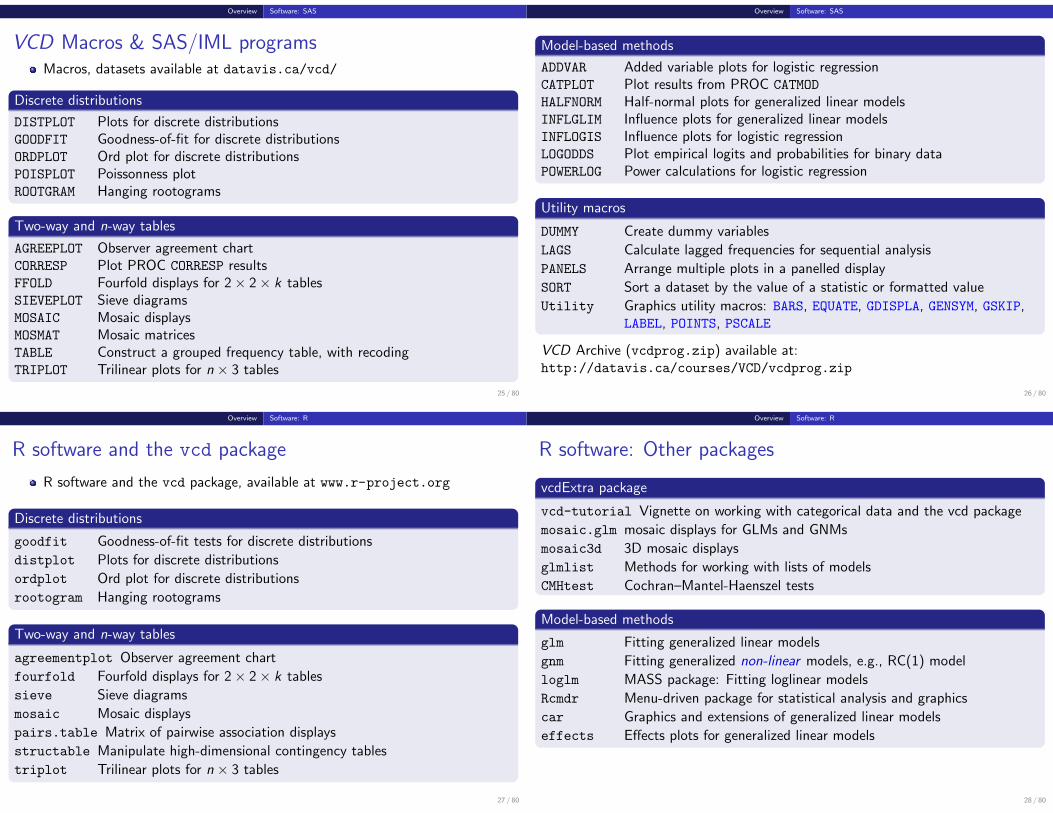
Overview Software: SAS
VCD Macros & SAS/IML programsMacros, datasets available at datavis.ca/vcd/
Discrete distributions
DISTPLOT Plots for discrete distributionsGOODFIT Goodness-of-fit for discrete distributionsORDPLOT Ord plot for discrete distributionsPOISPLOT Poissonness plotROOTGRAM Hanging rootograms
Two-way and n-way tables
AGREEPLOT Observer agreement chartCORRESP Plot PROC CORRESP resultsFFOLD Fourfold displays for 2× 2× k tablesSIEVEPLOT Sieve diagramsMOSAIC Mosaic displaysMOSMAT Mosaic matricesTABLE Construct a grouped frequency table, with recodingTRIPLOT Trilinear plots for n × 3 tables
25 / 80
Overview Software: SAS
Model-based methods
ADDVAR Added variable plots for logistic regressionCATPLOT Plot results from PROC CATMOD
HALFNORM Half-normal plots for generalized linear modelsINFLGLIM Influence plots for generalized linear modelsINFLOGIS Influence plots for logistic regressionLOGODDS Plot empirical logits and probabilities for binary dataPOWERLOG Power calculations for logistic regression
Utility macros
DUMMY Create dummy variables
LAGS Calculate lagged frequencies for sequential analysis
PANELS Arrange multiple plots in a panelled display
SORT Sort a dataset by the value of a statistic or formatted value
Utility Graphics utility macros: BARS, EQUATE, GDISPLA, GENSYM, GSKIP,LABEL, POINTS, PSCALE
VCD Archive (vcdprog.zip) available at:http://datavis.ca/courses/VCD/vcdprog.zip
26 / 80
Overview Software: R
R software and the vcd package
R software and the vcd package, available at www.r-project.org
Discrete distributions
goodfit Goodness-of-fit tests for discrete distributions
distplot Plots for discrete distributions
ordplot Ord plot for discrete distributions
rootogram Hanging rootograms
Two-way and n-way tables
agreementplot Observer agreement chart
fourfold Fourfold displays for 2× 2× k tables
sieve Sieve diagrams
mosaic Mosaic displays
pairs.table Matrix of pairwise association displays
structable Manipulate high-dimensional contingency tables
triplot Trilinear plots for n × 3 tables
27 / 80
Overview Software: R
R software: Other packages
vcdExtra package
vcd-tutorial Vignette on working with categorical data and the vcd package
mosaic.glm mosaic displays for GLMs and GNMs
mosaic3d 3D mosaic displays
glmlist Methods for working with lists of models
CMHtest Cochran–Mantel-Haenszel tests
Model-based methods
glm Fitting generalized linear models
gnm Fitting generalized non-linear models, e.g., RC(1) model
loglm MASS package: Fitting loglinear models
Rcmdr Menu-driven package for statistical analysis and graphics
car Graphics and extensions of generalized linear models
effects Effects plots for generalized linear models
28 / 80

Discrete distributions
Discrete distributions
Discrete distributions, such as the binomial, Poisson, negative binomial and othersform building blocks for the analysis of categorical data (logistic regression,loglinearmodels, generalized linear models)Such data consist of:
Counts of occurrences: accidents, words in text, blood cells with somecharacteristic.
Data: Basic outcome value, k , k = 0, 1, . . ., and number of observations, nk ,with that value.
We distinguish between the count, k, and the frequency, nk with which that countoccurs.
29 / 80
Discrete distributions
Discrete distributions: Examples
Saxony families
Saxony families with 12 children having k = 0, 1, . . . 12 sons.
k 0 1 2 3 4 5 6 7 8 9 10 11 12nk 3 24 104 286 670 1033 1343 1112 829 478 181 45 7
0 1 2 3 4 5 6 7 8 9 10 11 12
Number of males
Num
ber o
f fam
ilies
020
040
060
080
010
0012
00
30 / 80
Discrete distributions
Discrete distributions: Examples I
Federalist papers— disputed authorship
77 essays by Hamilton, Jay & Madison: persuade NY voters to ratifyConstitution, all signed with pseudonym (“Publius”)65 known, 12 disputed (H & M both claimed sole authorship)Mosteller and Wallace (1984): Analysis of frequency distributions of key“marker” words: from, may , whilst, . . . .e.g., blocks of 200 words with may :
Occurrences (k) 0 1 2 3 4 5 6Blocks (nk) 156 63 29 8 4 1 1
31 / 80
Discrete distributions
Discrete distributions: Examples II
0 1 2 3 4 5 6
Occurrences of 'may'
Num
ber o
f blo
cks
of te
xt0
5010
015
0
For each word,
fit probability model (Poisson, NegBin)→ estimate parameters (β1, β2, · · · )→ estimate log Odds (Hamilton vs. Madison)7→ All 12 of the disputed papers were attributed to Madison
32 / 80

Discrete distributions
Discrete distributions
Questions:What process gave rise to the distribution?Form of distribution: uniform, binomial, Poisson, negative binomial,geometric, etc.?Estimate parametersVisualize goodness of fit
For example:
Federalist Papers: might expect a Poisson(λ) distribution.Families in Saxony: might expect a Bin(n, p) distribution with n = 12.Perhaps p = 0.5 as well.
33 / 80
Discrete distributions
Discrete distributions
Lack of fit:Lack of fit tells us something about the process giving rise to the dataPoisson: assumes constant small probability of the basic eventBinomial: assumes constant probability and independent trials
Motivation:Models for more complex categorical data often use these basic discretedistributionsBinomial (with predictors) → logistic regressionPoisson (with predictors) → poisson regression, loglinear models⇒ many of these are special cases of generalized linear models
34 / 80
Discrete distributions Using SAS
Fitting and graphing discrete distributions
VCD
methods to fit, visualize, and diagnose discrete distributions:
Fitting: GOODFIT macro fits uniform, binomial, Poisson, negative binomial,geometric, logarithmic series distributions (or any specified multinomial)
Hanging rootograms: Sensitively assess departure between Observed,Fitted counts (ROOTGRAM macro)
Ord plots: Diagnose form of a discrete distribution (ORDPLOT macro)
Poissonness plots: Robust fitting and diagnostic plots for Poisson(POISPLOT macro)
Robust distribution plots (DISTPLOT macro)
35 / 80
Discrete distributions Using SAS macros
Sidebar: Using SAS macros
SAS macros are high-level, general programs consisting of a series of DATAsteps and PROC steps.
Keyword arguments substitute your data names, variable names, and optionsfor the named macro parameters.
Use as:%macname(data=dataset, var=variables, ...);
Most arguments have default values (e.g., data=_last_)
All VCD macros have internal and online documentation,http://datavis.ca/sasmac/
Macros can be installed in directories automatically searched by SAS. Put thefollowing options statement in your AUTOEXEC.SAS file:
options sasautos=('c:\sasuser\macros' sasautos);
36 / 80

Discrete distributions Using SAS macros
Sidebar: Using SAS macros
E.g., the GOODFIT macro is defined with the following arguments:
· · · goodfit.sas · · ·1 %macro goodfit(2 data=_last_, /* name of the input data set */3 var=, /* analysis variable (basic count) */4 freq=, /* frequency variable */5 dist=, /* name of distribution to be fit */6 parm=, /* required distribution parameters? */7 sumat=100000, /* sum probs. and fitted values here */8 format=, /* format for ungrouped analysis variable */9 out=fit, /* output fit data set */
10 outstat=stats); /* output statistics data set */
Typical use:
1 %goodfit(data=madison, /* data set */2 var=count, /* count variable */3 freq=blocks,4 dist=poisson);
37 / 80
Discrete distributions Fitting discrete distributions
Fitting discrete distributions
Distributions:Poisson, p(k) = e−λλk/k!Binomial, p(k) =
(nk
)pk(1− p)n−k
Negative binomial, p(k) =(n+k−1
k
)pn(1− p)k
Geometric, p(k) = p(1− p)k
Logarithmic series, p(k) = θk/[−k log(1− θ)]
Estimate parameter(s):Poisson, λ̂ =
∑knk/
∑nk = mean
Binomial, p̂ =∑
knk/(n∑
nk) = mean / n
Goodness of fit:
χ2 =K∑
k=1
(nk − Np̂k)2
Np̂k∼ χ2
(K−1)
where p̂k is the estimated probability of each basic count, under thehypothesis that the data follows the chosen distribution.
38 / 80
Discrete distributions Fitting discrete distributions
GOODFIT macro: Fitting discrete distributions
GOODFIT macro fits uniform, binomial, Poisson, negative binomial, geometric,logarithmic series distributions (or any specified multinomial)
E.g., Try fitting Poisson model
madfit.sas1 title "Instances of 'may' in Federalist papers";2 data madison;3 input count blocks;4 label count='Number of Occurrences'
5 blocks='Blocks of Text';6 datalines;7 0 1568 1 639 2 29
10 3 811 4 412 5 113 6 114 ;15 %goodfit(data=madison, var=count, freq=blocks,16 dist=poisson);
39 / 80
Discrete distributions Fitting discrete distributions
Fitting discrete distributions
The GOODFIT macro gives a table of observed and fitted frequencies, Pearson χ2
residuals (CHI) and likelihood-ratio deviance residuals (DEV).
Instances of 'may' in Federalist papers
COUNT BLOCKS PHAT EXP CHI DEV
0 156 0.51867 135.891 1.72499 6.561711 63 0.34050 89.211 -2.77509 -6.620562 29 0.11177 29.283 -0.05231 -0.750563 8 0.02446 6.408 0.62890 1.884234 4 0.00401 1.052 2.87493 3.269125 1 0.00053 0.138 2.31948 1.989926 1 0.00006 0.015 8.01267 2.89568
====== ======= =======262 0.99999 261.998
40 / 80

Discrete distributions Fitting discrete distributions
Fitting discrete distributions
In addition, it provides the overall goodness-of-fit tests:
Goodness-of-fit test for data set MADISON
Analysis variable: COUNT Number of OccurrencesDistribution: POISSONEstimated Parameters: lambda = 0.6565
Pearson chi-square = 88.92304707Prob > chi-square = 0
Likelihood ratio G2 = 25.243121314Prob > chi-square = 0.0001250511
Degrees of freedom = 5
The poisson model does not fit! Why?
41 / 80
Discrete distributions Fitting discrete distributions
What’s wrong with histograms?
Discrete distributions often graphed as histograms, with a theoretical fitteddistribution superimposed.
%goodfit(data=madison, var=count, freq=blocks,dist=poisson);
Fre
qu
en
cy
0
20
40
60
80
100
120
140
160
Number of Occurrences0 1 2 3 4 5 6
Problems:
largest frequencies dominate displaymust assess deviations vs. a curve
42 / 80
Discrete distributions Fitting discrete distributions
Hang & root them → Hanging rootogramsTukey (1972, 1977):
shift histogram bars to the fitted curve → judge deviations vs. horizontal line.plot√
freq→ smaller frequencies are emphasized.
%goodfit(data=madison, var=count, freq=blocks,dist=poisson, out=fit);
%rootgram(data=fit, var=count, obs=blocks);
Sq
rt(f
req
ue
ncy)
-2
0
2
4
6
8
10
12
Number of Occurrences0 1 2 3 4 5 6
43 / 80
Discrete distributions Fitting discrete distributions
Highlight differences → Deviation rootograms
Emphasize differences between observed and fitted frequenciesDraw bars to show the gaps (btype=dev)
%goodfit(data=madison, var=count, freq=blocks,dist=poisson, out=fit);
%rootgram(data=fit, var=count, obs=blocks, btype=dev);
Sq
rt(f
req
ue
ncy)
-2
0
2
4
6
8
10
12
Number of Occurrences0 1 2 3 4 5 6
44 / 80

Discrete distributions Ord plots: diagnose form
Ord plots: Diagnose form of discrete distribution
How to tell which discrete distributions are likely candidates?
Ord (1967): for each of Poisson, Binomial, Negative Binomial, andLogarithmic Series distributions,
plot of kpk/pk−1 against k is linearsigns of intercept and slope → determine the form, give rough estimates ofparameters
Slope Intercept Distribution Parameter(b) (a) (parameter) estimate0 + Poisson (λ) λ = a− + Binomial (n, p) p = b/(b − 1)+ + Neg. binomial (n,p) p = 1− b+ − Log. series (θ) θ = b
θ = −a
Fit line by WLS, using√
nk − 1 as weights
45 / 80
Discrete distributions Ord plots: diagnose form
Ord plots
ORDPLOT macro%ordplot(data=madison, count=Count, freq=blocks);
Diagnoses distribution asNegBinEstimates p̂ = 0.576
slope = 0.424intercept=-0.023
type: Negative binomialparm: p = 0.576
Instances of ’may’ in Federalist papers
Fre
qu
en
cy R
atio
, (k
n(k
) /
n(k
-1))
0
1
2
3
4
5
6
Occurrences of ’may’0 1 2 3 4 5 6
46 / 80
Discrete distributions Ord plots: diagnose form
Ord plots: Other distributions
slope = 1.061intercept=-0.709
type: Logarithmic seriesparm: theta = 1.061
Butterfly species collected in Malaya
Fre
qu
en
cy R
atio
, (k
n(k
) /
n(k
-1))
0
10
20
30
40
Number collected0 10 20 30
Logarithmic series
slope = -0.657intercept=10.946
type: Binomialparm: p = 0.396
Ord plot: Families in Saxony
Fre
quency R
atio, (k
n(k
) / n(k
-1))
1
2
3
4
5
6
7
8
9
10
Number of males0 1 2 3 4 5 6 7 8 9 10 11 12
Binomial
47 / 80
Discrete distributions Robust distribution plots
Robust distribution plots: Poisson
Ord plots lack robustness
one discrepant freqency, nk affects points for both k and k + 1
Robust plots for Poisson distribution (Hoaglin and Tukey, 1985)
For Poisson, plot count metameter = φ (nk) = loge(k! nk/N) vs. kLinear relation ⇒ Poisson, slope gives λ̂CI for points, diagnostic (influence) plotPOISPLOT macro
48 / 80

Discrete distributions Robust distribution plots
Poissonness plots: Details
If the distribution of nk is Poisson(λ) for some fixed λ, then each observedfrequency, nk ≈ mk = Npk .
Then, setting nk = Npk = e−λ λk/k!, and taking logs of both sides gives
log(nk) = log N − λ+ k log λ− log k!
which can be rearranged to
φ (nk) ≡ log
(k! nk
N
)= −λ+ (log λ) k
⇒ if the distribution is Poisson, plotting φ(nk) vs. k should give a line with
intercept = −λslope = log λ
Nonlinear relation → distribution is not Poisson
Hoaglin and Tukey (1985) give details on calculation of confidence intervalsand influence measures.
49 / 80
Discrete distributions Robust distribution plots
POISPLOT macro: example
1 title "Instances of 'may' in Federalist papers";2 data madison;3 input count blocks;4 label count='Number of Occurrences'
5 blocks='Blocks of Text';6 datalines;7 0 1568 1 639 2 29
10 3 811 4 412 5 113 6 114 ;15 %poisplot(data=madison,count=count, freq=blocks);
50 / 80
Discrete distributions Robust distribution plots
POISPLOT macro: output
Curvilinear relation → distribution is not Poisson
slope = 0.228intercept=-1.530
lambda: mean = 0.656 exp(slope) = 1.256
Instances of ’may’ in Federalist papers
Poi
sson
met
amet
er, l
n(k!
n(k
) / N
)
-5
-4
-3
-2
-1
0
1
2
3
Number of Occurrences
0 1 2 3 4 5 6
Poissonness plot
0
1
2
3
4
5
6
Influence plot
Par
amet
er c
hang
e
-0.7
-0.6
-0.5
-0.4
-0.3
-0.2
-0.1
0.0
0.1
0.2
0.3
0.4
Scaled Leverage
2 3 4 5 6 7 8 9 10
Influence plot for change in λ
51 / 80
Discrete distributions Robust distribution plots
Generalized robust distribution plotsOther distributions: Analogous plots, for suitable count metameter, φ (nk) vs. k.
Linear relation ⇒ correct distribution, slope gives parameter estimatesCI reflect variability of the individual counts, nk
DISTPLOT macro
%distplot(data=madison, count=count, freq=blocks,dist=negbin);
slope(b) = -0.992intercept= -0.654
n: a/log(p) = 1.413p: 1-e(b) = 0.629
Co
un
t m
eta
me
ter
-10
-9
-8
-7
-6
-5
-4
-3
-2
-1
0
Number of Occurrences0 1 2 3 4 5 6
52 / 80

Discrete distributions Using R
Discrete distributions with R and the vcd packageIn R, discrete distributions are conveniently represented as one-way frequencytables,
> library(vcd)> data(Federalist)> Federalist
nMay0 1 2 3 4 5 6
156 63 29 8 4 1 1
The goodfit() function in vcd fits a variety of discrete distributions:
> # fit the poisson model> gf1 <- goodfit(Federalist, type="poisson")> gf1
Observed and fitted values for poisson distributionwith parameters estimated by `ML'
count observed fitted0 156 135.891388701 63 89.211140672 29 29.283046173 8 6.407994844 4 1.051693815 1 0.138084996 1 0.01510854
53 / 80
Discrete distributions Using R
R is object-oriented. A goodfit object has print(), summary() and plot() methods:
> summary(gf1)
Goodness-of-fit test for poisson distribution
X^2 df P(> X^2)Likelihood Ratio 25.24312 5 0.0001250511
> plot(gf1, main="Federalist data: Poisson fit")> plot(gf1, main="Federalist data: Poisson fit", type="dev")
0
2
4
6
8
10
0 1 2 3 4 5 6
Number of Occurrences
sqrt(
Freq
uenc
y)
Federalist data: Poisson fit
0
2
4
6
8
10
0 1 2 3 4 5 6
Number of Occurrences
sqrt(
Freq
uenc
y)
Federalist data: Poisson fit
54 / 80
Discrete distributions Using R
Discrete distributions with R and the vcd packageThe Poisson distribution
> # In a poisson, mean = var; this is 'over-dispersed'
> mean(rep(0:6, times=Federalist))
[1] 0.6564885
> var(rep(0:6, times=Federalist))
[1] 1.007985
The negative binomial distribution, Nbin(r, p) allows the data to deviate from atrue Poisson according to a parameter r > 0.
> ## try negative binomial distribution (r, p)> gf2 <- goodfit(Federalist, type = "nbinomial")> summary(gf2)
Goodness-of-fit test for nbinomial distribution
X^2 df P(> X^2)Likelihood Ratio 1.964028 4 0.7423751
This has an acceptable fit to the Federalist data55 / 80
Discrete distributions Using R
Discrete distributions with R and the vcd packageCompare the fits side-by-side:
> plot(gf2, main="Federalist data: Negative binomial fit")> plot(gf1, main="Federalist data: Poisson fit")
0
2
4
6
8
10
12
0 1 2 3 4 5 6
Number of Occurrences
sqrt(
Freq
uenc
y)
Federalist data: Negative binomial fit
0
2
4
6
8
10
0 1 2 3 4 5 6
Number of Occurrences
sqrt(
Freq
uenc
y)
Federalist data: Poisson fit
Conclusions:Perhaps marker words like ’may’ do not occur with constant probability in allblocks of textPerhaps the blocks of text were written under different circumstances
56 / 80

Discrete distributions Using R
vcd includes Ord plot() and distplot() functions. E.g.,
> Ord_plot(Federalist,main = "Instances of 'may' in Federalist papers")
0 1 2 3 4 5 6
−1
0
1
2
3
4
5
6
Number of occurrences
Freq
uenc
y ra
tioInstances of ’may’ in Federalist papers
slope = 0.424intercept = −0.023
type: nbinomialestimate: prob = 0.576
57 / 80
Testing association Nominal factors
Testing Association in Two-Way Tables
Typical analysis: Nominal factors
Pearson χ2 (or LR χ2)— when most expected frequencies ≥ 5.
proc freq;weight count; /* if in frequency form */table factor * response / chisq;
Exact tests— small tables, small sample sizes (e.g., Fisher’s)
proc freq;weight count; /* if in frequency form */table factor * response / chisq;exact pchi;
58 / 80
Testing association Nominal factors
Example: Cholesterol diet and heart disease
Is there a relation between Hi/Lo cholesterol diet and heart disease?
fat.sas1 title 'Cholesterol diet and heart disease';2 data fat;3 input diet $ disease $ count;4 datalines;5 LoChol No 66 LoChol Yes 27 HiChol No 48 HiChol Yes 119 ;
10
11 proc freq data=fat;12 weight count;13 tables diet * disease / chisq nopercent nocol;14 exact pchi;
59 / 80
Testing association Nominal factors
Standard output:
Table of diet by disease
diet disease
Frequency|Row Pct |No |Yes | Total---------+--------+--------+HiChol | 4 | 11 | 15
| 26.67 | 73.33 |---------+--------+--------+LoChol | 6 | 2 | 8
| 75.00 | 25.00 |---------+--------+--------+Total 10 13 23
Statistics for Table of diet by disease
Statistic DF Value Prob------------------------------------------------------Chi-Square 1 4.9597 0.0259Likelihood Ratio Chi-Square 1 5.0975 0.0240Continuity Adj. Chi-Square 1 3.1879 0.0742
WARNING: 50% of the cells have expected counts less than 5.(Asymptotic) Chi-Square may not be a valid test.
The Pearson and LR χ2 tests are not valid— sample size too smallThe conservative continuity-adjusted test fails significance
60 / 80

Testing association Nominal factors
Exact tests are valid and significant.
Exact test output:
Pearson Chi-Square Test----------------------------------Chi-Square 4.9597DF 1Asymptotic Pr > ChiSq 0.0259Exact Pr >= ChiSq 0.0393
Fisher's Exact Test----------------------------------Cell (1,1) Frequency (F) 4Left-sided Pr <= F 0.0367Right-sided Pr >= F 0.9967
Table Probability (P) 0.0334Two-sided Pr <= P 0.0393
61 / 80
Testing association Nominal factors
Preview: Visualizing association in 2 × 2 tables
disease: No
diet
: LoC
hol
disease: Yes
diet
: HiC
hol
6 4
2 11
Fourfold display: area ∼ frequency
Color: blue (+), red(−)
Confidence bands: significance ofodds ratio
Interp: Hi cholesterol → Heartdisease
%ffold(data=fat, var=diet disease);
62 / 80
Testing association Ordinal factors and Stratified analyses
Ordinal factors and Stratified analyses
More powerful CMH tests
When either the row (factor) or column (response) levels are ordered, morespecific (CMH = Cochran - Mantel - Haentzel) tests which take order intoaccount have greater power to detect ordered relations.
proc freq;weight count;table factor * response / chisq cmh;
Control for other background variables
Stratified analysis tests the association between a main factor and responsewithin levels of the control variable(s)Can also test for homogeneous association across strata
proc freq;weight count;table strata * factor * response / chisq cmh;
63 / 80
Testing association Ordinal factors and Stratified analyses
Example: Arthritis treatment
Data on treatment for rheumatoid arthritis (Koch and Edwards, 1988)
Ordinal response: none, some, or marked improvement
Factor: active treatment vs. placebo
Strata: Sex
| Outcome---------+---------+--------------------------+Treatment| Sex |None |Some |Marked | Total---------+---------+--------+--------+--------+Active | Female | 6 | 5 | 16 | 27
| Male | 7 | 2 | 5 | 14---------+---------+--------+--------+--------+Placebo | Female | 19 | 7 | 6 | 32
| Male | 10 | 0 | 1 | 11---------+---------+--------+--------+--------+Total 42 14 28 84
64 / 80

Testing association Ordinal factors and Stratified analyses
Overall analysis, ignoring sex: arthfreq.sas · · ·
1 title 'Arthritis Treatment: PROC FREQ Analysis';2 data arth;3 input sex$ treat$ @;4 do improve = 'None ', 'Some', 'Marked';5 input count @;6 output;7 end;8 datalines;9 Female Active 6 5 16
10 Female Placebo 19 7 611 Male Active 7 2 512 Male Placebo 10 0 113 ;14 *-- Ignoring sex;15 proc freq order=data;16 weight count;17 tables treat * improve / cmh chisq nocol nopercent;18 run;
Notes:
PROC FREQ orders character variables alphabetically (i.e., ‘Marked’, ‘None’,‘Some’) by default.To treat the IMPROVE variable as ordinal, use order=data on the PROCFREQ statement.
65 / 80
Testing association Ordinal factors and Stratified analyses
Overall analysis, ignoring sex: Results (chisq option)
STATISTICS FOR TABLE OF TREAT BY IMPROVE
Statistic DF Value Prob------------------------------------------------------Chi-Square 2 13.055 0.001Likelihood Ratio Chi-Square 2 13.530 0.001Mantel-Haenszel Chi-Square 1 12.859 0.000Phi Coefficient 0.394Contingency Coefficient 0.367Cramer's V 0.394
Cochran-Mantel-Haenszel tests: (cmh option)
SUMMARY STATISTICS FOR TREAT BY IMPROVECochran-Mantel-Haenszel Statistics (Based on Table Scores)
Statistic Alternative Hypothesis DF Value Prob--------------------------------------------------------------
1 Nonzero Correlation 1 12.859 0.0002 Row Mean Scores Differ 1 12.859 0.0003 General Association 2 12.900 0.002
66 / 80
Testing association CMH tests for ordinal variables
CMH tests for ordinal variables
Three types of test:
Non-zero correlationUse when both row and column variables are ordinal.CMH χ2 = (N − 1)r 2, assigning scores (1, 2, 3, ...)most powerful for linear association
Row Mean Scores DifferUse when only column variable is ordinalAnalogous to the Kruskal-Wallis non-parametric test (ANOVA on rank scores)Ordinal variable must be listed last in the TABLES statement
General AssociationUse when both row and column variables are nominal.Similar to overall Pearson χ2 and Likelihood Ratio χ2.
67 / 80
Testing association CMH tests for ordinal variables
Sample CMH Profiles
Only general association:
| b1 | b2 | b3 | b4 | b5 | Total Mean--------+-------+-------+-------+-------+-------+a1 | 0 | 15 | 25 | 15 | 0 | 55 3.0a2 | 5 | 20 | 5 | 20 | 5 | 55 3.0a3 | 20 | 5 | 5 | 5 | 20 | 55 3.0
--------+-------+-------+-------+-------+-------+Total 25 40 35 40 25 165
Output:
Cochran-Mantel-Haenszel Statistics (Based on Table Scores)
Statistic Alternative Hypothesis DF Value Prob--------------------------------------------------------------
1 Nonzero Correlation 1 0.000 1.0002 Row Mean Scores Differ 2 0.000 1.0003 General Association 8 91.797 0.000
68 / 80

Testing association CMH tests for ordinal variables
Sample CMH Profiles
Linear Association:
| b1 | b2 | b3 | b4 | b5 | Total Mean--------+-------+-------+-------+-------+-------+a1 | 2 | 5 | 8 | 8 | 8 | 31 3.48a2 | 2 | 8 | 8 | 8 | 5 | 31 3.19a3 | 5 | 8 | 8 | 8 | 2 | 31 2.81a4 | 8 | 8 | 8 | 5 | 2 | 31 2.52
--------+-------+-------+-------+-------+-------+Total 17 29 32 29 17 124
Output:
Cochran-Mantel-Haenszel Statistics (Based on Table Scores)
Statistic Alternative Hypothesis DF Value Prob--------------------------------------------------------------
1 Nonzero Correlation 1 10.639 0.0012 Row Mean Scores Differ 3 10.676 0.0143 General Association 12 13.400 0.341
69 / 80
Testing association CMH tests for ordinal variables
Sample CMH Profiles
Visualizing Association: Sieve diagrams
a1
a2
a3
1 2 3 4 5
A
B
General Association
a1
a2
a3
a4
1 2 3 4 5
A
B
Linear Association
70 / 80
Testing association Stratified analysis
Stratified analysis
Overall analysis
ignores other variables (like sex), by collapsing over themrisks losing important interactions (e.g., different associations for M & F)
Stratified analysis
controls for the effects of one or more background variableslist stratification variable(s) first on the TABLES statement
proc freq;tables age * sex * treat * improve;
Looking forward: Loglinear models
allow more general hypotheses to be stated and testedcloser connection between testing and visualization (how are variablesassociated)
71 / 80
Testing association Stratified analysis
Stratified analysisThe statements below request a stratified analysis with CMH tests, controlling forsex.
· · · arthfreq.sas · · ·20 *-- Stratified analysis, controlling for sex;21 proc freq order=data;22 weight count;23 tables sex * treat * improve / cmh chisq nocol nopercent;24 run;
→ separate tables (partial tests) for Females and Males
STATISTICS FOR TABLE 1 OF TREAT BY IMPROVECONTROLLING FOR SEX=Female
Statistic DF Value Prob------------------------------------------------------Chi-Square 2 11.296 0.004Likelihood Ratio Chi-Square 2 11.731 0.003Mantel-Haenszel Chi-Square 1 10.935 0.001...
Strong association between TREAT and IMPROVE for females
72 / 80

Testing association Stratified analysis
Males:
STATISTICS FOR TABLE 2 OF TREAT BY IMPROVECONTROLLING FOR SEX=Male
Statistic DF Value Prob------------------------------------------------------Chi-Square 2 4.907 0.086Likelihood Ratio Chi-Square 2 5.855 0.054Mantel-Haenszel Chi-Square 1 3.713 0.054...
WARNING: 67% of the cells have expected counts lessthan 5. Chi-Square may not be a valid test.
Weak association between TREAT and IMPROVE for malesSample size N = 29 for males is small
73 / 80
Testing association Stratified analysis
Stratified tests
Individual (partial) tests are followed by a conditional test, controlling forstrata (SEX)These tests do not require large sample size in the individual strata— just alarge total sample size.They assume, but do not test that the association is the same for all strata.
SUMMARY STATISTICS FOR TREAT BY IMPROVECONTROLLING FOR SEX
Cochran-Mantel-Haenszel Statistics (Based on Table Scores)
Statistic Alternative Hypothesis DF Value Prob--------------------------------------------------------------
1 Nonzero Correlation 1 14.632 0.0002 Row Mean Scores Differ 1 14.632 0.0003 General Association 2 14.632 0.001
74 / 80
Testing association Homogeneity of association
Homogeneity of association
Is the association between the primary table variables the same over allstrata?
2 × 2 tables: → Equal odds ratios across all strata?
PROC FREQ: MEASURES option on TABLES statement → Breslow-Day test
proc freq;tables strata * factor * response / measures cmh ;
Larger tables: Use PROC CATMOD to test for no three-way association
≡ same association for the primary factor & response variables ∀ strata≡loglinear model: [Strata Factor] [Strata Response] [Factor Response]
proc catmod;...loglin strata | factor | response @2;
75 / 80
Testing association Homogeneity of association
Homogeneity of association: Example
Arthritis data: homogeneity ↔ no 3-way sex * treatment * outcomeassociation
≡ loglinear model: [SexTreat] [SexOutcome] [TreatOutcome]≡ loglin sex|treat|improve@2 for PROC CATMOD
Zero frequencies: PROC CATMOD treats as “structural zeros” by default; recodeif necessary.
· · · arthfreq.sas
26 title2 'Test homogeneity of treat*improve association';27 data arth;28 set arth;29 if count=0 then count=1E-20; *-- sampling zeros;30 proc catmod order=data;31 weight count;32 model sex * treat * improve = _response_ / ml ;33 loglin sex|treat|improve @2 / title='No 3-way association';34 run;35 loglin sex treat|improve / title='No Sex Associations';
76 / 80

Testing association Homogeneity of association
Homogeneity of association: Examplethe likelihood ratio χ2 (the badness-of-fit for the No 3-Way model) is the testfor homogeneityclearly non-significant → treatment-outcome association can be considered tobe the same for men and women.
Test homogeneity of treat*improve associationNo 3-way association
MAXIMUM-LIKELIHOOD ANALYSIS-OF-VARIANCE TABLE
Source DF Chi-Square Prob--------------------------------------------------SEX 1 14.13 0.0002TREAT 1 1.32 0.2512SEX*TREAT 1 2.93 0.0871IMPROVE 2 13.61 0.0011SEX*IMPROVE 2 6.51 0.0386TREAT*IMPROVE 2 13.36 0.0013
LIKELIHOOD RATIO 2 1.70 0.4267
But, associations of SEX*TREAT and SEX*IMPROVE are both small.Suggests stronger model of homogeneity, [Sex] [TreatOutcome], tested byloglin sex treat|improve; statement.
77 / 80
Testing association Homogeneity of association
Homogeneity of association: Reduced model· · · arthfreq.sas
30 proc catmod order=data;31 weight count;32 model sex * treat * improve = _response_ / ml ;33 loglin sex|treat|improve@2 / title='No 3-way association';34 run;35 loglin sex treat|improve / title='No Sex Associations';
Output:
No Sex AssociationsMAXIMUM-LIKELIHOOD ANALYSIS-OF-VARIANCE TABLE
Source DF Chi-Square Prob--------------------------------------------------SEX 1 12.95 0.0003TREAT 1 0.15 0.6991IMPROVE 2 10.99 0.0041TREAT*IMPROVE 2 12.00 0.0025
LIKELIHOOD RATIO 5 9.81 0.0809
Fits reasonably wellHow to interpret?
78 / 80
Testing association Homogeneity of association
Homogeneity of association
Visualizing Association: Mosaic displays
-2.0
2.3
1.9
Fem
ale
M
ale
Active Placebo
Non
e
Som
e
Mar
ked
Baseline Model: [Sex Treat][Improve] G2 (6) = 22.60
Baseline model
1.6
Fem
ale
M
ale
Active Placebo
Non
e
Som
e
Mar
ked
Reduced Model: [Sex][Treat Improve] G2 (5) = 9.81
Reduced model
79 / 80
Summary: Part 1
Summary: Part 1
Categorical dataTable form vs. case formNon-parametric methods vs. model-based methodsResponse models vs. association models
Graphical methods for categorical dataFrequency data more naturally displayed as count ∼ areaSieve diagram, fourfold & mosaic display: compare observed vs. expectedfrequencyGraphical principles: Visual comparison, effect-ordering, small multiples
Discrete distributionsFit: GOODFIT; Graph: hanging rootograms to show departuresOrd plot: diagnose form of distributionPOISPLOT, DISTPLOT for robust distribution plots
Testing associationPearson χ2, L.R. χ2 (largish samples) vs. Fisher exact test (small samples)CMH tests more powerful for ordinal factorsThree-way+ tables: Stratified analysis, homogeneity of associationVisualize with Sieve diagram, fourfold & mosaic display
80 / 80