Embed Size (px)
DESCRIPTION
Visualization Tool for Flow Cytometry Data Standards Project. Evgeny Maksakov [email protected] CS533C Department of Computer Science, UBC in collaboration with Terry Fox Laboratory, BC Cancer Agency (Prof. Ryan Brinkman & Dr. Josef Spidlen). Today. Flow Cytometry Overview - PowerPoint PPT Presentation
Citation preview

1
Visualization Tool for
Flow Cytometry Data Standards Project
Evgeny [email protected]
CS533C
Department of Computer Science, UBCin collaboration with
Terry Fox Laboratory, BC Cancer Agency
(Prof. Ryan Brinkman & Dr. Josef Spidlen)

2
Today
• Flow Cytometry Overview – Dataset description
• Existing Visualizations Overview
• Data analysis– Current (FlowJo)– Proposed
• Prototype Progress
• Future Work

3
Flow Cytometry
MeasureCell
Measuring properties of cells in a fluid stream

4
List of Flow Cytometry Application Fields
Chromatin structureTotal proteinLipidsSurface chargeMembrane fusion/runoverEnzyme activityOxidative metabolismSulfhydryl groups/glutathioneDNA synthesisDNA degradationGene expression
ImmunophenotypingDNA cell cycle/tumor ploidyMembrane potentialIon fluxCell viabilityIntracellular protein stainingpH changesCell tracking and proliferationSortingRedox state
The list is taken from http://www.basic.northwestern.edu/sharedresources/flowcytometry/

5
Flow Cytometry (FCM)

6
Dataset Properties
Typically for research at the TFL:• 100,000+ events• 5-10 dimensions
Capability:
• 1,000,000 events (cells going through the laser beam) per
dataset • Up to 20 dimensions
7
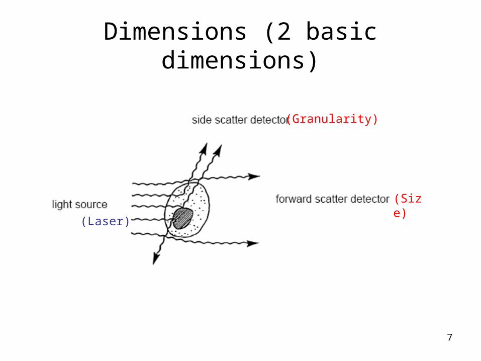
Dimensions (2 basic dimensions)
(Size)
(Laser)
(Granularity)

8
Dimensions (GFP intensity & PI)
Pictures is taken from http://en.wikipedia.org/wiki/Image:Aequorea_victoria.jpg & http://www.upenn.edu/pennnews/photos/
Green Fluorescent Protein intensity
measures gene expression
Mice glow green under ultraviolet light
PI (Propidium Iodide) dye intensitymeasures cells’ viability (life cells expunge the dye)
Aequorea Victoria (natural owner of GFP)

9
Dimensions (16 fluorescence intensities)
Picture from: http://www.bdbiosciences.com/image_library/

10
Attaching markers to cells

11
Current Visualization Solutions
Made deliberately for FCM:
• FlowJo (scatterplots, histograms, contour diagrams)
• FACSDiva (scatterplots, histograms, contour diagrams)

12
Current Visualization Solutions
Universal data visualization tool:
• GGobi– Draw dotplots and scatterplots, barcharts, spineplots and histograms,
parallel coordinate plots, scatterplot matrices
– Link data points and lines between plots using brushing and identification
– Pan and zoom
– Rotate data in 3D and tour high-dimensional data using sequences of 1D, 2D and 2x1D projections
– Uses R language for data manipulation
13
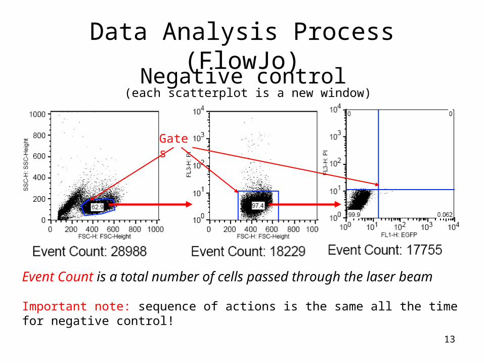
Data Analysis Process (FlowJo)
Event Count is a total number of cells passed through the laser beam
Negative control
Gates
(each scatterplot is a new window)
Important note: sequence of actions is the same all the time for negative control!

14
Data Analysis Process (FlowJo)
Looking for result
Marked cells (result)Non-marked cells
Important note: Same gates as in neg. control apply automatically on the positive set!

15
Other forms of result visualization (FlowJo)

16
ProposalUser requirements (based on user studies):
1. See all dimensions at once
2. Improve analysis sequence
3. Leave scatterplots and histograms (scientists used to them)
4. Gating/Filtering feature
5. Provide better usability than FlowJo
Solutions:
1. Use Parallel Coordinates with Gating/Filtering
2. Implement data clustering throughout dimensions
3. Include scatterplots and histograms in the interface
4. Make effective, convenient and interactive interface

17
Interface for FCM Data Analysis

18
Prototype progress
Highlighting of the gate. Random set, 3000 points, 7 dimensions.

19
Prototype progress
Filtering. Random set, 100 000 points, 7 dimensions. Full scale rendering takes ~1min.

20
Prototype progress
Interaction results. Random set, 3000 points, 7 dimensions.

21
Future Work
• Visualization of the real data
• Clustering
• Optimization
• User evaluation

22
3D Parallel Coordinate System for FCMMarc Streit at al. (2006)

23
3D Parallel Coordinate System for FCM
Picture from Marc Streit at al. (2006)
- Does not provide any new information about dataset
- Introduces visual occlusions
- Have to rotate to see all data
- Unavailable

24
Questions…