Embed Size (px)
Citation preview

VISUALISATION OF ATM NETWORK CONNECTIVITY ANDTOPOLOGY
A DISSERTATION
SUBMITTED TO THE DEPARTMENT OF COMPUTER SCIENCE,
FACULTY OF SCIENCE
AT THE UNIVERSITY OF CAPE TOWN
IN FULFILLMENT OF THE REQUIREMENTS
FOR THE DEGREE OF
MASTER OF SCIENCE
By
Oliver Saal
October 2001
Supervised by
Edwin H. Blake

c�
Copyright 2001
by
Oliver Saal
ii
Abstract
ATM and dynamic reconfiguration allow for rapid changes in a virtual path network depending on
traffic load and future demands. This technology improves the utilisation, lowers the call blocking
probability and increases the overall performance of a network. However, it poses several manage-
ment difficulties when user intervention is required to resolve complex routing problems.
In this dissertation, we describe a visualisation approach which uses a network metaphor to
aid administrators in managing dynamic ATM networks. Our metaphor scales well for networks
of varying size, addresses the cluttering problem experienced by past metaphors and maintains
the overall network context while providing additional support for navigation and interaction. We
apply the metaphor to three dynamic reconfiguration management tasks and show how these tasks
are visually represented using our approach.
An experiment was conducted to test the effectiveness of our metaphor implementation with
network administrators and researchers as subjects. Our experimental results indicate that a good
understanding of network conditions portrayed in the metaphor was achieved within a short period.
This dissertation highlights the problem of managing dynamic networks, adapts a visual metaphor
to address this problem and presents experimental results that demonstrate its effectiveness for both
administrators and researchers.
iii

Acknowledgment
I would like to thank my supervisor, Prof. Edwin Blake for his input and insight through the course
of this research. I would also like to extend my gratitude to Prof. Krzesinski and his students at
Stellenbosch for their help in suggesting and evaluating the countless metaphor prototypes. My
thanks also goes to Jinsong Feng who was my partner through the initial prototyping of the first
visualisation metaphors. I would also like to Gary, Patrick, James, Bryan and everyone who helped
to review countless versions and drafts of my dissertation. I am grateful to my colleagues in the lab
who provided comments, suggestions and discussions on my work.
Lastly, I could not have completed this dissertation without the understanding and support from
my family. To Tania, who stood by me and kept me motivated through the good and bad times of
the past years, my love and gratitude.
iv
Contents
Abstract iii
Acknowledgment iv
1 Introduction 1
1.1 Contribution . . . . . . . . . . . . . . . . . . . . . . . . . . . . . . . . . . . . . . 2
1.2 Aims . . . . . . . . . . . . . . . . . . . . . . . . . . . . . . . . . . . . . . . . . . 3
1.3 Overview of our Approach . . . . . . . . . . . . . . . . . . . . . . . . . . . . . . 4
1.4 Dissertation Overview . . . . . . . . . . . . . . . . . . . . . . . . . . . . . . . . 5
2 Background and Related Work 7
2.1 Introduction . . . . . . . . . . . . . . . . . . . . . . . . . . . . . . . . . . . . . . 7
2.2 Advantages of ATM networks . . . . . . . . . . . . . . . . . . . . . . . . . . . . 8
2.3 Drawbacks in Managing ATM . . . . . . . . . . . . . . . . . . . . . . . . . . . . 9
2.4 Network Data . . . . . . . . . . . . . . . . . . . . . . . . . . . . . . . . . . . . . 11
2.5 2D Network Metaphors . . . . . . . . . . . . . . . . . . . . . . . . . . . . . . . . 11
2.5.1 Problems with 2D metaphors . . . . . . . . . . . . . . . . . . . . . . . . . 12
2.5.2 Network Maps . . . . . . . . . . . . . . . . . . . . . . . . . . . . . . . . 13
2.5.3 Circular Segment Shape . . . . . . . . . . . . . . . . . . . . . . . . . . . 15
2.6 3D Network Display Metaphors . . . . . . . . . . . . . . . . . . . . . . . . . . . 17
2.6.1 Globe . . . . . . . . . . . . . . . . . . . . . . . . . . . . . . . . . . . . . 18
2.6.2 Helix . . . . . . . . . . . . . . . . . . . . . . . . . . . . . . . . . . . . . 19
2.6.3 Pin-Cushion . . . . . . . . . . . . . . . . . . . . . . . . . . . . . . . . . 21
2.6.4 Platter . . . . . . . . . . . . . . . . . . . . . . . . . . . . . . . . . . . . . 23
2.6.5 3D Network Map . . . . . . . . . . . . . . . . . . . . . . . . . . . . . . . 25
v
2.6.6 Limitations of 3D metaphors . . . . . . . . . . . . . . . . . . . . . . . . . 25
2.7 Visual Navigation and Exploration . . . . . . . . . . . . . . . . . . . . . . . . . . 27
2.8 Application Programming Languages . . . . . . . . . . . . . . . . . . . . . . . . 28
2.9 Summary . . . . . . . . . . . . . . . . . . . . . . . . . . . . . . . . . . . . . . . 29
3 Metaphor Design and Applications 30
3.1 Introduction . . . . . . . . . . . . . . . . . . . . . . . . . . . . . . . . . . . . . . 30
3.2 Dynamic reconfiguration in an ATM network . . . . . . . . . . . . . . . . . . . . 30
3.3 Units of information used in the DROP application . . . . . . . . . . . . . . . . . 31
3.4 Design objectives for our ATM metaphors . . . . . . . . . . . . . . . . . . . . . . 33
3.4.1 Abstract data . . . . . . . . . . . . . . . . . . . . . . . . . . . . . . . . . 33
3.4.2 Dynamic reconfiguration . . . . . . . . . . . . . . . . . . . . . . . . . . . 34
3.4.3 Call level vs cell level analysis . . . . . . . . . . . . . . . . . . . . . . . . 34
3.4.4 Cluttering . . . . . . . . . . . . . . . . . . . . . . . . . . . . . . . . . . . 34
3.5 Adapted Helix and Levels Metaphor . . . . . . . . . . . . . . . . . . . . . . . . . 35
3.6 Adapted Platter Metaphor . . . . . . . . . . . . . . . . . . . . . . . . . . . . . . . 37
3.6.1 Application 1: Capacity Distribution . . . . . . . . . . . . . . . . . . . . . 40
3.6.2 Application 2: Capacity vs Route Length . . . . . . . . . . . . . . . . . . 40
3.6.3 Application 3: Route distribution . . . . . . . . . . . . . . . . . . . . . . 42
3.7 2D Histogram and Barcharts . . . . . . . . . . . . . . . . . . . . . . . . . . . . . 44
3.7.1 Shortest route length . . . . . . . . . . . . . . . . . . . . . . . . . . . . . 45
3.7.2 Logical length distribution . . . . . . . . . . . . . . . . . . . . . . . . . . 46
3.8 Summary . . . . . . . . . . . . . . . . . . . . . . . . . . . . . . . . . . . . . . . 46
4 Experiment Design 48
4.1 Introduction . . . . . . . . . . . . . . . . . . . . . . . . . . . . . . . . . . . . . . 48
4.2 Experiment Overview . . . . . . . . . . . . . . . . . . . . . . . . . . . . . . . . . 49
4.2.1 Pilot and Final Experiment overview . . . . . . . . . . . . . . . . . . . . . 49
4.2.2 Tutorial and Questionnaire Phase . . . . . . . . . . . . . . . . . . . . . . 50
4.2.3 Questionnaire overview . . . . . . . . . . . . . . . . . . . . . . . . . . . 51
4.3 Subjects . . . . . . . . . . . . . . . . . . . . . . . . . . . . . . . . . . . . . . . . 52
4.4 Goals of Pilot and Final Experiment . . . . . . . . . . . . . . . . . . . . . . . . . 54
4.5 Equipment . . . . . . . . . . . . . . . . . . . . . . . . . . . . . . . . . . . . . . . 55
4.6 Questionnaire Planning and Validation . . . . . . . . . . . . . . . . . . . . . . . . 56
vi
4.6.1 Question Wording . . . . . . . . . . . . . . . . . . . . . . . . . . . . . . 56
4.6.2 Questionnaire Layout . . . . . . . . . . . . . . . . . . . . . . . . . . . . . 57
4.7 Summary . . . . . . . . . . . . . . . . . . . . . . . . . . . . . . . . . . . . . . . 57
5 Experimental Results and Discussion 59
5.1 Introduction . . . . . . . . . . . . . . . . . . . . . . . . . . . . . . . . . . . . . . 59
5.2 Results of Pilot experiment . . . . . . . . . . . . . . . . . . . . . . . . . . . . . . 59
5.2.1 H0 : Correct understanding of metaphor . . . . . . . . . . . . . . . . . . . 60
5.2.2 H1 : Section timing results . . . . . . . . . . . . . . . . . . . . . . . . . . 64
5.3 Discussion of results . . . . . . . . . . . . . . . . . . . . . . . . . . . . . . . . . 65
5.4 RESULTS . . . . . . . . . . . . . . . . . . . . . . . . . . . . . . . . . . . . . . . 66
5.4.1 H0 : Correct understanding of the network conditions . . . . . . . . . . . . 67
5.4.2 H1 : Section timing results . . . . . . . . . . . . . . . . . . . . . . . . . . 71
5.5 Discussion . . . . . . . . . . . . . . . . . . . . . . . . . . . . . . . . . . . . . . . 72
5.6 Summary . . . . . . . . . . . . . . . . . . . . . . . . . . . . . . . . . . . . . . . 74
6 Conclusion 75
6.1 Overcoming Deficiencies of Past Network Metaphors . . . . . . . . . . . . . . . . 75
6.2 Developing a Solution . . . . . . . . . . . . . . . . . . . . . . . . . . . . . . . . 76
6.3 Subjective Experiment Results . . . . . . . . . . . . . . . . . . . . . . . . . . . . 78
6.4 Future Work . . . . . . . . . . . . . . . . . . . . . . . . . . . . . . . . . . . . . . 79
6.4.1 Real-Time ATM Management . . . . . . . . . . . . . . . . . . . . . . . . 80
6.4.2 Emerging network architecture and protocols . . . . . . . . . . . . . . . . 80
6.5 Concluding remarks . . . . . . . . . . . . . . . . . . . . . . . . . . . . . . . . . . 82
A Experiment Material 83
A.1 Questionnaire Pictures - Section 1 and 2 . . . . . . . . . . . . . . . . . . . . . . . 83
A.2 Experiment questionnaire . . . . . . . . . . . . . . . . . . . . . . . . . . . . . . . 83
B Experiment Results 91
C Colour Plate 97
Bibliography 110
vii
List of Tables
1 List of routes from DROP output . . . . . . . . . . . . . . . . . . . . . . . . . . . 33
2 Grouping of experiment subjects . . . . . . . . . . . . . . . . . . . . . . . . . . . 53
3 Expected Score Table for an ATM Administrator . . . . . . . . . . . . . . . . . . 54
4 Equipment used in the experiment . . . . . . . . . . . . . . . . . . . . . . . . . . 55
5 Distribution of user choices in the questionnaire . . . . . . . . . . . . . . . . . . . 62
6 Pilot Experiment Mean Scores . . . . . . . . . . . . . . . . . . . . . . . . . . . . 62
7 Pilot Experiment Mean Section and Total Time . . . . . . . . . . . . . . . . . . . 64
8 Final Experiment Mean Scores . . . . . . . . . . . . . . . . . . . . . . . . . . . . 68
9 95% Confidence Levels of ATM administrator scores . . . . . . . . . . . . . . . . 69
10 Approximated Experiment Scores Ranges . . . . . . . . . . . . . . . . . . . . . . 70
11 Non-ATM Administrators Mean Section Scores . . . . . . . . . . . . . . . . . . . 71
12 Final Experiment Mean Section and Total Time . . . . . . . . . . . . . . . . . . . 72
viii

List of Figures
1 Overview of main components in a network management tool . . . . . . . . . . . 10
2 Network Map . . . . . . . . . . . . . . . . . . . . . . . . . . . . . . . . . . . . . 14
3 Circular Segment Shape . . . . . . . . . . . . . . . . . . . . . . . . . . . . . . . 15
4 Circular Segment Shape - CAIDA . . . . . . . . . . . . . . . . . . . . . . . . . . 16
5 Globe Metaphor . . . . . . . . . . . . . . . . . . . . . . . . . . . . . . . . . . . . 18
6 Helix Metaphor . . . . . . . . . . . . . . . . . . . . . . . . . . . . . . . . . . . . 20
7 Pin Cushion Metaphor . . . . . . . . . . . . . . . . . . . . . . . . . . . . . . . . 21
8 Flodar: Platter Metaphor . . . . . . . . . . . . . . . . . . . . . . . . . . . . . . . 23
9 Flodar: Building Metaphor . . . . . . . . . . . . . . . . . . . . . . . . . . . . . . 24
10 3D Network Map . . . . . . . . . . . . . . . . . . . . . . . . . . . . . . . . . . . 25
11 Diagram representing main units of ATM information . . . . . . . . . . . . . . . . 32
12 Helix and Levels Metaphor . . . . . . . . . . . . . . . . . . . . . . . . . . . . . . 36
13 Structural overview of platter metaphor . . . . . . . . . . . . . . . . . . . . . . . 38
14 Views of the initial platter metaphor prototype . . . . . . . . . . . . . . . . . . . . 39
15 Platter Metaphor: Capacity Distribution . . . . . . . . . . . . . . . . . . . . . . . 41
16 Platter Metaphor: Capacity and Logical Length Distribution . . . . . . . . . . . . 42
17 Platter Metaphor: Route Distribution . . . . . . . . . . . . . . . . . . . . . . . . . 43
18 2D Barchart: Shortest Route Length . . . . . . . . . . . . . . . . . . . . . . . . . 45
19 Histogram: Logical Length Distribution . . . . . . . . . . . . . . . . . . . . . . . 47
20 Platter Metaphor and Information Window used in the experiment . . . . . . . . . 52
21 Pilot Experiment Mean Score Scatterplot . . . . . . . . . . . . . . . . . . . . . . . 60
22 Histogram: Pilot Mean Score Distribution . . . . . . . . . . . . . . . . . . . . . . 61
23 Box and Whisker Plot: Pilot Section and Total Time . . . . . . . . . . . . . . . . . 65
24 Final Experiment Mean Score Scatterplot . . . . . . . . . . . . . . . . . . . . . . 68
25 Histogram: Final Mean Score Distribution . . . . . . . . . . . . . . . . . . . . . . 69
ix
26 Box and Whisker Plot: Final Section and Total Time . . . . . . . . . . . . . . . . 72
27 Questionnaire Pictures - Section 1 and 2 . . . . . . . . . . . . . . . . . . . . . . . 83
28 Colour Plate: Network Map . . . . . . . . . . . . . . . . . . . . . . . . . . . . . . 98
29 Colour Plate: Circular Segment Shape . . . . . . . . . . . . . . . . . . . . . . . . 99
30 Colour Plate: Circular Segment Shape - CAIDA . . . . . . . . . . . . . . . . . . . 99
31 Colour Plate: Globe Metaphor . . . . . . . . . . . . . . . . . . . . . . . . . . . . 100
32 Colour Plate: Helix Metaphor . . . . . . . . . . . . . . . . . . . . . . . . . . . . 100
33 Colour Plate: Pin Cushion Metaphor . . . . . . . . . . . . . . . . . . . . . . . . . 101
34 Colour Plate: Platter Metaphor (Flodar) . . . . . . . . . . . . . . . . . . . . . . . 101
35 Colour Plate: Building Metaphor (Flodar) . . . . . . . . . . . . . . . . . . . . . . 102
36 Colour Plate: 3D Network Map . . . . . . . . . . . . . . . . . . . . . . . . . . . . 102
37 Colour Plate: Helix and Levels Metaphor . . . . . . . . . . . . . . . . . . . . . . 103
38 Colour Plate: Views of the early platter prototype . . . . . . . . . . . . . . . . . . 104
39 Colour Plate: Capacity Distribution . . . . . . . . . . . . . . . . . . . . . . . . . 105
40 Colour Plate: Capacity and Logical Length Distribution . . . . . . . . . . . . . . . 106
41 Colour Plate: Route Distribution . . . . . . . . . . . . . . . . . . . . . . . . . . . 107
42 Colour Plate: Shortest Route Length . . . . . . . . . . . . . . . . . . . . . . . . . 108
43 Colour Plate: Histogram - Logical Length Distribution . . . . . . . . . . . . . . . 109
x
Chapter 1
Introduction
“Where is the knowledge that we have lost in information” T.S. Eliot
New computer applications in areas such as multimedia, imaging and distributed computing
demand high levels of performance from computer networks. Asynchronous transmission mode is a
technology designed to support these network performance needs. Datasets generated by high-speed
networks tend to be large and complex. To efficiently configure and operate these networks, as well
as manage performance and reliability for the user, these vast datasets must be understandable. It
has, therefore, become crucial to build efficient and user-friendly network monitoring, visualisation
and management tools [38]. Increasingly, visualisation proves key to improving the understanding
of administrators managing these networks. Visualisation entails presenting complex data in picto-
rial form through interactive graphics, enabling human perception capabilities to extract meaningful
information [9]. Network management and visualisation have seldom been used in conjunction with
dynamic high-speed networks. Past network management tools were largely designed to serve static
networks. Traditional network tools concentrated predominantly on IP-based networks which em-
phasise packet flow and node connectivity [31, 39, 40]. As a result, traditional network visualisation
tools are not geared towards managing dynamic networks [30].
ATM networks support numerous advantages. They offer a greater diversity of services than
traditional network architectures and support quality of service for applications ranging from simple
telephony to multimedia and video conferencing. Unlike IP networks, which are largely fixed in
their connectivity and capacity allocation, ATM supports dynamic reconfiguration which promotes
high utilisation of network links by reallocating capacity depending on traffic demands.
1
2 CHAPTER 1. INTRODUCTION
Even though dynamic reconfiguration restructures the network automatically, these reconfigu-
rations do not occur as often as theoretically possible. When management monitoring tools fail
to highlight the need for reconfiguration, user intervention is required to optimise network perfor-
mance. However, determining when user intervention is necessary is difficult because the infor-
mation generated by dynamic reconfiguration algorithms is complex. This complexity of ATM,
compared to traditional networks such as TCP/IP, has proven to be a barrier to its deployment.
Scalability is another area of major contrast between ATM management and IP management.
The management of IP is completely centralised by means of a hierarchy where network agents re-
lay accounting information to a central management console. ATM supports a larger, multi-layered
network. Dynamic reconfiguration algorithms generate substantially more network data. Conven-
tional IP visualisation tools cannot adequately handle the data influx required by ATM visualisation.
Our research domain falls in the field of Information Visualisation. The emphasis is on repre-
senting large datasets in a meaningful yet intuitive manner. Network administrators and researchers
need to understand the data generated by network management tools or agents in order to improve
the performance and reliability of a network. To this end, visualisation allows the representation
of network data through images. Human perceptual capabilities are exploited by representing data
using colour, shape, position, texture, motion, etc., and rendering the result on a graphics worksta-
tion. The fundamental problem in Information Visualisation involves developing and testing visual
metaphors to ascertain their effectiveness with respect to their application.
1.1 Contribution
Our contribution to this field includes a visualisation metaphor to aid in understanding dynamic
ATM networks. This dissertation does not attempt to make contributions to ATM resource man-
agement algorithms. Rather, we contribute to the range of visual metaphors used to provide greater
understanding of these algorithms and their impact on the network. We developed and tested two
network metaphors to accommodate the data generated by our dynamic ATM application. The two
metaphors which have been developed and tested include:
1. an adapted helix and levels metaphor combination
2. an adapted platter metaphor.
Our platter metaphor is an extension of the original metaphor used in the Flodar application
[42]. However, our contribution includes changes to the layout of nodes, support for new units of
1.2. AIMS 3
network information and the ability to scale for small or large networks. We applied the platter to
the following management tasks:
1. Capacity distribution
2. Capacity vs route length distribution
3. Route distribution
Our contribution includes the design and analysis of a questionnaire-based subjective experi-
ment to evaluate the effectiveness of our network metaphor. This experiment design can be extended
to other metaphors to measure and compare their effectiveness with respect to their application.
1.2 Aims
This research aims to address the lack of visual tools for managing ATM networks. This research
has as its goal the creation of a visualisation metaphor for an ATM network application as a means
of aiding dynamic network management. Our primary contribution is the development of a network
metaphor to address the problem of understanding connectivity changes in an ATM network.
After investigating and prototyping popular, three-dimensional network metaphors such as the
network map, globe and the helix metaphors, we adapted and applied several changes to the original
platter metaphor to support dynamic networks.
Our contribution is to provide support for specialised units of network information such as log-
ical route length, origin-destination pairs, capacity and virtual path connections. In addition, we
highlight the relationship between routes and some of these units, while maintaining overall net-
work context. We demonstrate via user experiments that the metaphor makes identifying abnormal
network conditions easy. The graphical primitives used in the construction of the metaphor support
network scalability and are geometrically simple for quick rendering. These features enable faster
visual updates.
Through the application of this modified platter metaphor, the efficient management of our ATM
network application is made possible by giving the administrator a more coherent understanding
of the logical network. As a result, it simplifies decision-making such as capacity allocation and
whether to introduce new routes or discard redundant routes.
It was vital that a visualisation catering to the distinct features of ATM be created while pro-
viding management support in a concise and informative framework. The obvious approach was a
visualisation tool using specialised network metaphors.
4 CHAPTER 1. INTRODUCTION
1.3 Overview of our Approach
We reviewed the nature of ATM network management, specifically focusing on dynamic reconfig-
uration and the problems this caused. The importance of understanding this application’s output
was highlighted and visualisation was proposed as a mean of accomplishing this task. Traditional
visualisation metaphors used to convey network topological information were investigated and their
main advantages and disadvantages were discussed. To effectively convey the correct understand-
ing about the connectivity of a reconfigured network, we emphasised our units of information for
dynamic reconfiguration. This information was central to our metaphor designs.
We investigated and implemented various adaptations to past visualisation metaphors to sup-
port our ATM application. In many cases, these adapted metaphors suffered from problems which
made them unsuitable for our application. Some of the problems included cluttering, occlusion,
dependency on a certain node placement algorithm and lack of support for specialised abstract data.
In the end, we proposed our own visualisation metaphors which supported our specific network
information within a simple and efficient 3D representation. Our first candidate metaphor, the helix
and levels metaphor was prototyped and applied to our ATM application. We examined its prop-
erties and discussed why we were not satisfied with its effectiveness for management purposes.
Our second metaphor, the platter metaphor, was introduced and its features were examined. We
implemented this metaphor as our final prototype and refined it to aid in managing our application.
We examined and tested the effectiveness of our metaphor using network researchers and ad-
ministrators. An experiment was designed to test our claims about its effectiveness. The hypotheses
were outlined and a questionnaire designed to elicit responses from experiment subjects. The ques-
tionnaire consisted of graded questions based on different network conditions.
The results of the experiment highlighted the findings for novice, ATM administrators and non-
ATM administrators.
1.4. DISSERTATION OVERVIEW 5
1.4 Dissertation Overview
Chapter 2 - Background and Related Work
In this chapter, traditional visualisation metaphors considered suitable for our application are
reviewed and their main advantages and limitations summarised. These metaphors include a net-
work map, circular segment shape, globe, helix, platter, pin-cushion and three-dimensional network
map. We conclude the chapter with a critical summary of the shortcomings of these metaphors with
respect to our application
Chapter 3 - Metaphor Design
This chapter introduces DROP, our dynamic reconfiguration application. The main units of
information such as OD pairs, logical paths, physical links and capacity are defined. We present
design objectives for a new metaphor which will provide specific ATM information. The adapted
helix and levels metaphor is presented and its main drawbacks are discussed. Due to difficulties
with this metaphor combination, a refined platter metaphor is adopted. This metaphor is prototyped,
examined and applied to a series of reconfiguration applications. We support the platter metaphor
with 2D diagrams including a bar-chart and histogram. Finally, we conclude the chapter by making
claims concerning the effectiveness of this metaphor.
Chapter 4 - Experiment Design
In response to our effectiveness claims about this metaphor, we compiled a user experiment us-
ing a network questionnaire. In this chapter, we outline a two-phase experiment conducted as a pilot
experiment followed by a final experiment. The pilot experiment is conducted to minimise prob-
lems in the questionnaire and experimental setup. As part of the experiment design, we introduced
the hypotheses of the experiment followed by planning and layout guidelines for the experiment
questionnaire.
Chapter 5 - Experiment Results and Discussions
In this chapter, we summarise the main results and discuss their significance. The results are
separated under pilot and final phase headings. Each phase confirms the hypotheses which were
outlined in the previous chapter. Following the results, we discuss significant findings and highlight
unexpected outcomes. We conclude by confirming our claims about the effectiveness of the platter
metaphor.
Chapter 6 - Conclusion
We conclude this dissertation focusing on the main results and interesting outcomes of our
approach to visualising an ATM application. We list the main limitations of past visualisation

6 CHAPTER 1. INTRODUCTION
metaphors and demonstrate how our implementation overcame many of these limitations. The
design objectives of our metaphor and the positive results of the user experiments are summarised.
Lastly, we suggest future work for extending the platter metaphor to support other applications and
network models.
Chapter 2
Background and Related Work
“The single biggest problem we face is that of visualisation” Richard P. Feynman
“We are surrounded by an ever-growing, ever-changing world of data. However, the
value of this data is not intrinsic, but lies in enabling us to make more informed deci-
sions and in increasing our shared knowledge and understanding.
The traditional interface of mouse, keyboard and screens of text allows us to work on
computers, while techniques such as visualisation will truly enable us to work with
computers.” G.R Walker, British Telecommunications [44]
2.1 Introduction
In the last decade, we have seen a significant demand for greater telecommunication services. Cel-
lular, cable and satellite communications allow people all over the world to communicate with one
another. New innovative network technologies and protocols allow for high capacity and high speed
network connections. It is no longer only telephone traffic that occupies the connections between
people, cities and continents. Nowadays, we encounter data traffic, video and satellite broadcasts
and audio transmissions to name a few. This is largely due to the increased transmission capacity
of new network technologies including optical cabling, emerging protocols such as xDSL and IPv6,
and greater demand for connectivity brought on by the Internet.
Asynchronous Transmission Mode or ATM is a high speed network capable of transmitting large
7
8 CHAPTER 2. BACKGROUND AND RELATED WORK
amounts of data between physically remote sites. The increased speed and network flexibility pro-
vided through features such as Quality of Service (QoS) make ATM a favourable network architec-
ture for diverse multimedia and broadband applications.
On the surface, ATM provides an efficient and fast network media for many multimedia appli-
cations but the management of these networks require additional tools and training. This chapter
introduces our dynamic reconfiguration application and examines past visual metaphors used to
help network administrators understand the changes within a network.
2.2 Advantages of ATM networks
The computing or more specifically the network community has seen a significant shift in network-
ing technologies in the last two decades. The advent and deployment of high speed network ar-
chitectures have introduced and promoted applications with high bandwidth usage and widespread
connectivity. Examples of these technologies include ATM, IPv6, gigabit networks and xDSL.
Each of these technologies improve and provide advanced features for communication including
high transmission speeds, greater bandwidth, high levels of security and increased performance
over traditional TCP/IP.
ATM could be considered the primary networking technology for next-generation, multi-media
broadband communications. Its protocols are designed to handle isochronous (time critical) data
such as video and telephony (audio), in addition to more conventional data communications between
computers. ATM protocols are capable of providing a homogeneous network for all traffic types.
The same protocols are used regardless of whether the application is to carry conventional telephony,
entertainment video, or computer network traffic over local area networks (LANs), metropolitan
area networks (MANs), or wide area networks (WANs).
In addition, ATM allows for greater flexibility in service delivery. It has point to point connection-
oriented cell transfers, with cells of fixed size. Network addresses can also be derived from the
network itself, unlike legacy LANs which employ MAC addresses that are fixed and independent of
the network topology.
ATM provides support for different traffic classes (e.g., constant bit rate, variable bit rate, un-
specified bit rate), allowing an application to specify its exact requirements (e.g., peak cell rate,
sustainable cell rate). This information is used to achieve high network utilisation through statisti-
cal multiplexing [15].
2.3. DRAWBACKS IN MANAGING ATM 9
Dynamic reconfiguration has been proposed as a simple and robust resource management con-
trol to manage ATM networks. It causes the network to respond optimally to slow variations in
traffic call patterns. The network is logically configured as a virtual path connection network, or
VPCN [29]. An example of a hierarchical control resource management model, Dynamic Reconfig-
uration and Optimisation Program or DROP, has been developed by the University of Stellenbosch
[5, 6]. DROP employs an algorithm which changes the virtual network structure to accommodate
and optimise the utilisation of network routes. The reconfiguration occurs when there are changes
in traffic demands, causing the network to restructure and adapt to the new load.
The output of each reconfiguration yields a revenue, which could be considered a measure of
the the network utilisation. This model proves that reconfiguration is especially useful in deal-
ing with the complex characteristics of multi-rate calls and unpredictable traffic demands. It has
been shown that ATM reconfiguration can be advantageous for large networks where its drawbacks
such as higher overall blocking are outweighed by its advantages, namely simplicity, efficiency and
tractability [5].
2.3 Drawbacks in Managing ATM
Where the queues and enquiries are physical — at a post office or bank, for example — efficient
management is much easier, in that all concerned can clearly see the situation and will modify their
behaviour accordingly [44]. The invisible queues and lost connections on an ATM network are
somehow less immediate, although in business terms they are equally important.
Dynamic reconfiguration can rapidly change network connectivity to accommodate traffic de-
mands and network loads. As a consequence, it becomes difficult to understand the interaction
between changing traffic and the logical routes or paths on which they are carried. Equally im-
portant is the amount of network information generated by network monitoring tools and agents.
This information is vital to ensure successful operation of the network. Information concerning the
network must be understood by network users and administrators so that appropriate steps can be
taken to avoid a communication breakdown and subsequent loss in revenue.
A small network with 50 nodes will typically generate a few million routes which is difficult
to monitor individually. To accentuate this problem further, ATM network administrators need
to distinguish between physical links and logical routes. Section 2.4 introduces the relationship
between nodes and links and how they tie together to form complex networks.
The data generated by reconfiguration algorithms increases the complexity of ATM networks
10 CHAPTER 2. BACKGROUND AND RELATED WORK
because its output is primarily abstract. It has no intuitive or real world representation which can be
used to simplify the information contained in this form. This coupled with the vast volume of data
generated amplifies the problem of understanding.
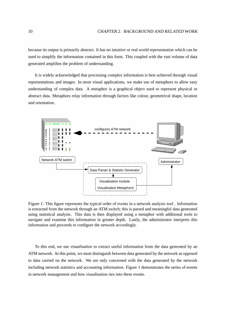
It is widely acknowledged that processing complex information is best achieved through visual
representations and images. In most visual applications, we make use of metaphors to allow easy
understanding of complex data. A metaphor is a graphical object used to represent physical or
abstract data. Metaphors relay information through factors like colour, geometrical shape, location
and orientation.
Visualisation module
Visualisation Metaphor/s
Network ATM switch Administrator
configures ATM network
Data Parser & Statistic Generator
������ ����
Figure 1: This figure represents the typical order of events in a network analysis tool . Informationis extracted from the network through an ATM switch; this is parsed and meaningful data generatedusing statistical analysis. This data is then displayed using a metaphor with additional tools tonavigate and examine this information in greater depth. Lastly, the administrator interprets thisinformation and proceeds to configure the network accordingly.
To this end, we use visualisation to extract useful information from the data generated by an
ATM network. At this point, we must distinguish between data generated by the network as opposed
to data carried on the network. We are only concerned with the data generated by the network
including network statistics and accounting information. Figure 1 demonstrates the series of events
in network management and how visualisation ties into these events.
2.4. NETWORK DATA 11
2.4 Network Data
Traditionally, a network is defined as a set of nodes and links. Nodes are normally static objects
interconnected with links. This linkage can occur over a large number of nodes creating a vast col-
lection of interconnected links and nodes. This representation of nodes connected via links is called
a network or graph. We are interested in network representations since they form a fundamental part
of the network traffic connectivity. Networks can be visually represented through network maps or
directed graphs.
Networks can also be defined mathematically as a set of n-tuples:
������������� �����������������������
For the simple node and link network, nodes are the 0-tuples and links are the 2-tuples. A parent
child relation in a hierarchical network can be represented by a 2-tuple. Note that each element of
an n-tuple can also be an n-tuple. In other words, we can represent in our network the relations
between traditional links i.e. links connecting links. Each data entry (a tuple) in the network is
associated with some attribute such as the capacity or traffic volume [19].
Present network visualisation tools use network agents to extract and forward network informa-
tion to an administrator. In most network monitoring and management applications, network data
is usually stored in the form of a log file or database. In our application, we used the ASCII log file
which is generated by our dynamic reconfiguration application.
2.5 2D Network Metaphors
Most visualisation metaphors used in traditional network management or analysis tools are two di-
mensional. Tufte [43] provides good insight into what makes a two dimensional metaphor effective.
Many of his examples were based on two dimensional metaphors showing both the positive and
negative features of these representations.
The Otter project and related research (Huffaker et al [27, 26]) focuses on a general purpose
network visualisation tool. The literature surrounding this project introduces metaphor and lay-
out designs when viewing network topologies. These design guidelines have been used to isolate
promising two-dimensional metaphors used in previous applications.
We examined two popular 2D metaphors, namely the network map and the circular segment
shape, used in network management tools. These metaphors were evaluated to determine whether
12 CHAPTER 2. BACKGROUND AND RELATED WORK
they could be adapted to dynamic network application. For each metaphor, we list the main advan-
tages and drawbacks with respect to their design and suitability for an ATM network application.
Before we examine these metaphors, we present a list of common problems experienced by 2D
metaphors.
2.5.1 Problems with 2D metaphors
From a literature survey conducted on network visualisation, we have compiled a list of common
problems with two-dimensional network metaphors. The following list of metaphor design guide-
lines are highlighted because they were largely unsupported or overlooked in the construction of
network metaphors. Given these guidelines and recurring metaphor design problems, we compared
two popular two-dimensional metaphors, namely the network map and circular segment shape to
see whether they could be adapted to serve our application.
Cluttering:
Probably the most common and distracting feature of many two-dimensional network
metaphors is the tendency to exhibit cluttering. For example, when a network map
becomes congested with too many routes, the user has difficulty navigating and dis-
tinguishing between important and non-important routes and nodes. This inhibits the
understanding of administrators and delays the actions needed to resolve network prob-
lems. Cluttering can also appear when a network application attempts to provide too
much information, causing an administrator to lose track of the overall network context.
Node Layout and Abstract Data:
The placement of nodes in a network map is usually associated with the nodes’ geo-
graphic position. This creates an intuitive view which is easy to understand. However,
it can be shown that for certain applications this node placement strategy is not al-
ways beneficial. In particular, when the data represented is abstract, as is the case
with dynamic reconfiguration and logical routes, the geographic node layout algorithm
mentioned above will not be effective.
At the same time, the interpretation of a network map, for example, is highly dependent
on the node layout. The same network drawn with different node positioning algorithms
often lead to quite different interpretations of the data.
2.5. 2D NETWORK METAPHORS 13
Network Scalability:
More commonly, two-dimensional visualisation displays were used primarily for sparse
networks with a few hundred nodes. Today we have networks with hundreds to thou-
sands of nodes, in turn creating vast networks with millions of routes. The sheer volume
of network information is generally too much to comprehend in a single 2D image. A
more favourable design would allow a metaphor to scale proportionally as the network
becomes larger.
Dynamic Reconfiguration of Links:
Past metaphors were generally used to represent the status of static network entities
such as servers or switches. As a result, most traditional network visualisation tools are
predominantly geared towards static network design which was noted by Becker, Eick
and Wilks [4]. Due to the lack of support for rapidly changing networks, traditional
network metaphors have largely overlooked support for dynamic network topologies.
Dynamic reconfiguration emphasises strongly the changing logical routes in a network.
These routes should be the core focus of a metaphor for it to be successful in terms of
dynamic network management.
2.5.2 Network Maps
Perhaps the most common network metaphor involves a node and link network diagram, known
commonly as a network map. The nodes are positioned spatially and represented using glyphs,
with lines drawn between the glyphs corresponding to the links. The lines may be segments, arcs,
or even curves drawn in 3D. The links connect various nodes together to form chains. Links are
typically characterised in communication networks as carrying network traffic, where the nodes
represent communicating stations i.e. switches, routers and servers. The node positioning may be
geographic, if spatial information is available, or logical to show interconnections [19].
Advantages
The exposure of network maps have become widespread. This coupled with the intuitive under-
standing of its representation makes it popular network metaphor. Consequently, most visual tools
used to represent communication networks are based on network maps. However as we accelerate
communication technology, we employ new techniques and networks to increase the capacity and
effectiveness of communication media. For purposes of small networks with geographic node in-
formation, the network map is ideal because it requires limited graphics rendering capability and is
14 CHAPTER 2. BACKGROUND AND RELATED WORK
(a)
(b)
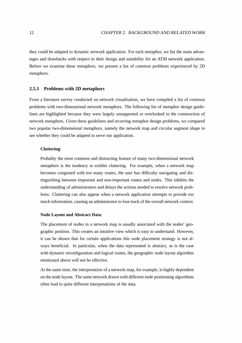
Figure 2: (a) Uncluttered network map: this metaphor works well for sparse static networks withfew routes. It uses a geographic node placement algorithm where nodes corresponds to major citiesin the US. (b) Cluttered network map: this network map shows the traffic on Christmas day 1994.This map was generated by the SeeNet software. It is evident that a links overlap particularly onthe right side of the network map along the western US seaboard. This cluttering makes identifyinginteresting or abnormal network conditions difficult. Overall network context is maintained by theimage in the top left hand corner. See 28 for the colour version of this image.
easy to understand.
Disadvantages
There are many improvements to the traditional 2D network map. The main and recurring prob-
lem of cluttering is the most common flaw in this metaphor. Figures 2 and 28[colour](b) illustrates
the problem of cluttering when links overlap thereby preventing quick investigation of routes in a
congested area. In turn, cluttering is exaggerated when the network under observation is large and
well-connected. In these conditions, additional techniques to filter and threshold information is re-
quired to maintain a concise display of the network. This has the drawback that the overall network
2.5. 2D NETWORK METAPHORS 15
context is lost.
In Section 2.6.5 we will see how the network map is applied in a three-dimensional environment.
2.5.3 Circular Segment Shape
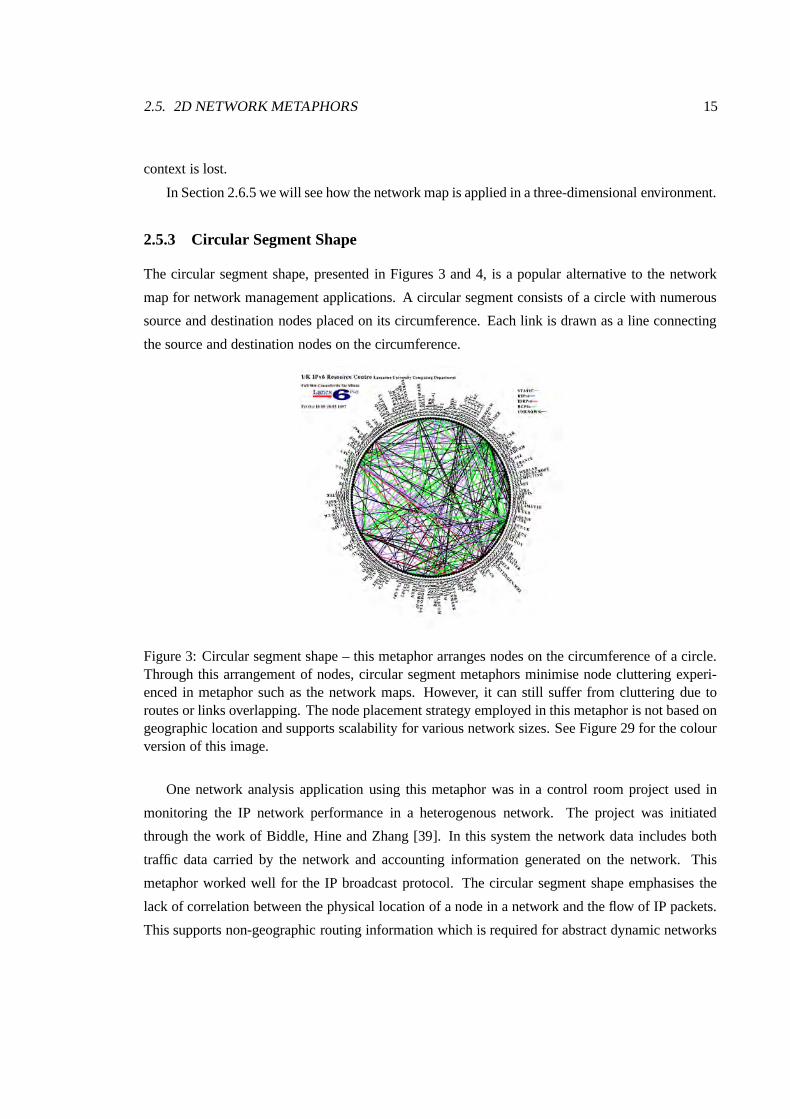
The circular segment shape, presented in Figures 3 and 4, is a popular alternative to the network
map for network management applications. A circular segment consists of a circle with numerous
source and destination nodes placed on its circumference. Each link is drawn as a line connecting
the source and destination nodes on the circumference.
Figure 3: Circular segment shape – this metaphor arranges nodes on the circumference of a circle.Through this arrangement of nodes, circular segment metaphors minimise node cluttering experi-enced in metaphor such as the network maps. However, it can still suffer from cluttering due toroutes or links overlapping. The node placement strategy employed in this metaphor is not based ongeographic location and supports scalability for various network sizes. See Figure 29 for the colourversion of this image.
One network analysis application using this metaphor was in a control room project used in
monitoring the IP network performance in a heterogenous network. The project was initiated
through the work of Biddle, Hine and Zhang [39]. In this system the network data includes both
traffic data carried by the network and accounting information generated on the network. This
metaphor worked well for the IP broadcast protocol. The circular segment shape emphasises the
lack of correlation between the physical location of a node in a network and the flow of IP packets.
This supports non-geographic routing information which is required for abstract dynamic networks
16 CHAPTER 2. BACKGROUND AND RELATED WORK
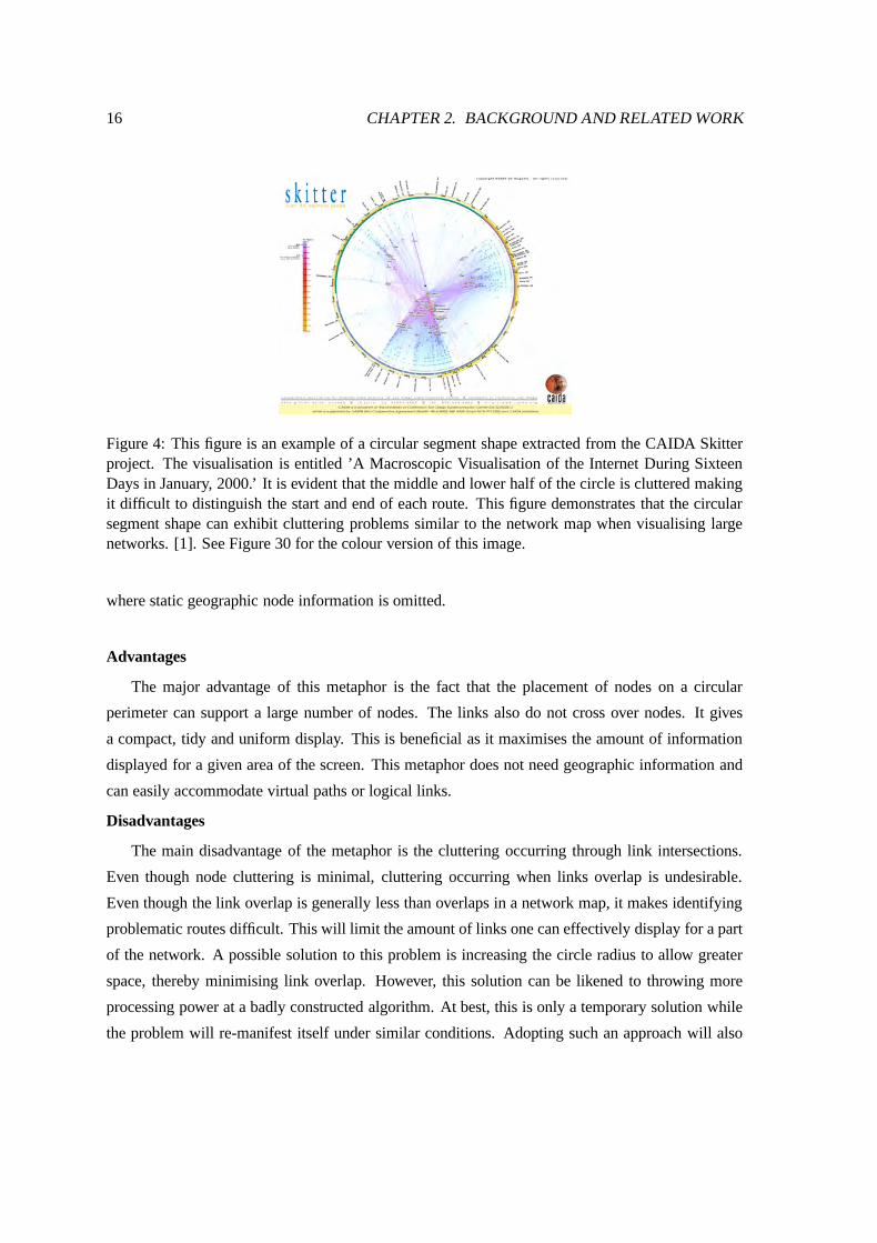
Figure 4: This figure is an example of a circular segment shape extracted from the CAIDA Skitterproject. The visualisation is entitled ’A Macroscopic Visualisation of the Internet During SixteenDays in January, 2000.’ It is evident that the middle and lower half of the circle is cluttered makingit difficult to distinguish the start and end of each route. This figure demonstrates that the circularsegment shape can exhibit cluttering problems similar to the network map when visualising largenetworks. [1]. See Figure 30 for the colour version of this image.
where static geographic node information is omitted.
Advantages
The major advantage of this metaphor is the fact that the placement of nodes on a circular
perimeter can support a large number of nodes. The links also do not cross over nodes. It gives
a compact, tidy and uniform display. This is beneficial as it maximises the amount of information
displayed for a given area of the screen. This metaphor does not need geographic information and
can easily accommodate virtual paths or logical links.
Disadvantages
The main disadvantage of the metaphor is the cluttering occurring through link intersections.
Even though node cluttering is minimal, cluttering occurring when links overlap is undesirable.
Even though the link overlap is generally less than overlaps in a network map, it makes identifying
problematic routes difficult. This will limit the amount of links one can effectively display for a part
of the network. A possible solution to this problem is increasing the circle radius to allow greater
space, thereby minimising link overlap. However, this solution can be likened to throwing more
processing power at a badly constructed algorithm. At best, this is only a temporary solution while
the problem will re-manifest itself under similar conditions. Adopting such an approach will also
2.6. 3D NETWORK DISPLAY METAPHORS 17
consume display space and limit the number of views for additional network information.
2.6 3D Network Display Metaphors
There is mounting evidence that 3D network displays are more effective than 2D displays [9]. There
have been numerous attempts to map the WWW using 3D metaphors. Notable examples include
Eick et al [8, 9], Dodge [13, 14], Gardin [22] and Munzer[35].
In the following section, we will list a few 3D metaphors which have been prototyped for use
in our network application. Each section will discuss the metaphor, its design and target application
and will provide a summary concluding its main advantages and drawbacks. We list some of the
limitations encountered through the course of implementing these metaphors in Section 2.6.6.
Wiss [47] and Young [48] provided a broad overview of three-dimensional information visu-
alisation metaphors and discussed each metaphor’s merits and drawbacks. Most of the network
metaphors covered in the literature focuses on global WWW traffic. We have investigated and
followed these recommendations which help avoid unsuitable network metaphors before finalising
potential candidate metaphors for our dynamic reconfiguration application.
We reviewed some three-dimensional metaphors used in network visualisation. We proceeded
to prototype these metaphors before providing a set of design guidelines to show how well these
metaphors would perform. This was done in support of two objectives. Firstly, the literature sur-
rounding 3D network metaphors were predominantly favouring a specific network application with
little support for a generalised dynamic network. Secondly, we could also not determine whether
these metaphors would be suitable for our application without investigating their performance using
sample output from our dynamic reconfiguration application.
We short-listed the following metaphors detailed in various literature and used in past network
management applications. These metaphor were used because we felt they would meet our initial
requirements which will be discussed in Chapter 3. These metaphors were prototyped and examined
to gauge whether they could be adapted to support dynamic reconfiguration.
1. Globe metaphor
2. Helix metaphor
3. Pin-cushion metaphor
4. Platter metaphor
18 CHAPTER 2. BACKGROUND AND RELATED WORK
5. 3D Network Map
Each metaphor will be discussed briefly, highlighting each metaphor’s benefits and drawbacks. At
the end of this chapter, we discussed the need for navigation tools and a suitable programming
platform for prototyping our metaphors.
2.6.1 Globe
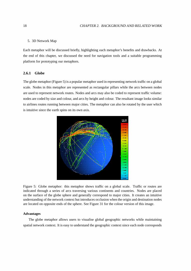
The globe metaphor (Figure 5) is a popular metaphor used in representing network traffic on a global
scale. Nodes in this metaphor are represented as rectangular pillars while the arcs between nodes
are used to represent network routes. Nodes and arcs may also be coded to represent traffic volume:
nodes are coded by size and colour, and arcs by height and colour. The resultant image looks similar
to airlines routes running between major cities. The metaphor can also be rotated by the user which
is intuitive since the earth spins on its own axis.
Figure 5: Globe metaphor: this metaphor shows traffic on a global scale. Traffic or routes areindicated through a series of arcs traversing various continents and countries. Nodes are placedon the surface of the globe sphere and generally correspond to major cities. It creates an intuitiveunderstanding of the network context but introduces occlusion when the origin and destination nodesare located on opposite ends of the sphere. See Figure 31 for the colour version of this image.
Advantages
The globe metaphor allows users to visualise global geographic networks while maintaining
spatial network context. It is easy to understand the geographic context since each node corresponds
2.6. 3D NETWORK DISPLAY METAPHORS 19
directly to a major city or country. This metaphor requires little screen space to accommodate all
the nodes and arcs because of the underlying spherical shape. Lastly, its popularity can also be
attributed to the intuitiveness and affordance of its shape which is easy to learn.
SeeNet3D is an example of a visualisation system making use of globe representation [9].
SeeNet3D was developed at Bell Labs to facilitate easy understanding of network traffic on a global
scale. It also makes use of a network map to visualise localised networks. To minimise cluttering,
SeeNet3D also contains three views for filtered display.
Disadvantages
The globe suffers from occlusion when viewing certain origin and destination pairs simultane-
ously. When the destination node is located on the opposite side of the globe to the origin, it is
hidden from view preventing an administrator from easily tracking a route. This hinders the abil-
ity of administrators to monitor routes effectively. To overcome this problem, the globe needs to
be rotated to investigate a origin-destination pair. At the same time, this occlusion does overcome
display cluttering by limiting the amount of links and nodes the user is able to see at any one time.
Moreover, the problem of occlusion can be minimised through translucency. That is, by making the
globe surface transparent, we can trace the path of each route or link. This is only a partial solution
since the user now has to distinguish between multiple links visible through the transparent surface.
In effect, it may be argued that this approach can create a more cluttered view by increasing the
number of visible routes within the same portion of the display.
2.6.2 Helix
The helix metaphor (Figure 6) resembles a spiral with an increasing radius. It does not encode nodes
in a geographic context. Instead it places nodes on its spiral which allows for good use of limited
screen space.
The helix metaphor has nodes spaced equidistantly on the spiral. These nodes represent in-
dividual routes. Each route has an associated capacity which is represented by an extension rod
originating from that node. This extension projects outwards from the spiral. Colour is used rep-
resent a change in capacity. The length of the extension can also be used to indicate the relative
capacity of routes in dynamic reconfiguration. Figure 6 shows a example of a helix metaphor pro-
totyped for our dynamic reconfiguration application. We investigated the helix metaphor in great
depth because it initially promised several features beneficial to dynamic reconfiguration. However,
we will discuss these merits and drawbacks in greater detail in Section 3.5.
Advantages
20 CHAPTER 2. BACKGROUND AND RELATED WORK
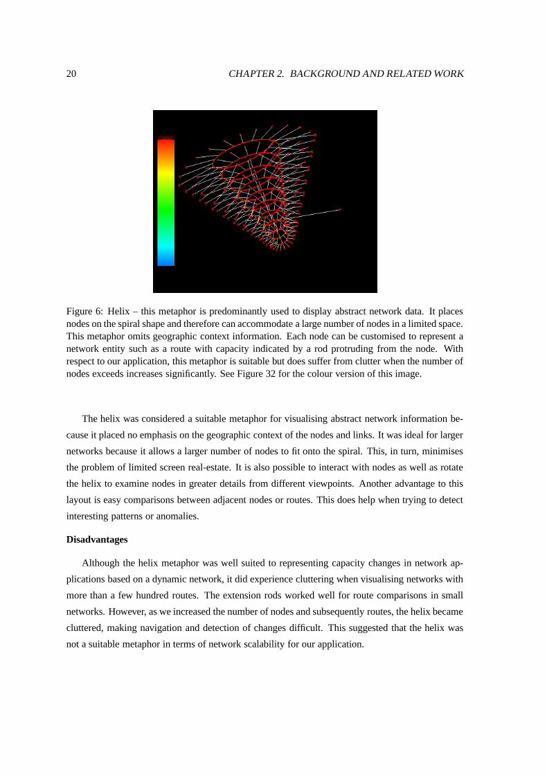
Figure 6: Helix – this metaphor is predominantly used to display abstract network data. It placesnodes on the spiral shape and therefore can accommodate a large number of nodes in a limited space.This metaphor omits geographic context information. Each node can be customised to represent anetwork entity such as a route with capacity indicated by a rod protruding from the node. Withrespect to our application, this metaphor is suitable but does suffer from clutter when the number ofnodes exceeds increases significantly. See Figure 32 for the colour version of this image.
The helix was considered a suitable metaphor for visualising abstract network information be-
cause it placed no emphasis on the geographic context of the nodes and links. It was ideal for larger
networks because it allows a larger number of nodes to fit onto the spiral. This, in turn, minimises
the problem of limited screen real-estate. It is also possible to interact with nodes as well as rotate
the helix to examine nodes in greater details from different viewpoints. Another advantage to this
layout is easy comparisons between adjacent nodes or routes. This does help when trying to detect
interesting patterns or anomalies.
Disadvantages
Although the helix metaphor was well suited to representing capacity changes in network ap-
plications based on a dynamic network, it did experience cluttering when visualising networks with
more than a few hundred routes. The extension rods worked well for route comparisons in small
networks. However, as we increased the number of nodes and subsequently routes, the helix became
cluttered, making navigation and detection of changes difficult. This suggested that the helix was
not a suitable metaphor in terms of network scalability for our application.
2.6. 3D NETWORK DISPLAY METAPHORS 21
Another drawback of the helix metaphor was the inherent lack of history information. Partic-
ularly in dynamic networks where changes occur frequently, it is beneficial to log changes in the
network. As each extension rod could only represent one iteration of each reconfiguration, it could
not provide past information about the previous capacity.
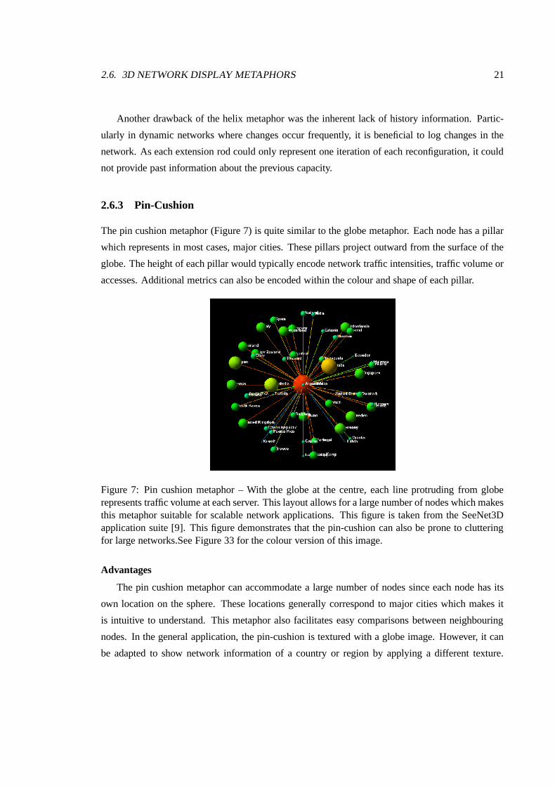
2.6.3 Pin-Cushion
The pin cushion metaphor (Figure 7) is quite similar to the globe metaphor. Each node has a pillar
which represents in most cases, major cities. These pillars project outward from the surface of the
globe. The height of each pillar would typically encode network traffic intensities, traffic volume or
accesses. Additional metrics can also be encoded within the colour and shape of each pillar.
Figure 7: Pin cushion metaphor – With the globe at the centre, each line protruding from globerepresents traffic volume at each server. This layout allows for a large number of nodes which makesthis metaphor suitable for scalable network applications. This figure is taken from the SeeNet3Dapplication suite [9]. This figure demonstrates that the pin-cushion can also be prone to clutteringfor large networks.See Figure 33 for the colour version of this image.
Advantages
The pin cushion metaphor can accommodate a large number of nodes since each node has its
own location on the sphere. These locations generally correspond to major cities which makes it
is intuitive to understand. This metaphor also facilitates easy comparisons between neighbouring
nodes. In the general application, the pin-cushion is textured with a globe image. However, it can
be adapted to show network information of a country or region by applying a different texture.

22 CHAPTER 2. BACKGROUND AND RELATED WORK
The downside to this modification is the loss of intuitiveness when navigating a country or region
“wrapped” on a sphere.
2.6. 3D NETWORK DISPLAY METAPHORS 23
Disadvantages
The main drawback of this metaphor is the omission of links between nodes highlighting traffic
paths. By design, the pin cushion metaphor does not show traffic routes limiting this metaphor
to localised network information on a city, region or country. In terms of network connectivity,
this metaphor does not provide much visual support for topological changes between origin and
destination nodes.
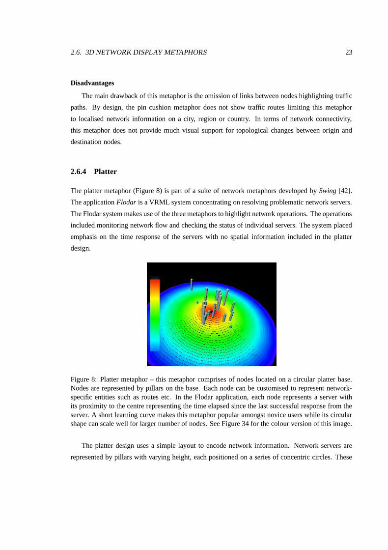
2.6.4 Platter
The platter metaphor (Figure 8) is part of a suite of network metaphors developed by Swing [42].
The application Flodar is a VRML system concentrating on resolving problematic network servers.
The Flodar system makes use of the three metaphors to highlight network operations. The operations
included monitoring network flow and checking the status of individual servers. The system placed
emphasis on the time response of the servers with no spatial information included in the platter
design.
Figure 8: Platter metaphor – this metaphor comprises of nodes located on a circular platter base.Nodes are represented by pillars on the base. Each node can be customised to represent network-specific entities such as routes etc. In the Flodar application, each node represents a server withits proximity to the centre representing the time elapsed since the last successful response from theserver. A short learning curve makes this metaphor popular amongst novice users while its circularshape can scale well for larger number of nodes. See Figure 34 for the colour version of this image.
The platter design uses a simple layout to encode network information. Network servers are
represented by pillars with varying height, each positioned on a series of concentric circles. These
24 CHAPTER 2. BACKGROUND AND RELATED WORK
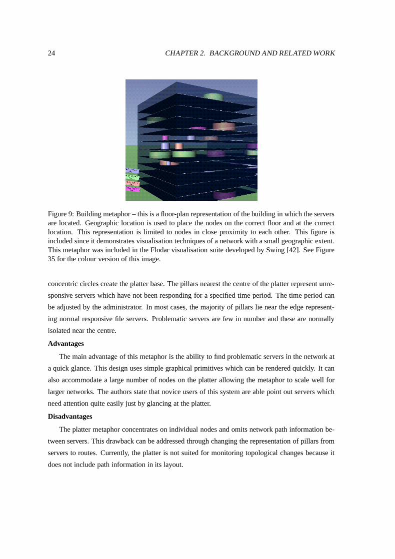
Figure 9: Building metaphor – this is a floor-plan representation of the building in which the serversare located. Geographic location is used to place the nodes on the correct floor and at the correctlocation. This representation is limited to nodes in close proximity to each other. This figure isincluded since it demonstrates visualisation techniques of a network with a small geographic extent.This metaphor was included in the Flodar visualisation suite developed by Swing [42]. See Figure35 for the colour version of this image.
concentric circles create the platter base. The pillars nearest the centre of the platter represent unre-
sponsive servers which have not been responding for a specified time period. The time period can
be adjusted by the administrator. In most cases, the majority of pillars lie near the edge represent-
ing normal responsive file servers. Problematic servers are few in number and these are normally
isolated near the centre.
Advantages
The main advantage of this metaphor is the ability to find problematic servers in the network at
a quick glance. This design uses simple graphical primitives which can be rendered quickly. It can
also accommodate a large number of nodes on the platter allowing the metaphor to scale well for
larger networks. The authors state that novice users of this system are able point out servers which
need attention quite easily just by glancing at the platter.
Disadvantages
The platter metaphor concentrates on individual nodes and omits network path information be-
tween servers. This drawback can be addressed through changing the representation of pillars from
servers to routes. Currently, the platter is not suited for monitoring topological changes because it
does not include path information in its layout.
2.6. 3D NETWORK DISPLAY METAPHORS 25
2.6.5 3D Network Map
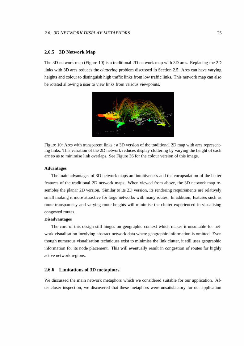
The 3D network map (Figure 10) is a traditional 2D network map with 3D arcs. Replacing the 2D
links with 3D arcs reduces the cluttering problem discussed in Section 2.5. Arcs can have varying
heights and colour to distinguish high traffic links from low traffic links. This network map can also
be rotated allowing a user to view links from various viewpoints.
Figure 10: Arcs with transparent links : a 3D version of the traditional 2D map with arcs represent-ing links. This variation of the 2D network reduces display cluttering by varying the height of eacharc so as to minimise link overlaps. See Figure 36 for the colour version of this image.
Advantages
The main advantages of 3D network maps are intuitiveness and the encapsulation of the better
features of the traditional 2D network maps. When viewed from above, the 3D network map re-
sembles the planar 2D version. Similar to its 2D version, its rendering requirements are relatively
small making it more attractive for large networks with many routes. In addition, features such as
route transparency and varying route heights will minimise the clutter experienced in visualising
congested routes.
Disadvantages
The core of this design still hinges on geographic context which makes it unsuitable for net-
work visualisation involving abstract network data where geographic information is omitted. Even
though numerous visualisation techniques exist to minimise the link clutter, it still uses geographic
information for its node placement. This will eventually result in congestion of routes for highly
active network regions.
2.6.6 Limitations of 3D metaphors
We discussed the main network metaphors which we considered suitable for our application. Af-
ter closer inspection, we discovered that these metaphors were unsatisfactory for our application
26 CHAPTER 2. BACKGROUND AND RELATED WORK
because of recurring problems. In following section, we list these problems and discuss their draw-
backs which need to be addressed to satisfy our visualisation objectives. This list limits itself to the
main problems we have encountered in the process of prototyping and testing these metaphors. As
such, we consider these limitations fundamental obstacles to their selection for our application.
Abstract Data / Geographic Information
Abstract information usually has no natural form or representation, and the literature and tech-
niques on visualising abstract data are correspondingly less developed. The visual metaphors, which
are needed to make abstract relationships visible, are only now emerging [9].
Dynamic reconfiguration results in fast changing logical routes and topological changes. The
information generated from this process includes:
� capacity,
� logical route path,
� physical links,
� origin-destination pairs,
� time of topological change
With the exception of logical route paths and physical links, the data does not contain spatial infor-
mation or attributes which can be intuitively visualised by the traditional visualisation metaphors. It
is the role of a metaphor to provide adequate mappings of abstract data to physical representations
which can be easily comprehended.
Occlusion
Most 3D applications allow for free-style navigation of the 3D network view. In some cases, we
can effectively occlude 3D objects from certain viewpoints. In doing so, we lose touch with parts
of the network which may contain more interesting information. Example of these problems occur
in the globe metaphor, where the surface can occlude the path of a route.
Loss of Overall Network Context
The difficulty with general 3D network displays is that they are often confusing and difficult to
navigate around, and cause the user to lose a sense of overall context as illustrated in Eick et al[17].
An effective metaphor should convey an overview of the entire network topology before proceeding
to a closer inspection of data. This can achieved in metaphors such as the network map and the
platter metaphor.
2.7. VISUAL NAVIGATION AND EXPLORATION 27
Limited Screen Real Estate
Another notable problem with 3D metaphors is the easy ability to swamp the limited screen real
estate. Metaphors are typically extended in each X,Y and Z direction to make full use of the 3D
space. This does however take up extra processing and finite display resources. Many metaphors
used in network visualisation should support interactive rates for real time management. To achieve
this, the metaphor should consist of graphical primitives which are geometrically inexpensive and
fast to render.
Differentiating between Physical and Logical Paths
Most 3D metaphors visualise capacity on the traffic links. In most network visualisation metaphors,
there is no underlying difference between physical and logical links. In the predominant TCP/IP net-
work, logical route information is combined into physical route information with no distinguishing
factors. This presents a hurdle to visualising ATM networks which should highlight the contrast
between physical and logical paths.
2.7 Visual Navigation and Exploration
Navigation through information is an important feature. Data is of little use if we cannot explore it
to find the interesting bits of information. To this end, a good visualisation metaphor should allow
a user to explore the environment and provide multiple viewpoints of a dataset.
Traditional network displays were predominantly two-dimensional, restricting views to planes
only. This restricted view was generally a top-down view of the data in a network map. Investigation
of a particular node or link could only be achieved through a zoom-effect or by user interaction on the
image representation for that object. In a typical network today, we may have thousands or millions
of links overlapping each other which makes mouse interaction on a specific link a daunting task.
Three dimensional network displays allow for navigation to view objects from various view-
points. This ability allows the user to perform drill-down views from different angles, making
closer and more detailed inspections possible. For example, Munzer et al demonstrated how traffic
on the MBone network is visualised using the globe shape to represent the world [35]. The ability
to rotate the globe allows users to follow routes from source node to destination node. This rotation
is not possible in 2D while in 3D it has an obvious affordance: the earth is spherical which allows
the object to rotate without losing its geometrical profile.
28 CHAPTER 2. BACKGROUND AND RELATED WORK
Each metaphor discussed thus far, has adhered to popular navigation techniques allowing fly-
through and zoom-effect examinations of data. In particular, our primary focus in terms of nav-
igation centers on maintaining an overall network context while supporting drill-down views for
more detailed information. In view of this, suitable metaphors for dynamic reconfiguration should
provide an overview of an entire network, allowing a network user to see all network conditions in
one view.
2.8 Application Programming Languages
While the core focus of a visualisation system hinges on the effectiveness of the views, most of the
development time is spent on the user interface and data handling [19].
Important aspects of a successful visualisation package are its design, speed and user-friendliness.
Another aspect which is also important is its portability. Many of the traditional 2D networks maps
were based on C (notable examples include SeeNet[9]). Today, the emphasis is on modular design
with object-oriented languages like C++ and Java. SeeNet3D was written in C++ with OpenGL as
its rendering application programming interface. In the same vein, Flodar was written in Java with
the graphical support of VRML.
Many of the modern network visualisation tools place emphasis on portability. The reason
is mainly because we are confronted with heterogeneous networks. Creating a visualisation tool,
which is normally coupled with a management module, is enhanced through multiple platform sup-
port. This allows administrators to install the visualisation tool on different computer environments
or platforms.
Java is an obvious choice as a programming language for network visualisation. Because it
supports true object oriented, multiple platforms and allows for remote web administration through
web pages and applets, Java is an ideal candidate for the programming language. However it does
have one major drawback, namely speed. At the time of this write-up, C++ was favoured over Java
for speed. Secondly, three-dimensional graphical libraries are less developed for Java than C++.
The main contender is Java3D which does not attain the same rendering performance as OpenGL
and C++.
C++ is favoured for its higher execution speed but does require special tweaking, even repro-
gramming, depending on the platform. Coupled with OpenGL, it is at present very popular amongst
designers. An example of a C++ implementation is SeeNet3D. The SeeNet3D system at the time
of writing this dissertation was a 5,000 line C++ program built on top of the Vz framework. Vz is a
2.9. SUMMARY 29
visualisation platform embodied in an object-oriented, cross platform (MS Windows, OpenGL, and
X11) C++ library. The Vz library provides a foundation for building highly-interactive, linked view
graphical displays.
2.9 Summary
At the beginning of this chapter, we highlighted the need for a visualisation metaphor to display
some unique characteristics of ATM networks. These characteristics include network topological
changes due to dynamic reconfiguration, abstract data generated from the DROP model and high
network scalability. These characteristics are not new to networks but have not been adequately
addressed by previous network visualisation tools.
In this regard, we have discussed metaphors used to convey network traffic and connectivity
information. We have highlighted the main metaphors used in past and current network visualisation
tools. We have demonstrated that many of these metaphors exhibit design flaws, making them
unsuitable for dynamic network management.
Past 2D metaphors suffered largely from display clutter, poor scalability for large networks
and limited interaction techniques. The 3D metaphors incorporated improvements over the 2D
metaphors but had drawbacks of their own.
We have found that past metaphors have largely concentrated on geographic context as a node
placement algorithm. This does not accommodate the abstract data generated through our ATM
model. Since the abstract data places greater emphasis on logical connections, we need to consider
metaphors which minimise the geographic importance of the network model which do not address
the following dynamic network features adequately: dynamic reconfiguration, support for abstract
data, network scalability.
We have seen a need to develop novel metaphors in a programming language which support
cross-platform and object oriented development. In the following chapters, we will discuss a new
metaphor to address the problem of visualising the unique ATM features of our DROP model. We
will highlight the advantages and disadvantages of the new metaphor and show its relative merits
over the previous metaphors mentioned in this chapter.
Chapter 3
Metaphor Design and Applications
3.1 Introduction
We have developed and refined a network visualisation metaphor that allows greater understanding
of a dynamic high-speed ATM network. Network metaphors are visual representations which en-
code the current condition and performance of a network. This chapter examines our visualisation
objectives and introduces adapted metaphors to address the visualisation requirements of an ATM
network application. These adapted metaphors are discussed in Sections 3.5 and 3.6. We demon-
strate the usefulness of our metaphors and provide 3 management tasks which are enriched through
this metaphor. In the following section, we will outline the requirements of a dynamic network
metaphor and the features that need to be encoded visually.
3.2 Dynamic reconfiguration in an ATM network
Asynchronous Transfer Mode or ATM is emerging as the primary networking technology for next-
generation, multi-media communications. ATM protocols are designed to handle isochronous data
such as video and telephony, in addition to more conventional data communications between com-
puters. ATM is based on small, constant-sized cells that permit rapid switching so that multiple
isochronous data can be statistically multiplexed together, along with computer network traffic.
Communication channels are no longer limited to a fixed data rate because of time-division multi-
plexing (TDM) protocols, rather any application uses only the bandwidth required. If an application
requires additional bandwidth for bursty data, it can request the additional bandwidth.
30
3.3. UNITS OF INFORMATION USED IN THE DROP APPLICATION 31
High-speed ATM networks are designed to carry a wide range of services, with differing band-
width and quality of service requirements. Underlying each ATM network are virtual path connec-
tions (VPCs) which form logical direct end-to-end connections between all origin-destination (OD)
pairs. These end-to-end connections create fully meshed logical networks or virtual path connection
networks (VPCNs) upon sparse physical networks [5, 6].
It is possible to dynamically adjust the routes and bandwidth of VPC’s in near real time in order
to maintain an optimally designed VPCN. DROP or Dynamic Reconfiguration and Optimisation
Program is an example of a hierarchical resource management tool for ATM networks. The net-
work resource manager of this tool adjusts the logical link capacities in order to optimally size the
virtual path whenever conditions demand such a reconfiguration. The reconfiguration maintains
sufficient capacity to carry the established connections in progress. This model assumes that the
effective bandwidths of various traffic classes are known and are fixed [5]. The DROP reconfigura-
tion algorithm has been applied to an ATM network model. Traffic is offered to this network and
reconfiguration occurs to optimally provide the necessary capacity to carry this traffic load.
Understanding the changing VPCN is difficult due to the large volumes of abstract data which
needs to be comprehended. Visualisation is widely accepted as a means of conveying complex
information in a simple and concise manner [23]. Before we implement our metaphors, we focus
on the units of information used in dynamic reconfiguration. Ultimately, these units of information
should be considered paramount in the creation of a network metaphor for dynamic reconfiguration
management applications.
3.3 Units of information used in the DROP application
Network information can be extracted from various data sources. In most network management
applications, data is extracted from an operational network. The DROP model generates an ASCII
log file as output, which is used to record the changes in the network. This file provides network
reconfiguration information in the following format :
The majority of routes in a dynamic network are logical routes. These routes consist of a single
link or a series of links to form end-to-end connections. Origin-destination pairs are a collection of
routes which share the same start and end node (see Figure 11). That is, route 1-2-18-11-16-9-3 and
route 1-10-15-18-11-16-9-3 belong to the same origin-destination pair, namely OD 1-3. A physical
link is considered a special route since it is itself an origin-destination pair with one link.
Origin-destination pairs, logical routes, physical links and their associated capacities are the
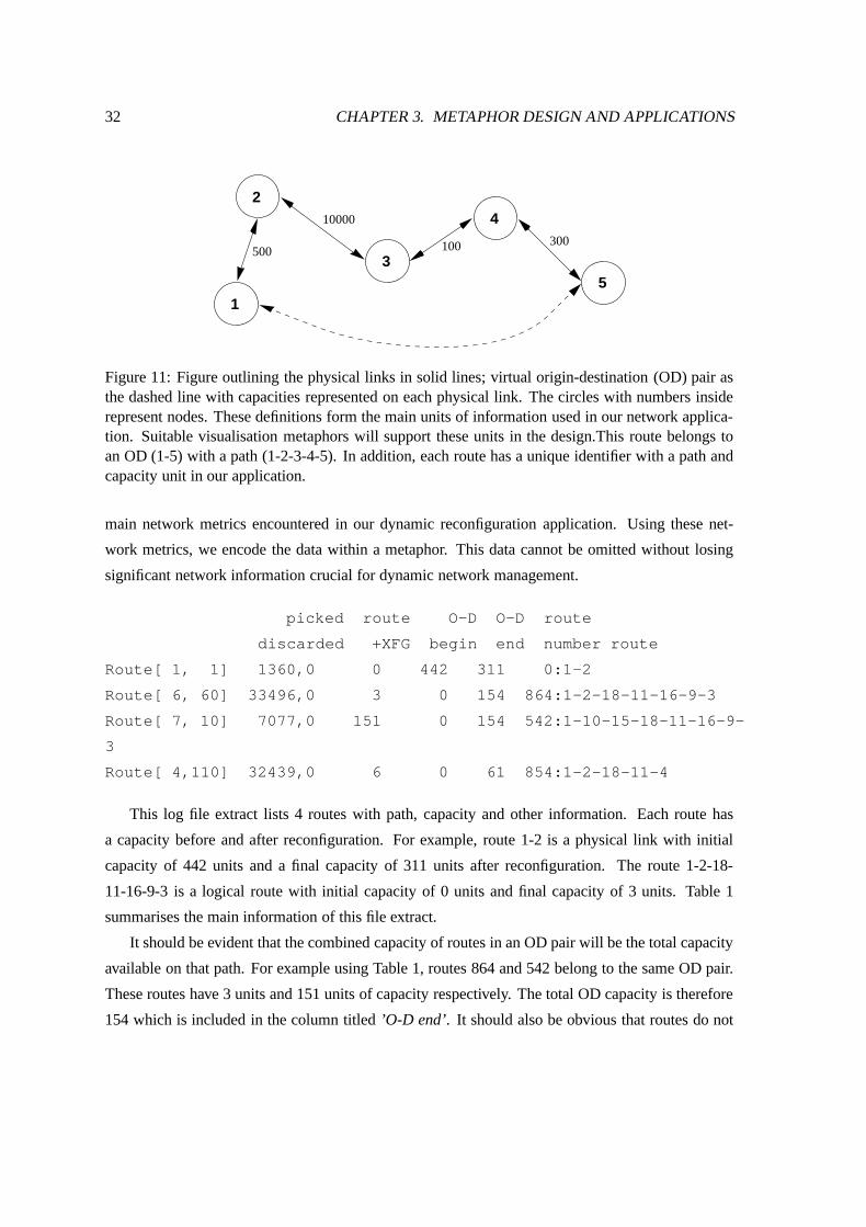
32 CHAPTER 3. METAPHOR DESIGN AND APPLICATIONS
500
5
4
1
10000
2
3300100
Figure 11: Figure outlining the physical links in solid lines; virtual origin-destination (OD) pair asthe dashed line with capacities represented on each physical link. The circles with numbers insiderepresent nodes. These definitions form the main units of information used in our network applica-tion. Suitable visualisation metaphors will support these units in the design.This route belongs toan OD (1-5) with a path (1-2-3-4-5). In addition, each route has a unique identifier with a path andcapacity unit in our application.
main network metrics encountered in our dynamic reconfiguration application. Using these net-
work metrics, we encode the data within a metaphor. This data cannot be omitted without losing
significant network information crucial for dynamic network management.
picked route O-D O-D route
discarded +XFG begin end number route
Route[ 1, 1] 1360,0 0 442 311 0:1-2
Route[ 6, 60] 33496,0 3 0 154 864:1-2-18-11-16-9-3
Route[ 7, 10] 7077,0 151 0 154 542:1-10-15-18-11-16-9-
3
Route[ 4,110] 32439,0 6 0 61 854:1-2-18-11-4
This log file extract lists 4 routes with path, capacity and other information. Each route has
a capacity before and after reconfiguration. For example, route 1-2 is a physical link with initial
capacity of 442 units and a final capacity of 311 units after reconfiguration. The route 1-2-18-
11-16-9-3 is a logical route with initial capacity of 0 units and final capacity of 3 units. Table 1
summarises the main information of this file extract.
It should be evident that the combined capacity of routes in an OD pair will be the total capacity
available on that path. For example using Table 1, routes 864 and 542 belong to the same OD pair.
These routes have 3 units and 151 units of capacity respectively. The total OD capacity is therefore
154 which is included in the column titled ’O-D end’. It should also be obvious that routes do not
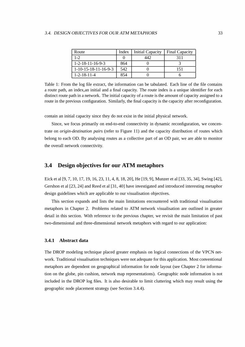
3.4. DESIGN OBJECTIVES FOR OUR ATM METAPHORS 33
Route Index Initial Capacity Final Capacity1-2 0 442 3111-2-18-11-16-9-3 864 0 31-10-15-18-11-16-9-3 542 0 1511-2-18-11-4 854 0 6
Table 1: From the log file extract, the information can be tabulated. Each line of the file containsa route path, an index,an initial and a final capacity. The route index is a unique identifier for eachdistinct route path in a network. The initial capacity of a route is the amount of capacity assigned to aroute in the previous configuration. Similarly, the final capacity is the capacity after reconfiguration.
contain an initial capacity since they do not exist in the initial physical network.
Since, we focus primarily on end-to-end connectivity in dynamic reconfiguration, we concen-
trate on origin-destination pairs (refer to Figure 11) and the capacity distribution of routes which
belong to each OD. By analysing routes as a collective part of an OD pair, we are able to monitor
the overall network connectivity.
3.4 Design objectives for our ATM metaphors
Eick et al [9, 7, 10, 17, 19, 16, 23, 11, 4, 8, 18, 20], He [19, 9], Munzer et al [33, 35, 34], Swing [42],
Gershon et al [23, 24] and Reed et al [31, 40] have investigated and introduced interesting metaphor
design guidelines which are applicable to our visualisation objectives.
This section expands and lists the main limitations encountered with traditional visualisation
metaphors in Chapter 2. Problems related to ATM network visualisation are outlined in greater
detail in this section. With reference to the previous chapter, we revisit the main limitation of past
two-dimensional and three-dimensional network metaphors with regard to our application:
3.4.1 Abstract data
The DROP modeling technique placed greater emphasis on logical connections of the VPCN net-
work. Traditional visualisation techniques were not adequate for this application. Most conventional
metaphors are dependent on geographical information for node layout (see Chapter 2 for informa-
tion on the globe, pin cushion, network map representations). Geographic node information is not
included in the DROP log files. It is also desirable to limit cluttering which may result using the
geographic node placement strategy (see Section 3.4.4).

34 CHAPTER 3. METAPHOR DESIGN AND APPLICATIONS
3.4.2 Dynamic reconfiguration
Maintaining a consistent and comprehensible view of the dynamic VPCN has not been adequately
addressed by previous traditional visual metaphors. The high frequency and volume of events in
our dynamic reconfiguration application may hinder the rendering and interactive performance of
a three-dimensional visualisation metaphor. During reconfiguration, routes may undergo several
transformations. These transformations may include changes in capacity, extermination or intro-
duction of logical routes to maintain service delivery levels. Routes and capacities are updated
frequently while origin-destination pairs are updated infrequently.
A suitable network metaphor should be able to scale well for networks of different sizes while
providing an interactive interface to the data. To achieve interactive rates, the primitives should
ideally be geometrically simple. This should allow fast rendering and navigation through the data.
3.4.3 Call level vs cell level analysis
Call level monitoring ignores the flow of packets or cells in ATM networks and places emphasis on
successful connections between start and destination nodes. Network maps and metaphors based on
global traffic were designed with TCP/IP networks in mind. The flow of IP packets were visualised
to show traffic routes and route problems. It is widely accepted that transmission reliability has im-
proved due to lower error rates in fibre optic technology. For our ATM application, the visualisation
focus should concentrate less on packet flow and greater emphasis should be placed on visualis-
ing more relevant metrics such as end-to-end connectivity, service delivery and network blocking
probability.
3.4.4 Cluttering
The number of nodes in a network is variable causing some metaphors to experience problems
when visualising large networks. Traditional 2D metaphors, such as the network map, are unsuited
to large networks as they are prone to exhibit display cluttering. Three-dimensional metaphors such
as the globe and pin-cushion experience less cluttering but due to their three-dimensional design,
the problem of occlusion is introduced.
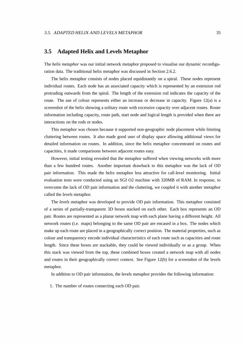
3.5. ADAPTED HELIX AND LEVELS METAPHOR 35
3.5 Adapted Helix and Levels Metaphor
The helix metaphor was our initial network metaphor proposed to visualise our dynamic reconfigu-
ration data. The traditional helix metaphor was discussed in Section 2.6.2.
The helix metaphor consists of nodes placed equidistantly on a spiral. These nodes represent
individual routes. Each node has an associated capacity which is represented by an extension rod
protruding outwards from the spiral. The length of the extension rod indicates the capacity of the
route. The use of colour represents either an increase or decrease in capacity. Figure 12(a) is a
screenshot of the helix showing a solitary route with excessive capacity over adjacent routes. Route
information including capacity, route path, start node and logical length is provided when there are
interactions on the rods or nodes.
This metaphor was chosen because it supported non-geographic node placement while limiting
cluttering between routes. It also made good user of display space allowing additional views for
detailed information on routes. In addition, since the helix metaphor concentrated on routes and
capacities, it made comparisons between adjacent routes easy.
However, initial testing revealed that the metaphor suffered when viewing networks with more
than a few hundred routes. Another important drawback to this metaphor was the lack of OD
pair information. This made the helix metaphor less attractive for call-level monitoring. Initial
evaluation tests were conducted using an SGI O2 machine with 320MB of RAM. In response, to
overcome the lack of OD pair information and the cluttering, we coupled it with another metaphor
called the levels metaphor.
The levels metaphor was developed to provide OD pair information. This metaphor consisted
of a series of partially-transparent 3D boxes stacked on each other. Each box represents an OD
pair. Routes are represented as a planar network map with each plane having a different height. All
network routes (i.e. maps) belonging to the same OD pair are encased in a box. The nodes which
make up each route are placed in a geographically correct position. The material properties, such as
colour and transparency encode individual characteristics of each route such as capacities and route
length. Since these boxes are stackable, they could be viewed individually or as a group. When
this stack was viewed from the top, these combined boxes created a network map with all nodes
and routes in their geographically correct context. See Figure 12(b) for a screenshot of the levels
metaphor.
In addition to OD pair information, the levels metaphor provides the following information:
1. The number of routes connecting each OD pair.
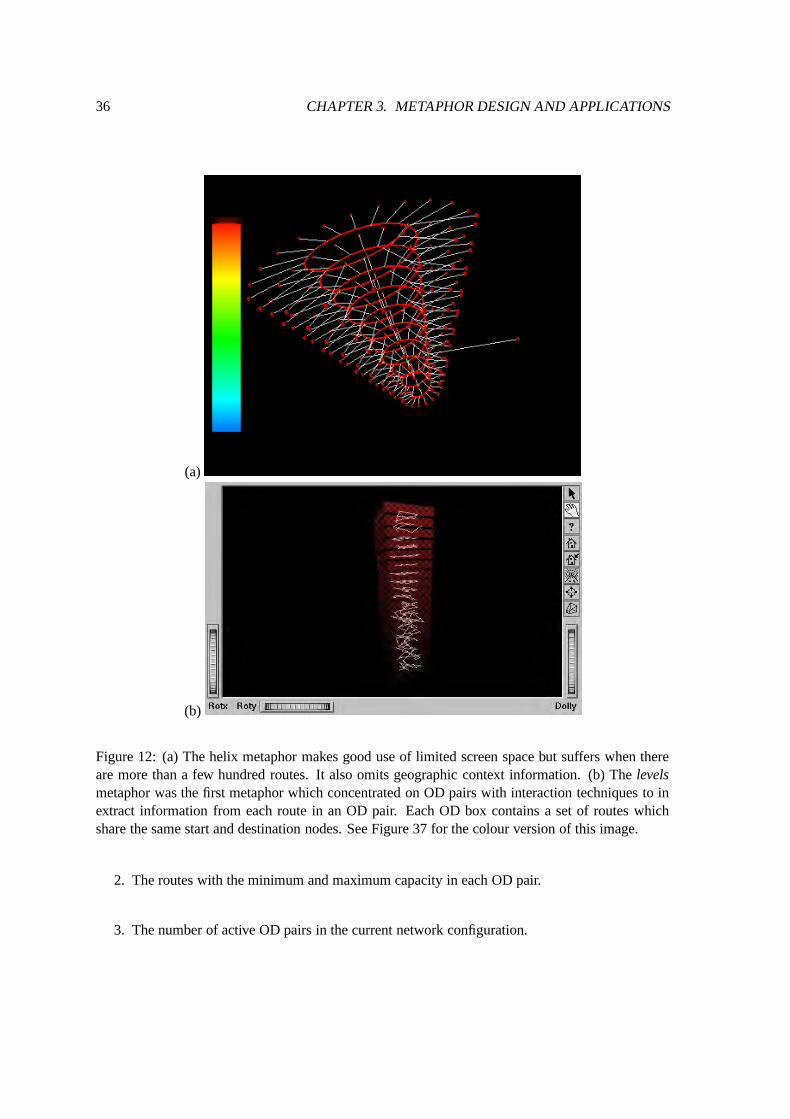
36 CHAPTER 3. METAPHOR DESIGN AND APPLICATIONS
(a)
(b)
Figure 12: (a) The helix metaphor makes good use of limited screen space but suffers when thereare more than a few hundred routes. It also omits geographic context information. (b) The levelsmetaphor was the first metaphor which concentrated on OD pairs with interaction techniques to inextract information from each route in an OD pair. Each OD box contains a set of routes whichshare the same start and destination nodes. See Figure 37 for the colour version of this image.
2. The routes with the minimum and maximum capacity in each OD pair.
3. The number of active OD pairs in the current network configuration.
3.6. ADAPTED PLATTER METAPHOR 37
The levels metaphor could also emphasise routes and their OD pair affiliation. It provided
acceptable interaction and navigation tools to extract detailed information about the route and its
parent OD pair.
There were also drawbacks to this metaphor. Even though each OD pair was represented by
a partially transparent box, the stacked boxes created an opaque view limiting the focus to mainly
the top boxes. This in turn made identifying interesting or problematic routes in the lower boxes
difficult. Our objective was to develop a metaphor which could maintain the overall network view
while allowing detailed examination through interactions.
Initial testing and feedback responses from a dynamic reconfiguration network specialist led us
to the conclusion that although the helix and levels metaphor placed emphasis on the main units of
information, it created more overhead in terms of user understanding and training. Cluttering was
also exhibited on the helix when visualising networks with more than a few hundred routes. In re-
sponse, we conceded to the ineffectiveness of this metaphor combination and decided to investigate
another promising metaphor to overcome these limitation and deliver our ATM information more
effectively.
3.6 Adapted Platter Metaphor
Our platter metaphor is an adaptation of the original metaphor used in the Flodar application which
was developed for identifying unresponsive network servers (refer to Section 2.6.4 for information
on the original platter metaphor).
We adapted the platter metaphor to accommodate support for OD pairs and routes and large
scalable networks. Each ring was customised to represent ATM information. We used the rings
primarily to indicate capacity. The capacity at the edge of the platter is zero for most management
applications but this can be changed providing administrators the ability to select the minimum
capacity for a network iteration. Similarly, the capacity in the centre of the platter can be specified
by the administrator and represents a user-defined maximum.
Routes are represented as a pillars (i.e. geometrically cylinders or cubes) on the platter while its
capacity is encoded by its closeness or proximity to the platter centre. Routes closest to the centre
have the highest capacity for a network configuration. The height of each pillar is not used to encode
network information. We took this decision because the height of an individual pillar closer to the
edge of the platter could occlude pillars on the same orthogonal line from the edge to the center.
An OD pair is represented by the arrangement of routes in a straight line projecting from the
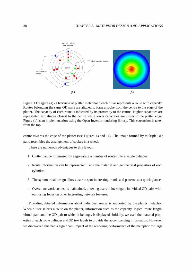
38 CHAPTER 3. METAPHOR DESIGN AND APPLICATIONS
Center
OD pair : 27-34 with 4 routes
Low capacityroutes
High capacity routes
(a) (b)
Figure 13: Figure (a) - Overview of platter metaphor : each pillar represents a route with capacity.Routes belonging the same OD pairs are aligned to form a spoke from the centre to the edge of theplatter. The capacity of each route is indicated by its proximity to the centre. Higher capacities arerepresented as cylinder closest to the centre while lower capacities are closer to the platter edge.Figure (b) is an implementation using the Open Inventor rendering library. This screenshot is takenfrom the top.
centre towards the edge of the platter (see Figures 13 and 14). The image formed by multiple OD
pairs resembles the arrangement of spokes in a wheel.
There are numerous advantages to this layout :
1. Clutter can be minimised by aggregating a number of routes into a single cylinder.
2. Route information can be represented using the material and geometrical properties of each
cylinder.
3. The symmetrical design allows user to spot interesting trends and patterns at a quick glance.
4. Overall network context is maintained, allowing users to investigate individual OD pairs with-
out losing focus on other interesting network features.
Providing detailed information about individual routes is supported by the platter metaphor.
When a user selects a route on the platter, information such as the capacity, logical route length,
virtual path and the OD pair to which it belongs, is displayed. Initially, we used the material prop-
erties of each route cylinder and 3D text labels to provide the accompanying information. However,
we discovered this had a significant impact of the rendering performance of the metaphor for large
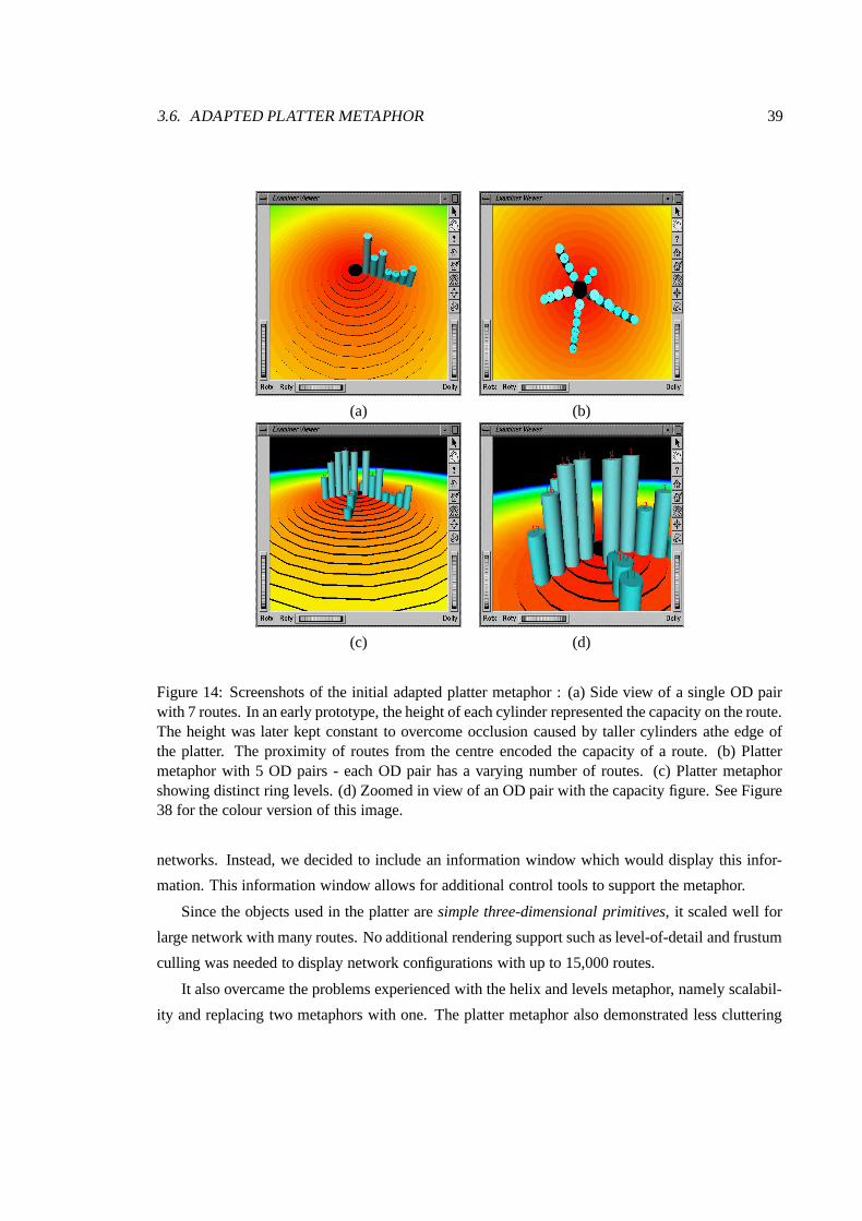
3.6. ADAPTED PLATTER METAPHOR 39
(a) (b)
(c) (d)
Figure 14: Screenshots of the initial adapted platter metaphor : (a) Side view of a single OD pairwith 7 routes. In an early prototype, the height of each cylinder represented the capacity on the route.The height was later kept constant to overcome occlusion caused by taller cylinders athe edge ofthe platter. The proximity of routes from the centre encoded the capacity of a route. (b) Plattermetaphor with 5 OD pairs - each OD pair has a varying number of routes. (c) Platter metaphorshowing distinct ring levels. (d) Zoomed in view of an OD pair with the capacity figure. See Figure38 for the colour version of this image.
networks. Instead, we decided to include an information window which would display this infor-
mation. This information window allows for additional control tools to support the metaphor.
Since the objects used in the platter are simple three-dimensional primitives, it scaled well for
large network with many routes. No additional rendering support such as level-of-detail and frustum
culling was needed to display network configurations with up to 15,000 routes.
It also overcame the problems experienced with the helix and levels metaphor, namely scalabil-
ity and replacing two metaphors with one. The platter metaphor also demonstrated less cluttering

40 CHAPTER 3. METAPHOR DESIGN AND APPLICATIONS
and supported a full context view of the entire network. This was particularly useful for identifying
patterns within the network.
Initial testing suggested that the platter metaphor was suitable for our primary applications.
The performance and effectiveness of this metaphor were based on feedback received from our
dynamic network expert. We tested the metaphor’s effectiveness across three management applica-
tions. These applications ranged from simple network accounting on the number of routes to more
complex applications such as displaying the distribution of capacity versus the route length in the
network. In the following sections, we provided ATM management tasks which are supported by
the platter metaphor.
3.6.1 Application 1: Capacity Distribution
Effective routing is the centre of all operations in network management [3]. The platter metaphor
can provide information about the capacity distribution of the VPCN network as illustrated in Figure
15. The layout of route cylinders in each OD pair are used to indicate capacity trends in the network.
This view enables administrators to gauge the distribution of capacity in the network. The layout
of routes in Figure 15 gives a concise indication that the majority of routes have low capacity since
most routes lie near the edge of the platter. Colour was used to indicate routes that belong to the
same OD pair (i.e. OD pair affiliation).
This view is useful when administrative intervention is required to distribute capacity amongst
routes. Attention can easily be drawn to routes which are close the centre of the platter. These routes
consume a large portion of capacity leaving less capacity for the rest of the network. Through this
view, administrators can easily identify routes with excessive capacity.
3.6.2 Application 2: Capacity vs Route Length
This application is similar to the capacity distribution view with colour used to indicate route length.
This application is useful when evaluating the optimal route configuration after a network has un-
dergone reconfiguration. Colour is used to indicate the number of links (i.e. logical route length) of
each route. We used six colours to encode route lengths ranging from one to ten or more links. For
example, red was used to indicate route lengths between one and three links while green encoded
lengths between four and six. As in our previous application, the capacity of each route is encoded
by its proximity to the centre. OD pair affiliation is still represented as a straight line from the edge
to the centre of the platter.
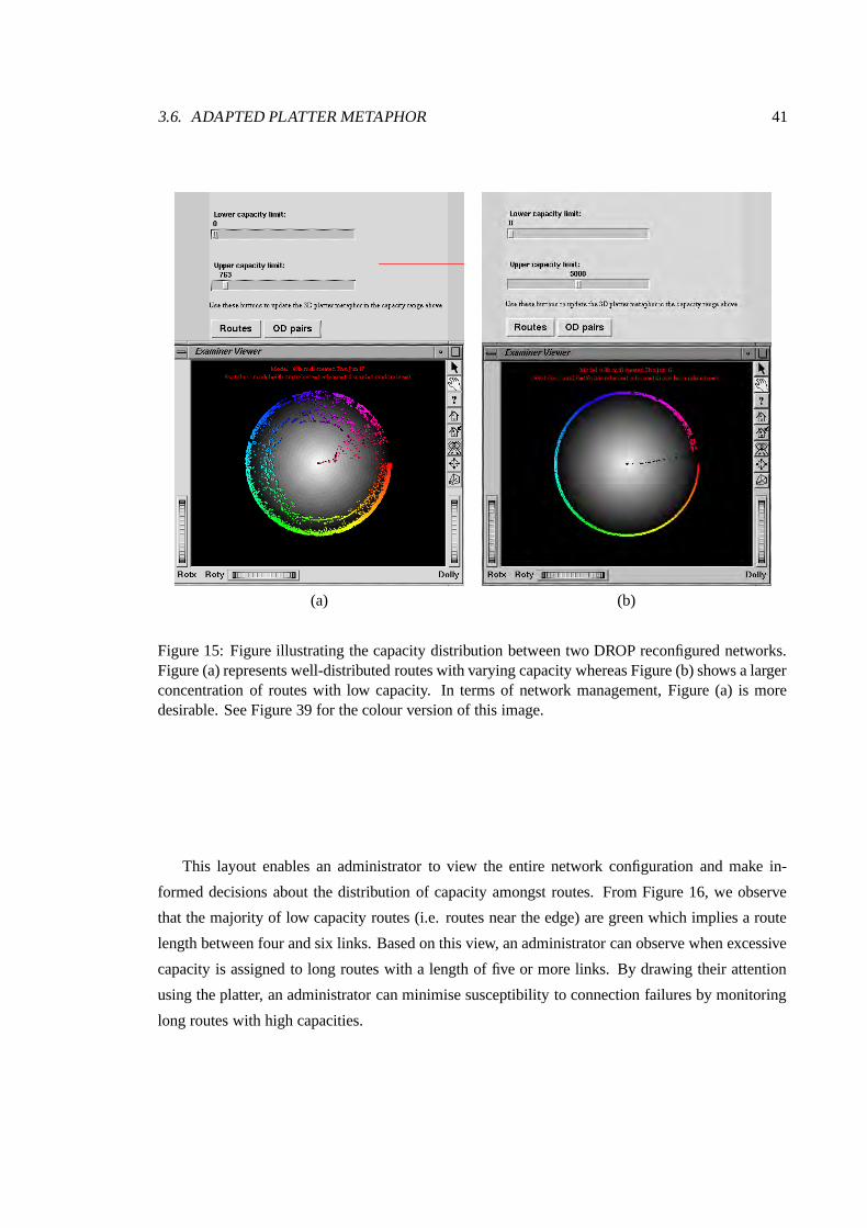
3.6. ADAPTED PLATTER METAPHOR 41
(a) (b)
Figure 15: Figure illustrating the capacity distribution between two DROP reconfigured networks.Figure (a) represents well-distributed routes with varying capacity whereas Figure (b) shows a largerconcentration of routes with low capacity. In terms of network management, Figure (a) is moredesirable. See Figure 39 for the colour version of this image.
This layout enables an administrator to view the entire network configuration and make in-
formed decisions about the distribution of capacity amongst routes. From Figure 16, we observe
that the majority of low capacity routes (i.e. routes near the edge) are green which implies a route
length between four and six links. Based on this view, an administrator can observe when excessive
capacity is assigned to long routes with a length of five or more links. By drawing their attention
using the platter, an administrator can minimise susceptibility to connection failures by monitoring
long routes with high capacities.
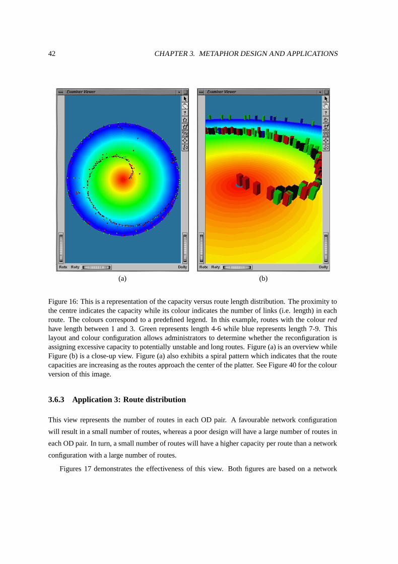
42 CHAPTER 3. METAPHOR DESIGN AND APPLICATIONS
(a) (b)
Figure 16: This is a representation of the capacity versus route length distribution. The proximity tothe centre indicates the capacity while its colour indicates the number of links (i.e. length) in eachroute. The colours correspond to a predefined legend. In this example, routes with the colour redhave length between 1 and 3. Green represents length 4-6 while blue represents length 7-9. Thislayout and colour configuration allows administrators to determine whether the reconfiguration isassigning excessive capacity to potentially unstable and long routes. Figure (a) is an overview whileFigure (b) is a close-up view. Figure (a) also exhibits a spiral pattern which indicates that the routecapacities are increasing as the routes approach the center of the platter. See Figure 40 for the colourversion of this image.
3.6.3 Application 3: Route distribution
This view represents the number of routes in each OD pair. A favourable network configuration
will result in a small number of routes, whereas a poor design will have a large number of routes in
each OD pair. In turn, a small number of routes will have a higher capacity per route than a network
configuration with a large number of routes.
Figures 17 demonstrates the effectiveness of this view. Both figures are based on a network
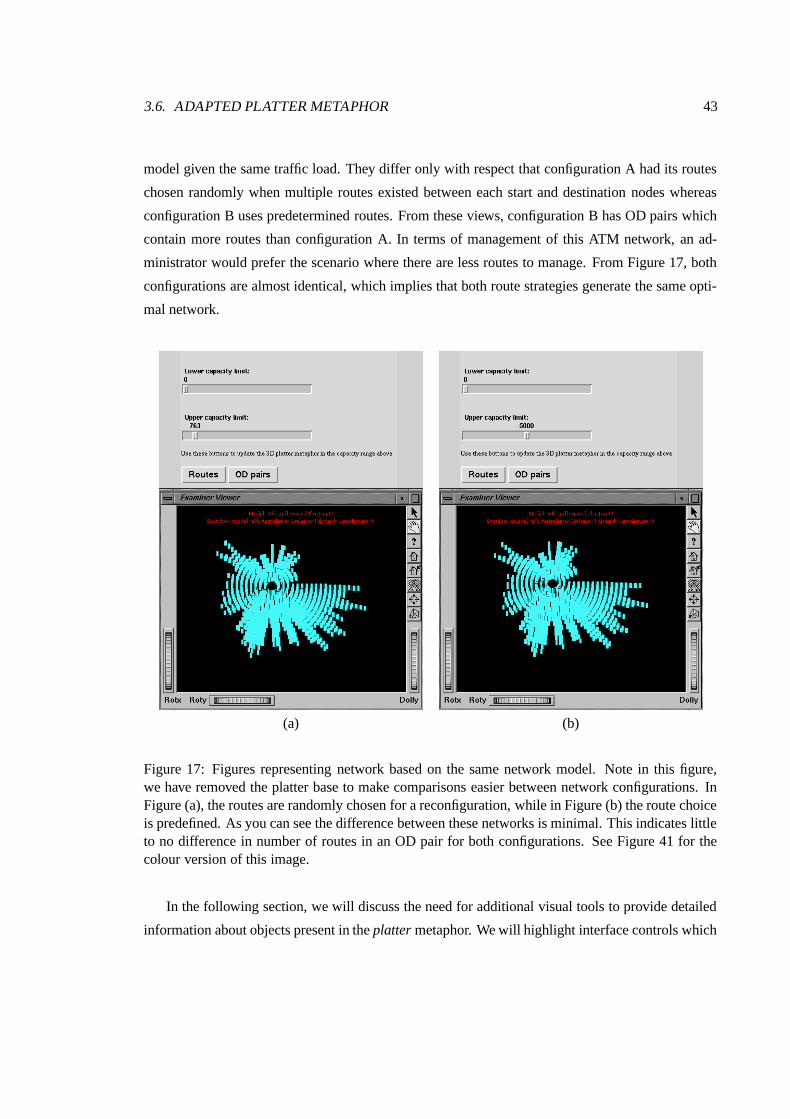
3.6. ADAPTED PLATTER METAPHOR 43
model given the same traffic load. They differ only with respect that configuration A had its routes
chosen randomly when multiple routes existed between each start and destination nodes whereas
configuration B uses predetermined routes. From these views, configuration B has OD pairs which
contain more routes than configuration A. In terms of management of this ATM network, an ad-
ministrator would prefer the scenario where there are less routes to manage. From Figure 17, both
configurations are almost identical, which implies that both route strategies generate the same opti-
mal network.
(a) (b)
Figure 17: Figures representing network based on the same network model. Note in this figure,we have removed the platter base to make comparisons easier between network configurations. InFigure (a), the routes are randomly chosen for a reconfiguration, while in Figure (b) the route choiceis predefined. As you can see the difference between these networks is minimal. This indicates littleto no difference in number of routes in an OD pair for both configurations. See Figure 41 for thecolour version of this image.
In the following section, we will discuss the need for additional visual tools to provide detailed
information about objects present in the platter metaphor. We will highlight interface controls which
44 CHAPTER 3. METAPHOR DESIGN AND APPLICATIONS
allow greater navigation around the scene as well as interaction controls allowing access to more
in-depth information about network routes and OD pairs.
3.7 2D Histogram and Barcharts
In addition to novel 3D metaphors, we complement our metaphors with standard barcharts and
histograms. These graphs offer additional network information on the VPCN. The interface tool
allows the user to control aspects of the barcharts and histograms to vary scales and to interact with
graphs.
The main purpose of the interface window is to provide detailed network information, which
is not provided in the metaphor. The platter metaphor shows the overall network context but due
to space and rendering speed constraints, information on the each individual route is not provided
in the three-dimensional display. Instead, this information is displayed in a Tcl/tk canvas window
which is updated when an mouse event occurs on the platter.
Cox and Eick et al emphasised that the network visualisation research should focus on how to
overcome fundamental problems in understanding large and complex networks using 3D graphics
technologies while simultaneously maintaining the benefits of the useful and well-established 2D
node and link maps[9].
This is one of our main objectives but we needed to supplement this visualisation with some
standard, well recognised visual techniques. Two-dimensional barcharts and histograms are used
to create a more versatile network visualisation tool. This feature allows us to extend the platter
metaphor with standard network metaphors to accommodate other network applications.
We chose two additional applications from the DROP model. The first application was a shortest
route length distribution showing the number of routes against the number of links in the each
route. That is, we plotted the shortest route for each OD pair against the length of the route. This
application will be discussed in greater detail in the following Section 3.7.1.
The second network application is a histogram view of the logical length distribution. This view
highlights the contrasts between the shortest route in an OD pair and the lengths of other routes in
the same OD pair. Its main function is to show the difference between the length of the shortest
route and other routes that connect the same origin and destination nodes.
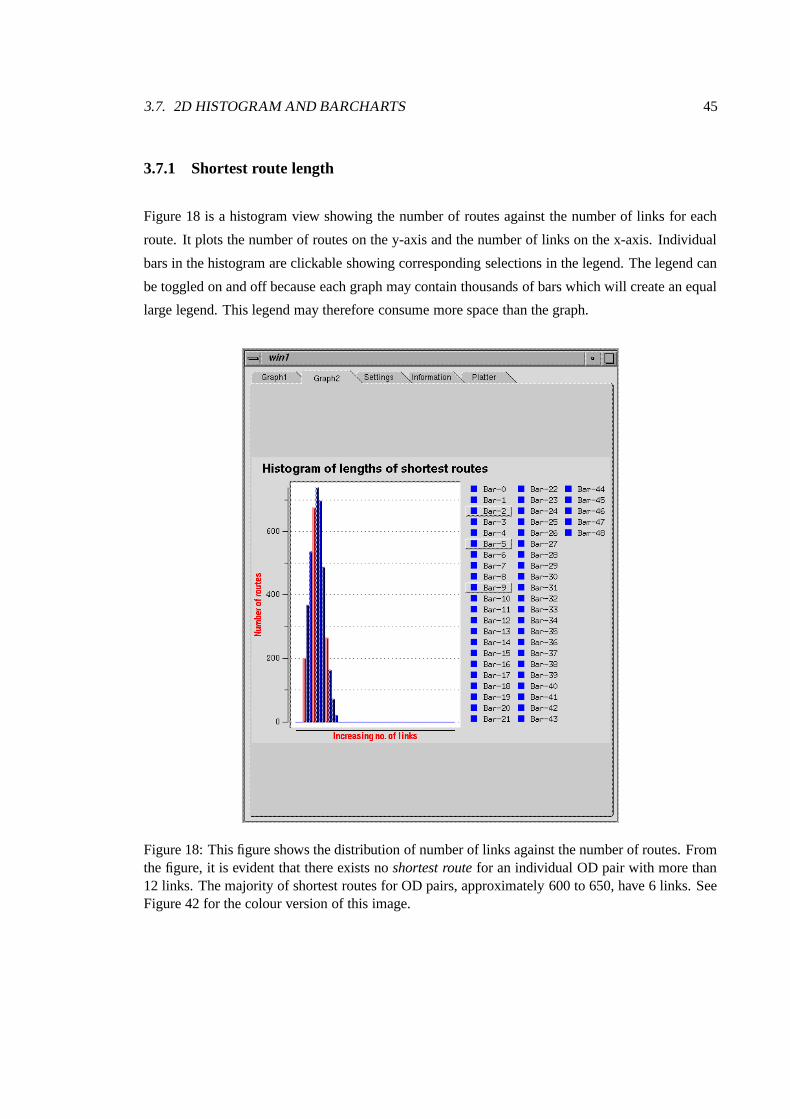
3.7. 2D HISTOGRAM AND BARCHARTS 45
3.7.1 Shortest route length
Figure 18 is a histogram view showing the number of routes against the number of links for each
route. It plots the number of routes on the y-axis and the number of links on the x-axis. Individual
bars in the histogram are clickable showing corresponding selections in the legend. The legend can
be toggled on and off because each graph may contain thousands of bars which will create an equal
large legend. This legend may therefore consume more space than the graph.
Figure 18: This figure shows the distribution of number of links against the number of routes. Fromthe figure, it is evident that there exists no shortest route for an individual OD pair with more than12 links. The majority of shortest routes for OD pairs, approximately 600 to 650, have 6 links. SeeFigure 42 for the colour version of this image.
46 CHAPTER 3. METAPHOR DESIGN AND APPLICATIONS
3.7.2 Logical length distribution
The logical length distribution barchart is similar to the shortest length histogram. It makes use of
barcharts which are easily recognisable to most people. Understanding the data in this histogram
is more complex. The data is partitioned according to the���
th index where i represents the length
from one to the longest route in the network. This���
th value is referred to as the unnormalised
length. Each route has also a normalised length which is calculated using the following formula :
For each OD pair (j,k):���������
unnormalised length of shortest route connecting (j,k)
Each item in the barchart is representative of the���
value. For example, when the���
th index is
1,����
= length - 1 of the shortest route connecting the OD pair.
If there exists two routes in the same OD pair, the first route will be blue while all subsequent
routes will be yellow or gold as illustrated in Figure 19. This feature allows the user to differentiate
the remaining routes length in comparison with other routes inside and outside the current OD pair.
3.8 Summary
In this chapter, we identified the main areas of network management for our visual application. We
introduced the DROP ATM network resource management application.
In addressing the shortcomings of previous metaphors, we focused on the units of network infor-
mation present in the DROP application. Our first metaphor was a combination of two metaphors,
namely the helix metaphor and the levels metaphor. This metaphor was suitable for small networks
with a few hundred routes. However, this metaphor was abandoned in favour of the platter metaphor
which overcame some of the limitations in the helix and levels metaphor.
The platter metaphor is an adaption of the original platter metaphor introduced in the Flodar
application [42]. This metaphor was tested on selected management applications using sample dy-
namic reconfiguration data. We described the visual output of the metaphor for each application.
To further enhance the versatility of this metaphor, the platter metaphor was supported by a his-
togram and barchart representations. In the next chapter, we conduct experiments to determine the
effectiveness of the platter metaphor using network administrators and researchers.

3.8. SUMMARY 47
(a) (b)
Figure 19: Histogram showing logical length distribution – Figure (a) illustrates a distinct increasingstepping pattern in the logical length distribution. This stepping pattern indicates that the routes arearranged in increasing order for various OD pairs. Figure (b) shows routes belonging to the sameOD pair in different colours. Notice that the route lengths are equal for most OD pairs. All routeshave a positive i’ value indicating an increased number of links over the shortest length. See Figure43 for the colour version of this image.
Chapter 4
Experiment Design
4.1 Introduction
In Chapter 2, we discussed the need for a network metaphor to visualise our ATM network ap-
plication. We discussed the main limitations of previous network metaphors and proposed new
metaphors to address these problems. Chapter 3 outlined the design of our metaphor and the advan-
tages it may hold.
Our primary metaphor, the platter metaphor was developed to overcome past problems and aid
in understanding dynamic network information. This metaphor promised numerous advantages over
past network metaphors including:
� support for reconfigurable networks
� accommodation of abstract network data
� ability to handle large and sparse networks
In support of our metaphor design objectives, we need to determine the usefulness and effec-
tiveness of this metaphor with respect to our ATM application. To evaluate the effectiveness of this
metaphor, we analysed the metaphor to determine how well it conveys our dynamic reconfiguration
information. Two important metrics were investigated:
1. Time taken to learn and interpret the metaphor,
2. Correct interpretation and understanding of current network conditions.
48

4.2. EXPERIMENT OVERVIEW 49
We employed user testing to test and verify our assertions about the effectiveness of the metaphor.
Users’ responses to a questionnaire were recorded and analysed to measure their understanding of
the current network configuration.
In this chapter, we discussed the pilot and final experiment used to realise our objectives. We
provide details on the tutorial and questionnaire phase. We will discuss the questionnaire and the
network skills required for each section. Some background information will be provided about the
subjects who participated in both experiments. We introduce the main objective of the experiment.
These objectives are formally stated as hypotheses. Later sections in this chapter describe the ex-
periment environment and the equipment used. Lastly, we conclude the chapter summarising the
main experiment design decisions. The results of this experiment will be analysed and discussed in
the following chapter, Experiment Results and Discussion, Chapter 5.
4.2 Experiment Overview
This experiment engages users and their understanding of the data. We consider this a fundamental
part of the design and application of new visual representations.
The main aim of our subjective testing is to determine the level of usability and efficiency sub-
jects experienced using the platter metaphor. Suitable subjects for this experiment include network
administrators and researchers with some network management experience. These subjects are fa-
miliar with fundamental network concepts and more importantly are more likely to use these tools
in their work environment.
Subjects were given a short tutorial explaining the concept of the metaphor and the network
properties it represents. Following this tutorial, these subjects completed a network questionnaire
designed to test their knowledge of the platter metaphor and its content. Questions were grouped
into sections which required specific ATM network knowledge. We will discuss the experiments, the
tutorial and questionnaire phases and give an overview of the questionnaire design in the following
sections.
4.2.1 Pilot and Final Experiment overview
We conducted two experiments: the pilot experiment tested the conditions of the experiment envi-
ronment while the final experiment extracted the main subjective information.
50 CHAPTER 4. EXPERIMENT DESIGN
Experiment 1: Pilot test
This experiment was a trial for the final experiment. In this experiment, we examined users’ re-
sponses to questions and the conditions in which the experiment was conducted. It ensured that
there were no obvious flaws in the format of the questionnaire and the manner in which it was
conducted. It also ensured that the environment (i.e. lighting, seating, writing equipment and equip-
ment etc.) was satisfactory for subjects. Additionally, feedback received from this experiment was
analysed and refined for inclusions in the final experiment. It is accepted as standard practice to
conduct pilot tests for first-time subjective experiments. Our pilot users are not meant to have the
same competency as the target or final test users. These pilot users verify that the experiment can
be conducted without bias or ambiguity during the course of the experiment.
Experiment 2 : Final test
This experiment was the primary experiment testing user reactions to various questions posed in a
multiple-choice questionnaire. The users consisted of network researchers and administrators with
experience or knowledge in network management or administration.
The final experiment followed the same format as the pilot except its subjects had some exposure
to network management or system administration. By removing the flaws found in the pilot, the final
experiment served as the primary experiment for testing our objectives.
4.2.2 Tutorial and Questionnaire Phase
Participation in this experiment was restricted to subjects who had no prior exposure to the platter
metaphor. Therefore, all tests were carried out in two phases:
1. Tutorial (group or individual)
2. Questionnaire (individual)
Tutorial
The tutorial phase is a 10 to 15 minute learning session for subjects. It is conducted using pairs
of subjects or on an individual basis. This phase introduces the platter metaphor, the problems it
addresses and an example of its implementation. Subjects have the opportunity to ask questions at
the end of the tutorial to verify that their understanding is correct.
Questionnaire
The questionnaire phase follows the tutorial phase. Its main purpose is to elicit information from
each subject on their understanding of the current network properties. An example of an ATM
4.2. EXPERIMENT OVERVIEW 51
network configuration is presented to each subject. Based on this example, subjects have to answer
network questions using the platter metaphor.
4.2.3 Questionnaire overview
It is well recognised that the main goal of an experiment should not be indicated to subjects [37].
Their knowledge of an experiment’s intention will influence their responses to questions.
Each subject was given a multiple-choice questionnaire (see Appendix A, Section A.2). This
questionnaire has five sections which examines different network knowledge including:
1. Physical appearance of the metaphor
2. Quantitative network route information
3. Detailed information on individual network routes
4. Problem solving using network information contained in the metaphor
5. Administrative network decisions based on the information provided by the metaphor
Each section contained 4 questions except for Section 4 which had 3 questions.
The questions in Sections 1 and 2 were based on a set of images (see Appendix A, Figure A.1).
These images were generated by our platter metaphor program. A subject was asked to investigate
and identify network routes portrayed in each image. In response, the subject chose an appropriate
response from the multiple-choice list.
Sections 3,4 and 5 are based on a computer program using the platter metaphor. The subject will
be asked to extract information from the metaphor using the three-dimensional navigation controls
and an information widget (see Figure 20).
Section 5 was treated as a special section since it required administrative knowledge to answer
successfully. Each question in this section is either TRUE, FALSE or UNDECIDED.
The experiment was conducted by an assistant and myself with at most two subjects at a time.
Subjects were tutored together to reduce the amount of tutoring required. By correlating the resul-
tant scores of both subjects in the same session, we could determine whether there may have been
significant problems in any particular testing session.
Following the tutorial phase, each subject was isolated in a room with a multiple-choice ques-
tionnaire and a computer containing the metaphor program. Isolation minimises the external inter-
ference that may influence the subject’s concentration.
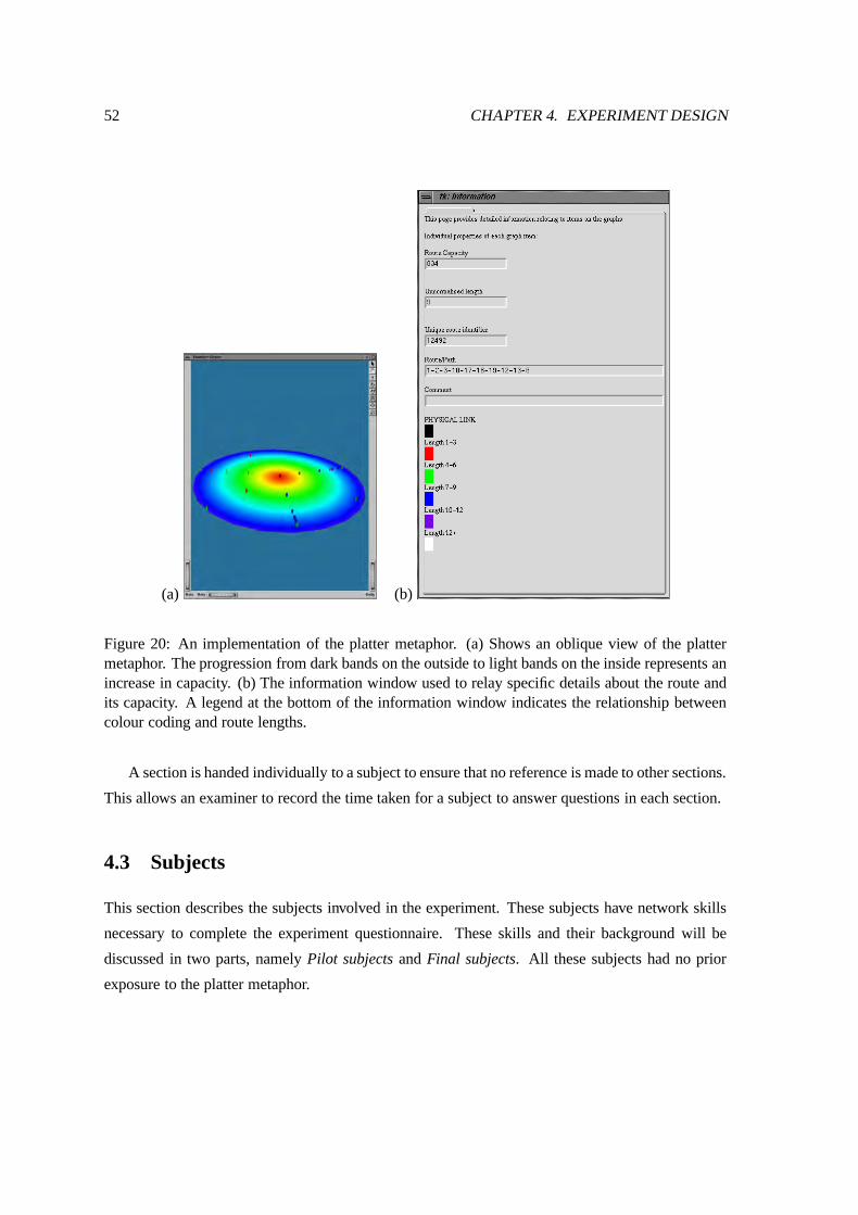
52 CHAPTER 4. EXPERIMENT DESIGN
(a) (b)
Figure 20: An implementation of the platter metaphor. (a) Shows an oblique view of the plattermetaphor. The progression from dark bands on the outside to light bands on the inside represents anincrease in capacity. (b) The information window used to relay specific details about the route andits capacity. A legend at the bottom of the information window indicates the relationship betweencolour coding and route lengths.
A section is handed individually to a subject to ensure that no reference is made to other sections.
This allows an examiner to record the time taken for a subject to answer questions in each section.
4.3 Subjects
This section describes the subjects involved in the experiment. These subjects have network skills
necessary to complete the experiment questionnaire. These skills and their background will be
discussed in two parts, namely Pilot subjects and Final subjects. All these subjects had no prior
exposure to the platter metaphor.
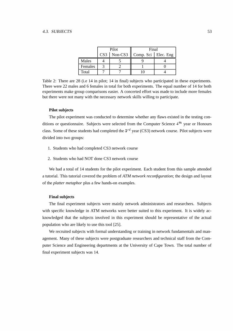
4.3. SUBJECTS 53
Pilot FinalCS3 Non-CS3 Comp. Sci Elec. Eng
Males 4 5 9 4Females 3 2 1 0Total 7 7 10 4
Table 2: There are 28 (i.e 14 in pilot; 14 in final) subjects who participated in these experiments.There were 22 males and 6 females in total for both experiments. The equal number of 14 for bothexperiments make group comparisons easier. A concerted effort was made to include more femalesbut there were not many with the necessary network skills willing to participate.
Pilot subjects
The pilot experiment was conducted to determine whether any flaws existed in the testing con-
ditions or questionnaire. Subjects were selected from the Computer Science�����
year or Honours
class. Some of these students had completed the ����
year (CS3) network course. Pilot subjects were
divided into two groups:
1. Students who had completed CS3 network course
2. Students who had NOT done CS3 network course
We had a total of 14 students for the pilot experiment. Each student from this sample attended
a tutorial. This tutorial covered the problem of ATM network reconfiguration; the design and layout
of the platter metaphor plus a few hands-on examples.
Final subjects
The final experiment subjects were mainly network administrators and researchers. Subjects
with specific knowledge in ATM networks were better suited to this experiment. It is widely ac-
knowledged that the subjects involved in this experiment should be representative of the actual
population who are likely to use this tool [25].
We recruited subjects with formal understanding or training in network fundamentals and man-
agement. Many of these subjects were postgraduate researchers and technical staff from the Com-
puter Science and Engineering departments at the University of Cape Town. The total number of
final experiment subjects was 14.
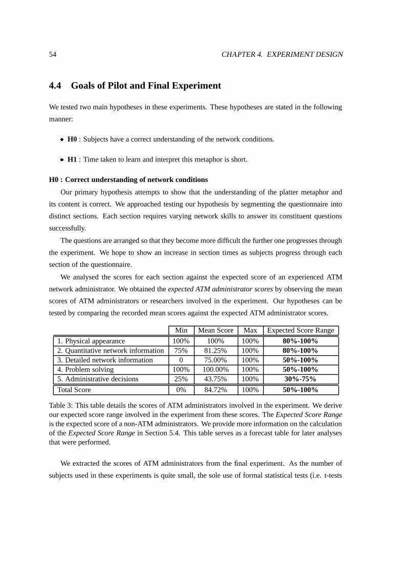
54 CHAPTER 4. EXPERIMENT DESIGN
4.4 Goals of Pilot and Final Experiment
We tested two main hypotheses in these experiments. These hypotheses are stated in the following
manner:
� H0 : Subjects have a correct understanding of the network conditions.
� H1 : Time taken to learn and interpret this metaphor is short.
H0 : Correct understanding of network conditions
Our primary hypothesis attempts to show that the understanding of the platter metaphor and
its content is correct. We approached testing our hypothesis by segmenting the questionnaire into
distinct sections. Each section requires varying network skills to answer its constituent questions
successfully.
The questions are arranged so that they become more difficult the further one progresses through
the experiment. We hope to show an increase in section times as subjects progress through each
section of the questionnaire.
We analysed the scores for each section against the expected score of an experienced ATM
network administrator. We obtained the expected ATM administrator scores by observing the mean
scores of ATM administrators or researchers involved in the experiment. Our hypotheses can be
tested by comparing the recorded mean scores against the expected ATM administrator scores.
Min Mean Score Max Expected Score Range
1. Physical appearance 100% 100% 100% 80%-100%2. Quantitative network information 75% 81.25% 100% 80%-100%3. Detailed network information 0 75.00% 100% 50%-100%4. Problem solving 100% 100.00% 100% 50%-100%5. Administrative decisions 25% 43.75% 100% 30%-75%
Total Score 0% 84.72% 100% 50%-100%
Table 3: This table details the scores of ATM administrators involved in the experiment. We deriveour expected score range involved in the experiment from these scores. The Expected Score Rangeis the expected score of a non-ATM administrators. We provide more information on the calculationof the Expected Score Range in Section 5.4. This table serves as a forecast table for later analysesthat were performed.
We extracted the scores of ATM administrators from the final experiment. As the number of
subjects used in these experiments is quite small, the sole use of formal statistical tests (i.e. t-tests

4.5. EQUIPMENT 55
etc) cannot confirm our goals within these constraints. We came to this conclusion following dis-
cussions with an experienced psychologist involved in this experiment. Alternatively, our revised
experiment approach addresses this flaw and also gives a clear indication of the sections where
subjects experience the most difficulties. Correlations are also used to highlight relations between
subjects and other factors.
H1 : Time taken to learn and interpret the metaphor is short
Our secondary goal states the the time taken to comprehend the metaphor is small, ideally less
than 1 hour. We hope to prove that users show good understanding of the metaphor and the network
it represents within 60 minutes.
It may prove useful to compare the results achieved in this experiment with results achieved in
previous network tests or examinations. This comparison should provide further support claims that
the experiment results are reliable. With regard to our pilot subjects, we correlate the experiment
results against the Computer Science 3rd year network course results. The Computer Science � ��
year network course is an introductory course on the fundamentals of computer networks. It serves
as a primer for more advanced modules covered in� ���
year Computer Science Honours course.
4.5 Equipment
The experiment was conducted in two isolated and identical rooms in the Computer Science depart-
ment. Table 4 lists the computer equipment used in the experiment:
MACHINE CPU MEMORY MISC
Masu SGI O2 175 MHz R10000 IP32 processor 320MB RAM 19in monitorAji SGI 02 195 MHz R10000 IP32 processor 320MB RAM 21in monitor
Table 4: Two machines used in our subjective testing experiment. The machines specifications aresimilar with exception of the CPU clock rate and monitor size. The allocation of these machineswere randomised to ensure that the machine allocation is negated and does not impact subject’sresults.
During the pilot, a video camera was used to record subjects’ sessions. We used this recording
to monitor section timing, interaction with the platter metaphor and more subtle body language. The
results of these video recordings did not indicate any significant problems.
Our C++ visualisation toolkit contains an implementation of the platter metaphor. This program
was prototyped on a SGI O2 running IRIX 6.5 and uses Tcl/tk [28] and the Open Inventor [41, 45]
56 CHAPTER 4. EXPERIMENT DESIGN
libraries for rendering.
4.6 Questionnaire Planning and Validation
The function of a question in an interview schedule or questionnaire is to elicit a particular commu-
nication. We hope that our respondents have certain information, ideas or attitudes on the subject of
our enquiry, and we want to get these from them with minimum of distortion [36].
The questionnaire used in these experiments are closed questionnaires. These questionnaires
require no writing and quantification is straightforward. This allows more questions to be answered
in a shorter time period. Closed questionnaires are therefore easier and quicker to answer. Another
advantage which holds particular interest is the fact that these questionnaires make group compar-
isons easier. In doing so, they are useful for testing specific hypotheses or goals. Lastly, they require
less training for the interviewer when being conducted.
The main drawbacks of closed questionnaires are the loss of spontaneity and expressiveness.
There may also exist a bias in answer categories. The main purpose of the pilot experiment was
to eliminate questionnaire problems in the experiment. These included problems contained in the
questionnaire as well as the manner in which it was conducted.
4.6.1 Question Wording
Question wording is well recognised as a important aspect when setting questionnaires as discussed
by Oppenheim [36]. A questionnaire can be flawed in many ways; one common manner is through
incorrect or ambiguous wording in the questionnaire.
Oppenheim also points out that each question has a covert function: to motivate the respon-
dent to continue to co-operate. They must strive to maintain the respondents interest and provide
the general feeling that they are being treated, not in an adversarial manner but with respect and
consideration.
This questionnaire is designed to be attractive and straightforward. The layout, spacing, choice
of paper and answering directions all contribute to its effectiveness.
Each question in our questionnaire was analysed against several guidelines to determine whether
they contravened normal and acceptable practice for extracting information through subjective test-
ing.

4.7. SUMMARY 57
4.6.2 Questionnaire Layout
The questionnaire is divided into distinct categories to examine user knowledge and understanding
based on the tutorial (See Appendix A.2). The categories are arranged in a funnelling manner or
increasing order of complexity :
1. Platter properties
2. Quantifying and reporting network information
3. Identifying network conditions
4. Problem solving skills
5. Administrative problems
The funnelling of questions is well recognised as a technique used in open and closed experiment
questionnaires [36]. The funnel approach is so named because it starts off the experiment with a
broad and general question and then progressively narrows down to more detailed and specific
questions.
The increasing order of complexity allowed us to determine whether the subject has first under-
stood the fundamentals of the metaphor and subsequently whether they were able to solve questions
based on its properties. It is fair to assume that if the fundamentals, namely the platter properties
(i.e. Section 1 in the questionnaire), are misunderstood then the subject will have great difficulty in
answering the remaining questions correctly.
Each subject supplied their biographical information at the end of the questionnaire (see Ap-
pendix A.2). By doing this last, it gave the interviewer more time to assess their responses to the
experiment and the metaphor. This assessment was more casual allowing subjects to express them-
selves more freely and provide further insight into their problems and recommendations.
4.7 Summary
This chapter outlined the experiment design objectives. We considered several factors which influ-
ences the environment and questionnaire of the experiment.
The experiment was conducted using a pilot followed by our main final experiment. The pilot
experiment is a trial experiment to eliminate flaws in the questionnaire and the experiment environ-
ment.

58 CHAPTER 4. EXPERIMENT DESIGN
Two main metrics were investigated:
1. Subjects have a correct and concise understanding of the network
2. Time taken to learn and interpret the metaphor
These goals are supported using correlations to determine the relationship between subjects and
predefined factors. Subjects were recruited from the Computer Science and Engineering depart-
ments at the University of Cape Town. The final experiment required subjects with experience in
network management and administration.
A careful design approach was used to ensure reliable and valid results. The testing was con-
ducted using experienced researchers to minimise opportunities to corrupt our results. We showed
that the questionnaire is not too easy to answer. To verify this claim, we partitioned the ques-
tionnaire into various sections. Each successive section is progressively more complex to answer.
We draw our main results from the final experiment which will discussed in the following chapter,
Experiment Results and Discussions.
Chapter 5
Experimental Results and Discussion
5.1 Introduction
We conducted an experiment to determine the effectiveness of the platter metaphor. This experiment
was conducted using subjects with experience in network management or administration. Suitable
subjects included network researchers and system administrators.
The main goal of this experiment was to investigate two hypotheses surrounding the effective-
ness of the metaphor and the time taken to learn the basic properties of the platter. As discussed in
Chapter 4, we conducted two experiments: the pilot experiment was used to detect and eliminate
potential problems in the questionnaire and the experiment environment and the final experiment
was used to confirm or refute our hypotheses.
This final results of this experiment are summarised in Section 5.4. Discussion of these results
are left for Section 5.5.
5.2 Results of Pilot experiment
We have included all computed results of the pilot experiment. The results and statistics were com-
piled and analysed using Microsoft Excel 97 and Statsoft’s STATISTICA with the Excel5 Super Book
[32] as a reference manual. The pilot experiment consisted of 14 Honours (4th year) students from
the Department of Computer Science at UCT. This experiment was used to verify the correctness of
the questionnaire and the manner in which it was conducted. The full details of the pilot results are
contained in Appendix B.
59
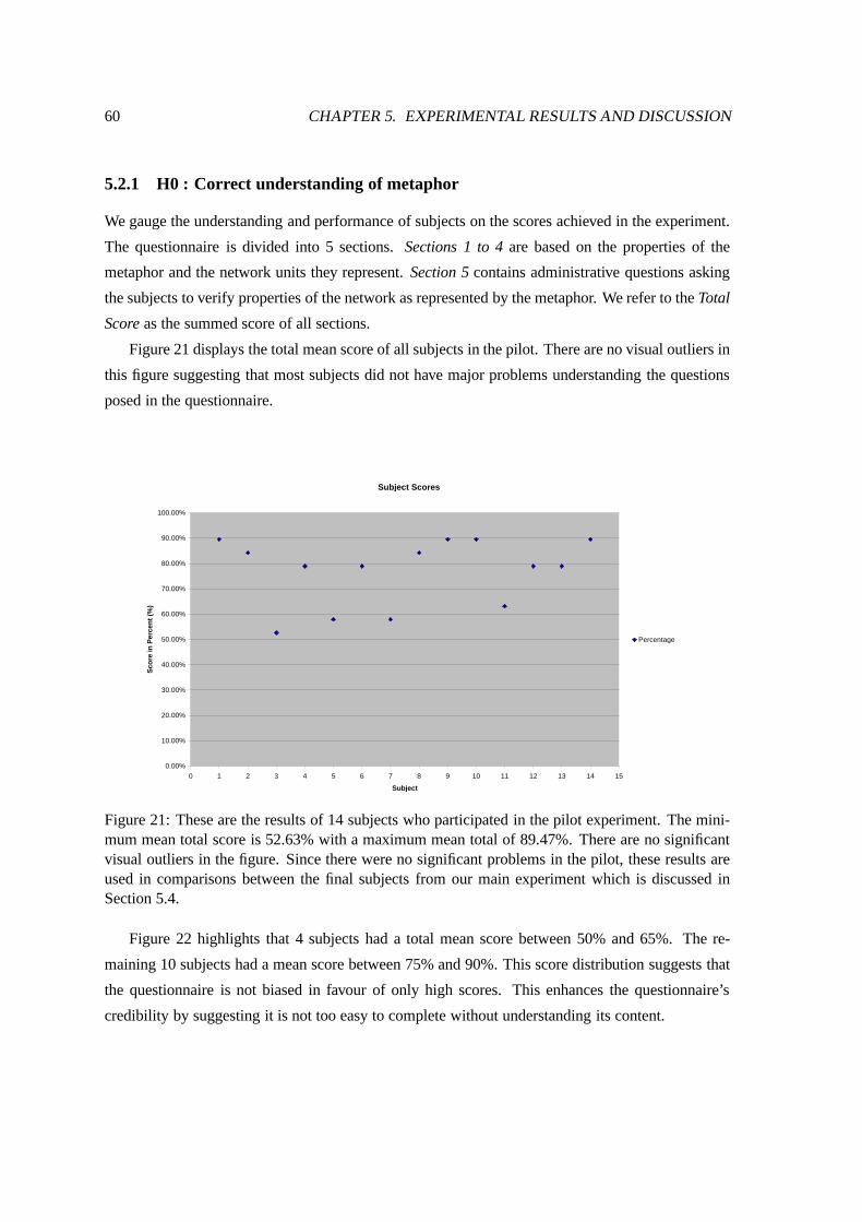
60 CHAPTER 5. EXPERIMENTAL RESULTS AND DISCUSSION
5.2.1 H0 : Correct understanding of metaphor
We gauge the understanding and performance of subjects on the scores achieved in the experiment.
The questionnaire is divided into 5 sections. Sections 1 to 4 are based on the properties of the
metaphor and the network units they represent. Section 5 contains administrative questions asking
the subjects to verify properties of the network as represented by the metaphor. We refer to the Total
Score as the summed score of all sections.
Figure 21 displays the total mean score of all subjects in the pilot. There are no visual outliers in
this figure suggesting that most subjects did not have major problems understanding the questions
posed in the questionnaire.
Subject Scores
0.00%
10.00%
20.00%
30.00%
40.00%
50.00%
60.00%
70.00%
80.00%
90.00%
100.00%
0 1 2 3 4 5 6 7 8 9 10 11 12 13 14 15
Subject
Sco
re in
Per
cen
t (%
)
Percentage
Figure 21: These are the results of 14 subjects who participated in the pilot experiment. The mini-mum mean total score is 52.63% with a maximum mean total of 89.47%. There are no significantvisual outliers in the figure. Since there were no significant problems in the pilot, these results areused in comparisons between the final subjects from our main experiment which is discussed inSection 5.4.
Figure 22 highlights that 4 subjects had a total mean score between 50% and 65%. The re-
maining 10 subjects had a mean score between 75% and 90%. This score distribution suggests that
the questionnaire is not biased in favour of only high scores. This enhances the questionnaire’s
credibility by suggesting it is not too easy to complete without understanding its content.
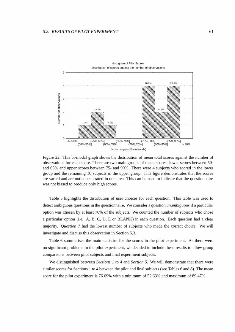
5.2. RESULTS OF PILOT EXPERIMENT 61
Histogram of Pilot Scores
Distribution of scores against the number of observations
Score ranges (5% intervals)
Num
ber
of o
bser
vatio
ns
� � � � � � � � � � � � � � �� � � � � � � � � � � � � � �� � � � � � � � � � � � � � �� � � � � � � � � � � � � � �� � � � � � � � � � � � � � �� � � � � � � � � � � � � � �� � � � � � � � � � � � � � �� � � � � � � � � � � � � � �� � � � � � � � � � � � � � �� � � � � � � � � � � � � � �� � � � � � � � � � � � � � �� � � � � � � � � � � � � � �� � � � � � � � � � � � � � �� � � � � � � � � � � � � � �� � � � � � � � � � � � � � �� � � � � � � � � � � � � � �
7.1%
� � � � � � � � � � � � � � �� � � � � � � � � � � � � � �� � � � � � � � � � � � � � �� � � � � � � � � � � � � � �� � � � � � � � � � � � � � �� � � � � � � � � � � � � � �� � � � � � � � � � � � � � �� � � � � � � � � � � � � � �� � � � � � � � � � � � � � �� � � � � � � � � � � � � � �� � � � � � � � � � � � � � �� � � � � � � � � � � � � � �� � � � � � � � � � � � � � �� � � � � � � � � � � � � � �� � � � � � � � � � � � � � �� � � � � � � � � � � � � � �� � � � � � � � � � � � � � �� � � � � � � � � � � � � � �� � � � � � � � � � � � � � �� � � � � � � � � � � � � � �� � � � � � � � � � � � � � �� � � � � � � � � � � � � � �� � � � � � � � � � � � � � �� � � � � � � � � � � � � � �� � � � � � � � � � � � � � �� � � � � � � � � � � � � � �� � � � � � � � � � � � � � �� � � � � � � � � � � � � � �� � � � � � � � � � � � � � �� � � � � � � � � � � � � � �� � � � � � � � � � � � � � �� � � � � � � � � � � � � � �
14.3%
� � � � � � � � � � � � � �� � � � � � � � � � � � � �� � � � � � � � � � � � � �� � � � � � � � � � � � � �� � � � � � � � � � � � � �� � � � � � � � � � � � � �� � � � � � � � � � � � � �� � � � � � � � � � � � � �� � � � � � � � � � � � � �� � � � � � � � � � � � � �� � � � � � � � � � � � � �� � � � � � � � � � � � � �� � � � � � � � � � � � � �� � � � � � � � � � � � � �� � � � � � � � � � � � � �� � � � � � � � � � � � � �
7.1%
� � � � � � � � � � � � � � �� � � � � � � � � � � � � � �� � � � � � � � � � � � � � �� � � � � � � � � � � � � � �� � � � � � � � � � � � � � �� � � � � � � � � � � � � � �� � � � � � � � � � � � � � �� � � � � � � � � � � � � � �� � � � � � � � � � � � � � �� � � � � � � � � � � � � � �� � � � � � � � � � � � � � �� � � � � � � � � � � � � � �� � � � � � � � � � � � � � �� � � � � � � � � � � � � � �� � � � � � � � � � � � � � �� � � � � � � � � � � � � � �� � � � � � � � � � � � � � �� � � � � � � � � � � � � � �� � � � � � � � � � � � � � �� � � � � � � � � � � � � � �� � � � � � � � � � � � � � �� � � � � � � � � � � � � � �� � � � � � � � � � � � � � �� � � � � � � � � � � � � � �� � � � � � � � � � � � � � �� � � � � � � � � � � � � � �� � � � � � � � � � � � � � �� � � � � � � � � � � � � � �� � � � � � � � � � � � � � �� � � � � � � � � � � � � � �� � � � � � � � � � � � � � �� � � � � � � � � � � � � � �� � � � � � � � � � � � � � �� � � � � � � � � � � � � � �� � � � � � � � � � � � � � �� � � � � � � � � � � � � � �� � � � � � � � � � � � � � �� � � � � � � � � � � � � � �� � � � � � � � � � � � � � �� � � � � � � � � � � � � � �� � � � � � � � � � � � � � �� � � � � � � � � � � � � � �� � � � � � � � � � � � � � �� � � � � � � � � � � � � � �� � � � � � � � � � � � � � �� � � � � � � � � � � � � � �� � � � � � � � � � � � � � �� � � � � � � � � � � � � � �� � � � � � � � � � � � � � �� � � � � � � � � � � � � � �� � � � � � � � � � � � � � �� � � � � � � � � � � � � � �� � � � � � � � � � � � � � �� � � � � � � � � � � � � � �� � � � � � � � � � � � � � �� � � � � � � � � � � � � � �� � � � � � � � � � � � � � �� � � � � � � � � � � � � � �� � � � � � � � � � � � � � �� � � � � � � � � � � � � � �� � � � � � � � � � � � � � �� � � � � � � � � � � � � � �� � � � � � � � � � � � � � �� � � � � � � � � � � � � � �� � � � � � � � � � � � � � �
28.6%
� � � � � � � � � � � � � � �� � � � � � � � � � � � � � �� � � � � � � � � � � � � � �� � � � � � � � � � � � � � �� � � � � � � � � � � � � � �� � � � � � � � � � � � � � �� � � � � � � � � � � � � � �� � � � � � � � � � � � � � �� � � � � � � � � � � � � � �� � � � � � � � � � � � � � �� � � � � � � � � � � � � � �� � � � � � � � � � � � � � �� � � � � � � � � � � � � � �� � � � � � � � � � � � � � �� � � � � � � � � � � � � � �� � � � � � � � � � � � � � �� � � � � � � � � � � � � � �� � � � � � � � � � � � � � �� � � � � � � � � � � � � � �� � � � � � � � � � � � � � �� � � � � � � � � � � � � � �� � � � � � � � � � � � � � �� � � � � � � � � � � � � � �� � � � � � � � � � � � � � �� � � � � � � � � � � � � � �� � � � � � � � � � � � � � �� � � � � � � � � � � � � � �� � � � � � � � � � � � � � �� � � � � � � � � � � � � � �� � � � � � � � � � � � � � �� � � � � � � � � � � � � � �� � � � � � � � � � � � � � �
14.3%
� � � � � � � � � � � � � � �� � � � � � � � � � � � � � �� � � � � � � � � � � � � � �� � � � � � � � � � � � � � �� � � � � � � � � � � � � � �� � � � � � � � � � � � � � �� � � � � � � � � � � � � � �� � � � � � � � � � � � � � �� � � � � � � � � � � � � � �� � � � � � � � � � � � � � �� � � � � � � � � � � � � � �� � � � � � � � � � � � � � �� � � � � � � � � � � � � � �� � � � � � � � � � � � � � �� � � � � � � � � � � � � � �� � � � � � � � � � � � � � �� � � � � � � � � � � � � � �� � � � � � � � � � � � � � �� � � � � � � � � � � � � � �� � � � � � � � � � � � � � �� � � � � � � � � � � � � � �� � � � � � � � � � � � � � �� � � � � � � � � � � � � � �� � � � � � � � � � � � � � �� � � � � � � � � � � � � � �� � � � � � � � � � � � � � �� � � � � � � � � � � � � � �� � � � � � � � � � � � � � �� � � � � � � � � � � � � � �� � � � � � � � � � � � � � �� � � � � � � � � � � � � � �� � � � � � � � � � � � � � �� � � � � � � � � � � � � � �� � � � � � � � � � � � � � �� � � � � � � � � � � � � � �� � � � � � � � � � � � � � �� � � � � � � � � � � � � � �� � � � � � � � � � � � � � �� � � � � � � � � � � � � � �� � � � � � � � � � � � � � �� � � � � � � � � � � � � � �� � � � � � � � � � � � � � �� � � � � � � � � � � � � � �� � � � � � � � � � � � � � �� � � � � � � � � � � � � � �� � � � � � � � � � � � � � �� � � � � � � � � � � � � � �� � � � � � � � � � � � � � �� � � � � � � � � � � � � � �� � � � � � � � � � � � � � �� � � � � � � � � � � � � � �� � � � � � � � � � � � � � �� � � � � � � � � � � � � � �� � � � � � � � � � � � � � �� � � � � � � � � � � � � � �� � � � � � � � � � � � � � �� � � � � � � � � � � � � � �� � � � � � � � � � � � � � �� � � � � � � � � � � � � � �� � � � � � � � � � � � � � �� � � � � � � � � � � � � � �� � � � � � � � � � � � � � �� � � � � � � � � � � � � � �� � � � � � � � � � � � � � �� � � � � � � � � � � � � � �
28.6%
0
1
2
3
4
5
<= 50%(50%,55%]
(55%,60%](60%,65%]
(65%,70%](70%,75%]
(75%,80%](80%,85%]
(85%,90%]> 90%
Figure 22: This bi-modal graph shows the distribution of mean total scores against the number ofobservations for each score. There are two main groups of mean scores: lower scores between 50-and 65% and upper scores between 75- and 90%. There were 4 subjects who scored in the lowergroup and the remaining 10 subjects in the upper group. This figure demonstrates that the scoresare varied and are not concentrated in one area. This can be used to indicate that the questionnairewas not biased to produce only high scores.
Table 5 highlights the distribution of user choices for each question. This table was used to
detect ambiguous questions in the questionnaire. We consider a question unambiguous if a particular
option was chosen by at least 70% of the subjects. We counted the number of subjects who chose
a particular option (i.e. A, B, C, D, E or BLANK) in each question. Each question had a clear
majority. Question 7 had the lowest number of subjects who made the correct choice. We will
investigate and discuss this observation in Section 5.3.
Table 6 summarises the main statistics for the scores in the pilot experiment. As there were
no significant problems in the pilot experiment, we decided to include these results to allow group
comparisons between pilot subjects and final experiment subjects.
We distinguished between Sections 1 to 4 and Section 5. We will demonstrate that there were
similar scores for Sections 1 to 4 between the pilot and final subjects (see Tables 6 and 8). The mean
score for the pilot experiment is 76.69% with a minimum of 52.63% and maximum of 89.47%.
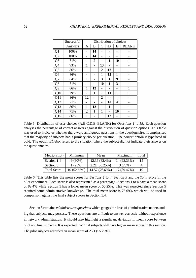
62 CHAPTER 5. EXPERIMENTAL RESULTS AND DISCUSSION
Successful Distribution of choicesAnswers A B C D E BLANK
Q1 100% - 14 - - - -Q2 100% - 14 - - - -Q3 71% - 2 - 1 10 1Q4 93% 1 - 13 - - -Q5 86% - - 2 12 - -Q6 86% - - 1 12 1 -Q7 64% 1 - 3 1 9 -Q8 71% - - 10 1 3 -Q9 86% 1 12 - - - 1Q10 79% - 1 - 11 1 1Q11 86% 12 - 2 - - -Q12 71% - - - 10 4 -Q13 86% 1 12 - 1 - -Q14 71% 2 1 1 - 10 -Q15 86% 1 - 1 12 - -
Table 5: Distribution of user choices (A,B,C,D,E, BLANK) for Questions 1 to 15. Each questionanalyses the percentage of correct answers against the distribution of question options. This tablewas used to indicates whether there were ambiguous questions in the questionnaire. It emphasisesthat the majority of subjects had a primary choice per question. The correct option is typefaced inbold. The option BLANK refers to the situation where the subject did not indicate their answer onthe questionnaire.
Metric(Pilot) Minimum Mean Maximum Total
Section 1-4 9 (60%) 12.36 (82.4%) 14 (93.33%) 15Section 5 1 (25%) 2.21 (55.25%) 3 (75%) 4Total Score 10 (52.63%) 14.57 (76.69%) 17 (89.47%) 19
Table 6: This table lists the mean scores for Sections 1 to 4, Section 5 and the Total Score in thepilot experiment. Each score is also represented as a percentage. Sections 1 to 4 have a mean scoreof 82.4% while Section 5 has a lower mean score of 55.25%. This was expected since Section 5required some administrative knowledge. The total mean score is 76.69% which will be used incomparison against the final subject scores in Section 5.4.
Section 5 contains administrative questions which gauges the level of administrative understand-
ing that subjects may possess. These questions are difficult to answer correctly without experience
in network administration. It should also highlight a significant deviation in mean score between
pilot and final subjects. It is expected that final subjects will have higher mean scores in this section.
The pilot subjects recorded an mean score of 2.21 (55.25%).
5.2. RESULTS OF PILOT EXPERIMENT 63
We discussed the need to examine the relationship between several variables in this experiment.
These relationships can be used to indicate flaws in the questionnaire. Correlations are used to mea-
sure the degree of relationship between two variables. In the following correlations, we examined
the relationship between the subject’s understanding, represented by Total Score, against other vari-
ables in the experiment. Each significant correlation was also discussed in greater detail to clarify
its causes and results.
Total Score vs CS3 score (insignificant)
We performed a correlation test between the Total Score and a previous network course result,
the CS3 network course results to support our claim that the questionnaire is well balanced and
unbiased.
We examined the correlation between the Total Score and the CS3 Score results to confirm that
the questionnaire is not too easy to answer. We expected that subjects with good scores in the CS3
course would perform equally well in the questionnaire. A correlation between the Total Score and
the CS3 Score was insignificant at the 95% confidence level. A r-correlation value of -0.57 (r=-0.57,
t=-1.38 , p=0.24 ) indicated that there was an inconclusive relationship.
Total Score vs S1 + S2 (significant)
We examined the correlation between the combined scores for Sections 1 and 2 and the Total Score.
This correlation should indicate that subjects who had difficulty understanding the fundamental
sections, namely Sections 1 and 2, are prone to struggle with the remaining sections. This claim is
tested by pooling the scores of Sections 1 and 2 and correlating it against the Total Score minus the
pooled score of Sections 1 and 2.
We obtained a r-correlation value of 0.65 (r=0.65, t=2.94 , p=0.12353) which is significant at a
95% confidence level. We may conclude that this validates our claim with a high degree of certainty:
poor understanding of the fundamental Sections 1 and 2 leads more likely to a lower overall score.
Total Score vs Total Time (insignificant)
We analyse the relationship between Total Score and the Total Time. It follows that subjects with
a good understanding require a shorter time period to complete the questionnaire. Alternatively,
subjects experiencing difficulties will take longer to complete the questionnaire. There exists a
negative r-correlation value of -0.36 (r=-0.36, t=-1.34, p=0.204). This value is insignificant at the
95% confidence level.

64 CHAPTER 5. EXPERIMENTAL RESULTS AND DISCUSSION
5.2.2 H1 : Section timing results
We analysed the section times of the pilot to confirm our funneling questionnaire design. These
section times represent the mean time to complete each section in the questionnaire. These timing
results were not intended for inclusion as results but for testing the questionnaire and experiment
conditions. Since there were no significant problems in the questionnaire, we included these results
for comparison against the final subjects’ timing results. Any deviation between the pilot and final
experiment times may indicate a problem in the questionnaire or in the understanding of novice or
expert users.
From these results, we demonstrated that our funnel approach (Section 4.6.2)has an effect on
the times for each section. We showed an increasing mean section time as subjects progress through
more difficult sections. We used the timing relationship between sections for detecting flaws in the
questionnaire.
Section Time (minutes) Min Mean Max
Section 1 2 2.58 3Section 2 2 3.57 8Section 3 2 4.50 8Section 4 4 6.64 17Section 5 1 4.38 16
Total time 14 21.14 36
Table 7: This table shows the minimum, mean and maximum section time and total time for thepilot experiment. The unit of time is minutes. It is evident that there is an increasing mean timefrom Section 1 to 4. Section 5 has shorter mean time because it has only three options per questionas opposed to other sections which have 5 options per question. All sections have four questionsexcept Section 4 which has three. The total mean time for the pilot is 21.14 minutes. Again, sincethere were no significant flaws in the pilot, these timing results will also be used in comparison withthe final subject mean time.
Table 7 lists the minimum, mean and maximum section times. An increasing mean time between
sections is evident. Section 5 has a lower mean time because each question in this section has only
three options per question. The total mean time is 21.14 minutes for the pilot experiment. Figure 23
highlights the minimum, mean and maximum time statistics for each section.
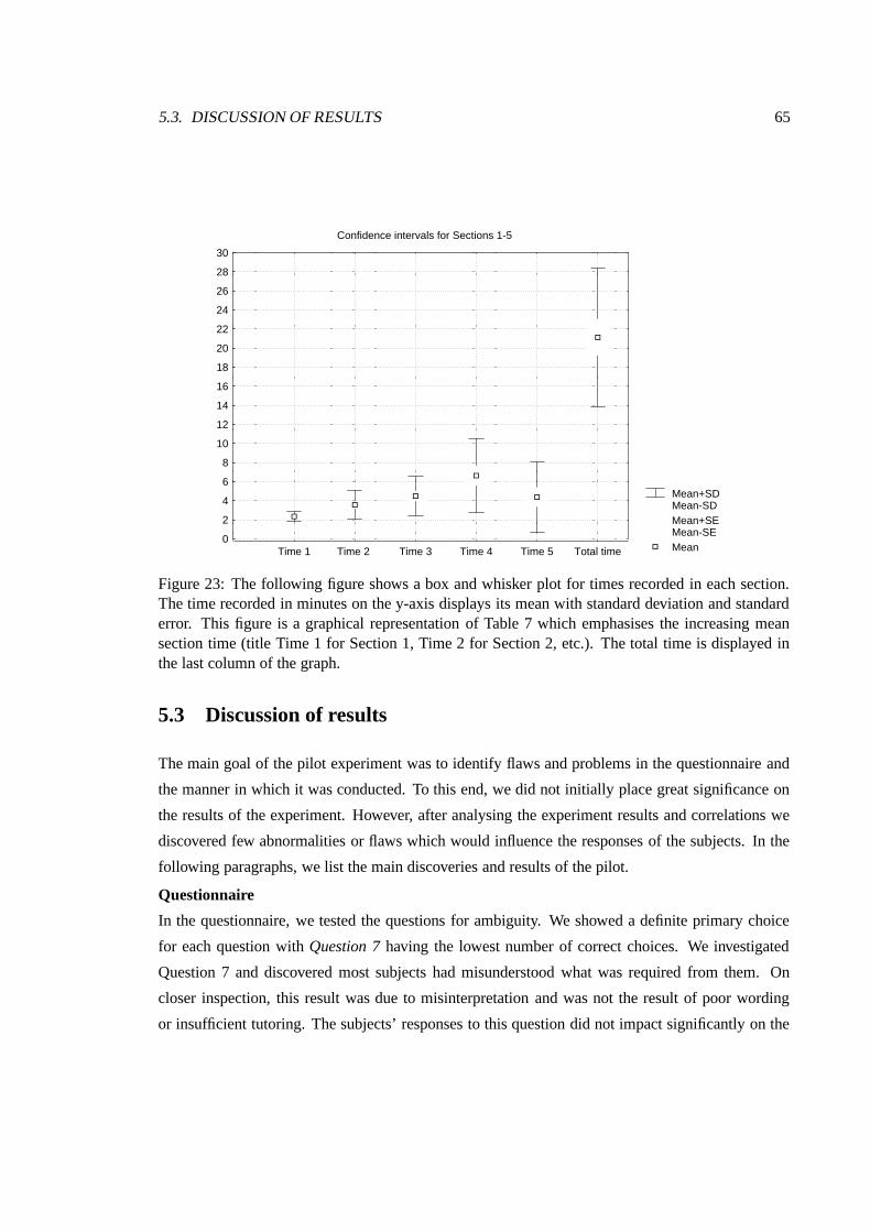
5.3. DISCUSSION OF RESULTS 65
Mean+SDMean-SDMean+SEMean-SEMean
Confidence intervals for Sections 1-5
0
2
4
6
8
10
12
14
16
18
20
22
24
26
28
30
Time 1 Time 2 Time 3 Time 4 Time 5 Total time
Figure 23: The following figure shows a box and whisker plot for times recorded in each section.The time recorded in minutes on the y-axis displays its mean with standard deviation and standarderror. This figure is a graphical representation of Table 7 which emphasises the increasing meansection time (title Time 1 for Section 1, Time 2 for Section 2, etc.). The total time is displayed inthe last column of the graph.
5.3 Discussion of results
The main goal of the pilot experiment was to identify flaws and problems in the questionnaire and
the manner in which it was conducted. To this end, we did not initially place great significance on
the results of the experiment. However, after analysing the experiment results and correlations we
discovered few abnormalities or flaws which would influence the responses of the subjects. In the
following paragraphs, we list the main discoveries and results of the pilot.
Questionnaire
In the questionnaire, we tested the questions for ambiguity. We showed a definite primary choice
for each question with Question 7 having the lowest number of correct choices. We investigated
Question 7 and discovered most subjects had misunderstood what was required from them. On
closer inspection, this result was due to misinterpretation and was not the result of poor wording
or insufficient tutoring. The subjects’ responses to this question did not impact significantly on the

66 CHAPTER 5. EXPERIMENTAL RESULTS AND DISCUSSION
remaining questions in the section.
The following assertions can be made about the questionnaire based on the results:
1. The questionnaire contains no ambiguous questions or significant question flaws. This is
supported by Table 5 which highlights the choices made by all subjects in the pilot.
2. The varied total score indicates that the questionnaire is not trivial and questions require
careful processing before being answered.
3. There are no outliers or significant deviations in the Total Score of the pilot experiment.
H0 : Correct understanding
Many of the pilot subjects have no practical experience in network management or system adminis-
trations.
The mean total score for the pilot is 76.69%. The lowest mean score is 56.47% with a maximum
mean score of 89.63%. All subjects show a good understanding of Sections 1 to 4 with a mean score
of 82.4%. Section 5 has a lower mean score of 55.25%. This is expected since Section 5 requires
network administrative skills.
With reference to our expected score ranges discussed in Section 4.4, these scores are within
our expected score range to realise our main hypotheses.
H1 : Section timing results
The timing results indicate an increasing mean time for Sections 1 to 4. This is expected as the
difficulty of each section increases. Section 5 has a lower mean time because it has only 3 options
unlike other sections which have 5 options. Again, all sections have 4 questions except Section 4
which has three questions (see Chapter 4 for details of each section in the questionnaire). The timing
results indicate that our funneling questionnaire design has achieved the desired effect. These results
will be used in comparisons between pilot and final subjects in our main experiment.
5.4 RESULTS
The final experiment concludes the user testing to evaluate the platter metaphor. The subjects re-
cruited for the final experiment were mainly from the Science and Engineering departments at UCT.
These subjects were predominantly postgraduate students with formal training in network research
or actively involved in network management. All subjects in this experiment had network manage-
ment or system administration skills. For more information on these subjects, refer to Appendix B
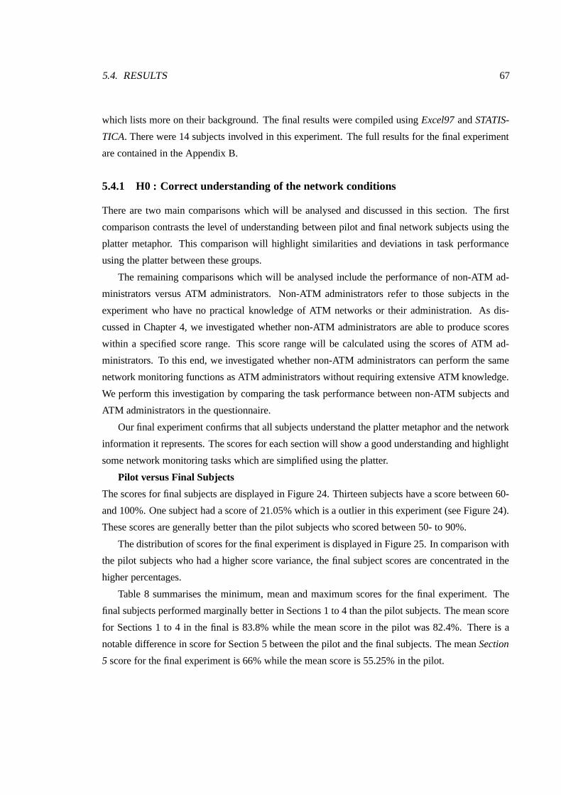
5.4. RESULTS 67
which lists more on their background. The final results were compiled using Excel97 and STATIS-
TICA. There were 14 subjects involved in this experiment. The full results for the final experiment
are contained in the Appendix B.
5.4.1 H0 : Correct understanding of the network conditions
There are two main comparisons which will be analysed and discussed in this section. The first
comparison contrasts the level of understanding between pilot and final network subjects using the
platter metaphor. This comparison will highlight similarities and deviations in task performance
using the platter between these groups.
The remaining comparisons which will be analysed include the performance of non-ATM ad-
ministrators versus ATM administrators. Non-ATM administrators refer to those subjects in the
experiment who have no practical knowledge of ATM networks or their administration. As dis-
cussed in Chapter 4, we investigated whether non-ATM administrators are able to produce scores
within a specified score range. This score range will be calculated using the scores of ATM ad-
ministrators. To this end, we investigated whether non-ATM administrators can perform the same
network monitoring functions as ATM administrators without requiring extensive ATM knowledge.
We perform this investigation by comparing the task performance between non-ATM subjects and
ATM administrators in the questionnaire.
Our final experiment confirms that all subjects understand the platter metaphor and the network
information it represents. The scores for each section will show a good understanding and highlight
some network monitoring tasks which are simplified using the platter.
Pilot versus Final Subjects
The scores for final subjects are displayed in Figure 24. Thirteen subjects have a score between 60-
and 100%. One subject had a score of 21.05% which is a outlier in this experiment (see Figure 24).
These scores are generally better than the pilot subjects who scored between 50- to 90%.
The distribution of scores for the final experiment is displayed in Figure 25. In comparison with
the pilot subjects who had a higher score variance, the final subject scores are concentrated in the
higher percentages.
Table 8 summarises the minimum, mean and maximum scores for the final experiment. The
final subjects performed marginally better in Sections 1 to 4 than the pilot subjects. The mean score
for Sections 1 to 4 in the final is 83.8% while the mean score in the pilot was 82.4%. There is a
notable difference in score for Section 5 between the pilot and the final subjects. The mean Section
5 score for the final experiment is 66% while the mean score is 55.25% in the pilot.
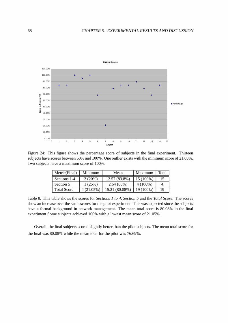
68 CHAPTER 5. EXPERIMENTAL RESULTS AND DISCUSSION
Subject Scores
0.00%
10.00%
20.00%
30.00%
40.00%
50.00%
60.00%
70.00%
80.00%
90.00%
100.00%
110.00%
0 1 2 3 4 5 6 7 8 9 10 11 12 13 14 15
Subject
Sco
re in
Per
cen
t (%
)
Percentage
Figure 24: This figure shows the percentage score of subjects in the final experiment. Thirteensubjects have scores between 60% and 100%. One outlier exists with the minimum score of 21.05%.Two subjects have a maximum score of 100%.
Metric(Final) Minimum Mean Maximum Total
Sections 1-4 3 (20%) 12.57 (83.8%) 15 (100%) 15Section 5 1 (25%) 2.64 (66%) 4 (100%) 4Total Score 4 (21.05%) 15.21 (80.08%) 19 (100%) 19
Table 8: This table shows the scores for Sections 1 to 4, Section 5 and the Total Score. The scoresshow an increase over the same scores for the pilot experiment. This was expected since the subjectshave a formal background in network management. The mean total score is 80.08% in the finalexperiment.Some subjects achieved 100% with a lowest mean score of 21.05%.
Overall, the final subjects scored slightly better than the pilot subjects. The mean total score for
the final was 80.08% while the mean total for the pilot was 76.69%.
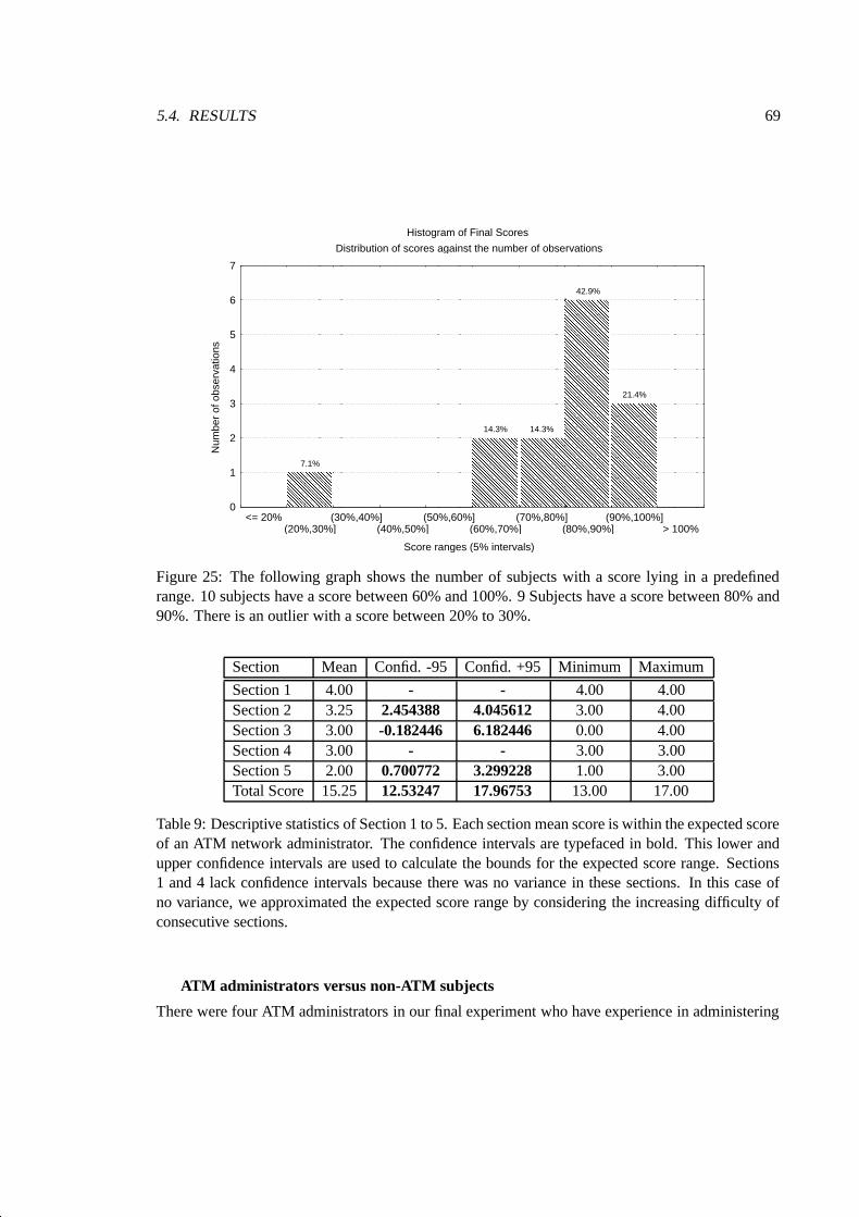
5.4. RESULTS 69
Histogram of Final Scores
Distribution of scores against the number of observations
Score ranges (5% intervals)
Num
ber
of o
bser
vatio
ns
� � � � � � � � � � � � � � �� � � � � � � � � � � � � � �� � � � � � � � � � � � � � �� � � � � � � � � � � � � � �� � � � � � � � � � � � � � �� � � � � � � � � � � � � � �� � � � � � � � � � � � � � �� � � � � � � � � � � � � � �� � � � � � � � � � � � � � �� � � � � � � � � � � � � � �� � � � � � � � � � � � � � �
7.1%
� � � � � � � � � � � � � � �� � � � � � � � � � � � � � �� � � � � � � � � � � � � � �� � � � � � � � � � � � � � �� � � � � � � � � � � � � � �� � � � � � � � � � � � � � �� � � � � � � � � � � � � � �� � � � � � � � � � � � � � �� � � � � � � � � � � � � � �� � � � � � � � � � � � � � �� � � � � � � � � � � � � � �� � � � � � � � � � � � � � �� � � � � � � � � � � � � � �� � � � � � � � � � � � � � �� � � � � � � � � � � � � � �� � � � � � � � � � � � � � �� � � � � � � � � � � � � � �� � � � � � � � � � � � � � �� � � � � � � � � � � � � � �� � � � � � � � � � � � � � �� � � � � � � � � � � � � � �� � � � � � � � � � � � � � �� � � � � � � � � � � � � � �
14.3%
� � � � � � � � � � � � � � �� � � � � � � � � � � � � � �� � � � � � � � � � � � � � �� � � � � � � � � � � � � � �� � � � � � � � � � � � � � �� � � � � � � � � � � � � � �� � � � � � � � � � � � � � �� � � � � � � � � � � � � � �� � � � � � � � � � � � � � �� � � � � � � � � � � � � � �� � � � � � � � � � � � � � �� � � � � � � � � � � � � � �� � � � � � � � � � � � � � �� � � � � � � � � � � � � � �� � � � � � � � � � � � � � �� � � � � � � � � � � � � � �� � � � � � � � � � � � � � �� � � � � � � � � � � � � � �� � � � � � � � � � � � � � �� � � � � � � � � � � � � � �� � � � � � � � � � � � � � �� � � � � � � � � � � � � � �� � � � � � � � � � � � � � �� � � � � � � � � � � � � � �� � � � � � � � � � � � � � �� � � � � � � � � � � � � � �� � � � � � � � � � � � � � �� � � � � � � � � � � � � � �� � � � � � � � � � � � � � �� � � � � � � � � � � � � � �� � � � � � � � � � � � � � �� � � � � � � � � � � � � � �� � � � � � � � � � � � � � �� � � � � � � � � � � � � � �� � � � � � � � � � � � � � �� � � � � � � � � � � � � � �� � � � � � � � � � � � � � �� � � � � � � � � � � � � � �� � � � � � � � � � � � � � �� � � � � � � � � � � � � � �� � � � � � � � � � � � � � �� � � � � � � � � � � � � � �� � � � � � � � � � � � � � �� � � � � � � � � � � � � � �� � � � � � � � � � � � � � �� � � � � � � � � � � � � � �� � � � � � � � � � � � � � �� � � � � � � � � � � � � � �� � � � � � � � � � � � � � �� � � � � � � � � � � � � � �� � � � � � � � � � � � � � �� � � � � � � � � � � � � � �� � � � � � � � � � � � � � �� � � � � � � � � � � � � � �� � � � � � � � � � � � � � �� � � � � � � � � � � � � � �� � � � � � � � � � � � � � �� � � � � � � � � � � � � � �� � � � � � � � � � � � � � �� � � � � � � � � � � � � � �� � � � � � � � � � � � � � �� � � � � � � � � � � � � � �� � � � � � � � � � � � � � �� � � � � � � � � � � � � � �� � � � � � � � � � � � � � �� � � � � � � � � � � � � � �� � � � � � � � � � � � � � �� � � � � � � � � � � � � � �� � � � � � � � � � � � � � �� � � � � � � � � � � � � � �
42.9%
� � � � � � � � � � � � � � �� � � � � � � � � � � � � � �� � � � � � � � � � � � � � �� � � � � � � � � � � � � � �� � � � � � � � � � � � � � �� � � � � � � � � � � � � � �� � � � � � � � � � � � � � �� � � � � � � � � � � � � � �� � � � � � � � � � � � � � �� � � � � � � � � � � � � � �� � � � � � � � � � � � � � �� � � � � � � � � � � � � � �� � � � � � � � � � � � � � �� � � � � � � � � � � � � � �� � � � � � � � � � � � � � �� � � � � � � � � � � � � � �� � � � � � � � � � � � � � �� � � � � � � � � � � � � � �� � � � � � � � � � � � � � �� � � � � � � � � � � � � � �� � � � � � � � � � � � � � �� � � � � � � � � � � � � � �� � � � � � � � � � � � � � �� � � � � � � � � � � � � � �� � � � � � � � � � � � � � �� � � � � � � � � � � � � � �� � � � � � � � � � � � � � �� � � � � � � � � � � � � � �� � � � � � � � � � � � � � �� � � � � � � � � � � � � � �� � � � � � � � � � � � � � �� � � � � � � � � � � � � � �� � � � � � � � � � � � � � �� � � � � � � � � � � � � � �� � � � � � � � � � � � � � �
21.4%
0
1
2
3
4
5
6
7
<= 20%(20%,30%]
(30%,40%](40%,50%]
(50%,60%](60%,70%]
(70%,80%](80%,90%]
(90%,100%]> 100%
Figure 25: The following graph shows the number of subjects with a score lying in a predefinedrange. 10 subjects have a score between 60% and 100%. 9 Subjects have a score between 80% and90%. There is an outlier with a score between 20% to 30%.
Section Mean Confid. -95 Confid. +95 Minimum Maximum
Section 1 4.00 - - 4.00 4.00Section 2 3.25 2.454388 4.045612 3.00 4.00Section 3 3.00 -0.182446 6.182446 0.00 4.00Section 4 3.00 - - 3.00 3.00Section 5 2.00 0.700772 3.299228 1.00 3.00Total Score 15.25 12.53247 17.96753 13.00 17.00
Table 9: Descriptive statistics of Section 1 to 5. Each section mean score is within the expected scoreof an ATM network administrator. The confidence intervals are typefaced in bold. This lower andupper confidence intervals are used to calculate the bounds for the expected score range. Sections1 and 4 lack confidence intervals because there was no variance in these sections. In this case ofno variance, we approximated the expected score range by considering the increasing difficulty ofconsecutive sections.
ATM administrators versus non-ATM subjects
There were four ATM administrators in our final experiment who have experience in administering
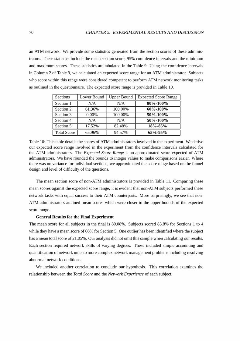
70 CHAPTER 5. EXPERIMENTAL RESULTS AND DISCUSSION
an ATM network. We provide some statistics generated from the section scores of these adminis-
trators. These statistics include the mean section score, 95% confidence intervals and the minimum
and maximum scores. These statistics are tabulated in the Table 9. Using the confidence intervals
in Column 2 of Table 9, we calculated an expected score range for an ATM administrator. Subjects
who score within this range were considered competent to perform ATM network monitoring tasks
as outlined in the questionnaire. The expected score range is provided in Table 10.
Sections Lower Bound Upper Bound Expected Score Range
Section 1 N/A N/A 80%-100%Section 2 61.36% 100.00% 60%-100%Section 3 0.00% 100.00% 50%-100%Section 4 N/A N/A 50%-100%Section 5 17.52% 82.48% 18%-85%
Total Score 65.96% 94.57% 65%-95%
Table 10: This table details the scores of ATM administrators involved in the experiment. We deriveour expected score range involved in the experiment from the confidence intervals calculated forthe ATM administrators. The Expected Score Range is an approximated score expected of ATMadministrators. We have rounded the bounds to integer values to make comparisons easier. Wherethere was no variance for individual sections, we approximated the score range based on the funneldesign and level of difficulty of the questions.
The mean section score of non-ATM administrators is provided in Table 11. Comparing these
mean scores against the expected score range, it is evident that non-ATM subjects performed these
network tasks with equal success to their ATM counterparts. More surprisingly, we see that non-
ATM administrators attained mean scores which were closer to the upper bounds of the expected
score range.
General Results for the Final Experiment
The mean score for all subjects in the final is 80.08%. Subjects scored 83.8% for Sections 1 to 4
while they have a mean score of 66% for Section 5. One outlier has been identified where the subject
has a mean total score of 21.05%. Our analysis did not omit this sample when calculating our results.
Each section required network skills of varying degrees. These included simple accounting and
quantification of network units to more complex network management problems including resolving
abnormal network conditions.
We included another correlation to conclude our hypothesis. This correlation examines the
relationship between the Total Score and the Network Experience of each subject.
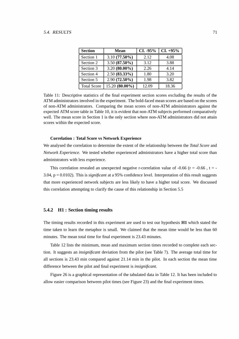
5.4. RESULTS 71
Section Mean CI. -95% CI. +95%
Section 1 3.10 (77.50%) 2.12 4.08Section 2 3.50 (87.50%) 3.12 3.88Section 3 3.20 (80.00%) 2.26 4.14Section 4 2.50 (83.33%) 1.80 3.20Section 5 2.90 (72.50%) 1.98 3.82
Total Score 15.20 (80.00%) 12.09 18.36
Table 11: Descriptive statistics of the final experiment section scores excluding the results of theATM administrators involved in the experiment. The bold-faced mean scores are based on the scoresof non-ATM administrators. Comparing the mean scores of non-ATM administrators against theexpected ATM score table in Table 10, it is evident that non-ATM subjects performed comparativelywell. The mean score in Section 1 is the only section where non-ATM administrators did not attainscores within the expected score.
Correlation : Total Score vs Network Experience
We analysed the correlation to determine the extent of the relationship between the Total Score and
Network Experience. We tested whether experienced administrators have a higher total score than
administrators with less experience.
This correlation revealed an unexpected negative r-correlation value of -0.66 (r = -0.66 , t = -
3.04, p = 0.0102). This is significant at a 95% confidence level. Interpretation of this result suggests
that more experienced network subjects are less likely to have a higher total score. We discussed
this correlation attempting to clarify the cause of this relationship in Section 5.5
5.4.2 H1 : Section timing results
The timing results recorded in this experiment are used to test our hypothesis H1 which stated the
time taken to learn the metaphor is small. We claimed that the mean time would be less than 60
minutes. The mean total time for final experiment is 23.43 minutes.
Table 12 lists the minimum, mean and maximum section times recorded to complete each sec-
tion. It suggests an insignificant deviation from the pilot (see Table 7). The average total time for
all sections is 23.43 min compared against 21.14 min in the pilot. In each section the mean time
difference between the pilot and final experiment is insignificant.
Figure 26 is a graphical representation of the tabulated data in Table 12. It has been included to
allow easier comparison between pilot times (see Figure 23) and the final experiment times.
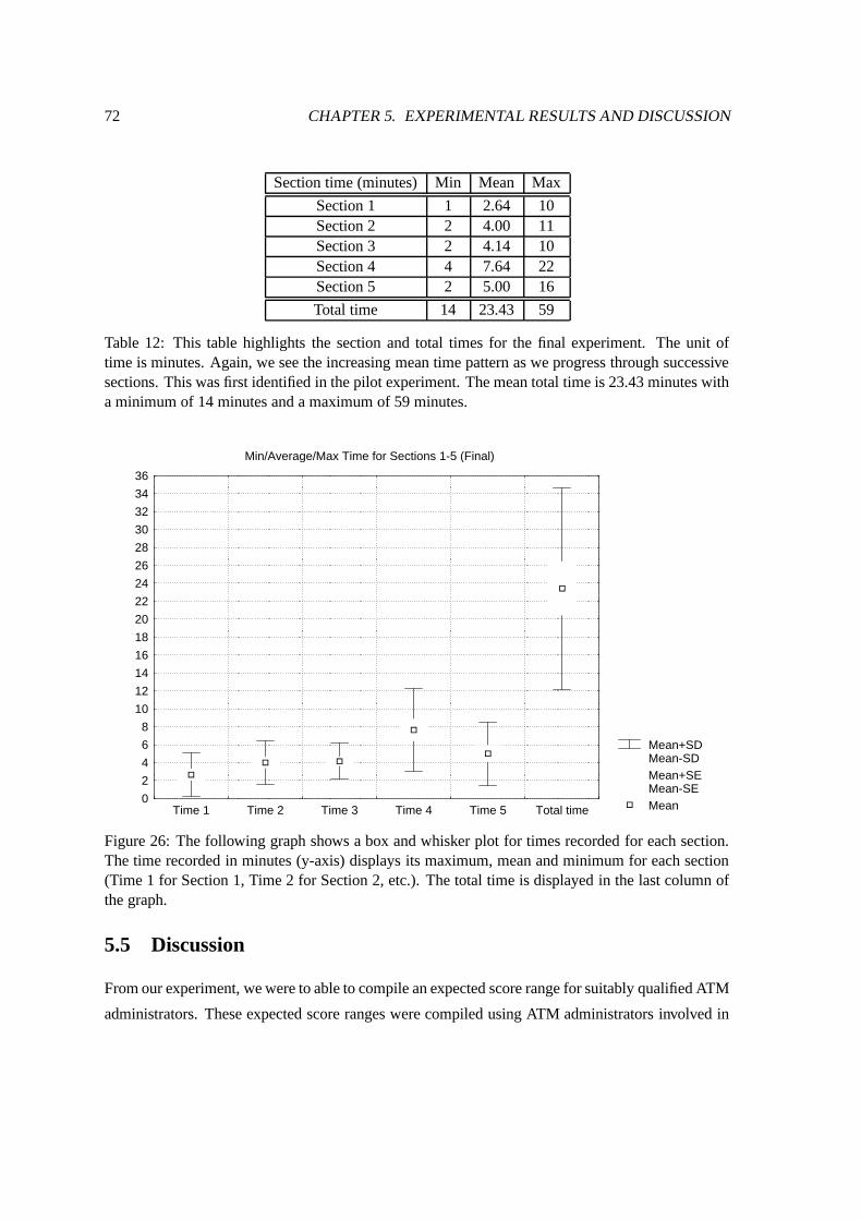
72 CHAPTER 5. EXPERIMENTAL RESULTS AND DISCUSSION
Section time (minutes) Min Mean Max
Section 1 1 2.64 10Section 2 2 4.00 11Section 3 2 4.14 10Section 4 4 7.64 22Section 5 2 5.00 16
Total time 14 23.43 59
Table 12: This table highlights the section and total times for the final experiment. The unit oftime is minutes. Again, we see the increasing mean time pattern as we progress through successivesections. This was first identified in the pilot experiment. The mean total time is 23.43 minutes witha minimum of 14 minutes and a maximum of 59 minutes.
Mean+SDMean-SDMean+SEMean-SEMean
Min/Average/Max Time for Sections 1-5 (Final)
0
2
4
6
8
10
12
14
16
18
20
22
24
26
28
30
32
34
36
Time 1 Time 2 Time 3 Time 4 Time 5 Total time
Figure 26: The following graph shows a box and whisker plot for times recorded for each section.The time recorded in minutes (y-axis) displays its maximum, mean and minimum for each section(Time 1 for Section 1, Time 2 for Section 2, etc.). The total time is displayed in the last column ofthe graph.
5.5 Discussion
From our experiment, we were to able to compile an expected score range for suitably qualified ATM
administrators. These expected score ranges were compiled using ATM administrators involved in
5.5. DISCUSSION 73
the final experiment. The minimum, mean and maximum scores were used to create a score range
which represented the expected score of an ATM administrator.
Using the expected score table, we show that non-ATM administrators perform equally well in
this experiment, without prior training in ATM management. From our questionnaire, we extracted
the mean times and mean scores for sections requiring varying degrees of network management
skills.
The expected scores were derived from 4 ATM administrators involved in the experiment. These
administrators have experience in configuring and administering ATM networks. Their experiment
scores were analysed and a 95% confidence interval was calculated.
Table 9 lists descriptive statistics for these ATM administrators. The expected score range is
calculated using the lower bound 95% Confidence Interval over the Total Score for each section.
The Total Score of these ATM administrators will also be used as a guide to determine the level of
understanding that subjects possessed after using the platter metaphor.
Table 10 lists the calculated expected score for each section. We used a conservative approach
when the bounds could not be calculated because of a lack of sample variance. Based on the previous
range and our increasing difficulty through funneling, we have approximated ranges for Sections 1,
3 and 4.
One subject performed poorly in the questionnaire resulting in a total score of 21.03%. This
subject had 10 years network experience. We identified this sample as an an outlier and recomputed
the Total Score vs Network Experience correlation. The new r-correlation value of 0.17 (r = 0.16; t
= 0.52; p= 0.61 ) is insignificant at the 95% confidence interval.
It is evident that the scores achieved by the final subjects for each section are within expected
score ranges. This supports our approach suggesting that this metaphor aids the understanding of
administrators and supports their management capabilities. In all sections, the mean time for each
section scored by subjects is in our expected range. The scores for Sections 1 to 4 are similar to
the pilot users while Section 5 shows an increase in final subject’s understanding. This is expected
since Section 5 requires administrative knowledge. At the same time, the score is only marginally
higher which may indicate that the pilot subjects may attain the same level of understanding as the
final subjects following further exposure to the platter metaphor.
We can conclude that the experiment design is favourable since these timing results are similar
to our pilot experiment. It demonstrates that most subjects have grasped the fundamentals of the
experiment within 30 minutes.
74 CHAPTER 5. EXPERIMENTAL RESULTS AND DISCUSSION
The final mean time to complete all networks tasks is 23.43 minutes. This is considered accept-
able by today’s standards. It is not uncommon to have network tools which require hours or days of
training before subjects have adequate grasp of its functionality.
5.6 Summary
This chapter concludes the experiment designed to evaluate the effectiveness of the platter metaphor.
This was achieved using a subjective experiment testing subjects’ knowledge of the network condi-
tions portrayed in the platter metaphor .
This experiment examined and confirmed the following hypotheses:
1. Subjects have a correct and concise understanding of the platter metaphor and the network
conditions it represented. We show that the average subject could perform equally well as an
ATM administrator using this tool.
2. Time taken to learn the metaphor is small, certainly less than 60 minutes.
There were 14 experiment participants for each experiment. The final experiment participants
included ATM administrators, network researchers and system administrators.
These results support the claim that the platter metaphor is useful when administrating our dy-
namic ATM network. It aids administrators particularly in understanding complex abstract network
relationships and connectivity. Subjects required a relatively small time to comprehend many of the
platter metaphor’s properties. These results emphasise that this metaphor does not require expert
administrative knowledge to monitor a network. It should be noted that prior administrative expe-
rience does aid in making network decisions. This experience will increase as the user becomes
accustomed to the metaphor.
Chapter 6
Conclusion
In this dissertation, we have examined visualisation tools designed to aid in network management
applications. In particular, we have investigated visualisation representations or metaphors, which
can be used to represent ATM network information.
In Chapter 2, the shortcomings inherent in previous metaphors were outlined. These metaphors
failed to adequately convey ATM information. In response, we developed a platter metaphor which
is an adaption of the Flodar metaphor [42] to encode ATM information.
Our main contribution lies in the overall metaphor design which can convey abstract ATM in-
formation in a concise and understandable manner. Our platter metaphor has overcome several
drawbacks inherent in previous metaphors while aiding the understanding of complex changes in
ATM networks.
To support our claims that this metaphor makes understanding a dynamic network easier, we
conducted user experiments involving network administrators and researchers. The results of the
experiment confirm that our metaphor is effective in conveying ATM network information correctly.
In addition, we can show that this understanding is achieved rapidly.
6.1 Overcoming Deficiencies of Past Network Metaphors
We motivated the need for a visualisation metaphor to display the unique characteristics of an ATM
network application called DROP. As was discussed in Chapter 3, DROP generates network infor-
mation which is difficult to understand without extensive training. The difficulty of analysis of this
information is also compounded by the size and complexity of the data generated. In an attempt to
solve this problem, we investigated several visualisation metaphors to encode this information in a
75
76 CHAPTER 6. CONCLUSION
visual representation.
In Chapter 2, we examined past network metaphors and discussed their applicability to dynamic
reconfiguration. Traditional network metaphors were designed predominantly for static, IP-based
networks, with little support for reconfigurable networks such as ATM. The main drawback of
these metaphors lies in their node placement algorithms. Unlike many previous metaphors which
use geographic location as their primary node placement strategy, we required a metaphor which
supports abstract data and minimises the geographic importance of network routes. Cluttering is
another drawback of many past metaphors.
Other issues which required attention included:
� support for abstract network data such as logical route paths, origin-destination pairs;
� maintaining overall network context
� ensuring good use of screen space
� the ability to scale for varying network sizes.
Section 3.2 to 3.4 introduced our dynamic reconfiguration application and discussed the main
considerations in developing a suitable metaphor for this application. Our metaphor design objec-
tives included support for the following features:
� abstract data,
� dynamic reconfiguration,
� call level analysis
� minimising the effects of cluttering.
Our metaphor was implemented in a C++ and OpenInventor framework, which supported rapid
prototyping and a modular, object-oriented design. OpenInventor is a registered trademark of Sili-
con Graphics Incorporated.
6.2 Developing a Solution
In Chapter 3, we introduced our ATM application which uses a dynamic reconfiguration algorithm
to optimise the capacity distribution and route utilisation within an ATM network. In Section 3.3, we
6.2. DEVELOPING A SOLUTION 77
examined this application’s output and introduced the main units of network information. Previous
metaphors provide good visual support for sparse and static networks but cannot adequately address
the following limitations which we consider important for our application:
1. Occlusion - viewing 3D objects from certain viewpoints can hide data which may be impor-
tant
2. Geographic node placement - the dominance of geographic node placement algorithms leaves
little support for applications which do not include geographic information. In addition, it is
difficult to map abstract network data to a geographic location.
3. Loss of overall network context - an overview of the network should be provided before drill-
down views are performed.
4. Inability to distinguish between physical or logical routes - ATM networks consist predom-
inantly of logical routes, while traditional metaphors highlight the static physical links in a
network
To address these concerns, we have developed two network metaphors to accommodate this
information (discussed in Sections 3.5 and 3.6). The helix and levels metaphor was our initial
metaphor developed to support dynamic reconfiguration (see Section 3.5). During initial testing, the
helix metaphor proved unsuitable for viewing networks with more than a few hundred routes. The
levels metaphor was incorporated to overcome this problem by representing the OD pair information
under a separate metaphor. However, this combination of metaphors remained unsuitable as a result
of cluttering. This cluttering resulted in the loss of overall network context which was a primary
metaphor design objective. These problems made identifying interesting network routes difficult
and hindered the effectiveness of this combination for our management purposes.
To address and overcome these deficiencies, we implemented another metaphor by extending the
functionality of the Flodar platter metaphor introduced by Swing [42]. Our modifications include:
� support for displaying routes and their capacities
� no reliance on a predefined node placement algorithm.
� the ability to make comparisons between a large number of routes
� maintaining the overall network context.
78 CHAPTER 6. CONCLUSION
In addition, our platter modifications shows the origin-destination information of all routes with
their logical lengths in the same view. This is particularly useful when trying to managing routes
which are consuming excessive capacity or experiencing congestion.
One significant drawback of the platter metaphor is the variable geometrical dimensions of each
pillar on the platter base (see Figure 14). The original platter metaphor encoded additional metrics
using the width and height of each pillar. This is useful for identifying and comparing network
servers in the original platter application where there were only a handful of servers but presents a
cluttering problem for larger networks with a few thousand pillars. To overcome this, we fixed the
width of each pillar to a constant size. In addition, the height of each pillar was fixed to reduce the
occlusion of other pillars from certain viewpoints.
We examined the effectiveness of this metaphor using several applications based on dynamic
reconfiguration (Section 3.6). These applications ranged from simple reporting on the number of
routes, to more complex applications such as visualising the distribution of capacity in the network.
As additional support, we used standard 2D representations, including a histogram and barchart, to
relay specific details about routes in the network (see Section 3.7).
6.3 Subjective Experiment Results
We believe that a metaphor’s usefulness and a user’s ability to work with it should be tested to con-
firm its effectiveness. In support of our examination of the metaphor, we performed an experiment
to measure the effectiveness of the modified platter metaphor using network researchers and admin-
istrators. The design of this experiment, including the goals, subjects, questionnaire wording and
layout are presented in Chapter 4.
We recruited ATM administrators and researchers to take part in this experiment. Our hypothe-
ses, namely
� H0 : Subjects have a correct understanding of the network conditions.
� H1 : Time taken to learn and interpret this metaphor is short.
were confirmed by the experiment. Our primary H0 hypothesis was confirmed showing good un-
derstanding of the dynamic network conditions among subjects. Our H1 hypothesis showed that the
time taken to reach the correct understanding of the network conditions was less than 30 minutes.
Section 5.4 highlights the results while Section 5.5 provides a discussion.
6.4. FUTURE WORK 79
These experimental results confirm our claims that the platter metaphor simplifies the under-
standing of our ATM application. The design of the platter enables efficient and easy monitoring,
requiring less time to identify abnormal network conditions than interpreting textual log files gen-
erated by a dynamic network. It aids administrators particularly in understanding complex network
relationships and connectivity changes. An understanding of the platter metaphor can be achieved
in a relatively short time. The experiment results also emphasised that the platter metaphor did not
require expert administrative knowledge or extensive previous training in order to monitor our ATM
network application.
6.4 Future Work
There are a number of areas that could be researched further to extend the goals and themes explored
in this dissertation. The platter metaphor is adaptable to other network management applications.
We introduced our management applications for dynamic reconfiguration in Sections 3.6.1 to 3.6.3.
Other applications can alter the material, colour or geometric properties of the platter design to en-
code different network data. Below are two future research directions for using the platter metaphor
in network monitoring applications:
Accounting information We have already demonstrated in Sections 3.6.1 to 3.6.2 that
accounting information can be shown on routes, capacities and origin-destination pairs.
We can extend this information to include other network data, such as response times,
server load and traffic characteristics. Metrics such as Quality of Service (QoS), block-
ing and error rates, latency and throughput are establishing themselves as important
units of network data in emerging network architectures. The platter can be extended
to include these metrics.
Threat analysis
In order to manage a network effectively, the possibility that a single link failure will
cause widespread network disruptions must be minimised. To achieve this, a user’s
attention should draw attention to individual links through which many routes pass.
In an ideal network environment, there will always exist an alternative path between
origin and destination nodes in the event of link failure. By employing a different
layout for routes on the platter, we can draw attention to links which may cause network
congestion if they were to fail. Again, this is another useful management application
80 CHAPTER 6. CONCLUSION
within an ATM network.
6.4.1 Real-Time ATM Management
Our ATM network application was based on an algorithm developed by Krzesinski et al [5, 6]. Our
metaphors form part of a visualisation toolkit in a network management or network analysis tool.
To realise the objective of applying this visualisation to an operational network, we are currently
collaborating with the Department of Electrical Engineering at the University of Cape Town to
complement their network management module with our platter metaphor [46]. The results of this
collaboration will be available towards the end of 2001.
6.4.2 Emerging network architecture and protocols
ATM is suitable for a wide area network (WAN), where it is called a broadband integrated services
digital network (B-ISDN), as well as for a local area network (LAN). However, the trend of the
last few years has shown that the deployment of an end-to-end ATM infrastructure is too expensive
compared to competing technology (in particular, Fast Ethernet and Gigabit Ethernet in LANs). In
addition, there is a lack of application programs constructed for the usage of pure ATM switched
connections. For these reasons, application developers, concentrate on the IP protocol stack. As
a result, the current usage of ATM is mainly as lower-layer technology for WANs, which in most
cases carry IP-related traffic [15].
Our intended application for the visualisation of network connectivity was designed for an ATM
network. Even though the platter metaphor was designed specifically to represent ATM network
data, the same visual properties can be used to represent other network architectures or protocols.
Future areas of interest include the following fields:
1. Wireless Communication
Wireless Local Loop (WLL) is a telecommunication access technology for delivering analog and
digital services, using radio instead of copper wires. It is being integrated with the existing cellular
and personal communication service (PCS) infrastructure. WLL solutions can be both mobile and
fixed [12]. The widespread use and deployment of cellular and wireless technology in the next
few years will increase through the application of emerging technologies such as Bluetooth[2]. The
management of these networks will also become equally more complex as the network structure
grows.
6.4. FUTURE WORK 81
We are currently applying the platter metaphor to a cellular telephone application to represent
information pertaining to the radio signal utilisation within a cell region and the number of current
cellular calls in progress. This adapted platter representation can be used to help in planning and
optimising the coverage provided by cellular base stations controllers and their accompanying an-
tennas (base station transceivers). The usefulness and applicability of this visual representation is
promising due to its simplicity and the circular nature of the platter, which corresponds with the
circular area range of a base station transceiver.
2. IPv6
Important advantages of IPv6 are the extended address space and QoS support built into the
protocol. The assumptions behind the development of IPv6 are that it will internetwork with IPv4
and be of specific application to new subnet technologies, where freedom of address assignment
is important. The extended address space is of particular significance as the number of ’always
on’ users is expected to increase rapidly. ’Always on’ users would benefit from globally unique
addresses due to lower processing requirements, since the server has to allocate user addresses only
once. In present IPv4-based implementations, addresses are assigned by a server each time users
are connected [21].
IPv6 has only recently emerged as a protocol specification which improves the performance of
IP based applications. Within its framework, it can sustain quality of service requirements for ap-
plications ranging from simple telephony to complex video and multimedia. Since the assignment
of IP addresses allows an individual device to be portable, mapping the network structure to a static
network map is counter-intuitive.
3. Traditional administration tools
There are standard commands and tools used in the administration of networks. Popular exam-
ples include the ping, traceroute/tracert and netstat commands, which are commonly used to install
and diagnose networks. Information gathered from these tools can be represented in a visual view.
For example, the platter metaphor can extend the functionality of the ping command by displaying
the results of a ping command. By showing the response times for multiple network devices within
a network, the platter can be used to monitor an entire LAN within a single view. This is similar
to the original Flodar application of monitoring servers within an LAN with the exception that our
approach extends the application to traditional network diagnosis tools.
82 CHAPTER 6. CONCLUSION
The platter metaphor can also be applied to show visual information extracted from the tracer-
oute command. The output of the traceroute command includes a series of network hops and their
response times. Since this is similar to dynamic reconfiguration, with the exception that network
paths are unlikely to change significantly in the traceroute output, the platter can be applied to show
the traceroute results visually.
6.5 Concluding remarks
In this dissertation, we have demonstrated that our platter metaphor is effective in conveying dy-
namic ATM network information. We have shown why previous metaphors proved unsuitable for
our dynamic reconfiguration algorithm. To overcome many of these limitations, we implemented
an adapted metaphor for our ATM application. The effectiveness of this metaphor was tested using
network administrators and researchers in a subjective experiment. The results of this experiment
confirm our claims that the platter metaphor makes understanding the network conditions easier
while reducing the time to understand and comprehend the current network configuration.
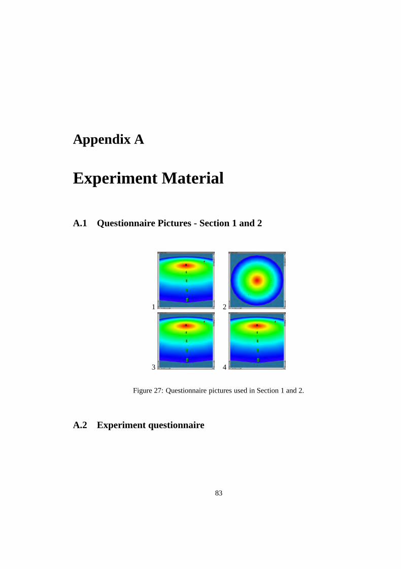
Appendix A
Experiment Material
A.1 Questionnaire Pictures - Section 1 and 2
1 2
3 4
Figure 27: Questionnaire pictures used in Section 1 and 2.
A.2 Experiment questionnaire
83

84 APPENDIX A. EXPERIMENT MATERIAL
PLATTER METAPHOR QUESTIONNAIRE
Instructions
This questionnaire is designed to determine your understanding of the visual representation or
metaphor known as the platter metaphor. You will be presented with a series of questions related
to the metaphor to gauge your understanding and knowledge about the metaphor.
Please use a pen, rather than a pencil to fill in this questionnaire. Indicate your answer by CIR-
CLING it.
These questionnaires are completely confidential, and your answers will be used for research
purposes only.
When you have completed a questionnaire, please RAISE your hand to indicate that you have
completed this questionnaire and that you are ready for the next section. A person will collect this
paper and give you the next section. There is a total of 5 sections.
The first 2 sections (i.e. sections 1,2) are based on images which accompany each individual
question. The last two sections (i.e. sections 3,4 and 5) are based on a computer tool using the
platter metaphor.
Sections 1 and 2 are based on images. Each question has an accompanying image labeled figure
1 for question 1, figure 2 for question 2, etc. You need to press ’SPACE’ to advance to the next figure
or ’BACKSPACE’ to return to the previous image. There are 4 images accompanying 4 questions in
each section.
If you have any questions, please feel free to ask.
When you are ready, you may turn the page.
Good luck !

A.2. EXPERIMENT QUESTIONNAIRE 85
Platter Metaphor Experiment
Section 1
Press ’SPACE’ to advance to the next figure or ’BACKSPACE’ to return to the previous figure. NB
Each question has its own figure : e.g. Q1 uses fig. 1, Q2 uses fig. 2, etc.
Q1. What does the colour of the platter’s cubes represent?
(a) Capacity
(b) Route length
(c) OD pair affiliation
(d) Distance from the center
(e) Distance from the edge
Q2. What does the distance from the center represent ?
(a) Route length
(b) Capacity
(c) Server response time
(d) Nothing
(e) OD pair affiliation
Q3. What network unit does the coloured cube represent?
(a) OD pair
(b) Physical link
(c) Traffic intensity
(d) Capacity range
(e) Route
Q4. What network unit does a straight line of coloured cubes represent?
(a) Route
(b) Capacity range
(c) OD pair
(d) Traffic intensity
(e) Physical link
Please RAISE your hand when you are done with this section

86 APPENDIX A. EXPERIMENT MATERIAL
Platter Metaphor Experiment
Section 2
Press ’SPACE’ to advance to the next figure or ’BACKSPACE’ to return to the previous figure. NB
Each question has its own figure : e.g. Q1 uses fig. 1, Q2 uses fig. 2, etc.
Q1. How many non-physical routes exist in the following OD pair?
(a) 2
(b) 3
(c) 1
(d) 4
(e) 0
Q2. How many OD pairs, excluding physical links, exist in the following network
configuration?
(a) 6
(b) 2
(c) 1
(d) 4
(e) 3
Q3. How many physical links exist in the following network configuration?
(a) 2
(b) 3
(c) 4
(d) 5
(e) 1
Q4. Given the following network configuration with a maximum capacity of 1500, what
approximate percentage of routes have a capacity of less than 750 units
(a) 100%
(b) 10%
(c) 60%
(d) 20%
(e) 80%

A.2. EXPERIMENT QUESTIONNAIRE 87
Platter Metaphor Experiment
Section 3
Q1. What is the maximum non-physical route capacity for the following network
configuration?
(a) 1498
(b) 1100
(c) 700
(d) 834
(e) None of the above
Q2. What is the maximum physical link capacity in the following network configuration?
(a) 1100
(b) 834
(c) 1498
(d) 0
(e) None of the above
Q3. What path does the non-physical route with the lowest capacity follow?
(a) 1-2-9-10-11-4
(b) 1-2-9-10-3
(c) 1-2
(d) 1-2-16-17-18-19-12-5
(e) 1-2-9
Q4. What is the route length of the route with the following route id : 2353
(a) 1
(b) 5
(c) 4
(d) 2
(e) 3
Please RAISE your hand when you are done with this section

88 APPENDIX A. EXPERIMENT MATERIAL
Platter Metaphor Experiment
Section 4
Q1. In the following network, there exists an OD pair with only 1 non-physical route in it.
What is the capacity of this route?
(a) 9
(b) 332
(c) 700
(d) 120
(e) 3
Q2. In this network, the low capacity routes (i.e less than 120 capacity units) have a length
between 4 and 6 links. There is however one exception! Identify this route and determine its
capacity. What is the capacity of this route?
(a) 16
(b) 111
(c) 3
(d) 113
(e) 9
Q3. Determine the minimum and maximum length of all non-physical routes in this network.
Which is the correct minimum and maximum route length respectively ?
(a) 3,10
(b) 6,8
(c) 2,9
(d) 2,10
(e) 4,9
Please RAISE your hand when you are done with this section

A.2. EXPERIMENT QUESTIONNAIRE 89
Platter Metaphor Experiment
Section 5
Q1. The route in your display is a problematic one. There are several properties about this
route which could make it difficult to manage. These properties are listed below. Which of
these properties are true ?
Answer by circling either TRUE, FALSE or UNDECIDED for each property.
i. The route length makes it more vulnerable to lost connections than other shorter routes.
................................................................................TRUE/FALSE/UNDECIDED
ii.The route capacity is close to the local maximum, leaving less capacity for other routes in the
network. ................................................................................TRUE/FALSE/UNDECIDED
iii. There are too many routes in the same OD pair causing congestion.
................................................................................TRUE/FALSE/UNDECIDED
iv. The route length is shared by another route in the same OD pair, causing conflicts along the
same path. ................................................................................TRUE/FALSE/UNDECIDED.
Please RAISE your hand when you are done with this section

90 APPENDIX A. EXPERIMENT MATERIAL
Biographical Information
Please provide the following information:
First Name
Surname
Occupation (i.e. student, administrator etc.)
Company, if student, please state faculty/research group and current year of study
Area of Computing (i.e. network management, graphics etc)
Years of Computing Experience in this Area
NB : do not divulge the contents of this experiment and questionnaire to other participants as this
will influence the results they obtain in their experiment.

Appendix B
Experiment Results
91

92 APPENDIX B. EXPERIMENT RESULTSP
erio
d:
26-A
pr-
00P
ilot
pla
tter
exp
erim
ent
2-M
ay-0
0A
uth
or
: O
liver
Saa
l
Sub
ject
Firs
t Nam
eS
urna
me
Occ
upat
ion
Com
pany
Are
a of
Com
putin
gE
xper
ienc
eE
xam
iner
Par
tner
Dat
e1
Nak
ene
Mat
habo
Stu
dent
UC
TH
CI
2O
SS
Ham
za26
-Apr
-00
2S
abee
haH
amza
Stu
dent
UC
TH
CI
3JC
N M
atha
bo26
-Apr
-00
3M
icah
D
anie
lsS
tude
ntU
CT
Usa
bilit
y3
OS
P L
ee27
-Apr
-00
4P
oi-I
(O
scar
)Le
eS
tude
ntU
CT
Net
wor
king
1JC
M D
anie
ls27
-Apr
-00
5Z
ayd
Hen
dric
ksS
tude
ntU
CT
JCP
Gre
en27
-Apr
-00
6P
hilip
G
reen
Stu
dent
UC
TN
etw
orks
0O
SZ
Hen
dric
ks27
-Apr
-00
7Y
i-Lie
nLo
Stu
dent
UC
TD
NL
Mol
ebog
eng
28-A
pr-0
08
Leka
laM
oleb
ogen
gS
tude
ntU
CT
Dat
abas
es1
OS
Y L
o28
-Apr
-00
9Ja
kkap
han
Tan
gkua
mpi
enS
tude
ntU
CT
DN
N J
ones
28-A
pr-0
010
Nat
alie
Jone
sS
tude
ntU
CT
VE
’s, V
isua
lisat
ion
1C
JJ
Tan
gkua
mpi
en28
-Apr
-00
11A
lan
Mul
ler
Stu
dent
UC
TG
raph
ics
5C
JT
Gw
ena
28-A
pr-0
012
Tin
ashe
Gen
aS
tude
ntU
CT
Net
wor
k A
dmin
istr
ator
2O
SA
Mul
ler
28-A
pr-0
013
And
yS
hear
man
Stu
dent
UC
TN
etw
ork
Tec
hnic
ian
5C
JB
Ste
yn2-
May
-00
14B
arry
Ste
ynS
tude
ntU
CT
Vis
ualis
atio
n1
OS
A S
hear
man
2-M
ay-0
0

93C
orr
ect
answ
ers
:B
BE
CD
DE
CB
DA
DB
ED
TT
FF
Sub
ject
Q1
Q2
Q3
Q4
Q5
Q6
Q7
Q8
Q9
Q10
Q11
Q12
Q13
Q14
Q15
Q16
-1Q
16-2
Q16
-3Q
16-4
T1
T2
T3
T4
T5
Tot
al T
ime
1B
BE
CD
DC
CB
DA
DB
ED
TF
FF
35
35
420
2B
BE
CD
DE
CB
DA
DB
AD
TU
TF
23
77
193
BB
EC
CC
DC
BE
AE
BA
DF
TT
U3
88
124
354
BB
EC
DD
AC
BD
CD
BE
AT
TT
F2
43
41
145
BB
BC
CD
CC
AB
AD
DE
DT
FF
U3
35
112
246
BB
BC
DD
ED
BD
AD
BE
DT
FF
U2
33
54
177
BB
CD
EE
CB
DA
DA
CC
FF
FU
33
25
316
8B
BE
CD
DE
CB
DC
DB
ED
FF
FF
23
54
418
9B
BE
CD
DC
CB
DA
DB
ED
TF
FF
24
35
216
10B
BE
CD
DE
CB
DA
EB
ED
TF
FF
23
65
420
11B
BD
AD
DE
EA
DB
ED
TT
TU
33
44
418
12B
BE
CD
DE
EB
DA
DB
ED
TF
UU
23
35
1629
13B
BE
CD
DE
EB
DA
EB
BD
TF
FF
23
817
636
14B
BE
CD
DE
CB
DA
EB
ED
TU
FF
22
34
314

94 APPENDIX B. EXPERIMENT RESULTSP
erio
d11
-May
-00
Fin
al P
latt
er E
xper
imen
t7-
Jun
-00
Au
tho
r :
Oliv
er S
aal
Sub
ject
sF
irst N
ame
Sur
nam
eO
ccup
atio
nC
ompa
nyA
rea
of C
ompu
ting
Exp
erie
nce
Exa
min
erP
artn
erD
ate
1Ia
nD
avie
sM
sc s
tude
ntU
CT
Com
pSci
DN
A T
heor
etic
al C
S3
CJ
I Azb
el11
-May
-00
2Ila
nA
zbel
Msc
stu
dent
UC
T C
ompS
ciD
atab
ases
Net
wor
k S
ecur
ity2
OS
I Dav
ies
11-M
ay-0
03
Elto
n S
aul
Msc
stu
dent
UC
T C
ompS
ciD
NA
Net
wor
k S
ecur
ity3
CJ
M N
elte
16-M
ay-0
04
Mic
hael
N
elte
Msc
stu
dent
UC
T C
ompS
ciD
NA
Net
wor
k/B
iom
etric
s2
OS
E S
aul
16-M
ay-0
05
Lour
ens
Wal
ters
Msc
stu
dent
UC
T C
ompS
ciD
NA
Net
wor
k S
pec/
Ana
lysi
s2
CJ
Y Y
avw
a16
-May
-00
6Y
akom
baY
avw
aM
sc s
tude
ntU
CT
Com
pSci
DN
A W
irele
ss C
omm
0.2
OS
L W
alte
rs16
-May
-00
7S
amue
lC
hetty
Sys
Adm
inU
CT
Win
NT
Adm
inis
trat
ion
10O
S17
-May
-00
8M
atth
ewW
est
Sys
Adm
inU
CT
UN
IX A
dmin
istr
atio
n6
OS
17-M
ay-0
09
Mar
c W
elz
PhD
stu
dent
UC
T C
ompS
ciD
NA
Net
wor
k S
ec/S
ysA
dmin
5O
S4-
Jun-
0010
And
rea
Fos
ter
Msc
stu
dent
UC
T C
ompS
ciD
istr
ibut
ed C
omp/
Sys
Adm
in2
OS
5-Ju
n-00
10K
evin
D
enni
sM
sc s
tude
ntU
CT
Ele
c E
ngC
RG
Net
wor
ks V
R3
RS
D F
ine
6-Ju
n-00
12D
anie
l F
ine
Msc
stu
dent
UC
T E
lec
Eng
CR
G N
etw
ork
Flo
w c
ontr
ol1.
5O
SK
Den
nis
6-Ju
n-00
13S
ven
She
psto
neM
sc s
tude
ntU
CT
Ele
c E
ngC
RG
Net
wor
k T
elep
hony
AT
M2
RS
S D
oyle
7-Ju
n-00
14S
tuar
tD
oyle
Msc
stu
dent
UC
T E
lec
Eng
CR
G N
etw
ork
VR
man
agem
ent
2O
SS
She
psto
ne7-
Jun-
00

95C
orr
ect
answ
ers
:B
BE
CD
DE
CB
DA
DB
ED
TT
FF
Sub
ject
sQ
1Q
2Q
3Q
4Q
5Q
6Q
7Q
8Q
9Q
10Q
11Q
12Q
13Q
14Q
15Q
16-1
Q16
-2Q
16-3
Q16
-4T
1T
2T
3T
4T
5T
otal
Tim
e1
BB
EC
DD
EC
BD
AD
BE
DF
UU
F1
33
75
192
BB
EC
DD
EE
BD
AD
BE
DF
FF
F2
24
42
143
BB
EC
DD
EC
BD
AD
BE
DT
TF
F2
53
66
224
BB
EC
DD
EC
BD
CD
BE
DT
TF
F2
24
43
155
BB
EC
DD
EC
BD
AD
BE
DT
TF
F6
53
55
246
CB
BC
DD
EA
EE
AD
BC
DT
TF
F10
1110
226
597
DA
DA
CD
EC
AC
DE
DD
CF
TT
T3
33
62
178
BB
AB
DA
EC
BD
AD
BE
AT
TF
F2
55
114
279
BB
DC
DD
EC
BD
AD
BE
DT
UF
T1
32
53
1410
BB
EC
DD
EE
BE
AD
BE
DT
UF
F1
36
75
2210
BB
EC
DD
EC
BD
AD
BE
DU
TU
F2
65
64
2312
BB
EC
DD
EE
BD
AD
BE
DT
FU
U2
33
516
2913
BB
EC
CD
EC
EE
EE
BE
DT
TT
F1
34
92
1914
BB
EC
DD
EE
BD
AD
BE
DT
TT
T2
23
107
24

96 APPENDIX B. EXPERIMENT RESULTSP
ilot
pla
tter
exp
erim
ent
Au
tho
r :
Oliv
er S
aal
Sub
ject
Sec
tion1
Sec
tion2
Sec
tion3
Sec
tion4
Sec
tion5
Q1-
Q15
Sco
reQ
16 S
core
Tot
al S
core
Per
cent
age
CS
3O
rder
Com
men
ts1
43
43
314
317
89.4
7%56
12
44
42
214
216
84.2
1%69
13
41
22
19
110
52.6
3%2
Inco
rrec
t col
or s
chem
e4
43
32
312
315
78.9
5%2
53
22
22
92
1157
.89%
36
33
43
213
215
78.9
5%3
73
34
01
101
1157
.89%
48
44
33
214
216
84.2
1%65
49
43
43
314
317
89.4
7%5
104
43
33
143
1789
.47%
511
23
23
210
212
63.1
6%73
612
43
43
114
115
78.9
5%6
134
33
23
123
1578
.95%
897
Inco
rrec
t col
or s
chem
e14
44
33
314
317
89.4
7%34
7
Fin
al P
latt
er E
xper
imen
tA
uth
or
: O
liver
Saa
l
Sub
ject
Sec
tion1
Sec
tion2
Sec
tion3
Sec
tion4
Sec
tion5
Q1-
Q15
Sco
reQ
16 S
core
Tot
al S
core
Per
cent
age
CS
3O
rder
Com
men
ts1
44
43
115
116
84.2
1%-1
12
43
43
214
216
84.2
1%-1
13
44
43
415
419
100.
00%
-12
44
43
34
144
1894
.74%
-12
54
44
34
154
1910
0.00
%-1
36
23
22
49
413
68.4
2%-1
37
03
00
13
14
21.0
5%-1
48
23
42
411
415
78.9
5%-1
59
34
43
214
216
84.2
1%-1
610
43
33
313
316
84.2
1%-1
710
44
43
215
217
89.4
7%-1
812
43
43
114
115
78.9
5%-1
813
43
03
310
313
68.4
2%-1
914
43
43
214
216
84.2
1%-1
9

Appendix C
Colour Plate
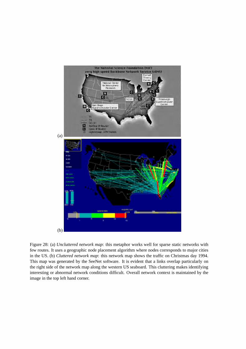
(a)
(b)
Figure 28: (a) Uncluttered network map: this metaphor works well for sparse static networks withfew routes. It uses a geographic node placement algorithm where nodes corresponds to major citiesin the US. (b) Cluttered network map: this network map shows the traffic on Christmas day 1994.This map was generated by the SeeNet software. It is evident that a links overlap particularly onthe right side of the network map along the western US seaboard. This cluttering makes identifyinginteresting or abnormal network conditions difficult. Overall network context is maintained by theimage in the top left hand corner.
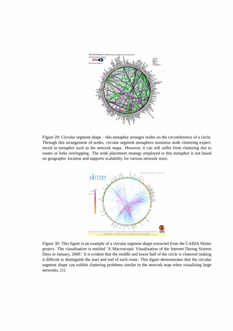
Figure 29: Circular segment shape – this metaphor arranges nodes on the circumference of a circle.Through this arrangement of nodes, circular segment metaphors minimise node cluttering experi-enced in metaphor such as the network maps. However, it can still suffer from cluttering due toroutes or links overlapping. The node placement strategy employed in this metaphor is not basedon geographic location and supports scalability for various network sizes.
Figure 30: This figure is an example of a circular segment shape extracted from the CAIDA Skitterproject. The visualisation is entitled ’A Macroscopic Visualisation of the Internet During SixteenDays in January, 2000.’ It is evident that the middle and lower half of the circle is cluttered makingit difficult to distinguish the start and end of each route. This figure demonstrates that the circularsegment shape can exhibit cluttering problems similar to the network map when visualising largenetworks. [1]
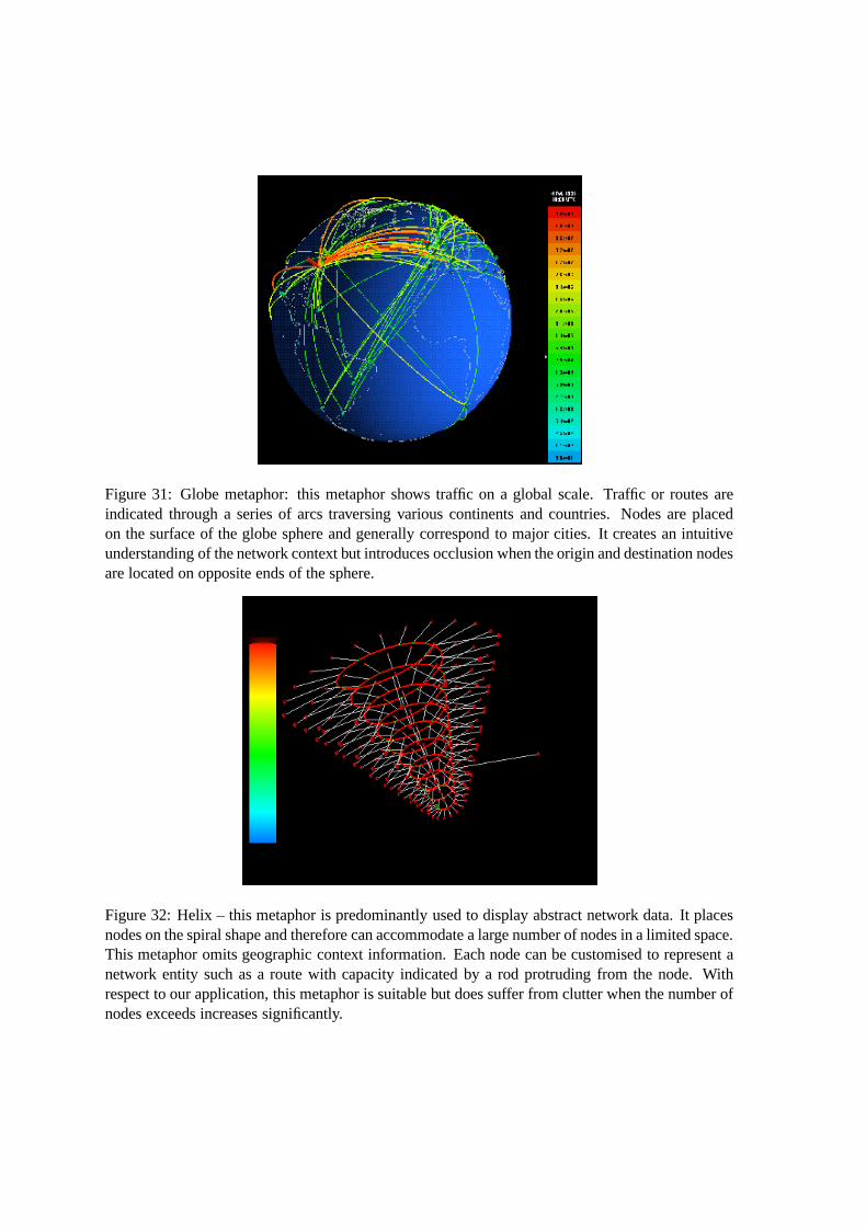
Figure 31: Globe metaphor: this metaphor shows traffic on a global scale. Traffic or routes areindicated through a series of arcs traversing various continents and countries. Nodes are placedon the surface of the globe sphere and generally correspond to major cities. It creates an intuitiveunderstanding of the network context but introduces occlusion when the origin and destination nodesare located on opposite ends of the sphere.
Figure 32: Helix – this metaphor is predominantly used to display abstract network data. It placesnodes on the spiral shape and therefore can accommodate a large number of nodes in a limited space.This metaphor omits geographic context information. Each node can be customised to represent anetwork entity such as a route with capacity indicated by a rod protruding from the node. Withrespect to our application, this metaphor is suitable but does suffer from clutter when the number ofnodes exceeds increases significantly.
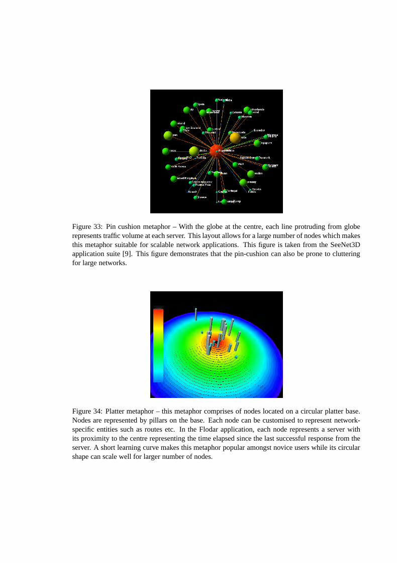
Figure 33: Pin cushion metaphor – With the globe at the centre, each line protruding from globerepresents traffic volume at each server. This layout allows for a large number of nodes which makesthis metaphor suitable for scalable network applications. This figure is taken from the SeeNet3Dapplication suite [9]. This figure demonstrates that the pin-cushion can also be prone to clutteringfor large networks.
Figure 34: Platter metaphor – this metaphor comprises of nodes located on a circular platter base.Nodes are represented by pillars on the base. Each node can be customised to represent network-specific entities such as routes etc. In the Flodar application, each node represents a server withits proximity to the centre representing the time elapsed since the last successful response from theserver. A short learning curve makes this metaphor popular amongst novice users while its circularshape can scale well for larger number of nodes.
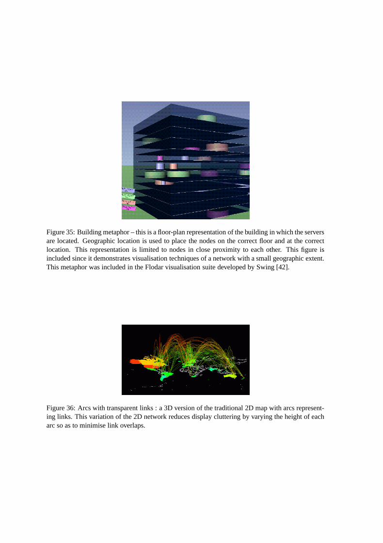
Figure 35: Building metaphor – this is a floor-plan representation of the building in which the serversare located. Geographic location is used to place the nodes on the correct floor and at the correctlocation. This representation is limited to nodes in close proximity to each other. This figure isincluded since it demonstrates visualisation techniques of a network with a small geographic extent.This metaphor was included in the Flodar visualisation suite developed by Swing [42].
Figure 36: Arcs with transparent links : a 3D version of the traditional 2D map with arcs represent-ing links. This variation of the 2D network reduces display cluttering by varying the height of eacharc so as to minimise link overlaps.
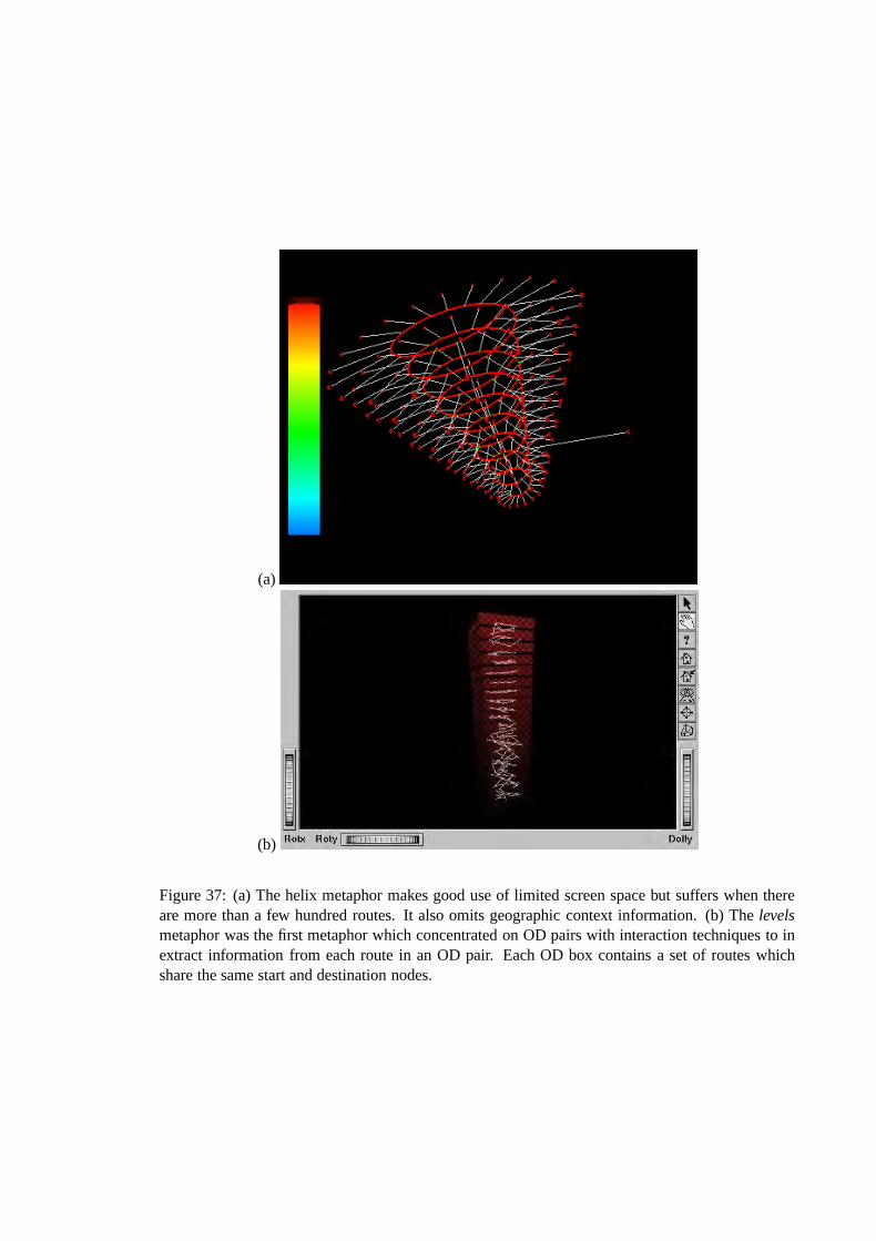
(a)
(b)
Figure 37: (a) The helix metaphor makes good use of limited screen space but suffers when thereare more than a few hundred routes. It also omits geographic context information. (b) The levelsmetaphor was the first metaphor which concentrated on OD pairs with interaction techniques to inextract information from each route in an OD pair. Each OD box contains a set of routes whichshare the same start and destination nodes.
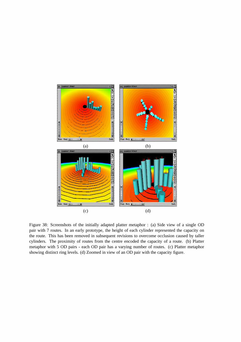
(a) (b)
(c) (d)
Figure 38: Screenshots of the initially adapted platter metaphor : (a) Side view of a single ODpair with 7 routes. In an early prototype, the height of each cylinder represented the capacity onthe route. This has been removed in subsequent revisions to overcome occlusion caused by tallercylinders. The proximity of routes from the centre encoded the capacity of a route. (b) Plattermetaphor with 5 OD pairs - each OD pair has a varying number of routes. (c) Platter metaphorshowing distinct ring levels. (d) Zoomed in view of an OD pair with the capacity figure.
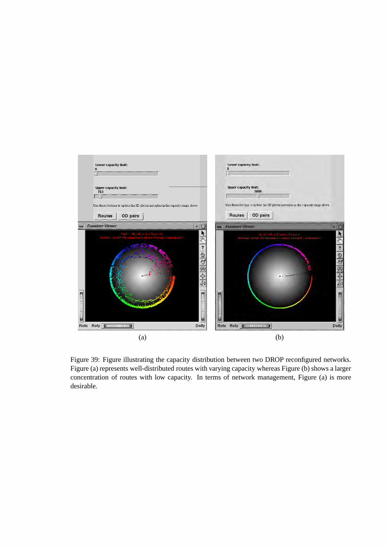
(a) (b)
Figure 39: Figure illustrating the capacity distribution between two DROP reconfigured networks.Figure (a) represents well-distributed routes with varying capacity whereas Figure (b) shows a largerconcentration of routes with low capacity. In terms of network management, Figure (a) is moredesirable.
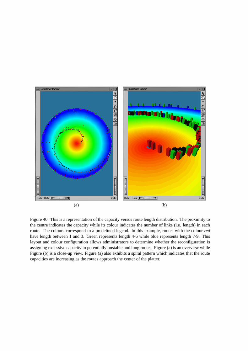
(a) (b)
Figure 40: This is a representation of the capacity versus route length distribution. The proximity tothe centre indicates the capacity while its colour indicates the number of links (i.e. length) in eachroute. The colours correspond to a predefined legend. In this example, routes with the colour redhave length between 1 and 3. Green represents length 4-6 while blue represents length 7-9. Thislayout and colour configuration allows administrators to determine whether the reconfiguration isassigning excessive capacity to potentially unstable and long routes. Figure (a) is an overview whileFigure (b) is a close-up view. Figure (a) also exhibits a spiral pattern which indicates that the routecapacities are increasing as the routes approach the center of the platter.
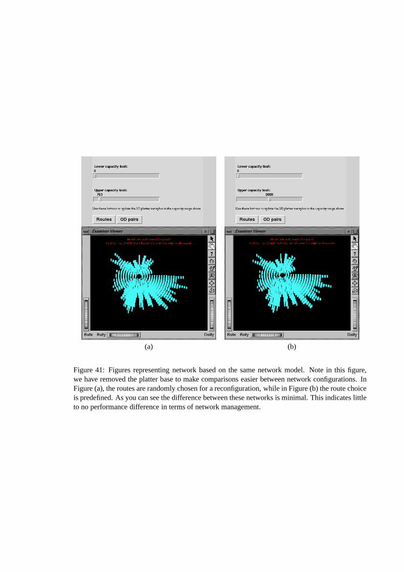
(a) (b)
Figure 41: Figures representing network based on the same network model. Note in this figure,we have removed the platter base to make comparisons easier between network configurations. InFigure (a), the routes are randomly chosen for a reconfiguration, while in Figure (b) the route choiceis predefined. As you can see the difference between these networks is minimal. This indicates littleto no performance difference in terms of network management.
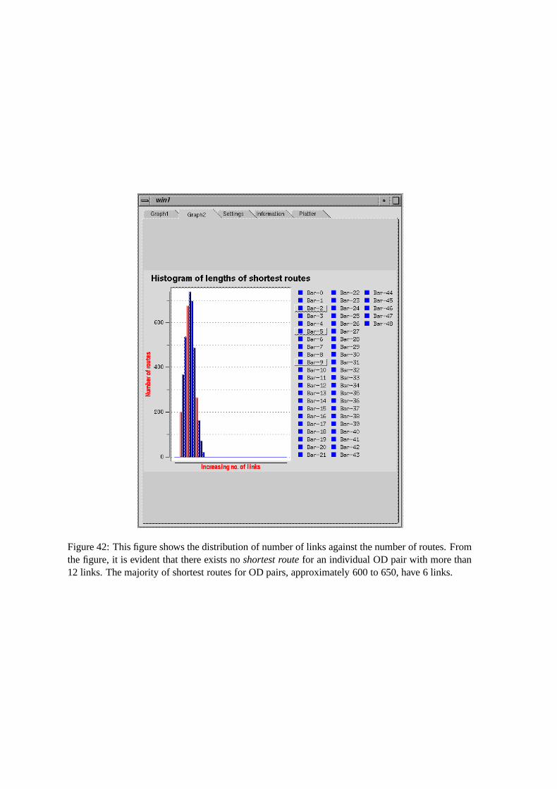
Figure 42: This figure shows the distribution of number of links against the number of routes. Fromthe figure, it is evident that there exists no shortest route for an individual OD pair with more than12 links. The majority of shortest routes for OD pairs, approximately 600 to 650, have 6 links.
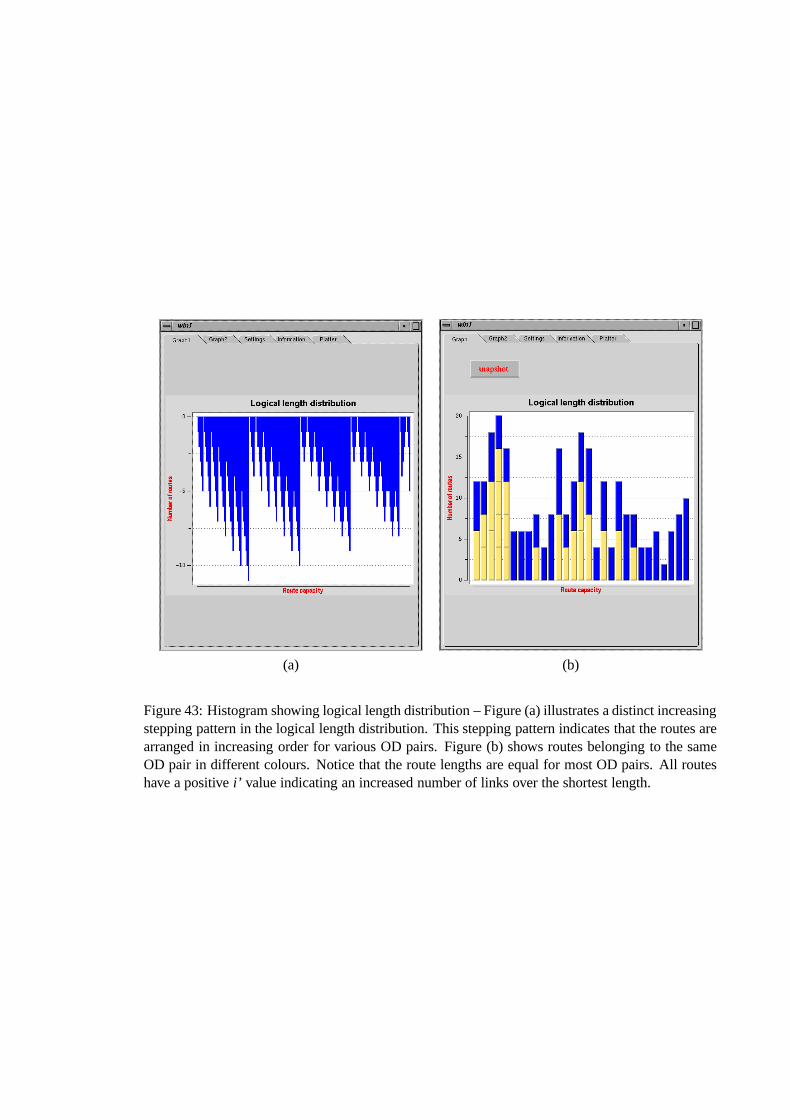
(a) (b)
Figure 43: Histogram showing logical length distribution – Figure (a) illustrates a distinct increasingstepping pattern in the logical length distribution. This stepping pattern indicates that the routes arearranged in increasing order for various OD pairs. Figure (b) shows routes belonging to the sameOD pair in different colours. Notice that the route lengths are equal for most OD pairs. All routeshave a positive i’ value indicating an increased number of links over the shortest length.
Bibliography
[1] CAIDA Organisation.
http://www.caida.org/analysis/topology/as core network/AS Network.xml.
[2] The Official Bluetooth Website. http://www.bluetooth.com.
[3] Association for Computer Machinery. Workshop on New Paradigms in Information
Visualization and Manipulation (NPIVM ’99), 1515 Broadway, New York, November 1999.
ACM Press.
[4] R. A. Becker, S. G. Eick, and A. R. Wilks. Visualizing Network Data. IEEE Transactions on
Visualization and Computer Graphics, March 1995.
[5] S. Berezner and A. Krzesinski. Call Admision and Routing in ATM Networks based on
Virtual Path Separation. In 4th Int Conf on Broadband Communications, Stuttgart Germany,
April 1998. 4th Int Conf on Broadband Communications.
[6] S. Berezner and A. Krzesinski. Optimal Reconfiguration of Large Manhattan grids.
Technical report, University of Natal and University of Stellenbosch, 1998.
[7] M. C. Chuah and S. G. Eick. Information Rich Glyphs for Software Management Data.
Computer Graphics and Applications, pages 24–28, July/August 1998.
[8] K. C. Cox and S. G. Eick. 3D Displays of Internet Traffic. Information Visualization ’95.
[9] K. C. Cox, S. G. Eick, and T. He. 3D Geographic Network Displays. ACM Sigmod Record,
24(4), December 1996.
[10] K. C. Cox, S. G. Eick, and G. J. Wills. Visual data mining : Recognizing telephone calling
fraud. Technical report, AT&T Bell Laboraties, April 1997.
110
[11] J. Dill and N. Gershom, editors. Managing Software with New Visual Representations. IEEE,
IEEE Computer Society Press, October 1997. Information Visualization Proceedings ’97.
[12] S. Dixit. Data Rides High on High-Speed Remote Access. IEEE Communications,
37(1):130–141, January 1999.
[13] M. Dodge. Cybergeography - www.cybergeography.org. Internet.
[14] M. Dodge. The Geographies of Cyberspace. In Working Paper Series, number Paper 8 in
Centre for Advanced Spatial Analysis Working Paper Series. CASA, UCL, 1999. Working
Paper Series.
[15] G. Eichler, H. Hussmann, G. Mamais, C. Prehofer, and S. Salsano. Implementing Intergrated
and Differentiated Services for the Internet with ATM Networks: A Pratical Approach. IEEE
Communications, 38(1):132–141, January 2000.
[16] S. G. Eick. Engineering Perceptually Effective Visualizations for Abstract Data. Technical
report, AT&T Bell Laboraties, 1000 East Warrenville Road, Napierville, IL, March 1995.
[17] S. G. Eick. Aspects of Network Visualization. IEEE Computer Graphics and Applications,
16(2):69–72, March 1996.
[18] S. G. Eick. Visual Discovery and Analysis. In H. Hagen, editor, IEEE Transactions on
Visualization and Computer Graphics, volume 6 (1), pages 44–58. IEEE Computer Society,
2000.
[19] S. G. Eick and T. He. Constructing Interactive Network Visual Interfaces. Bell Labs
Technical Journal, 3(2), 1998.
[20] S. G. Eick and G. J. Wills. Navigating Large Networks with Hierarchies. In Proc. IEEE Conf.
Visualization, pages 204–210, 25–29 Oct. 1993.
[21] N. Engell, A. Azcorra, E. Bertelsen, J. Carapinha, L. Dittman, D. Fernandez, J. K.
Kjaergaard, I. McKay, J. Maliszewski, and Z. Papir. Applying QoS Control though
Integration of IP and ATM. IEEE Communications, 38(7):132–136, January 2000.
[22] L. Gardin. Cybersapce geography visualization. http://heiwww.unige.ch/girardin/cgv/,
October 1995.
111
[23] N. Gershon and S. G. Eick. Information Visualization. Computer Graphics and Applications,
pages 28–31, 1997.
[24] N. Gershon, S. G. Eick, and S. Card. Design: Information Visualization. Interactions,
5(2):9–15, 1998.
[25] D. C. Holwell. Statistical Methods for Psychology. Duxbury Press, 1982.
[26] B. Huffaker. Macroscopic Internet Visualization and Measurement.
[27] B. Huffaker, E. Nemeth, and K. Claffy. Otter : A General-Purpose Network Visualization
Tool. http://www.caida.org/Tools/Otter/Paper.
[28] E. F. Johnson. Graphical Applications with Tcl/Tk. M&T Books, 1996.
[29] J. D. Kock and A. Krzesinski. Computing an Optimal Virtual Path Connection Network by
Simulated Annealing. In SATNAC98 Proceedings 1st Annual South African
Telecommunications, Network and Applications Conference, pages 611–617. Department of
Computer Science, University of Stellenbosch, 1998.
[30] E. E. Koutsofios, S. C. North, and D. A. Keim. Visualizing Large Telecommunication Data
Sets. Computer Graphics and Applications, pages 16–19, May/June 1999.
[31] S. E. Lamm, W. H. Scullin, and D. A. Reed. Real Time Geographic Visualisation of WWW
Traffic. Technical report, University of Illinois.
[32] P. McFedries. Excel 5 Super Book. Richard K. Swadley, 1994.
[33] T. Munzer. Exploring Large Graphs in 3D Hyperbolic Space. Computer Graphics and
Applications, pages 18–22, July/August 1998.
[34] T. Munzer and P. Burchard. Visualizing the Structure of the WWW in 3D Hyperbolic Space.
In Special Issue of Computer Grpahics, Proceedings of VRML ’95, pages 33–38, San Diego,
California,, December 1995. ACM Siggraph, ACM Siggraph.
[35] T. Munzer, E. Hoffman, K. Claffy, and B. Fenner. Visualizing the Global Topology of
Mbone. In Proceedings of the 1996 IEEE Symposium on Information Visualization, San
Francisco, CA, October 1996.
112
[36] A. Oppenhiem. Questionnaire Design, Interviewing and Attitude Measurement. Printers
Publishers Ltd., 1992.
[37] M. Orne. On the Social Psychology of the Psychological Experiment: with Particular
Reference to Demand Characteristics and their Implications. American Psychologist,
17:776–783, September/October 1962.
[38] G. Parulkar, D. Schmidt, E. Kraemer, J. Turner, and A. Kantawala. An Architecture for
Monitoring, Visualisation, and Control of Gigabit Networks. IEEE Network, 11(5):34–43,
September/October 1997.
[39] T. Robertson and R. Biddle. Visualising IP Network Performance with Tcl/Tk. Technical
report, Victoria University of Wellington, April 1996.
[40] W. H. Scullin, T. T. Kwan, and D. A. Reed. Real Time Visualisation of World Wide Web
Traffic. Technical report, University of Illinois.
[41] Silicon Graphics Inc. Optimizing Open Inventor Applications, 1993. Release 2.0.
[42] E. Swing. Flodar : Flow Visualisation of Network Traffic. IEEE, pages 6–8, September and
October 1998.
[43] E. R. Tufte. The Visual Display of Quantitative Information. Graphics Press, Cheshire,
Connecticut, 1983.
[44] G. Walker. Challenges of Information Visualisation. British Telecommunications
Engineering Journal, 14:17–25, April 1995.
[45] J. Wernecke. The Inventor Mentor. Addison-Wesley, August 1995.
[46] B. Williams, G. Mountain, and N. Ventura. Evaluation Tools for ATM Networks. In
SATNAC’2000 3rd Proceedings Annual South African Telecommunications, Network and
Applications Conference. University of Stellenbosch, University of Stellenbosch, September
2000.
[47] U. Wiss. A Cognitive Evaluation Framework for 3-Dimensional Information Visualisation.
http://www.cdt.luth.se/ ulrika.
[48] P. Young. Three Dimensional Information Visualisation. Technical report, University of
Durham, December 1996.
113
Index
abstract data, 12
affordance, 27
Asynchronous Transmission Mode, 1, 7
ATM, 1, 2, 7, 30
blocking probability, 34
call level monitoring, 34
capacity, 37
capacity distribution, 40
closed questionnaire, 56
cluttering, 12, 14, 34
correlation, 55, 58
drill-down, 27
DROP, 31
dynamic reconfiguration, 9, 13, 34
end-to-end connectivity, 34
Flodar, 28
gigabit networks, 8
globe metaphor, 18
helix metaphor, 19, 35
hypothesis, 54
information visualisation, 2
interface window, 44
IPv6, 8
isochronous, 8
LAN, 8
link, 11
logical length distribution, 44, 46
MAC, 8
MAN, 8
metaphors, 26
multiplexing, 8
navigation, 27
network accounting, 40
network context, 26, 28
network map, 13, 25
network scalability, 13
node, 11
node connectivity, 1
node layout, 12
occlusion, 19, 26
OD, 31, 33
OpenGL, 28
origin-destination, 31
pin cushion, 21
platter, 23, 37
portability, 28
QoS, 8
114

Quality of Service, 8
questionnaire funneling, 57
questionnaire layout, 57
questionnaire phase, 50
questionnaire wording, 56
route distribution, 42
routes, 37
screen real estate, 27
SeeNet, 28
SeeNet3D, 28
service delivery, 34
shortest route length, 45
TCP/IP, 15, 34
TDM, 30
tutorial, 49
tutorial phase, 50, 53
usability, 49
user interaction, 55
user testing, 49
virtual path connection, 31
virtual path connection network, 31
visualisation, 10
VPC, 31
VPCN, 31
WAN, 8
xDSL, 8
115