Embed Size (px)
Citation preview
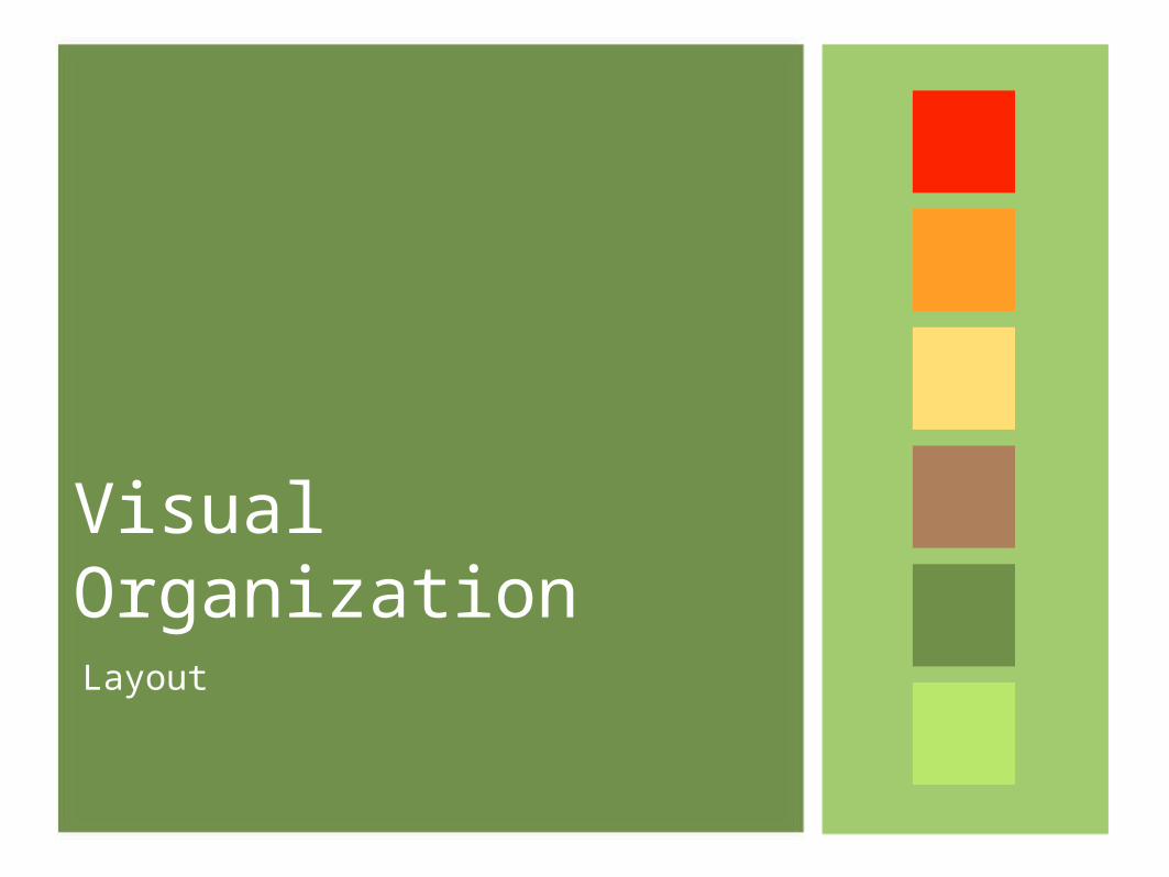
Visual OrganizationLayout
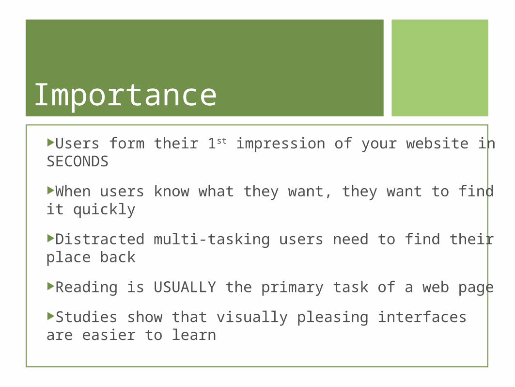
ImportanceUsers form their 1st impression of your website in
SECONDS
When users know what they want, they want to find it quickly
Distracted multi-tasking users need to find their place back
Reading is USUALLY the primary task of a web page
Studies show that visually pleasing interfaces are easier to learn
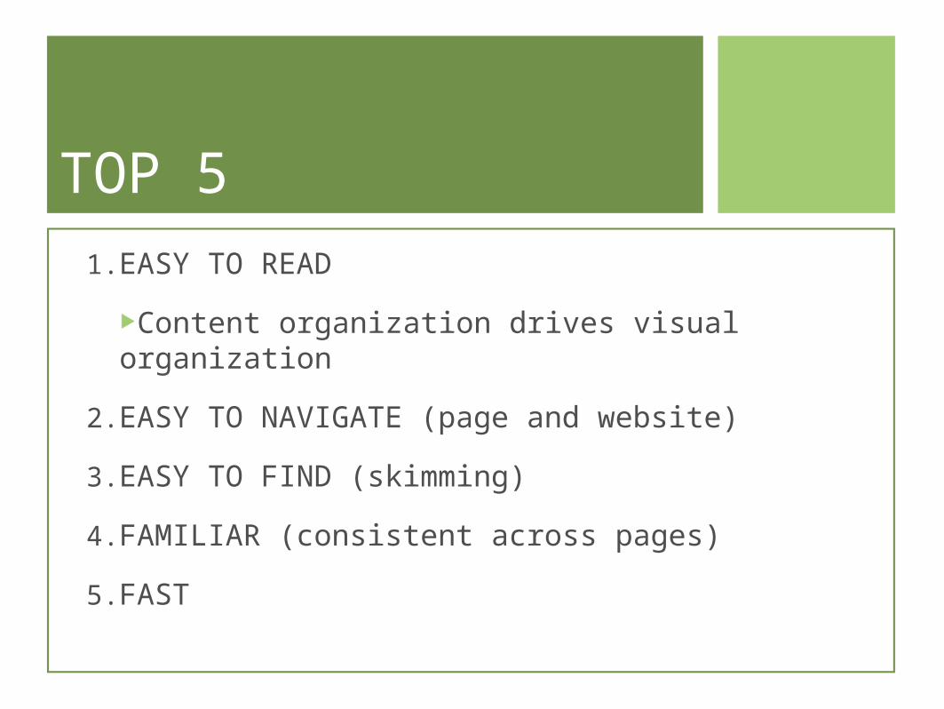
TOP 51.EASY TO READ
Content organization drives visual organization
2.EASY TO NAVIGATE (page and website)
3.EASY TO FIND (skimming)
4.FAMILIAR (consistent across pages)
5.FAST
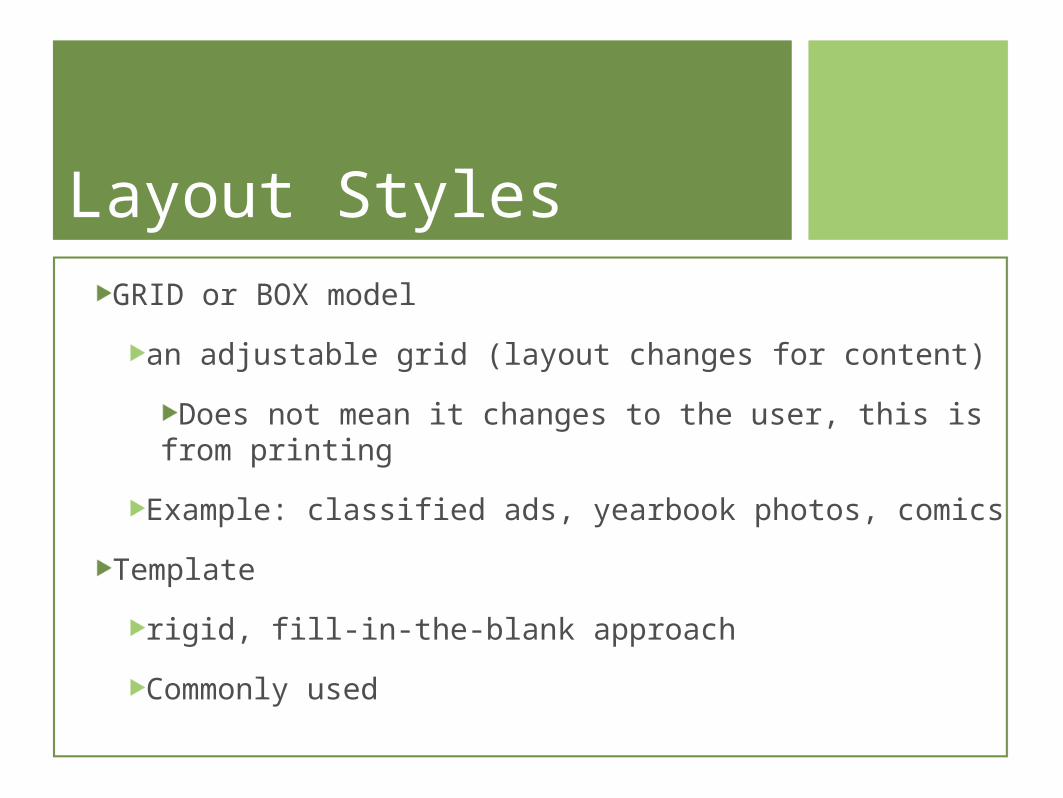
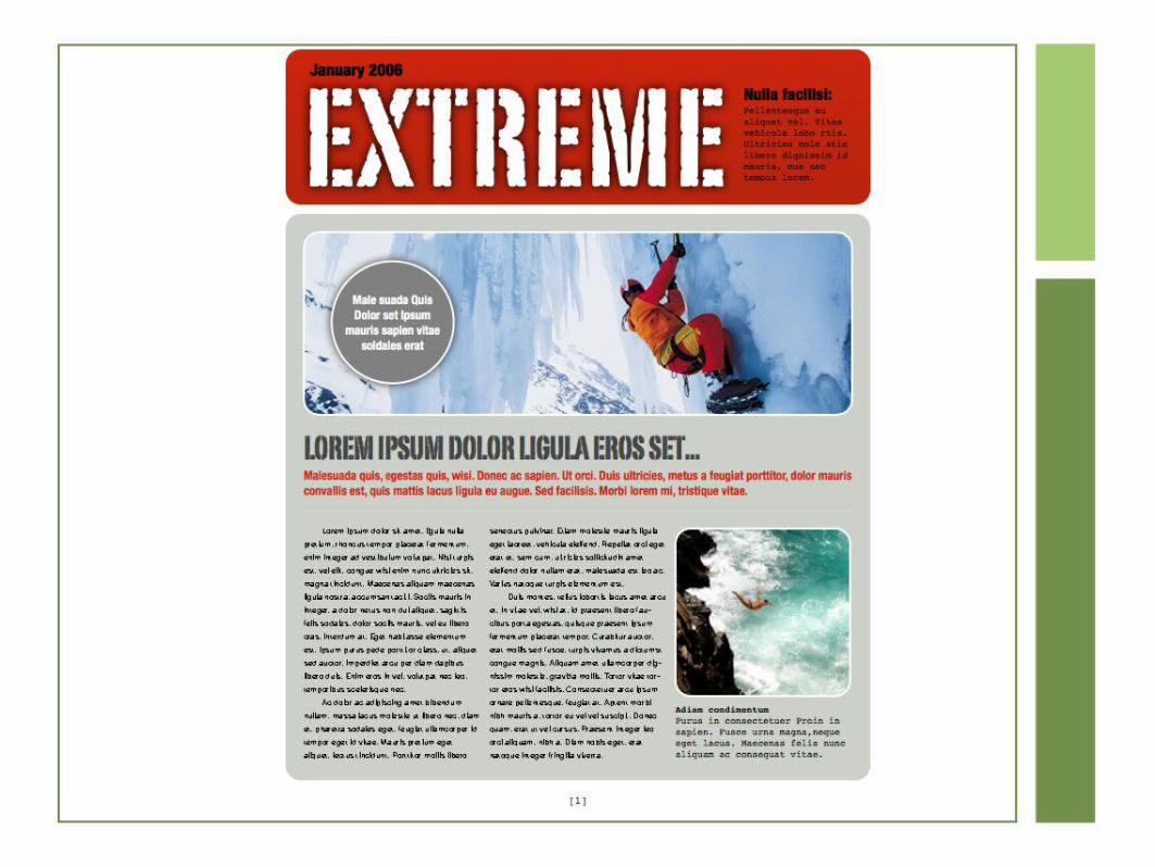
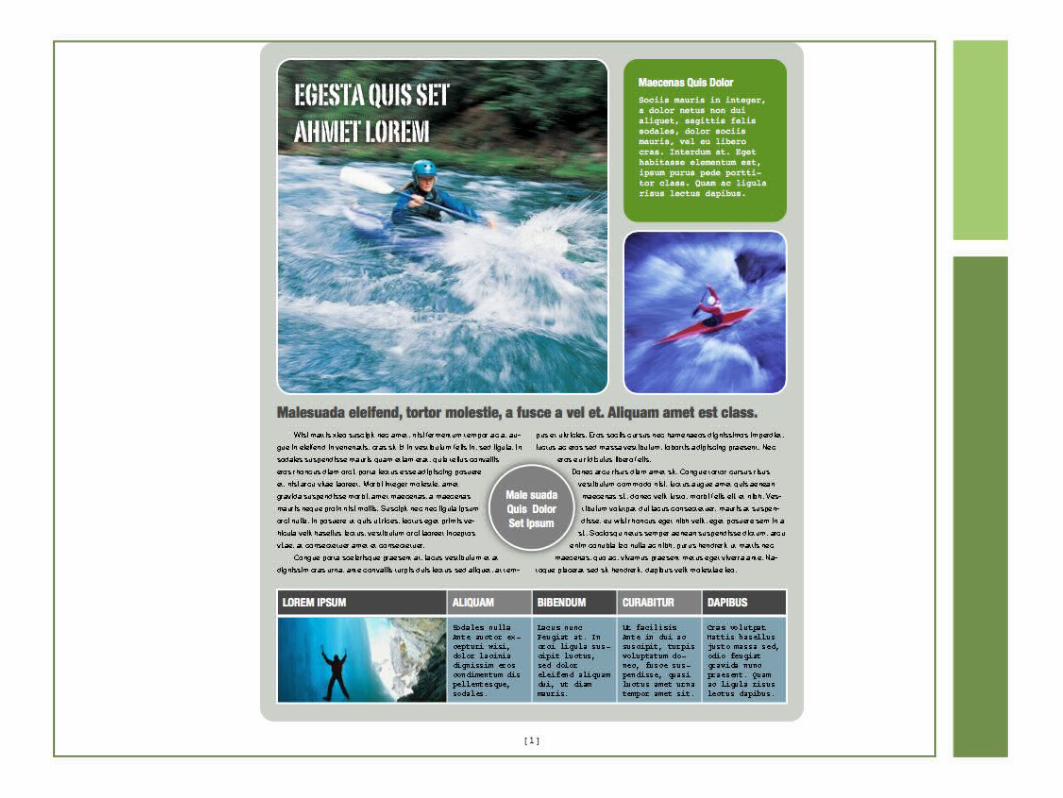
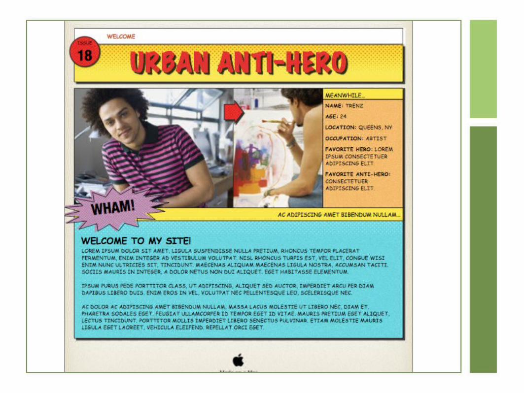
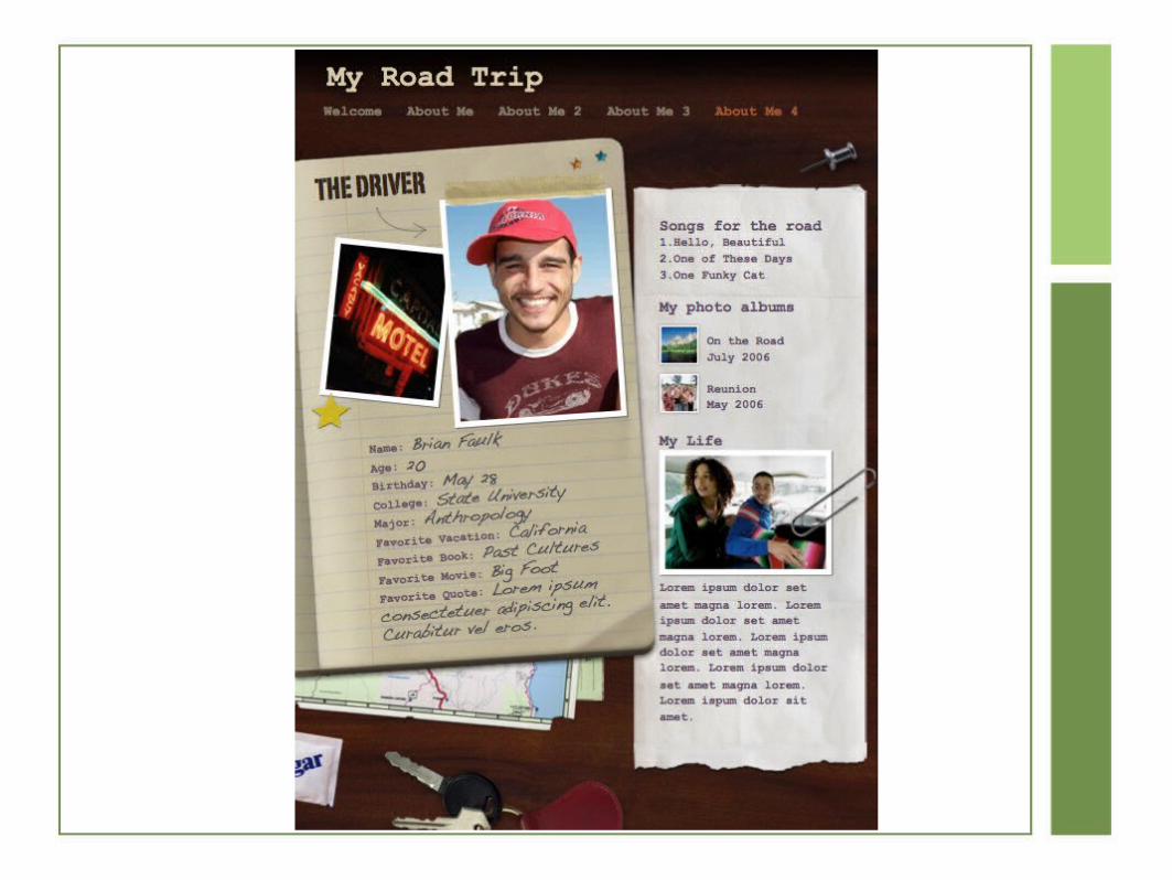
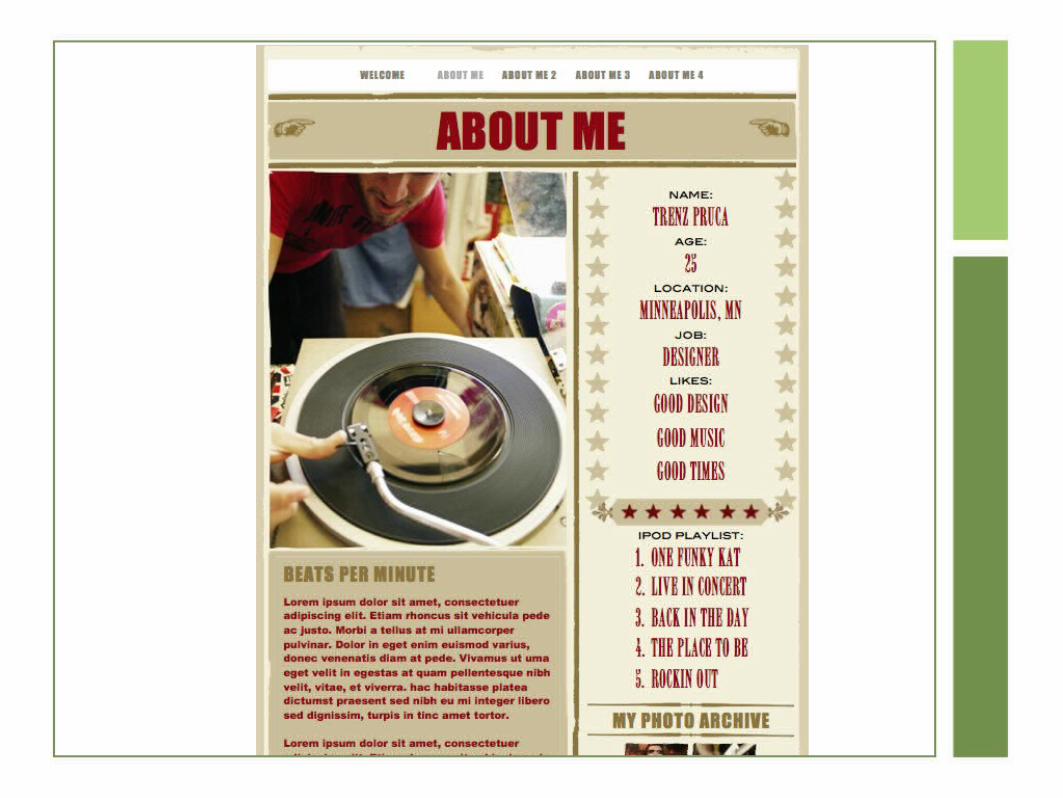
Layout StylesGRID or BOX model
an adjustable grid (layout changes for content)
Does not mean it changes to the user, this is from printing
Example: classified ads, yearbook photos, comics
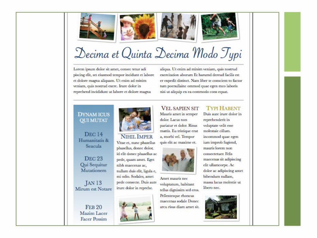
Template
rigid, fill-in-the-blank approach
Commonly used
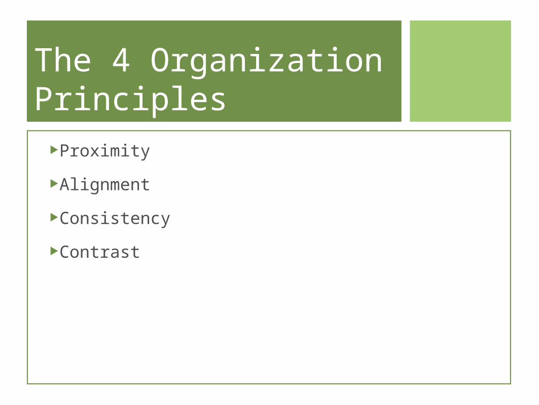
The 4 Organization Principles
Proximity
Alignment
Consistency
Contrast
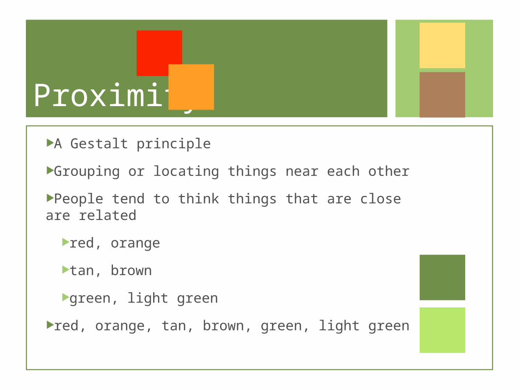
ProximityA Gestalt principle
Grouping or locating things near each other
People tend to think things that are close are related
red, orange
tan, brown
green, light green
red, orange, tan, brown, green, light green
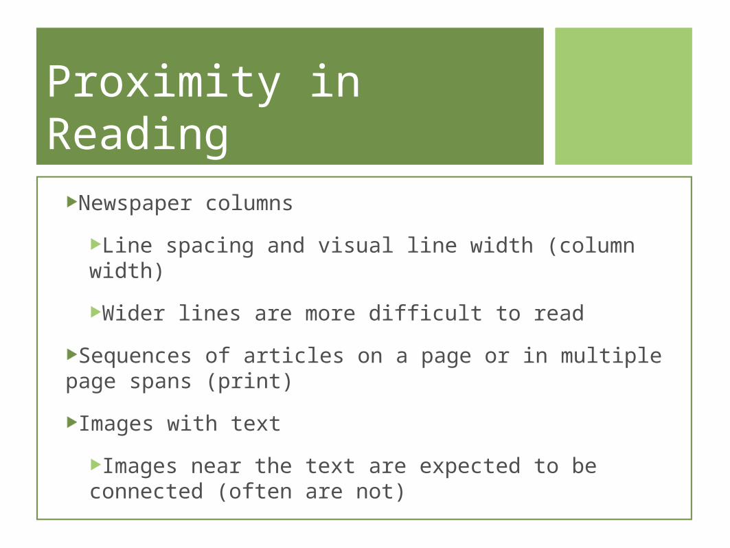
Proximity in ReadingNewspaper columns
Line spacing and visual line width (column width)
Wider lines are more difficult to read
Sequences of articles on a page or in multiple page spans (print)
Images with text
Images near the text are expected to be connected (often are not)
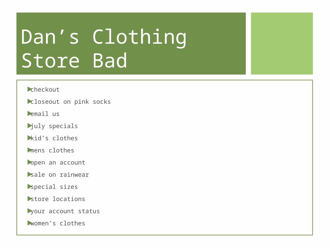
Dan’s Clothing Store Bad
checkout
closeout on pink socks
email us
july specials
kid’s clothes
mens clothes
open an account
sale on rainwear
special sizes
store locations
your account status
women’s clothes
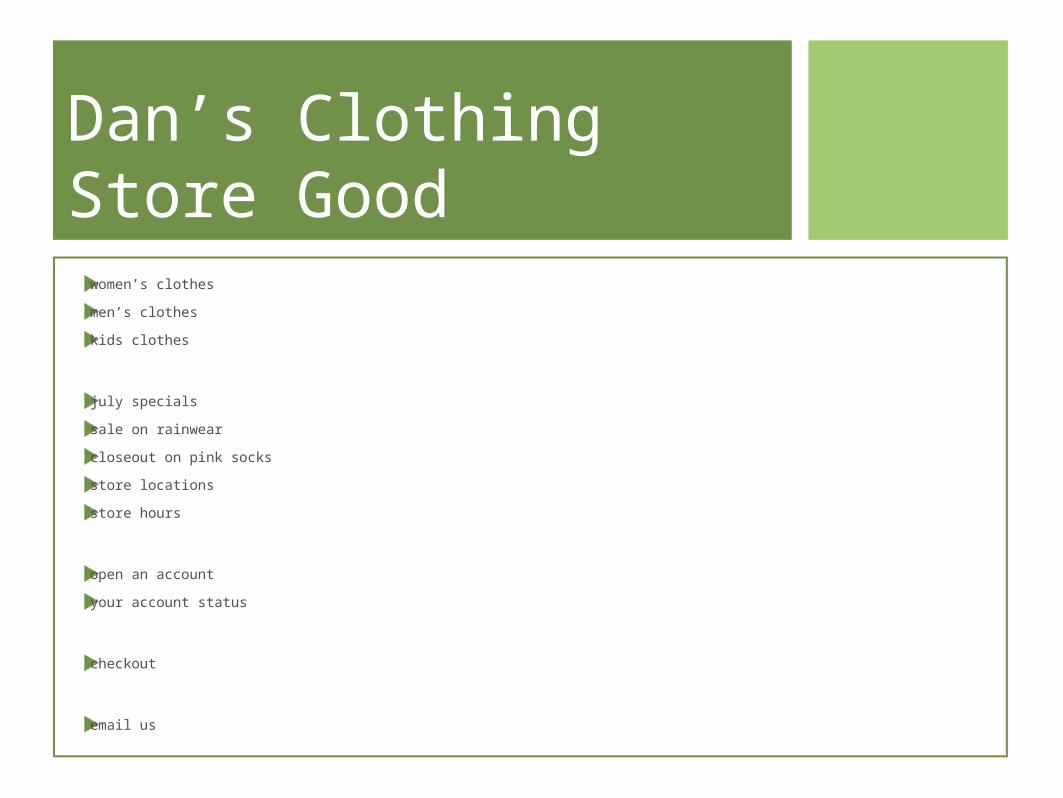
Dan’s Clothing Store Good
women’s clothes
men’s clothes
kids clothes
july specials
sale on rainwear
closeout on pink socks
store locations
store hours
open an account
your account status
checkout
email us
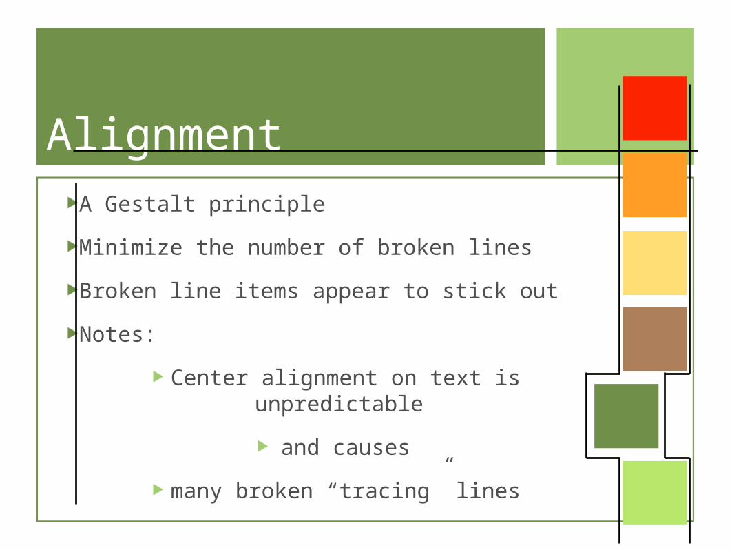
AlignmentA Gestalt principle
Minimize the number of broken lines
Broken line items appear to stick out
Notes:
Center alignment on text is unpredictable
and causes
many broken “tracing” lines
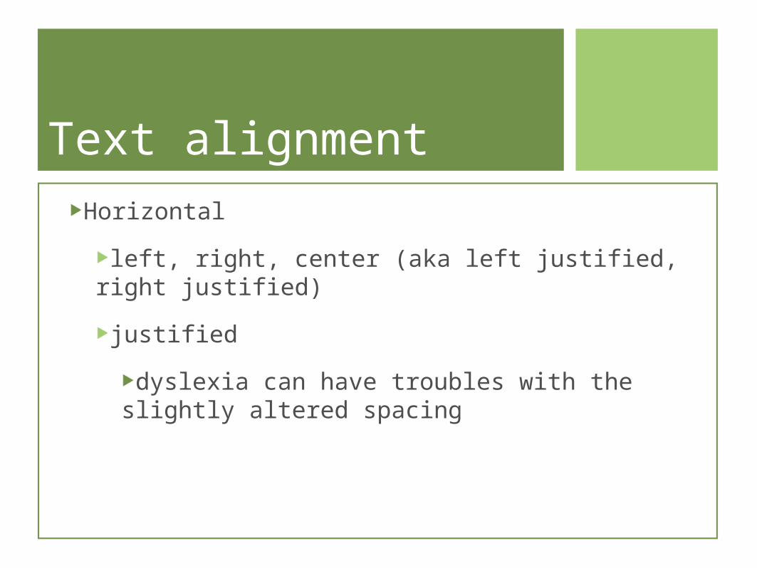
Text alignmentHorizontal
left, right, center (aka left justified, right justified)
justified
dyslexia can have troubles with the slightly altered spacing
Consistency•On the web, users might think they
changed websites
• large changes might take more bandwidth
•keep navigation’s position on pages
•builds user familiarity
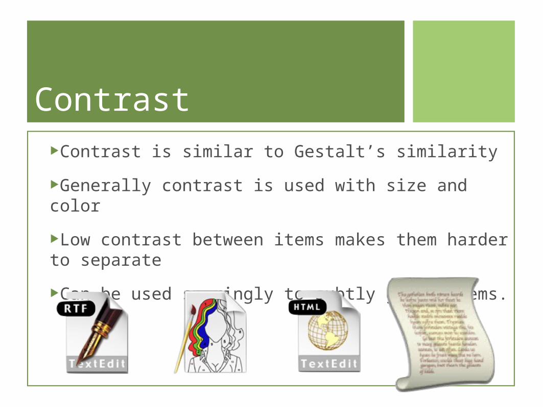
ContrastContrast is similar to Gestalt’s similarity
Generally contrast is used with size and color
Low contrast between items makes them harder to separate
Can be used sparingly to subtly group items.
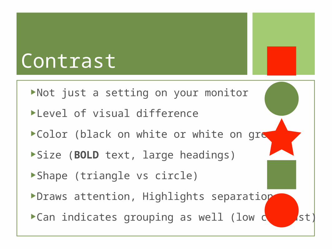
ContrastNot just a setting on your monitor
Level of visual difference
Color (black on white or white on green)
Size (BOLD text, large headings)
Shape (triangle vs circle)
Draws attention, Highlights separation
Can indicates grouping as well (low contrast)
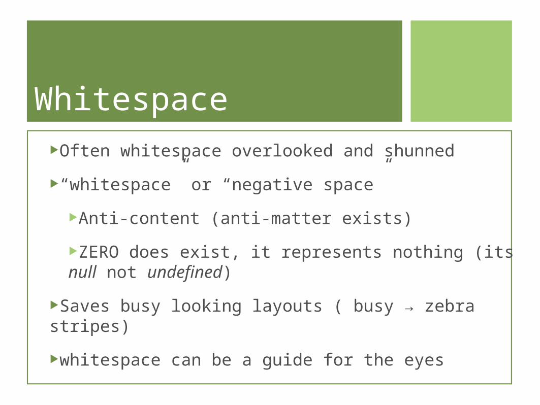
WhitespaceOften whitespace overlooked and shunned
“whitespace” or “negative space”
Anti-content (anti-matter exists)
ZERO does exist, it represents nothing (its null not undefined)
Saves busy looking layouts ( busy → zebra stripes)
whitespace can be a guide for the eyes
Guiding the Direction
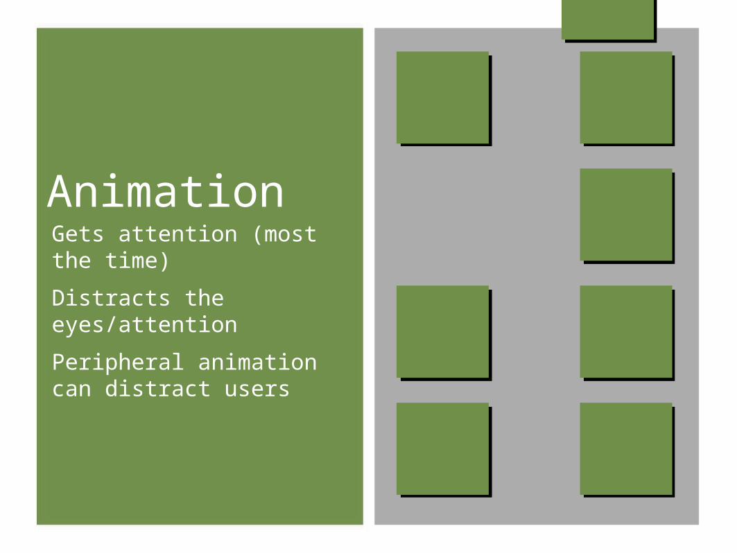
AnimationGets attention (most the time)
Distracts the eyes/attention
Peripheral animation can distract users
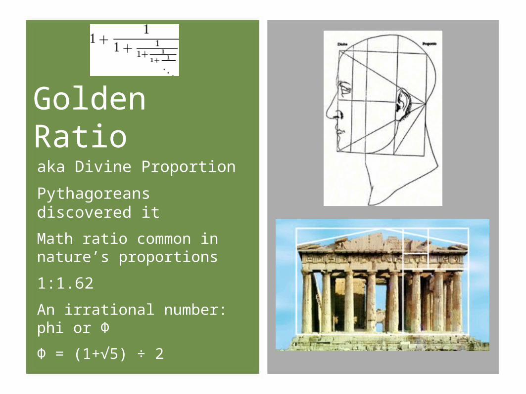
aka Divine Proportion
Pythagoreans discovered it
Math ratio common in nature’s proportions
1:1.62
An irrational number: phi or Φ
Φ = (1+√5) ÷ 2
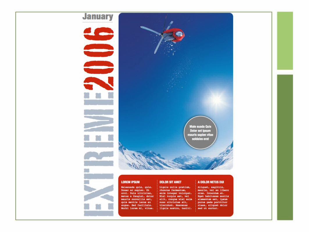
Golden Ratio
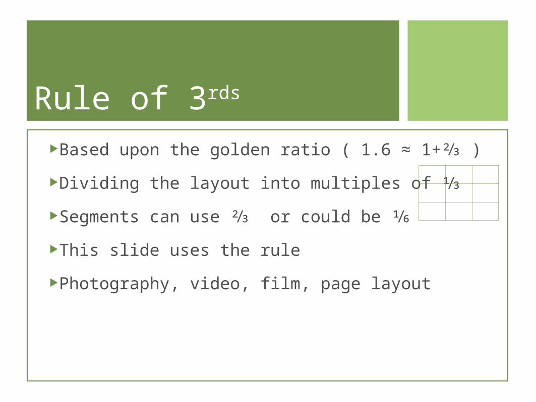
Rule of 3rds
Based upon the golden ratio ( 1.6 ≈ 1+⅔ )
Dividing the layout into multiples of ⅓
Segments can use ⅔ or could be ⅙
This slide uses the rule
Photography, video, film, page layout
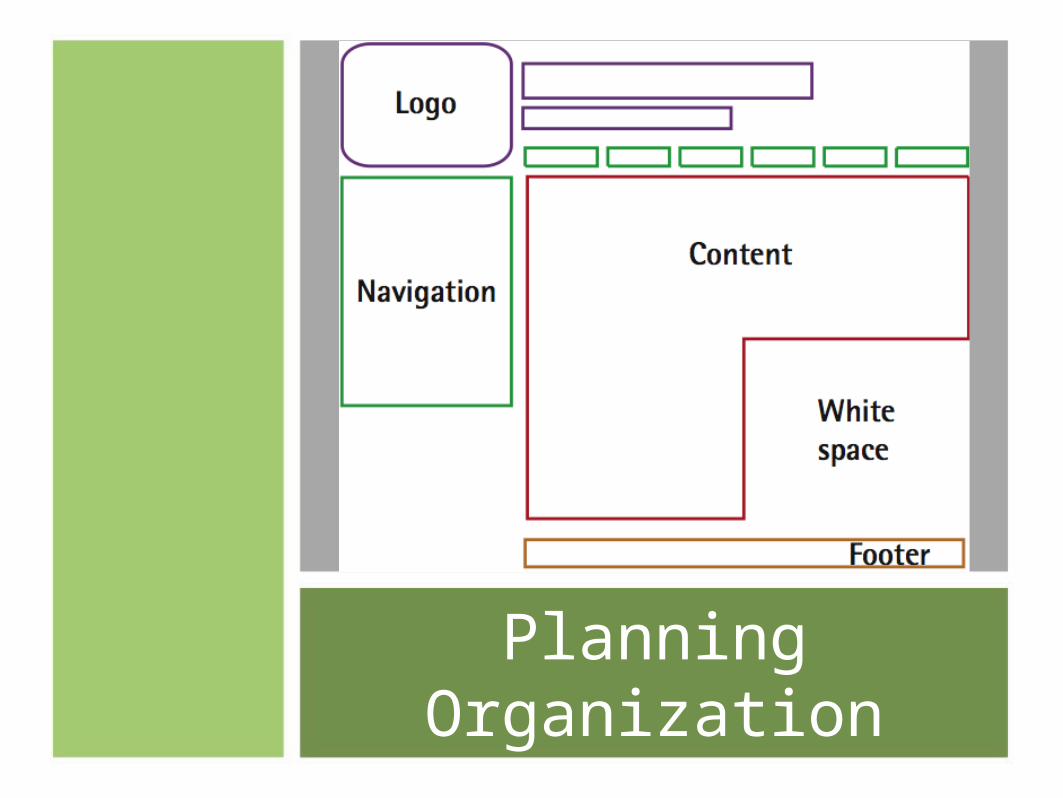
Planning Organization