Embed Size (px)
Citation preview

VISUAL NETWORK ANALYSIS: THE EXAMPLE OF THE RIO+20 ONLINE DEBATE
WORK IN PROGRESS
Tommaso Venturini, Mathieu Jacomy & Debora Pereira
Sciences Po Paris médialab
INTRODUCTION
In the last few years, a spectre has been haunting our academic and popular culture — the spectre of
networks. Throughout social as well as natural sciences, more and more phenomena have come to be
conceived as networks. Telecommunication networks, neural networks, social networks, epigenetic
networks, ecological and economic networksi, the very fabric of our existence seems to be made of lines
and dots. More recently, the interest for graphs overflowed from science to popular culture and images
of networks started to appear everywhere. They decorate buildings and objects; they are printed on t-
shirts and furniture; they colonize the desktop of our computers and the walls of our airports. Networks
have become the emblem of modernity, the privileged metaphor of our world’s complexity.
Our growing fascination for networks is not unjustified. Networks are powerful conceptual tools,
encapsulating in a single object multiple affordances for computation (networks as graphs), visualization
(networks as maps) and manipulation of data (networks as interfaces).
In the first place and to a large extent, the success of networks has to be credited to the amazing
versatility of graph mathematics. From railways to information routing, from financial to
communications flows, from ecosystems to organization management graphs have met countless
applications. Graph computational formalism proved so effective that we started seeing networks
everywhere and turned everything into systems of discrete but interconnected items. It would be unfair,
however, to reduce networks to their mathematical properties. Graph mathematics has been around
since Euler’s walk on Königsberg’s bridgesii, but it is not until the end of the last century that networks
acquired a multidisciplinary popularity. Graph computation is certainly powerful, but it is also very
demanding and for many years its advantages remained the privilege of scholars with solid
mathematical bases.

In the last few decades, however, networks acquired a new set of affordances and reached a larger
audience, thanks to the growing availability of tools to design them. Drawn on paper or screen,
networks become easier to handle and obtain properties that calculation cannot express. Far from being
merely aesthetic, the graphical representation of networks has an intrinsic hermeneutic value. Networks
become maps – though of a very peculiar type. The best example of this hermeneutic value is offered by
the famous 1933 map of the London tube by Harry Beck. Before Beck’s redesigned it, the diagram of the
London Underground was a geographical map (the station being located according to their geographical
coordinates). After the redesign, the tube’s map became a network of correspondences where stations
are positioned according to their connectivity in the transportation system. The gain in legibility was
such that not only Beck’s approach still shapes today’s London tube’s map, but it also spread to virtually
all worlds transportation systems.
(a) (b)
Figure 1 – London tube map (a) in 1920 before Beck redesign and (b) in 1933 after Beck redesign.
Finally, the encounter with personal computing has recently turned networks into tools for data
manipulation. Not only network-like visualizations are employed in a growing number of digital
interfaces, but more and more specialized software has been designed to support the exploration of
network data. Tools like Pajek (vlado.fmf.uni-lj.si/pub/networks/pajek), NetDraw
(sites.google.com/site/netdrawsoftware), Ucinet (www.analytictech.com/ucinet), Guess
(graphexploration.cond.org) and more recently Gephi (gephi.github.io) have progressively smooth out
the difficulties of graph mathematics, turning a complex mathematical formalism in a more accessible
point-and-click interfaceiii.
Combining the computation power of graphs with the visual expressivity of maps and the interactivity of
computer interface, networks accomplish the dream of Exploratory Data Analysis (Tukey, 1977): a

navigation through data so fluid that zooming in a single data-point and out to a landscape of a million
traces are just a click away (according to Shneiderman’s 1996 mantra “Overview first, zoom and filter,
then details on demand”). No wonder that networks are popular!
The expansion of networks from graphs to maps and interfaces has been impetuous and reached distant
regions of science and society. Yet the visualization of networks has so far lacked the reflexivity and
formalization that support other ways to represent data, like geographical maps or graphical statistics.
Network enthusiasts (and we are counting ourselves in) design their visualizations as if their visual
grammar and was obvious and no ambiguity existed on their meaning. Unfortunately, this is not the
case. We painfully lack the conceptual tools to think of the projection of graphs on the space of a screen
or a page. The very vocabulary we use has been borrowed from mathematics (e.g. cluster, structural
equivalence…) and geography (e.g. centrality, bridging…) and needs to be adapted to the new visual
paradigm. This paper means to contribute to such reflection and proposes a tentative framework for the
visual analysis of networks.
Before we move to the enunciation of a visual grammar of networks, however, we would like to briefly
discuss the obstacles that have so far delayed so far this type of reflection. The reasons date back to the
very foundation of graph mathematics. By solving the problem of Königsberg’s bridges, Euler performed
the most classical of mathematical operations. He abstracted the formal structure of the problem from
its empirical features: he took a city and turned it into a table of number (see figure 1). In doing so, Euler
laid the foundation of discrete mathematics at the cost of separating the idea of network from its
physical materializations. His operation was so successful that for more than two centuries the reflection
on networks was dominated by their structural properties, with little interest for practical applications.
One of the consequences of such focus on structures (at the expenses of the actual contents of
networks) has been that mathematicians never saw the interest of representing networks. For them,
design a network was (and to some extent still is) perfectly useless.

Figure 2 – Original figure and table from Euler’s article.
The idea that it could be worth to draw a network to see what it looks like comes from a different
tradition: the tradition of social networks analysis. Jacob Moreno, founder of this approach, was very
explicit about the importance of visualization: “A process of charting has been devised by the
sociometrists, the sociogram, which is more than merely a method of presentation. It is first of all a
method of exploration. It makes possible the exploration of sociometric facts” (1953, pp. 95-96). Since
Moreno and his followers were working on real networks constructed by the observation of actual social
relations, it made sense to them to design networks. Identifying visual patterns became the equivalent
of looking for social dynamics. In a seminal paper published on the New York Time in 1939, Moreno
refers to network analysis as “a new geography” (see fig. 2). By drawing his sociograms, Moreno
reconnected networks with their most ancient ancestor: the geometric figure, a set of points and line
whose properties are meant to be explored by its visual representation. Graphs returned to be graphic.
Figure 3 – Original figure and title from Moreno’s article.
This of course, was only the beginning of the reflection on network visualization. Once you decide to
draw a network as a set of dots and lines, you still have to decide which colors to use, which stroke,
which style and, most crucially, which composition rules to follow. None of these questions is trivial and
the story of how early analysts of social networks wrestled with their design is long and interesting.
Unfortunately, we do not have here the space to tell such story (but see Freeman, 2010 for a
remarkable account of it). For this paper, it will be enough to remark that, though crucial for the
founders of social network analysis, the reflection on network design progressively lost its interest for
their followers. Understandably fascinated by the parallel developments of graph mathematics, later
social networks’ analysts focused on statistics and progressively neglected networks design. In this
paper, we draw on the reflection of Moreno and his early followers to discuss how the visualization of
networks can be exploited for the study of social phenomena.
The next paragraph will introduce the three main visual variables (Bertin, 1967) mobilized by visual
network analysis: the position of nodes, their size and their color (or, more precisely, their hue). We will
briefly discuss the features of each of these variables and we will describe how they are employed to
represent different characteristics of networks. After having set the theoretical basis of our approach,
we will then propose an example of analysis in order to provide a practical guideline for visual network
analysis.
POSITION, SIZE, HUE AND THE MAPIFICATION OF NETWORKS
Of the three variables used to graphically represent networks – position, size and hue – the first one is
by far the most important. Like geographical maps, graphs are generally two-dimensional
representations, but unlike maps they cannot rely on a predefined set of projection rules. In a
geographical representation, the space is defined a priori by the way the horizontal and vertical axes are
constructed. Points are projected on such pre-existing space according to a set of rules that assign them
a pair of coordinates and thereby a univocal position. The same is true for any Cartesian coordinate
system, but not for networks.
In networks, the position of nodes does not depend on a pre-existing system of coordinates, as proven
by the fact that that networks can be rotated or flip without loss of information. Rather nodes’ position
is determined by the effort to minimize visual cluttering. As soon as Moreno started drawing graphs, he

discovered that some ways of positioning nodes could make his sociogram easier to read. He then
enunciated the main rule still in use today to draw clearer networks: “the fewer the number of lines
crossing, the better the sociogram” (1953, p.141, for a recent use of this criterion to evaluate the quality
of a layout see Purchase, 2002).
Easy to follow when working on a graph of a few dozen nodes and edges, Moreno’s precept becomes
impossible to implement directly on larger networks. Graphs with hundreds of nodes and edges cannot
avoid thousands of line crossings: how to even know if moving a node increases or decreases their
number? Since direct implementation of Moreno’s precept is impossible, one can try an indirect
approach: drawing closer the connected nodes minimizes the length of the edges and therefore the
possibility of crossings. But, even so, since each node is normally connected to several other nodes
themselves connected to dozens of other nodes, minimizing edges’ length is far from being trivial.
The solution is a spatialization technique that came to be known as “force-directed placement
algorithms”. A force-directed layout works following a physical analogy: nodes are given a repulsive
force that drives apart, while edges act as springs binding the nodes that they connect. Once the
algorithm is launched it changes the disposition of nodes until it reaches the equilibrium that guarantees
the best balance of forces. Such equilibrium minimizes the number of line crossings and thereby
maximizes the legibility of the graph. Früchterman and Reingold, who proposed the first efficient force-
directed algorithm in their famous paper Graph Drawing by Force-directed Placement (1991), cite line
crossing as the second of their 5 aesthetic criteria.
Such visualization technique, however, have a most interesting by-product of: not only do force-directed
algorithms minimize edge crossings, but they also give sense to the disposition of nodes in the space of
the graph. After spatialization, the geometrical distance between any two nodes become a proxy of
their mathematical (that is to say the number of edges that have to be ‘walked’ to go from one to the
other). More exactly, two nodes are visually close if they are directly connected or if they are connected
to the same set of nodes (nodes with the exact same neighbors are mechanically destined to occupy the
exact same position). Spatialization delivers an amazing result: it turns the discontinuous mathematics
of graphs into a continuous space.
The other two visual variables employed in the visualization of networks – size and hue – are less crucial
and easier to understand. According to Bertin (1967) the main difference between these two variables is
that while size is adapted to represent ordinal values (comparing two elements, it is possible to say

which one is bigger and how much), hue is not. Following such difference, in designing networks the size
of the nodes is generally used to designate qualitative values (such nodes importance or the connections
strength), while the hue tends to be used to distinguish different categories of elements.
AN EXAMPLE OF VISUAL NETWORK ANALYSIS
In this section we will provide some guidelines for visual network analysis by drawing on a practical
example. Our case study is a network of websites and hyperlinks related to the 2012 United Nations
Conference on Sustainable Development of Rio de Janeiro (aka Rio+20)iv. This case study will be
examined through the three visual variables introduced above and through five analytical steps that
constitute our framework for visual network analysis:
A. Visualizing node positions
1. How to read the variations of density
2. How to read the size and density of clusters
3. How to read centers and bridges
B. Visualizing node sizes
4. How to read the hierarchy of connectivity
C. Visualizing node colors
5. How to read the distribution of colored categories
Each of the five steps this framework we will be discussed by a) introducing the conceptual principle
employed to read the network; b) exemplifying the application of the principle on our case study; c)
providing a possible interpretation of the observed patterns.
A. VISUALIZING NODE POSITIONS
The distribution of nodes in space is the first (and most important) technical operation we have to
operate on our network. Figure 1 shows the result of a force-driven spatialization obtained with the
Gephi using the algorithm ForceAtlas2 (Jacomy et al., 2014) (LinLog mode, scaling 0.35, gravity 0.2,
prevent overlap).

Figure 4 – Network after the spatialization. The main component is the most interesting part. The
disconnected nodes form the ring (size and colors have not been modified).
1. HOW TO READ VARIATIONS OF DENSITY
READING PRINCIPLE
In most networks, spatialization reveals regions where numerous nodes are assembled and regions that
are empty or almost. These differences of density (determined by the uneven distribution of links

among nodes) are revealed by the force-directed algorithm and translate the mathematical properties
of the network. As convincingly shown by Andreas Noack (2009), the visual clustering produce by force-
directed algorithms is equivalent to the computation of the clusters by modularity (a technique often
used to detect communities in networks – Newman, 2006). Mathematical clustering however imposes a
dissection of the network that is often too clear-cut. The advantage of the visual techniques is their
fuzziness that allows negotiating the frontiers of clusters. These frontiers are naturally blurred, since
clusters are not exclusive categories, but shades of density. Clusters may have clear boundaries, like
cliffs separating a plateau from the valley, but most of the time their borders are gradual as the slopes of
a mountain. The fuzziness of clusters’ frontiers, by the way, is no obstacle to their recognition: a
mountain is easy to see even is it impossible to say exactly where it starts and ends.
What is important is to be able to distinguish the clusters and identify the empty zones between them.
These zones are called “structural holes”. The larger they are, the more these holes denote the absence
of connection between clusters. Finally, we can remark that large clusters are often composed by
smaller (and less distinct) sub-clusters. We can then summarize the first step by four questions:
Which are the main clusters?
Which are the main structural holes that separate them?
Which are the sub-clusters within each cluster?
Which are the smaller structural holes separating them?
APPLICATION TO RIO+20
Which are the main clusters? In our example it is easy to identify three main clusters at the top (A), at
the bottom right (B) and at the bottom left (C) of the network (see fig. 5). The clusters A and B are the
largest and the easiest to identify. The cluster C is smaller and does not contain more nodes than the
sub-clusters of A and B. The cluster C, however, is clearly distinguished from A and B and occupies its
own space. The triangular shape of our network is thus the result of the three main clusters pulling in
three different directions.

Figure 5 – The three main clusters
Besides A, B and C, ten smaller clusters are present in the network (see fig. 6). These clusters can be
divided in two groups. (1) The intermediary clusters M, E, F and L located among the main clusters. (2)
The peripheral clusters K, G, I, D, J and H pushed towards the margins of the graph by the scarcity of
edges that connects them to the three main clusters (some of them are so detached from the graph that
we are led to consider the possibility of excluding them from the corpus).
Figure 6 – Three main clusters (A-C) and ten smaller clusters (D to M)

Which are the sub-clusters? In the identification of the sub-clusters, there is always a part of
subjectivity. By definition sub-clusters smaller and less clear-cut than the main clusters and while some
are pretty evident (a1, a2 and c1 in fig. 7), most are not: does c3 contains enough nodes to be
interesting? Is a3 really separated from a1? Only a qualitative appreciation of the network can answer
this question. For the moment, we propose to divide cluster A in two main sub-clusters (a1 and a2) and
three smaller groups of nodes (a3, a4, a5) and to divide cluster C in three sub-clusters (c1, c2, c3).
Cluster B is significantly more compact and for the moment we will not cut any sub-clusters out of it.
Figure 7 – Sub-clusters of A, B and C
Which are the main structural holes? In our network, there are four main structural holes (see fig. 8):
one at the center of the graph and three separating the main cluster two by two. The cluster C is more
isolated than the other two. The structural holes are evident in this network: the absence of links
between main clusters is radical and demands to be explained.

Figure 8 – Structural holes separating A, B and C
INTERPRETATION
After having identified the clusters and sub-clusters of our network, we can try to make sense of them.
The crucial operation of this phase is to find a suitable ‘collective name’ for each group of nodes. This is
done by examining the nodes in each cluster and trying to find what they have in common (or at least
what most of them have in common). Clearly some knowledge of the websites and their contents is
necessary to discover their similarities and that why visual network analysis should always be
accompanied by some form of qualitative enquiry. In our case all the websites have been visited and
manually analyzed while constituting the corpus. Making sense of clusters is essential at this stage since
we will intensively refer to them in the next sections. Clusters are the main landmarks of the reading
process. The following table allows comparing the three main clusters:
Cluster Remarkable features Actors Contents
A
Most heterogeneous
cluster
Few authorities
Divided into 5 sub-
clusters
Social movements, environmental and
human rights NGOs (mostly in Brazil).
Main sites: MST, MAB, Via Campesina, CPT,
Racismo Ambiental, Cândido Neto, Telma
Monteiro, Ecodebate, Xingu Vivo, Cúpula dos
Povos, Greenpeace, Isa, International Rivers,
Fórum Br163, Fórum Carajás, Ingá, Rainforest,
Governo do Brasil.
Manifestations and social
conflicts, indigenous issues,
oppositions to dams, cultural
events, courses agro-ecology,
environmental education, forest
management, event Peoples
Summit.

B
Most homogeneous
cluster
Three dominant
authorities
Has no sub-cluster
UN-related agencies and NGOs working with
the concepts of green economy and
sustainable development.
Main sites: ONU, official Rio+20, Unep.
Reports on UN conferences and
debates. Repeated terms:
alternative energy, clean water
and air, carbon sequestration,
bio-solutions, green IT.
C Divided into 3 sub-
clusters
NGOs for the preservation of forests,
indigenous movements and scientific groups
who advocate global warming as caused by
humans.
Main sites:: Real Climate, Mongabay, Indigenize,
Davi Suzuki
Scientific terms, longer texts,
campaigns and appeals for
donation.
Table 1 – Comparison of the three main clusters
cluster A gathers a series of websites by “NGOs and social movements”. Most of the actor represented
are based in Brazil and are active in the protection of the environment and of human rights. The
contents of the websites include reports on the violence by the authorities; conflicts with the police;
protest against the construction of dams and infrastructures; statements in favor of agro-ecology and
environmental education. Each of the five sub-clusters of cluster A is characterized by a specific identity.
Sub-cluster a1 is composed by websites inspired by the theories of the Marxist eco-socialism (e.g. Via
Campesina, Movimento dos Sem Terra, Movimento dos Atingidos por Barragens).
Sub-cluster a2 features actors active in southern and central highlands of Brazil. It is more
heterogeneous than a1, its members do not exhibit the same militant politics associated with Marxist
ideology, but a softer version of environmental politics, which does not engage in politics and the
struggle for human rights.
Sub-cluster a3 is dominated by Xingu Vivo movement and shows a connection between local entities in
the north and northeast of Brazil and transnational NGOs, such as International Rivers and Conservation
Strategy. The principal struggle of the sites of this cluster is against the construction for dams in Xingu
River.
Sub-cluster a4 is dedicate to the People's Summit, an event in Rio de Janeiro organized by social
movements in Brazil during the official United Nations Rio +20 summit, and aiming to be a protest
against the official negotiations.
Sub-cluster a5 is centered around the official website of the Brazilian government.
Cluster B is composed of “international institutions” related to the UN, and institutions that work with
the concepts of green economy, sustainable development, green urban planning. The contents include
reports on conferences and campaigns for citizen participation. Recurring themes are alternative energy,
clean water, carbon market, biomaterials and green ICT. The cluster B is relatively homogeneous and
does not exhibit any sub-clusters.
Cluster C consists of websites by “environmental and climate NGOs” for the preservation of nature,
native movements (campaigns to buy land), and research groups defending the attribution of global
warming to anthropic causes. The contents include several scientific articles. The visual appearance of
the website is singular, with images of animals, forests, landscapes or nature, but without the presence
of men. We also note the presence of several appeals for donations. Cluster C is separated in three sub-
clusters of different size and orientation.
Sub-cluster c1 is composed of scientific websites debating climate change. The most referenced sites
are the Real Climate, EcoEquity, Skepticalscience, Climateaudit, and Simondonner Indigenize.
Sub-cluster c2 is centered around Mongabay, an NGO chose main goal is to disseminate information
and pictures about nature, and protesting against destruction."
Sub-cluster c3 is formed of four websites (Forests, Rain Forests Portal, ClimateArk and Water
Conservation) drawing contents from the Ecological Internet, a self-defining “non-profit organization
that specializes in the use of the Internet to achieve conservation outcomes”.
In general, the main clusters A, B and C form three coherent ensembles of websites. Though internal
differences exist, the websites in each of the main clusters are connected by hyperlinks because they
share analogous interests and a similar language. These specificities are also the reason of the
separation between the three clusters. The NGOs in A “NGOs and Social Movements” and the
institutions in B “International Institutions” differ on every aspect: movements (A) VS. establishment (B);
protest (A) VS. policy-making (B); mobilization (A) VS. planning (B). The institutions in B are also strongly
opposed to the NGOs in C “Environmental and Climate NGOs” because of a deep difference in their
values that opposes a pragmatic conception of modern societies (B) to a radical questioning of the place
of humankind in the world (C). Finally, the websites in C and A are separated by the object they defend:
communities for A and ecosystems for C. A and C also employ different forms of engagement: the

rationality of scientific knowledge and distant money donation (C) against the emotions of social
movements and first person participation (A). These differences explain why there are few links among
our three main clusters. The actors tend not to link each other, because of their ideological and practical
opposition. They are more than different thematic groups, they are opposed communities of interest.
2. HOW TO READ THE SIZE AND DENSITY OF CLUSTERS
READING PRINCIPLE
Network clusters have two main properties that we can observe separately: size and density. Making
sense of these properties is crucial to understand the balance of forces in the network. The size of
clusters is defined by the number of nodes they contain. The bigger clusters are, the more visible they
will be on the Web and it is interesting to investigate offline counterparts of such online significance.
The density, on the other hand, measures the cohesion of networks. Clusters are tight when they
contain many edges and loose when few edges connect their nodes. In the case of the Web, a high
number of in-cluster links may denote the activity of a community: the actors know and acknowledge
each other through their citations. A low density is also interesting. It may denote that the nodes do not
know their neighbors or that actively disregard them (because of competition or controversy).
APPLICATION TO RIO+20
The three main clusters count several dozens of nodes. Among them, A is the biggest and C the smallest.
All the other clusters are definitely smaller with less than a dozen nodes. As for the density, B is the only
among main clusters that is relatively dense. A and C are more spread out and clearly separated in
smaller and denser sub-clusters (which appears to be more interesting than they larger parents). Cluster
A is largely defined by a1 “Marxist Eco-socialism” and a2 “Environmental Politics”. These two sub-
clusters are large and dense and contain most of the nodes of A. a3 “Xingu Vivo Movement”, a4
“People's Summit” and a5 “Brazilian Government”, on the contrary, are scarcely dense and are
distinguished from a1 and a2 only by their separated position.
Cluster C contains a larger sub-cluster c1 “Scientific Websites”, a very sparse cluster c2 “Mongabay” and
another special case c3 “Ecological Internet” that appears to be a clique. Cliques are groups of nodes
that are all connected to each other. It is rare to observe large cliques in natural networks, but it is
possible to find small ones.
INTERPRETATION

Cluster A “NGOs and Social Movements” is the largest of our network and this is probably due to the
fact that it corresponds to an active community. The “occupation of the Web” is an important issue for
activists, both to assure their internal communication and to win the support of public opinion. Cluster C
“Environmental and Climate NGOs” is also composed predominantly by NGOs and associations, but its
lesser size may indicate less active community. Finally, the cluster B “International Institutions” is mainly
composed of the institutions gathered around the site of the United Nations (which explains the
absence of sub-clusters). The links between institutions are often the simple mark of formal partnership.
The size and shape of larger clusters seem therefore to be consistent with the different types of social
organizations present in our network.
The same can be said for the sub-clusters, which correspond to the divisions among the different types
of associative groups present in A and C. In the sub-cluster a1 “Marxist Eco-socialism”, a lot of
information is circulated and discussed. This activity creates many links among the actors explaining the
relatively high density. Blogs in particular play a central role in this group of sites (more on this later).
The sub-cluster a2 “Environmental Politics” displays a similarly intense communitarian activity (which
explains the high number of links), but has a different thematic focus and is composed of a different
type of actors, mostly NGOs. The separation between a1 and a2 may be in part explained by the fact
that blogs tend to cite other blogs while NGOs prefer citing other NGOs. Though permeable, these two
spheres remain relatively separated.
3. HOW TO READ CENTERS AND BRIDGES
READING PRINCIPLE
Now that we have identified the clusters, we can use them as landmarks to analyze two remarkable
positions in spatialized networks: centers and bridges.
Centrality can be global (referred to the whole network) or local (referred to a single cluster). These two
types of centrality are different. While the elements that are globally central are driven in this position
by the fact of being evenly linked to all the regions of the network, the element that are locally central
tend to be linked predominantly within one cluster. Central positions (local or global) can be occupied by
single nodes, clusters or by sub-clusters. In some cases, the center of the network (or the center of a
large cluster composed by several sub-cluster) is just empty.

Bridges, on the other hand, are nodes or clusters that have connections with several clusters (two or
more, but not all the clusters of the network). Bridges can be located outside the clusters they connect,
if their connections are evenly distributed among them, or they can be located within one of the
clusters, if they are more connected to it than to the others.
The following questions may help to identify systematically central and bridging elements:
Which nodes or clusters (if any) are located in the center of the network?
Which nodes or sub-clusters (if any) are located in the center of each cluster?
Which nodes (if any) are located in the center of each sub-cluster?
Which nodes or clusters (if any) are located among the main clusters?
Which nodes (if any) are located among the main sub-clusters?
APPLICATION TO RIO+20
Six nodes have been identified as centers of clusters and sub-clusters. Nature.com is the only node
occupying the center of our network and the only node connected the three main clusters. UN.org the
website of the United Nations, is at the center of the cluster B. CupulaDosPovos.org.br is at the center of
the sub-cluster a4 “People’s Summit” and RealClimate.org is at the center of c1 “Scientific Websites”.
Finally, two nodes are central in smaller clusters: IUCNWorldConservationCongress.org for E and
Demilitarize.org for F. The presence of many edges around each of these nodes has helped us to detect
their centrality.
Figure 9 – Nodes in central position in the network or in their cluster
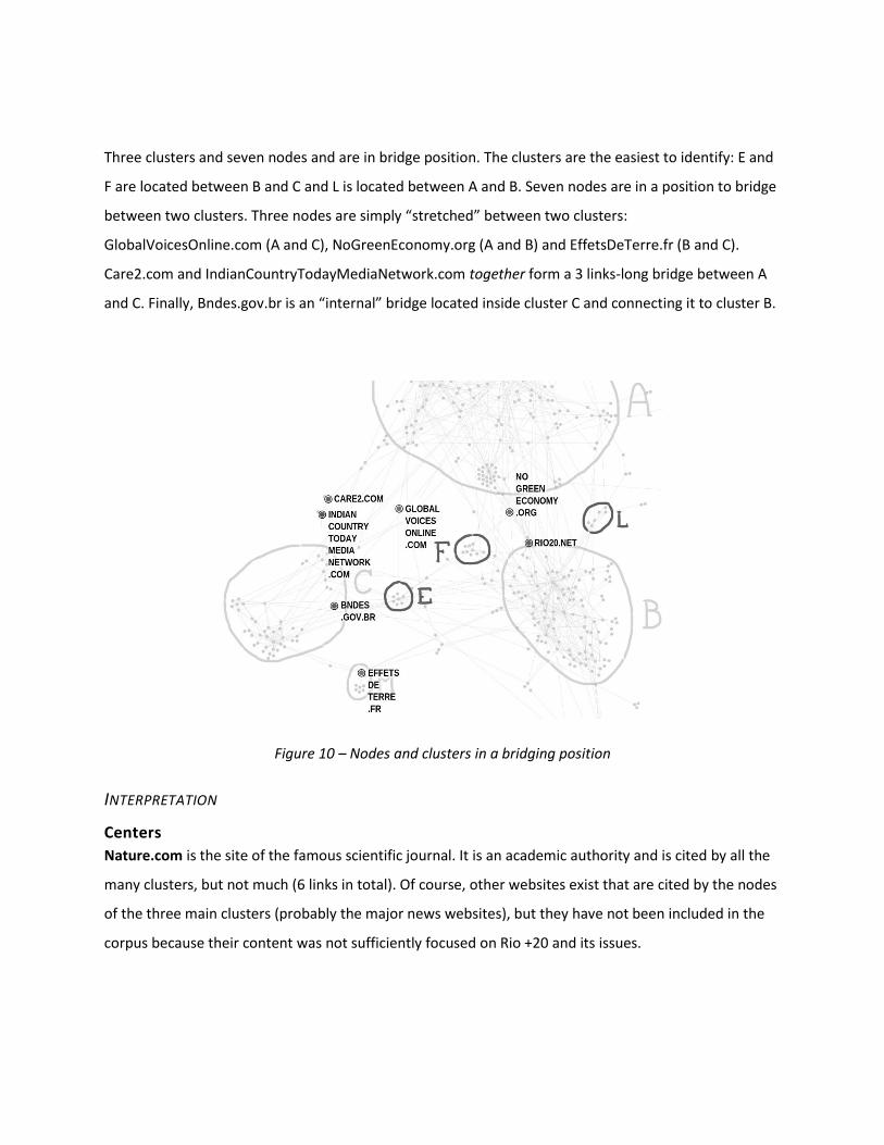
Three clusters and seven nodes and are in bridge position. The clusters are the easiest to identify: E and
F are located between B and C and L is located between A and B. Seven nodes are in a position to bridge
between two clusters. Three nodes are simply “stretched” between two clusters:
GlobalVoicesOnline.com (A and C), NoGreenEconomy.org (A and B) and EffetsDeTerre.fr (B and C).
Care2.com and IndianCountryTodayMediaNetwork.com together form a 3 links-long bridge between A
and C. Finally, Bndes.gov.br is an “internal” bridge located inside cluster C and connecting it to cluster B.
Figure 10 – Nodes and clusters in a bridging position
INTERPRETATION
Centers
Nature.com is the site of the famous scientific journal. It is an academic authority and is cited by all the
many clusters, but not much (6 links in total). Of course, other websites exist that are cited by the nodes
of the three main clusters (probably the major news websites), but they have not been included in the
corpus because their content was not sufficiently focused on Rio +20 and its issues.
UN.org UN.org is a large portal linked to most of the institutions that constitute cluster B (and this
explains its central position). The site contains information on the United Nations: its mission, structure,
Charter of Principles, the list of the member states and more.
RealClimate.org is a commentary website on climate science run by a group of renowned climate
scientists and addressed to journalists and to the general public.
CupolaDosPovos.org.br is the center of the sub-cluster a4 “People’s Summit’ and its connections keep
this group of nodes together. IUCNWorldConservationCongress.org and Demilitarize.org are in a similar
position in clusters E and F.
Bridges
Interestingly, in our network, the role of bridge is played not only by nodes but also by small clusters.
Clusters E “IUCN congress” is a bridge because of its focus on global warming mitigation. Mitigation is a
key theme in conferences and events organized both by the institutions of the clusters B and the NGOs
of the cluster C. As such it connects two distant regions of the network and facilitates their interaction.
Another site that promotes connections between clusters B “International Institutions” and C
“Environmental and Climate NGOs” is the blog Effets de Terre (an independent version of the blog that
the journalist Denis Delbecq maintained from 2005 to 2007 in the French newspaper Libération on
climate change and environmentalism).
Rio20.net presents the program of the Cupola dos Povos event and is cited by several actors in clusters
A and B. NoGreenEconomy.org is not an important website (the site seems “under construction” and it
contains only 5 posts). Its position between A and B is explained by the fact that the website is
maintained by a group of activists, whose position are close to those of the social movements in A while
criticizing punctually the approach of the institutions in B (and thereby citing them).
For all other cases, we have found no convincing interpretation. When the bridging position of a node
cannot be confirmed by the qualitative analysis, the best option is simply to ignore it. Unlike the larger
patterns visible in the networks, single edges are not always significant. The aim of the visual analysis is
not to explain the position of each and every node, but to detect large trends and notable nodes.
B. VISUALIZING NODE SIZES

We have now completed the part of the analysis based on the spatial position of nodes and we will start
mobilizing the two other visual variables employed in visual networks analysis. In particular, we will now
visualize the number of edges arriving to or leaving from a node by changing the diameter of the dot
that represents it. We will first change the size of each node according to number of incoming links (the
indegree) and then according to the number of outgoing links (the outdegree). To do so, we have used
the ranking palette of Gephi and set the diameter to 1 for the smallest degree and 20 for the largest.
It is also possible (and indeed useful) to just look at the list of nodes sorted by their indegree or
outdegree. Projecting the ranking on the spatialized networks, however, is interesting as it allows
identifying where most hubs and authorities are located: are they central in a cluster or do they bridge
different regions? Are they uniformly distributed or do they concentrate in some regions of the graph?
We could even go as far as to detect local hubs and authorities for each cluster.
4. HOW TO READ THE HIERARCHY OF CONNECTIVITY
READING PRINCIPLE
We will now consider the hierarchy of the most connected nodes. Following the tradition of network
analysis, we will call “authorities” the nodes that are the destination of many edges and “hub” the nodes
that are the origins of many edges. Authorities are websites with a high visibility and toward which
much of the traffic is addressed. To put it simply, authorities are cited a lot while hubs cite a lot. Hubs
are portals or websites that reference many other sites in the network. Both authorities and hubs tend
to be influential nodes in the corpus.
Please note that, counting inbound and outbound links, we only take into consideration the connections
within the corpus (and not all the hyperlinks that one website receives or sends). Nature.com for
instance, is certainly an authority in the Web, but it is not in our network (despite its central position).

Figure 11 – Top10 authorities: the ten most cited sites in the corpus [top indegree]
Figure 12 – Top10 hubs: the ten sites citing the most other sites in the corpus [top outdegree]
APPLICATION TO RIO+20
According to a power law often found in the Web (and in general in natural networks according to
Barabasi, 2003), the distribution of the indegree is very skewed in this graph, with the three most cited
websites having 28 to 51 inbound links, while the rest of the top10 varies from 18 to 13. It is remarkable

that all three main authorities of the graph are located in cluster B “International Institutions”. The rest
of the top10 (except for one authority in cluster C) is located in cluster A “NGOs and Social Movement”,
whose high density of connection naturally produce local authorities.
As for the hubs, more than a half of the top10 (and the 5 biggest hubs) is located in the cluster A and
again the density of such cluster can provide an explanation. It is interesting to remark the presence of
an important hub “IUCN Congress” in a bridging position between B and C.
INTERPRETATION
The main authorities of the network are international institutions and this status seems to drive a large
amount of hyperlinks to them. The three largest authorities (uncsd2012.org, un.org and unep.org) are
located in cluster B. The high density of this cluster and the lack of sub-clusters are largely due to the
centripetal force of these three websites. These three websites are however local authorities: even if
they receive links from other clusters, the largest part of their neighbors remains within cluster B.
Looking at outgoing links, given the high digital mobilization we observed in “NGOs and Social
Movements”, it is not surprising that most hubs are in cluster A and that these sites correspond to very
active communities: INGA.org.br, RuralPovertyPortal.org and OECO.com.br are strongly engaged on
rural ecology; AdVivo.com.br and ForumBr163.blogspot.fr on Marxist questions.
C. VISUALIZING NODE COLORS
The last transformation we would like to operate on our network is to color its nodes according to the
categories to which they belong. This stage, of course, is only possible if the nodes have been
categorized beforehand. To be sure, the same nodes can and (when possible) should be classified
according to different systems of classification. Each classification system is projected on the network as
a layer of colors applied to the same base-map. In our case, the nodes of the network had been
categorized at the moment of the harvesting according to two different systems of classification: the
approach to ecology that inspires them, and the language in which they are written. Drawing on these
classifications, we can use the partition panel in Gephi to attribute a different hue to each type of nodes.
It is important to remind that the color is a non-mixable visual variable. A node can be red or blue, for
example, but not the two at the same time. When categorizing nodes, it is therefore necessary to
employ exclusive categories. A website, for example, should be categorized as French or English, but not

as both. If both languages are present on the same websites, researchers can add an additional category
'multi-lingual' (which is also exclusive).
Figure 13 – Nodes of the network colored by approach (a) and language (b)
5. HOW TO READ THE DISTRIBUTION OF COLORED CATEGORIES
READING PRINCIPLE
Having colored the nodes of our graph, we can now examine how the colors are distributed in the
different regions of the network. In particular, it is interesting to observe if the nodes of the same color
tend to be closer than nodes of different colors – creating a correspondence between the typology and
the topology of the network. When such correspondence is observed it can be used as a basis to explain
the patterns observed in the network.
Of course, the correspondence between categories and clusters is not always bijective: one category
does not always correspond to one cluster. One category may colonize more than one cluster and two
or more categories can associate to form a single cluster. Still, if the nodes of the same color tend to be
closer than others, there is ground for interpretation. An interesting example of this situation is
provided by the so-called “hairball networks”. These are graphs that do no show any visible
clusterization and are therefore difficult to analyze visually. However, when their nodes are colored, a
polarization may appear. Even though the density of connection is homogeneous all over the graph,
nodes of different categories may still be visually separated.

Finally, when different layers of classification are present, it is interesting to compare them and observe
wether the different classifications produce the same borders in the network. Often this is not the case
and sometime this explains why the correspondence between categories and clusters is not bijective.
APPLICATION TO RIO+20
The most interesting differences between the websites of our network concern their different
approaches to ecology. In particular, it is possible to find in our corpus websites corresponding to the
three main ‘schools’ describe in the literature on ecologyv:
Social Ecology: explains environmental degradation as a result of capitalism and hierarchical
division in society. It advocates a return to primitive communitarian systems.
Deep Ecology: deep ecology argues that nature was not given to humans, who have no right to
use or exploit it. The objective of this type of ecology “is to preserve the nature of a hostile,
essentially aggressive humanity” (Lipietz, 2012, p. 45).
New ecology: emerged in the 60s, new ecology is directly opposed to consumerism.
An additional category, Green Economy, has been added to these to account for a large number of
websites (32% of the corpus) that do not to fit in any of the previous categories and seem to be unified
by the fact of proposing a synergy between ecology and market economy. Finally, as always, there are
cases than cannot be pigeonholed in any category and are therefore classified as “Others”.
Fig. 14 shows a clear correlation between our categorization and the topology of the network: as each of
the main clusters has a different dominant color. The cluster A “NGOs and Social Movements” is
dominated by the social ecology approach, the cluster B “International Institutions” is dominated by the
green ecology and the cluster C “Environmental NGOs” by deep ecology. It is worth to remind that the
spatialization algorithm we used do not take into consideration the categories of the nodes. The
correspondence between hue and position is a sign of strong correlation, so strong that we can make
the hypothesis that the ideological agreement is a major driver of the connectivity in our network.

Figure 14 – All main clusters have a distinctive color
Coloring the websites according to their language (fig. 13b), we observe again a strong correspondence
between typology and topology. Cluster A is largely composed by Portuguese websites, cluster B is
divided between English and multilingual websites and cluster C is mostly in English. Since the proximity
in the image indicates the (direct or indirect) connection, we observe a (non-surprising) tendency to link
websites of the same language.
It is interesting to observe the linguistic polarization of cluster B “International Institutions", with English
sites at the top and of multilingual sites at the bottom. Though clear-cut, the linguistic separation in the
cluster is not strong enough to produce a structural hole separating two different sub-clusters. It also
interesting to remark that cluster C “Environmental NGOs” is also dominated by English websites and
yet it does not merge to cluster B. In this case, the organizational (NGOs VS international institutions)
and ideological differences (deep ecology VS green economy) seem stronger than linguistic bounds.

INTERPRETATION
Drawing on the thematic and linguistic categorization, the separation between cluster A and B appears
even deeper that we initially suspected. The two clusters are opposed by the type of organization that
composes them (association VS institutions), by their approach to ecology (social ecology VS green
economy) and by their language (Portuguese VS English and multilingual). This linguist difference seems
also to imply a different geographical focus (local VS global). In this sense it is interesting to remark that
the English pole of cluster B is closer to A (more connected) than the multilingual pole.
On the other hand, the structural hole between B and C cannot be explained by language and derives
probably from the different positions in the debate. We can also observe that while Portuguese
websites cluster together, English websites do not. While Portuguese is the language shared by a
community of local activists, English seems to be a neutral language used to address an international
audience.
CONCLUSIONS
In this paper we have presented basics of visual investigation of networks. This technique, we hope, will
extend the “market” of network analysis, by making the power of networks available to scholars with
limited mathematical knowledge. By translating the key notions of graph mathematics (clustering,
authority, bridging…) into the three visual variables of position, size and hue, we have tried to provide
scholars with methods to analyze medium sized complex networks while sparing them most
mathematical complications.
But there is more. Part of the interest of visual network analysis comes from the particular relationship
between data and expertise that it proposes. Visual analysis entails a continuous iteration between
observation of data and interpretation of findings. The continuous nature of two of the analytic
variables (position and size) and the fact the third (color) depends on a manual categorization demand a
constant engagement by the researcher. Where are the limits of each cluster? Which nodes are central
or more visible? Which are the bridges? Spatialized and ranked networks may suggest insights, but they
never impose answers to these questions.
This has advantages and drawbacks. The main disadvantage of visual analysis is that it is impossible
without some previous knowledge of the data and the phenomenon that they refer to. Without the help
of Débora, who has constructed the hyperlink network and who has extensively studied Rio+20, there is

no way we could have carried out such an insightful analysis. As every innovative research technique,
visual research analysis is trapped in the “experimental regress” (Collins, 1975). Since both the method
and its objects (the networks of hyperlinks, citations, words co-occurrence…) are still largely unexplored,
it is hard to find a stable ground to establish their validity. How can we know that the patterns that we
glimpse on the networks are not mere artifacts of the spatialization algorithm or projection of our
previous knowledge? The only way out of these doubts is through the consistency between what we
observe in the network and what we already know about the phenomenon it refers to. In our case, for
example, we were comforted by finding a vast structural hole between social and deep ecology perfectly
consistent with the long discussed difference between these two approaches. It is also reassuring to find
the websites of the organizers of the event around which the corpus was built (uncsd2012.org, un.org
and unep.org) as the three largest authorities of the networks.
Our visual analysis, however, did not just confirm what we already knew about Rio+20 (little interest
would it have otherwise). It also offered a few notable surprises. The importance and separation of the
green economy cluster was one of them, as well as the centrality of CupulaDosPovos.org.br and the
bridging position of the site of its alternative summit, Rio20.net. We have already discussed these and
other findings in the article and we will not come back to them in the conclusion. These examples serve
only to illustrate the main advantage of visual network analysis. Precisely because it provides insights
and not clear-cut answers, the visual investigation of network is primarily a method for exploratory
analysis (Tukey, 1977). By encouraging scholars to engage with their networks (sometime to struggle
with them), visual network analysis forces researchers to assume an active attitude, to challenge and
search ground for the previous knowledge and to open up to findings that they may not have thought
to. Sometimes visual network is frowningly compared to “tasseography” (the art of interpreting patterns
in tea leaves, coffee grounds, or wine sediments). To a certain extent this comparison is not amiss: not
unlike the best forms of divination, visual analysis is indeed meant to confront enquirer to their data, to
explore their networks, to question their ideas. In this paper, we hope we have provided some guideline
for it.

REFERENCES
Barabási, Albert L. 2003. Linked. How Everything is Connected to Everything else and what it means for
Business, Science and Everyday Life. Cambridge: Plume.
Bertin, Jacque. 1967. Sémiologie Graphique. Paris - La Haye: Mouton.
Bramwel, Anna. 1989. Ecology in the 20th Century: a history. New York: Yale University Press.
Capra, Fritjof. 1997. “The Web of Life: A New Scientific Understanding of Living Systems.” Colonial
Waterbirds 20(1):152.
Collins, Harry M. 1975. “The Seven Sexes: A Study in the Sociology of a Phenomenon, or the Replication
of Experiments in Physics”. Sociology, 9:205–224.
Diegues, Antonio Carlos Santana. 2000. O mito moderno da natureza intocada. São Paulo: Editora
Hucitec.
Daly, Herman E., Cobb, John Jr. 1989. For the Common Good: Redirecting the Economy toward
Community, the Environment and a Sustainable Future. Boston: Beacon, 1989.
Freeman, Linton. 2000. “Visualizing Social Networks.” Journal of Social Structure, 1(1).
Fruchterman, Thomas MJ, and Edward M. Reingold. 1991. “Graph Drawing by Force‐directed
Placement.” Software: Practice and Experience 21(November):1129-1164.
Bookchin, Murray. 1985. “Ecology and Revolutionary Thought.” Antipode 17(2-3):89–98.
Jacomy, Mathieu, Tommaso Venturini, Sebastien Heymann, and Mathieu Bastian. 2014. “ForceAtlas2, a
Continuous Graph Layout Algorithm for Handy Network Visualization Designed for the Gephi Software.”
PloS one 9(6):e98679.
Newman, Mark E. J. 2006. “Modularity and community structure in networks”. Proceedings of the
National Academy of Sciences of the United States of America, 103(23), 8577–82.
Noack, Andreas. 2009. “Modularity clustering is force-directed layout”. Physical Review E, 79(2).

Koppes, Clayton. 1989. “Efficiency, Equity, Esthetics; Shifting Themes in American Conservation”. In:
Worster, Donald (ed.). The Ends of the Earth: Perspectives on Modern Environmental History. Cambridge:
Cambridge University Press.
Latour, Bruno. 2004. Politiques de la nature: comment faire entre les sciences en démocratie. Paris: La
Decouverte.
Lash, Scott, Szerszynski, Bronislaw and Wynne, Brian (Eds). 1996. Risk, Environment & Modernity:
Towards a New Ecology. London: Sage.
Lipietz, Alain. Qu’est-ce que l’ecolgie politique? La grande transformation du XXI e siècle. Paris: Les
Petits Matins, 2012.
Lynton, Keith Caldwell. 1990. International Environmental Policy. Durham, N.C.: Duke University Press.
Moreno, Jacob. 1953. Who Shall Survive? New York: Beacon House Inc.
Purchase, Helene C. 2002. “Metrics for Graph Drawing Aesthetics.” Journal of Visual Languages &
Computing 13:501–16.
Simmonet, Dominique. 1979. L'ecologisme. Paris: PUF (Que sais-je?).
Shneiderman, Ben. 1996. “The Eyes Have It: A Task by Data Type Taxonomy for Information
Visualizations.” P. 336_343 in Proceedings of the IEEE Symposium on Visual Languages. Washington:
IEEE Computer Society Press.
Tukey, John. W. 1977. Exploratory Data Analysis. Reading: Addison-Wesley.
Zencey, Eric. Apocalipse now? Ecology and the perfidy of Doomsday visions. Utne Reader, n. 31, p. 90-
93,1989.
i “The organic societies, like anthills and beehives, are metaphors that project the natural environment in the technological social space, as well as the structure of neurons and cells are models for understanding the networked world. In fact, networks naturally reflect the (dis) organization of the universe and nature. In a forest, eg., ecosystems are organized in network” (Capra, 1996)

ii Solutio problematis ad geometriam situs pertinentis, 1736.
iii A simple look at the URLs of the subsequent tools reveals the efforts deployed to make network-
manipulation tools user-friendly and thereby available to a larger public
iv « ‘Rio+20’ is the short name for the United Nations Conference on Sustainable Development
which took place in Rio de Janeiro, Brazil in June 2012 – twenty years after the landmark 1992 Earth
Summit in Rio. At the Rio+20 Conference, world leaders, along with thousands of participants from the
private sector, NGOs and other groups, came together to shape how we can reduce poverty, advance
social equity and ensure environmental protection on an ever more crowded planet»
(http://www.un.org/en/sustainablefuture/about.shtml).
The websites that compose the corpus that we will analyze have been selected according to two
criteria:
1. being issued by organizations and groups active on environmental issues;
2. containing contents specifically related to Rio+20.
v Cfr. in this vast literature, Diegues, 2000; Koppes, 1989; Simonnet, 1979; Lipietz, 2012; Latour, 2004; Herber, 1964; Bramwell, 1989; Lynton, 1989; Lash Et Al, 1996; Zencey, 1989; Daly; Cobb, 1989.