Embed Size (px)
Citation preview

Visual Analysis of the Behavior of Discovered Rules
Kaidi Zhao, Bing Liu
School of Computing National University of Singapore
Science Drive 2, Singapore 117543
{zhaokaid, liub}@comp.nus.edu.sg ABSTRACT Rule mining is a central task of data mining. It has been studied extensively by many researchers. Much of the existing research, however, focused on how to generate rules efficiently. Limited work has been done on how to help the user understand and use the discovered rules. In many real-life applications, we found that in order for the user to have a good understanding of a rule, to trust it and to use it, he/she wants to know the behavior of the rule over time. In this paper, we propose a visualization technique to allow the user to visually analyze rules and their changing behaviors over a number of time periods. This not only enables him/her to find interesting rules and their behaviors easily, but also allows him/her to have a much better understanding of the domain. We will present a number of analysis methods in the proposed visualization technique. Statistical tests are also included to show significant changes of rules. Experiments and applications indicate that the proposed visualization and analysis technique is both effective and easy to use.
1. INTRODUCTION
Rule mining is a central task of data mining. It has been successfully used in numerous real-life applications. Despite its success, some outstanding problems still exist. One such problem is the “large resulting rule set” problem. A rule mining algorithm can easily generate a large number of rules that cannot be handled by human users. Some methods such as rule pruning and interesting rules selection have been proposed to deal with this problem [e.g., 16, 18, 19, 22, 23]. The second problem is the “hard to understand” problem [e.g., 7]. Rules produced by rule generation algorithms are often hard to understand by human users. The third problem is the “rule behavior” problem [19]. In real-life environments, data change over time. Rules mined in the past may not be valid in the future (i.e., each rule has a behavior history over time). In this paper, we propose a visualization and analysis technique to enable the user to have a much better understanding of the rules and the application domain.
Broadly speaking, there are two approaches to visualization and visual data mining according to the content to be visualized. One approach is data visualization, visualizing the raw data. Visualizing the raw data has the direct advantage of well preserving the original data’s characteristics. Each data tuple
(record, or item) is visualized as one object on the screen, such as a point [14]. In [15], it gives a detailed survey and tutorial on visualization techniques used for exploring data. [3] demonstrates a good way of visually exploring multidimensional dataset using color circles. By proper visualization, the analysis can be easily performed and underlying characteristics of the data can be revealed. [5] presents a user-centered visualization technique to do classification where the user and the computer can both contribute their strengths. [4] provides another visualization method where domain knowledge of an expert can be profitably employed in the decision tree interactive construction process.
However, with a relatively small computer screen, the total number of data items that can be visualized at one time is limited. This is especially true as today’s dataset size is growing rapidly. Another drawback of visualizing the raw data is that it could not take advantage of the power of data mining algorithms. Our proposed visual analysis of rules is different from the above methods because we do not visualize the raw data.
The second approach to visualization is to visualize (some kind of intermediate) data mining results (such as rules), and do the visual mining from them as a secondary “fine-tune” step or information abstraction step. The secondary step visualization is useful as data mining algorithms often produce a large set of results that are hard to understand by human users. However, humans have superb visual capabilities and are able to spot interesting visual phenomenon much more easily than text-form mining results. By visualizing them, the data mining algorithms’ advantages are preserved and the results are made better understood by users. In [10], it provides a model for visualizing the knowledge discovery process from raw data. It consists of 5 steps: data visualization, visual data reduction, visual data preprocess, visual rule discovery and rule visualization. It visualizes a rule as a strip, called rule polygon. In [12], Mosaic plots and its variants are used to visualize association rules. By visualizing the contingency table that yields association rules, it gives a deeper understanding of the nature of the correlation between the left-hand side and the right-hand side of the rule. All the above methods and other related rule visualization algorithms, however, do not take time into consideration in rule visualization and analysis. They are different from our proposed approach of visualizing the behavior of the rules over time.
The basic idea of the proposed technique is to mine rules in datasets collected at different time periods. Thus, each rule has a sequence of support values and a sequence of confidence values. These values represent the rule’s behavior history. Our proposed visualization method then displays each rule (with its series of support values and confidence values) as a zigzagged line, using time as X-axis. With this visualization of rules’ “behavior history”, the rules’ trends are clearly shown and analysis of their behavior becomes intuitive.
In the visualization, the user can query and visualize rules

with similar behaviors, and selectively see a subset of the rules, e.g., neighborhood rules. Clustering of rules can also be performed and visualized to allow the user to see groups of similarly behaved rules. Statistical tests are employed so that we only display those significant changes. Our experiments show that the proposed method is effective and can better aid the user in understanding and analyzing the rules. 2. BASIC STEPS OF THE PROPOSED
VISUAL ANALYSIS TECHNIQUE In this section, we give an overview of the proposed technique, which consists of 3 steps: 1. Partition the datasets. The original dataset D is partitioned
vertically into a number of sub-datasets D1, D2, D3, … according to the time periods T1, T2, T3, … from which the data are collected. This partition is application dependent.
2. Mine the rules. We mine rules using an association rule miner (CBA [17] in our case). Three different approaches to mining from different sub-datasets are used. a. The first approach is to mine the rules from one sub-
dataset, and apply the resulting rules on other sub-datasets to calculate the support and confidence values on them. Thus, for each rule, we get a sequence of support values and a sequence of confidence values. Using this approach, we can see how the rules generated from one time period change over time.
b. The second approach is to mine each sub-dataset individually. Thus, we get the rule sets of R1, R2, R3, … accordingly. Then, we combine all the generated rule sets together into one rule set. We then apply this rule set to each sub-dataset to get each rule’s support and confidence value. This results in more rules. However, the users find this is more useful as it gives more detailed view of the whole data.
c. The third approach is to mine the rules from the whole dataset, and apply the rules to each sub-dataset to calculate their support and confidence values at each time period.
The choice of approach is application dependent. In this paper, we will only use the first approach in our discussion.
3. Visualize the resulting rule set. As each rule has a sequence of support and confidence values, we can easily treat each rule as a time sequence data. We use X-axis to represent the time, and Y-axis to represent the support or confidence value. Each rule is visualized as a zigzagged line. In this paper, we focus on visualizing the confidence values (visualizing the support is the same). We will present a number of visualization methods to help users discover useful and interesting results.
In the rest of the paper, we will not discuss step 1 and 2 further as they are straightforward. Interested readers please refer to [19]. The focus will be on step 3, namely visualization. Throughout the paper, we will use a running example from one of our real world applications to illustrate the proposed visualization.
Our data comes from a vehicle insurance company, which was collected over 7 years. For the 7 years, we have 17999, 21142, 19858, 20388, 22122, 22906, 33745 tuples respectively. We did not use public domain datasets such as those in UCI machine learning repository in our system, because most of them are not time related. First, we mine rules in the first time period dataset (mine the
first year’s dataset) using CBA [17]. We set the minimal support value to 0.5%, minimal confidence value to 50%. Next, we apply this set of rules to the rest of the time period datasets, and calculate each rule’s support and confidence values in each time period. If a rule does not appear in some dataset, we record its support and confidence values as 0. After this process, each rule has a sequence of support values over all the time periods, and also a sequence of confidence values over all the time periods.
3. PROPOSED METHODS FOR
VISUALIZING RULE BEHAVIORS After rules and their supports and confidences at different time periods are obtained, we are ready to visualize them in various ways. We use X-axis to represent time periods, and Y-axis to represent the confidence or support values. The behavior of each rule over time is visualized as a zigzagged line. Example: A rule R has a series of confidence values: 75%, 70%,
65%, 80%, 85%, 100% in time periods 1, 2, 3, 4, 5 and 6 respectively. Its confidence values are displayed in Figure 1 (labeled “1”). (Lines labeled 2 and 3 will be used later in Section 3.1)
Figure 1. Confidence changes of rules
Figure 2 shows the whole set of rules from our real world application. Immediately, the user finds that it is amazing that most of the rules seem to have very similar behaviors over the 7 time periods. This happens to be the characteristic of the insurance domain. (This confirms what the user knows from their experiences. This also gives them the confidence in our system.)
The user can move the mouse over the visualization result. As the mouse moves, the pointed rule is highlighted with another color, and its details such as the rule’s left hand side and right hand side, its confidence and support values over these time periods are displayed.
With little effort, the user is able to gain some basic understanding of the domain, i.e., how each rule’s behavior varies over time; whether a rule is stable; what is the trend of a rule; what is the trend of the whole rule set; and which set of rules is more similar, etc. Note that the origin of the Y-axis can be shifted (instead of using 0, see Figure 2) to allow the user to see more details. The user can also change the X-axis length to make the visualization result more comprehensible.

Figure 2. Visualizing all rules
3.1 Visualizing Rules With Similar
Behavior To A Query Rule Intuitively speaking, similar rules are those that have similar behaviors. Similar rules are of special interests to users as they allow the users to see one aspect of the domain that changes in a similar way. In this visualization, the user first selects a rule (a query rule) R that he/she is interested in and then asks the system to find and show those similarly behaved rules. Note that the rule can be selected by browsing the visualization results or by rule clustering, as we will be discussed later.
We measure the behavior similarity of two rules using a similarity function. In our system, the standard Euclidean distance function is used as default. Other similarity functions such as those in [2] [8] can also be used.
Euclidean distance is widely used in time series similarity analysis. It is defined as follows: for two series of data XA and XB that are on time periods of 1, 2, …n, their Euclidean distance d is:
d = ))((1
2,,� −
n
iBiA XX
where XA,i and XB,i are the values of XA and XB in the ith time period respectively.
Given a similarity threshold value ε , if d ε≤ , we say the time sequence data XA and XB are similar.
When a rule is selected for study, it is compared with other rules to find all its similar rules. The similar rules are drawn in a window for further visual analysis.
Using Euclidean distance directly may have an undesirable effect as it can be seen in Figure 1. In Figure 1, a human user will agree that all the three rules have similar behaviors. However, if we use the Euclidean distance directly to compare them, only rule 1 and rule 2 may be considered similar, the distance value between rule 1 and rule 3 is too large. To deal with the problem, before the calculation of similarity distance, normalization should be applied. In statistical analysis, the following normalization method is often used:
δXXX i
i−=, , where
NXXXX n...21 ++= ,
and N
XX i� −=
2)(δ
However, this method changes the range distribution of the original data. If applied in our visualization, it changes the gradient of slope of the zigzagged line, which in turn, makes the similarity judgment difficult.
In our system, linear transformation F = a*x + b [8] is used by default, and it gives good results. For a rule with behavior history sequence A, we apply the linear transformation F to it, A’={X’ | X’ = a*X + b} (X is the sequence data’s value at each time point). Then, we calculate the distance between A’ and the query rule R. Taking a and b as parameters, we find out the minimal distance and use it as the distance between A and R.
In the above linear transformation function, the parameter a is used to handle the scaling problem. The parameter b is used to handle the base value problem. The setting of these parameters is application-dependent and also dataset-dependent. How to calculate these parameters quickly and efficiently are discussed in works such as [6].
The selection of ε is an important consideration for the similarity function. For Euclidean Distance, users will be more agreeable with the results if ε is increased when the visualized lines are steeper, and is decreased when the visualized lines are flatter. This is especially true in our system as the parameter a in our linear function is fixed to 1, because the users do not want the rules to be scaled.
The ε value can be selected by the user after several tries. Or, it can be automatically calculated for each rule. In our system, ε is determined according to the line’s gradient of slope. For a rule R1 with n time periods, we calculate its ε with:
ε = 1
||1
11
−
−�−
+
N
XXn
ii
where Xi is the R1’s confidence (or support) value at time i. The more stable the value of R1 is, the smaller the ε value is. If the value of R1 is not stable, ε will be bigger. Two examples from our data are shown in Figure 3 and Figure 4. Figure 3 is the visual display of similar rules of a particular query rule with ε = 3, while Figure 4 shows the set of similar rules withε = 5 using the same query rule. Clearly, bigger ε makes the similarity judgment more “loose” and allows more rules to be included as “similar” rules.
Figure 3. Similar rules with ε = 3

Figure 4. Similar rules with ε = 5
3.2 Rule Behavior Visual Forecasting And Prediction
An important aspect of businesses is to predict the future. By analyzing the trend and predicting the future values, important business decisions can be made more accurately. The proposed visualization has some advantages for visual rule behavior forecasting and prediction.
The first advantage is that the rules have the time-related support value sequence and confidence value sequence. These well preserve each rule’s behavior history over time and make the prediction possible. The visualization uses the time as one axis. It matches human user’s habit of analyzing time related values.
The second advantage on visual prediction is that with the help of rule similarity group, we can predict a rule’s behavior based on how its similarity group behaves. In other word, if the majority of the similarity group rules have a certain trend at a future time point, human users may agree that this rule (which is not known) may also have such a trend at that future time point. For example, the unknown rule’s data comes from one particular department. But for some reason, this department’s most recent data cannot be obtained on time. While other departments’ data are already at hand. In order to make some business decisions, we cannot wait and have to predict this rule’s trend. Example: An example from our real dataset is shown in Figure 5.
In this example, we have a rule R1 (the highlighted rule in the figure). We already have the values of R1 at time 1 to time 6. We want to predict R1’s value at time 7. We have the values of R1’s similarity group rules R2, R3 , … , Rn from time 1 to time 7 (withε = 3 in our dataset). They are visualized in the Figure 5 (the part to the left of the vertical dot line).
There are 28 rules in R1’s similarity group. From the visualization results, we can see that 25 of them have their values decreased at time 7. Meanwhile, 3 of them have their values increased at time 7. A human user may be willing to guess that R1’s value is more likely to decrease at time 7.
We have only talked about pure visual forecasting and prediction. However, because of the time series like characters of our rules, many forecasting and prediction algorithms from time series field can be used to aid the users and improve the prediction accuracy [e.g., 20, 24].
Figure 5. Using similarity group for forecasting
3.3 Neighbor Rule Visual Analysis Neighbor rules are of special interests in some applications. For a given rule, the following question is interesting to the users: if we add/remove some attributes to/from one rule’s left hand (condition) side, how does the rule’s behavior change? If adding/removing certain attribute(s) to/from a rule does not change its behavior significantly, it may mean that these attributes are of no significance. Definition “Neighbor Rules”: We say rule B is a neighbor rule of rule A, if:
1) Rule B’s right hand side is the same as rule A’s right hand side, and
2) Rule B’s left hand side includes rule A’s left hand side or rule B’s left hand side is a subset of rule A’s left hand side.
Example: for rule R: “A, B → D”, its neighbor rules includes “A → D”, “B → D”, and “A, B, C → D”, etc. But rule R1: “A, C → D” is not, because C is not in R’s left hand side and B is not in R1’s left hand side.
Example An example from our real dataset is shown in Figure 6. It is the visualization result of one rule R’s neighbor rules. R’s neighbor rules are extremely similar in trends. R is “Car_type 1 → Class A”. This suggests that as long as one rule has car type 1 as one of its conditions (left hand side), it leads to class A and also has very similar trend as R. This interests the user and leads the user to some further analysis of the rules.
Figure 6. Behavior of neighbor rules: an example
Highlighted rule
3.4 Rule Clustering Clustering can be used when there are too many rules to be visualized in one screen. It divides the rules into meaningful subsets according to some similarity measures.
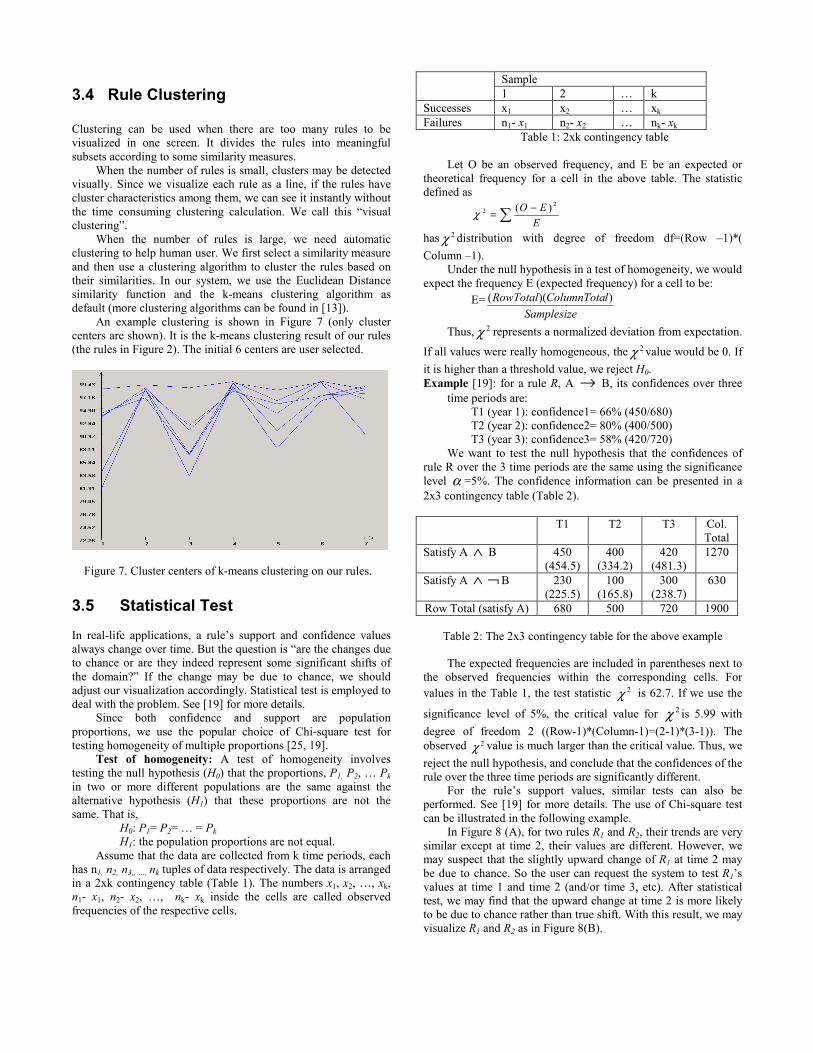
When the number of rules is small, clusters may be detected visually. Since we visualize each rule as a line, if the rules have cluster characteristics among them, we can see it instantly without the time consuming clustering calculation. We call this “visual clustering”. When the number of rules is large, we need automatic clustering to help human user. We first select a similarity measure and then use a clustering algorithm to cluster the rules based on their similarities. In our system, we use the Euclidean Distance similarity function and the k-means clustering algorithm as default (more clustering algorithms can be found in [13]). An example clustering is shown in Figure 7 (only cluster centers are shown). It is the k-means clustering result of our rules (the rules in Figure 2). The initial 6 centers are user selected.
Figure 7. Cluster centers of k-means clustering on our rules.
3.5 Statistical Test In real-life applications, a rule’s support and confidence values always change over time. But the question is “are the changes due to chance or are they indeed represent some significant shifts of the domain?” If the change may be due to chance, we should adjust our visualization accordingly. Statistical test is employed to deal with the problem. See [19] for more details.
Since both confidence and support are population proportions, we use the popular choice of Chi-square test for testing homogeneity of multiple proportions [25, 19].
Test of homogeneity: A test of homogeneity involves testing the null hypothesis (H0) that the proportions, P1, P2, … Pk in two or more different populations are the same against the alternative hypothesis (H1) that these proportions are not the same. That is,
H0: P1= P2= … = Pk H1: the population proportions are not equal.
Assume that the data are collected from k time periods, each has n1, n2, n3,, …, nk tuples of data respectively. The data is arranged in a 2xk contingency table (Table 1). The numbers x1, x2, …, xk, n1- x1, n2- x2, …, nk- xk inside the cells are called observed frequencies of the respective cells.
Sample 1 2 … k
Successes x1 x2 … xk Failures n1- x1 n2- x2 … nk- xk
Table 1: 2xk contingency table Let O be an observed frequency, and E be an expected or
theoretical frequency for a cell in the above table. The statistic defined as
�−=E
EO 22 )(χ
has 2χ distribution with degree of freedom df=(Row –1)*( Column –1). Under the null hypothesis in a test of homogeneity, we would expect the frequency E (expected frequency) for a cell to be:
E=Samplesize
lColumnTotaRowTotal ))((
Thus, 2χ represents a normalized deviation from expectation.
If all values were really homogeneous, the 2χ value would be 0. If it is higher than a threshold value, we reject H0. Example [19]: for a rule R, A → B, its confidences over three
time periods are: T1 (year 1): confidence1= 66% (450/680) T2 (year 2): confidence2= 80% (400/500) T3 (year 3): confidence3= 58% (420/720)
We want to test the null hypothesis that the confidences of rule R over the 3 time periods are the same using the significance level α =5%. The confidence information can be presented in a 2x3 contingency table (Table 2).
T1 T2 T3 Col.
Total Satisfy A ∧ B 450
(454.5) 400
(334.2) 420
(481.3) 1270
Satisfy A ∧ ¬ B 230 (225.5)
100 (165.8)
300 (238.7)
630
Row Total (satisfy A) 680 500 720 1900
Table 2: The 2x3 contingency table for the above example
The expected frequencies are included in parentheses next to the observed frequencies within the corresponding cells. For values in the Table 1, the test statistic 2χ is 62.7. If we use the
significance level of 5%, the critical value for 2χ is 5.99 with degree of freedom 2 ((Row-1)*(Column-1)=(2-1)*(3-1)). The observed 2χ value is much larger than the critical value. Thus, we reject the null hypothesis, and conclude that the confidences of the rule over the three time periods are significantly different. For the rule’s support values, similar tests can also be performed. See [19] for more details. The use of Chi-square test can be illustrated in the following example.
In Figure 8 (A), for two rules R1 and R2, their trends are very similar except at time 2, their values are different. However, we may suspect that the slightly upward change of R1 at time 2 may be due to chance. So the user can request the system to test R1’s values at time 1 and time 2 (and/or time 3, etc). After statistical test, we may find that the upward change at time 2 is more likely to be due to chance rather than true shift. With this result, we may visualize R1 and R2 as in Figure 8(B).

Figure 8. An example of using statistical tests
4. CONCLUSION In this paper, we used time based rule mining, and proposed some new methods to visualize rules and analyze their behaviors over time to help the user find interesting rules and to have a better understanding of the dynamic aspects of the domain. We propose the concepts of rules with behavior history, and rule similarity comparison based on their behavior history. In our approach, we first mine rules from different time periods and record their history information (i.e., support and confidence values at different time periods). We then visualize the rules using zigzagged lines with time as one axis, which makes time based visual analysis intuitive to human users. A number of effective rule visual analysis methods are presented, e.g., retrieving similar rules, visualizing the behavior of neighbor rules, rule clustering and combining statistical test in visualization. So far, we have performed a number of experiments on real-life data sets, the results indicate that the proposed technique is very effective and intuitive to human users. REFERENCE [1] Rakesh Agrawal, Tomasz Imielinski, and Arun Swami,
“Mining Association Rules Between Sets of Items in Large Databases.” SIGMOD-1993, 1993.
[2] Rakesh Agrawal, Christos Faloutsos, and Arun Swami. Efficient Similarity Search In Sequence Databases. Proceedings of the 4th International Conference of Foundations of Data Organization and Algorithms (FODO), 1994.
[3] Mihael Ankerst, Daniel A. Keim, and Hans-Peter Kriegel, “Circle Segments: A Technique for Visually Exploring Large Multidimensional Data Sets.” Proc. Visualization 96, 1996.
[4] Mihael Ankerst, Christian Elsen, Martin Ester, and Hans-Peter Kriegel. “Visual Classification: An Interactive Approach to Decision Tree Construction.” KDD-99, 1999.
[5] Mihael Ankerst, Martin Ester, and Hans-Peter Kriegel. Towards an Effective Cooperation of the User and the Computer for Classification. KDD-2000, 2000.
[6] Bela Bollobas, Gautam Das, Dimitrios Gunopulos, and Heikki Mannila. Time-Series Similarity Problems and Well-Separated Geometric Sets. Proc. of 13th Annual ACM Symposium on Computational Geometry, 1998.
[7] Shu Chen, and Bing Liu. "Generating Classification Rules According to User's Existing Knowledge," Proceedings of the SIAM International Conference on Data Mining (SDM-01), 2001
[8] Gautam Das, Dimitrios Gunopulos, and Heikki Mannila. “Finding Similar Time Series.” Principles of Data Mining and Knowledge Discovery, 1997.
[9] DBMiner, http://db.cs.sfu.ca/DBMiner/ [10] Jianchao Han, and Nick Cercone. “RuleViz: A Model for
Visualizing Knowledge Discovery Process.” KDD-2000, 2000.
[11] Christopher G. Healey, “Choosing Effective Colours for Data Visualization.” From www.cs.ubc.ca/libs/imager/tr/healey.1996b.html
[12] Heike Hofmann, Arno P.J.M. Siebes, and Adalber F.X. Wilhelm. “Visualizing Association Rules with Interactive Mosaic Plots.” KDD-2000, 2000.
[13] A.K. Jain, M.N. Murty, and P.J. Flynn. “Data Clustering: A Review.” ACM Computing Seureys, 1999.
[14] Daniel A. Keim. “Pixel-oriented Database Visualizations.” SIGMOD RECORD special issue on “Information Visualization”, 1996.
[15] Daniel A. Keim. “Visual Techniques for Exploring Database.” Int. Conference on Knowledge Discovery in Databases, KDD-97, 1997.
[16] Mika Klemettinen, Heikki Mannila, Pirjo Ronkainen, Hannu Toivonen, and A.Inkeri Verkamo. “Finding Interesting Rules from Large Sets of Discovered Association Rules.” CIKM-1994, 1994.
[17] Bing Liu, Wynne Hsu, and Yiming Ma, “Integration Classification and Association Rule Mining.” KDD-98, 1998.
[18] Bing Liu, Wynne Hsu, and Yiming Ma. “Pruning and summarizing the discovered associations.” KDD-1999, 1999.
[19] Bing Liu, Yiming Ma, and Ronnie Lee. “Analyzing the Behavior of Association Rules.” Forthcoming, 2001.
[20] Spyros Makridakis, Steven C. Wheelwright, and Rob J. Hyndman. Forecasting: methods and applications, John Wiley & Son, 1998.
[21] Heikki Mannila, Hannu Toivonen, and Inkeri Verkamo, “Efficient Algorithms for Discovering Association Rules.” KDD-94. 1994.
[22] B. Padmanabhan and A. Tuzhilin. "Small is beautiful: Discovering the minimal set of unexpected patterns." KDD-2000, 2000.
[23] A. Silberschatz, and A. Tuzhilin. “What makes patterns interesting in knowledge discovery systems.” IEEE Trans. on Know. and Data Eng. 8(6), 1996.
[24] Frank M. Thiesing. “Oliver Vornberger. Sales Forecasting Using Neural Networks.” Proceedings ICCN’97, 1997.
[25] Ronald E. Walpole, and Raymond H. Myers. Probability and Statistics For Engineers And Scientists. Prentice Hall, 1993.