Embed Size (px)
Citation preview
VIS15/VART2960 Photography: An Introduction Creating Impact In Images
Copyright 2008 RMIT Page 1
V IS15 / VART2960
photography: an introduction
Modu le Two: Creat i ng Impact I n Images

VIS15/VART2960 Photography: An Introduction Creating Impact In Images
Copyright 2008 RMIT Page 2
Contents
CREATING IMP ACT IN I MAGES . . . . . . . . . . . . . . . . . . . . . . . . . . . . . . . . . . . . . . . . . . . . . . . . . . . . . . . . . . . . . . . . . . . . . . . . . . . . . . . . . . . . . . . . . . . . . . . . . . . . . . . . . . . . . . . . . 3
OBJECT IVES ................................................................................................................................................................................... 3 2.1 THE EFFECT OF ORGANI SATION OF THE V I SU AL FIEL D ON THE WAY WE SEE . . . . . . . . . . . . . . . . . . . . . . . . . . . . . . . . . . . . . . . 4
OBJECT IVE ..................................................................................................................................................................................... 4 F IG URE-GROUND RELATION SH IP FOR D IFFERENT D ISCIPL INES ............................................................................................... 6 PRINC IPL ES OF ORG ANISATION OF THE V ISUAL FIELD ............................................................................................................. 9 THE PRIN CIPLE OF PROXIM ITY ................................................................................................................................................. 10 THE PRIN CIPLE OF S IMIL AR ITY ................................................................................................................................................. 12 SIM ILARITY AN D SYMMETRY ...................................................................................................................................................... 12 THE PRIN CIPLE OF CONT IN UITY ............................................................................................................................................... 13 CONTIN U ITY OF SEQUENCES...................................................................................................................................................... 15 THE PRIN CIPLE OF CLOSURE .................................................................................................................................................... 15 SUMMARY OF GESTALT PR INC IPL ES OF V ISUAL ORG ANISATION ............................................................................................ 16
THE SHAP E OF THINGS . . . . . . . . . . . . . . . . . . . . . . . . . . . . . . . . . . . . . . . . . . . . . . . . . . . . . . . . . . . . . . . . . . . . . . . . . . . . . . . . . . . . . . . . . . . . . . . . . . . . . . . . . . . . . . . . . . . . . . . . 18
ACT IV ITY 4 . MAGAZ INE CUTOUTS ............................................................................................................................................. 18
INSTRUCTIONS FOR SU BMISSION . . . . . . . . . . . . . . . . . . . . . . . . . . . . . . . . . . . . . . . . . . . . . . . . . . . . . . . . . . . . . . . . . . . . . . . . . . . . . . . . . . . . . . . . . . . . . . . . . . . . . . . . . . 18
2.2 COL OUR : A FUNCTION OF L IGHT . . . . . . . . . . . . . . . . . . . . . . . . . . . . . . . . . . . . . . . . . . . . . . . . . . . . . . . . . . . . . . . . . . . . . . . . . . . . . . . . . . . . . . . . . . . . . . . . . 19 OBJECT IVE ................................................................................................................................................................................... 19
2.3 DISTINGUI SHING BETWEEN THE THREE BASIC QUALITI ES OF COL OUR . . . . . . . . . . . . . . . . . . . . . . . . . . . . . . . . . . . . . . . . . . . . . . 21
OBJECT IVE ................................................................................................................................................................................... 21 HUE .............................................................................................................................................................................................. 21 SATURATION ................................................................................................................................................................................ 22 BR IGHTNESS ................................................................................................................................................................................ 23
2.4 DISTINGUI SHING BETWEEN THE WAYS IN WHICH L IGHT AFFECTS COL OUR . . . . . . . . . . . . . . . . . . . . . . . . . . . . . . . . . . . . . . . . . 24
OBJECT IVE ................................................................................................................................................................................... 24 1. INTEN SITY .............................................................................................................................................................................. 24 2. QUALITY ................................................................................................................................................................................. 25 3. COL OUR .................................................................................................................................................................................. 26
2.5 THE EMOTI ONAL EFFECT OF COL OUR . . . . . . . . . . . . . . . . . . . . . . . . . . . . . . . . . . . . . . . . . . . . . . . . . . . . . . . . . . . . . . . . . . . . . . . . . . . . . . . . . . . . . . . . . . . 27
OBJECT IVE ................................................................................................................................................................................... 27 STRONG COLOURS ...................................................................................................................................................................... 27 MUTED COL OURS ........................................................................................................................................................................ 27 COLOUR CON TRAST .................................................................................................................................................................... 30 WARM COLOURS AND COOL COL OURS ...................................................................................................................................... 30
ACTIV ITY 5 . I SEE THE L IGHT . . . . . . . . . . . . . . . . . . . . . . . . . . . . . . . . . . . . . . . . . . . . . . . . . . . . . . . . . . . . . . . . . . . . . . . . . . . . . . . . . . . . . . . . . . . . . . . . . . . . . . . . . . . . . . 32
INSTRUCTIONS FOR SU BMISSION . . . . . . . . . . . . . . . . . . . . . . . . . . . . . . . . . . . . . . . . . . . . . . . . . . . . . . . . . . . . . . . . . . . . . . . . . . . . . . . . . . . . . . . . . . . . . . . . . . . . . . . . . . 32

VIS15/VART2960 Photography: An Introduction Creating Impact In Images
Copyright 2008 RMIT Page 3
Creat ing impact in images In Module 1, you studied the ways in which photography is and has been used to communicate in different contexts. In this module we shall start to examine how to achieve the most with image making opportunities. Photography is concerned with perception. Making powerful images relies firstly on being alert to image making opportunities — on perceiving people, places, objects and events, not just as they occur, but also in terms of what they offer. However, making powerful images also depends on how you use your knowledge of perception to enhance what you see. Ob ject ives By the time you have completed this module, it is expected that you will be able to: • distinguish between figure and ground; • recognise situations in which the principles of Gestalt laws apply; • distinguish between the three qualities of light that affect colour; • relate hues of colour through the colour wheel.

VIS15/VART2960 Photography: An Introduction Creating Impact In Images
Copyright 2008 RMIT Page 4
2 .1 The ef fect o f organisat ion o f the v isual f ie ld on the way we see Ob ject ive By the time you complete this section, you should be able to understand in a practical way, how we distinguish between ‘figure and ground’. You should also be able to apply Gestalt psychology to the visual field to distinguish between the main elements in a scene. From a very young age, we able see. However, at first we do not comprehend what we see. We have to learn to make sense of the world. By and large this is a natural development, but for some special purposes, we have to learn to see and we have to learn to think about what we are seeing. This unit does not pretend to provide a theoretical treatment of the psychology of visual perception. Instead, it treats visual perception in a rather practical way. However, I suggest that you may find it worthwhile, to follow up through your own reading some of the topics the area of visual perception. If you decide to do this, Rudolf Arnheim's Art & Visual Perception is a good place to start. Every image we look at, whether in nature or made by the human hand is composed of forms & structures. We have to learn to identify and comprehend those structures. It may seem odd to talk psychology in a course in photography. One associates photography most with chemistry, physics, optics, maths etc., and less with the arts and psychology. However, an image-maker can learn much about making pictures by studying art, design and such branches of psychology as perception, motivation and learning theory.
VIS15/VART2960 Photography: An Introduction Creating Impact In Images
Copyright 2008 RMIT Page 5
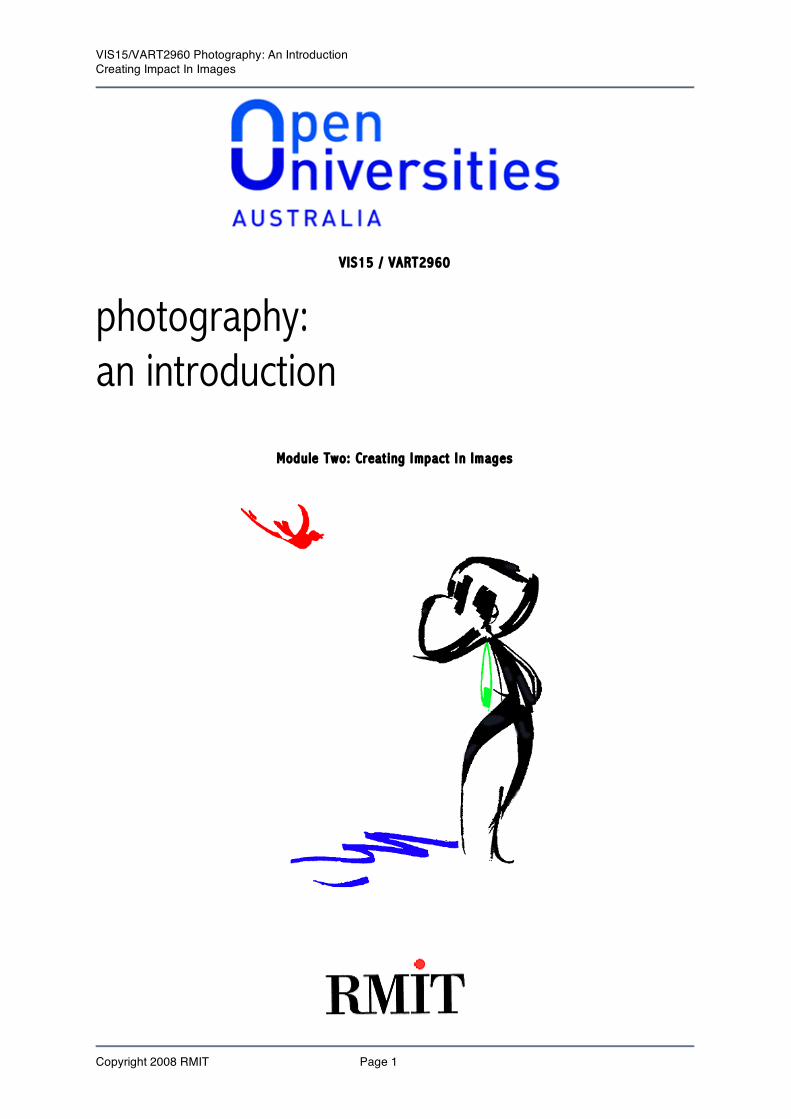
Figure and Ground
The whole of our perceptual field can be divided into figure and ground. When we look at something, the main object/form we are able to distinguish is known as f i gure . The remainder is referred to as ground. There are times when this phenomenon is not as pronounced. What governs our perception of f i gure?
The fence phenomena When we initially look at the illustration, we see black lines against a white background. However, as we continue to observe the figure, we may begin to see four narrow fence slats or white stripes. They are seen as figure. Furthermore, the closer together two elements are the greater the probability that they will be grouped together and seen as figure. It is not possible to have figure without ground; therefore, it is not possible to see four narrow slats and the three wide slats simultaneously. In the following example, the boundary between the right and left halves of the figure produces two quite different images depending on which half of the picture serves as figure and which half as ground. If the right becomes the ground, we see a profile of a woman. If the left becomes the ground then we see the facial profile of an old woman.

VIS15/VART2960 Photography: An Introduction Creating Impact In Images
Copyright 2008 RMIT Page 6
Figure-ground boundary. Profile of an old man or head and torso profile of a woman?
Closed areas are more readily seen as figures. Contrasting the enclosed areas by darkening them would make them even easier to see the figures.
F igure-ground relat ionsh ip fo r d i f ferent d isc ip l ines
Drawing hands, 1948 by Escher
VIS15/VART2960 Photography: An Introduction Creating Impact In Images
Copyright 2008 RMIT Page 7
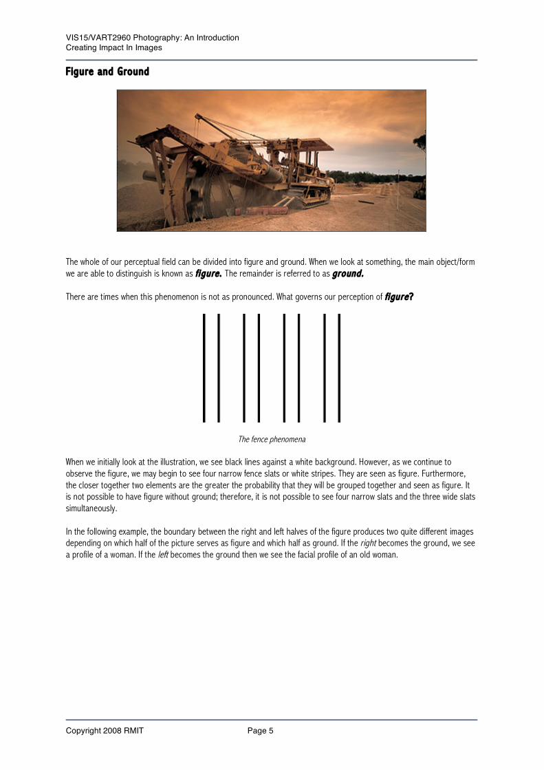
Spotted dog. Some spots are selected from the complete field of spots and because of their relationships are grouped to form the shape of the dog.
Goblet or Profiles
Face or Vase

VIS15/VART2960 Photography: An Introduction Creating Impact In Images
Copyright 2008 RMIT Page 8
Revers ib l e f igures - s ide by s ide:
Head & neck of young woman, or face of old woman Revers ib l e f igure – i nv ert :
View young woman on the left, when inverted the image appears as an old man with a turban. The concept of figure-ground is not just limited to visual experience. It can also apply to other types of sensory experience. In the case of sound, it is possible to conduct a conversation in a crowd or in a noisy room. The voice of the person with whom one is conversing becomes figure and the background conversation becomes ground. In the case of touch, the surface of a textured object becomes figure; the surface of a non-textured object becomes ground. In the case of smell, in an enclosed space, the strongest odour becomes figure.

VIS15/VART2960 Photography: An Introduction Creating Impact In Images
Copyright 2008 RMIT Page 9
Princ ip les o f organisat ion o f the v isual f ie ld The study of visual perception is quite extensive, from detection, discrimination, resolution, manipulation, attention, selection, Channel capacity to interference, illusion, storage and retrieval. In this section, we are concerned with just one aspect of visual perception — visual images. The Gestalt School of psychology, established in Germany in about 1912 by Dr. Max Wertheimer. The German word gestalt means ‘shape’ or ‘form’. The Gestalt psychologists were interested in the relationship between the parts of an image and the whole. They contended that the whole is always different from the sum of the parts.
An example of Gestalt; the camera A person can choose to see each visual element (the individual letters) separately or as grouped to from a camera.
Dot screen pattern of an eye When we look at a greatly enlarged half-tone image, what we see are a series of black dots of varying size. However, as soon as we begin to group the dots, we see something different. Our perceptual system groups adjacent dots that are similar in size, and shape. It is only after this organisation is achieved that we are able to see the image as an image. Some units of black dots are seen in one form; some in another. Some elements are seen together because they are similar in size, direction and shape. When viewed this image from a distance we perceive it as an eye. This grouping of visual elements is into a single figure is known as Gestalt.

VIS15/VART2960 Photography: An Introduction Creating Impact In Images
Copyright 2008 RMIT Page 10
The Gestalt psychologists were especially interested in figure-ground relationships and in the factors that help the observer to distinguish objects as patterns or figure. They proposed four principles of perceptual organisation: 1. Proximity; 2. Similarity; 3. Continuity; and 4. Closure. The Pr inc ip le o f Proximity The Principle of Proximity is the simplest of the four organising principles. It says that elements that are in close proximity to each other are seen as grouped. In written text, words are seen as such because the letters of words are closer together than the last letter of one word and the first letter of the next. The proximity of visual elements is the simplest factor accounting for the creation of visual 'wholes'. We articulate a painting or a typographical design firstly by the law of proximity, visual elements close to each other in a picture plane tend to be seen together and become the coherent figures. When the proximity of objects in three-dimensional space is considered, a new set of variables is introduced. When we observe proximity in photographs we can see ways in which objects arrange themselves: 1. Side by side 2. Up and down 3. Front-to-back In this photograph of the amusement rides, we have an example of proximity side by side.
Side by side In the following version of proximity up and down we can see the classical tower blend in the modern skyscraper.

VIS15/VART2960 Photography: An Introduction Creating Impact In Images
Copyright 2008 RMIT Page 11
Up and down An example of front-to-back proximity can be seen in this photograph of the fountain and the building in the background with the two doors. At first impression, it resembles a clown’s face.
Front-to-back

VIS15/VART2960 Photography: An Introduction Creating Impact In Images
Copyright 2008 RMIT Page 12
Space between letters plays an important part in determining how text is seen. Notice how the sentence below is made unintelligible simply by altering the spacing between the letters. Spatial organisation is the vital factor in an optical message. Sp atialor gani sationist hevital fa ctorian an optical message. spatial organisations thevital for ctorin an optical message. The Pr inc ip le o f S imi lar i ty Elements tend to be related if they have common qualities. For example, elements, which are of equal size, similar shape, running in similar directions, display corresponding colours, have similar values or similar textures tend to be grouped.
Twins We also observe that even though the overall configuration for A, B, and C remains square, B is seen as having horizontal rows of alternating circles and squares whilst A has vertical columns of alternating circles and squares
Organisation of the elements according to the law of similarity
S imi la r i ty and Symmetry

VIS15/VART2960 Photography: An Introduction Creating Impact In Images
Copyright 2008 RMIT Page 13
In the photograph below, the position of the pyramid in the foreground and the centering of the building’s roofline in the background show symmetry.
Symmetry can be considered a special case of similarity. Visual elements that are symmetrical provide for visual balance. The more symmetrical an area, the greater the tendency is to group it and see it as ‘figure’. One readily groups 1, 3, and 5 as figure with symmetric vertical areas.
Symmetry facilitates grouping. In the image ‘The Columns' below, we can see the impact created by the similarity of the grouping of the two types of columns.
The Pr inc ip le o f Cont inu ity

VIS15/VART2960 Photography: An Introduction Creating Impact In Images
Copyright 2008 RMIT Page 14
The principle of continuity says that every linear element has kinetic inertia and is seen as continuing in the same direction and with the same movement. A straight line is seen as continuing as a straight line. A curvilinear line is seen as continuing as a curvilinear line. A wavy line is seen as continuing as a wavy line with its original rhythm. Such linear continuation helps to form the image by creating groups of a simple order. It is a most potent device in binding together heterogeneous elements and thus reducing the picture-image to the number of units, which can be fully comprehended in one attentive act. 'Lady with raised arms’ is a good example of a photograph illustrating the principle of continuity.
The principle of continuity can also apply to the graduation or progression of colour in terms of hue, value & chroma. The eye moves along a direction of hue or value graduation similar to the way it moves along a line.

VIS15/VART2960 Photography: An Introduction Creating Impact In Images
Copyright 2008 RMIT Page 15
Cont inu ity o f Sequences Another from of continuity is in visual image sequence, varying in their spatial as well as temporal arrangement. Motion pictures are good examples of this; the only difference is that there are fewer picture in sequences with more abrupt changes from the scene to the other. This techniques of photography in an attempt to study motion. The following sequence of images shows the progression of an event.
The Pr inc ip le o f Closure Forces of organization driving toward spatial order, towards stability tend to shape optical units in closed compact wholes. Goethe observed that the after-image of a sharp square gradually becomes rounded into a circular shape. A closed area appears more formed, more stable, than one that is open and without boundaries. In viewing these images, one fills in the gaps.
It is easy to see the lines and dots as forming a triangle and circle This factor of closure may act on flat dimension, generating from linear units, the experience of a closed shape. It may also unify further dimension. Inter-connections of points, lines, shapes, colours and values are closed psychologically into either flat or three-dimensional wholes. The factor of closure can become more significant than proximity or similarity.

VIS15/VART2960 Photography: An Introduction Creating Impact In Images
Copyright 2008 RMIT Page 16
The principles of visual organisation established by the Gestalt psychologists provide a set of rules, which help to account for the way in which we understand that which we see. These rules can help you to anticipate how by changing the composition of an image, you can increase its impact. However, just as knowing the technical procedures and chemical processes involved in taking a photograph, a knowledge of the rules of visual organisation will not of itself assure one of making a powerful image. One must be able to apply that knowledge skillfully. Visual impact is a result of knowledge and ability of knowing and doing both can come through rigorous discipline and practice. Consequently the laws of Gestalt are merely a means to an end, a means of producing a good photograph. It establishes a series of principles in a simple way how man segregates and groups visual information. These principles can guide a photographer in creating pictures with impact. Summary o f Gestalt p r inc ip les o f v isual organisat ion
The grouping of visual elements becomes difficult when elements are similar and equally distant apart.

VIS15/VART2960 Photography: An Introduction Creating Impact In Images
Copyright 2008 RMIT Page 17
Gest a l t pr i nc ip le Appearance
Proximity Visual elements that are in close proximity tend to be grouped together and seen as figure.
Similarity Visual elements that are equi-distant from each other are grouped according to their similarity and seen as figure.
Similarity & Closure Increasing the distance between pair’s similar visual elements facilitates their grouping.
Closure Closed visual elements are seen as figures. Close Proximity Visual elements that are nearly closed and visually close
are seen as figure. Closure & Contrast Visual elements that are closed and contrast with
surrounding elements are seen as strong figure. Continuity Visual elements are grouped to form continuous straight or
curved lines. For further reading on the principles of Gestalt laws, visit the website address below: ht tp: / /www. rc i . rutge rs. edu/~cf s /305_html /Gesta l t /gesta l t . ht ml

VIS15/VART2960 Photography: An Introduction Creating Impact In Images
Copyright 2008 RMIT Page 18
The shape o f th ings For the next two activities in this module, you will be involved in how an understanding of visual literacy further contributes to creating images with greater impact. Act iv i ty 4. Magaz ine Cutouts In an attempt to identify how the laws of Gestalt are applied in advertising images, search through a range of magazines and scan one image that identify each of the 4 main principles as discussed in this module. You may find that some images may have more than one principle involved. In these cases, identify the most obvious one. Instruct ions for submission When you have collected all the information for this activity, create a Word document and include your scanned (small file) images together with your observations as to which principle(s) was used. Place this document into the St udent Tool s – D ig i ta l D rop Box * Remember to keep your file size under 2 Mb.

VIS15/VART2960 Photography: An Introduction Creating Impact In Images
Copyright 2008 RMIT Page 19
2.2 Co lour: A funct ion of l ight Ob ject ive By the time you complete this section, you should be able to distinguish between the additive and subtractive colour systems. Colour exists all around us, and is so much a natural part of our everyday experience, that we sometimes take it for granted. However, as photographers, we need to be keenly aware of colour and to look at it in a new, more precise way if we are to use it effectively. Colour is a powerful language. It helps to define what we see. It communicates mood or emotion. It delights our eyes To use colour effectively in one’s pictures, it is necessary to discard what one has learnt about colour and begin to see with a fresh eye — to recognise the relationship between light and colour, and to understand the effect of the characteristics of film on the way light records colour. In 1666 Isaac Newton (1642-1727) demonstrated that colour is a function of the interaction between light and that which it illuminates. By directing a ray of sunlight through a glass prism, Newton was able to separate the various components of the visible spectrum. Then by returning the spectrum through another prism, he produced the original ‘white’ or visible light. In this way Newton proved that sunlight is a combination light of all colours.
The deflection of white light through a prism All colours are derived from light interactions. We see by detecting different wavelengths of light. When all visible wavelengths are present, we see white, or daylight; when none are present we see black. There are two systems used to describe colour — the additive and the subtractive. The absorption characteristics of the additive primary colours - red, green and blue are such that they can be combined to make white only when projected or separately as coloured light beamed into a darkened environment. Called additive primaries because they introduce colour where none exists (black), each of these colours transmits about one-third of the spectrum’s wavelengths. The addition of any of these colours to one other when projected in separated beams of light produces other colours called secondary colours. Overlapped in beams of light, all three appear to the eye as white. A primary and a secondary colour whose light (in similar situations) combines to make white light are called Complementary colours. On the colour wheel complements are opposite each other e.g. blue and its complementary colour yellow. The subtractive method of combining colour starts with white light and subtracts from it the wavelengths of the three additive primaries. This process makes use of the secondary colours, which are the complements of the additive

VIS15/VART2960 Photography: An Introduction Creating Impact In Images
Copyright 2008 RMIT Page 20
primaries. The complements in combination, absorb or subtract the wavelengths of the additive primaries, leaving black. These complements — cyan, magenta, and yellow — are thus called the subtractive primaries. Each subtractive primary absorbs the wavelengths of its complement, and additive primary, and transmits or reflects the wavelengths for the other two additive primaries. And because each subtractive primary is the result of the mixture of two additive primaries, each shares the reflection and absorption characteristics of the two additive primaries. When filters for two subtractive primaries are overlapped on a light table, they do not cancel each other into blackness (as two additive primaries do), but they create a third colour — an additive primary. Only when all three subtractive primaries overlap is the result black because all three additive primaries are then absorbed. To sum up, the additive primaries produce colour only in darkness, as inside a camera or in a darkroom. The subtractive primaries produce colours in an illuminated environment against a white or light background, as paper or a light table. Objects appear coloured mainly because their surface pigments absorb some wavelengths but reflect others. For example, leaves are seen as green because they reflect green wavelengths and absorbing the rest. In white light, a leaf appears green. The denser the pigments and the stronger the light the more intense or saturated the colour appears. If the leaf is shiny, it reflects some white light, reducing the intensity of the colour. If the leaf is in shade or dim light, the colour is muted. In red light no green light is reflected and the leaf appears black. Oil on water diffracts light and produces interference. As a result you see colours from the same angles: a prism refracts it (bends light of different wavelengths differentially) to produce spectral colours. Various combinations of absorption, reflection, refraction and scattering effect light as it passes through the atmosphere, often producing colour casts. Skylight, for example, is often blue giving a blue cast in shadows. Colour vision becomes weaker in dim light. In low light conditions we tend to see in black and white. However, colour film records any colour present, however faint. Pictures taken in dim light often show surprising colour strengths. We notice strong colours more readily than muted hues — particularly if these are distant from us. However, in photographs, the more subtle shades of colour are recorded clearly. An unusual or striking colour effect is sometimes used as the subject of a picture. However, colour is more often used as an essential part of the structure of a picture. It is used to define shapes, patterns and textures, or convey distance — strong colour stand out, while weaker ones recede. Some colours blend gently, producing harmony. Others may emphasise shapes and create impact. The overall influence of one colour can determine mood, while small patches of colour attract the eye. The subtractive system is the one we shall work with here.

VIS15/VART2960 Photography: An Introduction Creating Impact In Images
Copyright 2008 RMIT Page 21
2 .3 D ist inguish ing between the three bas ic qual i t i es o f co lour Ob ject ive By the time you complete this section, you will learn to distinguish between the three basic qualities of colour. Many systems have been devised to categorise all the shades of colour we see around us. Although terminology may differ, most systems define colour in terms of three qualities: • hue; • saturation (intensity or chroma); and • brightness (luminance or value). Hue Hue is the property of colour that gives it its name, distinguishing it from other colours; e.g. yellow, red, green, blue, purple, etc. It is determined by the wavelengths present in light. The hue of a colour has nothing to do with whether the colour is light or dark, strong or weak. The usual way in which colour relationships are represented is with a colour wheel. The order of the colours in the wheel is the one in which they naturally fall when white light is passed through a prism to form a spectrum-red, orange, yellow, green, blue, and purple. The wheel is often divided into six or more equal areas, each representing one of the primary, secondary or tertiary colours. On the colour wheel, each hue is represented by its mid-value, the colour that has the maximum intensity. There is of course many possible variation of each colour or hue: for example, yellow ranges from orange yellow to green yellow. But in a colour wheel, only the mid-value of each hue appears. The colour circle is an abstract diagram: its purpose is to help you locate the middle values in relation to each other. There are no ‘lines’ between hues. The colour circle is a very useful device because it demonstrates fundamental colour relationships so well. Note that each secondary fits between two primaries. This order of colours is exactly the same as in a rainbow. (Of course, in nature the various hues blend gradually from one hue to another, whereas in the colour wheel they are arranged in separate patches, each of a distinctly different hue.)

VIS15/VART2960 Photography: An Introduction Creating Impact In Images
Copyright 2008 RMIT Page 22
The colour wheel
Study the colour wheel and its captions carefully. Notice that the closer together colours are on the wheel, the more related and harmonious they seem, because each colour contains some of the colour lying next to it. The farther apart they are, the more they contrast with each other. Colours that are directly opposite each other, such as red and blue-green, are call secondary colour and form the greatest contrast. Hues and the different effects they create when arranged in certain combination provide you with one of your basic tools for composing in colour. Satura t ion

VIS15/VART2960 Photography: An Introduction Creating Impact In Images
Copyright 2008 RMIT Page 23
Saturation is the relative purity, vividness, or intensity of a colour. The stronger or more intense a colour is, the more ‘saturated’ it is. A brilliant red is said to be a high saturation, a soft yellow is said to be of low saturation. Saturation is dependent on hue. The black, white, and greys of black-and-white photographs do not convey colour saturation. You can control the saturation of colours in your picture to a considerable degree by the kind of light and the kind of film you use, and by the way you expose that film. You often can achieve a wide range of effects from rich, fully saturated colours all the way to delicate, less saturated ones. Br ightness Brightness is the third dimension of colour. It means the lightness or darkness of a colour. Brightness is similar to value. Many photographers — even experienced photographers — confuse brightness with saturation. Brightness and saturation are not identical but are two separate dimensions. However, in colour photography, a change in one is often accompanied by a change in the other. The emotional and visual effect of brightness in colour photograph is generally similar to the effect of value in a B & W picture. Dark colours tend to create a somber, heavy, or dignified mood. Bright colours tend to suggest a light and airy feeling. You can control the brightness of the colours in your pictures by choosing your lighting and exposure. Think of all three dimensions of colour-hue, saturation, and brightness as elements of composition that can help your picture communicate more vividly. It’s important that you understand what these three dimensions are. It’s even more important that you train yourself to see them more exactly as they occur in nature and under your control in the studio. Saturation and brightness produce different tones of a hue. In general, colours, which differ greatly in hue, saturation or brightness, provoke contrast when placed together, while those that are similar produce harmony. Pictures limited in tonal range or hue can be very effective - as in high or low-key subjects, or predominant or isolated colour scenes.

VIS15/VART2960 Photography: An Introduction Creating Impact In Images
Copyright 2008 RMIT Page 24
2.4 D ist inguish ing between the ways in which l ight af fects co lour Ob ject ive By the time you complete this section, you will learn how to distinguish between the three basic qualities of light which affect colour. All photographs are produced by light. The particular kind of light has a significant effect on the hue, saturation and brightness of the colours your camera records. The light used in photography can vary in a number of ways. The three most important are: • intensity; • quality; and • colour. Let’s look at three of the most important of these and see what they do to the colours in the pictures. 1 . Intensity
The intensity of light is what you measure when you take a reading with your light meter. The intensity can vary greatly. The light of the sun at noon on a clear day is much more intense than sunlight on an overcast day. The light of a small living-room lamp is on the other hand very weak compared with sunlight. The intensity of light affects the colours in your picture. It especially affects their brightness and saturation. Generally speaking, the more intense the light, the brighter and more saturated that colours appear. Colours appear duller and less

VIS15/VART2960 Photography: An Introduction Creating Impact In Images
Copyright 2008 RMIT Page 25
saturated on a cloudy or rainy day, than they do in bright sunshine. Choosing light of a particular intensity, whether indoors or out, is therefore one of the ways you can control the colour in your pictures and make it either strong and poster like or soft and pastel. 2 . Qual i ty
The quality of light refers to whether it is high contrast and harsh or from low contrast and soft. Harsh, contrast light, such as the brilliant light from a spotlight or the sun causes distinct highlights and clearly defined shadows. Light, which is soft and low in contrast, such as the diffused light from a floodlight or the sun on a hazy day, causes even illumination with blurred indistinct shadows or almost no shadows at all. The quality of the light affects the brightness and saturation of the colours in a photograph. The harsher and more contrast the light, the brighter and more saturated the colours usually will appear.

VIS15/VART2960 Photography: An Introduction Creating Impact In Images
Copyright 2008 RMIT Page 26
3. Co lour
The light that comes to us from the sun we call ‘white’ light. However, so-called white light may actually vary considerably in colour. It may contain a higher-than-normal proportion of light in the yellow bandwidth, as the illumination from the late afternoon sun or electric-light bulbs does. On the other hand, it may contain a higher-than-normal proportion of light in the blue waveband like the light in the shade of a building on a day when there is blue sky or light on overcast days. Light may also contain an unusual amount of other colours, green for example, when the light is filtered through the leaves of a tree, red when it is reflected off the side of a red barn, or yellow when it is reflected off a yellow wall. Our brain adapts very readily to these subtle variations in the colour of light, and we see all of these types of light as white. Most of us fail to notice any difference between the colour of objects viewed under the yellowish light of a living-room lamp and the colour of objects under the much more bluish light outdoors on an overcast day. Colour films don’t have this kind of adaptability. They are designed or ‘balanced’ to give you normal colours under a specific type of light i.e., daylight, fluorescent or tungsten. If you use a warmer or cooler light source than the one for which the film is designed, you will get an overall change in the hue. The colours will be reproduced warmer than they look to the eye if the light source is warmer than the one for which the film was designed, and cooler if the light source is cooler. At the same time that hue changes, saturation and brightness may also change. If the light source is warmer than is normal for the film, warm colours tend to become brighter and more saturated, while cool colours tend to become darker and less saturated. The reverse happens when the light source is cooler than the one the film is designed for. The cool colours tend to look brighter and more saturated in the photograph, while the warm colours tend to look darker and less saturated. These general principles about the effect of light on the colours in your pictures have many creative uses.

VIS15/VART2960 Photography: An Introduction Creating Impact In Images
Copyright 2008 RMIT Page 27
2.5 The emot ional ef fect o f co lour Ob ject ive By the time you complete this section, you will learn how to use the many aspects colour in creating emotional response. S trong Co lours
Pure strong colours hold the eye and create bold, vital effects. You can use strong to command and direct attention or to create a festive mood. However, you must handle strong colours with care. They dominate all other colours in a picture. They can overwhelm shape and detail, and render a composition unbalanced. So you need to make sure that areas of strong colour support the main interest in your pictures. Many strong colours together result in a struggle for power. A gaudy clash of colours suits some subjects but generally strong colour pictures are more effective if you limit the range of hues and include areas of neutral contrast. Pure, strong, fully saturated colours can be direct and powerful in their emotional impact. This is the kind of colour children and primitive artists often use. The impact of colour contrast is greater when the colour are fully saturated. An intense, pure red seems to vibrate when it’s next to an intense, pure green. Heavily saturated colours of contrasting hues seem to clash, creating a sense of excitement, drama, and motion. Since the invention of synthetic dyes and pigments in the nineteenth century and the progress in colour photography, our modern environment has developed an unprecedented range of colour. You will find a myriad of strongly coloured subjects around you, particularly in the details of urban environments, in painted building, in illuminated signs and traffic signals, in vehicles and clothes in store windows. In nature too, close detail provides the strongest colours. Flowers, fruits, bright insects and the plumage of birds are examples of objects that exhibit strong colours. Strong colour is colour for colour’s sake – the main point of the colour is its intensity. Strong colours need strong simple design. Bold graphic images can be more effective than a riot of colour, particularly in close up. Primary colours are the most powerful, particularly red. A small area of red distracts attention from the rest of a scene. On the other hand, muted, unsaturated colours tend to be more restful and their effect is often more poetic and sophisticated. Contrasting hues such as red and green still stand out clearly from each other, but in a more subtle way. Muted Co lours

VIS15/VART2960 Photography: An Introduction Creating Impact In Images
Copyright 2008 RMIT Page 28
Whereas strong colour gives a sense of vitality, muted colour is evocative and expressive. You can use muted colours to convey many different moods; for example, industrial bleakness, rural tranquility, romantic portraits, and dramatic stormy landscapes. Muted colours are found in most natural landscapes; in worn, aged and weathered surfaces; in grey urban scenes, and in winter scenes. Colour is muted by the addition of black, grey or white — whether through the effects of lighting and exposure or through the presence of de-saturated tones in the subject. Low lighting reduces saturation. Shadows add black and grey, while reflection, flare and scattering of light de-saturate colour by introducing white. Shooting into the light also mutes colour, often increasing tonal contrast. You can use exposure selectively to emphasise such light effects — overexposure adds white; underexposure deepens colour and adds black. And finally, with a long lens, you can select an area of distant muted colour to produce a pale unreal effect. When mist drifts across a landscape, or it is obscured by rain, light is scattered and colours softened and muted. Dust, smoke and pollution also mute colour by obscuring the transmission of light waves. Smog may give a yellow or green cast to light; smoke usually mutes colour to a dusky blue; rain renders everything in shades of grey. Colours in distant scenes, are muted by atmospheric scattering of light, so that tones appear progressively paler as landscapes recede from the eye. This is known as aerial perspective. The minute droplets of water vapour in winter fog and mist can act like millions of tiny mirrors, reflecting light in all directions. Sometimes the effect is a brilliant white light that desaturates the most strident colours. More often it is that familiar soft blue, reinforced by the inherent blue sensitivity of colour film.

VIS15/VART2960 Photography: An Introduction Creating Impact In Images
Copyright 2008 RMIT Page 29
High Key Co lour
A high key effect is created when a scene is dominated by reflected white light. High key pictures contain large areas of light, desaturated colours with few mid-tones and shadows. Subjects for high key pictures may be found in nature or may be deliberately contrived. A high key tonal range is usually caused by atmospheric conditions by scattered reflected light in fog and mist and by powerfully reflective surfaces such as snow, sand and water. High key pictures tend to suggest lightness, heat delicacy and happiness. Potential subjects include sand dunes, seascapes, snowscapes and portraits. Low Key Co lour

VIS15/VART2960 Photography: An Introduction Creating Impact In Images
Copyright 2008 RMIT Page 30
A low-key effect is created when light is weak and the scene is dominated by shadows. Low-key pictures tend to have predominantly - dark, degraded colours, generous areas of shadow and few highlights, though they may also contain colours, which appear fairly bold and rich, due to the dark, shadowed background. Low-key effects produced by selecting naturally darkened subject colours - such as violet, black or grey. A blue colour cast due to weak light, fog or mist can lower the tonal range. A low-key tonal range is frequently used for nudes, portraits and stormy landscapes; the mood it evokes is mysterious, dramatic, dark or sensuous. Co lour Contrast
Colours with opposite characteristics interact strongly when placed together, creating a dynamic effect. Each colour offsets and exaggerates the qualities of the other, so that the colour images stand out boldly from your picture. This colour contrast is strengthened if you support it with the contrast of mass against detail. Both low and high key images have limited contrast. Warm and cold colours nearly always contrast — the warm colour advances while the cold one recedes. Dark colours contrast against light one - notice how the deep blue of the sky throws light subjects into sharp prominence, especially if you underexpose in favour of the highlights. A weak colour will boldly offset an adjacent strong one, too. Even quite soft colours provide contrast if widely separated on the colour circle. Warm co lours and Coo l co lours

VIS15/VART2960 Photography: An Introduction Creating Impact In Images
Copyright 2008 RMIT Page 31
When you hear photographers talking about ‘warm’ and ‘cool’ colours what they are talking about is hue. In general, yellows, oranges, and reds are considered warm colour, while blues and greens are considered cool. There’s a very simple reason for calling hues warm or cool. These terms describe the physical sensation we might feel if surrounded by large masses of such colour. We associate red, yellow, and orange with the sun, flame, and fire, which suggest heat. By contrast, cold, deep water is blue or blue-green. Ice often has a green or blue cast. The colours halfway between these warm and cool extremes, such as green-yellow and purple, and more neutral in their effect; they seem neither very warm nor very cool. However, a green hue, which is very close to yellow strikes us as warm, compared with a green that contains more blue. Thus we speak of a warm green or a cool green. In general, any hue is warm if it contains yellow and cool if it contains blue. Like low-key pictures, they are defined by limited contrast, being composed of fairly uniform, de-saturated shades.

VIS15/VART2960 Photography: An Introduction Creating Impact In Images
Copyright 2008 RMIT Page 32
Act iv i ty 5. I see the l ight In section 2.5 of this module we discussed the emotional effect of colour. This is a very important aspect in Colour Photography. In the next activity you are to personally examine how the qualities of light affect the world around us. You may choose to photograph either landscape or architecture locations at different times of the day and perhaps different weather conditions. One roll of 24 exposures or equivalent in digital format will require for this activity. Have this film processed and select the best five (5) images that illustrates the range of situations were the light and time of the day has resulted in creating a greater impact in your images. Instruct ions for submission Create a Word document and include a brief documentation of these five images and upload it into the St udent Too ls – D ig i ta l D rop Box * Remember to keep your file size under 2 Mb.