Embed Size (px)
Citation preview
Journal of Statistics Education, Volume 21, Number 1 (2013)
1
Using Data from Climate Science to Teach Introductory Statistics Gary Witt Temple University Journal of Statistics Education Volume 21, Number 1 (2013), www.amstat.org/publications/jse/v21n1/witt.pdf Copyright © 2013 by Gary Witt all rights reserved. This text may be freely shared among individuals, but it may not be republished in any medium without express written consent from the author and advance notification of the editor. Key Words: Simple linear regression; Multiple linear regression; Arctic sea ice. Abstract This paper shows how the application of simple statistical methods can reveal to students important insights from climate data. While the popular press is filled with contradictory opinions about climate science, teachers can encourage students to use introductory-level statistics to analyze data for themselves on this important issue in public policy. Two detailed examples demonstrate how climate data can be a useful tool in teaching introductory statistics. The first example addresses the very important topic of the rate of decline of Arctic sea ice. Many climate scientists believe that Arctic sea ice melt is accelerating. The simple data analyses of this paper are meant to encourage students to examine the evidence themselves. The second example compares two possible explanations for the rise in global temperature over the last three decades: changes in the intensity of sunlight or changes in the concentration of atmospheric carbon dioxide. In addition to the specific data sources for these examples, the paper lists reliable on-line catalogues of climate science databases for constructing other examples. 1. Introduction Data from climate science are ideally suited for examples in introductory statistics for at least three reasons.
First, the data have general interest, relating to a topic that is relevant to students and to their future.
Second, simple statistical techniques that are the subject of the course are capable of revealing to students insights from the data.
Journal of Statistics Education, Volume 21, Number 1 (2013)
2
Third, easily accessible, well-documented data sets are available to both teachers and students.
In the 1980s when climate change first became newsworthy, hard data on many relevant variables such as solar intensity and sea ice extent in polar regions (Intergovernmental Panel on Climate Change, Fourth Assessment Report 2007) had only been collected for a short time. Over the last quarter century, the data relevant for assessment of the impact of climate change have accumulated from satellite and surface observation. At the same time, climate scientists have recognized the importance of educating a wider audience about new discoveries in their field and have made data more easily available and more clearly documented. While climate science in general is an extremely sophisticated user of statistics, many basic relationships, trends, and sources of variability can be illustrated clearly with graphs, summary statistics and simple linear regression. There is one further practical reason to use examples from climate science in university level statistics courses. As of January 7, 2013, there were 665 signatories of the American College & University Presidents Climate Commitment (ACUPCC). These schools have committed to develop a Climate Action Plan that (among other things) seeks to integrate sustainability into the educational curriculum. Specifically the third paragraph of the ACUPCC posted on their website http://www.presidentsclimatecommitment.org/about/commitment states “Campuses that address the climate challenge … by integrating sustainability into their curriculum will better serve their students and meet their social mandate to help create a thriving, ethical and civil society.” This paper was written to help schools achieve this goal by using data from climate science to simultaneously teach statistical methods and expose students to the relevant facts from climate science. For more details and a list of colleges and universities that have signed this commitment see their website (ACUPCC 2007). There are many stories to tell in climate science and statistics is a language well-suited to tell them. This paper illustrates the use of climate science data with two such stories. The first addresses the debate among climate scientists about the rate of decline of the ice cap at the North Pole in the last decade. This story is told with satellite data from the changing extent of Arctic sea ice since 1979. The second story uses separate data sources for each of three variables, mean global surface temperature, the sun’s energy output (solar irradiance) and the amount of carbon dioxide in the atmosphere. These data are used to explore the relationship among the three variables. This story uses graphs and regression to illustrate the following important insights. Solar irradiance alone cannot explain observed temperature changes in recent decades while the fraction of carbon dioxide in the atmosphere explains a large percentage of temperature variability. More subtly, unless the carbon dioxide variable is present in the model, solar irradiance does not even have a positive slope when regressed on temperature. For use in more advanced classes, two additional variables are suggested that may further improve the model. Hansen (2009, Chapter 6, pp. 90-111) provides an authoritative explanation of the science behind this example in language accessible to a general audience.
Journal of Statistics Education, Volume 21, Number 1 (2013)
3
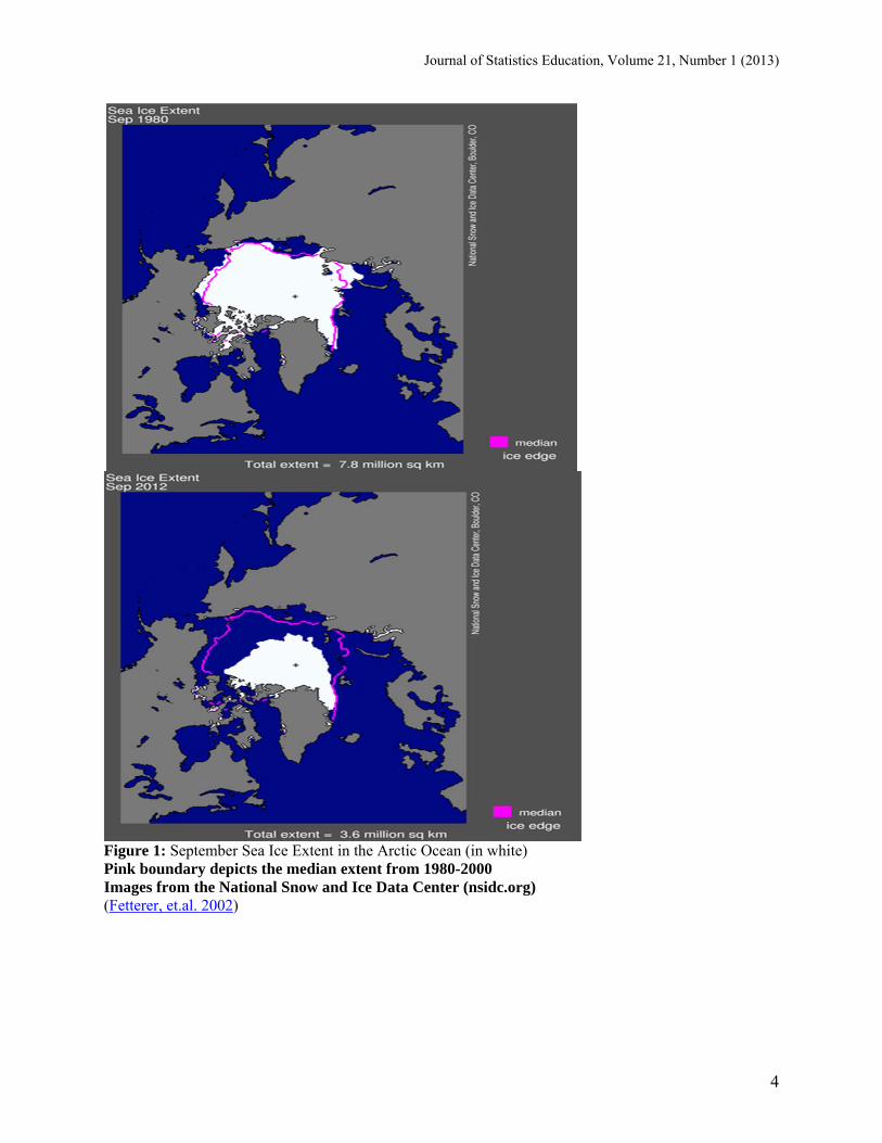
2. The Decline of Arctic Sea Ice Since the late 1980’s when climate scientists began to raise concerns that increasing levels of atmospheric CO2 would cause the earth to warm, they were very unsure about the rate of climate change. It was estimated by many climate scientists such as Flato (2004, Figure 2) that a significant portion of the Arctic Ocean would remain frozen all year round for most or all of the twenty-first century. The erosion of this consensus as described by Stroeve, Holland, Meier, Scambos, and Serreze (2007) and Hansen (2009, p. 167) began about five years ago. Using scatter plots and regression, we can analyze the data ourselves to understand why the consensus is changing. The data we will analyze is a time series of September Arctic sea ice extent from 1979 until 2012. What is September Arctic sea ice and why is it important? As far as we know, much of the Arctic Ocean has been covered in floating sea ice year round for a very long time (the North Pole is near the center of the Arctic Ocean). In A World without Ice, Henry Pollack (2010, p. 209) wrote, “The current rate of summer sea ice loss is exceeding all projections, and there is a very real possibility that in only a few decades the Arctic Ocean may be ice free in summer, for the first time” in millions of years. Rapid melting of Arctic sea ice would be important as both a symptom and a cause of a changing climate. As a symptom, rapid melting would be a proverbial “canary in the coal mine.” While melting Arctic sea ice does not raise sea level because it is already floating in the Arctic Ocean, it does send a powerful message that the climate is changing. More importantly, melting Arctic sea ice causes further climate change. The summer ice in the Arctic Ocean reflects sunlight. As the ice melts, the much darker sea water absorbs sunlight. This feedback mechanism is understood as an important driver of climate change throughout geologic history (Pollack, 2011, p. 43, p. 92). There are other possible effects of the loss of summer Arctic sea ice that are too complex to predict with any accuracy but could nevertheless be very consequential. These include changes in ocean currents and atmospheric weather patterns as well as the possibility of releasing further greenhouse gases by accelerating the melting of Arctic permafrost on land and on the East Siberian Arctic Shelf (Shakhova, et al., 2010). Since 1979, satellites have regularly measured the extent of sea ice in the Arctic Ocean (IPCC 2007 – AR4, WG1, Chap 4.4.2). Computer programs can calculate the area or extent of the ice coverage on a daily basis. These daily numbers for September are averaged to get the September sea ice extent. September is the month when the ice stops melting each summer and reaches its minimum extent. The following two images from the National Snow and Ice Data Center in Figure 1 are from September 1980 when the ice extent was 7,800,000 square kilometers and September 2012 when the ice extent was 3,600,000 square kilometers. The pink boundary depicts the median extent from 1980-2000.
Journal of Statistics Education, Volume 21, Number 1 (2013)
4
Figure 1: September Sea Ice Extent in the Arctic Ocean (in white) Pink boundary depicts the median extent from 1980-2000 Images from the National Snow and Ice Data Center (nsidc.org) (Fetterer, et.al. 2002)
Journal of Statistics Education, Volume 21, Number 1 (2013)
5
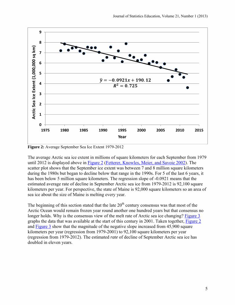
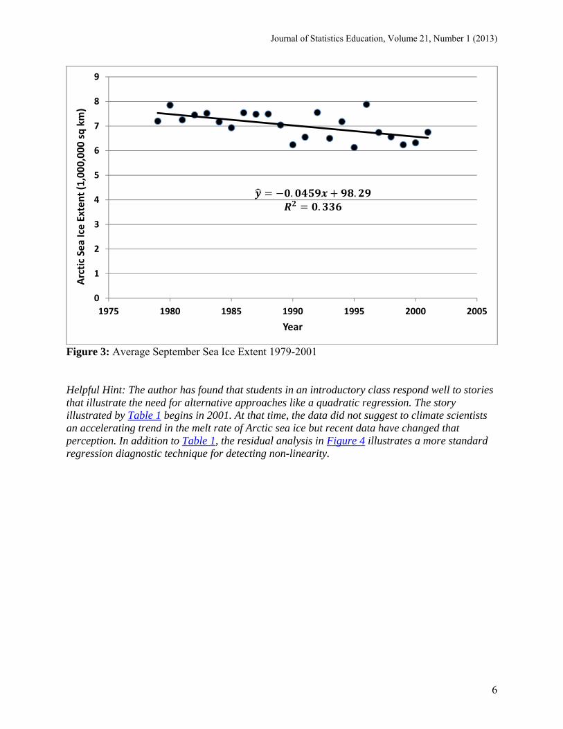
Figure 2: Average September Sea Ice Extent 1979-2012 The average Arctic sea ice extent in millions of square kilometers for each September from 1979 until 2012 is displayed above in Figure 2 (Fetterer, Knowles, Meier, and Savoie 2002). The scatter plot shows that the September ice extent was between 7 and 8 million square kilometers during the 1980s but began to decline below that range in the 1990s. For 5 of the last 6 years, it has been below 5 million square kilometers. The regression slope of -0.0921 means that the estimated average rate of decline in September Arctic sea ice from 1979-2012 is 92,100 square kilometers per year. For perspective, the state of Maine is 92,000 square kilometers so an area of sea ice about the size of Maine is melting every year. The beginning of this section stated that the late 20th century consensus was that most of the Arctic Ocean would remain frozen year round another one hundred years but that consensus no longer holds. Why is the consensus view of the melt rate of Arctic sea ice changing? Figure 3 graphs the data that was available at the start of this century in 2001. Taken together, Figure 2 and Figure 3 show that the magnitude of the negative slope increased from 45,900 square kilometers per year (regression from 1979-2001) to 92,100 square kilometers per year (regression from 1979-2012). The estimated rate of decline of September Arctic sea ice has doubled in eleven years.
0
1
2
3
4
5
6
7
8
9
1975 1980 1985 1990 1995 2000 2005 2010 2015
Arctic Sea Ice Extent (1,000,000 sq km)
Year
. ..
Journal of Statistics Education, Volume 21, Number 1 (2013)
6
Figure 3: Average September Sea Ice Extent 1979-2001 Helpful Hint: The author has found that students in an introductory class respond well to stories that illustrate the need for alternative approaches like a quadratic regression. The story illustrated by Table 1 begins in 2001. At that time, the data did not suggest to climate scientists an accelerating trend in the melt rate of Arctic sea ice but recent data have changed that perception. In addition to Table 1, the residual analysis in Figure 4 illustrates a more standard regression diagnostic technique for detecting non-linearity.
0
1
2
3
4
5
6
7
8
9
1975 1980 1985 1990 1995 2000 2005
Arctic Sea Ice Extent (1,000,000 sq km)
Year
. ..
Journal of Statistics Education, Volume 21, Number 1 (2013)
7
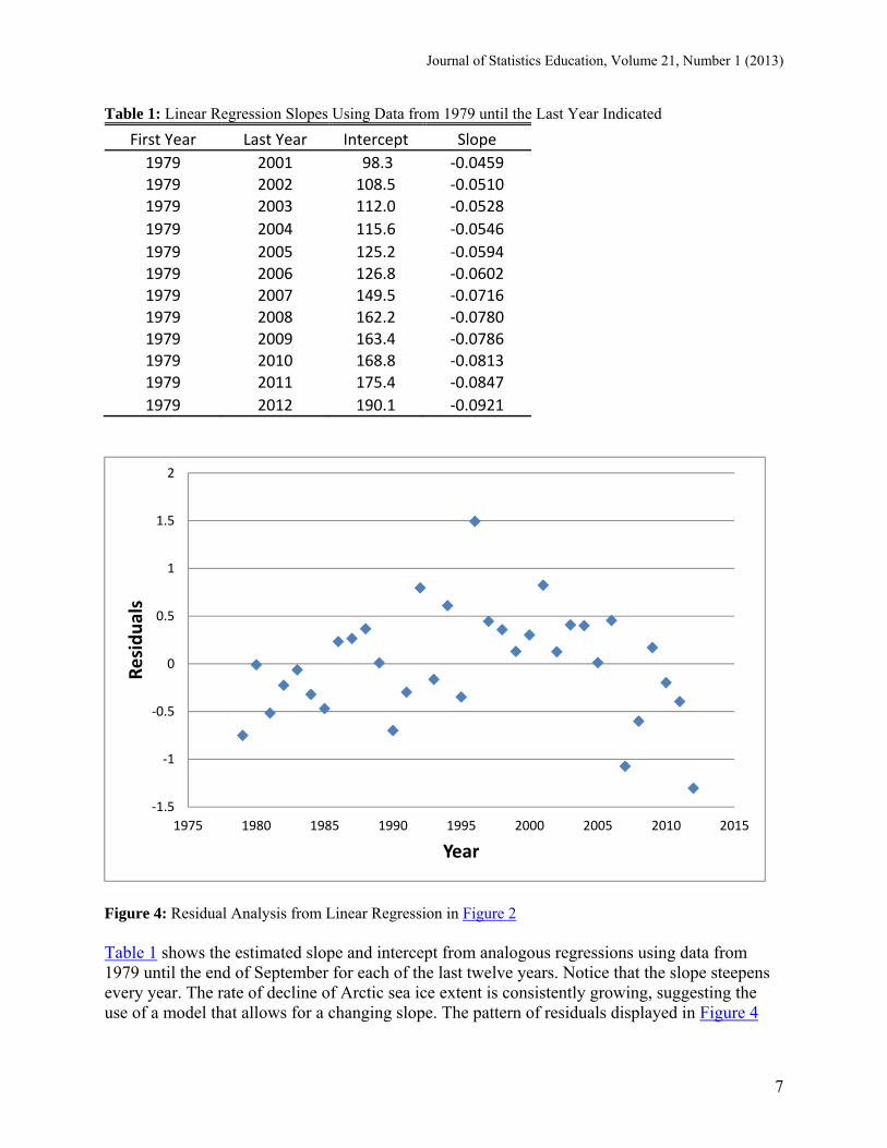
Table 1: Linear Regression Slopes Using Data from 1979 until the Last Year Indicated
First Year Last Year Intercept Slope
1979 2001 98.3 ‐0.0459 1979 2002 108.5 ‐0.0510 1979 2003 112.0 ‐0.0528
1979 2004 115.6 ‐0.0546
1979 2005 125.2 ‐0.0594 1979 2006 126.8 ‐0.0602 1979 2007 149.5 ‐0.0716 1979 2008 162.2 ‐0.0780 1979 2009 163.4 ‐0.0786 1979 2010 168.8 ‐0.0813 1979 2011 175.4 ‐0.0847
1979 2012 190.1 ‐0.0921
Figure 4: Residual Analysis from Linear Regression in Figure 2 Table 1 shows the estimated slope and intercept from analogous regressions using data from 1979 until the end of September for each of the last twelve years. Notice that the slope steepens every year. The rate of decline of Arctic sea ice extent is consistently growing, suggesting the use of a model that allows for a changing slope. The pattern of residuals displayed in Figure 4
‐1.5
‐1
‐0.5
0
0.5
1
1.5
2
1975 1980 1985 1990 1995 2000 2005 2010 2015
Residuals
Year
Journal of Statistics Education, Volume 21, Number 1 (2013)
8
reinforces that point. The residuals from the linear regression tend to be negative in early and late years, and positive in the middle years. A quadratic function of the form
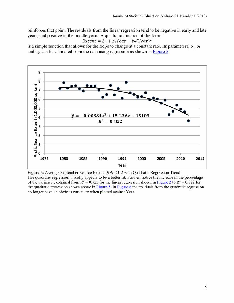
is a simple function that allows for the slope to change at a constant rate. Its parameters, b0, b1 and b2, can be estimated from the data using regression as shown in Figure 5.
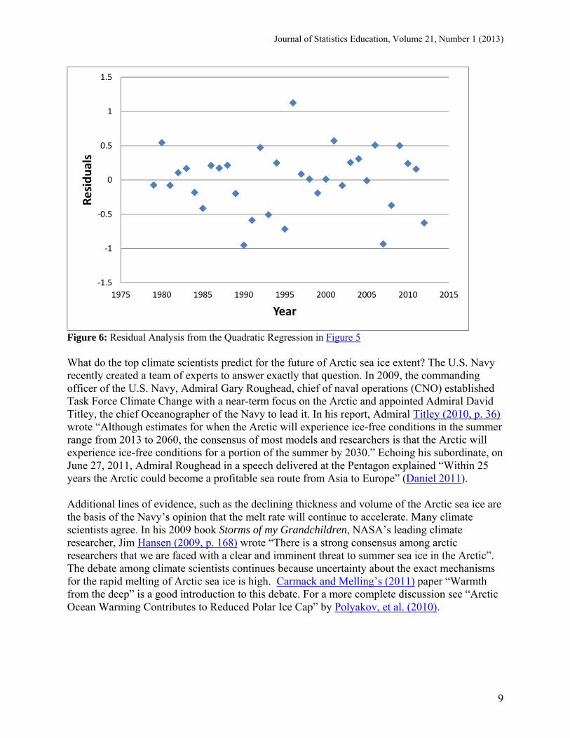
Figure 5: Average September Sea Ice Extent 1979-2012 with Quadratic Regression Trend The quadratic regression visually appears to be a better fit. Further, notice the increase in the percentage of the variance explained from R2 = 0.725 for the linear regression shown in Figure 2 to R2 = 0.822 for the quadratic regression shown above in Figure 5. In Figure 6 the residuals from the quadratic regression no longer have an obvious curvature when plotted against Year.
0
1
2
3
4
5
6
7
8
9
1975 1980 1985 1990 1995 2000 2005 2010 2015
Arctic Sea Ice Extent (1,000,000 sq km)
Year
. ..
Journal of Statistics Education, Volume 21, Number 1 (2013)
9
Figure 6: Residual Analysis from the Quadratic Regression in Figure 5 What do the top climate scientists predict for the future of Arctic sea ice extent? The U.S. Navy recently created a team of experts to answer exactly that question. In 2009, the commanding officer of the U.S. Navy, Admiral Gary Roughead, chief of naval operations (CNO) established Task Force Climate Change with a near-term focus on the Arctic and appointed Admiral David Titley, the chief Oceanographer of the Navy to lead it. In his report, Admiral Titley (2010, p. 36) wrote “Although estimates for when the Arctic will experience ice-free conditions in the summer range from 2013 to 2060, the consensus of most models and researchers is that the Arctic will experience ice-free conditions for a portion of the summer by 2030.” Echoing his subordinate, on June 27, 2011, Admiral Roughead in a speech delivered at the Pentagon explained “Within 25 years the Arctic could become a profitable sea route from Asia to Europe” (Daniel 2011). Additional lines of evidence, such as the declining thickness and volume of the Arctic sea ice are the basis of the Navy’s opinion that the melt rate will continue to accelerate. Many climate scientists agree. In his 2009 book Storms of my Grandchildren, NASA’s leading climate researcher, Jim Hansen (2009, p. 168) wrote “There is a strong consensus among arctic researchers that we are faced with a clear and imminent threat to summer sea ice in the Arctic”. The debate among climate scientists continues because uncertainty about the exact mechanisms for the rapid melting of Arctic sea ice is high. Carmack and Melling’s (2011) paper “Warmth from the deep” is a good introduction to this debate. For a more complete discussion see “Arctic Ocean Warming Contributes to Reduced Polar Ice Cap” by Polyakov, et al. (2010).
‐1.5
‐1
‐0.5
0
0.5
1
1.5
1975 1980 1985 1990 1995 2000 2005 2010 2015
Residuals
Year
Journal of Statistics Education, Volume 21, Number 1 (2013)
10
3. Temperature, Solar Intensity and CO2 The first example focused on describing the trend in a time series of Arctic sea ice extent. Although the second example depends on time series data as well, the focus switches to analysis of the relationship between three variables: global surface temperature, solar irradiance and the fraction of carbon dioxide in our atmosphere. To be clear, this simple example is not intended as proof that increasing levels of carbon dioxide are the primary cause of increasing global average temperature. The most basic purpose of this example is to encourage students to examine the variation in these three variables from 1979-2010 to see that temperature and carbon dioxide have both increased steadily while solar irradiance has oscillated between peaks and valleys in approximately eleven-year cycles. Students should be taught that observational studies combined with these simple statistical techniques can constitute some evidence for relationships between variables but will rarely, if ever, be sufficient as proof of causation. In this example, each variable is reported annually, eliminating seasonal effects. In this article, carbon dioxide alone is used instead of the Annual Greenhouse Gas Index (AGGI) published by NOAA for three reasons. First, carbon dioxide is the most important greenhouse gas by far, accounting for approximately 85% of the annual increase in the AGGI for the last decade. Other constituent gases of the AGGI include methane, nitrous oxide, and chlorofluorocarbons (CFCs). Explanation of the AGGI and its constituents are available at http://www.esrl.noaa.gov/gmd/aggi/. Second, because the carbon dioxide component of the AGGI and the overall AGGI have a 0.995 correlation over the time period in the example, replacing carbon dioxide concentration with the AGGI would yield very similar results. Third, explaining the AGGI to students would add another level of abstraction to the analysis. One goal of this example is to avoid unnecessary complexity. If, however, instructors believe their students will benefit from a more realistic example, the AGGI can be used to replace carbon dioxide concentration as an explanatory variable for temperature with very similar results to those reported in this article. Climate scientists have long predicted that increasing levels of atmospheric carbon dioxide and other greenhouse gases such as methane and nitrous oxide would increase average global temperature because of the greenhouse effect. The greenhouse effect follows from the following facts. Carbon dioxide, like other greenhouse gases, is transparent to visible light which heats the earth. The warming earth emits thermal radiation back toward space but greenhouse gases, unlike oxygen, have the property of absorbing some of that thermal radiation. The absorbed thermal radiation warms the earth and its lower atmosphere. Over one hundred years ago the Nobel prize winning chemist Svante Arrhenius (1908) wrote that “doubling of the percentage of carbon dioxide in the air would raise the temperature of the earth's surface by 4°C”. Since Arrhenius first wrote those words, the percentage of carbon dioxide in the atmosphere has increased about 40% and mean global temperature has increased by almost 1°C. In addition to increasing levels of greenhouse gases, what are other possible causes of increases in observed global mean temperature? Other possibilities include changes in ocean circulation, volcanic activity or a brighter sun. Could the variation in the intensity of sunlight alone explain most of the increase in global temperature in recent years? Scaffetta and West (2008) wrote “We estimate that the Sun could account for as much as 69% of the increase in Earth's average
Journal of Statistics Education, Volume 21, Number 1 (2013)
11
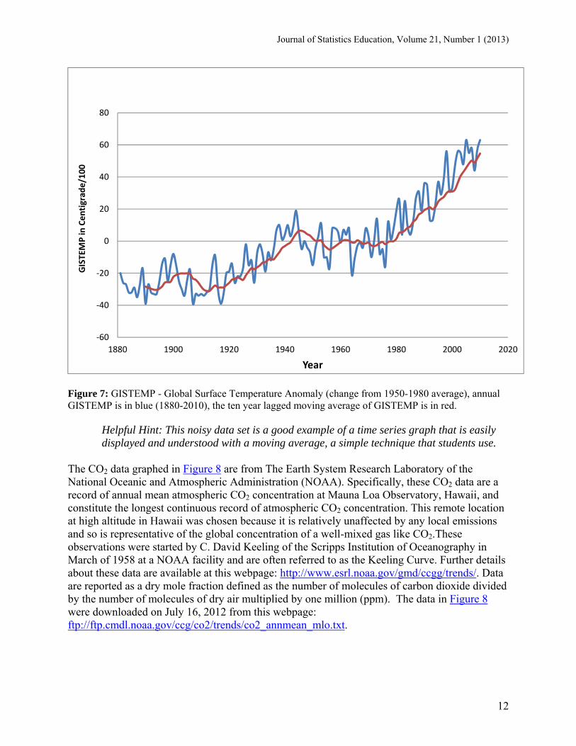
temperature”. Others disagree. Duffy, Santer and Wigley (2009) wrote a detailed rebuttal to Scaffetta and West’s (2008) paper. Which variable, CO2 or solar intensity, best explains the observed variation in global temperature? Once again, the goal in this paper is to help students examine the data themselves. Observations of the relevant variables since 1979 are readily available to address this question directly. Graphs of global surface temperature, solar intensity and atmospheric CO2 concentration follow. The graphs display the entire time series of data reported by the cited sources for each variable. With the use of proxies, such as sunspots for solar intensity, any of these three series can be extended much further back in time. Rather than trying to explain the validity of each proxy, analysis is confined to 1979-2010, the period for which reported data are available for all three variables. Standard data sources were used for each of the three variables. Background information about each variable and its source are listed with each graph. 3.1 Data for Temperature, Carbon Dioxide, and Solar Irradiance The temperature data is the Global Land-Ocean Temperature Index from the Goddard Institute of Space Studies (GISTEMP). It is reported in units of 1/100 of a degree centigrade increase above the 1950-1980 mean and is often referred to as the global surface temperature anomaly. The NASA Goddard Institute for Space Studies (GISS) is a laboratory in the NASA's Goddard Space Flight Center's Earth Sciences Division, which is part of Goddard Space Flight Center's Sciences and Exploration Directorate. For more details about the time series see the GISTEMP home page http://data.giss.nasa.gov/gistemp/. The series depicted in Figure 7 (in blue) was downloaded on July 16, 2012 from this table: http://data.giss.nasa.gov/gistemp/tabledata/GLB.Ts+dSST.txt. Also presented is the ten year lagged moving average for year T (in red), calculated by taking the mean of the ten previous years inclusive of year T, the mean of GISTEMP for years T-9, T-8, … , T-1, T.
Journal of Statistics Education, Volume 21, Number 1 (2013)
12
Figure 7: GISTEMP - Global Surface Temperature Anomaly (change from 1950-1980 average), annual GISTEMP is in blue (1880-2010), the ten year lagged moving average of GISTEMP is in red.
Helpful Hint: This noisy data set is a good example of a time series graph that is easily displayed and understood with a moving average, a simple technique that students use.
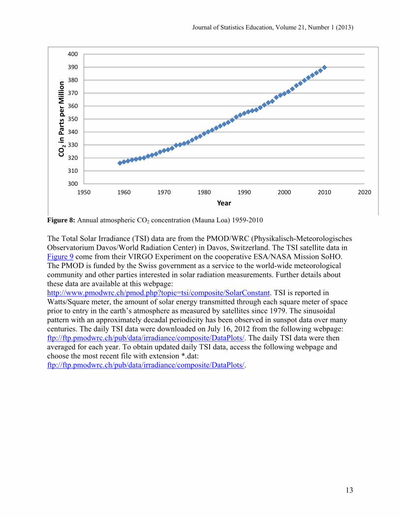
The CO2 data graphed in Figure 8 are from The Earth System Research Laboratory of the National Oceanic and Atmospheric Administration (NOAA). Specifically, these CO2 data are a record of annual mean atmospheric CO2 concentration at Mauna Loa Observatory, Hawaii, and constitute the longest continuous record of atmospheric CO2 concentration. This remote location at high altitude in Hawaii was chosen because it is relatively unaffected by any local emissions and so is representative of the global concentration of a well-mixed gas like CO2.These observations were started by C. David Keeling of the Scripps Institution of Oceanography in March of 1958 at a NOAA facility and are often referred to as the Keeling Curve. Further details about these data are available at this webpage: http://www.esrl.noaa.gov/gmd/ccgg/trends/. Data are reported as a dry mole fraction defined as the number of molecules of carbon dioxide divided by the number of molecules of dry air multiplied by one million (ppm). The data in Figure 8 were downloaded on July 16, 2012 from this webpage: ftp://ftp.cmdl.noaa.gov/ccg/co2/trends/co2_annmean_mlo.txt.
‐60
‐40
‐20
0
20
40
60
80
1880 1900 1920 1940 1960 1980 2000 2020
GISTEMP in
Centigrad
e/100
Year
Journal of Statistics Education, Volume 21, Number 1 (2013)
13
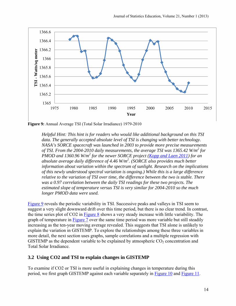
Figure 8: Annual atmospheric CO2 concentration (Mauna Loa) 1959-2010 The Total Solar Irradiance (TSI) data are from the PMOD/WRC (Physikalisch-Meteorologisches Observatorium Davos/World Radiation Center) in Davos, Switzerland. The TSI satellite data in Figure 9 come from their VIRGO Experiment on the cooperative ESA/NASA Mission SoHO. The PMOD is funded by the Swiss government as a service to the world-wide meteorological community and other parties interested in solar radiation measurements. Further details about these data are available at this webpage: http://www.pmodwrc.ch/pmod.php?topic=tsi/composite/SolarConstant. TSI is reported in Watts/Square meter, the amount of solar energy transmitted through each square meter of space prior to entry in the earth’s atmosphere as measured by satellites since 1979. The sinusoidal pattern with an approximately decadal periodicity has been observed in sunspot data over many centuries. The daily TSI data were downloaded on July 16, 2012 from the following webpage: ftp://ftp.pmodwrc.ch/pub/data/irradiance/composite/DataPlots/. The daily TSI data were then averaged for each year. To obtain updated daily TSI data, access the following webpage and choose the most recent file with extension *.dat: ftp://ftp.pmodwrc.ch/pub/data/irradiance/composite/DataPlots/.
300
310
320
330
340
350
360
370
380
390
400
1950 1960 1970 1980 1990 2000 2010 2020
CO
2in Parts per Million
Year
Journal of Statistics Education, Volume 21, Number 1 (2013)
14
Figure 9: Annual Average TSI (Total Solar Irradiance) 1979-2010
Helpful Hint: This hint is for readers who would like additional background on this TSI data. The generally accepted absolute level of TSI is changing with better technology. NASA’s SORCE spacecraft was launched in 2003 to provide more precise measurements of TSI. From the 2004-2010 daily measurements, the average TSI was 1365.42 W/m2 for PMOD and 1360.96 W/m2 for the newer SORCE project (Kopp and Laen 2011) for an absolute average daily difference of 4.46 W/m2. (SORCE also provides much better information about variation within the spectrum of sunlight. Research on the implications of this newly understood spectral variation is ongoing.) While this is a large difference relative to the variation of TSI over time, the difference between the two is stable. There was a 0.97 correlation between the daily TSI readings for these two projects. The estimated slope of temperature versus TSI is very similar for 2004-2010 so the much longer PMOD data were used.
Figure 9 reveals the periodic variability in TSI. Successive peaks and valleys in TSI seem to suggest a very slight downward drift over this time period, but there is no clear trend. In contrast, the time series plot of CO2 in Figure 8 shows a very steady increase with little variability. The graph of temperature in Figure 7 over the same time period was more variable but still steadily increasing as the ten-year moving average revealed. This suggests that TSI alone is unlikely to explain the variation in GISTEMP. To explore the relationships among these three variables in more detail, the next section uses graphs, sample correlations and a multiple regression with GISTEMP as the dependent variable to be explained by atmospheric CO2 concentration and Total Solar Irradiance. 3.2 Using CO2 and TSI to explain changes in GISTEMP To examine if CO2 or TSI is more useful in explaining changes in temperature during this period, we first graph GISTEMP against each variable separately in Figure 10 and Figure 11.
1365
1365.2
1365.4
1365.6
1365.8
1366
1366.2
1366.4
1366.6
1975 1980 1985 1990 1995 2000 2005 2010 2015
TS
I -
Wat
ts/s
q m
eter
Year
Journal of Statistics Education, Volume 21, Number 1 (2013)
15
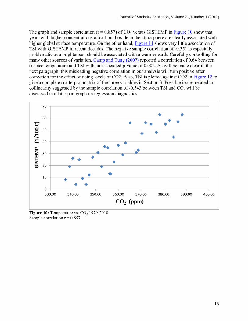
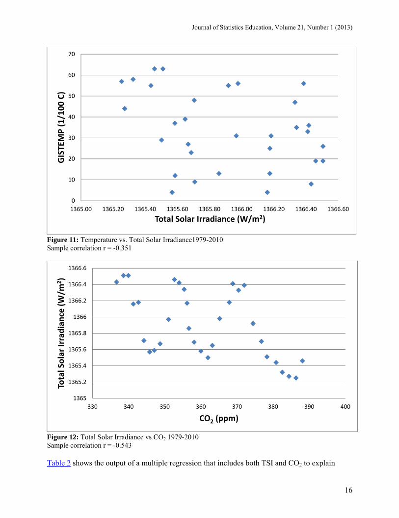
The graph and sample correlation (r = 0.857) of CO2 versus GISTEMP in Figure 10 show that years with higher concentrations of carbon dioxide in the atmosphere are clearly associated with higher global surface temperature. On the other hand, Figure 11 shows very little association of TSI with GISTEMP in recent decades. The negative sample correlation of -0.351 is especially problematic as a brighter sun should be associated with a warmer earth. Carefully controlling for many other sources of variation, Camp and Tung (2007) reported a correlation of 0.64 between surface temperature and TSI with an associated p-value of 0.002. As will be made clear in the next paragraph, this misleading negative correlation in our analysis will turn positive after correction for the effect of rising levels of CO2. Also, TSI is plotted against CO2 in Figure 12 to give a complete scatterplot matrix of the three variables in Section 3. Possible issues related to collinearity suggested by the sample correlation of -0.543 between TSI and CO2 will be discussed in a later paragraph on regression diagnostics.
Figure 10: Temperature vs. CO2 1979-2010 Sample correlation r = 0.857
0
10
20
30
40
50
60
70
330.00 340.00 350.00 360.00 370.00 380.00 390.00 400.00
GISTEMP (1/100 C)
CO2 (ppm)
Journal of Statistics Education, Volume 21, Number 1 (2013)
16
Figure 11: Temperature vs. Total Solar Irradiance1979-2010 Sample correlation r = -0.351
Figure 12: Total Solar Irradiance vs CO2 1979-2010 Sample correlation r = -0.543 Table 2 shows the output of a multiple regression that includes both TSI and CO2 to explain
0
10
20
30
40
50
60
70
1365.00 1365.20 1365.40 1365.60 1365.80 1366.00 1366.20 1366.40 1366.60
GISTEMP (1/100 C)
Total Solar Irradiance (W/m2)
1365
1365.2
1365.4
1365.6
1365.8
1366
1366.2
1366.4
1366.6
330 340 350 360 370 380 390 400
Total Solar Irradiance (W/m
2)
CO2 (ppm)
Journal of Statistics Education, Volume 21, Number 1 (2013)
17
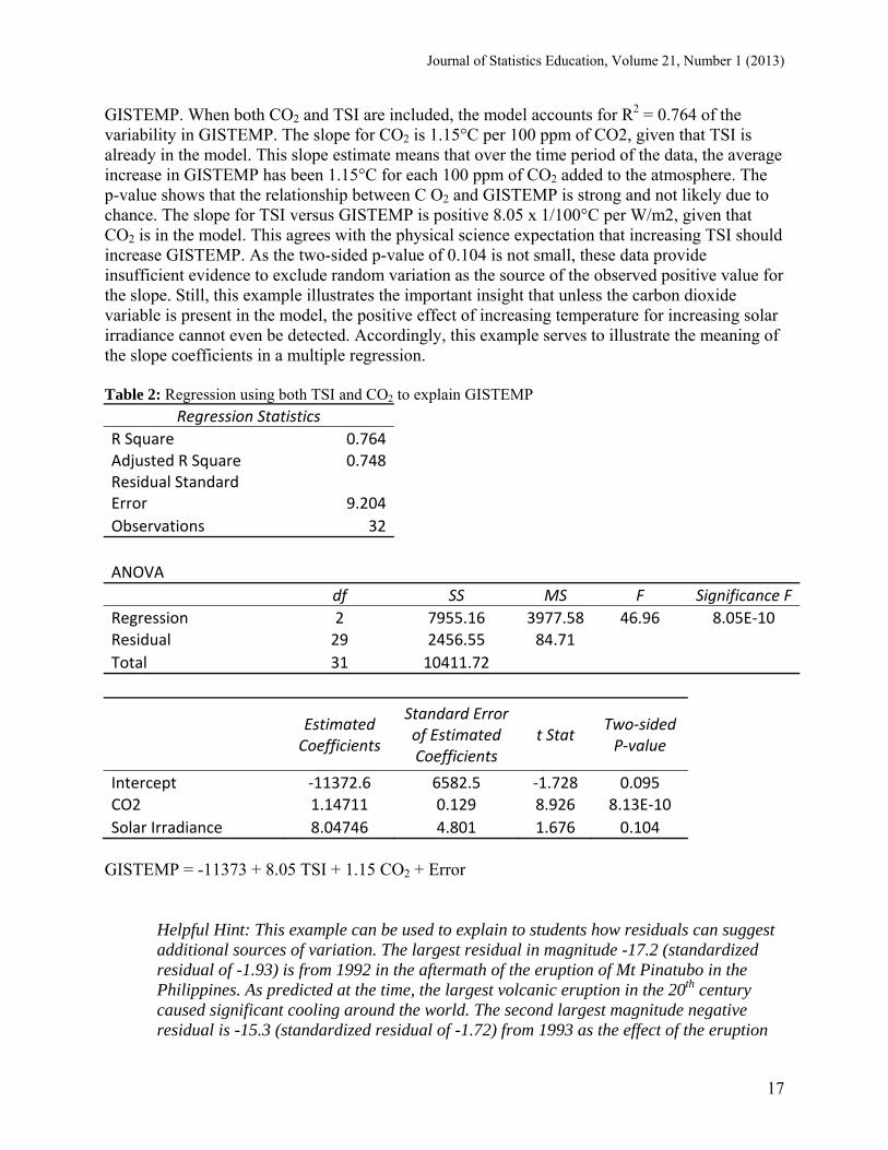
GISTEMP. When both CO2 and TSI are included, the model accounts for R2 = 0.764 of the variability in GISTEMP. The slope for CO2 is 1.15°C per 100 ppm of CO2, given that TSI is already in the model. This slope estimate means that over the time period of the data, the average increase in GISTEMP has been 1.15°C for each 100 ppm of CO2 added to the atmosphere. The p-value shows that the relationship between C O2 and GISTEMP is strong and not likely due to chance. The slope for TSI versus GISTEMP is positive 8.05 x 1/100°C per W/m2, given that CO2 is in the model. This agrees with the physical science expectation that increasing TSI should increase GISTEMP. As the two-sided p-value of 0.104 is not small, these data provide insufficient evidence to exclude random variation as the source of the observed positive value for the slope. Still, this example illustrates the important insight that unless the carbon dioxide variable is present in the model, the positive effect of increasing temperature for increasing solar irradiance cannot even be detected. Accordingly, this example serves to illustrate the meaning of the slope coefficients in a multiple regression. Table 2: Regression using both TSI and CO2 to explain GISTEMP
Regression Statistics
R Square 0.764Adjusted R Square 0.748Residual Standard Error 9.204
Observations 32
ANOVA
df SS MS F Significance F
Regression 2 7955.16 3977.58 46.96 8.05E‐10 Residual 29 2456.55 84.71
Total 31 10411.72
Estimated Coefficients
Standard Error of Estimated Coefficients
t Stat Two‐sided P‐value
Intercept ‐11372.6 6582.5 ‐1.728 0.095 CO2 1.14711 0.129 8.926 8.13E‐10
Solar Irradiance 8.04746 4.801 1.676 0.104
GISTEMP = -11373 + 8.05 TSI + 1.15 CO2 + Error
Helpful Hint: This example can be used to explain to students how residuals can suggest additional sources of variation. The largest residual in magnitude -17.2 (standardized residual of -1.93) is from 1992 in the aftermath of the eruption of Mt Pinatubo in the Philippines. As predicted at the time, the largest volcanic eruption in the 20th century caused significant cooling around the world. The second largest magnitude negative residual is -15.3 (standardized residual of -1.72) from 1993 as the effect of the eruption
Journal of Statistics Education, Volume 21, Number 1 (2013)
18
persisted. This suggests that the addition of a variable that measures the impact of volcanic eruptions on the atmosphere might improve the performance of this multiple regression. For more detail, see the Alternative Application below.
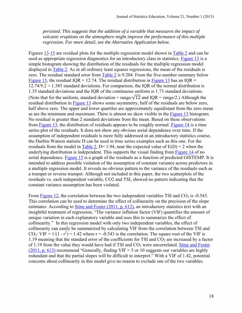
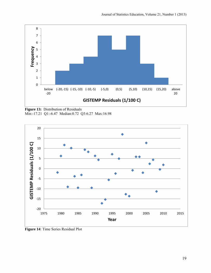
Figures 13-15 are residual plots for the multiple regression model shown in Table 2 and can be used as appropriate regression diagnostics for an introductory class in statistics. Figure 13 is a simple histogram showing the distribution of the residuals for the multiple regression model displayed in Table 2. As in all ordinary least squares regressions, the mean of the residuals is zero. The residual standard error from Table 2 is 9.204. From the five-number summary below Figure 13, the residual IQR = 12.74. The residual distribution in Figure 13 has an IQR = 12.74/9.2 = 1.385 standard deviations. For comparison, the IQR of the normal distribution is 1.35 standard deviations and the IQR of the continuous uniform is 1.73 standard deviations. (Note that for the uniform, standard deviation = range/√12 and IQR = range/2.) Although the residual distribution in Figure 13 shows some asymmetry, half of the residuals are below zero, half above zero. The upper and lower quartiles are approximately equidistant from the zero mean as are the minimum and maximum. There is almost no skew visible in the Figure 13 histogram. No residual is greater than 2 standard deviations from the mean. Based on these observations from Figure 13, the distribution of residuals appears to be roughly normal. Figure 14 is a time series plot of the residuals. It does not show any obvious serial dependence over time. If the assumption of independent residuals is more fully addressed in an introductory statistics course, the Durbin-Watson statistic D can be used in time series examples such as this one. For the residuals from the model in Table 2, D= 1.94, near the expected value of E(D) = 2 when the underlying distribution is independent. This supports the visual finding from Figure 14 of no serial dependence. Figure 15 is a graph of the residuals as a function of predicted GISTEMP. It is intended to address possible violation of the assumption of constant variance across predictors in a multiple regression model. It reveals no obvious pattern to the variance of the residuals such as a trumpet or reverse trumpet. Although not included in this paper, the two scatterplots of the residuals vs. each independent variable, CO2 and TSI, showed no pattern indicating that the constant variance assumption has been violated. From Figure 12, the correlation between the two independent variables TSI and CO2 is -0.543. This correlation can be used to determine the effect of collinearity on the precision of the slope estimates. According to Stine and Foster (2011, p. 612), an introductory statistics text with an insightful treatment of regression, “The variance inflation factor (VIF) quantifies the amount of unique variation in each explanatory variable and uses this to summarize the effect of collinearity.” In this regression model with only two independent variables, the effect of collinearity can easily be summarized by calculating VIF from the correlation between TSI and CO2: VIF = 1/(1 - r2) = 1.42 where r = -0.543 is the correlation. The square root of the VIF is 1.19 meaning that the standard error of the coefficients for TSI and CO2 are increased by a factor of 1.19 from the value they would have had if TSI and CO2 were uncorrelated. Stine and Foster (2011, p. 613) recommend “Generally, finding VIF > 5 or 10 suggests our variables are highly redundant and that the partial slopes will be difficult to interpret.” With a VIF of 1.42, potential concerns about collinearity in this model give no reason to exclude one of the two variables.
Journal of Statistics Education, Volume 21, Number 1 (2013)
19
Figure 13: Distribution of Residuals Min:-17.21 Q1:-6.47 Median:0.72 Q3:6.27 Max:16.98
Figure 14: Time Series Residual Plot
0
1
2
3
4
5
6
7
8
below‐20
(‐20,‐15) (‐15,‐10) (‐10,‐5) (‐5,0) (0,5) (5,10) (10,15) (15,20) above20
Frequency
GISTEMP Residuals (1/100 C)
‐20
‐15
‐10
‐5
0
5
10
15
20
1975 1980 1985 1990 1995 2000 2005 2010 2015
GISTEMP Residuals (1/100 C)
Year
Journal of Statistics Education, Volume 21, Number 1 (2013)
20
Figure 15: Scatterplot of Residuals vs. Predicted GISTEMP
Alternative Application: For more advanced classes, include two additional explanatory variables for the impact of volcanic activity on the atmosphere and the impact of the El Nino/La Nina phenomenon (El Nino Southern Oscillation or ENSO Index). For the same time period 1979-2010, including these two explanatory variables with TSI and CO2 decreases the two-tailed p-value for TSI to 0.0325 and increases R2 to 0.845. Both new variables have p-values below 0.01. This four variable model has remarkable explanatory power for such a complex system as the one that determines global surface temperature. Find the explanation of the volcanic activity variable on this link:http://www.esrl.noaa.gov/gmd/grad/mloapt.html. Find the data of the volcanic activity variable on this link: http://www.esrl.noaa.gov/gmd/webdata/grad/mloapt/mlo_transmission.html. Find the explanation and data for the ENSO index on this link: http://www.cpc.ncep.noaa.gov/products/analysis_monitoring/ensostuff/ensoyears.shtml . The ENSO index operates on climate with approximately a three month lag. The p-values and R2 reported here were based on lagging the ENSO Index three months.
4. Additional Sources of Data and other Teaching Material This paper has used two detailed examples to illustrate how data from climate science can be an effective teaching tool for introductory statistics classes. Data sources cited included National Oceanic and Atmospheric Administration, Goddard Institute of Space Studies, World Radiation Center and National Snow and Ice Data Center. A wealth of additional well-documented climate data is readily available. An excellent catalogue of data sources can be found at the RealClimate.org website: http://www.realclimate.org/index.php/data-sources/. NASA’s Global
‐20
‐15
‐10
‐5
0
5
10
15
20
0 10 20 30 40 50 60 70
GISTEMP Residuals (1/100 C)
Predicted GISTEMP (1/100 C)
Journal of Statistics Education, Volume 21, Number 1 (2013)
21
Change Master Directory is available at http://gcmd.gsfc.nasa.gov/. NOAA’s National Climate Data Center maintains an extensive data directory available at http://www.ncdc.noaa.gov/oa/ncdc.html. Yet another good climate data source is the Data Guide maintained by the National Center for Atmospheric Research Climate at https://climatedataguide.ucar.edu/. In addition to data, some research papers in climate science geared to a wider audience are almost ready-made for use in introductory statistics. For instance, see the recent publication Hansen, Sato, and Ruedy (2012) at NASA. Hansen and his colleagues use graphs to show how the distribution of temperature extremes around the world has evolved over the last few decades. With graphs and summary statistics, they carefully explain that both the average and the variability of global temperature have increased. Here is a quote from the Author Summary of Hansen, Sato and Ruedy (2012). “We illustrate variability of seasonal temperature in units of standard deviation (σ), including comparison with the normal distribution (“bell curve”) that the lay public may appreciate. The probability distribution (frequency of occurrence) of local summer-mean temperature anomalies was close to the normal distribution in the 1950s, 1960s, and 1970s in both hemispheres. However, in each subsequent decade the distribution shifted toward more positive anomalies, with the positive tail (hot outliers) of the distribution shifting the most.” This paper illustrates well how teachers of introductory statistics can choose from many interesting examples as climate scientists strive to make their work more accessible. 5. Conclusion Weather is the temperature, precipitation, atmospheric pressure and wind speed at one location on the earth at one point in time. Climate is the distribution of these variables for an entire region across time. While students can understand weather with no knowledge of statistics, climate is inherently a statistical concept. Because climate change is a topic of interest for many students today, teachers of introductory statistics can use the wealth of available climate data to motivate students to see that statistics can help them better understand their world. This paper presents two examples of data sets from climate science that can be understood by students in an introductory statistics course. The first shows how the trend in Arctic sea ice data can be well-represented with a quadratic regression. This example has been used successfully by the author in introductory statistics for undergraduate business majors and MBAs for the past three years. The second example shows that solar irradiance alone does not explain global surface temperature change over the last three decades but the increasing atmospheric concentration of CO2 does explain three-fourths of the variability in temperature. The second example also shows that the sign of slope of temperature versus solar irradiance agrees with the known physical relationship between the two variables only when atmospheric CO2 concentration is also included in the model. This example is a little more advanced but has been well-received in MBA level statistics classes. For undergraduates, it can be used omitting the multiple regression with both explanatory variables. Of course this paper only brushes the surface using a few climate data sets. Other climate data sources were listed so that statistics teachers can construct other such examples.
Journal of Statistics Education, Volume 21, Number 1 (2013)
22
Appendix: Data
Sea Ice Since 1979, satellites have continuously measured the extent of sea ice in the Arctic Ocean. Daily numbers are averaged to get the monthly sea ice extent for each month. This Sea Ice Data includes 34 observations with 2 variables. Data abstract: http://www.amstat.org/publications/jse/v21n1/witt/sea_ice_data_info.txt Data, available as a tab delimited text file: http://www.amstat.org/publications/jse/v21n1/witt/sea_ice_data.txt CO2 This data series from 1979-2010 includes the annual global mean surface temperature (Temp) and two possible explanatory variables: annual mean intensity of sunlight incoming to the earth's atmosphere (Solar Irradiance) and the annual average fraction of CO2 contained in the earth's atmosphere (CO2). This CO2 Data includes 32 observations with 4 variables. Data abstract: http://www.amstat.org/publications/jse/v21n1/witt/temp_co2_data_info.txt Data, available as a tab delimited text file: http://www.amstat.org/publications/jse/v21n1/witt/temp_co2_data.txt References Arrhenius, S. (1908), Worlds in the Making, English translation, New York, NY: Harper and Brothers. ACUPCC (2007), American College & University Presidents Climate Commitment, (established 2007). Available at http://www.presidentsclimatecommitment.org/index.php Camp, C. and Tung, K. (2007), “Surface Warming by the Solar Cycle as Revealed by the Composite Mean Difference Projection,” Geophysical Research Letters 24, July 18, 2007: L14703. Carmack, E., and Melling, H. (2011), “Warmth from the deep,” Nature Geosciences, 4. Available at www.nature.com/naturegeoscience Daniel, L. (2011), “Defense Department, Services Monitor Arctic Melting”, American Forces Press Service (June 27, 2011). Available at http://www.defense.gov/news/newsarticle.aspx?id=64474
Journal of Statistics Education, Volume 21, Number 1 (2013)
23
Duffy, P., Santer, B. and Wigley, T. (2009), “Solar variability does not explain late-20th-century warming,” Physics Today, 62, 48-49. Fetterer, F., K. Knowles, Meier, W., and Savoie, M. (2002, updated 2009). Sea Ice Index. Boulder, Colorado USA: National Snow and Ice Data Center. Available at http://nsidc.org/ Flato, G.M., and Participating CMIP Modeling Groups, (2004), “Sea-ice and its response to CO2 forcing as simulated by global climate change studies,” Climate Dynamics, 23, 220–241. Hansen, J. (2009), Storms of my Grandchildren, New York, NY: Bloomsbury USA. Hansen, J., M. Sato, and R. Ruedy, (2012), “Perception of Climate Change,” Proc. Natl. Acad. Sci., 109, 14726-14727, E2415-E2423, doi:10.1073/pnas.1205276109. Intergovernmental Panel on Climate Change, Fourth Assessment Report, (2007), Working Group 1. Available at http://www.ipcc.ch/publications_and_data/ar4/wg1/en/contents.html Kopp, G. and Laen, J. L. (2011), “A New, Lower Value of Total Solar Irradiance: Evidence and Climate Significance,”Geophysical Research Letters 38, article no. L01706. Pollack, H. (2010), A World Without Ice, New York, NY: Penguin Press. Polyakov, I., Timokhovl, L., Alexeev, V., Bacon, S., Dmitrenko, I., Fortier, L., Frolov,I., Gascard, J., Hansen, E., Ivanov, V., Laxon, S., Mauritzen, C., Perovich, D., Shimada, K., Simmons, H., Sokolov, V., Steele, and M., Toole, J., (2010), “Arctic Ocean Warming Contributes to Reduced Polar Ice Cap,” Journal of Physical Oceanography, December 2010, doi:10.1175/2010JPO4339.1. Scafetta, N., and West, B. (2008), “Is climate sensitive to solar variability?,” Physics Today, 61 (3), 50. Shakhova, N., Semiletov, I, Salyuk, A., Yusupov, V., Kosmach, D., and Gustafsson, O. (2010), “Extensive Methane Venting to the Atmosphere from Sediments of the East Siberian Arctic Shelf,” Science, 327(5970), 1246-1250, DOI: 10.1126/science.1182221. Stine, R. and Foster, D. (2011), Statistics for Business, Boston, MA: Addison-Wesley. Stroeve, J., Holland, M., Meier, W., Scambos, T., and Serreze, M. (2007), “Arctic sea Ice Decline: Faster than Forecast,” Geophysical Research Letters 34: article no. L09501. Titley, D, and St. John, C. (2010), “Arctic Security Considerations and the U.S. Navy’s Roadmap for the Arctic,” Naval War College Review, 63(2). Available at http://www.usnwc.edu/getattachment/e0734d9a-386e-4a2c-ba9d-86e7b290c57f/Arctic-Security-Considerations-and-the-U-S--navy-s
Journal of Statistics Education, Volume 21, Number 1 (2013)
24
Dr. Gary Witt (215) 204-8160 Fox School of Business, Temple University Speakman Hall, Rm 334 Philadelphia, PA 19122 Email: [email protected]
Volume 21 (2013) | Archive | Index | Data Archive | Resources | Editorial Board | Guidelines for Authors | Guidelines for Data Contributors | Guidelines for Readers/Data Users | Home Page |
Contact JSE | ASA Publications