Embed Size (px)
Citation preview
Table of Contents − Editor
TILCON Graphics Editor − The Basics
To start the TILCON Graphics Editor
Components of the Graphics Editor
Speedbar Overview
Redraw Option
Toolbox Overview
Using the TILCON Graphics Editor
Managing Files
Window Type
Window Attributes
Opening an Existing File
Save and Save As
Renaming or Overwriting a File
Import a File
Save Language
Manipulating Objects
Saving Objects
Re−sizing and Moving an Object
To Front/To Back
Cut, Copy and Paste
Duplicate
Delete
Undo/Redo
Grouping Objects
1
Common Options in the TILCON Graphics Editor
Anchor − Rotation
Blinking
Calculation
Color
Uniform Colors for Fill and Lines
Fountain Fill Color
Cursor Type
Curve Option
Grid Set Up
Help Bubbles
ID
Initial State
Justify
Layout and Look
Line Styles
Nudge Tools
Objects Browser
Pattern
Popup menu
Screen Units
Sizing − Depth/Placement/Sizing Options
Sort Option
Tab/Field Numbers
Testing Feature
2
Text Shadow
Text Wrap Mode
Undo Levels
Callback, Notify, Link and Trigger
Callback
For a button and/or check box
For a editable text, and/or multi−line text
For Label text
For a menu, and/or radio button item
For a Combo box, List box, Tree object,
Color Combo Box or Color List Box
For a Radio Button
For a drawing Object ID, or Chart
For a Directory Box
For a Image or LCD object
For a Slider or Number box
For a Popup menu
Notify
Link
Object type
To link object 1 to object 2
To Link an Animation Object
Trigger
Actions that can be triggered
Setting up a trigger
3

The Toolbox
Text
Fonts
Modifying Fonts
International character set support
Common forms accessed from the text forms
Blink
Callback
Trigger
Linking
Popup Menu
Editable text
To add (single−line) editable text
Mask
Format
Add (multiline) editable text
Message Text
To add Message text
Mask
Format
Label Text
To add Label text
Draw
4
Draw Speedbar Icons
Editing a Drawing
Polygon Option
Bezier Curve
Circle/Ellipse
Arrowheads
Common Options for All Drawing Shapes
Outline
Outline Behind
Color
To Front/To Back
Grouping
Size/Placement
Rotate
Patterns and Lines
Fill Patterns
Line Styles
Object ID
Image standards used
Scalable Windows
Window Attributes
The Workspace
Symbol Creation
To create a symbol
Symbol Tools
5

Saving Symbols
6
The Toolbox
Adding Objects to Your Work Window
Editing an Existing Object
Fine−tuning an Object's Appearance
Animation
Animation Area
To find an animation area for editing
Animation Object
Rotate Animation Object (.tsy & .cgm)
Button
To add a button to your window
To select On/Off button options
To add a button image
Charts
To create a new chart
To select a type of chart
Data selection
Scale options
To create Error Limits
For Area, Bar and Stacked bar charts
Scrolling Options
Pie Chart selections
Checkbox
To add a Checkbox to your window
To add an image to the Checkbox
Clock (Date and Time)
7
To add a clock
Color Combobox
To add a color Combobox
Color Listbox
To add a color listbox
Color State Object
To add a color state object
Combobox
To add a Combobox
Directory box
To add a Directory box
Draw Tools
Fill Meter
To add a Fill meter
Meter Rotate Options
Meter Depth/Placement/Sizing Options
HTML File Display
To add a HTML File Display
Listbox
To add a Listbox to your window
Menu
Menu item behavior
To add the main menubar
To add a sub−menu
Menu Form in QNX Photon microGUI
Multi−State Objects
8

To add multi−state objects
Needle Meter Body and Needle Options
To add a Needle meter body to your window
Meter Rotate Options
Meter Depth/Placement/Sizing Options
Needle Options
Number box
Panel
To add a Panel
Radio Button
To add a radio button to your window
To add an image to your item
Raw Image Object
To add a Raw Image to your window
Scale
To add a Scale
Scroll Area
To add a scroll area
Selector (Find) Tool
Slider
To add a slider
Size/Depth/Placement form
Spectrograph
To add a spectrograph
Tabbed Notebook
To add a Tabbed notebook
9
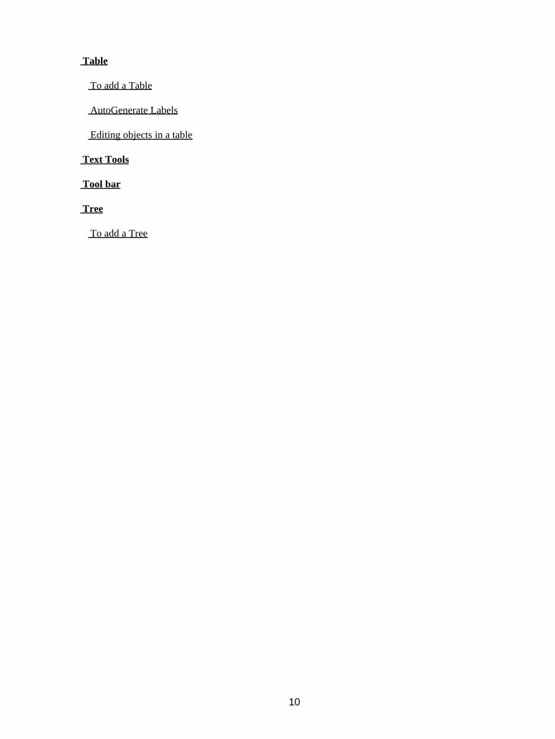
Table
To add a Table
AutoGenerate Labels
Editing objects in a table
Text Tools
Tool bar
Tree
To add a Tree
10
3 TILCON Graphics Editor
The TILCON Real−Time Developer consists of the TILCON Graphics Editor, TILCON API Library and theTILCON Run−Time. The system offers all the features and functions you need to build your real−timeapplication. The Developer is versatile, easy−to−learn and fun to use.
The Graphics Editor is a powerful tool that provides a comprehensive set of windowing and drawing functionsto build the user interfaces for an application.
The Graphics Editor treats everything as an object. All objects have interactions, can be linked to each other,trigger other objects and have their own specific data set, data type and location. The Graphics Editor allowsfor the definition of Run−Time parameters for GUI/MMI objects as they are built in a window. Parameterscan be set such as 'Notify', 'Callback', 'Trigger' and 'Link' to be functional for specific objects during theRun−Time of the application. The Run−Time will interpret these events when they occur and act accordingly.This built−in functionality significantly reduces code requirements for the application. It also reduces the timeneeded to develop a prototype of the application.
The color, format, layout and similar changes to windows and their objects can be made without affecting theapplication.
The Graphics Editor is easy to use and requires minimal programming experience for the creation of userinterfaces.
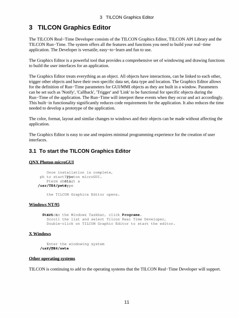
3.1 To start the TILCON Graphics Editor
QNX Photon microGUI
Once installation is complete, Type ph to start Photon microGUI. Start a Pterm shell. Type/usr/TE4/pwte;
the TILCON Graphics Editor opens.
Windows NT/95
Click Start on the Windows Taskbar, click Programs. Scroll the list and select Tilcon Real Time Developer, Double−click on TILCON Graphic Editor to start the editor.
X Windows
Enter the windowing system Type /usr/TE4/xwte
Other operating systems
TILCON is continuing to add to the operating systems that the TILCON Real−Time Developer will support.
3 TILCON Graphics Editor
11

3.2 Components of the Graphics Editor
The TILCON Graphics Editor is used to create or format the windows for your GUI/MMI real−timeapplication. It presents four distinctive parts: the Main menu bar, the Speedbar, the Toolbox and the Workspace.
Main Menu Bar Overview
The Main menu bar displays the seven main command menus of the TILCON Graphics Editor. Each menuoffers a choice of options.
File:
3 TILCON Graphics Editor
12

You can create, import, open, change and save any TILCON Graphics Editor file using the File menu. Itoffers all the commands for the management of your files. A window becomes a file when you save it andgive it a name. In addition, the File menu enables you to add and retrieve objects from the library; to run andstop tests of your application; to configure your system and to exit the TILCON Graphics Editor.
CommandSub−menuKeyboard shortcut New Ctrl+N Open Ctrl+O Save Ctrl+S Save As Save All Save Language Import Ctrl+P Add Object to Library Ctrl+T Retrieve Object from Library Ctrl+A Run Test Ctrl+R Exit
Edit:
You can make editorial changes to any TILCON Graphics Editor window quickly and easily with the Editmenu. Such editorial commands include cut, copy and paste and the grouping of objects in your window.
3 TILCON Graphics Editor
13
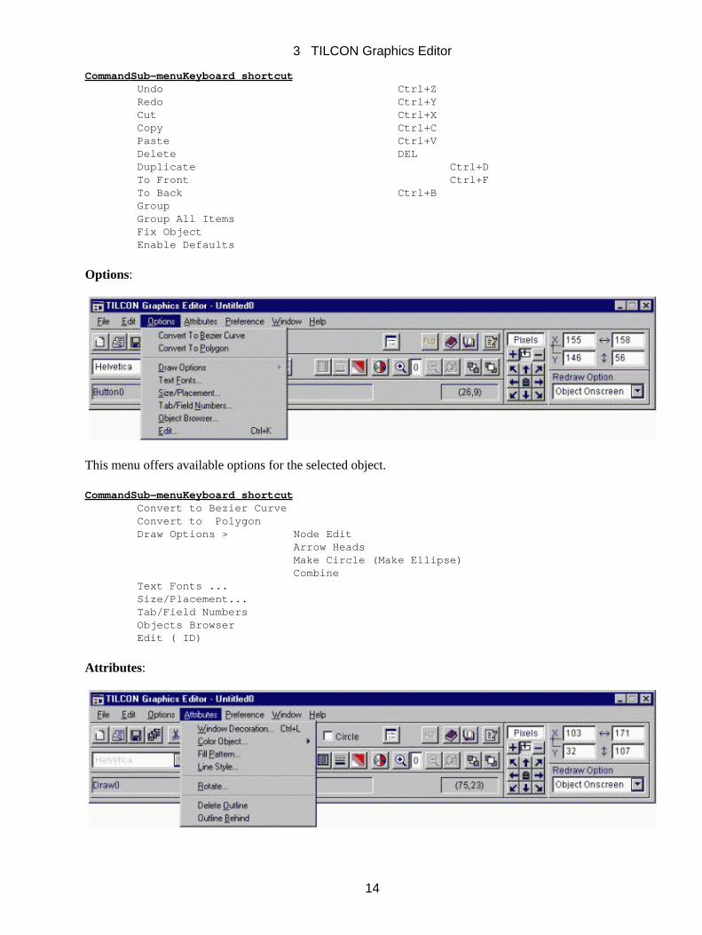
CommandSub−menuKeyboard shortcut Undo Ctrl+Z Redo Ctrl+Y Cut Ctrl+X Copy Ctrl+C Paste Ctrl+V Delete DEL Duplicate Ctrl+D To Front Ctrl+F To Back Ctrl+B Group Group All Items Fix Object Enable Defaults
Options:
This menu offers available options for the selected object.
CommandSub−menuKeyboard shortcut Convert to Bezier Curve Convert to Polygon Draw Options > Node Edit Arrow Heads Make Circle (Make Ellipse) Combine Text Fonts ... Size/Placement... Tab/Field Numbers Objects Browser Edit ( ID)
Attributes:
3 TILCON Graphics Editor
14
Using this menu, you can define the attributes of your window as well as add color, pattern and a variety ofeffects to the objects within your window.
CommandSub−menuKeyboard shortcut Window Decoration Ctrl+L Color Object > Uniform (Fill/Line) Color Fountain (Fill) color Fill Pattern Line Style
Rotate Delete Outline Outline Behind
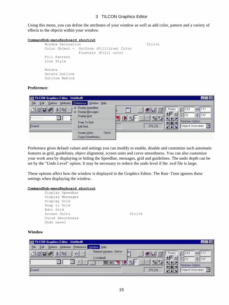
Preference:
Preference gives default values and settings you can modify to enable, disable and customize such automaticfeatures as grid, guidelines, object alignment, screen units and curve smoothness. You can also customizeyour work area by displaying or hiding the Speedbar, messages, grid and guidelines. The undo depth can beset by the "Undo Level" option. It may be necessary to reduce the undo level if the .twd file is large.
These options affect how the window is displayed in the Graphics Editor. The Run−Time ignores thesesettings when displaying the window.
CommandSub−menuKeyboard shortcut Display Speedbar Display Messages Display Grid Snap to Grid Edit Grid Screen Units Ctrl+U Curve Smoothness Undo Level
Window
3 TILCON Graphics Editor
15

The Window menu enables the screen to be refreshed. In version four the option of multiple windows beingopen is available. A list of all open windows is here for easy access during editing.
Help
On−Line help is available for you the user. The help feature includes API functions and their documentation,as well as the Tutorials in their entirety. In addition there is a Graphics Editor help function, which answersquestions concerning the TILCON Graphics Editor.
3.3 Speedbar Overview
The Speedbar gives you quick access to frequently used commands in the Main menu bar. It is a conveniencethat helps you perform common tasks quickly. Simply click the button in the Speedbar once to carry out theaction represented by that button.
To hide/display the Speedbar
Click Preference in the Main menu bar.• Click in Display Speedbar button in the pull−down menu to enable this feature.• Click out Display Speedbar button to hide the Speedbar.•
Note:The Speedbar’s appearance will change as each different object in a window is selected. This is designed toeliminate clutter on the Speedbar and make available options for each object more apparent. For example, ifDraw Tools is selected, the available icons (options) for the draw functions will appear on the Speedbar. Thesame is true for the Chart option and for many GUI/MMI objects in the Toolbar. The different icons (options)available for each object will be illustrated within the explanation on the use of that object.
Status Bar
3 TILCON Graphics Editor
16
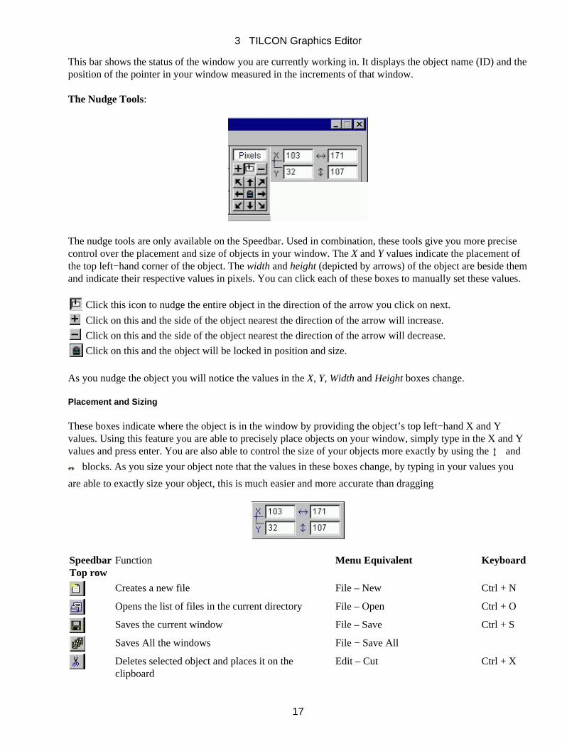
This bar shows the status of the window you are currently working in. It displays the object name (ID) and theposition of the pointer in your window measured in the increments of that window.
The Nudge Tools:
The nudge tools are only available on the Speedbar. Used in combination, these tools give you more precisecontrol over the placement and size of objects in your window. The X and Y values indicate the placement ofthe top left−hand corner of the object. The width and height (depicted by arrows) of the object are beside themand indicate their respective values in pixels. You can click each of these boxes to manually set these values.
Click this icon to nudge the entire object in the direction of the arrow you click on next.
Click on this and the side of the object nearest the direction of the arrow will increase.
Click on this and the side of the object nearest the direction of the arrow will decrease.
Click on this and the object will be locked in position and size.
As you nudge the object you will notice the values in the X, Y, Width and Height boxes change.
Placement and Sizing
These boxes indicate where the object is in the window by providing the object’s top left−hand X and Yvalues. Using this feature you are able to precisely place objects on your window, simply type in the X and Yvalues and press enter. You are also able to control the size of your objects more exactly by using the and
blocks. As you size your object note that the values in these boxes change, by typing in your values you
are able to exactly size your object, this is much easier and more accurate than dragging
SpeedbarTop row
Function Menu Equivalent Keyboard
Creates a new file File – New Ctrl + N
Opens the list of files in the current directory File – Open Ctrl + O
Saves the current window File – Save Ctrl + S
Saves All the windows File − Save All
Deletes selected object and places it on theclipboard
Edit – Cut Ctrl + X
3 TILCON Graphics Editor
17
Places a copy of the selected object on the clipboardEdit – Copy Ctrl + C
Pastes what is on the clipboard onto the screen Edit –Paste Ctrl + V
Object browser Object Browser
Tab/Field Numbers Options −Tab/Field Numbers
Selects object from object library File − Retrieve object fromlibrary
Ctrl + T
Stores object in object library File − Add object to library Ctrl + A
Run test File − Run Test Ctrl + R
SpeedbarBottom Row
Function Menu Equivalent Keyboard
Allows font and font size selection Options − TextOptions
Provides bold type face Options − TextOptions
Italicizes the text Options − TextOptions
Group selected objects Edit − Group
Fills selected object with a choice of pattern Attributes − FillPattern
Offers line type and thickness selection Attributes − Line Style
Opens Fountain Fill Color Attributes − ColorobjectFountain (Fill) Color
Opens the Uniform (fill/line) color menu Attributes − ColorobjectUniform (Fill/Line)Color
Brings selected object to the front of all other objectson the screen
Edit − To Front
Places the selected object behind others on the screenEdit − To Back
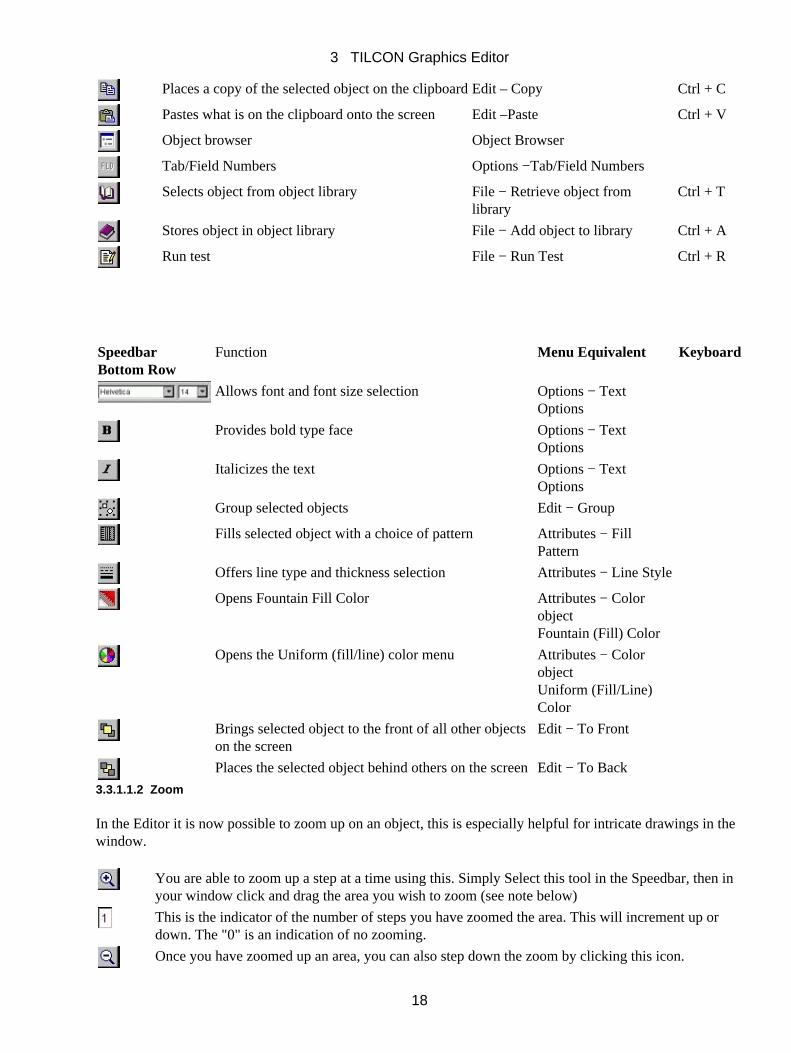
3.3.1.1.2 Zoom
In the Editor it is now possible to zoom up on an object, this is especially helpful for intricate drawings in thewindow.
You are able to zoom up a step at a time using this. Simply Select this tool in the Speedbar, then inyour window click and drag the area you wish to zoom (see note below)
This is the indicator of the number of steps you have zoomed the area. This will increment up ordown. The "0" is an indication of no zooming.
Once you have zoomed up an area, you can also step down the zoom by clicking this icon.
3 TILCON Graphics Editor
18
This icon will return your zoomed area to its original size and the step indicator to zero.
Note:You must click zoom tool each time and drag the area you wish to zoom. Once you have zoomed to the limitsthe zoom + tool will grey out and you will not be able to zoom up further.
If you drag the left side of your object(s) or the top of your object(s) the object will remain in your windowarea and appear to enlarge. However if you drag the right side of your object(s), the object(s) will shift left inthe window and only the dragged area is viewable of the object(s) you selected. The same is true if you dragthe bottom of the object(s). The dragged area will shift to the top of the window and only the dragged area isviewable of the object you selected.
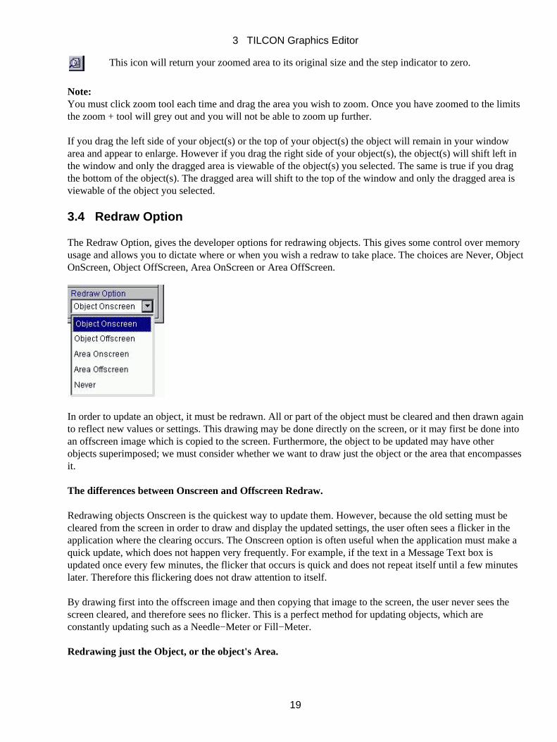
3.4 Redraw Option
The Redraw Option, gives the developer options for redrawing objects. This gives some control over memoryusage and allows you to dictate where or when you wish a redraw to take place. The choices are Never, ObjectOnScreen, Object OffScreen, Area OnScreen or Area OffScreen.
In order to update an object, it must be redrawn. All or part of the object must be cleared and then drawn againto reflect new values or settings. This drawing may be done directly on the screen, or it may first be done intoan offscreen image which is copied to the screen. Furthermore, the object to be updated may have otherobjects superimposed; we must consider whether we want to draw just the object or the area that encompassesit.
The differences between Onscreen and Offscreen Redraw.
Redrawing objects Onscreen is the quickest way to update them. However, because the old setting must becleared from the screen in order to draw and display the updated settings, the user often sees a flicker in theapplication where the clearing occurs. The Onscreen option is often useful when the application must make aquick update, which does not happen very frequently. For example, if the text in a Message Text box isupdated once every few minutes, the flicker that occurs is quick and does not repeat itself until a few minuteslater. Therefore this flickering does not draw attention to itself.
By drawing first into the offscreen image and then copying that image to the screen, the user never sees thescreen cleared, and therefore sees no flicker. This is a perfect method for updating objects, which areconstantly updating such as a Needle−Meter or Fill−Meter.
Redrawing just the Object, or the object's Area.
3 TILCON Graphics Editor
19

Object−only is the policy of choice when an object stands alone, when other objects are not layered above orbeneath it. Drawing only one object is much faster than redrawing its area, but that object will be drawn overany other object at that location.
The Area Redraw Options, as mentioned above, redraw not only the object that you are updating, but all of theother objects which are layered over and under it. As the name implies, it draws the "area" which is affectedby the update. This way, an object is redrawn in its correct position amidst the layers. If the area is drawnOnscreen, flickering will appear for the updating of the area. If it is done Offscreen, the layers are drawn fromthe back to the front, and appear much smoother when displayed.
A final option, Never, is useful for objects when you know another redraw is forthcoming. Objects with thisredraw policy do not draw themselves when they are updated, only when the area they are in must be redrawn.
3.5 Toolbox Overview
The Toolbox provides you with a wide selection of tools needed to build a real−time application. Theseinclude GUI/MMI tools as well as comprehensive text, draw, meters, charts and animation menus. TheToolbox can be moved to any convenient location on the screen.
Whether it is a button, meter, chart or drawing, all objects are added to your work window in the same simpleway:
Click the tool icon for the object you wish to create.• Click the workspace and drag to the size you want the object to be; release the mouse button and theForm for your object opens.
•
Complete the Form and click OK; the object then appears in the workspace.•
The Main menu and Speedbar provide you with options to modify the appearanceof your object using colors, patterns, fonts and more. All text, indicators and imageswithin any object can be precisely positioned, sized and given depth by usingOptions in the Main menu. For more information on each Object please see chaptersix.
3 TILCON Graphics Editor
20
Toolbox icon Function
Normal operating mode (Selector)
Opens the draw tool menu
Creation of editable text
Creation of message text
Creation of label text
Creation of multi line editable text
Enables the design of various menus
Adds a button to the window
Adds a radio button to the window
Adds a check box to the window
Adds a tool bar to the window
Adds a panel to the window with a label
Adds a number box to the window
Toolbox icon Function
Adds a list box to the window
Adds a combo box to the window
Adds a scrolled area inside a window
Adds a tabbed notebook to the window
Adds a tree object
Adds a slider to the window
Adds a scale object to the window
Adds a directory box to the window
Produces a table of objects and/or data
Adds a HTML object to the window
3 TILCON Graphics Editor
21
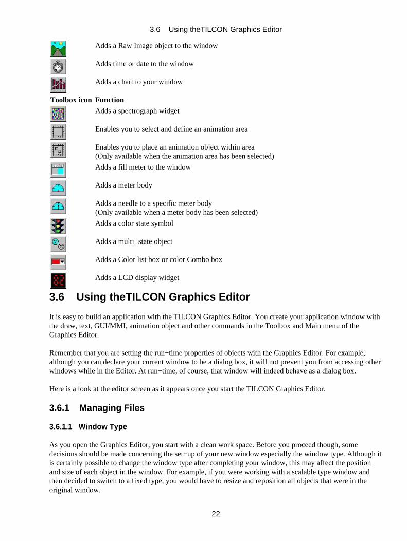
Adds a Raw Image object to the window
Adds time or date to the window
Adds a chart to your window
Toolbox icon Function
Adds a spectrograph widget
Enables you to select and define an animation area
Enables you to place an animation object within area(Only available when the animation area has been selected)
Adds a fill meter to the window
Adds a meter body
Adds a needle to a specific meter body(Only available when a meter body has been selected)
Adds a color state symbol
Adds a multi−state object
Adds a Color list box or color Combo box
Adds a LCD display widget
3.6 Using theTILCON Graphics Editor
It is easy to build an application with the TILCON Graphics Editor. You create your application window withthe draw, text, GUI/MMI, animation object and other commands in the Toolbox and Main menu of theGraphics Editor.
Remember that you are setting the run−time properties of objects with the Graphics Editor. For example,although you can declare your current window to be a dialog box, it will not prevent you from accessing otherwindows while in the Editor. At run−time, of course, that window will indeed behave as a dialog box.
Here is a look at the editor screen as it appears once you start the TILCON Graphics Editor.
3.6.1 Managing Files
3.6.1.1 Window Type
As you open the Graphics Editor, you start with a clean work space. Before you proceed though, somedecisions should be made concerning the set−up of your new window especially the window type. Although itis certainly possible to change the window type after completing your window, this may affect the positionand size of each object in the window. For example, if you were working with a scalable type window andthen decided to switch to a fixed type, you would have to resize and reposition all objects that were in theoriginal window.
3.6 Using theTILCON Graphics Editor
22
There are two basic types of windows scalable and fixed. In a scalable type window, any change in the size ofthe window will affect the size of the objects within it. The dimensions of objects in a fixed type window are afixed number of pixels, any change to window size will not affect the objects within it.
The available window types (with extensions in brackets) are:
Fixed base (.twd): where all objects on the form remain at their original creation size and location onthe form, regardless of whether the form is resized.
Scalable base (.twd): where the objects on the form are resized when the size of the window is changed.
Fixed child (.twd): where the form is always shown on top of its parent, and follows the same idea asFixed Base with the resizing of the form and its objects.
Scalable child (.twd): where the form is always shown on top of its parent, and follows the same idea asScalable Base with the resizing of the form and its objects.
Application modaldialog (.twd):
where the user is prevented from accessing its parents while this form is active.
Create symbol (.tsy): where you may create and save a vector image that can later be used within certainobjects (e.g. state objects).
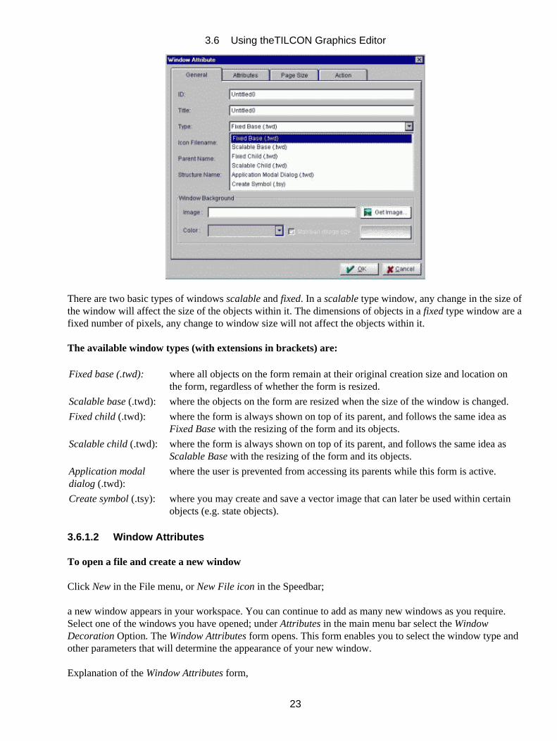
3.6.1.2 Window Attributes
To open a file and create a new window
Click New in the File menu, or New File icon in the Speedbar;
a new window appears in your workspace. You can continue to add as many new windows as you require.Select one of the windows you have opened; under Attributes in the main menu bar select the WindowDecoration Option. The Window Attributes form opens. This form enables you to select the window type andother parameters that will determine the appearance of your new window.
Explanation of the Window Attributes form,
3.6 Using theTILCON Graphics Editor
23
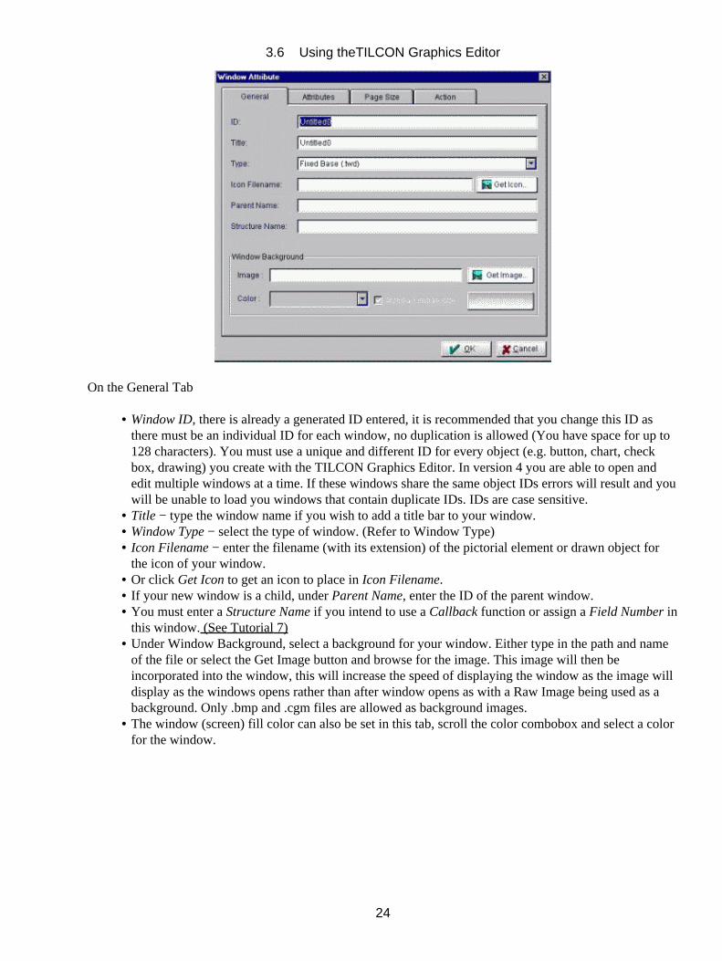
On the General Tab
Window ID, there is already a generated ID entered, it is recommended that you change this ID asthere must be an individual ID for each window, no duplication is allowed (You have space for up to128 characters). You must use a unique and different ID for every object (e.g. button, chart, checkbox, drawing) you create with the TILCON Graphics Editor. In version 4 you are able to open andedit multiple windows at a time. If these windows share the same object IDs errors will result and youwill be unable to load you windows that contain duplicate IDs. IDs are case sensitive.
•
Title − type the window name if you wish to add a title bar to your window.• Window Type − select the type of window. (Refer to Window Type)• Icon Filename − enter the filename (with its extension) of the pictorial element or drawn object forthe icon of your window.
•
Or click Get Icon to get an icon to place in Icon Filename.• If your new window is a child, under Parent Name, enter the ID of the parent window.• You must enter a Structure Name if you intend to use a Callback function or assign a Field Number inthis window. (See Tutorial 7)
•
Under Window Background, select a background for your window. Either type in the path and nameof the file or select the Get Image button and browse for the image. This image will then beincorporated into the window, this will increase the speed of displaying the window as the image willdisplay as the windows opens rather than after window opens as with a Raw Image being used as abackground. Only .bmp and .cgm files are allowed as background images.
•
The window (screen) fill color can also be set in this tab, scroll the color combobox and select a colorfor the window.
•
3.6 Using theTILCON Graphics Editor
24
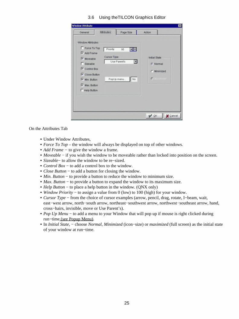
On the Attributes Tab
Under Window Attributes,• Force To Top – the window will always be displayed on top of other windows.• Add Frame − to give the window a frame.• Moveable − if you wish the window to be moveable rather than locked into position on the screen.• Sizeable− to allow the window to be re−sized.• Control Box − to add a control box to the window.• Close Button − to add a button for closing the window.• Min. Button − to provide a button to reduce the window to minimum size.• Max. Button − to provide a button to expand the window to its maximum size.• Help Button − to place a help button in the window. (QNX only)• Window Priority − to assign a value from 0 (low) to 100 (high) for your window.• Cursor Type − from the choice of cursor examples (arrow, pencil, drag, rotate, I−beam, wait,east−west arrow, north−south arrow, northeast−southwest arrow, northwest−southeast arrow, hand,cross−hairs, invisible, move or Use Parent’s).
•
Pop Up Menu − to add a menu to your Window that will pop up if mouse is right clicked duringrun−time (see Popup Menu).
•
In Initial State, − choose Normal, Minimized (icon−size) or maximized (full screen) as the initial stateof your window at run−time.
•
3.6 Using theTILCON Graphics Editor
25
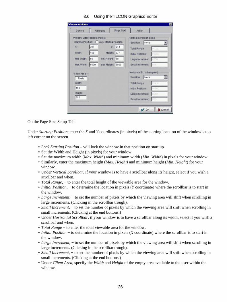
On the Page Size Setup Tab
Under Starting Position, enter the X and Y coordinates (in pixels) of the starting location of the window’s topleft corner on the screen.
Lock Starting Position – will lock the window in that position on start up.• Set the Width and Height (in pixels) for your window.• Set the maximum width (Max. Width) and minimum width (Min. Width) in pixels for your window.• Similarly, enter the maximum height (Max. Height) and minimum height (Min. Height) for yourwindow.
•
Under Vertical Scrollbar, if your window is to have a scrollbar along its height, select if you wish ascrollbar and when.
•
Total Range, − to enter the total height of the viewable area for the window.• Initial Position, − to determine the location in pixels (Y coordinate) where the scrollbar is to start inthe window.
•
Large Increment, − to set the number of pixels by which the viewing area will shift when scrolling inlarge increments. (Clicking in the scrollbar trough).
•
Small Increment, − to set the number of pixels by which the viewing area will shift when scrolling insmall increments. (Clicking at the end buttons.)
•
Under Horizontal Scrollbar, if your window is to have a scrollbar along its width, select if you wish ascrollbar and when.
•
Total Range − to enter the total viewable area for the window.• Initial Position − to determine the location in pixels (X coordinate) where the scrollbar is to start inthe window.
•
Large Increment, − to set the number of pixels by which the viewing area will shift when scrolling inlarge increments. (Clicking in the scrollbar trough).
•
Small Increment, − to set the number of pixels by which the viewing area will shift when scrolling insmall increments. (Clicking at the end buttons.)
•
Under Client Area, specify the Width and Height of the empty area available to the user within thewindow.
•
3.6 Using theTILCON Graphics Editor
26
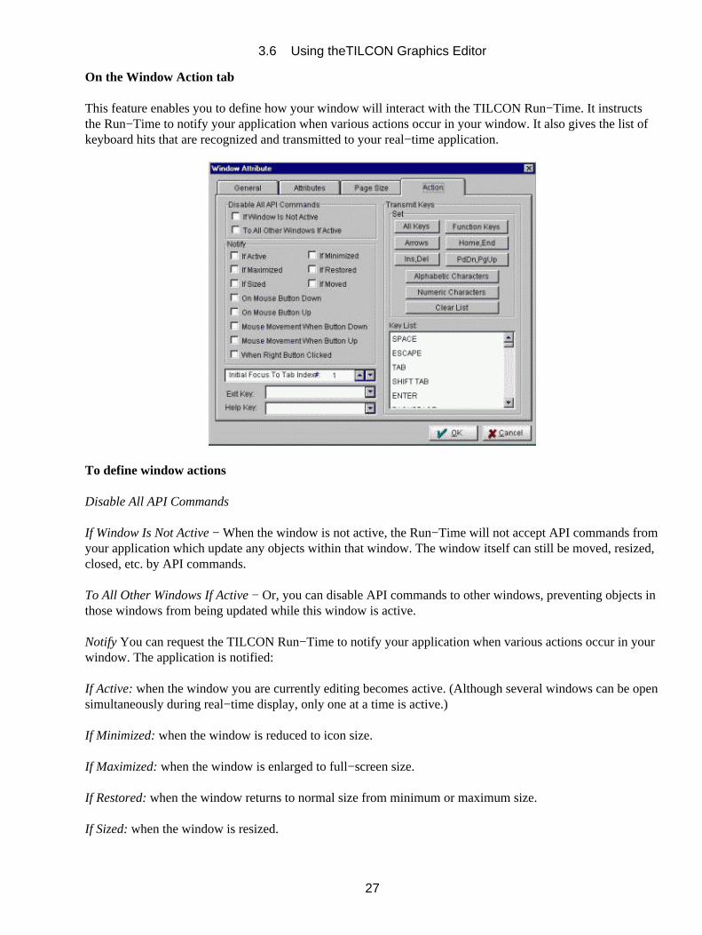
On the Window Action tab
This feature enables you to define how your window will interact with the TILCON Run−Time. It instructsthe Run−Time to notify your application when various actions occur in your window. It also gives the list ofkeyboard hits that are recognized and transmitted to your real−time application.
To define window actions
Disable All API Commands
If Window Is Not Active − When the window is not active, the Run−Time will not accept API commands fromyour application which update any objects within that window. The window itself can still be moved, resized,closed, etc. by API commands.
To All Other Windows If Active − Or, you can disable API commands to other windows, preventing objects inthose windows from being updated while this window is active.
Notify You can request the TILCON Run−Time to notify your application when various actions occur in yourwindow. The application is notified:
If Active: when the window you are currently editing becomes active. (Although several windows can be opensimultaneously during real−time display, only one at a time is active.)
If Minimized: when the window is reduced to icon size.
If Maximized: when the window is enlarged to full−screen size.
If Restored: when the window returns to normal size from minimum or maximum size.
If Sized: when the window is resized.
3.6 Using theTILCON Graphics Editor
27
If Moved: when the window is moved to another location.
On Mouse Button Down: when the mouse button is pressed down within the window.
On Mouse Button Up: when the mouse button is released within the window.
Mouse Movement When Button Down:when the mouse is cruising the window with button down.
Mouse Movement When Button Up:when the mouse is cruising the window with button up.
Initial Focus to Tab Index
This feature enables you to set the Tab field, which will have the keyboard focus when the window is opened.You can assign a Tab field to editable text and GUI objects in your window. Tab fields are numbered and anindex of numbers is maintained (see Tab/Field).
Click Exit Key and scroll for your choice of key combination as shortcut to close (hide, not delete) thewindow.
Click Help Key and scroll for your choice of key combination as shortcut to help for the window.
Transmit Keys
Under Transmit Keys, click your choice of keys and key combinations or make your selection from the Listbox. When this window is active, keystrokes from the selected keys will be transmitted by the Run−Time tothe real−time application. (Holding the CTRL key while clicking in the List box will toggle individual items.By dragging the mouse after clicking on an item you can also select multiple transmit keys.)
OK − closes the Window Attributes form and keeps changes.
3.6.2 Opening an Existing File
To open an existing file
Open in the File menu or the Open File List button in the Speedbar; opens the File Open form.•
In the File Open form,
3.6 Using theTILCON Graphics Editor
28

The abbreviated button under List Files of Type is used to select the correct filename extension.• Drives selects the drive where the file is stored.• Click within the Directories List, which gives the subdirectories of the current path.• Select the desired filename in the File List; it automatically appears on the File Name line.•
Or,
Type name of file on Filename line (include path if not in current selected directory) .• OK closes the form and opens the selected file.•
If the file is located on a network drive and not your local drive, select Network . The form that appears willbe dependent on the operating system you are currently using. In any case the network drive mapping featurewill be invoked for your particular operating system. Simply map the network drive to the path of the requiredfile.
3.6.3 Save and Save As
These features enable you to save your window to a disk file.
The filename is preserved but the extension will be determined by the window parameters
To save a window
Save in the File menu or the Save File button in the Speedbar will produce one of the following;.•
a)If this is the first time that you have saved your window the Save As form will open to give you theopportunity to name and locate where you wish the file saved.
3.6 Using theTILCON Graphics Editor
29
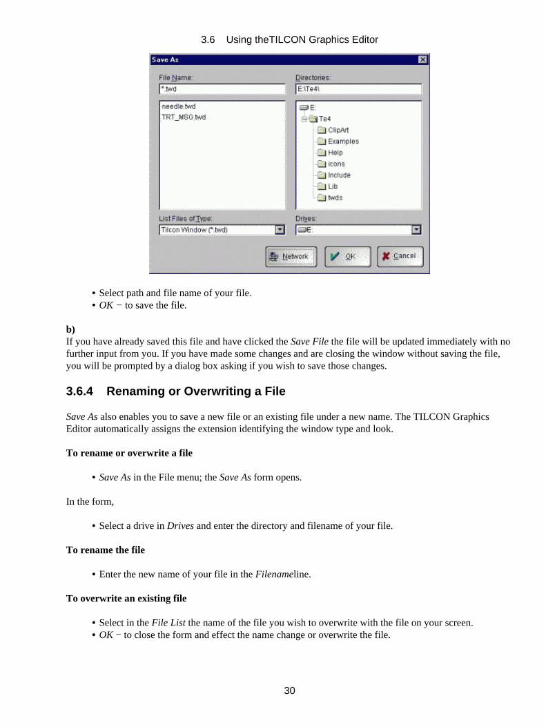
Select path and file name of your file.• OK − to save the file.•
b)If you have already saved this file and have clicked the Save File the file will be updated immediately with nofurther input from you. If you have made some changes and are closing the window without saving the file,you will be prompted by a dialog box asking if you wish to save those changes.
3.6.4 Renaming or Overwriting a File
Save As also enables you to save a new file or an existing file under a new name. The TILCON GraphicsEditor automatically assigns the extension identifying the window type and look.
To rename or overwrite a file
Save As in the File menu; the Save As form opens.•
In the form,
Select a drive in Drives and enter the directory and filename of your file.•
To rename the file
Enter the new name of your file in the Filenameline.•
To overwrite an existing file
Select in the File List the name of the file you wish to overwrite with the file on your screen.• OK − to close the form and effect the name change or overwrite the file.•
3.6 Using theTILCON Graphics Editor
30
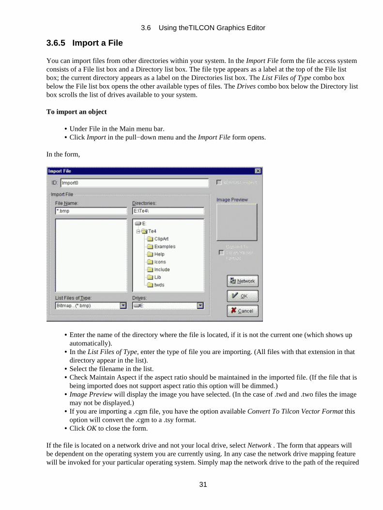
3.6.5 Import a File
You can import files from other directories within your system. In the Import File form the file access systemconsists of a File list box and a Directory list box. The file type appears as a label at the top of the File listbox; the current directory appears as a label on the Directories list box. The List Files of Type combo boxbelow the File list box opens the other available types of files. The Drives combo box below the Directory listbox scrolls the list of drives available to your system.
To import an object
Under File in the Main menu bar.• Click Import in the pull−down menu and the Import File form opens.•
In the form,
Enter the name of the directory where the file is located, if it is not the current one (which shows upautomatically).
•
In the List Files of Type, enter the type of file you are importing. (All files with that extension in thatdirectory appear in the list).
•
Select the filename in the list.• Check Maintain Aspect if the aspect ratio should be maintained in the imported file. (If the file that isbeing imported does not support aspect ratio this option will be dimmed.)
•
Image Preview will display the image you have selected. (In the case of .twd and .two files the imagemay not be displayed.)
•
If you are importing a .cgm file, you have the option available Convert To Tilcon Vector Format thisoption will convert the .cgm to a .tsy format.
•
Click OK to close the form.•
If the file is located on a network drive and not your local drive, select Network . The form that appears willbe dependent on the operating system you are currently using. In any case the network drive mapping featurewill be invoked for your particular operating system. Simply map the network drive to the path of the required
3.6 Using theTILCON Graphics Editor
31
file
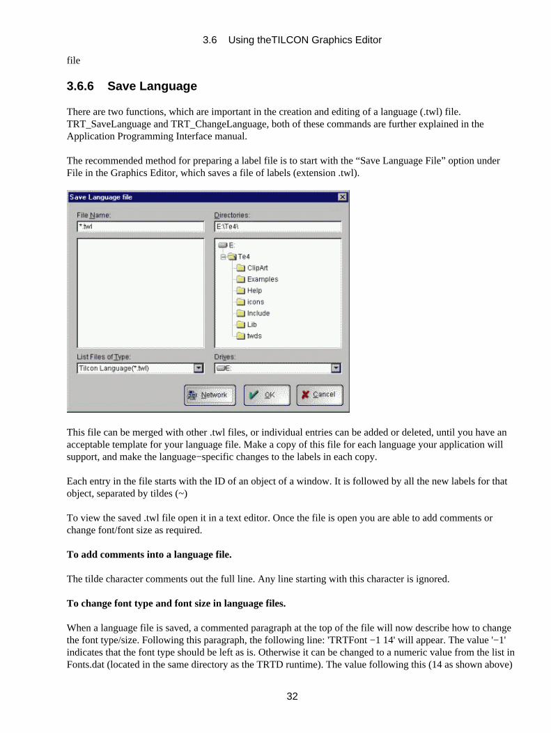
3.6.6 Save Language
There are two functions, which are important in the creation and editing of a language (.twl) file.TRT_SaveLanguage and TRT_ChangeLanguage, both of these commands are further explained in theApplication Programming Interface manual.
The recommended method for preparing a label file is to start with the “Save Language File” option underFile in the Graphics Editor, which saves a file of labels (extension .twl).
This file can be merged with other .twl files, or individual entries can be added or deleted, until you have anacceptable template for your language file. Make a copy of this file for each language your application willsupport, and make the language−specific changes to the labels in each copy.
Each entry in the file starts with the ID of an object of a window. It is followed by all the new labels for thatobject, separated by tildes (~)
To view the saved .twl file open it in a text editor. Once the file is open you are able to add comments orchange font/font size as required.
To add comments into a language file.
The tilde character comments out the full line. Any line starting with this character is ignored.
To change font type and font size in language files.
When a language file is saved, a commented paragraph at the top of the file will now describe how to changethe font type/size. Following this paragraph, the following line: 'TRTFont −1 14' will appear. The value '−1'indicates that the font type should be left as is. Otherwise it can be changed to a numeric value from the list inFonts.dat (located in the same directory as the TRTD runtime). The value following this (14 as shown above)
3.6 Using theTILCON Graphics Editor
32
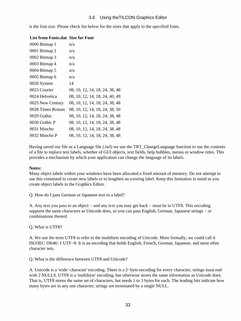
is the font size. Please check list below for the sizes that apply to the specified fonts.
List from Fonts.dat Size for Font
0000 Bitmap 1 n/a
0001 Bitmap 2 n/a
0002 Bitmap 3 n/a
0003 Bitmap 4 n/a
0004 Bitmap 5 n/a
0005 Bitmap 6 n/a
0020 System 14
0023 Courier 08, 10, 12, 14, 18, 24, 38, 48
0024 Helvetica 08, 10, 12, 14, 18, 24, 40, 49
0025 New Century 08, 10, 12, 14, 18, 24, 38, 48
0028 Times Roman08, 10, 12, 14, 18, 24, 38, 50
0029 Gothic 08, 10, 12, 14, 18, 24, 38, 48
0030 Gothic P 08, 10, 12, 14, 18, 24, 38, 48
0031 Mincho 08, 10, 12, 14, 18, 24, 38, 48
0032 Mincho P 08, 10, 12, 14, 18, 24, 38, 48
Having saved our file as a Language file (.twl) we use the TRT_ChangeLanguage function to use the contentsof a file to replace text labels, whether of GUI objects, text fields, help bubbles, menus or window titles. Thisprovides a mechanism by which your application can change the language of its labels.
Notes:Many object labels within your windows have been allocated a fixed amount of memory. Do not attempt touse this command to create new labels or to lengthen an existing label. Keep this limitation in mind as youcreate object labels in the Graphics Editor.
Q. How do I pass German or Japanese text to a label?
A. Any text you pass to an object − and any text you may get back − must be in UTF8. This encodingsupports the same characters as Unicode does, so you can pass English, German, Japanese strings − orcombinations thereof.
Q. What is UTF8?
A. We use the term UTF8 to refer to the multibyte encoding of Unicode. More formally, we could call itISO/IEC 10646−1 UTF−8. It is an encoding that holds English, French, German, Japanese, and most othercharacter sets.
Q. What is the difference between UTF8 and Unicode?
A. Unicode is a 'wide−character' encoding. There is a 2−byte encoding for every character; strings must endwith 2 NULLS. UTF8 is a 'multibyte' encoding, but otherwise stores the same information as Unicode does.That is, UTF8 stores the same set of characters, but needs 1 to 3 bytes for each. The leading bits indicate howmany bytes are in any one character; strings are terminated by a single NULL.
3.6 Using theTILCON Graphics Editor
33
Q. What about ASCII characters?
A. By the design of Unicode, UTF8 is a superset of ASCII − the single bytes with values 0 to 127 are validUTF8 characters with the same meaning as ASCII 0 to 127.
Q. What about extended ASCII?
A. Those are different. In extended ASCII, some characters (e.g. accented ones) are represented by a singlebyte valued between 128 and 255. In UTF8, the encoding for the same character would require 2 bytes.
Q. What other encodings are there?
A. Shift−JIS, Latin−1, Latin−2,....
Q. When I write C code, which encoding does my text editor use?
A. Depends on the OS and on the text editor. Under Photon, ped can save a file as UTF8 or in one of severalother encodings. Editors under Win95 usually use a multibyte encoding that depends on the local 'codepage' −e.g. ShiftJIS on Japanese Win95. NT editors may do the same, or they may use Unicode.
Q. How do I get a UTF8 string if my text editor uses a different encoding?
A. If you know you have a Unicode string, you can get the UTF8 equivalent using a standard C function forchanging between wide−character and multibyte: wcstomb(). If you know you have a codepage−dependentmultibyte string, there is a MS−Windows function for converting it to Unicode; you could then convert toUTF8. Tilcon provides the convenience function TRT_MBToUTF8() to combine these steps for you.
Q. How do I change the text on an object so it is displayed in a different language?
A. You have two choices. You can use TRT_SetValues() to modifythe attributes of objects one−by−one (e.g.the TRT_ATT_TEXT attribute). Or you can change many labels in one shot using theTRT_ChangeLanguage() function.
Q. Why consider individual updates when TRT_ChangeLanguage is available?
A. TRT_ChangeLanguage reads all its text from specified files, which will normally be prepared atdevelopment time. This is fine for static labels, but handling dynamic text is more difficult. Presumably yourapplication can determine what to put into the dynamic text, and would use TRT_SetValues to update that textappropriately.
Q. Can I hard−code any text into my application?
A. Yes. Especially if it is in pure ASCII (which is valid in UTF8). But for non−ASCII text you'll have toconsider which encoding your text editor uses and how to translate your hard−coded text to UTF8. This maybecome complicated if you are targeting a different platform or language−environment than your developmentone.
Q. What if I develop on Win95?
A. You can use TRT_MBToUTF8 to convert your text to UTF8. But this function converts the text at*runtime* and depends on the MS codepage... are you sure the codepage will be the same at runtime as it was
3.6 Using theTILCON Graphics Editor
34
on the machine where you edited the code?
Q. What if my editor saves C code in Unicode?
A. See the wcstomb() function for translating it to UTF8.
Q. What about ped in Photon?
A. It can save the file as UTF8, so your hard−coded text should work anywhere.
Q. What about cross−platform development, or targeting?
A. You should then avoid hard−coding... put your text into data files that you can convert to/from UTF8.
Q. How does TRT_ChangeLanguage work?
A. As a parameter, TRT_ChangeLanguages takes the name of a .twl file. A .twl file is encoded in UTF8; eachline contains the ID of a Tilcon object followed by all the text to use within that object.
Q. How do I make a .twl file?
A. First, understand that you'll need one .twl for each language. Usually, you'll also have separate .twl files foreach window, though it is possible to combine several .twl files together.
To make the first .twl, while editing a window with the Tilcon Graphics Editor, choose File/SaveLanguage.This generates a .twl file with an entry for every object in the window. Next, make a copy of this file for eachlanguage you want to support (e.g. my_win_french.twl, my_win_japanese.twl).
Finally, send these .twl files to be translated. The catch is that you'll need to get back UTF8 files. The nextquestion deals with that issue.
Q. What if my starting .twl is in German and my translator uses Japanese Win95?
A. Along with TRTD we ship a language conversion utility. Essentially, that utility does TRT_MBToUTF8 orTRT_UTF8ToMB on an entire file. But this utility makes use of the *local* codepage... so you have to askyour translator to run it. For the UTF8 .twl to be read by the translator on the Japanese system, it would haveto be converted on a Japanese system. For a Japanese (Shift−JIS) file to be converted to UTF8, it would haveto be converted on a Japanese system.
Q. Do I need the Tilcon RunTime in order to use this text conversion utility?
A. No. The conversion utility is a stand−alone application.
Q. I'm confident the text I'm passing to the Tilcon object is in UTF8. But it still looks like garbage whendisplayed. What's wrong?
A. Could be the font you're using. In QNX, the font manager is pretty good about swapping fonts whenneeded, so Japanese text shows up in Courier or Helvetica labels. But we can't guarantee it will work for allcases; you may have to change the font to one capable of displaying the text − e.g. Mincho instead of System.In MS, you *must* set the font correctly or you'll see garbage.
3.6 Using theTILCON Graphics Editor
35

Q. So how do I change the font in an object?
A. Within a .twl you can specify a font by number, or you can use TRT_SetValues to setTRT_ATT_TEXT_TYPE. See the file TE4/include/TRTConst.h and lookup TRT_ATT_TEXT_TYPE for thevalid font numbers. See also TE4/fonts.dat.
3.7 Manipulating Objects
Objects are any selectable item in your window. These include symbols, text, drawings, meters, menus, stateobjects, animation objects, charts, etc.
3.7.1 Saving Objects
When working with objects such as symbols, text, state objects, charts or drawings (which you may never beable to draw as artistically again), it is important to save your file often.
Add object to library
In some cases you may wish to save an object layout to use as a template. For example, you may wish aparticular type and look of a button that is to be used throughout the project. By creating the button andadding this button object to the library, this object or template is now available for use. The library file alsohas a record of who and when it was created, this enables tracking of changes made to the file and the ownerof the file.
Select Add Object to Library from the File menu or click on Store Object icon in the Speedbar.•
The Add Object to Library form opens:
In the form,
File Name − enter the name of the object. The file extension .two is added automatically.
3.7 Manipulating Objects
36
Drives − select the drive you wish to store the object on.
Directories − enter the directory where the object is to be stored.
In the Object Attributes a record of important information about the object is maintained, such as ObjectName, Creation Date, Owner’s Name, Last Modified Date and Modified By.
Comment box − add anything else that might be needed.
OK − save the object to the library and close the form.
To retrieve an object from the library
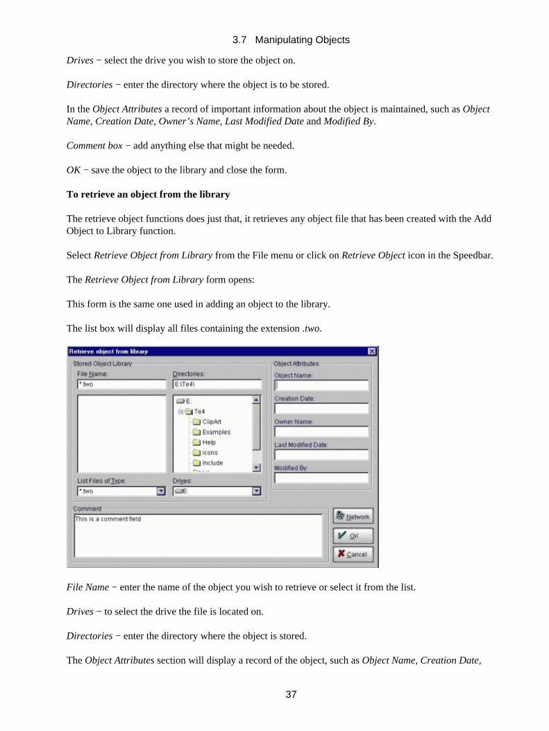
The retrieve object functions does just that, it retrieves any object file that has been created with the AddObject to Library function.
Select Retrieve Object from Library from the File menu or click on Retrieve Object icon in the Speedbar.
The Retrieve Object from Library form opens:
This form is the same one used in adding an object to the library.
The list box will display all files containing the extension .two.
File Name − enter the name of the object you wish to retrieve or select it from the list.
Drives − to select the drive the file is located on.
Directories − enter the directory where the object is stored.
The Object Attributes section will display a record of the object, such as Object Name, Creation Date,
3.7 Manipulating Objects
37

Owner’s Name, Last Modified Date and Modified By. The Comment box may display additional information.
OK − to retrieve the object from the library and close the form.
3.7.2 Re−sizing and Moving an Object
An activating rectangle or rubber band appears around any screen object that has been selected forrepositioning, resizing or any other form of editing.
To select an object and an element of an object
Click on the object; an activating rectangle appears around it.• Click on the specific element within the object to select it; an activating rectangle appears around yourchoice of element.
•
To move an object
Select the object.• Click anywhere within the activating rectangle and hold.• Drag the cursor (the activating rectangle moves with it) to the new location of the object; release themouse button and the object will be placed on that exact spot.
•
To resize an object
Select the object.• Take one of the control points at the corners of the activating rectangle and pull it until you obtain theobject size you want, then release the mouse button.
•
To change the height only:
Click the mid control point in the top side or bottom side of the activating rectangle and pull up ordown until you have the desired height, then release the mouse button.
•
To change the width only:
Click the mid control point in one of the sides of the activating rectangle and pull left or right untilyou have the desired width, then release the mouse button.
•
3.7.2.1 To Front/To Back
To move an object to the front or to the back of all other objects on the screen
Select the object.• Click To Front or To Back in the Edit menu or the To Front or To Back icon in the Speedbar.•
3.7.2.2 Cut, Copy and Paste
Cut deletes the selected object from the window and places it on the clipboard.
Copy places a duplicate of the selected object on the clipboard leaving the original intact and in its existingposition.
3.7 Manipulating Objects
38

Paste will take the last object placed on the clipboard and place it in the window at the place indicated by thecursor.
To cut and paste an object
You can Paste the last item you have Cut or made a Copy of.
Select the object.• Click Cut in the Edit menu or the Cut icon in the Speedbar.• Click Paste in the Edit menu or the Paste icon in the Speedbar.• Place the Cursor in the window where you want to paste the object.•
To copy and paste an object
Select the object.• Click Copy in the Edit menu or the Copy icon in the Speedbar.• Click Paste in the Edit menu or the Paste icon in the Speedbar.• Place the Cursor in the window where you want to paste the object.•
3.7.2.3 Duplicate
Duplicate produces a copy of the selected object.
To duplicate an object
Select the object.• Click Duplicate in the Edit menu; the Duplicate Options form opens.•
In the form,
Select either Auto or Custom positioning.• The Auto selection activates the Auto Placement features; here you can select the Offset Distancebetween the object and its duplicate and indicate in which direction the offset should occur. Thisoffset is the same for both your X and Y positions.
•
The Custom selection activates the Custom Placement features and allows you to offset theduplicate’s X and Y coordinates by different measurements; thus, you can place the duplicate withmore precision.
•
3.7 Manipulating Objects
39
Select Apply to place the duplicate.•
3.7.2.4 Delete
The Delete command removes the selected object from your window. The object can only be replaced byusing the Undo command immediately after the deletion.
To delete an object
Select the object; if the object is part of a group, select the group first then the object.• Click Delete in the Edit menu or press the Delete key on your keyboard.•
3.7.2.5 Undo/Redo
Undo is a convenience feature that reverses your last editing action on any object (button, text, drawing, etc.)before another item is selected. (Note: you are able to undo a number of editing actions that have occurredbut this stepping back causes every change to be undone in reverse order, last change first etc..)
Redo allows you to change your mind immediately after clicking Undo. It reverses the Undo command.
To undo/redo the last editing action
Undo in the Edit menu to undo the changes.
Redo to reverse the undone action.
3.7.3 Grouping Objects
You can group objects within the same activating rectangle so that they can be manipulated as a single item.The TILCON Graphics Editor offers two types of groupings, one is temporary where you drag an area andthose items are grouped for as long as they are selected, the other is more permanent as you give the group anID and the group will remain as such until ungrouped.
Group
To group objects for editing
Click outside the furthest item of those you want to group; drag the cursor to sweep an area thatsurrounds all desired items completely within the rubber band. (The whole item must be enclosed bythe rubber band; if not, it will not be included in the group.) Now all items within the box are groupedto act as one. This is a temporary group, if you require a permanent group;
•
Click the Group icon in the Speedbar;•
The Group ID form will open
3.7 Manipulating Objects
40
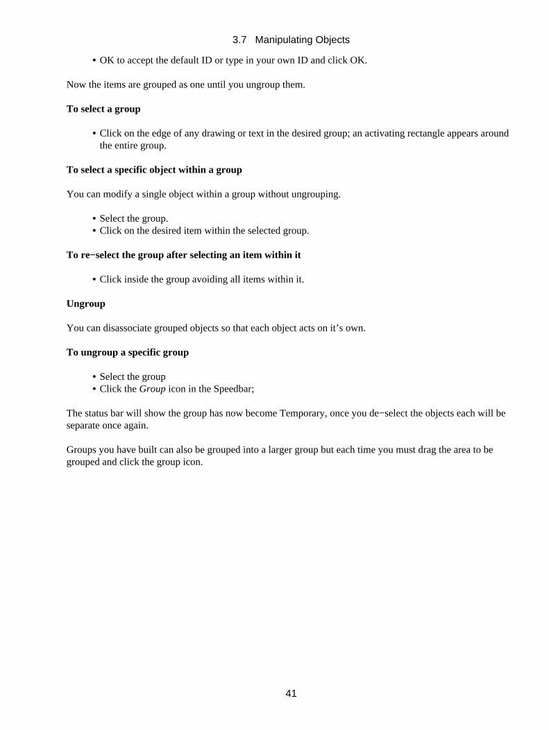
OK to accept the default ID or type in your own ID and click OK.•
Now the items are grouped as one until you ungroup them.
To select a group
Click on the edge of any drawing or text in the desired group; an activating rectangle appears aroundthe entire group.
•
To select a specific object within a group
You can modify a single object within a group without ungrouping.
Select the group.• Click on the desired item within the selected group.•
To re−select the group after selecting an item within it
Click inside the group avoiding all items within it.•
Ungroup
You can disassociate grouped objects so that each object acts on it’s own.
To ungroup a specific group
Select the group• Click the Group icon in the Speedbar;•
The status bar will show the group has now become Temporary, once you de−select the objects each will beseparate once again.
Groups you have built can also be grouped into a larger group but each time you must drag the area to begrouped and click the group icon.
3.7 Manipulating Objects
41
4 Common Options in the TILCON Graphics Editor
There are several options such as Calculation, which appear again and again in the TILCON Graphics Editormenus and forms. To avoid irritating repetition in the manual, we have grouped a description of these optionsin this chapter. They appear in alphabetical order.
Contents
Anchor − RotationBlinkCalculationColorCursor TypeCurve OptionGridHelp Bubbles PositionIDInitial StateJustifyLayout and LookLine StylesNudge ToolsObjects BrowserPatternPopup menuScreen Units (Scaleable windows only)Size and PlacementSort OptionTab/Field NumbersTesting FeatureText ShadowText Wrap ModeUndo Levels
To select objects, to alter their properties, and to open forms with additional options.
Click on the object using the left mouse button. If there are selectable elements within the object, you can thenselect any one of them with a click. Once an object (or element) is selected, you can apply the options in theMain menu or Speedbar that are relevant to it (color, for instance).
To access the real−time properties of the object
Click the right mouse button.
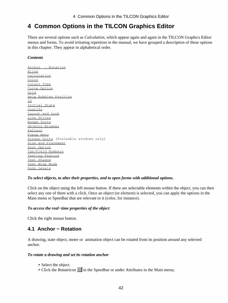
4.1 Anchor − Rotation
A drawing, state object, meter or animation object can be rotated from its position around any selectedanchor.
To rotate a drawing and set its rotation anchor
Select the object.• Click the Rotateicon in the Speedbar or under Attributes in the Main menu;•
4 Common Options in the TILCON Graphics Editor
42
The Rotation Options Form opens.
Click the anchor and move it anywhere on the screen if desired, to change the center point of rotation.• Scroll the number of degrees of rotation the drawing will rotate around the placement of the anchor.•
To duplicate a drawing
In the Form,
Click Rotate & Duplicate.• Scroll the number of degrees of rotation the drawing will be duplicated and the duplicate will rotatearound the placement of the anchor.
•
Click Closeto close form.•
Note:Drawings can be copied with single or consecutive clicks for different effects.
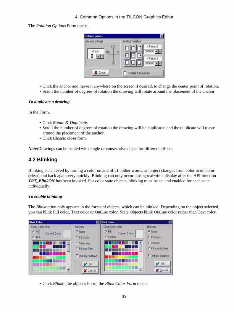
4.2 Blinking
Blinking is achieved by turning a color on and off. In other words, an object changes from color to no color(clear) and back again very quickly. Blinking can only occur during real−time display after the API functionTRT_BlinkON has been invoked. For color state objects, blinking must be set and enabled for each stateindividually.
To enable blinking
The Blinkoption only appears in the forms of objects, which can be blinked. Depending on the object selected,you can blink Fill color, Text color or Outline color. State Objects blink Outline color rather than Text color.
Click Blinkin the object's Form; the Blink Color Form opens.•
4 Common Options in the TILCON Graphics Editor
43
In the Form,
Under Clear Color With,•
Fill, if you want to clear the fill color when it is in the clear color phase of blinking or
Text (or Outline) if you wish to clear the text (outline) color of the object when it is in the clear color phase ofblinking.
Select a color from the Color List (which can be expanded using the scroll arrows); it will appear inthe Current Color preview box and will alternate with the clear color in blinking.
•
UnderBlinking,•
None, Fill Color, Text (or Outline) or Fill and Text (or Outline) − determines which will blink duringrun−time operation.
Initially Enabled − if the blinking is to be enabled initially.• OK −to accept choices and close the Form.•
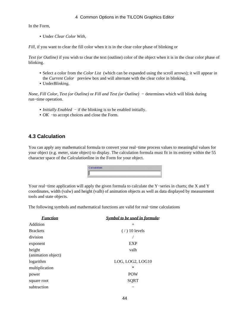
4.3 Calculation
You can apply any mathematical formula to convert your real−time process values to meaningful values foryour object (e.g. meter, state object) to display. The calculation formula must fit in its entirety within the 55character space of the Calculationline in the Form for your object.
Your real−time application will apply the given formula to calculate the Y−series in charts; the X and Ycoordinates, width (valw) and height (valh) of animation objects as well as data displayed by measurementtools and state objects.
The following symbols and mathematical functions are valid for real−time calculations
Function Symbol to be used in formula:
Addition +
Brackets ( / ) 10 levels
division /
exponent EXP
height(animation object)
valh
logarithm LOG, LOG2, LOG10
multiplication *
power POW
square root SQRT
subtraction −
4 Common Options in the TILCON Graphics Editor
44
trigonometric functions ACOS, ACOSH, ASIN, ASINH, ATAN, ATAN−1,COS, COSH, SIN, SINH, TAN, TANH
Arguments of trigonometric functions are assumed to be in radians.
unary +. unary − not allowed
variable value val
width(animation object)
valw
X position(animation object)
valx
Y position(animation object)
valy
API commands send values to objects during a real−time program which pass through the calculation formula(if any) before they are displayed:
Example 1: The API function TRT_MeterValue is used to update a meter with value 5. Your conversion formula on the Calculation line of the Dialog box is: val * val. The value displayed on the meter is 25.
Example 2: If the calculation formula is SIN (val) The display will be the sine of the real−time values sent by the API.
Example 3: To display the third power of the value val, the calculation is POW (val,3).
4.4 Color
The TILCON Graphics Editor offers you a palette of 256 on−screen colors, the ability to select RGB, CMYKvalues, HLS selections, inverted colors and transparency. You can apply color to virtually any object, be itchart, symbol, drawing or text. Some color options may not be applicable to the selected object and theTILCON Graphics Editor automatically grays out such features in menus or does not display them in theSpeedbar.
Using Color
With the TILCON Graphics Editor, you can quickly change the color of virtually every component of thedisplay on your screen. Color, more than any other feature, has a dramatic impact on the picture on yourscreen. Try different color combinations to get the exact effect you want.
Line / Outline
You can color any line and the outline of virtually any component on the screen. You also have the option ofcoloring any pattern.
Fill:
4 Common Options in the TILCON Graphics Editor
45
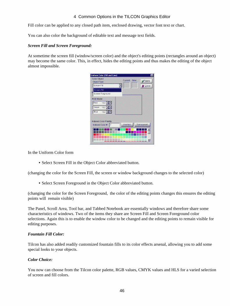
Fill color can be applied to any closed path item, enclosed drawing, vector font text or chart.
You can also color the background of editable text and message text fields.
Screen Fill and Screen Foreground:
At sometime the screen fill (window/screen color) and the object's editing points (rectangles around an object)may become the same color. This, in effect, hides the editing points and thus makes the editing of the objectalmost impossible.
In the Uniform Color form
Select Screen Fill in the Object Color abbreviated button.•
(changing the color for the Screen Fill, the screen or window background changes to the selected color)
Select Screen Foreground in the Object Color abbreviated button.•
(changing the color for the Screen Foreground, the color of the editing points changes this ensures the editingpoints will remain visible)
The Panel, Scroll Area, Tool bar, and Tabbed Notebook are essentially windows and therefore share somecharacteristics of windows. Two of the items they share are Screen Fill and Screen Foreground colorselections. Again this is to enable the window color to be changed and the editing points to remain visible forediting purposes.
Fountain Fill Color:
Tilcon has also added readily customized fountain fills to its color effects arsenal, allowing you to add somespecial looks to your objects.
Color Choice:
You now can choose from the Tilcon color palette, RGB values, CMYK values and HLS for a varied selectionof screen and fill colors.
4 Common Options in the TILCON Graphics Editor
46
In addition to the Tilcon Color Palette, Tilcon provides support for 3 color models
RGB:
Red, Green, Blue. The three colors of light which can be mixed to produce any other color. These colorscorrespond to the three "guns" in a color cathode ray tube and to the color receptors in the human eye.
CMYK:
Cyan, Magenta, Yellow, along with the "key" (black). CYMK is a system for describing colors by giving thequantity of each secondary color. The CMYK system is used for printing. For mixing of pigments, it is betterto use the secondary colors, since they mix subtractively instead of additively. The secondary colors of lightare cyan, magenta and yellow, which correspond to the primary colors of pigment (blue, red and yellow). Inaddition, although black could be obtained by mixing these three in equal proportions, in four−color printingit always has its own ink. This gives the CMYK model. The K stands for "Key' or 'blacK,' so as not to causeconfusion with the B in RGB.
HLS:
(Hue, Luminance, Saturation) A color model that is similar to the way an artist mixes colors by adding whiteand black to pure pigments. The hue is measured around the vertical axis from 0 to 359 degrees (0=red,60=yellow, 120=green, 180=cyan, 240=blue, 300=magenta). Saturation (white) is measured from 0 to 1 or 0to 100%, with 0 being the most amount of white and 1 or 100% being the least, yielding pure hues.Luminance is measured (0=black, 0.5=pure hues, 1=white).
The Tilcon Color Palette:
Tilcon uses a common method for saving file space when creating 8−bit color images. Instead of each pixelcontaining its own red, green and blue values, which would require 24 bits, each pixel holds an 8−bit value,which is an index number into the color palette. The Tilcon palette consists of 256 colors predefined RGBvalues from 0 to 255. These are the colors available in color listboxes, and the colors available in the GraphicsEditor as you create your windows. The red, green and blue intensities for each palette entry are listed inChapter 2 of this manual.
4.4.1 Uniform Colors
To access Uniform Colors for Fill and Lines
For drawings, text, charts and other objects,
Click the Coloricon in the Speedbar.•
Or,
Click Color Object under Attributes in the Main menu. The Uniform (Fill/Line) Color formopens.•
The Uniform Color form remains open until you choose to close it. This enables you to change the color ofdifferent objects in your window and see the results without having to re−open the Uniform Color form forevery object.
4 Common Options in the TILCON Graphics Editor
47
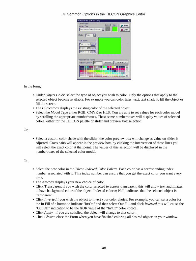
In the form,
Under Object Color, select the type of object you wish to color. Only the options that apply to theselected object become available. For example you can color lines, text, text shadow, fill the object orfill the screen.
•
The Currentbox displays the existing color of the selected object.• Select the Model Type either RGB, CMYK or HLS. You are able to set values for each color modelby scrolling the appropriate numberboxes. These same numberboxes will display values of selectedcolors, either for the TILCON palette or slider and preview box selection.
•
Or,
Select a custom color shade with the slider, the color preview box will change as value on slider isadjusted. Cross hairs will appear in the preview box, by clicking the intersection of these lines youwill select the exact color at that point. The values of this selection will be displayed in thenumberboxes of the selected color model.
•
Or,
Select the new color in the Tilcon Indexed Color Palette. Each color has a corresponding indexnumber associated with it. This index number can ensure that you get the exact color you want everytime.
•
The Newbox displays your new choice of color.• Click Transparent if you wish the color selected to appear transparent, this will allow text and imagesto have background color of the object. Indexed color #; Null, indicates that the selected object istransparent.
•
Click Invertedif you wish the object to invert your color choice. For example, you can set a color forthe In Fill of a button to indicate "In/On" and then select Out Fill and click Inverted this will cause the"Out/Off" indication to be the XOR value of the "In/On" color choice.
•
Click Apply if you are satisfied, the object will change to that color.• Click Closeto close the Form when you have finished coloring all desired objects in your window.•
4 Common Options in the TILCON Graphics Editor
48
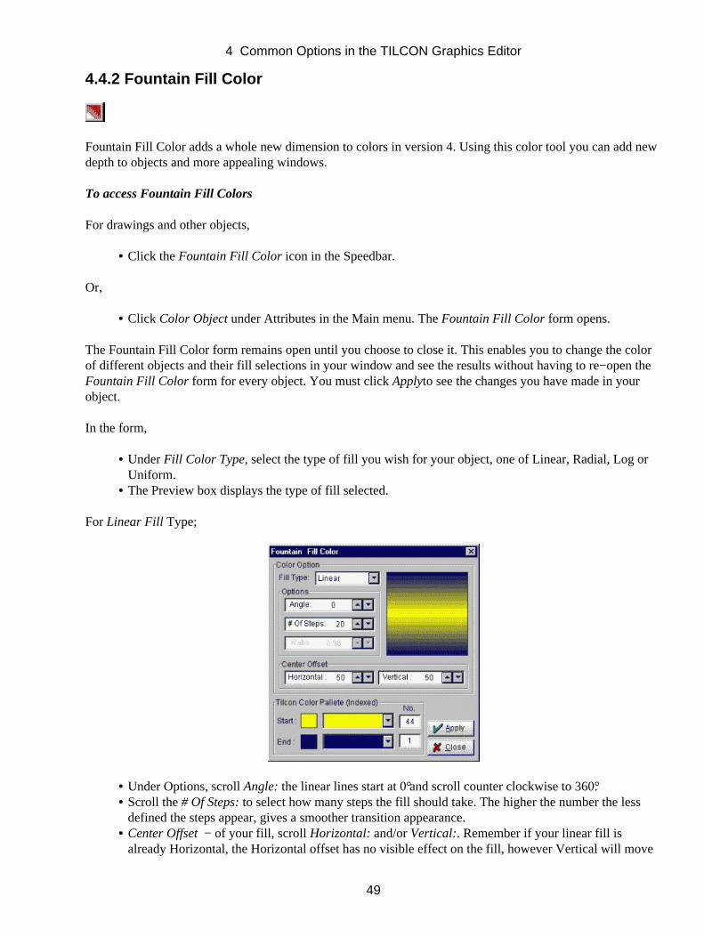
4.4.2 Fountain Fill Color
Fountain Fill Color adds a whole new dimension to colors in version 4. Using this color tool you can add newdepth to objects and more appealing windows.
To access Fountain Fill Colors
For drawings and other objects,
Click the Fountain Fill Color icon in the Speedbar.•
Or,
Click Color Object under Attributes in the Main menu. The Fountain Fill Color form opens.•
The Fountain Fill Color form remains open until you choose to close it. This enables you to change the colorof different objects and their fill selections in your window and see the results without having to re−open theFountain Fill Color form for every object. You must click Applyto see the changes you have made in yourobject.
In the form,
Under Fill Color Type, select the type of fill you wish for your object, one of Linear, Radial, Log orUniform.
•
The Preview box displays the type of fill selected.•
For Linear Fill Type;
Under Options, scroll Angle: the linear lines start at 0° and scroll counter clockwise to 360°.• Scroll the # Of Steps: to select how many steps the fill should take. The higher the number the lessdefined the steps appear, gives a smoother transition appearance.
•
Center Offset − of your fill, scroll Horizontal: and/or Vertical:. Remember if your linear fill isalready Horizontal, the Horizontal offset has no visible effect on the fill, however Vertical will move
•
4 Common Options in the TILCON Graphics Editor
49
the fill from side to side on your object. With Angle selected to 90°the linear fill will be Vertical andonly the Horizontal Offset will re−position the fill on your object.Select the Startand End color in the Tilcon Indexed Color Palette. This index number can ensure thatyou get the exact color you want every time.
•
Apply − if you are satisfied, the object will fill with the type of fill selected within the number ofsteps selected and in the direction indicated by your other selections.
•
Close − to close the Form when you have finished filling your object.•
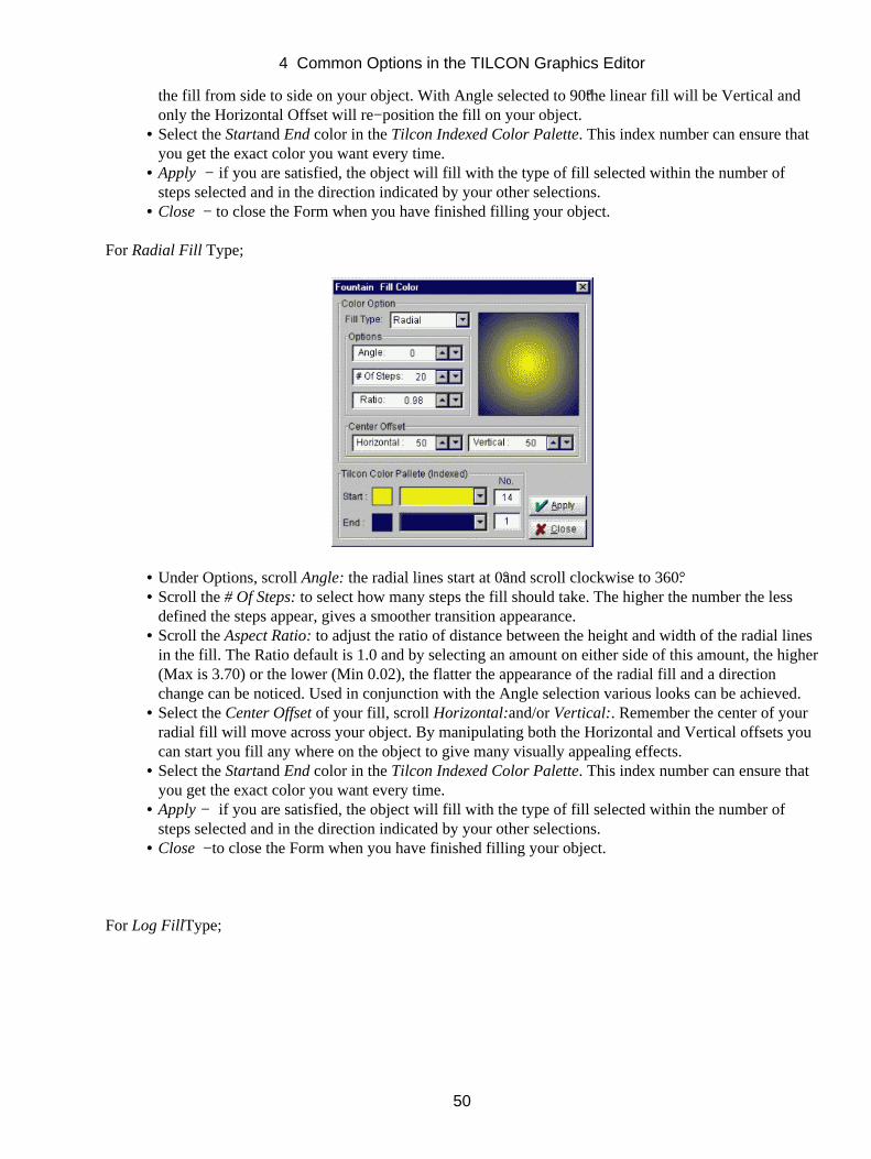
For Radial Fill Type;
Under Options, scroll Angle: the radial lines start at 0°and scroll clockwise to 360°.• Scroll the # Of Steps: to select how many steps the fill should take. The higher the number the lessdefined the steps appear, gives a smoother transition appearance.
•
Scroll the Aspect Ratio: to adjust the ratio of distance between the height and width of the radial linesin the fill. The Ratio default is 1.0 and by selecting an amount on either side of this amount, the higher(Max is 3.70) or the lower (Min 0.02), the flatter the appearance of the radial fill and a directionchange can be noticed. Used in conjunction with the Angle selection various looks can be achieved.
•
Select the Center Offset of your fill, scroll Horizontal:and/or Vertical:. Remember the center of yourradial fill will move across your object. By manipulating both the Horizontal and Vertical offsets youcan start you fill any where on the object to give many visually appealing effects.
•
Select the Startand End color in the Tilcon Indexed Color Palette. This index number can ensure thatyou get the exact color you want every time.
•
Apply − if you are satisfied, the object will fill with the type of fill selected within the number ofsteps selected and in the direction indicated by your other selections.
•
Close −to close the Form when you have finished filling your object.•
For Log FillType;
4 Common Options in the TILCON Graphics Editor
50

Under Options, scroll Angle: the log lines start at 0° and scroll counter clockwise to 360°.• Scroll the # Of Steps: to select how many steps the fill should take. The higher the number the lessdefined the steps appear, gives a smoother transition appearance.
•
Select the Center Offset of your fill, scroll Horizontal:and/or Vertical:. Remember if your log fill isalready Horizontal, the Horizontal offset has no visible effect on the fill, however Vertical will movethe fill from side to side on your object. With Angle selected to 90°the log fill will be Vertical andonly the Horizontal Offset will re−position the fill on your object.
•
Select the Startand End color in the Tilcon Indexed Color Palette. This index number can ensure thatyou get the exact color you want every time.
•
Uniform Fill Type;
If in the event that you change your mind and decide not to proceed with the selected fountain fill,you are able to return to the last saved uniform fill selections by selecting Uniform in the Fill ColorType abbreviated button.
•
Apply − if you are satisfied, the object will fill with the type of fill selected within the number ofsteps selected and in the direction indicated by your other selections.
•
Close − to close the Form when you have finished filling your object.•
4 Common Options in the TILCON Graphics Editor
51
4.5 Cursor Type
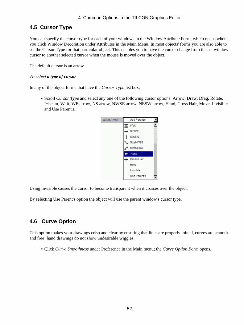
You can specify the cursor type for each of your windows in the Window Attribute Form, which opens whenyou click Window Decoration under Attributes in the Main Menu. In most objects' forms you are also able toset the Cursor Type for that particular object. This enables you to have the cursor change from the set windowcursor to another selected cursor when the mouse is moved over the object.
The default cursor is an arrow.
To select a type of cursor
In any of the object forms that have the Cursor Type list box,
Scroll Cursor Type and select any one of the following cursor options: Arrow, Draw, Drag, Rotate,I−beam, Wait, WE arrow, NS arrow, NWSE arrow, NESW arrow, Hand, Cross Hair, Move, Invisibleand Use Parent's.
•
Using invisible causes the cursor to become transparent when it crosses over the object.
By selecting Use Parent's option the object will use the parent window's cursor type.
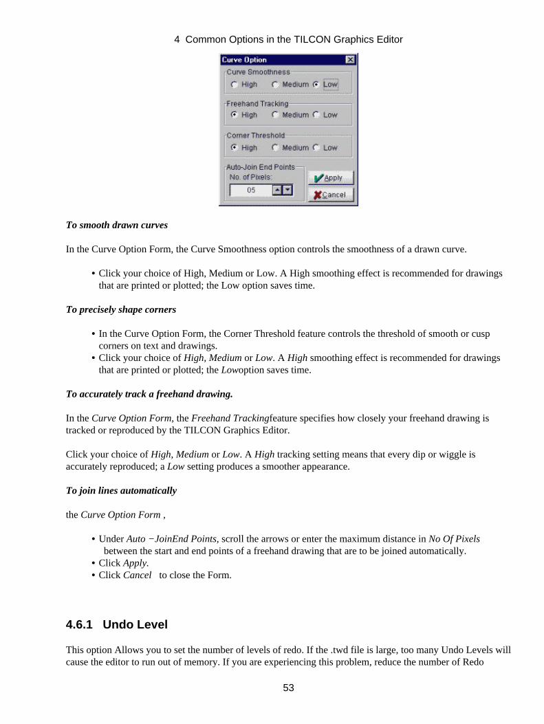
4.6 Curve Option
This option makes your drawings crisp and clear by ensuring that lines are properly joined, curves are smoothand free−hand drawings do not show undesirable wiggles.
Click Curve Smoothness under Preference in the Main menu; the Curve Option Form opens.•
4 Common Options in the TILCON Graphics Editor
52
To smooth drawn curves
In the Curve Option Form, the Curve Smoothness option controls the smoothness of a drawn curve.
Click your choice of High, Medium or Low. A High smoothing effect is recommended for drawingsthat are printed or plotted; the Low option saves time.
•
To precisely shape corners
In the Curve Option Form, the Corner Threshold feature controls the threshold of smooth or cuspcorners on text and drawings.
•
Click your choice of High, Medium or Low. A High smoothing effect is recommended for drawingsthat are printed or plotted; the Lowoption saves time.
•
To accurately track a freehand drawing.
In the Curve Option Form, the Freehand Trackingfeature specifies how closely your freehand drawing istracked or reproduced by the TILCON Graphics Editor.
Click your choice of High, Medium or Low. A High tracking setting means that every dip or wiggle isaccurately reproduced; a Low setting produces a smoother appearance.
To join lines automatically
the Curve Option Form ,
Under Auto −JoinEnd Points, scroll the arrows or enter the maximum distance in No Of Pixels between the start and end points of a freehand drawing that are to be joined automatically.
•
Click Apply.• Click Cancel to close the Form.•
4.6.1 Undo Level
This option Allows you to set the number of levels of redo. If the .twd file is large, too many Undo Levels willcause the editor to run out of memory. If you are experiencing this problem, reduce the number of Redo
4 Common Options in the TILCON Graphics Editor
53
Levels.
Click Undo Levels under Preference in the Main menu; the Undo Levels. Form opens.•
To Change the Undo Levels
In the Undo Levels Option Form, select the number of Undo Levels desired.
4.7 Grid Set Up
The Snap to Grid feature helps you to align or space items on your screen quickly and easily. It forces thecursor to move only the distance you specify and to stay on the grid points. Snap to Grid does not apply whiledrawing freehand curves.
Note:In order to see the grid, Display Grid in Preference in the Main Menu must be checked.
To snap to grid
Click Snap to Grid in Preference in the Main menu; a checkmark appears to indicate that the feature isenabled.
•
Click Snap to Grid again to disable this feature.•
Edit Grid
The Edit Grid feature enables you to change the distance between grid points and also the screenmeasurement units.
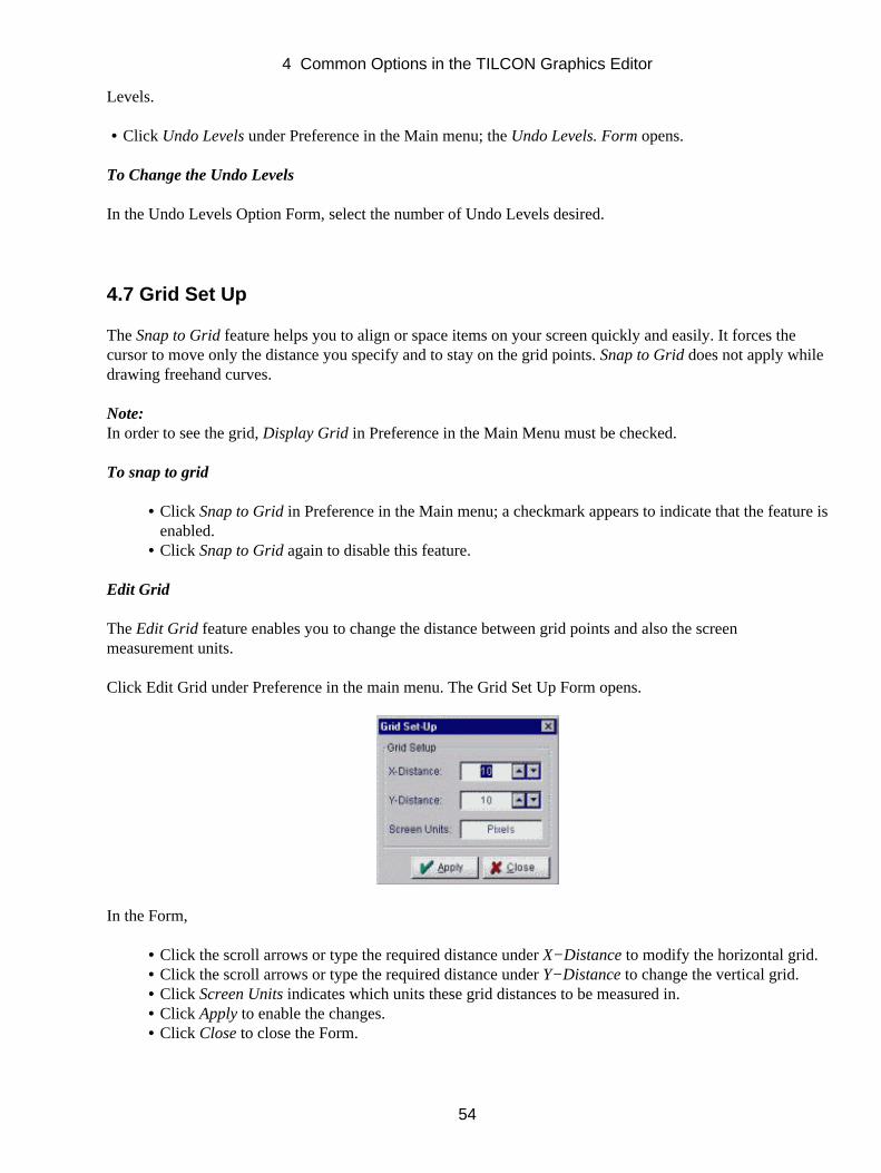
Click Edit Grid under Preference in the main menu. The Grid Set Up Form opens.
In the Form,
Click the scroll arrows or type the required distance under X−Distance to modify the horizontal grid.• Click the scroll arrows or type the required distance under Y−Distance to change the vertical grid.• Click Screen Units indicates which units these grid distances to be measured in.• Click Apply to enable the changes.• Click Close to close the Form.•
4 Common Options in the TILCON Graphics Editor
54
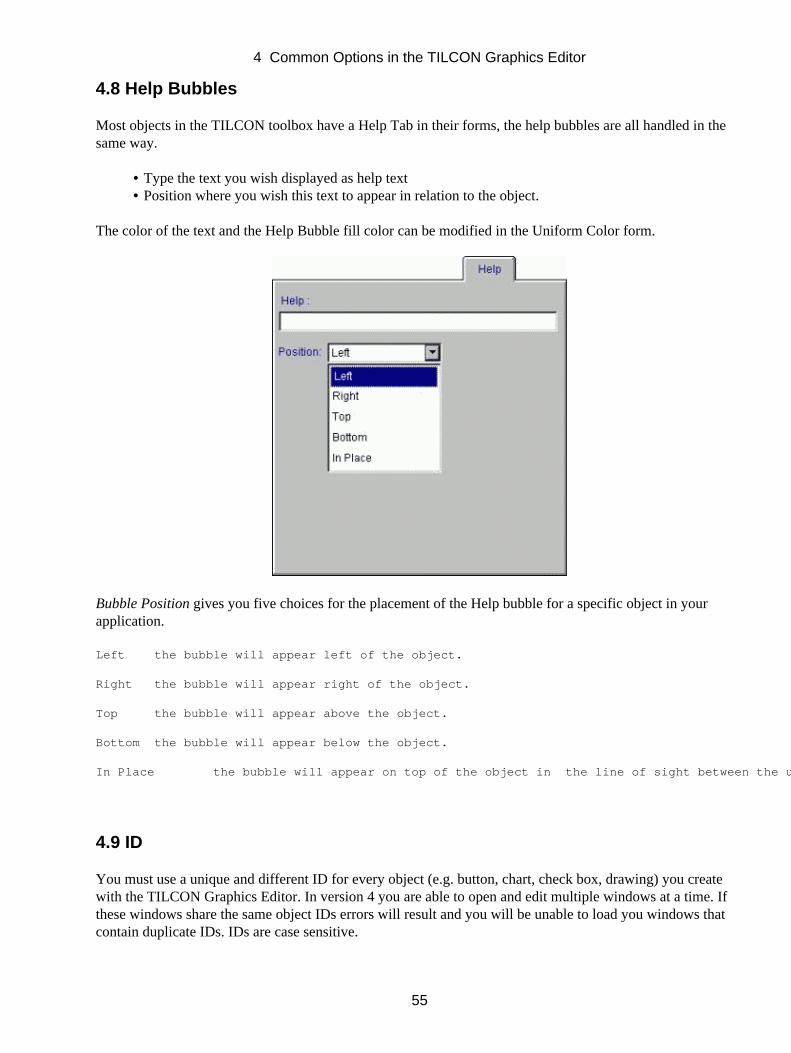
4.8 Help Bubbles
Most objects in the TILCON toolbox have a Help Tab in their forms, the help bubbles are all handled in thesame way.
Type the text you wish displayed as help text• Position where you wish this text to appear in relation to the object.•
The color of the text and the Help Bubble fill color can be modified in the Uniform Color form.
Bubble Position gives you five choices for the placement of the Help bubble for a specific object in yourapplication.
Left the bubble will appear left of the object.
Right the bubble will appear right of the object.
Top the bubble will appear above the object.
Bottom the bubble will appear below the object.
In Place the bubble will appear on top of the object in the line of sight between the user and the actual object.
4.9 ID
You must use a unique and different ID for every object (e.g. button, chart, check box, drawing) you createwith the TILCON Graphics Editor. In version 4 you are able to open and edit multiple windows at a time. Ifthese windows share the same object IDs errors will result and you will be unable to load you windows thatcontain duplicate IDs. IDs are case sensitive.
4 Common Options in the TILCON Graphics Editor
55

Duplicate IDs are especially troublesome when working in multiple window environments. For example, if aTRT_WindowLoad command is triggered from a window containing "Button1" and the window being loadedcontains another "Button1" the TRT_WindowLoad will not be executed, simply because of duplicate IDs.
To change an ID
Select the object (left−click on it).• Right−click to open the object's form.•
Or,
Select Edit ID under Options in the Main menu.• Make the required changes in the form and click OK.•
4.10 Initial State
There are many options for the specified initial state of your object. The following is a list of all availablestates and what they mean:
Hide − The object is initially hidden.
Enclosed − The object will be enclosed when initialized.
Dim − The item will be dimmed initially or greyed out.
Checked − The item will be initially checked.
4.11 Justify
This option is used to position text on buttons, boxes, etc.
Left − Aligns text along the left margin.
Right − Aligns text along the right margin.
Center − Aligns text along both margins.
4 Common Options in the TILCON Graphics Editor
56
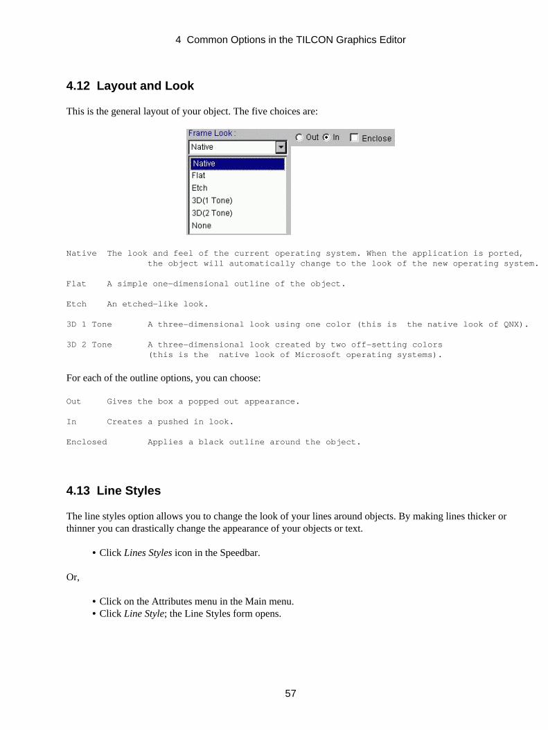
4.12 Layout and Look
This is the general layout of your object. The five choices are:
Native The look and feel of the current operating system. When the application is ported, the object will automatically change to the look of the new operating system.
Flat A simple one−dimensional outline of the object.
Etch An etched−like look.
3D 1 Tone A three−dimensional look using one color (this is the native look of QNX).
3D 2 Tone A three−dimensional look created by two off−setting colors (this is the native look of Microsoft operating systems).
For each of the outline options, you can choose:
Out Gives the box a popped out appearance.
In Creates a pushed in look.
Enclosed Applies a black outline around the object.
4.13 Line Styles
The line styles option allows you to change the look of your lines around objects. By making lines thicker orthinner you can drastically change the appearance of your objects or text.
Click Lines Styles icon in the Speedbar.•
Or,
Click on the Attributes menu in the Main menu.• Click Line Style; the Line Styles form opens.•
4 Common Options in the TILCON Graphics Editor
57
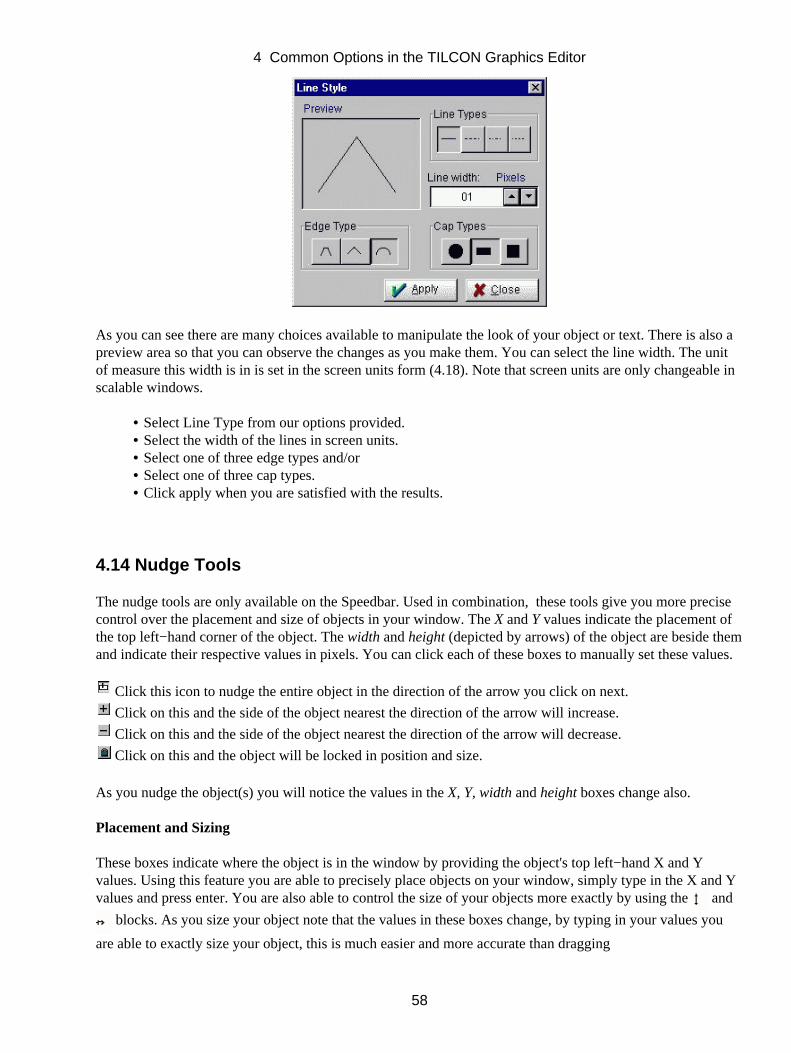
As you can see there are many choices available to manipulate the look of your object or text. There is also apreview area so that you can observe the changes as you make them. You can select the line width. The unitof measure this width is in is set in the screen units form (4.18). Note that screen units are only changeable inscalable windows.
Select Line Type from our options provided.• Select the width of the lines in screen units.• Select one of three edge types and/or• Select one of three cap types.• Click apply when you are satisfied with the results.•
4.14 Nudge Tools
The nudge tools are only available on the Speedbar. Used in combination, these tools give you more precisecontrol over the placement and size of objects in your window. The X and Y values indicate the placement ofthe top left−hand corner of the object. The width and height (depicted by arrows) of the object are beside themand indicate their respective values in pixels. You can click each of these boxes to manually set these values.
Click this icon to nudge the entire object in the direction of the arrow you click on next.
Click on this and the side of the object nearest the direction of the arrow will increase.
Click on this and the side of the object nearest the direction of the arrow will decrease.
Click on this and the object will be locked in position and size.
As you nudge the object(s) you will notice the values in the X, Y, width and height boxes change also.
Placement and Sizing
These boxes indicate where the object is in the window by providing the object's top left−hand X and Yvalues. Using this feature you are able to precisely place objects on your window, simply type in the X and Yvalues and press enter. You are also able to control the size of your objects more exactly by using the and
blocks. As you size your object note that the values in these boxes change, by typing in your values you
are able to exactly size your object, this is much easier and more accurate than dragging
4 Common Options in the TILCON Graphics Editor
58
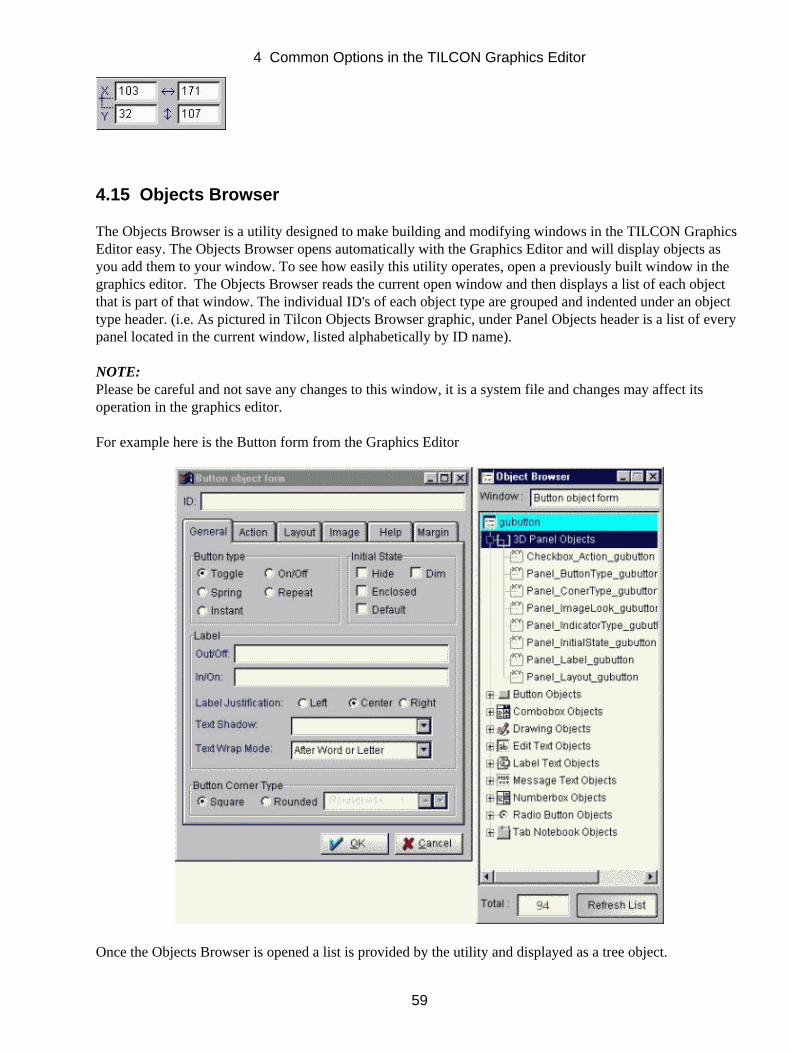
4.15 Objects Browser
The Objects Browser is a utility designed to make building and modifying windows in the TILCON GraphicsEditor easy. The Objects Browser opens automatically with the Graphics Editor and will display objects asyou add them to your window. To see how easily this utility operates, open a previously built window in thegraphics editor. The Objects Browser reads the current open window and then displays a list of each objectthat is part of that window. The individual ID's of each object type are grouped and indented under an objecttype header. (i.e. As pictured in Tilcon Objects Browser graphic, under Panel Objects header is a list of everypanel located in the current window, listed alphabetically by ID name).
NOTE:Please be careful and not save any changes to this window, it is a system file and changes may affect itsoperation in the graphics editor.
For example here is the Button form from the Graphics Editor
Once the Objects Browser is opened a list is provided by the utility and displayed as a tree object.
4 Common Options in the TILCON Graphics Editor
59
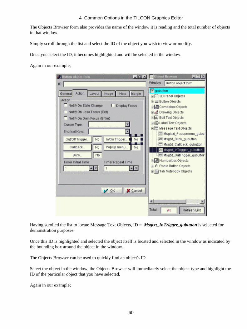
The Objects Browser form also provides the name of the window it is reading and the total number of objectsin that window.
Simply scroll through the list and select the ID of the object you wish to view or modify.
Once you select the ID, it becomes highlighted and will be selected in the window.
Again in our example;
Having scrolled the list to locate Message Text Objects, ID = Msgtxt_InTrigger_gubutton is selected fordemonstration purposes.
Once this ID is highlighted and selected the object itself is located and selected in the window as indicated bythe bounding box around the object in the window.
The Objects Browser can be used to quickly find an object's ID.
Select the object in the window, the Objects Browser will immediately select the object type and highlight theID of the particular object that you have selected.
Again in our example;
4 Common Options in the TILCON Graphics Editor
60
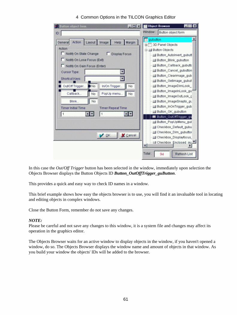
In this case the Out/Off Trigger button has been selected in the window, immediately upon selection theObjects Browser displays the Button Objects ID Button_OutOffTrigger_guButton.
This provides a quick and easy way to check ID names in a window.
This brief example shows how easy the objects browser is to use, you will find it an invaluable tool in locatingand editing objects in complex windows.
Close the Button Form, remember do not save any changes.
NOTE:Please be careful and not save any changes to this window, it is a system file and changes may affect itsoperation in the graphics editor.
The Objects Browser waits for an active window to display objects in the window, if you haven't opened awindow, do so. The Objects Browser displays the window name and amount of objects in that window. Asyou build your window the objects' IDs will be added to the browser.
4 Common Options in the TILCON Graphics Editor
61

4.16 Pattern
There are many types of fill patterns available to enhance your drawings. Fill patterns can be used for screensand objects.
Click the Patternsicon on the Speedbar.•
Or,
Click Attributes in the Main menu.• Click Fill Pattern, the Fill Patterns form opens.•
4 Common Options in the TILCON Graphics Editor
62
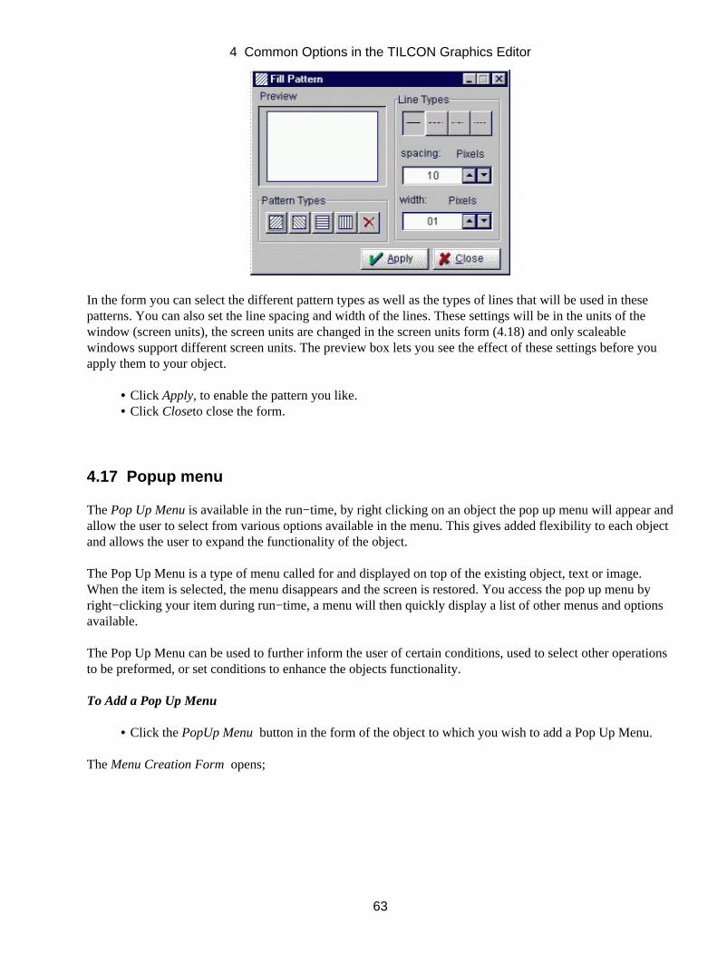
In the form you can select the different pattern types as well as the types of lines that will be used in thesepatterns. You can also set the line spacing and width of the lines. These settings will be in the units of thewindow (screen units), the screen units are changed in the screen units form (4.18) and only scaleablewindows support different screen units. The preview box lets you see the effect of these settings before youapply them to your object.
Click Apply, to enable the pattern you like.• Click Closeto close the form.•
4.17 Popup menu
The Pop Up Menu is available in the run−time, by right clicking on an object the pop up menu will appear andallow the user to select from various options available in the menu. This gives added flexibility to each objectand allows the user to expand the functionality of the object.
The Pop Up Menu is a type of menu called for and displayed on top of the existing object, text or image.When the item is selected, the menu disappears and the screen is restored. You access the pop up menu byright−clicking your item during run−time, a menu will then quickly display a list of other menus and optionsavailable.
The Pop Up Menu can be used to further inform the user of certain conditions, used to select other operationsto be preformed, or set conditions to enhance the objects functionality.
To Add a Pop Up Menu
Click the PopUp Menu button in the form of the object to which you wish to add a Pop Up Menu.•
The Menu Creation Form opens;
4 Common Options in the TILCON Graphics Editor
63
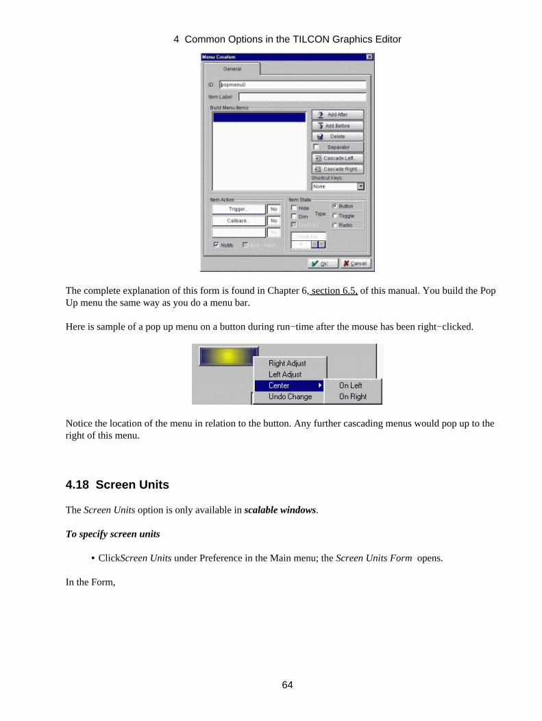
The complete explanation of this form is found in Chapter 6, section 6.5, of this manual. You build the PopUp menu the same way as you do a menu bar.
Here is sample of a pop up menu on a button during run−time after the mouse has been right−clicked.
Notice the location of the menu in relation to the button. Any further cascading menus would pop up to theright of this menu.
4.18 Screen Units
The Screen Units option is only available in scalable windows.
To specify screen units
ClickScreen Units under Preference in the Main menu; the Screen Units Form opens.•
In the Form,
4 Common Options in the TILCON Graphics Editor
64
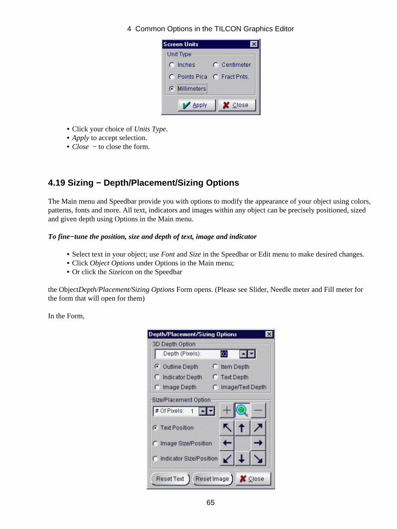
Click your choice of Units Type.• Apply to accept selection.• Close − to close the form.•
4.19 Sizing − Depth/Placement/Sizing Options
The Main menu and Speedbar provide you with options to modify the appearance of your object using colors,patterns, fonts and more. All text, indicators and images within any object can be precisely positioned, sizedand given depth using Options in the Main menu.
To fine−tune the position, size and depth of text, image and indicator
Select text in your object; use Font and Size in the Speedbar or Edit menu to make desired changes.• Click Object Options under Options in the Main menu;• Or click the Sizeicon on the Speedbar•
the ObjectDepth/Placement/Sizing Options Form opens. (Please see Slider, Needle meter and Fill meter forthe form that will open for them)
In the Form,
4 Common Options in the TILCON Graphics Editor
65
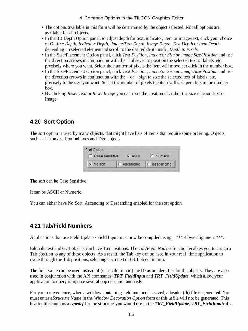
The options available in this form will be determined by the object selected. Not all options areavailable for all objects.
•
In the 3D Depth Option panel, to adjust depth for text, indicator, item or image/text, click your choiceof Outline Depth, Indicator Depth, Image/Text Depth, Image Depth, Text Depth or Item Depthdepending on selected elementand scroll to the desired depth under Depth in Pixels.
•
In the Size/Placement Option panel, click Text Position, Indicator Size or Image Size/Position and usethe direction arrows in conjunction with the "bullseye" to position the selected text of labels, etc.precisely where you want. Select the number of pixels the item will move per click in the number box.
•
In the Size/Placement Option panel, click Text Position, Indicator Size or Image Size/Position and usethe direction arrows in conjunction with the + or − sign to size the selected text of labels, etc.precisely to the size you want. Select the number of pixels the item will size per click in the numberbox.
•
By clicking Reset Text or Reset Image you can reset the position of and/or the size of your Text orImage.
•
4.20 Sort Option
The sort option is used by many objects, that might have lists of items that require some ordering. Objectssuch as Listboxes, Comboboxes and Tree objects
The sort can be Case Sensitive.
It can be ASCII or Numeric.
You can either have No Sort, Ascending or Descending enabled for the sort option.
4.21 Tab/Field Numbers
Applications that use Field Update / Field Input must now be compiled using *** 4 byte alignment ***.
Editable text and GUI objects can have Tab positions. The Tab/Field Numberfunction enables you to assign aTab position to any of these objects. As a result, the Tab key can be used in your real−time application tocycle through the Tab positions, selecting each text or GUI object in turn.
The field value can be used instead of (or in addition to) the ID as an identifier for the objects. They are alsoused in conjunction with the API commands TRT_FieldInput and TRT_FieldUpdate, which allow yourapplication to query or update several objects simultaneously.
For your convenience, when a window containing field numbers is saved, a header (.h) file is generated. Youmust enter aStructure Name in the Window Decoration Option form or this .hfile will not be generated. Thisheader file contains a typedef for the structure you would use in the TRT_FieldUpdate, TRT_FieldInputcalls.
4 Common Options in the TILCON Graphics Editor
66

For example, window Example.twd contains 3 objects with field numbers.
Field 1 is a checkbox (id=c1) with datatype=unsigned char.
Field 2 is a numberbox (id=n1) with a datatype=double.
Field 3 is a text field (id=t1) whose maximum length is 10 and with a datatype=ASCII.
The Structure Name in the Window Decoration Optionform is St_name.
The file Example.hwould be generated and would contain;
typedef struct{ /*1*/ unsigned char c1; /*checkbox*/ /*2*/ double n1; /*numberbox*/ /*3*/ unsigned char t1[11]; /*text*/ }St_name_field;
To set the Tab/Field position of editable text or GUI objects
Select the object.• Click Edit in the Main menu bar.• Click Tab/Field Number in the pull−down menu; the Edit Tab/Field form opens.•
Within a window, each object in the Tab cycle must have a unique Tab position, or it will be ignored. (Anobject with Tab 0 position is also ignored.) The cycle within each window starts at position 1.
In the form
Click on and assign a Tab Order # of the first object as 1, (remember to select the next object beforeyou assign its Tab Order #) and so on for all the objects within your window.
•
Click Enable and scroll the Field # to identify the field of the first object as 1, and so on for all theobjects within your window.
•
4 Common Options in the TILCON Graphics Editor
67
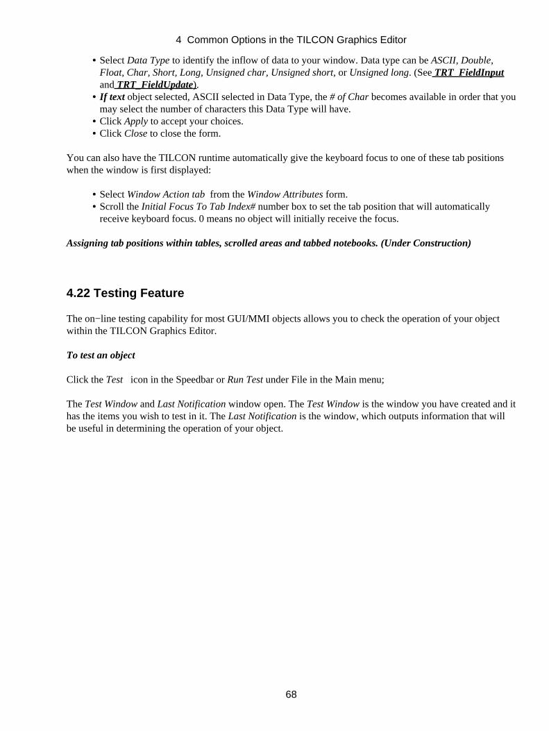
Select Data Type to identify the inflow of data to your window. Data type can be ASCII, Double,Float, Char, Short, Long, Unsigned char, Unsigned short, or Unsigned long. (See TRT_FieldInputand TRT_FieldUpdate).
•
If text object selected, ASCII selected in Data Type, the # of Char becomes available in order that youmay select the number of characters this Data Type will have.
•
Click Apply to accept your choices.• Click Close to close the form.•
You can also have the TILCON runtime automatically give the keyboard focus to one of these tab positionswhen the window is first displayed:
Select Window Action tab from the Window Attributes form.• Scroll the Initial Focus To Tab Index# number box to set the tab position that will automaticallyreceive keyboard focus. 0 means no object will initially receive the focus.
•
Assigning tab positions within tables, scrolled areas and tabbed notebooks. (Under Construction)
4.22 Testing Feature
The on−line testing capability for most GUI/MMI objects allows you to check the operation of your objectwithin the TILCON Graphics Editor.
To test an object
Click the Test icon in the Speedbar or Run Test under File in the Main menu;
The Test Window and Last Notification window open. The Test Window is the window you have created and ithas the items you wish to test in it. The Last Notification is the window, which outputs information that willbe useful in determining the operation of your object.
4 Common Options in the TILCON Graphics Editor
68
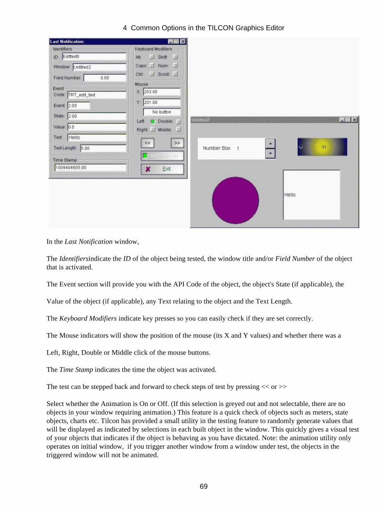
In the Last Notification window,
The Identifiersindicate the ID of the object being tested, the window title and/or Field Number of the objectthat is activated.
The Event section will provide you with the API Code of the object, the object's State (if applicable), the
Value of the object (if applicable), any Text relating to the object and the Text Length.
The Keyboard Modifiers indicate key presses so you can easily check if they are set correctly.
The Mouse indicators will show the position of the mouse (its X and Y values) and whether there was a
Left, Right, Double or Middle click of the mouse buttons.
The Time Stamp indicates the time the object was activated.
The test can be stepped back and forward to check steps of test by pressing << or >>
Select whether the Animation is On or Off. (If this selection is greyed out and not selectable, there are noobjects in your window requiring animation.) This feature is a quick check of objects such as meters, stateobjects, charts etc. Tilcon has provided a small utility in the testing feature to randomly generate values thatwill be displayed as indicated by selections in each built object in the window. This quickly gives a visual testof your objects that indicates if the object is behaving as you have dictated. Note: the animation utility onlyoperates on initial window, if you trigger another window from a window under test, the objects in thetriggered window will not be animated.
4 Common Options in the TILCON Graphics Editor
69
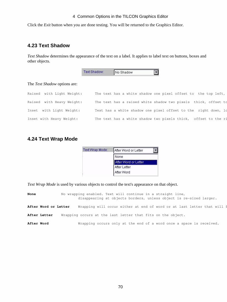
Click the Exit button when you are done testing. You will be returned to the Graphics Editor.
4.23 Text Shadow
Text Shadow determines the appearance of the text on a label. It applies to label text on buttons, boxes andother objects.
The Text Shadow options are:
Raised with Light Weight: The text has a white shadow one pixel offset to the top left, "raising" the text.
Raised with Heavy Weight: The text has a raised white shadow two pixels thick, offset to the top left.
Inset with Light Weight: Text has a white shadow one pixel offset to the right down, lowering the text.
Inset with Heavy Weight: The text has a white shadow two pixels thick, offset to the right down.
4.24 Text Wrap Mode
Text Wrap Mode is used by various objects to control the text's appearance on that object.
None No wrapping enabled. Text will continue in a straight line, disappearing at objects borders, unless object is re−sized larger.
After Word or Letter Wrapping will occur either at end of word or at last letter that will fit on object.
After Letter Wrapping occurs at the last letter that fits on the object.
After Word Wrapping occurs only at the end of a word once a space is received.
4 Common Options in the TILCON Graphics Editor
70
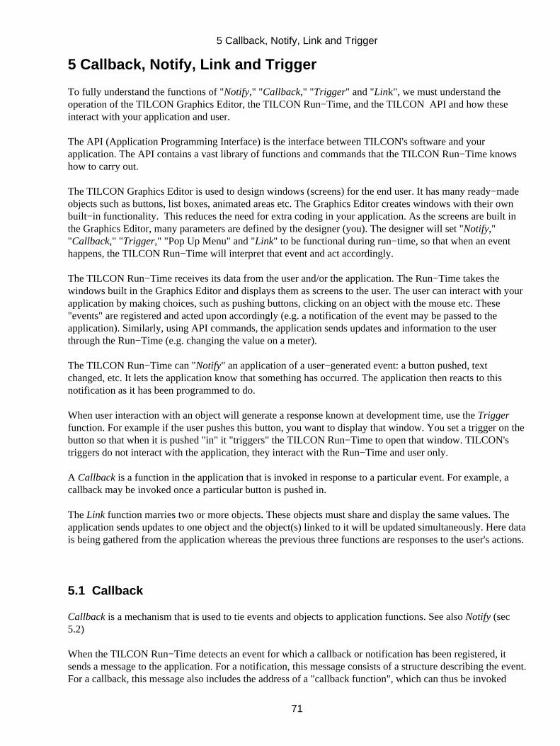
5 Callback, Notify, Link and Trigger
To fully understand the functions of "Notify," "Callback," "Trigger" and "Link", we must understand theoperation of the TILCON Graphics Editor, the TILCON Run−Time, and the TILCON API and how theseinteract with your application and user.
The API (Application Programming Interface) is the interface between TILCON's software and yourapplication. The API contains a vast library of functions and commands that the TILCON Run−Time knowshow to carry out.
The TILCON Graphics Editor is used to design windows (screens) for the end user. It has many ready−madeobjects such as buttons, list boxes, animated areas etc. The Graphics Editor creates windows with their ownbuilt−in functionality. This reduces the need for extra coding in your application. As the screens are built inthe Graphics Editor, many parameters are defined by the designer (you). The designer will set "Notify,""Callback," "Trigger," "Pop Up Menu" and "Link" to be functional during run−time, so that when an eventhappens, the TILCON Run−Time will interpret that event and act accordingly.
The TILCON Run−Time receives its data from the user and/or the application. The Run−Time takes thewindows built in the Graphics Editor and displays them as screens to the user. The user can interact with yourapplication by making choices, such as pushing buttons, clicking on an object with the mouse etc. These"events" are registered and acted upon accordingly (e.g. a notification of the event may be passed to theapplication). Similarly, using API commands, the application sends updates and information to the userthrough the Run−Time (e.g. changing the value on a meter).
The TILCON Run−Time can "Notify" an application of a user−generated event: a button pushed, textchanged, etc. It lets the application know that something has occurred. The application then reacts to thisnotification as it has been programmed to do.
When user interaction with an object will generate a response known at development time, use the Triggerfunction. For example if the user pushes this button, you want to display that window. You set a trigger on thebutton so that when it is pushed "in" it "triggers" the TILCON Run−Time to open that window. TILCON'striggers do not interact with the application, they interact with the Run−Time and user only.
A Callback is a function in the application that is invoked in response to a particular event. For example, acallback may be invoked once a particular button is pushed in.
The Link function marries two or more objects. These objects must share and display the same values. Theapplication sends updates to one object and the object(s) linked to it will be updated simultaneously. Here datais being gathered from the application whereas the previous three functions are responses to the user's actions.
5.1 Callback
Callback is a mechanism that is used to tie events and objects to application functions. See also Notify (sec5.2)
When the TILCON Run−Time detects an event for which a callback or notification has been registered, itsends a message to the application. For a notification, this message consists of a structure describing the event.For a callback, this message also includes the address of a "callback function", which can thus be invoked
5 Callback, Notify, Link and Trigger
71
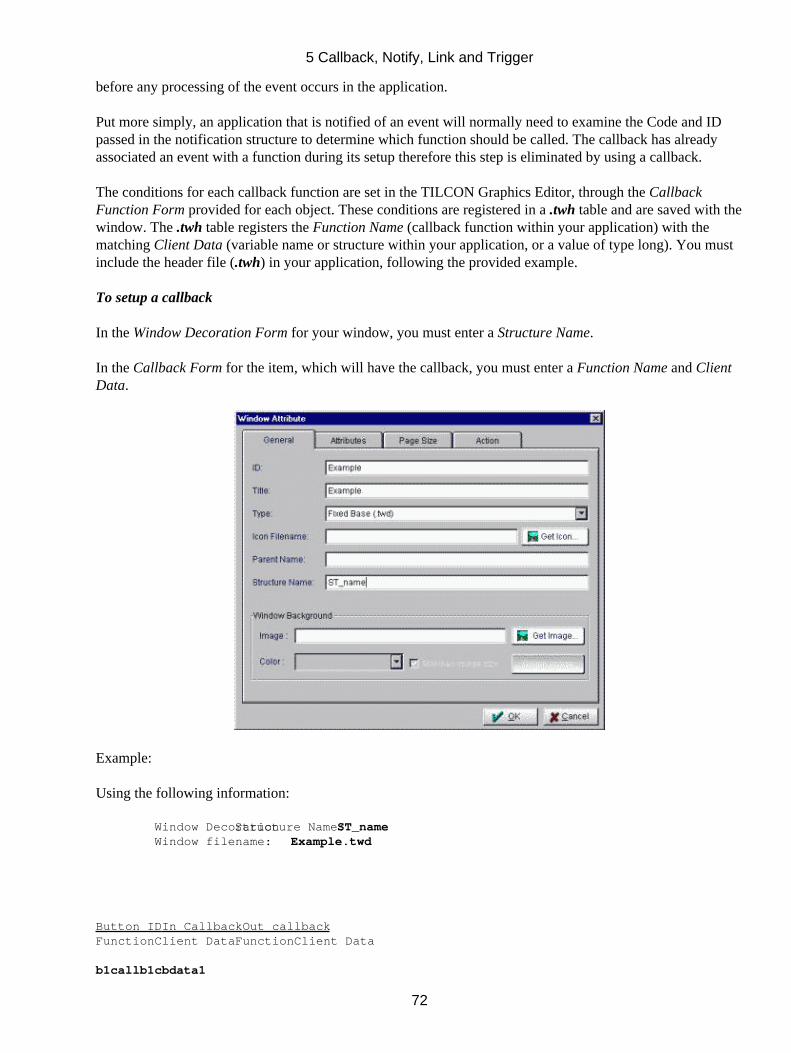
before any processing of the event occurs in the application.
Put more simply, an application that is notified of an event will normally need to examine the Code and IDpassed in the notification structure to determine which function should be called. The callback has alreadyassociated an event with a function during its setup therefore this step is eliminated by using a callback.
The conditions for each callback function are set in the TILCON Graphics Editor, through the CallbackFunction Form provided for each object. These conditions are registered in a .twh table and are saved with thewindow. The .twh table registers the Function Name (callback function within your application) with thematching Client Data (variable name or structure within your application, or a value of type long). You mustinclude the header file (.twh) in your application, following the provided example.
To setup a callback
In the Window Decoration Form for your window, you must enter a Structure Name.
In the Callback Form for the item, which will have the callback, you must enter a Function Name and ClientData.
Example:
Using the following information:
Window Decoration Structure Name: ST_name Window filename: Example.twd
Button IDIn CallbackOut callbackFunctionClient DataFunctionClient Data
b1callb1cbdata1
5 Callback, Notify, Link and Trigger
72
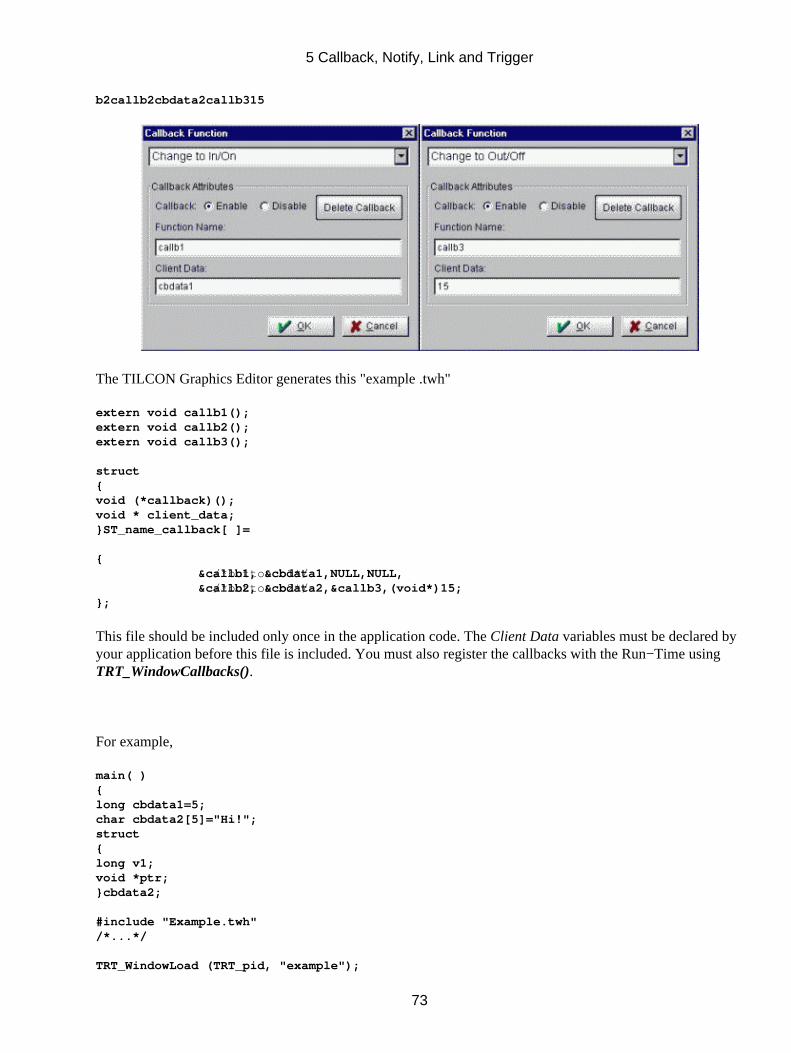
b2callb2cbdata2callb315
The TILCON Graphics Editor generates this "example .twh"
extern void callb1();extern void callb2();extern void callb3();
struct{void (*callback)();void * client_data;}ST_name_callback[ ]=
{ /*button b1*/ &callb1, &cbdata1,NULL,NULL, /*button b2*/ &callb2, &cbdata2,&callb3,(void*)15;};
This file should be included only once in the application code. The Client Data variables must be declared byyour application before this file is included. You must also register the callbacks with the Run−Time usingTRT_WindowCallbacks().
For example,
main( ){long cbdata1=5;char cbdata2[5]="Hi!";struct{long v1;void *ptr;}cbdata2;
#include "Example.twh"/*...*/
TRT_WindowLoad (TRT_pid, "example");
5 Callback, Notify, Link and Trigger
73
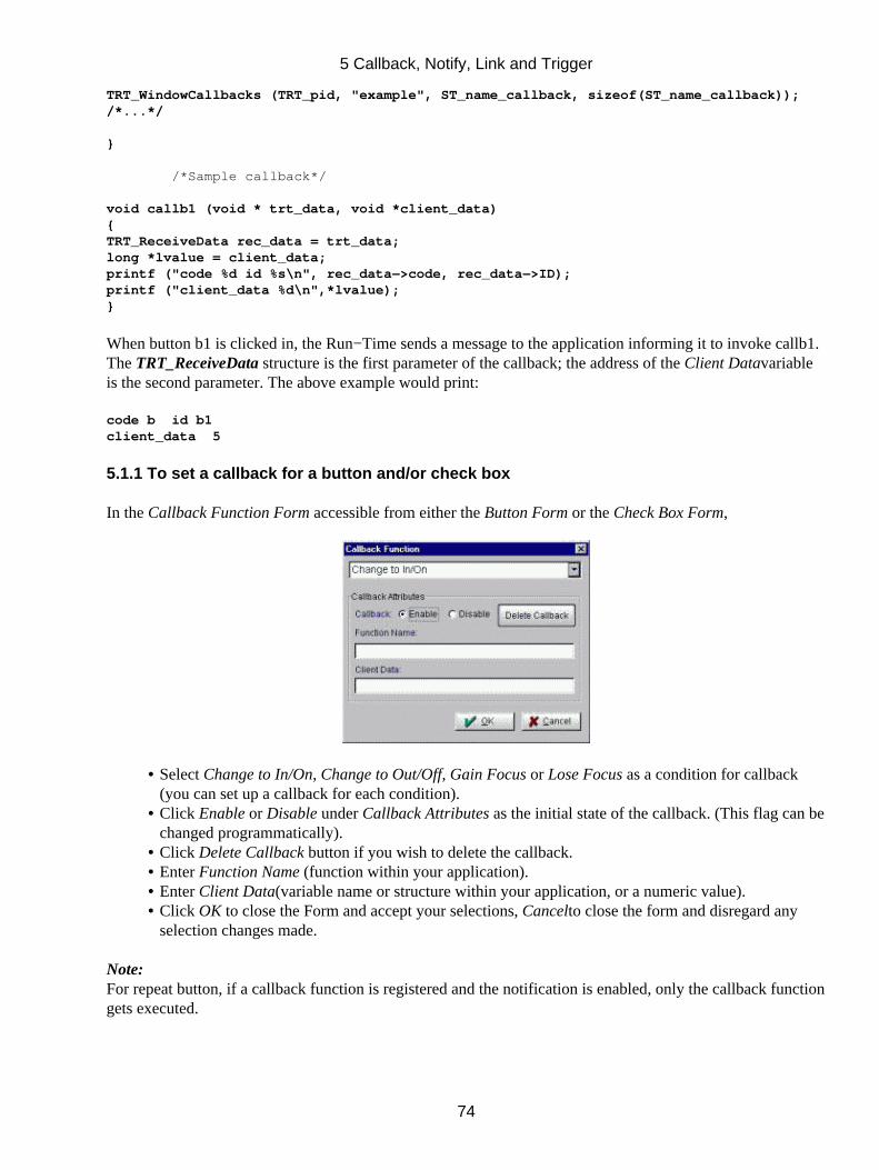
TRT_WindowCallbacks (TRT_pid, "example", ST_name_callback, sizeof(ST_name_callback));/*...*/
}
/*Sample callback*/
void callb1 (void * trt_data, void *client_data){TRT_ReceiveData rec_data = trt_data;long *lvalue = client_data;printf ("code %d id %s\n", rec_data−>code, rec_data−>ID);printf ("client_data %d\n",*lvalue);}
When button b1 is clicked in, the Run−Time sends a message to the application informing it to invoke callb1.The TRT_ReceiveData structure is the first parameter of the callback; the address of the Client Datavariableis the second parameter. The above example would print:
code b id b1client_data 5
5.1.1 To set a callback for a button and/or check box
In the Callback Function Form accessible from either the Button Form or the Check Box Form,
Select Change to In/On, Change to Out/Off, Gain Focus or Lose Focus as a condition for callback(you can set up a callback for each condition).
•
Click Enable or Disable under Callback Attributes as the initial state of the callback. (This flag can bechanged programmatically).
•
Click Delete Callback button if you wish to delete the callback.• Enter Function Name (function within your application).• Enter Client Data(variable name or structure within your application, or a numeric value).• Click OK to close the Form and accept your selections, Cancelto close the form and disregard anyselection changes made.
•
Note:For repeat button, if a callback function is registered and the notification is enabled, only the callback functiongets executed.
5 Callback, Notify, Link and Trigger
74
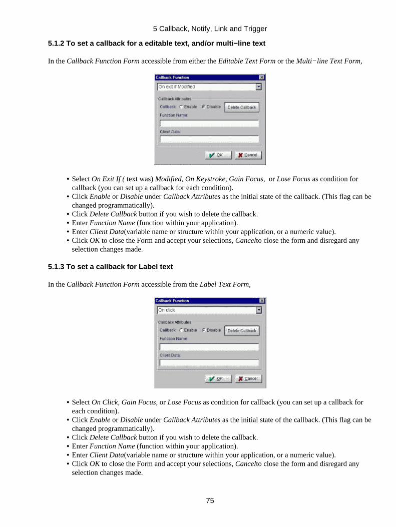
5.1.2 To set a callback for a editable text, and/or multi−line text
In the Callback Function Form accessible from either the Editable Text Form or the Multi−line Text Form,
Select On Exit If ( text was) Modified, On Keystroke, Gain Focus, or Lose Focus as condition forcallback (you can set up a callback for each condition).
•
Click Enable or Disable under Callback Attributes as the initial state of the callback. (This flag can bechanged programmatically).
•
Click Delete Callback button if you wish to delete the callback.• Enter Function Name (function within your application).• Enter Client Data(variable name or structure within your application, or a numeric value).• Click OK to close the Form and accept your selections, Cancelto close the form and disregard anyselection changes made.
•
5.1.3 To set a callback for Label text
In the Callback Function Form accessible from the Label Text Form,
Select On Click, Gain Focus, or Lose Focus as condition for callback (you can set up a callback foreach condition).
•
Click Enable or Disable under Callback Attributes as the initial state of the callback. (This flag can bechanged programmatically).
•
Click Delete Callback button if you wish to delete the callback.• Enter Function Name (function within your application).• Enter Client Data(variable name or structure within your application, or a numeric value).• Click OK to close the Form and accept your selections, Cancelto close the form and disregard anyselection changes made.
•
5 Callback, Notify, Link and Trigger
75
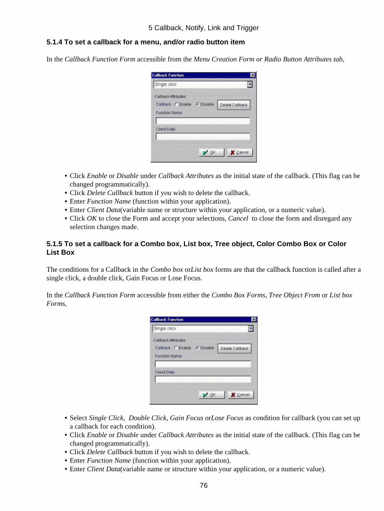
5.1.4 To set a callback for a menu, and/or radio button item
In the Callback Function Form accessible from the Menu Creation Form or Radio Button Attributes tab,
Click Enable or Disable under Callback Attributes as the initial state of the callback. (This flag can bechanged programmatically).
•
Click Delete Callback button if you wish to delete the callback.• Enter Function Name (function within your application).• Enter Client Data(variable name or structure within your application, or a numeric value).• Click OK to close the Form and accept your selections, Cancel to close the form and disregard anyselection changes made.
•
5.1.5 To set a callback for a Combo box, List box, Tree object, Color Combo Box or ColorList Box
The conditions for a Callback in the Combo box orList box forms are that the callback function is called after asingle click, a double click, Gain Focus or Lose Focus.
In the Callback Function Form accessible from either the Combo Box Forms, Tree Object From or List boxForms,
Select Single Click, Double Click, Gain Focus orLose Focus as condition for callback (you can set upa callback for each condition).
•
Click Enable or Disable under Callback Attributes as the initial state of the callback. (This flag can bechanged programmatically).
•
Click Delete Callback button if you wish to delete the callback.• Enter Function Name (function within your application).• Enter Client Data(variable name or structure within your application, or a numeric value).•
5 Callback, Notify, Link and Trigger
76
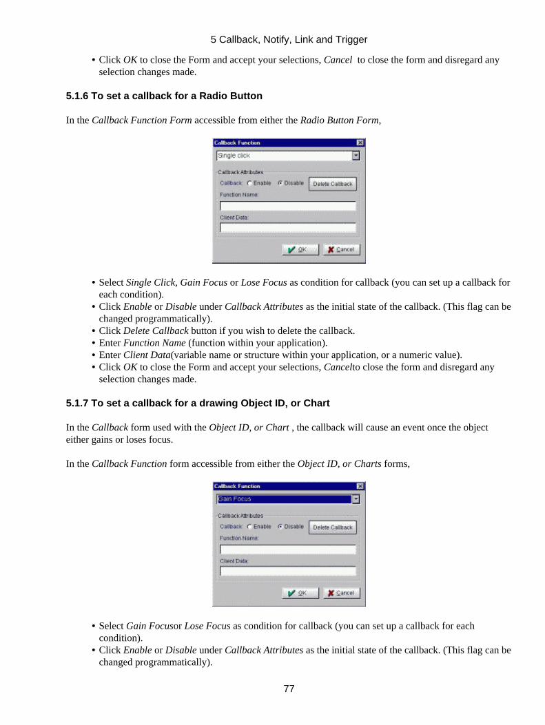
Click OK to close the Form and accept your selections, Cancel to close the form and disregard anyselection changes made.
•
5.1.6 To set a callback for a Radio Button
In the Callback Function Form accessible from either the Radio Button Form,
Select Single Click, Gain Focus or Lose Focus as condition for callback (you can set up a callback foreach condition).
•
Click Enable or Disable under Callback Attributes as the initial state of the callback. (This flag can bechanged programmatically).
•
Click Delete Callback button if you wish to delete the callback.• Enter Function Name (function within your application).• Enter Client Data(variable name or structure within your application, or a numeric value).• Click OK to close the Form and accept your selections, Cancelto close the form and disregard anyselection changes made.
•
5.1.7 To set a callback for a drawing Object ID, or Chart
In the Callback form used with the Object ID, or Chart , the callback will cause an event once the objecteither gains or loses focus.
In the Callback Function form accessible from either the Object ID, or Charts forms,
Select Gain Focusor Lose Focus as condition for callback (you can set up a callback for eachcondition).
•
Click Enable or Disable under Callback Attributes as the initial state of the callback. (This flag can bechanged programmatically).
•
5 Callback, Notify, Link and Trigger
77
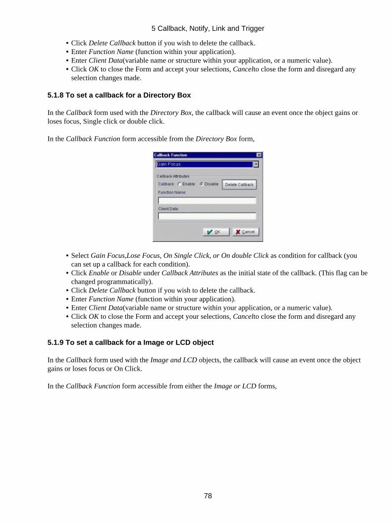
Click Delete Callback button if you wish to delete the callback.• Enter Function Name (function within your application).• Enter Client Data(variable name or structure within your application, or a numeric value).• Click OK to close the Form and accept your selections, Cancelto close the form and disregard anyselection changes made.
•
5.1.8 To set a callback for a Directory Box
In the Callback form used with the Directory Box, the callback will cause an event once the object gains orloses focus, Single click or double click.
In the Callback Function form accessible from the Directory Box form,
Select Gain Focus,Lose Focus, On Single Click, or On double Click as condition for callback (youcan set up a callback for each condition).
•
Click Enable or Disable under Callback Attributes as the initial state of the callback. (This flag can bechanged programmatically).
•
Click Delete Callback button if you wish to delete the callback.• Enter Function Name (function within your application).• Enter Client Data(variable name or structure within your application, or a numeric value).• Click OK to close the Form and accept your selections, Cancelto close the form and disregard anyselection changes made.
•
5.1.9 To set a callback for a Image or LCD object
In the Callback form used with the Image and LCD objects, the callback will cause an event once the objectgains or loses focus or On Click.
In the Callback Function form accessible from either the Image or LCD forms,
5 Callback, Notify, Link and Trigger
78
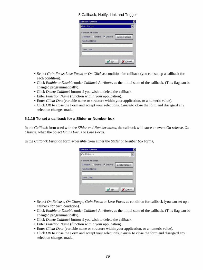
Select Gain Focus,Lose Focus or On Click as condition for callback (you can set up a callback foreach condition).
•
Click Enable or Disable under Callback Attributes as the initial state of the callback. (This flag can bechanged programmatically).
•
Click Delete Callback button if you wish to delete the callback.• Enter Function Name (function within your application).• Enter Client Data(variable name or structure within your application, or a numeric value).• Click OK to close the Form and accept your selections, Cancelto close the form and disregard anyselection changes made.
•
5.1.10 To set a callback for a Slider or Number box
In the Callback form used with the Slider and Number boxes, the callback will cause an event On release, OnChange, when the object Gains Focus or Lose Focus.
In the Callback Function form accessible from either the Slider or Number box forms,
Select On Release, On Change, Gain Focus or Lose Focus as condition for callback (you can set up acallback for each condition).
•
Click Enable or Disable under Callback Attributes as the initial state of the callback. (This flag can bechanged programmatically).
•
Click Delete Callback button if you wish to delete the callback.• Enter Function Name (function within your application).• Enter Client Data (variable name or structure within your application, or a numeric value).• Click OK to close the Form and accept your selections, Cancel to close the form and disregard anyselection changes made.
•
5 Callback, Notify, Link and Trigger
79
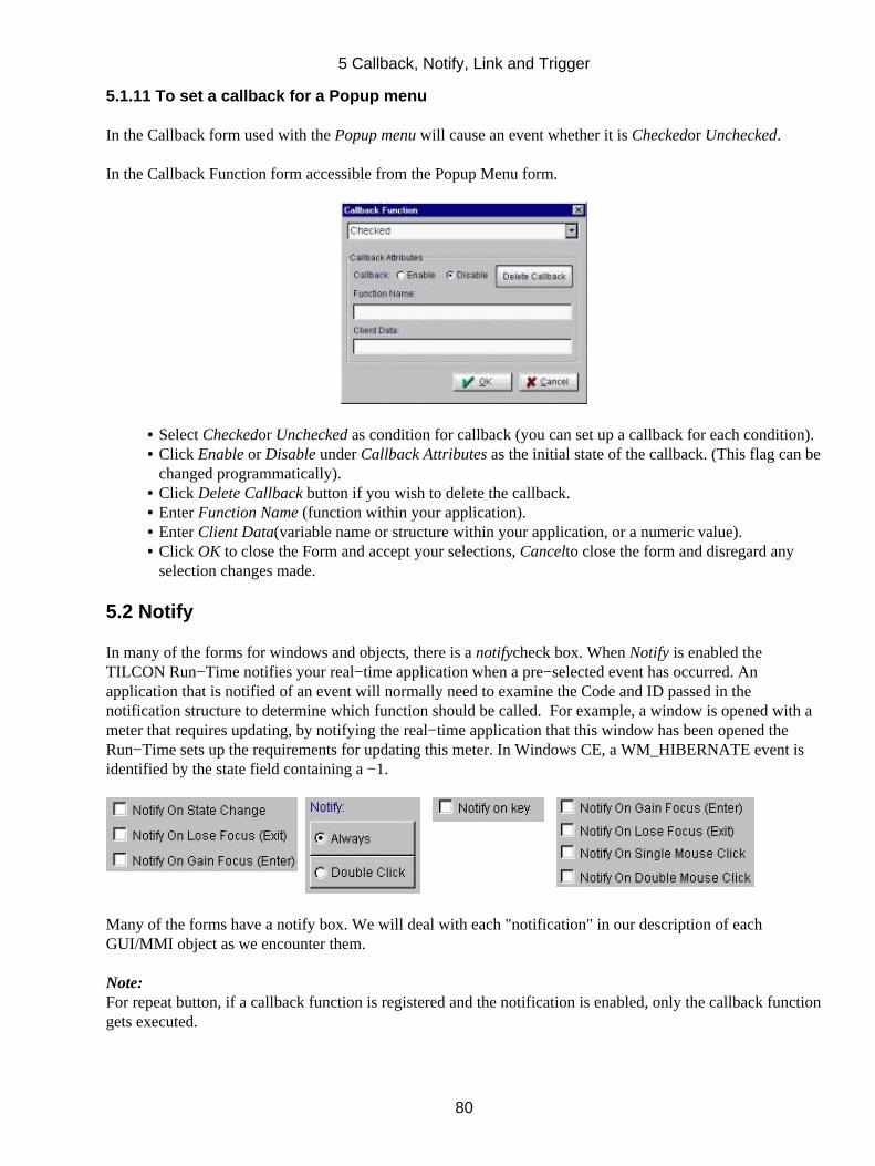
5.1.11 To set a callback for a Popup menu
In the Callback form used with the Popup menu will cause an event whether it is Checkedor Unchecked.
In the Callback Function form accessible from the Popup Menu form.
Select Checkedor Unchecked as condition for callback (you can set up a callback for each condition).• Click Enable or Disable under Callback Attributes as the initial state of the callback. (This flag can bechanged programmatically).
•
Click Delete Callback button if you wish to delete the callback.• Enter Function Name (function within your application).• Enter Client Data(variable name or structure within your application, or a numeric value).• Click OK to close the Form and accept your selections, Cancelto close the form and disregard anyselection changes made.
•
5.2 Notify
In many of the forms for windows and objects, there is a notifycheck box. When Notify is enabled theTILCON Run−Time notifies your real−time application when a pre−selected event has occurred. Anapplication that is notified of an event will normally need to examine the Code and ID passed in thenotification structure to determine which function should be called. For example, a window is opened with ameter that requires updating, by notifying the real−time application that this window has been opened theRun−Time sets up the requirements for updating this meter. In Windows CE, a WM_HIBERNATE event isidentified by the state field containing a −1.
Many of the forms have a notify box. We will deal with each "notification" in our description of eachGUI/MMI object as we encounter them.
Note:For repeat button, if a callback function is registered and the notification is enabled, only the callback functiongets executed.
5 Callback, Notify, Link and Trigger
80
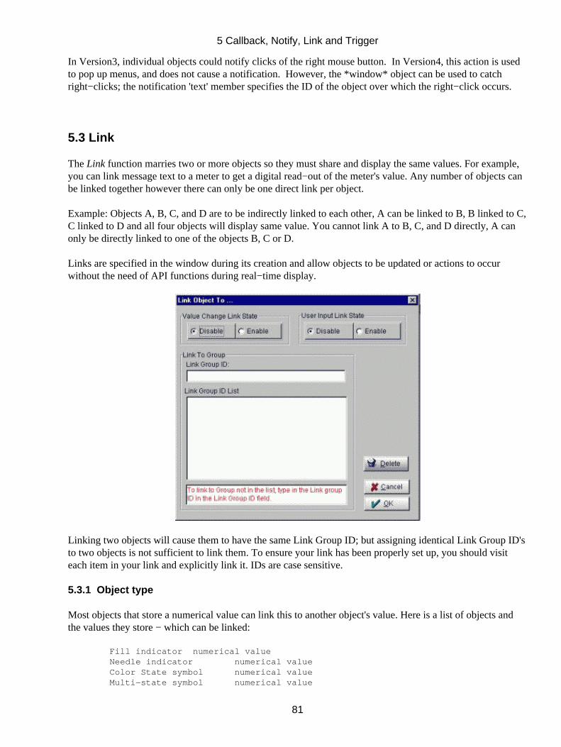
In Version3, individual objects could notify clicks of the right mouse button. In Version4, this action is usedto pop up menus, and does not cause a notification. However, the *window* object can be used to catchright−clicks; the notification 'text' member specifies the ID of the object over which the right−click occurs.
5.3 Link
The Link function marries two or more objects so they must share and display the same values. For example,you can link message text to a meter to get a digital read−out of the meter's value. Any number of objects canbe linked together however there can only be one direct link per object.
Example: Objects A, B, C, and D are to be indirectly linked to each other, A can be linked to B, B linked to C,C linked to D and all four objects will display same value. You cannot link A to B, C, and D directly, A canonly be directly linked to one of the objects B, C or D.
Links are specified in the window during its creation and allow objects to be updated or actions to occurwithout the need of API functions during real−time display.
Linking two objects will cause them to have the same Link Group ID; but assigning identical Link Group ID'sto two objects is not sufficient to link them. To ensure your link has been properly set up, you should visiteach item in your link and explicitly link it. IDs are case sensitive.
5.3.1 Object type
Most objects that store a numerical value can link this to another object's value. Here is a list of objects andthe values they store − which can be linked:
Fill indicator numerical value Needle indicator numerical value Color State symbol numerical value Multi−state symbol numerical value
5 Callback, Notify, Link and Trigger
81
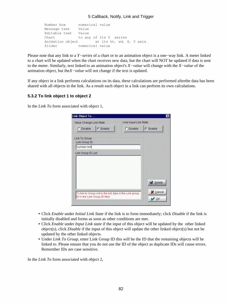
Number box numerical value Message text Value Editable text Value Chart to any of its Y series Animation object at its ht, wd, X, Y axis Slider numerical value
Please note that any link to a Y−series of a chart or to an animation object is a one−way link. A meter linkedto a chart will be updated when the chart receives new data, but the chart will NOT be updated if data is sentto the meter. Similarly, text linked to an animation object's X−value will change with the X−value of theanimation object, but theX−value will not change if the text is updated.
If any object in a link performs calculations on its data, these calculations are performed afterthe data has beenshared with all objects in the link. As a result each object in a link can perform its own calculations.
5.3.2 To link object 1 to object 2
In the Link To form associated with object 1,
Click Enable under Initial Link State if the link is to form immediately; click Disable if the link isinitially disabled and forms as soon as other conditions are met.
•
Click Enable under Input Link state if the input of this object will be updated by the other linkedobject(s), click Disable if the input of this object will update the other linked object(s) but not beupdated by the other linked objects.
•
Under Link To Group, enter Link Group ID this will be the ID that the remaining objects will belinked to. Please ensure that you do not use the ID of the object as duplicate IDs will cause errors.Remember IDs are case sensitive.
•
In the Link To form associated with object 2,
5 Callback, Notify, Link and Trigger
82
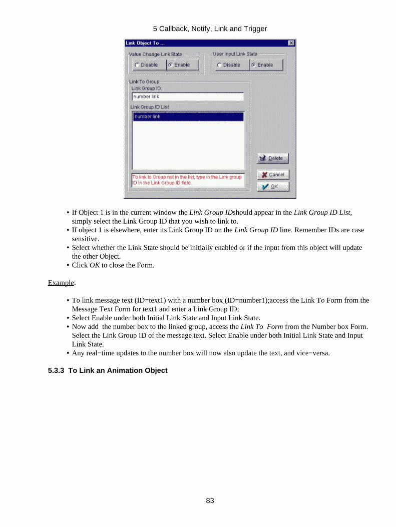
If Object 1 is in the current window the Link Group IDshould appear in the Link Group ID List,simply select the Link Group ID that you wish to link to.
•
If object 1 is elsewhere, enter its Link Group ID on the Link Group ID line. Remember IDs are casesensitive.
•
Select whether the Link State should be initially enabled or if the input from this object will updatethe other Object.
•
Click OK to close the Form.•
Example:
To link message text (ID=text1) with a number box (ID=number1);access the Link To Form from theMessage Text Form for text1 and enter a Link Group ID;
•
Select Enable under both Initial Link State and Input Link State.• Now add the number box to the linked group, access the Link To Form from the Number box Form.Select the Link Group ID of the message text. Select Enable under both Initial Link State and InputLink State.
•
Any real−time updates to the number box will now also update the text, and vice−versa.•
5.3.3 To Link an Animation Object
5 Callback, Notify, Link and Trigger
83
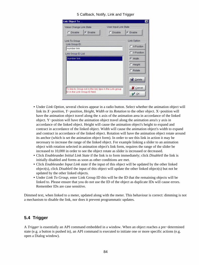
Under Link Option, several choices appear in a radio button. Select whether the animation object willlink its X−position, Y−position, Height, Width or its Rotation to the other object. X−position willhave the animation object travel along the x axis of the animation area in accordance of the linkedobject. Y−position will have the animation object travel along the animation area's y axis inaccordance of the linked object. Height will cause the animation object's height to expand andcontract in accordance of the linked object. Width will cause the animation object's width to expandand contract in accordance of the linked object. Rotation will have the animation object rotate aroundits anchor (which is set the animation object form). In order to see this link in action it may benecessary to increase the range of the linked object. For example linking a slider to an animationobject with rotation selected in animation object's link form, requires the range of the slider beincreased to 10,000 in order to see the object rotate as slider is increased or decreased.
•
Click Enableunder Initial Link State if the link is to form immediately; click Disableif the link isinitially disabled and forms as soon as other conditions are met.
•
Click Enableunder Input Link state if the input of this object will be updated by the other linkedobject(s), click Disableif the input of this object will update the other linked object(s) but not beupdated by the other linked objects.
•
Under Link To Group, enter Link Group ID this will be the ID that the remaining objects will belinked to. Please ensure that you do not use the ID of the object as duplicate IDs will cause errors.Remember IDs are case sensitive.
•
Dimmed text, when linked to a meter, updated along with the meter. This behaviour is correct: dimming is nota mechanism to disable the link, nor does it prevent programmatic updates.
5.4 Trigger
A Trigger is essentially an API command embedded in a window. When an object reaches a pre−determinedstate (e.g. a button is pushed in), an API command is executed to initiate one or more specific actions (e.g.open a Dialog window).
5 Callback, Notify, Link and Trigger
84
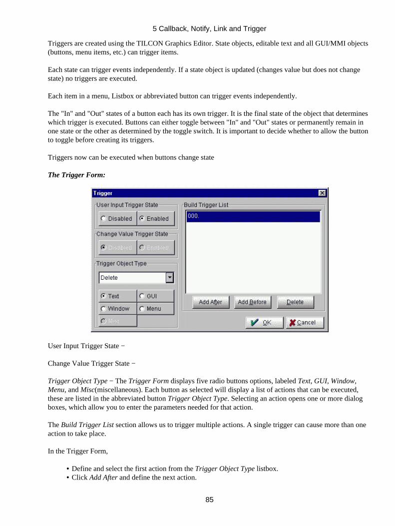
Triggers are created using the TILCON Graphics Editor. State objects, editable text and all GUI/MMI objects(buttons, menu items, etc.) can trigger items.
Each state can trigger events independently. If a state object is updated (changes value but does not changestate) no triggers are executed.
Each item in a menu, Listbox or abbreviated button can trigger events independently.
The "In" and "Out" states of a button each has its own trigger. It is the final state of the object that determineswhich trigger is executed. Buttons can either toggle between "In" and "Out" states or permanently remain inone state or the other as determined by the toggle switch. It is important to decide whether to allow the buttonto toggle before creating its triggers.
Triggers now can be executed when buttons change state
The Trigger Form:
User Input Trigger State −
Change Value Trigger State −
Trigger Object Type − The Trigger Form displays five radio buttons options, labeled Text, GUI, Window,Menu, and Misc(miscellaneous). Each button as selected will display a list of actions that can be executed,these are listed in the abbreviated button Trigger Object Type. Selecting an action opens one or more dialogboxes, which allow you to enter the parameters needed for that action.
The Build Trigger List section allows us to trigger multiple actions. A single trigger can cause more than oneaction to take place.
In the Trigger Form,
Define and select the first action from the Trigger Object Type listbox.• Click Add After and define the next action.•
5 Callback, Notify, Link and Trigger
85

Use Add After, Add Before, and Delete to create and customize the list of triggered actions.•
5.4.1 Actions that can be triggered
The Trigger Form displays five radio buttons options, labeled Text, GUI, Window, Menu, and Misc(miscellaneous). Each button as selected will display a list of actions that can be executed, these are listed inthe abbreviated button Trigger Object Type. Selecting an action opens one or more dialog boxes, which allowyou to enter the parameters needed for that action.
The following is a list of the available actions. Since each action is equivalent to calling an API command, therelevant functions are also given. Descriptions of these functions (and actions) can be found in the TILCONAPI Manual.
TEXTActionAPI Command Display TRT_Display Hide TRT_Hide Dim TRT_Dim Delete TRT_Delete Undim TRT_UnDim
As soon as you select the action, the Trigger Object Form that opens.
In the Form,
Select Message Text, Label, Multi−line Editable or Editable Text;• Click the text ID in the ID's List•
Or,
Enter the ID on the Trigger Object ID Of line (useful if the text you wish to trigger to is not in yourwindow.) Remember IDs are case sensitive.
•
Click OK to close the form and enable the Trigger.•
5 Callback, Notify, Link and Trigger
86
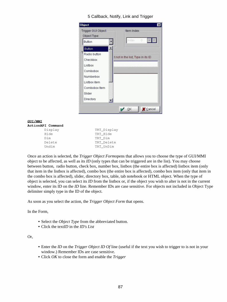
GUI/MMIActionAPI Command Display TRT_Display Hide TRT_Hide Dim TRT_Dim Delete TRT_Delete Undim TRT_UnDim
Once an action is selected, the Trigger Object Formopens that allows you to choose the type of GUI/MMIobject to be affected, as well as its ID (only types that can be triggered are in the list). You may choosebetween button, radio button, check box, number box, listbox (the entire box is affected) listbox item (onlythat item in the listbox is affected), combo box (the entire box is affected), combo box item (only that item inthe combo box is affected), slider, directory box, table, tab notebook or HTML object. When the type ofobject is selected, you can select its ID from the listbox or, if the object you wish to alter is not in the currentwindow, enter its ID on the ID line. Remember IDs are case sensitive. For objects not included in Object Typedelimiter simply type in the ID of the object.
As soon as you select the action, the Trigger Object Form that opens.
In the Form,
Select the Object Type from the abbreviated button.• Click the textID in the ID's List•
Or,
Enter the ID on the Trigger Object ID Of line (useful if the text you wish to trigger to is not in yourwindow.) Remember IDs are case sensitive.
•
Click OK to close the form and enable the Trigger•
5 Callback, Notify, Link and Trigger
87
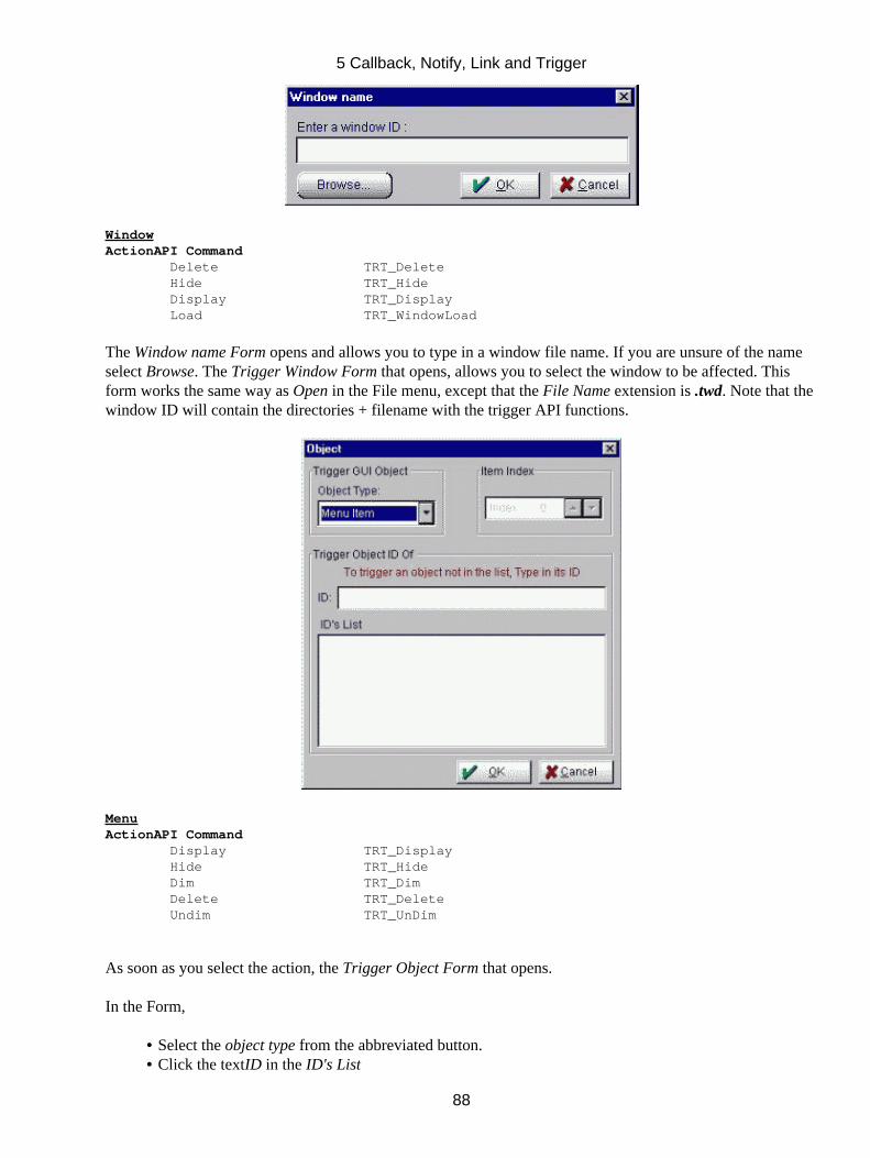
WindowActionAPI Command Delete TRT_Delete Hide TRT_Hide Display TRT_Display Load TRT_WindowLoad
The Window name Form opens and allows you to type in a window file name. If you are unsure of the nameselect Browse. The Trigger Window Form that opens, allows you to select the window to be affected. Thisform works the same way as Open in the File menu, except that the File Name extension is .twd. Note that thewindow ID will contain the directories + filename with the trigger API functions.
MenuActionAPI Command Display TRT_Display Hide TRT_Hide Dim TRT_Dim Delete TRT_Delete Undim TRT_UnDim
As soon as you select the action, the Trigger Object Form that opens.
In the Form,
Select the object type from the abbreviated button.• Click the textID in the ID's List•
5 Callback, Notify, Link and Trigger
88
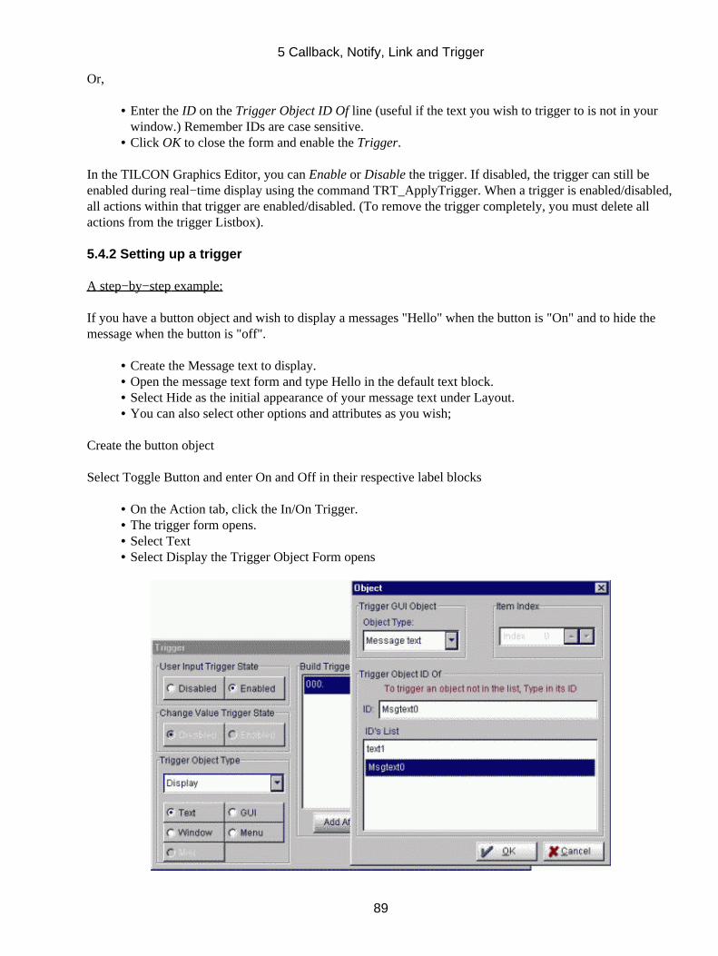
Or,
Enter the ID on the Trigger Object ID Of line (useful if the text you wish to trigger to is not in yourwindow.) Remember IDs are case sensitive.
•
Click OK to close the form and enable the Trigger.•
In the TILCON Graphics Editor, you can Enable or Disable the trigger. If disabled, the trigger can still beenabled during real−time display using the command TRT_ApplyTrigger. When a trigger is enabled/disabled,all actions within that trigger are enabled/disabled. (To remove the trigger completely, you must delete allactions from the trigger Listbox).
5.4.2 Setting up a trigger
A step−by−step example:
If you have a button object and wish to display a messages "Hello" when the button is "On" and to hide themessage when the button is "off".
Create the Message text to display.• Open the message text form and type Hello in the default text block.• Select Hide as the initial appearance of your message text under Layout.• You can also select other options and attributes as you wish;•
Create the button object
Select Toggle Button and enter On and Off in their respective label blocks
On the Action tab, click the In/On Trigger.• The trigger form opens.• Select Text• Select Display the Trigger Object Form opens•
5 Callback, Notify, Link and Trigger
89
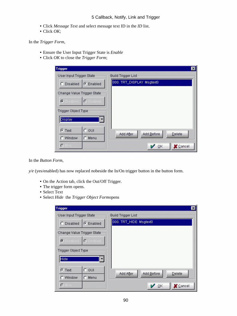
Click Message Text and select message text ID in the ID list.• Click OK;•
In the Trigger Form,
Ensure the User Input Trigger State is Enable• Click OK to close the Trigger Form;•
In the Button Form,
y/e (yes/enabled) has now replaced nobeside the In/On trigger button in the button form.
On the Action tab, click the Out/Off Trigger.• The trigger form opens.• Select Text• Select Hide the Trigger Object Formopens•
5 Callback, Notify, Link and Trigger
90
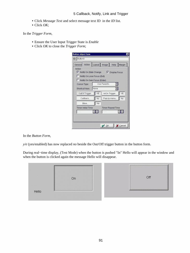
Click Message Text and select message text ID in the ID list.• Click OK;•
In the Trigger Form,
Ensure the User Input Trigger State is Enable• Click OK to close the Trigger Form;•
In the Button Form,
y/e (yes/enabled) has now replaced no beside the Out/Off trigger button in the button form.
During real−time display, (Test Mode) when the button is pushed "In" Hello will appear in the window andwhen the button is clicked again the message Hello will disappear.
5 Callback, Notify, Link and Trigger
91
6 The Toolbox
The Toolbox gives you all the features you need to build your real−time application.
6.1.1 Adding Objects to Your Work Window
Whether it is a button, meter, chart or drawing, all objects are added to your work window in the same simpleway:
In the Toolbox,
Click the tool icon for the object you wish to create.• Click the workspace and drag to the size you want the object to be; release the mouse button and theForm for your object opens. If you move this form off the window where your object is to bedisplayed, your object can be viewed as well as the form so that you are able to see the changes to theobject as you make them in the form.
•
As you complete the Form, the settings should be reflected in the object on your window.• Click OK to close the form and accept your settings.•
6.1.2 Editing an Existing Object
You may need to change the properties of an existing object.
To edit the form of an existing object:
Select the object (left−click on it).• Right−click to open the object's form.•
Or,
Select Edit under Options in the Main menu.• Make the required changes in the form and click OK.•
Or,
Select the Objects Browser from the menu bar. This is a common tool provided with the editor, itsoperation and use are covered in detail in Chapter 4 of this manual.
•
6.1.3 Fine−tuning an Object's Appearance
The Main menu and Speedbar provide you with options to modify the appearance of your object using colors,patterns, fonts and more. All text, indicators and images within any object can be precisely positioned, sizedand given depth using Options in the Main menu. (Common Options in the TILCON Graphics Editor )
6.2 Selector (Find) Tool
The Selector or find tool is active (pressed in) in the default setting. This means that you can select any object,
6 The Toolbox
92
with the exception of an animation area, in your window at any time.
6.3 Draw Tools Chapter 8
Draw with high end drawing tools such as Bezier curve, line, box ,arc, circle, rounded box, polygon, over 20different built in arrows and flow chart symbols are just some of the TILCON drawing tools available.
6.4 Text Tools Chapter 7
Use Editable, Message, Label and Multi−line text options to get the results you require.
6.5 Menu
Menubars are placed at the top of the window. The menubar provides multiple levels of drop−down menuitems. The cascaded sub−menus provide command, toggle and radio button behavior for each of their items.Each item can send a notification, invoke a callback or trigger a command upon its selection. Additionally,Pop−up Menus can be created in most objects; these appear when a 'right−click' occurs on an object that hasdefined a pop−up menu.
6.5.1 Menu item behavior
An item in a menubar can perform one of two functions. It can:
execute a command• cascade a sub−menu or•
The sub−menu has greater functionality than a menu item; an item in a sub−menu can perform one of threefunctions. It can:
cascade a sub−menu,• execute a command, or• toggle its state like a Check box or Radio button would.•
6.5.2 To add the main menubar
Click the Menu icon in the Toolbox; the Menu Creation Form opens.
6 The Toolbox
93
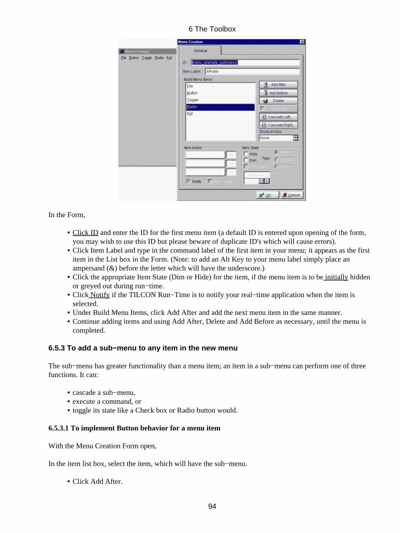
In the Form,
Click ID and enter the ID for the first menu item (a default ID is entered upon opening of the form,you may wish to use this ID but please beware of duplicate ID's which will cause errors).
•
Click Item Label and type in the command label of the first item in your menu; it appears as the firstitem in the List box in the Form. (Note: to add an Alt Key to your menu label simply place anampersand (&) before the letter which will have the underscore.)
•
Click the appropriate Item State (Dim or Hide) for the item, if the menu item is to be initially hiddenor greyed out during run−time.
•
Click Notify if the TILCON Run−Time is to notify your real−time application when the item isselected.
•
Under Build Menu Items, click Add After and add the next menu item in the same manner.• Continue adding items and using Add After, Delete and Add Before as necessary, until the menu iscompleted.
•
6.5.3 To add a sub−menu to any item in the new menu
The sub−menu has greater functionality than a menu item; an item in a sub−menu can perform one of threefunctions. It can:
cascade a sub−menu,• execute a command, or• toggle its state like a Check box or Radio button would.•
6.5.3.1 To implement Button behavior for a menu item
With the Menu Creation Form open,
In the item list box, select the item, which will have the sub−menu.
Click Add After.•
6 The Toolbox
94
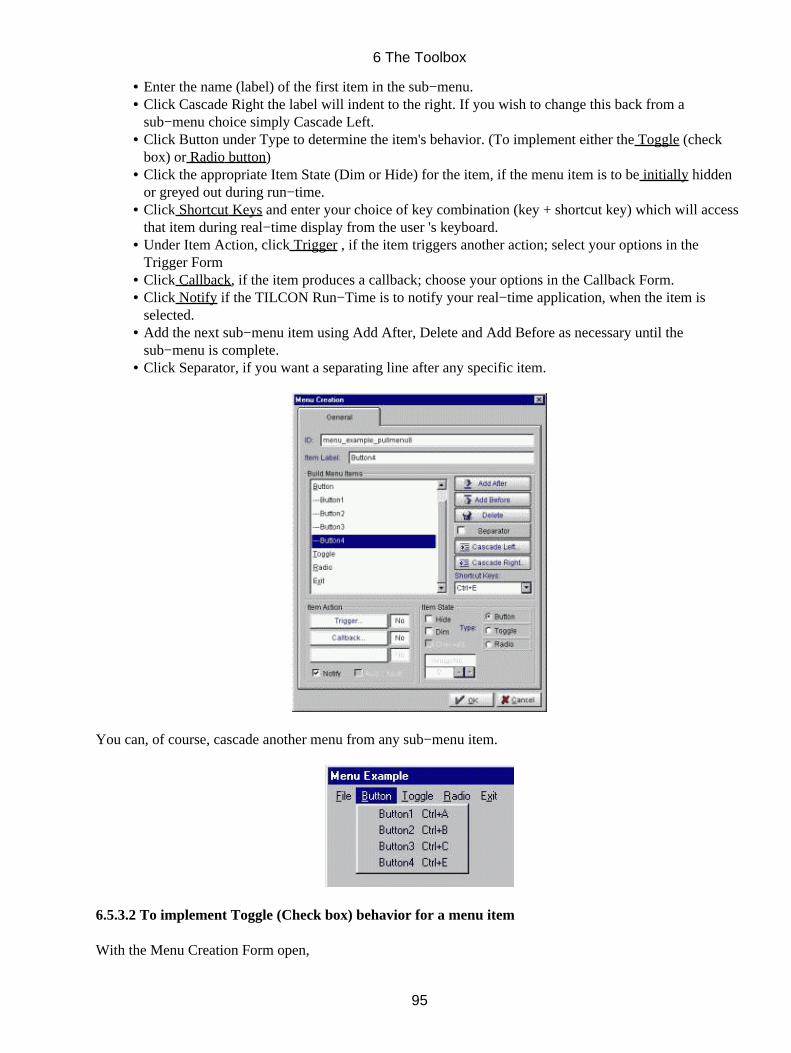
Enter the name (label) of the first item in the sub−menu.• Click Cascade Right the label will indent to the right. If you wish to change this back from asub−menu choice simply Cascade Left.
•
Click Button under Type to determine the item's behavior. (To implement either the Toggle (checkbox) or Radio button)
•
Click the appropriate Item State (Dim or Hide) for the item, if the menu item is to be initially hiddenor greyed out during run−time.
•
Click Shortcut Keys and enter your choice of key combination (key + shortcut key) which will accessthat item during real−time display from the user 's keyboard.
•
Under Item Action, click Trigger , if the item triggers another action; select your options in theTrigger Form
•
Click Callback, if the item produces a callback; choose your options in the Callback Form.• Click Notify if the TILCON Run−Time is to notify your real−time application, when the item isselected.
•
Add the next sub−menu item using Add After, Delete and Add Before as necessary until thesub−menu is complete.
•
Click Separator, if you want a separating line after any specific item.•
You can, of course, cascade another menu from any sub−menu item.
6.5.3.2 To implement Toggle (Check box) behavior for a menu item
With the Menu Creation Form open,
6 The Toolbox
95
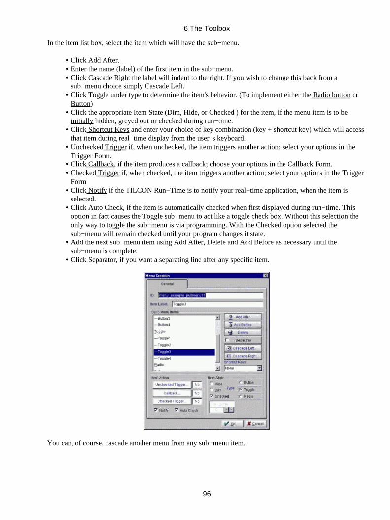
In the item list box, select the item which will have the sub−menu.
Click Add After.• Enter the name (label) of the first item in the sub−menu.• Click Cascade Right the label will indent to the right. If you wish to change this back from asub−menu choice simply Cascade Left.
•
Click Toggle under type to determine the item's behavior. (To implement either the Radio button orButton)
•
Click the appropriate Item State (Dim, Hide, or Checked ) for the item, if the menu item is to beinitially hidden, greyed out or checked during run−time.
•
Click Shortcut Keys and enter your choice of key combination (key + shortcut key) which will accessthat item during real−time display from the user 's keyboard.
•
Unchecked Trigger if, when unchecked, the item triggers another action; select your options in theTrigger Form.
•
Click Callback, if the item produces a callback; choose your options in the Callback Form.• Checked Trigger if, when checked, the item triggers another action; select your options in the TriggerForm
•
Click Notify if the TILCON Run−Time is to notify your real−time application, when the item isselected.
•
Click Auto Check, if the item is automatically checked when first displayed during run−time. Thisoption in fact causes the Toggle sub−menu to act like a toggle check box. Without this selection theonly way to toggle the sub−menu is via programming. With the Checked option selected thesub−menu will remain checked until your program changes it state.
•
Add the next sub−menu item using Add After, Delete and Add Before as necessary until thesub−menu is complete.
•
Click Separator, if you want a separating line after any specific item.•
You can, of course, cascade another menu from any sub−menu item.
6 The Toolbox
96
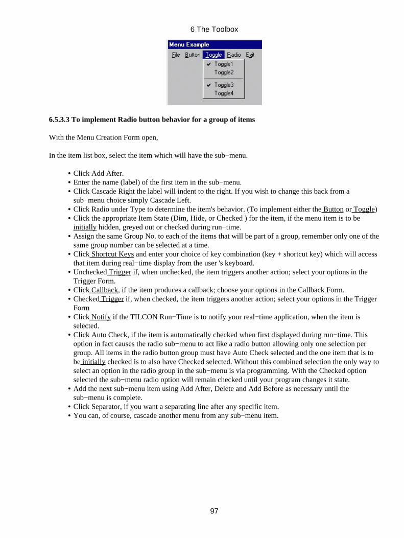
6.5.3.3 To implement Radio button behavior for a group of items
With the Menu Creation Form open,
In the item list box, select the item which will have the sub−menu.
Click Add After.• Enter the name (label) of the first item in the sub−menu.• Click Cascade Right the label will indent to the right. If you wish to change this back from asub−menu choice simply Cascade Left.
•
Click Radio under Type to determine the item's behavior. (To implement either the Button or Toggle)• Click the appropriate Item State (Dim, Hide, or Checked ) for the item, if the menu item is to beinitially hidden, greyed out or checked during run−time.
•
Assign the same Group No. to each of the items that will be part of a group, remember only one of thesame group number can be selected at a time.
•
Click Shortcut Keys and enter your choice of key combination (key + shortcut key) which will accessthat item during real−time display from the user 's keyboard.
•
Unchecked Trigger if, when unchecked, the item triggers another action; select your options in theTrigger Form.
•
Click Callback, if the item produces a callback; choose your options in the Callback Form.• Checked Trigger if, when checked, the item triggers another action; select your options in the TriggerForm
•
Click Notify if the TILCON Run−Time is to notify your real−time application, when the item isselected.
•
Click Auto Check, if the item is automatically checked when first displayed during run−time. Thisoption in fact causes the radio sub−menu to act like a radio button allowing only one selection pergroup. All items in the radio button group must have Auto Check selected and the one item that is tobe initially checked is to also have Checked selected. Without this combined selection the only way toselect an option in the radio group in the sub−menu is via programming. With the Checked optionselected the sub−menu radio option will remain checked until your program changes it state.
•
Add the next sub−menu item using Add After, Delete and Add Before as necessary until thesub−menu is complete.
•
Click Separator, if you want a separating line after any specific item.• You can, of course, cascade another menu from any sub−menu item.•
6 The Toolbox
97
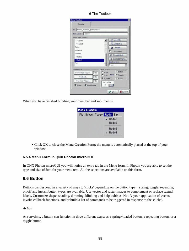
When you have finished building your menubar and sub−menus,
Click OK to close the Menu Creation Form; the menu is automatically placed at the top of yourwindow.
•
6.5.4 Menu Form in QNX Photon microGUI
In QNX Photon microGUI you will notice an extra tab in the Menu form. In Photon you are able to set thetype and size of font for your menu text. All the selections are available on this form.
6.6 Button
Buttons can respond in a variety of ways to 'clicks' depending on the button type − spring, toggle, repeating,on/off and instant button types are available. Use vector and raster images to complement or replace textuallabels. Customize shape, shading, dimming, blinking and help bubbles. Notify your application of events,invoke callback functions, and/or build a list of commands to be triggered in response to the 'clicks'.
Action
At run−time, a button can function in three different ways: as a spring−loaded button, a repeating button, or atoggle button.
6 The Toolbox
98
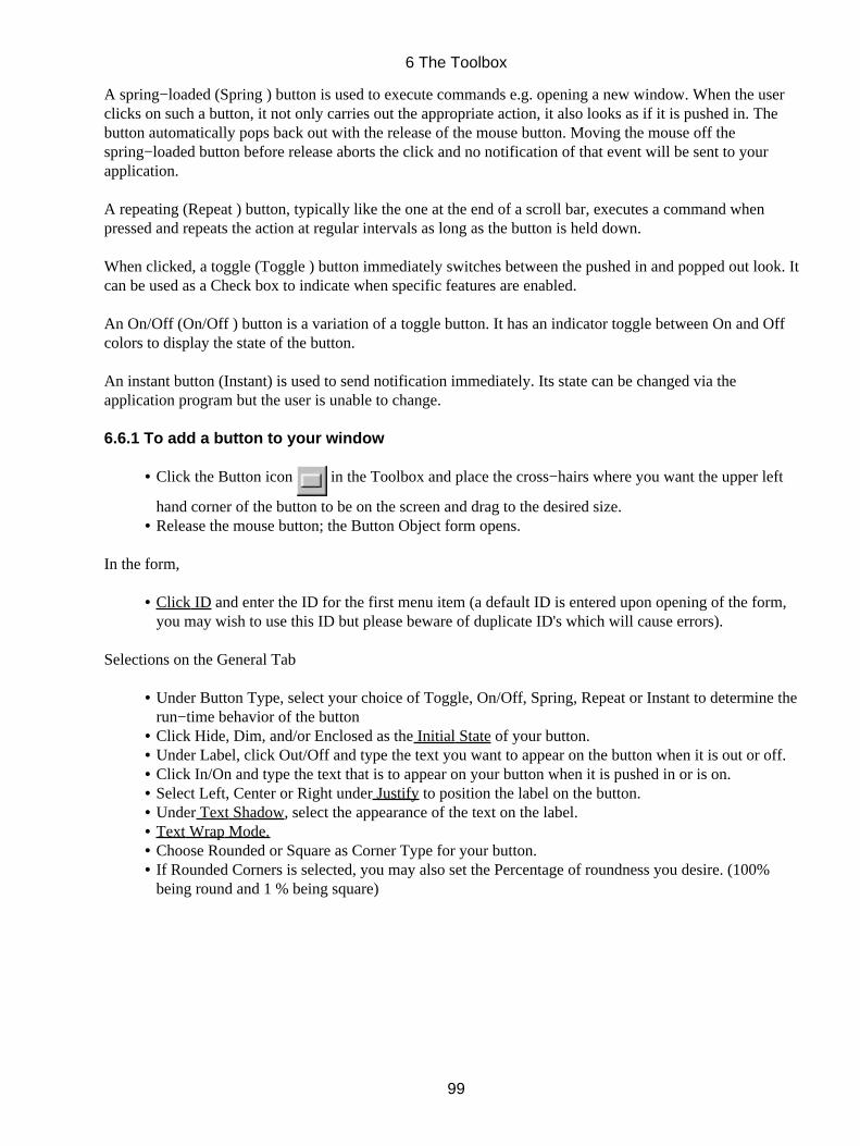
A spring−loaded (Spring ) button is used to execute commands e.g. opening a new window. When the userclicks on such a button, it not only carries out the appropriate action, it also looks as if it is pushed in. Thebutton automatically pops back out with the release of the mouse button. Moving the mouse off thespring−loaded button before release aborts the click and no notification of that event will be sent to yourapplication.
A repeating (Repeat ) button, typically like the one at the end of a scroll bar, executes a command whenpressed and repeats the action at regular intervals as long as the button is held down.
When clicked, a toggle (Toggle ) button immediately switches between the pushed in and popped out look. Itcan be used as a Check box to indicate when specific features are enabled.
An On/Off (On/Off ) button is a variation of a toggle button. It has an indicator toggle between On and Offcolors to display the state of the button.
An instant button (Instant) is used to send notification immediately. Its state can be changed via theapplication program but the user is unable to change.
6.6.1 To add a button to your window
Click the Button icon in the Toolbox and place the cross−hairs where you want the upper left
hand corner of the button to be on the screen and drag to the desired size.
•
Release the mouse button; the Button Object form opens.•
In the form,
Click ID and enter the ID for the first menu item (a default ID is entered upon opening of the form,you may wish to use this ID but please beware of duplicate ID's which will cause errors).
•
Selections on the General Tab
Under Button Type, select your choice of Toggle, On/Off, Spring, Repeat or Instant to determine therun−time behavior of the button
•
Click Hide, Dim, and/or Enclosed as the Initial State of your button.• Under Label, click Out/Off and type the text you want to appear on the button when it is out or off.• Click In/On and type the text that is to appear on your button when it is pushed in or is on.• Select Left, Center or Right under Justify to position the label on the button.• Under Text Shadow, select the appearance of the text on the label.• Text Wrap Mode.• Choose Rounded or Square as Corner Type for your button.• If Rounded Corners is selected, you may also set the Percentage of roundness you desire. (100%being round and 1 % being square)
•
6 The Toolbox
99
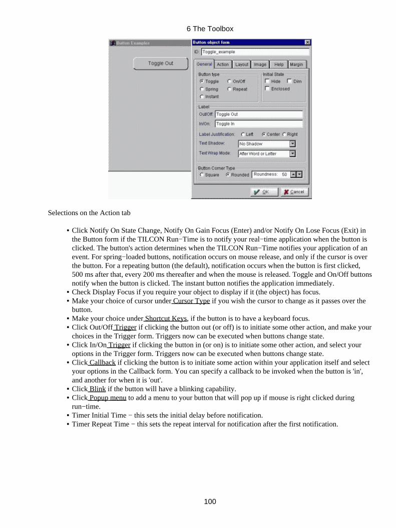
Selections on the Action tab
Click Notify On State Change, Notify On Gain Focus (Enter) and/or Notify On Lose Focus (Exit) inthe Button form if the TILCON Run−Time is to notify your real−time application when the button isclicked. The button's action determines when the TILCON Run−Time notifies your application of anevent. For spring−loaded buttons, notification occurs on mouse release, and only if the cursor is overthe button. For a repeating button (the default), notification occurs when the button is first clicked,500 ms after that, every 200 ms thereafter and when the mouse is released. Toggle and On/Off buttonsnotify when the button is clicked. The instant button notifies the application immediately.
•
Check Display Focus if you require your object to display if it (the object) has focus.• Make your choice of cursor under Cursor Type if you wish the cursor to change as it passes over thebutton.
•
Make your choice under Shortcut Keys, if the button is to have a keyboard focus.• Click Out/Off Trigger if clicking the button out (or off) is to initiate some other action, and make yourchoices in the Trigger form. Triggers now can be executed when buttons change state.
•
Click In/On Trigger if clicking the button in (or on) is to initiate some other action, and select youroptions in the Trigger form. Triggers now can be executed when buttons change state.
•
Click Callback if clicking the button is to initiate some action within your application itself and selectyour options in the Callback form. You can specify a callback to be invoked when the button is 'in',and another for when it is 'out'.
•
Click Blink if the button will have a blinking capability.• Click Popup menu to add a menu to your button that will pop up if mouse is right clicked duringrun−time.
•
Timer Initial Time − this sets the initial delay before notification.• Timer Repeat Time − this sets the repeat interval for notification after the first notification.•
6 The Toolbox
100
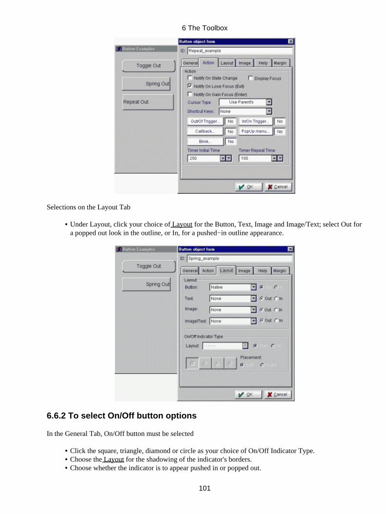
Selections on the Layout Tab
Under Layout, click your choice of Layout for the Button, Text, Image and Image/Text; select Out fora popped out look in the outline, or In, for a pushed−in outline appearance.
•
6.6.2 To select On/Off button options
In the General Tab, On/Off button must be selected
Click the square, triangle, diamond or circle as your choice of On/Off Indicator Type.• Choose the Layout for the shadowing of the indicator's borders.• Choose whether the indicator is to appear pushed in or popped out.•
6 The Toolbox
101
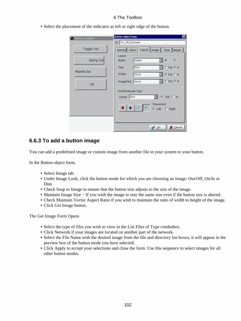
Select the placement of the indicator as left or right edge of the button.•
6.6.3 To add a button image
You can add a predefined image or custom image from another file in your system to your button.
In the Button object form,
Select Image tab.• Under Image Look, click the button mode for which you are choosing an image: Out/Off, On/In orDim.
•
Check Snap to Image to ensure that the button size adjusts to the size of the image.• Maintain Image Size − If you wish the image to stay the same size even if the button size is altered.• Check Maintain Vector Aspect Ratio if you wish to maintain the ratio of width to height of the image.• Click Get Image button.•
The Get Image Form Opens
Select the type of files you wish to view in the List Files of Type combobox.• Click Network if your images are located on another part of the network.• Select the File Name with the desired image from the file and directory list boxes; it will appear in thepreview box of the button mode you have selected.
•
Click Apply to accept your selections and close the form. Use this sequence to select images for allother button modes.
•
6 The Toolbox
102
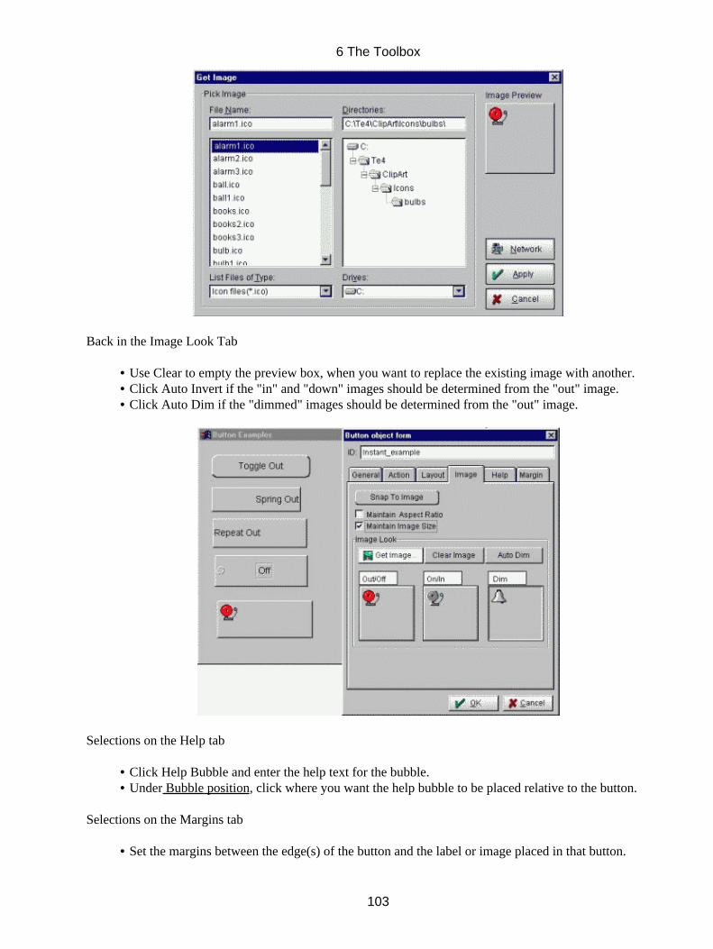
Back in the Image Look Tab
Use Clear to empty the preview box, when you want to replace the existing image with another.• Click Auto Invert if the "in" and "down" images should be determined from the "out" image.• Click Auto Dim if the "dimmed" images should be determined from the "out" image.•
Selections on the Help tab
Click Help Bubble and enter the help text for the bubble.• Under Bubble position, click where you want the help bubble to be placed relative to the button.•
Selections on the Margins tab
Set the margins between the edge(s) of the button and the label or image placed in that button.•
6 The Toolbox
103

Click OK to close the Button object form. The button appears in your workspace. It is selected andready for editing.
•
Sizing − Depth/Placement/Sizing OptionsModifying Fonts.Color OptionsNudge Tools
6.7 Radio Button
Radio buttons manage a group of buttons; selecting one item automatically de−selects the others in the group.Apply vector/raster images and help bubbles to each label. Customize layout, bullets, shading. Triggers andcallbacks are available for individual items, as well as notification of the selected item by the group.
6 The Toolbox
104
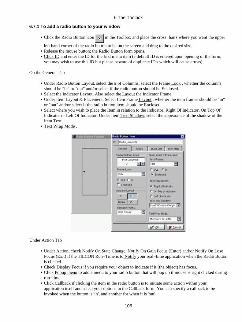
6.7.1 To add a radio button to your window
Click the Radio Button icon in the Toolbox and place the cross−hairs where you want the upper
left hand corner of the radio button to be on the screen and drag to the desired size.
•
Release the mouse button; the Radio Button form opens.• Click ID and enter the ID for the first menu item (a default ID is entered upon opening of the form,you may wish to use this ID but please beware of duplicate ID's which will cause errors).
•
On the General Tab
Under Radio Button Layout, select the # of Columns, select the Frame Look , whether the columnsshould be "in" or "out" and/or select if the radio button should be Enclosed.
•
Select the Indicator Layout. Also select the Layout the Indicator Frame.• Under Item Layout & Placement, Select Item Frame Layout , whether the item frames should be "in"or "out" and/or select if the radio button item should be Enclosed.
•
Select where you wish to place the Item in relation to the Indicator, Right Of Indicator, On Top OfIndicator or Left Of Indicator. Under Item Text Shadow, select the appearance of the shadow of theItem Text.
•
Text Wrap Mode .•
Under Action Tab
Under Action, check Notify On State Change, Notify On Gain Focus (Enter) and/or Notify On LoseFocus (Exit) if the TILCON Run−Time is to Notify your real−time application when the Radio Buttonis clicked.
•
Check Display Focus if you require your object to indicate if it (the object) has focus.• Click Popup menu to add a menu to your radio button that will pop up if mouse is right clicked duringrun−time.
•
Click Callback if clicking the item in the radio button is to initiate some action within yourapplication itself and select your options in the Callback form. You can specify a callback to beinvoked when the button is 'in', and another for when it is 'out'.
•
6 The Toolbox
105
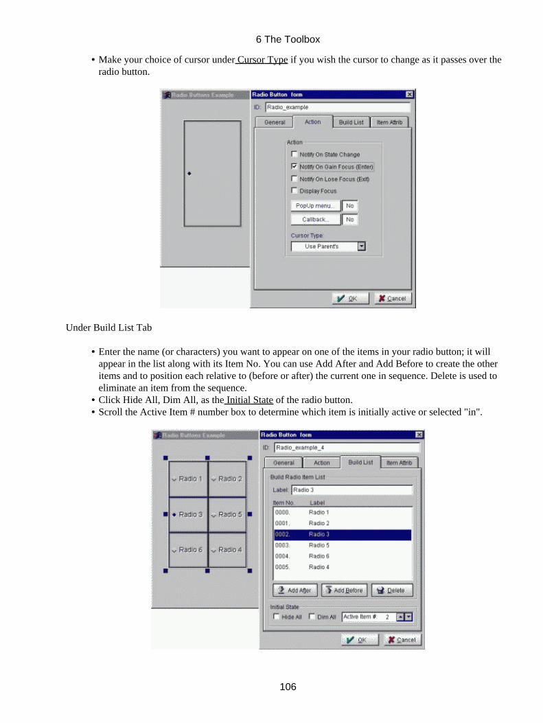
Make your choice of cursor under Cursor Type if you wish the cursor to change as it passes over theradio button.
•
Under Build List Tab
Enter the name (or characters) you want to appear on one of the items in your radio button; it willappear in the list along with its Item No. You can use Add After and Add Before to create the otheritems and to position each relative to (before or after) the current one in sequence. Delete is used toeliminate an item from the sequence.
•
Click Hide All, Dim All, as the Initial State of the radio button.• Scroll the Active Item # number box to determine which item is initially active or selected "in".•
6 The Toolbox
106
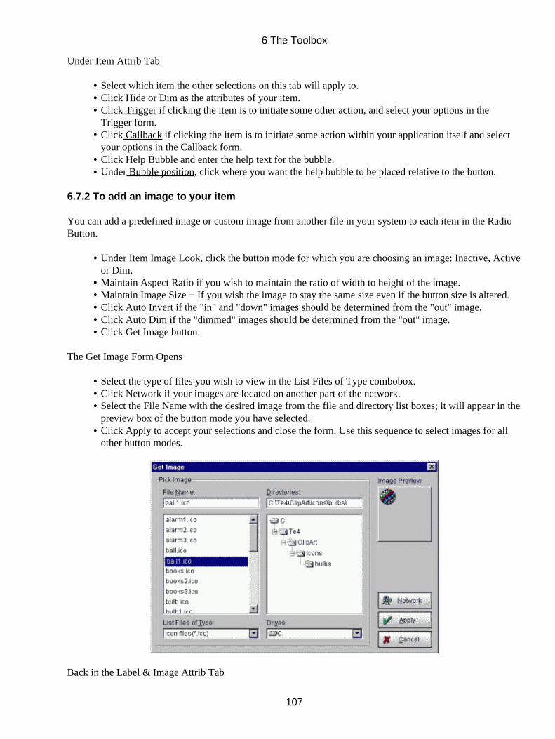
Under Item Attrib Tab
Select which item the other selections on this tab will apply to.• Click Hide or Dim as the attributes of your item.• Click Trigger if clicking the item is to initiate some other action, and select your options in theTrigger form.
•
Click Callback if clicking the item is to initiate some action within your application itself and selectyour options in the Callback form.
•
Click Help Bubble and enter the help text for the bubble.• Under Bubble position, click where you want the help bubble to be placed relative to the button.•
6.7.2 To add an image to your item
You can add a predefined image or custom image from another file in your system to each item in the RadioButton.
Under Item Image Look, click the button mode for which you are choosing an image: Inactive, Activeor Dim.
•
Maintain Aspect Ratio if you wish to maintain the ratio of width to height of the image.• Maintain Image Size − If you wish the image to stay the same size even if the button size is altered.• Click Auto Invert if the "in" and "down" images should be determined from the "out" image.• Click Auto Dim if the "dimmed" images should be determined from the "out" image.• Click Get Image button.•
The Get Image Form Opens
Select the type of files you wish to view in the List Files of Type combobox.• Click Network if your images are located on another part of the network.• Select the File Name with the desired image from the file and directory list boxes; it will appear in thepreview box of the button mode you have selected.
•
Click Apply to accept your selections and close the form. Use this sequence to select images for allother button modes.
•
Back in the Label & Image Attrib Tab
6 The Toolbox
107
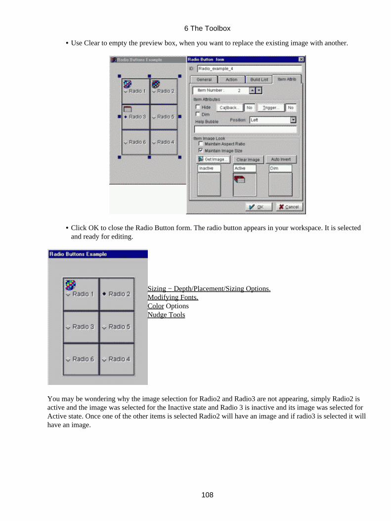
Use Clear to empty the preview box, when you want to replace the existing image with another.•
Click OK to close the Radio Button form. The radio button appears in your workspace. It is selectedand ready for editing.
•
Sizing − Depth/Placement/Sizing Options.Modifying Fonts.Color OptionsNudge Tools
You may be wondering why the image selection for Radio2 and Radio3 are not appearing, simply Radio2 isactive and the image was selected for the Inactive state and Radio 3 is inactive and its image was selected forActive state. Once one of the other items is selected Radio2 will have an image and if radio3 is selected it willhave an image.
6 The Toolbox
108
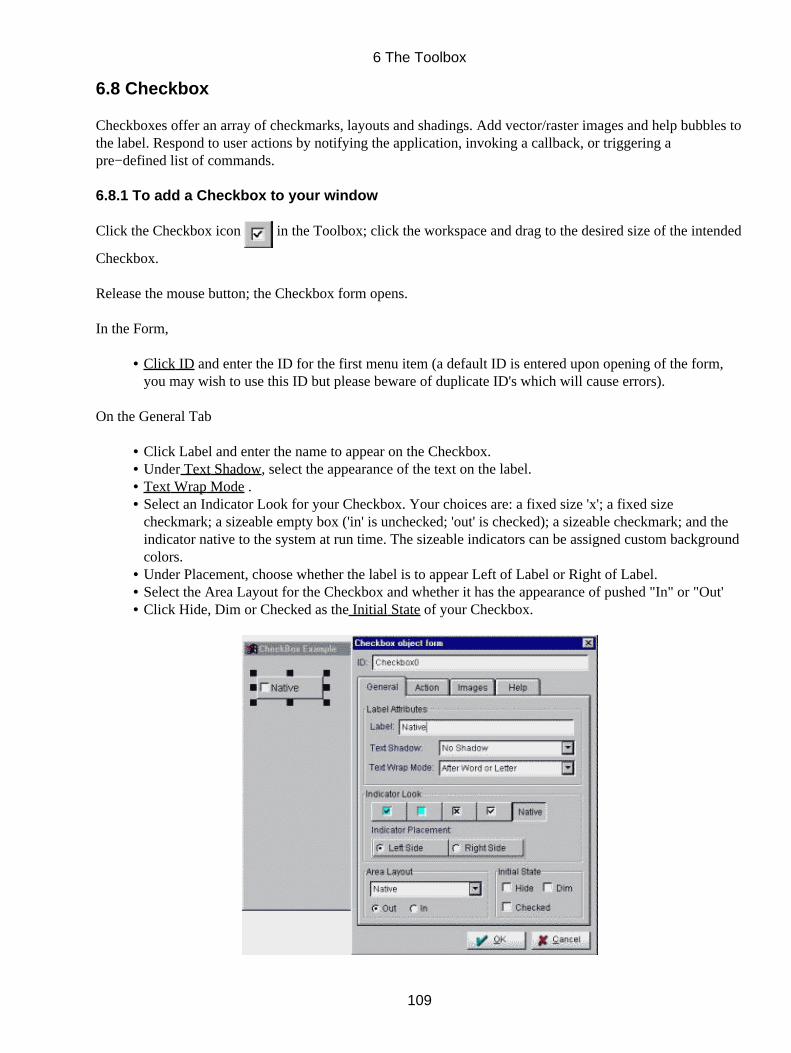
6.8 Checkbox
Checkboxes offer an array of checkmarks, layouts and shadings. Add vector/raster images and help bubbles tothe label. Respond to user actions by notifying the application, invoking a callback, or triggering apre−defined list of commands.
6.8.1 To add a Checkbox to your window
Click the Checkbox icon in the Toolbox; click the workspace and drag to the desired size of the intended
Checkbox.
Release the mouse button; the Checkbox form opens.
In the Form,
Click ID and enter the ID for the first menu item (a default ID is entered upon opening of the form,you may wish to use this ID but please beware of duplicate ID's which will cause errors).
•
On the General Tab
Click Label and enter the name to appear on the Checkbox.• Under Text Shadow, select the appearance of the text on the label.• Text Wrap Mode .• Select an Indicator Look for your Checkbox. Your choices are: a fixed size 'x'; a fixed sizecheckmark; a sizeable empty box ('in' is unchecked; 'out' is checked); a sizeable checkmark; and theindicator native to the system at run time. The sizeable indicators can be assigned custom backgroundcolors.
•
Under Placement, choose whether the label is to appear Left of Label or Right of Label.• Select the Area Layout for the Checkbox and whether it has the appearance of pushed "In" or "Out'• Click Hide, Dim or Checked as the Initial State of your Checkbox.•
6 The Toolbox
109

On the Action tab
Check Notify On State Changes, Notify On Gain Focus (Enter) and/or Notify On Lose Focus (Exit) ifthe TILCON Run−Time is to Notify your real−time application of Checkbox events.
•
Check Display Focus if you require your object to indicate if it (the object) has focus.• Click Uncheck Trigger , if un−checking the box triggers another action; select your options in theTrigger form. One function can be invoked when the box becomes checked; another when it becomesunchecked.
•
Click Check Trigger , if checking the box triggers another action; select your options in the Triggerform. One function can be invoked when the box becomes checked; another when it becomesunchecked.
•
Click Callback to specify callback functions from your application. Choose your options in theCallback form.
•
Click Popup menu to add a menu to your Checkbox that will pop up if mouse is right clicked duringrun−time.
•
Make your choice under Shortcut Keys, if the button is to have a keyboard focus.• Make your choice of cursor under Cursor Type if you wish the cursor to change as it passes over theCheckbox.
•
6.8.2 To add an image to the Checkbox
As with buttons, you can assign an image to be part of your Checkbox. You can use different images for theCheckbox in checked, unchecked or dim state.
Under Image Look, click the button mode for which you are choosing an image: Uncheck, Checkedor Dim.
•
Check Snap to Image to ensure that the Checkbox size adjusts to the size of the image.• Check Maintain Aspect Ratio if you wish to maintain the height and width ratios of the image.• Maintain Image Size − If you wish the image to stay the same size even if the button size is altered.• Click Get Image button.•
6 The Toolbox
110

The Get Image Form Opens
Select the type of files you wish to view in the List Files of Type combobox.• Click Network if your images are located on another part of the network.• Select the File Name with the desired image from the file and directory list boxes; it will appear in thepreview box of the button mode you have selected.
•
Click Apply to accept your selections and close the form. Use this sequence to select images for allother button modes.
•
Back in the Image Look Tab
Use Clear to empty the preview box, when you want to replace the existing image with another.• Click Auto Invert if the "in" and "down" images should be determined from the "out" image.• Click Auto Dim if the "dimmed" images should be determined from the "out" image.•
6 The Toolbox
111
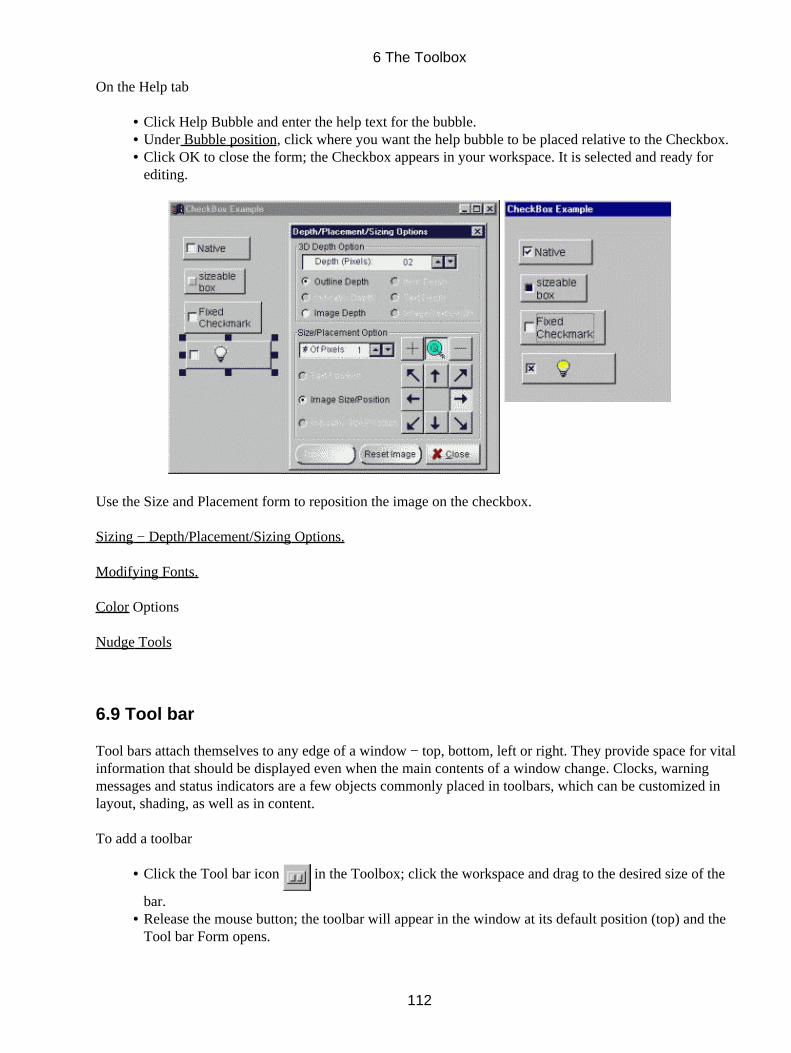
On the Help tab
Click Help Bubble and enter the help text for the bubble.• Under Bubble position, click where you want the help bubble to be placed relative to the Checkbox.• Click OK to close the form; the Checkbox appears in your workspace. It is selected and ready forediting.
•
Use the Size and Placement form to reposition the image on the checkbox.
Sizing − Depth/Placement/Sizing Options.
Modifying Fonts.
Color Options
Nudge Tools
6.9 Tool bar
Tool bars attach themselves to any edge of a window − top, bottom, left or right. They provide space for vitalinformation that should be displayed even when the main contents of a window change. Clocks, warningmessages and status indicators are a few objects commonly placed in toolbars, which can be customized inlayout, shading, as well as in content.
To add a toolbar
Click the Tool bar icon in the Toolbox; click the workspace and drag to the desired size of the
bar.
•
Release the mouse button; the toolbar will appear in the window at its default position (top) and theTool bar Form opens.
•
6 The Toolbox
112
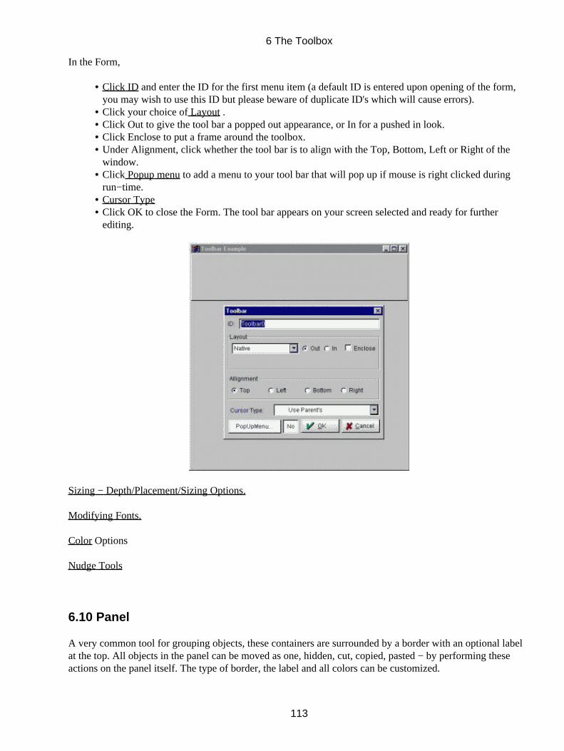
In the Form,
Click ID and enter the ID for the first menu item (a default ID is entered upon opening of the form,you may wish to use this ID but please beware of duplicate ID's which will cause errors).
•
Click your choice of Layout .• Click Out to give the tool bar a popped out appearance, or In for a pushed in look.• Click Enclose to put a frame around the toolbox.• Under Alignment, click whether the tool bar is to align with the Top, Bottom, Left or Right of thewindow.
•
Click Popup menu to add a menu to your tool bar that will pop up if mouse is right clicked duringrun−time.
•
Cursor Type• Click OK to close the Form. The tool bar appears on your screen selected and ready for furtherediting.
•
Sizing − Depth/Placement/Sizing Options.
Modifying Fonts.
Color Options
Nudge Tools
6.10 Panel
A very common tool for grouping objects, these containers are surrounded by a border with an optional labelat the top. All objects in the panel can be moved as one, hidden, cut, copied, pasted − by performing theseactions on the panel itself. The type of border, the label and all colors can be customized.
6 The Toolbox
113
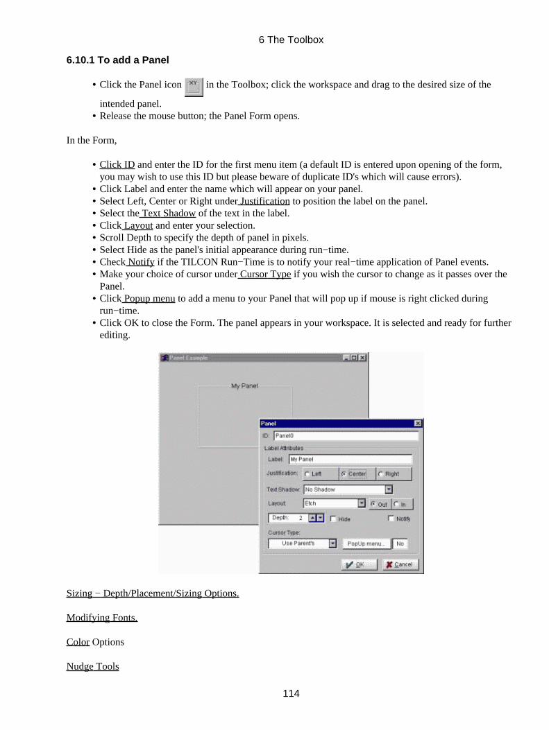
6.10.1 To add a Panel
Click the Panel icon in the Toolbox; click the workspace and drag to the desired size of the
intended panel.
•
Release the mouse button; the Panel Form opens.•
In the Form,
Click ID and enter the ID for the first menu item (a default ID is entered upon opening of the form,you may wish to use this ID but please beware of duplicate ID's which will cause errors).
•
Click Label and enter the name which will appear on your panel.• Select Left, Center or Right under Justification to position the label on the panel.• Select the Text Shadow of the text in the label.• Click Layout and enter your selection.• Scroll Depth to specify the depth of panel in pixels.• Select Hide as the panel's initial appearance during run−time.• Check Notify if the TILCON Run−Time is to notify your real−time application of Panel events.• Make your choice of cursor under Cursor Type if you wish the cursor to change as it passes over thePanel.
•
Click Popup menu to add a menu to your Panel that will pop up if mouse is right clicked duringrun−time.
•
Click OK to close the Form. The panel appears in your workspace. It is selected and ready for furtherediting.
•
Sizing − Depth/Placement/Sizing Options.
Modifying Fonts.
Color Options
Nudge Tools
6 The Toolbox
114
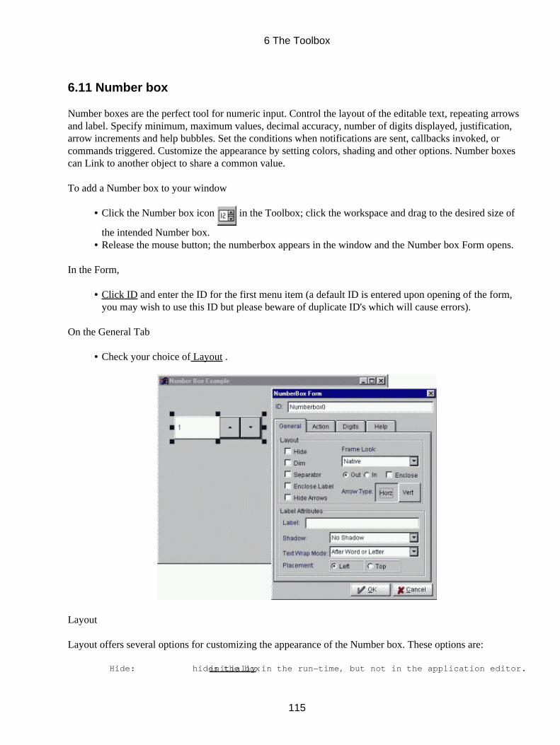
6.11 Number box
Number boxes are the perfect tool for numeric input. Control the layout of the editable text, repeating arrowsand label. Specify minimum, maximum values, decimal accuracy, number of digits displayed, justification,arrow increments and help bubbles. Set the conditions when notifications are sent, callbacks invoked, orcommands triggered. Customize the appearance by setting colors, shading and other options. Number boxescan Link to another object to share a common value.
To add a Number box to your window
Click the Number box icon in the Toolbox; click the workspace and drag to the desired size of
the intended Number box.
•
Release the mouse button; the numberbox appears in the window and the Number box Form opens.•
In the Form,
Click ID and enter the ID for the first menu item (a default ID is entered upon opening of the form,you may wish to use this ID but please beware of duplicate ID's which will cause errors).
•
On the General Tab
Check your choice of Layout .•
Layout
Layout offers several options for customizing the appearance of the Number box. These options are:
Hide: hides the box initially in the run−time, but not in the application editor.
6 The Toolbox
115
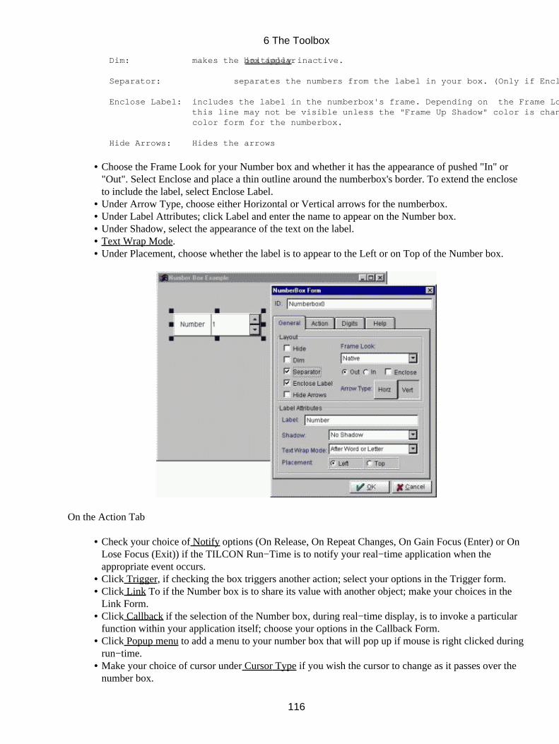
Dim: makes the box appear initially inactive.
Separator: separates the numbers from the label in your box. (Only if Enclose Label is selected)
Enclose Label: includes the label in the numberbox's frame. Depending on the Frame Look selected, this line may not be visible unless the "Frame Up Shadow" color is changed in the color form for the numberbox.
Hide Arrows: Hides the arrows
Choose the Frame Look for your Number box and whether it has the appearance of pushed "In" or"Out". Select Enclose and place a thin outline around the numberbox's border. To extend the encloseto include the label, select Enclose Label.
•
Under Arrow Type, choose either Horizontal or Vertical arrows for the numberbox.• Under Label Attributes; click Label and enter the name to appear on the Number box.• Under Shadow, select the appearance of the text on the label.• Text Wrap Mode.• Under Placement, choose whether the label is to appear to the Left or on Top of the Number box.•
On the Action Tab
Check your choice of Notify options (On Release, On Repeat Changes, On Gain Focus (Enter) or OnLose Focus (Exit)) if the TILCON Run−Time is to notify your real−time application when theappropriate event occurs.
•
Click Trigger, if checking the box triggers another action; select your options in the Trigger form.• Click Link To if the Number box is to share its value with another object; make your choices in theLink Form.
•
Click Callback if the selection of the Number box, during real−time display, is to invoke a particularfunction within your application itself; choose your options in the Callback Form.
•
Click Popup menu to add a menu to your number box that will pop up if mouse is right clicked duringrun−time.
•
Make your choice of cursor under Cursor Type if you wish the cursor to change as it passes over thenumber box.
•
6 The Toolbox
116
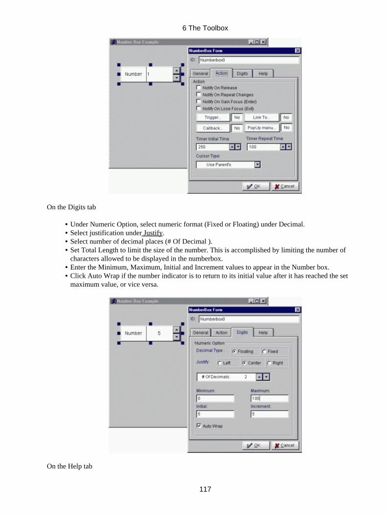
On the Digits tab
Under Numeric Option, select numeric format (Fixed or Floating) under Decimal.• Select justification under Justify.• Select number of decimal places (# Of Decimal ).• Set Total Length to limit the size of the number. This is accomplished by limiting the number ofcharacters allowed to be displayed in the numberbox.
•
Enter the Minimum, Maximum, Initial and Increment values to appear in the Number box.• Click Auto Wrap if the number indicator is to return to its initial value after it has reached the setmaximum value, or vice versa.
•
On the Help tab
6 The Toolbox
117
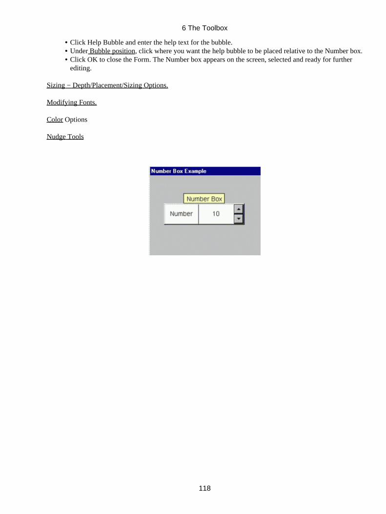
Click Help Bubble and enter the help text for the bubble.• Under Bubble position, click where you want the help bubble to be placed relative to the Number box.• Click OK to close the Form. The Number box appears on the screen, selected and ready for furtherediting.
•
Sizing − Depth/Placement/Sizing Options.
Modifying Fonts.
Color Options
Nudge Tools
6 The Toolbox
118
6.12 Listbox
Listboxes allow the selection of one or more items from a list. Tailor the listbox behavior to your needs bychoosing multiple/single selection, specifying the orientation and sorting of the items, and setting theconditions under which notifications are sent, callbacks invoked, or commands triggered. Specify multiplecolumns with individual widths. Provide images, help bubbles, hiding, dimming and colors for each item.
6.12.1 To add a Listbox to your window
Click the Listbox icon in the Toolbox; click the work space and drag to the desired size of the
intended Listbox.
•
Release the mouse button; the Listbox Form opens.• Click ID and enter the ID for the first menu item (a default ID is entered upon opening of the form,you may wish to use this ID but please beware of duplicate ID's which will cause errors).
•
On the General Tab
Under Listbox Layout, select a Horizontal or Vertical Orientation for your Listbox. In a verticalListbox, a vertical scroll bar is added when the Listbox contains more items than it can display.Similarly, a horizontal Listbox will add a horizontal scroll bar when necessary.
•
Click your choice of Frame Look for the Listbox and whether it has the appearance of pushed "In" or"Out". Specify if the box is to be Enclosed. Enclosed is used to put a thin line around the Listbox.
•
Scroll for the number of Visible Columns in your Listbox. Visible Columns, this specifies the numberof visible columns in a Listbox. A horizontal Listbox may contain more columns than are visible.Multi−column Listboxes calculate the width allowed for each item from the total Listbox area and thenumber of its columns; items too big to be displayed within this width are clipped. Item height isdetermined from the font and row margins used in the Listbox.
•
Scroll for the number of Visible Rows in your Listbox. Visible Rows specifies the number of visiblerows in a Listbox. A vertical Listbox may contain more rows than are visible.
•
Text Wrap Mode .• Under Initial State, select your choice of Hide, Dim.• Sort Option ,•
6 The Toolbox
119

On the Action tab
Click Browse, Multiple or Single (single click) under Select Mode as your choice for the method ofselection of items in your Listbox.
•
SelectMode:
Browse: The selected item is always the same as the item with keyboard focus. Moving theselection, by dragging the mouse or using the arrow keys, causes the Listbox to notify youat each selection with the double−click flag set to False. Space bar and Enter causenotifications with double−click set at True.
Single: Keyboard focus is independent of the selected item. Notification occurs on mouse release,space bar hits (double−click flag set to False ) and Enter (double−click flag set at True ).If the Allow 0 Selections flag is set, the space bar (and clicking on the highlightedselection) will toggle the item with focus between selected and de−selected.
Multiple: Allows several items to be selected simultaneously.
Click De−selects all; selects and gives focus to the item clicked.
Drag Selects items between the item with focus and the item under the cursor.Others are de−selected.
Shift+Click Selects items between item with focus and item under mouse cursor; withoutany de−selection.
Shift +DragSelects any item the cursor passes over; without any de−selection.
Ctrl+Click Toggles the item clicked and gives it focus.
Ctrl+Drag Toggles each item the cursor passes over.
Release Gives keyboard focus to the item under the cursor*. Notifies of anyselections as follows:
Notification:One notification per item selected. State, ID, text apply to each item;d−value can be used to determine how many remain.Example:Items A and B are selected −
6 The Toolbox
120

First notification: d−value = 2, ID = A ;second notification: d−value = 1, ID = BExample:Item A is selected − Notification: d−value = 1, ID = AExample:Item A (keyboard focus) is de−selected, and no other item is selectedd−value = 0, ID = A
Hidden selected items do not count as being selected.Dimmed selected items do count.* Arrow keys can be used to move the keyboard focus.pg up, dn + Shift − moves keyboard focus and selects the item that receivesit.pg up, dn + Ctrl − moves keyboard focus and toggles the item that receivesit.
Highlight Option; Individual, whole line, or block• Click your choice of Always, As Required or Never for your Scroll bar selections.• Select if Notify On Gain Focus (Enter), On Lose Focus (Exit), On Single Mouse Click or On DoubleMouse Click to indicate when the TILCON Run−Time is to Notify your real−time application.
•
Check Display Focus if you require your object to indicate if it (the object) has focus.• Allow No Selection. Allow No Selection: Single and Multimodes of the space bar (and mouse clicks)can be used to de−select the current item. Disabling this option forces the Listbox always to maintainat least one item selected. Sort Items when checked will have the items of a listbox displayed inalphanumeric order initially at run−time.
•
Popup menu to add a menu to your Listbox that will pop up if mouse is right clicked during run−time.• Callback if the selection of the Listbox during real−time display is to invoke a particular functionwithin your application itself; choose your options in the Callback Form.
•
Make your choice of cursor under Cursor Type if you wish the cursor to change as it passes over theListbox.
•
On the Attributes Tab
Under Item Attributes, you can specify common properties for the items in the Listbox.•
6 The Toolbox
121
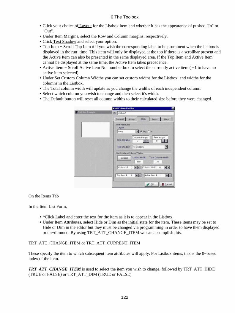
Click your choice of Layout for the Listbox item and whether it has the appearance of pushed "In" or"Out".
•
Under Item Margins, select the Row and Column margins, respectively.• Click Text Shadow and select your option.• Top Item − Scroll Top Item # if you wish the corresponding label to be prominent when the listbox isdisplayed in the run−time. This item will only be displayed at the top if there is a scrollbar present andthe Active Item can also be presented in the same displayed area. If the Top Item and Active Itemcannot be displayed at the same time, the Active Item takes precedence.
•
Active Item − Scroll Active Item No. number box to select the currently active item ( −1 to have noactive item selected).
•
Under Set Custom Column Widths you can set custom widths for the Listbox, and widths for thecolumns in the Listbox.
•
The Total column width will update as you change the widths of each independent column.• Select which column you wish to change and then select it's width.• The Default button will reset all column widths to their calculated size before they were changed.•
On the Items Tab
In the Item List Form,
*Click Label and enter the text for the item as it is to appear in the Listbox.• Under Item Attributes, select Hide or Dim as the initial state for the item. These items may be set toHide or Dim in the editor but they must be changed via programming in order to have them displayedor un−dimmed. By using TRT_ATT_CHANGE_ITEM we can accomplish this.
•
TRT_ATT_CHANGE_ITEM or TRT_ATT_CURRENT_ITEM
These specify the item to which subsequent item attributes will apply. For Listbox items, this is the 0−basedindex of the item.
TRT_ATT_CHANGE_ITEM is used to select the item you wish to change, followed by TRT_ATT_HIDE(TRUE or FALSE) or TRT_ATT_DIM (TRUE or FALSE)
6 The Toolbox
122
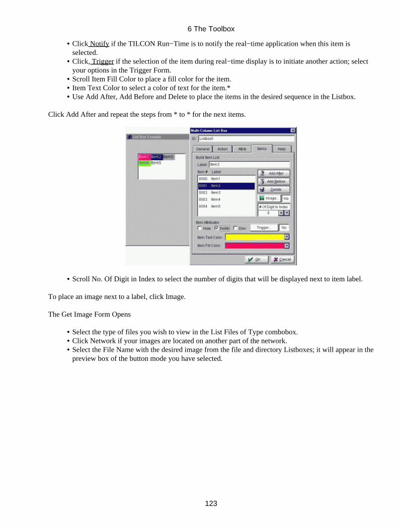
Click Notify if the TILCON Run−Time is to notify the real−time application when this item isselected.
•
Click, Trigger if the selection of the item during real−time display is to initiate another action; selectyour options in the Trigger Form.
•
Scroll Item Fill Color to place a fill color for the item.• Item Text Color to select a color of text for the item.*• Use Add After, Add Before and Delete to place the items in the desired sequence in the Listbox.•
Click Add After and repeat the steps from * to * for the next items.
Scroll No. Of Digit in Index to select the number of digits that will be displayed next to item label.•
To place an image next to a label, click Image.
The Get Image Form Opens
Select the type of files you wish to view in the List Files of Type combobox.• Click Network if your images are located on another part of the network.• Select the File Name with the desired image from the file and directory Listboxes; it will appear in thepreview box of the button mode you have selected.
•
6 The Toolbox
123
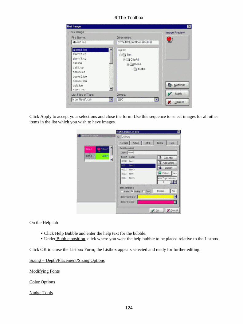
Click Apply to accept your selections and close the form. Use this sequence to select images for all otheritems in the list which you wish to have images.
On the Help tab
Click Help Bubble and enter the help text for the bubble.• Under Bubble position, click where you want the help bubble to be placed relative to the Listbox.•
Click OK to close the Listbox Form; the Listbox appears selected and ready for further editing.
Sizing − Depth/Placement/Sizing Options
Modifying Fonts
Color Options
Nudge Tools
6 The Toolbox
124
6.13 Combobox
Comboboxes combine a text field and a listbox. Choose a popup or static listbox, editable or non editable text,and an array of options for both listbox and text components: layout, colors, images, shading, help bubbles, toname a few.
The types of text that can be included in a Combobox are:
Static List: This non−editable text offers the user choices. Editable text: This text is always visible and can be changed by the user. It includes text fields that can only be filled by the user as when entering a password, for example.
6.13.1 To add a Combobox
Click the Combobox icon in the Toolbox; click the workspace and drag to the desired size of theintended box.
•
Release the mouse button; the Combobox Form opens.•
In the Form,
Click ID and enter the ID for the first menu item (a default ID is entered upon opening of the form, you maywish to use this ID but please beware of duplicate ID's which will cause errors).
On the General Tab
Make your Layout choices for the Pulldown Frame and whether the Combobox appears "In" or "out".• Click Enclose to put a frame around the Combobox.• Scroll Visible # Of Column to set the number of columns which will be visible during run−time.• Scroll Visible # Of Rows to set the number of rows which will be visible during run−time.• Make your Layout choices for the Combobox Item and whether the Combobox items appear "In" or"out".
•
Click Enclose to put a frame around the Combobox items.• Scroll Left Margin to set the number of pixels between rows in the item list.• Scroll Column Margin to set the number of pixels between columns in the item list.• Under Initial State, select Dim (makes the box appear inactive) or Hide (hides the box in therun−time, but not in the application editor) as the state of the box.
•
Sort Option; Case Sensitive and/or Ascii or Numeric. No Sort, Ascending or Descending.• Click Static List if the list items in the box will be totally displayed and not be altered by the user.• Click Editable Text if the text in the box is editable by the user.•
6 The Toolbox
125
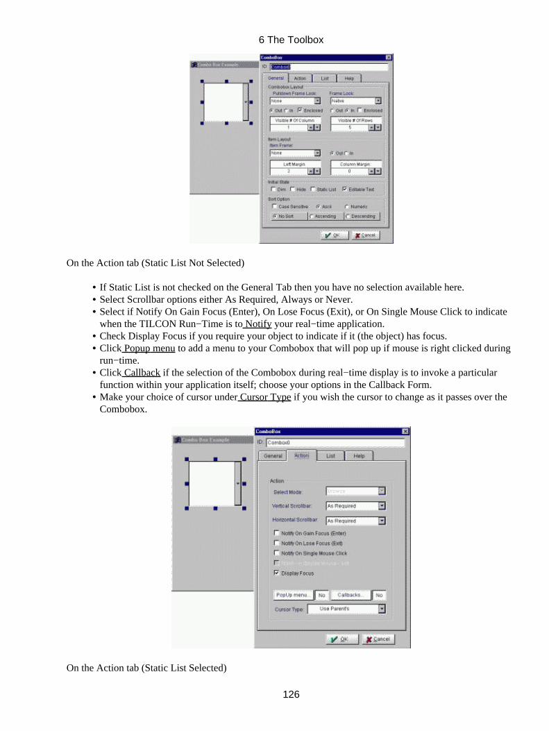
On the Action tab (Static List Not Selected)
If Static List is not checked on the General Tab then you have no selection available here.• Select Scrollbar options either As Required, Always or Never.• Select if Notify On Gain Focus (Enter), On Lose Focus (Exit), or On Single Mouse Click to indicatewhen the TILCON Run−Time is to Notify your real−time application.
•
Check Display Focus if you require your object to indicate if it (the object) has focus.• Click Popup menu to add a menu to your Combobox that will pop up if mouse is right clicked duringrun−time.
•
Click Callback if the selection of the Combobox during real−time display is to invoke a particularfunction within your application itself; choose your options in the Callback Form.
•
Make your choice of cursor under Cursor Type if you wish the cursor to change as it passes over theCombobox.
•
On the Action tab (Static List Selected)
6 The Toolbox
126
If you have Static List checked, click your choice of Browse (click, drag, release to select all choices) orSingle (click, drag, release to select last option) as Select Mode in the box.
Select Mode: Browse: The selected item is always the same as the item with keyboard focus.Moving the selection, by dragging the mouse or using the arrow keys, causesthe Listbox to notify you at each selection with the double−click flag set toFalse. Space bar and Enter cause notifications with double−click set at True.
Single: Keyboard focus is independent of the selected item. Notification occurs onmouse release, space bar hits (double−click flag set to False) and Enter(double−click flag set at True). If the Allow 0 Selections flag is set, the spacebar (and clicking on the highlighted selection) will toggle the item with focusbetween selected and de−selected.
Click De−selects all; selects and gives focus to the item clicked.
Drag Selects items between the item with focus and the item underthe cursor. Others are de−selected.
Release Gives keyboard focus to the item under the cursor*. Notifiesof any selections as follows:
Notification:One notification per item selected. State, ID, text apply toeach item; d−value can be used to determine how manyremain.Example:Items A and B are selected −First notification: d−value = 2, ID = A ;second notification: d−value = 1, ID = BExample:Item A is selected − Notification: d−value = 1, ID = AExample:Item A (keyboard focus) is de−selected, and no other item isselectedd−value = 0, ID = A
Hidden selected items do not count as being selected.Dimmed selected items do count.* Arrow keys can be used to move the keyboard focus.pg up, dn + Shift − moves keyboard focus and selects the itemthat receives it.pg up, dn + Ctrl − moves keyboard focus and toggles the itemthat receives it.
Select Scrollbar options either As Required, Always or Never.• Select if Notify On Gain Focus (Enter), On Lose Focus (Exit), On Single Mouse Click or On DoubleMouse Click to indicate when the TILCON Run−Time is to Notify your real−time application.
•
Check Display Focus if you require your object to indicate if it (the object) has focus.• Popup menu to add a menu to your Combobox that will pop up if mouse is right clicked duringrun−time.
•
Callback if the selection of the Combobox during real−time display is to invoke a particular functionwithin your application itself; choose your options in the Callback Form.
•
6 The Toolbox
127
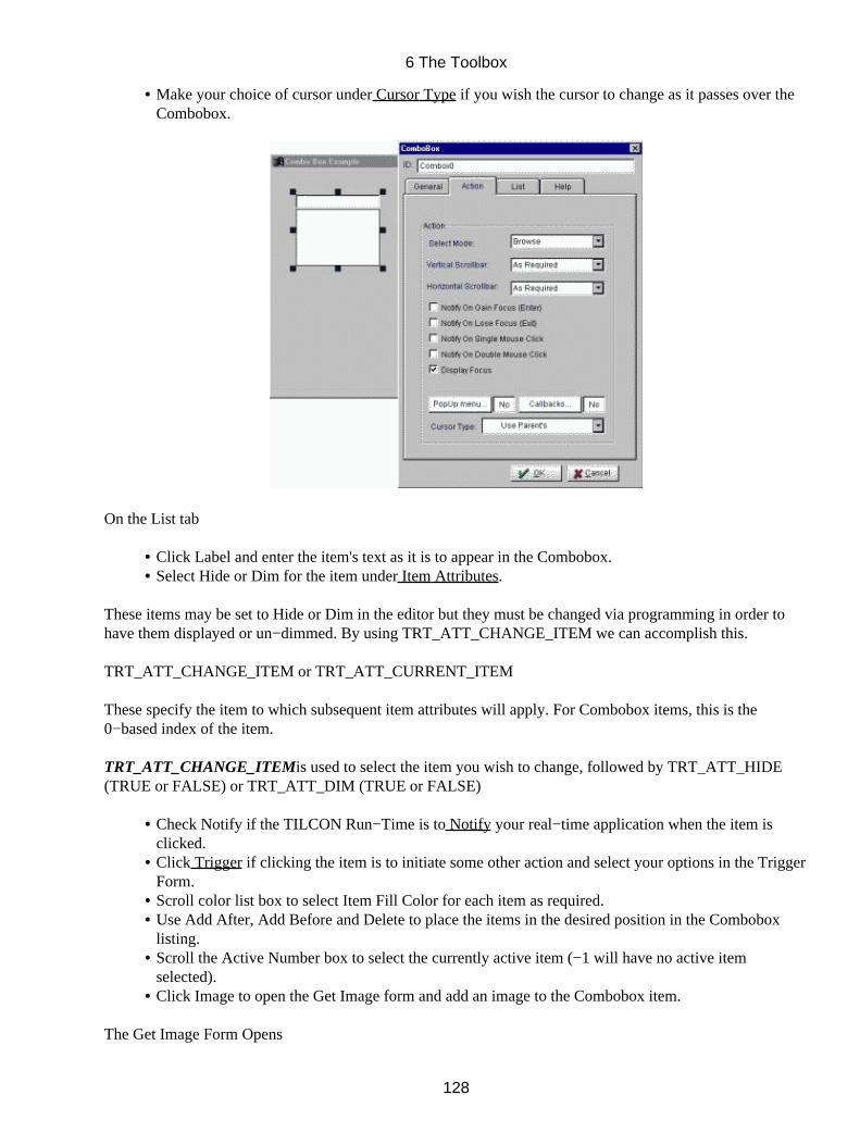
Make your choice of cursor under Cursor Type if you wish the cursor to change as it passes over theCombobox.
•
On the List tab
Click Label and enter the item's text as it is to appear in the Combobox.• Select Hide or Dim for the item under Item Attributes.•
These items may be set to Hide or Dim in the editor but they must be changed via programming in order tohave them displayed or un−dimmed. By using TRT_ATT_CHANGE_ITEM we can accomplish this.
TRT_ATT_CHANGE_ITEM or TRT_ATT_CURRENT_ITEM
These specify the item to which subsequent item attributes will apply. For Combobox items, this is the0−based index of the item.
TRT_ATT_CHANGE_ITEMis used to select the item you wish to change, followed by TRT_ATT_HIDE(TRUE or FALSE) or TRT_ATT_DIM (TRUE or FALSE)
Check Notify if the TILCON Run−Time is to Notify your real−time application when the item isclicked.
•
Click Trigger if clicking the item is to initiate some other action and select your options in the TriggerForm.
•
Scroll color list box to select Item Fill Color for each item as required.• Use Add After, Add Before and Delete to place the items in the desired position in the Comboboxlisting.
•
Scroll the Active Number box to select the currently active item (−1 will have no active itemselected).
•
Click Image to open the Get Image form and add an image to the Combobox item.•
The Get Image Form Opens
6 The Toolbox
128
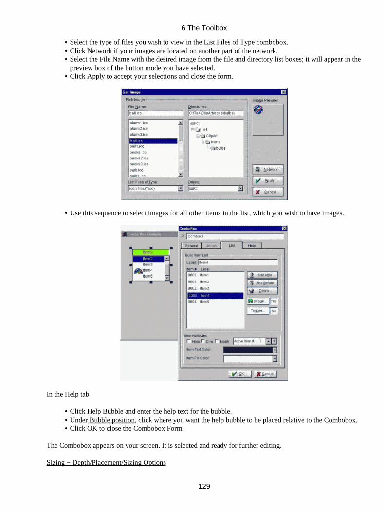
Select the type of files you wish to view in the List Files of Type combobox.• Click Network if your images are located on another part of the network.• Select the File Name with the desired image from the file and directory list boxes; it will appear in thepreview box of the button mode you have selected.
•
Click Apply to accept your selections and close the form.•
Use this sequence to select images for all other items in the list, which you wish to have images.•
In the Help tab
Click Help Bubble and enter the help text for the bubble.• Under Bubble position, click where you want the help bubble to be placed relative to the Combobox.• Click OK to close the Combobox Form.•
The Combobox appears on your screen. It is selected and ready for further editing.
Sizing − Depth/Placement/Sizing Options
6 The Toolbox
129

Modifying Fonts
Color Options
Nudge Tools
6.14 Scroll Area
This container combines with scroll bars allowing you to group many or large objects into a small area of yourwindow. Any object can be placed into a scroll area, including background images (e.g. maps) over whichother objects can be layered. Choose the viewed and total size, shadings, and scrollbar options.
6.14.1 To add a scroll bar
Click the Scroll Area icon in the Toolbox; click the workspace and drag to the desired size of the
intended scroll area. Release the mouse button; the Scroll Area Form opens.
In the Form,
Click ID and enter the ID for the scroll area (a default ID is entered upon opening of the form, youmay wish to use this ID but please beware of duplicate ID's which will cause errors).
•
Select Horizontal Scrollbar and/or Vertical Scrollbar.• Enter your values for Total Range (full length or height the scroll area will occupy in your window),Initial Position (point where scroll area begins in your window), Small Increment (minimum valuemovement by scrolling) and Large Increment (maximum value movement per single click). Thevalues are expressed in pixels unless your screen units are in inches or your window is scalable.
•
Make your choices under Area Layout to determine the appearance of the scroll area.• Click Hide if you want the scroll area to be initially hidden in run−time.• Notify − If the TILCON Run−Time is to notify your real−time application of an event.• Popup Menu − add a menu to your scroll area that will pop up if mouse is right clicked duringrun−time.
•
Cursor Type − Make your choice of cursor under Cursor Type if you wish the cursor to change as itpasses over the scroll area.
•
Click OK to close the Form. The scroll area will appear in your window ready for further editing.•
6 The Toolbox
130
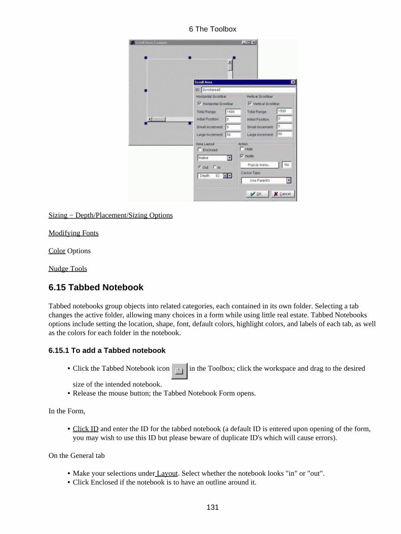
Sizing − Depth/Placement/Sizing Options
Modifying Fonts
Color Options
Nudge Tools
6.15 Tabbed Notebook
Tabbed notebooks group objects into related categories, each contained in its own folder. Selecting a tabchanges the active folder, allowing many choices in a form while using little real estate. Tabbed Notebooksoptions include setting the location, shape, font, default colors, highlight colors, and labels of each tab, as wellas the colors for each folder in the notebook.
6.15.1 To add a Tabbed notebook
Click the Tabbed Notebook icon in the Toolbox; click the workspace and drag to the desired
size of the intended notebook.
•
Release the mouse button; the Tabbed Notebook Form opens.•
In the Form,
Click ID and enter the ID for the tabbed notebook (a default ID is entered upon opening of the form,you may wish to use this ID but please beware of duplicate ID's which will cause errors).
•
On the General tab
Make your selections under Layout. Select whether the notebook looks "in" or "out".• Click Enclosed if the notebook is to have an outline around it.•
6 The Toolbox
131
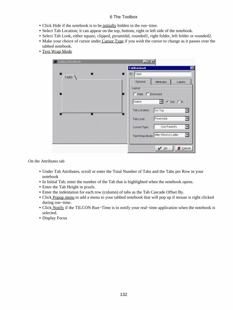
Click Hide if the notebook is to be initially hidden in the run−time.• Select Tab Location; it can appear on the top, bottom, right or left side of the notebook.• Select Tab Look, either square, clipped, pyramidal, rounded1, right folder, left folder or rounded2.• Make your choice of cursor under Cursor Type if you wish the cursor to change as it passes over thetabbed notebook.
•
Text Wrap Mode•
On the Attributes tab
Under Tab Attributes, scroll or enter the Total Number of Tabs and the Tabs per Row in yournotebook
•
In Initial Tab, enter the number of the Tab that is highlighted when the notebook opens.• Enter the Tab Height in pixels.• Enter the indentation for each row (column) of tabs as the Tab Cascade Offset By.• Click Popup menu to add a menu to your tabbed notebook that will pop up if mouse is right clickedduring run−time.
•
Click Notify if the TILCON Run−Time is to notify your real−time application when the notebook isselected.
•
Display Focus•
6 The Toolbox
132
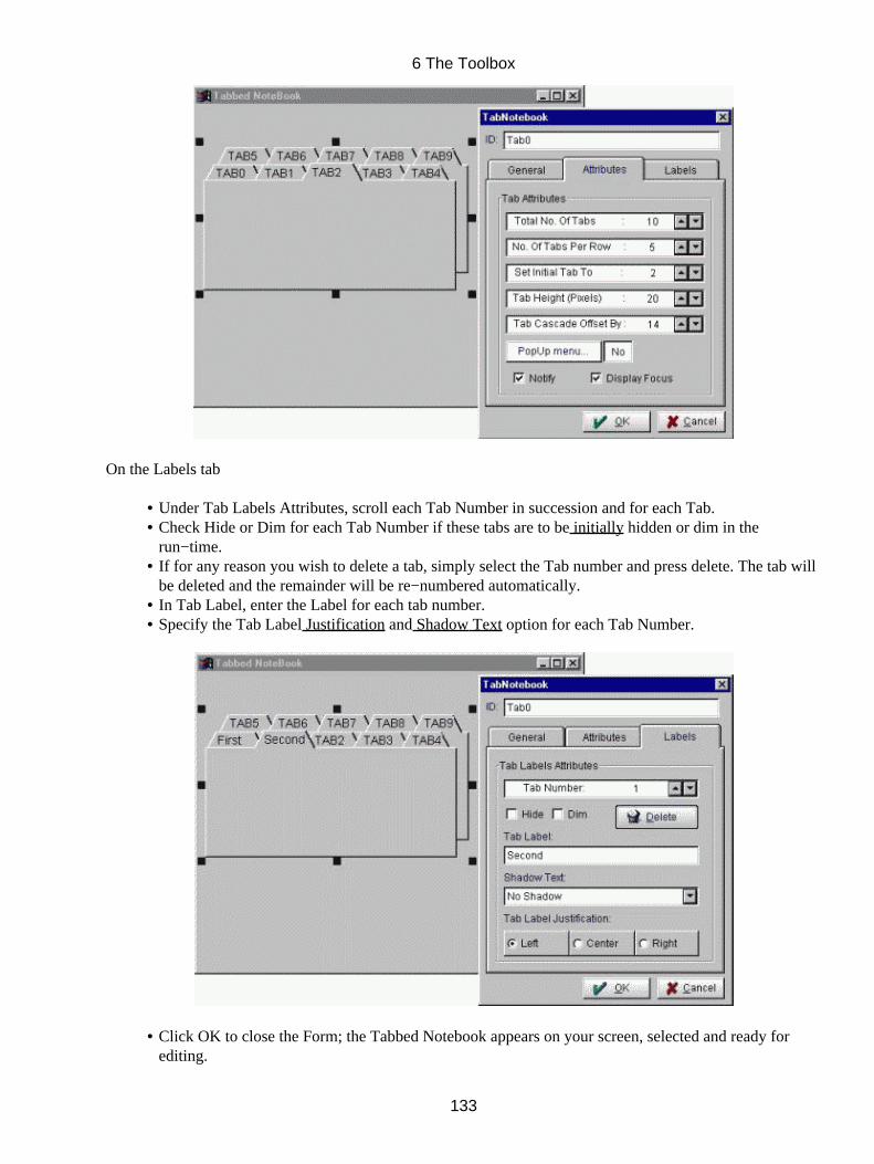
On the Labels tab
Under Tab Labels Attributes, scroll each Tab Number in succession and for each Tab.• Check Hide or Dim for each Tab Number if these tabs are to be initially hidden or dim in therun−time.
•
If for any reason you wish to delete a tab, simply select the Tab number and press delete. The tab willbe deleted and the remainder will be re−numbered automatically.
•
In Tab Label, enter the Label for each tab number.• Specify the Tab Label Justification and Shadow Text option for each Tab Number.•
Click OK to close the Form; the Tabbed Notebook appears on your screen, selected and ready forediting.
•
6 The Toolbox
133

Sizing − Depth/Placement/Sizing Options
Modifying Fonts
(each Tab must be selected individually to set text options)
Color Options
Nudge Tools
6.16 Tree
Trees provide a visualization of a hierarchical list of items. Trees are built quickly and easily: each item isadded as a child or sibling of a previous item. Branches expand and collapse in response to user 'clicks';selected items can trigger commands or send notifications to the application. Customize each item by addingan image, changing its shading or providing a help bubble.
6.16.1 To add a Tree
Click the Tree Object icon in the Toolbox; click the workspace and drag to the desired size of
the intended box.
•
Release the mouse button; the Tree Form opens.•
In the Form,
Click ID and enter the ID for the Tree (a default ID is entered upon opening of the form, you may wish to usethis ID but please beware of duplicate ID's which will cause errors).
On the General Tab
Make your Tree Area Layout choices for the Tree, select the Frame Look of the tree and whether theTree appears "In" or "out".
•
Click Enclose to put a thin line around the Tree.• Select the Look for the items within the Tree in Items Look combobox.• Scroll Row Margin to set the number of pixels between rows in the item list.• Scroll Column Margin to set the number of pixels between columns in the item list.• Scroll and set the Image Height and Width in pixels for the items in the Tree.• Under Initial State, select Dim (makes the tree appear inactive) or Hide (hides the tree in therun−time, but not in the application editor) as the initial state of the tree.
•
Sort Option; Case Sensitive and/or Ascii or Numeric, No Sort, Ascending or Descending.• Scroll Active Item No. number box to select the currently active item ( −1 to have no active itemselected).
•
Scroll Top Item # if you wish the corresponding label to be prominent when the tree is displayed inthe run−time. This item will only be displayed at the top if there is a scrollbar present and the ActiveItem can also be presented in the same displayed area. If the Top Item and Active Item cannot bedisplayed at the same time, the Active Item takes precedence.
•
6 The Toolbox
134
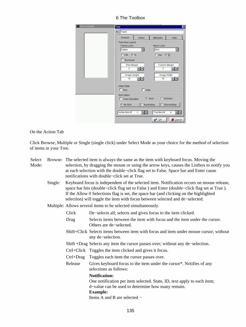
On the Action Tab
Click Browse, Multiple or Single (single click) under Select Mode as your choice for the method of selectionof items in your Tree.
SelectMode:
Browse: The selected item is always the same as the item with keyboard focus. Moving theselection, by dragging the mouse or using the arrow keys, causes the Listbox to notify youat each selection with the double−click flag set to False. Space bar and Enter causenotifications with double−click set at True.
Single: Keyboard focus is independent of the selected item. Notification occurs on mouse release,space bar hits (double−click flag set to False ) and Enter (double−click flag set at True ).If the Allow 0 Selections flag is set, the space bar (and clicking on the highlightedselection) will toggle the item with focus between selected and de−selected.
Multiple: Allows several items to be selected simultaneously.
Click De−selects all; selects and gives focus to the item clicked.
Drag Selects items between the item with focus and the item under the cursor.Others are de−selected.
Shift+Click Selects items between item with focus and item under mouse cursor; withoutany de−selection.
Shift +DragSelects any item the cursor passes over; without any de−selection.
Ctrl+Click Toggles the item clicked and gives it focus.
Ctrl+Drag Toggles each item the cursor passes over.
Release Gives keyboard focus to the item under the cursor*. Notifies of anyselections as follows:
Notification:One notification per item selected. State, ID, text apply to each item;d−value can be used to determine how many remain.Example:Items A and B are selected −
6 The Toolbox
135

First notification: d−value = 2, ID = A ;second notification: d−value = 1, ID = BExample:Item A is selected − Notification: d−value = 1, ID = AExample:Item A (keyboard focus) is de−selected, and no other item is selectedd−value = 0, ID = A
Hidden selected items do not count as being selected.Dimmed selected items do count.* Arrow keys can be used to move the keyboard focus.pg up, dn + Shift − moves keyboard focus and selects the item that receivesit.pg up, dn + Ctrl − moves keyboard focus and toggles the item that receivesit.
Select Scroll bar options either As Required, Always or Never.• Select if Notify On Gain Focus (Enter), On Lose Focus (Exit), On Single Mouse Click or On DoubleMouse Click to indicate when the TILCON Run−Time is to Notify your real−time application.
•
Click No Selection. Disabling this option forces the Tree to always maintain at least one itemselected.
•
Check Display Focus if you require your object to indicate if it (the object) has focus.• Popup menu to add a menu to your Tree that will pop up if mouse is right clicked during run−time.• Callback if the selection of the Tree during real−time display is to invoke a particular function withinyour application itself; choose your options in the Callback Form.
•
Make your choice of cursor under Cursor Type if you wish the cursor to change as it passes over theTree.
•
On the Attributes Tab
Click Label and enter the item's text as it is to appear in the Tree.•
6 The Toolbox
136
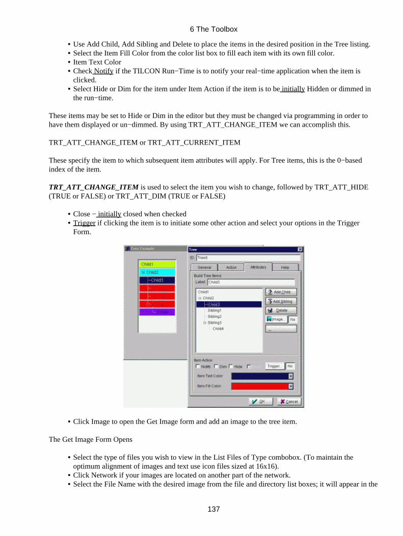
Use Add Child, Add Sibling and Delete to place the items in the desired position in the Tree listing.• Select the Item Fill Color from the color list box to fill each item with its own fill color.• Item Text Color• Check Notify if the TILCON Run−Time is to notify your real−time application when the item isclicked.
•
Select Hide or Dim for the item under Item Action if the item is to be initially Hidden or dimmed inthe run−time.
•
These items may be set to Hide or Dim in the editor but they must be changed via programming in order tohave them displayed or un−dimmed. By using TRT_ATT_CHANGE_ITEM we can accomplish this.
TRT_ATT_CHANGE_ITEM or TRT_ATT_CURRENT_ITEM
These specify the item to which subsequent item attributes will apply. For Tree items, this is the 0−basedindex of the item.
TRT_ATT_CHANGE_ITEM is used to select the item you wish to change, followed by TRT_ATT_HIDE(TRUE or FALSE) or TRT_ATT_DIM (TRUE or FALSE)
Close − initially closed when checked• Trigger if clicking the item is to initiate some other action and select your options in the TriggerForm.
•
Click Image to open the Get Image form and add an image to the tree item.•
The Get Image Form Opens
Select the type of files you wish to view in the List Files of Type combobox. (To maintain theoptimum alignment of images and text use icon files sized at 16x16).
•
Click Network if your images are located on another part of the network.• Select the File Name with the desired image from the file and directory list boxes; it will appear in the•
6 The Toolbox
137

preview box of the button mode you have selected.
Click Apply to accept your selections and close the form. Use this sequence to select images for allother items in the list which you wish to have images.
•
If an image is not required simply select the item which has an image and click Remove Image.•
In the Help tab
Click Help Bubble and enter the help text for the bubble.• Under Bubble position, click where you want the help bubble to be placed relative to the Combobox.• Click OK to close the Tree Object Form.•
The Tree appears on your screen. It is selected and ready for further editing.
Sizing − Depth/Placement/Sizing Options Placement (see 4 for Depth/Placement and Size Options)
Modifying Fonts
6 The Toolbox
138

Color Options
Nudge Tools
6 The Toolbox
139
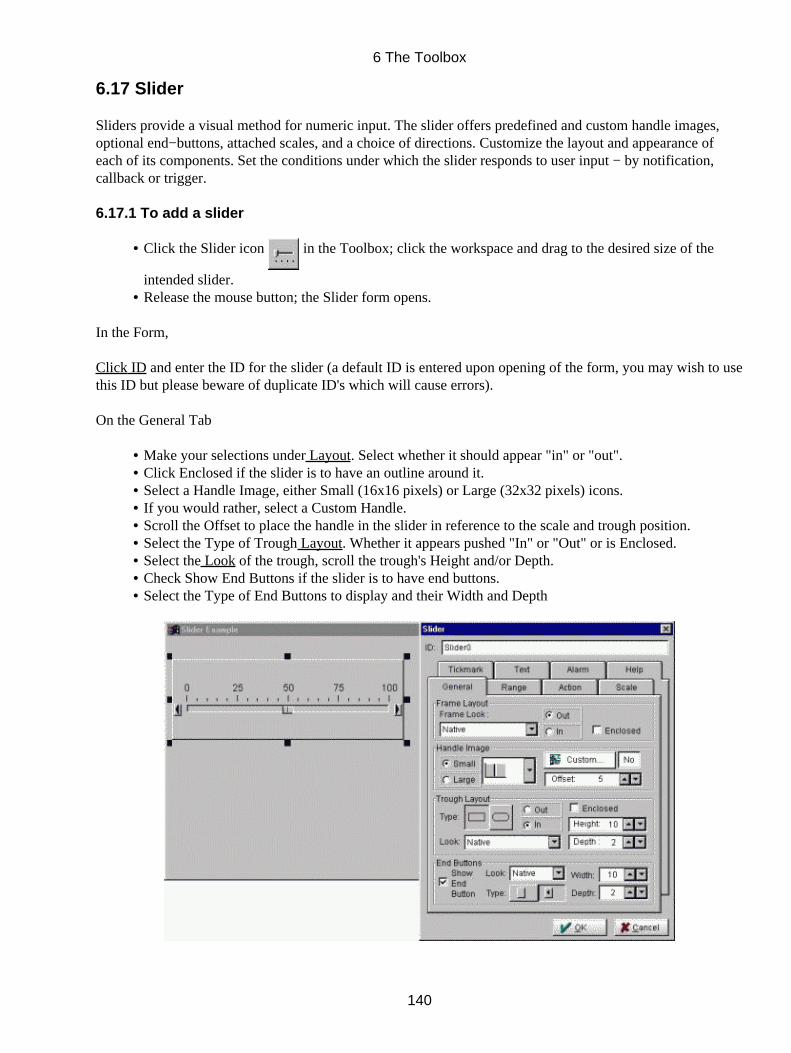
6.17 Slider
Sliders provide a visual method for numeric input. The slider offers predefined and custom handle images,optional end−buttons, attached scales, and a choice of directions. Customize the layout and appearance ofeach of its components. Set the conditions under which the slider responds to user input − by notification,callback or trigger.
6.17.1 To add a slider
Click the Slider icon in the Toolbox; click the workspace and drag to the desired size of the
intended slider.
•
Release the mouse button; the Slider form opens.•
In the Form,
Click ID and enter the ID for the slider (a default ID is entered upon opening of the form, you may wish to usethis ID but please beware of duplicate ID's which will cause errors).
On the General Tab
Make your selections under Layout. Select whether it should appear "in" or "out".• Click Enclosed if the slider is to have an outline around it.• Select a Handle Image, either Small (16x16 pixels) or Large (32x32 pixels) icons.• If you would rather, select a Custom Handle.• Scroll the Offset to place the handle in the slider in reference to the scale and trough position.• Select the Type of Trough Layout. Whether it appears pushed "In" or "Out" or is Enclosed.• Select the Look of the trough, scroll the trough's Height and/or Depth.• Check Show End Buttons if the slider is to have end buttons.• Select the Type of End Buttons to display and their Width and Depth•
6 The Toolbox
140
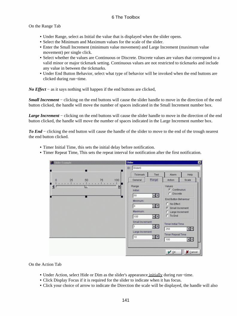
On the Range Tab
Under Range, select as Initial the value that is displayed when the slider opens.• Select the Minimum and Maximum values for the scale of the slider.• Enter the Small Increment (minimum value movement) and Large Increment (maximum valuemovement) per single click.
•
Select whether the values are Continuous or Discrete. Discrete values are values that correspond to avalid minor or major tickmark setting. Continuous values are not restricted to tickmarks and includeany value in between the tickmarks.
•
Under End Button Behavior, select what type of behavior will be invoked when the end buttons areclicked during run−time.
•
No Effect − as it says nothing will happen if the end buttons are clicked,
Small Increment − clicking on the end buttons will cause the slider handle to move in the direction of the endbutton clicked, the handle will move the number of spaces indicated in the Small Increment number box.
Large Increment − clicking on the end buttons will cause the slider handle to move in the direction of the endbutton clicked, the handle will move the number of spaces indicated in the Large Increment number box.
To End − clicking the end button will cause the handle of the slider to move to the end of the trough nearestthe end button clicked.
Timer Initial Time, this sets the initial delay before notification.• Timer Repeat Time, This sets the repeat interval for notification after the first notification.•
On the Action Tab
Under Action, select Hide or Dim as the slider's appearance initially during run−time.• Click Display Focus if it is required for the slider to indicate when it has focus.• Click your choice of arrow to indicate the Direction the scale will be displayed, the handle will also•
6 The Toolbox
141
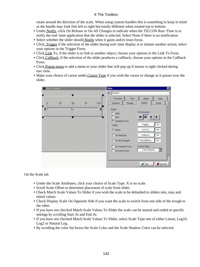
rotate around the direction of the scale. When using custom handles this is something to keep in mindas the handle may look fine left to right but totally different when rotated top to bottom.Under Notify, click On Release or On All Changes to indicate when the TILCON Run−Time is tonotify the real−time application that the slider is selected. Select None if there is no notification.
•
Select whether the slider should Notify when it gains and/or loses focus.• Click, Trigger if the selection of the slider during real−time display is to initiate another action; selectyour options in the Trigger Form.
•
Click Link To, if the slider is to link to another object; choose your options in the Link To Form.• Click Callback, if the selection of the slider produces a callback; choose your options in the CallbackForm.
•
Click Popup menu to add a menu to your slider that will pop up if mouse is right clicked duringrun−time.
•
Make your choice of cursor under Cursor Type if you wish the cursor to change as it passes over theslider.
•
On the Scale tab
Under the Scale Attributes, click your choice of Scale Type. X is no scale.• Scroll Scale Offset to determine placement of scale from slider.• Check Match Scale Values To Slider if you wish the scale to be defaulted to sliders min, max andinitial values.
•
Check Display Scale On Opposite Side if you want the scale to switch from one side of the trough tothe other.
•
If you have not checked Match Scale Values To Slider the scale can be started and ended at specificsettings by scrolling Start At and End At.
•
If you have not checked Match Scale Values To Slider, select Scale Type one of either Linear, Log10,Log2 or Natural Log.
•
By scrolling the color list boxes the Scale Color and the Scale Shadow Color can be selected.•
6 The Toolbox
142
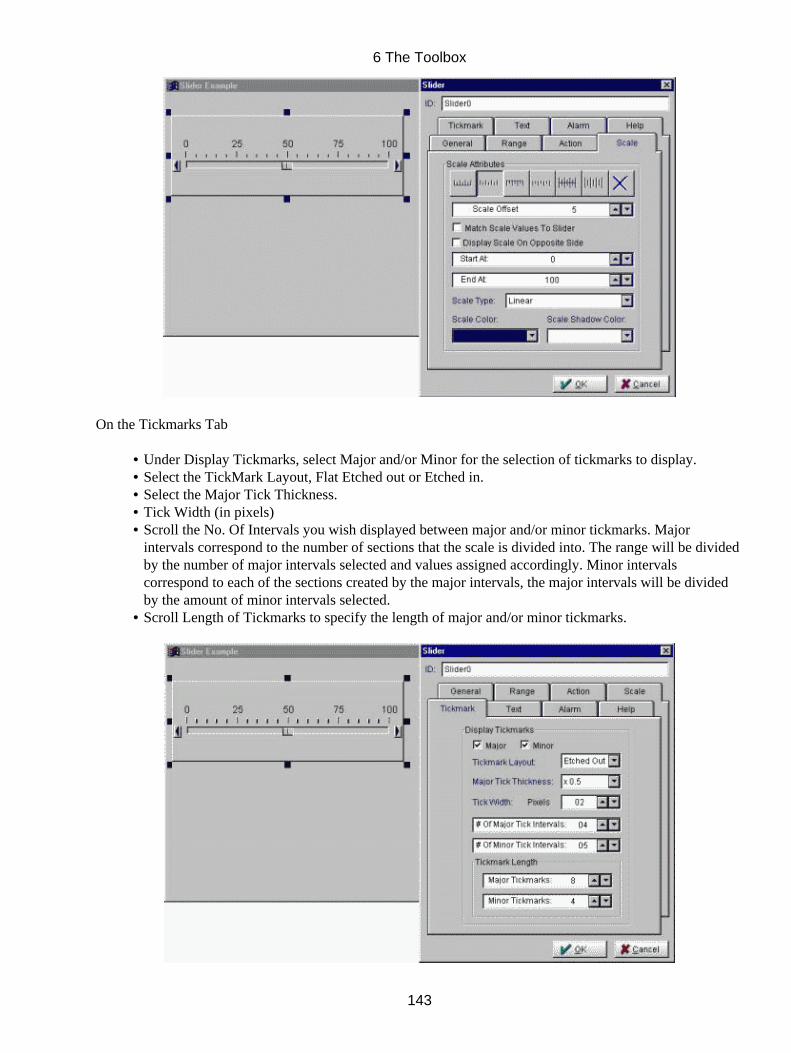
On the Tickmarks Tab
Under Display Tickmarks, select Major and/or Minor for the selection of tickmarks to display.• Select the TickMark Layout, Flat Etched out or Etched in.• Select the Major Tick Thickness.• Tick Width (in pixels)• Scroll the No. Of Intervals you wish displayed between major and/or minor tickmarks. Majorintervals correspond to the number of sections that the scale is divided into. The range will be dividedby the number of major intervals selected and values assigned accordingly. Minor intervalscorrespond to each of the sections created by the major intervals, the major intervals will be dividedby the amount of minor intervals selected.
•
Scroll Length of Tickmarks to specify the length of major and/or minor tickmarks.•
6 The Toolbox
143
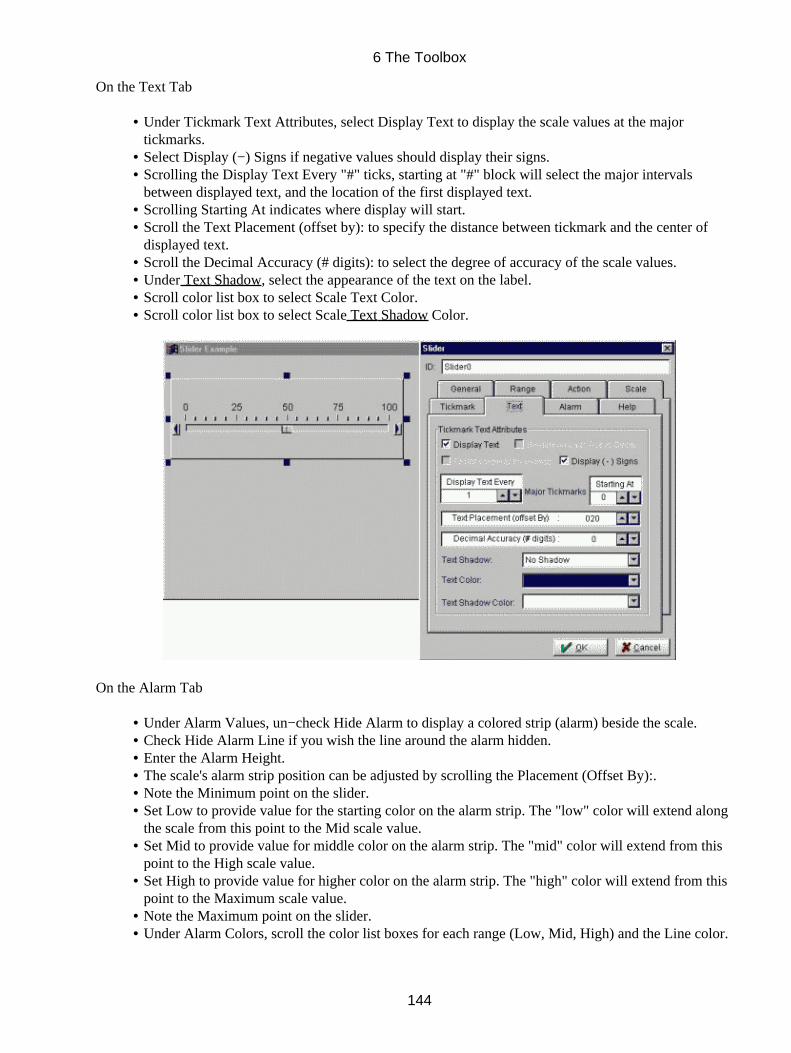
On the Text Tab
Under Tickmark Text Attributes, select Display Text to display the scale values at the majortickmarks.
•
Select Display (−) Signs if negative values should display their signs.• Scrolling the Display Text Every "#" ticks, starting at "#" block will select the major intervalsbetween displayed text, and the location of the first displayed text.
•
Scrolling Starting At indicates where display will start.• Scroll the Text Placement (offset by): to specify the distance between tickmark and the center ofdisplayed text.
•
Scroll the Decimal Accuracy (# digits): to select the degree of accuracy of the scale values.• Under Text Shadow, select the appearance of the text on the label.• Scroll color list box to select Scale Text Color.• Scroll color list box to select Scale Text Shadow Color.•
On the Alarm Tab
Under Alarm Values, un−check Hide Alarm to display a colored strip (alarm) beside the scale.• Check Hide Alarm Line if you wish the line around the alarm hidden.• Enter the Alarm Height.• The scale's alarm strip position can be adjusted by scrolling the Placement (Offset By):.• Note the Minimum point on the slider.• Set Low to provide value for the starting color on the alarm strip. The "low" color will extend alongthe scale from this point to the Mid scale value.
•
Set Mid to provide value for middle color on the alarm strip. The "mid" color will extend from thispoint to the High scale value.
•
Set High to provide value for higher color on the alarm strip. The "high" color will extend from thispoint to the Maximum scale value.
•
Note the Maximum point on the slider.• Under Alarm Colors, scroll the color list boxes for each range (Low, Mid, High) and the Line color.•
6 The Toolbox
144
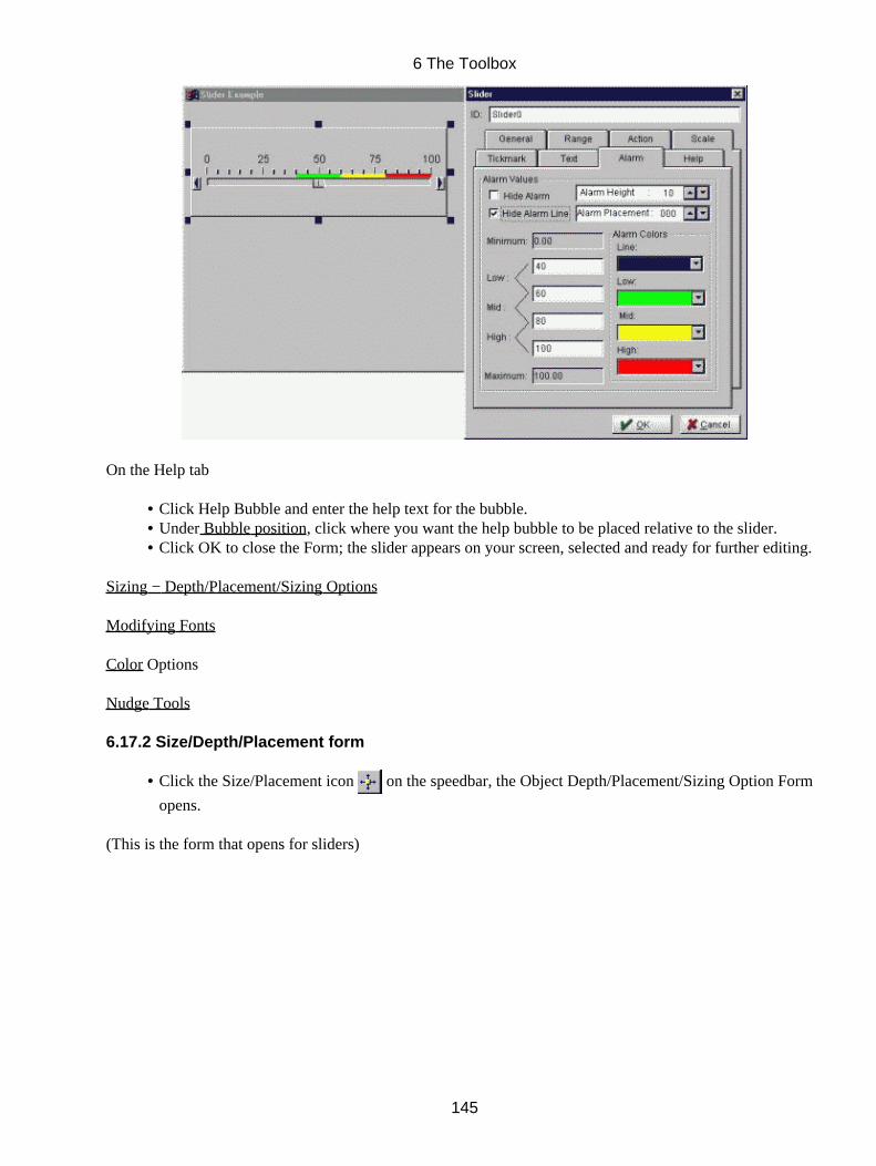
On the Help tab
Click Help Bubble and enter the help text for the bubble.• Under Bubble position, click where you want the help bubble to be placed relative to the slider.• Click OK to close the Form; the slider appears on your screen, selected and ready for further editing.•
Sizing − Depth/Placement/Sizing Options
Modifying Fonts
Color Options
Nudge Tools
6.17.2 Size/Depth/Placement form
Click the Size/Placement icon on the speedbar, the Object Depth/Placement/Sizing Option Form
opens.
•
(This is the form that opens for sliders)
6 The Toolbox
145
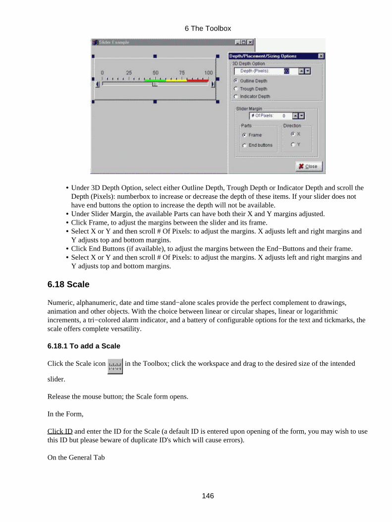
Under 3D Depth Option, select either Outline Depth, Trough Depth or Indicator Depth and scroll theDepth (Pixels): numberbox to increase or decrease the depth of these items. If your slider does nothave end buttons the option to increase the depth will not be available.
•
Under Slider Margin, the available Parts can have both their X and Y margins adjusted.• Click Frame, to adjust the margins between the slider and its frame.• Select X or Y and then scroll # Of Pixels: to adjust the margins. X adjusts left and right margins andY adjusts top and bottom margins.
•
Click End Buttons (if available), to adjust the margins between the End−Buttons and their frame.• Select X or Y and then scroll # Of Pixels: to adjust the margins. X adjusts left and right margins andY adjusts top and bottom margins.
•
6.18 Scale
Numeric, alphanumeric, date and time stand−alone scales provide the perfect complement to drawings,animation and other objects. With the choice between linear or circular shapes, linear or logarithmicincrements, a tri−colored alarm indicator, and a battery of configurable options for the text and tickmarks, thescale offers complete versatility.
6.18.1 To add a Scale
Click the Scale icon in the Toolbox; click the workspace and drag to the desired size of the intended
slider.
Release the mouse button; the Scale form opens.
In the Form,
Click ID and enter the ID for the Scale (a default ID is entered upon opening of the form, you may wish to usethis ID but please beware of duplicate ID's which will cause errors).
On the General Tab
6 The Toolbox
146
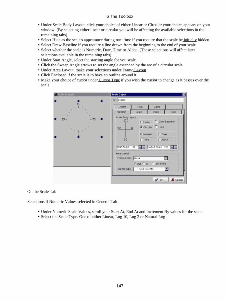
Under Scale Body Layout, click your choice of either Linear or Circular your choice appears on yourwindow. (By selecting either linear or circular you will be affecting the available selections in theremaining tabs)
•
Select Hide as the scale's appearance during run−time if you require that the scale be initially hidden.• Select Draw Baseline if you require a line drawn from the beginning to the end of your scale.• Select whether the scale is Numeric, Date, Time or Alpha. (These selections will affect laterselections available in the remaining tabs)
•
Under Start Angle, select the starting angle for you scale.• Click the Sweep Angle arrows to set the angle extended by the arc of a circular scale.• Under Area Layout, make your selections under Frame Layout.• Click Enclosed if the scale is to have an outline around it.• Make your choice of cursor under Cursor Type if you wish the cursor to change as it passes over thescale.
•
On the Scale Tab
Selections if Numeric Values selected in General Tab
Under Numeric Scale Values, scroll your Start At, End At and Increment By values for the scale.• Select the Scale Type. One of either Linear, Log 10, Log 2 or Natural Log•
6 The Toolbox
147
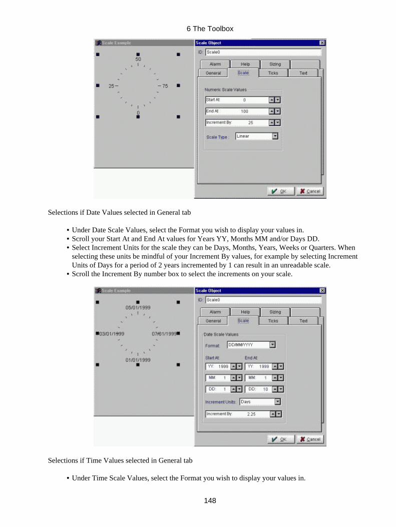
Selections if Date Values selected in General tab
Under Date Scale Values, select the Format you wish to display your values in.• Scroll your Start At and End At values for Years YY, Months MM and/or Days DD.• Select Increment Units for the scale they can be Days, Months, Years, Weeks or Quarters. Whenselecting these units be mindful of your Increment By values, for example by selecting IncrementUnits of Days for a period of 2 years incremented by 1 can result in an unreadable scale.
•
Scroll the Increment By number box to select the increments on your scale.•
Selections if Time Values selected in General tab
Under Time Scale Values, select the Format you wish to display your values in.•
6 The Toolbox
148
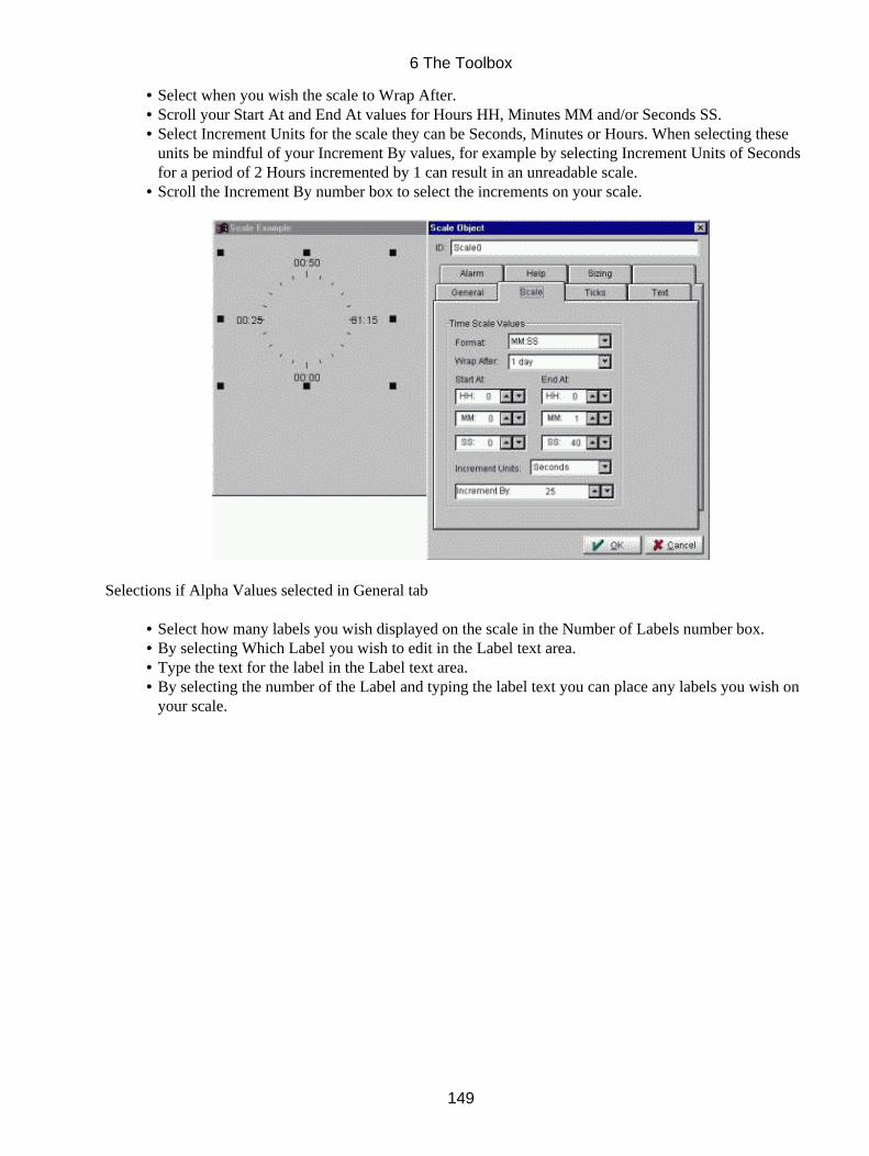
Select when you wish the scale to Wrap After.• Scroll your Start At and End At values for Hours HH, Minutes MM and/or Seconds SS.• Select Increment Units for the scale they can be Seconds, Minutes or Hours. When selecting theseunits be mindful of your Increment By values, for example by selecting Increment Units of Secondsfor a period of 2 Hours incremented by 1 can result in an unreadable scale.
•
Scroll the Increment By number box to select the increments on your scale.•
Selections if Alpha Values selected in General tab
Select how many labels you wish displayed on the scale in the Number of Labels number box.• By selecting Which Label you wish to edit in the Label text area.• Type the text for the label in the Label text area.• By selecting the number of the Label and typing the label text you can place any labels you wish onyour scale.
•
6 The Toolbox
149

On the Tickmarks Tab
Under Display Tickmarks, select Major and/or Minor. (To determine which Tickmarks will bedisplayed).
•
Select the TickMark Layout.• Under Tickmark Location, select either Counter Clock Wise Side / Outside, Clock Wise Side orThrough Baseline
•
Scroll the No. Of Intervals you wish displayed between major and/or minor tickmarks. Majorintervals correspond to the number of sections that the scale is divided into. The range will be dividedby the number of major intervals selected and values assigned accordingly. Minor intervalscorrespond to each of the sections created by the major intervals, the major intervals will be dividedby the amount of minor intervals selected.
•
Select the Major Tick Thickness.• Tick width (in pixels)• Scroll Length of Tickmarks to specify the length of major and/or minor tickmarks.• By scrolling the color list boxes the Scale Color and the Scale Shadow Color can be selected.•
6 The Toolbox
150
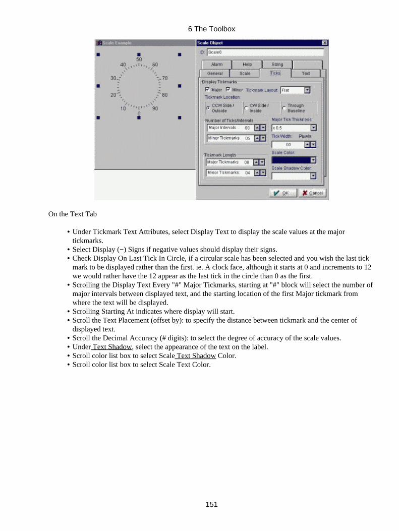
On the Text Tab
Under Tickmark Text Attributes, select Display Text to display the scale values at the majortickmarks.
•
Select Display (−) Signs if negative values should display their signs.• Check Display On Last Tick In Circle, if a circular scale has been selected and you wish the last tickmark to be displayed rather than the first. ie. A clock face, although it starts at 0 and increments to 12we would rather have the 12 appear as the last tick in the circle than 0 as the first.
•
Scrolling the Display Text Every "#" Major Tickmarks, starting at "#" block will select the number ofmajor intervals between displayed text, and the starting location of the first Major tickmark fromwhere the text will be displayed.
•
Scrolling Starting At indicates where display will start.• Scroll the Text Placement (offset by): to specify the distance between tickmark and the center ofdisplayed text.
•
Scroll the Decimal Accuracy (# digits): to select the degree of accuracy of the scale values.• Under Text Shadow, select the appearance of the text on the label.• Scroll color list box to select Scale Text Shadow Color.• Scroll color list box to select Scale Text Color.•
6 The Toolbox
151
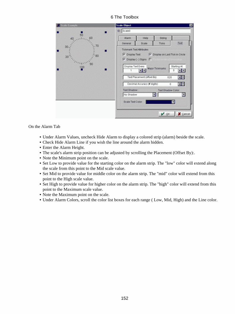
On the Alarm Tab
Under Alarm Values, uncheck Hide Alarm to display a colored strip (alarm) beside the scale.• Check Hide Alarm Line if you wish the line around the alarm hidden.• Enter the Alarm Height.• The scale's alarm strip position can be adjusted by scrolling the Placement (Offset By):.• Note the Minimum point on the scale.• Set Low to provide value for the starting color on the alarm strip. The "low" color will extend alongthe scale from this point to the Mid scale value.
•
Set Mid to provide value for middle color on the alarm strip. The "mid" color will extend from thispoint to the High scale value.
•
Set High to provide value for higher color on the alarm strip. The "high" color will extend from thispoint to the Maximum scale value.
•
Note the Maximum point on the scale.• Under Alarm Colors, scroll the color list boxes for each range ( Low, Mid, High) and the Line color.•
6 The Toolbox
152
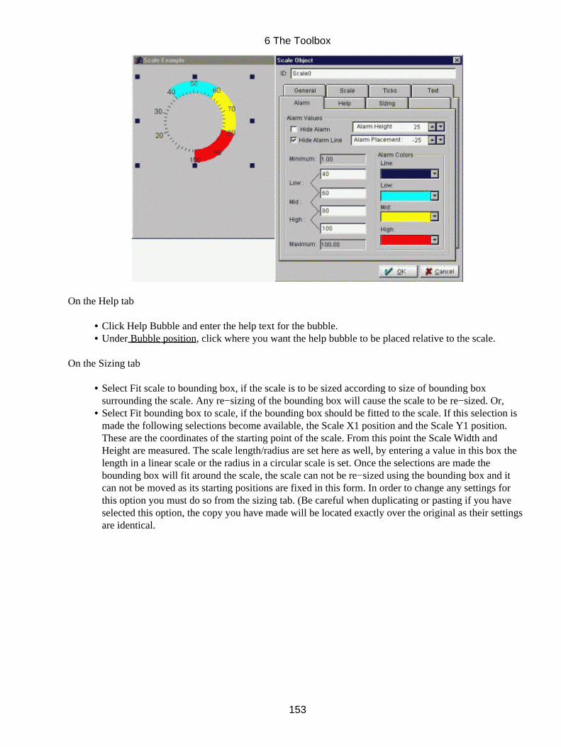
On the Help tab
Click Help Bubble and enter the help text for the bubble.• Under Bubble position, click where you want the help bubble to be placed relative to the scale.•
On the Sizing tab
Select Fit scale to bounding box, if the scale is to be sized according to size of bounding boxsurrounding the scale. Any re−sizing of the bounding box will cause the scale to be re−sized. Or,
•
Select Fit bounding box to scale, if the bounding box should be fitted to the scale. If this selection ismade the following selections become available, the Scale X1 position and the Scale Y1 position.These are the coordinates of the starting point of the scale. From this point the Scale Width andHeight are measured. The scale length/radius are set here as well, by entering a value in this box thelength in a linear scale or the radius in a circular scale is set. Once the selections are made thebounding box will fit around the scale, the scale can not be re−sized using the bounding box and itcan not be moved as its starting positions are fixed in this form. In order to change any settings forthis option you must do so from the sizing tab. (Be careful when duplicating or pasting if you haveselected this option, the copy you have made will be located exactly over the original as their settingsare identical.
•
6 The Toolbox
153
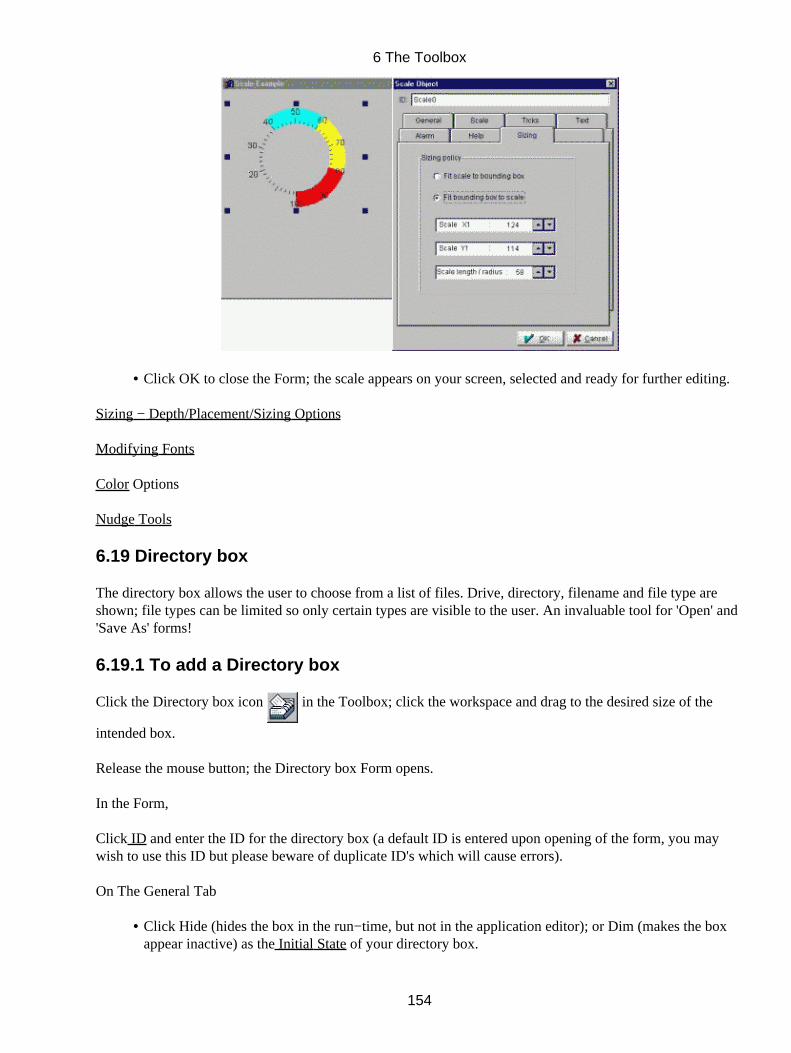
Click OK to close the Form; the scale appears on your screen, selected and ready for further editing.•
Sizing − Depth/Placement/Sizing Options
Modifying Fonts
Color Options
Nudge Tools
6.19 Directory box
The directory box allows the user to choose from a list of files. Drive, directory, filename and file type areshown; file types can be limited so only certain types are visible to the user. An invaluable tool for 'Open' and'Save As' forms!
6.19.1 To add a Directory box
Click the Directory box icon in the Toolbox; click the workspace and drag to the desired size of the
intended box.
Release the mouse button; the Directory box Form opens.
In the Form,
Click ID and enter the ID for the directory box (a default ID is entered upon opening of the form, you maywish to use this ID but please beware of duplicate ID's which will cause errors).
On The General Tab
Click Hide (hides the box in the run−time, but not in the application editor); or Dim (makes the boxappear inactive) as the Initial State of your directory box.
•
6 The Toolbox
154
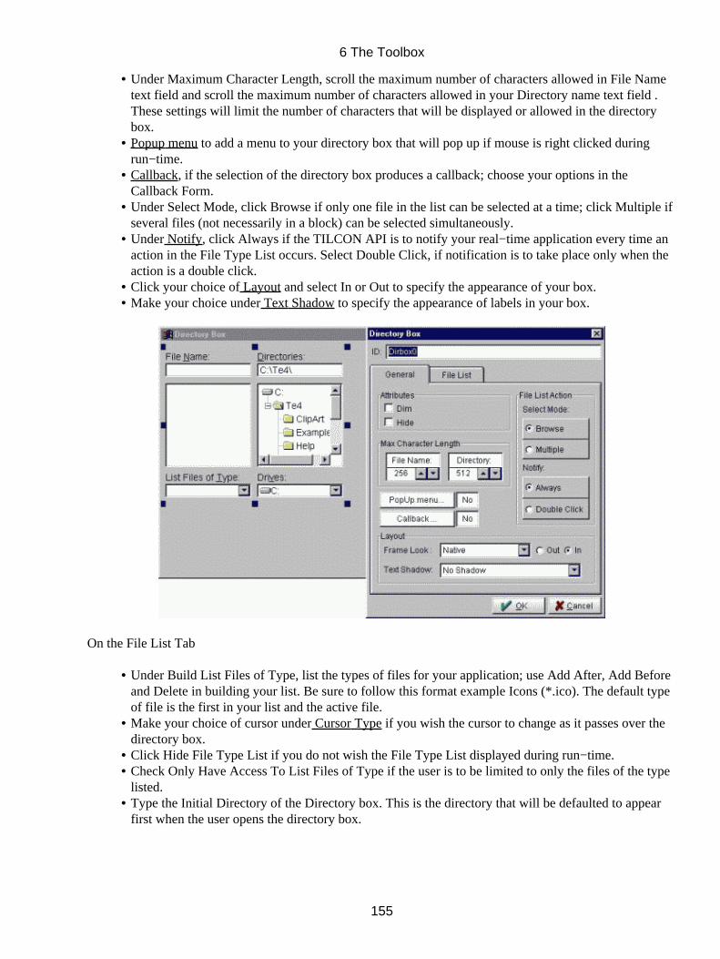
Under Maximum Character Length, scroll the maximum number of characters allowed in File Nametext field and scroll the maximum number of characters allowed in your Directory name text field .These settings will limit the number of characters that will be displayed or allowed in the directorybox.
•
Popup menu to add a menu to your directory box that will pop up if mouse is right clicked duringrun−time.
•
Callback, if the selection of the directory box produces a callback; choose your options in theCallback Form.
•
Under Select Mode, click Browse if only one file in the list can be selected at a time; click Multiple ifseveral files (not necessarily in a block) can be selected simultaneously.
•
Under Notify, click Always if the TILCON API is to notify your real−time application every time anaction in the File Type List occurs. Select Double Click, if notification is to take place only when theaction is a double click.
•
Click your choice of Layout and select In or Out to specify the appearance of your box.• Make your choice under Text Shadow to specify the appearance of labels in your box.•
On the File List Tab
Under Build List Files of Type, list the types of files for your application; use Add After, Add Beforeand Delete in building your list. Be sure to follow this format example Icons (*.ico). The default typeof file is the first in your list and the active file.
•
Make your choice of cursor under Cursor Type if you wish the cursor to change as it passes over thedirectory box.
•
Click Hide File Type List if you do not wish the File Type List displayed during run−time.• Check Only Have Access To List Files of Type if the user is to be limited to only the files of the typelisted.
•
Type the Initial Directory of the Directory box. This is the directory that will be defaulted to appearfirst when the user opens the directory box.
•
6 The Toolbox
155
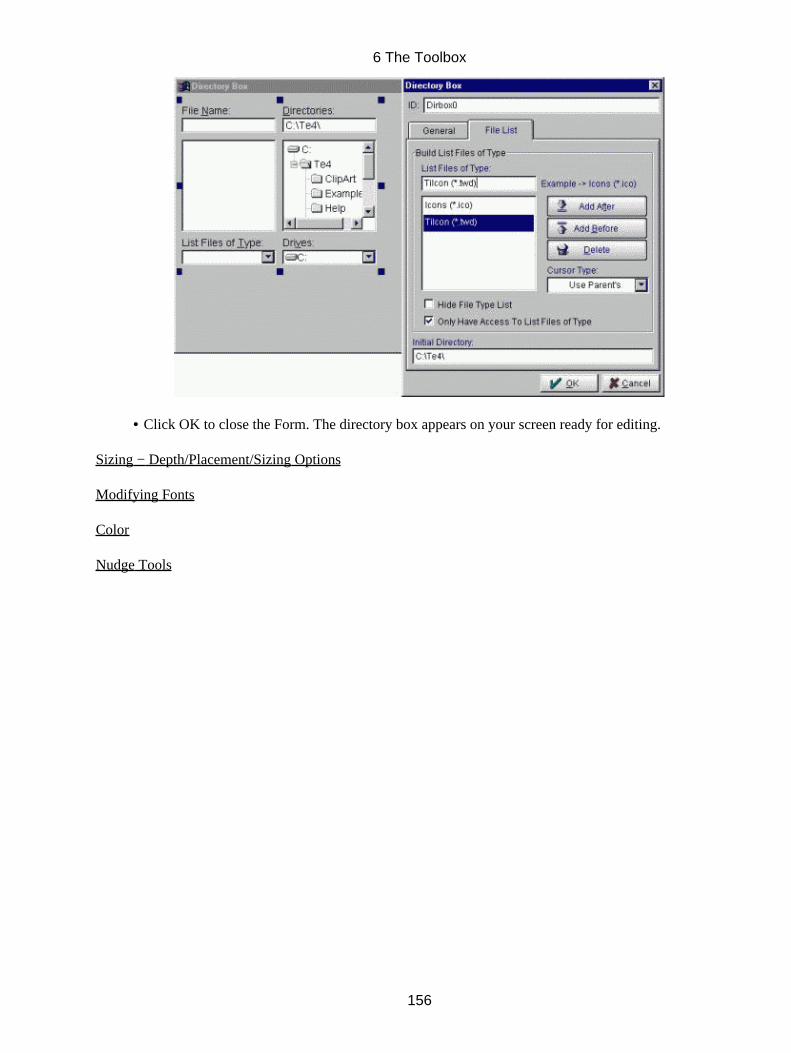
Click OK to close the Form. The directory box appears on your screen ready for editing.•
Sizing − Depth/Placement/Sizing Options
Modifying Fonts
Color
Nudge Tools
6 The Toolbox
156
6.20 Table
Tables provide spreadsheet−like control of your data I/O. Each column can contain its own type of object,including editable text, message text, raw images, number boxes and comboboxes. Every cell has all theoptions and attributes available to the type of object it contains, so tables provide vast amounts of built−infunctionality and configurability. In addition to which the table has many attributes of its own, includingrow/column dimensions, scrollbar options, grid line options and colors, and sorting. And, as with all objects,every attribute can be modified dynamically!
6.20.1 To add a Table
Click the Table Object icon in the Toolbox; click the workspace and drag to the desired size of the
intended table. Release the mouse button; the Table Object form opens.
In the form,
Click ID and enter the ID for the table (a default ID is entered upon opening of the form, you may wish to usethis ID but please beware of duplicate ID's which will cause errors).
On the General Tab
Under Table Layout, click # Of Rows and enter or scroll to specify the number of rows in your table.• Click # Of Columns and enter or scroll to specify the number of columns in your table.• Select a Fill Color for your table from the list box.• Make your selections for the Frame Look for your table, select if it should appear out or in.• Click Enclosed if the table is to have an outline around it.• Select Hide or Dim as the appearance of the table initially during run−time.• Top # −This selects which row will be displayed as the default at the top of the table.• Left # −This selects which column will be displayed as the default at the left hand side of the table.• Click your choices of Horizontal Scrollbar and/or Vertical Scrollbar. Your choices under each type ofscrollbar are As Required, Always or Never.
•
Enter the Small Increment (minimum value movement) and Large Increment (maximum valuemovement) per single click for each type of scrollbar.
•
Text Wrap Mode•
6 The Toolbox
157
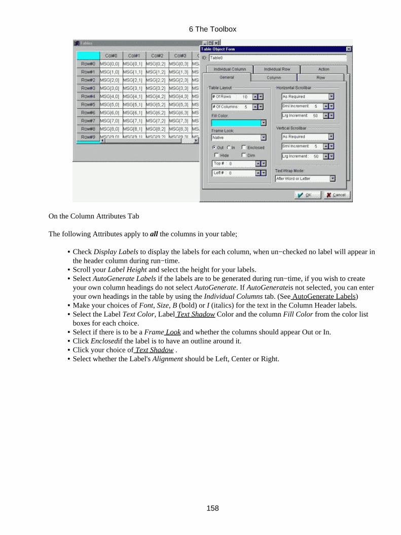
On the Column Attributes Tab
The following Attributes apply to all the columns in your table;
Check Display Labels to display the labels for each column, when un−checked no label will appear inthe header column during run−time.
•
Scroll your Label Height and select the height for your labels.• Select AutoGenerate Labels if the labels are to be generated during run−time, if you wish to createyour own column headings do not select AutoGenerate. If AutoGenerateis not selected, you can enteryour own headings in the table by using the Individual Columns tab. (See AutoGenerate Labels)
•
Make your choices of Font, Size, B (bold) or I (italics) for the text in the Column Header labels.• Select the Label Text Color, Label Text Shadow Color and the column Fill Color from the color listboxes for each choice.
•
Select if there is to be a Frame Look and whether the columns should appear Out or In.• Click Enclosedif the label is to have an outline around it.• Click your choice of Text Shadow .• Select whether the Label's Alignment should be Left, Center or Right.•
6 The Toolbox
158
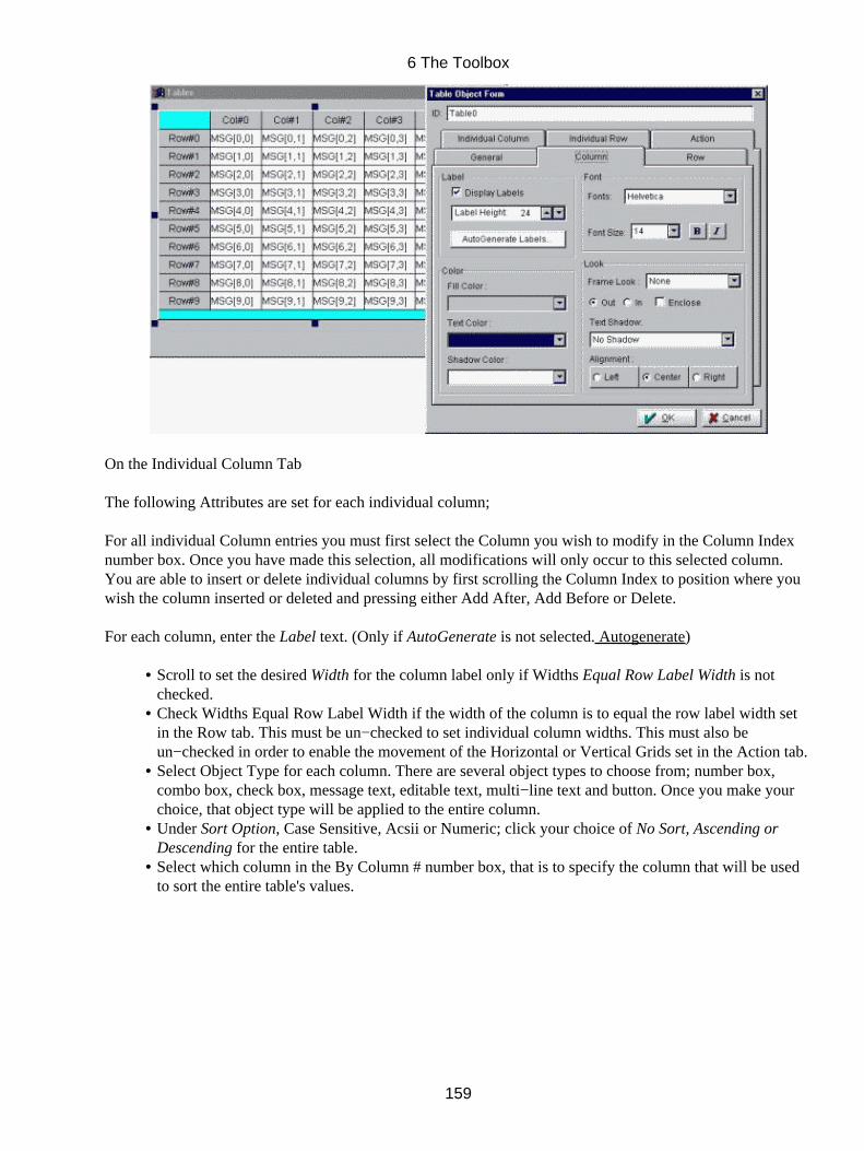
On the Individual Column Tab
The following Attributes are set for each individual column;
For all individual Column entries you must first select the Column you wish to modify in the Column Indexnumber box. Once you have made this selection, all modifications will only occur to this selected column.You are able to insert or delete individual columns by first scrolling the Column Index to position where youwish the column inserted or deleted and pressing either Add After, Add Before or Delete.
For each column, enter the Label text. (Only if AutoGenerate is not selected. Autogenerate)
Scroll to set the desired Width for the column label only if Widths Equal Row Label Width is notchecked.
•
Check Widths Equal Row Label Width if the width of the column is to equal the row label width setin the Row tab. This must be un−checked to set individual column widths. This must also beun−checked in order to enable the movement of the Horizontal or Vertical Grids set in the Action tab.
•
Select Object Type for each column. There are several object types to choose from; number box,combo box, check box, message text, editable text, multi−line text and button. Once you make yourchoice, that object type will be applied to the entire column.
•
Under Sort Option, Case Sensitive, Acsii or Numeric; click your choice of No Sort, Ascending orDescending for the entire table.
•
Select which column in the By Column # number box, that is to specify the column that will be usedto sort the entire table's values.
•
6 The Toolbox
159
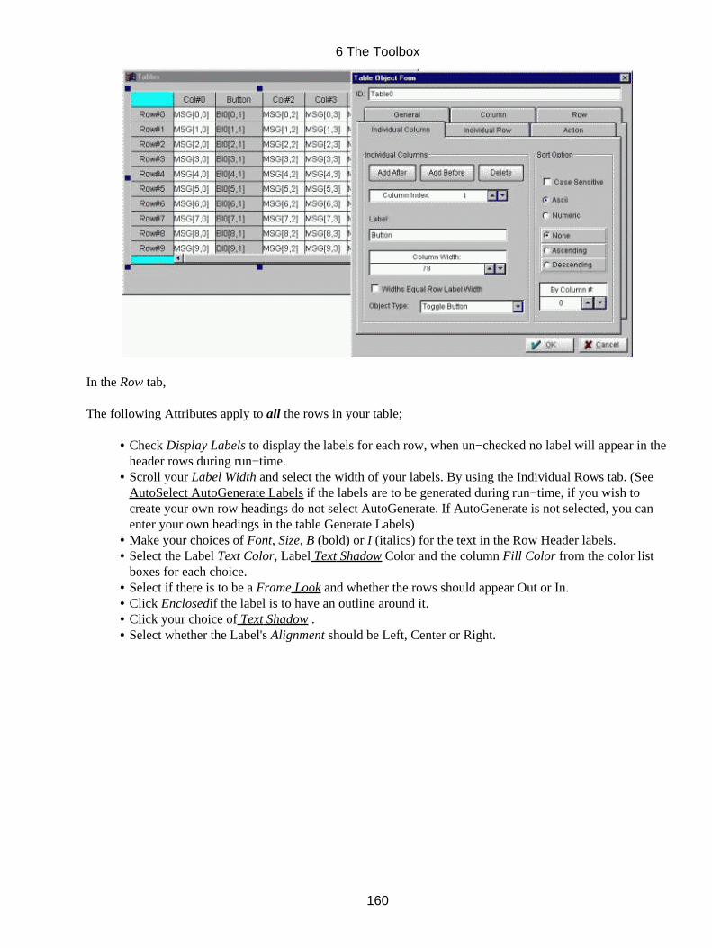
In the Row tab,
The following Attributes apply to all the rows in your table;
Check Display Labels to display the labels for each row, when un−checked no label will appear in theheader rows during run−time.
•
Scroll your Label Width and select the width of your labels. By using the Individual Rows tab. (SeeAutoSelect AutoGenerate Labels if the labels are to be generated during run−time, if you wish tocreate your own row headings do not select AutoGenerate. If AutoGenerate is not selected, you canenter your own headings in the table Generate Labels)
•
Make your choices of Font, Size, B (bold) or I (italics) for the text in the Row Header labels.• Select the Label Text Color, Label Text Shadow Color and the column Fill Color from the color listboxes for each choice.
•
Select if there is to be a Frame Look and whether the rows should appear Out or In.• Click Enclosedif the label is to have an outline around it.• Click your choice of Text Shadow .• Select whether the Label's Alignment should be Left, Center or Right.•
6 The Toolbox
160
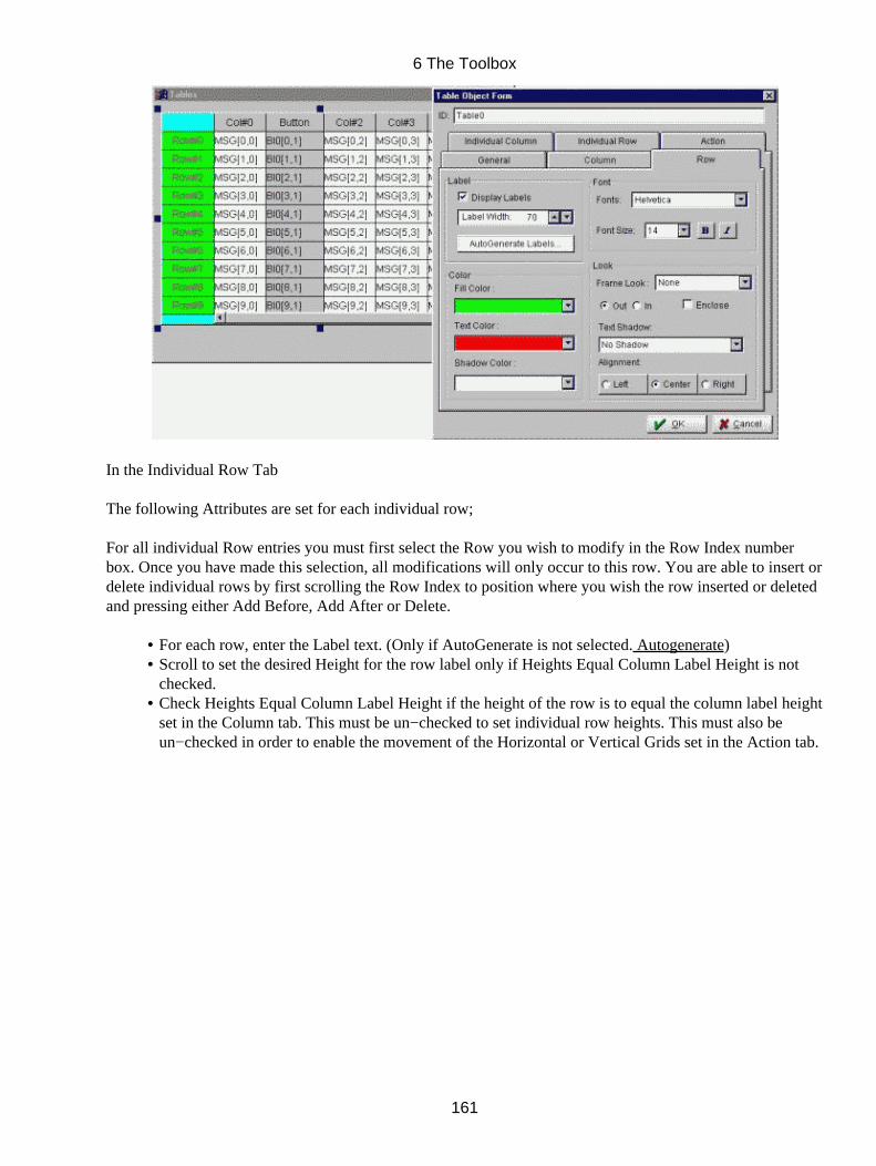
In the Individual Row Tab
The following Attributes are set for each individual row;
For all individual Row entries you must first select the Row you wish to modify in the Row Index numberbox. Once you have made this selection, all modifications will only occur to this row. You are able to insert ordelete individual rows by first scrolling the Row Index to position where you wish the row inserted or deletedand pressing either Add Before, Add After or Delete.
For each row, enter the Label text. (Only if AutoGenerate is not selected. Autogenerate)• Scroll to set the desired Height for the row label only if Heights Equal Column Label Height is notchecked.
•
Check Heights Equal Column Label Height if the height of the row is to equal the column label heightset in the Column tab. This must be un−checked to set individual row heights. This must also beun−checked in order to enable the movement of the Horizontal or Vertical Grids set in the Action tab.
•
6 The Toolbox
161
In the Action Tab
Under Action, check Notify When Label Selected if run time is to Notify when labels are selected.• Check Movable Horizontal Grid and/or Movable Vertical Grid if during run−time the user will beallowed to move the grids. (In order for the user to be able to move or re−size the horizontal and/orvertical grids during run−time the Heights EqualColumn Label Height check box on the IndividualColumn Tab MUST NOT be checked and/or the Widths Equal Row Label Width check box on theIndividual Row Tab MUST NOT be checked.)
•
Cursor Type• Under Horizontal Grid click your choice of grid line appearance (either None, Flat, Inset or Raised)and specify the line Width. Select the Line Color and the line Shadow Color from their respectivecolor list boxes.
•
Under Vertical Grid click your choice of grid line appearance (either None, Flat, Inset or Raised) andspecify the line Width. Select the Line Color and the line Shadow Color from their respective colorlist boxes.
•
Database: Set Interpretation − Scroll Up, Scroll Down, Loop Over, Replace All or Append. GetInterpretation − Get First Rows, Get Last Rows or Get Current Row
•
6 The Toolbox
162
Click OK to close the Table Object form. The table appears on your screen selected and ready forfurther editing.
•
Sizing − Depth/Placement/Sizing Options
Color
Nudge Tools
6.20.2 AutoGenerate Labels
When you select AutoGenerate from either the Column or Row Attributes tab the following form opens;
Under Mode, with Specify labels individually selected you are able to select each row or columnnumber and enter labels one at a time for each individual row or column. These selections are made ineither the Individual Column tab or Individual Row tab.
•
Select Generate using numeric format or Generate using letters the following steps apply.• Under format, type a Prefix that will precede either your numeric values or letters and/or type a Suffixthat will follow either your numeric values or letters.
•
In the Start From number box select where the numeric format should start.• Select whether the Letter Case should be Upper or Lower.•
6 The Toolbox
163
6.20.3 Editing objects in a table
The example shows some of the objects that can be placed within the Table.
To edit each cell simply,
Click on the cell to select it, and Click the right mouse button, the appropriate form will open and youare able to edit each of the objects individually.
•
To edit an entire column at a time
To make all the objects in one column identical, simply select the column label (it will appear dark) edit theobject form to select the look and functionality you require. Click OK to close the object's form, all the objectsin that column should reflect the settings you have selected.
6 The Toolbox
164
All the editing choices and features are available for each object making this a very powerful way ofdisplaying huge amounts of data and providing vast amounts of built−in functionality in a very orderlyarrangement.
For Button (all types)
For Checkbox
For Combobox
For Editable text
For Message Text
For Multi−line editable text
For Number box
Note:All the actions (such as triggers, linking, callbacks etc.) which are available for the above objects are alsoavailable to these same objects within a table.
Triggers Delete, Display and Hide cannot be implemented on objects within the table. You cannot hide anobject or a column of objects within a table. Delete, Display and Hide can be set in these objects'forms within the table to be applied to objects outside the table. For example you can not set atrigger on a button to display a text field within the same table, however you can set the trigger todisplay a text field outside the table.Dim and Undim can be implemented anywhere in a table. Objects, either singly or in a columncan be dimmed or un− dimmed either by other objects within the table or objects outside the table.As well any object within the table can dim or un−dim any object outside the table.
Callbacks
6 The Toolbox
165
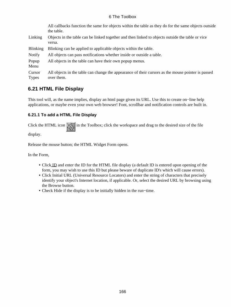
All callbacks function the same for objects within the table as they do for the same objects outsidethe table.
Linking Objects in the table can be linked together and then linked to objects outside the table or viceversa.
Blinking Blinking can be applied to applicable objects within the table.
Notify All objects can pass notifications whether inside or outside a table.
PopupMenu
All objects in the table can have their own popup menus.
CursorTypes
All objects in the table can change the appearance of their cursors as the mouse pointer is passedover them.
6.21 HTML File Display
This tool will, as the name implies, display an html page given its URL. Use this to create on−line helpapplications, or maybe even your own web browser! Font, scrollbar and notification controls are built in.
6.21.1 To add a HTML File Display
Click the HTML icon in the Toolbox; click the workspace and drag to the desired size of the file
display.
Release the mouse button; the HTML Widget Form opens.
In the Form,
Click ID and enter the ID for the HTML file display (a default ID is entered upon opening of theform, you may wish to use this ID but please beware of duplicate ID's which will cause errors).
•
Click Initial URL (Universal Resource Locators) and enter the string of characters that preciselyidentify your object's Internet location, if applicable. Or, select the desired URL by browsing usingthe Browse button.
•
Check Hide if the display is to be initially hidden in the run−time.•
6 The Toolbox
166
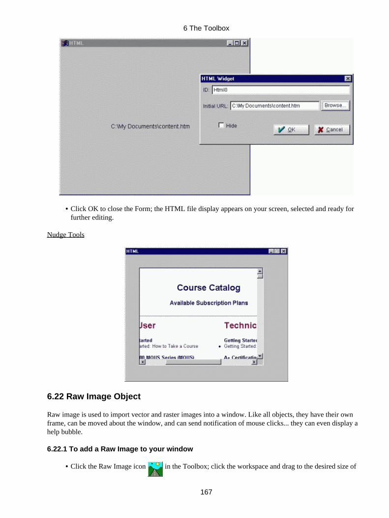
Click OK to close the Form; the HTML file display appears on your screen, selected and ready forfurther editing.
•
Nudge Tools
6.22 Raw Image Object
Raw image is used to import vector and raster images into a window. Like all objects, they have their ownframe, can be moved about the window, and can send notification of mouse clicks... they can even display ahelp bubble.
6.22.1 To add a Raw Image to your window
Click the Raw Image icon in the Toolbox; click the workspace and drag to the desired size of•
6 The Toolbox
167

the intended image.Release the mouse button; the Image form opens.• Type in file location or Select Get Image• In the Get Image Form• Select the type of files you wish to view in the List Files of Type combobox.• Click Network if your images are located on another part of the network.• Select the File Name with the desired image from the file and directory list boxes; it will appear in thepreview box of the button mode you have selected.
•
Click Apply to accept your selections and close the form.•
Back in the Image form on the General tab
Make your selections under Layout.• Scroll Depth if the image is to have an outline around it.•
6 The Toolbox
168

In the Action tab
Click Hide, as Initial State of the image in the run−time.• Select if Notify On Gain Focus (Enter), On Lose Focus (Exit), On Click to indicate when theTILCON Run−Time is to Notify your real−time application.
•
Check Maintain Image Aspect Ratio if you wish to maintain the ratio of width to height of the image.• Check Maintain Image Size if you wish the size of the image to be maintained.•
Click Callback if clicking the image is to initiate some action within your application itself and selectyour options in the Callback form.
•
Click Popup menu to add a menu to your image that will pop up if mouse is right clicked duringrun−time.
•
Make your choice of cursor under Cursor Type if you wish the cursor to change as it passes over theraw image.
•
Check Snap to Image if the frame of the raw image is to snap to the size of the actual image.•
6 The Toolbox
169

On the Help tab
Click Help Bubble and enter the help text for the bubble.• Under Bubble positon, click where you want the help bubble to be placed relative to the image• Click OK to close the Form; the image appears on your screen, selected and ready for further editing.•
Sizing − Depth/Placement/Sizing Options
Color
Nudge Tools
6 The Toolbox
170
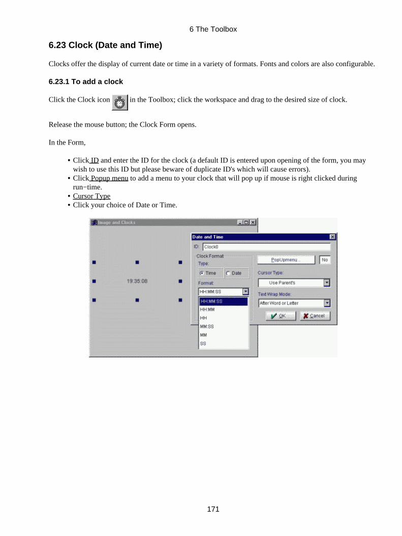
6.23 Clock (Date and Time)
Clocks offer the display of current date or time in a variety of formats. Fonts and colors are also configurable.
6.23.1 To add a clock
Click the Clock icon in the Toolbox; click the workspace and drag to the desired size of clock.
Release the mouse button; the Clock Form opens.
In the Form,
Click ID and enter the ID for the clock (a default ID is entered upon opening of the form, you maywish to use this ID but please beware of duplicate ID's which will cause errors).
•
Click Popup menu to add a menu to your clock that will pop up if mouse is right clicked duringrun−time.
•
Cursor Type• Click your choice of Date or Time.•
6 The Toolbox
171
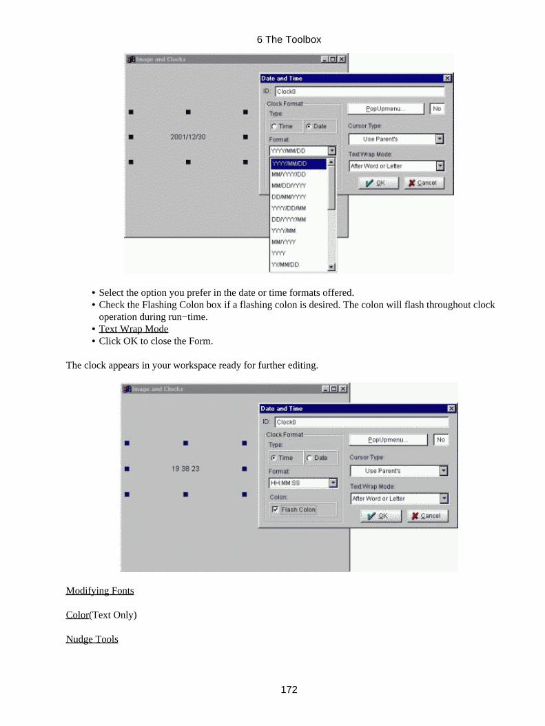
Select the option you prefer in the date or time formats offered.• Check the Flashing Colon box if a flashing colon is desired. The colon will flash throughout clockoperation during run−time.
•
Text Wrap Mode• Click OK to close the Form.•
The clock appears in your workspace ready for further editing.
Modifying Fonts
Color(Text Only)
Nudge Tools
6 The Toolbox
172
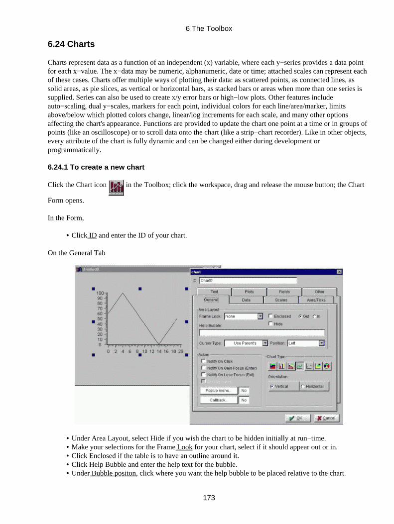
6.24 Charts
Charts represent data as a function of an independent (x) variable, where each y−series provides a data pointfor each x−value. The x−data may be numeric, alphanumeric, date or time; attached scales can represent eachof these cases. Charts offer multiple ways of plotting their data: as scattered points, as connected lines, assolid areas, as pie slices, as vertical or horizontal bars, as stacked bars or areas when more than one series issupplied. Series can also be used to create x/y error bars or high−low plots. Other features includeauto−scaling, dual y−scales, markers for each point, individual colors for each line/area/marker, limitsabove/below which plotted colors change, linear/log increments for each scale, and many other optionsaffecting the chart's appearance. Functions are provided to update the chart one point at a time or in groups ofpoints (like an oscilloscope) or to scroll data onto the chart (like a strip−chart recorder). Like in other objects,every attribute of the chart is fully dynamic and can be changed either during development orprogrammatically.
6.24.1 To create a new chart
Click the Chart icon in the Toolbox; click the workspace, drag and release the mouse button; the Chart
Form opens.
In the Form,
Click ID and enter the ID of your chart.•
On the General Tab
Under Area Layout, select Hide if you wish the chart to be hidden initially at run−time.• Make your selections for the Frame Look for your chart, select if it should appear out or in.• Click Enclosed if the table is to have an outline around it.• Click Help Bubble and enter the help text for the bubble.• Under Bubble positon, click where you want the help bubble to be placed relative to the chart.•
6 The Toolbox
173
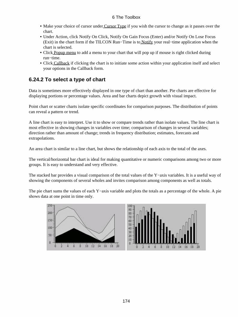
Make your choice of cursor under Cursor Type if you wish the cursor to change as it passes over thechart.
•
Under Action, click Notify On Click, Notify On Gain Focus (Enter) and/or Notify On Lose Focus(Exit) in the chart form if the TILCON Run−Time is to Notify your real−time application when thechart is selected.
•
Click Popup menu to add a menu to your chart that will pop up if mouse is right clicked duringrun−time.
•
Click Callback if clicking the chart is to initiate some action within your application itself and selectyour options in the Callback form.
•
6.24.2 To select a type of chart
Data is sometimes more effectively displayed in one type of chart than another. Pie charts are effective fordisplaying portions or percentage values. Area and bar charts depict growth with visual impact.
Point chart or scatter charts isolate specific coordinates for comparison purposes. The distribution of pointscan reveal a pattern or trend.
A line chart is easy to interpret. Use it to show or compare trends rather than isolate values. The line chart ismost effective in showing changes in variables over time; comparison of changes in several variables;direction rather than amount of change; trends in frequency distribution; estimates, forecasts andextrapolations.
An area chart is similar to a line chart, but shows the relationship of each axis to the total of the axes.
The vertical/horizontal bar chart is ideal for making quantitative or numeric comparisons among two or moregroups. It is easy to understand and very effective.
The stacked bar provides a visual comparison of the total values of the Y−axis variables. It is a useful way ofshowing the components of several wholes and invites comparison among components as well as totals.
The pie chart sums the values of each Y−axis variable and plots the totals as a percentage of the whole. A pieshows data at one point in time only.
6 The Toolbox
174
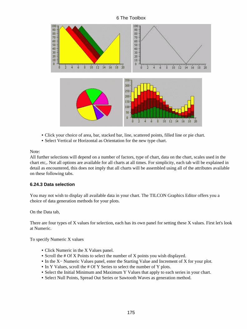
Click your choice of area, bar, stacked bar, line, scattered points, filled line or pie chart.• Select Vertical or Horizontal as Orientation for the new type chart.•
Note:All further selections will depend on a number of factors, type of chart, data on the chart, scales used in thechart etc,. Not all options are available for all charts at all times. For simplicity, each tab will be explained indetail as encountered, this does not imply that all charts will be assembled using all of the attributes availableon these following tabs.
6.24.3 Data selection
You may not wish to display all available data in your chart. The TILCON Graphics Editor offers you achoice of data generation methods for your plots.
On the Data tab,
There are four types of X values for selection, each has its own panel for setting these X values. First let's lookat Numeric.
To specify Numeric X values
Click Numeric in the X Values panel.• Scroll the # Of X Points to select the number of X points you wish displayed.• In the X− Numeric Values panel, enter the Starting Value and Increment of X for your plot.• In Y Values, scroll the # Of Y Series to select the number of Y plots.• Select the Initial Minimum and Maximum Y Values that apply to each series in your chart.• Select Null Points, Spread Out Series or Sawtooth Waves as generation method.•
6 The Toolbox
175
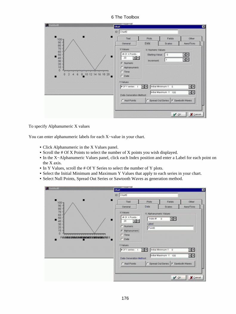
To specify Alphanumeric X values
You can enter alphanumeric labels for each X−value in your chart.
Click Alphanumeric in the X Values panel.• Scroll the # Of X Points to select the number of X points you wish displayed.• In the X−Alphanumeric Values panel, click each Index position and enter a Label for each point onthe X axis.
•
In Y Values, scroll the # Of Y Series to select the number of Y plots.• Select the Initial Minimum and Maximum Y Values that apply to each series in your chart.• Select Null Points, Spread Out Series or Sawtooth Waves as generation method.•
6 The Toolbox
176
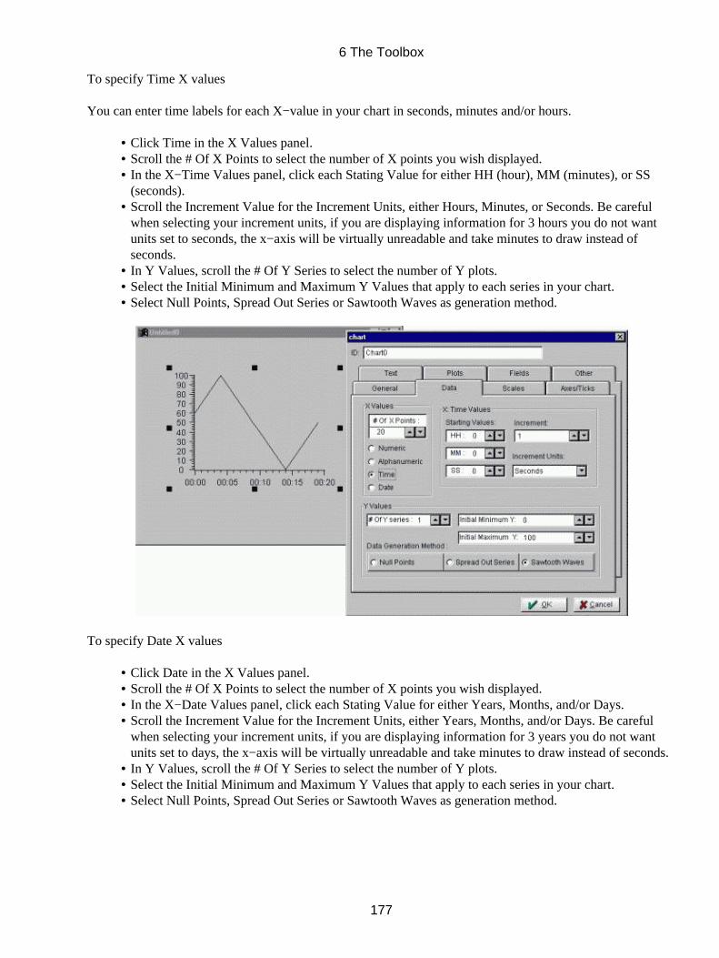
To specify Time X values
You can enter time labels for each X−value in your chart in seconds, minutes and/or hours.
Click Time in the X Values panel.• Scroll the # Of X Points to select the number of X points you wish displayed.• In the X−Time Values panel, click each Stating Value for either HH (hour), MM (minutes), or SS(seconds).
•
Scroll the Increment Value for the Increment Units, either Hours, Minutes, or Seconds. Be carefulwhen selecting your increment units, if you are displaying information for 3 hours you do not wantunits set to seconds, the x−axis will be virtually unreadable and take minutes to draw instead ofseconds.
•
In Y Values, scroll the # Of Y Series to select the number of Y plots.• Select the Initial Minimum and Maximum Y Values that apply to each series in your chart.• Select Null Points, Spread Out Series or Sawtooth Waves as generation method.•
To specify Date X values
Click Date in the X Values panel.• Scroll the # Of X Points to select the number of X points you wish displayed.• In the X−Date Values panel, click each Stating Value for either Years, Months, and/or Days.• Scroll the Increment Value for the Increment Units, either Years, Months, and/or Days. Be carefulwhen selecting your increment units, if you are displaying information for 3 years you do not wantunits set to days, the x−axis will be virtually unreadable and take minutes to draw instead of seconds.
•
In Y Values, scroll the # Of Y Series to select the number of Y plots.• Select the Initial Minimum and Maximum Y Values that apply to each series in your chart.• Select Null Points, Spread Out Series or Sawtooth Waves as generation method.•
6 The Toolbox
177
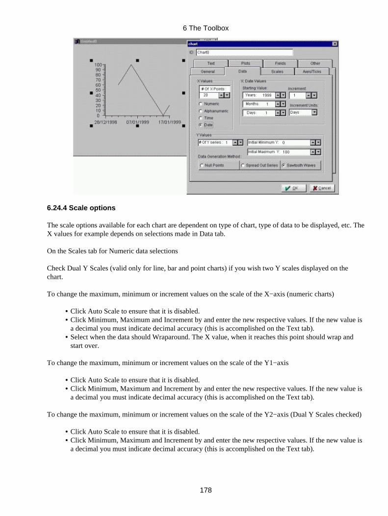
6.24.4 Scale options
The scale options available for each chart are dependent on type of chart, type of data to be displayed, etc. TheX values for example depends on selections made in Data tab.
On the Scales tab for Numeric data selections
Check Dual Y Scales (valid only for line, bar and point charts) if you wish two Y scales displayed on thechart.
To change the maximum, minimum or increment values on the scale of the X−axis (numeric charts)
Click Auto Scale to ensure that it is disabled.• Click Minimum, Maximum and Increment by and enter the new respective values. If the new value isa decimal you must indicate decimal accuracy (this is accomplished on the Text tab).
•
Select when the data should Wraparound. The X value, when it reaches this point should wrap andstart over.
•
To change the maximum, minimum or increment values on the scale of the Y1−axis
Click Auto Scale to ensure that it is disabled.• Click Minimum, Maximum and Increment by and enter the new respective values. If the new value isa decimal you must indicate decimal accuracy (this is accomplished on the Text tab).
•
To change the maximum, minimum or increment values on the scale of the Y2−axis (Dual Y Scales checked)
Click Auto Scale to ensure that it is disabled.• Click Minimum, Maximum and Increment by and enter the new respective values. If the new value isa decimal you must indicate decimal accuracy (this is accomplished on the Text tab).
•
6 The Toolbox
178
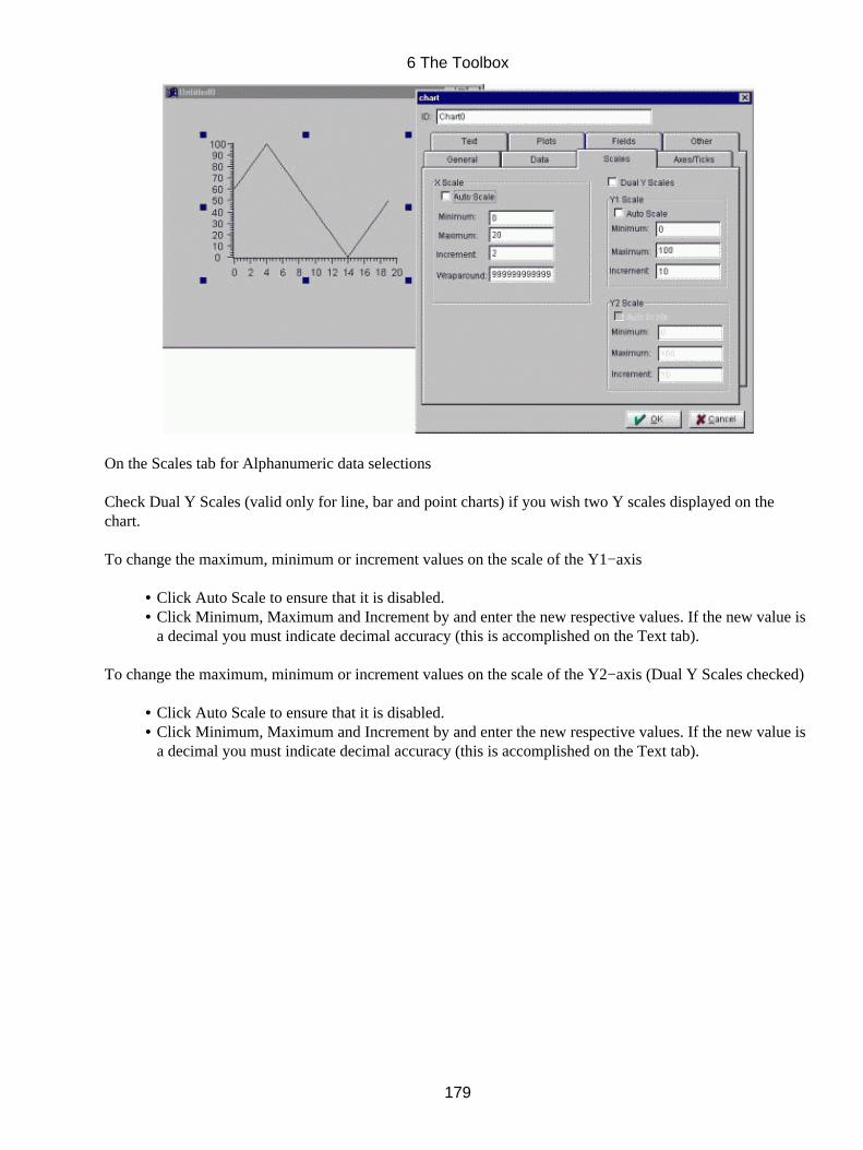
On the Scales tab for Alphanumeric data selections
Check Dual Y Scales (valid only for line, bar and point charts) if you wish two Y scales displayed on thechart.
To change the maximum, minimum or increment values on the scale of the Y1−axis
Click Auto Scale to ensure that it is disabled.• Click Minimum, Maximum and Increment by and enter the new respective values. If the new value isa decimal you must indicate decimal accuracy (this is accomplished on the Text tab).
•
To change the maximum, minimum or increment values on the scale of the Y2−axis (Dual Y Scales checked)
Click Auto Scale to ensure that it is disabled.• Click Minimum, Maximum and Increment by and enter the new respective values. If the new value isa decimal you must indicate decimal accuracy (this is accomplished on the Text tab).
•
6 The Toolbox
179
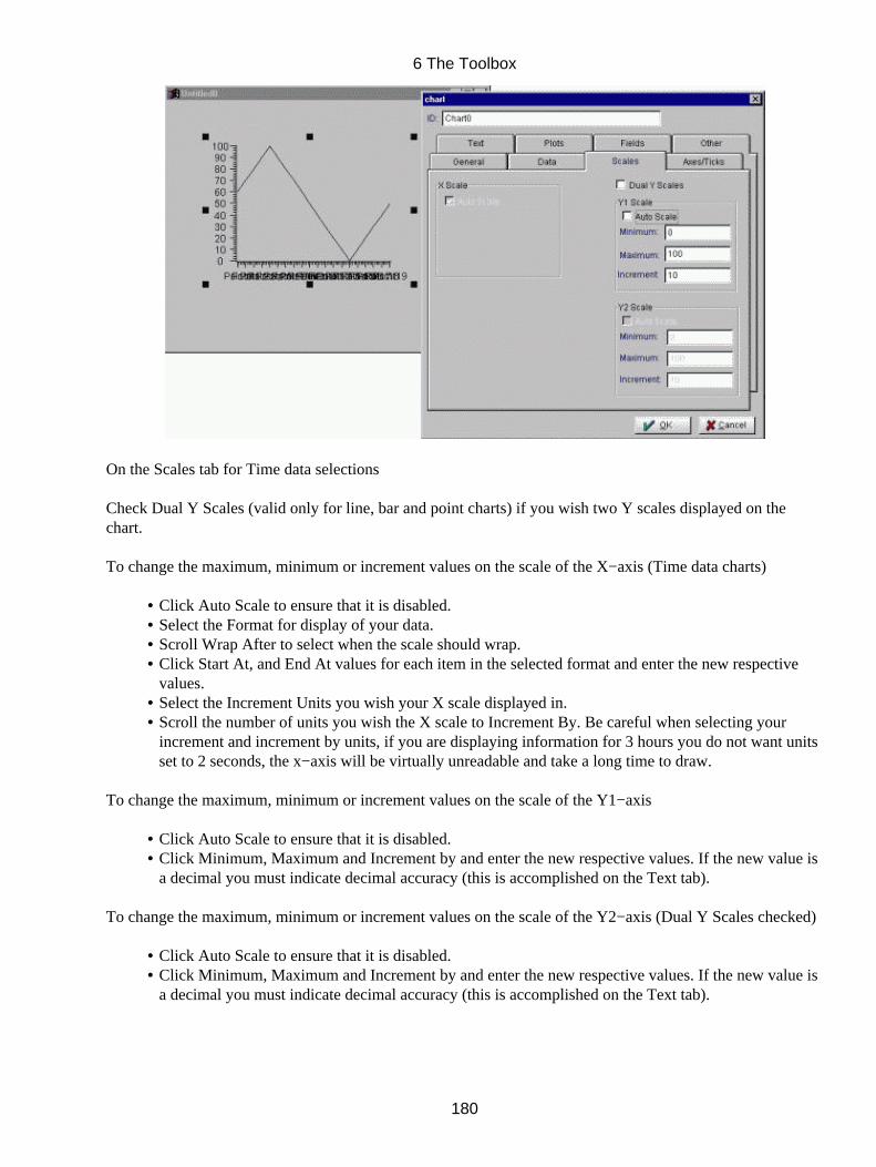
On the Scales tab for Time data selections
Check Dual Y Scales (valid only for line, bar and point charts) if you wish two Y scales displayed on thechart.
To change the maximum, minimum or increment values on the scale of the X−axis (Time data charts)
Click Auto Scale to ensure that it is disabled.• Select the Format for display of your data.• Scroll Wrap After to select when the scale should wrap.• Click Start At, and End At values for each item in the selected format and enter the new respectivevalues.
•
Select the Increment Units you wish your X scale displayed in.• Scroll the number of units you wish the X scale to Increment By. Be careful when selecting yourincrement and increment by units, if you are displaying information for 3 hours you do not want unitsset to 2 seconds, the x−axis will be virtually unreadable and take a long time to draw.
•
To change the maximum, minimum or increment values on the scale of the Y1−axis
Click Auto Scale to ensure that it is disabled.• Click Minimum, Maximum and Increment by and enter the new respective values. If the new value isa decimal you must indicate decimal accuracy (this is accomplished on the Text tab).
•
To change the maximum, minimum or increment values on the scale of the Y2−axis (Dual Y Scales checked)
Click Auto Scale to ensure that it is disabled.• Click Minimum, Maximum and Increment by and enter the new respective values. If the new value isa decimal you must indicate decimal accuracy (this is accomplished on the Text tab).
•
6 The Toolbox
180

On the Scales tab for Date data selections
Check Dual Y Scales (valid only for line, bar and point charts) if you wish two Y scales displayed onthe chart.
•
Set when the scale is to Wrap After or where the chart should Resume At when scrolling.•
To change the maximum, minimum or increment values on the scale of the X−axis (Date data charts)
Click Auto Scale to ensure that it is disabled.• Select the Format for display of your data.• Click Start At, and End At values for each item in the selected format and enter the new respectivevalues.
•
Select the Increment Units you wish your X scale displayed in.• Scroll the number of units you wish the X scale to Increment By. Be careful when selecting yourincrement and increment by units, if you are displaying information for 3 years you do not want unitsset to 2 days, the x−axis will be virtually unreadable and take a long time to draw.
•
To change the maximum, minimum or increment values on the scale of the Y1−axis
Click Auto Scale to ensure that it is disabled.• Click Minimum, Maximum and Increment by and enter the new respective values. If the new value isa decimal you must indicate decimal accuracy (this is accomplished on the Text tab).
•
To change the maximum, minimum or increment values on the scale of the Y2−axis (Dual Y Scales checked)
Click Auto Scale to ensure that it is disabled.• Click Minimum, Maximum and Increment by and enter the new respective values. If the new value isa decimal you must indicate decimal accuracy (this is accomplished on the Text tab).
•
6 The Toolbox
181

On the Axes/Ticks tab
The Axes/Ticks options available for each chart are dependent on type of chart, type of data to be displayed,etc.
Select Which Axis that will be modified. The Y−Axis 2 will only be available if Dual Y Scale is checked inthe Scale tab.
The following selections will only alter the Axis selected above.
Under Tickmarks/Grid, select if you will display Major Tickmarks and /or Minor Tickmarks.• Click Tickmarks Between to position the identification of axis values between tickmarks on that axis(not available at printing).
•
Check Major Grids if you wish to have a grid displayed originating from your major tickmarks.• Check Minor Grids if you wish to have a grid displayed originating from your minor tickmarks.• Under #. of Minor Intervals, specify how many Minor intervals between the Major Tickmarks.• In the Tickmark Direction combobox, select the direction you wish the tickmarks to display,Outwards tickmarks display outward from axis, Inwards tickmarks display towards the chart on theinside of the axis and Through Axis has the tickmarks equally on either side of the axis line.
•
Select the layout of the Tickmarks, either Flat, Etched In or Etched Out in the Tickmark Layoutcombobox.
•
Scroll to set the Tickmark Length of the Minor and/or Major tickmarks.• Tick Width (pixels)• Select the thickness of the Major Tickmarks in the Major Tick Thickness combobox, 1 is equal to onepixel, all others (x 0.5 et al) are a multiplier of the nominal line thickness..
•
Scroll the color list box to select the Axis/Tick color, and if selected the Axis/Tick Shadow color.(The shadow color will be displayed if you have selected "Etched Out" or "In" in the TickmarkLayout combobox.
•
Under Scale Options, select the location of the Axis, either the Default Location, the Opposite Sidefrom the Default Location or Through the Origin of the Axis.
•
Select the Type of scale to Linear, to change to logarithmic scaling on the axis (numeric charts), select•
6 The Toolbox
182
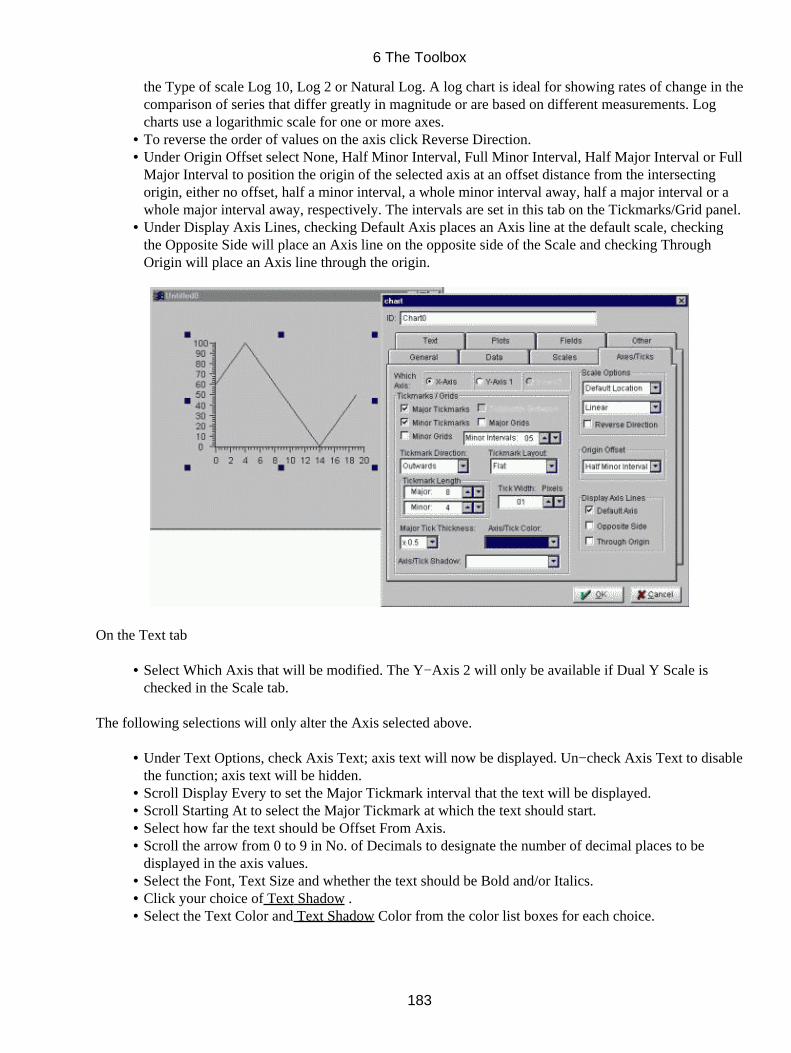
the Type of scale Log 10, Log 2 or Natural Log. A log chart is ideal for showing rates of change in thecomparison of series that differ greatly in magnitude or are based on different measurements. Logcharts use a logarithmic scale for one or more axes.To reverse the order of values on the axis click Reverse Direction.• Under Origin Offset select None, Half Minor Interval, Full Minor Interval, Half Major Interval or FullMajor Interval to position the origin of the selected axis at an offset distance from the intersectingorigin, either no offset, half a minor interval, a whole minor interval away, half a major interval or awhole major interval away, respectively. The intervals are set in this tab on the Tickmarks/Grid panel.
•
Under Display Axis Lines, checking Default Axis places an Axis line at the default scale, checkingthe Opposite Side will place an Axis line on the opposite side of the Scale and checking ThroughOrigin will place an Axis line through the origin.
•
On the Text tab
Select Which Axis that will be modified. The Y−Axis 2 will only be available if Dual Y Scale ischecked in the Scale tab.
•
The following selections will only alter the Axis selected above.
Under Text Options, check Axis Text; axis text will now be displayed. Un−check Axis Text to disablethe function; axis text will be hidden.
•
Scroll Display Every to set the Major Tickmark interval that the text will be displayed.• Scroll Starting At to select the Major Tickmark at which the text should start.• Select how far the text should be Offset From Axis.• Scroll the arrow from 0 to 9 in No. of Decimals to designate the number of decimal places to bedisplayed in the axis values.
•
Select the Font, Text Size and whether the text should be Bold and/or Italics.• Click your choice of Text Shadow .• Select the Text Color and Text Shadow Color from the color list boxes for each choice.•
6 The Toolbox
183
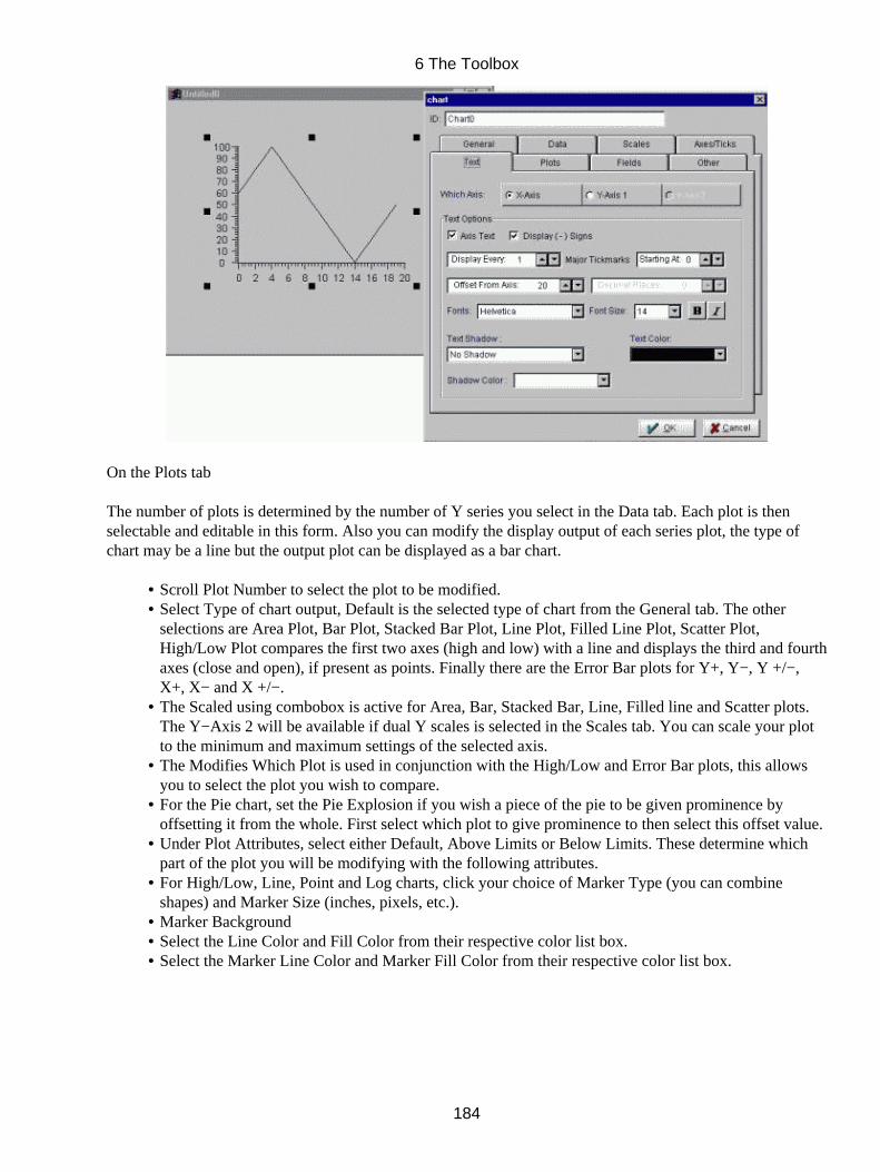
On the Plots tab
The number of plots is determined by the number of Y series you select in the Data tab. Each plot is thenselectable and editable in this form. Also you can modify the display output of each series plot, the type ofchart may be a line but the output plot can be displayed as a bar chart.
Scroll Plot Number to select the plot to be modified.• Select Type of chart output, Default is the selected type of chart from the General tab. The otherselections are Area Plot, Bar Plot, Stacked Bar Plot, Line Plot, Filled Line Plot, Scatter Plot,High/Low Plot compares the first two axes (high and low) with a line and displays the third and fourthaxes (close and open), if present as points. Finally there are the Error Bar plots for Y+, Y−, Y +/−,X+, X− and X +/−.
•
The Scaled using combobox is active for Area, Bar, Stacked Bar, Line, Filled line and Scatter plots.The Y−Axis 2 will be available if dual Y scales is selected in the Scales tab. You can scale your plotto the minimum and maximum settings of the selected axis.
•
The Modifies Which Plot is used in conjunction with the High/Low and Error Bar plots, this allowsyou to select the plot you wish to compare.
•
For the Pie chart, set the Pie Explosion if you wish a piece of the pie to be given prominence byoffsetting it from the whole. First select which plot to give prominence to then select this offset value.
•
Under Plot Attributes, select either Default, Above Limits or Below Limits. These determine whichpart of the plot you will be modifying with the following attributes.
•
For High/Low, Line, Point and Log charts, click your choice of Marker Type (you can combineshapes) and Marker Size (inches, pixels, etc.).
•
Marker Background• Select the Line Color and Fill Color from their respective color list box.• Select the Marker Line Color and Marker Fill Color from their respective color list box.•
6 The Toolbox
184
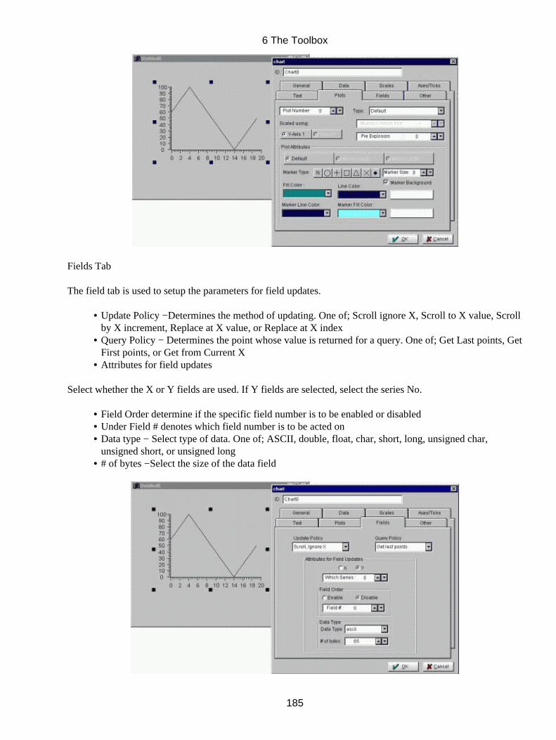
Fields Tab
The field tab is used to setup the parameters for field updates.
Update Policy −Determines the method of updating. One of; Scroll ignore X, Scroll to X value, Scrollby X increment, Replace at X value, or Replace at X index
•
Query Policy − Determines the point whose value is returned for a query. One of; Get Last points, GetFirst points, or Get from Current X
•
Attributes for field updates•
Select whether the X or Y fields are used. If Y fields are selected, select the series No.
Field Order determine if the specific field number is to be enabled or disabled• Under Field # denotes which field number is to be acted on• Data type − Select type of data. One of; ASCII, double, float, char, short, long, unsigned char,unsigned short, or unsigned long
•
# of bytes −Select the size of the data field•
6 The Toolbox
185
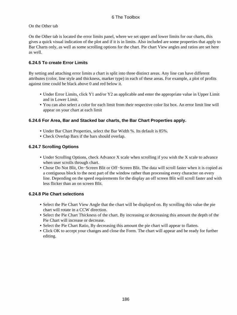
On the Other tab
On the Other tab is located the error limits panel, where we set upper and lower limits for our charts, thisgives a quick visual indication of the plot and if it is in limits. Also included are some properties that apply toBar Charts only, as well as some scrolling options for the chart. Pie chart View angles and ratios are set hereas well.
6.24.5 To create Error Limits
By setting and attaching error limits a chart is split into three distinct areas. Any line can have differentattributes (color, line style and thickness, marker type) in each of these areas. For example, a plot of profitsagainst time could be black above 0 and red below it.
Under Error Limits, click Y1 and/or Y2 as applicable and enter the appropriate value in Upper Limitand in Lower Limit.
•
You can also select a color for each limit from their respective color list box. An error limit line willappear on your chart at each limit
•
6.24.6 For Area, Bar and Stacked bar charts, the Bar Chart Properties apply.
Under Bar Chart Properties, select the Bar Width %. Its default is 85%.• Check Overlap Bars if the bars should overlap.•
6.24.7 Scrolling Options
Under Scrolling Options, check Advance X scale when scrolling if you wish the X scale to advancewhen user scrolls through chart.
•
Chose Do Not Blit, On−Screen Blit or Off−Screen Blit. The data will scroll faster when it is copied asa contiguous block to the next part of the window rather than processing every character on everyline. Depending on the speed requirements for the display an off screen Blit will scroll faster and withless flicker than an on screen Blit.
•
6.24.8 Pie Chart selections
Select the Pie Chart View Angle that the chart will be displayed on. By scrolling this value the piechart will rotate in a CCW direction.
•
Select the Pie Chart Thickness of the chart. By increasing or decreasing this amount the depth of thePie Chart will increase or decrease.
•
Select the Pie Chart Ratio, By decreasing this amount the pie chart will appear to flatten.• Click OK to accept your changes and close the Form. The chart will appear and be ready for furtherediting.
•
6 The Toolbox
186
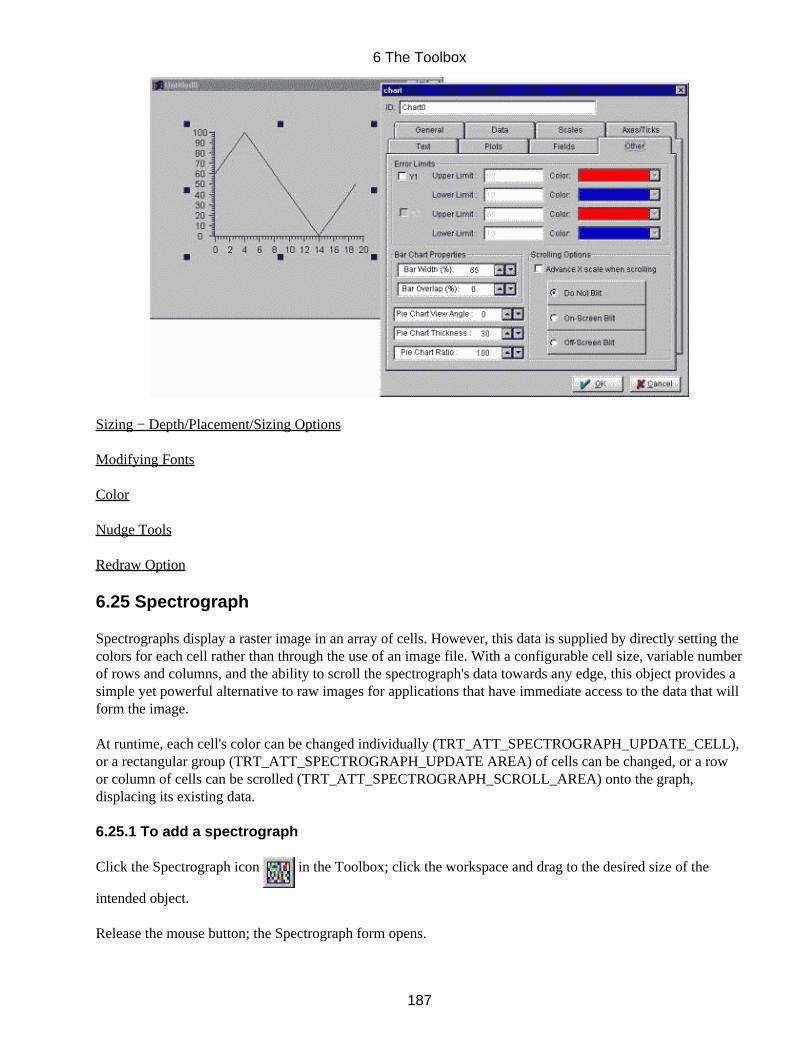
Sizing − Depth/Placement/Sizing Options
Modifying Fonts
Color
Nudge Tools
Redraw Option
6.25 Spectrograph
Spectrographs display a raster image in an array of cells. However, this data is supplied by directly setting thecolors for each cell rather than through the use of an image file. With a configurable cell size, variable numberof rows and columns, and the ability to scroll the spectrograph's data towards any edge, this object provides asimple yet powerful alternative to raw images for applications that have immediate access to the data that willform the image.
At runtime, each cell's color can be changed individually (TRT_ATT_SPECTROGRAPH_UPDATE_CELL),or a rectangular group (TRT_ATT_SPECTROGRAPH_UPDATE AREA) of cells can be changed, or a rowor column of cells can be scrolled (TRT_ATT_SPECTROGRAPH_SCROLL_AREA) onto the graph,displacing its existing data.
6.25.1 To add a spectrograph
Click the Spectrograph icon in the Toolbox; click the workspace and drag to the desired size of the
intended object.
Release the mouse button; the Spectrograph form opens.
6 The Toolbox
187

In the Form,
Click ID and enter the ID for the spectrograph (a default ID is entered upon opening of the form, you maywish to use this ID but please beware of duplicate ID's which will cause errors).
In Layout panel, select whether it appears "in" or "out", select enclosed to surround the graph with a thin blackline.
The two following settings set the amount of pixels that will be used to display each data element Cell Size.
Set the width Size X for each cell in pixels.
Set the height Size Y for each cell in pixels.
The following settings set the amount of data to be displayed in the spectrograph.
Under Image Size, set the number of columns in the graph.• Set the number of rows in the graph.•
By increasing the coarseness from 1, fewer cells are displayed, but at several times their normal size. Thisimproves display speed at the cost of resolution.
Choose whether to store the runtime data as indices into our palette (1 byte per cell) or as RGB values(4 bytes per cell).
•
Choose whether Y Origin corresponds to the top or the bottom of the graph.• Snap to Image if the spectrograph should be sized to the image.• Cursor Type•
Click OK to accept your settings and close the form.
The Spectrograph widget appears on your screen, selected and ready for editing.
6 The Toolbox
188

Sizing − Depth/Placement/Sizing Options
Color
Nudge Tools
6 The Toolbox
189
6.26 Animation
Animation Areas and Objects provide smooth motion for vector images and raster images, and smooth sizingand rotation for vector images. The area defines the space in which the objects may move and sets up acoordinate system scaled to that area. Object position, and the size and rotation of vector objects, arecalculated with respect to the animation area coordinates.
The Animation Area function enables you to select and define an area on the screen for the animation ofobjects.
You can add an animation area anywhere on the screen and have control over its size, height and width. In thisway, you can define one animation area that is the whole screen or several that fill all or any part of thescreen.
The animation area can be moved and re−sized in the same way as any other object. When an animation areahas been moved or re−sized, all objects associated with this area will also move or be re−sized as groupedobjects.
How the animation feature works
You access the Animation Area function, give your area an ID and define the area's minimum and maximumX and Y−coordinates. The scale units of your X and Y axes can denote any parameter (temperature,frequency, etc.) you want and have any value you assign to them. You then click your cursor on the top lefthand corner of the screen and drag it to define the desired area.
You can easily modify the line and fill colors of the animation area (i.e. using the Attributes menu in the Mainmenu bar). To find the animation area for editing is quite different from finding other objects (charts, text,draw, meters etc.). Because these areas are unique you must use the Object Browser utility (covered in detailin chapter 11) by selecting the animation area in the browser you are able to find the animation area anywherein your window and modify it as need be.
Once the area has been selected, you can place an animation object into it using the Animation Objectselection in the toolbox. You can add as many objects as you wish.
Symbols for animation objects, which must be from vector files, should preferably be created with the CreateSymbol type window (file extension .tsy), but other types (CGM, etc.) are suitable. Use NULL as screenbackground color when creating symbols as it allows the TILCON Graphics Editor to display backgroundobjects under animation conditions. Similarly, it is better for placement purposes to use the whole screen (thewhite printable part of it) when creating symbols .
Each animation object has two anchors: one for linear motion and the other for rotation. The rotation anchorsare defined in Object Options in the Options menu in the Main menu bar. The translation anchors are definedin the Animation Object form on the General tab. Within you real−time application, API commands canmove, rotate and resize your object within the animation area (any part of the object that should fall outsidethe area will 'disappear' from the screen).
6.26.1 Animation Area
The X−scale and Y−scale values you provide for your area are the coordinates used for the placement andanimation of objects (in response to API functions). These scale values can denote various parameters (e.g.temperature, longitude/latitude, seconds/minutes/hours, frequency) and used properly, they provide unlimited
6 The Toolbox
190
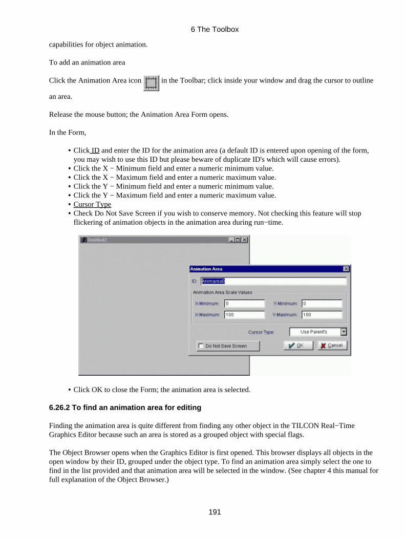
capabilities for object animation.
To add an animation area
Click the Animation Area icon in the Toolbar; click inside your window and drag the cursor to outline
an area.
Release the mouse button; the Animation Area Form opens.
In the Form,
Click ID and enter the ID for the animation area (a default ID is entered upon opening of the form,you may wish to use this ID but please beware of duplicate ID's which will cause errors).
•
Click the X − Minimum field and enter a numeric minimum value.• Click the X − Maximum field and enter a numeric maximum value.• Click the Y − Minimum field and enter a numeric minimum value.• Click the Y − Maximum field and enter a numeric maximum value.• Cursor Type• Check Do Not Save Screen if you wish to conserve memory. Not checking this feature will stopflickering of animation objects in the animation area during run−time.
•
Click OK to close the Form; the animation area is selected.•
6.26.2 To find an animation area for editing
Finding the animation area is quite different from finding any other object in the TILCON Real−TimeGraphics Editor because such an area is stored as a grouped object with special flags.
The Object Browser opens when the Graphics Editor is first opened. This browser displays all objects in theopen window by their ID, grouped under the object type. To find an animation area simply select the one tofind in the list provided and that animation area will be selected in the window. (See chapter 4 this manual forfull explanation of the Object Browser.)
6 The Toolbox
191
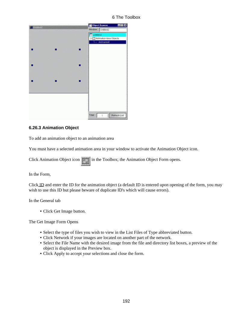
6.26.3 Animation Object
To add an animation object to an animation area
You must have a selected animation area in your window to activate the Animation Object icon.
Click Animation Object icon in the Toolbox; the Animation Object Form opens.
In the Form,
Click ID and enter the ID for the animation object (a default ID is entered upon opening of the form, you maywish to use this ID but please beware of duplicate ID's which will cause errors).
In the General tab
Click Get Image button.•
The Get Image Form Opens
Select the type of files you wish to view in the List Files of Type abbreviated button.• Click Network if your images are located on another part of the network.• Select the File Name with the desired image from the file and directory list boxes, a preview of theobject is displayed in the Preview box.
•
Click Apply to accept your selections and close the form.•
6 The Toolbox
192
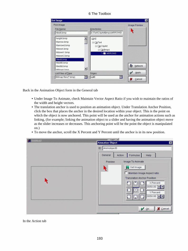
Back in the Animation Object form in the General tab
Under Image To Animate, check Maintain Vector Aspect Ratio if you wish to maintain the ratios ofthe width and height vectors.
•
The translation anchor is used to position an animation object. Under Translation Anchor Position,click the box that places the anchor in the desired location within your object. This is the point onwhich the object is now anchored. This point will be used as the anchor for animation actions such aslinking, (for example; linking the animation object to a slider and having the animation object moveas the slider increases or decreases. This anchoring point will be the point the object is manipulatedon.)
•
To move the anchor, scroll the X Percent and Y Percent until the anchor is in its new position.•
In the Action tab
6 The Toolbox
193
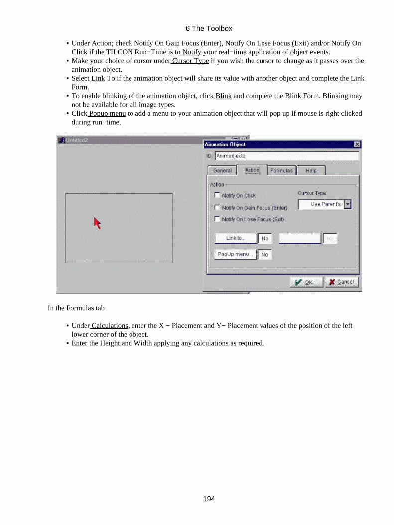
Under Action; check Notify On Gain Focus (Enter), Notify On Lose Focus (Exit) and/or Notify OnClick if the TILCON Run−Time is to Notify your real−time application of object events.
•
Make your choice of cursor under Cursor Type if you wish the cursor to change as it passes over theanimation object.
•
Select Link To if the animation object will share its value with another object and complete the LinkForm.
•
To enable blinking of the animation object, click Blink and complete the Blink Form. Blinking maynot be available for all image types.
•
Click Popup menu to add a menu to your animation object that will pop up if mouse is right clickedduring run−time.
•
In the Formulas tab
Under Calculations, enter the X − Placement and Y− Placement values of the position of the leftlower corner of the object.
•
Enter the Height and Width applying any calculations as required.•
6 The Toolbox
194
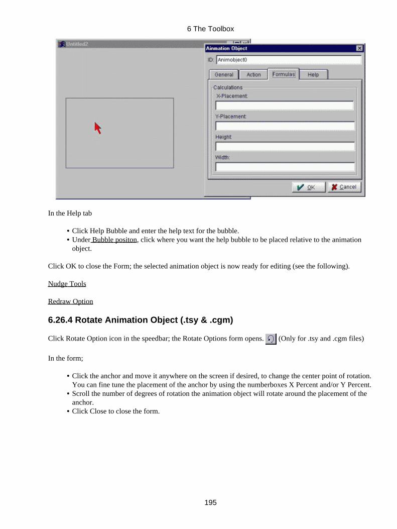
In the Help tab
Click Help Bubble and enter the help text for the bubble.• Under Bubble positon, click where you want the help bubble to be placed relative to the animationobject.
•
Click OK to close the Form; the selected animation object is now ready for editing (see the following).
Nudge Tools
Redraw Option
6.26.4 Rotate Animation Object (.tsy & .cgm)
Click Rotate Option icon in the speedbar; the Rotate Options form opens. (Only for .tsy and .cgm files)
In the form;
Click the anchor and move it anywhere on the screen if desired, to change the center point of rotation.You can fine tune the placement of the anchor by using the numberboxes X Percent and/or Y Percent.
•
Scroll the number of degrees of rotation the animation object will rotate around the placement of theanchor.
•
Click Close to close the form.•
6 The Toolbox
195
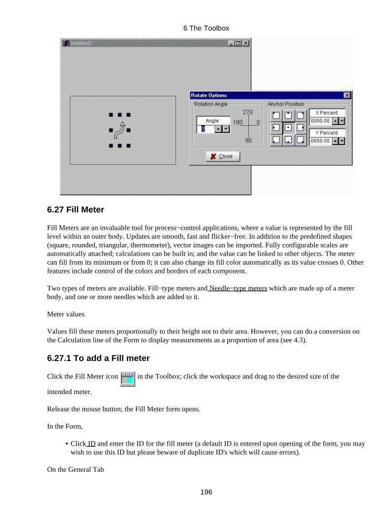
6.27 Fill Meter
Fill Meters are an invaluable tool for process−control applications, where a value is represented by the filllevel within an outer body. Updates are smooth, fast and flicker−free. In addition to the predefined shapes(square, rounded, triangular, thermometer), vector images can be imported. Fully configurable scales areautomatically attached; calculations can be built in; and the value can be linked to other objects. The metercan fill from its minimum or from 0; it can also change its fill color automatically as its value crosses 0. Otherfeatures include control of the colors and borders of each component.
Two types of meters are available. Fill−type meters and Needle−type meters which are made up of a meterbody, and one or more needles which are added to it.
Meter values
Values fill these meters proportionally to their height not to their area. However, you can do a conversion onthe Calculation line of the Form to display measurements as a proportion of area (see 4.3).
6.27.1 To add a Fill meter
Click the Fill Meter icon in the Toolbox; click the workspace and drag to the desired size of the
intended meter.
Release the mouse button; the Fill Meter form opens.
In the Form,
Click ID and enter the ID for the fill meter (a default ID is entered upon opening of the form, you maywish to use this ID but please beware of duplicate ID's which will cause errors).
•
On the General Tab
6 The Toolbox
196
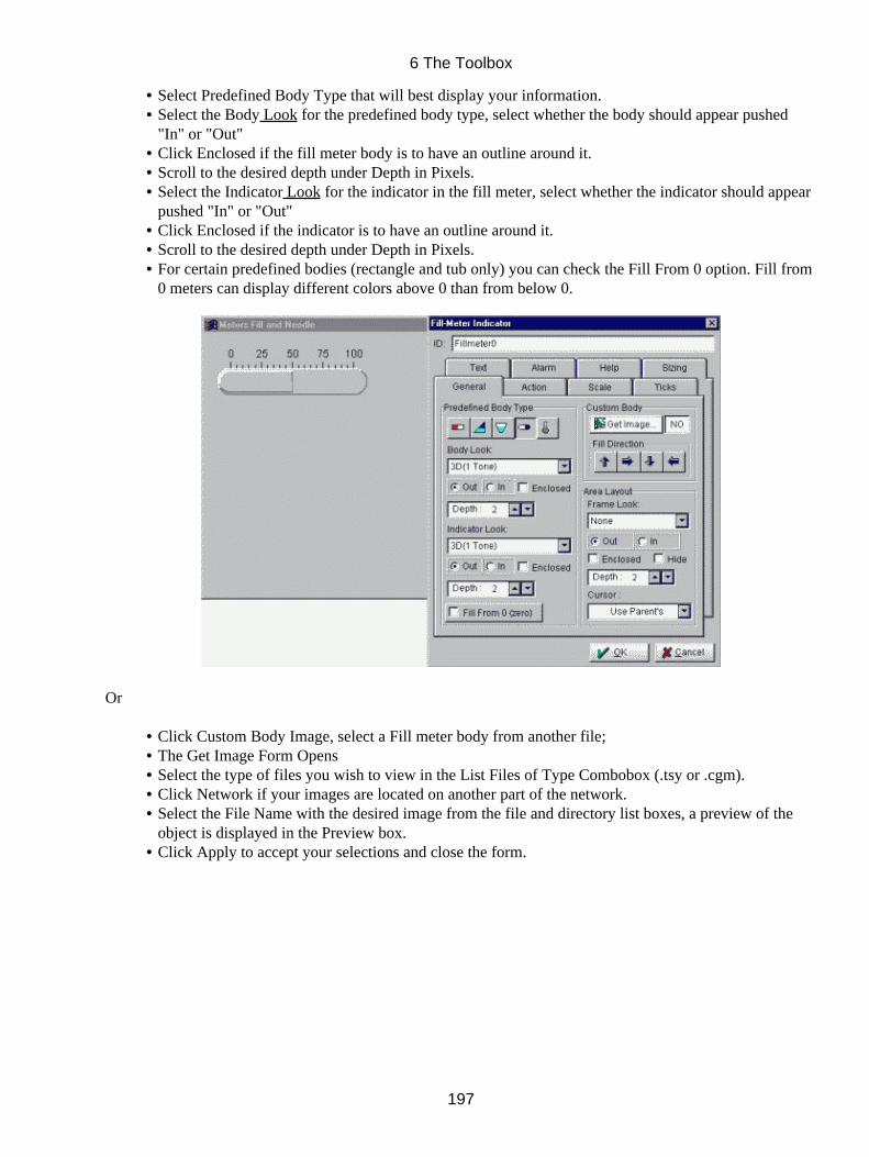
Select Predefined Body Type that will best display your information.• Select the Body Look for the predefined body type, select whether the body should appear pushed"In" or "Out"
•
Click Enclosed if the fill meter body is to have an outline around it.• Scroll to the desired depth under Depth in Pixels.• Select the Indicator Look for the indicator in the fill meter, select whether the indicator should appearpushed "In" or "Out"
•
Click Enclosed if the indicator is to have an outline around it.• Scroll to the desired depth under Depth in Pixels.• For certain predefined bodies (rectangle and tub only) you can check the Fill From 0 option. Fill from0 meters can display different colors above 0 than from below 0.
•
Or
Click Custom Body Image, select a Fill meter body from another file;• The Get Image Form Opens• Select the type of files you wish to view in the List Files of Type Combobox (.tsy or .cgm).• Click Network if your images are located on another part of the network.• Select the File Name with the desired image from the file and directory list boxes, a preview of theobject is displayed in the Preview box.
•
Click Apply to accept your selections and close the form.•
6 The Toolbox
197
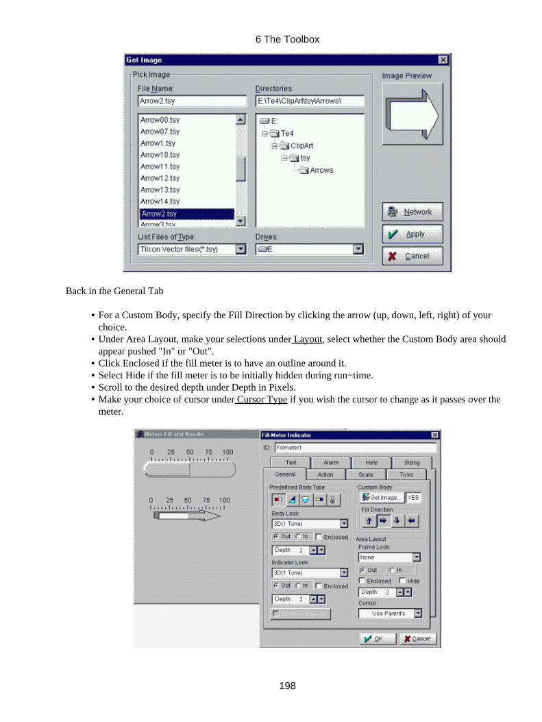
Back in the General Tab
For a Custom Body, specify the Fill Direction by clicking the arrow (up, down, left, right) of yourchoice.
•
Under Area Layout, make your selections under Layout, select whether the Custom Body area shouldappear pushed "In" or "Out".
•
Click Enclosed if the fill meter is to have an outline around it.• Select Hide if the fill meter is to be initially hidden during run−time.• Scroll to the desired depth under Depth in Pixels.• Make your choice of cursor under Cursor Type if you wish the cursor to change as it passes over themeter.
•
6 The Toolbox
198

In the Action tab
Under Indicator Values, enter the Initial, Minimum and Maximum values for the Fill meter.• Under Notify, check if notify should occur On Single Click, On Gain Focus and/or On Lost Focus.• Select Link To if the indicator will share its value with another object and complete the Link Form.• Click, Trigger if the selection of the fill meter during real−time display is to initiate another action;select your options in the Trigger Form.
•
Click Popup menu to add a menu to your fill meter that will pop up if mouse is right clicked duringrun−time.
•
Click the Calculation line and enter any required conversions or calculations.•
On the Scale Tab
Under the Scale Attributes, click your choice of Scale Type. Click Null (X) to hide the scale duringdisplay.
•
Scroll Scale Offset to determine placement of scale from meter.• Check Match Scale Values To Meter if you wish the scale to be defaulted to meter's min, max andinitial values.
•
Check Display Scale On Opposite Side if you want the scale to switch from one side of the object tothe other.
•
If you have not checked Match Scale Values To Meter the scale can be started and ended at specificsettings by scrolling Start At and End At.
•
If you have not checked Match Scale Values To Meter, select Scale Type one of either Linear, Log10, Log 2 or Natural Log. By scrolling the color list boxes the Scale Color and the Scale ShadowColor can be selected.
•
6 The Toolbox
199
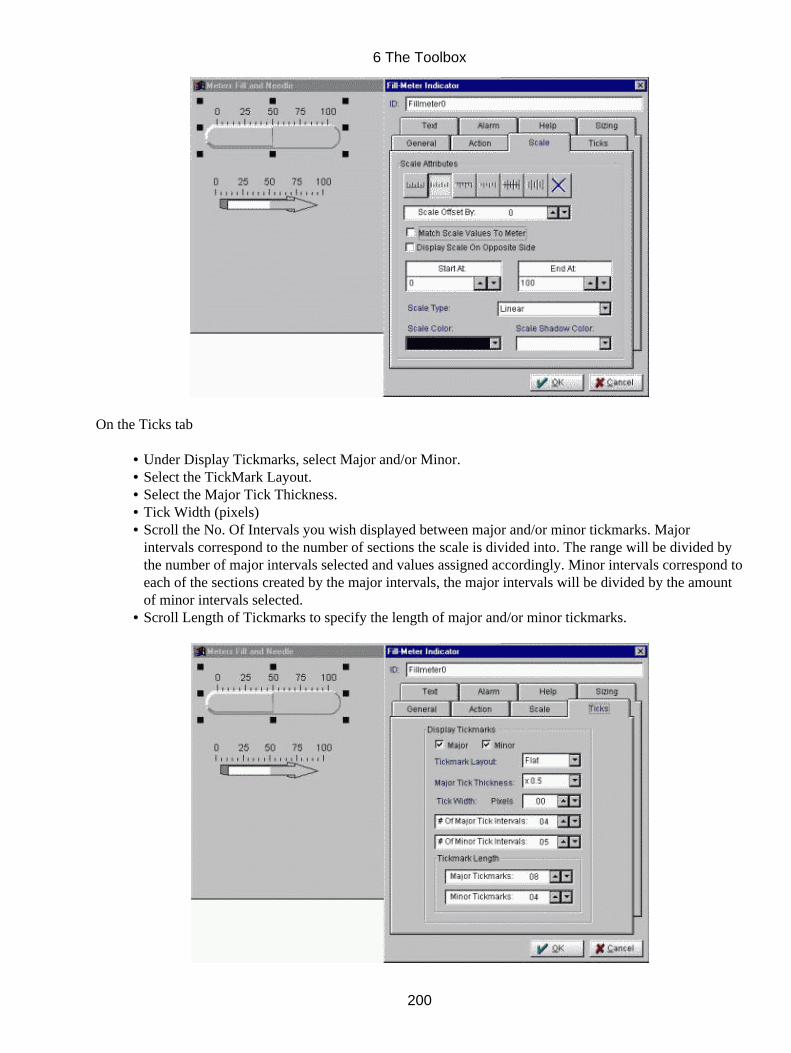
On the Ticks tab
Under Display Tickmarks, select Major and/or Minor.• Select the TickMark Layout.• Select the Major Tick Thickness.• Tick Width (pixels)• Scroll the No. Of Intervals you wish displayed between major and/or minor tickmarks. Majorintervals correspond to the number of sections the scale is divided into. The range will be divided bythe number of major intervals selected and values assigned accordingly. Minor intervals correspond toeach of the sections created by the major intervals, the major intervals will be divided by the amountof minor intervals selected.
•
Scroll Length of Tickmarks to specify the length of major and/or minor tickmarks.•
6 The Toolbox
200

On the Text Tab
Under Tickmark Text Attributes, select Display Text to display the scale values at the majortickmarks.
•
Select Display (−) Signs if negative values should display their signs.• Check Factor (nearest thousand)(not available at time of printing)• Scrolling the Display Text Every "#" Major Tickmarks, starting at "#" block will select the number ofmajor intervals between displayed text, and the starting location of the first Major tickmark fromwhere the text will be displayed.
•
Scrolling Starting At indicates where display will start.• Scroll the Text Placement (offset by): to specify the distance between tickmark and the center ofdisplayed text.
•
Scroll the Decimal Accuracy (# digits): to select the degree of accuracy of the scale values.• Under Text Shadow , select the appearance of the text on the label.• Scroll color list box to select Scale Text Color.• Scroll color list box to select Scale Text Shadow Color.•
On the Alarm Tab
Under Alarm Values, uncheck Hide Alarm to display a colored strip (alarm) beside the scale.• Check Hide Alarm Line if you wish to hide the alarm line.• Enter the Alarm Height in pixels or in screen units (inches, cm, mm, ...).• The scale's alarm strip position can be adjusted by scrolling the Placement (Offset By):.• Note the Minimum point on the meter.• Set Low to provide value for the starting color on the alarm strip. The "low" color will extend alongthe scale from this point to the Mid scale value.
•
Set Mid to provide value for middle color on the alarm strip. The "mid" color will extend from thispoint to the High scale value.
•
Set High to provide value for higher color on the alarm strip. The "high" color will extend from thispoint to the Maximum scale value.
•
Note the Maximum point on the meter.•
6 The Toolbox
201
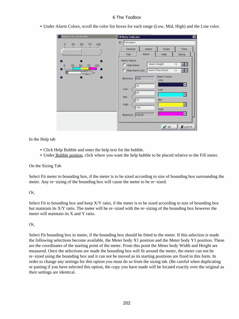
Under Alarm Colors, scroll the color list boxes for each range (Low, Mid, High) and the Line color.•
In the Help tab
Click Help Bubble and enter the help text for the bubble.• Under Bubble positon, click where you want the help bubble to be placed relative to the Fill meter.•
On the Sizing Tab
Select Fit meter to bounding box, if the meter is to be sized according to size of bounding box surrounding themeter. Any re−sizing of the bounding box will cause the meter to be re−sized.
Or,
Select Fit to bounding box and keep X/Y ratio, if the meter is to be sized according to size of bounding boxbut maintain its X/Y ratio. The meter will be re−sized with the re−sizing of the bounding box however themeter will maintain its X and Y ratio.
Or,
Select Fit bounding box to meter, if the bounding box should be fitted to the meter. If this selection is madethe following selections become available, the Meter body X1 position and the Meter body Y1 position. Theseare the coordinates of the starting point of the meter. From this point the Meter body Width and Height aremeasured. Once the selections are made the bounding box will fit around the meter, the meter can not bere−sized using the bounding box and it can not be moved as its starting positions are fixed in this form. Inorder to change any settings for this option you must do so from the sizing tab. (Be careful when duplicatingor pasting if you have selected this option, the copy you have made will be located exactly over the original astheir settings are identical.
6 The Toolbox
202
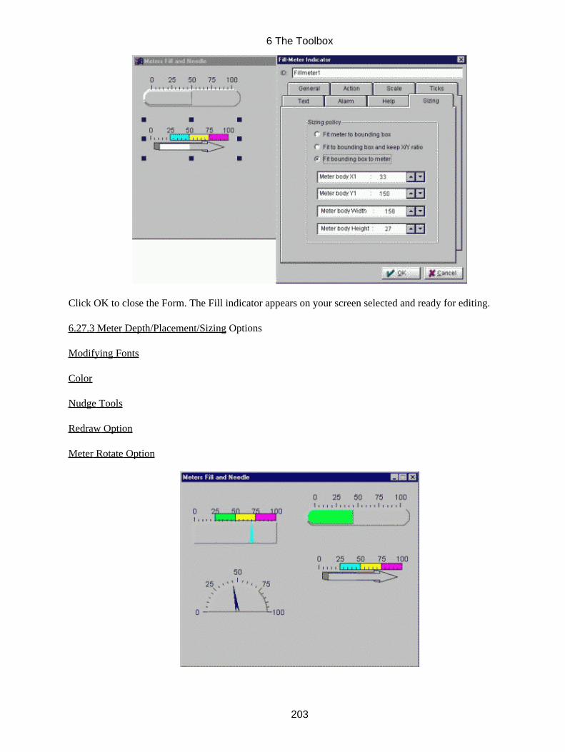
Click OK to close the Form. The Fill indicator appears on your screen selected and ready for editing.
6.27.3 Meter Depth/Placement/Sizing Options
Modifying Fonts
Color
Nudge Tools
Redraw Option
Meter Rotate Option
6 The Toolbox
203

6.27.2 Meter Rotate Options
Available from the speedbar Rotate Options provides the ability to rotate the meter around its center. (onlyavailable for Predefined body types)
Scroll the Angle numberbox to increase or decrease the angle at which the meter will be placed in thewindow.
Click Close to exit the form, once you are finished rotating the meter.
6.27.3 Meter Depth/Placement/Sizing Options
Clicking on the Depth/placement/Sizing Icon, the following form opens:
In the form,
Select either Outline Depth, Body Depth or Indicator Depth and scroll the 3D depth (Pixels) numberbox to either increase or decrease the depth for each item.
•
Under Meter margin, the available Parts can have both their X and Y margins adjusted.• Click Frame Margin to adjust the margins between the meter and its frame.• Select X Margin or the Y Margin and then scroll # Of Pixels: to adjust the margins. X adjusts left andright margins and Y adjusts top and bottom margins.
•
Click Body Margin to adjust the margins between the body and its frame.• Select the X Margin or the Y Margin and then scroll the # of Pixels: to adjust the margins. X adjustsleft and right margins and Y adjusts top and bottom margins.
•
6 The Toolbox
204

6.28 Needle Meter Body and Needle Options
Needle Meters are formed after adding one or more Needles into a Needle Meter Body. An array of bodyshapes are available, defining the behaviour of the needles; they can also be hidden so the needles are shownover imported images, increasing their realism. As with fill meters, scales are automatically attached, andneedle updates are smooth and flicker−free. Needles offer an array of predefined shapes and widths; vectorimages can also be imported to increase realism. Links can be made to other objects; calculations can beapplied to values before they are displayed. Other options affect colors, tip/tail lengths, and pin shape andsize.
6.28.1 To add a Needle meter body to your window
Click the Needle Meter Body icon in the Toolbox; click the workspace and drag to the desired size of
the intended body.
Release the mouse button; the Needle meter Body form opens.
In the Form,
Click ID and enter the ID for the needle meter body (a default ID is entered upon opening of the form, youmay wish to use this ID but please beware of duplicate ID's which will cause errors).
6 The Toolbox
205

On the General Tab
Under Meter Body Layout, click your choice of meter Body Type it appears on your window.• Click the Sweep Angle arrows to set the angle extended by the arc of a circular body.• Under Start Angle, select the starting angle for you body; it is displayed in the Form.• Under Body Look , make your selections, select whether the body should appear pushed "In" or"Out".
•
Click Enclosed if the body is to have an outline around it.• Scroll to the desired depth under Depth in Pixels.• For the closed circular body, check Chord instead of radii, if you want a chord from one end of the arcto the other; un check Chord instead of radii, if you want radial lines between each end and the centerof the circle.
•
Check Hide Body if you wish the body initially hidden during run−time.• Under Area Layout, make your selections under Frame Look, select whether the frame should appearpushed "In" or "Out".
•
Click Enclosed if the frame is to have an outline around it.• Select Hide if the frame is to be hidden during run−time.• Make your choice of cursor under Cursor Type if you wish the cursor to change as it passes over theneedle meter body.
•
6 The Toolbox
206

On the Scale tab
Under the Scale Attributes, click your choice of Scale Type. Click Null to hide the scale duringdisplay.
•
Scroll Scale Offset to determine placement of scale from meter.• Check Display Scale On Opposite Side if you want the scale to switch from one side of the object tothe other.
•
The scale can be started and ended at specific settings by scrolling and• Enter Start At and End At scale values. These determine the text displayed along the scale, but areactually independent of any meter values.
•
Select Scale Type one of either Linear, Log 10, Log 2 or Natural Log.• By scrolling the color list boxes the Scale Color and the Scale Shadow Color can be selected.•
6 The Toolbox
207
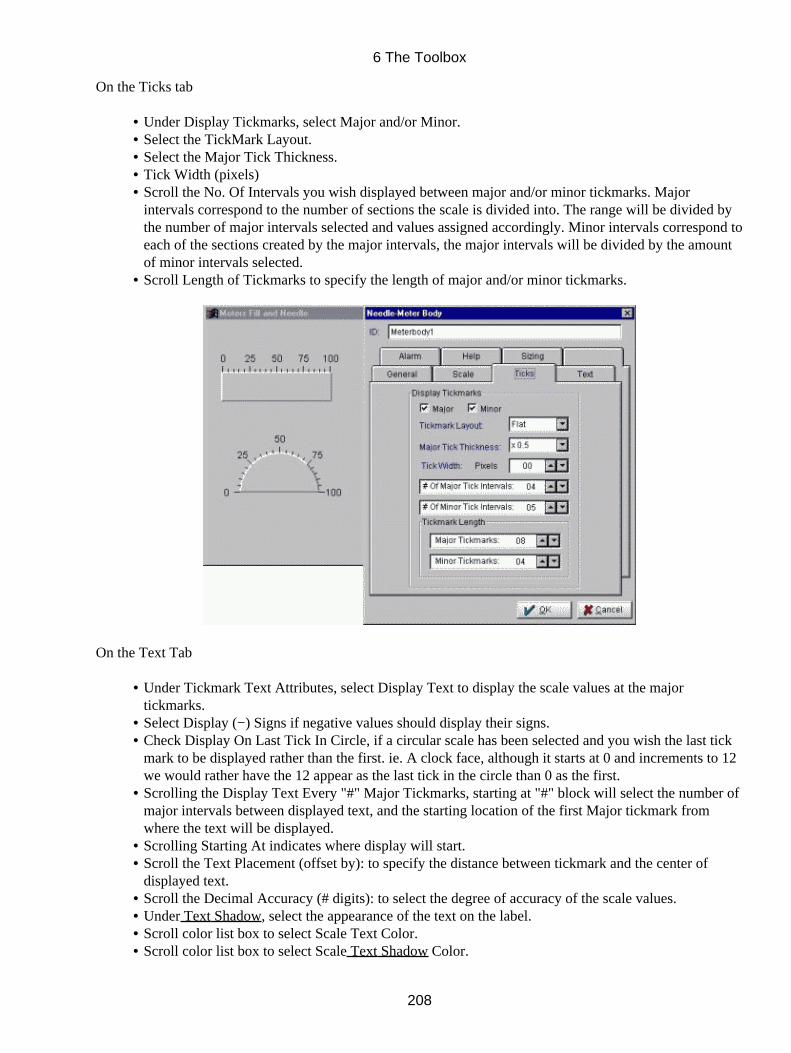
On the Ticks tab
Under Display Tickmarks, select Major and/or Minor.• Select the TickMark Layout.• Select the Major Tick Thickness.• Tick Width (pixels)• Scroll the No. Of Intervals you wish displayed between major and/or minor tickmarks. Majorintervals correspond to the number of sections the scale is divided into. The range will be divided bythe number of major intervals selected and values assigned accordingly. Minor intervals correspond toeach of the sections created by the major intervals, the major intervals will be divided by the amountof minor intervals selected.
•
Scroll Length of Tickmarks to specify the length of major and/or minor tickmarks.•
On the Text Tab
Under Tickmark Text Attributes, select Display Text to display the scale values at the majortickmarks.
•
Select Display (−) Signs if negative values should display their signs.• Check Display On Last Tick In Circle, if a circular scale has been selected and you wish the last tickmark to be displayed rather than the first. ie. A clock face, although it starts at 0 and increments to 12we would rather have the 12 appear as the last tick in the circle than 0 as the first.
•
Scrolling the Display Text Every "#" Major Tickmarks, starting at "#" block will select the number ofmajor intervals between displayed text, and the starting location of the first Major tickmark fromwhere the text will be displayed.
•
Scrolling Starting At indicates where display will start.• Scroll the Text Placement (offset by): to specify the distance between tickmark and the center ofdisplayed text.
•
Scroll the Decimal Accuracy (# digits): to select the degree of accuracy of the scale values.• Under Text Shadow, select the appearance of the text on the label.• Scroll color list box to select Scale Text Color.• Scroll color list box to select Scale Text Shadow Color.•
6 The Toolbox
208
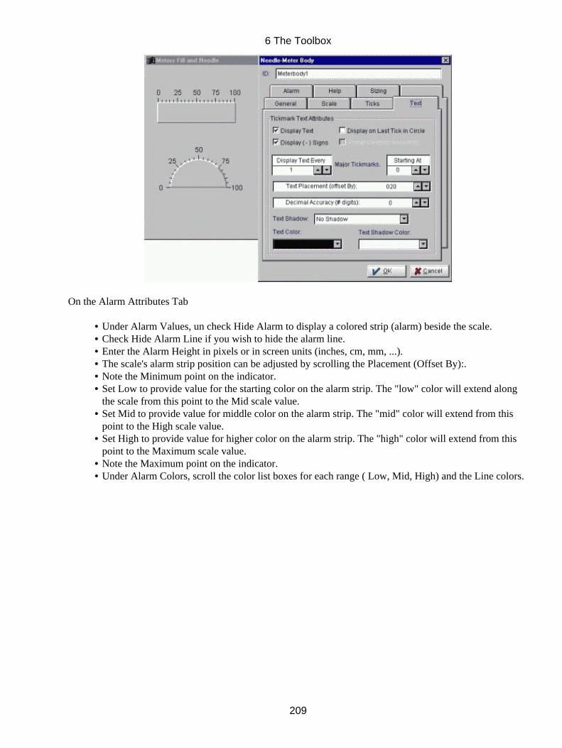
On the Alarm Attributes Tab
Under Alarm Values, un check Hide Alarm to display a colored strip (alarm) beside the scale.• Check Hide Alarm Line if you wish to hide the alarm line.• Enter the Alarm Height in pixels or in screen units (inches, cm, mm, ...).• The scale's alarm strip position can be adjusted by scrolling the Placement (Offset By):.• Note the Minimum point on the indicator.• Set Low to provide value for the starting color on the alarm strip. The "low" color will extend alongthe scale from this point to the Mid scale value.
•
Set Mid to provide value for middle color on the alarm strip. The "mid" color will extend from thispoint to the High scale value.
•
Set High to provide value for higher color on the alarm strip. The "high" color will extend from thispoint to the Maximum scale value.
•
Note the Maximum point on the indicator.• Under Alarm Colors, scroll the color list boxes for each range ( Low, Mid, High) and the Line colors.•
6 The Toolbox
209
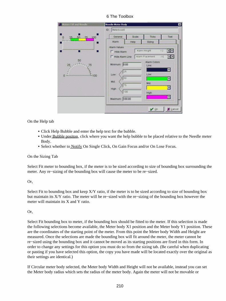
On the Help tab
Click Help Bubble and enter the help text for the bubble.• Under Bubble positon, click where you want the help bubble to be placed relative to the Needle meterBody.
•
Select whether to Notify On Single Click, On Gain Focus and/or On Lose Focus.•
On the Sizing Tab
Select Fit meter to bounding box, if the meter is to be sized according to size of bounding box surrounding themeter. Any re−sizing of the bounding box will cause the meter to be re−sized.
Or,
Select Fit to bounding box and keep X/Y ratio, if the meter is to be sized according to size of bounding boxbut maintain its X/Y ratio. The meter will be re−sized with the re−sizing of the bounding box however themeter will maintain its X and Y ratio.
Or,
Select Fit bounding box to meter, if the bounding box should be fitted to the meter. If this selection is madethe following selections become available, the Meter body X1 position and the Meter body Y1 position. Theseare the coordinates of the starting point of the meter. From this point the Meter body Width and Height aremeasured. Once the selections are made the bounding box will fit around the meter, the meter cannot bere−sized using the bounding box and it cannot be moved as its starting positions are fixed in this form. Inorder to change any settings for this option you must do so from the sizing tab. (Be careful when duplicatingor pasting if you have selected this option, the copy you have made will be located exactly over the original astheir settings are identical.)
If Circular meter body selected, the Meter body Width and Height will not be available, instead you can setthe Meter body radius which sets the radius of the meter body. Again the meter will not be movable or
6 The Toolbox
210
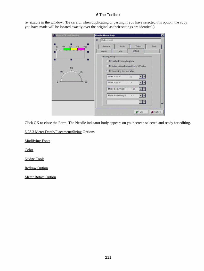
re−sizable in the window. (Be careful when duplicating or pasting if you have selected this option, the copyyou have made will be located exactly over the original as their settings are identical.)
Click OK to close the Form. The Needle indicator body appears on your screen selected and ready for editing.
6.28.3 Meter Depth/Placement/Sizing Options
Modifying Fonts
Color
Nudge Tools
Redraw Option
Meter Rotate Option
6 The Toolbox
211

6.28.2 Meter Rotate Options
Available from the speedbar Rotate Options provides the ability to rotate the meter body around its center.
Scroll the Angle numberbox to increase or decrease the angle at which the meter body will be placed in thewindow.
Click Close to exit the form, once you are finished rotating the meter body.
6.28.3 Meter Depth/Placement/Sizing Options
Clicking on the Depth/placement/Sizing Icon, the following form opens:
In the form,
Select either Outline Depth or Body Depth and scroll the 3D depth (Pixels) number box to eitherincrease or decrease the depth for each item.
•
6 The Toolbox
212
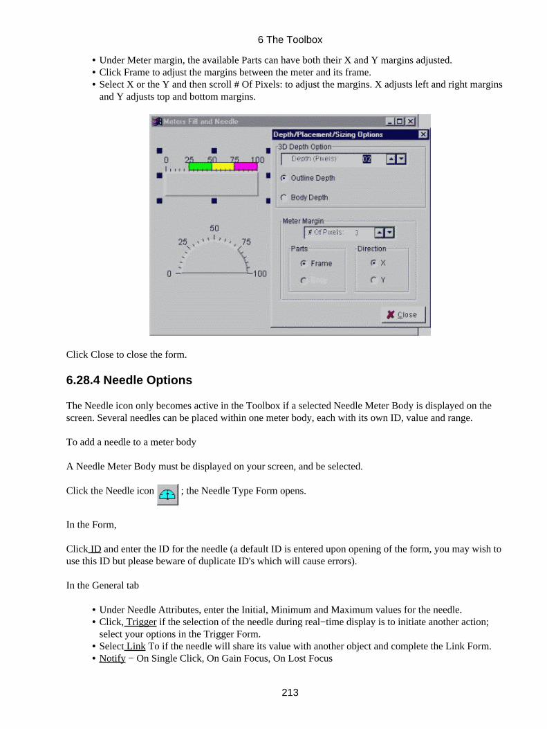
Under Meter margin, the available Parts can have both their X and Y margins adjusted.• Click Frame to adjust the margins between the meter and its frame.• Select X or the Y and then scroll # Of Pixels: to adjust the margins. X adjusts left and right marginsand Y adjusts top and bottom margins.
•
Click Close to close the form.
6.28.4 Needle Options
The Needle icon only becomes active in the Toolbox if a selected Needle Meter Body is displayed on thescreen. Several needles can be placed within one meter body, each with its own ID, value and range.
To add a needle to a meter body
A Needle Meter Body must be displayed on your screen, and be selected.
Click the Needle icon ; the Needle Type Form opens.
In the Form,
Click ID and enter the ID for the needle (a default ID is entered upon opening of the form, you may wish touse this ID but please beware of duplicate ID's which will cause errors).
In the General tab
Under Needle Attributes, enter the Initial, Minimum and Maximum values for the needle.• Click, Trigger if the selection of the needle during real−time display is to initiate another action;select your options in the Trigger Form.
•
Select Link To if the needle will share its value with another object and complete the Link Form.• Notify − On Single Click, On Gain Focus, On Lost Focus•
6 The Toolbox
213
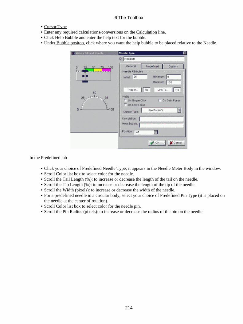
Cursor Type• Enter any required calculations/conversions on the Calculation line.• Click Help Bubble and enter the help text for the bubble.• Under Bubble positon, click where you want the help bubble to be placed relative to the Needle.•
In the Predefined tab
Click your choice of Predefined Needle Type; it appears in the Needle Meter Body in the window.• Scroll Color list box to select color for the needle.• Scroll the Tail Length (%): to increase or decrease the length of the tail on the needle.• Scroll the Tip Length (%): to increase or decrease the length of the tip of the needle.• Scroll the Width (pixels): to increase or decrease the width of the needle.• For a predefined needle in a circular body, select your choice of Predefined Pin Type (it is placed onthe needle at the center of rotation).
•
Scroll Color list box to select color for the needle pin.• Scroll the Pin Radius (pixels): to increase or decrease the radius of the pin on the needle.•
6 The Toolbox
214

Or,
In the Custom tab
Under Custom Needle Type, click Custom Needle Image
The Get Image Form Opens
Select the type of files you wish to view in the List Files of Type combobox. (.tsy)• Click Network if your images are located on another part of the network.• Select the File Name with the desired image from the file and directory list boxes, a preview of theobject is displayed in the Preview box.
•
Click Apply to accept your selections and close the form.•
Back in the Needle Type form and Custom tab
6 The Toolbox
215
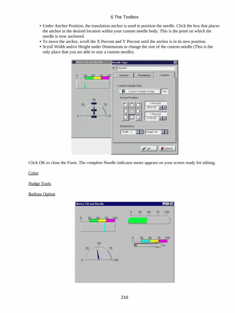
Under Anchor Position, the translation anchor is used to position the needle. Click the box that placesthe anchor in the desired location within your custom needle body. This is the point on which theneedle is now anchored.
•
To move the anchor, scroll the X Percent and Y Percent until the anchor is in its new position.• Scroll Width and/or Height under Dimensions to change the size of the custom needle (This is theonly place that you are able to size a custom needle).
•
Click OK to close the Form. The complete Needle indicator meter appears on your screen ready for editing.
Color
Nudge Tools
Redraw Option
6 The Toolbox
216

6.29 Color State Object
Color−State Objects are ideal alarms. They are configured to have one or more 'states' corresponding to arange of values. When the value in the object crosses the boundary from one state to another, the color of theobject changes, and the object can trigger a command or notify the application of this event. Vector imagesare imported and used as the symbols. Blinking can be set for each state individually; links can be made toother objects; and calculations can be applied to values before state changes are assessed.
For example, you can create a light that is normally green, but that is red and blinking when its value exceedscertain limits, with a trigger to display a relevant window. Alarms (color state objects) are 'display−only'objects; to monitor mouse clicks on the alarm, you can place a button beneath the alarm (use a button withNull fill color).
6.29.1 To add a color state object
Click the Color State Object icon in the Toolbox; click the workspace and drag to the desired size of the
intended object.
Release the mouse button; the Color State Object Form opens.
In the Form,
Click ID and enter the ID for the color state (a default ID is entered upon opening of the form, you may wishto use this ID but please beware of duplicate ID's which will cause errors).
On the General Tab
Click your choice of Frame Look for the color state object and whether it has the appearance ofpushed "In" or "Out".
•
Specify if the box is to be Enclosed. Enclosed is used to place a thin line around the color state object.• Check Hide if the color state is to be hidden initially in the run−time.• Under Action, select if Notify On State Change, On Gain Focus (Enter), On Lose Focus (Exit), orWhen Clicked to indicate when the TILCON Run−Time is to Notify your real−time application.
•
Make your choice of cursor under Cursor Type if you wish the cursor to change as it passes over thecolor state.
•
Click Popup menu to add a menu to your color state object that will pop up if the mouse is rightclicked during run−time.
•
Select Link To if the color−state object is to share its value with another object.• Enter any required calculations/conversions on the Calculation line.•
6 The Toolbox
217
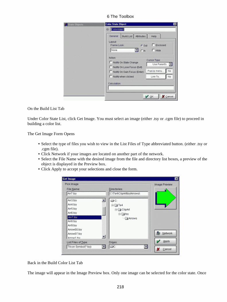
On the Build List Tab
Under Color State List, click Get Image. You must select an image (either .tsy or .cgm file) to proceed inbuilding a color list.
The Get Image Form Opens
Select the type of files you wish to view in the List Files of Type abbreviated button. (either .tsy or.cgm file).
•
Click Network if your images are located on another part of the network.• Select the File Name with the desired image from the file and directory list boxes, a preview of theobject is displayed in the Preview box.
•
Click Apply to accept your selections and close the form.•
Back in the Build Color List Tab
The image will appear in the Image Preview box. Only one image can be selected for the color state. Once
6 The Toolbox
218

you have selected an image, the Get Image button will change its label to Change Image, this will allow youto change the image if you wish.
Once an image has been selected the greyed items will become available,
Use Add After or Add Before to create an additional, blank state before or after the current one in thestate sequence.
•
Use Delete to eliminate a color state from the sequence.• For each state select a color from the Assign color to each state color list box.*• Repeat these steps (* to *) until you have assigned colors to each state of your object.•
Use the State # to select any state for changing color; the symbol for the selected state appears in the ImagePreview box colored as requested.
On the Attributes tab
Use the State # to select any state for changing its attributes; the symbol for the selected state appearsin the Image Preview box.
•
* Specify the State No.• Under Display Conditions, select what range of values of incoming data the color change for that stateis to occur (Click the greater than, less than symbols, etc., as appropriate.)
•
6 The Toolbox
219
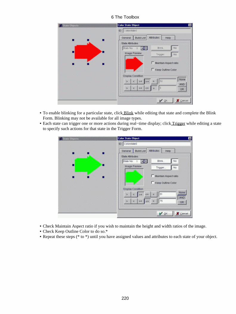
To enable blinking for a particular state, click Blink while editing that state and complete the BlinkForm. Blinking may not be available for all image types.
•
Each state can trigger one or more actions during real−time display; click Trigger while editing a stateto specify such actions for that state in the Trigger Form.
•
Check Maintain Aspect ratio if you wish to maintain the height and width ratios of the image.• Check Keep Outline Color to do so.*• Repeat these steps (* to *) until you have assigned values and attributes to each state of your object.•
6 The Toolbox
220
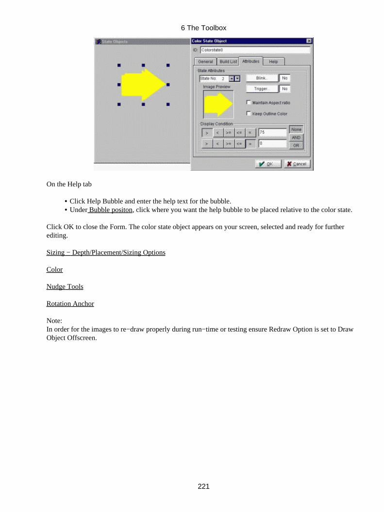
On the Help tab
Click Help Bubble and enter the help text for the bubble.• Under Bubble positon, click where you want the help bubble to be placed relative to the color state.•
Click OK to close the Form. The color state object appears on your screen, selected and ready for furtherediting.
Sizing − Depth/Placement/Sizing Options
Color
Nudge Tools
Rotation Anchor
Note:In order for the images to re−draw properly during run−time or testing ensure Redraw Option is set to DrawObject Offscreen.
6 The Toolbox
221
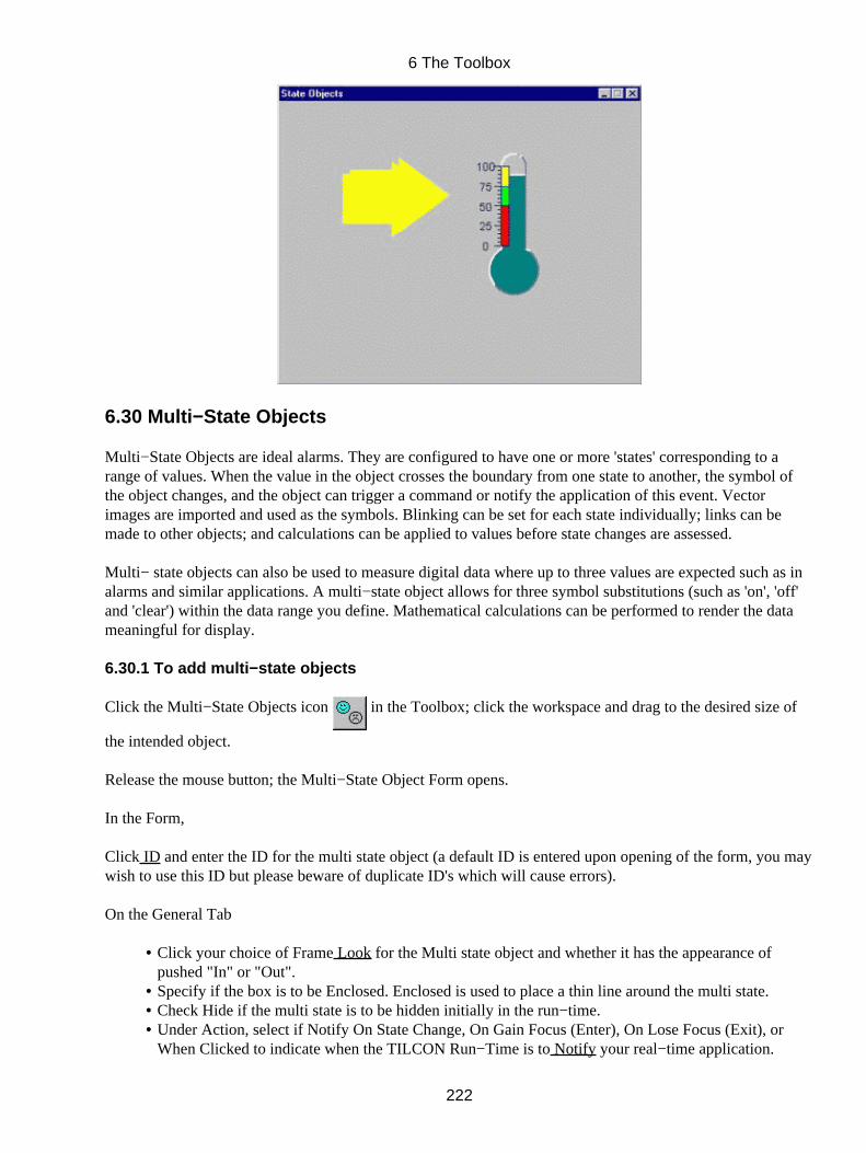
6.30 Multi−State Objects
Multi−State Objects are ideal alarms. They are configured to have one or more 'states' corresponding to arange of values. When the value in the object crosses the boundary from one state to another, the symbol ofthe object changes, and the object can trigger a command or notify the application of this event. Vectorimages are imported and used as the symbols. Blinking can be set for each state individually; links can bemade to other objects; and calculations can be applied to values before state changes are assessed.
Multi− state objects can also be used to measure digital data where up to three values are expected such as inalarms and similar applications. A multi−state object allows for three symbol substitutions (such as 'on', 'off'and 'clear') within the data range you define. Mathematical calculations can be performed to render the datameaningful for display.
6.30.1 To add multi−state objects
Click the Multi−State Objects icon in the Toolbox; click the workspace and drag to the desired size of
the intended object.
Release the mouse button; the Multi−State Object Form opens.
In the Form,
Click ID and enter the ID for the multi state object (a default ID is entered upon opening of the form, you maywish to use this ID but please beware of duplicate ID's which will cause errors).
On the General Tab
Click your choice of Frame Look for the Multi state object and whether it has the appearance ofpushed "In" or "Out".
•
Specify if the box is to be Enclosed. Enclosed is used to place a thin line around the multi state.• Check Hide if the multi state is to be hidden initially in the run−time.• Under Action, select if Notify On State Change, On Gain Focus (Enter), On Lose Focus (Exit), orWhen Clicked to indicate when the TILCON Run−Time is to Notify your real−time application.
•
6 The Toolbox
222
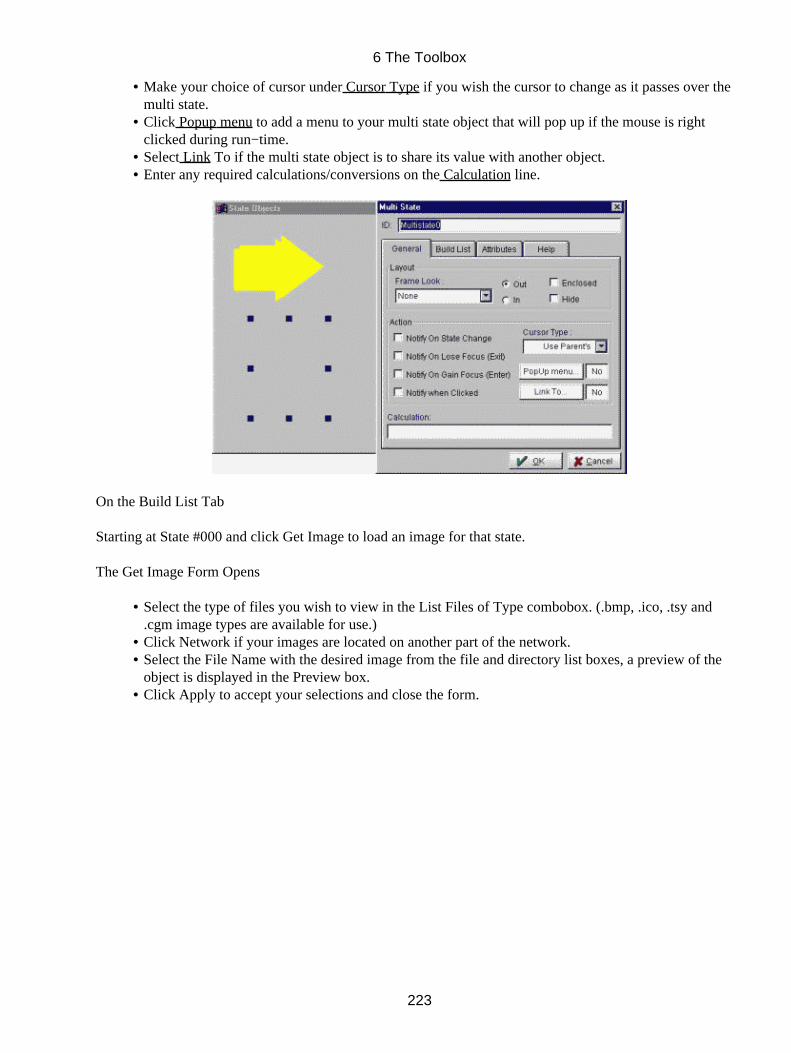
Make your choice of cursor under Cursor Type if you wish the cursor to change as it passes over themulti state.
•
Click Popup menu to add a menu to your multi state object that will pop up if the mouse is rightclicked during run−time.
•
Select Link To if the multi state object is to share its value with another object.• Enter any required calculations/conversions on the Calculation line.•
On the Build List Tab
Starting at State #000 and click Get Image to load an image for that state.
The Get Image Form Opens
Select the type of files you wish to view in the List Files of Type combobox. (.bmp, .ico, .tsy and.cgm image types are available for use.)
•
Click Network if your images are located on another part of the network.• Select the File Name with the desired image from the file and directory list boxes, a preview of theobject is displayed in the Preview box.
•
Click Apply to accept your selections and close the form.•
6 The Toolbox
223
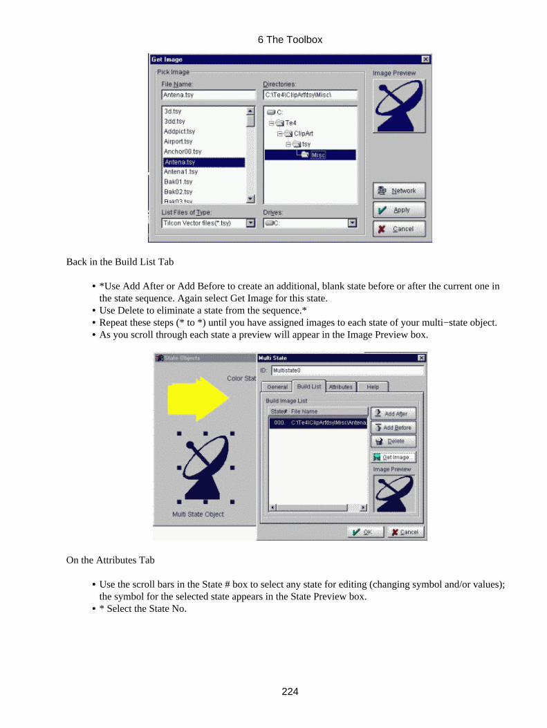
Back in the Build List Tab
*Use Add After or Add Before to create an additional, blank state before or after the current one inthe state sequence. Again select Get Image for this state.
•
Use Delete to eliminate a state from the sequence.*• Repeat these steps (* to *) until you have assigned images to each state of your multi−state object.• As you scroll through each state a preview will appear in the Image Preview box.•
On the Attributes Tab
Use the scroll bars in the State # box to select any state for editing (changing symbol and/or values);the symbol for the selected state appears in the State Preview box.
•
* Select the State No.•
6 The Toolbox
224
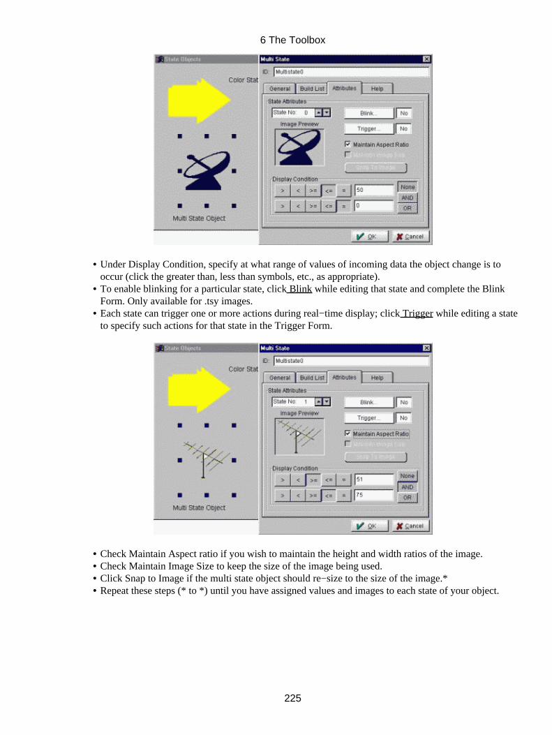
Under Display Condition, specify at what range of values of incoming data the object change is tooccur (click the greater than, less than symbols, etc., as appropriate).
•
To enable blinking for a particular state, click Blink while editing that state and complete the BlinkForm. Only available for .tsy images.
•
Each state can trigger one or more actions during real−time display; click Trigger while editing a stateto specify such actions for that state in the Trigger Form.
•
Check Maintain Aspect ratio if you wish to maintain the height and width ratios of the image.• Check Maintain Image Size to keep the size of the image being used.• Click Snap to Image if the multi state object should re−size to the size of the image.*• Repeat these steps (* to *) until you have assigned values and images to each state of your object.•
6 The Toolbox
225

In the Help tab
Click Help Bubble and enter the help text for the bubble.
Under Bubble positon, click where you want the help bubble to be placed relative to the multi state object.
Click OK to close the Form. The multi−state object appears on your screen selected and ready for furtherediting.
Sizing − Depth/Placement/Sizing Options
Color
Nudge Tools
Rotation Anchor
6 The Toolbox
226
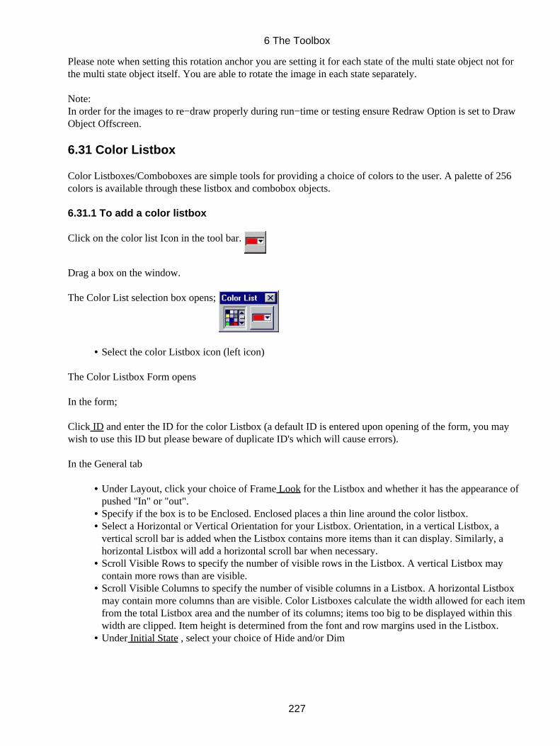
Please note when setting this rotation anchor you are setting it for each state of the multi state object not forthe multi state object itself. You are able to rotate the image in each state separately.
Note:In order for the images to re−draw properly during run−time or testing ensure Redraw Option is set to DrawObject Offscreen.
6.31 Color Listbox
Color Listboxes/Comboboxes are simple tools for providing a choice of colors to the user. A palette of 256colors is available through these listbox and combobox objects.
6.31.1 To add a color listbox
Click on the color list Icon in the tool bar.
Drag a box on the window.
The Color List selection box opens;
Select the color Listbox icon (left icon)•
The Color Listbox Form opens
In the form;
Click ID and enter the ID for the color Listbox (a default ID is entered upon opening of the form, you maywish to use this ID but please beware of duplicate ID's which will cause errors).
In the General tab
Under Layout, click your choice of Frame Look for the Listbox and whether it has the appearance ofpushed "In" or "out".
•
Specify if the box is to be Enclosed. Enclosed places a thin line around the color listbox.• Select a Horizontal or Vertical Orientation for your Listbox. Orientation, in a vertical Listbox, avertical scroll bar is added when the Listbox contains more items than it can display. Similarly, ahorizontal Listbox will add a horizontal scroll bar when necessary.
•
Scroll Visible Rows to specify the number of visible rows in the Listbox. A vertical Listbox maycontain more rows than are visible.
•
Scroll Visible Columns to specify the number of visible columns in a Listbox. A horizontal Listboxmay contain more columns than are visible. Color Listboxes calculate the width allowed for each itemfrom the total Listbox area and the number of its columns; items too big to be displayed within thiswidth are clipped. Item height is determined from the font and row margins used in the Listbox.
•
Under Initial State , select your choice of Hide and/or Dim•
6 The Toolbox
227

In the Action tab
Select if Notify On Gain Focus (Enter), On Lose Focus (Exit), On Single Mouse Click or On DoubleMouse Click to indicate when the TILCON Run−Time is to Notify your real−time application.
•
Check Display Focus if you require your object to indicate if it (the object) has focus.• Click Popup menu to add a menu to your Listbox that will pop up if mouse is right clicked duringrun−time.
•
Click Callback if the selection of the Listbox during real−time display is to invoke a particularfunction within your application itself; choose your options in the Callback Form.
•
Make your choice of cursor under Cursor Type if you wish the cursor to change as it passes over theListbox.
•
In the Attributes tab
Under Item Attributes, you can specify common properties for the items in the Listbox.• Click your choice of Layout for the Listbox item and whether it has the appearance of pushed "In" or"out".
•
6 The Toolbox
228
Scroll the Active Color Index # to specify the active indexed color to be selected when first opened inthe run−time.
•
Click, Trigger if the selection of the item during real−time display is to initiate another action; selectyour options in the Trigger Form. A trigger can be set for each index of the color pallette. Selectwhich index color that the trigger is to be set on by scrolling the Active Color Index #.
•
In the Help tab
Click Help Bubble and enter the help text for the bubble.
Under Bubble positon, click where you want the help bubble to be placed relative to the Listbox.
Click OK to close the form and place your color Listbox on the window.
Sizing − Depth/Placement/Sizing Options
Modifying Fonts
6 The Toolbox
229
Color
Nudge Tools
6.32 Color Combobox
Color Listboxes/Comboboxes are simple tools for providing a choice of colors to the user. A palette of 256colors is available through these listbox and combobox objects.
6.32.1 To add a color Combobox
Click on the color list Icon in the tool bar.
Drag a box on the window.
The Color List selection box opens;
Select the color Combobox icon (right icon)•
The Color Combobox Form opens
Click ID and enter the ID for the color Combobox (a default ID is entered upon opening of the form, you maywish to use this ID but please beware of duplicate ID's which will cause errors).
In the General tab
Under Layout , select the Pull down Frame Look for the Combobox and whether the Comboboxappears "In" or "out'.
•
Click Enclosed to put a thin line around the Combobox.• Scroll Visible # Of Column to set the number of columns which will be visible during run−time.• Scroll Visible # Of Rows to set the number of rows which will be visible during run−time.• Under Initial State , select Dim (makes the box appear inactive) or Hide (hides the box in therun−time, but not in the application editor) as the state of the box.
•
Click Static List if the list items in the box is to be displayed in the window without activating thecombobox itself.
•
6 The Toolbox
230
In the Action tab
Select if Notify On Gain Focus (Enter), On Lose Focus (Exit), On Single Mouse Click or On DoubleMouse Click to indicate when the TILCON Run−Time is to Notify your real−time application.
•
Check Display Focus if you require your object to indicate if it (the object) has focus.• Click Popup menu to add a menu to your Combobox that will pop up if mouse is right clicked duringrun−time.
•
Click Callback if the selection of the Combobox during real−time display is to invoke a particularfunction within your application itself; choose your options in the Callback Form.
•
Make your choice of cursor under Cursor Type if you wish the cursor to change as it passes over theCombobox.
•
In the Attributes tab
Make your Item Attributes choices for the Combobox Item and whether the Combobox items appear"In" or "out".
•
Scroll the Active Color Index # to specify the active indexed color to be selected when first opened in•
6 The Toolbox
231
the run−time.Click, Trigger if the selection of the item during real−time display is to initiate another action; selectyour options in the Trigger Form. A trigger can be set for each index of the color pallette. Selectwhich index color that the trigger is to be set on by scrolling the Active Color Index #.
•
In the Help tab
Click Help Bubble and enter the help text for the bubble.
Under Bubble positon, click where you want the help bubble to be placed relative to the Combobox.
Click OK to close the form, the color Combobox appears on the window.
Sizing − Depth/Placement/Sizing Options
Modifying Fonts
6 The Toolbox
232
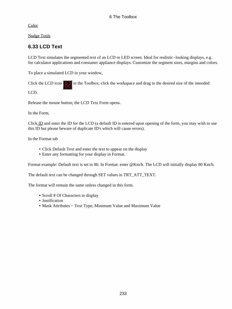
Color
Nudge Tools
6.33 LCD Text
LCD Text simulates the segmented text of an LCD or LED screen. Ideal for realistic−looking displays, e.g.for calculator applications and consumer appliance displays. Customize the segment sizes, margins and colors.
To place a simulated LCD in your window,
Click the LCD icon in the Toolbox; click the workspace and drag to the desired size of the intended
LCD.
Release the mouse button; the LCD Text Form opens.
In the Form,
Click ID and enter the ID for the LCD (a default ID is entered upon opening of the form, you may wish to usethis ID but please beware of duplicate ID's which will cause errors).
In the Format tab
Click Default Text and enter the text to appear on the display• Enter any formatting for your display in Format.•
Format example: Default text is set to 80. In Format: enter @Km/h. The LCD will initially display 80 Km/h.
The default text can be changed through SET values in TRT_ATT_TEXT.
The format will remain the same unless changed in this form.
Scroll # Of Characters to display• Justification• Mask Attributes − Text Type, Minimum Value and Maximum Value•
6 The Toolbox
233
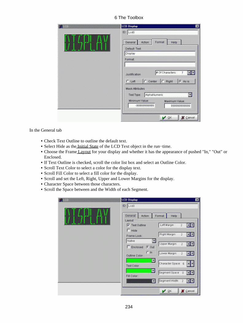
In the General tab
Check Text Outline to outline the default text.• Select Hide as the Initial State of the LCD Text object in the run−time.• Choose the Frame Layout for your display and whether it has the appearance of pushed "In," "Out" orEnclosed.
•
If Text Outline is checked, scroll the color list box and select an Outline Color.• Scroll Text Color to select a color for the display text.• Scroll Fill Color to select a fill color for the display.• Scroll and set the Left, Right, Upper and Lower Margins for the display.• Character Space between those characters.• Scroll the Space between and the Width of each Segment.•
6 The Toolbox
234
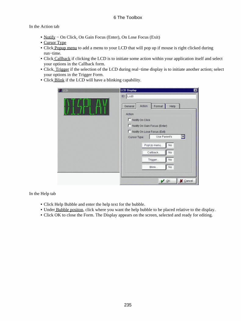
In the Action tab
Notify − On Click, On Gain Focus (Enter), On Lose Focus (Exit)• Cursor Type• Click Popup menu to add a menu to your LCD that will pop up if mouse is right clicked duringrun−time.
•
Click Callback if clicking the LCD is to initiate some action within your application itself and selectyour options in the Callback form.
•
Click, Trigger if the selection of the LCD during real−time display is to initiate another action; selectyour options in the Trigger Form.
•
Click Blink if the LCD will have a blinking capability.•
In the Help tab
Click Help Bubble and enter the help text for the bubble.• Under Bubble positon, click where you want the help bubble to be placed relative to the display.• Click OK to close the Form. The Display appears on the screen, selected and ready for editing.•
6 The Toolbox
235

Sizing − Depth/Placement/Sizing Options
Color
Nudge Tools
6 The Toolbox
236
7 Text
The TILCON Graphics Editor offers powerful text handling capabilities and a wide variety of sizes, fonts andstyles in bitmap text as well as options in system text. This section describes how to use the Text functions tobest advantage for:
Editable text (system fonts) in real−time applications.• Label text (bit−map and system fonts) for headings, titles or descriptions in your window.• Message text (bit−map and system fonts) for warnings, etc. in your window.• Multi−line editable text (system fonts) in real−time applications.•
Depending on the type of text you select, different options become available in the TILCON Graphics Editor.
7.1 Fonts
Fonts have been divided into two categories: system fonts and bitmap fonts. The font differences and list ofour available fonts are as follows:
System fonts: These fonts are non−scalable, can be colored (fill and text) and display quickly.
System Fonts System Courier Helvetica New Century Times Roman Gothic Gothic P Mincho Mincho P
Bitmap fonts: These are scalable, can be colored (text color) and display more slowly than system fonts.
Bitmap Fonts Bitmap1 Bitmap2 Bitmap3 Bitmap4 Bitmap5 Bitmap6
Font options
Bold and/or Italics may not have any effect on certain fonts.
If no format, default numeric text has 2 digits after the decimal.
7.1.1 Modifying Fonts
For objects such as buttons, text options are available from the speedbar or the Main Menu under Options.Text options may also be set in the object's form such as in the Table object. The following applies to theobjects such as all text objects, buttons, panels and scales etc. that have text entered and editable.
7 Text
237
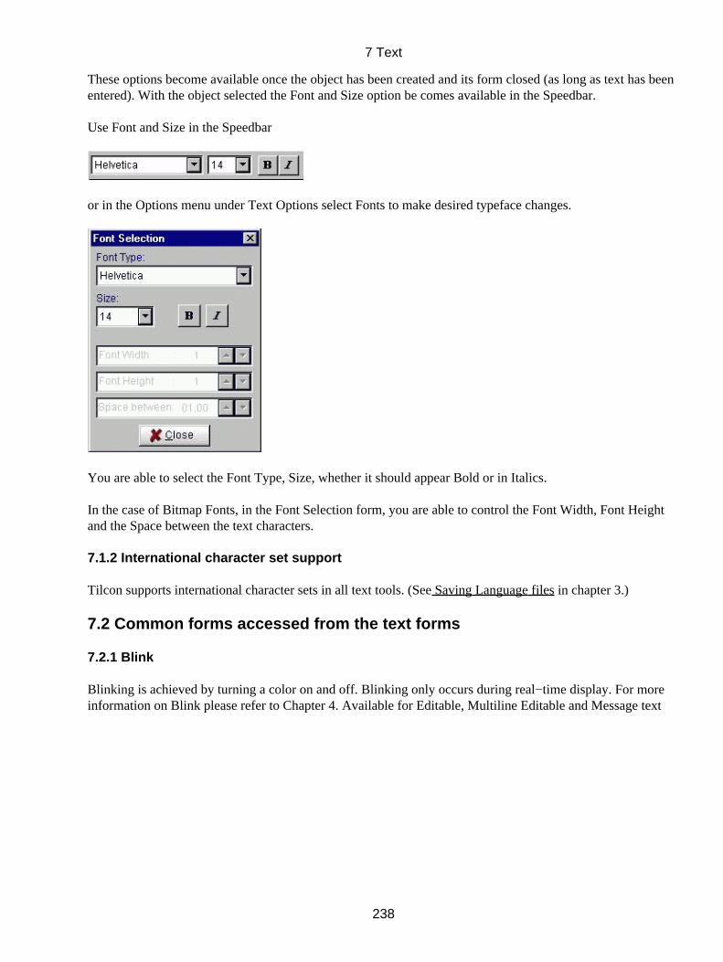
These options become available once the object has been created and its form closed (as long as text has beenentered). With the object selected the Font and Size option be comes available in the Speedbar.
Use Font and Size in the Speedbar
or in the Options menu under Text Options select Fonts to make desired typeface changes.
You are able to select the Font Type, Size, whether it should appear Bold or in Italics.
In the case of Bitmap Fonts, in the Font Selection form, you are able to control the Font Width, Font Heightand the Space between the text characters.
7.1.2 International character set support
Tilcon supports international character sets in all text tools. (See Saving Language files in chapter 3.)
7.2 Common forms accessed from the text forms
7.2.1 Blink
Blinking is achieved by turning a color on and off. Blinking only occurs during real−time display. For moreinformation on Blink please refer to Chapter 4. Available for Editable, Multiline Editable and Message text
7 Text
238
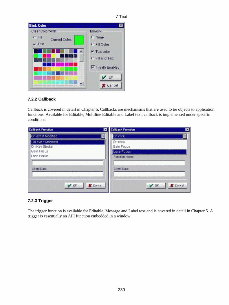
7.2.2 Callback
Callback is covered in detail in Chapter 5. Callbacks are mechanisms that are used to tie objects to applicationfunctions. Available for Editable, Multiline Editable and Label text, callback is implemented under specificconditions.
7.2.3 Trigger
The trigger function is available for Editable, Message and Label text and is covered in detail in Chapter 5. Atrigger is essentially an API function embedded in a window.
7 Text
239
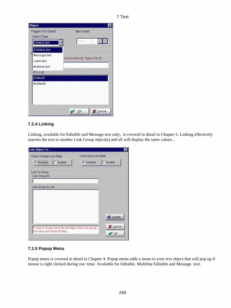
7.2.4 Linking
Linking, available for Editable and Message text only, is covered in detail in Chapter 5. Linking effectivelymarries the text to another Link Group object(s) and all will display the same values. .
7.2.5 Popup Menu
Popup menu is covered in detail in Chapter 4. Popup menu adds a menu to your text object that will pop up ifmouse is right clicked during run−time. Available for Editable, Multiline Editable and Message text.
7 Text
240
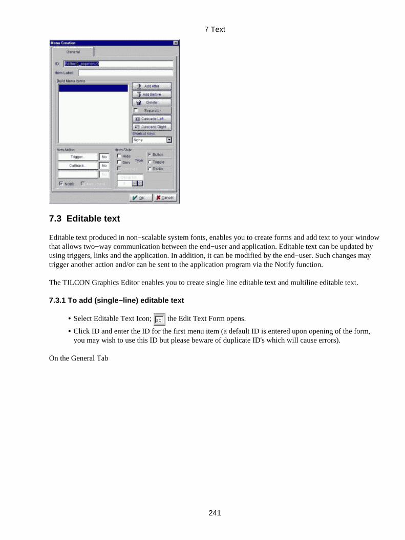
7.3 Editable text
Editable text produced in non−scalable system fonts, enables you to create forms and add text to your windowthat allows two−way communication between the end−user and application. Editable text can be updated byusing triggers, links and the application. In addition, it can be modified by the end−user. Such changes maytrigger another action and/or can be sent to the application program via the Notify function.
The TILCON Graphics Editor enables you to create single line editable text and multiline editable text.
7.3.1 To add (single−line) editable text
Select Editable Text Icon; the Edit Text Form opens.•
Click ID and enter the ID for the first menu item (a default ID is entered upon opening of the form,you may wish to use this ID but please beware of duplicate ID's which will cause errors).
•
On the General Tab
7 Text
241

Under Layout, make your choice of Hide or Dim as the Initial State of the text in the run−time.• Click Selectable to enable the end−user of your application to select the text when the cursor is on itand Editable to allow the user to modify it during run−time.
•
Determine the Look of the frame surrounding the text, whether the frame appears pushed "In" or"Out" and/or if the frame is Enclosed.
•
Scroll to set the Maximum Char's (maximum characters, so you can allocate the necessary memory)for your text.
•
Scroll your Left Margin or Top Margin if there are to be margins around your text, measured in pixels• Click Default, and type the copy for your text.• Under Justification, choose Right or Left as the position of the text.•
On the Action Tab
7 Text
242
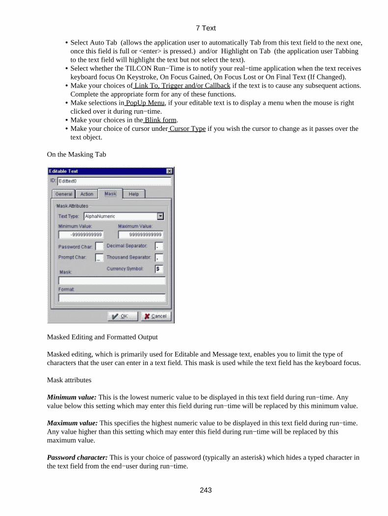
Select Auto Tab (allows the application user to automatically Tab from this text field to the next one,once this field is full or <enter> is pressed.) and/or Highlight on Tab (the application user Tabbingto the text field will highlight the text but not select the text).
•
Select whether the TILCON Run−Time is to notify your real−time application when the text receiveskeyboard focus On Keystroke, On Focus Gained, On Focus Lost or On Final Text (If Changed).
•
Make your choices of Link To, Trigger and/or Callback if the text is to cause any subsequent actions.Complete the appropriate form for any of these functions.
•
Make selections in PopUp Menu, if your editable text is to display a menu when the mouse is rightclicked over it during run−time.
•
Make your choices in the Blink form.• Make your choice of cursor under Cursor Type if you wish the cursor to change as it passes over thetext object.
•
On the Masking Tab
Masked Editing and Formatted Output
Masked editing, which is primarily used for Editable and Message text, enables you to limit the type ofcharacters that the user can enter in a text field. This mask is used while the text field has the keyboard focus.
Mask attributes
Minimum value: This is the lowest numeric value to be displayed in this text field during run−time. Anyvalue below this setting which may enter this field during run−time will be replaced by this minimum value.
Maximum value: This specifies the highest numeric value to be displayed in this text field during run−time.Any value higher than this setting which may enter this field during run−time will be replaced by thismaximum value.
Password character: This is your choice of password (typically an asterisk) which hides a typed character inthe text field from the end−user during run−time.
7 Text
243
Prompt character: This is your choice of character (typically, underline) to indicate a blank that the end−userof your application should fill during run−time.
Decimal separator: Typically, a period or comma, the decimal separator can be any character you choose.
Thousand separator: Usually a comma or space, the thousand separator can be any character of your choice.
Currency Symbol: Typically $ to indicate type of currency you choose.
7.3.2 Mask
Mask characterCharacter user can enter 0 Digit # Digit + − space A A − Z 0 − 9 space a a − z 0 − 9 space L A − Z l a − z C a − z A − Z 0 − 9 space & Any printable character \ The next character in mask will appear as is, cannot be modified by the user other Appears as−is; cannot be changed by the user
Example : Mask in text field: M\ask l l 00 When the text field gets focus, it displays: Mask _ _ _ _ User can enter 2 letters and 2 digits: Mask a b 1 2
7.3.3 Format
When a text field receives a value − through user input or API command − the text can format that valuebefore displaying it.
If the text is Alphabetic or Alphanumeric, the format character is @.
Example 1: Format: none user enters: HELLO text field displays: HELLO
Example 2: Format: blah@blah user enters: HELLO text field displays: blahHELLOblah
Example 3: Format: blahblah user enters: HELLO text field displays: blahblah
If the text is Numeric, the format string is: pos_format; neg_format; 0_format
If 0_format (used to format text when its value = 0) is not specified, pos_format is used when thevalue = 0
•
If neg_format is not specified, pos_format is used for negative values.• If pos_format is not specified, text is displayed as−is.•
Format charactersMeaning $ Currency symbol % Express as percentage
7 Text
244
. Decimal separator # Significant digit, or omitted 0 Digit ? Significant digit or space "string" Displays whatever is inside the double quotation marks \ Displays the next character in the format , Use thousands separator e, E Use scientific notation
Example: Format: "The value is " #,###.00;(#,###.00);−
User enters:Text field displays: 0 _ 1 The value is 1.00 1234.567 The value is 1,234.57 −3.1 (3.10)
To enter a mask or a format string
On the Text Masking tab,• Scroll Text Type to the type of text you wish to mask. Select either AlphaNumeric, Alphabetic,numeric, Date, or Time.
•
Depending on the text type, make your entries for Minimum Value, Maximum Value, Password Char,Prompt Char, Decimal Separator, Thousand Separator, or Currency Symbol.
•
Click Mask and enter the mask characters for the text field.• Click Format and enter the format string for the text field.•
On the Help Tab
Click Help Bubble and enter the help text for the bubble.• Under Bubble Position, click where you want the help bubble to be placed relative to the text.• Click OKto close the Form; your text is now selected ready for further editing.• Select font type, size, bold or italic in the speedbar or in Font Selection form.• Apply the nudge arrows to fine−tune the position of the text, if appropriate.• The Text object can be further modified with the Depth/Placement/Sizing Options.•
7.4 To add (multiline) editable text
Click the Multiline Text icon in the Toolbox. •
Click the work area, drag and release the mouse button; the Multi Line Text Form opens.• Click ID and enter the ID for the first menu item (a default ID is entered upon opening of the form,you may wish to use this ID but please beware of duplicate ID's which will cause errors).
•
On the General Tab
7 Text
245
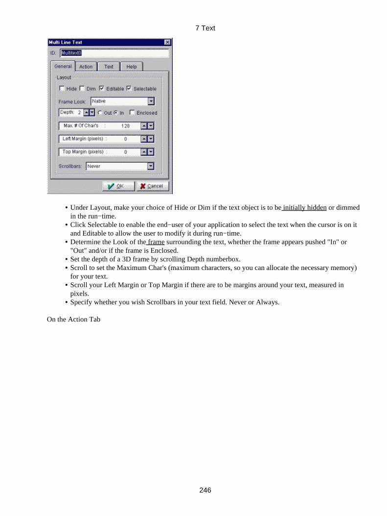
Under Layout, make your choice of Hide or Dim if the text object is to be initially hidden or dimmedin the run−time.
•
Click Selectable to enable the end−user of your application to select the text when the cursor is on itand Editable to allow the user to modify it during run−time.
•
Determine the Look of the frame surrounding the text, whether the frame appears pushed "In" or"Out" and/or if the frame is Enclosed.
•
Set the depth of a 3D frame by scrolling Depth numberbox.• Scroll to set the Maximum Char's (maximum characters, so you can allocate the necessary memory)for your text.
•
Scroll your Left Margin or Top Margin if there are to be margins around your text, measured inpixels.
•
Specify whether you wish Scrollbars in your text field. Never or Always.•
On the Action Tab
7 Text
246
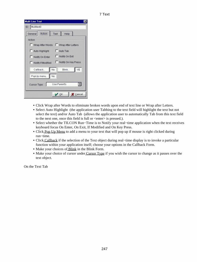
Click Wrap after Words to eliminate broken words upon end of text line or Wrap after Letters.• Select Auto Highlight (the application user Tabbing to the text field will highlight the text but notselect the text) and/or Auto Tab (allows the application user to automatically Tab from this text fieldto the next one, once this field is full or <enter> is pressed.).
•
Select whether the TILCON Run−Time is to Notify your real−time application when the text receiveskeyboard focus On Enter, On Exit, If Modified and On Key Press.
•
Click Pop Up Menu to add a menu to your text that will pop up if mouse is right clicked duringrun−time.
•
Click Callback if the selection of the Text object during real−time display is to invoke a particularfunction within your application itself; choose your options in the Callback Form.
•
Make your choices of Blink in the Blink Form.• Make your choice of cursor under Cursor Type if you wish the cursor to change as it passes over thetext object.
•
On the Text Tab
7 Text
247

Click Default text, and type the copy in the multiline text field.•
On the Help tab
Help Bubble and enter the help text for the bubble.• Under Bubble Position, click where you want the help bubble to be placed relative to the text.• Click OK to close the Form; your text is now selected ready for editing.• Select font type, size, bold or italic in the speedbar or in Font Selection form.• Apply the nudge arrows to fine tune the position of the text, if appropriate.• The Text object can be further modified with the Depth/Placement/Sizing Options.•
7.5 Message Text
Message text enables you to place text in System or Bitmap fonts anywhere within your window. Usebit−map fonts for scalable windows because system fonts cannot be scaled. Your real−time application cansend warnings, updates or other messages to the text fields in your window. Triggers, links and APIcommands from your program can update message text but the user cannot select or modify these fields.
7.5.1 To add Message text
Click the Message Text icon in the Toolbox. •
Click the work area, drag and release the mouse button; the Message Text Form opens.• Click ID and enter the ID for the first menu item (a default ID is entered upon opening of the form,you may wish to use this ID but please beware of duplicate ID's which will cause problems).
•
On the General Tab
7 Text
248
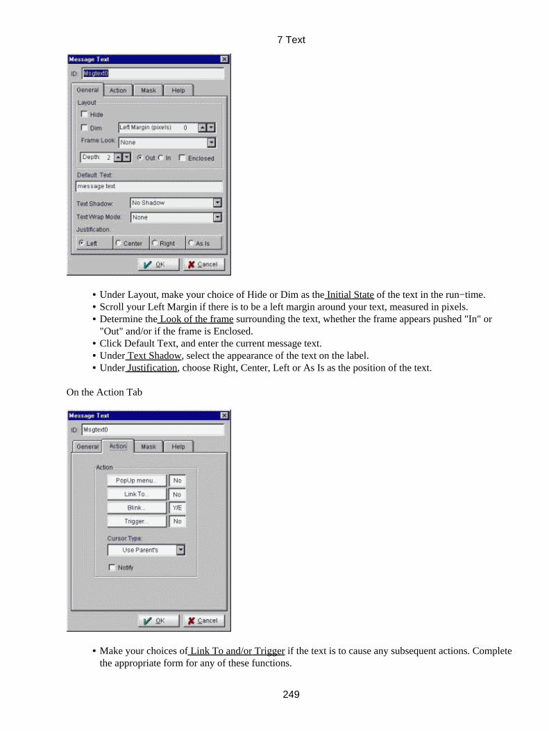
Under Layout, make your choice of Hide or Dim as the Initial State of the text in the run−time.• Scroll your Left Margin if there is to be a left margin around your text, measured in pixels.• Determine the Look of the frame surrounding the text, whether the frame appears pushed "In" or"Out" and/or if the frame is Enclosed.
•
Click Default Text, and enter the current message text.• Under Text Shadow, select the appearance of the text on the label.• Under Justification, choose Right, Center, Left or As Is as the position of the text.•
On the Action Tab
Make your choices of Link To and/or Trigger if the text is to cause any subsequent actions. Completethe appropriate form for any of these functions.
•
7 Text
249
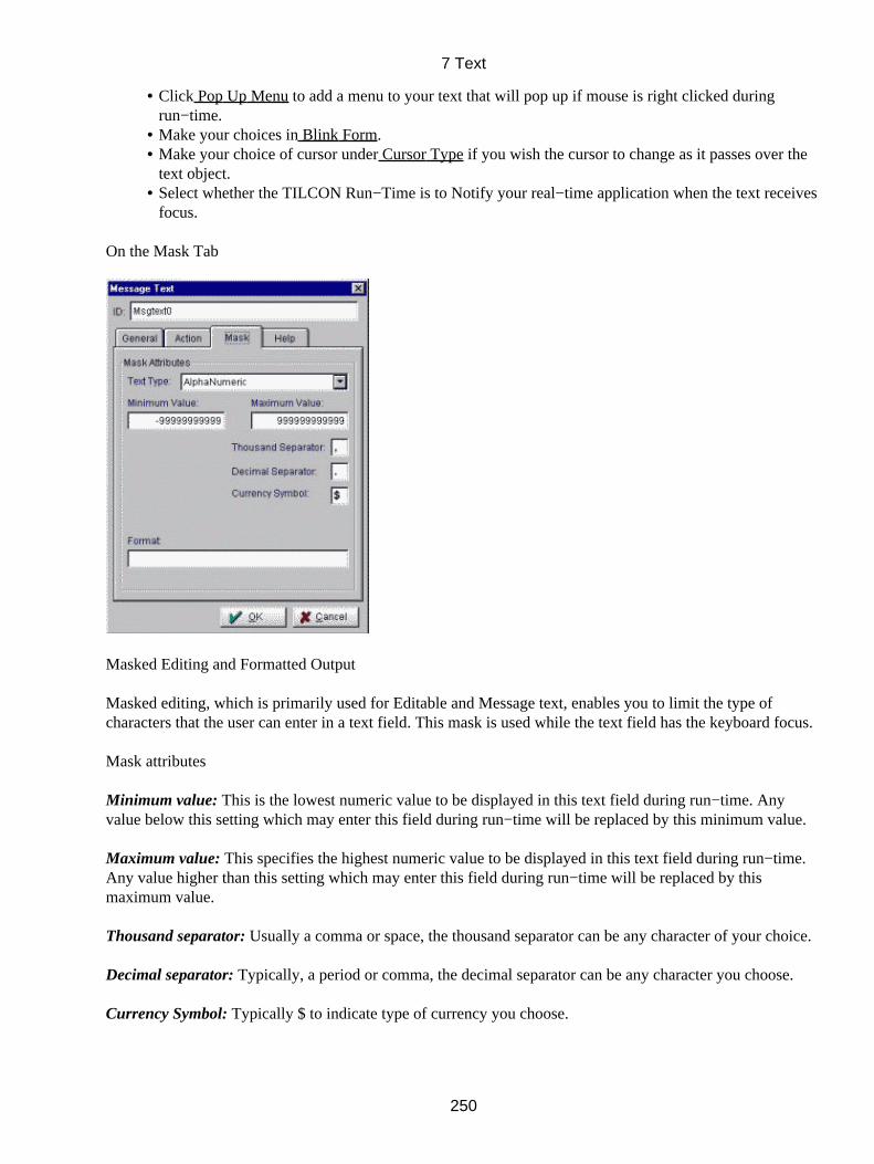
Click Pop Up Menu to add a menu to your text that will pop up if mouse is right clicked duringrun−time.
•
Make your choices in Blink Form.• Make your choice of cursor under Cursor Type if you wish the cursor to change as it passes over thetext object.
•
Select whether the TILCON Run−Time is to Notify your real−time application when the text receivesfocus.
•
On the Mask Tab
Masked Editing and Formatted Output
Masked editing, which is primarily used for Editable and Message text, enables you to limit the type ofcharacters that the user can enter in a text field. This mask is used while the text field has the keyboard focus.
Mask attributes
Minimum value: This is the lowest numeric value to be displayed in this text field during run−time. Anyvalue below this setting which may enter this field during run−time will be replaced by this minimum value.
Maximum value: This specifies the highest numeric value to be displayed in this text field during run−time.Any value higher than this setting which may enter this field during run−time will be replaced by thismaximum value.
Thousand separator: Usually a comma or space, the thousand separator can be any character of your choice.
Decimal separator: Typically, a period or comma, the decimal separator can be any character you choose.
Currency Symbol: Typically $ to indicate type of currency you choose.
7 Text
250

7.5.2 Mask
Mask characterCharacter user can enter 0 Digit # Digit + − space A A − Z 0 − 9 space a a − z 0 − 9 space L A − Z l a − z C a − z A − Z 0 − 9 space & Any printable character \ The next character in mask will appear as is, cannot be modified by the user other Appears as−is; cannot be changed by the user
Example : Mask in text field: M\ask l l 00 When the text field gets focus, it displays: Mask _ _ _ _ User can enter 2 letters and 2 digits: Mask a b 1 2
7.5.3 Format
When a text field receives a value − through user input or API command − the text can format that valuebefore displaying it.
If the text is Alphabetic or Alphanumeric, the format character is @.
Example 1: Format: none user enters: HELLO text field displays: HELLO
Example 2: Format: blah@blah user enters: HELLO text field displays: blahHELLOblah
Example 3: Format: blahblah user enters: HELLO text field displays: blahblah
If the text is Numeric, the format string is: pos_format; neg_format; 0_format
If 0_format (used to format text when its value = 0) is not specified, pos_format is used when thevalue = 0
•
If neg_format is not specified, pos_format is used for negative values.• If pos_format is not specified, text is displayed as−is.•
Format charactersMeaning $ Currency symbol % Express as percentage . Decimal separator # Significant digit, or omitted 0 Digit ? Significant digit or space "string" Displays whatever is inside the double quotation marks \ Displays the next character in the format , Use thousands separator e, E Use scientific notation
7 Text
251

Example: Format: "The value is " #,###.00;(#,###.00);−
User enters:Text field displays: 0 _ 1 The value is 1.00 1234.567 The value is 1,234.57 −3.1 (3.10)
To enter a mask or a format string
On the Text Masking tab,• Scroll Text Type to the type of text you wish to mask. Select either AlphaNumeric, Alphabetic,numeric, Date, or Time.
•
Depending on the text type, make your entries for Minimum Value, Maximum Value, Password Char,Prompt Char, Decimal Separator, Thousand Separator, or Currency Symbol.
•
Click Mask and enter the mask characters for the text field.• Click Format and enter the format string for the text field.•
On the Help Tab
Click Help Bubble and enter the help text for the bubble.• Under Bubble Position, click where you want the help bubble to be placed relative to the text.• Click OK to close the Form; your text is now selected ready for further editing.• Select font type, size, bold or italic in the speedbar or in Font Selection form.• Apply the nudge arrows to fine tune the position of the text, if appropriate.• The Text object can be further modified with the Depth/Placement/Sizing Options.•
7.6 Label Text
Label text is primarily used for headings on listboxes and other GUI objects. System and bitmap fonts aresuitable for this type of text. A Shortcut Key can also be added to give a keyboard focus to the label text.
7.6.1 To add Label text
Select Label Text Icon ; the Label Text Form opens.
In the Label Text Form,
7 Text
252
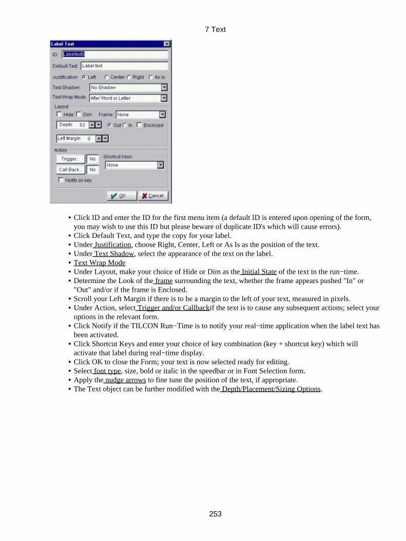
Click ID and enter the ID for the first menu item (a default ID is entered upon opening of the form,you may wish to use this ID but please beware of duplicate ID's which will cause errors).
•
Click Default Text, and type the copy for your label.• Under Justification, choose Right, Center, Left or As Is as the position of the text.• Under Text Shadow, select the appearance of the text on the label.• Text Wrap Mode• Under Layout, make your choice of Hide or Dim as the Initial State of the text in the run−time.• Determine the Look of the frame surrounding the text, whether the frame appears pushed "In" or"Out" and/or if the frame is Enclosed.
•
Scroll your Left Margin if there is to be a margin to the left of your text, measured in pixels.• Under Action, select Trigger and/or Callbackif the text is to cause any subsequent actions; select youroptions in the relevant form.
•
Click Notify if the TILCON Run−Time is to notify your real−time application when the label text hasbeen activated.
•
Click Shortcut Keys and enter your choice of key combination (key + shortcut key) which willactivate that label during real−time display.
•
Click OK to close the Form; your text is now selected ready for editing.• Select font type, size, bold or italic in the speedbar or in Font Selection form.• Apply the nudge arrows to fine tune the position of the text, if appropriate.• The Text object can be further modified with the Depth/Placement/Sizing Options.•
7 Text
253
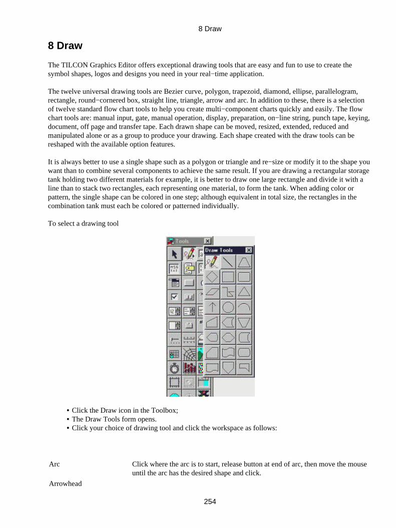
8 Draw
The TILCON Graphics Editor offers exceptional drawing tools that are easy and fun to use to create thesymbol shapes, logos and designs you need in your real−time application.
The twelve universal drawing tools are Bezier curve, polygon, trapezoid, diamond, ellipse, parallelogram,rectangle, round−cornered box, straight line, triangle, arrow and arc. In addition to these, there is a selectionof twelve standard flow chart tools to help you create multi−component charts quickly and easily. The flowchart tools are: manual input, gate, manual operation, display, preparation, on−line string, punch tape, keying,document, off page and transfer tape. Each drawn shape can be moved, resized, extended, reduced andmanipulated alone or as a group to produce your drawing. Each shape created with the draw tools can bereshaped with the available option features.
It is always better to use a single shape such as a polygon or triangle and re−size or modify it to the shape youwant than to combine several components to achieve the same result. If you are drawing a rectangular storagetank holding two different materials for example, it is better to draw one large rectangle and divide it with aline than to stack two rectangles, each representing one material, to form the tank. When adding color orpattern, the single shape can be colored in one step; although equivalent in total size, the rectangles in thecombination tank must each be colored or patterned individually.
To select a drawing tool
Click the Draw icon in the Toolbox;• The Draw Tools form opens.• Click your choice of drawing tool and click the workspace as follows:•
Arc Click where the arc is to start, release button at end of arc, then move the mouseuntil the arc has the desired shape and click.
Arrowhead
8 Draw
254
Click the end of any shape (end of line for example) where you want thearrowhead to appear.
Bezier curve Click and hold mouse button at starting point, trace the path you wish to drawand release button at end point.
Ellipse Click the screen and drag the cursor.
Flow/process chart shapesClick the screen and drag the cursor.
Parallelogram Click the screen and drag the cursor.
Polygon Click the screen and release button at starting point and at each vertex; "doubleclick" the last point to end the polygon drawing.
Rectangle Click the screen and drag the cursor.
Round cornered rectangleClick the screen and drag the cursor.
Straight line Click the screen and hold button at starting point of line, release at end point.
Trapezoid Click the screen and drag the cursor.
Triangle Click the screen and drag the cursor.
8.1 Draw Speedbar Icons
Once you have selected your drawing tool and placed it on the workspace, notice the Speedbar. New optionsare displayed to enhancing your drawings.
Following is a brief description of each of the icons, please bear in mind that not all these icons will be visibleall the time. The available choices depend on type of object and text that is being manipulated.
Rotate
Node edit
Arrow Option − To change arrow type or size.
Group
Fills selected object with a choice of pattern.
Offers line type and thickness selection.
Opens the Fountain Fill Color Form.
Opens the Uniform (Fill/Line) color form.
Brings selected object to the front of all other objects on the screen.
Places the selected object behind others on the screen.
The Redraw Option, gives the developer options for redrawing objects. This givessome control over memory usage and allows you to dictate where or when you wish aredraw to take place. The choices are Never, Object OnScreen, Object OffScreen,Area OnScreen or Area OffScreen.
Appears when an ellipse or circle is drawn. Checking this option makes an ellipse intoa circle.
8 Draw
255
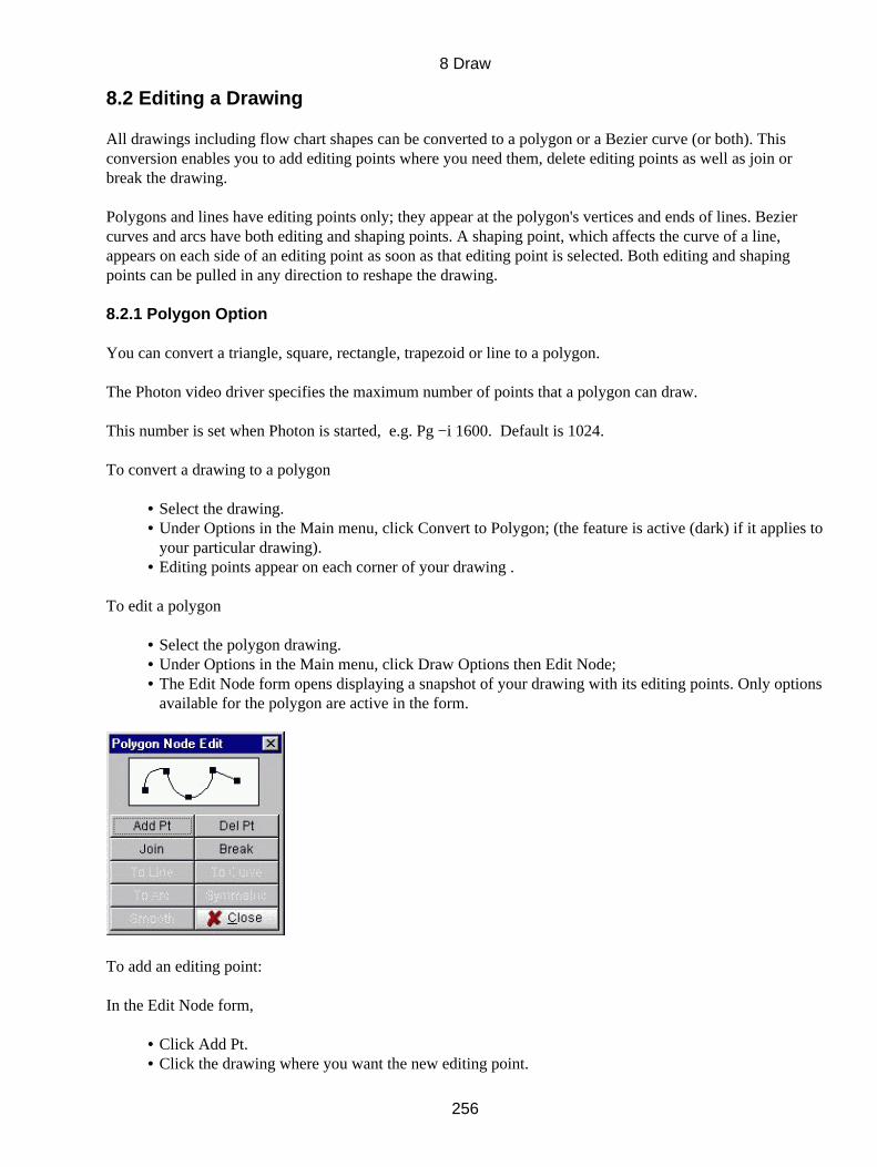
8.2 Editing a Drawing
All drawings including flow chart shapes can be converted to a polygon or a Bezier curve (or both). Thisconversion enables you to add editing points where you need them, delete editing points as well as join orbreak the drawing.
Polygons and lines have editing points only; they appear at the polygon's vertices and ends of lines. Beziercurves and arcs have both editing and shaping points. A shaping point, which affects the curve of a line,appears on each side of an editing point as soon as that editing point is selected. Both editing and shapingpoints can be pulled in any direction to reshape the drawing.
8.2.1 Polygon Option
You can convert a triangle, square, rectangle, trapezoid or line to a polygon.
The Photon video driver specifies the maximum number of points that a polygon can draw.
This number is set when Photon is started, e.g. Pg −i 1600. Default is 1024.
To convert a drawing to a polygon
Select the drawing.• Under Options in the Main menu, click Convert to Polygon; (the feature is active (dark) if it applies toyour particular drawing).
•
Editing points appear on each corner of your drawing .•
To edit a polygon
Select the polygon drawing.• Under Options in the Main menu, click Draw Options then Edit Node;• The Edit Node form opens displaying a snapshot of your drawing with its editing points. Only optionsavailable for the polygon are active in the form.
•
To add an editing point:
In the Edit Node form,
Click Add Pt.• Click the drawing where you want the new editing point.•
8 Draw
256
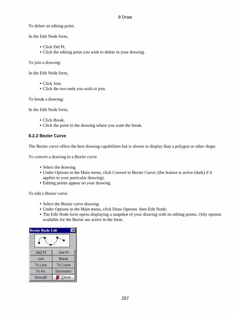
To delete an editing point:
In the Edit Node form,
Click Del Pt.• Click the editing point you wish to delete in your drawing.•
To join a drawing:
In the Edit Node form,
Click Join.• Click the two ends you wish to join.•
To break a drawing:
In the Edit Node form,
Click Break.• Click the point in the drawing where you want the break.•
8.2.2 Bezier Curve
The Bezier curve offers the best drawing capabilities but is slower to display than a polygon or other shape.
To convert a drawing to a Bezier curve
Select the drawing.• Under Options in the Main menu, click Convert to Bezier Curve; (the feature is active (dark) if itapplies to your particular drawing).
•
Editing points appear on your drawing.•
To edit a Bezier curve
Select the Bezier curve drawing.• Under Options in the Main menu, click Draw Options then Edit Node;• The Edit Node form opens displaying a snapshot of your drawing with its editing points. Only optionsavailable for the Bezier are active in the form.
•
8 Draw
257
To add an editing point:
In the Edit Node form,
Click Add Pt..• Click the drawing where you want the new editing point.•
To delete an editing point:
In the Edit Node form,
Click Del Pt.• Click the editing point you wish to delete in your drawing.•
To join a drawing:
In the Edit Node form,
Click Join.• Click the two ends you wish to join.•
To break a drawing:
In the Edit Node form,
Click Break.• Click the point in the drawing where you want the break.•
To straighten a Bezier curve into a line:
In the Edit Node form,
Click To Line.• Click the line segment you wish to straighten in your drawing.•
To change a Bezier into an arc:
In the Edit Node form,
Click To Arc.• Click the line segment you wish to change into an arc.•
To curve a straight line segment in a Bezier curve:
In the Edit Node form,
Click To Curve.• Click the line segment you wish to change to a curve; it now has shaping points.•
To make symmetrical changes in a Bezier curve:
8 Draw
258

In the Edit Node form,
Click Symetric.• Click an editing point; the two adjacent shaping points, one on each side of the editing point, appear.• Click one of the shaping points and move it; that movement is symmetrically reflected in the othershaping point.
•
To smooth a Bezier curve:
When making changes by moving editing points and shaping points, the result is often uneven or jagged. ThisBezier curve option allows you to smooth out the bumps.
In the Edit Node form,
Click Smooth in the Tool box.• Click a control point on the activating rectangle and pull to increase or reduce the height or width ofyour drawing without changing its relative symmetry.
•
8.3 Circle
A circle can be changed to an ellipse (without altering its appearance) so that it can be converted to a Bezierfor additional editing. An ellipse of course, can be converted to a circle with an accompanying change inappearance.
To change an ellipse into a circle
Select the ellipse.• Under Options in the Main menu, click Draw Options then Make circle;• Make a Circle remains checked.•
Or,
On the speedbar, check the checkbox next to circle.•
The elliptical drawing becomes a circle.
To change a circle into an ellipse
Select the circle.• Under Options in the Main menu, click Draw Options then Make Circle, to un−check Make Circle.•
Or,
On the speedbar, un−check the checkbox next to circle.•
Although its appearance does not change, the circle now functions as an ellipse.
8 Draw
259
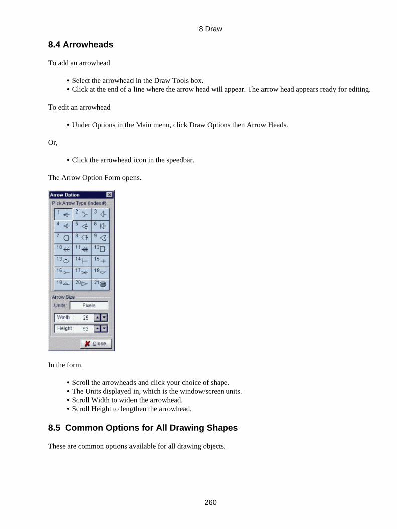
8.4 Arrowheads
To add an arrowhead
Select the arrowhead in the Draw Tools box.• Click at the end of a line where the arrow head will appear. The arrow head appears ready for editing. •
To edit an arrowhead
Under Options in the Main menu, click Draw Options then Arrow Heads.•
Or,
Click the arrowhead icon in the speedbar.•
The Arrow Option Form opens.
In the form.
Scroll the arrowheads and click your choice of shape.• The Units displayed in, which is the window/screen units.• Scroll Width to widen the arrowhead.• Scroll Height to lengthen the arrowhead.•
8.5 Common Options for All Drawing Shapes
These are common options available for all drawing objects.
8 Draw
260
8.5.1 Outline
You can delete (then add) the outline of a closed drawing.
To delete the outline of a closed drawing
Select the closed shape.• Click Attributes in the Main Menu.• Click Delete Outline; the outline disappears. Delete Outline remains checked.•
To restore the Outline
Click Delete Outline to un−check the selection and to restore the outline.•
8.5.2 Outline Behind
To move the outline of a closed drawing into the background
Select the closed shape.• Click Attributes in the Main Menu.• Click Outline Behind; the outline moves behind the object. Outline Behind remains checked.•
To restore the Outline to the front
Click Outline Behind to un−check the selection and restore the outline to the front.•
8.5.3 Color
There are two main color options available Uniform (Line/Fill) Color and Fountain Fill color. Both theseoptions are covered in detail in Chapter 4 (section 4.4). Here also you will find information on color modelsused and the Tilcon color palette.
8.5.4 To Front/To Back
To move an object to the front or to the back of all other objects on the screen
Select the object.• Click To Front or To Back in the Edit menu or the To Front or To Back icon in the Speedbar.•
8.5.5 Grouping
You can group objects within the same activating rectangle so that they can be manipulated as a single item.The TILCON Graphics Editor offers two types of groupings, one is temporary where you drag an area andthose items are grouped for as long as they are selected, the other is more permanent as you give the group anID and the group will remain as such until ungrouped.
8.5.6 Size/Placement
Size and Placement.
Nudge tools
8 Draw
261
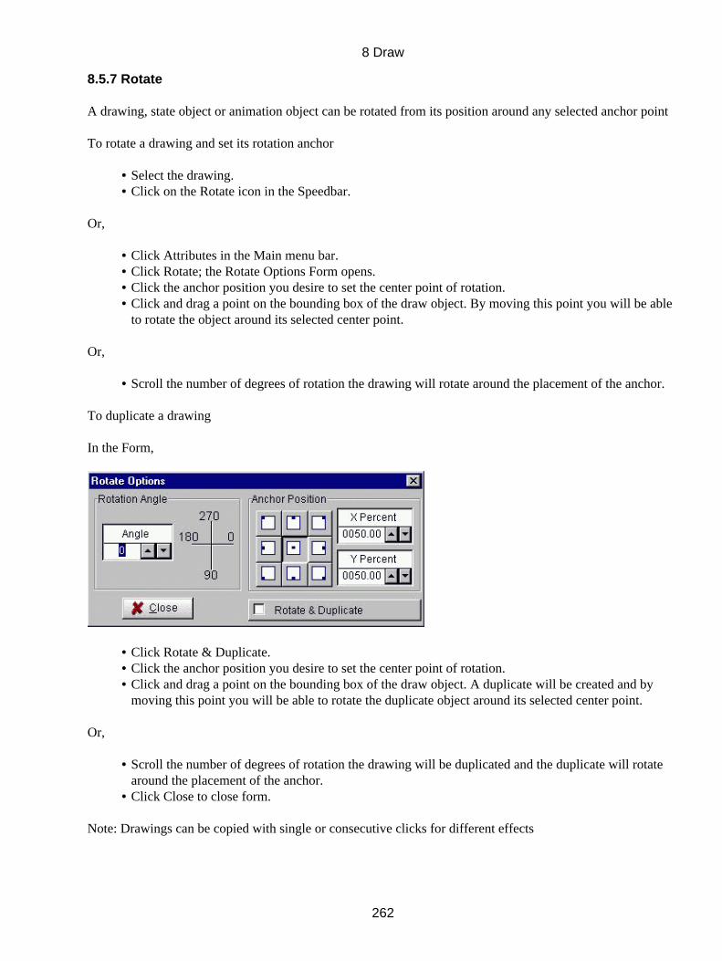
8.5.7 Rotate
A drawing, state object or animation object can be rotated from its position around any selected anchor point
To rotate a drawing and set its rotation anchor
Select the drawing.• Click on the Rotate icon in the Speedbar.•
Or,
Click Attributes in the Main menu bar.• Click Rotate; the Rotate Options Form opens.• Click the anchor position you desire to set the center point of rotation.• Click and drag a point on the bounding box of the draw object. By moving this point you will be ableto rotate the object around its selected center point.
•
Or,
Scroll the number of degrees of rotation the drawing will rotate around the placement of the anchor.•
To duplicate a drawing
In the Form,
Click Rotate & Duplicate.• Click the anchor position you desire to set the center point of rotation.• Click and drag a point on the bounding box of the draw object. A duplicate will be created and bymoving this point you will be able to rotate the duplicate object around its selected center point.
•
Or,
Scroll the number of degrees of rotation the drawing will be duplicated and the duplicate will rotatearound the placement of the anchor.
•
Click Close to close form.•
Note: Drawings can be copied with single or consecutive clicks for different effects
8 Draw
262

8.5.8 Patterns and Lines
There are many types of fill patterns available to enhance your drawings. There are also different thicknessand looks of lines available.
8.5.9 Fill Patterns
These are available for screen fills as well as object fill. You can select the different pattern types as well asthe types of lines that will be used in these patterns. You can also set the line spacing and unit of measurementthis spacing is in.
8.5.10 Line Styles
The line styles option allows you to change the look of your lines around objects. By making lines thicker orthinner you can drastically change the appearance of your objects or text.
8.6 Object ID
All objects have the capability of notifying the application of an event. These IDs are set in the Object IDForm which is available by selecting the object and right clicking on the object.
Select the object.• Right click the mouse, the Object ID form opens.•
In the form,
Click ID and enter the ID for the drawing object (a default ID is entered upon opening of the form,you may wish to use this ID but please beware of duplicate ID's which will cause errors).
•
8 Draw
263

Select choice of Do Not Find, Find On Line, or Find On Bounding Box. If Do Not Find is selectedthere is no further selections available. If Find On Line is selected the following selections will applyif the user clicks on the line. If Find On Bounding Box is selected then the following selections willapply if the user clicks on the bounding box around the draw object.
•
Click Help Bubble and enter the help text for the bubble.• Under Bubble Position, click where you want the help bubble to be placed relative to the Object.• Click PopUp Menu to add a menu to your draw object that will pop up if mouse is right clickedduring run−time.
•
Click Trigger if the selection of the object during real−time display is to initiate another action; selectyour options in the Trigger Form.
•
Click Callback if the selection of the Listbox during real−time display is to invoke a particularfunction within your application itself; choose your options in the Callback Form.
•
Check which Notify you wish enabled On Click, On Lose or On Gain focus.• Make your choice of cursor under Cursor Type if you wish the cursor to change as it passes over thedrawing object.
•
Click OK to accept your choices and close the form.•
8.7 Image standards used
CGM
(Computer Graphics Metafile) A standard format for interchanging graphics images. CGM stores imagesprimarily in vector graphics, but also provides a raster format. Earlier GDM and VDM formats have beenmerged into CGM. There are many non−standard varieties of CGM in use. We use ANSI Standard.
Icon
In a graphical user interface (GUI), a small, pictorial, on−screen representation of an object, such as adocument, program, folder or disk drive.
BMP file
(BitMaP file) Also known as a "bump" file, it is a Windows and OS/2 bitmapped graphics file format. It is theWindows native bitmap format, and every Windows application has access to the BMP software routines inWindows that support it. BMP files provide formats for 2, 16, 256 or 16 million colors (1−bit, 4−bit, 8−bitand 24−bit color). BMP files use the .BMP extensions.
JPEG
(Joint Photographic Experts Group) Pronounced "jay−peg." An ISO/ITU standard for compressing stillimages that is very popular due to its high compression capability. Using discrete cosine transform, it provideslossy compression (you lose some data from the original image) with ratios up to 100:1 and higher. It dependson the image, but ratios of 10:1 to 20:1 may provide little noticeable loss. The more the loss can be tolerated,the more the image can be compressed. Compression is achieved by dividing the picture into tiny pixelblocks, which are halved over and over until the ratio is achieved. JPEG is implemented in software andhardware, with the latter providing sufficient speed for realtime, on−the−fly compression.
TSY
Tilcon Symbol creation of which is covered in detail in Chapter 9, is a vector graphic format created byTILCON and used within our editor and runtime.
8 Draw
264

When using imported or drawn graphics be careful of CPU usage and redraw time which will be affecteddepending on how the graphics are used. To decrease CPU usage and speed up the display use the backgroundoption in the window attributes form. This draws the graphic as one single object, thus drawing will be fasterand use less CPU time. .tsy files and .cgm files may have many layers of detail and re−drawing these slowsdown the display.
8 Draw
265
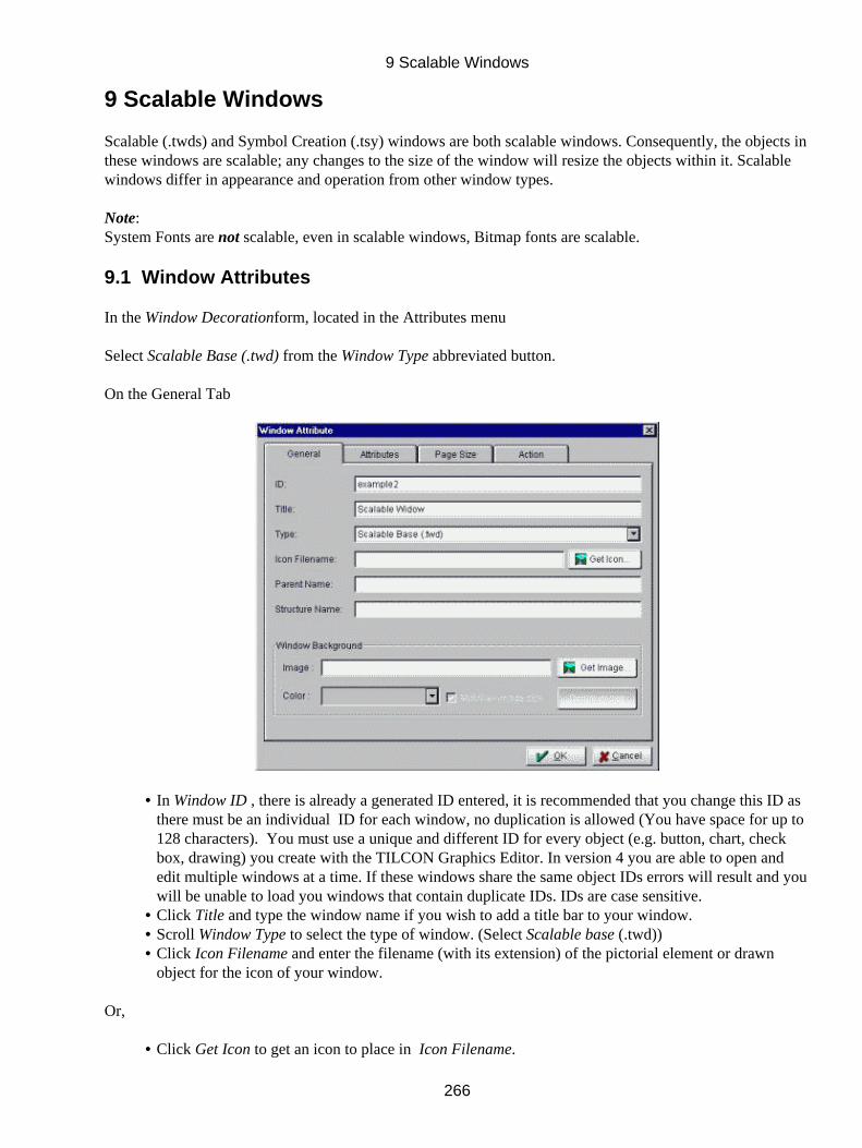
9 Scalable Windows
Scalable (.twds) and Symbol Creation (.tsy) windows are both scalable windows. Consequently, the objects inthese windows are scalable; any changes to the size of the window will resize the objects within it. Scalablewindows differ in appearance and operation from other window types.
Note:System Fonts are not scalable, even in scalable windows, Bitmap fonts are scalable.
9.1 Window Attributes
In the Window Decorationform, located in the Attributes menu
Select Scalable Base (.twd) from the Window Type abbreviated button.
On the General Tab
In Window ID , there is already a generated ID entered, it is recommended that you change this ID asthere must be an individual ID for each window, no duplication is allowed (You have space for up to128 characters). You must use a unique and different ID for every object (e.g. button, chart, checkbox, drawing) you create with the TILCON Graphics Editor. In version 4 you are able to open andedit multiple windows at a time. If these windows share the same object IDs errors will result and youwill be unable to load you windows that contain duplicate IDs. IDs are case sensitive.
•
Click Title and type the window name if you wish to add a title bar to your window.• Scroll Window Type to select the type of window. (Select Scalable base (.twd))• Click Icon Filename and enter the filename (with its extension) of the pictorial element or drawnobject for the icon of your window.
•
Or,
Click Get Icon to get an icon to place in Icon Filename.•
9 Scalable Windows
266
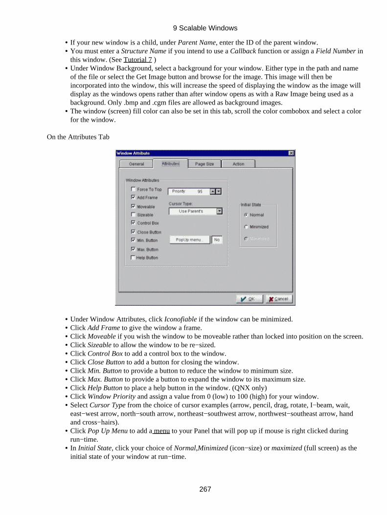
If your new window is a child, under Parent Name, enter the ID of the parent window.• You must enter a Structure Name if you intend to use a Callback function or assign a Field Number inthis window. (See Tutorial 7 )
•
Under Window Background, select a background for your window. Either type in the path and nameof the file or select the Get Image button and browse for the image. This image will then beincorporated into the window, this will increase the speed of displaying the window as the image willdisplay as the windows opens rather than after window opens as with a Raw Image being used as abackground. Only .bmp and .cgm files are allowed as background images.
•
The window (screen) fill color can also be set in this tab, scroll the color combobox and select a colorfor the window.
•
On the Attributes Tab
Under Window Attributes, click Iconofiable if the window can be minimized.• Click Add Frame to give the window a frame.• Click Moveable if you wish the window to be moveable rather than locked into position on the screen.• Click Sizeable to allow the window to be re−sized.• Click Control Box to add a control box to the window.• Click Close Button to add a button for closing the window.• Click Min. Button to provide a button to reduce the window to minimum size.• Click Max. Button to provide a button to expand the window to its maximum size.• Click Help Button to place a help button in the window. (QNX only)• Click Window Priority and assign a value from 0 (low) to 100 (high) for your window.• Select Cursor Type from the choice of cursor examples (arrow, pencil, drag, rotate, I−beam, wait,east−west arrow, north−south arrow, northeast−southwest arrow, northwest−southeast arrow, handand cross−hairs).
•
Click Pop Up Menu to add a menu to your Panel that will pop up if mouse is right clicked duringrun−time.
•
In Initial State, click your choice of Normal,Minimized (icon−size) or maximized (full screen) as theinitial state of your window at run−time.
•
9 Scalable Windows
267
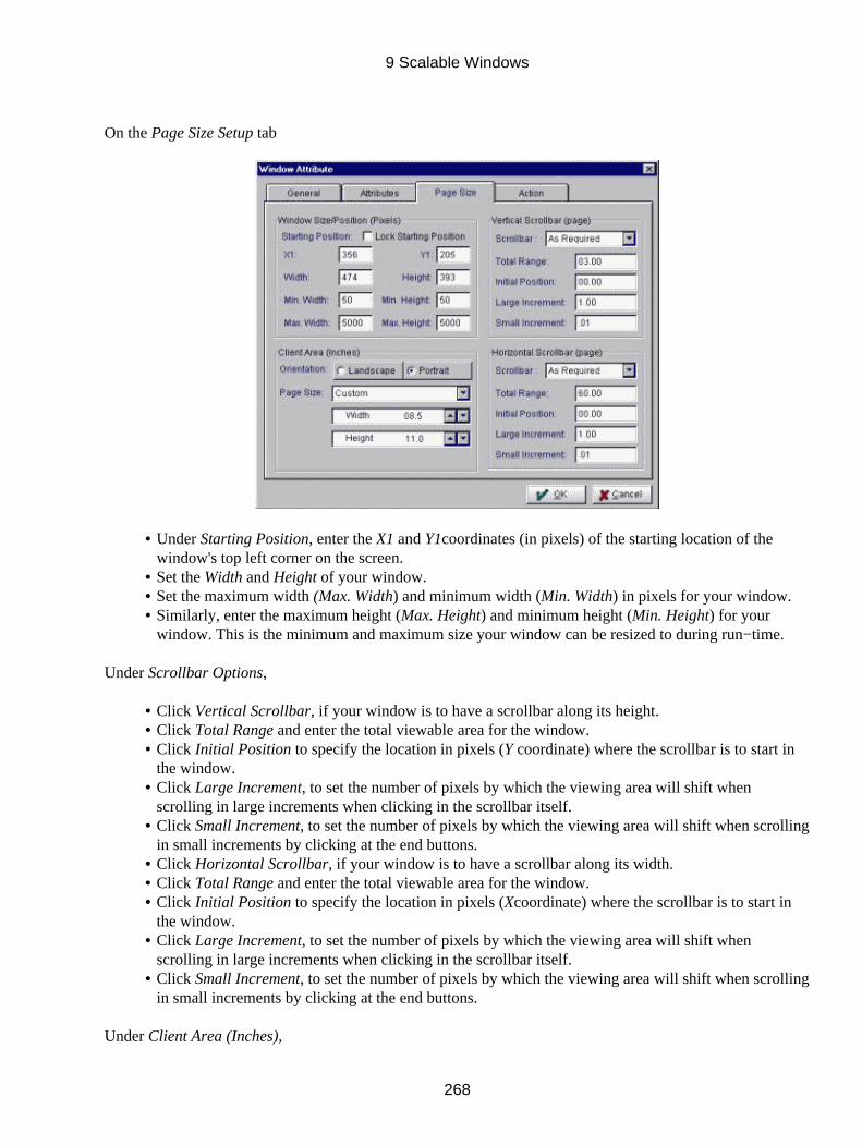
On the Page Size Setup tab
Under Starting Position, enter the X1 and Y1coordinates (in pixels) of the starting location of thewindow's top left corner on the screen.
•
Set the Width and Height of your window.• Set the maximum width (Max. Width) and minimum width (Min. Width) in pixels for your window.• Similarly, enter the maximum height (Max. Height) and minimum height (Min. Height) for yourwindow. This is the minimum and maximum size your window can be resized to during run−time.
•
Under Scrollbar Options,
Click Vertical Scrollbar, if your window is to have a scrollbar along its height.• Click Total Range and enter the total viewable area for the window.• Click Initial Position to specify the location in pixels (Y coordinate) where the scrollbar is to start inthe window.
•
Click Large Increment, to set the number of pixels by which the viewing area will shift whenscrolling in large increments when clicking in the scrollbar itself.
•
Click Small Increment, to set the number of pixels by which the viewing area will shift when scrollingin small increments by clicking at the end buttons.
•
Click Horizontal Scrollbar, if your window is to have a scrollbar along its width.• Click Total Range and enter the total viewable area for the window.• Click Initial Position to specify the location in pixels (Xcoordinate) where the scrollbar is to start inthe window.
•
Click Large Increment, to set the number of pixels by which the viewing area will shift whenscrolling in large increments when clicking in the scrollbar itself.
•
Click Small Increment, to set the number of pixels by which the viewing area will shift when scrollingin small increments by clicking at the end buttons.
•
Under Client Area (Inches),
9 Scalable Windows
268

(Note: The unit of measurement indicated in brackets beside the Client Area is established in theScreen Units Form.
•
Select Portraitor Landscape Orientation for your window's appearance.• Select your Page Size from the abbreviated button. Select Custom to set your own size of client area.• Scroll Width and Height to select the Custom settings.•
On the Window Action tab
This feature enables you to define how your window will interact with the TILCON Run−Time. It instructsthe Run−Time to notify your application when various actions occur in your window. It also gives the list ofkeyboard hits that are recognized and transmitted to your real−time application.
To define window actions
Disable All API Commands
If Window Is Not Active − When the window is not active, the Run−Time will not accept API commands fromyour application which update any objects within that window. The window itself can still be moved, resized,closed, etc. by API commands.
To All Other Windows If Active − Or, you can disable API commands to other windows, preventing objects inthose windows from being updated while this window is active.
Notify
You can request the TILCON Run−Time to notify your application when various actions occur in yourwindow. The application is notified:
If Active: when the window you are currently editing becomes active. (Although several windows can be
9 Scalable Windows
269
open simultaneously during real−time display, only one at a time is active.)
If Minimized: when the window is reduced to icon size.
If Maximized: when the window is enlarged to full−screen size.
If Restored: when the window returns to normal size from minimum or maximum size.
If Sized: when the window is resized.
If Moved: when the window is moved to another location.
On Mouse Button Down: when the mouse button is pressed down within the window.
On Mouse Button Up: when the mouse button is released within the window.
Mouse Movement When Button Down: when the mouse is cruising the window with button down.
Mouse Movement When Button Up: when the mouse is cruising the window with button up.
Initial Focus to Tab Index
This feature enables you to set the Tab field, which will have the keyboard focus when the window is opened.You can assign a Tab field to editable text and GUI objects in your window. Tab fields are numbered and anindex of numbers is maintained.
Click Exit Key and scroll for your choice of key combination as shortcut to close (hide, not delete) thewindow.
•
Help Key•
Transmit Keys
Under Transmit Keys, click your choice of keys and key combinations or make your selection fromthe List box. When this window is active, keystrokes from the selected keys will be transmitted by theRun−Time to the real−time application. (Holding the CTRL key while clicking in the List box willtoggle individual items. By dragging the mouse after clicking on an item you can also select multipletransmit keys.)
•
Click OK to close the Window Attributes form.•
9.2 The Workspace
The gray area, bordered by white, is the space available for your scalable objects or symbol. Any part of yourobject that extends into the white area will not be visible when the window is used.
9 Scalable Windows
270

You can use the window's corners and edges to resize the window and center it. The size of the scalablewindow isn't important because it will be scaled when used. The size of the object or symbol within the grayarea (i.e. the size of the window contents with respect to the gray area) will be preserved.
9.3 Symbol Creation
The Symbol Creation window type is a scalable window and so has the same available options. Rememberthat the Symbol Creation form functions as a Scalable Base window but it cannot contain objects with an IDor be displayed in a real−time program. These generated symbols are used by objects within windows. Asymbol can be used to create a custom button; it can become a custom body of a meter; it can form ananimation object; or it can be used by 'state objects'.
9.3.1 To create a symbol
Select Window Decoration in the Attributes in the Main menu; the Window Decoration Option Formopens.
•
In the Form,
Click the Window Type abbreviated button.• Select Create Symbol (*.tsy).• Click OK to close the Form; a blank window opens.•
9 Scalable Windows
271
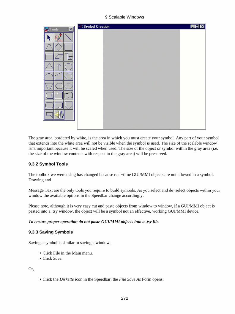
The gray area, bordered by white, is the area in which you must create your symbol. Any part of your symbolthat extends into the white area will not be visible when the symbol is used. The size of the scalable windowisn't important because it will be scaled when used. The size of the object or symbol within the gray area (i.e.the size of the window contents with respect to the gray area) will be preserved.
9.3.2 Symbol Tools
The toolbox we were using has changed because real−time GUI/MMI objects are not allowed in a symbol.Drawing and
Message Text are the only tools you require to build symbols. As you select and de−select objects within yourwindow the available options in the Speedbar change accordingly.
Please note, although it is very easy cut and paste objects from window to window, if a GUI/MMI object ispasted into a .tsy window, the object will be a symbol not an effective, working GUI/MMI device.
To ensure proper operation do not paste GUI/MMI objects into a .tsy file.
9.3.3 Saving Symbols
Saving a symbol is similar to saving a window.
Click File in the Main menu.• Click Save.•
Or,
Click the Diskette icon in the Speedbar, the File Save As Form opens;•
9 Scalable Windows
272
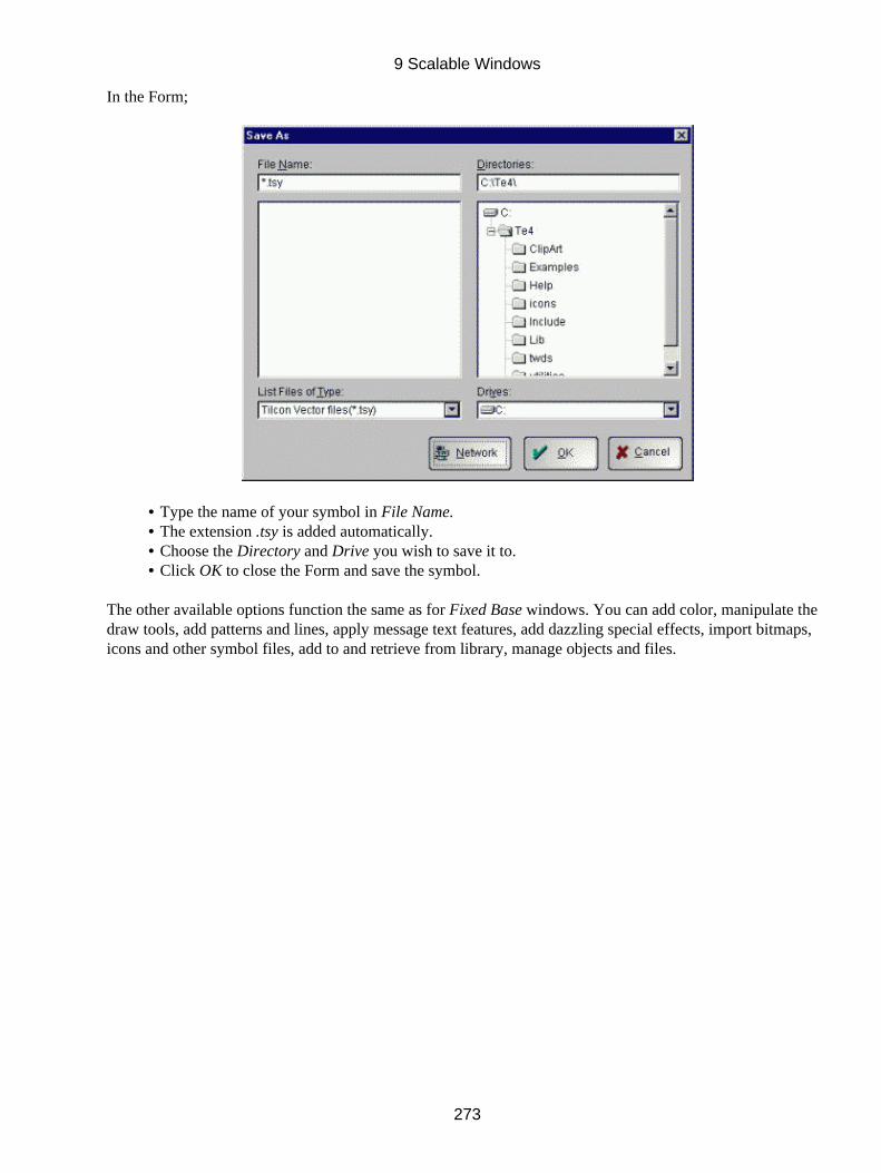
In the Form;
Type the name of your symbol in File Name.• The extension .tsy is added automatically.• Choose the Directory and Drive you wish to save it to.• Click OK to close the Form and save the symbol.•
The other available options function the same as for Fixed Base windows. You can add color, manipulate thedraw tools, add patterns and lines, apply message text features, add dazzling special effects, import bitmaps,icons and other symbol files, add to and retrieve from library, manage objects and files.
9 Scalable Windows
273


