Embed Size (px)
Citation preview
User Experience
in Microsoft Dynamics CRM 2013 and Microsoft
Dynamics CRM Online Fall ’13
COMPANY: Microsoft Corporation
AUTHOR: Ted Cyrek
RELEASED: October 2013
Copyright
This document is provided "as-is". Information and views expressed in this document, including URL and other Internet Web site
references, may change without notice.
Some examples depicted herein are provided for illustration only and are fictitious. No real association or connection is intended or
should be inferred.
This document does not provide you with any legal rights to any intellectual property in any Microsoft product. You may copy and use
this document for your internal, reference purposes.
© 2013 Microsoft Corporation. All rights reserved.
Microsoft, Active Directory, Microsoft Dynamics, Microsoft Dynamics logo, Windows, and Windows Server are trademarks of the
Microsoft group of companies.
All other trademarks are property of their respective owners.
Feedback
To send comments or suggestions about this document, please click this link and type your feedback in the message
body.
Important: The subject-line information is used to route your feedback. If you remove or modify the subject line, we
may be unable to process your feedback.
Table of Contents
The CRM User Experience .................................................................................................. 1
Quotes from our customers ........................................................................................................................ 2
The Reimagined User Experience........................................................................................ 4
Commands ................................................................................................................................................ 7
Quick Create .............................................................................................................................................. 8
Form Structure ........................................................................................................................................... 9
Form Scaling ............................................................................................................................................ 10
Click and Screen efficiency ...................................................................................................................... 14
Time to Complete Tasks ........................................................................................................................... 15
System Usability Scale ...................................................................................................... 16
1
Page left intentionally blank.
1
The CRM User Experience The #1 obstacle to the success of CRM solutions is User Adoption.
Whether or not we design for an emotional reaction, we are going to get one. As a design team,
we intentionally design software to create positive emotions, even love, to our customers. – CRM
User Experience Mission
Adoption is a challenge that faces all enterprise business software installations. The continued
consumerization of the computer and software market leads to higher expectations as new generations
of workers enter the workforce and existing employees begin to realize the opportunities presented by
software. Taking advantage of these trends, Microsoft Dynamics CRM is building software that business
people love to use and help them love their jobs. It’s time for us to stop talking and thinking about the
technology and start focusing on the emotion and effects our work has on the end users of Microsoft
Dynamics CRM.
What does User Experience mean to an Information Technology Professional?
Adoption, happy customers, happy executives
What does User Experience mean to a Business Decision Maker?
Employee retention, increased sales
What does User Experience mean to an end user?
Life balance, loving their work and success
The following paper takes a look at the User Experience that we have created for Microsoft Dynamics
CRM 2013 and Microsoft Dynamics CRM Online Fall ‘13 from both a reasoned perspective (Why did we
make the design decision that we did?) and a data perspective (What were the overall numerical and
quantifiable gains observed with the new experience?).
2
Quotes from our customers
CRM 2013
“The product is modern looking and each screen is not overcrowded. It does all seem to flow in the
sales process from step to step and I like the sale process steps at the top because it reminds me what I
need to cover.”
-Competitor Client User: Telecommunications Sales
“The product is clean looking in that it has just the information I need when I need it. It does not
overwhelm me. Everything I need is laid out and easily available on each page.”
- Competitor Client User: Telecommunications Sales
CRM for phones
“I really liked the way you laid out the smartphone application using the menu structure compared to
Salesforce which uses a bunch of 16 tiles. You have really thought about what a mobile user needs
and selected the top tasks rather than like Salesforce which throws everything at us.”
- Competitor Mobile/Client User: Dental Equipment Sales
CRM for tablets
“This is pretty self-explanatory and easy. The information is organized and you can really dive into the
information if you need too.”
- Competitor Mobile/Client User: Computer Hardware Sales
“Salesforce took me a couple of weeks to learn and I think I could learn this much quicker.”
- Competitor Mobile/Client User: Computer Sales
“User interface is very pretty. Fresh a new way of looking business. The screens are clean.”
- Competitor /Seibel Mobile/Client User: Technology Sales
”The application is clean. That is one of my pet peeves with Salesforce there is a lot of links and ways to
open stuff that is not relevant to what I am doing. This is clean and simple and easy to use. It’s very
intuitive and straightforward. All the information is there and it is easy to find what you are looking
for.”
- Competitor Client User: Automotive Sales
3
User Experience Principles
While designing and building the newest version CRM 2013 and CRM Online Fall ’13, the Engineering
and Design teams focused the design on these principles:
Simple
Focus on the essential tasks with a clear, consistent purpose that matches user intention
Usable
Measure usability iteratively, incorporate feedback into designs
Modern
Apply principles of modern user interface design inspired by Windows 8 to create delightful, engaging,
and process-centric experiences
Fast
Design and deliver great perceived productivity and performance
4
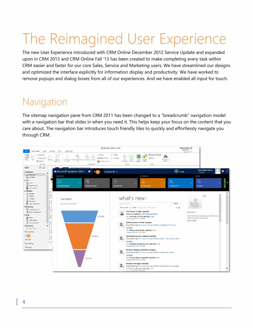
The Reimagined User Experience The new User Experience introduced with CRM Online December 2012 Service Update and expanded
upon in CRM 2013 and CRM Online Fall ‘13 has been created to make completing every task within
CRM easier and faster for our core Sales, Service and Marketing users. We have streamlined our designs
and optimized the interface explicitly for information display and productivity. We have worked to
remove popups and dialog boxes from all of our experiences. And we have enabled all input for touch.
Navigation
The sitemap navigation pane from CRM 2011 has been changed to a “breadcrumb” navigation model
with a navigation bar that slides in when you need it. This helps keep your focus on the content that you
care about. The navigation bar introduces touch friendly tiles to quickly and effortlessly navigate you
through CRM.
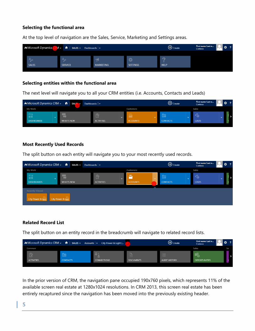
5
Selecting the functional area
At the top level of navigation are the Sales, Service, Marketing and Settings areas.
Selecting entities within the functional area
The next level will navigate you to all your CRM entities (i.e. Accounts, Contacts and Leads)
Most Recently Used Records
The split button on each entity will navigate you to your most recently used records.
Related Record List
The split button on an entity record in the breadcrumb will navigate to related record lists.
In the prior version of CRM, the navigation pane occupied 190x760 pixels, which represents 11% of the
available screen real estate at 1280x1024 resolutions. In CRM 2013, this screen real estate has been
entirely recaptured since the navigation has been moved into the previously existing header.
6
Though hidden, when using a mouse, the number of clicks for selecting the first 7 items has not been
increased from the original navigation design, it still only takes a single click to get to these most
common end user targets and these are customizable.
We have increased the touchable surface by 83%, making navigation while using modern devices much
easier.
7
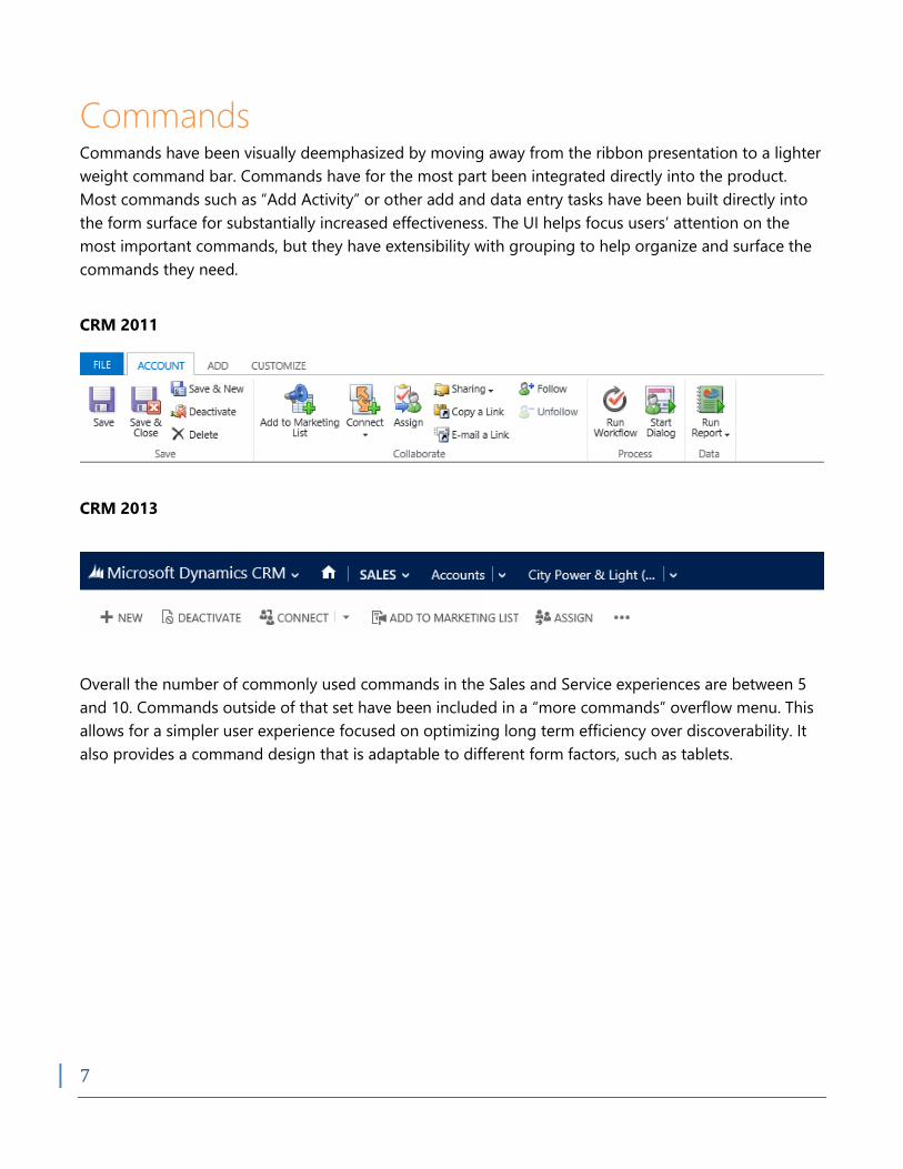
Commands Commands have been visually deemphasized by moving away from the ribbon presentation to a lighter
weight command bar. Commands have for the most part been integrated directly into the product.
Most commands such as “Add Activity” or other add and data entry tasks have been built directly into
the form surface for substantially increased effectiveness. The UI helps focus users’ attention on the
most important commands, but they have extensibility with grouping to help organize and surface the
commands they need.
CRM 2011
CRM 2013
Overall the number of commonly used commands in the Sales and Service experiences are between 5
and 10. Commands outside of that set have been included in a “more commands” overflow menu. This
allows for a simpler user experience focused on optimizing long term efficiency over discoverability. It
also provides a command design that is adaptable to different form factors, such as tablets.
8
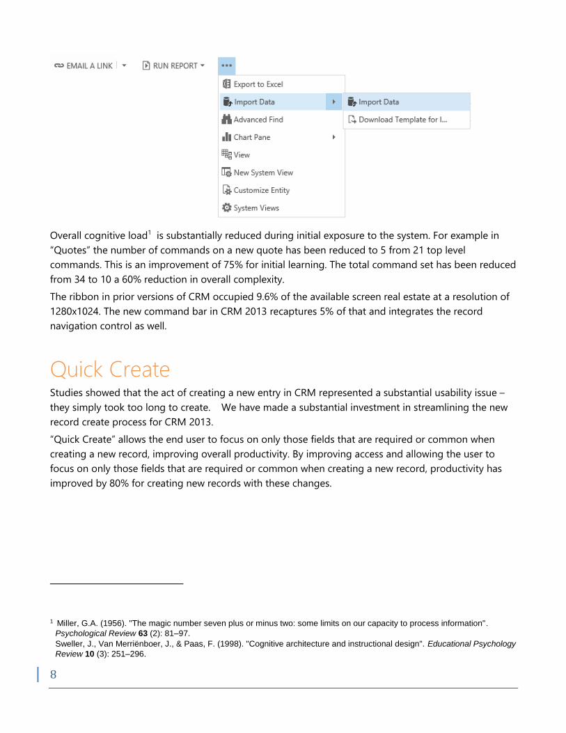
Overall cognitive load1 is substantially reduced during initial exposure to the system. For example in
“Quotes” the number of commands on a new quote has been reduced to 5 from 21 top level
commands. This is an improvement of 75% for initial learning. The total command set has been reduced
from 34 to 10 a 60% reduction in overall complexity.
The ribbon in prior versions of CRM occupied 9.6% of the available screen real estate at a resolution of
1280x1024. The new command bar in CRM 2013 recaptures 5% of that and integrates the record
navigation control as well.
Quick Create Studies showed that the act of creating a new entry in CRM represented a substantial usability issue –
they simply took too long to create. We have made a substantial investment in streamlining the new
record create process for CRM 2013.
“Quick Create” allows the end user to focus on only those fields that are required or common when
creating a new record, improving overall productivity. By improving access and allowing the user to
focus on only those fields that are required or common when creating a new record, productivity has
improved by 80% for creating new records with these changes.
1 Miller, G.A. (1956). "The magic number seven plus or minus two: some limits on our capacity to process information".
Psychological Review 63 (2): 81–97.
Sweller, J., Van Merriënboer, J., & Paas, F. (1998). "Cognitive architecture and instructional design". Educational Psychology
Review 10 (3): 251–296.
9
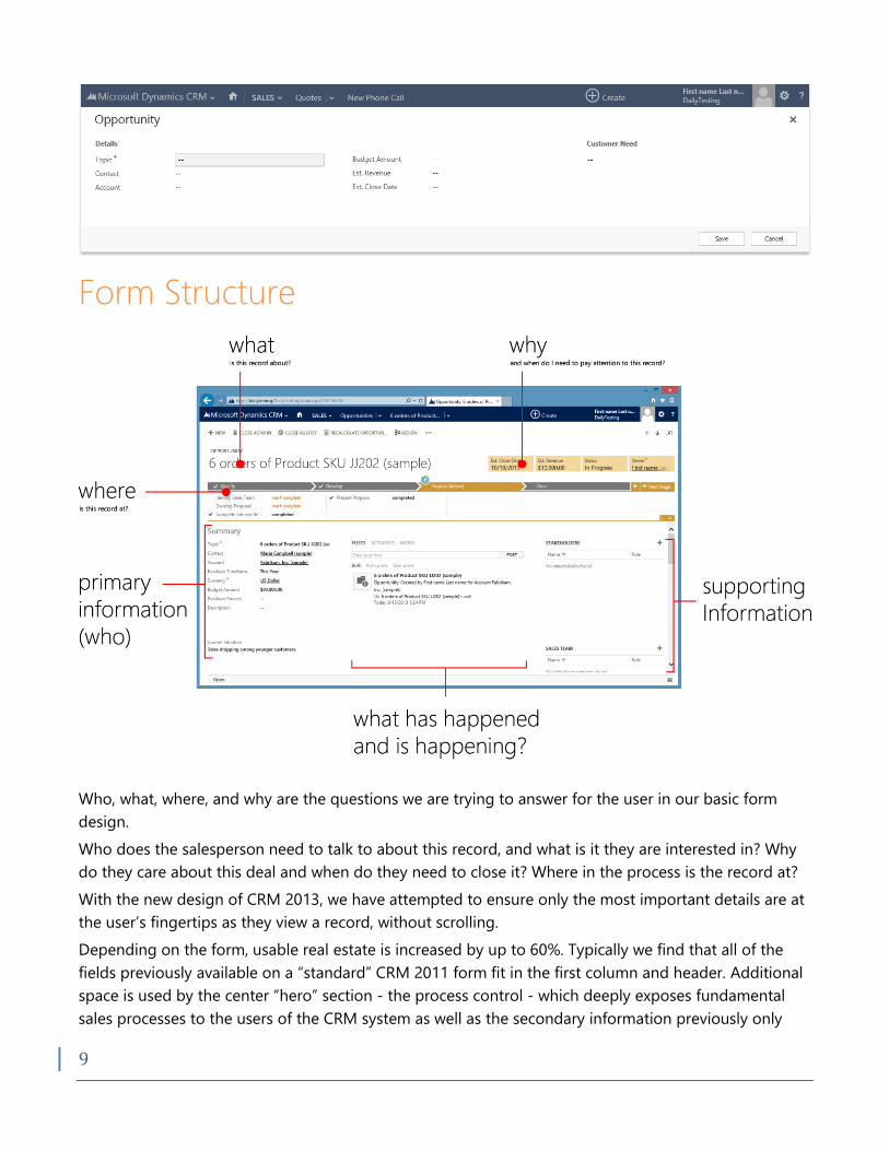
Form Structure
Who, what, where, and why are the questions we are trying to answer for the user in our basic form
design.
Who does the salesperson need to talk to about this record, and what is it they are interested in? Why
do they care about this deal and when do they need to close it? Where in the process is the record at?
With the new design of CRM 2013, we have attempted to ensure only the most important details are at
the user’s fingertips as they view a record, without scrolling.
Depending on the form, usable real estate is increased by up to 60%. Typically we find that all of the
fields previously available on a “standard” CRM 2011 form fit in the first column and header. Additional
space is used by the center “hero” section - the process control - which deeply exposes fundamental
sales processes to the users of the CRM system as well as the secondary information previously only
10
available below the fold as sub-grids, or on secondary pages. This provides core experiences for some
of the most important activities around an entity, including, for example the products grid on a quote
object.
Overall the streamlined user interface provides for significantly higher data density with a reduction in
apparent visual complexity. This is achieved through a process called chunking2 where information is
combined into small groups of similar elements in close proximity.
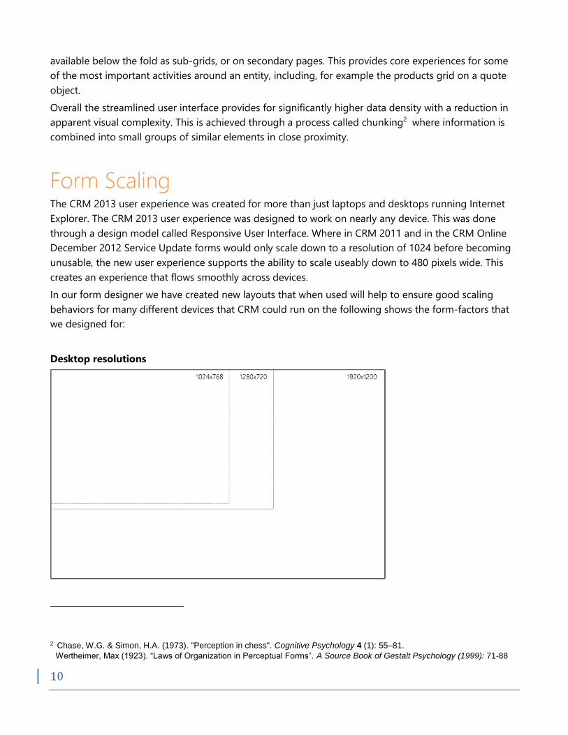
Form Scaling The CRM 2013 user experience was created for more than just laptops and desktops running Internet
Explorer. The CRM 2013 user experience was designed to work on nearly any device. This was done
through a design model called Responsive User Interface. Where in CRM 2011 and in the CRM Online
December 2012 Service Update forms would only scale down to a resolution of 1024 before becoming
unusable, the new user experience supports the ability to scale useably down to 480 pixels wide. This
creates an experience that flows smoothly across devices.
In our form designer we have created new layouts that when used will help to ensure good scaling
behaviors for many different devices that CRM could run on the following shows the form-factors that
we designed for:
Desktop resolutions
2 Chase, W.G. & Simon, H.A. (1973). "Perception in chess". Cognitive Psychology 4 (1): 55–81.
Wertheimer, Max (1923). “Laws of Organization in Perceptual Forms”. A Source Book of Gestalt Psychology (1999): 71-88
11
Tablet resolutions
Phone resolutions
12
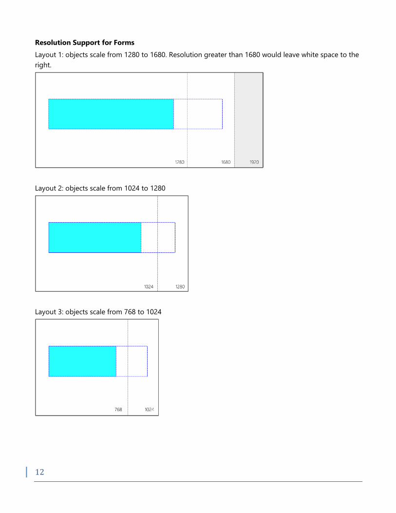
Resolution Support for Forms
Layout 1: objects scale from 1280 to 1680. Resolution greater than 1680 would leave white space to the
right.
Layout 2: objects scale from 1024 to 1280
Layout 3: objects scale from 768 to 1024
13
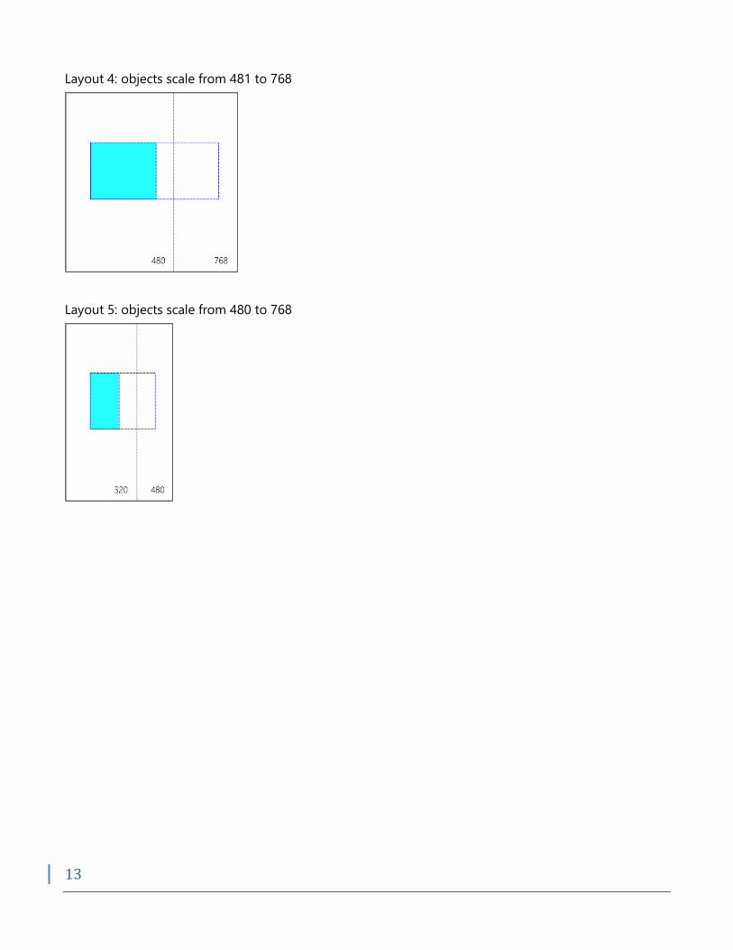
Layout 4: objects scale from 481 to 768
Layout 5: objects scale from 480 to 768
14
Usability and Productivity
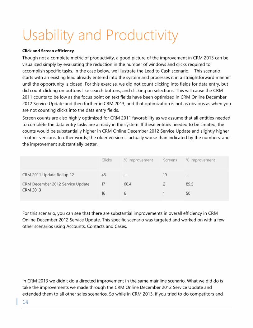
Click and Screen efficiency
Though not a complete metric of productivity, a good picture of the improvement in CRM 2013 can be
visualized simply by evaluating the reduction in the number of windows and clicks required to
accomplish specific tasks. In the case below, we illustrate the Lead to Cash scenario. This scenario
starts with an existing lead already entered into the system and processes it in a straightforward manner
until the opportunity is closed. For this exercise, we did not count clicking into fields for data entry, but
did count clicking on buttons like search buttons, and clicking on selections. This will cause the CRM
2011 counts to be low as the focus point on text fields have been optimized in CRM Online December
2012 Service Update and then further in CRM 2013, and that optimization is not as obvious as when you
are not counting clicks into the data entry fields.
Screen counts are also highly optimized for CRM 2011 favorability as we assume that all entities needed
to complete the data entry tasks are already in the system. If these entities needed to be created, the
counts would be substantially higher in CRM Online December 2012 Service Update and slightly higher
in other versions. In other words, the older version is actually worse than indicated by the numbers, and
the improvement substantially better.
Clicks % Improvement Screens % Improvement
CRM 2011 Update Rollup 12
CRM December 2012 Service Update
CRM 2013
43
17
16
--
60.4
6
19
2
1
--
89.5
50
For this scenario, you can see that there are substantial improvements in overall efficiency in CRM
Online December 2012 Service Update. This specific scenario was targeted and worked on with a few
other scenarios using Accounts, Contacts and Cases.
In CRM 2013 we didn’t do a directed improvement in the same mainline scenario. What we did do is
take the improvements we made through the CRM Online December 2012 Service Update and
extended them to all other sales scenarios. So while in CRM 2013, if you tried to do competitors and
15
quotes work, for example, you would end up in the old fashioned “pop-up” and “click driven” user
experience where the experience was terrible. Those experiences received dramatic overhauls in CRM
2013, achieving an overall improvement between 60-90% for data entry efficiency in all updated forms
when calculated by screens and click counts.
Improved/Converted Entitles Improvement
CRM December 2012 Service Update
CRM 2013
5
28
--
5.6
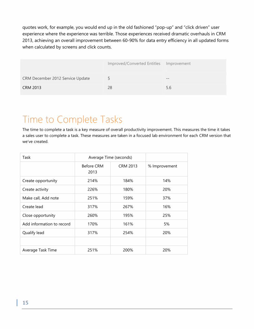
Time to Complete Tasks The time to complete a task is a key measure of overall productivity improvement. This measures the time it takes
a sales user to complete a task. These measures are taken in a focused lab environment for each CRM version that
we’ve created.
Task Average Time (seconds)
Before CRM
2013
CRM 2013 % Improvement
Create opportunity 214% 184% 14%
Create activity 226% 180% 20%
Make call, Add note 251% 159% 37%
Create lead 317% 267% 16%
Close opportunity 260% 195% 25%
Add information to record 170% 161% 5%
Qualify lead 317% 254% 20%
Average Task Time 251% 200% 20%
16
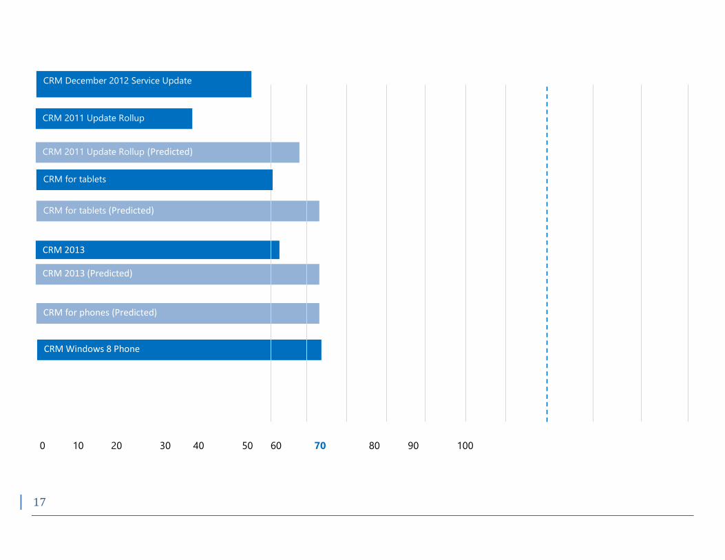
System Usability Scale The System Usability Scale (SUS) is a standardized 10-question survey designed to quickly and easily
assess the usability of a system in terms of:
1. Effectiveness (can users successfully achieve their objectives?)
2. Efficiency (how much effort and resource is expended in achieving those objectives?)
3. Satisfaction (was the experience satisfactory?)
Each survey is scored for an individual evaluation score from 0 to 100. We are constantly evaluating our
designs and looking to improve our overall satisfaction scores. These scores are important indicators
for whether or not we are successful in our efforts to improve overall usability in the product.
As we design our product we are constantly evaluating our designs and looking to improve our overall
system usability scores. These scores are important indicators for whether or not we are successful in
our efforts to improve overall usability in the product. As illustrated in the chart below we have made
significant perceived usability improvement from CRM 2011 to CRM 2013, Mobile Table Applications,
and Windows 8 Phone Applications. Each major release has increased the SUS scores by 10% or more
with a 20% increase over CRM 2011 by CRM 2013. This means that people find the Microsoft
Dynamics CRM 2013 release easier to use, they expect to need far less technical support to achieve their
goals, and perhaps most important they actually find the product desirable and want to use it!
17
CRM 2011 Update Rollup (Predicted)
0 10 20 30 40 50 60 70 80 90 100
CRM 2013
CRM 2013 (Predicted)
CRM for tablets (Predicted)
CRM for phones (Predicted)
CRM Windows 8 Phone
CRM December 2012 Service Update
CRM 2011 Update Rollup
12Update Rollup 12
CRM for tablets

18

19