Embed Size (px)
Citation preview
www.simba.com 1 ODTUG Kscope11
USE NEW BI FEATURES IN EXCEL 2010 WITH ORACLE OLAP A whitepaper for the ODTUG Kscope11 conference by Russ Tront and Amyn Rajan, Simba Technologies
Abstract Excel has proven itself to users to be an easy, convenient, and highly flexible tool analyzing enterprise data. Microsoft’s recent investments in Excel for business intelligence have taken the product to a new level. Our goal in this session is to introduce some of the new and advanced ad hoc analytics capabilities of Excel 2010. We will show how to build powerful BI dashboards and visually appealing graphs that make it easy to analyze your data and thus improve the performance of your enterprise. In addition, we show you not just how to import Oracle data, but how to connect Excel live to your Oracle OLAP data so that you’ll never again be faced with the issue of stale or inconsistent data. You’ll retain live ad hoc analysis and report design from within Excel. With these recent advancements, ad-hoc analysis and reporting in the most common desktop tool has never been this easy.
Introduction Excel is the world’s most pervasive BI tool. Users are so familiar with the Excel user experience that many prefer to do enterprise analysis with Excel rather than their very expensive BI tool – going so far as to use the BI tool just to export data to Excel for their actual analysis. Even Gartner has suggested that IT departments “wave the white flag on using Excel for business intelligence,” a clear indication that Excel is the most accepted way of providing business users and analysts with the functionality that they need.
Starting with Excel 2007, Microsoft has added a number of features that provide excellent BI analysis and reporting on the desktop. This trend continued for Excel 2010, so that Excel is now a top-of-the-line BI analysis and reporting tool. In this session we’ll look at how some of the newest features can be employed to:
• Provide intuitively interactive reports
• Show trend lines in a single cell
• Save frequently-used BI filters for re-use, without the help of IT
• Select from BI hierarchies via search
• Drill-through to underlying transactional data
In this paper, and in the corresponding Kscope11 conference technical session, we elaborate on the BI features of Excel and introduce those that are new with Excel 2010, allowing increasingly insightful and convenient analytics in user’s client application of choice. This new Excel functionality is now available for full, ad hoc query and reporting while hot connected direct to Oracle OLAP cubes. And because the latter runs in the database, you can harness your database server hardware and security for high performance BI from that one-version-of-the-truth repository.
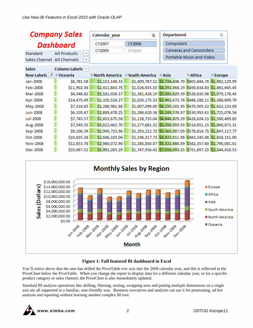
Excel is an Excellent BI Client Application Excel is a pervasive, key application within the enterprise that is familiar to all. Excel is also a full BI client application capable of deep, multi-dimensional BI queries, reporting and dashboards. Figure 1 below shows an example of how you can create cross-tab PivotTables and apply various forms of conditional formatting to highlight differences, add icon sets to highlight trends and anomalies, and create the insightful charts that Excel is well known for.
Use New BI Features in Excel 2010 with Oracle OLAP
www.simba.com 2 ODTUG Kscope11
Figure 1: Full featured BI dashboard in Excel
You’ll notice above that the user has drilled the PivotTable row axis into the 2008 calendar year, and this is reflected in the PivotChart below the PivotTable. When you change the report to display data for a different calendar year, or for a specific product category or sales channel, the PivotChart is also immediately updated.
Standard BI analysis operations like drilling, filtering, sorting, swapping axes and putting multiple dimensions on a single axis are all supported in a familiar, user-friendly way. Business executives and analysts can use it for penetrating, ad hoc analysis and reporting without learning another complex BI tool.
Use New BI Features in Excel 2010 with Oracle OLAP
www.simba.com 3 ODTUG Kscope11
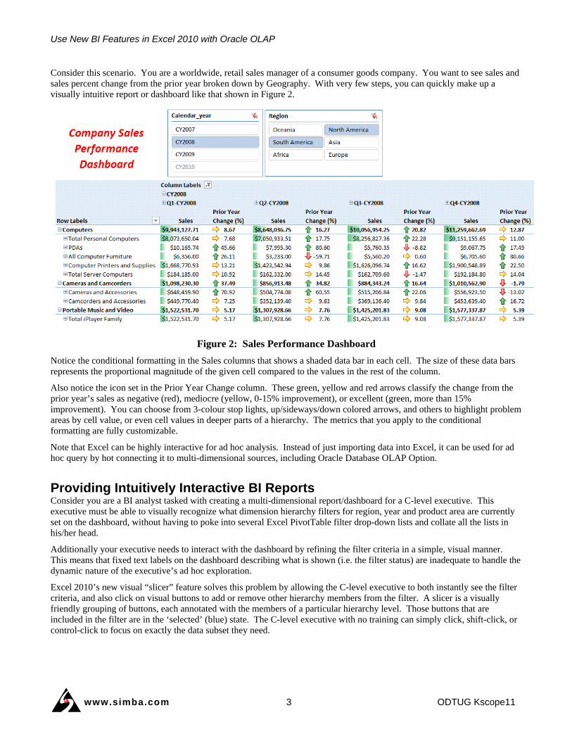
Consider this scenario. You are a worldwide, retail sales manager of a consumer goods company. You want to see sales and sales percent change from the prior year broken down by Geography. With very few steps, you can quickly make up a visually intuitive report or dashboard like that shown in Figure 2.
Figure 2: Sales Performance Dashboard
Notice the conditional formatting in the Sales columns that shows a shaded data bar in each cell. The size of these data bars represents the proportional magnitude of the given cell compared to the values in the rest of the column.
Also notice the icon set in the Prior Year Change column. These green, yellow and red arrows classify the change from the prior year’s sales as negative (red), mediocre (yellow, 0-15% improvement), or excellent (green, more than 15% improvement). You can choose from 3-colour stop lights, up/sideways/down colored arrows, and others to highlight problem areas by cell value, or even cell values in deeper parts of a hierarchy. The metrics that you apply to the conditional formatting are fully customizable.
Note that Excel can be highly interactive for ad hoc analysis. Instead of just importing data into Excel, it can be used for ad hoc query by hot connecting it to multi-dimensional sources, including Oracle Database OLAP Option.
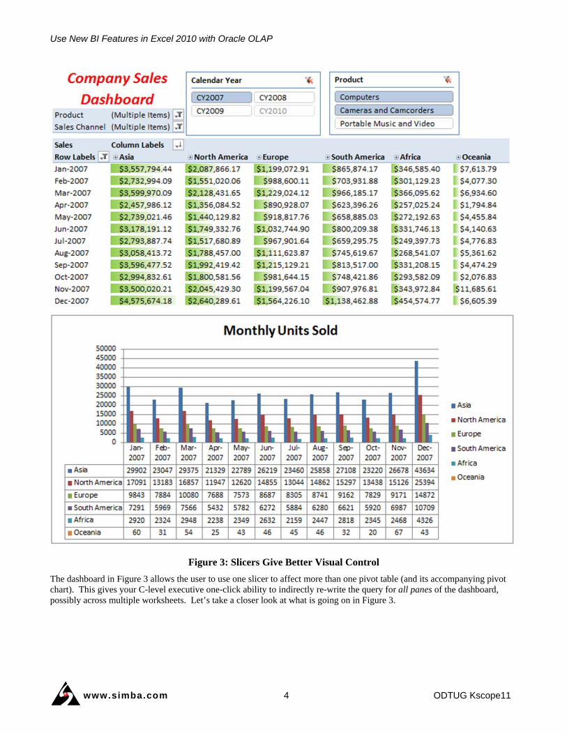
Providing Intuitively Interactive BI Reports Consider you are a BI analyst tasked with creating a multi-dimensional report/dashboard for a C-level executive. This executive must be able to visually recognize what dimension hierarchy filters for region, year and product area are currently set on the dashboard, without having to poke into several Excel PivotTable filter drop-down lists and collate all the lists in his/her head.
Additionally your executive needs to interact with the dashboard by refining the filter criteria in a simple, visual manner. This means that fixed text labels on the dashboard describing what is shown (i.e. the filter status) are inadequate to handle the dynamic nature of the executive’s ad hoc exploration.
Excel 2010’s new visual “slicer” feature solves this problem by allowing the C-level executive to both instantly see the filter criteria, and also click on visual buttons to add or remove other hierarchy members from the filter. A slicer is a visually friendly grouping of buttons, each annotated with the members of a particular hierarchy level. Those buttons that are included in the filter are in the ‘selected’ (blue) state. The C-level executive with no training can simply click, shift-click, or control-click to focus on exactly the data subset they need.
Use New BI Features in Excel 2010 with Oracle OLAP
www.simba.com 4 ODTUG Kscope11
Figure 3: Slicers Give Better Visual Control
The dashboard in Figure 3 allows the user to use one slicer to affect more than one pivot table (and its accompanying pivot chart). This gives your C-level executive one-click ability to indirectly re-write the query for all panes of the dashboard, possibly across multiple worksheets. Let’s take a closer look at what is going on in Figure 3.
Use New BI Features in Excel 2010 with Oracle OLAP
www.simba.com 5 ODTUG Kscope11
The report looks very similar to the one in Figure 1. The difference is the chart at the bottom shows a different measure. The PivotTable at the top still shows sales revenue by region, but the chart shows units sold by region. That chart originates from a second PivotTable (not shown). Now, notice at the top of the report that there are two report filters (titled “Product” and Sales Channel”) and two slicers (titled “Calendar Year” and “Product”). The slicers control both the Sales revenue PivotTable, as well as the Monthly Units Sold PivotTable and PivotChart. Whenever the user updates the slicer, both PivotTables and the PivotChart are updated immediately and simultaneously.
Also notice how the slicer visually indicates which product lines have been selected, whereas the report filter merely indicates “Multiple items” have been selected. Which do you think is easier for the user to manipulate? Which do you think offers better feedback to the user as to the context of the information displayed?
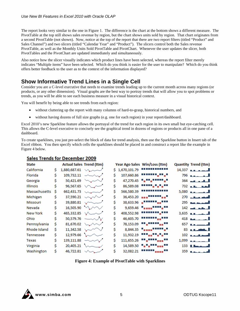
Show Informative Trend Lines in a Single Cell Consider you are a C-level executive that needs to examine trends leading up to the current month across many regions (or products, or any other dimension). Visual graphs are the best way to portray trends that will allow you to spot problems or trends, as you will be able to see each business measure in a visual historical context.
You will benefit by being able to see trends from each region:
without cluttering up the report with many columns of hard-to-grasp, historical numbers, and
without having dozens of full size graphs (e.g. one for each region) in your report/dashboard.
Excel 2010’s new Sparkline feature allows the portrayal of the trend for each region in its own small but eye-catching cell. This allows the C-level executive to concisely see the graphical trend in dozens of regions or products all in one pane of a dashboard.
To create sparklines, you just pre-select the block of data for trend analysis, then use the Sparkline button in Insert tab of the Excel ribbon. You then specify which cells the sparklines should be placed in and construct a report like the example in Figure 4 below.
Figure 4: Example of PivotTable with Sparklines
Use New BI Features in Excel 2010 with Oracle OLAP
www.simba.com 6 ODTUG Kscope11
Notice the three types of sparklines in use: line graphs, win/loss bars and columnar graphs.
Several things are obvious from this report.
1. You can see the current month’s sales data, followed by the trend for the past twelve months.
2. You can quickly see when in the year the high and low points in sales occurred, without carefully examining all the individual monthly numbers (which we have nicely hidden).
3. You can see that for most regions, December is by far the best month for sales; though for some, it is January or November. You can easily adjust the report to focus on a different year (e.g. by using a slicer as described earlier) to see if this is a pattern year-over-year, or perhaps there was some one time external event that influenced sales.
4. California and Massachusetts are consistently increasing sales versus the same period a year ago. You may wish to inquire what they are doing right, and see if you can use that information to help the sales teams in Nevada, Washington and Virginia.
5. Sales notwithstanding, you notice that the quantity sold is the highest in all regions in December of 2009. This means you need to talk to your operations team to ensure they are ready for the increase in shipments. Again, reviewing the data for previous years can confirm if this is a trend, or perhaps due to some wildly successful promotion.
Reports like these are the starting point on your analytical journey. Because Excel is interactive, you can easily change the parameters of the report such as the time frame, product category, etc. This is especially powerful when your Excel PivotTable is directly connected to your OLAP data source.
Saving Frequently-Used BI Filters Consider you are a BI analyst tasked with producing a large group of dashboard and report panes for a CEO. You want to define a reusable subset of hierarchy members that can be reused with far fewer steps across many dashboards or reports in your workbook. And you would prefer not to wait for IT to set this up in the multi-dimensional data source.
Excel 2010 introduces the concept of workbook-scoped “named sets” of hierarchy members.
Consider these two examples:
List of Spanish speaking countries in the geography dimension. See Figure 5 below for an example. Alternately, you may want a named set of just the Spanish speaking ones in your region, and without getting help from IT to set this up as a different Geography dimension hierarchy broken down by language.
From the Stores dimension, a list of stores with floor area greater than 10,000 square feet.
The above examples may be specified in Excel 2010 using an existing PivotTable axis filter, an MDX literal list or a MDX expression.
Many BI analysts may prefer the first of these choices: simply filter a hierarchy down to the desired set of members that are of interest to the business case, and then use the “Create Set Based on …” menu item for the appropriate axis. After giving this list an analyst-friendly name and saving, this now becomes available from the PivotTable Field List to be very simply employed by any other PivotTables and charts in the workbook. See the named set called “Spanish Speaking Countries” in the Geography dimension on the right below.
Use New BI Features in Excel 2010 with Oracle OLAP
www.simba.com 7 ODTUG Kscope11
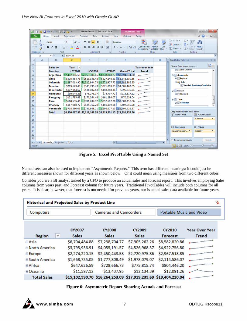
Figure 5: Excel PivotTable Using a Named Set
Named sets can also be used to implement “Asymmetric Reports.” This term has different meanings: it could just be different measures shown for different years as shown below. Or it could mean using measures from two different cubes.
Consider you are a BI analyst tasked by a CFO to produce an actual sales and forecast report. This involves employing Sales columns from years past, and Forecast column for future years. Traditional PivotTables will include both columns for all years. It is clear, however, that forecast is not needed for previous years, nor is actual sales data available for future years.
Figure 6: Asymmetric Report Showing Actuals and Forecast
Use New BI Features in Excel 2010 with Oracle OLAP
www.simba.com 8 ODTUG Kscope11
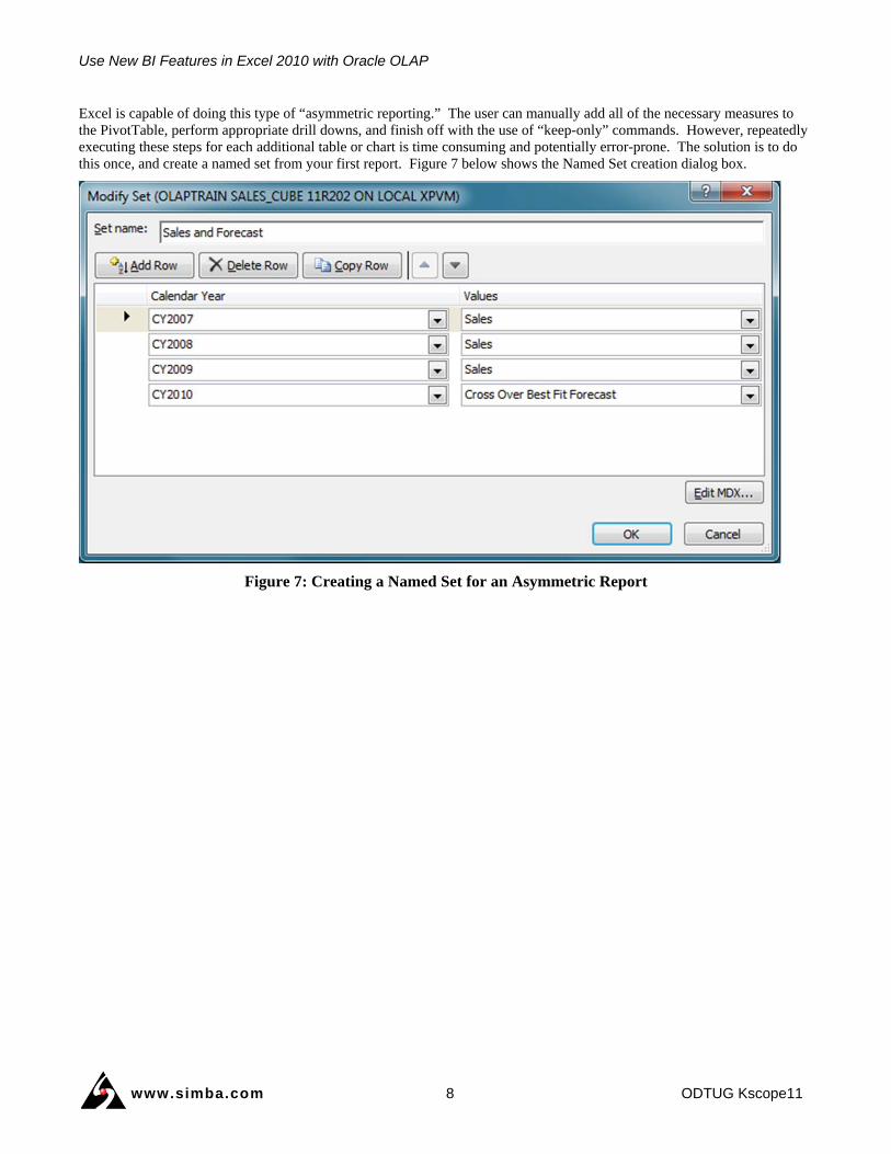
Excel is capable of doing this type of “asymmetric reporting.” The user can manually add all of the necessary measures to the PivotTable, perform appropriate drill downs, and finish off with the use of “keep-only” commands. However, repeatedly executing these steps for each additional table or chart is time consuming and potentially error-prone. The solution is to do this once, and create a named set from your first report. Figure 7 below shows the Named Set creation dialog box.
Figure 7: Creating a Named Set for an Asymmetric Report
Use New BI Features in Excel 2010 with Oracle OLAP
www.simba.com 9 ODTUG Kscope11
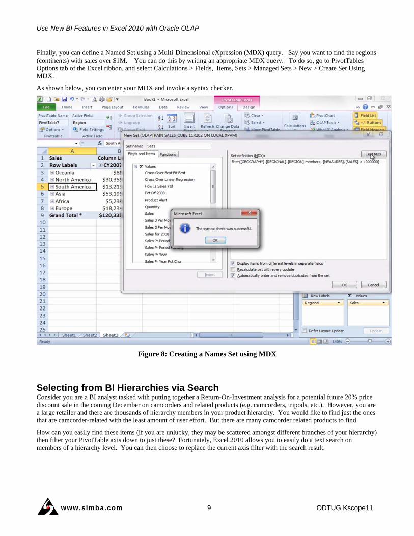
Finally, you can define a Named Set using a Multi-Dimensional eXpression (MDX) query. Say you want to find the regions (continents) with sales over $1M. You can do this by writing an appropriate MDX query. To do so, go to PivotTables Options tab of the Excel ribbon, and select Calculations > Fields, Items, Sets > Managed Sets > New > Create Set Using MDX.
As shown below, you can enter your MDX and invoke a syntax checker.
Figure 8: Creating a Names Set using MDX
Selecting from BI Hierarchies via Search Consider you are a BI analyst tasked with putting together a Return-On-Investment analysis for a potential future 20% price discount sale in the coming December on camcorders and related products (e.g. camcorders, tripods, etc.). However, you are a large retailer and there are thousands of hierarchy members in your product hierarchy. You would like to find just the ones that are camcorder-related with the least amount of user effort. But there are many camcorder related products to find.
How can you easily find these items (if you are unlucky, they may be scattered amongst different branches of your hierarchy) then filter your PivotTable axis down to just these? Fortunately, Excel 2010 allows you to easily do a text search on members of a hierarchy level. You can then choose to replace the current axis filter with the search result.
Use New BI Features in Excel 2010 with Oracle OLAP
www.simba.com 10 ODTUG Kscope11
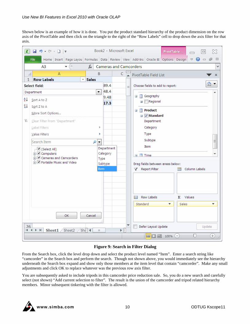
Shown below is an example of how it is done. You put the product standard hierarchy of the product dimension on the row axis of the PivotTable and then click on the triangle to the right of the “Row Labels” cell to drop down the axis filter for that axis.
Figure 9: Search in Filter Dialog
From the Search box, click the level drop down and select the product level named “Item”. Enter a search string like “camcorder” in the Search box and perform the search. Though not shown above, you would immediately see the hierarchy underneath the Search box expand and show only those members at the item level that contain “camcorder”. Make any small adjustments and click OK to replace whatever was the previous row axis filter.
You are subsequently asked to include tripods in this camcorder price reduction sale. So, you do a new search and carefully select (not shown) “Add current selection to filter”. The result is the union of the camcorder and tripod related hierarchy members. Minor subsequent tinkering with the filter is allowed.
Use New BI Features in Excel 2010 with Oracle OLAP
www.simba.com 11 ODTUG Kscope11
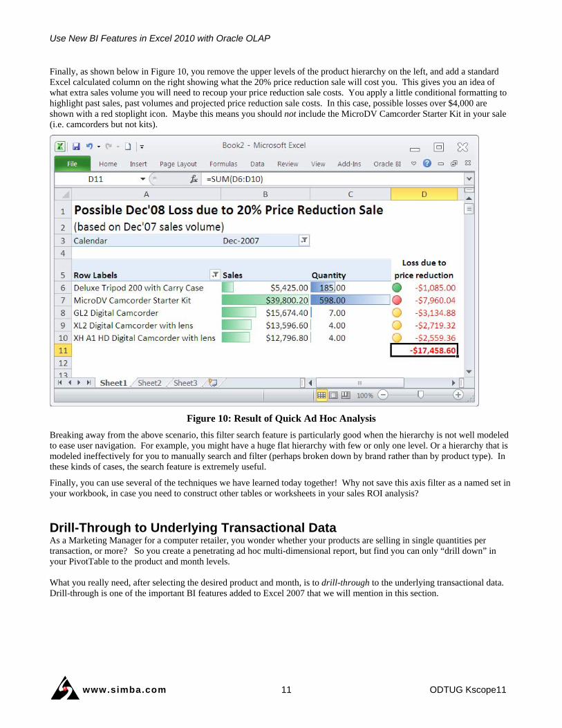
Finally, as shown below in Figure 10, you remove the upper levels of the product hierarchy on the left, and add a standard Excel calculated column on the right showing what the 20% price reduction sale will cost you. This gives you an idea of what extra sales volume you will need to recoup your price reduction sale costs. You apply a little conditional formatting to highlight past sales, past volumes and projected price reduction sale costs. In this case, possible losses over $4,000 are shown with a red stoplight icon. Maybe this means you should not include the MicroDV Camcorder Starter Kit in your sale (i.e. camcorders but not kits).
Figure 10: Result of Quick Ad Hoc Analysis
Breaking away from the above scenario, this filter search feature is particularly good when the hierarchy is not well modeled to ease user navigation. For example, you might have a huge flat hierarchy with few or only one level. Or a hierarchy that is modeled ineffectively for you to manually search and filter (perhaps broken down by brand rather than by product type). In these kinds of cases, the search feature is extremely useful.
Finally, you can use several of the techniques we have learned today together! Why not save this axis filter as a named set in your workbook, in case you need to construct other tables or worksheets in your sales ROI analysis?
Drill-Through to Underlying Transactional Data As a Marketing Manager for a computer retailer, you wonder whether your products are selling in single quantities per transaction, or more? So you create a penetrating ad hoc multi-dimensional report, but find you can only “drill down” in your PivotTable to the product and month levels. What you really need, after selecting the desired product and month, is to drill-through to the underlying transactional data. Drill-through is one of the important BI features added to Excel 2007 that we will mention in this section.
Use New BI Features in Excel 2010 with Oracle OLAP
www.simba.com 12 ODTUG Kscope11
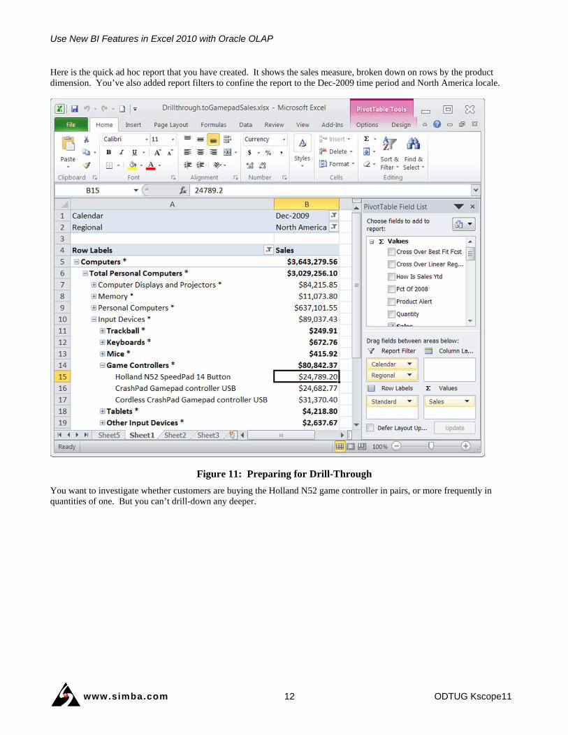
Here is the quick ad hoc report that you have created. It shows the sales measure, broken down on rows by the product dimension. You’ve also added report filters to confine the report to the Dec-2009 time period and North America locale.
Figure 11: Preparing for Drill-Through
You want to investigate whether customers are buying the Holland N52 game controller in pairs, or more frequently in quantities of one. But you can’t drill-down any deeper.
Use New BI Features in Excel 2010 with Oracle OLAP
www.simba.com 13 ODTUG Kscope11
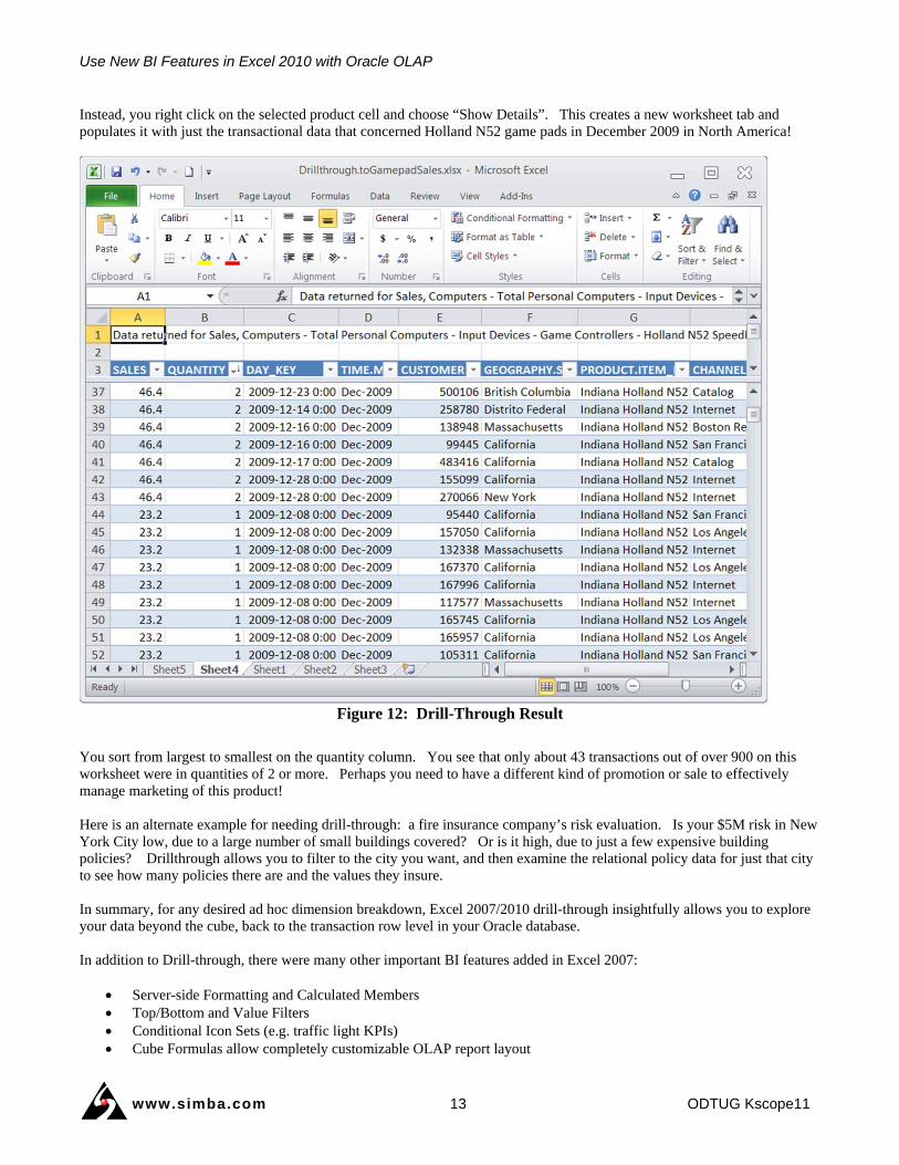
Instead, you right click on the selected product cell and choose “Show Details”. This creates a new worksheet tab and populates it with just the transactional data that concerned Holland N52 game pads in December 2009 in North America!
Figure 12: Drill-Through Result
You sort from largest to smallest on the quantity column. You see that only about 43 transactions out of over 900 on this worksheet were in quantities of 2 or more. Perhaps you need to have a different kind of promotion or sale to effectively manage marketing of this product! Here is an alternate example for needing drill-through: a fire insurance company’s risk evaluation. Is your $5M risk in New York City low, due to a large number of small buildings covered? Or is it high, due to just a few expensive building policies? Drillthrough allows you to filter to the city you want, and then examine the relational policy data for just that city to see how many policies there are and the values they insure. In summary, for any desired ad hoc dimension breakdown, Excel 2007/2010 drill-through insightfully allows you to explore your data beyond the cube, back to the transaction row level in your Oracle database. In addition to Drill-through, there were many other important BI features added in Excel 2007:
Server-side Formatting and Calculated Members Top/Bottom and Value Filters Conditional Icon Sets (e.g. traffic light KPIs) Cube Formulas allow completely customizable OLAP report layout
Use New BI Features in Excel 2010 with Oracle OLAP
www.simba.com 14 ODTUG Kscope11
Greatly improved PivotTable interface and ability to hide levels Improved Data Connection Wizard Ability to automatically suppress PivotTable rows with no data
We encourage those of you moving to, or using Excel 2007 to investigate these significant features.
One Version of the Truth So Excel has some amazingly powerful and helpful analytic features. However, the fear some organizations have of using Excel as a BI tool is based on the fact some people use it to analyze a copy of the data, rather than maintaining a live connection to source data such as Oracle Database OLAP cubes. When data is just copied from the data warehouse or OLAP cube it becomes disconnected, and worse, thence shared via email or other distribution. The user no longer knows how accurate and current the data is. Spreadsheets that contain data of indeterminate age, origin and veracity are often termed ‘spreadmarts.’ Spreadmarts can be dangerous if decisions are made based on out-of-date or inaccurate information.
The key to using Excel as an effective and user-friendly BI tool is to ensure users can maintain a hot connection to the data warehouse. Excel can communicate directly to Oracle Database OLAP cubes using Simba’s “MDX Provider for Oracle OLAP”. Rather than saving a copy of the data, Excel spreadsheets can instead save connection information that allows users to refresh the data each time the spreadsheet is opened – each with their own database userid and password if necessary to adhere to corporate security policies. This ensures that all viewers of the spreadsheet, the reports and the dashboards have current and accurate information. One version of truth throughout the enterprise – which is exactly what a BI tool is supposed to deliver. In addition, this connectivity allows other viewers to further delve into the data with full ad hoc query capability.
Please note that Simba’s MDX Provider for Oracle OLAP is not an Excel add-in in the traditional sense. There is no added set of Excel menus with new, unfamiliar commands. Nor do you have to use an add-in’s query builder dialog, or result panes. Instead, using Simba’s MDX Provider for Oracle OLAP entails a one-time driver install and configuration, after which you use Excel directly, natively and securely against your live Oracle OLAP cube data.
For more information and videos on:
• how these kinds of dashboards can be created with Oracle OLAP cubes,
• Simba’s MDX Provider for Oracle OLAP usable with Excel 2003/2007/2010, and
• several great Excel features including integration with other Microsoft Office applications,
go to http://www.simba.com/oracle. For a comprehensive video of the capabilities of Excel BI and Simba’s MDX Provider for Oracle OLAP, see the video narrated by Bud Endress, Oracle’s Director of Product Management, OLAP Option at http://www.simba.com/MDX-Provider-for-Oracle-OLAP.htm
Summary Business executives, CIOs and BI analysts that want timely, customizable multi-dimensional query and reporting from their data warehouses and multi-dimensional cubes such as Oracle OLAP can reliably use a familiar tool such as Microsoft Excel. With the full BI feature set that Microsoft has added to recent versions of Excel, including slicers, sparklines, named sets and more powerful searches in filters, users have even more power to perform insightful ad hoc analysis, and to create reports and meaningful dashboards. With Simba’s MDX Provider for Oracle OLAP, IT departments no longer have to worry about spreadmarts in their organization thanks to direct connections to high performance, multi-dimensional data, pre-aggregated and secured in your Oracle database.
The most creative and capable business people in an organization understand the power of Excel. The MDX Provider for Oracle OLAP allows them to unleash their skills on the multi-dimensional data in your Oracle database.
For more information on leveraging Simba’s “MDX Provider for Oracle OLAP” in your organization, visit http://www.simba.com/oracle

Use New BI Features in Excel 2010 with Oracle OLAP
www.simba.com 15 ODTUG Kscope11
About Simba Simba Technologies Inc. (http://www.simba.com ) is the recognized world leader in standards-based data access products and solutions. Simba works with leading companies globally to deliver first class data connectivity solutions.
Simba is a data connectivity pioneer. Since 1991, it has developed advanced data access solutions used by millions of users. Today, more than half of all OLE DB for OLAP (ODBO) / MDX providers have been built with Simba technology.
Printed in Canada. ©2011 Simba Technologies Inc. All Rights Reserved. Simba Technologies and the Simba logo are trademarks of Simba Technologies Inc. Oracle, JD Edwards, and PeopleSoft are registered trademarks of Oracle and/or its affiliates. All other trademarks or servicemarks are the property of their respective owners.