Embed Size (px)
Citation preview

ARL-TN-0814 ● MAR 2017
US Army Research Laboratory
Usability Study and Heuristic Evaluation of the Applied Robotics for Installations and Base Operations (ARIBO) Driverless Vehicle Reservation Application ARIBO Mobile by Kristin E Schaefer and Edward R Straub Approved for public release; distribution is unlimited.

NOTICES
Disclaimers
Research was sponsored by the US Army Research Laboratory. The views and
conclusions contained in this document are those of the authors and should not be
interpreted as representing the official policies, either expressed or implied, of the
Army Research Laboratory or the US Government. The US Government is
authorized to reproduce and distribute reprints for Government purposes
notwithstanding any copyright notation herein.
Citation of manufacturer’s or trade names does not constitute an official
endorsement or approval of the use thereof.
Destroy this report when it is no longer needed. Do not return it to the originator.

ARL-TN-0814 ● MAR 2017
US Army Research Laboratory
Usability Study and Heuristic Evaluation of the Applied Robotics for Installations and Base Operations (ARIBO) Driverless Vehicle Reservation Application ARIBO Mobile
by Kristin E Schaefer Human Research and Engineering Directorate, ARL
Edward R Straub US Army Tank Automotive Research, Development and Engineering Center, Warren, MI
Approved for public release; distribution is unlimited.
ii
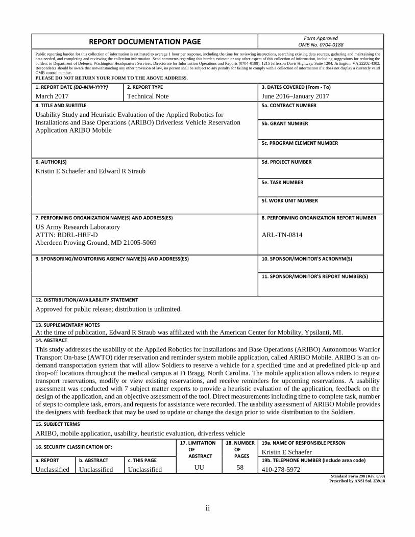
REPORT DOCUMENTATION PAGE Form Approved
OMB No. 0704-0188 Public reporting burden for this collection of information is estimated to average 1 hour per response, including the time for reviewing instructions, searching existing data sources, gathering and maintaining the
data needed, and completing and reviewing the collection information. Send comments regarding this burden estimate or any other aspect of this collection of information, including suggestions for reducing the
burden, to Department of Defense, Washington Headquarters Services, Directorate for Information Operations and Reports (0704-0188), 1215 Jefferson Davis Highway, Suite 1204, Arlington, VA 22202-4302.
Respondents should be aware that notwithstanding any other provision of law, no person shall be subject to any penalty for failing to comply with a collection of information if it does not display a currently valid
OMB control number.
PLEASE DO NOT RETURN YOUR FORM TO THE ABOVE ADDRESS.
1. REPORT DATE (DD-MM-YYYY)
March 2017
2. REPORT TYPE
Technical Note
3. DATES COVERED (From - To)
June 2016–January 2017
4. TITLE AND SUBTITLE
Usability Study and Heuristic Evaluation of the Applied Robotics for
Installations and Base Operations (ARIBO) Driverless Vehicle Reservation
Application ARIBO Mobile
5a. CONTRACT NUMBER
5b. GRANT NUMBER
5c. PROGRAM ELEMENT NUMBER
6. AUTHOR(S)
Kristin E Schaefer and Edward R Straub
5d. PROJECT NUMBER
5e. TASK NUMBER
5f. WORK UNIT NUMBER
7. PERFORMING ORGANIZATION NAME(S) AND ADDRESS(ES)
US Army Research Laboratory
ATTN: RDRL-HRF-D
Aberdeen Proving Ground, MD 21005-5069
8. PERFORMING ORGANIZATION REPORT NUMBER
ARL-TN-0814
9. SPONSORING/MONITORING AGENCY NAME(S) AND ADDRESS(ES)
10. SPONSOR/MONITOR'S ACRONYM(S)
11. SPONSOR/MONITOR'S REPORT NUMBER(S)
12. DISTRIBUTION/AVAILABILITY STATEMENT
Approved for public release; distribution is unlimited.
13. SUPPLEMENTARY NOTES
At the time of publication, Edward R Straub was affiliated with the American Center for Mobility, Ypsilanti, MI. 14. ABSTRACT
This study addresses the usability of the Applied Robotics for Installations and Base Operations (ARIBO) Autonomous Warrior
Transport On‐base (AWTO) rider reservation and reminder system mobile application, called ARIBO Mobile. ARIBO is an on-
demand transportation system that will allow Soldiers to reserve a vehicle for a specified time and at predefined pick-up and
drop-off locations throughout the medical campus at Ft Bragg, North Carolina. The mobile application allows riders to request
transport reservations, modify or view existing reservations, and receive reminders for upcoming reservations. A usability
assessment was conducted with 7 subject matter experts to provide a heuristic evaluation of the application, feedback on the
design of the application, and an objective assessment of the tool. Direct measurements including time to complete task, number
of steps to complete task, errors, and requests for assistance were recorded. The usability assessment of ARIBO Mobile provides
the designers with feedback that may be used to update or change the design prior to wide distribution to the Soldiers.
15. SUBJECT TERMS
ARIBO, mobile application, usability, heuristic evaluation, driverless vehicle
16. SECURITY CLASSIFICATION OF: 17. LIMITATION OF ABSTRACT
UU
18. NUMBER OF PAGES
58
19a. NAME OF RESPONSIBLE PERSON
Kristin E Schaefer
a. REPORT
Unclassified
b. ABSTRACT
Unclassified
c. THIS PAGE
Unclassified
19b. TELEPHONE NUMBER (Include area code)
410-278-5972 Standard Form 298 (Rev. 8/98)
Prescribed by ANSI Std. Z39.18

Approved for public release; distribution is unlimited.
iii
Contents
List of Figures v
List of Tables vi
Acknowledgments vii
1. Summary 1
2. Introduction: ARIBO-AWTO Program 1
3. ARIBO Mobile 3
3.1 Current Design of the Application 3
3.2 Usability Considerations 4
4. Methods 4
4.1 Participants 5
4.2 Procedure 5
5. Usability Assessment and Heuristic Evaluation 6
5.1 Log into the Application 7
5.2 Navigate the Main Menu Screen 10
5.3 Request a New Ride 12
5.4 View Current Appointments 16
5.5 Cancel an Appointment 18
5.6 Modify a Current Appointment 21
5.7 Identify a Failed Request 23
6. Discussion 26
7. Conclusion 31
8. References 32

Approved for public release; distribution is unlimited.
iv
Appendix A. Nielsen’s Usability Heuristics 35
Appendix B. Table of Times to Log into ARIBO Mobile 37
Appendix C. Making a New Reservation Screenshots 39
List of Symbols, Abbreviations, and Acronyms 46
Distribution List 47

Approved for public release; distribution is unlimited.
v
List of Figures
Fig. 1 Base AWTO platform (a) and wheelchair accessible version (b) ..........2
Fig. 2 Example routes between the medical barracks and Womack Army Medical Center, Ft Bragg .......................................................................2
Fig. 3 The application is designed to run on both mobile platforms as well as a publically available kiosk ....................................................................4
Fig. 4 Main Android tablet screen with the current ARIBO Mobile icon circled in red ..........................................................................................7
Fig. 5 ARIBO Mobile login screen ..................................................................8
Fig. 6 ARIBO logo ...........................................................................................8
Fig. 7 Main menu screen ................................................................................10
Fig. 8 Request transportation screen ..............................................................12
Fig. 9 View Appointments menu ...................................................................16
Fig. 10 The Transport Screen provides more information about scheduled transportation .......................................................................................18
Fig. 11 Users needed to turn the screen 90° to access the OK, Reschedule Transport, and Cancel Transport options .............................................19
Fig. 12 Example of a Failed Request screen ....................................................23
Fig. 13 Example of View Failed Requests screen ............................................24
Fig. 14 The change in application logo from the original (left) to the ARIBO (right) logo ...........................................................................................27
Fig. 15 The Resync option was removed from the main menu screen ............28
Fig. 16 Software changes were made so that all buttons (e.g., OK, reschedule transport, cancel transport) were available in both landscape (left) and portrait (right) views ............................................................................28
Fig. 17 Changes were made to increase clarity of scheduled appointments ....29
Fig. 18 Text delineating a Request Failure was added to increase clarity of the display to the user ................................................................................30
Fig. C-1 Screenshot of the main Request Transportation screen .......................40
Fig. C-2 Screenshot of options for selecting specific criteria related to pick-up time ......................................................................................................41
Fig. C-3 Screenshot of calendar feature .............................................................42
Fig. C-4 Screenshot of clock function ................................................................43
Fig. C-5 Screenshot of special accommodations options ...................................44
Fig. C-6 Screenshot of pop-up menu to set the number of accompanying passengers ............................................................................................45

Approved for public release; distribution is unlimited.
vi
List of Tables
Table 1 Heuristic evaluation of login procedures ...............................................9
Table 2 Heuristic evaluation of main menu ......................................................11
Table 3 Time and number of button presses to make a reservation ..................13
Table 4 Heuristic evaluation of scheduling portion of the application .............14
Table 5 Heuristic evaluation of View Appointments menu ..............................17
Table 6 Number of button press and time to cancel an existing appointment ..19
Table 7 Heuristic evaluation of canceling an appointment ...............................20
Table 8 Time, button presses, and errors in modifying a current appointment 21
Table 9 Heuristic evaluation of modifying an appointment .............................22
Table 10 Identifying and correcting a failed request ..........................................25
Table 11 Heuristic evaluation of reservation failures .........................................25
Table B-1 Login time for subject matter experts (SMEs) .....................................38

Approved for public release; distribution is unlimited.
vii
Acknowledgments
ARIBO Mobile was designed and developed as a joint effort between Robotic
Research, LLC, and the University of Texas at Arlington Research Institute as part
of the US Army Tank Automotive Research, Development and Engineering Center
Applied Robotics for Installations and Base Operations (ARIBO) program. We
would like to acknowledge their hard work on developing this mobile application
to benefit the Soldiers with the Warrior Transition Battalion at Ft Bragg, North
Carolina. We would like to also thank our subject matter experts associated with
the US Army Research Laboratory and Aberdeen Proving Ground, our reviewers,
and supervisors.

Approved for public release; distribution is unlimited.
viii
INTENTIONALLY LEFT BLANK.
Approved for public release; distribution is unlimited.
1
1. Summary
This study addresses the usability of the Applied Robotics for Installations and Base
Operations (ARIBO) Autonomous Warrior Transport On‐base (AWTO) rider
reservation and reminder system mobile application, called ARIBO Mobile. This
mobile application is used to interface with the ARIBO driverless vehicle
transportation system, allowing Soldiers with the Warrior Transition Battalion, Ft
Bragg, North Carolina, to request transport reservations, modify or view existing
reservations, and receive reminders for upcoming reservations. ARIBO is an on-
demand transportation system, which will allow Soldiers to reserve a vehicle for a
specified time and at predefined pick-up and drop-off locations throughout the
medical campus at Ft Bragg.
A usability assessment was conducted with 7 subject matter experts to provide a
heuristic evaluation of the application, feedback on the design of the application,
and an objective assessment of the tool. Direct measurements including time to
complete task, number of steps to complete task, errors, and requests for assistance
were recorded. The usability assessment of ARIBO Mobile provides the designers
with feedback that may be used to update or change the design prior to wide
distribution to the Soldiers.
2. Introduction: ARIBO-AWTO Program
The US Army Tank Automotive Research, Development and Engineering Center
(TARDEC) Applied Robotics for Installations and Base Operations (ARIBO)
program is a series of pilot programs using federal installations and universities as
test beds for developing guidelines for operating autonomous vehicles in public,
noncombat environments. The strategic objectives include socializing users and
nonusers with autonomous systems, identifying operational issues and developing
mitigation strategies to increase trust and use, and generating empirical data (e.g.,
performance, reliability, maintenance). The goal is to produce technical and social-
behavioral value through a cycle of data collection, reliability analysis, and
technical and behavioral improvement. One specific research focus has been on the
prototype development of autonomy-enabled on-demand transit vehicles, called the
Autonomous Warrior Transport On-base (AWTO) project located at Ft Bragg,
North Carolina (see also Mottern et al. 2015).
The goal of the AWTO research project is to build knowledge around how
autonomy-enabled vehicles perform in and impact real-world environments. The
prototype driverless shuttle vehicle (Fig. 1) was designed to address the specific
needs of the Warrior Transition Battalion (WTB) at Ft Bragg. Soldiers in this

Approved for public release; distribution is unlimited.
2
battalion may have mobility difficulties and require transportation assistance from
the medical barracks to Womack Army Medical Center (Fig. 2). TARDEC funded
an effort from Robotic Research, LLC, to develop robotic technology to provide
the driverless transport system and the associated reservation/reminder system,
ARIBO Mobile, for these Soldiers and caretakers. The modular technologies are
compatible with other TARDEC Warfighter-focused autonomy projects.
Fig. 1 Base AWTO platform (a) and wheelchair accessible version (b)
Fig. 2 Example routes between the medical barracks and Womack Army Medical Center,
Ft Bragg
(a)
(b)

Approved for public release; distribution is unlimited.
3
3. ARIBO Mobile
Initial trust begins to develop before the first interaction with the real-world system.
Expectations, attitudes toward technology, cultural and societal views, individual
differences such as personality and the propensity to trust, even the physical
appearance of the system, can impact individuals' initial perceptions about the
trustworthiness of the robotic system (Schaefer et al. 2012; Schaefer 2013;
Burgoon et al. 2016). For the ARIBO-AWTO driverless vehicles, the first
interaction is not with the vehicle itself but with the reservation and reminder
application, called ARIBO Mobile. The design of this user interface can have a
direct and potentially lasting effect on a rider's trust and future use of the vehicle.
3.1 Current Design of the Application
The design and development of ARIBO Mobile was a combined effort between
Robotic Research, LLC, and the University of Texas at Arlington Research Institute
(UTARI). The reservation component of the application was designed around 3
main types of transportation requirements: on-demand, reservation-based, and
optimized ride-sharing transportation services. The reminder system was designed
to send mobile application notifications, emails, or SMS messages to the rider to
remind them of their appointment. Reminders are particularly important for
AWTO, because some passengers may be affected with traumatic brain injuries that
can affect memory recall. Specific customizations were made to accommodate
riders' needs. To make this system available to the maximum number of potential
riders, the application was designed to run on Android-powered smartphone
platforms and publically available kiosks (Fig. 3). Tablet computers are secured in
the kiosks located at the primary rider pick-up and drop-off locations. The 3-in-1
kiosks, dedicated to the ARIBO Mobile application, allow for maximum flexibility
for placement around the site and are American Disabilities Act–compliant to
accommodate wheelchair users. An Android application was developed to provide
mobile phone access, and a web application is currently in development.

Approved for public release; distribution is unlimited.
4
Fig. 3 The application is designed to run on both mobile platforms as well as a publically
available kiosk
3.2 Usability Considerations
Subject matter expert (SME) review was used to assess the initial design of the
application and identify potential challenges to ongoing application development.
The first challenge for ARIBO Mobile development was scaling a display for use
on both a smartphone and a larger tablet interface. The second challenge was to
develop an application that can be easily used by individuals with a wide range of
technological acuity or skill, as well as mental and physical limitations due to
injury. Consideration of these challenges and previous research during the design
of the user interface should reduce stress and cognitive load to maximize ease-of-
use of the system and acceptance by a wider range of riders. Usability guidelines
suggest that to reduce cognitive load, similar items should be placed in close spatial
proximity taking into account symmetry, unity, and cohesion of items (Endsley
1988). The design should also include traditional Windows-type interaction to link
the new application to similar known systems such as a back arrow, clickable
buttons, and markers for drop-downs (Goodrich and Schultz 2007). In addition, the
number of items per page, spacing between items, and the reduction of “dead space”
or nonfunctioning buttons affect perception, acceptance, and ease of use (Baker et
al. 2004). Poor usability of ARIBO Mobile could affect ridership, trust, and
appropriate use of the driverless transport vehicles.
4. Methods
Usability testing is “an approach that emphasizes the property of being usable, i.e.
it is the product that is being tested rather than the user” (Sharp et al. 2007, p. 646).
A 3-part procedure was used to guide the design process, including an objective
assessment, a heuristic evaluation, and verbal feedback (Ericsson and Simon 1980;
Approved for public release; distribution is unlimited.
5
Nielsen 1993; Lamming and Newman 1995). This procedure addressed the
following items:
Recommendations for reducing ambiguity in design elements
Identification of possible individual differences or accessibility limitations
due to vision, hearing, dexterity, or mental acuity
Frequency and clarity of scheduling reminders
4.1 Participants
Seven SMEs were selected per their expertise in the field of usability assessment
or mobile interface design. This is in line with previous research that recommends
between 5 and 12 SMEs (Nielsen and Landauer 1993; Dumas and Redish 1999;
Baxter et al. 2015). All 7 SMEs provided a heuristic evaluation and verbal
feedback; however, because of an internet accessibility issue, only 6 SMEs
completed the objective assessment. The objective assessment is Part 1 of the
procedure.
4.2 Procedure
This assessment included 3 types of usability assessments.
1) The first type of assessment objectively measured the capabilities of the
system. SMEs completed 5 different tasks using ARIBO Mobile. The time
to complete each task, the number of steps to complete each task, errors,
and the number/type of requests for assistance were recorded. The 7 tasks
included the following:
a) Log into the application
b) Navigate the main menu screen
c) Request a new ride
d) View current appointments
e) Cancel an appointment
f) Modify a current appointment
g) Identify a failed request
2) Following the objective assessment, participants completed a heuristic
evaluation (Nielsen 1993). The SMEs walked through each task again and
provided comments and feedback on the design for Nielsen’s 10 heuristics

Approved for public release; distribution is unlimited.
6
(Appendix A). General comments and specific design recommendations
were recorded. SMEs also provided information to rate the importance, or
priority, of each recommendation based on the scale below (Nielsen 1994):
0 - not a usability problem at all
1 - cosmetic problem only (need not be fixed unless extra time is
available on the project)
2 - minor usability problem (fixing this should be given low priority)
3 - major usability problem (important to fix, so should be given high
priority)
4 - usability catastrophe (imperative to fix this before product can be
released)
3) After review of the entire task, in Part 3 of the assessment procedure
participants were asked to provide feedback on the following points:
Amount and type of training recommendations to use the application
Identification of design recommendations for riders that may have
limitations due to vision, hearing, dexterity, or mental acuity
5. Usability Assessment and Heuristic Evaluation
This section outlines the usability findings associated with the following 7 tasks:
log into the application, navigate the main menu screen, request a ride, view current
appointments, cancel an appointment, modify an appointment, and identify a failed
appointment.

Approved for public release; distribution is unlimited.
7
5.1 Log into the Application
Five out of 6 of the SMEs who performed the objective assessment required
assistance in locating the ARIBO icon to load the ARIBO Mobile application
(Fig. 4). Search time ranged between 7 and 32 s before requesting assistance to
complete the action.
Fig. 4 Main Android tablet screen with the current ARIBO Mobile icon circled in red
After locating the ARIBO icon, the average total login time was 22.833 s (range of
16–39 s). This process included accessing the keyboard, entering the username and
password, and pressing the login button (Fig. 5). No additional button presses,
errors, or requests for assistance were reported. A table of the timing information
is provided in Appendix B.

Approved for public release; distribution is unlimited.
8
Fig. 5 ARIBO Mobile login screen
Overall, SMEs felt that the login design and process, once they were able to open
the application, was user friendly and self-explanatory. The high-priority
recommendation was to change the green icon to the ARIBO icon (Fig. 6) to
increase recognition of the system and remind users of the available service.
Additional cosmetic and low-priority comments were made about the choice in
keyboard, case sensitivity of login information, and request for help logging in to
ARIBO Mobile. The heuristic evaluation in Table 1 provides some additional
recommendations for the login process.
Fig. 6 ARIBO logo

Approved for public release; distribution is unlimited.
9
Table 1 Heuristic evaluation of login procedures
Heuristic SME recommendation No. of
SMEs Priority
Aesthetic and
minimalist design
No recommendations. . . . 0
Match between system
and real world
No recommendations. . . . 0
Recognition rather
than recall
ARIBO Mobile Icon: The ARIBO Mobile
icon should represent the ARIBO program
(Fig. 4). It is important for users to make the
connection to the application to increase
recognition and use.
7 3
Consistency and
standards
Virtual Keyboard: No clearly marked
open/close keyboard buttons. The current
Android keyboard uses a check mark in
place of “Enter”. This may not be apparent
to all users.
2 1
Visibility of system
status/ Feedback
Keyboard Feedback: Update kiosk
tablets with Android update for high-
frequency vibrations on keypad. This
improves typing accuracy and is good for
individuals with vision-related limitations
or physical limitations such as tremors.
1 1
User control and
freedom/ Clearly
marked exits
No recommendations. . . . 0
Shortcuts/ Flexibility
and efficiency of use
No recommendations. . . . 0
Help users recognize,
diagnose, and recover
from errors
Login Error Messages: The usernames
and passwords are case sensitive. An error
message stating “Invalid Username or
Password” will appear. Recommend
adding a statement or updating error
message.
1 1
Error prevention No recommendations. . . . 0
Help and
documentation
Login Help: A button “Need Help with
Login?” appears on main login screen.
However, when it opens, the keyboard is
opened automatically and covers up the
directions and additional help information.
1 2
Approved for public release; distribution is unlimited.
10
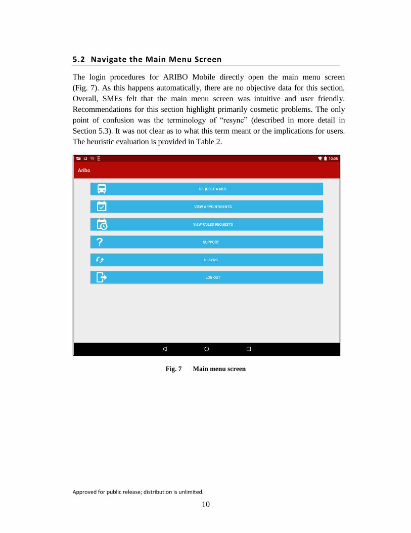
5.2 Navigate the Main Menu Screen
The login procedures for ARIBO Mobile directly open the main menu screen
(Fig. 7). As this happens automatically, there are no objective data for this section.
Overall, SMEs felt that the main menu screen was intuitive and user friendly.
Recommendations for this section highlight primarily cosmetic problems. The only
point of confusion was the terminology of “resync” (described in more detail in
Section 5.3). It was not clear as to what this term meant or the implications for users.
The heuristic evaluation is provided in Table 2.
Fig. 7 Main menu screen

Approved for public release; distribution is unlimited.
11
Table 2 Heuristic evaluation of main menu
Heuristic SME recommendation No. of
SMEs Priority
Aesthetic and
minimalist design
Menu Layout: Current menu layout is
ideal for mobile phone application and
vertical orientation. Recommend
autoadjusting for screen size to increase
font size in proportion to button size and
reduce “white space” to fill the screen.
3 1
Match between system
and real world
No recommendations. . . . 0
Recognition rather
than recall
Icons: Icons are intuitive and match
description for 5 out of 6 items.
Recommendation to change “view failed
requests” icon to a crossed out calendar.
7 1
Consistency and
standards
Menu Items: Clarity needed for menu
item “Resync” and when it will/should be
used.
5 2
Visibility of system
status/ Feedback
Indicators: Recommendation for
indicators for number of appointments and
number of failed requests on the associated
buttons to increase clarity.
1 1
User control and
freedom/ Clearly
marked exits
No recommendations. . . . 0
Shortcuts/ Flexibility
and efficiency of use
No recommendations. . . . 0
Help users recognize,
diagnose, and recover
from errors
No recommendations. . . . 0
Error prevention No recommendations. . . . 0
Help and
documentation
Help Options: Help documentation are
provided under the “Support” menu item.
Recommend changing name to increase
clarity (e.g., “Help” or “Contact
Information”).
1 1

Approved for public release; distribution is unlimited.
12
5.3 Request a New Ride
One of the key requirements for the ARIBO Mobile application is the capability to
schedule a ride. All SMEs were able to quickly and accurately locate and select the
“Request a Ride” button from main menu (M = 10 s). This menu option opened the
“Request transportation” screen (Fig. 8). Both objective assessment and heuristic
evaluation are provided below.
Fig. 8 Request transportation screen
The minimum number of button presses required to successfully schedule a vehicle
with only 2 location options, no special accommodations, or passengers is 8 button
presses. If every box is checked, it takes 16 total actions to make a complete request,
specifically: Location (2), Dates/Times (10), Special Accommodations (2),
Accompanying Passengers (3), Request (1), Passenger Accommodations (2), and
Request (1). Screenshots of all the different features for creating a new reservation
can be found in Appendix C. The average number of button presses for the SMEs
to successfully schedule a ride was 23 button presses for a total average scheduling
time of 91.833 s (Table 3). The design of this part of the application (e.g., 10 button
presses to set date and time) and system errors may account for some of the issues
with scheduling ARIBO vehicle service.

Approved for public release; distribution is unlimited.
13
Table 3 Time and number of button presses to make a reservation
SME Time to get to new
reservation
Time to schedule
new reservation
Number of
button presses
1 21 157 26
2 10 55 19
3 4 34 16
4 5 84 14
5 10 69 25
6 10 152 38
Min 4 34 14
Max 21 157 38
Range 17 123 24
Average 10.000 91.833 23
Note: Time is in seconds.
A few errors occurred while making new reservations. Only one SME (SME 6) had
an error making a reservation by leaving the date blank. The system provided an
error through a “toast” (i.e., a small popup that provides simple feedback and
disappears after a short amount of time), and the user was able to correct the error
with an additional 4 button presses. More significantly, a system error occurred
between the mobile application and the server during objective measurement on
SMEs 1, 5, and 6, requiring the SMEs to “resync” the application. No error
messages were provided, meaning the SME needed advance knowledge about the
application to go back to the Resync menu option to update the application. This
resulted in extra time (50 s, 30 s, and 58 s, respectively) and button presses (6, 6,
and 14 button presses, respectively). This error resulted in substantial user
frustration and significant time increase. One SME started to reschedule the whole
ride before realizing there may be a connectivity issue.
A heuristic evaluation is provided in Table 4. Overall, SMEs felt that this menu was
streamlined and clear. The major usability concerns were related to connectivity
issues and the amount of button presses tied to specific features (e.g., clock). SMEs
also made recommendations for changes to the design that could minimize potential
errors in the future (e.g., addition of confirmation screens, or constraining the
number of passengers).

Approved for public release; distribution is unlimited.
14
Table 4 Heuristic evaluation of scheduling portion of the application
Heuristic SME recommendation No. of
SMEs Priority
Aesthetic and
minimalist design
Design: The overall design is relatively
streamlined. However, red on red
coloration for titles is confusing. Red is
traditionally a color reserved for errors.
Recommendation for banner to be a
different color.
Special Accommodations: Section is
bigger than rest of items in menu.
1
1
1
1
Match between system
and real world
“Leaving After”: Designers added a
“leaving after/arriving by” scheduling
option to match real world transportation
systems. SMEs were confused by this
option. Recommended changing autofill to
“Arriving by” to work more closely with
military operations and avoid most
confusion.
Extra leg room: Why would user
select/not select extra leg room as an
option? Consider changing terminology.
4
3
1
1
Recognition rather
than recall
Smart Kiosk: The kiosk tablets should
autofill the start location to reduce the
number of button presses and working
memory load of user.
1 1
Consistency and
standards
Calendar: Mobile optimized and intuitive.
Clock: Clock appears to be mobile
optimized. Clock options may not be
familiar to all users (e.g., scrolling clock).
Appearance and functionality may also
vary per Android device.
SMEs unsure of need for minute accuracy.
Recommendation: could reduce number of
button presses by autodefaulting the
minute or setting to the next available
pick-up time.
Clock am/pm: Users are Soldiers and
used to working in military time. Scaling
issue with am/pm button leads to difficulty
pressing button.
1
7
2
2
0
2
1
2
Visibility of system
status/ Feedback
What to do: The application never tells
the user what to do; however, it is
relatively intuitive.
1 0

Approved for public release; distribution is unlimited.
15
Table 4 Heuristic evaluation of scheduling portion of the application (continued)
Heuristic SME recommendation No. of
SMEs Priority
User control and
freedom/ Clearly
marked exits
Back Arrow: A “back” arrow is present in
the upper left hand corner of the screen,
but the text next to it is the page heading.
Recommendation to link the correct
terminology with back button.
4 1
Shortcuts/ Flexibility
and efficiency of use
Shortcut: Recommend adding a “pick me
up now” button with most of the menus
autofilled.
5 2
Help users recognize,
diagnose, and recover
from errors
System Connectivity Error: A toast
appeared stating that the ride was
successfully scheduled; however, the ride
did not appear in the View Appointments
menu.
Recommendation would be to add a
refresh button in the Appointments
window to reduce confusion, increased
steps, and potential disuse of the
application.
3 3
Error prevention Need Confirmation Screens:
Recommend adding confirmation screens
for most major actions to avoid errors at
the end of scheduling.
Need appointment time verification and
confirmation prior. This does not appear
when there is a connectivity issue.
Constrain Number of Passengers:
Current design looks like a number (even
if it is 0) should be added.
Recommendation to limit to either max
number of passengers or available number
of seats. One SME was able to reserve a
vehicle for 32 passengers. Number keypad
has a lot of unusable buttons. Recommend
reducing the number of options available
to user.
Special Accommodations: “Extra Leg
Room” is unclear terminology and is not
an option for passengers.
6
3
4
2
2
2
2
2
Help and
documentation
No help or documentation available. 1 0

Approved for public release; distribution is unlimited.
16
5.4 View Current Appointments
All SMEs were able to quickly (M = 8.833 s) and accurately locate previously
scheduled appointments through the main menu (Fig. 9). Users of this system may
have a number of scheduled rides per day. Therefore, the organization and
disambiguation of the information on the View Appointments menu is a high
priority. All SMEs found the extended information on the Transport menu to be
helpful, but 4 of the SMEs made a specific note to increase the visibility of the
button to be easily identified as a selectable button.
Fig. 9 View Appointments menu
There were 2 primary recommendations for this window (Table 5). First was to
update the organization of the information for each reservation so that it was clear
where the vehicle was going and what time it would arrive for service. Second was
to make clickable items more recognizable (e.g., 3-D formatting, gradients, 3
vertical dots, long press option, or add buttons for more info, modify, and cancel
on this screen). This would allow users to realize they could access more
information by clicking on a reservation.

Approved for public release; distribution is unlimited.
17
Table 5 Heuristic evaluation of View Appointments menu
Heuristic SME recommendation No. of
SMEs Priority
Aesthetic and
minimalist design
Buttons: Not clear that the reservations
are selectable. Recommendation to make
the selectable options look more like
selectable buttons (e.g., 3-D formatting,
gradients, 3 vertical dots, long press
option, or add buttons for more info,
modify, and cancel on this screen).
4 2
Match between system
and real world
No recommendations. . . . 0
Recognition rather
than recall Custom Name Appointments:
Recommend the capability to be able to
provide a custom name to their
appointments to help reduce confusion,
memory issues, and cognitive load.
Custom Order Appointments:
Recommendation to customized ordering
of appointments. Examples include
making the “next” appointment more
salient, add the capability to
collapse/expand by day, or have selections
for “just created”.
1
1
1
1
Consistency and
standards
No recommendations. . . . 0
Visibility of system
status/ Feedback
Feedback: Recommendation to show the
vehicle’s status (on time, late, etc.).
2 1
User control and
freedom/ Clearly
marked exits
No recommendations. . . . 0
Shortcuts/ Flexibility
and efficiency of use
No recommendations. . . . 0
Help users recognize,
diagnose, and recover
from errors
Ambiguous Appointment Information:
Need to list drop-off location on the View
Appointments window.
Need to move time under pick-up location
so users know when the vehicle should
arrive.
Highlight or Bold the important
information.
7
7
2
3
3
1
Error prevention No recommendations. 7 0
Help and
documentation
Buttons: Nothing to tell user to touch the
reservation for more details (see
recommendations in Aesthetics).
. . . 0

Approved for public release; distribution is unlimited.
18
5.5 Cancel an Appointment
The options to cancel or modify existing appointments was included in the design
and development of the system to account for users’ schedule changes. From the
main menu screen, the option to cancel or modify an appointment should take 3
button presses, one to open the View Appointments window (Fig. 9), one to click
on the appointment for more information (Fig. 10), and one to click on the cancel
button (Fig. 11). However, because of an error in design, none of the SMEs could
figure out how to cancel an appointment. The OK, Reschedule Transport, and the
Cancel buttons were only visible if the tablet computer was held in portrait mode.
This problem was considered to be between a major usability problem and a
usability catastrophe as the application is not usable without access to this
functionality. SMEs also suggested that designers consider Soldiers that may have
an injury that may not allow them to hold the tablet in the portrait position or may
have their personal device stationary on a desk.
Fig. 10 The Transport Screen provides more information about scheduled transportation
Approved for public release; distribution is unlimited.
19
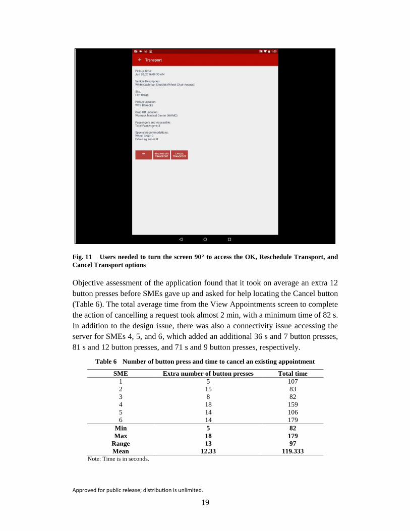
Fig. 11 Users needed to turn the screen 90° to access the OK, Reschedule Transport, and
Cancel Transport options
Objective assessment of the application found that it took on average an extra 12
button presses before SMEs gave up and asked for help locating the Cancel button
(Table 6). The total average time from the View Appointments screen to complete
the action of cancelling a request took almost 2 min, with a minimum time of 82 s.
In addition to the design issue, there was also a connectivity issue accessing the
server for SMEs 4, 5, and 6, which added an additional 36 s and 7 button presses,
81 s and 12 button presses, and 71 s and 9 button presses, respectively.
Table 6 Number of button press and time to cancel an existing appointment
SME Extra number of button presses Total time
1 5 107
2 15 83
3 8 82
4 18 159
5 14 106
6 14 179
Min 5 82
Max 18 179
Range 13 97
Mean 12.33 119.333 Note: Time is in seconds.

Approved for public release; distribution is unlimited.
20
The heuristic evaluation (Table 7) identified the critical screen orientation issue.
SMEs also provided 2 low-priority recommendations to address the issue of blank
space (Fig. 12) and to consider adding the cancel option to the View Appointments
screen. This would increase recognition and decrease the number of button presses
needed to make the action.
Table 7 Heuristic evaluation of canceling an appointment
Heuristic SME recommendation No. of
SMEs Priority
Aesthetic and
minimalist design
Font Size: Removal of blank space would
allow the font size to be larger and easier
to read.
6 1
Match between system
and real world
No recommendations. . . . . . .
Recognition rather
than recall
Cancel Appointment: A lot of steps were
needed to cancel the appointment.
Recommended moving the Cancel option
into the View Appointments screen to
reduce the number of button presses and
increase recognition.
4 1
Consistency and
standards
No recommendations. . . . 0
Visibility of system
status/ Feedback
No recommendations. . . . 0
User control and
freedom/ Clearly
marked exits
No recommendations. . . . 0
Shortcuts/ Flexibility
and efficiency of use
No recommendations. . . . 0
Help users recognize,
diagnose, and recover
from errors
No recommendations. . . . 0
Error prevention Orientation: Landscape screen orientation
hid essential buttons to modify/cancel an
appointment. This led to increased
frustration and loss of confidence in the
system. Recommendation to make screen
fluid rather than extended so it
automatically adjusts to new screen
orientation, allowing user to see all options
on screen.
6 3–4
Help and
documentation
Help Documentation: No help
documentation. Required assistance to
figure out how to cancel the appointment.
6 0

Approved for public release; distribution is unlimited.
21
5.6 Modify a Current Appointment
ARIBO Mobile provides the option to modify an existing appointment. It follows
the same process as canceling an appointment: select “View Appointments” from
the main menu (Fig. 7), select the appointment from the View Appointments screen
(Fig. 9), and select “Reschedule Transport” (Fig. 11) to update or modify the
appointment. Once SMEs were aware of the need to rotate the Transport screen,
they were able to quickly and accurately locate the “Reschedule Transport” button
to modify the appointment without any errors. The time to get to the modify
appointment screen took an average of 21 s compared to the 119.333 s to cancel the
appointment (Table 8).
Table 8 Time, button presses, and errors in modifying a current appointment
SME Time to access
modify appt.
Time to
modify appt.
No. of extra button
presses
No.
of errors
1 19 68 5 2
2 17 34 20 4
3 20 42 8 2
4 17 56 16 2
5 26 45 7 0
6 27 30 11 1
Min 17 30 5 0
Max 27 68 20 4
Range 10 38 15 4
Mean 21.000 45.833 11.17 1.83
Note: Time is in seconds.
SMEs were asked to change their appointment time from the previously scheduled
10:00 am to 2:15 pm. This should have required 6 button presses to complete this
action with the current design of the clock. However, because of a design flaw in
the application, no information was retained from the original reservation. SMEs
had to reschedule the entire reservation. Since SMEs were familiar with the
application at this point, the number of extra button presses (M = 11) and time (M
= 45.833 s) were reduced from the total button presses (M = 23) and time (M =
91.833 s) it took to make the original appointment.
Even though the number of button presses and time were reduced overall, a number
of errors were recorded. The errors for SMEs 1, 3, 4, and 6 occurred because they
assumed that the form was autofilled from the original appointment. The technical
capability to autofill a form is standard in Android development with a few lines of
code. The potential benefit of incorporating an autofill feature for modifying
requests is essential for this population who have multiple appointments, some in
a single day, as well as those with traumatic brain injury or memory

Approved for public release; distribution is unlimited.
22
impairment. Users may not realize items have been cleared out. This can lead to an
increase in errors and frustration. People tend to rely on calendar information and
may not remember the appointment date or time if it clears out. SME 2 also had
errors related to this issue but also had a major error by not changing the clock time
from am/pm. This error led to a failed request that required the SME to completely
reschedule the appointment a second time, resulting in 11 extra button presses.
Table 9 identifies 3 major usability issues relating to retaining original reservation
information and responding to errors. These should be addressed prior to wide
distribution of this application.
Table 9 Heuristic evaluation of modifying an appointment
Heuristic SME recommendation No. of
SMEs Priority
Aesthetic and
minimalist design
No recommendations. . . . 0
Match between system
and real world
No recommendations. . . . 0
Recognition rather
than recall
Autofill: When modifying an
appointment, the system should retain
(autofill) original information.
6 3
Consistency and
standards
No recommendations. . . . 0
Visibility of system
status/ Feedback
No recommendations. . . . 0
User control and
freedom/ Clearly
marked exits
No recommendations. . . . 0
Shortcuts/ Flexibility
and efficiency of use
No recommendations. . . . 0
Help users recognize,
diagnose, and recover
from errors
Error messages: Error messages should
be salient and clearly explain issue (e.g.,
pop out, location, do not use toast).
4 3
Error prevention Warnings: Warnings should be provided
at the time of the error. Users should never
get to a failed reservation screen.
4 3
Help and
documentation
Addition of confirmation screens for all
major actions assist the user in knowing if
system accepted action or not.
4 1

Approved for public release; distribution is unlimited.
23
When errors do occur, error messages should be salient. Currently, the design of
the system uses a toast at the bottom of the screen to communicate certain errors.
The concern with using a toast is that it is small, only present for a short time (even
though Android offers options for longer toasts), and is located at the bottom of the
screen, which may be covered by the hand of the user. Traditionally, toasts are used
for immediate feedback, not for error messages. The second type of error message
occurs at the end of the reservation. Users are taken to the Failed Reservation screen
(described in Section 5.7) and are required to reenter all reservation information.
From a usability perspective, design should be modified to avoid the opportunity
for failure when possible.
5.7 Identify a Failed Request
Once a user presses the “Request” button (Fig. 8) when scheduling an appointment,
ARIBO Mobile is currently designed to take the user to the Transport screen
(Fig. 11) to confirm the reservation or to a Failed Request screen (Fig. 12) to inform
the user of a reason for the failure.
Fig. 12 Example of a Failed Request screen

Approved for public release; distribution is unlimited.
24
When a connectivity error occurs, users are provided a toast stating the reservation
is successfully scheduled, even when a failure ensued. Since there is a separate
window for Failed Requests on the main menu, users need to be aware of how to
access the failed requests on the View Failed Requests screen (Fig. 13). On this
screen the failure is not clearly displayed.
Fig. 13 Example of View Failed Requests screen
A connectivity error occurred for 4 out of the 6 SMEs who completed the objective
assessment. With being previously aware of the connectivity issue and how to
resolve this issue, results still demonstrated an average of 3.5 extra button presses
to determine that a failure had occurred. The 2 participants who did not have a
connectivity issue were sent to the Failed Request screen automatically
(Table 10). On average it took 63.5 s for SMEs to fix the failed request since
previously selected options were cleared out.

Approved for public release; distribution is unlimited.
25
Table 10 Identifying and correcting a failed request
SME Time to fix failed
request
Number of button presses to
identify a failed request
1 93 4
2 45 3
3 65 0
4 114 0
5 32 10
6 32 4
Min 32 0
Max 114 10
Range 82 10
Mean 63.500 3.5
Note: Time is in seconds.
A heuristic evaluation was provided for assessing the process for identifying and
resolving a failed reservation (Table 11). SMEs agreed that errors should be
provided to the user immediately at the time of an error. A failure that requires the
user to exit the current window should not occur.
Table 11 Heuristic evaluation of reservation failures
Heuristic SME recommendation No. of
SMEs Priority
Aesthetic and
minimalist design
Failed Request Window: The font size for
the reason for failed request (Fig. 12) is too
small. Recommend adding clear design to
“pop out” the text from the rest of the
information (e.g., font size, color, bold).
View Failed Request Window: The
buttons of the failed request (Fig. 13) are
the same color as the successful requests in
the View Requests window. Recommend
moving all trip reservations to the same
place (View Requests window) and change
the color of failed request button to red.
4
1
1
1
Match between
system and real world
No recommendations. . . . 0
Recognition rather
than recall
Recognition of failed request: Buttons
(Fig. 13) and content (Fig. 12) should easily
be recognized as a failure. Currently, the
only defining marker is the page title.
6 1
Consistency and
standards
No recommendations. . . . 0
Visibility of system
status/ Feedback
No recommendations. . . . 0

Approved for public release; distribution is unlimited.
26
Table 11 Heuristic evaluation of reservation failures (continued)
Heuristic SME recommendation No. of
SMEs Priority
User control and
freedom/ Clearly
marked exits
Connectivity Issue: When there is a
connectivity issue, the Failed Request
screen does not open. Users assume success
and are not provided instructions.
3 3
Shortcuts/ Flexibility
and efficiency of use
No recommendations. . . . 0
Help users recognize,
diagnose, and recover
from errors
No recommendations. . . . 0
Error prevention Failed Request Menu Item: This window
is more of a developer debug list and
should not be available to the user.
User should receive a “retry” option or be
notified of an error before it goes into a
separate window.
Possible failures: Users are not aware of
potential failures (e.g., number of riders per
vehicle, times the vehicle operates). Add
some text or a pop-up message that states
when something is incorrect.
1
6
4
3
3
1
Help and
documentation
No recommendations. . . . 0
6. Discussion
Overall, SMEs felt the application was user friendly and self-explanatory. A
majority of the feedback involved cosmetic or minor usability problems. A few
findings should be addressed prior to wide distribution of this application.
1) ARIBO Mobile Icon: The ARIBO Mobile icon should represent the
ARIBO program rather than using the generic Android icon. It is important
for users to make the connection to the application to increase recognition
and use. Based on the findings of this evaluation, the mobile icon has
already been updated (Fig. 14).

Approved for public release; distribution is unlimited.
27
Fig. 14 The change in application logo from the original (left) to the ARIBO (right) logo
2) Connectivity Issues: Wireless connections may not be stable at all
locations leading to the potential for a connectivity issue. While this is not
something the designers can control, it is possible to control how the system
updates and informs the user. If a screen needs to be updated or refreshed,
the option to do so should be on that particular page. It is also essential that
the system not send conflicting messages—for example, a toast that states
a ride was scheduled successfully, but then it does not appear in the
appointments list.
As a result of this evaluation, the resync option on the main menu was removed,
and software was updated to account for any reservation errors due to a loss in
signal (Fig. 15). Additional modifications are currently underway.

Approved for public release; distribution is unlimited.
28
Fig. 15 The Resync option was removed from the main menu screen
3) Screen Orientation: All buttons and options should be available despite
screen orientation (i.e., make the screen fluid rather than extended to adjust
to new screen orientation). As a result of this evaluation, changes were made
to the software to account for screen orientation issues (Fig. 16).
Fig. 16 Software changes were made so that all buttons (e.g., OK, reschedule transport,
cancel transport) were available in both landscape (left) and portrait (right) views

Approved for public release; distribution is unlimited.
29
4) Reduce Ambiguity of Appointment Times: When listing scheduled
appointments, it is important to reduce any ambiguity. For example, it is
important to list both the pick-up and drop-off locations. The time that the
vehicle will arrive to pick up the passenger should also be positioned under
the pick-up location. Therefore, changes were made in the design to clearly
mark pick-up and drop-off locations (Fig. 17).
Fig. 17 Changes were made to increase clarity of scheduled appointments
5) Autofill Appointment Modifications: When modifying an appointment,
the system should retain original reservation information. This item is
currently on the developers’ task list to be completed by January 2017.
6) Add Salient Error Messages and Warnings: Users should never get to a
separate failed reservation screen. Errors should be salient and clearly
explain an issue. They should also occur at the time of the error, not
following completion of an appointment reservation. To date, some
advancements were made, including to the current Failed Request screen.
Overall, errors are more salient and clearly identified in bold red text, as
shown in Fig. 18. After pressing the “request” button on the Ride Request
page, the user is now always taken to either a Successful Request page that
details all the information of the ride, or a Request FAILED page (in red
font) informing them of the reason why the request failed.

Approved for public release; distribution is unlimited.
30
Fig. 18 Text delineating a Request Failure was added to increase clarity of the display to the
user
The following is a list of minor usability problems. These are items that are low
priority but may improve ease of use for the users.
1) Login Help: The button “Need Help with Login?” is available on the main
login screen. However, when a user selects this option, the keyboard is
opened automatically and covers up the directions and help information.
Following the results of this evaluation, this feature has been updated so
that the keyboard no longer covers up important text.
2) Clarity of Menu Items: The developers need to increase the clarity of the
“Resync” menu item to communicate to the user what it is and when it
should be used. In response to this evaluation, the “Resync” button has been
removed completely. Its functionality has been automated and users have
no need for this.
3) Clock: While the clock appears to be mobile optimized, the options may
not be familiar to all users. The appearance and functionality may also vary
per Android device. The developers should also consider that Soldiers are
used to working with a 24-h clock, not a 12-h clock. The am/pm button is
also small and difficult to press. The developers are currently looking into
options.

Approved for public release; distribution is unlimited.
31
4) “Pick Me Up Now” Button: The addition of a “Pick Me Up Now” button
could increase on-demand ridership and ease of use. This option should
autofill date, time, and potentially even current location (from kiosk
devices). This would greatly reduce the amount of information the user
would need to enter. The developers are currently looking into options to
determine how to best address this issue.
5) Add in Error Prevention Options: Certain documentation or information
could help prevent users from making errors during the reservation process.
For example, constrain the number of passengers, update terminology (e.g.,
“extra leg room” is unclear), and add confirmation screens for appointment
time verification. A change in the software was made to address potential
errors by changing “extra leg room” to “extra leg room (for leg/foot
injury)”.
6) Make Selectable Options More Salient: Selectable buttons should look
like buttons. Options could include 3-D formatting, gradients, 3 vertical
dots, or text stating “more info”. The developers are currently looking into
options to determine how to best address this issue.
7. Conclusion
The ARIBO Mobile application has the power to shape users’ initial perceptions
about the ARIBO AWTO system before they ever board the vehicle. Because of
the ubiquity of smartphones and other mobile devices, when users log in to the
ARIBO Mobile application to schedule, check, edit, or cancel a ride, they will have
certain expectations about the usability of the tool. The manner and degree to which
the tool meets or violates user expectations can influence their trust in the overall
system’s ability to reliably transport them to where they need to be, when they need
to be there.
With one notable (see Section 6, “Screen Orientation”) and a few minor exceptions,
the developers of the ARIBO Mobile application met their first challenge by scaling
a display for use on both a smartphone and a larger tablet interface. The second
challenge, to develop an application easily used by individuals with a wide range
of technological acuity or skill, as well as mental and physical limitations due to
injury, was largely met with a few notable exceptions. Enabling autofill options,
improving error messages, and implementing other recommendations (see Section
6) will reduce stress and cognitive load of users improving ease-of-use and system
acceptance. Future work will include end-user evaluations using actual Soldiers of
various ability levels to help capture any accessibility issues or additional problems
that may not have come up during the SME evaluation.

Approved for public release; distribution is unlimited.
32
8. References
Baker M, Casey R, Keyes B, Yanco HA. Improved interfaces for human-robot
interaction in urban search and rescue. Proceedings of the Conference on
Systems, Man, and Cybernetics; 2004 Oct 10–13; The Hague, Netherlands.
IEEE; c2004. p. 2960–2965. DOI: 10.1109/ICSMC.2004.1400783
Baxter K, Courage C, Caine K. Understanding your users: a practical guide to user
research methods. 2nd ed. Waltham (MA): Elsevier; 2015.
Burgoon JK, Bonito JA, Lowry PB, Humpherys SL, Moody GD, Gaskin JE,
Giboney JS. Application of expectancy violations theory to communication
with and judgments about embodied agents during a decision-making task.
International Journal of Human-Computer Studies. 2016;91:24–36.
http://dx.doi.org/10.1016/j.ijhcs.2016.02.002.
Dumas JS, Redish JC. A practical guide to usability testing (revised edition).
Portland (OR): Intellect; 1999.
Endsley MR. Design and evaluation for situation awareness enhancement.
Proceedings of the Human Factors and Ergonomics Society; 1988 Oct 24–28;
Anaheim (CA): SAGE Publications; c1988;32(2):97–101.
Ericsson KA, Simon HA. Verbal reports as data. Psychological Review. 1980;87
(3):215–251.
Goodrich MA, Schultz AC. Human-robot interaction: a survey. Foundations and
Trends in Human-Computer Interaction. 2007;1(3):203–275.
Lamming M, Newman W. Interactive system design. Boston (MA): Addison-
Wesley Longman Publishing Co; 1995.
Mottern E, Putney J, Barghout J, Straub E. Moving technology forward by putting
robots to work on military installations: autonomous warrior transport on‐base
(AWTO). NDIA Ground Vehicle Systems Engineering and Technology
Symposium: Autonomous Ground Systems; 2015 Aug 2–4; Novi, MI.
Nielsen J. Usability engineering. San Diego (CA): Academic Press; 1993.
Nielsen J. Heuristic evaluation. In: Nielsen J, Mack RL, editors. Usability
inspection methods. New York (NY): John Wiley & Sons; 1994. p. 25–62.

Approved for public release; distribution is unlimited.
33
Nielsen J, Landauer TK. A mathematical model of the finding of usability
problems. Proceedings of the INTERACT'93 and CHI'93 conference on
Human Factors in Computing Systems; 1993 Apr 24–29; Amsterdam, The
Netherlands. New York (NY): ACM; c1993. p. 206–213.
Schaefer KE. The perception and measurement of human-robot trust [dissertation].
[Orlando (FL)]: University of Central; 2013.
Schaefer KE, Sanders TL, Yordon RE, Billings DR, Hancock PA. Classification of
robot form: factors predicting perceived trustworthiness. Proceedings of the
Human Factors and Ergonomics Society; 2012 Oct 22–26; Boston, MA.
Thousand Oaks (CA): SAGE Publishing; c2012;56(1):1548–1552.
Sharp H, Rogers Y, Preece J. Interaction design: beyond human-computer
interaction. 2nd ed. West Sussex (UK): John Wiley & Sons; 2007.

Approved for public release; distribution is unlimited.
34
INTENTIONALLY LEFT BLANK.

Approved for public release; distribution is unlimited.
35
Appendix A. Nielsen’s Usability Heuristics

Approved for public release; distribution is unlimited.
36
Nielsen Heuristics Aesthetic and minimalist design
Dialogues should not contain information that is irrelevant or rarely needed. Every extra unit of information in a dialogue competes with the relevant units of information and diminishes their relative visibility. Less is often more. There should be a balance between graphic design, color, and information.
Match between system and the real world The system should speak the users' language, with words, phrases, and concepts familiar to the user, rather than system-oriented terms. Follow real-world conventions, making information appear in a natural and logical order.
Recognition rather than recall Minimize the user's memory load by making objects, actions, and menu options visible. The user should not have to remember information from one part of the dialogue to another. Instructions for use of the system should be visible or easily retrievable whenever appropriate.
Consistency and standards Users should not have to wonder whether different words, situations, or actions mean the same thing. Follow platform conventions.
Visibility of system status / Feedback The system should always keep users informed about what is going on through appropriate feedback within reasonable time.
User control and freedom / Clearly Marked Exits Users often choose system functions by mistake and will need a clearly marked "emergency exit" to leave the unwanted state without having to go through an extended dialogue. Support undo and redo.
Shortcuts / Flexibility and efficiency of use Accelerators -- unseen by the novice user -- may often speed up the interaction for the expert user, such that the system can cater to both inexperienced and experienced users. Allow users to tailor frequent actions.
Help users recognize, diagnose, and recover from errors Error messages should be expressed in plain language (no codes), precisely indicate the problem, and constructively suggest a solution.
Error prevention Even better than good error messages is a careful design, which prevents a problem from occurring in the first place. Either eliminate error-prone conditions or check for them and present users with a confirmation option before they commit to the action. Avoid insert and edit modes.
Help and documentation Even though it is better if the system can be used without documentation, it may be necessary to provide help and documentation. Any such information should be easy to search, focused on the user's task, list concrete steps to be carried out, and not be too large.

Approved for public release; distribution is unlimited.
37
Appendix B. Table of Times to Log into ARIBO Mobile

Approved for public release; distribution is unlimited.
38
Table B-1 Login time for subject matter experts (SMEs)
SME Locate
icon
Access
keyboard
Enter
username
Enter
password
Total login
time
Total login time
w/o icon
1 11 14 14 11 50 39
2 7 7 6 8 28 21
3 12 3 8 8 31 19
4 20 3 13 10 46 26
5 9 3 5 8 25 16
6 32 4 6 6 48 16
Min 7 3 5 6 25 16
Max 32 14 14 11 50 39
Range 25 11 9 5 25 23
Mean 15.167 5.667 8.667 8.500 38.000 22.833 Note: Time is in seconds.

Approved for public release; distribution is unlimited.
39
Appendix C. Making a New Reservation Screenshots

Approved for public release; distribution is unlimited.
40
Fig. C-1 Screenshot of the main Request Transportation screen

Approved for public release; distribution is unlimited.
41
Fig. C-2 Screenshot of options for selecting specific criteria related to pick-up time

Approved for public release; distribution is unlimited.
42
Fig. C-3 Screenshot of calendar feature
Approved for public release; distribution is unlimited.
43
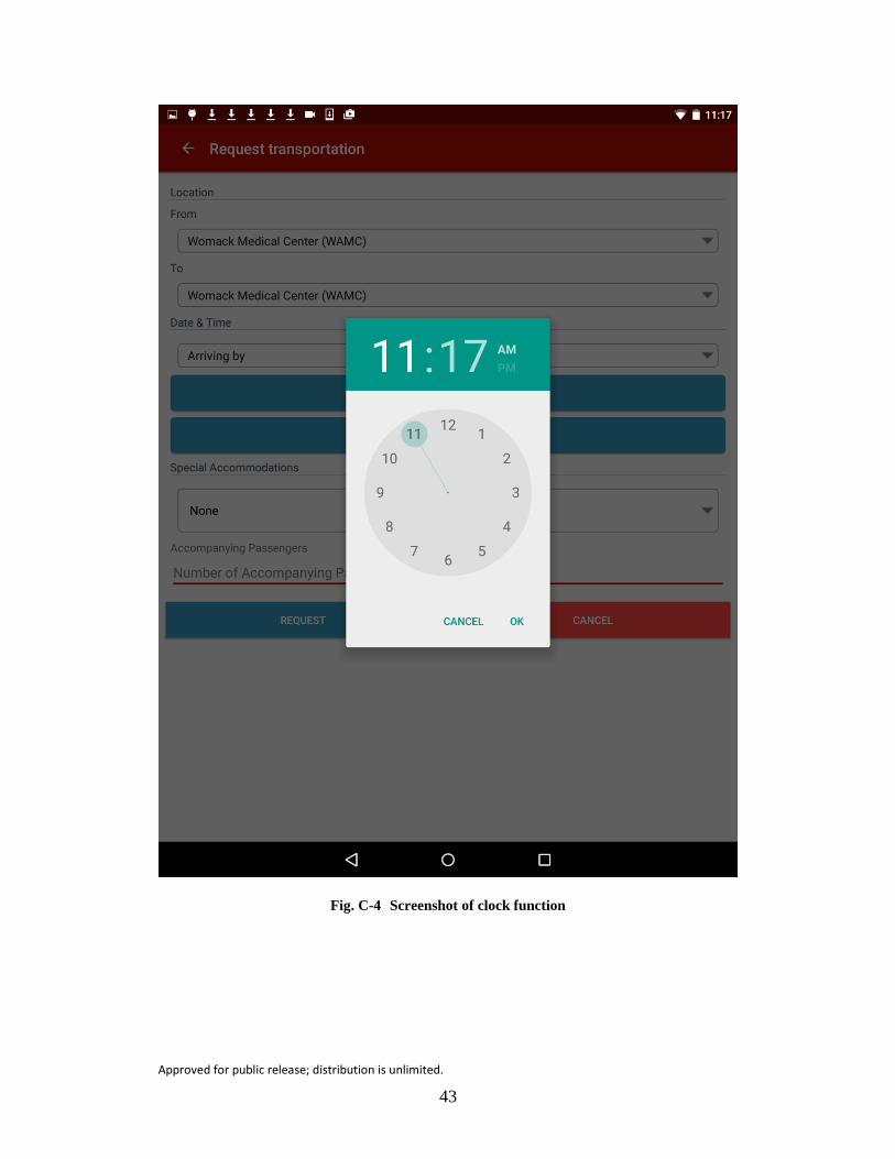
Fig. C-4 Screenshot of clock function

Approved for public release; distribution is unlimited.
44
Fig. C-5 Screenshot of special accommodations options

Approved for public release; distribution is unlimited.
45
Fig. C-6 Screenshot of pop-up menu to set the number of accompanying passengers

Approved for public release; distribution is unlimited.
46
List of Symbols, Abbreviations, and Acronyms
ARIBO Applied Robotics for Installations and Base Operations
AWTO Autonomous Warrior Transport On-base
SME subject matter expert
TARDEC US Army Tank Automotive Research, Development and
Engineering Center
WTB Warrior Transition Battalion

Approved for public release; distribution is unlimited.
47
1 DEFENSE TECHNICAL
(PDF) INFORMATION CTR
DTIC OCA
2 DIRECTOR
(PDF) US ARMY RESEARCH LAB
RDRL CIO L
IMAL HRA MAIL & RECORDS
MGMT
1 GOVT PRINTG OFC
(PDF) A MALHOTRA
2 ROBOTIC RSRCH
(PDF) J PUTNEY
E MOTTERN
4 TARDEC
(PDF) E STRAUB
A JIMENEZ
J ERNAT
D KOWACHEK
1 ARMY RSCH LAB – HRED
(PDF) RDRL HRB B
T DAVIS
BLDG 5400 RM C242
REDSTONE ARSENAL AL
35898-7290
7 ARMY RSCH LAB – HRED
(PDF) SFC PAUL RAY SMITH
CENTER
RDRL HRO COL H BUHL
RDRL HRA I MARTINEZ
RDRL HRR R SOTTILARE
RDRL HRA C RODRIGUEZ
RDRL HRA B J HART
RDRL HRA A C METEVIER
RDRL HRA D B PETTIT
12423 RESEARCH PARKWAY
ORLANDO FL 32826
1 USA ARMY G1
(PDF) DAPE HSI B KNAPP
300 ARMY PENTAGON
RM 2C489
WASHINGTON DC 20310-0300
1 USAF 711 HPW
(PDF) 711 HPW/RH K GEISS
2698 G ST BLDG 190
1 USN ONR
(PDF) ONR CODE 34 P MASON
875 N RANDOLPH STREET
SUITE 1425
ARLINGTON VA 22203-1995
1 USN ONR
(PDF) ONR CODE 341 J TANGNEY
875 N RANDOLPH STREET
BLDG 87
ARLINGTON VA 22203-1986
1 USA HQDA
(PDF) ARI M SAMS
6000 6TH STREET BLDG 1464
FT BELVOIR VA 22060
1 USA NSRDEC
(PDF) RDNS D D TAMILIO
10 GENERAL GREENE AVE
NATICK MA 01760-2642
1 OSD OUSD ATL
(PDF) HPT&B B PETRO
4800 MARK CENTER DRIVE
SUITE 17E08
ALEXANDRIA VA 22350
12 DIR USARL
(PDF) RDRL HR
L ALLENDER
P FRANASZCZUK
RDRL HRB
J LOCKETT
RDRL HRB A
M LAFIANDRA
RDRL HRB C
J GRYNOVICKI
RDRL HRB D
D HEADLEY
RDRL HRF
K OIE
RDRL HRF A
A DECOSTANZA
RDRL HRF B
A EVANS
RDRL HRF C
J GASTON
RDRL HRF D
A MARATHE
K SCHAEFER
WRIGHT PATTERSON AFB OH
45433-7604

Approved for public release; distribution is unlimited.
48
INTENTIONALLY LEFT BLANK.