Embed Size (px)
Citation preview
University of Texas System Productivity Dashboard A Model for ExcellenceAssociation for Institutional Research, May 2013
Dr. Stephanie Bond HuieVice Chancellor ad interim for Strategic Initiatives
Jennifer WhitmanSenior Systems Analyst for Strategic Initiatives
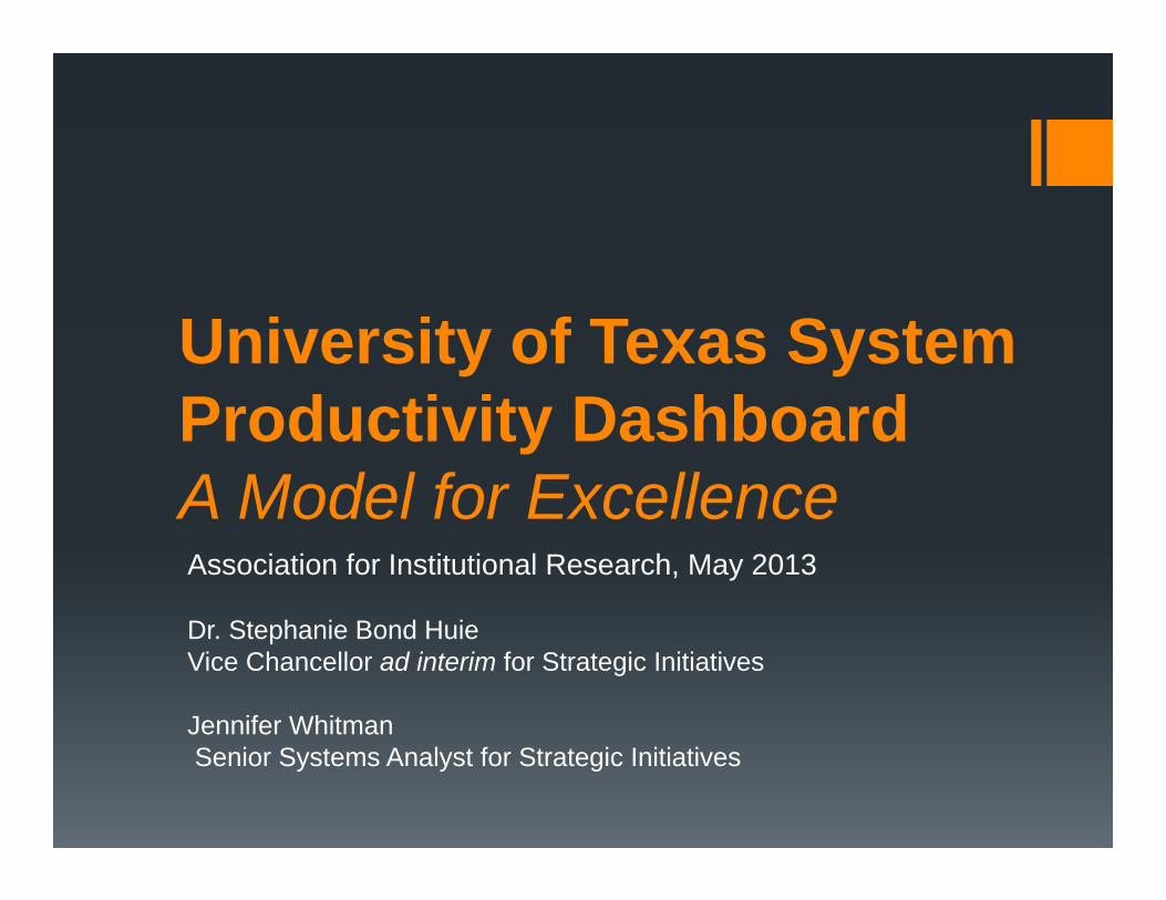
• 15 institutions 9 academic institutions 6 health institutions
• 215,606 students (Fall 2012) 75% undergraduate 40% Hispanic
• 48,819 degrees/certificates awarded (AY 2012) 66% undergraduate One third of degrees awarded by public universities in Texas Nearly two thirds of degrees awarded by public health-related
institutions in Texas
UT System By the Numbers
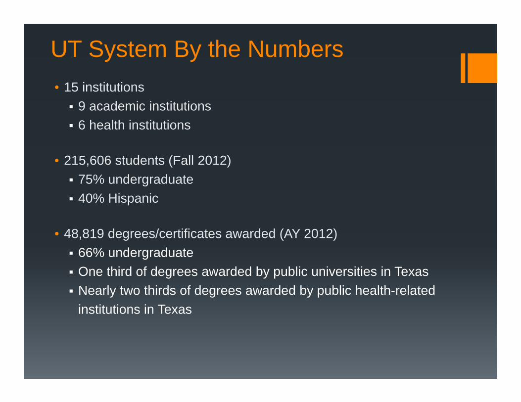
• Framework for Advancing Excellence adopted in May 2011
• Key Elements - Framework Action Plan adopted in August 2011
1. Undergraduate Student Access & Success 2. Faculty/Administrators/Staff Excellence3. Research4. Productivity and Efficiency 5. Enhance Philanthropic Success6. Ph.D. Programs7. The Health of Texas8. Expanding Educational and Health Opportunities in South Texas
Framework for Advancing Excellence
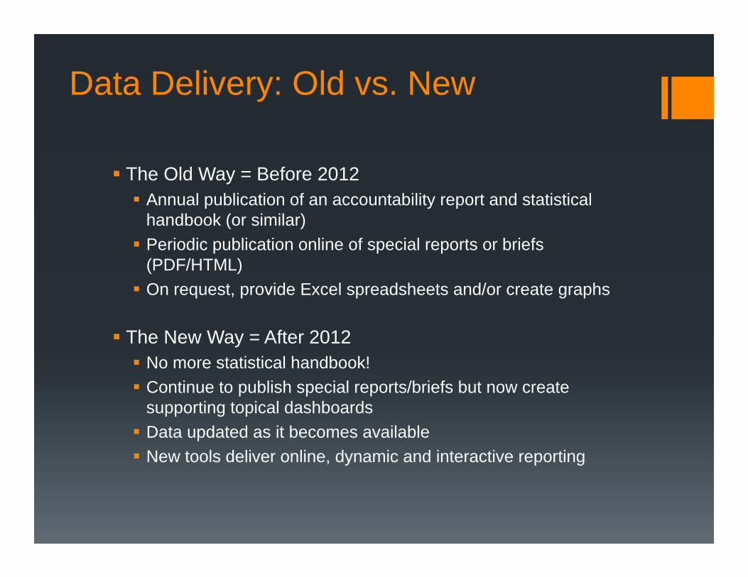
Data Delivery: Old vs. New
The Old Way = Before 2012 Annual publication of an accountability report and statistical
handbook (or similar) Periodic publication online of special reports or briefs
(PDF/HTML) On request, provide Excel spreadsheets and/or create graphs
The New Way = After 2012 No more statistical handbook! Continue to publish special reports/briefs but now create
supporting topical dashboards Data updated as it becomes available New tools deliver online, dynamic and interactive reporting
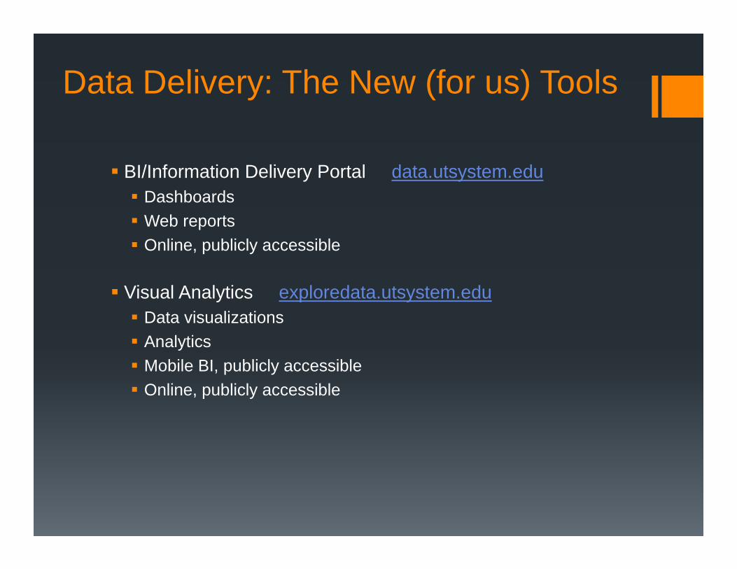
Data Delivery: The New (for us) Tools
BI/Information Delivery Portal data.utsystem.edu Dashboards Web reports Online, publicly accessible
Visual Analytics exploredata.utsystem.edu Data visualizations Analytics Mobile BI, publicly accessible Online, publicly accessible
Building the Dashboard
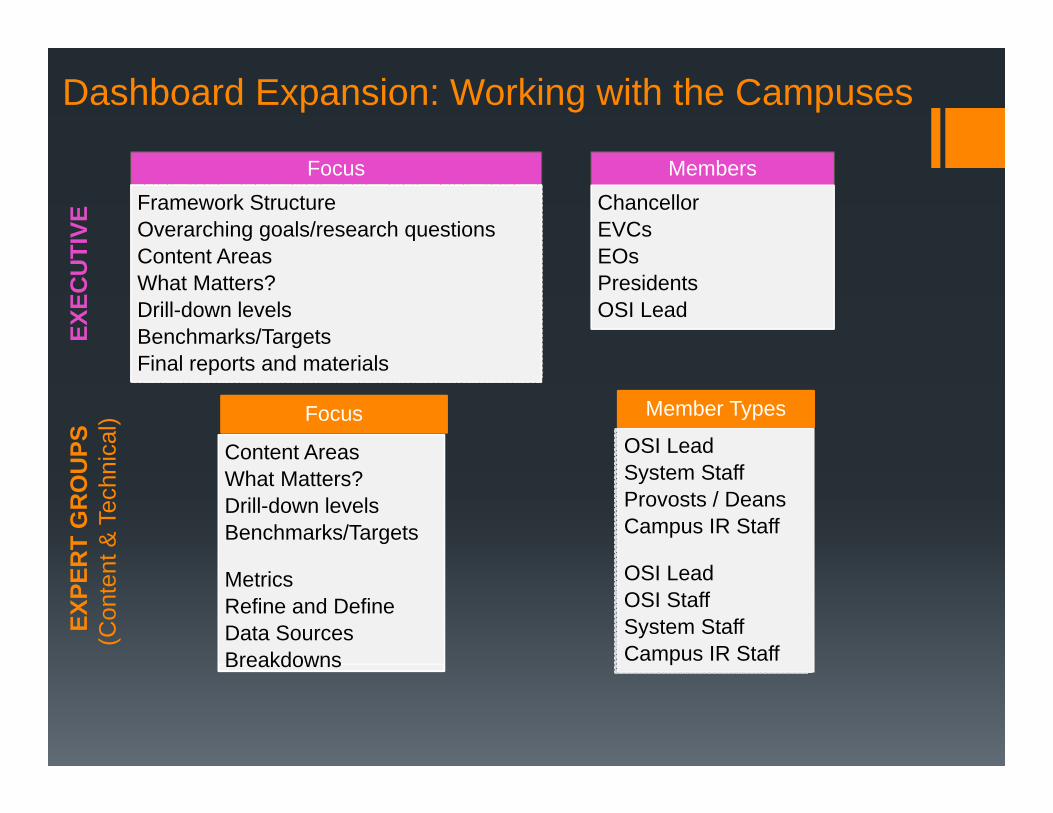
Dashboard Expansion: Working with the CampusesEX
ECU
TIVE
EXPE
RT
GR
OU
PS(C
onte
nt &
Tec
hnic
al)
FocusFramework StructureOverarching goals/research questionsContent AreasWhat Matters?Drill-down levelsBenchmarks/TargetsFinal reports and materials
MembersChancellorEVCsEOsPresidentsOSI Lead
Focus
Content AreasWhat Matters?Drill-down levelsBenchmarks/Targets
MetricsRefine and DefineData SourcesBreakdowns
Member Types
OSI LeadSystem StaffProvosts / DeansCampus IR Staff
OSI LeadOSI StaffSystem StaffCampus IR Staff
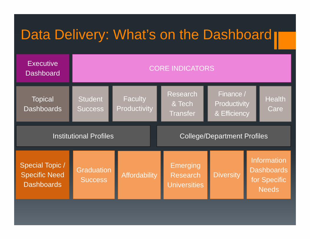
Executive Dashboard
Topical Dashboards
Student Success
Faculty Productivity
Research& Tech
Transfer
Finance / Productivity& Efficiency
Health Care
Special Topic / Specific Need Dashboards
CORE INDICATORS
Graduation Success Affordability
Emerging Research
Universities
Information Dashboards for Specific
Needs
Institutional Profiles College/Department Profiles
Diversity
Data Delivery: What’s on the Dashboard
Administering the Dashboard
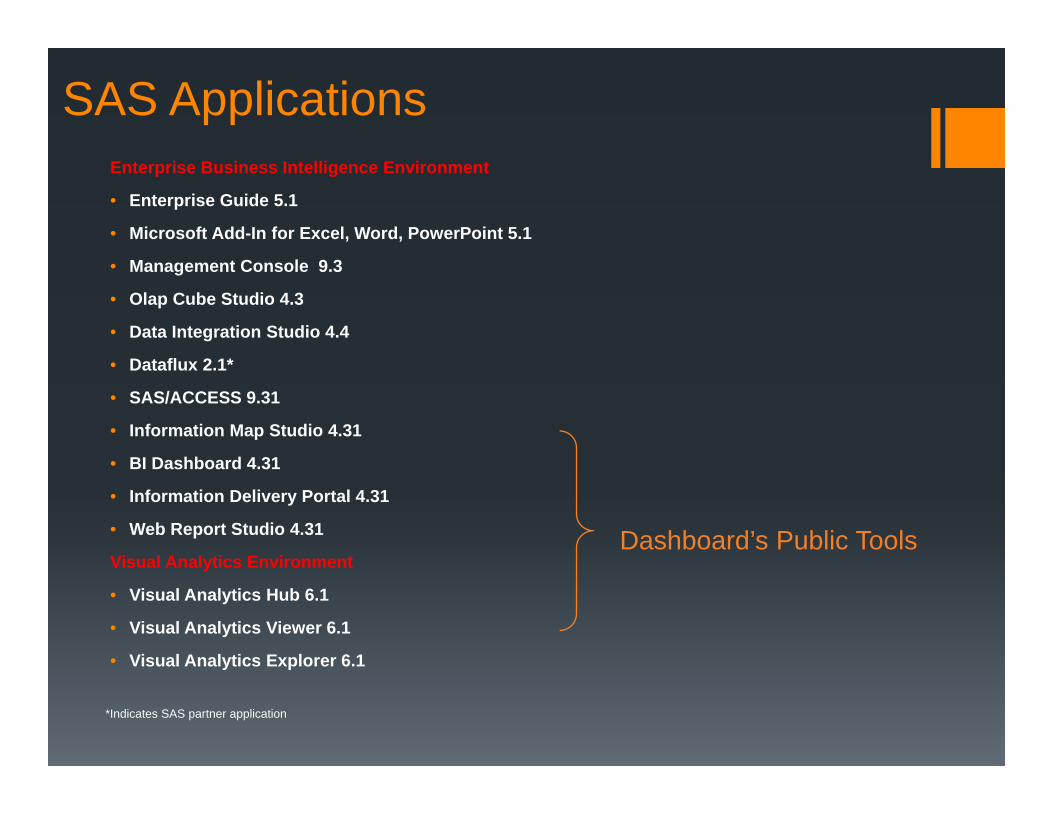
Enterprise Business Intelligence Environment
• Enterprise Guide 5.1
• Microsoft Add-In for Excel, Word, PowerPoint 5.1
• Management Console 9.3
• Olap Cube Studio 4.3
• Data Integration Studio 4.4
• Dataflux 2.1*
• SAS/ACCESS 9.31
• Information Map Studio 4.31
• BI Dashboard 4.31
• Information Delivery Portal 4.31
• Web Report Studio 4.31
Visual Analytics Environment
• Visual Analytics Hub 6.1
• Visual Analytics Viewer 6.1
• Visual Analytics Explorer 6.1
*Indicates SAS partner application
SAS Applications
Dashboard’s Public Tools
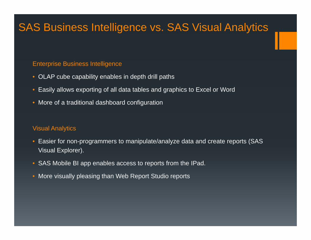
Enterprise Business Intelligence
• OLAP cube capability enables in depth drill paths
• Easily allows exporting of all data tables and graphics to Excel or Word
• More of a traditional dashboard configuration
Visual Analytics
• Easier for non-programmers to manipulate/analyze data and create reports (SAS Visual Explorer).
• SAS Mobile BI app enables access to reports from the IPad.
• More visually pleasing than Web Report Studio reports
SAS Business Intelligence vs. SAS Visual Analytics
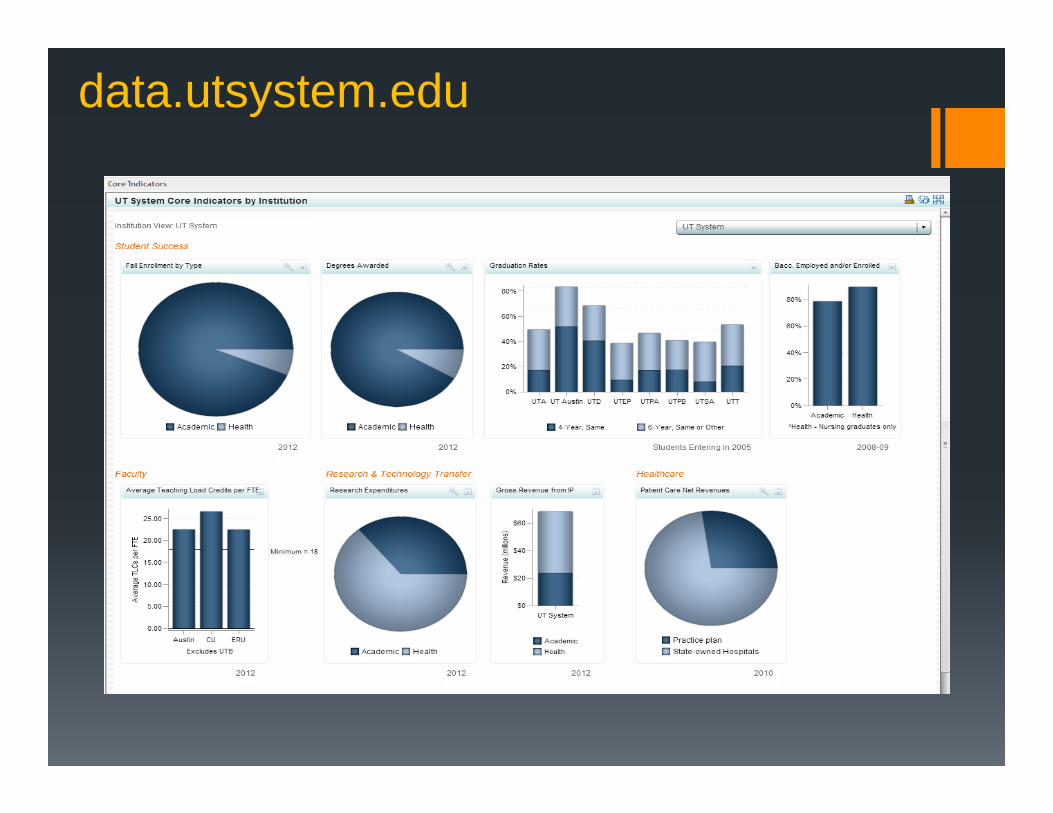
data.utsystem.edu
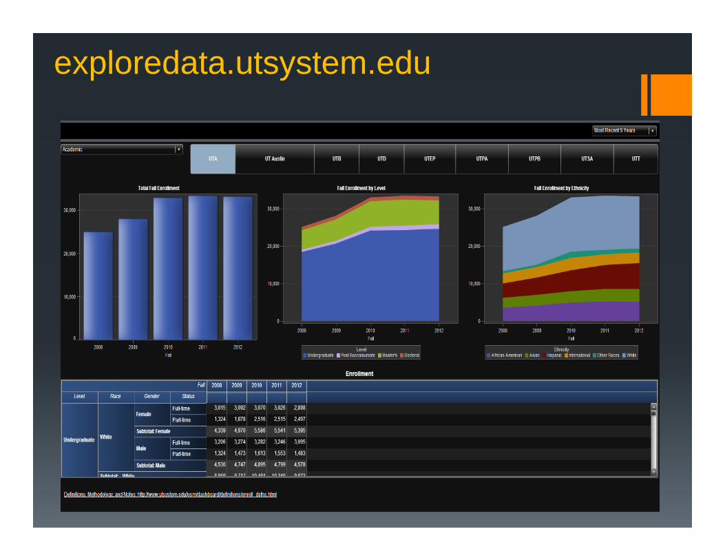
exploredata.utsystem.edu
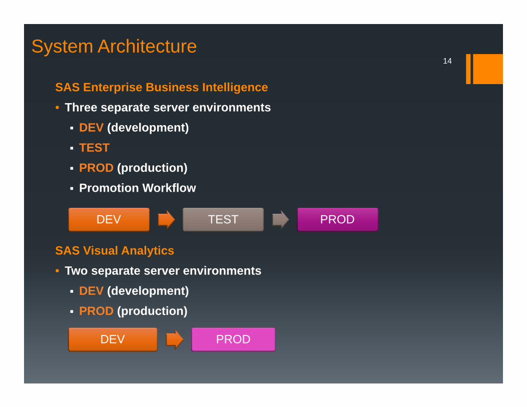
SAS Enterprise Business Intelligence• Three separate server environments DEV (development) TEST PROD (production) Promotion Workflow
SAS Visual Analytics• Two separate server environments DEV (development) PROD (production)
System Architecture14
DEV TEST PROD
DEV PROD
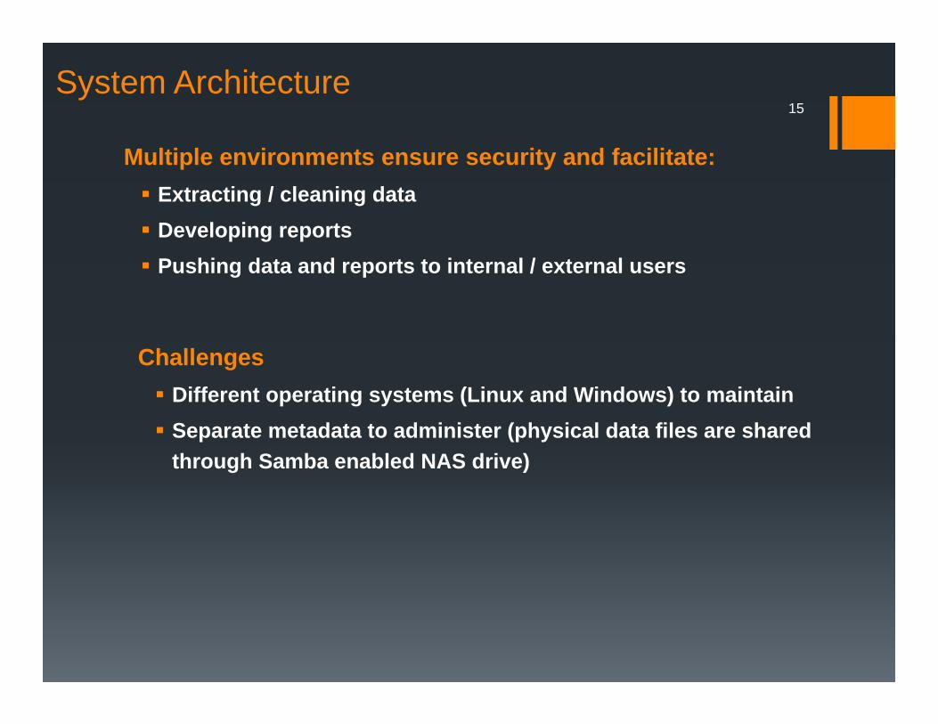
Multiple environments ensure security and facilitate: Extracting / cleaning data Developing reports Pushing data and reports to internal / external users
System Architecture 15
Challenges Different operating systems (Linux and Windows) to maintain Separate metadata to administer (physical data files are shared
through Samba enabled NAS drive)
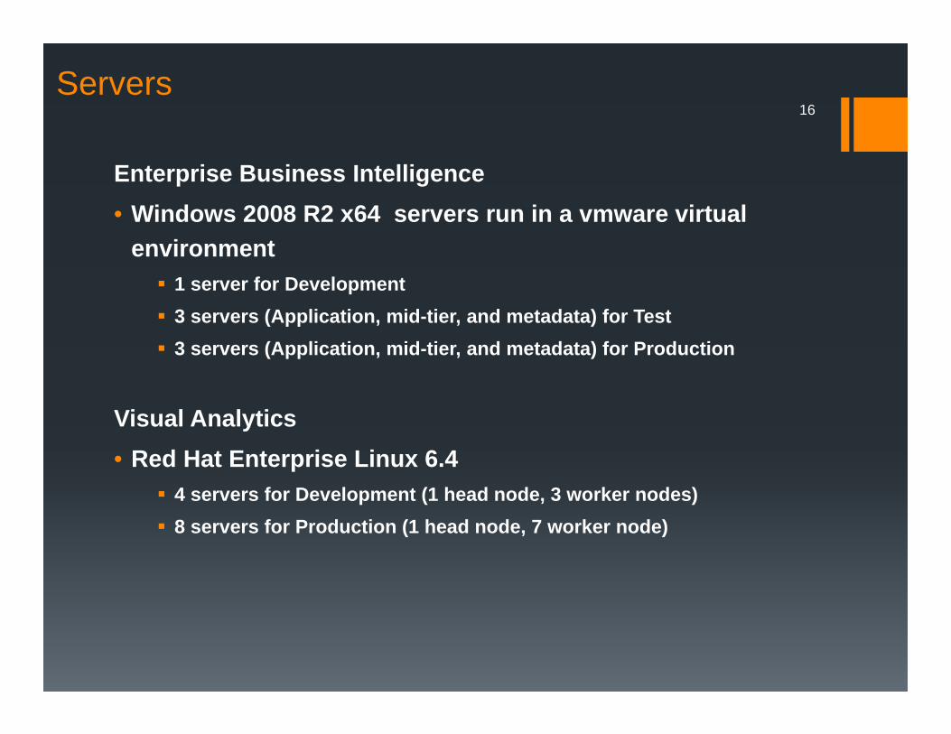
Visual Analytics• Red Hat Enterprise Linux 6.4
4 servers for Development (1 head node, 3 worker nodes) 8 servers for Production (1 head node, 7 worker node)
Servers16
Enterprise Business Intelligence • Windows 2008 R2 x64 servers run in a vmware virtual
environment 1 server for Development 3 servers (Application, mid-tier, and metadata) for Test 3 servers (Application, mid-tier, and metadata) for Production
Delivering & Using Data
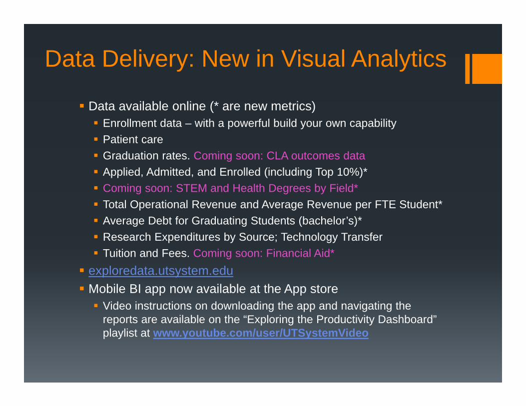
Data Delivery: New in Visual Analytics
Data available online (* are new metrics) Enrollment data – with a powerful build your own capability Patient care Graduation rates. Coming soon: CLA outcomes data Applied, Admitted, and Enrolled (including Top 10%)* Coming soon: STEM and Health Degrees by Field* Total Operational Revenue and Average Revenue per FTE Student* Average Debt for Graduating Students (bachelor’s)* Research Expenditures by Source; Technology Transfer Tuition and Fees. Coming soon: Financial Aid*
exploredata.utsystem.edu Mobile BI app now available at the App store Video instructions on downloading the app and navigating the
reports are available on the “Exploring the Productivity Dashboard” playlist at www.youtube.com/user/UTSystemVideo
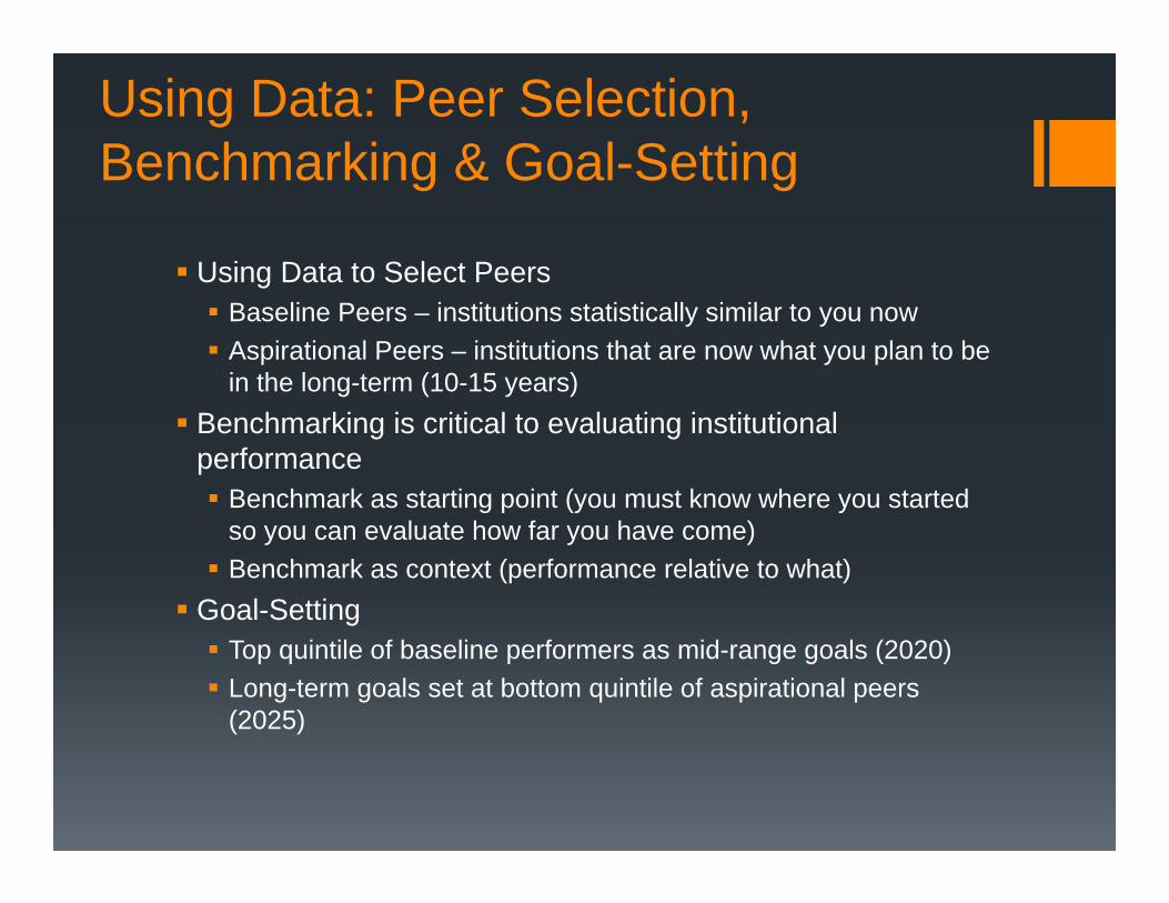
Using Data: Peer Selection, Benchmarking & Goal-Setting
Using Data to Select Peers Baseline Peers – institutions statistically similar to you now Aspirational Peers – institutions that are now what you plan to be
in the long-term (10-15 years) Benchmarking is critical to evaluating institutional
performance Benchmark as starting point (you must know where you started
so you can evaluate how far you have come) Benchmark as context (performance relative to what)
Goal-Setting Top quintile of baseline performers as mid-range goals (2020) Long-term goals set at bottom quintile of aspirational peers
(2025)
20
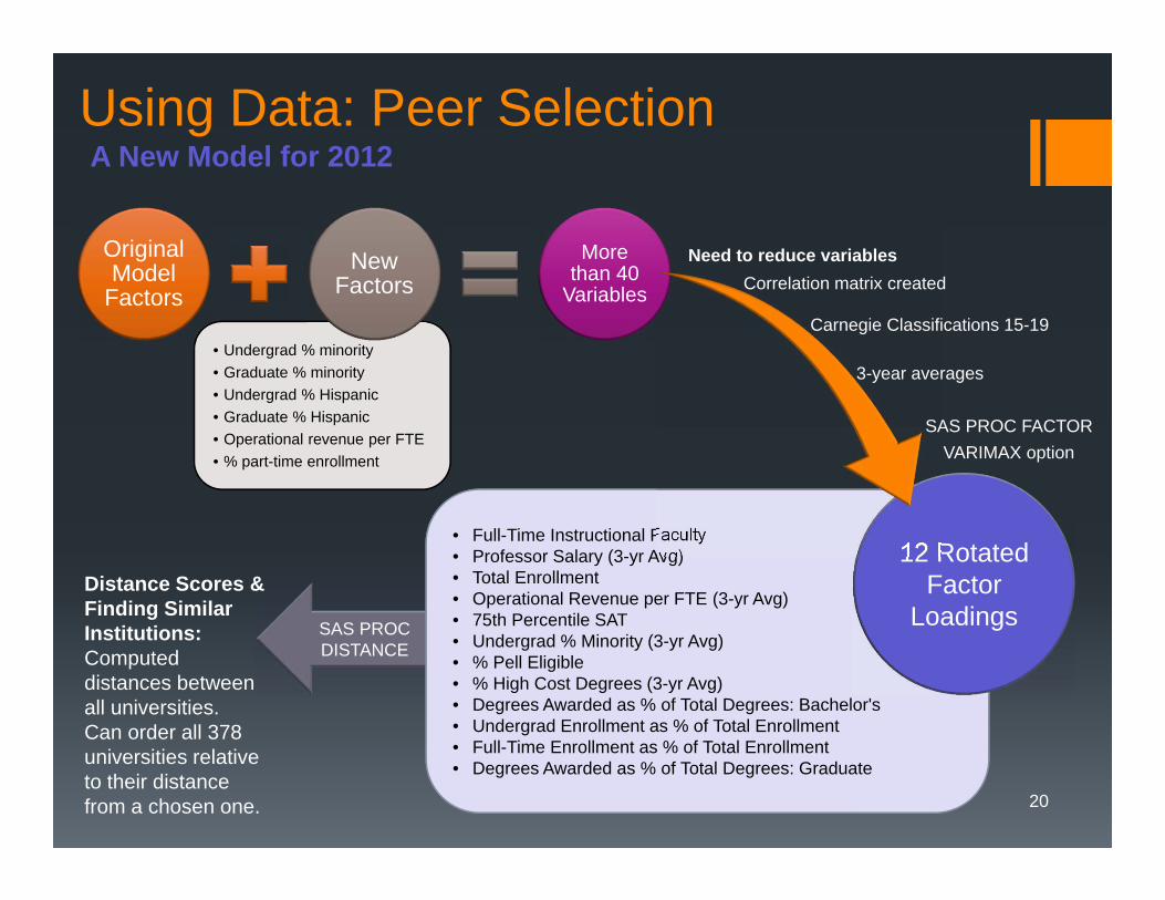
Using Data: Peer Selection
• Undergrad % minority• Graduate % minority• Undergrad % Hispanic• Graduate % Hispanic• Operational revenue per FTE• % part-time enrollment
Original Model
FactorsNew
FactorsMore
than 40 Variables
A New Model for 2012
SAS PROC DISTANCE
• Full-Time Instructional Faculty• Professor Salary (3-yr Avg)• Total Enrollment• Operational Revenue per FTE (3-yr Avg)• 75th Percentile SAT• Undergrad % Minority (3-yr Avg)• % Pell Eligible• % High Cost Degrees (3-yr Avg)• Degrees Awarded as % of Total Degrees: Bachelor's• Undergrad Enrollment as % of Total Enrollment• Full-Time Enrollment as % of Total Enrollment• Degrees Awarded as % of Total Degrees: Graduate
12 Rotated Factor
Loadings
Need to reduce variablesCorrelation matrix created
Carnegie Classifications 15-19
3-year averages
SAS PROC FACTORVARIMAX option
Distance Scores & Finding Similar Institutions: Computed distances between all universities. Can order all 378 universities relative to their distance from a chosen one.
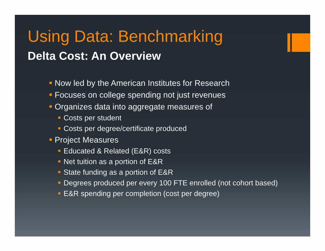
Using Data: BenchmarkingDelta Cost: An Overview
Now led by the American Institutes for Research Focuses on college spending not just revenues Organizes data into aggregate measures of Costs per student Costs per degree/certificate produced
Project Measures Educated & Related (E&R) costs Net tuition as a portion of E&R State funding as a portion of E&R Degrees produced per every 100 FTE enrolled (not cohort based) E&R spending per completion (cost per degree)
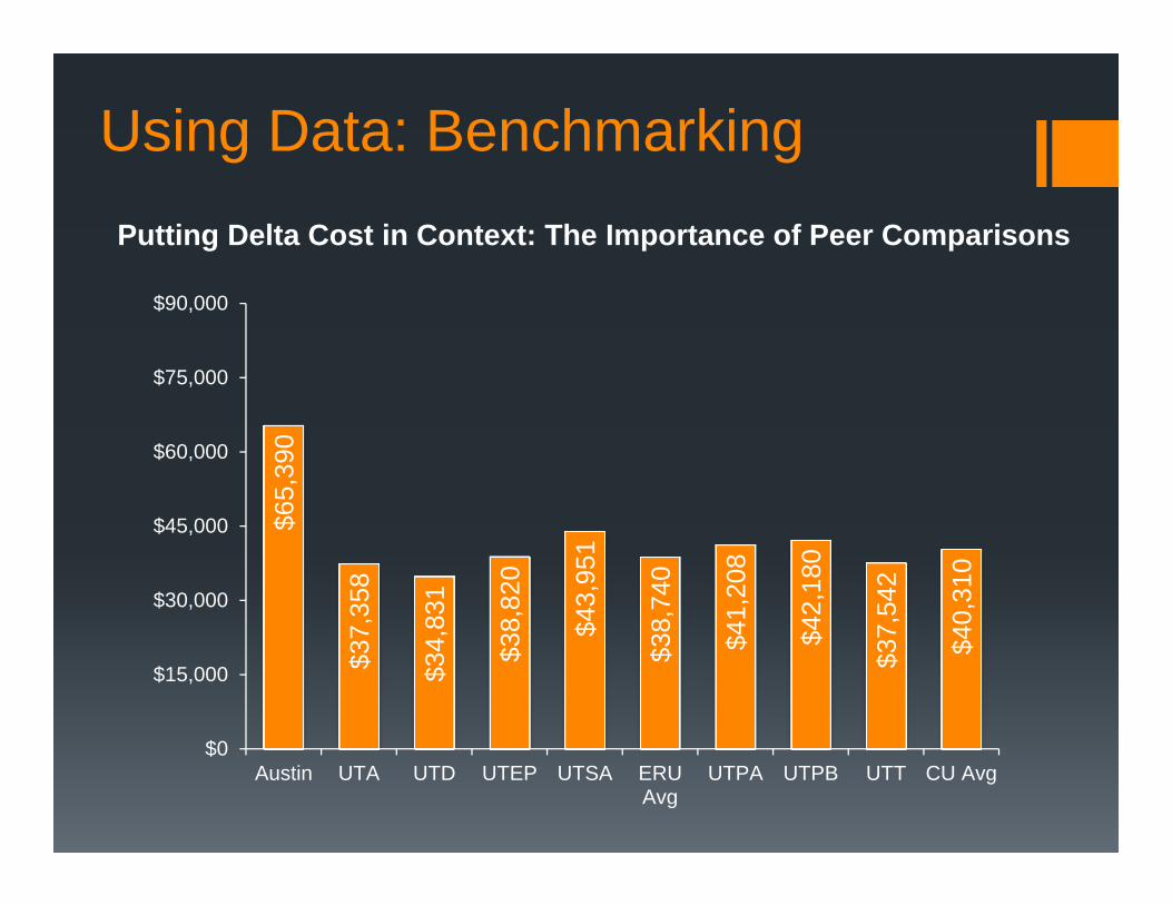
Using Data: Benchmarking
$65,
390
$37,
358
$34,
831
$38,
820
$43,
951
$38,
740
$41,
208
$42,
180
$37,
542
$40,
310
$0
$15,000
$30,000
$45,000
$60,000
$75,000
$90,000
Austin UTA UTD UTEP UTSA ERUAvg
UTPA UTPB UTT CU Avg
Putting Delta Cost in Context: The Importance of Peer Comparisons
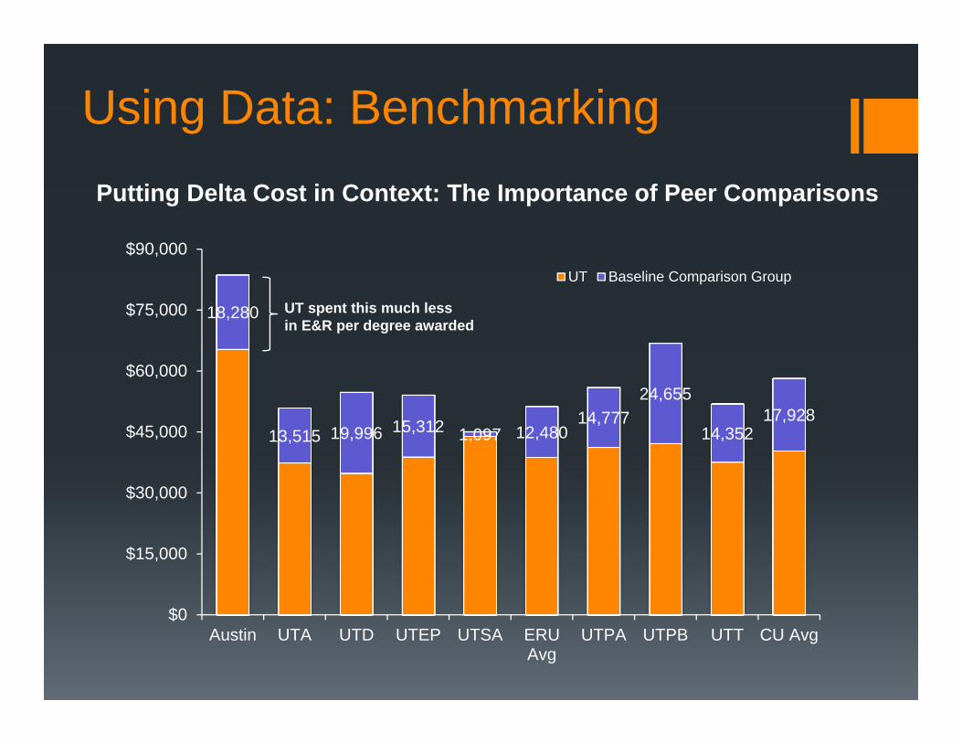
Using Data: Benchmarking
18,280
13,515 19,996 15,312 1,097 12,480 14,777
24,655
14,352 17,928
$0
$15,000
$30,000
$45,000
$60,000
$75,000
$90,000
Austin UTA UTD UTEP UTSA ERUAvg
UTPA UTPB UTT CU Avg
UT Baseline Comparison Group
UT spent this much less in E&R per degree awarded
Putting Delta Cost in Context: The Importance of Peer Comparisons
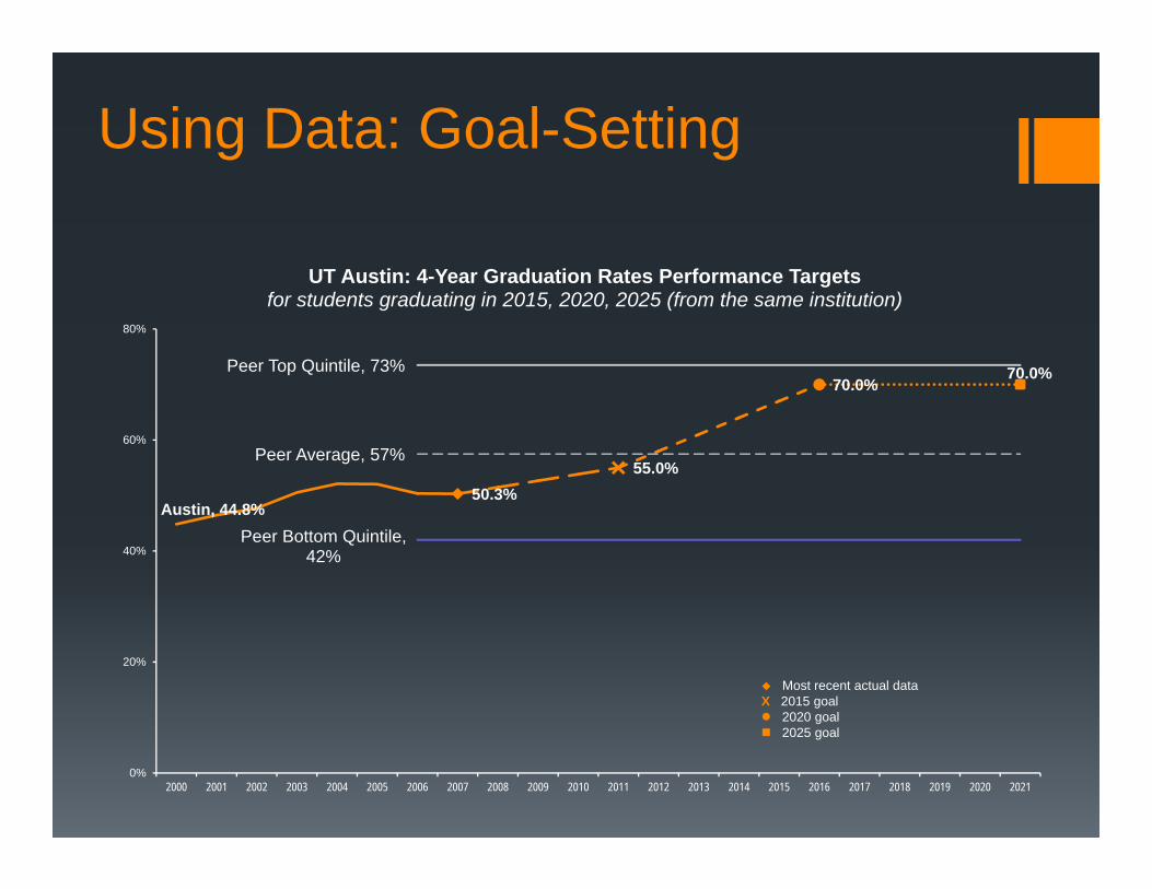
Using Data: Goal-Setting
Austin, 44.8%50.3%
55.0%
70.0%70.0%
Peer Bottom Quintile, 42%
Peer Average, 57%
Peer Top Quintile, 73%
0%
20%
40%
60%
80%
2000 2001 2002 2003 2004 2005 2006 2007 2008 2009 2010 2011 2012 2013 2014 2015 2016 2017 2018 2019 2020 2021
UT Austin: 4-Year Graduation Rates Performance Targetsfor students graduating in 2015, 2020, 2025 (from the same institution)
Most recent actual dataX 2015 goal 2020 goal 2025 goal
Using Data: Informing Policy-Making
Support regental task forces Task Force on University Excellence and Productivity Student Debt Reduction Task Force Task Force on Engineering Education
Provide data for ad hoc requests Internal – board, chancellor, officers External – legislature, media, others
Not just data Data is just data Research and analysis transform the data into information Visualization and presentation make that information consumable
Examples follow
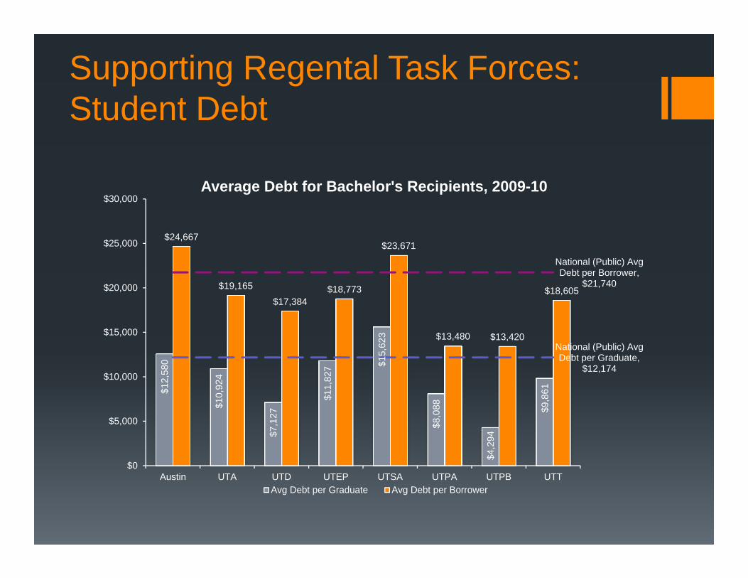
Supporting Regental Task Forces: Student Debt
$12,
580
$10,
924
$7,1
27
$11,
827 $1
5,62
3
$8,0
88
$4,2
94
$9,8
61
$24,667
$19,165
$17,384$18,773
$23,671
$13,480 $13,420
$18,605
National (Public) Avg Debt per Borrower,
$21,740
National (Public) Avg Debt per Graduate,
$12,174
$0
$5,000
$10,000
$15,000
$20,000
$25,000
$30,000
Austin UTA UTD UTEP UTSA UTPA UTPB UTT
Average Debt for Bachelor's Recipients, 2009-10
Avg Debt per Graduate Avg Debt per Borrower
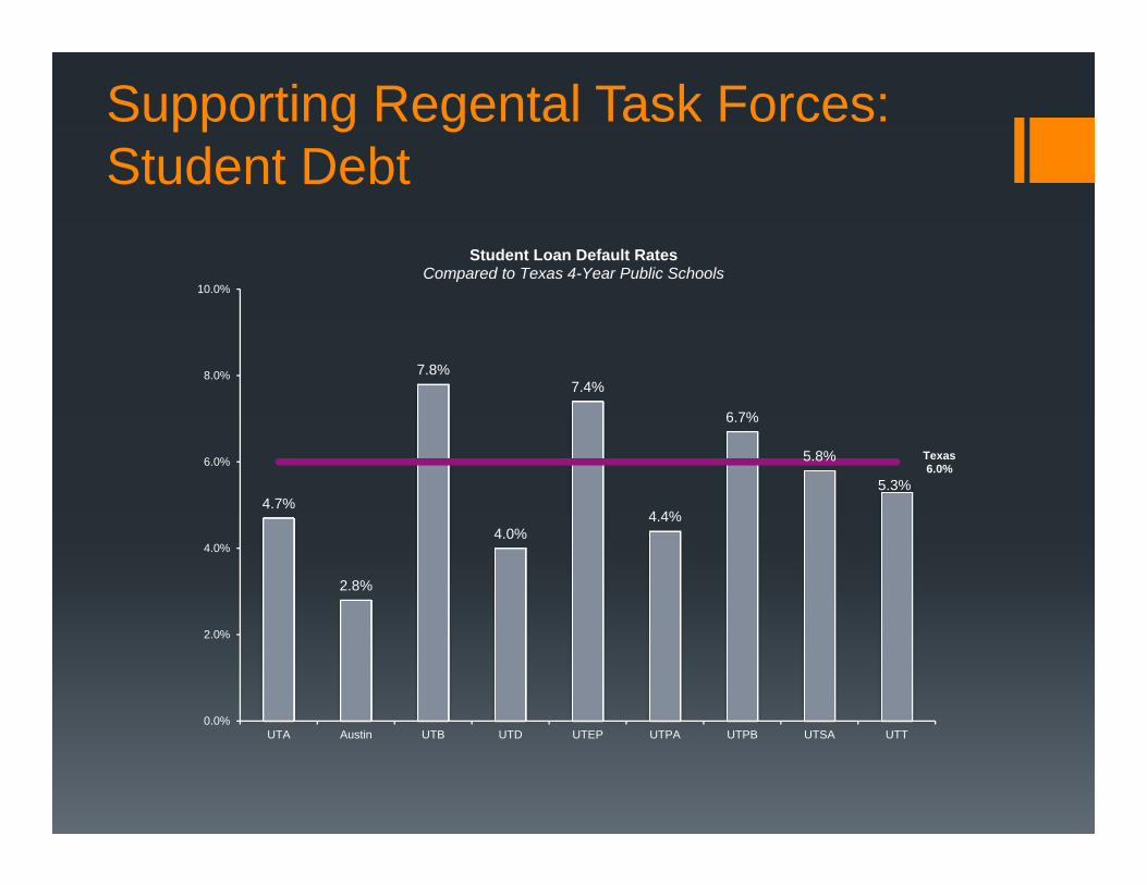
Supporting Regental Task Forces: Student Debt
4.7%
2.8%
7.8%
4.0%
7.4%
4.4%
6.7%
5.8%
5.3%
Texas6.0%
0.0%
2.0%
4.0%
6.0%
8.0%
10.0%
UTA Austin UTB UTD UTEP UTPA UTPB UTSA UTT
Student Loan Default RatesCompared to Texas 4-Year Public Schools
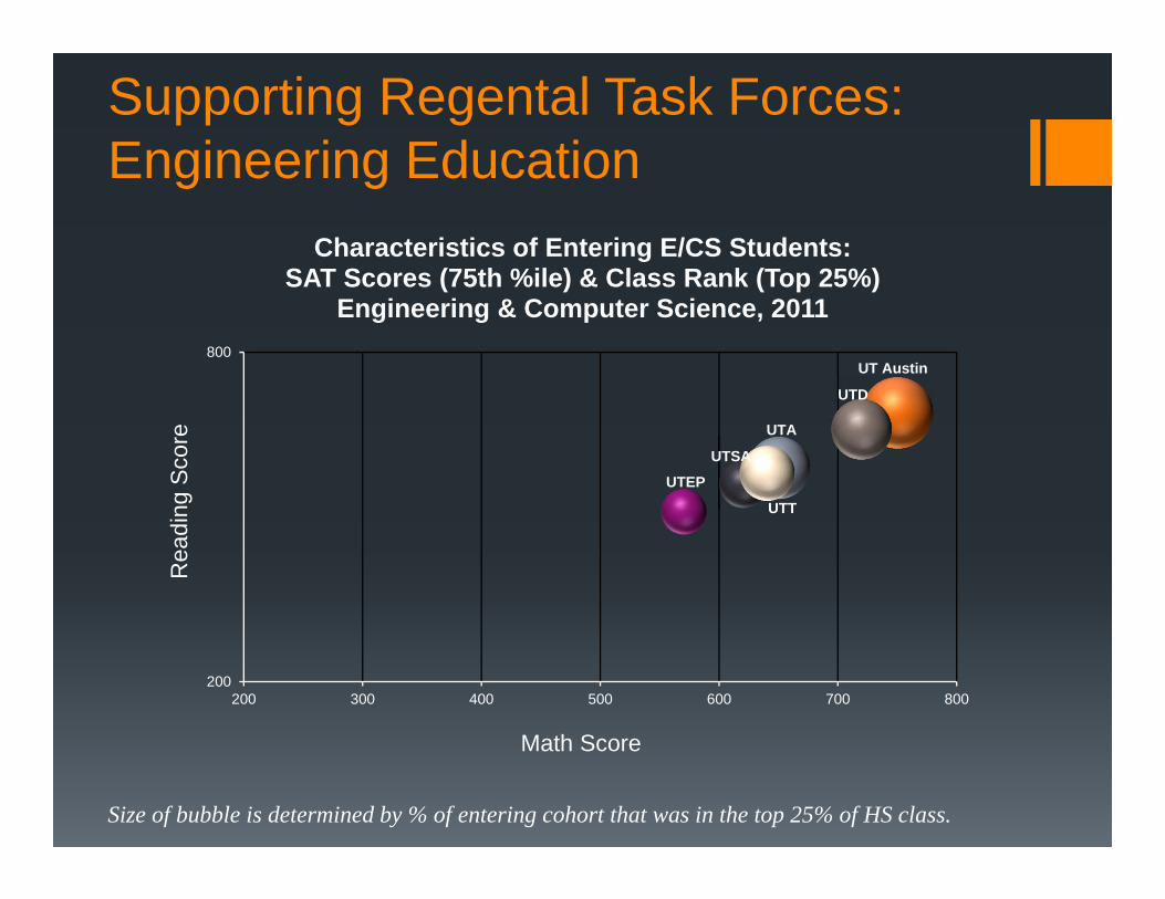
Supporting Regental Task Forces: Engineering Education
UTA
UT Austin
UTD
UTEP
UTSA
UTT
200
800
200 300 400 500 600 700 800
Characteristics of Entering E/CS Students:SAT Scores (75th %ile) & Class Rank (Top 25%)
Engineering & Computer Science, 2011
Math Score
Rea
ding
Sco
re
Size of bubble is determined by % of entering cohort that was in the top 25% of HS class.
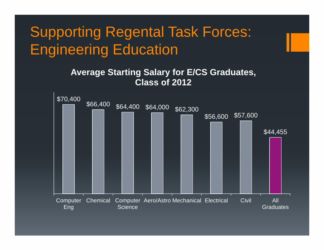
Supporting Regental Task Forces: Engineering Education
$70,400 $66,400 $64,400 $64,000 $62,300
$56,600 $57,600
$44,455
ComputerEng
Chemical ComputerScience
Aero/Astro Mechanical Electrical Civil AllGraduates
Average Starting Salary for E/CS Graduates, Class of 2012
Using Data: Informing Policy-Making
Make New Connections
New agreement with the Texas Workforce Commission
Employment outcomes (state; average salary; and, within Texas,
industry)
Agreement with National Student Clearinghouse
Fill in the gaps after graduation, particularly for students who attend
graduate school out of state
Where do undergraduates go if they don’t go to UT?
Using Data: Informing Policy-Making
Be Data Smart
Data is just data
Research and analysis transform the data into information
Visualization and presentation make that information consumable
Beware Data Marketing
Data should tell a story, but only in the sense that the visualizations
presented should accurately reflect underlying patterns
Not all data consumers are data savvy
Use good data practices and be consistent
Thank you