Embed Size (px)
Citation preview
1 G R A P H I C A N D E D I T O R I A L S T A N D A R D S
University Graphic StandardsREVISED FEBRUARY 8, 2018
2 G R A P H I C A N D E D I T O R I A L S T A N D A R D S
The Johnson & Wales University IdentityA strong visual identity contributes to the power of the Johnson & Wales University brand. It also strengthens JWU’s ability to recruit outstanding faculty, students and staff while engaging alumni, and enhances the brand’s value and reputation worldwide.
Everyone in the JWU community plays an important role in bringing this cohesive new identity to life by 1) maintaining its integrity and 2) applying these standards consistently throughout all university communications, including print, web, display, broadcast and electronic formats.
Every element of the JWU brand identity — the logos, typefaces, colors, and the design treatment of photos and text — projects attributes of our institution.
These guidelines were created to help you use these elements effectively and within the JWU brand. Through consistent use of these guidelines, JWU will enjoy greater awareness and recognition, and continue to build stronger brand equity over time.
3 G R A P H I C A N D E D I T O R I A L S T A N D A R D S H O W T O U S E T H I S G U I D E
How to Use This GuideTo understand and use the JWU brand standards correctly, quickly identify the right artwork and download the appropriate file for your purposes, always follow these simple steps:
1) Decide what medium you’ll use the artwork in.
Print? Electronic? Signage? Different applications may require different file types. Decide in advance on how you’ll use the artwork before you download it.
2) Find your subject in the Table of Contents.
Once you’ve located your subject, go directly to that page in the PDF.
3) Read the instructions first. Once you’re on the right page,
reading the instructions will help you understand how to get the right artwork for your needs.
4) Find and select the right artwork for your application.
Once you’ve read the instructions copy and are ready to get your artwork, locate the correct artwork folder (ex: Logo, Wildcat Graphic, etc.) and open it. Find the correct file format (.jpeg, .eps, etc.) and color mode (CMYK, PMS or RGB) artwork file best suited for your print or electronic application.
For more information on acceptable file formats and color modes, see the Glossary of Design Terms.
5) Click on the selected file and download it.
Once you’ve found the correct artwork file, select it then download it. Be sure to specify where you want the file to go on your computer, such as your download folder or desktop, so you can find it easily.
Note: For Print Applications
Use PMS or CMYK color mode files from the Print Artwork folder.
For Electronic Applications Use RGB color mode files from the Electronic Artwork folder.
For more information, contact Design Services, Ed Pereira, assistant director, 401-598-2362, [email protected].
The path to the creative assets that make up the Johnson & Wales University brand are available via the following path.
University DESExternal Shared FoldersJWU Graphic Standards
Brand Components Crest JWU Acronym Graphic Logo Logo (stacked) University Seal Wildcat Graphic Wordmark
Other Approved University Graphics Alumni Related Graphics Campus and College Identifiers JWU Fund Graphic JWU Global Identifier Safety & Security Graphic Sustainability Graphic Wildcat Team Graphics
Typography
University Templates JWU PowerPoint Templates JWU Word Templates
JWU Graphic Standard.pdf
4 G R A P H I C A N D E D I T O R I A L S T A N D A R D S C O N T E N T S
Contents
5 G R A P H I C A N D E D I T O R I A L S T A N D A R D S J W U B R A N D C O M P O N E N T S
JWU Brand Components
6 J W U B R A N D C O M P O N E N T S O V E R V I E W
JWU Brand ComponentsThe Johnson & Wales University brand consists of several components that have been carefully designed to work independently and in conjunction with each other. These elements, used consistantly, will create a coordinated presentation of JWU materials that will build and reinforce our brand.
These brand components were designed to be used without alteration and include variations to cover all university applications. If you have any questions, please confer with Design Services.
7 J W U B R A N D C O M P O N E N T S L O G O
Logo
The university logo is our primary identifier. It consists of two elements: the crest and the wordmark. The logo elements must not be altered in any way. They have been carefully designed to work in all environments. Artwork is available for all scenarios, eliminating any need to create a specialized logo.
The preferred configuration for the university logo is the horizontal format, which should be used in most applications. The stacked version is reserved for architectural applications and where there are format constraints.
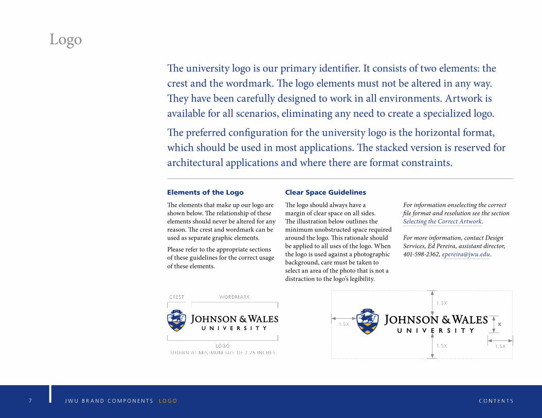
Elements of the Logo
The elements that make up our logo are shown below. The relationship of these elements should never be altered for any reason. The crest and wordmark can be used as separate graphic elements.
Please refer to the appropriate sections of these guidelines for the correct usage of these elements.
Clear Space Guidelines
The logo should always have a margin of clear space on all sides. The illustration below outlines the minimum unobstructed space required around the logo. This rationale should be applied to all uses of the logo. When the logo is used against a photographic background, care must be taken to select an area of the photo that is not a distraction to the logo’s legibility.
For information onselecting the correct file format and resolution see the section Selecting the Correct Artwork.
For more information, contact Design Services, Ed Pereira, assistant director, 401-598-2362, [email protected].
1.5X
1.5X
1.5X X
1.5X
Logo Variations
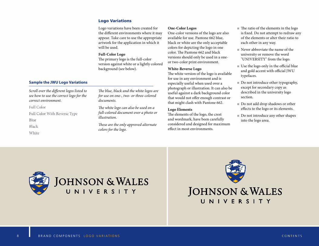
Logo variations have been created for the different environments where it may appear. Take care to use the appropriate artwork for the application in which it will be used.
Full-Color Logo The primary logo is the full-color version against white or a lightly colored background (see below).
One-Color Logos One-color versions of the logo are also available for use. Pantone 662 blue, black or white are the only acceptable colors for depicting the logo in one color. The Pantone 662 and black versions should only be used in a one- or two-color print environment.
White-Reverse Logo The white version of the logo is available for use in any environment and is especially useful when used over a photograph or illustration. It can also be useful against a dark background color that would not offer enough contrast or that might clash with Pantone 662.
Logo Elements The elements of the logo, the crest and wordmark, have been carefully considered and designed for maximum effect in most environments.
The ratio of the elements in the logo is fixed. Do not attempt to redraw any of the elements or alter their ratio to each other in any way.
Never abbreviate the name of the university or remove the word "UNIVERSITY" from the logo.
Use the logo only in the official blue and gold accent with official JWU typefaces.
Do not introduce other typography, except for secondary copy as described in the university logo section.
Do not add drop shadows or other effects to the logo or its elements.
Do not introduce any other shapes into the logo area.
8 B R A N D C O M P O N E N T S L O G O V A R I A T I O N S
Sample the JWU Logo Variations
Scroll over the different logos listed to see how to use the correct logo for the correct environment.
The blue, black and the white logos are for use on one-, two- or three-colored documents.
The white logo can also be used on a full-colored document over a photo or illustration.
These are the only approved alternate colors for the logo.
9 B R A N D C O M P O N E N T S W O R D M A R K
Wordmark
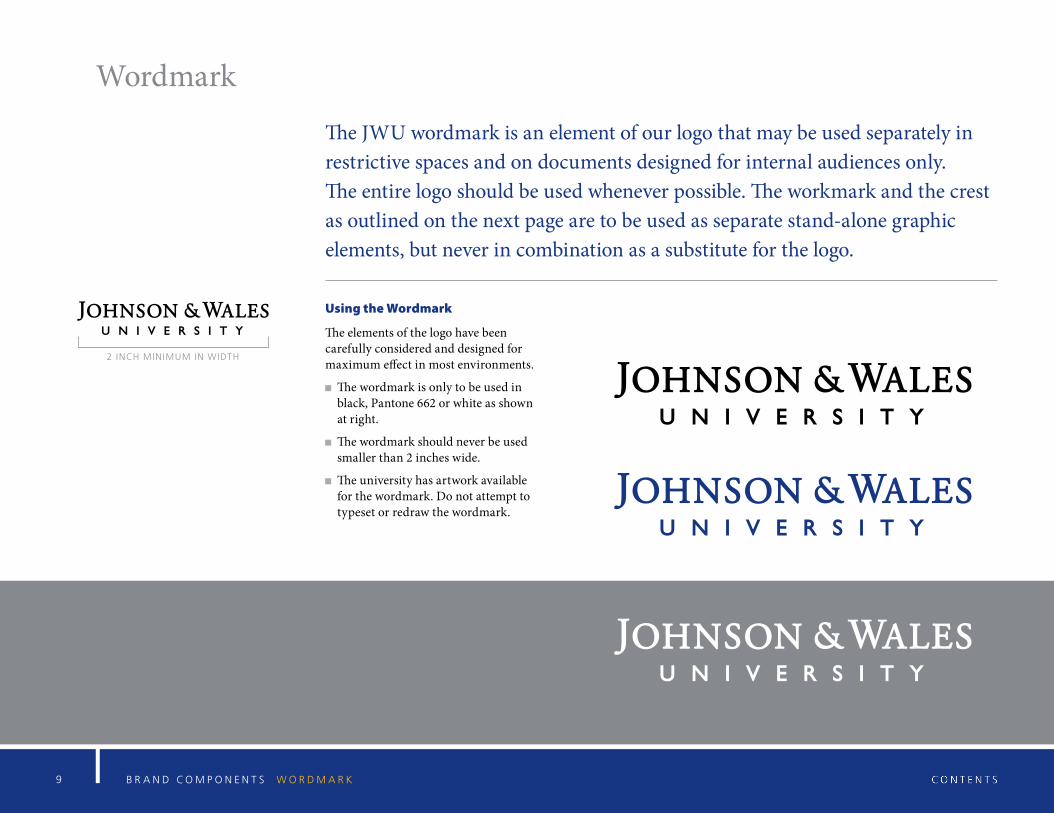
The JWU wordmark is an element of our logo that may be used separately in restrictive spaces and on documents designed for internal audiences only. The entire logo should be used whenever possible. The workmark and the crest as outlined on the next page are to be used as separate stand-alone graphic elements, but never in combination as a substitute for the logo.
Using the Wordmark
The elements of the logo have been carefully considered and designed for maximum effect in most environments.
The wordmark is only to be used in black, Pantone 662 or white as shown at right.
The wordmark should never be used smaller than 2 inches wide.
The university has artwork available for the wordmark. Do not attempt to typeset or redraw the wordmark.
2 INCH MINIMUM IN WIDTH
1 0 B R A N D C O M P O N E N T S C R E S T
Crest
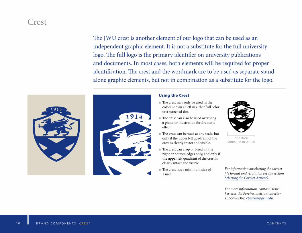
The JWU crest is another element of our logo that can be used as an independent graphic element. It is not a substitute for the full university logo. The full logo is the primary identifier on university publications and documents. In most cases, both elements will be required for proper identification. The crest and the wordmark are to be used as separate stand-alone graphic elements, but not in combination as a substitute for the logo.
Using the Crest
The crest may only be used in the colors shown at left in either full color or a screened tint.
The crest can also be used overlying a photo or illustration for dramatic effect.
The crest can be used at any scale, but only if the upper left quadrant of the crest is clearly intact and visible.
The crest can crop or bleed off the right or bottom edges only, and only if the upper left quadrant of the crest is clearly intact and visible.
The crest has a minimum size of 1 inch.
For information onselecting the correct file format and resolution see the section Selecting the Correct Artwork.
For more information, contact Design Services, Ed Pereira, assistant director, 401-598-2362, [email protected].
ONE INCH
MINIMUM IN WIDTH
11 B R A N D C O M P O N E N T S J W U A C R O N Y M G R A P H I C
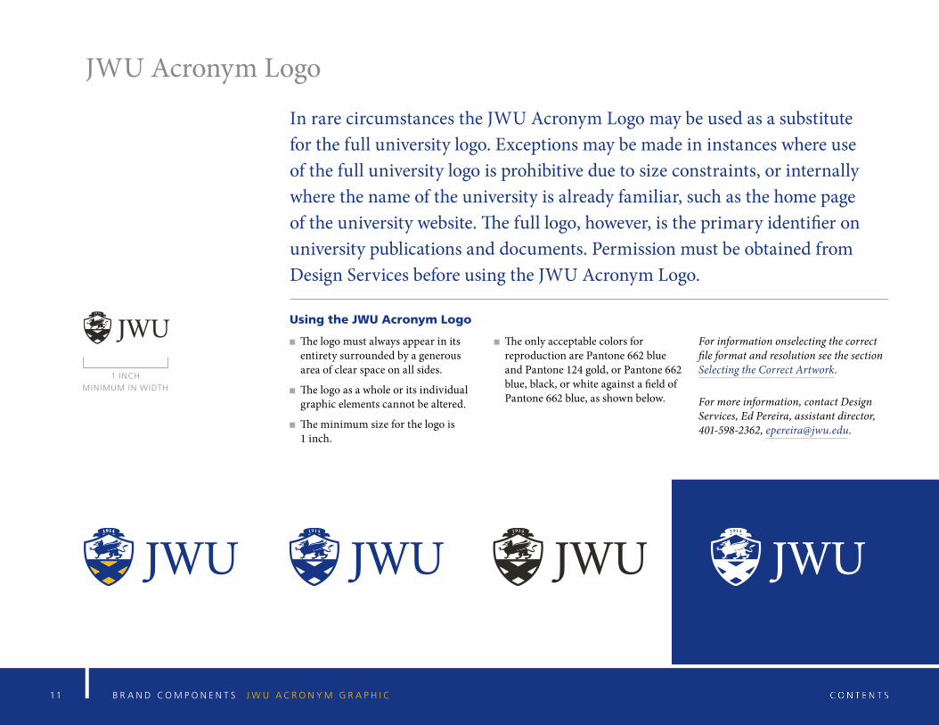
JWU Acronym Logo
In rare circumstances the JWU Acronym Logo may be used as a substitute for the full university logo. Exceptions may be made in instances where use of the full university logo is prohibitive due to size constraints, or internally where the name of the university is already familiar, such as the home page of the university website. The full logo, however, is the primary identifier on university publications and documents. Permission must be obtained from Design Services before using the JWU Acronym Logo.
Using the JWU Acronym Logo
The logo must always appear in its entirety surrounded by a generous area of clear space on all sides.
The logo as a whole or its individual graphic elements cannot be altered.
The minimum size for the logo is 1 inch.
The only acceptable colors for reproduction are Pantone 662 blue and Pantone 124 gold, or Pantone 662 blue, black, or white against a field of Pantone 662 blue, as shown below.
For information onselecting the correct file format and resolution see the section Selecting the Correct Artwork.
For more information, contact Design Services, Ed Pereira, assistant director, 401-598-2362, [email protected].
1 INCH
MINIMUM IN WIDTH
1 2 B R A N D C O M P O N E N T S U N I V E R S I T Y S E A L
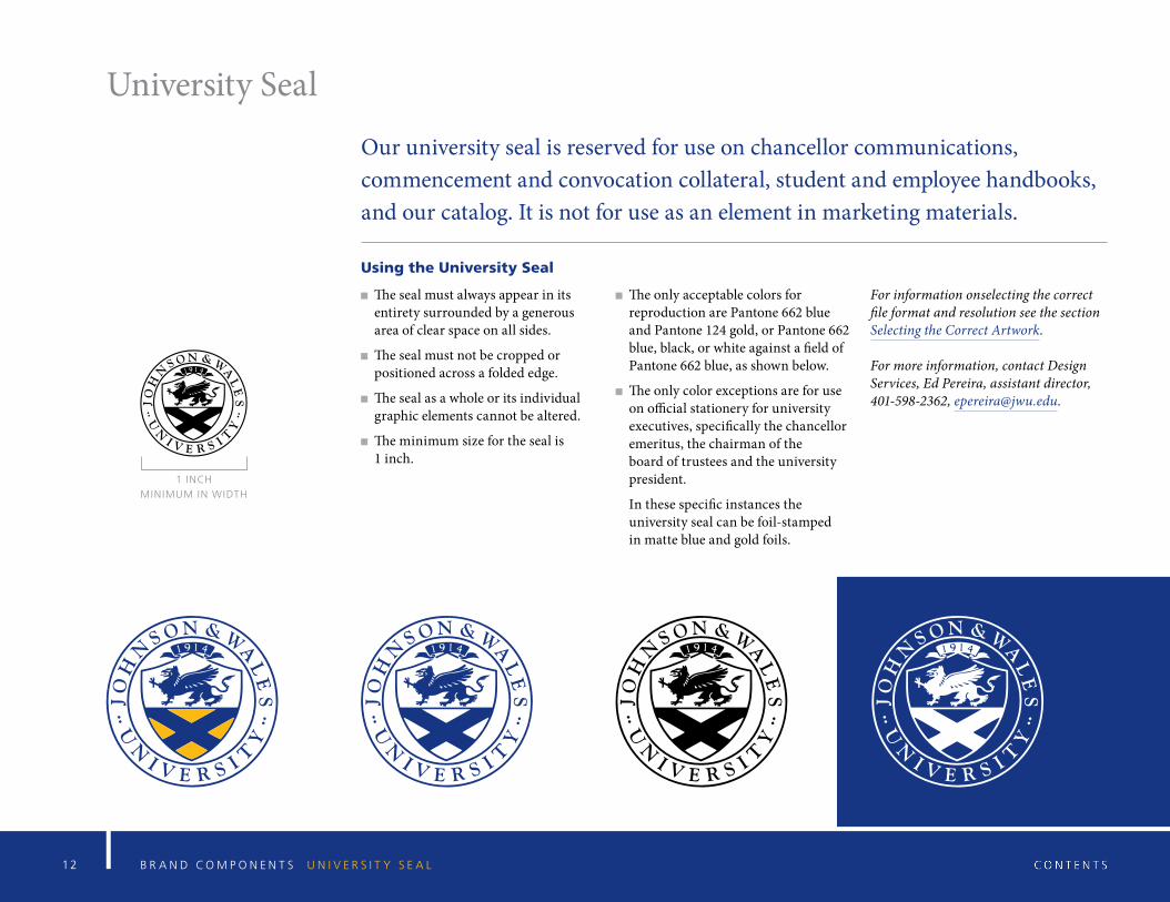
University Seal
Our university seal is reserved for use on chancellor communications, commencement and convocation collateral, student and employee handbooks, and our catalog. It is not for use as an element in marketing materials.
Using the University Seal
The seal must always appear in its entirety surrounded by a generous area of clear space on all sides.
The seal must not be cropped or positioned across a folded edge.
The seal as a whole or its individual graphic elements cannot be altered.
The minimum size for the seal is 1 inch.
The only acceptable colors for reproduction are Pantone 662 blue and Pantone 124 gold, or Pantone 662 blue, black, or white against a field of Pantone 662 blue, as shown below.
The only color exceptions are for use on official stationery for university executives, specifically the chancellor emeritus, the chairman of the board of trustees and the university president.
In these specific instances the university seal can be foil-stamped in matte blue and gold foils.
For information onselecting the correct file format and resolution see the section Selecting the Correct Artwork.
For more information, contact Design Services, Ed Pereira, assistant director, 401-598-2362, [email protected].
1 INCH
MINIMUM IN WIDTH
1 3 J W U B R A N D C O M P O N E N T S W I L D C A T G R A P H I C S
Wildcat Graphics
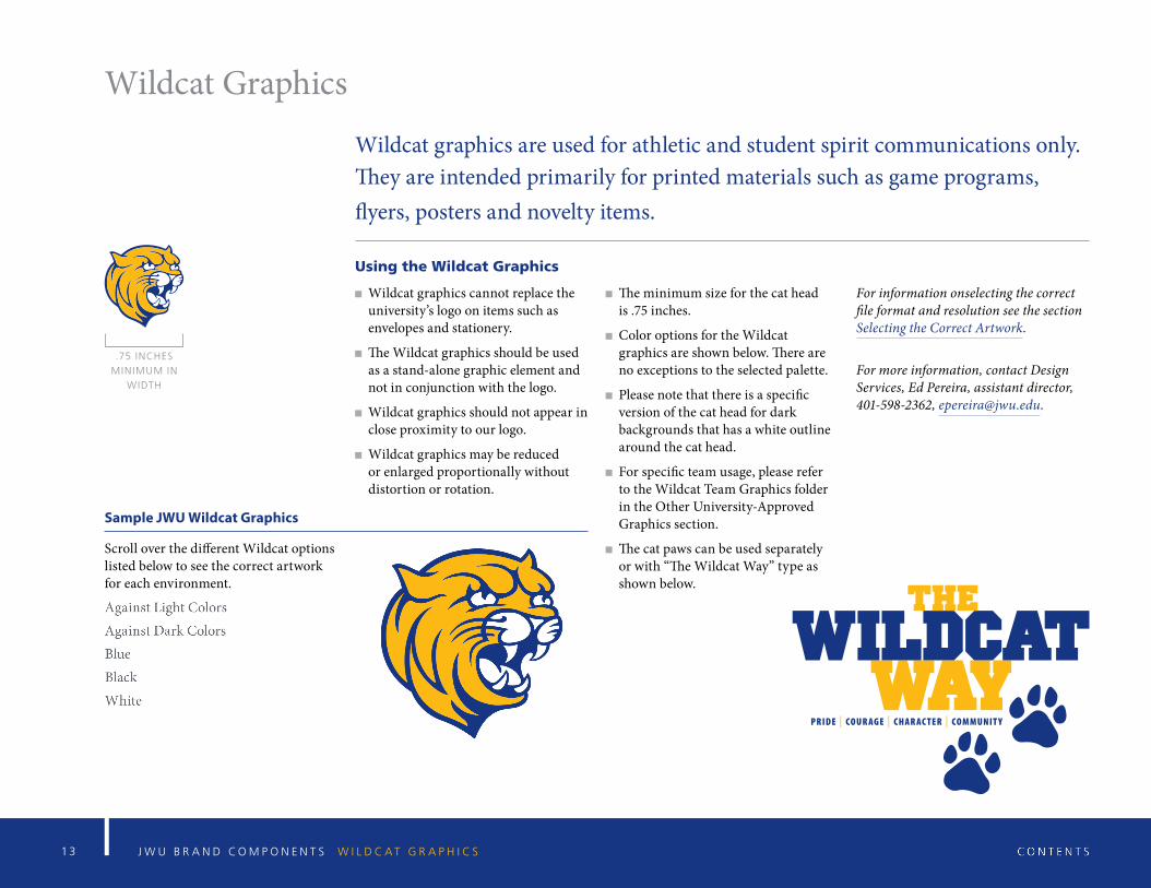
Wildcat graphics are used for athletic and student spirit communications only. They are intended primarily for printed materials such as game programs, flyers, posters and novelty items.
Using the Wildcat Graphics
Wildcat graphics cannot replace the university’s logo on items such as envelopes and stationery.
The Wildcat graphics should be used as a stand-alone graphic element and not in conjunction with the logo.
Wildcat graphics should not appear in close proximity to our logo.
Wildcat graphics may be reduced or enlarged proportionally without distortion or rotation.
The minimum size for the cat head is .75 inches.
Color options for the Wildcat graphics are shown below. There are no exceptions to the selected palette.
Please note that there is a specific version of the cat head for dark backgrounds that has a white outline around the cat head.
For specific team usage, please refer to the Wildcat Team Graphics folder in the Other University-Approved Graphics section.
The cat paws can be used separately or with “The Wildcat Way” type as shown below.
For information onselecting the correct file format and resolution see the section Selecting the Correct Artwork.
For more information, contact Design Services, Ed Pereira, assistant director, 401-598-2362, [email protected].
Sample JWU Wildcat Graphics
Scroll over the different Wildcat options listed below to see the correct artwork for each environment.
.75 INCHES
MINIMUM IN
WIDTH
1 4 G R A P H I C A N D E D I T O R I A L S T A N D A R D S T Y P O G R A P H I C S T A N D A R D S
Typographic Standards
1 5 T Y P O G R A P H I C S T A N D A R D S O V E R V I E W
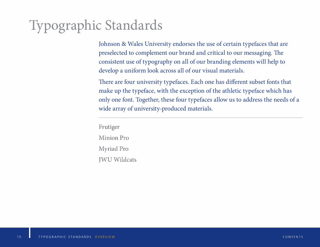
Typographic StandardsJohnson & Wales University endorses the use of certain typefaces that are preselected to complement our brand and critical to our messaging. The consistent use of typography on all of our branding elements will help to develop a uniform look across all of our visual materials.
There are four university typefaces. Each one has different subset fonts that make up the typeface, with the exception of the athletic typeface which has only one font. Together, these four typefaces allow us to address the needs of a wide array of university-produced materials.
1 6 T Y P O G R A P H I C S T A N D A R D S G U I D E L I N E S F O R G O O D T Y P O G R A P H Y
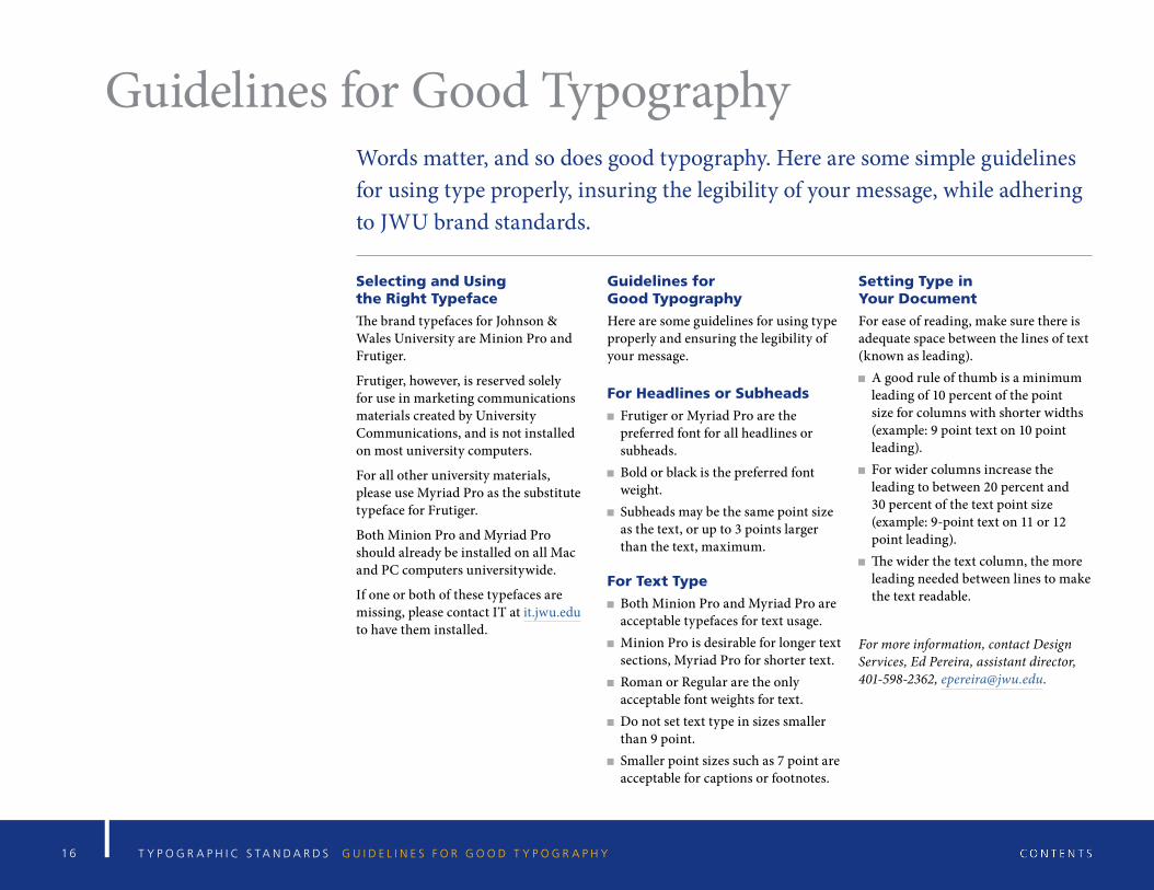
Guidelines for Good TypographyWords matter, and so does good typography. Here are some simple guidelines for using type properly, insuring the legibility of your message, while adhering to JWU brand standards.
Selecting and Using the Right Typeface
The brand typefaces for Johnson & Wales University are Minion Pro and Frutiger.
Frutiger, however, is reserved solely for use in marketing communications materials created by University Communications, and is not installed on most university computers.
For all other university materials, please use Myriad Pro as the substitute typeface for Frutiger.
Both Minion Pro and Myriad Pro should already be installed on all Mac and PC computers universitywide.
If one or both of these typefaces are missing, please contact IT at it.jwu.edu to have them installed.
Guidelines for Good Typography
Here are some guidelines for using type properly and ensuring the legibility of your message.
For Headlines or Subheads
Frutiger or Myriad Pro are the preferred font for all headlines or subheads.
Bold or black is the preferred font weight.
Subheads may be the same point size as the text, or up to 3 points larger than the text, maximum.
For Text Type
Both Minion Pro and Myriad Pro are acceptable typefaces for text usage.
Minion Pro is desirable for longer text sections, Myriad Pro for shorter text.
Roman or Regular are the only acceptable font weights for text.
Do not set text type in sizes smaller than 9 point.
Smaller point sizes such as 7 point are acceptable for captions or footnotes.
Setting Type in Your Document
For ease of reading, make sure there is adequate space between the lines of text (known as leading).
A good rule of thumb is a minimum leading of 10 percent of the point size for columns with shorter widths (example: 9 point text on 10 point leading).
For wider columns increase the leading to between 20 percent and 30 percent of the text point size (example: 9-point text on 11 or 12 point leading).
The wider the text column, the more leading needed between lines to make the text readable.
For more information, contact Design Services, Ed Pereira, assistant director, 401-598-2362, [email protected].
1 7 T Y P O G R A P H I C S T A N D A R D S F R U T I G E R T Y P E F A C E
ABCDEFGHIJKLMNOPQRSTUV WXYZabcdefghijklmnopqrstuvwxyz0123456789[({<+=#&%!?$@*•~>})]
Typeface vs. Font
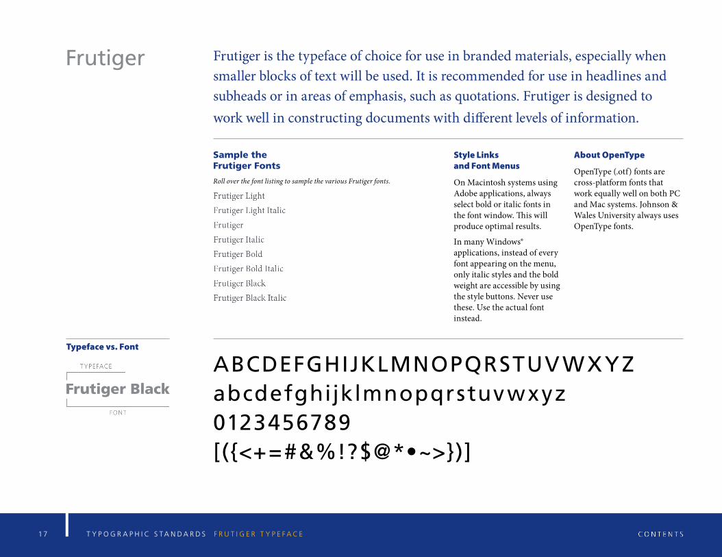
Frutiger is the typeface of choice for use in branded materials, especially when smaller blocks of text will be used. It is recommended for use in headlines and subheads or in areas of emphasis, such as quotations. Frutiger is designed to work well in constructing documents with different levels of information.
Sample the Frutiger Fonts
Roll over the font listing to sample the various Frutiger fonts.
Style Links and Font Menus
On Macintosh systems using Adobe applications, always select bold or italic fonts in the font window. This will produce optimal results.
In many Windows® applications, instead of every font appearing on the menu, only italic styles and the bold weight are accessible by using the style buttons. Never use these. Use the actual font instead.
About OpenType
OpenType (.otf) fonts are cross-platform fonts that work equally well on both PC and Mac systems. Johnson & Wales University always uses OpenType fonts.
Frutiger
1 8 T Y P O G R A P H I C S T A N D A R D S M I N I O N P R O T Y P E F A C E
A BCDEFGHIJK LMNOPQRSTU V W X YZabcdefghijk lmnopqrstuv w x yz0123456789[({<+=#& %!?$@*•~>})]
Typeface vs. Font
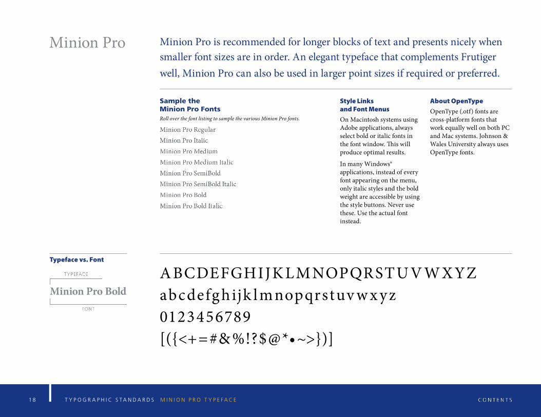
Minion Pro is recommended for longer blocks of text and presents nicely when smaller font sizes are in order. An elegant typeface that complements Frutiger well, Minion Pro can also be used in larger point sizes if required or preferred.
Sample the Minion Pro Fonts
Roll over the font listing to sample the various Minion Pro fonts.
Style Links and Font MenusOn Macintosh systems using Adobe applications, always select bold or italic fonts in the font window. This will produce optimal results.
In many Windows® applications, instead of every font appearing on the menu, only italic styles and the bold weight are accessible by using the style buttons. Never use these. Use the actual font instead.
About OpenTypeOpenType (.otf) fonts are cross-platform fonts that work equally well on both PC and Mac systems. Johnson & Wales University always uses OpenType fonts.
Minion Pro
1 9 T Y P O G R A P H I C S T A N D A R D S M Y R I A D P R O T Y P E F A C E
ABCDEFGHIJKLMNOPQRSTUV W X YZabcdefghijk lmnopqrstuv w x y z0123456789[({<+=#&%!?$@*•~>})]
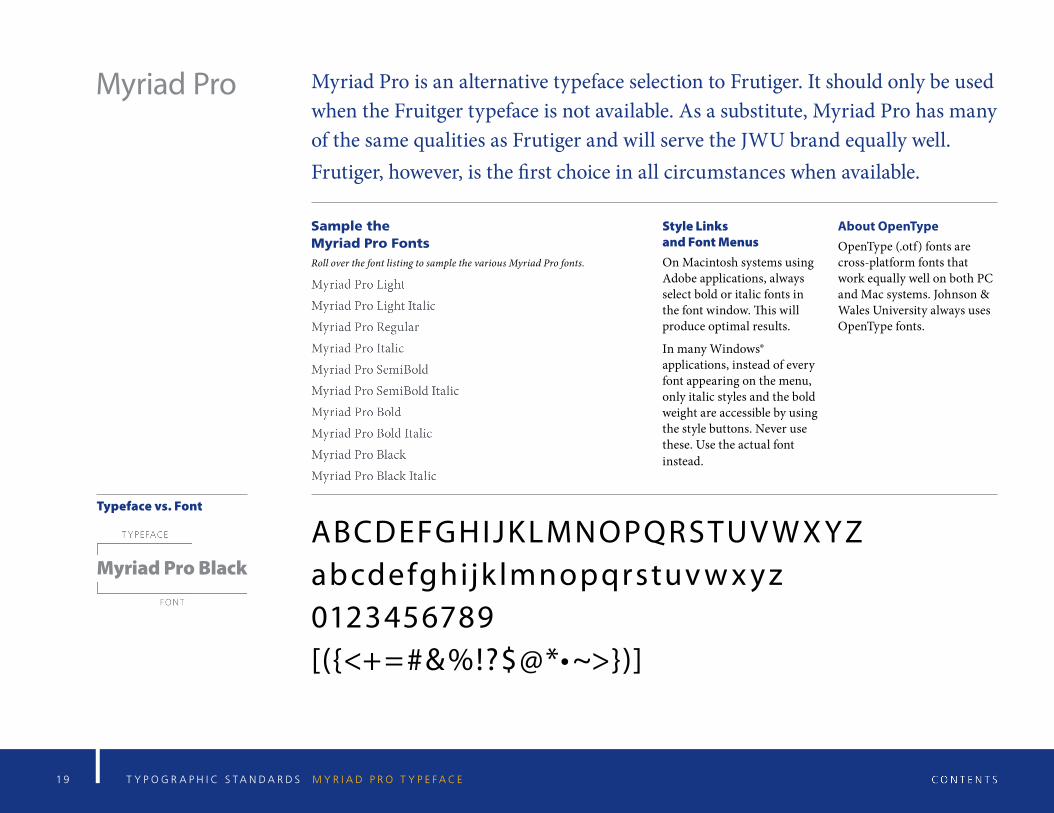
Typeface vs. Font
Myriad Pro is an alternative typeface selection to Frutiger. It should only be used when the Fruitger typeface is not available. As a substitute, Myriad Pro has many of the same qualities as Frutiger and will serve the JWU brand equally well.Frutiger, however, is the first choice in all circumstances when available.
Sample the Myriad Pro FontsRoll over the font listing to sample the various Myriad Pro fonts.
Style Links and Font MenusOn Macintosh systems using Adobe applications, always select bold or italic fonts in the font window. This will produce optimal results.
In many Windows® applications, instead of every font appearing on the menu, only italic styles and the bold weight are accessible by using the style buttons. Never use these. Use the actual font instead.
About OpenTypeOpenType (.otf) fonts are cross-platform fonts that work equally well on both PC and Mac systems. Johnson & Wales University always uses OpenType fonts.
Myriad Pro
2 0 T Y P O G R A P H I C S T A N D A R D S J W U W I L D C A T S T Y P E F A C E
ABCDEFGHIJKLMNOPQ RSTUVWXYZ0123456789[({<+=#&%!?$@*•>})]
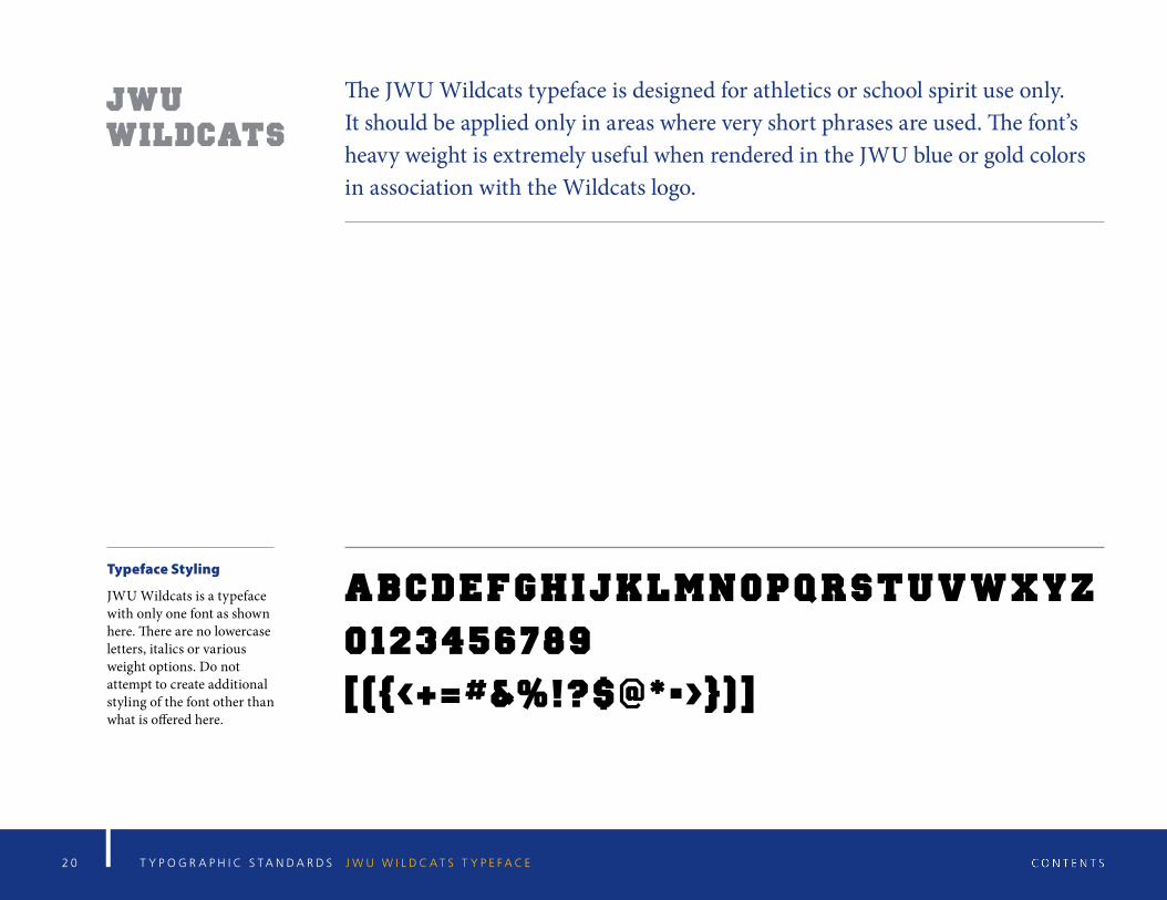
The JWU Wildcats typeface is designed for athletics or school spirit use only. It should be applied only in areas where very short phrases are used. The font’s heavy weight is extremely useful when rendered in the JWU blue or gold colors in association with the Wildcats logo.
JWU Wildcats
Typeface Styling
JWU Wildcats is a typeface with only one font as shown here. There are no lowercase letters, italics or various weight options. Do not attempt to create additional styling of the font other than what is offered here.
2 1 G R A P H I C A N D E D I T O R I A L S T A N D A R D S C O L O R P A L E T T E S T A N D A R D S
Color Palette Standards
2 2
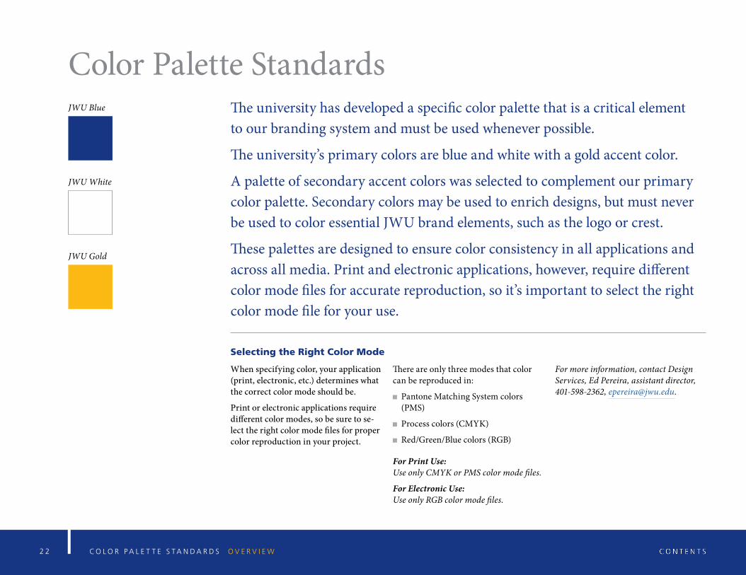
Color Palette StandardsJWU Blue
JWU White
JWU Gold
The university has developed a specific color palette that is a critical element to our branding system and must be used whenever possible.
The university’s primary colors are blue and white with a gold accent color.
A palette of secondary accent colors was selected to complement our primary color palette. Secondary colors may be used to enrich designs, but must never be used to color essential JWU brand elements, such as the logo or crest.
These palettes are designed to ensure color consistency in all applications and across all media. Print and electronic applications, however, require different color mode files for accurate reproduction, so it’s important to select the right color mode file for your use.
Selecting the Right Color Mode
When specifying color, your application (print, electronic, etc.) determines what the correct color mode should be.
Print or electronic applications require different color modes, so be sure to se-lect the right color mode files for proper color reproduction in your project.
There are only three modes that color can be reproduced in:
Pantone Matching System colors (PMS)
Process colors (CMYK)
Red/Green/Blue colors (RGB)
For Print Use: Use only CMYK or PMS color mode files.
For Electronic Use: Use only RGB color mode files.
For more information, contact Design Services, Ed Pereira, assistant director, 401-598-2362, [email protected].
C O L O R P A L E T T E S T A N D A R D S O V E R V I E W
2 3
100%
80%
60%
40%
20%
C O L O R P A L E T T E S T A N D A R D S P M S C O L O R M O D E
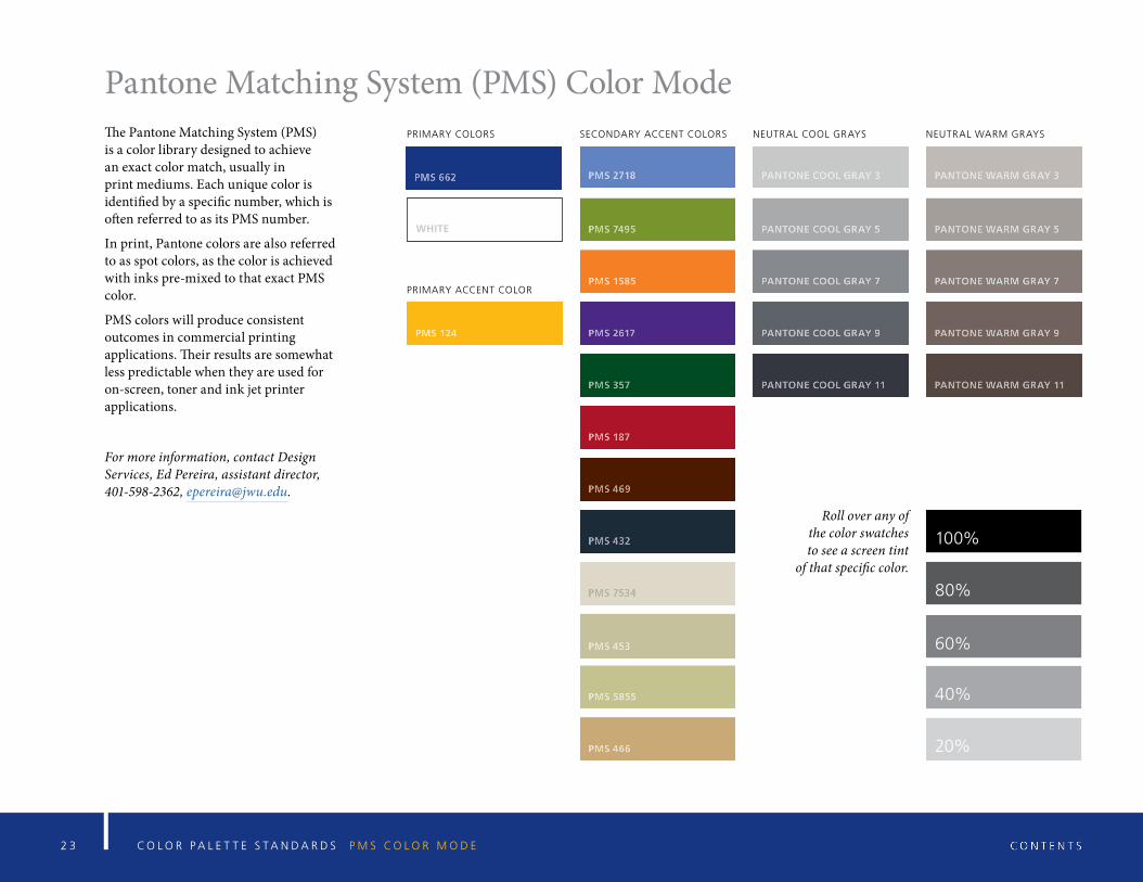
Pantone Matching System (PMS) Color ModeThe Pantone Matching System (PMS) is a color library designed to achieve an exact color match, usually in print mediums. Each unique color is identified by a specific number, which is often referred to as its PMS number.
In print, Pantone colors are also referred to as spot colors, as the color is achieved with inks pre-mixed to that exact PMS color.
PMS colors will produce consistent outcomes in commercial printing applications. Their results are somewhat less predictable when they are used for on-screen, toner and ink jet printer applications.
For more information, contact Design Services, Ed Pereira, assistant director, 401-598-2362, [email protected].
Roll over any of the color swatches to see a screen tint
of that specific color.
WHITE
PRIMARY COLORS
PRIMARY ACCENT COLOR
SECONDARY ACCENT COLORS NEUTRAL COOL GRAYS NEUTRAL WARM GRAYS

2 4 C O L O R P A L E T T E S T A N D A R D S C M Y K C O L O R M O D E
CMYK Color ModeCMYK is the color mode used for commercial printing, including large format printing. It is commonly referred to as full-color or four-color printing.
CMYK is a subtractive process in which percentages of the four process colors, cyan (C), magenta (M), yellow (Y) and black (K), are mixed to create a full range of colors.
The formulas in the swatches indicate the proper percentages of each CMYK color that when combined achieve the best match for that specific color.
The formulas shown are the correct color mix for coated papers. Please refer to the Pantone color bridge palette for uncoated papers.
For more information, contact Design Services, Ed Pereira, assistant director, 401-598-2362, [email protected].
100%
80%
60%
40%
20%
Roll over any of the color swatches to see a screen tint
of that specific color.
C0/M0/Y0/K0
PRIMARY COLORS
PRIMARY ACCENT COLOR
SECONDARY ACCENT COLORS NEUTRAL COOL GRAYS NEUTRAL WARM GRAYS

2 5 C O L O R P A L E T T E S T A N D A R D S R G B C O L O R M O D E
RGB Color ModeRGB is the color mode used for on-screen presentations such as websites, email blasts and PowerPoint presentations.
RGB is an additive color process in which colors are created by mixing different shades of red (R), green (G) and blue (B).
The alphanumerical formulas in the swatches indicate the proper mix of each RGB color to achieve the best match for that specific color.
The # numerical formulas represent the hexidecimal formula for matching that specific color on-screen.
For more information, contact Design Services, Ed Pereira, assistant director, 401-598-2362, [email protected].
100%
80%
60%
40%
20%
Roll over any of the color swatches to see a screen tint
of that specific color.
#FFFFFF R255/G255/B255
PRIMARY COLORS
PRIMARY ACCENT COLOR
SECONDARY ACCENT COLORS NEUTRAL COOL GRAYS NEUTRAL WARM GRAYS

2 6 G R A P H I C A N D E D I T O R I A L S T A N D A R D S O T H E R U N I V E R S I T Y - A P P R O V E D L O G O S
Other University-Approved Graphics
2 7 O T H E R U N I V E R S I T Y - A P P R O V E D L O G O S O V E R V I E W
Other University-Approved Graphics The Johnson & Wales University brand consists of many components that
have been carefully designed to work independently and in conjunction with each other. However, in certain circumstances, the university has approved additional graphic identity variations for specific programs, organizations and services. The following section outlines these approved graphics and signatures and defines their correct usage.
2 8 O T H E R U N I V E R S I T Y - A P P R O V E D L O G O S A L U M N I - R E L A T E D G R A P H I C S
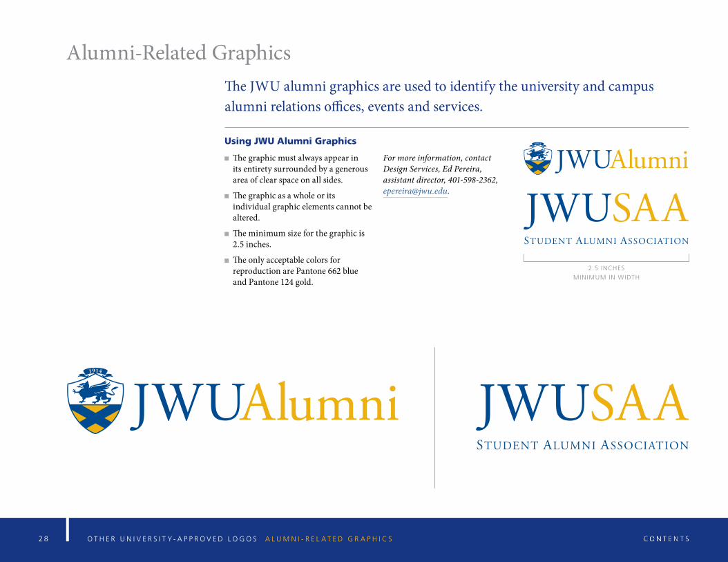
Alumni-Related GraphicsThe JWU alumni graphics are used to identify the university and campus alumni relations offices, events and services.
Using JWU Alumni Graphics
The graphic must always appear in its entirety surrounded by a generous area of clear space on all sides.
The graphic as a whole or its individual graphic elements cannot be altered.
The minimum size for the graphic is 2.5 inches.
The only acceptable colors for reproduction are Pantone 662 blue and Pantone 124 gold.
For more information, contact Design Services, Ed Pereira, assistant director, 401-598-2362, [email protected].
2.5 INCHES
MINIMUM IN WIDTH
2 9 O T H E R U N I V E R S I T Y - A P P R O V E D L O G O S C O L L E G E A N D C A M P U S I D E N T I F I E R S
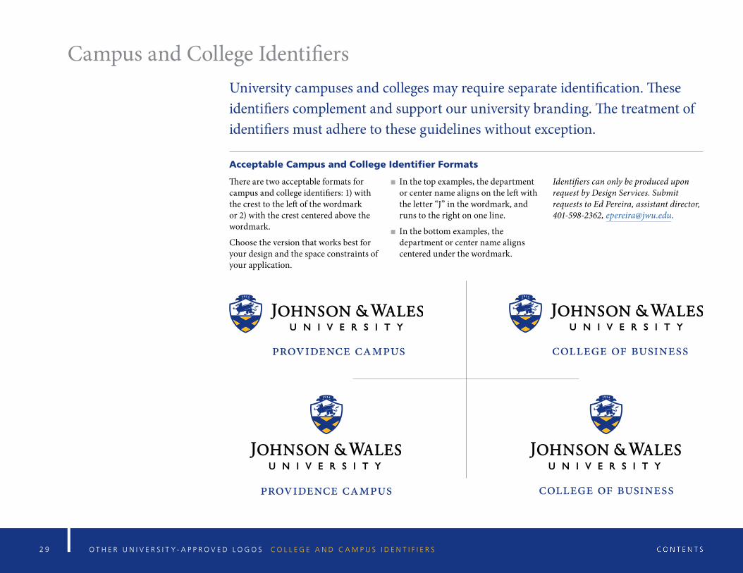
Campus and College IdentifiersUniversity campuses and colleges may require separate identification. These identifiers complement and support our university branding. The treatment of identifiers must adhere to these guidelines without exception.
Acceptable Campus and College Identifier Formats
There are two acceptable formats for campus and college identifiers: 1) with the crest to the left of the wordmark or 2) with the crest centered above the wordmark.
Choose the version that works best for your design and the space constraints of your application.
In the top examples, the department or center name aligns on the left with the letter “J” in the wordmark, and runs to the right on one line.
In the bottom examples, the department or center name aligns centered under the wordmark.
Identifiers can only be produced upon request by Design Services. Submit requests to Ed Pereira, assistant director, 401-598-2362, [email protected].
college of businessprovidence campus
providence campus college of business
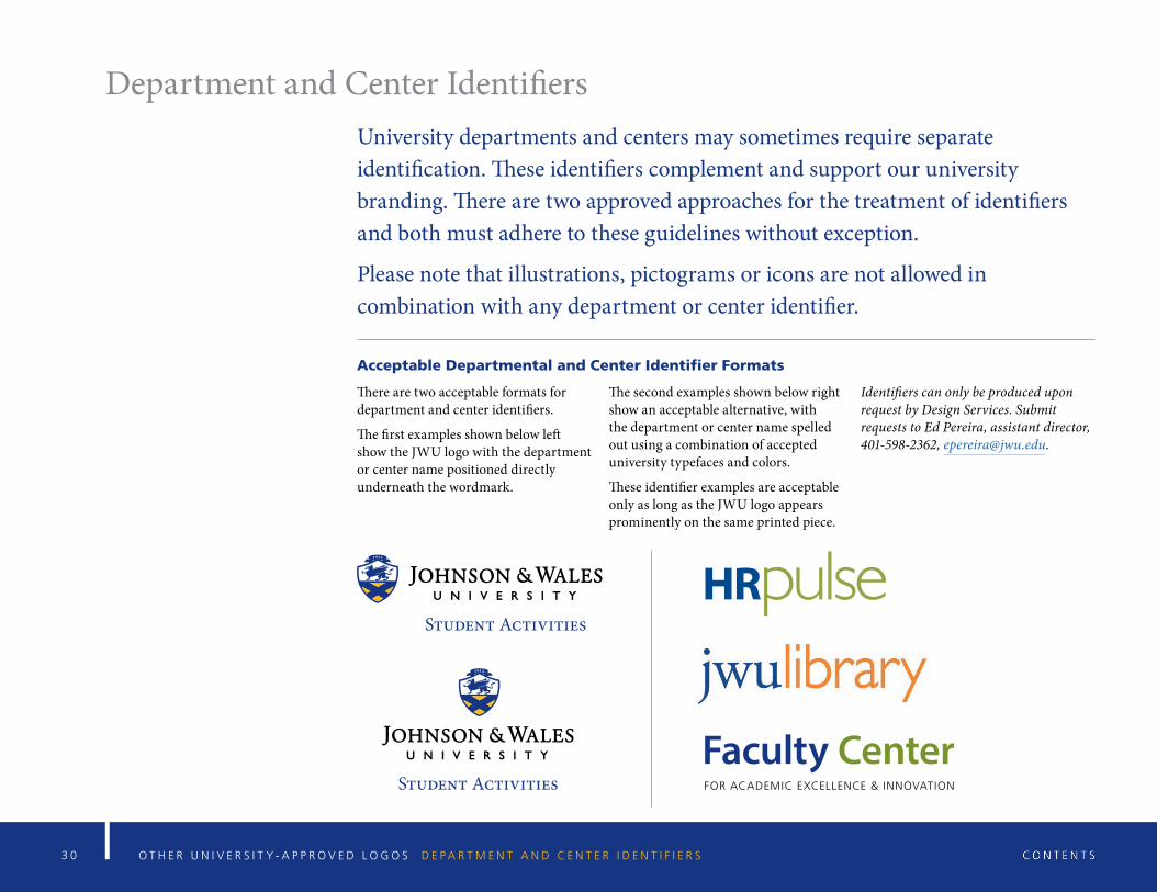
3 0 O T H E R U N I V E R S I T Y - A P P R O V E D L O G O S D E P A R T M E N T A N D C E N T E R I D E N T I F I E R S
Department and Center IdentifiersUniversity departments and centers may sometimes require separate identification. These identifiers complement and support our university branding. There are two approved approaches for the treatment of identifiers and both must adhere to these guidelines without exception.
Please note that illustrations, pictograms or icons are not allowed in combination with any department or center identifier.
Acceptable Departmental and Center Identifier Formats
There are two acceptable formats for department and center identifiers.
The first examples shown below left show the JWU logo with the department or center name positioned directly underneath the wordmark.
The second examples shown below right show an acceptable alternative, with the department or center name spelled out using a combination of accepted university typefaces and colors.
These identifier examples are acceptable only as long as the JWU logo appears prominently on the same printed piece.
Identifiers can only be produced upon request by Design Services. Submit requests to Ed Pereira, assistant director, 401-598-2362, [email protected].
HRpulse
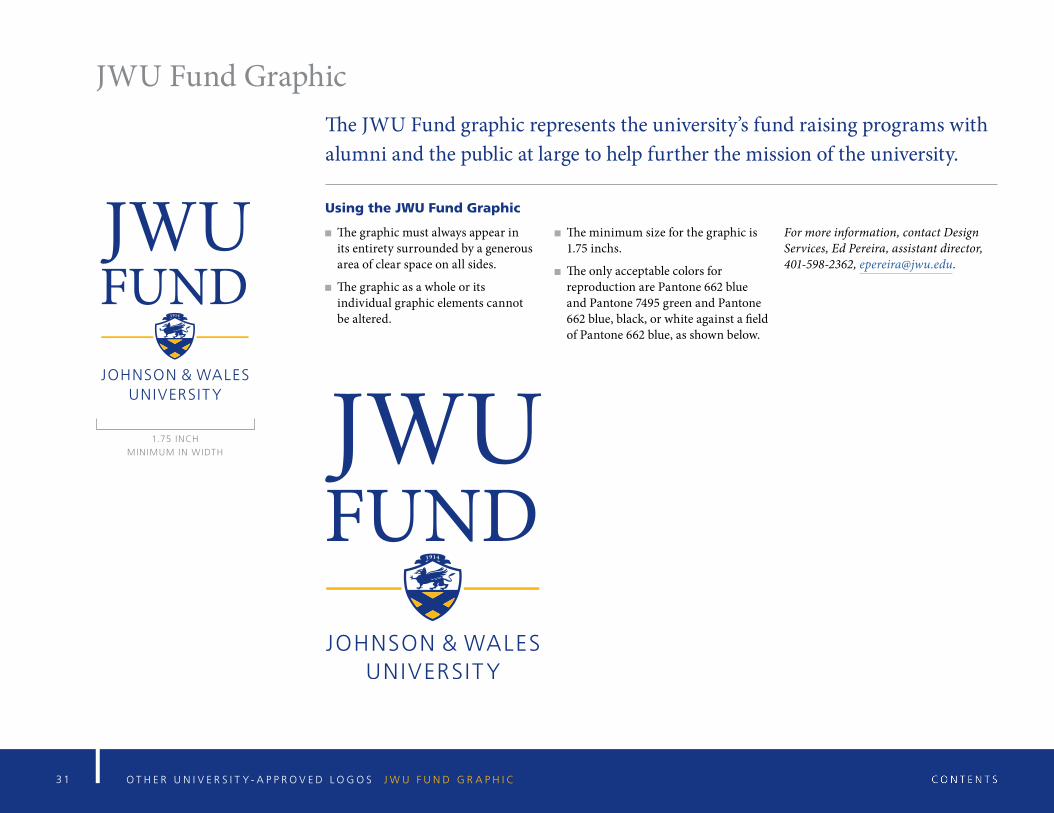
3 1 O T H E R U N I V E R S I T Y - A P P R O V E D L O G O S J W U F U N D G R A P H I C
JWU Fund GraphicThe JWU Fund graphic represents the university’s fund raising programs with alumni and the public at large to help further the mission of the university.
Using the JWU Fund Graphic
The graphic must always appear in its entirety surrounded by a generous area of clear space on all sides.
The graphic as a whole or its individual graphic elements cannot be altered.
The minimum size for the graphic is 1.75 inchs.
The only acceptable colors for reproduction are Pantone 662 blue and Pantone 7495 green and Pantone 662 blue, black, or white against a field of Pantone 662 blue, as shown below.
For more information, contact Design Services, Ed Pereira, assistant director, 401-598-2362, [email protected].
1.75 INCH
MINIMUM IN WIDTH
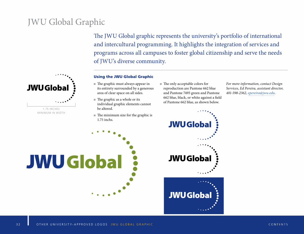
JWU Global GraphicThe JWU Global graphic represents the university’s portfolio of international and intercultural programming. It highlights the integration of services and programs across all campuses to foster global citizenship and serve the needs of JWU’s diverse community.
Using the JWU Global Graphic
The graphic must always appear in its entirety surrounded by a generous area of clear space on all sides.
The graphic as a whole or its individual graphic elements cannot be altered.
The minimum size for the graphic is 1.75 inchs.
The only acceptable colors for reproduction are Pantone 662 blue and Pantone 7495 green and Pantone 662 blue, black, or white against a field of Pantone 662 blue, as shown below.
For more information, contact Design Services, Ed Pereira, assistant director, 401-598-2362, [email protected].
O T H E R U N I V E R S I T Y - A P P R O V E D L O G O S J W U G L O B A L G R A P H I C3 2
1.75 INCHES
MINIMUM IN WIDTH
3 3 O T H E R U N I V E R S I T Y - A P P R O V E D L O G O S J W U S U S T A I N A B I L I T Y G R A P H I C
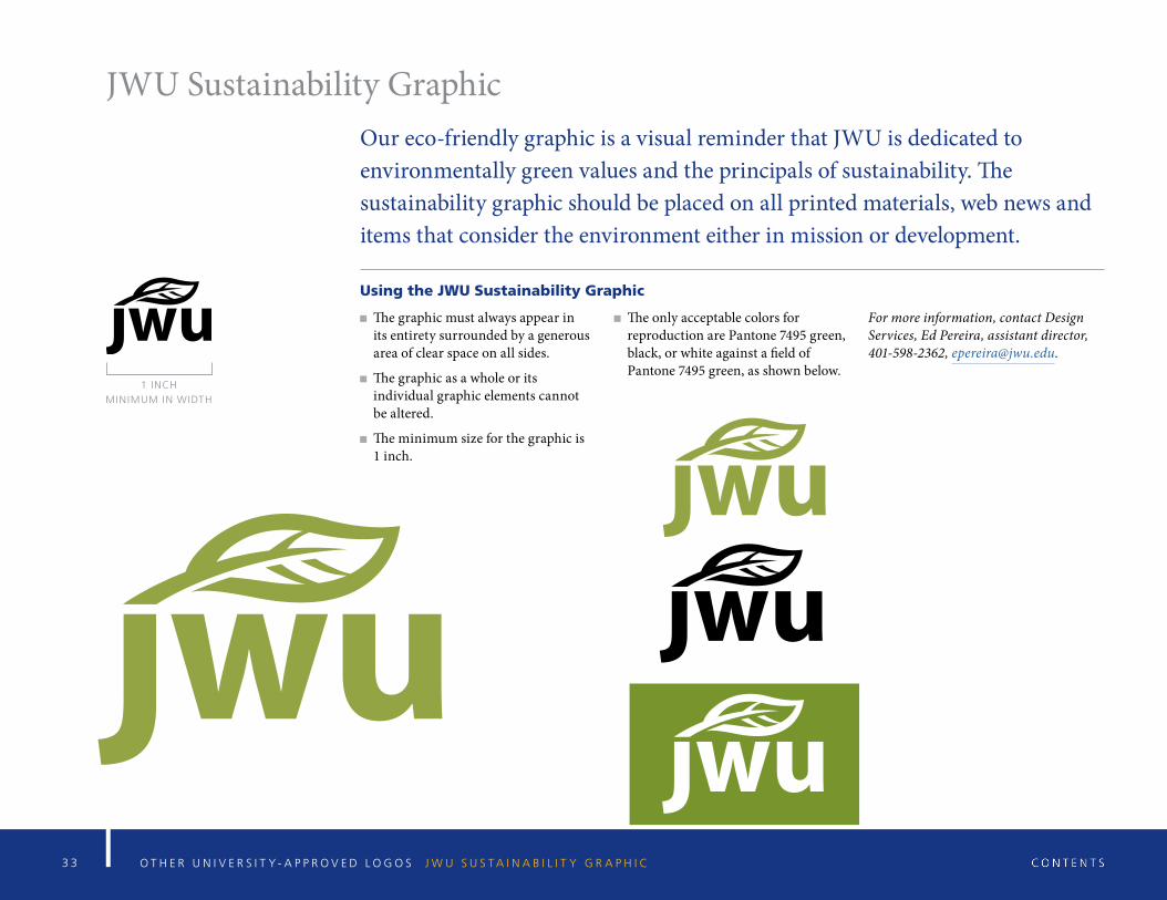
JWU Sustainability GraphicOur eco-friendly graphic is a visual reminder that JWU is dedicated to environmentally green values and the principals of sustainability. The sustainability graphic should be placed on all printed materials, web news and items that consider the environment either in mission or development.
Using the JWU Sustainability Graphic
The graphic must always appear in its entirety surrounded by a generous area of clear space on all sides.
The graphic as a whole or its individual graphic elements cannot be altered.
The minimum size for the graphic is 1 inch.
The only acceptable colors for reproduction are Pantone 7495 green, black, or white against a field of Pantone 7495 green, as shown below.
For more information, contact Design Services, Ed Pereira, assistant director, 401-598-2362, [email protected].
1 INCH
MINIMUM IN WIDTH
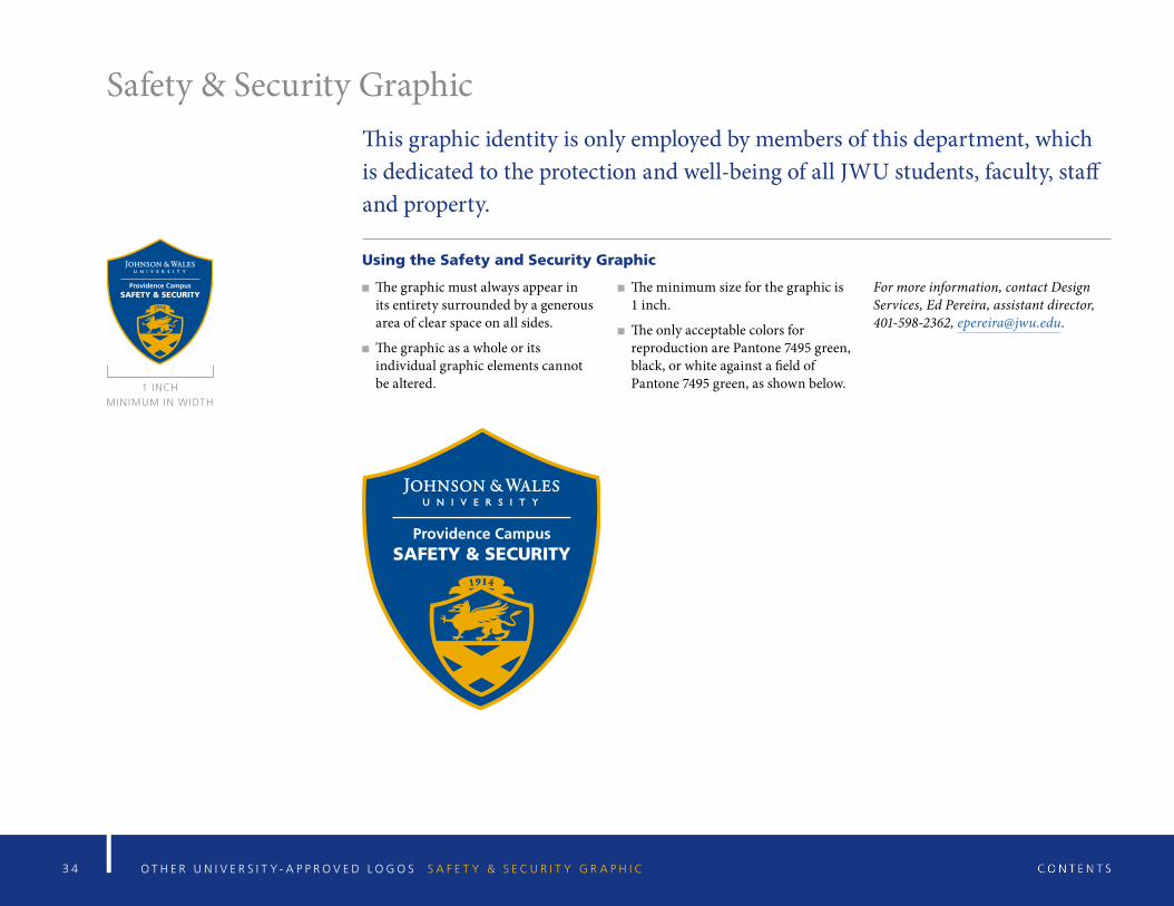
3 4 O T H E R U N I V E R S I T Y - A P P R O V E D L O G O S S A F E T Y & S E C U R I T Y G R A P H I C
Safety & Security GraphicThis graphic identity is only employed by members of this department, which is dedicated to the protection and well-being of all JWU students, faculty, staff and property.
Using the Safety and Security Graphic
The graphic must always appear in its entirety surrounded by a generous area of clear space on all sides.
The graphic as a whole or its individual graphic elements cannot be altered.
The minimum size for the graphic is 1 inch.
The only acceptable colors for reproduction are Pantone 7495 green, black, or white against a field of Pantone 7495 green, as shown below.
For more information, contact Design Services, Ed Pereira, assistant director, 401-598-2362, [email protected].
1 INCH
MINIMUM IN WIDTH
3 5 O T H E R U N I V E R S I T Y - A P P R O V E D L O G O S W I L D C A T T E A M G R A P H I C S
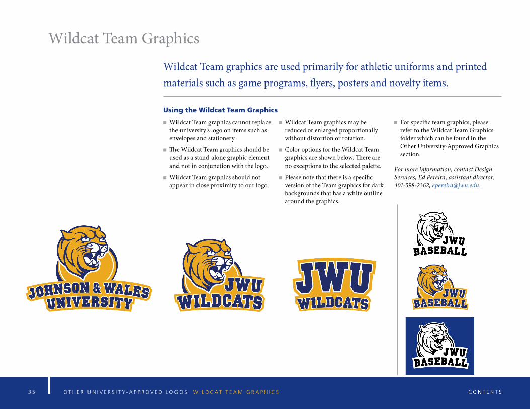
Wildcat Team Graphics
Wildcat Team graphics are used primarily for athletic uniforms and printed materials such as game programs, flyers, posters and novelty items.
Using the Wildcat Team Graphics
Wildcat Team graphics cannot replace the university’s logo on items such as envelopes and stationery.
The Wildcat Team graphics should be used as a stand-alone graphic element and not in conjunction with the logo.
Wildcat Team graphics should not appear in close proximity to our logo.
Wildcat Team graphics may be reduced or enlarged proportionally without distortion or rotation.
Color options for the Wildcat Team graphics are shown below. There are no exceptions to the selected palette.
Please note that there is a specific version of the Team graphics for dark backgrounds that has a white outline around the graphics.
For specific team graphics, please refer to the Wildcat Team Graphics folder which can be found in the Other University-Approved Graphics section.
For more information, contact Design Services, Ed Pereira, assistant director, 401-598-2362, [email protected].
3 6 G R A P H I C A N D E D I T O R I A L S T A N D A R D S U N I V E R S I T Y T E M P L A T E S
University Templates
3 7
University Templates
Templates are standardized formats that allow us to communicate the Johnson & Wales University brand with a unified visual identity. Approved templates are shown on the following pages for PowerPoint presentations, letterhead and stationery formats, envelopes, business cards, memos and fax forms. All JWU materials must use these approved designs and formats as depicted, which may not be altered or modified in any way.
U N I V E R S I T Y T E M P L A T E S S O V E R V I E W
3 8 U N I V E R S I T Y T E M P L A T E S P O W E R P O I N T
Powerpoint Templates
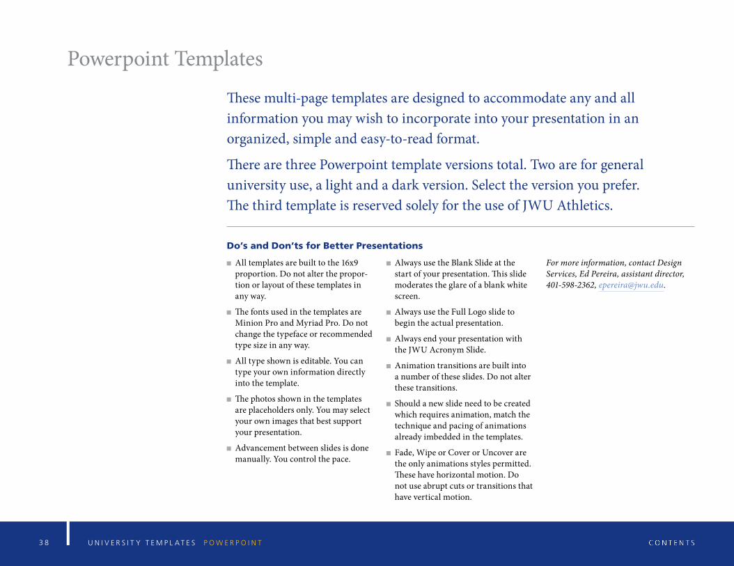
These multi-page templates are designed to accommodate any and all information you may wish to incorporate into your presentation in an organized, simple and easy-to-read format.
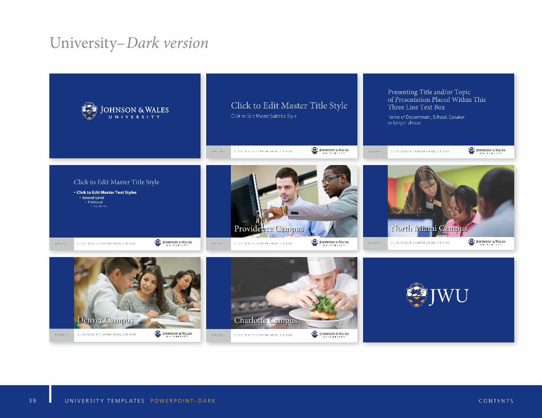
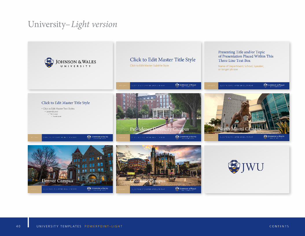
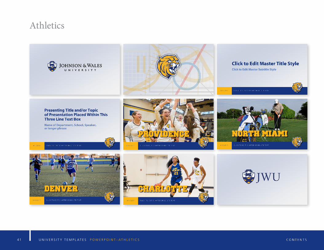
There are three Powerpoint template versions total. Two are for general university use, a light and a dark version. Select the version you prefer. The third template is reserved solely for the use of JWU Athletics.
Do’s and Don’ts for Better Presentations
All templates are built to the 16x9 proportion. Do not alter the propor-tion or layout of these templates in any way.
The fonts used in the templates are Minion Pro and Myriad Pro. Do not change the typeface or recommended type size in any way.
All type shown is editable. You can type your own information directly into the template.
The photos shown in the templates are placeholders only. You may select your own images that best support your presentation.
Advancement between slides is done manually. You control the pace.
Always use the Blank Slide at the start of your presentation. This slide moderates the glare of a blank white screen.
Always use the Full Logo slide to begin the actual presentation.
Always end your presentation with the JWU Acronym Slide.
Animation transitions are built into a number of these slides. Do not alter these transitions.
Should a new slide need to be created which requires animation, match the technique and pacing of animations already imbedded in the templates.
Fade, Wipe or Cover or Uncover are the only animations styles permitted. These have horizontal motion. Do not use abrupt cuts or transitions that have vertical motion.
For more information, contact Design Services, Ed Pereira, assistant director, 401-598-2362, [email protected].
3 9 U N I V E R S I T Y T E M P L A T E S P O W E R P O I N T – D A R K
University–Dark version
4 0 U N I V E R S I T Y T E M P L A T E S P O W E R P O I N T – L I G H T
University–Light version
4 1 U N I V E R S I T Y T E M P L A T E S P O W E R P O I N T – A T H L E T I C S
Athletics
4 2 U N I V E R S I T Y T E M P L A T E S P O W E R P O I N T
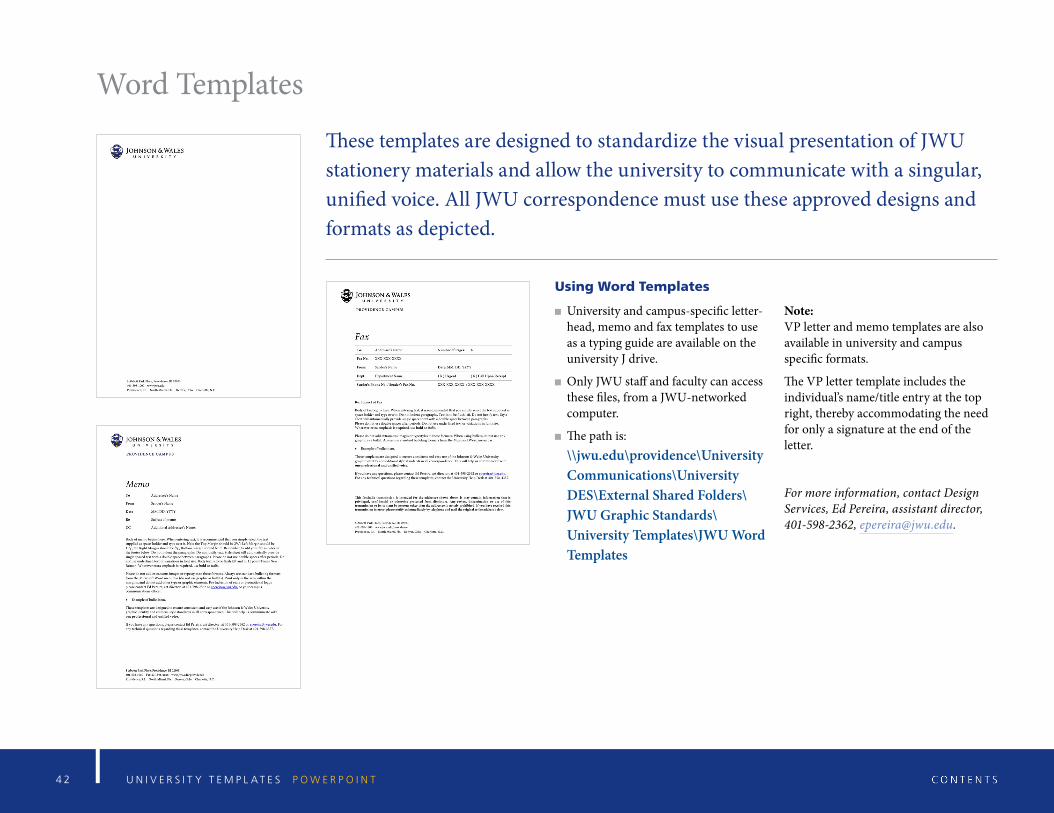
Word Templates
These templates are designed to standardize the visual presentation of JWU stationery materials and allow the university to communicate with a singular, unified voice. All JWU correspondence must use these approved designs and formats as depicted.
Using Word Templates
University and campus-specific letter-head, memo and fax templates to use as a typing guide are available on the university J drive.
Only JWU staff and faculty can access these files, from a JWU-networked computer.
The path is: \\jwu.edu\providence\University Communications\University DES\External Shared Folders\JWU Graphic Standards\ University Templates\JWU Word Templates
Note: VP letter and memo templates are also available in university and campus specific formats.
The VP letter template includes the individual’s name/title entry at the top right, thereby accommodating the need for only a signature at the end of the letter.
For more information, contact Design Services, Ed Pereira, assistant director, 401-598-2362, [email protected].
4 3 U N I V E R S I T Y T E M P L A T E S B U S I N E S S C A R D S A N D S T A T I O N E R Y
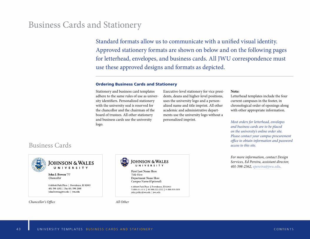
Business Cards and Stationery
Standard formats allow us to communicate with a unified visual identity. Approved stationery formats are shown on below and on the following pages for letterhead, envelopes, and business cards. All JWU correspondence must use these approved designs and formats as depicted.
Ordering Business Cards and Stationery
Stationery and business card templates adhere to the same rules of use as univer-sity identifiers. Personalized stationery with the university seal is reserved for the chancellor and the chairman of the board of trustees. All other stationery and business cards use the university logo.
Executive-level stationery for vice presi-dents, deans and higher-level positions, uses the university logo and a person-alized name and title imprint. All other academic and administrative depart-ments use the university logo without a personalized imprint.
Note: Letterhead templates include the four current campuses in the footer, in chronological order of openings along with other appropriate information.
Most orders for letterhead, envelopes and business cards are to be placed on the university’s online order site. Please contact your campus procurement office to obtain information and password access to this site.
For more information, contact Design Services, Ed Pereira, assistant director, 401-598-2362, [email protected].
Business Cards
Chancellor’s Office All Other
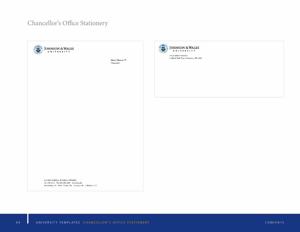
4 4 U N I V E R S I T Y T E M P L A T E S C H A N C E L L O R ’ S O F F I C E S T A T I O N E R Y
Chancellor’s Office Stationery
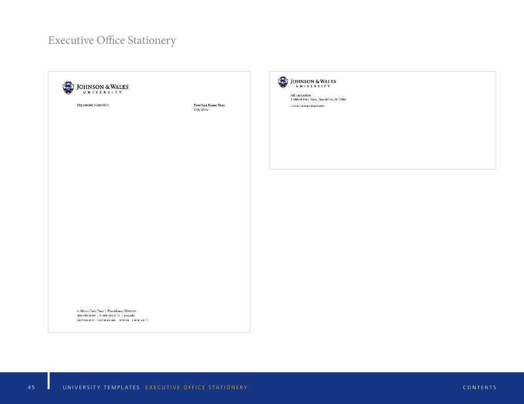
4 5 U N I V E R S I T Y T E M P L A T E S E X E C U T I V E O F F I C E S T A T I O N E R Y
Executive Office Stationery
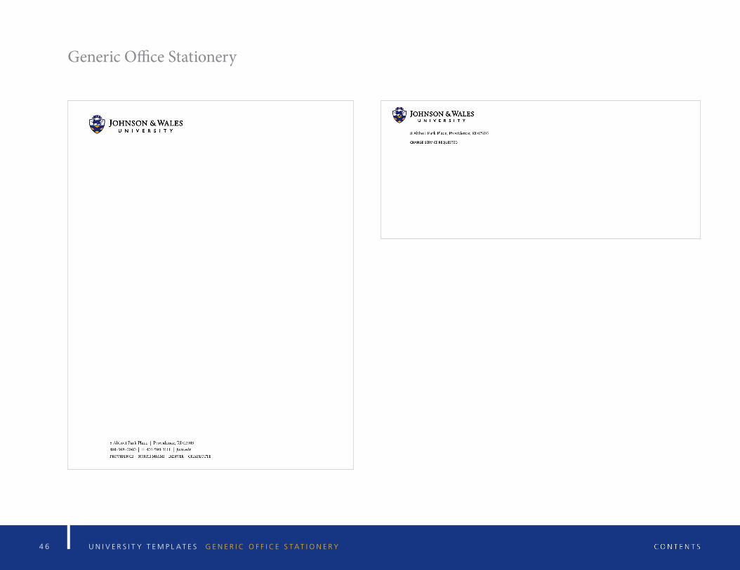
4 6 U N I V E R S I T Y T E M P L A T E S G E N E R I C O F F I C E S T A T I O N E R Y
Generic Office Stationery
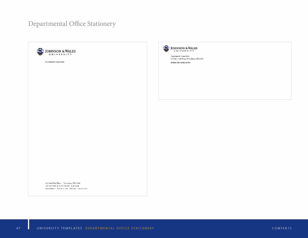
4 7 U N I V E R S I T Y T E M P L A T E S D E P A R T M E N T A L O F F I C E S T A T I O N E R Y
Departmental Office Stationery
4 8 G R A P H I C A N D E D I T O R I A L S T A N D A R D S P H O T O G R A P H Y
Photography
4 9
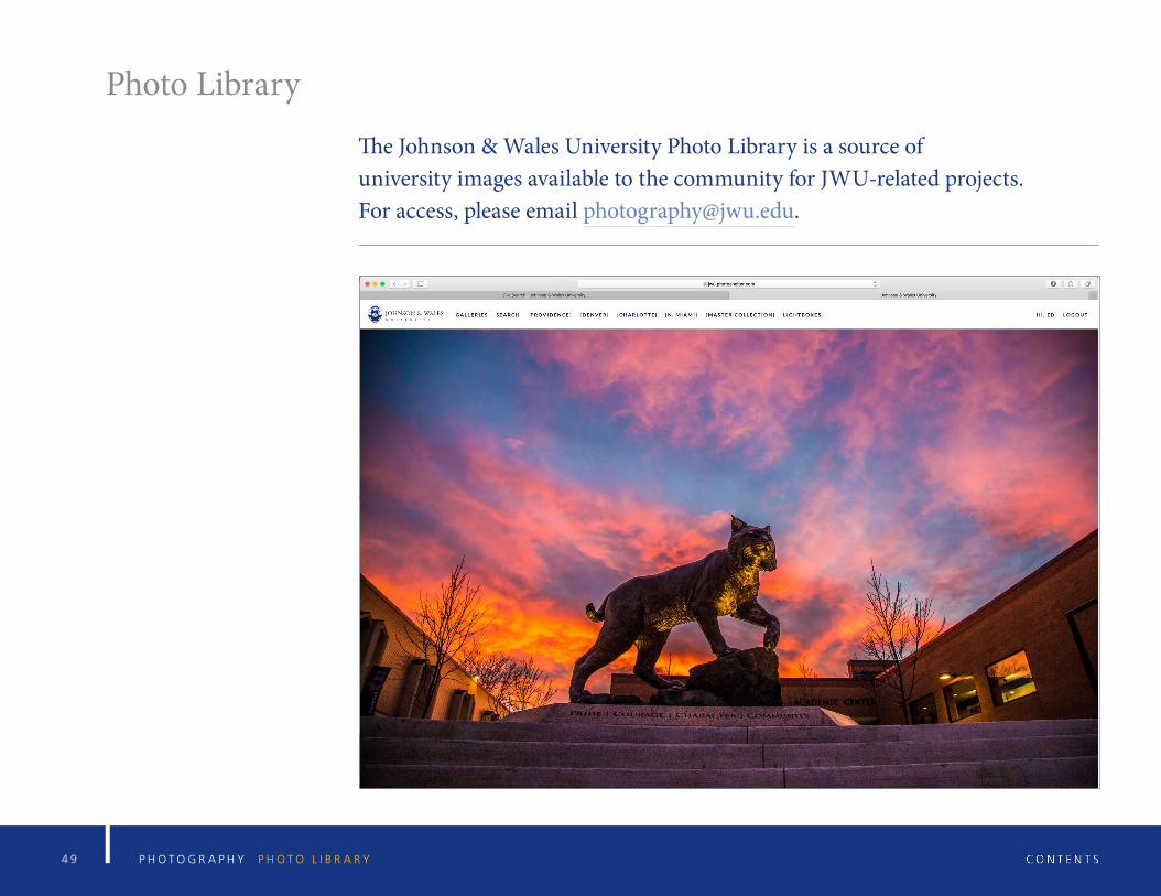
Photo Library
The Johnson & Wales University Photo Library is a source of university images available to the community for JWU-related projects. For access, please email [email protected].
P H O T O G R A P H Y P H O T O L I B R A R Y
5 0 G R A P H I C A N D E D I T O R I A L S T A N D A R D S G L O S S A R Y O F D E S I G N T E R M S
Glossary of Design Terms
51 G R A P H I C A N D E D I T O R I A L S T A N D A R D S G L O S S A R Y O F D E S I G N T E R M S
Glossary of Design Terms
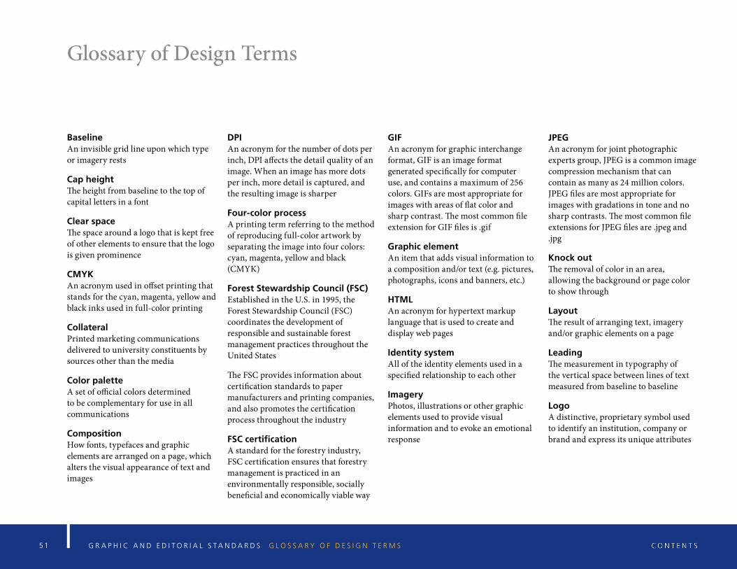
BaselineAn invisible grid line upon which type or imagery rests
Cap heightThe height from baseline to the top of capital letters in a font
Clear spaceThe space around a logo that is kept free of other elements to ensure that the logo is given prominence
CMYKAn acronym used in offset printing that stands for the cyan, magenta, yellow and black inks used in full-color printing
CollateralPrinted marketing communications delivered to university constituents by sources other than the media
Color paletteA set of official colors determined to be complementary for use in all communications
CompositionHow fonts, typefaces and graphic elements are arranged on a page, which alters the visual appearance of text and images
DPI An acronym for the number of dots per inch, DPI affects the detail quality of an image. When an image has more dots per inch, more detail is captured, and the resulting image is sharper
Four-color processA printing term referring to the method of reproducing full-color artwork by separating the image into four colors: cyan, magenta, yellow and black (CMYK)
Forest Stewardship Council (FSC)Established in the U.S. in 1995, the Forest Stewardship Council (FSC) coordinates the development of responsible and sustainable forest management practices throughout the United States
The FSC provides information about certification standards to paper manufacturers and printing companies, and also promotes the certification process throughout the industry
FSC certificationA standard for the forestry industry, FSC certification ensures that forestry management is practiced in an environmentally responsible, socially beneficial and economically viable way
GIFAn acronym for graphic interchange format, GIF is an image format generated specifically for computer use, and contains a maximum of 256 colors. GIFs are most appropriate for images with areas of flat color and sharp contrast. The most common file extension for GIF files is .gif
Graphic element An item that adds visual information to a composition and/or text (e.g. pictures, photographs, icons and banners, etc.)
HTMLAn acronym for hypertext markup language that is used to create and display web pages
Identity systemAll of the identity elements used in a specified relationship to each other
ImageryPhotos, illustrations or other graphic elements used to provide visual information and to evoke an emotional response
JPEGAn acronym for joint photographic experts group, JPEG is a common image compression mechanism that can contain as many as 24 million colors. JPEG files are most appropriate for images with gradations in tone and no sharp contrasts. The most common file extensions for JPEG files are .jpeg and .jpg
Knock outThe removal of color in an area, allowing the background or page color to show through
LayoutThe result of arranging text, imagery and/or graphic elements on a page
LeadingThe measurement in typography of the vertical space between lines of text measured from baseline to baseline
LogoA distinctive, proprietary symbol used to identify an institution, company or brand and express its unique attributes
5 2 G R A P H I C A N D E D I T O R I A L S T A N D A R D S G L O S S A R Y O F D E S I G N T E R M S
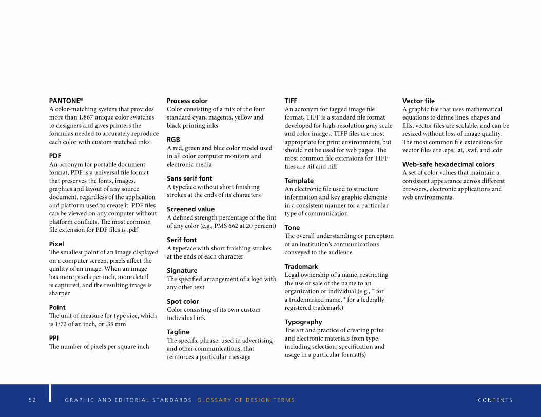
PANTONE®
A color-matching system that provides more than 1,867 unique color swatches to designers and gives printers the formulas needed to accurately reproduce each color with custom matched inks
PDFAn acronym for portable document format, PDF is a universal file format that preserves the fonts, images, graphics and layout of any source document, regardless of the application and platform used to create it. PDF files can be viewed on any computer without platform conflicts. The most common file extension for PDF files is .pdf
PixelThe smallest point of an image displayed on a computer screen, pixels affect the quality of an image. When an image has more pixels per inch, more detail is captured, and the resulting image is sharper
PointThe unit of measure for type size, which is 1/72 of an inch, or .35 mm
PPIThe number of pixels per square inch
Process colorColor consisting of a mix of the four standard cyan, magenta, yellow and black printing inks
RGBA red, green and blue color model used in all color computer monitors and electronic media
Sans serif fontA typeface without short finishing strokes at the ends of its characters
Screened valueA defined strength percentage of the tint of any color (e.g., PMS 662 at 20 percent)
Serif fontA typeface with short finishing strokes at the ends of each character
SignatureThe specified arrangement of a logo with any other text
Spot colorColor consisting of its own custom individual ink
TaglineThe specific phrase, used in advertising and other communications, that reinforces a particular message
TIFFAn acronym for tagged image file format, TIFF is a standard file format developed for high-resolution gray scale and color images. TIFF files are most appropriate for print environments, but should not be used for web pages. The most common file extensions for TIFF files are .tif and .tiff
TemplateAn electronic file used to structure information and key graphic elements in a consistent manner for a particular type of communication
ToneThe overall understanding or perception of an institution’s communications conveyed to the audience
TrademarkLegal ownership of a name, restricting the use or sale of the name to an organization or individual (e.g., ™ for a trademarked name, ® for a federally registered trademark)
TypographyThe art and practice of creating print and electronic materials from type, including selection, specification and usage in a particular format(s)
Vector fileA graphic file that uses mathematical equations to define lines, shapes and fills, vector files are scalable, and can be resized without loss of image quality. The most common file extensions for vector files are .eps, .ai, .swf. and .cdr
Web-safe hexadecimal colorsA set of color values that maintain a consistent appearance across different browsers, electronic applications and web environments.
5 3 G R A P H I C A N D E D I T O R I A L S T A N D A R D S S E L E C T I N G T H E C O R R E C T A R T W O R K
Selecting the Correct Artwork
5 4 G R A P H I C A N D E D I T O R I A L S T A N D A R D S S E L E C T I N G T H E C O R R E C T A R T W O R K
Selecting the Correct Artwork
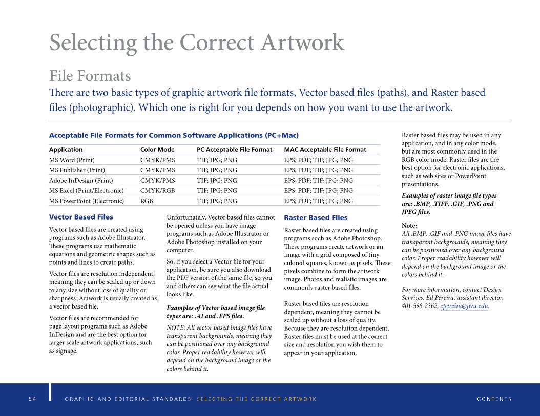
Acceptable File Formats for Common Software Applications (PC+Mac)
Application Color Mode PC Acceptable File Format MAC Acceptable File Format
MS Word (Print) CMYK/PMS TIF; JPG; PNG EPS; PDF; TIF; JPG; PNGMS Publisher (Print) CMYK/PMS TIF; JPG; PNG EPS; PDF; TIF; JPG; PNGAdobe InDesign (Print) CMYK/PMS TIF; JPG; PNG EPS; PDF; TIF; JPG; PNGMS Excel (Print/Electronic) CMYK/RGB TIF; JPG; PNG EPS; PDF; TIF; JPG; PNGMS PowerPoint (Electronic) RGB TIF; JPG; PNG EPS; PDF; TIF; JPG; PNG
Vector Based Files
Vector based files are created using programs such as Adobe Illustrator. These programs use mathematic equations and geometric shapes such as points and lines to create paths.
Vector files are resolution independent, meaning they can be scaled up or down to any size without loss of quality or sharpness. Artwork is usually created as a vector based file.
Vector files are recommended for page layout programs such as Adobe InDesign and are the best option for larger scale artwork applications, such as signage.
Unfortunately, Vector based files cannot be opened unless you have image programs such as Adobe Illustrator or Adobe Photoshop installed on your computer.
So, if you select a Vector file for your application, be sure you also download the PDF version of the same file, so you and others can see what the file actual looks like.
Examples of Vector based image file types are: .AI and .EPS files.
NOTE: All vector based image files have transparent backgrounds, meaning they can be positioned over any background color. Proper readability however will depend on the background image or the colors behind it.
Raster Based Files
Raster based files are created using programs such as Adobe Photoshop. These programs create artwork or an image with a grid composed of tiny colored squares, known as pixels. These pixels combine to form the artwork image. Photos and realistic images are commonly raster based files.
Raster based files are resolution dependent, meaning they cannot be scaled up without a loss of quality. Because they are resolution dependent, Raster files must be used at the correct size and resolution you wish them to appear in your application.
Raster based files may be used in any application, and in any color mode, but are most commonly used in the RGB color mode. Raster files are the best option for electronic applications, such as web sites or PowerPoint presentations.
Examples of raster image file types are: .BMP, .TIFF, .GIF, .PNG and JPEG files.
Note: All .BMP, .GIF and .PNG image files have transparent backgrounds, meaning they can be positioned over any background color. Proper readability however will depend on the background image or the colors behind it.
For more information, contact Design Services, Ed Pereira, assistant director, 401-598-2362, [email protected].
File FormatsThere are two basic types of graphic artwork file formats, Vector based files (paths), and Raster based files (photographic). Which one is right for you depends on how you want to use the artwork.
5 5 G R A P H I C A N D E D I T O R I A L S T A N D A R D S S E L E C T I N G T H E C O R R E C T A R T W O R K
ResolutionThere are two basic types of resolution which are based upon end-use, print vs electronic. Print applications require 300ppi (pixels per inch) which are required for crisp reproduction of a file at actual size. Electronic applications require 72ppi. Vector files however work at any size.
The Importance of Resolution
Resolution refers to the number of pixels per square inch (ppi) in an image file.
Print and electronic mediums require different resolutions to reproduce well. You must have the correct resolution for your application.
Print applications require a high resolution 300ppi file, at actual size, to reproduce crisply and cleanly on paper.
Electronic applications require a low-er resolution 72ppi file, at actual size, to reproduce clearly on-screen.
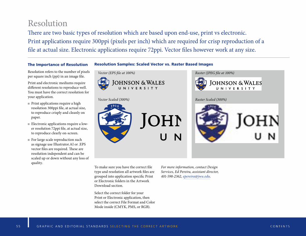
For large scale reproduction such as signage use Illustrator.AI or .EPS vector files are required. These are resolution independent and can be scaled up or down without any loss of quality.
Resolution Samples: Scaled Vector vs. Raster Based Images
Vector (EPS file at 100%) Raster (JPEG file at 100%)
Vector Scaled (300%) Raster Scaled (300%)
To make sure you have the correct file type and resolution all artwork files are grouped into application specific Print or Electronic folders in the Artwork Download section.
Select the correct folder for your Print or Electronic application, then select the correct File Format and Color Mode inside (CMYK, PMS, or RGB).
For more information, contact Design Services, Ed Pereira, assistant director, 401-598-2362, [email protected].