Embed Size (px)
DESCRIPTION
uid unit 1
Citation preview
UNIT IINTRODUCTION
Human–Computer Interface – Characteristics of Graphics Interface –Direct ManipulationGraphical System – Web User Interface –Popularity –Characteristic & Principles.
Defining the User Interface It is the parts of the computer and its software that people can touch, feel, talk to, or otherwise
understand and direct. It is a sub field to Human-computer interaction study. User interface design is a subset of a field of study called human computer interaction. (HCI). HCI is the study, planning and design of how people and computers work together. User interface has 2 components:
o Input,o Output
Input is how a person communicates his or her needs or desires to the computer. Ex. Keyboard, mouse.
Output is how the computer conveys its results of its computations and requirements to the user. Ex. Display screen
Importance of good design: The Importance of Good Design
Its very important to our users. It is the window to view the capabilities of the system
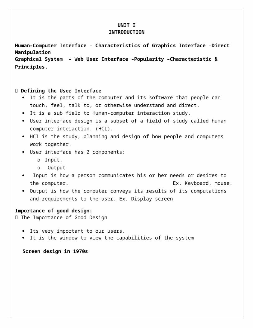
Screen design in 1970s
Screen design in 1980s
Screen design nowadays with GUI
The reasons for inefficient and confusing design is, No care on design Not enough time Not knowing what really makes good design Not possessing common sense.
A well designed interface and screen is very important to the users. It is the main window to view the capabilities of the system. A screen design affects a person in a variety of ways. If the design is confusing and inefficient, people will have greater difficulty and make more mistakes, Chase some people away from the system. It also leads to aggravation, frustration and increased stress.

Benefits of good design: Poor clarity forced screens force the users to take more time to process. The screen clarity and reliability is done by making screens less crowded. Separate items are placed in separate lines. Reformatting enquiry screens with good design principles Increase productivity Good reorganization of the system
Human Computer Interface: The human–computer interface can be described as the point of communication between the human user
and the computer. The flow of information between the human and computer is defined as the loop of interaction.
The loop of interaction has several aspects to it including:
Task Environment: The conditions and goals set upon the user.
Machine Environment: The environment that the computer is connected to, i.e. a laptop in a college student's dorm room.
Areas of the Interface: Non-overlapping areas involve processes of the human and computer not pertaining to their interaction. Meanwhile, the overlapping areas only concern themselves with the processes pertaining to their interaction.
Input Flow: The flow of information that begins in the task environment, when the user has some task that requires using their computer.
Output: The flow of information that originates in the machine environment.
Feedback: Loops through the interface that evaluate, moderate, and confirm processes as they pass from the human through the interface to the computer and back.
A human usually has 5 senses:
– Sight,– Hearing,– Touch,– Taste,– Smell,
• A computer hasn’t any senses as such; it is machinery, with electrons running around in and out of component devices.
• A good interface match would include as many senses as possible.• Computer input and output is basically seeing what we enter and what is displayed.• Sound can be added to some programs, either by giving instructions by voice, or listening to a
commentary / music.• Touch can be in the form of using the mouse, a joystick, or a drawing tablet.
HCI DESIGNER MUST CONSIDER A VARIETY OF FOLLOWING FACTORS:
1. What people want and expect.2. What physical limitations and people posses.3. How their perceptual and information processing system works.4. What people find enjoyable and attractive.

Introduction of the Graphical User Interface: A graphical user interface (GUI), often pronounced gooey, is a type of user interface that
allows users to interact with programs in more ways than typing such as computers. Graphical user interfaces, such as Microsoft Windows and the one used by the Apple Macintosh,
feature the following basic components:
o Pointer: A symbol that appears on the display screen and that you move to select objects and commands. Usually, the pointer appears as a small angled arrow. Text -processing applications, however, use an I-beam pointer that is shaped like a capital I.
o Pointing device: A device, such as a mouse or trackball that enables you to select objects on the display screen.
o Icons: Small pictures that represent commands, files, or windows. By moving the pointer to the icon and pressing a mouse button, you can execute a command or convert the icon into a window. You can also move the icons around the display screen as if they were real objects on your desk.
o Desktop: The area on the display screen where icons are grouped is often referred to as the desktop because the icons are intended to represent real objects on a real desktop.
o Windows: You can divide the screen into different areas. In each window, you can run a different program or display a different file. You can move windows around the display screen, and change their shape and size at will.
o Menus: Most graphical user interfaces let you execute commands by selecting a choice from a menu.
A user interface, as recently described, is a collection of techniques and mechanisms to interact with something.
In a graphical interface, the primary interaction mechanism is a pointing device of some kind. This device is the electronic equivalent to the human hand. What the user interacts with is a collection of elements referred to as objects. They can be seen, heard, touched, or otherwise perceived. Objects are always visible to the user and are used to perform tasks. They are interacted with as entities independent of all other objects. People perform operations, called actions, on objects.
Advantages of graphical system:The success of graphical systems has been attributed to a host of factors. The following have been
commonly referenced in literature and endorsed by their advocates as advantages of these systems.
Symbols recognized faster than text: o Symbols can be recognized faster and more accurately than text. An example of a good
classification scheme that speeds up recognition is the icons. These icons allow speedy recognition of the type of message being presented.
Faster learning: o A graphical, pictorial representation aids learning, and symbols can also be easily learned.

Faster use and problem solving: o Visual or spatial representation of information has been found to be easier to retain and
manipulate and leads to faster and more successful problem solving. Easier remembering:
o Because of greater simplicity, it is easier for casual users to retain operational concepts. More natural:
o Symbolic displays are more natural and advantageous because the human mind has a powerful image memory.
Fewer errors: o Reversibility of actions reduces error rates because it is always possible to undo the last step.
Error messages are less frequently needed. Increased feeling of control:
o The user initiates actions and feels in control. This increases user confidence Immediate feedback:
o The results of actions furthering user goals can be seen immediately. If the response is not in the desired direction, the direction can be changed quickly.
Predictable system responses:o Predictable system responses also speed learning.
Easily reversible actions: o This ability to reverse unwanted actions also increases user confidence
More attractive: o Direct-manipulation systems are more entertaining, cleverer, and more appealing.
May consume less space: o Icons may take up less space than the equivalent in words but this is not the case always.
Replaces national languages: o Icons possess much more universality than text and are much more easily comprehended
worldwide. Easily augmented with text displays:
o Where graphical design limitations exist, direct-manipulation systems can easily be augmented with text displays. The reverse is not true.
Low typing requirements: o Pointing and selection controls, such as the mouse or trackball, eliminate the need for typing
skills.
Graphical system disadvantages:The body of positive research, hypotheses, and comment concerning graphical systems is being challenged
by some studies, findings, and opinions that indicate that graphical representation and interaction may not necessarily always be better.
Indeed, in some cases, it may be poorer than pure textual or alphanumeric displays. Among the disadvantages put forth are these:
Greater design complexity: o Controls and basic alternatives must be chosen from a pile of choices numbering in excess of 50.
This design potential may not necessarily result in better design unless proper controls and windows are selected. Poor design can undermine acceptance.
Learning still necessary: o The first time one encounters many graphical systems, what to do is not immediately obvious. A
severe learning and remembering requirement is imposed on many users because meanings of icons or using pointing device have to be learned.

Lack of experimentally-derived design guidelines: o Today there is a lack of widely available experimentally-derived design guidelines. Earlier only
few studies to aid in making design decisions were performed and available for today now. Consequently, there is too little understanding of how most design aspects relate to productivity and satisfaction.
Inconsistencies in technique and terminology: o Many differences in technique, terminology, and look and feel exist among various graphical
system providers, and even among successive versions of the same system. So the user has to learn or relearn again while shifting to next terminology.
Not always familiar: o Symbolic representations may not be as familiar as words or numbers. Numeric symbols elicit
faster responses than graphic symbols in a visual search task. Window manipulation requirements:
o Window handling and manipulation times are still excessive and repetitive. This wastes time Production limitations:
o The number of symbols that can be clearly produced using today’s technology is still limited. A body of recognizable symbols must be produced that are equally legible and equally recognizable using differing technologies. This is extremely difficult today.
Few tested icons exist: o Icons must be researched, designed, tested, and then introduced into the marketplace. The
consequences of poor or improper design will be confusion and lower productivity for users. Inefficient for touch typists:
o For an experienced touch typist, the keyboard is a very fast and powerful device. Not always the preferred style of interaction:
o Not all users prefer a pure iconic interface. User will also prefer alternatives with textual captions.
Not always fastest style of interaction: o Graphic instructions on an automated bank teller machine were inferior to textual instructions.
May consume more screen space: o Not all applications will consume less screen space. A listing of names and telephone numbers in
a textual format will be more efficient to scan than a card file. Hardware limitations:
o Good design also requires hardware of adequate power, processing speed, screen resolution, and graphic capability.
Characteristics of the Graphical User Interface:
Sophisticated Visual Presentation Pick-and-Click Interaction Restricted Set of Interface Options Visualization Object Orientation Use of Recognition Memory Concurrent Performance of Functions
Sophisticated Visual Presentation
Visual presentation is the visual aspect of the interface. It is what people see on the screen. The sophistication of a graphical system permits displaying lines, including drawings and icons. It also permits the displaying of a variety of character fonts, including different sizes and styles.
The meaningful interface elements visually presented to the user in a graphical system include windows (primary, secondary, or dialog boxes), menus (menu bar, pull down, pop-up, cascading), icons to represent objects such as programs or files, assorted screen-based controls (text boxes, list boxes, combination boxes, settings, scroll bars, and buttons), and a mouse pointer and cursor. The objective is to reflect visually on the screen the real world of the user as realistically, meaningfully, simply, and clearly as possible.
Pick-and-Click Interaction To identify a proposed action is commonly referred to as pick, the signal to perform an action as click. The primary mechanism for performing this pick-and-click is most often the mouse and its buttons and
the secondary mechanism for performing these selection actions is the keyboard.
Restricted Set of Interface Options The array of alternatives available to the user is what is presented on the screen or what may be retrieved
through what is presented on the screen, nothing less, and nothing more. This concept fostered the acronym WYSIWYG.
Visualization Visualization is a cognitive process that allows people to understand information that is difficult to
perceive, because it is either too voluminous or too abstract. The goal is not necessarily to reproduce a realistic graphical image, but to produce one that conveys the
most relevant information. Effective visualizations can facilitate mental insights, increase productivity, and foster faster and more accurate use of data.
Object Orientation A graphical system consists of objects and actions. Objects are what people see on the screen as a single
unit. Objects can be composed of sub objects .For example, an object may be a document and its sub objects
may be a paragraph, sentence, word, and letter. Objects are divided into three meaningful classes as Data objects, which present information, container
objects to hold other objects and Device objects, represent physical objects in the real world. Objects can exist within the context of other objects, and one object may affect the way another object
appears or behaves. These relationships are called collections, constraints, composites, and containers.
Properties or Attributes of Objects: Properties are the unique characteristics of an object. Properties help to describe an object and can be
changed by users.
Actions: People take actions on objects. They manipulate objects in specific ways (commands) or modify the properties of objects (property or
attribute specification). The following is a typical property/attribute specification sequence:
o The user selects an object—for example, several words of text.o The user then selects an action to apply to that object, such as the action BOLD.

o The selected words are made bold and will remain bold until selected and changed again.
Application versus Object or Data Orientation An application-oriented approach takes an action: object approach, like this:
Action> 1. An application is opened (for example, word processing).
Object> 2. A file or other object selected (for example, a memo).
An object-oriented object: action approach does this:
Object> 1. An object is chosen (a memo).
Action> 2. An application is selected (word processing).
Views: Views are ways of looking at an object’s information. IBM’s SAA CUA describes four kinds of views:
composed, contents, settings, and help.
Use of Recognition Memory Continuous visibility of objects and actions encourages to eliminate “out of sight, out of mind” problem
Concurrent Performance of Functions Graphic systems may do two or more things at one time. Multiple programs may run simultaneously. It may process background tasks (cooperative multitasking) or preemptive multitasking. Data may also be transferred between programs. It may be temporarily stored on a “clipboard” for later
transfer or be automatically swapped between programs.
Direct Manipulation System: Direction manipulation system is one in which the user is able to select an object and then specify which
actions are to be taken.
System is portrayed as extension of real world - The system replicates objects and actions in the working environment on the screen.(Familiar).- A person has power to access and modify these objects.- The physical organization of the system is unfamiliar to the user and hence hidden from view.
Continuous visibility of objects and actions - Objects are continuously visible(desktop)- Remainders of action to be performed as obvious.- Labeled buttons replaced complex commands and syntax.- Cursor action and motion is physically obvious and natural.
This concept is referred as: 1. Virtual reality (nelson 1980) 2. WYSIWYG (Hatfield 1981).
- What you see is what you get Actions are rapid and incremental with visible display of results
Tactile feedback is not possible yet, but immediate visual feedbacks of the outcome of actions are provided.
Auditory feedback may also be provided. Evolution of tasks is continuous and effortless.

Incremental actions are easily reversible
Example: The "trash" on the desktop is an excellent example of direct manipulation within computer systems.
Users can see both the trash and the files or folders they want to move to the trash. They then physically select the files and drag them to the trash can. While the user is doing this, all of the selected files move as well, illustrating which items the user has selected. When the mouse is placed over the trash, there is a shading indication that it has been selected. The user
then has to release the mouse button to move the files to the trash. If there are many files, a dialogue box will show up illustrating the progress of moving files to the trash. Once the action is completed, the files are no longer visible in their original location. The user can change her mind at any time while dragging the files to the trash. Even after placing them there, they can as easily be taken out of the trash and put back in place.
Earlier Direct manipulation systems:1. Concept of direct manipulation actually preceded the first graphical system.
Eg: Earliest full screen text editors. 2. Screen texts resembled paper on desk (real world extension).3. Text reviewed in their entirely (continuous visibility).4. Editing or reconstructing easily done. (Rapid incremental action).5. Actions should be reversed when necessary.
Indirect Manipulation:
Direct manipulation of all screen objects and action may not feasible because of the following Operations being difficult to conceptualize in the graphical system Graphics capability of the system being limited Amount of space available for placing manipulation controls in the window border being limited Difficulties for people to learn and remember all the necessary operations and actions
For such cases indirect manipulation is provided.
- Indirect manipulation substitutes words and text, such as pull-down or pop-up menus, for symbols and substitutes typing for pointing.
- Most window system uses a combination of both. E.g.: Menus icon, etc.
The Web User Interface Web interface design is essentially the design of navigation and the presentation of information. Proper interface design is largely a matter of properly balancing the structure and relationships of
menus, content, and other linked documents or graphics. The design goal is to build a hierarchy of menus and pages that feels natural, is well structured, is easy to use, and is truthful.
The Web is a navigation environment where people move between pages of information, not an application environment. It is also a graphically rich environment.
Web interface design is difficult for a number of reasons. First, its underlying design language, HTML. Next, browser navigation retreated to the pre-GUI era.
Web interface design is also more difficult because the main issues concern information architecture and task flow, neither of which is easy to standardize. It is more difficult because of the availability of the various types of multimedia, and the desire of many designers to use something simply because it is available. It is more difficult because users are ill defined, and the user’s tools so variable in nature.

The popularity of Web
Web usage has reflected this popularity. The number of Internet hosts has risen dramatically. Users have become much more discerning about good design. Slow download times, confusing
navigation, confusing page organization, disturbing animation, or other undesirable site features often results in user abandonment of the site for others with a more agreeable interface.
It allows millions of people scattered across the globe to communicate, access information, publish, and be heard.
It allows people to control much of the display and the rendering of Web pages. It provides security for the data transmitted. It allows changing topography and colors.
Characteristics of Web Design A Web interface possesses a number of characteristics, some similar to a GUI interface, and, as has
already been shown, some different.
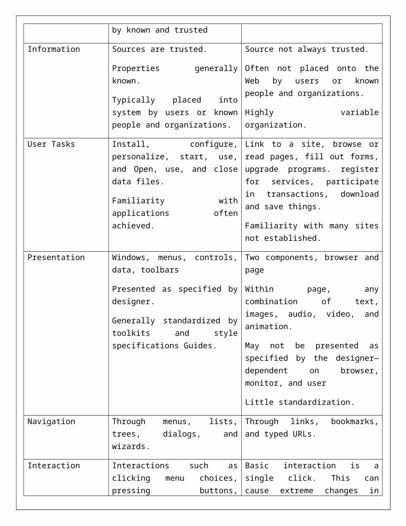
GUI versus Web DesignCHARACTERISTICS
GUI WEB
Devices User hardware variations limited.
User hardware characteristics well defined
Screens appear exactly as specified.
User hardware variations enormous.
Screen appearance influenced by hardware being used.
User Focus Data and applications. Information and navigation.
Data Typically created and used by known and trusted
Full of unknown content.
Information Sources are trusted.
Properties generally known.
Typically placed into system by users or known people and organizations.
Source not always trusted.
Often not placed onto the Web by users or known people and organizations.
Highly variable organization.
User Tasks Install, configure, personalize, start, use, and Open, use, and close data files.
Familiarity with applications often achieved.
Link to a site, browse or read pages, fill out forms, upgrade programs. register for services, participate in transactions, download and save things.
Familiarity with many sites not established.
Presentation Windows, menus, controls, data, Two components, browser and page

toolbars
Presented as specified by designer.
Generally standardized by toolkits and style specifications Guides.
Within page, any combination of text, images, audio, video, and animation.
May not be presented as specified by the designer—dependent on browser, monitor, and user
Little standardization.
Navigation Through menus, lists, trees, dialogs, and wizards.
Through links, bookmarks, and typed URLs.
Interaction Interactions such as clicking menu choices, pressing buttons, selecting list choices, and cut/copy/paste occur within context of active program.
Basic interaction is a single click. This can cause extreme changes in context, which may not be noticed.
Response Time Nearly instantaneous Quite variable, depending on transmission speeds, page content, and so on. Long times can upset the user.
System Capability Unlimited capability proportional to sophistication of hardware and software.
Limited by constraints imposed by the hardware, browser, software, client support, and user willingness to allow features because of response time, security, and privacy concerns.
Task Efficiency Targeted to a specific audience with specific tasks.
Only limited by the amount of programming undertaken to support it.
Limited by browser and network capabilities.
Actual user audience usually not well understood.
Often intended for anyone and everyone.
Consistency Major objective exists within and across applications.
Aided by platform toolkit and design guidelines.
Universal consistency in GUI products generally
Sites tend to establish their own identity.
Frequently standards set within a site.
Frequent ignoring of GUI guidelines for identical created through toolkits and design guidelines. Components, especially controls.
User Assistance Integral part of most systems and applications.
Documentation, both online and
No similar help systems.

offline,
Customer service support, if provided, usually provided.
Personal support desk also usually provided.
Accessed through standard mechanisms.
The little available help is built into the page oriented to product or service offered.
Integration Seamless integration of all applications into the platform environment is a major objective.
Apparent for some basic functions
within most Web sites (navigation, printing, and so on.) in accomplishing this objective
Sites tend to achieve individual distinction rather than integration.
Security Tightly controlled, proportional to degree of willingness to invest resources and effort.
Not an issue for most home PC users.
Renowned for security exposures.
Browser-provided security options typically understood by average users. When employed, may have function-limiting side effects
Reliability Tightly controlled in business systems, Susceptible to disruptions caused by user, telephone proportional to degree of willingness line and cable providers, Internet service providers, to invest resources and effort. Hosting servers, and remotely accessed sites.
PRINTED PAGES VERSUS WEB PAGES:
1. Page size:– Printed pages are larger than web pages.– Printed pages are fixed in size, web pages are variable.– Printed pages have integrated and complete look, web pages are presented in pieces whose
dimension differs depending on the user’s technology (browser, monitor and so on.)– The visual impact of printed pages is maintained in hard copy form. Web pages exists as
snapshots of pages areas and some parts are never seen and require scrolling- visual impact degraded.
Design implication: top of a web page is most important and signals to users must always be provided that parts of a page lie below the surface.
2. Page rendering:– Printed pages are presented as complete entities- their entire content available for reading or
review.– Web page rendered slowly, depending upon transmission line speeds and page content.

– If page download is slow, user may switch to a different site.– Printed pages are superior to web pages.
3. Page layout:• Printed page layout is precise, web pages layout is an approximation- affected by
deficiencies in design tool kits and characteristics of user’s browser and hardware particularly screen sizes.
• Design implication: understand the restrictions, and design for the most common user tools. 4. Page resolution:
• Print character resolution exceeds screen character resolution.• Screen reading is slower than reading from document.
Design implication: provide an easy way to print long web documents.5. User focus:
• Printed pages present entire information with clear size and nature of material.• Some printed pages may be read sequentially (a novel) and other partially and some what
sequentially (newspapers) and some other are skimmed in a systematic way.• Web pages are snapshots with few cues as to structure and sequence, length and depth.
6. Page navigation:- Printed page navigation is simple – page turning, a motor skill learned early in life.- Substantial interaction between page is rare, the process being sequential.- Web navigation requires innumerable decision like.
1. What is at the end of this link? 2. Where is it? 3. Will it address my need or solve problem.Design implication: provide overview of information organization schemes and clear descriptions of where links lead.
7. Interactivity: - printed page design involves letting the eyes traverse static information, selectively looking at information and using spatial combinations to enhance page elements.
- Web design involves letting the hands move the information (scrolling, pointing expanding, clicking) in conjunction with eyes.
8. Page independence: - In web page any page in a site can almost be accessed from anywhere else, pages must be made freestanding.- Printed pages, being sequential, organized and providing a clear sense of place, are not considered independent.
General PrinciplesThe design goals in creating a user interface are described below. They are fundamental to the design and
implementation of all effective interfaces, including GUI and Web ones. These principles are general characteristics of the interface, and they apply to all aspects.
Aesthetically Pleasing— Provide visual appeal by following these presentation and graphic design principles:
Provide meaningful contrast between screen elements. Create groupings. Align screen elements and groups. Provide three-dimensional representation. Use color and graphics effectively and simply.

Clarity— The interface should be visually, conceptually, and linguistically clear, including:
Visual elements Functions Metaphors Words and text
Compatibility— Provide compatibility with the following:
The user The task and job The product
— Adopt the user’s perspective. Comprehensibility
— A system should be easily learned and understood. A user should know the following: What to look at What to do When to do it Where to do it Why to do it How to do it
— The flow of actions, responses, visual presentations, and information should be in a sensible order that is easy to recollect and place in context.
Configurability— Permit easy personalization, configuration, and reconfiguration of settings.
Enhances a sense of control. Encourages an active role in understanding.
Consistency— A system should look, act, and operate the same throughout. Similar components should:
Have a similar look. Have similar uses. Operate similarly.
— The same action should always yield the same result.— The function of elements should not change.— The position of standard elements should not change.— In addition to increased learning requirements, inconsistency in design has a number of other
prerequisites and by-products, including:— More specialization by system users.— Greater demand for higher skills.— More preparation time and less production time.— More frequent changes in procedures.— More error-tolerant systems (because errors are more likely).— More kinds of documentation.— More time to find information in documents.— More unlearning and learning when systems are changed.— More demands on supervisors and managers.— More things to do wrong.
Control— The user must control the interaction.
Actions should result from explicit user requests. Actions should be performed quickly. Actions should be capable of interruption or termination. The user should never be interrupted for errors.
— The context maintained must be from the perspective of the user.— The means to achieve goals should be flexible and compatible with the user’s skills, experiences,
habits, and preferences.— Avoid modes since they constrain the actions available to the user.— Permit the user to customize aspects of the interface, while always providing a proper set of
defaults. Directness
— Provide direct ways to accomplish tasks. Available alternatives should be visible. The effect of actions on objects should be visible.
Efficiency— Minimize eye and hand movements, and other control actions.
Transitions between various system controls should flow easily and freely. Navigation paths should be as short as possible. Eye movement through a screen should be obvious and sequential.
— Anticipate the user’s wants and needs whenever possible. Familiarity
— Employ familiar concepts and use a language that is familiar to the user.— Keep the interface natural, mimicking the user’s behavior patterns.— Use real-world metaphors.
Flexibility— A system must be sensitive to the differing needs of its users, enabling a level and type of
performance based upon: Each user’s knowledge and skills. Each user’s experience. Each user’s personal preference. Each user’s habits. The conditions at that moment.
Forgiveness— Tolerate and forgive common and unavoidable human errors.— Prevent errors from occurring whenever possible.— Protect against possible catastrophic errors.
Predictability— The user should be able to anticipate the natural progression of each task.
Provide distinct and recognizable screen elements. Provide cues to the result of an action to be performed.
— All expectations should be fulfilled uniformly and completely.— When an error does occur, provide constructive messages.
Recovery— A system should permit:
Commands or actions to be abolished or reversed. Immediate return to a certain point if difficulties arise.
— Ensure that users never lose their work as a result of: An error on their part.

Hardware, software, or communication problems. Responsiveness
— The system must rapidly respond to the user’s requests.— Provide immediate acknowledgment for all user actions:
Visual. Textual. Auditory.
Simplicity— Provide as simple an interface as possible.— Five ways to provide simplicity:
Use progressive disclosure, hiding things until they are needed.— Present common and necessary functions first.— Prominently feature important functions.— Hide more sophisticated and less frequently used functions.
Provide defaults. Minimize screen alignment points. Make common actions simple at the expense of uncommon actions being made harder. Provide uniformity and consistency.
Transparency— Permit the user to focus on the task or job, without concern for the mechanics of the interface.
Workings and reminders of workings inside the computer should be invisible to the user. Trade-Offs
— Final design will be based on a series of trade-offs balancing often-conflicting design principles.— People’s requirements always take precedence over technical requirements.


![Unit I: [Understanding Corporate Environment] Unit II](https://img.pdfslide.us/doc/110x75/629bc04220e18e3e813c59da/unit-i-understanding-corporate-environment-unit-ii-.jpg)