Embed Size (px)
Citation preview

Unit 2Data
Generic Business Administration
NQFLEVEL
4Mathematical Literacy

Mathematical Literacy — Generic Business Administration NQF LEVEL 4
UNIT 2 — DATA 2.2
Activity8 W
hat are my chances?
Activity10
Manip
ulat
ions
and misunderstandingsActivity
1
Gettin
g to work
Activity2
Gettin
g organised
Activity3 M
akin
g sense of the figures
Activity4
Analy
sing patterns
Activity6 Re
ading
and predicting
Activity5Fr
omthe motor industry
Activity7
Inter
preting tables
Activity9
Co
mbined events
DATA
CollectingRecording
RepresentingDisplaying
StatisticalApplications
InterpretingEvaluating
Probability

Mathematical Literacy — Generic Business Administration NQF LEVEL 4
UNIT 2 — DATA 2.3
Overview
In this unit students develop a variety of mathematical skills including:
• Data collection and organisation, using the context of different means of transport for getting to work.
• Graphical representation of data using data similar to their own collected data.
• Analysis of data to answer questions, using graphs and tables from the motor industry.
• Reading and interpreting the fi gures in a newspaper report on the Top Ten Brands survey.
• Finding connections and correlations between data, and predicting trends.
• Analysis of existing data to aid decision making, in the context of the National Skills Fund.
• Verifi cation of experimental results by analysis and probability calculation, using the lotto as a context.
• Calculating probabilities involving more than one event.• Analysing and critiquing ways in which data can be
manipulated and misunderstood.
Activity 1: Getting to workThis is a preliminary activity designed to raise some of the issues involved in data collection. Students will collect their own simple data about different means of transport and decide what conclusions can be drawn. In order to locate this in a wider context, an information handout has been included that defi nes some common statistical terms and ideas. Problems such as sample size and representativeness are introduced.
Activity 2: Getting organisedThis activity involves the organisation and representation of raw data on a frequency table, a bar graph and a pie chart. Students use data similar to that which they collected in the previous activity to answer simple questions and to determine the different central tendencies of the data.
Activity 3: Making sense of the fi guresThis activity involves reading fi gures from tables and bar graphs. Students are given three graphs and two tables taken from the Sunday Times / Markinor Top Brands Survey. They analyse the data type and sample size, and read off various simple results. They do calculations and suggest some conclusions that could be drawn from them.
Activity 4: Analysing patternsIn this activity students work with patterns and distribution of data. The extend the idea of ‘measuring the centre’ to measuring variance from the mean and understanding the ‘spread’ of the data. They identify data items that seem ‘not to fi t the pattern’ (outliers) and analyse the effect these have on the mean. They draw scatterplots to illustrate various distributions using additional data taken from the Sunday Times / Markinor Top Brands Survey.
The following Unit Standards, Specifi c Outcomes and Assessment Criteria are addressed by this unit:
Apply knowledge of statistics and probability to critically interrogate and effectively communicate fi ndings on life-related problems. (Math Lit 9015).• Critique and use techniques for collecting,
organising and representing data (SO1).o Correctly identify and interpret
situations and issues involving statistics, including problems with samples and contamination (AC1, 3, 4).
o Use methods of collecting, recording, organising, representing and calculating correctly (AC2, 5 , 6, 7).
o Use graphs, summaries and resolutions consistently and correctly (AC8, 9).
• Use theoretical and experimental probability to develop models (SO2).o Correctly use experimental data and
simulation to model a situation and make predictions (AC1, 2).
o Interpret, communicate and verify results in terms of the real context (AC3, 4).
• Critically interrogate and use probability and statistical models (SO3).o Make meaningful interpretations,
predictions and judgements (AC2, 4).o Critique assumptions (AC3).o Identify bias, errors and misuse of
statistics (AC5).
Unit outcomes

Mathematical Literacy — Generic Business Administration NQF LEVEL 4
UNIT 2 — DATA 2.4
Activity 5: From the motor industryIn this activity students read and interpret tables. The context is sales, manufacturing and productivity in the motor industry. They calculate percentage increase, productivity ratio and labour index in simplifi ed examples. They represent the information tables on a bar graph and a broken line graph.
Activity 6: Reading and predictingIn this activity students read data and make predictions by analysing trend lines. They observe patterns and measure important connections between variables. They identify variance from the mean as well as outliers, suggesting what implications these may have in real life situations.
Activity 7: Interpreting tablesThis activity involves the reading and interpretation of information from tables. Students are given a table showing the amounts allocated to various provinces by the National Skills Fund for the training of unemployed people in South Africa. They are also given a table showing the number of people trained per programme and are required to cross-reference these tables, make calculations, interpret the relationship between the rows and columns and draw various conclusions.
Activity 8: What are my chances?This activity introduces the idea of probability. A preliminary handout has been included with background information on some of the common applications and terminology used in this branch of statistics. The students work with single events in the context of the ‘Lotto draw’, comparing ‘counted’ results with calculated probability. In this way students work with the mathematical verifi cation of experimental results.
Activity 9: Combined eventsIn this activity students move from the probabilities involving single events, to probabilities of combined events. They work with the multiplication principle and are introduced to the ideas of dependent, independent and mutually exclusive events. A handout has been included with further information necessary to answer a selection of probability questions.
Activity 10: Manipulations and misunderstandingsIn this activity students critique the ways that data is used to support arguments. They identify how data is manipulated and how one can be misled by incomplete statistics, inappropriate samples and graphical methods.
Mathematical Literacy — Generic Business Administration NQF LEVEL 4
UNIT 2 — DATA 2.5
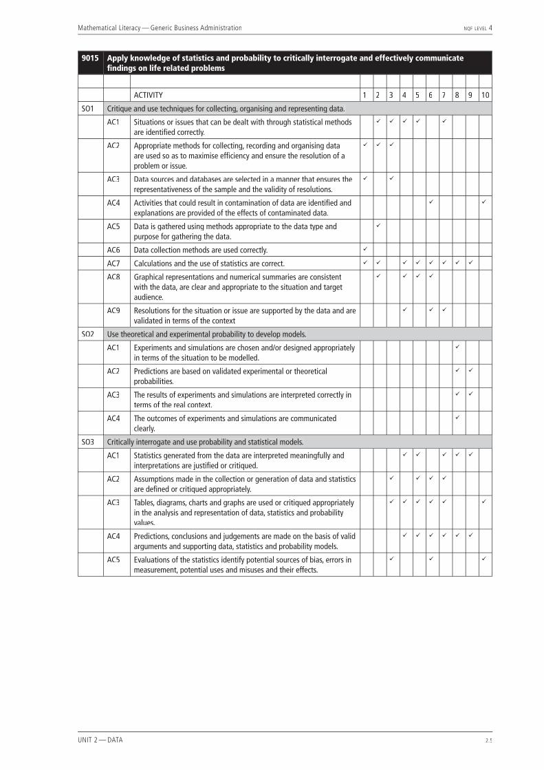
9015 Apply knowledge of statistics and probability to critically interrogate and effectively communicate fi ndings on life related problems
ACTIVITY 1 2 3 4 5 6 7 8 9 10
SO1 Critique and use techniques for collecting, organising and representing data.
AC1 Situations or issues that can be dealt with through statistical methods are identifi ed correctly.
ü ü ü ü ü
AC2 Appropriate methods for collecting, recording and organising data are used so as to maximise effi ciency and ensure the resolution of a problem or issue.
ü ü ü
AC3 Data sources and databases are selected in a manner that ensures the representativeness of the sample and the validity of resolutions.
ü ü
AC4 Activities that could result in contamination of data are identifi ed and explanations are provided of the effects of contaminated data.
ü ü
AC5 Data is gathered using methods appropriate to the data type and purpose for gathering the data.
ü
AC6 Data collection methods are used correctly. ü
AC7 Calculations and the use of statistics are correct. ü ü ü ü ü ü ü ü
AC8 Graphical representations and numerical summaries are consistent with the data, are clear and appropriate to the situation and target audience.
ü ü ü ü
AC9 Resolutions for the situation or issue are supported by the data and are validated in terms of the context
ü ü ü
SO2 Use theoretical and experimental probability to develop models.
AC1 Experiments and simulations are chosen and/or designed appropriately in terms of the situation to be modelled.
ü
AC2 Predictions are based on validated experimental or theoretical probabilities.
ü ü
AC3 The results of experiments and simulations are interpreted correctly in terms of the real context.
ü ü
AC4 The outcomes of experiments and simulations are communicated clearly.
ü
SO3 Critically interrogate and use probability and statistical models.
AC1 Statistics generated from the data are interpreted meaningfully and interpretations are justifi ed or critiqued.
ü ü ü ü ü
AC2 Assumptions made in the collection or generation of data and statistics are defi ned or critiqued appropriately.
ü ü ü ü
AC3 Tables, diagrams, charts and graphs are used or critiqued appropriately in the analysis and representation of data, statistics and probability values.
ü ü ü ü ü ü
AC4 Predictions, conclusions and judgements are made on the basis of valid arguments and supporting data, statistics and probability models.
ü ü ü ü ü ü
AC5 Evaluations of the statistics identify potential sources of bias, errors in measurement, potential uses and misuses and their effects.
ü ü ü

Mathematical Literacy — Generic Business Administration NQF LEVEL 4
UNIT 2 — DATA 2.6

Mathematical Literacy — Generic Business Administration NQF LEVEL 4
UNIT 2 — DATA 2.7
Activity 1 — Getting to work
ABOUT THIS ACTIVITYThis is a preliminary activity designed to raise some of the issues involved in data collection. Students will collect their own simple data about different means of transport and decide what conclusions can be drawn. In order to locate this in a wider context, an information handout has been included that defi nes some common statistical terms and ideas. Problems such as sample size and representativeness are introduced. This activity addresses the following Specifi c Outcomes and Assessment Criteria of unit standard 9015: SO1 — AC 1, 2, 3, 6, 7.
MANAGING THIS ACTIVITYThe students need to be familiar with the terms and ideas in the handout. This could be done as a teacher-led discussion, a question and answer session, or a student-led presentation where students fi nd out the meanings of key words and explain them to the class. It would be useful for each student to have a copy of Handout 1 and for students to suggest their own simple examples to illustrate each statistical idea. These terms will be used often in the next few activities.
Give each student a copy of Worksheet 1 with instructions that they should choose any 20 people and fi ll in the data sheet. This will take a bit of time and is best done outside of the classroom to achieve a greater variety of data. Back in class, students should now combine their totals on a new sheet to collect as much data as possible. We call this cumulative data, and these combined totals should be fi lled in on the cumulative tables given on the worksheet. It may cumulative data, and these combined totals should be fi lled in on the cumulative tables given on the worksheet. It may cumulative databe necessary to discuss the idea of a cumulative table — this is a table that adds the data from all the sheets together and records the totals. The students are now in a position to answer the questions and complete the worksheet.
1.1 A variety of answers would be expected here. Students may mention that commonly used types of transport differ signifi cantly in different age groups. They could pick up differences or similarities in the transport patterns of males and females. They may fi nd some people had diffi culty calculating a monthly expense from a daily expense. They may be surprised by high transport costs etc.
1.2 A survey with closed-ended questions was used. No opinions were asked, only facts.
1.3 Students collected information from 20 people, so the sample size is 20.
1.4 The size of the class sample is calculated by multiplying the number of students in the class by 20. So in a class of 30, the cumulative sample would be 30 × 20 = 600.
1.5 Students should describe the group of people they questioned in terms of how representative they are of other groups in South Africa. Their samples are likely to be poor representations because they probably collected information from family and friends, which means there may be too many in a similar age group or socio-economic group. There is unlikely to be a representative spread of urban and rural respondents etc.
1.6 To calculate the percentage, students should count the number of people who travel by train in their sample, divide it by 20 (the number of people in the whole sample) and multiply by 100. For example if 8 people in a sample of 20 usually travel by train, the percentage is 8 ÷ 20 × 100 = 40%. In the cumulative sample, take the total number who travel by train, divide by the number of people in the whole cumulative sample, and multiply by 100. For example 150 ÷ 600 × 100 = 25%.
1.7 The sample size is bigger, so one would expect a greater variety of answers.
1.8 In general, the larger the sample the more representative the results, so the combined results would be more reliable. However, a sample of 600 is still a very small sample and would be considered very unrepresentative in a larger context.
1.9 This is clearly not representative of the percentage of people who use trains as transport in South Africa. Only some cities have any public train service at all, and an entirely different set of results would be expected in a rural context. The sample is too small and too unrepresentative to allow any valid conclusions to be drawn.

Mathematical Literacy — Generic Business Administration NQF LEVEL 4
UNIT 2 — DATA 2.8
1.10 A variety of answers would be expected, depending on the sample. It may be interesting to explore the reasons why patterns of travel may or may not be different for males and females. It would be an opportunity to raise a few gender issues and safety issues for discussion among class members.
1.11 Students read from their own data and compare with the cumulative data.
1.12 Students read from their own data the number of people between 20 and 35 years who travel in their own cars, divide this by 20 and multiply by 100 to fi nd percentage.

Mathematical Literacy — Generic Business Administration NQF LEVEL 4
UNIT 2 — DATA 2.9
Activity 1 — Getting to workIdentify any 20 people and fi ll in the following table of data, using ticks to indicate to which category they belong and M or F to indicate male or female.
NameAge
(years) Gen
der
What type of transport do you use most often?
Approximately how much do you spend per month on
transport?
0-18
19-3
5
35+
M/F
Trai
n
Taxi
Ow
n ca
r
Cycl
e/w
alk
R0 –
R20
0
R200
–R30
0
R300
-R40
0
R400
+
1
2
3
4
5
6
7
8
9
0
1
2
3
4
5
6
7
8
9
0
Totals
Complete the following tables of combined cumulative data from your class:
Numbers in each age group and type of transport used most often.
Age (years) Train Taxi Own car Cycle / Walk
0 – 18
19 - 35
35 +
TOTALS
WORKSHEET 1
Mathematical Literacy — Generic Business Administration NQF LEVEL 4
UNIT 2 — DATA 2.10
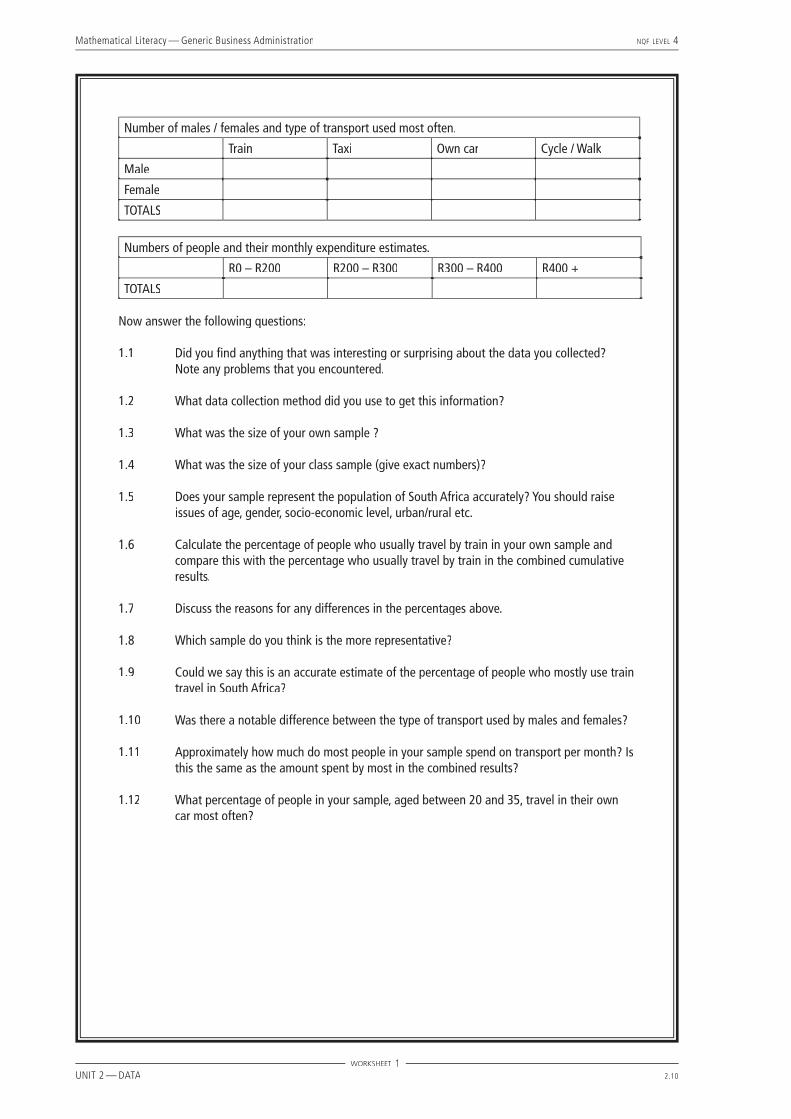
Number of males / females and type of transport used most often.
Train Taxi Own car Cycle / Walk
Male
Female
TOTALS
Numbers of people and their monthly expenditure estimates.
R0 – R200 R200 – R300 R300 – R400 R400 +
TOTALS
Now answer the following questions:
1.1 Did you fi nd anything that was interesting or surprising about the data you collected? Note any problems that you encountered.
1.2 What data collection method did you use to get this information?
1.3 What was the size of your own sample ?
1.4 What was the size of your class sample (give exact numbers)?
1.5 Does your sample represent the population of South Africa accurately? You should raise issues of age, gender, socio-economic level, urban/rural etc.
1.6 Calculate the percentage of people who usually travel by train in your own sample and compare this with the percentage who usually travel by train in the combined cumulative results.
1.7 Discuss the reasons for any differences in the percentages above.
1.8 Which sample do you think is the more representative?
1.9 Could we say this is an accurate estimate of the percentage of people who mostly use train travel in South Africa?
1.10 Was there a notable difference between the type of transport used by males and females?
1.11 Approximately how much do most people in your sample spend on transport per month? Is this the same as the amount spent by most in the combined results?
1.12 What percentage of people in your sample, aged between 20 and 35, travel in their own car most often?
WORKSHEET 1
Mathematical Literacy — Generic Business Administration NQF LEVEL 4
UNIT 2 — DATA 2.11
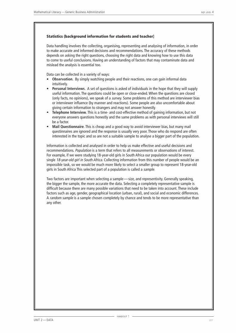
Statistics (background information for students and teacher)
Data handling involves the collecting, organising, representing and analysing of information, in order to make accurate and informed decisions and recommendations. The accuracy of these methods depends on asking the right questions, choosing the right data and knowing how to use this data to come to useful conclusions. Having an understanding of factors that may contaminate data and mislead the analysis is essential too.
Data can be collected in a variety of ways:• Observation. By simply watching people and their reactions, one can gain informal data
intuitively. • Personal Interviews. A set of questions is asked of individuals in the hope that they will supply
useful information. The questions could be open or close-ended. When the questions are closed (only facts, no opinions), we speak of a survey. Some problems of this method are interviewer bias survey. Some problems of this method are interviewer bias surveyor interviewer infl uence (by manner and reactions). Some people are also uncomfortable about giving certain information to strangers and may not answer honestly.
• Telephone Interview. This is a time- and cost-effective method of gaining information, but not everyone answers questions honestly and the same problems as with personal interviews will still be a factor.
• Mail Questionnaire. This is cheap and a good way to avoid interviewer bias, but many mail questinnaires are ignored and the response is usually very poor. Those who do respond are often interested in the topic and so are not a suitable sample to analyse a bigger part of the population.
Information is collected and analysed in order to help us make effective and useful decisions and recommendations. Population is a term that refers to all measurements or observations of interest. For example, if we were studying 18-year-old girls in South Africa our population would be every single 18-year-old girl in South Africasingle 18-year-old girl in South Africasingle . Collecting information from this number of people would be an 18-year-old girl in South Africa. Collecting information from this number of people would be an 18-year-old girl in South Africaimpossible task, so we would be much more likely to select a smaller group to represent 18-year-old girls in South Africa This selected part of a population is called a sample.
Two factors are important when selecting a sample — size, and representivity. Generally speaking, the bigger the sample, the more accurate the data. Selecting a completely representative sample is diffi cult because there are many possible variations that need to be taken into account. These include factors such as age, gender, geographical location (urban, rural), and social and economic differences. A random sample is a sample chosen completely by chance and tends to be more representative than any other.
HANDOUT 1

Mathematical Literacy — Generic Business Administration NQF LEVEL 4
UNIT 2 — DATA 2.12

Mathematical Literacy — Generic Business Administration NQF LEVEL 4
UNIT 2 — DATA 2.13
Activity 2 — Getting organised
ABOUT THIS ACTIVITYThis activity involves the organisation and representation of raw data on a frequency table, a bar graph and a pie chart. Students use data similar to that which they collected in the previous activity to answer simple questions and to determine the different central tendencies of the data. The Specifi c Outcomes and Assessment Criteria addressed are: S01 – AC 1, 2, 5, 7, 8 of Unit Standard 9015.
MANAGING THIS ACTIVITYThe lesson should start with a class discussion around what the students already know about organising data. The teacher should ask key questions which would try to draw the following information from the students (many students will be familiar with these ideas):
Raw data is information that has not been counted or organised in any way. A useful method for counting raw data is the tally, where data is counted in groups of 5 using four vertical lines and a slash ( IIII ). The word frequency means ‘how many times’ and we draw a frequency table to show how many times an item occurs in the data. Pie graphs and bar charts are commonly used representations of data and can be found in newspapers, magazines and on the internet. Features common to these graphs include labelled axes, scale, key and heading.
It may be necessary to remind students how to calculate the sizes of the pie ‘slices’ (the fraction we want, multiplied by 360°, will give the size of the angle). It will not be necessary at this point to measure angles accurately, but students should be familiar with a half-circle, where the angle is half of 360° = 180°, as well as the quarter-circle = 90°, one-third of a circle = 120° and two-thirds of a circle = 240°. Examples of a pie chart and bar graph are shown below:
Example of a pie chart
Notice that the actual fi gures are not always shown on a pie chart, but the comparison between ‘slices’ is easily seen. Figures and percentages can sometimes be used, depending on what is being illustrated.
Example of a bar graph:
Mathematical Literacy — Generic Business Administration NQF LEVEL 4
UNIT 2 — DATA 2.14
Students should be given the defi nitions of the different measures of central tendency of the data and should be encouraged to discuss their own examples of when each one may be useful:• Mean (average) is the sum of all items divided by the number of items. Useful when fi nding the class average in a
test.• Median is the ‘middle’ term if the data is arranged in order (ascending or descending). If there is an even number of
terms, we calculate the median by taking the average of the two in the middle. Useful when fi nding the ‘middle’ of data that has a few very high or very low items that could ‘skew’ the average.
• Mode is the term that occurs most frequently. Useful for the owner of a shoe store who needs to know what size shoe is the most popular, rather than the average foot size of his/her customers!
At this point students should each be given a copy of Worksheet 2.
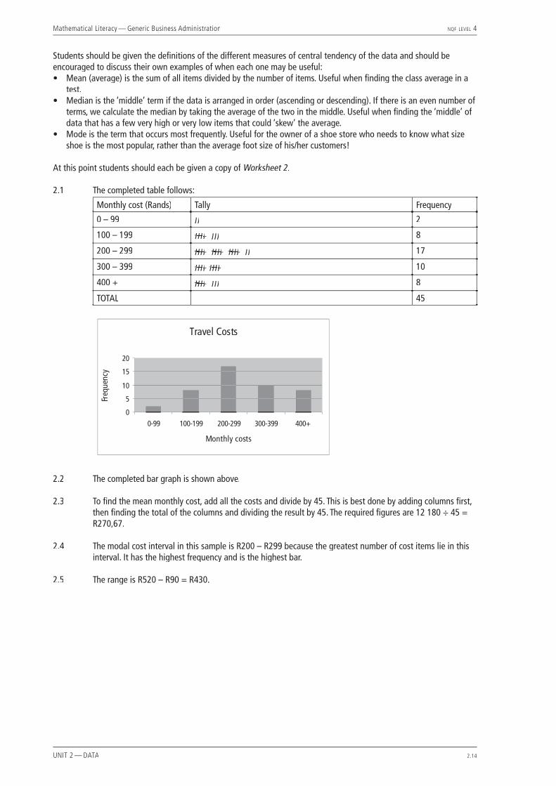
2.1 The completed table follows:
Monthly cost (Rands) Tally Frequency
0 – 99 II 2
100 – 199 IIIIIIII III 8
200 – 299 IIIIIIII IIIIIIII IIIIIIII II 17
300 – 399 IIIIIIII IIIIIIII 10
400 + IIIIIIII III 8
TOTAL 45
2.2 The completed bar graph is shown above.
2.3 To fi nd the mean monthly cost, add all the costs and divide by 45. This is best done by adding columns fi rst, then fi nding the total of the columns and dividing the result by 45. The required fi gures are 12 180 ÷ 45 = R270,67.
2.4 The modal cost interval in this sample is R200 – R299 because the greatest number of cost items lie in this interval. It has the highest frequency and is the highest bar.
2.5 The range is R520 – R90 = R430.

Mathematical Literacy — Generic Business Administration NQF LEVEL 4
UNIT 2 — DATA 2.15
2.6 The completed bar graph:
2.7 The completed pie graph – taxi (half-circle), train (third of a circle), own car (a sixth).
2.8 Calculate 200 ÷ 600 × 100 = 33.3%.
2.9 Taxis are used by the highest number of people, therefore taxi is the modal type of transport.
2.10 Various answers are expected — cost, distance, safety and time should be mentioned.

Mathematical Literacy — Generic Business Administration NQF LEVEL 4
UNIT 2 — DATA 2.16
Mathematical Literacy — Generic Business Administration NQF LEVEL 4
UNIT 2 — DATA 2.17
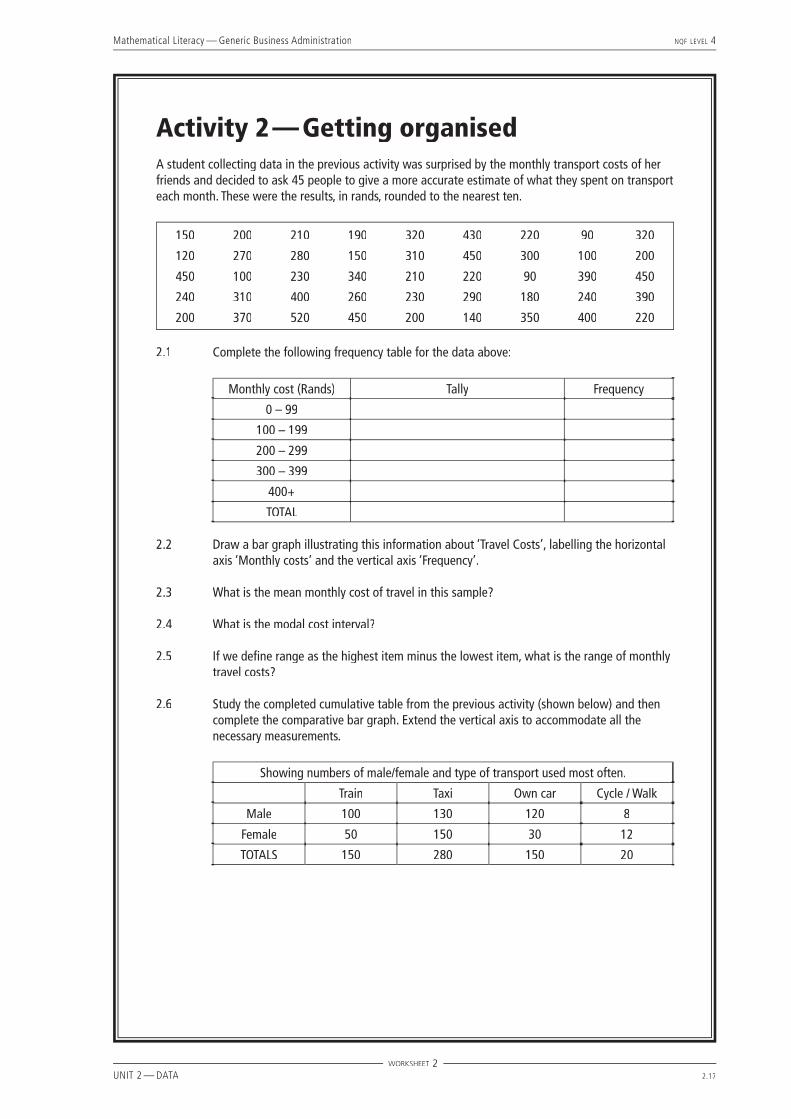
Activity 2 — Getting organisedA student collecting data in the previous activity was surprised by the monthly transport costs of her friends and decided to ask 45 people to give a more accurate estimate of what they spent on transport each month. These were the results, in rands, rounded to the nearest ten.
150 200 210 190 320 430 220 90 320
120 270 280 150 310 450 300 100 200
450 100 230 340 210 220 90 390 450
240 310 400 260 230 290 180 240 390
200 370 520 450 200 140 350 400 220
2.1 Complete the following frequency table for the data above:
Monthly cost (Rands) Tally Frequency
0 – 99
100 – 199
200 – 299
300 – 399
400+
TOTAL
2.2 Draw a bar graph illustrating this information about ‘Travel Costs’, labelling the horizontal axis ‘Monthly costs’ and the vertical axis ‘Frequency’.
2.3 What is the mean monthly cost of travel in this sample?
2.4 What is the modal cost interval?
2.5 If we defi ne range as the highest item minus the lowest item, what is the range of monthly travel costs?
2.6 Study the completed cumulative table from the previous activity (shown below) and then complete the comparative bar graph. Extend the vertical axis to accommodate all the necessary measurements.
Showing numbers of male/female and type of transport used most often.
Train Taxi Own car Cycle / Walk
Male 100 130 120 8
Female 50 150 30 12
TOTALS 150 280 150 20
WORKSHEET 2

Mathematical Literacy — Generic Business Administration NQF LEVEL 4
UNIT 2 — DATA 2.18
2.7 Use a pie graph to illustrate the data given in the following table:
Showing total numbers of people and type of transport.
Train Taxi Own car Cycle / Walk
200 300 100 0 600
2.8 What percentage of people use the train in 2.7 above?
2.9 What is the modal means of travel in 2.7 above?
2.10 What are some of the issues that determine what type of transport people use?
WORKSHEET 2
Mathematical Literacy — Generic Business Administration NQF LEVEL 4
UNIT 2 — DATA 2.19
Activity 3 — Making sense of the fi gures
ABOUT THIS ACTIVITY This activity involves reading fi gures from tables and bar graphs. Students are given three graphs and two tables taken from the Sunday Times / Markinor Top Brands Survey. They analyse the data type and sample size, and read off various simple results. They do calculations and suggest some conclusions that could be drawn from them. The Specifi c Outcomes and Assessment Criteria addressed are as follows: SO1 – AC 1, 2, 3, 5, 7, 8; SO3 – AC 1, 2, 3 of Unit Standard 9015.
MANAGING THIS ACTIVITYNo further information is needed for students to start this activity. However, the extract from the newspaper could be diffi cult to understand and it may be a good idea to give students a copy of Handout 3 immediately and read it together as a class with some teacher input about the context, before tackling the questions. Explain that a business-to-consumer survey means that consumers (ie. customers) answer questions about businesses, whereas a business-to-business survey means that businesses answer questions about other businesses. ‘Down-weighting’ means that scores are reduced by a percentage. ‘Top-of-mind awareness’ means that the consumer may have a certain business at the top of his/her mind because of advertising or promotions. Ask the class to what extent they think that advertising is successful in gaining top-of-mind customer awareness and to what extent this affects their choices.
Now give students a copy of Worksheet 3.
3.1 The research was conducted by the Sunday Times and Markinor.
3.2 Interviews were used to collect the data in metropolitan as well as rural areas. The type of research is a survey, so we assume the questions were closed-ended and respondents indicated their chosen brands in various categories.
3.3 The two modules are: business-to-consumer and business-to business.
3.4 In the business-to-consumer module, the sample size was 3 500 (2 000 in the metropolitan areas and 1 500 in the rural areas). In the business-to-business module the sample was 400 (executives in South Africa’s business community).
3.5 The business-to-consumer sample is not representative of a whole population as no-one under 16 years was interviewed (perhaps they would not be considered independent consumers anyway) and only those living in residential homes were interviewed. However, the sample did comprise all races and all geographical areas, both urban and rural. 3 500 gives us greater confi dence in the representativeness of the study than 35 could, but it is not and cannot be 100%.
3.6 The business-to-business module involved only business executives from companies with a staff base of 100 or more, so this module does not represent a whole population. It does, however, provide opinions of top executives from large companies in South Africa. Mention to students that of course not all surveys are interested in representing the whole population and many intend to sample only a defi ned section of the population.
3.7 Short term loyalty means that customers buy a different brand this time only, usually because there is a good price or an advert caught their eye and they decided to try a new brand, but they go back to their usual brand next time.
3.8 Eskom — read from the bar graph titled ‘Most admired South African brand’.
3.9 2,9% of the total 3 500, which is 102 mentions. (2,9 ÷ 100 × 3500 = 102).
3.10 Vodacom gets 2% of the mentions, read from the bar graph. This is 70 mentions (2 ÷ 100 × 3500 = 70).
3.11 Coca-Cola (read from the graph). It also has by far the longest ‘bar’.
3.12 Sprite, read from the graph or the table.
Mathematical Literacy — Generic Business Administration NQF LEVEL 4
UNIT 2 — DATA 2.20
3.13 Liquifruit is the only pure fruit juice in the top ten, which is interesting, and it may be valuable to other pure fruit juice manufacturers to do further research on why this is so. One cannot assume that it is only to do with lack of health consciousness – other facts need to be considered eg. price, advertising, awareness, availability, etc.
3.14 Oros is the only concentrate.
3.15 Liquifruit has the greatest difference of 82,8 – 10,0 = 72,8.
3.16 To fi nd this mean percentage: add all items in the column ‘% brand relationship scores’ in the table and divide by the number of stores: 150,8 ÷ 10 = 15%.
3.17 To fi nd the median, add the middle two scores and halve: (87,8 + 77,5) ÷ 2 = 82,7.
3.18 The range is 84,8 – 78,5 = 6,3. Hyperama is the furthest away from the median, but only by 4,2. We can conclude that there is a very high level of trust in all the stores with little variation from the middle.
3.19 Woolworths scored low in weighted awareness. Possibly Woolworths does less advertising, has less special offers or has fewer food outlets with easy access.
3.20 Pick ‘n Pay; Spar; Shoprite — read off the graph or the table.

Mathematical Literacy — Generic Business Administration NQF LEVEL 4
UNIT 2 — DATA 2.21
Activity 3 — Making sense of the fi gures Study the data given on Handout 3 and then answer the following questions:
3.1 Who conducted the research that generated this data?
3.2 What type of data collection method was used?
3.3 What are the two modules that are being considered in this survey?
3.4 What is the sample size in each of the modules?
3.5 Is the business-to-consumer module representative of the whole population? Explain your answer.
3.6 Is the business-to-business module representative of the whole population? Explain.
3.7 What do we mean by short term loyalty and how is it achieved?
ALL THE RESULTS GIVEN ARE BUSINESS-TO-CONSUMER
3.8 What is the most admired South African brand?
3.9 If Telkom has 2,9% of the total mentions, how many actual mentions did Telkom get?
3.10 What percentage of mentions did Vodacom get? How many actual mentions does this represent?
3.11 What soft drink has the highest % brand relationship score?
3.12 Which soft drink has a brand relationship score of 19%?
3.13 Only one of the top ten soft drinks is pure fruit juice – can we draw any conclusions about the health consciousness of South Africans?
3.14 Only one of the top ten is a concentrate – which one?
Study the tables of fi gures to answer the next questions:
3.15 Which soft drink shows the greatest difference between weighted awareness and weighted trust?
3.16 Calculate the mean % brand relationship score of the top ten grocery stores.
3.17 What is the median weighted trust score of the top ten grocery stores?
3.18 What is the range of these weighted trust scores? Which store is furthest from the median weighted trust score? Could we draw any conclusion from this?
3.19 In which weighted score did Woolworths score low? Can you suggest why?
3.20 Which three stores show the highest % brand relationship score?
WORKSHEET 3

Mathematical Literacy — Generic Business Administration NQF LEVEL 4
UNIT 2 — DATA 2.22
Data Sheet The data given on this sheet is a short extract adapted from the Markinor/Sunday Times Top Brands survey of 2004 as reported in the Sunday Times Business Times, 19 September 2004.
How the survey worksA business-to-business module has been added to the business-to-consumer survey conducted by Sunday Times and Markinor. The module comprises research conducted among 400 top execu-tives in South Africa’s business community.
The outcomes of this module of the survey provide businesses, investors and the public with a brand health measurement, based on the opinions of South Africa’s top management.
The business-to-consumer module’s universe comprised all adults 16 years and older, living
in residential homes in South Af-rica. The survey thus comprised all races and all geographic areas – urban as well as rural.
A total of 3 500 interviews were conducted: 2 000 interviews were conducted in metropolitan areas and 1 500 were conducted in ru-ral areas.
The sample for the business-to-business model was extracted from companies with a staff base of 100 or more.
The brand relationship score is based on a measure of customer loyalty to the brand. Some brands achieve short-term behavioural
loyalty through discounting or promotions. For this reason the brand relationship score is ex-pressed as a percentage.
This score is down-weighted by the extent to which the trust and confi dence score falls short of the maximum. This down-weighted score is further reduced by short-falls in the brand’s top-of-mind awareness.
The result is a brand relation-ship score based on customers’ behavioural commitment to the brand, taking into account weak-nesses in ‘liking’ and top-of-mind awareness.
HANDOUT 3

Mathematical Literacy — Generic Business Administration NQF LEVEL 4
UNIT 2 — DATA 2.23
Soft drinks % brand relationship
scores
Overall ranking %
Weighted awareness
Weighted trust/ confi dence
Brand loyalty
Coca-Cola 60.7 79.1 90.5 84.9
Fanta 22.5 36.1 80.1 77.9
Sprite 19.0 30.7 79.9 77.4
Lemon Twist 13.4 22.9 77.4 75.8
Schweppes 8.0 13.2 78.7 76.6
Liquifruit 6.5 10.0 82.8 78.9
Oros 6.2 10.6 75.9 76.4
Stoney Ginger Beer 5.5 9.8 73.7 75.5
Sparletta 5.0 8.3 78.3 77.2
Krest 4.0 7.1 73.6 77.2
Grocery store % brand relationship
scores
Overall ranking %
Weighted awareness
Weighted trust/ confi dence
Brand loyalty
Pick ‘n Pay 23.4 35.5 84.8 77.5
Spar 22.8 35.8 81.3 78.3
Shoprite 20.5 27.6 88.2 84.3
Checkers 17.0 26.7 82.7 76.8
Shoprite/Checkers 16.3 22.0 87.8 84.4
Score 11.0 17.7 77.5 79.7
OK Bazaars 5.6 10.8 74.4 69.6
Woolworths 4.2 6.0 85.8 81.5
Diskom 3.3 5.9 75.6 73.4
Hyperama 3.1 5.8 78.5 68.9
HANDOUT 3

Mathematical Literacy — Generic Business Administration NQF LEVEL 4
UNIT 2 — DATA 2.24
Mathematical Literacy — Generic Business Administration NQF LEVEL 4
UNIT 2 — DATA 2.25
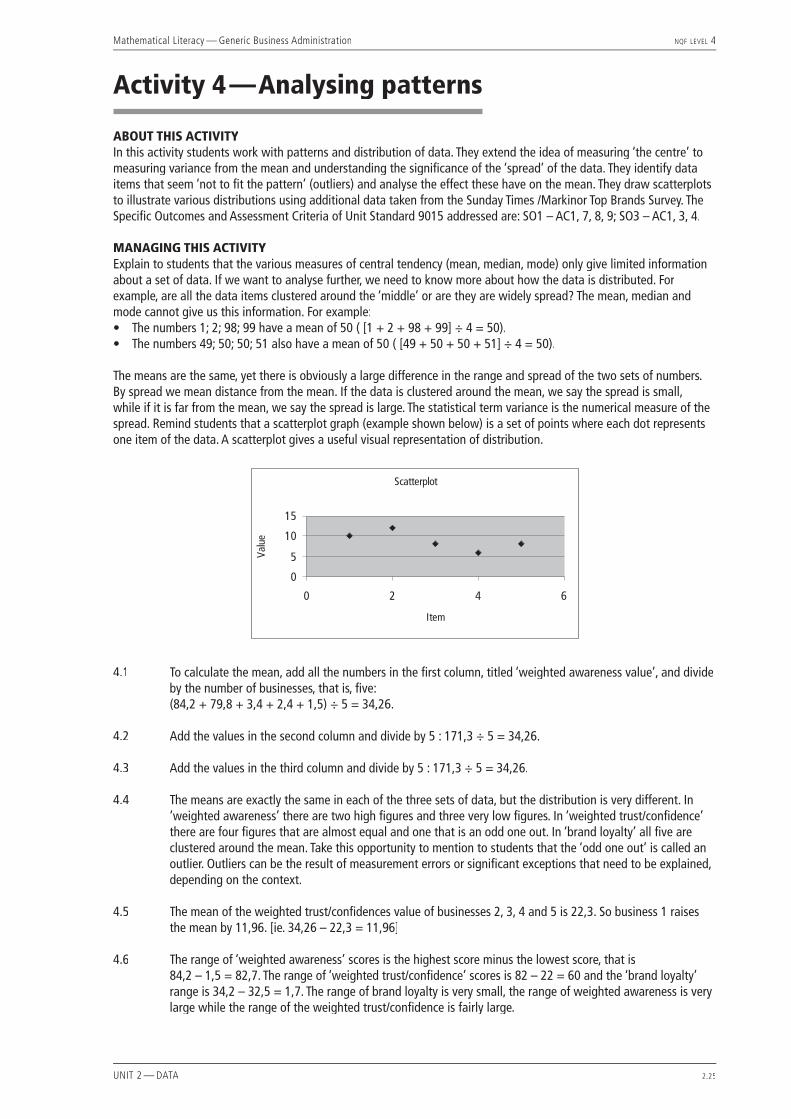
Activity 4 — Analysing patterns ABOUT THIS ACTIVITY In this activity students work with patterns and distribution of data. They extend the idea of measuring ‘the centre’ to measuring variance from the mean and understanding the signifi cance of the ‘spread’ of the data. They identify data items that seem ‘not to fi t the pattern’ (outliers) and analyse the effect these have on the mean. They draw scatterplots to illustrate various distributions using additional data taken from the Sunday Times /Markinor Top Brands Survey. The Specifi c Outcomes and Assessment Criteria of Unit Standard 9015 addressed are: SO1 – AC1, 7, 8, 9; SO3 – AC1, 3, 4.
MANAGING THIS ACTIVITY Explain to students that the various measures of central tendency (mean, median, mode) only give limited information about a set of data. If we want to analyse further, we need to know more about how the data is distributed. For example, are all the data items clustered around the ‘middle’ or are they are widely spread? The mean, median and mode cannot give us this information. For example:• The numbers 1; 2; 98; 99 have a mean of 50 ( [1 + 2 + 98 + 99] ÷ 4 = 50).• The numbers 49; 50; 50; 51 also have a mean of 50 ( [49 + 50 + 50 + 51] ÷ 4 = 50).
The means are the same, yet there is obviously a large difference in the range and spread of the two sets of numbers. By spread we mean distance from the mean. If the data is clustered around the mean, we say the spread is small, while if it is far from the mean, we say the spread is large. The statistical term variance is the numerical measure of the spread. Remind students that a scatterplot graph (example shown below) is a set of points where each dot represents one item of the data. A scatterplot gives a useful visual representation of distribution.
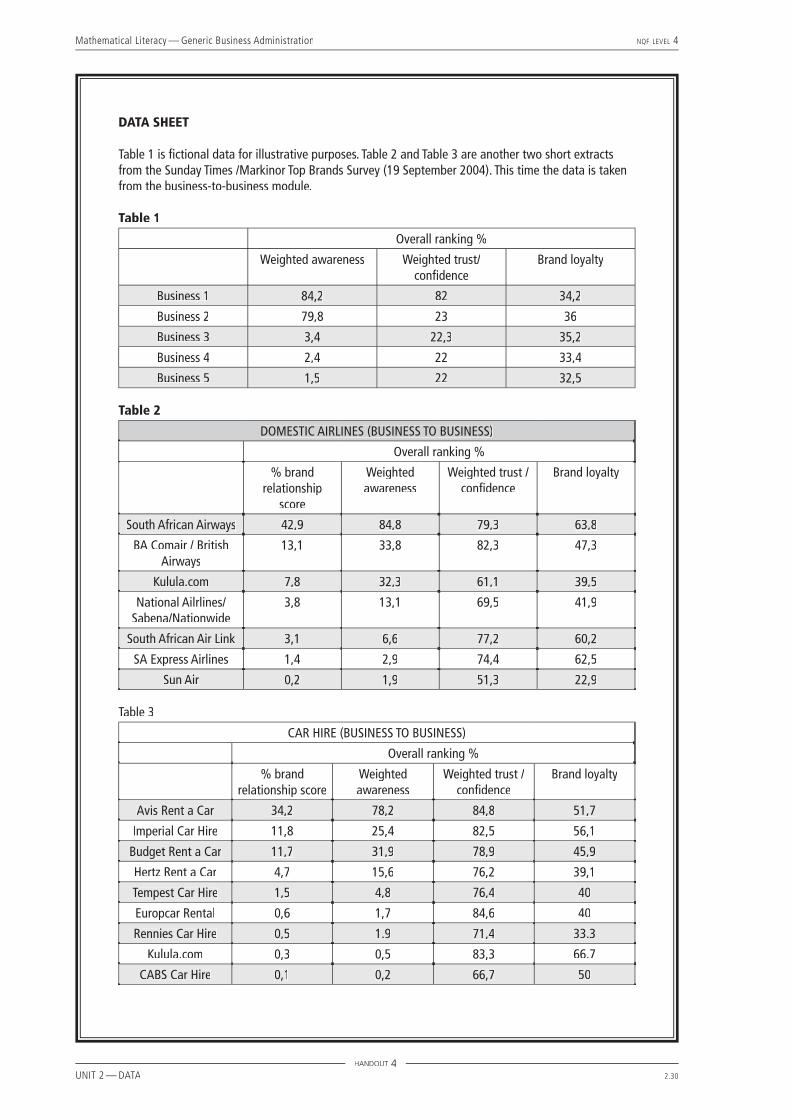
4.1 To calculate the mean, add all the numbers in the fi rst column, titled ‘weighted awareness value’, and divide by the number of businesses, that is, fi ve:
(84,2 + 79,8 + 3,4 + 2,4 + 1,5) ÷ 5 = 34,26.
4.2 Add the values in the second column and divide by 5 : 171,3 ÷ 5 = 34,26.
4.3 Add the values in the third column and divide by 5 : 171,3 ÷ 5 = 34,26.
4.4 The means are exactly the same in each of the three sets of data, but the distribution is very different. In ‘weighted awareness’ there are two high fi gures and three very low fi gures. In ‘weighted trust/confi dence’ there are four fi gures that are almost equal and one that is an odd one out. In ‘brand loyalty’ all fi ve are clustered around the mean. Take this opportunity to mention to students that the ‘odd one out’ is called an outlier. Outliers can be the result of measurement errors or signifi cant exceptions that need to be explained, depending on the context.
4.5 The mean of the weighted trust/confi dences value of businesses 2, 3, 4 and 5 is 22,3. So business 1 raises the mean by 11,96. [ie. 34,26 – 22,3 = 11,96]
4.6 The range of ‘weighted awareness’ scores is the highest score minus the lowest score, that is 84,2 – 1,5 = 82,7. The range of ‘weighted trust/confi dence’ scores is 82 – 22 = 60 and the ‘brand loyalty’ range is 34,2 – 32,5 = 1,7. The range of brand loyalty is very small, the range of weighted awareness is very large while the range of the weighted trust/confi dence is fairly large.

Mathematical Literacy — Generic Business Administration NQF LEVEL 4
UNIT 2 — DATA 2.26
4.7 In weighted awareness: 84,2 is furthest from the mean by 84,2 – 34,26 = 49,94. In weighted trust/confi dence: 82 is furthest from the mean by 82 – 34,26 = 47,74. In brand loyalty: 32,5 is furthest from the mean by 34,26 – 32,5 = 1,76.
4.8
Weighted awareness scores are spread far from the mean.
Weighted trust/confi dence scores are all clustered around 22 except the outlier, that is 82, which is much higher than the others and seems to be the odd one out.
Brand loyalty scores are all clustered around the mean, so the spread is small.
4.9 A variety of answers would be expected here and it would be a good opportunity for some class discussion. South African Airways has by far the highest brand relationship score at 42,9% which is more than three times higher than the second score. All the other airlines score below 13,5% and only two airlines score above the mean (average) which is 10,3%. There is a large range of scores – from 42,9% down to 0,2%. SAA has the highest weighted awareness score and a high weighted trust/confi dence score, although BA Comair/British Airlines has the highest trust/confi dence score. The highest loyalty score is SAA again, with SA Express Airlines a close second.
4.10 No. Kulula.com has the second highest weighted trust/confi dence score of 83.3% and yet a far below average % brand relationship score of 0,3%. Students may fi nd other suitable examples here.

Mathematical Literacy — Generic Business Administration NQF LEVEL 4
UNIT 2 — DATA 2.27
4.11 A possible reason could be the low weighted awareness score. Customers could show trust and loyalty to Kulula.com, but there may be only a few customers who are aware of what they offer.
4.12 No again. Kulula.com has the highest brand loyalty score and yet a low % brand relationship score. There are many other possible examples here.
4.13 Weighted awareness seems to be a very signifi cant factor. All tables support this, as no top % brand relationship score has a low weighted awareness score.
4.14 Increase awareness, perhaps by advertising or promotions.

Mathematical Literacy — Generic Business Administration NQF LEVEL 4
UNIT 2 — DATA 2.28
Mathematical Literacy — Generic Business Administration NQF LEVEL 4
UNIT 2 — DATA 2.29
Activity 4 — Analysing patterns The following questions refer to the tables of data given in Handout 4:Refer to Table 1:
4.1 Calculate the mean of the weighted awareness values for all the given businesses.
4.2 Calculate the mean of the weighted trust/confi dence values.
4.3 Calculate the mean of the brand loyalty values.
4.4 Describe in words what is the same and what is different about these three sets of data.
4.5 Calculate the mean weighted trust/confi dence value for businesses 2, 3, 4 and 5 only. What effect does business 1 have on the mean?
4.6 Calculate the range of each of the sets of data above and describe in words what you observe.
4.7 Which value is furthest from the mean in each of the three cases? By how much?
4.8 Draw three scatterplots showing these three sets of data and describe the spread in each case.
4.9 Write a paragraph analysing the % brand relationship scores of the top ten domestic airlines given in Table 2. You should mention the top scores, the range and spread of scores, how many scores were above average and any other observations about trust, loyalty etc.
4.10 Refer to Table 3. Does high trust and confi dence in a car hire company guarantee a high % brand relationship score? Give an example to support your answer.
4.11 Why do you think this is the case?
4.12 Does a high brand loyalty score guarantee a high % brand relationship score? Give an example to support your answer.
4.13 What do you think the greatest factor affecting % brand relationship seems to be? Do all the relevant tables, including those on Handout 3, support this answer?
4.14 What advice would you give to companies who wish to improve their % brand relationship scores.
WORKSHEET 4
Mathematical Literacy — Generic Business Administration NQF LEVEL 4
UNIT 2 — DATA 2.30
DATA SHEET
Table 1 is fi ctional data for illustrative purposes. Table 2 and Table 3 are another two short extracts from the Sunday Times /Markinor Top Brands Survey (19 September 2004). This time the data is taken from the business-to-business module.
Table 1
Overall ranking %
Weighted awareness Weighted trust/confi dence
Brand loyalty
Business 1 84,2 82 34,2
Business 2 79,8 23 36
Business 3 3,4 22,3 35,2
Business 4 2,4 22 33,4
Business 5 1,5 22 32,5
Table 2
DOMESTIC AIRLINES (BUSINESS TO BUSINESS)
Overall ranking %
% brand relationship
score
Weighted awareness
Weighted trust / confi dence
Brand loyalty
South African Airways 42,9 84,8 79,3 63,8
BA Comair / British Airways
13,1 33,8 82,3 47,3
Kulula.com 7,8 32,3 61,1 39,5
National Ailrlines/ Sabena/Nationwide
3,8 13,1 69,5 41,9
South African Air Link 3,1 6,6 77,2 60,2
SA Express Airlines 1,4 2,9 74,4 62,5
Sun Air 0,2 1,9 51,3 22,9
Table 3
CAR HIRE (BUSINESS TO BUSINESS)
Overall ranking %
% brand relationship score
Weighted awareness
Weighted trust / confi dence
Brand loyalty
Avis Rent a Car 34,2 78,2 84,8 51,7
Imperial Car Hire 11,8 25,4 82,5 56,1
Budget Rent a Car 11,7 31,9 78,9 45,9
Hertz Rent a Car 4,7 15,6 76,2 39,1
Tempest Car Hire 1,5 4,8 76,4 40
Europcar Rental 0,6 1,7 84,6 40
Rennies Car Hire 0,5 1.9 71,4 33.3
Kulula.com 0,3 0,5 83,3 66.7
CABS Car Hire 0,1 0,2 66,7 50
HANDOUT 4
Mathematical Literacy — Generic Business Administration NQF LEVEL 4
UNIT 2 — DATA 2.31
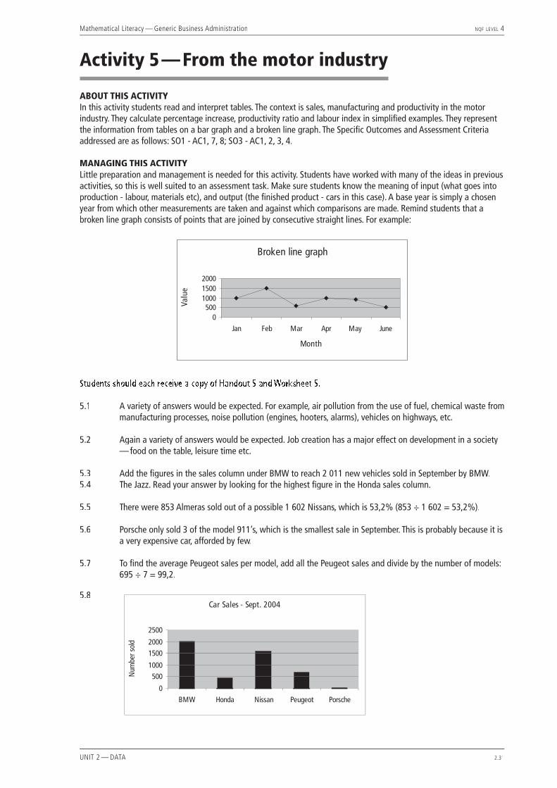
Activity 5 — From the motor industry
ABOUT THIS ACTIVITYIn this activity students read and interpret tables. The context is sales, manufacturing and productivity in the motor industry. They calculate percentage increase, productivity ratio and labour index in simplifi ed examples. They represent the information from tables on a bar graph and a broken line graph. The Specifi c Outcomes and Assessment Criteria addressed are as follows: SO1 - AC1, 7, 8; SO3 - AC1, 2, 3, 4.
MANAGING THIS ACTIVITYLittle preparation and management is needed for this activity. Students have worked with many of the ideas in previous activities, so this is well suited to an assessment task. Make sure students know the meaning of input (what goes into production - labour, materials etc), and output (the fi nished product - cars in this case). A base year is simply a chosen year from which other measurements are taken and against which comparisons are made. Remind students that a broken line graph consists of points that are joined by consecutive straight lines. For example:
Students should each receive a copy of Handout 5 and Worksheet 5.
5.1 A variety of answers would be expected. For example, air pollution from the use of fuel, chemical waste from manufacturing processes, noise pollution (engines, hooters, alarms), vehicles on highways, etc.
5.2 Again a variety of answers would be expected. Job creation has a major effect on development in a society — food on the table, leisure time etc.
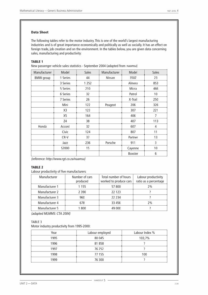
5.3 Add the fi gures in the sales column under BMW to reach 2 011 new vehicles sold in September by BMW.5.4 The Jazz. Read your answer by looking for the highest fi gure in the Honda sales column.
5.5 There were 853 Almeras sold out of a possible 1 602 Nissans, which is 53,2% (853 ÷ 1 602 = 53,2%).
5.6 Porsche only sold 3 of the model 911’s, which is the smallest sale in September. This is probably because it is a very expensive car, afforded by few.
5.7 To fi nd the average Peugeot sales per model, add all the Peugeot sales and divide by the number of models: 695 ÷ 7 = 99,2.
5.8

Mathematical Literacy — Generic Business Administration NQF LEVEL 4
UNIT 2 — DATA 2.32
5.9 Manufacturer 2: (2 390 ÷ 22 123) × 100 = 10,8%.
Manufacturer 3: (960 ÷ 22 234) × 100 = 4,3%.
Manufacturer 5: (1 800 ÷ 49 000) × 100 = 3,7%.
5.10 A high productivity ratio is better. This means that more cars are produced in the given time, so effi ciency is better.
5.11 No. Manufacturer 1 put in the longest hours (57 800), but manufacturer 2 produced the most cars (2 390). In fact, manufacturer 2 worked less than half the time and produced more than twice the number of cars as Manufacturer 1.
5.12 Manufacturer 2. Their productivity is very high so they are working very effi ciently. Also, workers are not working very long hours so morale is probably good too.
5.13 Calculations are as follows: For 1996, the labour index % is (81 858 ÷ 77 155) × 100 = 106,1%.
For 1997, the labour index % is (76 252 ÷ 77 155) × 100 = 98,8%.
For 1999, the labour index % is (76 300 ÷ 77 155) × 100 = 98,9%.
For 2000, the labour index % is (77 248 ÷ 77 155) ×100 = 100,1%.
5.14 No, the numbers decreased. The labour index also decreased from 100% to 98,9%.
5.15 The percentage increase in workers between 1999 and 2000 is:
77 248 – 76 30076 300
× 100 = 1,2%
5.16

Mathematical Literacy — Generic Business Administration NQF LEVEL 4
UNIT 2 — DATA 2.33
Activity 5 — From the motor industryThe following questions refer to the data given in Handout 5.
5.1 In what way do you think the motor industry affects the environment?
5.2 In what way do you think this industry has a social effect?
REFER TO TABLE 1
5.3 How many new passenger vehicles were sold by BMW in September 2004?
5.4 Which model of Honda sold the most in September?
5.5 What percentage of Nissan passenger vehicles sold in September were Almeras?
5.6 In the given data, which make and model showed the lowest sales in September? Suggest a reason for this.
5.7 What was the average number of cars sold per model by Peugeot in September?
5.8 Draw a bar graph comparing the monthly totals of passenger vehicles sold by BMW, Honda, Nissan, Peugeot and Porsche in September 2004.
REFER TO TABLE 2
5.9 Fill in the missing spaces in the labour productivity column, given that:
Productivity =outputinput
5.10 Is it better for a manufacturer to have a high or a low productivity ratio? Explain your answer.
5.11 From the given data would it be true to say that the manufacturer that put in the longest hours produced the most cars? Use fi gures from the table to support your answer.
5.12 Which manufacturer has the best chance of doing well in business? Give a reason.
REFER TO TABLE 3
5.13 Fill in the missing spaces in the Labour Index % column given that 1998 is the base year which serves as 100% and that:
Labour Index =Quantity of labour in a particular year
Quantity of labour in the base year ×1001
5.14 Is it true to say that the number of workers increased between 1998 and 1999? What happened to the labour index between 1998 and 1999?
5.15 What is the percentage increase in number of workers between 1999 and 2000?
5.16 Draw a broken line graph showing the changes in labour employed between 1995 and 2000.
WORKSHEET 5
Mathematical Literacy — Generic Business Administration NQF LEVEL 4
UNIT 2 — DATA 2.34
Data Sheet
The following tables refer to the motor industry. This is one of the world’s largest manufacturing industries and is of great importance economically and politically as well as socially. It has an effect on foreign trade, job creation and on the environment. In the tables below, you are given data concerning sales, manufacturing and productivity:
TABLE 1New passenger vehicle sales statistics - September 2004 (adapted from naamsa)naamsa)naamsa
Manufacturer Model Sales Manufacturer Model Sales
BMW group 1 Series 44 Nissan 350Z 23
3 Series 1 252 Almera 853
5 Series 210 Micra 466
6 Series 32 Patrol 10
7 Series 26 X-Trail 250
Mini 122 Peugeot 206 326
X3 123 307 221
X5 164 406 7
Z4 38 407 113
Honda Accord 32 607 4
Civic 124 807 11
CR-V 37 Partner 13
Jazz 236 Porsche 911 3
S2000 15 Cayenne 10
Boxster 6
(reference: http://www.rgt.co.za/naamsa)
TABLE 2Labour productivity of fi ve manufacturers:
Manufacturer Number of cars produced
Total number of hours worked to produce cars
Labour productivity ratio as a percentage
Manufacturer 1 1 155 57 800 2%
Manufacturer 2 2 390 22 123 ?
Manufacturer 3 960 22 234 ?
Manufacturer 4 678 33 456 2%
Manufacturer 5 1 800 49 000 ?
(adapted MLMMS: CTA 2004)
TABLE 3Motor industry productivity from 1995-2000:
Year Labour employed Labour Index %
1995 80 045 103,7%
1996 81 858 ?
1997 76 252 ?
1998 77 155 100
1999 76 300 ?
HANDOUT 5

Mathematical Literacy — Generic Business Administration NQF LEVEL 4
UNIT 2 — DATA 2.35
Activity 6 — Reading and predicting
ABOUT THIS ACTIVITYIn this activity students read data and make predictions by analysing trend lines. They observe patterns and measure important connections between variables. They identify variance from the mean as well as outliers, suggesting what implications these may have in real life situations. The Specifi c Outcomes and Assessment Criteria addressed are as follows: SO1 – AC 4, 7, 8, 9; SO3 – AC 2, 3, 4, 5 of Unit Standard 9015.
MANAGING THIS ACTIVITYThis activity requires very little management and is well suited to an assessment task. Students are required to read, measure, calculate and interpret using ideas from the previous activities. Remind students that a trend line, or line-of-best-fi t, is a line drawn as close to as many measured data items as possible. It is used to approximate and predict values that have not been measured but that are expected to follow the trend. Explain, also, the idea of a percentile – if an item is in the 60th percentile, it means that 60% of the other items are either equal to or less than this one. Discuss the idea of Body-Mass-Index, which is used as a health indicator. A BMI of between 19 and 22 is considered to be ideal.
To calculate BMI use the following formula:BMI = Weight (kg) ÷ Stature (cm) ÷ Stature (cm) × 10 000
Students should each receive copies of Handout 6 and Worksheet 6.
6.1 Expected height measured against age.
6.2 If your height is in the 90th percentile, it means that 90% of all people are ‘on’ or below your height. Only 10% of people are therefore taller than you.
6.3 One set shows age against weight, the other shows age against height (stature). The scale shows both cm and inches, as well as both kg and lb (pounds). All calculations here will use cm and kg only.
6.4 173 – 152 = 21. Read this on the age 16 line from the top to the bottom trend line.
6.5 Yes. She is in the 95th percentile, so only 5% of girls are taller than she is.
6.6 No, she would be underweight. She should weigh between 24 and 47kg.
6.7 About 31kg – read off the 5th percentile line because her height is in the 5th percentile.
6.8 Weight – 33kg; height -138cm. Read off the 50th percentile line to fi nd the average.
6.9 90cm – read off the 90th percentile line for age 2.
6.10 Body-Mass-Index – this is a measure used by health professionals to make medical decisions and recommendations. BMI = 70 ÷ 165 ÷ 165 x 10 000 = 25,7. Ideal BMI is considered to be 19 – 22, so this is higher than ideal. Of course, this remains an indicator only and variation is expected.
6.11 About 69kg – split the difference in the trend lines.
6.12 At 17 she would be about 58kg and at 18 about 59kg — draw your own trend line three steps higher than the 50th percentile to read these fi gures.

Mathematical Literacy — Generic Business Administration NQF LEVEL 4
UNIT 2 — DATA 2.36

Mathematical Literacy — Generic Business Administration NQF LEVEL 4
UNIT 2 — DATA 2.37
Activity 6 — Reading and predictingRefer to the data sheet (Handout 6) — 2 to 20 years: Girls Stature-for-age and Weight-for-age percentiles
This interesting graph shows trend lines for the normal expected growth of girls between 2 and 20 years. The lowest trend line is the normal growth pattern expected for short or small girls and the highest line is for the tall, large girls. Most girls are expected to fall somewhere between these two, with some variation. A problem could be indicated when there is a sudden sharp drop or rise which is not the expected trend.
6.1 What does stature-for-age mean?
6.2 What does it mean to say that your height is in the 90th percentile?
6.3 here are two sets of graphs shown here. What is the difference between them?
6.4 The sets of parallel lines show the trends for the different percentiles of girls’ height and weight measured over a large sample. In this data, what is the range of heights for a girl of 16?
6.5 If a young woman of 18 is 174 cm tall, is she tall for her age? In what percentile is her height?
6.6 If a girl of 10 weighs 20kg, would she be of average weight? Explain.
6.7 If a girl of 12 was 140cm tall, what would you expect her weight to be according to this data?
6.8 According to this data, what is the mean height and weight for a girl of 10?
6.9 A two-year-old is tall for her age and her height is in the 90th percentile. How tall is she?
6.10 What is BMI? Using the formula given in the table in the top left of the graph, and repeated below, calculate the BMI of a young woman of 20 who is 165 cm tall and weighs 70kg.
BMI = Weight (kg) ÷ stature (cm) ÷ stature (cm) × 10 000.
6.11 What do you think the weight of the same young woman of 20 was when she was 19?
6.12 If a girl of 14 weighs 60kg, predict her weight at 17 and 18 years if she follows the trends shown on this graph.
WORKSHEET 6

Mathematical Literacy — Generic Business Administration NQF LEVEL 4
UNIT 2 — DATA 2.38
HANDOUT 6
������� ��������� �
�������
� ��� �������� ������ ��� ������ ���������� �� ������������� ����
��� �������� ������ ��� ������� ������� ���������� ��� ������ ���������
�������������������������������
� �� �� ������ �����
������� �������������� ������������������� ���
����
������ �
��������� ��� ��� ���� ��������� ����������
�
�
�
�
�
�
�
�
�
�
�
�
��
���
���
���
���
���
���
���
���
���
��
��
��
��
��
��
��
��
���
���
���
���
���
���
���
���
���
���
���
���
���
���
����
��
��
��
��
��
���
��
��
��
��
��
��
��
��
��
��
��
���
��
��
�
�
�
�
�
�
�
��
��
��
��
��
��
��
��
�
�
�
�
�
�
�
��
��
��
��
��
��
��
��
��
��
��
��
��
��
��
��
��
��
��
��
��
��
��
��
��
��
��
��
����
��
��
��
��
��
��
��
��
��
���
���
���
���
���
���
���
���
���
���
���
���
� � � � � � � � �� �� �� �� �� �� �� �� �� ��
�� �� �� �� �� �� �� ��
��� �������
��� �������
���
�� ��� � � � � � � ��
��
��
��
��
��
���
��
��
��
��
��
���
����
�������� ������� �������� �������
��� ������ ������� ����

Mathematical Literacy — Generic Business Administration NQF LEVEL 4
UNIT 2 — DATA 2.39
Activity 7 — Interpreting tables
ABOUT THIS ACTIVITYThis activity involves the reading and interpretation of information from tables. Students are given a table showing the amounts allocated to various provinces by the National Skills Fund for the training of unemployed people in South Africa. They are also given a table showing the numbers of people trained per programme and are required to cross-reference these tables, make calculations, interpret the relationship between the rows and columns and draw various conclusions. The Specifi c Outcomes and Assessment Criteria addressed are as follows: SO1 - AC1, 7, 8; S03 - AC1, 2, 3, 4 of Unit Standard 9015.
MANAGING THIS ACTIVITYThis activity requires little management as all the statistical terms and ideas have been discussed previously. One could introduce the activity by locating development in its social context and initiating a discussion around the great need for skills development to alleviate the unemployment problem in South Africa. Students are working with large numbers, so they need to be careful with their calculator work. Each student should be given a copy of Handout 7 and Worksheet 7.
7.1 The Eastern Cape received by far the highest funding allocation — more than double the next highest. It received an amount of two hundred and three million, and thirty seven thousand rand.
7.2 To fi nd the mean funding per province, read the TOTAL of the total funding column and divide by the number of provinces: R689 614 000 ÷ 10 = R68 961 400.
7.3 Provincial development projects received the largest total allocation of R596 436 000, which is596 436 000 ÷ 689 614 000 × 100 = 86,5% of the whole.
7.4 Gauteng South spent the most on people with disabilities. Read the largest fi gure in the ‘people with disabilities’ column.
7.5 The Free State spent an amount of R1 783 000 on its retrenchees programme out of a total of R43 090 000, which is 1 783 000 ÷ 43 090 000 × 100 = 4%.
7.6 The Netherlands youth project is located in Mpumalanga (read across the row).
7.7 The Western Cape trained a total of 26 697 people (read from the second table) and a total of R40 603 000 was spent by the Western Cape (read from the fi rst table). This translates into an amount of R40 603 000 ÷ 26 697 = R1 521 per person.
7.8 The national average is found by dividing the total spent nationally by the number trained nationally, that is R689 614 000 ÷ 380 101 = R1 814. Therefore the amount spent per person by the Western Cape was less than the national average by about R300.
7.9 The amount spent per person in the Netherlands project was R1 015 000 ÷ 687 = R1477. The amount spent per person in the youth development programme in North West was R927 000 ÷ 820 = R1 130. Therefore, yes, the amounts were approximately the same, although the Netherlands project was about R350 more expensive.
7.10 Limpopo spent a total of R2 484 000 training 1 280 prisoners, so it cost themR2 484 000 ÷ 1 280 = R1 941 to train one prisoner.
7.11 The Eastern Cape spent R 13 630 000 ÷ R203 037 000 × 100 = 6,7% of its funds on its disaster relief programme. KwaZulu Natal spent R434 000 ÷ R77 242 000 = 0,6% of its funds on the disaster relief programme. So the Eastern Cape spent a much larger percentage of its total on this programme, as well as a much larger actual amount.
7.12 In Gauteng South only one youth was trained at a cost of R1 146 000.

Mathematical Literacy — Generic Business Administration NQF LEVEL 4
UNIT 2 — DATA 2.40
7.13 The cost of training one youth in North West was R1 130, in the Netherlands project it was R1 477 (and the national training average was R1 814). There is thus a huge discrepancy in Gauteng South where it cost over a million to train one youth. This fi gure clearly needs to be questioned — there could simply be an error with the fi gure given, or there could be a problem with the programme concerned, or the type of training received by this youth could have been of an entirely different order to the norm.
7.14 R 179 201 000 was the biggest amount spent on a single programme (the Eastern Cape provincial development project).
7.15 A variety of suggestions would be expected here. Some points that could be made are that only three provinces allocated funds to youth development programmes, only two provinces to disaster relief programmes and only three to retrenchees programmes. Further research would be necessary to establish whether one would be justifi ed in saying that there is a need for redistributing funds in the other provinces for development in these areas. There could well be programmes that are operating independently.

Mathematical Literacy — Generic Business Administration NQF LEVEL 4
UNIT 2 — DATA 2.41
Activity 7 — Interpreting tables The following questions are based on the data found on Handout 7.
7.1 Which province received the highest funding allocation from the National Skills Fund and how much was it (write the number in words)?
7.2 What was the mean funding allocation to each province? Consider Gauteng (S) and Gauteng (N) to be separate provinces.
7.3 Which of the programmes received the largest total allocation and what percentage of the whole was this?
7.4 Which province spent the most on people with disabilities?
7.5 What percentage of its total allocation did the Free State spend on its social plan for retrenchees?
7.6 In which province was the Netherlands youth programme located?
7.7 How many people were trained in the Western Cape and what was the average amount spent per person?
7.8 Was this amount spent per person in the Western Cape more or less than the national average?
7.9 Was the amount spent per person in the Netherlands youth programme approximately the same as the amount spent per person in the youth development programme in North West?
7.10 How much did it cost Limpopo province to train one prisoner and what percentage of their funds did they allocate to the training of prisoners?
7.11 Compare the percentages allocated to disaster relief by the Eastern Cape and KwaZulu Natal.
7.12 How much was spent on each youth trained in the Gauteng South youth development programme?
7.13 Compare the answers found in questions 7.9 and 7.12. How do you interpret the similarities and/or differences?
7.14 What was the biggest amount spent on a single programme by any province?
7.15 If you could redistribute the funds, are there any major changes you would make or any programmes you feel have been inadequately fi nanced? Explain your answer.
WORKSHEET 7

Mathematical Literacy — Generic Business Administration NQF LEVEL 4
UNIT 2 — DATA 2.42
DATA SHEET
The following information is from the Mail and Guardian, and is taken from a wall chart published by Independent Newspapers and the Department of Labour in response to the ‘10 years of Freedom’ campaign in South Africa (2004). As part of the delivery of skills to its citizens, the government has allocated funds from the National Skills Fund specifi cally for the training of unemployed people as follows:
NATIONAL SKILLS FUND (Social Development Funding Window)Funds spent on training of unemployed people per programme per province (2000-2004)
Province Total funding
Funding per programme (Rands)
Provincial SDI and IDZ projects
Social plan: retrenchees
People with disabilities
Training of prisoners
W. Cape 40 603 000 33 413 000 0 0 205 000 4 847 000
E. Cape 203 037 000 179 201 000 5 602 000 0 881 000 2 816 000
N. Cape 16 373 000 13 219 000 0 0 570 000 2 184 000
Free State 43 090 000 38 465 000 0 1 783 000 360 000 1 889 000
KZ Natal 77 242 000 67 002 000 34 000 0 2 813 000 2 742 000
N.West 81 905 000 69 832 000 0 963 000 1 768 000 7 803 000
Gauteng (S) 58 695 000 49 738 000 0 388 000 4 366 000 2 523 000
Gauteng (N) 39 686 000 30 703 000 0 0 3 785 000 4 533 000
69 152 000 62 955 000 0 0 1 752 000 2 245 000
Limpopo 59 831 000 51 908 000 2 931 000 0 1 217 000 2 484 000
TOTALS 689 614 000 596 436 000 8 567 000 3 134 000 17 717 000 34 066 000
Other minor programmes
Youth Youth Service: defence
Disaster relief
Working for water
W. Cape 66 000 0 0 66 000 0 2 072 000
E. Cape 57 000 0 0 57 000 13 630 000 850 000
N.Cape 0 0 0 0 0 400 000
Free State 371 000 0 0 371 000 0 222 000
KZ Natal 14 000 0 0 14 000 434 000 4 203 000
N. West 927 000 927 000 0 0 0 612 000
Gauteng (S) 1 191 000 1 146 000 0 45 000 0 489 000
Gauteng (N) 20 000 0 0 20 000 0 645 000
1 019 000 0 1 015 000 4 000 0 1 181 000
Limpopo 29 000 0 0 29 000 0 1 262 000
TOTALS 3 694 000 2 073 000 1 015 000 606 000 14 064 000 11 936 000
HANDOUT 7

Mathematical Literacy — Generic Business Administration NQF LEVEL 4
UNIT 2 — DATA 2.43
Unemployed people trained per programme per province (2000 - 2004)
Province Total trainedNumbers trained per programme
Provincial SDI and IDZ programmes
Social plan: retrenchees
People with disabilities
Training of prisoners
W. Cape 26 697 16 757 0 0 310 5 512
E. Cape 131 169 118 335 4 238 0 636 2 523
N. Cape 9 937 7 835 0 0 431 1 366
Free State 25 140 21 631 0 455 351 2 255
KZ Natal 36 914 27 557 24 0 234 1 533
North West 46 861 39 018 0 375 923 4 273
Gauteng (S) 23 291 19 739 0 123 972 1 478
Gauteng (N) 20 898 16 147 0 0 873 2 828
24 665 17 895 0 0 695 2 153
Limpopo 34 529 27 277 2 439 0 958 1 280
TOTALS 380 101 312 191 6 701 953 6 383 25 201
Other minor programmes
Youth Youth Service: defence
Disaster relief
Working for water
W. Cape 22 0 0 22 0 4 096
E. Cape 21 0 0 21 2 051 3 365
N. Cape 0 0 0 0 0 305
Free State 200 0 0 200 0 248
KZ Natal 0 0 0 0 69 7 497
North West 820 820 0 0 0 1 452
Gauteng (S) 2 1 0 1 0 977
Gauteng (N) 0 0 0 0 0 1 050
687 0 687 0 0 3 235
Limpopo 0 0 0 0 0 2 575
TOTALS 1 752 821 687 244 2 120 24 800
HANDOUT 7

Mathematical Literacy — Generic Business Administration NQF LEVEL 4
UNIT 2 — DATA 2.44

Mathematical Literacy — Generic Business Administration NQF LEVEL 4
UNIT 2 — DATA 2.45
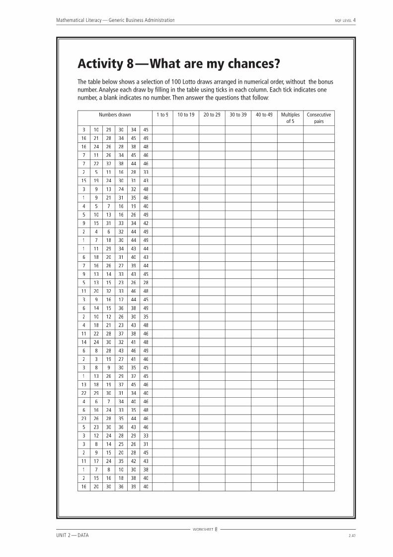
Activity 8 — What are my chances?
ABOUT THIS ACTIVITY This activity introduces the idea of probability. A preliminary handout has been included with background information on some of the common applications and terminology used in this branch of statistics. The students work with single events in the context of the ‘Lotto draw’, comparing ‘counted’ results with calculated probability. In this way they work with the mathematical verifi cation of experimental results. The Specifi c Outcomes and Assessment Criteria addressed are: S02 – AC1, 2, 3, 4; S03 – AC1, 4 of Unit Standard 9015.
MANAGING THIS ACTIVITYGames of chance, gambling, betting on the horses and the national lottery are possible contexts where students have some experience of probability. A good way to introduce this topic would be for the teacher to generate a discussion around games of chance, drawing from the students some of the common words and expressions relating to probability, for example ‘What are the odds?’, ‘The chances are..’. One could explore the idea that the chance of guessing correctly twice in a row is much less than the chance of guessing correctly once. Probability is not always an easy concept for students to grasp and it would be a good idea to spend plenty of time explaining and exploring the ideas mentioned in Handout 8. Students should then each get a copy of Handout 8 and Worksheet 8.
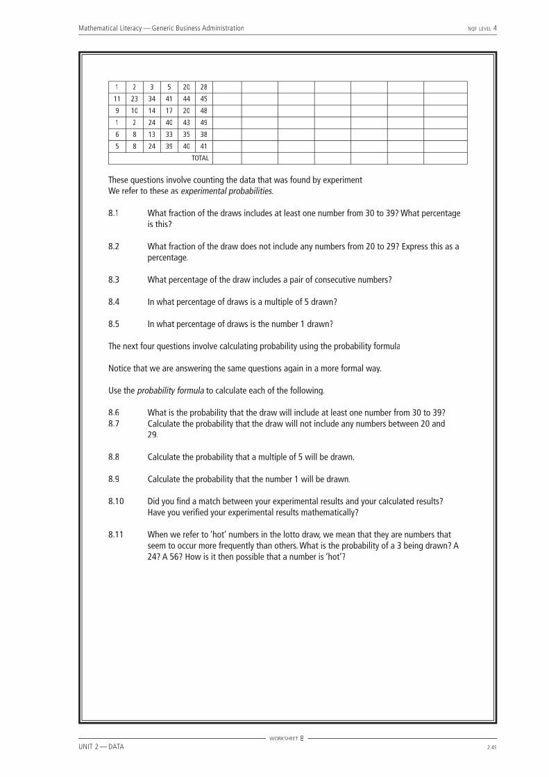
8.1 There were 600 numbers drawn (100 draws × 6 numbers each) and there were 120 numbers drawn between 30 and 39 (counted from the table of ticks). The fraction of the draw that includes at least one number between 30 and 39 is thus:120600
; &120600
× 100 = 20%
8.2 There were 119 numbers drawn from 20 to 29 (found by counting ticks), therefore there were 600 – 119 = 481 numbers not between 20 and 29. The fraction is thus:
481600
= 80%
8.3 Count 52 consecutive pairs, therefore percentage is 52 ÷ 600 = 8,7%.
8.4 Count 119 multiples of 5, therefore percentage is 119 ÷ 600 = 20% approximately.
8.5 Count a total of 15 draws of the number 1. The percentage is thus 15 ÷ 600 = 2,5%.
8.6 There are 10 numbers from 30 to 39 and a possible 49 numbers in total from which to select. So the probability of selecting a number between 30 and 39 is ‘number of ways to select’ ÷ ‘total possible equally likely selections’:
P = P = P1049
= 20,4% 8.7 There are 39 numbers that are not between 20 and 29, so the probability that the draw will not include
any numbers between 20 and 29 is:
P = P = P3949
= 79,6%
8.8 There are 9 multiples of fi ve between 1 and 49, so the probability of drawing one is 9 ÷ 49 = 18,4%.
8.9 The probability that the number 1 will be drawn is 1 ÷ 49 = 2,04%.
8.10 From the calculations, we see that the experimental data was not a perfect match with the statistical calculations, but was close in each case:
20% compared to 20,4%;
80% compared to 79,6%;
20% compared to 18,4%;
2,5% compared to 2,04%. We would expect the experimental data to be more accurate the bigger the sample. But we can say that our calculations did verify the experimental results.
Mathematical Literacy — Generic Business Administration NQF LEVEL 4
UNIT 2 — DATA 2.46
8.11 Each number has a 1 in 49 (about 2%) chance of being drawn every week, so in fact no number occurs more frequently than any other. The reason that numbers seem to be ‘hot’ is because the sample is too small and we are not getting an accurate picture. Think of fl ipping a coin — it is quite possible to get 4 ‘heads’ and 1 ‘tail’ in 5 throws, but this certainly does not mean that the probability of getting ‘heads’ is 80%. It simply means that the sample was too small to get an accurate result.
Mathematical Literacy — Generic Business Administration NQF LEVEL 4
UNIT 2 — DATA 2.47
Activity 8 — What are my chances?The table below shows a selection of 100 Lotto draws arranged in numerical order, without the bonus number. Analyse each draw by fi lling in the table using ticks in each column. Each tick indicates one number, a blank indicates no number. Then answer the questions that follow:
Numbers drawn 1 to 9 10 to 19 20 to 29 30 to 39 40 to 49 Multiples of 5
Consecutive pairs
3 10 29 30 34 45
16 21 28 34 45 49
16 24 26 28 38 48
7 11 26 34 45 46
7 22 37 38 44 46
2 5 11 16 28 33
15 19 24 30 31 43
3 9 13 24 32 48
1 9 21 31 35 46
4 5 7 16 19 40
5 10 13 16 26 49
9 15 31 33 34 42
2 4 6 32 44 49
1 7 18 30 44 49
1 11 29 34 43 44
6 18 20 31 40 43
7 16 26 27 39 44
9 13 14 33 43 45
5 13 15 23 26 28
11 20 32 33 46 48
3 9 16 17 44 45
6 14 15 36 38 49
2 10 12 26 30 35
4 18 21 23 43 48
11 22 28 37 38 46
14 24 30 32 41 48
6 8 28 43 46 49
2 3 19 27 41 46
3 8 9 30 35 45
1 13 26 29 37 45
13 18 19 37 45 46
22 29 30 31 34 40
4 6 7 34 40 46
6 16 24 33 35 48
23 26 28 35 44 46
5 23 30 36 43 46
3 12 24 28 29 33
3 8 14 25 26 31
2 9 15 20 28 45
11 17 24 35 42 43
1 7 8 10 30 38
2 15 16 18 38 40
16 20 30 36 39 40
WORKSHEET 8

Mathematical Literacy — Generic Business Administration NQF LEVEL 4
UNIT 2 — DATA 2.48
1 4 23 35 39 48
5 6 12 22 25 44
4 12 24 35 43 46
4 7 19 30 47 48
3 10 14 28 36 44
6 8 15 21 35 48
14 16 20 30 37 39
1 7 17 27 28 38
2 5 27 44 45 46
4 18 25 32 40 44
18 19 21 36 37 45
23 36 42 45 46 47
4 11 14 15 33 36
8 14 21 24 30 33
2 12 17 23 36 38
17 24 27 31 34 35
5 9 23 29 35 45
1 12 23 30 35 48
1 4 7 10 35 38
11 13 15 17 24 25
10 13 19 30 32 42
2 9 14 29 30 40
9 10 28 33 37 40
1 6 8 27 31 47
15 19 21 32 42 46
13 17 30 38 47 49
6 18 21 31 36 45
12 15 24 30 39 44
8 11 20 27 42 46
6 11 22 28 29 34
6 10 27 29 35 49
4 10 14 18 26 34
2 8 14 34 41 49
19 20 25 29 35 43
3 4 5 7 11 14
1 11 22 26 32 42
16 23 24 27 28 40
4 10 26 28 29 45
16 22 26 35 38 43
4 5 11 18 31 41
15 16 31 32 36 41
7 12 14 27 44 46
7 22 24 26 33 43
4 7 11 19 33 39
15 16 20 28 44 46
1 4 7 16 37 38
3 8 19 26 27 34
25 26 27 29 40 45
1 4 15 30 46 49
4 15 25 35 40 48
3 14 24 26 42 46
WORKSHEET 8
Mathematical Literacy — Generic Business Administration NQF LEVEL 4
UNIT 2 — DATA 2.49
1 2 3 5 20 28
11 23 34 41 44 45
9 10 14 17 20 48
1 2 24 40 43 49
6 8 13 33 35 38
5 8 24 39 40 41
TOTAL
These questions involve counting the data that was found by experiment We refer to these as experimental probabilities.
8.1 What fraction of the draws includes at least one number from 30 to 39? What percentage is this?
8.2 What fraction of the draw does not include any numbers from 20 to 29? Express this as a percentage.
8.3 What percentage of the draw includes a pair of consecutive numbers?
8.4 In what percentage of draws is a multiple of 5 drawn?
8.5 In what percentage of draws is the number 1 drawn? The next four questions involve calculating probability using the probability formula Notice that we are answering the same questions again in a more formal way. Use the probability formula to calculate each of the following.
8.6 What is the probability that the draw will include at least one number from 30 to 39?8.7 Calculate the probability that the draw will not include any numbers between 20 and
29.
8.8 Calculate the probability that a multiple of 5 will be drawn.
8.9 Calculate the probability that the number 1 will be drawn.
8.10 Did you fi nd a match between your experimental results and your calculated results? Have you verifi ed your experimental results mathematically?
8.11 When we refer to ‘hot’ numbers in the lotto draw, we mean that they are numbers that seem to occur more frequently than others. What is the probability of a 3 being drawn? A 24? A 56? How is it then possible that a number is ‘hot’?
WORKSHEET 8

Mathematical Literacy — Generic Business Administration NQF LEVEL 4
UNIT 2 — DATA 2.50
Probability (background information for students and teachers)
Probability is the study of ‘chance’. It estimates answers to questions such as:• What are the chances that it will rain today?• What are the odds that 45 will be one of the numbers drawn in the Lotto on Saturday?• What are the chances that a particular drug will cure a disease?• How likely is it that an insurance claim will be made on a particular policy?• How much profi t is likely to be made on a particular product?
Probability provides a statistical tool for describing, managing, estimating and planning many important things in society across a variety of sectors. It is a ratio expressing the chance that something will happen. It can be expressed as a fraction, a percentage or an odds ratio. The following four statements all mean exactly the same:• The odds are 50%.• There is a 1 in 2 chance.• The probability is 0,5.• There are equal chances.
The probability scale is measured from 0 to 1. A zero probability means it is impossible and a probability of 1 means it is 100% certain. A probability of 1⁄2 means that there is 50% for and 50% against, in other words equal odds. Probability is defi ned as:
P =number of desired outcomes
total number of equally likely outcomes
When fl ipping a coin, there is 1 possible outcome out of 2 equally likely outcomes that it will land on heads, so the probability of getting heads is:
P = P = P12
or 50%
When throwing a six sided die, there is a 1 in 6 chance that it will land on a 4 (die is the singular of dice — one die, a pair of dice). There is thus a 16,7% probability of getting a 4.
HANDOUT 8

Mathematical Literacy — Generic Business Administration NQF LEVEL 4
UNIT 2 — DATA 2.51
Activity 9 —Combined events
ABOUT THIS ACTIVITY In this activity students move from probabilities involving single events, to probabilities of combined events. They work with the multiplication principle and are introduced to the ideas of dependent, independent and mutually exclusive events. A handout has been included with further information necessary to answer a selection of probability questions. The Specifi c Outcomes and Assessment Criteria addressed are: SO2 – AC2, 3; S03 – AC1, 4.
MANAGING THIS ACTIVITYExplain to students that events are often combined. Instead of only considering one probability, we now consider successive probabilities and work with a number of events happening together. Spend time discussing the ideas in Handout 9, getting students to suggest more of their own illustrative examples to try and help understand the differences between dependent, independent and mutually exclusive events. Students should each get a copy of Handout 9 and Worksheet 9.
9.1.1 There are 10 faulty bottles out of 100 possible bottles, so the probability is 10 ÷ 100, or 10%.
9.1.2 There are 9 faulty bottles left out of a possible 99 bottles, so the probability is 9 ÷ 99 or 9,09%.
9.1.3 They are dependent events, because selecting one bottle leaves a different number to select from next time.
9.1.4 Using the multiplication principle:
P = (P = (P10100
)(999
) = (1
110) or 0,91%
9.2.1 From a total of 127 possible people an actual 58 came in, thus the likelihood that someone who walks past will come in is: 58 ÷ 127 = 45,7%.
9.2.2 From a total of 58 possible people 25 actually bought something, thus the likelihood that a person who comes in will buy something is: 25 ÷ 58 = 43%.
9.2.3 Using the multiplication principle for successive events:
P = P = P58127
×2558
= 25127
= 19,7%
9.3 These are mutually exclusive events, because a pair of denim jeans cannot be too tight and too loose. Thus
simply add the probabilities together : 30% + 10% = 40% probability that the jeans will not fi t.
9.4 We start with a total of 10 horses. After one has been chosen there are 9 left and after two have been chosen there are 8 left. We fi nd the combined probability using the multiplication principle for successive events. Thus the probabilities are as follows:
9.4.1 110
9.4.2 19
9.4.3 110
×19
×18
=1
720
9.5 We again use the multiplication principle for successive events and multiply the two individual probabilities:
P = P = P60100
×60100
= 36%; P =P =P35
×35
=925
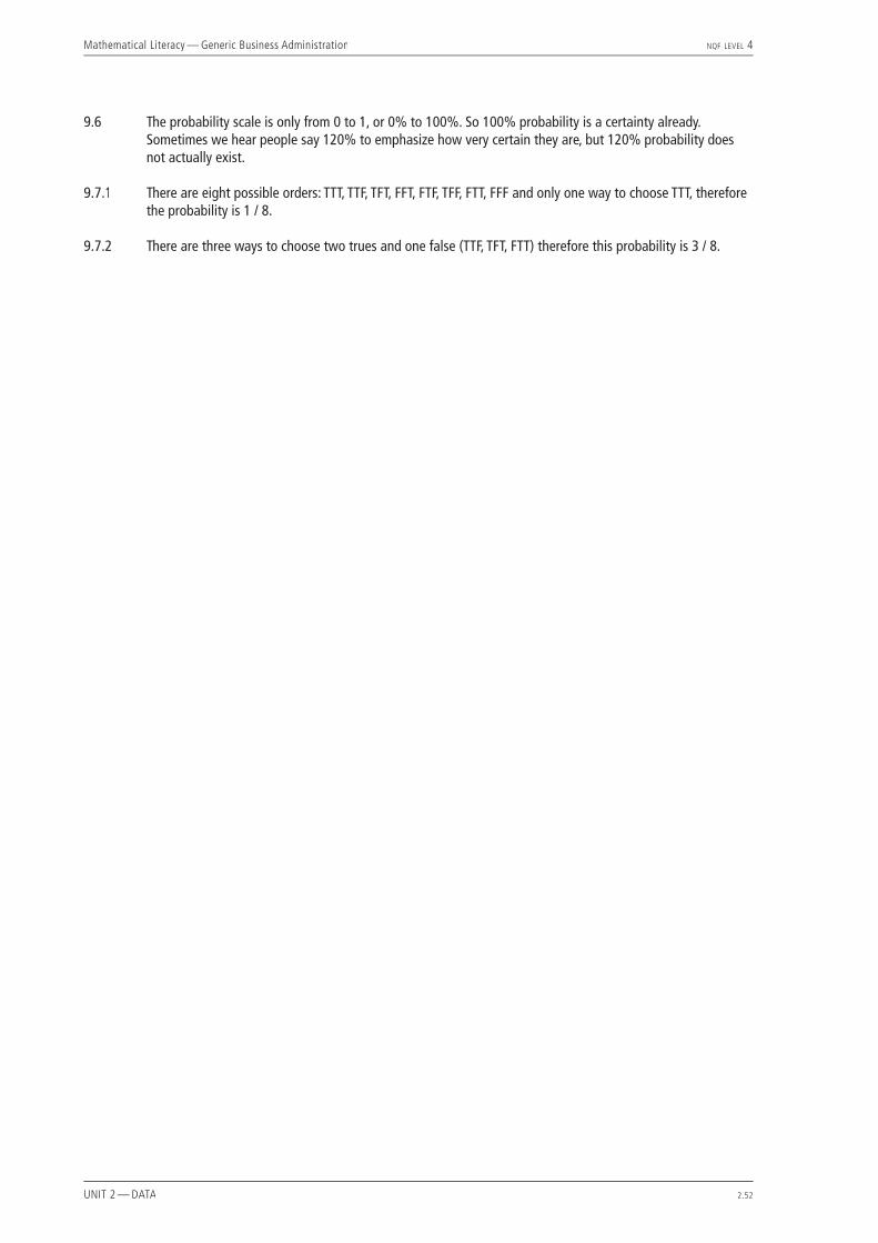
Mathematical Literacy — Generic Business Administration NQF LEVEL 4
UNIT 2 — DATA 2.52
9.6 The probability scale is only from 0 to 1, or 0% to 100%. So 100% probability is a certainty already. Sometimes we hear people say 120% to emphasize how very certain they are, but 120% probability does not actually exist.
9.7.1 There are eight possible orders: TTT, TTF, TFT, FFT, FTF, TFF, FTT, FFF and only one way to choose TTT, therefore the probability is 1 / 8.
9.7.2 There are three ways to choose two trues and one false (TTF, TFT, FTT) therefore this probability is 3 / 8.

Mathematical Literacy — Generic Business Administration NQF LEVEL 4
UNIT 2 — DATA 2.53
Activity 9 — Combined eventsIn this activity you have been given a number of problems to solve. You will need to decide whether you are dealing with a single event or combined events. If you are dealing with combined events, you will need to decide whether the events are dependent, independent or mutually exclusive. You will then need to use the probability formula and the fundamental counting principle to calculate the required probabilities.
9.1 In order to control the quality of a certain chemical product, a procedure is put in place where one bottle is selected at random from each batch. A second bottle is then selected without replacing the fi rst. If both bottles are faulty, the whole batch is discarded. If a batch of 100 contains 10 faulty bottles and each bottle has the same chance of being selected:
9.1.1 What is the probability of selecting a faulty bottle on the fi rst draw?9.1.2 What is the probability of selecting a faulty bottle on the second draw if the fi rst was also
faulty?9.1.3 Are these events dependent or independent?9.1.4 What is the probability that you will select two faulty bottles in succession?
9.2 The owner of a health-shop counted 127 people who walked past her shop yesterday. Of these, 58 came into the shop and of these 58, only 25 bought something.
9.2.1 What is the likelihood that someone who walks past the shop will come in?9.2.2 What is the likelihood that a person who comes in will buy something?9.2.3 What is the likelihood that a person who walks past will come in and buy something?
9.3 A clothing store sells second-hand denim jeans. If you buy a pair in your usual size without trying them on, the probability that the waist is too tight is 30% and the probability that it is too loose is 10%. If you choose a pair in your usual size, what is the probability that they will not fi t (too loose or too tight)?
9.4 There are 10 horses racing at a racecourse and each horse has an equally likely chance of winning.
9.4.1 What is the probability of choosing the winning horse? Give your answer as a fraction.9.4.2 Having decided on the winning horse, what is the probability of choosing the horse that
will come in second?9.4.3 What is the probability that you will correctly choose the fi rst three positions (1st, 2nd,
and 3rd)?
9.5 A sports match ends in a draw and must be decided by a penalty shootout. One of the goal-scorers has a season record of 60% success. What are the chances that he will now score two goals in a row assuming he is allowed consecutive shots? Give your answer as a percentage and also as a fraction.
9.6 Explain why 120% cannot be the probability of some event.
9.7 Your lecturer wants to set three true-false type questions. To decide on which questions to ask, she lists all the true-false possibilities (TTF, TFT…) on slips of paper and picks one from a hat at random. A student who does not know the answers guesses that all three are true.
9.7.1 What is the probability that the student is correct?9.7.2 What is the probability that two questions are true and one is false?
WORKSHEET 9
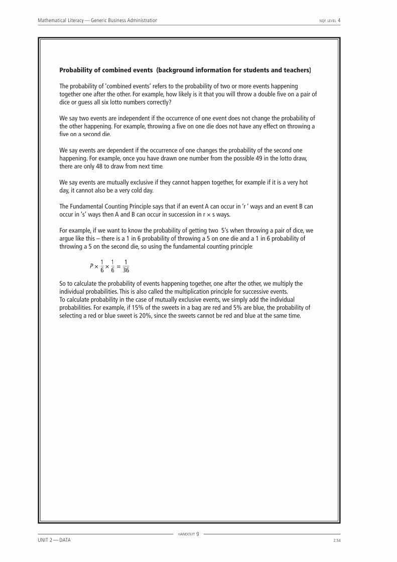
Mathematical Literacy — Generic Business Administration NQF LEVEL 4
UNIT 2 — DATA 2.54
Probability of combined events (background information for students and teachers)
The probability of ‘combined events’ refers to the probability of two or more events happening together one after the other. For example, how likely is it that you will throw a double fi ve on a pair of dice or guess all six lotto numbers correctly?
We say two events are independent if the occurrence of one event does not change the probability of the other happening. For example, throwing a fi ve on one die does not have any effect on throwing a fi ve on a second die.
We say events are dependent if the occurrence of one changes the probability of the second one happening. For example, once you have drawn one number from the possible 49 in the lotto draw, there are only 48 to draw from next time.
We say events are mutually exclusive if they cannot happen together, for example if it is a very hot day, it cannot also be a very cold day.
The Fundamental Counting Principle says that if an event A can occur in ‘r ‘ ways and an event B can occur in ‘s’ ways then A and B can occur in succession in r × s ways.
For example, if we want to know the probability of getting two 5’s when throwing a pair of dice, we argue like this – there is a 1 in 6 probability of throwing a 5 on one die and a 1 in 6 probability of throwing a 5 on the second die, so using the fundamental counting principle:
P ×16
×16
=136
So to calculate the probability of events happening together, one after the other, we multiply the individual probabilities. This is also called the multiplication principle for successive events.To calculate probability in the case of mutually exclusive events, we simply add the individual probabilities. For example, if 15% of the sweets in a bag are red and 5% are blue, the probability of selecting a red or blue sweet is 20%, since the sweets cannot be red and blue at the same time.
HANDOUT 9

Mathematical Literacy — Generic Business Administration NQF LEVEL 4
UNIT 2 — DATA 2.55
Activity 10 — Manipulations and misunderstandings
ABOUT THIS ACTIVITY In this activity students critique the ways that data is used to support arguments. They identify how data is manipulated and how one can be misled by incomplete statistics, inappropriate samples and graphical methods. The Specifi c Outcomes and Assessment Criteria addressed are: S01 – AC4; S03 – AC3, 5 of Unit Standard 9015.
MANAGING THIS ACTIVITYIntroduce students to the idea that numbers are only reliable when they are correctly understood. Statistics are very easy to manipulate and one often hears arguments that sound very convincing because they are backed up by fi gures or graphs that support the argument. However, if we look a little more carefully, we may fi nd that only selected data was used, the sample was inadequate or the graph was not so convincing if you examined the fi gures closely. Sometimes genuine mistakes are made by the statistician, but at times manipulation is done deliberately for less honest reasons. One should always read ‘the numbers’ with critical eyes and well-informed questions.
10.1 When presenting a group of numbers we often summarise our data using an average, and while that average may be mathematically correct, it could be highly misleading. In the case of a fi rm that pays an average salary of R250 000, we may fi nd that the CEO earns R3 000 000, while the other fi ve employees each earn less than R80 000. In this case the median or mode value would give a more representative picture and we would be better able to judge whether the fi rm is a fair employer and whether its members are well paid or not.
10.2 When we say 80% prefer this product, we have no idea of the sample size or the sample composition. If, for example, the sample size was only 10 people and they were all 16 years old, all we would actually know was that eight sixteen-year-olds preferred this product. This is certainly not enough information to make a business decision about the product.
10.3 This is another example of an incomplete statement. Does this mean 22% less ink than other ink jet printers, other printers in general or printers developed 10 years ago? Without a basis of comparison, this claim is essentially worthless.
10.4 Here the problem is a misunderstanding of the difference between percentage and percentage points. A percentage point is a unit of measurement that is calculated as a portion of 100, while a percentage is a portion of a whole (where the whole isn’t necessarily 100) multiplied by 100. So in the case of the microwaves, 63% (33 ÷ 52 × 100) had a faulty component. The industry average is 35%, so this is 28 percentage points higher than the national average – that is 80% higher, because the base fi gure here is 35 not 100. So in order to calculate the percentage difference, you have to divide 28 by 35 and multiply by 100, giving the fi gure of 80%. (28 ÷ 35 × 100).
10.5 Technically a graph should be more accurate than a statement, since it represents more of the variables of your data. However, graphs can be just as misleading when you are showing statistics. In 10.5.1, the results show slow but steady growth. In 10.5.2, the fi gures are exactly the same but the impression is of more rapid growth because the slope is steeper. This effect is created by starting the graph at 80 instead of 0. In 10.5.3, the slope is still greater, giving the impression of even better results although the fi gures remain identical. Changing the scale on the value axis thus creates quite different impressions and could easily be used to manipulate an argument. When trying to show strong growth the steeper slope would be more convincing, while when trying to encourage caution the fl atter slope would be more suitable. Manipulating the scale is a simple way of dramatically altering the visual impact of a set of data.
10.6 The impact of changing the scale on the axes is again illustrated in these three bar graphs. The data is identical in each case. In 10.6.1, the impression is that the sales were steady over the six months with some fl uctuation. In 10.6.2 the starting point on the value axis has been shifted to create the impression that there was much more fl uctuation in sales and month two was a very poor month with sales of close to zero. In 10.6.3, the scale was changed on the x-axis. This created broader bars perhaps giving the impression of solid, healthy growth. Again we notice the different visual impact that could be misleading to the careless reader.

Mathematical Literacy — Generic Business Administration NQF LEVEL 4
UNIT 2 — DATA 2.56

Mathematical Literacy — Generic Business Administration NQF LEVEL 4
UNIT 2 — DATA 2.58
10.5.3
10.6 The following three bar graphs show sales over 5 months.
10.6.1
10.6.2
10.6.3
WORKSHEET 10

Unit 3Measurement
Generic Business Administration
NQFLEVEL
4Mathematical Literacy