Embed Size (px)
Citation preview
Unions and Inequality Over the Twentieth Century:
New Evidence from Survey Data∗
Henry S. Farber, Daniel Herbst, Ilyana Kuziemko, Suresh Naidu
October 9, 2020
Abstract
U.S. income inequality has varied inversely with union density over the past hundredyears. But moving beyond this aggregate relationship has proven difficult, in part be-cause of limited micro-data on union membership prior to 1973. We develop a newsource of micro-data on union membership dating back to 1936, survey data primarilyfrom Gallup (N ≈ 980,000), to examine the long-run relationship between unions andinequality. We document dramatic changes in the demographics of union members:when density was at its mid-century peak, union households were much less educatedand more non-white than other households, whereas pre-World-War-II and today theyare more similar to non-union households on these dimensions. However, despite largechanges in composition and density since 1936, the household union premium holdsrelatively steady between ten and twenty log points. We then use our data to examinethe effect of unions on income inequality. Using distributional decompositions, time-series regressions, state-year regressions, as well as a new instrumental-variable strategybased on the 1935 legalization of unions and the World-War-II era War Labor Board,we find consistent evidence that unions reduce inequality, explaining a significant shareof the dramatic fall in inequality between the mid-1930s and late 1940s.
∗We thank our research assistants Obaid Haque, Chitra Marti, Brendan Moore, Tamsin Kan-tor, Amy Wickett, and Jon Zytnick and especially Fabiola Alba, Divyansh Devnani, Elisa Jacome,Elena Marchetti-Bowick, Amitis Oskoui, Paola Gabriela Villa Paro, Ahna Pearson, Shreya Tan-don, and Maryam Rostoum. We have benefited from comments by seminar participants at Berke-ley, Columbia, Georgetown, Harvard, INSEAD, SOLE, the NBER Development of the AmericanEconomy, Income Distribution and Macroeconomics, and Labor Studies meetings, McGill Uni-versity, Princeton, Rutgers, Sciences Po, UMass Amherst, UC Davis, Universitat Pompeu Fabra,Stanford, and Vanderbilt. We are indebted to Devin Caughey and Eric Schickler for answeringquestions on the early Gallup data. We thank John Bakija, Gillian Brunet, Bill Collins, An-gus Deaton, Arindrajit Dube, Barry Eidlin, Nicole Fortin, John Grigsby, Ethan Kaplan, ThomasLemieux, Gregory Niemesh, John Schmitt, Stefanie Stantcheva, Bill Spriggs, and Gabriel Zucmanfor data and comments. All remaining errors are our own. Farber: Princeton University and NBER,[email protected]. Herbst: University of Arizona, [email protected]. Kuziemko: Prince-ton University and NBER, [email protected]. Naidu: Columbia University and NBER,[email protected].
1 Introduction
Understanding the determinants of the U -shaped pattern of U.S. income inequality over the
twentieth century has become a central goal among economists over the past few decades.
While most economists agree that both redistributive institutions such as unions and taxation
as well as market forces such as technology and trade have roles to play in explaining this
pattern, there remains widespread disagreement over the relative importance of the two.
While there is a substantial literature in labor economics and sociology that argues for
a causal relationship from labor unions to lowered labor market inequality (Card, 2001;
DiNardo, Fortin, and Lemieux, 1996; Western and Rosenfeld, 2011), another view holds that
more fundamental drivers, namely technological developments that increase the demand for
educated labor faster than increases in educational attainment, better explain the time-series
variation in inequality (Acemoglu and Autor, 2011; Goldin and Katz, 2008; Goldin, Katz,
and Autor, 2020).
In the aggregate, there is a well-documented inverse relationship between income in-
equality and union membership in the US (see Figure 1). But moving beyond this aggregate
relationship has proven difficult. While aggregate measures of union density date back to the
early twentieth century, it is not until the Current Population Survey (CPS) introduces a
question about union membership in 1973 that labor economists have had a consistent source
of microdata that includes union status. Put differently, it is not until unions are in steady
decline that they can be studied with U.S. microdata. By contrast, the U.S. Census has
tracked Americans’ education and wages consistently since 1940, allowing historical analysis
of models emphasizing supply and demand of skill as determining levels of inequality (see,
e.g., the seminal work by Goldin and Katz, 2008).
In this paper we bring a new source of household-level data to the study of unions
and inequality. While the Census Bureau did not ask about union membership until the
1973 CPS, public opinion polls regularly asked about household union membership, together
with extensive questions on demographics, socio-economic status and political views. We
harmonize these surveys, primarily Gallup public opinion polls, going back to 1936. Our new
dataset draws from over 500 surveys over the period from 1936-1986 and has over 980,000
observations, each providing union status at the household level. We combine these data
with more familiar microdata sources (e.g., the CPS) to extend the analysis into the present
day.
These new data sources allow us to revisit the role of unions in shaping the income dis-
tribution and to contribute to the long-running “institutions versus market forces” debate
on the causes of inequality, particularly their role during the mid-century “Great Compres-
1
sion”.1 The competitive model focusing on the supply and demand for skilled workers offers
hypotheses on the joint movement of relative wages and relative quantities and can be used
to assess the economic forces at work. Given the increase in relative college wages since the
1960s, authors in this tradition (with a long pedigree stretching back to Douglas (1930),
Tinbergen (1970), and Freeman (1976)) have focused on changes in demand resulting from
technology (Katz and Murphy, 1992; Autor, 2014; Card and Lemieux, 2001; Katz and Au-
tor, 1999; Autor, Katz, and Kearney, 2008)) interacting with the rate of schooling increases.
Adaptations of the relative skill model to account for recent patterns in wage inequality
include Beaudry, Green, and Sand (2016), Acemoglu and Autor (2011), Autor, Levy, and
Murnane (2003), and Deming (2017). On the institutions side, the literature includes Bound
and Johnson (1992), DiNardo, Fortin, and Lemieux (1996) and Lee (1999), with recent liter-
ature incorporating firms as important determinants of inequality (Song et al., 2015; Autor
et al., 2020; Card, Heining, and Kline, 2013). A third strand of literature has attempted to
“horse race” these two forces in ecological regressions across countries (Blau and Kahn, 1996;
Jaumotte and Osorio Buitron, 2020), albeit with limited identifying variation. Bringing new
micro data to the study of unions allows us to present several new results suggesting unions
played a significant role in reducing income inequality at mid-century, when unions were at
their peak and inequality at its lowest. These results fall into two broad sets.
Our first set of results replicates many of the stylized facts about unions established with
CPS data and extends them back to earlier decades. We begin by showing that patterns
of selection into unions has varied substantially over time: the education of union members
relative to non-union members has followed a marked U -shaped pattern, mirroring the pat-
tern of inequality itself and the sharp inverse of union density. That is, at mid-century, when
density was the highest, unions were drawing in the least educated workers. Today, as in
the 1930s, unions are smaller and union and non-union households look similar in terms
of education. A similar pattern emerges for minorities: unions were relatively less white at
mid-century than either before or after, even conditioning on education.
A key stylized fact about CPS-era unions is that members enjoy a wage premium, but did
this advantage exist as union density was growing in the 1930s and 1940s and at their peak
in the 1950s and 1960s? We show that the income advantage accruing to union households
relative to non-union households with the same demographics and skill proxies holds quite
steady (between ten and twenty log points) over our eighty-year period, despite the huge
1Collins and Niemesh (2019) is another recent paper emphasizing the role of unions in the GreatCompression. They use the industry measures of union density constructed by Troy (1965) and formproxies of union density using 1940 IPUMS industry allocations within state economic areas. Webuild on this by providing direct measures of household union membership at the annual level overthis period.
2
swings in union density and composition. As unobserved selection is typically a challenge
in interpreting cross-sectional union premium regressions, we use a panel survey from 1956–
1960, and we can show that the cross-sectional and respondent fixed-effects estimates are
very close in magnitude.
The household union premium is larger for the less-educated households, decreasing by
four log points for every additional year of education, and effects for non-white households
are also remarkably stable over our entire sample period. We show that unions not only
reduce the differentials paid to observable traits such as education and race, but shrink
the differentials associated with non-observable traits as well: the ratio of residual income
variance in the union sector to that in the non-union sector remains stable at roughly 0.60
over our entire sample period.
Together, the U -shape in selection by education and relatively constant patterns in union
premia suggest that during the middle decades of the twentieth century, unions were con-
ferring a substantial advantage to what would otherwise have been low-income households,
thus compressing the income distribution. In our second set of results, we move beyond
these stylized facts consistent with the role of unions depressing inequality, and instead more
explicitly model the relationship of inequality to union density.
We begin by decomposing household income distributions, following DiNardo, Fortin,
and Lemieux (1996)’s analysis of modern CPS data. We model selection into unions and
then re-weight the non-union distribution to look like a deunionized counterfactual. We
show that unions significantly compressed the mid-century income distribution: the Gini
coefficient would have been 0.025 higher in 1968 had no household been unionized—a large
effect, equal to the increase in the Gini from 1980 to 1990.2 This exercise is most directly
related to the stylized facts we document on selection and the union premium.
For each year of our sample period, we can estimate the effect of unions on the un-
conditional household income distribution, accounting for the changing position of union
households in the counterfactual non-union income distribution as well as any changes in
the union income premium. Across our eighty-year sample period, we find a consistent nega-
tive effect of re-weighting the full income distribution toward the union income distribution
on both the Gini coefficient and the 90/10 ratio. As would be expected given the changes
in selection and density documented earlier, the negative effect of unions on inequality is
especially large at mid-century, when unions were organizing the most negatively-selected
workers. We also document a role for spillovers using Fortin, Lemieux, and Lloyd (2018)’s
extension of DiNardo, Fortin, and Lemieux (1996), suggesting that the micro-effect of unions
2In 1980, the U.S. household Gini in the CPS was 0.403 and after a decade of rapid growth ininequality, it stood at 0.428 (data from FRED).
3
on union members does not capture all of the effects of unions on the income distribution.
Next, we turn to regression analysis where instead of microdata we employ annual aggre-
gated data from a variety of sources and include union density as an explanatory variable.
We begin by simply adding union density to the canonical regressions estimated by Katz
and Murphy (1992), Autor, Katz, and Kearney (2008) and Goldin and Katz (2008), who use
aggregate time-series regressions to show that the supply of educated workers is a strong,
negative predictor of the college-wage premium. We then refine our time series analysis by
adding geographic variation, regressing state-year measures of inequality on state-year union
density. While the aggregate-level analysis could have been performed without the data
sources we have developed, the state-year regressions are made possible by state identifiers
in our Gallup microdata. In both the annual and the state-year regression analyses, union
density has a negative effect on standard measures of inequality such as the college pre-
mium, the 90/10 ratio, the Gini coefficient, the top-ten-percent income share, and the labor
share of net income. While these exercises depends on a different set of (admittedly strong)
identifying assumptions, they each yield a negative and significant effect of union density on
measures of income inequality, in many cases comparable to or larger than the effect of skill
shares.
Finally, we move to an explicitly causal estimate of the effect of union density on in-
equality, leveraging state-level heterogeneity in the two national policies most responsible
for raising union density in the twentieth century: the Wagner Act and the National War
Labor Board. The relatively fine annual and geographic variation in our data allows us to
examine annual changes in union density and inequality across states in response to the im-
mediate post-Wagner Act membership increase and World War II production contracts. We
show that equality and union density differentially and robustly increased in states with high
latent union demand and war production in the 1935-1947 period, with no other differential
change in any other period.
We see three key contributions in extending microdata analyses of unions back to the
1930s. First, economists’ understanding of the basic economics of U.S. labor unions—the size
or stability of the union premium, selection into unions by education or other proxies for
non-union wages, differences in residual wage variance between the covered- and non-covered
sectors—relies almost entirely on CPS data and is thus limited to 1973 and later. We use
our new micro-data to examine these stylized facts going back to 1936 (Sections 3 and 4).
Importantly, tracing out how selection and the union premium varies during the decline, at
the nadir, and then during the rise of U.S. income inequality sheds light on whether unions
are a plausible factor in explaining the time-series pattern of inequality. These findings
motivate our second contribution, in which we model inequality as an explicit function of
4
union density (Section 5) in regression analyses. Finally, constructing state-year measures
of union density back through the heyday of union growth allows us to leverage identifying
variation from the two historical moments that account for almost all the sustained increase
in private sector union density in American history: the Wagner Act and World War II.
Cross-state variation in the effects of these national policies (increasing union density while
simultaneously decreasing inequality) adds further evidence that unions played an integral
role in the steep reduction in inequality that look place from the 1930s to the 1940s.
The rest of the paper is organized as follows. In the next section, we describe our data
sources, in particular the Gallup data. Section 2 also presents our new time-series on house-
hold union membership. Section 3 analyzes selection into unions, focusing on education and
race. Section 4 estimates household union income premiums over much of the 20th century,
and Section 5 presents our evidence on the effect of unions on the shape of the overall income
distribution. Section 6 offers concluding thoughts and directions for future work.
2 Household union status, 1936 to present
In this section, we briefly describe how we combine Gallup and other historical microdata
sources with more modern data to create a measure of household union status going back to
the 1930s.
2.1 Gallup data
Since 1937, Gallup has often asked respondents whether anyone in the household is a member
of a labor union. This question not only allows us to plot household union density over a nine-
decade period, as we do in this section, but also to examine the types of households that had
union members and whether union membership conferred a family-income premium, as we
do in subsequent sections. Before beginning this analysis, we highlight a few key points about
the Gallup and other historical data sources that we use. A far more complete treatment
can be found in Appendix B.3
Before the 1950s when it adopts more modern sampling techniques to reach a more
representative population, Gallup data suffers from several important sampling biases that
tend to over-sample the better-off. First, George Gallup sought to sample voters, meaning
under-sampling the South (which had low turnout even among whites) and in particular
Southern blacks (who were almost completely disenfranchised). Further, the focus on voters
resulted in over-sampling of the educated (due to their higher turnout). Second, survey-takers
3Much of the information summarized here and presented in more detail in Appendix B comesfrom Berinsky (2006).
5
in these early years were given only vague instructions (e.g., “get a good spread” for age)
and often found it more pleasant working in nicer areas, further oversampling the well-off.
Even after 1950, these biases remain, though become smaller. We compare the (unweighted)
Gallup data to decennial Census data in each decade in Appendix Tables B.1 and B.2.
As we are interested in the full U.S. population, we seek to correct these sampling biases
to the extent possible. We weight the Gallup data to match Census region × race cells
before 1942 and region× race× education cells from 1942 (when Gallup adds its education
question) onward. Moreover, in Appendix D, we show that all of our key results are robust
to various weighting schemes, including not weighting at all.
As we can only compare Gallup to the Census every ten years, we also seek some annual
measures to check Gallup’s reliability at higher frequencies. In Appendix Figure A.1, we
show that our Gallup unemployment measure matches in changes (and often in levels) that
of the official Historical Statistics of the United States (HSUS) from the 1930s onward,
picking up the high unemployment of the “Roosevelt Recession” period. As another test of
whether Gallup can pick up high-frequency changes in population demographics, Appendix
Figure A.2 shows the “missing men” during World War II deployment: the average age of
men increases nearly three years, as millions of young men were sent overseas and no longer
available for Gallup to interview.
Beyond sampling, Gallup’s standard union membership survey question deserves men-
tion, as it differs from that used in the most widely used modern economic survey data,
the CPS. Gallup typically asks whether you or your spouse is a member of a union, so we
cannot consistently extract individual-level union membership as one could in the CPS.4 In
Appendix D, we compare our key results whenever possible using individual instead of house-
hold union measures—while occasionally levels shift, the changes over time are remarkably
similar.
2.2 Additional Data Sources
While we rely heavily on the Gallup data, we supplement Gallup with a number of additional
survey data sources from the 1930s onward. Gallup does not ask family income for much of
the 1950s, but the American National Election Survey (ANES) asks both family income and
union household status throughout that period, so we augment our Gallup data with the
ANES in much of our analysis.5
4In some but not all cases they will then ask who (the respondent or the spouse) but to beconsistent across as many surveys as possible, we create a harmonized household union variable.
5The ANES has a relatively small sample size in any given year so that our ability to use theANES to provide detailed breakdowns of union status and income by geography or demographics
6
We have found one survey that includes a union question that pre-dates our Gallup data.
This 1935-36 survey was conducted by the Bureau of Home Economics (BHS) and Bureau
of Labor Statistics (BLS) to measure household demographics, income, and expenditures
across a broad range of U.S. households, and we will henceforth refer to it as the 1936
Expenditure Survey. The survey asks about union dues as an expenditure category, which
is how we measure household union membership. Rather than sampling randomly from the
whole population, the agencies chose respondents from 257 cities, towns, and rural counties
within six geographic regions. In most communities, the sample was limited to native-white
families with both a husband and wife, though blacks were sampled the Southeast and blacks
a single individuals in some major Northern cities.6 To mitigate the effects of this selective
sampling on our estimates, we employ the same cell-weighting strategy as we do in our Gallup
sample.
We further supplement our sample with a 1946 survey performed by the U.S. Psycho-
logical Corporation that includes state identifiers, family income, union status and standard
demographics.7 In 1947 and 1950 we use data from National Opinion Research Corporation
(NORC) as a check on our union density estimates from Gallup, but, as these data do not
have state identifiers, we do not use them in our regression analysis. We also use the Panel
Survey of Income Dynamics (PSID) for the late 1960s and early 1970s. From 1977 onward,
we can use the CPS to examine household measures of union membership.8
Summary statistics for the CPS, ANES, and these additional data sources appear in
Appendix Table B.3. In general, at least along the dimensions on which Gallup appears most
suspect in its early years (share residing in the South, share white, education level), these data
sources appear more representative. The table shows all data sources unweighted, though
we will use ANES and CPS weights in years they are provided, to follow past literature. We
weight the 1936 Expenditure survey and the 1946 U.S. Psychological Corporation survey in
the same manner that we do Gallup.
is limited.6Black families were included in New York City, Columbus, OH, and the Southeast, and single
individuals were included in Providence, RI, Columbus, OH, Portland, OR, and Chicago, IL. Notethat Hausman (2016) uses these data in studying the effects of the 1936 Veteran’s Bonus.
7The Psychological Corporation survey was a public opinion survey conducted in April 1946, in125 cities with 5,000 respondents (plus an additional rural sample). See Link (1946) for a descriptionof the survey and cross-tabulations.
8Beginning in 1977, the CPS includes both the union-membership question and individual state-of-residence identifiers. As most of our analysis conditions on state of residence, we generally donot use CPS data from 1973–1976, which has the union variable but only identifies twelve of themost populous states plus DC, and groups the rest into ten state groups.
7
2.3 The union share of households over time
Figure 2 plots our weighted Gallup-based measure of the union share of households, by year,
alongside several other series (Appendix Figure D.1 shows that the weighted and unweighted
Gallup measures are very similar). The Gallup series bounces around between eleven and
fifteen percent from 1937 to 1940. Between 1941 and 1945, the years the U.S. is involved in
World War II, the household union-membership rate in our Gallup data roughly doubles.
The union share of households continues to grow at a slower pace in the years immediately
after the war, before enjoying a second spurt to reach its peak in the early 1950s. After that
point, the union share of households in the Gallup data slowly but steadily declines.
Also presented in Figure 2 are our supplemental survey-based series. Note that each of
these series generally has fewer observations per year than Gallup. The ANES sits very
close to Gallup, though as expected is noisier. The 1936 expenditure survey is very close
to our earliest Gallup observation, in 1937. The U.S. Psychological Corporation appears
substantially lower than our Gallup measures in 1946, whereas the two NORC surveys (from
1947 and 1950) are very close to the Gallup estimates for those years.
To avoid clutter and to focus on the earlier data, we end our series in the 1980s and
do not plot our CPS series in this figure, instead plotting the official CPS/BLS individual
worker series, divided by the number of households, in blue for comparison. Appendix Figure
A.3 shows the Gallup and CPS household-level series from 1970 until today, allowing readers
to more easily assess their degree of concordance during their period of overlap (1977-1986).
Reassuringly, in the years when Gallup and the CPS overlap, they are quite close.9 As we
emphasized in Section 2.1, our measure of union density is based on whether a household
has a union member, as the Gallup data do not always allow us to examine respondent-level
membership. Appendix Figure D.2 shows how our household notion of density compares to
the more traditional individual measure of density within the ANES and CPS, where both
measures can be computed. The household measure is always above the individual measure,
as we would expect. But in both datasets, the household and individual measures track each
other in changes quite closely.
2.4 Comparison to historical aggregate series
Finally, Figure 2 plots two widely-used historical aggregate data series, the BLS series (based
on union self-reports of membership) and the Troy series (compiled by Leo Troy for the NBER
9Given the labor-intensity of reading in the Gallup data, we do not continue past 1986 andbeyond this point rely on the CPS. We cut off at 1986 in order to have a ten-year period whereGallup and CPS overlap, which allows us to check consistency of Gallup over a substantial periodof time.
8
and based on union’s self-reported revenue data).10 While the Gallup measures do not always
agree with the BLS and Troy series in levels, they are, for the most part, highly consistent
in changes. We describe these existing historical data sources in greater detail in Appendix
E, summarizing key points below.
The density measures based on existing historical aggregate sources are everywhere above
our microdata-based series until the 1950s, at which point they converge. As we document
in Appendix E, labor historians believe the union self-reports of their own membership
(which the BLS series uses) are significantly biased upwards. Especially from 1937-1955,
when organized labor in the US was split into two warring factions—the American Federation
of Labor and the Congress of Industrial Organization—the two federations over-stated their
membership in attempts to gain advantages over the other. Membership inflation became
such an issue that the federations themselves did not know their own membership. The CIO
felt the need to commission a 1942 internal investigation into membership inflation, privately
concluding that its official membership tally was inflated by a factor of two.
Leo Troy was aware of the membership inflation issue, and thus where possible bases
estimates on dues revenue (from which he can back out membership using dues formulae).
But as we discuss in Appendix E, revenue reports are missing for much of the early CIO,
and the same incentives likely led unions to inflate dues revenue as well.
That respondents polled by Gallup did not share these incentives to overstate union
membership is an advantage of our data. However, there is an important reason why Gallup
and other opinion surveys may understate true union membership: individuals can be in
unions without knowing it, especially during certain historical moments. As we discuss in
greater detail in Section 5.4, during World War II, the government gave unions the authority
to default-enroll workers when they started a job at any firm receiving war-related defense
contracts and to automatically deduct dues payments from their paychecks. Thus, some
workers during this period of rapid growth in density may not have known they were members
and thus answered Gallup survey enumerators honestly (though incorrectly) that they were
not in a union. It is not surprising that the Gallup data most undershoots the Troy and
BLS numbers during the war years. Similarly, moments of high unemployment complicated
calculations of union density. Until Congress mandated annual reporting in 1959, unions
had great discretion in how to count a union member who became unemployed, whereas an
unemployed respondent in Gallup, no longer paying his union dues, might honestly consider
10These series give aggregate union counts of membership, so we divide by estimates of total U.S.households (geometrically interpolated between Census years) to make the numbers as comparableas possible to Gallup. This transformation will obviously overstate the union share of householdsif many households had multiple union members.
9
himself no longer a member.11 Indeed, Figure 2 shows that Gallup shows essentially no net
growth between 1937-1940, which includes the period after the upholding of the NLRA, but
also includes the Roosevelt Recession, whereas the BLS and Troy show robust growth.12
In summary, while the microdata-based versions of household union density we develop
and the more widely used measures based on aggregate data differ slightly in levels (in
a manner consistent with their non-trivial differences in methodology), they in almost all
years firmly agree in changes. Like the Troy and BLS series, the Gallup data exhibit the
same inverted U -shape over the twentieth century. Moreover, as we will show in Section 5,
the relationship between aggregate union density and inequality is very similar whether we
use our new, micro-data-based measures of household unionization rates or the traditional,
aggregate measures.13
An important advantage of our series, however, is that it is based on microdata, which
allow us to examine who joined unions and how this selection changed over time. It is to this
task we now turn.
3 Selection Into Unions
Labor economists have long debated the nature of selection into unions. We focus on selection
into union by education, and then by race. Less-educated and non-white households have
on average lower income than other households, and thus selection along these margins
into unions reveals whether or not unions historically excluded or included the relative less
advantaged. Besides being of independent interest, the nature of selection into unions is an
indirect test about whether union density was causally related to the Great Compression: if
union members were, say, more educated and whiter than non-union members in mid-century,
it would be difficult to argue that the increased union density was exercising equalizing
pressure.
11As noted, Gallup and ANES did not skip over the unemployed or those otherwise out of thelabor force when fielding their union question, and many unemployed and retired respondents inthese surveys nonetheless identify as union members.
12Indeed, it is well documented that at least among the largest locals where data are available,dues payments plummeted for CIO unions during the 1938 recession, as millions of workers werelaid off (Lichtenstein, 2003). We speculate that unions continued to report these laid-off workers asmembers.
13Of course, it is possible that Gallup’s non-representative sampling contributes to the gap be-tween it and the BLS and Troy series. We suspect non-random sampling is not an important factor.First, the sampling biases with respect to calculating average density go in both directions (e.g.,Gallup’s oversampling the well-off creates negative bias but under-sampling the union-hostile Southcreates positive bias). Second, as noted, the weighted and unweighted versions of the Gallup uniondensity series are very similar (see Appendix Figure D.1).
10
While we focus on selection on observables, there is likely selection on unobservables that
bias our results. These unobserved traits could include uncredentialled trade skills or raw
ability. Lewis (1986) wrote “I have strong priors on the direction of the bias....the Micro, OLS,
and CS wage gap estimates are biased upward—the omitted quality variables are positively
correlated with union status.” Abowd and Farber (1982) and Farber (1983) enriched the
model of selection into unions to include selection by union employers from among the pool
of workers who would like a union job. They argue that, because unions confer a larger
wage advantage to the less skilled, the the marginal cost of skill to union employers is lower
than for nonunion employers. The result is that most skilled will not want a union job, and
employers will want to hire the most highly skilled from among those workers who do desire
a union job. Thus, low observed skill workers will be positively selected into union jobs by
employers based on their unobservables and high observed skill workers will be negatively
selected into union jobs by workers based on their unobservables. This two-sided selection
results in the union sector being composed of the center of the (observed plus unobserved
to the econometrician) skill distribution for a particular job. Card (1996) presents evidence
consistent with this two-sided view of selection, and argues that the resulting biases cancel
each other out resulting in a relatively unbiased cross-sectional union premium.
3.1 Selection into unions by education
We begin our analysis of who joined unions by estimating the following equation, separately
by survey-source d (e.g., Gallup, ANES, CPS) and year y:
Unionhst = βdyEducRh + γ1Female
Rh + f(ageRh ) + µs + νt + ehst. (1)
In this equation, subscripts h, s, and t denote household, state and survey-date, respectively
(our Gallup data provides many surveys per year, so survey date t will map to some unique y
and survey-date fixed effects subsume year fixed effects). The superscript R serves to remind
readers that in many cases, a variable refers specifically to the respondent (not necessarily
the household head). Unionhst is an indicator for whether anyone in the household is a union
member (and is the underlying household-level variable we use to construct the aggregate
time-series in the previous section). EducRh is the respondent’s education in years.14 FemaleRhis a female dummy, f(ageRh ) is a function of age of the respondent (age and its square when
respondent’s age is recorded in years, fixed effects for each category when it is recorded in
14Where a specific survey does not collect information directly on years of schooling but reportsspecific ranges or credentials, we use simple rules to convert these measures to years of schooling.The note to Figure 3 describes how we impute years of schooling in these cases.
11
categories), and µs and νt are vectors of state and survey-date fixed effects, respectively.
The vector of estimated βdy values tells us, for a given year y and using data from a given
survey source d, how own years of schooling predicts whether you live in a union household,
conditional on basic demographics and state of residence.15 Note here that we are not yet
controlling for race.
Figure 3 shows these results across our key datasets. A clear U -shape emerges, with the
year-specific point-estimates remarkably consistent across all data sources.16 In the earliest
years (1936 through approximately 1943) the coefficients suggest that an additional year
of education reduces the likelihood of living in a union household by only two to three
percentage points. At the trough of the U (around 1960), we estimate that an additional year
of education reduces the likelihood of living in a union household by roughly five percentage
points. Since the 1960s, the negative marginal effect of education on the probability of living
in a union household declines steadily: it reaches zero around 2000 and is now positive and
in some years statistically significant, though small.
The differential increase in education among union households in recent decades may
reflect, in part, the substantial growth of relatively highly-educated public sector labor unions
since the 1960s. Indeed, as we show in Appendix Figure A.7, before President Kennedy’s 1962
executive order giving federal employees the right to organize, the share of union members
in the public sector was nearly negligible, hovering around five percent, while today one in
every two union members works in the public sector.17 While we do not know sector for the
Gallup, Psych. Corp., and 1936 expenditure surveys, we can compare our baseline selection
patterns from the ANES and CPS to those when we drop any household with a public
sector worker. As Appendix Figure A.8 shows, while the levels of the selection effect change
slightly for this sample, the increase in the education of union households from 1970 onward
is unchanged. While we do not have data from before 1950, any effect of public-sector unions
is likely to be tiny, as both the public sector workforce was smaller and public-sector unions
were essentially nonexistent.
Another possible explanation for the relative up-skilling of union households is the steep
15For the ANES, given the small sample sizes, we constrain the coefficients on education (βdy)to be equal across six-year bins in order to reduce sampling error. For the Gallup and other sur-veys, we estimate the coefficients on education (βdy) by estimating separate regressions for eachsurvey source× year combination.
16This pattern holds when other education measures are used instead of years of schooling.Appendix Figures A.4, A.5, and A.6 show similar patterns when, respectively, a high-school dummy,college dummy and log years schooling serve as the education measure.
17Over the period from 1973-2016, tabulation of CPS data indicates that 5.3 percent of collegegraduates employed in the private sector were members of labor unions. In contrast, fully 39.7percent of college graduates employed in the public sector are union members.
12
decline since the 1960s in the share of union members in manufacturing employment—also
depicted in Appendix Figure A.7. The manufacturing share of union members is the rough
inverse of the public-sector share, falling from nearly fifty percent in the 1950s to less than
ten percent today. Appendix Figure A.8 also shows the education selection patterns after
dropping households with either a public-sector or a manufacturing worker. A large majority
of the up-skilling effect remains.18 We return to this pattern in the conclusion when we discuss
questions for future work.
As noted in Section 2, we use a household and not an individual concept of union mem-
bership. In the discussion above, we have implicitly assumed that the selection patterns over
time reflect less-educated workers joining unions in the middle decades of the 1900s, but in
principle they could instead reflect changes in marriage patterns whereby union members,
for whatever reason, became more likely to marry less-educated spouses during this period.
We address this concern in two ways. First, we reproduce the selection-by-education
analysis (Figure 3) after excluding observations where the respondent is female. In this
sample we do not rely on the education of the spouse as a proxy for the education of the
likely union member. Appendix Figure D.4 shows that selection into unions by years of
schooling for the male-only sample yields the same U -shape as we saw with the full sample.
Second, in the CPS era, we can directly compare results using the household- and individual-
based union membership concept. While we can only examine more recent years with our
CPS data, both the individual and household selection series (plotted in Appendix Figure
D.3) show the same marked increase in terms of selection by years of schooling from the
1970s until today.
All of this evidence suggests that union members were substantially less educated than
non-members until quite recently and especially so in the 1950s and 1960s. While “skill”
is multi-dimensional and has unobserved components, so long as unobserved dimensions of
skill correlate with education, then the historical data from mid-century challenges Lewis’
conjecture that “omitted quality variables are positively correlated with union status.”
3.2 Selection into unions by race
We next examine selection by race, which is important for at least two reasons. First, given
that school quality is an often unobserved dimension of skill (Card and Krueger, 1992) and
blacks have always attended lower-quality schools than whites, race may serve as another
proxy for skill and thus further inform the selection evidence in the previous subsection.
18These results use our standard weights as described in Section 2 and B, but Appendix TableD.1 shows robustness to other weighting schemes, including not weighting.
13
Second, selection of union members by race over time is an important (and unresolved)
historical question. Historians disagree on the degree to which unions discriminated against
black workers over the twentieth century (Ashenfelter, 1972, Northrup, 1971; Foner, 1976;
King Jr, 1986; Katznelson, 2013).
We analyze selection by race in the same manner as selection by years of schooling, and
simply replace EducRh with WhiteRh in equation (1).19 The estimated coefficients on White
across time and data sources are presented in Figure 4. Again, a U -shape emerges, though
it is noisier than that in the selection-by-education analysis. In the beginning of our sample
period, whites are (conditional on our covariates) more likely to be in union households than
non-whites. This advantage diminishes during the war years and continues to grow more
negative until about the 1960s. While noisy, at this point, whites are about ten percentage
points less likely to be in a union household than are other respondents. Since then, whites
gain on non-white households and the differential attenuates toward zero as we reach the
modern day.
While not quite as consistent as for education, selection by race again agrees for the most
part across data sources. There is some disagreement between Gallup and CPS, whereby
Gallup shows minimal selection with respect to race by the early 1980s, whereas CPS shows
that whites are still somewhat less likely to live in union households. However, by the end
of the sample period, there is no remaining selection by race in the CPS either. As we noted
in the previous Section, Gallup’s sampling of the South changes over time, so in Appendix
Figure A.9 we replicate the analysis dropping all observations from the South, finding very
similar results.
We believe it is an important contribution to show that, at least with respect to member-
ship, blacks were not underrepresented in unions throughout most of the twentieth century.
But this result must be viewed in context. First, part of the over-representation of blacks in
unions is merely a byproduct of unions organizing lower-skilled areas of the economy, which
are disproportionately non-white. Appendix Figure A.10 shows that controlling for years of
schooling reduces the negative effect of the White coefficient in most years, though the basic
U -shape remains.20
Second, membership alone does not summarize how unions treat non-white workers.
While the mid-century leaders of the industrial unions of the CIO committed themselves
publicly to policies of racial equality (Schickler, 2016), leadership roles remained overwhelm-
19Results are essentially exactly the inverse when instead of White we use a black dummy. Weuse White instead because sometimes Gallup uses “negro” and sometimes “non-white” and thusWhite would appear, in principle, a more stable marker.
20For completeness, we also show (in Appendix Figure A.11) that the pattern of selection byeducation we see in Figure 3 barely changes if we simultaneously control for race.
14
ingly white, and U.S. labor history is littered with ugly examples of the white rank-and-file
walking off the job in reaction to integration. By the early 1960s, over 100 locals of AFL-CIO
unions (mostly in the South) remained explicitly segregated (Minchin, 2017). The 1964 Civil
Rights Act led to large unions, even ones with Black leaders such as the UAW, being sued
under Title VII. The AFL-CIO did not have a black officer until 2007.
Nonetheless, at mid-century, unions were organizing groups that were disproportionately
non-white. Moreover, during most of the twentieth century the non-unionized sector prac-
ticed de facto or de jure racial discrimination, a topic we explore in the next section when
we examine the union premium and in particular the premium by race.
4 The Union Family Income Premium Over the Twentieth Cen-
tury
Estimating the union premium—the wage differential between union and otherwise-similar
non-unions workers—is at the core of the modern empirical neoclassical approach towards
measuring the effect of labor unions, pioneered by Lewis (1963). The early analysis by Lewis
generally focused on industry-level differences, as consistent sources of microdata were not
yet available. Freeman and Medoff (1984) were among the first to use CPS microdata to
estimate determinants of union membership and the union premium with individual-level
data. They find a union premium of roughly sixteen percent, averaging across studies in
the 1970s. In general, a ten to twenty log-point union premium—controlling for Mincer-type
covariates and estimated on cross-sectional wage data such as the CPS—has been found
consistently in the literature. As noted in the introduction and in the Lewis (1986) review
of the literature, there is almost no microdata-based estimates of the union premium prior
to the 1968 PSID.21 An important exception is a recent paper, Callaway and Collins (2018),
which uses detailed microdata from a survey of six cities in 1951 to estimate a union premium
comparable in magnitude to what we find. The advantage of our data is that it is nationally
representative as well as available over long stretches of time, and includes income from all
sources not just earnings. The disadvantage is that our income data is binned household
data rather than continuous individual worker data.
A key challenge in this literature is separating any causal effect of union membership
21While cross-sectional estimates of the union premium go back at least to the 1960s (see Johnson(1975) for a summary of research from that period), many are based on ecological regressions (e.g.Rosen (1970)) between union density and average wages at the industry or occupation (often notlabor market) level. These macro estimates are summarized and critiqued in Lewis (1983). The onepre-PSID exception to our knowledge is Stafford (1968) who estimates a union premium of 16% inthe 1966 Survey of Consumer Finance.
15
on wages from non-random selection into unions. On the one hand, if higher union wages
create excess demand for union jobs, then union-sector employers have their pick of queueing
workers and unobserved skill could be higher in the union sector, overstating the union
premium. On the other hand, a higher union wage premium for less-skilled workers and
union protections against firing might differentially attract workers with unobservably less
skill and motivation. Naturally, researchers have turned to panel-data estimation to address
this selection bias, though Freeman (1984) and Lewis (1986) warn about attenuation bias
due to misreported union status, which fixed-effects regressions exacerbate. Card (1996) uses
CPS ORG data to examine workers as they switch between the union and non-union sectors
(using the 1977 CPS linkage to employer data to correct for measurement error), showing
that the union premium remains significant even after accounting for negative selection at
the top and positive selection at the bottom.22
4.1 Baseline results
To construct a union premium series back to 1936, we use all the datasets employed in the
selection analysis so long as they contain family income, which excludes most of Gallup data
from the 1940s and 1950s. We also drop surveys with severe income top-coding (which we
defined as more than 30 percent of observations in the top category), which results in losing
some Gallup data from the 1970s.
Across all these surveys, we estimate the following regression equation separately by data
source d and year y:
ln(yhst) =βdyUnionh + γ1FemaleRh + γ2Race
Rh + f(ageRh )+
g(Employedh) + λeduRh + νt + µs + ehst. (2)
While we are estimating a household income function, we do our best to mimic classic
Mincerian controls. In the above equation, yhst is household income of household h from
survey date t in state s; Unionh is an indicator for whether anyone in the household is a
22Lemieux (1998) performs a similar exercise using Canadian data, with the added advantagethat he can focus on involuntary switchers. He finds estimates that are in fact quite close to OLSestimates of the union premium. Other scholars (e.g., Raphael, 2000 and Kulkarni and Hirsch,2019) have used the Displaced Workers Survey (which records many involuntary separations thuslessening concerns about endogenous switching and is known to have limited mis-measurement ofunion status) to estimate worker-level panel regressions, again finding premiums close to cross-sectional OLS estimates (about 15 percent). Jakubson (1991) estimates longitudinal union premiain the PSID, getting estimates of around 5-8%, but does not account for measurement error.
16
union member; FemaleRh and RaceRh are, respectively, indicators for gender and fixed effects
for racial categories of the respondent ; f(ageRh ) is a function of age of the respondent (age and
its square when respondent’s age is recorded in years, fixed effects for each category when it
is recorded in categories); g(Employedh) is a flexible function controlling for the number of
workers in the household; λeducRh is a vector of fixed effects for the educational attainment of
the respondent; and µs and νt are vectors of state and survey-date fixed effects, respectively.
Note that for the 1946 U.S. Psychological Corporation and for the Gallup surveys from 1961
onward, we cannot control for the number of workers per household, but we show later that
this bias should be small.
As with our selection results in the previous section, Figure 5 shows our union premium
results separately by survey source and year. While not a perfectly flat line, the premium
holds relatively stable. Of the sixty-some point estimates we report, only a handful are
greater than 0.20 or less than 0.10. Not a single estimate has a confidence interval intersecting
zero. Given the standard errors around each estimate, the family union premium does not
appear to follow any discernible pattern over time, and in Appendix Table A.3 we check for
heterogeneity by macroeconomic conditions, as in Blanchflower and Bryson (2004), but find
little.
While the majority of our estimates are from cross-sectional data, there is a unique three-
wave panel survey of the ANES (1956, 1958 and 1960) that allows us to estimate household
union premium controlling for respondent fixed effects. The union premium estimated in
this specification is almost identical to the cross-sectional estimate from the ANES in the
same period, and statistically significant at the five-percent level despite a small sample.
We provide more details and specifications in Appendix Table A.2. To our knowledge, this
analysis yields the earliest panel-based estimate of the union premium, at least from U.S.
data.
Card (2001), using CPS data, noted as a puzzle that the union wage premium was
surprisingly stable between 1973 and 1993, even as private-sector union density declined
by half. Our results, if anything, deepen this puzzle, as we show that the premium remains
somewhere between ten and twenty log points over a nine-decade period that saw density (as
well as the degree of negative selection by skill) both increase and then decrease.23 We have
no clear resolution of this puzzle and indeed find it hard to write down a model of collective
23While the unions literature is mostly empirical, the few theory papers on unions that do exist donot help rationalize the surprising pattern of declining density alongside steady premiums. Existingmodels in which SBTC determines union density rates predict that the premium should dwindle asdensity declines. This result is also hard to rationalize with models that assume a union objectivefunction that is a positive function of both union wages and membership, such as Dinlersoz andGreenwood (2016).
17
bargaining outcomes with standard union and firm objective functions that yields a steady
premium in the face of increasing then declining density. One simple explanation is that the
union premium is bounded below by some minimum, say five percent, below which workers
will not pay dues and attend meetings. It may also be bounded above by some amount of
product market (or other input market) competition on the firm side.24 We flag this question
and the testing of this hypothesis as a potentially fruitful area for future research.
4.2 Robustness and Related Results
As a family union premium is a departure from the more familiar individual earnings pre-
mium estimated in past papers, Appendix Table A.1 shows the coefficients on the Mincer
equation covariates in equation (2), so readers can compare it to standard earnings equations.
In all cases, the coefficients on the covariates have the same signs and similar magnitudes as
we typically see from an individual earnings regression.
As another check on whether the household nature of our inquiry creates biases, in Ap-
pendix Figure D.5 we use the CPS to compare our premium results with (a) the traditional
worker-level earnings premium, where individual earnings are regressed on individual union
membership and (b) a worker-level family income premium, where family income is regressed
on individual union membership. Our premium results—family income regressed on house-
hold union membership—generally fall between these two other estimates. In almost all
years, they agree in changes.
In Appendix Figure A.12, we show results after controlling for occupation of the house-
hold head. As noted, occupation categories vary considerably across survey sources so our
attempts to harmonize will be imperfect, which is why we relegate this figure to the Ap-
pendix. The appendix figure reports coefficients that are somewhat larger than in the main
Figure 5, consistent with unions differentially drawing from households where the head has
a lower-paid occupation.
As noted earlier, we cannot control for the employment status of household members in
the Gallup and the Psychological Corporation data. Appendix Figure A.13 shows that any
bias is likely very small: in the ANES, not controlling for employment status increases the
estimated union premium only slightly, relative to the baseline results where these controls
are included.25
24Rios-Avila and Hirsch (2014) offer this explanation for the steady nature of the union premium,between ten and twenty points, across time and countries.
25Union households are more likely to have at least one person employed (likely the union memberhimself), which explains why controlling for household employment has a (slight) negative effecton the estimated union household premia. However, living with a union member is a negativepredictor of own employment (results available upon request), which likely accounts for the fact
18
The family income premium may not fully capture changes in the household’s economic
well-being. Union families may benefit from other forms of compensation such as health
benefits or vacation, as has been documented in the CPS-era (see Freeman, 1981 and Buch-
mueller, DiNardo, and Valletta, 2004 among others). Unfortunately, Gallup and our other
sources do not consistently ask about benefits. One exception is from a 1949 Gallup survey
that asked about paid vacation. As we show in Appendix Table A.4, Gallup respondents
in union households are over twenty percentage points (about forty percent) more likely to
report receiving paid vacation as a benefit.
On the other hand, the union premium may also reflect compensating differentials for
workplace dis-amenities, which would suggest that our estimated premia are overstating the
differential well-being of union households. Some evidence against this claim comes from
another Gallup survey in 1939 that asks respondents how easily they could find a job “as
good” as their current one. As we show in Appendix Table A.5, union households are signif-
icantly more likely to say it would be hard for them to find a job just as good. Similar to the
union premium, this tendency is similar to that in the modern day (the same table shows
these results using the 1977-2018 GSS). To the extent respondents considered non-wage job
characteristics (safety, working conditions, benefits, etc.) this result is an additional piece of
evidence that union members, even in the early days of the labor movement, felt their jobs
were better—in a broad sense—than non-union members.
Our estimates of a sizable union premium contrast with recent papers using regression
discontinuities in close NLRB representation elections to estimate the causal effect of union-
ization on firm-level outcomes (DiNardo and Lee, 2004; Lee and Mas, 2012; Frandsen, 2020).
These papers have found little evidence of positive union wage premia, although some have
found effects on non-wage benefits such as pensions (Knepper, 2020). What explains the
discrepancy? A possibility is that the LATE identified by the RD papers is not informative
about the average treatment effect of unions. Importantly, most existing union workplaces
were organized earlier and most elections are not very close. It is reasonable that a clear
(sizeable) union victory in an election reflects workers’ expectations of substantial advantage
while a very close election reflects workers’ expectations of more limited advantage. As such,
the LATE identified by the RD papers is likely not informative (and likely understates) the
average advantage of unionization. We do not mean to imply that we have identified the
true average causal effect of unions on wages, but neither is it the case that the small effects
found in the close-election RD analyses are appropriate when applied broadly.
that controlling for total number of workers in the household has only a small effect on the estimatedpremium.
19
4.3 Heterogeneous Union Household Income Effects
We have so far assumed that unions confer the same family income premium regardless of
the characteristics of the respondent. We now explore heterogeneity by years of schooling
and race.
We begin by augmenting our family income equation (2) by adding an interaction term
between years of schooling and the household union dummy. Figure 6 presents the coefficient
on this interaction term, as usual, separately by survey-source and year. The results are
consistent throughout the period and show that less-educated households enjoyed a larger
union family income premium. Over the nine decades of our sample period, this differential
effect appears relatively stable. For each additional year of education, the household union
premium declines by roughly four log points.
The analogous results from addingWhiteRh×Unionh to equation (2) instead of Y ears of educRh×Unionh are shown in Figure 7. The interactions are not statistically significant in the earliest
surveys (the 1936 BLS Expenditure Survey and the 1942 Gallup Survey), though their signs
suggest that white workers enjoyed larger premiums. However, in the 1946 Psychological
Corporation survey and in succeeding Gallup, ANES and CPS surveys, there is consistent
evidence of a larger union family income premium for nonwhites over the next five decades.
This racial differential in the union effect on household income has declined somewhat since
the 1990s and in the most recent CPS data it cannot be distinguished from zero.
We saw in our selection analysis that some of the disproportionate membership of non-
white households was merely driven by disproportionate membership of the less-educated, so
we check whether the differential premium to non-whites is similarly explained. In Appendix
Figure A.14 we reproduce the analysis in Figure 7 but include Y ears of educRh × Unionh in
all regressions.26 The results barely change, suggesting that even for households with the
same level of education, black households enjoyed higher union premiums. Of course, the
union premium equation is only identified by comparing family income for unionized versus
non-unionized households, so this result does not mean that non-white union workers were
paid more than white union workers, just that the white pay advantage was significantly
smaller in the union sector. Returning to our discussion at the end of Section 3, this result
suggests that despite the many ways that the U.S. labor movement discriminated against
non-whites, such discrimination appeared worse in the non-organized sector.
Our conclusion from the heterogeneity analysis is that, at least for most of our sample
period, disadvantaged households (i.e., those with respondents who are non-white or less ed-
ucated) are those most benefited (in terms of family income) by having a household member
26For completeness, we also reproduce the heterogeneity by years of schooling analysis in Figure6 after adding Whiteh×Unionh interaction. The results barely change (see Appendix Figure A.15).
20
in a union. Ignoring this differential effect would tend to underestimate the effect of unions
on inequality, especially from 1940–1990, when the differential premium for black households
appears largest. We return to this point in Section 5.4.
4.4 Effects on Residual Income Dispersion
An influential view of unions is that they lower the return paid not only to observed skill,
as we document above, but also to unobserved skill. Supporting this view is the fact that,
at least in the CPS era, the union wage distribution is compressed even after conditioning
on observable measures of human capital (e.g., Freeman and Medoff, 1984 and Card, 2001).
We implement an analogous analysis at the household level to determine if unions per-
formed a similar function in earlier decades. Separately for union and non-union households,
we regress log family income on all the covariates (except union) in equation (2). As before,
we perform this analysis separately by survey-source and year. We then calculate residuals
for each sector and compute the ratio of variances between the union and non-union residuals
(which has an F -distribution with degrees of freedom given by the two sample sizes, allowing
us to construct confidence intervals). If unions compress the distribution of unobserved skill,
then this ratio should be less than one.
Figure 8 shows, over our sample period, the ratio of variance of residual log family income
between the union and non-union sector, together with 95% confidence intervals. The ratio
is uniformly below one, and often below 0.5, with confidence intervals that always exclude
equality of the variances. Like the union premium estimates, there does not seem to be
a strong pattern over time in the union-nonunion difference in residual income inequality.
Instead, it appears that the CPS-era pattern of unions compressing residual inequality holds
in a very similar manner throughout the post-1936 period.27
5 The Effect of Unions on Inequality
Empirically, we have so far documented that, in their effect on household income, unions have
exhibited remarkable stability over the past eighty years. During our long sample period, the
union premium has remained between ten and twenty log points, with the less-educated
receiving an especially large premium. Moreover, the negative effect of unions on residual
income variance is large and also relatively stable over time. By contrast, selection into
unions varies considerably. From the 1940s to 1960s, when unions were at their peak and
inequality at its nadir, disadvantaged households were much more likely to be union members
27For example, Card (2001) estimates a union-non-union variance ratio of around 0.61 in 1973using individual male earnings, very similar to what we find in the 1970s for household income.
21
than either before or since. These pieces of evidence suggest, at least indirectly, that unions
were a powerful force pushing to lower income inequality during the heyday of the labor
movement.
In this section, we explore in a more direct manner the relationship between unions and
income inequality, joining an extensive empirical literature examining how unions shape the
income distribution. It is helpful to separate this literature into two conceptual categories.
First, assume that unions affect the wages of only their members and that estimates of the
union premium can recover this causal effect, putting aside selection and spillover issues
discussed earlier. Then, simple variance decompositions can estimate the counterfactual no-
union income distribution and thus the effect of unions on inequality. For example, so long as
unions draw from the bottom part of the counterfactual non-union wage distribution, then
their conferring a union premium to this otherwise low-earning group reduces inequality.
Moreover, residual wage inequality also appears to be lower among union workers, suggest-
ing that unions reduce inequality with respect to unobservable traits as well (Card, 2001).
DiNardo, Fortin, and Lemieux (1996) and Firpo, Fortin, and Lemieux (2009) take this ap-
proach and find that unions substantially reduce wage inequality, especially for men.
A second category of papers argues that unions affect the wages of non-union workers as
well. Unions can raise non-union wages via union “threat” effects (Farber, 2005; Taschereau-
Dumouchel, 2020) or by the setting of wage standards throughout an industry (Western
and Rosenfeld, 2011). Conversely, unions can lower non-union wages by creating surplus
labor supply for uncovered firms (Lewis, 1963). Unions might also affect the compensation
of management (Pischke, DiNardo, and Hallock, 2000; Frydman and Saks, 2010) and the
returns to capital (Abowd, 1989; Lee and Mas, 2012; Dinardo and Hallock, 2002), thus
reducing inequality by lowering compensation in the right tail of the income distribution.
By targeting the largest “superstar” firms (Autor et al., 2020) that have high capital fixed
costs and low labor share, unions may compress cross-firm dispersion as well as the capital-
labor split of income. Frydman and Molloy (2012) show that, across industries, the fraction
unionized was a significant determinant of CEO pay compression in the 1940s and 1950s.
Finally, as an organized lobby for redistributive taxes and regulation, unions might affect the
income distribution via political-economy mechanisms (Leighley and Nagler, 2007; Acemoglu
and Robinson, 2013).
In this section, we add several new results to this literature. First, and most directly
related to the results in the previous two sections, we conduct distributional decompositions
following DiNardo, Fortin, and Lemieux (1996), where we show how measures of inequality
change with the level and composition of union membership. This exercise jointly accounts
for where union households are in the income distribution as well as the effect of union mem-
22
bership on a household’s position in the income distribution. The identifying assumptions
are as follows: first, that, conditional on our controls, union membership is not otherwise
correlated with determinants of income and, second, that union membership affects only
the income of union households (i.e., no “spillovers” to other workers or households). We
show robustness to weakened versions of these assumptions, in particular showing evidence
of spillovers using extensions to the reweighting methodology proposed by Fortin, Lemieux,
and Lloyd, 2018.
Second, we turn to more aggregate analysis. We follow some of the canonical work on the
effect of skills shares on the college premium, adding union density to these standard, aggre-
gate, time-series estimations. Note here that aggregate analysis does not rule out spillovers,
but instead rests on the (strong) identifying assumption that conditional on our time-series
controls, union density is exogenous. Next, we use the state identifiers in the Gallup data to
conduct a parallel analysis at the state-year level. Finally, we leverage the historical cross-
state variation in union density generated by the Wagner Act and World War II to obtain
instrumental variables estimates of the effect of union density on inequality.
5.1 Distributional Decompositions
In this section we present the historical impact of unions on inequality using distributional
decompositions, following DiNardo, Fortin, and Lemieux, 1996 (henceforth DFL). First, we
compare observed inequality in each year to what inequality would look like without any
union members. The difference provides a measure of unions’ impact on inequality within
a given year. Second, we use differences in this measure across key years in our data to
identify the total contribution of unions to changes in inequality over time. In other words,
we estimate how much of the fall and rise in inequality can be explained by unions.
Both of these exercises require estimating a counterfactual income distribution that would
have existed had selection into unions been different than what was observed. Assuming
union membership is conditionally independent of household income, we can simulate this
counterfactual using reweighting procedures. Specifically, we will construct “deunionized”
counterfactuals in each year by reweighting the non-union population so that their distribu-
tion of observables matches that of the general population.28
In our first exercise, we consider the income distribution under the counterfactual that
nobody joins a union and compare it to the unweighted income distribution in each year. The
top panel of Figure 9 plots differences in Gini coefficients for true and reweighted populations
28While the DFL methodology is by now standard, we provide a more complete review of DFLreweighting methods in Appendix F.
23
over time, Gini (FYt)−Gini(FY
C0t
). Unsurprisingly, this within-year impact of unions tracks
both the pattern of union density and negative selection into unions documented earlier.
During the period of peak union density, unions reduced the Gini coefficient by 0.025 relative
to the non-unionized counterfactual. More surprising is that even though union members are
positively selected on education today, unions still exert a small equalizing force, suggesting
that the within-union compression effect still dominates the union-non-union difference.
The bottom panel of Figure 9 shows differences in log income percentiles between true
and deunionized counterfactual distributions for the three years where we have continuous
income data (1936 consumption survey, PSID, and CPS). In 1936 and 2014, the differences
in these distributions are small, but in 1968 there is a large compressing effect of unions. We
show the densities themselves in Appendix Figure F.1. In addition to true and deunionized
density plots, the bottom panel of Figure 9 shows dashed lines corresponding to a deunionized
counterfactual that also accounts for potential spillover effects of unions. We construct these
spillover-adjusted distributions following Fortin, Lemieux, and Lloyd (2018), who augment
the standard DFL reweighting procedure to allow for labor-market-level union density effects
on the household income distribution.29
The time series and percentile plots tell a similar story: unions had a small impact on
overall income inequality during the pre-war and modern eras, when density was low, but
significantly compressed income inequality during the period in-between, when density was
high. How much of the absolute change in inequality can we attribute to this differential
impact from unions? To answer this question, we decompose the absolute change in inequality
into its “total union effect,” the difference between observed changes in inequality and the
change in inequality that would have occurred in the absence of unions. For the time period
tB to t, this total union effect is computed as the difference in within-year union effects,
∆U =[Gini(FYt)−Gini(FYtB
)]−[Gini(F
YC0t
)−Gini(FY
C0tB
)]
(3)
=[Gini(FYt)−Gini(F
YC0t
)]−[Gini(FYtB
)−Gini(FY
C0tB
)]. (4)
Table 1 reports the total union effect over different periods. The contribution of unions
29Our procedure consists of further reweighting the DFL-weighted distribution to look as it wouldwithout unions in the same labor market. Spillover-adjustment weights are constructed to removethe predicted impact of state-year-industry (in CPS) or state-year (in 1968 PSID) union densitythroughout the income distribution. Predictions are formed from an ordered probit of non-unionhousehold income against state-year-industry (in CPS) or state-year (in 1968 PSID) union densities.These labor market densities are only directly available in the CPS and PSID, and hence dashedlines are omitted for 1936, although we present results with predicted state-year shares (along withadditional details) in Appendix F.
24
to the change in household inequality between 1936 and 1968 is considerable, with unions
explaining 23% of the change in the Gini, 46% of the change in the 90/10, 18% of the change
in the 90/50, and 80% of the change in the 10/50 (note that these are ratios of household
income, not individual earnings). The contribution of unions to the change in household
inequality since 1968 is smaller but not insignificant, with unions explaining about 10% of
the increase in the gini, and between 12-18 percent of the change in the percentile ratios.
In the left columns of Table 1, we further decompose the total union effect into the por-
tion attributable to changes in union membership (a “unionization effect”) and the portion
attributable to changes in union wages (a “union wage effect”). Note, however, that estimat-
ing these subcomponents requires predicting union membership in one year using estimates
of union selection from another, which comes with considerable caveats in our mixed-dataset
setting.30
In sum, the pure “micro” effect of unions on household inequality from 1936 to 1968
is considerable, even without accounting for spillovers, and larger than the effect of union
decline on the recent rise in inequality. Further, even during periods of positively selected
union members and low density, such as 1936 and today, unions are still an equalizing force,
although nowhere as quantitatively important as during the period of peak union density,
where union density was high and union members considerably less educated than non-union
members.
5.2 Time-series Regressions
While the distributional decompositions capture the effect of union density on household
income inequality, they require a strong assumption that there are no spillovers, threat effects,
or political economy mechanisms that alter wages for non-union workers. The plausibility of
these more macro mechanisms warrants an aggregate analysis, complementing the individual
household regressions estimated above. Further, our household survey data is binned and
misses inequality across individuals, as well as inequality at the bottom and the top of the
distribution, which can be addressed with more standard inequality measures constructed
from other sources.
Our aggregate analysis of the effect of unions on inequality is motivated by the literature
on the college wage premium. Following Katz and Murphy (1992) as well as Goldin and
Margo (1992) and using a mix of data from the Decennial Census, the CPS and a 1915
survey from Iowa, Goldin and Katz (2008) show that the evolution of the college premium
30Details on our detailed decomposition into unionization and union wage effects is provided inAppendix F.
25
between 1915 and 2005 is well-explained by the relative supply of college workers, controlling
for flexible functions of time. Autor, Katz, and Kearney, 2008 confirm this analysis using
data from the CPS in the 1963-2005 period and adding more covariates.
We begin by simply adding union density to the specifications estimated in these papers:
log(wageCol
t
wageHSt
)= βUnionDensityt + γlog
(NColt
NHSt
)+ f(t) + λXt + εt. (5)
The dependent variable is the log college wage premium, which we specify as a function of
the supply of skilled workers, log(NColt /NHS
t ), a polynomial in time, f(t), other time-series
controls Xt, which we vary to probe robustness, and, importantly, UnionDensityt.31
We choose time-series controls Xt both to follow past literature as well as to capture the
most obvious confounds in estimating the effect of unions on inequality. Specifically, following
Autor, Katz, and Kearney (2008) we include the real value of the federal minimum wage
and the civilian unemployment rate and following Piketty, Saez, and Stantcheva (2014) we
include the top marginal tax rate in the federal individual income tax schedule. As unions
historically push for full employment, higher minimum wages and higher top tax rates, these
might be “bad controls” and their inclusion would understate the full effect of union density
on inequality. We adjust for heteroskedasticity and AR(1) serial correlation in the error εt
using Newey-West standard errors.32
The first two columns of Table 2 show the results from this exercise. Col. (1) does not
include additional controls Xt, whereas col. (2) does. The coefficient on union density is
negative and highly significant (and very similar to each other in magnitude), and we discuss
specific magnitudes below.
We also find a significant and negative coefficient on skill shares and in fact (despite some-
what different sample periods) recover a coefficient very close to those in Goldin and Katz
(2008) and Autor, Katz, and Kearney (2008). Interestingly, as we show in Appendix Table
A.6, union density and the skill-shares measure negatively co-vary at both the annual and
state-year level (though this negative covariance is small and insignificant once we condition
on our usual regression controls). Thus, controlling for skill shares tends to increase the sig-
31As we do not have a strong view regarding whether, at the aggregate level, our Gallup-basedestimate of early union density is better than the traditional BLS estimate, we take a simple averageof the two.
32These regressions can be seen as following Katz and Autor (1999), who decompose group-level wages into their “latent competitive wage” (i.e., relative skill shares and technological trends,augmented with measures of institutions, such as union density). However, we do not model grouplevel density as having group-level effects, as in Card and Lemieux (2001), who put relative unionshares (college union density divided by HS grad union density) as a regressor in the relative wageequation; rather, we consider overall density as affecting the relative wage.
26
nificance of union density, and vice versa. This point is important because going forward we
will sometimes use noisy measures of skill share (e.g., interpolations between Census years),
but as skill shares and density both tend to decrease inequality and negatively covary, noisy
measurement of this control variable should generally yield conservative coefficient estimates
on density.
Panel A of Appendix Table A.7 shows that these results are robust to many variants of
our main specifications (e.g., using the Gallup series alone or the BLS series alone to calculate
UnionDensityt instead of averaging the two together, and substituting either a quartic or a
quadratic for the cubic time polynomial) and also reports more of the coefficients, which we
suppress in the main tables in the interest of space.
While the canonical analysis in Goldin and Katz (2008) and related work focuses on
the college premium, we extend our analysis in Table 2 by using the same specifications as
in cols. (1) and (2) but using other measures of inequality as outcomes. Cols. (3) - (4) of
Table 2 are identical to Cols. (1) - (2) except that the 90/10 log wage ratio for men (also
taken from the IPUMS Census and CPS) is used as the outcome variable. The results are
quite similar, with union density again having a negative and significant association with
inequality that is robust to adding our vector of controls. Cols. (5) - (8) examine the 90/50
and the 10/50 ratios, showing that the effect we find on the 90/10 comes from the bottom
half of the distribution, as the coefficients on density, while negative, are insignificant for
the 90/50. For these outcomes, the same robustness checks documented in the top panel of
Appendix Table A.7 are reported in panels B, C and D.
The rest of Table 2 examines annual data.33 These additional years not only give us more
observations, but also allow us to use inter-Census variation (e.g., during World War II).
Cols. (9) and (10) use the Gini coefficient constructed by Kopczuk, Saez, and Song (2010)
from Social Security data. The next two columns use the top-ten-percent income share from
Piketty and Saez (2003).34 The final two columns use the labor share of national income
from Piketty, Saez, and Zucman (2018). For all three of these outcomes, the union density
coefficient suggests a significant decrease in inequality (a negative coefficient for the Gini
33As noted earlier, a small complication in using these annual outcomes is that our pre-CPSestimates of the skill shares log(NCol
t /NHSt ) in equation (5) come from the Census and thus in principle
are only available every ten years. To circumvent this issue, we include two separate educationcontrols: (i) skill shares as measured (annually) in our Gallup data and an annual measure of skillshares equal to that from the CPS when it is available; and (ii) interpolating between Census yearsin the earlier period. In this sense, we treat education as a nuisance variable and simply try tocontrol flexibly for it, allowing us to continue to estimate the conditional effect of union density.
34Results are qualitatively similar, with larger coefficients, if we instead use the top 10 share fromPiketty, Saez, and Zucman (2018). We present results on top ten share using the Piketty and Saez(2003) data for consistency with the state-year measure we use below (Frank, 2015).
27
and top-ten share, and a positive one for labor share), robust to controls. The three panels
of Appendix Table A.8 provide the usual robustness checks.
Our estimate magnitudes are generally sensible yet economically significant. Table 2
implies that a ten percentage point increase in union density results in a 12-15 percent fall in
the college premium, 2-1.7 percent falls in 90-10 wage ratios for men, small and insignificant
effects on 90-50 male wage ratio, and 1.5 to 1.8 percent increase in the 50-10 wage ratio.
We further find that the same size increase leads to a 0.016 to 0.014 decrease in the Gini,
roughly 3% of the mean, and 2.3 to 3.5 percentage points in the top ten share and 4.5-4.8
percentage points in the labor share.
The magnitudes implied by the time-series analysis are clearly larger than those implied
by the micro-effect of unions on union members, even including the spillover effects. There
are clear limitations to the time-series analysis—perhaps most obviously, concerns about
endogeneity of union density and suspect inference due to small samples. Moreover, unlike
the analysis of skill shares in Goldin and Katz (2008) and similar papers, the inclusion of
union density is not theoretically motivated.
To examine the role of spillovers more rigorously, we draw on the counterfactual distri-
butions we estimated in the previous section. In Appendix F we use the difference between
the actual Gini (constructed here from our survey data, not the SSA data) and the DFL
counterfactual Gini coefficient from Section 5.1 as an outcome in the time-series regression,
again controlling for skill shares and time polynomials. The coefficient on union density in
this regression isolates the effect of union density on inequality that is solely due to the effect
of unions on the incomes of union households. This could be called the pure “micro” effect
of unions. The effect here is roughly between -0.04 and -.06, so that a 10 percentage point
increase in union density reduces the Gini via the micro effect by roughly 0.005 points. But
the effect of union density on the overall Gini itself is -0.3, where a 10 percentage point
increase in density reduces the Gini by 0.03. This table suggests much of the effect of unions
on inequality would be through the effects on non-union workers, but there are good reasons
to think our selection equation is mis-specified (no controls for industry or occupation, for
example, which Figure A.12 suggests increases the union premium) and use of binned income
data implies we are underestimating the micro-effect of unions on inequality.
In the next section, we take an intermediate position on the scope of spillovers and the
endogeneity of union density by estimating similar aggregate regressions at the state-year
level, which allows a much richer set of controls, including state and year fixed effects.
28
5.3 State-Year Panel Regressions
While the time-series analysis generates summary accounts of the aggregate association of
unions on the U.S. economy, a major limitation are the many unobserved factors (e.g., tech-
nology, macroeconomic policy, trade, outsourcing, industry structure) potentially correlated
with both inequality and union density and not necessarily absorbed by our controls. In this
section we replicate the analysis at the state-year level, controlling for state and year fixed
effects, which can absorb a considerable amount of unobserved heterogeneity.
The Gallup data always contain state identifiers, so we can construct continuous state-
year measures of union density throughout the pre-CPS period, something that was not
possible with previous data.35 Although we do not attempt to isolate exogenous variation
in union density in this section, we can determine whether the inverse inequality-density
relationship in the aggregate time series also holds at the state-year level, conditional on
year and state fixed effects.36 Importantly, as all states have access to the same national
technology, the vector of year fixed effects in this design controls for simple variants of
SBTC that affect all states the same way.
We combine our Gallup state-year measures with household state-year measures cal-
culated from the CPS. We take a weighted average of Gallup-generated state-year union
densities and CPS-generated state-year union densities, with weights proportional to the
number of observations in each sample (so the CPS gets a much larger weight). This proce-
dure results in a panel of annual state-year union density measures going back to 1937. Note
that such a high-frequency panel was impossible to construct before the Gallup data, as in
most years the BLS and Troy series did not break down their aggregate counts geographi-
cally, and when they did, it was generally only for a few years (Troy) or by coarse regions
(BLS).
To examine the effect of unions on inequality, we closely follow equation (5) and estimate
specifications of the form:
yst = βUnionDensityst + γlog(NCol
st
NHSst
)+ λXst + µt,r(s) + δs + εst (6)
where yst is a measure of inequality, for example the college-HS wage gap or the percent of
total income accruing to the top ten percent, in state s and year t. A contribution of our
paper that we use in this analysis (as well as in the next subsection) is the construction of
35Troy (1965) presents state breakdowns for 1939 and 1956, and Hirsch, Macpherson, and Vroman(2001) use BLS reports to construct state-year measures of density from 1964 onwards.
36Similar regressions are estimated at the cross-country level by Jaumotte and Osorio Buitron(2020), though their sample period of 1980-2010 is far shorter than ours.
29
historical state-year measures of the labor share of net income, following Piketty, Saez, and
Zucman (2018). We present details and validation in Appendix H.
As before, we control for skill-shares log(NColst /NHS
st ) in all specifications.37 We include state
fixed effects (δs) and a vector of year fixed effects that allow each year to have a different
effect for the South (µt,r(s)). Note that we include South-by-year fixed effects because, as
discussed earlier, Gallup’s sampling of the South improves over time and we want to flexibly
control for this evolution. We cluster the standard errors at the state level.
As before, we will show results with and without Xst, a vector of additional state-year
controls. We try our best to capture the same covariates as in equation (5), though in some
cases controls that are available at the annual level in the historical period are not available
at the state-year level. To control for economic expansions and contractions, we include in Xst
state-year log income per capita and state-year measures of the share of households subject
to the federal income tax. We include these measures as proxies for relative local economic
prosperity, as annual state-level unemployment rates are not consistently available until the
1963 CPS. We include top marginal income tax rates by state, and to more fully capture
the political-economy climate, we also control for a state-year level “policy liberalism” index
developed by Caughey and Warshaw (2016).38 Manufacturing moving from the unionized
Northeast and Midwest to the South and West is often cited as a reason for the decline in
density, so we include in Xst the one-digit industry employment shares at the state-year level.
Finally, to deal with possible unobserved but smooth state-specific changes in technology or
other unobservables that may be confounding the estimated relationship, Xst also includes
state-specific linear and quadratic trends.
Because our Gallup sample size will become small for less populous states, our coefficients
may be attenuated due to finite-sample bias in our state-year level union density measures.
To address this concern, we use a “split-sample” IV strategy.39 For each state-year, we
split the Gallup observations into two random samples s0 and s1, and use the union density
calculated from s1 to instrument the union density calculated from s0. This procedures yields
the following first-stage equation:
37The top-ten-percent and labor shares of income are available at the annual level, so just asin the time-series regressions we include the interpolated IPUMS-CPS education measure (at thestate-year level) as well as the Gallup measure of education for these outcomes (at the state-yearlevel).
38We are indebted to Jon Bakija, Stefanie Stantcheva and John Grigsby for facilitating our accessto the state-level income tax data.
39See Angrist and Krueger (1995) for an early description of the methodology. Inoue and Solon(2010) and Aydemir and Borjas (2011) provide further exposition and applications, respectively.
30
UnionDensity0st = ηUnionDensity1
st − ι log
(NCol
st
NHSst
)+ λfXst + µt×South + δs + νst. (7)
The second-stage equation in the split-sample IV is merely equation (6) with UnionDensityst
replaced by UnionDensity0
st, the prediction generated from the first stage. Since UnionDensity1
and UnionDensity0 are calculated from a random split of the data, the sampling errors in
the two measures will be orthogonal. Omitted-variable bias aside, if the only issue is mea-
surement error, the IV estimator βIV will yield a consistent, unattenuated estimate of β. We
repeat this procedure 200 times and report bootstrapped estimates and standard errors.
Table 3 shows results from the specification in equation (6) across the state-year analogues
of the inequality outcomes used in Table 2. As in the previous subsection, the odd-numbered
columns do not include the additional controls Xst, while the even-numbered columns do.
Cols. (1) and (2) show results when the college premium is the outcome variable. The
coefficient on state-year union density is negative and significant, and the magnitude barely
changes whether or not additional controls are included. Indeed, across the male percentile
ratios and the Gini coefficient (cols. 3 to 10), the coefficient on state-year density is consis-
tently signed, significant and quite robust to adding additional controls.
We now turn to regressions where state-year measures of top-ten and labor share of
income are the outcomes. The first two columns for the top-ten share (cols. 11 and 12)
and labor share (cols. 14 and 15) are analogous to all of the earlier outcomes and show a
significant, robust negative (positive) coefficient when top-ten (labor) share is the outcome
(though the point-estimate for the labor-share regressions is somewhat more sensitive to
controls than our other outcomes). Unlike the earlier outcomes, which rely on Census income
data and thus cannot extend earlier than 1940, these outcomes allow us to go back further in
time, which we do in the third column for each outcome (cols. 13 and 16). Not only can we
extend back to 1937 using Gallup density data, but we can also use the 1929 Handbook of
American Trade Unions to develop a measure of state-level union density for 1929.40 While
we require microdata for much of the previous analysis, in this section, we need only a state-
level measure. Adding 1929 is especially useful because it pre-dates the New Deal and Great
Depression, two events potentially linked to both inequality and union density. Cols. (13)
40This measure is based on the distribution of union locals across states in 1929. Cohen, Malloy,and Nguyen (2016) construct a similar measure and validate it for a number of states. We providemore details on its construction in Appendix C. The next time the Handbook is available is 1937.We already have our Gallup data from that year, so the Handbook only provides one additionalyear of data (i.e., 1929).
31
and (16) replicate, respectively, cols. (11) and (14) and if anything adding this additional
year slightly increases the magnitudes on the density variable.41
In Appendix Tables A.9 and A.10 we show a variety of specifications that add interme-
diate sets of controls between the odd and even columns reported in Table 3. These tables
also contain a set of estimates (column 1) that do not use the split-sample IV for state-year
union density. These estimates verify the presence of attenuation bias, with the split-sample
IV coefficients roughly fifty percent larger than the OLS coefficients.
A natural concern is that unions’ compression of state-level income distributions comes
at the cost of slowed economic growth (e.g., lowered net business entry or capital flight).
In fact, union density shows consistently positive, but sometimes insignificant, effects on
log state income per capita, and we can rule out even small negative effects of unions on
state-level economic activity (see Appendix Table A.11).
The magnitudes in these regressions are substantially smaller than those in the time-series
regression, but generally larger than those implied by the distributional decompositions.
While we do not have enough microdata to do the decomposition at the state-year level, we
think these regressions reveal a lower bound on the extent of spillovers. For the Gini, the state-
year effect is about 50% larger than the aggregate effect via the “micro-channel” reported
in Appendix F and similar to the estimated size of spillovers at the state-year-industry level
in 1968 reported in Section 5.1. We find it reassuring that the ecological regressions and the
Fortin, Lemieux, and Lloyd (2018) decompositions yield similar results as to the extent of
spillovers, despite having very different underlying samples and methodologies.
5.4 Isolating exogenous policy variation
While quite robust, our state panel analysis so far makes no attempt to isolate plausibly
exogenous variation in union density. In this final exercise, we attempt to isolate exogenous
components of this variation, focusing on a period highlighted by Goldin and Katz (2008).
They note that in the years around World War II, particularly in the 1940s, the decline in
inequality “went far beyond what can be accounted for by market forces alone,” and they
suggest that unions played a role. While Goldin and Katz use aggregate time-series data
to identify the 1940s as an anomaly that unions might help explain, our state-year data
further support their insight. In Appendix Figure G.1, we show that states that exhibit
41We do not replicate the columns with additional controls because not all of our controls goback to 1929. To control for skill shares in 1929, we use the 1940 Census for older ages and projectthem back to 1929. While migration in between 1929 and 1940 would create error, we use eachindividual’s state of residence in 1935 to construct these projected measures. See Appendix C formore information and validation.
32
larger increases in union density from 1940-1950 also experience larger declines in inequality.
We progress beyond this correlation in two important ways. First, unlike most existing
examinations of the Great Compression phenomenon (e.g., Collins and Niemesh, 2019), which
for reasons of data availability have largely focused on inequality as measured in Census years,
our use of annual data allows us to precisely examine the timing of state-specific changes
in inequality. This higher-frequency analysis enables us to rule out a variety of transitory
effects of the mid- and late-1930s and World War II and focus on the rise in union density
as a persistent institutional change. We show that unions play an especially important role
in compressing inequality from the mid 1930s until the mid 1940s.
Second, we isolate plausibly exogenous components of the increase in density at the state
level. In fact, two events account for almost all the mid-twentieth-century rise in private-
sector union density in the US: first, the legalization of labor organizing itself (via the 1935
Wagner Act and the 5-4 Supreme Court decision upholding it in 1937) and the spurt of
unionization that immediately followed; and, second, the start of the Second World War in
Europe, which, as we noted earlier, facilitated union growth because of the massive increase
in demand for U.S. industrial production and the federal government’s enforcement of pro-
union policies at firms receiving defense contracts. We construct two measures that capture
the incidence of these two policy shocks across states. First, we define our Wagner shock s as
the number of new members added via NLRB elections and large recognition strikes between
1935 and 1938 in state s. This measure isolates the increase in union density driven by worker
take-up of the new federal procedures created by the Wagner act, rather than changes due
to, say, local variation in the 1938 recession, union friendly state governments, or worker
organizing occurring outside the NLRA process. Second, we define our War-spending shock s
as the value of defense production contracts from 1940-1945 received by state s. Both terms
are defined per capita and then standardized (mean subtracted out and then divided by
standard deviation).42
These two events provide hope for identification because they both have the following
three characteristics: (1) the source of the shock was a national policy and thus was not
driven by, say, technological changes that could be endogenous to local labor market con-
ditions or pro-union local politicians; (2) despite being driven by the federal government,
these two shocks had differential effects across states, providing geographic variation; (3)
these differential effects across states do not appear to stem from endogenous variation, as
42Gillezeau (2017) looks at state-year persistence in union density over time, also using Gallupdata to measure union density in 1939 and 1945 along with data from Troy, and uses state-levelwar contracts as a cross-sectional instrument. He does not look at inequality nor does he considera panel specification as we do.
33
outside of the period of these two national policy shocks, more heavily treated states do not
trend differently with respect to union density or inequality measures. Put differently, while
we do not claim that these shocks hit a random set of states, the pre-existing differences
across states do not correlate with differential changes in density or inequality outside of the
treatment period. For example, in Appendix G we show that states with larger IV values
had greater strike activity since at least 1914 (when the BLS began recording strike data
by state), suggesting they indeed may have had greater latent demand for unions long be-
fore the Wagner Act, and we use pre-1929 strikes interacted with post-Wagner Act as an
alternative instrument in the Appendix. However, we show that these strikes were generally
unsuccessful, and only during about a ten-year window beginning in 1935 (when the federal
government briefly takes a pro-union stance) does this latent demand for unions translate
into actual growth of union density. We show many more results and robustness checks as
well as provide additional historical context in Appendix G; the remainder of this subsection
summarizes the key points.43
We show results in both changes and levels. For results in changes, our first-stage speci-
fication is:
Unionst − Unions,t−9 =β1Wagner shock s × It=1938t + β2War-spending shock s × It=1947
t
+ γ1Wagner shock s + γ2War-spending shock s
+ λr(s)t + γ
(log(NCol
st
NHSst
)− log
(NColst−9
NHSst−9
))+ ηXst + est,
(8)
where the outcome variable is a nine-year change in union density in state s (as 1929 is
our first year of union data, the intervals in our regression sample are 1929-1938, 1938-1947,
1947-1956, etc.). The Wagner and War-spending shocks are defined above, their interactions
with It=1938t and It=1947
t , respectively, are the two instruments, λr(s)t are Census-region-by-
year fixed effects, and Xst are other controls that we vary to probe robustness. We also
include the (interpolated) state-year skill shares, with coefficient γ for all specifications as in
our state-year regressions above. Note that we generate estimates for 1929 state skill shares
based on the 1940 Census, adjusting for age and migration (details in Appendix C). Our
identifying assumptions are that the passage and unexpected upholding of the Wagner Act
pushes union density upward from 1929 to 1938 but not otherwise, and that the war-spending
shock pushes density upward from 1938 to 1947 but not otherwise.
Using nine-year intervals may seem odd, but it is done intentionally, as it allows us to
43We also experimented with Right-to-Work laws as an alternative instrumental variable, butfound no sufficiently robust effect of Right-to-Work on union density. We provide an extensivediscussion of these results and the Right-to-Work literature in Appendix I.
34
avoid shocks related to the Great Depression and our period of missing data for state-year
density (1930-1936), as well as avoid any year with war-related wage controls (1942-1946).
Beyond the union-friendly policies that we use as identification, defense production may have
also increased demand for low-skilled workers, which might itself temporarily lower inequality
and is another reason to avoid those years. In the IV analysis it is especially important to
include 1929, as it gives us a pre-Wagner Act datapoint, so the intervals 1929-1938 and
1938-1947 present the natural starting point to our sample period.
The first two columns of Table 4 show the results of estimating equation (8). Col. (1)
is our preferred specification and shows that the two interaction terms substantially shift
upward union density in the appropriate window (i.e., the Wagner-Act shock during the
1929-1937 window and the War-spending shock during the 1938-1947 window). Importantly,
the main effects of the Wagner and War-spending variables are not significant and in fact
wrong-signed, meaning that outside of the specific windows captured by the interaction
terms, Wagner and War-spending states are not predisposed to union-density growth. Note
that the two IVs are highly correlated—states that saw larger density gains immediately
after Wagner also received more defense contracts, as we show in a scatter plot in Appendix
Figure G.4—so showing that the two IVs have an effect in the appropriate window is not a
trivial test. Col. (2) shows that the first-stage F -statistic is even larger when the clear outlier
in Figure G.4, Michigan, is excluded from the sample. We do further checks of the first-stage
in Appendix G.
The top-ten share is the outcome in cols. (3) to (5). In col. (3), we show as a baseline the
OLS results for the treatment-period intervals only. Despite the fact that measurement error
in the un-instrumented changes in density surely result in attenuation bias, the OLS effect
of changes on density on changes in top-ten share is large, negative and significant.44 The IV
analogue is larger in magnitude, and reported in col. (4), with col. (5) showing robustness
to dropping Michigan. As we saw in cols. (1) and (2) with union density, we again see that
Wagner and war-spending states are not generally disposed to reducing the top-ten income
share, as the main effects of Wagner and War-spending are small and insignificant. But the
(instrumented) effect of union density is large, negative, and significant, suggesting that a ten
percentage-point increase in a state’s union density leads to a six percentage-point decline
in top-ten share of income.
Why would the IV be larger than the OLS in our context? First, the IV addresses mea-
surement error, especially important in a panel setting. Second and more interesting, the
44The OLS results for the full period remain negative and significant, but smaller, as one wouldguess from the state-year OLS results in Table 3. The same pattern holds true for the labor-shareresults in col. (6) of this table.
35
endogeneity of union density in this context likely masks some of the effect of unions on
inequality. As we show below, in the 1920s, states that would later be hit with our IV shocks
had greater top-ten shares; and as we show in Appendix Figure G.6, they also had more
strikes in the 1920s (though almost all were unsuccessful in this pre-Wagner era). These
results suggest that, absent the federal intervention embodied in our IVs, inequality and
worker agitation positively correlated, leading OLS estimates to understate the effect of
union density on inequality, at least in this critical period.
Finally, cols. (6) through (8) shows the analogous results for labor-share. We find the
same pattern (OLS and IV agreeing in sign and all highly significant, with the IV results
larger in magnitude).
We also show higher-frequency results in levels. As noted, our two policy shocks are highly
correlated, so in this higher-frequency analysis we pool them. (They are already standardized,
so we merely sum them.) We then regress our union density measure on the pooled IV along
with region fixed effects, separately by year. We repeat the same exercise with the top-ten
and labor share of income. As we are now examining outcomes in levels, not changes, our
hypothesis is that the only period in which the relationship between union density and the
pooled IV should exhibit a sustained increase is during the treatment period (i.e., from the
1935 passage of Wagner until the end of the war). Similarly, the only period in which we
should observe a sustained decrease (increase) in the relationship between the top-ten (labor)
share and the pooled IV is during the treatment period.
The first series in Figure 10 shows the relationship between union density and the pooled
policy shock IV. While we have limited pre-period data on union density, there is little
correlation with our IV and our proxied union density in 1929; thus, states that would
soon be hit by these shocks were not, to the extent we can measure, historically union
friendly. However, beginning in the late 1930s and continuing through the war years, the
IV is associated with a massive increase in union density. By 1947, most of the increase is
complete. There is little backsliding (and minimal further growth), so states that enjoyed
these one-time shocks remain (relatively) union-heavy states. Of course, we might discount
any effect during the war, given the command economy during this time, but the rise in
union density appears sticky. It remains high despite the fact that the default enrollment
and other war-time policies end in 1945. In Panel A of Appendix Figure G.3 we use our
microdata to show that this relationship is not driven by an ecological bias: households in
treated states select into unions at a higher level in the treatment period, even conditional
on the household covariates included in our selection regressions above.
The next series presents the same reduced-form results for the top-ten share—showing
the coefficient separately by year when it is regressed on the pooled IV and region fixed
36
effects. A nice feature of this reduced-form analysis as opposed to the IV analysis is that we
can show the relationship between outcome variables and the IVs even in years when we do
not observe union density. Indeed, as we noted while discussing Table 4, Figure 10 shows that
our IV predicts higher top-ten-share inequality from 1917 until the mid-1930s. However, over
the treatment period, the coefficient on the IV dramatically declines and recovers slowly over
the rest of our sample period. The evolution of labor share tells a similar story, though due
to data limitations we have a shorter pre-period. Over the treatment period, the relationship
between state labor share and the pooled IV climbs sharply. Again, in our analysis in changes
in Table 4 we avoided years directly touched by the war, but this annual analysis clearly
shows that wartime declines in inequality endure, even though all formal war-time labor
market policies were abolished by 1946.
The primary threat to the analysis in Table 4 and Figure 10 is that states that are differen-
tially unionizing in response to the Wagner Act and defense production are also experiencing
other state-specific shocks that reduce inequality over this period. In Appendix G we rule out
a large number of such confounds by allowing a variety of state characteristics to have time-
varying effects and by controlling for contemporaneous policies (e.g., state-level minimum
wages and state-level top marginal tax rates) and politics. In particular, as state manufactur-
ing is an obvious potential confound, we show results allowing states’ pre-treatment-period
or contemporaneous manufacturing employment to have a different effect in each year. Nor
is manufacturing employment a mediator of the relationship between inequality and union
density: the relationship of the IV variables with manufacturing employment is stable from
1910 to 1950 (see Appendix Figure G.10), with a very short-lived increase during the war.
This long-run stability is in sharp contrast to the dramatic and persistent increase (decrease)
in the pooled IV variable’s relationship with union density and labor share (top-ten share).
In Appendix Figure G.11 we also show that the pooled instrument is uncorrelated with prob-
ability of Democratic governor. Appendix Table G.4 further shows that in the reduced form
regressions, each instrument affects the outcome variable only in the relevant time period,
and both instruments independently yield qualitatively similar results. We also provide evi-
dence from our Gallup opinion data that egalitarian or pro-worker norms or beliefs are not
significantly affected by our instruments or by the war years more generally. Public attitudes
toward union (business) grew more negative (positive) during the war, if anything more so in
states hit by our IV shocks (see the discussion in Appendix G.5.4 and the regression results
in Appendix Table G.8).
In terms of magnitudes, the IV estimates are quite large. A ten-percentage-point increase
in union density leads to a roughly 5-6 percentage-point decrease in the top ten share of
income and a 2-3 point increase in the labor share. These magnitudes would imply that the
37
16 percentage point increase in union density between 1940 and 1970 could explain 80-90% of
the fall in the top-ten percent share in the same period, and over 100 percent of the increase
in the labor share. Applied to the modern period, the same magnitudes would imply that
the 14 percentage-point de-unionization between 1970 and 2014 can account for 65-70% of
the increase in the top ten percent share and 60-85% of the fall in labor share.
We note two complications in interpreting these state-year regressions (which also apply
to the state-year OLS regressions in Section 5.3) and in particular whether they lead to over-
statement of the effects of density. First, migration of individuals with high capital income
from more to less unionized states in response to these policy shocks would lower inequality
in more unionized states, but do nothing to lower national inequality. If, as seems likely, most
such moves are within Census region, then our region x year fixed effects in fact exacerbate
the problem. To probe this issue, we re-run the regression without the region x year fixed
effects, and in fact the estimates are larger, suggesting that within-region negative spillovers
are small or are offset by, say, unskilled, low-wage laborers moving to newly unionized states.
Second, our state-year results do not necessarily “aggregate up” to the aggregate effect on
inequality (e.g., unions’ reducing the top-ten share in the richest states will have a much
larger effect on the national top-ten share than their reducing the top-ten share in a poor
state like Mississippi (whose 90th percentile during much of our sample period is not much
higher than the national median). However, the IV estimates are even larger when weighted
by state-population or income (see Appendix Table G.3), suggesting that this aggregation
bias is not generating an overestimate of the effect of unions.
How could unions reduce inequality so drastically in this period? The LATE identified by
these two shocks likely differ from that induced by other variation in union density. During
our treatment period, unions organized the “superstar” firms (Autor et al., 2020) of their
day. Appendix Figure G.2 shows the number of the four largest companies with major union
contracts, both by employment and market capitalization. The increase in union coverage
among the largest firms over the treatment period is far more dramatic than the overall rise in
union density (as displayed in Figure 2). In our treatment period, unions won recognition at
(and negotiated national contracts with) the largest companies in America—General Motors,
Ford, US Steel, and AT&T. The resulting decrease in inequality (as measured by top ten
share) could well be disproportionate: for example, large firms may exercise standard-setting
influence in their sectors or have, by dint of their scale, low non-supervisory labor share and
high payments to CEOs and shareholders. This latter explanation is consistent with Frydman
and Molloy (2012), who argue unionization was the primary restraint on CEO pay in this
period. This explanation is also consistent with the smaller effects when Michigan is dropped,
as the large auto companies based in that state were the largest employers in the country and
38
became unionized in our treatment period. While the absence of detailed microdata—and
in particular firm identifiers—makes it difficult to distinguish precise mechanisms, we find
these results intriguing and worthy of future work.
Further, unions during our treatment period were organizing sectors experiencing an
influx of less educated workers, including Black workers from the Great Migration. Panel B
of Appendix Figure G.3 shows that the increase in union density driven by the instruments
was disproportionately among non-white households.45 The expansion of unions induced by
the Wagner Act and National War Labor Board brought unusually high numbers of Black
workers into unions, and the larger effects of unions on Black (and other less educated)
workers incomes documented in Section 4 would imply a particularly large LATE on labor
share and top incomes.
Mechanically, if the increase in union density driven by these policies had a larger effects
on wages than the average increase in density, then the large magnitudes, at least on the
labor share measure, could be readily explained. The effect of a one percentage point increase
in union density on the labor share of income (assuming no other effects on income per capita
or employment) would be close to the vicinity of our IV coefficients, even without spillovers.46
While we lack the data to examine the effects separately on non-union vs union members,
it is clear that the IV estimate magnitudes are not implausibly large.
6 Conclusion
We leverage historical polling data, allowing us to provide a systematic, representative study
of unions’ effects on the income distribution over a much longer period than existing work.
A combination of low-skill composition, compression, and a large union income premium
made mid-century unions a powerful force for equalizing the income distribution. We show
that unions were a major force in the Great Compression, above and beyond what can
45We would have liked to repeat this exercise for education as well as race, but we do not haveeducation information in Gallup until 1942, more than halfway through our treatment period.
46Labor share is given by (wuu+ w(1− u))LY where u is union density, w (wu) is the non-union
(union) wage, L is employment, and Y is total income. If union premium is 25% as in our mainestimate from 1942, then the mechanical effect of a ten percentage point increase in union density onlabor share, starting from a base (union density u = 0) labor share of 0.7, is 0.1×0.25× wL
Y = 0.017,over half the effect in Table 4. Suppose that unions are organizing firms and workers that pay muchhigher premia in levels. Quantitatively, this combination would imply a large increase in the level ofunion wages, putting a 30% union premium due to negative selection (Table A.2 Column 5) on topof a 20% largest-firm premium, as reported in Bloom et al. (2018). The firm-size premium is well-documented for even non-union firms (Brown and Medoff, 1989), and a constant union premiumapplied to a higher wage would result in a larger increase in labor share. Together these two effectswould increase the change in the labor share to 0.025, close to the estimate in column 8 of Table 4.
39
be accounted for by the direct effect of unions on union members. We leverage cross-state
instruments from the two policy shocks that explain almost all the increase in 20th century
union density, and find that they have large effects on inequality as measured by the labor
share or the top income share, further providing evidence that unions affect moments of the
income distribution beyond what can explained by their effects on union members alone.
The famous U -shape in U.S. economic inequality over the twentieth century has been the
object of a large and distinguished literature adjudicating the roles of supply-and-demand of
skilled labor versus changes in labor-market institutions such as unions. Our results push the
body of evidence towards the conclusion that institutions can have substantial and lasting
effects on the income distribution, while also confirming a significant role for relative skill
supplies. We believe the large and immediate effects of the Wagner Act and War Labor
Board we find are hard to attribute to more secular and slower-moving changes like skill
shares, but an important question would be how the subsequent rise in education triggered
by the GI Bill helped sustain these low levels of inequality.
Looking forward, recent events suggest a spurt of grass-roots organizing activity, from the
Covid-related mass walkouts at Amazon distribution centers and wildcat strikes at Tyson
and other meat-processing plants to the wave of teachers strikes in 2018 and 2019. The
configuration of crisis and mobilization targeting the country’s largest firms recalls the 1930s,
though our results suggest that without legal or other institutional changes at the federal
level, translating this activity into growth in union density or coverage will be difficult.
We welcome future work that develops theoretical models explaining the joint evolution
of union density, skill composition, premia, and overall inequality that we have documented.
More work on the effect of unions, perhaps in light of the recent literature documenting
pervasive labor market power (Manning, 2020), would inform whether unions could be an
important part of a feasible policy package to lower inequality.
References
Abowd, John M (1989). “The effect of wage bargains on the stock market value of the firm”.The American Economic Review, pp. 774–800.
Abowd, John M. and Henry S. Farber (1982). “Job Queues and the Union Status of Workers”.Industrial and Labor Relations Review 35.3, pp. 354–367.
Acemoglu, Daron and David Autor (2011). “Skills, tasks and technologies: Implications foremployment and earnings”. Handbook of labor economics. Vol. 4. Elsevier, pp. 1043–1171.
Acemoglu, Daron and James A Robinson (2013). “Economics versus politics: Pitfalls of policyadvice”. The Journal of Economic Perspectives 27.2, pp. 173–192.
40
Angrist, Joshua D and Alan B Krueger (1995). “Split-sample instrumental variables es-timates of the return to schooling”. Journal of Business & Economic Statistics 13.2,pp. 225–235.
Ashenfelter, Orley (1972). “Racial discrimination and trade unionism”. Journal of politicaleconomy 80.3, Part 1, pp. 435–464.
Autor, David et al. (2020). “The fall of the labor share and the rise of superstar firms”. TheQuarterly Journal of Economics 135.2, pp. 645–709.
Autor, David H (2014). “Skills, education, and the rise of earnings inequality among the“other 99 percent””. Science 344.6186, pp. 843–851.
Autor, David H, Lawrence F Katz, and Melissa S Kearney (2008). “Trends in US wage in-equality: Revising the revisionists”. The Review of economics and statistics 90.2, pp. 300–323.
Autor, David H, Frank Levy, and Richard J Murnane (2003). “The skill content of recenttechnological change: An empirical exploration”. The Quarterly journal of economics118.4, pp. 1279–1333.
Aydemir, Abdurrahman and George J Borjas (2011). “Attenuation bias in measuring thewage impact of immigration”. Journal of Labor Economics 29.1, pp. 69–112.
Beaudry, Paul, David A Green, and Benjamin M Sand (2016). “The great reversal in thedemand for skill and cognitive tasks”. Journal of Labor Economics 34.S1, S199–S247.
Berinsky, Adam J (2006). “American public opinion in the 1930s and 1940s: The analysis ofquota-controlled sample survey data”. International Journal of Public Opinion Quarterly70.4, pp. 499–529.
Blanchflower, David G and Alex Bryson (2004). The Union Wage Premium in the US and theUK. 612. Centre for Economic Performance, London School of Economics and PoliticalScience.
Blau, Francine D and Lawrence M Kahn (1996). “International differences in male wage in-equality: institutions versus market forces”. Journal of Political Economy 104.4, pp. 791–837.
Bloom, Nicholas et al. (2018). “The disappearing large-firm wage premium”. AEA Papersand Proceedings. Vol. 108, pp. 317–22.
Bound, John and George Johnson (1992). “Changes in the Structure of Wages in the 1980’s:An Evaluation of Alternative Explanations”. American Economic Review 82.3, pp. 371–92.
Brown, Charles and James Medoff (1989). “The employer size-wage effect”. Journal of po-litical Economy 97.5, pp. 1027–1059.
Buchmueller, Thomas C, John DiNardo, and Robert Valletta (2004). “A submerging labormarket institution? Unions and the nonwage aspects of work”. Emerging labor marketinstitutions for the twenty-first century. University of Chicago Press, pp. 231–264.
Callaway, Brantly and William J Collins (2018). “Unions, workers, and wages at the peak ofthe American labor movement”. Explorations in Economic History 68, pp. 95–118.
Card, David (1996). “The Effect of Unions on the Structure of Wages: A Longitudinal Anal-ysis”. Econometrica 64.4, pp. 957–979.
— (2001). “The effect of unions on wage inequality in the US labor market”. ILR Review54.2, pp. 296–315.
41
Card, David, Jorg Heining, and Patrick Kline (2013). “Workplace heterogeneity and the riseof West German wage inequality”. The Quarterly journal of economics 128.3, pp. 967–1015.
Card, David and Alan B Krueger (1992). “Does school quality matter? Returns to educa-tion and the characteristics of public schools in the United States”. Journal of politicalEconomy 100.1, pp. 1–40.
Card, David and Thomas Lemieux (2001). “Can falling supply explain the rising return tocollege for younger men? A cohort-based analysis”. The Quarterly Journal of Economics116.2, pp. 705–746.
Caughey, Devin and Christopher Warshaw (2016). “The dynamics of state policy liberalism,1936–2014”. American Journal of Political Science 60.4, pp. 899–913.
Cohen, Lauren, Christopher J Malloy, and Quoc Nguyen (2016). “The impact of forced mi-gration on modern cities: Evidence from 1930s crop failures”. Available at SSRN 2767564.
Collins, William J and Gregory T Niemesh (2019). “Unions and the Great Compressionof wage inequality in the US at mid-century: evidence from local labour markets”. TheEconomic History Review 72.2, pp. 691–715.
Deming, David J (2017). “The growing importance of social skills in the labor market”. TheQuarterly Journal of Economics 132.4, pp. 1593–1640.
DiNardo, John, Nicole M Fortin, and Thomas Lemieux (1996). “Labor Market Institutionsand the Distribution of Wages, 1973-1992: A Semiparametric Approach”. Econometrica64.5, pp. 1001–1044.
Dinardo, John and Kevin F Hallock (2002). “When unions “mattered”: the impact of strikeson financial markets, 1925–1937”. ILR Review 55.2, pp. 219–233.
DiNardo, John and David S Lee (2004). “Economic impacts of new unionization on privatesector employers: 1984–2001”. The Quarterly Journal of Economics 119.4, pp. 1383–1441.
Dinlersoz, Emin and Jeremy Greenwood (2016). “The rise and fall of unions in the UnitedStates”. Journal of Monetary Economics 83, pp. 129–146.
Douglas, Paul H (1930). Real wages in the United States, 1890-1926. Houghton Mifflin Com-pany, New York.
Farber, Henry (1983). “The Determination of the Union Status of Workers”. Econometrica51.
Farber, Henrys (2005). “Nonunion wage rates and the threat of unionization”. ILR Review58.3, pp. 335–352.
Firpo, Sergio, Nicole M Fortin, and Thomas Lemieux (2009). “Unconditional quantile re-gressions”. Econometrica 77.3, pp. 953–973.
Foner, Philip Sheldon (1976). Organized labor and the black worker: 1619-1973. Vol. 475.International publishers.
Fortin, Nicole, Thomas Lemieux, and Neil Lloyd (2018). Labor Market Institutions and theDistribution of Wages: The Role of Spillover Effects. Tech. rep. Working Paper.
Frandsen, Brigham (2020). “The surprising impacts of unionization on establishments: Ac-counting for selection in close union representation elections”. Journal of Labor Eco-nomics.
Frank, Mark (2015). “Frank-Sommeiller-Price Series for Top Income Shares by US Statessince 1917”. WTID Methodological Notes.
Freeman, Richard (1976). “The overeducated american”.
42
Freeman, Richard (1984). “Longitudinal Analyses of the Effects of Trade Unions”. Journalof Labor Economics 2.1, pp. 1–26.
Freeman, Richard and James Medoff (1984). What do unions do.Freeman, Richard B. (1981). “The Effect of Unionism on Fringe Benefits”. Industrial and
Labor Relations Review 34.4, pp. 489–509.Frydman, Carola and Raven Molloy (2012). “Pay cuts for the boss: Executive compensation
in the 1940s”. The Journal of Economic History 72.1, pp. 225–251.Frydman, Carola and Raven E Saks (2010). “Executive compensation: A new view from a
long-term perspective, 1936–2005”. Review of Financial Studies, p. 120.Gillezeau, Rob (2017). Labour Law Enforcement during World War II and the Growth of the
US Trade Union Movement. Tech. rep. Working Paper.Goldin, Claudia, Lawrence F Katz, and David Autor (2020). “Extending the Race between
Education and Technology”. AEA Papers and Proceedings. Vol. 110, pp. 347–51.Goldin, Claudia and Robert Margo (Feb. 1992). “The Great Compression: The Wage Struc-
ture in the United States at Mid-Century”. The Quarterly Journal of Economics 107,pp. 1–34.
Goldin, Claudia Dale and Lawrence F Katz (2008). The race between education and technol-ogy. Harvard University Press.
Hausman, Joshua K. (Apr. 2016). “Fiscal Policy and Economic Recovery: The Case of the1936 Veterans’ Bonus”. American Economic Review 106.4, pp. 1100–1143.
Hirsch, Barry T, David A Macpherson, and Wayne G Vroman (2001). “Estimates of uniondensity by state”. Monthly Labor Review 124.7, pp. 51–55.
Inoue, Atsushi and Gary Solon (2010). “Two-sample instrumental variables estimators”. TheReview of Economics and Statistics 92.3, pp. 557–561.
Jakubson, George (1991). “Estimation and testing of the union wage effect using panel data”.The Review of Economic Studies 58.5, pp. 971–991.
Jaumotte, Florence and Carolina Osorio Buitron (2020). “Inequality: traditional drivers andthe role of union power”. Oxford Economic Papers 72.1, pp. 25–58.
Johnson, George E (1975). “Economic analysis of trade unionism”. The American EconomicReview, pp. 23–28.
Katz, Lawrence F and DH Autor (1999). “Changes in the Wage Structure and EarningsInequality”. 1987. Ed. by Orley Ashenfelter and D. Card, pp. 35–78.
Katz, Lawrence F and Kevin M Murphy (1992). “Changes in relative wages, 1963–1987:supply and demand factors”. The Quarterly Journal of Economics 107.1, pp. 35–78.
Katznelson, Ira (2013). Fear Itself: The New Deal and the origins of our time. WW Norton& Company.
King Jr, Martin Luther (1986). “If the Negro wins, Labor wins”. A Testament of Hope: TheEssential Writings of Martin Luther King, Jr, pp. 201–207.
Knepper, Matthew (2020). “From the Fringe to the Fore: Labor Unions and Employee Com-pensation”. Review of Economics and Statistics 102.1, pp. 98–112.
Kopczuk, Wojciech, Emmanuel Saez, and Jae Song (2010). “Earnings inequality and mobil-ity in the United States: evidence from social security data since 1937”. The QuarterlyJournal of Economics 125.1, pp. 91–128.
Kulkarni, Abhir and Barry T Hirsch (2019). “Revisiting Union Wage and Job Loss EffectsUsing the Displaced Worker Surveys”. ILR Review, p. 0019793920912728.
43
Lee, David S (1999). “Wage inequality in the United States during the 1980s: Rising dis-persion or falling minimum wage?” The Quarterly Journal of Economics 114.3, pp. 977–1023.
Lee, David S and Alexandre Mas (2012). “Long-Run Impacts of Unions on Firms: New Ev-idence from Financial Markets, 1961–1999”. The Quarterly Journal of Economics 127.1,pp. 333–378.
Leighley, Jan E and Jonathan Nagler (2007). “Unions, voter turnout, and class bias in theUS electorate, 1964–2004”. Journal of Politics 69.2, pp. 430–441.
Lemieux, Thomas (1998). “Estimating the Effects of Unions on Wage Inequality in a PanelData Model with Comparative Advantage and Nonrandom Selection”. Journal of LaborEconomics 16.2, pp. 261–291.
Lewis, H Gregg (1963). Unionism and Relative Wages in the United States. University ofChicago Press.
— (1983). “Union relative wage effects: A survey of macro estimates”. Journal of LaborEconomics 1.1, pp. 1–27.
— (1986). “Union relative wage effects”. Handbook of labor economics 2, pp. 1139–1181.Lichtenstein, Nelson (2003). Labor’s War at Home: The CIO in World War II. Temple
University Press.Link, Henry C (1946). “The Psychological Corporation’s index of public opinion.” Journal
of Applied Psychology 30.4, p. 297.Manning, Alan (2020). “Monopsony in labor markets: a review”. ILR Review, p. 0019793920922499.Minchin, Timothy J (2017). Labor under fire: A history of the AFL-CIO since 1979. UNC
Press Books.Northrup, Herbert Roof (1971). Organized labor and the Negro. Periodicals Service Co.Piketty, Thomas and Emmanuel Saez (2003). “Income inequality in the United States, 1913–
1998”. The Quarterly journal of economics 118.1, pp. 1–41.Piketty, Thomas, Emmanuel Saez, and Stefanie Stantcheva (2014). “Optimal taxation of top
labor incomes: A tale of three elasticities”. American economic journal: economic policy6.1, pp. 230–271.
Piketty, Thomas, Emmanuel Saez, and Gabriel Zucman (2018). “Distributional nationalaccounts: methods and estimates for the United States”. The Quarterly Journal of Eco-nomics 133.2, pp. 553–609.
Pischke, Jorn-Steffen, John E DiNardo, and Kevin F Hallock (2000). “Unions and the labormarket for managers”.
Raphael, Steven (2000). “Estimating the Union Earnings Effect Using a Sample of DisplacedWorkers”. Industrial and Labor Relations Review 53.3, pp. 503–521.
Rios-Avila, Fernando and Barry T. Hirsch (2014). “Unions, Wage Gaps, and Wage Disper-sion: New Evidence from the Americas”. Industrial Relations: A Journal of Economy andSociety 53.1, pp. 1–27. eprint: https://onlinelibrary.wiley.com/doi/pdf/10.1111/irel.12044.
Rosen, Sherwin (1970). “Unionism and the occupational wage structure in the United States”.International Economic Review 11.2, pp. 269–286.
Schickler, Eric (2016). Racial realignment: The transformation of American liberalism, 1932–1965. Princeton University Press.
44
Song, Jae et al. (2015). Firming up inequality. Tech. rep. National Bureau of EconomicResearch.
Stafford, Frank P (1968). “Concentration and labor earnings: comment”. The AmericanEconomic Review 58.1, pp. 174–181.
Taschereau-Dumouchel, Mathieu (2020). “The union threat”.Tinbergen, Jan (1970). “A Positive and a Normative Theory of Income Distribution”. Review
of Income and wealth 16.3, pp. 221–265.Troy, Leo (1965). Trade Union Membership, 1897–1962. NBER.Western, Bruce and Jake Rosenfeld (2011). “Unions, norms, and the rise in US wage in-
equality”. American Sociological Review 76.4, pp. 513–537.
45
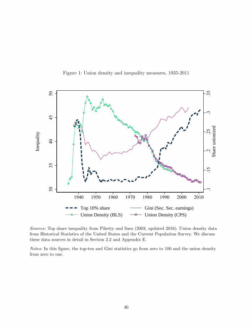
Figure 1: Union density and inequality measures, 1935-2011
.1.1
5.2
.25
.3.3
5Sh
are
unio
nize
d
3035
4045
50
Ineq
ualit
y
1940 1950 1960 1970 1980 1990 2000 2010
Top 10% share Gini (Soc. Sec. earnings)
Union Density (BLS) Union Density (CPS)
Sources: Top share inequality from Piketty and Saez (2003, updated 2016). Union density datafrom Historical Statistics of the United States and the Current Population Survey. We discussthese data sources in detail in Section 2.2 and Appendix E.
Notes: In this figure, the top-ten and Gini statistics go from zero to 100 and the union densityfrom zero to one.
46
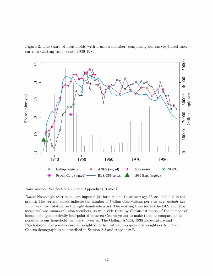
Figure 2: The share of households with a union member, comparing our survey-based mea-sures to existing time series, 1936-1985
010
000
2000
030
000
4000
050
000
Gal
lup
sam
ple
size
.1.1
5.2
.25
.3.3
5
Shar
e un
ioni
zed
1940 1950 1960 1970 1980
Gallup (wgted) ANES (wgted) Troy series NORC
Psych. Corp (wgted) BLS/CPS series 1936 Exp. (wgted)
Data sources: See Sections 2.2 and Appendices B and E.
Notes: No sample restrictions are imposed (so farmers and those over age 65 are included in thisgraph). The vertical spikes indicate the number of Gallup observations per year that include theunion variable (plotted on the right-hand-side axis). The existing time series (the BLS and Troymeasures) are counts of union members, so we divide them by Census estimates of the number ofhouseholds (geometrically interpolated between Census years) to make them as comparable aspossible to our household membership series. The Gallup, ANES, 1936 Expenditure andPsychological Corporation are all weighted, either with survey-provided weights or to matchCensus demographics as described in Section 2.2 and Appendix B.
47
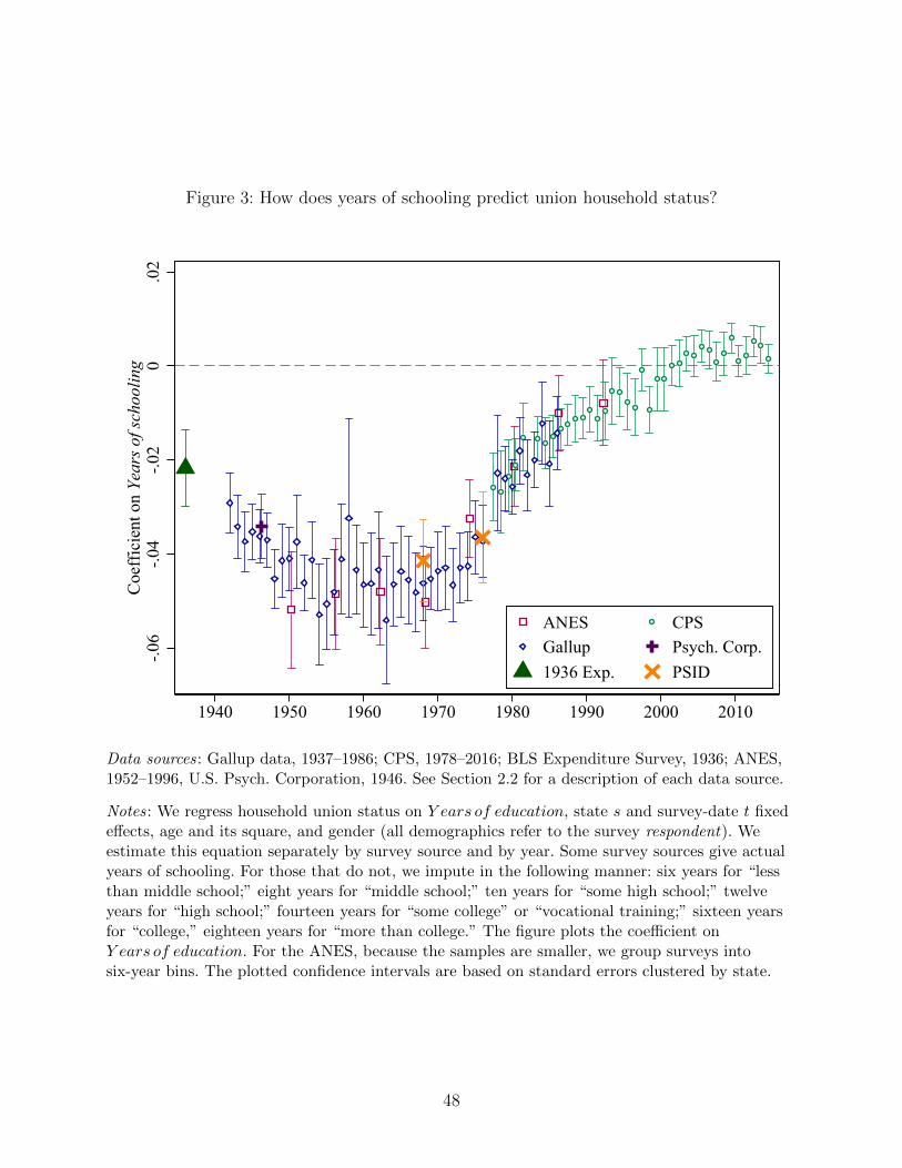
Figure 3: How does years of schooling predict union household status?
-.06
-.04
-.02
0.0
2C
oeff
icie
nt o
n Ye
ars o
f sch
oolin
g
1940 1950 1960 1970 1980 1990 2000 2010
ANES CPSGallup Psych. Corp.1936 Exp. PSID
Data sources: Gallup data, 1937–1986; CPS, 1978–2016; BLS Expenditure Survey, 1936; ANES,1952–1996, U.S. Psych. Corporation, 1946. See Section 2.2 for a description of each data source.
Notes: We regress household union status on Y ears of education, state s and survey-date t fixedeffects, age and its square, and gender (all demographics refer to the survey respondent). Weestimate this equation separately by survey source and by year. Some survey sources give actualyears of schooling. For those that do not, we impute in the following manner: six years for “lessthan middle school;” eight years for “middle school;” ten years for “some high school;” twelveyears for “high school;” fourteen years for “some college” or “vocational training;” sixteen yearsfor “college,” eighteen years for “more than college.” The figure plots the coefficient onY ears of education. For the ANES, because the samples are smaller, we group surveys intosix-year bins. The plotted confidence intervals are based on standard errors clustered by state.
48
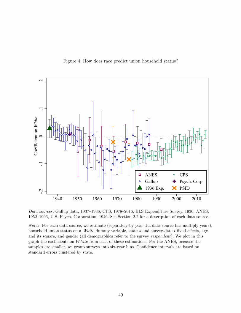
Figure 4: How does race predict union household status?
-.2-.1
0.1
.2C
oeff
icie
nt o
n W
hite
1940 1950 1960 1970 1980 1990 2000 2010
ANES CPSGallup Psych. Corp.1936 Exp. PSID
Data sources: Gallup data, 1937–1986; CPS, 1978–2016; BLS Expenditure Survey, 1936; ANES,1952–1996, U.S. Psych. Corporation, 1946. See Section 2.2 for a description of each data source.
Notes: For each data source, we estimate (separately by year if a data source has multiply years),household union status on a White dummy variable, state s and survey-date t fixed effects, ageand its square, and gender (all demographics refer to the survey respondent). We plot in thisgraph the coefficients on White from each of these estimations. For the ANES, because thesamples are smaller, we group surveys into six-year bins. Confidence intervals are based onstandard errors clustered by state.
49
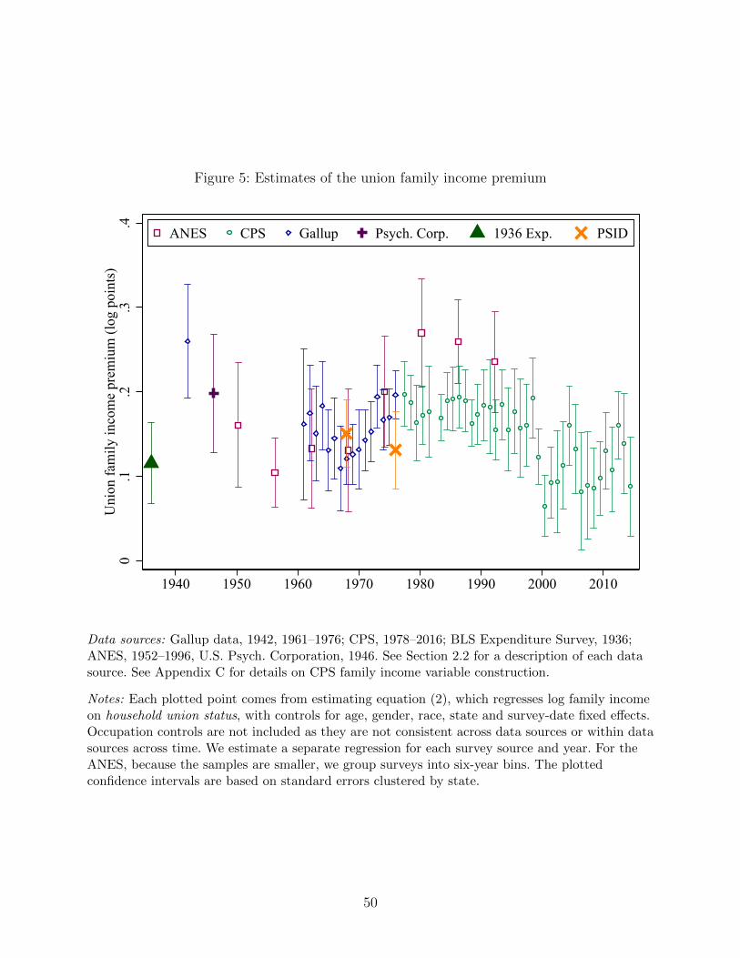
Figure 5: Estimates of the union family income premium
0.1
.2.3
.4U
nion
fam
ily in
com
e pr
emiu
m (l
og p
oint
s)
1940 1950 1960 1970 1980 1990 2000 2010
ANES CPS Gallup Psych. Corp. 1936 Exp. PSID
Data sources: Gallup data, 1942, 1961–1976; CPS, 1978–2016; BLS Expenditure Survey, 1936;ANES, 1952–1996, U.S. Psych. Corporation, 1946. See Section 2.2 for a description of each datasource. See Appendix C for details on CPS family income variable construction.
Notes: Each plotted point comes from estimating equation (2), which regresses log family incomeon household union status, with controls for age, gender, race, state and survey-date fixed effects.Occupation controls are not included as they are not consistent across data sources or within datasources across time. We estimate a separate regression for each survey source and year. For theANES, because the samples are smaller, we group surveys into six-year bins. The plottedconfidence intervals are based on standard errors clustered by state.
50
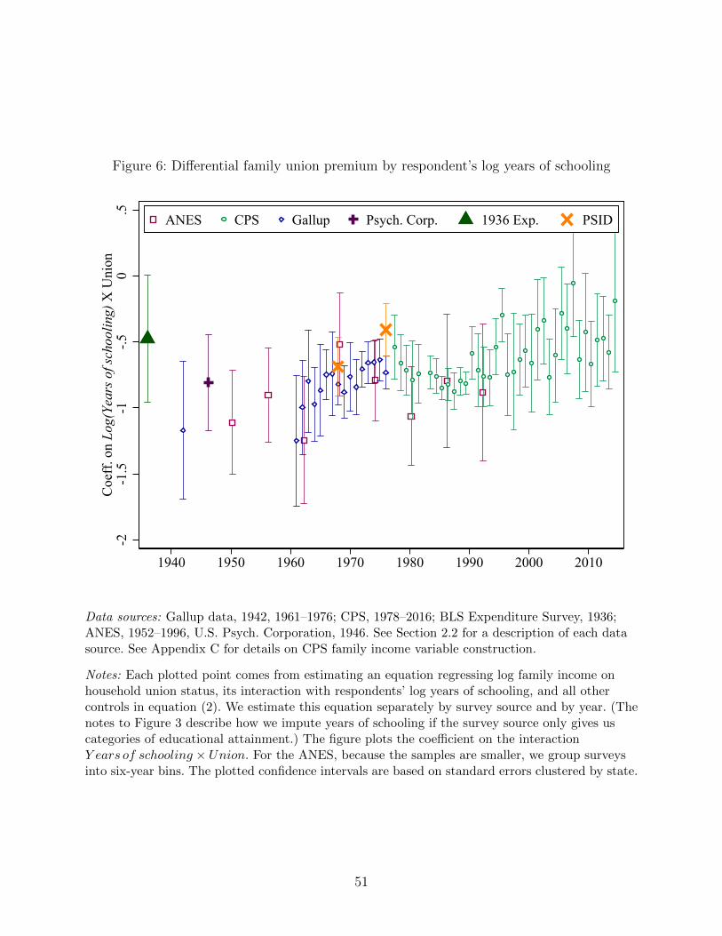
Figure 6: Differential family union premium by respondent’s log years of schooling
-2-1
.5-1
-.50
.5C
oeff
. on
Log(
Year
s of s
choo
ling)
X U
nion
1940 1950 1960 1970 1980 1990 2000 2010
ANES CPS Gallup Psych. Corp. 1936 Exp. PSID
Data sources: Gallup data, 1942, 1961–1976; CPS, 1978–2016; BLS Expenditure Survey, 1936;ANES, 1952–1996, U.S. Psych. Corporation, 1946. See Section 2.2 for a description of each datasource. See Appendix C for details on CPS family income variable construction.
Notes: Each plotted point comes from estimating an equation regressing log family income onhousehold union status, its interaction with respondents’ log years of schooling, and all othercontrols in equation (2). We estimate this equation separately by survey source and by year. (Thenotes to Figure 3 describe how we impute years of schooling if the survey source only gives uscategories of educational attainment.) The figure plots the coefficient on the interactionY ears of schooling × Union. For the ANES, because the samples are smaller, we group surveysinto six-year bins. The plotted confidence intervals are based on standard errors clustered by state.
51
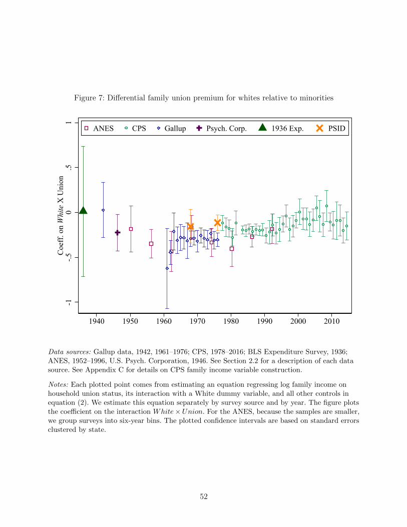
Figure 7: Differential family union premium for whites relative to minorities
-1-.5
0.5
1C
oeff
. on
Whi
te X
Uni
on
1940 1950 1960 1970 1980 1990 2000 2010
ANES CPS Gallup Psych. Corp. 1936 Exp. PSID
Data sources: Gallup data, 1942, 1961–1976; CPS, 1978–2016; BLS Expenditure Survey, 1936;ANES, 1952–1996, U.S. Psych. Corporation, 1946. See Section 2.2 for a description of each datasource. See Appendix C for details on CPS family income variable construction.
Notes: Each plotted point comes from estimating an equation regressing log family income onhousehold union status, its interaction with a White dummy variable, and all other controls inequation (2). We estimate this equation separately by survey source and by year. The figure plotsthe coefficient on the interaction White×Union. For the ANES, because the samples are smaller,we group surveys into six-year bins. The plotted confidence intervals are based on standard errorsclustered by state.
52
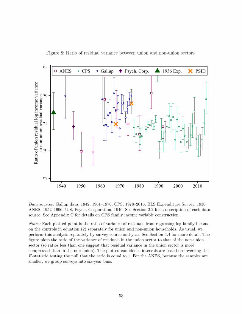
Figure 8: Ratio of residual variance between union and non-union sectors
.3.4
.5.6
.7
Rat
io o
f uni
on re
sidu
al lo
g in
com
e va
rianc
eto
non
-uni
on re
sidu
al v
aria
nce
1940 1950 1960 1970 1980 1990 2000 2010
ANES CPS Gallup Psych. Corp. 1936 Exp. PSID
Data sources: Gallup data, 1942, 1961–1976; CPS, 1978–2016; BLS Expenditure Survey, 1936;ANES, 1952–1996, U.S. Psych. Corporation, 1946. See Section 2.2 for a description of each datasource. See Appendix C for details on CPS family income variable construction.
Notes: Each plotted point is the ratio of variance of residuals from regressing log family incomeon the controls in equation (2) separately for union and non-union households. As usual, weperform this analysis separately by survey source and year. See Section 4.4 for more detail. Thefigure plots the ratio of the variance of residuals in the union sector to that of the non-unionsector (so ratios less than one suggest that residual variance in the union sector is morecompressed than in the non-union). The plotted confidence intervals are based on inverting theF -statistic testing the null that the ratio is equal to 1. For the ANES, because the samples aresmaller, we group surveys into six-year bins.
53
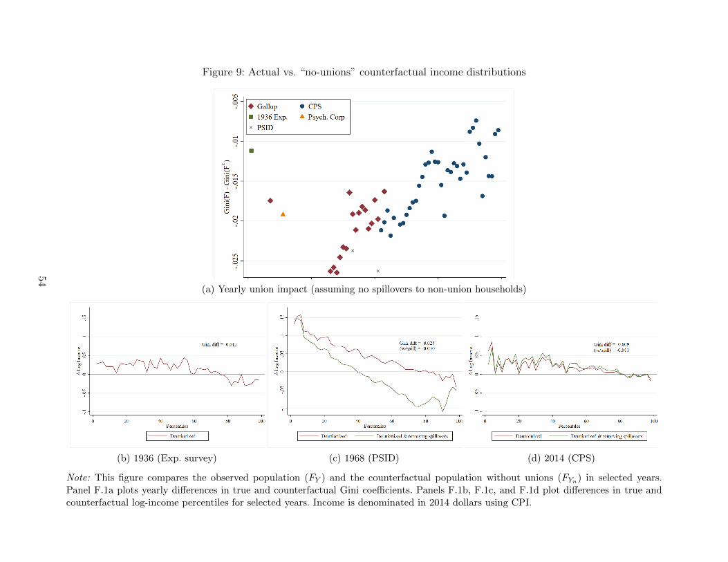
Figure 9: Actual vs. “no-unions” counterfactual income distributions
(a) Yearly union impact (assuming no spillovers to non-union households)
(b) 1936 (Exp. survey) (c) 1968 (PSID) (d) 2014 (CPS)
Note: This figure compares the observed population (FY ) and the counterfactual population without unions (FYn) in selected years.Panel F.1a plots yearly differences in true and counterfactual Gini coefficients. Panels F.1b, F.1c, and F.1d plot differences in true andcounterfactual log-income percentiles for selected years. Income is denominated in 2014 dollars using CPI.
54
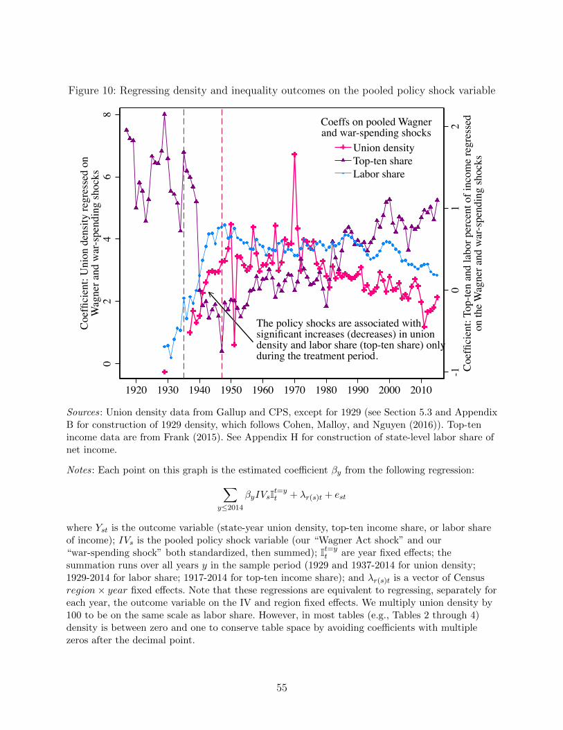
Figure 10: Regressing density and inequality outcomes on the pooled policy shock variable
The policy shocks are associated withsignificant increases (decreases) in uniondensity and labor share (top-ten share) onlyduring the treatment period.
-10
12
Coe
ffici
ent:
Top-
ten
and
labo
r per
cent
of i
ncom
e re
gres
sed
on th
e W
agne
r and
war
-spe
ndin
g sh
ocks
02
46
8
Coe
ffici
ent:
Uni
on d
ensi
ty re
gres
sed
onW
agne
r and
war
-spe
ndin
g sh
ocks
1920 1930 1940 1950 1960 1970 1980 1990 2000 2010
Union densityTop-ten shareLabor share
Coeffs on pooled Wagnerand war-spending shocks
Sources: Union density data from Gallup and CPS, except for 1929 (see Section 5.3 and AppendixB for construction of 1929 density, which follows Cohen, Malloy, and Nguyen (2016)). Top-tenincome data are from Frank (2015). See Appendix H for construction of state-level labor share ofnet income.
Notes: Each point on this graph is the estimated coefficient βy from the following regression:∑y≤2014
βyIVsIt=yt + λr(s)t + est
where Yst is the outcome variable (state-year union density, top-ten income share, or labor shareof income); IVs is the pooled policy shock variable (our “Wagner Act shock” and our“war-spending shock” both standardized, then summed); It=y
t are year fixed effects; thesummation runs over all years y in the sample period (1929 and 1937-2014 for union density;1929-2014 for labor share; 1917-2014 for top-ten income share); and λr(s)t is a vector of Censusregion× year fixed effects. Note that these regressions are equivalent to regressing, separately foreach year, the outcome variable on the IV and region fixed effects. We multiply union density by100 to be on the same scale as labor share. However, in most tables (e.g., Tables 2 through 4)density is between zero and one to conserve table space by avoiding coefficients with multiplezeros after the decimal point.
55
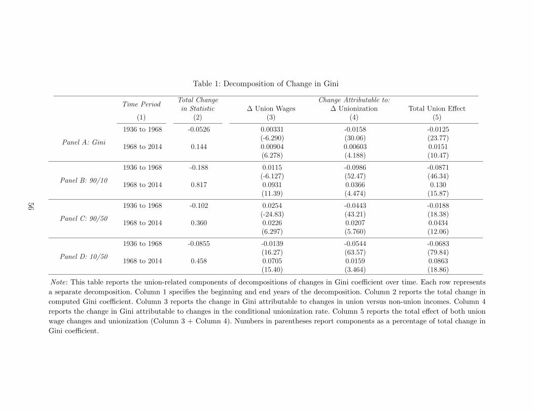
Table 1: Decomposition of Change in Gini
Time PeriodTotal Change Change Attributable to:
in Statistic ∆ Union Wages ∆ Unionization Total Union Effect(1) (2) (3) (4) (5)
Panel A: Gini
1936 to 1968 -0.0526 0.00331 -0.0158 -0.0125(-6.290) (30.06) (23.77)
1968 to 2014 0.144 0.00904 0.00603 0.0151(6.278) (4.188) (10.47)
Panel B: 90/10
1936 to 1968 -0.188 0.0115 -0.0986 -0.0871(-6.127) (52.47) (46.34)
1968 to 2014 0.817 0.0931 0.0366 0.130(11.39) (4.474) (15.87)
Panel C: 90/50
1936 to 1968 -0.102 0.0254 -0.0443 -0.0188(-24.83) (43.21) (18.38)
1968 to 2014 0.360 0.0226 0.0207 0.0434(6.297) (5.760) (12.06)
Panel D: 10/50
1936 to 1968 -0.0855 -0.0139 -0.0544 -0.0683(16.27) (63.57) (79.84)
1968 to 2014 0.458 0.0705 0.0159 0.0863(15.40) (3.464) (18.86)
Note: This table reports the union-related components of decompositions of changes in Gini coefficient over time. Each row represents
a separate decomposition. Column 1 specifies the beginning and end years of the decomposition. Column 2 reports the total change in
computed Gini coefficient. Column 3 reports the change in Gini attributable to changes in union versus non-union incomes. Column 4
reports the change in Gini attributable to changes in the conditional unionization rate. Column 5 reports the total effect of both union
wage changes and unionization (Column 3 + Column 4). Numbers in parentheses report components as a percentage of total change in
Gini coefficient.
56
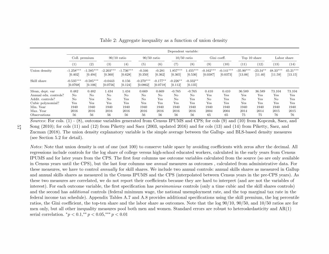
Table 2: Aggregate inequality as a function of union density
Dependent variable:
Coll. premium 90/10 ratio 90/50 ratio 10/50 ratio Gini coeff. Top 10 share Labor share
(1) (2) (3) (4) (5) (6) (7) (8) (9) (10) (11) (12) (13) (14)
Union density -1.258∗∗∗ -1.585∗∗∗ -2.203∗∗∗ -1.736∗∗∗ -0.346 -0.281 1.857∗∗∗ 1.455∗∗∗ -0.162∗∗∗ -0.141∗∗∗ -35.90∗∗∗ -23.34∗∗ 48.33∗∗∗ 45.21∗∗∗
[0.402] [0.494] [0.360] [0.628] [0.350] [0.362] [0.365] [0.536] [0.0387] [0.0373] [13.06] [11.40] [11.59] [13.15]
Skill share -0.535∗∗∗ -0.585∗∗∗ -0.0443 0.156 -0.270∗∗∗ -0.177∗∗ -0.226∗∗ -0.332∗∗
[0.0768] [0.106] [0.0756] [0.124] [0.0862] [0.0718] [0.112] [0.135]
Mean, dept. var 0.482 0.482 1.434 1.434 0.669 0.669 -0.765 -0.765 0.410 0.410 36.589 36.589 73.104 73.104Annual edu. controls? No No No No No No No No Yes Yes Yes Yes Yes YesAddit. controls? No Yes No Yes No Yes No Yes No Yes No Yes No YesCubic polynomial? Yes Yes Yes Yes Yes Yes Yes Yes Yes Yes Yes Yes Yes YesMin. Year 1940 1940 1940 1940 1940 1940 1940 1940 1940 1940 1940 1940 1940 1940Max. Year 2016 2016 2016 2016 2016 2016 2016 2016 2004 2004 2014 2014 2015 2015Observations 56 56 56 56 56 56 56 56 65 65 75 75 76 76
Sources: For cols. (1) - (8), outcome variables generated from Census IPUMS and CPS; for cols (9) and (10) from Kopczuk, Saez, andSong (2010); for cols (11) and (12) from Piketty and Saez (2003, updated 2016) and for cols (13) and (14) from Piketty, Saez, andZucman (2018). The union density explanatory variable is the simple average between the Gallup- and BLS-based density measures(see Section 5.2 for detail).
Notes: Note that union density is out of one (not 100) to conserve table space by avoiding coefficients with zeros after the decimal. Allregressions include controls for the log share of college versus high-school educated workers, calculated in the early years from CensusIPUMS and for later years from the CPS. The first four columns use outcome variables calculated from the source (so are only availablein Census years until the CPS), but the last four columns use annual measures as outcomes , calculated from administrative data. Forthese measures, we have to control annually for skill shares. We include two annual controls: annual skills shares as measured in Gallupand annual skills shares as measured in the Census IPUMS and the CPS (interpolated between Census years in the pre-CPS years). Asthese two measures are correlated, we do not report their coefficients because they are hard to interpret (and are not the variables ofinterest). For each outcome variable, the first specification has parsimonious controls (only a time cubic and the skill shares controls)and the second has additional controls (federal minimum wage, the national unemployment rate, and the top marginal tax rate in thefederal income tax schedule). Appendix Tables A.7 and A.8 provides additional specifications using the skill premium, the log percentileratios, the Gini coefficient, the top-ten share and the labor share as outcomes. Note that the log 90/10, 90/50, and 10/50 ratios are formen only, but all other inequality measures pool both men and women. Standard errors are robust to heteroskedasticity and AR(1)serial correlation. ∗p < 0.1,∗∗ p < 0.05,∗∗∗ p < 0.01
57
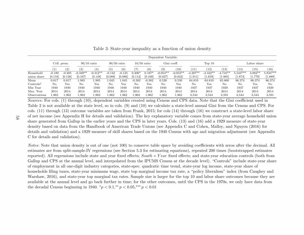
Table 3: State-year inequality as a function of union density
Dependent Variable:
Coll. prem. 90/10 ratio 90/50 ratio 10/50 ratio Gini coeff. Top 10 Labor share
(1) (2) (3) (4) (5) (6) (7) (8) (9) (10) (11) (12) (13) (14) (15) (16)Household -0.180 -0.205 -0.349** -0.312** -0.142 -0.125 0.206* 0.187* -0.054** -0.053** -4.207** -3.422** -4.716** 5.543*** 3.882** 5.834***union share [0.134] [0.126] [0.167] [0.148] [0.088] [0.086] [0.112] [0.100] [0.027] [0.022] [1.911] [1.659] [1.985] [1.874] [1.770] [1.889]Mean 0.817 0.817 1.985 1.985 1.045 1.045 -0.382 -0.382 0.530 0.530 64.810 64.810 65.860 86.374 86.374 86.374Controls? No Yes No Yes No Yes No Yes No Yes No Yes No No Yes NoMin Year 1940 1940 1940 1940 1940 1940 1940 1940 1940 1940 1937 1937 1929 1937 1937 1929Max. Year 2014 2014 2014 2014 2014 2014 2014 2014 2014 2014 2014 2014 2014 2014 2014 2014Observations 1,962 1,962 1,962 1,962 1,962 1,962 1,962 1,962 1,962 1,962 3,544 3,544 3,591 3,544 3,544 3,591
Sources: For cols. (1) through (10), dependent variables created using Census and CPS data. Note that the Gini coefficient used inTable 2 is not available at the state level, so in cols. (9) and (10) we calculate a state-level annual Gini from the Census and CPS. Forcols. (11) through (13) outcome variables are taken from Frank, 2015; for cols (14) through (16) we construct a state-level labor shareof net income (see Appendix H for details and validation). The key explanatory variable comes from state-year average household unionshare generated from Gallup in the earlier years and the CPS in later years. Cols. (13) and (16) add a 1929 measure of state-yeardensity based on data from the Handbook of American Trade Unions (see Appendix C and Cohen, Malloy, and Nguyen (2016) fordetails and validation) and a 1929 measure of skill shares based on the 1940 Census with age and migration adjustment (see AppendixC for details and validation).
Notes: Note that union density is out of one (not 100) to conserve table space by avoiding coefficients with zeros after the decimal. Allestimates are from split-sample-IV regressions (see Section 5.3 for estimating equations), repeated 200 times (bootstrapped estimatesreported). All regressions include state and year fixed effects; South× Y ear fixed effects; and state-year education controls (both fromGallup and CPS at the annual level, and interpolated from the IPUMS Census at the decade level). “Controls” include state-year shareof employment in all one-digit industry categories, state-spec. quadratic time trend, state-year log income, state-year share ofhouseholds filing taxes, state-year minimum wage, state top marginal income tax rate, a “policy liberalism” index (from Caughey andWarshaw, 2016), and state-year top marginal tax rates. Sample size is larger for the top 10 and labor share outcomes because they areavailable at the annual level and go back further in time; for the other outcomes, until the CPS in the 1970s, we only have data fromthe decadal Census beginning in 1940. ∗p < 0.1,∗∗ p < 0.05,∗∗∗ p < 0.01
58
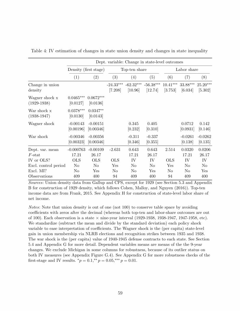
Table 4: IV estimation of changes in state union density and changes in state inequality
Dept. variable: Change in state-level outcomes
Density (first stage) Top-ten share Labor share
(1) (2) (3) (4) (5) (6) (7) (8)
Change in union -24.33∗∗∗ -62.32∗∗∗ -56.38∗∗∗ 10.41∗∗∗ 33.88∗∗∗ 25.20∗∗∗
density [7.208] [10.96] [12.74] [3.753] [6.034] [5.302]
Wagner shock x 0.0465∗∗∗ 0.0672∗∗∗
(1929-1938) [0.0127] [0.0136]
War shock x 0.0378∗∗∗ 0.0347∗∗
(1938-1947) [0.0130] [0.0143]
Wagner shock -0.00143 -0.00151 0.345 0.405 0.0712 0.142[0.00196] [0.00346] [0.232] [0.310] [0.0931] [0.146]
War shock -0.00346 -0.00356 -0.311 -0.337 -0.0261 -0.0262[0.00323] [0.00346] [0.346] [0.355] [0.138] [0.135]
Dept. var. mean -0.000763 -0.00109 -2.631 0.643 0.643 2.514 0.0320 0.0206F -stat 17.21 26.17 17.21 26.17 17.21 26.17IV or OLS? OLS OLS OLS IV IV OLS IV IVExcl. control period No No Yes No No Yes No NoExcl. MI? No Yes No No Yes No No YesObservations 409 400 94 409 400 94 409 400
Sources: Union density data from Gallup and CPS, except for 1929 (see Section 5.3 and AppendixB for construction of 1929 density, which follows Cohen, Malloy, and Nguyen (2016)). Top-tenincome data are from Frank, 2015. See Appendix H for construction of state-level labor share ofnet income.
Notes: Note that union density is out of one (not 100) to conserve table space by avoidingcoefficients with zeros after the decimal (whereas both top-ten and labor-share outcomes are outof 100). Each observation is a state × nine-year interval (1929-1938, 1938-1947, 1947-1958, etc).We standardize (subtract the mean and divide by the standard deviation) each policy shockvariable to ease interpretation of coefficients. The Wagner shock is the (per capita) state-levelgain in union membership via NLRB elections and recognition strikes between 1935 and 1938.The war shock is the (per capita) value of 1940-1945 defense contracts to each state. See Section5.4 and Appendix G for more detail. Dependent variables means are means of the the 9-yearchanges. We exclude Michigan in some columns for robustness, because of its outlier status onboth IV measures (see Appendix Figure G.4). See Appendix G for more robustness checks of thefirst-stage and IV results. ∗p = 0.1,∗∗ p = 0.05,∗∗∗ p = 0.01.
59
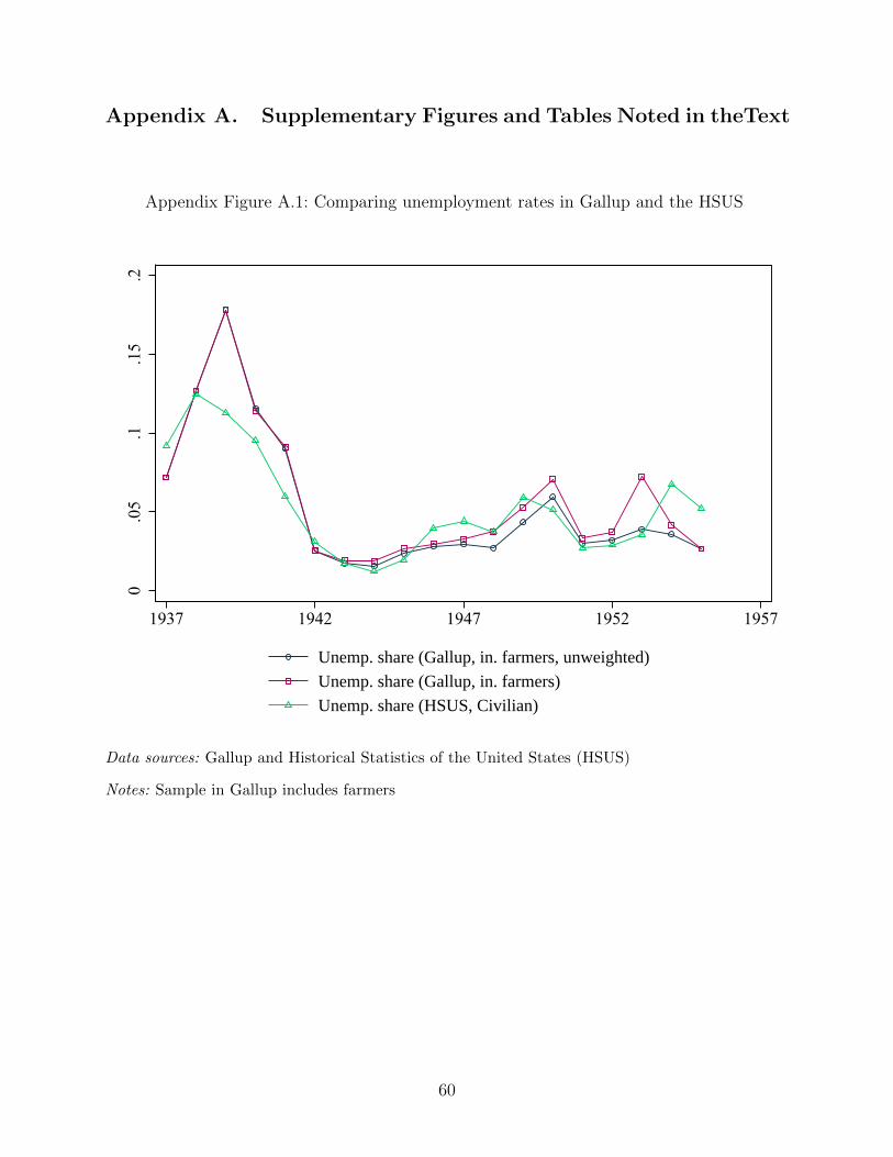
Appendix A. Supplementary Figures and Tables Noted in theText
Appendix Figure A.1: Comparing unemployment rates in Gallup and the HSUS
0.0
5.1
.15
.2
1937 1942 1947 1952 1957
Unemp. share (Gallup, in. farmers, unweighted)
Unemp. share (Gallup, in. farmers)
Unemp. share (HSUS, Civilian)
Data sources: Gallup and Historical Statistics of the United States (HSUS)
Notes: Sample in Gallup includes farmers
60
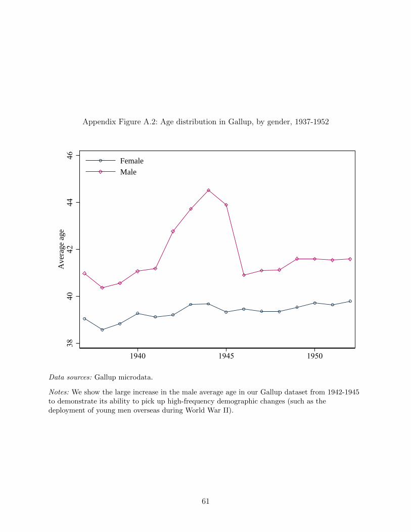
Appendix Figure A.2: Age distribution in Gallup, by gender, 1937-1952
3840
4244
46A
vera
ge a
ge
1940 1945 1950
Female
Male
Data sources: Gallup microdata.
Notes: We show the large increase in the male average age in our Gallup dataset from 1942-1945to demonstrate its ability to pick up high-frequency demographic changes (such as thedeployment of young men overseas during World War II).
61
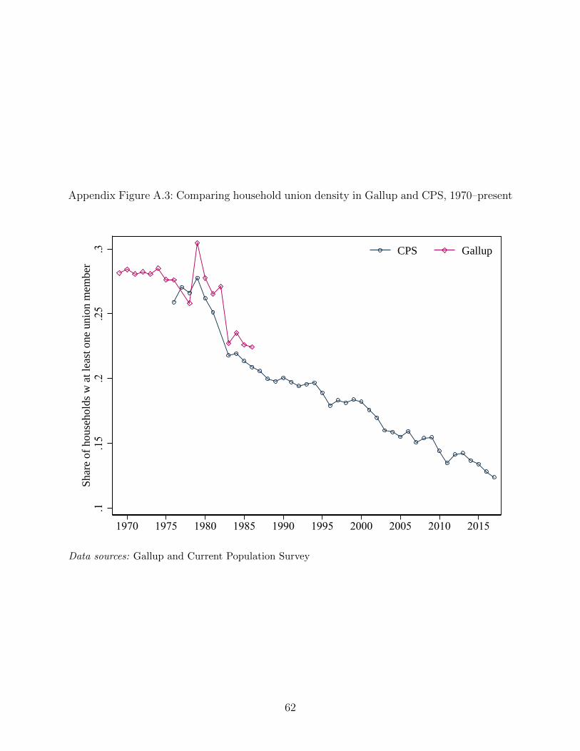
Appendix Figure A.3: Comparing household union density in Gallup and CPS, 1970–present
.1.1
5.2
.25
.3Sh
are
of h
ouse
hold
s w
at l
east
one
uni
on m
embe
r
1970 1975 1980 1985 1990 1995 2000 2005 2010 2015
CPS Gallup
Data sources: Gallup and Current Population Survey
62
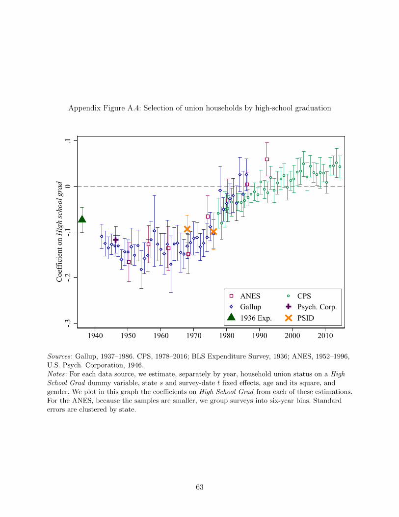
Appendix Figure A.4: Selection of union households by high-school graduation
-.3-.2
-.10
.1C
oeff
icie
nt o
n H
igh
scho
ol g
rad
1940 1950 1960 1970 1980 1990 2000 2010
ANES CPSGallup Psych. Corp.1936 Exp. PSID
Sources: Gallup, 1937–1986. CPS, 1978–2016; BLS Expenditure Survey, 1936; ANES, 1952–1996,U.S. Psych. Corporation, 1946.Notes: For each data source, we estimate, separately by year, household union status on a HighSchool Grad dummy variable, state s and survey-date t fixed effects, age and its square, andgender. We plot in this graph the coefficients on High School Grad from each of these estimations.For the ANES, because the samples are smaller, we group surveys into six-year bins. Standarderrors are clustered by state.
63
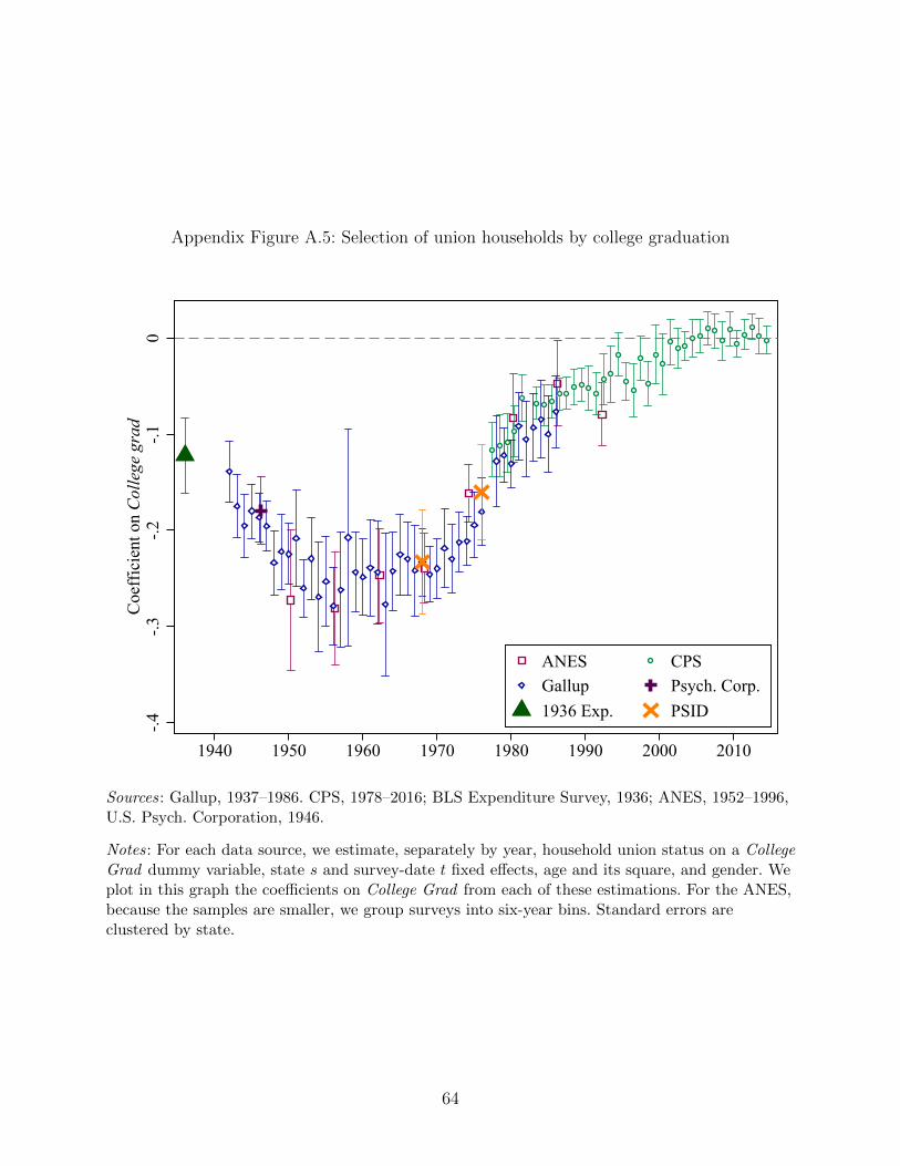
Appendix Figure A.5: Selection of union households by college graduation
-.4-.3
-.2-.1
0C
oeff
icie
nt o
n C
olle
ge g
rad
1940 1950 1960 1970 1980 1990 2000 2010
ANES CPSGallup Psych. Corp.1936 Exp. PSID
Sources: Gallup, 1937–1986. CPS, 1978–2016; BLS Expenditure Survey, 1936; ANES, 1952–1996,U.S. Psych. Corporation, 1946.
Notes: For each data source, we estimate, separately by year, household union status on a CollegeGrad dummy variable, state s and survey-date t fixed effects, age and its square, and gender. Weplot in this graph the coefficients on College Grad from each of these estimations. For the ANES,because the samples are smaller, we group surveys into six-year bins. Standard errors areclustered by state.
64
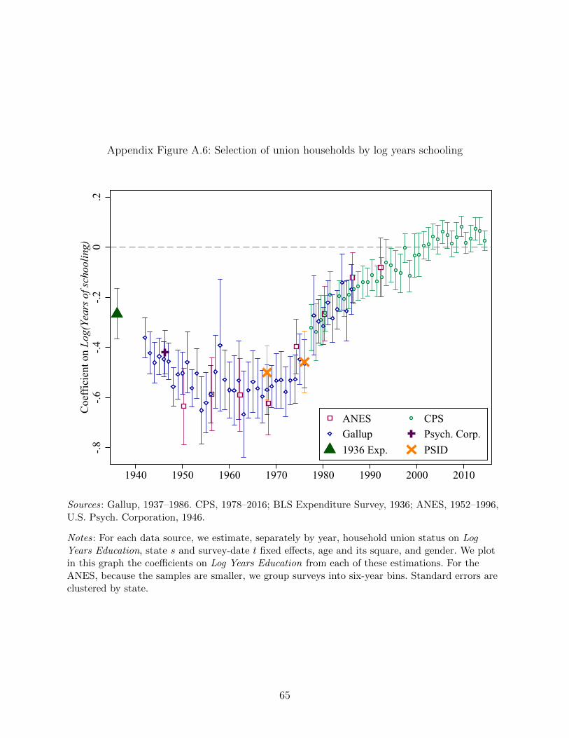
Appendix Figure A.6: Selection of union households by log years schooling
-.8-.6
-.4-.2
0.2
Coe
ffic
ient
on
Log(
Year
s of s
choo
ling)
1940 1950 1960 1970 1980 1990 2000 2010
ANES CPSGallup Psych. Corp.1936 Exp. PSID
Sources: Gallup, 1937–1986. CPS, 1978–2016; BLS Expenditure Survey, 1936; ANES, 1952–1996,U.S. Psych. Corporation, 1946.
Notes: For each data source, we estimate, separately by year, household union status on LogYears Education, state s and survey-date t fixed effects, age and its square, and gender. We plotin this graph the coefficients on Log Years Education from each of these estimations. For theANES, because the samples are smaller, we group surveys into six-year bins. Standard errors areclustered by state.
65
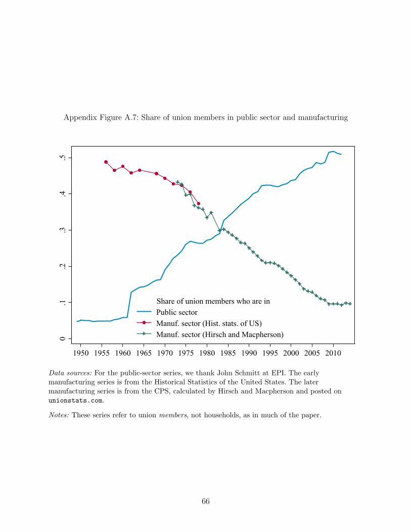
Appendix Figure A.7: Share of union members in public sector and manufacturing
0.1
.2.3
.4.5
1950 1955 1960 1965 1970 1975 1980 1985 1990 1995 2000 2005 2010
Public sectorManuf. sector (Hist. stats. of US)Manuf. sector (Hirsch and Macpherson)
Share of union members who are in
Data sources: For the public-sector series, we thank John Schmitt at EPI. The earlymanufacturing series is from the Historical Statistics of the United States. The latermanufacturing series is from the CPS, calculated by Hirsch and Macpherson and posted onunionstats.com.
Notes: These series refer to union members, not households, as in much of the paper.
66
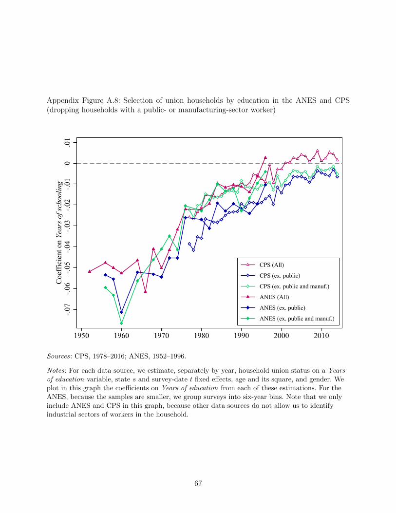
Appendix Figure A.8: Selection of union households by education in the ANES and CPS(dropping households with a public- or manufacturing-sector worker)
-.07
-.06
-.05
-.04
-.03
-.02
-.01
0.0
1C
oeff
icie
nt o
n Ye
ars o
f sch
oolin
g
1950 1960 1970 1980 1990 2000 2010
CPS (All)
CPS (ex. public)
CPS (ex. public and manuf.)
ANES (All)
ANES (ex. public)
ANES (ex. public and manuf.)
Sources: CPS, 1978–2016; ANES, 1952–1996.
Notes: For each data source, we estimate, separately by year, household union status on a Yearsof education variable, state s and survey-date t fixed effects, age and its square, and gender. Weplot in this graph the coefficients on Years of education from each of these estimations. For theANES, because the samples are smaller, we group surveys into six-year bins. Note that we onlyinclude ANES and CPS in this graph, because other data sources do not allow us to identifyindustrial sectors of workers in the household.
67
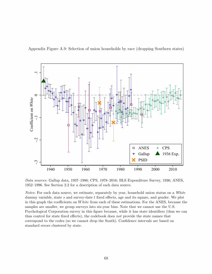
Appendix Figure A.9: Selection of union households by race (dropping Southern states)
-.3-.2
-.10
.1C
oeff
icie
nt o
n W
hite
1940 1950 1960 1970 1980 1990 2000 2010
ANES CPSGallup 1936 Exp.PSID
Data sources: Gallup data, 1937–1986; CPS, 1978–2016; BLS Expenditure Survey, 1936; ANES,1952–1996. See Section 2.2 for a description of each data source.
Notes: For each data source, we estimate, separately by year, household union status on a Whitedummy variable, state s and survey-date t fixed effects, age and its square, and gender. We plotin this graph the coefficients on White from each of these estimations. For the ANES, because thesamples are smaller, we group surveys into six-year bins. Note that we cannot use the U.S.Psychological Corporation survey in this figure because, while it has state identifiers (thus we canthus control for state fixed effects), the codebook does not provide the state names thatcorrespond to the codes (so we cannot drop the South). Confidence intervals are based onstandard errors clustered by state.
68
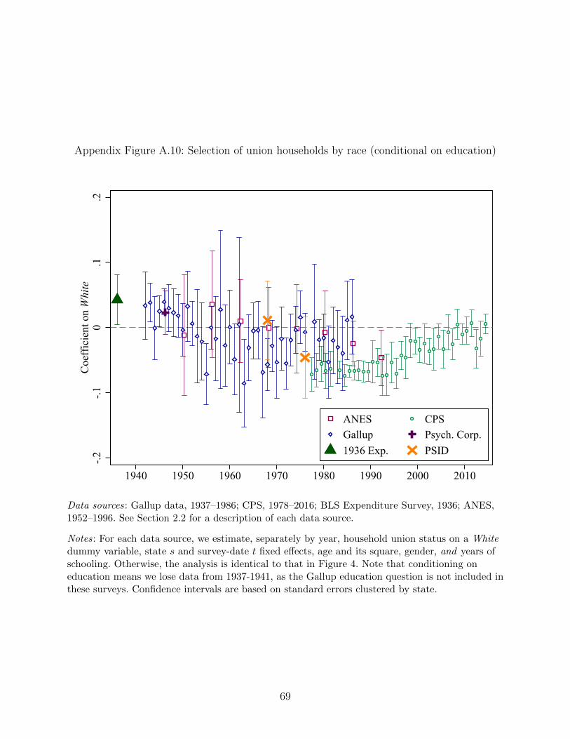
Appendix Figure A.10: Selection of union households by race (conditional on education)
-.2-.1
0.1
.2C
oeff
icie
nt o
n W
hite
1940 1950 1960 1970 1980 1990 2000 2010
ANES CPSGallup Psych. Corp.1936 Exp. PSID
Data sources: Gallup data, 1937–1986; CPS, 1978–2016; BLS Expenditure Survey, 1936; ANES,1952–1996. See Section 2.2 for a description of each data source.
Notes: For each data source, we estimate, separately by year, household union status on a Whitedummy variable, state s and survey-date t fixed effects, age and its square, gender, and years ofschooling. Otherwise, the analysis is identical to that in Figure 4. Note that conditioning oneducation means we lose data from 1937-1941, as the Gallup education question is not included inthese surveys. Confidence intervals are based on standard errors clustered by state.
69
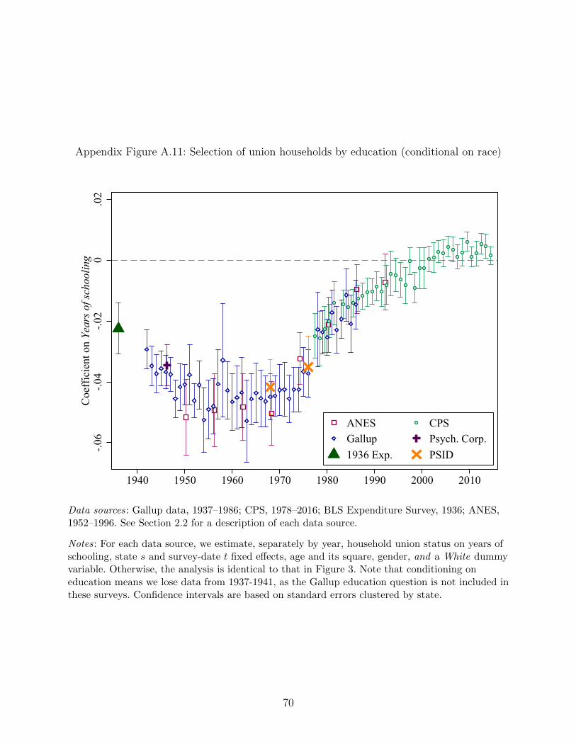
Appendix Figure A.11: Selection of union households by education (conditional on race)
-.06
-.04
-.02
0.0
2C
oeff
icie
nt o
n Ye
ars o
f sch
oolin
g
1940 1950 1960 1970 1980 1990 2000 2010
ANES CPSGallup Psych. Corp.1936 Exp. PSID
Data sources: Gallup data, 1937–1986; CPS, 1978–2016; BLS Expenditure Survey, 1936; ANES,1952–1996. See Section 2.2 for a description of each data source.
Notes: For each data source, we estimate, separately by year, household union status on years ofschooling, state s and survey-date t fixed effects, age and its square, gender, and a White dummyvariable. Otherwise, the analysis is identical to that in Figure 3. Note that conditioning oneducation means we lose data from 1937-1941, as the Gallup education question is not included inthese surveys. Confidence intervals are based on standard errors clustered by state.
70
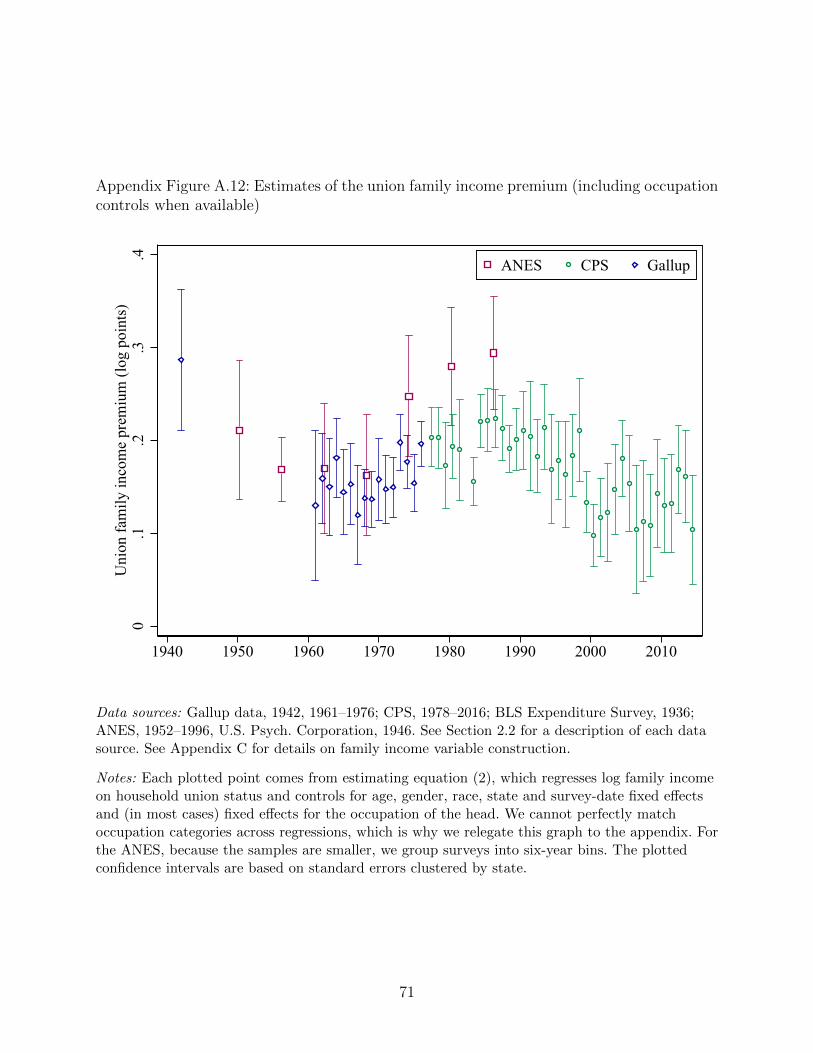
Appendix Figure A.12: Estimates of the union family income premium (including occupationcontrols when available)
0.1
.2.3
.4U
nion
fam
ily in
com
e pr
emiu
m (l
og p
oint
s)
1940 1950 1960 1970 1980 1990 2000 2010
ANES CPS Gallup
Data sources: Gallup data, 1942, 1961–1976; CPS, 1978–2016; BLS Expenditure Survey, 1936;ANES, 1952–1996, U.S. Psych. Corporation, 1946. See Section 2.2 for a description of each datasource. See Appendix C for details on family income variable construction.
Notes: Each plotted point comes from estimating equation (2), which regresses log family incomeon household union status and controls for age, gender, race, state and survey-date fixed effectsand (in most cases) fixed effects for the occupation of the head. We cannot perfectly matchoccupation categories across regressions, which is why we relegate this graph to the appendix. Forthe ANES, because the samples are smaller, we group surveys into six-year bins. The plottedconfidence intervals are based on standard errors clustered by state.
71
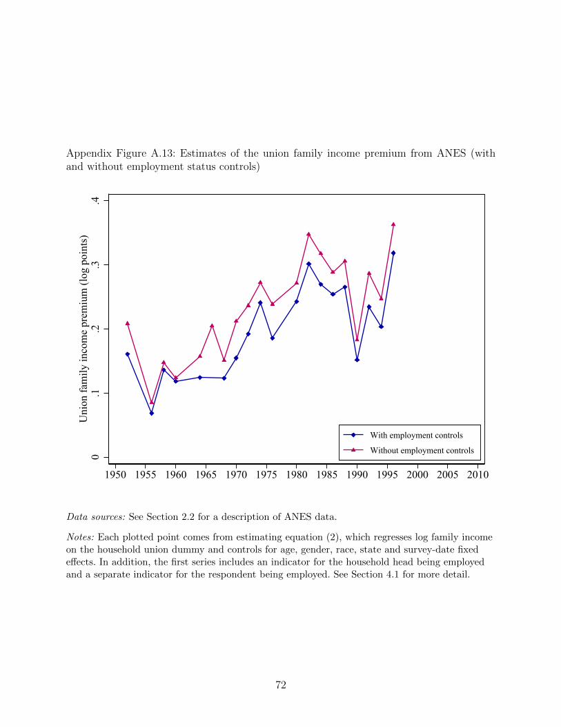
Appendix Figure A.13: Estimates of the union family income premium from ANES (withand without employment status controls)
0.1
.2.3
.4U
nion
fam
ily in
com
e pr
emiu
m (l
og p
oint
s)
1950 1955 1960 1965 1970 1975 1980 1985 1990 1995 2000 2005 2010
With employment controls
Without employment controls
Data sources: See Section 2.2 for a description of ANES data.
Notes: Each plotted point comes from estimating equation (2), which regresses log family incomeon the household union dummy and controls for age, gender, race, state and survey-date fixedeffects. In addition, the first series includes an indicator for the household head being employedand a separate indicator for the respondent being employed. See Section 4.1 for more detail.
72
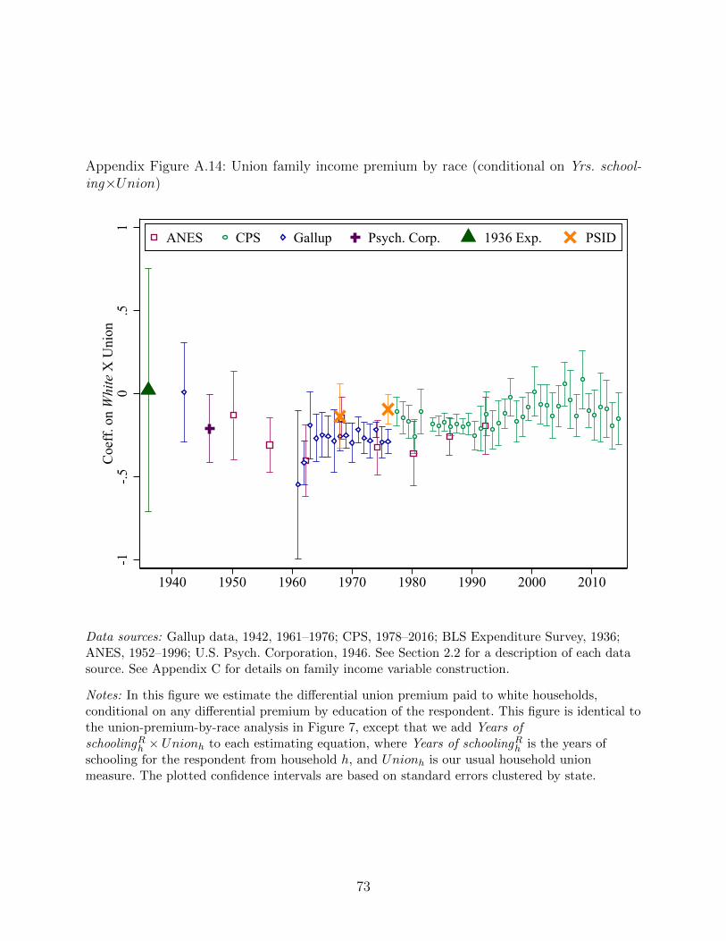
Appendix Figure A.14: Union family income premium by race (conditional on Yrs. school-ing×Union)
-1-.5
0.5
1C
oeff
. on
Whi
te X
Uni
on
1940 1950 1960 1970 1980 1990 2000 2010
ANES CPS Gallup Psych. Corp. 1936 Exp. PSID
Data sources: Gallup data, 1942, 1961–1976; CPS, 1978–2016; BLS Expenditure Survey, 1936;ANES, 1952–1996; U.S. Psych. Corporation, 1946. See Section 2.2 for a description of each datasource. See Appendix C for details on family income variable construction.
Notes: In this figure we estimate the differential union premium paid to white households,conditional on any differential premium by education of the respondent. This figure is identical tothe union-premium-by-race analysis in Figure 7, except that we add Years ofschoolingR
h × Unionh to each estimating equation, where Years of schoolingRh is the years of
schooling for the respondent from household h, and Unionh is our usual household unionmeasure. The plotted confidence intervals are based on standard errors clustered by state.
73
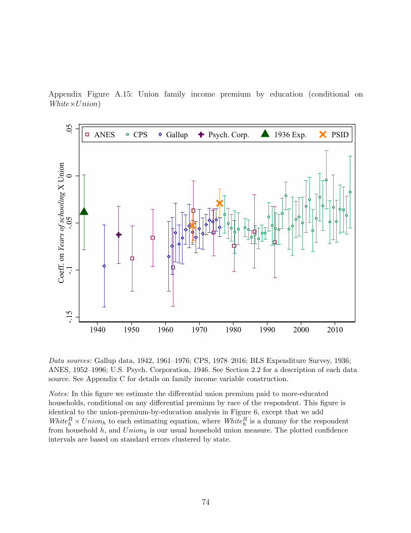
Appendix Figure A.15: Union family income premium by education (conditional onWhite×Union)
-.15
-.1-.0
50
.05
Coe
ff. o
n Ye
ars o
f sch
oolin
g X
Uni
on
1940 1950 1960 1970 1980 1990 2000 2010
ANES CPS Gallup Psych. Corp. 1936 Exp. PSID
Data sources: Gallup data, 1942, 1961–1976; CPS, 1978–2016; BLS Expenditure Survey, 1936;ANES, 1952–1996; U.S. Psych. Corporation, 1946. See Section 2.2 for a description of each datasource. See Appendix C for details on family income variable construction.
Notes: In this figure we estimate the differential union premium paid to more-educatedhouseholds, conditional on any differential premium by race of the respondent. This figure isidentical to the union-premium-by-education analysis in Figure 6, except that we addWhiteR
h × Unionh to each estimating equation, where WhiteRh is a dummy for the respondent
from household h, and Unionh is our usual household union measure. The plotted confidenceintervals are based on standard errors clustered by state.
74
Appendix Table A.1: Estimating family union income premium and reporting coefficients onadditional covariates, by data source and time period
Dep’t var: Logged family income
(1) (2) (3) (4) (5) (6)
Union household 0.116∗∗∗ 0.259∗∗∗ 0.196∗∗∗ 0.160∗∗∗ 0.129∗∗∗ 0.246∗∗∗
[0.0239] [0.0332] [0.0337] [0.0151] [0.0212] [0.0179]
Years of education 0.175∗∗∗ 0.146∗∗∗ 0.115∗∗∗ 0.122∗∗∗ 0.122∗∗∗
[0.00672] [0.00681] [0.00371] [0.00624] [0.00653]
Years of educ., 0.125∗∗∗
household head [0.00770]
White dummy 0.880∗∗∗ 0.461∗∗∗ 0.410∗∗∗ 0.443∗∗∗ 0.517∗∗∗ 0.326∗∗∗
[0.0477] [0.0883] [0.0317] [0.0299] [0.0656] [0.0408]
Female -0.109∗∗∗ -0.203∗∗∗ -0.0903∗∗∗ -0.121∗∗∗ -0.126∗∗∗
[0.0312] [0.0195] [0.00386] [0.0200] [0.0154]
Household head is 0.0955∗∗∗
female [0.0261]
Age 0.0749∗∗∗ 0.0521∗∗∗ 0.0682∗∗∗ 0.0698∗∗∗ 0.0640∗∗∗ 0.0740∗∗∗
[0.00824] [0.0134] [0.00515] [0.00227] [0.00407] [0.00407]
Age squared, divided -0.842∗∗∗ -0.614∗∗∗ -0.884∗∗∗ -0.817∗∗∗ -0.744∗∗∗ -0.753∗∗∗
by 1000 [0.0999] [0.165] [0.0625] [0.0261] [0.0518] [0.0454]
Data source Exp. survey Gallup U.S. Psych. Gallup ANES ANESYear(s) in sample 1936 1942-1942 1946 1961-1975 1952-1970 1972-1990Observations 4976 2538 5415 171973 9212 12925
Data sources: Gallup data, 1942, 1961–1975; CPS, 1978–2016; BLS Expenditure Survey, 1936;ANES, 1952–1996, U.S. Psych. Corporation, 1946. See Section 2.2 for a description of each datasource. See Appendix C for details on family income variable construction.
Notes: All regressions include state fixed effects and survey date fixed effects. We control fornumber of employed individuals in the household, except in the Gallup and U.S. Psych. datawhere this control is not available. Otherwise, all other samples include ages 21–64. Since the goalof the table is to show the coefficients from regressions run on the datasets least likely to befamiliar to readers, we do not include the CPS. Standard errors in brackets, clustered by state.∗p < 0.1,∗∗ p < 0.05,∗∗∗ p < 0.01
75
Appendix Table A.2: Estimating family union income premium using 1956-1960 ANES panel
Dept. variable: Log family income
(1) (2) (3) (4) (5)
Union household 0.134∗∗∗ 0.114∗∗∗ 0.103∗ 0.0635 0.0692[0.0309] [0.0283] [0.0559] [0.0809] [0.0544]
Union household x 0.0486Low-educ. respondent [0.106]
Union household x 0.249Non-white respondent [0.209]
Added controls? No Yes No No NoRespondent FE? No No Yes Yes YesObservations 3303 3303 3303 3303 3303Notes: All regressions include year fixed effects and a quadratic in age. Sample restricted to ages 18 to 65. Controls includerace, sex, education and occupation fixed effects. “Low education” is high school degree or less. Standard errors in brackets,clustered by individual. ∗p < 0.1,∗∗ p < 0.05,∗∗∗ p < 0.01
Appendix Table A.3: Heterogeneity of the union premium
Dept. variable: Log family income
(1) (2) (3) (4) (5) (6) (7)
Union household 0.194∗∗∗ 0.202∗∗∗ 0.198∗∗∗ 0.191∗∗∗ 0.185∗∗∗ 0.170∗∗∗ 0.148∗∗∗
[0.00404] [0.0233] [0.0236] [0.00749] [0.00389] [0.00354] [0.00852]
Union x National -0.117unemp. rate [0.352]
Union x National -0.0152union density [0.103]
Union x ∆ 0.0775Ln(CPI) [0.148]
Union x South 0.0562∗∗∗ -0.0118∗ -0.00312[0.00417] [0.00641] [0.00717]
Union x State ever 0.0832∗∗∗ 0.0959∗∗∗
RTW [0.00751] [0.0100]
Union x State 0.0214∗∗
currently RTW [0.00879]
Observations 1,153,757 1,153,757 1,148,781 1,153,757 1,153,757 1,153,757 1,153,757Notes: All regressions include state and survey-date fixed effects and number of employed individuals in household wheneveravailable. State ever RTW is a state-level dummy indicating that a state passed a right-to-work law at some point during oursample period. State currently RTW is coded as one for any year after a state passes its first RTW law. Standard errors inbrackets, clustered by year. ∗p < 0.1,∗∗ p < 0.05,∗∗∗ p < 0.01
76
Appendix Table A.4: Paid vacation as a function of union status (Gallup, 1949)
Dep’t var: Do you (or husband) get paid vacation?
(1) (2) (3) (4) (5)
Union household 0.223∗∗∗ 0.188∗∗∗ 0.323∗∗ 0.288 0.130∗∗∗
[0.0319] [0.0292] [0.129] [0.222] [0.0291]
White x Union -0.144household [0.130]
Years educ. x Union -0.00904household [0.0194]
Low-skill labor x 0.137∗∗∗
Union [0.0487]
Dept. var. mean 0.517 0.524 0.524 0.524 0.524State FE? Yes Yes Yes Yes YesDemographic controls? Yes Yes Yes Yes YesOccupation FE? No Yes Yes Yes YesObservations 1969 1911 1911 1911 1911
Notes: Data from Gallup, May 1949. Demographic controls include respondent’s age and square,education (four fixed effects), gender, and race. When occupation controls are added, they refer tothe head of the household. Low-skill occupation dummy denotes “unskilled and semi-skilledlabor.” Standard errors in brackets, clustered by state. ∗p < 0.1,∗∗ p < 0.05,∗∗∗ p < 0.01
77
Appendix Table A.5: Ease of finding a job as good as the one you have
Dept. var: Would be easy to find a job as good as current one
Gallup (1939) GSS (1977-2018)
(1) (2) (3) (4) (5)
Union household -0.124∗∗∗ -0.121∗∗∗ -0.0943∗∗∗ -0.0863∗∗∗ -0.0766∗∗∗
[0.0275] [0.0272] [0.0310] [0.00953] [0.00960]
Mean, dept. var. 0.497 0.497 0.497 0.254 0.255State FE Yes Yes Yes Reg. Reg.Demogr. controls No Yes Yes No YesEduc. controls No No Yes No YesOccup. controls No No Yes No NoObservations 1978 1978 1978 12039 12019
Notes: The Gallup question reads: “If you lost your present job (business, farm), how hard do youthink it would be for you to get another job (business, farm) just as good?” We code “impossible”and “quite hard” (“fairly hard” and “easy”) as zero (one). Demographic controls includerespondent’s age and its square, education (four fixed effects), gender and race. Occupationcontrols refer to household head; low-skill occupation to “unskilled, semi-skilled labor.” The GSSquestion reads: “About how easy would it be for you to find a job with another employer withapproximately the same income and fringe benefits you now have?” We code “very easy”(“somewhat easy” and “not easy at all”) as one (zero). All GSS regressions include year fixedeffects. Demographic and education controls are as in Gallup. Standard errors are in brackets andclustered by state (region). ∗p < 0.1,∗∗ p < 0.05,∗∗∗ p < 0.01
Appendix Table A.6: Covariance between union density and skill shares
Annual regressions State-year panel regs.
(1) (2) (3) (4) (5) (6)
Skill share measure -0.0820*** -0.0485 -0.217*** -0.0211 -0.0208** -0.00312[0.0196] [0.0353] [0.0506] [0.0444] [0.00917] [0.0131]
Time polynomial? None Cubic Quad. Quartic None NoneState FE? N/A N/A N/A N/A No YesYear FE? No No No No No YesObservations 56 56 56 56 1968 1968
Notes: This table shows how our union density variable and the skill-share measure (both usedextensively in Section 5) co-vary at different levels of aggregation as well as conditionally andunconditionally. See Section 2 for more information on the construction of the density variable.We follow Autor, Katz, and Kearney (2008) and Goldin and Katz (2008) in constructingskill-shares measures (see Appendix C for more information). ∗p < 0.1,∗∗ p < 0.05,∗∗∗ p < 0.01
78
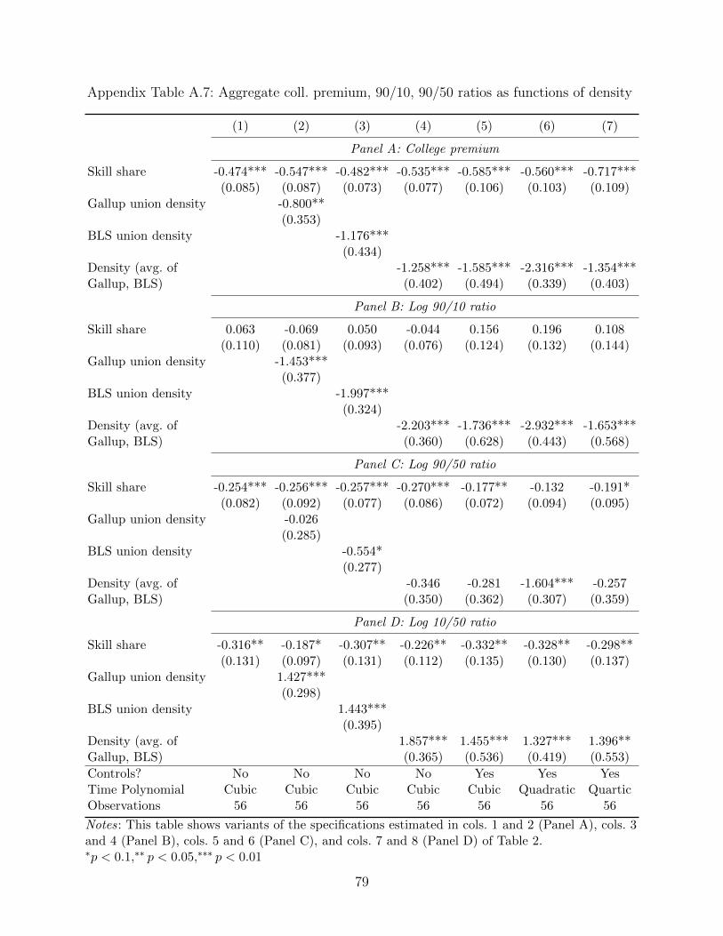
Appendix Table A.7: Aggregate coll. premium, 90/10, 90/50 ratios as functions of density
(1) (2) (3) (4) (5) (6) (7)
Panel A: College premium
Skill share -0.474*** -0.547*** -0.482*** -0.535*** -0.585*** -0.560*** -0.717***(0.085) (0.087) (0.073) (0.077) (0.106) (0.103) (0.109)
Gallup union density -0.800**(0.353)
BLS union density -1.176***(0.434)
Density (avg. of -1.258*** -1.585*** -2.316*** -1.354***Gallup, BLS) (0.402) (0.494) (0.339) (0.403)
Panel B: Log 90/10 ratio
Skill share 0.063 -0.069 0.050 -0.044 0.156 0.196 0.108(0.110) (0.081) (0.093) (0.076) (0.124) (0.132) (0.144)
Gallup union density -1.453***(0.377)
BLS union density -1.997***(0.324)
Density (avg. of -2.203*** -1.736*** -2.932*** -1.653***Gallup, BLS) (0.360) (0.628) (0.443) (0.568)
Panel C: Log 90/50 ratio
Skill share -0.254*** -0.256*** -0.257*** -0.270*** -0.177** -0.132 -0.191*(0.082) (0.092) (0.077) (0.086) (0.072) (0.094) (0.095)
Gallup union density -0.026(0.285)
BLS union density -0.554*(0.277)
Density (avg. of -0.346 -0.281 -1.604*** -0.257Gallup, BLS) (0.350) (0.362) (0.307) (0.359)
Panel D: Log 10/50 ratio
Skill share -0.316** -0.187* -0.307** -0.226** -0.332** -0.328** -0.298**(0.131) (0.097) (0.131) (0.112) (0.135) (0.130) (0.137)
Gallup union density 1.427***(0.298)
BLS union density 1.443***(0.395)
Density (avg. of 1.857*** 1.455*** 1.327*** 1.396**Gallup, BLS) (0.365) (0.536) (0.419) (0.553)
Controls? No No No No Yes Yes YesTime Polynomial Cubic Cubic Cubic Cubic Cubic Quadratic QuarticObservations 56 56 56 56 56 56 56
Notes: This table shows variants of the specifications estimated in cols. 1 and 2 (Panel A), cols. 3and 4 (Panel B), cols. 5 and 6 (Panel C), and cols. 7 and 8 (Panel D) of Table 2.∗p < 0.1,∗∗ p < 0.05,∗∗∗ p < 0.01
79
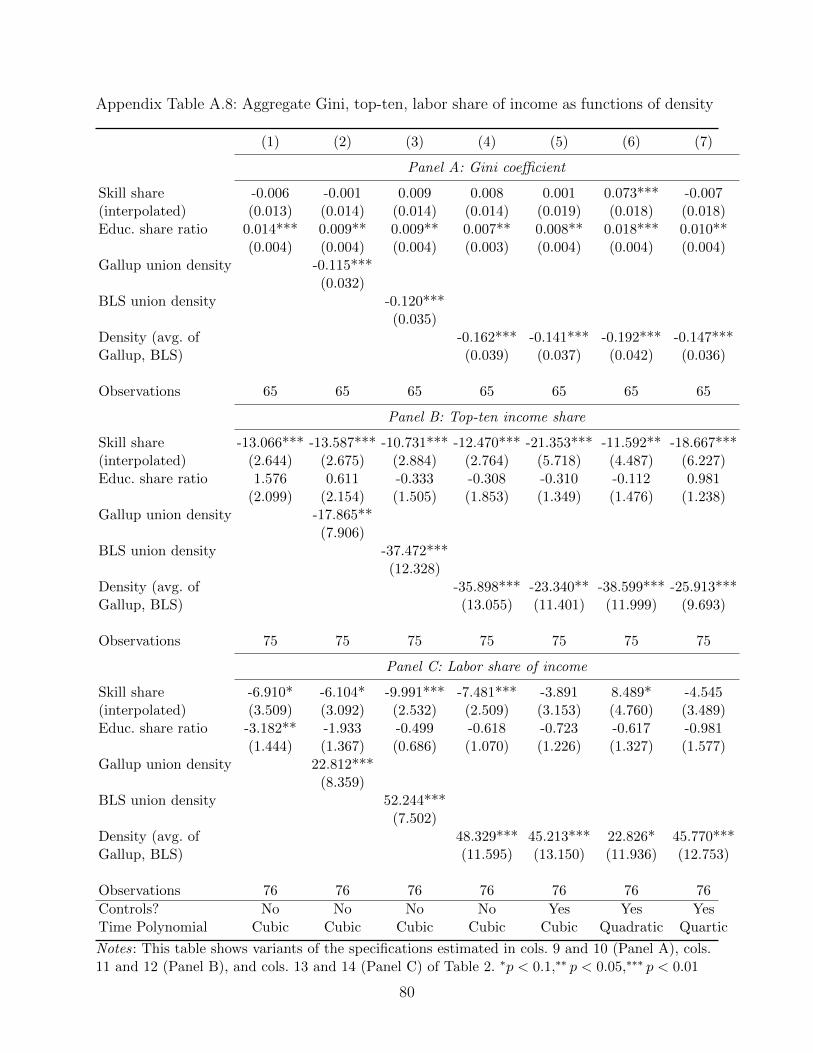
Appendix Table A.8: Aggregate Gini, top-ten, labor share of income as functions of density
(1) (2) (3) (4) (5) (6) (7)
Panel A: Gini coefficient
Skill share -0.006 -0.001 0.009 0.008 0.001 0.073*** -0.007(interpolated) (0.013) (0.014) (0.014) (0.014) (0.019) (0.018) (0.018)Educ. share ratio 0.014*** 0.009** 0.009** 0.007** 0.008** 0.018*** 0.010**
(0.004) (0.004) (0.004) (0.003) (0.004) (0.004) (0.004)Gallup union density -0.115***
(0.032)BLS union density -0.120***
(0.035)Density (avg. of -0.162*** -0.141*** -0.192*** -0.147***Gallup, BLS) (0.039) (0.037) (0.042) (0.036)
Observations 65 65 65 65 65 65 65
Panel B: Top-ten income share
Skill share -13.066*** -13.587*** -10.731*** -12.470*** -21.353*** -11.592** -18.667***(interpolated) (2.644) (2.675) (2.884) (2.764) (5.718) (4.487) (6.227)Educ. share ratio 1.576 0.611 -0.333 -0.308 -0.310 -0.112 0.981
(2.099) (2.154) (1.505) (1.853) (1.349) (1.476) (1.238)Gallup union density -17.865**
(7.906)BLS union density -37.472***
(12.328)Density (avg. of -35.898*** -23.340** -38.599*** -25.913***Gallup, BLS) (13.055) (11.401) (11.999) (9.693)
Observations 75 75 75 75 75 75 75
Panel C: Labor share of income
Skill share -6.910* -6.104* -9.991*** -7.481*** -3.891 8.489* -4.545(interpolated) (3.509) (3.092) (2.532) (2.509) (3.153) (4.760) (3.489)Educ. share ratio -3.182** -1.933 -0.499 -0.618 -0.723 -0.617 -0.981
(1.444) (1.367) (0.686) (1.070) (1.226) (1.327) (1.577)Gallup union density 22.812***
(8.359)BLS union density 52.244***
(7.502)Density (avg. of 48.329*** 45.213*** 22.826* 45.770***Gallup, BLS) (11.595) (13.150) (11.936) (12.753)
Observations 76 76 76 76 76 76 76
Controls? No No No No Yes Yes YesTime Polynomial Cubic Cubic Cubic Cubic Cubic Quadratic Quartic
Notes: This table shows variants of the specifications estimated in cols. 9 and 10 (Panel A), cols.11 and 12 (Panel B), and cols. 13 and 14 (Panel C) of Table 2. ∗p < 0.1,∗∗ p < 0.05,∗∗∗ p < 0.01
80
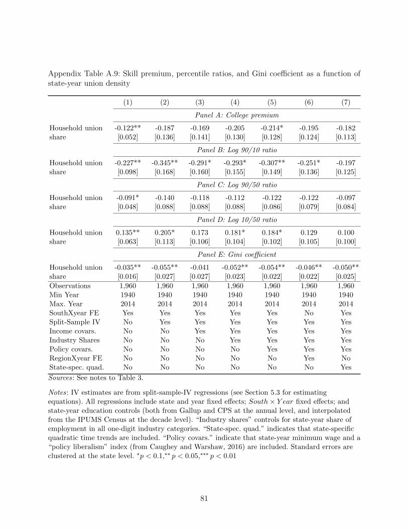
Appendix Table A.9: Skill premium, percentile ratios, and Gini coefficient as a function ofstate-year union density
(1) (2) (3) (4) (5) (6) (7)
Panel A: College premium
Household union -0.122** -0.187 -0.169 -0.205 -0.214* -0.195 -0.182share [0.052] [0.136] [0.141] [0.130] [0.128] [0.124] [0.113]
Panel B: Log 90/10 ratio
Household union -0.227** -0.345** -0.291* -0.293* -0.307** -0.251* -0.197share [0.098] [0.168] [0.160] [0.155] [0.149] [0.136] [0.125]
Panel C: Log 90/50 ratio
Household union -0.091* -0.140 -0.118 -0.112 -0.122 -0.122 -0.097share [0.048] [0.088] [0.088] [0.088] [0.086] [0.079] [0.084]
Panel D: Log 10/50 ratio
Household union 0.135** 0.205* 0.173 0.181* 0.184* 0.129 0.100share [0.063] [0.113] [0.106] [0.104] [0.102] [0.105] [0.100]
Panel E: Gini coefficient
Household union -0.035** -0.055** -0.041 -0.052** -0.054** -0.046** -0.050**share [0.016] [0.027] [0.027] [0.023] [0.022] [0.022] [0.025]
Observations 1,960 1,960 1,960 1,960 1,960 1,960 1,960Min Year 1940 1940 1940 1940 1940 1940 1940Max. Year 2014 2014 2014 2014 2014 2014 2014SouthXyear FE Yes Yes Yes Yes Yes No YesSplit-Sample IV No Yes Yes Yes Yes Yes YesIncome covars. No No Yes Yes Yes Yes YesIndustry Shares No No No Yes Yes Yes YesPolicy covars. No No No No Yes Yes YesRegionXyear FE No No No No No Yes NoState-spec. quad. No No No No No No Yes
Sources: See notes to Table 3.
Notes: IV estimates are from split-sample-IV regressions (see Section 5.3 for estimatingequations). All regressions include state and year fixed effects; South× Y ear fixed effects; andstate-year education controls (both from Gallup and CPS at the annual level, and interpolatedfrom the IPUMS Census at the decade level). “Industry shares” controls for state-year share ofemployment in all one-digit industry categories. “State-spec. quad.” indicates that state-specificquadratic time trends are included. “Policy covars.” indicate that state-year minimum wage and a“policy liberalism” index (from Caughey and Warshaw, 2016) are included. Standard errors areclustered at the state level. ∗p < 0.1,∗∗ p < 0.05,∗∗∗ p < 0.01
81
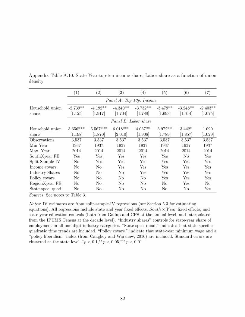
Appendix Table A.10: State Year top-ten income share, Labor share as a function of uniondensity
(1) (2) (3) (4) (5) (6) (7)
Panel A: Top 10p. Income
Household union -2.739** -4.192** -4.340** -3.732** -3.479** -3.248** -2.403**share [1.125] [1.917] [1.704] [1.788] [1.693] [1.614] [1.075]
Panel B: Labor share
Household union 3.656*** 5.567*** 6.018*** 4.037** 3.972** 3.442* 1.090share [1.198] [1.870] [2.010] [1.906] [1.789] [1.857] [1.029]
Observations 3,537 3,537 3,537 3,537 3,537 3,537 3,537Min Year 1937 1937 1937 1937 1937 1937 1937Max. Year 2014 2014 2014 2014 2014 2014 2014SouthXyear FE Yes Yes Yes Yes Yes No YesSplit-Sample IV No Yes Yes Yes Yes Yes YesIncome covars. No No Yes Yes Yes Yes YesIndustry Shares No No No Yes Yes Yes YesPolicy covars. No No No No Yes Yes YesRegionXyear FE No No No No No Yes NoState-spec. quad. No No No No No No Yes
Sources: See notes to Table 3.
Notes: IV estimates are from split-sample-IV regressions (see Section 5.3 for estimatingequations). All regressions include state and year fixed effects; South× Y ear fixed effects; andstate-year education controls (both from Gallup and CPS at the annual level, and interpolatedfrom the IPUMS Census at the decade level). “Industry shares” controls for state-year share ofemployment in all one-digit industry categories. “State-spec. quad.” indicates that state-specificquadratic time trends are included. “Policy covars.” indicate that state-year minimum wage and a“policy liberalism” index (from Caughey and Warshaw, 2016) are included. Standard errors areclustered at the state level. ∗p < 0.1,∗∗ p < 0.05,∗∗∗ p < 0.01
82
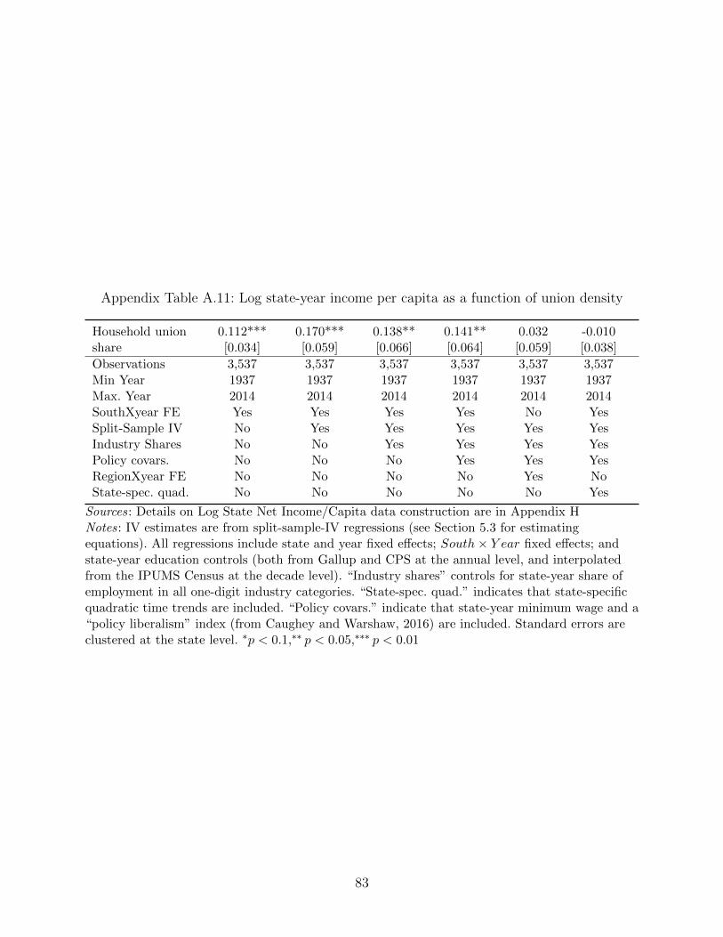
Appendix Table A.11: Log state-year income per capita as a function of union density
Household union 0.112*** 0.170*** 0.138** 0.141** 0.032 -0.010share [0.034] [0.059] [0.066] [0.064] [0.059] [0.038]
Observations 3,537 3,537 3,537 3,537 3,537 3,537Min Year 1937 1937 1937 1937 1937 1937Max. Year 2014 2014 2014 2014 2014 2014SouthXyear FE Yes Yes Yes Yes No YesSplit-Sample IV No Yes Yes Yes Yes YesIndustry Shares No No Yes Yes Yes YesPolicy covars. No No No Yes Yes YesRegionXyear FE No No No No Yes NoState-spec. quad. No No No No No Yes
Sources: Details on Log State Net Income/Capita data construction are in Appendix HNotes: IV estimates are from split-sample-IV regressions (see Section 5.3 for estimatingequations). All regressions include state and year fixed effects; South× Y ear fixed effects; andstate-year education controls (both from Gallup and CPS at the annual level, and interpolatedfrom the IPUMS Census at the decade level). “Industry shares” controls for state-year share ofemployment in all one-digit industry categories. “State-spec. quad.” indicates that state-specificquadratic time trends are included. “Policy covars.” indicate that state-year minimum wage and a“policy liberalism” index (from Caughey and Warshaw, 2016) are included. Standard errors areclustered at the state level. ∗p < 0.1,∗∗ p < 0.05,∗∗∗ p < 0.01
83
Appendix B. Background on Gallup and other historical data sources
B.1. Brief history of Gallup and other historical polling data
One of the main contributions of the paper is the introduction of newly available household-
level data that include information on union membership. We draw much of these data
from public opinion polls, which have recently been posted online by the Roper Center at
Cornell.47
Polling has a long history in American life. The earliest systematic polls were conducted
by magazines, in particular Literary Digest, which would include a returnable postcard with
opinion questions to conduct “straw polls” on the issues of the day (Igo, 2007).48 Beginning
in the late 1930s, George Gallup, Elmo Roper, and Archibald Crossley began importing
techniques from market research into the domain of public opinion polling.
Gallup established the American Institute of Public Opinion (AIPO) and set out to
conduct nationwide surveys of American opinions on a range of social and political issues.49
Gallup was scrupulously non-partisan, never running polls on behalf of a particular party.
AIPO also devoted considerable efforts to develop neutral, easy to understand question
wording. By 1940, about eight million people had read Gallup’s tri-weekly polling report,
America Speaks! which was syndicated in newspapers. Gallup and other pollsters made
money by selling their results to businesses for consumer research and newspapers for public
opinion.
B.2. Evolution of Gallup’s sampling methodology
B.2.1. Gallup methodology before 1950
Before 1950, Gallup used so-called “quota-based” sampling. Survey-takers had to fill quotas
for each pre-determined strata thought to capture distinct political views. Enumerators were
given both hard (e.g., gender, must have one-third female) and soft (e.g., age, “get a good
spread”) quotas, but within each quota, interviewers had a lot of discretion. As Berinsky
(2006a) notes, “interviewers preferred to work in safer areas and tended to question ap-
proachable respondents,” which likely led to Gallup over-sampling, within each quota strata,
47See https://ropercenter.cornell.edu/ipoll-database/.48The Earliest Literary Digest poll we could find referenced was a poll to predict the outcome of
the 1916 presidential election.49Similar organizations were formed at roughly the same time: Roper’s company was steadily
employed by Fortune magazine starting in 1935, Henry Cantril started the Organization of PublicOpinion Research (OPOR) in 1940, and the University of Chicago’s National Opinion ResearchCenter (NORC) was founded in 1941.
84
more prosperous and well-off respondents.50
Gallup once noted that the “the voting public...is the universe of the opinion researcher,”
suggesting his aim was to be representative of voters, which implies substantial underrep-
resentation of certain segments of the population. Presumably because the South had low
turnout (given many of its elections during this time did not even manage a Republican chal-
lenger), it was under-sampled. Southern blacks were differentially underrepresented among
Southerners, consistent with their near total disenfranchisement during this period. Gallup
purposely over-sampled men because of a belief that women merely adopted their husbands’
opinions on Election Day.51
Documentation for Gallup surveys prior to 1950 describe the sampling procedure as
follows:
Prior to 1950, the samples for all Gallup surveys, excluding special surveys,
were a combination of what is known as a purposive design for the selection of
cities, towns, and rural areas, and the quota method for the selection of individu-
als within such selected areas. The first step in obtaining the sample was to draw
a national sample of places (cities, towns, and rural areas). These were distributed
by six regions and five or six city size, urban rural groups or strata in proportion
to the distribution of the population of voting age by these regional-city size
strata. The distribution of cases between the non-south and south, however, was
on the basis of the vote in presidential elections. Within each region the sample
of such places was drawn separately for each of the larger states and for groups of
smaller states. The places were selected to provide broad geographic distribution
within states and at the same time in combination to be politically representative
of the state or group of states in terms of three previous elections. Specifically
they were selected so that in combination they matched the state vote for three
previous elections within small tolerances. Great emphasis was placed on election
data as a control in the era from 1935 to 1950. Within the civil divisions in the
sample, respondents were selected on the basis of age, sex and socioeconomic
50Berinsky, 2006a provides great detail on Gallup’s quota-based sampling procedures, from whichwe draw much of the information in this subsection. Consistent with discretion within the quota-based sampling leading to oversampling of the well-to-do, Gallup over-predicts the Republican voteshare in 1940 and 1944, though in both cases he still correctly predicts Roosevelt victories. In 1948,this over-sampling of Republican voters leads him to incorrectly call the election.
51It is worth noting that any oversampling of men is not a substantial problem for our purposessince we are interested in measures of union status and income at the household level. Since mostmen and women are combined in households, particularly in the earlier years, reports of “any unionmembers in the household” and “household income” should not be affected by whether the surveyedindividual in the household was male or female.
85
quotas. Otherwise, interviewers were given considerable latitude within the sam-
ple areas, being permitted to draw their cases from households and from persons
on the street anywhere in the community.
B.2.2. Gallup methodology after 1950
From 1950 onward, Gallup uses modern-day probabilistic sampling procedures. Weights are
often provided, but their documentation is not consistent. As a result, in our analyses of the
Gallup data we use weights that we generate from the Census, as detailed in Appendix B.5.
The following excerpt is taken from post-1950 Gallup survey documentation on sampling:
All Gallup polls since 1950, excluding certain special surveys, have been based
on a national probability sample of interviewing areas. Refinements in the sample
design have been introduced at various points in time since then. However, over
this period the design in its essentials has conformed to the current procedure,
as follows:
1. The United States is divided into seven size-of-community strata: cities of
population 1,000,000 and over; 250,000 to 999,999; and 50,000 to 249,999;
with the urbanized areas of all these cities forming a single stratum; cities
of 2,500 to 49,999; rural villages; and farm or open country rural areas.
2. Within each of these strata, the population is further divided into seven
regions: New England, Middle Atlantic, East Central, West Central, South,
Mountain, and Pacific Coast.
3. Within each size-of-community and regional stratum the population is ar-
rayed in geographic order and zoned into equal-sized groups of sampling
units.
4. In each zone, pairs of localities are selected with probability of selection pro-
portional to the size of each locality’s population–producing two replicated
samples of localities.
5. Within selected cities for which population data are reported by census
tracts or enumeration districts, these sample subdivisions are drawn with
probability of selection proportional to the size of the population.
6. For other cities, minor civil divisions, and rural areas in the sample for
which population data are not reported by census tracts or enumeration
districts, small, definable geographic areas are drawn, with the probability
86

of selection proportional to size where available data permit; otherwise with
equal probability.
7. Within each subdivision selected for which block statistics are available, a
block or block cluster is drawn with probability of selection proportional to
the number of dwelling units.
8. In cities and towns for which block statistics are not available, blocks are
drawn at random, that is, with equal probability.
9. In subdivisions that are rural or open country in character, segments ap-
proximately equal in size of population are delineated and drawn with equal
probability.
10. In each cluster of blocks and each segment so selected, a randomly selected
starting point is designated on the interviewer’s map of the area. Starting
at this point, interviewers are required to follow a given direction in the
selection of households, taking households in sequence, until their assigned
number of interviews has been completed.
11. Within each occupied dwelling unit or household reached, the interviewer
asks to speak to the youngest man 18 or older at home, or if no man is at
home, the oldest woman 18 or older. This method of selection within the
household has been developed empirically to produce an age distribution by
men and women separately which compares closely with the age distribution
of the population. It increases the probability of selecting younger men,
who are at home relatively infrequently, and the probability of reaching
older women in the household who tend to be under-represented unless
given a disproportionate chance of being drawn from among those at home.
The method of selection among those at home within the household is not
strictly random, but it is systematic and objective and eliminates interviewer
judgement in the selection process.
12. Interviewing is conducted at times when adults are most likely to be at home,
which means on weekends or if on weekdays, after 4:00 p.m. for women and
after 6:00 p.m. for men.
13. Allowance for persons not at home is made by a “times-at-home” weighting
procedure rather than by “call-backs.” this procedure is a standard method
for reducing the sample bias that would otherwise result from underrepre-
sentation of persons who are difficult to find at home.
87
14. The pre-stratification by regions is routinely supplemented by fitting each
obtained sample to the latest available census bureau estimates of the re-
gional distribution of the population. Also, minor adjustments of the sample
are made by educational attainment (by men and women separately), based
on the annual estimates of the census bureau derived from their current pop-
ulation survey. The sampling procedure described is designed to produce an
approximation of the adult civilian population living in the United States,
except for those persons in institutions such as hospitals.
Note that not until the 1980s does Gallup switch from face-to-face interviews to phone
interviews. For this period we make use of the much larger CPS data instead of Gallup, so
the vast majority of our Gallup data comes from face-to-face interviews.
B.3. The Gallup union question
The typical Gallup union question is “Are you (or is your husband) a member of a labor
union?”, with the choices most often being: “neither,” “yes, I am,” “yes, he is,” “yes, both
are.” In 1959, “husband” changes to “husband/wife.” In some years, however, the question
does not ask which member or members of the household is or are in a union, so we cannot,
for example, always measure individual union status. We harmonize these questions to form
a measure of household union status, where we code a household as union if either household
head or spouse is a union member. While technically the implied unit of observation is
couple (or individual if the respondent is not part of a couple), we will generally refer to this
measure as household union status. Importantly, Gallup asks this question of all respondents,
not skipping those in, say, agricultural occupations or who are unemployed.
B.4. Weighting the Gallup data
To construct weights, we use post-stratification methods (i.e., cell-weighting). Specifically,
we weight observations in the Gallup data so that the annual proportions of education-race-
region cells in Gallup match the corresponding proportions in U.S. Census data. The process
involves several steps: First, we construct comparable measures of education (less than high
school, high school graduate, some college, college graduate), race (white, non-white), and
region (South, non-South) in both Gallup and Census data. Second, we construct annual
proportions of each education-race-region cell for each dataset. In the Census data, we apply
representative household weights and linearly interpolate values for intercensal years to best
approximate the “true” annual proportions of each cell. Third, we generate cell-specific
88
weights wct by applying the following formula:
wct =πCct
πGct
(9)
where c denotes a particular education-race-region cell (e.g., white Southerners with a college
degree), and πCct and πG
ct denote annual cell proportions for Census and Gallup, respectively.
Finally, we let wit = wct for each respondent i in year t corresponding to cell c in the Gallup
data and re-normalize so∑Nt
iwit
Nt= 1 for each year t.
We repeat the procedure above for several alternative cell definitions (e.g., education-race-
age-state, age-gender-region). Our preferred weights use education-race-region cells because
we find this definition makes our sample as representative as possible without compromising
comparability across surveys or creating excessively small or “empty” cells.52 For surveys
without education data, we use race-region weights.
B.5. Comparing Gallup to Census Microdata
We begin with Gallup data from 1950 onward, returning shortly to earlier data. Table B.1
compares Gallup data to 1950–1980 Census data. To summarize how the actual (unweighted)
Gallup observations compare to the full U.S. adult population, we compare unweighted
Gallup data to Census IPUMS tabulations. Given Gallup’s well-documented under-sampling
of the South, we show results separately for Southern and non-Southern states.
In 1950, Gallup exhibits some under-sampling of the South, but, by 1960, this bias had
disappeared. From 1950 to 1960, Gallup under-sampled blacks in both the South and the
Non-South. This bias continued in the South through 1970, to a smaller degree. These biases
reflect the substantial disenfranchisement of blacks, particularly in the South during this
period. Age and gender appear representative in Gallup in both regions in each decade.
Gallup respondents outside the South are more educated than their Census counterparts,
with the largest gap being a high school completion difference of around 8.5 percentage points
in 1950 and 1960. In the South, except for 1950, Gallup and IPUMS show similar levels of
education. Gallup Southern respondents have higher high school completion rates than those
in the Census in 1950, as Gallup was still under-sampling Southern blacks in that year. In
Appendix D we show some of our key results with the Gallup data both unweighted and
weighted to match Census characteristics, but Appendix Table B.1 gives some sense of how
much “work” the weights must do.
52For a more thorough discussion of post-stratification weighting, including optimal cell “fine-ness,” see Berinsky, 2006b
89
Appendix Table B.2 looks separately at 1940, given that Gallup’s sampling procedures
were quite different during its earlier years. In fact, in 1940, very few Gallup surveys ask
about education (the summary statistics we present for that variable are based on only 5,767
observations), so in this table we include occupation categories as supplemental proxies for
socio-economic status. The first column shows, again, unweighted Gallup data. Col. (2)
presents summary statistics for all adults in the 1940 IPUMS. Perhaps the most striking
discrepancy is gender: consistent with their stated methodology at the time, Gallup over-
samples men. Col. (3) adjusts the Census sampling so that men are sampled at the Gallup
frequencies and also down-weights large households (since Gallup only interviews one person
per household). Comparing col. (1) versus (3) shows, as expected, that Gallup significantly
under-samples the South.
Consistent with concerns about Gallup over-sampling the affluent, Gallup respondents in
1940 are substantially more educated than their Census counterparts. Unfortunately, given
that only in 1942 does Gallup begin to regularly include an education question, the Gallup
sample for which we have an education measure in 1940 is quite small (about 5,700 individu-
als, relative to over 150,000 for the other Gallup variables in 1940). Given the small education
sample in 1940, we use occupational categories to further explore socio-economic status in
Gallup versus the 1940 Census. Gallup and IPUMS use different occupation categories—
Gallup’s are much coarser and unfortunately IPUMS categories do not completely nest
Gallup categories—so comparisons are not straightforward. Consistent with the concerns
cited earlier that Gallup over-sampled the well-to-do, Gallup respondents appear to have
slightly higher-status occupations relative to their Census counterparts, with “white-collar”
workers significantly overrepresented.
For the most part, these patterns hold when we drop Southern states from both samples
(the final two columns of Table B.2). Importantly, outside of the South, Gallup appears to
sample blacks in proportion to their population, even in the very early years of its existence.
Also, outside the South, Gallup appears to accurately sample the remaining six regions of
the US.53
In general, we show results with Gallup data using weights to match (interpo-
lated) Census IPUMS summary statistics, even though the need for weights is not
obvious after 1960. From 1937 until 1941, we weight so that Gallup matched the
IPUMS in terms of White × South cells, given that the summary statistics show that
Gallup sampling along these dimensions appears suspect in the early years. Beginning
in 1942 (the first year in which Gallup surveys ask the union and education questions
in the same survey) we weight by White × Education × South, where Education ∈53We use Gallup-defined geographic regions in this table.
90
{No high school degree, HS degree, Some college, College graduate}, thus giving us 2× 4×2 = 16 cells on which to match. In practice, however, our results are very similar with and
without weights.
References
Berinsky, Adam J (2006a). “American public opinion in the 1930s and 1940s: The analysis of
quota-controlled sample survey data”. International Journal of Public Opinion Quarterly
70.4, pp. 499–529.
— (2006b). “American public opinion in the 1930s and 1940s: The analysis of quota-
controlled sample survey data”. International Journal of Public Opinion Quarterly 70.4,
pp. 499–529.
Igo, Sarah Elizabeth (2007). The averaged American: Surveys, citizens, and the making of a
mass public. Harvard University Press.
91
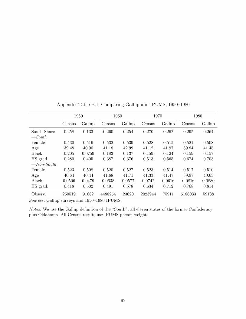
Appendix Table B.1: Comparing Gallup and IPUMS, 1950–1980
1950 1960 1970 1980
Census Gallup Census Gallup Census Gallup Census Gallup
South Share 0.258 0.133 0.260 0.254 0.270 0.262 0.295 0.264—SouthFemale 0.530 0.516 0.532 0.539 0.528 0.515 0.521 0.508Age 39.48 40.90 41.18 42.99 41.12 41.97 39.84 41.45Black 0.205 0.0759 0.183 0.137 0.159 0.124 0.159 0.157HS grad. 0.280 0.405 0.387 0.376 0.513 0.565 0.674 0.703—Non-SouthFemale 0.523 0.508 0.520 0.527 0.523 0.514 0.517 0.510Age 40.64 40.44 41.68 41.71 41.33 41.47 39.97 40.63Black 0.0506 0.0479 0.0638 0.0577 0.0742 0.0616 0.0816 0.0880HS grad. 0.418 0.502 0.491 0.578 0.634 0.712 0.768 0.814
Observ. 250519 91682 4488254 23620 2023944 75911 6186033 59138
Sources: Gallup surveys and 1950–1980 IPUMS.
Notes: We use the Gallup definition of the “South”: all eleven states of the former Confederacyplus Oklahoma. All Census results use IPUMS person weights.
92
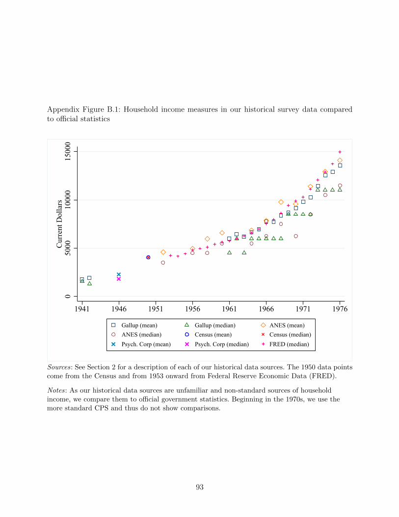
Appendix Figure B.1: Household income measures in our historical survey data comparedto official statistics
050
0010
000
1500
0C
urre
nt D
olla
rs
1941 1946 1951 1956 1961 1966 1971 1976
Gallup (mean) Gallup (median) ANES (mean)ANES (median) Census (mean) Census (median)Psych. Corp (mean) Psych. Corp (median) FRED (median)
Sources: See Section 2 for a description of each of our historical data sources. The 1950 data pointscome from the Census and from 1953 onward from Federal Reserve Economic Data (FRED).
Notes: As our historical data sources are unfamiliar and non-standard sources of householdincome, we compare them to official government statistics. Beginning in the 1970s, we use themore standard CPS and thus do not show comparisons.
93
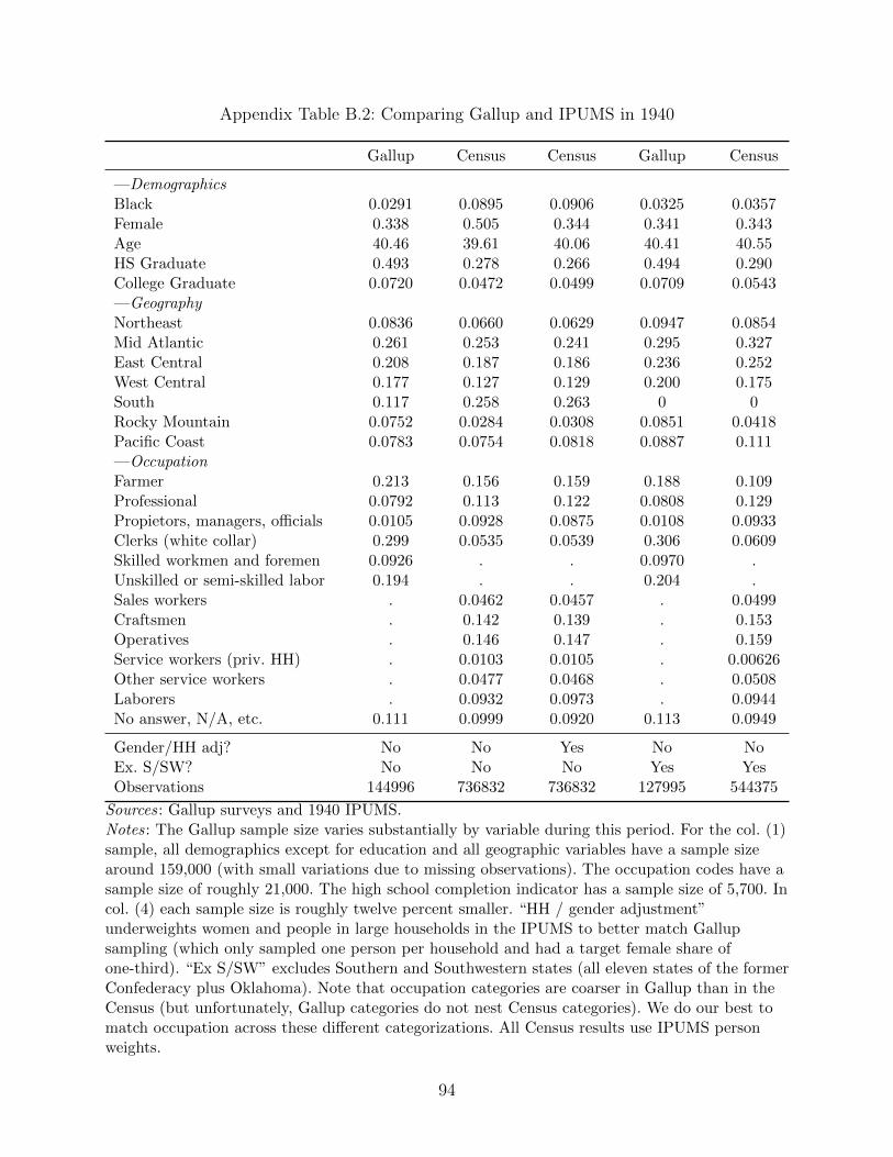
Appendix Table B.2: Comparing Gallup and IPUMS in 1940
Gallup Census Census Gallup Census
—DemographicsBlack 0.0291 0.0895 0.0906 0.0325 0.0357Female 0.338 0.505 0.344 0.341 0.343Age 40.46 39.61 40.06 40.41 40.55HS Graduate 0.493 0.278 0.266 0.494 0.290College Graduate 0.0720 0.0472 0.0499 0.0709 0.0543—GeographyNortheast 0.0836 0.0660 0.0629 0.0947 0.0854Mid Atlantic 0.261 0.253 0.241 0.295 0.327East Central 0.208 0.187 0.186 0.236 0.252West Central 0.177 0.127 0.129 0.200 0.175South 0.117 0.258 0.263 0 0Rocky Mountain 0.0752 0.0284 0.0308 0.0851 0.0418Pacific Coast 0.0783 0.0754 0.0818 0.0887 0.111—OccupationFarmer 0.213 0.156 0.159 0.188 0.109Professional 0.0792 0.113 0.122 0.0808 0.129Propietors, managers, officials 0.0105 0.0928 0.0875 0.0108 0.0933Clerks (white collar) 0.299 0.0535 0.0539 0.306 0.0609Skilled workmen and foremen 0.0926 . . 0.0970 .Unskilled or semi-skilled labor 0.194 . . 0.204 .Sales workers . 0.0462 0.0457 . 0.0499Craftsmen . 0.142 0.139 . 0.153Operatives . 0.146 0.147 . 0.159Service workers (priv. HH) . 0.0103 0.0105 . 0.00626Other service workers . 0.0477 0.0468 . 0.0508Laborers . 0.0932 0.0973 . 0.0944No answer, N/A, etc. 0.111 0.0999 0.0920 0.113 0.0949
Gender/HH adj? No No Yes No NoEx. S/SW? No No No Yes YesObservations 144996 736832 736832 127995 544375
Sources: Gallup surveys and 1940 IPUMS.Notes: The Gallup sample size varies substantially by variable during this period. For the col. (1)sample, all demographics except for education and all geographic variables have a sample sizearound 159,000 (with small variations due to missing observations). The occupation codes have asample size of roughly 21,000. The high school completion indicator has a sample size of 5,700. Incol. (4) each sample size is roughly twelve percent smaller. “HH / gender adjustment”underweights women and people in large households in the IPUMS to better match Gallupsampling (which only sampled one person per household and had a target female share ofone-third). “Ex S/SW” excludes Southern and Southwestern states (all eleven states of the formerConfederacy plus Oklahoma). Note that occupation categories are coarser in Gallup than in theCensus (but unfortunately, Gallup categories do not nest Census categories). We do our best tomatch occupation across these different categorizations. All Census results use IPUMS personweights.
94
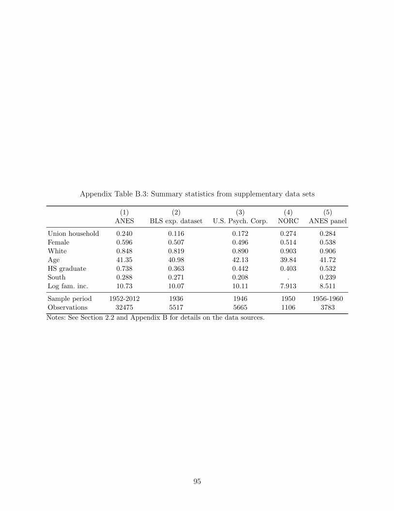
Appendix Table B.3: Summary statistics from supplementary data sets
(1) (2) (3) (4) (5)ANES BLS exp. dataset U.S. Psych. Corp. NORC ANES panel
Union household 0.240 0.116 0.172 0.274 0.284Female 0.596 0.507 0.496 0.514 0.538White 0.848 0.819 0.890 0.903 0.906Age 41.35 40.98 42.13 39.84 41.72HS graduate 0.738 0.363 0.442 0.403 0.532South 0.288 0.271 0.208 . 0.239Log fam. inc. 10.73 10.07 10.11 7.913 8.511
Sample period 1952-2012 1936 1946 1950 1956-1960Observations 32475 5517 5665 1106 3783
Notes: See Section 2.2 and Appendix B for details on the data sources.
95
Appendix C. Sample selection and construction of key variables
C.1. Sample Selection
To construct our main Gallup sample, we apply the following selection criteria to the popula-
tion of recorded Gallup survey respondents from years 1937 through 1987. First, we eliminate
respondents to surveys in which the union membership question was not asked. Second, we
remove any respondents younger than 21 or older than 64 (we cap at 65 to focus on the
working-age population, and only halfway through our sample period did Gallup begin to
include 18-20 year olds and we wish to have a consistent sampling rule throughout the entire
period). Third, we remove respondents who live in Alaska, Hawaii, or Washington DC (again,
Gallup did not include these respondents at the beginning of our sample period). For the
state-year analyses we also exclude Idaho because the state identifiers are often miscoded as
Hawaii.
Our CPS sample is taken from the May supplements in years 1976 to 1981, the Merged
Outgoing Rotation Groups in years 1983 to 1989, and the Annual Social and Economic
Supplement in years 1990 to 2015. Note that the CPS did not ask about union status in
1982. Since the CPS contains information for all individuals within a household, to make
the CPS comparable with Gallup, we restrict our CPS sample to one randomly selected
observation from each household, which we refer to as the “designated” respondent.54 For
state-year measures our CPS-based series begins in 1977, as individual state-of-residence
identifiers are not available before that time. We exclude designated respondents in armed
forces. Additionally, we exclude Alaska, DC and Hawaii from all analyses, and Idaho from
the state-year analysis to make it comparable with the Gallup sample.
C.2. Variable Construction
Union Density In both Gallup and CPS, union density is calculated as the number of
households with at least one reported union member divided by the total number of house-
holds. The Gallup sample is limited to respondents aged 21-65 whereas the CPS sample is
limited to “designated” respondents aged 18-65.
Family Income Our Gallup measure of family income covers years 1942 and 1961 through
1976. Gallup family income is derived from the responses to survey questions of the following
form: “Which best represents the total annual income, before taxes, of all the members of
54The exception to this is Appendix Figure D.5, which examine the robustness of our premiumestimates to using all observations within a household.
96
your immediate family living in your household?” Responses are coded into income bins
which vary across surveys. We construct a harmonized income measure by calculating the
midpoint of each interior binned response. For top and bottom bins, we estimate implied
midpoints from a fitted Pareto distribution as in Von Hippel, Hunter, and Drown (2017).
Our CPS measure of family income is taken from the May and March supplements in years
1978 through 2015. This measures combines all reported income from household members 15
years and older. To construct this variable in early CPS years (May and March before 1990),
we use the family income variable, which is binned into 12 categories. For the following years
(CPS March only) we use the continuous family income variable, which reports the total
income for the respondent’s family. To make the continuous variable comparable with the
binned variable of earlier years, we recode it into bins matching those of the ANES income
variable in the corresponding year.
College premium, college high school share ratio, wage ratios The college wage
premium, college high school share ratio, and the 90-10, 90-50, and 10-50 wage ratios are
calculated using a sample of 18 to 65 year-old full-time, full-year wage and salary workers who
make at least one-half of the minimum wage and who have 0-48 years of potential experience
in the March CPS (1964-2019 for the time series analysis and 1977-2019 for the state-year
analysis) and the 1940-1970 Census.55 Unemployed and NILF respondents are excluded from
the analysis.
In the time-series analysis, we calculate changes in each measure between 1940-50, 1950-
60, and 1960-70 in the Census data and append these changes to the measure from 1964-2019
(or 1977-2019 in the state-year analysis) calculated from the March CPS.
The college-high school share ratio is calculated in terms of efficiency units following
the methodology outlined in Autor, Katz, and Kearney, 2008. Workers are divided into cells
based on two sexes, five education categories (high school drop outs, high school graduates,
some college, college graduates, greater than college), and years of experience (ten-year bins
for the state-year analysis).
For each cell in each year we calculate the weighted sum of weeks worked by all individuals
in the cell using the individual weights from the data. This comprises the “quantity” of labor
supplied. To translate this into efficiency units of labor supply we also calculate the “price”
of each week of labor in a particular cell. The “price” of labor corresponds to weighted
average of log real weekly income in each cell, normalized by a reference wage (the wage of
male high school graduates with the highest category of experience cell in our data, which is
55We follow Autor, Katz, and Kearney, 2008 and calculate years of potential experience as ageminus assigned years of schooling minus six, rounded down to the nearest integer value.
97
40-48 in the main sample but 30-40 in the backwards projection to 1930 described below),
and averaged over the entire period. The efficiency units of labor supplied by each cell is the
product of the “quantity” and “price” of labor.
The total efficiency units of labor supplied in a given year is calculated by summing across
cells. We calculate aggregate college-equivalent labor supply as the share of total efficiency
units of labor supplied by college or college-plus workers plus half of the share of labor
supplied by workers with some college. The college-high school share ratio is the natural
logarithm of the ratio of college-equivalent to non-college-equivalent labor supply shares in
each year.
As the 1930 census does not ask years of schooling, we construct the 1929 college-high
school share ratios by projecting backwards from cohorts in 1940, using their state of resi-
dence in 1935. We use the efficiency units in 1940 aggregated across 34-64 age groups, which
are the cohorts that would be 24-54 in 1930. The correlation between these age groups in
1940 is 0.885 and 0.883 updated by migration, which validates the backward projection for
that year.
The college wage premium is calculated following the methodology outlined in Autor,
Katz, and Kearney, 2008 and Goldin and Katz, 2008. The premium is the fixed weighted
average of the premium earned by college graduates vs high school graduates and more
than college educated workers vs high school graduates. These premiums are estimated by
regressing the log real hourly earnings on a set of five education dummies, a full-time dummy,
a female dummy, a non-white dummy, a set of three geographic division dummies, a quartic in
experience and the interaction of female with both non-white and the quartic in experience.
The weights are the relative employment shares of college and more than college educated
workers in 1980.
Weights are calculated as follows:
CollegeShare =Number of workers with exactly college education
Number of workers with exactly college or more than college education
MoreThanCollegeShare =Number of workers with more than college education
Number of workers with exactly college or more than college education
The 90-10, 90-50, and 10-50 wage ratios are calculated as the difference in the Xth
and Yth percentile of log real weekly earnings among men in our sample.
Gini coefficient For the aggregate time-series analysis, the Gini coefficient is taken from
Kopczuk, Saez, and Song, 2010. For the state-year analysis, we estimate the Gini coefficient
from a sample of 18 to 65 year-old workers who are not self-employed, have non-allocated
income, and have 0-48 years of potential experience in the March CPS (1977-2019) and the
98
1940-1970 Census. We append changes in the Gini coefficient between 1940-50, 1950-60, and
1960-70 in the Census data to the coefficient in 1977-2019 calculated from the March CPS.
Manufacturing Employment We estimate major industry employment shares from 1910
to 2015 by combining data from the Census, BLS State and Area Employment, Hours and
Earnings series, and ACS. Although the BLS is our preferred data source, it is only available
between 1939 and 2001. Furthermore, not every state-industry pair has data beginning in
1939, and for some pairs data starts as late as 1982. We therefore supplement the BLS series
with Census data from 1910 to 1980 and ACS data from 2001 to 2015.
For each dataset, state, and year we group calculate the share of employed individuals
that work within each major industry: mining, construction, manufacturing, transportation,
trade, finance, services, and government. We group 1950 census industry codes in the Census
and ACS to match these BLS industries.56 To combine the Census and ACS with the BLS,
we append changes in the Census and ACS to the BLS series in its first and last year,
respectively.
References
Autor, David H, Lawrence F Katz, and Melissa S Kearney (2008). “Trends in US wage in-
equality: Revising the revisionists”. The Review of economics and statistics 90.2, pp. 300–
323.
Goldin, Claudia Dale and Lawrence F Katz (2008). The race between education and technol-
ogy. Harvard University Press.
Kopczuk, Wojciech, Emmanuel Saez, and Jae Song (2010). “Earnings inequality and mobil-
ity in the United States: evidence from social security data since 1937”. The Quarterly
Journal of Economics 125.1, pp. 91–128.
Von Hippel, Paul T, David J Hunter, and McKalie Drown (2017). “Better estimates from
binned income data: Interpolated CDFs and mean-matching”. Sociological Science 4,
pp. 641–655.
56Mining corresponds to 1950 census industry codes 206-239, construction to 246, manufacturingto 306-499, transportation to 506-598, trade to 606-699, finance to 716-756, services to 806-899,and government to 906-976.
99
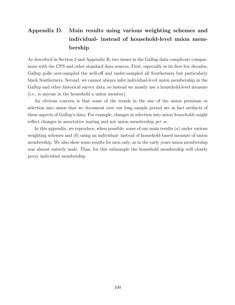
Appendix D. Main results using various weighting schemes and
individual- instead of household-level union mem-
bership
As described in Section 2 and Appendix B, two issues in the Gallup data complicate compar-
isons with the CPS and other standard data sources. First, especially in its first few decades,
Gallup polls over-sampled the well-off and under-sampled all Southerners but particularly
black Southerners. Second, we cannot always infer individual-level union membership in the
Gallup and other historical survey data, so instead we mostly use a household-level measure
(i.e., is anyone in the household a union member).
An obvious concern is that some of the trends in the size of the union premium or
selection into union that we document over our long sample period are in fact artifacts of
these aspects of Gallup’s data. For example, changes in selection into union households might
reflect changes in assortative mating and not union membership per se.
In this appendix, we reproduce, when possible, some of our main results (a) under various
weighting schemes and (b) using an individual- instead of household-based measure of union
membership. We also show some results for men only, as in the early years union membership
was almost entirely male. Thus, for this subsample the household membership will closely
proxy individual membership.
100
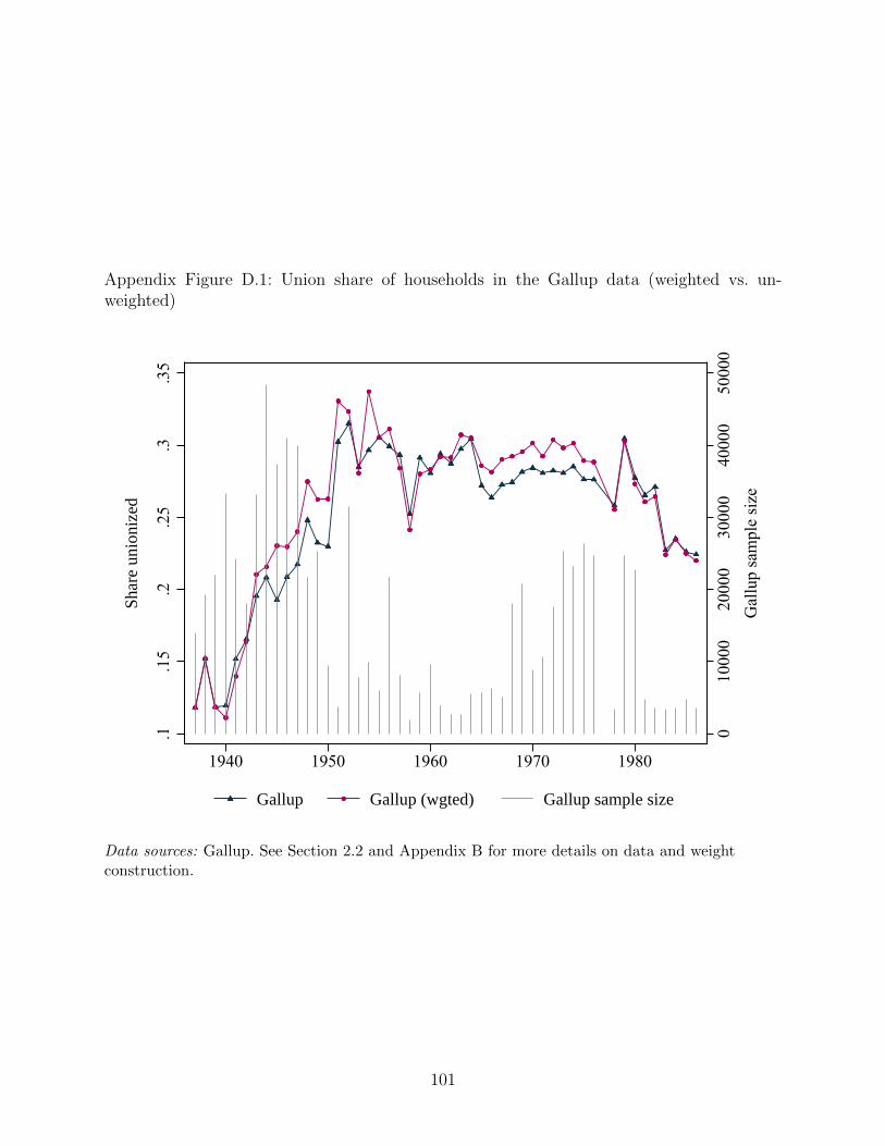
Appendix Figure D.1: Union share of households in the Gallup data (weighted vs. un-weighted)
010
000
2000
030
000
4000
050
000
Gal
lup
sam
ple
size
.1.1
5.2
.25
.3.3
5
Shar
e un
ioni
zed
1940 1950 1960 1970 1980
Gallup Gallup (wgted) Gallup sample size
Data sources: Gallup. See Section 2.2 and Appendix B for more details on data and weightconstruction.
101
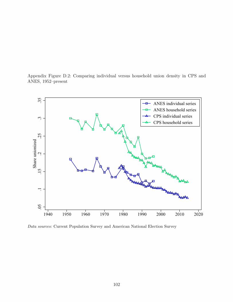
Appendix Figure D.2: Comparing individual versus household union density in CPS andANES, 1952–present
.05
.1.1
5.2
.25
.3.3
5Sh
are
unio
nize
d
1940 1950 1960 1970 1980 1990 2000 2010 2020
ANES individual seriesANES household seriesCPS individual seriesCPS household series
Data sources: Current Population Survey and American National Election Survey
102
Appendix Figure D.3: Selection into unions by years of scholling in the CPS, individual andhousehold measures
-.03
-.02
-.01
0.0
1C
oeff
icie
nt o
n Ye
ars o
f sch
oolin
g
1980 1990 2000 2010
CPS Individual series CPS Household series
Data sources: Current Population Survey.
Notes: The “household series” replicates the CPS analysis in Figure 3 (i.e., regresses, separatelyby year, a household union dummy on years of schooling, gender and state fixed effects, plottingthe coefficient on years of schooling. The “individual series” substitutes individual unionmembership as the outcome variable instead of the household union dummy.
103
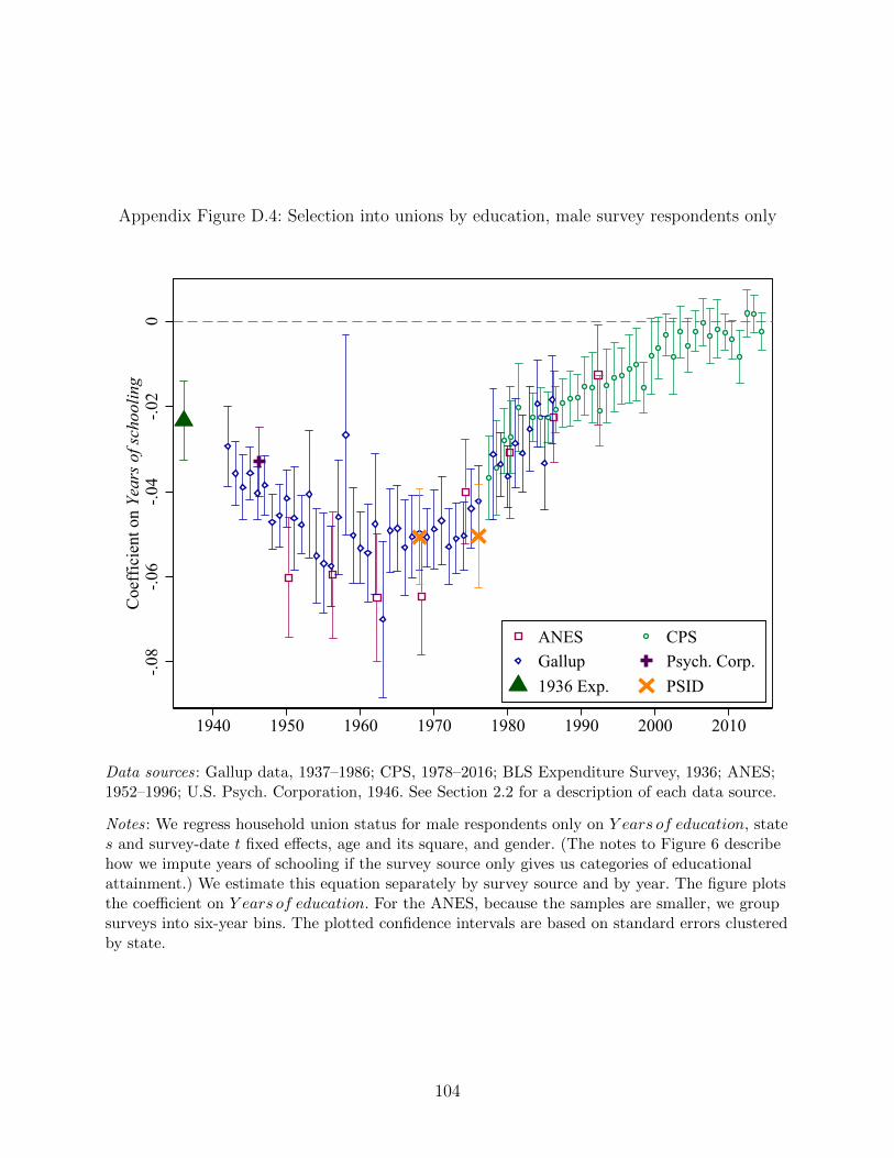
Appendix Figure D.4: Selection into unions by education, male survey respondents only
-.08
-.06
-.04
-.02
0C
oeff
icie
nt o
n Ye
ars o
f sch
oolin
g
1940 1950 1960 1970 1980 1990 2000 2010
ANES CPSGallup Psych. Corp.1936 Exp. PSID
Data sources: Gallup data, 1937–1986; CPS, 1978–2016; BLS Expenditure Survey, 1936; ANES;1952–1996; U.S. Psych. Corporation, 1946. See Section 2.2 for a description of each data source.
Notes: We regress household union status for male respondents only on Y ears of education, states and survey-date t fixed effects, age and its square, and gender. (The notes to Figure 6 describehow we impute years of schooling if the survey source only gives us categories of educationalattainment.) We estimate this equation separately by survey source and by year. The figure plotsthe coefficient on Y ears of education. For the ANES, because the samples are smaller, we groupsurveys into six-year bins. The plotted confidence intervals are based on standard errors clusteredby state.
104
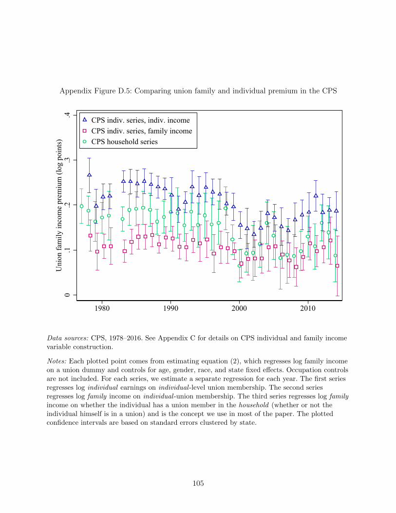
Appendix Figure D.5: Comparing union family and individual premium in the CPS
0.1
.2.3
.4U
nion
fam
ily in
com
e pr
emiu
m (l
og p
oint
s)
1980 1990 2000 2010
CPS indiv. series, indiv. incomeCPS indiv. series, family incomeCPS household series
Data sources: CPS, 1978–2016. See Appendix C for details on CPS individual and family incomevariable construction.
Notes: Each plotted point comes from estimating equation (2), which regresses log family incomeon a union dummy and controls for age, gender, race, and state fixed effects. Occupation controlsare not included. For each series, we estimate a separate regression for each year. The first seriesregresses log individual earnings on individual -level union membership. The second seriesregresses log family income on individual -union membership. The third series regresses log familyincome on whether the individual has a union member in the household (whether or not theindividual himself is in a union) and is the concept we use in most of the paper. The plottedconfidence intervals are based on standard errors clustered by state.
105
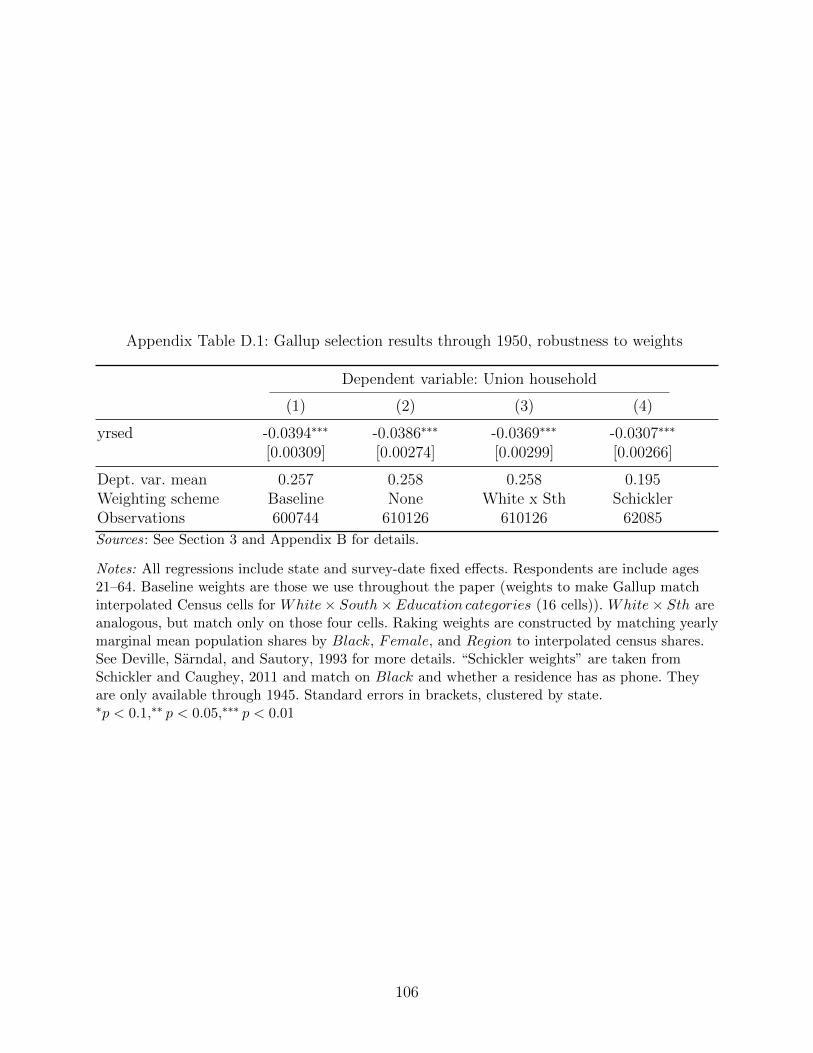
Appendix Table D.1: Gallup selection results through 1950, robustness to weights
Dependent variable: Union household
(1) (2) (3) (4)
yrsed -0.0394∗∗∗ -0.0386∗∗∗ -0.0369∗∗∗ -0.0307∗∗∗
[0.00309] [0.00274] [0.00299] [0.00266]
Dept. var. mean 0.257 0.258 0.258 0.195Weighting scheme Baseline None White x Sth SchicklerObservations 600744 610126 610126 62085
Sources: See Section 3 and Appendix B for details.
Notes: All regressions include state and survey-date fixed effects. Respondents are include ages21–64. Baseline weights are those we use throughout the paper (weights to make Gallup matchinterpolated Census cells for White× South× Education categories (16 cells)). White× Sth areanalogous, but match only on those four cells. Raking weights are constructed by matching yearlymarginal mean population shares by Black, Female, and Region to interpolated census shares.See Deville, Sarndal, and Sautory, 1993 for more details. “Schickler weights” are taken fromSchickler and Caughey, 2011 and match on Black and whether a residence has as phone. Theyare only available through 1945. Standard errors in brackets, clustered by state.∗p < 0.1,∗∗ p < 0.05,∗∗∗ p < 0.01
106
Appendix E. Existing Measures of Union Density Pre-Dating the
Current Population Survey
The CPS first asks respondents their union status in 1973, and then only in selected months
until 1983 from which time information on union status was collected each month in the
CPS as part of the outgoing rotation group supplement. Before this survey, the primary
sources for union density are the BLS and Troy/NBER historical time series mentioned in
the introduction. The data underlying these calculations are union reports of membership
and dues revenue when available, and a variety of other sources when not available. Neither
of these data sources ever used representative samples of individual workers to calculate
union density.
In general, the data derived from union reports likely become more accurate by the
1960s. Post-1959 the BLS collected mandatory financial reports from unions as a condition
of the Labor-Management Reporting and Disclosure (Landrum-Griffin) Act, and Troy and
Sheflin (1985) incorporate these data into their estimates of union density. Beginning in
1964, the BLS disaggregates union membership counts by state, and Hirsch, Macpherson,
and Vroman (2001) splice these reports together with the CPS to form state-year union
density panel beginning in 1964 and continuing through today.57
Before the 1960s, however, union data were far less standardized. In the remainder of this
section, we detail the methodology of the two most widely used data sources on aggregate
union density: the BLS and Troy series.
E.1. The BLS Estimate of Early Union Density
The BLS series is based on union-reported membership figures starting in the late 1940s. Prior
to 1948, the methodology for calculating union membership does not appear standardized.
For example, the 1945 Monthly Labor Report notes as its sources: “This study is based on an
analysis of approximately 15,000 employer-union agreements as well as employment, union
membership, and other data available to the Bureau of Labor Statistics [emphasis ours]”
(Bureau of Labor Statistics, 1945)58
57Freeman et al. (1998) constructs a time-series of union density from 1880 to 1995, splicingtogether the official series from the BLS with series constructed from the CPS. Freeman reportsalternative series constructed by other scholars (Troy (1965), Troy and Sheflin (1985),Wolman(1924), and Galenson (1960)) in the Appendix to his paper.
58For example, one alternative source the BLS used was convention representation formulas.“Convention formulas” specified the number of seats, as a function of membership, each union wouldhave at the umbrella organization convention. By inverting this formula and using the conventionrecords, rough estimates of union membership could be formed.
107
It is obviously hard to verify information from unspecified “sources available to the BLS”
but even in instances where the BLS can rely on union membership reports, concerns arise.
A key issue is that unions had important incentives to over-state their membership and until
the late 1950s faced no penalty for doing so. In the early and mid-1930s, the main umbrella
organization for local unions was the American Federation of Labor (AFL). They were often
charged with over-stating their membership, presumably to inflate their political influence.
For example, a 1934 New York Times story casts doubt on the AFL’s claim to represent over
six million workers, noting that “complete and authoritative data are lacking” and that the
figures provided by the AFL “are not regarded as accurate.”59 Individual unions also had
an incentive to inflate the numbers they reported to the AFL. For example, the number of
seats each union would receive at the annual convention was based on a formula to which
membership was the main input.
If anything, these incentives to over-report likely grew after 1937, when the Committee on
Industrial Organization broke away from the AFL to form a rival umbrella organization, the
Congress of Industrial Organizations (CIO). Both federations of labor, the AFL and CIO,
now competed for local unions to join their umbrella organizations, as well as for sympathies
of government officials, tasks that were aided by a public perception that the federation was
large and growing. Based on our read of New York Times articles on unions in the late
1930s and early 1940s, one of the most common if not the most common topic is the conflict
between the two federations.60 Individual unions still had incentives to compete for influence
within their given federation, and thus inflate membership.
Membership inflation became such an issue that the federations themselves may not
have known how many actual members they had. In fact, the CIO commissioned an internal
investigation into membership inflation, conducted by then-United Steelworkers of America
president Philip Murray. Murray’s 1942 report concluded that actual CIO membership was
less than fifty percent of the official number the federation was reporting (Galenson, 1960).
59See, “Organized Labor is Put at 6,700,000”, New York Times, May 1935. reporting that “Forone thing, complete and authoritative data are lacking, and this is especially true during timesof depression, when some unions drop unemployed workers from the rolls and exempt them frompaying dues. . . . . The [AFL] reported an average membership of 2,609,011 for the year ended Aug.31, 1934. These official figures, which are not regarded as an accurate measure of the movement,are far below the peak figure of 4,078,740 for 1920.”
60As just one example, a 1938 NYT headline and subtitles read: “Green Says Lewis FalsifiedReport; A.F.L. Head Alleges Statement on C.I.O. membership is an ‘Amazing Inflation; QuestionsIncome Data,” referring to AFL head William Green and CIO head John Lewis, respectively.
108
E.2. The Troy Estimates of Early Union Density
In his NBER volumes estimating union density, Troy is well aware of the problems doc-
umented above with the BLS estimates. For this reason, he defines membership as “dues-
paying members” and proceeds to estimate union membership using unions’ financial reports
where available, presumably under the assumption that financial reports were less biased
than membership reports. For each union, he divides aggregate union dues revenue by av-
erage full-time member dues to recover an estimate of union membership. While Troy is
cognizant of the limitations of his data and methodology, he believes the biases are largely
understating union membership (e.g. some groups, such as veterans, pay lower than average
or no dues).
But union financial reports, like membership reports, are also not verified until the late
1950s. Nor is it obvious that union revenue data are not similarly inflated (in fact, the
AFL accused the CIO of lying about their income data, as we mention in footnote 60).
Moreover, revenue data are largely incomplete for the 1930s and 1940s. For example, in his
1940 estimates, Troy (1965) notes that the sources for 54.4% of his total is not in fact from
financial reports, but instead an “Other” category, which includes personal correspondence
with unions, asking their membership.61 As such, for these early years, the Troy data in fact
appears to face the same issue with membership-inflation as does the BLS data.62
In addition, Troy imputes the membership of many CIO unions in the late 1930s and
1940s by assigning them the membership of their AFL counterpart in the same sector.63
This procedure likely over-states CIO membership, given that the AFL was believed to be
twice as large as the CIO during this period (we also find this 2:1 ratio in our Gallup data),
though obviously that average ratio may vary by sector.
In summary, while a likely improvement over the BLS series, it is difficult to believe
that Troy’s estimates (or Troy and Sheflin (1985)) are without extensive mismeasurement.
Given the limitations of the existing pre-CPS data on union density, in the next section we
introduce a new source: Gallup and other opinion surveys.
61“Other” is down to 10% by 1960 (Troy (1965)).62Troy (1965) also only presents validation exercises for his post-1950 data, comparing reported
measurement with that inferred from dues receipts for the Chemical and Rubber Workers in 1953,leaving it open whether the BLS or Troy (or neither) is correct for the pre-1950 series.
63From Troy (1965) [pp. A53]: “The average membership per local industrial union is arbitrarilyestimated to be 300, and this figure is multiplied each year by the number of such unions reportedby the ClO. The estimate of an average membership of 300 is deemed a fair one since the averagemembership of the local trade and federal labor unions of the AFL, a class of unions similar to thelocal industrial unions of the CIO, varies from a low of 82 in 1937 to a high of 193 in 1948.”
109
E.3. Other pre-CPS state-year measures of union density
The only sources of state-year data on union density prior to the CPS we are aware of
are measures created by Hirsch, Macpherson, and Vroman (2001) from BLS reports (which
begin disaggregating union membership regionally, often by state, in 1964) from 1964-1977,
and measures created by Troy and Sheflin (1985) for the years 1939 and 1956. Our Gallup
measure is quite highly correlated (correlation = .724) with the existing Hirsch-Macpherson
measures (individual union density as a fraction of non-farm employment) for the 1964-1986
years, which are where there is overlap. This correlation increases to .75 when we restriction
attention to the CPS years with state identifiers (1978-1986).
The historical Troy measures for 1939 and 1953 are constructed from even more frag-
mentary records than the annual series we discuss above (as many union reports did not
disaggregate either revenue or membership by state). Nevertheless our Gallup measures are
also correlated with these data in both cross-sections and changes (1939 correlation = 0.78,
1953 correlation = 0.75, correlation in changes =0.5).
Finally, to test for pre-trends in our IV design, we make use of the 1929 Handbook of
American Trade Unions, which reports the number of locals for each union by state. We then
take the national membership of each union and apportion it to states in 1929 based on the
share of locals in that state to form a proxy for the number of members of a given union in
a given state, and then sum across unions to get a state-level measure of union membership
in 1929. Cohen, Malloy, and Nguyen (2016) construct a similar measure and validate it for
a number of states.
References
Bureau of Labor Statistics (1945). Extent of Collective Bargaining and Union Status, January
1945. Tech. rep. Bulletin # 829.
Cohen, Lauren, Christopher J Malloy, and Quoc Nguyen (2016). “The impact of forced mi-
gration on modern cities: Evidence from 1930s crop failures”. Available at SSRN 2767564.
Freeman, Richard B et al. (1998). “Spurts in Union Growth: Defining Moments and Social
Processes”. NBER Chapters, pp. 265–296.
Galenson, Walter (1960). The CIO challenge to the AFL: a history of the American labor
movement, 1935-1941. Harvard University Press.
Hirsch, Barry T, David A Macpherson, and Wayne G Vroman (2001). “Estimates of union
density by state”. Monthly Labor Review 124.7, pp. 51–55.
Troy, Leo (1965). Trade Union Membership, 1897–1962. NBER.
110
Troy, Leo and Neil Sheflin (1985). “Union Sourcebook: Membership, Finances, Structure,
Directory”. West Orange, NJ: Industrial Relations Data and Information Services.
Wolman, Leo (1924). The Growth of American Trade Unions, 1880-1923. NBER, pp. 163–
170.
Appendix F. Distributional Decomposition Appendix
Re-weighting Let households’ selection into unions be given by u(X, ε) in reality and
uC(X, ε) under some counterfactual, C. The true income distribution, FY , is observed, but
the counterfactual, FCY , must be estimated. Using Bayes rule, we find that
FCY =
∫ ∫FY |X,udFuC |XdFX
=
∫ ∫FY |X,udFu|XΨ(u,X)dFX
=
∫ ∫FY |X,uΨ(u,X)dFu,X , (10)
where Ψ(u,X) is reweighting factor given by
Ψ(u,X) ≡ u ∗ Pr(uC = 1|X)
Pr(u = 1|X)+ (1− u)
Pr(uC = 0|X)
Pr(u = 0|X). (11)
Equation 10 illustrates how the counterfactual income distribution relates to the observed
income distribution, allowing us to simulate the former by reweighting on observables in the
latter. As Equation 11 shows, the nature of this reweighting depends not only on Pr(u =
1|X), which we estimate using predicted values from logistic regressions of observed union
status, but also on Pr(uC = 1|X), which depends on the counterfactual in question. In
our case we will consider setting a within-year counterfactual where Pr(uC = 1|X) = 0,
effectively deunionizing the income distribution by reweighting union members to have the
same income distribution as the non-union members with the same X. We will also consider
an over-time counterfactual where Pr(uC = 1|X) = Pr(utB = 1|X), where uB indicates union
membership in a base year tB.
Decomposing the Total Union Effect Unions can contribute to changes in inequality
through two channels: first, changes in union membership over time; and second, changes
to the union-non-union wage structure. For each time period, we further decompose the
total union component into these respective “unionization” and “union wage” effects by
considering an alternative counterfactual. For each time period tB to t, we reweight year-t
111
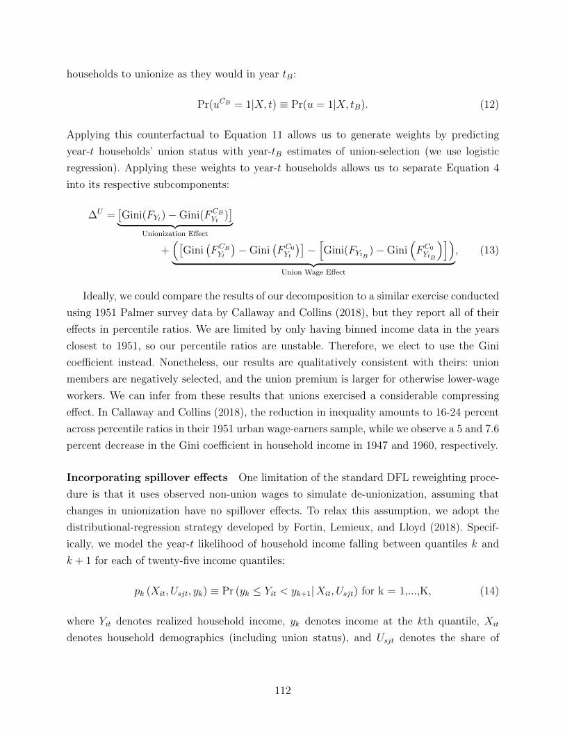
households to unionize as they would in year tB:
Pr(uCB = 1|X, t) ≡ Pr(u = 1|X, tB). (12)
Applying this counterfactual to Equation 11 allows us to generate weights by predicting
year-t households’ union status with year-tB estimates of union-selection (we use logistic
regression). Applying these weights to year-t households allows us to separate Equation 4
into its respective subcomponents:
∆U =[Gini(FYt)−Gini(FCB
Yt)]︸ ︷︷ ︸
Unionization Effect
+([
Gini(FCBYt
)−Gini
(FC0Yt
)]−[Gini(FYtB
)−Gini(FC0YtB
)])︸ ︷︷ ︸
Union Wage Effect
, (13)
Ideally, we could compare the results of our decomposition to a similar exercise conducted
using 1951 Palmer survey data by Callaway and Collins (2018), but they report all of their
effects in percentile ratios. We are limited by only having binned income data in the years
closest to 1951, so our percentile ratios are unstable. Therefore, we elect to use the Gini
coefficient instead. Nonetheless, our results are qualitatively consistent with theirs: union
members are negatively selected, and the union premium is larger for otherwise lower-wage
workers. We can infer from these results that unions exercised a considerable compressing
effect. In Callaway and Collins (2018), the reduction in inequality amounts to 16-24 percent
across percentile ratios in their 1951 urban wage-earners sample, while we observe a 5 and 7.6
percent decrease in the Gini coefficient in household income in 1947 and 1960, respectively.
Incorporating spillover effects One limitation of the standard DFL reweighting proce-
dure is that it uses observed non-union wages to simulate de-unionization, assuming that
changes in unionization have no spillover effects. To relax this assumption, we adopt the
distributional-regression strategy developed by Fortin, Lemieux, and Lloyd (2018). Specif-
ically, we model the year-t likelihood of household income falling between quantiles k and
k + 1 for each of twenty-five income quantiles:
pk (Xit, Usjt, yk) ≡ Pr (yk ≤ Yit < yk+1|Xit, Usjt) for k = 1,...,K, (14)
where Yit denotes realized household income, yk denotes income at the kth quantile, Xit
denotes household demographics (including union status), and Usjt denotes the share of
112
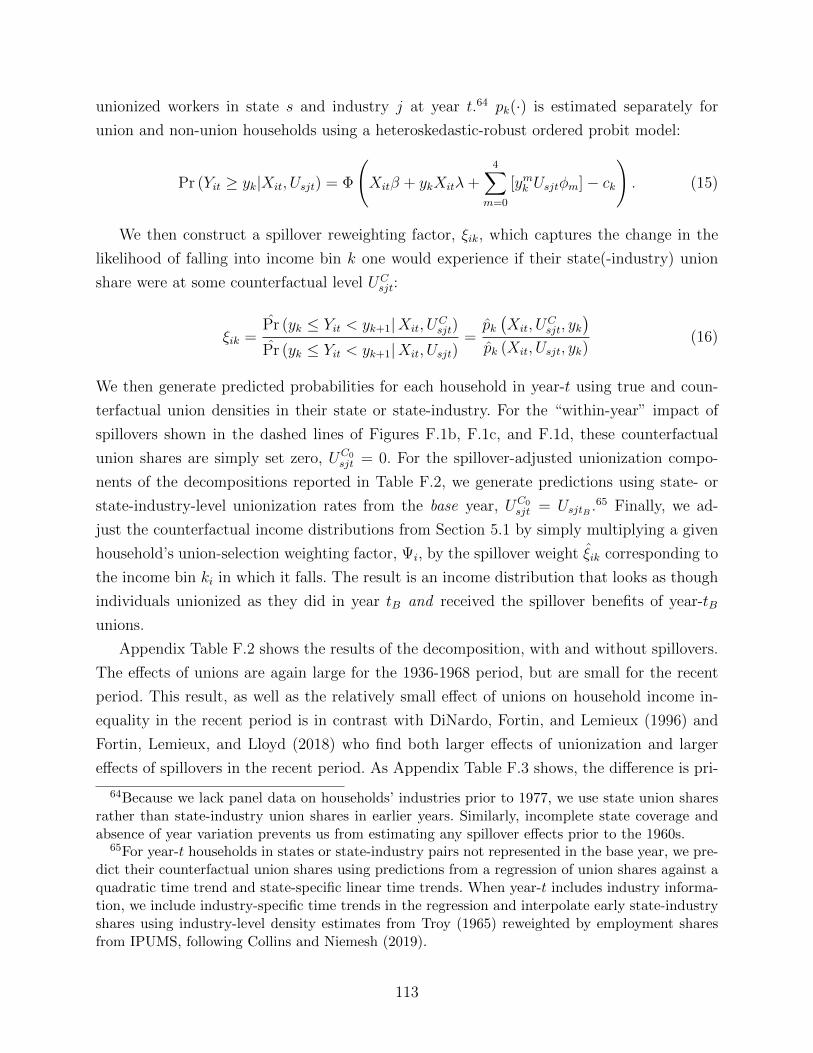
unionized workers in state s and industry j at year t.64 pk(·) is estimated separately for
union and non-union households using a heteroskedastic-robust ordered probit model:
Pr (Yit ≥ yk|Xit, Usjt) = Φ
(Xitβ + ykXitλ+
4∑m=0
[ymk Usjtφm]− ck
). (15)
We then construct a spillover reweighting factor, ξik, which captures the change in the
likelihood of falling into income bin k one would experience if their state(-industry) union
share were at some counterfactual level UCsjt:
ξik =Pr (yk ≤ Yit < yk+1|Xit, U
Csjt)
Pr (yk ≤ Yit < yk+1|Xit, Usjt)=pk(Xit, U
Csjt, yk
)pk (Xit, Usjt, yk)
(16)
We then generate predicted probabilities for each household in year-t using true and coun-
terfactual union densities in their state or state-industry. For the “within-year” impact of
spillovers shown in the dashed lines of Figures F.1b, F.1c, and F.1d, these counterfactual
union shares are simply set zero, UC0sjt = 0. For the spillover-adjusted unionization compo-
nents of the decompositions reported in Table F.2, we generate predictions using state- or
state-industry-level unionization rates from the base year, UC0sjt = UsjtB .65 Finally, we ad-
just the counterfactual income distributions from Section 5.1 by simply multiplying a given
household’s union-selection weighting factor, Ψi, by the spillover weight ξik corresponding to
the income bin ki in which it falls. The result is an income distribution that looks as though
individuals unionized as they did in year tB and received the spillover benefits of year-tB
unions.
Appendix Table F.2 shows the results of the decomposition, with and without spillovers.
The effects of unions are again large for the 1936-1968 period, but are small for the recent
period. This result, as well as the relatively small effect of unions on household income in-
equality in the recent period is in contrast with DiNardo, Fortin, and Lemieux (1996) and
Fortin, Lemieux, and Lloyd (2018) who find both larger effects of unionization and larger
effects of spillovers in the recent period. As Appendix Table F.3 shows, the difference is pri-
64Because we lack panel data on households’ industries prior to 1977, we use state union sharesrather than state-industry union shares in earlier years. Similarly, incomplete state coverage andabsence of year variation prevents us from estimating any spillover effects prior to the 1960s.
65For year-t households in states or state-industry pairs not represented in the base year, we pre-dict their counterfactual union shares using predictions from a regression of union shares against aquadratic time trend and state-specific linear time trends. When year-t includes industry informa-tion, we include industry-specific time trends in the regression and interpolate early state-industryshares using industry-level density estimates from Troy (1965) reweighted by employment sharesfrom IPUMS, following Collins and Niemesh (2019).
113
marily due to the inequality concept and population being used, rather than the differences
in the selection equation. We use household income inequality, while DiNardo, Fortin, and
Lemieux (1996) use individual earnings inequality, and often focus on men. Changing house-
hold composition, female labor force participation, and wealth inequality are just some of
the forces affecting household income inquality that would be missed in simply looking at in-
dividual male earnings. The divergence between household and individual inequality changes
is smaller in the early part of our sample than the latter part: the top 10% measured by
individual income in Piketty, Saez, and Zucman (2018) between 1936 and 1968 is 13.2, while
it is 12.4 when measured in tax units (which are closer to our notion of households), while
the change in top 10% between 1968 and 2014 is 8.6 when measured at the individual level
while it is 12.4 when measured at the tax unit level.
114
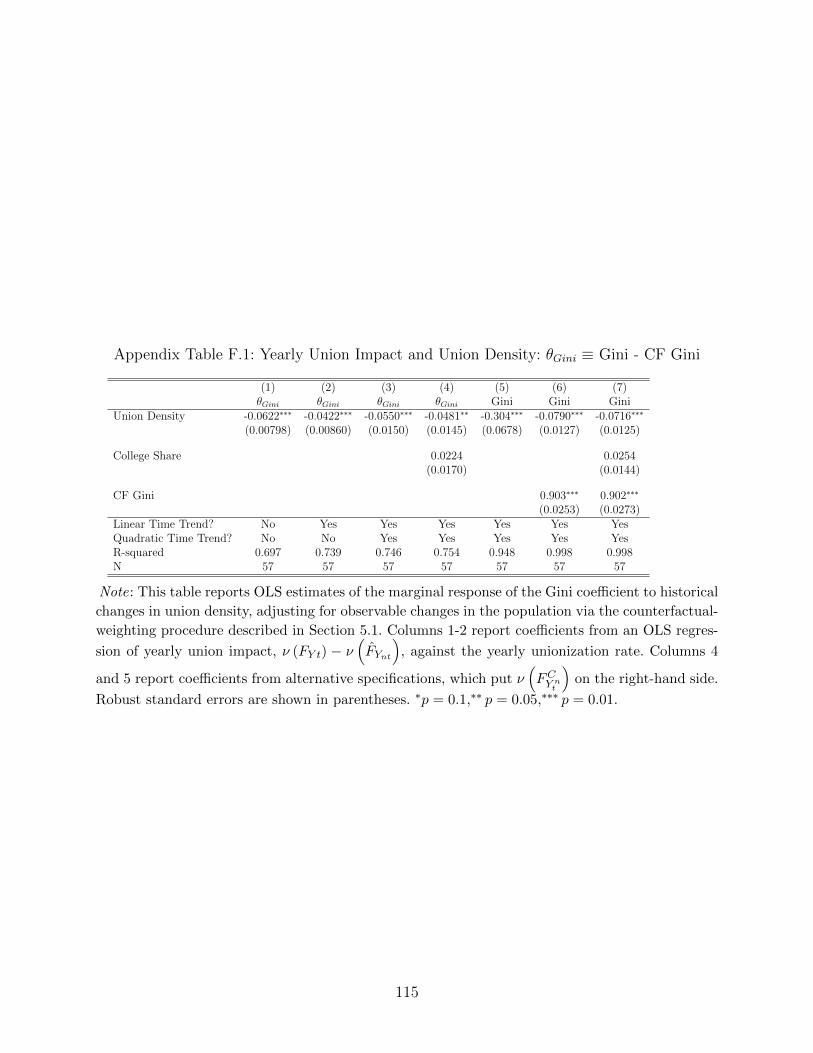
Appendix Table F.1: Yearly Union Impact and Union Density: θGini ≡ Gini - CF Gini
(1) (2) (3) (4) (5) (6) (7)θGini θGini θGini θGini Gini Gini Gini
Union Density -0.0622∗∗∗ -0.0422∗∗∗ -0.0550∗∗∗ -0.0481∗∗ -0.304∗∗∗ -0.0790∗∗∗ -0.0716∗∗∗
(0.00798) (0.00860) (0.0150) (0.0145) (0.0678) (0.0127) (0.0125)
College Share 0.0224 0.0254(0.0170) (0.0144)
CF Gini 0.903∗∗∗ 0.902∗∗∗
(0.0253) (0.0273)Linear Time Trend? No Yes Yes Yes Yes Yes YesQuadratic Time Trend? No No Yes Yes Yes Yes YesR-squared 0.697 0.739 0.746 0.754 0.948 0.998 0.998N 57 57 57 57 57 57 57
Note: This table reports OLS estimates of the marginal response of the Gini coefficient to historical
changes in union density, adjusting for observable changes in the population via the counterfactual-
weighting procedure described in Section 5.1. Columns 1-2 report coefficients from an OLS regres-
sion of yearly union impact, ν (FY t) − ν(FYnt
), against the yearly unionization rate. Columns 4
and 5 report coefficients from alternative specifications, which put ν(FCY nt
)on the right-hand side.
Robust standard errors are shown in parentheses. ∗p = 0.1,∗∗ p = 0.05,∗∗∗ p = 0.01.
115
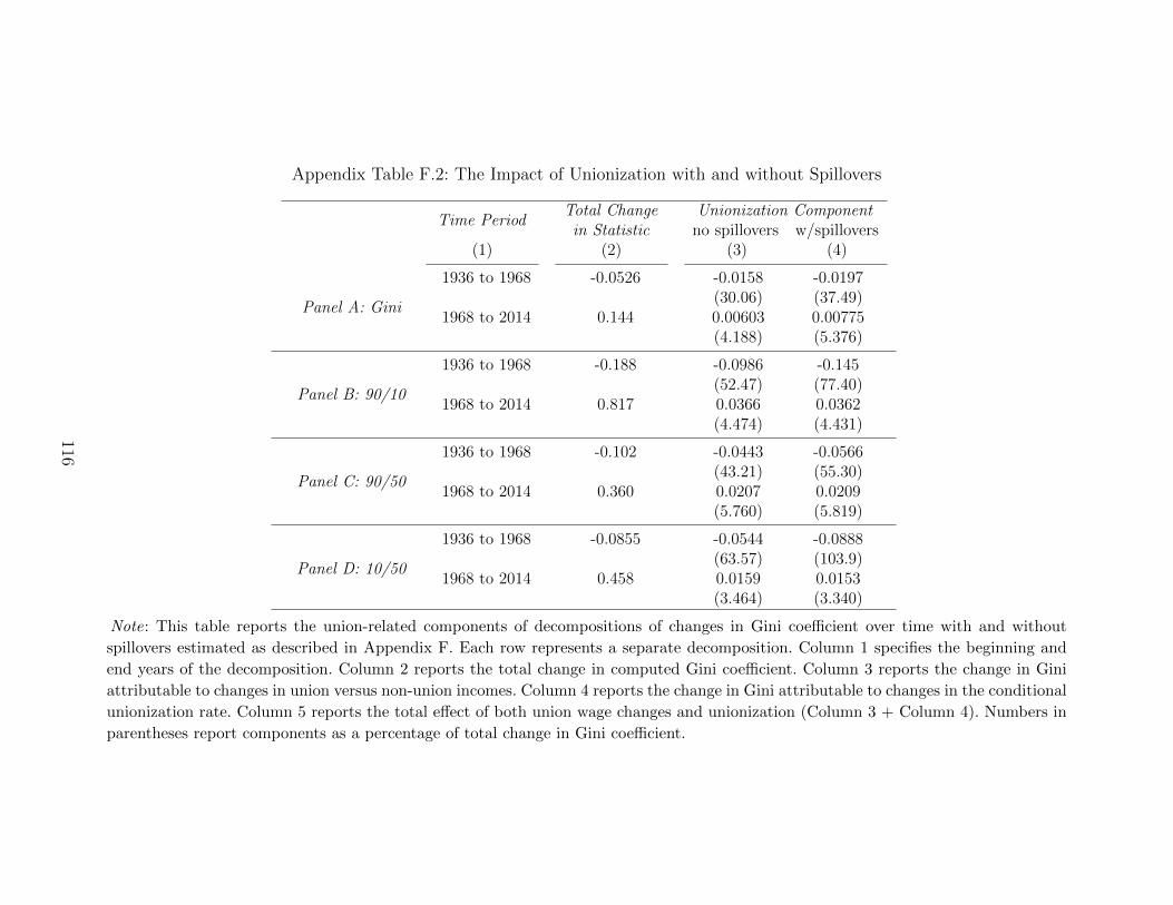
Appendix Table F.2: The Impact of Unionization with and without Spillovers
Time PeriodTotal Change Unionization Component
in Statistic no spillovers w/spillovers(1) (2) (3) (4)
Panel A: Gini
1936 to 1968 -0.0526 -0.0158 -0.0197(30.06) (37.49)
1968 to 2014 0.144 0.00603 0.00775(4.188) (5.376)
Panel B: 90/10
1936 to 1968 -0.188 -0.0986 -0.145(52.47) (77.40)
1968 to 2014 0.817 0.0366 0.0362(4.474) (4.431)
Panel C: 90/50
1936 to 1968 -0.102 -0.0443 -0.0566(43.21) (55.30)
1968 to 2014 0.360 0.0207 0.0209(5.760) (5.819)
Panel D: 10/50
1936 to 1968 -0.0855 -0.0544 -0.0888(63.57) (103.9)
1968 to 2014 0.458 0.0159 0.0153(3.464) (3.340)
Note: This table reports the union-related components of decompositions of changes in Gini coefficient over time with and without
spillovers estimated as described in Appendix F. Each row represents a separate decomposition. Column 1 specifies the beginning and
end years of the decomposition. Column 2 reports the total change in computed Gini coefficient. Column 3 reports the change in Gini
attributable to changes in union versus non-union incomes. Column 4 reports the change in Gini attributable to changes in the conditional
unionization rate. Column 5 reports the total effect of both union wage changes and unionization (Column 3 + Column 4). Numbers in
parentheses report components as a percentage of total change in Gini coefficient.
116
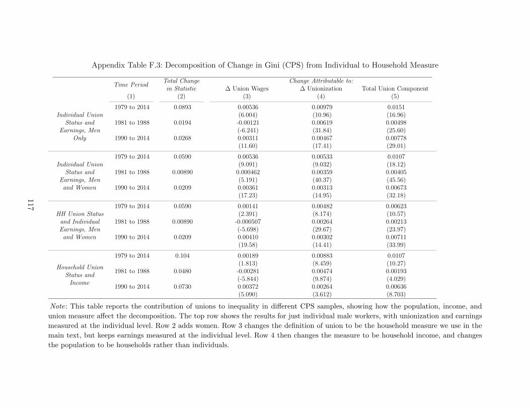
Appendix Table F.3: Decomposition of Change in Gini (CPS) from Individual to Household Measure
Time PeriodTotal Change Change Attributable to:
in Statistic ∆ Union Wages ∆ Unionization Total Union Component(1) (2) (3) (4) (5)
Individual UnionStatus and
Earnings, MenOnly
1979 to 2014 0.0893 0.00536 0.00979 0.0151(6.004) (10.96) (16.96)
1981 to 1988 0.0194 -0.00121 0.00619 0.00498(-6.241) (31.84) (25.60)
1990 to 2014 0.0268 0.00311 0.00467 0.00778(11.60) (17.41) (29.01)
Individual UnionStatus and
Earnings, Menand Women
1979 to 2014 0.0590 0.00536 0.00533 0.0107(9.091) (9.032) (18.12)
1981 to 1988 0.00890 0.000462 0.00359 0.00405(5.191) (40.37) (45.56)
1990 to 2014 0.0209 0.00361 0.00313 0.00673(17.23) (14.95) (32.18)
HH Union Statusand IndividualEarnings, Men
and Women
1979 to 2014 0.0590 0.00141 0.00482 0.00623(2.391) (8.174) (10.57)
1981 to 1988 0.00890 -0.000507 0.00264 0.00213(-5.698) (29.67) (23.97)
1990 to 2014 0.0209 0.00410 0.00302 0.00711(19.58) (14.41) (33.99)
Household UnionStatus and
Income
1979 to 2014 0.104 0.00189 0.00883 0.0107(1.813) (8.459) (10.27)
1981 to 1988 0.0480 -0.00281 0.00474 0.00193(-5.844) (9.874) (4.029)
1990 to 2014 0.0730 0.00372 0.00264 0.00636(5.090) (3.612) (8.703)
Note: This table reports the contribution of unions to inequality in different CPS samples, showing how the population, income, and
union measure affect the decomposition. The top row shows the results for just individual male workers, with unionization and earnings
measured at the individual level. Row 2 adds women. Row 3 changes the definition of union to be the household measure we use in the
main text, but keeps earnings measured at the individual level. Row 4 then changes the measure to be household income, and changes
the population to be households rather than individuals.
117
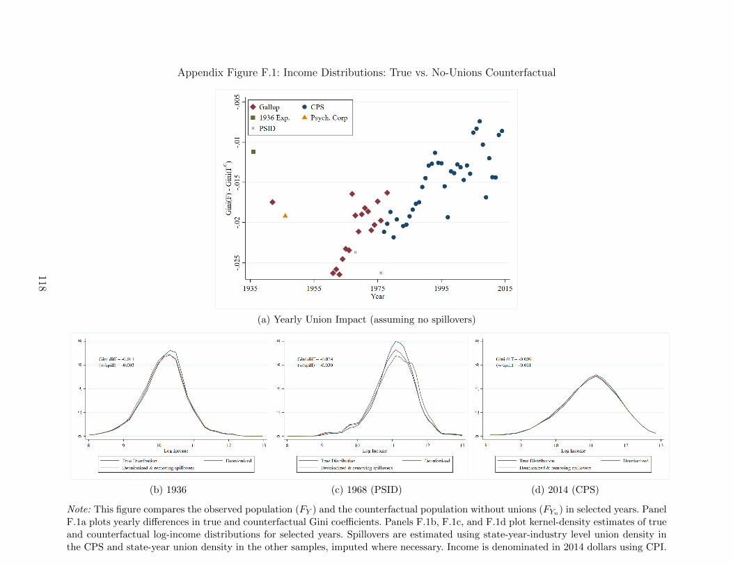
Appendix Figure F.1: Income Distributions: True vs. No-Unions Counterfactual
(a) Yearly Union Impact (assuming no spillovers)
(b) 1936 (c) 1968 (PSID) (d) 2014 (CPS)
Note: This figure compares the observed population (FY ) and the counterfactual population without unions (FYn) in selected years. PanelF.1a plots yearly differences in true and counterfactual Gini coefficients. Panels F.1b, F.1c, and F.1d plot kernel-density estimates of trueand counterfactual log-income distributions for selected years. Spillovers are estimated using state-year-industry level union density inthe CPS and state-year union density in the other samples, imputed where necessary. Income is denominated in 2014 dollars using CPI.
118
References
Callaway, Brantly and William J Collins (2018). “Unions, workers, and wages at the peak of
the American labor movement”. Explorations in Economic History 68, pp. 95–118.
Collins, William J and Gregory T Niemesh (2019). “Unions and the Great Compression
of wage inequality in the US at mid-century: evidence from local labour markets”. The
Economic History Review 72.2, pp. 691–715.
DiNardo, John, Nicole M Fortin, and Thomas Lemieux (1996). “Labor Market Institutions
and the Distribution of Wages, 1973-1992: A Semiparametric Approach”. Econometrica
64.5, pp. 1001–1044.
Fortin, Nicole, Thomas Lemieux, and Neil Lloyd (2018). Labor Market Institutions and the
Distribution of Wages: The Role of Spillover Effects. Tech. rep. Working Paper.
Piketty, Thomas, Emmanuel Saez, and Gabriel Zucman (2018). “Distributional national
accounts: methods and estimates for the United States”. The Quarterly Journal of Eco-
nomics 133.2, pp. 553–609.
Troy, Leo (1965). Trade Union Membership, 1897–1962. NBER.
119
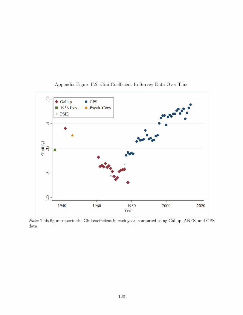
Appendix Figure F.2: Gini Coefficient In Survey Data Over Time
Note: This figure reports the Gini coefficient in each year, computed using Gallup, ANES, and CPSdata.
120
Appendix G. Detailed IV analysis
As we demonstrate in Section 5 of the main text, there is a robust, negative relationship
between union density and a variety of inequality measures, both at the aggregate time-series
level (Section 5.2) and at the state-year level (Section 5.3). In this Appendix, we provide a
more detailed treatment of the IV analysis summarized in Section 5.4 of the main paper.
We focus on two key policy shocks that take place in the 1930s and 1940s, both of which
had large but differential effects across states, allowing for identification of the effects of
changes in state-level union density on changes in state-level measures of inequality. We begin
by presenting historical details on the relevance of the two policy changes and qualitative
evidence on the plausibility of the exclusion restriction. We then present our first-stage and
2SLS estimates, followed by a variety of econometric checks on our identification assumptions.
G.1. Two policy shocks that increased union density
We make use of two historical policies that together spurred a substantial increase in union
density over a short, roughly ten-year period of time. First, we use the legalization of union
organizing itself via the 1935 National Labor Relations Act (the NLRA, or “Wagner Act”)
and the 5-4 Supreme Court decision that upheld its constitutionality in 1937. As we will
show, these events are associated with a modest increase in strike activity but a much larger
increase in the probability of a strike’s success, as well as a large increase in union members
via the Act’s establishment of a union recognition process via the National Labor Relations
Board (NLRB). We construct our “Wagner Act” shock as follows: new union members, by
state, added from 1935 to 1938 via NLRB elections and successful recognition strikes, divided
by 1930 state population.66
In the midst of this new legal opportunity for union organizing, Germany invaded Poland
in September of 1939, marking the start of World War II in Europe. By the spring of 1940,
the war created enormous U.S. government demand for military equipment to aid the Allied
cause. Between 1940 and 1945, the federal government mobilized much of the country’s
66For the NLRB elections data, we thank Ethan Kaplan. The strikes data come from The LaborFact Book, a publication of Labor Research Associates (LRA), which was a labor journal thatoperated from the 1930s through the 1960s. The Labor Fact Books only record large strikes, butunlike BLS strike measures they allow us to tabulate successful union recognition strikes by state,obviously crucial to our state-year analysis. Where multiple states are listed we assign them equally,but have also experimented with allocation based on share manufacturing. Note that BLS reportsalso records much of this information (whether a strike is for union recognition or some othergoal, the strike’s outcome, the state, etc.), but all in separate tables, and thus constructing cross-tabulations by state is not possible.
121
industrial capacity for war production, spending $340 billion on national defense (or over
three times the nominal GDP in 1940).67 Because the war coincided with unprecedented
union power, important concessions were made to labor in exchange for its cooperation.
First, Roosevelt announced in 1940 that only firms that were NLRA-compliant would receive
defense contracts from the National Defense Advisory Commission.68 Second, when the US
enters the war after Pearl Harbor as a military combatant, the newly established National
War Labor Board (NWLB) imposes automatic enrollment and maintenance-of-membership
at any firm receiving war-related production orders: if the firm was unionized, then any new
worker would be default-enrolled into the union upon starting a job and would be maintained
as a union member. He would only have a 15-day window to dis-enroll, but “few workers took
the initiative to withdraw from the union in their first hectic weeks on the job.”69 Third, the
NWLB allowed unions to have dues automatically deducted from members’ paychecks (“dues
checkoff”), eliminating the onerous practice of nagging members in-person for late dues and
creating for the first time a steady source of revenue for unions. As we show in Appendix
Figure G.2, unions managed to organize other “superstar” firms of the time during the war.
Further, the new union members brought in under these policies were disproportionately low
education and, as we show in Appendix Figure G.3, Black, who have larger union premia
than the average union member.
Given the thumb the government put on the scale in unions’ favor in war-related indus-
tries, we posit that the more defense contracts a state received during the war, the more union
density grew. We construct our “war spending shock” as follows: total 1940-1945 military
spending by state, divided by state population.70
G.2. First-stage relationship between the policy shocks and union
density
G.2.1. Results in changes
We take two approaches to documenting the first-stage relationship and other results. First,
we examine results in changes within state. We take care to avoid years during the Second
67See Brunet (2018).68This convinced even the staunchly anti-union Henry Ford to recognize the United Auto Workers
(UAW) in 1941, lest he lose out on these enormous defense contracts. See chapter six of Loomis(2018)
69See Lichtenstein (2003), Kindle Location 1415.70We use newly digitized war-era military supply contract data to construct per capita 1940-1945
war spending for each state. This measure is in 1942 dollars. We are very grateful to Gillian Brunetfor sharing these data.
122
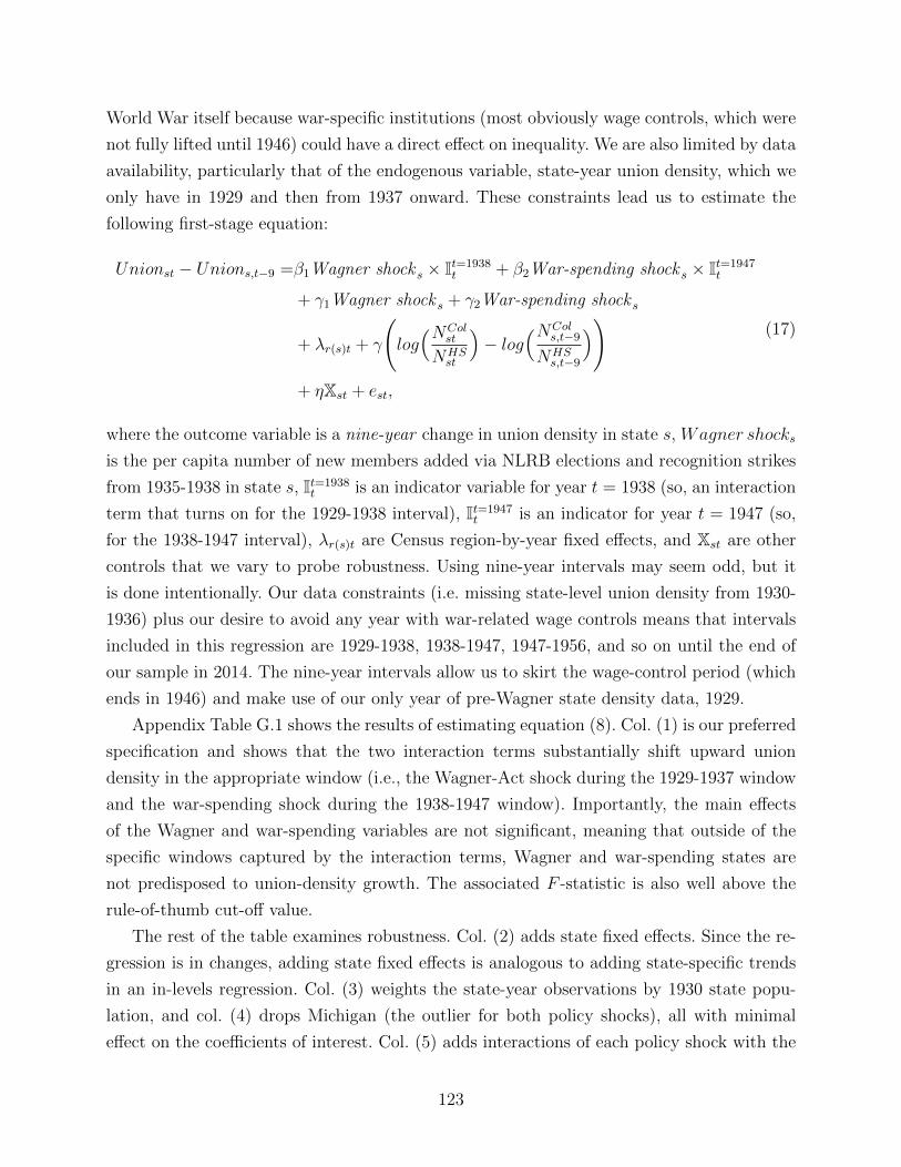
World War itself because war-specific institutions (most obviously wage controls, which were
not fully lifted until 1946) could have a direct effect on inequality. We are also limited by data
availability, particularly that of the endogenous variable, state-year union density, which we
only have in 1929 and then from 1937 onward. These constraints lead us to estimate the
following first-stage equation:
Unionst − Unions,t−9 =β1Wagner shock s × It=1938t + β2War-spending shock s × It=1947
t
+ γ1Wagner shock s + γ2War-spending shock s
+ λr(s)t + γ
(log(NCol
st
NHSst
)− log
(NCols,t−9
NHSs,t−9
))+ ηXst + est,
(17)
where the outcome variable is a nine-year change in union density in state s, Wagner shocks
is the per capita number of new members added via NLRB elections and recognition strikes
from 1935-1938 in state s, It=1938t is an indicator variable for year t = 1938 (so, an interaction
term that turns on for the 1929-1938 interval), It=1947t is an indicator for year t = 1947 (so,
for the 1938-1947 interval), λr(s)t are Census region-by-year fixed effects, and Xst are other
controls that we vary to probe robustness. Using nine-year intervals may seem odd, but it
is done intentionally. Our data constraints (i.e. missing state-level union density from 1930-
1936) plus our desire to avoid any year with war-related wage controls means that intervals
included in this regression are 1929-1938, 1938-1947, 1947-1956, and so on until the end of
our sample in 2014. The nine-year intervals allow us to skirt the wage-control period (which
ends in 1946) and make use of our only year of pre-Wagner state density data, 1929.
Appendix Table G.1 shows the results of estimating equation (8). Col. (1) is our preferred
specification and shows that the two interaction terms substantially shift upward union
density in the appropriate window (i.e., the Wagner-Act shock during the 1929-1937 window
and the war-spending shock during the 1938-1947 window). Importantly, the main effects
of the Wagner and war-spending variables are not significant, meaning that outside of the
specific windows captured by the interaction terms, Wagner and war-spending states are
not predisposed to union-density growth. The associated F -statistic is also well above the
rule-of-thumb cut-off value.
The rest of the table examines robustness. Col. (2) adds state fixed effects. Since the re-
gression is in changes, adding state fixed effects is analogous to adding state-specific trends
in an in-levels regression. Col. (3) weights the state-year observations by 1930 state popu-
lation, and col. (4) drops Michigan (the outlier for both policy shocks), all with minimal
effect on the coefficients of interest. Col. (5) adds interactions of each policy shock with the
123
“wrong” window to the col. 1 regression—a demanding specification check given the high
correlation between the two variables, as shown earlier in Appendix Figure G.4. While the
standard errors on the variables of interest increase somewhat, the point-estimates are quite
stable. Moreover, the coefficients on the “wrong” interactions are insignificant: the effect of
the Wagner shock is only significant in the earlier window and that of the war shock only
significant in the later window.
Nonetheless, it is clear from the changes in the coefficients and the fall in the F-statistic
between columns (3) and (5) that the two shocks are highly correlated. Appendix Figure G.4
shows a scatter plot of our two policy shock variables. The figure shows, as expected, that
Michigan (the birthplace of the modern U.S. labor movement in the 1930s and the “Arsenal
of Democracy” during the war) is an outlier for both of the shocks. More generally, the two
shocks have a correlation of 0.7, and so we pool the two shocks into a single state-level shock
variable. Using this single instrument and interacting it with the two treatment windows
gives similar results, as shown in column (6) of Table G.1.
G.2.2. Results in levels
The second approach we take is more graphical and non-parametric: we simply regress state-
year union density (in levels) on the pooled policy shock variable, separately in each year.
Instead of using nine-year intervals to avoid the war and specifying in which windows we
expect the see effects, we plot the relationship in each year and observe whether the changes
emerge in the periods we predict.
In particular, we estimate:
Unionst =∑
y∈1929,1937...2014
βyIVsIt=yt + λr(s)t + Xstγ + est, (18)
where Unionst is state-year density, IVs is the time-invariant pooled policy shock variable
for state s, It=yt is an indicator variable for when year t is equal to year y, λr(s)t is a vector of
region×year fixed effects, and Xst is a vector of covariates that we vary to probe robustness,
but always includes log skill shares log(
NColst
NHSst
). y is summed over all years for which we
have a state-year union density estimate (i.e. 1929 and then 1937 onward). In our baseline
estimation, Xst is omitted, and thus equation (18) is equivalent to regressing union density
on the pooled IV and region fixed effects separately by each year of the sample period, and
then plotting the resulting βy values.
As the results are in levels, our hypothesis makes predictions about the changes in the
relationship between union density and the pooled IV variable. We argue that the only time
union density should exhibit a sustained change in its relationship with the IV is during the
124
treatment period (1935 to the end of the war), and that the relationship should increase. We
are agnostic as to the sign of the density-IV correlation before the treatment period, but we
expect that it should increase from this level on during the treatment period.
The results from the baseline estimation are shown in the first series of Figure G.5.
We only have pre-period data for 1929, but we see a large increase from 1929 to 1937.
Unfortunately we cannot show the precise timing due to lack of data. The coefficient in
1929 is close to zero, showing that before the treatment period, states about to be hit by
our policy shock variables were not historically union friendly. From 1937 onward we have
annual data, and the relationship between the IV and union density increases steadily during
the remainder of the treatment period. Afterwards, we see no sustained increase but also no
back-sliding, suggesting that the states hit by the policy shock variables retain (relative to
other states) greater density levels even after the war ends.
G.3. Are the policy shocks plausibly exogenous?
Appendix Table G.1 and Figure G.5 show that our shocks appear to have a strong, first-stage
effect on union density, but of course they do not speak to whether the shocks provide a valid
experiment. In arguing that these policy shocks provide quasi-exogenous variation in union
density, we never claim that they hit a random subset of states. Indeed, states with larger
IV values (i.e., those that gained more union members via strikes and elections in the mid
and late 1930s as well as received more dollars per capita of government war contracts) were
different in important ways from other states. Table G.2 uses the 1920 Census to examine
what state-level characteristics predict the pooled IV variable. By far the strongest predictor
is the manufacturing share of employment in the state. Not only is pre-period manufacturing
a key predictor of the IV, but the manufacturing sector is key to the first-stage of the IV as
well, as we are arguing that the government taking over manufacturing production during
World War II was the driving mechanism for why war spending increased union density
in a state. For these reasons, we will give special attention to the potential confound of
manufacturing in Section G.5.1.
The rest of this section provides historical context for the two policy shocks, which helps
establish their validity as sources of identification.
G.3.1. The “Wagner shock”
The historical consensus, both from contemporaneous accounts as well as more modern
assessments, argues that the decision of the federal government to no longer intervene on the
side of employers—not a sudden increase in union demand among workers—led to the historic
125
gains in density immediately after the Wagner Act’s passage. Employers had considerable
latitude, both legal and extra-legal, in combating unions before Wagner. Firms put down
strikes and other organizing activity with an array of raw paramilitary power and espionage,
and if needed, military assistance from the state. White, 2016 describes the weapons the
major steel companies stockpiled to deter or put down organizing activity: “[T]he major steel
companies had evolved potent systems of labor repression that included political and legal
resources as well as extensive police forces and stockpiles of armaments....massive arsenal[s]
of firearms and gas weapons.” Henry Ford not only commanded a “brutal private army”,
but also paid an espionage force of over 1,000 employees to spy on fellow workers and report
back any hints of organizing activity.71
A final recourse for firms was the power of the state. Prior to the NLRA, the coercive
powers of the American government, at all levels, were regularly used against organized la-
bor, with military deployments and judicial repression commonplace (Naidu and Yuchtman,
2018). Riker (1979) documents that the most frequent domestic use of the national military
in the nineteenth century was to put down labor unrest. As late as summer 1934 the na-
tional guard was called in to put down major strikes in Toledo and Minneapolis, as well as
a general strike of West-coast dockworkers lead by the Teamsters. In all cases the national
guard succeeded after pitched street battles.
The Wagner Act legally protected collective actions such as picketing and strikes, by-
passed judicial injunctions, and mandated resources for independent enforcement of orga-
nizing rights. It was this policy shift, not an increase in union organizing, that led to the
sudden gains in the second half of the 1930s. Writing about the 1937 Flint sit-down strike
(which led to GM’s official recognition of the UAW), Lichtenstein, 1995 notes that: “The
UAW victory was possible not so much because of the vast outpouring of union sentiment
among autoworkers, but because General Motors was temporarily denied recourse to the
police power of the state.” Taking a more modern perspective, Loomis (2018) agrees: “[T]he
government played a critical role in determining Flint’s outcome. Ten years earlier, with the
stridently anti-union Calvin Coolidge as president, the outcome would likely have turned out
very different, no matter what the Flint strikers did.”
We provide two pieces of evidence on strikes in support of historians’ contention that
organizing successes immediately after Wagner’s passage did not stem from an increase in
grass-roots organizing activity, but rather a top-down change in the rules government used
to referee management-labor relations. We treat strikes as a proxy for labor activism and
mobilization. First, zooming in on the period immediately before and after the Wagner
71The “private army” quote is from Loomis (2018, p. 122), and Lichtenstein (1995) discussesanti-union espionage at Ford.
126
Act passes, we show in Appendix Figure G.6 that strike activity increases only modestly
upon passage of the Wagner Act. We also show in Appendix Figure G.5 that strike activity
increases only modestly upon passage of the Wagner Act. Although leaders in the CIO
urged their colleagues to ”seize the once-in-a-lifetime organizing opportunities so evident in
the mid-1930s” (Lichtenstein, 2003)72, strike activity only rises by twenty percent. Nor do
their goals change remarkably, as there is only a modest uptick (15 percent) in the share of
strikes for which union recognition is a key goal.
The most dramatic change is the share of strikes that are successful, which increases from
just over twenty percent to forty percent. This time-series evidence supports the conclusion
of White (2016) that “poverty and resentments alone did not undermine the open shop. The
surge of unionization was influenced by the arrival from above of a new political economy
premised on greater regulation of industrial production by the federal government.”
Appendix Figure G.6 only speaks to national time-series evidence; it is possible that
organizing activity shifted toward union-friendly states after Wagner, in violation of our
identification story. By constrast, Appendix Figure G.7 shows that the relationship between
our Wagner variable and state strike activity is roughly constant since 1914 (the first year
of state-level strikes data). Essentially, the same states were striking before and after the
Wagner Act, but only met with success after its passage.
This steady relationship supports the reading that the geographic variation in post-NLRA
density gains can be modeled as arising from (a) constant differences in latent union demand
at the state level interacted with (b) a national policy shock in 1935 that allowed that demand
to translate into density gains. Latent union demand likely comes from industrial structure
(such as high fixed-cost capital investments and product market power enabling workers to
capture rents) or cultural and ideological differences across states. Political scientists and
sociologists (Davis, 1999; Eidlin, 2018; Goldfield, 1989) who study the period emphasize the
role of persistent communities and networks of highly ideological labor activists pushing for
strikes and other forms of collective action even when success was impossible. Appendix
Figure G.7 supports these arguments. If, as we claim, the geographic variation in post-
Wagner gains in density are explained by the interaction between long-standing differences
in demand for unions in certain localities and a shift in the federal government’s position
on the legality of organizing, then it should be possible to construct an alternative IV using
earlier episodes of union demand interacted with the treatment period. We perform this
exercise in Section G.5.2.
72As further evidence that the modest increase in organizing was likely endogenous to the NLRA,the CIO, with its unprecedented focus on organizing industrial workers, was only formed as acommittee within the AFL six months after the NLRA’s passage.
127
G.3.2. The “war shock”
While we will perform extensive robustness tests later in this Appendix, here we provide
evidence from existing work that per capita war spending is plausibly exogenous to other
factors that could shape inequality.
Brunet (2018), whose war-spending data we in fact use to construct our war-shock mea-
sure, shows that war spending had only a modest state-level fiscal multiplier (0.25 to 0.3).73
She conducts a battery of tests showing that war spending was independent of a variety of
other state-level changes during World War II. For example, she shows that war spending was
not correlated with increases in government employment, nor was it targeted to places with
more available labor (e.g., those states with lower pre-war employment levels). These results
foreshadow the success of our robustness checks in Section G.5, in that flexibly controlling
for a variety of state-level characteristics typically has little effect on our main results.
Furthermore, the war contracts did not radically change the geography of American
industry; contracts favored existing manufacturing firms and their subcontractors. As we
will show in Section G.5.1, any differential increase in manufacturing employment correlated
with the IV was extremely short-lived (disappearing by 1946), and states that received more
war contracts do not subsequently show faster growth in manufacturing employment after
the war ends. Much of war production involved conversion of existing factories, and as such
not substantially the expanding overall manufacturing share of employment. Yet, even in
states that built new factories to accommodate the demands of war production, such as
those in the South, manufacturing employment rapidly returned to baseline and did not
gain a solid foothold until decades later (Jaworski, 2017).
Finally, Rhode, Snyder Jr, and Strumpf (2017) show that during the war, defense con-
tracts were free of the usual political considerations. They find that the electoral importance
of a state did not predict the volume of its war contracts, perhaps because contracts were
drawn up directly by military, not Congressional or White House, agencies.74
73This result echoes Fishback and Cullen (2013), who find that war spending at the county-levelled to some modest population growth, but limited if any sustained per capita economic growth.
74In his memoirs, Donald Nelson, the chairman of the War Production Board, frequently empha-sizes the importance of ensuring that production orders came directly from the military and werefree of interference from civilian authorities. See Nelson (1946).
128
G.4. Main IV results
G.4.1. Results in changes
We begin with the two-stage-least-squares (2SLS) analogue of our first-stage results in Table
G.1, with Wagner shocks×It=1938t and War shocks×It=1947
t as the two excluded instruments.
The first six columns of Appendix Table G.3 show results when the top-ten income share
is the outcome, following the same specifications as in Appendix Table G.1. Our preferred
estimate in col. (1) suggests that a ten-percentage-point increase in state union density
decreases the top-ten share by roughly 6.2 percentage points, with the point-estimates from
other specifications ranging from 3.6 to 8.1 percentage points.
The remaining six columns of Appendix Table G.3 show analogous results using the state
labor-share as the outcome, with our preferred estimate indicating a 3.6 percentage point
increase from a ten percentage-point increase in density. The remaining specifications cluster
quite tightly around this baseline result.
For completeness, Appendix Table G.4 shows the corresponding reduced form specifica-
tions. Reassuringly, both instruments have independently significant effects on both labor
share and top ten share in most specifications that include the two together, with the war
shock having a larger reduced form effect than the Wagner Act shock.
G.4.2. Results in levels
As we did with the first-stage results, we also show annual results in levels. Again, predictions
in this setting map to changes in the relationship between the pooled IV variable and the
inequality outcomes. The only time when the relationship between the IV and our inequality
outcomes should change is during the treatment period. One advantage of this approach over
the 2SLS regressions is that we do not need to observe union density to plot the reduced-form
relationship between our inequality outcomes and the pooled IV variable. We can thus look
further back in time in the reduced form than we can in the first-stage.
The first series of Appendix Figure G.8 shows the relationship between the pooled IV and
the top-ten income share from 1917 onward, using the same specification as we showed for
the first-stage relationship in Appendix Figure G.5. The figure shows that in the pre-period,
the pooled IV is associated with a higher share of income going to the richest ten percent,
meaning states that would soon be hit by our pro-union policy shocks were not historically
more egalitarian (in fact, the opposite), at least by this measure. While noisy, this positive
pre-period relationship can generally be distinguished from zero each year and is largely
unchanged until the mid- to late-1930s. It then begins a dramatic and sustained decline. By
the start of the war in Europe, the sign of the relationship has flipped. The relationship slowly
129
recovers some of its magnitude over the rest of the sample period, but the changes cannot
be distinguished from zero in any of these years. The shape of the relationship between the
pooled IV and the top-ten share echoes the results from Appendix Table G.3: the only period
of sustained decrease in the relationship between top-ten inequality and the IV is during the
treatment period.
The first series of Appendix Figure G.9 is the labor-share analogue of this analysis. It
tells a very similar story, though data limitations shorten the pre-period relative to that of
state top-ten inequality. In the early 1930s, our IV predicts a lower state-level labor share,
again highlighting that states that would soon receive pro-union policy shocks were not
historically worker-friendly. Over the treatment period, the sign of this relationship flips and
then remains positive over the rest of the sample period. Again, the only period of sustained
increase in the relationship between the state-year top ten and labor shares to the IV is
during the treatment period.
G.5. Robustness checks
In this section, we rule out a number of potential violations of our exclusion restriction,
which says that any other determinants of inequality are independent of the change in union
density induced by our policy variables. Potential confounding variables include the change in
manufacturing employment, omitted determinants of new unionization following the Wagner
act, other policies such as taxes and minimum wages, and finally, any independent role of
egalitarian norms or beliefs. In the subsections below we present evidence ruling out these
alternative mechanisms.
G.5.1. Controlling for contemporaneous and pre-period difference in manufac-
turing
We start with the role of manufacturing, which we view as the most important potential
confound. As we showed in Appendix Table G.2, states that have a larger manufacturing
share of employment in the pre-treatment period have larger values for our IV variable, so
we have reason for concern.
The first three columns of Appendix Table G.5 show how our top-ten 2SLS results vary as
we add manufacturing controls. The first column of this table reproduces the baseline result,
col. 1 of Appendix Table G.3, for ease of comparison. In col. 2, including contemporaneous
state manufacturing share of employment and its interaction with the two treatment windows
reduces the first-stage F statistic somewhat and increases the coefficient on union density
from 0.62 to 0.7. In col. 3, controlling for 1920-era manufacturing share of employment also
130
reduces the first-stage F (to just below ten), with little effect on the second-stage point-
estimate. Interestingly, while adding these controls for manufacturing employment weakens
the first stage given its high correlation with the policy shock variables, contemporaneous
or historical manufacturing employment does not appear to be an alternative mechanism
for reducing top-ten-share inequality during our treatment periods. The coefficients on the
interactions of both manufacturing variables with the two treatment windows are positive
(significantly so for the first window), suggesting manufacturing-heavy states (all else, in-
cluding the policy shock variables, equal) predicts higher inequality during our treatment
period.
The first three columns of Appendix Table G.6 perform the parallel analysis when labor-
share is the outcome. As expected, the effects on the first-stage are identical, though in the
case of labor share the second-stage point-estimates are more stable, and the manufacturing
controls and interactions have coefficients close to zero.
We perform similar robustness tests in Appendix Figures G.5, G.8 and G.9. These test
demonstrate robustness of our estimated relationship between the pooled IV and union
density, top-ten share, and labor share, respectively, to including the same controls for man-
ufacturing employment. Echoing the results in the tables, the first stage is somewhat noisier,
but follows the same general shape. While the reduced-form relationships between the in-
equality outcomes and the pooled IV sometimes shift in levels, the large changes that occur
during our treatment period remain. We also control for pre-treatment agricultural share of
employment, as it is a potential confound noted in Brunet (2018), with little effect on the
estimates.
A final concern related to manufacturing is that the massive shift to producing the tanks,
planes, and artillery needed for the war effort may have permanently transformed some states’
manufacturing sectors, making it impossible to partial out any effect of the coincident rise of
unions. Appendix Figure G.10 puts the manufacturing share of employment on the left-hand
side of the analysis, exploring whether the shocks embedded in our pooled IV variable are
associated with permanent changes in a state’s manufacturing share of employment. While
a positive blip can be observed for the few years of direct American combat involvement, the
effect of the IV on state’s manufacturing share completely disappears by 1946, whereas the
effects on union density and inequality remain sticky. In fact, from 1910 to 1955 there is no
sustained change in the relationship between a state’s manufacturing employment and our
IV variable: states with greater values for the IV are clearly more reliant on manufacturing
employment, but the relationship is steady for over forty years. Beginning in the late 1950s,
which is well after our treatment period, the relationship begins a slow and steady decline.
To summarize, our key findings are robust to controlling flexibly for contemporaneous
131
manufacturing employment, as well as allowing pre-period differences in manufacturing em-
ployment to have a different effect in each year. These checks are important because of
the strong positive relationship between the IV and state-level manufacturing employment.
Moreover, the policy shocks we use as identification appear to have no lasting effect on
states’ manufacturing employment, consistent with the papers cited in Section G.3.2. States
with large values for the IV are more manufacturing intensive before, during, and after our
treatment period. It thus appears that manufacturing employment neither confounds nor
mediates the relationship between the IV and union density or that between the IV and our
inequality measures.
G.5.2. Using pre-treatment-period strikes as an alternative instrument
We view the Wagner Shock (i.e., the number of union members gained in a state from 1935
to 1038 via recognition strikes and NLRB elections) as the second most serious threat to the
IV analysis, considering that/given that it may be driven by local factors (e.g., friendly state
governments, unobserved increases in local labor demand, or other local economic conditions)
that might have their own independent effect on inequality. We do not observe coincident
changes in the relationship between the pooled IV and Democrats in the governor’s mansion.
Appendix Figure G.11 shows that in fact there is no systematic relationships between the
two variables over the course of our long sample period—it is possible that even within party,
IV states during the treatment period enjoyed more worker-friendly political environments
(or other local factors conducive to union organizing) in a manner difficult to observe.
We thus turn to a more comprehensive check on this possible endogeneity concern. As we
showed in section G.3 and Appendix Figure G.7, states that gained the most union members
immediately after the Wagner Act passed had long harbored the greatest latent demand for
unions (at least as proxied by strike activity). Yet until the mid 1930s, this demand did not
translate to greater density because the government consistently sided with management,
with no formal protection of the right to organize.
Based on this logic, we substitute the Wagner shock in our IV with a measure of pre-
period demand for unions: the (per capita) number of strikes in a state from 1921-1928, the
years immediately before our first year of union density data in 1929. Whatever economic
or political factors that might have contaminated the Wagner Act variable as an IV are
unlikely to exist in this earlier period. While FDR was neutral if not friendly toward unions,
Warren G. Harding’s inauguration in 1921 ushered in an intense anti-union period at the
federal level. Conversely, we might worry that union-friendly Democratic governors such
as Michigan’s Frank Murphy or Pennsylvania’s George Howard Earle III played a role in
the organization of industrial giants GM and U.S. Steel in the late 1930s, these states were
132
controlled by Republicans in the 1920s. Finally, whatever local economic conditions prevailed
in these states in the mid and late 1930s (specifically, the end of the Great Depression and
the start of the Roosevelt Recession) are unlikely to reflect conditions during this pre-crash
Roaring Twenties period. In summary, this measure reflects state-level demand for unions
among workers (which we argue is long-standing and slow-moving), but is purged of any
local effects specific to the mid- and late-1930s that may affect our outcomes of interest.
In Appendix Table G.7, we replicate the first-stage and 2SLS results using this measure
of latent union demand instead of the Wagner shock. The war-spending shock remains un-
changed. While the first-stage is less precise, the point-estimates are comparable to those in
Appendix Table G.1, and the resulting 2SLS point estimates are also similar to their baseline
estimates in Appendix Tables G.3.
G.5.3. Other robustness checks
The remaining rows of Appendix Tables G.5 and G.6 focus on robustness to other policies
that might reduce inequality. Of course, these could be “bad controls” in that, say, greater
union density might lead to states to increase the minimum wage or pass other worker-
friendly policies. Nonetheless, robustness to these controls would help show the centrality of
union density in moving our inequality measures during our treatment period. Furthermore,
the 1930s and 1940s is a moment of historically active policy-making at the federal and state
level, so it is important to show robustness to controlling flexibly for these policies.
Col. (4) of both tables adds as a control the share of tax units filing a federal income tax
return in each state-year (and, as always, its interaction with the two treatment windows),
as this share increases substantially during the war years and as such could have its own
effect on the income distribution (a large public-finance literature shows that even pre-tax
measures of inequality can be shaped by taxes). As we have alluded to already, local politics
could be a confound, and col. (5) thus controls in the same manner for whether the state
has a Democratic governor. The next two columns focus on state-level economic policy, in
particular the minimum wage (which states can raise above the federal minimum) and a
state-year “policy liberalism index” developed by Caughey and Warshaw (2016).
The next two columns refer to the local effects of major federal interventions. While our
IV makes use of America’s industrial support of the Allies, from December 1941 onward,
the U.S. was also an active military partner, and the loss of so many working-age men to
the armed forced may have had effects on labor markets during our key period. We thus
control for mobilization rates by state from 1942 to 1945, and as usual its interactions with
the treatment periods. In column (10), we control for per capita New Deal spending in each
state in the same manner.
133
The final two columns adds additional state-year level covariates. Column (11) adds state
top marginal tax rates on income, as described above, and Column (12) allows the state-year
level measure of skill shares to have a separate effect in each treatment period, rather than
a constant effect as in our main specification.
None of these controls meaningfully change the 2SLS coefficient for the labor-share out-
come. The one outcome sensitive to these controls for the top-ten outcome is the IRS share,
which is not surprising as the top-ten and the IRS share are drawn from the same data
source and thus some mechanical correlation is likely present. Even so, it remains negative
and significant. Moreover, none of these additional robustness checks reduce the first-stage
F statistic below ten.
G.5.4. Did World War II create egalitarian norms?
Finally, we consider a widely held view that the massive economic and military mobilization
during World War II created lasting, egalitarian social norms that helped keep inequality in
check for several decades.75 If such sentiment came in part from actual war-related produc-
tion, then it is a factor both correlated with our policy shock and related to inequality and
thus threatens our identification.
We respond to this claim in three ways. First, we look at Gallup questions asking people
how the war changed their views, in an attempt to see if aggregate changes in sentiment
support the “egalitarian social norms” hypothesis. Our results are surprising (at least to
us). We find no evidence that the war created the pro-labor or pro-worker sentiment that
we would expect if egalitarian norms were an important constraint on inequality in the
immediate post-war period. For example, in 1945, 56 percent of Gallup respondents tell
pollsters that their view of labor unions is worse than before the war, while only 19 percent
say the same of business owners and managers.76
The Gallup question that is most directly related to how the war shaped respondents’
views about fairness, deservingness, and income is from a June 1945 survey asking respon-
dents both who they think has done the best financially during the war and who should be
doing better?77 There is an overwhelming consensus that workers have made out well, as 62
75Goldin and Margo (1992), Piketty and Saez (2003), and Goldin and Katz (2008) are amonghighly-cited works in economics that speculate as to the war creating egalitarian social norms.
76In a March 1945 poll, Gallup asked: “Is your attitude toward labor unions today more or lessfavorable than it was before the war?” to which 56 percent answered “less favorable,” 24 percent“the same,” and 20 percent “more favorable.” Gallup asked in the same survey the analogousquestion, with “owners and managers of business concerns” in place of “labor unions.” In responseto this question, only 19 percent answered “less favorable,” 49 percent “the same” and 32 percent“more favorable.”
77These are questions 10a and 10b from the June 1-5, 1945 survey. The wording of question 10a
134
percent choose workers as the group that has done best, compared to only 19 percent that
chooses white-color professionals and managers/owners of businesses. Moreover, 38 percent
of Gallup subjects say that these well-off occupation groups should have done better during
the war, compared to only nine percent saying the same about workers.
While these aggregate sentiments cast some a priori doubt on the egalitarian-social-norms
hypothesis, our second response to the argument is to check if respondents in states hit with
the two policy shocks are more likely to say that the war changed their views in a worker-
friendly manner. In Table G.8 we regress a dummy variable coded as one if the respondent
said they think workers and the poor should be doing better than they are against the pooled
IV (col. 1), only the Wagner shock (col. 2), only the war-spending shock (col. 3), and both
variables entered in the same regression (col. 4). In all cases, the coefficients of interest are
very close to zero and insignificant. The remaining four columns perform the same exercise,
but for the respondent saying that business owners/managers and professionals should be
doing better. We again find small coefficients, with the only marginally significant results
suggesting that respondents in Wagner-shock states are more sympathetic to business and
professional interests.
Our third response considers a related “norms” argument: even if the war did not change
Americans’ stated views on what constitutes a fair income distribution, war-time wage struc-
tures altered worker reference points, and this process constrained post-war inequality (see,
e.g., Kahneman, Knetsch, and Thaler (1986) on how respect for reference points constrains
labor-market equilibria). The wages set by the NWLB and the 1942 Stabilization Act were
more egalitarian than those that prevailed in the pre-war economy. While the government
officially lifted them in 1946, workers and managers may have simply grown accustomed to
this new, more compressed wage structure.
Yet, the immediate post-war years seem an unlikely moment for reference points or ex-
pectations to have much bite. First, inflation spiked briefly after the war, which should have
quickly eroded any nominal wage stickiness.78 Second, labor churn reached an all-time high
after the war. U.S. military personnel shrunk from over 12 million in 1945 to only 1.5 mil-
lion by 1947, meaning that over ten million Americans suddenly entered the potential labor
is “What class or group of people in this country has done best financially during the war comparedto what they made before the war?” The follow-up question (10b) is: “Do you think any class orgroup of people in this country is NOT making as much money as it should? [capitalization in theoriginal].”
78Annual inflation during the war years averaged 5.1 percent, and was even lowerat 3.3 percent between 1943-1945, whereas it averaged over 11 percent in 1946-1947.See https://www.minneapolisfed.org/about-us/monetary-policy/inflation-calculator/
consumer-price-index-1913-.
135
supply.79 Similarly, non-farm payroll contracted by two million (or by 4.9 percent) in the
single month of September 1945, a record that would stand in both absolute and percentage
terms until the Covid-19-related layoffs in April 2020.80 Thus, even if workers had formed
strong reference points concerning wages during the war, those workers may not have been
in the same job or even still in the labor force a few years or even months later. Finally, the
War Industries Board during World War I also imposed wage controls in war production,
though without any of the pro-union policies that accompanied the World War II effort. If
norms born from wage controls limit post-war inequality growth, we should have expected a
similar, though muted, dampening of inequality in the years after the war, as U.S. involve-
ment lasted only 19 months, compared to 44 in World War II. Instead, the 1920s ushered in
historic growth of top-share income inequality.81
We thus conclude that in the immediate post-World-War-II era, unions were not partic-
ularly popular, and if anything war-era defense production had burnished the reputation of
business over that of workers. Nevertheless, war-era policy made unions powerful (both in
terms of millions of new members and solid revenue streams via automatic maintenance-of-
membership and dues check-off), and over the next few decades they played an important
role in maintaining historically low levels of inequality.
References
Acemoglu, Daron, David H Autor, and David Lyle (2004). “Women, war, and wages: The
effect of female labor supply on the wage structure at midcentury”. Journal of political
Economy 112.3, pp. 497–551.
Brunet, Gillian (2018). “Stimulus on the Home Front: The State-Level Effects of WWII
Spending”.
Caughey, Devin and Christopher Warshaw (2016). “The dynamics of state policy liberalism,
1936–2014”. American Journal of Political Science 60.4, pp. 899–913.
Davis, Mike (1999). Prisoners of the American dream: Politics and economy in the history
of the US working class. Verso.
Eidlin, Barry (2018). Labor and the Class Idea in the United States and Canada. Cambridge
University Press.
79See Acemoglu, Autor, and Lyle (2004).80See https://www.bls.gov/cps/employment-situation-covid19-faq-april-2020.pdf.81Goldin and Margo (1992) note that skill premia appear to briefly compress during the First
World War in the US but then quickly bounce back, and they also highlight the difference with theSecond World War.
136
Fishback, Price and Joseph A Cullen (2013). “Second World War spending and local eco-
nomic activity in US counties, 1939–58”. The Economic History Review 66.4, pp. 975–
992.
Goldfield, Michael (1989). “Worker insurgency, radical organization, and New Deal labor
legislation”. American Political Science Review 83.4, pp. 1257–1282.
Goldin, Claudia and Robert Margo (Feb. 1992). “The Great Compression: The Wage Struc-
ture in the United States at Mid-Century”. The Quarterly Journal of Economics 107,
pp. 1–34.
Goldin, Claudia Dale and Lawrence F Katz (2008). The race between education and technol-
ogy. Harvard University Press.
Jaworski, Taylor (2017). “World War II and the Industrialization of the American South”.
The Journal of Economic History 77.4, pp. 1048–1082.
Kahneman, Daniel, Jack L Knetsch, and Richard Thaler (1986). “Fairness as a constraint on
profit seeking: Entitlements in the market”. The American economic review, pp. 728–741.
Lichtenstein, Nelson (1995). Walter Reuther: The most dangerous man in Detroit. University
of Illinois Press.
— (2003). Labor’s War at Home: The CIO in World War II. Temple University Press.
Loomis, Erik (2018). A History of America in Ten Strikes. The New Press.
Naidu, Suresh and Noam Yuchtman (2018). Labor Market Institutions in the Gilded Age of
American Economic History. Tech. rep. National Bureau of Economic Research.
Nelson, Donald (1946). Arsenal of Ddemocracy: The story of American war production.
Harcourt, Brace and Company.
Piketty, Thomas and Emmanuel Saez (2003). “Income inequality in the United States, 1913–
1998”. The Quarterly journal of economics 118.1, pp. 1–41.
Rhode, Paul W, James M Snyder Jr, and Koleman Strumpf (2017). The Arsenal of democ-
racy: production and politics during WWII. Tech. rep. National Bureau of Economic
Research.
Riker, William H (1979). Soldiers of the States. Ayer Publishing.
White, Ahmed (2016). The last great strike: Little Steel, the CIO, and the struggle for labor
rights in New Deal America. Univ of California Press.
137
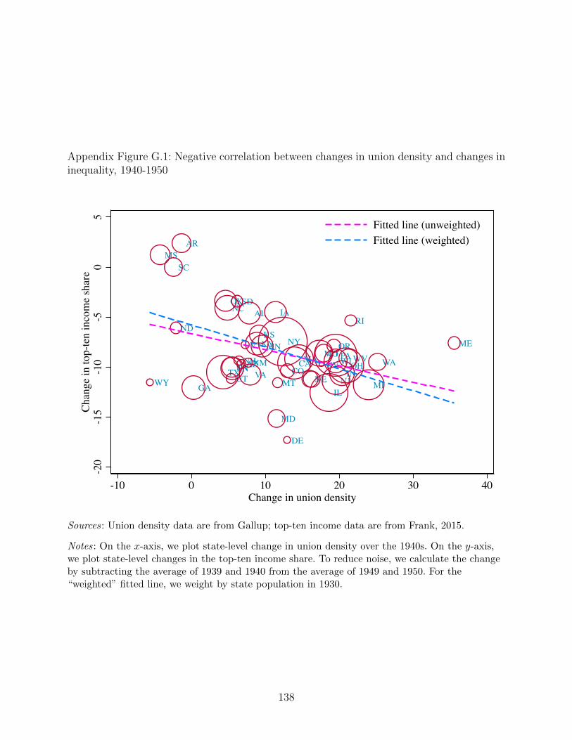
Appendix Figure G.1: Negative correlation between changes in union density and changes ininequality, 1940-1950
NY
MT
MA
MS
OHLA
NC
NM
AR
GAWY
MO
OK
PA
UTIL
VTCT
DE
FLIN
AL
MEKS
WA
NE
MD
RI
KYWV
TN CO
IA
NJ
CAAZNHMN
TX
SC
SD
WIVA
MI
ND
NV
OR
-20
-15
-10
-50
5Ch
ange
in to
p-te
n in
com
e sh
are
-10 0 10 20 30 40Change in union density
Fitted line (unweighted)Fitted line (weighted)
Sources: Union density data are from Gallup; top-ten income data are from Frank, 2015.
Notes: On the x-axis, we plot state-level change in union density over the 1940s. On the y-axis,we plot state-level changes in the top-ten income share. To reduce noise, we calculate the changeby subtracting the average of 1939 and 1940 from the average of 1949 and 1950. For the“weighted” fitted line, we weight by state population in 1930.
138
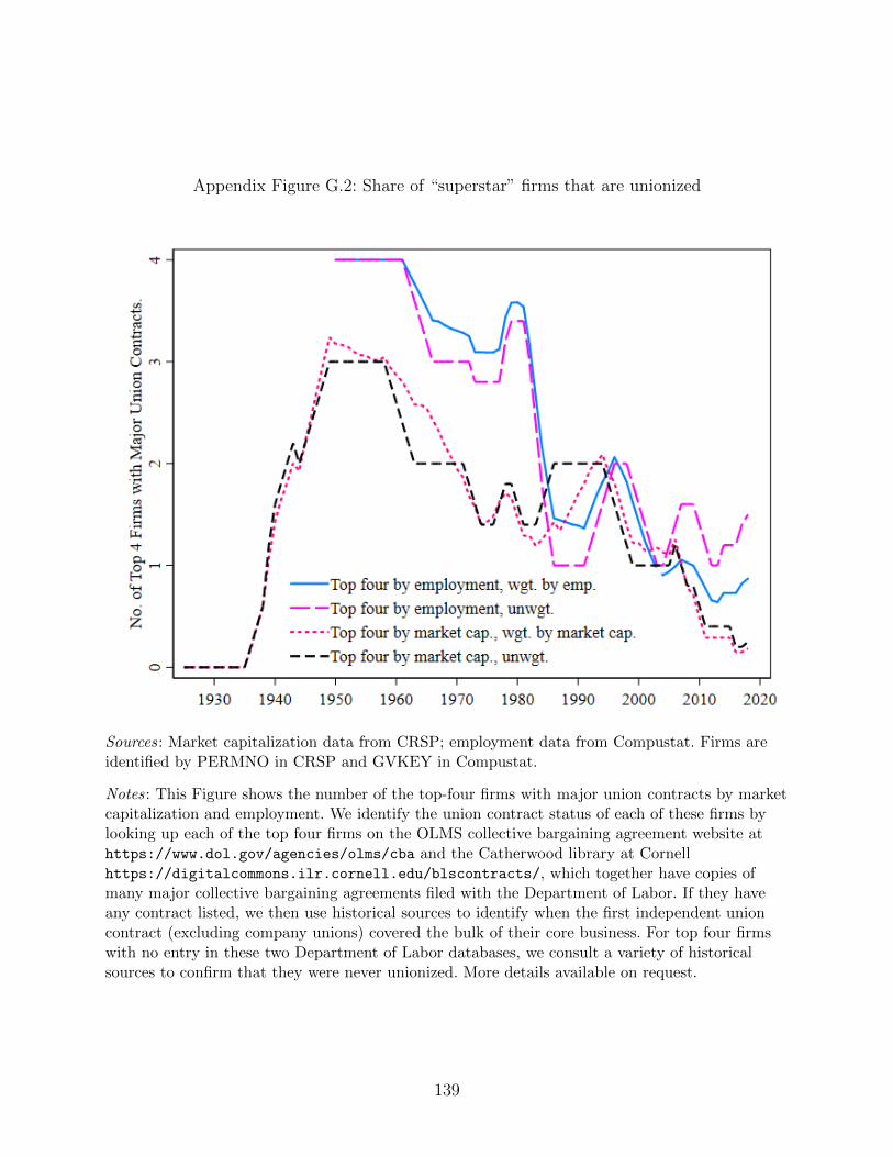
Appendix Figure G.2: Share of “superstar” firms that are unionized
Sources: Market capitalization data from CRSP; employment data from Compustat. Firms areidentified by PERMNO in CRSP and GVKEY in Compustat.
Notes: This Figure shows the number of the top-four firms with major union contracts by marketcapitalization and employment. We identify the union contract status of each of these firms bylooking up each of the top four firms on the OLMS collective bargaining agreement website athttps://www.dol.gov/agencies/olms/cba and the Catherwood library at Cornellhttps://digitalcommons.ilr.cornell.edu/blscontracts/, which together have copies ofmany major collective bargaining agreements filed with the Department of Labor. If they haveany contract listed, we then use historical sources to identify when the first independent unioncontract (excluding company unions) covered the bulk of their core business. For top four firmswith no entry in these two Department of Labor databases, we consult a variety of historicalsources to confirm that they were never unionized. More details available on request.
139
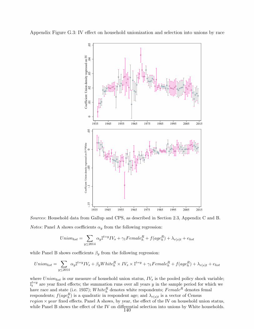
Appendix Figure G.3: IV effect on household unionization and selection into unions by race
0.0
1.0
2.0
3.0
4.0
5C
oeff
icie
nt: U
nion
den
sity
regr
esse
d on
IV
1935 1945 1955 1965 1975 1985 1995 2005 2015
-.15
-.1-.0
50
.05
Coe
ffic
ient
: Uni
on d
ensi
ty re
gres
sed
on IV
*Whi
te
1935 1945 1955 1965 1975 1985 1995 2005 2015
Sources: Household data from Gallup and CPS, as described in Section 2.3, Appendix C and B.
Notes: Panel A shows coefficients αy from the following regression:
Unionhst =∑
y≤2014
αyIt=yIVs + γ1FemaleRh + f(ageRh ) + λr(s)t + ehst
while Panel B shows coefficients βy from the following regression:
Unionhst =∑
y≤2014
αyIt=yIVs + βyWhiteRh × IVs × It=y + γ1FemaleRh + f(ageRh ) + λr(s)t + ehst
where Unionhst is our measure of household union status, IVs is the pooled policy shock variable;It=yt are year fixed effects; the summation runs over all years y in the sample period for which we
have race and state (i.e. 1937); WhiteRh denotes white respondents; FemaleR denotes femalrespondents; f(ageRh ) is a quadratic in respondent age; and λr(s)t is a vector of Censusregion× year fixed effects. Panel A shows, by year, the effect of the IV on household union status,while Panel B shows the effect of the IV on differential selection into unions by White households.
140
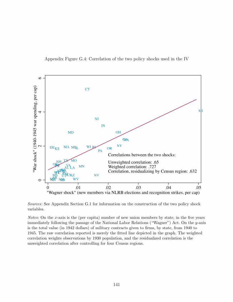
Appendix Figure G.4: Correlation of the two policy shocks used in the IV
IA
ARWY KY
NC
MTNV
NM
TX
MI
LAOK
CT
FL
RI
OH
IL
IN
WA
NHAL
CO
MN
NY
NJ
CA
ND
OR
AZ
KS
TN
DE
NE
MD
MAPA
SC
SD
MO
UTMS
WI
GAVT
WV
VA
ME
Correlations between the two shocks:Unweighted correlation: .65Weighted correlation: .727Correlation, residualizing by Census region: .632
02
46
"War
shoc
k" (1
940-
1945
war
spen
ding
, per
cap
)
0 .01 .02 .03 .04 .05 "Wagner shock" (new members via NLRB elections and recognition strikes, per cap)
Sources: See Appendix Section G.1 for information on the construction of the two policy shockvariables.
Notes: On the x-axis is the (per capita) number of new union members by state, in the five yearsimmediately following the passage of the National Labor Relations (“Wagner”) Act. On the y-axisis the total value (in 1942 dollars) of military contracts given to firms, by state, from 1940 to1945. The raw correlation reported is merely the fitted line depicted in the graph. The weightedcorrelation weights observations by 1930 population, and the residualized correlation is theunweighted correlation after controlling for four Census regions.
141
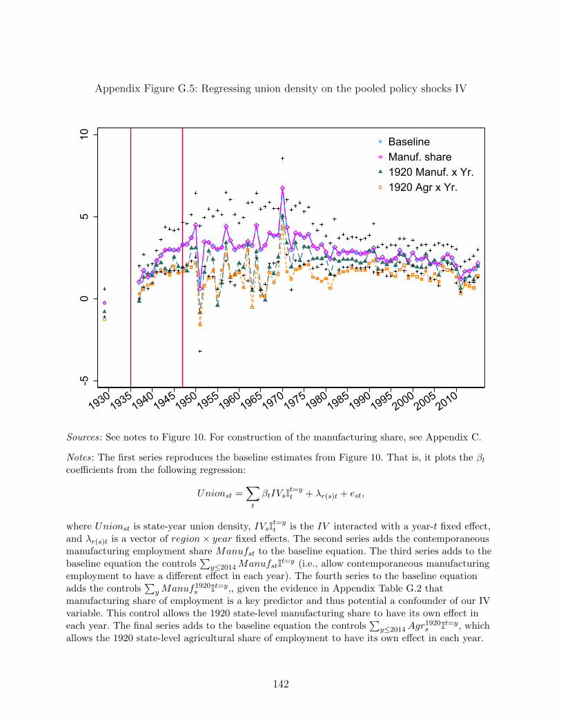
Appendix Figure G.5: Regressing union density on the pooled policy shocks IV-5
05
10
19301935
19401945
19501955
19601965
19701975
19801985
19901995
20002005
2010
BaselineManuf. share1920 Manuf. x Yr.1920 Agr x Yr.
Sources: See notes to Figure 10. For construction of the manufacturing share, see Appendix C.
Notes: The first series reproduces the baseline estimates from Figure 10. That is, it plots the βtcoefficients from the following regression:
Unionst =∑t
βtIVsIt=yt + λr(s)t + est,
where Unionst is state-year union density, IVsIt=yt is the IV interacted with a year-t fixed effect,
and λr(s)t is a vector of region× year fixed effects. The second series adds the contemporaneousmanufacturing employment share Manufst to the baseline equation. The third series adds to thebaseline equation the controls
∑y≤2014ManufstIt=y (i.e., allow contemporaneous manufacturing
employment to have a different effect in each year). The fourth series to the baseline equationadds the controls
∑yManuf1920
s It=y,, given the evidence in Appendix Table G.2 thatmanufacturing share of employment is a key predictor and thus potential a confounder of our IVvariable. This control allows the 1920 state-level manufacturing share to have its own effect ineach year. The final series adds to the baseline equation the controls
∑y≤2014Agr
1920s It=y, which
allows the 1920 state-level agricultural share of employment to have its own effect in each year.
142
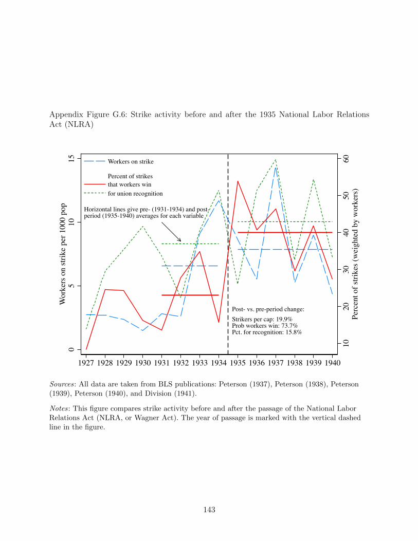
Appendix Figure G.6: Strike activity before and after the 1935 National Labor RelationsAct (NLRA)
Horizontal lines give pre- (1931-1934) and post-period (1935-1940) averages for each variable
Post- vs. pre-period change:Strikers per cap: 19.9%Prob workers win: 73.7%Pct. for recognition: 15.8%
1020
3040
5060
Perc
ent o
f stri
kes (
wei
ghte
d by
wor
kers
)
05
1015
Wor
kers
on
strik
e pe
r 100
0 po
p
1927 1928 1929 1930 1931 1932 1933 1934 1935 1936 1937 1938 1939 1940
Workers on strike Percent of strikesthat workers winfor union recognition
Sources: All data are taken from BLS publications: Peterson (1937), Peterson (1938), Peterson(1939), Peterson (1940), and Division (1941).
Notes: This figure compares strike activity before and after the passage of the National LaborRelations Act (NLRA, or Wagner Act). The year of passage is marked with the vertical dashedline in the figure.
143
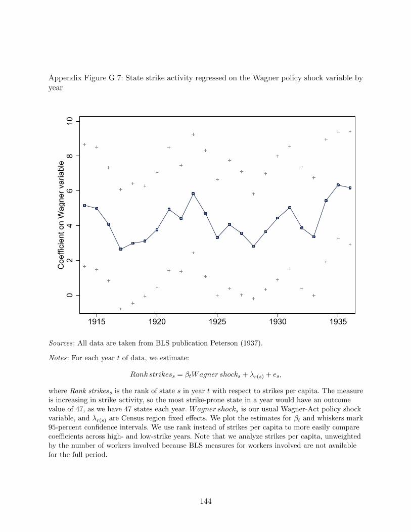
Appendix Figure G.7: State strike activity regressed on the Wagner policy shock variable byyear
02
46
810
Coe
ffici
ent o
n W
agne
r var
iabl
e
1915 1920 1925 1930 1935
Sources: All data are taken from BLS publication Peterson (1937).
Notes: For each year t of data, we estimate:
Rank strikess = βtWagner shocks + λr(s) + es,
where Rank strikess is the rank of state s in year t with respect to strikes per capita. The measureis increasing in strike activity, so the most strike-prone state in a year would have an outcomevalue of 47, as we have 47 states each year. Wagner shocks is our usual Wagner-Act policy shockvariable, and λr(s) are Census region fixed effects. We plot the estimates for βt and whiskers mark95-percent confidence intervals. We use rank instead of strikes per capita to more easily comparecoefficients across high- and low-strike years. Note that we analyze strikes per capita, unweightedby the number of workers involved because BLS measures for workers involved are not availablefor the full period.
144
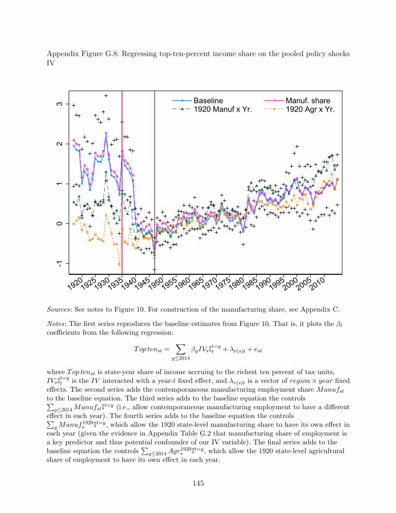
Appendix Figure G.8: Regressing top-ten-percent income share on the pooled policy shocksIV
-10
12
3
19201925
19301935
19401945
19501955
19601965
19701975
19801985
19901995
20002005
2010
Baseline Manuf. share1920 Manuf x Yr. 1920 Agr x Yr.
Sources: See notes to Figure 10. For construction of the manufacturing share, see Appendix C.
Notes: The first series reproduces the baseline estimates from Figure 10. That is, it plots the βtcoefficients from the following regression:
Top tenst =∑
y≤2014
βyIVsIt=yt + λr(s)t + est
where Top tenst is state-year share of income accruing to the richest ten percent of tax units,IVsIt=y
t is the IV interacted with a year-t fixed effect, and λr(s)t is a vector of region× year fixedeffects. The second series adds the contemporaneous manufacturing employment share Manufstto the baseline equation. The third series adds to the baseline equation the controls∑
y≤2014ManufstIt=y (i.e., allow contemporaneous manufacturing employment to have a differenteffect in each year). The fourth series adds to the baseline equation the controls∑
yManuf1920s It=y, which allow the 1920 state-level manufacturing share to have its own effect in
each year (given the evidence in Appendix Table G.2 that manufacturing share of employment isa key predictor and thus potential confounder of our IV variable). The final series adds to thebaseline equation the controls
∑y≤2014Agr
1920s It=y, which allow the 1920 state-level agricultural
share of employment to have its own effect in each year.
145
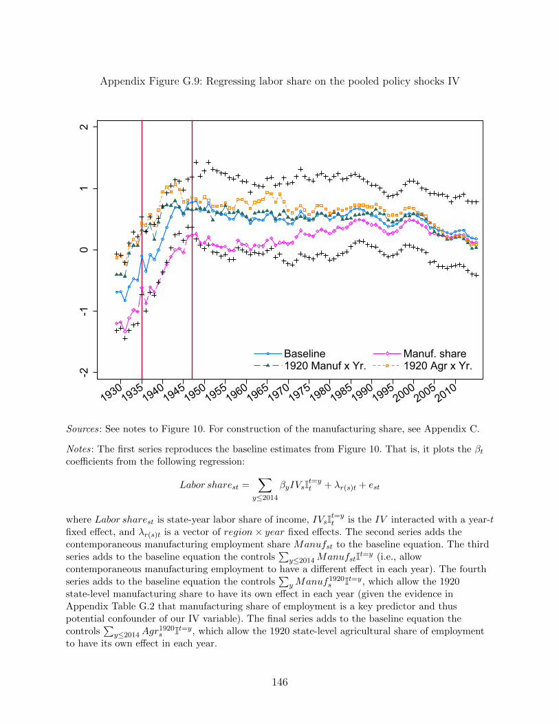
Appendix Figure G.9: Regressing labor share on the pooled policy shocks IV-2
-10
12
19301935
19401945
19501955
19601965
19701975
19801985
19901995
20002005
2010
Baseline Manuf. share1920 Manuf x Yr. 1920 Agr x Yr.
Sources: See notes to Figure 10. For construction of the manufacturing share, see Appendix C.
Notes: The first series reproduces the baseline estimates from Figure 10. That is, it plots the βtcoefficients from the following regression:
Labor sharest =∑
y≤2014
βyIVsIt=yt + λr(s)t + est
where Labor sharest is state-year labor share of income, IVsIt=yt is the IV interacted with a year-t
fixed effect, and λr(s)t is a vector of region× year fixed effects. The second series adds thecontemporaneous manufacturing employment share Manufst to the baseline equation. The thirdseries adds to the baseline equation the controls
∑y≤2014ManufstIt=y (i.e., allow
contemporaneous manufacturing employment to have a different effect in each year). The fourthseries adds to the baseline equation the controls
∑yManuf1920
s It=y, which allow the 1920state-level manufacturing share to have its own effect in each year (given the evidence inAppendix Table G.2 that manufacturing share of employment is a key predictor and thuspotential confounder of our IV variable). The final series adds to the baseline equation thecontrols
∑y≤2014Agr
1920s It=y, which allow the 1920 state-level agricultural share of employment
to have its own effect in each year.
146
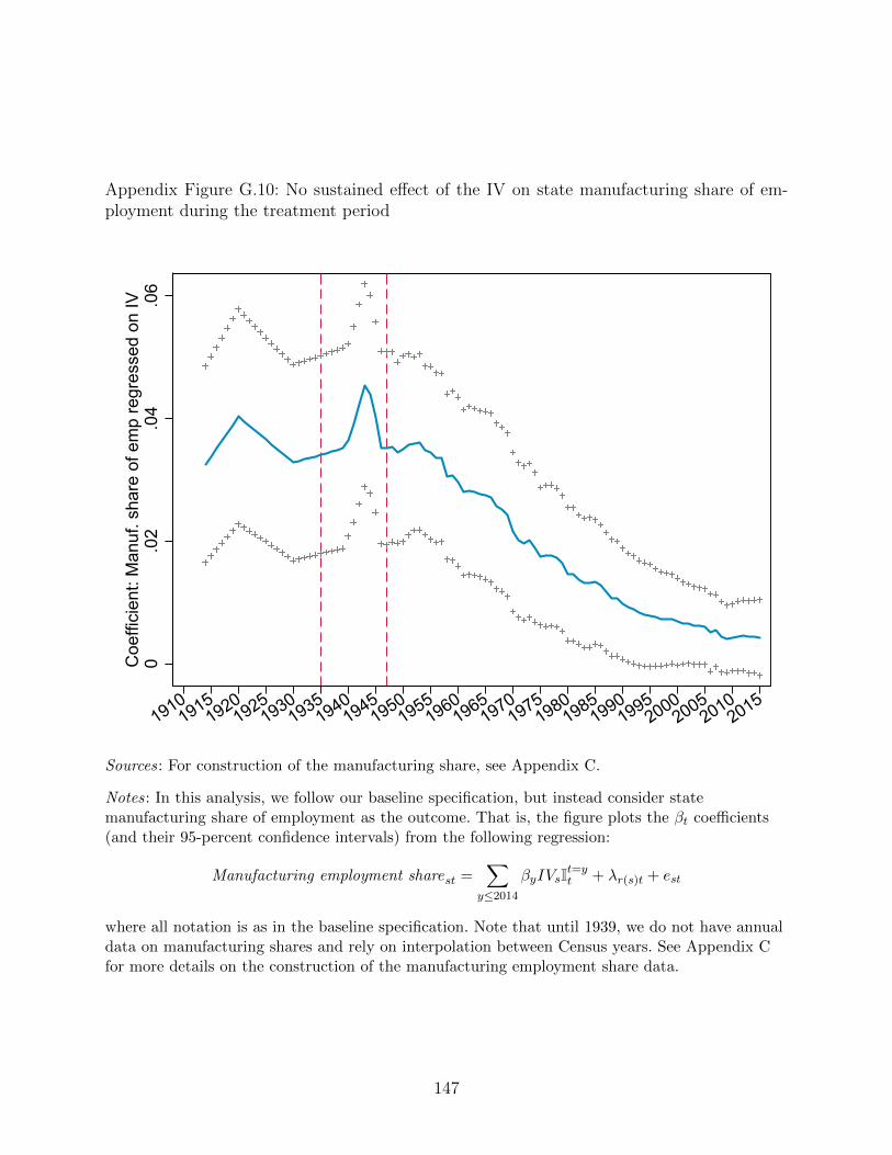
Appendix Figure G.10: No sustained effect of the IV on state manufacturing share of em-ployment during the treatment period
0.0
2.0
4.0
6C
oeffi
cien
t: M
anuf
. sha
re o
f em
p re
gres
sed
on IV
19101915
19201925
19301935
19401945
19501955
19601965
19701975
19801985
19901995
20002005
20102015
Sources: For construction of the manufacturing share, see Appendix C.
Notes: In this analysis, we follow our baseline specification, but instead consider statemanufacturing share of employment as the outcome. That is, the figure plots the βt coefficients(and their 95-percent confidence intervals) from the following regression:
Manufacturing employment sharest =∑
y≤2014
βyIVsIt=yt + λr(s)t + est
where all notation is as in the baseline specification. Note that until 1939, we do not have annualdata on manufacturing shares and rely on interpolation between Census years. See Appendix Cfor more details on the construction of the manufacturing employment share data.
147
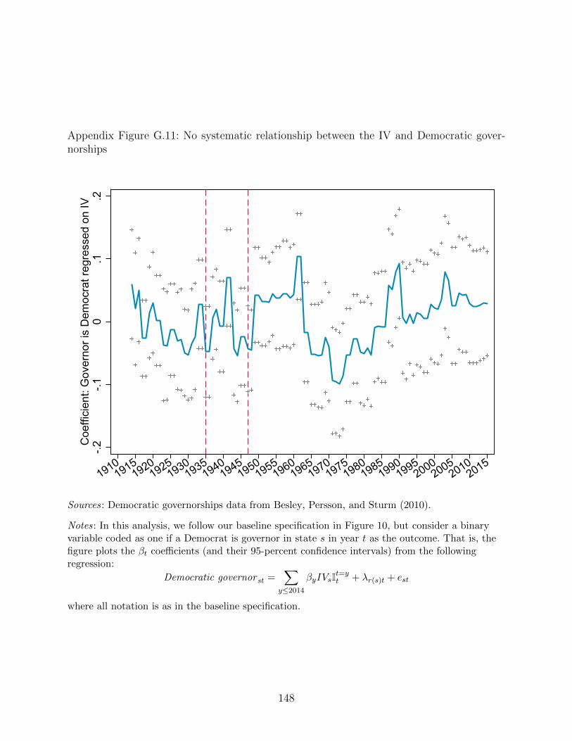
Appendix Figure G.11: No systematic relationship between the IV and Democratic gover-norships
-.2-.1
0.1
.2C
oeffi
cien
t: G
over
nor i
s D
emoc
rat r
egre
ssed
on
IV
19101915
19201925
19301935
19401945
19501955
19601965
19701975
19801985
19901995
20002005
20102015
Sources: Democratic governorships data from Besley, Persson, and Sturm (2010).
Notes: In this analysis, we follow our baseline specification in Figure 10, but consider a binaryvariable coded as one if a Democrat is governor in state s in year t as the outcome. That is, thefigure plots the βt coefficients (and their 95-percent confidence intervals) from the followingregression:
Democratic governor st =∑
y≤2014
βyIVsIt=yt + λr(s)t + est
where all notation is as in the baseline specification.
148
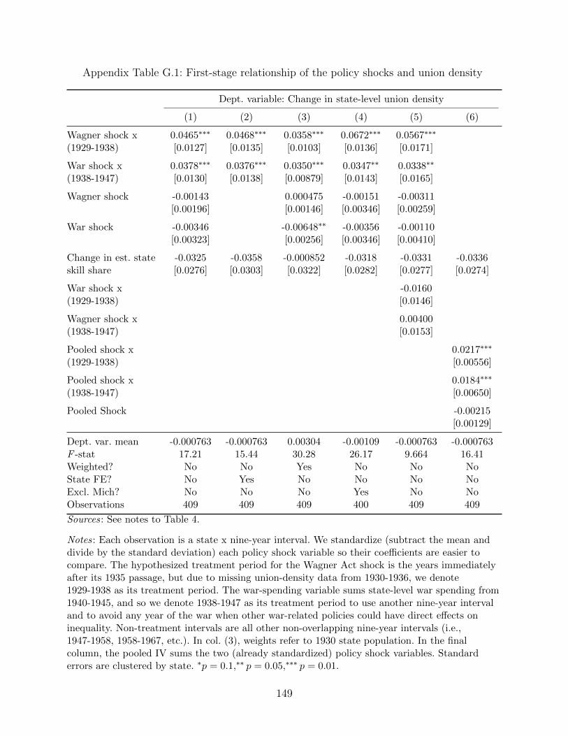
Appendix Table G.1: First-stage relationship of the policy shocks and union density
Dept. variable: Change in state-level union density
(1) (2) (3) (4) (5) (6)
Wagner shock x 0.0465∗∗∗ 0.0468∗∗∗ 0.0358∗∗∗ 0.0672∗∗∗ 0.0567∗∗∗
(1929-1938) [0.0127] [0.0135] [0.0103] [0.0136] [0.0171]
War shock x 0.0378∗∗∗ 0.0376∗∗∗ 0.0350∗∗∗ 0.0347∗∗ 0.0338∗∗
(1938-1947) [0.0130] [0.0138] [0.00879] [0.0143] [0.0165]
Wagner shock -0.00143 0.000475 -0.00151 -0.00311[0.00196] [0.00146] [0.00346] [0.00259]
War shock -0.00346 -0.00648∗∗ -0.00356 -0.00110[0.00323] [0.00256] [0.00346] [0.00410]
Change in est. state -0.0325 -0.0358 -0.000852 -0.0318 -0.0331 -0.0336skill share [0.0276] [0.0303] [0.0322] [0.0282] [0.0277] [0.0274]
War shock x -0.0160(1929-1938) [0.0146]
Wagner shock x 0.00400(1938-1947) [0.0153]
Pooled shock x 0.0217∗∗∗
(1929-1938) [0.00556]
Pooled shock x 0.0184∗∗∗
(1938-1947) [0.00650]
Pooled Shock -0.00215[0.00129]
Dept. var. mean -0.000763 -0.000763 0.00304 -0.00109 -0.000763 -0.000763F -stat 17.21 15.44 30.28 26.17 9.664 16.41Weighted? No No Yes No No NoState FE? No Yes No No No NoExcl. Mich? No No No Yes No NoObservations 409 409 409 400 409 409
Sources: See notes to Table 4.
Notes: Each observation is a state x nine-year interval. We standardize (subtract the mean anddivide by the standard deviation) each policy shock variable so their coefficients are easier tocompare. The hypothesized treatment period for the Wagner Act shock is the years immediatelyafter its 1935 passage, but due to missing union-density data from 1930-1936, we denote1929-1938 as its treatment period. The war-spending variable sums state-level war spending from1940-1945, and so we denote 1938-1947 as its treatment period to use another nine-year intervaland to avoid any year of the war when other war-related policies could have direct effects oninequality. Non-treatment intervals are all other non-overlapping nine-year intervals (i.e.,1947-1958, 1958-1967, etc.). In col. (3), weights refer to 1930 state population. In the finalcolumn, the pooled IV sums the two (already standardized) policy shock variables. Standarderrors are clustered by state. ∗p = 0.1,∗∗ p = 0.05,∗∗∗ p = 0.01.
149
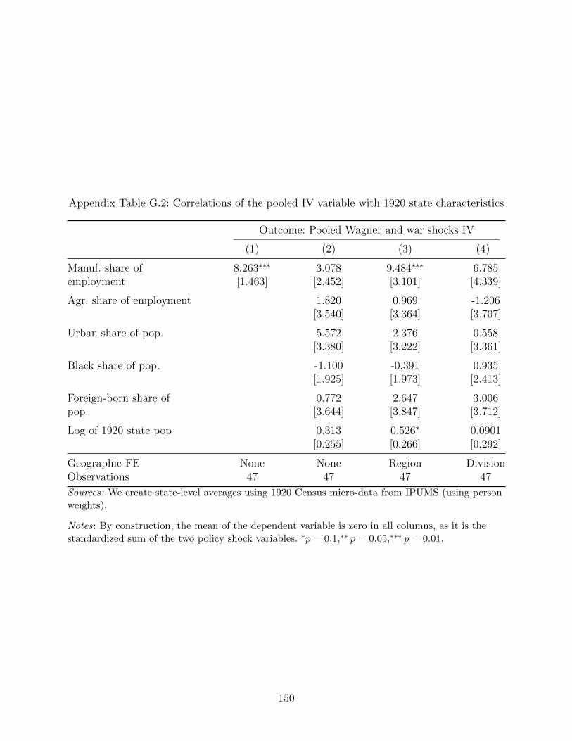
Appendix Table G.2: Correlations of the pooled IV variable with 1920 state characteristics
Outcome: Pooled Wagner and war shocks IV
(1) (2) (3) (4)
Manuf. share of 8.263∗∗∗ 3.078 9.484∗∗∗ 6.785employment [1.463] [2.452] [3.101] [4.339]
Agr. share of employment 1.820 0.969 -1.206[3.540] [3.364] [3.707]
Urban share of pop. 5.572 2.376 0.558[3.380] [3.222] [3.361]
Black share of pop. -1.100 -0.391 0.935[1.925] [1.973] [2.413]
Foreign-born share of 0.772 2.647 3.006pop. [3.644] [3.847] [3.712]
Log of 1920 state pop 0.313 0.526∗ 0.0901[0.255] [0.266] [0.292]
Geographic FE None None Region DivisionObservations 47 47 47 47
Sources: We create state-level averages using 1920 Census micro-data from IPUMS (using personweights).
Notes: By construction, the mean of the dependent variable is zero in all columns, as it is thestandardized sum of the two policy shock variables. ∗p = 0.1,∗∗ p = 0.05,∗∗∗ p = 0.01.
150
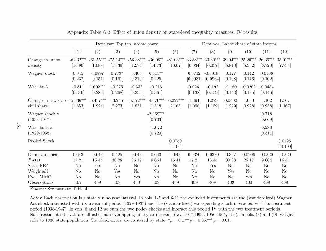
Appendix Table G.3: Effect of union density on state-level inequality measures, IV results
Dept var: Top-ten income share Dept var: Labor-share of state income
(1) (2) (3) (4) (5) (6) (7) (8) (9) (10) (11) (12)
Change in union -62.32∗∗∗ -61.55∗∗∗ -75.14∗∗∗ -56.38∗∗∗ -36.98∗∗ -81.03∗∗∗ 33.88∗∗∗ 33.30∗∗∗ 39.94∗∗∗ 25.20∗∗∗ 26.36∗∗∗ 38.91∗∗∗
density [10.96] [10.89] [17.39] [12.74] [14.73] [16.67] [6.034] [6.037] [5.813] [5.302] [6.720] [7.733]
Wagner shock 0.345 0.0897 0.279∗ 0.405 0.515∗∗ 0.0712 -0.00180 0.127 0.142 0.0186[0.232] [0.151] [0.161] [0.310] [0.225] [0.0931] [0.0964] [0.108] [0.146] [0.102]
War shock -0.311 1.602∗∗∗ -0.275 -0.337 -0.213 -0.0261 -0.192 -0.160 -0.0262 -0.0454[0.346] [0.286] [0.268] [0.355] [0.361] [0.138] [0.159] [0.143] [0.135] [0.146]
Change in est. state -5.536∗∗∗ -5.497∗∗∗ -3.245 -5.172∗∗∗ -4.576∗∗∗ -6.222∗∗∗ 1.394 1.279 0.0402 1.060 1.102 1.567skill share [1.853] [1.924] [2.273] [1.831] [1.518] [2.166] [1.096] [1.159] [1.299] [0.928] [0.958] [1.167]
Wagner shock x -2.369∗∗∗ 0.718(1938-1947) [0.703] [0.669]
War shock x -1.072 0.236(1929-1938) [0.723] [0.311]
Pooled Shock 0.0750 0.0126[0.100] [0.0499]
Dept. var. mean 0.643 0.643 0.425 0.643 0.643 0.643 0.0320 0.0320 0.367 0.0206 0.0320 0.0320F -stat 17.21 15.44 30.28 26.17 9.664 16.41 17.21 15.44 30.28 26.17 9.664 16.41State FE? No Yes No No No No No Yes No No No NoWeighted? No No Yes No No No No No Yes No No NoExcl. Mich? No No No Yes No No No No No Yes No NoObservations 409 409 409 400 409 409 409 409 409 400 409 409
Sources: See notes to Table 4.
Notes: Each observation is a state x nine-year interval. In cols. 1-5 and 6-11 the excluded instruments are the (standardized) WagnerAct shock interacted with its treatment period (1929-1937) and the (standardized) war-spending shock interacted with its treatmentperiod (1938-1947). In cols. 6 and 12 we sum the two policy shocks and interact this pooled IV with the two treatment periods.Non-treatment intervals are all other non-overlapping nine-year intervals (i.e., 1947-1956, 1956-1965, etc.). In cols. (3) and (9), weightsrefer to 1930 state population. Standard errors are clustered by state. ∗p = 0.1,∗∗ p = 0.05,∗∗∗ p = 0.01.
151
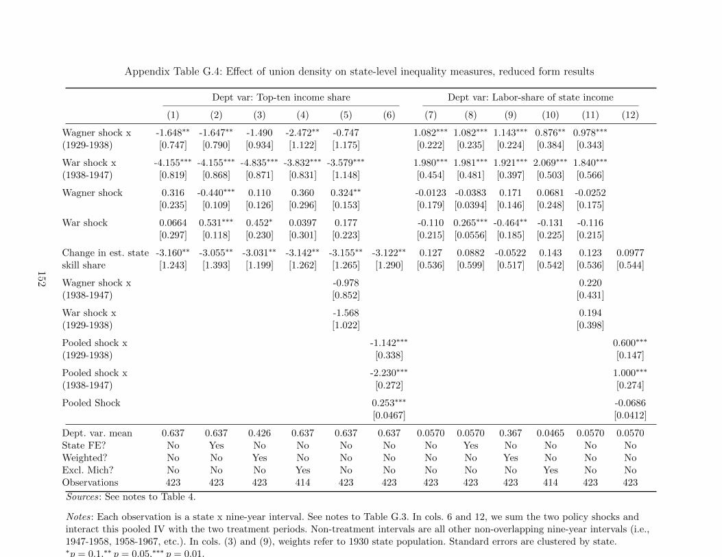
Appendix Table G.4: Effect of union density on state-level inequality measures, reduced form results
Dept var: Top-ten income share Dept var: Labor-share of state income
(1) (2) (3) (4) (5) (6) (7) (8) (9) (10) (11) (12)
Wagner shock x -1.648∗∗ -1.647∗∗ -1.490 -2.472∗∗ -0.747 1.082∗∗∗ 1.082∗∗∗ 1.143∗∗∗ 0.876∗∗ 0.978∗∗∗
(1929-1938) [0.747] [0.790] [0.934] [1.122] [1.175] [0.222] [0.235] [0.224] [0.384] [0.343]
War shock x -4.155∗∗∗ -4.155∗∗∗ -4.835∗∗∗ -3.832∗∗∗ -3.579∗∗∗ 1.980∗∗∗ 1.981∗∗∗ 1.921∗∗∗ 2.069∗∗∗ 1.840∗∗∗
(1938-1947) [0.819] [0.868] [0.871] [0.831] [1.148] [0.454] [0.481] [0.397] [0.503] [0.566]
Wagner shock 0.316 -0.440∗∗∗ 0.110 0.360 0.324∗∗ -0.0123 -0.0383 0.171 0.0681 -0.0252[0.235] [0.109] [0.126] [0.296] [0.153] [0.179] [0.0394] [0.146] [0.248] [0.175]
War shock 0.0664 0.531∗∗∗ 0.452∗ 0.0397 0.177 -0.110 0.265∗∗∗ -0.464∗∗ -0.131 -0.116[0.297] [0.118] [0.230] [0.301] [0.223] [0.215] [0.0556] [0.185] [0.225] [0.215]
Change in est. state -3.160∗∗ -3.055∗∗ -3.031∗∗ -3.142∗∗ -3.155∗∗ -3.122∗∗ 0.127 0.0882 -0.0522 0.143 0.123 0.0977skill share [1.243] [1.393] [1.199] [1.262] [1.265] [1.290] [0.536] [0.599] [0.517] [0.542] [0.536] [0.544]
Wagner shock x -0.978 0.220(1938-1947) [0.852] [0.431]
War shock x -1.568 0.194(1929-1938) [1.022] [0.398]
Pooled shock x -1.142∗∗∗ 0.600∗∗∗
(1929-1938) [0.338] [0.147]
Pooled shock x -2.230∗∗∗ 1.000∗∗∗
(1938-1947) [0.272] [0.274]
Pooled Shock 0.253∗∗∗ -0.0686[0.0467] [0.0412]
Dept. var. mean 0.637 0.637 0.426 0.637 0.637 0.637 0.0570 0.0570 0.367 0.0465 0.0570 0.0570State FE? No Yes No No No No No Yes No No No NoWeighted? No No Yes No No No No No Yes No No NoExcl. Mich? No No No Yes No No No No No Yes No NoObservations 423 423 423 414 423 423 423 423 423 414 423 423
Sources: See notes to Table 4.
Notes: Each observation is a state x nine-year interval. See notes to Table G.3. In cols. 6 and 12, we sum the two policy shocks andinteract this pooled IV with the two treatment periods. Non-treatment intervals are all other non-overlapping nine-year intervals (i.e.,1947-1958, 1958-1967, etc.). In cols. (3) and (9), weights refer to 1930 state population. Standard errors are clustered by state.∗p = 0.1,∗∗ p = 0.05,∗∗∗ p = 0.01.
152
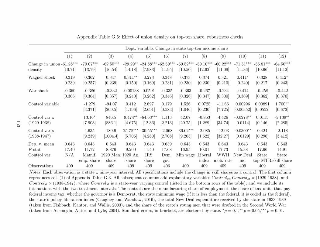
Appendix Table G.5: Effect of union density on top-ten share, robustness checks
Dept. variable: Change in state top-ten income share
(1) (2) (3) (4) (5) (6) (7) (8) (9) (10) (11) (12)
Change in union -61.28∗∗∗ -70.07∗∗∗ -62.55∗∗∗ -29.29∗∗ -24.88∗∗∗ -62.59∗∗∗ -60.52∗∗∗ -59.10∗∗∗ -60.22∗∗∗ -71.51∗∗∗ -55.81∗∗∗ -64.50∗∗∗
density [10.71] [13.79] [16.54] [14.18] [7.983] [11.95] [10.50] [12.62] [11.09] [11.36] [10.66] [11.12]
Wagner shock 0.319 0.362 0.347 0.311∗∗ 0.273 0.348 0.373 0.374 0.321 0.411∗ 0.328 0.412∗
[0.239] [0.257] [0.239] [0.150] [0.169] [0.231] [0.230] [0.230] [0.210] [0.240] [0.217] [0.243]
War shock -0.360 -0.386 -0.332 -0.00138 0.0591 -0.335 -0.363 -0.267 -0.234 -0.414 -0.258 -0.442[0.366] [0.364] [0.357] [0.240] [0.262] [0.346] [0.326] [0.347] [0.300] [0.369] [0.362] [0.370]
Control variable -1.279 -94.07 0.412 2.697 0.179 1.526 0.0725 -11.66 0.00296 0.00891 1.700∗∗
[3.371] [209.5] [1.196] [2.691] [0.583] [1.046] [0.230] [7.725] [0.00352] [0.0552] [0.672]
Control var x 13.16∗ 846.5 9.474∗∗ -64.63∗∗∗ 1.113 42.07 -0.863 4.426 -0.0278∗∗ 0.0115 -5.139∗∗
(1929-1938) [7.903] [886.1] [4.675] [12.36] [2.213] [29.75] [1.289] [34.74] [0.0114] [0.146] [2.285]
Control var x 4.635 189.9 25.78∗∗∗ -30.55∗∗∗ -2.068 -36.62∗∗∗ -2.085 -12.03 -0.0300∗∗ 0.424 -2.118(1938-1947) [9.239] [1004.4] [5.706] [4.280] [2.708] [9.205] [1.622] [32.27] [0.0129] [0.296] [3.412]
Dep. v. mean 0.643 0.643 0.643 0.643 0.643 0.639 0.643 0.643 0.643 0.643 0.643 0.643F -stat 17.40 11.72 8.876 9.200 11.40 17.68 16.95 10.01 17.73 15.38 17.66 14.91Control var. N/A Manuf. 1920 Man. 1920 Ag. IRS Dem. Min wage Liberal WWII New Deal State State
emp. share share share share gov. index mob. rate aid top MTR skill shareObservations 409 409 409 409 409 406 409 409 409 409 409 409
Notes: Each observation is a state x nine-year interval. All specifications include the change in skill shares as a control. The first columnreproduces col. (1) of Appendix Table G.3. All subsequent columns add explanatory variables Controlst, Controlst × (1929-1938), andControlst × (1938-1947), where Controlst is a state-year varying control (listed in the bottom rows of the table), and we include itsinteractions with the two treatment intervals. The controls are the manufacturing share of employment, the share of tax units that payfederal income tax, whether the governor is a Democrat, the state minimum wage (if it is less than the federal, it is coded as the federal),the state’s policy liberalism index (Caughey and Warshaw, 2016), the total New Deal expenditure received by the state in 1933-1939(taken from Fishback, Kantor, and Wallis, 2003), and the share of the state’s young men that were drafted in the Second World War(taken from Acemoglu, Autor, and Lyle, 2004). Standard errors, in brackets, are clustered by state. ∗p = 0.1,∗∗ p = 0.05,∗∗∗ p = 0.01.
153
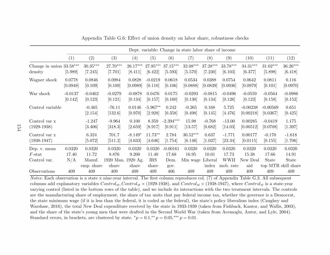
Appendix Table G.6: Effect of union density on labor share, robustness checks
Dept. variable: Change in state labor share of income
(1) (2) (3) (4) (5) (6) (7) (8) (9) (10) (11) (12)
Change in union 33.58∗∗∗ 30.35∗∗∗ 27.70∗∗∗ 26.17∗∗∗ 27.95∗∗∗ 37.15∗∗∗ 32.08∗∗∗ 37.28∗∗∗ 33.78∗∗∗ 34.31∗∗∗ 31.02∗∗∗ 36.26∗∗∗
density [5.989] [7.245] [7.701] [8.411] [6.422] [5.593] [5.570] [7.230] [6.103] [6.377] [5.898] [6.418]
Wagner shock 0.0778 0.0846 0.0984 0.0828 -0.0219 0.0618 0.0534 0.0388 0.0754 0.0642 0.0811 0.116[0.0948] [0.109] [0.109] [0.0989] [0.110] [0.106] [0.0888] [0.0839] [0.0936] [0.0979] [0.101] [0.0970]
War shock -0.0137 -0.0462 -0.0279 -0.0878 0.0476 0.0175 -0.0293 -0.0815 -0.0496 -0.0559 -0.0564 -0.0986[0.142] [0.123] [0.121] [0.134] [0.157] [0.160] [0.130] [0.134] [0.126] [0.123] [0.158] [0.152]
Control variable -0.465 -76.11 0.0146 -5.967∗∗ 0.242 -0.265 0.168 5.725 -0.00238 -0.00569 0.651[2.154] [132.6] [0.970] [2.928] [0.358] [0.498] [0.145] [4.476] [0.00218] [0.0367] [0.425]
Control var x -1.247 -9.964 0.100 8.359 -2.394∗∗∗ 15.98 -0.768 -13.00 0.00285 -0.0419 1.175(1929-1938) [3.406] [318.3] [2.659] [8.917] [0.911] [13.57] [0.682] [14.03] [0.00512] [0.0708] [1.397]
Control var x 6.324 701.7 -8.149∗ 11.73∗∗ 2.784 30.52∗∗∗ 0.637 -1.771 0.00177 -0.170 -1.618(1938-1947) [5.072] [511.2] [4.633] [4.646] [1.754] [6.146] [1.037] [23.34] [0.0115] [0.155] [1.706]
Dep. v. mean 0.0320 0.0320 0.0320 0.0320 0.0320 -0.00161 0.0320 0.0320 0.0320 0.0320 0.0320 0.0320F -stat 17.40 11.72 8.876 9.200 11.40 17.68 16.95 10.01 17.73 15.38 17.66 14.91Control var. N/A Manuf. 1920 Man. 1920 Ag. IRS Dem. Min wage Liberal WWII New Deal State State
emp. share share share share gov. index mob. rate aid top MTR skill shareObservations 409 409 409 409 409 406 409 409 409 409 409 409
Notes: Each observation is a state x nine-year interval. The first column reproduces col. (7) of Appendix Table G.3. All subsequentcolumns add explanatory variables Controlst, Controlst × (1929-1938), and Controlst × (1938-1947), where Controlst is a state-yearvarying control (listed in the bottom rows of the table), and we include its interactions with the two treatment intervals. The controlsare the manufacturing share of employment, the share of tax units that pay federal income tax, whether the governor is a Democrat,the state minimum wage (if it is less than the federal, it is coded as the federal), the state’s policy liberalism index (Caughey andWarshaw, 2016), the total New Deal expenditure received by the state in 1933-1939 (taken from Fishback, Kantor, and Wallis, 2003),and the share of the state’s young men that were drafted in the Second World War (taken from Acemoglu, Autor, and Lyle, 2004).Standard errors, in brackets, are clustered by state. ∗p = 0.1,∗∗ p = 0.05,∗∗∗ p = 0.01.
154
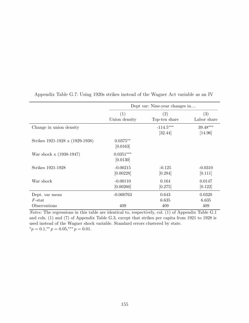
Appendix Table G.7: Using 1920s strikes instead of the Wagner Act variable as an IV
Dept var: Nine-year changes in....
(1) (2) (3)Union density Top-ten share Labor share
Change in union density -114.5∗∗∗ 39.48∗∗∗
[32.44] [14.96]
Strikes 1921-1928 x (1929-1938) 0.0375∗∗
[0.0163]
War shock x (1938-1947) 0.0351∗∗∗
[0.0130]
Strikes 1921-1928 -0.00215 -0.125 -0.0310[0.00228] [0.284] [0.111]
War shock -0.00110 0.164 0.0147[0.00260] [0.275] [0.122]
Dept. var mean -0.000763 0.643 0.0320F -stat 6.635 6.635Observations 409 409 409
Notes: The regressions in this table are identical to, respectively, col. (1) of Appendix Table G.1and cols. (1) and (7) of Appendix Table G.3, except that strikes per capita from 1921 to 1928 isused instead of the Wagner shock variable. Standard errors clustered by state.∗p = 0.1,∗∗ p = 0.05,∗∗∗ p = 0.01.
155
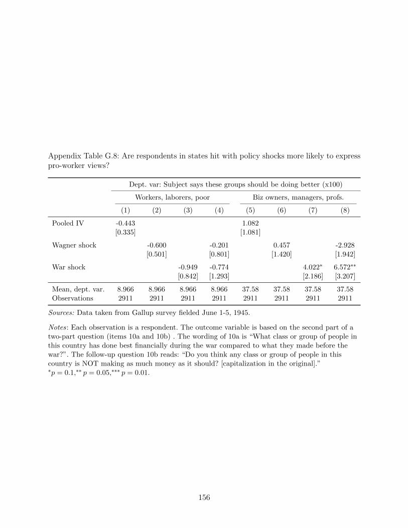
Appendix Table G.8: Are respondents in states hit with policy shocks more likely to expresspro-worker views?
Dept. var: Subject says these groups should be doing better (x100)
Workers, laborers, poor Biz owners, managers, profs.
(1) (2) (3) (4) (5) (6) (7) (8)
Pooled IV -0.443 1.082[0.335] [1.081]
Wagner shock -0.600 -0.201 0.457 -2.928[0.501] [0.801] [1.420] [1.942]
War shock -0.949 -0.774 4.022∗ 6.572∗∗
[0.842] [1.293] [2.186] [3.207]
Mean, dept. var. 8.966 8.966 8.966 8.966 37.58 37.58 37.58 37.58Observations 2911 2911 2911 2911 2911 2911 2911 2911
Sources: Data taken from Gallup survey fielded June 1-5, 1945.
Notes: Each observation is a respondent. The outcome variable is based on the second part of atwo-part question (items 10a and 10b) . The wording of 10a is “What class or group of people inthis country has done best financially during the war compared to what they made before thewar?”. The follow-up question 10b reads: “Do you think any class or group of people in thiscountry is NOT making as much money as it should? [capitalization in the original].”∗p = 0.1,∗∗ p = 0.05,∗∗∗ p = 0.01.
156
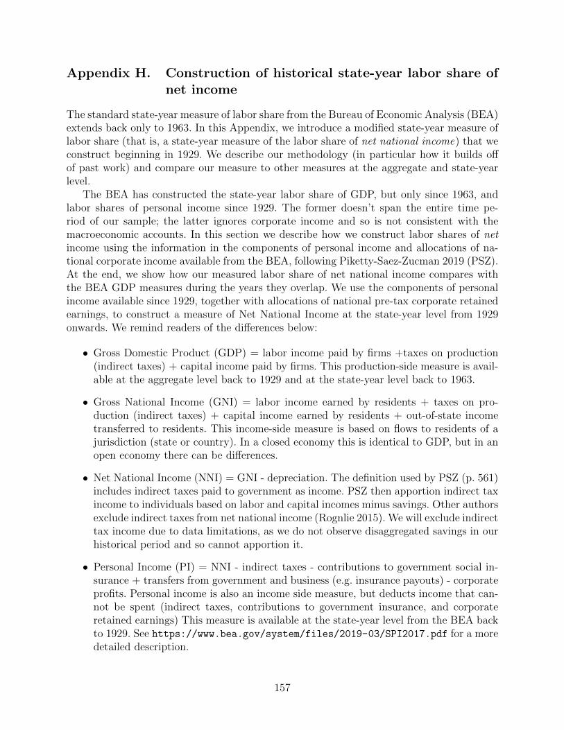
Appendix H. Construction of historical state-year labor share ofnet income
The standard state-year measure of labor share from the Bureau of Economic Analysis (BEA)extends back only to 1963. In this Appendix, we introduce a modified state-year measure oflabor share (that is, a state-year measure of the labor share of net national income) that weconstruct beginning in 1929. We describe our methodology (in particular how it builds offof past work) and compare our measure to other measures at the aggregate and state-yearlevel.
The BEA has constructed the state-year labor share of GDP, but only since 1963, andlabor shares of personal income since 1929. The former doesn’t span the entire time pe-riod of our sample; the latter ignores corporate income and so is not consistent with themacroeconomic accounts. In this section we describe how we construct labor shares of netincome using the information in the components of personal income and allocations of na-tional corporate income available from the BEA, following Piketty-Saez-Zucman 2019 (PSZ).At the end, we show how our measured labor share of net national income compares withthe BEA GDP measures during the years they overlap. We use the components of personalincome available since 1929, together with allocations of national pre-tax corporate retainedearnings, to construct a measure of Net National Income at the state-year level from 1929onwards. We remind readers of the differences below:
• Gross Domestic Product (GDP) = labor income paid by firms +taxes on production(indirect taxes) + capital income paid by firms. This production-side measure is avail-able at the aggregate level back to 1929 and at the state-year level back to 1963.
• Gross National Income (GNI) = labor income earned by residents + taxes on pro-duction (indirect taxes) + capital income earned by residents + out-of-state incometransferred to residents. This income-side measure is based on flows to residents of ajurisdiction (state or country). In a closed economy this is identical to GDP, but in anopen economy there can be differences.
• Net National Income (NNI) = GNI - depreciation. The definition used by PSZ (p. 561)includes indirect taxes paid to government as income. PSZ then apportion indirect taxincome to individuals based on labor and capital incomes minus savings. Other authorsexclude indirect taxes from net national income (Rognlie 2015). We will exclude indirecttax income due to data limitations, as we do not observe disaggregated savings in ourhistorical period and so cannot apportion it.
• Personal Income (PI) = NNI - indirect taxes - contributions to government social in-surance + transfers from government and business (e.g. insurance payouts) - corporateprofits. Personal income is also an income side measure, but deducts income that can-not be spent (indirect taxes, contributions to government insurance, and corporateretained earnings) This measure is available at the state-year level from the BEA backto 1929. See https://www.bea.gov/system/files/2019-03/SPI2017.pdf for a moredetailed description.
157
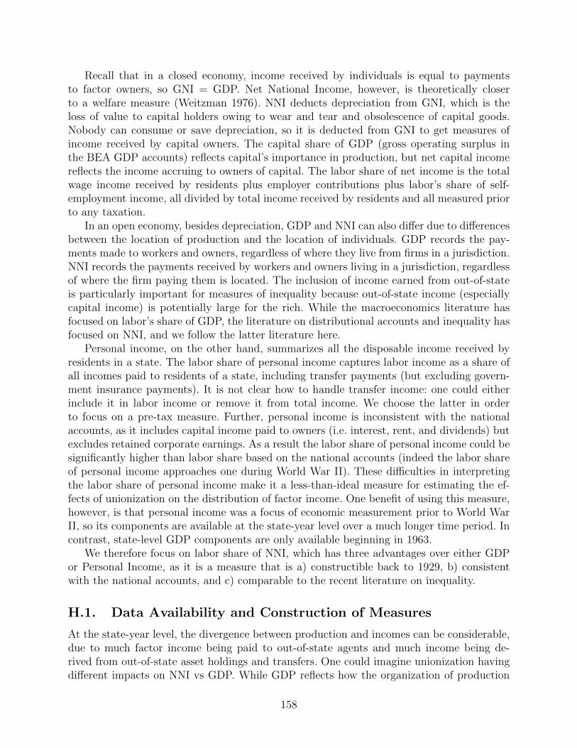
Recall that in a closed economy, income received by individuals is equal to paymentsto factor owners, so GNI = GDP. Net National Income, however, is theoretically closerto a welfare measure (Weitzman 1976). NNI deducts depreciation from GNI, which is theloss of value to capital holders owing to wear and tear and obsolescence of capital goods.Nobody can consume or save depreciation, so it is deducted from GNI to get measures ofincome received by capital owners. The capital share of GDP (gross operating surplus inthe BEA GDP accounts) reflects capital’s importance in production, but net capital incomereflects the income accruing to owners of capital. The labor share of net income is the totalwage income received by residents plus employer contributions plus labor’s share of self-employment income, all divided by total income received by residents and all measured priorto any taxation.
In an open economy, besides depreciation, GDP and NNI can also differ due to differencesbetween the location of production and the location of individuals. GDP records the pay-ments made to workers and owners, regardless of where they live from firms in a jurisdiction.NNI records the payments received by workers and owners living in a jurisdiction, regardlessof where the firm paying them is located. The inclusion of income earned from out-of-stateis particularly important for measures of inequality because out-of-state income (especiallycapital income) is potentially large for the rich. While the macroeconomics literature hasfocused on labor’s share of GDP, the literature on distributional accounts and inequality hasfocused on NNI, and we follow the latter literature here.
Personal income, on the other hand, summarizes all the disposable income received byresidents in a state. The labor share of personal income captures labor income as a share ofall incomes paid to residents of a state, including transfer payments (but excluding govern-ment insurance payments). It is not clear how to handle transfer income: one could eitherinclude it in labor income or remove it from total income. We choose the latter in orderto focus on a pre-tax measure. Further, personal income is inconsistent with the nationalaccounts, as it includes capital income paid to owners (i.e. interest, rent, and dividends) butexcludes retained corporate earnings. As a result the labor share of personal income could besignificantly higher than labor share based on the national accounts (indeed the labor shareof personal income approaches one during World War II). These difficulties in interpretingthe labor share of personal income make it a less-than-ideal measure for estimating the ef-fects of unionization on the distribution of factor income. One benefit of using this measure,however, is that personal income was a focus of economic measurement prior to World WarII, so its components are available at the state-year level over a much longer time period. Incontrast, state-level GDP components are only available beginning in 1963.
We therefore focus on labor share of NNI, which has three advantages over either GDPor Personal Income, as it is a measure that is a) constructible back to 1929, b) consistentwith the national accounts, and c) comparable to the recent literature on inequality.
H.1. Data Availability and Construction of Measures
At the state-year level, the divergence between production and incomes can be considerable,due to much factor income being paid to out-of-state agents and much income being de-rived from out-of-state asset holdings and transfers. One could imagine unionization havingdifferent impacts on NNI vs GDP. While GDP reflects how the organization of production
158
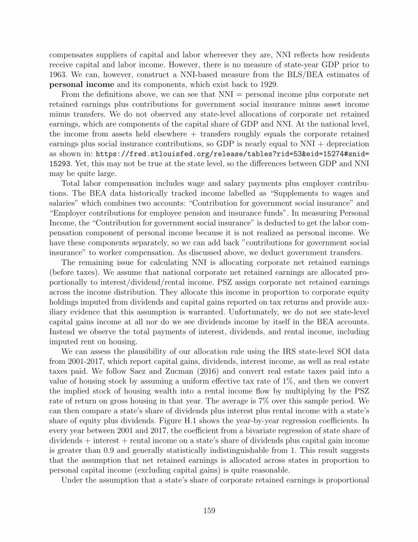
compensates suppliers of capital and labor whereever they are, NNI reflects how residentsreceive capital and labor income. However, there is no measure of state-year GDP prior to1963. We can, however, construct a NNI-based measure from the BLS/BEA estimates ofpersonal income and its components, which exist back to 1929.
From the definitions above, we can see that NNI = personal income plus corporate netretained earnings plus contributions for government social insurance minus asset incomeminus transfers. We do not observed any state-level allocations of corporate net retainedearnings, which are components of the capital share of GDP and NNI. At the national level,the income from assets held elsewhere + transfers roughly equals the corporate retainedearnings plus social insurance contributions, so GDP is nearly equal to NNI + depreciationas shown in: https://fred.stlouisfed.org/release/tables?rid=53&eid=15274#snid=15293. Yet, this may not be true at the state level, so the differences between GDP and NNImay be quite large.
Total labor compensation includes wage and salary payments plus employer contribu-tions. The BEA data historically tracked income labelled as “Supplements to wages andsalaries” which combines two accounts: “Contribution for government social insurance” and“Employer contributions for employee pension and insurance funds”. In measuring PersonalIncome, the “Contribution for government social insurance” is deducted to get the labor com-pensation component of personal income because it is not realized as personal income. Wehave these components separately, so we can add back ”contributions for government socialinsurance” to worker compensation. As discussed above, we deduct government transfers.
The remaining issue for calculating NNI is allocating corporate net retained earnings(before taxes). We assume that national corporate net retained earnings are allocated pro-portionally to interest/dividend/rental income. PSZ assign corporate net retained earningsacross the income distribution. They allocate this income in proportion to corporate equityholdings imputed from dividends and capital gains reported on tax returns and provide aux-iliary evidence that this assumption is warranted. Unfortunately, we do not see state-levelcapital gains income at all nor do we see dividends income by itself in the BEA accounts.Instead we observe the total payments of interest, dividends, and rental income, includingimputed rent on housing.
We can assess the plausibility of our allocation rule using the IRS state-level SOI datafrom 2001-2017, which report capital gains, dividends, interest income, as well as real estatetaxes paid. We follow Saez and Zucman (2016) and convert real estate taxes paid into avalue of housing stock by assuming a uniform effective tax rate of 1%, and then we convertthe implied stock of housing wealth into a rental income flow by multiplying by the PSZrate of return on gross housing in that year. The average is 7% over this sample period. Wecan then compare a state’s share of dividends plus interest plus rental income with a state’sshare of equity plus dividends. Figure H.1 shows the year-by-year regression coefficients. Inevery year between 2001 and 2017, the coefficient from a bivariate regression of state share ofdividends + interest + rental income on a state’s share of dividends plus capital gain incomeis greater than 0.9 and generally statistically indistinguishable from 1. This result suggeststhat the assumption that net retained earnings is allocated across states in proportion topersonal capital income (excluding capital gains) is quite reasonable.
Under the assumption that a state’s share of corporate retained earnings is proportional
159
to a state’s share of dividend, interest, and rental income, our calculation of NNI is given by:
Y NNIst = Y PI
st + SocInsst − Transfersst +Y PI,Kst∑
s′∈S YPI,Ks′t
NetCorpRetainedEarnt (19)
Note that if all corporate profits (minus depreciation) are paid out as dividends, they will beincluded in the personal income paid as capital income Y PI,K
st , and net corporate retainedearnings is 0. Then NNI will be identical to personal income plus social insurance minustransfers. We calculate pre-tax net corporate retained earnings as the sum of net privatesaving by domestic business plus corporate taxes paid, both of which are available in thenational accounts back to 1929. We also make use of PSZ’s estimate of aggregate capitalincome, Y NNI,K
t as a check and construct an alternative measure of pre-tax net corporateretained earnings as the difference between national capital income and the sum of state-levelpersonal capital income, so NetCorpRetainedEarnt = Y NNI,K
t −∑
s′∈S YPI,Ks′t . We find that
these two measures of net corporate retained earnings are extremely close, and the differencesare likely due to the adjustment for sales taxes in PSZ.
H.2. Construction of the aggregate series
Data sources:
• Annual estimates (1929-2018) of the compensation of employees is obtained from thehttps://fred.stlouisfed.org/series/GDICOMPAFRED.
• Annual estimates (1929-2018) of the GDP are also obtained from the https://fred.
stlouisfed.org/series/GDPAFRED.
• Annual estimates (1929-2018) of NNI were obtained from PSZ, for comparison.
Calculation
We calculate the aggregate labor share by dividing total compensation of employees by GDP.
H.3. Construction of the state-year series
Data sources
• Data on state-level personal income (1929-2018), as well as wages and salaries, supple-ments to wages and salaries, and proprietor’s income is obtained from the https://
apps.bea.gov/itable/iTable.cfm?ReqID=70&step=1BEA—Annual State PersonalIncome and Employment, Personal Income and Employment by Major Component(SAINC4).
• Data on the national https://fred.stlouisfed.org/series/A065RC1A027NBEAPersonalIncome, https://fred.stlouisfed.org/series/GDPAGDP, https://fred.stlouisfed.org/series/A127RC1A027NBEAnet private saving by domestic business, https://fred.stlouisfed.org/series/FCTAXfederal taxes on corporate income, and https://fred.
160
stlouisfed.org/series/ASLCTAXstate and local taxes on corporate income in eachyear was obtained from the FRED.
Calculation
We define the labor share of NNI in state s in year t as:
Labor sharest =wagesst + supplementsst + 0.66proprietors incomest
Y NNIst
,
where Y NNI is calculated as in Equation (19). Imputing 2/3 of proprietor’s income to laborincome is standard for advanced countries (see Krueger, 1999, Gollin, 2002 or Johnson, 1954).We discussed this measure with BEA staff, who confirmed that there is no exact way to getcorporate retained earnings at the state-year level, mostly because corporate income is notreported (and hasn’t ever been reported) at the state level to the BEA, except for a fewhighly regulated sectors. We confirm that our measure is highly correlated with the standardBEA measure when they overlap. We further consulted the BEA to see if there was a wayto construct a more comprehensive denominator (i.e. including corporate retained earnings)and were told that this would not be feasible with existing data.
H.4. Results
Figure H.2 plots different measures of aggregate labor share over our sample period. The nu-merator is identical in all measures, but the denominator corresponds to different definitionsof income. The figure shows the labor share of Personal Income, Personal Income WithoutTransfers (which approaches one during World War II), our measure of Net National In-come, the measure of labor share of Net National Income from Piketty, Saez, and Zucman(2018) for comparison, and labor share of GDP. Our measure tracks the PSZ measure veryclosely, with the difference being the deduction of indirect taxes from our NNI measure dueto lack of data on how the sales tax incidence (i.e., consumption) is divided between capitaland labor income. The labor share of GDP measure is generally the lowest, consistent withdepreciation being added to the GDP denominator but not affecting the numerator.
Figure H.3 shows the series for Personal Income, NNI, and GDP (for the post 1963 years)separately for two high union density states and two low union density states. In all cases,while labor share of personal income is greater than labor share of NNI and labor share ofNNI is greater than labor share of GDP, all series roughly track each other.
Panel B of Table A.10 shows the same repertoire of state-year panel specifications shownin the paper for other outcomes with the labor share of Net National Income as the outcome.As discussed in the main text, coefficients are uniformly positive and significant, althoughthe inclusion of state-specific quadratic trends lowers the sign and significance somewhat.Table shows the same specifications, with the labor share of Personal Income as the outcome.Coefficients are again uniformly positive and significant, although somewhat less stable andmore sensitive to the state-specific time quadratic than the NNI based labor share regressions.
We next compare our results with GDP-based labor share to those with NNI-based laborshare, for the years for which we have comparable data. Table H.2 shows two specifications,
161
one without any controls save state and year (and south X year) fixed effects, the otherwith all the controls in column 6 of Panel B of Table A.10. We show the full sample withour measure of labor share, and then restrict attention to the post-1963 sample where theBEA’s labor share of GDP measure is available. While the effect of union density of laborshare of GDP is positive and of comparable magnitude (albeit not significant) to the full-sample in the specification without controls, the inclusion of all the controls (particularlythe state-specific quadratics) makes the effect close to 0 and insignificant. Our labor shareof NNI measure, while smaller in both specifications compared to the full sample, remainsstatistically significant in both. Much more of the production side of income statistics (asopposed to the income side) at the state-level is interpolated in the 5 years in betweenEconomic Censuses, and this smoothing may be one reason for the difference in precision aswell as differential robustness to controls in the two measures.
References
Gollin, Douglas (2002). “Getting income shares right”. Journal of political Economy 110.2,pp. 458–474.
Johnson, D Gale (1954). “The functional distribution of income in the United States, 1850-1952”. The Review of Economics and Statistics, pp. 175–182.
Krueger, Alan B (1999). “Measuring labor’s share”. American Economic Review 89.2, pp. 45–51.
Piketty, Thomas, Emmanuel Saez, and Gabriel Zucman (2018). “Distributional nationalaccounts: methods and estimates for the United States”. The Quarterly Journal of Eco-nomics 133.2, pp. 553–609.
Saez, Emmanuel and Gabriel Zucman (2016). “Wealth inequality in the United States since1913: Evidence from capitalized income tax data”. The Quarterly Journal of Economics131.2, pp. 519–578.
162
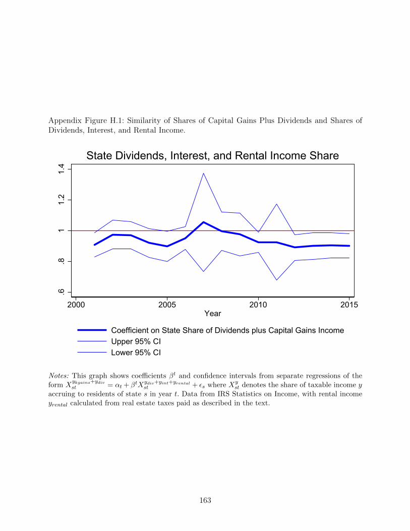
Appendix Figure H.1: Similarity of Shares of Capital Gains Plus Dividends and Shares ofDividends, Interest, and Rental Income.
.6.8
11.
21.
4
2000 2005 2010 2015Year
Coefficient on State Share of Dividends plus Capital Gains IncomeUpper 95% CILower 95% CI
State Dividends, Interest, and Rental Income Share
Notes: This graph shows coefficients βt and confidence intervals from separate regressions of theform X
ykgains+ydivst = αt + βtXydiv+yint+yrental
st + εs where Xyst denotes the share of taxable income y
accruing to residents of state s in year t. Data from IRS Statistics on Income, with rental incomeyrental calculated from real estate taxes paid as described in the text.
163
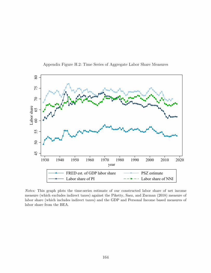
Appendix Figure H.2: Time Series of Aggregate Labor Share Measures
4550
5560
6570
7580
Labo
r sha
re
1930 1940 1950 1960 1970 1980 1990 2000 2010 2020year
FRED est. of GDP labor share PSZ estimateLabor share of PI Labor share of NNI
Notes: This graph plots the time-series estimate of our constructed labor share of net incomemeasure (which excludes indirect taxes) against the Piketty, Saez, and Zucman (2018) measure oflabor share (which includes indirect taxes) and the GDP and Personal Income based measures oflabor share from the BEA.
164
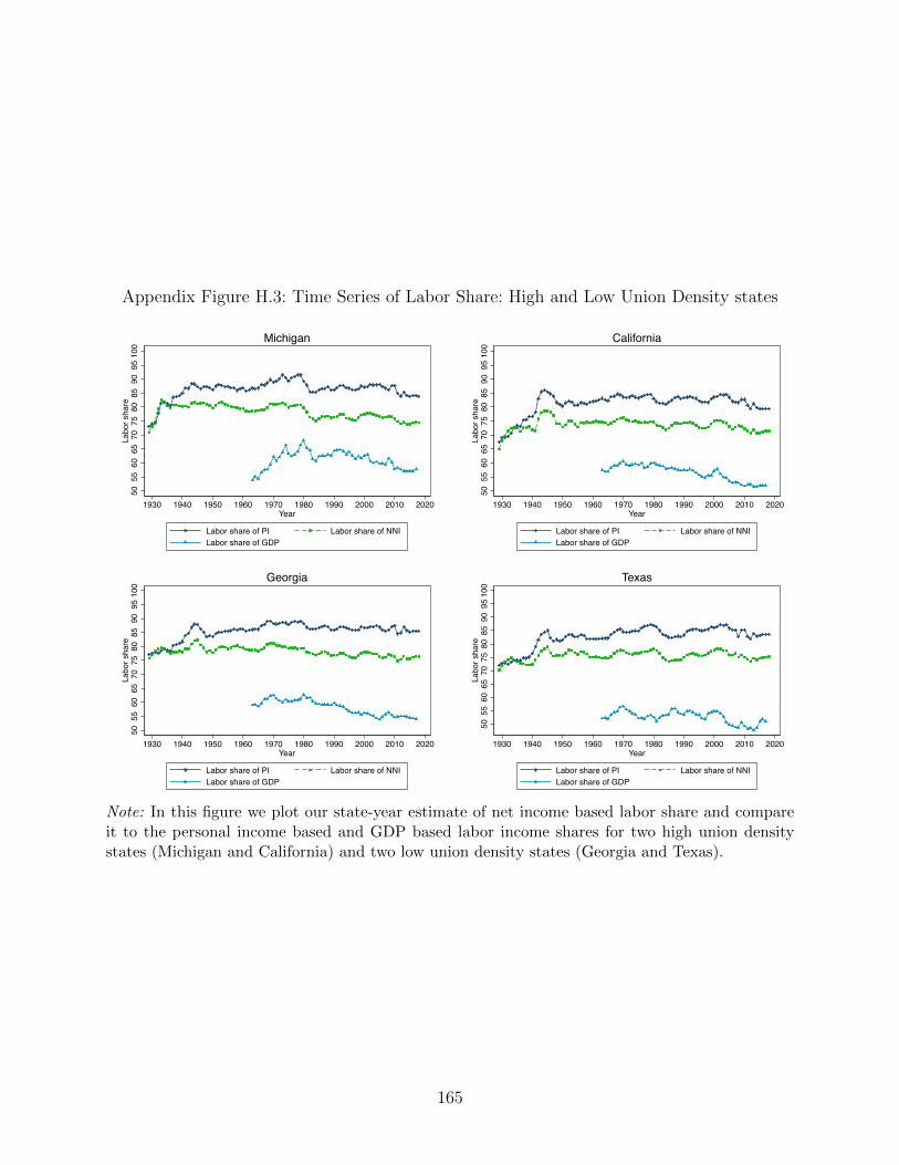
Appendix Figure H.3: Time Series of Labor Share: High and Low Union Density states
5055
6065
7075
8085
9095
100
Labo
r sha
re
1930 1940 1950 1960 1970 1980 1990 2000 2010 2020Year
Labor share of PI Labor share of NNILabor share of GDP
Michigan
5055
6065
7075
8085
9095
100
Labo
r sha
re
1930 1940 1950 1960 1970 1980 1990 2000 2010 2020Year
Labor share of PI Labor share of NNILabor share of GDP
California
5055
6065
7075
8085
9095
100
Labo
r sha
re
1930 1940 1950 1960 1970 1980 1990 2000 2010 2020Year
Labor share of PI Labor share of NNILabor share of GDP
Georgia
5055
6065
7075
8085
9095
100
Labo
r sha
re
1930 1940 1950 1960 1970 1980 1990 2000 2010 2020Year
Labor share of PI Labor share of NNILabor share of GDP
Texas
Note: In this figure we plot our state-year estimate of net income based labor share and compareit to the personal income based and GDP based labor income shares for two high union densitystates (Michigan and California) and two low union density states (Georgia and Texas).
165
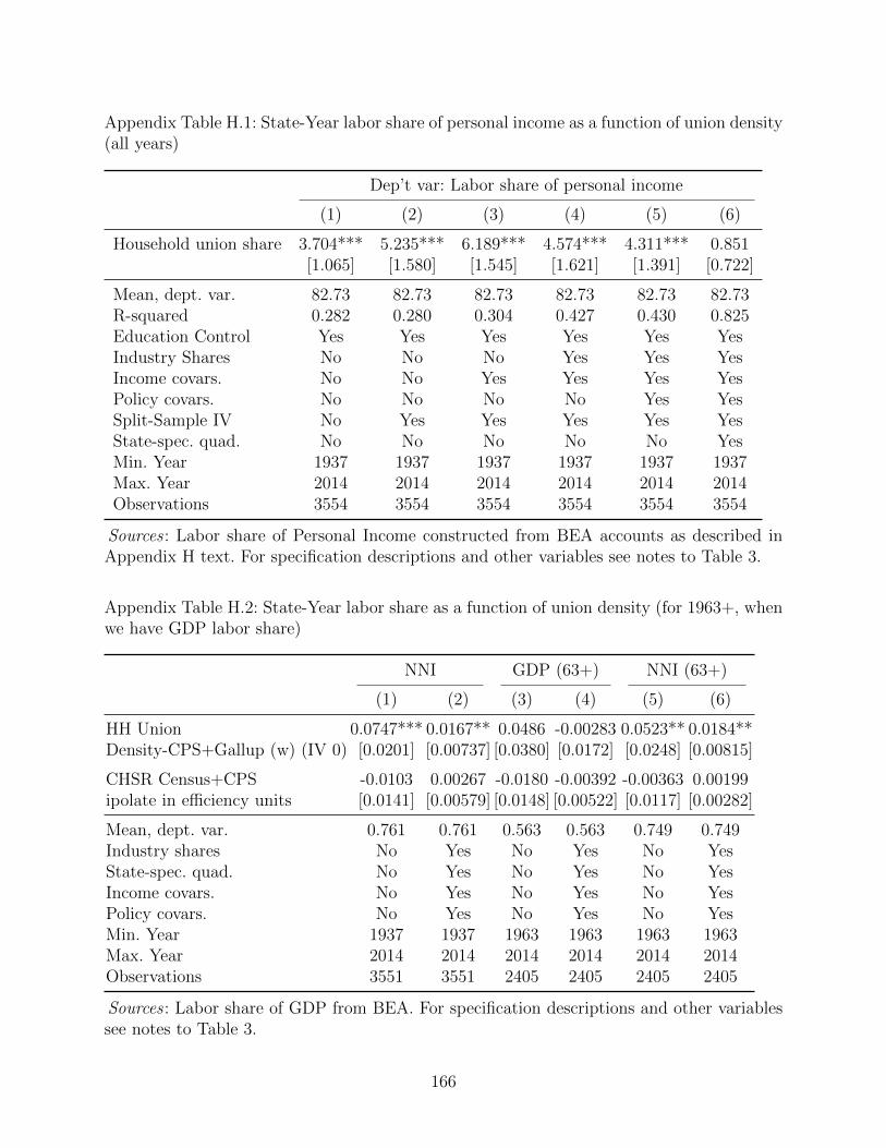
Appendix Table H.1: State-Year labor share of personal income as a function of union density(all years)
Dep’t var: Labor share of personal income
(1) (2) (3) (4) (5) (6)
Household union share 3.704*** 5.235*** 6.189*** 4.574*** 4.311*** 0.851[1.065] [1.580] [1.545] [1.621] [1.391] [0.722]
Mean, dept. var. 82.73 82.73 82.73 82.73 82.73 82.73R-squared 0.282 0.280 0.304 0.427 0.430 0.825Education Control Yes Yes Yes Yes Yes YesIndustry Shares No No No Yes Yes YesIncome covars. No No Yes Yes Yes YesPolicy covars. No No No No Yes YesSplit-Sample IV No Yes Yes Yes Yes YesState-spec. quad. No No No No No YesMin. Year 1937 1937 1937 1937 1937 1937Max. Year 2014 2014 2014 2014 2014 2014Observations 3554 3554 3554 3554 3554 3554
Sources : Labor share of Personal Income constructed from BEA accounts as described inAppendix H text. For specification descriptions and other variables see notes to Table 3.
Appendix Table H.2: State-Year labor share as a function of union density (for 1963+, whenwe have GDP labor share)
NNI GDP (63+) NNI (63+)
(1) (2) (3) (4) (5) (6)
HH Union 0.0747*** 0.0167** 0.0486 -0.00283 0.0523** 0.0184**Density-CPS+Gallup (w) (IV 0) [0.0201] [0.00737] [0.0380] [0.0172] [0.0248] [0.00815]
CHSR Census+CPS -0.0103 0.00267 -0.0180 -0.00392 -0.00363 0.00199ipolate in efficiency units [0.0141] [0.00579] [0.0148] [0.00522] [0.0117] [0.00282]
Mean, dept. var. 0.761 0.761 0.563 0.563 0.749 0.749Industry shares No Yes No Yes No YesState-spec. quad. No Yes No Yes No YesIncome covars. No Yes No Yes No YesPolicy covars. No Yes No Yes No YesMin. Year 1937 1937 1963 1963 1963 1963Max. Year 2014 2014 2014 2014 2014 2014Observations 3551 3551 2405 2405 2405 2405
Sources : Labor share of GDP from BEA. For specification descriptions and other variablessee notes to Table 3.
166
Appendix I. Right-To-Work Analysis
In this appendix, we consider the potential for the enactment of Right-to-Work (RTW)laws to provide credible exogenous variation in state-level union density. Besides being ofindependent interest, RIW laws could provide a candidate instrumental variable for ourcentral analyses in the post-1947 period. Unfortunately, the results of this section showthat there is at best only weak evidence that RTW laws can serve this function. The greatmajority of RTW laws, passed in the 1940s and 1950s, were passed in states that, ex ante, hadrelatively low union density and did show unusual (off-trend) movements in union densitysubsequent to RTW enactment. This suggests that RTW laws are more an indicator of somecombination of pre-existing effective employer and government resistance to unionization aswell as lower demand by workers for union representation.
RTW laws are widely considered to be a policy designed to weaken unions by allowingworkers to opt out of dues and agency fees. This sets up a classic free-rider problem sinceunions have the obligation to represent all workers in a bargaining unit, even those whodo not pay to support the union. All wages and benefits negotiated by the union as wellas other services provided by the union (e.g., handling of workplace grievances, eligibilityfor promotion, prioritization in the case of layoffs) are enjoyed by all workers, regardless ofwhether they pay to support the union. The first RTW laws were passed in the mid 1940s,but their legal status was ambiguous until the Taft-Hartley Act of 1947. The Taft-HartleyAct amended the National Labor Relations (Wagner) Act of 1935 and allowed states to enactRTW laws. Over the succeeding decade a substantial number of states enacted RTW laws,a small number of which were subsequently repealed.
Table I.1 contains a list of states that have enacted RTW laws, along with information on
the year of enactment. While a handful of states passed RTW laws prior to the enactment of
the Taft-Hartley Act in 1947, the act was followed by RTW passage in a substantial number
of states (10 states in 1947-48 and another 8 states in the 1950s). These “early adopters”
were largely states historically hostile to labor unions.82 This is in contrast to some of the
states with a history of strong labor unions that have adopted RTW laws more recently:
Indiana (2012), a re-passage after 1965 repeal), Michigan (2013), West Virginia (2016), and
Wisconsin (2016).
There is a substantial older literature based on the idea that right-to-work laws are a
natural candidate as exogenous shifters of union density. In fact, this literature largely fails to
find substantial negative effects of RTW laws on union density. An early study by Lumsden
and Petersen (1975), using state level unionization levels in 1939, 1953, and 1968 confirms
that states with RTW laws have lower union density but that changes in union density
are unrelated to the presence of a RTW law or how long a RTW law has been in effect.
They conclude that the laws have little substantive impact on union density. Using data
82Interestingly, 3 northeastern states (Delaware, Maine, and New Hampshire) adopted RTW lawsvery early (1947-48), but repealed the laws almost immediately. Additionally, Louisiana enacted anRTW law relatively early (1954) and repealed it soon after, before enacting RTW again in 1976.
167
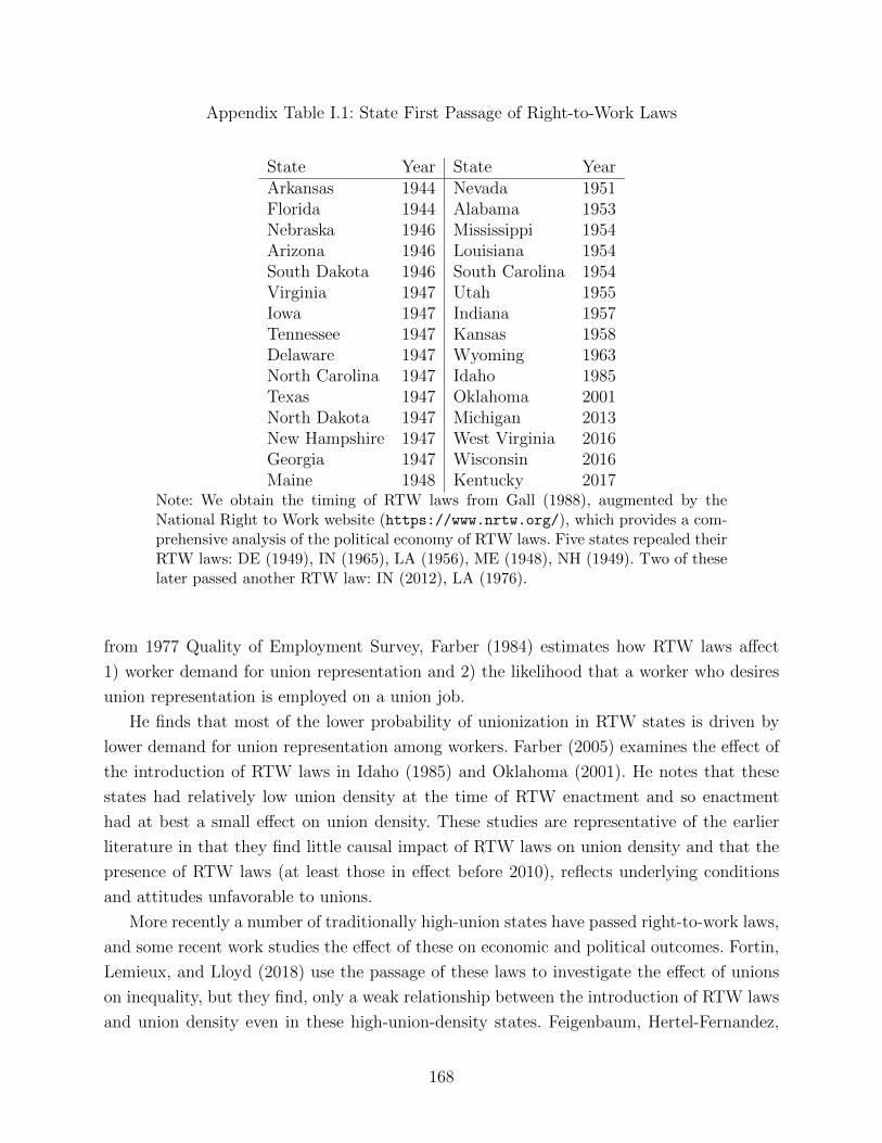
Appendix Table I.1: State First Passage of Right-to-Work Laws
State Year State YearArkansas 1944 Nevada 1951Florida 1944 Alabama 1953Nebraska 1946 Mississippi 1954Arizona 1946 Louisiana 1954South Dakota 1946 South Carolina 1954Virginia 1947 Utah 1955Iowa 1947 Indiana 1957Tennessee 1947 Kansas 1958Delaware 1947 Wyoming 1963North Carolina 1947 Idaho 1985Texas 1947 Oklahoma 2001North Dakota 1947 Michigan 2013New Hampshire 1947 West Virginia 2016Georgia 1947 Wisconsin 2016Maine 1948 Kentucky 2017
Note: We obtain the timing of RTW laws from Gall (1988), augmented by theNational Right to Work website (https://www.nrtw.org/), which provides a com-prehensive analysis of the political economy of RTW laws. Five states repealed theirRTW laws: DE (1949), IN (1965), LA (1956), ME (1948), NH (1949). Two of theselater passed another RTW law: IN (2012), LA (1976).
from 1977 Quality of Employment Survey, Farber (1984) estimates how RTW laws affect
1) worker demand for union representation and 2) the likelihood that a worker who desires
union representation is employed on a union job.
He finds that most of the lower probability of unionization in RTW states is driven by
lower demand for union representation among workers. Farber (2005) examines the effect of
the introduction of RTW laws in Idaho (1985) and Oklahoma (2001). He notes that these
states had relatively low union density at the time of RTW enactment and so enactment
had at best a small effect on union density. These studies are representative of the earlier
literature in that they find little causal impact of RTW laws on union density and that the
presence of RTW laws (at least those in effect before 2010), reflects underlying conditions
and attitudes unfavorable to unions.
More recently a number of traditionally high-union states have passed right-to-work laws,
and some recent work studies the effect of these on economic and political outcomes. Fortin,
Lemieux, and Lloyd (2018) use the passage of these laws to investigate the effect of unions
on inequality, but they find, only a weak relationship between the introduction of RTW laws
and union density even in these high-union-density states. Feigenbaum, Hertel-Fernandez,
168
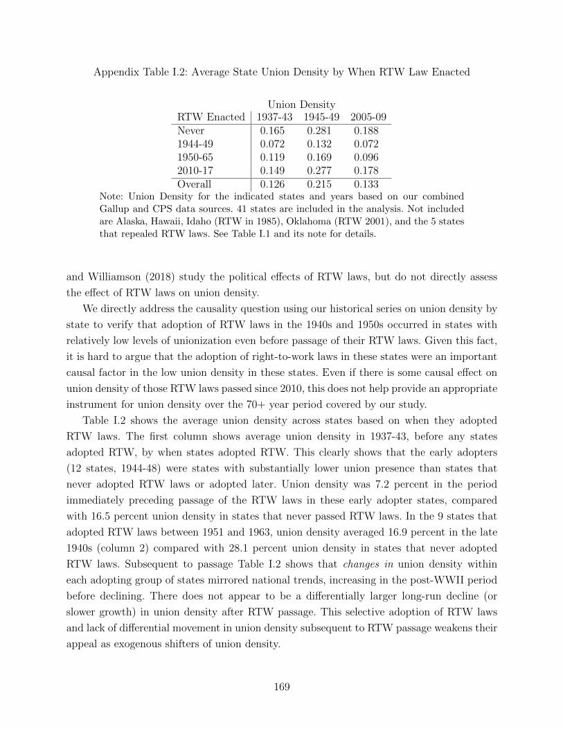
Appendix Table I.2: Average State Union Density by When RTW Law Enacted
Union DensityRTW Enacted 1937-43 1945-49 2005-09Never 0.165 0.281 0.1881944-49 0.072 0.132 0.0721950-65 0.119 0.169 0.0962010-17 0.149 0.277 0.178Overall 0.126 0.215 0.133
Note: Union Density for the indicated states and years based on our combinedGallup and CPS data sources. 41 states are included in the analysis. Not includedare Alaska, Hawaii, Idaho (RTW in 1985), Oklahoma (RTW 2001), and the 5 statesthat repealed RTW laws. See Table I.1 and its note for details.
and Williamson (2018) study the political effects of RTW laws, but do not directly assess
the effect of RTW laws on union density.
We directly address the causality question using our historical series on union density by
state to verify that adoption of RTW laws in the 1940s and 1950s occurred in states with
relatively low levels of unionization even before passage of their RTW laws. Given this fact,
it is hard to argue that the adoption of right-to-work laws in these states were an important
causal factor in the low union density in these states. Even if there is some causal effect on
union density of those RTW laws passed since 2010, this does not help provide an appropriate
instrument for union density over the 70+ year period covered by our study.
Table I.2 shows the average union density across states based on when they adopted
RTW laws. The first column shows average union density in 1937-43, before any states
adopted RTW, by when states adopted RTW. This clearly shows that the early adopters
(12 states, 1944-48) were states with substantially lower union presence than states that
never adopted RTW laws or adopted later. Union density was 7.2 percent in the period
immediately preceding passage of the RTW laws in these early adopter states, compared
with 16.5 percent union density in states that never passed RTW laws. In the 9 states that
adopted RTW laws between 1951 and 1963, union density averaged 16.9 percent in the late
1940s (column 2) compared with 28.1 percent union density in states that never adopted
RTW laws. Subsequent to passage Table I.2 shows that changes in union density within
each adopting group of states mirrored national trends, increasing in the post-WWII period
before declining. There does not appear to be a differentially larger long-run decline (or
slower growth) in union density after RTW passage. This selective adoption of RTW laws
and lack of differential movement in union density subsequent to RTW passage weakens their
appeal as exogenous shifters of union density.
169
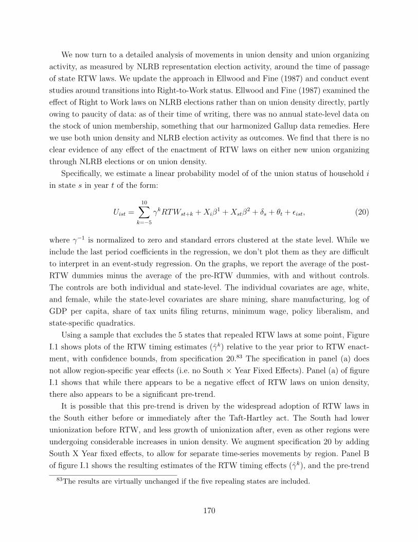
We now turn to a detailed analysis of movements in union density and union organizing
activity, as measured by NLRB representation election activity, around the time of passage
of state RTW laws. We update the approach in Ellwood and Fine (1987) and conduct event
studies around transitions into Right-to-Work status. Ellwood and Fine (1987) examined the
effect of Right to Work laws on NLRB elections rather than on union density directly, partly
owing to paucity of data: as of their time of writing, there was no annual state-level data on
the stock of union membership, something that our harmonized Gallup data remedies. Here
we use both union density and NLRB election activity as outcomes. We find that there is no
clear evidence of any effect of the enactment of RTW laws on either new union organizing
through NLRB elections or on union density.
Specifically, we estimate a linear probability model of of the union status of household i
in state s in year t of the form:
Uist =10∑
k=−5
γkRTWst+k +Xiβ1 +Xstβ
2 + δs + θt + εist, (20)
where γ−1 is normalized to zero and standard errors clustered at the state level. While we
include the last period coefficients in the regression, we don’t plot them as they are difficult
to interpret in an event-study regression. On the graphs, we report the average of the post-
RTW dummies minus the average of the pre-RTW dummies, with and without controls.
The controls are both individual and state-level. The individual covariates are age, white,
and female, while the state-level covariates are share mining, share manufacturing, log of
GDP per capita, share of tax units filing returns, minimum wage, policy liberalism, and
state-specific quadratics.
Using a sample that excludes the 5 states that repealed RTW laws at some point, Figure
I.1 shows plots of the RTW timing estimates (γk) relative to the year prior to RTW enact-
ment, with confidence bounds, from specification 20.83 The specification in panel (a) does
not allow region-specific year effects (i.e. no South × Year Fixed Effects). Panel (a) of figure
I.1 shows that while there appears to be a negative effect of RTW laws on union density,
there also appears to be a significant pre-trend.
It is possible that this pre-trend is driven by the widespread adoption of RTW laws in
the South either before or immediately after the Taft-Hartley act. The South had lower
unionization before RTW, and less growth of unionization after, even as other regions were
undergoing considerable increases in union density. We augment specification 20 by adding
South X Year fixed effects, to allow for separate time-series movements by region. Panel B
of figure I.1 shows the resulting estimates of the RTW timing effects (γk), and the pre-trend
83The results are virtually unchanged if the five repealing states are included.
170
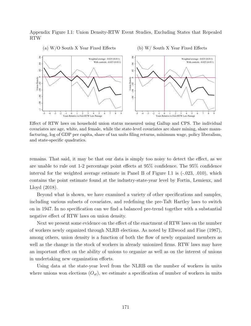
Appendix Figure I.1: Union Density-RTW Event Studies, Excluding States that RepealedRTW
(a) W/O South X Year Fixed Effects
-.1-.0
8-.0
6-.0
4-.0
20
.02
.04
.06
Uni
on D
ensi
ty
-5 -4 -3 -2 -1 0 1 2 3 4 5 6 7 8 9Years Relative to First RTW Law Passage
Weighted average: -0.035 (0.011) With controls: -0.023 (0.011)
(b) W/ South X Year Fixed Effects
-.06
-.04
-.02
0.0
2.0
4.0
6U
nion
Den
sity
-5 -4 -3 -2 -1 0 1 2 3 4 5 6 7 8 9Years Relative to First RTW Law Passage
Weighted average: -0.035 (0.011) With controls: -0.023 (0.011)
Effect of RTW laws on household union status measured using Gallup and CPS. The individualcovariates are age, white, and female, while the state-level covariates are share mining, share manu-facturing, log of GDP per capita, share of tax units filing returns, minimum wage, policy liberalism,and state-specific quadratics.
remains. That said, it may be that our data is simply too noisy to detect the effect, as we
are unable to rule out 1-2 percentage point effects at 95% confidence. The 95% confidence
interval for the weighted average estimate in Panel B of Figure I.1 is (-.023, .010), which
contains the point estimate found at the industry-state-year level by Fortin, Lemieux, and
Lloyd (2018).
Beyond what is shown, we have examined a variety of other specifications and samples,
including various subsets of covariates, and redefining the pre-Taft Hartley laws to switch
on in 1947. In no specification can we find a balanced pre-trend together with a substantial
negative effect of RTW laws on union density.
Next we present some evidence on the effect of the enactment of RTW laws on the number
of workers newly organized through NLRB elections. As noted by Ellwood and Fine (1987),
among others, union density is a function of both the flow of newly organized members as
well as the change in the stock of workers in already unionized firms. RTW laws may have
an important effect on the ability of unions to organize as well as on the interest of unions
in undertaking new organization efforts.
Using data at the state-year level from the NLRB on the number of workers in units
where unions won elections (Ost), we estimate a specification of number of workers in units
171
where unions won elections in state s in year t of the form:
Ost =10∑
k=−5
γkRTWst+k +Xstβ + δs + θt + εst, (21)
where γ−1 is normalized to zero and standard errors clustered at the state level. As before,
while we include the last period coefficients in the regression, we don’t plot them as they
are difficult to interpret in an event-study regression. On the graphs, we report the average
of the post-RTW dummies minus the average of the pre-RTW dummies, with and without
controls. The state-level covariates include share mining, share manufacturing, log of GDP
per capita, share of tax units filing returns, minimum wage, policy liberalism, and state-
specific quadratics. Complete state-year NLRB election data are not available until 1945, so
we begin this analysis in 1950.
Analogously to Figure I.1, Figure I.2 shows plots of the RTW timing estimates (γk)
relative to the year prior to RTW enactment and confidence bounds from specification 21,
using a sample that excludes the 5 states that repealed RTW laws at some point.84 Figure
I.2, shows that there is little detectable effect of RTW laws on new members organized
through NLRB elections, with or without South X Year FE. This result is not consistent
with Ellwood and Fine (1987) but is consistent with a large amount of work documenting
little direct effect of RTW on union membership. For example, Farber (1984) shows that
RTW does not even affect the stated willingness of workers to join unions.
We also examined a variety of political outcomes in addition to union density and new
organization. We did find small negative effects of RTW on share of Democrats in state
legislatures and senates, with no pre-trend. This is consistent with Feigenbaum, Hertel-
Fernandez, and Williamson (2018), who do find large effects of RTW on Democratic vote
share (along with small effects on density), along with evidence that unions respond to RTW
by reallocating resources from political mobilization towards maintenance of membership.
The weak and ambiguous results related to the effect of the introduction of RTW laws on
both the stock of union members and the flow of new members is consistent with our analysis
earlier in this appendix that highlighted the heavy negative selection in the passage of RTW
laws. RTW laws, particularly those passed in the 1940s and 1950s, tend to be enacted where
there is relatively less support for unions. While enactment of Right-To-Work laws may have
some effect on unions that we are unable to detect, it is not a plausible candidate for an
instrumental variable for union density in our data.
84The results are virtually unchanged if the five repealing states are included.
172
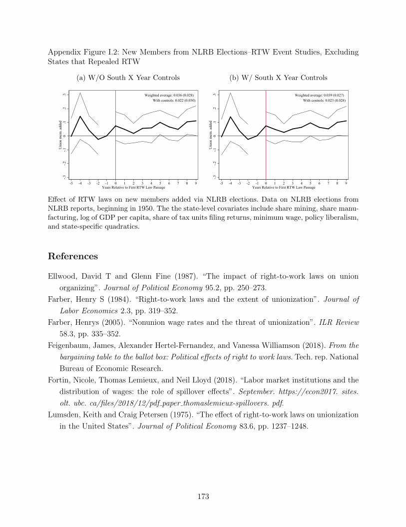
Appendix Figure I.2: New Members from NLRB Elections–RTW Event Studies, ExcludingStates that Repealed RTW
(a) W/O South X Year Controls
-.3-.2
-.10
.1.2
.3U
nion
mem
. add
ed
-5 -4 -3 -2 -1 0 1 2 3 4 5 6 7 8 9Years Relative to First RTW Law Passage
Weighted average: 0.036 (0.028) With controls: 0.022 (0.030)
(b) W/ South X Year Controls
-.3-.2
-.10
.1.2
.3U
nion
mem
. add
ed
-5 -4 -3 -2 -1 0 1 2 3 4 5 6 7 8 9Years Relative to First RTW Law Passage
Weighted average: 0.039 (0.027) With controls: 0.023 (0.028)
Effect of RTW laws on new members added via NLRB elections. Data on NLRB elections fromNLRB reports, beginning in 1950. The the state-level covariates include share mining, share manu-facturing, log of GDP per capita, share of tax units filing returns, minimum wage, policy liberalism,and state-specific quadratics.
References
Ellwood, David T and Glenn Fine (1987). “The impact of right-to-work laws on union
organizing”. Journal of Political Economy 95.2, pp. 250–273.
Farber, Henry S (1984). “Right-to-work laws and the extent of unionization”. Journal of
Labor Economics 2.3, pp. 319–352.
Farber, Henrys (2005). “Nonunion wage rates and the threat of unionization”. ILR Review
58.3, pp. 335–352.
Feigenbaum, James, Alexander Hertel-Fernandez, and Vanessa Williamson (2018). From the
bargaining table to the ballot box: Political effects of right to work laws. Tech. rep. National
Bureau of Economic Research.
Fortin, Nicole, Thomas Lemieux, and Neil Lloyd (2018). “Labor market institutions and the
distribution of wages: the role of spillover effects”. September. https://econ2017. sites.
olt. ubc. ca/files/2018/12/pdf paper thomaslemieux-spillovers. pdf.
Lumsden, Keith and Craig Petersen (1975). “The effect of right-to-work laws on unionization
in the United States”. Journal of Political Economy 83.6, pp. 1237–1248.
173