Embed Size (px)
DESCRIPTION
International Journal Of Tipographics
Citation preview
as on U sac UPPER AND LOWER CA
: THE INT'RNATION-ALTholfRNAL OF GRAPHIC DESIGN AND DIGITAL MEDIA
FACE CORPORATION : VOL.25 NO.3 : WINTER 1998: $5 US $9.90 AUD £4.95
1J1 _P i)Epd N
Large Enough To Have What You Need. Small Enough To Know Who You Are!
At Graphic Paper NY, you're more than an account number. We believe that customer service is the most important aspect of our business. We built our reputation on offering Product and Service Excellence to our customers.
WE OFFER...
• Next day delivery on most orders.
• Same day deliveries can be arranged.
The largest selection of Domtar® fine paper in the metropolitan area.
• One of the largest inventories of fine paper.
A full-service converting facility to accommodate special sizes.
• Friendly and accommodating service for all orders...big or small.
WHERE THE CUSTOMER ALWAYS COMES FIRST.
GRAPHIC PAPER NEW YORK, INC. 31 Windsor Place • Central Islip, NY 11722
Toll Free: 1-800-840-4555 Tel: 516-761-9700 • Fax: 516-761-9701
Agfa Direct Fall 1998
Fonts • Royalty Free Images • Scanners & Digital Cameras • Software • Books
44011Milost
agfadirect com Featuring:
4
t' ,.‘'E-,%,,j;:i.t.• Bard(tidd \'; = . 6 8' Lineale Elegante
, 1 I I) Obsessed Zs, '... 4a baYiac lioniantica ..... ,...., oa)
THORTA, FACLF ry ( crtocSoutrx / . Amur q° 1:1 1,AfiC En wo
t4ve titilance Type
hlications
oftwore
.4g fa
Cover. John D.Berry explores William aslon's rise to prominence in 18th century England & Justin Howes's faithful reproduction of several of Caslon's types for the new ITC Founder's Caslon.
Vigital Arts. Saki Mafundikwa, New York graphic designer and instructor, returns to his native Zimbabwe to establish his nation's first digital visual arts school-a study in the evolution of an idea. By Eileen Gunn
Little Square Books. A new breed of instructional design books published by Studio Vista took London by storm in the 1960s and '70s, and are still widely sought after today. By Patrick Baglee
The Breaking Point. Olav Martin Kvern gives us some tips on controlling line breaks and using the right hyphen for the job.
New from ITC. ITC introduces seven new Fontek handwriting-based typefaces, including two by the late Phil! Grimshaw, as well the distressed
- ITC Coventry family. Text by John D. Berry
Pret-a-lire. Mark van Bronkhorst presents exam-ples of outdoor lettering found in various parts of France.
Usac
Messagefrom ITC
N OCTOBER, ITC WENT TO
England & France. In London, we hosted a launch party at the St. Bride Printing Library for an ambitious new type family, ITC Founder's Caslon - a direct revival by Justin Howes of William Caslon's type designs from the 18th century. In Lyon, we participated in the 1998 conference of the Association Typographique Internationale (ATypI), typography's premier international gathering ofpro-fessional practitioners.
In England we were celebrat- ing the first typeface family to bring the quirks & subtleties of
Caslon's distinct & various type sizes into the digital realm. In France we were celebrating the myriad ways in which typography can be approached, in distinct languages and cultures, in a variety of unpredictable technologies, and in the quirks & subtleties of the peo-ple who make up the typographic world.
- Mark Batty,President
Upper & Lower Case
The international journal of graphic design
and digital media published by
International Typeface Corporation
Executive Publisher:
Mark J. Batty
Editor & Publisher: John D. Berry
Graphic Design:
Mark van Bronkhorst
MvB Design, Albany, California
Design Director: Clive Chiu
Production:
Akeml Aoki, MvB Design
Associate Publisher: Rebecca L. Pappas
Advertising Sales:
Barbara H. Arnold, BHA Associates Inc.
Phone (781) 259 9207
Fax (781) 259 9883
Distribution: Edward Wormly
For information on existing
subscriptions fax (516) 756 2604
List Rental Office:
Worldata
(561) 393 8200 www.worldata.com
x1/1998 International Typeface
Corporation. U&Ic (ISSN 0362 6245) is
published quarterly by International
Typeface Corporation, 228 E. 45th Street,
New York NY 10017
U.S. Subscription Rates:
$30 for three years
Foreign Airmail Subscriptions:
$60 U.S. for three years
U.S. funds drawn on U.S. Bank
To Contact ITC:
Call (212) 949 8072
Fax (212) 949 8485
General: [email protected]
Web: www.itcfonts.com
Editorial/Production: [email protected]
Circulation: [email protected]
Advertising: [email protected]
Periodicals Postage Paid at New York, NY
and additional mailing offices
Postmaster: Send address changes to
U&Ic Subscription Department,
P.O. Box 129, Plainview, NY 11803-0129
ITC Operating Executive Board 1998:
Mark J. Batty, President and CEO
Randy S. Weitz, Controller
Ilene Strizver,
Director of Typeface Development
ITC Founders:
Aaron Burns, Herb Lubalin,
Edward Rondtha ler
ITC, U&Ic and the U&Ic logotype are
registered trademarks of International
Typeface Corporation
Microfilm (16mm or 35mm) and
microfiche (105mm) copies of Uric are
available from UMI, 300 North Zeeb Road
Ann Arbor, MI 48106-1346
Phone (800) 521 0600 or (313) 761 4700
Fax (313) 761 3221
Photography on pages 30-33
4 1998 Mark van Bronkhorst
Photograph on page 9
71998 Michael Chinyamurindi
5
I Ismail Ete.4 V
"ZIVA will benefit both the kids, by providing a path and an achievement, and the Zimbabwe economy, by supporting professionalism in business marketing:' - Peter Cawley, co-founder of the 2B1 Foundation
ZIVA A school of the `vigitar arts grows in Zimbabwe
In 1997, after twenty years in the United States, Zimbabwean graphic designer and teacher Saki Mafundikwa returned to his homeland with a focused vision of the contribution he could make to the future of Zimbabwe: ZIVA, a center for the teaching ofskills that will equip young African women and men with the tools necessary to enter into the 2I st century with the same confidence, courage, and knowledge as their counterparts in the West. Just a year later, in defiance of the cur-rent economic and social upheaval in Zimbabwe, ZIVA is ready to open its doors. By Eileen Gunn
Zimbabwe is a land of heartstopping physical beauty, from Victoria Falls, a sheet of falling water over a mile wide, to its huge, game-rich national parks. The peo-ple of Zimbabwe have moved beyond its recent colonial past (an apartheid-based state known as Rhodesia) to create a society notable for cooperation among both the races and the tribes. The music of the Shona and Ndebele people—especially the polyphonic grace of the mbira and the irresistible dance music of marimba ensembles—has gained an enthusiastic audience around the world, as has Shona stone sculpture, an art form created and nur-tured by two local art schools in the 196os.
But the present of Zimbabwe is darkened by eco-nomic, political, and health crises: a draining war with Zaire, galloping unemployment and inflation, a surge in preventable diseases like malaria and tuberculosis, and the highest AIDS infection rate in the world. A pro-ject that would require major effort even in the West, such as opening an art school, is far more difficult in Zimbabwe.
Mafundikwa is up to the challenge. He holds a degree in telecommunications and fine arts from Indiana Uni-versity and an MFA from Yale, and served as an adjunct professor at the Cooper Union School of Art in New York. Until last year, he worked at Random House as a designer of books, Web sites, and multimedia. Margaret Morton, leader of the graphic design area at Cooper Union and a member of Z IVA'S advisory board, says that the school is an idea Saki conceived when he was teach-ing at Cooper Union. "It's such an exciting project, but a huge undertaking. It's a dream he's had for a long time."
Now he's on the verge of awakening it to reality: zIVA is scheduled to open in Harare before the end of the year, in a four-room, colonial-period house in the heart of downtown. Saki handles everything himself, from local business licenses to recalcitrant shippers in New York. He's designated one room for the design library and another for a children's library, and has hired a carpenter
to build chairs and tables for the students in the largest room. "Sure, we'd like a bigger place, but it's better to start small."
In the U.S., he's enlisted the help of design profes-sionals, educators, and fundraisers, and persuaded companies like Adobe and Macromedia to donate soft-ware. "He is among the most tireless, resourceful, and self-sacrificing fundraisers I have ever met," says Peter Cawley, co-founder of the 281 Foundation, a non-profit organization concerned with connecting children in developing countries to the computer revolution. "He can create a setting— a facility and faculty—where a child who begins to learn about computing and the visual arts can take that interest and ambition farther than had ever been previously possible in Harare?'
Mafundikwa has a concrete understanding of what he needs to do to sustain the school while he creates that setting. "The idea so far," he says,"is more like a training center. A three-year course of studies will come later, but right now, people have more immediate needs." Initially, the school will offer six-week courses of instruction in computer competency, including the use of graphics and multimedia programs. For this phase, Mafundikwa expects to draw students primarily from people who are already working in advertising or design, and graduates of the Harare Polytech design school—people who want to extend their skills to electronic media."They're start-ing to go electronic, but they never really had the train-ing—not just in the use of QuarkXPress and Adobe Illustrator, but also in design, and in the professional details that indicate quality design."
How much will tuition be? "I truly don't know. But it can't be much, otherwise no one will be able to come." ZIVA will also provide free computer clinics for children
Opposite: True Riggins, a student of Saki Mafundikwa's at Cooper Union, graphically depicts the origin of the symbol for "king" in the Bamum syllabary of Cameroon as a human figure with arms waving triumphantly.
7
nn., tn.* Po
1. no4ftes ••••.•
40
41
.G•an. Al.rne rashen arno, d opMarii wood ind pr-ro deth Tn. Rorne. popula,nam, As euNk, yrn0.1 npawq emnd ceme • e M power m nee
is or welly.. re.° kinto clefb end al,a An made O., •••,9•t•
The Barnum Script
sim vntM ••••••••••
CbmsOwe.
Sultan Njoya, king of the Harmed Cameroon, as over r10 years. was d man of genius At the and of :he mmeteen. century. he caromed an indepen- dent system of minting Ice he own language as well as a sacral Moon Mnguage• He was
.nepied by a dream, which he was told to dims a man, hand on a board and Men to wash off his drawn°, and drink the water He Men auk,. Ns islibiaida M draw ()Marne odocts and to name them. Armed well dor mauls, ha esp.,
°melted until he had Created Ms first system of writing. containing Min pelographic and Mee strophe symbols.
Altar Ma perfection ol Ike [ASH:Hrs. ' , ova set up a semen of schools ...book houses' throughout Ns kingdom al which ivrelreds of hi sub,la leamod to read end write An important end vaned collection of Her waa rumpled, only
some of which hes been preitemod. Among other works, lump iernpled Nma on No history and customs at his
vo kingdom, a hook of
rules and for conduct at ha court ants a ogled tme of maps of es domains. Ho created a *rap arid ethnographic collect. at Pa palace. and
encouraged Me development of IradiSdial weav-ing and dyeing.
Afjdcgabets
Saki Malundikwa
Saki Mafundikwa
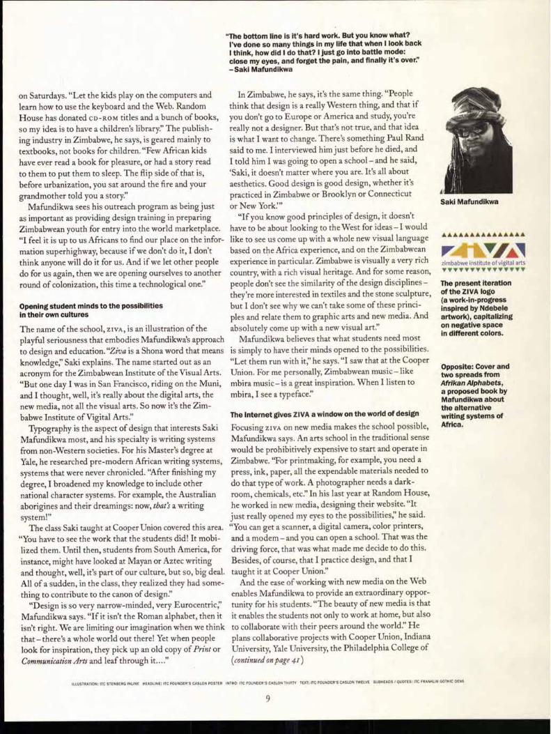
zimbabwe institute of vigital arts •YvvvvvvvIryvvvy
The present iteration of the ZIVA logo (a work-in-progress inspired by Ndebele artwork), capitalizing on negative space in different colors.
Opposite: Cover and two spreads from Afrikan Alphabets, a proposed book by Mafundikwa about the alternative writing systems of Africa.
on Saturdays. "Let the kids play on the computers and learn how to use the keyboard and the Web. Random House has donated CD-ROM titles and a bunch of books, so my idea is to have a children's library?' The publish-ing industry in Zimbabwe, he says, is geared mainly to textbooks, not books for children. "Few African kids have ever read a book for pleasure, or had a story read to them to put them to sleep. The flip side of that is, before urbanization, you sat around the fire and your grandmother told you a story?'
Mafundikwa sees his outreach program as being just as important as providing design training in preparing Zimbabwean youth for entry into the world marketplace. "I feel it is up to us Africans to find our place on the infor-mation superhighway, because if we don't do it, I don't think anyone will do it for us. And if we let other people do for us again, then we are opening ourselves to another round of colonization, this time a technological one."
Opening student minds to the possibilities in their own cultures
The name of the school, ZIVA, is an illustration of the playful seriousness that embodies Mafundikwa's approach to design and education. "Ziva is a Shona word that means knowledge;' Saki explains. The name started out as an acronym for the Zimbabwean Institute of the Visual Arts. "But one day I was in San Francisco, riding on the Muni, and I thought, well, it's really about the digital arts, the new media, not all the visual arts. So now it's the Zim-babwe Institute of Vigital Arts?'
Typography is the aspect of design that interests Saki Mafundikwa most, and his specialty is writing systems from non Western societies. For his Master's degree at Yale, he researched pre-modern African writing systems, systems that were never chronicled. "After finishing my degree, I broadened my knowledge to include other national character systems. For example, the Australian aborigines and their dreamings: now, tbat's a writing system!"
The class Saki taught at Cooper Union covered this area. "You have to see the work that the students did! It mobi-lized them. Until then, students from South America, for instance, might have looked at Mayan or Aztec writing and thought, well, it's part of our culture, but so, big deal. All of a sudden, in the class, they realized they had some-thing to contribute to the canon of design:'
"Design is so very narrow-minded, very Eurocentric," Mafundikwa says. "If it isn't the Roman alphabet, then it isn't right. We are limiting our imagination when we think that — there's a whole world out there! Yet when people look for inspiration, they pick up an old copy of Print or Communication Arts and leaf through it...."
"The bottom line is it's hard work. But you know what? I've done so many things in my life that when I look back
I think, how did I do that? I just go into battle mode: close my eyes, and forget the pain, and finally it's over:' -Saki Mafundikwa
In Zimbabwe, he says, it's the same thing. "People think that design is a really Western thing, and that if you don't go to Europe or America and study, you're really not a designer. But that's not true, and that idea is what I want to change. There's something Paul Rand said to me. I interviewed him just before he died, and I told him I was going to open a school—and he said, `Saki, it doesn't matter where you are. It's all about aesthetics. Good design is good design, whether it's practiced in Zimbabwe or Brooklyn or Connecticut or New York:"
"If you know good principles of design, it doesn't have to be about looking to the West for ideas — I would like to see us come up with a whole new visual language based on the Africa experience, and on the Zimbabwean experience in particular. Zimbabwe is visually a very rich country, with a rich visual heritage. And for some reason, people don't see the similarity of the design disciplines —they're more interested in textiles and the stone sculpture, but I don't see why we can't take some of these princi-ples and relate them to graphic arts and new media. And absolutely come up with a new visual art."
Mafundikwa believes that what students need most is simply to have their minds opened to the possibilities. "Let them run with it," he says. "I saw that at the Cooper Union. For me personally, Zimbabwean music—like mbira music— is a great inspiration. When I listen to mbira, I see a typeface."
The Internet gives ZIVA a window on the world of design
Focusing zivA on new media makes the school possible, Mafundikwa says. An arts school in the traditional sense would be prohibitively expensive to start and operate in Zimbabwe. "For printmaking, for example, you need a press, ink, paper, all the expendable materials needed to do that type of work. A photographer needs a dark-room, chemicals, etc?' In his last year at Random House, he worked in new media, designing their website. "It just really opened my eyes to the possibilities;' he said. "You can get a scanner, a digital camera, color printers, and a modem—and you can open a school. That was the driving force, that was what made me decide to do this. Besides, of course, that I practice design, and that I taught it at Cooper Union?'
And the ease of working with new media on the Web enables Mafundikwa to provide an extraordinary oppor-tunity for his students. "The beauty of new media is that it enables the students not only to work at home, but also to collaborate with their peers around the world?' He plans collaborative projects with Cooper Union, Indiana University, Yale University, the Philadelphia College of (continued on page 41)
ILLUSTRATION: ITC STENBERG INURE HEADLINE: ITC FOUNDER'S CASLON POSTER INTRO: ITC FOUNDER'S CASLON THIRTY TEXT: ITC FOUNDER'S CASLON TWELVE SUBHEADS / QUOTES: ITC FRANKLIN GOTHIC DEMI
9
I0
Thoughts on Design
Paul Rand
• 0 ow
0
0
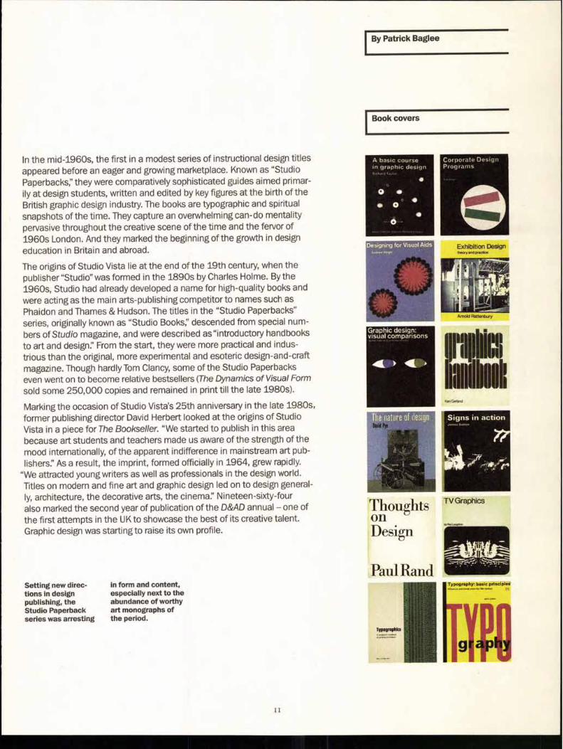
Book covers
A basic course in graphic design
•
Corporate Design Programs
41 ►
TV Graphics
Setting new direc-tions in design publishing, the Studio Paperback series was arresting
in form and content, especially next to the abundance of worthy art monographs of the period.
By Patrick Baglee
In the mid-1960s, the first in a modest series of instructional design titles appeared before an eager and growing marketplace. Known as "Studio Paperbacks," they were comparatively sophisticated guides aimed primar-ily at design students, written and edited by key figures at the birth of the British graphic design industry. The books are typographic and spiritual snapshots of the time. They capture an overwhelming can-do mentality pervasive throughout the creative scene of the time and the fervor of 1960s London. And they marked the beginning of the growth in design education in Britain and abroad.
The origins of Studio Vista lie at the end of the 19th century, when the publisher "Studio" was formed in the 1890s by Charles Holme. By the 1960s, Studio had already developed a name for high-quality books and were acting as the main arts-publishing competitor to names such as Phaidon and Thames & Hudson. The titles in the "Studio Paperbacks" series, originally known as "Studio Books;' descended from special num-bers of Studio magazine, and were described as"introductory handbooks to art and design:' From the start, they were more practical and indus-trious than the original, more experimental and esoteric design-and-craft magazine. Though hardly Tom Clancy, some of the Studio Paperbacks even went on to become relative bestsellers (The Dynamics of Visual Form sold some 250,000 copies and remained in print till the late 1980s).
Marking the occasion of Studio Vista's 25th anniversary in the late 1980s, former publishing director David Herbert looked at the origins of Studio Vista in a piece for The Bookseller. "We started to publish in this area because art students and teachers made us aware of the strength of the mood internationally, of the apparent indifference in mainstream art pub-lishers:' As a result, the imprint, formed officially in 1964, grew rapidly.
"We attracted young writers as well as professionals in the design world. Titles on modern and fine art and graphic design led on to design general-ly, architecture, the decorative arts, the cinema:' Nineteen-sixty-four also marked the second year of publication of the D&AD annual — one of the first attempts in the UK to showcase the best of its creative talent. Graphic design was starting to raise its own profile.
II
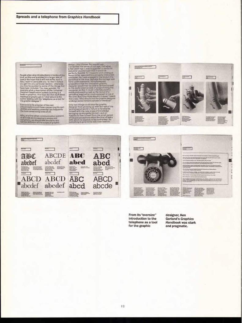
People often skip introductions in books of this kind, so this one is printed in a larger size of type in the hope that it will not suffer such a fate. I want to persuade you to read it before you get into any particular section; otherwise you may be puzzled by some of the things that have been included. You may wonder, for example what a description of the Universal Decimal Classification system is doing in a hook on graphics. And how did that stuff about topological graphs get in? And whom is the author kidding with his 'telephone as a tool for the graphic designer'?
Everyone is the prisoner of his own preconceptions and those concerning his own abilities and working potential are frequently the most constricting ones of all.
Why, at a time when communication systems of all kinds are increasing in scope and complexity, we should feel bound by any narrow definition of the scope of graphic
design, I don't know. But we still are. • I remember the sense of outrage I felt when a few years ago it was suggested to me by an industrial psychologist that it would be perfectly feasible for magazine and catalogue layout to be executed by a properly instructed computer. As I was engaged in the layout of a periodical at the time, perhaps the outrage was fairly understandable. His subsequent proposition that the redundant graphic designer would then be able to devote himself to the really creative task of programming the computer so that it could undertake such a subtle and exacting task as the layout of a periodical was just so much eyewash to me at the time. But if you think about it, it doesn't seem that crazy. Why should not the graphic desig ner undergo some metamorphosis of this kind?
Only two things could stop the graphic designer from growing up with the rest of the technological world: a failure to familiarise himself with the new areas of knowledge springing up alongside his own; and an inability to free himself from the strait-jacket of his preconceptions about the kind of tasks with which he expects to be confronted. So everything is grist to his mill: now read on.
ztjf3c AB CDE ABC ABC ' abtbef abcdef abed abcd
ABCD ABCD ABC ABCD 'abcdef abcdef abcd abcde
°
J
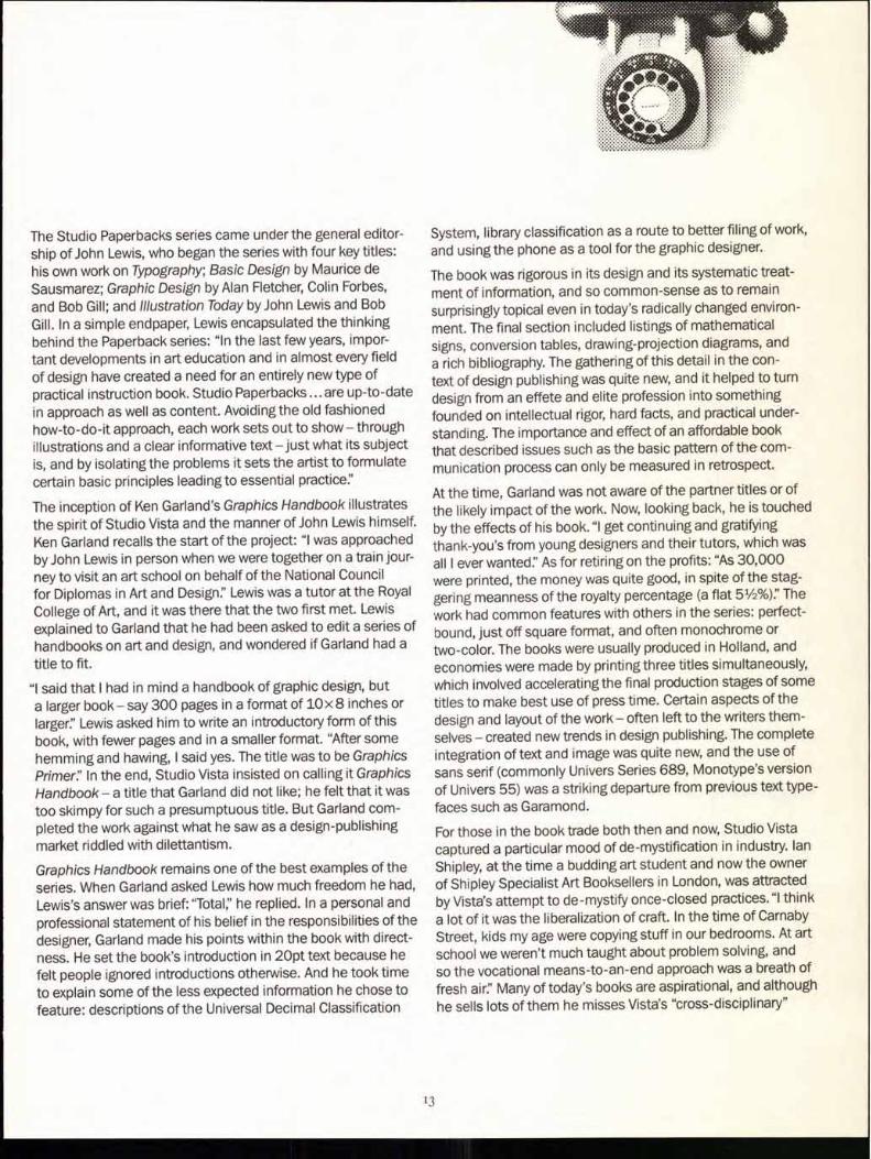
Spreads and a telephone from Graphics Handbook
From its "oversize"
designer, Ken introduction to the
Garland's Graphics telephone as a tool
Handbook was stark for the graphic and pragmatic.
12
The Studio Paperbacks series came under the general editor-ship of John Lewis, who began the series with four key titles: his own work on Typography; Basic Design by Maurice de
Sausmarez; Graphic Design by Alan Fletcher, Colin Forbes,
and Bob Gill; and Illustration Today by John Lewis and Bob Gill. In a simple endpaper, Lewis encapsulated the thinking behind the Paperback series: "In the last few years, impor-tant developments in art education and in almost every field of design have created a need for an entirely new type of practical instruction book. Studio Paperbacks ... are up-to-date in approach as well as content. Avoiding the old fashioned how-to-do-it approach, each work sets out to show— through illustrations and a clear informative text —just what its subject is, and by isolating the problems it sets the artist to formulate certain basic principles leading to essential practice:'
The inception of Ken Garland's Graphics Handbook illustrates the spirit of Studio Vista and the manner of John Lewis himself. Ken Garland recalls the start of the project: "I was approached by John Lewis in person when we were together on a train jour-ney to visit an art school on behalf of the National Council for Diplomas in Art and Design:' Lewis was a tutor at the Royal College of Art, and it was there that the two first met. Lewis explained to Garland that he had been asked to edit a series of handbooks on art and design, and wondered if Garland had a title to fit.
"I said that I had in mind a handbook of graphic design, but a larger book— say 300 pages in a format of 10x 8 inches or larger:' Lewis asked him to write an introductory form of this book, with fewer pages and in a smaller format. "After some hemming and hawing, I said yes. The title was to be Graphics
Primerf In the end, Studio Vista insisted on calling it Graphics Handbook — a title that Garland did not like; he felt that it was too skimpy for such a presumptuous title. But Garland com-pleted the work against what he saw as a design-publishing market riddled with dilettantism.
Graphics Handbook remains one of the best examples of the series. When Garland asked Lewis how much freedom he had, Lewis's answer was brief: "Total," he replied. In a personal and professional statement of his belief in the responsibilities of the designer, Garland made his points within the book with direct-ness. He set the book's introduction in 2Opt text because he felt people ignored introductions otherwise. And he took time to explain some of the less expected information he chose to feature: descriptions of the Universal Decimal Classification
System, library classification as a route to better filing of work, and using the phone as a tool for the graphic designer.
The book was rigorous in its design and its systematic treat-ment of information, and so common-sense as to remain surprisingly topical even in today's radically changed environ-ment. The final section included listings of mathematical signs, conversion tables, drawing-projection diagrams, and a rich bibliography. The gathering of this detail in the con-text of design publishing was quite new, and it helped to turn design from an effete and elite profession into something founded on intellectual rigor, hard facts, and practical under-standing. The importance and effect of an affordable book that described issues such as the basic pattern of the com-munication process can only be measured in retrospect.
At the time, Garland was not aware of the partner titles or of the likely impact of the work. Now, looking back, he is touched by the effects of his book. "I get continuing and gratifying thank-you's from young designers and their tutors, which was all I ever wanted:' As for retiring on the profits: "As 30,000 were printed, the money was quite good, in spite of the stag-gering meanness of the royalty percentage (a flat 51/2%):' The work had common features with others in the series: perfect-bound, just off square format, and often monochrome or two-color. The books were usually produced in Holland, and economies were made by printing three titles simultaneously, which involved accelerating the final production stages of some titles to make best use of press time. Certain aspects of the design and layout of the work — often left to the writers them-selves — created new trends in design publishing. The complete integration of text and image was quite new, and the use of sans serif (commonly Univers Series 689, Monotype's version of Univers 55) was a striking departure from previous text type-faces such as Garamond.
For those in the book trade both then and now, Studio Vista captured a particular mood of de-mystification in industry. Ian Shipley, at the time a budding art student and now the owner of Shipley Specialist Art Booksellers in London, was attracted by Vista's attempt to de-mystify once-closed practices. "I think a lot of it was the liberalization of craft. In the time of Carnaby Street, kids my age were copying stuff in our bedrooms. At art school we weren't much taught about problem solving, and so the vocational means-to-an-end approach was a breath of fresh air:' Many of today's books are aspirational, and although he sells lots of them he misses Vista's "cross-disciplinary"
13
...ansaroul
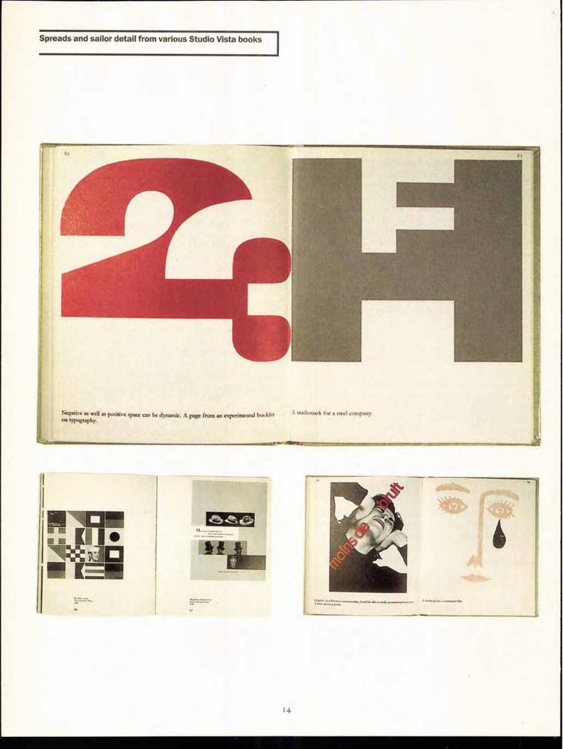
Spreads and sailor detail from various Studio Vista books
Negative as Iva its positive space can be dynamic. A page from an experimental Inn Ain
41)%4211411.
trademark for a steel cmpany.
"Iv 48111Wirit
14
approach. "They talked about signage systems. They raised the intellectual stakes. And I wonder whether a lot of design publishing now even gets close."
Conway Lloyd-Morgan worked as an editor at Studio Vista directly with both John Lewis and David Herbert. As a student at Oxford in the 1960s, Lloyd-Morgan had ambitions to be the art critic for Isis, the university magazine then edited by Anthony Holden. Having pitched for the job, he was awarded the task, with the proviso that he also design the publication. At Blackwell's bookshop he picked up several "quite different" publications from the Studio Paperbacks series for 12/6, and began his fledgling design career. Inspired by the books, he later interviewed Herbert about the imprint— only to find out some years later that Herbert considered the article one of the worst on publishing that he'd ever read.
This didn't stop Lloyd-Morgan from eventually beginning a fruit-ful relationship with Vista. "Vista looked at subjects nobody else did. These weren't coffee-table books. They fitted swing-ing London, yet at the same time they were understated. They touched the zeitgeist like no one else did:' And the relation-ship with the young design community was exciting: "All the best names were in touch with us. They were interested in experimenting with lithography over letterpress, they needed the publicity, and they liked the fast turnaround on titles. I'm sure Vista bankrolled many a late-night Trattoria meal on Old Compton Street:
The relationship between Herbert and Lewis was regarded by Morgan as pivotal to the imprint's success. "It was hard to define, but they complemented each other even when they disagreed:' And the pioneering spirit led to some entrepre-neurial acts. In the late stages of Kitsch in 1969, a picture of a vulgar interpretation of Rodin's "Kiss" was required. The Italian publisher informed Vista that it would take weeks to supply an original, and so a member of the Vista staff and his wife were photographed later that night in the same position, and the image was published. Authors visiting the offices would see staff in mini-skirts and high heels, turtlenecks and drainpipe jeans — this was a young, vibrant team, and it was what people grew to expect.
Sadly, it didn't last. By the mid-1970s, despite success — and being published to a growing American market by Reinhold in New York — Studio Vista was in a decline, attributed variously to the decline in the "art-mood: to new and emerging publish-ing markets in which it was difficult to compete, and to an alliance with a new London publisher who was less enthusi-
astic about"avant-garde" works. Fundamentally, however, Studio Vista ran out of material. After 62 Picturebacks, 36 Studio Paperbacks, 30 Handbooks, and 48 Pocket How-to books, Vista ran out of subject matter. Some titles were re-published by the Herbert Press, and publishers such as Lund Humphries, Penguin, and Macmillan followed the spirit of the imprint in their own work. Conway Lloyd-Morgan pub-lished Twentieth Century Type Designers as an homage to the spirit of Studio Vista — even going so far as to create it in a square format.
Studio Vista as an imprint, and Studio Paperbacks in particu-lar, stand as influential points in design publishing. Now, they are sought after by ardent collectors, but poor construction means that they are rarely to be found in good condition. On reflection, the values of Studio Paperbacks were numerous. Apart from establishing new trends in design and instructional publishing, and by default capturing the birth of the British graphic-design industry, the books made the point that design was not just about looking good but about its effectiveness and accountability within a broader social context. These weren't heavily varnished beauty parades filled with flotsam and jet-sam. They gave information, delivered by practitioners who dis-cussed and explained the processes that they believed would lead to a better-designed and better-structured world. An aim not entirely without merit in these troubled times.
Patrick Baglee is Design Editor at Real Time Studios and chair of the Typographic Circle in London.
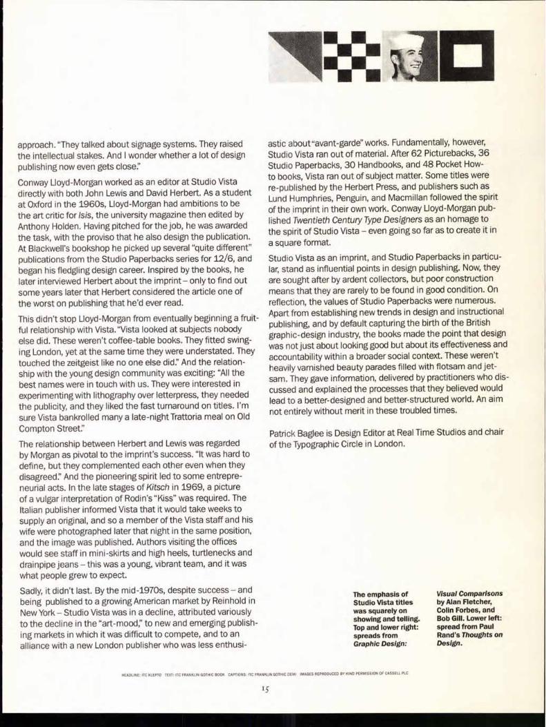
The emphasis of
Visual Comparisons Studio Vista titles
by Alan Fletcher, was squarely on
Colin Forbes, and showing and telling. Bob Gill. Lower left: Top and lower right: spread from Paul
spreads from
Rand's Thoughts on Graphic Design:
Design.
HEADLINE ITC KLEPTO TEXT: ITC FRANKLIN GOTHIC BOOK CAPTIONS: ITC FRANKLIN GOTHIC DEMI IMAGES REPRODUCED BY KIND PERMISSION OF CASSELL PLC
15
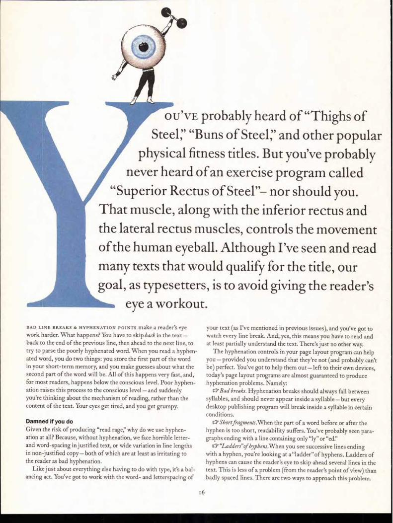
OU'VE probably heard of "Thighs of
Steer "Buns of Steer and other popular
physical fitness titles. But you've probably
never heard of an exercise program called
"Superior Rectus of Steel"— nor should you.
That muscle, along with the inferior rectus and
the lateral rectus muscles, controls the movement
of the human eyeball. Although I've seen and read
many texts that would qualify for the title, our
goal, as typesetters, is to avoid giving the reader's eye a workout.
BAD LINE BREAKS & HYPHENATION POINTS make a reader's eye work harder. What happens? You have to skip back in the text—back to the end of the previous line, then ahead to the next line, to try to parse the poorly hyphenated word. When you read a hyphen-ated word, you do two things: you store the first part of the word in your short-term memory, and you make guesses about what the second part of the word will be. All of this happens very fast, and, for most readers, happens below the conscious level. Poor hyphen-ation raises this process to the conscious level—and suddenly you're thinking about the mechanism of reading, rather than the content of the text. Your eyes get tired, and you get grumpy.
Damned if you do
Given the risk of producing "read rage," why do we use hyphen-ation at all? Because, without hyphenation, we face horrible letter-and word-spacing in justified text, or wide variation in line lengths in non-justified copy— both of which are at least as irritating to the reader as bad hyphenation.
Like just about everything else having to do with type, it's a bal-ancing act. You've got to work with the word- and letterspacing of
your text (as I've mentioned in previous issues), and you've got to watch every line break. And, yes, this means you have to read and at least partially understand the text. There's just no other way.
The hyphenation controls in your page layout program can help you—provided you understand that they're not (and probably can't be) perfect. You've got to help them out— left to their own devices, today's page layout programs are almost guaranteed to produce hyphenation problems. Namely: a Bad breaks. Hyphenation breaks should always fall between
syllables, and should never appear inside a syllable—but every desktop publishing program will break inside a syllable in certain conditions.
Short fi-agments.When the part of a word before or after the hyphen is too short, readability suffers. You've probably seen para-graphs ending with a line containing only "ly" or "ed."
"Ladders"of byphens.When you see successive lines ending with a hyphen, you're looking at a"ladder"of hyphens. Ladders of hyphens can cause the reader's eye to skip ahead several lines in the text. This is less of a problem (from the reader's point of view) than badly spaced lines. There are two ways to approach this problem.
6
Entering a non- 5B-Option-Hyphen Not available MACINTOSH
breaking hyphen
Entering a non- breaking space
-Space 38-Option-Space Option-Space MACINTOSH
Entering a line-end character
Keeping a range of text from breaking
Shift-Return
Does not have this feature. Workaround: enter non-breaking spaces between words, then put a discretionary hyphen before the range
Shift-Return
Select the text, then choose No Break from the Line End pop-up menu in the Character Specifi-
cations dialog box
Shift-Return MACINTOSH
Select the text, then turn on the Selected Words option in the Keep Together section of the Spacing Inspector
Task
XPress
PageMaker
FreeHand'
Entering a discretionary hyphen
ft-Hyphen -Shift-Hyphen 38-Hyphen MACINTOSH
The Skeptical Typographer by Olav Martin Kvern
You can either limit the number of consecutive hyphens you'll allow (all three programs have this feature); or you can let the program hyphenate freely. Either way, you'll have to read through the text and add discretionary hyphens or line-end characters to prevent bad spacing.
a Breaking tbe unbreakable. Some words (especially acronyms) should not be broken at all.
There are two major hyphenation methods in use today: "Algorithmic,"which uses a set of basic"word construction" rules to determine syllable breaks in a word (and, therefore, hyphenation points), and "Dictionary-based:' which uses stored hyphenation information for a large number of words. Algorithmic methods break down when a word doesn't follow their rules; dictionary-based methods fail when a text contains words that aren't in their dictionaries. Most major desktop publishing programs can use both methods.
In the following sections, I'll provide a brief description of the hyphenation controls in Adobe PageMaker 6.5, QuarkXPress 4, and FreeHand 8. Hyphenation is a paragraph-level attribute in all three programs. First, I'll cover a few manual hyphenation features the programs have in common.
Hyphenation helpers When you're adjusting line breaks and hyphenation in a publica-tion, your page layout program provides several very useful tools (see table below): a Discretionary bypben, or"clucby." A discretionary hyphen is a
"potential" hyphen. When you enter a discretionary hyphen charac-ter in a word, you're telling your page layout program to use the location of the character as a hyphenation point. The discretionary hyphen overrides any other hyphenation points in the word. Entering a discretionary hyphen in a word does not force the program to hyphenate the word at that point — that depends on your hyphenation settings and the position of the word in the line. Entering a discretionary hyphen immediately before the first charac-ter of a word prevents the program from hyphenating the word in PageMaker and XPress. Enter discretionary hyphens, rather than hyphens — if you enter a hyphen, you can expect to have it appear in the middle of a line when text reflows.
a Non-breaking hyphen. In general, hyphen-ated compounds (adjectives, such as "long-sufferine or nouns, such as"mother-in-law") should break between words, but some con-
structions, such as "Figure 5-23," should not break. When you want to enter a hyphen, but keep that hyphen from ending up at the end of a line, use a non-breaking hyphen.
Non-breaking spaces. Enter a non-breaking space between words to keep your page layout program from breaking the line between the words.
0' Line-end character. Sometimes, you just want a line to break at a particular point, without hyphenating a word. Entering a carriage return works, but also creates a new paragraph. Instead, enter a line-break character (also known as a"soft return") to break the line without creating a new paragraph. Do not enter tab characters or spaces to force the text to break! a "No break" characterftrmatting. All three programs give you a
way to specify that a range of text does not break (whether through hyphenation or due to a space or other "breakable" character in the range).
7
XPress also features an interesting special character—the dis-cretionary line end. This character behaves as if it were a discre-
- tionary hyphen, but does not enter a hyphen when the line breaks at the character. Press Command-Return (Macintosh) or Ctrl-Enter (Windows) to enter this character.
Hyphenation in XPress
XPress uses an algorithmic hyphenation system, which would a recipe for disaster if not for two mitigating factors:
aXpress's hyphenation controls are very good. ll'You can choose to have XPress supplement the hyphenation
algorithm with "Hyphenation Exceptions"— a hyphenation dic-tionary. You can add words to this dictionary.
Actually, XPress uses one of two available hyphenation algo-rithms—you can choose which one you want using the Hyphen-ation Method pop-up menu in the Paragraph Tab of the Prefer-ences dialog box (see Fig.i).
The hyphenation method is a publication default, so opening a publication composed with an older hyphenation method will not result in any text recomposition. If you change hyphenation meth-ods, however, you can expect text to reflow.
In XPress, you don't apply hyphenation and justification set-tings directly to a range of text. Instead, you create an "H&J" — a kind of style for hyphenation and justification settings—and then apply the H&J to text. When you create or edit an H&j, you'll use the controls in the Edit Hyphenation and Justification dialog box (see Fig. 2).
The width of the hyphenation zone, measured from the right indent of the paragraph, determines the area in which XPress looks for a place to break the line in non-justified copy. The smaller the hyphenation zone, the less likely it is XPress will hyphenate words. If you set the hyphenation zone to zero, XPress will hyphenate words only if you've entered a discretionary hyphen or discretionary line break character in them. If you're working with justified text, the value you enter in this field has no effect.
Once you've created an H&J, you can apply it to a paragraph. Select the paragraph, then choose Formats from the Style menu. XPress displays the Formats dialog box. Choose the name of the H&J from the H&J pop-up menu and click o K. H&J 'S can be saved as part of a paragraph style.
To see how XPress will hyphenate a word, select the word and choose Selected Hyphenation from the Utilities menu. XPress dis- plays a preview of the word's hyphenation points (see Fig. 3).
To add words to or edit words in Xpress's hyphenation dictionary, choose Hyphenation Exceptions from the Utilities menu. XPress displays the Hyphenation Exceptions dialog box (see Fig. 4
Hyphenation in PageMaker
PageMaker uses a dictionary-based hyphenation method, but can also use an algorithmic method (if you're truly desperate). The words in PageMaker's hyphenation dictionaries feature hyphen-ation points "ranked" from best to worst.
PageMaker's dictionary-based hyphenation will generally pro- duce better word breaks than the algorithmic method used by XPress, but PageMaker lacks controls for setting the size of the word fragments on either side of the hyphen—which means you
have to watch for breaks in short words and two-character breaks at the end of paragraphs. Next, some of the word breaks specified in the dictionary are very questionable—the word "image," for example, has a first-level (i.e.,"best") hyphenation point after the "im."
To set the hyphenation for a selected paragraph or range of para-graphs, choose Hyphenation from the Type menu. PageMaker dis-plays the Hyphenation dialog box (see Fig. 5).
The width of the hyphenation zone, measured from the right indent of the paragraph, determines the area in which PageMaker looks for a place to break the line in non-justified copy. The smaller the hyphenation zone, the less likely it is that PageMaker will hyphenate words. If you set the hyphenation zone to zero, Page-Maker will hyphenate words only if you've entered a discretion-ary hyphen or discretionary line break character in them. If you're working with justified text, the value you enter in this field has no effect.
To see how PageMaker will hyphenate a word, select the word and choose Hyphenation from the Type menu. Click the Add but-ton to see the dictionary hyphenation points.
PageMaker's hyphenation settings can be stored in paragraph styles, so it's easy to specify that hyphenation be turned off for head-ings and subheads, but turned on for body text.
Hyphenation in FreeHand
FreeHand uses dictionary based hyphenation, and even uses almost the same hyphenation dictionaries as PageMaker does.With a little work, you can even use your PageMaker user dictionary in Free-Hand. (Which means you can use PageMaker's dictionary editor to add or change hyphenation points—something you can't do in FreeHand. If you really want to do this, send me a message and I'll send you instructions.) As in PageMaker, these dictionaries are used for both hyphenation and spelling.
FreeHand may also use a hyphenation algorithm—or it may be that the settings for the Flush Zone and Ragged Width (see the pre-vious installment of this column, in the Fall issue—as I said there, it's best to simply turn these off) cause FreeHand to break its hyphen-ation rules more frequently than the other two programs break theirs. It's hard to tell.
FreeHand's hyphenation controls aren't quite as complete as those found in PageMaker or XPress. You'll find FreeHand's hyphenation controls in the Paragraph Inspector (see Fig. 6).
Highfalutin' hyphenation The typesetting tools we have today can produce excellent type, but they can't do it on their own. You have to help them. To do that, you have to understand how each program does what it does, and why. You also have to understand that the default settings of Page- Maker, XPress, and every other page layout program on the market will not produce the best type the program can offer. The job of this column is to fill in those details, question the authority of our soft-ware vendors, and promote world peace through argument.
0 LAV MARTIN KVERN is the author of Real World FreeHand. Drop him a line c/o U&lc, or e-mail him (okverngix.netcom.com )—he'd love to know what you think of this column so far.
INITIAL: ITC FOUNDER'S CASLON POSTER INTRO: ITC FOUNDER'S CASLON THIRTY HEADLINE: ITC FOUNDER'S CASLON FORTY-TWO ITALIC TEXT: ITC FOUNDER'S CASLON TWELVE, ORNAMENTS SUBHEADS / TABLE: ITC FRANKLIN GOTHIC DEMI LABELS: ITC ZAPF DINGBATs
Or Ch ha) ter ✓ ph Tool Senora' Para
Typesetting wl
-Leading
Auto Leading:
Mode:
Eit Maintain Leading
Name: -Justh
Edit Hyphenation & Just ,
Baseline Grid
Start
Increment:
I 0.5"
112 pt
Break Capitalized Words
I-18,1s for Documents
H&Js:
Auto Hyphenation Enabled; Smallest Word; 6; Min Before: 3; Minimorn After : 2; Don't Break Cap War ..; hens in a Row: unlimited, Hyphenation Tone. 0";
New Edit Duplicate
eami
Suggested Hyphenation
hyphen-ation
1t,L,
Hyphenation Exceptions
No exceptions.
Hyphenation: # On Q Off
0 Manual only
• Manual plus dictionary Q Manual plus algorithm
Hyphenation
Word:
Dictionary:
Add:
urti--cote
( US English
• As all lowercase Q Exactly as typed
Cancel")
Edit Hyphenation
Document language:
US English
Consecutive hyphens ir 12) Skip capitalized words
❑ Inhibit hyphens in selection
( Cancel
=-1 [01 1-1el IA Iii Paragraph spacing:
Above:
Below:
Indents;
Left:
Right:
First
❑ Hang punctuation
0 lE1 Hyphenate
Rules:
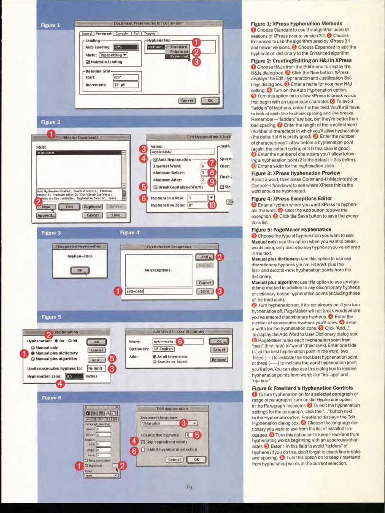
Figure 1: XPress Hyphenation Methods 0 Choose Standard to use the algorithm used by versions of XPress prior to version 3.1. Choose
Enhanced to use the algorithm used by XPress 3.1 and newer versions. 0 Choose Expanded to add the hyphenation dictionary to the Enhanced algorithm.
Figure 2: Creating/Editing an H&J in XPress 0 Choose H&Js from the Edit menu to display the H&Js dialog box. 0 Click the New button. XPress displays the Edit Hyphenation and Justification Set-tings dialog box. Enter a name for your new H&J
setting. 0 Turn on the Auto Hyphenation option. Turn this option on to allow XPress to break words
that begin with an uppercase character. Q To avoid
"ladders"of hyphens, enter 1 in this field. You'll still have to look at each line to check spacing and line breaks. Remember—ladders" are bad, but they're better than bad spacing. 0 Enter the length of the smallest word (number of characters) in which you'll allow hyphenation (the default of 6 is pretty good). Q Enter the number of characters you'll allow before a hyphenation point (again, the default setting of 3 in this case is good). 0 Enter the number of characters you'll allow follow-ing a hyphenation point (2 is the default-3 is better).
Enter a width for the hyphenation zone.
Figure 3: XPress Hyphenation Preview Select a word, then press Command-H (Macintosh) or Control-H (Windows) to see where XPress thinks the word should be hyphenated.
Figure 4: XPress Exceptions Editor 0 Enter a hyphen where you want XPress to hyphen-ate the word. Click the Add button to save the
exception. 0 Click the Save button to save the excep-
tions list.
Figure 5: PageMaker Hyphenation 0 Choose the type of hyphenation you want to use: Manual only: use this option when you want to break
words using only discretionary hyphens you've entered in the text. Manual plus dictionary: use this option to use any
discretionary hyphens you've entered, plus the first- and second-rank hyphenation points from the
dictionary. Manual plus algorithm: use this option to use an algo-rithmic method in addition to any discretionary hyphens or dictionary-based hyphenation points (including those
of the third rank). Turn hyphenation on, if it's not already on. If you turn
hyphenation off, PageMaker will not break words where you've entered discretionary hyphens. 0 Enter the
number of consecutive hyphens you'll allow. 0 Enter
a width for the hyphenation zone. Q Click Add.." to display the Add Word to User Dictionary dialog box.
PageMaker ranks each hyphenation point from "best" (first rank) to"worst"(third rank). Enter one tilde (-) at the best hyphenation point in the word, two tildes (-.-) to indicate the next best hyphenation point, or three (—) to indicate the worst hyphenation point you'll allow.You can also use this dialog box to remove hyphenation points from words like "im-age" and "op-tion:"
Figure 6: FreeHand's Hyphenation Controls 0 To turn hyphenation on for a selected paragraph or range of paragraphs, turn on the Hyphenate option in the Paragraph Inspector. To edit the hyphenation
settings for the paragraph, click the "..." button next to the Hyphenate option. FreeHand displays the Edit Hyphenation dialog box. 0 Choose the language dic-tionary you want to use from the list of installed lan-
guages. 0 Turn this option on to keep FreeHand from hyphenating words beginning with an uppercase char-
acter. 0 Enter 1 in this field to avoid "ladders" of hyphens (if you do this, don't forget to check line breaks and spacing). Q Turn this option on to keep FreeHand
from hyphenating words in the current selection.
ITC Founder's Caslon
len CA S 1,0 l's%:
sold his types to printers in
London in the middle of the i8th century,
Ad 'di xt by John D. Berry
1.,1 arri 42-POINT ITC FOUNDER ' S CASLON FORTY-TWO
THE TYPES WERE CON-
sidered neither quaint nor old-fashioned: they LOOKED LIKE THE ORDINARY text & display types of the day. When Caslon's typefaces
24-POINT ITC FOUNDER ' S CASLON THIRTY
WERE REVIVED IN THE MIDDLE
of the 19th century, after the onslaught of the "modern"
IS-POINT ITC FOUNDER'S CASLON TWELVE
DIDOTS AND BODONIS, THEY WERE USED
at first for "old-fashioned" books and books that might or might not be read
I2-POINT ITC FOUNDER'S CASLON TWELVE
STRAIGHT THROUGH. BUT BY THE TURN OF THE CENTURY,
Caslon Old Face (as it came to be known) had become re-established as a standard typeface; in the early loth century,
10-POINT ITC FOUNDER ' S CASLON TWELVE
THANKS TO NUMEROUS REVIVALS MANUFACTURED BOTH FOR HAND-
setting and for the various hot-metal typesetting machines on the market, Caslon had earned its place in a rule of thumb for printers r
THE ORIGINAL CASLON LETTER FOUNDRY
IN CHISWELL STREET, LONDON.
"This new Foundery was begun in the Year 1720, and 1763;
and will (with God's leave) be carried on, improved, and inlarged,
by WILLIAM CASLON and Son, Letter-Founders in LONDON."
—From the colophon of Caslon's 1764 specimen book
P ECIM W. CASLON, Letter-Founder, in Ironmonger-Row, Oh
.BCD b.13CDE BCDEFG 3CDEFGHI 1CDEFGHIJK CDEFGHIJKL 2,DEFGHIKLMN
Toufque tan- pa abutere, tilina, pad- ounue tandem here, Catilina,
DOUBLE PICA ROMAN. oCoufque tandem abutere, Cati- lina, patientia noftra ? quamdiu nos etiam furor ifte tuus eludet? quem ad finem fefe effrenata jac- ABCDEFGH JIKLMNOP
GREAT PRIMER ROMAN. Quoufque tandem abutere, Catilina, pa- tientia noftra ? quamdiu nos etiam fu- ror tuus .eludet?'quem ad finem fe- fe effrenata jadabit audacia ? nihilne te noClurnurn pnefidium palatii, nihil ur- bis vigilia , nihil timor populi, nihil con- ABCDEFGHIJK.LMNOPQRS
ENGLISH ROMAN.
Qt_19Ufqtle tandem abutere, Catilina, patientia nOftra? quamdiu nos etiam furor ifte tuus eludet? quern ad finem fefe effrenata jaEtabit audacia ? nihilne te nodurnum prxfidium palatii, nihil urbis timor populi, nihil confen-fus bonorum omnium, nihil hic munitifTimus ABCDEFGHIJKLMNOPQRSTVUW
PICA ROMAN.
Melium; novis rebus ftudentem, manu fua occidit. Fuit, fuit ifta quondam in hac repub. virtus, ut viri fortes acrioribus fuppliciis civem perniciofum, quam acerbiffimum hoftem coErcerent. Habemus enim fe-natufconfultum in re, Catilina, vehemens, & grave: non deett reip. confilium, neque autoritas hujus or-dinis : nos, nos, dico aperte, confules defumus. De-ABCDEFGHIJKLMNOPQRSTVUWX
SMALL PICA ROMAN. No z. At not ingefimum jam diem patimur hebefcere aciem horum autoritatis. habemus enim hu)ufmodi fenatufconfultum, ve- nuntamen inclufum in tabubs, tanquam gladium in vagina
Double Pica Italick. guoufvue tandem abutere,Catili- na, patientia nollra ? quamdiu nos etiam furor ifle tuus eludet ? quem adfinem fete effrenata jac- ARCDEFGHyIKLMNO
Great Primer Italick. not flue tandem aware, Catilina, pa-
- tientia nofira ? viamdiu nos etiam fu-:ror e tuus eludet ? pew ad finem left efrenata jaahit audacia ? nihilne te noHurnum prrefidium palatii, nihil ur-bis nihil timor populi, nihil con--
'.,l'BCDEFGHIfKLMNOPR,,R
Englifts It click. o rioulizte tandem abutere, Catilina, patientia nof-traf quamdiu not etiain furor ifie tuus eludet? quent ad finem fife cfrenata jatlabit audacia? nihilne te noblurnum prcefidium lialatii, in& az-- bis vigilice, tall timor populi, nibid confelyits bo-norum omnium, nibil hic munitilimus habendi fe-AB CD EF G HI f K ItIN 0 P VZSrVU
Small Pica Italick. No t. nos vigefimum - jam diem patimur hebtfierc aciem hontm
autoritatis. babemus cairn huitifmedi jenatu corrjuttum, verum- tame', incltifitm in tabitlit, tanquam gladium in. vagina mon- —.•
Pica Italick. Melium, novis rebus ftudentem, manu fizz I occidit. Fuit, fait ilia quondam in bac repub. viritts, ut viri
fortes acrioribus fuppliciis civem ponmiciofilm, quam a- .cerbillimum &Jima coe'rcerent. Habemus enim .finatar confieltum in te, Catilina , vehancns, & grave: non deeji reip. confilium, neque antoritas Intjus ordinis : nos, nos, dico aperte, confides defiemus. Decrevit quondam fenatus ABCDETG IIIJKLMNO P ZRST7it7WXYZ
"When in doubt, use Caslon." In the proliferation of type styles throughout this century, any number of faces that William Caslon
would never have recognized have been issued under the name "Caslon." And in the past four decades,
in the process of being adaptedfirst to phototypesetting and then to digital, most of the versions of Caslon
either lost their character or ended up too spindly and anemic to be used effectively in text.
A few exceptions have appeared in recent years.
F., Street, LONDON.
Pica 1Blacit, ann be it furtber enadeb by the autixoitp
itbat ail anb eberp of the fats er: quer 113illo to be mane fogb by birtue of
is; ad, fo mane of them- gib fball from 113eDC,F(651)3tAVVifigDIPZIatte
&evict. Black. be it Wahl mantis br tbt alltb0}itt :o, bat all emb corm fait erthrquer Zino to be ton t to)*Greggof fist° EIS fo
C thcm Ilgt1 from time to time =lain imblItbatan tatD man. until tOr tottOorgizso ono manioc the Came curium to tfola 214
Pica Gcolaick.
ntisixit cpti iN hcricrtAri velar/It MSZ tPecni f.IIMJtI qimaiNASSinS ciginstS fit,q)A1 (flews SVe 1N hIMINA
Pica Coptick. oirz.pxrt tteJUL
TOR4-2.,1 21C rte ov.r..erta.v epoq rte 7-cofit o-fx,r-ro rt.r..qxrt exert rkto•vn (nob Iirtd a-re4'-f- rtAsirtito-s ejtzert IIJLICOOlf ft- oL
Pica Amman.
raowir...”....”1: b.p4r1: &pry wire% rrp.14-1. & bt4 dip llusesnarny'
r Imre & the .r.7.1 Cluj' iik.ton_nrrsur & tRasu3 'Q "# ir4414,
Englifh Syriack.
!
Pica Samaritan. 7.M1z folSisc .%ox ■ 311.cr Pat %11/ 0...9 13A %tin to
Z %nr%),..s 'Nutif.M (nor 5L Sh vzIrrrs tSTRt '19'S
C AROL TWOMBLY'S ADOBE CASLON made Caslon usable again as a text face, although in doing so she regularized it a bit and smoothed out a few of
its peculiarities. She also expanded it into a type family of several weights, in accordance with Adobe's philosophy of what's needed for today's typeset-ting. (Despite the range of weights, Twombly has been quite explicit that her Caslon is only a text face and should not be used larger than 18-point.) At the other end of the size spectrum, Matthew Carter's Big Caslon takes the eccen-tric features of Caslon's largest sizes and sharpens them into a lively, high-contrast display face (in one weight of roman only) that should probably only be used at 36-point or larger. A few other potentially useful Caslons exist in digital form, but there remained a big gap: an accurate revival of William Caslon's original types, in all their variations from size to size.
That's the gap that ITC Founder's Caslon sets out to fill. Justin Howes, using the extensive resources of the St. Bride Printing Library in London, thoroughly researched William Caslon and his types and took on the task of digitizing every size of type that Caslon cast. In the 18th century, each size of a typeface had to be cut separately, by hand, so the design might vary subtly from size to size; the punchcutter would compensate for the changes in scale and make each individual font appropriate to its size. (Since these were pieces of metal, not electronic representations, and photography hadn't been invented yet, there was no possibility of printing a type at any size other than the size for which it was originally cut.) Caslon's types varied pretty obvi-ously from size to size; anyone adapting the face to modern typesetting meth-ods has generally had to choose one size to work from, or amalgamate "typi-cal" features from various sizes into a single homogenized "Caslon." What Justin Howes did was take each size on its own merits, and digitize it sepa-rately, keeping its peculiarities and reproducing it the way it actually appeared on the printed page. Out of Caslon's welter of sizes and designs, ITC has chosen to issue four in its Founder's Caslon series.
Enghth Ara' hick.
.33s N 11 31.1 it :70 Cr" grA:"11 4.∎
23
2 4
Caslon
Cas Cas lo Caslon Caslon
CHOICE CUTS.
THE ITC FOUNDER'S CASLON FAMILY comprises a text size (Founder's Caslon Twelve, based on the Pica or 12-point size) and three display
sizes (Founder's Caslon Thirty and Forty-Two, based respectively on the Two-line English or 3o-point and on the Two-line Double Pica or 42-point size, and Founder's Caslon Poster, which is based on contem-porary proofs of the only authentic wood-letter version of Caslon Old Face, produced in the 189os by the HWCaslon firm in a range of sizes). The text size, the 3o-point, and the 42-point have italics and small caps, and the 42-point also has alternate italics. The "poster"size exists solely as a roman face. In keeping with the original Caslon types, none of the sizes have bold weights, and the numerals in all the fonts are old-style (lowercase) figures. The character sets include a full set of ligatures, including "quaint" forms such as 6l, plus the 18th-century long-s (f) and its own ligatures (see page 34).
There's a scale of smoothness as well as size. Founder's Caslon Twelve, which is taken from printed text type, has noticeably uneven edges, and more irregularities of form than the larger sizes. At the original 12-point size, this roughness translates simply as natural printing, and it actually enhances the pleasure and ease of reading text. If you use Founder's Caslon Twelve at, say, 36-point, the rough edges will look exaggerated. The edges are progressively smoother in Thirty, Forty-Two, and Poster, as befits the size of use for which they were intended.
There's also a special font of Founder's Caslon Ornaments, which pro-vides 18th-century type ornaments taken from William Caslon's speci-men sheets. (continued on page 34)
12 Reg 30 Reg
42 Reg 42 Italic
30 SC
42 SC
12 SC
30 Italic
12 Italic
Poster
25
IN1C, ,Sra\v5
JiKi0 3i/1\1\1007°\1,_ -?/\DiTiOl\i/°\L iK F-Ok
_CDOV Gr'\,5U7°L. &GI Il., 1.___Ot/\1L1207°\,5." PO5iTiC
7012 Ti-LL 5727n\i-I-f I i-C L- I I -E25, "(
.21\1/°\IL V -L25IC I .t.2, MI I &LIG-1
GUQ\
fttir time jpil6rif9 aid a were
vtandwriftehll look.13rij
:Ii CripiiritaN "wah-ted
-oniefttitAi Ile felt
gUer ibterivetatioN
.•dwrifihj. For a rt,
10•c of ftte
ders gives the., ,e ICce fellers are ye.
"gt seems," say veciar(y at smairsize -ign, area somewhere tier Gate and a pen,
'lie &cau,se ulie c d ihinisnu
ITC Samuel"
ITC Regallia -
26
9T
.)\ 0-(P QRsTuu--(A9-)6 6,xxte,ytIljkLAAorerttirimcoi2s.457g0
ITC Dartangnon'
7°w. \33 OGDD LFF CG1 1 1-HiJiKkL_Liv
K. 0 CD`D` efp c)R1- .65 TTUUVV{Alz\.?<XVVI
//112 -1- 5O-77o90 ITC Vino Bianco '"
il3CDCFGI-41)gLA711\10P0 i -ra1/1NKY2 12345678/0
bcd99 hopl rrtmvpv<9z
Pfiff0 ITC Samuel -
_Axpecto 6g_tgcv_a/t _No (pi Qj ,s-)s_i Tit rficW9C cg cdcdef9Aijkimnopqrslu,vwxyz 1.224,5-67g9 0 ITC Regallia'"
FONTEK.
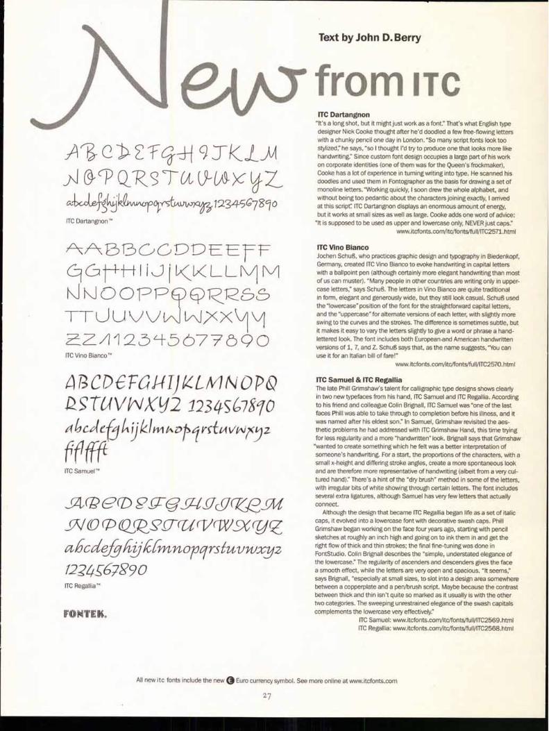
ITC Dartangnon "It's a long shot, but it might just work as a font." That's what English type designer Nick Cooke thought after he'd doodled a few free-flowing letters with a chunky pencil one day in London. "So many script fonts look too stylized;' he says, "so I thought I'd try to produce one that looks more like handwriting." Since custom font design occupies a large part of his work on corporate identities (one of them was for the Queen's frockmaker), Cooke has a lot of experience in turning writing into type. He scanned his doodles and used them in Fontographer as the basis for drawing a set of monoline letters. "Working quickly, I soon drew the whole alphabet, and without being too pedantic about the characters joining exactly, I arrived at this script: ITC Dartangnon displays an enormous amount of energy, but it works at small sizes as well as large. Cooke adds one word of advice:
"It is supposed to be used as upper and lowercase only, NEVER just caps:' www.itcfonts.com/itc/fonts/full/ITC2571.html
ITC Vino Bianco Jochen Schul, who practices graphic design and typography in Biedenkopf, Germany, created ITC Vino Bianco to evoke handwriting in capital letters with a ballpoint pen (although certainly more elegant handwriting than most of us can muster). "Many people in other countries are writing only in upper-case letters," says Schuf. The letters in Vino Bianco are quite traditional in form, elegant and generously wide, but they still look casual. Schuf used the "lowercase" position of the font for the straightforward capital letters, and the "uppercase" for alternate versions of each letter, with slightly more swing to the curves and the strokes. The difference is sometimes subtle, but it makes it easy to vary the letters slightly to give a word or phrase a hand-lettered look. The font includes both Europeanand American handwritten versions of 1, 7, and Z. SchuB says that, as the name suggests, "You can use it for an Italian bill of fare!"
www.itcfonts.com/itc/fonts/full/ITC2570.html
ITC Samuel & ITC Regallia The late Phill Grimshaw's talent for calligraphic type designs shows clearly in two new typefaces from his hand, ITC Samuel and ITC Regallia. According to his friend and colleague Colin Brignall, ITC Samuel was "one of the last faces Phill was able to take through to completion before his illness, and it was named after his eldest son." In Samuel, Grimshaw revisited the aes-thetic problems he had addressed with ITC Grimshaw Hand, this time trying for less regularity and a more "handwritten" look. Brignall says that Grimshaw
"wanted to create something which he felt was a better interpretation of someone's handwriting. For a start, the proportions of the characters, with a small x-height and differing stroke angles, create a more spontaneous look and are therefore more representative of handwriting (albeit from a very cul-tured hand)." There's a hint of the "dry brush" method in some of the letters, with irregular bits of white showing through certain letters. The font includes several extra ligatures, although Samuel has very few letters that actually connect.
Although the design that became ITC Regallia began life as a set of italic caps, it evolved into a lowercase font with decorative swash caps. Phill Grimshaw began working on the face four years ago, starting with pencil sketches at roughly an inch high and going on to ink them in and get the right flow of thick and thin strokes; the final fine-tuning was done in FontStudio. Colin Brignall describes the "simple, understated elegance of the lowercase." The regularity of ascenders and descenders gives the face a smooth effect, while the letters are very open and spacious. "It seems," says Brignall, "especially at small sizes, to slot into a design area somewhere between a copperplate and a pen/brush script. Maybe because the contrast between thick and thin isn't quite so marked as it usually is with the other two categories. The sweeping unrestrained elegance of the swash capitals complements the lowercase very effectively."
ITC Samuel: www.itcfonts.com/itc/fonts/full/ITC2569.html ITC Regallia: www.itcfonts.com/itc/fonts/full/ITC2568.html
Text by John D. Berry
from ITC
All new itc fonts include the new 0 Euro currency symbol. See more online at www.itcfonts.com
27
,Iitry is what typ, ut in the rain," says CIL
fined this three-weight fan roots of a handsome sans s&
Per of grime and rust, basically Iventry in the roughly produce
Coventry section of Clevela makes it an objet trouve,' -sion of something tha'
faxed or photr- ITC Coventry'"
— _
oeutcrt, riaut up ,d, 6C,
cutO Deiscat/D .
but CYLVtioatedli 1,0
dug rte caCe6 a "tam
Cte. oa, Lto "C ittitagzA
ITC Redonda"
,mate th6 spoi,. izriting -y3itA. the mot.
1 - a C6YKr)et6) 0A-J-C1/66)1A,
,1) cira-yoing tiL6 16ttotfo -rykts-k
p, I paid sp6cia1 att6Atiox tc
f) co-iov and energy Of reirso
`CrYYMeAt (41ter canwrtiy coAtrast h6tize6n ?LI
' ITC Freemouse"
‘6,ff
2x(ir?
acAe0MgV6JpCfra 047QA_S`CUV -W -XZ aBcaeffocuuttop it6tiwco,95 1234567'890 ITC Redonda'"
ABCOMBfq--XajdtDRA eXPORS(621VWCp ITC Redonda" Fancy
(42CD6.T(0.1-17,1.X.LNIN UT a, RS.7-1/CIA -P3XYZ -1234567890
496616fgkijkhtutorcirstx-z ITC Freemouse-
ABCDEFGHIJKLMNOPQRSTUVWX YZ abcdefghijklmnopqrstuvwxyz 1234567890 ITC Coventry'" Heavy
ABCDEFGHIJKLMNOPQRSTUVWX YZ abcdefghijklmnopqrstuvwxyz 1234567890 ITC Coventry'" Medium
ABCDEFGHIJKLMNOPQRSTUVWX YZ abcdefghijklmnopqrstuvwxyz 1234567890 ITC Coventry'" Thin
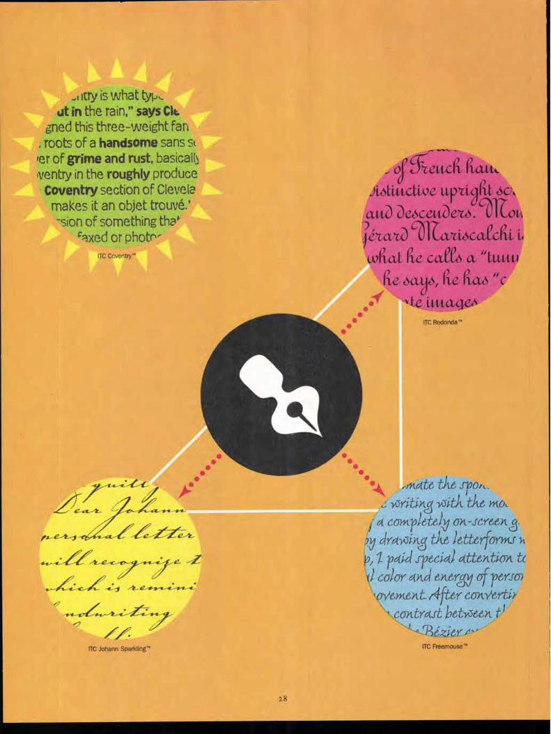
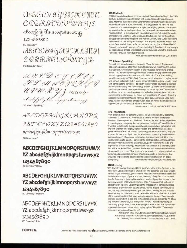
ITC Redonda ITC Redonda is based on a common style of French handwriting in the 19th century, a distinctive upright script with looping ascenders and descen-ders. Montreal-based designer Gerard Mariscalchi is himself French-born, with what he calls a "tumultuous life." In a long career, he says, he has
"conceived and realized corporate images, packaging, posters, illustrations, a dozen typefaces, and even about thirty stamps for African and southern Pacific states." He fell in love with type in his twenties, "studying the works of masters like Excoffon, Usherwood, and Frutiger, as well as those from calligraphers and type designers like Plantin, Cochin, and Duren" According to Mariscalchi, the "calligraphic script" that inspired Redonda was in use in the French administration for more than a century (circa 1840-1960)." Redonda comes with two sets of caps, both highly flourished: those in regu-lar Redonda are ornate, with loosely waving swashes, while the swashes in Redonda Fancy are more tightly curled.
www.itcfonts.com/itc/fonts/fulVITC2573.html
ITC Johann Sparkling The quill pen scratches across the page: "Dear Johann..." Anyone who has seen a personal letter from the 18th century will recognize the style of this typeface, which is reminiscent of the educated handwriting of that period. "ITC Johann Sparkling is intended to close the gap between highly formal copperplate scripts and the scribbled look of 'true' handwriting," says Vienna designer Viktor Solt. "I am not much interested in highly formal and perfect calligraphy but in quick, personal-looking scripts. Usually I start with some historic samples. I do not try to copy these sources but to incor-porate them into my own handwriting. It takes up to two weeks and many sheets of paper until the respective script becomes my own. Of course this would not be an economic approach to individual lettering jobs, but I can conserve the custom script for future use by digitizing it" Johann Sparkling appears much smaller than its nominal point size, so it's best used fairly large. And of course these ornate swash caps are never meant to be used together, only in conjunction with the lowercase.
www.itcfonts.com/itc/fonts/full/ITC2572.html
ITC Freemouse Very different from his earlier ITC faces, ITC Coconino and ITC Beorama, Slobodan Miladinov's ITC Freemouse is still the result of the tension between the computer and the hand. "Freemouse was my first experiment in creating type using only the computer as a design tool," says Miladinov.
"I wanted to sublimate the spontaneity and expressivity of calligraphic writ-ing with the modern, slightly digital outlook of a completely on-screen generated typeface." He started by drawing the letterforms using only the mouse. "At that step, I paid special attention to preserving the emotional color and energy of personal calligraphic gesture/movement. After con-verting the lines to a path, I achieved the contrast between thin and thick strokes by manipulating the Bezier curves, partly following the logic and experience of italic lettering." Freemouse has the look of a chancery italic, but with a backward flip to some of the letters and a very lively contrast of stroke width and curve."That game of improvisation," continues Miladinov,
"determined unexpected, random effects, especially in the details, that would be impossible to get and control in conventional pen-on-paper calligraphy." www.itcfonts.conVitc/fonts/fulVITC2578.html
ITC Coventry "ITC Coventry is what type would look like if you left a gothic font out in the rain," says Cleveland designer Brian Sooy, who designed this three-weight family. if you look close, you'll see the roots of a handsome sans serif font buried under a layer of grime and rust, basically." Sooy found his inspira-tion for Coventry in the roughly produced student flyers that he saw in the Coventry section of Cleveland Heights, Ohio. "I suppose that makes it an objet trouve," he says. Coventry gives the impression of something that's been faxed or photocopied several times. "While it looks very irregular in text, it's very carefully spaced to give that effect. Too regular and it would look that way, too little and it would resemble a fifteen-dollar font from one of the many foundries that have sprung up across the net:' Sooy intends the face to work both in text and in headlines, even on billboards. "If it has any historical reference, it's a very short history. I wasn't attempting to mimic any grunge fonts, I was attempting to create a font that stylistically appeared distressed but remained highly legible." He adds: "Coventry is distressed so you don't have to be."
ITC Coventry Thin: www.itcfonts.com/itc/fonts/full/ITC2575.html ITC Coventry Medium: www.itcfonts.com/itc/fonts/full/ITC2576.html
ITC Coventry Thin: www.itcfonts.com/itc/fontsifulVITC2577.html
FONTE K. All new itc fonts include the new ()Euro currency symbol. See more online at www.itcfonts.com
2 9
L., P F r WI A
Tr-r
, 4-4 .1 4-1 sr) J J—.1 1 6 J r, rd 1-7, — Tr)
D E I, ED EE
TT 7 7 - 2
RANcAISE
cy- ,444,1
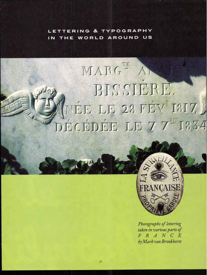
LETTERING & TYPOGRAPHY
IN THE WORLD AROUND US
Photographs of lettering taken in various parts of FRANCE by Mark van Bronkhorst
31
MARK VAN BRONKHORST
(MvB Design, Albany, California)
gathers examples of obscure and
strange lettering wherever he
goes. He designs U&/c.
"TAB C DE FGHLI KLM N a, 0 PQRSTUVWXY&Z
abcdefghijklmnopqrstuvwxyz 12345 678 9 ofiflffffiffl$L€cifthfigft
ITC Founder's CaslonTM: a revival ofW. Caslon's types by Justin Howes
AITC FOUNDERS CASLON FORTY-TWO
aABCDEFG HIJKLMNOPQ RSTUVWXY&Z ABCDEFGHIJKLMN
OPQRSTUVWXY&Z
abcdefghijklm nopqrstuvwxyz 123456789ofiflff ffiffiSkCaffhfiSft
ITC FOUNDER'S CASLON TWELVE
ABCDEFGHIJKLMNO PQRSTUVWXY&Z ABCDEFGHIJKLMNOPIZR
STUVWXY&Z1234567890
abcdefghijklmnopqrstuvwxyz
fiflffffifii$£€CIffhfiAil@?!
(CONTINUED FROM PAGE 25)
WILLIAM CASLON I was the preeminent punch-cutter and type supplier of
18th-century England, and his types crossed the Atlantic to become the standard medium for the printed word in the American colo-nies as well. (The founding document of the United States, the Declaration of Inde-pendence, was set in Caslon types when it was first printed and distributed throughout the insurgent colonies.) He started out as a gunsmith's apprentice, and when he went into business for himself, he branched out into engraving the tools and stamps used by bookbinders. His lettering skills caught the eyes of a consortium of Englishmen who wanted to break the dependence of the London printing trade on types imported from Holland, and several of his friends financed his start in type founding. English printing and type founding had been stunted throughout much of the 16th and i7th cen-turies by overzealous government censor-ship and control, but by 1720, when Caslon went into business, the restrictions had eased, and the country was alive with print-ing and publishing. Caslon's first typefaces were an Arabic font and a pica roman and italic. (continued on page 36)
AITC FOUNDER'S CASLON FORTY-TWO ITALIC
a 11 a BB CC DDEEFGGI-11/ KIEL 711 NeN0 PP 4_,Q RIOTT UVD wxrY&Z abcdefghhijkklm flop qrstuzn)ww xyz 12345 6789 Off
'MSc kaffbfifift ITC FOUNDER' S CASLON TWELVE ITALIC
ABCDEFGHI7KLMNO PQRSTUVWXY&Z abcdefghijklmnopqrstuvwxyz 123456789ofififffiffi
$ LE affhfi1?11 ITC FOUNDER 'S CASLON THIRTY
Aa. ABCDEFGHIJKLM NOPQRSTUVWXY&Z ABCDEFGHIJKLMNOPQRSTUVWXY&Z
abcdefghijklmnopqrstuvwxyz i23456789ofiflffffiffl$afflThfi1 ft
ITC FOUNDER'S CASLON THIRTY ITALIC
Aa ABCDEFGHIJKLM N P Q,1? Sruvwxr ce z abcdefghijklmnopqrstuvwxyz 123456789°May"; 1$ eaffhfifill See more online: www.itcfonts.com
ITC FOUNDER'S CASLON ORNAMENTS
'‘WXXWV'ffa001U34PigkifilXXXX .4. trail a SW 2 0 i" A K;)' kt;• Ni NI Zig NC etfti giileNCWi`9-4=65MSHEM**'laiticf ."40VilMICAPa'A)"m kt°
Pump San& 9c Shatter ziOALSA" 0 /0 Etacko EcA ,pt
VgeaS CV;raidt Pre %iggg -
$19.00 (Text)
$29.00 (Display)
ITC American T ewriter® Ilia light Italic, /Atm Medium Italia, Bold, Bele Italic, tight Cat., Medium Cond., kid Cot)
ITC Souvenir® (Lite Light Italic, Mtn, Medium Itaem, Doer Demi Hallo, Bold, Bold Ilk)
ITC Tiffany IV). Light Italic, Medium, Medic, Italic, Demi, Dam Itm, Heavy, Heavy Italic)
IF hi:11:i,
Friz Quadrata (Regular, Regular Italic, Bold, Bold Dec)
Medlin, Bat
ITC Korinna® (Regular, Rudy Regular, Bold, Kure, Bold, CkBold, Kursiv Ex-Bold. Nervy, Kursk , Heavy I
ITC Lubalin Graph® (Eklight, blight Oblique, Book, Book Oblique, Medium Medium berm, Demi, Derlli Uwe, Bold, Add Oblique)
ITC Serif Gothic® (Ugh, Regular, Bold, Extra Bold, Hem, Black)
IT! OIL ICIIMECI' ITC Black Tulip BOINK' CHALLENGE - (BO, Wm Bole I
VontInewitil Ye/trld
Elate IQ FRANKFURTER -
I Reeder. Beld)
Wain)"
ITC MACHINE kular. bolo)
"Flashback: Faces of the '705" is a
collection of 50 typefaces reminiscent
of the graphic design styles of the 1970s. With the
renewed interest in retro styles in fashion and
graphic design, there's no better time than now to
revisit the lost decade. Typefaces in this collection
include quintessential designs like ITC American
Typewriter, ITC Serif Gothic, ITC Avant Garde Gothic,
and ITC Souvenir. If you're looking for something
a little bit more groovy, you may want to check out
ITC Beesknees, ITC Black Tulip, Pump, or ITC Ziggy.
To view the entire collection visit www.itcfonts.com/
itc/promos.html. Display faces are $29 and text
faces are just $19 per weight. Special pricing for
these fonts will be available through February
28, 1999.
Visitors to the ITC Web site at www.itcfonts.com
can click on the individual typeface names to see
a preview and learn about the development of
each one. They can also set their own sample
words in these ITC typefaces using euripides,'"
ITC's online utility that lets users type a word or
phrase and see what it looks like in ITC typefaces.
For more information, call ITC at 1-800-634-9325x145
ITC Avant Garde Gothic® (betight, EktIght Oblique, Bock, Book Oblique. Medium, Medium Dig® Demi, Data Odom,
Bold, Bold Oblique)
ITC Bauhaus® I light, Mtn, Oemi Bold, Ddb, Hem)
ITC Eras® (ligilt, Book. Maim Demi, Buhl, Ultra)
ITC Kaber (Boot, Medium, Dot, Bold, Ultra)
(ITC Founder's Caslon,continuedfrom page 34) By the 1730s, Caslon was dominating his competitors and had
issued his first type-specimen sheet, showing not only a wide range of roman and italic text and display sizes but also fonts of Hebrew, Greek, Armenian, Syriac, Gothic, Coptic, Saxon, Samaritan, and Arabic. His business continued to expand, his types followed the British shipping lanes, and William Caslon ended up a rich and respected member of the establishment. In 1750, he was made a justice of the peace (a peculiarly English sort of accolade). As a promoter of music as well as printing, he hosted monthly con-certs in his large home; these were held on the first Thursday after the full moon, which led his guests (among whom may well have been the composer Handel) to call themselves the "Lunaticks."
Caslon also founded a dynasty: when he died in 1766, he left the business to his son, William Caslon II, and the foundry continued through his descendents and later under independent owners, until 1936; thereafter, its more popular types were acquired by the Stephenson Blake foundry, which continued to sell them until it closed its doors only a few years ago. Although even the Caslon foundry's own specimens, in the early 19th century, showed only the newfangled "modern" styles of type, the original Caslon types were always available if they were needed.
Although they never completely disappeared, the credit for reviving Caslon's types usually goes to Charles Whittingham and his Chiswick Press. In several books in the 1840s, Whittingham flew in the face of fashion and used the Caslon types on title pages, and in 1844 he published the first new book set entirely in Caslon, The Diary of Lady Willoughby. (Ironically, that book was a period piece of an even earlier period: its subtitle is A's relates to berDomestic History in the Reign of Charles I, nearly a century before William Caslon cut his first punch.) The typography was deliberately antique, but the typefaces began to seep into the public conscious-ness nonetheless.
George Bernard Shaw famously insisted that all his books must be set in Caslon — hand-set, until an enterprising printer insisted on a blind test of the same page in hand-set and machine-set Caslon; after long and diligent examination, Shaw picked the"real" page, which turned out to be machine-set. (In the 18th century, Caslon had been the subject of another famous test of type identification. When Benjamin Franklin was championing the types of John Baskerville and another disgruntled customer was complaining that the new types were painful to the eye, Franklin presented a type specimen to the critic and told him it was set in Baskerville; predictably, Baskerville's detractor proceeded to elaborate upon the defects of the printed page in front of him. But in fact the unknowing critic had been set up: Franklin had given him a speci-men of the same old Caslon types that the gentleman was used to. Franklin had simply torn off the top line with the founder's name. Perhaps that's a feature of Caslon and a source of its popularity, that we can see in it whatever we want to see.)
As Colin Banks said of the type, at the launch party for ITC
Founder's Caslon at the St. Bride Printing Library in London in October, "It does have a sort of enduring English charm, and we think of it here as our very own." By dint of hard study and care-ful digital work, Justin Howes has delved into the English past and brought that charm back, transparently, ready to be deployed in the service of every modern goal.
Jo HN D. BERRY is editor and publisher of U&/c.
3 6
Tim Donaldson Tim's long history of analog work with
pen-in-hand has given rise to a
vocabulary of altered forms that he
has naturally embodied into his type
designs. He likes to create designs
that look as if they were produced by
hand even though the tools were
actually digital. Donaldson admits he
likes to merge his respect for modern
design principles with his objections
to excessive discipline.
While mainly focused on freelance
lettering design and creating new
typefaces, Donaldson also reinvests
in the typographic arts by teaching at
Stafford College in England.
www.FontSmart.corn
V3 HEWLETT® PACKARD
Expanding Possibilities Circle 4 on Reader Service Card
In its third release of its designer series, ITC is offering a special collection of three typeface packages featuring the work of
Tim Donaldson .
The collection will be available from December 15, 1998 through February 28, 1999.
Package 1: $175
ffl@ pump p ©o pomp- PNEUMA: Scruff; spooky; ITC Farmhaul Normal, ITC Parmhauf Not Jo Normal,
Trackvad;
Package 2: $175
irc Hun' ana-feript 3014, 77-cifil-fekT: ITC StugckhEagr,
Package 3: $175
ITC A;rs-frearn; ITC Ahvyhog; NuscarIT Green; ITC Jellybaby: Neo Neor; Orange; Pink'"
DESIGNER PACKAGE (A1125 Fonts): $299
www.itcfonts.com/itc/promos.html 1 800 634-9325 x145
A
ITCC
A; rsfrea 4r6 er
ALGERIAN CONDENSED ITC Awyhog"
6-6 f 1TC Bina car Zfackacrier-
ITC BLAI ^ rM (LIGHT, MEDIUM,
/71' 70 lIC 13r“.
caivh-lba- Atutits-A" 'c)T e4vpl
ITC CflgIONC Cedataleart
REGULAR, BOLD
ITC Ellipse- (ROMAN, ITALIC, BOLD, BOLD ITALIC)
Fine 1-land fRaNce5- uNciaL
friik5/LotA)
jt7L 1-(A4.-priT" ITC citce'"
1R111,40- La Bamba- MANiSSE-
Olehanill(.._R.,_,,c) Orange" p44.- Papy rus'"
P. all
otpe ?egt.&
ITC ENNIE MACKINTOSH- LIGHT. SOLD
IIV [Wert—. THREE. FOUR)
ITC Scarborough-,--. ..L., 71- 5111112.2ar
TNI
9C1(
TWAt18-
ITC Tempus- Sans (REGULAR, ITALIC)
1TG Viner 4fA44-r
Westwood e,,f„
ITC Zemke nand
BOLD)
C,117 (REGULAR, BOLD)
IP
=20 Auk, r fre3
430
6. 0
TYPE EMBELLISHMENTS ONE
ItgrSJzi•c445
*\.
14 I
Fx^ y+
VA trio '7°-.
ITC Coventry'" THIN. MEDIUM, HEAVY
7C
/7C 71-1,66makcse -
gge
ITC 544 iiimer
ITC}ViHO 13i7I\JOOT"
/AO Adobe Adobe Systems Inc. T: (408) 536-6000 USA or
(800) 661-9410 F: (800) 814-7783 T:011-44-131 -453-22-11 UK F: 011-44-131-453-44-22 www.adobe.com
Agfa Division/Bayer Corp. (USA) T: (978) 658-5600 or
(800) 424-TYPE(8973) F: (978) 657-8568 USA www.agfadirect.com
Bitstream T: (800) 522-3668 USA or
(617) 497-6222 F: (617) 868-4732 www.bitstream.com LL
Iii
v\:fo-v■- S
w
El ffa OWE IE3 13111.111111 $0feoR@ANIcA.__,c-
mmEse-1) 91510MIEM 1011.7 71M7 CH
www.itcfonts.com D EL ECTAB L ES
tlftcwdr 1 8I 'irtitzt fe_A- c,5
ORGANICS
043 -0:rcloN) ‘s.(1 nkilk
;Am itt g
c*:ig&11111E9Icg WA 53
*Exentge4vos CALLIGRAPHIC ORNAMENTS
• iti*. ..4.0(676
g
ITC HOLISTICS-
Ilow auailahlc io Packages
www.itcfonts.com/itc/fonts/packages.html
ORGANICS 2
flea ti
ssi
ITC PROFESSIONAL CONNECTIONS-
CeTA 1#4e*A1Cci4
eitOria4;6pl\c,itt ,
AorkTr-44. -va
req
ITC ANCESTOR-
1
ITC Founder's Caslon- Twelve ROMAN, ITALIC
ITC Founder's Caslon" Thirty ROMAN. ITALIC
ITC Founder's Castoff" Forty Two ROMAN, ITALIC
ITC Founder's Castoff' Poster ROMAN
ITC Founder's Casimir" Ornaments
ITC American Typewriter' LIGHT. LIGHT ITALIC. MEDIUM, MEDIUM ITALIC, BOLD,
BOLD ITALIC, CONDENSED LIGHT, CONDENSED MEDIUM,
CONDENSED BOLD
Charlotte" BOOK, BOOK ITALIC. MEDIUM, BOLD
ITC Charter" REGULAR, ITALIC, BOLD, BOLD ITALIC. BLACK. BLACK ITALIC
ITC Dyadis- BOOK, BOOK ITALIC. MEDIUM, MEDIUM ITALIC,
BOLD, BOLD ITALIC
ITC Humana- Serif LIGHT, LIGHT ITALIC, MEDIUM, MEDIUM ITALIC.
BOLD, BOLD ITALIC
rrc viustana Script LIGHT, MEDIUM, BOLD
ITC Legacy' Serif BOOK, BOOK ITALIC, FAEDIUM, MEDIUM ITALIC.
BOLD, BOLO ITALIC, ULTRA
ITC Officina'Serif BOOK, BOOK ITALIC, MEDIUM, MEDIUM ITALIC,
BOLD, BOLD ITALIC, EXTRA BOLD, EXTRA BOLD ITALIC,
BLACK, BLACK ITALIC
ITC T3ria- BOOK, BOO ITALIC, MEDIUM, MEDIUM ITALIC,
BOLD, BOLD ITALIC
ITC Benguiat Gothic' BOOK, BOOK ITALIC. MEDIUM, MEDIUM ITALIC. BOLD,
BOLD ITALIC HEAVY, HEAVY ITALIC
Charlotte" Sans BOOK BOOK ITALIC MEDIUM, BOLD
ITC Conduit" LIGHT, LIGHT ITALIC, MEDIUM, MEDIUM ITALIC,
BOLD, BOLD ITALIC
ITC Franklin Gothic® BOOK, BOOK ITALIC, DEMI, DEMI ITALIC
ITC Franklin Gothic® MEDIUM, MEDIUM ITALIC, HEAVY, HEAVY ITALIC
ITC Franklin Gothic® Cond. BOOK, BOOK ITALIC, MEDIUM, MEDIUM ITALIC,
DEMI, DEMI ITALIC
ITC Franklin Gothic® Comp. BOOK, BOOK ITALIC, DEMI, DEMI ITALIC,
EXTRA COMP BOOK, EXTRA COMP DEMI
ITC Humana- Sans LIGHT, LIGHT ITALIC, MEDIUM. MEDIUM ITALIC.
BOLD, BOLD ITALIC
ITC Legacy Sans BOOK, BOOK ITALIC. MEDIUM, MEDIUM ITALIC,
BOLD, BOLD ITALIC, ULTRA
ITC Officina'Sans BOOK. BOOK ITALIC, MEDIUM, MEDIUM ITALIC, BOLD,
BOLD ITALIC, EXTRA BOLD, EXTRA BOLD ITALIC,
BLACK, BLACK ITALIC
E+F Designstudios (Germany) T: 011 49 40 3988 3988 F: 011 49 40 3988 3999 www.bitstream.com
EyeWire EyeWire (Canada) (Formerly Adobe Studios)
T: (403) 262-8008 or (800) 661-9410
F: (800) 814-7783 www.eyewire.com
110SWOP
FontShop Berlin GmbH (Germany) T: 011 49 30 69 58 95 F: 011 49 30 6 9288 65 www.fontshop.de
Linotype Library GmbH (Germany) T: 011 49 6172 4840 In US call (800) 297-7423 F: (516) 549-5847 www.linotypelibrary.com
MON( 11 PF
Monotype Typography Ltd. (UK) T: 011 44 73 776 5959 F: 011 44 73 776 9243 www.monotype.com
Type
Precision Type (USA) T: (800) 248 3668 F: (516) 543-5721
Treacyfaces akodgkerg
Treacyfaces (USA) T. (203) 389 7037 F: (203) 389 7039 www.treacyfaces.com
You're bncoln Holding Our railr
Sales Brochure This issue of U&/c, like
every one since the first
in 1973, was printed by
us Lincoln Graphics.
Every page tells you
why we continually win
awards for printing
excellence from organi-
zations such as PIMNY,
AIGA, and PIA. And
if we print this well on
newsprint, imagine what
we can do on top quality
paper. Whatever
your printing needs
publications, catalogs,
brochures, inserts and
direct mail pieces we
provide total service.
From concept, through
production, to mailing.
When you've fin-
ished reading our sales
brochure, contact us at:
Lincoln Graphics, Inc.
167o Old Country Rd.
Plainview,
New York NY 118o3
Tel: 516-293-7600
Fax:516-293-7608
Circle 3 on Reader Service Card
(ziv A: continued from page 9) United States Postal Service STATEMENT OF OWNERSHIP, MANAGEMENT, AND CIRCULATION
(Required by 39 USC. 3685)
3. Piling Date 11/18/98
1. Publication iltle 2. PubliAtIou Number
01111 0068-330
Esselte Letterset Esselte House 4 Buckingham Gate London SW1E 6JR England
15. Extent and Malan of Circulation Average No. Copies Each Issue Actual No. Copies of Single Issue During heading 12 Meths Published Newest to PRing Date
66,129 59,994 a. Total Number of Copies ()feline Run)
40,973 37,614 (2) Paid or Requested Mail Subscriptions
(Onds* advertises proof copies and eichonge cop.)
le 4.425 1. Total het °blame= (Sum opsd and let)
le 61,464 4. Total Distribution gum of iSc ant tiil
► 66,123 L Total [Sam of 25g. 75b(1), and iSh (S)
Date 1V18/98
e7. Signoras. +MINI. of !dims, Publisher, Business Manager, or Owen Rebecca L. Pappas, Associate Publisher
TITLE NAME
ADDRESS
STATE CITY
"As our computer equipment becomes outdated, we'll be sending it to Saki, and there are many possibilities for faculty exchanges, joint online projects, and other collaboration:' -Margaret Morton, Cooper Union
4. Issue 5 Frequency . Number of Imam Published Annually
Quarterly 4 (NM)
7. Completobtailing Address of [yawn Of of Pub/Nation (Not orb.) (Toot city. minds gate and 217,4)
International Typeface Corporation 228 East 45th Street, 12th Floor New York, NY 10017-3303
6. Complete Stalling Address of Headquarters or General Busluess Office of Publisher (Norprinter)
International Typeface Corporation 228 East 45th Street, 12th floor New York, FP( 10017-3 30 3
6. Annual Subscription Print 514.00
Contact Parson Rebecca L. Pappas Tetaphona (212) 9494072 ant
the Arts, the Media Lab, San Francisco State University, and the London College of Printing. "The Internet makes it possible to share different ways of thinking, new ideas. Our students will be able to interact with students in America or England or Japan without leaving home."
Mafundikwa's vision for ZIVA includes reaching out to people who may not have the means to pursue an education in design or computers. "If I see somebody in the country—this happens all the time—some really gifted young person who's basically wasting away, I'll take him in. And we'll not be ignoring an important segment of the population—women who want computer skills. There's massive unemployment in Zimbabwe. For women especially, having those skills could mean a lot of work for them."
Eventually, ZIVA plans to provide a three-year Bachelor of Arts degree with majors in graphic design, multimedia, video, film, illustration, and photography, both traditional and digi-tal applications. Another part of the ZIVA plan is an effort to archive and digitize the national collections and the Zimbab-wean design iconography for easier access by the rest of the world, either as a site that can be accessed online or as a CD-ROM.
For Z IVA 'S site on the World Wide Web, Saki Mafundikwa is designing a home page based on an aerial view of the Great Zimbabwe, the medieval stone structure that gives Zimbabwe its name. (The word zimbabwe in the Shona language means "houses made of stone.") This huge walled city of concentric, fitted-stone circles, which dates from the twelfth century, is one of the architectural wonders of the world. "The aerial view of it is my metaphor for the website," Saki says. Z IVA'S logo is also based on the shapes of the stones in the Great Zimbabwe. "I call it the ZIVA font. As soon as we're up and running, I'd like the students to design the rest of the ZIVA font. This would show them that you can create your fonts on your experience—the bricks become the font. And there's so much in Zimbab-wean culture that we can tap into. Like the Mbira font —I see it in my head."
SAKI MAFUNDIKWA is happy to accept donations of hardware and software that may be outdated in the West but would be quite useful to his students. His needs at present are for 80486 or newer PCs, and Macintoshes of any configuration, and software that will run on those systems. Contact ZIVA at 263-4-884647 in Harare, or send e-mail to [email protected] .
EILEEN GUNN is a writer who lives in Brooklyn.
4 1
2. Pull Names and Complete Nailing &Rhesus of Publisher. Mar, and Managing editor (Do net leave blank)
Publisher (Name and maplees maning ob..) Mark.). Batty, Executive Publisher Internabonal. Typeface Corporation, 228 East 45th Street, 12111 Floor, New York, NY 10017-3303
Editor (Name an 41 =nolo. mailing airdiesi) John O. Berry International Typeface Corporation, 228 East 45th Street 12th Floor, New York, NY 10017.3303
10. Owner (Do not Ism blank. If the publication is owned by a corporation, give the name and address of the corporanon unrnedrate6 r followed by the names and addresses of stockholdars owning or holding 1 percent or more of Ore total amount of stock If not owned by a corporation, give the names and addresses
tithe individual owners. If owed by o partnership o r other unincorporated firm, give 00 name and address as well as those of each individual owner. If the
publication it published by a nonprofit organisation, give its name and address.)
Pa Name Complete /Wing AMA..
is. Known Bondholders, Mortgagees, and Other Security Holders Owning or Holding 1 Percent or More of Total Amount of Bonds. Mortgages, or Other Securities. If none, check box ❑ None
Pell NU. Complete Nailing Address
NONE
12. Tax Status (Par completion Sy norgrojd °mongolism ardirorimd to mail &special/ores) (Cheotone) The purpose, function, and nonprofit status of this organization and the exempt status for federal income tax purpose..
CO Has Not Changed During Preceding 12 Months
❑ Has Changed During Preceding 12 Months (Publisher must submit ecolomition of change with this Rammer)
13. PubIleatlan !Ma 44. Ism Data for En-elation Data Below
URIC 9/98
b. Paid and/m Requested Clreuladou (1) Sales Through Dealers and Carriers, Street Vendors,
and Counter Sales (Not mailed) 16,066 14,075
Total Paid and/or DAquested CI:relation gum fish( I) and 3ib(e)) ► 57.039 51,689
9. Pres DIstrIbettou by Nall (Samples, complimentary, aM other frit) 4,425
11111111PrrIbutIon Outside the Nall (Carriers or other room) N/A
h. Copies tot distributed II) Office Use, leftovers, Spoiled ;2) Returns from News Agents
Percent Paid and/or Requested Circulation (15,1500 100) 92,7%
16. PublleatIon at Statement of Ownership N Publication required. Witt be printed in the Winter. 1908 issue of this publication
0 Publication not required.
testy Mat all Information furnished on this form Is true and complete. I understand Mat anyone.° furnishes false or misleading information on this form orehoomits mete, or Information requested on Me form may be subject to criminal sanctions (including lines and imprisonment) and/or civil sane.. (including multiple damages and endl penalties).
4,217
N/A
4,217
55,906
4,088 N/A
59,994
92.46%
4,665 N/A
PLEASE PRINT OLD ADDRESS OR ATTACH MAILING LABEL HERE
SEND U&LC TO MY NEW ADDRESS:
POSTAL/ZIP CODE COUNTRY
FAX TO (212) 880-5454 00,/ MAIL TO U&LC
PO sox 129, PLAINVIEW, NY 11803-0129
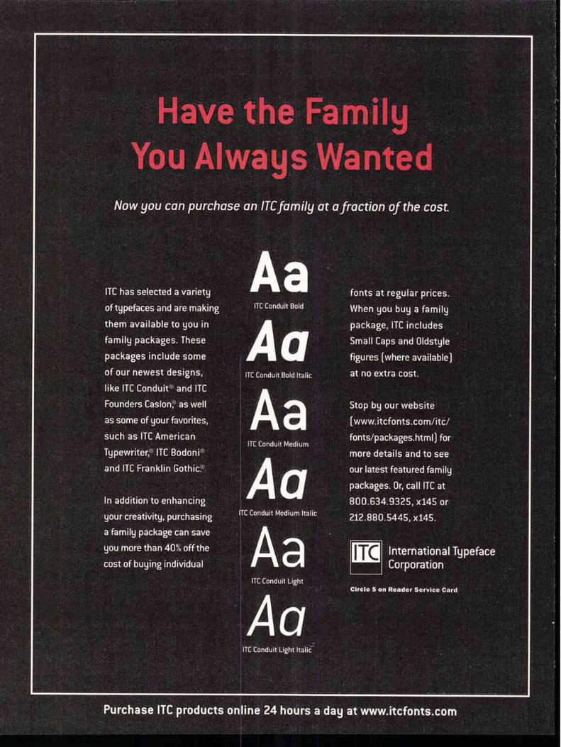
Have the Family You Always Wanted
Now you can purchase an ITC family at a fraction of the cost.
ITC has selected a variety
of typefaces and are making
them available to you in
family packages. These
packages include some
of our newest designs,
like ITC Conduit® and ITC
Founders Caslonc ) as well
as some of your favorites,
such as ITC American
Typewriter, ITC Bodoni'
and ITC Franklin Gothic.
In addition to enhancing
your creativity, purchasing
a family package can save
you more than 40% off the
cost of buying individual
ITC Conduit Bold
ITC Conduit Medium
ITC Conduit Medium Italic
ITC Conduit Light
AG
fonts at regular prices.
When you buy a family
package, ITC includes
Small Caps and Oldstyle
figures (where available)
at no extra cost.
Stop by our website
(www.itcfonts.com/itc/
fonts/packages.html) for
more details and to see
our latest featured family
packages. Or, call ITC at
800.634.9325, x145 or
212.880.5445, x145.
ITC Circle 5 on Reader Service Card
a
International Typeface Corporation
ITC Conduit Light Italic
Purchase ITC products online 24 hours a day at www.itcfonts.com


![7+($6&(16,212)7+(/25' - Hubbard, Ohio · 2020. 5. 22. · ,1 285 3$5,6+:25'$021*86 dZ t} u }vPµ (} :µv ] À]o o ]v Z Zµ Z]v Z À µo U (} Z} ÁZ} Áv } G u} u v]vP(µooÇ}v Z ]vP](https://img.pdfslide.us/doc/110x75/6102d3bc0da06e3056465f6c/7616212725-hubbard-ohio-2020-5-22-1-285-3562502186.jpg)