Embed Size (px)
Citation preview

UP
U UNIVERSA LPOS TALUNION
QCS Dispatch - Service and volume report – User Guide part B
Using Pivot Tables and other Excel features
2015-01-22
Contents
A. Purpose of this User Guide.......................................................................................................... 1
B. Introduction .................................................................................................................................. 1
C. The Typical Process .................................................................................................................... 2
D. Tips on using Pivot Tables ........................................................................................................... 8
E. Creating graphs ......................................................................................................................... 13
F. Summary – Pivot Tables ............................................................................................................ 14
G. Other Excel Features ................................................................................................................. 14
H. Typical Pivot Tables applied to the QCS Dispatch - Service and volume report ...................... 16
A. Purpose of this User Guide
The user guide for the QCS Dispatch - Service and volume report is in three parts:
• Part A Explanation and Suggested Usages • Part B Using Pivot Tables and other Excel features • Part C Supplement
Part A is intended to provide information and explanation regarding how the report can be used to analyse and improve postal operational processes.
This part (Part B) is intended to illustrate how to use the features of Excel when using the QCS Dispatch - Service and volume report Excel file.
Part C is a short (2-page) supplement to part A, primarily to assist in interpreting the report
The screens depicted in this document are based on Excel 2010. The same functionality is in earlier and
later versions of Excel, but the navigation can be different.
B. Introduction
The QCS Dispatch -Service and volume report enables either a PDF report or an Excel file to be created.
The Excel file is designed to be analysed, such as by Excel Pivot Tables.
A Pivot Table is a special type of table unique to Excel that enables you to summarize large amounts of data
and “pivot”, or re-arrange, the data to display different summaries of the information the table contains.
Creating a Pivot Table is usually an iterative process. It is typical to “play” with the data, re-arranging the
rows and the columns several times, until you have a table that makes sense and meets your business
need. Each iteration takes only a few seconds.
Pivot Tables can be combined with Excel’s graphing features to easily create highly visual graphs.
The Excel version of the QCS Dispatch - Service and volume report is specifically designed to work with
Pivot Tables.
This document is intended to illustrate how to use Excel Pivot Tables to analyze the information in the Excel
version of the QCS Dispatch- Service and volume report. It is intended for users unfamiliar with Pivot Tables.
It also provides examples of typical Pivot Tables, specifically for the QCS Dispatch - Service and volume
report.

2
Note that Excel has many more advanced features of Pivot Tables that can also be used, that are not
mentioned in this document.
As well, there are features of Excel, other than Pivot Tables, that are also very powerful and useful in
analysing the information in the Excel version of the QCS -Dispatch Service and volume report. These
include: auto-filters, freezing panes, and hiding columns.
For reasons of confidentiality of information, the QCS Dispatch - Service and volume report used in these
examples have fictitious operator codes, IMPC codes, and carrier codes. Other than that, it is actual live
data.
C. The Typical Process
Step 1: Create the file to start with (Figure 1)
Step 2: Select the entire file.
Click the box to the left of column A and above row 1 to select the entire file (Figure 2)
3
Step 3: Launch the Pivot Table
Click Insert, then Pivot Table. The Create Pivot Table box will appear. Click OK to place the Pivot Table on a
new worksheet. (Figure 3)
4
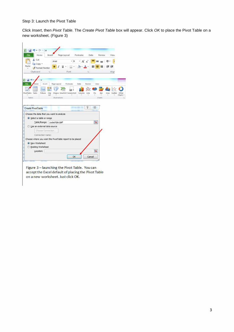
Step 4: Start building your pivot table.
This is done by dragging and placing fields contained in the QCS Dispatch Service and Volume report file to
either: Report Filter, Column Labels, Row Labels, or Values (Figure 4)

5
Step 5: Review and adjust
After building an initial Pivot table, look at it, and then change it as many times as needed to create the table
you need. In the example below, after the initial table was created, it seemed better to have “Class” as
another row (rather than a column) and to also report the sum of Kilos. Thus, for each partner, you can now
see the number of dispatches and the total kilos by mail class.(Figure 5)
Step 6: Apply Filters
At any time, you can apply the filters that you have defined. In the example below, Category B (Surface
Airlift) was selected by clicking the down arrow in cell B1 and then selecting value B. (Figure 6)
Step 7: Specify how fields are displayed
After determining the fields to be displayed you will need to determine how they are displayed. Excel
provides various options. The most commonly used options for the QCS Dispatch Service and Volume report

6
are Counts, Sums, and Averages. Occasionally Minimums and Maximums may also be used. (Figure 7, 7a,
7b, and 7c)
Step 8: Change to outline form
You will typically want to change the report layout. Microsoft Excel 2010 applies a default report layout that is
not ideal for the QCS Dispatch - Service and Volume report. It is usually appropriate to change the report
layout. (Figure 8)

7
8
D. Tips on using Pivot Tables
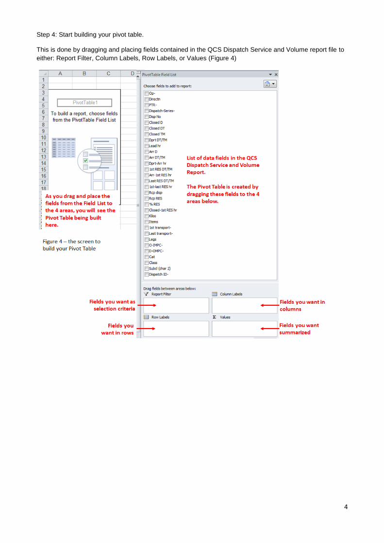
Tip 1: Exiting and re-entering a Pivot Table
If you click a cell outside the Pivot Table, the Field List will disappear. When you click a cell within the Pivot
Table, the Field List will re-appear. (Figure 9).
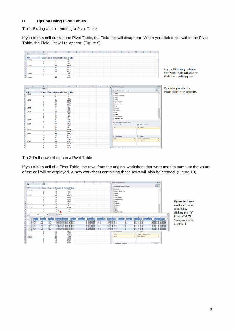
Tip 2: Drill-down of data in a Pivot Table
If you click a cell of a Pivot Table, the rows from the original worksheet that were used to compute the value
of the cell will be displayed. A new worksheet containing these rows will also be created. (Figure 10).
9
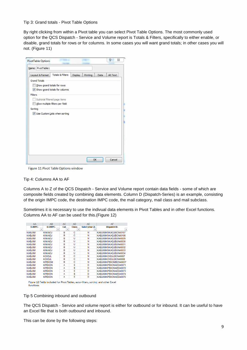
Tip 3: Grand totals - Pivot Table Options
By right clicking from within a Pivot table you can select Pivot Table Options. The most commonly used
option for the QCS Dispatch - Service and Volume report is Totals & Filters, specifically to either enable, or
disable, grand totals for rows or for columns. In some cases you will want grand totals; in other cases you will
not. (Figure 11)
Tip 4: Columns AA to AF
Columns A to Z of the QCS Dispatch - Service and Volume report contain data fields - some of which are
composite fields created by combining data elements. Column D (Dispatch-Series) is an example, consisting
of the origin IMPC code, the destination IMPC code, the mail category, mail class and mail subclass.
Sometimes it is necessary to use the indivual data elements in Pivot Tables and in other Excel functions.
Columns AA to AF can be used for this.(Figure 12)
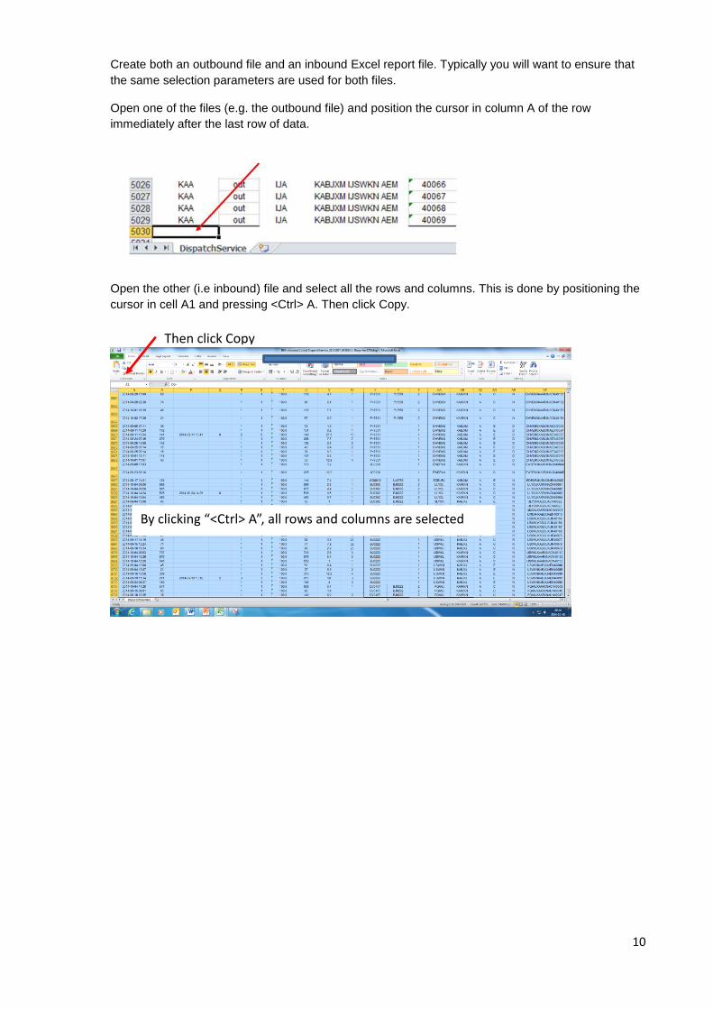
Tip 5 Combining inbound and outbound
The QCS Dispatch - Service and volume report is either for outbound or for inbound. It can be useful to have
an Excel file that is both outbound and inbound.
This can be done by the following steps:
10
Create both an outbound file and an inbound Excel report file. Typically you will want to ensure that
the same selection parameters are used for both files.
Open one of the files (e.g. the outbound file) and position the cursor in column A of the row
immediately after the last row of data.
Open the other (i.e inbound) file and select all the rows and columns. This is done by positioning the
cursor in cell A1 and pressing <Ctrl> A. Then click Copy.
By clicking “<Ctrl> A”, all rows and columns are selected
Then click Copy

11
Then, in the outbound file, right click, then Paste to place the inbound file contents after the contents
of the outbound file.
Now, delete the extra row of column titles that came with the inbound file. In this example it is row
5030.

12
This results in a file that has both outbound and inbound dispatches. Column B, titled “Directn”, can
be used to distinguish between outbound and inbound. An example Pivot Table:
This displays the number of dispatches and kilos for each partner, with inbound on the same row as outbound, enabling inbound to be easily compared with outbound.
13
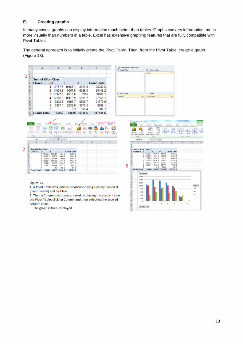
E. Creating graphs
In many cases, graphs can display information much better than tables. Graphs convery information much
more visually than numbers in a table. Excel has extensive graphing features that are fully compatible with
Pivot Tables.
The general approach is to initially create the Pivot Table. Then, from the Pivot Table, create a graph.
(Figure 13).
14
F. Summary – Pivot Tables
Pivot Tables are quite easy, and can be very useful. It can also be fun to create Pivot Tables, as each one
can give a different persective of the business issue you are analyzing.
In effect, Pivot Tables enable you to “mine” the data in the QCS Dispatch -Service and volume report. You
are not limited to using the reports in the format in which they are created.
The most important thing - is to thoroughly understand each of the data elements that comprise the Excel
QCS Dispatch - Service and volume report. These are defined in another section of the user guide.
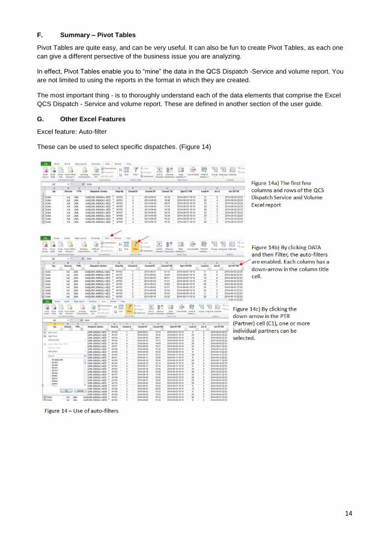
G. Other Excel Features
Excel feature: Auto-filter
These can be used to select specific dispatches. (Figure 14)
15
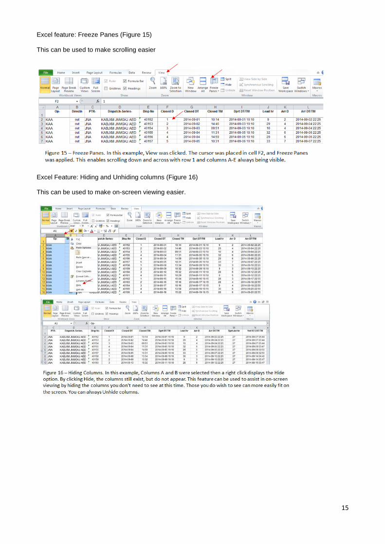
Excel feature: Freeze Panes (Figure 15)
This can be used to make scrolling easier
Excel Feature: Hiding and Unhiding columns (Figure 16)
This can be used to make on-screen viewing easier.

16
H. Typical Pivot Tables applied to the QCS Dispatch - Service and volume report
An almost infinite number of Pivot Tables can be applied to the Excel Dispatch - Service and volume report.
Similarly, there is a wide variety of business situations designated operators may face. As example - some
have many offices of exchange, others only one; some have direct transport to many destinations, others
have direct transport to very few destinations; some rely heavily on closed transit, others have very little
closed transit; some use surface airlift (SAL), others do not.
Pivot Tables used to analyse outbound dispatches may be different than those used to analyse inbound
dispatches. For outbound, origins are in control of the content and quality of their PREDES messages they
send. But for inbound, destinations are not in control of the content and quality of the PREDES messages
they receive.
This section provides a few examples of Pivot Tables to help get started in using them.

17
Example 1
This Pivot Table displays the number of dispatches and the average time durations for each of a) lead time,
b) planned departure to planned arrival, c) planned arrival to 1st RESDES, d) closed date/time to 1
st RESDES
(the sum of the previous three), and e) 1st to last RESDES.
It is displayed by Partner and enables filtering on Category and Class. In this example Category A is
selected. It is also possible to filter specific partners.
This can be used to assess the operational performance of dispatches. If, for example, the average of
planned arrival to 1st RESDES for dispatches of category A is high, then it is possible that transportation
arrangements are not working as planned, or that there are delays in processing receptacles within the
destination Post.
18
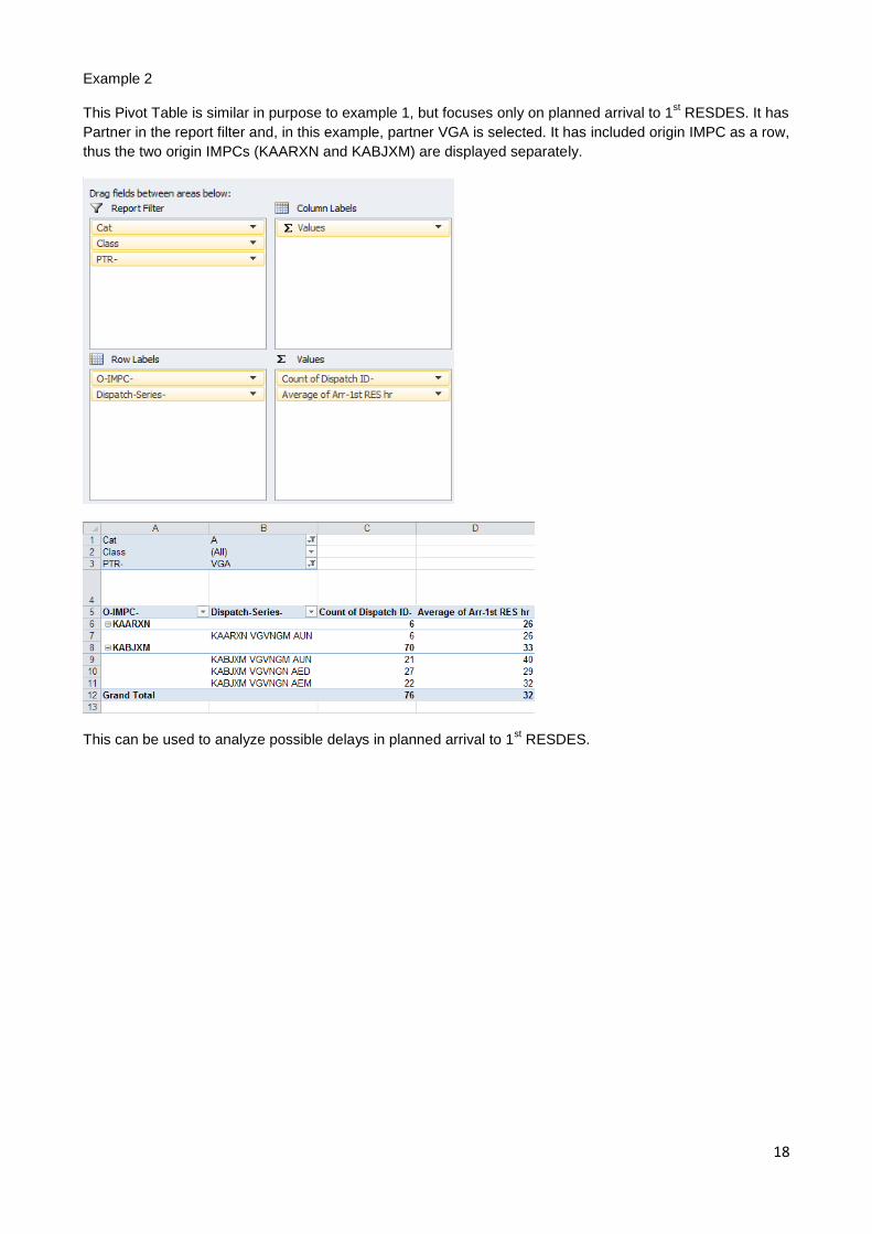
Example 2
This Pivot Table is similar in purpose to example 1, but focuses only on planned arrival to 1st RESDES. It has
Partner in the report filter and, in this example, partner VGA is selected. It has included origin IMPC as a row,
thus the two origin IMPCs (KAARXN and KABJXM) are displayed separately.
This can be used to analyze possible delays in planned arrival to 1st RESDES.

19
Example 3
This Pivot Table displays the volume of mail (Kilos, Items, and Receptacles) dispatched.
It is displayed by Partner and enables filtering on Category and Class. In this example Category A is
selected. It is also possible to filter to include only specific selected partners.
This can be used to review the volumes of mail to or from each partner, by category and/or class. Other
fields can also be included such as the origin or destination IMPCs, date, day of week, etc.

20
Example 4
In this example the kilograms dispatched are displayed by 1st transport and by closed day of week (1- Mo, 2-
Tu…7-Su).
This can be used by an origin designated operator for transport capacity planning.