Embed Size (px)
Citation preview
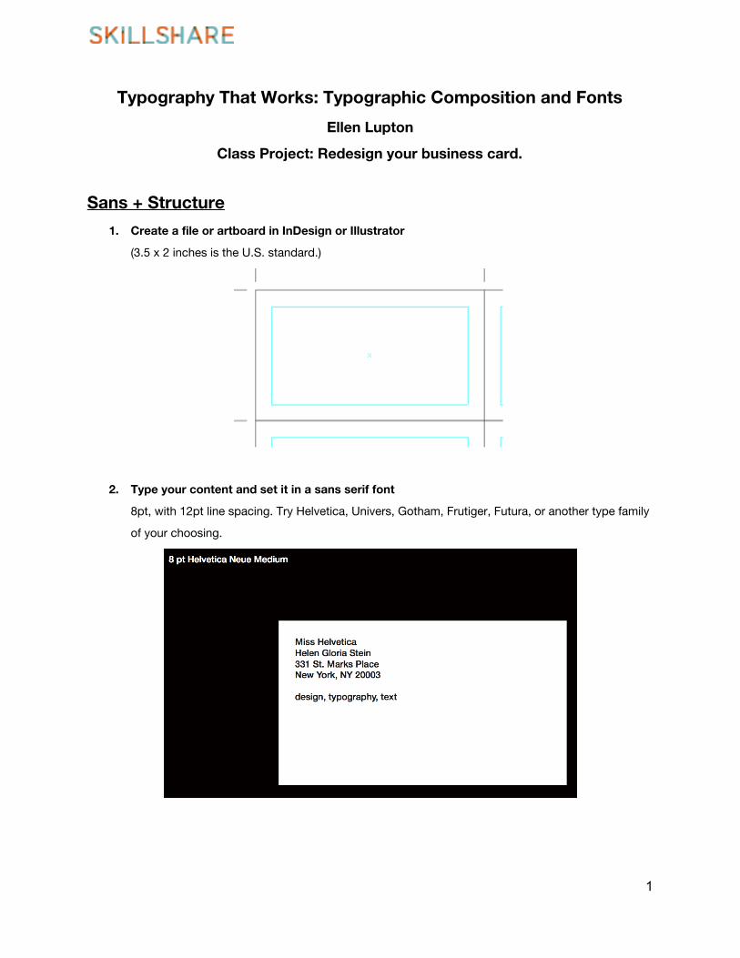
Typography That Works: Typographic Composition and Fonts
Ellen Lupton
Class Project: Redesign your business card.
Sans + Structure
1. Create a file or artboard in InDesign or Illustrator
(3.5 x 2 inches is the U.S. standard.)
2. Type your content and set it in a sans serif font
8pt, with 12pt line spacing. Try Helvetica, Univers, Gotham, Frutiger, Futura, or another type family
of your choosing.
1
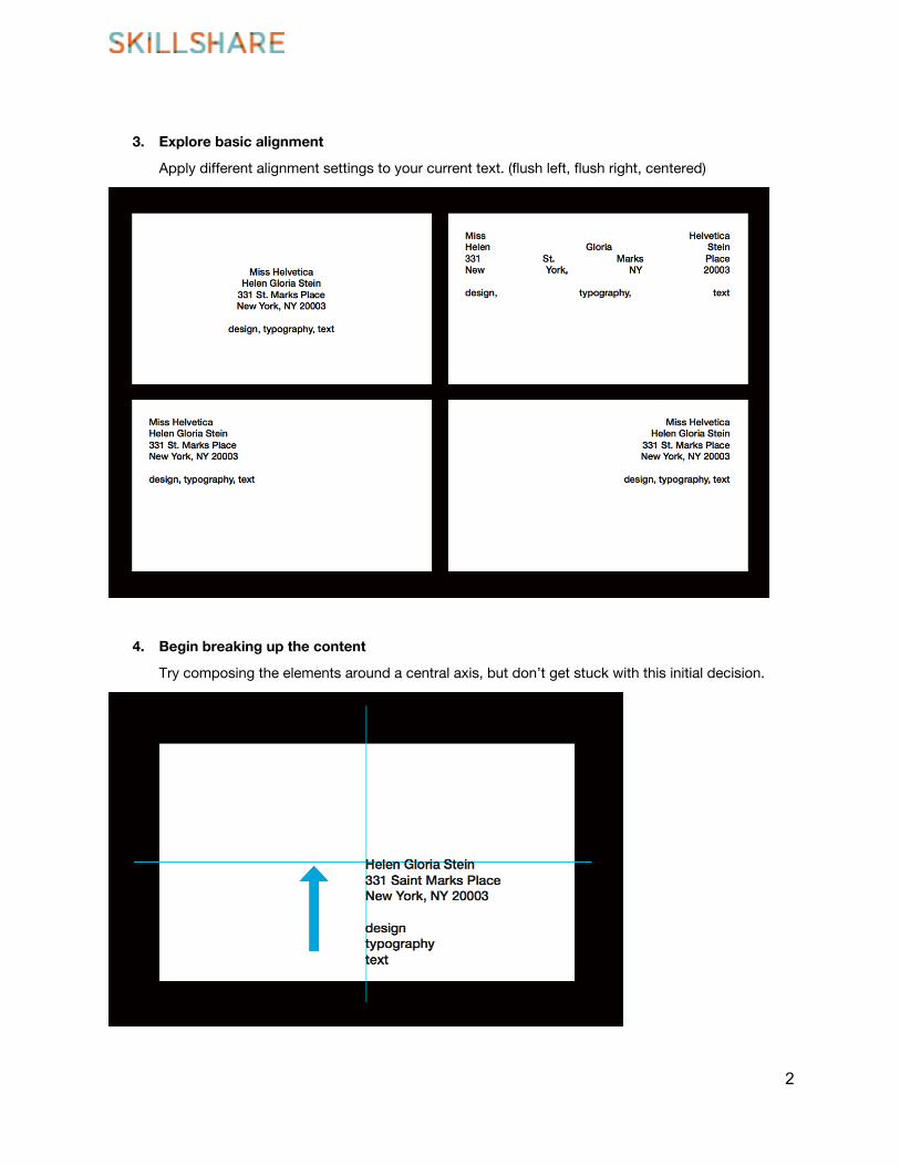
3. Explore basic alignment
Apply different alignment settings to your current text. (flush left, flush right, centered)
4. Begin breaking up the content
Try composing the elements around a central axis, but don’t get stuck with this initial decision.
2
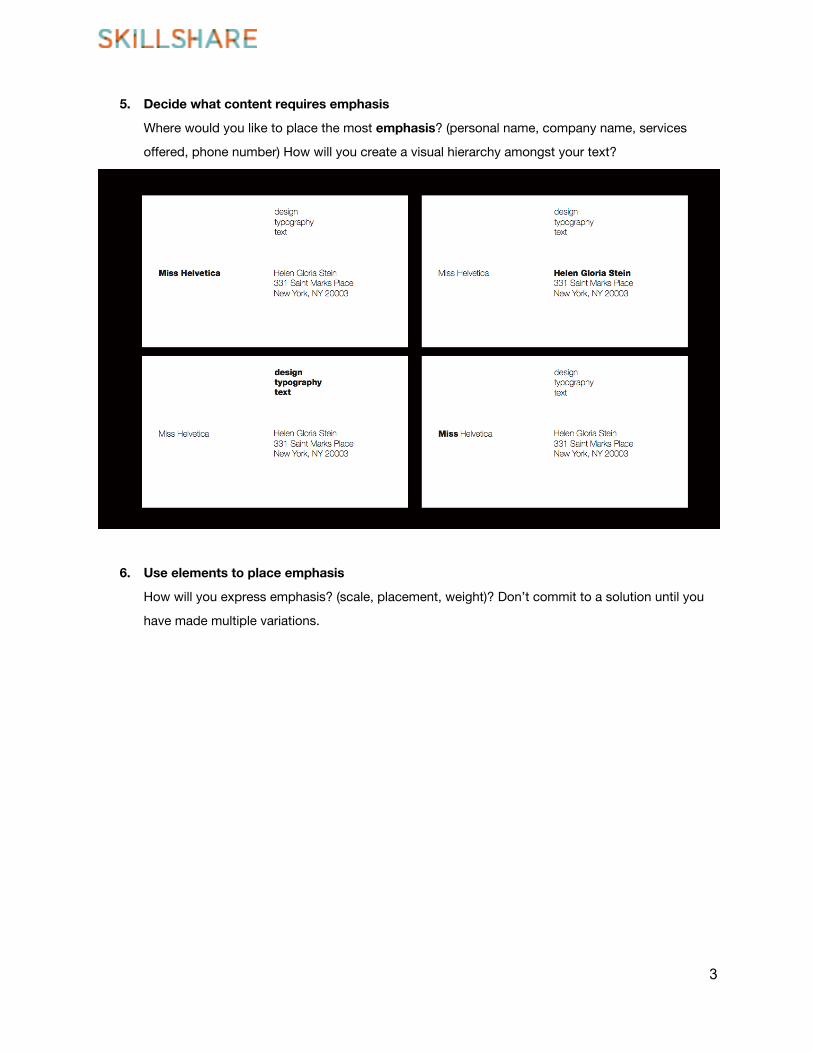
5. Decide what content requires emphasis
Where would you like to place the most emphasis? (personal name, company name, services
offered, phone number) How will you create a visual hierarchy amongst your text?
6. Use elements to place emphasis
How will you express emphasis? (scale, placement, weight)? Don’t commit to a solution until you
have made multiple variations.
3
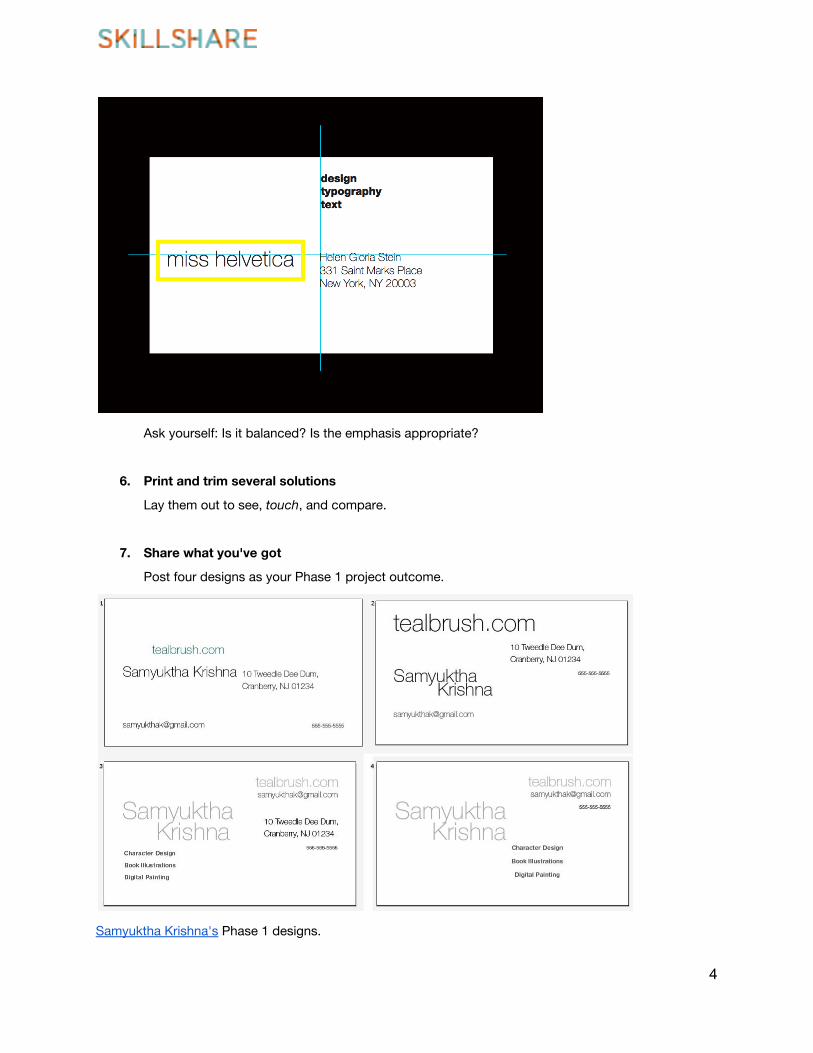
Ask yourself: Is it balanced? Is the emphasis appropriate?
6. Print and trim several solutions
Lay them out to see, touch, and compare.
7. Share what you've got
Post four designs as your Phase 1 project outcome.
Samyuktha Krishna's Phase 1 designs.
4
Serif + Details
1. Write a few sentences
… about who you are or what you do. Facts are fine. I'm a designer. Statements are fun. I put
things in their right place.
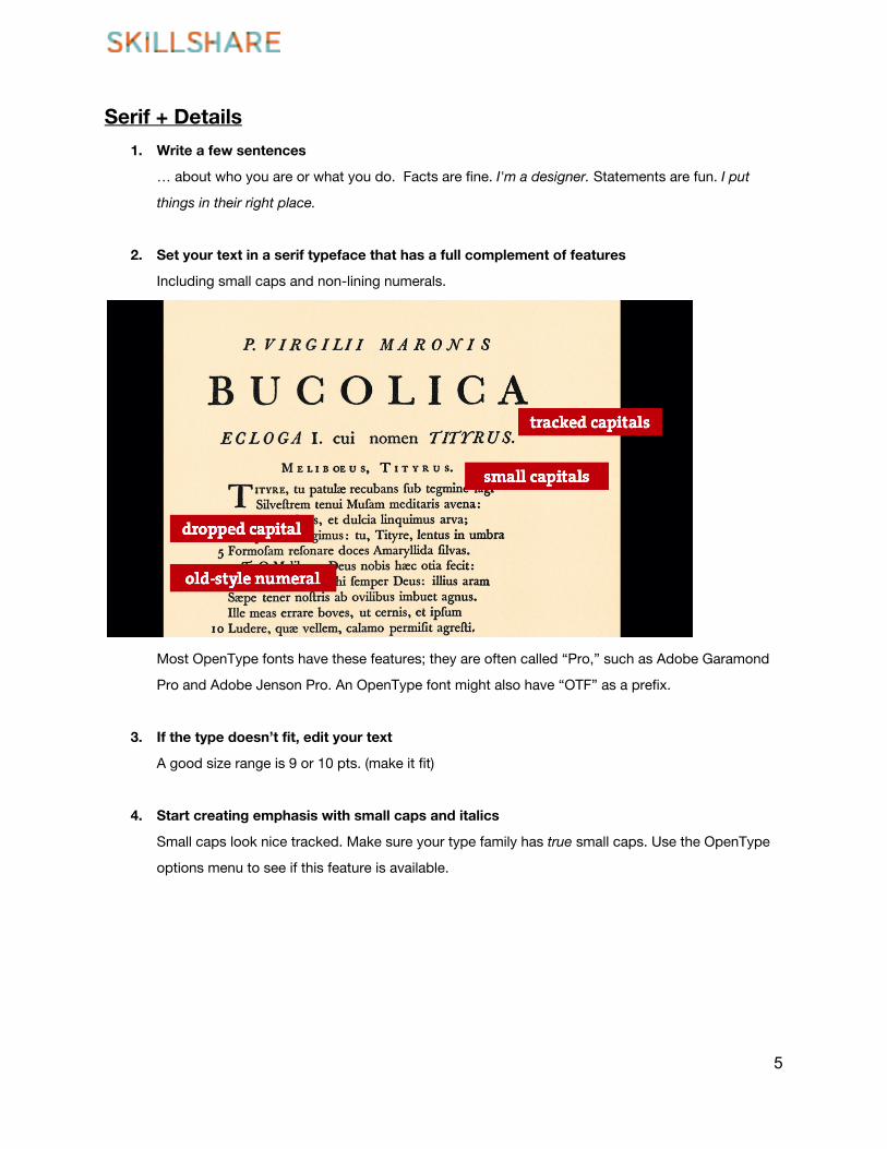
2. Set your text in a serif typeface that has a full complement of features
Including small caps and non-lining numerals.
Most OpenType fonts have these features; they are often called “Pro,” such as Adobe Garamond
Pro and Adobe Jenson Pro. An OpenType font might also have “OTF” as a prefix.
3. If the type doesn’t fit, edit your text
A good size range is 9 or 10 pts. (make it fit)
4. Start creating emphasis with small caps and italics
Small caps look nice tracked. Make sure your type family has true small caps. Use the OpenType
options menu to see if this feature is available.
5
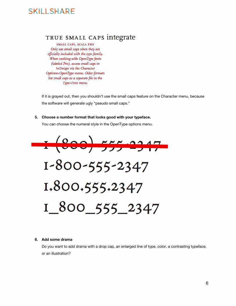
If it is grayed out, then you shouldn’t use the small caps feature on the Character menu, because
the software will generate ugly “pseudo small caps.”
5. Choose a number format that looks good with your typeface.
You can choose the numeral style in the OpenType options menu.
6. Add some drama
Do you want to add drama with a drop cap, an enlarged line of type, color, a contrasting typeface,
or an illustration?
6
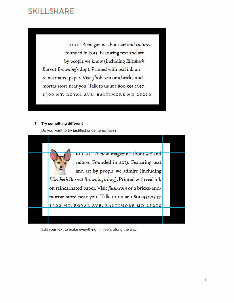
7. Try something different
Do you want to try justified or centered type?
Edit your text to make everything fit nicely, along the way.
7
Slab + Customization
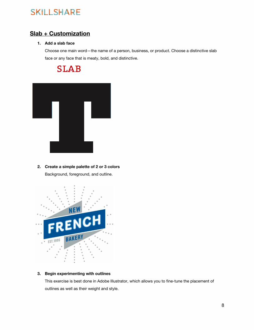
1. Add a slab face
Choose one main word—the name of a person, business, or product. Choose a distinctive slab
face or any face that is meaty, bold, and distinctive.
2. Create a simple palette of 2 or 3 colors
Background, foreground, and outline.
3. Begin experimenting with outlines
This exercise is best done in Adobe Illustrator, which allows you to fine-tune the placement of
outlines as well as their weight and style.
8
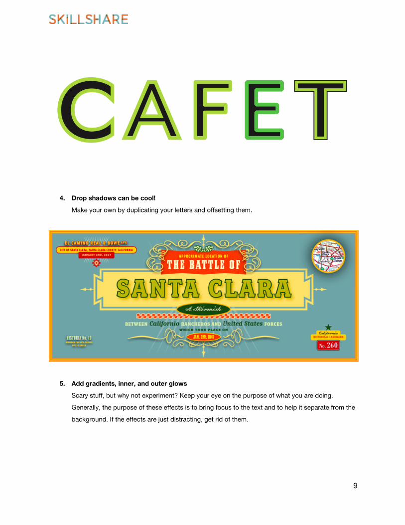
4. Drop shadows can be cool!
Make your own by duplicating your letters and offsetting them.
5. Add gradients, inner, and outer glows
Scary stuff, but why not experiment? Keep your eye on the purpose of what you are doing.
Generally, the purpose of these effects is to bring focus to the text and to help it separate from the
background. If the effects are just distracting, get rid of them.
9
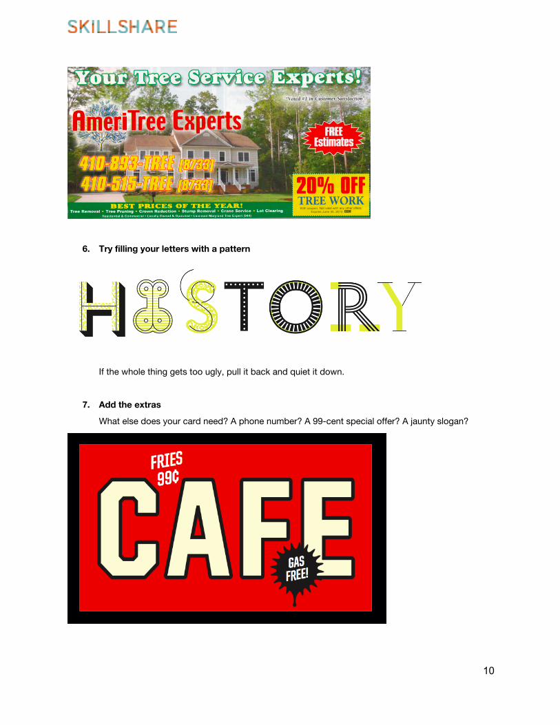
6. Try filling your letters with a pattern
If the whole thing gets too ugly, pull it back and quiet it down.
7. Add the extras
What else does your card need? A phone number? A 99-cent special offer? A jaunty slogan?
10