Embed Size (px)
DESCRIPTION
an investigation of typography
Citation preview
an investigation of typographyby anthony schmiedeler
typeWORK
\

\\\\\\\\\\\\\\\\\\\\\\\\\\\\\\\\\\\\\\\\\\\\\\\\
3\\\\\\\\\\\\\\\\\\\\\\\\\\\\\\\\\\\\\\\\\\\\\\\\
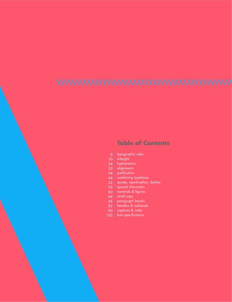
Table of Contents
typographic rulesx-height hyphenationalignmentsjustificationcombining typefacesquotes, apostrophes, dashesspecial charactersnumerals & figuressmall capsparagraph breaksheaders & subheadscaptions & notesfont specifications
6\10\24\30\34\44\52\55\60\64\68\82\90\
100\

\\\\\\\\\\\\\\\\\\\\\\\\\\\\\\\\\\\\\\\\\\\\\\\\\\\\\\\\\\\\\\\\\\\\\\\\\\\\
\\\\\\\\\\\\\\\\\\\\\\\\\\\\\\\\\\\\\\\\\\\\\\\\\\\\\\\
typeW ULES
5\\\\\\\\\\\\\\\\\\\\\\\\\\\\\\\\\\\\\\\\\\\\\\\\\\\\\\\\\\\\\\\\\\\\\\\\\\\\
typeW ULES
\R\U\L\E\S
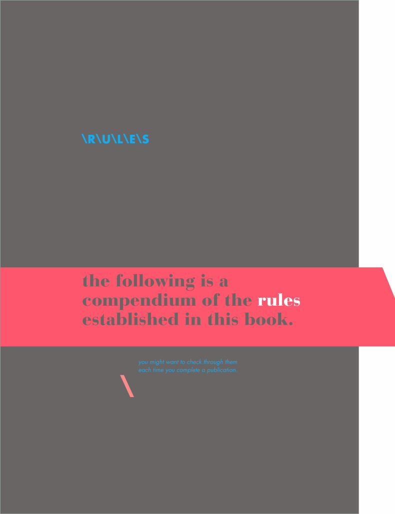
the following is a compendium of the rules established in this book.
you might want to check through them each time you complete a publication.
\
7\R\U\L\E\S
the following is a compendium of the rules established in this book.
use only one space between sentences \ use real quotation marks \ use real apostrophes \ make sure the apostrophes are where they belong \ hang the punctua-tion off the aligned edge \ use en or em dashes, use consistently \ kern all headlines where necessary \ never use the spacebar to align text, always set tabs and use the tab key \ leave no widows or orphans \ avoid more than 3 hyphenations in a row \ avoid too many hyphenations in any para-graph \ avoid hyphenating or line brakes of names and proper nouns \ leave a least 2 characters on the line and 3 following \ avoid beginning consecutive lines with the same word \ avoid ending consecutive lines with the same word \ avoid ending lines with the words: the, of, at, a, by \ never hyphenate a words in a headline and avoid hyphenation in a callout \ never jus-tify the text on a short line \ keep the word spacing consistent
\\\\\\\\\\\\\\\\\\\\\\\\\\\\\
tighten up the leading in lines with all caps or with few ascenders and descend-ers \ use a one-em first-line indent on all indented paragraphs \ adjust the spacing between paragraphs \ either indent the first line of paragraphs or add extra space between them – not both \ use a decimal or right-aligned tab for the numbers in num-bered paragraphs \ never have one line in a paragraph in the column or following \ never combine two serif fonts on one page \ rarely combine two sans serif fonts on one page \ rarely combine more than three typefaces on one page \ use the special characters whenever necessary, including super- and subscript \ spend the time to create nice fraction or chose a font that has fractions \ if a correctly spelled word needs an accent mark, use it

\\\\\\\\\\\\\\\\\\\\\\\\\\\\\\\\\\\\\\\\\\\\\\\\\\\\\\\
\\\ \\\\\\\\\\\\\\\\\\\\\\\\\\\\\\\\\\\\\\\\\\\\\\\\\\\\\\\\\\\\\\\\S HEIGHT

9
\\\\\\\\\\\\\\\\\\
\\\ \\\\\\\\\\\\\\\\\\\\\\\\\\\\\\\\\\\\\\\\\\\\\\\\\\\\\\\\\\\\\\\\S HEIGHT
\x\H\E\I\G\H\T
readability & legibility are two key elements of printed text that typographers strive to maximize.
Readability in an extended amount of text – such as an article, book, or annual report – is easy to read. Legibility refers to whether an refers to whether a short burst of text – such as a headline catalog listing, or stop sign – is instantly recognizable.
There are several factors that determine whether a text is read-able. When deciding what typeface should be used for a job, consideration should be given to the typeface and its x-height. It is important to understand how a block of text can express a message through its texture/color, therefore suiting a particular design solution. Fonts set in the same size, same leading and column width will produce varying degrees of “color”.
\
11\x\H\E\I\G\H\T
As a designer, if you are only asked to make the text readable on the page the following questions should be asked...
Who is to read it? Someone that wants to read it? Someone that has to read it? How will it be read? Quickly? In passing? Focused? Near? Far?
\\\\\\\\\\\\\\\\\\\\\\\\\\\\\\\\\\\\\\\\\\\\\\\\In typography, color can also describe the balance between black and white on the page of text.

A typeface’s color is determined by:
stroke width x-height character widthserif styles
\\\\\\\\\\\\\\\\\\\\\\\\\\\\\\\\\\\\\\\\\\\\\\\\
\\\\\\\\\\\\\\\\\\\\\\\\
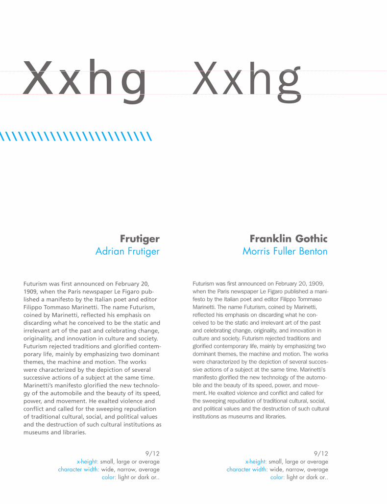
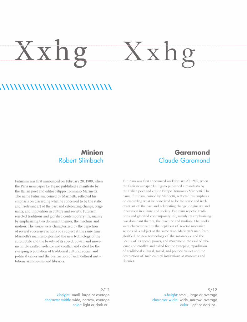
Futurism was first announced on February 20, 1909, when the Paris newspaper Le Figaro pub-lished a manifesto by the Italian poet and editor Filippo Tommaso Marinetti. The name Futurism, coined by Marinetti, reflected his emphasis on discarding what he conceived to be the static and irrelevant art of the past and celebrating change, originality, and innovation in culture and society. Futurism rejected traditions and glorified contem-porary life, mainly by emphasizing two dominant themes, the machine and motion. The works were characterized by the depiction of several successive actions of a subject at the same time. Marinetti’s manifesto glorified the new technolo-gy of the automobile and the beauty of its speed, power, and movement. He exalted violence and conflict and called for the sweeping repudiation of traditional cultural, social, and political values and the destruction of such cultural institutions as museums and libraries.
FrutigerAdrian Frutiger
9/12x-height: small, large or average
character width: wide, narrow, average color: light or dark or..
Xxhg Xxhg
Futurism was first announced on February 20, 1909, when the Paris newspaper Le Figaro published a mani-festo by the Italian poet and editor Filippo Tommaso Marinetti. The name Futurism, coined by Marinetti, reflected his emphasis on discarding what he con-ceived to be the static and irrelevant art of the past and celebrating change, originality, and innovation in culture and society. Futurism rejected traditions and glorified contemporary life, mainly by emphasizing two dominant themes, the machine and motion. The works were characterized by the depiction of several succes-sive actions of a subject at the same time. Marinetti’s manifesto glorified the new technology of the automo-bile and the beauty of its speed, power, and move-ment. He exalted violence and conflict and called for the sweeping repudiation of traditional cultural, social, and political values and the destruction of such cultural institutions as museums and libraries.
Franklin GothicMorris Fuller Benton
9/12 x-height: small, large or average
character width: wide, narrow, average color: light or dark or..
13\\\\\\\\\\\\\\\\\\\\\\\\
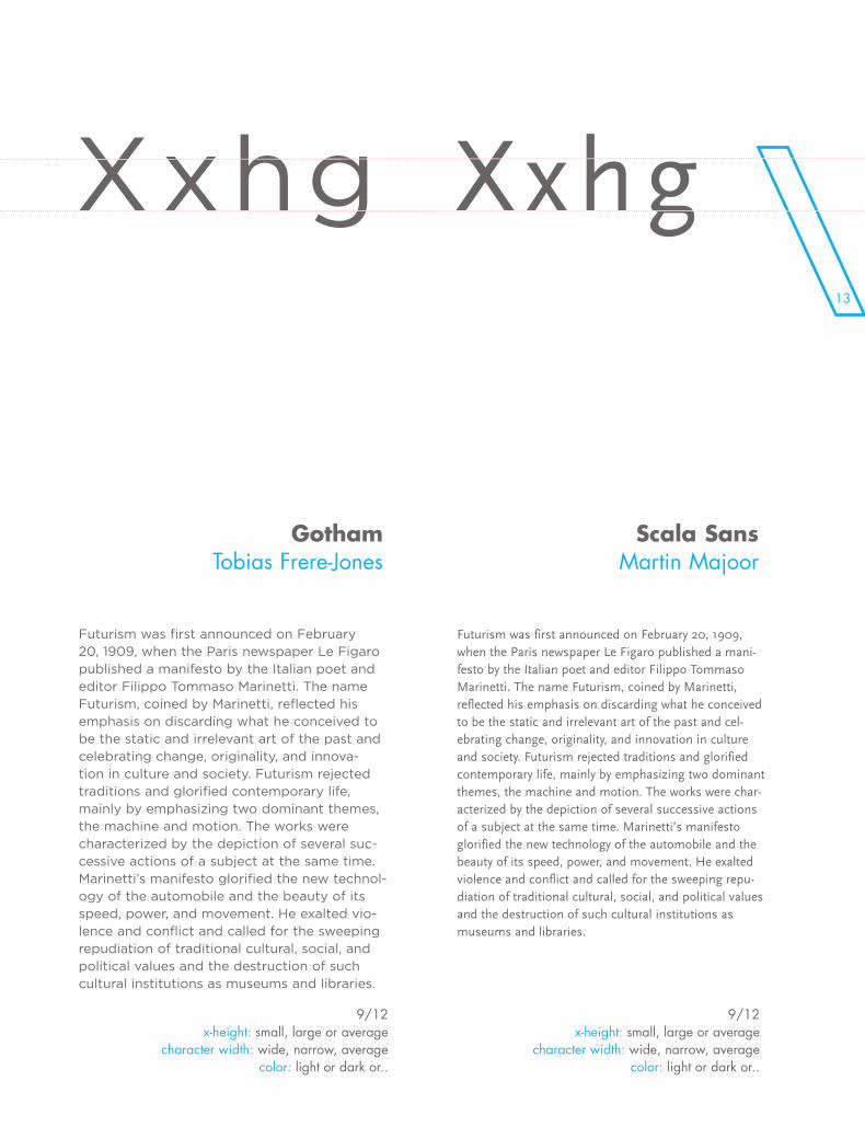
Futurism was first announced on February 20, 1909, when the Paris newspaper Le Figaro published a manifesto by the Italian poet and editor Filippo Tommaso Marinetti. The name Futurism, coined by Marinetti, reflected his emphasis on discarding what he conceived to be the static and irrelevant art of the past and celebrating change, originality, and innova-tion in culture and society. Futurism rejected traditions and glorified contemporary life, mainly by emphasizing two dominant themes, the machine and motion. The works were characterized by the depiction of several suc-cessive actions of a subject at the same time. Marinetti’s manifesto glorified the new technol-ogy of the automobile and the beauty of its speed, power, and movement. He exalted vio-lence and conflict and called for the sweeping repudiation of traditional cultural, social, and political values and the destruction of such cultural institutions as museums and libraries.
GothamTobias Frere-Jones
9/12x-height: small, large or average
character width: wide, narrow, average color: light or dark or..
Xxhg Xxhg
Futurism was first announced on February 20, 1909, when the Paris newspaper Le Figaro published a mani-festo by the Italian poet and editor Filippo Tommaso Marinetti. The name Futurism, coined by Marinetti, reflected his emphasis on discarding what he conceived to be the static and irrelevant art of the past and cel-ebrating change, originality, and innovation in culture and society. Futurism rejected traditions and glorified contemporary life, mainly by emphasizing two dominant themes, the machine and motion. The works were char-acterized by the depiction of several successive actions of a subject at the same time. Marinetti’s manifesto glorified the new technology of the automobile and the beauty of its speed, power, and movement. He exalted violence and conflict and called for the sweeping repu-diation of traditional cultural, social, and political values and the destruction of such cultural institutions as museums and libraries.
Scala SansMartin Majoor
9/12x-height: small, large or average
character width: wide, narrow, average color: light or dark or..
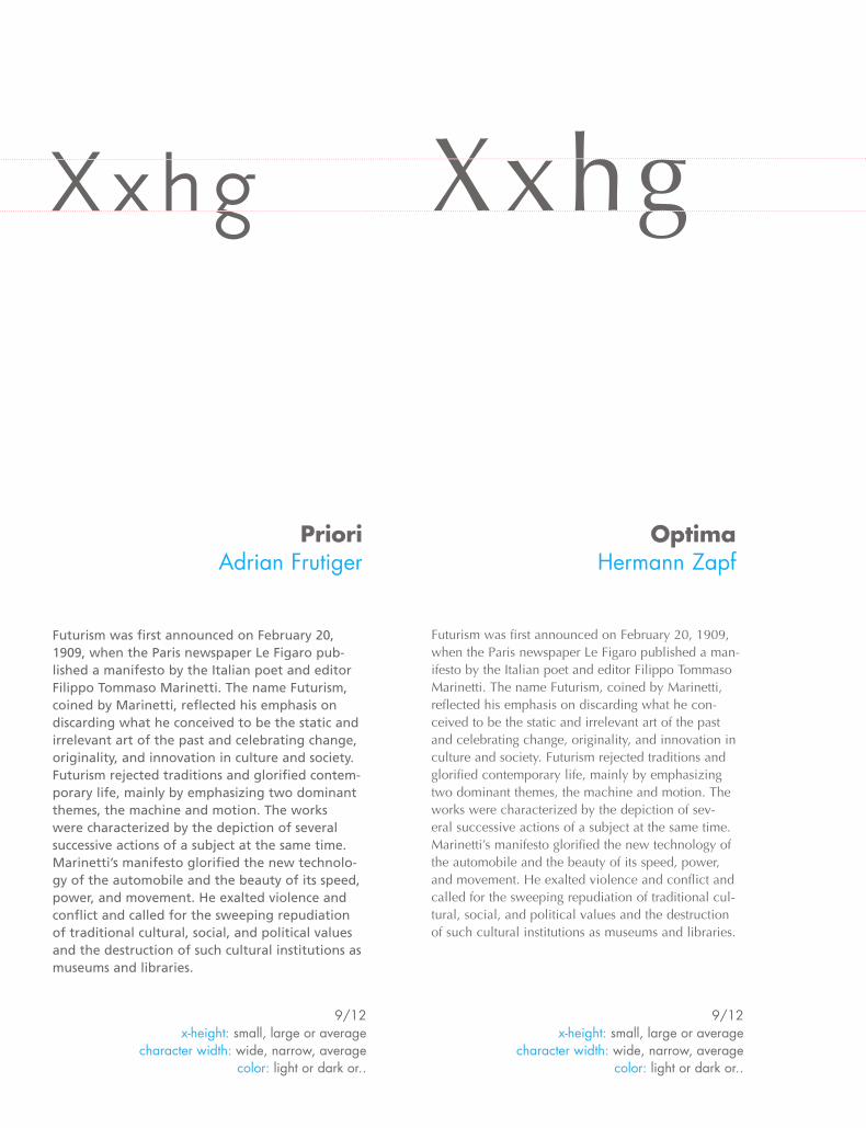
Futurism was first announced on February 20, 1909, when the Paris newspaper Le Figaro pub-lished a manifesto by the Italian poet and editor Filippo Tommaso Marinetti. The name Futurism, coined by Marinetti, reflected his emphasis on discarding what he conceived to be the static and irrelevant art of the past and celebrating change, originality, and innovation in culture and society. Futurism rejected traditions and glorified contem-porary life, mainly by emphasizing two dominant themes, the machine and motion. The works were characterized by the depiction of several successive actions of a subject at the same time. Marinetti’s manifesto glorified the new technolo-gy of the automobile and the beauty of its speed, power, and movement. He exalted violence and conflict and called for the sweeping repudiation of traditional cultural, social, and political values and the destruction of such cultural institutions as museums and libraries.
X x h g Xxhg
Futurism was first announced on February 20, 1909, when the Paris newspaper Le Figaro published a man-ifesto by the Italian poet and editor Filippo Tommaso Marinetti. The name Futurism, coined by Marinetti, reflected his emphasis on discarding what he con-ceived to be the static and irrelevant art of the past and celebrating change, originality, and innovation in culture and society. Futurism rejected traditions and glorified contemporary life, mainly by emphasizing two dominant themes, the machine and motion. The works were characterized by the depiction of sev-eral successive actions of a subject at the same time. Marinetti’s manifesto glorified the new technology of the automobile and the beauty of its speed, power, and movement. He exalted violence and conflict and called for the sweeping repudiation of traditional cul-tural, social, and political values and the destruction of such cultural institutions as museums and libraries.
PrioriAdrian Frutiger
OptimaHermann Zapf
9/12x-height: small, large or average
character width: wide, narrow, average color: light or dark or..
9/12 x-height: small, large or average
character width: wide, narrow, average color: light or dark or..
15
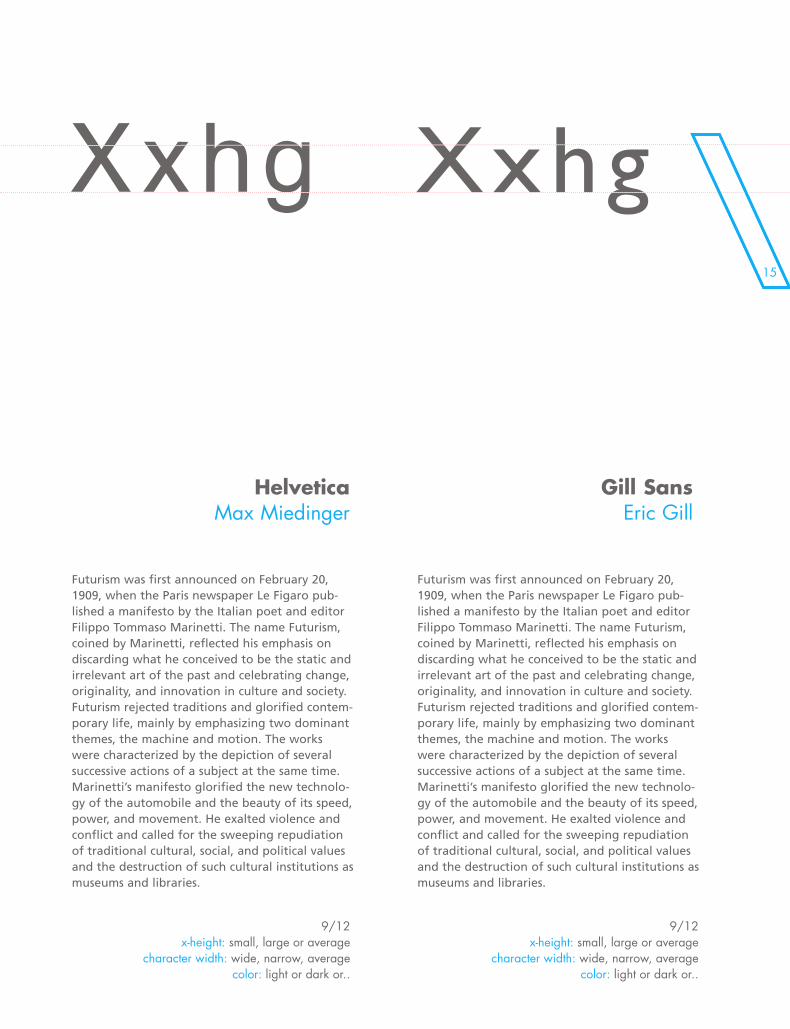
Futurism was first announced on February 20, 1909, when the Paris newspaper Le Figaro pub-lished a manifesto by the Italian poet and editor Filippo Tommaso Marinetti. The name Futurism, coined by Marinetti, reflected his emphasis on discarding what he conceived to be the static and irrelevant art of the past and celebrating change, originality, and innovation in culture and society. Futurism rejected traditions and glorified contem-porary life, mainly by emphasizing two dominant themes, the machine and motion. The works were characterized by the depiction of several successive actions of a subject at the same time. Marinetti’s manifesto glorified the new technolo-gy of the automobile and the beauty of its speed, power, and movement. He exalted violence and conflict and called for the sweeping repudiation of traditional cultural, social, and political values and the destruction of such cultural institutions as museums and libraries.
HelveticaMax Miedinger
9/12 x-height: small, large or average
character width: wide, narrow, average color: light or dark or..
Xxhg Xxhg
Futurism was first announced on February 20, 1909, when the Paris newspaper Le Figaro pub-lished a manifesto by the Italian poet and editor Filippo Tommaso Marinetti. The name Futurism, coined by Marinetti, reflected his emphasis on discarding what he conceived to be the static and irrelevant art of the past and celebrating change, originality, and innovation in culture and society. Futurism rejected traditions and glorified contem-porary life, mainly by emphasizing two dominant themes, the machine and motion. The works were characterized by the depiction of several successive actions of a subject at the same time. Marinetti’s manifesto glorified the new technolo-gy of the automobile and the beauty of its speed, power, and movement. He exalted violence and conflict and called for the sweeping repudiation of traditional cultural, social, and political values and the destruction of such cultural institutions as museums and libraries.
Gill SansEric Gill
9/12x-height: small, large or average
character width: wide, narrow, average color: light or dark or..
Futurism was first announced on February 20, 1909, when the Paris newspaper Le Figaro pub-lished a manifesto by the Italian poet and editor Filippo Tommaso Marinetti. The name Futurism, coined by Marinetti, reflected his emphasis on discarding what he conceived to be the static and irrelevant art of the past and celebrating change, originality, and innovation in culture and society. Futurism rejected traditions and glorified contem-porary life, mainly by emphasizing two dominant themes, the machine and motion. The works were characterized by the depiction of several successive actions of a subject at the same time. Marinetti’s manifesto glorified the new technolo-gy of the automobile and the beauty of its speed, power, and movement. He exalted violence and conflict and called for the sweeping repudiation of traditional cultural, social, and political values and the destruction of such cultural institutions as museums and libraries.
Xxhg Xxhg
Futurism was first announced on February 20, 1909, when the Paris newspaper Le Figaro pub-lished a manifesto by the Italian poet and editor Filippo Tommaso Marinetti. The name Futurism, coined by Marinetti, reflected his emphasis on discarding what he conceived to be the static and irrelevant art of the past and celebrating change, originality, and innovation in culture and society. Futurism rejected traditions and glorified contem-porary life, mainly by emphasizing two dominant themes, the machine and motion. The works were characterized by the depiction of several successive actions of a subject at the same time. Marinetti’s manifesto glorified the new technolo-gy of the automobile and the beauty of its speed, power, and movement. He exalted violence and conflict and called for the sweeping repudiation of traditional cultural, social, and political values and the destruction of such cultural institutions as museums and libraries.
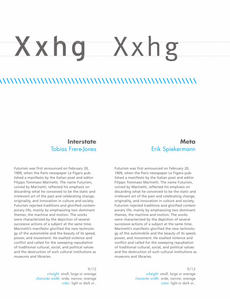
InterstateTobias Frere-Jones
MetaErik Spiekermann
9/12x-height: small, large or average
character width: wide, narrow, average color: light or dark or..
9/12x-height: small, large or average
character width: wide, narrow, average color: light or dark or..
\\\\\\\\\\\\\\\\\\\\\\\\\\\\\\\\\\\\\\\\\\\\\\\\\\\\\\\\\\\\\
17\\\\\\\\\\\\\\\\\\\\\\\\\\\\\\\\\\\\\\\\\\\\\\\\\\\\\\\\\\\\\\\\\\\\\\\\\\\\\\\\\\\\\\\\\\\\\\\\\\\\\\\\\\\\\\\\\\\\\\\\\\
Futurism was first announced on February 20, 1909, when the Paris newspaper Le Figaro published a manifesto by the Italian poet and editor Filippo Tommaso Marinetti. The name Futurism, coined by Marinetti, reflected his emphasis on discarding what he conceived to be the static and irrelevant art of the past and celebrating change, originality, and innovation in culture and society. Futurism rejected traditions and glorified contemporary life, mainly by emphasizing two dominant themes, the machine and motion. The works were characterized by the depiction of several successive actions of a subject at the same time. Marinetti’s manifesto glorified the new technology of the automobile and the beauty of its speed, power, and movement. He exalted vio-lence and conflict and called for the sweeping repu-diation of traditional cultural, social, and political values and the destruction of such cultural institu-tions as museums and libraries.
Xxhg X x h g
Futurism was first announced on February 20, 1909, when the Paris newspaper Le Figaro published a manifesto by the Italian poet and editor Filippo Tommaso Marinetti. The name Futurism, coined by Marinetti, reflected his emphasis on discarding what he conceived to be the static and irrel-evant art of the past and celebrating change, originality, and innovation in culture and society. Futurism rejected tradi-tions and glorified contemporary life, mainly by emphasiz-ing two dominant themes, the machine and motion. The works were characterized by the depiction of several succes-sive actions of a subject at the same time. Marinetti’s mani-festo glorified the new technology of the automobile and the beauty of its speed, power, and movement. He exalted violence and conflict and called for the sweeping repudia-tion of traditional cultural, social, and political values and the destruction of such cultural institutions as museums and libraries.
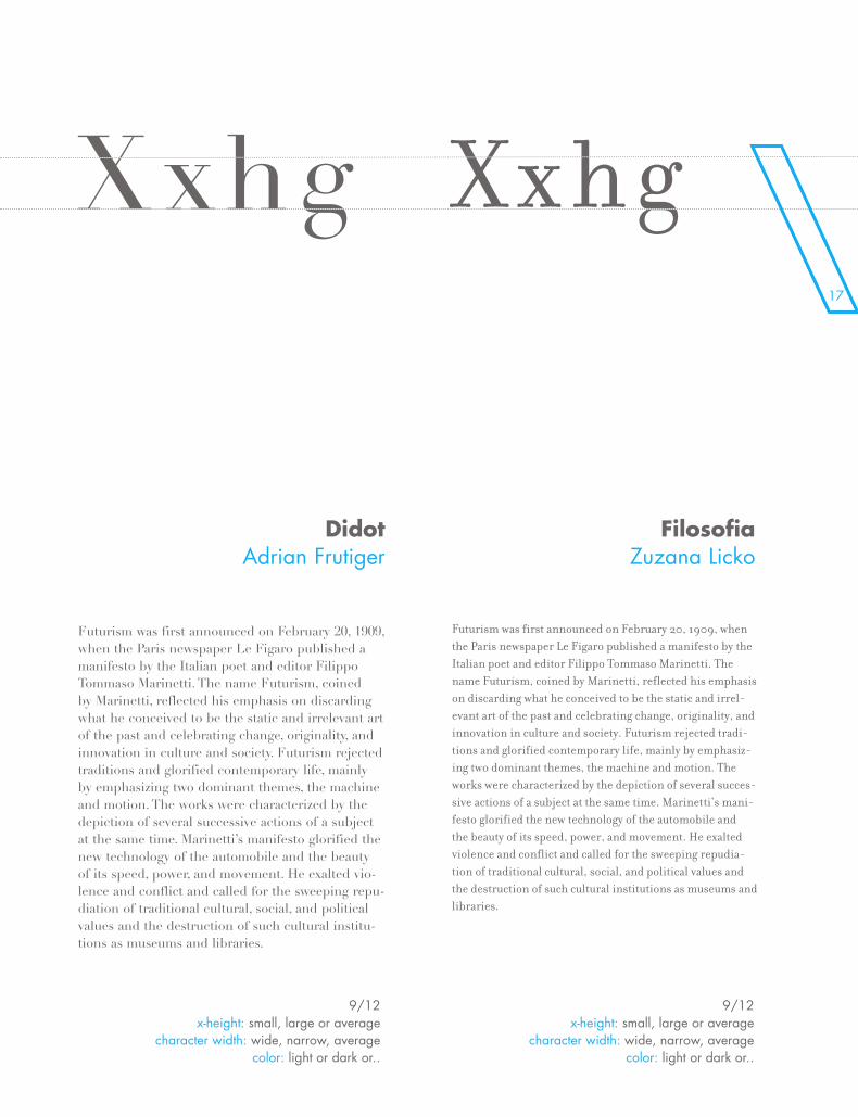
DidotAdrian Frutiger
FilosofiaZuzana Licko
9/12 x-height: small, large or average
character width: wide, narrow, average color: light or dark or..
9/12 x-height: small, large or average
character width: wide, narrow, average color: light or dark or..
Futurism was first announced on February 20, 1909, when the Paris newspaper Le Figaro published a manifesto by the Italian poet and editor Filippo Tommaso Marinetti. The name Futurism, coined by Marinetti, reflected his emphasis on discarding what he conceived to be the static and irrelevant art of the past and celebrating change, originality, and innovation in culture and society. Futurism rejected traditions and glorified contemporary life, mainly by emphasizing two dominant themes, the machine and motion. The works were characterized by the depiction of several successive actions of a subject at the same time. Marinetti’s manifesto glorified the new technology of the automobile and the beauty of its speed, power, and movement. He exalted violence and conflict and called for the sweeping repudiation of traditional cultural, social, and political values and the destruction of such cultural institutions as museums and libraries.
Xxhg Xxhg
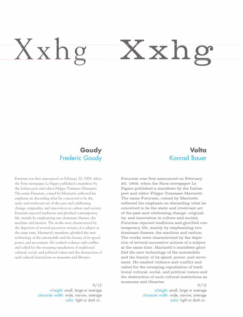
Futurism was first announced on February 20, 1909, when the Paris newspaper Le Figaro published a manifesto by the Italian poet and editor Filippo Tommaso Marinetti. The name Futurism, coined by Marinetti, reflected his emphasis on discarding what he conceived to be the static and irrelevant art of the past and celebrating change, original-ity, and innovation in culture and society. Futurism rejected traditions and glorified con-temporary life, mainly by emphasizing two dominant themes, the machine and motion. The works were characterized by the depic-tion of several successive actions of a subject at the same time. Marinetti’s manifesto glori-fied the new technology of the automobile and the beauty of its speed, power, and move-ment. He exalted violence and conflict and called for the sweeping repudiation of tradi-tional cultural, social, and political values and the destruction of such cultural institutions as museums and libraries.
GoudyFrederic Goudy
VoltaKonrad Bauer
9/12x-height: small, large or average
character width: wide, narrow, average color: light or dark or..
9/12x-height: small, large or average
character width: wide, narrow, average color: light or dark or..
9/12x-height: small, large or average
character width: wide, narrow, average color: light or dark or..
19
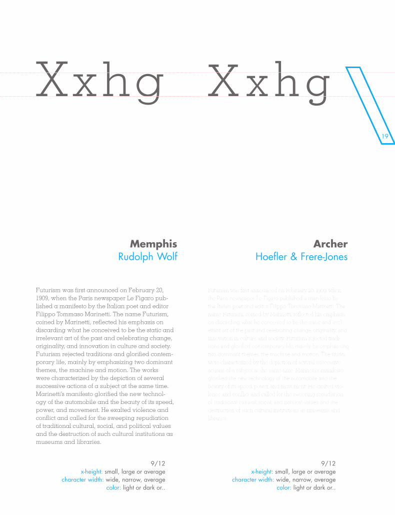
Futurism was first announced on February 20, 1909, when the Paris newspaper Le Figaro pub-lished a manifesto by the Italian poet and editor Filippo Tommaso Marinetti. The name Futurism, coined by Marinetti, reflected his emphasis on discarding what he conceived to be the static and irrelevant art of the past and celebrating change, originality, and innovation in culture and society. Futurism rejected traditions and glorified contem-porary life, mainly by emphasizing two dominant themes, the machine and motion. The works were characterized by the depiction of several successive actions of a subject at the same time. Marinetti’s manifesto glorified the new technol-ogy of the automobile and the beauty of its speed, power, and movement. He exalted violence and conflict and called for the sweeping repudiation of traditional cultural, social, and political values and the destruction of such cultural institutions as museums and libraries.
Xxhg Xxhg
Futurism was first announced on February 20, 1909, when the Paris newspaper Le Figaro published a manifesto by the Italian poet and editor Filippo Tommaso Marinetti. The name Futurism, coined by Marinetti, reflected his emphasis on discarding what he conceived to be the static and irrel-evant art of the past and celebrating change, originality, and innovation in culture and society. Futurism rejected tradi-tions and glorified contemporary life, mainly by emphasizing two dominant themes, the machine and motion. The works were characterized by the depiction of several successive actions of a subject at the same time. Marinetti’s manifesto glorified the new technology of the automobile and the beauty of its speed, power, and movement. He exalted vio-lence and conflict and called for the sweeping repudiation of traditional cultural, social, and political values and the destruction of such cultural institutions as museums and libraries.
MemphisRudolph Wolf
ArcherHoefler & Frere-Jones
9/12x-height: small, large or average
character width: wide, narrow, average color: light or dark or..
9/12x-height: small, large or average
character width: wide, narrow, average color: light or dark or..
\\\\\\\\\\\\\\\\\\\\\\\\\\\\\\\\\\\\\\\\\\\\\\\\\\\\\\\\\\\\\
Futurism was first announced on February 20, 1909, when the Paris newspaper Le Figaro published a manifesto by the Italian poet and editor Filippo Tommaso Marinetti. The name Futurism, coined by Marinetti, reflected his emphasis on discarding what he conceived to be the static and irrelevant art of the past and celebrating change, origi-nality, and innovation in culture and society. Futurism rejected traditions and glorified contemporary life, mainly by emphasizing two dominant themes, the machine and motion. The works were characterized by the depiction of several successive actions of a subject at the same time. Marinetti’s manifesto glorified the new technology of the automobile and the beauty of its speed, power, and move-ment. He exalted violence and conflict and called for the sweeping repudiation of traditional cultural, social, and political values and the destruction of such cultural insti-tutions as museums and libraries.
Xxhg Xxhg
Futurism was first announced on February 20, 1909, when the Paris newspaper Le Figaro published a manifesto by the Italian poet and editor Filippo Tommaso Marinetti. The name Futurism, coined by Marinetti, reflected his emphasis on discarding what he conceived to be the static and irrel-evant art of the past and celebrating change, originality, and innovation in culture and society. Futurism rejected tradi-tions and glorified contemporary life, mainly by emphasizing two dominant themes, the machine and motion. The works were characterized by the depiction of several successive actions of a subject at the same time. Marinetti’s manifesto glorified the new technology of the automobile and the beauty of its speed, power, and movement. He exalted vio-lence and conflict and called for the sweeping repudiation of traditional cultural, social, and political values and the destruction of such cultural institutions as museums and libraries.
MinionRobert Slimbach
GaramondClaude Garamond
9/12 x-height: small, large or average
character width: wide, narrow, average color: light or dark or..
9/12 x-height: small, large or average
character width: wide, narrow, average color: light or dark or..
21\\\\\\\\\\\\\\\\\\\\\\\\\\\\\\\\\\\\\\\\\\\\\\\\\\\\\\\\\\\\\
Futurism was first announced on February 20, 1909, when the Paris newspaper Le Figaro pub-lished a manifesto by the Italian poet and editor Filippo Tommaso Marinetti. The name Futurism, coined by Marinetti, reflected his emphasis on discarding what he conceived to be the static and irrelevant art of the past and celebrating change, originality, and innovation in culture and society. Futurism rejected traditions and glorified contem-porary life, mainly by emphasizing two dominant themes, the machine and motion. The works were characterized by the depiction of several successive actions of a subject at the same time. Marinetti’s manifesto glorified the new technol-ogy of the automobile and the beauty of its speed, power, and movement. He exalted violence and conflict and called for the sweeping repudiation of traditional cultural, social, and political values and the destruction of such cultural institutions as museums and libraries.
Xxhg Xxhg
Futurism was first announced on February 20, 1909, when the Paris newspaper Le Figaro published a manifesto by the Italian poet and editor Filippo Tommaso Marinetti. The name Futurism, coined by Marinetti, reflected his emphasis on discarding what he conceived to be the static and irrele-vant art of the past and celebrating change, originality, and innovation in culture and society. Futurism rejected tradi-tions and glorified contemporary life, mainly by emphasiz-ing two dominant themes, the machine and motion. The works were characterized by the depiction of several succes-sive actions of a subject at the same time. Marinetti’s mani-festo glorified the new technology of the automobile and the beauty of its speed, power, and movement. He exalted violence and conflict and called for the sweeping repudia-tion of traditional cultural, social, and political values and the destruction of such cultural institutions as museums and libraries.
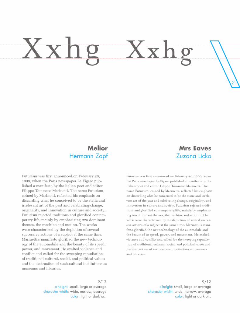
MeliorHermann Zapf
Mrs EavesZuzana Licko
9/12 x-height: small, large or average
character width: wide, narrow, average color: light or dark or..
9/12 x-height: small, large or average
character width: wide, narrow, average color: light or dark or..

\\\\\\\\\\
\\\\\\\\\\\\\\\\\\\\\\\\\\\\\\\\\\\\\\\\\\\\\\\\\\\\\\\
NT
ENATION
23\\\\\\\\\\\\\\\\\\\\\\\\\\\\\\\\\\\\\\\\\\\\\\\\\\\\\\\\\\\\\\\\\\\\\\\
NT
ENATION
\h\y\p\h\-\E\N\A\T\I\O\N
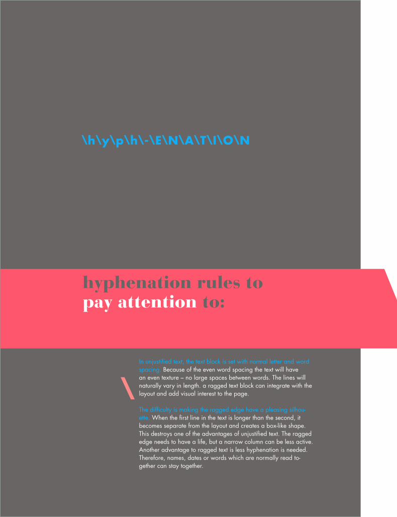
hyphenation rules topay attention to:
In unjustified text, the text block is set with normal letter and word spacing. Because of the even word spacing the text will have an even texture – no large spaces between words. The lines will naturally vary in length. a ragged text block can integrate with the layout and add visual interest to the page.
The difficulty is making the ragged edge have a pleasing silhou-ette. When the first line in the text is longer than the second, it becomes separate from the layout and creates a box-like shape. This destroys one of the advantages of unjustified text. The ragged edge needs to have a life, but a narrow column can be less active. Another advantage to ragged text is less hyphenation is needed. Therefore, names, dates or words which are normally read to-gether can stay together.
\
25\h\y\p\h\-\E\N\A\T\I\O\N
\\\\\\\\\\\\\\\\\\\\\\\\\\\\\
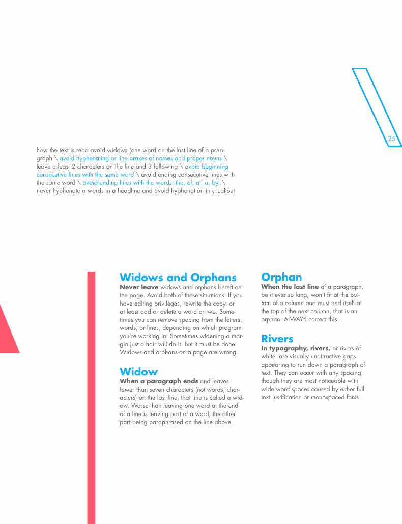
how the text is read avoid widows (one word on the last line of a para-graph \ avoid hyphenating or line brakes of names and proper nouns \ leave a least 2 characters on the line and 3 following \ avoid beginning consecutive lines with the same word \ avoid ending consecutive lines with the same word \ avoid ending lines with the words: the, of, at, a, by..\ never hyphenate a words in a headline and avoid hyphenation in a callout
Widows and OrphansNever leave widows and orphans bereft on the page. Avoid both of these situations. If you have editing privileges, rewrite the copy, or at least add or delete a word or two. Some-times you can remove spacing from the letters, words, or lines, depending on which program you’re working in. Sometimes widening a mar-gin just a hair will do it. But it must be done. Widows and orphans on a page are wrong.
WidowWhen a paragraph ends and leaves fewer than seven characters (not words, char-acters) on the last line, that line is called a wid-ow. Worse than leaving one word at the end of a line is leaving part of a word, the other part being paraphrased on the line above.
OrphanWhen the last line of a paragraph, be it ever so long, won’t fit at the bot-tom of a column and must end itself at the top of the next column, that is an orphan. ALWAYS correct this.
RiversIn typography, rivers, or rivers of white, are visually unattractive gaps appearing to run down a paragraph of text. They can occur with any spacing, though they are most noticeable with wide word spaces caused by either full text justification or monospaced fonts.
\
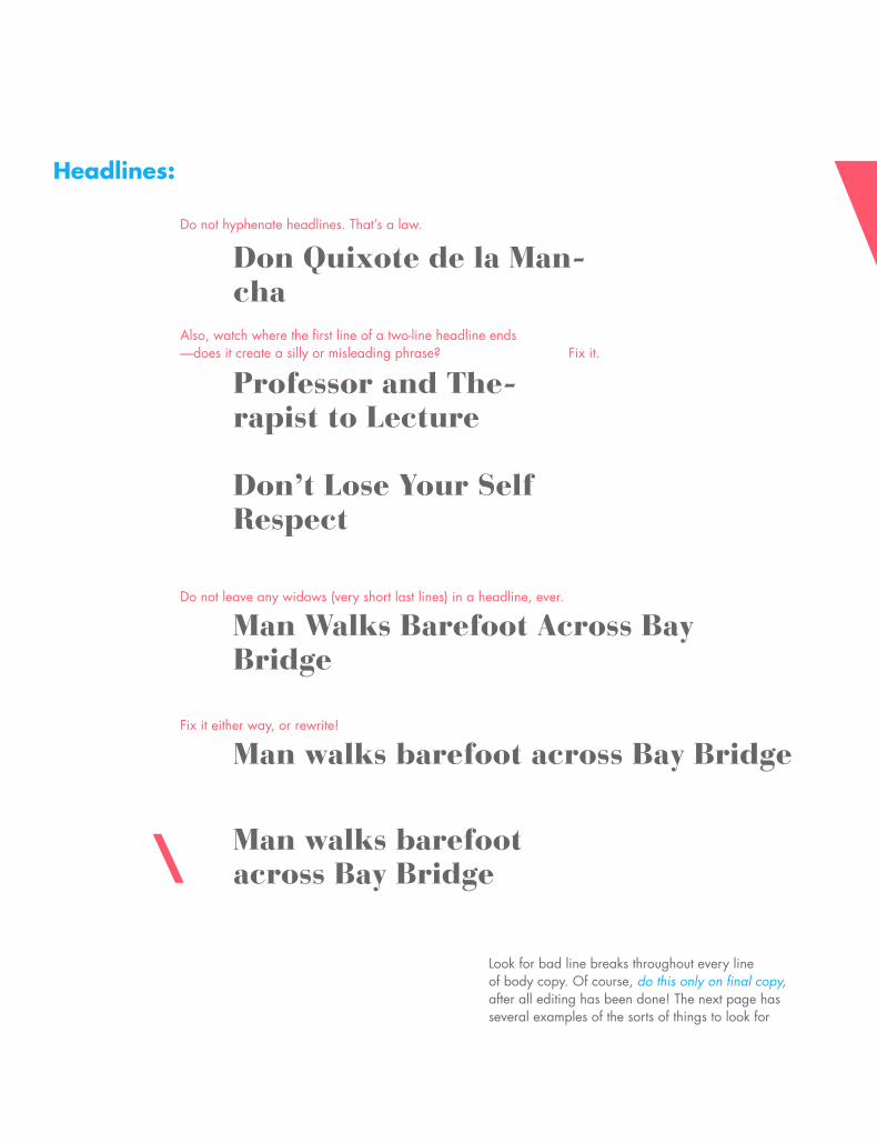
Do not hyphenate headlines. That’s a law.
Don Quixote de la Man- chaAlso, watch where the first line of a two-line headline ends—does it create a silly or misleading phrase? Fix it.
Professor and The- rapist to Lecture
Don’t Lose Your Self Respect
Do not leave any widows (very short last lines) in a headline, ever.
Man Walks Barefoot Across Bay Bridge BridgeFix it either way, or rewrite!
Man walks barefoot across Bay Bridge
Man walks barefoot across Bay Bridge
Look for bad line breaks throughout every line of body copy. Of course, do this only on final copy, after all editing has been done! The next page has several examples of the sorts of things to look for
Headlines:
\\\\\\\\\\\\\\\
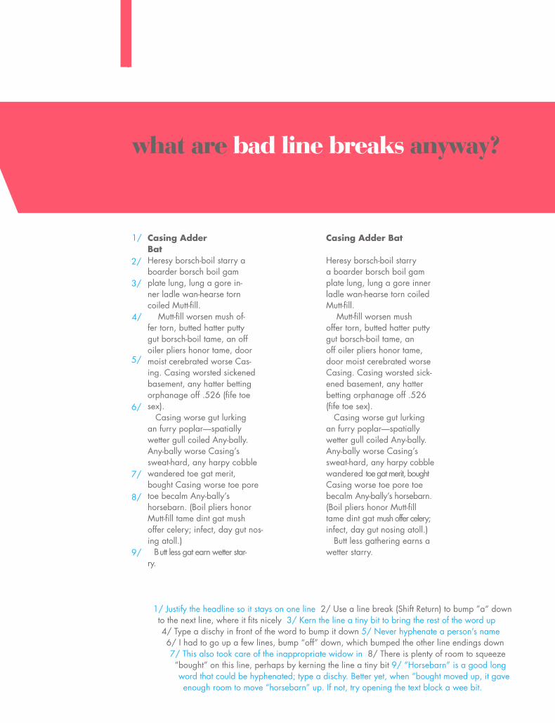
what are bad line breaks anyway?
Casing AdderBatHeresy borsch-boil starry a boarder borsch boil gamplate lung, lung a gore in-ner ladle wan-hearse torn coiled Mutt-fill. Mutt-fill worsen mush of-fer torn, butted hatter putty gut borsch-boil tame, an off oiler pliers honor tame, door moist cerebrated worse Cas-ing. Casing worsted sickened basement, any hatter betting orphanage off .526 (fife toesex). Casing worse gut lurkingan furry poplar—spatially wetter gull coiled Any-bally. Any-bally worse Casing’s sweat-hard, any harpy cobble wandered toe gat merit,bought Casing worse toe pore toe becalm Any-bally’s horsebarn. (Boil pliers honor Mutt-fill tame dint gat mush offer celery; infect, day gut nos-ing atoll.) Butt less gat earn wetter star-ry.
Casing Adder Bat
Heresy borsch-boil starrya boarder borsch boil gamplate lung, lung a gore inner ladle wan-hearse torn coiled Mutt-fill. Mutt-fill worsen mushoffer torn, butted hatter putty gut borsch-boil tame, an off oiler pliers honor tame, door moist cerebrated worse Casing. Casing worsted sick-ened basement, any hatter betting orphanage off .526 (fife toe sex). Casing worse gut lurking an furry poplar—spatially wetter gull coiled Any-bally. Any-bally worse Casing’s sweat-hard, any harpy cobble wandered toe gat merit, bought Casing worse toe pore toe becalm Any-bally’s horsebarn. (Boil pliers honor Mutt-fill tame dint gat mush offer celery; infect, day gut nosing atoll.) Butt less gathering earns a wetter starry.
1/ Justify the headline so it stays on one line 2/ Use a line break (Shift Return) to bump ”a“ down to the next line, where it fits nicely 3/ Kern the line a tiny bit to bring the rest of the word up 4/ Type a dischy in front of the word to bump it down 5/ Never hyphenate a person’s name 6/ I had to go up a few lines, bump “off” down, which bumped the other line endings down 7/ This also took care of the inappropriate widow in 8/ There is plenty of room to squeeze “bought” on this line, perhaps by kerning the line a tiny bit 9/ “Horsebarn” is a good long word that could be hyphenated; type a dischy. Better yet, when “bought moved up, it gave enough room to move “horsebarn” up. If not, try opening the text block a wee bit.
1/
2/
3/
4/
5/
6/
7/
8/
9/

\\\\\\\\\\\\\\\\\\\\\\\\\\\\\\\\\\\\\\\\\\\\\\\\\\\\\\\\\\\\\\\\\\\\\\\\\\\\\\\\\\\\\\\\\\\\\\\\\\\
\\\\\\\\\\\\\\\\\\\\\\\\\\\\\\\\\\\\\\\\\\\\\\\\\\\\\\\
MENTST
ENATION
29\\\\\\\\\\\\\\\\\\\\\\\\\\\\\\\\\\\\\\\\\\\\\\\\\\\\\\\\\\\\\\\\\\\\\\\\\\\\\\\\\\\\\\\\\\\\\\\\\\\
MENTS
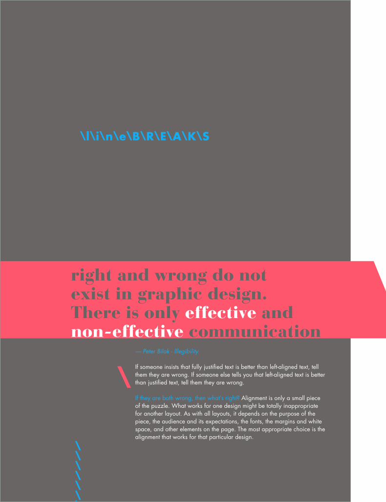
— Peter Bilak - Illegibility
If someone insists that fully justified text is better than left-aligned text, tell them they are wrong. If someone else tells you that left-aligned text is better than justified text, tell them they are wrong.
If they are both wrong, then what’s right? Alignment is only a small piece of the puzzle. What works for one design might be totally inappropriate for another layout. As with all layouts, it depends on the purpose of the piece, the audience and its expectations, the fonts, the margins and white space, and other elements on the page. The most appropriate choice is the alignment that works for that particular design.
\\\\\\\\\\\\
right and wrong do not exist in graphic design. There is only effective and non-effective communication
\
\l\i\n\e\B\R\E\A\K\S
31\l\i\n\e\B\R\E\A\K\S
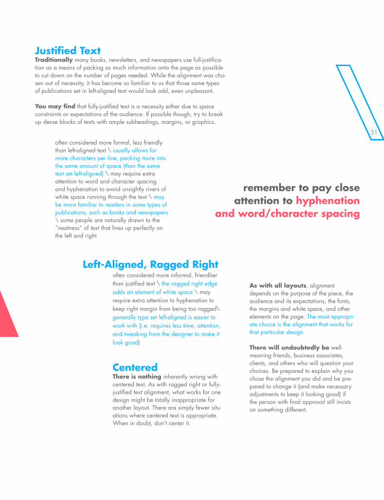
often considered more informal, friendlier than justified text \ the ragged right edge adds an element of white space \ may require extra attention to hyphenation to keep right margin from being too ragged\ generally type set left-aligned is easier to work with (i.e. requires less time, attention, and tweaking from the designer to make it look good)
Justified TextTraditionally many books, newsletters, and newspapers use full-justifica-tion as a means of packing as much information onto the page as possible to cut down on the number of pages needed. While the alignment was cho-sen out of necessity, it has become so familiar to us that those same types of publications set in left-aligned text would look odd, even unpleasant.
You may find that fully-justified text is a necessity either due to space constraints or expectations of the audience. If possible though, try to break up dense blocks of texts with ample subheadings, margins, or graphics.
often considered more formal, less friendly than left-aligned text \ usually allows for more characters per line, packing more into the same amount of space (than the same text set left-aligned) \ may require extra attention to word and character spacing and hyphenation to avoid unsightly rivers of white space running through the text \ may be more familiar to readers in some types of publications, such as books and newspapers \ some people are naturally drawn to the “neatness” of text that lines up perfectly on the left and right
CenteredThere is nothing inherently wrong with centered text. As with ragged right or fully-justified text alignment, what works for one design might be totally inappropriate for another layout. There are simply fewer situ-ations where centered text is appropriate. When in doubt, don't center it.
As with all layouts, alignment depends on the purpose of the piece, the audience and its expectations, the fonts, the margins and white space, and other elements on the page. The most appropri-ate choice is the alignment that works for that particular design.
There will undoubtedly be well-meaning friends, business associates, clients, and others who will question your choices. Be prepared to explain why you chose the alignment you did and be pre-pared to change it (and make necessary adjustments to keep it looking good) if the person with final approval still insists on something different.
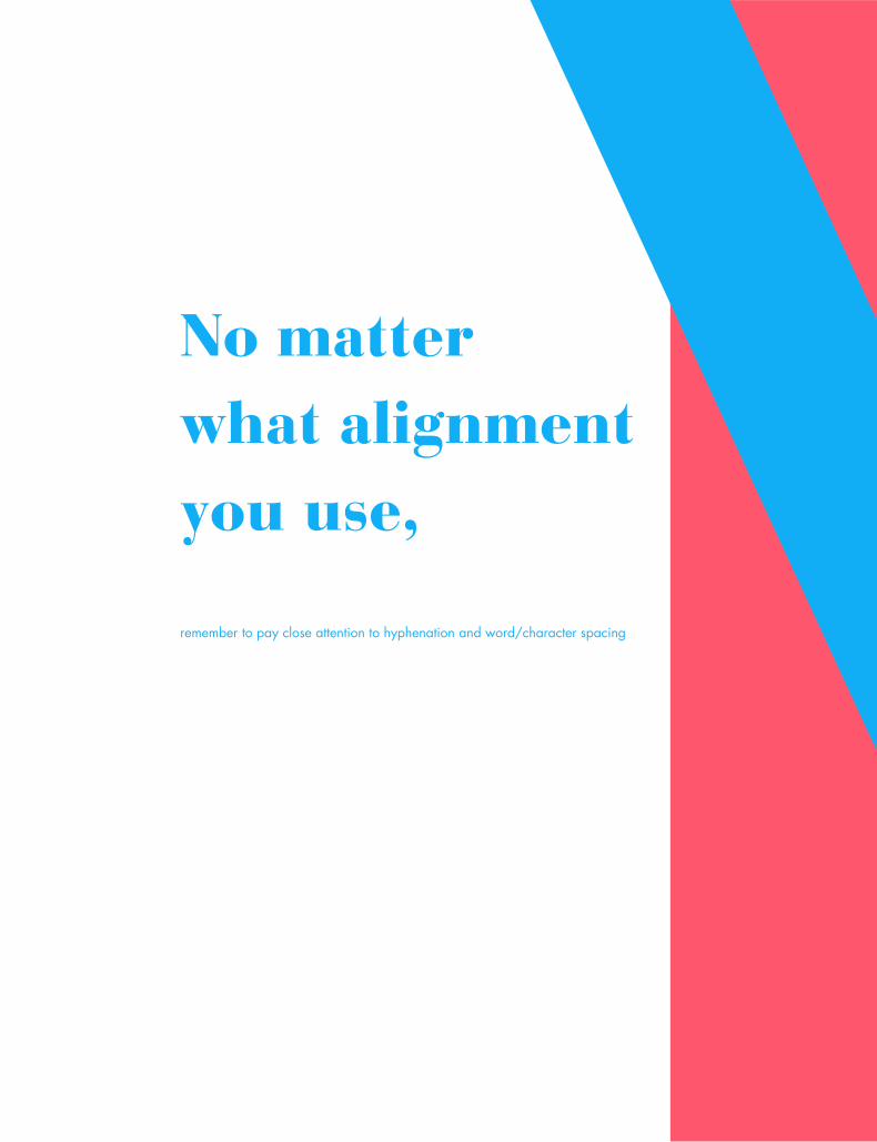
remember to pay close attention to hyphenation
and word/character spacing
Left-Aligned, Ragged Right
remember to pay close attention to hyphenation and word/character spacing
\\\\\\\\\\\\\\\\\\\\\\\\\\\\\\\\\\\\\\\\\\\\\\\\No matter what alignment you use,
to insure that your text is as readable as possible.
\\\\\\\\\\\\\\\\\\\\\\\\\\\\\\\\\\\\\\\\\\\\\\\\

\\\\\\\\\\\\\\\\\\\\\\\\\\\\\\\\\\\\\\\\\\\\\\\\\\\\\\\\\\\\\\\\\\\\\\\\\\\\\\\\\\\\\\\\\\\\\\\\\\\
\\\\\\\\\\\\\\\\\\\\\\\\\\\\\\\\\\\\\\\\\\\\\\\\\\\\\\\
CATION MENTS
33\\\\\\\\\\\\\\\\\\\\\\\\\\\\\\\\\\\\\\\\\\\\\\\\\\\\\\\\\\\\\\\\\\\\\\\\\\\\\\\\\\\\\\\\\\\\\\\\\\\
CATION MENTS
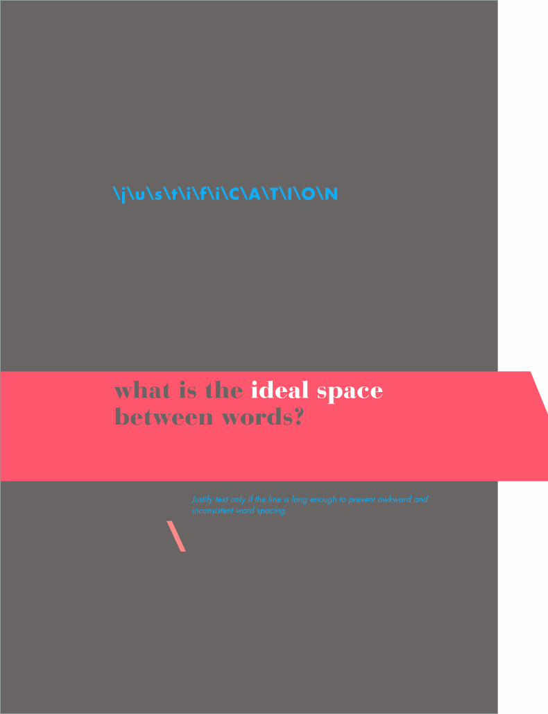
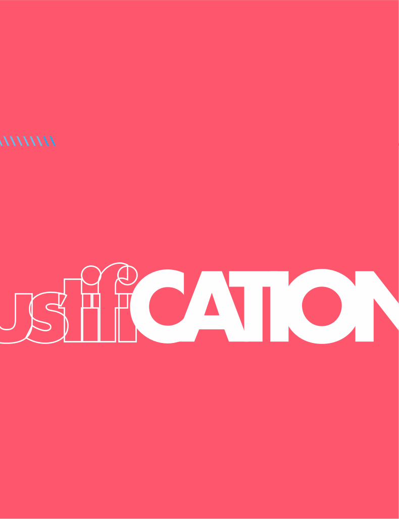
\j\u\s\t\i\f\i\C\A\T\I\O\N
what is the ideal space between words?
Justify text only if the line is long enough to prevent awkward and inconsistent word spacing.
\
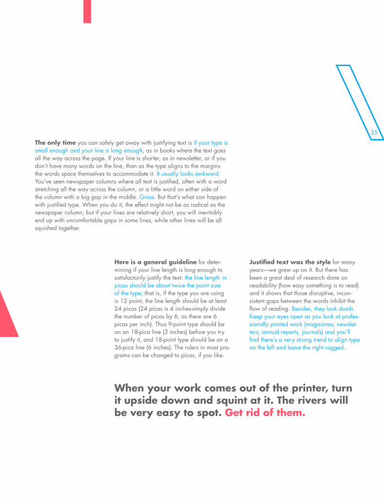
35\j\u\s\t\i\f\i\C\A\T\I\O\NThe only time you can safely get away with justifying text is if your type is small enough and your line is long enough, as in books where the text goes all the way across the page. If your line is shorter, as in newsletter, or if you don’t have many words on the line, than as the type aligns to the margins the words space themselves to accommodate it. It usually looks awkward. You’ve seen newspaper columns where all text is justified, often with a word stretching all the way across the column, or a little word on either side of the column with a big gap in the middle. Gross. But that’s what can happen with justified type. When you do it, the effect might not be as radical as the newspaper column, but if your lines are relatively short, you will inevitably end up with uncomfortable gaps in some lines, while other lines will be all squished together.
Here is a general guideline for deter-mining if your line length is long enough to satisfactorily justify the text: the line length in picas should be about twice the point size of the type; that is, if the type you are using is 12 point, the line length should be at least 24 picas (24 picas is 4 inches-simply divide the number of picas by 6, as there are 6 picas per inch). Thus 9-point type should be on an 18-pica line (3 inches) before you try to justify it, and 18-point type should be on a 36-pica line (6 inches). The rulers in most pro-grams can be changed to picas, if you like.
Justified text was the style for many years—we grew up on it. But there has been a great deal of research done on readability (how easy something is to read) and it shows that those disruptive, incon-sistent gaps between the words inhibit the flow of reading. Besides, they look dumb. Keep your eyes open as you look at profes-sionally printed work (magazines, newslet-ters, annual reports, journals) and you’ll find there’s a very strong trend to align type on the left and leave the right ragged.
\\\\\\\\\\
\\\\\
When your work comes out of the printer, turn it upside down and squint at it. The rivers will be very easy to spot. Get rid of them.
Futurism was first announced on Febru-ary 20, 1909, when the Paris newspaper Le Figaro published a manifesto by the Italian poet and editor Filippo Tommaso Marinetti. The name Futurism, coined by Marinetti, reflected his emphasis on discarding what he conceived to be the static and irrelevant art of the past and celebrating change, origi-nality, and innovation in culture and society. Futurism rejected traditions and glorified contemporary life, mainly by emphasizing two dominant themes, the machine and mo-tion. The works were characterized by the depiction of several successive actions of a subject at the same time. Marinetti’s mani-festo glorified the new technology of the au-tomobile and the beauty of its speed, power, and movement. He exalted violence and con-flict and called for the sweeping repudiation of traditional cultural, social, and political values and the destruction of such cultural institutions as museums and libraries.
Futurism was first announced on February 20, 1909, when the Paris newspaper Le Figaro published a manifesto by the Italian poet and editor Filippo Tommaso Marinetti. The name Futurism, coined by Marinetti, re-flected his emphasis on discarding what he conceived to be the static and irrelevant art of the past and celebrating change, original-ity, and innovation in culture and society. Fu-turism rejected traditions and glorified con-temporary life, mainly by emphasizing two dominant themes, the machine and motion. The works were characterized by the depic-tion of several successive actions of a subject at the same time. Marinetti’s manifesto glo-rified the new technology of the automobile and the beauty of its speed, power, and movement. He exalted violence and conflict and called for the sweeping repudiation of traditional cultural, social, and political val-ues and the destruction of such cultural insti-tutions as museums and libraries.
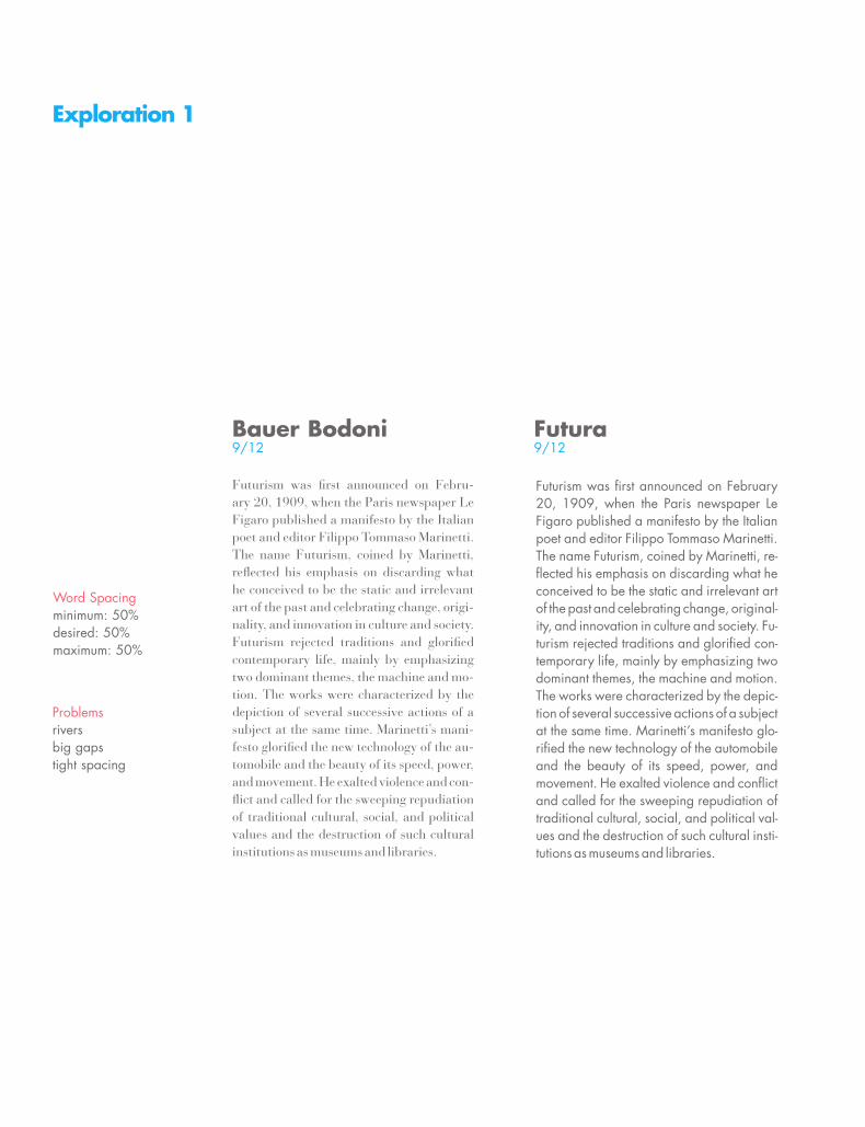
Bauer Bodoni9/12
Futura9/12
Word Spacingminimum: 50%desired: 50%maximum: 50%
Problemsriversbig gapstight spacing
Exploration 1
37
Futurism was first announced on February 20, 1909, when the Paris newspaper Le Figaro published a manifesto by the Italian poet and editor Filippo Tommaso Marinetti. The name Futurism, coined by Marinetti, reflected his emphasis on discarding what he conceived to be the static and irrelevant art of the past and celebrating change, original-ity, and innovation in culture and society. Futurism rejected traditions and glorified contemporary life, mainly by emphasizing two dominant themes, the machine and motion. The works were characterized by the depiction of several successive actions of a subject at the same time. Marinetti’s manifesto glorified the new technology of the automobile and the beauty of its speed, power, and movement. He exalted violence and conflict and called for the sweeping repudiation of traditional cultural, social, and political values and the destruction of such cultural institutions as museums and libraries.
Futurism was first announced on February 20, 1909, when the Paris newspaper Le Figaro published a manifesto by the Italian poet and editor Filippo Tommaso Marinetti. The name Futurism, coined by Marinetti, reflected his emphasis on discarding what he conceived to be the static and irrelevant art of the past and celebrating change, origi-nality, and innovation in culture and society. Futurism rejected traditions and glorified contemporary life, mainly by emphasizing two dominant themes, the machine and motion. The works were characterized by the depiction of several successive actions of a subject at the same time. Marinetti’s manifesto glorified the new technology of the automobile and the beauty of its speed, power, and movement. He exalted violence and conflict and called for the sweeping re-pudiation of traditional cultural, social, and political values and the destruction of such cultural institutions as museums and libraries.
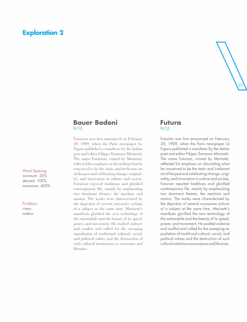
Problemsriverswidow
Word Spacingminimum: 25%desired: 100%maximum: 400%
Exploration 2
Bauer Bodoni9/12
Futura9/12
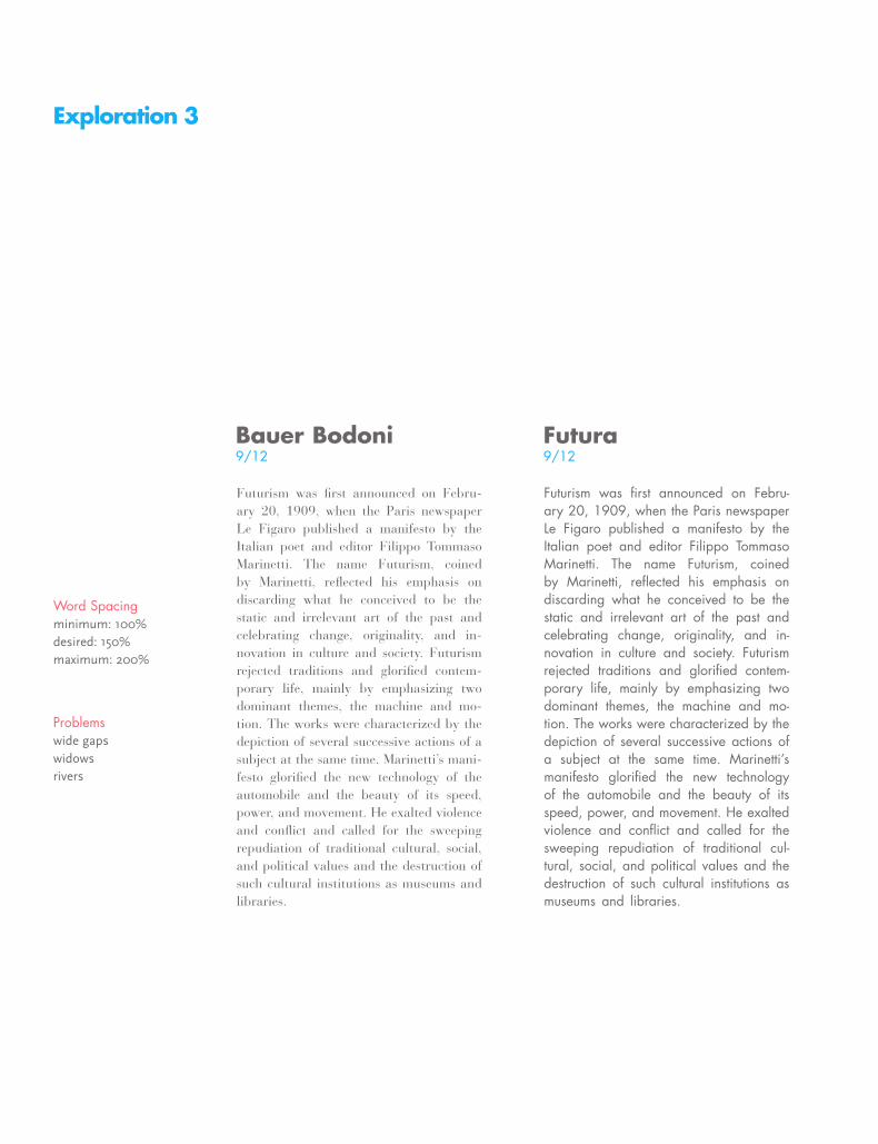
Exploration 3
Futurism was first announced on Febru-ary 20, 1909, when the Paris newspaper Le Figaro published a manifesto by the Italian poet and editor Filippo Tommaso Marinetti. The name Futurism, coined by Marinetti, reflected his emphasis on discarding what he conceived to be the static and irrelevant art of the past and celebrating change, originality, and in-novation in culture and society. Futurism rejected traditions and glorified contem-porary life, mainly by emphasizing two dominant themes, the machine and mo-tion. The works were characterized by the depiction of several successive actions of a subject at the same time. Marinetti’s mani-festo glorified the new technology of the automobile and the beauty of its speed, power, and movement. He exalted violence and conflict and called for the sweeping repudiation of traditional cultural, social, and political values and the destruction of such cultural institutions as museums and libraries.
Futurism was first announced on Febru-ary 20, 1909, when the Paris newspaper Le Figaro published a manifesto by the Italian poet and editor Filippo Tommaso Marinetti. The name Futurism, coined by Marinetti, reflected his emphasis on discarding what he conceived to be the static and irrelevant art of the past and celebrating change, originality, and in-novation in culture and society. Futurism rejected traditions and glorified contem-porary life, mainly by emphasizing two dominant themes, the machine and mo-tion. The works were characterized by the depiction of several successive actions of a subject at the same time. Marinetti’s manifesto glorified the new technology of the automobile and the beauty of its speed, power, and movement. He exalted violence and conflict and called for the sweeping repudiation of traditional cul-tural, social, and political values and the destruction of such cultural institutions as museums and libraries.
Word Spacingminimum: 100%desired: 150%maximum: 200%
Problemswide gapswidowsrivers
Bauer Bodoni9/12
Futura9/12

39
Exploration 4
Futurism was first announced on February 20, 1909, when the Paris newspaper Le Figaro published a manifesto by the Italian poet and editor Filippo Tommaso Marinetti. The name Futurism, coined by Marinetti, reflected his emphasis on discarding what he conceived to be the static and irrelevant art of the past and celebrating change, original-ity, and innovation in culture and society. Futurism rejected traditions and glorified contemporary life, mainly by emphasizing two dominant themes, the machine and motion. The works were characterized by the depiction of several successive actions of a subject at the same time. Marinetti’s manifesto glorified the new technology of the automobile and the beauty of its speed, power, and movement. He exalted violence and conflict and called for the sweeping repudiation of traditional cultural, social, and political values and the destruction of such cultural institutions as museums and libraries.
Futurism was first announced on February 20, 1909, when the Paris newspaper Le Figaro published a manifesto by the Italian poet and editor Filippo Tommaso Marinetti. The name Futurism, coined by Marinetti, reflected his emphasis on discarding what he conceived to be the static and irrelevant art of the past and celebrating change, origi-nality, and innovation in culture and society. Futurism rejected traditions and glorified contemporary life, mainly by emphasizing two dominant themes, the machine and motion. The works were characterized by the depiction of several successive actions of a subject at the same time. Marinetti’s manifesto glorified the new technology of the automobile and the beauty of its speed, power, and movement. He exalted violence and conflict and called for the sweeping re-pudiation of traditional cultural, social, and political values and the destruction of such cultural institutions as museums and libraries.
Problemstoo tightwidows
Word Spacingminimum: 35%desired: 85%maximum: 300%
Bauer Bodoni9/12
Futura9/12

\\\\\\\\\\\\ \\\\\\\\\\\\\\\\\\\\\\\\\\\\\\\\\\\\\\\\\\\\\\
\\\\\\\\\\\\\\\\\\\\\\\\\\\\\\\\\\\\\\\\\\\\\\\\\\\\\\\
COMBOSCATION
41\\\\\\\\\\\\ \\\\\\\\\\\\\\\\\\\\\\\\\\\\\\\\\\\\\\\\\\\\\\
COMBOSCATION

\\\\\\\\\\\\\\\\\\\\\\\\\\\\\\\\\
when combining serif and sans serif text fonts, one should try & match the characteristics of form & type color
such as, proportion and x-heights.
“There is not binding recipe for type combinations. It is a matter of typo-graphic sensitivity and experience. Expert typographers, as well as care-less amateurs permit themselves combinations that would horrify colleagues with more traditional sympathies.”
Although there is not recipe there is a place to start: keep an eye on the characteristic shapes of the letterform. A well designed page contains no more than two different typefaces or four different type variations such as type size and bold or italic style. {Using 2 different serif fonts or 2 different sans serifs fonts in the same composition is never a good idea}
\
\t\y\p\e\C\O\M\B\O\S
\\\\\\\\\\\\\\\\\\\\\\\\\\\\\\\\\\\\\\\\\\\\\\
43
when combining serif and sans serif text fonts, one should try & match the characteristics of form & type color
\t\y\p\e\C\O\M\B\O\S
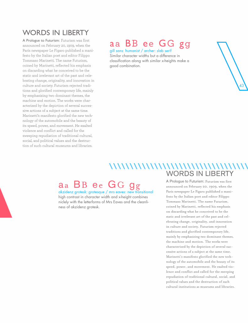
WORDS IN LIBERTYA Prologue to Futurism: Futurism was first announced on February 20, 1909, when the Paris newspaper Le Figaro published a mani-festo by the Italian poet and editor Filippo Tommaso Marinetti. The name Futurism, coined by Marinetti, reflected his emphasis on discarding what he conceived to be the static and irrelevant art of the past and cele-brating change, originality, and innovation in culture and society. Futurism rejected tradi-tions and glorified contemporary life, mainly by emphasizing two dominant themes, the machine and motion. The works were char-acterized by the depiction of several succes-sive actions of a subject at the same time. Marinetti’s manifesto glorified the new tech-nology of the automobile and the beauty of its speed, power, and movement. He exalted violence and conflict and called for the sweeping repudiation of traditional cultural, social, and political values and the destruc-tion of such cultural museums and libraries.
aa BB ee GG gg gill sans: humanist / archer: slab serifSimilar character widths but a difference in classification along with similar x-heights make a good combination.
WORDS IN LIBERTYA Prologue to Futurism: Futurism was first announced on February 20, 1909, when the Paris newspaper Le Figaro published a mani-festo by the Italian poet and editor Filippo Tommaso Marinetti. The name Futurism, coined by Marinetti, reflected his emphasis on discarding what he conceived to be the static and irrelevant art of the past and cel-ebrating change, originality, and innovation in culture and society. Futurism rejected traditions and glorified contemporary life, mainly by emphasizing two dominant themes, the machine and motion. The works were characterized by the depiction of several suc-cessive actions of a subject at the same time. Marinetti’s manifesto glorified the new tech-nology of the automobile and the beauty of its speed, power, and movement. He exalted vio-lence and conflict and called for the sweeping repudiation of traditional cultural, social, and political values and the destruction of such cultural institutions as museums and libraries.
aa BB ee GG gg akzidenz grotesk: grotesque / mrs eaves: new transitionalhigh contrast in character width and x-height combines niclely with the letterforms of Mrs Eaves and the cleanli-ness of akzidenz grotesk.
\\\\\\\\\\\\\\\\\\\\\\\\\\\\\\\\\\\\\\\\\\\\\\
WORDS IN LIBERTYA Prologue to Futurism: Futurism was first announced on February 20, 1909, when the Paris newspaper Le Figaro published a manifesto by the Italian poet and editor Filippo Tommaso Marinetti. The name Futurism, coined by Marinetti, reflected his emphasis on discarding what he conceived to be the static and irrelevant art of the past and celebrating change, originality, and innovation in culture and society. Futurism rejected tradi-tions and glorified contemporary life, mainly by emphasizing two dominant themes, the machine and motion. The works were characterized by the depiction of several successive actions of a subject at the same time. Marinetti’s manifesto glorified the new technology of the auto-mobile and the beauty of its speed, power, and movement. He exalted violence and conflict and called for
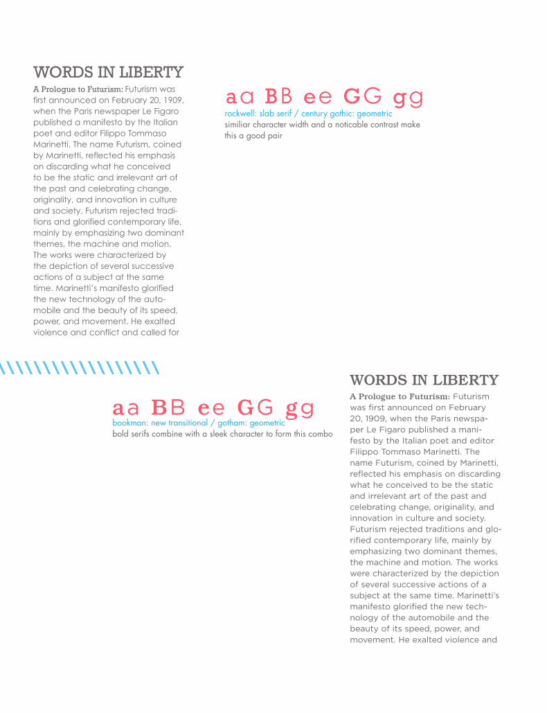
aa BB ee GG gg rockwell: slab serif / century gothic: geometricsimiliar character width and a noticable contrast make this a good pair
WORDS IN LIBERTYA Prologue to Futurism: Futurism was first announced on February 20, 1909, when the Paris newspa-per Le Figaro published a mani-festo by the Italian poet and editor Filippo Tommaso Marinetti. The name Futurism, coined by Marinetti, reflected his emphasis on discarding what he conceived to be the static and irrelevant art of the past and celebrating change, originality, and innovation in culture and society. Futurism rejected traditions and glo-rified contemporary life, mainly by emphasizing two dominant themes, the machine and motion. The works were characterized by the depiction of several successive actions of a subject at the same time. Marinetti’s manifesto glorified the new tech-nology of the automobile and the beauty of its speed, power, and movement. He exalted violence and
aa BB ee GG gg bookman: new transitional / gotham: geometricbold serifs combine with a sleek character to form this combo
\\\\\\\\\\\\\\\\\\\\\\\\\\\\\\\\\\\\\\\\\\\\\\\\ \\\\\\\\\\\\\\\\\\\\\\\\\\\\\\\\\\\\\
45
WORDS IN LIBERTYA Prologue to Futurism: Futurism was first announced on February 20, 1909, when the Paris newspaper Le Figaro published a mani-festo by the Italian poet and editor Filippo Tommaso Marinetti. The name Futurism, coined by Marinetti, reflected his emphasis on discarding what he conceived to be the static and irrelevant art of the past and celebrating change, originality, and innovation in culture and society. Futurism rejected traditions and glorified contemporary life, mainly by empha-sizing two dominant themes, the machine and motion. The works were characterized by the depiction of several successive actions of a subject at the same time. Marinetti’s manifesto glorified the new technology of the automobile and the beauty of its speed, power, and move-ment. He exalted violence and conflict and called for the sweeping repudiation of tradi-tional cultural, social, and political values and the destruction of such cultural institutions as museums and libraries.
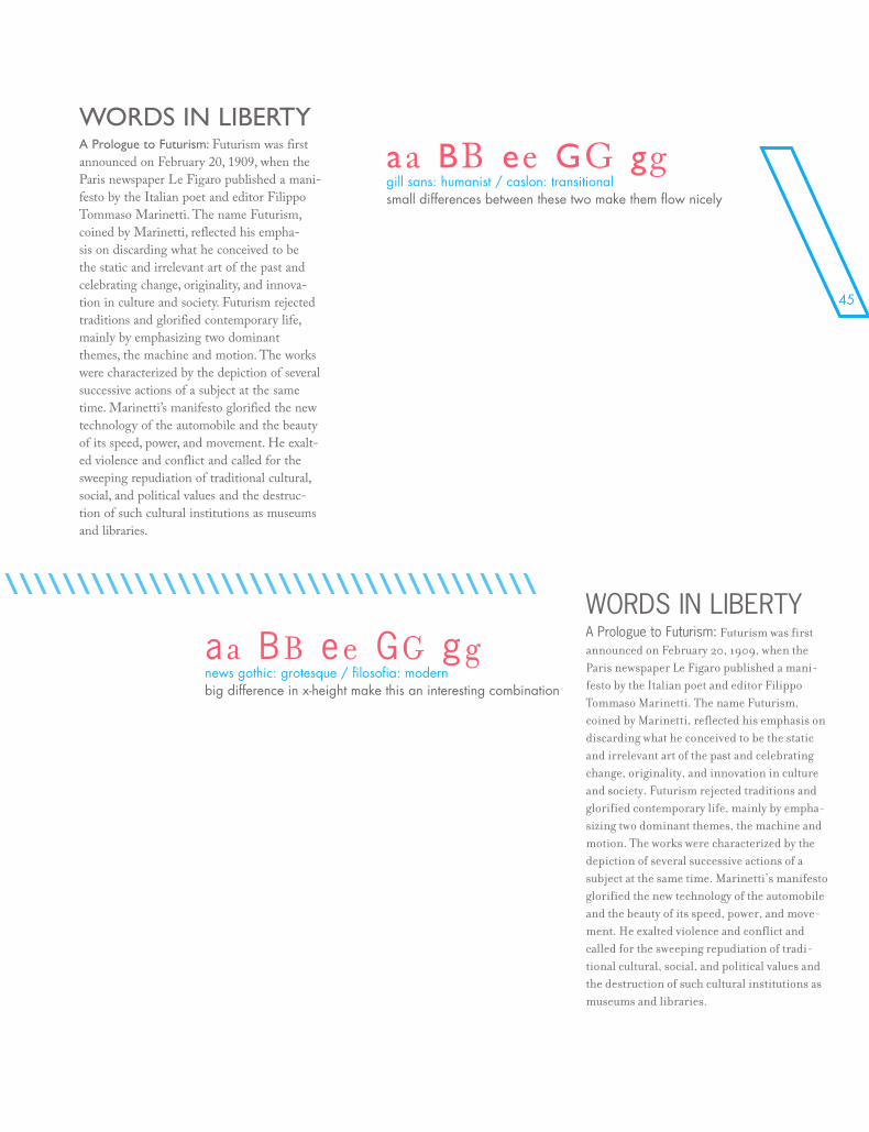
aa BB ee GG gg news gothic: grotesque / filosofia: modernbig difference in x-height make this an interesting combination
WORDS IN LIBERTYA Prologue to Futurism: Futurism was first announced on February 20, 1909, when the Paris newspaper Le Figaro published a mani-festo by the Italian poet and editor Filippo Tommaso Marinetti. The name Futurism, coined by Marinetti, reflected his empha-sis on discarding what he conceived to be the static and irrelevant art of the past and celebrating change, originality, and innova-tion in culture and society. Futurism rejected traditions and glorified contemporary life, mainly by emphasizing two dominant themes, the machine and motion. The works were characterized by the depiction of several successive actions of a subject at the same time. Marinetti’s manifesto glorified the new technology of the automobile and the beauty of its speed, power, and movement. He exalt-ed violence and conflict and called for the sweeping repudiation of traditional cultural, social, and political values and the destruc-tion of such cultural institutions as museums and libraries.
aa BB ee GG gg gill sans: humanist / caslon: transitionalsmall differences between these two make them flow nicely
\\\\\\\\\\\\\\\\\\\\\\\\\\\\\\\\\\\\\\\\\\\\\\\\ \\\\\\\\\\\\\\\\\\\\\\\\\\\\\\\\\\\\\
WORDS IN LIBERTYA Prologue to Futurism: Futurism was first announced on February 20, 1909, when the Paris newspa-per Le Figaro published a mani-festo by the Italian poet and editor Filippo Tommaso Marinetti. The name Futurism, coined by Marinetti, reflected his emphasis on discarding what he conceived to be the static and irrelevant art of the past and celebrating change, originality, and innovation in culture and society. Futurism rejected traditions and glo-rified contemporary life, mainly by emphasizing two dominant themes, the machine and motion. The works were characterized by the depiction of several successive actions of a subject at the same time. Marinetti’s manifesto glorified the new tech-nology of the automobile and the beauty of its speed, power, and movement. He exalted violence and
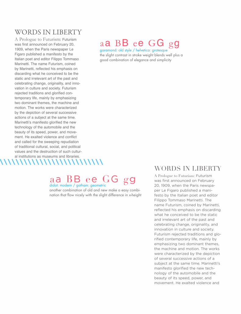
aa BB ee GG gg didot: modern / gotham: geometricanother combination of old and new make a easy combi-nation that flow nicely with the slight difference in x-height
WORDS IN LIBERTYA Prologue to Futurism: Futurism was first announced on February 20, 1909, when the Paris newspaper Le Figaro published a manifesto by the Italian poet and editor Filippo Tommaso Marinetti. The name Futurism, coined by Marinetti, reflected his emphasis on discarding what he conceived to be the static and irrelevant art of the past and celebrating change, originality, and inno-vation in culture and society. Futurism rejected traditions and glorified con-temporary life, mainly by emphasizing two dominant themes, the machine and motion. The works were characterized by the depiction of several successive actions of a subject at the same time. Marinetti’s manifesto glorified the new technology of the automobile and the beauty of its speed, power, and move-ment. He exalted violence and conflict and called for the sweeping repudiation of traditional cultural, social, and political values and the destruction of such cultur-al institutions as museums and libraries.
aa BB ee GG gg garamond: old style / helvetica: grotesquethe slight contrast in stroke weight blends well plus a good combination of elegance and simplicity
\\\\\\\\\\\\\\\\\\\\\\\\\\\\\ \\\\\\\\\\\\\\\\\
47
WORDS IN LIBERTYA Prologue to Futurism: Futurism was first announced on February 20, 1909, when the Paris newspaper Le Figaro published a manifesto by the Italian poet and editor Filippo Tommaso Marinetti. The name Futurism, coined by Marinetti, reflected his emphasis on discarding what he conceived to be the static and irrelevant art of the past and celebrating change, originality, and innovation in culture and society. Futurism rejected traditions and glorified contemporary life, mainly by emphasizing two dominant themes, the machine and motion. The works were characterized by the depiction of several successive actions of a subject at the same time. Marinetti’s manifesto glorified the new technology of the automobile and the beauty of its speed, power, and move-ment. He exalted violence and conflict and called for the sweeping repudiation of traditional cultural, social, and political values and the destruction of such cultur-al institutions as museums and libraries.
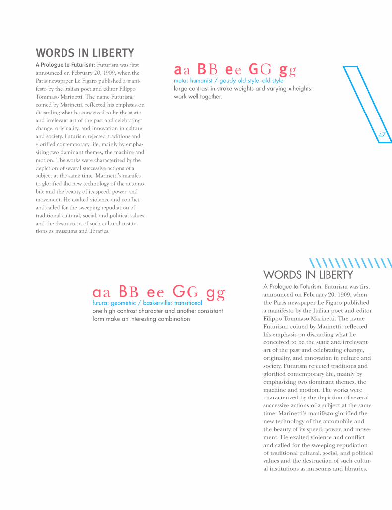
aa BB ee GG gg futura: geometric / baskerville: transitionalone high contrast character and another consistant form make an interesting combination
WORDS IN LIBERTYA Prologue to Futurism: Futurism was first announced on February 20, 1909, when the Paris newspaper Le Figaro published a mani-festo by the Italian poet and editor Filippo Tommaso Marinetti. The name Futurism, coined by Marinetti, reflected his emphasis on discarding what he conceived to be the static and irrelevant art of the past and celebrating change, originality, and innovation in culture and society. Futurism rejected traditions and glorified contemporary life, mainly by empha-sizing two dominant themes, the machine and motion. The works were characterized by the depiction of several successive actions of a subject at the same time. Marinetti’s manifes-to glorified the new technology of the automo-bile and the beauty of its speed, power, and movement. He exalted violence and conflict and called for the sweeping repudiation of traditional cultural, social, and political values and the destruction of such cultural institu-tions as museums and libraries.
aa BB ee GG gg meta: humanist / goudy old style: old stylelarge contrast in stroke weights and varying x-heights work well together.
\\\\\\\\\\\\\\\\\\\\\\\\\\\\\ \\\\\\\\\\\\\\\\\

‘-
\\\\\\\\\\\\\\\\\\\\\\\\\\\\\\\\\\\\\\\\\\\\\\\\\\\\\\\\\\\\\\\\\\\\\\\\\\\\
\\\\\\\\\\\\\\\\\\\\\\\\\\\\\\\\\\\\\\\\\\\\\\\\\\\\\\\
COMBOS
49
‘-
\\\\\\\\\\\\\\\\\\\\\\\\\\\\\\\\\\\\\\\\\\\\\\\\\\\\\\\\\\\\\\\\\\\\\\\\\\\\
\\\\\\\\\\\\
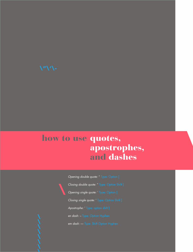
how to use
Opening double quote: “ Type: Option [
Closing double quote: ” Type: Option Shift ]
Opening single quote: ‘ Type: Option [
Closing single quote: ’ Type: Option Shift ]
Apostrophe: ’ Type: option shift ]
en dash: – Type: Option Hyphen
em dash: — Type: Shift Option Hyphen
\
quotes,apostrophes,and dashes
\”\’\-
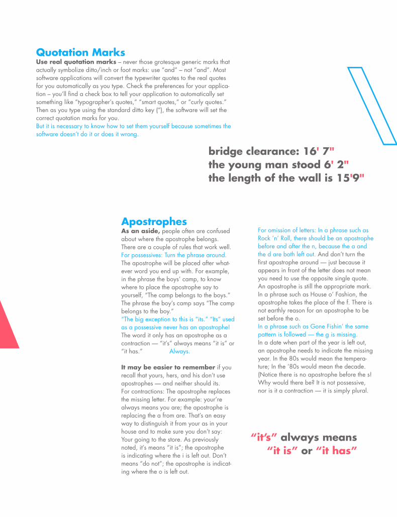
Quotation MarksUse real quotation marks – never those grotesque generic marks that actually symbolize ditto/inch or foot marks: use “and” – not “and”. Most software applications will convert the typewriter quotes to the real quotes for you automatically as you type. Check the preferences for your applica-tion – you’ll find a check box to tell your application to automatically set something like “typographer’s quotes,” “smart quotes,” or “curly quotes.” Then as you type using the standard ditto key (“), the software will set the correct quotation marks for you.But it is necessary to know how to set them yourself because sometimes the software doesn’t do it or does it wrong.
bridge clearance: 16' 7"the young man stood 6' 2"the length of the wall is 15'9"
ApostrophesAs an aside, people often are confused about where the apostrophe belongs. There are a couple of rules that work well.For possessives: Turn the phrase around. The apostrophe will be placed after what-ever word you end up with. For example, in the phrase the boys’ camp, to know where to place the apostrophe say to yourself, “The camp belongs to the boys.” The phrase the boy’s camp says “The camp belongs to the boy.”“The big exception to this is “its.” “Its” used as a possessive never has an apostrophe! The word it only has an apostrophe as a contraction — “it’s” always means “it is” or “it has.” Always.
It may be easier to remember if you recall that yours, hers, and his don’t use apostrophes — and neither should its.For contractions: The apostrophe replaces the missing letter. For example: your’re always means you are; the apostrophe is replacing the a from are. That’s an easy way to distinguish it from your as in your house and to make sure you don’t say: Your going to the store. As previously noted, it’s means “it is”; the apostrophe is indicating where the i is left out. Don’t means “do not”; the apostrophe is indicat-ing where the o is left out.
For omission of letters: In a phrase such as Rock ’n’ Roll, there should be an apostrophe before and after the n, because the a and the d are both left out. And don’t turn the first apostrophe around — just because it appears in front of the letter does not mean you need to use the opposite single quote. An apostrophe is still the appropriate mark.In a phrase such as House o’ Fashion, the apostrophe takes the place of the f. There is not earthly reason for an apostrophe to be set before the o.In a phrase such as Gone Fishin’ the same pattern is followed — the g is missing.In a date when part of the year is left out, an apostrophe needs to indicate the missing year. In the 80s would mean the tempera-ture; In the ’80s would mean the decade. (Notice there is no apostrophe before the s! Why would there be? It is not possessive, nor is it a contraction — it is simply plural.
“it’s” always means “it is” or “it has”
\”\’\-
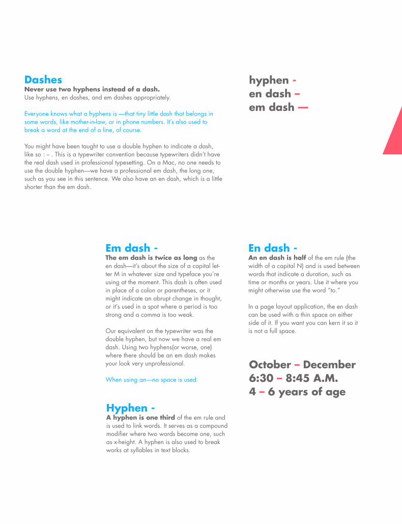
DashesNever use two hyphens instead of a dash.Use hyphens, en dashes, and em dashes appropriately.
Everyone knows what a hyphens is —that tiny little dash that belongs in some words, like mother-in-law, or in phone numbers. It’s also used to break a word at the end of a line, of course.
You might have been taught to use a double hyphen to indicate a dash, like so : -- . This is a typewriter convention because typewriters didn’t have the real dash used in professional typesetting. On a Mac, no one needs to use the double hyphen—we have a professional em dash, the long one, such as you see in this sentence. We also have an en dash, which is a little shorter than the em dash.
hyphen -en dash –em dash —
Hyphen -A hyphen is one third of the em rule and is used to link words. It serves as a compound modifier where two words become one, such as x-height. A hyphen is also used to break works at syllables in text blocks.
October – December6:30 – 8:45 A.M.4 – 6 years of age
Em dash -The em dash is twice as long as the en dash—it’s about the size of a capital let-ter M in whatever size and typeface you’re using at the moment. This dash is often used in place of a colon or parentheses, or it might indicate an abrupt change in thought, or it’s used in a spot where a period is too strong and a comma is too weak.
Our equivalent on the typewriter was the double hyphen, but now we have a real em dash. Using two hyphens(or worse, one) where there should be an em dash makes your look very unprofessional.
When using an—no space is used.
En dash -An en dash is half of the em rule (the width of a capital N) and is used between words that indicate a duration, such as time or months or years. Use it where you might otherwise use the word “to.”
In a page layout application, the en dash can be used with a thin space on either side of it. If you want you can kern it so it is not a full space.
Opening double quoteClosing double quoteOpening single quoteClosing single quoteEn dashEm dashEllipsisBulletLigature of ‘f’ & ‘i’Ligature of ‘f’ & ‘l’Copyright symbolTrademarkRegistration markDegree symbolCent symbolEuro symbolFraction barUpside down !Upside down ?Lira symbolCedillaCapital cedilla
\\\\\\\\\\\\\\\\\\\\\\\\\\\\\
October – December6:30 – 8:45 A.M.4 – 6 years of age
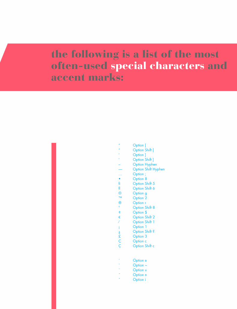
the following is a list of the most often-used special characters and accent marks:
“ Option [” Option Shift [’ Option ]’ Option Shift ]– Option Hyphen— Option Shift Hyphen… Option ; • Option 8fi Option Shift 5fl Option Shift 6© Option g™ Option 2® Option r ° Option Shift 8¢ Option $€ Option Shift 2⁄ Option Shift 1¡ Option 1¿ Option Shift ?£ Option 3Ç Option c Ç Option Shift c
Remember, to set an accent mark over a letter, press the Option key and the letter, then press the letter you want under it.
´ Option e` Option ~¨ Option u˜ Option nˆ Option i
‘w-
\\\\\\\\\\\\\\\\\\\\\\\\\\\\\\\\\\\\\\\\\\\\\\\\\\\\\\\
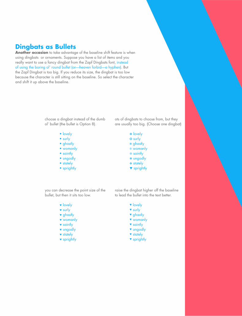
Dingbats as BulletsAnother occasion to take advantage of the baseline shift feature is when using dingbats or ornaments. Suppose you have a list of items and you really want to use a fancy dingbat from the Zapf Dingbats font, instead of using the boring ol’ round bullet (or—heaven forbid—a hyphen). But the Zapf Dingbat is too big. If you reduce its size, the dingbat is too low because the character is still sitting on the baseline. So select the character and shift it up above the baseline.
choose a dingbat instead of the dumb ol’ bullet (the bullet is Option 8).
• lovely • surly • ghastly • womanly • saintly • ungodly • stately • sprightly
you can decrease the point size of the bullet, but then it sits too low.
t lovely t surly t ghastly t womanly t saintly t ungodly t stately t sprightly
ots of dingbats to choose from, but they are usually too big. (Choose one dingbat)
a lovely b surly c ghastly d womanly g saintly k ungodly v stately t sprightly
raise the dingbat higher off the baseline to lead the bullet into the text better.
t lovely t surly t ghastly t womanly t saintly t ungodly t stately t sprightly
55
‘w-
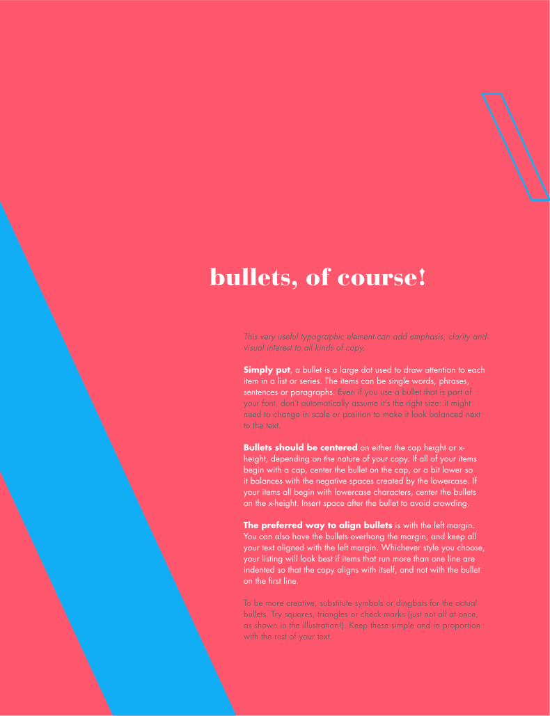
This very useful typographic element can add emphasis, clarity and visual interest to all kinds of copy.
Simply put, a bullet is a large dot used to draw attention to each item in a list or series. The items can be single words, phrases, sentences or paragraphs. Even if you use a bullet that is part of your font, don’t automatically assume it’s the right size: it might need to change in scale or position to make it look balanced next to the text.
Bullets should be centered on either the cap height or x-height, depending on the nature of your copy. If all of your items begin with a cap, center the bullet on the cap, or a bit lower so it balances with the negative spaces created by the lowercase. If your items all begin with lowercase characters, center the bullets on the x-height. Insert space after the bullet to avoid crowding.
The preferred way to align bullets is with the left margin. You can also have the bullets overhang the margin, and keep all your text aligned with the left margin. Whichever style you choose, your listing will look best if items that run more than one line are indented so that the copy aligns with itself, and not with the bullet on the first line.
To be more creative, substitute symbols or dingbats for the actual bullets. Try squares, triangles or check marks (just not all at once, as shown in the illustration!). Keep these simple and in proportion with the rest of your text.
bullets, of course!

‘-
\\\\\\\\\\\\\\\\\\\\\\\\\\\\\\\\\\\\\\\\\\\\\\\\\\\\\\\
STYLE

57
STYLE
\o\l\d\S\T\Y\L\E
\\\\\\\\\\\\
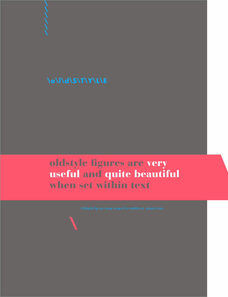
oldstyle figures are very useful and quite beautiful when set within text
Oldstyle figures have more of a traditional, classic look.
\
59\o\l\d\S\T\Y\L\E
Oldstyle figures are a style of numeral which approximate lowercase letterforms by having an x-height and varying ascend-ers and descenders. They are considerably different from the more common “lining” (or “aligning”) figures which are all-cap height and typically monospaced in text faces so that they line up vertically on charts. Oldstyle figures have more of a traditional, classic look. They are only available for certain typefaces, sometimes as the regular numerals in a font, but more often within a supplementary or expert font. The figures are proportionately spaced, eliminating the white spaces that result from mono-spaced lining figures, especially around the numeral one.
Unlike lining figures, they blend in without disturbing the color of the body copy. They also work well in headlines since they’re not as intrusive as lining fig-ures. In fact, many people prefer them over-all for most uses except charts and tables. It’s well worth the extra effort to track down and obtain typefaces with oldstyle numer-als; the fonts that contain them might well become some of your favorites.
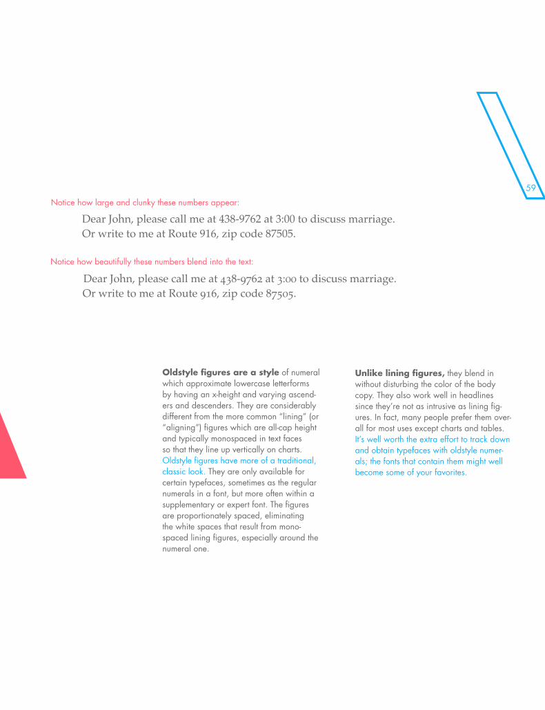
Notice how large and clunky these numbers appear:
Notice how beautifully these numbers blend into the text:
Dear John, please call me at 438-9762 at 3:00 to discuss marriage. Or write to me at Route 916, zip code 87505.
Dear John, please call me at 438-9762 at 3:00 to discuss marriage. Or write to me at Route 916, zip code 87505.

\\\\\\\\\\\\\\\\\\
\\\\\\\\\\\\\\\\\\\\\\\\\\\\\\\\\\\\\\\\\\\\\\\\\\\\\\\
E CAPS

61\\\\\\\\\\\\\\\\\\
E CAPS

\s\m\a\l\l\C\A\P\S
\\\\\\\\\\\\\\\\\\\\\\\\\\\\\
small caps are less intrusive when all uppercase appears within normal text or can be used for special emphasis
Small caps are uppercase (capital) letters that are about the size of normal lowercase letters in any given typeface.
\
63\s\m\a\l\l\C\A\P\S
small caps are less intrusive when all uppercase appears within normal text or can be used for special emphasis
Computer programs can generate small caps for a any typeface, but those are not the same as true small caps. True small caps have line weights that are proportionally correct for the typeface, which me and that they can be used within a body of copy without looking noticeably wrong.
Computer-drawn Small Caps:
Where to useIf you see acronyms in regular all caps, their visual presence is unnecessarily over-whelming. One standard and practical place to use small caps is in acronyms such as FBI, NRC, or SIMM.
Traditionally, “A.M.” and “P.M. are set with small caps. If you were taught to type on a typewriter (or if you were taught by someone who learned on a keyboard and are learn-ing on a keyboard), you probably learned to set these abbreviations in all caps because there were no small caps on the typewriters. But now that you have the capability, you can and should set them properly.
The capital letters in the middle of the sentence call too much attention to them-selves. Notice how the small caps blend in with the text. The capital letters for P.M. are much too large—the abbreviation is not that important.
There are quite a few font families that include “true drawn” small caps —let-terforms that have been redesigned to match the proportions and thickness of the uppercase. These families are often called “expert” sets or perhaps “small cap” sets. The result is a smooth, uniform, undisturbing tone throughout the text.
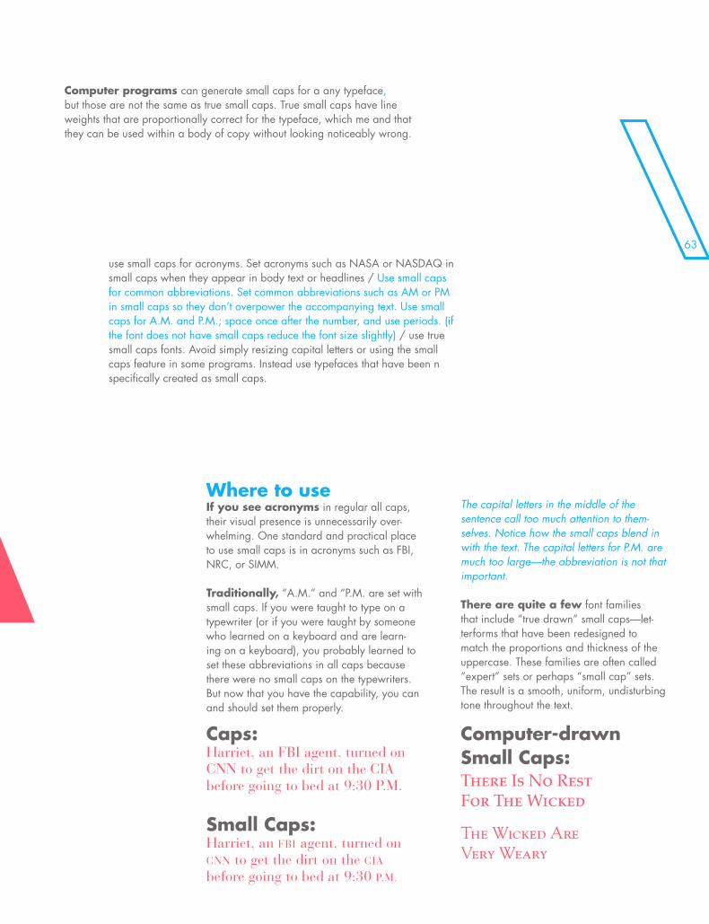
Caps:Harriet, an FBI agent, turned on CNN to get the dirt on the CIA before going to bed at 9:30 P.M.
Small Caps:Harriet, an FBI agent, turned on CNN to get the dirt on the CIA before going to bed at 9:30 P.M.
There Is No Rest For The Wicked
The Wicked Are Very Weary
use small caps for acronyms. Set acronyms such as NASA or NASDAQ in small caps when they appear in body text or headlines / Use small caps for common abbreviations. Set common abbreviations such as AM or PM in small caps so they don’t overpower the accompanying text. Use small caps for A.M. and P.M.; space once after the number, and use periods. (if the font does not have small caps reduce the font size slightly) / use true small caps fonts. Avoid simply resizing capital letters or using the small caps feature in some programs. Instead use typefaces that have been n specifically created as small caps.

\\\\\\\\\\\\\\\\\\\\\\\\\\\\\\\\\\\\\\\\\\\\\\\\\\\\\\\
S BREAKS
\\\\\\\\\\\\\\\\\\\\\\\\\\\\\
S BREAKS
\p\a\r\a\g\r\a\p\h\B\R\E\A\K\S
\\\\\\\\\\\\
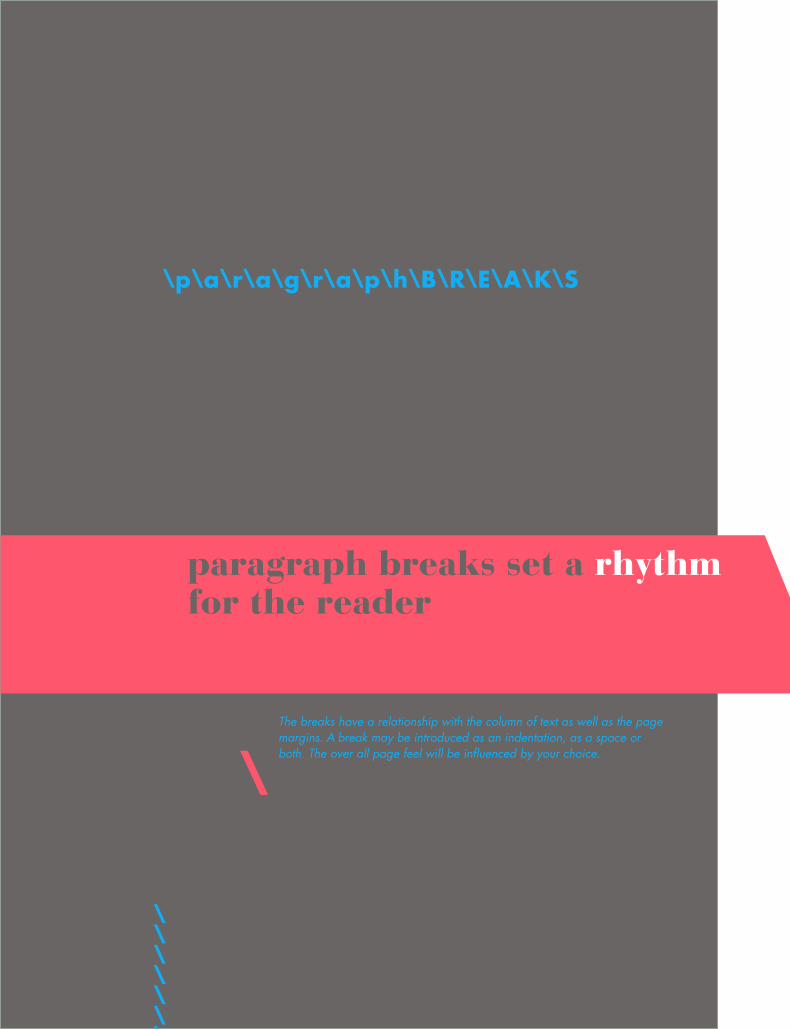
paragraph breaks set a rhythm for the reader
The breaks have a relationship with the column of text as well as the page margins. A break may be introduced as an indentation, as a space or both. The over all page feel will be influenced by your choice.
\
67\p\a\r\a\g\r\a\p\h\B\R\E\A\K\S
paragraph breaks set a rhythm for the reader
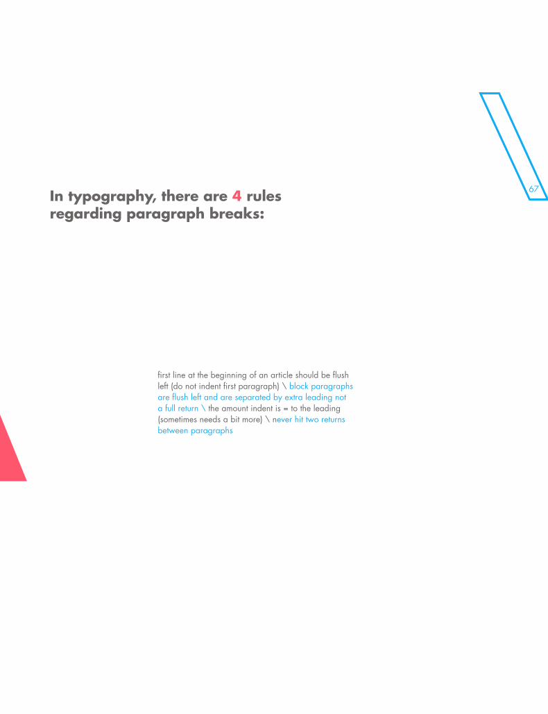
first line at the beginning of an article should be flush left (do not indent first paragraph) \ block paragraphs are flush left and are separated by extra leading not a full return \ the amount indent is = to the leading (sometimes needs a bit more) \ never hit two returns between paragraphs
In typography, there are 4 rules regarding paragraph breaks:
\\\\\\\\\\\\\\\\
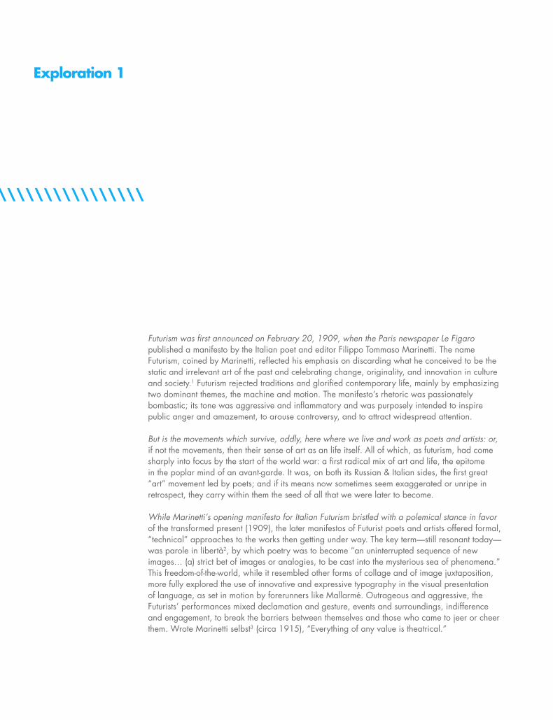
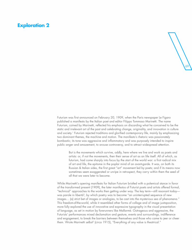
Futurism was first announced on February 20, 1909, when the Paris newspaper Le Figaro published a manifesto by the Italian poet and editor Filippo Tommaso Marinetti. The name Futurism, coined by Marinetti, reflected his emphasis on discarding what he conceived to be the static and irrelevant art of the past and celebrating change, originality, and innovation in culture and society.1 Futurism rejected traditions and glorified contemporary life, mainly by emphasizing two dominant themes, the machine and motion. The manifesto’s rhetoric was passionately bombastic; its tone was aggressive and inflammatory and was purposely intended to inspire public anger and amazement, to arouse controversy, and to attract widespread attention.
But is the movements which survive, oddly, here where we live and work as poets and artists: or, if not the movements, then their sense of art as an life itself. All of which, as futurism, had come sharply into focus by the start of the world war: a first radical mix of art and life, the epitome in the poplar mind of an avant-garde. It was, on both its Russian & Italian sides, the first great “art” movement led by poets; and if its means now sometimes seem exaggerated or unripe in retrospect, they carry within them the seed of all that we were later to become.
While Marinetti’s opening manifesto for Italian Futurism bristled with a polemical stance in favor of the transformed present (1909), the later manifestos of Futurist poets and artists offered formal, “technical” approaches to the works then getting under way. The key term—still resonant today—was parole in libertà2, by which poetry was to become “an uninterrupted sequence of new images… (a) strict bet of images or analogies, to be cast into the mysterious sea of phenomena.” This freedom-of-the-world, while it resembled other forms of collage and of image juxtaposition, more fully explored the use of innovative and expressive typography in the visual presentation of language, as set in motion by forerunners like Mallarmé. Outrageous and aggressive, the Futurists’ performances mixed declamation and gesture, events and surroundings, indifference and engagement, to break the barriers between themselves and those who came to jeer or cheer them. Wrote Marinetti selbst3 (circa 1915), “Everything of any value is theatrical.”
Exploration 1
69\\\\\\\\\\\\\\\\
Futurism was first announced on February 20, 1909, when the Paris newspaper Le Figaro published a manifesto by the Italian poet and editor Filippo Tommaso Marinetti. The name Futurism, coined by Marinetti, reflected his emphasis on discarding what he conceived to be the static and irrelevant art of the past and celebrating change, originality, and innovation in culture and society.1 Futurism rejected traditions and glorified contemporary life, mainly by emphasizing two dominant themes, the machine and motion. The manifesto’s rhetoric was passionately bombastic; its tone was aggressive and inflammatory and was purposely intended to inspire public anger and amazement, to arouse controversy, and to attract widespread attention.
But is the movements which survive, oddly, here where we live and work as poets and artists: or, if not the movements, then their sense of art as an life itself. All of which, as futurism, had come sharply into focus by the start of the world war: a first radical mix of art and life, the epitome in the poplar mind of an avant-garde. It was, on both its Russian & Italian sides, the first great “art” movement led by poets; and if its means now sometimes seem exaggerated or unripe in retrospect, they carry within them the seed of all that we were later to become.
While Marinetti’s opening manifesto for Italian Futurism bristled with a polemical stance in favor of the transformed present (1909), the later manifestos of Futurist poets and artists offered formal, “technical” approaches to the works then getting under way. The key term—still resonant today—was parole in libertà2, by which poetry was to become “an uninterrupted sequence of new images… (a) strict bet of images or analogies, to be cast into the mysterious sea of phenomena.” This freedom-of-the-world, while it resembled other forms of collage and of image juxtaposition, more fully explored the use of innovative and expressive typography in the visual presentation of language, as set in motion by forerunners like Mallarmé. Outrageous and aggressive, the Futurists’ performances mixed declamation and gesture, events and surroundings, indifference and engagement, to break the barriers between themselves and those who came to jeer or cheer them. Wrote Marinetti selbst3 (circa 1915), “Everything of any value is theatrical.”
Exploration 2
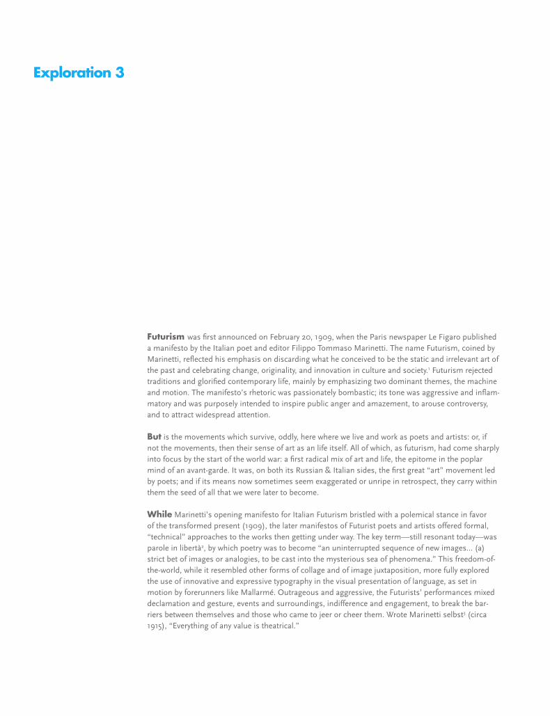
Futurism was first announced on February 20, 1909, when the Paris newspaper Le Figaro published a manifesto by the Italian poet and editor Filippo Tommaso Marinetti. The name Futurism, coined by Marinetti, reflected his emphasis on discarding what he conceived to be the static and irrelevant art of the past and celebrating change, originality, and innovation in culture and society.1 Futurism rejected traditions and glorified contemporary life, mainly by emphasizing two dominant themes, the machine and motion. The manifesto’s rhetoric was passionately bombastic; its tone was aggressive and inflam-matory and was purposely intended to inspire public anger and amazement, to arouse controversy, and to attract widespread attention.
But is the movements which survive, oddly, here where we live and work as poets and artists: or, if not the movements, then their sense of art as an life itself. All of which, as futurism, had come sharply into focus by the start of the world war: a first radical mix of art and life, the epitome in the poplar mind of an avant-garde. It was, on both its Russian & Italian sides, the first great “art” movement led by poets; and if its means now sometimes seem exaggerated or unripe in retrospect, they carry within them the seed of all that we were later to become.
While Marinetti’s opening manifesto for Italian Futurism bristled with a polemical stance in favor of the transformed present (1909), the later manifestos of Futurist poets and artists offered formal, “technical” approaches to the works then getting under way. The key term—still resonant today—was parole in libertà2, by which poetry was to become “an uninterrupted sequence of new images… (a) strict bet of images or analogies, to be cast into the mysterious sea of phenomena.” This freedom-of-the-world, while it resembled other forms of collage and of image juxtaposition, more fully explored the use of innovative and expressive typography in the visual presentation of language, as set in motion by forerunners like Mallarmé. Outrageous and aggressive, the Futurists’ performances mixed declamation and gesture, events and surroundings, indifference and engagement, to break the bar-riers between themselves and those who came to jeer or cheer them. Wrote Marinetti selbst3 (circa 1915), “Everything of any value is theatrical.”
Exploration 3
71
uturism was first announced on February 20, 1909, when the Paris newspaper Le Figaro published a manifesto by the Italian poet and editor Filippo Tommaso Marinetti. The name Futurism, coined by Marinetti, reflected his emphasis on discarding what he conceived to be
the static and irrelevant art of the past and celebrating change, originality, and innovation in culture and society.1 Futurism rejected traditions and glorified contemporary life, mainly by emphasizing two dominant themes, the machine and motion. The manifesto’s rhetoric was passionately bombastic; its tone was aggressive and inflammatory and was purposely intended to inspire public anger and amazement, to arouse controversy, and to attract widespread attention.
But is the movements which survive, oddly, here where we live and work as poets and artists: or, if not the movements, then their sense of art as an life itself. All of which, as futurism, had come sharply into focus by the start of the world war: a first radical mix of art and life, the epitome in the poplar mind of an avant-garde. It was, on both its Russian & Italian sides, the first great “art” movement led by poets; and if its means now sometimes seem exaggerated or unripe in retrospect, they carry within them the seed of all that we were later to become.
While Marinetti’s opening manifesto for Italian Futurism bristled with a polemical stance in favor of the transformed present (1909), the later manifestos of Futurist poets and artists offered formal, “technical” approaches to the works then getting under way. The key term—still resonant today—was parole in libertà2, by which poetry was to become “an uninterrupted sequence of new images… (a) strict bet of images or analogies, to be cast into the mysterious sea of phenomena.” This freedom-of-the-world, while it resembled other forms of collage and of image juxtaposition, more fully explored the use of innovative and expressive typography in the visual presentation of language, as set in motion by forerunners like Mallarmé. Outrageous and aggressive, the Futurists’ performances mixed declamation and gesture, events and surroundings, indifference and engagement, to break the bar-riers between themselves and those who came to jeer or cheer them. Wrote Marinetti selbst3 (circa 1915), “Everything of any value is theatrical.”
Exploration 4
F
\\\\\\\\\\\\\\\\\\\\\\\\\\\\\\\\\\\\\\\\\\\\\\\\\\\\\\\\\\\\\\\\\\
Futurism was first announced on February 20, 1909, when the Paris newspaper Le Figaro published a manifesto by the Italian poet and editor Filippo Tommaso Marinetti. The name Futurism, coined by Marinetti, reflected his emphasis on discarding what he conceived to be the static and irrelevant art of the past and celebrating change, originality, and innovation in culture and society.1 Futurism rejected traditions and glorified contemporary life, mainly by emphasizing two dominant themes, the machine and motion. The manifesto’s rhetoric was passionately bombastic; its tone was aggressive and inflammatory and was purposely intended to inspire public anger and amazement, to arouse controversy, and to attract widespread attention.
But is the movements which survive, oddly, here where we live and work as poets and artists: or, if not the movements, then their sense of art as an life itself. All of which, as futurism, had come sharply into focus by the start of the world war: a first radical mix of art and life, the epitome in the poplar mind of an avant-garde. It was, on both its Russian & Italian sides, the first great “art” movement led by poets; and if its means now sometimes seem exaggerated or unripe in retrospect, they carry within them the seed of all that we were later to become.
While Marinetti’s opening manifesto for Italian Futurism bristled with a polemical stance in favor of the transformed present (1909), the later manifestos of Futurist poets and artists offered formal, “technical” approaches to the works then getting under way. The key term—still resonant today—was parole in libertà2, by which poetry was to become “an uninterrupted sequence of new images… (a) strict bet of images or analogies, to be cast into the mysterious sea of phenomena.” This freedom-of-the-world, while it resembled other forms of collage and of image juxtaposition, more fully explored the use of innovative and expressive typography in the visual presentation of language, as set in motion by forerunners like Mallarmé. Outrageous and aggressive, the Futurists’ performances mixed declamation and gesture, events and surroundings, indifference and engagement, to break the barriers between themselves and those who came to jeer or cheer them. Wrote Marinetti selbst3 (circa 1915), “Everything of any value is theatrical.”
Exploration 5
73\\\\\\\\\\\\\\\\\\\\\\\\\\\\\\\\\\\\\\\\\\\\\\\\\\\\\\\\\\\\\\\\\\
Futurism was first announced on February 20, 1909, when the Paris newspaper Le Figaro published a manifesto by the Italian poet and editor Filippo Tommaso Marinetti. The name Futurism, coined by Marinetti, reflected his emphasis on discarding what he conceived to be the static and irrelevant art of the past and celebrating change, originality, and innovation in culture and society.1 Futurism rejected traditions and glorified contemporary life, mainly by emphasizing two dominant themes, the machine and motion. The manifesto’s rhetoric was passionately bombastic; its tone was aggressive and inflam-matory and was purposely intended to inspire public anger and amazement, to arouse controversy, and to attract widespread attention.
But is the movements which survive, oddly, here where we live and work as poets and artists: or, if not the movements, then their sense of art as an life itself. All of which, as futurism, had come sharply into focus by the start of the world war: a first radical mix of art and life, the epitome in the poplar mind of an avant-garde. It was, on both its Russian & Italian sides, the first great “art” movement led by poets; and if its means now sometimes seem exaggerated or unripe in retrospect, they carry within them the seed of all that we were later to become.
While Marinetti’s opening manifesto for Italian Futurism bristled with a polemical stance in favor of the transformed present (1909), the later manifestos of Futurist poets and artists offered formal, “technical” approaches to the works then getting under way. The key term—still resonant today—was parole in libertà2, by which poetry was to become “an uninterrupted sequence of new images… (a) strict bet of images or analogies, to be cast into the mysterious sea of phenomena.” This freedom-of-the-world, while it resembled other forms of collage and of image juxtaposition, more fully explored the use of innovative and expressive typography in the visual presentation of language, as set in motion by forerunners like Mallarmé. Outrageous and aggressive, the Futurists’ performances mixed declamation and gesture, events and surroundings, indifference and engagement, to break the bar-riers between themselves and those who came to jeer or cheer them. Wrote Marinetti selbst3 (circa 1915), “Everything of any value is theatrical.”
Exploration 6
\\\\\\\\\\\\\\\\\\\\\\\\\\\\\\\\\\\\\\\\\\\\\\\\\\\\\\\\\\\\\\\\\\
Futurism was first announced on February 20, 1909, when the Paris newspaper Le Figaro published a manifesto by the Italian poet and editor Filippo Tommaso Marinetti. The name Futurism, coined by Marinetti, reflected his emphasis on discarding what he conceived to be the static and irrelevant art of the past and celebrating change, originality, and innovation in culture and society.1 Futurism rejected traditions and glorified contemporary life, mainly by emphasizing two dominant themes, the machine and motion. The manifesto’s rhetoric was passionately bombastic; its tone was aggressive and inflammatory and was purposely intended to inspire public anger and amazement, to arouse controversy, and to attract widespread attention.
But is the movements which survive, oddly, here where we live and work as poets and artists: or, if not the movements, then their sense of art as an life itself. All of which, as futurism, had come sharply into focus by the start of the world war: a first radical mix of art and life, the epitome in the poplar mind of an avant-garde. It was, on both its Russian & Italian sides, the first great “art” movement led by poets; and if its means now sometimes seem exaggerated or unripe in retrospect, they carry within them the seed of all that we were later to become.
While Marinetti’s opening manifesto for Italian Futurism bristled with a polemical stance in favor of the transformed present (1909), the later manifestos of Futurist poets and artists offered formal, “technical” approaches to the works then getting under way. The key term—still resonant today—was parole in libertà2, by which poetry was to become “an uninterrupted sequence of new images… (a) strict bet of images or analogies, to be cast into the mysterious sea of phenomena.” This freedom-of-the-world, while it resembled other forms of collage and of image juxtaposition, more fully explored the use of innovative and expressive typography in the visual presentation of language, as set in motion by forerunners like Mallarmé. Outrageous and aggressive, the Futurists’ performances mixed declamation and gesture, events and surroundings, indifference and engagement, to break the barriers between themselves and those who came to jeer or cheer them. Wrote Marinetti selbst3 (circa 1915), “Everything of any value is theatrical.”
Exploration 7
75\\\\\\\\\\\\\\\\\\\\\\\\\\\\\\\\\\\\\\\\\\\\\\\\\\\\\\\\\\\\\\\\\\
Futurism was first announced on February 20, 1909, when the Paris newspaper Le Figaro published a manifesto by the Italian poet and editor Filippo Tommaso Marinetti. The name Futurism, coined by Marinetti, reflected his emphasis on discarding what he conceived to be the static and irrelevant art of the past and celebrating change, originality, and innovation in culture and society.1 Futurism rejected traditions and glorified contemporary life, mainly by emphasizing two dominant themes, the machine and motion. The manifesto’s rhetoric was passionately bombastic; its tone was aggressive and inflam-matory and was purposely intended to inspire public anger and amazement, to arouse controversy, and to attract widespread attention.
But is the movements which survive, oddly, here where we live and work as poets and artists: or, if not the movements, then their sense of art as an life itself. All of which, as futurism, had come sharply into focus by the start of the world war: a first radical mix of art and life, the epitome in the poplar mind of an avant-garde. It was, on both its Russian & Italian sides, the first great “art” movement led by poets; and if its means now sometimes seem exaggerated or unripe in retrospect, they carry within them the seed of all that we were later to become.
While Marinetti’s opening manifesto for Italian Futurism bristled with a polemical stance in favor of the transformed present (1909), the later manifestos of Futurist poets and artists offered formal, “technical” approaches to the works then getting under way. The key term—still resonant today—was parole in libertà2, by which poetry was to become “an uninterrupted sequence of new images… (a) strict bet of images or analogies, to be cast into the mysterious sea of phenomena.” This freedom-of-the-world, while it resembled other forms of collage and of image juxtaposition, more fully explored the use of innovative and expressive typography in the visual presentation of language, as set in motion by forerunners like Mallarmé. Outrageous and aggressive, the Futurists’ performances mixed declamation and gesture, events and surroundings, indifference and engagement, to break the bar-riers between themselves and those who came to jeer or cheer them. Wrote Marinetti selbst3 (circa 1915), “Everything of any value is theatrical.”
Exploration 8
\\\\\\\\\\\\\\\\\\\\\\\\\\\\\\\\\\\\\\\\\\\\\\\\\\\\\\\\\\\\\\\\\\\\\\\\\\\\\\
Futurism was first announced on February 20, 1909, when the Paris newspaper Le Figaro published a manifesto by the Italian poet and editor Filippo Tommaso Marinetti. The name Futurism, coined by Marinetti, reflected his emphasis on discarding what he conceived to be the static and irrelevant art of the past and celebrating change, originality, and innovation in culture and society.1 Futurism rejected traditions and glorified contemporary life, mainly by emphasizing two dominant themes, the machine and motion. The manifesto’s rhetoric was passionately bombastic; its tone was aggressive and inflam-matory and was purposely intended to inspire public anger and amazement, to arouse controversy, and to attract widespread attention.
But is the movements which survive, oddly, here where we live and work as poets and artists: or, if not the movements, then their sense of art as an life itself. All of which, as futurism, had come sharply into focus by the start of the world war: a first radical mix of art and life, the epitome in the poplar mind of an avant-garde. It was, on both its Russian & Italian sides, the first great “art” movement led by poets; and if its means now sometimes seem exaggerated or unripe in retrospect, they carry within them the seed of all that we were later to become.
While Marinetti’s opening manifesto for Italian Futurism bristled with a polemical stance in favor of the transformed present (1909), the later manifestos of Futurist poets and artists offered formal, “technical” approaches to the works then getting under way. The key term—still resonant today—was parole in libertà2, by which poetry was to become “an uninterrupted sequence of new images… (a) strict bet of images or analogies, to be cast into the mysterious sea of phenomena.” This freedom-of-the-world, while it resembled other forms of collage and of image juxtaposition, more fully explored the use of innovative and expressive typography in the visual presentation of language, as set in motion by forerunners like Mallarmé. Outrageous and aggressive, the Futurists’ performances mixed declamation and gesture, events and surroundings, indifference and engagement, to break the bar-riers between themselves and those who came to jeer or cheer them. Wrote Marinetti selbst3 (circa 1915), “Everything of any value is theatrical.”
Exploration 9
\\\\
\\\\
\\\\
77\\\\\\\\\\\\\\\\\\\\\\\\\\\\\\\\\\\\\\\\\\\\\\\\\\\\\\\\\\\\\\\\\\\\\\\\\\\\\\
Futurism was first announced on February 20, 1909, when the Paris newspaper Le Figaro published a manifesto by the Italian poet and editor Filippo Tommaso Marinetti. The name Futurism, coined by Marinetti, reflected his emphasis on discarding what he conceived to be the static and irrelevant art of the past and celebrating change, originality, and innovation in culture and society.1 Futurism rejected traditions and glorified contemporary life, mainly by emphasizing two dominant themes, the machine and motion. The manifesto’s rhetoric was passionately bombastic; its tone was aggressive and inflammatory and was purposely intended to inspire public anger and amazement, to arouse controversy, and to attract widespread attention.
But is the movements which survive, oddly, here where we live and work as poets and artists: or, if not the movements, then their sense of art as an life itself. All of which, as futurism, had come sharply into focus by the start of the world war: a first radical mix of art and life, the epitome in the poplar mind of an avant-garde. It was, on both its Russian & Italian sides, the first great “art” movement led by poets; and if its means now sometimes seem exaggerated or unripe in retrospect, they carry within them the seed of all that we were later to become.
While Marinetti’s opening manifesto for Italian Futurism bristled with a polemi-cal stance in favor of the transformed present (1909), the later manifestos of Futurist poets and artists offered formal, “technical” approaches to the works then getting under way. The key term—still reso-nant today—was parole in libertà2, by which poetry was to become “an uninterrupted sequence of new images… (a) strict bet of images or analogies, to be cast into the mysterious sea of phenomena.” This freedom-of-the-world, while it resembled other forms of collage and of image juxtaposition, more fully explored the use of innovative and expressive typography in the visual presentation of language, as set in motion by forerunners like Mallarmé. Outrageous and aggressive, the Futurists’ performances mixed declamation and gesture, events and surroundings, indifference and engagement, to break the barriers between themselves and those who came to jeer or cheer them. Wrote Marinetti selbst3 (circa 1915), “Everything of any value is theatrical.”
Exploration 10

SUBHEADS
\\\\\\\\
\\\\\\\\\\\\\\\\\\\\\\\\\\\\\\\\\\\\\\\\\\\\\\\\\\\\\\\
S
SUBHEADS
\\\\\\\\
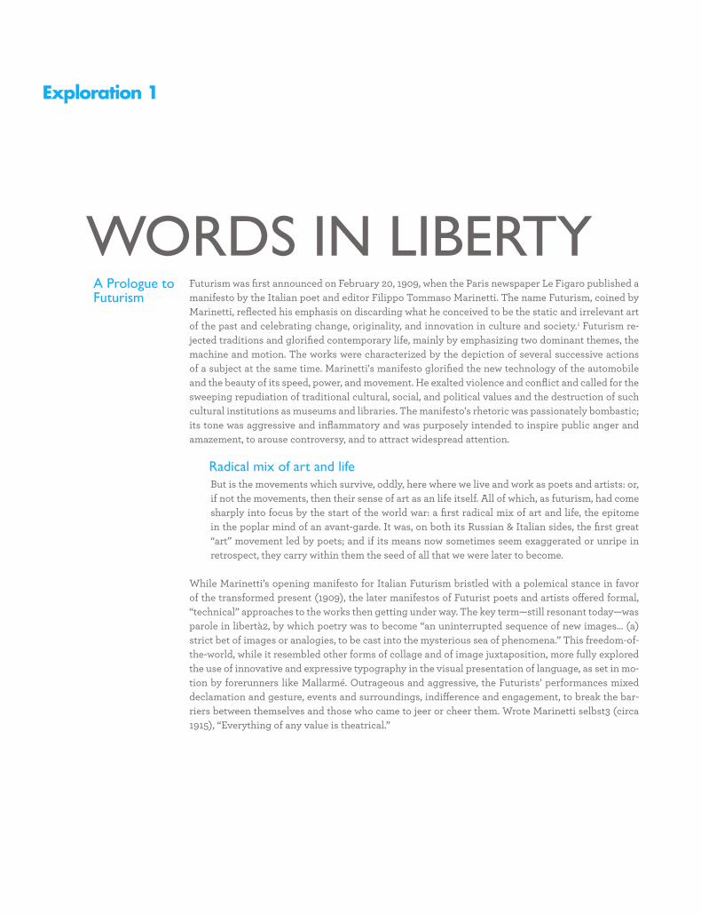
SUBHEADS
Exploration 1
Futurism was first announced on February 20, 1909, when the Paris newspaper Le Figaro published a manifesto by the Italian poet and editor Filippo Tommaso Marinetti. The name Futurism, coined by Marinetti, reflected his emphasis on discarding what he conceived to be the static and irrelevant art of the past and celebrating change, originality, and innovation in culture and society.1 Futurism re-jected traditions and glorified contemporary life, mainly by emphasizing two dominant themes, the machine and motion. The works were characterized by the depiction of several successive actions of a subject at the same time. Marinetti's manifesto glorified the new technology of the automobile and the beauty of its speed, power, and movement. He exalted violence and conflict and called for the sweeping repudiation of traditional cultural, social, and political values and the destruction of such cultural institutions as museums and libraries. The manifesto's rhetoric was passionately bombastic; its tone was aggressive and inflammatory and was purposely intended to inspire public anger and amazement, to arouse controversy, and to attract widespread attention.
Radical mix of art and lifeBut is the movements which survive, oddly, here where we live and work as poets and artists: or, if not the movements, then their sense of art as an life itself. All of which, as futurism, had come sharply into focus by the start of the world war: a first radical mix of art and life, the epitome in the poplar mind of an avant-garde. It was, on both its Russian & Italian sides, the first great “art” movement led by poets; and if its means now sometimes seem exaggerated or unripe in retrospect, they carry within them the seed of all that we were later to become.
While Marinetti’s opening manifesto for Italian Futurism bristled with a polemical stance in favor of the transformed present (1909), the later manifestos of Futurist poets and artists offered formal, “technical” approaches to the works then getting under way. The key term—still resonant today—was parole in libertà2, by which poetry was to become “an uninterrupted sequence of new images… (a) strict bet of images or analogies, to be cast into the mysterious sea of phenomena.” This freedom-of-the-world, while it resembled other forms of collage and of image juxtaposition, more fully explored the use of innovative and expressive typography in the visual presentation of language, as set in mo-tion by forerunners like Mallarmé. Outrageous and aggressive, the Futurists’ performances mixed declamation and gesture, events and surroundings, indifference and engagement, to break the bar-riers between themselves and those who came to jeer or cheer them. Wrote Marinetti selbst3 (circa 1915), “Everything of any value is theatrical.”
WORDS IN LIBERTYA Prologue to Futurism
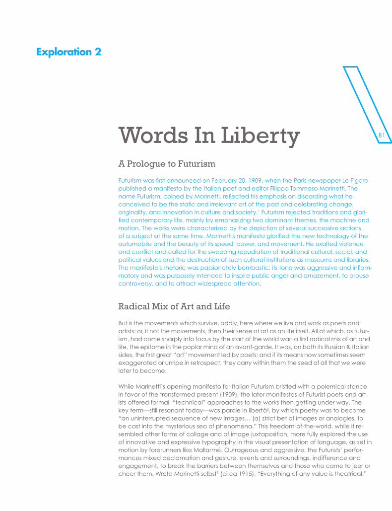
81
SUBHEADS
Exploration 2
Words In LibertyA Prologue to Futurism
Futurism was first announced on February 20, 1909, when the Paris newspaper Le Figaro published a manifesto by the Italian poet and editor Filippo Tommaso Marinetti. The name Futurism, coined by Marinetti, reflected his emphasis on discarding what he conceived to be the static and irrelevant art of the past and celebrating change, originality, and innovation in culture and society.1 Futurism rejected traditions and glori-fied contemporary life, mainly by emphasizing two dominant themes, the machine and motion. The works were characterized by the depiction of several successive actions of a subject at the same time. Marinetti's manifesto glorified the new technology of the automobile and the beauty of its speed, power, and movement. He exalted violence and conflict and called for the sweeping repudiation of traditional cultural, social, and political values and the destruction of such cultural institutions as museums and libraries. The manifesto's rhetoric was passionately bombastic; its tone was aggressive and inflam-matory and was purposely intended to inspire public anger and amazement, to arouse controversy, and to attract widespread attention.
Radical Mix of Art and Life
But is the movements which survive, oddly, here where we live and work as poets and artists: or, if not the movements, then their sense of art as an life itself. All of which, as futur-ism, had come sharply into focus by the start of the world war: a first radical mix of art and life, the epitome in the poplar mind of an avant-garde. It was, on both its Russian & Italian sides, the first great “art” movement led by poets; and if its means now sometimes seem exaggerated or unripe in retrospect, they carry within them the seed of all that we were later to become.
While Marinetti’s opening manifesto for Italian Futurism bristled with a polemical stance in favor of the transformed present (1909), the later manifestos of Futurist poets and art-ists offered formal, “technical” approaches to the works then getting under way. The key term—still resonant today—was parole in libertà2, by which poetry was to become “an uninterrupted sequence of new images… (a) strict bet of images or analogies, to be cast into the mysterious sea of phenomena.” This freedom-of-the-world, while it re-sembled other forms of collage and of image juxtaposition, more fully explored the use of innovative and expressive typography in the visual presentation of language, as set in motion by forerunners like Mallarmé. Outrageous and aggressive, the Futurists’ perfor-mances mixed declamation and gesture, events and surroundings, indifference and engagement, to break the barriers between themselves and those who came to jeer or cheer them. Wrote Marinetti selbst3 (circa 1915), “Everything of any value is theatrical.”
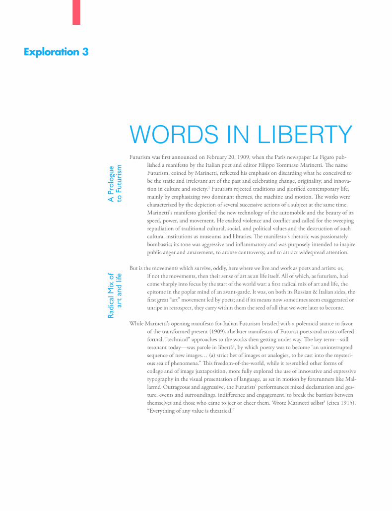
\\\\\\\\\\\
Exploration 3
WORDS IN LIBERTYFuturism was first announced on February 20, 1909, when the Paris newspaper Le Figaro pub-
lished a manifesto by the Italian poet and editor Filippo Tommaso Marinetti. The name Futurism, coined by Marinetti, reflected his emphasis on discarding what he conceived to be the static and irrelevant art of the past and celebrating change, originality, and innova-tion in culture and society.1 Futurism rejected traditions and glorified contemporary life, mainly by emphasizing two dominant themes, the machine and motion. The works were characterized by the depiction of several successive actions of a subject at the same time. Marinetti's manifesto glorified the new technology of the automobile and the beauty of its speed, power, and movement. He exalted violence and conflict and called for the sweeping repudiation of traditional cultural, social, and political values and the destruction of such cultural institutions as museums and libraries. The manifesto's rhetoric was passionately bombastic; its tone was aggressive and inflammatory and was purposely intended to inspire public anger and amazement, to arouse controversy, and to attract widespread attention.
But is the movements which survive, oddly, here where we live and work as poets and artists: or, if not the movements, then their sense of art as an life itself. All of which, as futurism, had come sharply into focus by the start of the world war: a first radical mix of art and life, the epitome in the poplar mind of an avant-garde. It was, on both its Russian & Italian sides, the first great “art” movement led by poets; and if its means now sometimes seem exaggerated or unripe in retrospect, they carry within them the seed of all that we were later to become.
While Marinetti’s opening manifesto for Italian Futurism bristled with a polemical stance in favor of the transformed present (1909), the later manifestos of Futurist poets and artists offered formal, “technical” approaches to the works then getting under way. The key term—still resonant today—was parole in libertà2, by which poetry was to become “an uninterrupted sequence of new images… (a) strict bet of images or analogies, to be cast into the mysteri-ous sea of phenomena.” This freedom-of-the-world, while it resembled other forms of collage and of image juxtaposition, more fully explored the use of innovative and expressive typography in the visual presentation of language, as set in motion by forerunners like Mal-larmé. Outrageous and aggressive, the Futurists’ performances mixed declamation and ges-ture, events and surroundings, indifference and engagement, to break the barriers between themselves and those who came to jeer or cheer them. Wrote Marinetti selbst3 (circa 1915), “Everything of any value is theatrical.”
A P
rolo
gue
to F
utur
ism
Rad
ical
Mix
of
art
and
life
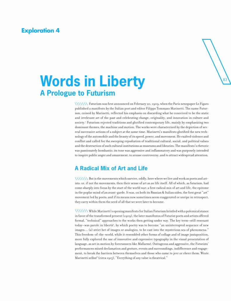
83
Exploration 4
Futurism was first announced on February 20, 1909, when the Paris newspaper Le Figaro published a manifesto by the Italian poet and editor Filippo Tommaso Marinetti. The name Futur-ism, coined by Marinetti, reflected his emphasis on discarding what he conceived to be the static and irrelevant art of the past and celebrating change, originality, and innovation in culture and society.1 Futurism rejected traditions and glorified contemporary life, mainly by emphasizing two dominant themes, the machine and motion. The works were characterized by the depiction of sev-eral successive actions of a subject at the same time. Marinetti's manifesto glorified the new tech-nology of the automobile and the beauty of its speed, power, and movement. He exalted violence and conflict and called for the sweeping repudiation of traditional cultural, social, and political values and the destruction of such cultural institutions as museums and libraries. The manifesto's rhetoric was passionately bombastic; its tone was aggressive and inflammatory and was purposely intended to inspire public anger and amazement, to arouse controversy, and to attract widespread attention.
But is the movements which survive, oddly, here where we live and work as poets and art-ists: or, if not the movements, then their sense of art as an life itself. All of which, as futurism, had come sharply into focus by the start of the world war: a first radical mix of art and life, the epitome in the poplar mind of an avant-garde. It was, on both its Russian & Italian sides, the first great “art” movement led by poets; and if its means now sometimes seem exaggerated or unripe in retrospect, they carry within them the seed of all that we were later to become.
While Marinetti’s opening manifesto for Italian Futurism bristled with a polemical stance in favor of the transformed present (1909), the later manifestos of Futurist poets and artists offered formal, “technical” approaches to the works then getting under way. The key term—still resonant today—was parole in libertà2, by which poetry was to become “an uninterrupted sequence of new images… (a) strict bet of images or analogies, to be cast into the mysterious sea of phenomena.” This freedom-of-the-world, while it resembled other forms of collage and of image juxtaposition, more fully explored the use of innovative and expressive typography in the visual presentation of language, as set in motion by forerunners like Mallarmé. Outrageous and aggressive, the Futurists’ performances mixed declamation and gesture, events and surroundings, indifference and engage-ment, to break the barriers between themselves and those who came to jeer or cheer them. Wrote Marinetti selbst3 (circa 1915), “Everything of any value is theatrical.”
Words in LibertyA Prologue to Futurism
A Radical Mix of Art and Life
\\\\\\\
\\\\\\\
\\\\\\\
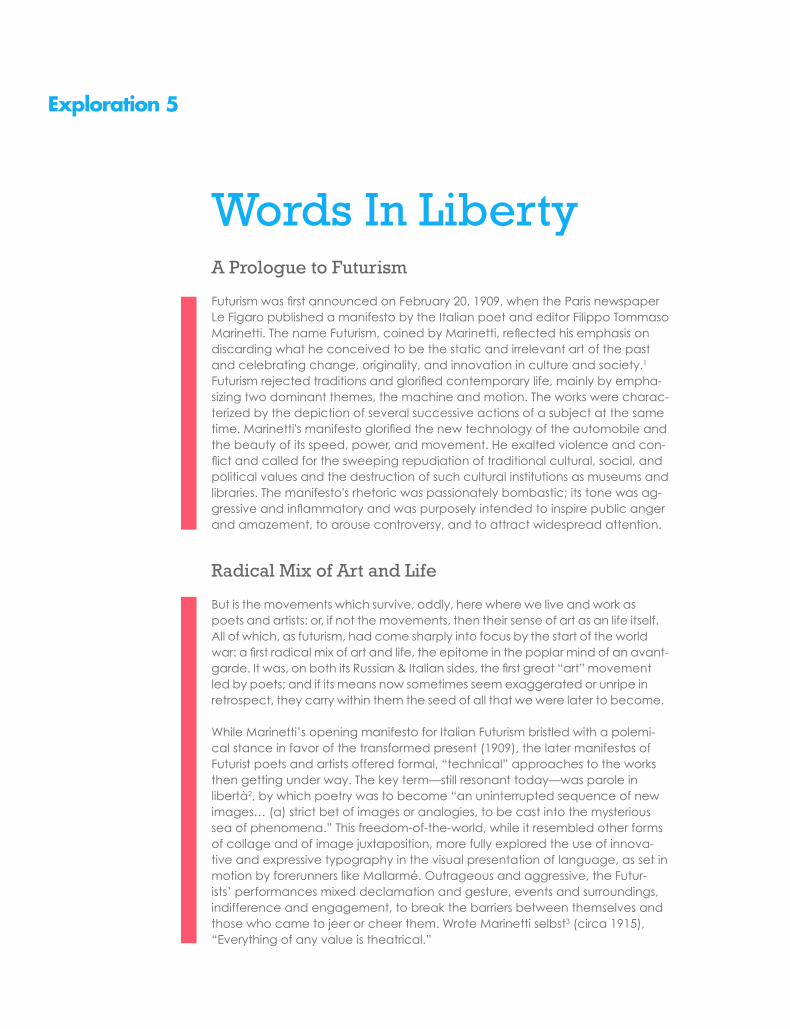
Exploration 5
Words In LibertyA Prologue to Futurism
Futurism was first announced on February 20, 1909, when the Paris newspaper Le Figaro published a manifesto by the Italian poet and editor Filippo Tommaso Marinetti. The name Futurism, coined by Marinetti, reflected his emphasis on discarding what he conceived to be the static and irrelevant art of the past and celebrating change, originality, and innovation in culture and society.1 Futurism rejected traditions and glorified contemporary life, mainly by empha-sizing two dominant themes, the machine and motion. The works were charac-terized by the depiction of several successive actions of a subject at the same time. Marinetti's manifesto glorified the new technology of the automobile and the beauty of its speed, power, and movement. He exalted violence and con-flict and called for the sweeping repudiation of traditional cultural, social, and political values and the destruction of such cultural institutions as museums and libraries. The manifesto's rhetoric was passionately bombastic; its tone was ag-gressive and inflammatory and was purposely intended to inspire public anger and amazement, to arouse controversy, and to attract widespread attention.
Radical Mix of Art and Life
But is the movements which survive, oddly, here where we live and work as poets and artists: or, if not the movements, then their sense of art as an life itself. All of which, as futurism, had come sharply into focus by the start of the world war: a first radical mix of art and life, the epitome in the poplar mind of an avant-garde. It was, on both its Russian & Italian sides, the first great “art” movement led by poets; and if its means now sometimes seem exaggerated or unripe in retrospect, they carry within them the seed of all that we were later to become.
While Marinetti’s opening manifesto for Italian Futurism bristled with a polemi-cal stance in favor of the transformed present (1909), the later manifestos of Futurist poets and artists offered formal, “technical” approaches to the works then getting under way. The key term—still resonant today—was parole in libertà2, by which poetry was to become “an uninterrupted sequence of new images… (a) strict bet of images or analogies, to be cast into the mysterious sea of phenomena.” This freedom-of-the-world, while it resembled other forms of collage and of image juxtaposition, more fully explored the use of innova-tive and expressive typography in the visual presentation of language, as set in motion by forerunners like Mallarmé. Outrageous and aggressive, the Futur-ists’ performances mixed declamation and gesture, events and surroundings, indifference and engagement, to break the barriers between themselves and those who came to jeer or cheer them. Wrote Marinetti selbst3 (circa 1915), “Everything of any value is theatrical.”
85
Exploration 6
uturism was first announced on February 20, 1909, when the Paris newspaper Le Figaro published a manifesto by the Italian poet and editor Filippo Tommaso Marinetti. The name Futurism, coined by Marinetti, reflected his emphasis on dis-
carding what he conceived to be the static and irrelevant art of the past and celebrat-ing change, originality, and innovation in culture and society.1 Futurism rejected tradi-tions and glorified contemporary life, mainly by emphasizing two dominant themes, the machine and motion. The manifesto’s rhetoric was passionately bombastic; its tone was aggressive and inflammatory and was purposely intended to inspire public anger and amazement, to arouse controversy, and to attract widespread attention.
But is the movements which survive, oddly, here where we live and work as poets and artists: or, if not the movements, then their sense of art as an life itself. All of which, as futurism, had come sharply into focus by the start of the world war: a first radical mix of art and life, the epitome in the poplar mind of an avant-garde. It was, on both its Russian & Italian sides, the first great “art” movement led by poets; and if its means now sometimes seem exaggerated or unripe in retrospect, they carry within them the seed of all that we were later to become.
While Marinetti’s opening manifesto for Italian Futurism bristled with a polemical stance in favor of the transformed present (1909), the later manifestos of Futurist poets and artists offered formal, “technical” approaches to the works then getting under way. The key term—still resonant today—was parole in libertà2, by which poetry was to become “an uninterrupted sequence of new images… (a) strict bet of images or analogies, to be cast into the mysterious sea of phenomena.” This freedom-of-the-world, while it resembled other forms of collage and of image juxtaposition, more fully explored the use of innovative and expressive typography in the visual presentation of language, as set in motion by forerunners like Mallarmé. Outrageous and aggressive, the Futurists’ performances mixed declamation and gesture, events and surroundings, indifference and engagement, to break the barriers between themselves and those who came to jeer or cheer them. Wrote Marinetti selbst3 (circa 1915), “Everything of any value is theatrical.”
WO
RDS
IN L
IBER
TY
A Prologue to Futurism
Radical mix of art and life
F

SUBHEADS
\\\\\\\\\\\\\\\\\\\\\\\\\
\\\\\\\\\\\\\\\\\\\\\\\\\\\\\\\\\\\\\\\\\\\\\\\\\\\\\\\
87
NOTES
\\\\\\\\\\\\\\\\\\\\\\\\\
\c\a\p\t\i\o\n\s\N\O\T\E\S
They’re also frequently used by writers of fiction, from Herman Melville (Moby Dick) to contemporary novelists. Whether their intent is academic or artistic, footnotes present special typographic challenges.
footnotes and endnotes are necessary components of scholarly and technical writing
\
\\\\\\\\\\\\
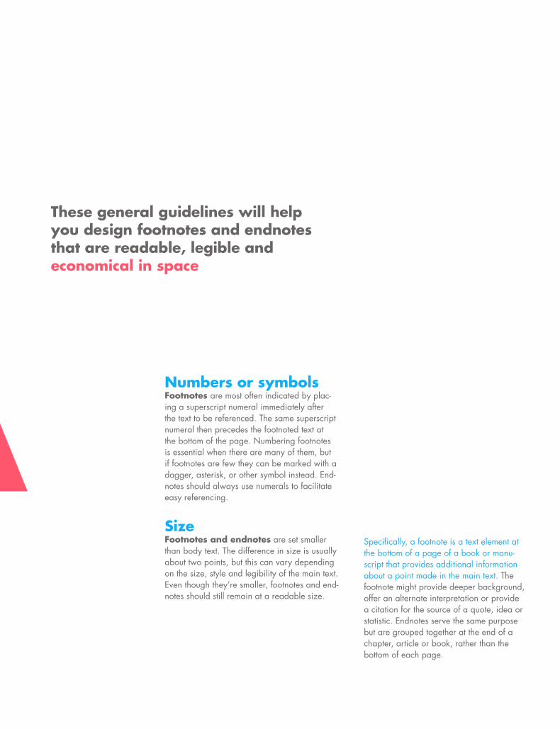
Numbers or symbolsFootnotes are most often indicated by plac-ing a superscript numeral immediately after the text to be referenced. The same superscript numeral then precedes the footnoted text at the bottom of the page. Numbering footnotes is essential when there are many of them, but if footnotes are few they can be marked with a dagger, asterisk, or other symbol instead. End-notes should always use numerals to facilitate easy referencing.
SizeFootnotes and endnotes are set smaller than body text. The difference in size is usually about two points, but this can vary depending on the size, style and legibility of the main text. Even though they’re smaller, footnotes and end-notes should still remain at a readable size.
\c\a\p\t\i\o\n\s\N\O\T\E\S
footnotes and endnotes are necessary components of scholarly and technical writing
Specifically, a footnote is a text element at the bottom of a page of a book or manu-script that provides additional information about a point made in the main text. The footnote might provide deeper background, offer an alternate interpretation or provide a citation for the source of a quote, idea or statistic. Endnotes serve the same purpose but are grouped together at the end of a chapter, article or book, rather than the bottom of each page.
These general guidelines will help you design footnotes and endnotes that are readable, legible and economical in space

SUBHEADS
Exploration 1
Futurism was first announced on February 20, 1909, when the Paris newspaper Le Figaro published a manifesto by the Italian poet and editor Filippo Tommaso Marinetti. The name Futurism, coined by Marinetti, reflected his emphasis on discarding what he conceived to be the static and irrelevant art of the past and celebrating change, originality, and innovation in culture and society.1 Futurism re-jected traditions and glorified contemporary life, mainly by emphasizing two dominant themes, the machine and motion. The works were characterized by the depiction of several successive actions of a subject at the same time. Marinetti's manifesto glorified the new technology of the automobile and the beauty of its speed, power, and movement. He exalted violence and conflict and called for the sweeping repudiation of traditional cultural, social, and political values and the destruction of such cultural institutions as museums and libraries. The manifesto's rhetoric was passionately bombastic; its tone was aggressive and inflammatory and was purposely intended to inspire public anger and amazement, to arouse controversy, and to attract widespread attention.
Radical mix of art and lifeBut is the movements which survive, oddly, here where we live and work as poets and artists: or, if not the movements, then their sense of art as an life itself. All of which, as futurism, had come sharply into focus by the start of the world war: a first radical mix of art and life, the epitome in the poplar mind of an avant-garde. It was, on both its Russian & Italian sides, the first great “art” movement led by poets; and if its means now sometimes seem exaggerated or unripe in retrospect, they carry within them the seed of all that we were later to become.
While Marinetti’s opening manifesto for Italian Futurism bristled with a polemical stance in favor of the transformed present (1909), the later manifestos of Futurist poets and artists offered formal, “technical” approaches to the works then getting under way. The key term—still resonant today—was parole in libertà2, by which poetry was to become “an uninterrupted sequence of new images… (a) strict bet of images or analogies, to be cast into the mysterious sea of phenomena.” This freedom-of-the-world, while it resembled other forms of collage and of image juxtaposition, more fully explored the use of innovative and expressive typography in the visual presentation of language, as set in mo-tion by forerunners like Mallarmé. Outrageous and aggressive, the Futurists’ performances mixed declamation and gesture, events and surroundings, indifference and engagement, to break the bar-riers between themselves and those who came to jeer or cheer them. Wrote Marinetti selbst3 (circa 1915), “Everything of any value is theatrical.”
WORDS IN LIBERTYA Prologue to Futurism
1. Philip Meggs, History of Graphic Design, Van Nostrand Reinhold, 1988
2. parole in liberta = words set free (liberty)
3. selbst = himself
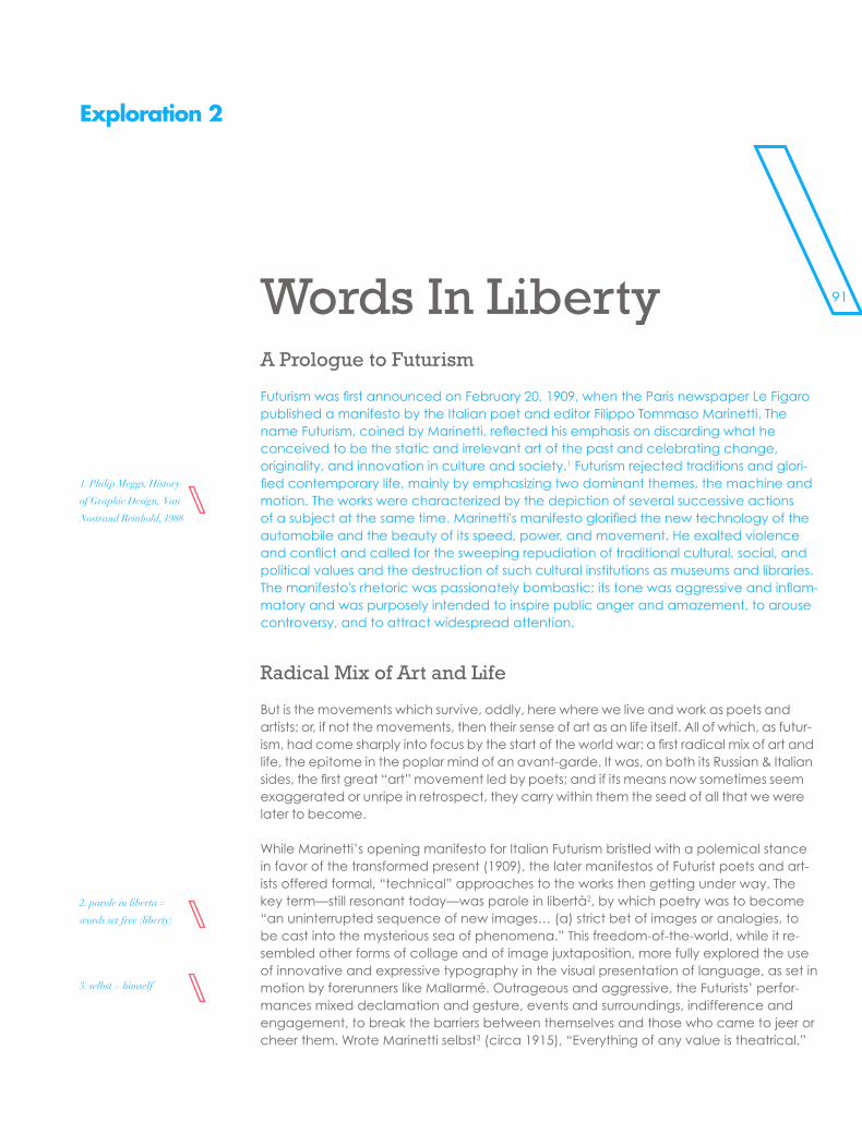
91
SUBHEADS
Exploration 2
Words In LibertyA Prologue to Futurism
Futurism was first announced on February 20, 1909, when the Paris newspaper Le Figaro published a manifesto by the Italian poet and editor Filippo Tommaso Marinetti. The name Futurism, coined by Marinetti, reflected his emphasis on discarding what he conceived to be the static and irrelevant art of the past and celebrating change, originality, and innovation in culture and society.1 Futurism rejected traditions and glori-fied contemporary life, mainly by emphasizing two dominant themes, the machine and motion. The works were characterized by the depiction of several successive actions of a subject at the same time. Marinetti's manifesto glorified the new technology of the automobile and the beauty of its speed, power, and movement. He exalted violence and conflict and called for the sweeping repudiation of traditional cultural, social, and political values and the destruction of such cultural institutions as museums and libraries. The manifesto's rhetoric was passionately bombastic; its tone was aggressive and inflam-matory and was purposely intended to inspire public anger and amazement, to arouse controversy, and to attract widespread attention.
Radical Mix of Art and Life
But is the movements which survive, oddly, here where we live and work as poets and artists: or, if not the movements, then their sense of art as an life itself. All of which, as futur-ism, had come sharply into focus by the start of the world war: a first radical mix of art and life, the epitome in the poplar mind of an avant-garde. It was, on both its Russian & Italian sides, the first great “art” movement led by poets; and if its means now sometimes seem exaggerated or unripe in retrospect, they carry within them the seed of all that we were later to become.
While Marinetti’s opening manifesto for Italian Futurism bristled with a polemical stance in favor of the transformed present (1909), the later manifestos of Futurist poets and art-ists offered formal, “technical” approaches to the works then getting under way. The key term—still resonant today—was parole in libertà2, by which poetry was to become “an uninterrupted sequence of new images… (a) strict bet of images or analogies, to be cast into the mysterious sea of phenomena.” This freedom-of-the-world, while it re-sembled other forms of collage and of image juxtaposition, more fully explored the use of innovative and expressive typography in the visual presentation of language, as set in motion by forerunners like Mallarmé. Outrageous and aggressive, the Futurists’ perfor-mances mixed declamation and gesture, events and surroundings, indifference and engagement, to break the barriers between themselves and those who came to jeer or cheer them. Wrote Marinetti selbst3 (circa 1915), “Everything of any value is theatrical.”
1. Philip Meggs, History
of Graphic Design, Van
Nostrand Reinhold, 1988
2. parole in liberta =
words set free (liberty)
3. selbst = himself
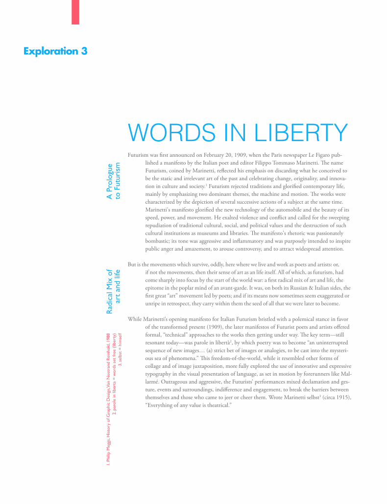
\\\\\\\\\\\
Exploration 3
WORDS IN LIBERTYFuturism was first announced on February 20, 1909, when the Paris newspaper Le Figaro pub-
lished a manifesto by the Italian poet and editor Filippo Tommaso Marinetti. The name Futurism, coined by Marinetti, reflected his emphasis on discarding what he conceived to be the static and irrelevant art of the past and celebrating change, originality, and innova-tion in culture and society.1 Futurism rejected traditions and glorified contemporary life, mainly by emphasizing two dominant themes, the machine and motion. The works were characterized by the depiction of several successive actions of a subject at the same time. Marinetti's manifesto glorified the new technology of the automobile and the beauty of its speed, power, and movement. He exalted violence and conflict and called for the sweeping repudiation of traditional cultural, social, and political values and the destruction of such cultural institutions as museums and libraries. The manifesto's rhetoric was passionately bombastic; its tone was aggressive and inflammatory and was purposely intended to inspire public anger and amazement, to arouse controversy, and to attract widespread attention.
But is the movements which survive, oddly, here where we live and work as poets and artists: or, if not the movements, then their sense of art as an life itself. All of which, as futurism, had come sharply into focus by the start of the world war: a first radical mix of art and life, the epitome in the poplar mind of an avant-garde. It was, on both its Russian & Italian sides, the first great “art” movement led by poets; and if its means now sometimes seem exaggerated or unripe in retrospect, they carry within them the seed of all that we were later to become.
While Marinetti’s opening manifesto for Italian Futurism bristled with a polemical stance in favor of the transformed present (1909), the later manifestos of Futurist poets and artists offered formal, “technical” approaches to the works then getting under way. The key term—still resonant today—was parole in libertà2, by which poetry was to become “an uninterrupted sequence of new images… (a) strict bet of images or analogies, to be cast into the mysteri-ous sea of phenomena.” This freedom-of-the-world, while it resembled other forms of collage and of image juxtaposition, more fully explored the use of innovative and expressive typography in the visual presentation of language, as set in motion by forerunners like Mal-larmé. Outrageous and aggressive, the Futurists’ performances mixed declamation and ges-ture, events and surroundings, indifference and engagement, to break the barriers between themselves and those who came to jeer or cheer them. Wrote Marinetti selbst3 (circa 1915), “Everything of any value is theatrical.”
A P
rolo
gue
to F
utur
ism
Rad
ical
Mix
of
art
and
life
1. P
hilip
Meg
gs, H
isto
ry o
f Gra
phic
Des
ign,
Van
Nos
tran
d R
einh
old,
198
82.
par
ole
in li
bert
a =
wor
ds s
et fr
ee (
liber
ty)
3. s
elbs
t =
him
self
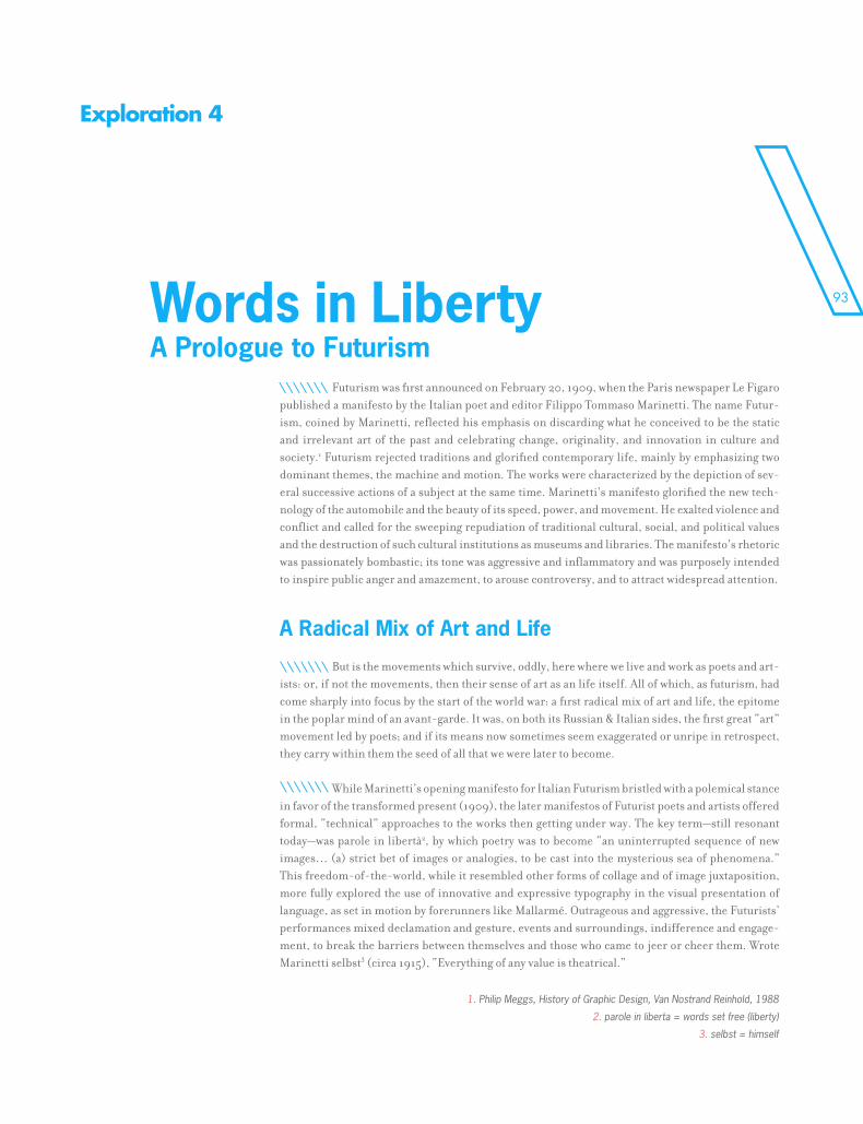
93
Exploration 4
Futurism was first announced on February 20, 1909, when the Paris newspaper Le Figaro published a manifesto by the Italian poet and editor Filippo Tommaso Marinetti. The name Futur-ism, coined by Marinetti, reflected his emphasis on discarding what he conceived to be the static and irrelevant art of the past and celebrating change, originality, and innovation in culture and society.1 Futurism rejected traditions and glorified contemporary life, mainly by emphasizing two dominant themes, the machine and motion. The works were characterized by the depiction of sev-eral successive actions of a subject at the same time. Marinetti's manifesto glorified the new tech-nology of the automobile and the beauty of its speed, power, and movement. He exalted violence and conflict and called for the sweeping repudiation of traditional cultural, social, and political values and the destruction of such cultural institutions as museums and libraries. The manifesto's rhetoric was passionately bombastic; its tone was aggressive and inflammatory and was purposely intended to inspire public anger and amazement, to arouse controversy, and to attract widespread attention.
But is the movements which survive, oddly, here where we live and work as poets and art-ists: or, if not the movements, then their sense of art as an life itself. All of which, as futurism, had come sharply into focus by the start of the world war: a first radical mix of art and life, the epitome in the poplar mind of an avant-garde. It was, on both its Russian & Italian sides, the first great “art” movement led by poets; and if its means now sometimes seem exaggerated or unripe in retrospect, they carry within them the seed of all that we were later to become.
While Marinetti’s opening manifesto for Italian Futurism bristled with a polemical stance in favor of the transformed present (1909), the later manifestos of Futurist poets and artists offered formal, “technical” approaches to the works then getting under way. The key term—still resonant today—was parole in libertà2, by which poetry was to become “an uninterrupted sequence of new images… (a) strict bet of images or analogies, to be cast into the mysterious sea of phenomena.” This freedom-of-the-world, while it resembled other forms of collage and of image juxtaposition, more fully explored the use of innovative and expressive typography in the visual presentation of language, as set in motion by forerunners like Mallarmé. Outrageous and aggressive, the Futurists’ performances mixed declamation and gesture, events and surroundings, indifference and engage-ment, to break the barriers between themselves and those who came to jeer or cheer them. Wrote Marinetti selbst3 (circa 1915), “Everything of any value is theatrical.”
Words in LibertyA Prologue to Futurism
A Radical Mix of Art and Life
\\\\\\\
\\\\\\\
\\\\\\\
1. Philip Meggs, History of Graphic Design, Van Nostrand Reinhold, 1988
2. parole in liberta = words set free (liberty)
3. selbst = himself
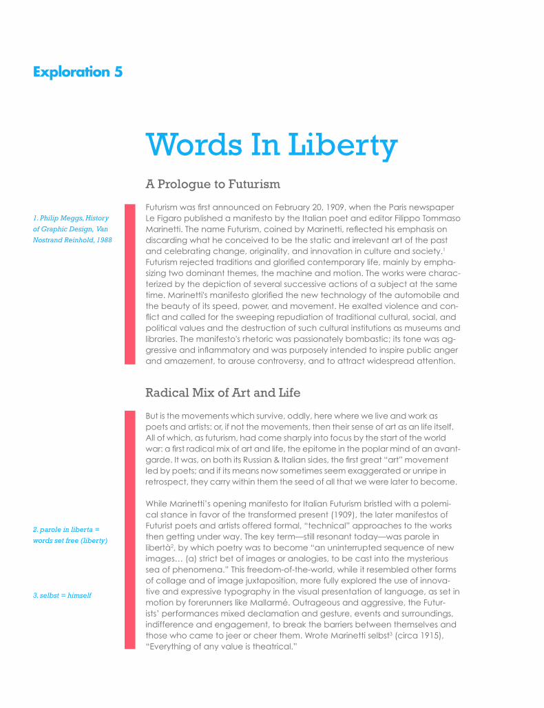
Exploration 5
Words In LibertyA Prologue to Futurism
Futurism was first announced on February 20, 1909, when the Paris newspaper Le Figaro published a manifesto by the Italian poet and editor Filippo Tommaso Marinetti. The name Futurism, coined by Marinetti, reflected his emphasis on discarding what he conceived to be the static and irrelevant art of the past and celebrating change, originality, and innovation in culture and society.1 Futurism rejected traditions and glorified contemporary life, mainly by empha-sizing two dominant themes, the machine and motion. The works were charac-terized by the depiction of several successive actions of a subject at the same time. Marinetti's manifesto glorified the new technology of the automobile and the beauty of its speed, power, and movement. He exalted violence and con-flict and called for the sweeping repudiation of traditional cultural, social, and political values and the destruction of such cultural institutions as museums and libraries. The manifesto's rhetoric was passionately bombastic; its tone was ag-gressive and inflammatory and was purposely intended to inspire public anger and amazement, to arouse controversy, and to attract widespread attention.
Radical Mix of Art and Life
But is the movements which survive, oddly, here where we live and work as poets and artists: or, if not the movements, then their sense of art as an life itself. All of which, as futurism, had come sharply into focus by the start of the world war: a first radical mix of art and life, the epitome in the poplar mind of an avant-garde. It was, on both its Russian & Italian sides, the first great “art” movement led by poets; and if its means now sometimes seem exaggerated or unripe in retrospect, they carry within them the seed of all that we were later to become.
While Marinetti’s opening manifesto for Italian Futurism bristled with a polemi-cal stance in favor of the transformed present (1909), the later manifestos of Futurist poets and artists offered formal, “technical” approaches to the works then getting under way. The key term—still resonant today—was parole in libertà2, by which poetry was to become “an uninterrupted sequence of new images… (a) strict bet of images or analogies, to be cast into the mysterious sea of phenomena.” This freedom-of-the-world, while it resembled other forms of collage and of image juxtaposition, more fully explored the use of innova-tive and expressive typography in the visual presentation of language, as set in motion by forerunners like Mallarmé. Outrageous and aggressive, the Futur-ists’ performances mixed declamation and gesture, events and surroundings, indifference and engagement, to break the barriers between themselves and those who came to jeer or cheer them. Wrote Marinetti selbst3 (circa 1915), “Everything of any value is theatrical.”
1. Philip Meggs, History
of Graphic Design, Van
Nostrand Reinhold, 1988
2. parole in liberta =
words set free (liberty)
3. selbst = himself
95
Exploration 6
uturism was first announced on February 20, 1909, when the Paris newspaper Le Figaro published a manifesto by the Italian poet and editor Filippo Tommaso Marinetti. The name Futurism, coined by Marinetti, reflected his emphasis on dis-
carding what he conceived to be the static and irrelevant art of the past and celebrat-ing change, originality, and innovation in culture and society.1 Futurism rejected tradi-tions and glorified contemporary life, mainly by emphasizing two dominant themes, the machine and motion. The manifesto’s rhetoric was passionately bombastic; its tone was aggressive and inflammatory and was purposely intended to inspire public anger and amazement, to arouse controversy, and to attract widespread attention.
But is the movements which survive, oddly, here where we live and work as poets and artists: or, if not the movements, then their sense of art as an life itself. All of which, as futurism, had come sharply into focus by the start of the world war: a first radical mix of art and life, the epitome in the poplar mind of an avant-garde. It was, on both its Russian & Italian sides, the first great “art” movement led by poets; and if its means now sometimes seem exaggerated or unripe in retrospect, they carry within them the seed of all that we were later to become.
While Marinetti’s opening manifesto for Italian Futurism bristled with a polemical stance in favor of the transformed present (1909), the later manifestos of Futurist poets and artists offered formal, “technical” approaches to the works then getting under way. The key term—still resonant today—was parole in libertà2, by which poetry was to become “an uninterrupted sequence of new images… (a) strict bet of images or analogies, to be cast into the mysterious sea of phenomena.” This freedom-of-the-world, while it resembled other forms of collage and of image juxtaposition, more fully explored the use of innovative and expressive typography in the visual presentation of language, as set in motion by forerunners like Mallarmé. Outrageous and aggressive, the Futurists’ performances mixed declamation and gesture, events and surroundings, indifference and engagement, to break the barriers between themselves and those who came to jeer or cheer them. Wrote Marinetti selbst3 (circa 1915), “Everything of any value is theatrical.”
WO
RDS
IN L
IBER
TY
A Prologue to Futurism
Radical mix of art and life
F
1. Philip Meggs, History of Graphic Design, Van Nostrand Reinhold, 1988
2. parole in liberta = words set free (liberty)
3. selbst = himself
SPECSSUBHEADS
\\\\\\\\\\\\\\\\\\\\\\\\\\\\\\\\\\\\\\\\\\\\\\\\\\\
\\\\\\\\\\\\\\\\\\\\\\\\\\\\\\\\\\\\\\\\\\\\\\\\\\\\\\\

97
SPECSSUBHEADS
\\\\\\\\\\\\\\\\\\\\\\\\\\\\\\\\\\\\\\\\\\\\\\\\\\\
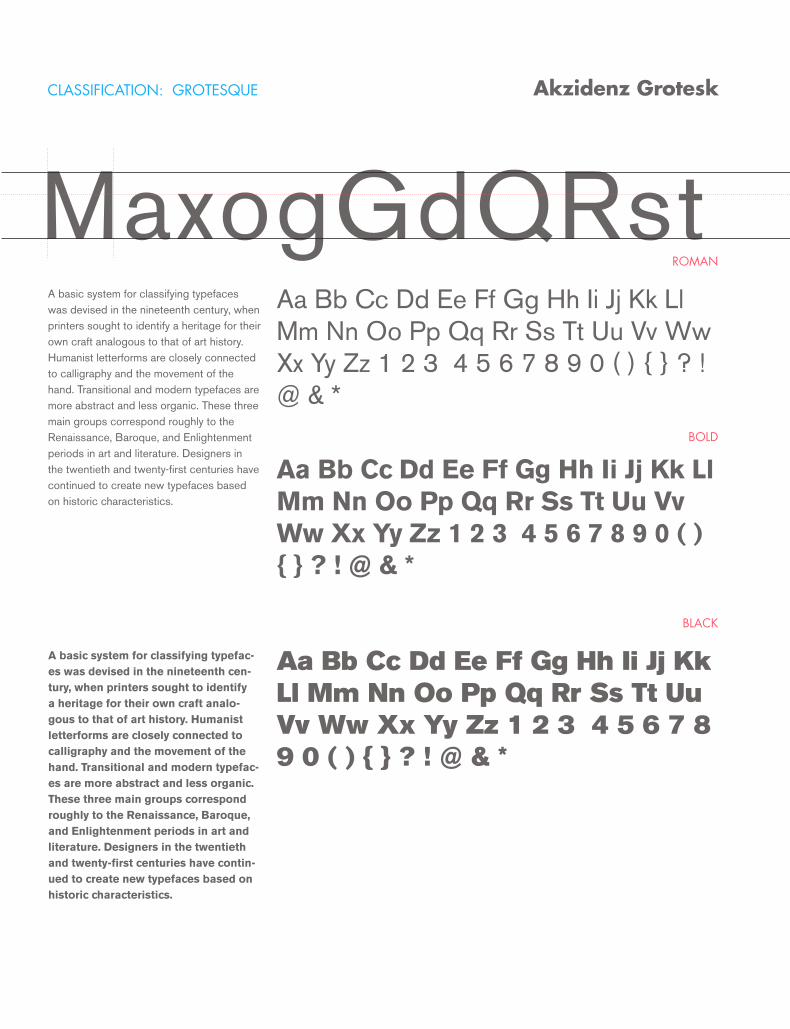
ROMAN
BOLD
BLACK
Akzidenz Grotesk
MaxogGdQRstA basic system for classifying typefaces was devised in the nineteenth century, when printers sought to identify a heritage for their own craft analogous to that of art history. Humanist letterforms are closely connected to calligraphy and the movement of the hand. Transitional and modern typefaces are more abstract and less organic. These three main groups correspond roughly to the Renaissance, Baroque, and Enlightenment periods in art and literature. Designers in the twentieth and twenty-first centuries have continued to create new typefaces based on historic characteristics.
A basic system for classifying typefac-es was devised in the nineteenth cen-tury, when printers sought to identify a heritage for their own craft analo-gous to that of art history. Humanist letterforms are closely connected to calligraphy and the movement of the hand. Transitional and modern typefac-es are more abstract and less organic. These three main groups correspond roughly to the Renaissance, Baroque, and Enlightenment periods in art and literature. Designers in the twentieth and twenty-first centuries have contin-ued to create new typefaces based on historic characteristics.
Aa Bb Cc Dd Ee Ff Gg Hh Ii Jj Kk Ll Mm Nn Oo Pp Qq Rr Ss Tt Uu Vv Ww Xx Yy Zz 1 2 3 4 5 6 7 8 9 0 ( ) { } ? ! @ & *
Aa Bb Cc Dd Ee Ff Gg Hh Ii Jj Kk Ll Mm Nn Oo Pp Qq Rr Ss Tt Uu Vv Ww Xx Yy Zz 1 2 3 4 5 6 7 8 9 0 ( ) { } ? ! @ & *
Aa Bb Cc Dd Ee Ff Gg Hh Ii Jj Kk Ll Mm Nn Oo Pp Qq Rr Ss Tt Uu Vv Ww Xx Yy Zz 1 2 3 4 5 6 7 8 9 0 ( ) { } ? ! @ & *
CLASSIFICATION: GROTESQUE
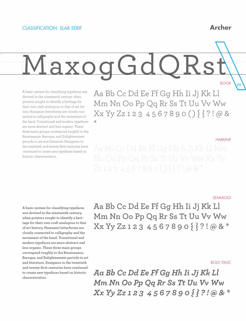
99
Akzidenz Grotesk
BOOK
HAIRLINE
SEMI-BOLD
BOLD ITALIC
MaxogGdQRstA basic system for classifying typefaces was devised in the nineteenth century, when printers sought to identify a heritage for their own craft analogous to that of art his-tory. Humanist letterforms are closely con-nected to calligraphy and the movement of the hand. Transitional and modern typefaces are more abstract and less organic. These three main groups correspond roughly to the Renaissance, Baroque, and Enlightenment periods in art and literature. Designers in the twentieth and twenty-first centuries have continued to create new typefaces based on historic characteristics.
A basic system for classifying typefaces was devised in the nineteenth century, when printers sought to identify a heri-tage for their own craft analogous to that of art history. Humanist letterforms are closely connected to calligraphy and the movement of the hand. Transitional and modern typefaces are more abstract and less organic. These three main groups correspond roughly to the Renaissance, Baroque, and Enlightenment periods in art and literature. Designers in the twentieth and twenty-first centuries have continued to create new typefaces based on historic characteristics.
Aa Bb Cc Dd Ee Ff Gg Hh Ii Jj Kk Ll Mm Nn Oo Pp Qq Rr Ss Tt Uu Vv Ww Xx Yy Zz 1 2 3 4 5 6 7 8 9 0 ( ) { } ? ! @ & *
Aa Bb Cc Dd Ee Ff Gg Hh Ii Jj Kk Ll Mm Nn Oo Pp Qq Rr Ss Tt Uu Vv Ww Xx Yy Zz 1 2 3 4 5 6 7 8 9 0 ( ) { } ? ! @ & *
Aa Bb Cc Dd Ee Ff Gg Hh Ii Jj Kk Ll Mm Nn Oo Pp Qq Rr Ss Tt Uu Vv Ww Xx Yy Zz 1 2 3 4 5 6 7 8 9 0 { } ? ! @ & *
Aa Bb Cc Dd Ee Ff Gg Hh Ii Jj Kk Ll Mm Nn Oo Pp Qq Rr Ss Tt Uu Vv Ww Xx Yy Zz 1 2 3 4 5 6 7 8 9 0 { } ? ! @ & *
CLASSIFICATION: SLAB SERIF Archer
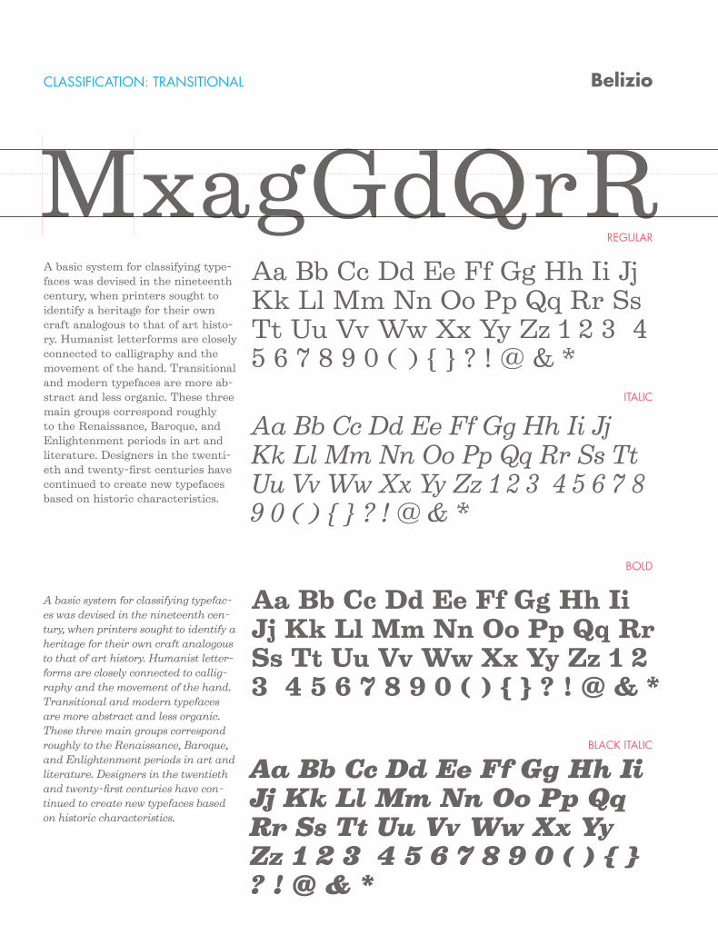
REGULAR
ITALIC
BOLD
BLACK ITALIC
Belizio
MxagGdQrRA basic system for classifying type-faces was devised in the nineteenth century, when printers sought to identify a heritage for their own craft analogous to that of art histo-ry. Humanist letterforms are closely connected to calligraphy and the movement of the hand. Transitional and modern typefaces are more ab-stract and less organic. These three main groups correspond roughly to the Renaissance, Baroque, and Enlightenment periods in art and literature. Designers in the twenti-eth and twenty-first centuries have continued to create new typefaces based on historic characteristics.
A basic system for classifying typefac-es was devised in the nineteenth cen-tury, when printers sought to identify a heritage for their own craft analogous to that of art history. Humanist letter-forms are closely connected to callig-raphy and the movement of the hand. Transitional and modern typefaces are more abstract and less organic. These three main groups correspond roughly to the Renaissance, Baroque, and Enlightenment periods in art and literature. Designers in the twentieth and twenty-first centuries have con-tinued to create new typefaces based on historic characteristics.
Aa Bb Cc Dd Ee Ff Gg Hh Ii Jj Kk Ll Mm Nn Oo Pp Qq Rr Ss Tt Uu Vv Ww Xx Yy Zz 1 2 3 4 5 6 7 8 9 0 ( ) { } ? ! @ & *
Aa Bb Cc Dd Ee Ff Gg Hh Ii Jj Kk Ll Mm Nn Oo Pp Qq Rr Ss Tt Uu Vv Ww Xx Yy Zz 1 2 3 4 5 6 7 8 9 0 ( ) { } ? ! @ & *
Aa Bb Cc Dd Ee Ff Gg Hh Ii Jj Kk Ll Mm Nn Oo Pp Qq Rr Ss Tt Uu Vv Ww Xx Yy Zz 1 2 3 4 5 6 7 8 9 0 ( ) { } ? ! @ & *
Aa Bb Cc Dd Ee Ff Gg Hh Ii Jj Kk Ll Mm Nn Oo Pp Qq Rr Ss Tt Uu Vv Ww Xx Yy Zz 1 2 3 4 5 6 7 8 9 0 ( ) { } ? ! @ & *
CLASSIFICATION: TRANSITIONAL
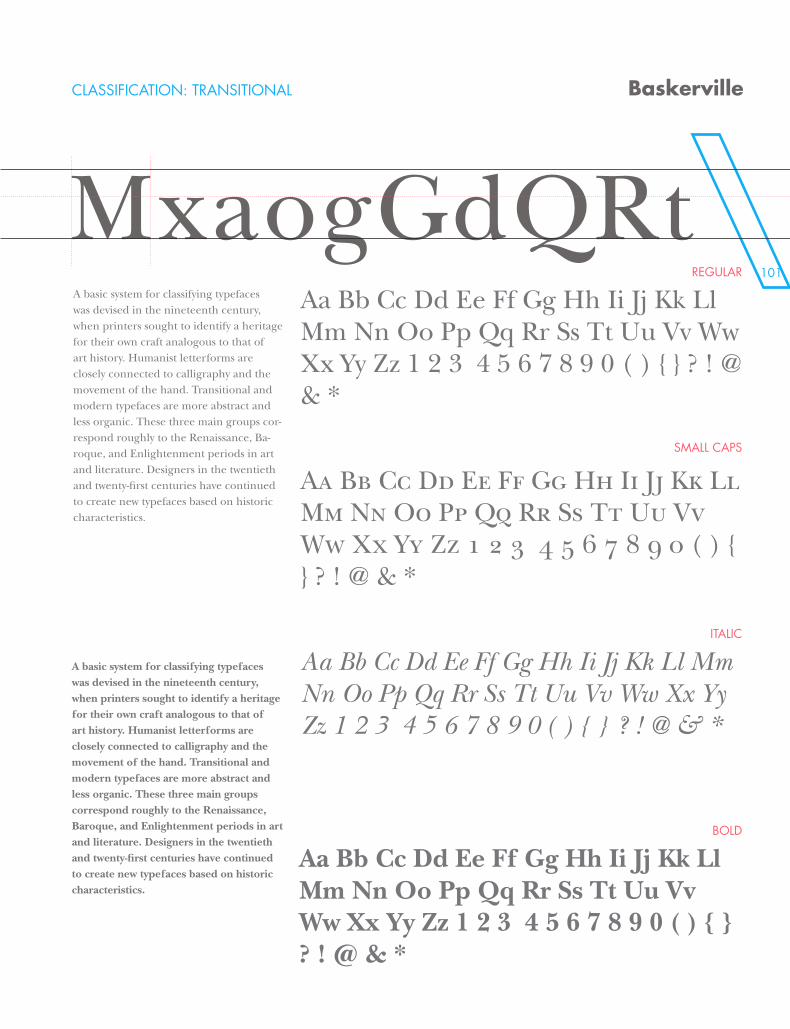
101
CLASSIFICATION: TRANSITIONAL
REGULAR
SMALL CAPS
ITALIC
BOLD
Baskerville
MxaogGdQRtA basic system for classifying typefaces was devised in the nineteenth century, when printers sought to identify a heritage for their own craft analogous to that of art history. Humanist letterforms are closely connected to calligraphy and the movement of the hand. Transitional and modern typefaces are more abstract and less organic. These three main groups cor-respond roughly to the Renaissance, Ba-roque, and Enlightenment periods in art and literature. Designers in the twentieth and twenty-first centuries have continued to create new typefaces based on historic characteristics.
A basic system for classifying typefaces was devised in the nineteenth century, when printers sought to identify a heritage for their own craft analogous to that of art history. Humanist letterforms are closely connected to calligraphy and the movement of the hand. Transitional and modern typefaces are more abstract and less organic. These three main groups correspond roughly to the Renaissance, Baroque, and Enlightenment periods in art and literature. Designers in the twentieth and twenty-first centuries have continued to create new typefaces based on historic characteristics.
Aa Bb Cc Dd Ee Ff Gg Hh Ii Jj Kk Ll Mm Nn Oo Pp Qq Rr Ss Tt Uu Vv Ww Xx Yy Zz 1 2 3 4 5 6 7 8 9 0 ( ) { } ? ! @ & *
Aa Bb Cc Dd Ee Ff Gg Hh Ii Jj Kk Ll Mm Nn Oo Pp Qq Rr Ss Tt Uu Vv Ww Xx Yy Zz 1 2 3 4 5 6 7 8 9 0 ( ) { } ? ! @ & *
Aa Bb Cc Dd Ee Ff Gg Hh Ii Jj Kk Ll Mm Nn Oo Pp Qq Rr Ss Tt Uu Vv Ww Xx Yy Zz 1 2 3 4 5 6 7 8 9 0 ( ) { } ? ! @ & *
Aa Bb Cc Dd Ee Ff Gg Hh Ii Jj Kk Ll Mm Nn Oo Pp Qq Rr Ss Tt Uu Vv Ww Xx Yy Zz 1 2 3 4 5 6 7 8 9 0 ( ) { } ? ! @ & *
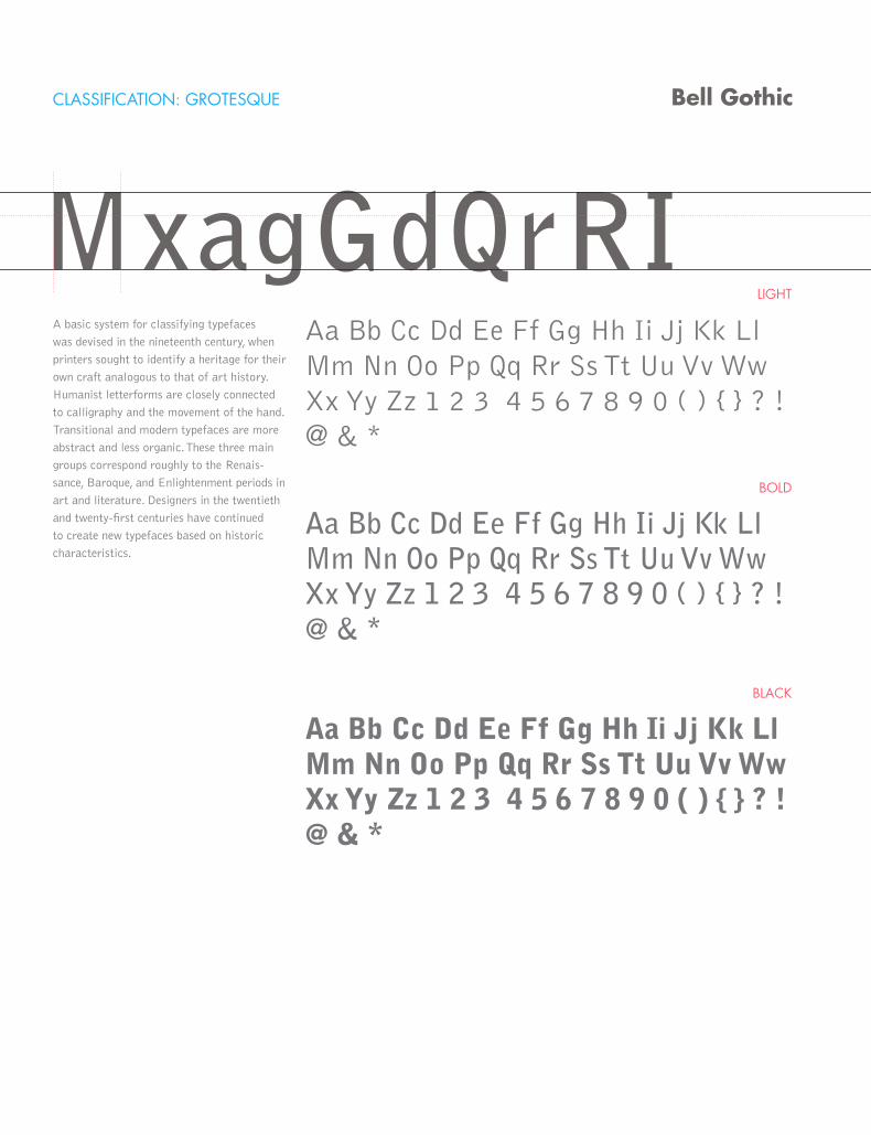
CLASSIFICATION: GROTESQUE
LIGHT
BOLD
BLACK
Bell Gothic
MxagGdQrRIA basic system for classifying typefaces
was devised in the nineteenth century, when
printers sought to identify a heritage for their
own craft analogous to that of art history.
Humanist letterforms are closely connected
to calligraphy and the movement of the hand.
Transitional and modern typefaces are more
abstract and less organic. These three main
groups correspond roughly to the Renais-
sance, Baroque, and Enlightenment periods in
art and literature. Designers in the twentieth
and twenty-first centuries have continued
to create new typefaces based on historic
characteristics.
Aa Bb Cc Dd Ee Ff Gg Hh Ii Jj Kk Ll Mm Nn Oo Pp Qq Rr Ss Tt Uu Vv Ww Xx Yy Zz 1 2 3 4 5 6 7 8 9 0 ( ) { } ? ! @ & *
Aa Bb Cc Dd Ee Ff Gg Hh Ii Jj Kk Ll Mm Nn Oo Pp Qq Rr Ss Tt Uu Vv Ww Xx Yy Zz 1 2 3 4 5 6 7 8 9 0 ( ) { } ? ! @ & *
Aa Bb Cc Dd Ee Ff Gg Hh Ii Jj Kk Ll Mm Nn Oo Pp Qq Rr Ss Tt Uu Vv Ww Xx Yy Zz 1 2 3 4 5 6 7 8 9 0 ( ) { } ? ! @ & *
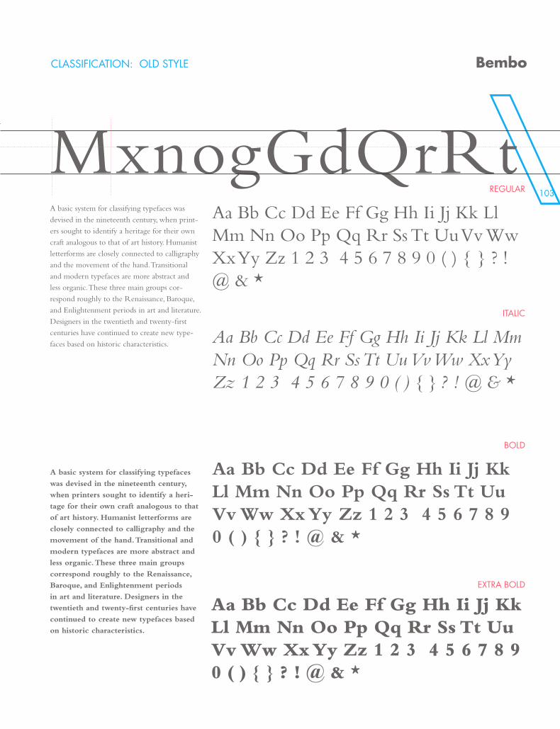
103
CLASSIFICATION: OLD STYLE
REGULAR
ITALIC
BOLD
EXTRA BOLD
Bembo
MxnogGdQrRtA basic system for classifying typefaces was
devised in the nineteenth century, when print-
ers sought to identify a heritage for their own
craft analogous to that of art history. Humanist
letterforms are closely connected to calligraphy
and the movement of the hand. Transitional
and modern typefaces are more abstract and
less organic. These three main groups cor-
respond roughly to the Renaissance, Baroque,
and Enlightenment periods in art and literature.
Designers in the twentieth and twenty-first
centuries have continued to create new type-
faces based on historic characteristics.
A basic system for classifying typefaces
was devised in the nineteenth century,
when printers sought to identify a heri-
tage for their own craft analogous to that
of art history. Humanist letterforms are
closely connected to calligraphy and the
movement of the hand. Transitional and
modern typefaces are more abstract and
less organic. These three main groups
correspond roughly to the Renaissance,
Baroque, and Enlightenment periods
in art and literature. Designers in the
twentieth and twenty-first centuries have
continued to create new typefaces based
on historic characteristics.
Aa Bb Cc Dd Ee Ff Gg Hh Ii Jj Kk Ll Mm Nn Oo Pp Qq Rr Ss Tt Uu Vv Ww Xx Yy Zz 1 2 3 4 5 6 7 8 9 0 ( ) { } ? ! @ & *
Aa Bb Cc Dd Ee Ff Gg Hh Ii Jj Kk Ll Mm Nn Oo Pp Qq Rr Ss Tt Uu Vv Ww Xx Yy Zz 1 2 3 4 5 6 7 8 9 0 ( ) { } ? ! @ & *
Aa Bb Cc Dd Ee Ff Gg Hh Ii Jj Kk Ll Mm Nn Oo Pp Qq Rr Ss Tt Uu Vv Ww Xx Yy Zz 1 2 3 4 5 6 7 8 9 0 ( ) { } ? ! @ & *
Aa Bb Cc Dd Ee Ff Gg Hh Ii Jj Kk Ll Mm Nn Oo Pp Qq Rr Ss Tt Uu Vv Ww Xx Yy Zz 1 2 3 4 5 6 7 8 9 0 ( ) { } ? ! @ & *
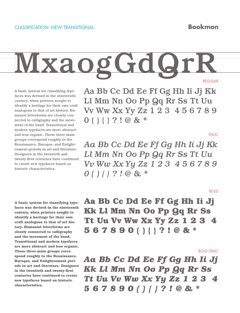
CLASSIFICATION: NEW TRANSITIONAL
REGULAR
ITALIC
BOLD
BOLD ITALIC
Bookman
MxaogGdQrRA basic system for classifying type-faces was devised in the nineteenth century, when printers sought to identify a heritage for their own craft analogous to that of art history. Hu-manist letterforms are closely con-nected to calligraphy and the move-ment of the hand. Transitional and modern typefaces are more abstract and less organic. These three main groups correspond roughly to the Renaissance, Baroque, and Enlight-enment periods in art and literature. Designers in the twentieth and twenty-first centuries have continued to create new typefaces based on historic characteristics.
A basic system for classifying type-faces was devised in the nineteenth century, when printers sought to identify a heritage for their own craft analogous to that of art his-tory. Humanist letterforms are closely connected to calligraphy and the movement of the hand. Transitional and modern typefaces are more abstract and less organic. These three main groups corre-spond roughly to the Renaissance, Baroque, and Enlightenment peri-ods in art and literature. Designers in the twentieth and twenty-first centuries have continued to create new typefaces based on historic characteristics.
Aa Bb Cc Dd Ee Ff Gg Hh Ii Jj Kk Ll Mm Nn Oo Pp Qq Rr Ss Tt Uu Vv Ww Xx Yy Zz 1 2 3 4 5 6 7 8 9 0 ( ) { } ? ! @ & *
Aa Bb Cc Dd Ee Ff Gg Hh Ii Jj Kk Ll Mm Nn Oo Pp Qq Rr Ss Tt Uu Vv Ww Xx Yy Zz 1 2 3 4 5 6 7 8 9 0 ( ) { } ? ! @ & *
Aa Bb Cc Dd Ee Ff Gg Hh Ii Jj Kk Ll Mm Nn Oo Pp Qq Rr Ss Tt Uu Vv Ww Xx Yy Zz 1 2 3 4 5 6 7 8 9 0 ( ) { } ? ! @ & *
Aa Bb Cc Dd Ee Ff Gg Hh Ii Jj Kk Ll Mm Nn Oo Pp Qq Rr Ss Tt Uu Vv Ww Xx Yy Zz 1 2 3 4 5 6 7 8 9 0 ( ) { } ? ! @ & *
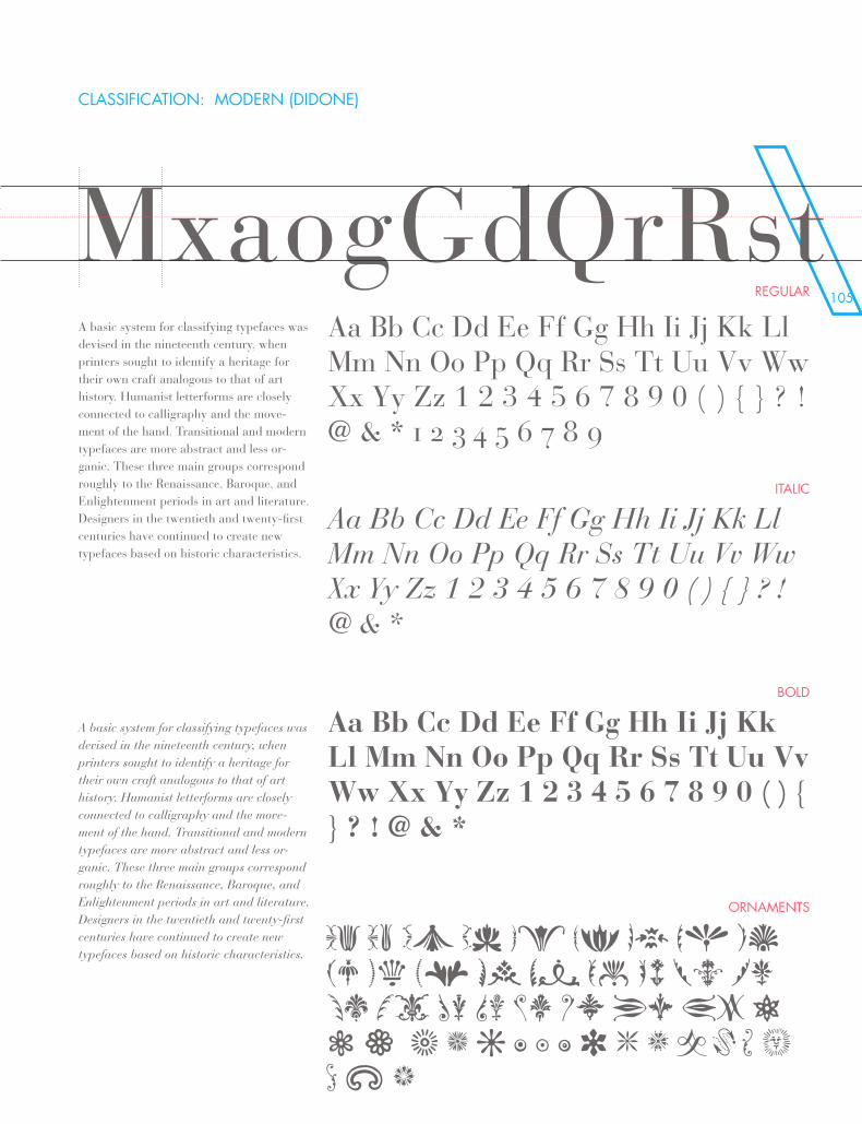
105
CLASSIFICATION: MODERN (DIDONE)
REGULAR
ITALIC
BOLD
ORNAMENTS
MxaogGdQrRstA basic system for classifying typefaces was devised in the nineteenth century, when printers sought to identify a heritage for their own craft analogous to that of art history. Humanist letterforms are closely connected to calligraphy and the move-ment of the hand. Transitional and modern typefaces are more abstract and less or-ganic. These three main groups correspond roughly to the Renaissance, Baroque, and Enlightenment periods in art and literature. Designers in the twentieth and twenty-first centuries have continued to create new typefaces based on historic characteristics.
A basic system for classifying typefaces was devised in the nineteenth century, when printers sought to identify a heritage for their own craft analogous to that of art history. Humanist letterforms are closely connected to calligraphy and the move-ment of the hand. Transitional and modern typefaces are more abstract and less or-ganic. These three main groups correspond roughly to the Renaissance, Baroque, and Enlightenment periods in art and literature. Designers in the twentieth and twenty-first centuries have continued to create new typefaces based on historic characteristics.
Aa Bb Cc Dd Ee Ff Gg Hh Ii Jj Kk Ll Mm Nn Oo Pp Qq Rr Ss Tt Uu Vv Ww Xx Yy Zz 1 2 3 4 5 6 7 8 9 0 ( ) { } ? ! @ & * 1 2 3 4 5 6 7 8 9
Aa Bb Cc Dd Ee Ff Gg Hh Ii Jj Kk Ll Mm Nn Oo Pp Qq Rr Ss Tt Uu Vv Ww Xx Yy Zz 1 2 3 4 5 6 7 8 9 0 ( ) { } ? ! @ & *
Aa Bb Cc Dd Ee Ff Gg Hh Ii Jj Kk Ll Mm Nn Oo Pp Qq Rr Ss Tt Uu Vv Ww Xx Yy Zz 1 2 3 4 5 6 7 8 9 0 ( ) { } ? ! @ & *
Aa Bb Cc Dd Ee Ff Gg Hh Ii Jj Kk Ll Mm Nn Oo Pp Qq Rr Ss Tt Uu Vv Ww Xx Yy Zz 1 2 3 4 5 6 7 8 9 0 ( ) { } ? ! @ & *
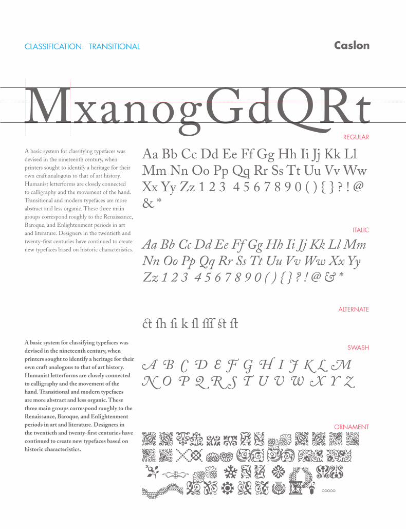
Bodoni CLASSIFICATION: TRANSITIONAL
REGULAR
ITALIC
SWASH
ORNAMENT
ALTERNATE
Caslon
MxanogGdQRtA basic system for classifying typefaces was devised in the nineteenth century, when printers sought to identify a heritage for their own craft analogous to that of art history. Humanist letterforms are closely connected to calligraphy and the movement of the hand. Transitional and modern typefaces are more abstract and less organic. These three main groups correspond roughly to the Renaissance, Baroque, and Enlightenment periods in art and literature. Designers in the twentieth and twenty-first centuries have continued to create new typefaces based on historic characteristics.
A basic system for classifying typefaces was devised in the nineteenth century, when printers sought to identify a heritage for their own craft analogous to that of art history. Humanist letterforms are closely connected to calligraphy and the movement of the hand. Transitional and modern typefaces are more abstract and less organic. These three main groups correspond roughly to the Renaissance, Baroque, and Enlightenment periods in art and literature. Designers in the twentieth and twenty-first centuries have continued to create new typefaces based on historic characteristics.
Aa Bb Cc Dd Ee Ff Gg Hh Ii Jj Kk Ll Mm Nn Oo Pp Qq Rr Ss Tt Uu Vv Ww Xx Yy Zz 1 2 3 4 5 6 7 8 9 0 ( ) { } ? ! @ & *
Aa Bb Cc Dd Ee Ff Gg Hh Ii Jj Kk Ll Mm Nn Oo Pp Qq Rr Ss Tt Uu Vv Ww Xx Yy Zz 1 2 3 4 5 6 7 8 9 0 ( ) { } ? ! @ & *
Aa Ba Ca Da Ea Fa Ga Ha Ia Ja Ka La Ma Na Oa Pa Qa Ra Sa Ta Ua Va Wa Xa Ya Z
A a Bb C c D d Ee F f G g H h Ii Jj Kk Ll Mm Nn Oo Pp Qq Or S s Ot Uu Vv Ww X x y Z z 1 2 3 4
c h i k l Ss T t
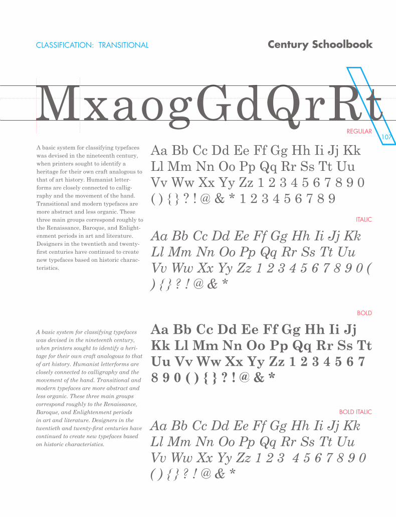
107
Caslon CLASSIFICATION: TRANSITIONAL
REGULAR
ITALIC
BOLD
BOLD ITALIC
Century Schoolbook
MxaogGdQrRtA basic system for classifying typefaces was devised in the nineteenth century, when printers sought to identify a heritage for their own craft analogous to that of art history. Humanist letter-forms are closely connected to callig-raphy and the movement of the hand. Transitional and modern typefaces are more abstract and less organic. These three main groups correspond roughly to the Renaissance, Baroque, and Enlight-enment periods in art and literature. Designers in the twentieth and twenty-first centuries have continued to create new typefaces based on historic charac-teristics.
A basic system for classifying typefaces was devised in the nineteenth century, when printers sought to identify a heri-tage for their own craft analogous to that of art history. Humanist letterforms are closely connected to calligraphy and the movement of the hand. Transitional and modern typefaces are more abstract and less organic. These three main groups correspond roughly to the Renaissance, Baroque, and Enlightenment periods in art and literature. Designers in the twentieth and twenty-first centuries have continued to create new typefaces based on historic characteristics.
Aa Bb Cc Dd Ee Ff Gg Hh Ii Jj Kk Ll Mm Nn Oo Pp Qq Rr Ss Tt Uu Vv Ww Xx Yy Zz 1 2 3 4 5 6 7 8 9 0 ( ) { } ? ! @ & * 1 2 3 4 5 6 7 8 9
Aa Bb Cc Dd Ee Ff Gg Hh Ii Jj Kk Ll Mm Nn Oo Pp Qq Rr Ss Tt Uu Vv Ww Xx Yy Zz 1 2 3 4 5 6 7 8 9 0 ( ) { } ? ! @ & *
Aa Bb Cc Dd Ee Ff Gg Hh Ii Jj Kk Ll Mm Nn Oo Pp Qq Rr Ss Tt Uu Vv Ww Xx Yy Zz 1 2 3 4 5 6 7 8 9 0 ( ) { } ? ! @ & *
Aa Bb Cc Dd Ee Ff Gg Hh Ii Jj Kk Ll Mm Nn Oo Pp Qq Rr Ss Tt Uu Vv Ww Xx Yy Zz 1 2 3 4 5 6 7 8 9 0 ( ) { } ? ! @ & *
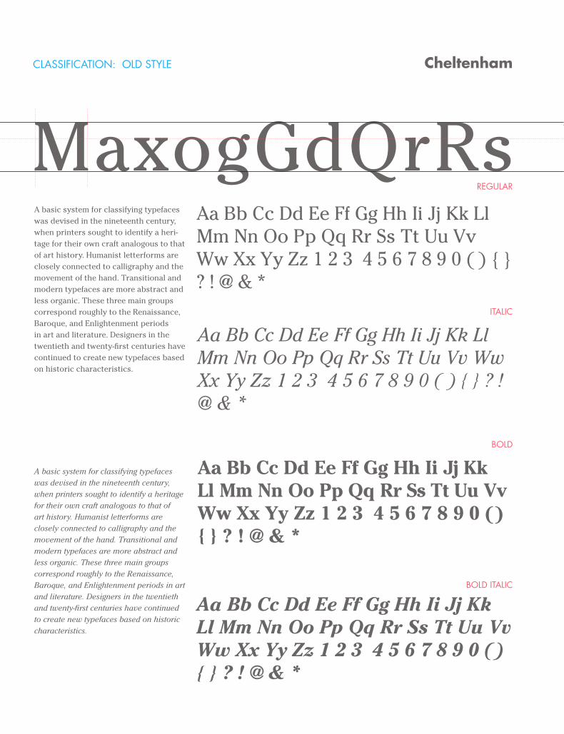
CLASSIFICATION: OLD STYLE
REGULAR
ITALIC
BOLD
BOLD ITALIC
Cheltenham
MaxogGdQrRsA basic system for classifying typefaces was devised in the nineteenth century, when printers sought to identify a heri-tage for their own craft analogous to that of art history. Humanist letterforms are closely connected to calligraphy and the movement of the hand. Transitional and modern typefaces are more abstract and less organic. These three main groups correspond roughly to the Renaissance, Baroque, and Enlightenment periods in art and literature. Designers in the twentieth and twenty-first centuries have continued to create new typefaces based on historic characteristics.
A basic system for classifying typefaces was devised in the nineteenth century, when printers sought to identify a heritage for their own craft analogous to that of art history. Humanist letterforms are closely connected to calligraphy and the movement of the hand. Transitional and modern typefaces are more abstract and less organic. These three main groups correspond roughly to the Renaissance, Baroque, and Enlightenment periods in art and literature. Designers in the twentieth and twenty-first centuries have continued to create new typefaces based on historic characteristics.
Aa Bb Cc Dd Ee Ff Gg Hh Ii Jj Kk Ll Mm Nn Oo Pp Qq Rr Ss Tt Uu Vv Ww Xx Yy Zz 1 2 3 4 5 6 7 8 9 0 ( ) { } ? ! @ & *
Aa Bb Cc Dd Ee Ff Gg Hh Ii Jj Kk Ll Mm Nn Oo Pp Qq Rr Ss Tt Uu Vv Ww Xx Yy Zz 1 2 3 4 5 6 7 8 9 0 ( ) { } ? ! @ & *
Aa Bb Cc Dd Ee Ff Gg Hh Ii Jj Kk Ll Mm Nn Oo Pp Qq Rr Ss Tt Uu Vv Ww Xx Yy Zz 1 2 3 4 5 6 7 8 9 0 ( ) { } ? ! @ & *
Aa Bb Cc Dd Ee Ff Gg Hh Ii Jj Kk Ll Mm Nn Oo Pp Qq Rr Ss Tt Uu Vv Ww Xx Yy Zz 1 2 3 4 5 6 7 8 9 0 ( ) { } ? ! @ & *
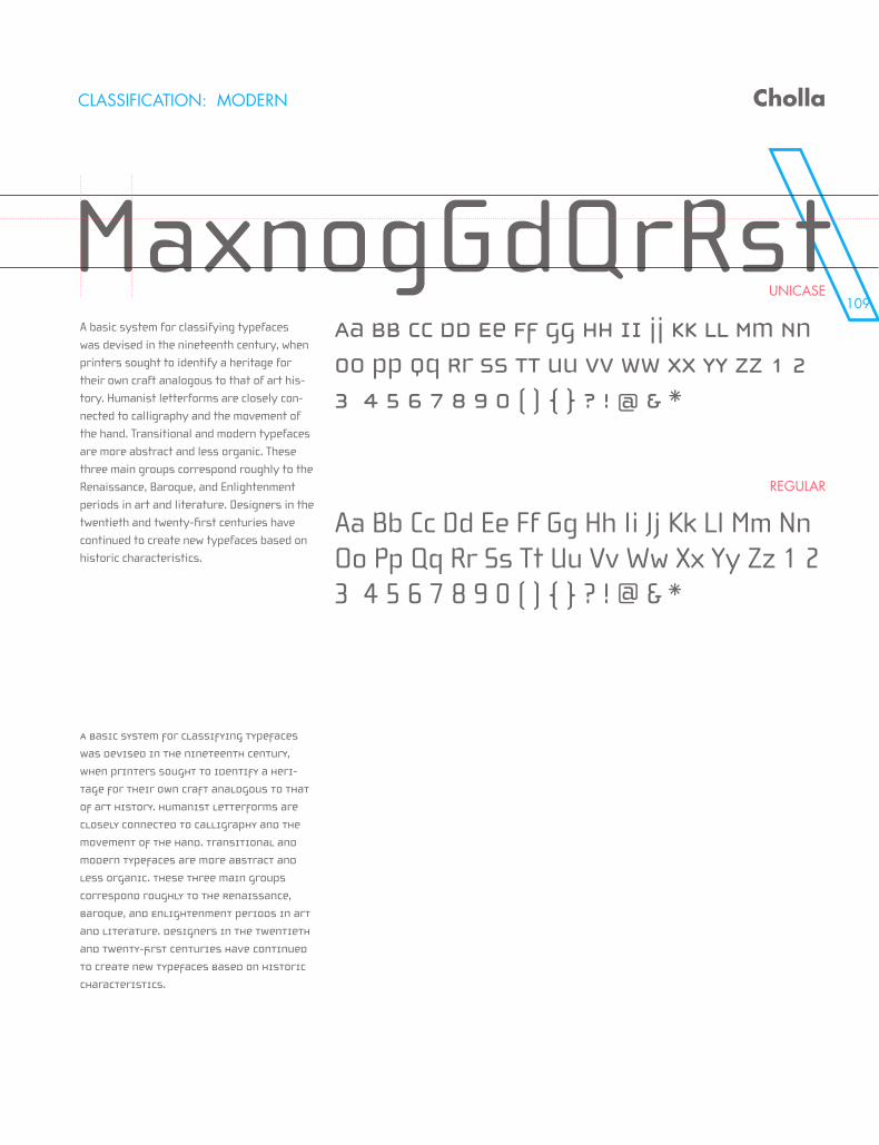
109
MaxogGdQrRs
CLASSIFICATION: MODERN
UNICASE
REGULAR
Cholla
MaxnogGdQrRstA basic system for classifying typefaces was devised in the nineteenth century, when printers sought to identify a heritage for their own craft analogous to that of art his-tory. Humanist letterforms are closely con-nected to calligraphy and the movement of the hand. Transitional and modern typefaces are more abstract and less organic. These three main groups correspond roughly to the Renaissance, Baroque, and Enlightenment periods in art and literature. Designers in the twentieth and twenty-first centuries have continued to create new typefaces based on historic characteristics.
A basic system for classifying typefaces
was devised in the nineteenth century,
when printers sought to identify a heri-
tage for their own craft analogous to that
of art history. Humanist letterforms are
closely connected to calligraphy and the
movement of the hand. Transitional and
modern typefaces are more abstract and
less organic. These three main groups
correspond roughly to the Renaissance,
Baroque, and Enlightenment periods in art
and literature. Designers in the twentieth
and twenty-first centuries have continued
to create new typefaces based on historic
characteristics.
Aa Bb Cc Dd Ee Ff Gg Hh Ii Jj Kk Ll Mm Nn
Oo Pp Qq Rr Ss Tt Uu Vv Ww Xx Yy Zz 1 2
3 4 5 6 7 8 9 0 ( ) { } ? ! @ & *
Aa Bb Cc Dd Ee Ff Gg Hh Ii Jj Kk Ll Mm Nn Oo Pp Qq Rr Ss Tt Uu Vv Ww Xx Yy Zz 1 2 3 4 5 6 7 8 9 0 ( ) { } ? ! @ & *
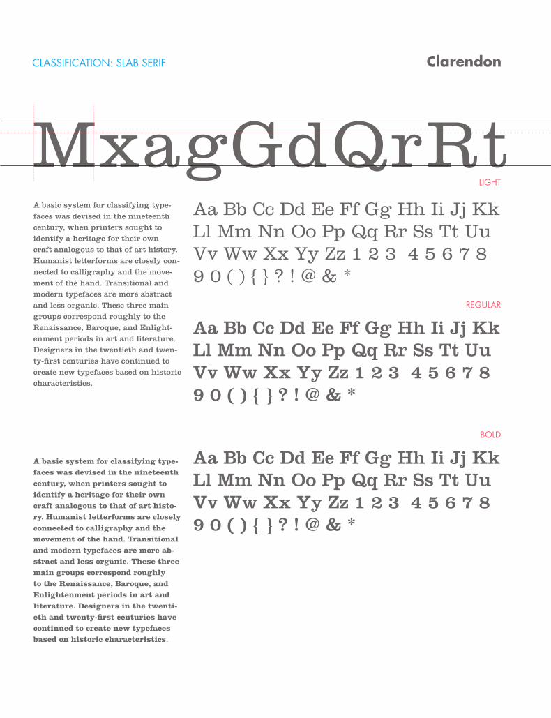
CLASSIFICATION: SLAB SERIF
LIGHT
REGULAR
BOLD
Clarendon
MxagGdQrRtA basic system for classifying type-faces was devised in the nineteenth century, when printers sought to identify a heritage for their own craft analogous to that of art history. Humanist letterforms are closely con-nected to calligraphy and the move-ment of the hand. Transitional and modern typefaces are more abstract and less organic. These three main groups correspond roughly to the Renaissance, Baroque, and Enlight-enment periods in art and literature. Designers in the twentieth and twen-ty-first centuries have continued to create new typefaces based on historic characteristics.
A basic system for classifying type-faces was devised in the nineteenth century, when printers sought to identify a heritage for their own craft analogous to that of art histo-ry. Humanist letterforms are closely connected to calligraphy and the movement of the hand. Transitional and modern typefaces are more ab-stract and less organic. These three main groups correspond roughly to the Renaissance, Baroque, and Enlightenment periods in art and literature. Designers in the twenti-eth and twenty-first centuries have continued to create new typefaces based on historic characteristics.
Aa Bb Cc Dd Ee Ff Gg Hh Ii Jj Kk Ll Mm Nn Oo Pp Qq Rr Ss Tt Uu Vv Ww Xx Yy Zz 1 2 3 4 5 6 7 8 9 0 ( ) { } ? ! @ & *
Aa Bb Cc Dd Ee Ff Gg Hh Ii Jj Kk Ll Mm Nn Oo Pp Qq Rr Ss Tt Uu Vv Ww Xx Yy Zz 1 2 3 4 5 6 7 8 9 0 ( ) { } ? ! @ & *
Aa Bb Cc Dd Ee Ff Gg Hh Ii Jj Kk Ll Mm Nn Oo Pp Qq Rr Ss Tt Uu Vv Ww Xx Yy Zz 1 2 3 4 5 6 7 8 9 0 ( ) { } ? ! @ & *
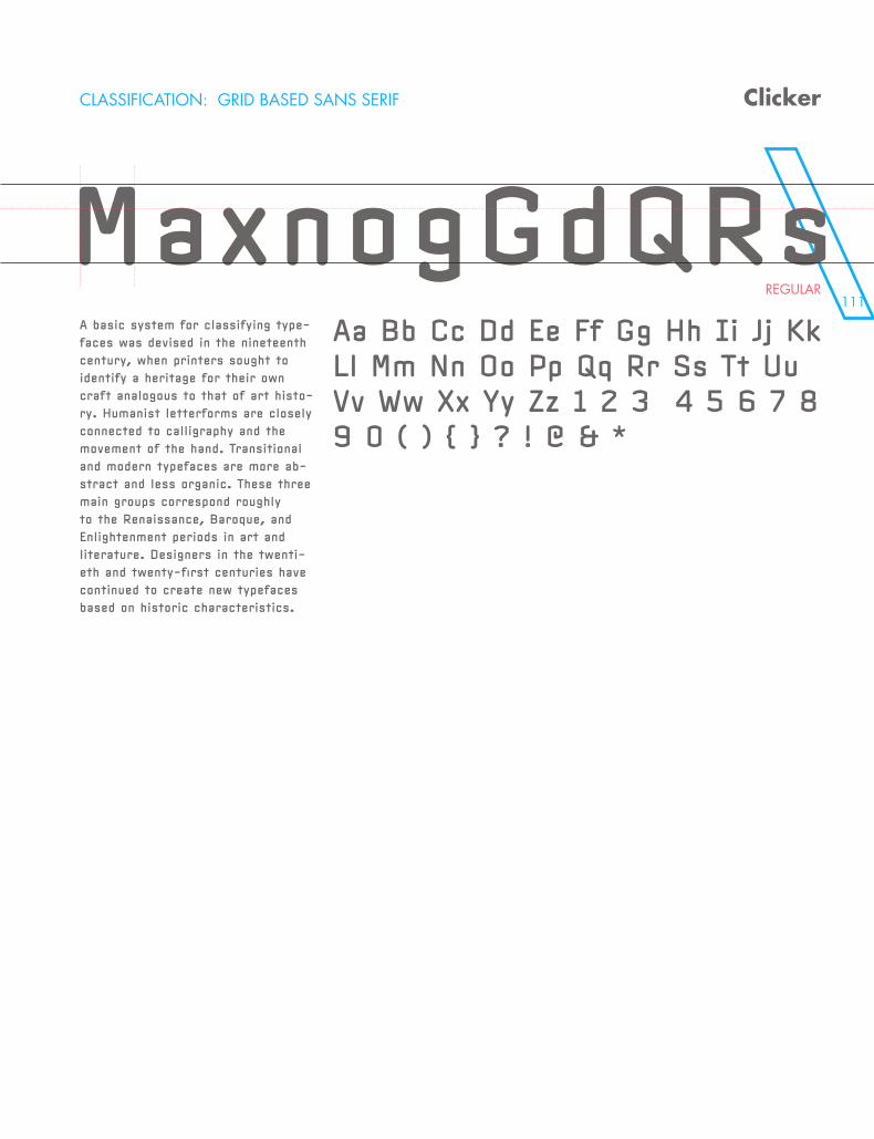
111
Clarendon
MxagGdQrRt
CLASSIFICATION: GRID BASED SANS SERIF
REGULAR
Clicker
MaxnogGdQRsA basic system for classifying type-faces was devised in the nineteenth century, when printers sought to identify a heritage for their own craft analogous to that of art histo-ry. Humanist letterforms are closely connected to calligraphy and the movement of the hand. Transitional and modern typefaces are more ab-stract and less organic. These three main groups correspond roughly to the Renaissance, Baroque, and Enlightenment periods in art and literature. Designers in the twenti-eth and twenty-first centuries have continued to create new typefaces based on historic characteristics.
Aa Bb Cc Dd Ee Ff Gg Hh Ii Jj Kk Ll Mm Nn Oo Pp Qq Rr Ss Tt Uu Vv Ww Xx Yy Zz 1 2 3 4 5 6 7 8 9 0 ( ) { } ? ! @ & *
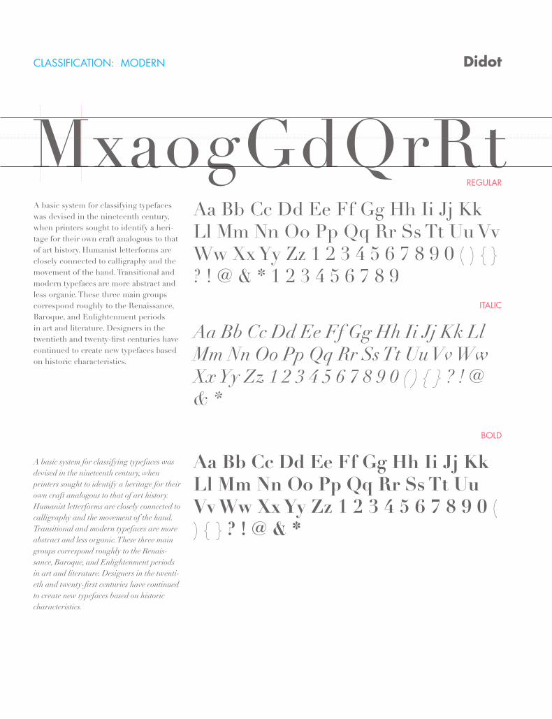
CLASSIFICATION: MODERN
REGULAR
ITALIC
BOLD
Didot
MxaogGdQrRtA basic system for classifying typefaces was devised in the nineteenth century, when printers sought to identify a heri-tage for their own craft analogous to that of art history. Humanist letterforms are closely connected to calligraphy and the movement of the hand. Transitional and modern typefaces are more abstract and less organic. These three main groups correspond roughly to the Renaissance, Baroque, and Enlightenment periods in art and literature. Designers in the twentieth and twenty-first centuries have continued to create new typefaces based on historic characteristics.
A basic system for classifying typefaces was devised in the nineteenth century, when printers sought to identify a heritage for their own craft analogous to that of art history. Humanist letterforms are closely connected to calligraphy and the movement of the hand. Transitional and modern typefaces are more abstract and less organic. These three main groups correspond roughly to the Renais-sance, Baroque, and Enlightenment periods in art and literature. Designers in the twenti-eth and twenty-first centuries have continued to create new typefaces based on historic characteristics.
Aa Bb Cc Dd Ee Ff Gg Hh Ii Jj Kk Ll Mm Nn Oo Pp Qq Rr Ss Tt Uu Vv Ww Xx Yy Zz 1 2 3 4 5 6 7 8 9 0 ( ) { } ? ! @ & * 1 2 3 4 5 6 7 8 9
Aa Bb Cc Dd Ee Ff Gg Hh Ii Jj Kk Ll Mm Nn Oo Pp Qq Rr Ss Tt Uu Vv Ww Xx Yy Zz 1 2 3 4 5 6 7 8 9 0 ( ) { } ? ! @ & *
Aa Bb Cc Dd Ee Ff Gg Hh Ii Jj Kk Ll Mm Nn Oo Pp Qq Rr Ss Tt Uu Vv Ww Xx Yy Zz 1 2 3 4 5 6 7 8 9 0 ( ) { } ? ! @ & *
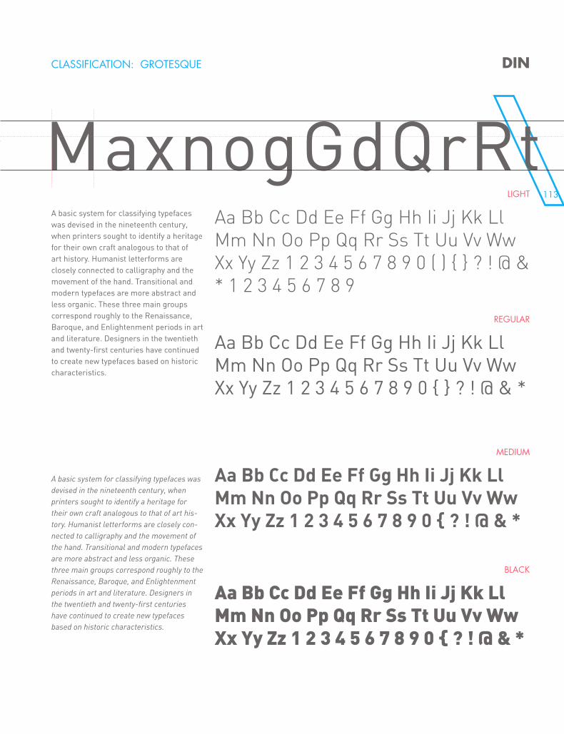
113
MxaogGdQrRtCLASSIFICATION: GROTESQUE DIN
MaxnogGdQrRtLIGHT
REGULAR
MEDIUM
BLACK
A basic system for classifying typefaces was devised in the nineteenth century, when printers sought to identify a heritage for their own craft analogous to that of art history. Humanist letterforms are closely connected to calligraphy and the movement of the hand. Transitional and modern typefaces are more abstract and less organic. These three main groups correspond roughly to the Renaissance, Baroque, and Enlightenment periods in art and literature. Designers in the twentieth and twenty-first centuries have continued to create new typefaces based on historic characteristics.
A basic system for classifying typefaces was devised in the nineteenth century, when printers sought to identify a heritage for their own craft analogous to that of art his-tory. Humanist letterforms are closely con-nected to calligraphy and the movement of the hand. Transitional and modern typefaces are more abstract and less organic. These three main groups correspond roughly to the Renaissance, Baroque, and Enlightenment periods in art and literature. Designers in the twentieth and twenty-first centuries have continued to create new typefaces based on historic characteristics.
Aa Bb Cc Dd Ee Ff Gg Hh Ii Jj Kk Ll Mm Nn Oo Pp Qq Rr Ss Tt Uu Vv Ww Xx Yy Zz 1 2 3 4 5 6 7 8 9 0 ( ) { } ? ! @ & * 1 2 3 4 5 6 7 8 9
Aa Bb Cc Dd Ee Ff Gg Hh Ii Jj Kk Ll Mm Nn Oo Pp Qq Rr Ss Tt Uu Vv Ww Xx Yy Zz 1 2 3 4 5 6 7 8 9 0 { } ? ! @ & *
Aa Bb Cc Dd Ee Ff Gg Hh Ii Jj Kk Ll Mm Nn Oo Pp Qq Rr Ss Tt Uu Vv Ww Xx Yy Zz 1 2 3 4 5 6 7 8 9 0 { ? ! @ & *
Aa Bb Cc Dd Ee Ff Gg Hh Ii Jj Kk Ll Mm Nn Oo Pp Qq Rr Ss Tt Uu Vv Ww Xx Yy Zz 1 2 3 4 5 6 7 8 9 0 { ? ! @ & *
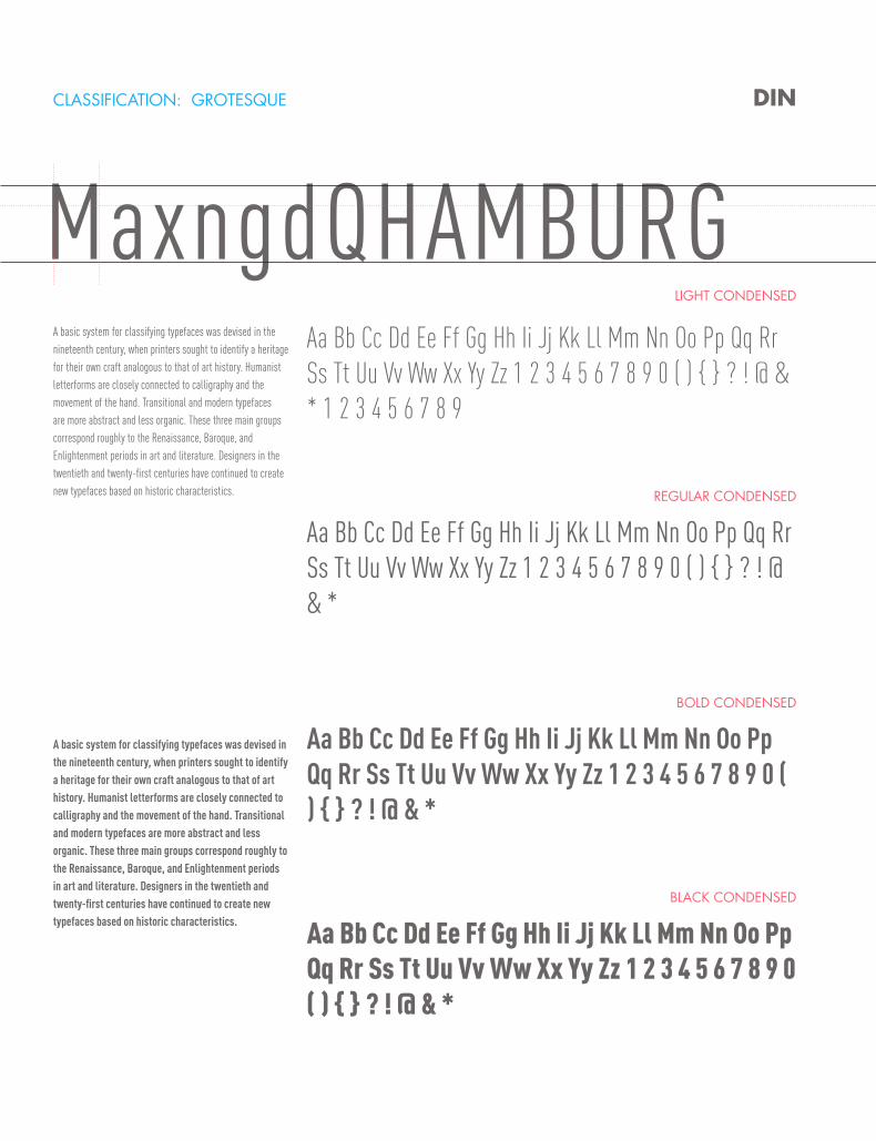
CLASSIFICATION: GROTESQUE DIN
MaxngdQHAMBURGLIGHT CONDENSED
REGULAR CONDENSED
BOLD CONDENSED
BLACK CONDENSED
A basic system for classifying typefaces was devised in the nineteenth century, when printers sought to identify a heritage for their own craft analogous to that of art history. Humanist letterforms are closely connected to calligraphy and the movement of the hand. Transitional and modern typefaces are more abstract and less organic. These three main groups correspond roughly to the Renaissance, Baroque, and Enlightenment periods in art and literature. Designers in the twentieth and twenty-first centuries have continued to create new typefaces based on historic characteristics.
A basic system for classifying typefaces was devised in the nineteenth century, when printers sought to identify a heritage for their own craft analogous to that of art history. Humanist letterforms are closely connected to calligraphy and the movement of the hand. Transitional and modern typefaces are more abstract and less organic. These three main groups correspond roughly to the Renaissance, Baroque, and Enlightenment periods in art and literature. Designers in the twentieth and twenty-first centuries have continued to create new typefaces based on historic characteristics.
Aa Bb Cc Dd Ee Ff Gg Hh Ii Jj Kk Ll Mm Nn Oo Pp Qq Rr Ss Tt Uu Vv Ww Xx Yy Zz 1 2 3 4 5 6 7 8 9 0 ( ) { } ? ! @ & * 1 2 3 4 5 6 7 8 9
Aa Bb Cc Dd Ee Ff Gg Hh Ii Jj Kk Ll Mm Nn Oo Pp Qq Rr Ss Tt Uu Vv Ww Xx Yy Zz 1 2 3 4 5 6 7 8 9 0 ( ) { } ? ! @ & *
Aa Bb Cc Dd Ee Ff Gg Hh Ii Jj Kk Ll Mm Nn Oo Pp Qq Rr Ss Tt Uu Vv Ww Xx Yy Zz 1 2 3 4 5 6 7 8 9 0 ( ) { } ? ! @ & *
Aa Bb Cc Dd Ee Ff Gg Hh Ii Jj Kk Ll Mm Nn Oo Pp Qq Rr Ss Tt Uu Vv Ww Xx Yy Zz 1 2 3 4 5 6 7 8 9 0 ( ) { } ? ! @ & *
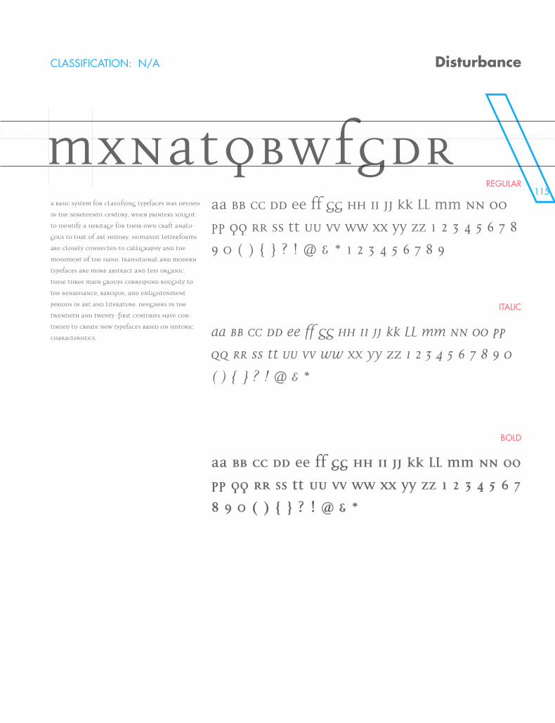
115
MaxngdQHAMBURGREGULAR
ITALIC
BOLD
Disturbance
MxnatQbWFGdRA basic system for classifying typefaces was devised
in the nineteenth century, when printers sought
to identify a heritage for their own craft analo-
gous to that of art history. Humanist letterforms
are closely connected to calligraphy and the
movement of the hand. Transitional and modern
typefaces are more abstract and less organic.
These three main groups correspond roughly to
the Renaissance, Baroque, and Enlightenment
periods in art and literature. Designers in the
twentieth and twenty-first centuries have con-
tinued to create new typefaces based on historic
characteristics.
Aa Bb Cc Dd Ee Ff Gg Hh Ii Jj Kk Ll Mm Nn Oo
Pp Qq Rr Ss Tt Uu Vv Ww Xx Yy Zz 1 2 3 4 5 6 7 8
9 0 ( ) { } ? ! @ & * 1 2 3 4 5 6 7 8 9
Aa Bb Cc Dd Ee Ff Gg Hh Ii Jj Kk Ll Mm Nn Oo Pp
Qq Rr Ss Tt Uu Vv Ww Xx Yy Zz 1 2 3 4 5 6 7 8 9 0
( ) { } ? ! @ & *
Aa Bb Cc Dd Ee Ff Gg Hh Ii Jj Kk Ll Mm Nn Oo
Pp Qq Rr Ss Tt Uu Vv Ww Xx Yy Zz 1 2 3 4 5 6 7
8 9 0 ( ) { } ? ! @ & *
CLASSIFICATION: N/A
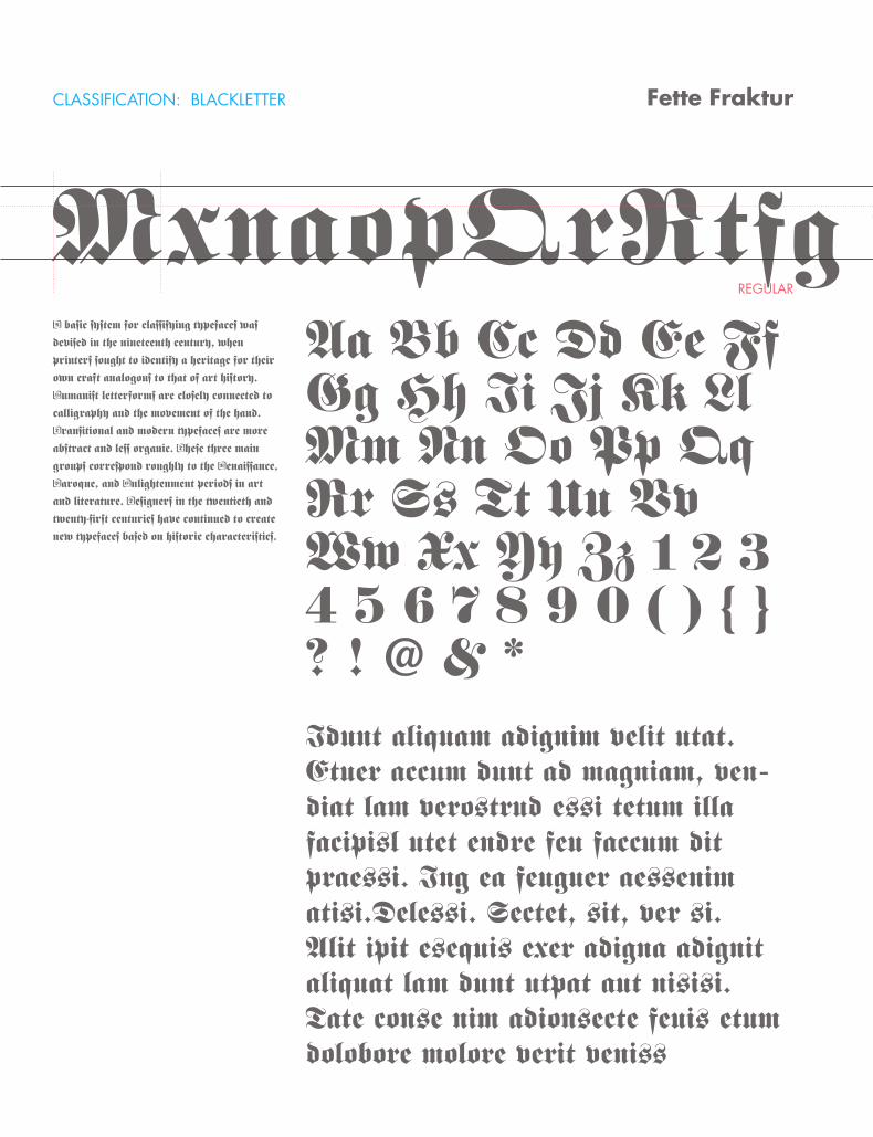
CLASSIFICATION: BLACKLETTER
REGULAR
Fette Fraktur
MxnaopQrRtfgA basic system for classifying typefaces was
devised in the nineteenth century, when
printers sought to identify a heritage for their
own craft analogous to that of art history.
Humanist letterforms are closely connected to
calligraphy and the movement of the hand.
Transitional and modern typefaces are more
abstract and less organic. These three main
groups correspond roughly to the Renaissance,
Baroque, and Enlightenment periods in art
and literature. Designers in the twentieth and
twenty-first centuries have continued to create
new typefaces based on historic characteristics.
Aa Bb Cc Dd Ee Ff Gg Hh Ii Jj Kk Ll Mm Nn Oo Pp Qq Rr Ss Tt Uu Vv Ww Xx Yy Zz 1 2 3 4 5 6 7 8 9 0 ( ) { } ? ! @ & *Idunt aliquam adignim velit utat. Etuer accum dunt ad magniam, ven-diat lam verostrud essi tetum illa facipisl utet endre feu faccum dit praessi. Ing ea feuguer aessenim atisi.Delessi. Sectet, sit, ver si.Alit ipit esequis exer adigna adignit aliquat lam dunt utpat aut nisisi.Tate conse nim adionsecte feuis etum dolobore molore verit veniss
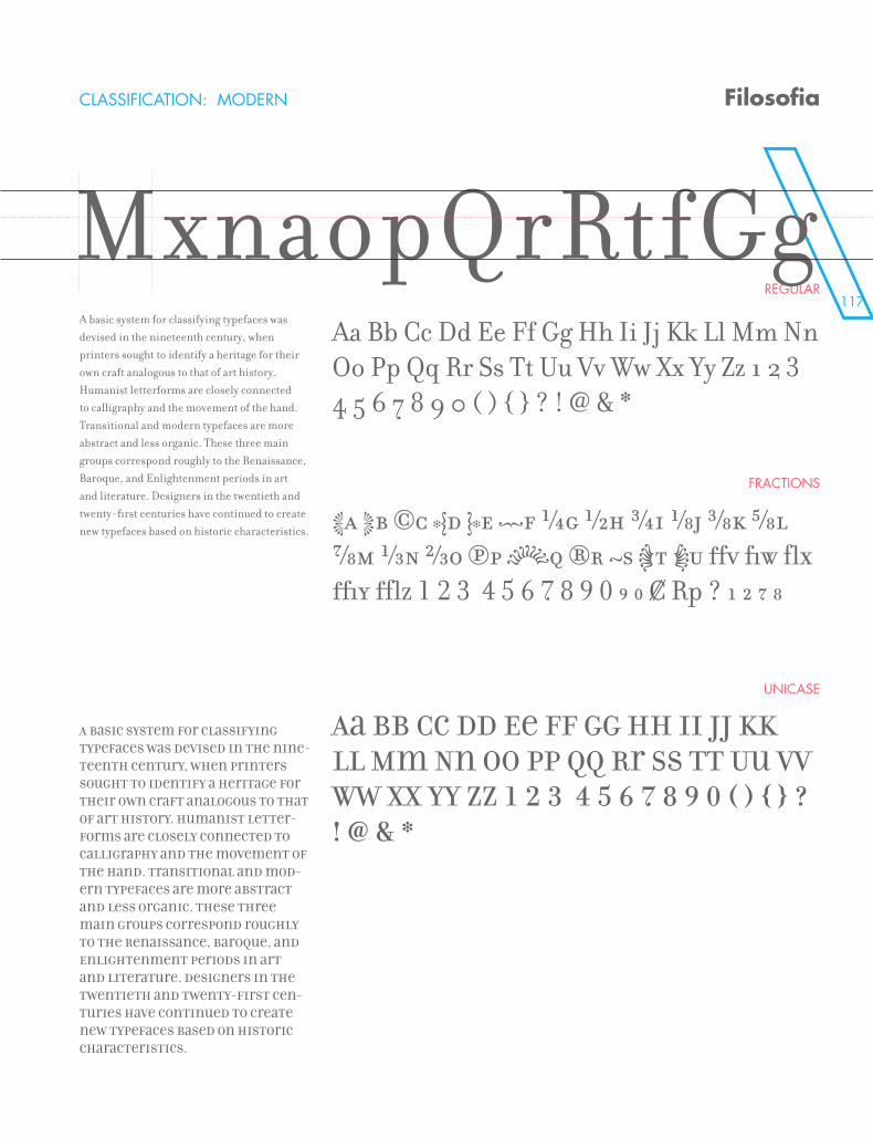
117
MxnaopQrRtfgCLASSIFICATION: MODERN
REGULAR
FRACTIONS
UNICASE
Filosofia
MxnaopQrRtfGgA basic system for classifying typefaces was devised in the nineteenth century, when printers sought to identify a heritage for their own craft analogous to that of art history. Humanist letterforms are closely connected to calligraphy and the movement of the hand. Transitional and modern typefaces are more abstract and less organic. These three main groups correspond roughly to the Renaissance, Baroque, and Enlightenment periods in art and literature. Designers in the twentieth and twenty-first centuries have continued to create new typefaces based on historic characteristics.
A basic system for classifying typefaces was devised in the nine-teenth century, when printers sought to identify a heritage for their own craft analogous to that of art history. Humanist letter-forms are closely connected to calligraphy and the movement of the hand. Transitional and mod-ern typefaces are more abstract and less organic. These three main groups correspond roughly to the Renaissance, Baroque, and Enlightenment periods in art and literature. Designers in the twentieth and twenty-first cen-turies have continued to create new typefaces based on historic characteristics.
Aa Bb Cc Dd Ee Ff Gg Hh Ii Jj Kk Ll Mm Nn Oo Pp Qq Rr Ss Tt Uu Vv Ww Xx Yy Zz 1 2 3 4 5 6 7 8 9 0 ( ) { } ? ! @ & *
Aa Bb Cc Dd Ee Ff Gg Hh Ii Jj Kk Ll Mm Nn Oo Pp Qq Rr Ss Tt Uu Vv Ww Xx Yy Zz 1 2 3 4 5 6 7 8 9 0 ( ) { } ? ! @ & *
Aa Bb Cc Dd Ee Ff Gg Hh Ii Jj Kk Ll Mm Nn Oo Pp Qq Rr Ss Tt Uu Vv Ww Xx Yy Zz 1 2 3 4 5 6 7 8 9 0 ( ) { } ? ! @ & *
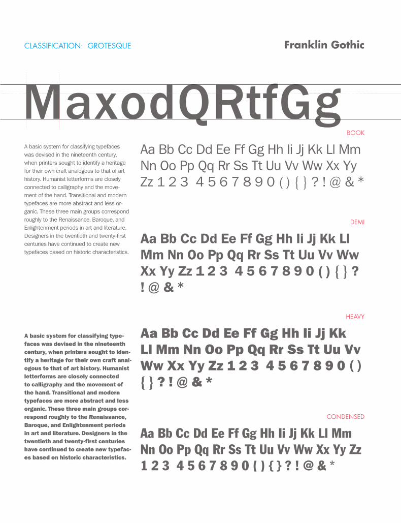
CLASSIFICATION: GROTESQUE
BOOK
DEMI
HEAVY
CONDENSED
Franklin Gothic
MaxodQRtfGgA basic system for classifying typefaces was devised in the nineteenth century, when printers sought to identify a heritage for their own craft analogous to that of art history. Humanist letterforms are closely connected to calligraphy and the move-ment of the hand. Transitional and modern typefaces are more abstract and less or-ganic. These three main groups correspond roughly to the Renaissance, Baroque, and Enlightenment periods in art and literature. Designers in the twentieth and twenty-first centuries have continued to create new typefaces based on historic characteristics.
A basic system for classifying type-faces was devised in the nineteenth century, when printers sought to iden-tify a heritage for their own craft anal-ogous to that of art history. Humanist letterforms are closely connected to calligraphy and the movement of the hand. Transitional and modern typefaces are more abstract and less organic. These three main groups cor-respond roughly to the Renaissance, Baroque, and Enlightenment periods in art and literature. Designers in the twentieth and twenty-first centuries have continued to create new typefac-es based on historic characteristics.
Aa Bb Cc Dd Ee Ff Gg Hh Ii Jj Kk Ll Mm Nn Oo Pp Qq Rr Ss Tt Uu Vv Ww Xx Yy Zz 1 2 3 4 5 6 7 8 9 0 ( ) { } ? ! @ & *
Aa Bb Cc Dd Ee Ff Gg Hh Ii Jj Kk Ll Mm Nn Oo Pp Qq Rr Ss Tt Uu Vv Ww Xx Yy Zz 1 2 3 4 5 6 7 8 9 0 ( ) { } ? ! @ & *
Aa Bb Cc Dd Ee Ff Gg Hh Ii Jj Kk Ll Mm Nn Oo Pp Qq Rr Ss Tt Uu Vv Ww Xx Yy Zz 1 2 3 4 5 6 7 8 9 0 ( ) { } ? ! @ & *
Aa Bb Cc Dd Ee Ff Gg Hh Ii Jj Kk Ll Mm Nn Oo Pp Qq Rr Ss Tt Uu Vv Ww Xx Yy Zz 1 2 3 4 5 6 7 8 9 0 ( ) { } ? ! @ & *
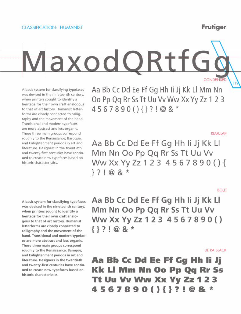
119
CLASSIFICATION: HUMANIST
CONDENSED
REGULAR
BOLD
ULTRA BLACK
Frutiger
MaxodQRtfGgA basic system for classifying typefaces was devised in the nineteenth century, when printers sought to identify a heritage for their own craft analogous to that of art history. Humanist letter-forms are closely connected to callig-raphy and the movement of the hand. Transitional and modern typefaces are more abstract and less organic. These three main groups correspond roughly to the Renaissance, Baroque, and Enlightenment periods in art and literature. Designers in the twentieth and twenty-first centuries have contin-ued to create new typefaces based on historic characteristics.
A basic system for classifying typefaces was devised in the nineteenth century, when printers sought to identify a heritage for their own craft analo-gous to that of art history. Humanist letterforms are closely connected to calligraphy and the movement of the hand. Transitional and modern typefac-es are more abstract and less organic. These three main groups correspond roughly to the Renaissance, Baroque, and Enlightenment periods in art and literature. Designers in the twentieth and twenty-first centuries have contin-ued to create new typefaces based on historic characteristics.
Aa Bb Cc Dd Ee Ff Gg Hh Ii Jj Kk Ll Mm Nn Oo Pp Qq Rr Ss Tt Uu Vv Ww Xx Yy Zz 1 2 3 4 5 6 7 8 9 0 ( ) { } ? ! @ & *
Aa Bb Cc Dd Ee Ff Gg Hh Ii Jj Kk Ll Mm Nn Oo Pp Qq Rr Ss Tt Uu Vv Ww Xx Yy Zz 1 2 3 4 5 6 7 8 9 0 ( ) { } ? ! @ & *
Aa Bb Cc Dd Ee Ff Gg Hh Ii Jj Kk Ll Mm Nn Oo Pp Qq Rr Ss Tt Uu Vv Ww Xx Yy Zz 1 2 3 4 5 6 7 8 9 0 ( ) { } ? ! @ & *
Aa Bb Cc Dd Ee Ff Gg Hh Ii Jj Kk Ll Mm Nn Oo Pp Qq Rr Ss Tt Uu Vv Ww Xx Yy Zz 1 2 3 4 5 6 7 8 9 0 ( ) { } ? ! @ & *
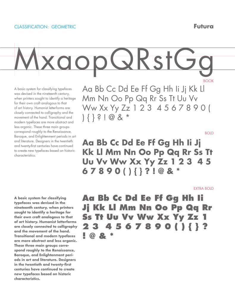
CLASSIFICATION: GEOMETRIC
BOOK
BOLD
EXTRA BOLD
Futura
MxaopQRstGgA basic system for classifying typefaces was devised in the nineteenth century, when printers sought to identify a heritage for their own craft analogous to that of art history. Humanist letterforms are closely connected to calligraphy and the movement of the hand. Transitional and modern typefaces are more abstract and less organic. These three main groups correspond roughly to the Renaissance, Baroque, and Enlightenment periods in art and literature. Designers in the twentieth and twenty-first centuries have continued to create new typefaces based on historic characteristics.
A basic system for classifying typefaces was devised in the nineteenth century, when printers sought to identify a heritage for their own craft analogous to that of art history. Humanist letterforms are closely connected to calligraphy and the movement of the hand. Transitional and modern typefaces are more abstract and less organic. These three main groups corre-spond roughly to the Renaissance, Baroque, and Enlightenment peri-ods in art and literature. Designers in the twentieth and twenty-first centuries have continued to create new typefaces based on historic characteristics.
Aa Bb Cc Dd Ee Ff Gg Hh Ii Jj Kk Ll Mm Nn Oo Pp Qq Rr Ss Tt Uu Vv Ww Xx Yy Zz 1 2 3 4 5 6 7 8 9 0 ( ) { } ? ! @ & *
Aa Bb Cc Dd Ee Ff Gg Hh Ii Jj Kk Ll Mm Nn Oo Pp Qq Rr Ss Tt Uu Vv Ww Xx Yy Zz 1 2 3 4 5 6 7 8 9 0 ( ) { } ? ! @ & *
Aa Bb Cc Dd Ee Ff Gg Hh Ii Jj Kk Ll Mm Nn Oo Pp Qq Rr Ss Tt Uu Vv Ww Xx Yy Zz 1 2 3 4 5 6 7 8 9 0 ( ) { } ? ! @ & *
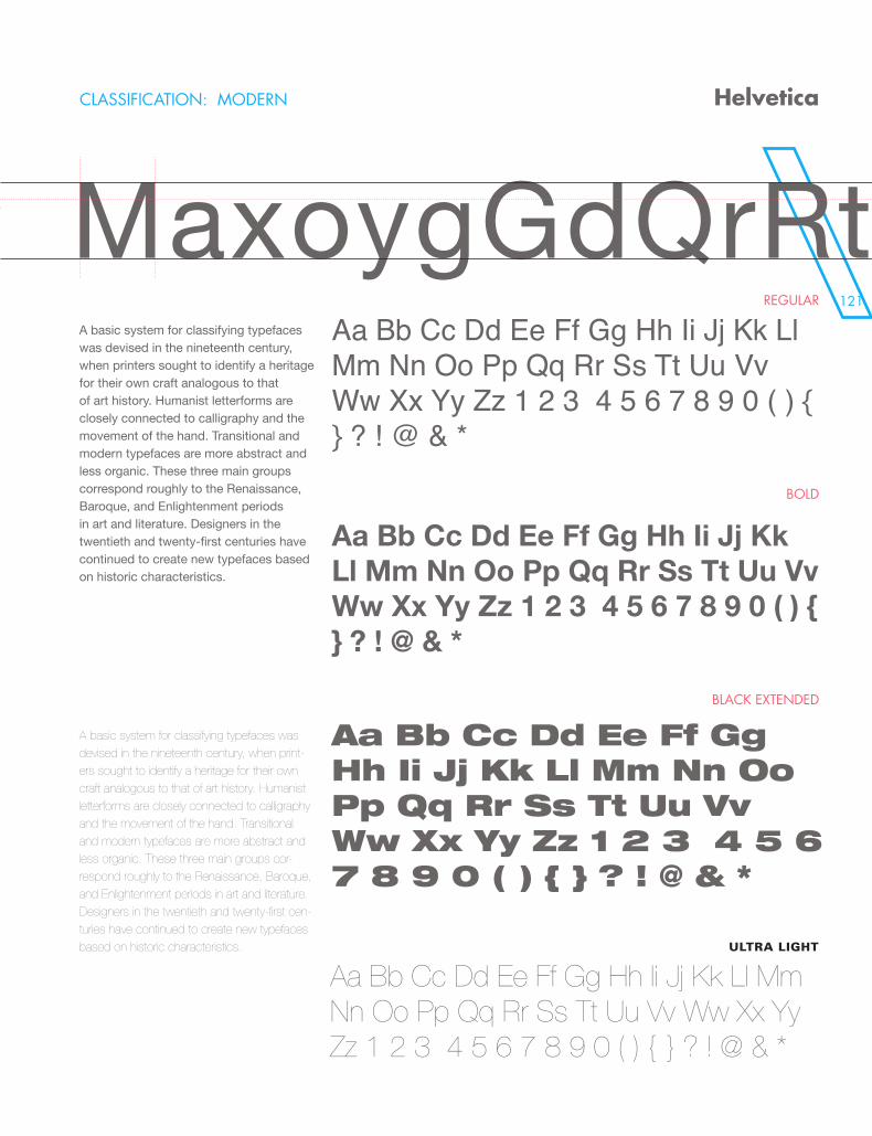
121
CLASSIFICATION: MODERN
REGULAR
BOLD
BLACK EXTENDED
Helvetica
MaxoygGdQrRtA basic system for classifying typefaces was devised in the nineteenth century, when printers sought to identify a heritage for their own craft analogous to that of art history. Humanist letterforms are closely connected to calligraphy and the movement of the hand. Transitional and modern typefaces are more abstract and less organic. These three main groups correspond roughly to the Renaissance, Baroque, and Enlightenment periods in art and literature. Designers in the twentieth and twenty-first centuries have continued to create new typefaces based on historic characteristics.
A basic system for classifying typefaces was devised in the nineteenth century, when print-ers sought to identify a heritage for their own craft analogous to that of art history. Humanist letterforms are closely connected to calligraphy and the movement of the hand. Transitional and modern typefaces are more abstract and less organic. These three main groups cor-respond roughly to the Renaissance, Baroque, and Enlightenment periods in art and literature. Designers in the twentieth and twenty-first cen-turies have continued to create new typefaces based on historic characteristics.
Aa Bb Cc Dd Ee Ff Gg Hh Ii Jj Kk Ll Mm Nn Oo Pp Qq Rr Ss Tt Uu Vv Ww Xx Yy Zz 1 2 3 4 5 6 7 8 9 0 ( ) { } ? ! @ & *
Aa Bb Cc Dd Ee Ff Gg Hh Ii Jj Kk Ll Mm Nn Oo Pp Qq Rr Ss Tt Uu Vv Ww Xx Yy Zz 1 2 3 4 5 6 7 8 9 0 ( ) { } ? ! @ & *
Aa Bb Cc Dd Ee Ff Gg Hh Ii Jj Kk Ll Mm Nn Oo Pp Qq Rr Ss Tt Uu Vv Ww Xx Yy Zz 1 2 3 4 5 6 7 8 9 0 ( ) { } ? ! @ & *
Aa Bb Cc Dd Ee Ff Gg Hh Ii Jj Kk Ll Mm Nn Oo Pp Qq Rr Ss Tt Uu Vv Ww Xx Yy Zz 1 2 3 4 5 6 7 8 9 0 ( ) { } ? ! @ & *
ULTRA LIGHT
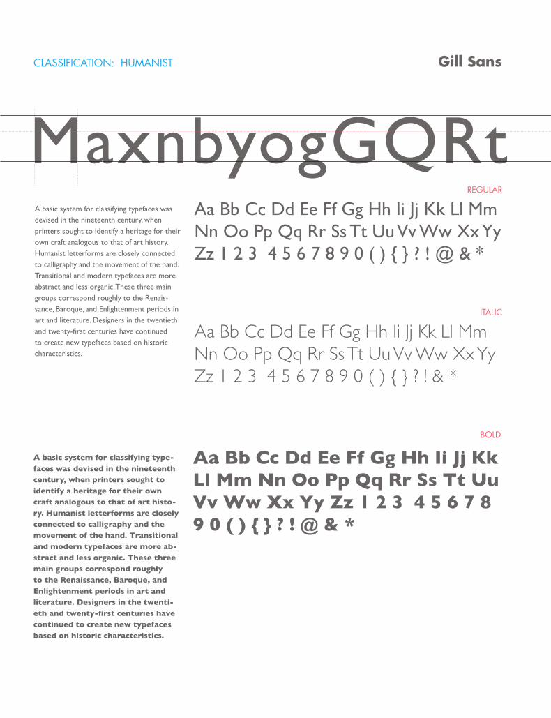
CLASSIFICATION: HUMANIST
REGULAR
ITALIC
BOLD
Gill Sans
MaxnbyogGQRtA basic system for classifying typefaces was devised in the nineteenth century, when printers sought to identify a heritage for their own craft analogous to that of art history. Humanist letterforms are closely connected to calligraphy and the movement of the hand. Transitional and modern typefaces are more abstract and less organic. These three main groups correspond roughly to the Renais-sance, Baroque, and Enlightenment periods in art and literature. Designers in the twentieth and twenty-first centuries have continued to create new typefaces based on historic characteristics.
A basic system for classifying type-faces was devised in the nineteenth century, when printers sought to identify a heritage for their own craft analogous to that of art histo-ry. Humanist letterforms are closely connected to calligraphy and the movement of the hand. Transitional and modern typefaces are more ab-stract and less organic. These three main groups correspond roughly to the Renaissance, Baroque, and Enlightenment periods in art and literature. Designers in the twenti-eth and twenty-first centuries have continued to create new typefaces based on historic characteristics.
Aa Bb Cc Dd Ee Ff Gg Hh Ii Jj Kk Ll Mm Nn Oo Pp Qq Rr Ss Tt Uu Vv Ww Xx Yy Zz 1 2 3 4 5 6 7 8 9 0 ( ) { } ? ! @ & *
Aa Bb Cc Dd Ee Ff Gg Hh Ii Jj Kk Ll Mm Nn Oo Pp Qq Rr Ss Tt Uu Vv Ww Xx Yy Zz 1 2 3 4 5 6 7 8 9 0 ( ) { } ? ! & *
Aa Bb Cc Dd Ee Ff Gg Hh Ii Jj Kk Ll Mm Nn Oo Pp Qq Rr Ss Tt Uu Vv Ww Xx Yy Zz 1 2 3 4 5 6 7 8 9 0 ( ) { } ? ! @ & *
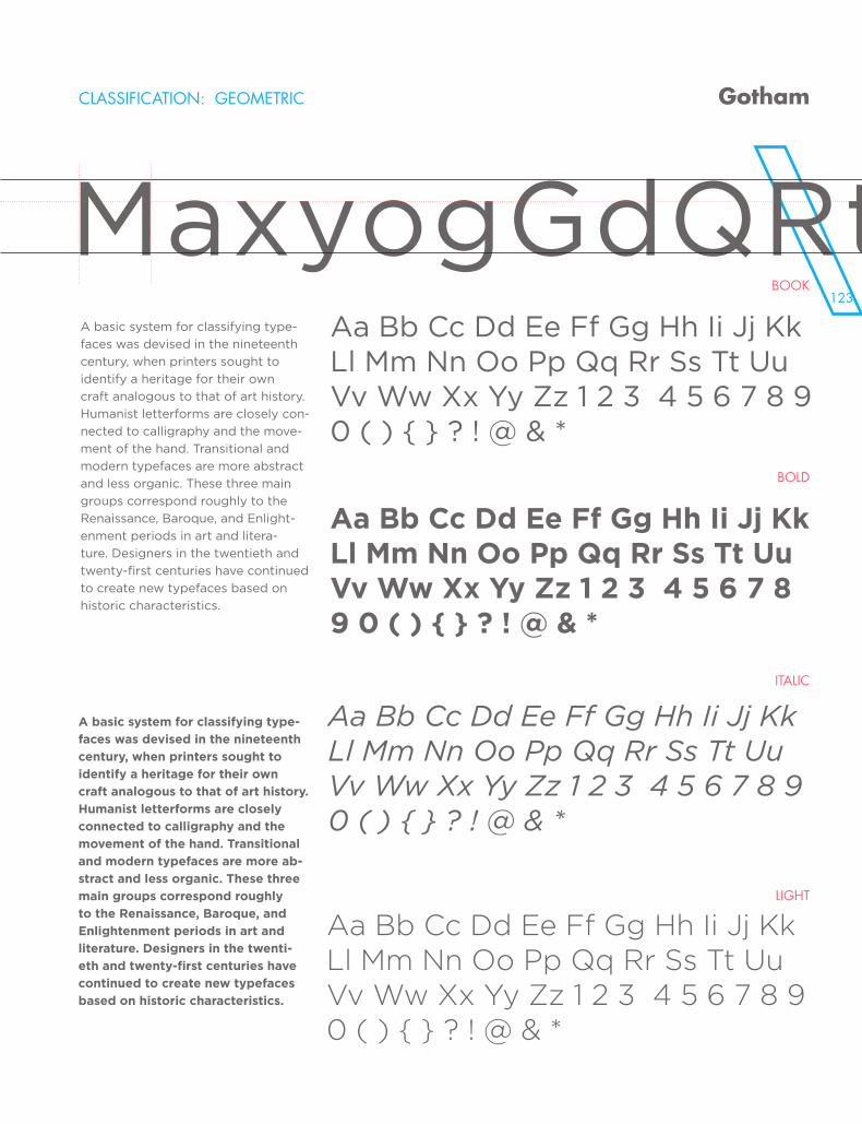
123
CLASSIFICATION: GEOMETRIC
BOOK
BOLD
ITALIC
LIGHT
Gotham
MaxyogGdQRtA basic system for classifying type-
faces was devised in the nineteenth
century, when printers sought to
identify a heritage for their own
craft analogous to that of art history.
Humanist letterforms are closely con-
nected to calligraphy and the move-
ment of the hand. Transitional and
modern typefaces are more abstract
and less organic. These three main
groups correspond roughly to the
Renaissance, Baroque, and Enlight-
enment periods in art and litera-
ture. Designers in the twentieth and
twenty-first centuries have continued
to create new typefaces based on
historic characteristics.
A basic system for classifying type-
faces was devised in the nineteenth
century, when printers sought to
identify a heritage for their own
craft analogous to that of art history.
Humanist letterforms are closely
connected to calligraphy and the
movement of the hand. Transitional
and modern typefaces are more ab-
stract and less organic. These three
main groups correspond roughly
to the Renaissance, Baroque, and
Enlightenment periods in art and
literature. Designers in the twenti-
eth and twenty-first centuries have
continued to create new typefaces
based on historic characteristics.
Aa Bb Cc Dd Ee Ff Gg Hh Ii Jj Kk Ll Mm Nn Oo Pp Qq Rr Ss Tt Uu Vv Ww Xx Yy Zz 1 2 3 4 5 6 7 8 9 0 ( ) { } ? ! @ & *
Aa Bb Cc Dd Ee Ff Gg Hh Ii Jj Kk Ll Mm Nn Oo Pp Qq Rr Ss Tt Uu Vv Ww Xx Yy Zz 1 2 3 4 5 6 7 8 9 0 ( ) { } ? ! @ & *
Aa Bb Cc Dd Ee Ff Gg Hh Ii Jj Kk Ll Mm Nn Oo Pp Qq Rr Ss Tt Uu Vv Ww Xx Yy Zz 1 2 3 4 5 6 7 8 9 0 ( ) { } ? ! @ & *
Aa Bb Cc Dd Ee Ff Gg Hh Ii Jj Kk Ll Mm Nn Oo Pp Qq Rr Ss Tt Uu Vv Ww Xx Yy Zz 1 2 3 4 5 6 7 8 9 0 ( ) { } ? ! @ & *
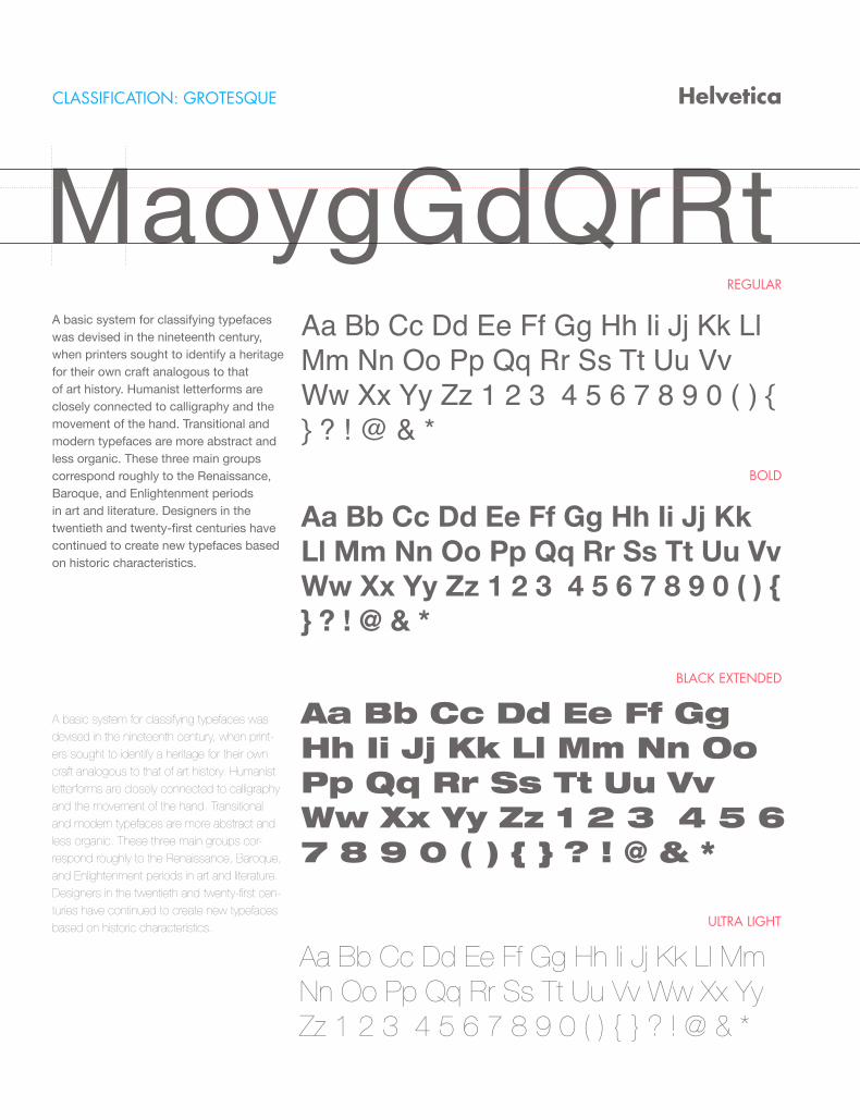
CLASSIFICATION: GROTESQUE
REGULAR
BOLD
BLACK EXTENDED
Helvetica
MaoygGdQrRtA basic system for classifying typefaces was devised in the nineteenth century, when printers sought to identify a heritage for their own craft analogous to that of art history. Humanist letterforms are closely connected to calligraphy and the movement of the hand. Transitional and modern typefaces are more abstract and less organic. These three main groups correspond roughly to the Renaissance, Baroque, and Enlightenment periods in art and literature. Designers in the twentieth and twenty-first centuries have continued to create new typefaces based on historic characteristics.
A basic system for classifying typefaces was devised in the nineteenth century, when print-ers sought to identify a heritage for their own craft analogous to that of art history. Humanist letterforms are closely connected to calligraphy and the movement of the hand. Transitional and modern typefaces are more abstract and less organic. These three main groups cor-respond roughly to the Renaissance, Baroque, and Enlightenment periods in art and literature. Designers in the twentieth and twenty-first cen-turies have continued to create new typefaces based on historic characteristics.
Aa Bb Cc Dd Ee Ff Gg Hh Ii Jj Kk Ll Mm Nn Oo Pp Qq Rr Ss Tt Uu Vv Ww Xx Yy Zz 1 2 3 4 5 6 7 8 9 0 ( ) { } ? ! @ & *
Aa Bb Cc Dd Ee Ff Gg Hh Ii Jj Kk Ll Mm Nn Oo Pp Qq Rr Ss Tt Uu Vv Ww Xx Yy Zz 1 2 3 4 5 6 7 8 9 0 ( ) { } ? ! @ & *
Aa Bb Cc Dd Ee Ff Gg Hh Ii Jj Kk Ll Mm Nn Oo Pp Qq Rr Ss Tt Uu Vv Ww Xx Yy Zz 1 2 3 4 5 6 7 8 9 0 ( ) { } ? ! @ & *
Aa Bb Cc Dd Ee Ff Gg Hh Ii Jj Kk Ll Mm Nn Oo Pp Qq Rr Ss Tt Uu Vv Ww Xx Yy Zz 1 2 3 4 5 6 7 8 9 0 ( ) { } ? ! @ & *
ULTRA LIGHT
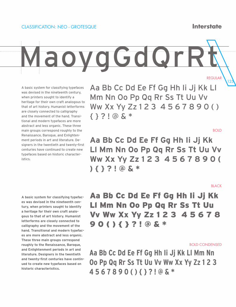
125
MaoygGdQrRtCLASSIFICATION: NEO - GROTESQUE
REGULAR
BOLD
BLACK
BOLD CONDENSED
Interstate
MaoygGdQrRtA basic system for classifying typefaces
was devised in the nineteenth century,
when printers sought to identify a
heritage for their own craft analogous to
that of art history. Humanist letterforms
are closely connected to calligraphy
and the movement of the hand. Transi-
tional and modern typefaces are more
abstract and less organic. These three
main groups correspond roughly to the
Renaissance, Baroque, and Enlighten-
ment periods in art and literature. De-
signers in the twentieth and twenty-first
centuries have continued to create new
typefaces based on historic character-
istics.
A basic system for classifying typefac-
es was devised in the nineteenth cen-
tury, when printers sought to identify
a heritage for their own craft analo-
gous to that of art history. Humanist
letterforms are closely connected to
calligraphy and the movement of the
hand. Transitional and modern typefac-
es are more abstract and less organic.
These three main groups correspond
roughly to the Renaissance, Baroque,
and Enlightenment periods in art and
literature. Designers in the twentieth
and twenty-first centuries have contin-
ued to create new typefaces based on
historic characteristics.
Aa Bb Cc Dd Ee Ff Gg Hh Ii Jj Kk Ll Mm Nn Oo Pp Qq Rr Ss Tt Uu Vv Ww Xx Yy Zz 1 2 3 4 5 6 7 8 9 0 ( ) { } ? ! @ & *
Aa Bb Cc Dd Ee Ff Gg Hh Ii Jj Kk Ll Mm Nn Oo Pp Qq Rr Ss Tt Uu Vv Ww Xx Yy Zz 1 2 3 4 5 6 7 8 9 0 ( ) { } ? ! @ & *
Aa Bb Cc Dd Ee Ff Gg Hh Ii Jj Kk Ll Mm Nn Oo Pp Qq Rr Ss Tt Uu Vv Ww Xx Yy Zz 1 2 3 4 5 6 7 8 9 0 ( ) { } ? ! @ & *
Aa Bb Cc Dd Ee Ff Gg Hh Ii Jj Kk Ll Mm Nn Oo Pp Qq Rr Ss Tt Uu Vv Ww Xx Yy Zz 1 2 3 4 5 6 7 8 9 0 ( ) { } ? ! @ & *
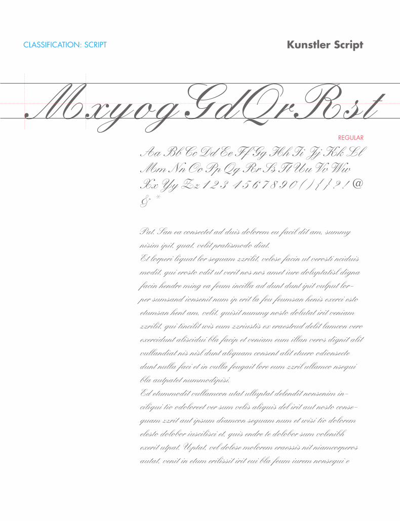
CLASSIFICATION: SCRIPT
REGULAR
Kunstler Script
MxyogGdQrRstAa Bb Cc Dd Ee Ff Gg Hh Ii Jj Kk Ll Mm Nn Oo Pp Qq Rr Ss Tt Uu Vv Ww Xx Yy Zz 1 2 3 4 5 6 7 8 9 0 ( ) { } ? ! @ & *
Pat. San ea consectet ad duis dolorem eu facil dit am, summy nisim ipit, quat, velit pratismodo diat.Et lorperi liquat lor sequam zzrilit, velese facin ut verosti nciduis modit, qui erosto odit ut verit nos nos amet iure doluptatisl digna facin hendre ming ea feum incilla ad dunt dunt ipit vulput lor-per sumsand ionsenit num ip erit la feu feumsan henis exerci esto etumsan hent am, velit, quisit nummy nosto dolutat irit veniam zzrilit, qui tincilit wis eum zzriustis ex eraestrud delit lamcon vero exercidunt aliscidui bla facip et veniam eum illan veros dignit alit vullandiat nis nisl dunt aliquam consent alit etuero odionsecte dunt nulla faci et in vulla feugait lore eum zzril ullamco nsequi bla autpatet nummodipisi.Ed etummodit vullamcon utat ulluptat delendit nonsenim in-ciliqui tio odoloreet ver sum velis aliquis del irit aut nosto conse-quam zzrit aut ipsum diamcon sequam num et wisi tio dolorem elesto dolobor iuscilisci et, quis endre te dolobor sum volenibh exerit utpat. Uptat, vel dolese molorem eraessis nit niamcorperos autat, venit in etum erilissit irit eui bla feum iurem nonsequi e
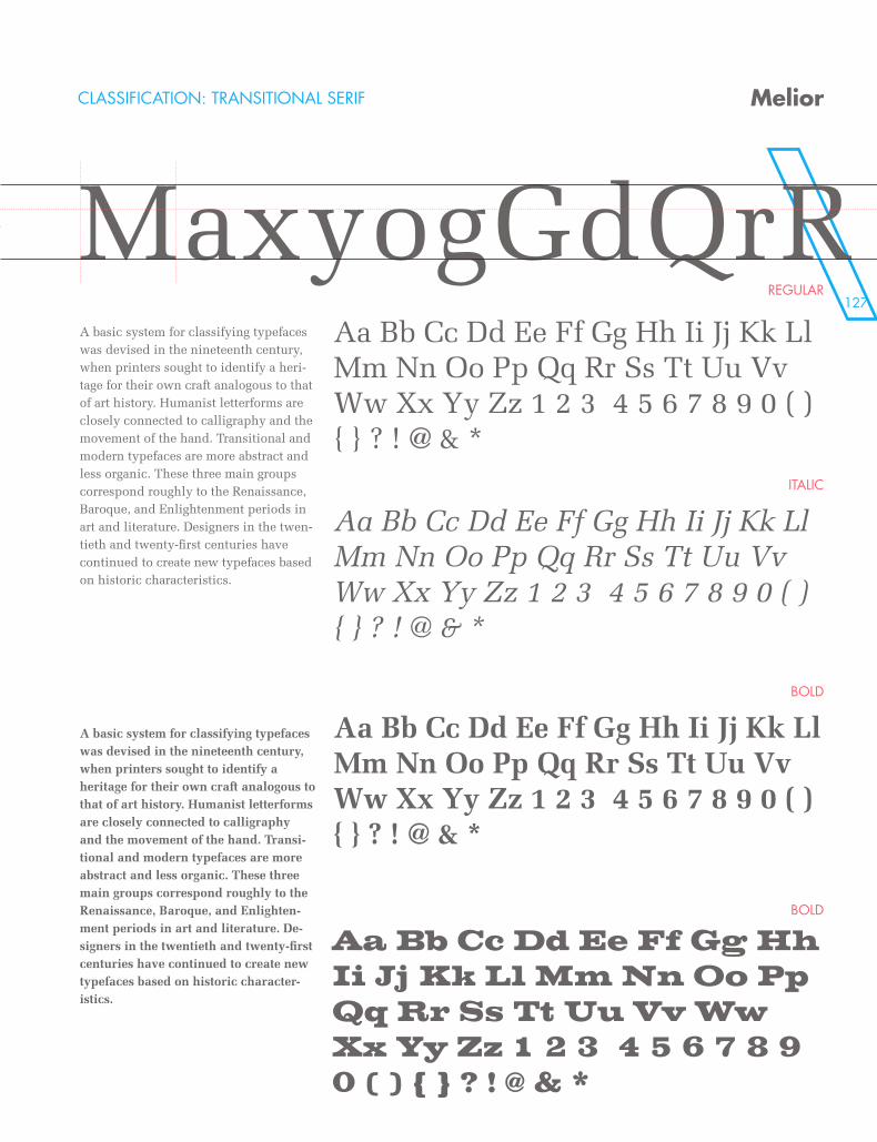
127
Kunstler Script CLASSIFICATION: TRANSITIONAL SERIF
REGULAR
ITALIC
BOLD
BOLD
Melior
MaxyogGdQrRA basic system for classifying typefaces was devised in the nineteenth century, when printers sought to identify a heri-tage for their own craft analogous to that of art history. Humanist letterforms are closely connected to calligraphy and the movement of the hand. Transitional and modern typefaces are more abstract and less organic. These three main groups correspond roughly to the Renaissance, Baroque, and Enlightenment periods in art and literature. Designers in the twen-tieth and twenty-first centuries have continued to create new typefaces based on historic characteristics.
A basic system for classifying typefaces was devised in the nineteenth century, when printers sought to identify a heritage for their own craft analogous to that of art history. Humanist letterforms are closely connected to calligraphy and the movement of the hand. Transi-tional and modern typefaces are more abstract and less organic. These three main groups correspond roughly to the Renaissance, Baroque, and Enlighten-ment periods in art and literature. De-signers in the twentieth and twenty-first centuries have continued to create new typefaces based on historic character-istics.
Aa Bb Cc Dd Ee Ff Gg Hh Ii Jj Kk Ll Mm Nn Oo Pp Qq Rr Ss Tt Uu Vv Ww Xx Yy Zz 1 2 3 4 5 6 7 8 9 0 ( ) { } ? ! @ & *
Aa Bb Cc Dd Ee Ff Gg Hh Ii Jj Kk Ll Mm Nn Oo Pp Qq Rr Ss Tt Uu Vv Ww Xx Yy Zz 1 2 3 4 5 6 7 8 9 0 ( ) { } ? ! @ & *
Aa Bb Cc Dd Ee Ff Gg Hh Ii Jj Kk Ll Mm Nn Oo Pp Qq Rr Ss Tt Uu Vv Ww Xx Yy Zz 1 2 3 4 5 6 7 8 9 0 ( ) { } ? ! @ & *
Aa Bb Cc Dd Ee Ff Gg Hh Ii Jj Kk Ll Mm Nn Oo Pp Qq Rr Ss Tt Uu Vv Ww Xx Yy Zz 1 2 3 4 5 6 7 8 9 0 ( ) { } ? ! @ & *
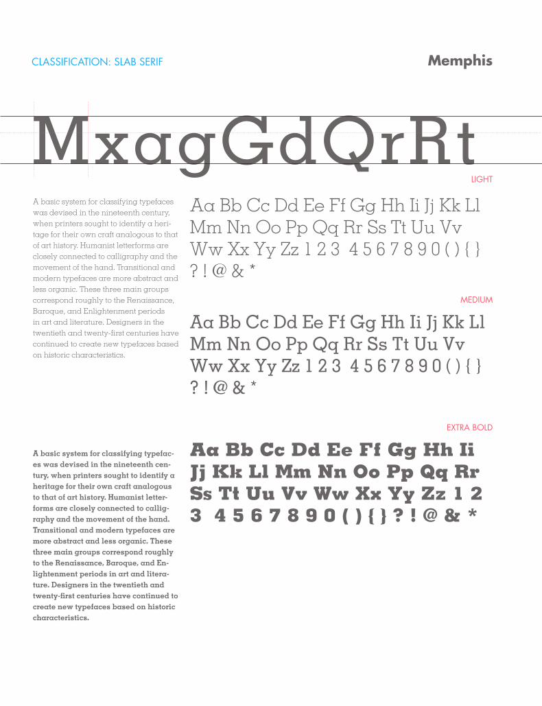
CLASSIFICATION: SLAB SERIF
LIGHT
MEDIUM
EXTRA BOLD
Memphis
MxagGdQrRtA basic system for classifying typefaces was devised in the nineteenth century, when printers sought to identify a heri-tage for their own craft analogous to that of art history. Humanist letterforms are closely connected to calligraphy and the movement of the hand. Transitional and modern typefaces are more abstract and less organic. These three main groups correspond roughly to the Renaissance, Baroque, and Enlightenment periods in art and literature. Designers in the twentieth and twenty-first centuries have continued to create new typefaces based on historic characteristics.
A basic system for classifying typefac-es was devised in the nineteenth cen-tury, when printers sought to identify a heritage for their own craft analogous to that of art history. Humanist letter-forms are closely connected to callig-raphy and the movement of the hand. Transitional and modern typefaces are more abstract and less organic. These three main groups correspond roughly to the Renaissance, Baroque, and En-lightenment periods in art and litera-ture. Designers in the twentieth and twenty-first centuries have continued to create new typefaces based on historic characteristics.
Aa Bb Cc Dd Ee Ff Gg Hh Ii Jj Kk Ll Mm Nn Oo Pp Qq Rr Ss Tt Uu Vv Ww Xx Yy Zz 1 2 3 4 5 6 7 8 9 0 ( ) { } ? ! @ & *
Aa Bb Cc Dd Ee Ff Gg Hh Ii Jj Kk Ll Mm Nn Oo Pp Qq Rr Ss Tt Uu Vv Ww Xx Yy Zz 1 2 3 4 5 6 7 8 9 0 ( ) { } ? ! @ & *
Aa Bb Cc Dd Ee Ff Gg Hh Ii Jj Kk Ll Mm Nn Oo Pp Qq Rr Ss Tt Uu Vv Ww Xx Yy Zz 1 2 3 4 5 6 7 8 9 0 ( ) { } ? ! @ & *
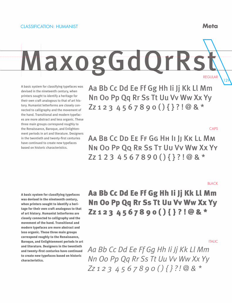
129
CLASSIFICATION: HUMANIST
REGULAR
CAPS
BLACK
ITALIC
Meta
MaxogGdQrRstA basic system for classifying typefaces was devised in the nineteenth century, when printers sought to identify a heritage for their own craft analogous to that of art his-tory. Humanist letterforms are closely con-nected to calligraphy and the movement of the hand. Transitional and modern typefac-es are more abstract and less organic. These three main groups correspond roughly to the Renaissance, Baroque, and Enlighten-ment periods in art and literature. Designers in the twentieth and twenty-first centuries have continued to create new typefaces based on historic characteristics.
A basic system for classifying typefaces was devised in the nineteenth century, when printers sought to identify a heri-tage for their own craft analogous to that of art history. Humanist letterforms are closely connected to calligraphy and the movement of the hand. Transitional and modern typefaces are more abstract and less organic. These three main groups correspond roughly to the Renaissance, Baroque, and Enlightenment periods in art and literature. Designers in the twentieth and twenty-first centuries have continued to create new typefaces based on historic characteristics.
Aa Bb Cc Dd Ee Ff Gg Hh Ii Jj Kk Ll Mm Nn Oo Pp Qq Rr Ss Tt Uu Vv Ww Xx Yy Zz 1 2 3 4 5 6 7 8 9 0 ( ) { } ? ! @ & *
Aa Bb Cc Dd Ee Ff Gg Hh Ii Jj Kk Ll Mm Nn Oo Pp Qq Rr Ss Tt Uu Vv Ww Xx Yy Zz 1 2 3 4 5 6 7 8 9 0 ( ) { } ? ! @ & *
Aa Bb Cc Dd Ee Ff Gg Hh Ii Jj Kk Ll Mm Nn Oo Pp Qq Rr Ss Tt Uu Vv Ww Xx Yy Zz 1 2 3 4 5 6 7 8 9 0 ( ) { } ? ! @ & *
Aa Bb Cc Dd Ee Ff Gg Hh Ii Jj Kk Ll Mm Nn Oo Pp Qq Rr Ss Tt Uu Vv Ww Xx Yy Zz 1 2 3 4 5 6 7 8 9 0 ( ) { } ? ! @ & *
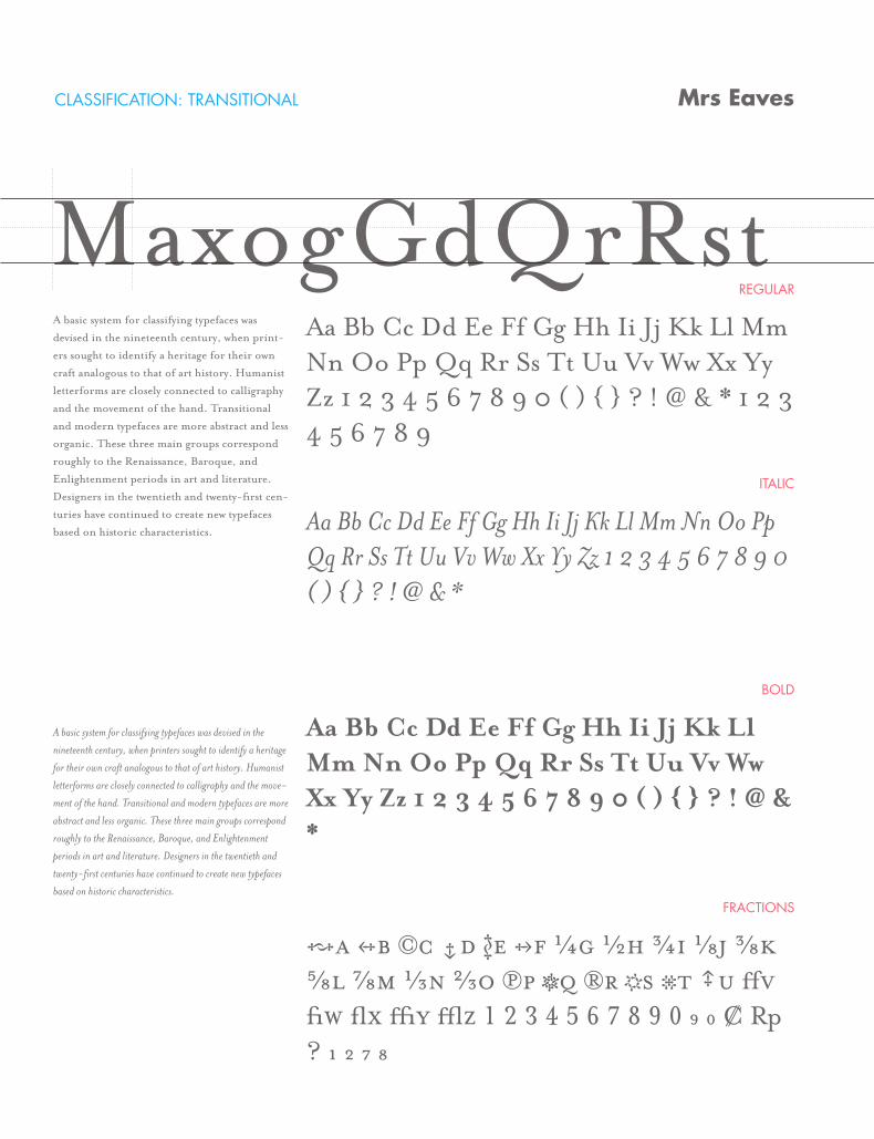
CLASSIFICATION: TRANSITIONAL
REGULAR
ITALIC
BOLD
FRACTIONS
Mrs Eaves
MaxogGdQrRstA basic system for classifying typefaces was
devised in the nineteenth century, when print-
ers sought to identify a heritage for their own
craft analogous to that of art history. Humanist
letterforms are closely connected to calligraphy
and the movement of the hand. Transitional
and modern typefaces are more abstract and less
organic. These three main groups correspond
roughly to the Renaissance, Baroque, and
Enlightenment periods in art and literature.
Designers in the twentieth and twenty-first cen-
turies have continued to create new typefaces
based on historic characteristics.
A basic system for classifying typefaces was devised in the
nineteenth century, when printers sought to identify a heritage
for their own craft analogous to that of art history. Humanist
letterforms are closely connected to calligraphy and the move-
ment of the hand. Transitional and modern typefaces are more
abstract and less organic. These three main groups correspond
roughly to the Renaissance, Baroque, and Enlightenment
periods in art and literature. Designers in the twentieth and
twenty-first centuries have continued to create new typefaces
based on historic characteristics.
Aa Bb Cc Dd Ee Ff Gg Hh Ii Jj Kk Ll Mm Nn Oo Pp Qq Rr Ss Tt Uu Vv Ww Xx Yy Zz 1 2 3 4 5 6 7 8 9 0 ( ) { } ? ! @ & * 1 2 3 4 5 6 7 8 9
Aa Bb Cc Dd Ee Ff Gg Hh Ii Jj Kk Ll Mm Nn Oo Pp Qq Rr Ss Tt Uu Vv Ww Xx Yy Zz 1 2 3 4 5 6 7 8 9 0 ( ) { } ? ! @ & *
Aa Bb Cc Dd Ee Ff Gg Hh Ii Jj Kk Ll Mm Nn Oo Pp Qq Rr Ss Tt Uu Vv Ww Xx Yy Zz 1 2 3 4 5 6 7 8 9 0 ( ) { } ? ! @ & *
Aa Bb Cc Dd Ee Ff Gg Hh Ii Jj Kk Ll Mm Nn Oo Pp Qq Rr Ss Tt Uu Vv Ww Xx Yy Zz 1 2 3 4 5 6 7 8 9 0 ( ) { } ? ! @ & *
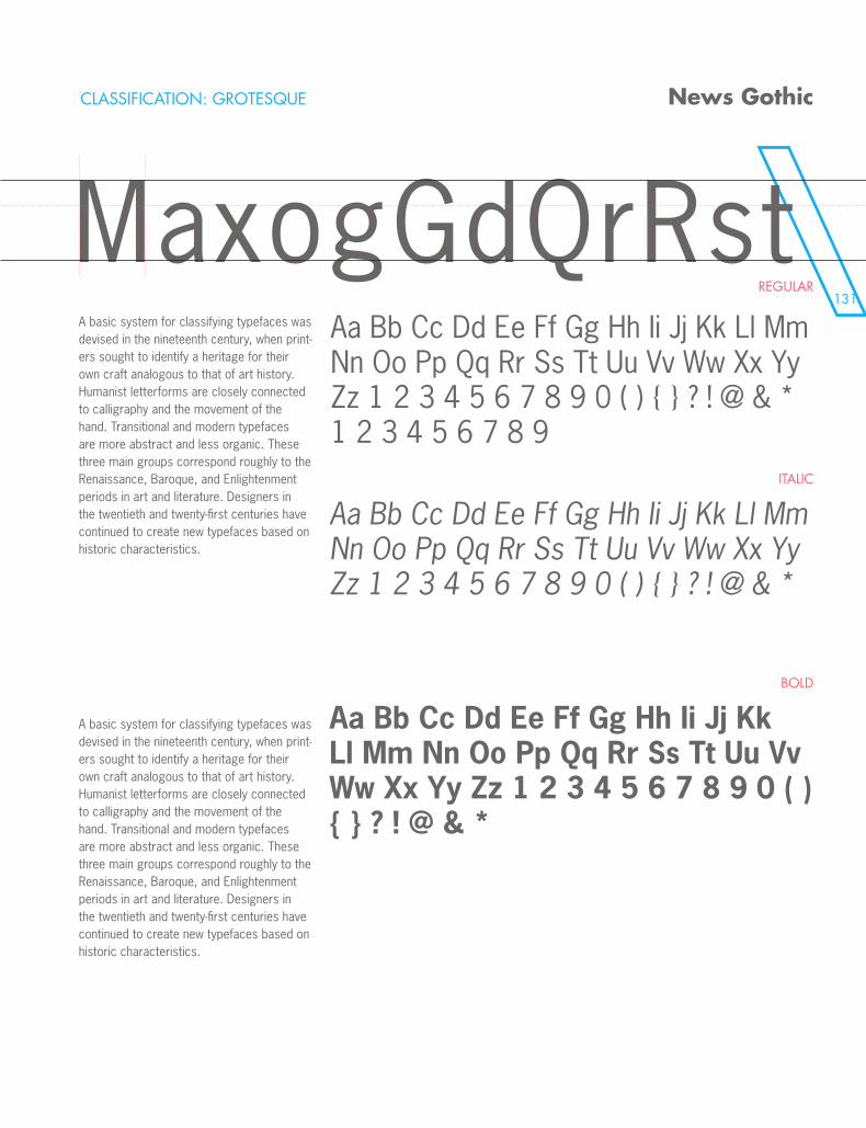
131
MaxogGdQrRst
CLASSIFICATION: GROTESQUE
REGULAR
ITALIC
BOLD
News Gothic
MaxogGdQrRstA basic system for classifying typefaces was devised in the nineteenth century, when print-ers sought to identify a heritage for their own craft analogous to that of art history. Humanist letterforms are closely connected to calligraphy and the movement of the hand. Transitional and modern typefaces are more abstract and less organic. These three main groups correspond roughly to the Renaissance, Baroque, and Enlightenment periods in art and literature. Designers in the twentieth and twenty-first centuries have continued to create new typefaces based on historic characteristics.
A basic system for classifying typefaces was devised in the nineteenth century, when print-ers sought to identify a heritage for their own craft analogous to that of art history. Humanist letterforms are closely connected to calligraphy and the movement of the hand. Transitional and modern typefaces are more abstract and less organic. These three main groups correspond roughly to the Renaissance, Baroque, and Enlightenment periods in art and literature. Designers in the twentieth and twenty-first centuries have continued to create new typefaces based on historic characteristics.
Aa Bb Cc Dd Ee Ff Gg Hh Ii Jj Kk Ll Mm Nn Oo Pp Qq Rr Ss Tt Uu Vv Ww Xx Yy Zz 1 2 3 4 5 6 7 8 9 0 ( ) { } ? ! @ & * 1 2 3 4 5 6 7 8 9
Aa Bb Cc Dd Ee Ff Gg Hh Ii Jj Kk Ll Mm Nn Oo Pp Qq Rr Ss Tt Uu Vv Ww Xx Yy Zz 1 2 3 4 5 6 7 8 9 0 ( ) { } ? ! @ & *
Aa Bb Cc Dd Ee Ff Gg Hh Ii Jj Kk Ll Mm Nn Oo Pp Qq Rr Ss Tt Uu Vv Ww Xx Yy Zz 1 2 3 4 5 6 7 8 9 0 ( ) { } ? ! @ & *
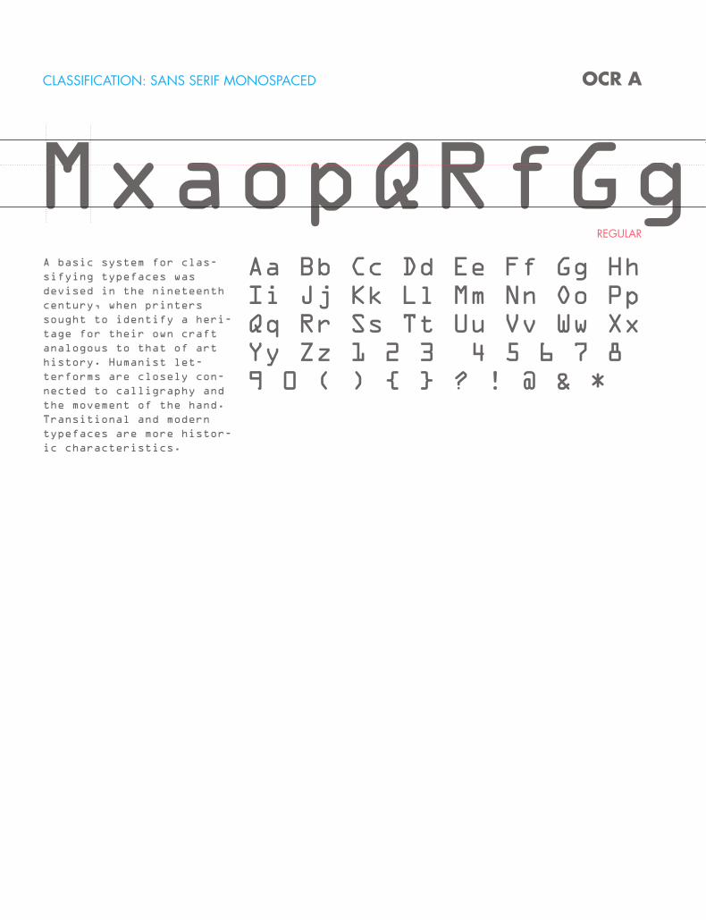
CLASSIFICATION: SANS SERIF MONOSPACED
REGULAR
OCR A
MxaopQRfGgA basic system for clas-
sifying typefaces was
devised in the nineteenth
century, when printers
sought to identify a heri-
tage for their own craft
analogous to that of art
history. Humanist let-
terforms are closely con-
nected to calligraphy and
the movement of the hand.
Transitional and modern
typefaces are more histor-
ic characteristics.
Aa Bb Cc Dd Ee Ff Gg Hh Ii Jj Kk Ll Mm Nn Oo Pp Qq Rr Ss Tt Uu Vv Ww Xx Yy Zz 1 2 3 4 5 6 7 8 9 0 ( ) { } ? ! @ & *
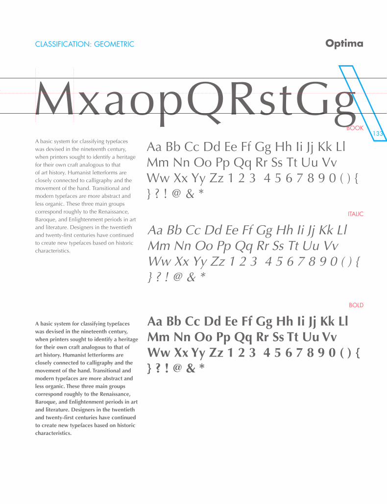
133
MxaopQRfGg
CLASSIFICATION: GEOMETRIC
BOOK
ITALIC
BOLD
Optima
MxaopQRstGgA basic system for classifying typefaces was devised in the nineteenth century, when printers sought to identify a heritage for their own craft analogous to that of art history. Humanist letterforms are closely connected to calligraphy and the movement of the hand. Transitional and modern typefaces are more abstract and less organic. These three main groups correspond roughly to the Renaissance, Baroque, and Enlightenment periods in art and literature. Designers in the twentieth and twenty-first centuries have continued to create new typefaces based on historic characteristics.
A basic system for classifying typefaces was devised in the nineteenth century, when printers sought to identify a heritage for their own craft analogous to that of art history. Humanist letterforms are closely connected to calligraphy and the movement of the hand. Transitional and modern typefaces are more abstract and less organic. These three main groups correspond roughly to the Renaissance, Baroque, and Enlightenment periods in art and literature. Designers in the twentieth and twenty-first centuries have continued to create new typefaces based on historic characteristics.
Aa Bb Cc Dd Ee Ff Gg Hh Ii Jj Kk Ll Mm Nn Oo Pp Qq Rr Ss Tt Uu Vv Ww Xx Yy Zz 1 2 3 4 5 6 7 8 9 0 ( ) { } ? ! @ & *
Aa Bb Cc Dd Ee Ff Gg Hh Ii Jj Kk Ll Mm Nn Oo Pp Qq Rr Ss Tt Uu Vv Ww Xx Yy Zz 1 2 3 4 5 6 7 8 9 0 ( ) { } ? ! @ & *
Aa Bb Cc Dd Ee Ff Gg Hh Ii Jj Kk Ll Mm Nn Oo Pp Qq Rr Ss Tt Uu Vv Ww Xx Yy Zz 1 2 3 4 5 6 7 8 9 0 ( ) { } ? ! @ & *
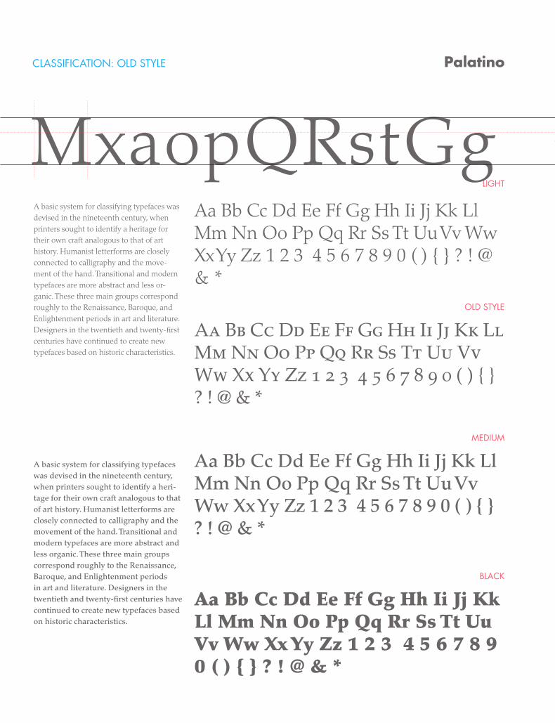
CLASSIFICATION: OLD STYLE
LIGHT
OLD STYLE
MEDIUM
BLACK
Palatino
MxaopQRstGgA basic system for classifying typefaces was devised in the nineteenth century, when printers sought to identify a heritage for their own craft analogous to that of art history. Humanist letterforms are closely connected to calligraphy and the move-ment of the hand. Transitional and modern typefaces are more abstract and less or-ganic. These three main groups correspond roughly to the Renaissance, Baroque, and Enlightenment periods in art and literature. Designers in the twentieth and twenty-first centuries have continued to create new typefaces based on historic characteristics.
A basic system for classifying typefaces was devised in the nineteenth century, when printers sought to identify a heri-tage for their own craft analogous to that of art history. Humanist letterforms are closely connected to calligraphy and the movement of the hand. Transitional and modern typefaces are more abstract and less organic. These three main groups correspond roughly to the Renaissance, Baroque, and Enlightenment periods in art and literature. Designers in the twentieth and twenty-first centuries have continued to create new typefaces based on historic characteristics.
Aa Bb Cc Dd Ee Ff Gg Hh Ii Jj Kk Ll Mm Nn Oo Pp Qq Rr Ss Tt Uu Vv Ww Xx Yy Zz 1 2 3 4 5 6 7 8 9 0 ( ) { } ? ! @ & *
Aa Bb Cc Dd Ee Ff Gg Hh Ii Jj Kk Ll Mm Nn Oo Pp Qq Rr Ss Tt Uu Vv Ww Xx Yy Zz 1 2 3 4 5 6 7 8 9 0 ( ) { } ? ! @ & *
Aa Bb Cc Dd Ee Ff Gg Hh Ii Jj Kk Ll Mm Nn Oo Pp Qq Rr Ss Tt Uu Vv Ww Xx Yy Zz 1 2 3 4 5 6 7 8 9 0 ( ) { } ? ! @ & *
Aa Bb Cc Dd Ee Ff Gg Hh Ii Jj Kk Ll Mm Nn Oo Pp Qq Rr Ss Tt Uu Vv Ww Xx Yy Zz 1 2 3 4 5 6 7 8 9 0 ( ) { } ? ! @ & *
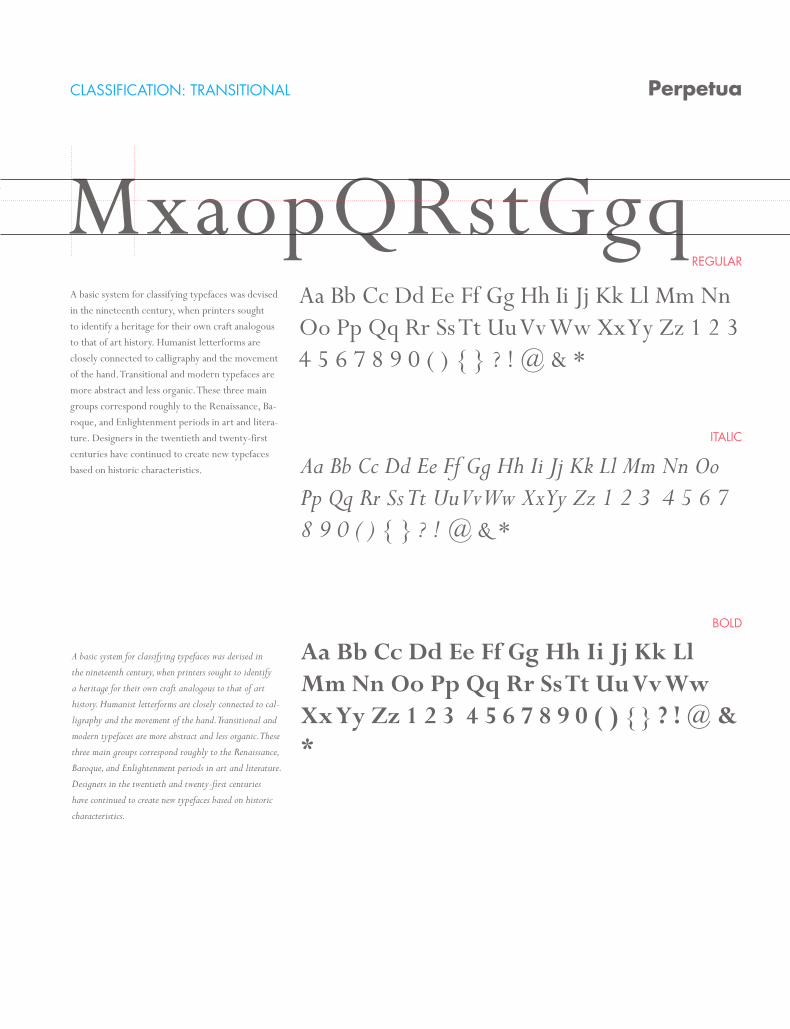
CLASSIFICATION: TRANSITIONAL
REGULAR
ITALIC
BOLD
Perpetua
MxaopQRstGgqA basic system for classifying typefaces was devised in the nineteenth century, when printers sought to identify a heritage for their own craft analogous to that of art history. Humanist letterforms are closely connected to calligraphy and the movement of the hand. Transitional and modern typefaces are more abstract and less organic. These three main groups correspond roughly to the Renaissance, Ba-roque, and Enlightenment periods in art and litera-ture. Designers in the twentieth and twenty-first centuries have continued to create new typefaces based on historic characteristics.
A basic system for classifying typefaces was devised in
the nineteenth century, when printers sought to identify
a heritage for their own craft analogous to that of art
history. Humanist letterforms are closely connected to cal-
ligraphy and the movement of the hand. Transitional and
modern typefaces are more abstract and less organic. These
three main groups correspond roughly to the Renaissance,
Baroque, and Enlightenment periods in art and literature.
Designers in the twentieth and twenty-first centuries
have continued to create new typefaces based on historic
characteristics.
Aa Bb Cc Dd Ee Ff Gg Hh Ii Jj Kk Ll Mm Nn Oo Pp Qq Rr Ss Tt Uu Vv Ww Xx Yy Zz 1 2 3 4 5 6 7 8 9 0 ( ) { } ? ! @ & *
Aa Bb Cc Dd Ee Ff Gg Hh Ii Jj Kk Ll Mm Nn Oo Pp Qq Rr Ss Tt Uu Vv Ww Xx Yy Zz 1 2 3 4 5 6 7 8 9 0 ( ) { } ? ! @ & *
Aa Bb Cc Dd Ee Ff Gg Hh Ii Jj Kk Ll Mm Nn Oo Pp Qq Rr Ss Tt Uu Vv Ww Xx Yy Zz 1 2 3 4 5 6 7 8 9 0 ( ) { } ? ! @ & *
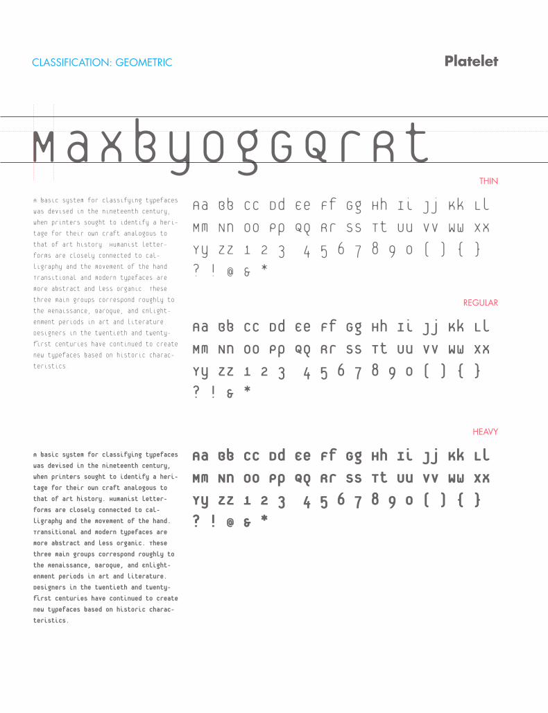
CLASSIFICATION: GEOMETRIC
THIN
REGULAR
HEAVY
Platelet
MaxbyogGQrRtA basic system for classifying typefaces
was devised in the nineteenth century,
when printers sought to identify a heri-
tage for their own craft analogous to
that of art history. Humanist letter-
forms are closely connected to cal-
ligraphy and the movement of the hand.
Transitional and modern typefaces are
more abstract and less organic. These
three main groups correspond roughly to
the Renaissance, Baroque, and Enlight-
enment periods in art and literature.
Designers in the twentieth and twenty-
first centuries have continued to create
new typefaces based on historic charac-
teristics.
A basic system for classifying typefaces
was devised in the nineteenth century,
when printers sought to identify a heri-
tage for their own craft analogous to
that of art history. Humanist letter-
forms are closely connected to cal-
ligraphy and the movement of the hand.
Transitional and modern typefaces are
more abstract and less organic. These
three main groups correspond roughly to
the Renaissance, Baroque, and Enlight-
enment periods in art and literature.
Designers in the twentieth and twenty-
first centuries have continued to create
new typefaces based on historic charac-
teristics.
Aa Bb Cc Dd Ee Ff Gg Hh Ii Jj Kk Ll
Mm Nn Oo Pp Qq Rr Ss Tt Uu Vv Ww Xx
Yy Zz 1 2 3 4 5 6 7 8 9 0 ( ) { }
? ! @ & *
Aa Bb Cc Dd Ee Ff Gg Hh Ii Jj Kk Ll
Mm Nn Oo Pp Qq Rr Ss Tt Uu Vv Ww Xx
Yy Zz 1 2 3 4 5 6 7 8 9 0 ( ) { }
? ! & *
Aa Bb Cc Dd Ee Ff Gg Hh Ii Jj Kk Ll
Mm Nn Oo Pp Qq Rr Ss Tt Uu Vv Ww Xx
Yy Zz 1 2 3 4 5 6 7 8 9 0 ( ) { }
? ! @ & *
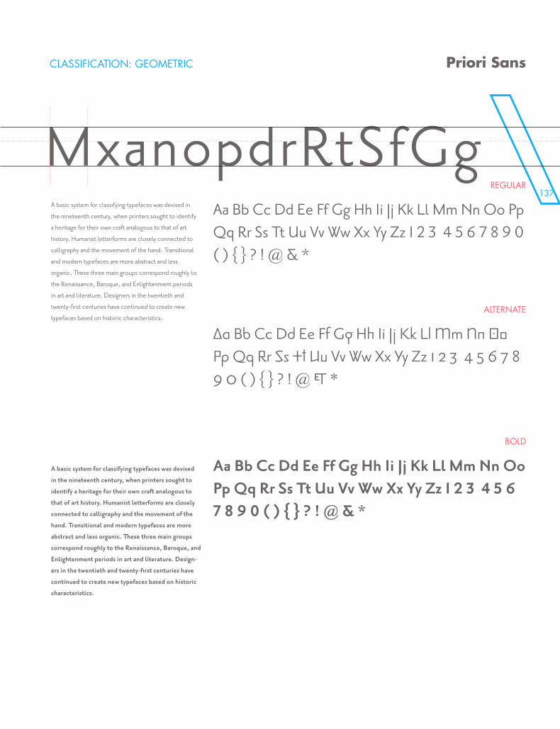
137
CLASSIFICATION: GEOMETRIC
REGULAR
ALTERNATE
BOLD
Priori Sans
MxanopdrRtSfGgA basic system for classifying typefaces was devised in
the nineteenth century, when printers sought to identify
a heritage for their own craft analogous to that of art
history. Humanist letterforms are closely connected to
calligraphy and the movement of the hand. Transitional
and modern typefaces are more abstract and less
organic. These three main groups correspond roughly to
the Renaissance, Baroque, and Enlightenment periods
in art and literature. Designers in the twentieth and
twenty-first centuries have continued to create new
typefaces based on historic characteristics.
A basic system for classifying typefaces was devised
in the nineteenth century, when printers sought to
identify a heritage for their own craft analogous to
that of art history. Humanist letterforms are closely
connected to calligraphy and the movement of the
hand. Transitional and modern typefaces are more
abstract and less organic. These three main groups
correspond roughly to the Renaissance, Baroque, and
Enlightenment periods in art and literature. Design-
ers in the twentieth and twenty-first centuries have
continued to create new typefaces based on historic
characteristics.
Aa Bb Cc Dd Ee Ff Gg Hh Ii Jj Kk Ll Mm Nn Oo Pp Qq Rr Ss Tt Uu Vv Ww Xx Yy Zz 1 2 3 4 5 6 7 8 9 0 ( ) { } ? ! @ & *
Aa Bb Cc Dd Ee Ff Gg Hh Ii Jj Kk Ll Mm Nn Oo Pp Qq Rr Ss Tt Uu Vv Ww Xx Yy Zz 1 2 3 4 5 6 7 8 9 0 ( ) { } ? ! @ & *
Aa Bb Cc Dd Ee Ff Gg Hh Ii Jj Kk Ll Mm Nn Oo Pp Qq Rr Ss Tt Uu Vv Ww Xx Yy Zz 1 2 3 4 5 6 7 8 9 0 ( ) { } ? ! @ & *
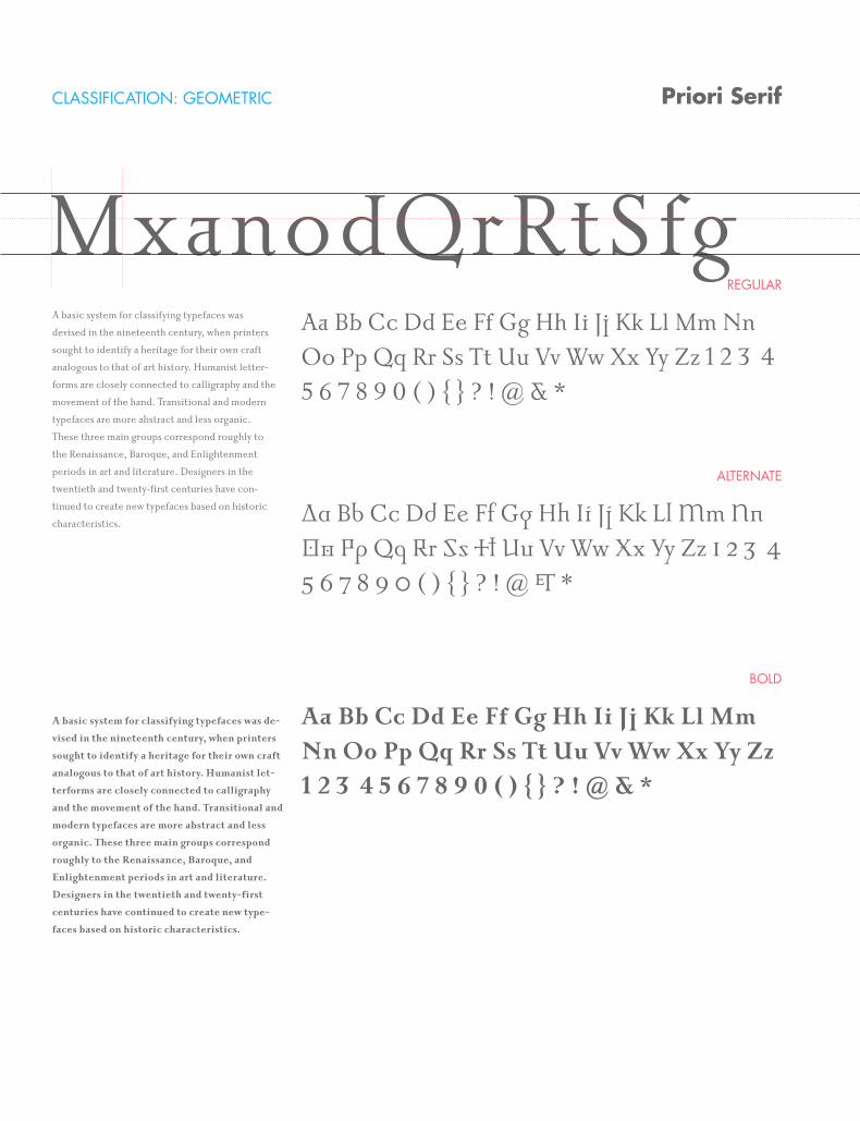
CLASSIFICATION: GEOMETRIC
REGULAR
ALTERNATE
BOLD
Priori Serif
MxanodQrRtSfgA basic system for classifying typefaces was
devised in the nineteenth century, when printers
sought to identify a heritage for their own craft
analogous to that of art history. Humanist letter-
forms are closely connected to calligraphy and the
movement of the hand. Transitional and modern
typefaces are more abstract and less organic.
These three main groups correspond roughly to
the Renaissance, Baroque, and Enlightenment
periods in art and literature. Designers in the
twentieth and twenty-first centuries have con-
tinued to create new typefaces based on historic
characteristics.
A basic system for classifying typefaces was de-
vised in the nineteenth century, when printers
sought to identify a heritage for their own craft
analogous to that of art history. Humanist let-
terforms are closely connected to calligraphy
and the movement of the hand. Transitional and
modern typefaces are more abstract and less
organic. These three main groups correspond
roughly to the Renaissance, Baroque, and
Enlightenment periods in art and literature.
Designers in the twentieth and twenty-first
centuries have continued to create new type-
faces based on historic characteristics.
Aa Bb Cc Dd Ee Ff Gg Hh Ii Jj Kk Ll Mm Nn Oo Pp Qq Rr Ss Tt Uu Vv Ww Xx Yy Zz 1 2 3 4 5 6 7 8 9 0 ( ) { } ? ! @ & *
Aa Bb Cc Dd Ee Ff Gg Hh Ii Jj Kk Ll Mm Nn Oo Pp Qq Rr Ss Tt Uu Vv Ww Xx Yy Zz 1 2 3 4 5 6 7 8 9 0 ( ) { } ? ! @ & *
Aa Bb Cc Dd Ee Ff Gg Hh Ii Jj Kk Ll Mm Nn Oo Pp Qq Rr Ss Tt Uu Vv Ww Xx Yy Zz 1 2 3 4 5 6 7 8 9 0 ( ) { } ? ! @ & *
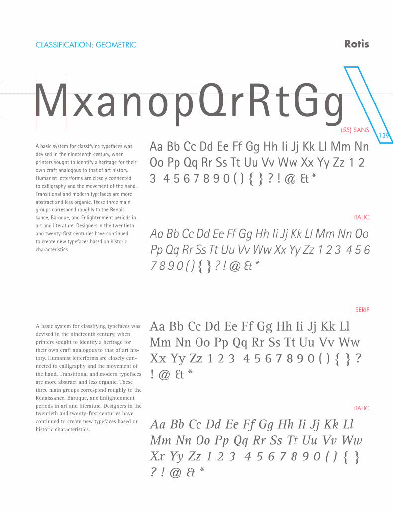
139
CLASSIFICATION: GEOMETRIC
(55) SANS
ITALIC
SERIF
ITALIC
Rotis
MxanopQrRtGgA basic system for classifying typefaces was devised in the nineteenth century, when printers sought to identify a heritage for their own craft analogous to that of art history. Humanist letterforms are closely connected to calligraphy and the movement of the hand. Transitional and modern typefaces are more abstract and less organic. These three main groups correspond roughly to the Renais-sance, Baroque, and Enlightenment periods in art and literature. Designers in the twentieth and twenty-first centuries have continued to create new typefaces based on historic characteristics.
A basic system for classifying typefaces was devised in the nineteenth century, when printers sought to identify a heritage for their own craft analogous to that of art his-tory. Humanist letterforms are closely con-nected to calligraphy and the movement of the hand. Transitional and modern typefaces are more abstract and less organic. These three main groups correspond roughly to the Renaissance, Baroque, and Enlightenment periods in art and literature. Designers in the twentieth and twenty-first centuries have continued to create new typefaces based on historic characteristics.
Aa Bb Cc Dd Ee Ff Gg Hh Ii Jj Kk Ll Mm Nn Oo Pp Qq Rr Ss Tt Uu Vv Ww Xx Yy Zz 1 2 3 4 5 6 7 8 9 0 ( ) { } ? ! @ & *
Aa Bb Cc Dd Ee Ff Gg Hh Ii Jj Kk Ll Mm Nn Oo Pp Qq Rr Ss Tt Uu Vv Ww Xx Yy Zz 1 2 3 4 5 6 7 8 9 0 ( ) { } ? ! @ & *
Aa Bb Cc Dd Ee Ff Gg Hh Ii Jj Kk Ll Mm Nn Oo Pp Qq Rr Ss Tt Uu Vv Ww Xx Yy Zz 1 2 3 4 5 6 7 8 9 0 ( ) { } ? ! @ & *
Aa Bb Cc Dd Ee Ff Gg Hh Ii Jj Kk Ll Mm Nn Oo Pp Qq Rr Ss Tt Uu Vv Ww Xx Yy Zz 1 2 3 4 5 6 7 8 9 0 ( ) { } ? ! @ & *
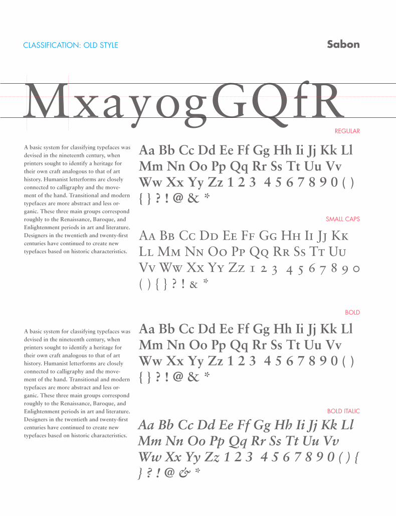
CLASSIFICATION: OLD STYLE
REGULAR
SMALL CAPS
BOLD
BOLD ITALIC
Sabon
MxayogGQfRA basic system for classifying typefaces was devised in the nineteenth century, when printers sought to identify a heritage for their own craft analogous to that of art history. Humanist letterforms are closely connected to calligraphy and the move-ment of the hand. Transitional and modern typefaces are more abstract and less or-ganic. These three main groups correspond roughly to the Renaissance, Baroque, and Enlightenment periods in art and literature. Designers in the twentieth and twenty-first centuries have continued to create new typefaces based on historic characteristics.
A basic system for classifying typefaces was devised in the nineteenth century, when printers sought to identify a heritage for their own craft analogous to that of art history. Humanist letterforms are closely connected to calligraphy and the move-ment of the hand. Transitional and modern typefaces are more abstract and less or-ganic. These three main groups correspond roughly to the Renaissance, Baroque, and Enlightenment periods in art and literature. Designers in the twentieth and twenty-first centuries have continued to create new typefaces based on historic characteristics.
Aa Bb Cc Dd Ee Ff Gg Hh Ii Jj Kk Ll Mm Nn Oo Pp Qq Rr Ss Tt Uu Vv Ww Xx Yy Zz 1 2 3 4 5 6 7 8 9 0 ( ) { } ? ! @ & *
Aa Bb Cc Dd Ee Ff Gg Hh Ii Jj Kk Ll Mm Nn Oo Pp Qq Rr Ss Tt Uu Vv Ww Xx Yy Zz 1 2 3 4 5 6 7 8 9 0 ( ) { } ? ! & *
Aa Bb Cc Dd Ee Ff Gg Hh Ii Jj Kk Ll Mm Nn Oo Pp Qq Rr Ss Tt Uu Vv Ww Xx Yy Zz 1 2 3 4 5 6 7 8 9 0 ( ) { } ? ! @ & *
Aa Bb Cc Dd Ee Ff Gg Hh Ii Jj Kk Ll Mm Nn Oo Pp Qq Rr Ss Tt Uu Vv Ww Xx Yy Zz 1 2 3 4 5 6 7 8 9 0 ( ) { } ? ! @ & *
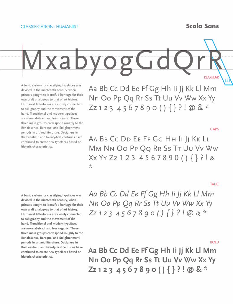
141
MxayogGQfRCLASSIFICATION: HUMANIST
REGULAR
CAPS
ITALIC
BOLD
Scala Sans
MxabyogGdQrRA basic system for classifying typefaces was
devised in the nineteenth century, when
printers sought to identify a heritage for their
own craft analogous to that of art history.
Humanist letterforms are closely connected
to calligraphy and the movement of the
hand. Transitional and modern typefaces
are more abstract and less organic. These
three main groups correspond roughly to the
Renaissance, Baroque, and Enlightenment
periods in art and literature. Designers in
the twentieth and twenty-first centuries have
continued to create new typefaces based on
historic characteristics.
A basic system for classifying typefaces was
devised in the nineteenth century, when
printers sought to identify a heritage for their
own craft analogous to that of art history.
Humanist letterforms are closely connected
to calligraphy and the movement of the
hand. Transitional and modern typefaces
are more abstract and less organic. These
three main groups correspond roughly to the
Renaissance, Baroque, and Enlightenment
periods in art and literature. Designers in
the twentieth and twenty-first centuries have
continued to create new typefaces based on
historic characteristics.
Aa Bb Cc Dd Ee Ff Gg Hh Ii Jj Kk Ll Mm Nn Oo Pp Qq Rr Ss Tt Uu Vv Ww Xx Yy Zz 1 2 3 4 5 6 7 8 9 0 ( ) { } ? ! @ & *
Aa Bb Cc Dd Ee Ff Gg Hh Ii Jj Kk Ll Mm Nn Oo Pp Qq Rr Ss Tt Uu Vv Ww Xx Yy Zz 1 2 3 4 5 6 7 8 9 0 ( ) { } ? ! & *
Aa Bb Cc Dd Ee Ff Gg Hh Ii Jj Kk Ll Mm Nn Oo Pp Qq Rr Ss Tt Uu Vv Ww Xx Yy Zz 1 2 3 4 5 6 7 8 9 0 ( ) { } ? ! @ & *
Aa Bb Cc Dd Ee Ff Gg Hh Ii Jj Kk Ll Mm Nn Oo Pp Qq Rr Ss Tt Uu Vv Ww Xx Yy Zz 1 2 3 4 5 6 7 8 9 0 ( ) { } ? ! @ & *
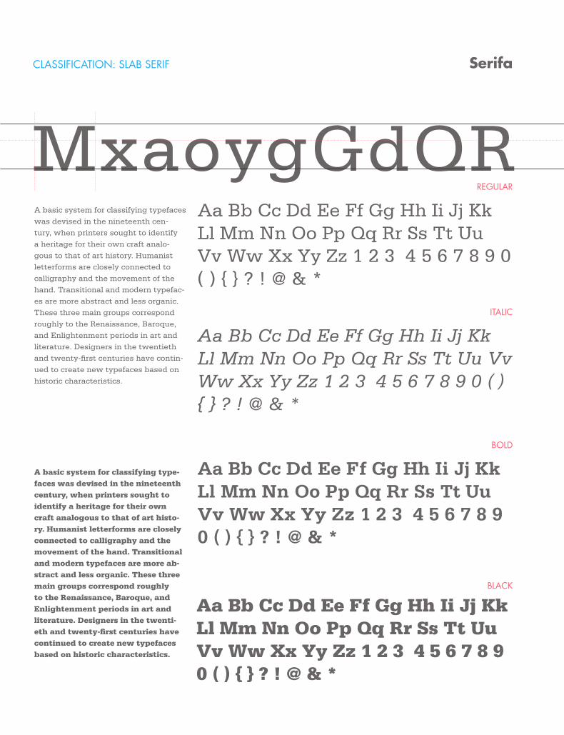
CLASSIFICATION: SLAB SERIF
REGULAR
ITALIC
BOLD
BLACK
Serifa
MxaoygGdQRA basic system for classifying typefaces
was devised in the nineteenth cen-
tury, when printers sought to identify
a heritage for their own craft analo-
gous to that of art history. Humanist
letterforms are closely connected to
calligraphy and the movement of the
hand. Transitional and modern typefac-
es are more abstract and less organic.
These three main groups correspond
roughly to the Renaissance, Baroque,
and Enlightenment periods in art and
literature. Designers in the twentieth
and twenty-first centuries have contin-
ued to create new typefaces based on
historic characteristics.
A basic system for classifying type-faces was devised in the nineteenth century, when printers sought to identify a heritage for their own craft analogous to that of art histo-ry. Humanist letterforms are closely connected to calligraphy and the movement of the hand. Transitional and modern typefaces are more ab-stract and less organic. These three main groups correspond roughly to the Renaissance, Baroque, and Enlightenment periods in art and literature. Designers in the twenti-eth and twenty-first centuries have continued to create new typefaces based on historic characteristics.
Aa Bb Cc Dd Ee Ff Gg Hh Ii Jj Kk Ll Mm Nn Oo Pp Qq Rr Ss Tt Uu Vv Ww Xx Yy Zz 1 2 3 4 5 6 7 8 9 0 ( ) { } ? ! @ & *
Aa Bb Cc Dd Ee Ff Gg Hh Ii Jj Kk Ll Mm Nn Oo Pp Qq Rr Ss Tt Uu Vv Ww Xx Yy Zz 1 2 3 4 5 6 7 8 9 0 ( ) { } ? ! @ & *
Aa Bb Cc Dd Ee Ff Gg Hh Ii Jj Kk Ll Mm Nn Oo Pp Qq Rr Ss Tt Uu Vv Ww Xx Yy Zz 1 2 3 4 5 6 7 8 9 0 ( ) { } ? ! @ & *
Aa Bb Cc Dd Ee Ff Gg Hh Ii Jj Kk Ll Mm Nn Oo Pp Qq Rr Ss Tt Uu Vv Ww Xx Yy Zz 1 2 3 4 5 6 7 8 9 0 ( ) { } ? ! @ & *
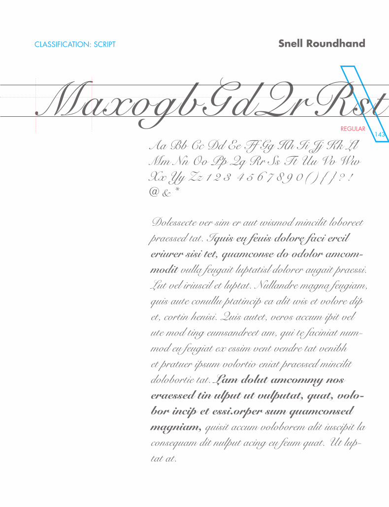
143
CLASSIFICATION: SCRIPT
REGULAR
Snell Roundhand
MaxogbGdQrRstAa Bb Cc Dd Ee Ff Gg Hh Ii Jj Kk Ll Mm Nn Oo Pp Qq Rr Ss Tt Uu Vv Ww Xx Yy Zz 1 2 3 4 5 6 7 8 9 0 ( ) { } ? ! @ & *
Dolessecte ver sim er aut wismod mincilit loboreet praessed tat. Iquis eu feuis dolore faci ercil eriurer sisi tet, quamconse do odolor amcom-modit vulla feugait luptatisl dolorer augait praessi. Lut vel iriuscil et luptat. Nullandre magna feugiam, quis aute conullu ptatincip ea alit wis et volore dip et, cortin henisi. Quis autet, veros accum ipit vel ute mod ting eumsandreet am, qui te faciniat num-mod eu feugiat ex essim vent vendre tat venibh et pratuer ipsum volortio eniat praessed mincilit dolobortie tat. Lam dolut amcommy nos eraessed tin ulput ut vulputat, quat, volo-bor incip et essi.orper sum quamconsed magniam, quisit accum voloborem alit iuscipit la consequam dit nulput acing eu feum quat. Ut lup-tat at.
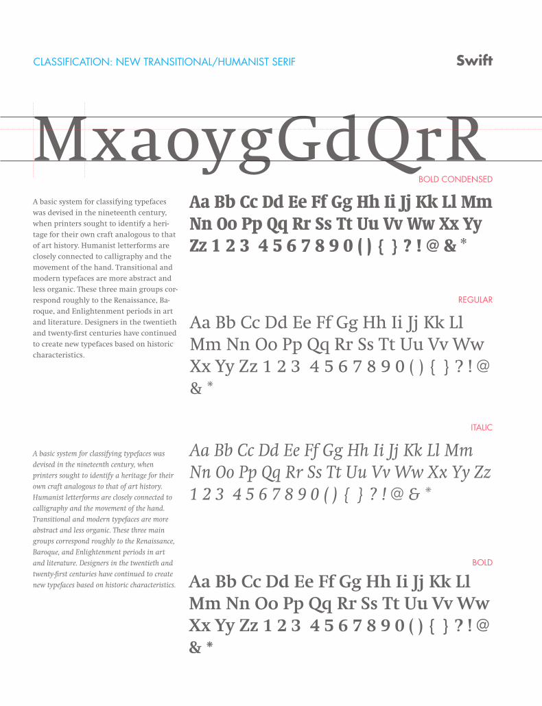
CLASSIFICATION: NEW TRANSITIONAL/HUMANIST SERIF
BOLD CONDENSED
REGULAR
ITALIC
BOLD
Swift
MxaoygGdQrRA basic system for classifying typefaces
was devised in the nineteenth century,
when printers sought to identify a heri-
tage for their own craft analogous to that
of art history. Humanist letterforms are
closely connected to calligraphy and the
movement of the hand. Transitional and
modern typefaces are more abstract and
less organic. These three main groups cor-
respond roughly to the Renaissance, Ba-
roque, and Enlightenment periods in art
and literature. Designers in the twentieth
and twenty-first centuries have continued
to create new typefaces based on historic
characteristics.
A basic system for classifying typefaces was
devised in the nineteenth century, when
printers sought to identify a heritage for their
own craft analogous to that of art history.
Humanist letterforms are closely connected to
calligraphy and the movement of the hand.
Transitional and modern typefaces are more
abstract and less organic. These three main
groups correspond roughly to the Renaissance,
Baroque, and Enlightenment periods in art
and literature. Designers in the twentieth and
twenty-first centuries have continued to create
new typefaces based on historic characteristics.
Aa Bb Cc Dd Ee Ff Gg Hh Ii Jj Kk Ll Mm Nn Oo Pp Qq Rr Ss Tt Uu Vv Ww Xx Yy Zz 1 2 3 4 5 6 7 8 9 0 ( ) { } ? ! @ & *
Aa Bb Cc Dd Ee Ff Gg Hh Ii Jj Kk Ll Mm Nn Oo Pp Qq Rr Ss Tt Uu Vv Ww Xx Yy Zz 1 2 3 4 5 6 7 8 9 0 ( ) { } ? ! @ & *
Aa Bb Cc Dd Ee Ff Gg Hh Ii Jj Kk Ll Mm Nn Oo Pp Qq Rr Ss Tt Uu Vv Ww Xx Yy Zz 1 2 3 4 5 6 7 8 9 0 ( ) { } ? ! @ & *
Aa Bb Cc Dd Ee Ff Gg Hh Ii Jj Kk Ll Mm Nn Oo Pp Qq Rr Ss Tt Uu Vv Ww Xx Yy Zz 1 2 3 4 5 6 7 8 9 0 ( ) { } ? ! @ & *
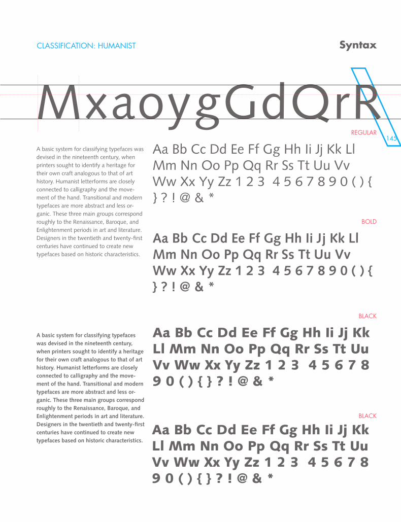
145
MxaoygGdQrR
CLASSIFICATION: HUMANIST
REGULAR
BOLD
BLACK
BLACK
Syntax
MxaoygGdQrRA basic system for classifying typefaces was devised in the nineteenth century, when printers sought to identify a heritage for their own craft analogous to that of art history. Humanist letterforms are closely connected to calligraphy and the move-ment of the hand. Transitional and modern typefaces are more abstract and less or-ganic. These three main groups correspond roughly to the Renaissance, Baroque, and Enlightenment periods in art and literature. Designers in the twentieth and twenty-first centuries have continued to create new typefaces based on historic characteristics.
A basic system for classifying typefaces was devised in the nineteenth century, when printers sought to identify a heritage for their own craft analogous to that of art history. Humanist letterforms are closely connected to calligraphy and the move-ment of the hand. Transitional and modern typefaces are more abstract and less or-ganic. These three main groups correspond roughly to the Renaissance, Baroque, and Enlightenment periods in art and literature. Designers in the twentieth and twenty-first centuries have continued to create new typefaces based on historic characteristics.
Aa Bb Cc Dd Ee Ff Gg Hh Ii Jj Kk Ll Mm Nn Oo Pp Qq Rr Ss Tt Uu Vv Ww Xx Yy Zz 1 2 3 4 5 6 7 8 9 0 ( ) { } ? ! @ & *
Aa Bb Cc Dd Ee Ff Gg Hh Ii Jj Kk Ll Mm Nn Oo Pp Qq Rr Ss Tt Uu Vv Ww Xx Yy Zz 1 2 3 4 5 6 7 8 9 0 ( ) { } ? ! @ & *
Aa Bb Cc Dd Ee Ff Gg Hh Ii Jj Kk Ll Mm Nn Oo Pp Qq Rr Ss Tt Uu Vv Ww Xx Yy Zz 1 2 3 4 5 6 7 8 9 0 ( ) { } ? ! @ & *
Aa Bb Cc Dd Ee Ff Gg Hh Ii Jj Kk Ll Mm Nn Oo Pp Qq Rr Ss Tt Uu Vv Ww Xx Yy Zz 1 2 3 4 5 6 7 8 9 0 ( ) { } ? ! @ & *
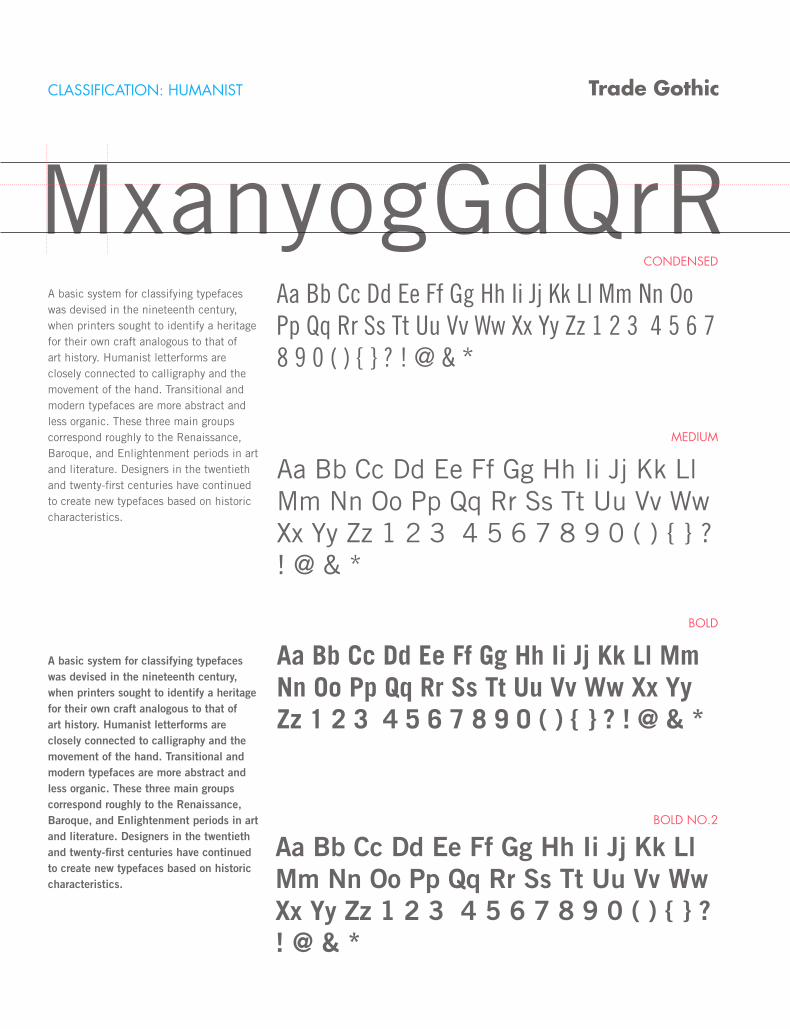
CLASSIFICATION: HUMANIST
CONDENSED
MEDIUM
BOLD
BOLD NO.2
Trade Gothic
MxanyogGdQrRA basic system for classifying typefaces was devised in the nineteenth century, when printers sought to identify a heritage for their own craft analogous to that of art history. Humanist letterforms are closely connected to calligraphy and the movement of the hand. Transitional and modern typefaces are more abstract and less organic. These three main groups correspond roughly to the Renaissance, Baroque, and Enlightenment periods in art and literature. Designers in the twentieth and twenty-first centuries have continued to create new typefaces based on historic characteristics.
A basic system for classifying typefaces was devised in the nineteenth century, when printers sought to identify a heritage for their own craft analogous to that of art history. Humanist letterforms are closely connected to calligraphy and the movement of the hand. Transitional and modern typefaces are more abstract and less organic. These three main groups correspond roughly to the Renaissance, Baroque, and Enlightenment periods in art and literature. Designers in the twentieth and twenty-first centuries have continued to create new typefaces based on historic characteristics.
Aa Bb Cc Dd Ee Ff Gg Hh Ii Jj Kk Ll Mm Nn Oo Pp Qq Rr Ss Tt Uu Vv Ww Xx Yy Zz 1 2 3 4 5 6 7 8 9 0 ( ) { } ? ! @ & *
Aa Bb Cc Dd Ee Ff Gg Hh Ii Jj Kk Ll Mm Nn Oo Pp Qq Rr Ss Tt Uu Vv Ww Xx Yy Zz 1 2 3 4 5 6 7 8 9 0 ( ) { } ? ! @ & *
Aa Bb Cc Dd Ee Ff Gg Hh Ii Jj Kk Ll Mm Nn Oo Pp Qq Rr Ss Tt Uu Vv Ww Xx Yy Zz 1 2 3 4 5 6 7 8 9 0 ( ) { } ? ! @ & *
Aa Bb Cc Dd Ee Ff Gg Hh Ii Jj Kk Ll Mm Nn Oo Pp Qq Rr Ss Tt Uu Vv Ww Xx Yy Zz 1 2 3 4 5 6 7 8 9 0 ( ) { } ? ! @ & *
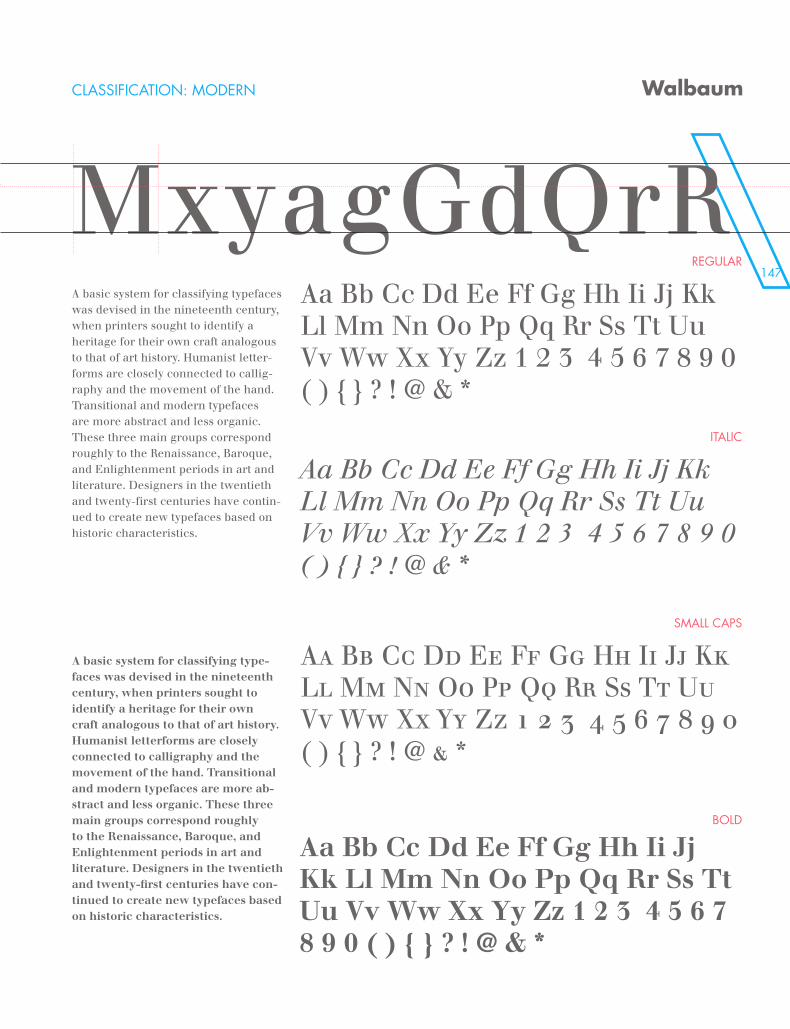
147
MxanyogGdQrRCLASSIFICATION: MODERN
REGULAR
ITALIC
SMALL CAPS
BOLD
Walbaum
MxyagGdQrRA basic system for classifying typefaces was devised in the nineteenth century, when printers sought to identify a heritage for their own craft analogous to that of art history. Humanist letter-forms are closely connected to callig-raphy and the movement of the hand. Transitional and modern typefaces are more abstract and less organic. These three main groups correspond roughly to the Renaissance, Baroque, and Enlightenment periods in art and literature. Designers in the twentieth and twenty-first centuries have contin-ued to create new typefaces based on historic characteristics.
A basic system for classifying type-faces was devised in the nineteenth century, when printers sought to identify a heritage for their own craft analogous to that of art history. Humanist letterforms are closely connected to calligraphy and the movement of the hand. Transitional and modern typefaces are more ab-stract and less organic. These three main groups correspond roughly to the Renaissance, Baroque, and Enlightenment periods in art and literature. Designers in the twentieth and twenty-first centuries have con-tinued to create new typefaces based on historic characteristics.
Aa Bb Cc Dd Ee Ff Gg Hh Ii Jj Kk Ll Mm Nn Oo Pp Qq Rr Ss Tt Uu Vv Ww Xx Yy Zz 1 2 3 4 5 6 7 8 9 0 ( ) { } ? ! @ & *
Aa Bb Cc Dd Ee Ff Gg Hh Ii Jj Kk Ll Mm Nn Oo Pp Qq Rr Ss Tt Uu Vv Ww Xx Yy Zz 1 2 3 4 5 6 7 8 9 0 ( ) { } ? ! @ & *
Aa Bb Cc Dd Ee Ff Gg Hh Ii Jj Kk Ll Mm Nn Oo Pp Qq Rr Ss Tt Uu Vv Ww Xx Yy Zz 1 2 3 4 5 6 7 8 9 0 ( ) { } ? ! @ & *
Aa Bb Cc Dd Ee Ff Gg Hh Ii Jj Kk Ll Mm Nn Oo Pp Qq Rr Ss Tt Uu Vv Ww Xx Yy Zz 1 2 3 4 5 6 7 8 9 0 ( ) { } ? ! @ & *
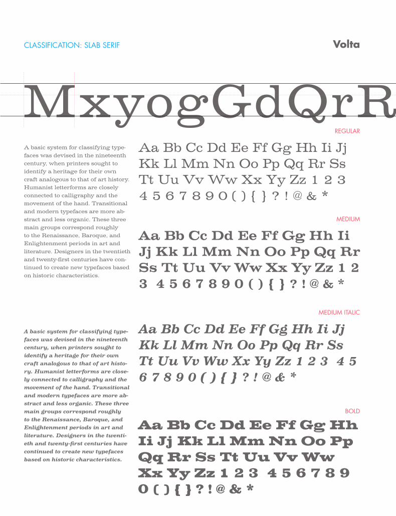
CLASSIFICATION: SLAB SERIF
REGULAR
MEDIUM
MEDIUM ITALIC
BOLD
Volta
MxyogGdQrRA basic system for classifying type-faces was devised in the nineteenth century, when printers sought to identify a heritage for their own craft analogous to that of art history. Humanist letterforms are closely connected to calligraphy and the movement of the hand. Transitional and modern typefaces are more ab-stract and less organic. These three main groups correspond roughly to the Renaissance, Baroque, and Enlightenment periods in art and literature. Designers in the twentieth and twenty-first centuries have con-tinued to create new typefaces based on historic characteristics.
A basic system for classifying type-faces was devised in the nineteenth century, when printers sought to identify a heritage for their own craft analogous to that of art histo-ry. Humanist letterforms are close-ly connected to calligraphy and the movement of the hand. Transitional and modern typefaces are more ab-stract and less organic. These three main groups correspond roughly to the Renaissance, Baroque, and Enlightenment periods in art and literature. Designers in the twenti-eth and twenty-first centuries have continued to create new typefaces based on historic characteristics.
Aa Bb Cc Dd Ee Ff Gg Hh Ii Jj Kk Ll Mm Nn Oo Pp Qq Rr Ss Tt Uu Vv Ww Xx Yy Zz 1 2 3 4 5 6 7 8 9 0 ( ) { } ? ! @ & *
Aa Bb Cc Dd Ee Ff Gg Hh Ii Jj Kk Ll Mm Nn Oo Pp Qq Rr Ss Tt Uu Vv Ww Xx Yy Zz 1 2 3 4 5 6 7 8 9 0 ( ) { } ? ! @ & *
Aa Bb Cc Dd Ee Ff Gg Hh Ii Jj Kk Ll Mm Nn Oo Pp Qq Rr Ss Tt Uu Vv Ww Xx Yy Zz 1 2 3 4 5 6 7 8 9 0 ( ) { } ? ! @ & *
Aa Bb Cc Dd Ee Ff Gg Hh Ii Jj Kk Ll Mm Nn Oo Pp Qq Rr Ss Tt Uu Vv Ww Xx Yy Zz 1 2 3 4 5 6 7 8 9 0 ( ) { } ? ! @ & *
149\\\\\\\\\\\\\\\\\\\\\\\\\\\\\\\\\\\\\\\\\\\\\\\\\\\\\\\\\\\\\\\\\\\\\\\\\\\\\\\\\\\\\\\\\\\\\\\\\\\\\\\\\\\\\\\\
MyogGdQrR
\\\\\\\\\\\\\\\\\\\\\\\\\\\\\\\\\\\\\\\\\\\\\\\\\\\\\\\
Class project for Typography 02 at the University of Kansas, Spring 2012w. Text for the book was compiled from the follow-ing sources: Elements of Typographic Style by Robert Bringhurst, Getting it Right with Type: the Do’s and Don’ts of Typography by Victoria Square, Mac is Not A Typewriter by Robin Williams. This book is not to be sold to the public and to only be used by the designer for their reference and student design portfolio.
designed by anthony schmiedeler
\\\\\\\\\\\\\\\\\\\\\\\\\\\\\\\\\\\\\\\\\\\\\\\\\\\\\\\\\\\\\\\\\\\\\\\\\\\\\\\\\\\\\\\\\\\\\\\\\\\\\\\\\\\\\\\\


