Embed Size (px)
Citation preview
Types of Data Displays
Based on the 2008 AZ State Mathematics Standard
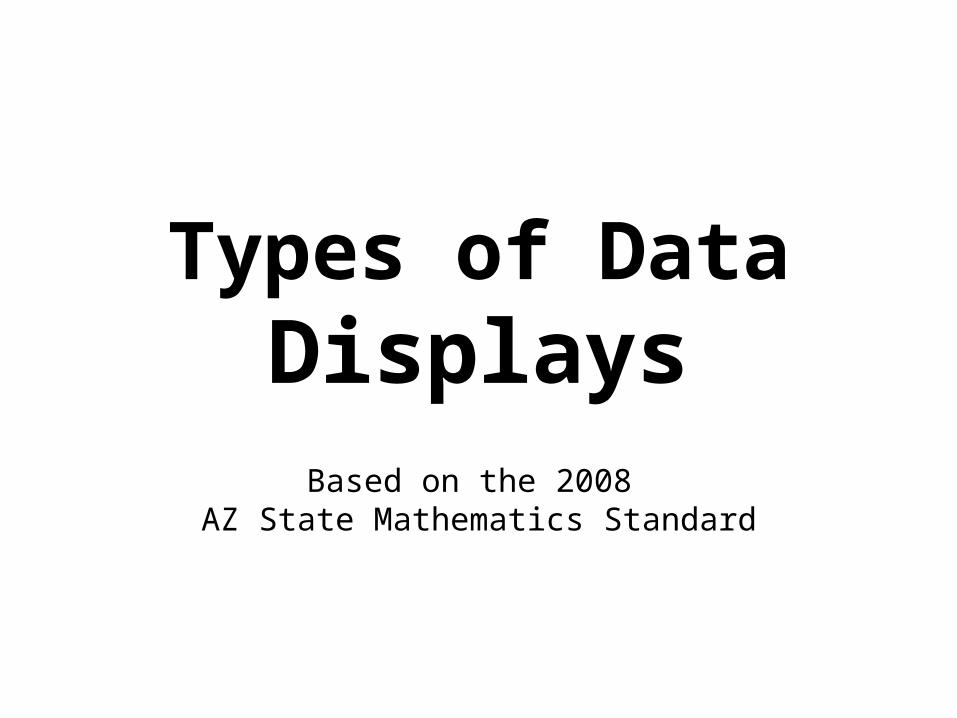
Pictograph(Grades 1 and 2)
Pictograph(Grades 1 and 2)
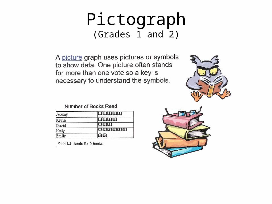
For Grade 1: the pictures/icons in the pictograph represent a quantity of 1.
For Grade 2: The pictures/icons in the pictograph represent more than 1 and a key is required to interpret the graph.
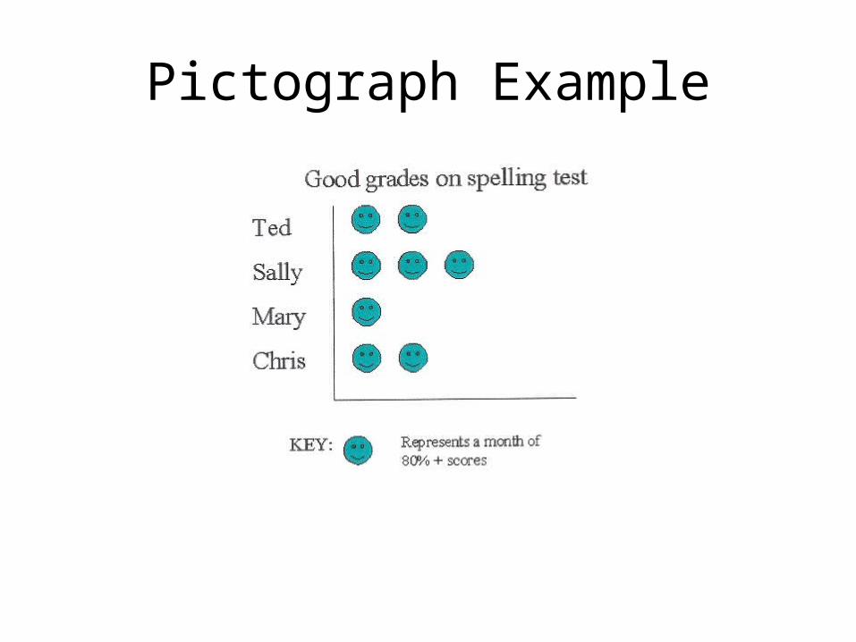
Pictograph Example
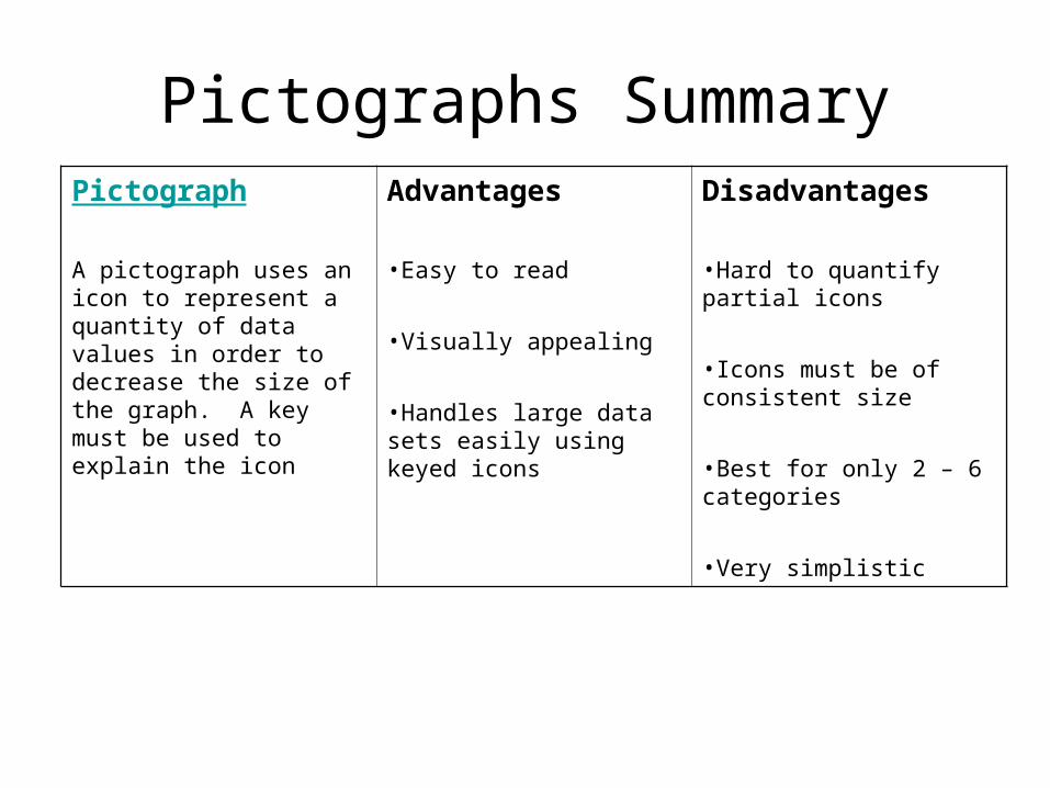
Pictographs SummaryPictograph
A pictograph uses an icon to represent a quantity of data values in order to decrease the size of the graph. A key must be used to explain the icon
Advantages
•Easy to read
•Visually appealing
•Handles large data sets easily using keyed icons
Disadvantages
•Hard to quantify partial icons
•Icons must be of consistent size
•Best for only 2 – 6 categories
•Very simplistic
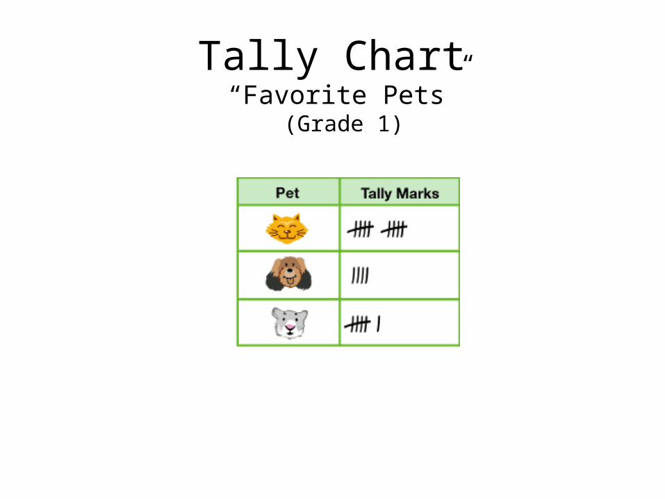
Tally Chart “Favorite Pets”
(Grade 1)
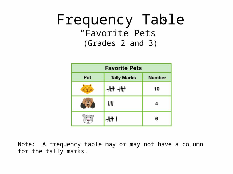
Frequency Table“Favorite Pets”(Grades 2 and 3)
Note: A frequency table may or may not have a column for the tally marks.
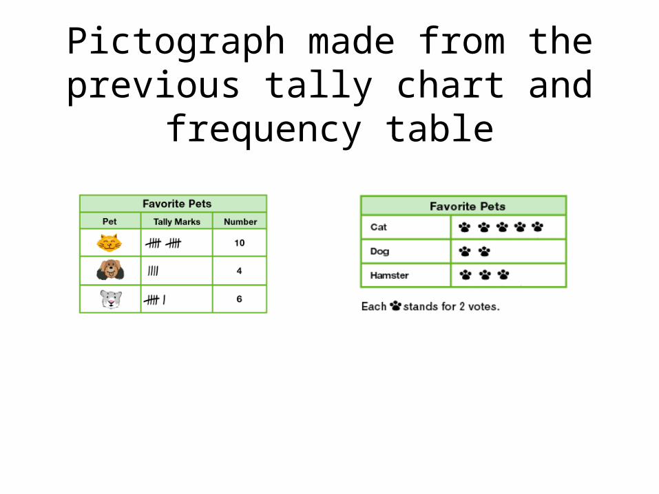
Pictograph made from the previous tally chart and frequency table
Bar Graphs(Grades 2, 3, 4, 5)
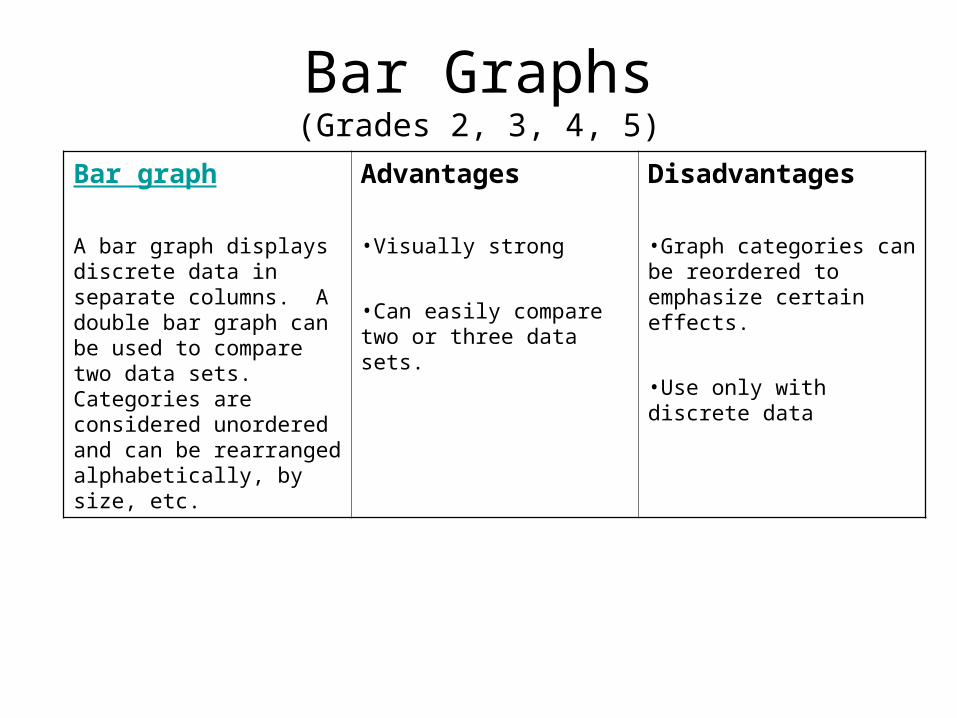
Bar graph
A bar graph displays discrete data in separate columns. A double bar graph can be used to compare two data sets. Categories are considered unordered and can be rearranged alphabetically, by size, etc.
Advantages
•Visually strong
•Can easily compare two or three data sets.
Disadvantages
•Graph categories can be reordered to emphasize certain effects.
•Use only with discrete data
Bar Graphs(Grades 2, 3, 4, 5)
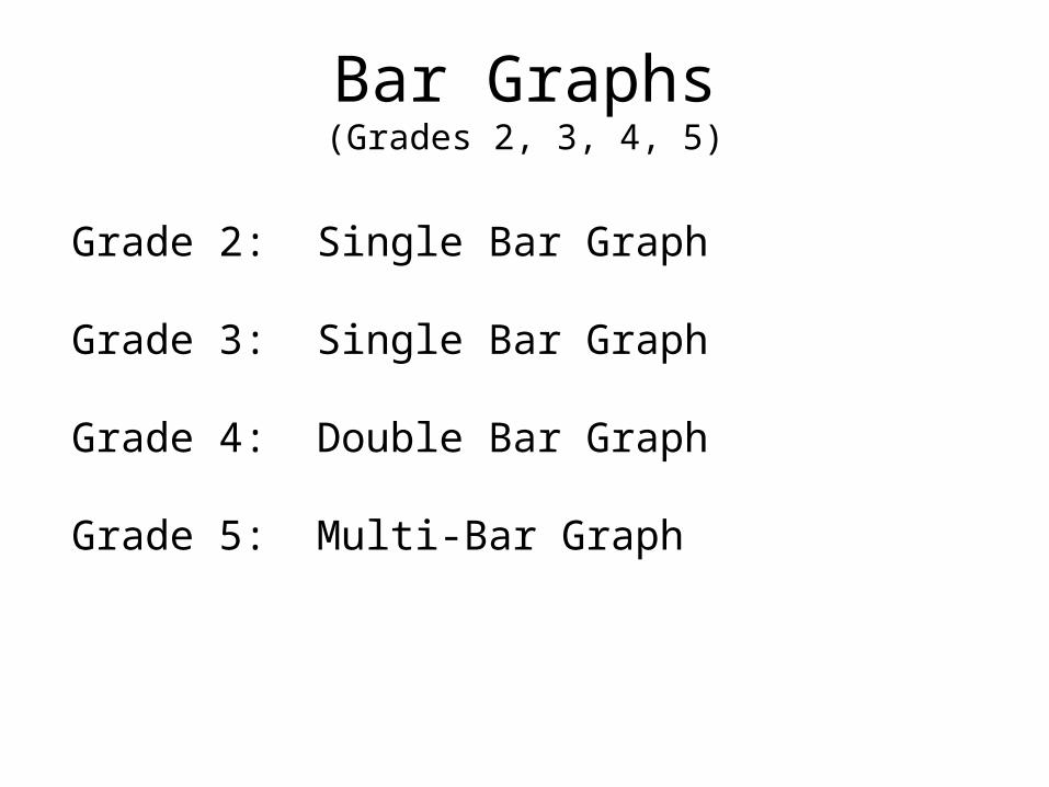
Grade 2: Single Bar Graph
Grade 3: Single Bar Graph
Grade 4: Double Bar Graph
Grade 5: Multi-Bar Graph
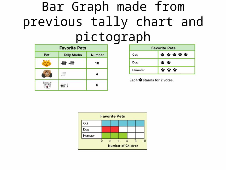
Bar Graph made from previous tally chart and pictograph
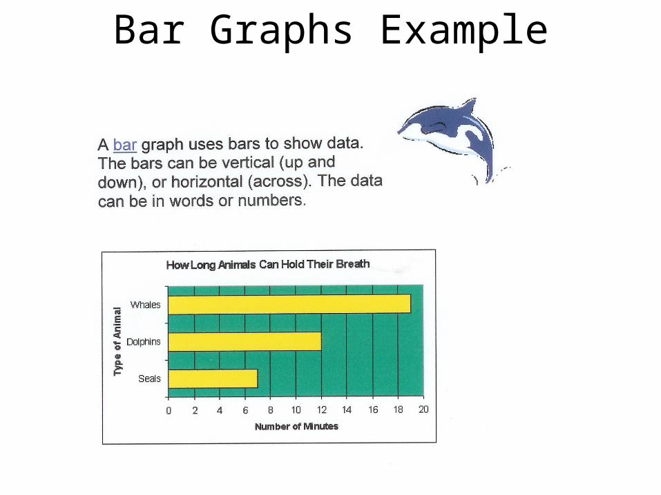
Bar Graphs Example
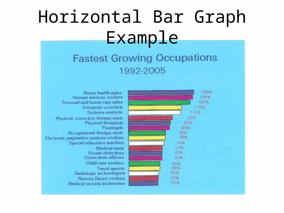
Horizontal Bar Graph Example
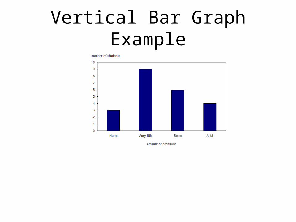
Vertical Bar Graph Example
Which Direction?
Vertical Bar GraphDisplays data better than horizontal bar graphs,
and is preferred when possible.
Horizontal Bar GraphUseful when category names are too long to fit at
the foot of a column.
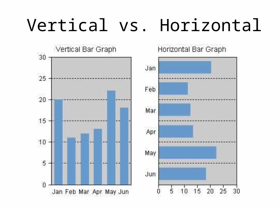
Vertical vs. Horizontal
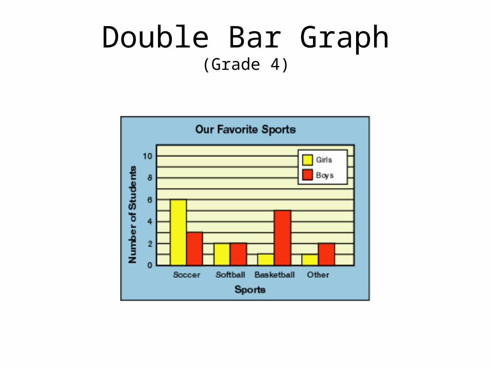
Double Bar Graph(Grade 4)
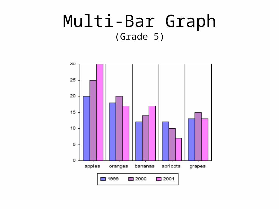
Multi-Bar Graph(Grade 5)
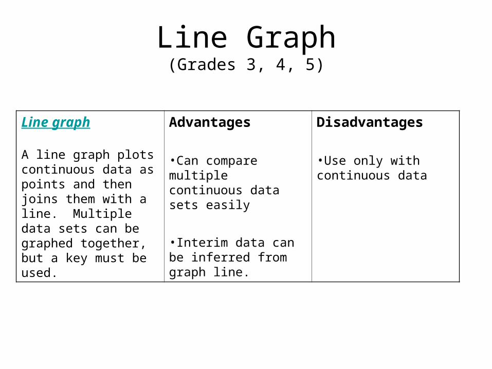
Line Graph(Grades 3, 4, 5)
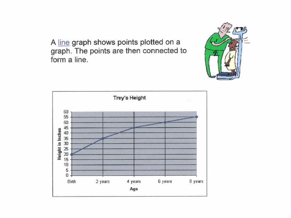
Line graph
A line graph plots continuous data as points and then joins them with a line. Multiple data sets can be graphed together, but a key must be used.
Advantages
•Can compare multiple continuous data sets easily
•Interim data can be inferred from graph line.
Disadvantages
•Use only with continuous data
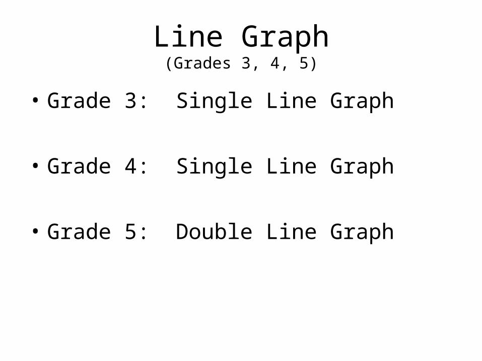
• Grade 3: Single Line Graph
• Grade 4: Single Line Graph
• Grade 5: Double Line Graph
Line Graph(Grades 3, 4, 5)
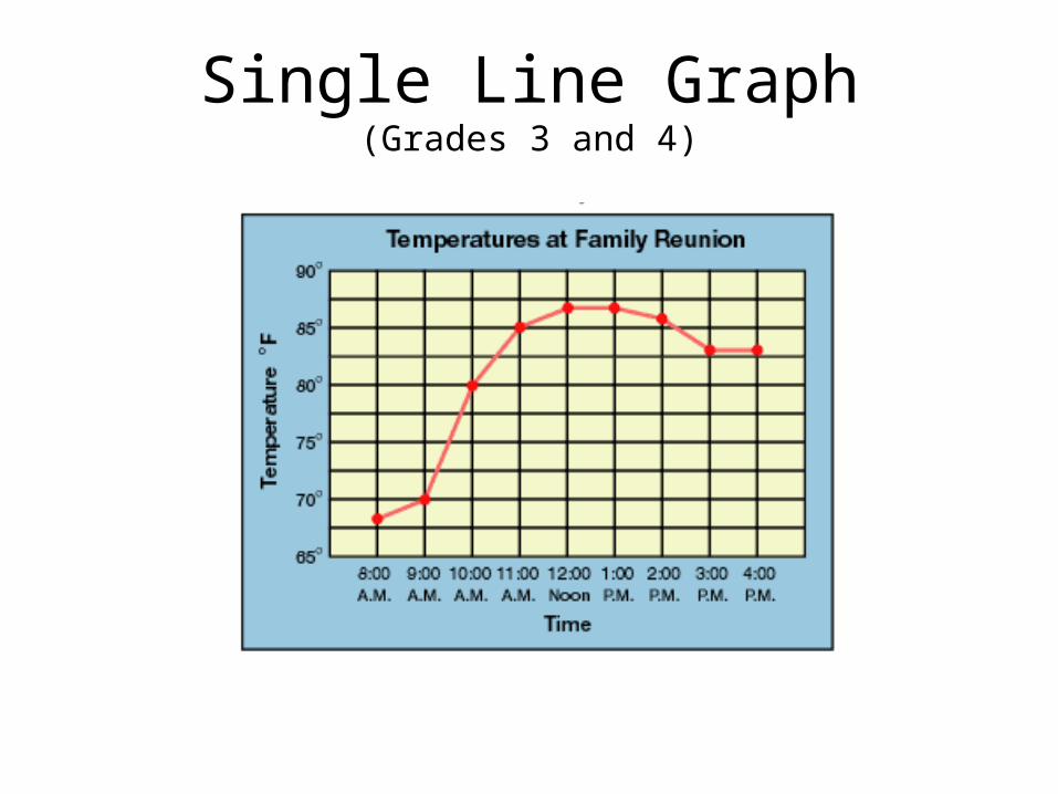
Single Line Graph(Grades 3 and 4)
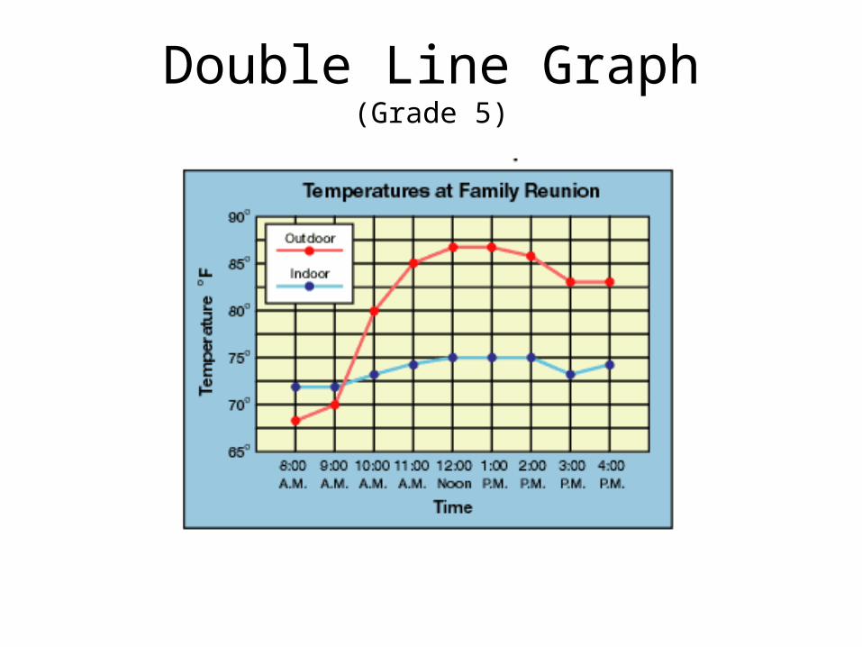
Double Line Graph(Grade 5)
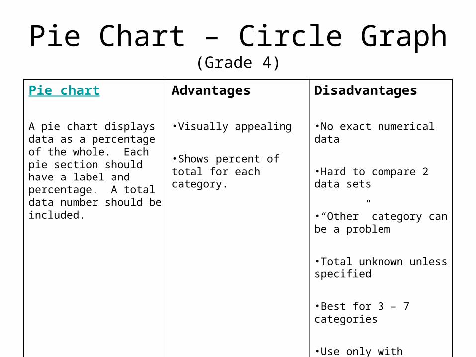
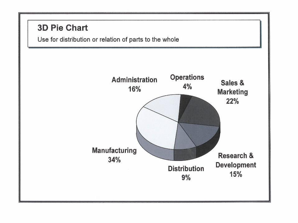
Pie Chart – Circle Graph(Grade 4)
Pie chart
A pie chart displays data as a percentage of the whole. Each pie section should have a label and percentage. A total data number should be included.
Advantages
•Visually appealing
•Shows percent of total for each category.
Disadvantages
•No exact numerical data
•Hard to compare 2 data sets
•“Other” category can be a problem
•Total unknown unless specified
•Best for 3 – 7 categories
•Use only with discrete data
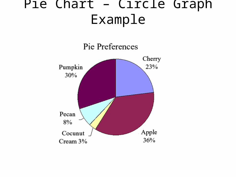
Pie Chart – Circle Graph Example
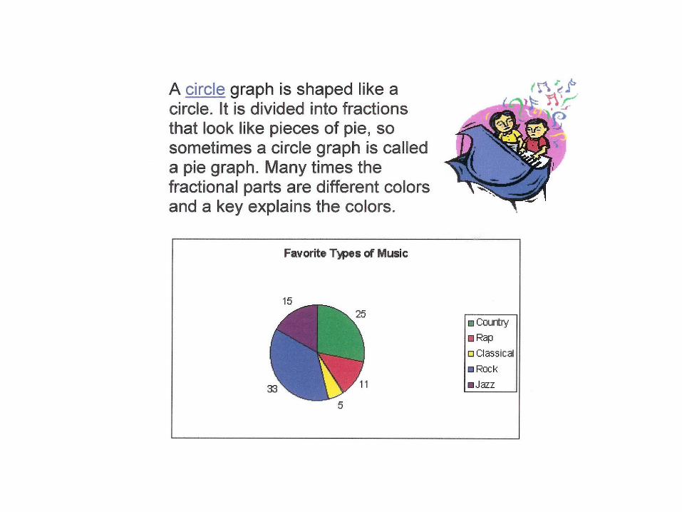
Pie (circle) charts - more info
• A way of summarizing a set of categorical data or displaying the different values of a given variable (e.g. percentage distribution).
• A circle is divided into a series of segments. Each segment represents a particular category.
• The area of each segment is the same proportion of a circle’s area as the category is of the total data set.
• Quite popular. Circle provides a visual concept of the whole (100%).
• Best used for displaying statistical information when there are no more than six components – otherwise, the resulting picture will be too complex to understand.
• Pie charts are not useful when the values of each component are similar because it is difficult to see the differences between slice sizes.
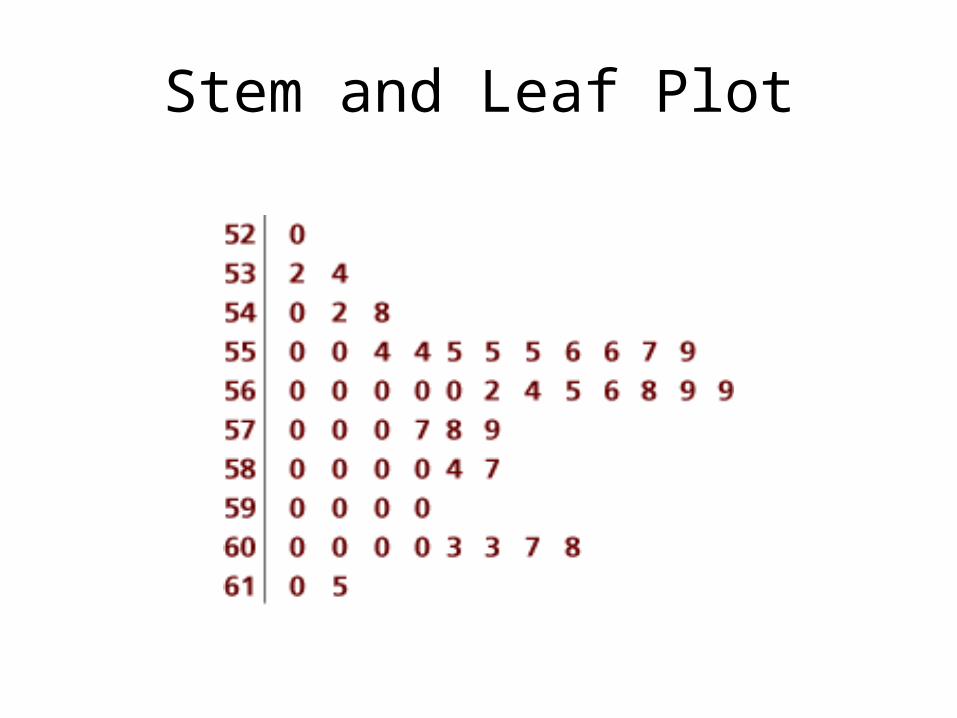
Stem and Leaf Plot(Grade 6)
Stem and Leaf Plot
Stem and leaf plots record data values in rows, and can easily be made into a histogram. Large data sets can be accommodated by splitting stems.
Advantages
•Concise representation of data
•Shows range, minimum & maximum, gaps & clusters, and outliers easily
•Can handle extremely large data sets
Disadvantages
•Not visually appealing
•Does not easily indicate measures of centrality for large data sets.
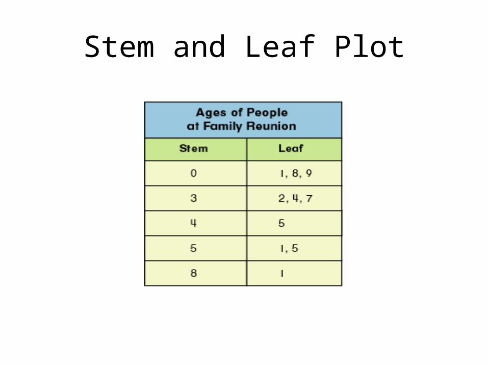
Stem and Leaf Plot
Stem and Leaf Plot
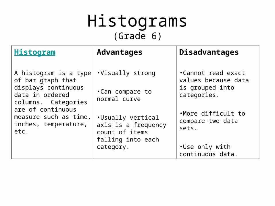
Histograms(Grade 6)
Histogram
A histogram is a type of bar graph that displays continuous data in ordered columns. Categories are of continuous measure such as time, inches, temperature, etc.
Advantages
•Visually strong
•Can compare to normal curve
•Usually vertical axis is a frequency count of items falling into each category.
Disadvantages
•Cannot read exact values because data is grouped into categories.
•More difficult to compare two data sets.
•Use only with continuous data.
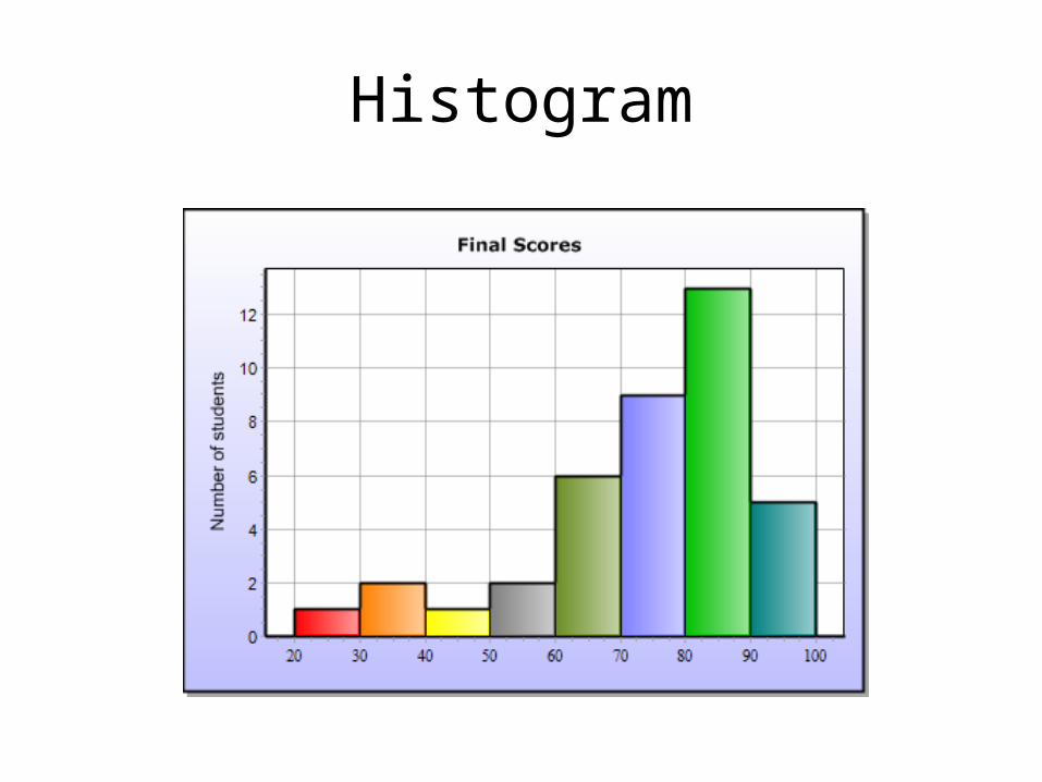
Histogram
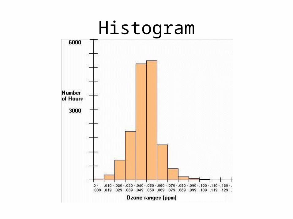
Histogram
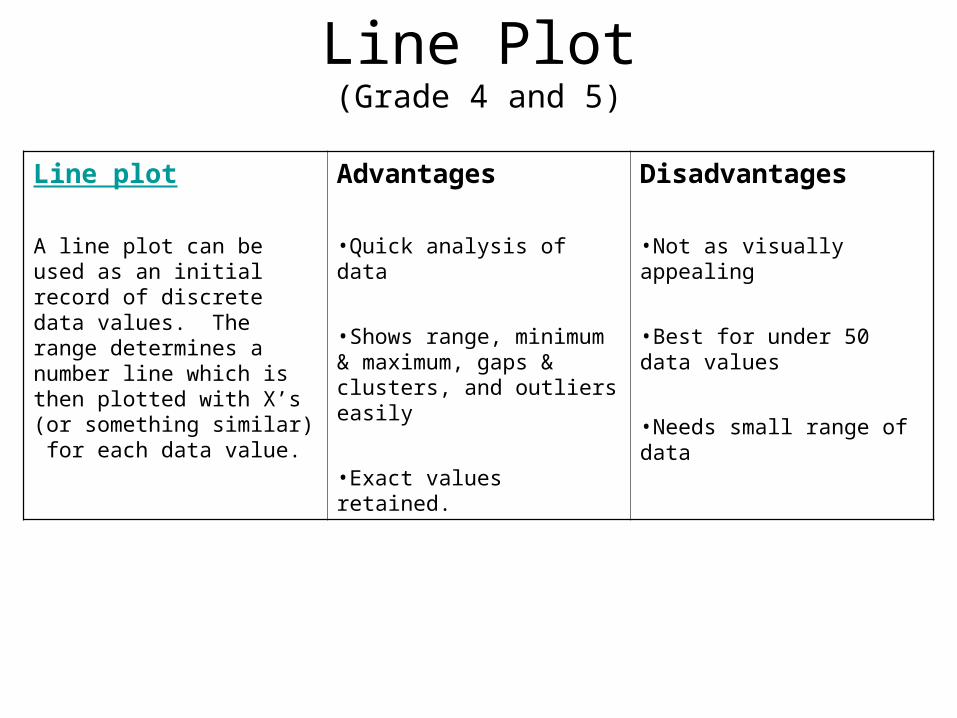
Line Plot(Grade 4 and 5)
Line plot
A line plot can be used as an initial record of discrete data values. The range determines a number line which is then plotted with X’s (or something similar) for each data value.
Advantages
•Quick analysis of data
•Shows range, minimum & maximum, gaps & clusters, and outliers easily
•Exact values retained.
Disadvantages
•Not as visually appealing
•Best for under 50 data values
•Needs small range of data
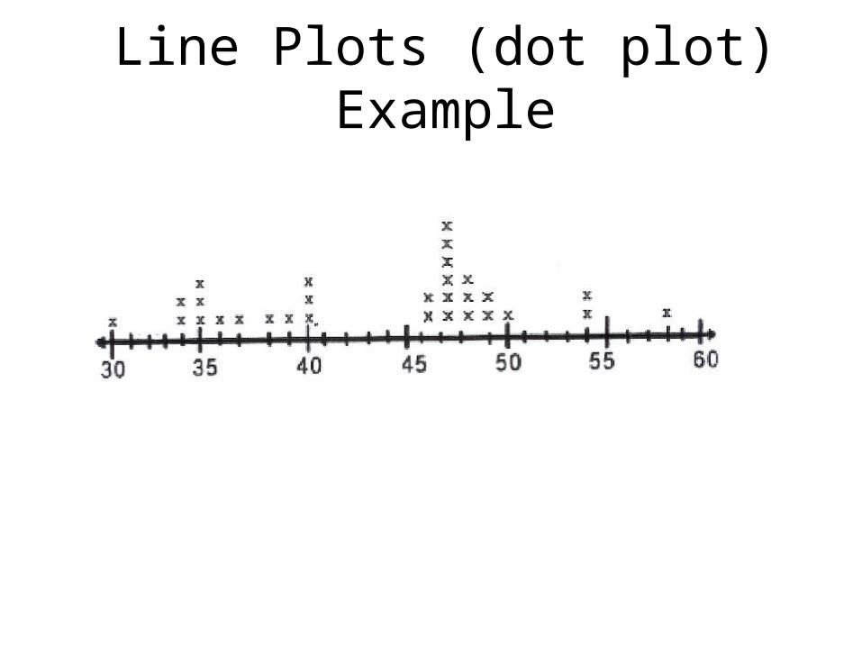
Line Plots (dot plot) Example
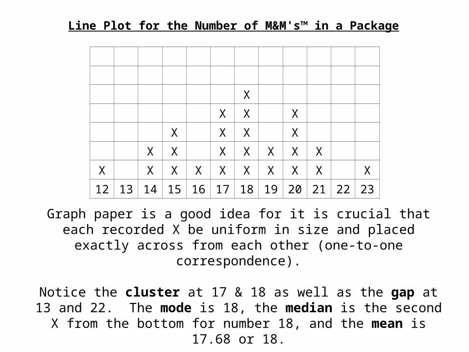
Line Plot for the Number of M&M's™ in a Package
X
X X X
X X X X
X X X X X X X
X X X X X X X X X X
12 13 14 15 16 17 18 19 20 21 22 23
Graph paper is a good idea for it is crucial that each recorded X be uniform in size and placed exactly across from each other (one-to-one
correspondence).
Notice the cluster at 17 & 18 as well as the gap at 13 and 22. The mode is 18, the median is the second X from the bottom for number
18, and the mean is 17.68 or 18.
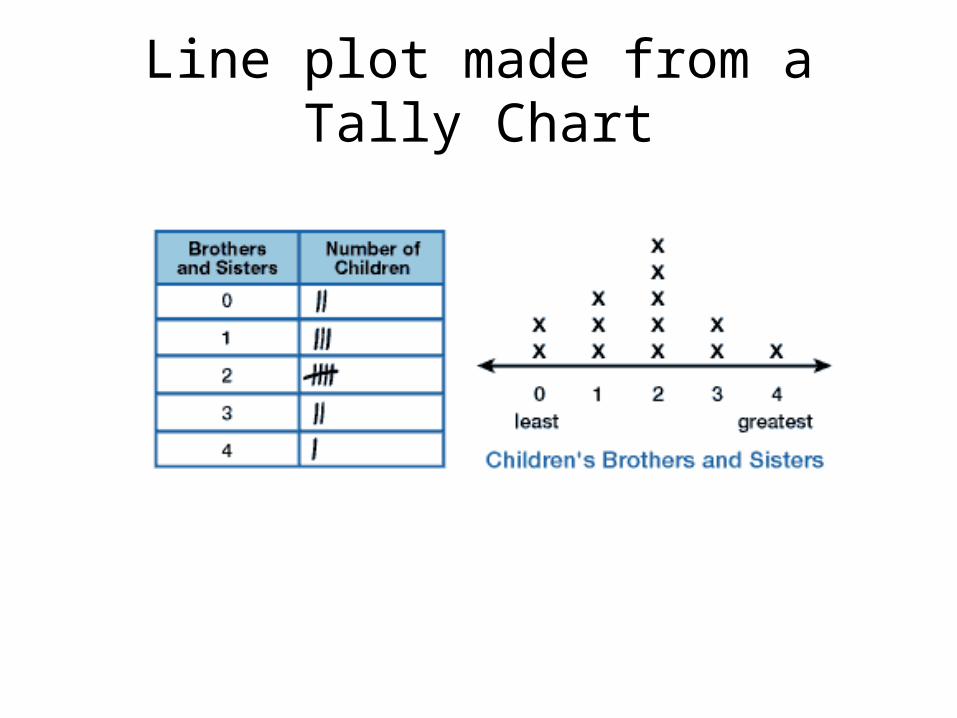
Line plot made from a Tally Chart
There are many more types of Data Displays
Here are a few - - -
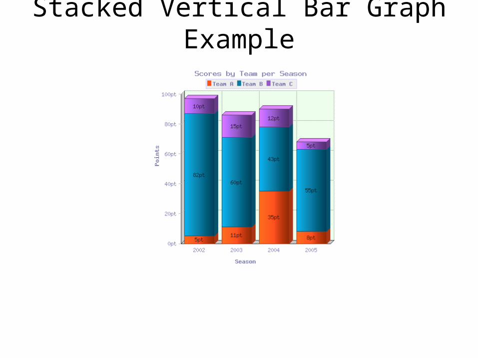
Stacked Vertical Bar Graph Example
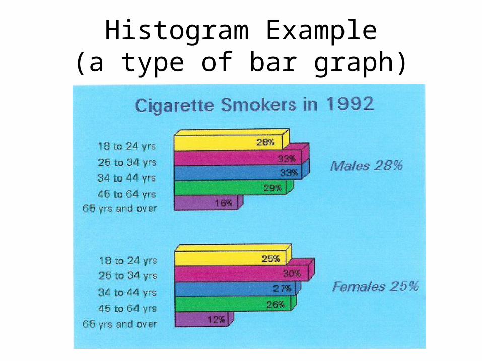
Histogram Example(a type of bar graph)
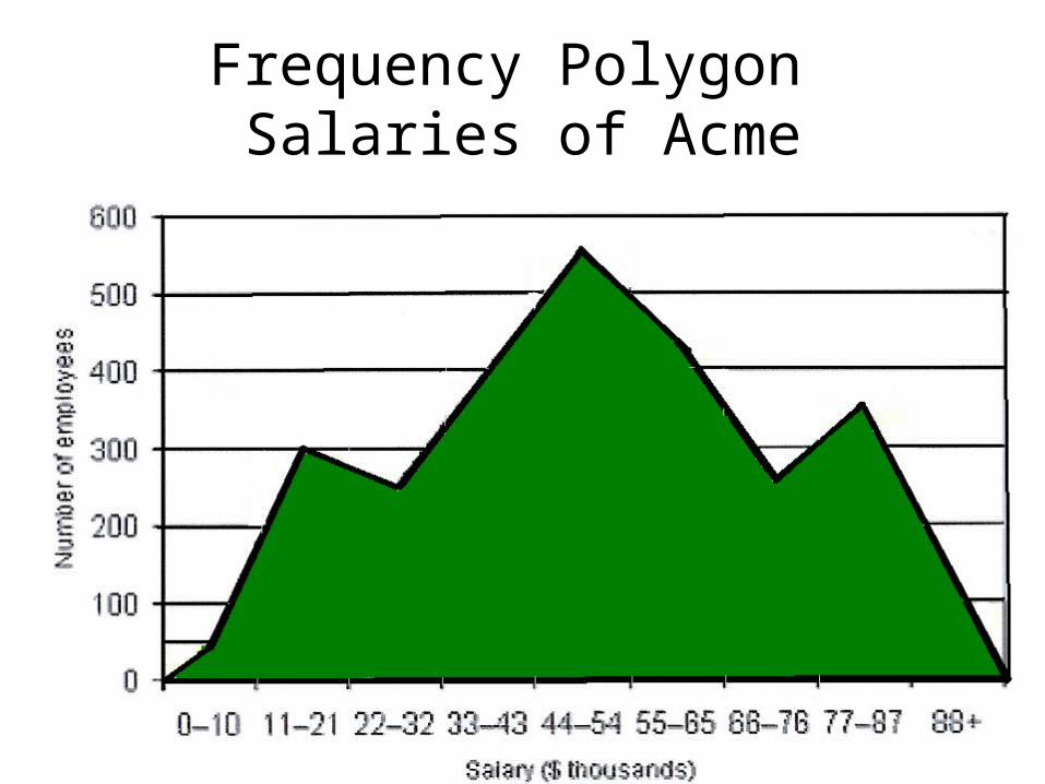
Frequency Polygon Salaries of Acme
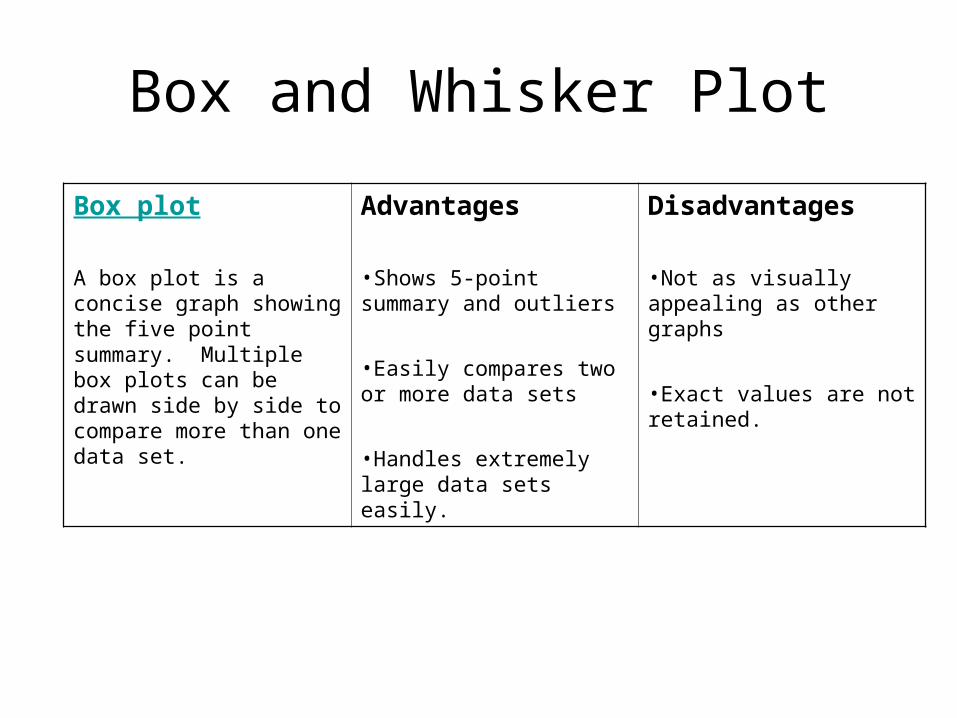
Box and Whisker Plot
Box plot
A box plot is a concise graph showing the five point summary. Multiple box plots can be drawn side by side to compare more than one data set.
Advantages
•Shows 5-point summary and outliers
•Easily compares two or more data sets
•Handles extremely large data sets easily.
Disadvantages
•Not as visually appealing as other graphs
•Exact values are not retained.
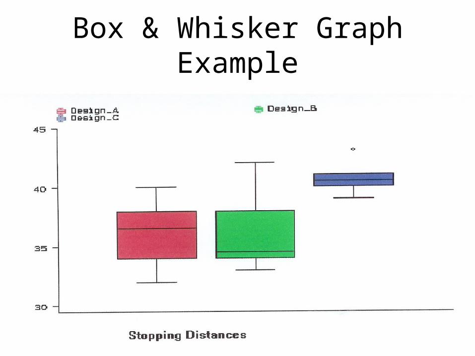
Box & Whisker Graph Example
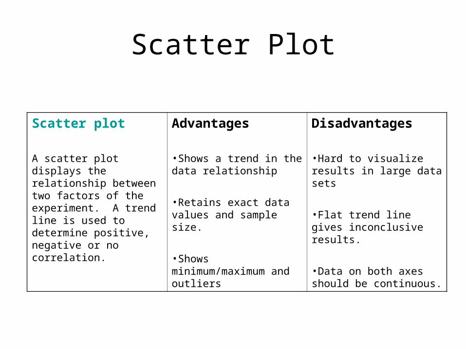
Scatter Plot
Scatter plot
A scatter plot displays the relationship between two factors of the experiment. A trend line is used to determine positive, negative or no correlation.
Advantages
•Shows a trend in the data relationship
•Retains exact data values and sample size.
•Shows minimum/maximum and outliers
Disadvantages
•Hard to visualize results in large data sets
•Flat trend line gives inconclusive results.
•Data on both axes should be continuous.
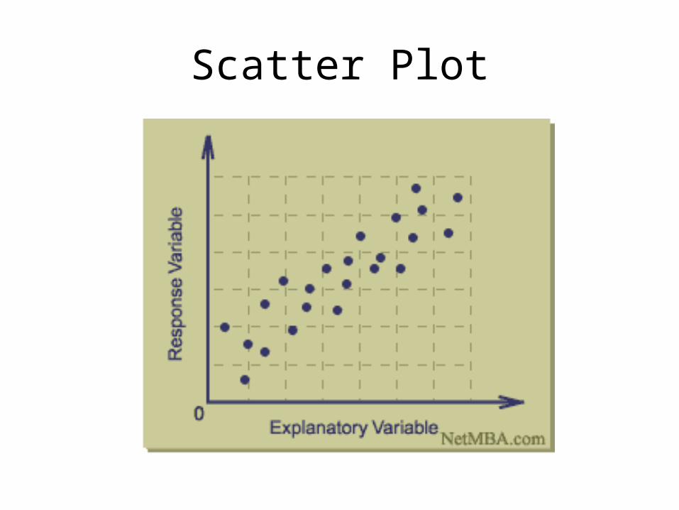
Scatter Plot
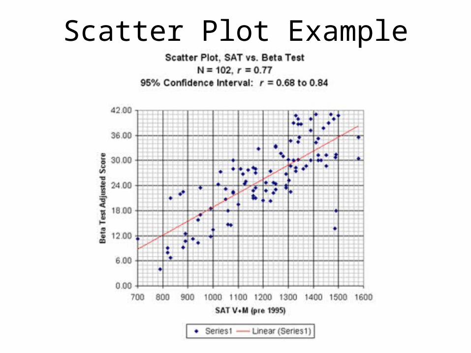
Scatter Plot Example
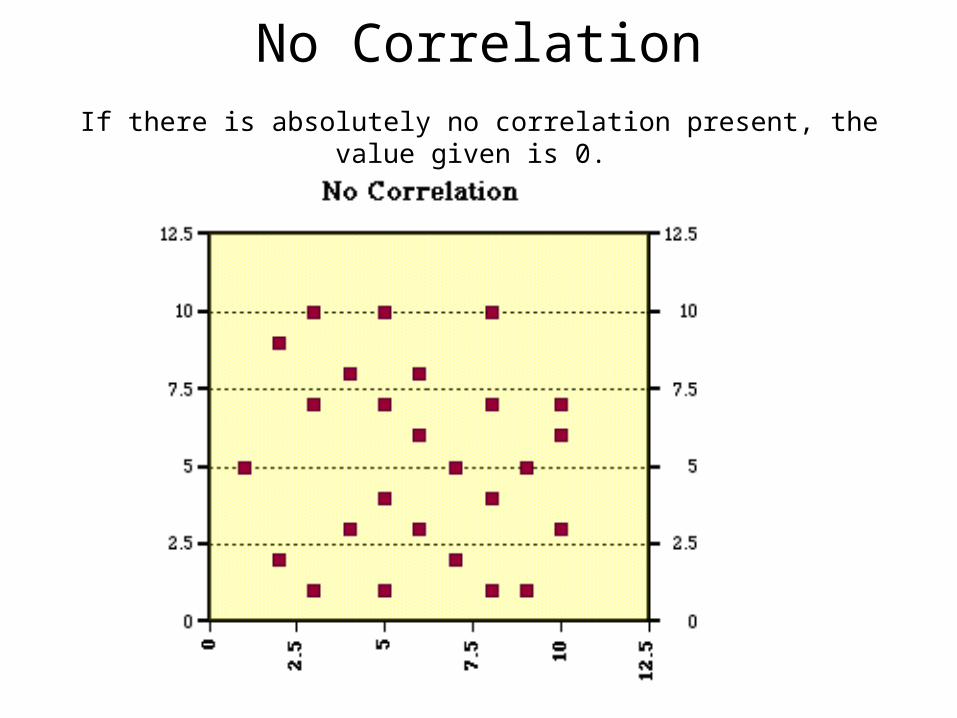
No CorrelationIf there is absolutely no correlation present, the value given is 0.
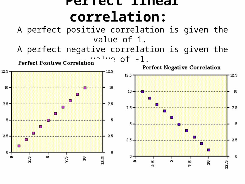
Perfect linear correlation: A perfect positive correlation is given the value of 1.
A perfect negative correlation is given the value of -1.
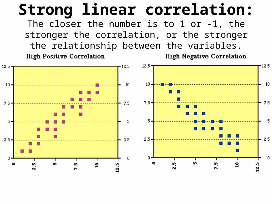
Strong linear correlation: The closer the number is to 1 or -1, the stronger the correlation, or the
stronger the relationship between the variables.
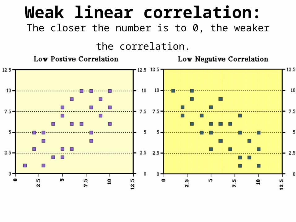
Weak linear correlation: The closer the number is to 0, the weaker the correlation.
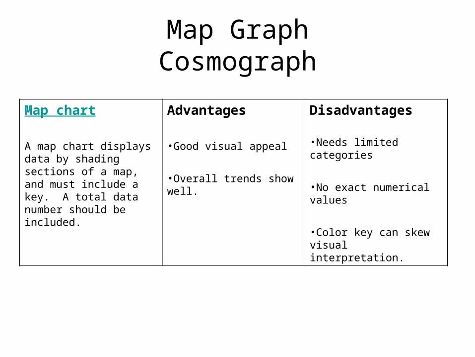
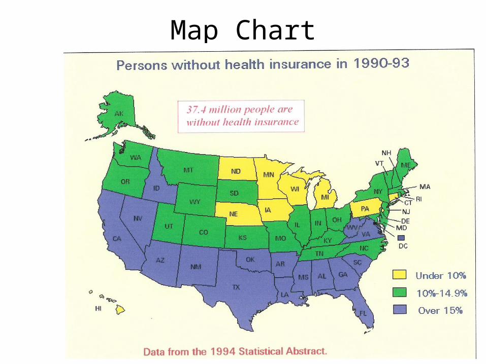
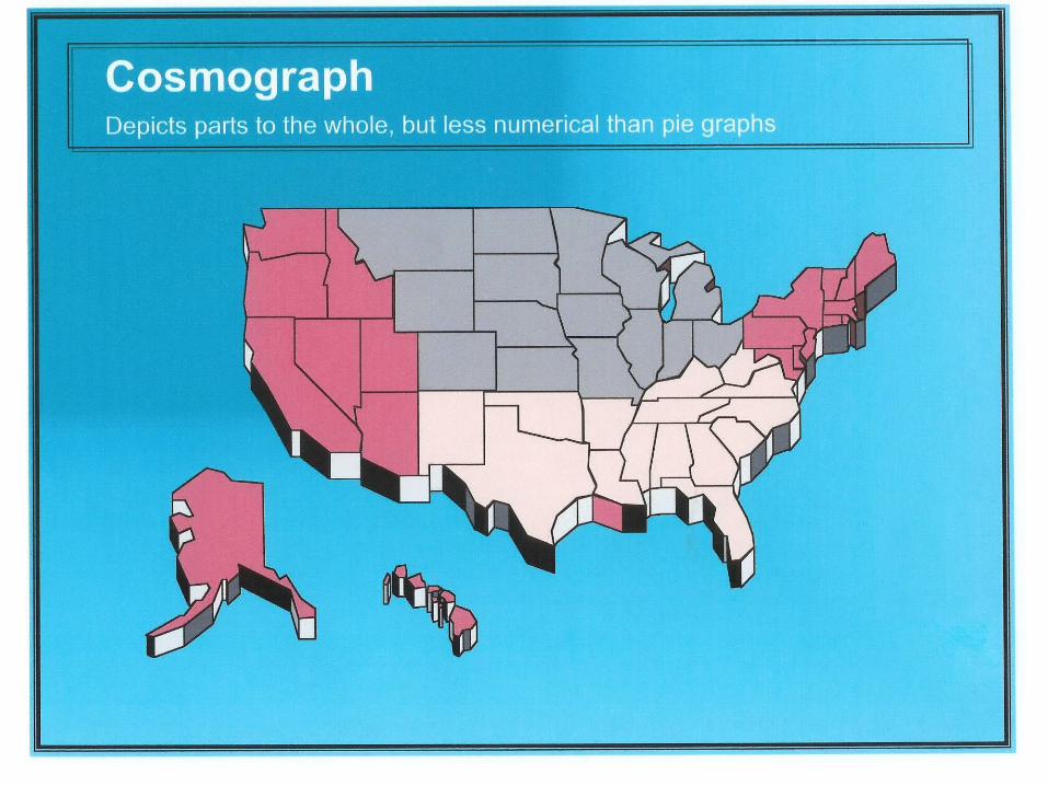
Map GraphCosmograph
Map chart
A map chart displays data by shading sections of a map, and must include a key. A total data number should be included.
Advantages
•Good visual appeal
•Overall trends show well.
Disadvantages
•Needs limited categories
•No exact numerical values
•Color key can skew visual interpretation.
Map ChartCosmograph
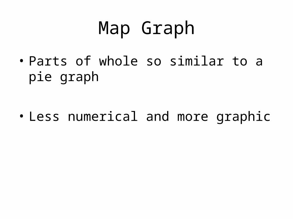
Map Graph
• Parts of whole so similar to a pie graph
• Less numerical and more graphic
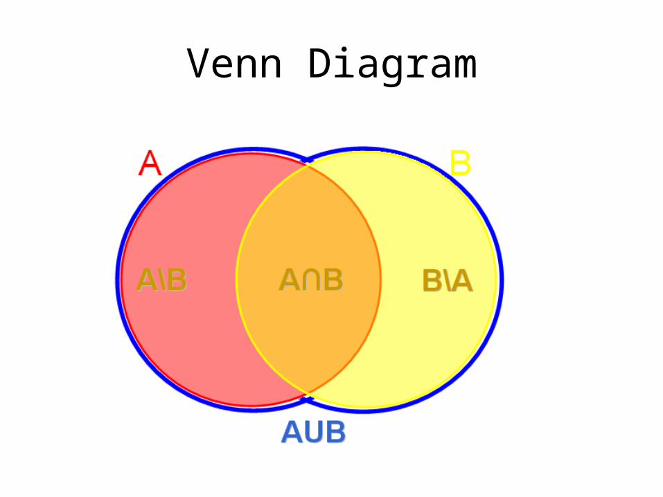
Venn Diagram
Venn Diagram