Embed Size (px)
Citation preview

1
Two-DimensionalDesign Theory Journal
Digital & TraditionalGraphic Design
PublishingDigital Imaging
PhotographyWeb Graphic Design
Graphic Communications
Professor: Max BlobnerCommunity College of Allegheny County

2
Table of Contents
Definition ...................................................................................................................p.3
Fields of Art ................................................................................................................p.4
Resources ...................................................................................................................p.5
Visual Aesthetics:
Visual Elements ............................................................................................pp.6-11
Principles of Design ....................................................................................pp.12-14
Software ...................................................................................................................p.15
Theory (compositional) ...................................................................................pp.16-18
Collage and Composite techniques ...............................................................pp.19-23
Photoshop/Illustrator Techniques .................................................................pp.24-27
Phases of Design ..............................................................................................pp.28-35
Logos ........................................................................................................................p.36
File Formats ..............................................................................................................p.37
History of Photography ..................................................................................pp.38-41
History of Typography ....................................................................................pp.42-43
History of Graphic Design ...............................................................................pp.44-47
Contents
Typographical Variations - Development Phase of Design. Study of case, attributes, condensed, expanded, negative, custom, cursive, kerning, combination, and arrangements. Olympic Assignment - Sport Title
Art150-AIN1
General Information:Try not to use more than 2 fonts for entire layout for this assignment. Combining serif and sans serif fonts should be considered. Also, utilizing custom and cursive fonts can be a successful alternative. But some custom fonts are associated to specific themes and styles. Also, many cursive fonts can be difficult to read in smaller sizes and may not associate well to many sport themes.
Consider using a font that has many options within the family (i.e. bold, italic, semi-bold, condensed etc...).I chose the sport gymnastics in this development phase layout to demonstrate the many options for the letters “G” and “A”. The ‘G-g’ and ‘A-a’ letters have a considerable amount of options from uppercase to lowercase between different fonts and attributes.
Standard:-Serif/Sans Serif-Times/Myriad Pro
Condensed:Tracking (-50)
Expanded:Tracking (+75)
Negative space: Custom/Cursive:-Readability is imperative-Must associate well to the sport
Kerning:More precise way to control spacing between letters.
Combination/Create your own:-More than one word for sport title-Arrangements
gymnasticsGYMNASTICSGymnasticsgymnasticsGYMNASTICSGymnasticsgymnasticsGYMNASTICSGymnasticsgymnasticsGYMNASTICSGymnasticsgymnasticsGYMNASTICSGymnasticsgymnasticsGYMNASTICSGymnasticsgymnasticsGYMNASTICSGymnasticsgymnasticsGYMNASTICSGymnasticsgymnasticsGYMNASTICSGymnastics
Avant Garde/Century Gothic fontlower case “a” option
gymnastics
gymnasticsGYMNASTICSGymnasticsgymnasticsGYMNASTICSGymnasticsgymnasticsGYMNASTICSGymnasticsgymnasticsGYMNASTICSGymnasticsgymnasticsGYMNASTICSGymnasticsgymnasticsGYMNASTICSGymnasticsgymnasticsGYMNASTICSGymnasticsgymnasticsGYMNASTICSGymnasticsgymnasticsGYMNASTICSGymnastics
gymnasticsGYMNASTICSGymnasticsgymnasticsGYMNASTICSGymnasticsgymnasticsGYMNASTICSGymnasticsgymnasticsGYMNASTICSGymnasticsgymnasticsGYMNASTICSGymnasticsgymnasticsGYMNASTICSGymnasticsgymnasticsGYMNASTICSGymnasticsgymnasticsGYMNASTICSGymnasticsgymnasticsGYMNASTICSGymnastics
gymnasticsGYMNASTICSGymnasticsgymnasticsGYMNASTICSGymnasticsgymnasticsGYMNASTICSGymnasticsgymnasticsGYMNASTICSGymnasticsgymnasticsGYMNASTICSGymnasticsgymnasticsGYMNASTICSGymnasticsgymnasticsGYMNASTICSGymnasticsgymnasticsGYMNASTICSGymnasticsgymnasticsGYMNASTICSGymnastics
gymnast i c sG YM NA S TI C SGymnast i c sgymnastics
GYMNASTICS
Gymnastics
gymnast i c sGYMNASTICSGymnast i c sgymnas t i c s
GYMNASTICS
Gymnas t i c s
gymnas t i c s
GYMNASTICS
Gymnas t i c s
gymnasticsGYMNASTICSGymnasticsgymnas t i c s
GYMNASTICS
Gymnas t i c s
gymnastics
GYMNASTICS
Gymnastics
gymnasticsGYMNASTICSGymnasticsgymnast ic s
Gymnast ic s
etc....
Gymnastics (original)
Gymnastics (revised-kerned)
Gymnastics (original)
Gymnastics (revised-kerned)
Gymnastics (original)
Gymnastics (revised-kerned)
Gymnastics (original)
Gymnastics (revised-kerned)
Rhythmic Gymnastics -(no)
Rhythmic Gymnastics +(yes)
Rhythmic Gymnastics-when combining words using different fonts the lower case ‘x’-height should be equal.
-(above) serif and sans serif combinations-(below) custom, cursive, serif, sans serif com-binations, formats and arrangements
Rhythmic Gymnastics
Rhythmic Gymnastics
-View the design journal for more combi-nations, formats, and arrangements. Consider creating your own font or editing original using create outlines>direct selec-tion. Also, effect options.
-There are endless combinations applying typography styles to a design layout. Be sure that the font choice is in good asso-ciation to the theme of the composition.
This is only an general overview of typography.
Type can be analyzed into more categories and anatomy. The following link to a site called “Counter Space” provides a great resource for further exploration into typography.
As explained in the design journal fonts can be generally classified into serif, sans serif, cur-sive/custom.
These classifications can be expanded further into old style, transitional, slab serif, modern, and sans serif.
View the Counter Space website for more information.
http://www.counterspace.us/typography/
tracking
kerning
IMPORTANTView Art150
Introduction to Graphic Design
Olympic assignment for applied approaches
to design layout.
Root Assignmenthttp://web.acd.ccac.
edu/~mblobner/media/olympics1.pdf
Assignment Examples:
http://web.acd.ccac.edu/~mblobner/media/
olympics2.pdf

3
Definition
Graphic Design
Definition1- Webster.com: the art or profession of using design elements (as typography and images) to convey information or create an effect.
Definition2: “Design for Communication”.
The development of the digital word has expanded the abilities of today’s Graphic Designer.
This digital world is also very technical. Today’s designers not only have to be astute as an
aesthetic designer, but as a digital technician. Traditional techniques are not lost though.
Utilizing traditional two-dimensional design techniques such as; airbrush, hand-drawn
lettering (i.e. calligraphy), drawing, painting, printmaking, and mixed media is still used
in the industry and are commonly overlooked as a conceptual solution.
Today, industry dictates a designer must be skilled in the digital realm. Learning software
is a critical part in the apprenticeship. In most cases learning one software package is not
enough. Designers in the print industry must be adapt at vector, raster, and page-layout
software to produce even single page layouts. Designers in the web industry must learn
HTML coding, advanced scripting such as Java, animation, and/or a “What You See Is
What You Get” (WYSIWYG) editor which aids in the layout of web pages by writing most
of the HTML code itself.
Just when you discover all that is necessary to get started in Graphic Design the field
becomes more difficult. Working in design for print dictates utilizing a Subtractive Color
format (pigments) with the “process” colors cyan, magenta, yellow, and black. A Web
(computer monitor/TV) designer utilizes a Additive Color format (visible) with the colors
red, green, and blue. The field seems to become more difficult as you progress further into
it. One day though it all comes together. How long is this time? Most aspiring designers
need at least two years of schooling and two years in the industry.
Many digital designers branch of into a more fine arts approach to using a computer. This
is mainly in the digital imaging area. Also, many fine art discipline majors utilize the com-
puter to enhance the artistic process.
The power of the digital realm is recognized by most. The computer is just a tool. Personal
concept is what sets designers apart.

4
Fields of Art
Visual Art
others:Dance TheatreMusicCulinary ArtLiteraturePoetryArchitecture
Where does Graphic Design fit into the grand scheme of Art and Design?
Two-Dimensional
Three-Dimensional:CeramicsSculptureGlassMetalWoodFiber
Digital (Graphic Design)
Traditional:PaintingDrawingPrintmakingPhotographyIllustration
Print (main field)WebMultimediaTelevisionFilmVideo
IndependentCompositions:Definition:Compositions that work within themselves. Independent compositions have elements of design that “internally ref-erence” one another. The compositions can exist on their own (logos) such as on a baseball hat, shoes, and shirts. They are not designed for a specific page size. examples:LogosSymbolsIconsPictographs
Single Page Compositions:Definition:Compositions that are designed for a single page format. Main format choices are portrait, landscape, square.examples:PostersPromotional Visual identityBrandingAdvertisements
Multiple Page Compositions:Definition:Compositions that are designed for multiple page “sequen-tial design” layouts. Where an existing design will carry across multiple pages. examples: Publishing Annual ReportsMagazinesArticlesNewspapersBrochuresFlyers

5
Resources
Other Primary resources for graphic design: 1. http://web.acd.ccac.edu/~mblobner -click the course resource link to find many more design related links.2. http://www.ccac.edu/artgallery -link to art department website (student galleries and related links)3. http://www.adobe.com (Adobe corporation)
Training Videos:Adobe TV: -http://tv.adobe.comVideo2brain videos (AdobePress): -http://www.video2brain.comTotal Training videos: -http://www.totaltraining.comLynda Publishing: -http://www.lynda.com
Hard Copy:Adobe Classroom in a Book(s)
ResourcesPrint Magazine: This site is an excellent resource for graphic design. Within the site there are more links to other graphic design resource sites. http://www.printmag.com
How Design (Magazine): This is another excellent resource for graphic design that is more focused on the behind the scenes look at the industry. http://www.howdesign.com
View all of the resources and many more at:
http://www.pinterest.com/mblobner
6
Visual Aesthetics
Visual AestheticsTwo-dimensional design is based on utilizing visual elements and principles of design to create successful compositions. The following outline breaks down the elements and prin-ciples you should consider in the earliest phases of design.
A. Visual Elements - Two Dimensional Design/Art
Definition: Visual Elements are the basis for art and design. They provide the foundation to build compositions. Applying Principles of Design to Visual Elements creates an aes-thetically sound piece. Consider the table of elements in chemistry. The elements listed in the table make-up all on our planet. The following listed Visual Elements make up all in two-dimen-sional art and design.
1. Line
2. Shape
3. Texture
4. Space (Positive and Negative)
5. Time and Motion
6. Color
7. Typography
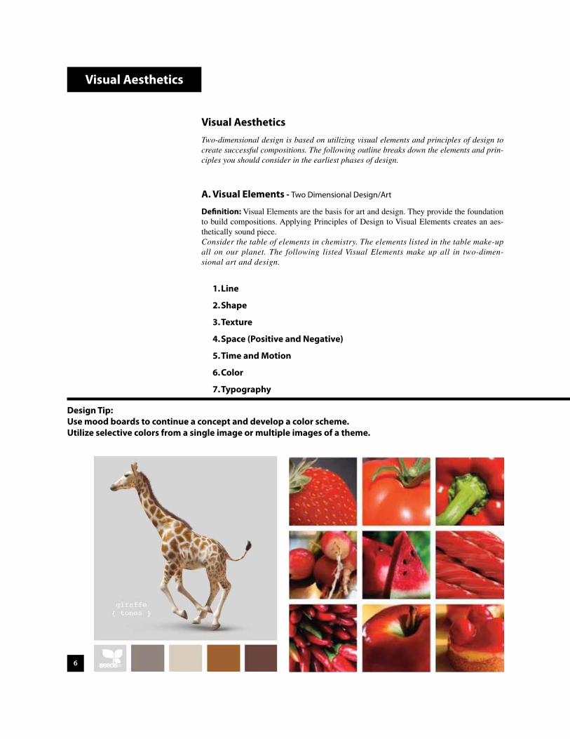
Design Tip:Use mood boards to continue a concept and develop a color scheme.Utilize selective colors from a single image or multiple images of a theme.

7
b. Implied: An “actual” line does not exist, but rather a line that is implied or psychic. The line can be implied or even psychic by suggestion, illusion, visual substitu-tion, or something that you can feel-like direction. Some examples are where the mind wants to fill in the blanks or connect the dots.
2. Shape a. Utilizing shape in two-dimensional design is a common practice. By applying principles
of design to a shape(s) such as repetition and scale. You can excel your overall design. Any shape can prove to be viable - geometric or organic.
Visual Aesthetics
Vertical LineTall/Thin
Horizontal LineFlat/Heavy
Curved LineOrganic/Natural
Diagonal LineDynamic/Energy
1. Line a. Actual: Characteristics, The following illustrations are the most commonly used “ac-
tual” lines. Other types of line include; sharp, jagged, hard, soft, thick, thin, ragged and irregular. One type of line is not considered better than the other in design. The function of the design will dictate which type (if any) of line to choose.

8
4. Positive and Negative Space a. Positive space is the dark (also called figure) and the Negative is the light (also called
the ground). Both are important in design. Many young designers only concentrate on the positive (i.e. type, imagery, solid shapes....) without considering the negative aspect of the piece.
5. Time/Motion a. Time can be depicted through sequential photography. Motion can be depicted
through photography as well. Panning with a moving object to blur background, or slow shutter on moving subject to blur the subject are techniques frequently used. Photography can imply motion through special techniques also, such as slow shutter while zooming. One can also create motion blur on an existing photograph using photo editing software. Some other ways of depicting motion are utilizing repetition and rhythm, also through animation in web design.
Visual Aesthetics
Negative
Positive
3. Texture a. Implied: Illusion of texture or an impression. Using texture on a two-dimensional sur-
face can prove difficult. Using imagery that has texture in the photograph such as brick, fur, smooth, slippery, rough, rugged, etc can be a successful solution. Other techniques are background textures by stretching across a printed page or repeating across a web page. Examples of this could be crumpled paper/foil that you scan in. The key to successful treat-ment of texture is to have proper contrast and value in the image or created graphic to give the “illusion” depth and surface. Texture that you can physically touch is “Actual” texture.
Visual Elements - Two Dimensional Design/Art (continued)
Positive
Positive Negative

9
6. ColorA. Descriptions 1. Hue- movement within color 2. Value- color initial 3. Chroma- brightness
B. Schemes 1. Primary: pigments: Red, Yellow, and Blue. 2. Secondary: pigments: Orange, Purple, and Green. 3. Monochromatic: one color value range. 4. Complimentary: opposite color wheel -- 5. Analogous: adjacent colors. ex. 6. Warm/Cool/ 7. Other ex. earthtones, pastels, metallic, industrial, etc...
C. Associations 1. Red- no shape, first color in visible spectrum, sharpest, heavy mood+: stimulating, exciting, hot, love, strength, mood-: loud, aggressive, danger, lust, cruelty, destruction 2. Orange- rectangular, warm, low value of brown mood+: vitality, strength mood-: materialism 3. Yellow- triangular, highest visibility, sharp and angular, mood+: youth, wisdom mood-: cowardliness, deceive 4. Green: hexagon, nature, eye does not focus well to it, soft edges mood+: cool, fresh, calm mood-: jealousy, envy, selfishness 5. Blue: circle, cold, wet, atmospheric, most blurred on the eye, mass not detail mood+: peace, truth, deep, seriousness mood-: cold, depression, sad 6. Purple- oval, never angular, has base mood+: mystery, dignity, patience, oneness mood-: occult like feel 7. Black- mood+: elegance, chic, high-tech mood-: death, despair, somber 8. White- mood+: purity, cleanliness, refreshing, innocence, peace, mood-: sterile, glare 9. Pink (example) shy, sweet, romantic, softness, femininenote: orange and blue most common on earth.-Additive color mixture (visible) will result in white (R,G,B-monitors/web design)-Subtractive color mixture (pigments) will result in black (C,M,Y,K- inkjet/industry printers)
010 5
Visual Aesthetics
RGB-Additive monitors/
web design
CMYK-Subtractive
inkjet/color lasers/industry printers
CMYK-Color
Seperations
change in value or tint
Value ranges from 0-10. Color has value as well.

10
7. Typography a. The ability to design with typography is essential. Understanding the following basic
principles should aid in creating successful typography based designs. By treating type as shapes a designer can excel his/her compositions. An example being the letter “A” has a triangular shape.
b. There are two main forms of type Serif (meaning with serifs) and Sans Serif (meaning without serifs-”sans” is French for without). Serifs are small extensions to the initial base of the letterforms. Traditional serifs are curved. Others may be more square and are considered slab serifs. Serif fonts are used a lot in body copy for the serifs help the eye move from one letter to another. Sans serif fonts are used in headers, logos, and anything that requires bold striking and simplistic lettering for ease of reading. There are many other forms of type such as cursive, and custom fonts.
T serifs TTSerif type Slab Serif type Sans Serif type
c. After deciding which case to use - the next step is exploring attributes. Applying at-tributes to single letterforms, words, or even paragraphs can change the typography. Tracking, vertical scale, and horizontal scale are some of the more traditional ways to change initial type attributes.
Tracking: Usually applied to spacing of entire words or moreover to paragraphs.
typography (-100), typography, t yp o graphy (+100)
Vertical Scale: Do not want to distort too much.
typography (50%), typography, t yp o graphy (150%)
Horizontal Scale: Do not want to distort too much.
typography (50%), typography, typography (150%)
Kerning: A more precise way to control spacing between characters.
Typography(original) Typography (space between each character manually kerned)
d. Other notes: Type is usually measured in points for ease of understanding. 72 points equal one inch. If we tried to measure type in inches the dimensions would be too confusing - i.e. (.05231”).
Visual Aesthetics
Visual Elements - Two Dimensional Design/Art (continued)

11
Resources Visual Aesthetics
This is only an general overview of typography.
Type can be analyzed into more categories and anatomy. The following link to a site called “Counter Space” provides a great resource for further exploration into typography.
http://www.counterspace.us/typography/
Typography-continued e. Good typography should also be considered where body text is concerned. Usually
body text is in serif form because the serifs allow for easy reading. They allow the text to flow. This is especially important for smaller text. Most books, magazines, newspapers use a serif font for body text. Body copy is usually 9 points in size with 12 points leading. Leading is the space between “baselines” in a paragraph. You should try to keep you columns force justified to ensure a graphically sound layout. Otherwise you may have unwanted “rivers” or space on the sides of your columns. A final thing to consider is not to have single words or even a couple of short words at the end of a paragraph. These are considered widows and orphans in the industry, and can prove to be visually distracting.
Good typography should also be considered where body text is concerned. Usually body text is in serif form because the serifs allow for easy reading. They allow the text to flow. This is especially important for smaller text. Most books, magazines, newspapers use a serif font for body text. Body copy is usually 9 points in size with 12 points leading. Leading is the space between “baselines” in a paragraph. You should try to keep you columns force justified to ensure a graphically sound layout. Otherwise you may have unwanted “rivers” or space on the sides of your columns. A final thing to consider is not to have single words or even a couple of short words at the end of a paragraph. These are considered widows and orphans in the industry, and can prove to be visu-ally distracting.
Good typography should also be considered where body text is concerned. Usually body text is in serif form because the ser-ifs allow for easy reading. They allow the text to flow. This is especially important for smaller text. Most books, magazines, newspapers use a serif font for body text. Body copy is usually 9 points in size with 12 points leading. Leading is the space between “baselines” in a paragraph. You should try to keep you columns force justified to ensure a graphically sound layout. Otherwise you may have unwanted “rivers” or space on the sides of your columns. A final thing to consider is not to have single words or even a couple of short words at the end of a paragraph. These are considered widows and orphans in the industry, and can prove to be visually distracting.
Not so goodwidows and rivers
GoodJustified with no widows/orphans
LEADING
ApbjiqZ baseline

12
Visual Aesthetics
Visual Aesthetics-continuedrecap-Two-dimensional design is based on utilizing visual elements and principles of de-sign to create successful compositions. The following outline breaks down the elements and principles you should consider in the earliest phases of design.
B. Principles of Design - Two Dimensional Design/Art
Definition: Principles of design are applied to the Visual Elements to create aes-thetic compositions.
1. Unity and Variety
2. Balance
3. Scale and Proportion
4. Hierarchy (focal point)
5. Rhythm and Repetition

13
Visual Aesthetics
Bilateral Symmetry
Symmetry throughBalanced Proportions
1. Unity and Variety a. Unity comes from an aesthetic unification of design elements in a composition. Some
examples could be using all organic shapes, same typography, a consistent color scheme, and unity of multiple page design such as having the same header on all pages of a magazine article.
b. Variety is also important to consider so a piece does not become too boring. By add-ing some contrasting elements into an existing design will allow the composition to become more interesting. Some examples of this could be combining fonts in a layout, changing the background color on pages in a website (but keeping the layout consistent), and mixing organic and geometric shapes.
2. Balance a. It is essential to consider balance in the initial phases of design. The composition
should not feel heavy on one side to give the illusion that it is tipping off balance. One may think that to create balance the composition must be symmetrical. This is true, but an asymmetrical composition can have balance as well. Some exam-ples to balance an asymmetrical design is to use large fields of color, larger sized shape(s), and balance through typography. The balance of Positive and Negative space is also very important!
3. Scale and Proportion a. Scale is the size relationship between elements. Proportion is size relationship of
those elements to the composition (format and page size).
Unity&
Variety
Unity&
VarietyVarietyUnity
T ypography
scale relationships-not so good-
scale relationships
-good-
proportion-considering balance-
14
Visual Aesthetics
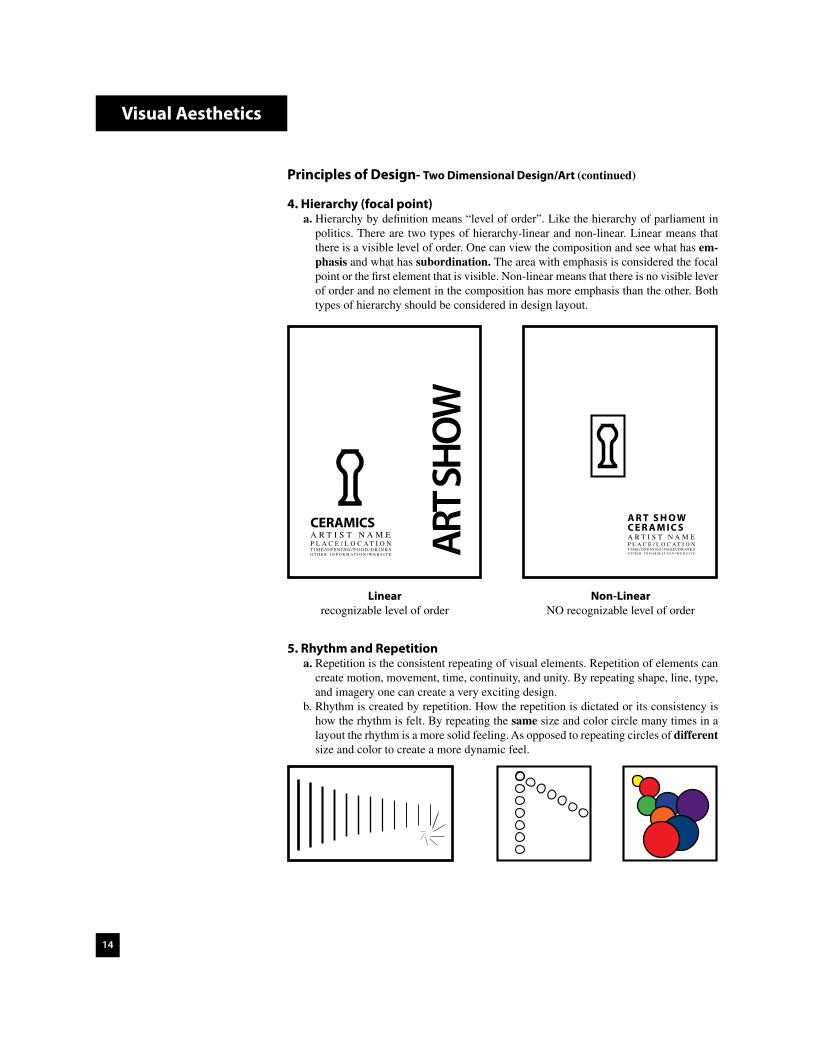
4. Hierarchy (focal point) a. Hierarchy by definition means “level of order”. Like the hierarchy of parliament in
politics. There are two types of hierarchy-linear and non-linear. Linear means that there is a visible level of order. One can view the composition and see what has em-phasis and what has subordination. The area with emphasis is considered the focal point or the first element that is visible. Non-linear means that there is no visible lever of order and no element in the composition has more emphasis than the other. Both types of hierarchy should be considered in design layout.
5. Rhythm and Repetition a. Repetition is the consistent repeating of visual elements. Repetition of elements can
create motion, movement, time, continuity, and unity. By repeating shape, line, type, and imagery one can create a very exciting design.
b. Rhythm is created by repetition. How the repetition is dictated or its consistency is how the rhythm is felt. By repeating the same size and color circle many times in a layout the rhythm is a more solid feeling. As opposed to repeating circles of different size and color to create a more dynamic feel.
ART S
HOW
CERAMICSA R T I S T N A M EP L A C E / L O C A T I O NT I M E / O P E N I N G / F O O D / D R I N K SO T H E R I N F O R M A T I O N / W E B S I T E
A R T S H O WC E R A M I C SA R T I S T N A M EP L A C E / L O C A T I O NT I M E / O P E N I N G / F O O D / D R I N K SO T H E R I N F O R M A T I O N / W E B S I T E
Linearrecognizable level of order
Non-LinearNO recognizable level of order
Principles of Design- Two Dimensional Design/Art (continued)

15
Software
There is specific software in the industry for specific jobs.
Raster based (pixels)The purpose of raster based software is to manipulate, enhance, edit, and color correct imagery. Also is used in web media preparation. The function of the software is it utilizes pixels of information related in squares. software examples:Adobe Photoshop, Adobe FireWorks, Paint Shop Pro.
Vector Based (highly mathematical)Precision graphics is the primary reason for using vector based software. The ability of precise and custom typography and lettering sets this software apart. Vector based software mathematical functions to produce infinitely precise graphics. software examples:Adobe Illustrator.
Page Layout/Word ProcessingThe purpose of page layout software is to bring text, images and graphics together in a single or multiple page layout. For example, to layout a magazine article a designer would have to scan the imagery into a raster based software program to color correct, enhance or edit. Any precision graphics (article header) would be done in a vector based application. Then all files would then be placed into the page layout software to construct the page(s) for the article with the given text from an editor. software examples:Adobe InDesign, QuarkExpress, Microsoft Publisher, Microsoft Word.
What You See Is What You Get (WYSIWYG) EditorsThis software allows the designer to focus more on the design rather than writing code. The WYSIWYG editors allow a designer to layout a web page visually while the software is writing the code for him/her behind the scenes. Most web designers are going the way of WYSIWYG editors. It is still essential though to know HTML and other coding such as Java. The WYSIWYG editors save valuable time in what other wise would be repetitive tasks. software examples:Adobe Dreamweaver, Microsoft Share Point Designer.
Gif AnimationAnimation in the Gif format.software examples:Adobe FireWorks, Adobe Photoshop/Elements, there are many other small applications.
FlashThe web is mainly raster based. Flash is the vector based application for web design. software examples:Adobe Flash.
Multimediasoftware examples:Adobe Premier, Adobe Director, Adobe AfterEffects, Adobe Authorware, Apple.
Three Dimensional Animation/Modelingsoftware examples:SoftImage, Lightwave, 3d StudioMax, Maya.
Computer Aided Draftingsoftware examples:Autocad, Autodesk, Pro-Engineer, Solid Works, Google Apps.
TRaster based file example
Vector based file example

16
A. Compositional TheoryThe theory of composition is essential to consider in page layout. Implementing just some basic theory can accelerate your design potential. Before compositional theory can be approached one thing must be determined first. This is always the first step in design for page layout. You must choose your format; portrait, landscape, or square. There are other shapes used in the industry such as circular shaped brochures etc..., but it is very minimal. After your format choice is determined then a compositional theory should be looked at next.
1. Symmetrical and Asymmetrical a. Symmetrical theory is where elements are balanced (equal) on both sides of the cen-
ter line. Asymmetrical both sides are not equal.
2. Law of Thirds a. This theory is mainly derived from photography, but can be implemented into graphic
design as well. It is basically breaking the board up into thirds and placing elements along the third lines and at the intersections.
PORTRAIT
LANDSCAPE
SQUARE
NOT SO GOOD GOOD
3. Layout Grids a. The use of layout grids is very common. For more experienced designers the layout
grid offers guides for graphic elements to line-up while still considering the basic rules of compositional theory.
4. Radial Layout a. This theory allows the designer to layout elements in a radial pattern. The elements
of the design. The actual center does not need to be in the center of the page.
Theory

17
Compositional Theory applied to page layoutAll of the theories covered should be considered designing a layout. Using the theories, margins, guides and grids will aid you in successful designs. Do not think of these as design handicaps. All designers use them to enhance the quality of the work.Where the law of thirds intersect creates 4 focal points on the page. These four areas should be considered as main focal points for emphasized visual elements. Where the sym-metrical lines intersect the law of thirds creates more subdued focal points.
Theory
CYCLINGS u m m e r O l y m p i c s 2 0 0 4 - A t h e n s , G r e e c e
About ATHENS 2004 Athens was selected as the host city of the 2004 Olympic Games in Lausanne, Switzer-land on 5 September 1997. On that same day, the Host City Contract for the Games of the XXVIII Olympiad was signed. These events marked the beginning of a unique journey in the history of Olympism that will culminate in Greece from 13 to 29 August 2004. The Games are returning home to the country that gave birth to the Olympic celebration more than 2,000 years ago.
Roa
d R
acin
g
CYCLINGS u m m e r O l y m p i c s 2 0 0 4 - A t h e n s , G r e e c e
About ATHENS 2004 Athens was selected as the host city of the 2004 Olympic Games in Lausanne, Switzer-land on 5 September 1997. On that same day, the Host City Contract for the Games of the XXVIII Olympiad was signed. These events marked the beginning of a unique journey in the history of Olympism that will culminate in Greece from 13 to 29 August 2004. The Games are returning home to the country that gave birth to the Olympic celebration more than 2,000 years ago.
Road Racing
CYCL
ING
S
um
me
r O
l ym
pi c
s 2
00 4 -
At h
e n s , G r e e c e
About ATHENS 2004
Athens was selected as the host city of the 2004 Olympic Games in Lausanne,
Switzerland on 5 September 1997. On that same day, the Host City Contract for the Games of the XXVIII Olympiad was signed. These events marked the beginning of a unique journey in the history of Olympism that will culminate in Greece from 13 to 29 August
2004. The Games are returning home to the country that gave b irth to the
Olympic celebration more than 2,000 years ago.
R
oad
Racin
g
CYCLINGS u m m e r O l y m p i c s 2 0 0 4 - A t h e n s , G r e e c e
About ATHENS 2004 Athens was selected as the host city of the 2004 Olympic Games in Lausanne, Switzer-land on 5 September 1997. On that same day, the Host City Contract for the Games of the XXVIII Olympiad was signed. These events marked the beginning of a unique journey in the history of Olympism that will culminate in Greece from 13 to 29 August 2004. The Games are returning home to the country that gave birth to the Olympic celebration more than 2,000 years ago.
Roa
d R
acin
g
This ancient composition formula is called the “golden ratio (mean)”. Research more about on the internet and library.
Note:These are just some general examples

18
Compositional Theory applied to Single Photographs:Theory
Levels
19
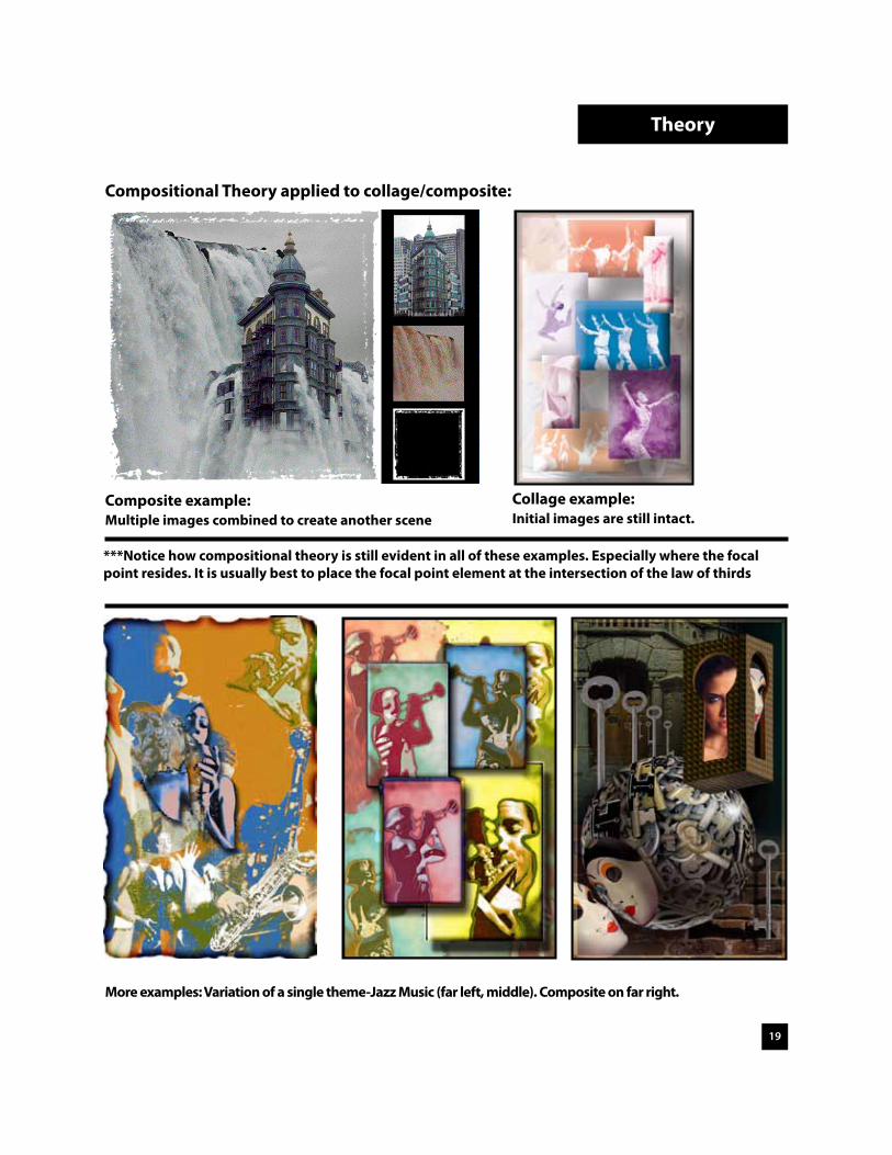
Compositional Theory applied to collage/composite:
Theory
Collage example:Initial images are still intact.
Composite example:Multiple images combined to create another scene
***Notice how compositional theory is still evident in all of these examples. Especially where the focal point resides. It is usually best to place the focal point element at the intersection of the law of thirds
More examples: Variation of a single theme-Jazz Music (far left, middle). Composite on far right.

20
Collage of multiple images
Step 1: CollectCollage is a process. This process can be broken down into 3 steps: Collect, Construct, and Compose. After selecting crafted imagery you will begin the composition considering theory. A focal point image will be determined then the other imagery will be placed accordingly with diminishing sizes from the original focal point image. Final compositional approaches will be reviewed utilizing shape, effects, border and arrangements.
Initial imagery collected to start the collage approach. Collect as much imagery related to your theme as possible. You can always eliminate imagery as you work along. Of course, the theme for the images below is “ocean” related. A focal point image should be selected at this point. Consider bringing the color of the images together utilizing the “Match Color” feature in Photoshop (Image>Adjustments>Match Color).
Theory

21
Theory
Step 2: Construct a. Compositional theory of law of thirds, symmetrical, radial, grids, guides and margins are
now considered (see pages 16-19) A focal point image should be chosen at this point. The focal point image should be placed at one of the intersection of the law of thirds. This image should be about 20% of the entire artboard to create dominance and emphasis. The intersection of the thirds creates 4 visual hotspots within a page layout. Consider the margins inset around the artboard as well (shown .5” in violet). If an image is not going to go off the page then it should reside on a margin to create an implied internal frame.
Focal point image is 20% of overall page size and is placed at an intersection of the law of thirds.

22
Theory
Step 3: Compose a. Additional imagery will be added in diminishing sizes to create subordination. Notice
since the imagery is not going off the page it is residing on the margins

23
Theory
Step 3 continued: Compose a. Once you complete your initial composition try different arrangements, focal points,
dominant imagery, effects, edge treatments, and shapes. Working off of the page can create dynamic effects as well.
Standard
Feather
New Focal Pt.
Effected
Circular
Combination

24
Modes
RGB for web, CMYK for print BitMap mode-50% Threshold
BitMap-Halftone Screen Grayscale- Leveled
Notice how the curves are inverted to create a positive and negative effectDuotone-Two colors

25
Effects
RGB Color invert
Filter-Artistic>Rough Pastels
Filter-Sketch>Graphic Pen with color
Grayscale invert
Filter-Artistic>Cut Out
Filter-Render>Difference Clouds

26
Live Trace
Original Live Trace- 70 colors Live Trace- 16 colors
Once an image is placed into Adobe Illustrator and selected you can utilize preset options in the control palette for “Live Trace”. I suggest going to the Object pull down menu then Live Trace>Tracing Options. You will then see this dialogue box with many more options for you to refine your trace. Tracing an image gives you a vector based result that gives a posterized look. Also, you can scale the traced image infinitely and live paint to whichever colors you choose.

27
Live Trace
Live Trace- Mode Black and White Threshold @ 100
Circular clipping maskLive Paint bucket fill
Converted to Live Paint. Object>Live Paint>MakeThen color fill with Live Paint bucket
Even after live tracing and live painting you can “Expand” the selection and apply brushes to artwork. See Illustrator “Help Menu” for more information.

28
Phases of Design
Three Phases of DesignThe following are examples of the “standard” approach to design. There are more specific approaches that we will learn in further lessons. Summarizing the phases of design into three steps is the most basic approach. The phases of design can progress into much more detail. Once you continue onto more advanced de-sign there can be as many as 5 or more design phases such as; conceptualization, methodology, implementation, finalization, etc…
Of course, the first thing you need to do is come up with an idea. This is called conceptualization. CONCEPT and VARIATIONS are the most important part in design. Your concept should be original! You may come up with a few ideas upon hearing about your project. Also, it may take a while and come to you at some unexpected time such as in your sleep. You may feel that your concept is unique and will be successful, but with some research you may find that your idea has been used before. This is where you progress into the first phase of design...
1RESEARCH
2DEVELOPMENT
3FINALIZE

29
Phases of Design
1. ResearchIn this preliminary step the designer will focus his/her attention to researching the given assignment or personal concept. It is important to utilize various resources to come up with a creative solution. Most designers start with looking at examples of existing designs of the project on the web, libraries, design archives, and bookstores. Then continue further by implementing their own conceptual ideas surrounding the needs of the design. While in this phase the designer should start to consider the demographic and scope (who is the target audience). Other concerns, pending on the project are paper, binding, color, format, size, and media (web, print, television, video, multimedia).Outline of Phase: a. Research-subject and client b. Resources-look at examples c. Demographic and scope d. What media will comp exist? e. Other; paper, binding, color, format, and size.
2. Development- variations (see following pages for more details)The development phase if primarily consisted of variations. During the development process you should make final decisions on what visual elements and principles of design that you are going to utilize. Also, do not rely on the computer to visualize your concepts. Try to start with sketches (thumbnails) and work through you ideas until you come up with a comprehensive solution on paper. Then move onto the digital realm. You may go through variations of typography for development of a logo. Also, you may go through variations of compositional theory for a poster layout. Regardless of what type of project that you are working on -remember...
“Do not rely on your first conceptual idea all of the way through the design process. Always, work on at least (3) three
completely different ideas for a project.”While in the variation phase is important not to forget about utilizing traditional art forms to your advantage such as; illustrations, markings, paintings, textures, etc...Outline of Phase: a. What Visual Elements and Principles of Design are going to be utilized b. Variations of a concept are as important as the concept itself. e. Traditional forms of art-hand drawn 3. FinalizeIn this phase you will proceed into final craftsmanship. All aspects of the design should look professionally finished. You need to decide the best approach digitally to complete your design. Also, what type of media will your work reside. For example, if you are developing a logo for print and the web. You will need to have one version for high resolution print out-put in CMYK color mode and another at web presentation resolution (72ppi) in RGB color mode.Outline of Phase: a. Final Craftsmanship b. Digital-which software c. Resolution d. Color Modes (CMYK-RGB) e. Post-Production control

30
Development Phase of Design-DETAIL Typography Variation Steps (3)This is variations as applied to designing typography (letterforms). It can be applied to arranging single letterforms (such as the letterform project) or designing typography of entire word(s).
Step 1: Type Study a. In this step you should explore your type in uppercase, lowercase and mixed case.
Then look at the type in different font styles and attributes (italic, bold, outline...).
Case:
TYPOGRAPHY, typography, Typography
Fonts (just some examples. Serif and Sans Serif should be explored):
TYPOGRAPHY, typography, TypographyTYPOGRAPHY, typography, TypographyTYPOGRAPHY, typography, TypographyTYPOGRAPHY, typography, Typography
Other attributes:
TYPOGRAPHY, Typography
Tracking: Usually applied to spacing of entire words or moreover to paragraphs.
typography (-100), typography, t yp o graphy (+100)
Vertical Scale: Do not want to distort too much.
typography (50%), typography, t yp o graphy (150%)
Horizontal Scale: Do not want to distort too much.
typography (50%), typography, typography (150%)
Kerning: A more precise way to control spacing between characters.
Typography(original) Typography (space between each character manually kerned)
Examples (repeated)
Development

31
Step 2: Arrangement Study a. Of course, arrangement differs when working with single letterforms as opposed to
working with a single word or words. Arrangement formats that should be considered are; Juxtapose (place side by side), Diagonal, Overlap, Stacking, Mirroring, Rotate, Rotate about a center point, square, diamond, left justified, right justified, full justi-fied.... basically explore all possible arrangements that could prove to be a viable so-lution. Here are just some examples using the letter “M” and the words logo and type.
MMM M
MM
MMMMMM M M M
MMMM MM
M MMMMM
LOGO TYPE, LOGO type, Logo TYPE, LoGo TyPe
LOGOTYPE
LOGOTYPE
LOGOTYPE
LOGOT Y P E
LOGOT Y P E
LOGOT Y P E
LOGOT Y P E
LOGO
TYPELo
go Type
Step 3: Format Study a. This basically means to explore different shapes surrounding and within your type.
Once different shapes are explored then apply different positive and negative rela-tionships. You can take it to another level by exploring contrast of space, multiple shapes, using masking techniques (pathfinders) to “exclude”, and abstractions. You do not have to use these results you may go back to a solution that you like in the initial steps of the variations phase.
MMM
MMMM
MMMM
MMMM
MMMM
MMMM
M
LOGO TYPELOGO TYPE LOGO TYPE
Development

32
Development Phase of Design-DETAILObjects and Shapes Variation Steps (2)This is the variation phase as applied to designing objects and shapes. These processes can be applied to basically any shape imaginable. Even more organic objects such as a graphi-cally translated tree still needs to go through these steps to ensure a sound result.
Step 1: Characteristic Study a. This is the most crucial step. In the case of objects such as a tennis racquet or a
wrench (in the industry you may encounter just about any object that someone may want to have translated into a logo) you should start by drawing the object best pos-sible to ensure that all of the characteristics are being studied. Do not leave out any detail. Also, view the object from different viewpoints. Pay close attention to the interior as well as the exterior qualities. Once this is completed you can start to ex-plore whether you want to use the entire object or maybe crop out specific areas. The examples that follow this will be demonstrated using a star.
Even though this is just a basic star there are many characteristics within and around. If you look at the structure of a star it is really a pentagon with 5 triangles attached and much more. This is what observing the characteristics of shapes and objects is about.
Remember: It is important to have equal amounts of positive and negative space when
designing logos!
Development

33
Step 2: Format Study a. Try to move the shape or object into some standard formats first such as a square, land-
scape rectangle, and portrait rectangle. Then into more complex shapes, even multiple shapes. Then explore positive and negative space relationships along with contrast and exclusions. You may even go into abstraction (taking the initial shape out of its usual appearance while still retaining most of the qualities that make the shape).
fill in the blanks
fill in the blanks
fill in the blanks
-space relationships
Development

34
Development
Development Phase of Design-DETAILOutline TreatmentThis is the variation phase as applied to designing outline treatment of objects, symbols, and shapes. You should still consider applying a format to your design if you choose this method of design approach. You should continue to go through variations until you reach “nirvana”- the best combination.
Gesture
Painterly
Graphical/ Radical
Other
Other

35
Development
Development Phase of Design-DETAILGraphic Translation of Photographic ImageryThis is the variation phase as applied to translating imagery in a graphic sense. You should focus on the key elements that make the translation interesting. Try not to keep to much detail in the translation. Ultimately, you can move into abstracting from the original.
Original High Contrast edit
Vector Clean-up Simplified Abstraction
36
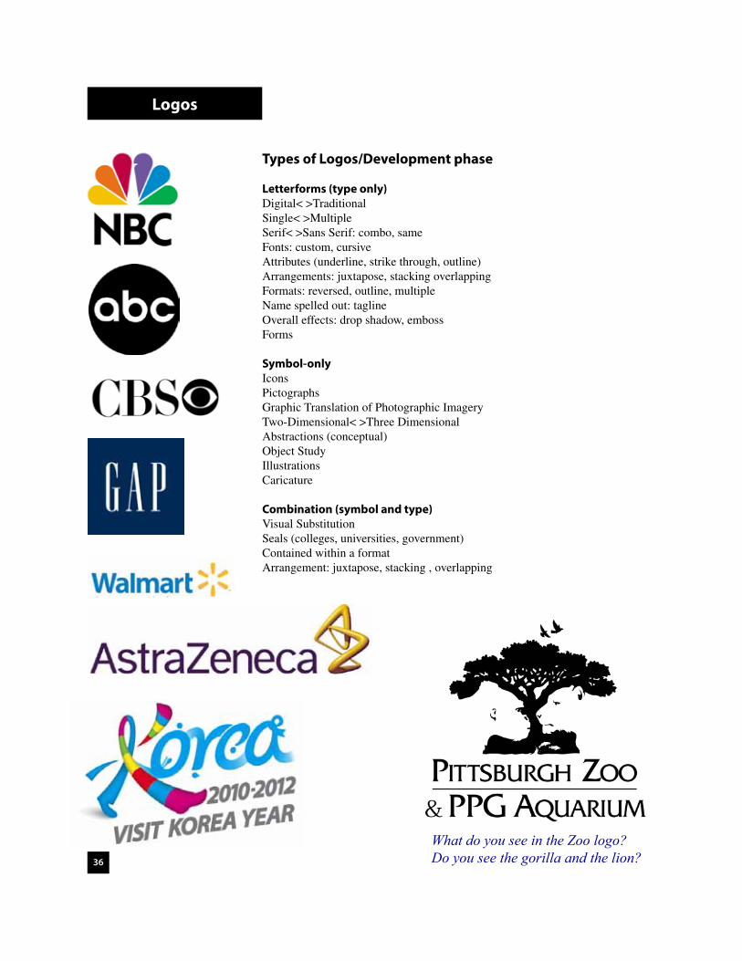
Types of Logos/Development phase
Letterforms (type only)Digital< >TraditionalSingle< >MultipleSerif< >Sans Serif: combo, sameFonts: custom, cursiveAttributes (underline, strike through, outline)Arrangements: juxtapose, stacking overlappingFormats: reversed, outline, multipleName spelled out: taglineOverall effects: drop shadow, embossForms
Symbol-onlyIconsPictographsGraphic Translation of Photographic ImageryTwo-Dimensional< >Three DimensionalAbstractions (conceptual)Object StudyIllustrationsCaricature
Combination (symbol and type)Visual SubstitutionSeals (colleges, universities, government)Contained within a formatArrangement: juxtapose, stacking , overlapping
Logos
What do you see in the Zoo logo? Do you see the gorilla and the lion?

37
Web File Formats Fortunately, the software designers at Adobe and others implemented a “Save for Web” option under the File pull-down menu. This feature enables users to easily prepare and save media for the web. The following outline is demonstrated utilizing this option. Ultimately, the general rule is files (images) with many colors (more than 256) should be saved in JPEG. Files that are less than 256 colors (logos, line art, simple graphics-animations) should be saved in GIF.
GIF file format: “Graphic Interchange Format”General Information:
1. 8-bit file format: A bit of information is a zero or a one. Therefore an 8-bit file means a string of 8 zeros and ones are denoted for each pixel of information.
2. GIF is a lossless compression. The file does not get compressed when saving. This means you can keep saving a GIF many times without losing quality.
3. 256 colors maximum can be saved for a GIF file.
4. GIF files can support transparency and animation.
5. GIF files that are interlaced means that when a website is loading ... the interlaced option causes the file to appear at low resolution - then to medium resolution- finally to the resolution it was initially saved in. It is usually not suggested to use the interlace option due to the distracting quality it gives visually when loading.
6. Dithering is usually best when gradients are present. Dithering will apply a screened pattern into the file to “diffuse” the gradients so there is not banding.
JPEG: “Joint Photographic Expert Group”General Information:
1. 24-bit file format: Can handle millions of colors.
2. JPEG is a lossy compression. The file gets compressed when saving--even on maximum quality. Therefore, it is good practice to save a working file in a non-compressible format until ready for JPEG.
3. JPEG does not support transparency or animation (quicktime).
4. JPEG files that are progressive (basically same as a “interlaced” GIF file) means that when a website is loading ... the progressive option causes the file to appear at low resolution-then to medium- finally to the resolution it was initially save in. It is usually not suggested to use the interlace option due to the distracting quality it gives visually when loading.
Print File FormatsWithin the Adobe design environment you can utilize native Adobe Photoshop (*.PSD) im-age files to place into Adobe Illustrator and Adobe InDesign.
File Formats

38
History of Photography outline
Reference: Photography by Bruce Warren. 1992.(Chapter 10, pp. 255)
A. History of Photography I. Technical History A. Camera Obscura 1. camera=room, obscura=darkened.2. references as early as 4 B.C. 3. addition of lenses. 4. image tracing. B. Silver Salts 1. Johann Heinrich Schulze (1725) light sensitive. 2. Thomas Wedgwood and Sir Humphry Davy (1800) temporary images.
II. The First Photograph B. Joseph Nicephore Niepce 1. early as 1816 produced paper negative (realized positive). 2. heliograph: positive representation of the etching on a metal (pewter) plate. -Could be inked and printed. 3. in 1826-7 produced first photographs. black tone (view from window).
III. The Daguerreotype A. Louis Jacques Mande Daguerre 1. daguerreotypes: only similarities to the heliograph were that they were both done on metal plates. 2. daguerreotypes images were produced on copper sheets plated with silver (fumed). 3. final result produced a delicate, silvery monochromatic and one-of-a-kind result. 4. invention announced publicly to the Academie des Sciences on 1.7.1839.
IV. The Calotype A. William henry Fox Talbot 1. presented his “photogenic drawing” invention quickly after the daguerreo type invention announcement. 2. the “photogenic drawing” now called a photogram involved a process of lay ing objects on the sensitized paper and exposing them to light. 3. eventually invented the negative-positive system. 4. calotype: paper sensitized with silver iodide. 5. reproducible photograph on a paper base. 6. photographers used the calotype process to produce first book of photographs The Pencil of Nature, published by Talbot in 1844.
V. Credit for the Invention of Photography A. Niepce primary-first working photograph process. B. Talbot-positive-negative system. C. Daguere-most glory. Public announcement. Preference to process (precious). D. Other 1. Hoppolyte Bayard-direct positive process in 1839. 2. Sir John Herschel-reproduce calotype in a few days. Discovered true fixative “hypo”.
History-Photo

39
VI. The Collodion Wet-Plate Process A. Niepce de Saint Victor (cousin) (1847) 1. introduced first successful glass plate processes using albumen (egg whites). 2. not as sensitive as calotype or daguerreotype, but process proven on albumen paper. B. Frederick Scott Archer (1851) 1. discovered use of collodion as a carrier for silver salts (glass). 2. plates had to be exposed and developed before drying thus wet-plate process. 3. glass negatives were sharp and detailed, and could be repeatedly printed without loss of quality. 4. replaced daguerreotype process by the end of the 1850s. 5. disadvantage was that dark room had to have mobility, glass fragile.
VII. Gelatin Emulsions A. Richard L. Maddox (1871) 1. discovered gelatin as a carrier for the silver salts. B. Richard Kennett and Charles H. Bennett (1879) 2. improved it into a practical process. C. Process 1. photographic plates could be stored, carried to a site and exposed. Then developed at a later time (8 months). 2. standardization of materials.
VIII. Flexible Film Base A. George Eastman (1854) 1. need to replace heavy, fragile glass. 2. Kodak camera that used film. Later transferred to glass. B. Hannibal Goodwin (1898) 1. invented usable film base. Patent to late due to Eastman’s production.
VIIII. Further Improvements A. Increasing film speed and broadening color sensitivity B. Safety C. More sensitive photographic papers allowed use of enlarges (smaller camera formats) D. Lens optics E. Ermanox camera (1924) 1. allowed available-light candid photography. F. Autochrome color (1907 discontinued in 1932) G. Kodachrome (1935) 1. produced by Eastman Company. Practical and affordable. H. Flashes/bulbs. (1930) I. Light meters (1931) J. Special techniques K. Polaroid (instant)
X. Electronic Imaging (see supplemental) XI. Nonsilver Processes A. Cyanotype-blueprint process, Herschel B. Platinotype-platinum print, William Willis (1873) C. Carbon print-coated paper, invented in 1856 D. Sir Joseph Wilson Swan (1864) 1. improved on carbon tissue transferred to a sheet of paper. 2. gum-bichromate print-could add water color pigments.
History-Photo
40
XII. Reproduction of Photographs in Printed Media A. Photogravure, collotype, and woodburtype. 1. excellent reproduction processes but difficult and labor intensive. B. Rotogravure (1895) 1. photogravure adopted to rotary printing presses. Used in high-circulation illustrated magazines. C. Halftone process (see supplemental) 1. dot pattern relating to line per inch screen.
B. Functional History of Photography I. Introduction Two-dimensional media was the representational method before photography. Often times attempting to give an realistic impression. Advances in the photographic and print-ing processes allowed for quick and affordable images. In current times with the advances in the photographic, printing, and computer realms. The image capture is the standard in representing realistic views. A. Portraiture B. Travel and Exploration C. Architectural D. Photojournalism (See supplemental) E. Documentary F. Snapshot G. Personal Social H. Advertising and Fashion J. Industrial I. Scientific J. Nature K. Art
C. Aesthetic History of Photography II. Introduction A reference back to the first book of photographs by Talbot, The pencil of Nature. This is one of the first forms of an artistic approach to photography. Two important figures that establish photography as a serious medium were Oscar G. Rejlander and Henry Peach Robinson. They developed the photomontage technique (multiple printing). In Peter Henry Emerson book Naturalistic Photography for Students of the Art, (1889) he presented an aesthetic theory for photography. In 1890, partly motivated by studies by Ferdinand Hurter and Verodriffield showing the firm scientific basis of photographic reproduction, Emerson recanted on his feeling that photography was a viable art form. A. Pictorialism 1. Pictorialists (1890) a. a loosely structured group of photographers who fought the battle for pho-
tography as and art form about 1890 through the first decade or two of the twentieth century. Pictorialism covered a wide range of styles, but the main principle that gave coherence to the movement was that photography was a valid art form to be considered on an equal footing with painting, drawing, sculpture, and the other fine arts.
b. Photo-secession: a new society formed in 1902 further the fight for the establishment of art photography. c. Stieglitz, a member of the photo-secession, published fifty issues of Camera Work from 1903 to 1917.
History-Photo

41
B. Straight Photography (~1892) 1. working in a direct manner, employing a fully detailed, sharp image printed without manipulation. 2. contributors a. Edward Weston, Ansel Adams, and Imogene Cunningham. The Group f/64. C. Bauhaus Movement (1920s-1930s) 1. German school of architecture and design. Initiated radical trends in art including dadaism, cubism, constructivism, and surrealism. D. Social Landscape Photography 1. the people, events, and artifacts that present a cultural and social picture for the times. 2. Robert Frank (1950s) a. used straight photography techniques to reflect social landscapes. His photographs were published in the book Les Americains in 1958. b. other members include (1960s Diane Arbus, Lee Friedlander, Garry Winogrand, and Danny Lyon. E. Conceptual Photography 1. the object created is of secondary importance to the idea. F. Current Directions (See supplemental) G. Styles and Trends in Applied Photography
-applied photography is the creation of photographs with a specific purpose on commission for clients and includes a number of specialties such as portrait, fashion, wedding, advertising, architecture, and scientific photography. The stylis-tic trends in applied photography roughly paralleled those in photography as art.
_______________
SupplementalI. Digital Photography A. History 1. 1981 still video 2. 1984 Apple Macintosh 3. 1986 Mega Pixel Imager (1 million pixels) 4. 1988 Thermal dye transfer 5. 1990 Adobe Photoshop 6. Apple quicktake camera (.5 the quality of 35mm film) 7. 1994 Associated Press goes digital a. advantages - elimination of dark rooms/developing errors.
- photo-journalism currently at 88% digital. Eventually 100%. Do not need high resolution for newsprint.
B. Charged Coupling Device (CCD) 1. Description a. uses small sensors that except image individually to produce pixels (RGB). b. analogue to digital.
II. Adobe Photoshop (others) A. Description 1. industry standard software for color correction and manipulation of photographic images. 2. raster (pixel) based program.
II. Printing Industry A. Offset press 1. CMYK a. virtually all color printing is done in cmyk 2. Spot Colors a. pre-mixed colors. 3. Plates/Screens a. cyan-15 degrees, magenta-30 degrees, yellow-45 degrees, black-0 degrees
History-Photo

42
History of Typography-Condensed version
3100 b.c. .............Mesopotamia pictographs1000 b.c. .............Early Greek Alphabet197 b.c. ...............Rosetta Stone (inscribed)200 b.c. ...............Parchment used for manuscripts
____________________After Christ
100 .....................Ts’ai Lun invents paper114 .....................Tajans column200-500 ..............Roman square and rustic capitals394 .....................Hieroglyphics ended770......................Early chinese relief printing800......................Book of Kells868......................Earliest printed manuscripts 1040....................Chinese invent movable type1400....................Woodblock printing in Europe1440....................Gutenberg perfects typographic printing1455....................Line Bible completed1460’s .................First type faces started to evolve1523 .....................Garamond type face created (you probaly have this on your computer)1609....................German newspaper1621....................First English newspaper1722....................Caslon type face created1757....................Baskersville type face created1780....................Bodini type face created1822....................Photolithicgraphic printing (photographs able to be reproduced in mass)1840....................Lithography in America1880....................Linotype machine, Mergenthaler1892....................American type founders1901....................Copperplate type face created1904....................Franklin Gothic type face created1920s ..................Bauhaus Art movement-Sans serif fonts1932....................Times Roman type face created1940’s-50’s .........New York School-Paul Rand1950’s .................International Typographic style-Swiss, German1960’s-70’s .........Pop Art-Warhol, Max1970’s .................Post-Modern design1980’s .................New Wave, Post Modern, Post Industrial, Deconstructivism
up to 1980s many more type faces were created the are commonly used today constructed from “traditional” techniques.
1984....................MacIntosh computer invented-Digital fonts implemented
History-Type
Go to the following link for a detailed resource for the history of graphic design and typography.http://www.designhistory.org

43
Evolution of Western alphabets
Chinese movable types c. 1300BC
Monumental capitals, Roman tomb
The Book of Durrow, 680
Tory, letterforms from Champ Fleury, 1529
Linotype machine
Gutenberg perfects typographic printing
Monotype machine, 1902
History-Type

44Albrecht Dürer, broadside, woodcut, 1515 (rhino)/type diagrams from Underweisung der Messung, 1525
History of Graphic Design-Condensed version
800......................Book of Kells/Durrow868......................Earliest printed manuscripts 1040....................Chinese invent movable type1400....................Woodblock printing in Europe1440....................Gutenberg perfects typographic printing1455....................Line Bible completed1460’s .................First type faces started to evolve1550....................Start of Pamphlets, folios, astronomical charts, public announcements.1609....................German newspaper1850’s .................Start of the Arts and Crafts movement1850’s-1910 ........ Industrial revolution1890-1910 ..........Art Nouveau-International decorative style-Mucha1822....................Photolithicgraphic printing (photographs able to be reproduced in mass)1840....................Lithography in America1880....................Linotype machine, Mergenthaler. Posters, Advertisements, logos,
Corporate Identities.1892....................American type founders1900-1925 ..........Wartime related media. Popular art movements distribute public communications1910-20’s ............Modern Art influences: Cubism, Futurism, Surrealism, Dada1919-1933 ..........Bauhaus Art movement-Sans serif fonts created. Probaly one of the
most influential movements pertaining to design. Gropius, Itten, Klee, Kandinsky, Bayer to name a few.
1940’s-50’s .........New York School-Paul Rand1950’s ................. International Typographic style-Swiss, German1960’s-70’s .........Pop Art-Warhol, Max1970’s .................Post-Modern design1970’s .................Relapse utilizing design concepts from the past1980’s .................New Wave, Post Modern, Post Industrial, Deconstructivism-Greiman, Carson1984....................MacIntosh computer invented-Digital fonts implemented
History-GD
Go to the following link for a detailed resource for the history of graphic design and typography.http://www.designhistory.org

45
Cellarius astronomical chart, 1662
Broadside, 1851
Chromolithograph poster, 1870
Morris chairs advertisement
History-GD

46
Flagg, recruiting poster, 1917
Kauffer, poster for Daily Herald, 1918
alexander lieberman, vogue, cover, 1945
herbert matter, swiss tourism poster, 1934
paula scher, swatch poster, 1985
schmidt, bauhaus exhibition poster, 1923
History-GD

47
paul rand, IBM logos, 1956
doyle dane bernbach, volkswagen print ad, 1968
alan hori, typography as discourse, poster, 1989
david carson, the end of print, book cover, 1995
fred woodward, rolling stone, magazine spread, 1995
History-GD
Go to the following link for a detailed resource for the history of graphic design and typography.http://www.designhistory.org