Embed Size (px)
Citation preview
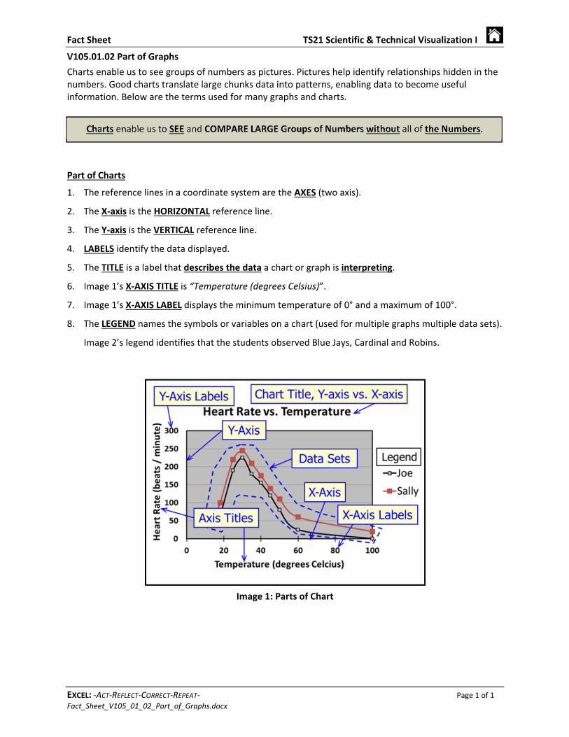
Fact Sheet TS21 Scientific & Technical Visualization I
EXCEL: ‐ACT‐REFLECT‐CORRECT‐REPEAT‐ Page 1 of 1 Fact_Sheet_V105_01_02_Part_of_Graphs.docx
V105.01.02 Part of Graphs
Charts enable us to see groups of numbers as pictures. Pictures help identify relationships hidden in the numbers. Good charts translate large chunks data into patterns, enabling data to become useful information. Below are the terms used for many graphs and charts.
Part of Charts
1. The reference lines in a coordinate system are the AXES (two axis).
2. The X‐axis is the HORIZONTAL reference line.
3. The Y‐axis is the VERTICAL reference line.
4. LABELS identify the data displayed.
5. The TITLE is a label that describes the data a chart or graph is interpreting.
6. Image 1’s X‐AXIS TITLE is “Temperature (degrees Celsius)”.
7. Image 1’s X‐AXIS LABEL displays the minimum temperature of 0° and a maximum of 100°.
8. The LEGEND names the symbols or variables on a chart (used for multiple graphs multiple data sets).
Image 2’s legend identifies that the students observed Blue Jays, Cardinal and Robins.
Image 1: Parts of Chart
Fact Sheet TS21 Scientific & Technical Visualization I
EXCEL: ‐ACT‐REFLECT‐CORRECT‐REPEAT‐ Page 1 of 1 Fact_Sheet_V105_01_01_Purpose_of_Graphs.docx
Image 4: Scatter Plot Image 6: Stacked Pie Chart Image 5: Stacked Pie Chart
V105.01.01 Purpose of Graphs
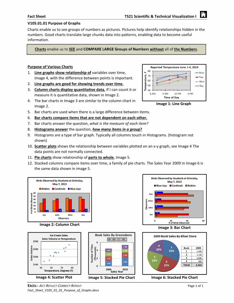
Charts enable us to see groups of numbers as pictures. Pictures help identify relationships hidden in the numbers. Good charts translate large chunks data into patterns, enabling data to become useful information.
Purpose of Various Charts
1. Line graphs show relationship of variables over time,
Image 4, with the difference between points is important.
2. Line graphs are good for showing trends over time.
3. Column charts display quantitative data. If I can count it or
measure it is quantitative data, shown in Image 2.
4. The bar charts in Image 3 are similar to the column chart in
Image 2.
5. Bar charts are used when there is a large difference between items.
6. Bar charts compare items that are not dependent on each other.
7. Bar charts answer the question, what is the measure of each item?
8. Histograms answer the question, how many items in a group?
9. Histograms are a type of bar graph. Typically all columns touch in Histograms. (histogram not
shown)
10. Scatter plots shows the relationship between variables plotted on an x‐y graph, see Image 4 The
data points are not normally connected.
11. Pie charts show relationship of parts to whole, Image 5.
12. Stacked columns compare items over time, a family of pie charts. The Sales Year 2009 in Image 6 is
the same data shown in image 5.
Image 2: Column Chart Image 3: Bar Chart
Image 1: Line Graph
Fact Sheet TS21 Scientific & Technical Visualization I
EXCEL: ‐ACT‐REFLECT‐CORRECT‐REPEAT‐ Page 1 of 1 Fact_Sheet_V105_01_03_Coordinate_Systems.docx
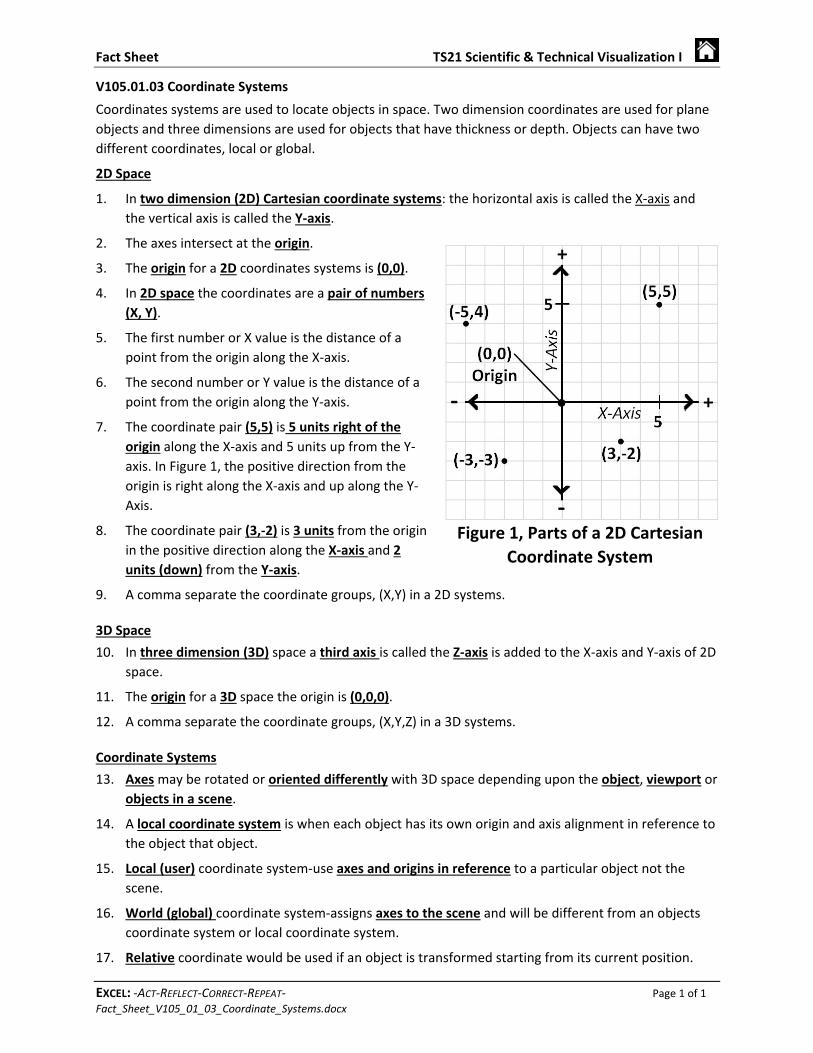
V105.01.03 Coordinate Systems
Coordinates systems are used to locate objects in space. Two dimension coordinates are used for plane
objects and three dimensions are used for objects that have thickness or depth. Objects can have two
different coordinates, local or global.
2D Space
1. In two dimension (2D) Cartesian coordinate systems: the horizontal axis is called the X‐axis and
the vertical axis is called the Y‐axis.
2. The axes intersect at the origin.
3. The origin for a 2D coordinates systems is (0,0).
4. In 2D space the coordinates are a pair of numbers
(X, Y).
5. The first number or X value is the distance of a
point from the origin along the X‐axis.
6. The second number or Y value is the distance of a
point from the origin along the Y‐axis.
7. The coordinate pair (5,5) is 5 units right of the
origin along the X‐axis and 5 units up from the Y‐
axis. In Figure 1, the positive direction from the
origin is right along the X‐axis and up along the Y‐
Axis.
8. The coordinate pair (3,‐2) is 3 units from the origin
in the positive direction along the X‐axis and 2
units (down) from the Y‐axis.
9. A comma separate the coordinate groups, (X,Y) in a 2D systems.
3D Space
10. In three dimension (3D) space a third axis is called the Z‐axis is added to the X‐axis and Y‐axis of 2D
space.
11. The origin for a 3D space the origin is (0,0,0).
12. A comma separate the coordinate groups, (X,Y,Z) in a 3D systems.
Coordinate Systems
13. Axes may be rotated or oriented differently with 3D space depending upon the object, viewport or
objects in a scene.
14. A local coordinate system is when each object has its own origin and axis alignment in reference to
the object that object.
15. Local (user) coordinate system‐use axes and origins in reference to a particular object not the
scene.
16. World (global) coordinate system‐assigns axes to the scene and will be different from an objects
coordinate system or local coordinate system.
17. Relative coordinate would be used if an object is transformed starting from its current position.
Figure 1, Parts of a 2D Cartesian
Coordinate System

Fact Sheet TS21 Scientific & Technical Visualization I
EXCEL: ‐ACT‐REFLECT‐CORRECT‐REPEAT‐ Page 1 of 1 _00_Fact_Sheets‐Blank_Sheet.docx
This page was
intentionally
left blank.
Fact Sheet TS21 Scientific & Technical Visualization I
EXCEL: ‐ACT‐REFLECT‐CORRECT‐REPEAT‐ Page 1 of 1 Fact_Sheet_V105_02_01_Design_Brief
105.02.01 Design Brief
1. Problem identification and definition
a. Establish a clear idea of what is to be accomplished.
b. Identify and define the specific problem.
c. Identify the intended audience.
2. Plan of work
a. A written step‐by‐step process by which the goal is to be
accomplished.
b. The plan can include expected time for completion.
c. The plan should include any division of work among team
members.
3. Literature Research and Review
a. Includes complete topic research of available literature.
b. Remember to document resources.
4. Hypothesis
a. Form a proposed solution to the problem.
b. Use an if/then statement if necessary.
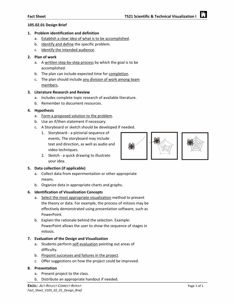
c. A Storyboard or sketch should be developed if needed.
1. Storyboard ‐ a pictorial sequence of
events. The storyboard may include
text and direction, as well as audio and
video techniques.
2. Sketch ‐ a quick drawing to illustrate
your idea.
5. Data collection (if applicable)
a. Collect data from experimentation or other appropriate
means.
b. Organize data in appropriate charts and graphs.
6. Identification of Visualization Concepts
a. Select the most appropriate visualization method to present
the theory or data. For example, the process of mitosis may be
effectively demonstrated using presentation software, such as
PowerPoint.
b. Explain the rationale behind the selection. Example:
PowerPoint allows the user to show the sequence of stages in
mitosis.
7. Evaluation of the Design and Visualization
a. Students perform self‐evaluation pointing out areas of
difficulty.
b. Pinpoint successes and failures in the project.
c. Offer suggestions on how the project could be improved.
8. Presentation
a. Present project to the class.
b. Distribute an appropriate handout if needed.
Fact Sheet TS21 Scientific & Technical Visualization I
EXCEL: ‐ACT‐REFLECT‐CORRECT‐REPEAT‐ Page 1 of 1 Fact_Sheet_V105_02_02_IDEAL_SAFE
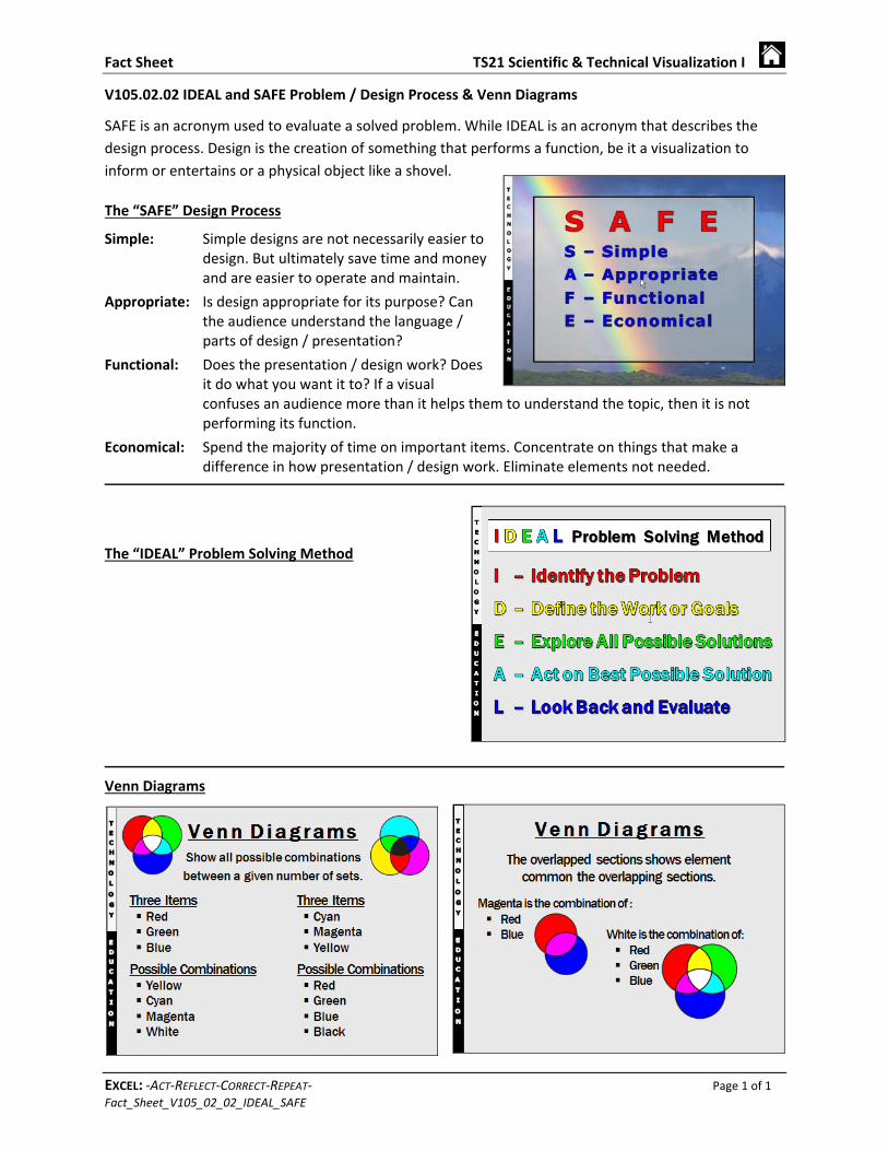
V105.02.02 IDEAL and SAFE Problem / Design Process & Venn Diagrams
SAFE is an acronym used to evaluate a solved problem. While IDEAL is an acronym that describes the
design process. Design is the creation of something that performs a function, be it a visualization to
inform or entertains or a physical object like a shovel.
The “SAFE” Design Process
Simple: Simple designs are not necessarily easier to design. But ultimately save time and money and are easier to operate and maintain.
Appropriate: Is design appropriate for its purpose? Can the audience understand the language / parts of design / presentation?
Functional: Does the presentation / design work? Does it do what you want it to? If a visual confuses an audience more than it helps them to understand the topic, then it is not performing its function.
Economical: Spend the majority of time on important items. Concentrate on things that make a difference in how presentation / design work. Eliminate elements not needed.
The “IDEAL” Problem Solving Method
Venn Diagrams
Fact Sheet TS21 Scientific & Technical Visualization I
EXCEL: ‐ACT‐REFLECT‐CORRECT‐REPEAT‐ Page 1 of 1 Fact_Sheet_V105_02_03_Nominal_Group_Technique
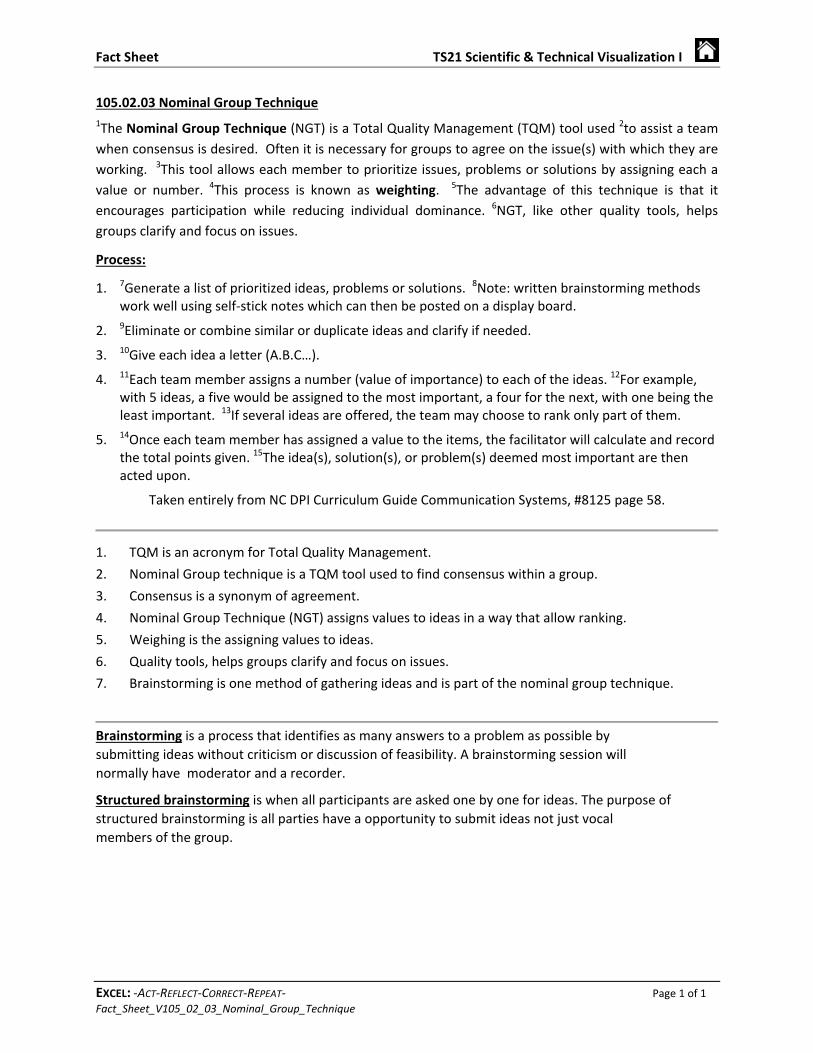
105.02.03 Nominal Group Technique
1The Nominal Group Technique (NGT) is a Total Quality Management (TQM) tool used 2to assist a team
when consensus is desired. Often it is necessary for groups to agree on the issue(s) with which they are
working. 3This tool allows each member to prioritize issues, problems or solutions by assigning each a
value or number. 4This process is known as weighting. 5The advantage of this technique is that it
encourages participation while reducing individual dominance. 6NGT, like other quality tools, helps
groups clarify and focus on issues.
Process:
1. 7Generate a list of prioritized ideas, problems or solutions. 8Note: written brainstorming methodswork well using self‐stick notes which can then be posted on a display board.
2. 9Eliminate or combine similar or duplicate ideas and clarify if needed.
3. 10Give each idea a letter (A.B.C…).
4. 11Each team member assigns a number (value of importance) to each of the ideas. 12For example,with 5 ideas, a five would be assigned to the most important, a four for the next, with one being theleast important. 13If several ideas are offered, the team may choose to rank only part of them.
5. 14Once each team member has assigned a value to the items, the facilitator will calculate and recordthe total points given. 15The idea(s), solution(s), or problem(s) deemed most important are thenacted upon.
Taken entirely from NC DPI Curriculum Guide Communication Systems, #8125 page 58.
1. TQM is an acronym for Total Quality Management.
2. Nominal Group technique is a TQM tool used to find consensus within a group.
3. Consensus is a synonym of agreement.
4. Nominal Group Technique (NGT) assigns values to ideas in a way that allow ranking.
5. Weighing is the assigning values to ideas.
6. Quality tools, helps groups clarify and focus on issues.
7. Brainstorming is one method of gathering ideas and is part of the nominal group technique.
Brainstorming is a process that identifies as many answers to a problem as possible by
submitting ideas without criticism or discussion of feasibility. A brainstorming session will
normally have moderator and a recorder.
Structured brainstorming is when all participants are asked one by one for ideas. The purpose of
structured brainstorming is all parties have a opportunity to submit ideas not just vocal
members of the group.
Fact Sheet TS21 Scientific & Technical Visualization I
EXCEL: ‐ACT‐REFLECT‐CORRECT‐REPEAT‐ Page 1 of 1 Fact_Sheet_V105_02_04_Flow_Charts
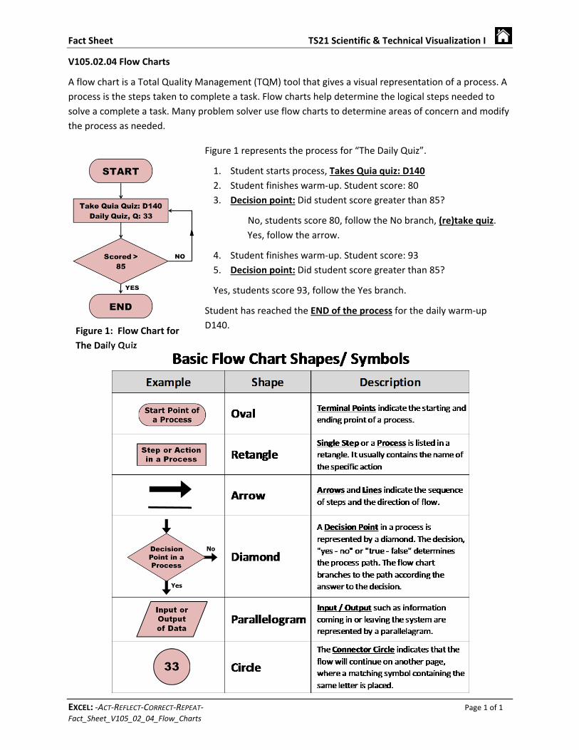
V105.02.04 Flow Charts
A flow chart is a Total Quality Management (TQM) tool that gives a visual representation of a process. A
process is the steps taken to complete a task. Flow charts help determine the logical steps needed to
solve a complete a task. Many problem solver use flow charts to determine areas of concern and modify
the process as needed.
Figure 1 represents the process for “The Daily Quiz”.
1. Student starts process, Takes Quia quiz: D140
2. Student finishes warm‐up. Student score: 80
3. Decision point: Did student score greater than 85?
No, students score 80, follow the No branch, (re)take quiz.
Yes, follow the arrow.
4. Student finishes warm‐up. Student score: 93
5. Decision point: Did student score greater than 85?
Yes, students score 93, follow the Yes branch.
Student has reached the END of the process for the daily warm‐up
D140. Figure 1: Flow Chart for
The Daily Quiz
Fact Sheet TS21 Scientific & Technical Visualization I
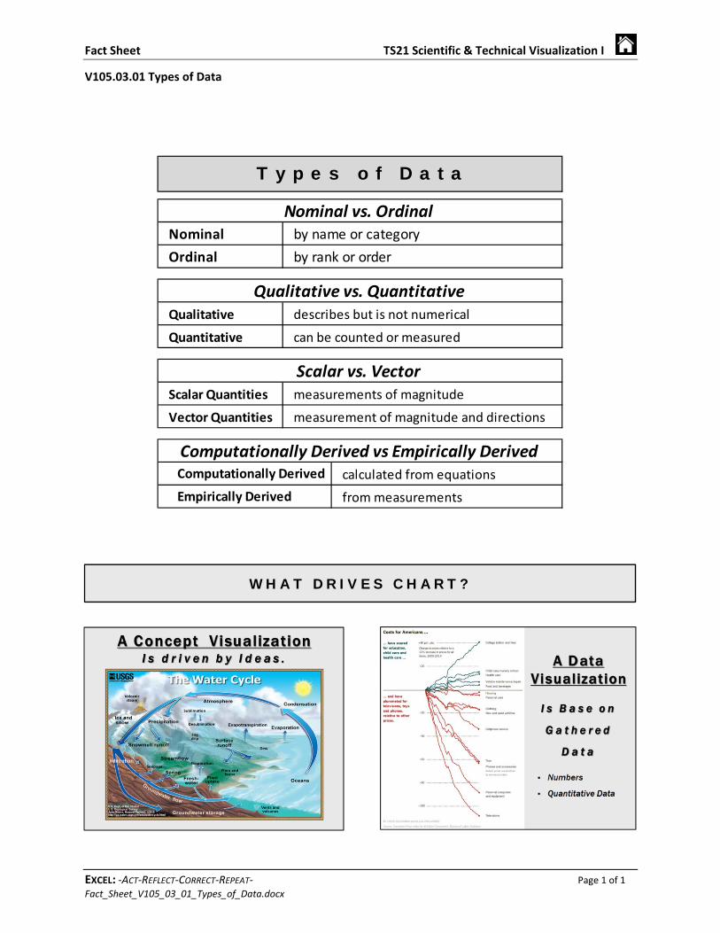
EXCEL: ‐ACT‐REFLECT‐CORRECT‐REPEAT‐ Page 1 of 1 Fact_Sheet_V105_03_01_Types_of_Data.docx
W H A T D R I V E S C H A R T ?
Nominal by name or category
Ordinal by rank or order
Qualitative describes but is not numerical
Quantitative can be counted or measured
Scalar Quantities measurements of magnitude
Vector Quantities measurement of magnitude and directions
calculated from equations
from measurementsEmpirically Derived
Nominal vs. Ordinal
Computationally Derived vs Empirically Derived
Scalar vs. Vector
Qualitative vs. Quantitative
T y p e s o f D a t a
Computationally Derived
V105.03.01 Types of Data
Fact Sheet TS21 Scientific & Technical Visualization I
EXCEL: ‐ACT‐REFLECT‐CORRECT‐REPEAT‐ Page 1 of 1 Fact_Sheet_V105_03_02_Central Tendency.docx
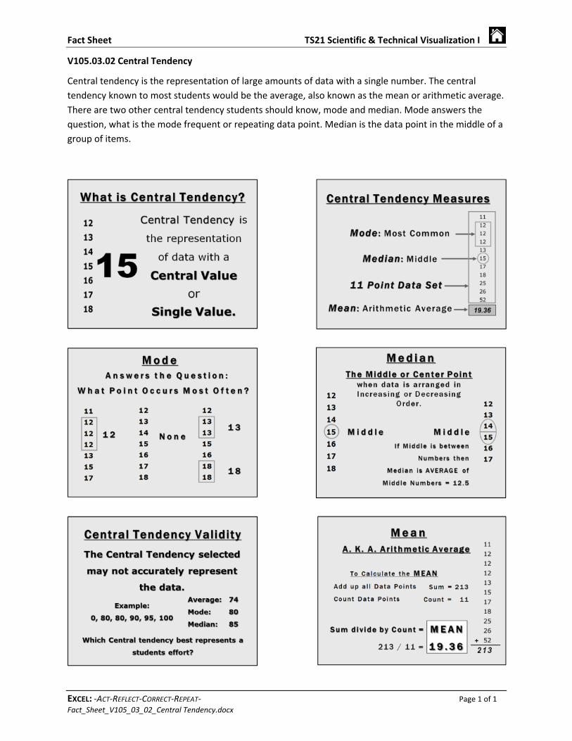
V105.03.02 Central Tendency
Central tendency is the representation of large amounts of data with a single number. The central
tendency known to most students would be the average, also known as the mean or arithmetic average.
There are two other central tendency students should know, mode and median. Mode answers the
question, what is the mode frequent or repeating data point. Median is the data point in the middle of a
group of items.
Fact Sheet TS21 Scientific & Technical Visualization I
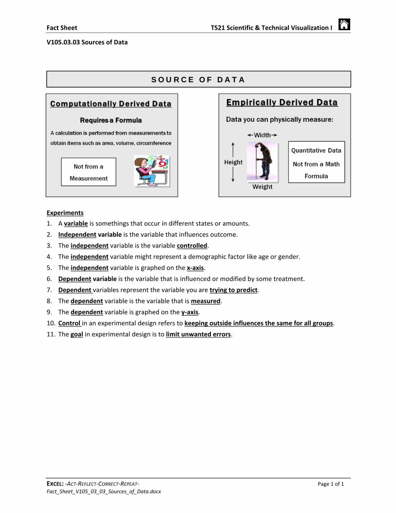
EXCEL: ‐ACT‐REFLECT‐CORRECT‐REPEAT‐ Page 1 of 1 Fact_Sheet_V105_03_03_Sources_of_Data.docx
V105.03.03 Sources of Data
Experiments
1. A variable is somethings that occur in different states or amounts.
2. Independent variable is the variable that influences outcome.
3. The independent variable is the variable controlled.
4. The independent variable might represent a demographic factor like age or gender.
5. The independent variable is graphed on the x‐axis.
6. Dependent variable is the variable that is influenced or modified by some treatment.
7. Dependent variables represent the variable you are trying to predict.
8. The dependent variable is the variable that is measured.
9. The dependent variable is graphed on the y‐axis.
10. Control in an experimental design refers to keeping outside influences the same for all groups.
11. The goal in experimental design is to limit unwanted errors.
S O U R C E O F D A T A

Fact Sheet TS21 Scientific & Technical Visualization I
EXCEL: ‐ACT‐REFLECT‐CORRECT‐REPEAT‐ Page 1 of 1 _00_Fact_Sheets‐Blank_Sheet.docx
This page was
intentionally
left blank.