Embed Size (px)
Citation preview

Tools and Techniques
Handbook
Acknowledgment: During the first years of my professional career I had the pleasure of working with many excellent professionals at Arthur Andersen. It is because of their hard work and dedication of advancing knowledge that this document was prepared. So I feel it is somewhat ashamed to see this document go to waste. Therefore, I have decided to make it available for students enrolled in Module 2 of my Excellence in Financial Management Program. This document is made possible by the folks at Arthur Andersen and I do not take any credit for this Tools and Techniques Handbook. – Matt H. Evans
Key Question
Typical Process Tricks & Tips
Tool Description
Typical Output Format
Training Modules
2
Tools and Techniques
Porter’s 5 Forces What are the key market drivers ? SWOT What are the top-line factors affecting the issue at hand ? Growth Share (BCG) Matrix What industries or sectors should we be in ? Product Life Cycle What stage of the product cycle are we at ? EOS : ROS – RMS Does size matter ? EOS : Learning Curve What are the benefits of scale or experience ? ROS / RONA How well are we using our assets ? Value Disciplines What type of possible strategies are there in this market ? Happy Line Where are we over-satisfying our customers ? Conversion Waterfall Where do we lose potential customers ? SWOT What are the top-line factors affecting the issue at hand ?
Pareto Curve (“80:20”) What matters ? Value Map (“Mekko”) What are the various segments and sub-segments ?. Value Chain Where do our core competencies reside ? Weighted Column Maker Which are the most profitable competitors in absolute terms
? Share Gain Line Who has been gaining market share ? KPC Combs What are the main purchasing criteria, and how do we fare ? Harvey Balls What is the best way to display “soft” quantitative data ? Quotes What is the best way to display qualitative data ? Lollipops Can I come up with creative data displays of my own ? Channel Maps What is the relative importance of various routes to
market ? Conceptual Maps How can I simply structure a set of data before analysing it ? Forces at Work What are the forces at work ? Crocodile Chart Can I come up with creative data displays of my own too ? Parfait What is the easiest way to display market growth ?
Logic Tree How does one organise the research ? Process Maps What are the key steps ? Sanity Checks Does this number make sense ? Top-down Estimation How can I estimate a sub-set ? One-Off Interviews What are the main issues with one-off interviews ? Interview Programmes What are the main issues with interview programmes ? Focus Groups What are the main issues with organising focus groups ? Clustering How can I group people by preferences ? Factorial Analysis How can I group people’s preferences in broader sets ?
Desk Sources Where can I find secondary data ? Usual AABC Sources What are the usual AABC sources ?
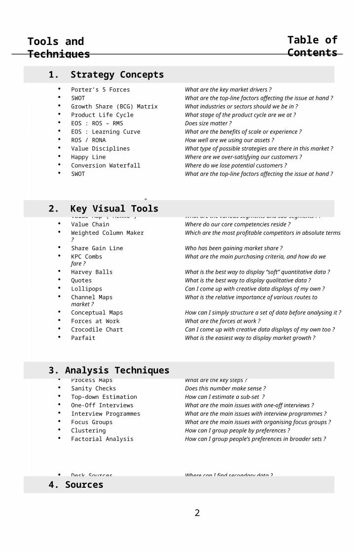
Table of Contents
3. Analysis Techniques
1. Strategy Concepts
2. Key Visual Tools
4. Sources

Key Question
Typical Process Tricks & Tips
Tool Description
Typical Output Format
Training Modules
3
Tools and Techniques Table of Contents
1. Strategy Concepts

Key Question
Typical Process Tricks & Tips
Tool Description
Typical Output Format
Training Modules
4
Tools and Techniques Porter’s 5 Forces
What are the key market drivers ?
Porter’s model is a great check list when starting to describe an industry. It helps you organise your research and, more importantly, provides a good framework in which to present your findings.
• Start with top-line list of the main players in each of the 5 boxes- key competitors- key suppliers- key customers- most likely entrants- most likely substitution
• Carry out lit. search on the names compiled above
• Gather all relevant articles in one
binder
• “lift” most common comments into a word document
• Organize results into 5 boxes
• Summarize
• Keep a good balance between words and data
• “Force quantification” of words. For example if you read “customer power is likely to continue growing at broadly the same rate” try and find relevant data and write “customer power is likely to continue growing, keeping price hikes on historical level of 2%p.a.”
• Think about Newton and Archimedes (every proactive force creates its own reactive force) and try capturing both the net effect and the 2 opposing forces
• Ground model in the analytical process: what further research would be required to conclude on a given trend?
Market-I
Threat of New Entrants
Porter’s 5 forces map
Threat of Substitution
Bargaining power of Customers
Bargaining power of Suppliers
Rivalry among
Competitors

Key Question
Typical Process Tricks & Tips
Tool Description
Typical Output Format
Training Modules
5
Tools and Techniques SWOT
What are the top-line factors affecting the issue at hand ?
The SWOT box is a less formal , more intuitive version of Porter’s model . It provides a good framework in which to lay out initial findings - and can be used to start a Logic Tree (see below)
• Self-explanatory • Many issues are both an opportunity and a threat, or a strength and a weakness !
• Do not sit on the fence; you will revisit this analysis in due course but start by choosing a box for every phenomenon observed / anticipated
Competitor-I
Strengths
Opportunities
Weaknesses
Threats
SWOT analysis of Chelsea FC
• Experienced players• Key real estate location• “Cultured” football
methods shared across the squad
• Midfield play
• Little development opportunities for the youth teams
• Old players more accident prone
• Low scoring• Inexperienced manager
• Attract further key international names
• Umbrella branding (internationally recognized name)
• Still backed by private investors
• MUFC and Arsenal keep getting bigger
• Leeds, Liverpool, etc back in contention for N° 3 spot

Key Question
Typical Process Tricks & Tips
Tool Description
Typical Output Format
Training Modules
6
Tools and Techniques
Low High
Growth Share (BCG) Matrix
Which industries or sectors should we be in?
The Share-Growth matrix is a simple matrix devised to visualise multiple investment alternatives. It helps you compares relative attractiveness of different shares vs. growth situations. It requires an Excel sheet and the Bubble function in the Chart Menu.
• Compile competitor or division market shares in their relevant market
• Gather market growth rates for each industry or segment
• Plot
• Split chart in 4 quadrants : Dog; Question Mark; Star; and Milk
• Do not worry exceedingly about accuracy of positioning of a given data point in the matrix but focus rather on relative positioning
• Each quadrant of the matrix corresponds to a generic term, describing the strategic opportunities available to a company or division present there:
- bottom-left quadrant, “dog”, small market share of a below par growth industry, little opportunity
- top-left , “question mark”, small market share of an above par growth industry, good opportunity
- top-right, “star”, big market share of above par growth industry, great opportunity
- bottom-right, “cow”, big market share at below par growth, superb position but little opportunity , time to milk !
• Original BCG had the x-axis with RMS (relative market share) and was plotted with leaders on the left rather than the right
Market-I
Fish food service segments, Share & growth, 1998
SegmentFORECAST growth(%)
Restaurants
0 10 20 30 40 50 60%
Fish & Chips
Services
Clubs
Pubs
Hotels
Education
Health Catering
-2,0%
0,0%
2,0%
4,0%
6,0%
8,0%
10,0%
12,0%
Segment share (% of market)
High
Low

Key Question
Typical Process Tricks & Tips
Tool Description
Typical Output Format
Training Modules
7
Tools and Techniques Product Life Cycle
What stage of the cycle are we at ?
The Product Life Cycle is a concept devised to keep in mind that relative competitive advantages can ebb and flow. It helps you position competitors or industries against one another and against a time line. Works better on a theoretical level rather than with lots of data
• Find start date of timeline (i.e. first recorded mention of the technology, the product, the industry, etc)
• Define a vertical axis (i.e. sales, penetration levels, etc)
• Create Excel table with measurement records over time
• Plot
• Tip : it is usually quicker - and as illustrative to plot 3 or 4 milestones than it is plotting the whole line
Market-II
Measure or phenomenon(ie sales in £, penetration in %, etc)
Time line of phenomenon(in years, or months, or days, etc)
Product life cycle curve

Key Question
Typical Process Tricks & Tips
Tool Description
Typical Output Format
Training Modules
8
Tools and Techniques
The ROS-RMS is a simple chart displaying together relative size of competitors and profitability levels. It requires an Excel table and the Bubble function in the Chart Menu. The parallel band lines need be added afterwards
EOS : ROS - RMS
• Define list of competitors to be included, and order annual reports
• Create Excel table with last year’s sales + last 3 years’ profits
• Plot
• Annotate competitors with incomplete and / or misguiding data, such as less than 3 years of profits; latest year of sales is not last year; finer data available includes other divisions, not just sales and profits of relevant segments, etc
• Strip down competitor sales to relevant segments
• Estimate comparative profitability of remaining segments
• Order annual reports in advance : 2 weeks lead-time for foreign companies
• Don’t forget 3 years average for ROS
• Start plotting data you have : partial is better than nothing
• Do not hesitate to call competitor directly - after clearance from case team manager - to gain idea of segment profitability (ie “higher than average of company”, etc)
Does size matter ?
0,01 0,10 1,00 10,00
ROS - RMSIndustry A
RMS (log)
ROS (last 3 years, %)
0,01 0,10 1,00 10,00
-20
-15
-10
-5
0
5
10
15
20
-25
25%
-20
-15
-10
-5
0
5
10
15
20
-25
25%
RMS (log)
ROS (last 3 years, %)
ROS - RMSIndustry B
Competitor-I & II

Key Question
Typical Process Tricks & Tips
Tool Description
Typical Output Format
Training Modules
9
Tools and Techniques
The Learning Curve is a very simple concept: it is the trend line of a set of data where the Y axis represents the cost/unit of the X axis. It requires an Excel table and the Scatter function in Chart Menu
EOS : Learning Curve
• Define the exact value chain dimension whose learning curve you want to display (manufacturing, purchasing, etc)
• Choose the number of data points you need (5 will result in rather illustrative outcome, 10 - 12 will give more confidence)
• Gather data on cost/unit from client for relevant objects (eg: get exact capacity and cost/tonne for client in 4 plants)
• Interview competitors’ relevant director for missing data using smart approach (eg: by how much would your cost/unit drop if you doubled size
• Careful! There are 2 versions of the “learning curve”. One is really about learning, the other really about scale
• In the first case, the X axis represents the cumulative N° of units produced to date and the Y axis the cost/unit over time (A typical example is plane production. Few units produced per year, and the cost of each unit keeps coming down as assemblers get better at it with experience)
• In the second case, the X axis represents the size of a given process (eg. plant capacity) and the Y axis the cost/unit for this process in various plants.
• Tip: manufacturing directors are not often approached for market research and thus tend to talk a lot
What are the benefits of scale or experience ?
Manufacturing Capacity (kTonnes, 1996, Log scale)
Cost per Tonne (excl. materials, 1993, £k/Tonne)
Manufacturing scale curve, Biscuits industry, 1997
A 10 times increase in scale represents a theoretical cost improvement of £275p.T. Some of this, however, would be offset by increased distribution and other costs
R2 = 65%
0,0
0,2
0,4
0,6
0,8
1,0
1,2
1 000 10 000 100 000
Broxburn
Linkoping
Durango
Lauragais X1
X2
Hatton
AshbyGyor
Maastricht
Jyvas Hyva
CarlisleDortmund
GenoaTyneside
Competitor-II
Key Question
Typical Process Tricks & Tips
Tool Description
Typical Output Format
Training Modules
10
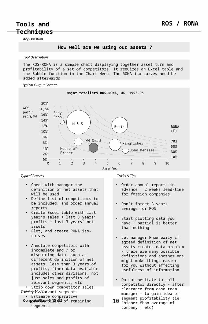
Tools and Techniques ROS / RONA
How well are we using our assets ?
The ROS-RONA is a simple chart displaying together asset turn and profitability of a set of competitors. It requires an Excel table and the Bubble function in the Chart Menu. The RONA iso-curves need be added afterwards
• Check with manager the definition of net assets that will be used
• Define list of competitors to be included, and order annual reports
• Create Excel table with last year’s sales + last 3 years’ profits + last 3 years’ net assets
• Plot, and create RONA iso-curves
• Annotate competitors with incomplete and / or misguiding data, such as different definition of net assets, less than 3 years of profits; finer data available includes other divisions, not just sales and profits of relevant segments, etc
• Strip down competitor sales to relevant segments
• Estimate comparative profitability of remaining segments
• Order annual reports in advance : 2 weeks lead-time for foreign companies
• Don’t forget 3 years average for ROS
• Start plotting data you have : partial is better than nothing
• Let manager know early if agreed definition of net assets creates data problem - there are many possible definitions and another one might make things easier for you without affecting usefulness of information
• Do not hesitate to call competitor directly - after clearance from case team manager - to gain idea of segment profitability (ie “higher than average of company”, etc)
Major retailers ROS-RONA, UK, 1993-95
RONA (%)
70%
50%
30%
10%0%
2%
4%
6%
8%
10%
12%
14%
16%
1,8%
20%
0 1 2 3 4 5 6 7 8 9 10
ROS (last 3 years, %)
Asset Turn
M & S Boots
Kingfisher
John Menzies
WH Smith
House of Fraser
Body Shop
Competitor-I & II

Key Question
Typical Process Tricks & Tips
Tool Description
Typical Output Format
Training Modules
11
Tools and Techniques Value Disciplines
What types of possible strategies are there in this market ?
The Value Discipline model helps you position competitors or industries against one another according to 3 possible main generic strategies. Works better on a theoretical level rather than with lots of data
• If without data :
• Define list of competitors to be included
• Position each competitor on map based on available evidence (lit.search, annual reports, brokers’ reports, gutfeel, etc)
• If using data :
• Create Excel table with score of each competitor against each of the 3 dimensions
• Plot data using the Radar function in the Chart Menu
Competitor-I
Product Leadership
Rolls
Daewoo
Operational Excellence
Customer
Intimacy
BMW
LadaVauxha
ll
Value disciplines, Car industry, UK, 1999
Key Question
Typical Process Tricks & Tips
Tool Description
Typical Output Format
Training Modules
12
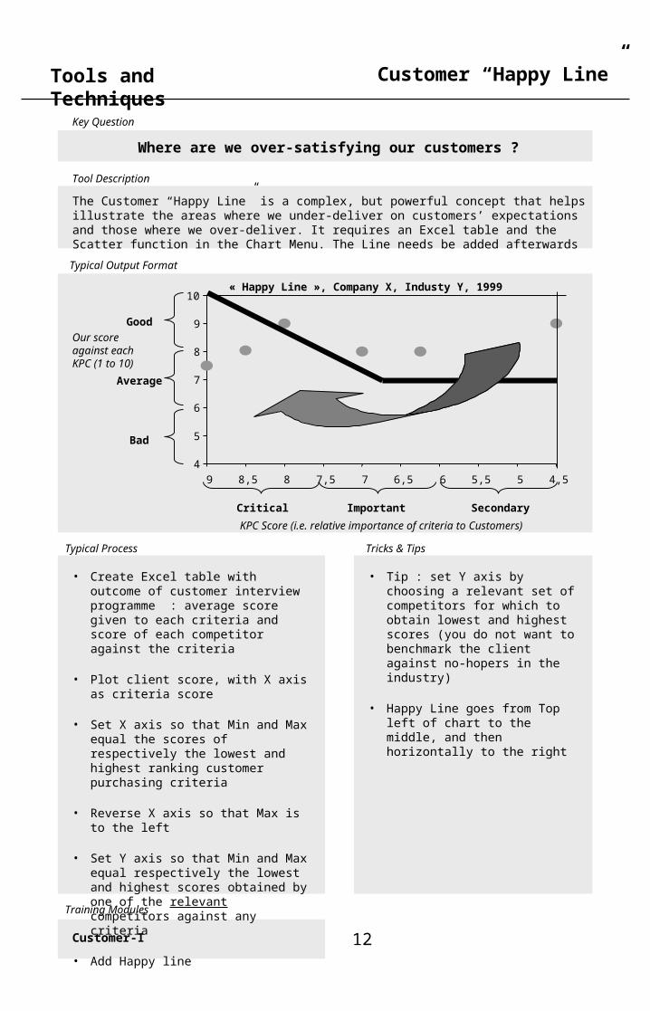
Tools and Techniques Customer “Happy Line”
Where are we over-satisfying our customers ?
The Customer “Happy Line” is a complex, but powerful concept that helps illustrate the areas where we under-deliver on customers’ expectations and those where we over-deliver. It requires an Excel table and the Scatter function in the Chart Menu. The Line needs be added afterwards
• Create Excel table with outcome of customer interview programme : average score given to each criteria and score of each competitor against the criteria
• Plot client score, with X axis as criteria score
• Set X axis so that Min and Max equal the scores of respectively the lowest and highest ranking customer purchasing criteria
• Reverse X axis so that Max is to the left
• Set Y axis so that Min and Max equal respectively the lowest and highest scores obtained by one of the relevant competitors against any criteria
• Add Happy line
• Tip : set Y axis by choosing a relevant set of competitors for which to obtain lowest and highest scores (you do not want to benchmark the client against no-hopers in the industry)
• Happy Line goes from Top left of chart to the middle, and then horizontally to the right
Customer-I
4
5
6
7
8
9
10
4,555,566,577,588,59
KPC Score (i.e. relative importance of criteria to Customers)
Good
Important Secondary
Our score against each KPC (1 to 10)Average
Bad
Critical
« Happy Line », Company X, Industy Y, 1999

Key Question
Typical Process Tricks & Tips
Tool Description
Typical Output Format
Training Modules
13
Tools and Techniques Conversion Waterfall
Where do we lose potential customers ?
The Conversion Waterfall is a concept that helps you summarise the findings of a customer interview programme along 6 major measures. It requires an Excel table and the Bar function in the Chart Menu. Can work as well on a preliminary, data-less level
• Create Excel table with outcome of customer interview programme : share of the sample population that meets the successive measures
• Plot
• Self-explanatory
Customer-I
0%
10%
20%
30%
40%
50%
60%
70%
80%
90%
100%
Awareness Knowledge Liking Preference Visit Purchase
FranceGermany
% of population
Conversion waterfall, Retailer X, France & Germany, 1997

Key Question
Typical Process Tricks & Tips
Tool Description
Typical Output Format
Training Modules
14
Tools and Techniques Table of Contents
2. Key Visual Tools

Key Question
Typical Process Tricks & Tips
Tool Description
Typical Output Format
Training Modules
15
Tools and Techniques Pareto Curve (“80:20”)
What matters ?
The Pareto Curve is a simple and powerful concept : it posits that quite regularly 20% of a given population will account for 80% of this population’s actions with a third party (ie sales, purchases, etc). It requires an Excel table and the Scatter function in the Chart Menu*
• Let’s assume we are drawing a Pareto of a client’s customers
• Gather client total sales, and sales by customer
• Rank customers in column by decreasing sales
• Calculate weight of each customer as a % of total client’s sales
• Set-up column with cumulative share of customer sales
• Plot scatter of cumulative sales column
• * : instead of using the scatter function you can use the Bar function, Select Data series, and set Options / Gap to “0”
• Tip : do not despair if you only have sales of the Top 50 customers (or of the Top 50 suppliers) . Find out how many customers (or suppliers) make up the total list and posit that each of the smaller ones has the same - tiny - weight. You can now draw a pseudo-Pareto where the top right hand part of the curve will effectively be a near-flat straight line
Customer-I & II
0%
20%
40%
60%
80%
100%
0 10 20 30 40 50 60 70 80 90 100Customers (Ranked by decreasing Sales)
Cumulative % of Sales
20% of a given population accounts for 80% of this population’s actions (eg. 20% of a customer base account for 80% of sales)
Pareto Rule
Company X, Customer Pareto, 1998

Key Question
Typical Process Tricks & Tips
Tool Description
Typical Output Format
Training Modules
16
Tools and Techniques Value Maps (“Mekko”)
What are the various segments and sub-segments ?
A Mekko is a visually simple but analytically complex tool that helps you display in one soleslide 2 successive cuts at a data set (eg market size by product category and by product, industry sales by sector and by competitor, etc). It requires a special input tool; the “Mekko Maker”
Other
Payment Protection
General insurance market, UK, 1998
100%
80
60
40
20
0
0 20 40 60 80 100%
Commercial Property
Personal PropertyPrivate Comprehensive
Private Non-Comprehensive
Fleet
Commercial VehiclesCorporate
Other
Employers Liability
Public/General Liability
Personal vs commercial split for sector
Sector as per cent of UK market
Property £8.2bn
Motor £6.8b
n
Accident& Health £2.7bn
Pecuniary Loss£2.3bn
Liability £ 1.9bn
Total Market = £21.9bn
Personal
= PIExtendedWarranty
Consequential Loss
Domestic Mortgage
• Create Excel table formatted as follows : - one segment by column - rank segments by decreasing size - each sub-segment of a given segment in the successive rows of the relevant column - rank sub-segments by decreasing size
• Open “Mekko Maker”
• Copy Excel table into “Mekko Maker”
• Tip : use only absolute measure of size (ie £), not market shares or other relative measures / ratios
• For clarity of reading segments of size inferior to 5% of total market size should be grouped into an “other” segment
• Likewise, all sub-segments of size inferior to 3% of total size of a given segment should be grouped into an “other” sub-segment
• Use shading & patterns
Market-I & II

Key Question
Typical Process Tricks & Tips
Tool Description
Typical Output Format
Training Modules
17
Tools and Techniques Value Chain
Where do our core competencies reside ?
The Value Chain model helps you highlight for different competitors within a given industries the competencies each one has developed to succeed. Works better on a theoretical level rather than with lots of data
Finance
HR
Technology
Logistics
Manuf’ing Marketing
Sales
Purchasing
• Identify the main competencies in the industry
• Create generic industry arrow with support functions and operating functions
• Gather from desk research (annual reports, articles, etc) and one-off interviews the area of the value chain where each competitor chooses to focus (“core competencies”)
• Do not hesitate to alter the arrow above
• Only principle to follow for visual :
- horizontal division separate “support” functions from operating ones- key operating processes are split vertically
• This principle will justify treating different functions differently by industry (e.g. technology is a support competency in most industries, but a key operating one for a software company)
• Tip : an organisation chart is often a good starting point to understand emphasis attached to the competency
Competitor-I
Value chain

Key Question
Typical Process Tricks & Tips
Tool Description
Typical Output Format
Training Modules
18
Tools and Techniques
A Weighted Column chart is a simple tool that helps you display at once both competitor profitability level and overall industry profits. It requires a special input tool; the “Weighted Column Maker”
Weighted Column Maker
Share of Market, by Competitor
ROS(last 3 years,%)
Industry profitability, Industry X, 1995-98
Weighted Average = 10.0%
-10%
-5
0
5
10
15
20%
0 20 40 60 80 100%
Comp 1 Comp 2 Etc
• Define list of competitors to be included, and order annual reports
• Create Excel table with last year’s sales + last 3 years’ profits
• Plot
• Annotate competitors with incomplete and / or misguiding data, such as less than 3 years of profits; latest year of sales is not last year; finer data available includes other divisions, not just sales and profits of relevant segments, etc
• Strip down competitor sales to relevant segments
• Estimate comparative profitability of remaining segments
• Order annual reports in advance : 2 weeks lead-time for foreign companies
• Don’t forget 3 years average for ROS
• Start plotting data you have : partial is better than nothing
• Do not hesitate to call competitor directly - after clearance from case team manager - to gain idea of segment profitability (ie “higher than average of company”, etc)
• Plot Weighted Average industry profitability line based on information you have, but indicate what total % of industry sales you have profitability data for
Competitor-I & II
Which are the most profitable competitors in absolute terms ?

Key Question
Typical Process Tricks & Tips
Tool Description
Typical Output Format
Training Modules
19
Tools and Techniques Share Gain Line
Who has been gaining market share ?
The Share Gain Line is a visually simple tool - if a bit difficult to grasp at first - that helps you display relative share performance of competitors in the market context. It requires an Excel table and the Bubble function in the Chart Menu. The “Zero-gain” line needs be added afterwards
• Gather historical market data and compile market growth for each market
• Define list of competitors to be included by market
• Gather historical competitors sales data and compile competitors sales growth
• Create excel table with market size Year Zero (Yo), market size now (Yn), competitors sales Yo and competitor sales Yn
• Plot
• Draw line bisecting the two axes
• Always write meaning of bisecting line on the chart: above line = gaining sharebelow line = losing share
• Tip : for multi-segments on one graph all the bubbles in a given market should be on the same vertical line
Share movements by competitor, Music, Cards & Video retail, UK, 1995-1999
-10%
0%
10%
20%
30%
40%
50%
60%
-10% 0% 10% 20% 30% 40% 50% 60%
Total Market Growth
Competitors Growth (% over 4 years)
VideoCardsMusic
Competitorsgaining share
Competitorslosing share
WH Smith
Blockbuster
Disney Store
WoolworthsJ. Menzies
Disney Store
Paperchase
BootsWH Smith
J. MenziesWoolworths
Our Price
WH Smith
Competitor-I & II

Key Question
Typical Process Tricks & Tips
Tool Description
Typical Output Format
Training Modules
20
Tools and Techniques KPC Combs
What are the main purchasing criteria, and how do we fare ?
The KPC Combs is a visually simple tool - if a bit difficult to grasp at first - that helps you display jointly both the importance of customer purchasing criteria and the ranking of competitors against those criteria. It requires an Excel table and the Bar + Line function in the Chart Menu
• Create Excel table with outcome of customer interview programme : average score given to each criteria and score of each competitor against the criteria
• Plot
• You can plot both the Criteria and competitors score using the same scale : draw chart as a Line chart, select the Criteria line; go into Chart Options and select a Bar
• Do not forget to set minimum and maximum of Y axis to values of the range offered (eg from 1 to 10, not 0 to 10)
• Tip : for a large interview programme, the dispersion of the average scores will be minimal. You can increase visibility of differences by setting Y values more finely on either side of the average (eg display from 3 to 8, or 4 to 7, instead of from 1 to 10)
Customer-I & II
CriteriaComp 1Comp 2Comp 3Client
1
2
3
4
5
6
7
8
9
10
Score (1 to
10)
Criteria 1 Criteria 2 Criteria 3 Criteria 4 Criteria 5 Criteria 6
Key Purchasing Criteria
Key purchase criteria (KPC) comb, Industry X, Germany, 1999

Key Question
Typical Process Tricks & Tips
Tool Description
Typical Output Format
Training Modules
21
Tools and Techniques Harvey Balls
What is the best way to display “soft” quantitative data ?
Harvey Balls are a technique that helps you summarise the results of a benchmarking exercise where the item benchmarked obey different metrics. It needs to be hand drawn. Can work as well on a preliminary, data-less level
Supply chain efficiency
Customer retention level
Staff utilisation level
Etc ...
Competitors
KPI
WH Smith
John Menzies
Boots Woolworths etc
Competitor benchmark summary table, Mixed retailers, UK, 1999
• Select dimensions to be included in table
• Write down a code for each dimension (ie what score justifies a full ball, what deserve half, what is a quarter, what is zero)
• If wanting a “Total” row, give a weighting to each dimension and calculate total for each column
• Hand-draw
• Tip : Write code before filling the table, as filling a Harvey Ball table usually throws open at least one implication that wasn’t foreseen with just the base data
Competitor-I

Key Question
Typical Process Tricks & Tips
Tool Description
Typical Output Format
Training Modules
22
Tools and Techniques Quotes
What is the best way to display qualitative data ?
Quotes are a systematically under-used technique for displaying qualitative data in a powerful way.
• Create on an on-going basis a database / binder of comments with good quote value
• Write comprehensive notes during one-off interviews
• Manage a good filing system when carrying outlit. search
• Quote value rests in the nature of comment heard or read and / or in the authority of the source
• Format all quotes in a consistent manner, preferably as above
• Try and get a number in every other quote, ie :
– select the quotes on the basis of their number content (ex-post)
– force interviewee to quantify qualitative statements (ex-ante)
Customer-I
“ There has bee a trend away from sport shoes and towards “work” boots worn as streetwear. This has been going on at the rate of 2-3% p.a. over the last 3 years, is getting stronger now, and is no longer just a teenage fashion”
- J. Swartz, CEO, Timberland
“Consumer shift towards good value and cheaper shoes, together with the availability of imports from the Far East and economically weaker countries have intensified price pressure and competition in the market”
- Euromonitor
“Camel is the best selling boot in Germany, with in excess of 5% market share”
- Marketing Director, Camel UK
Key Question
Typical Process Tricks & Tips
Tool Description
Typical Output Format
Training Modules
23
Tools and Techniques Lollipops
Can I come up with creative data displays of my own ?
Lollipops are a technique that helps you display in one sole slide a large number of detailed information across a large selection of objects (competitors, products, etc). It requires an Excel table and the Bubble function in the Chart Menu
• Create Excel table with all the data required : one object / criteria per row (eg competitor) and one measure per box vertically (eg plant capacity of competitors plant)
• Plot
• A Lollipop chart is simply a creative answer to a regular problem : how to display a large number of data points, the detail of which is necessary but less important that the overall picture it paints
• A “Mekko” is another creative way to solve the problem described above
• Any solution you may come up with that solves your display issue has got to be a good one !
• Tip1 : always try creative solution on paper before launching into big Excel manipulation
• Tip2 : remember that a nicely laid out Excel table is always a more powerful visual than a cumbersome graph ...
N/A
Plant sizes & total capacity by competitor, Storage products industry, Europe, 1998
Poly
pal
Cons
truc
tor
Scha
efer
Dex
ion
Mec
alux
Ned
con
Met
aFe
ralc
oTi
xit
Gal
ler
Esm
ena
Stow
Apex
Mag
ista
Trav
hydr
oAr
emsa
Mau
ser
Arbi
tec
Plant size (k tonnes),
0
10
20
30
40
50
60
70k
Total Capacity(k tonnes)
60ktonnes
UK
E
DD
UK
D
DD
UKB
UKB
E
NLNL
D
SF
SN
Competitor

Key Question
Typical Process Tricks & Tips
Tool Description
Typical Output Format
Training Modules
24
Tools and Techniques Channel Maps
End-Customers
Products
Channels
£22.3bn
£7.0bn
£4.6bn £6.3bn
£4.4bn
£3.2bn
£7.3bn
£0.5bn£0.8bn
£18.2bn
£15.3bn
£7.6bn
Construction Materials Manufacturers/Importers
Builders Merchant
s
Direct
DIY Stores, Superstores and Hardware shops, Garden Centres etc
Builders/Contractors Home Customers
Additional Products*
Distributors/Stockists
Specialist Merchants/ Factors Wholesalers
• Gather on one page all the data you have about the industry sales (manufacturer sales, retail sales, wholesale sales), and organize data into 3 tiers : products (or manufacturers), channels, and end-customers (or retailers)
• Firstly, draw the product and end-customer horizontal bars
• Secondly, draw the “direct” flow between these 2 bars (on the left of the above map), and infer from this a MSP to RSP ratio
• Thirdly, split this ratio in two to “body double” the MSP to WSP and WSP to RSP ratios, and “convert” your whole data set in the relevant unit you are using
• Finally, draw a first map, and iterate...
• Be sure to use the same units throughout, £100 of manufacturer sales can be exactly the same as £200 of retailer sales if RSP (retail selling price) = 2xMSP (manufacturer selling price) in thi industry ..
• Tip : when possible volumes are a better measure than values (as stay the same throughout the flow - normally…)
Market-I
What is the relative importance of various routes to market ?
Channel Maps are a technique that helps you display the complexity of various routes to market whilst quantifying their relative importance. There isn’t a software available to generate them : they need to be hand drawn
Channel map, Construction materials, UK, 1999

Key Question
Typical Process Tricks & Tips
Tool Description
Typical Output Format
Training Modules
25
Tools and Techniques Conceptual Maps
How can I simply structure a set of data before analysing it ?
Conceptual Maps are basic techniques that help you breakdown complex issues into sub-sets so as to better either lay out the thinking, plan the research or map the results. They do not require intricate softwares; just a ruler, a pencil, and an eraser ...
• Conceptual Maps come in various shapes. The mother of all conceptual is the “2 x 2” Matrix, where various objects are plotted in 4 boxes : dimensions 1 & 2 with sub-sets “low” and “high”
• A Conceptual Cross provides another way to think about how objects can be classified against 2 other dimensions
• The 2x2 Matrix is the most useful consulting tool ever …
• The Conceptual Cross is marginally less helpful. It can come handy when you find that the objects you have plotted in a matrix all fall on the diagonal line : a 45° rotation of Matrix dimensions gives you a Cross map
Customer-I
Key conceptual maps
Dimension 1
Dimension 2
Low High
Low
High
“2x2” Matrix
Dimension 3
Dimension 4
Conceptual Cross
Key Question
Typical Process Tricks & Tips
Tool Description
Typical Output Format
Training Modules
26
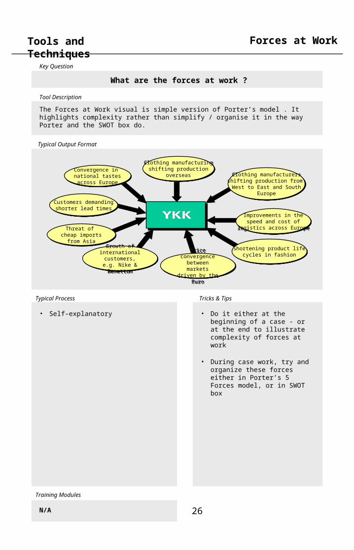
Tools and Techniques Forces at Work
What are the forces at work ?
The Forces at Work visual is simple version of Porter’s model . It highlights complexity rather than simplify / organise it in the way Porter and the SWOT box do.
• Self-explanatory • Do it either at the beginning of a case - or at the end to illustrate complexity of forces at work
• During case work, try and organize these forces either in Porter’s 5 Forces model, or in SWOT box
N/A
Threat of cheap imports
from Asia
Threat of cheap imports
from Asia
Shortening product lifecycles in fashion
Shortening product lifecycles in fashion
Clothing manufacturersshifting production from West to East and South
Europe
Clothing manufacturersshifting production from West to East and South
Europe
Price convergence
between markets driven
by the Euro
Price convergence
between markets driven
by the Euro
Convergence in national tastesacross Europe
Convergence in national tastesacross Europe
Improvements in thespeed and cost of
logistics across Europe
Improvements in thespeed and cost of
logistics across Europe
Growth of international
customers, e.g. Nike & Benetton
Growth of international
customers, e.g. Nike & Benetton
Customers demandingshorter lead times
Customers demandingshorter lead times
Clothing manufacturingshifting production
overseas
Clothing manufacturingshifting production
overseas

Key Question
Typical Process Tricks & Tips
Tool Description
Typical Output Format
Training Modules
27
Tools and Techniques Crocodile Chart
Can I come up with creative data displays of my own too ?
Crocodile Charts are a technique that helps you display in one sole slide how the issue you are studying narrows down to your specific area of focus. It requires an Excel table and the Bubble function in the Chart Menu
• Create Excel table with all the data required
• Plot 4 bars
• Add connecting lines
• Tip : it is easier to add lines across all bars and delete unnecessary one upon finalizing the chart than the other way round
N/A
0%
10%
20%
30%
40%
50%
60%
70%
80%
90%
100%
Global Continental National Regional
LandUK
North
SouthEurope
Sea
Crocodile chart, Oil reserves, 1995

Key Question
Typical Process Tricks & Tips
Tool Description
Typical Output Format
Training Modules
28
Tools and Techniques Parfait
What is the easiest way to display market growth ?
A Parfait is a visually simple tool that helps you display jointly both the relative size of market segments and their relative growth. It requires an Excel table and the Area function in the Chart Menu
• Create Excel table with all the data required
• Plot
• Do not forget to add growth data to the right of the chart
N/A
UK Clothing Market 1994-98
Market size(1998, £m)
500
1 000
1 500
2 000
2 500
3 000
1994 1995 1996 1997 1998
Annual Growth
10%
3%
2%
2%
Womenswear
Menswear
Sportswear
Childrenswear

Key Question
Typical Process Tricks & Tips
Tool Description
Typical Output Format
Training Modules
29
Tools and Techniques Table of Contents
3. Analysis Techniques

Key Question
Typical Process Tricks & Tips
Tool Description
Typical Output Format
Training Modules
30
Tools and Techniques Logic Tree
How does one organise the research ?
One half of Structured Thinking, the Logic Tree turns the initial client brief into a set of discrete questions. Each Logic Tree has a “twin” in the shape of the Research Tree. Once the key questions have been established it is usually clear which research method is the most appropriate
• Write “top of tree” as a positive statement answering the client question
• Create sub-branches by splitting the top of the tree into its natural components (writing a good Logic Tree is an art and a technique that one acquires with experience)
• The sub-branches should obey the MECE method (Mutually Exclusive Completely Exhaustive), i.e.all the sub-branches taken together must exhaustively support the branch above, and each sub-branch must deal with something different from the other sub-branches
• The MECE methods implies that - if one of the sub-branches is false
then the top of the tree must be false
- if all the sub-branches are true then the top of the tree must be true
• A positive statement is more difficult than a negative statement, and thus gives client more confidence on strength of our answer
• Tip : some first level “split” of the logic tree occur rather regularly. Typical first level branches are :
- Sales, Margins and Costs - Customers, Competitors and
Cost
• Tip : do the research tree only once finished with logic tree (on 80:20 basis). Indeed some research branches can address several branch of the logic tree at once
N/A
I gather data to informthe applicabilityof each option
I can find a solutionto my sockless state
I can find another
sock in the flat
I can getan entirely new pair
I can compensate for
what I don’t have
I can tracethe othersock
I can traceanotherpair
I can buy anew pairin time
I can haveonesent
I can alterclothingto hidesocklessness
I canjustifysocklessness
Researchinside the flat
Researchoutside the flat
Inquire aboutsocklessness
Checkmy room (under the bed, otherdrawers)
AskflatmatesChecklaundryroom
Checkthere aresock shopson the way
Checkwho iscomingCall toget themto bringone
Check withpartner thatsocks are needed
Ask fora good jokeThinkof how to turn it intoa statement
Research Tree
Logic Tree

Key Question
Typical Process Tricks & Tips
Tool Description
Typical Output Format
Training Modules
31
Tools and Techniques Process Maps
What are the key steps ?
Process Maps are a technique that helps you group a set of research and/or action points into broad sequential steps
• Self-explanatory • Try to aim for 4 to 7 steps to keep the process map useful
N/A
Deal Origination
Bidding, Negotiation
& Closing
Owning
Exit (Trade Sale or
Flotation)
• Strategy development
• Post-acquisitiondisputes
• Market Study / strategic due diligence- External validation- Ammunition for
negotiations- ‘Black holes’ check
• Resolve competition and regulatory issues
• Valuation analysis
• Business planpreparation
• Market study for potential prospectus
• ‘Outside in’ view for potential buyers’- Synergy valuation
for negotiations
• Target identification
• Assessment of potential post-deal synergies

Key Question
Typical Process Tricks & Tips
Tool Description
Typical Output Format
Training Modules
32
Tools and Techniques
Sanity Checks are basic techniques that help you assess the viability of a data point obtained through desk research or one-off interviews. This do not require anything else than careful consideration ...
Sanity Checks
Does this number make sense ?
• See above & Generic Research • Most important test is materiality test, i.e. how different are the various estimates obtained ?
• Tip : choose a different color - red for examples - for the body doubles in an Excel worksheet
ConfidenceRanging
Feel RightTest
MaterialityTest
ImpactCriticalityTest
Body Doubling
Narrowing a variety of N° fromdifferent sourcesdown to a rangewithin which you are fairly confidentthe true answer isto be found(“confidenceinterval”)
Main data sanity checks
Connecting dataobtained on esotericissues to moreeasilyunderstandabledimensions andassessingcredibilityof implication
Putting in perspective thedifferences between the various estimatesobtained typicallyby expressingbiggest delta as %of average value
Establish whether the differentestimates obtainedlead to the sameoutcome withregard to thequestionyou are reallyaddressing
Choosing one unique data pointas the estimate you will go withpending further information
Generic Research
Key Question
Typical Process Tricks & Tips
Tool Description
Typical Output Format
Training Modules
33
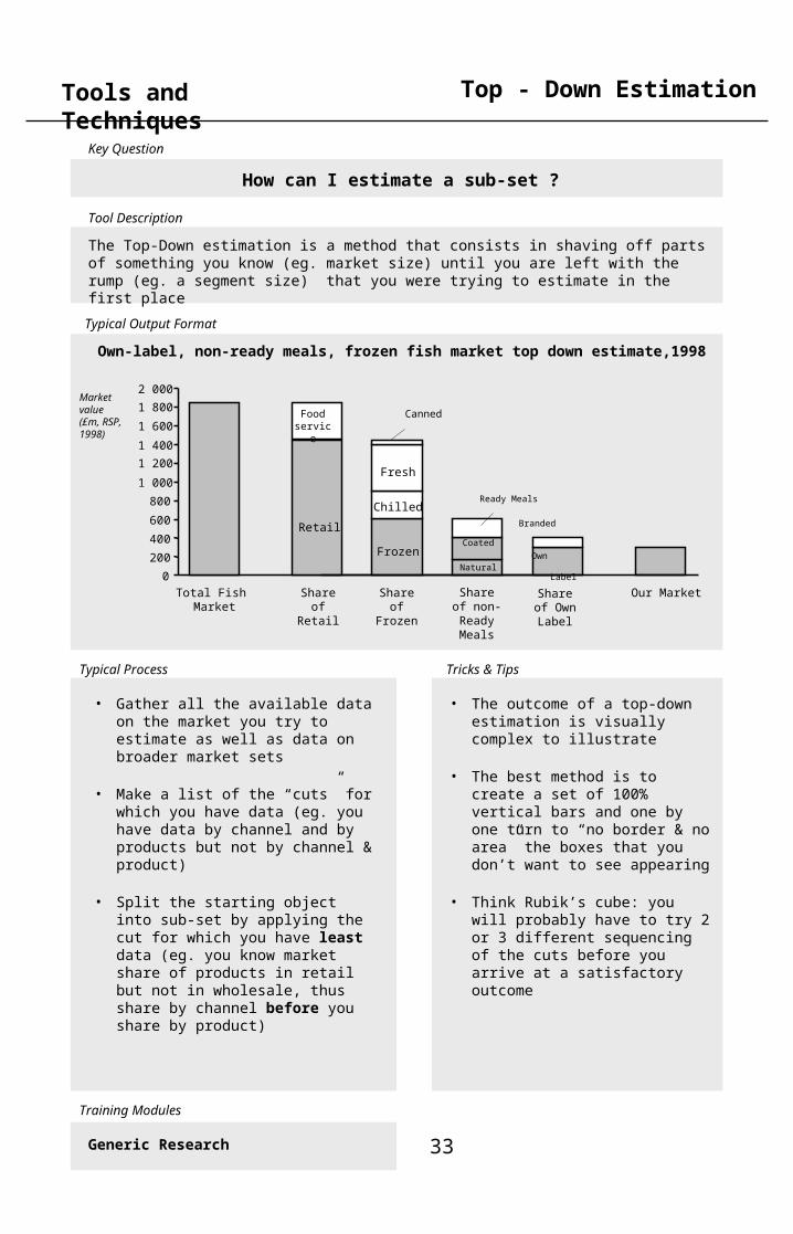
Tools and Techniques Top - Down Estimation
How can I estimate a sub-set ?
The Top-Down estimation is a method that consists in shaving off parts of something you know (eg. market size) until you are left with the rump (eg. a segment size) that you were trying to estimate in the first place
• Gather all the available data on the market you try to estimate as well as data on broader market sets
• Make a list of the “cuts” for which you have data (eg. you have data by channel and by products but not by channel & product)
• Split the starting object into sub-set by applying the cut for which you have least data (eg. you know market share of products in retail but not in wholesale, thus share by channel before you share by product)
• The outcome of a top-down estimation is visually complex to illustrate
• The best method is to create a set of 100% vertical bars and one by one turn to “no border & no area” the boxes that you don’t want to see appearing
• Think Rubik’s cube: you will probably have to try 2 or 3 different sequencing of the cuts before you arrive at a satisfactory outcome
0
200
400
600
Total Fish Market
Share of Retail
Share of Frozen
Share of non-
Ready Meals
Share of Own Label
Our Market
Own LabelNatural
Coated
Ready Meals
Branded
Frozen
Chilled
Fresh
Canned
Retail
Food service
800
1 000
1 200
1 400
1 600
1 800
2 000Market value (£m, RSP, 1998)
Generic Research
Own-label, non-ready meals, frozen fish market top down estimate,1998
Key Question
Typical Process Tricks & Tips
Tool Description
Typical Output Format
Training Modules
34
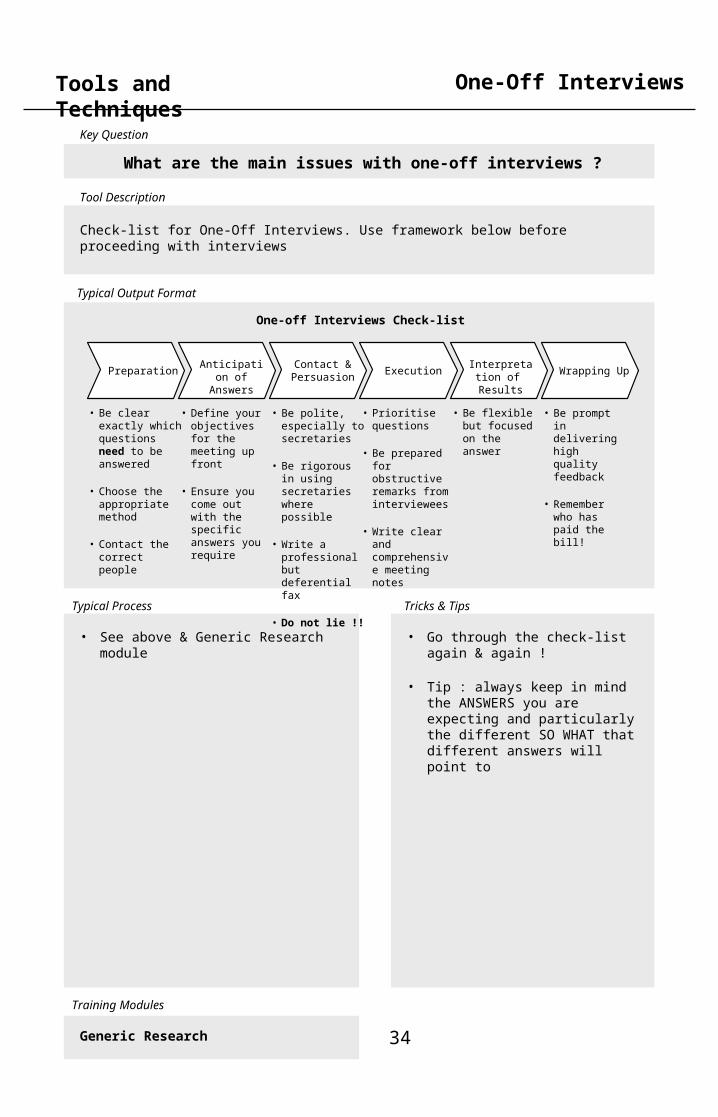
Tools and Techniques One-Off Interviews
What are the main issues with one-off interviews ?
Check-list for One-Off Interviews. Use framework below before proceeding with interviews
• See above & Generic Research module
• Be clear exactly which questions need to be answered
• Choose the appropriate method
• Contact the correct people
• Define your objectives for the meeting up front
• Ensure you come out with the specific answers you require
PreparationContact & Persuasion
ExecutionInterpretation of Results
Wrapping Up Anticipation of Answers
• Be prompt in delivering high quality feedback
• Remember who has paid the bill!
• Be flexible but focused on the answer
• Prioritise questions
• Be prepared for obstructive remarks from interviewees
• Write clear and comprehensive meeting notes
• Be polite, especially to secretaries
• Be rigorous in using secretaries where possible
• Write a professional but deferential fax
• Do not lie !!
One-off Interviews Check-list
Generic Research
• Go through the check-list again & again !
• Tip : always keep in mind the ANSWERS you are expecting and particularly the different SO WHAT that different answers will point to

Key Question
Typical Process Tricks & Tips
Tool Description
Typical Output Format
Training Modules
35
Tools and Techniques
Interview Programme Check-List
Interview Programmes
What are the main issues with interview programmes ?
Check-list for Interview Programmes. Use framework below before proceeding with interviews
• See above & Customer-I module • Go through the check-list again & again !
• Tip : always keep in mind the ANSWERS you are expecting and particularly the different SO WHAT that different answers will point to
Customer-I
• Choose the appropriate method
- on the phone - in the street - mix
• Select the best sample
- suitable proportion
of market - hit rate
• Create a questionnaire which is focused on testing the hypothesis
- correct questions
- questions asked in the correct way
PreparationContact & Persuasion
ExecutionInterpretation of Results
Wrapping Up Anticipation of Answers
• Keep paper copies of questionnaires at hand !
• Only appropriate analysis is carried out
(80 : 20)
• Ensure process is managed
effectively
• Set-up database and maintain it throughout
• Temp performance monitored and data inputed as rapidly as possible
• Ensure interviewers are fully briefed
• Pilot questionnaire and re-draft ineffective questions

Key Question
Typical Process Tricks & Tips
Tool Description
Typical Output Format
Training Modules
36
Tools and Techniques Focus Groups
What are the main issues with organising focus groups ?
Check-list for Focus Group. Use framework below before proceeding with organising groups
• See Tricks & Tips • If possible, pre-select to ensure representative cross section by asking key questions on the phone
• Confirm details in writing (by fax for speed)
• Invite up to double the candidates you want unless they are motivated to come - offer cash/other incentive as appropriate as sanctioned by the project manager Think through the timing
• Draft issues for debate of key questions beforehand
• Stick to the agenda• Use flip charts to document
contributions• Keep travel to a minimum• Ensure venue is appropriately
comfortable• Keep database as for interview
programmes • Be prepared!
Customer-I
• Venue and travel arrangements
• Agreeing the plan with the client
• Maintaining records
• What to take• (equipment, props,• etc...) • Selecting candidates
• Invitations• Hit rate• Incentives
Focussingdebate Logistics
Getting theright people
• Organising the day• Managing the
debate

Key Question
Typical Process Tricks & Tips
Tool Description
Typical Output Format
Training Modules
37
Tools and Techniques
Cluster analysis, Storage product industry, 1998
Clustering
How can I group people by preferences ?
Clusturing is a complex technique that helps you group object (eg customers) according to their similarity of preference between a set of dimensions (eg customer purchasing criteria). It requires an Excel spreadsheet and a conjoint analysis software, such as SPSS
• Create Excel table with detail of customer interview programme : score given to each criteria by each customer (one customer per row, one criteria per column)
• Import dataset into conjoint analysis software (SPSS or other)
• Run Classify \ Cluster function in Statistics menu of conjoint analysis software
• Write down N° of rows that fall in each cluster
• Go back to Excel spreadsheet, create Cluster N° column to tag each row according to relevant cluster
• Calculate average criteria score by cluster
• Spend 3 or 4 hours reading the conjoint analysis software manual, and practicing on fictitious dataset !
• A Cluster analysis will start by giving you X clusters for your X customers (fair enough each one is different …). It will then start grouping the two customers with the most similar preferences into a single cluster, leaving you with X-1 clusters, etc, until all is one big cluster. The real N° of clusters in the population is usually obtained by trial and error, thus …
• Tip : Never erase the content of a given Cluster N° column when tagging rows in Excel … a discarded solution usually turns out to be the correct one in the end !
Customer-I & II
Y
Cluster
X
Z
Cluster
Cluster
A lot
Little A lot
Average
Average
Average
A lot
Speed of service
Exclusivity of operations
All-round support

Key Question
Typical Process Tricks & Tips
Tool Description
Typical Output Format
Training Modules
38
Tools and Techniques Factorial Analysis
Key Question
Tool Description
Typical Output Format
Training Modules
How can I group people’s preferences in broader sets ?
Factorial Analysis is a complex technique that helps you group a large number of dimensions of choice (eg 14 customer purchasing criteria) into the relevant, fewer factors that underpin clusters’ preferences. It requires an Excel spreadsheet and a conjoint analysis software, such as SPSS
• Create Excel table with detail of customer interview programme : score given to each criteria by each customer (one customer per row, one criteria per column)
• Import dataset into conjoint analysis software (SPSS or other)
• Run Data Reduction \Factor function in Statistics menu of conjoint analysis software
• Check resulting plot, and iterate if need be
• Spend 3 or 4 hours reading the conjoint analysis software manual, and practicing on fictitious dataset !
• A good dataset will always give you a reduction of your X criteria into X/3 or X/4 factors. Trying to fathom what these factors represent can be a notoriously difficult exercise. Ask for help
• Tip : it is usually easier to understand a factor after having carried out a Cluster analysis (see previous page)
Customer-I
Factorial analysis, Storage product industry, 1998
Factor 1Speed of service
Factor 2Exclusivity of operations
Factor 3All-round support
•1. Speedy quotations turnaround time•2. Distributor brand•3. Choice of payment terms•4. Technical support & design assistance•5. Speedy & reliable delivery•6. Literature with distributor brand/name•7. No competing direct sales force•8. Complete territorial exclusivity•9. Choice of pricing structures•10. Full technical & design digest•11. Free contract management facility•12. Choice of stock holding policy•13. Free & regular training programmes•14. Dedicated account manager
Key Purchasing Criteria Factors
Factor 1 = KPC 1 & 5Factor 2 = KPC 2, 7 & 8Factor 3 = KPC 3, 4, 6, 9, 10, 11, 12, 13 & 14

Key Question
Typical Process Tricks & Tips
Tool Description
Typical Output Format
Training Modules
39
Tools and Techniques Table of Contents
4. Sources

Key Question
Typical Process Tricks & Tips
Tool Description
Typical Output Format
Training Modules
40
Tools and Techniques Desk Sources
Where can I find secondary data ?
Check-list for Desk Sources. Use framework below and create your own portfolio of regular & favourite sources
• Spend 10 minutes laying out the nature and type of the data you are after
• Spend 10 minutes writing down the sources where you are likely to encounter each required data
• Start chasing !
• Tip : when procuring documents there is always a trade-off between immediacy of availability and cost … a well planned research is one that leaves more $ in the case-team dinner pot !
• Tip2 : it is uncanny how the document you need on D day is the one you thew away on day D-1. Never throw, always file away.
• Tip3 : other team members will randomly access your file. Do develop a filing system that is easily understandable by all ...
Generic Research
Desk research avenues of enquiry
Search CD-ROMor on-line databases
Search theNet
Search AABCknowledgebase
Search businesssources
Procuredocuments
Go to various libraries
- Profound- Datastar- Reuters- Worldscope- etc
Eg. - FT.com- search engines- etc
- annual reports- brokers reports- market reports- etc
- City business library- MBS library- etc
Pure electronic Pure paperMix
- trade publications
- government statistics
- etc
- Global Best Practices database- etc

Key Question
Typical Process Tricks & Tips
Tool Description
Typical Output Format
Training Modules
41
Tools and Techniques
Reuters Business BriefingNews articles, regulatory news announcements (e.g. latest interims, directors shareholdings etc)Competitor listingsDescriptions of businessDisclosure tearsheets (one page share performance and financial summary)Reuters industry briefings (useful snapshot)(£25 per hour)
FT ProfileSimilar to Reuters but refined searching method (words in the first paragraph of an article, within one sentence / paragraph and using truncationmore FT articlesMintel (market research reports)(4p or more for every line viewed including headlines)
Dow Jones Interactive Similar to FT but US focus(Approx £2 per article)
Research Bank CD (Investext) Company and industry reports, merger info etc(FREE unless printing, then $9 per page)
I-Plus DirectOn-line version of Research Bank CDNo free viewing, but can be useful for text searching (reports available one weeks after published date)
ProfoundMarket research reports and briefing reports (UK, USA, Japan, France & Germany)(£200+ per report, can do individual sections for £2)
AnbarManagement and academic journals(£6 per article – next day delivery)
Oxford Economic Forecastingon the webGlobal forecast for industries, consumer prices etc.(FREE)
UMI- ProquestManagement and academic journals (can download info)(Approx. $4 per article)
Lexis Nexis General business news and legal information database, e.g. EC directives, particular cases etc. ($1-4 per article)
Datastar + DialogHost system for databases. Particularly strong on medical, pharmaceuticals, chemicals, intellectual property and patents.(European bias for Datastar, US for Dialog)(Charge per article)
Consumers association on the webSearch back copies of “which”(FREE)
Marketsearch onlineGlobal sources of published market research and market reports(FREE)
WARCWorld Advertising Research CentreSource of advertising information including “Admap” – main advertising journal not avail elsewhere(FREE)
News Research
Usual AABC Sources (1)

Key Question
Typical Process Tricks & Tips
Tool Description
Typical Output Format
Training Modules
42
Tools and Techniques
One Source Web & CDReports or custom tables on historical financials (weblinks – news stories) Web = UK companies + current yearCD = Global + last 10 years(FREE)
Worldscope + AmadeusCondensed financial information on quoted companies worldwide. Amadeus = Europe (including non listed, but have to be of certain size)(FREE)
ICC Juniper100% coverage of UK companies including info on dissolved companies(£9 for annual reports and accounts on private co.s)
HooversUS company profiles, including history, competitors, management structure – useful for large US private companies(Reuters or FREE on web)
Dun & Bradstreet Direct AccessWorld-wide company reports including credit score. Useful for US companies that are not listed or small UK companies(£20-70 per report)
Disclosure - Global AccessAnnual reports, etc of almost all listed companies globally(£22 annual report)
Kompass On-lineIdentifying companies within a particular industry worldwide(£1.15 per minute + 15 – 75p per article)
• Chartered Institute of Marketing • Chartered Institute of Accountants • Electricity Council • Institute of Management • Industrial Society • IPD - Institute of personnel development. • London Business School Library
Free access to all staff• Institute of Logistics• Cranfield Material Handling Centre
(Logistics issues)• Anglo American Chamber• London Chamber of Commerce• Institute of Directors• Financial Times Business Information
Services• Disclosure First Contact • British Library Document Supply Centre.
• Xls. – Gateway to Information providers• Euromonitor – Global Marketing data &
statistics on- line• Datamonitor Statistics extracts• FT journals online – Media/ Energy• Primark Extel Company Analysis• Analysis – telecoms information• Lafferty online – Direct• EIU – direct• Mintel Market Research
Financial Information Information Alliances
Proposed / On Trial
Usual AABC Sources (2)
All of the below offer us research and information resources/ book loans , research helpline and library access