Embed Size (px)
Citation preview
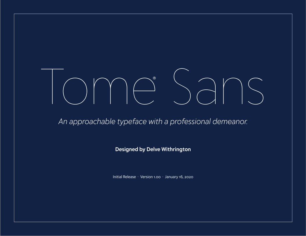
Tome SansAn approachable typeface with a professional demeanor.
Designed by Delve Withrington
Initial Release · Version 1.00 · January 16, 2020
®
TOME SANSTOME SANS 2
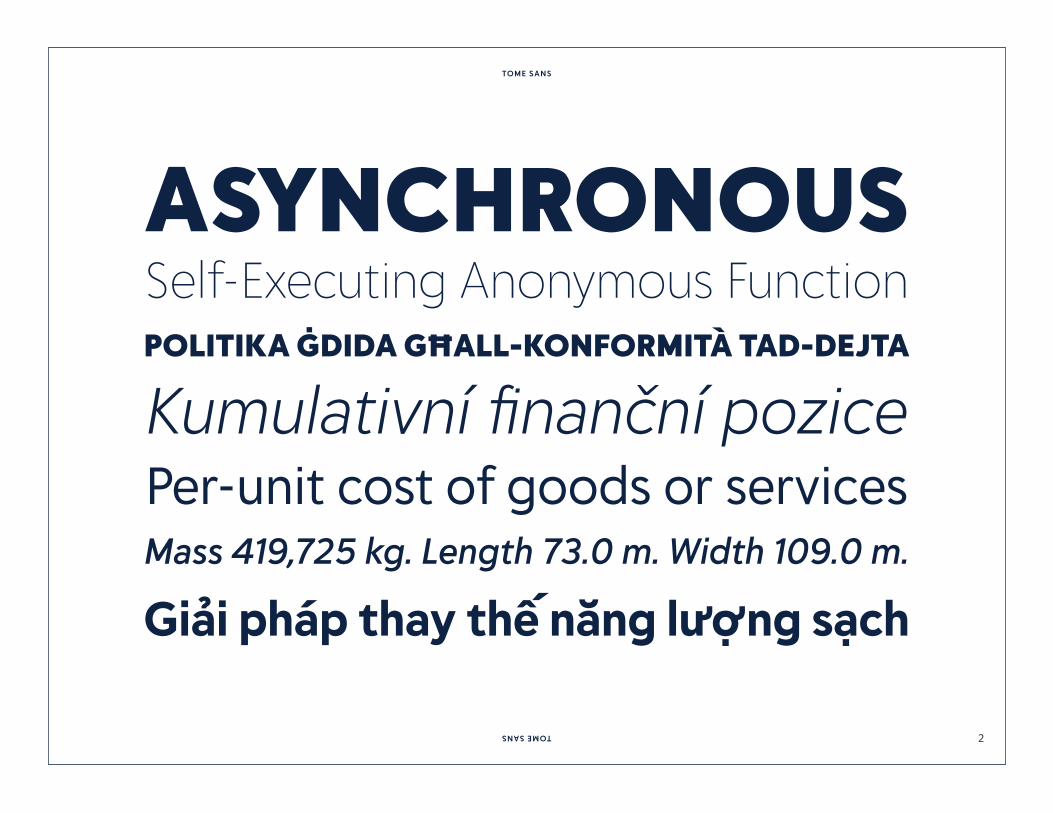
ASYNCHRONOUS Self-Executing Anonymous Function POLITIKA ĠDIDA GĦALL-KONFORMITÀ TAD-DEJTA
Kumulativní finanční pozicePer-unit cost of goods or servicesMass 419,725 kg. Length 73.0 m. Width 109.0 m.
Giải pháp thay thế năng lượng sạch

TOME SANSTOME SANS 3
INCONSPICUOUSbut not lacking in character.

TOME SANSTOME SANS 4
HamburgefontsivHamburgefontsivHamburgefontsivHamburgefontsivHamburgefontsivHamburgefontsivHamburgefontsivHamburgefontsivHamburgefontsivHamburgefontsiv
HamburgefontsivHamburgefontsivHamburgefontsivHamburgefontsivHamburgefontsivHamburgefontsivHamburgefontsivHamburgefontsivHamburgefontsivHamburgefontsiv
24PT WEIGHT COMPARISON
BLACK
EXTRABOLD
BOLD
SEMIBOLD
MEDIUM
BOOK
LIGHT
EXTRALIGHT
THIN
EXTRATHIN
BLACK ITALIC
EXTRABOLD ITALIC
BOLD ITALIC
SEMIBOLD ITALIC
MEDIUM ITALIC
BOOK ITALIC
LIGHT ITALIC
EXTRALIGHT ITALIC
THIN ITALIC
EXTRATHIN ITALIC
TOME SANSTOME SANS 5
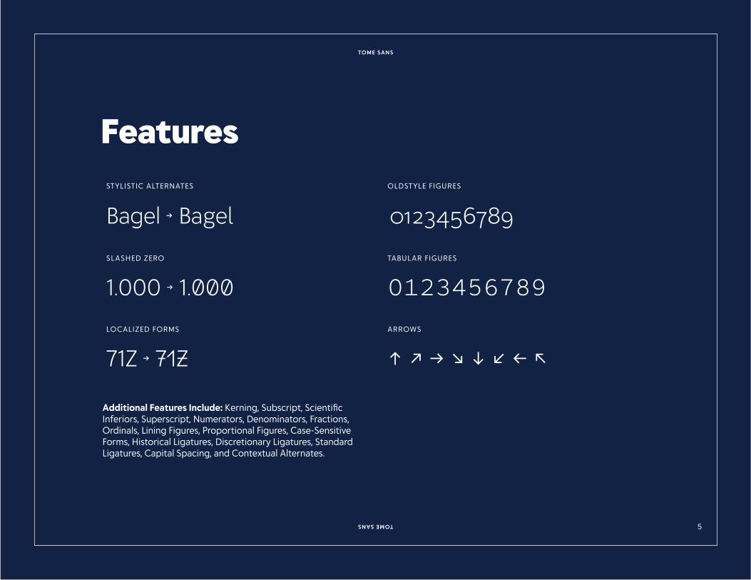
STYLISTIC ALTERNATES OLDSTYLE FIGURES
Bagel → Bagel 0123456789SLASHED ZERO TABULAR FIGURES
1.000 → 1.000 0123456789LOCALIZED FORMS ARROWS
71Z → 71Z ↑ ↗ → ↘ ↓ ↙ ← ↖
Features
Additional Features Include: Kerning, Subscript, Scientific Inferiors, Superscript, Numerators, Denominators, Fractions, Ordinals, Lining Figures, Proportional Figures, Case-Sensitive Forms, Historical Ligatures, Discretionary Ligatures, Standard Ligatures, Capital Spacing, and Contextual Alternates.
TOME SANSTOME SANS 6
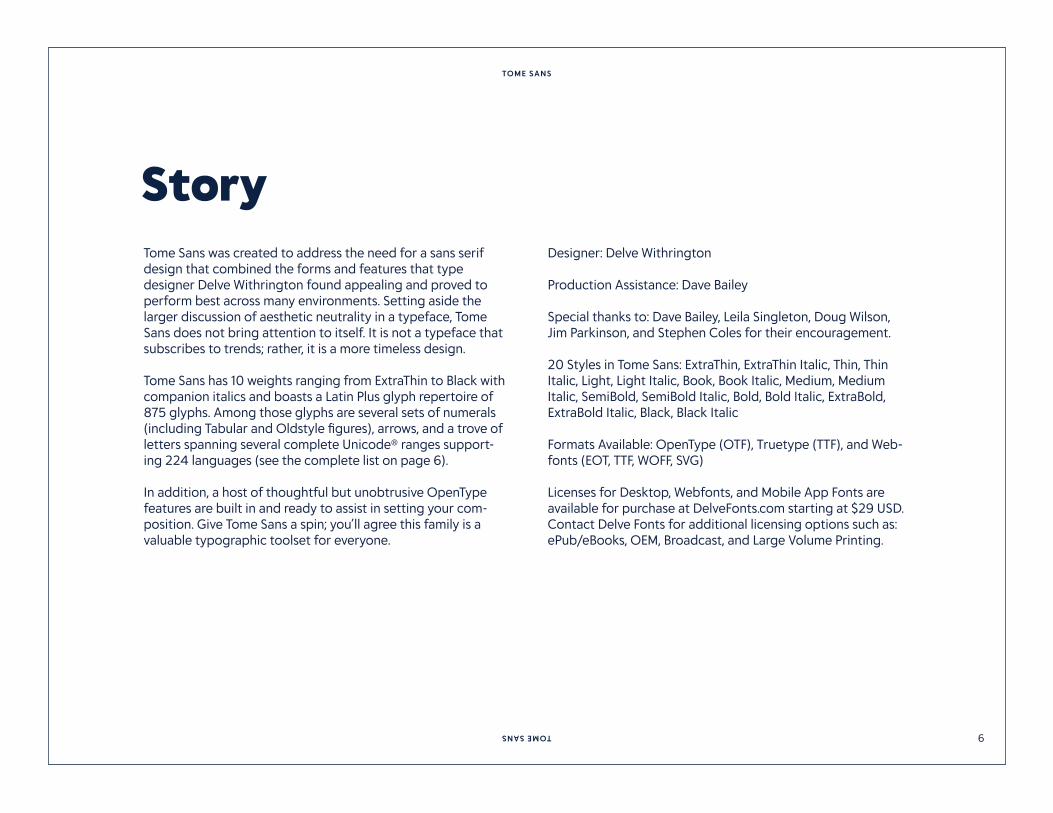
Tome Sans was created to address the need for a sans serif design that combined the forms and features that type designer Delve Withrington found appealing and proved to perform best across many environments. Setting aside the larger discussion of aesthetic neutrality in a typeface, Tome Sans does not bring attention to itself. It is not a typeface that subscribes to trends; rather, it is a more timeless design.
Tome Sans has 10 weights ranging from ExtraThin to Black with companion italics and boasts a Latin Plus glyph repertoire of 875 glyphs. Among those glyphs are several sets of numerals (including Tabular and Oldstyle figures), arrows, and a trove of letters spanning several complete Unicode® ranges support-ing 224 languages (see the complete list on page 6).
In addition, a host of thoughtful but unobtrusive OpenType features are built in and ready to assist in setting your com-position. Give Tome Sans a spin; you’ll agree this family is a valuable typographic toolset for everyone.
Designer: Delve Withrington
Production Assistance: Dave Bailey
Special thanks to: Dave Bailey, Leila Singleton, Doug Wilson, Jim Parkinson, and Stephen Coles for their encouragement. 20 Styles in Tome Sans: ExtraThin, ExtraThin Italic, Thin, Thin Italic, Light, Light Italic, Book, Book Italic, Medium, Medium Italic, SemiBold, SemiBold Italic, Bold, Bold Italic, ExtraBold, ExtraBold Italic, Black, Black Italic
Formats Available: OpenType (OTF), Truetype (TTF), and Web-fonts (EOT, TTF, WOFF, SVG)
Licenses for Desktop, Webfonts, and Mobile App Fonts are available for purchase at DelveFonts.com starting at $29 USD. Contact Delve Fonts for additional licensing options such as: ePub/eBooks, OEM, Broadcast, and Large Volume Printing.
Story
TOME SANSTOME SANS 7
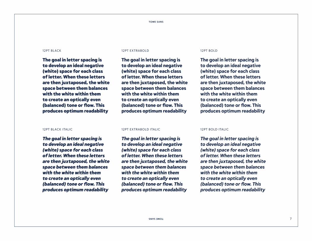
12PT BLACK
12PT BLACK ITALIC
12PT EXTRABOLD
12PT EXTRABOLD ITALIC
12PT BOLD
12PT BOLD ITALIC
The goal in letter spacing is to develop an ideal negative (white) space for each class of letter. When these letters are then juxtaposed, the white space between them balances with the white within them to create an optically even (balanced) tone or flow. This produces optimum readability
The goal in letter spacing is to develop an ideal negative (white) space for each class of letter. When these letters are then juxtaposed, the white space between them balances with the white within them to create an optically even (balanced) tone or flow. This produces optimum readability
The goal in letter spacing is to develop an ideal negative (white) space for each class of letter. When these letters are then juxtaposed, the white space between them balances with the white within them to create an optically even (balanced) tone or flow. This produces optimum readability
The goal in letter spacing is to develop an ideal negative (white) space for each class of letter. When these letters are then juxtaposed, the white space between them balances with the white within them to create an optically even (balanced) tone or flow. This produces optimum readability
The goal in letter spacing is to develop an ideal negative (white) space for each class of letter. When these letters are then juxtaposed, the white space between them balances with the white within them to create an optically even (balanced) tone or flow. This produces optimum readability
The goal in letter spacing is to develop an ideal negative (white) space for each class of letter. When these letters are then juxtaposed, the white space between them balances with the white within them to create an optically even (balanced) tone or flow. This produces optimum readability

TOME SANSTOME SANS 8
12PT SEMIBOLD
12PT SEMIBOLD ITALIC
12PT MEDIUM
12PT MEDIUM ITALIC
12PT BOOK
12PT BOOK ITALIC
The goal in letter spacing is to develop an ideal negative (white) space for each class of letter. When these letters are then juxtaposed, the white space between them balances with the white within them to create an optically even (balanced) tone or flow. This produces optimum readability
The goal in letter spacing is to develop an ideal negative (white) space for each class of letter. When these letters are then juxtaposed, the white space between them balances with the white within them to create an optically even (balanced) tone or flow. This produces optimum readability
The goal in letter spacing is to develop an ideal negative (white) space for each class of letter. When these letters are then juxtaposed, the white space between them balances with the white within them to create an optically even (balanced) tone or flow. This produces optimum readability and good legibility.
The goal in letter spacing is to develop an ideal negative (white) space for each class of letter. When these letters are then juxtaposed, the white space between them balances with the white within them to create an optically even (balanced) tone or flow. This produces optimum readability and good legibility.
The goal in letter spacing is to develop an ideal negative (white) space for each class of letter. When these letters are then juxtaposed, the white space between them balances with the white within them to create an optically even (balanced) tone or flow. This produces optimum readability and good legibility.
The goal in letter spacing is to develop an ideal negative (white) space for each class of letter. When these letters are then juxtaposed, the white space between them balances with the white within them to create an optically even (balanced) tone or flow. This produces optimum readability and good legibility.

TOME SANSTOME SANS 9
12PT LIGHT
12PT LIGHT ITALIC
12PT EXTRALIGHT
12PT EXTRALIGHT ITALIC
The goal in letter spacing is to develop an ideal negative (white) space for each class of letter. When these letters are then juxtaposed, the white space between them balances with the white within them to create an optically even (balanced) tone or flow. This produces optimum readability and good legibility.
The goal in letter spacing is to develop an ideal negative (white) space for each class of letter. When these letters are then juxtaposed, the white space between them balances with the white within them to create an optically even (balanced) tone or flow. This produces optimum readability and good legibility.
The goal in letter spacing is to develop an ideal negative (white) space for each class of letter. When these letters are then juxtaposed, the white space between them balances with the white within them to create an optically even (balanced) tone or flow. This produces optimum readability and good legibility.
The goal in letter spacing is to develop an ideal negative (white) space for each class of letter. When these letters are then juxtaposed, the white space between them balances with the white within them to create an optically even (balanced) tone or flow. This produces optimum readability and good legibility.
12PT THIN
12PT THIN ITALIC
The goal in letter spacing is to develop an ideal negative (white) space for each class of letter. When these letters are then juxtaposed, the white space between them balances with the white within them to create an optically even (balanced) tone or flow. This produces optimum readability and good legibility.
The goal in letter spacing is to develop an ideal negative (white) space for each class of letter. When these letters are then juxtaposed, the white space between them balances with the white within them to create an optically even (balanced) tone or flow. This produces optimum readability and good legibility.
TOME SANSTOME SANS 10
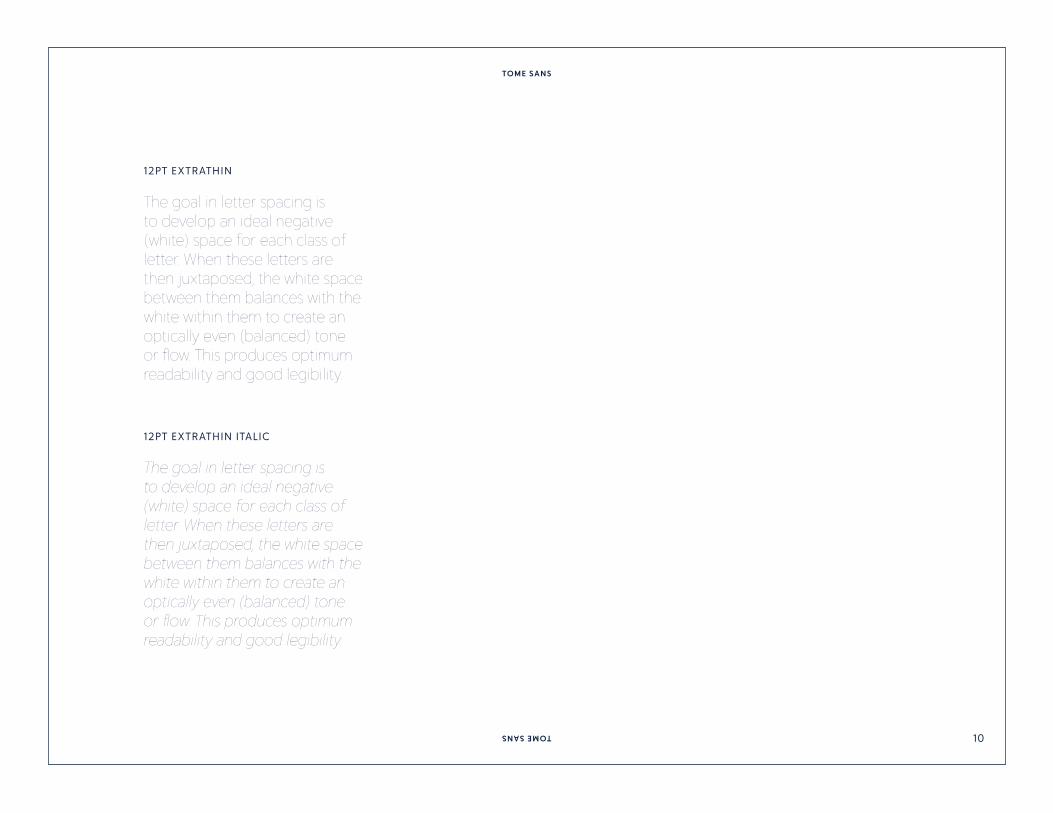
12PT EXTRATHIN
12PT EXTRATHIN ITALIC
The goal in letter spacing is to develop an ideal negative (white) space for each class of letter. When these letters are then juxtaposed, the white space between them balances with the white within them to create an optically even (balanced) tone or flow. This produces optimum readability and good legibility.
The goal in letter spacing is to develop an ideal negative (white) space for each class of letter. When these letters are then juxtaposed, the white space between them balances with the white within them to create an optically even (balanced) tone or flow. This produces optimum readability and good legibility.

TOME SANSTOME SANS 11
Tome Sans has a Latin Plus character set, which supports the following 224 languages:
Abenaki, Afaan Oromo, Afar, Afrikaans, Albanian, Alsatian, Amis, Anuta, Aragonese, Aranese, Aromanian, Arrernte, Arva-nitic, Asturian, Atayal, Aymara, Azerbaijani, Bashkir, Basque, Belarusian, Bemba, Bikol, Bislama, Bosnian, Breton, Bulgarian Romanization, Cape Verdean, Catalan, Cebuano, Chamorro, Chavacano, Chichewa, Chickasaw, Chinese Pinyin, Cimbrian, Cofan, Cornish, Corsican, Creek, Crimean Tatar, Croatian, Czech, Danish, Dawan, Delaware, Dholuo, Drehu, Dutch, English, Esperanto, Estonian, Faroese, Fijian, Filipino, Finnish, Folkspraak, French, Frisian, Friulian, Gagauz, Galician, Ganda, Genoese, German, Gikuyu, Gooniyandi, Greenlandic, Greenlan-dic Old Orthography, Guadeloupean, Gwichin, Haitian Creole, Han, Hawaiian, Hiligaynon, Hopi, Hotcak, Hungarian, Icelandic, Ido, Igbo, Ilocano, Indonesian, Interglossa, Interlingua, Irish, Istroromanian, Italian, Jamaican, Javanese, Jerriais, Kaingang, Kala Lagaw Ya, Kapampangan, Kaqchikel, Karakalpak, Karelian, Kashubian, Kikongo, Kinyarwanda, Kiribati, Kirundi, Klingon, Kurdish, Ladin, Latin, Latino Sine, Latvian, Lithuanian, Lojban, Lombard, Low Saxon, Luxembourgish, Maasai, Makhuwa, Malay,
Maltese, Manx, Maori, Marquesan, Meglenoromanian, Meriam Mir, Mirandese, Mohawk, Moldovan, Montagnais, Montene-grin, Murrinhpatha, Nagamese Creole, Nahuatl, Ndebele, Neapolitan, Ngiyambaa, Niuean, Noongar, Norwegian, Novial, Occidental, Occitan, Old Icelandic, Old Norse, Oshiwambo, Ossetian, Palauan, Papiamento, Piedmontese, Polish, Portu-guese, Potawatomi, Qeqchi, Quechua, Rarotongan, Romanian, Romansh, Rotokas, Sami Inari, Sami Lule, Sami Northern, Sami Skolt, Sami Southern, Samoan, Sango, Saramaccan, Sardinian, Scottish Gaelic, Serbian, Seri, Seychellois, Shawnee, Shona, Sicilian, Silesian, Slovak, Slovenian, Slovio, Somali, Sorbian Lower, Sorbian Upper, Sotho Northern, Sotho Southern, Spanish, Sranan, Sundanese, Swahili, Swazi, Swedish, Taga-log, Tahitian, Tetum, Tok Pisin, Tokelauan, Tongan, Tshiluba, Tsonga, Tswana, Tumbuka, Turkish, Turkmen, Tuvaluan, Tzotzil, Ukrainian, Uzbek, Venetian, Vepsian, Vietnamese, Volapuk, Voro, Wallisian, Walloon, Waraywaray, Warlpiri, Wayuu, Welsh, Wikmungkan, Wiradjuri, Wolof, Xavante, Xhosa, Yapese, Yindji-barndi, Zapotec, Zarma, Zazaki, Zulu, Zuni
Language Support
TOME SANSTOME SANS 12
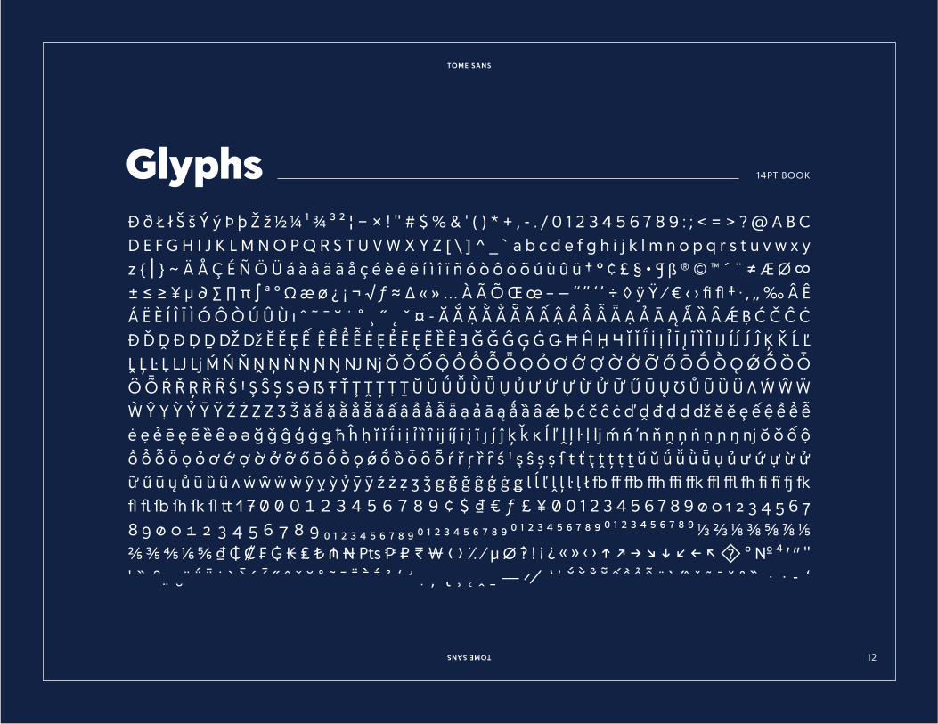
14PT BOOK
� � � � � � � � � � � � � � � � � � � � � � � � $ � � � ( ) � � , - . / 0 1 2 � 4 5 6 7 8 9 : ; � � � � � A B C D E F G H I J K L M N O P Q R S T U V W X Y Z � � � � � � a b c d e f g h i j k l m n o p q r s t u v w x y z � � � � � � � � � � � � � � � � � � � � � � � � � � � � � � � � � � � � � � � � � � � � ® � � � � � � � � � � � � � � � � � � � � � � � � � � � � � � � � � � � � � � � � � � � ’ � � � � � � � � � � � � � � � � � � � � � � � � � � � � � � � � � � � � � � � � � � � � � � � � � � � � � � � � � � � � � � � � � � � � � � � � � � � � � � � � � � � � � � � � � � � � � � � � � � � � � � � � � � � � � � � � � � � � � � � � � � � � � � � � � � � � � � � � � � � � � � � � � � � � � � � � � � � � � � � � � � � � � � � � � � � � � � � � � � � � � � � � � � � � � � � � � � � � � � � � � � � � � � � � � � � � � � � � � � � � � � � � � � � � � � � � � � � � � � � � � � � � � � � � � � � � � � � � � � � � � � � � � � � � � � � � � � � � � � � � � � � � � � � � � � � � � � � � � � � � � � � � � � � � � � � � � � � � � � � � � � � � � � � � � � � � � � � � � � � � � � � � � � � � � � � � � � � � � � � � � � � � � � � � � � � � � � � � � � � � � � � � � � � � � � � � � � � � � � � � � � � � � � � � � � � � � � � � � � � � � � � � � � � � � fi � � � fl � � � � � � � � � � � � � � � � � � � � � � � � � � � � � � � � � � � � � � � 0 1 2 � � � 6 � � � � � � � � � � � � � � � � � � � � � � � � � � � � � � � � � � � � � � � � � � � � � � � � � � � � � � � � � � � � � � � � � � � � � � � � � � � � � � � � � � � � � � � � � � � � � � � � � � � � � � � � � � � � � � � � � � � � � � � � � � � � � � � � � � � � � � � � � � � � � � � � � � � � � � � � � � � � � � � � � � � � � � � � � � �
Glyphs

TOME SANSTOME SANS 1�
14PT BOOK ITALIC
� � � � � � � � � � � � � � � � � � � � � � � � � � � � ( ) � � , � . � � � � � � � � � � � � � � � � � � � � � � � � � H � � � � � � � � � � � T � � W � � � � � � � � � a b c d e f g h i j k l m n o p � r s t u v w x y � � � � � � � � � � � � � � � � � � � � � � � � � � � � � � � � � � � � � � � � � � � � � � � � � � � � � � � � � � � � � � � � � � � � � � � � � � � � � � � � � � � � � � � � � � � � � � � � � � � � � � � � � � � � � � � � � � � � � � � � � � � � � � � � � � � � � � � � � � � � � � � � � � � � � � � � � � � � � � � � � � � � � � � � � � � � � � � � � � � � � � � � � � � � � � � � � � � � � � � � � � � � � � � � � � � � � � � � � � � � � � � � � � � � � � � � � � � � � � � � � � � � � � � � � � � � � � � � � � � � � � � � � � � � � � � � � � � � � � � � � � � � � � � � � � � � � � � � � � � � � � � � � � � � � � � � � � � � � � � � � � � � � � � � � � � � � � � � � � � � � � � � � � � � � � � � � � � � � � � � � � � � � � � � � � � � � � � � � � � � � � � � � � � � � � � � � � � � � � � � � � � � � � � � � � � � � � � � � � � � � � � � � � � � � � � � � � � � � � � � � � � � � � � � � � � � � � � � � � � � � � � � � � � � � � � � � � � � � � � � � � � � � � � � � � � � � � � g � � � � � � l � � � � � � � � � � � � � � � � � � � � fl � � � � � � � � � � � � � � � � � � � � � � � � � � � � � � � � � � � � � � � � � � � � � � � � � � � � � � � � � � � � � � � � � � � � � � � � � � � � � � � � � � � � � � � � � � � � � � � � � � � � � � � � � � � � � � � � � � � � � � � � � � � � � � � � � � � � � � � � � � � � � � � � � � � � � � � � � � � � � � � � � � � � � � � � � � � � � � � � � � � � � � � � � � � � � � � � � � � � � � � � � � � � � � � � � � � � � � � � �
Glyphs

TOME SANSTOME SANS 14
EMAIL:
support�delvefonts.comPHONE:
1.510.88�.��58
MAILING ADDRESS:
Delve Fonts LLC2717 Santa Clara Ave.Alameda, CA 94501
Tome and Delve Fonts are trademarks of Delve Fonts LLC. All other trademarks or copyrights mentioned are the
property of their respective owners.
Copyright � 2021, Delve Fonts LLC. All Rights Reserved.


![Guerrin - Tome 6[1]](https://img.pdfslide.us/doc/110x75/53fbd70bdab5ca9d238b4666/guerrin-tome-61.jpg)