Embed Size (px)
Citation preview

xii
Statistical Thinking and You
The purpose of this book is to give you a working knowledge of the big ideas of statistics and of the methods used in solving statistical problems. Because data always come from a real-world context, doing statistics means more than just manipulating data. The Practice of Statistics (TPS), Fifth Edition, is full of data. Each set of data has some brief background to help you understand what the data say. We deliberately chose contexts and data sets in the examples and exercises to pique your interest.
TPS 5e is designed to be easy to read and easy to use. This book is written by current high school AP® Statistics teachers, for high school students. We aimed for clear, concise explana-tions and a conversational approach that would encourage you to read the book. We also tried to enhance both the visual appeal and the book’s clear organization in the layout of the pages.
Be sure to take advantage of all that TPS 5e has to offer. You can learn a lot by reading the text, but you will develop deeper understanding by doing Activities and Data Explorations and answering the Check Your Understanding questions along the way. The walkthrough guide on pages xiv–xx gives you an inside look at the important features of the text.
You learn statistics best by doing statistical problems. This book offers many different types of problems for you to tackle.
• Section Exercises include paired odd- and even-numbered problems that test the same skill or concept from that section. There are also some multiple-choice ques-tions to help prepare you for the AP® exam. Recycle and Review exercises at the end of each exercise set involve material you studied in previous sections.
• Chapter Review Exercises consist of free-response questions aligned to specific learning objectives from the chapter. Go through the list of learning objectives summarized in the Chapter Review and be sure you can say “I can do that” to each item. Then prove it by solving some problems.
• The AP® Statistics Practice Test at the end of each chapter will help you prepare for in-class exams. Each test has 10 to 12 multiple-choice questions and three free-response problems, very much in the style of the AP® exam.
• Finally, the Cumulative AP® Practice Tests after Chapters 4, 7, 10, and 12 provide challenging, cumulative multiple-choice and free-response questions like ones you might find on a midterm, final, or the AP® Statistics exam.
The main ideas of statistics, like the main ideas of any important subject, took a long time to discover and take some time to master. The basic principle of learning them is to be persistent. Once you put it all together, statistics will help you make informed decisions based on data in your daily life.
To the Student
Starnes-Yates5e_fm_i-xxiii_hr.indd 12 11/20/13 7:43 PM

Section 2.1 Scatterplots and Correlations
xiii
TPS and AP® Statistics
The Practice of Statistics (TPS) was the first book written specifically for the Advanced Place-ment (AP®) Statistics course. Like the previous four editions, TPS 5e is organized to closely fol-low the AP® Statistics Course Description. Every item on the College Board’s “Topic Outline” is covered thoroughly in the text. Look inside the front cover for a detailed alignment guide. The few topics in the book that go beyond the AP® syllabus are marked with an asterisk (*).
Most importantly, TPS 5e is designed to prepare you for the AP® Statistics exam. The entire author team has been involved in the AP® Statistics program since its early days. We have more than 80 years’ combined experience teaching introductory statistics and more than 30 years’ combined experience grading the AP® exam! Two of us (Starnes and Tabor) have served as Question Leaders for several years, helping to write scoring rubrics for free-response questions. Including our Content Advisory Board and Supplements Team (page vii), we have two former Test Development Committee members and 11 AP® exam Readers.
TPS 5e will help you get ready for the AP® Statistics exam throughout the course by:
• Using terms, notation, formulas, and tables consistent with those found on the AP® exam. Key terms are shown in bold in the text, and they are defined in the Glossary. Key terms also are cross-referenced in the Index. See page F-1 to find “Formulas for the AP® Statistics Exam” as well as Tables A, B, and C in the back of the book for reference.
• Following accepted conventions from AP® exam rubrics when presenting model solutions. Over the years, the scoring guidelines for free-response questions have become fairly consistent. We kept these guidelines in mind when writing the solutions that appear throughout TPS 5e. For example, the four-step State-Plan-Do-Conclude process that we use to complete inference problems in Chapters 8 through 12 closely matches the four-point AP® scoring rubrics.
• Including AP® Exam Tips in the margin where appropriate. We place exam tips in the margins and in some Technology Corners as “on-the-spot” reminders of common mistakes and how to avoid them. These tips are collected and summa-rized in Appendix A.
• Providing hundreds of AP®-style exercises throughout the book. We even added a new kind of problem just prior to each Chapter Review, called a FRAPPY (Free Response AP® Problem, Yay!). Each FRAPPY gives you the chance to solve an AP®-style free-response problem based on the material in the chapter. After you finish, you can view and critique two example solutions from the book’s Web site (www.whfreeman.com/tps5e). Then you can score your own response using a ru-bric provided by your teacher.
Turn the page for a tour of the text. See how to use the book to realize success in the course and on the AP® exam.
Starnes-Yates5e_fm_i-xxiii_hr.indd 13 11/20/13 7:43 PM

xiv
Read the LEARNING OBJECTIVES at the beginning of each section. Focus on mastering these skills and concepts as you work through the chapter.
Take note of the green DEFINITION boxes that explain important vocabulary. Flip back to them to review key terms and their definitions.
Look for the boxes with the blue bands. Some explain how to make graphs or set up calculations while others recap important concepts.
Read the AP® EXAM TIPS. They give advice on how to be successful on the AP® exam.
Watch for CAUTION ICONS. They alert you to common mistakes that students make.
Scan the margins for the purple notes, which represent the “voice of the teacher” giving helpful hints for being successful in the course.
READ THE TEXT and use the book’s features to help you grasp the big ideas.
What does correlation measure? The Fathom screen shots below pro-vide more detail. At the left is a scatterplot of the SEC football data with two lines added—a vertical line at the group’s mean points per game and a horizontal line at the mean number of wins of the group. Most of the points fall in the upper-right or lower-left “quadrants” of the graph. That is, teams with above-average points per game tend to have above-average numbers of wins, and teams with below-average points per game tend to have numbers of wins that are below average. This confirms the positive association between the variables.
Below on the right is a scatterplot of the standardized scores. To get this graph, we transformed both the x- and the y-values by subtracting their mean and divid-ing by their standard deviation. As we saw in Chapter 2, standardizing a data set converts the mean to 0 and the standard deviation to 1. That’s why the vertical and horizontal lines in the right-hand graph are both at 0.
THINKABOUT IT
Notice that all the products of the standardized values will be positive—not surprising, considering the strong positive association between the variables. What if there was a negative association between two variables? Most of the points would be in the upper-left and lower-right “quadrants” and their z-score products would be negative, resulting in a negative correlation.
Facts about Correlation
AP® EXAM TIP The formula sheet for the AP® exam uses different notation for these
equations: b1 = r sy
sx and
b0 = y– − b1x–. That’s because the least-squares line is written as y = b 0 + b1x . We prefer our simpler versions without the subscripts!
3.1 Scatterplots and CorrelationWHAT YOU WILL LEARN• Identify explanatory and response variables in situations
where one variable helps to explain or influences the other.• Make a scatterplot to display the relationship between
two quantitative variables.• Describe the direction, form, and strength of a
relationship displayed in a scatterplot and identify outli-ers in a scatterplot.
• Interpret the correlation. • Understand the basic properties of correlation,
including how the correlation is influenced by outliers. • Use technology to calculate correlation. • Explain why association does not imply causation.
By the end of the section, you should be able to:
The following example illustrates the process of constructing a scatterplot.
1. Decide which variable should go on each axis.2. Label and scale your axes.3. Plot individual data values.
HOW TO MAKE A SCATTERPLOT
Make connections and deepen your understanding by reflecting on the questions asked in THINK ABOUT IT passages.
DEFINITION: ExtrapolationExtrapolation is the use of a regression line for prediction far outside the interval of values of the explanatory variable x used to obtain the line. Such predictions are often not accurate.
Often, using the regression line to make a prediction for x = 0 is an extrapolation. That’s why the y intercept isn’t always statistically meaningful.
Few relationships are linear for all values of the explanatory variable. Don’t make predictions using values of x that are much larger or much smaller than those that actually appear in your data.
caution
!

xv
CHECK YOUR UNDERSTANDINGIdentify the explanatory and response variables in each setting.1. How does drinking beer affect the level of alcohol in people’s blood? The legal limit for driving in all states is 0.08%. In a study, adult volunteers drank different numbers of cans of beer. Thirty minutes later, a police officer measured their blood alcohol levels.2. The National Student Loan Survey provides data on the amount of debt for recent college graduates, their current income, and how stressed they feel about college debt. A sociologist looks at the data with the goal of using amount of debt and income to explain the stress caused by college debt.
LEARN STATISTICS BY DOING STATISTICS
Reaching for Chips
Before class, your teacher will prepare a population of 200 colored chips, with 100 having the same color (say, red). The parameter is the actual proportion p of red chips in the population: p = 0.50. In this Activity, you will investigate sampling variability by taking repeated random samples of size 20 from the population.1. After your teacher has mixed the chips thoroughly, each student in the class should take a sample of 20 chips and note the sample proportion p of red chips. When finished, the student should return all the chips to the bag, stir them up, and pass the bag to the next student.Note: If your class has fewer than 25 students, have some students take two samples.2. Each student should record the p-value in a chart on the board and plot this value on a class dotplot. Label the graph scale from 0.10 to 0.90 with tick marks spaced 0.05 units apart.3. Describe what you see: shape, center, spread, and any outliers or other un-usual features.
MATERIALS:200 colored chips, including 100 of the same color; large bag or other container
ACTIVITY
I’m a Great Free-Throw Shooter!
A basketball player claims to make 80% of the free throws that he attempts. We think he might be exaggerating. To test this claim, we’ll ask him to shoot some free throws—virtually—using The Reasoning of a Statistical Test applet at the book’s Web site.1. Go to www.whfreeman.com/tps5e and launch the applet.
2. Set the applet to take 25 shots. Click “Shoot.” How many of the 25 shots did the player make? Do you have enough data to decide whether the player’s claim is valid?3. Click “Shoot” again for 25 more shots. Keep doing this until you are convinced either that the player makes less than 80% of his shots or that the player’s claim is true. How large a sample of shots did you need to make your decision?4. Click “Show true probability” to reveal the truth. Was your conclusion correct?5. If time permits, choose a new shooter and repeat Steps 2 through 4. Is it easier to tell that the player is exaggerating when his actual proportion of free throws made is closer to 0.8 or farther from 0.8?
MATERIALS:Computer with Internet access and projection capability
ACTIVITY
APPLET
Every chapter begins with a hands-on ACTIVITY that introduces the content of the chapter. Many of these activities involve collecting data and drawing conclusions from the data. In other activities, you’ll use dynamic applets to explore statistical concepts.
CHECK YOUR UNDERSTANDING questions appear throughout the section. They help you to clarify defi-nitions, concepts, and procedures. Be sure to check your answers in the back of the book.
Following the debut of the new SAT Writing test in March 2005, Dr. Les Perelman from the Massachusetts Institute of Technology stirred controversy by reporting, “It appeared to me that regardless of what a student wrote, the longer the essay, the higher the score.” He went on to say, “I have never found a quantifiable predictor in 25 years of grading that was anywhere as strong as this one. If you just graded them based on length without ever reading them, you’d be right over 90 percent of the time.”3 The table below shows the data that Dr. Perelman used to draw his conclusions.4
Length of essay and score for a sample of SAT essays
Words: 460 422 402 365 357 278 236 201 168 156 133
Score: 6 6 5 5 6 5 4 4 4 3 2
Words: 114 108 100 403 401 388 320 258 236 189 128
Score: 2 1 1 5 6 6 5 4 4 3 2
Words: 67 697 387 355 337 325 272 150 135
Score: 1 6 6 5 5 4 4 2 3
Does this mean that if students write a lot, they are guaranteed high scores? Carry out your own analysis of the data. How would you respond to each of Dr. Perelman’s claims?
DATA EXPLORATION The SAT essay: Is longer better?DATA EXPLORATIONS ask you to play the role of data detective. Your goal is to answer a puzzling, real-world question by examining data graphically and numerically.

xvi
EXAMPLES: Model statistical problems and how to solve them
Read through each EXAMPLE, and then try out the concept yourself by working the FOR PRACTICE exercise in the Section Exercises.
The red number box next to the exercise directs you back to the page in the section where the model example appears.
Here is another example of the four-step process in action.
Gesell ScoresPutting it all togetherDoes the age at which a child begins to talk predict a later score on a test of mental ability? A study of the development of young children recorded the age in months at which each of 21 children spoke their first word and their Gesell Adaptive Score, the result of an aptitude test taken much later.16 The data appear in the table be-low, along with a scatterplot, residual plot, and computer output. Should we use a linear model to predict a child’s Gesell score from his or her age at first word? If so, how accurate will our predictions be?
Age (months) at first word and Gesell scoreCHILD AGE SCORE CHILD AGE SCORE CHILD AGE SCORE
1 15 95 8 11 100 15 11 102
2 26 71 9 8 104 16 10 100
3 10 83 10 20 94 17 12 105
4 9 91 11 7 113 18 42 57
5 15 102 12 9 96 19 17 121
6 20 87 13 10 83 20 11 86
7 18 93 14 11 84 21 10 100
EXAMPLESTEP4
4-STEP EXAMPLES: By read-ing the 4-Step Examples and mastering the special “State-Plan-Do-Conclude” framework, you can develop good problem-solving skills and your ability to tackle more complex problems like those on the AP® exam.
1. Coral reefs How sensitive to changes in water temperature are coral reefs? To find out, measure the growth of corals in aquariums where the water temperature is controlled at different levels. Growth is measured by weighing the coral before and after the experiment. What are the explanatory and response variables? Are they categorical or quantitative?
pg 144
Need extra help? Examples and exercises marked with the PLAY ICON are supported by short video clips prepared by experienced AP® teachers. The video guides you through each step in the example and solution and gives you extra help when you need it.
144 C H A P T E R 3 DESCRIBING RELATIONSHIPS
It is easiest to identify explanatory and response variables when we actually specify values of one variable to see how it affects another variable. For instance, to study the effect of alcohol on body temperature, researchers gave several dif-ferent amounts of alcohol to mice. Then they measured the change in each mouse’s body temperature 15 minutes later. In this case, amount of alcohol is the explanatory variable, and change in body temperature is the response variable. When we don’t specify the values of either variable but just observe both variables, there may or may not be explanatory and response vari-ables. Whether there are depends on how you plan to use the data.
You will often see explanatory variables called independent variables and response variables called dependent variables. Because the words “independent” and “dependent” have other meanings in statistics, we won’t use them here.
Linking SAT Math and Critical Reading ScoresExplanatory or response?Julie asks, “Can I predict a state’s mean SAT Math score if I know its mean SAT Critical Reading score?” Jim wants to know how the mean SAT Math and Critical Reading scores this year in the 50 states are related to each other.
PROBLEM: For each student, identify the explanatory variable and the response variable if possible.SOLUTION: Julie is treating the mean SAT Critical Reading score as the explanatory variable and the mean SAT Math score as the response variable. Jim is simply interested in exploring the relation-ship between the two variables. For him, there is no clear explanatory or response variable.
EXAMPLE
For Practice Try Exercise 1
xvii
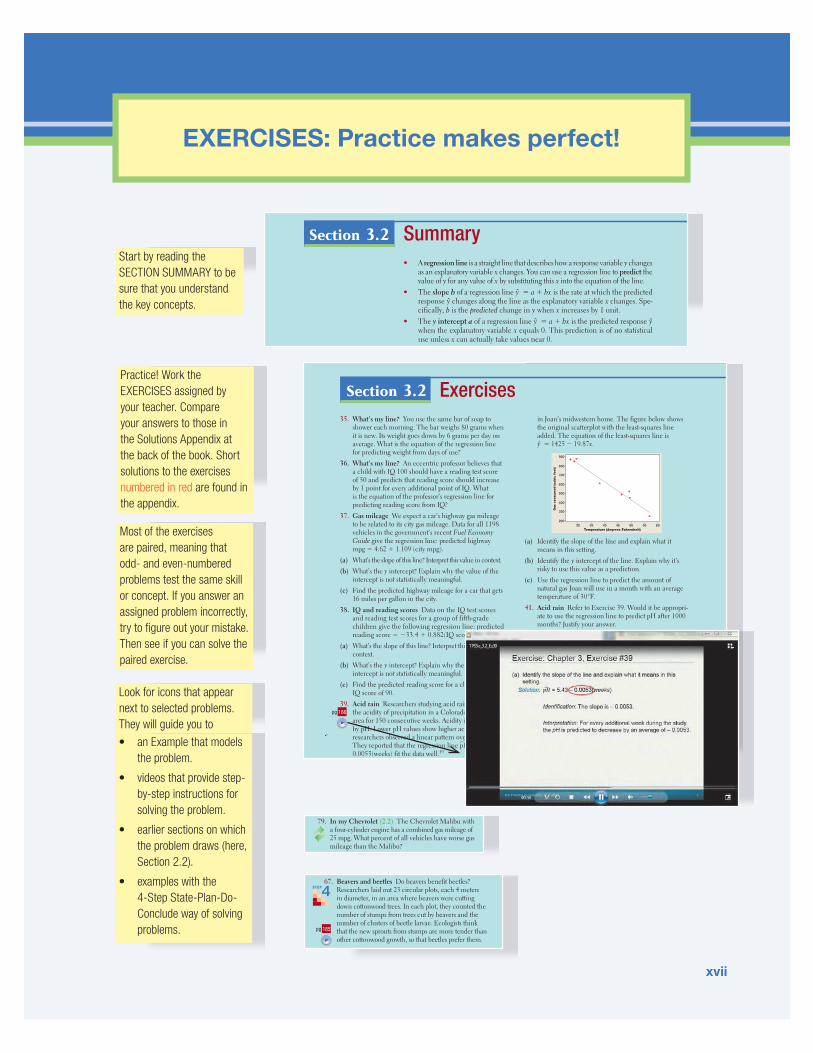
EXERCISES: Practice makes perfect!
Summary• A regression line is a straight line that describes how a response variable y changes
as an explanatory variable x changes. You can use a regression line to predict the value of y for any value of x by substituting this x into the equation of the line.
• The slope b of a regression line y = a + bx is the rate at which the predicted response y changes along the line as the explanatory variable x changes. Spe-cifically, b is the predicted change in y when x increases by 1 unit.
• The y intercept a of a regression line y = a + bx is the predicted response y when the explanatory variable x equals 0. This prediction is of no statistical use unless x can actually take values near 0.
• Avoid extrapolation, the use of a regression line for prediction using values
Section 3.2Start by reading the SECTION SUMMARY to be sure that you understand the key concepts.
Practice! Work the EXERCISES assigned by your teacher. Compare your answers to those in the Solutions Appendix at the back of the book. Short solutions to the exercises numbered in red are found in the appendix.
Look for icons that appear next to selected problems. They will guide you to
Most of the exercises are paired, meaning that odd- and even-numbered problems test the same skill or concept. If you answer an assigned problem incorrectly, try to figure out your mistake. Then see if you can solve the paired exercise.
Exercises35. What’s my line? You use the same bar of soap to
shower each morning. The bar weighs 80 grams when it is new. Its weight goes down by 6 grams per day on average. What is the equation of the regression line for predicting weight from days of use?
36. What’s my line? An eccentric professor believes that a child with IQ 100 should have a reading test score of 50 and predicts that reading score should increase by 1 point for every additional point of IQ. What is the equation of the professor’s regression line for predicting reading score from IQ?
37. Gas mileage We expect a car’s highway gas mileage to be related to its city gas mileage. Data for all 1198 vehicles in the government’s recent Fuel Economy Guide give the regression line: predicted highway mpg = 4.62 + 1.109 (city mpg).
(a) What’s the slope of this line? Interpret this value in context.(b) What’s the y intercept? Explain why the value of the
intercept is not statistically meaningful.(c) Find the predicted highway mileage for a car that gets
16 miles per gallon in the city.38. IQ and reading scores Data on the IQ test scores
and reading test scores for a group of fifth-grade children give the following regression line: predicted reading score = −33.4 + 0.882(IQ score).
(a) What’s the slope of this line? Interpret this value in context.
(b) What’s the y intercept? Explain why the value of the intercept is not statistically meaningful.
(c) Find the predicted reading score for a child with an IQ score of 90.
39. Acid rain Researchers studying acid rain measured the acidity of precipitation in a Colorado wilderness area for 150 consecutive weeks. Acidity is measured by pH. Lower pH values show higher acidity. The researchers observed a linear pattern over time. They reported that the regression line pH = 5.43 − 0.0053(weeks) fit the data well.19
in Joan’s midwestern home. The figure below shows the original scatterplot with the least-squares line added. The equation of the least-squares line is y = 1425 − 19.87x.
60Temperature (degrees Fahrenheit)
Gas
consu
med (cu
bic
feet)
900
800
700
600
500
400
300
200555045403530
(a) Identify the slope of the line and explain what it means in this setting.
(b) Identify the y intercept of the line. Explain why it’s risky to use this value as a prediction.
(c) Use the regression line to predict the amount of natural gas Joan will use in a month with an average temperature of 30°F.
41. Acid rain Refer to Exercise 39. Would it be appropri-ate to use the regression line to predict pH after 1000 months? Justify your answer.
42. How much gas? Refer to Exercise 40. Would it be appropriate to use the regression line to predict Joan’s natural-gas consumption in a future month with an average temperature of 65°F? Justify your answer.
43. Least-squares idea The table below gives a small set of data. Which of the following two lines fits the data better: y = 1 − x or y = 3 − 2x? Use the least-squares criterion to justify your answer. (Note: Neither of these two lines is the least-squares regression line for these data.)
x: −1 1 1 3 5
y: 2 0 1 −1 −5
44. Least-squares idea In Exercise 40, the line drawn on the scatterplot is the least-squares regression line.
pg 166
Section 3.2
• an Example that models the problem.
• videos that provide step-by-step instructions for solving the problem.
• earlier sections on which the problem draws (here, Section 2.2).
• examples with the 4-Step State-Plan-Do- Conclude way of solving problems.
67. Beavers and beetles Do beavers benefit beetles? Researchers laid out 23 circular plots, each 4 meters in diameter, in an area where beavers were cutting down cottonwood trees. In each plot, they counted the number of stumps from trees cut by beavers and the number of clusters of beetle larvae. Ecologists think that the new sprouts from stumps are more tender than other cottonwood growth, so that beetles prefer them.
STEP4
pg 185
gallon (mpg) and standard deviation 4.3 mpg.79. In my Chevrolet (2.2) The Chevrolet Malibu with
a four-cylinder engine has a combined gas mileage of 25 mpg. What percent of all vehicles have worse gas mileage than the Malibu?
80. The top 10% (2.2) How high must a vehicle’s gas

xviii
REVIEW and PRACTICE for quizzes and tests
Section 3.1: Scatterplots and CorrelationIn this section, you learned how to explore the relationship between two quantitative variables. As with distributions of a single variable, the first step is always to make a graph. A scatterplot is the appropriate type of graph to investigate as-sociations between two quantitative variables. To describe a scatterplot, be sure to discuss four characteristics: direction, form, strength, and outliers. The direction of an associa-tion might be positive, negative, or neither. The form of an association can be linear or nonlinear. An association is strong if it closely follows a specific form. Finally, outliers are any points that clearly fall outside the pattern of the rest of the data.
The correlation r is a numerical summary that describes the direction and strength of a linear association. When r > 0, the association is positive, and when r < 0, the association is negative. The correlation will always take values between −1 and 1, with r = −1 and r = 1 indicat-ing a perfectly linear relationship. Strong linear associa-tions have correlations near 1 or −1, while weak linear relationships have correlations near 0. However, it isn’t
possible to determine the form of an association from only the correlation. Strong nonlinear relationships can have a correlation close to 1 or a correlation close to 0, depending on the association. You also learned that out-liers can greatly affect the value of the correlation and that correlation does not imply causation. That is, we can’t assume that changes in one variable cause changes in the other variable, just because they have a correla-tion close to 1 or –1.
Section 3.2: Least-Squares RegressionIn this section, you learned how to use least-squares re-gression lines as models for relationships between vari-ables that have a linear association. It is important to understand the difference between the actual data and the model used to describe the data. For example, when you are interpreting the slope of a least-squares regression line, describe the predicted change in the y variable. To emphasize that the model only provides predicted val-ues, least-squares regression lines are always expressed in terms of y instead of y.
Chapter ReviewReview the CHAPTER SUMMARY to be sure that you understand the key concepts in each section.
Tackle the CHAPTER REVIEW EXERCISES for practice in solving problems that test concepts from throughout the chapter.
Use the WHAT DID YOU LEARN? table to guide you to model examples and exer-cises to verify your mastery of each LEARNING OBJECTIVE.
What Did You Learn?Learning Objective Section Related Example
on Page(s)Relevant Chapter Review Exercise(s)
Identify explanatory and response variables in situations where one variable helps to explain or influences the other. 3.1 144 R3.4
Make a scatterplot to display the relationship between two quantitative variables. 3.1 145, 148 R3.4
Describe the direction, form, and strength of a relationship displayed in a scatterplot and recognize outliers in a scatterplot. 3.1 147, 148 R3.1
Interpret the correlation. 3.1 152 R3.3, R3.4
Understand the basic properties of correlation, including how the correlation is influenced by outliers. 3.1 152, 156, 157 R3.1, R3.2
Use technology to calculate correlation. 3.1 Activity on 152, 171 R3.4
Explain why association does not imply causation. 3.1 Discussion on 156, 190 R3.6
Interpret the slope and y intercept of a least-squares regression line. 3.2 166 R3.2, R3.4
Use the least-squares regression line to predict y for a given x. Explain the dangers of extrapolation. 3.2
167, Discussion on 168 (for extrapolation) R3.2, R3.4, R3.5
Calculate and interpret residuals. 3.2 169 R3.3, R3.4
Explain the concept of least squares. 3.2 Discussion on 169 R3.5
Determine the equation of a least-squares regression line using technology or computer output. 3.2
Technology Corner on 171, 181 R3.3, R3.4
Construct and interpret residual plots to assess whether a linear model is appropriate. 3.2 Discussion on 175, 180 R3.3, R3.4
Interpret the standard deviation of the residuals and r 2 and use these values to assess how well the least-squares regression line models the relationship between two variables. 3.2 180 R3.3, R3.5
Describe how the slope, y intercept, standard deviation of the residuals, and r 2 are influenced by outliers. 3.2 Discussion on 188 R3.1
Find the slope and y intercept of the least-squares regression line from the means and standard deviations of x and y and their correlation. 3.2 183 R3.5
Chapter Review ExercisesChapter 3These exercises are designed to help you review the important ideas and methods of the chapter.
R3.1 Born to be old? Is there a relationship between the gestational period (time from conception to birth) of an animal and its average life span? The figure shows a scatterplot of the gestational period and av-erage life span for 43 species of animals.30
0
10
20
30
40
Life
spa
n (y
ears
)
Gestation (days)
A B
7000 100 200 300 400 500 600
(a) Describe the association shown in the scatterplot. (b) Point A is the hippopotamus. What effect does this
R3.3 Stats teachers’ cars A random sample of AP® Sta-tistics teachers was asked to report the age (in years) and mileage of their primary vehicles. A scatterplot of the data, a least-squares regression printout, and a residual plot are provided below.
Predictor Coef SE Coef T PConstant 3704 8268 0.45 0.662Age 12188 1492 8.17 0.000
S = 20870.5 R-Sq = 83.7% R-Sq(adj) = 82.4%
160,000
140,000
120,000
100,000
80,000
60,000
40,000
20,000
0
0 2 4 6 8 10 12
Age
Mile
age
60,00050,00040,00030,000
Res
idua
l

xix
and the AP® Exam
T3.1 A school guidance counselor examines the number of extracurricular activities that students do and their grade point average. The guidance counselor says, “The evidence indicates that the correlation between the number of extracurricular activities a student par-ticipates in and his or her grade point average is close to zero.” A correct interpretation of this statement would be that
(a) active students tend to be students with poor grades, and vice versa.
(b) students with good grades tend to be students who are not involved in many extracurricular activities, and vice versa.
(c) students involved in many extracurricular activities are just as likely to get good grades as bad grades; the same is true for students involved in few extracurricular activities.
(d) there is no linear relationship between number of activ-ities and grade point average for students at this school.
(e) involvement in many extracurricular activities and good grades go hand in hand.
T3.2 The British government conducts regular surveys of household spending. The average weekly house-hold spending (in pounds) on tobacco products and
alcoholic beverages for each of 11 regions in Great Britain was recorded. A scatterplot of spending on alcohol versus spending on tobacco is shown below. Which of the following statements is true?
6.5
6.0
5.5
5.0
4.5
3.0 3.5 4.0 4.5Tobacco
Alc
ohol
(a) The observation (4.5, 6.0) is an outlier. (b) There is clear evidence of a negative association be-
tween spending on alcohol and tobacco. (c) The equation of the least-squares line for this plot
would be approximately y = 10 − 2x. (d) The correlation for these data is r = 0.99. (e) The observation in the lower-right corner of the plot is
influential for the least-squares line.
Section I: Multiple Choice Select the best answer for each question.
AP® Statistics Practice TestChapter 3Each chapter concludes withan AP® STATISTICSPRACTICE TEST. This testincludes about 10 AP®-stylemultiple-choice questions and3 free-response questions.
Four CUMULATIVE AP® TESTSsimulate the real exam. They are placed after Chapters 4, 7, 10, and 12. The tests expand in length and content coverage from the first through the fourth.
Learn how to answer free-response questions successfully by working the FRAPPY! THE FREE RESPONSE AP® PROBLEM, YAY! that comes just before the Chapter Review in every chapter.
Cumulative AP® Practice Test 1
AP1.1 You look at real estate ads for houses in Sarasota, Florida. Many houses range from $200,000 to $400,000 in price. The few houses on the water, however, have prices up to $15 million. Which of the following statements best describes the distribu-tion of home prices in Sarasota?
(a) The distribution is most likely skewed to the left, and the mean is greater than the median.
(b) The distribution is most likely skewed to the left, and the mean is less than the median.
(c) The distribution is roughly symmetric with a few high outliers, and the mean is approximately equal to the median.
AP1.4 For a certain experiment, the available experimen-tal units are eight rats, of which four are female (F1, F2, F3, F4) and four are male (M1, M2, M3, M4). There are to be four treatment groups, A, B, C, and D. If a randomized block design is used, with the experimental units blocked by gender, which of the following assignments of treatments is impossible?
(a) A S (F1, M1), B S (F2, M2), C S (F3, M3), D S (F4, M4)
(b) A S (F1, M2), B S (F2, M3), C S (F3, M4), D S (F4, M1)
(c) A S (F1, M2), B S (F3, F2),
Section I: Multiple Choice Choose the best answer for Questions AP1.1 to AP1.14.
Section II: Free Response Show all your work. Indicate clearly the methods you use, because you will be graded on the correctness of your methods as well as on the accuracy and completeness of your results and explanations.
AP1.15 The manufacturer of exercise machines for fitness centers has designed two new elliptical machines that are meant to increase cardiovascular fit-ness. The two machines are being tested on 30 volunteers at a fitness center near the company’s headquarters. The volunteers are randomly as-signed to one of the machines and use it daily for two months. A measure of cardiovascular fitness is administered at the start of the experiment and again at the end. The following table contains the
the two machines. Note that higher scores indicate larger gains in fitness.
Machine A Machine B
0 2
5 4 1 0
8 7 6 3 2 0 2 1 5 9
9 7 4 1 1 3 2 4 8 9
6 1 4 2 5 7
The following problem is modeled after actual AP® Statistics exam free response questions. Your task is to generate a complete, con-cise response in 15 minutes.
Directions: Show all your work. Indicate clearly the methods you use, because you will be scored on the correctness of your methods as well as on the accuracy and completeness of your results and explanations.
Two statistics students went to a flower shop and ran-domly selected 12 carnations. When they got home, the students prepared 12 identical vases with exactly the same amount of water in each vase. They put one tablespoon of sugar in 3 vases, two tablespoons of sugar in 3 vases, and three tablespoons of sugar in 3 vases. In the remaining 3 vases, they put no sugar. After the vases were prepared, the students randomly assigned 1 carnation to each vase
FRAPPY! Free Response AP® Problem, Yay!
and observed how many hours each flower continued to look fresh. A scatterplot of the data is shown below.
Sugar (tbsp)
Fres
hnes
s (h
)
220
210
190
200
180
170
160
240
230
0 1 2 3
(a) Briefly describe the association shown in the scatterplot.
(b) The equation of the least-squares regression line for these data is y = 180.8 + 15.8x. Interpret the slope of the line in the context of the study.
(c) Calculate and interpret the residual for the flower that had 2 tablespoons of sugar and looked fresh for 204 hours.
(d) Suppose that another group of students conducted a similar experiment using 12 flowers, but in-cluded different varieties in addition to carnations. Would you expect the value of r2 for the second group’s data to be greater than, less than, or about the same as the value of r2 for the first group’s data? Explain.
After you finish, you can view two example solutions on the book’s Web site (www.whfreeman.com/tps5e). Determine whether you think each solution is “complete,” “substantial,” “developing,” or “minimal.” If the solution is not complete, what improvements would you suggest to the student who wrote it? Finally, your teacher will provide you with a scoring rubric. Score your response and note what, if anything, you would do differently to improve your own score.

xx
Use TECHNOLOGY to discover and analyze
Measuring Linear Association: Correlation
7. TECHNOLOGY CORNER
Making scatterplots with technology is much easier than constructing them by hand. We’ll use the SEC football data from page 146 to show how to construct a scatterplot on a TI-83/84 or TI-89.
• Enter the data values into your lists. Put the points per game in L1/list1 and the number of wins in L2/list2.• Define a scatterplot in the statistics plot menu (press F2 on the TI-89). Specify the settings shown below.
• Use ZoomStat (ZoomData on the TI-89) to obtain a graph. The calculator will set the window dimensions automatically
by looking at the values in L1/list1 and L2/list2.
Notice that there are no scales on the axes and that the axes are not labeled. If you copy a scatterplot from your calculator onto your paper, make sure that you scale and label the axes.
SCATTERPLOTS ON THE CALCULATORTI-Nspire instructions in Appendix B; HP Prime instructions on the book’s Web site
AP® EXAM TIP If you are asked to make a scatterplot on a free-response question, be sure to label and scale both axes. Don’t just copy an unlabeled calculator graph directly onto your paper.
Use technology as a tool for discovery and analysis. TECHNOLOGY CORNERS give step-by-step instructions for using the TI-83/84 and TI-89 calculator. Instructions for the TI-Nspire are in an end-of-book appendix. HP Prime instructions are on the book’s Web site and in the e-Book.
You can access video instructions for the Technology Corners through the e-Book or on the book’s Web site.
Find the Technology Corners easily by consulting the summary table at the end of each section or the complete table inside the back cover of the book.
Other types of software displays, including Minitab, Fathom, and applet screen captures, appear throughout the book to help you learn to read and interpret many different kinds of output.
3.2 TECHNOLOGY CORNERS
8. Least-squares regression lines on the calculator page 1719. Residual plots on the calculator page 175
TI-Nspire Instructions in Appendix B; HP Prime instructions on the book’s Web site
59. Merlins breeding Exercise 13 (page 160) gives data on the number of breeding pairs of merlins in an isolated area in each of seven years and the percent of males who returned the next year. The data show that the percent returning is lower after successful breeding seasons and that the relationship is roughly linear. The figure below shows Minitab regression output for these data.
Regression Analysis: Percent return versus Breeding pairs
Predictor Coef SE Coef T PConstant 266.07 52.15 5.10 0.004Breeding pairs -6.650 1.736 -3.83 0.012
S = 7.76227 R-Sq = 74.6% R-Sq(adj) = 69.5%
(a) What is the equation of the least-squares regression line for predicting the percent of males that return from the number of breeding pairs? Use the equa-tion to predict the percent of returning males after a season with 30 breeding pairs.
(b) What percent of the year-to-year variation in percent of returning males is accounted for by the straight-line relationship with number of breeding pairs the previous year?
(c) Use the information in the figure to find the cor-
pg 181

Overview What Is Statistics?
Does listening to music while studying help or hinder learning? If an athlete fails a drug test, how sure can we be that she took a banned substance? Does having a pet help people live longer? How well do SAT scores predict college success? Do most people recycle? Which of two diets will help obese children lose more weight and keep it off? Should a poker player go “all in” with pocket aces? Can a new drug help people quit smoking? How strong is the evidence for global warming?
These are just a few of the questions that statistics can help answer. But what is statistics? And why should you study it?
Statistics Is the Science of Learning from Data
Data are usually numbers, but they are not “just numbers.” Data are numbers with a context. The number 10.5, for example, carries no information by itself. But if we hear that a family friend’s new baby weighed 10.5 pounds at birth, we congratulate her on the healthy size of the child. The context engages our knowledge
about the world and allows us to make judgments. We know that a baby weighing 10.5 pounds is quite large, and that a human baby is unlikely to weigh 10.5 ounces or 10.5 kilograms. The context makes the number meaningful.
In your lifetime, you will be bombarded with data and sta-tistical information. Poll results, television ratings, music sales, gas prices, unemployment rates, medical study outcomes, and standardized test scores are discussed daily in the media. Using data effectively is a large and growing part of most professions. A solid understanding of statistics will enable you to make sound, data-based decisions in your career and everyday life.
Data Beat Personal Experiences
It is tempting to base conclusions on your own experiences or the experiences of those you know. But our experiences may not be typical. In fact, the incidents that stick in our memory are often the unusual ones.
Do cell phones cause brain cancer?Italian businessman Innocente Marcolini developed a brain tumor at age 60. He also talked on a cellular phone up to 6 hours per day for 12 years as part of his job. Mr. Marcolini’s physician suggested that the
brain tumor may have been caused by cell-phone use. So Mr. Marcolini decided to file suit in the Italian court system. A court ruled in his favor in October 2012.
Several statistical studies have investigated the link between cell-phone use and brain cancer. One of the largest was conducted by the Danish Cancer Society. Over 350,000 resi-dents of Denmark were included in the study. Researchers compared the brain-cancer rate for the cell-phone users with the rate in the general population. The result: no statistical differ-ence in brain-cancer rates.1 In fact, most studies have produced similar conclusions. In spite of the evidence, many people (like Mr. Marcolini) are still convinced that cell phones can cause brain cancer.
In the public’s mind, the compelling story wins every time. A statistically literate person knows better. Data are more reliable than personal experiences because they systematically describe an overall picture rather than focus on a few incidents.
xxi
Starnes-Yates5e_fm_i-xxiii_hr.indd 21 11/20/13 7:44 PM

Where the Data Come from Matters
Are you kidding me?The famous advice columnist Ann Landers once asked her readers, “If you had it to do over again, would you have children?” A few weeks later, her column was headlined “70% OF PARENTS SAY KIDS NOT WORTH IT.” Indeed, 70% of the nearly 10,000 parents who wrote in said they would not have children if they could make the choice again. Do you believe that 70% of all parents regret having children?
You shouldn’t. The people who took the trouble to write Ann Landers are not represen-tative of all parents. Their letters showed that many of them were angry with their children. All we know from these data is that there are some unhappy parents out there. A statistically designed poll, unlike Ann Landers’s appeal, targets specific people chosen in a way that gives all parents the same chance to be asked. Such a poll showed that 91% of parents would have children again.
Where data come from matters a lot. If you are careless about how you get your data, you may announce 70% “No” when the truth is close to 90% “Yes.”
Who talks more—women or men?According to Louann Brizendine, author of The Female Brain, women say nearly three times as many words per day as men. Skeptical researchers devised a study to test this claim. They used electronic devices to record the talking patterns of 396 university students from Texas, Arizona, and Mexico. The device was programmed to record 30 seconds of sound every 12.5 minutes without the carrier’s knowledge. What were the results?
According to a published report of the study in Scientific American, “Men showed a slightly wider variability in words uttered. . . . But in the end, the sexes came out just about even in the daily averages: women at 16,215 words and men at 15,669.”2 When asked where she got her figures, Brizendine admitted that she used unreliable sources.3
The most important information about any statistical study is how the data were produced. Only carefully designed studies produce results that can be trusted.
Always Plot Your Data
Yogi Berra, a famous New York Yankees baseball player known for his unusual quotes, had this to say: “You can observe a lot just by watching.” That’s a motto for learning from data. A carefully chosen graph is often more instructive than a bunch of numbers.
Do people live longer in wealthier countries?The Gapminder Web site, www.gapminder.org, provides loads of data on the health and well-being of the world’s inhabitants. The graph on the next pages displays some data from Gapminder.4 The individual points represent all the world’s nations for which data are available. Each point shows the income per person and life expectancy in years for one country.
We expect people in richer countries to live longer. The overall pattern of the graph does show this, but the relationship has an interesting shape. Life expectancy rises very quickly as personal income increases and then levels off. People in very rich countries like the United States live no longer than people in poorer but not extremely poor nations. In some less wealthy countries, people live longer than in the United States. Several other nations stand out in the graph. What’s special about each of these countries?
xxii
Starnes-Yates5e_fm_i-xxiii_hr.indd 22 11/20/13 7:44 PM

Graph of the life expectancy of people in many nations against each nation’s income per person in 2012.
Variation Is Everywhere
Individuals vary. Repeated measurements on the same individual vary. Chance outcomes—like spins of a roulette wheel or tosses of a coin—vary. Almost everything varies over time. Statistics provides tools for understanding variation.
Have most students cheated on a test?Researchers from the Josephson Institute were determined to find out. So they surveyed about 23,000 students from 100 randomly selected schools (both public and private) nationwide. The question they asked was “How many times have you cheated during a test at school in the past year?” Fifty-one percent said they had cheated at least once.5
If the researchers had asked the same question of all high school students, would exactly 51% have answered “Yes”? Probably not. If the Josephson Institute had selected a different sample of about 23,000 students to respond to the survey, they would probably have gotten a different estimate. Variation is every-where!
Fortunately, statistics provides a description of how the sample results will vary in relation to the ac-tual population percent. Based on the sampling method that this study used, we can say that the estimate of 51% is very likely to be within 1% of the true population value. That is, we can be quite confident that between 50% and 52% of all high school students would say that they have cheated on a test.
Because variation is everywhere, conclusions are uncertain. Statistics gives us a language for talk-ing about uncertainty that is understood by statistically literate people everywhere.
Life
exp
ecta
ncy
50
60
70
Gabon
United States Qatar
80
50,00
0
60,00
0
70,00
0
80,00
0
90,00
0
40,00
0
30,00
0
20,00
0
10,00
0
Income per person in 2012
South Africa
Equatorial Guinea
Botswana
America
East Asia & Pacific
Europe & Central Asia
Middle East & North Africa
South Asia
Sub-Saharan Africa
xxiii
Starnes-Yates5e_fm_i-xxiii_hr.indd 23 11/20/13 7:44 PM

Introduction 2Data Analysis: Making Sense of Data
Section 1.1 7Analyzing Categorical Data
Section 1.2 25Displaying Quantitative Data with Graphs
Section 1.3 48Describing Quantitative Data with Numbers
Free Response AP® Problem, YAY! 74
Chapter 1 Review 74
Chapter 1 Review Exercises 76
Chapter 1 AP® Statistics Practice Test 78
Chapter
1

1
Exploring Data
Do Pets or Friends Help Reduce Stress?If you are a dog lover, having your dog with you may reduce your stress level. Does having a friend with you reduce stress? To examine the effect of pets and friends in stressful situations, researchers recruited 45 women who said they were dog lovers. Fifteen women were assigned at random to each of three groups: to do a stressful task alone, with a good friend present, or with their dogs present. The stressful task was to count backward by 13s or 17s. The woman’s average heart rate during the task was one measure of the effect of stress. The table below shows the data.1
Average heart rates during stress with a pet (P), with a friend (F), and for the control group (C)
GROUP RATE GROUP RATE GROUP RATE GROUP RATE
P 69.169 P 68.862 C 84.738 C 75.477
F 99.692 C 87.231 C 84.877 C 62.646
P 70.169 P 64.169 P 58.692 P 70.077
C 80.369 C 91.754 P 79.662 F 88.015
C 87.446 C 87.785 P 69.231 F 81.600
P 75.985 F 91.354 C 73.277 F 86.985
F 83.400 F 100.877 C 84.523 F 92.492
F 102.154 C 77.800 C 70.877 P 72.262
P 86.446 P 97.538 F 89.815 P 65.446
F 80.277 P 85.000 F 98.200
C 90.015 F 101.062 F 76.908
C 99.046 F 97.046 P 69.538
Based on the data, does it appear that the presence of a pet or friend reduces heart rate during a stressful task? In this chapter, you’ll develop the tools to help answer this question.
case study

2 C H A P T E R 1 EXPLORING DATA
Statistics is the science of data. The volume of data available to us is overwhelm-ing. For example, the Census Bureau’s American Community Survey collects data from 3,000,000 housing units each year. Astronomers work with data on tens of millions of galaxies. The checkout scanners at Walmart’s 10,000 stores in 27 countries record hundreds of millions of transactions every week.
In all these cases, the data are trying to tell us a story—about U.S. households, objects in space, or Walmart shoppers. To hear what the data are saying, we need to help them speak by organizing, displaying, summarizing, and asking questions. That’s data analysis.
Individuals and VariablesAny set of data contains information about some group of individuals. The char-acteristics we measure on each individual are called variables.
A high school’s student data base, for example, includes data about every cur-rently enrolled student. The students are the individuals described by the data set. For each individual, the data contain the values of variables such as age, gender, grade point average, homeroom, and grade level. In practice, any set of data is accompanied by background information that helps us understand the data. When you first meet a new data set, ask yourself the following questions:1. Who are the individuals described by the data? How many individuals are there?2. What are the variables? In what units are the variables recorded? Weights, for ex-
ample, might be recorded in grams, pounds, thousands of pounds, or kilograms.We could follow a newspaper reporter’s lead and extend our list of questions
to include Why, When, Where, and How were the data produced? For now, we’ll focus on the first two questions.
Some variables, like gender and grade level, assign labels to individuals that place them into categories. Others, like age and grade point average (GPA), take numeri-cal values for which we can do arithmetic. It makes sense to give an average GPA for a group of students, but it doesn’t make sense to give an “average” gender.
Introduction Data Analysis: Making Sense of Data
WHAT YOU WILL LEARN• Identify the individuals and variables in a set of data. • Classify variables as categorical or quantitative.
By the end of the section, you should be able to:
DEFINITION: Individuals and variablesIndividuals are the objects described by a set of data. Individuals may be people, animals, or things.
A variable is any characteristic of an individual. A variable can take different values for different individuals.
Starnes-Yates5e_c01_xxiv-081hr3.indd 2 11/13/13 1:06 PM

3Introduction Data Analysis: Making Sense of Data
Not every variable that takes number values is quantitative. Zip code is one example. Although zip codes are numbers, it doesn’t make sense to talk about the average zip code. In fact, zip codes place individuals (peo-ple or dwellings) into categories based on location. Some variables—such as gen-der, race, and occupation—are categorical by nature. Other categorical variables are created by grouping values of a quantitative variable into classes. For instance, we could classify people in a data set by age: 0–9, 10–19, 20–29, and so on.
The proper method of analysis for a variable depends on whether it is categori-cal or quantitative. As a result, it is important to be able to distinguish these two types of variables. The type of data determines what kinds of graphs and which numerical summaries are appropriate.
caution
!AP® EXAM TIP If you learn to distinguish categorical from quantitative variables now, it will pay big rewards later. You will be expected to analyze categorical and quantitative variables correctly on the AP® exam.
DEFINITION: Categorical variable and quantitative variableA categorical variable places an individual into one of several groups or categories.
A quantitative variable takes numerical values for which it makes sense to find an average.
Census at SchoolData, individuals, and variablesCensusAtSchool is an international project that collects data about primary and secondary school students using surveys. Hundreds of thousands of students from Australia, Canada, New Zealand, South Africa, and the United Kingdom have taken part in the project since 2000. Data from the surveys are available at the project’s Web site (www.censusatschool.com). We used the site’s “Random Data Selector” to choose 10 Canadian students who completed the survey in a recent year. The table below displays the data.
Province GenderLanguage
spoken HandedHeight (cm)
Wrist circum. (mm)
Preferred communication
Saskatchewan Male 1 Right 175 180 In person
Ontario Female 1 Right 162.5 160 In person
Alberta Male 1 Right 178 174 Facebook
Ontario Male 2 Right 169 160 Cell phone
Ontario Female 2 Right 166 65 In person
Nunavut Male 1 Right 168.5 160 Text messaging
Ontario Female 1 Right 166 165 Cell phone
Ontario Male 4 Left 157.5 147 Text Messaging
Ontario Female 2 Right 150.5 187 Text Messaging
Ontario Female 1 Right 171 180 Text Messaging
There is at least one suspicious value in the data table. We doubt that the girl who is 166 cm tall really has a wrist circumference of 65 mm (about 2.6 inches). Always look to be sure the values make sense!
EXAMPLE

4 C H A P T E R 1 EXPLORING DATA
Most data tables follow the format shown in the example—each row is an indi-vidual, and each column is a variable. Sometimes the individuals are called cases.
A variable generally takes values that vary (hence the name “variable”!). Categorical variables sometimes have similar counts in each category and some-times don’t. For instance, we might have expected similar numbers of males and females in the CensusAtSchool data set. But we aren’t surprised to see that most students are right-handed. Quantitative variables may take values that are very close together or values that are quite spread out. We call the pattern of vari-ation of a variable its distribution.
To make life simpler, we sometimes refer to “categorical data” or “quantitative data” instead of identifying the variable as categorical or quantitative.
For Practice Try Exercise 3
Section 1.1 begins by looking at how to describe the distribution of a single cat-egorical variable and then examines relationships between categorical variables. Sections 1.2 and 1.3 and all of Chapter 2 focus on describing the distribution of a quantitative variable. Chapter 3 investigates relationships between two quantita-tive variables. In each case, we begin with graphical displays, then add numerical summaries for a more complete description.
CHECK YOUR UNDERSTANDINGJake is a car buff who wants to find out more about the vehicles that students at his school drive. He gets permission to go to the student parking lot and record some data. Later, he does some research about each model of car on the Internet. Finally, Jake
PROBLEM:(a) Who are the individuals in this data set?(b) What variables were measured? Identify each as categorical or quantitative. (c) Describe the individual in the highlighted row.
SOLUTION:(a) The individuals are the 10 randomly selected Canadian students who participated in the CensusAtSchool survey.(b) The seven variables measured are the province where the student lives (categorical), gender (categorical), number of languages spoken (quantitative), dominant hand (categorical), height (quan-titative), wrist circumference (quantitative), and preferred communication method (categorical).(c) This student lives in Ontario, is male, speaks four languages, is left-handed, is 157.5 cm tall (about 62 inches), has a wrist circumference of 147 mm (about 5.8 inches), and prefers to com-municate via text messaging.
We’ll see in Chapter 4 why choosing at random, as we did in this example, is a good idea.
• Begin by examining each variable by itself. Then move on to study rela-tionships among the variables.
• Start with a graph or graphs. Then add numerical summaries.
HOW TO EXPLORE DATA
DEFINITION: DistributionThe distribution of a variable tells us what values the variable takes and how often it takes these values.
Starnes-Yates5e_c01_xxiv-081hr3.indd 4 11/13/13 1:06 PM

5Introduction Data Analysis: Making Sense of Data
From Data Analysis to InferenceSometimes, we’re interested in drawing conclusions that go beyond the data at hand. That’s the idea of inference. In the CensusAtSchool example, 9 of the 10 randomly selected Canadian students are right-handed. That’s 90% of the sample. Can we conclude that 90% of the population of Canadian students who partici-pated in CensusAtSchool are right-handed? No.
If another random sample of 10 students was selected, the percent who are right-handed might not be exactly 90%. Can we at least say that the actual popula-tion value is “close” to 90%? That depends on what we mean by “close.”
The following Activity gives you an idea of how statistical inference works.
makes a spreadsheet that includes each car’s model, year, color, number of cylinders, gas mileage, weight, and whether it has a navigation system.
1. Who are the individuals in Jake’s study?2. What variables did Jake measure? Identify each as categorical or quantitative.
Hiring discrimination—it just won’t fly!
An airline has just finished training 25 pilots—15 male and 10 female—to become captains. Unfortunately, only eight captain positions are available right now. Air-line managers announce that they will use a lottery to determine which pilots will fill the available positions. The names of all 25 pilots will be written on identical slips of paper. The slips will be placed in a hat, mixed thoroughly, and drawn out one at a time until all eight captains have been identified.
A day later, managers announce the results of the lottery. Of the 8 captains chosen, 5 are female and 3 are male. Some of the male pilots who weren’t selected suspect that the lottery was not carried out fairly. One of these pilots asks your statistics class for advice about whether to file a grievance with the pilots’ union.
The key question in this possible discrimination case seems to be: Is it plausible (believable) that these results happened just by chance? To find out, you and your classmates will simulate the lottery process that airline managers said they used.
1. Mix the beads/slips thoroughly. Without looking, remove 8 beads/slips from the bag. Count the number of female pilots selected. Then return the beads/slips to the bag.2. Your teacher will draw and label a number line for a class dot-plot. On the graph, plot the number of females you got in Step 1.3. Repeat Steps 1 and 2 if needed to get a total of at least 40 simulated lottery results for your class.
4. Discuss the results with your classmates. Does it seem believable that airline managers carried out a fair lottery? What advice would you give the male pilot who contacted you?5. Would your advice change if the lottery had chosen 6 female (and 2 male) pilots? What about 7 female pilots? Explain.
MATERIALS:Bag with 25 beads (15 of one color and 10 of another) or 25 identical slips of paper (15 labeled “M” and 10 labeled “F”) for each student or pair of students
ACTIVITY
Starnes-Yates5e_c01_xxiv-081hr3.indd 5 11/13/13 1:06 PM

6 C H A P T E R 1 EXPLORING DATA
Our ability to do inference is determined by how the data are produced. Chapter 4 discusses the two main methods of data production—sampling and experiments—and the types of conclusions that can be drawn from each. As the Activity illustrates, the logic of inference rests on asking, “What are the chances?” Probability, the study of chance behavior, is the topic of Chapters 5 through 7. We’ll introduce the most common inference techniques in Chapters 8 through 12.
Exercises1. Protecting wood How can we help wood surfaces
resist weathering, especially when restoring historic wooden buildings? In a study of this question, re-searchers prepared wooden panels and then exposed them to the weather. Here are some of the variables recorded: type of wood (yellow poplar, pine, cedar); type of water repellent (solvent-based, water-based); paint thickness (millimeters); paint color (white, gray, light blue); weathering time (months). Identify each variable as categorical or quantitative.
2. Medical study variables Data from a medical study contain values of many variables for each of the people who were the subjects of the study. Here are some of the variables recorded: gender (female or male); age (years); race (Asian, black, white, or other); smoker (yes or no); systolic blood pressure (millimeters of mer-cury); level of calcium in the blood (micrograms per milliliter). Identify each as categorical or quantitative.
3. A class survey Here is a small part of the data set that describes the students in an AP® Statistics class. The data come from anonymous responses to a question-naire filled out on the first day of class.
Gender HandHeight
(in.)Homeworktime (min)
Favorite music
Pocket change (cents)
F L 65 200 Hip-hop 50
M L 72 30 Country 35
M R 62 95 Rock 35
F L 64 120 Alternative 0
M R 63 220 Hip-hop 0
F R 58 60 Alternative 76
F R 67 150 Rock 215
(a) What individuals does this data set describe?
(b) What variables were measured? Identify each as cat-egorical or quantitative.
(c) Describe the individual in the highlighted row.
4. Coaster craze Many people like to ride roller coast-ers. Amusement parks try to increase attendance by building exciting new coasters. The following table displays data on several roller coasters that were opened in a recent year.2
Summary• A data set contains information about a number of individuals. Individuals
may be people, animals, or things. For each individual, the data give values for one or more variables. A variable describes some characteristic of an in-dividual, such as a person’s height, gender, or salary.
• Some variables are categorical and others are quantitative. A categorical vari-able assigns a label that places each individual into one of several groups, such as male or female. A quantitative variable has numerical values that measure some characteristic of each individual, such as height in centimeters or salary in dollars.
• The distribution of a variable describes what values the variable takes and how often it takes them.
Introduction
Introduction The solutions to all exercises numbered in red are found in the Solutions Appendix, starting on page S-1.
pg 3

7Section 1.1 Analyzing Categorical Data
Roller coaster TypeHeight
(ft) DesignSpeed (mph)
Duration (s)
Wild Mouse Steel 49.3 Sit down 28 70
Terminator Wood 95 Sit down 50.1 180
Manta Steel 140 Flying 56 155
Prowler Wood 102.3 Sit down 51.2 150
Diamondback Steel 230 Sit down 80 180
(a) What individuals does this data set describe?(b) What variables were measured? Identify each as cat-
egorical or quantitative.(c) Describe the individual in the highlighted row.
5. Ranking colleges Popular magazines rank colleges and universities on their “academic quality” in serv-ing undergraduate students. Describe two categorical variables and two quantitative variables that you might record for each institution.
6. Students and TV You are preparing to study the television-viewing habits of high school students. De-scribe two categorical variables and two quantitative variables that you might record for each student.
Multiple choice: Select the best answer.Exercises 7 and 8 refer to the following setting. At the Census Bureau Web site www.census.gov, you can view detailed data collected by the American Community Survey. The following table includes data for 10 people chosen at random from the more than 1 million people in households contacted by the survey. “School” gives the highest level of education completed.
Weight(lb)
Age(yr)
Travelto work(min) School Gender
Incomelast
year ($)
187 66 0 Ninth grade 1 24,000
158 66 n/a High school grad 2 0
176 54 10 Assoc. degree 2 11,900
339 37 10 Assoc. degree 1 6000
91 27 10 Some college 2 30,000
155 18 n/a High school grad 2 0
213 38 15 Master’s degree 2 125,000
194 40 0 High school grad 1 800
221 18 20 High school grad 1 2500
193 11 n/a Fifth grade 1 0
7. The individuals in this data set are
(a) households. (b) people. (c) adults.(d) 120 variables.(e) columns.
8. This data set contains(a) 7 variables, 2 of which are categorical.(b) 7 variables, 1 of which is categorical.(c) 6 variables, 2 of which are categorical.(d) 6 variables, 1 of which is categorical.(e) None of these.
1.1 Analyzing Categorical DataWHAT YOU WILL LEARN• Display categorical data with a bar graph. Decide if it
would be appropriate to make a pie chart. • Identify what makes some graphs of categorical data
deceptive.• Calculate and display the marginal distribution of a
categorical variable from a two-way table.
• Calculate and display the conditional distribution of a categorical variable for a particular value of the other categorical variable in a two-way table.
• Describe the association between two categori-cal variables by comparing appropriate conditional distributions.
By the end of the section, you should be able to:
The values of a categorical variable are labels for the categories, such as “male” and “female.” The distribution of a categorical variable lists the categories and gives either the count or the percent of individuals who fall within each category. Here’s an example.

8 C H A P T E R 1 EXPLORING DATA
Radio Station FormatsDistribution of a categorical variableThe radio audience rating service Arbitron places U.S radio stations into categories that describe the kinds of programs they broadcast. Here are two different tables showing the distribution of station formats in a recent year:3
Frequency table Relative frequency table
Format Count of stations Format Percent of stationsAdult contemporary 1556 Adult contemporary 11.2
Adult standards 1196 Adult standards 8.6
Contemporary hit 569 Contemporary hit 4.1
Country 2066 Country 14.9
News/Talk/Information 2179 News/Talk/Information 15.7
Oldies 1060 Oldies 7.7
Religious 2014 Religious 14.6
Rock 869 Rock 6.3
Spanish language 750 Spanish language 5.4
Other formats 1579 Other formats 11.4
Total 13,838 Total 99.9
In this case, the individuals are the radio stations and the variable being measured is the kind of programming that each station broadcasts. The table on the left, which we call a frequency table, displays the counts (frequencies) of stations in each format category. On the right, we see a relative frequency table of the data that shows the percents (relative frequencies) of stations in each format category.
It’s a good idea to check data for consistency. The counts should add to 13,838, the total number of stations. They do. The percents should add to 100%. In fact, they add to 99.9%. What happened? Each percent is rounded to the near-est tenth. The exact percents would add to 100, but the rounded percents only come close. This is roundoff error. Roundoff errors don’t point to mistakes in our work, just to the effect of rounding off results.
EXAMPLE
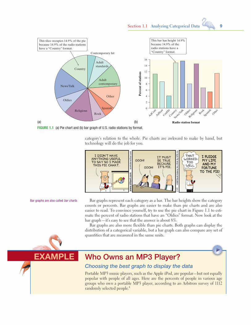
Bar Graphs and Pie ChartsColumns of numbers take time to read. You can use a pie chart or a bar graph to display the distribution of a categorical variable more vividly. Figure 1.1 illustrates both displays for the distribution of radio stations by format.
Pie charts show the distribution of a categorical variable as a “pie” whose slices are sized by the counts or percents for the categories. A pie chart must include all the categories that make up a whole. In the radio station example, we needed the “Other formats” category to complete the whole (all radio stations) and allow us to make a pie chart. Use a pie chart only when you want to emphasize each
Starnes-Yates5e_c01_xxiv-081hr3.indd 8 11/13/13 1:07 PM
9Section 1.1 Analyzing Categorical Data
category’s relation to the whole. Pie charts are awkward to make by hand, but technology will do the job for you.
Contemporary hit
Adultcontemporary
Adultstandards
Other
Rock
Spanish
News/Talk
Oldies
Religious
Country
This slice occupies 14.9% of the piebecause 14.9% of the radio stationshave a “Country” format.
AdCont
AdStan
ConHit
Country
News/T
alk
Oldies
Religio
usRock
Spanish
Other
16
14
12
10
8
6
4
2
0
Perc
ent o
f sta
tions
Radio station format
This bar has height 14.9%because 14.9% of theradio stations have a“Country” format.
(a) (b)
FIGURE 1.1 (a) Pie chart and (b) bar graph of U.S. radio stations by format.
Bar graphs represent each category as a bar. The bar heights show the category counts or percents. Bar graphs are easier to make than pie charts and are also easier to read. To convince yourself, try to use the pie chart in Figure 1.1 to esti-mate the percent of radio stations that have an “Oldies” format. Now look at the bar graph—it’s easy to see that the answer is about 8%.
Bar graphs are also more flexible than pie charts. Both graphs can display the distribution of a categorical variable, but a bar graph can also compare any set of quantities that are measured in the same units.
Bar graphs are also called bar charts.
Who Owns an MP3 Player?Choosing the best graph to display the dataPortable MP3 music players, such as the Apple iPod, are popular—but not equally popular with people of all ages. Here are the percents of people in various age groups who own a portable MP3 player, according to an Arbitron survey of 1112 randomly selected people.4
EXAMPLE

10 C H A P T E R 1 EXPLORING DATA
Age group (years) Percent owning an MP3 player
12 to 17 54
18 to 24 30
25 to 34 30
35 to 54 13
55 and older 5
PROBLEM:(a) Make a well-labeled bar graph to display the data. Describe what you see.(b) Would it be appropriate to make a pie chart for these data? Explain.
SOLUTION:(a) We start by labeling the axes: age group goes on the horizontal axis, and percent who own an MP3 player goes on the vertical axis. For the vertical scale, which is measured in percents, we’ll start at 0 and go up to 60, with tick marks for every 10. Then for each age category, we draw a bar with height corresponding to the percent of survey respondents who said they have an MP3 player. Figure 1.2 shows the com-pleted bar graph. It appears that MP3 players are more popular among young people and that their popularity generally decreases as the age category increases.(b) Making a pie chart to display these data is not appropriate because each percent in the table refers to a different age group, not to parts of a single whole.
Graphs: Good and BadBar graphs compare several quantities by comparing the heights of bars that rep-resent the quantities. Our eyes, however, react to the area of the bars as well as to their height. When all bars have the same width, the area (width × height) varies in proportion to the height, and our eyes receive the right impression. When you draw a bar graph, make the bars equally wide.
Artistically speaking, bar graphs are a bit dull. It is tempting to replace the bars with pictures for greater eye appeal. Don’t do it! The following example shows why.
For Practice Try Exercise 15
FIGURE 1.2 Bar graph comparing the per-cents of several age groups who own portable MP3 players.
Age group (years)
60
50
40
30
20
10
012–17 18–24 25–34 35–54 55+
% wh
o ow
n m
p3 p
laye
r
Who Buys iMacs?Beware the pictograph!When Apple, Inc., introduced the iMac, the company wanted to know whether this new computer was expanding Apple’s market share. Was the iMac mainly be-ing bought by previous Macintosh owners, or was it being purchased by first-time computer buyers and by previous PC users who were switching over? To find out, Apple hired a firm to conduct a survey of 500 iMac customers. Each customer was categorized as a new computer purchaser, a previous PC owner, or a previous Mac-intosh owner. The table summarizes the survey results.5
EXAMPLE

11
Previous ownership Count Percent (%)
None 85 17.0
PC 60 12.0
Macintosh 355 71.0
Total 500 100.0
PROBLEM:(a) Here’s a clever graph of the data that uses pictures instead of the more traditional bars. How is this graph misleading?(b) Two possible bar graphs of the data are shown below. Which one could be considered deceptive? Why?
80
70
60
50
40
30
20
10
0
Perc
ent
Previous computerNone PC Macintosh
80
70
60
50
40
30
20
10Pe
rcen
tPrevious computer
None PC Macintosh
SOLUTION:(a) Although the heights of the pictures are accurate, our eyes respond to the area of the pictures. The pictograph makes it seem like the percent of iMac buyers who are former Mac owners is at least ten times higher than either of the other two categories, which isn’t the case.(b) The bar graph on the right is misleading. By starting the vertical scale at 10 instead of 0, it looks like the percent of iMac buyers who previously owned a PC is less than half the percent who are first-time computer buyers. We get a distorted impression of the relative percents in the three categories.
For Practice Try Exercise 17
Section 1.1 Analyzing Categorical Data
400
300
200
100
None Windows Macintosh
Num
ber
of b
uyer
s
Previous computer
There are two important lessons to be learned from this example: (1) beware the pictograph, and (2) watch those scales.
Two-Way Tables and Marginal DistributionsWe have learned some techniques for analyzing the distribution of a single cate-gorical variable. What do we do when a data set involves two categorical variables? We begin by examining the counts or percents in various categories for one of the variables. Here’s an example to show what we mean.
caution
!

12 C H A P T E R 1 EXPLORING DATA
I’m Gonna Be Rich!Two-way tablesA survey of 4826 randomly selected young adults (aged 19 to 25) asked, “What do you think the chances are you will have much more than a middle-class income at age 30?” The table below shows the responses.6
Young adults by gender and chance of getting rich
Opinion
Gender
TotalFemale Male
Almost no chance 96 98 194
Some chance but probably not 426 286 712
A 50-50 chance 696 720 1416
A good chance 663 758 1421
Almost certain 486 597 1083
Total 2367 2459 4826
This is a two-way table because it describes two categorical variables, gender and opinion about becoming rich. Opinion is the row variable because each row in the table describes young adults who held one of the five opinions about their chances. Because the opinions have a natural order from “Almost no chance” to “Almost certain,” the rows are also in this order. Gender is the column variable. The entries in the table are the counts of individuals in each opinion-by-gender class.
EXAMPLE
DEFINITION: Marginal distributionThe marginal distribution of one of the categorical variables in a two-way table of counts is the distribution of values of that variable among all individuals described by the table.
How can we best grasp the information contained in the two-way table above? First, look at the distribution of each variable separately. The distribution of a cat-egorical variable says how often each outcome occurred. The “Total” column at the right of the table contains the totals for each of the rows. These row totals give the distribution of opinions about becoming rich in the entire group of 4826 young adults: 194 thought that they had almost no chance, 712 thought they had just some chance, and so on. (If the row and column totals are missing, the first thing to do in studying a two-way table is to calculate them.) The distributions of opinion alone and gender alone are called marginal distributions because they appear at the right and bottom margins of the two-way table.
Starnes-Yates5e_c01_xxiv-081hr3.indd 12 11/13/13 1:07 PM

13Section 1.1 Analyzing Categorical Data
Percents are often more informative than counts, especially when we are com-paring groups of different sizes. We can display the marginal distribution of opin-ions in percents by dividing each row total by the table total and converting to a percent. For instance, the percent of these young adults who think they are almost certain to be rich by age 30 is
almost certain totaltable total
=10834826
= 0.224 = 22.4%
I’m Gonna Be Rich!Examining a marginal distributionPROBLEM:(a) Use the data in the two-way table to calculate the marginal distribution (in percents) of opinions.(b) Make a graph to display the marginal distribution. Describe what you see.
SOLUTION:(a) We can do four more calculations like the one shown above to obtain the marginal distribution of opinions in percents. Here is the complete distribution.
Response Percent
Almost no chance 1944826
= 4.0%
Some chance 7124826
= 14.8%
A 50–50 chance 14164826
= 29.3%
A good chance 14214826
= 29.4%
Almost certain 10834826
= 22.4%
(b) Figure 1.3 is a bar graph of the distribution of opinion among these young adults. It seems that many young adults are optimistic about their future income. Over 50% of those who responded to the survey felt that they had “a good chance” or were “almost certain” to be rich by age 30.
EXAMPLE
For Practice Try Exercise 19
FIGURE 1.3 Bar graph showing the marginal distribution of opinion about chance of being rich by age 30.
Survey response
Chance of being wealthy by age 30
30
20
10
0Almostnone
Somechance
50–50chance
Goodchance
Almostcertain
Perc
ent
Each marginal distribution from a two-way table is a distribution for a single categorical variable. As we saw earlier, we can use a bar graph or a pie chart to display such a distribution.
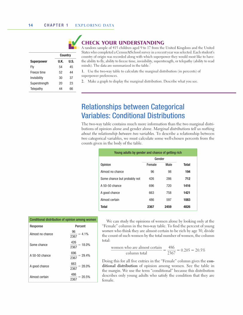
14 C H A P T E R 1 EXPLORING DATA
1. Use the two-way table to calculate the marginal distribution (in percents) of superpower preferences.2. Make a graph to display the marginal distribution. Describe what you see.
Relationships between Categorical Variables: Conditional DistributionsThe two-way table contains much more information than the two marginal distri-butions of opinion alone and gender alone. Marginal distributions tell us nothing about the relationship between two variables. To describe a relationship between two categorical variables, we must calculate some well-chosen percents from the counts given in the body of the table.
Young adults by gender and chance of getting rich
Opinion
Gender
TotalFemale Male
Almost no chance 96 98 194
Some chance but probably not 426 286 712
A 50-50 chance 696 720 1416
A good chance 663 758 1421
Almost certain 486 597 1083
Total 2367 2459 4826
We can study the opinions of women alone by looking only at the “Female” column in the two-way table. To find the percent of young women who think they are almost certain to be rich by age 30, divide the count of such women by the total number of women, the column total:
women who are almost certaincolumn total
=486
2367= 0.205 = 20.5%
Doing this for all five entries in the “Female” column gives the con-ditional distribution of opinion among women. See the table in the margin. We use the term “conditional” because this distribution describes only young adults who satisfy the condition that they are female.
CHECK YOUR UNDERSTANDING A random sample of 415 children aged 9 to 17 from the United Kingdom and the United States who completed a CensusAtSchool survey in a recent year was selected. Each student’s country of origin was recorded along with which superpower they would most like to have: the ability to fly, ability to freeze time, invisibility, superstrength, or telepathy (ability to read minds). The data are summarized in the table.7
Conditional distribution of opinion among women
Response Percent
Almost no chance96
2367= 4.1%
Some chance4262367
= 18.0%
A 50-50 chance6962367
= 29.4%
A good chance6632367
= 28.0%
Almost certain4862367
= 20.5%
Country
Superpower U.K. U.S.Fly 54 45
Freeze time 52 44
Invisibility 30 37
Superstrength 20 23
Telepathy 44 66
Starnes-Yates5e_c01_xxiv-081hr3.indd 14 11/13/13 1:07 PM

15Section 1.1 Analyzing Categorical Data
Now let’s examine the men’s opinions.
There are two sets of conditional distributions for any two-way table: one for the column variable and one for the row variable. So far, we have looked at the condi-tional distributions of opinion for the two genders. We could also examine the five conditional distributions of gender, one for each of the five opinions, by looking separately at the rows in the original two-way table. For instance, the conditional distribution of gender among those who responded “Almost certain” is
Female Male
486
1083= 44.9%
5971083
= 55.1%
DEFINITION: Conditional distributionA conditional distribution of a variable describes the values of that variable among individuals who have a specific value of another variable. There is a separate condi-tional distribution for each value of the other variable.
I’m Gonna Be Rich!Calculating a conditional distributionPROBLEM: Calculate the conditional distribution of opinion among the young men.SOLUTION: To find the percent of young men who think they are almost certain to be rich by age 30, divide the count of such men by the total number of men, the column total:
men who are almost certaincolumn total
=597
2459= 24.3%
If we do this for all five entries in the “Male” column, we get the conditional distribution shown in the table.
Conditional distribution of opinion among men
Response Percent
Almost no chance 982459
= 4.0%
Some chance 2862459
= 11.6%
A 50-50 chance 7202459
= 29.3%
A good chance 7582459
= 30.8%
Almost certain 5972459
= 24.3%
EXAMPLE
For Practice Try Exercise 21

16 C H A P T E R 1 EXPLORING DATA
That is, of the young adults who said they were almost cer-tain to be rich by age 30, 44.9% were female and 55.1% were male.
Because the variable “gender” has only two categories, com-paring the five conditional distributions amounts to comparing the percents of women among young adults who hold each opinion. Figure 1.4 makes this comparison in a bar graph. The bar heights do not add to 100%, because each bar represents a different group of people.
1. TECHNOLOGY CORNER
Figure 1.5 presents the two conditional distributions of opinion, for women and for men, and also the marginal distribution of opinion for all of the young adults. The distributions agree (up to rounding) with the results in the last two examples.
ANALYZING TWO-WAY TABLES
FIGURE 1.4 Bar graph comparing the percents of females among those who hold each opinion about their chance of being rich by age 30.
70
60
50
40
30
20
10
0
Perc
ent o
f wom
enin
the
opin
ion
grou
p
Opinion
Almostnone
Somechance
A 50–50chance
A goodchance
Almostcertain
FIGURE 1.5 Minitab output for the two-way table of young adults by gender and chance of being rich, along with each entry as a percent of its column total. The “Female” and “Male” columns give the conditional distributions of opinion for women and men, and the “All” column shows the marginal distribution of opinion for all these young adults.
Which conditional distributions should we compare? Our goal all along has been to analyze the relationship between gender and opinion about chances of becoming rich for these young adults. We started by examining the conditional distributions of opinion for males and females. Then we looked at the conditional distributions of gender for each of the five opinion categories. Which of these two gives us the information we want? Here’s a hint: think about whether changes in one variable might help explain changes in the other. In this case, it seems reasonable to think that gender might influence young adults’ opinions about their chances of getting rich. To see whether the data support this idea, we should compare the conditional distributions of opinion for women and men.
Software will calculate conditional distributions for you. Most programs allow you to choose which conditional distributions you want to compute.
THINKABOUT IT

17Section 1.1 Analyzing Categorical Data
EXAMPLE
Putting It All Together: Relationships Between Categorical VariablesNow it’s time to complete our analysis of the relationship between gender and opinion about chances of becoming rich later in life.
Women’s and Men’s OpinionsConditional distributions and relationshipsPROBLEM: Based on the survey data, can we conclude that young men and women differ in their opinions about the likelihood of future wealth? Give appropriate evidence to support your answer.SOLUTION: We suspect that gender might influence a young adult’s opinion about the chance of get-ting rich. So we’ll compare the conditional distributions of response for men alone and for women alone.
Response Percent of Females Percent of Males
Almost no chance96
2367= 4.1%
982459
= 4.0%
Some chance4262367
= 18.0%2862459
= 11.6%
A 50-50 chance6962367
= 29.4%7202459
= 29.3%
A good chance6632367
= 28.0%7582459
= 30.8%
Almost certain4862367
= 20.5%5972459
= 24.3%
We’ll make a side-by-side bar graph to compare the opinions of males and females. Figure 1.6 displays the completed graph.Based on the sample data, men seem somewhat more optimistic about their future income than women. Men were less likely to say that they have “some chance but probably not” than women (11.6% vs. 18.0%). Men were more likely to say that they have “a good chance” (30.8% vs. 28.0%) or are “almost certain” (24.3% vs. 20.5%) to have much more than a middle-class income by age 30 than women were.
For Practice Try Exercise 25
We could have used a segmented bar graph to compare the distributions of male and female responses in the previous example. Figure 1.7 shows the completed graph. Each bar has five segments—one for each of the opinion categories. It’s fairly difficult to compare the percents of males and females in each category because the “middle” segments in the two bars start at different locations on the vertical axis. The side-by-side bar graph in Figure 1.6 makes comparison easier.
FIGURE 1.6 Side-by-side bar graph comparing the opinions of males and females.
Opinion
Perc
ent
Chance of being wealthy by age 30
Almostnone
Somechance
50–50chance
Goodchance
Almostcertain
FemaleMale
30
20
10
0
40
70
60
90
80
50
100
40
30
20
10
0
Perc
ent
OpinionFemale Male
Almost certain
A good chance
A 50–50 chance
Some chance
Almost none
FIGURE 1.7 Segmented bar graph com-paring the opinions of males and females.

18 C H A P T E R 1 EXPLORING DATA
DEFINITION: AssociationWe say that there is an association between two variables if knowing the value of one variable helps predict the value of the other. If knowing the value of one variable does not help you predict the value of the other, then there is no association between the variables.
Can we say that there is an association between gender and opinion in the popu-lation of young adults? Making this determination requires formal inference, which will have to wait a few chapters.
What does “no association” mean? Figure 1.6 (page 17) suggests an association between gender and opinion about future wealth for young adults. Knowing that a young adult is male helps us predict his opinion: he is more likely than a female to say “a good chance” or “almost certain.” What would the graph look like if there was no association between the two vari-ables? In that case, knowing that a young adult is male would not help us predict his opinion. He would be no more or less likely than a female to say “a good chance” or “almost certain” or any of the other possible responses. That is, the conditional distributions of opinion about becoming rich would be the same for males and females. The segmented bar graphs for the two genders would look the same, too.
THINKABOUT IT
CHECK YOUR UNDERSTANDINGLet’s complete our analysis of the data on superpower preferences from the previ-ous Check Your Understanding (page 14). Here is the two-way table of counts once again.
Country
Superpower U.K. U.S.Fly 54 45
Freeze time 52 44
Invisibility 30 37
Superstrength 20 23
Telepathy 44 66
1. Find the conditional distributions of superpower preference among students from the United Kingdom and the United States.2. Make an appropriate graph to compare the conditional distributions.3. Is there an association between country of origin and superpower preference? Give appropriate evidence to support your answer.
Both graphs provide evidence of an association between gender and opinion about future wealth in this sample of young adults. Men more often rated their chances of becoming rich in the two highest categories; women said “some chance but probably not” much more frequently.
There’s one caution that we need to offer: even a strong association be-tween two categorical variables can be influenced by other variables lurking in the background. The Data Exploration that follows gives you a chance to explore this idea using a famous (or infamous) data set.
caution
!
19Section 1.1 Analyzing Categorical Data
In 1912 the luxury liner Titanic, on its first voyage across the Atlantic, struck an iceberg and sank. Some passengers got off the ship in lifeboats, but many died. The two-way table below gives information about adult passengers who lived and who died, by class of travel.
Survival status
Class of Travel
First class Second class Third class
Lived 197 94 151Died 122 167 476
Here’s another table that displays data on survival status by gender and class of travel.
Survival status
Class of Travel
First class Second class Third class
Female Male Female Male Female Male
Lived 140 57 80 14 76 75
Died 4 118 13 154 89 387
The movie Titanic, starring Leonardo DiCaprio and Kate Winslet, suggested the following:• First-class passengers received special treatment in boarding the lifeboats,
while some other passengers were prevented from doing so (especially third-class passengers).
• Women and children boarded the lifeboats first, followed by the men.1. What do the data tell us about these two suggestions? Give appropriate graphical and numerical evidence to support your answer.2. How does gender affect the relationship between class of travel and survival status? Explain.
DATA EXPLORATION A Titanic disaster
Summary• The distribution of a categorical variable lists the categories and gives the
count (frequency) or percent (relative frequency) of individuals that fall within each category.
• Pie charts and bar graphs display the distribution of a categorical variable. Bar graphs can also compare any set of quantities measured in the same units. When examining any graph, ask yourself, “What do I see?”
• A two-way table of counts organizes data about two categorical variables mea-sured for the same set of individuals. Two-way tables are often used to sum-marize large amounts of information by grouping outcomes into categories.
Section 1.1
20 C H A P T E R 1 EXPLORING DATA
• The row totals and column totals in a two-way table give the marginal dis-tributions of the two individual variables. It is clearer to present these distri-butions as percents of the table total. Marginal distributions tell us nothing about the relationship between the variables.
• There are two sets of conditional distributions for a two-way table: the dis-tributions of the row variable for each value of the column variable, and the distributions of the column variable for each value of the row variable. You may want to use a side-by-side bar graph (or possibly a segmented bar graph) to display conditional distributions.
• There is an association between two variables if knowing the value of one vari-able helps predict the value of the other. To see whether there is an association between two categorical variables, compare an appropriate set of conditional distributions. Remember that even a strong association between two categori-cal variables can be influenced by other variables.
1.1 TECHNOLOGY CORNER
TI-Nspire instructions in ApTI-
1. Analyzing two-way tables page 16
Exercises9. Cool car colors The most popular colors for cars
and light trucks change over time. Silver passed green in 2000 to become the most popular color worldwide, then gave way to shades of white in 2007. Here is the distribution of colors for vehicles sold in North America in 2011.8
Color Percent of vehicles
White 23
Black 18
Silver 16
Gray 13
Red 10
Blue 9
Brown/beige 5
Yellow/gold 3
Green 2
(a) What percent of vehicles had colors other than those listed?
(b) Display these data in a bar graph. Be sure to label your axes.
(c) Would it be appropriate to make a pie chart of these data? Explain.
10. Spam Email spam is the curse of the Internet. Here is a compilation of the most common types of spam:9
Type of spam Percent
Adult 19
Financial 20
Health 7
Internet 7
Leisure 6
Products 25
Scams 9
Other ??
(a) What percent of spam would fall in the “Other” category?
(b) Display these data in a bar graph. Be sure to label your axes.
(c) Would it be appropriate to make a pie chart of these data? Explain.
Section 1.1
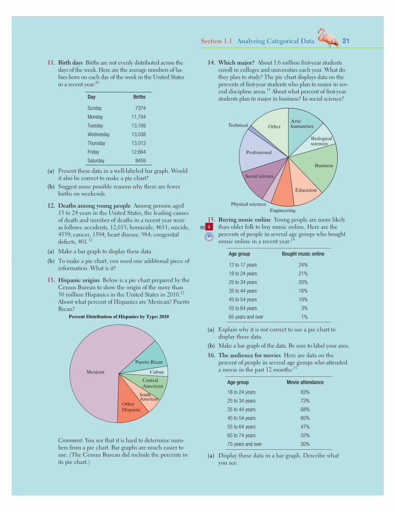
21Section 1.1 Analyzing Categorical Data
11. Birth days Births are not evenly distributed across the days of the week. Here are the average numbers of ba-bies born on each day of the week in the United States in a recent year:10
Day Births
Sunday 7374
Monday 11,704
Tuesday 13,169
Wednesday 13,038
Thursday 13,013
Friday 12,664
Saturday 8459
(a) Present these data in a well-labeled bar graph. Would it also be correct to make a pie chart?
(b) Suggest some possible reasons why there are fewer births on weekends.
12. Deaths among young people Among persons aged 15 to 24 years in the United States, the leading causes of death and number of deaths in a recent year were as follows: accidents, 12,015; homicide, 4651; suicide, 4559; cancer, 1594; heart disease, 984; congenital defects, 401.11
(a) Make a bar graph to display these data.(b) To make a pie chart, you need one additional piece of
information. What is it?
13. Hispanic origins Below is a pie chart prepared by the Census Bureau to show the origin of the more than 50 million Hispanics in the United States in 2010.12 About what percent of Hispanics are Mexican? Puerto Rican?
Percent Distribution of Hispanics by Type: 2010
Mexican
Puerto Rican
Cuban
CentralAmerican
OtherHispanic
SouthAmerican
Comment: You see that it is hard to determine num-bers from a pie chart. Bar graphs are much easier to use. (The Census Bureau did include the percents in its pie chart.)
14. Which major? About 1.6 million first-year students enroll in colleges and universities each year. What do they plan to study? The pie chart displays data on the percents of first-year students who plan to major in sev-eral discipline areas.13 About what percent of first-year students plan to major in business? In social science?
Biologicalsciences
Arts/humanities
Business
Education
Engineering
Social science
Physical sciences
Technical Other
Professional
15. Buying music online Young people are more likely than older folk to buy music online. Here are the percents of people in several age groups who bought music online in a recent year:14
Age group Bought music online
12 to 17 years 24%
18 to 24 years 21%
25 to 34 years 20%
35 to 44 years 16%
45 to 54 years 10%
55 to 64 years 3%
65 years and over 1%
(a) Explain why it is not correct to use a pie chart to display these data.
(b) Make a bar graph of the data. Be sure to label your axes.16. The audience for movies Here are data on the
percent of people in several age groups who attended a movie in the past 12 months:15
Age group Movie attendance
18 to 24 years 83%
25 to 34 years 73%
35 to 44 years 68%
45 to 54 years 60%
55 to 64 years 47%
65 to 74 years 32%
75 years and over 20%
(a) Display these data in a bar graph. Describe what you see.
pg 9

22 C H A P T E R 1 EXPLORING DATA
(b) Would it be correct to make a pie chart of these data? Why or why not?
(c) A movie studio wants to know what percent of the to-tal audience for movies is 18 to 24 years old. Explain why these data do not answer this question.
17. Going to school Students in a high school statistics class were given data about the main method of trans-portation to school for a group of 30 students. They produced the pictograph shown.
Walk
Bus
Car
Cycle
Mod
e of
tran
spor
t
STATE COLLEGE BUS SERVICE STATE COLLEGE BUS SERVICE
Key:= 1 Cycler= 2 Cars= 7 Bus takers= 2 Walkers
STATE COLLEGE BUS SERVICE
(a) How is this graph misleading?(b) Make a new graph that isn’t misleading.18. Oatmeal and cholesterol Does eating oatmeal
reduce cholesterol? An advertisement included the following graph as evidence that the answer is “Yes.”
210
208
206
204
202
200
198
196
Cho
lest
erol
Week 1 Week 2 Week 3 Week 4
Representative cholesterol point drop
(a) How is this graph misleading?(b) Make a new graph that isn’t misleading. What do
you conclude about the relationship between eating oatmeal and cholesterol reduction?
19. Attitudes toward recycled products Recycling is sup-posed to save resources. Some people think recycled products are lower in quality than other products, a fact that makes recycling less practical. People who use a recycled product may have different opinions from those who don’t use it. Here are data on attitudes toward coffee filters made of recycled paper from a sample of people who do and don’t buy these filters:16
Buy recycled filters?
Think quality is Yes No
Higher 20 29
The same 7 25
Lower 9 43
(a) How many people does this table describe? How many of these were buyers of coffee filters made of recycled paper?
(b) Give the marginal distribution (in percents) of opinion about the quality of recycled filters. What percent of the people in the sample think the quality of the recycled product is the same or higher than the quality of other filters?
20. Smoking by students and parents Here are data from a survey conducted at eight high schools on smoking among students and their parents:17
Neither parent
smokes
One parent
smokes
Both parents smoke
Student does not smoke 1168 1823 1380
Student smokes 188 416 400
(a) How many students are described in the two-way table? What percent of these students smoke?
(b) Give the marginal distribution (in percents) of parents’ smoking behavior, both in counts and in percents.
21. Attitudes toward recycled products Exercise 19 gives data on the opinions of people who have and have not bought coffee filters made from recycled paper. To see the relationship between opinion and experience with the product, find the conditional distributions of opinion (the response variable) for buyers and nonbuyers. What do you conclude?
22. Smoking by students and parents Refer to Exercise 20. Calculate three conditional distributions of students’ smoking behavior: one for each of the three parental smoking categories. Describe the relation-ship between the smoking behaviors of students and their parents in a few sentences.
23. Popular colors—here and there Favorite vehicle colors may differ among countries. The side-by-side bar graph shows data on the most popular colors of cars in a recent year for the United States and Europe. Write a few sentences comparing the two distributions.
White
/pearl
30
25
20
15
10
5
0
Perc
ent
Color
Black
Silver
BlueGra
yRed
Beige/b
rown
Green
Yellow/go
ld
U.S.Europe
pg 13
pg 10
pg 15

Section 1.1 Analyzing Categorical Data 23
24. Comparing car colors Favorite vehicle colors may differ among types of vehicle. Here are data on the most popular colors in a recent year for luxury cars and for SUVs, trucks, and vans.
Color Luxury cars (%) SUVs, trucks, vans (%)
Black 22 13
Silver 16 16
White pearl 14 1
Gray 12 13
White 11 25
Blue 7 10
Red 7 11
Yellow/gold 6 1
Green 3 4
Beige/brown 2 6
(a) Make a graph to compare colors by vehicle type.(b) Write a few sentences describing what you see.
25. Snowmobiles in the park Yellowstone National Park surveyed a random sample of 1526 winter visitors to the park. They asked each person whether they owned, rented, or had never used a snowmobile. Re-spondents were also asked whether they belonged to an environmental organization (like the Sierra Club). The two-way table summarizes the survey responses.
Environmental Club
No Yes Total
Never used 445 212 657
Snowmobile renter 497 77 574
Snowmobile owner 279 16 295
Total 1221 305 1526
Do these data suggest that there is an association between environmental club membership and snowmobile use among visitors to Yellowstone Na-tional Park? Give appropriate evidence to support your answer.
26. Angry people and heart disease People who get an-gry easily tend to have more heart disease. That’s the conclusion of a study that followed a random sample of 12,986 people from three locations for about four years. All subjects were free of heart disease at the beginning of the study. The subjects took the Spiel-berger Trait Anger Scale test, which measures how prone a person is to sudden anger. Here are data for the 8474 people in the sample who had normal blood pressure. CHD stands for “coronary heart disease.” This includes people who had heart attacks and those who needed medical treatment for heart disease.
Low anger Moderate anger High anger Total
CHD 53 110 27 190
No CHD 3057 4621 606 8284
Total 3110 4731 633 8474
Do these data support the study’s conclusion about the relationship between anger and heart disease? Give appropriate evidence to support your answer.
Multiple choice: Select the best answer for Exercises 27 to 34.Exercises 27 to 30 refer to the following setting. The National Survey of Adolescent Health interviewed several thousand teens (grades 7 to 12). One question asked was “What do you think are the chances you will be married in the next ten years?” Here is a two-way table of the responses by gender:18
Female Male
Almost no chance 119 103
Some chance, but probably not 150 171
A 50-50 chance 447 512
A good chance 735 710
Almost certain 1174 756
27. The percent of females among the respondents was(a) 2625. (c) about 46%. (e) None of these.(b) 4877. (d) about 54%.
28. Your percent from the previous exercise is part of(a) the marginal distribution of females.(b) the marginal distribution of gender.(c) the marginal distribution of opinion about marriage.(d) the conditional distribution of gender among adoles-
cents with a given opinion.(e) the conditional distribution of opinion among adoles-
cents of a given gender.
29. What percent of females thought that they were almost certain to be married in the next ten years?
(a) About 16% (c) About 40% (e) About 61%(b) About 24% (d) About 45%
30. Your percent from the previous exercise is part of(a) the marginal distribution of gender.(b) the marginal distribution of opinion about marriage.(c) the conditional distribution of gender among adoles-
cents with a given opinion.(d) the conditional distribution of opinion among adoles-
cents of a given gender.(e) the conditional distribution of “Almost certain”
among females.
pg 17

24 C H A P T E R 1 EXPLORING DATA
31. For which of the following would it be inappropriate to display the data with a single pie chart?
(a) The distribution of car colors for vehicles purchased in the last month.
(b) The distribution of unemployment percentages for each of the 50 states.
(c) The distribution of favorite sport for a sample of 30 middle school students.
(d) The distribution of shoe type worn by shoppers at a local mall.
(e) The distribution of presidential candidate preference for voters in a state.
32. The following bar graph shows the distribution of favorite subject for a sample of 1000 students. What is the most serious problem with the graph?
Math
280260240220200180160
Num
ber
of s
tude
nts
140120100
Favorite subject
Science
English
Social
studies
Foreign
langu
age
Fine arts
(a) The subjects are not listed in the correct order.(b) This distribution should be displayed with a pie chart.(c) The vertical axis should show the percent of students. (d) The vertical axis should start at 0 rather than 100.(e) The foreign language bar should be broken up by
language.
33. In the 2010–2011 season, the Dallas Mavericks won the NBA championship. The two-way table below displays the relationship between the outcome of each game in the regular season and whether the Mavericks scored at least 100 points.
100 or more points Fewer than 100 points Total
Win 43 14 57
Loss 4 21 25
Total 47 35 82
Which of the following is the best evidence that there is an association between the outcome of a game and whether or not the Mavericks scored at least 100 points?
(a) The Mavericks won 57 games and lost only 25 games. (b) The Mavericks scored at least 100 points in 47 games
and fewer than 100 points in only 35 games. (c) The Mavericks won 43 games when scoring at least
100 points and only 14 games when scoring fewer than 100 points.
(d) The Mavericks won a higher proportion of games when scoring at least 100 points (43/47) than when they scored fewer than 100 points (14/35).
(e) The combination of scoring 100 or more points and winning the game occurred more often (43 times) than any other combination of outcomes.
34. The following partially complete two-way table shows the marginal distributions of gender and handedness for a sample of 100 high school students.
Male Female Total
Right x 90
Left 10
Total 40 60 100
If there is no association between gender and handed-ness for the members of the sample, which of the following is the correct value of x?
(a) 20.(b) 30.(c) 36.(d) 45.(e) Impossible to determine without more information.
35. Marginal distributions aren’t the whole story Here are the row and column totals for a two-way table with two rows and two columns:
a b 50
c d 50
60 40 100
Find two different sets of counts a, b, c, and d for the body of the table that give these same totals. This shows that the relationship between two variables can-not be obtained from the two individual distributions of the variables.
36. Fuel economy (Introduction) Here is a small part of a data set that describes the fuel economy (in miles per gallon) of model year 2012 motor vehicles:
Make and model Vehicle type
Transmission type
Number of cylinders
City mpg
Highway mpg
Aston Martin Vantage
Two-seater Manual 8 14 20
Honda Civic Hybrid
Subcompact Automatic 4 44 44
Toyota Prius Midsize Automatic 4 51 48
Chevrolet Impala
Large Automatic 6 18 30
(a) What are the individuals in this data set?(b) What variables were measured? Identify each as cat-
egorical or quantitative.

Section 1.2 Displaying Quantitative Data with Graphs 25
1.2 Displaying Quantitative Data with Graphs
WHAT YOU WILL LEARN• Make and interpret dotplots and stemplots of quantita-
tive data.
• Describe the overall pattern (shape, center, and spread) of a distribution and identify any major departures from the pattern (outliers).
• Identify the shape of a distribution from a graph as roughly symmetric or skewed.
• Make and interpret histograms of quantitative data. • Compare distributions of quantitative data using dot-
plots, stemplots, or histograms.
By the end of the section, you should be able to:
To display the distribution of a categorical variable, use a bar graph or a pie chart. How can we picture the distribution of a quantitative variable? In this section, we present several types of graphs that can be used to display quantitative data.
DotplotsOne of the simplest graphs to construct and interpret is a dotplot. Each data value is shown as a dot above its location on a number line. We’ll show how to make a dotplot using some sports data.
Gooooaaaaallllll!How to make a dotplotHow good was the 2012 U.S. women’s soccer team? With players like Abby Wambach, Megan Rapinoe, and Hope Solo, the team put on an impressive showing en route to winning the gold medal at the 2012 Olympics in London. Here are data on the num-ber of goals scored by the team in the 12 months prior to the 2012 Olympics.19
1 3 1 14 13 4 3 4 2 5 2 0 4
1 3 4 3 4 2 4 3 1 2 4 2
Here are the steps in making a dotplot:• Draw a horizontal axis (a number line) and label it with the variable name. In this case, the variable is number of goals scored.• Scale the axis. Start by looking at the minimum and maximum values of the
variable. For these data, the minimum number of goals scored was 0, and the maximum was 14. So we mark our scale from 0 to 14, with tick marks at every whole-number value.• Mark a dot above the location on the hori-zontal axis corresponding to each data value. Figure 1.8 displays a completed dotplot for the soccer data.
EXAMPLE
14121086420Number of goals scored
FIGURE 1.8 A dotplot of goals scored by the U.S. women’s soccer team in 2012.
Starnes-Yates5e_c01_xxiv-081hr3.indd 25 11/13/13 1:07 PM

26 C H A P T E R 1 EXPLORING DATA
You’ll learn more formal ways of describing shape, center, and spread and iden-tifying outliers soon. For now, let’s use our informal understanding of these ideas to examine the graph of the U.S. women’s soccer team data.
Shape: The dotplot has a peak at 4, a single main cluster of dots between 0 and 5, and a large gap between 5 and 13. The main cluster has a longer tail to the left of the peak than to the right. What does the shape tell us? The U.S. women’s soccer team scored between 0 and 5 goals in most of its games, with 4 being the most common value (known as the mode).
Center: The “midpoint” of the 25 values shown in the graph is the 13th value if we count in from either end. You can confirm that the midpoint is at 3. What does this number tell us? In a typical game during the 2012 season, the U.S. women’s soccer team scored about 3 goals.
Spread: The data vary from 0 goals scored to 14 goals scored.
Outliers: The games in which the women’s team scored 13 goals and 14 goals clearly stand out from the overall pattern of the distribution. So we label them as possible outliers. (In Section 1.3, we’ll establish a procedure for determining whether a particular value is an outlier.)
When describing a distribution of quantitative data, don’t forget your SOCS (shape, outliers, center, spread)!
Making a graph is not an end in itself. The purpose of a graph is to help us understand the data. After you make a graph, always ask, “What do I see?” Here is a general strategy for interpreting graphs of quantitative data.
In any graph, look for the overall pattern and for striking departures from that pattern.
• You can describe the overall pattern of a distribution by its shape, center, and spread.
• An important kind of departure is an outlier, an individual value that falls outside the overall pattern.
HOW TO EXAMINE THE DISTRIBUTION OF A QUANTITATIVE VARIABLE
EXAMPLE Are You Driving a Gas Guzzler?Interpreting a dotplot
The Environmental Protection Agency (EPA) is in charge of determining and reporting fuel economy ratings for cars (think of those large window stickers on a new car). For years, consumers complained that their actual gas mileages were noticeably lower than the values reported by the EPA. It seems that the EPA’s tests—all of which are done on computerized devices to ensure consistency—did not consider things like outdoor temperature, use of the air conditioner, or realistic acceleration and braking by driv-ers. In 2008 the EPA changed the method for measuring a vehicle’s fuel economy to try to give more accurate e stimates.
The following table displays the EPA estimates of highway gas mileage in miles per gallon (mpg) for a sample of 24 model year 2012 midsize cars.20

27Section 1.2 Displaying Quantitative Data with Graphs
Model mpg Model mpg Model mpg
Acura RL 24 Dodge Avenger 30 Mercedes-Benz E350 30
Audi A8 28 Ford Fusion 25 Mitsubishi Galant 30
Bentley Mulsanne 18 Hyundai Elantra 40 Nissan Maxima 26
BMW 550I 23 Jaguar XF 23 Saab 9-5 Sedan 28
Buick Lacrosse 27 Kia Optima 34 Subaru Legacy 31
Cadillac CTS 27 Lexus ES 350 28 Toyota Prius 48
Chevrolet Malibu 33 Lincoln MKZ 27 Volkswagen Passat 31
Chrysler 200 30 Mazda 6 31 Volvo S80 26
Figure 1.9 shows a dotplot of the data:
FIGURE 1.9 Dotplot displaying EPA estimates of highway gas mileage for model year 2012 midsize cars.
20 25 30 35 40 45HwyMPG
For Practice Try Exercise 39
PROBLEM: Describe the shape, center, and spread of the distribution. Are there any outliers?SOLUTION:Shape: The dotplot has a peak at 30 mpg and a main cluster of values from 23 to 34 mpg. There are large gaps between 18 and 23, 34 and 40, 40 and 48 mpg. Center: The midpoint of the 24 values shown in the graph is 28. So a typical model year 2012 midsize car in the sample got about 28 miles per gallon on the highway. Spread: The data vary from 18 mpg to 48 mpg.Outliers: We see two midsize cars with unusually high gas mileage ratings: the Hyundai Elantra (40 mpg) and the Toyota Prius (48 mpg). The Bentley Mulsanne stands out for its low gas mileage rating (18 mpg). All three of these values seem like clear outliers.
The 2012 Nissan Leaf, an electric car, got an EPA estimated 92 miles per gallon on the highway. With the U.S. government’s plan to raise the fuel economy standard to an average of 54.5 mpg by 2025, even more alternative-fuel vehicles like the Leaf will have to be developed.
Describing ShapeWhen you describe a distribution’s shape, concentrate on the main features. Look for major peaks, not for minor ups and downs in the graph. Look for clusters of values and obvious gaps. Look for potential outliers, not just for the smallest and largest observations. Look for rough symmetry or clear skewness.
DEFINITION: Symmetric and skewed distributionsA distribution is roughly symmetric if the right and left sides of the graph are ap-proximately mirror images of each other.
A distribution is skewed to the right if the right side of the graph (containing the half of the observations with larger values) is much longer than the left side. It is skewed to the left if the left side of the graph is much longer than the right side.
Skewedto theleft!
For his own safety, which way should Mr. Starnes go “skewing”?

28 C H A P T E R 1 EXPLORING DATA
EXAMPLE Die Rolls and Quiz ScoresDescribing shapeFigure 1.10 displays dotplots for two different sets of quantitative data. Let’s practice describing the shapes of these distributions. Figure 1.10(a) shows the results of roll-ing a pair of fair, six-sided dice and finding the sum of the up-faces 100 times. This distribution is roughly symmetric. The dotplot in Figure 1.10(b) shows the scores on an AP® Statistics class’s first quiz. This distribution is skewed to the left.
FIGURE 1.10 Dotplots displaying different shapes: (a) roughly symmetric; (b) skewed to the left.
Score70 75 80 85 90 95 100
Dice rolls2 4 6 8 10 12
(a)
(b)
For brevity, we sometimes say “left-skewed” instead of “skewed to the left” and “right-skewed” instead of “skewed to the right.” We could also describe a distribu-tion with a long tail to the left as “skewed toward negative values” or “negatively skewed” and a distribution with a long right tail as “positively skewed.”
The direction of skewness is the direction of the long tail, not the direc-tion where most observations are clustered. See the drawing in the margin on page 27 for a cute but corny way to help you keep this straight.
caution
!
FIGURE 1.11 Dotplot displaying duration (in minutes) of Old Faithful eruptions. This graph has a bimodal shape.
Although the dotplots in the previous example have different shapes, they do have something in common. Both are unimodal, that is, they have a single peak: the graph of dice rolls at 7 and the graph of quiz scores at 90. (We don’t count minor ups and downs in a graph, like the “bumps” at 9 and 11 in the dice rolls dotplot, as “peaks.”) Figure 1.11 is a dotplot of the duration (in minutes) of 220

29Section 1.2 Displaying Quantitative Data with Graphs
eruptions of the Old Faithful geyser. We would describe this distribution’s shape as roughly symmetric and bimodal because it has two clear peaks: one near 2 minutes and the other near 4.5 minutes. (Although we could continue the pattern with “trimodal” for three peaks and so on, it’s more common to refer to distribu-tions with more than two clear peaks as multimodal.)
What shape will the graph have? Some variables have distributions with predictable shapes. Many biological measurements on individuals from the same species and gender—lengths of bird bills, heights of young women—have roughly symmetric distributions. Salaries and home prices, on the other hand, usually have right-skewed distributions. There are many moderately priced hous-es, for example, but the few very expensive mansions give the distribution of house prices a strong right skew. Many distributions have irregular shapes that are nei-ther symmetric nor skewed. Some data show other patterns, such as the two peaks in Figure 1.11. Use your eyes, describe the pattern you see, and then try to explain the pattern.
THINKABOUT IT
CHECK YOUR UNDERSTANDINGThe Fathom dotplot displays data on the number of siblings reported by each student in a statistics class.
1. Describe the shape of the distribution.2. Describe the center of the distribution.3. Describe the spread of the distribution.4. Identify any potential outliers.
Comparing DistributionsSome of the most interesting statistics questions involve comparing two or more groups. Which of two popular diets leads to greater long-term weight loss? Who texts more—males or females? Does the number of people living in a household differ among countries? As the following example suggests, you should always discuss shape, center, spread, and possible outliers whenever you compare distri-butions of a quantitative variable.

30 C H A P T E R 1 EXPLORING DATA
EXAMPLE Household Size: U.K. versus South AfricaComparing distributionsHow do the numbers of people living in households in the United Kingdom (U.K.) and South Africa compare? To help answer this question, we used CensusAtSchool’s “Random Data Selector” to choose 50 students from each country. Figure 1.12 is a dotplot of the household sizes reported by the survey respondents.
PROBLEM: Compare the distributions of household size for these two countries.SOLUTION: Shape: The distribution of household size for the U.K. sample is roughly symmetric and unimodal, while the distribution for the South Africa sample is skewed to the right and unimodal. Center: Household sizes for the South African students tended to be larger than for the U.K. students. The midpoints of the household sizes for the two groups are 6 people and 4 people, respectively.Spread: The household sizes for the South African students vary more (from 3 to 26 people) than for the U.K. students (from 2 to 6 people).Outliers: There don’t appear to be any outliers in the U.K. distribution. The South African distribution seems to have two outliers in the right tail of the distribution—students who reported living in households with 15 and 26 people.
For Practice Try Exercise 43
Household size
U.K
.
0 5 10 15 20 25 30
Household sizePla
ce 0 5 10 15 20 25 30
Sout
h A
fric
a
FIGURE 1.12 Dotplots of household size for random samples of 50 students from the United Kingdom and South Africa.
AP® EXAM TIP When comparing distributions of quantitative data, it’s not enough just to list values for the center and spread of each distribution. You have to explicitly compare these values, using words like “greater than,” “less than,” or “about the same as.”
Notice that we discussed the distributions of household size only for the two samples of 50 students in the previous example. We might be interested in whether the sample data give us convincing evidence of a difference in the population dis-tributions of household size for South Africa and the United Kingdom. We’ll have to wait a few chapters to decide whether we can reach such a conclusion, but our

31Section 1.2 Displaying Quantitative Data with Graphs
ability to make such an inference later will be helped by the fact that the students in our samples were chosen at random.
StemplotsAnother simple graphical display for fairly small data sets is a stemplot (also called a stem-and-leaf plot). Stemplots give us a quick picture of the shape of a distribu-tion while including the actual numerical values in the graph. Here’s an example that shows how to make a stemplot.
EXAMPLE How Many Shoes?Making a stemplotHow many pairs of shoes does a typical teenager have? To find out, a group of AP® Statistics students conducted a survey. They selected a random sample of 20
female students from their school. Then they recorded the num-ber of pairs of shoes that each respondent reported having. Here are the data:
50 26 26 31 57 19 24 22 23 38 13 50 13 34 23 30 49 13 15 51
Here are the steps in making a stemplot. Figure 1.13 displays the process.• Separate each observation into a stem, consisting of all but the final digit, and a leaf, the final digit. Write the stems in a ver-tical column with the smallest at the top, and draw a vertical line at the right of this column. Do not skip any stems, even if there is
no data value for a particular stem. For these data, the tens digits are the stems, and the ones digits are the leaves. The stems run from 1 to 5.• Write each leaf in the row to the right of its stem. For example, the female student with 50 pairs of shoes would have stem 5 and leaf 0, while the student with 31 pairs of shoes would have stem 3 and leaf 1.• Arrange the leaves in increasing order out from the stem.• Provide a key that explains in context what the stems and leaves represent.
The AP® Statistics students in the previous example also collected data from a random sample of 20 male students at their school. Here are the numbers of pairs of shoes reported by each male in the sample:
14 7 6 5 12 38 8 7 10 10 10 11 4 5 22 7 5 10 35 7
1 2 3 4 5
Add leaves Order leavesStems
1 93335 2 664233 3 1840 4 9 5 0701
1 33359 2 233466 3 0148 4 9 5 0017
Key: 4|9 representsa female studentwho reported having49 pairs of shoes.
Add a key
FIGURE 1.13 Making a stemplot of the shoe data. (1) Write the stems. (2) Go through the data and write each leaf on the proper stem. (3) Arrange the leaves on each stem in order out from the stem. (4) Add a key.

32 C H A P T E R 1 EXPLORING DATA
0 4555677778 1 0000124 2 2 3 58
0 4 0 555677778 1 0000124 1 2 2 2 3 3 58
Key: 2|2 representsa male student with22 pairs of shoes.
(a) (b)
Notice that we includethis stem even thoughit contains no data.
FIGURE 1.14 Two stemplots showing the male shoe data. Figure 1.14(b) improves on the stemplot of Figure 1.14(a) by splitting stems.
What would happen if we tried the same approach as before: using the first digits as stems and the last digits as leaves? The completed stemplot is shown in Figure 1.14(a). What shape does this distribution have? It is difficult to tell with so few stems. We can get a better picture of male shoe ownership by splitting stems.
In Figure 1.14(a), the values from 0 to 9 are placed on the “0” stem. Figure 1.14(b) shows another stemplot of the same data. This time, values having leaves 0 through 4 are placed on one stem, while values ending in 5 through 9 are placed on another stem. Now we can see the single peak, the cluster of values between 4 and 14, and the large gap between 22 and 35 more clearly.
What if we want to compare the number of pairs of shoes that males and females have? That calls for a back-to-back stemplot with common stems. The leaves on each side are ordered out from the common stem. Figure 1.15 is a back-to-back stemplot for the male and female shoe data. Note that we have used the split stems from Figure 1.14(b) as the common stems. The values on the right are the male data from Figure 1.14(b). The values on the left are the female data, ordered out from the stem from right to left. We’ll ask you to compare these two distributions shortly.
CHECK YOUR UNDERSTANDING1. Use the back-to-back stemplot in Figure 1.15 to write a few sentences comparing the number of pairs of shoes owned by males and females. Be sure to address shape, center, spread, and outliers.
Here are a few tips to consider before making a stemplot:• Stemplots do not work well for large data sets, where each stem must hold a
large number of leaves.• There is no magic number of stems to use, but five is a good minimum. Too
few or too many stems will make it difficult to see the distribution’s shape.• If you split stems, be sure that each stem is assigned an equal number of pos-
sible leaf digits (two stems, each with five possible leaves; or five stems, each with two possible leaves).
• You can get more flexibility by rounding the data so that the final digit after rounding is suitable as a leaf. Do this when the data have too many digits. For example, in reporting teachers’ salaries, using all five digits (for example, $42,549) would be unreasonable. It would be better to round to the nearest thousand and use 4 as a stem and 3 as a leaf.
Instead of rounding, you can also truncate (remove one or more digits) when data have too many digits. The teacher’s salary of $42,549 would truncate to $42,000.
0 4 0 555677778 1 0000124 1 2 2 2 3 3 58 4 4 5 5
Key: 2|2 representsa male student with22 pairs of shoes.
Females Males
33395
433266
4108
91007
FIGURE 1.15 Back-to-back stemplot comparing numbers of pairs of shoes for male and female students at a school.
Starnes-Yates5e_c01_xxiv-081hr3.indd 32 11/13/13 1:07 PM

33Section 1.2 Displaying Quantitative Data with Graphs
Multiple choice: Select the best answer for Questions 2 through 4.
Here is a stemplot of the percents of residents aged 65 and older in the 50 states and the District of Columbia. The stems are whole percents and the leaves are tenths of a percent.
2. The low outlier is Alaska. What percent of Alaska residents are 65 or older?(a) 0.68 (b) 6.8 (c) 8.8 (d) 16.8 (e) 68
3. Ignoring the outlier, the shape of the distribution is(a) skewed to the right. (c) skewed to the middle. (e) roughly symmetric.(b) skewed to the left. (d) bimodal.
4. The center of the distribution is close to(a) 11.6%. (b) 12.0%. (c) 12.8%. (d) 13.3%. (e) 6.8% to 16.8%.
6 8 7 8 8 9 7910 0811 1556612 01222344445788899913 0123333344489914 0266615 2316 8
Key: 8|8 represents a statein which 8.8% of residentsare 65 and older.
HistogramsQuantitative variables often take many values. A graph of the distribution is clearer if nearby values are grouped together. One very common graph of the distribution of a quantitative variable is a histogram. Let’s look at how to make a histogram using data on foreign-born residents in the United States.
EXAMPLE Foreign-Born ResidentsMaking a histogramWhat percent of your home state’s residents were born outside the United States? A few years ago, the country as a whole had 12.5% foreign-born residents, but the states varied from 1.2% in West Virginia to 27.2% in California. The following table presents the data for all 50 states.21 The individuals in this data set are the states. The variable is the percent of a state’s residents who are foreign-born. It’s much easier to see from a graph than from the table how your state compared with other states.
State Percent
Alabama 2.8Alaska 7.0Arizona 15.1Arkansas 3.8California 27.2Colorado 10.3Connecticut 12.9Delaware 8.1Florida 18.9Georgia 9.2Hawaii 16.3Idaho 5.6Illinois 13.8Indiana 4.2Iowa 3.8Kansas 6.3Kentucky 2.7
State Percent
Louisiana 2.9Maine 3.2Maryland 12.2Massachusetts 14.1Michigan 5.9Minnesota 6.6Mississippi 1.8Missouri 3.3Montana 1.9Nebraska 5.6Nevada 19.1New Hampshire 5.4New Jersey 20.1New Mexico 10.1New York 21.6North Carolina 6.9North Dakota 2.1
State Percent
Ohio 3.6Oklahoma 4.9Oregon 9.7Pennsylvania 5.1Rhode Island 12.6South Carolina 4.1South Dakota 2.2Tennessee 3.9Texas 15.9Utah 8.3Vermont 3.9Virginia 10.1Washington 12.4West Virginia 1.2Wisconsin 4.4Wyoming 2.7

34 C H A P T E R 1 EXPLORING DATA
Here are the steps in making a histogram:• Divide the data into classes of equal width. The data in the table vary from 1.2 to 27.2, so we might choose to use classes of width 5, beginning at 0:
0–5 5–10 10–15 15–20 20–25 25–30
But we need to specify the classes so that each individual falls into exactly one class. For instance, what if exactly 5.0% of the residents in a state were born outside the United States? Because a value of 0.0% would go in the 0–5 class, we’ll agree to place a value of 5.0% in the 5–10 class, a value of 10.0% in the 10–15 class, and so on. In reality, then, our classes for the percent of foreign-born residents in the states are
0 to <5 5 to <10 10 to <15 15 to <20 20 to <25 25 to <30
• Find the count (frequency) or percent (relative frequency) of individuals in each class. Here are a frequency table and a relative frequency table for these data:
Relative frequency table
Class Percent
0 to <5 40
5 to <10 26
10 to <15 18
15 to <20 10
20 to <25 4
25 to <30 2
Total 100
Frequency table
Class Count
0 to <5 20
5 to <10 13
10 to <15 9
15 to <20 5
20 to <25 2
25 to <30 1
Total 50
• Label and scale your axes and draw the histogram. Label the horizontal axis with the variable whose distribution you are displaying. That’s the percent of a state’s residents who are foreign-born. The scale on the horizontal axis runs from 0 to 30 because that is the span of the classes we chose. The vertical axis contains the scale of counts or percents. Each bar represents a class. The base of the bar covers the class, and the bar height is the class frequency or relative frequency. Draw the bars with no horizontal space between them unless a class is empty, so that its bar has height zero.
Figure 1.16(a) shows a completed frequency histogram; Figure 1.16(b) shows a completed relative frequency histogram. The two graphs look identical except for the vertical scales.
FIGURE 1.16 (a) Frequency his-togram and (b) relative frequency histogram of the distribution of the percent of foreign-born residents in the 50 states.
Percent of foreign-born residents
0
5
10
15
20
0 5 10 15 20 25 30
Num
ber
of s
tate
s
This bar has height 13because 13 states havebetween 5.0% and 9.9%foreign-born residents.
Percent of foreign-born residents
0
10
20
30
40
0 5 10 15 20 25 30
Perc
ent o
f sta
tes
This bar has height 26because 26% of stateshave between 5.0% and9.9% foreign-bornresidents.
Notice that the frequencies add to 50, the number of individuals (states) in the data, and that the relative frequencies add to 100%.
(a) (b)
Starnes-Yates5e_c01_xxiv-081hr3.indd 34 11/13/13 1:07 PM

35Section 1.2 Displaying Quantitative Data with Graphs
What do the histograms in Figure 1.16 tell us about the percent of foreign-born residents in the states? To find out, we follow our familiar routine: describe the pattern and look for any departures from the pattern.
Shape: The distribution is skewed to the right and unimodal. Most states have few-er than 10% foreign-born residents, but several states have much higher percents.
Center: From the graph, we see that the midpoint would fall somewhere in the 5.0% to 9.9% class. (Arranging the values in the table in order of size shows that the midpoint is 6.1%.)
Spread: The percent of foreign-born residents in the states varies from less than 5% to over 25%.
Outliers: We don’t see any observations outside the overall pattern of the distribution.
Figure 1.17 shows (a) a frequency histogram and (b) a relative frequency histogram of the same distribution, with classes half as wide. The new classes are 0–2.4, 2.5–4.9, and so on. Now California, at 27.2%, stands out as a potential outlier in the right tail. The choice of classes in a histogram can influence the appearance of a distribution. Histograms with more classes show more detail but may have a less clear pattern.
To find the center, remember that we’re looking for the value having 25 states with smaller percents foreign-born and 25 with larger.
Percent of foreign-born residents
16
14
12
10
8
6
4
2
00 5 10 15 20 25 30
Num
ber
of s
tate
s
Percent of foreign-born residents
0
30
25
20
15
10
5
0 5 10 15 20 25 30
Perc
ent o
f sta
tes
FIGURE 1.17 (a) Frequency histogram and (b) relative frequency histogram of the distribution of the percent of foreign-born residents in the 50 states, with classes half as wide as in Figure 1.16.
(a) (b)
What are we actually doing when we make a histogram? The dotplot on the left below shows the foreign-born resident data. We grouped the data values into classes of width 5, beginning with 0 to <5, as indicated by the dashed lines. Then we tallied the number of values in each class. The dotplot on
THINKABOUT IT
Here are some important things to consider when you are constructing a histogram:• Our eyes respond to the area of the bars in a histogram, so be sure to choose
classes that are all the same width. Then area is determined by height, and all classes are fairly represented.
• There is no one right choice of the classes in a histogram. Too few classes will give a “skyscraper” graph, with all values in a few classes with tall bars. Too many will produce a “pancake” graph, with most classes having one or no observations. Neither choice will give a good picture of the shape of the distribution. Five classes is a good minimum.

36 C H A P T E R 1 EXPLORING DATA
the right shows the results of that process. Finally, we drew bars of the appropriate height for each class to get the completed histogram shown.
Statistical software and graphing calculators will choose the classes for you. The default choice is a good starting point, but you should adjust the classes to suit your needs. To see what we’re talking about, launch the One-Variable Statistical Calculator applet at the book’s Web site, www.whfreeman.com/tps5e. Select the “Percent of foreign-born residents” data set, and then click on the “Histogram” tab. You can change the number of classes by dragging the horizontal axis with your mouse or by entering different values in the boxes above the graph. By doing so, it’s easy to see how the choice of classes affects the histogram. Bottom line: Use your judgment in choosing classes to display the shape.
APPLET
2. TECHNOLOGY CORNER
TI-83/84 TI-89
1. Enter the data for the percent of state residents born outside the United States in your Statistics/List Editor.
• Press STAT and choose Edit... • Press APPS and select Stats/List Editor.
• Type the values into list L1. • Type the values into list1.
HISTOGRAMS ON THE CALCULATORTI-Nspire instructions in Appendix B; HP Prime instructions on the book’s Web site.
0 5 10 15 20 25 30Percent of foreign-born residents
5 10 15 20 25 300Percent of foreign-born residents
5
0 5 10 15 20 25 30
10
15
20
Num
ber
of s
tate
s
Percent of foreign-born residents
i
i

37Section 1.2 Displaying Quantitative Data with Graphs
2. Set up a histogram in the Statistics Plots menu.
• Press 2nd Y= (STAT PLOT). • Press F2 and choose Plot Setup...
• Press ENTER or 1 to go into Plot1. • With Plot1 highlighted, press F1 to define.
Set Hist.BucketWidth to 5.
• Adjust the settings as shown. • Adjust the settings as shown.
3. Use ZoomStat (ZoomData on the TI-89) to let the calculator choose classes and make a histogram.
• Press ZOOM and choose ZoomStat. • Press F5 (ZoomData).• Press TRACE and ◀ ▶ to examine the classes. • Press F3 (Trace) and ◀ ▶ to examine the classes.
Note the calculator’s unusual choice of classes.
4. Adjust the classes to match those in Figure 1.16, and then graph the histogram.
• Press WINDOW and enter the values shown below.
• Press ◆ F2 (WINDOW) and enter the values shown below.
• Press GRAPH . • Press ◆ F3 (GRAPH).
• Press TRACE and ◀ ▶ to examine the classes. • Press F3 (Trace) and ◀ ▶ to examine the classes.
5. See if you can match the histogram in Figure 1.17.
AP® EXAM TIP If you’re asked to make a graph on a free-response question, be sure to label and scale your axes. Unless your calculator shows labels and scaling, don’t just transfer a calculator screen shot to your paper.
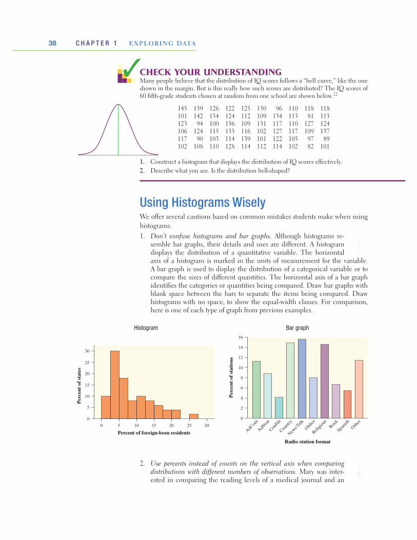
38 C H A P T E R 1 EXPLORING DATA
Using Histograms WiselyWe offer several cautions based on common mistakes students make when using histograms.1. Don’t confuse histograms and bar graphs. Although histograms re-
semble bar graphs, their details and uses are different. A histogram displays the distribution of a quantitative variable. The horizontal axis of a histogram is marked in the units of measurement for the variable. A bar graph is used to display the distribution of a categorical variable or to compare the sizes of different quantities. The horizontal axis of a bar graph identifies the categories or quantities being compared. Draw bar graphs with blank space between the bars to separate the items being compared. Draw histograms with no space, to show the equal-width classes. For comparison, here is one of each type of graph from previous examples.
caution
!
Histogram Bar graph
Percent of foreign-born residents
0
25
30
5
10
15
20
0 5 10 15 20 25 30
Perc
ent o
f sta
tes
AdCont
AdStan
ConHit
Country
News/T
alk
Oldies
Religio
usRock
Spanish
Other
16
14
12
10
8
6
4
2
0
Perc
ent o
f sta
tions
Radio station format
2. Use percents instead of counts on the vertical axis when comparing distributions with different numbers of observations. Mary was inter-ested in comparing the reading levels of a medical journal and an
caution
!
CHECK YOUR UNDERSTANDINGMany people believe that the distribution of IQ scores follows a “bell curve,” like the one shown in the margin. But is this really how such scores are distributed? The IQ scores of 60 fifth-grade students chosen at random from one school are shown below.22
145 139 126 122 125 130 96 110 118 118 101 142 134 124 112 109 134 113 81 113 123 94 100 136 109 131 117 110 127 124 106 124 115 133 116 102 127 117 109 137 117 90 103 114 139 101 122 105 97 89 102 108 110 128 114 112 114 102 82 101
1. Construct a histogram that displays the distribution of IQ scores effectively.2. Describe what you see. Is the distribution bell-shaped?

39Section 1.2 Displaying Quantitative Data with Graphs
3. Just because a graph looks nice doesn’t make it a meaningful display of data. The students in a small statistics class recorded the number of letters in their first names. One student entered the data into an Excel spreadsheet and then used Excel’s “chart maker” to produce the graph shown below left. What kind of graph is this? It’s a bar graph that compares the raw data values. But first-name length is a quantitative variable, so a bar graph is not an ap-propriate way to display its distribution. The dotplot on the right is a much better choice.
caution
!
14121086420
90
80
70
60
50
40
30
20
10
014121086420
JLength
Freq
uenc
y
MLength
1412 14121086420
30
25
20
15
10
5
01086420
JLength
Perc
ent
MLength
(a) (b)
FIGURE 1.18 Two sets of histograms comparing word lengths in articles from a journal and from an airline magazine. In (a), the vertical scale uses frequencies. The graph in (b) fixes this problem by using percents on the vertical scale.
4 5 6 7
First name length
CHECK YOUR UNDERSTANDINGAbout 1.6 million first-year students enroll in colleges and universities each year. What do they plan to study? The graph on the next page displays data on the percents of first-year students who plan to major in several discipline areas.23
airline magazine. She counted the number of letters in the first 400 words of an article in the medical journal and of the first 100 words of an article in the airline magazine. Mary then used Minitab statistical software to produce the histograms shown in Figure 1.18(a). This figure is misleading—it com-pares frequencies, but the two samples were of very different sizes (100 and 400). Using the same data, Mary’s teacher produced the histograms in Figure 1.18(b). By using relative frequencies, this figure provides an accurate com-parison of word lengths in the two samples.
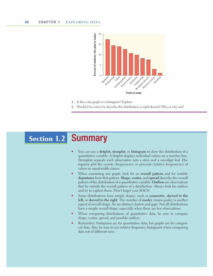
40 C H A P T E R 1 EXPLORING DATA
Summary• You can use a dotplot, stemplot, or histogram to show the distribution of a
quantitative variable. A dotplot displays individual values on a number line. Stemplots separate each observation into a stem and a one-digit leaf. His-tograms plot the counts (frequencies) or percents (relative frequencies) of values in equal-width classes.
• When examining any graph, look for an overall pattern and for notable departures from that pattern. Shape, center, and spread describe the overall pattern of the distribution of a quantitative variable. Outliers are observations that lie outside the overall pattern of a distribution. Always look for outliers and try to explain them. Don’t forget your SOCS!
• Some distributions have simple shapes, such as symmetric, skewed to the left, or skewed to the right. The number of modes (major peaks) is another aspect of overall shape. So are distinct clusters and gaps. Not all distributions have a simple overall shape, especially when there are few observations.
• When comparing distributions of quantitative data, be sure to compare shape, center, spread, and possible outliers.
• Remember: histograms are for quantitative data; bar graphs are for categori-cal data. Also, be sure to use relative frequency histograms when comparing data sets of different sizes.
Section 1.2
1. Is this a bar graph or a histogram? Explain.2. Would it be correct to describe this distribution as right-skewed? Why or why not?
Busines
s
Profes
sional
Other
Arts/human
ities
Social s
cience
s
Educatio
n
Enginee
ring
Biological
scien
ces
Physica
l scie
nces
Technica
l
20
15
10
5
0Perc
ent o
f stu
dent
s w
ho p
lan
to m
ajor
Field of study
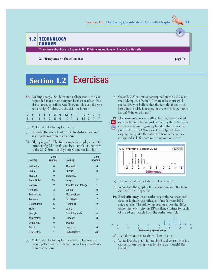
41Section 1.2 Displaying Quantitative Data with Graphs
1.2 TECHNOLOGY CORNER
2. Histograms on the calculator page 36
TI-Nspire instructions in Appendix B; HP Prime instructions on the book’s Web site.
Exercises37. Feeling sleepy? Students in a college statistics class
responded to a survey designed by their teacher. One of the survey questions was “How much sleep did you get last night?” Here are the data (in hours):
9 6 8 6 8 8 6 6.5 6 7 9 4 3 45 6 11 6 3 6 6 10 7 8 4.5 9 7 7
(a) Make a dotplot to display the data.(b) Describe the overall pattern of the distribution and
any departures from that pattern.
38. Olympic gold! The following table displays the total number of gold medals won by a sample of countries in the 2012 Summer Olympic Games in London.
CountryGold
medals CountryGold
medals
Sri Lanka 0 Thailand 0
China 38 Kuwait 0
Vietnam 0 Bahamas 1
Great Britain 29 Kenya 2
Norway 2 Trinidad and Tobago 1
Romania 2 Greece 0
Switzerland 2 Mozambique 0
Armenia 0 Kazakhstan 7
Netherlands 6 Denmark 2
India 0 Latvia 1
Georgia 1 Czech Republic 4
Kyrgyzstan 0 Hungary 8
Costa Rica 0 Sweden 1
Brazil 3 Uruguay 0
Uzbekistan 1 United States 46
(a) Make a dotplot to display these data. Describe the overall pattern of the distribution and any departures from that pattern.
(b) Overall, 205 countries participated in the 2012 Sum-mer Olympics, of which 54 won at least one gold medal. Do you believe that the sample of countries listed in the table is representative of this larger popu-lation? Why or why not?
39. U.S. women’s soccer—2012 Earlier, we examined data on the number of goals scored by the U.S. wom-en’s soccer team in games played in the 12 months prior to the 2012 Olympics. The dotplot below displays the goal differential for those same games, computed as U.S. score minus opponent’s score.
(a) Explain what the dot above −1 represents.
(b) What does the graph tell us about how well the team did in 2012? Be specific.
40. Fuel efficiency In an earlier example, we examined data on highway gas mileages of model year 2012 midsize cars. The following dotplot shows the differ-ence (highway – city) in EPA mileage ratings for each of the 24 car models from the earlier example.
-2 0 2 4 6 8 10 12Difference (highway – city)
(a) Explain what the dot above 12 represents.(b) What does the graph tell us about fuel economy in the
city versus on the highway for these car models? Be specific.
pg 26
Section 1.2

42 C H A P T E R 1 EXPLORING DATA
41. Dates on coins Suppose that you and your friends emptied your pockets of coins and recorded the year marked on each coin. The distribution of dates would be skewed to the left. Explain why.
42. Phone numbers The dotplot below displays the last digit of 100 phone numbers chosen at random from a phone book. Describe the shape of the distribution. Does this shape make sense to you? Explain.
Last digit0 2 4 6 8
43. Creative writing Do external rewards—things like money, praise, fame, and grades—promote creativity? Researcher Teresa Amabile designed an experiment to find out. She recruited 47 experienced creative writers who were college students and divided them into two groups using a chance process (like draw-ing names from a hat). The students in one group were given a list of statements about external reasons (E) for writing, such as public recognition, making money, or pleasing their parents. Students in the oth-er group were given a list of statements about internal reasons (I) for writing, such as expressing yourself and enjoying playing with words. Both groups were then instructed to write a poem about laughter. Each stu-dent’s poem was rated separately by 12 different poets using a creativity scale.24 These ratings were averaged to obtain an overall creativity score for each poem.
Dotplots of the two groups’ creativity scores are shown below. Compare the two distributions. What do you conclude about whether external rewards promote creativity?
Average rating0 5 10 15 20 25
Average rating
30
0 5 10 15 20 25 30
Rew
ard
E
I
44. Healthy cereal? Researchers collected data on 77 brands of cereal at a local supermarket.25 For each brand, the sugar content (grams per serving) and the shelf in the store on which the cereal was located (1 = bottom, 2 = middle, 3 = top) were recorded. A dotplot
of the data is shown below. Compare the three distribu-tions. Critics claim that supermarkets tend to put sugary kids’ cereals on lower shelves, where the kids can see them. Do the data from this study support this claim?
45. Where do the young live? Below is a stemplot of the percent of residents aged 25 to 34 in each of the 50 states. As in the stemplot for older residents (page 33), the stems are whole percents, and the leaves are tenths of a percent. This time, each stem has been split in two, with values having leaves 0 through 4 placed on one stem, and values ending in 5 through 9 placed on another stem.
11 4411 6677812 013412 66677888813 000000111144413 778899914 004414 56715 111516 0
(a) Why did we split stems?(b) Give an appropriate key for this stemplot. (c) Describe the shape, center, and spread of the distribu-
tion. Are there any outliers?
46. Watch that caffeine! The U.S. Food and Drug Administration (USFDA) limits the amount of caffeine in a 12-ounce can of carbonated beverage to 72 milli-grams. That translates to a maximum of 48 milligrams of caffeine per 8-ounce serving. Data on the caffeine content of popular soft drinks (in milligrams per 8-ounce serving) are displayed in the stemplot below.
1 556 2 033344 2 55667778888899 3 113 3 55567778 4 33 4 77
(a) Why did we split stems?(b) Give an appropriate key for this graph.(c) Describe the shape, center, and spread of the distribu-
tion. Are there any outliers?
pg 30

43Section 1.2 Displaying Quantitative Data with Graphs
47. El Niño and the monsoon It appears that El Niño, the periodic warming of the Pacific Ocean west of South America, affects the monsoon rains that are es-sential for agriculture in India. Here are the monsoon rains (in millimeters) for the 23 strong El Niño years between 1871 and 2004:26
628 669 740 651 710 736 717 698 653 604 781 784
790 811 830 858 858 896 806 790 792 957 872
(a) To make a stemplot of these rainfall amounts, round the data to the nearest 10, so that stems are hundreds of millimeters and leaves are tens of millimeters. Make two stemplots, with and without splitting the stems. Which plot do you prefer? Why?
(b) Describe the shape, center, and spread of the distribution.
(c) The average monsoon rainfall for all years from 1871 to 2004 is about 850 millimeters. What effect does El Niño appear to have on monsoon rains?
48. Shopping spree A marketing consultant observed 50 consecutive shoppers at a supermarket. One vari-able of interest was how much each shopper spent in the store. Here are the data (in dollars), arranged in increasing order:
3.11 8.88 9.26 10.81 12.69 13.78 15.23 15.62 17.00 17.39 18.36 18.43 19.27 19.50 19.54 20.16 20.59 22.22 23.04 24.47 24.58 25.13 26.24 26.26 27.65 28.06 28.08 28.38 32.03 34.98 36.37 38.64 39.16 41.02 42.97 44.08 44.67 45.40 46.69 48.65 50.39 52.75 54.80 59.07 61.22 70.32 82.70 85.76 86.37 93.34
(a) Round each amount to the nearest dollar. Then make a stemplot using tens of dollars as the stems and dol-lars as the leaves.
(b) Make another stemplot of the data by splitting stems. Which of the plots shows the shape of the distribution better?
(c) Write a few sentences describing the amount of money spent by shoppers at this supermarket.
49. Do women study more than men? We asked the students in a large first-year college class how many minutes they studied on a typical weeknight. Here are the responses of random samples of 30 women and 30 men from the class:
Women Men
180 120 180 360 240 90 120 30 90 200120 180 120 240 170 90 45 30 120 75150 120 180 180 150 150 120 60 240 300200 150 180 150 180 240 60 120 60 30120 60 120 180 180 30 230 120 95 150 90 240 180 115 120 0 200 120 120 180
(a) Examine the data. Why are you not surprised that most responses are multiples of 10 minutes? Are there any responses you consider suspicious?
(b) Make a back-to-back stemplot to compare the two sam-ples. Does it appear that women study more than men (or at least claim that they do)? Justify your answer.
50. Basketball playoffs Here are the numbers of points scored by teams in the California Division I-AAA high school basketball playoffs in a single day’s games:27
71 38 52 47 55 53 76 65 77 63 65 63 68
54 64 62 87 47 64 56 78 64 58 51 91 74
71 41 67 62 106 46
On the same day, the final scores of games in Divi-sion V-AA were
98 45 67 44 74 60 96 54 92 72 93 46
98 67 62 37 37 36 69 44 86 66 66 58
(a) Construct a back-to-back stemplot to compare the points scored by the 32 teams in the Division I-AAA playoffs and the 24 teams in the Division V-AA playoffs.
(b) Write a few sentences comparing the two distributions.
51. Returns on common stocks The return on a stock is the change in its market price plus any dividend payments made. Total return is usually expressed as a percent of the beginning price. The figure below shows a histogram of the distribution of the monthly returns for all common stocks listed on U.S. markets over a 273-month period.28 The extreme low outlier represents the market crash of October 1987, when stocks lost 23% of their value in one month.
Monthly percent return on common stocks
0
80
20
40
60
–25 –15 15–20 0 10–5–10 5
Num
ber
of m
onth
s
(a) Describe the overall shape of the distribution of monthly returns.
(b) What is the approximate center of this distribution?(c) Approximately what were the smallest and largest
monthly returns, leaving out the outliers?(d) A return less than zero means that stocks lost value
in that month. About what percent of all months had returns less than zero?

44 C H A P T E R 1 EXPLORING DATA
52. Shakespeare The histogram below shows the dis-tribution of lengths of words used in Shakespeare’s plays.29 Describe the shape, center, and spread of this distribution.
Number of letters in word
0
10
15
20
5
25
Perc
ent o
f Sha
kesp
eare
’s w
ords
1 3 5 7 9 112 4 6 8 10 12
53. Traveling to work How long do people travel each day to get to work? The following table gives the average travel times to work (in minutes) for workers in each state and the District of Columbia who are at least 16 years old and don’t work at home.30
AL 23.6 LA 25.1 OH 22.1
AK 17.7 ME 22.3 OK 20.0
AZ 25.0 MD 30.6 OR 21.8
AR 20.7 MA 26.6 PA 25.0
CA 26.8 MI 23.4 RI 22.3
CO 23.9 MN 22.0 SC 22.9
CT 24.1 MS 24.0 SD 15.9
DE 23.6 MO 22.9 TN 23.5
FL 25.9 MT 17.6 TX 24.6
GA 27.3 NE 17.7 UT 20.8
HI 25.5 NV 24.2 VT 21.2
ID 20.1 NH 24.6 VA 26.9
IL 27.9 NJ 29.1 WA 25.2
IN 22.3 NM 20.9 WV 25.6
IA 18.2 NY 30.9 WI 20.8
KS 18.5 NC 23.4 WY 17.9
KY 22.4 ND 15.5 DC 29.2
(a) Make a histogram of the travel times using classes of width 2 minutes, starting at 14 minutes. That is, the first class is 14 to 16 minutes, the second is 16 to 18 minutes, and so on.
(b) The shape of the distribution is a bit irregular. Is it closer to symmetric or skewed? Describe the center and spread of the distribution. Are there any outliers?
54. Carbon dioxide emissions Burning fuels in power plants and motor vehicles emits carbon dioxide
(CO2), which contributes to global warming. The table below displays CO2 emissions per person from countries with populations of at least 20 million.31
(a) Make a histogram of the data using classes of width 2, starting at 0.
(b) Describe the shape, center, and spread of the distribu-tion. Which countries are outliers?
Carbon dioxide emissions (metric tons per person)
Country CO2
Algeria 2.6
Argentina 3.6
Australia 18.4
Bangladesh 0.3
Brazil 1.8
Canada 17.0
China 3.9
Colombia 1.3
Congo 0.2
Egypt 2.0
Ethiopia 0.1
France 6.2
Germany 9.9
Ghana 0.3
India 1.1
Indonesia 1.6
Iran 6.0
Iraq 2.9
Italy 7.8
Japan 9.5
Kenya 0.3
Korea, North 3.3
Korea, South 9.3
Malaysia 5.5
Country CO2
Mexico 3.7
Morocco 1.4
Myanmar 0.2
Nepal 0.1
Nigeria 0.4
Pakistan 0.8
Peru 1.0
Philippines 0.9
Poland 7.8
Romania 4.2
Russia 10.8
Saudi Arabia 13.8
South Africa 7.0
Spain 7.9
Sudan 0.3
Tanzania 0.1
Thailand 3.3
Turkey 3.0
Ukraine 6.3
United Kingdom 8.8
United States 19.6
Uzbekistan 4.2
Venezuela 5.4
Vietnam 1.0
55. DRP test scores There are many ways to measure the reading ability of children. One frequently used test is the Degree of Reading Power (DRP). In a research study on third-grade students, the DRP was administered to 44 students.32 Their scores were:
40 26 39 14 42 18 25 43 46 27 19 47 19 26 35 34 15 44 40 38 31 46 52 25 35 35 33 29 34 41 49 28 52 47 35 48 22 33 41 51 27 14 54 45
Make a histogram to display the data. Write a para-graph describing the distribution of DRP scores.

45Section 1.2 Displaying Quantitative Data with Graphs
56. Drive time Professor Moore, who lives a few miles outside a college town, records the time he takes to drive to the college each morning. Here are the times (in minutes) for 42 consecutive weekdays:
8.25 7.83 8.30 8.42 8.50 8.67 8.17 9.00 9.00 8.17 7.92 9.00 8.50 9.00 7.75 7.92 8.00 8.08 8.42 8.75 8.08 9.75 8.33 7.83 7.92 8.58 7.83 8.42 7.75 7.42 6.75 7.42 8.50 8.67 10.17 8.75 8.58 8.67 9.17 9.08 8.83 8.67
Make a histogram to display the data. Write a para-graph describing the distribution of Professor Moore’s drive times.
57. The statistics of writing style Numerical data can distinguish different types of writing and, sometimes, even individual authors. Here are data on the percent of words of 1 to 15 letters used in articles in Popular Science magazine:33
Length: 1 2 3 4 5 6 7 8 9 10 11 12 13 14 15 Percent: 3.6 14.8 18.7 16.0 12.5 8.2 8.1 5.9 4.4 3.6 2.1 0.9 0.6 0.4 0.2
(a) Make a histogram of this distribution. Describe its shape, center, and spread.
(b) How does the distribution of lengths of words used in Popular Science compare with the similar distribution for Shakespeare’s plays in Exercise 52? Look in particular at short words (2, 3, and 4 letters) and very long words (more than 10 letters).
58. Chest out, Soldier! In 1846, a published paper pro-vided chest measurements (in inches) of 5738 Scottish militiamen. The table below summarizes the data.34
Chest size Count Chest size Count
33 3 41 934
34 18 42 658
35 81 43 370
36 185 44 92
37 420 45 50
38 749 46 21
39 1073 47 4
40 1079 48 1
(a) Make a histogram of this distribution.
(b) Describe the shape, center, and spread of the chest measurements distribution. Why might this information be useful?
59. Paying for championships Does paying high salaries lead to more victories in professional sports? The New York Yankees have long been known for having Major League Baseball’s highest team payroll. And over the years, the team has won many champion-ships. This strategy didn’t pay off in 2008, when the
Philadelphia Phillies won the World Series. Maybe the Yankees didn’t spend enough money that year. The graph below shows histograms of the salary dis-tributions for the two teams during the 2008 season. Why can’t you use this graph to effectively compare the team payrolls?
0
5000
000
1000
0000
1500
0000
2000
0000
2500
0000
3500
0000
12
10
8
6
4
2
0 0
Freq
uenc
y
Freq
uenc
y
Yankees 2008
Salary Salary30
0000
00 0
2000
000
4000
000
6000
000
8000
000
1000
0000
1400
0000
9
7
1
6
2
4
5
3
8
Phillies 2008
1200
0000
60. Paying for championships Refer to Exercise 59. Here is another graph of the 2008 salary distributions for the Yankees and the Phillies. Write a few sen-tences comparing these two distributions.
18
16
14
12
10
8
6
4
2
0
18
16
14
12
10
8
6
4
2
0
Freq
uenc
y
0
8000
000
1600
0000
3200
0000
Yankees 2008
2400
0000 0
8000
000
1600
0000
3200
0000
2400
0000
Phillies 2008
Freq
uenc
y
SalarySalary
61. Birth months Imagine asking a random sample of 60 students from your school about their birth months. Draw a plausible graph of the distribution of birth months. Should you use a bar graph or a histogram to display the data?
62. Die rolls Imagine rolling a fair, six-sided die 60 times. Draw a plausible graph of the distribution of die rolls. Should you use a bar graph or a histogram to display the data?
63. Who makes more? A manufacturing company is reviewing the salaries of its full-time employees below the executive level at a large plant. The clerical staff is almost entirely female, while a majority of the pro-duction workers and technical staff is male. As a re-sult, the distributions of salaries for male and female employees may be quite different. The following table gives the frequencies and relative frequencies for women and men.

46 C H A P T E R 1 EXPLORING DATA
Women Men
Salary ($1000) Number % Number %
10–15 89 11.8 26 1.1
15–20 192 25.4 221 9.0
20–25 236 31.2 677 27.6
25–30 111 14.7 823 33.6
30–35 86 11.4 365 14.9
35–40 25 3.3 182 7.4
40–45 11 1.5 91 3.7
45–50 3 0.4 33 1.3
50–55 2 0.3 19 0.8
55–60 0 0.0 11 0.4
60–65 0 0.0 0 0.0
65–70 1 0.1 3 0.1
Total 756 100.1 2451 99.9
(a) Explain why the total for women is greater than 100%.(b) Make histograms for these data, choosing the vertical
scale that is most appropriate for comparing the two distributions.
(c) Write a few sentences comparing the salary distribu-tions for men and women.
64. Comparing AP® scores The table below gives the distribution of grades earned by students taking the AP® Calculus AB and AP® Statistics exams in 2012.35
No. of exams
Grade
5 4 3 2 1
Calculus AB 266,994 67,394 45,523 46,526 27,216 80,335
Statistics 153,859 19,267 32,521 39,355 27,684 35,032
66. Population pyramids Refer to Exercise 65. Here is a graph of the projected population distribution for China in the year 2050. Describe what the graph suggests about China’s future population. Be specific.
10095908580757065605550454035302520151050
Population (in millions)
China 2050Male Female
12 1260 600 024 2436 3648 48
67. Student survey A survey of a large high school class asked the following questions:
(i) Are you female or male? (In the data, male = 0, female = 1.)
(ii) Are you right-handed or left-handed? (In the data, right = 0, left = 1.)
(iii) What is your height in inches?(iv) How many minutes do you study on a typical
weeknight? The figure below shows graphs of the student respons-
es, in scrambled order and without scale markings. Which graph goes with each variable? Explain your reasoning.
(c) (d)
(a) (b)
68. Choose a graph What type of graph or graphs would you make in a study of each of the following issues at your school? Explain your choices.
(a) Which radio stations are most popular with students?(b) How many hours per week do students study?(c) How many calories do students consume per day?
(a) Make an appropriate graphical display to compare the grade distributions for AP® Calculus AB and AP® Statistics.
(b) Write a few sentences comparing the two distributions of exam grades.
65. Population pyramids A population pyramid is a helpful graph for examining the distribution of a country’s population. Here is a population pyramid for Vietnam in the year 2010. Describe what the graph tells you about Vietnam’s population that year. Be specific.
10095908580757065605550454035302520151050
Population (in millions)
Vietnam 2010Male Female
1 15 50 02 23 34 4

47Section 1.2 Displaying Quantitative Data with Graphs
Multiple choice: Select the best answer for Exercises 69 to 74.
69. Here are the amounts of money (cents) in coins car-ried by 10 students in a statistics class: 50, 35, 0, 97, 76, 0, 0, 87, 23, 65. To make a stemplot of these data, you would use stems
(a) 0, 1, 2, 3, 4, 5, 6, 7, 8, 9.(b) 0, 2, 3, 5, 6, 7, 8, 9.(c) 0, 3, 5, 6, 7.(d) 00, 10, 20, 30, 40, 50, 60, 70, 80, 90.(e) None of these.70. The histogram below shows the heights of 300 ran-
domly selected high school students. Which of the following is the best description of the shape of the distribution of heights?
(a) Roughly symmetric and unimodal(b) Roughly symmetric and bimodal(c) Roughly symmetric and multimodal(d) Skewed to the left(e) Skewed to the right71. You look at real estate ads for houses in Naples, Flor-
ida. There are many houses ranging from $200,000 to $500,000 in price. The few houses on the water, however, have prices up to $15 million. The distribu-tion of house prices will be
(a) skewed to the left.(b) roughly symmetric.(c) skewed to the right.(d) unimodal.(e) too high.
72. The following histogram shows the distribution of the percents of women aged 15 and over who have never married in each of the 50 states and the District of Columbia. Which of the following statements about the histogram is correct?
(a) The center of the distribution is about 36%.(b) There are more states with percents above 32 than
there are states with percents less than 24.
(c) It would be better if the values from 34 to 50 were deleted on the horizontal axis so there wouldn’t be a large gap.
(d) There was one state with a value of exactly 33%.(e) About half of the states had percents between 24%
and 28%.
Percent of women overage 15 who never married
0
12
14
10
8
6
4
2
Num
ber
of s
tate
s
20 5224 40 44 4828 32 36
73. When comparing two distributions, it would be best to use relative frequency histograms rather than fre-quency histograms when
(a) the distributions have different shapes.(b) the distributions have different spreads.(c) the distributions have different centers. (d) the distributions have different numbers of observations.(e) at least one of the distributions has outliers. 74. Which of the following is the best reason for choos-
ing a stemplot rather than a histogram to display the distribution of a quantitative variable?
(a) Stemplots allow you to split stems; histograms don’t. (b) Stemplots allow you to see the values of individual
observations.(c) Stemplots are better for displaying very large sets of data.(d) Stemplots never require rounding of values.(e) Stemplots make it easier to determine the shape of a
distribution.75. Baseball players (Introduction) Here is a small part
of a data set that describes Major League Baseball players as of opening day of the 2012 season:
Player Team Position Age Height Weight Salary
Rodriguez, Alex Yankees Infielder 37 6-3 225 29,000,000
Gonzalez, Adrian Dodgers Infielder 30 6-2 225 21,000,000
Cruz, Nelson Rangers Outfielder 32 6-2 240 5,000,000
Lester, Jon Red Sox Pitcher 28 6-4 240 7,625,000
Strasburg, Stephen Nationals Pitcher 24 6-4 220 3,000,000

48 C H A P T E R 1 EXPLORING DATA
How long do people spend traveling to work? The answer may depend on where they live. Here are the travel times in minutes for 15 workers in North Carolina, chosen at random by the Census Bureau:38
30 20 10 40 25 20 10 60 15 40 5 30 12 10 10
(a) What individuals does this data set describe?(b) In addition to the player’s name, how many variables
does the data set contain? Which of these variables are categorical and which are quantitative?
76. I love my iPod! (1.1) The rating service Arbitron asked adults who used several high-tech devices and services whether they “loved” using them. Below is a graph of the percents who said they did.36
(a) Summarize what this graph tells you in a sentence or two.
(b) Would it be appropriate to make a pie chart of these data? Why or why not?
iPod
Broad
band
HDTV
Sat ra
dioDVR
MP3
Blackber
ry
Cable
TV
Pay TV
50
40
30
20
10
0
Perc
ent o
f use
rs w
ho lo
ve it
High-tech device or service
77. Risks of playing soccer (1.1) A study in Sweden looked at former elite soccer players, people who had played soccer but not at the elite level, and people of the same age who did not play soccer. Here is a two-way table that classifies these individuals by whether or not they had arthritis of the hip or knee by their mid-fifties:37
Elite Non-Elite Did not play
Arthritis 10 9 24
No arthritis 61 206 548
(a) What percent of the people in this study were elite soccer players? What percent had arthritis?
(b) What percent of the elite soccer players had arthritis? What percent of those who had arthritis were elite soc-cer players?
78. Risks of playing soccer (1.1) Refer to Exercise 77. We suspect that the more serious soccer players have more arthritis later in life. Do the data confirm this suspicion? Give graphical and numerical evidence to support your answer.
1.3 Describing Quantitative Data with Numbers
WHAT YOU WILL LEARN• Calculate measures of center (mean, median).• Calculate and interpret measures of spread (range, IQR,
standard deviation).• Choose the most appropriate measure of center and
spread in a given setting.
• Identify outliers using the 1.5 × IQR rule.• Make and interpret boxplots of quantitative data.• Use appropriate graphs and numerical summaries to
compare distributions of quantitative variables.
By the end of the section, you should be able to:

49Section 1.3 Describing Quantitative Data with Numbers
We aren’t surprised that most people estimate their travel time in multiples of 5 minutes. Here is a stemplot of these data:
0 5 1 000025 2 005 3 00 4 00 5 6 0
Key: 2|5 is a NCworker who travels 25 minutes to work.
The distribution is single-peaked and right-skewed. The longest travel time (60 minutes) may be an outlier. Our main goal in this section is to describe the center and spread of this and other distributions of quantitative data with numbers.
Measuring Center: The MeanThe most common measure of center is the ordinary arithmetic average, or mean.
DEFINITION: The mean xTo find the mean x– (pronounced “x-bar”) of a set of observations, add their values and divide by the number of observations. If the n observations are x1, x2, . . . , xn, their mean is
x– =sum of observations
n=
x1 + x2 +c+ xn
n
or, in more compact notation,
x– =∑xi
n
The ∑ (capital Greek letter sigma) in the formula for the mean is short for “add them all up.” The subscripts on the observations xi are just a way of keeping the n observations distinct. They do not necessarily indicate order or any other special facts about the data.
Actually, the notation x– refers to the mean of a sample. Most of the time, the data we’ll encounter can be thought of as a sample from some larger population. When we need to refer to a population mean, we’ll use the symbol m (Greek letter mu, pronounced “mew”). If you have the entire population of data available, then you calculate m in just the way you’d expect: add the values of all the observations, and divide by the number of observations.
EXAMPLE Travel Times to Work in North CarolinaCalculating the meanHere is a stemplot of the travel times to work for the sample of 15 North Carolinians.
0 5 1 000025 2 005 3 00 4 00 5 6 0
Key: 2|5 is a NCworker who travels 25 minutes to work.

50 C H A P T E R 1 EXPLORING DATA
The previous example illustrates an important weakness of the mean as a measure of center: the mean is sensitive to the influence of extreme observations. These may be outliers, but a skewed distribution that has no outliers will also pull the mean toward its long tail. Because the mean cannot resist the influence of extreme observations, we say that it is not a resistant mea-sure of center.
What does the mean mean? A group of elementary schoolchildren was asked how many pets they have. Here are their responses, arranged from lowest to highest:39
1 3 4 4 4 5 7 8 9
What’s the mean number of pets for this group of children? It’s
x– =sum of observations
n =1 + 3 + 4 + 4 + 4 + 5 + 7 + 8 + 9
9= 5 pets
But what does that number tell us? Here’s one way to look at it: if every child in the group had the same number of pets, each would have 5 pets. In other words, the mean is the “fair share” value.
The mean tells us how large each data value would be if the total were split equally among all the observations. The mean of a distribution also has a physical interpretation, as the following Activity shows.
caution
!
THINKABOUT IT
For Practice Try Exercise 79
PROBLEM:(a) Find the mean travel time for all 15 workers.(b) Calculate the mean again, this time excluding the person who reported a 60-minute travel time to work. What do you notice?
SOLUTION:(a) The mean travel time for the sample of 15 North Carolina workers is
x– =∑xi
n =x1 + x2 +c+ xn
n =30 + 20 +c+ 10
15=
33715
= 22.5 minutes
(b) If we leave out the longest travel time, 60 minutes, the mean for the remaining 14 people is
x– =∑xi
n =x1 + x2 +c + xn
n =27714
= 19.8 minutes
This one observation raises the mean by 2.7 minutes.
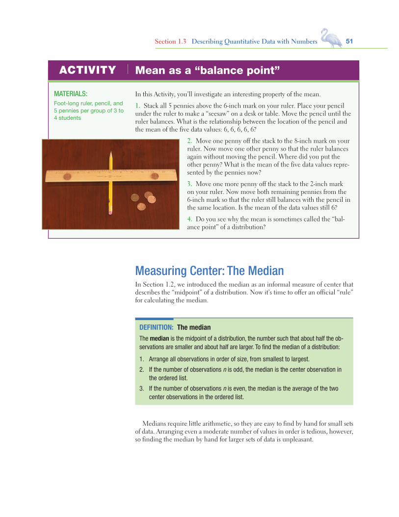
51Section 1.3 Describing Quantitative Data with Numbers
Mean as a “balance point”
In this Activity, you’ll investigate an interesting property of the mean.
1. Stack all 5 pennies above the 6-inch mark on your ruler. Place your pencil under the ruler to make a “seesaw” on a desk or table. Move the pencil until the ruler balances. What is the relationship between the location of the pencil and the mean of the five data values: 6, 6, 6, 6, 6?
2. Move one penny off the stack to the 8-inch mark on your ruler. Now move one other penny so that the ruler balances again without moving the pencil. Where did you put the other penny? What is the mean of the five data values repre-sented by the pennies now?
3. Move one more penny off the stack to the 2-inch mark on your ruler. Now move both remaining pennies from the 6-inch mark so that the ruler still balances with the pencil in the same location. Is the mean of the data values still 6?
4. Do you see why the mean is sometimes called the “bal-ance point” of a distribution?
MATERIALS:Foot-long ruler, pencil, and 5 pennies per group of 3 to 4 students
ACTIVITY
Measuring Center: The MedianIn Section 1.2, we introduced the median as an informal measure of center that describes the “midpoint” of a distribution. Now it’s time to offer an official “rule” for calculating the median.
DEFINITION: The medianThe median is the midpoint of a distribution, the number such that about half the ob-servations are smaller and about half are larger. To find the median of a distribution:
1. Arrange all observations in order of size, from smallest to largest.
2. If the number of observations n is odd, the median is the center observation in the ordered list.
3. If the number of observations n is even, the median is the average of the two center observations in the ordered list.
Medians require little arithmetic, so they are easy to find by hand for small sets of data. Arranging even a moderate number of values in order is tedious, however, so finding the median by hand for larger sets of data is unpleasant.

52 C H A P T E R 1 EXPLORING DATA
Comparing the Mean and the MedianOur discussion of travel times to work in North Carolina illustrates an important dif-ference between the mean and the median. The median travel time (the midpoint of the distribution) is 20 minutes. The mean travel time is higher, 22.5 minutes. The mean is pulled toward the right tail of this right-skewed distribution. The median,
0 5 1 000025 2 005 3 00 4 00 5 6 0
Key: 2|5 is a NCworker who travels 25 minutes to work.
The next example shows you how to find the median when there is an even number of data values.
Travel Times to Work in North CarolinaFinding the median when n is oddWhat is the median travel time for our 15 North Carolina workers? Here are the data arranged in order:
5 10 10 10 10 12 15 20 20 25 30 30 40 40 60The count of observations n = 15 is odd. The bold 20 is the center observation in the ordered list, with 7 observations to its left and 7 to its right. This is the median, 20 minutes.
EXAMPLE
Stuck in TrafficFinding the median when n is evenPeople say that it takes a long time to get to work in New York State due to the heavy traffic near big cities. What do the data say? Here are the travel times in minutes of 20 randomly chosen New York workers:
10 30 5 25 40 20 10 15 30 20 15 20 85 15 65 15 60 60 40 45
PROBLEM:(a) Make a stemplot of the data. Be sure to include a key.(b) Find the median by hand. Show your work.
SOLUTION:(a) Here is a stemplot of the data. The stems indicate10 minutes and the leaves indicate minutes.(b) Because there is an even number of data values, there is no center observation. There is a center pair—the bold 20 and 25 in the stemplot—which have 9 observations before them and 9 after them in the ordered list. The median is the average of these two observations:
20 + 252
= 22.5 minutes
EXAMPLE
For Practice Try Exercise 81
0 51 0055552 00053 004 0055 6 0057 8 5
Key: 4|5 is aNew York workerwho reported a45-minute traveltime to work.

53Section 1.3 Describing Quantitative Data with Numbers
The mean and median of a roughly symmetric distribution are close together. If the distribution is exactly symmetric, the mean and median are exactly the same. In a skewed distribution, the mean is usually farther out in the long tail than is the median.40
COMPARING THE MEAN AND MEDIAN
The mean and median measure center in different ways, and both are useful.
Should we choose the mean or the median? Many economic vari-ables have distributions that are skewed to the right. College tuitions, home pric-es, and personal incomes are all right-skewed. In Major League Baseball (MLB), for instance, most players earn close to the minimum salary (which was $480,000 in 2012), while a few earn more than $10 million. The median salary for MLB players in 2012 was about $1.08 million—but the mean salary was about $3.44 million. Alex Rodriguez, Prince Fielder, Joe Mauer, and several other highly paid superstars pull the mean up but do not affect the median.
Reports about incomes and other strongly skewed distributions usually give the median (“midpoint”) rather than the mean (“arithmetic average”). However, a county that is about to impose a tax of 1% on the incomes of its residents cares about the mean income, not the median. The tax revenue will be 1% of total income, and the total is the mean times the number of residents.
THINKABOUT IT
CHECK YOUR UNDERSTANDINGHere, once again, is the stemplot of travel times to work for 20 randomly selected New Yorkers. Earlier, we found that the median was 22.5 minutes.1. Based only on the stemplot, would you expect the mean travel time to be less than, about the same as, or larger than the median? Why?2. Use your calculator to find the mean travel time. Was your answer to Question 1 correct?3. Would the mean or the median be a more appropriate summary of the center of this distribution of drive times? Justify your answer.
0 5 1 005555 2 0005 3 00 4 005 5 6 005 7 8 5
Key: 4|5 is aNew York workerwho reported a45-minute traveltime to work.
unlike the mean, is resistant. If the longest travel time were 600 minutes rather than 60 minutes, the mean would increase to more than 58 minutes but the median would not change at all. The outlier just counts as one observation above the center, no matter how far above the center it lies. The mean uses the actual value of each observation and so will chase a single large observation upward.
You can compare the behavior of the mean and median by using the Mean and Median applet at the book’s Web site, www.whfreeman.com/tps5e.
APPLET
Measuring Spread: Range and Interquartile Range (IQR )A measure of center alone can be misleading. The mean annual temperature in San Francisco, California, is 57°F—the same as in Springfield, Missouri. But the wardrobe needed to live in these two cities is very different! That’s because daily

54 C H A P T E R 1 EXPLORING DATA
To calculate the quartiles:1. Arrange the observations in increasing order and locate the median in
the ordered list of observations.2. The first quartile Q1 is the median of the observations that are to the
left of the median in the ordered list.3. The third quartile Q3 is the median of the observations that are to
the right of the median in the ordered list.
The interquartile range (IQR) is defined as
IQR = Q3 − Q1
Be careful in locating the quartiles when several observations take the same numerical value. Write down all the observations, arrange them in order, and apply the rules just as if they all had distinct values.
HOW TO CALCULATE THE QUARTILES Q1 AND Q3 AND THE INTERQUARTILE RANGE (IQR )
Let’s look at how this process works using a familiar set of data.
temperatures vary a lot more in Springfield than in San Francisco. A useful numerical description of a distribution requires both a measure of center and a measure of spread.
The simplest measure of variability is the range. To compute the range of a quantitative data set, subtract the smallest value from the largest value. For the New York travel time data, the range is 85 − 5 = 80 minutes. The range shows the full spread of the data. But it depends on only the maximum and minimum values, which may be outliers.
We can improve our description of spread by also looking at the spread of the middle half of the data. Here’s the idea. Count up the ordered list of observations, starting from the minimum. The first quartile Q1 lies one-quarter of the way up the list. The second quartile is the median, which is halfway up the list. The third quartile Q3 lies three-quarters of the way up the list. These quartiles mark out the middle half of the distribution. The interquartile range (IQR) measures the range of the middle 50% of the data. We need a rule to make this idea exact. The process for calculating the quartiles and the IQR uses the rule for finding the median.
Note that the range of a data set is a single number that represents the distance between the maximum and the minimum value. In everyday language, people sometimes say things like, “The data values range from 5 to 85.” Be sure to use the term range correctly, now that you know its statistical definition.
Travel Times to Work in North CarolinaCalculating quartilesOur North Carolina sample of 15 workers’ travel times, arranged in increasing order, is
Q1 is the medianof the values to theleft of the median.
5 10 10 10 10 12 15 20
Median
20 25 30 30 40 40 60
Q3 is the medianof the values to theright of the median.
EXAMPLE
Starnes-Yates5e_c01_xxiv-081hr3.indd 54 11/13/13 1:07 PM
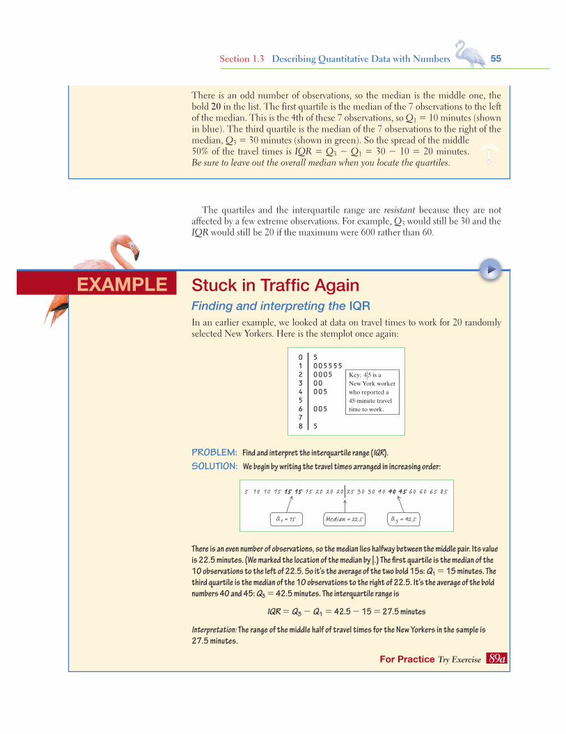
55Section 1.3 Describing Quantitative Data with Numbers
The quartiles and the interquartile range are resistant because they are not affected by a few extreme observations. For example, Q3 would still be 30 and the IQR would still be 20 if the maximum were 600 rather than 60.
There is an odd number of observations, so the median is the middle one, the bold 20 in the list. The first quartile is the median of the 7 observations to the left of the median. This is the 4th of these 7 observations, so Q1 = 10 minutes (shown in blue). The third quartile is the median of the 7 observations to the right of the median, Q3 = 30 minutes (shown in green). So the spread of the middle 50% of the travel times is IQR = Q3 − Q1 = 30 − 10 = 20 minutes. Be sure to leave out the overall median when you locate the quartiles.
caution
!
Stuck in Traffic AgainFinding and interpreting the IQRIn an earlier example, we looked at data on travel times to work for 20 randomly selected New Yorkers. Here is the stemplot once again:
0 5 1 005555 2 0005 3 00 4 005 5 6 005 7 8 5
Key: 4|5 is aNew York workerwho reported a45-minute traveltime to work.
PROBLEM: Find and interpret the interquartile range (IQR).SOLUTION: We begin by writing the travel times arranged in increasing order:
Q1 = 15 Q3 = 42.5
155 10 10 15 15 15 20 20 20 25 30 30 40 40 45 60 60 65 85
Median = 22.5
There is an even number of observations, so the median lies halfway between the middle pair. Its value is 22.5 minutes. (We marked the location of the median by |.) The first quartile is the median of the 10 observations to the left of 22.5. So it’s the average of the two bold 15s: Q1 = 15 minutes. The third quartile is the median of the 10 observations to the right of 22.5. It’s the average of the bold numbers 40 and 45: Q3 = 42.5 minutes. The interquartile range is
IQR = Q3 − Q1 = 42.5 − 15 = 27.5 minutes
Interpretation: The range of the middle half of travel times for the New Yorkers in the sample is 27.5 minutes.
EXAMPLE
For Practice Try Exercise 89a

56 C H A P T E R 1 EXPLORING DATA
Travel Times to Work in North CarolinaIdentifying outliersEarlier, we noted the influence of one long travel time of 60 minutes in our sam-ple of 15 North Carolina workers.
PROBLEM: Determine whether this value is an outlier.SOLUTION: Earlier, we found that Q1 = 10 minutes, Q3 = 30 minutes, and IQR = 20 minutes. To check for outliers, we first calculate
1.5 × IQR = 1.5(20) = 30By the 1.5 × IQR rule, any value greater than
Q3 + 1.5 × IQR = 30 + 30 = 60or less than
Q1 − 1.5 × IQR = 10 − 30 = −20would be classified as an outlier. The maximum value of 60 minutes is not quite large enough to be an outlier because it falls right on the upper cutoff value.
EXAMPLE
For Practice Try Exercise 89 b
Does the 1.5 × IQR rule identify any outliers for the New York travel time data? In the previous example, we found that Q1 = 15 minutes, Q3 = 42.5 min-utes, and IQR = 27.5 minutes. For these data,
1.5 × IQR = 1.5(27.5) = 41.25
Any values not falling between
Q1 − 1.5 × IQR = 15 − 41.25 = −26.25 and Q3 + 1.5 × IQR = 42.5 + 41.25 = 83.75
are flagged as outliers. Look again at the stemplot: the only outlier is the longest travel time, 85 minutes. The 1.5 × IQR rule suggests that the three next-longest travel times (60 and 65 minutes) are just part of the long right tail of this skewed distribution.
0 5 1 005555 2 0005 3 00 4 005 5 6 005 7 8 5
Key: 4|5 is aNew York workerwho reported a45-minute traveltime to work.
0 5 1 000025 2 005 3 00 4 00 5 6 0
Key: 2|5 is a NCworker who travels 25 minutes to work.
Identifying OutliersIn addition to serving as a measure of spread, the interquartile range (IQR) is used as part of a rule of thumb for identifying outliers.
DEFINITION: The 1.5 × IQR rule for outliersCall an observation an outlier if it falls more than 1.5 × IQR above the third quartile or below the first quartile.
Whenever you find outliers in your data, try to find an explanation for them. Sometimes the explanation is as simple as a typing error, like typing 10.1 as 101. Sometimes a measuring device broke down or someone gave a silly response, like the student in a class survey who claimed to study 30,000 minutes per night. (Yes,
57Section 1.3 Describing Quantitative Data with Numbers
EXAMPLE
DEFINITION: The five-number summaryThe five-number summary of a distribution consists of the smallest observation, the first quartile, the median, the third quartile, and the largest observation, written in order from smallest to largest. That is, the five-number summary is
Minimum Q1 Median Q3 Maximum
These five numbers divide each distribution roughly into quarters. About 25% of the data values fall between the minimum and Q1, about 25% are between Q1 and the median, about 25% are between the median and Q3, and about 25% are between Q3 and the maximum.
The five-number summary of a distribution leads to a new graph, the boxplot (sometimes called a box-and-whisker plot).
• A central box is drawn from the first quartile (Q1) to the third quartile (Q3).• A line in the box marks the median.• Lines (called whiskers) extend from the box out to the smallest and larg-
est observations that are not outliers.• Outliers are marked with a special symbol such as an asterisk (*).
HOW TO MAKE A BOXPLOT
Here’s an example that shows how to make a boxplot.
Home Run KingMaking a boxplotBarry Bonds set the major league record by hitting 73 home runs in a single season in 2001. On August 7, 2007, Bonds hit his 756th career home run, which broke Hank Aaron’s longstanding record of 755. By the end of the 2007 season when Bonds retired, he had increased the total to 762. Here are data on the num-ber of home runs that Bonds hit in each of his 21 complete seasons:
16 25 24 19 33 25 34 46 37 33 42 40 37 34 49 73 46 45 45 26 28
that really happened.) In all these cases, you can simply remove the outlier from your data. When outliers are “real data,” like the long travel times of some New York work-ers, you should choose measures of center and spread that are not greatly affected by the outliers.
The Five-Number Summary and BoxplotsThe smallest and largest observations tell us little about the distribution as a whole, but they give information about the tails of the distribution that is missing if we know only the median and the quartiles. To get a quick summary of both center and spread, use all five numbers.
AP® EXAM TIP You may be asked to determine whether a quantitative data set has any outliers. Be prepared to state and use the rule for identifying outliers.

58 C H A P T E R 1 EXPLORING DATA
PROBLEM: Make a boxplot for these data.SOLUTION: Let’s start by ordering the data values so that we can find the five-number summary.
16 19 24 25 25 26 28 33 33 34 34 37 37 40 42 45 45 46 46 49 73 Min Q1 = 25.5 Median Q3 = 45 Max
Now we check for outliers. Because IQR = 45 − 25.5 = 19.5, by the 1.5 × IQR rule, any value greater than Q3 + 1.5 × IQR = 45 + 1.5 × 19.5 = 74.25 or less than Q1 − 1.5 × IQR = 25.5 − 1.5 × 19.5 = −3.75 would be classified as an outlier. So there are no outliers in this data set. Now we are ready to draw the boxplot. See the finished graph at left.
For Practice Try Exercise 91Number of home runs hit in a season by Barry Bonds
min16
max73
Q125.5
Med34
Q345
15 20 35 4525 30 40 60 7050 55 65 75
What are we actually doing when we make a boxplot? The top dotplot shows Barry Bonds’s home run data. We have marked the first quartile, the median, and the third quartile with blue lines. The process of testing for outliers with the 1.5 × IQR rule is shown in visual form. Because there are no outliers, we draw the whiskers to the maximum and minimum data values, as shown in the finished boxplot at right.
0 10
Q1 ! 25.5 Med ! 34 Q3 ! 45
IQR ! 19.5
1.5 " IQR ! 29.25Lower cutoff for outliers Upper cutoff for outliers
20 30 40 50 60 70Home runs
0 10
Min ! 16
Med ! 34
Max ! 73
Q1 ! 25.5 Q3 ! 45
20 30 40 50 60 70Home runs
Figure 1.19 shows boxplots (this time, they are oriented vertically) comparing travel times to work for the samples of workers from North Carolina and New York. We will identify outliers as isolated points in the graph (like the * for the maxi-mum value in the New York data set).
Boxplots show less detail than histograms or stemplots, so they are best used for side-by-side comparison of more than one distribution, as in Figure 1.19. As always, be sure to dis-cuss shape, center, spread, and outliers as part of your com-parison. For the travel time to work data:Shape: We see from the graph that both distributions are right-skewed. For both states, the distance from the minimum to the median is much smaller than the distance from the median to the maximum.Center: It appears that travel times to work are generally a bit longer in New York than in North Carolina. The median, both quartiles, and the maximum are all larger in New York.
THINKABOUT IT
0
10
20
30
40
50
60
70
80
90
Trav
el ti
me
to w
ork
(min
utes
) *
North Carolina New York
Whisker ends at lastdata value that is notan outlier, 65.
An outlier is any pointmore than 1.5 box lengthsbelow Q1 or above Q3.
The interquartile rangeis the length of the box.
FIGURE 1.19 Boxplots comparing the travel times to work of samples of workers in North Carolina and New York.

59Section 1.3 Describing Quantitative Data with Numbers
Spread: Travel times are also more variable in New York, as shown by the lengths of the boxes (the IQR) and the range.Outliers: Earlier, we showed that the maximum travel time of 85 minutes is an outlier for the New York data. There are no outliers in the North Carolina sample.
3. TECHNOLOGY CORNER
The TI-83/84 and TI-89 can plot up to three boxplots in the same viewing window. Let’s use the calculator to make parallel boxplots of the travel time to work data for the samples from North Carolina and New York.
1. Enter the travel time data for North Carolina in L1/list1 and for New York in L2/list2.2. Set up two statistics plots: Plot1 to show a boxplot of the North Carolina data and Plot2 to show a boxplot of the New
York data. The setup for Plot1 is shown below. When you define Plot2, be sure to change L1/list1 to L2/list2.
TI-83/84 TI-89
Note: The calculator offers two types of boxplots: one that shows outliers and one that doesn’t. We’ll always use the type that identifies outliers.
3. Use the calculator’s Zoom feature to display the parallel boxplots. Then Trace to view the five-number summary.
TI-83/84 TI-89
• Press ZOOM and select ZoomStat. • Press F5 (ZoomData).
• Press TRACE . • Press F3 (Trace).
MAKING CALCULATOR BOXPLOTSTI-Nspire instructions in Appendix B; HP Prime instructions on the book’s Web site.
CHECK YOUR UNDERSTANDINGThe 2011 roster of the Dallas Cowboys professional football team included 8 offensive linemen. Their weights (in pounds) were
310 307 345 324 305 301 290 3071. Find the five-number summary for these data by hand. Show your work.2. Calculate the IQR. Interpret this value in context.3. Determine whether there are any outliers using the 1.5 × IQR rule.4. Draw a boxplot of the data.
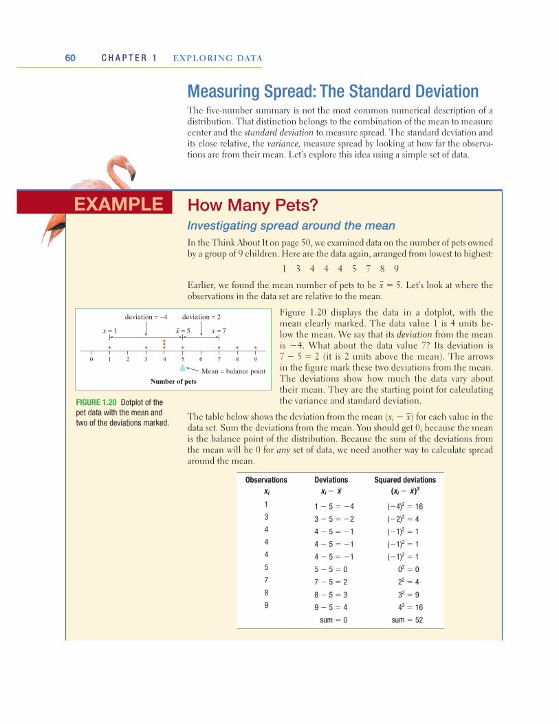
60 C H A P T E R 1 EXPLORING DATA
EXAMPLE
Measuring Spread: The Standard DeviationThe five-number summary is not the most common numerical description of a distribution. That distinction belongs to the combination of the mean to measure center and the standard deviation to measure spread. The standard deviation and its close relative, the variance, measure spread by looking at how far the observa-tions are from their mean. Let’s explore this idea using a simple set of data.
Number of pets
0 1 2 83 4 5 6 7 9
Mean = balance point
x = 1 x = 5
deviation = –4
x = 7
deviation = 2
How Many Pets?Investigating spread around the meanIn the Think About It on page 50, we examined data on the number of pets owned by a group of 9 children. Here are the data again, arranged from lowest to highest:
1 3 4 4 4 5 7 8 9
Earlier, we found the mean number of pets to be x = 5. Let’s look at where the observations in the data set are relative to the mean.
Figure 1.20 displays the data in a dotplot, with the mean clearly marked. The data value 1 is 4 units be-low the mean. We say that its deviation from the mean is −4. What about the data value 7? Its deviation is 7 − 5 = 2 (it is 2 units above the mean). The arrows in the figure mark these two deviations from the mean. The deviations show how much the data vary about their mean. They are the starting point for calculating the variance and standard deviation.
The table below shows the deviation from the mean (xi − x) for each value in the data set. Sum the deviations from the mean. You should get 0, because the mean is the balance point of the distribution. Because the sum of the deviations from the mean will be 0 for any set of data, we need another way to calculate spread around the mean.
Observations xi
Deviations xi − x–
Squared deviations (xi − x–)2
1 1 − 5 = −4 (−4)2 = 163 3 − 5 = −2 (−2)2 = 44 4 − 5 = −1 (−1)2 = 14 4 − 5 = −1 (−1)2 = 14 4 − 5 = −1 (−1)2 = 15 5 − 5 = 0 02 = 07 7 − 5 = 2 22 = 48 8 − 5 = 3 32 = 99 9 − 5 = 4 42 = 16
sum = 0 sum = 52
FIGURE 1.20 Dotplot of the pet data with the mean and two of the deviations marked.
Starnes-Yates5e_c01_xxiv-081hr3.indd 60 11/13/13 1:07 PM
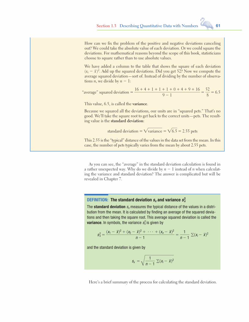
61Section 1.3 Describing Quantitative Data with Numbers
How can we fix the problem of the positive and negative deviations canceling out? We could take the absolute value of each deviation. Or we could square the deviations. For mathematical reasons beyond the scope of this book, statisticians choose to square rather than to use absolute values.
We have added a column to the table that shows the square of each deviation (xi − x–)2. Add up the squared deviations. Did you get 52? Now we compute the average squared deviation—sort of. Instead of dividing by the number of observa-tions n, we divide by n − 1:
As you can see, the “average” in the standard deviation calculation is found in a rather unexpected way. Why do we divide by n − 1 instead of n when calculat-ing the variance and standard deviation? The answer is complicated but will be revealed in Chapter 7.
DEFINITION: The standard deviation sx and variance s2x
The standard deviation sx measures the typical distance of the values in a distri-bution from the mean. It is calculated by finding an average of the squared devia-tions and then taking the square root. This average squared deviation is called the variance. In symbols, the variance s2
x is given by
s 2x =
(x1 − x–)2 + (x2 − x–)2 + c + (xn − x–)2
n − 1=
1n − 1
∑(xi − x–)2
and the standard deviation is given by
s x =
Å1
n − 1 ∑(xi − x–)2
“average” squared deviation =16 + 4 + 1 + 1 + 1 + 0 + 4 + 9 + 16
9 − 1=
528
= 6.5
This value, 6.5, is called the variance.
Because we squared all the deviations, our units are in “squared pets.” That’s no good. We’ll take the square root to get back to the correct units—pets. The result-ing value is the standard deviation:
standard deviation ="variance ="6.5 = 2.55 pets
This 2.55 is the “typical” distance of the values in the data set from the mean. In this case, the number of pets typically varies from the mean by about 2.55 pets.
Here’s a brief summary of the process for calculating the standard deviation.

62 C H A P T E R 1 EXPLORING DATA
Many calculators report two standard deviations. One is usually labeled sx, the symbol for the standard deviation of a population. This standard deviation is calculated by dividing the sum of squared deviations by n instead of n − 1 before taking the square root. If your data set consists of the entire population, then it’s appropriate to use sx. Most often, the data we’re examining come from a sample. In that case, we should use sx.
More important than the details of calculating sx are the properties that de-scribe the usefulness of the standard deviation:• sx measures spread about the mean and should be used only when the mean is
chosen as the measure of center.• sx is always greater than or equal to 0. sx = 0 only when there is no variabil-
ity. This happens only when all observations have the same value. Otherwise, sx > 0. As the observations become more spread out about their mean, sx gets larger.
• sx has the same units of measurement as the original observations. For example, if you measure metabolic rates in calories, both the mean x and the standard deviation sx are also in calories. This is one reason to prefer sx to the variance s2
x, which is in squared calories.• Like the mean x, sx is not resistant. A few outliers can make sx very large. The
use of squared deviations makes sx even more sensitive than x to a few extreme observations. For example, the standard deviation of the travel times for the 15 North Carolina workers is 15.23 minutes. If we omit the maximum value of 60 minutes, the standard deviation drops to 11.56 minutes.
caution
!
To find the standard deviation of n observations:1. Find the distance of each observation from the mean and square each of
these distances.2. Average the distances by dividing their sum by n − 1.3. The standard deviation sx is the square root of this average squared distance:
sx =Å
1n − 1
∑(xi − x)2
HOW TO FIND THE STANDARD DEVIATION

63Section 1.3 Describing Quantitative Data with Numbers
Numerical Summaries with TechnologyGraphing calculators and computer software will calculate numerical summaries for you. That will free you up to concentrate on choosing the right methods and interpreting your results.
4. TECHNOLOGY CORNER
Let’s find numerical summaries for the travel times of North Carolina and New York workers from the previous Tech-nology Corner (page 59). We’ll start by showing you the necessary calculator techniques and then look at output from computer software.I. One-variable statistics on the calculator If you haven’t done so already, enter the North Carolina data in L1/list1 and the New York data in L2/list2.
1. Find the summary statistics for the North Carolina travel times.
TI-83/84 TI-89
• Press STAT ▶ (CALC); choose 1-VarStats. OS 2.55 or later: In the dialog box, press 2nd
1 (L1) and ENTER to specify L1 as the List. Leave FreqList blank. Arrow down to Calculate and press ENTER . Older OS: Press 2nd 1 (L1) and ENTER .
• Press F4 (Calc); choose 1-Var Stats.• Type list1 in the list box. Press ENTER .
Press ▼ to see the rest of the one-variable statistics for North Carolina.
COMPUTING NUMERICAL SUMMARIES WITH TECHNOLOGYTI-Nspire instructions in Appendix B; HP Prime instructions on the book’s Web site.
CHECK YOUR UNDERSTANDINGThe heights (in inches) of the five starters on a basketball team are 67, 72, 76, 76, and 84.1. Find the mean. Show your work.2. Make a table that shows, for each value, its deviation from the mean and its squared deviation from the mean.3. Show how to calculate the variance and standard deviation from the values in your table.4. Interpret the standard deviation in this setting.

64 C H A P T E R 1 EXPLORING DATA
2. Repeat Step 1 using L2/list2 to find the summary statistics for the New York travel times.
What’s with that third quartile? Earlier, we saw that the quartiles of the New York travel times are Q1 = 15 and Q3 = 42.5. Look at the Minitab output in the Technology Corner. Minitab says that Q3 = 43.75. What happened? Minitab and some other software use different rules for locating quartiles. Results from the various rules are always close to each other, so the differences are rarely important in practice. But because of the slight difference, Minitab wouldn’t identify the maximum value of 85 as an outlier by the 1.5 × IQR rule.
Choosing Measures of Center and SpreadWe now have a choice between two descriptions of the center and spread of a distribution: the median and IQR, or x and sx. Because x and sx are sensitive to extreme observations, they can be misleading when a distribution is strongly skewed or has outliers. In these cases, the median and IQR, which are both resistant to extreme values, provide a better summary. We’ll see in the next chapter that the mean and standard deviation are the natural measures of center and spread for a very important class of symmetric distributions, the Normal distributions.
THINKABOUT IT
The median and IQR are usually better than the mean and standard devia-tion for describing a skewed distribution or a distribution with strong outli-ers. Use x and sx only for reasonably symmetric distributions that don’t have outliers.
CHOOSING MEASURES OF CENTER AND SPREAD
II. Output from statistical software We used Minitab statistical software to produce descriptive statistics for the New York and North Carolina travel time data. Minitab allows you to choose which numerical summaries are included in the output.
Descriptive Statistics: Travel time to work
Variable N Mean StDev Minimum Q1 Median Q3 Maximum
NY Time 20 31.25 21.88 5.00 15.00 22.50 43.75 85.00
NC Time 15 22.47 15.23 5.00 10.00 20.00 30.00 60.00

65Section 1.3 Describing Quantitative Data with Numbers
EXAMPLE
Remember that a graph gives the best overall picture of a distribution. Numerical measures of center and spread report specific facts about a dis-tribution, but they do not describe its entire shape. Numerical summaries do not highlight the presence of multiple peaks or clusters, for example. Always plot your data.
Organizing a Statistics ProblemAs you learn more about statistics, you will be asked to solve more complex prob-lems. Although no single strategy will work on every problem, it can be helpful to have a general framework for organizing your thinking. Here is a four-step process you can follow.
caution
!
State: What’s the question that you’re trying to answer?Plan: How will you go about answering the question? What statistical tech-niques does this problem call for?Do: Make graphs and carry out needed calculations.Conclude: Give your conclusion in the setting of the real-world problem.
To keep the four steps straight, just remember: Statistics Problems Demand Consistency!
HOW TO ORGANIZE A STATISTICS PROBLEM: A FOUR-STEP PROCESS
Many examples and exercises in this book will tell you what to do—construct a graph, perform a calculation, interpret a result, and so on. Real statistics problems don’t come with such detailed instructions. From now on, you will encounter some examples and exercises that are more realistic. They are marked with the four-step icon. Use the four-step process as a guide to solving these problems, as the following example illustrates.
STEP4
Who Texts More—Males or Females?Putting it all togetherFor their final project, a group of AP® Statistics students wanted to compare the texting habits of males and females. They asked a random sample of students from their school to record the number of text messages sent and received over a two-day period. Here are their data:
Males: 127 44 28 83 0 6 78 6 5 213 73 20 214 28 11 Females: 112 203 102 54 379 305 179 24 127 65 41 27 298 6 130 0
What conclusion should the students draw? Give appropriate evidence to support your answer.
STATE: Do males and females at the school differ in their texting habits?PLAN: We’ll begin by making parallel boxplots of the data about males and females. Then we’ll calculate one-variable statistics. Finally, we’ll compare shape, center, spread, and outliers for the two distributions.
STEP4

66 C H A P T E R 1 EXPLORING DATA
DO: Figure 1.21 is a sketch of the boxplots we got from our calculator. The table below shows numerical summaries for males and females.
x sx Min Q1 Med Q3 Max IQR
Male 62.4 71.4 0 6 28 83 214 77Female 128.3 116.0 0 34 107 191 379 157
Due to the strong skewness and outliers, we’ll use the median and IQR instead of the mean and standard deviation when comparing center and spread. Shape: Both distributions are strongly right-skewed. Center: Females typically text more than males. The median number of texts for females (107) is about four times as high as for males (28). In fact, the median for the females is above the third quartile for the males. This indicates that over 75% of the males texted less than the “typical” (median) female. Spread: There is much more variation in texting among the females than the males. The IQR for females (157) is about twice the IQR for males (77). Outliers: There are two outliers in the male distribution: students who reported 213 and 214 texts in two days. The female distribution has no outliers.
CONCLUDE: The data from this survey project give very strong evidence that male and fe-male texting habits differ considerably at the school. A typical female sends and receives about 79 more text messages in a two-day period than a typical male. The males as a group are also much more consistent in their texting frequency than the females.
For Practice Try Exercise 105
Now it’s time for you to put what you have learned into practice in the follow-ing Data Exploration.
Females
Number of text messages in 2-day period
0 34 107 191 379
0 100 400200 300
Males0 6 28 83 127 213 214
These two values appeared asone dot in the calculator graph.We found them both by tracing.
FIGURE 1.21 Parallel boxplots of the texting data.
Mr. Starnes teaches AP® Statistics, but he also does the class scheduling for the high school. There are two AP® Statistics classes—one taught by Mr. Starnes and one taught by Ms. McGrail. The two teachers give the same first test to their classes and grade the test together. Mr. Starnes’s students earned an average score that was 8 points higher than the average for Ms. McGrail’s class. Ms. McGrail won-ders whether Mr. Starnes might have “adjusted” the class rosters from the com-puter scheduling program. In other words, she thinks he might have “stacked” his class. He denies this, of course.
To help resolve the dispute, the teachers collect data on the cumulative grade point averages and SAT Math scores of their students. Mr. Starnes provides the GPA data from his computer. The students report their SAT Math scores. The fol-lowing table shows the data for each student in the two classes. Note that the two data values in each row come from a single student.
DATA EXPLORATION Did Mr. Starnes stack his class?

67Section 1.3 Describing Quantitative Data with Numbers
Starnes GPA Starnes SAT-M McGrail GPA McGrail SAT-M2.9 670 2.9 620
2.86 520 3.3 590
2.6 570 3.98 650
3.6 710 2.9 600
3.2 600 3.2 620
2.7 590 3.5 680
3.1 640 2.8 500
3.085 570 2.9 502.5
3.75 710 3.95 640
3.4 630 3.1 630
3.338 630 2.85 580
3.56 670 2.9 590
3.8 650 3.245 600
3.2 660 3.0 600
3.1 510 3.0 620
2.8 580
2.9 600
3.2 600
Did Mr. Starnes stack his class? Give appropriate graphical and numerical evidence to support your conclusion.
AP® EXAM TIP Use statistical terms carefully and correctly on the AP® exam. Don’t say “mean” if you really mean “median.” Range is a single number; so are Q1, Q3, and IQR. Avoid colloquial use of language, like “the outlier skews the mean.” Skewed is a shape. If you misuse a term, expect to lose some credit.
case closed
Do pets or friends help reduce stress?Refer to the chapter-opening Case Study (page 1). You will now use what you have learned in this chapter to analyze the data.
1. Construct an appropriate graph for comparing the heart rates of the women in the three groups.
2. Calculate numerical summaries for each group’s data. Which mea-sures of center and spread would you choose to compare? Why?
3. Determine if there are any outliers in each of the three groups. Show your work.
4. Write a few sentences comparing the distributions of heart rates for the women in the three groups.
5. Based on the data, does it appear that the presence of a pet or friend reduces heart rate during a stressful task? Justify your answer.

68 C H A P T E R 1 EXPLORING DATA
SummarySection 1.3• A numerical summary of a distribution should report at least its center and
its spread, or variability.• The mean x– and the median describe the center of a distribution in differ-
ent ways. The mean is the average of the observations, and the median is the midpoint of the values.
• When you use the median to indicate the center of a distribution, describe its spread using the quartiles. The first quartile Q1 has about one-fourth of the observations below it, and the third quartile Q3 has about three-fourths of the observations below it. The interquartile range (IQR) is the range of the middle 50% of the observations and is found by IQR = Q3 − Q1.
• An extreme observation is an outlier if it is smaller than Q1 − (1.5 × IQR) or larger than Q3 + (1.5 × IQR).
• The five-number summary consisting of the median, the quartiles, and the maximum and minimum values provides a quick overall description of a dis-tribution. The median describes the center, and the IQR and range describe the spread.
• Boxplots based on the five-number summary are useful for comparing dis-tributions. The box spans the quartiles and shows the spread of the middle half of the distribution. The median is marked within the box. Lines extend from the box to the smallest and the largest observations that are not outliers. Outliers are plotted as isolated points.
• The variance s2x and especially its square root, the standard devia-
tion sx, are common measures of spread about the mean. The standard deviation sx is zero when there is no variability and gets larger as the spread increases.
• The median is a resistant measure of center because it is relatively unaf-fected by extreme observations. The mean is nonresistant. Among measures of spread, the IQR is resistant, but the standard deviation and range are not.
• The mean and standard deviation are good descriptions for roughly sym-metric distributions without outliers. They are most useful for the Normal distributions introduced in the next chapter. The median and IQR are a bet-ter description for skewed distributions.
• Numerical summaries do not fully describe the shape of a distribution. Always plot your data.
1.3 TECHNOLOGY CORNERS
3. Making calculator boxplots page 594. Computing numerical summaries with technology page 63
TI-Nspire Instructions in Appendix B; HP Prime instructions on the book’s Web site.

69Section 1.3 Describing Quantitative Data with Numbers
Exercises79. Quiz grades Joey’s first 14 quiz grades in a marking
period were
86 84 91 75 78 80 7487 76 96 82 90 98 93
Calculate the mean. Show your work.80. Cowboys The 2011 roster of the Dallas Cowboys
professional football team included 7 defensive line-men. Their weights (in pounds) were 321, 285, 300, 285, 286, 293, and 298. Calculate the mean. Show your work.
81. Quiz grades Refer to Exercise 79.(a) Find the median by hand. Show your work.(b) Suppose Joey has an unexcused absence for the 15th
quiz, and he receives a score of zero. Recalculate the mean and the median. What property of measures of center does this illustrate?
82. Cowboys Refer to Exercise 80.(a) Find the median by hand. Show your work.(b) Suppose the heaviest lineman had weighed 341
pounds instead of 321 pounds. How would this change affect the mean and the median? What prop-erty of measures of center does this illustrate?
83. Incomes of college grads According to the Census Bureau, the mean and median income in a recent year of people at least 25 years old who had a bach-elor’s degree but no higher degree were $48,097 and $60,954. Which of these numbers is the mean and which is the median? Explain your reasoning.
84. House prices The mean and median selling prices of existing single-family homes sold in July 2012 were $263,200 and $224,200.41 Which of these numbers is the mean and which is the median? Explain how you know.
85. Baseball salaries Suppose that a Major League Base-ball team’s mean yearly salary for its players is $1.2 million and that the team has 25 players on its active roster. What is the team’s total annual payroll? If you knew only the median salary, would you be able to answer this question? Why or why not?
86. Mean salary? Last year a small accounting firm paid each of its five clerks $22,000, two junior accountants $50,000 each, and the firm’s owner $270,000. What is the mean salary paid at this firm? How many of the em-ployees earn less than the mean? What is the median salary? Write a sentence to describe how an unethical recruiter could use statistics to mislead prospective employees.
87. Domain names When it comes to Internet domain names, is shorter better? According to one ranking of Web sites in 2012, the top 8 sites (by number of “hits”) were google.com, youtube.com, wikipedia.org, yahoo.com, amazon.com, ebay.com, craigslist.org, and facebook.com. These familiar sites certainly have short domain names. The histogram below shows the do-main name lengths (in number of letters in the name, not including the extensions .com and .org) for the 500 most popular Web sites.
(a) Estimate the mean and median of the distribution. Explain your method clearly.
(b) If you wanted to argue that shorter domain names were more popular, which measure of center would you choose—the mean or the median? Justify your answer.
88. Do adolescent girls eat fruit? We all know that fruit is good for us. Below is a histogram of the number of servings of fruit per day claimed by 74 seventeen-year-old girls in a study in Pennsylvania.42
Servings of fruit per day
0
10
5
15
Num
ber
of s
ubje
cts
0 2 4 6 81 3 5 7
(a) With a little care, you can find the median and the quartiles from the histogram. What are these num-bers? How did you find them?
(b) Estimate the mean of the distribution. Explain your method clearly.
pg 49
pg 52
Section 1.3

70 C H A P T E R 1 EXPLORING DATA
89. Quiz grades Refer to Exercise 79.(a) Find and interpret the interquartile range (IQR).(b) Determine whether there are any outliers. Show your
work.90. Cowboys Refer to Exercise 80.(a) Find and interpret the interquartile range (IQR).(b) Determine whether there are any outliers. Show your
work.91. Don’t call me In a September 28, 2008, article titled
“Letting Our Fingers Do the Talking,” the New York Times reported that Americans now send more text messages than they make phone calls. According to a study by Nielsen Mobile, “Teenagers ages 13 to 17 are by far the most prolific texters, sending or receiving 1742 messages a month.” Mr. Williams, a high school statistics teacher, was skeptical about the claims in the article. So he collected data from his first-period statistics class on the number of text messages and calls they had sent or received in the past 24 hours. Here are the texting data:
0 7 1 29 25 8 5 1 25 98 9 0 26 8 118 72 0 92 52 14 3 3 44 5 42
(a) Make a boxplot of these data by hand. Be sure to check for outliers.
(b) Explain how these data seem to contradict the claim in the article.
92. Acing the first test Here are the scores of Mrs. Liao’s students on their first statistics test:
93 93 87.5 91 94.5 72 96 95 93.5 93.5 73 82 45 88 80 86 85.5 87.5 81 78 86 89 92 91 98 85 82.5 88 94.5 43
(a) Make a boxplot of the test score data by hand. Be sure to check for outliers.
(b) How did the students do on Mrs. Liao’s first test? Justify your answer.
93. Texts or calls? Refer to Exercise 91. A boxplot of the difference (texts – calls) in the number of texts and calls for each student is shown below.
Difference (texts – calls)–20 120600 80 1004020
(a) Do these data support the claim in the article about texting versus calling? Justify your answer with appro-priate evidence.
(b) Can we draw any conclusion about the preferences of all students in the school based on the data from Mr. Williams’s statistics class? Why or why not?
94. Electoral votes To become president of the United States, a candidate does not have to receive a majority of the popular vote. The candidate does have to win a majority of the 538 electoral votes that are cast in the Electoral College. Here is a stemplot of the number of electoral votes for each of the 50 states and the District of Columbia.
0 3333333344444 0 55555666777788999 1 0000111123 1 5557 2 011 2 7 3 14 3 4 4 5 5 5
Key: 1|5 is astate with 15electoral votes.
(a) Make a boxplot of these data by hand. Be sure to check for outliers.
(b) Which measure of center and spread would you use to summarize the distribution—the mean and stan-dard deviation or the median and IQR? Justify your answer.
95. Comparing investments Should you put your mon-ey into a fund that buys stocks or a fund that invests in real estate? The boxplots compare the daily returns (in percent) on a “total stock market” fund and a real estate fund over a one-year period.43
–4.0
Dai
ly p
erce
nt r
etur
n
Type of investment
4.03.53.02.52.01.51.00.50.0
–0.5–1.0–1.5–2.0–2.5–3.0–3.5
Stocks Real estate
(a) Read the graph: about what were the highest and low-est daily returns on the stock fund?
(b) Read the graph: the median return was about the same on both investments. About what was the me-dian return?
(c) What is the most important difference between the two distributions?
pg 56
pg 55
pg 57

71Section 1.3 Describing Quantitative Data with Numbers
96. Income and education level Each March, the Bureau of Labor Statistics compiles an Annual Demographic Supplement to its monthly Cur-rent Population Survey.44 Data on about 71,067 individuals between the ages of 25 and 64 who were employed full-time were collected in one of these surveys. The boxplots below compare the distributions of income for people with five levels of education. This figure is a variation of the boxplot idea: because large data sets often contain very extreme observations, we omitted the individuals in each category with the top 5% and bottom 5% of incomes. Write a brief description of how the distri-bution of income changes with the highest level of education reached. Give specifics from the graphs to support your statements.
Tota
l inc
ome
(tho
usan
ds o
f dol
lars
)
300
0
250
200
150
100
50
NotHS grad
HSgrad
Somecollege
Bachelor’s Advanced
97. Phosphate levels The level of various substances in the blood influences our health. Here are measure-ments of the level of phosphate in the blood of a pa-tient, in milligrams of phosphate per deciliter of blood, made on 6 consecutive visits to a clinic: 5.6, 5.2, 4.6, 4.9, 5.7, 6.4. A graph of only 6 observations gives little information, so we proceed to compute the mean and standard deviation.
(a) Find the standard deviation from its definition. That is, find the deviations of each observation from the mean, square the deviations, then obtain the variance and the standard deviation.
(b) Interpret the value of sx you obtained in part (a).
98. Feeling sleepy? The first four students to arrive for a first-period statistics class were asked how much sleep (to the nearest hour) they got last night. Their responses were 7, 7, 9, and 9.
(a) Find the standard deviation from its definition. That is, find the deviations of each observation from the mean, square the deviations, then obtain the variance and the standard deviation.
(b) Interpret the value of sx you obtained in part (a).
(c) Do you think it’s safe to conclude that the mean amount of sleep for all 30 students in this class is close to 8 hours? Why or why not?
99. Shopping spree The figure displays computer output for data on the amount spent by 50 grocery shoppers.
(a) What would you guess is the shape of the distribu-tion based only on the computer output? Explain.
(b) Interpret the value of the standard deviation.(c) Are there any outliers? Justify your answer.100. C-sections Do male doctors perform more cesarean
sections (C-sections) than female doctors? A study in Switzerland examined the number of cesarean sections (surgical deliveries of babies) performed in a year by samples of male and female doctors. Here are summary statistics for the two distributions:
x sx Min Q1 Med Q3 Max IQR
Male doctors 41.333 20.607 20 27 34 50 86 23
Female doctors 19.1 10.126 5 10 18.5 29 33 19
(a) Based on the computer output, which distribution would you guess has a more symmetrical shape? Explain.
(b) Explain how the IQRs of these two distributions can be so similar even though the standard deviations are quite different.
(c) Does it appear that male doctors perform more C-sections? Justify your answer.
101. The IQR Is the interquartile range a resistant mea-sure of spread? Give an example of a small data set that supports your answer.
102. What do they measure? For each of the following summary statistics, decide (i) whether it could be used to measure center or spread and (ii) whether it is resistant.
(a) Q1 + Q3
2 (b)
Max − Min2
103. SD contest This is a standard deviation contest. You must choose four numbers from the whole numbers 0 to 10, with repeats allowed.
(a) Choose four numbers that have the smallest possible standard deviation.
(b) Choose four numbers that have the largest possible standard deviation.
(c) Is more than one choice possible in either part (a) or (b)? Explain.

72 C H A P T E R 1 EXPLORING DATA
104. Measuring spread Which of the distributions shown has a larger standard deviation? Justify your answer.
105. SSHA scores Here are the scores on the Survey of Study Habits and Attitudes (SSHA) for 18 first-year college women:
154 109 137 115 152 140 154 178 101 103 126 126 137 165 165 129 200 148
and for 20 first-year college men:
108 140 114 91 180 115 126 92 169 146 109 132 75 88 113 151 70 115 187 104
Do these data support the belief that men and women differ in their study habits and attitudes to-ward learning? (Note that high scores indicate good study habits and attitudes toward learning.) Follow the four-step process.
106. Hummingbirds and tropical flower Research-ers from Amherst College studied the relationship between varieties of the tropical flower Heliconia on the island of Dominica and the different species of hummingbirds that fertilize the flowers.45 Over time, the researchers believe, the lengths of the flowers and the forms of the hummingbirds’ beaks have evolved to match each other. If that is true, flower varieties fertil-ized by different hummingbird species should have distinct distributions of length.
The table below gives length measurements (in millimeters) for samples of three varieties of Heliconia, each fertilized by a different species of hummingbird. Do these data support the researchers’ belief? Follow the four-step process.
H. bihai
47.12 46.75 46.80 47.12 46.67 47.43 46.44 46.6448.07 48.34 48.15 50.26 50.12 46.34 46.94 48.36
H. caribaea red
41.90 42.01 41.93 43.09 41.47 41.69 39.78 40.5739.63 42.18 40.66 37.87 39.16 37.40 38.20 38.0738.10 37.97 38.79 38.23 38.87 37.78 38.01
H. caribaea yellow
36.78 37.02 36.52 36.11 36.03 35.45 38.13 37.1035.17 36.82 36.66 35.68 36.03 34.57 34.63
Multiple choice: Select the best answer for Exercises 107 to 110.
107. If a distribution is skewed to the right with no outliers,(a) mean < median. (d) mean > median.(b) mean ≈ median. (e) We can’t tell without(c) mean = median. examining the data.
108. The scores on a statistics test had a mean of 81 and a standard deviation of 9. One student was absent on the test day, and his score wasn’t included in the calculation. If his score of 84 was added to the distri-bution of scores, what would happen to the mean and standard deviation?
(a) Mean will increase, and standard deviation will increase.
(b) Mean will increase, and standard deviation will decrease.
(c) Mean will increase, and standard deviation will stay the same.
(d) Mean will decrease, and standard deviation will increase.
(e) Mean will decrease, and standard deviation will decrease.
109. The stemplot shows the number of home runs hit by each of the 30 Major League Baseball teams in 2011. Home run totals above what value should be consid-ered outliers?
0910111213141516171819202122
1537894719
89344452392233561302
Key: 14|8 is ateam with 148home runs.
(a) 173 (b) 210 (c) 222 (d) 229 (e) 257
pg 65
STEP4
STEP4
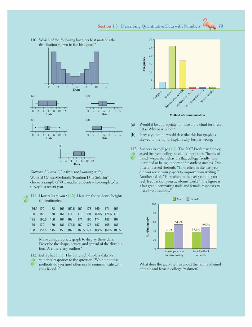
73Section 1.3 Describing Quantitative Data with Numbers
110. Which of the following boxplots best matches the distribution shown in the histogram?
0 2 4 6 8 10 12Data
Data0
(a)
2 4 6 8 10 12
Data0
(b)
2 4 6 8 10 12
Data0
(c)
2 4 6 8 10 12
Data0
(d)
2 4 6 8 10 12
Data0
(e)
2 4 6 8 10 12
Exercises 111 and 112 refer to the following setting. We used CensusAtSchool’s “Random Data Selector” to choose a sample of 50 Canadian students who completed a survey in a recent year.
111. How tall are you? (1.2) Here are the students’ heights (in centimeters).
166.5 170 178 163 150.5 169 173 169 171 166
190 183 178 161 171 170 191 168.5 178.5 173
175 160.5 166 164 163 174 160 174 182 167
166 170 170 181 171.5 160 178 157 165 187
168 157.5 145.5 156 182 168.5 177 162.5 160.5 185.5
Make an appropriate graph to display these data. Describe the shape, center, and spread of the distribu-tion. Are there any outliers?
112. Let’s chat (1.1) The bar graph displays data on students’ responses to the question “Which of these methods do you most often use to communicate with your friends?”
Cell phone
In per
son
Inter
net ch
at or M
SN
MyS
pace/F
aceb
ook
Telephone (
landlin
e)
Text m
essa
ging
30
25
20
15
10
5
0
Freq
uenc
y
Method of communication
(a) Would it be appropriate to make a pie chart for these data? Why or why not?
(b) Jerry says that he would describe this bar graph as skewed to the right. Explain why Jerry is wrong.
113. Success in college (1.1) The 2007 Freshman Survey asked first-year college students about their “habits of mind”—specific behaviors that college faculty have identified as being important for student success. One question asked students, “How often in the past year did you revise your papers to improve your writing?” Another asked, “How often in the past year did you seek feedback on your academic work?” The figure is a bar graph comparing male and female responses to these two questions.46
0
100
Revise papers toimprove writing
% “
Freq
uent
ly”
Seek feedbackon work
80
60
40
20
Male Female
36.9%
54.9%
37.6%
49.0%
What does the graph tell us about the habits of mind of male and female college freshmen?

74 C H A P T E R 1 EXPLORING DATA
Chapter ReviewIntroduction: Data Analysis: Making Sense of Data In this brief section, you learned several fundamental concepts that will be important throughout the course: the idea of a distribution and the distinction between quantitative and categorical variables. You also learned a strategy for exploring data:
• Begin by examining each variable by itself. Then move on to study relationships between variables.
• Start with a graph or graphs. Then add numerical summaries.
Section 1.1: Analyzing Categorical Data In this section, you learned how to display the distribution of a single categorical variable with pie charts and bar graphs
and what to look for when describing these displays. Re-member to properly label your graphs! Poor labeling is an easy way to lose points on the AP® exam. You should also be able to recognize misleading graphs and be careful to avoid making misleading graphs yourself.
Next, you learned how to investigate the association between two categorical variables. Using a two-way table, you learned how to calculate and display marginal and conditional distributions. Graphing and comparing con-ditional distributions allow you to look for an association between the variables. If there is no association between the two variables, graphs of the conditional distributions will look the same. However, if differences in the con-ditional distributions do exist, there is an association be-tween the variables.
The following problem is modeled after actual AP® Statistics exam free response questions. Your task is to generate a complete, con-cise response in 15 minutes.
Directions: Show all your work. Indicate clearly the methods you use, because you will be scored on the correctness of your methods as well as on the accuracy and completeness of your results and explanations.
Using data from the 2010 census, a random sample of 348 U.S. residents aged 18 and older was selected. Among the variables recorded were gender (male or female), housing sta-tus (rent or own), and marital status (married or not married).
The two-way table below summarizes the relationship between gender and housing status.
Male Female TotalOwn 132 122 254Rent 50 44 94Total 182 166 348
(a) What percent of males in the sample own their home?
(b) Make a graph to compare the distribution of hous-ing status for males and females.
(c) Using your graph from part (b), describe the rela-tionship between gender and housing status.
(d) The two-way table below summarizes the relation-ship between marital status and housing status.
Married Not Married TotalOwn 172 82 254Rent 40 54 94Total 212 136 348
For the members of the sample, is the relationship between marital status and housing status stronger or weaker than the relationship between gender and housing status that you described in part (c)? Justify your choice using the data provided in the two-way tables.
After you finish, you can view two example solutions on the book’s Web site (www.whfreeman.com/tps5e). Determine whether you think each solution is “complete,” “substantial,” “developing,” or “minimal.” If the solution is not complete, what improvements would you suggest to the student who wrote it? Finally, your teacher will provide you with a scoring rubric. Score your response and note what, if anything, you would do differently to improve your own score.
FRAPPY! Free Response AP® Problem, Yay!

What Did You Learn?Learning Objective Section Related Example Relevant Chapter on Page Review Exercise(s)
Identify the individuals and variables in a set of data. Intro 3 R1.1
Classify variables as categorical or quantitative. Intro 3 R1.1
Display categorical data with a bar graph. Decide whether it would be appropriate to make a pie chart. 1.1 9 R1.2, R1.3
Identify what makes some graphs of categorical data deceptive. 1.1 10 R1.3
Calculate and display the marginal distribution of a categorical variable from a two-way table. 1.1 13 R1.4
Calculate and display the conditional distribution of a categorical variable for a particular value of the other categorical variable in a two-way table. 1.1 15 R1.4
Describe the association between two categorical variables by comparing appropriate conditional distributions. 1.1 17 R1.5
Dotplots: 25 Make and interpret dotplots and stemplots of quantitative data. 1.2 Stemplots: 31 R1.6
Describe the overall pattern (shape, center, and spread) of a distribution and identify any major departures from the pattern (outliers). 1.2 Dotplots: 26 R1.6, R1.9
Identify the shape of a distribution from a graph as roughly symmetric or skewed. 1.2 28 R1.6, R1.7, R1.8, R1.9
Section 1.2: Displaying Quantitative Data with Graphs In this section, you learned how to create three differ-ent types of graphs for a quantitative variable: dotplots, stemplots, and histograms. Each of the graphs has dis-tinct benefits, but all of them are good tools for examin-ing the distribution of a quantitative variable. Dotplots and stemplots are handy for small sets of data. Histograms are the best choice when there are a large number of observations. On the AP® exam, you will be expected to create each of these types of graphs, label them properly, and comment on their characteristics.
When you are describing the distribution of a quanti-tative variable, you should look at its graph for the overall pattern (shape, center, spread) and striking departures from that pattern (outliers). Use the acronym SOCS (shape, outliers, center, spread) to help remember these four characteristics. Likewise, when comparing distri-butions, you should include explicit comparison words such as “is greater than” or “is approximately the same as.” When asked to compare distributions, a very com-mon mistake on the AP® exam is describing the charac-teristics of each distribution separately without making these explicit comparisons.
Section 1.3: Describing Quantitative Data with Numbers To measure the center of a distribution of quantitative data, you learned how to calculate the mean and the median of a distribution. You also learned that the median is a resistant measure of center but the mean isn’t resistant because it can be greatly affected by skewness or outliers.
To measure the spread of a distribution of quantitative data, you learned how to calculate the range, interquartile range, and standard deviation. The interquartile range (IQR) is a resistant measure of spread because it ignores the upper 25% and lower 25% of the distribution, but the range isn’t resistant because it uses only the minimum and maximum value. The standard deviation is the most commonly used measure of spread and approximates the typical distance of a value in the data set from the mean. The standard deviation is not resistant—it is heavily affected by extreme values.
To identify outliers in a distribution of quantitative data, you learned the 1.5 × IQR rule. You also learned that boxplots are a great way to visually summarize the distribution of quan-titative data. Boxplots are helpful for comparing distributions because they make it easy to compare both center (median) and spread (range, IQR). Yet boxplots aren’t as useful for dis-playing the shape of a distribution because they do not display modes, clusters, gaps, and other interesting features.
75

76 C H A P T E R 1 EXPLORING DATA
Chapter Review ExercisesChapter 1These exercises are designed to help you review the important ideas and methods of the chapter.
R1.1 Hit movies According to the Internet Movie Data-base, Avatar is tops based on box office sales world-wide. The following table displays data on several popular movies.47
Time Box officeMovie Year Rating (minutes) Genre (dollars)
Avatar 2009 PG-13 162 Action 2,781,505,847
Titanic 1997 PG-13 194 Drama 1,835,300,000
Harry Potter and the Deathly Hallows: Part 2 2011 PG-13 130 Fantasy 1,327,655,619
Transformers: Dark of the Moon 2011 PG-13 154 Action 1,123,146,996
The Lord of the Rings: The Return of the King 2003 PG-13 201 Action 1,119,929,521
Pirates of the Caribbean: Dead Man’s Chest 2006 PG-13 151 Action 1,065,896,541
Toy Story 3 2010 G 103 Animation 1,062,984,497
(a) What individuals does this data set describe? (b) Clearly identify each of the variables. Which are
quantitative? (c) Describe the individual in the highlighted row.
R1.2 Movie ratings The movie rating system we use today was first established on November 1, 1968. Back then, the possible ratings were G, PG, R, and X. In 1984, the PG-13 rating was created. And in 1990, NC-17 replaced the X rating. Here is a summary of the ratings assigned to movies between 1968 and 2000: 8% rated G, 24% rated PG, 10% rated PG-13, 55% rated R, and 3% rated NC-17.48 Make an ap-propriate graph for displaying these data.
R1.3 I’d die without my phone! In a survey of over 2000 U.S. teenagers by Harris Interactive, 47% said that “their social life would end or be worsened without their cell phone.”49 One survey question asked the teens how important it is for their phone to have certain features. The figure below displays data on the percent who indicated that a particular feature is vital.
0
60
Make/receivecalls
Send/receivetext messages
50
40
30
20
10
Camera Send/receivepictures
46%
39%
19% 17%
Make and interpret histograms of quantitative data. 1.2 33 R1.7, R1.8
Compare distributions of quantitative data using dotplots, stemplots, or histograms. 1.2 30 R1.8, R1.10
Mean: 49 Calculate measures of center (mean, median). 1.3 Median: 52 R1.6
Calculate and interpret measures of spread (range, IQR, IQR: 55 standard deviation). 1.3 Std. dev.: 60 R1.9
Choose the most appropriate measure of center and spread in a given setting. 1.3 65 R1.7
Identify outliers using the 1.5 × IQR rule. 1.3 56 R1.6, R1.7, R1.9
Make and interpret boxplots of quantitative data. 1.3 57 R1.7
Use appropriate graphs and numerical summaries to compare distributions of quantitative variables. 1.3 65 R1.8, R1.10
Learning Objective Section Related Example Relevant Chapter on Page(s) Review Exercise(s)
What Did You Learn? (continued)

77 Chapter Review Exercises
(a) Explain how the graph gives a misleading impression. (b) Would it be appropriate to make a pie chart to
display these data? Why or why not? (c) Make a graph of the data that isn’t misleading.
R1.4 Facebook and age Is there a relationship between Facebook use and age among college students? The following two-way table displays data for the 219 students who responded to the survey.50
Age
Facebook user?
Younger (18–22)
Middle (23–27)
Older (28 and up)
Yes 78 49 21
No 4 21 46
(a) What percent of the students who responded were Facebook users? Is this percent part of a marginal distribution or a conditional distribution? Explain.
(b) What percent of the younger students in the sample were Facebook users? What percent of the Facebook users in the sample were younger students?
R1.5 Facebook and age Use the data in the previous exercise to determine whether there is an associa-tion bet ween Facebook use and age. Give appropri-ate graphical and numerical evidence to support your answer.
R1.6 Density of the earth In 1798, the English scientist Henry Cavendish measured the density of the earth several times by careful work with a torsion bal-ance. The variable recorded was the density of the earth as a multiple of the density of water. Here are Cavendish’s 29 measurements:51
5.50 5.61 4.88 5.07 5.26 5.55 5.36 5.29 5.58 5.655.57 5.53 5.62 5.29 5.44 5.34 5.79 5.10 5.27 5.395.42 5.47 5.63 5.34 5.46 5.30 5.75 5.68 5.85
(a) Present these measurements graphically in a stemplot. (b) Discuss the shape, center, and spread of the distri-
bution. Are there any outliers? (c) What is your estimate of the density of the earth
based on these measurements? Explain.
R1.7 Guinea pig survival times Here are the survival times in days of 72 guinea pigs after they were injected with infectious bacteria in a medical experiment.52 Survival times, whether of machines under stress or cancer patients after treatment, usually have distributions that are skewed to the right.
43 45 53 56 56 57 58 66 67 73 74 79
80 80 81 81 81 82 83 83 84 88 89 91
91 92 92 97 99 99 100 100 101 102 102 102
103 104 107 108 109 113 114 118 121 123 126 128
137 138 139 144 145 147 156 162 174 178 179 184
191 198 211 214 243 249 329 380 403 511 522 598
(a) Make a histogram of the data and describe its main features. Does it show the expected right skew?
(b) Now make a boxplot of the data. Be sure to check for outliers.
(c) Which measure of center and spread would you use to summarize the distribution—the mean and standard deviation or the median and IQR? Justify your answer.
R1.8 Household incomes Rich and poor households differ in ways that go beyond income. Following are histo-grams that compare the distributions of household size (number of people) for low-income and high-income households.53 Low-income households had annual in-comes less than $15,000, and high-income households had annual incomes of at least $100,000.
Household size, low income
0
60
75 63 41 2
Perc
ent
50
40
30
20
10
Household size, high income
0
60
75 63 41 2
Perc
ent
50
40
30
20
10
(a) About what percent of each group of households consisted of two people?
(b) What are the important differences between these two distributions? What do you think explains these differences?
Exercises R1.9 and R1.10 refer to the following setting. Do you like to eat tuna? Many people do. Unfortunately, some of the tuna that people eat may contain high levels of mer-cury. Exposure to mercury can be especially hazardous for pregnant women and small children. How much mercury is safe to consume? The Food and Drug Administration will take action (like removing the product from store shelves) if the mercury concentration in a six-ounce can of tuna is 1.00 ppm (parts per million) or higher.

78 C H A P T E R 1 EXPLORING DATA
T1.1 You record the age, marital status, and earned in-come of a sample of 1463 women. The number and type of variables you have recorded is
(a) 3 quantitative, 0 categorical. (b) 4 quantitative, 0 categorical. (c) 3 quantitative, 1 categorical. (d) 2 quantitative, 1 categorical. (e) 2 quantitative, 2 categorical.
T1.2 Consumers Union measured the gas mileage in miles per gallon of 38 vehicles from the same model year on a special test track. The pie chart provides
information about the country of manufacture of the model cars tested by Consumers Union. Based on the pie chart, we conclude that
(a) Japanese cars get significantly lower gas mileage than cars from other countries.
(b) U.S. cars get significantly higher gas mileage than cars from other countries.
(c) Swedish cars get gas mileages that are between those of Japanese and U.S. cars.
(d) cars from France have the lowest gas mileage. (e) more than half of the cars in the study were from the
United States.
Section I: Multiple Choice Select the best answer for each question.
AP® Statistics Practice TestChapter 1
What is the typical mercury concentration in cans of tuna sold in stores? A study conducted by Defenders of Wildlife set out to answer this question. Defenders col-lected a sample of 164 cans of tuna from stores across the United States. They sent the selected cans to a laboratory that is often used by the Environmental Protection Agency for mercury testing.54
R1.9 Mercury in tuna A histogram and some computer output provide information about the mercury con-centration in the sampled cans (in parts per million, ppm).
Descriptive Statistics: Mercury_ppm
Variable N Mean StDev Min Mercury 164 0.285 0.300 0.012 Variable Q1 Med Q3 MaxMercury 0.071 0.180 0.380 1.500
(a) Interpret the standard deviation in context. (b) Determine whether there are any outliers. (c) Describe the shape, center, and spread of the
distribution.
R1.10 Mercury in tuna Is there a difference in the mercury concentration of light tuna and albacore tuna? Use the parallel boxplots and the computer output to write a few sentences comparing the two distributions.
Descriptive Statistics: Mercury_ppm
Type N Mean StDev Min Albacore 20 0.401 0.152 0.170 Light 144 0.269 0.312 0.012 Type Q1 Med Q3 MaxAlbacore 0.293 0.400 0.460 0.730 Light 0.059 0.160 0.347 1.500

France
U.S.
Germany
Italy
Japan
Sweden
T1.3 Which of the following bar graphs is equivalent to the pie chart in Question T1.2?
(a)15
10
5
France Germany Italy Japan Sweden U.S.
(b)25
France Germany Italy Japan Sweden U.S.
20
15
10
5
(c)
France Germany Italy Japan Sweden U.S.
20
15
10
5
(d)
France Germany Italy Japan Sweden U.S.
20
15
10
5
(e) None of these.
T1.4 Earthquake intensities are measured using a device called a seismograph, which is designed to be most sensitive to earthquakes with intensities between 4.0 and 9.0 on the Richter scale. Measurements of nine earthquakes gave the following readings:
4.5 L 5.5 H 8.7 8.9 6.0 H 5.2
where L indicates that the earthquake had an inten-sity below 4.0 and an H indicates that the earthquake had an intensity above 9.0. The median earthquake intensity of the sample is
(a) 5.75. (b) 6.00. (c) 6.47. (d) 8.70. (e) Cannot be determined.
AP® Statistics Practice Test 79

80 C H A P T E R 1 EXPLORING DATA
Questions T1.5 and T1.6 refer to the following setting. In a statistics class with 136 students, the professor records how much money (in dollars) each student has in his or her pos-session during the first class of the semester. The histogram shows the data that were collected.
Amount of money
0
60
Freq
uenc
y
0
50
40
30
20
10
10 20 30 40 7050 8060 90 100 110
T1.5 The percentage of students with less than $10 in their possession is closest to
(a) 30%. (b) 35%. (c) 45%. (d) 60%. (e) 70%.T1.6 Which of the following statements about this distri-
bution is not correct?
(a) The histogram is right-skewed. (b) The median is less than $20. (c) The IQR is $35. (d) The mean is greater than the median. (e) The histogram is unimodal.T1.7 Forty students took a statistics examination having
a maximum of 50 points. The score distribution is given in the following stem-and-leaf plot:
0 28 1 2245 2 01333358889 3 001356679 4 22444466788 5 000
The third quartile of the score distribution is equal to (a) 45. (b) 44. (c) 43. (d) 32. (e) 23.
T1.8 The mean salary of all female workers is $35,000. The mean salary of all male workers is $41,000. What must be true about the mean salary of all workers?
(a) It must be $38,000. (b) It must be larger than the median salary. (c) It could be any number between $35,000 and
$41,000. (d) It must be larger than $38,000. (e) It cannot be larger than $40,000.
Questions T1.9 and T1.10 refer to the following setting. A survey was designed to study how business operations vary according to their size. Companies were classified as small, medium, or large. Questionnaires were sent to 200 randomly selected busi-nesses of each size. Because not all questionnaires in a survey of this type are returned, researchers decided to investigate the relationship between the response rate and the size of the busi-ness. The data are given in the following two-way table:
Business size
Response? Small Medium Large
Yes 125 81 40
No 75 119 160
T1.9 What percent of all small companies receiving questionnaires responded?
(a) 12.5% (c) 33.3% (e) 62.5% (b) 20.8% (d) 50.8%T1.10 Which of the following conclusions seems to be
supported by the data?
(a) There are more small companies than large compa-nies in the survey.
(b) Small companies appear to have a higher response rate than medium or big companies.
(c) Exactly the same number of companies responded as didn’t respond.
(d) Overall, more than half of companies responded to the survey.
(e) If we combined the medium and large companies, then their response rate would be equal to that of the small companies.
T1.11 An experiment was conducted to investigate the effect of a new weed killer to prevent weed growth in onion crops. Two chemicals were used: the standard weed killer (C) and the new chemical (W). Both chemicals were tested at high and low concentrations on a total of 50 test plots. The percent of weeds that grew in each plot was recorded. Here are some boxplots of the results. Which of the following is not a correct state-ment about the results of this experiment?
* * *
W—low conc.
C—low conc.
W—high conc.
C—high conc.
0 10 20 30 40 50
Percent of weeds that grew
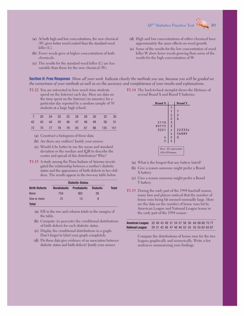
(a) At both high and low concentrations, the new chemical (W) gives better weed control than the standard weed killer (C).
(b) Fewer weeds grew at higher concentrations of both chemicals.
(c) The results for the standard weed killer (C) are less variable than those for the new chemical (W).
(d) High and low concentrations of either chemical have approximately the same effects on weed growth.
(e) Some of the results for the low concentration of weed killer W show fewer weeds growing than some of the results for the high concentration of W.
Section II: Free Response Show all your work. Indicate clearly the methods you use, because you will be graded on the correctness of your methods as well as on the accuracy and completeness of your results and explanations.T1.12 You are interested in how much time students
spend on the Internet each day. Here are data on the time spent on the Internet (in minutes) for a particular day reported by a random sample of 30 students at a large high school:
7 20 24 25 25 28 28 30 32 35
42 43 44 45 46 47 48 48 50 51
72 75 77 78 79 83 87 88 135 151
(a) Construct a histogram of these data. (b) Are there any outliers? Justify your answer. (c) Would it be better to use the mean and standard
deviation or the median and IQR to describe the center and spread of this distribution? Why?
T1.13 A study among the Pima Indians of Arizona investi-gated the relationship between a mother’s diabetic status and the appearance of birth defects in her chil-dren. The results appear in the two-way table below.
Birth Defects
Diabetic Status
TotalNondiabetic Prediabetic Diabetic
None 754 362 38
One or more 31 13 9
Total
(a) Fill in the row and column totals in the margins of the table.
(b) Compute (in percents) the conditional distributions of birth defects for each diabetic status.
(c) Display the conditional distributions in a graph. Don’t forget to label your graph completely.
(d) Do these data give evidence of an association between diabetic status and birth defects? Justify your answer.
T1.14 The back-to-back stemplot shows the lifetimes of several Brand X and Brand Y batteries.
1 1 7 2 2 2 6 3 3 4 223334 4 56889 5 0 5
Key: 4|2 represents420–429 hours.
Brand X Brand Y
2110997753221
45
(a) What is the longest that any battery lasted? (b) Give a reason someone might prefer a Brand
X battery. (c) Give a reason someone might prefer a Brand
Y battery.
T1.15 During the early part of the 1994 baseball season, many fans and players noticed that the number of home runs being hit seemed unusually large. Here are the data on the number of home runs hit by American League and National League teams in the early part of the 1994 season:
American League: 35 40 43 49 51 54 57 58 58 64 68 68 75 77National League: 29 31 42 46 47 48 48 53 55 55 55 63 63 67
Compare the distributions of home runs for the two leagues graphically and numerically. Write a few sentences summarizing your findings.
AP® Statistics Practice Test 81

Solutions
Chapter 1IntroductionAnswers to Check Your Understandingpage 4: 1. The cars in the student parking lot. 2. He measured the car’s model (categorical), year (quantitative), color (categori-cal), number of cylinders (quantitative), gas mileage (quantitative), weight (quantitative), and whether it has a navigation system (categorical).
Answers to Odd-Numbered Introduction Exercises1.1 Type of wood, type of water repellent, and paint color are cat-egorical. Paint thickness and weathering time are quantitative.1.3 (a) AP® Statistics students who completed a questionnaire on the first day of class. (b) Categorical: gender, handedness, and favorite type of music. Quantitative: height, homework time, and the total value of coins in a student’s pocket. (c) The individual is a female who is right-handed. She is 58 inches tall, spends 60 min-utes on homework, prefers Alternative music, and has 76 cents in her pocket.1.5 Student answers will vary. For example, quantitative variables could be graduation rate and student-faculty ratio, and categorical variables could be region of the country and type of institution (2-year college, 4-year college, university).1.7 b
Section 1.1Answers to Check Your Understandingpage 14: 1. Fly: 99/415 = 23.9%, Freeze time: 96/415 = 23.1%, Invisibility: 67/415 = 16.1%, Superstrength: 43/415 = 10.4%, Telepathy: 110/415 = 26.5%. 2. A bar graph is shown below. It appears that telepathy, ability to fly, and ability to freeze time were the most popular choices, with about 25% of students choosing each one. Invisibility was the 4th most popular and superstrength was the least popular.
Fly
30
25
20
15
10
5
0
Freeze
time
Invisi
bility
Supers
treng
th
Telepa
thy
Superpower preference
Perc
ent
page 18: 1. For the U.K. students: 54/200 = 27% said fly, 52/200 = 26% said freeze time, 30/200 = 15% said invisibility, 20/200 = 10% said superstrength, and 44/200 = 22% said telepathy. For the U.S. students: 45/215 = 20.9% said fly, 44/215 = 20.5% said freeze time, 37/215 = 17.2% said invisibility, 23/215 = 10.7% said super-strength, and 66/215 = 30.7% said telepathy. 2. A bar graph is shown in the next column. 3. There is an association between country of origin and superpower preference. Students in the U.K. are more likely to choose flying and freezing time, while students in the U.S. are more likely to choose invisibility or telepathy. Superstrength is about equally unpopular in both countries.
Fly
Freeze
time
Invisi
bility
Supers
treng
th
Telepa
thy
Superpower preference
35302520151050
U.K.U.S.
Perc
ent
Answers to Odd-Numbered Section 1.1 Exercises1.9 (a) 1% (b) A bar graph is given below. (c) Yes, because the numbers in the table refer to parts of a single whole.
Color
Whit
eBlac
kSilv
erGray Red
Blue
Brown/b
eige
Yellow
/gold
Green
Other
25
20
15
10
5
0
Perc
ent
1.11 (a) A bar graph is given below. A pie chart would also be appro-priate because the numbers in the table refer to parts of a single whole. (b) Perhaps induced or C-section births are scheduled for weekdays so doctors don’t have to work as much on the weekend.
Day
Sund
ayM
onda
yTu
esda
yW
edne
sday
Thur
sday
Frid
aySa
turd
ay
Bir
ths
20000
400060008000
10,00012,00014,000
1.13 About 63% are Mexican and 9% are Puerto Rican.1.15 (a) The given percents represent fractions of different age groups, rather than parts of a single whole. (b) A bar graph is given below.
Age group
Perc
ent
05
10152025
12–1
7 ye
ars
18–2
4 ye
ars
25–3
4 ye
ars
35–4
4 ye
ars
45–5
4 ye
ars
55–6
4 ye
ars
65 y
ears
and
over
1.17 (a) The areas of the pictures should be proportional to the numbers of students they represent. (b) A bar graph is given below.
Mode of transportation
0Cycle Car Bus Walk
2468
101214
Num
ber
of s
tude
nts
S-1
Starnes-Yates5e_Answer_S1-S24hr2.indd 1 12/2/13 10:36 AM

S-2 S o l u t i o n s
1.19 (a) 133 people; 36 buyers of coffee filters made of recycled paper. (b) 36.8% said “higher,” 24.1% said “the same,” and 39.1% said “lower.” Overall, 60.9% of the members of the sample think the quality is the same or higher.1.21 For buyers, 55.6% said higher, 19.4% said the same, and 25% said lower. For the nonbuyers, 29.9% said higher, 25.8% said the same, and 44.3% said lower. We see that buyers are much more likely to consider recycled filters higher in quality and much less likely to consider them lower in quality than nonbuyers.1.23 Americans are much more likely to choose white/pearl and red, while Europeans are much more likely to choose silver, black, or gray. Preferences for blue, beige/brown, green, and yellow/gold are about the same for both groups.1.25 A table and a side-by-side bar graph comparing the distributions of snowmobile use for environmental club members and nonmembers are shown below. There appears to be an associa-tion between environmental club membership and snowmobile use. The visitors who are members of an environmental club are much more likely to have never used a snowmobile and less likely to have rented or owned a snowmobile than visitors who are not in an environmental club.
Not a member Member
Never used 445/1221 = 36.4% 212/305 = 69.5%
Snowmobile renter
497/1221 = 40.7% 77/305 = 25.2%
Snowmobile owner
279/1221 = 22.9% 16/305 = 5.2%
706050403020100
Perc
ent
NoClub
Snowmobile
YesYesYes No No
Neverused
Snowmobilerenter
Snowmobileowner
1.27 d1.29 d1.31 b1.33 d
1.35 Answers will vary. Two possible tables are given below.
10 40 30 20
50 0 30 20
Section 1.2Answers to Check Your Understandingpage 29: 1. This distribution is skewed to the right and uni-modal. 2. The midpoint of the 28 values is between 1 and 2. 3. The number of siblings varies from 0 to 6. 4. There are two potential outliers at 5 and 6 siblings.
page 32: 1. Both males and females have distributions that are skewed to the right, though the distribution for the males is more heavily skewed. The midpoint for the males (9 pairs) is less than the midpoint for the females (26 pairs). The number of shoes owned by females varies more (from 13 to 57) than for males (from 4 to 38). The male distribution has three likely outliers at 22, 35, and 38. The females do not have any likely outliers. 2. b 3. e 4. c page 38: 1. One possible histogram is shown below. 2. The dis-tribution is roughly symmetric and bell-shaped. The typical IQ appears to be between 110 and 120 and the IQs vary from 80 to 150. There do not appear to be any outliers.
18
0
16
2
14
4
12
86
10
Freq
uenc
y
IQ90 110 130 15012010080 140
page 39: 1. This is a bar graph because field of study is a categori-cal variable. 2. No, because the variable is categorical and the cat-egories could be listed in any order on the horizontal axis.
Answers to Odd-Numbered Section 1.2 Exercises1.37 (a) The graph is shown below. (b) The distribution is roughly symmetric with a midpoint of 6 hours. The hours of sleep vary from 3 to 11. There do not appear to be any outliers.
Hours of sleep753 8 9 10 1164
1.39 (a) This dot represents a game where the opposing team won by 1 goal. (b) All but 4 of the 25 values are positive, which indicates that the U.S. women’s soccer team had a very good season. They won 21/25 = 84% of their games. 1.41 As coins get older, they are taken out of circulation and new coins are introduced, meaning that most coins will be from recent years with a few from previous years.1.43 Both distributions are roughly symmetric and have about the same amount of variability. The center of the internal distribution is greater than the center of the external distribution, indicating that external rewards do not promote creativity. Neither distribution appears to have outliers. 1.45 (a) Otherwise, most of the data would appear on just a few stems, making it hard to identify the shape of the distribution. (b) Key: 12 | 1 means that 12.1% of that state’s residents are aged 25 to 34. (c) The distribution of percent of residents aged 25−34 is roughly symmetric with a possible outlier at 16.0%. The center is around 13%. Other than the outlier at 16.0%, the values vary from 11.4% to 15.1%.1.47 (a) The stemplots are given in the next column. The stemplot with split stems makes it easier to see the shape of the distribution. (b) The distribution is slightly skewed to the right with a center near 780 mm, and values that vary from around 600 mm to 960 mm. There do not appear to be any outliers. (c) In El Niño years, there is typically less rain than in other years (18 of 23 years).
Starnes-Yates5e_Answer_S1-S24hr1.indd 2 11/21/13 2:44 PM

S o l u t i o n s S-3
Without splitting stems With splitting stems6 0 3 5 5 7 6 0 3
7 0 1 2 4 4 8 8 9 9 9 6 5 5 7
8 1 1 3 6 6 7 7 0 1 2 4 4
9 0 6 7 8 8 9 9 9
8 1 1 3
8 6 6 7
Key: 6 | 3 = 630 mm of rain 9 0
9 6
1.49 (a) Most people will round their answers to the nearest 10 minutes (or 30 or 60). The students who claimed 300 and 360 min-utes of studying on a typical weeknight may have been exaggerat-ing. (b) The stemplots suggest that women (claim to) study more than men. The center for women (about 175 minutes) is greater than the center for men (about 120 minutes).
Women Men0 0 3 3 3 3
9 6 0 5 6 6 6 8 9 9 9
2 2 2 2 2 2 2 2 1 0 2 2 2 2 2 2
8 8 8 8 8 8 8 8 8 8 7 5 5 5 5 1 5 5 8
4 4 4 0 2 0 0 3 4 4
2
3 0
6 3
1.51 (a) The distribution is slightly skewed to the left and uni-modal. (b) The center is between 0% and 2.5%. (c) The highest return was between 10% and 12.5%. Ignoring the low outliers, the lowest return was between −12.5% and −10%. (d) About 37% of these months (102 out of 273) had negative returns. 1.53 (a) The histogram is given below. (b) The distribution of travel times is roughly symmetric. The center is near 23 minutes and the values vary from 15.5 to 30.9 minutes. There do not appear to be any outliers.
Freq
uenc
y
14
0
12
2
10
64
8
Travel time (minutes)22 282420 26 301814 3216
1.55 The histogram is given below. The distribution of DRP scores is roughly symmetric with the center around 35. The DRP scores vary from 14 to 54. There do not appear to be any outliers.
9876543210
Freq
uenc
y
DRP scores12 18 24 30 36 42 48 54 60
1.57 (a) The histogram is given below. The distribution of word lengths is skewed to the right and single-peaked. The center is around 4 letters, with words that vary from 1 to 15 letters. There do not appear to be any outliers. (b) There are more short words in Shakespeare’s plays and more very long words in Popular Science articles.
Length of words (number of letters)6 104 8 122 14
Perc
ent o
f wor
ds
20
15
10
0
5
1.59 The scale on the horizontal axis is very different from one graph to the other.1.61 A bar graph should be used because birth month is a categori-cal variable. A possible bar graph is given below.
Perc
ent
9
0
2
4
6
8
1
3
5
7
Month
Janu
ary
July
Sept
embe
rN
ovem
ber
May
Aug
ust
June
Apr
il
Oct
ober
Dec
embe
r
Febr
uary
Mar
ch
1.63 (a) The percents for women sum to 100.1% due to round-ing errors. (b) Relative frequency histograms are shown below because there are considerably more men than women. (c) Both histograms are skewed to the right. The center of the women’s distribution of salaries is less than the men’s. The distributions of salaries are about equally variable, and the table shows that there are some outliers in each distribution who make between $65,000 and $70,000.
Salary ($ thousands)10 40 705030 6020
Perc
ent o
f men
05
101520253035
Salary ($ thousands)10 40 705030 6020
Perc
ent o
f wom
en
05
101520253035
1.65 The distribution of age is skewed to the right for both males and females, meaning that younger people outnumber older peo-ple. Among the younger Vietnamese, there are more males than females. After age 35, however, females seem to outnumber the males, making the center of the female distribution a little greater than the male distribution. Both distributions have about the same amount of variability and no outliers.
Key: 2 | 3 = 230 minutes
Starnes-Yates5e_Answer_S1-S24hr1.indd 3 11/21/13 2:44 PM

S-4 S o l u t i o n s
1.67 (a) Amount of studying. We would expect some students to study very little, but most students to study a moderate amount. Any outliers would likely be high outliers, leading to a right-skewed distri-bution. (b) Right- versus left-handed. About 90% of the population is right-handed (represented by the bar at 0). (c) Gender. We would expect a more similar percentage of males and females than for the right-handed and left-handed students. (d) Heights. We expect many heights near the average and a few very short or very tall people. 1.69 a1.71 c1.73 d1.75 (a) Major League Baseball players who were on the roster on opening day of the 2012 season. (b) 6. Two variables are categorical (team, position) and the other 4 are quantitative (age, height, weight, and salary). 1.77 (a) 71/858 = 8.3% were elite soccer players and 43/858 = 5.0% of the people had arthritis. (b) 10/71 = 14.1% of elite soccer players had arthritis and 10/43 = 23.3% of those with arthritis were elite soc-cer players.
Section 1.3Answers to Check Your Understandingpage 53: 1. Because the distribution is skewed to the right, we would expect the mean to be larger than the median. 2. Yes. The mean is 31.25 minutes, which is greater than the median of 22.5 minutes. 3. Because the distribution is skewed, the median would be a better measure of the center of the distribution. page 59: 1. The data in order are: 290, 301, 305, 307, 307, 310, 324, 345. The 5-number summary is 290, 303, 307, 317, 345. 2. The IQR is 14 pounds. The range of the middle half of the data is 14 pounds. 3. Any outliers occur below 303 − 1.5(14) = 282 or above 317 + 1.5(14) = 338, so 345 pounds is an outlier. 4. The boxplot is given below.
Weight290 300 310 320 330 340 350
page 63: 1. The mean is 75. 2. The table is given below.
Observation Deviation Squared deviation
67 67 − 75 = −8 (−8)2 = 64
72 72 − 75 = −3 (−3)2 = 9
76 76 − 75 = 1 12 = 1
76 76 − 75 = 1 12 = 1
84 84 − 75 = 9 92 = 81
Total 0 156
3. The variance is s2x =
1565 − 1
= 39 inches squared and the stan-
dard deviation is sx ="39 = 6.24 inches.4. The players’ heights typically vary by about 6.24 inches from the mean height of 75 inches.
Answers to Odd-Numbered Section 1.3 Exercises1.79 x = 85
1.81 (a) median = 85 (b) x = 79.33 and median = 84. The median did not change much but the mean did, showing that the median is more resistant to outliers than the mean. 1.83 The mean is $60,954 and the median is $48,097. The distri-bution of salaries is likely to be quite right skewed because of a few people who have a very large income, making the mean larger than the median.1.85 The team’s annual payroll is 1.2(25) = 30 or $30 million. No, because the median only describes the middle value in the distribu-tion. It doesn’t provide specific information about any of the other values. 1.87 (a) Estimating the frequencies of the bars (from left to right) as 10, 40, 42, 58, 105, 60, 58, 38, 27, 18, 20, 10, 5, 5, 1, and 3, the
mean is x =3504500
= 7.01. The median is the average of the 250th and 251st values, which is 6. (b) Because the median is less than the mean, we would use the median to argue that shorter domain names are more popular.
1.89 (a) IQR = 91 − 78 = 13. The middle 50% of the data have a range of 13 points. (b) Any outliers are below 78 − 1.5(13) = 58.5 or above 91 + 1.5(13) = 110.5. There are no outliers.1.91 (a) Outliers are anything below 3 − 1.5(40) = −57 or above 43 + 1.5(40) = 103, so 118 is an outlier. The boxplot is shown below. (b) The article claims that teens send 1742 texts a month, which is about 58 texts a day. Nearly all of the members of the class (21 of 25) sent fewer than 58 texts per day, which seems to contra-dict the claim in the article.
Num
ber
of te
xts
120
100
80
60
40
20
0
*
1.93 (a) Positive numbers indicate students who had more text messages than calls. Because the 1st quartile is about 0, roughly 75% of the students had more texts than calls, which supports the article’s conclusion. (b) No. Students in statistics classes tend to be upperclassmen and their responses might differ from those of underclassmen. 1.95 (a) About 3% and −3.5%. (b) About 0.1%. (c) The stock fund is much more variable. It has higher positive returns, but also higher negative returns.
1.97 (a) sx =Å
2.066 − 1
= 0.6419 mg$dl. (b) The phosphate level
typically varies from the mean by about 0.6419 mg/dl.
1.99 (a) Skewed to the right, because the mean is much larger than the median and Q3 is much further from the median than Q1. (b) The amount of money spent typically varies from the mean by $21.70. (c) Any points below 19.06 − 1.5(26.66) = −20.93 or above 45.72 + 1.5(26.66) = 85.71 are outliers. Because the maxi-mum of 93.34 is greater than 85.71, there is at least one outlier.1.101 Yes. For example, in data set 1, 2, 3, 4, 5, 6, 7, 8 the IQR is 4. If 8 is changed to 88, the IQR will still be 4.1.103 (a) One possible answer is 1, 1, 1, 1. (b) 0, 0, 10, 10. (c) For part (a), any set of four identical numbers will have sx = 0. For part (b), however, there is only one possible answer. We want the values to be as far from the mean as possible, so our best choice is two values at each extreme.
Starnes-Yates5e_Answer_S1-S24hr1.indd 4 11/21/13 2:44 PM

S-5S o l u t i o n s
1.105 State: Do the data indicate that men and women differ in their study habits and attitudes toward learning? Plan: We will draw side-by-side boxplots of the data about men and women; compute summary statistics; and compare the shape, center, and spread of both distributions. Do: The boxplots are given below, as is a table of summary statistics.
SSHA score60 80 100 120 140 160 180 200 220
Female
Male
*
Variable N Mean StDev Minimum Q1 Median Q3 Maximum
Women 18 141.06 26.44 101.00 126.00 138.50 154.00 200.00
Men 20 121.25 32.85 70.00 98.00 114.50 143.00 187.00
Both distributions are slightly skewed to the right. Both the mean and median are higher for women than for men. The scores for men are more variable than the scores for women. There are no outliers in the male distribution and a single outlier at 200 in the fe-male distribution. Conclude: Men and women differ in their study habits and attitudes toward learning. The typical score for females is about 24 greater than the typical score for males. Female scores are also more consistent than male scores. 1.107 d1.109 e1.111 A histogram is given below. This distribution is roughly symmetric with a center around 170 cm and values that vary from 145.5 cm to 191 cm. There do not appear to be any outliers.
Freq
uenc
y
86420
1012
Heights (cm)150 170160 190180
1.113 Women appear to be more likely to engage in behaviors that are indicative of good “habits of mind.” They are especially more likely to revise papers to improve their writing. The difference is a little smaller for seeking feedback on their work, although the percentage is still higher for females.
Answers to Chapter 1 Review Exercises R1.1 (a) Movies. (b) Quantitative: Year, time, box office sales. Categorical: Rating, genre. Note: Year might be considered categor-ical if we want to know how many of these movies were made each year rather than the average year. (c) This movie is Avatar, released in 2009. It was rated PG-13, runs 162 minutes, is an action film, and had box office sales of $2,781,505,847.R1.2 A bar chart is given below.
RatingG PG PG-13 R NC-17
Perc
ent
6050
40
30
20
100
R1.3 (a) The “bars” are different widths. For example, the bar for “send/receive text messages” should be roughly twice the size of the bar for “camera” when it is actually about 4 times as large. (b) No, because they do not describe parts of a whole. Students were free to answer in more than one category. (c) A bar graph is given below.
Features
Mak
e/re
ceiv
eca
llsSe
nd/re
ceiv
e
text
mes
sage
sC
amer
aSe
nd/re
ceiv
epi
ctur
es
Perc
ent
50
40
30
20
10
0
R1.4 (a) 148/219 = 67.6%. Marginal distribution, because it is part of the distribution of one variable for all categories of the other vari-able. (b) 78/82 = 95.1% of the younger students were Facebook users. 78/148 = 52.7% of the Facebook users were younger.R1.5 There does appear to be an association between age and Facebook status. From both the table and the graph given below, we can see that as age increases, the percent of Facebook users decreases. For younger students, about 95% are members. That drops to 70% for middle students and drops even further to 31.3% for older students.
Facebook user?
Age Yes No
Younger (18–22) 95.1% 4.9%
Middle (23–27) 70.0% 30.0%
Older (28 and up) 31.3% 68.7%
100
80
60
40
20
0
Perc
ent
YesFacebook
Age
NoNoNo Yes Yes
Younger Middle Older
R1.6 (a) A stemplot is given below. (b) The distribution is roughly symmetric with one possible outlier at 4.88. The center of the dis-tribution is between 5.4 and 5.5. The densities vary from 4.88 to 5.85. (c) Because the distribution is roughly symmetric, we can use the mean to estimate the Earth’s density to be about 5.45 times the density of water.
48 8
49
50 7
51 0
52 6799
53 04469
54 2467
55 03578
56 12358
57 59
58 5
Key: 48 | 8 = 4.88
Starnes-Yates5e_Answer_S1-S24hr1.indd 5 11/21/13 2:44 PM

S-6 S o l u t i o n s
R1.7 (a) A histogram is given below. The survival times are right-skewed, as expected. The median survival time is 102.5 days and the range of survival times is 598 − 43 = 555 days. There are sev-eral high outliers with survival times above 500.
Survival time (days)120 240 360 480 600
Freq
uenc
y35302520151050
(b) The boxplot is given below.
Surv
ival
tim
e (d
ays) 600
500
400
300
200
100
0
*
***
**
(c) Use the median and IQR to summarize the distribution because the outliers will have a big effect on the mean and standard deviation. R1.8 (a) About 20% of low-income and 33% of high-income households. (b) The shapes of both distributions are skewed to the right; however, the skewness is much stronger in the distribu-tion for low-income households. On average, household size is larger for high-income households. One-person households might have less income because they would include many young single people who have no job or retired single people with a fixed income. R1.9 (a) The amount of mercury per can of tuna will typically vary from the mean by about 0.3 ppm. (b) Any point below 0.071 − 1.5(0.309) = −0.393 or above 0.38 + 1.5(0.309) = 0.8435 would be considered an outlier. There are no low outliers, but there are several high outliers. (c) The distribution of the amount of mercury in cans of tuna is highly skewed to the right. The median is 0.18 ppm and the IQR is 0.309 ppm.R1.10 The distribution for light tuna is skewed to the right with several high outliers, while the distribution for albacore tuna is more symmetric with just a couple of high outliers. Because it has a greater center, the albacore tuna generally has more mercury. However, the light tuna has a much bigger spread of values, with some cans having as much as twice the amount of mercury as the largest amount in the albacore tuna.
Answers to Chapter 1 AP® Statistics Practice Test T1.1 d T1.2 e T1.3 b T1.4 b T1.5 c T1.6 c T1.7 b T1.8 c
T1.9 e T1.10 b T1.11 d T1.12 (a) A histogram is given below. (b) Any point below 30 − 1.5(47) = −40.5 or above 77 + 1.5(47) = 147.5 is an outlier. So 151 minutes is an outlier. (c) Median and IQR, because the distribution is skewed and has a high outlier.
Freq
uenc
y
10
8
6
4
2
0
Time on Internet (minutes)0 40 80 120 160
T1.13 (a) Row totals are 1154, 53, and 1207. Column totals are 785, 375, 47, and 1207. (b) Nondiabetic: 96.1% none and 3.9% one or more. Prediabetic: 96.5% none and 3.5% one or more. Diabetic: 80.9% none and 19.1% one or more. (c) The graph is given below.
Non
eO
ne o
r mor
e
Non
eO
ne o
r mor
e
Non
eO
ne o
r mor
e
Non
diab
etic
Pred
iabe
tic
Dia
betic
Perc
ent
100
0Birth defects
Diabetic status
40
80
20
60
(d) Yes. Nondiabetics and prediabetics appear to have babies with birth defects at about the same rate. However, those with diabetes have a much higher rate of babies with birth defects.T1.14 (a) Between 550 and 559 hours. (b) Because it has a higher minimum lifetime or because its lifetimes are more consistent (less variable). (c) Because it has a higher median lifetime.T1.15 Side-by-side boxplots and descriptive statistics for both leagues are given below. Both distributions are roughly symmetric, although there are two low outliers in the NL. The data suggest that the num-ber of home runs is somewhat less in the NL. All 5 numbers in the 5-number summary are less for the NL teams than for the AL teams. However, there is more variability among the AL teams.
Home runs20 30 40 50 60 70 80
AmericanLeague
NationalLeague **
Variable N Mean StDev Minimum Q1 Median Q3 Maximum
American League
14 56.93 12.69 35.00 49.00 57.50 68.00 77.00
National League
14 50.14 11.13 29.00 46.00 50.50 55.00 67.00
Starnes-Yates5e_Answer_S1-S24hr1.indd 6 11/21/13 2:44 PM