Embed Size (px)
Citation preview
8/8/2019 TInspire Core
http://slidepdf.com/reader/full/tinspire-core 1/13
TI-nspire CASReplacement calculator screens for the Core material
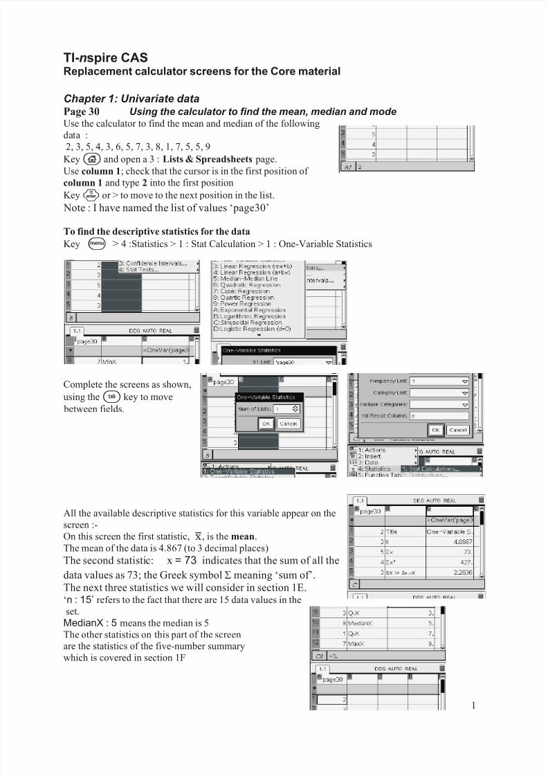
Chapter 1: Univariate dataPage 30 Using the calculator to find the mean, median and modeUse the calculator to find the mean and median of the following
data :2, 3, 5, 4, 3, 6, 5, 7, 3, 8, 1, 7, 5, 5, 9
Keyc and open a 3 : Lists & Spreadsheets page.
Use column 1; check that the cursor is in the first position of
column 1 and type 2 into the first position
Key· or > to move to the next position in the list.
Note : I have named the list of values ‘page30’
To find the descriptive statistics for the data
Key b > 4 :Statistics > 1 : Stat Calculation > 1 : One-Variable Statistics
Complete the screens as shown,
using thee key to move
between fields.
All the available descriptive statistics for this variable appear on the
screen :-
On this screen the first statistic, ?, is the mean.
The mean of the data is 4.867 (to 3 decimal places)
The second statistic: x = 73 indicates that the sum of all the
data values as 73; the Greek symbol ? meaning ‘sum of’.
The next three statistics we will consider in section 1E.‘n : 15’ refers to the fact that there are 15 data values in the
set.
MedianX : 5 means the median is 5
The other statistics on this part of the screen
are the statistics of the five-number summary
which is covered in section 1F
1
8/8/2019 TInspire Core
http://slidepdf.com/reader/full/tinspire-core 2/13
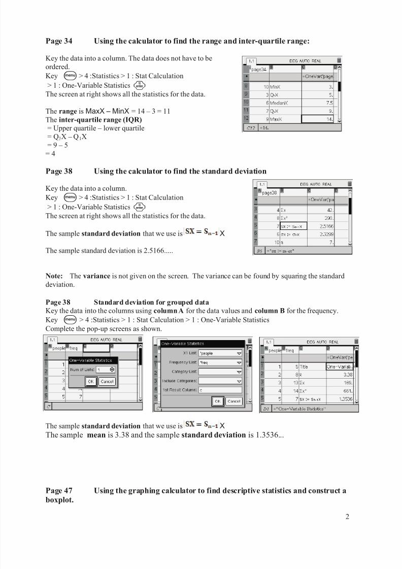
Page 34 Using the calculator to find the range and inter-quartile range:
Key the data into a column. The data does not have to be
ordered.
Key b > 4 :Statistics > 1 : Stat Calculation
> 1 : One-Variable Statistics·The screen at right shows all the statistics for the data.
The range is MaxX – MinX = 14 – 3 = 11
The inter-quartile range (IQR)
= Upper quartile – lower quartile
= Q3X – Q1X
= 9 – 5
= 4
Page 38 Using the calculator to find the standard deviation
Key the data into a column.
Key b > 4 :Statistics > 1 : Stat Calculation> 1 : One-Variable Statistics·
The screen at right shows all the statistics for the data.
The sample standard deviation that we use is X
The sample standard deviation is 2.5166.....
Note: The variance is not given on the screen. The variance can be found by squaring the standard
deviation.
Page 38 Standard deviation for grouped data
Key the data into the columns using column A for the data values and column B for the frequency.
Key b > 4 :Statistics > 1 : Stat Calculation > 1 : One-Variable Statistics
Complete the pop-up screens as shown.
The sample standard deviation that we use is X
The sample mean is 3.38 and the sample standard deviation is 1.3536...
Page 47 Using the graphing calculator to find descriptive statistics and construct a
boxplot.
2
8/8/2019 TInspire Core
http://slidepdf.com/reader/full/tinspire-core 3/13
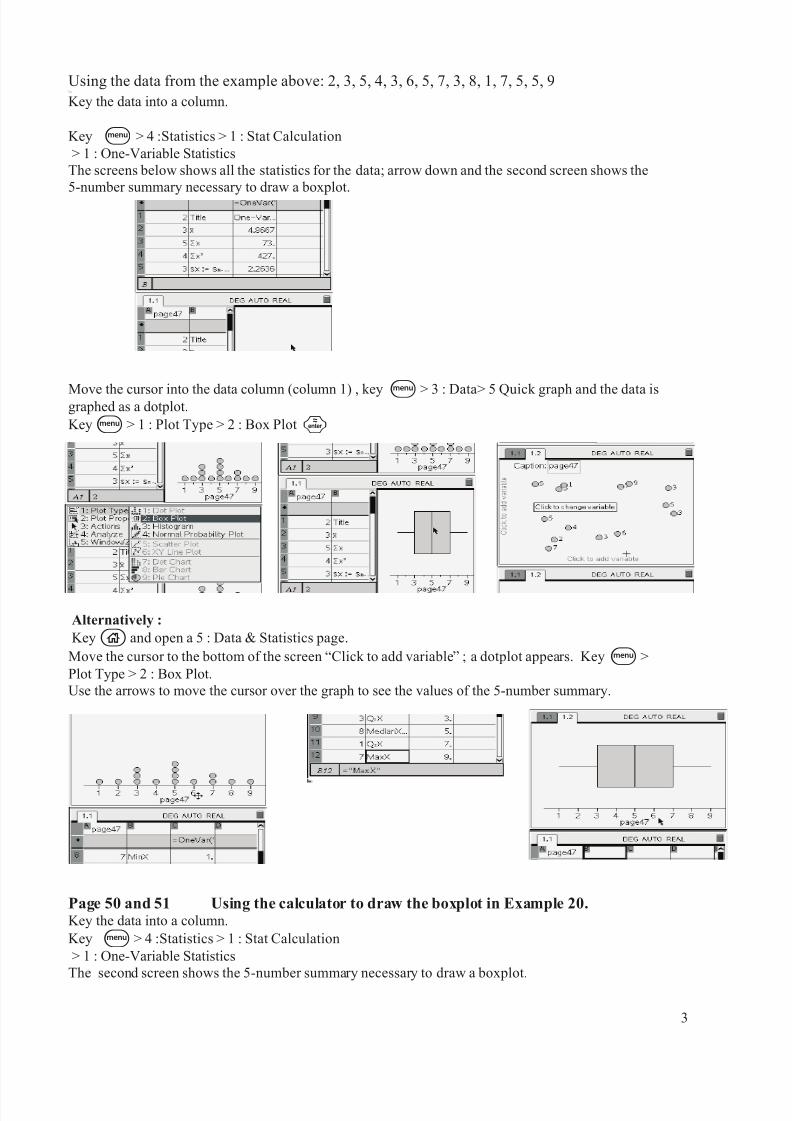
Using the data from the example above: 2, 3, 5, 4, 3, 6, 5, 7, 3, 8, 1, 7, 5, 5, 9TTap on
Key the data into a column.
Key b > 4 :Statistics > 1 : Stat Calculation
> 1 : One-Variable Statistics
The screens below shows all the statistics for the data; arrow down and the second screen shows the
5-number summary necessary to draw a boxplot.
Move the cursor into the data column (column 1) , key b > 3 : Data> 5 Quick graph and the data isgraphed as a dotplot.
Keyb > 1 : Plot Type > 2 : Box Plot·
Alternatively :
Keyc and open a 5 : Data & Statistics page.
Move the cursor to the bottom of the screen “Click to add variable” ; a dotplot appears. Keyb >
Plot Type > 2 : Box Plot.
Use the arrows to move the cursor over the graph to see the values of the 5-number summary.
Page 50 and 51 Using the calculator to draw the boxplot in Example 20.Key the data into a column.
Key b > 4 :Statistics > 1 : Stat Calculation
> 1 : One-Variable Statistics
The second screen shows the 5-number summary necessary to draw a boxplot.
3
8/8/2019 TInspire Core
http://slidepdf.com/reader/full/tinspire-core 4/13
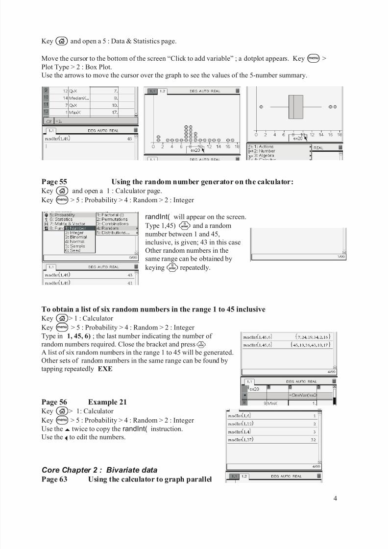
Keyc and open a 5 : Data & Statistics page.
Move the cursor to the bottom of the screen “Click to add variable” ; a dotplot appears. Keyb >
Plot Type > 2 : Box Plot.
Use the arrows to move the cursor over the graph to see the values of the 5-number summary.
Page 55 Using the random number generator on the calculator:
Keyc and open a 1 : Calculator page.Keyb > 5 : Probability > 4 : Random > 2 : Integer
randInt( will appear on the screen.
Type 1,45) · and a random
number between 1 and 45,
inclusive, is given; 43 in this case
Other random numbers in the
same range can be obtained by
keying· repeatedly.
To obtain a list of six random numbers in the range 1 to 45 inclusive
Keyc> 1 : Calculator
Keyb > 5 : Probability > 4 : Random > 2 : Integer
Type in 1, 45, 6) ; the last number indicating the number of
random numbers required. Close the bracket and press·A list of six random numbers in the range 1 to 45 will be generated.
Other sets of random numbers in the same range can be found by
tapping repeatedly EXE
Page 56 Example 21
Keyc> 1: Calculator
Keyb > 5 : Probability > 4 : Random > 2 : Integer
Use the £ twice to copy the randInt( instruction.
Use the ¡ to edit the numbers.
Core Chapter 2 : Bivariate data
Page 63 Using the calculator to graph parallel
4
8/8/2019 TInspire Core
http://slidepdf.com/reader/full/tinspire-core 5/13
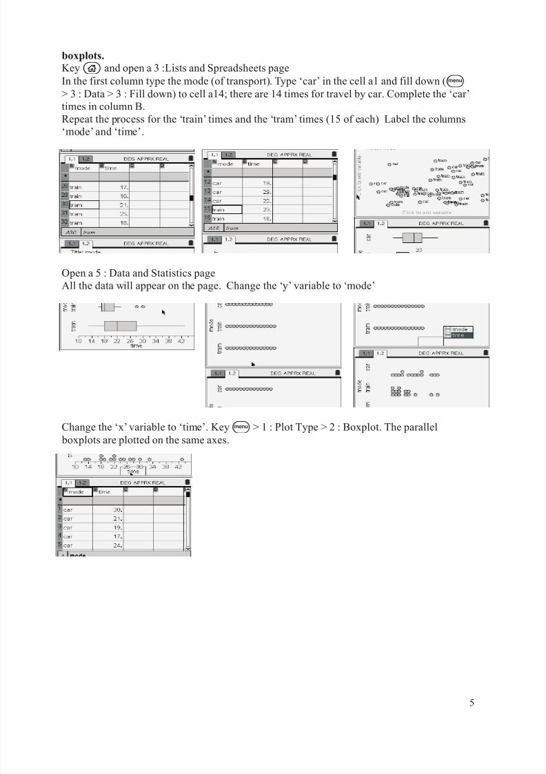
boxplots.
Keyc and open a 3 :Lists and Spreadsheets page
In the first column type the mode (of transport). Type ‘car’ in the cell a1 and fill down (b> 3 : Data > 3 : Fill down) to cell a14; there are 14 times for travel by car. Complete the ‘car’
times in column B.
Repeat the process for the ‘train’ times and the ‘tram’ times (15 of each) Label the columns
‘mode’ and ‘time’.
Open a 5 : Data and Statistics pageAll the data will appear on the page. Change the ‘y’ variable to ‘mode’
Change the ‘x’ variable to ‘time’. Keyb > 1 : Plot Type > 2 : Boxplot. The parallel
boxplots are plotted on the same axes.
5
8/8/2019 TInspire Core
http://slidepdf.com/reader/full/tinspire-core 6/13
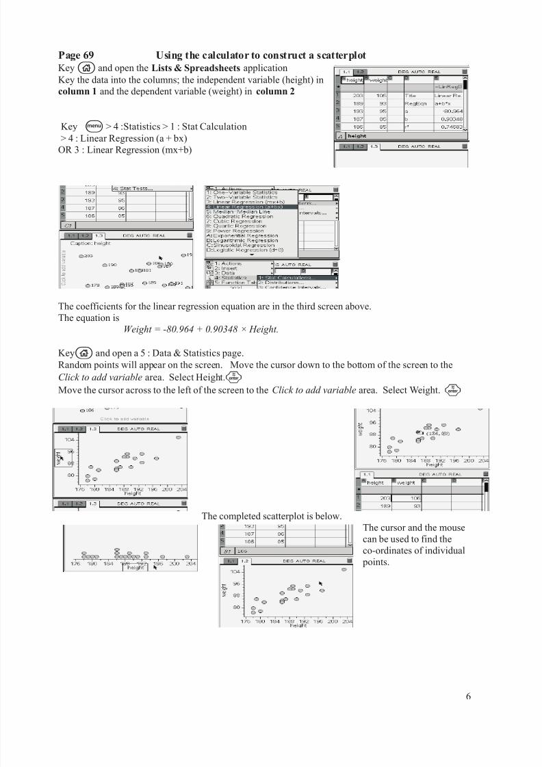
Page 69 Using the calculator to construct a scatterplot
Keyc and open the Lists & Spreadsheets application
Key the data into the columns; the independent variable (height) in
column 1 and the dependent variable (weight) in column 2
Key b > 4 :Statistics > 1 : Stat Calculation
> 4 : Linear Regression (a + bx)
OR 3 : Linear Regression (mx+b)
The coefficients for the linear regression equation are in the third screen above.
The equation is
Weight = -80.964 + 0.90348 × Height.
Keyc and open a 5 : Data & Statistics page.
Random points will appear on the screen. Move the cursor down to the bottom of the screen to the
Click to add variable area. Select Height.·Move the cursor across to the left of the screen to the Click to add variable area. Select Weight. ·
The completed scatterplot is below.
The cursor and the mouse
can be used to find theco-ordinates of individual
points.
6

8/8/2019 TInspire Core
http://slidepdf.com/reader/full/tinspire-core 7/13
Page 75 Using the calculator to find Pearson’s correlation coefficientEnter
Keyc and open the Lists & Spreadsheets application
Key the data into the columns; the independent variable (x) in column 1
and the dependent variable (y) in column 2
Produce a scatterplot for the data; it will reveal any errors made in entering
the data and any outliers. It will also indicate whether the data is linear.
The scatterplot indicates strong, positive, linear correlation between the
variables.
Key/¡ to return to the Lists... page:Key b > 4 :Statistics > 1 : Stat Calculation
> 4 : Linear Regression (a + bx)
OR 3 : Linear Regression (mx+b)
Select the variables :
The linear regression co-efficients for this data are shown above. Scrolling down will reveal the value
of Pearson’s correlation coefficient r ; 0.9130....for this example.
This r value indicates a strong, positive correlation as indicated by the scatterplot.
Page 78 Calculation of the coefficient of determination.
r 2
is also found on the linear regression screen of the calculator.
r 2
= 0.8336.... for this example
Alternatively, if the value of r is known, then this cansimply be squared.
7
8/8/2019 TInspire Core
http://slidepdf.com/reader/full/tinspire-core 8/13
Core Chapter 3 : Linear regression
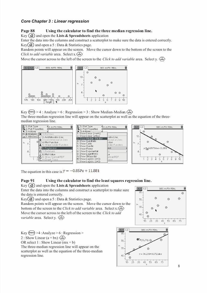
Page 88 Using the calculator to find the three median regression line.
Keyc and open the Lists & Spreadsheets application
Enter the data into the columns and construct a scatterplot to make sure the data is entered correctly.
Keyc and open a 5 : Data & Statistics page.
Random points will appear on the screen. Move the cursor down to the bottom of the screen to theClick to add variable area. Select x.·Move the cursor across to the left of the screen to the Click to add variable area. Select y.·
Keyb > 4 : Analyze > 6 : Regression > 3 : Show Median-Median.·The three-median regression line will appear on the scatterplot as well as the equation of the three-
median regression line.
The equation in this case is
Page 91 Using the calculator to find the least squares regression line.
Keyc and open the Lists & Spreadsheets application
Enter the data into the columns and construct a scatterplot to make sure
the data is entered correctly.
Keyc and open a 5 : Data & Statistics page.
Random points will appear on the screen. Move the cursor down to the bottom of the screen to the Click to add variable area. Select x.·Move the cursor across to the left of the screen to the Click to add
variable area. Select y. ·
Keyb >4 :Analyze > 6 : Regression >
2 : Show Linear (a + bx)·OR select 1 : Show Linear (mx + b)
The three-median regression line will appear on the
scatterplot as well as the equation of the three-median
regression line.
8
8/8/2019 TInspire Core
http://slidepdf.com/reader/full/tinspire-core 9/13
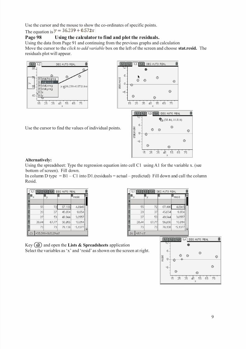
Use the cursor and the mouse to show the co-ordinates of specific points.
The equation is
Page 98 Using the calculator to find and plot the residuals.Using the data from Page 91 and continuing from the previous graphs and calculation
Move the cursor to the click to add variable box on the left of the screen and choose stat.resid. The
residuals plot will appear.
Use the cursor to find the values of individual points.
Alternatively:
Using the spreadsheet: Type the regression equation into cell C1 using A1 for the variable x. (see
bottom of screen). Fill down.
In column D type = B1 – C1 into D1.(residuals = actual – predicted) Fill down and call the column
Resid.
Keyc and open the Lists & Spreadsheets applicationSelect the variables as ‘x’ and ‘resid’ as shown on the screen at right.
9
8/8/2019 TInspire Core
http://slidepdf.com/reader/full/tinspire-core 10/13
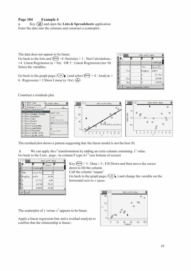
Page 104 Example 4
a. Keyc and open the Lists & Spreadsheets application
Enter the data into the columns and construct a scatterplot .
The data does not appear to be linear.
Go back to the lists andb >4 :Statistics > 1 : Stat Calculations..
>4 Linear Regression (a + bx) OR 3 : Linear Regression (mx+b)
Select the variables.
Go back to the graph page (/¢ ) and selectb > 4 : Analyze >
6 : Regression > 2 Show Linear (a +bx)·
Construct a residuals plot.
The residual plot shows a pattern suggesting that the linear model is not the best fit.
b. We can apply thex2
transformation by adding an extra column containing x2
value.
Go back to the Lists.. page ; in column F type A12
(see bottom of screen)
Keyb > 3 : Data >.3 : Fill Down and then move the cursor
down to fill the column.
Call the column ‘xsquar’
Go back to the graph page (/¢ ) and change the variable on the
horizontal axis to x squar .
The scatterplot of y versus x2
appears to be linear.
Apply a linear regression line and a residual analysis to
confirm that the relationship is linear:-
10
8/8/2019 TInspire Core
http://slidepdf.com/reader/full/tinspire-core 11/13
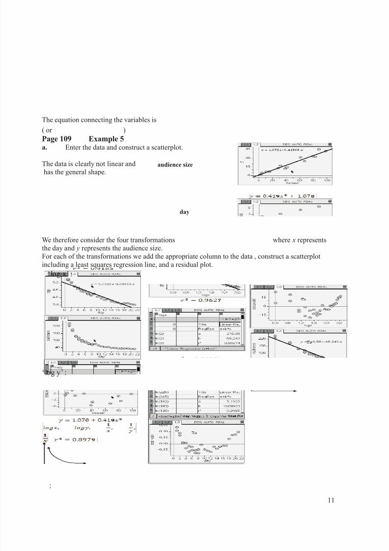
The equation connecting the variables is
( or )
Page 109 Example 5a. Enter the data and construct a scatterplot.
The data is clearly not linear and
has the general shape.
We therefore consider the four transformations where x represents
the day and y represents the audience size.
For each of the transformations we add the appropriate column to the data , construct a scatterplot
including a least squares regression line, and a residual plot.
‘log x’ :
‘log y’ :
:
day
audience size
11
8/8/2019 TInspire Core
http://slidepdf.com/reader/full/tinspire-core 12/13
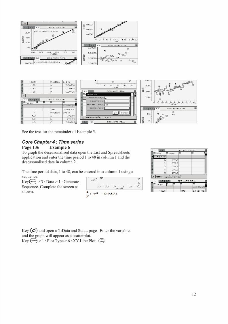
See the text for the remainder of Example 5.
Core Chapter 4 : Time seriesPage 136 Example 6To graph the deseasonalised data open the List and Spreadsheets
application and enter the time period 1 to 48 in column 1 and the
deseasonalised data in column 2.
The time period data, 1 to 48, can be entered into column 1 using asequence:
Keyb > 3 : Data > 1 : Generate
Sequence. Complete the screen as
shown.
Keyc and open a 5 :Data and Stat... page. Enter the variables
and the graph will appear as a scatterplot.
Keyb > 1 : Plot Type > 6 : XY Line Plot. ·
12

8/8/2019 TInspire Core
http://slidepdf.com/reader/full/tinspire-core 13/13
Select b > 4 : Analyze > 6 : Regression
> 2 : Show Linear (a +bx)· to paste a least-squares regression
line and equation on the screen.
13