Embed Size (px)
Citation preview

BIT116: ScriptingLecture 02 Part 2
Thursday, July 9th, 2015
Instructor: Craig Duckett
Crash Course in CSS

2
HTML Color Codes

3
HTML Color Codes
http://www.w3schools.com/html/html_colors.asp
http://www.w3schools.com/html/html_colornames.asp
http://www.computerhope.com/htmcolor.htm
http://www.computerhope.com/color-qa.htm
http://html-color-codes.info/
/* RGB model */#f00 /* 3-digit shortchand hex form #rgb */#ff0000 /* 6-digit traditional hex form #rrggbb */rgb(255, 0, 0) /* integer range 0 - 255 */rgb(100%, 0%, 0%) /* float range 0.0% - 100.0% */ /* RGB with alpha channel, added to CSS3 */rgba(255, 0, 0, 0.5) /* 0.5 opacity, semi-transparent */ /* HSL model, added to CSS3 */hsl(0, 100%, 50%) /* red */hsl(120, 100%, 50%) /* green */hsl(120, 100%, 25%) /* dark green */hsl(120, 100%, 75%) /* light green */hsl(120, 50%, 50%) /* pastel green */ /* HSL model with alpha channel */hsla(120, 100%, 50%, 1) /* green */hsla(120, 100%, 50%, 0.5) /* semi-transparent green */hsla(120, 100%, 50%, 0.1) /* very transparent green */
http://en.wikipedia.org/wiki/Web_colors
• Red/Green/Blue Hecadecimal Triplets• 0123456789abcdef
• Red/Green/Blue RGB Decimal Code• 0 - 255
• X11 Color Names• thistle, magenta, indigo, gray, grey
• HSL/HSV hue-saturation-lightness -value
• 0 - 360° , 0 - 100%, 0 - 100%• Web Safe Colors
• VGA 256 216 (6 × 6 × 6 = 216)each from 00 to FF
For this class we will be using 6 or 3 character hexadecimal color coding in our CSS, like #00ffff for example

4
HTML Color Coding
<html><body bgcolor="#00ffff">
<h1>Practice! Practice! Practice!</h1><p><a href="http://www.google.com">Google</a></p>
<p>bgcolor attribute not supported in HTML5. Use CSS instead.</p>
</body></html>
Using bgcolor this way is “old school” as web developers now use CSS to format web content!
The hexadecimal ‘triplets’ represent a mixture of red, green, and blue:
00 (red) ff (green) ff (blue)
All 0s make black, all fs make white, with 16,777,216 color variations available by varying the six characters. http://html-color-codes.info/
http://faculty.cascadia.edu/cduckett/bit116/Lecture_03/html0j.html
http://www.w3schools.com/html/html_colors.asp

5
The combination of Red, Green and Blue values from 0 to 255 gives a total of more than 16 million different colors to play with (256 x 256 x 256).
http://www.w3schools.com/html/html_colors.asp

6
CSS also has “predefined” colors that you can use rather than having to remember thehexadecimal or rgb triplets. I will occasionally be utilizing these predefined colors whilst working with the CSS. This means, instead of referencing a hexadecimal triplet in the code like #ff0000 you can reference it by a name like red.
CSS Color Names
http://www.w3schools.com/cssref/css_colornames.asp

7
A Crash Course in CSS

8
What is CSS ?
• CSS stands for Cascading Style Sheets• Styles define how to display HTML elements• Styles were added to HTML 4.0 to solve a problem of separating content from
the way it is formatted and displayed• External Style Sheets can save a lot of work by adding formatting and display
configuration to an entire web site• External Style Sheets are stored in .css files
CSS is a way to style and present the information offered in an HTML page. Whereas the HTML is the meaning or content, the style sheet is the presentation of that document, including its font size and type, item colors, item formatting, margins and padding, rows and columns, in short the look and feel of a web page or entire web site.

9
CSS3 (1999 Draft; 2012 Browser Support)to coincide with HTML5
CSS2 (1998 Draft; 2010 Browser Support)
CSS1 (1996 Draft; 2000 Browser Support)to coincide with HTML4/XHTML1
Cascading Style Sheets
http://www.csszengarden.com/ CSS Formatting Demo:

10
Three Ways to Insert CSS into an HTML Page
• Inline Style• Internal Style Sheet• External Style Sheet

11
Inline Style
Inline style does exactly what it sounds like, it adds a style or styles in direct line with the HTML code itself (i.e., it is "embedded" inline with the HTML code)
An inline style loses many of the advantages of style sheets by mixing content with presentation. To use inline styles you use the style attribute in the relevant tag. The style attribute can contain any CSS property. The example below shows how to change the font color and the left and right margins of a paragraph:
<p style="color:#663399; margin-left:20px; margin-right:600px;">Lorem ipsum dolor sit amet, consectetur adipiscing elit. Ut pellentesque iaculis luctus. Phasellus quis faucibus turpis. Ut convallis quam id risus mattis lobortis. Cras quis augue vulputate, laoreet mauris id, pharetra ligula. Curabitur placerat sem eros, non rhoncus justo sollicitudin eu.</p>
http://faculty.cascadia.edu/cduckett/bit116/Lecture_03/html0k.html

12
Internal Style Sheet
An internal style sheet should be used when a single document has a unique style. You define internal styles in the head section of an HTML page, by using the <style> tag, like this:
<head><title>Style in Head Example</title><style>
p {margin-left:20px; margin-right:400px; color:#ff0000;} /* Or the f00 3-character shortcut */body {background-color: #ffff99;} /* Or the ff9 3-character shortcut */
</style></head>
http://faculty.cascadia.edu/cduckett/bit116/Lecture_03/html0l.html

13
CSS Syntax
A CSS declaration always ends with a semicolon, and declaration groups are surrounded by curly brackets or "squiggles":
p {color:red; text-align:center;}
NOTE: We will talk about creating and using "class" and "id" in CSS in a future lecture

14
External Style Sheet
An external style sheet is ideal when the style is applied to many pages. With an external style sheet, you can change the look of an entire Web site by changing one file. Each page must link to the style sheet using the <link> tag. The <link> tag goes inside the head section:
<head><link rel="stylesheet" type="text/css" href="style.css"></head>
An external style sheet can be written in any text editor. The file should not contain any html tags. Your style sheet should be saved with a .css extension and given any name you choose appropriate to your design intentions (e.g., style.css). An example of a style sheet file is shown below:
p {color:red; margin-left:20px; margin-right:400px;}
body {background-color: #cccc66;}
html0m.css
html0m.html
FYI: link rel is link relation and in our case it is a "stylesheet". There are other types of relations besides stylesheet, like author, help, license, search, to name a few.
http://faculty.cascadia.edu/cduckett/bit116/Lecture_03/html0m.html
http://faculty.cascadia.edu/cduckett/bit116/Lecture_03/html0m.css

15
Style Sheet Element Formatting
p {color:red; margin-left:20px; margin-right:600px;}
body {background-color: #cccc66;}
The way you format your style sheet is really up to you. Pick a style that you like and then stick with it for consistency.
p {color:red; margin-left:20px; margin-right:600px;}
body {background-color: #cccc66;}
p { color:red; margin-left:20px; margin-right:600px;}
body { background-color: #cccc66;}

16
Multiple Style Sheets and TypesIf some properties have been set for the same selector in different style sheets, the values will be inherited from the more specific style sheet. For example, an external style sheet has these properties for the h3 selector:h3{ color:red; text-align:left; font-size:8pt;}
And an internal style sheet has these properties for the h3 selector:h3{text-align:right; font-size:20pt;}
If the page with the internal style sheet also links to the external style sheet the properties for h3 will be:color:red; from the external text-align:right; from the internalfont-size:20pt; from the internal
The color is inherited from the external style sheet and the text-alignment and the font-size is replaced by the internal style sheet.

17
Styles can be specified three ways:
• inside an HTML element• inside the head section of an HTML page• in an external CSS file
Tip: multiple external style sheets can be referenced inside a single HTML document.
Cascading Order
What style will be used when there is more than one style specified for an HTML element? Generally speaking we can say that all the styles will "cascade" into a new "virtual" style sheet by the following rules, where number four has the highest priority:
1. Browser default2. External style sheet3. Internal style sheet (in the head section)4. Inline style (inside an HTML element)
So, an inline style (inside an HTML element) has the highest priority, which means that it will override a style defined inside the <head> tag, or in an external style sheet, or in a browser (a default value).
NOTE: If the link to the external style sheet is placed after the internal style sheet in HTML <head>, the external style sheet will override the internal style sheet!

18
Pros and Cons of the Three Different CSS Styles
Inline StylePros – Fast, down-and-dirty way to get styles into the code; great for testing or roughing out an idea; comes in handy in unique situationsCons – Can be tedious because it's on an item by item basis; if you want to change a style you have to work down through your code to find the style, and you've have to do this through your entire page, then you'd have to repeat this through all your other pages whose style you want to change in the same way
Internal StylePros – Almost as fast as inline styleCons – If you have multiple pages that use the same internal style, and you change one page, then you have to go through ALL your pages to manually change the CSS style to make sure all your pages are the same
External StylePros – It is common for websites to have common 'theme' across all its pages. You can club all such common styles in external file and with one download you get the required style that can be used in multiple pages: saves download time; if you want to change style throughout your entire site, you only have to do this in the external file, and not manually going through each one of your pages (saves a LOT of time if you have many pages in your site)Cons – There will be one additional HTTP request for each external style sheet you have

19
HTML & CSS for Page LayoutAs we saw in a previous lecture, the semantic markup introduced in HTML5 allows to construct page layouts differently.
Although we still can use <div> tags for creating layouts, many of the standard page elements such as header, navigation, footer have now their own tags. This does not change the way CSS and HTML work together but it makes our code more meaningful and saves us from typing some <div>'s (we can still use divs to create "wrappers" to center sections, produce "responsive" pages, etc).
NOTE: We will discuss "id" and "class" a bit later in today's lecture

20
HTML & CSS for Page LayoutA basic layout uses a header, a main content area and a footer. On the HTML side there is nothing new except that we use might a div wrapper layer for centering the content in the browser.
<body> <div id="wrapper"> <header> <h1>This is the header</h1> </header> <section> <p>Here would come the main content</p> </section> <footer> <p>Last but not least, the footer</p> </footer> </div></body>
NOTE: We will discuss "id" and "class" a bit later in today's lecture
Without the CSS, the web page looks pretty basic, even though all the HTML tags are in place. We'll use the CSS to jazz things up a bit.

21
CSS Syntax (Review)
A CSS declaration always ends with a semicolon, and declaration groups are surrounded by curly brackets or "squiggles":
p {color:red; text-align:center;}

22
HTML & CSS for Page LayoutNow looking at the CSS, first we reset the margin and padding of all elements to zero and tell the browser to render all HTML5 section tags as block.
* { margin:0px; padding:0px;} header, footer, section, aside, article, nav { display: block;}
NOTE: We will discuss "id" and "class" a bit later in today's lecture

23
HTML & CSS for Page Layout
The wrapper centers the rest of the content
div#wrapper { width:90%; margin:0px auto;}
NOTE: We will discuss "id" and "class" a bit later in today's lecture

24
HTML & CSS for Page LayoutWhile we simply add some color to distinguish the three sections of the document: header, the main section and the footer.
header { background-color:#CCA; height:50px;} section { background-color:#F3C200; height:100px;} footer { background-color:#CC6; height:20px;}
NOTE: We will discuss "id" and "class" a bit later in today's lecture

25
HTML & CSS for Page LayoutPutting it all together and the CSS render content of the now page looks like this:
NOTE: We will discuss "id" and "class" a bit later in today's lecture
Demo code: test001.html

26
Common CSS Selectors & Declarations

27
Commenting
Some notes about these CSS properties, attributes, and values:
First, commenting inside HTML and CSS
HTML Comment
<!-- Comment Goes Here -->
CSS Comment
/* Comment Goes Here */

28
The id Selector: # (the pound or hash character))
Standards specify that any given id name can only be referenced once within a page or document. From my experience, ids are most commonly used correctly in CSS layouts. This makes sense because there are usually only one 'wrapper' per page, or only one menu, one banner, usually only one content pane, etc. What this means is, two selectors cannot us the same id. If you want to do that, then you would create and use a class (which we'll talk about a bit later). NOTE: Do NOT start an id name with a number! It will not work in Firefox.
In the CSS
#wrapper {width:70%; sets width of div in relation to the browser margin:0px auto;}
In the HTML
<div id="wrapper"> . . .</div>

29
The id Attribute: id="someName"
The id attribute will become very important when using JavaScript:
<div id="someName"> . . .</div>
For most of the quarter we will be using the javaScript getElementById( ) method to manipulate our web pages and content.
document.getElementById("someName")
An Example: http://www.w3schools.com/jsref/tryit.asp?filename=tryjsref_document_getelementbyid

30
The margin PropertyThe margin clears an area around an element (outside the border). The margin does not have a background color, and is completely transparent. The top, right, bottom, and left margin can be changed independently using separate properties. A shorthand margin property can also be used, to change all margins at once.
W3Schools: margin
The margin property can have from one to four values:
margin:25px 50px 75px 100px; • top margin is 25px• right margin is 50px• bottom margin is 75px• left margin is 100px
margin:25px 50px 75px; top - right/left - bottom• top margin is 25px• right and left margins are 50px• bottom margin is 75px
margin:25px 50px; top/bottom - right/left• top and bottom margins are 25px• right and left margins are 50px
margin:25px;all four margins are 25px
margin-top:100px;margin-bottom:100px;margin-right:50px;margin-left:50px;
31
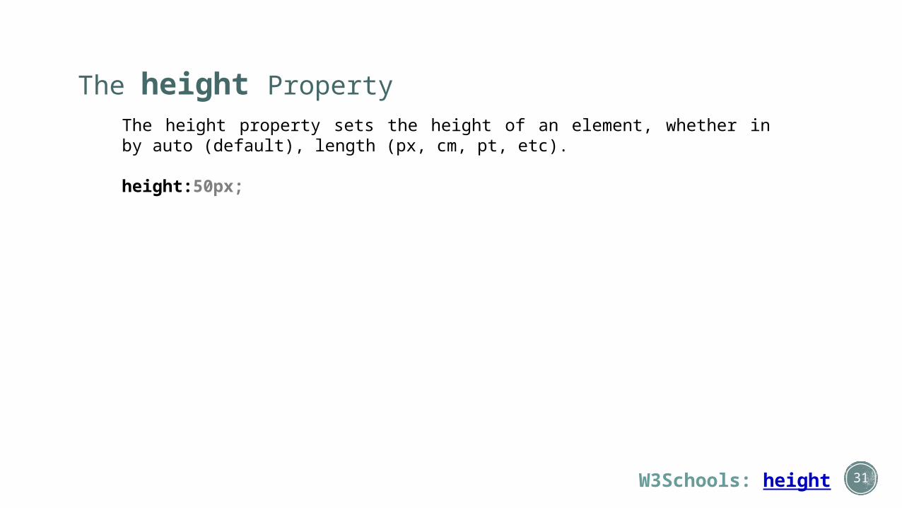
The height PropertyThe height property sets the height of an element, whether in by auto (default), length (px, cm, pt, etc).
height:50px;
W3Schools: height

32
The background-color PropertyThe background-color property sets the background color of an element.
background-color:#ccccaa; or #cca
W3Schools: background-color

33
The class Selector: . (a period or “dot” character)
The class selector is used to specify a style for a group of elements. Unlike the id selector, the class selector is most often used on several elements. This allows you to set a particular style for many HTML elements with the same class. The class selector is defined with a period or "dot": . NOTE: You can name a class anything you want, although it is recommended you give it a name according to its function.
In the example below, all HTML elements with class="center" will be center-aligned:
In the CSS
.center {text-align:center;}
In the HTML
<h1 class="center">Rex Winkus's Portfolio</h1><p class="center">Week 01</p>
W3Schools: Class vs ID

34
The class Selector, specified by a HTML Element
You can also specify that only predetermined HTML elements should be affected by a class. In other words, even if other elements call a class by name, only the type of element uniquely specified will be affected by the call.
In the CSS
p.center{text-align:center;}
In the HTML
<h1 class="center">This heading will not be affected</h1><p class="center">This paragraph will be center-aligned.</p>
W3Schools: Class vs IDhttp://www.htmldog.com/guides/css/intermediate/classid/

35
Some Other Basic CSS Properties: font-family
In the CSS [remember, that these class names can be anything you want]
p.serif{font-family:"Times New Roman",Times,serif;}p.sansserif{font-family:Arial,Helvetica,sans-serif;}
In the HTML
<h1 class="serif">This is heading 1</h1> This isn't affected<h2 class="sansserif">This is heading 2</h2> This isn't affected<p class="serif">This is a paragraph.</p><p class="sansserif">This is a paragraph.</p>
W3Schools: font-family

36
Some Other Basic CSS Properties: font-size
In the CSS
h1 {font-size:250%;}h2 {font-size:200%;}.ften {font-size:10pt;}.f875em {font-size:0.875em;}
In the HTML
<h1>This is heading 1</h1><h2>This is heading 2</h2><p>This is a paragraph.</p><p class="ften">This is a paragraph.</p><p class="f875em">This is a paragraph.</p>
W3Schools: font-size
An "em" is a relative property based on the default font-size of the browsers, which is typically 16px. For example, this means that:
• 1em = (16 x 1) = 16px = 100% • 1.25em (16 x 1.25) = 20px = 125%• 0.75em (16 x 0.75) = 12px = 75%• 2em (16 x 2) = 32px = 200%

37
Some Other Basic CSS Properties: font-style
In the CSS [remember, that these class names can be anything you want]
.normal {font-style:normal;}p.italic {font-style:italic;}.oblique {font-style:oblique;}
In the HTML
<p class="normal">This is a paragraph, normal.</p><p class="italic">This is a paragraph, italic.</p><p class="oblique">This is a paragraph, oblique.</p><h2 class="oblique">This is a heading1, oblique.</h2>
W3Schools: font-style

38
Some Other Basic CSS Properties: font-variant
In the CSS [remember, that these class names can be anything you want]
.normal {font-variant:normal;}
.small {font-variant:small-caps;}
In the HTML
<h2 class="small">Rex Winkus's Portfolio</p><p class="normal">My name is Rex Winkus.</p><p class="small">My name is Rex Winkus.</p>
W3Schools: font-variant

39
Some Other Basic CSS Properties: font-weight
In the CSS [remember, that these class names can be anything you want]
p.normal {font-weight:normal;}p.light {font-weight:lighter;}p.thick {font-weight:bold;}p.thicker {font-weight:900;}
In the HTML
<p class="normal">This is a paragraph.</p><p class="light">This is a paragraph.</p><p class="thick">This is a paragraph.</p><p class="thicker">This is a paragraph.</p>
W3Schools: font-weight
Value Description
normal Default. Defines normal characters
bold Defines thick characters
bolder Defines thicker characters
lighter Defines lighter characters
100200300400500600700800900
Defines from thin to thick characters. 400 is the same as normal, and 700 is the same as bold

40
Some Other Basic CSS Properties: font (shorthand property)
The font shorthand property sets all the font properties in one declaration. The properties that can be set, are (in order): "font-style font-variant font-weight font-size/line-height font-family". The font-size and font-family values are required. If one of the other values are missing, the default values will be inserted, if any.
In the CSS [remember, that these class names can be anything you want]
.ex1{font:15px arial,sans-serif;}p.ex2{font:italic bold 12px/30px Georgia,serif;}
In the HTML
<p class="ex1">Rex Winkus's Portfolio</p><p class="ex2">My name is Rex Winkus.</p><h1 class="ex1">My name is Rex Winkus.</h1><h1 class="ex2">My name is Rex Winkus.</h1> This is not altered
W3Schools: font (shorthand)

41
Some Other Basic CSS Properties: line-height
The line-height property specifies the line height.
In the CSS [remember, that these class names can be anything you want]
p.normal{line-height:100%} 100% of normal, or 16pxp.small {line-height:90%} 90% of normal, or 14.4pxp.big {line-height:2} twice normal line height, or 32pxp.reallybig {line-height:48px} three times normal line height, or 3
In the HTML
<p class="ex1">Rex Winkus's Portfolio</p><p class="ex2">My name is Rex Winkus.</p><h1 class="ex1">My name is Rex Winkus.</h1><h1 class="ex2">My name is Rex Winkus.</h1> This is not altered
W3Schools: line-height

42
Some Other Basic CSS Properties: text-decoration
The text-decoration property specifies the decoration added to text.
In the CSS [remember, that the class names can be anything you want]
h1 {text-decoration:overline;}h2 {text-decoration:line-through;}h3 {text-decoration:underline;}.none {text-decoration:none;}
In the HTML
<h1>This is heading 1</h1><h2>This is heading 2</h2><h3>This is heading 3</h3><a class="none" href="http://www.google.com">Google</a>
W3Schools: text-decoration

43
Some Other Basic CSS Properties: text-align
The text-align property specifies the horizontal alignment of text in an element.
In the CSS
h1 {text-align:center}h2 {text-align:left}h3 {text-align:right}
In the HTML
<h1>This is heading 1</h1><h2>This is heading 2</h2><h3>This is heading 3</h3>
W3Schools: text-align
Value Description
left Aligns to the left
right Aligns to the right
center Centers the text
justify stretches the lines so each line has equal width

44
Some Other Basic CSS Properties: text-transform
The text-transform property controls the capitalization of text.
In the CSS
h1 {text-transform:uppercase;}h2 {text-transform:capitalize;}p {text-transform:lowercase;}
In the HTML
<p class="uppercase">This is some text.</p><p class="lowercase">This is some text.</p><p class="capitalize">This is some text.</p>
W3Schools: text-transform
Value Description
none No capitalization. The text renders as it is (this is the default)
capitalize Transforms the first character of each word to uppercase
uppercase
Transforms all characters to uppercase
lowercase
Transforms all characters to lowercase

45
Some Other Basic CSS Properties: colorThe color property specifies the color of text.
In the CSS
body {color:red;}h1 {color:#00ff00;}p.ex {color:rgb(0,0,255);}
In the HTML
<h1>This is heading 1</h1><p>This is an ordinary paragraph. Notice that this text is red. The default text-color for a page is defined in the body selector.</p><p class="ex">This is a paragraph with class="ex". This text is blue.</p>
W3Schools: color
Value Description
color Specifies the text color. Look at CSS Color Values for a complete list of possible color values.
inherit Specifies that the color should be inherited from the parent element

46
We Are Stopping Here!
I’ve included the remaining slides for informational purposes only. You are not required to read or know them now, although some of their topics will be introduced as the quarter progresses.

47
CSS Box Model

CSS Box Model: Content
W3Schools: CSS Box Model
Important: When you set the width and height properties of an element with CSS, you just set the width and height of the content area. To calculate the full size of an element, you must also add the padding, borders and margins and include both the left and right sides.
The total width of the element in the example below is 310px:
width
height
margin-top
margin-bottom
border-bottom
padding-bottom
border-top
padding-top
mar
gin-
left
bord
er-
left
padd
ing-
left
mar
gin-
right
bord
er-r
ight
padd
ing-
right
width:250px;padding:10px;border:10px solid gray;margin:10px;
Let's do the math:
250px (width)+ 20px (left + right padding)+ 20px (left + right border)+ 20px (left + right margin)
= 310px
48

CSS Box Model
W3Schools: CSS Box Model
All HTML elements can be considered as boxes. In CSS, the term "box model" is used when talking about design and layout. The CSS box model is essentially a box that wraps around HTML elements, and it consists of: margins, borders, padding, and the actual content. The box model allows us to place a border around elements and space elements in relation to other elements.
The image below illustrates the box model:
Explanation of the different parts:
• Margin - Clears an area around the border. The margin does not have a background color, it is completely transparent
• Border - A border that goes around the padding and content. The border is affected by the background color of the box
• Padding - Clears an area around the content. The padding is affected by the background color of the box
• Content - The content of the box, where text and images appear
In order to set the width and height of an element correctly in all browsers, you need to know how the box model works.
width
height
margin-top
margin-bottom
border-bottom
padding-bottom
border-top
padding-top
mar
gin-
left
bord
er-
left
padd
ing-
left
mar
gin-
right
bord
er-r
ight
padd
ing-
right
49

CSS Box Model: Padding
W3Schools: padding
The CSS padding properties define the space between the element border and the element content. The padding clears an area around the content (inside the border) of an element. The padding is affected by the background color of the element. The top, right, bottom, and left padding can be changed independently using separate properties. A shorthand padding property can also be used, to change all paddings at once.
In the CSS [Remember, you can use any class name you want here]
.padding {padding-top:25px;padding-bottom:25px;padding-right:50px;padding-left:50px;}
In the HTML
<p class="padding">This is a paragraph.</p>
padding shorthand:
padding:25px 50px 75px 100px; top padding is 25px right padding is 50px bottom padding is 75px left padding is 100px
padding:25px 50px 75px; top padding is 25px right and left paddings are 50px bottom padding is 75px
padding:25px 50px; top and bottom paddings are 25px right and left paddings are 50px
padding:25px; all four paddings are 25px
50

CSS Box Model: Border
W3Schools: border
border-styleThe border-style property specifies what kind of border to display. NOTE: None of the border properties will have ANY effect unless the border-style property is set!• dotted• dashed• solid• double• groove• ridge• inset• outset
border-widthThe border-width property is used to set the width of the border. The width is set in pixels, or by using one of the three pre-defined values: thin, medium, or thick. Note: The "border-width" property does not work if it is used alone. Use the "border-style" property to set the borders first.
51

CSS Box Model: Border CONTINUED
W3Schools: border
A look at border-style and border-width:
In the CSS
p.one {border-style:solid;border-width:5px;}
p.two{border-style:solid;border-width:medium;}
In the HTML
<p class="one">Some text.</p><p class="two">Some text.</p>
52

CSS Box Model: Border CONTINUED
W3Schools: border
border-colorThe border-color property is used to set the color of the border. The color can be set by:
• name - specify a color name, like "red"• RGB - specify a RGB value, like "rgb(255,0,0)"• Hex - specify a hex value, like "#ff0000"
You can also set the border color to "transparent".
Note: The border-color property does not work if it is used alone. Use the border-style property to set the borders first.
53

CSS Box Model: Border CONTINUED
W3Schools: border
A look at border-style and border-color:
In the CSS
p.one {border-style:solid;border-color:red;}
p.two{border-style:solid;border-color:#98bf21;}
In the HTML
<p class="one">A solid red border.</p><p class="two">A solid green border.</p>
54
CSS Box Model: Border CONTINUED
W3Schools: border
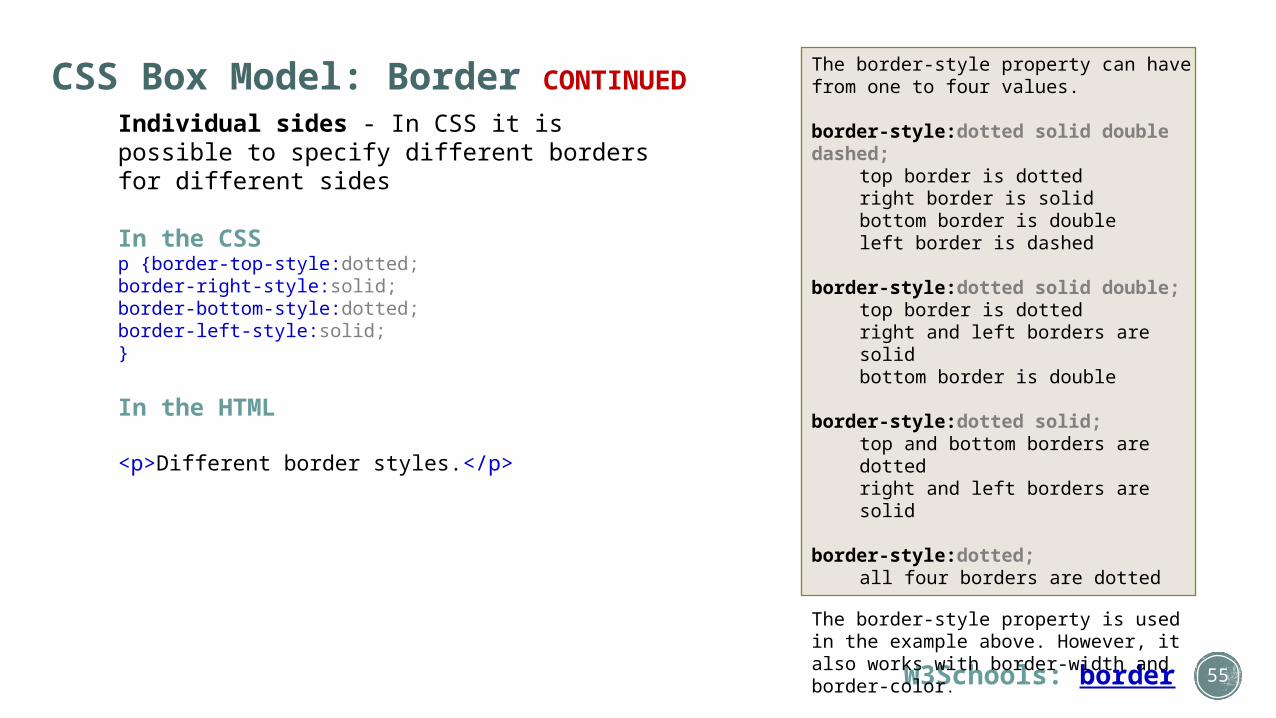
Individual sides - In CSS it is possible to specify different borders for different sides
In the CSS p {border-top-style:dotted;border-right-style:solid;border-bottom-style:dotted; border-left-style:solid;}
In the HTML
<p>Different border styles.</p>
The border-style property can have from one to four values.
border-style:dotted solid double dashed; top border is dottedright border is solidbottom border is doubleleft border is dashed
border-style:dotted solid double; top border is dottedright and left borders are solidbottom border is double
border-style:dotted solid; top and bottom borders are dottedright and left borders are solid
border-style:dotted;all four borders are dotted
The border-style property is used in the example above. However, it also works with border-width and border-color.
55

CSS Box Model: Border CONTINUED
W3Schools: border
Border Shorthand
To shorten the code, it is also possible to specify all the individual border properties in one property. This is called a shorthand property. The border property is a shorthand for the following individual border properties:• border-width• border-style (required)• border-color
In the CSS
P {border:5px solid red; }
In the HTML
<p>A solid red border 5 pixels thick!</p>
NOTE: There are several more CSS border properties I did not mention here. Please refer to All CSS Border Properties in the W3Schools link below.
56

CSS Box Model: Margin
W3Schools: margin
The margin clears an area around an element (outside the border). The margin does not have a background color, and is completely transparent. The top, right, bottom, and left margin can be changed independently using separate properties. A shorthand margin property can also be used, to change all margins at once.
In the CSS
margin-top:100px;margin-bottom:100px;margin-right:50px;margin-left:50px;
57

CSS Box Model: Margin (Shorthand)
W3Schools: margin
The margin (shorthand) property can have from one to four values.
margin:25px 50px 75px 100px; top margin is 25pxright margin is 50pxbottom margin is 75pxleft margin is 100px
margin:25px 50px 75px;top margin is 25pxright and left margins are 50pxbottom margin is 75px
margin:25px 50px;top and bottom margins are 25pxright and left margins are 50px
margin:25px;all four margins are 25px
58

CSS Box Model: Outline
W3Schools: outline
An outline is a line that is drawn around elements (outside the borders) to make the element "stand out". The outline properties specify the style, color, and width of an outline. The outline property is different from the border property. NOTE: The outline is not a part of an element's dimensions; the element's total width and height is not affected by the width of the outline.
In the CSS
p {border:1px solid red;outline:green dotted thick;}
In the HTML
<p>IE8 supports the outline properties only if a !DOCTYPE is specified.</p>
59

60
CSS Links & Link Colors

CSS Links & Link Colors: link, visited, hover, active
W3Schools: CSS link colors
Links can be styled with any CSS property (e.g. color, font-family, background, etc.) In addition, links can be styled differently depending on what state they are in.
The four links states are: a:link - a normal, unvisited linka:visited - a link the user has visiteda:hover - a link when the user mouses over ita:active - a link the moment it is clicked
In the CSS
a:link {color:#FF0000;} /* unvisited link */a:visited {color:#00FF00;} /* visited link */a:hover {color:#FF00FF;} /* mouse over link */a:active {color:#0000FF;} /* selected link */
http://www.w3schools.com/css/css_examples.asp61

CSS Links & Link Styles: Text Decoration
W3Schools: CSS link styles
In the example below the link changes decoration depending on what state it is in. Lets go through some of the other common ways to style links:
Text DecorationThe text-decoration property is mostly used to remove underlines from links:
In the CSS
a:link {text-decoration:none;}a:visited {text-decoration:none;}a:hover {text-decoration:underline;}a:active {text-decoration:underline;}
http://www.w3schools.com/css/css_examples.asp62

CSS Links & Link Styles: Background Color
W3Schools: CSS link styles
In the example below the link changes color depending on what state it is in. Lets go through some of the other common ways to style links:
Background ColorThe background-color property specifies the background color for links:
In the CSS
a:link {background-color:#B2FF99;}a:visited {background-color:#FFFF85;}a:hover {background-color:#FF704D;}a:active {background-color:#FF704D;}
http://www.w3schools.com/css/css_examples.asp63

CSS Links: Multiple Link Styles
W3Schools: CSS link styles
In the example below the link changes style depending on what state it is in. Lets go through some of the other common ways to style links:
Background ColorThe background-color property specifies the background color for links:
In the CSS
a:link {color:red; background-color:orange; text-decorantion:none;}a:visited {color:teal; background-color:khaki; text-decorantion:none;}a:hover {color:yellow; background-color:firebrick; text-decorantion:underline;text-decorantion:overline;}a:active {color:white; background-color:red; text-decorantion:underline;text-decorantion:overline;}
http://www.w3schools.com/css/css_examples.asp64

65
Intermediate CSS

Intermediate CSS: Group and Nesting Selectors
W3Schools: grouping - nesting
Grouping Selectors
In style sheets there are often elements with the same style.
In the CSS
h1{color:green;}h2{color:green;}p{color:green;}
To minimize the code, you can group selectors. Separate each selector with a comma. In the example below we have grouped the selectors from the code above:
h1,h2,p{color:green;}
66

Intermediate CSS: Group and Nesting Selectors
W3Schools: grouping - nesting
Nesting SelectorsIt is possible to apply a style for a selector within a selector. In the example below, one style is specified for all p elements, one style is specified for all elements with class="marked", and a third style is specified only for p elements within elements with class="marked":
In the CSS
p{color:blue; text-align:center;}.marked{background-color:red;}.marked p{color:orange; /* Similar to p.marked but without having to separately add class to p tag*/ }
67

Intermediate CSS: Dimensions (Height and Width)
W3Schools: Dimension
The CSS dimension properties allow you to control the height and width of an element.
In the CSS
img.normal{height:auto;}
img.big{height:120px;}
p.ex{height:100px;width:100px;}
68

Intermediate CSS: Display
W3Schools: Display
CSS Display - Block and Inline Elements
A block element is an element that takes up the full width available, and has a line break before and after it.
Examples of block elements: <h1> <p> <div>
An inline element only takes up as much width as necessary, and does not force line breaks.
Examples of inline elements: <span> <a>
69

Intermediate CSS: Display
W3Schools: Display
Changing How an Element is Displayed
Changing an inline element to a block element, or vice versa, can be useful for making the page look a specific way, and still follow web standards.
The following example displays list items (which are usually block) as inline elements:
CSSli {display:inline;}
HTML<ul> <li><a href="www.google.com">Google</a></li> <li><a href="www.yahoo.com">Yahoo</a></li> <li><a href="www.bing.com">Bing</a></li> <li><a href="www.excite.com">Excite</a></li></ul>
70

Intermediate CSS: Display
W3Schools: Display
Span
The following example displays span elements (which are usually inline) as block elements:
CSSspan {display:block;}
HTML<h2>Nirvana</h2><span>Record: MTV Unplugged</span><span>Year: 1993</span><h2>Radiohead</h2><span>Record: OK Computer</span><span>Year: 1997</span>
71

Intermediate CSS: Display
W3Schools: Display
Hiding an Element - display:none or visibility:hidden
Hiding an element can be done by setting the display property to "none" or the visibility property to "hidden". However, notice that these two methods produce different results:
visibility:hidden hides an element, but it will still take up the same space as before. The element will be hidden, but still affect the layout. example
h1.hidden {visibility:hidden;}
display:none hides an element, and it will not take up any space. The element will be hidden, and the page will be displayed as if the element is not there. example
h1.hidden {display:none;}
72

Intermediate CSS: Positioning
W3Schools: Positioning
The CSS positioning properties allow you to position an element. It can also place an element behind another, and specify what should happen when an element's content is too big. Elements can be positioned using the top, bottom, left, and right properties. However, these properties will not work unless the position property is set first. They also work differently depending on the positioning method.
There are four different positioning methods:
• Static Positioning• Fixed Positioning• Relative Positioning• Absolute Positioning
73

Intermediate CSS: Positioning
W3Schools: Positioning
Static Positioning
HTML elements are positioned static by default. A static positioned element is always positioned according to the normal flow of the page.
Static positioned elements are not affected by the top, bottom, left, and right properties.
74

Intermediate CSS: Positioning
W3Schools: Positioning
Fixed Positioning
An element with fixed position is positioned relative to the browser window. It will not move even if the window is scrolled example
CSSp.pos_fixed{position:fixed; top:50px; right:5px;}
Note: IE7 and IE8 support the fixed value only if a !DOCTYPE is specified.
Fixed positioned elements are removed from the normal flow. The document and other elements behave like the fixed positioned element does not exist.
Fixed positioned elements can overlap other elements
75

Intermediate CSS: Positioning
W3Schools: Positioning
Relative Positioning
A relative positioned element is positioned relative to its normal position. example
CSSh2.pos_left{ position:relative; left:-50px; /* Notice the minus sign*/}
h2.pos_right{ position:relative; left:50px;}
76

Intermediate CSS: Positioning
W3Schools: Positioning
Relative Positioning
The content of relatively positioned elements can be moved and overlap other elements, but the reserved space for the element is still preserved in the normal flow. example
CSSh2.pos_top{position:relative; top:-50px;}
HTML<body><h2>This is a heading with no position</h2><h2 class="pos_top">This heading is moved upwards according to its normal position</h2></body>
77

Intermediate CSS: Positioning
W3Schools: Positioning
Absolute Positioning
An absolute position element is positioned relative to the first parent element that has a position other than static. If no such element is found, the containing block is <html> example
CSSh2{position:absolute; left:100px; top:150px;}HTML<body><h2>This is a heading with an absolute position</h2><p>With absolute positioning, an element can be placed anywhere…</p>
Absolutely positioned elements are removed from the normal flow. The document and other elements behave like the absolutely positioned element does not exist.Absolutely positioned elements can overlap other elements.
78

Intermediate CSS: Positioning
W3Schools: Positioning
Overlapping Elements: z-index
When elements are positioned outside the normal flow, they can overlap other elements. The z-index property specifies the stack order of an element (which element should be placed in front of, or behind, the others). An element can have a positive or negative stack order. example
CSS
img{position:absolute; left:0px; top:0px; z-index:-1;}
An element with greater stack order is always in front of an element with a lower stack order. If two positioned elements overlap, without a z-index specified, the element positioned last in the HTML code will be shown on top.
79

Intermediate CSS: Positioning
W3Schools: Positioning
All Positioning Properties
Propert Description
bottom Sets the bottom margin edge for a positioned box
clip Clips an absolutely positioned element
cursor Specifies the type of cursor to be displayed
left Sets the left margin edge for a positioned box
overflow Specifies what happens if content overflows an element's box
position Specifies the type of positioning for an element
right Sets the right margin edge for a positioned box
top Sets the top margin edge for a positioned box
z-index Sets the stack order of an element
80

81
Intermediate CSS: Floats

Intermediate CSS: Float
W3Schools: Floating
With CSS float, an element can be pushed to the left or right, allowing other elements to wrap around it. Float is very often used for images, but it is also useful when working with layouts.
Elements are floated horizontally, this means that an element can only be floated left or right, not up or down.
A floated element will move as far to the left or right as it can. Usually this means all the way to the left or right of the containing element.
The elements after the floating element will flow around it.
The elements before the floating element will not be affected.
There are two float properties:
• clear• float
82

Intermediate CSS: Float
CSS Tricks: All About Floats W3Schools: Floating
With CSS float, an element can be pushed to the left or right, allowing other elements to wrap around it. Float is very often used for images, but it is also useful when working with layouts.
Elements are floated horizontally, this means that an element can only be floated left or right, not up or down.
A floated element will move as far to the left or right as it can. Usually this means all the way to the left or right of the containing element. The elements after the floating element will flow around it. The elements before the floating element will not be affected.
There are two float properties:
• float• clear
83

Using Floats for Layouts
Layouts are where the float property is incredibly useful. We can achieve the traditional two-column layout in a variety of ways; most of them use one or two floated elements. Let’s take a look at a simple example: a two-column website with the content area on the left, navigation on the right, and a header and footer area to cap it off. For the sake of this example, we’re only going to look at the code related to the floated elements.
Floatutorial: Float Tutorial - Learn CSS Layout: Float - Smashing Magazine: The Mystery of the Float Property 84

85
#container {width:
960px;margin: 0
auto;}header {
padding: 5px;
background: #c99;
}section {
float: left;
width: 780px;
background: #fcc;
padding-left:5px;
padding-right:5px;
text-align:justify;
}nav {
float: right;
width: 160px;
padding-top:15px;
background: #fcf;
}footer {
clear: both;
background: #c99;
padding: 5px;
}
Ok, let’s talk about what’s going on here. Our containing parent is aptly called #container. This holds our floated elements in place. If we didn’t have it, our floated elements would shoot out to the far left and right of the viewport (our browser window). Up top we have our header. Next, we have section and nav. These are our floated elements. We sent section to the left, and nav to the right, to achieve our two-column layout. I’ve defined a width for each, so that they fill our entire parent container. Finally, we have the footer, on which we’ve set the clear property. As we know from before, this clear property brings the elements following any floated elements back into the normal flow. In this case the footer has the value both assigned to it, causing our footer to sit below both the section and nav elements.

Using Floats for Layouts
What would have happened had we forgotten to assign the clear property to our footer? Our page would look like this:
Our footer has slid up underneath the nav. This is happening because there is room underneath the nav for the footer to fill, and given the normal flow that we work within, this is actually the correct behavior. But it’s definitely not what we’re looking for, is it? You can start to see the interaction between the float and clear property and how they complement each other so well.
86

Using Floats for Layouts
Some Tips & Tricks: Faux Columns
Demo: "Original" 2-Column PageDemo: Updated 2-Column Page using a "Faux Column"
Discussion: Equal Height Column DebacleCode-Sucks: Faux Column LayoutsVanseo Design: 4 Methods for Creating Equal Height Columns in CSS
Some Tips & Tricks: Using height or display:table
Demo: Using heightDemo: Using display:table
87
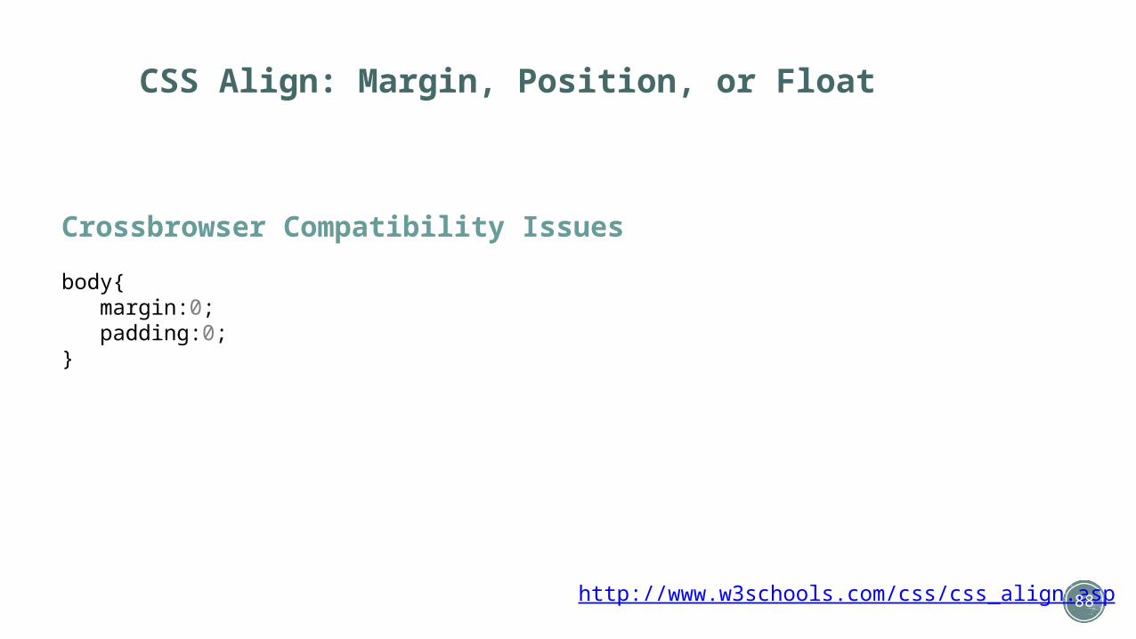
CSS Align: Margin, Position, or Float
Crossbrowser Compatibility Issues
body{ margin:0; padding:0;}
http://www.w3schools.com/css/css_align.asp 88

89
Tables

Tables
The Basic Table
Company Employees Founded
ACME Inc 1000 1947
XYZ Corp 2000 1973
90

Tables
The Basic Table: The Parts Explained
Company Employees Founded
ACME Inc 1000 1947
XYZ Corp 2000 1973
Table is the container that holds all the individual parts
Company Employees Founded
ACME Inc 1000 1947
XYZ Corp 2000 1973
Company Employees Founded
ACME Inc 1000 1947
XYZ Corp 2000 1973
<table>
Each row is a container that holds all the individual data cells
<tr>
Each cell is a container that holds the individual data
<td>
91

Basic Table
Company Employees Founded
ACME Inc 1000 1947
XYZ Corp 2000 1973
<table>
</table>
92

93
Basic Table
Company Employees Founded
ACME Inc 1000 1947
XYZ Corp 2000 1973
<table>
</table>
<tr>
<tr>
<tr>
</tr>
</tr>
</tr>

94
Basic Table
Company Employees Founded
ACME Inc 1000 1947
XYZ Corp 2000 1973
<table>
</table>
<tr>
<tr>
<tr>
</tr>
</tr>
</tr>
<td>
<td>
<td>
<td>
<td>
<td>
<td>
<td>
<td>
</td>
</td>
</td>
</td>
</td>
</td>
</td>
</td>
</td>
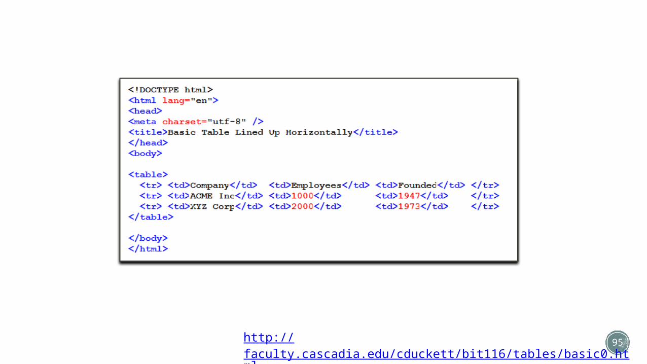
95http://faculty.cascadia.edu/cduckett/bit116/tables/basic0.html
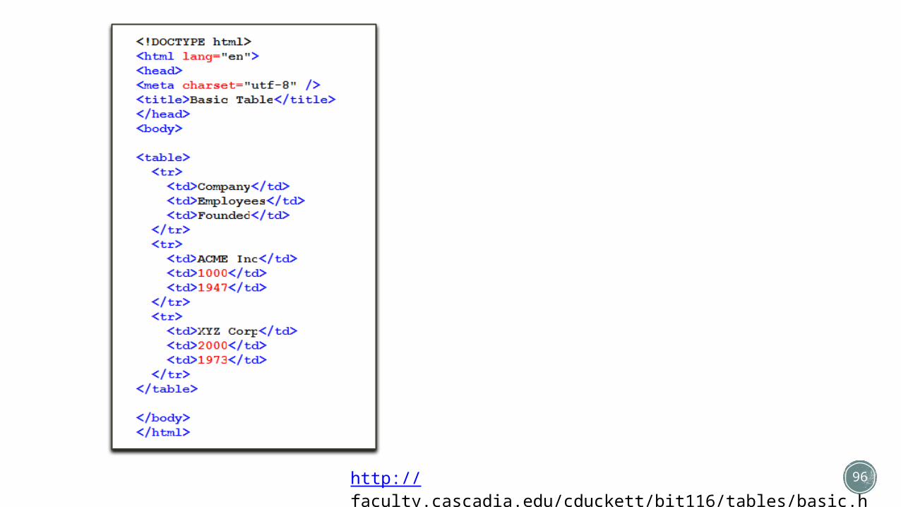
96http://faculty.cascadia.edu/cduckett/bit116/tables/basic.html

97
Basic Table
Company Employees Founded
ACME Inc 1000 1947
XYZ Corp 2000 1973
<table>
</table>
<tr>
<tr>
<tr>
</tr>
</tr>
</tr>
<td>
<td>
<td>
<td>
<td>
<td>
<td>
<td>
<td>
</td>
</td>
</td>
</td>
</td>
</td>
</td>
</td>
</td>

98
Company Employees Founded
ACME Inc 1000 1947
XYZ Corp 2000 1973
<table>
</table>
<tr>
<tr>
<tr>
</tr>
</tr>
</tr>
<td>
<td>
<td>
<td>
<td>
<td>
<td>
<td>
<td>
</td>
</td>
</td>
</td>
</td>
</td>
</td>
</td>
</td>
Column Column Column

99
Tables
The Basic Table with Border
http://faculty.cascadia.edu/cduckett/bit116/tables/basic2.html
<table border=1>

100
Tables
Firefox
<table border=8>
Internet Explorer Chrome
http://faculty.cascadia.edu/cduckett/bit116/tables/basic2a.html

101
Firefox<style>table{ border-color: #000; border-width: 8px; border-style: solid; /* Same as: border: 8px solid #000; */}
td { border-color: #369; border-width: 2px; border-style: solid; /* Same as: border: 2px solid #369; */}</style>
Internet Explorer
Chrome
http://faculty.cascadia.edu/cduckett/bit116/tables/basic2b.html
Tables: Borders Made Using CSS

102
Tables
The Basic Table with Table Header Tags<th>
http://faculty.cascadia.edu/cduckett/bit116/tables/basic3.html
http://faculty.cascadia.edu/cduckett/bit116/tables/basic3a.html
http://faculty.cascadia.edu/cduckett/bit116/tables/basic3b.html

103
Tables
The Basic Table with Table Header Tags and Background Colors
http://faculty.cascadia.edu/cduckett/bit116/tables/basic4.html

104
Additional Table Tags
Caption
http://faculty.cascadia.edu/cduckett/bit116/tables/basic5.html

105
Additional Table Tags
Border Collapse with CSS table{ border-collapse:collapse;}
http://faculty.cascadia.edu/cduckett/bit116/tables/basic6.html
From this…
to this…

106
Additional Table Tags
Table Padding with CSS td{ padding:15px;}
http://faculty.cascadia.edu/cduckett/foundations/tables/basic7.html

107
Additional Table Tags
Alignment with CSS td{ text-align:right;}
http://faculty.cascadia.edu/cduckett/bit116/tables/basic8.html

108
Height and Vertical Alignment with CSS td{ height:50px; vertical-align:top;}
http://faculty.cascadia.edu/cduckett/bit116/tables/basic9.html
Additional Table Tags

109
Additional Table Tags
Table Width with CSS
table{ width:50%;}
td{ width:150px;}
or
http://faculty.cascadia.edu/cduckett/bit116/tables/basic10.html
http://faculty.cascadia.edu/cduckett/bit116/tables/basic11.html
110
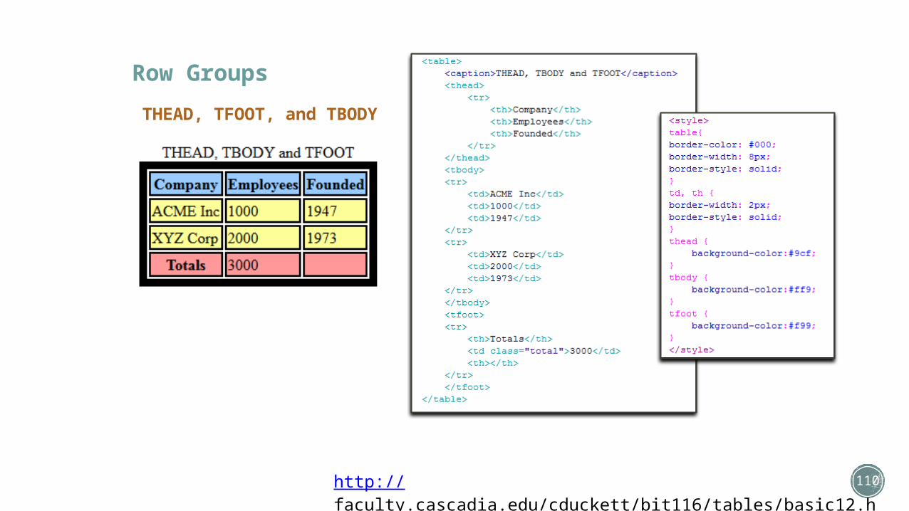
Row Groups
THEAD, TFOOT, and TBODY
http://faculty.cascadia.edu/cduckett/bit116/tables/basic12.html

111
Spanning
Column and Row Spanning
http://faculty.cascadia.edu/cduckett/bit116/tables/basic13.html

112
Spanning
Column and Row Spanning
Column Span
Ro
w S
pan
Row
RowRowRow
Column Column Column

113
Spanning
Column and Row Spanning
http://faculty.cascadia.edu/cduckett/bit116/tables/basic13a.html

114
Spanning
Column and Row Spanning
http://faculty.cascadia.edu/cduckett/bit116/tables/basic14.html

115
Table Inside a Table
http://faculty.cascadia.edu/cduckett/bit116/tables/basic15.html

116
Tables
Other Table Links• HTML Table Tutorial• HTML5 Tables
http://faculty.cascadia.edu/cduckett/bit116/tables/
More Table Examples with CSS Formatting• General Table• Column Options• Column Styles• Financial • Dark

117
CSS Multi-Column Layout

118
CSS Multicolumn Layout
CSS3 multicolumn layout has been a tantalizing possibility for some years now. However, with lack of support in Internet Explorer it hasn’t been taken up as much as it deserves. With IE 10 supporting these properties, and its usefulness in creating responsive designs, I hope we will very soon see it used more.
.columns { column-count:4; column-gap:10px;}

119
CSS Multicolumn Layout
Multicolumn layout makes it possible to arrange content in columns, in the same way that content flows in a newspaper. You can take a container in your document and state that you want it to be arranged into columns, and the browser will make it so.
If you specify the number of columns that you want the content arranged into, the browser will work out the width of each column so that it will fit into the parent box. If you specify a width for the columns then the browser will display as many columns as it is able, maintaining that width for each.

120
CSS Multicolumn Properties
Column Width & Count
Setting the number or the width of columns is important to the multi column layout content. Columns should be set by using either ‘column-width’ or ‘column-count’, but should never be used together. Both of these properties are by default set to ‘auto’.
‘Column width’ does exactly what it says. It allows you to specify a fixed width for the columns. The measurement of this width can be carried out in the standard way using px, ems etc. Depending on what you enter for the column width it can vary and may be slightly wider or narrower to fit the space available. If this property is set to ‘auto’, then this means the width of the columns will be dictated by other properties, such as the one below.
column-count: (number of columns) | auto;

121
CSS Multicolumn Properties
Column Count
Should you want the layout to be split into a number of specified columns then this is the property that you would opt for.
By setting the value of this the content is divided into the required amount of columns.
If this property is set to ‘auto’, then this means the number columns will be decided by other properties, such as ‘column-width’.
column-width: (length) | auto;

122
CSS Multicolumn Properties
Column
‘Columns’ is effectively a shorthand property that allows you to set the ‘column width’ and ‘column count’. Here are a view valid values that you might associate with ‘columns’
column-width: (length) | auto;
columns: 12em; /* column-width: 12em; column-count: auto */columns: auto 12em; /* column-width: 12em; column-count: auto */columns: 2; /* column-width: auto; column-count: 2 */columns: 2 auto; /* column-width: auto; column-count: 2 */columns: auto; /* column-width: auto; column-count: auto */columns: auto auto; /* column-width: auto; column-count: auto */

123
CSS Multicolumn Properties
Column-Gap
‘Column gap’ give us the opportunity to add a space between each of the columns and gives the content room to breathe. We specify the width of the gap using standard CSS measurements. The width of the gap that you specify cannot be negative.
column-gap: (length) | normal;

124
CSS Multicolumn Properties
Column-Rule
‘Column Rule’ effectively puts a border down the middle of the ‘column-gap’. Therefore, to enable this, a ‘column-gap’ width must be specified that has the same or larger value than the column rule. The column rule also has several separate sub properties as well as a shorthand version. This shorthand version works in the same way as the shorthand ‘border’ property. You can see this below:
column-rule-width:1px;column-rule-style: solid;column-rule-color: #000;column-rule: 1px solid #000; /* This is the shorthand version */

125
CSS Multicolumn Properties
Column-Span
‘Column-span’ allows us to span across all of the columns. If we take our simple example from earlier and add a h1 title to our content, we can easily get this h1 tag to span the entire 4 columns by adding column-span:all to it
h1{ column-span: all;}
column-span: all | none;

126
CSS Multicolumn Properties
Column-Fill
The ‘column-fill’ property gives us two controls for setting how the amount of the content is balanced over the columns.
If set to ‘balance’ then the variation in the column length will be minimized and all lengths will be as equal as possible.
If set to ‘auto’ then the columns will be filled in order and (for instance) may result in the 4th of 4 columns having less content than the 3 previous columns. If balance was set on this then it would allow all 4 columns to be roughly of equal height.
This property solves the problem of undesirable gaps being left in the content.
column-span: all | none;
127
CSS Multicolumn Properties
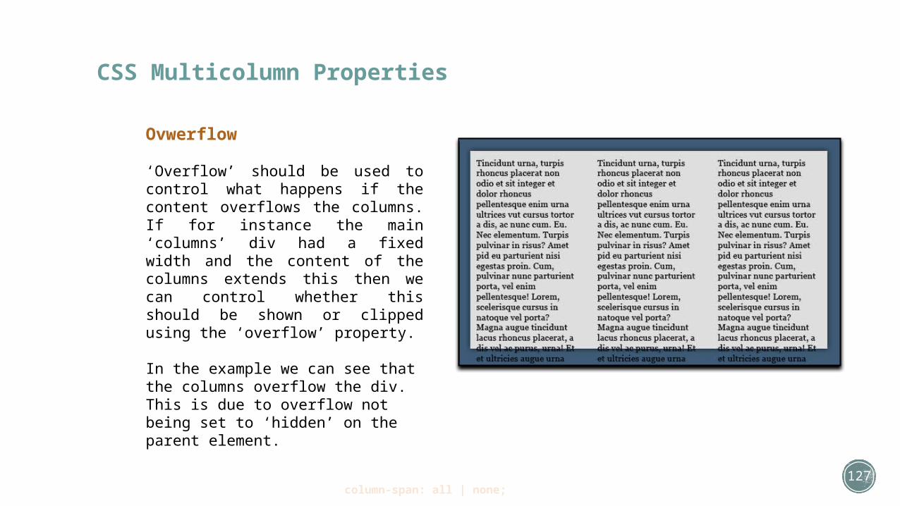
Ovwerflow
‘Overflow’ should be used to control what happens if the content overflows the columns. If for instance the main ‘columns’ div had a fixed width and the content of the columns extends this then we can control whether this should be shown or clipped using the ‘overflow’ property.
In the example we can see that the columns overflow the div. This is due to overflow not being set to ‘hidden’ on the parent element.
column-span: all | none;

128
CSS Multicolumn Layout
Example
Links• W3Schools: Multicolumn• W3C: Multicolumn• CSS3 Info: Multicolumns• Tutsplus: Multicolumns• CanIUse: Multicolumns
• Multicolumn Layout Generator• Multicolumn Examples
http://faculty.cascadia.edu/cduckett/bit116/multicolumn.html

129
CSS Vendor Prefix Tools
Links• Prefixr• Prefix-Free• CSS3 Please• Prefix My CSS
In the mad rush to bring CSS3 properties to the masses, browser vendors added their own vendor prefixes to the property names as an interim solution. Now, we have a bit of a mess as a result. I'm not going to enumerate all of the ways in which vendor prefixes are bad and how the world would be a better place without them. You already know that. What's needed is a sane way to deal with them that doesn't take up all of your development time. One approach, is to use tools that generate CSS rules for you from unprefixed CSS3 properties. That allows you, the developer, to blissfully imagine that prefixes never existed, by shielding you from those evil little monsters.

130
HTML/CSS WYSIWYG Web Editors
Paid Editors• Dreamweaver (Free Trial)• CoffeeCup HTML Editor (Free Version Available)• TO Web (Free Version Available)• Web Architect (Free Trial Available)
Free Editors• KompoZer• NVU• Blue Griffon• Microsoft Expression Web 4 (Now Free!)• Amaya (W3C)• Page Breeze• Trellian
Add-On Tools• Web Assist• Extend Studio• Adobe Exchange

131
Tips & Tricks

132
Assorted Tips & TricksTips & Tricks• HTML5 & CSS3 Readiness Chart• Can I Use … ?• Initializer• Front End Tools for Workflow• The ToolBox
• HTML/CSS Frameworks• Blueprint• Bluetrip• Elements• Malo
• CSS Tips & Tricks• CSS3.me Generator• CSS3Generator• LayerStyles• Gradient Editor• Arrow Please• Create CSS3• CSS Values
http://www.pinterest.com/pibbydotcom/html5-css3-tips-and-tricks/
133
Please begin working on the LECTURE 3 In-Class Exercises.
When you have completed your ICE, call the Instructor over to verify your work. If you have questions about your work, please call over the Instructor to clarify.
Once you have completed your ICEs, you are free to go for the day.
If you don't finish your ICEs by the end of class, you will still get full credit for actively doing the work, but it is greatly recommended you finish any outstanding ICEs outside of class.
Lecture 3