Embed Size (px)
Citation preview
Thursday, 9/25
Today you will –
Complete Warm-up
Check Homework
Notes on Appropriate Graphs and Misleading Graphs
HW6: Graph Worksheets
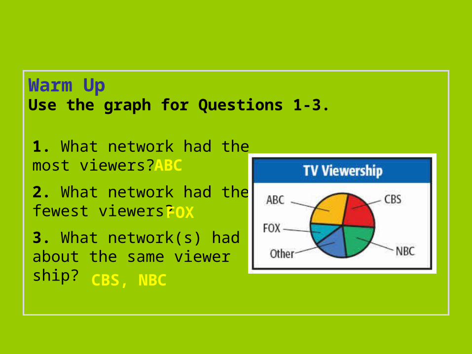
Warm UpUse the graph for Questions 1-3.
1. What network had the most viewers?
2. What network had the fewest viewers?
3. What network(s) had about the same viewer ship?
ABC
FOX
CBS, NBC
Learn to select and use appropriate representations for displaying data.
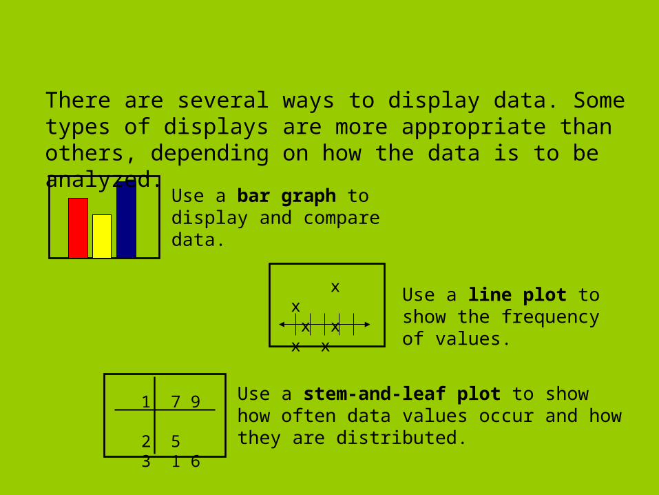
Use a bar graph to display and compare data.
There are several ways to display data. Some types of displays are more appropriate than others, depending on how the data is to be analyzed.
x x x x x x
Use a line plot to show the frequency of values.
1 7 9 2 5 3 1 6
Use a stem-and-leaf plot to show how often data values occur and how they are distributed.
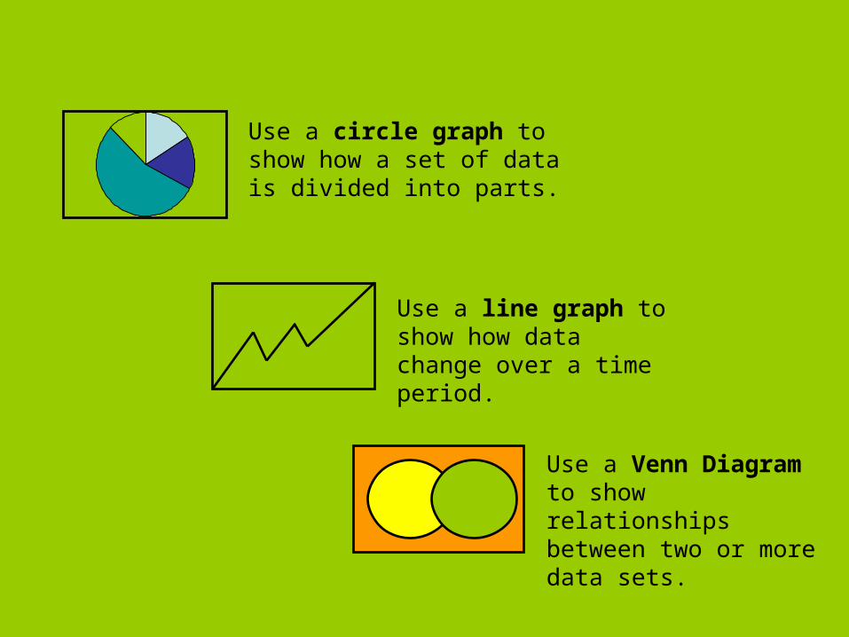
Use a line graph to show how data change over a time period.
Use a Venn Diagram to show relationships between two or more data sets.
Use a circle graph to show how a set of data is divided into parts.
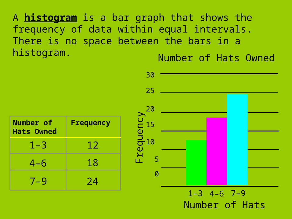
1–3
FrequencyNumber of Hats Owned
12
4–6 18
7–9 24
30
25
20
15
10
5
0
1–3 4–6 7–9
Number of Hats Owned
Freq
uen
cy
Number of Hats
A histogram is a bar graph that shows the frequency of data within equal intervals. There is no space between the bars in a histogram.
Additional Example 1A: Choosing an Appropriate Display
The students want to create a display to show each species of butterfly as a percentage of all species in the butterfly family. Which type of graph would they use? Explain.
Butterfly Family Number of Species
Gossamer-wing 7
Skippers 10
Swallowtails 5
Whites and sulphurs 4
Circle graph; each listed species is a part of the whole population.
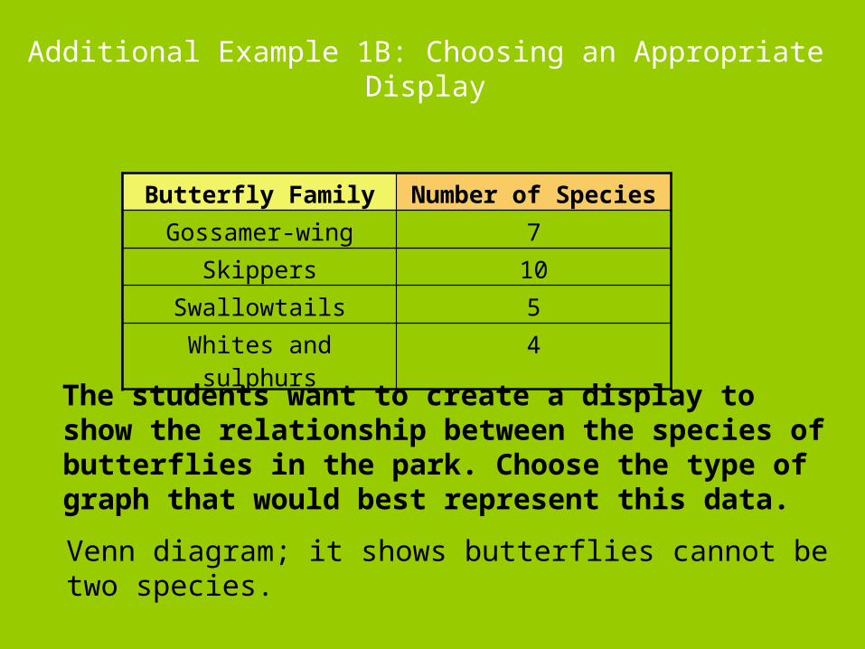
Additional Example 1B: Choosing an Appropriate Display
The students want to create a display to show the relationship between the species of butterflies in the park. Choose the type of graph that would best represent this data.
Butterfly Family Number of Species
Gossamer-wing 7
Skippers 10
Swallowtails 5
Whites and sulphurs 4
Venn diagram; it shows butterflies cannot be two species.
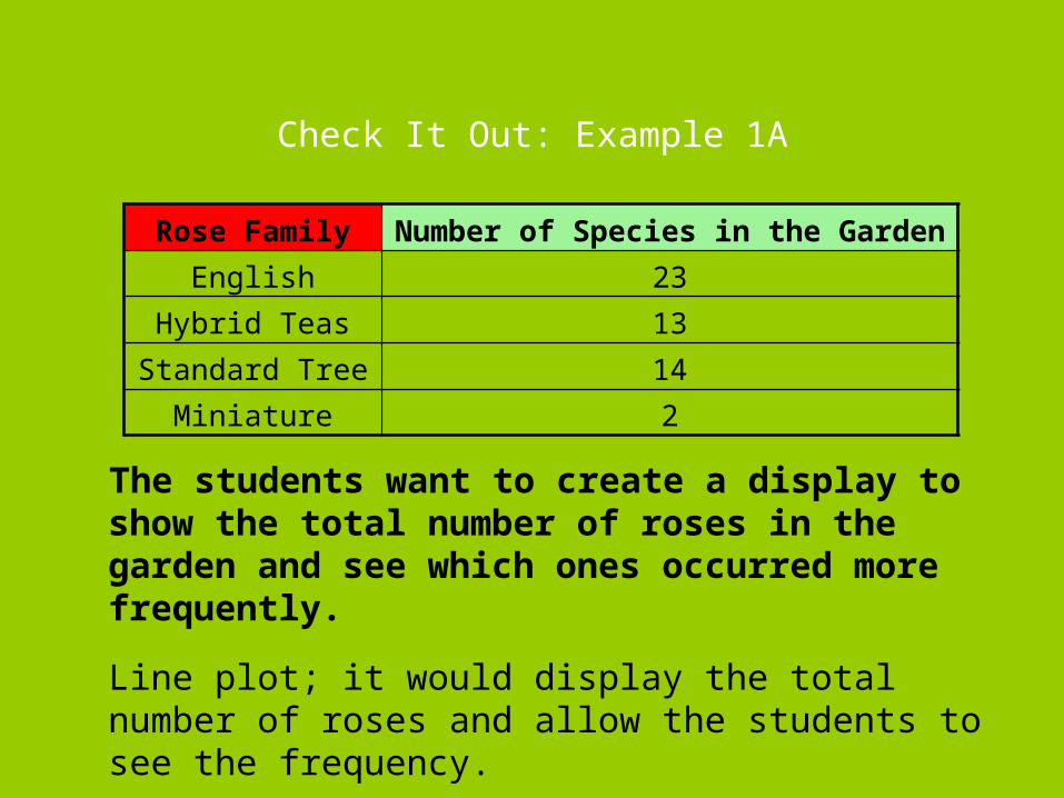
Check It Out: Example 1A
The students want to create a display to show the total number of roses in the garden and see which ones occurred more frequently.
Rose Family Number of Species in the Garden
English 23
Hybrid Teas 13
Standard Tree 14
Miniature 2
Line plot; it would display the total number of roses and allow the students to see the frequency.
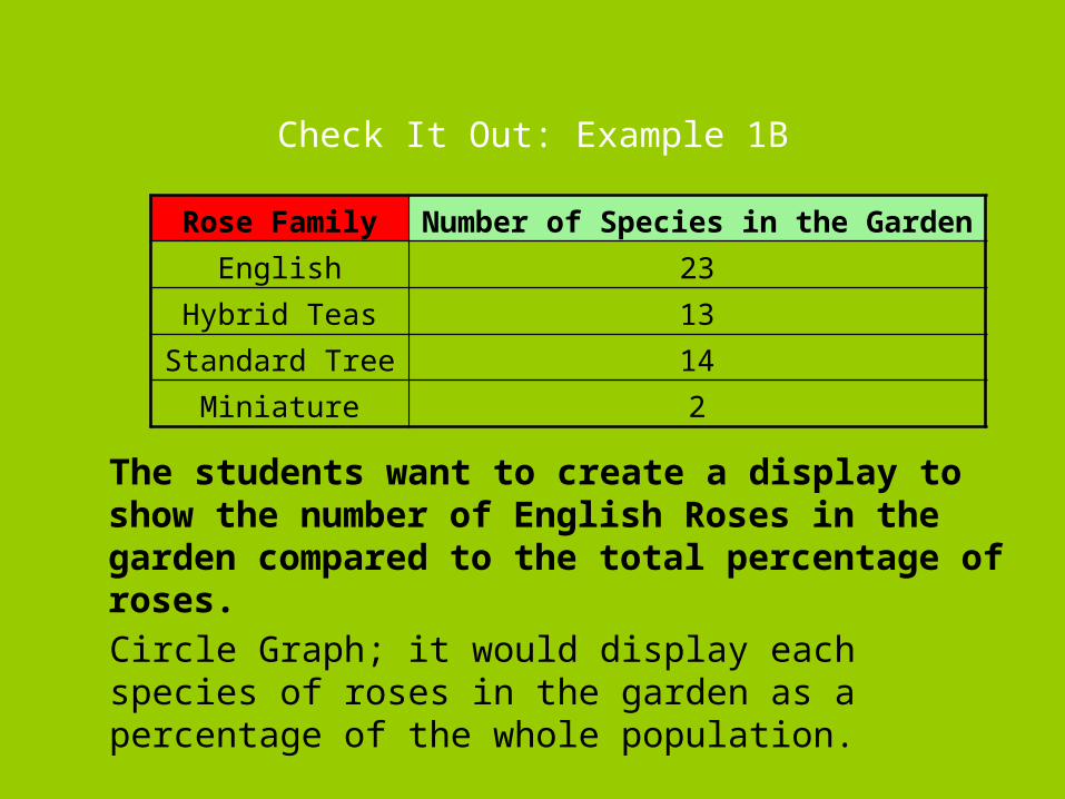
Check It Out: Example 1B
The students want to create a display to show the number of English Roses in the garden compared to the total percentage of roses.
Rose Family Number of Species in the Garden
English 23
Hybrid Teas 13
Standard Tree 14
Miniature 2
Circle Graph; it would display each species of roses in the garden as a percentage of the whole population.
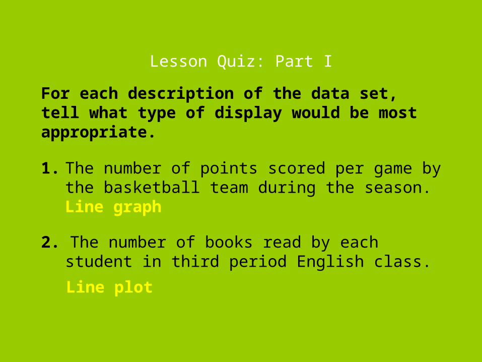
Lesson Quiz: Part I
1. The number of points scored per game by the basketball team during the season.
2. The number of books read by each student in third period English class.
Line plot
Line graph
For each description of the data set, tell what type of display would be most appropriate.
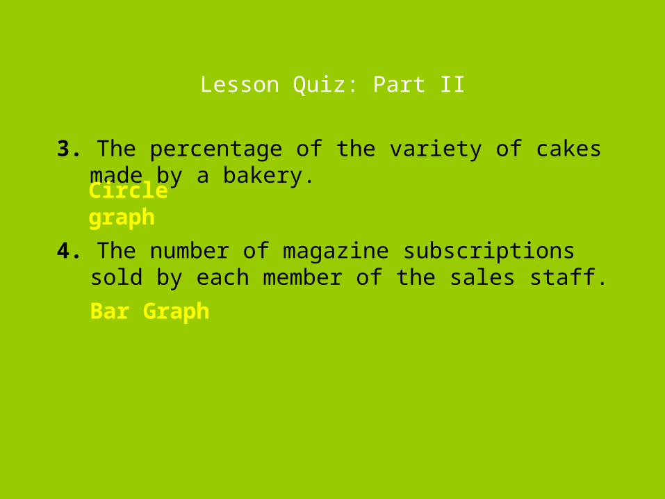
Lesson Quiz: Part II
3. The percentage of the variety of cakes made by a bakery.
4. The number of magazine subscriptions sold by each member of the sales staff.
Circle graph
Bar Graph
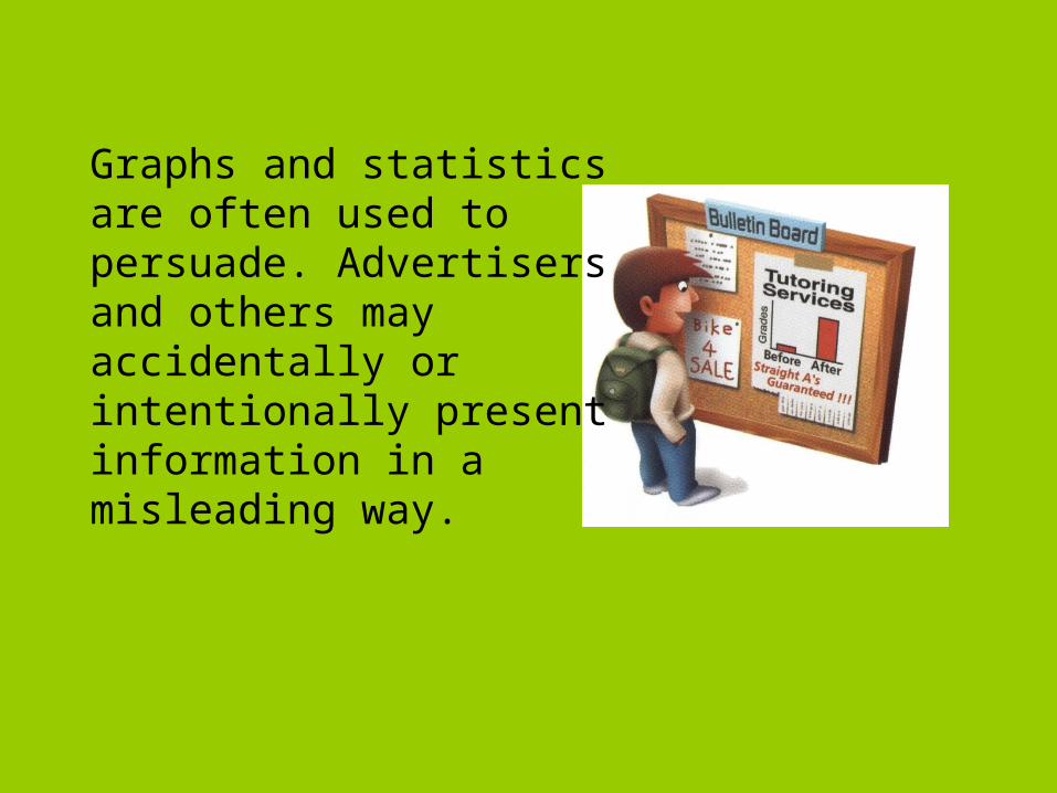
Graphs and statistics are often used to persuade. Advertisers and others may accidentally or intentionally present information in a misleading way.
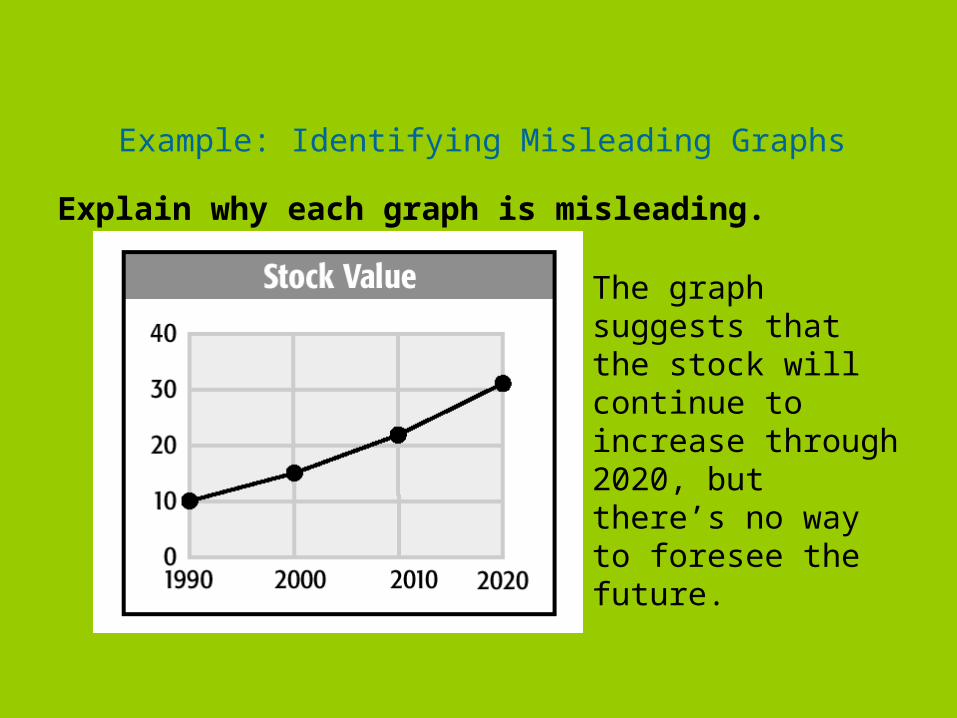
Example: Identifying Misleading Graphs
Explain why each graph is misleading.
The graph suggests that the stock will continue to increase through 2020, but there’s no way to foresee the future.
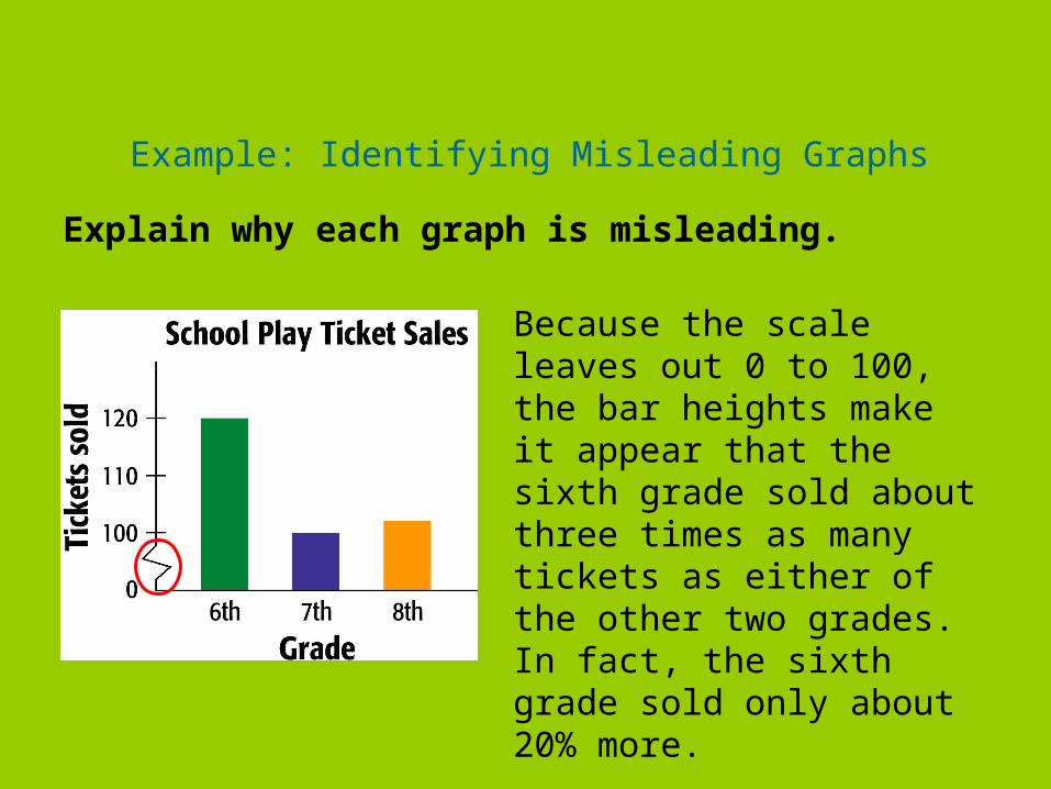
Example: Identifying Misleading Graphs
Explain why each graph is misleading.
Because the scale leaves out 0 to 100, the bar heights make it appear that the sixth grade sold about three times as many tickets as either of the other two grades. In fact, the sixth grade sold only about 20% more.
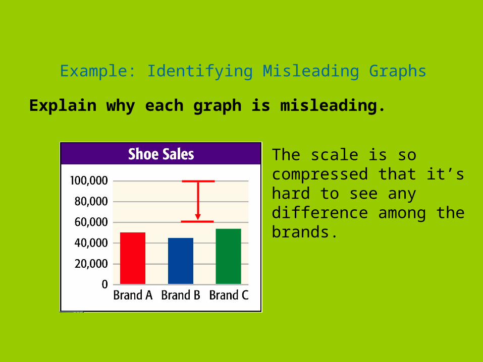
Example: Identifying Misleading Graphs
Explain why each graph is misleading.
The scale is so compressed that it’s hard to see any difference among the brands.
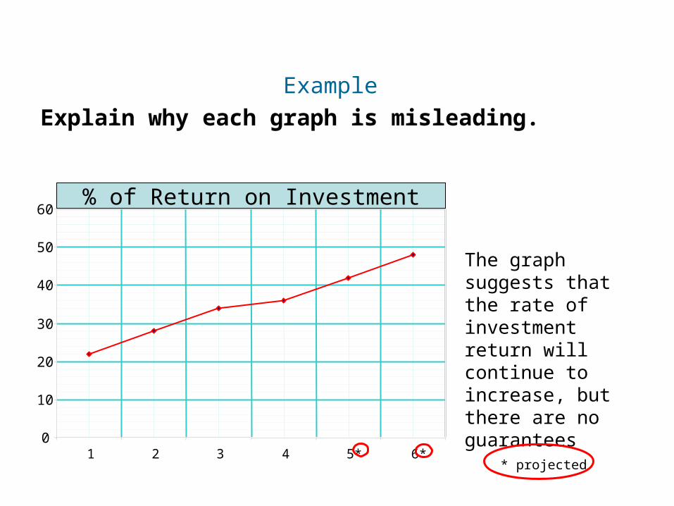
Example
Insert Lesson Title Here
Explain why each graph is misleading.
0
10
20
30
40
50
60
1 2 3 4 5* 6** projected
% of Return on Investment
The graph suggests that the rate of investment return will continue to increase, but there are no guarantees
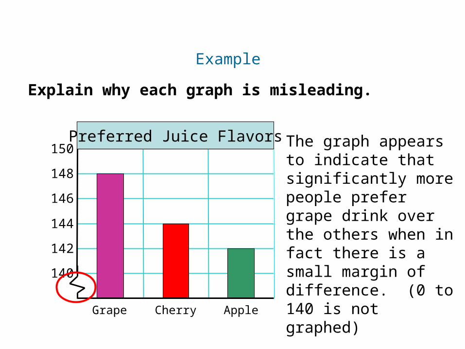
Example
Insert Lesson Title Here
Explain why each graph is misleading.
140
142
144
146
148
150Preferred Juice Flavors
Grape Cherry Apple
The graph appears to indicate that significantly more people prefer grape drink over the others when in fact there is a small margin of difference. (0 to 140 is not graphed)
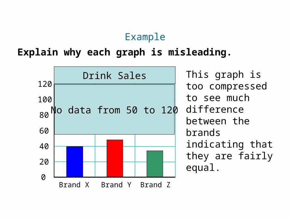
Example
Insert Lesson Title Here
Explain why each graph is misleading.
0
20
40
60
80
100
120
Brand X Brand Y Brand Z
Drink Sales This graph is too compressed to see much difference between the brands indicating that they are fairly equal.
No data from 50 to 120
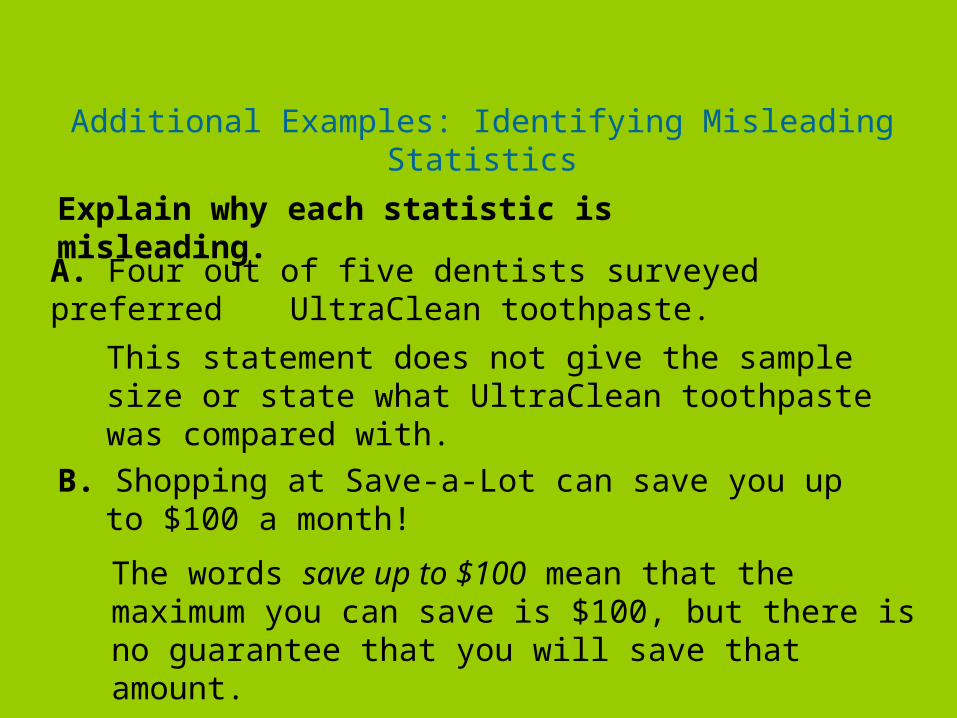
Additional Examples: Identifying Misleading Statistics
Explain why each statistic is misleading.
A. Four out of five dentists surveyed preferred UltraClean toothpaste.
This statement does not give the sample size or state what UltraClean toothpaste was compared with.
B. Shopping at Save-a-Lot can save you up to $100 a month!
The words save up to $100 mean that the maximum you can save is $100, but there is no guarantee that you will save that amount.