Embed Size (px)
Citation preview
Theories of Colour Harmony: past, present and future
Ildikó Rozsovits
Coloroid Ltd.
ABSTRACT: Initially, artists and scientists studying colour harmony thought colour harmony was an attribute of the colour composition. If the colour features of the composition show any special regularity we appreciate the colours harmonious. According to the contemporary theories of colour design we find harmony in hue, saturation or chroma and lightness or value scales of colours.
In recent decades other possible factors of colour harmony occurred. A possible factor can be the conditions of colour appearance, like the spatial situation of coloured surfaces. There are other factors which refer to the personality of the experiments’ subjects, for example colour preference, age and gender. The influence of cultural environment is also important; the different symbolic meanings of colours and colour associations in different cultures are good examples.
Therefore my goal is to start a large serial of experiments about the possible factors of colour harmony and to discover a network of correlations with a complex statistical analysis.
1. MOTIVATION: Being a colour designer, my task is to support colour selection in architectural, design and marketing decision processes. One of the most important tools of this partly intuitive, partly conscious work is colour harmony. This is the reason why I committed myself to start a new research about this topic.
2. COLOUR HARMONY THEORIES – PAST: By the definition of Judd colour harmony is a pleasing effect produced by two or more colours seen in neighbouring areas [1]. But initially, empirical research of colour harmony was a part of practical artwork.
2.1 Tones in painting: In the renaissance, concepts of colour harmony were created by artists and architects on the basis of their art experiences [2,3]. Colour harmony did not appear as theory but as practice of paint mixing. A typical practice was mixing all colours in a composition with a certain colour which caused accordance between the tones.
2.2 Light-chords: The first scientific discovery was owed to Newton who showed the multicolour nature of light projecting the colour spectrum by refraction of sunlight [4]. His colour circle had seven primaries which caused an analogy of colours and sounds. To generate colour harmony by regular steps in the wavelength of colours seemed to be logic, because the essential differences between the visual and auditive systems of perception were not well described at that time.
2.3 Balance between psychophysical forces: Another group of colour harmony theories are based on the experiments that eye tends to balance colour effects [5]. Good demonstrations are the phenomena of light and colour adaptation, colour fatigue, and complementary afterimages [6]. In this theory colour harmony is based on complementary colour pairs. Impressionist painters often studied this phenomenon in practice. One of the representatives of this theory was Itten who influenced the European art education by his writings on art and colour theory [7].
In the beginning of the 20th century conscious work with colours began both in art and science.
2.4 Colours in scales – whiteness and blackness: Tint shade and tone scales were applied first in art painting later in colour printing and other industrial paint mixing. The first colour order systems and their harmony concepts were based on the experimented colour harmony in these scales. These paint mixing based scales are the basis of the Natural Colour System (NCS), the Swedish standard which is one of the most frequently used colour system nowadays in architectural industry in Europe [8].
3. COLOUR HARMONY THEORIES – PRESENT: In recent models colour attributes are defined as features of human colour vision instead of physical features of colours or colour mixing [9].
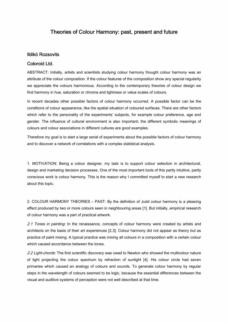
3.1 Colour harmony concepts of colour order systems: Perceptual colour attributes are hue, saturation or chroma and lightness or value. The Munsell Colour System is based on these attributes and is perceptually uniform which means it is built up on the just perceptible colour differences [10]. In this system harmony is defined as uniform step scales of hue, chroma and/or value.
Fig.1 Colour harmony relations in the Munsell Colour System (source: Munsell: A Grammar of Color)
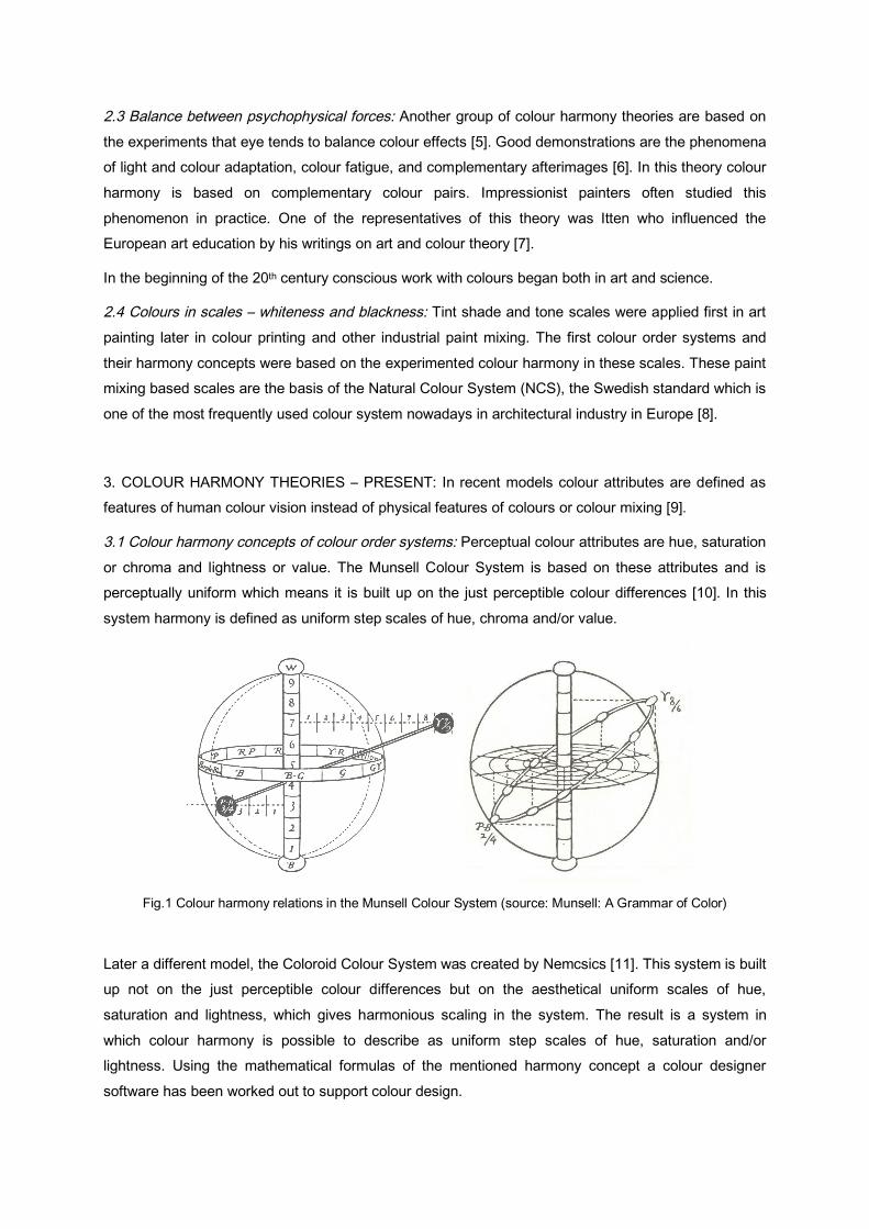
Later a different model, the Coloroid Colour System was created by Nemcsics [11]. This system is built up not on the just perceptible colour differences but on the aesthetical uniform scales of hue, saturation and lightness, which gives harmonious scaling in the system. The result is a system in which colour harmony is possible to describe as uniform step scales of hue, saturation and/or lightness. Using the mathematical formulas of the mentioned harmony concept a colour designer software has been worked out to support colour design.
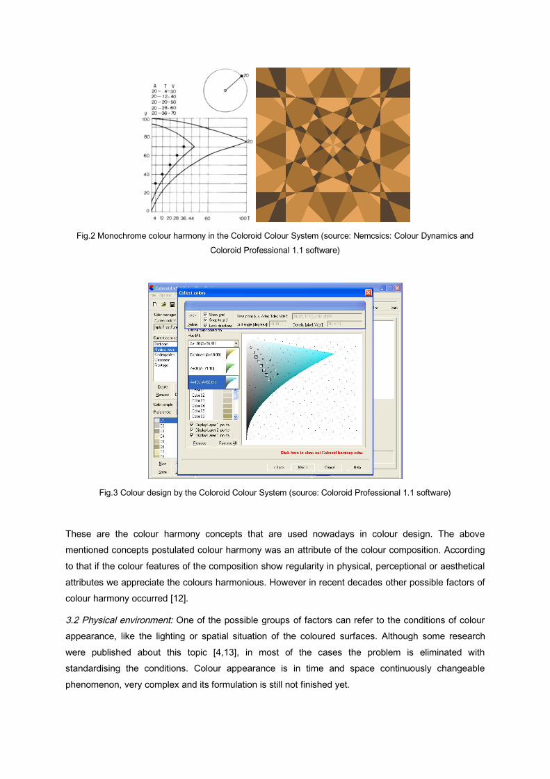
Fig.2 Monochrome colour harmony in the Coloroid Colour System (source: Nemcsics: Colour Dynamics and Coloroid Professional 1.1 software)
Fig.3 Colour design by the Coloroid Colour System (source: Coloroid Professional 1.1 software)
These are the colour harmony concepts that are used nowadays in colour design. The above mentioned concepts postulated colour harmony was an attribute of the colour composition. According to that if the colour features of the composition show regularity in physical, perceptional or aesthetical attributes we appreciate the colours harmonious. However in recent decades other possible factors of colour harmony occurred [12].
3.2 Physical environment: One of the possible groups of factors can refer to the conditions of colour appearance, like the lighting or spatial situation of the coloured surfaces. Although some research were published about this topic [4,13], in most of the cases the problem is eliminated with standardising the conditions. Colour appearance is in time and space continuously changeable phenomenon, very complex and its formulation is still not finished yet.
3.3 Personality of the subjects: There are other factors which refer to the personality of the experiments’ subjects, for example colour preference, age and gender.
3.3.1 Colour preference: Our relation to colours is subjective, we have personal colour preferences. In psychology projective personality tests were worked out based on colour preference to describe some personality attributes [14]. Even colour preferences of different groups of population were studied [4,15,16].
Colours have physiological and psychological effects. Experiments verified the effects of lights of different wavelength on biological parameters. Red increases blood pressure and the rhythm of respirations. Green calms the nervous system and reduces blood pressure. Red illumination increased the efficiency of the problem solution requiring creative skills, while blue helped in solving logical problems. However, people missing logical skills preferred blue, while people missing creative skills preferred red, it means they preferred those colours which increased their missed skills [4].
Therefore physiological and psychological effects of colours and the physiological and psychological statement of the subjects are in interaction and appear in colour preference.
3.3.2 Cultural environment: The different symbolic meanings of colours and colour associations in different cultures are influenced by the cultural environment and can cause differences in colour preferences. The interest of the researchers in this topic increased in the last years. The colour preferences difference of cultures and its effect on colour harmony were investigated [17].
Even effects of colour trends, actual fashion and hype can be important [18]. Fashion focuses on a certain colour or colour collection, and can relevantly change the population’s relations to colours impressing them by its freshness. The effect is probably based on the impulse seeking human nature.
3.3.3 Colour association: People connect colours with semantic content. It can be based on the physiological effect of colours, like “cold” and “warm” colours. Even the cultural effects are important, the difference of the colours of mourning in different cultures can be an example. There are personal associations and emotional content of colours as well.
3.4 Actual research projects about colour harmony: A part of nowadays’ research projects does not take these already studied factors into consideration, they focus again only on the colour attributes of the colour composition [19,20]. Their aim is to formulate the connection of the colour attributes.
4. COLOUR HARMONY CONCEPTS – FUTURE: Till now the factors of colour harmony were investigated separately, their correlations were not described. The influence ratios of the colour harmony factors are even not obvious.
Therefore my aim is to start a large serial of experiments about the possible factors of colour harmony and to discover a network of correlations with a complex statistical analysis. The first experiments were the starting-point of a longitudinal research following the cultural changes in the future. Results
could allow getting a view of the processes of human visual evaluation and could support colour design.
REFERENCES: [1] Judd, D.B., Wyszecki, G. (1975). Color in business, science and industry. 3rd Ed, New York, Wiley and Sons [2] Alberti, L.B. (1436). Della Pittura. [3] Vinci, L. da (1270). Trattato della Pittura. [4] Newton, I. (1704). Opticks, or a Treatise of the Reflections, Refractions, Inflexions and Colours of Light. London [5] Nemcsics A. (1990). Colour Dynamics. Budapest, Akadémiai Kiadó [6] Sekuler, R., Blake R. (1993). Perception. New York, McGraw-Hill Education [7] Itten, J. (1961). Kunst der Farbe. Ravensburg [8] Hård, A., Sivik, L., Tonnquist, G. (1996). ‘NCS Natural Colour System - From Concept to Research and Applications, part 1 and 2.’ Colour Research & Application, Vol. 21, No 3 [9] Westland, S., Laycock, K., Cheung, V., Henry, P., Mahyar, F. (2007). ‘Colour Harmony’ Colour: Design & Creativity 1, 1-15. http://www.colour-journal.org/2007/1/1/07101article.htm [10] Munsell, A. H. (1921). A Grammar of Color, Mittineague, Mass. [11] Nemcsics A. (1987). ‘Color space of the Coloroid color system.’ Color Research & Application Vol. 12, No 3, pp. 135-146 [12] Burchett, K.E. (1991). ‘Color harmony attributes’ Color Research & Application Vol. 16, No 4, pp. 275-278 [13] Stahre B. (2009). ‘Defining Reality in Virtual Reality : Exploring Visual Appearance and Spatial Experience Focusing on Colour.’ CREATE Workshop on Communicating Colour Veszprém [14] Lüscher, M. (1949). Psychologie der Farben. Einführung in den psychosomatischen Farbtest. Basel, Test-Verlag [15] Klausz Cs. (1967). ‘A magyar színpreferencia kísérlet kialakítása, végzése és feldolgozása.’ ÉKME Tud. Közl. 13, No. 1-2. [16] Hurlbert, A., Ling Y., Robinson J. (2003). 'Real men don't like pink: Sex differences in colour preference.’ Perception, pg. 29. [17] Szabó F., Sueeprasan, S., Malkovics, R., Ngammaneewat, P. (2009). ‘Towards a Culture Dependent Model of Colour Harmony’ Proc. 11th Congress of the International Colour Association, Sydney [18] Granville, W.C. (1987). ‘Color harmony: What is it?’ Color Research & Application Vol. 12, No 4, pp. 196-201 [19] Ou, L., Luo, M. R. (2006). ‘A Study of Colour Harmony for Two-colour Combinations’ Color Research and Application, Vol. 31, No. 3, pp. 191-204 [20] Szabo F., Schanda J., Bodrogi P. (2007). ‘Experimental Investigation of the Distortion of Colour Harmony.’ Proc. International Conference on Colour Harmony, Budapest


![Bazaar velvet colour harmony slide_share[2]](https://img.pdfslide.us/doc/110x75/58ee77321a28ab72248b466f/bazaar-velvet-colour-harmony-slideshare2.jpg)