Embed Size (px)
Citation preview
1
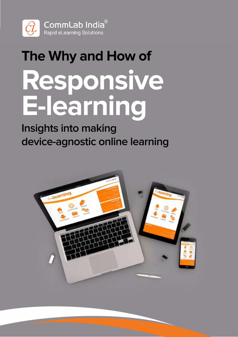
The Why and How of
ResponsiveE-learningInsights into making device-agnostic online learning
2
PREFACE ..........................................................................................................................
UNIT 1: INTRODUCTION ..............................................................................................
UNIT 2: WHEN IS RESPONSIVE DESIGN A MUST FOR ORGANIZATIONS .....
UNIT 3: BENEFITS OF MAKING YOUR COURSES RESPONSIVE ......................
UNIT 4: HOW TO IMPLEMENT RESPONSIVE E-LEARNING ................................
UNIT 5: TOOLS USED FOR RESPONSIVE E-LEARNING ......................................
CONCLUSION .................................................................................................................
Table of Contents3
4
13
17
23
29
33
Page No:
3
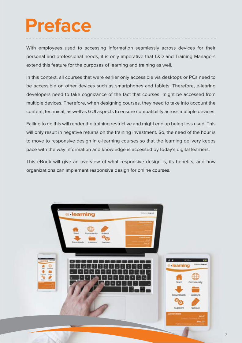
PrefaceWith employees used to accessing information seamlessly across devices for their
personal and professional needs, it is only imperative that L&D and Training Managers
extend this feature for the purposes of learning and training as well.
In this context, all courses that were earlier only accessible via desktops or PCs need to
be accessible on other devices such as smartphones and tablets. Therefore, e-learing
developers need to take cognizance of the fact that courses might be accessed from
multiple devices. Therefore, when designing courses, they need to take into account the
content, technical, as well as GUI aspects to ensure compatibility across multiple devices.
Failing to do this will render the training restrictive and might end up being less used. This
will only result in negative returns on the training investment. So, the need of the hour is
to move to responsive design in e-learning courses so that the learning delivery keeps
pace with the way information and knowledge is accessed by today’s digital learners.
This eBook will give an overview of what responsive design is, its benefits, and how
organizations can implement responsive design for online courses.
3

4
Unit 1 Introduction
4
5
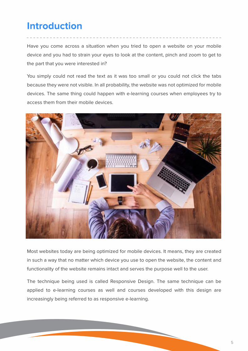
Have you come across a situation when you tried to open a website on your mobile
device and you had to strain your eyes to look at the content, pinch and zoom to get to
the part that you were interested in?
You simply could not read the text as it was too small or you could not click the tabs
because they were not visible. In all probability, the website was not optimized for mobile
devices. The same thing could happen with e-learning courses when employees try to
access them from their mobile devices.
Most websites today are being optimized for mobile devices. It means, they are created
in such a way that no matter which device you use to open the website, the content and
functionality of the website remains intact and serves the purpose well to the user.
The technique being used is called Responsive Design. The same technique can be
applied to e-learning courses as well and courses developed with this design are
increasingly being referred to as responsive e-learning.
Introduction
6
Responsive E-learning: Fundamentals
To understand responsive design in the context of e-learning, it is essential to go back to
its origin which is in web design.
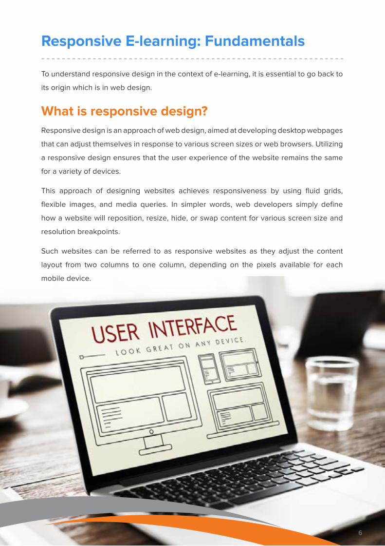
What is responsive design?Responsive design is an approach of web design, aimed at developing desktop webpages
that can adjust themselves in response to various screen sizes or web browsers. Utilizing
a responsive design ensures that the user experience of the website remains the same
for a variety of devices.
This approach of designing websites achieves responsiveness by using fluid grids,
flexible images, and media queries. In simpler words, web developers simply define
how a website will reposition, resize, hide, or swap content for various screen size and
resolution breakpoints.
Such websites can be referred to as responsive websites as they adjust the content
layout from two columns to one column, depending on the pixels available for each
mobile device.
6
7
What is responsive e-learning?
Responsive E-learning: Fundamentals
Responsive e-learning is a design approach that fluidly
alters the layout of content to fit the environment in which
it is viewed. Courses designed with responsive design
principles run flawlessly across all types of devices –
PCs, Laptops, Tablets, Phablets, Smartphones.
Responsive e-learning content is fluid and flexible in
nature as the content restructures itself as per changing
needs. It involves the development of only one master
course that modifies itself according to the display
screens of the device a learner is using. This means
that you can author just once and publish the e-learning
content for your entire target group.
How is it different from adaptive designResponsive design is often confused with adaptive
design. However, there is a distinct difference between
the two.
Adaptive design is an approach that uses a fixed set of
layouts or templates that are developed to suit specific
groups of screen sizes. It means for each screen size a
different layout or template is created and stored.
When a user accesses the content from a device, the
layout that was created to suit that device is activated
and used to deliver the content. As a result, you will end
up having multiple versions of the same content, albeit
in different sizes/layouts.
8
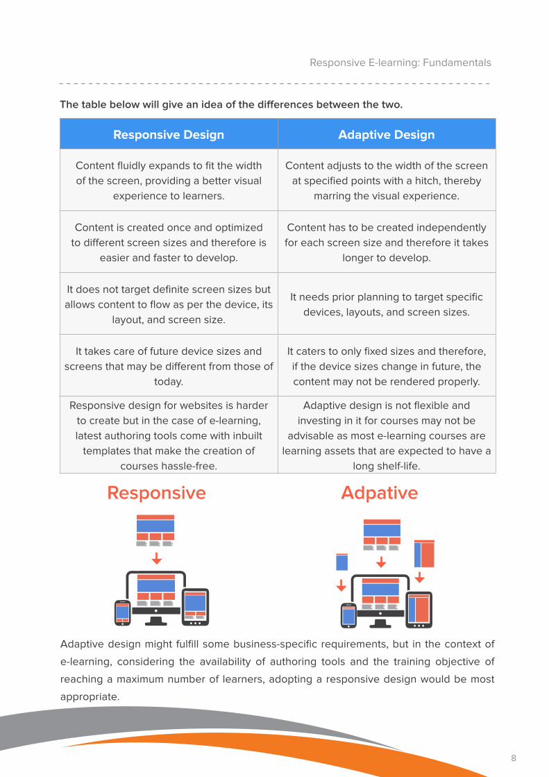
The table below will give an idea of the differences between the two.
Responsive Design Adaptive Design
Content fluidly expands to fit the width
of the screen, providing a better visual
experience to learners.
Content adjusts to the width of the screen
at specified points with a hitch, thereby
marring the visual experience.
Content is created once and optimized
to different screen sizes and therefore is
easier and faster to develop.
Content has to be created independently
for each screen size and therefore it takes
longer to develop.
It does not target definite screen sizes but
allows content to flow as per the device, its
layout, and screen size.
It needs prior planning to target specific
devices, layouts, and screen sizes.
It takes care of future device sizes and
screens that may be different from those of
today.
It caters to only fixed sizes and therefore,
if the device sizes change in future, the
content may not be rendered properly.
Responsive design for websites is harder
to create but in the case of e-learning,
latest authoring tools come with inbuilt
templates that make the creation of
courses hassle-free.
Adaptive design is not flexible and
investing in it for courses may not be
advisable as most e-learning courses are
learning assets that are expected to have a
long shelf-life.
Adaptive design might fulfill some business-specific requirements, but in the context of
e-learning, considering the availability of authoring tools and the training objective of
reaching a maximum number of learners, adopting a responsive design would be most
appropriate.
Responsive E-learning: Fundamentals
Responsive Adpative
9
What it Means to Make Courses Responsive
When you make your courses responsive, your learners will be able to access the course
from any device – PCs, Laptops, Tablets, or Smartphones. Their learning experience and
viewing experience will not be hampered.
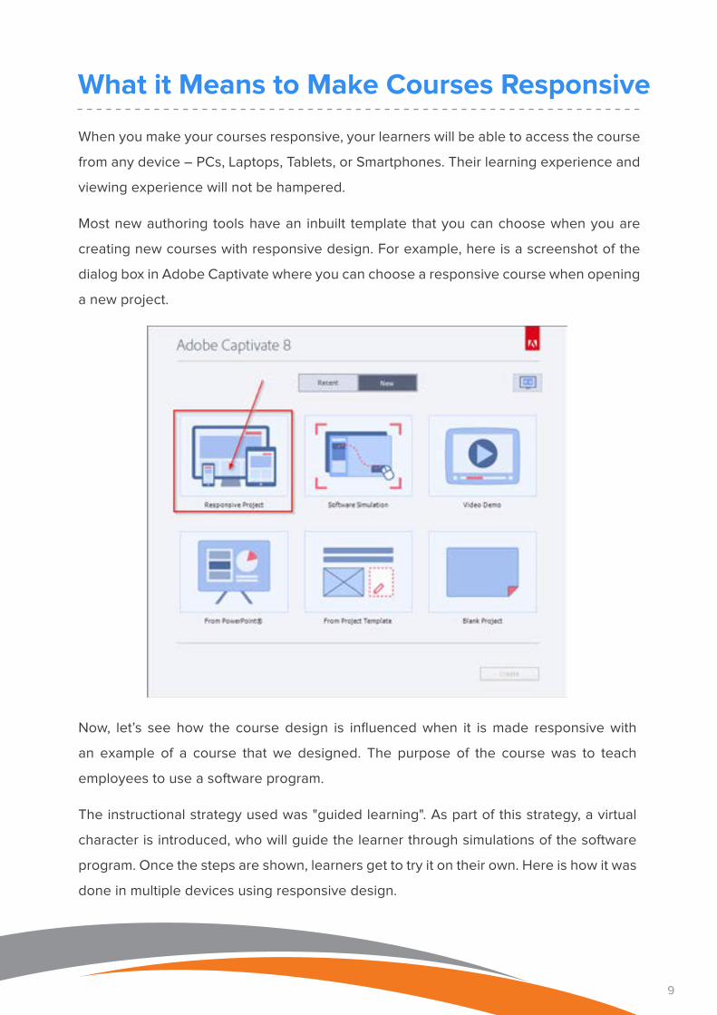
Most new authoring tools have an inbuilt template that you can choose when you are
creating new courses with responsive design. For example, here is a screenshot of the
dialog box in Adobe Captivate where you can choose a responsive course when opening
a new project.
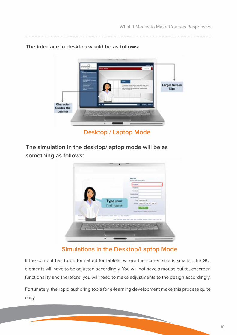
Now, let’s see how the course design is influenced when it is made responsive with
an example of a course that we designed. The purpose of the course was to teach
employees to use a software program.
The instructional strategy used was "guided learning". As part of this strategy, a virtual
character is introduced, who will guide the learner through simulations of the software
program. Once the steps are shown, learners get to try it on their own. Here is how it was
done in multiple devices using responsive design.
10
The simulation in the desktop/laptop mode will be as something as follows:
If the content has to be formatted for tablets, where the screen size is smaller, the GUI
elements will have to be adjusted accordingly. You will not have a mouse but touchscreen
functionality and therefore, you will need to make adjustments to the design accordingly.
Fortunately, the rapid authoring tools for e-learning development make this process quite
easy.
What it Means to Make Courses Responsive
The interface in desktop would be as follows:
Desktop / Laptop Mode
Simulations in the Desktop/Laptop Mode
11
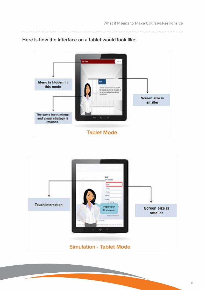
Here is how the interface on a tablet would look like:
What it Means to Make Courses Responsive
Tablet Mode
Simulation - Tablet Mode
12
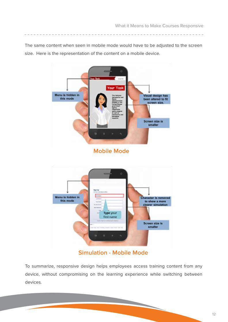
The same content when seen in mobile mode would have to be adjusted to the screen
size. Here is the representation of the content on a mobile device.
What it Means to Make Courses Responsive
To summarize, responsive design helps employees access training content from any
device, without compromising on the learning experience while switching between
devices.
Mobile Mode
Simulation - Mobile Mode
13
Unit 2 When is Responsive Design a Must for Organizations
13
14
When is Responsive Design a Must for Organizations
The main objective of having an e-learning
course with responsive design is to make
sure that learners are able to enjoy viewing
the courses on their mobile devices, just as
they do when they access it via desktops.
This means, responsive design becomes
very important when you have employees
who have limited access to desktops but
usually have their smartphones or tablets
with them.
So, who are these employees? It would
really depend on the type of organization
and profile of the employees and the jobs
they do but broadly speaking, salespeople,
service engineers, technicians, patient care
givers, shop floor employees are some of
the people that would greatly benefit from
a responsive e-learning course.
14
15
When is Responsive Design a Must for Organizations
If your training will be accessed from multiple devices
Here are some of the situations when you should make
your course responsive.
If you have a large number of employees who spend more time on the field and have
limited access to continuous training, you can consider providing training to them via
mobile devices. Unless, your organization provides a specific device to them, chances
are that your employees will use a range of devices with different screen sizes. Now, if
your e-learning or online courses should work well on each of these devices, responsive
design is the only answer.
Another question that you need to ask is if you expect employees to use the courses
on the go to meet real-life challenges that their work throws at them. The answer to this
question will help you decide if you should opt for responsive design.
If you think your training needs to be future-proof
Think about the mobile phones we were using just ten years ago. Technology moves
pretty fast and mobile technology certainly has only moved faster. Ten years ago, we had
basic keypads on the phones, now we have advanced touchscreens.
So, the important question is, where will we be in another ten years? Responsive design
means it doesn’t matter how much device screen sizes change, your learning platform
will adapt to fit them.
A fluid design is one of the best solutions for future-proofing your learning platform,
ensuring it stays up to date as mobile technology advances. New devices will be
introduced everyday and responsive design makes sure that your course runs smoothly
on each one of them.
16
When is Responsive Design a Must for Organizations
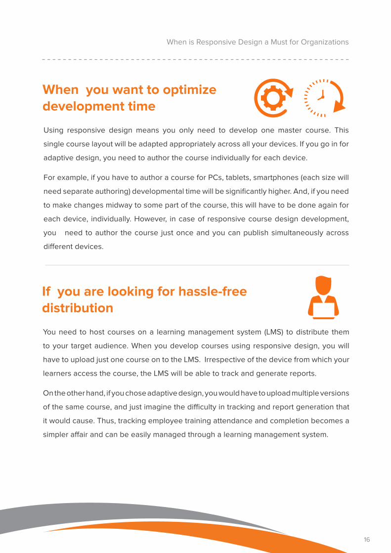
When you want to optimize development time
Using responsive design means you only need to develop one master course. This
single course layout will be adapted appropriately across all your devices. If you go in for
adaptive design, you need to author the course individually for each device.
For example, if you have to author a course for PCs, tablets, smartphones (each size will
need separate authoring) developmental time will be significantly higher. And, if you need
to make changes midway to some part of the course, this will have to be done again for
each device, individually. However, in case of responsive course design development,
you need to author the course just once and you can publish simultaneously across
different devices.
If you are looking for hassle-free distribution
You need to host courses on a learning management system (LMS) to distribute them
to your target audience. When you develop courses using responsive design, you will
have to upload just one course on to the LMS. Irrespective of the device from which your
learners access the course, the LMS will be able to track and generate reports.
On the other hand, if you chose adaptive design, you would have to upload multiple versions
of the same course, and just imagine the difficulty in tracking and report generation that
it would cause. Thus, tracking employee training attendance and completion becomes a
simpler affair and can be easily managed through a learning management system.
17
Unit 3 Benefits of Making your Courses Responsive
17
18
Benefits of Making your Courses Responsive
Developing device-specific versions of courses is a daunting task, and responsive design
provides a device-agnostic solution. Responsive e-learning courses can be accessed
through multiple devices and provide the same learning experience, irrespective of the
device from which it is accessed.
Here are some more benefits of creating e-learning courses with responsive
design.
Increases user baseBy making your courses responsive, you
will provide a new medium for learning
that learners can access at the time that
is suitable or when they need it the most.
It also touches people who would have
otherwise been deprived of access to
knowledge resources for the simple reason
that they work away from office and do not
have access to desktop computers.
Thus, more number of people can
be brought into the training fold with
more regular and consistent learning
resources. Thus, salespeople, service
engineers, technicians, and patient care
givers can greatly benefit from resources
that they need ‘on-the-job’ and do not
have to depend on unreliable sources for
instant knowledge.
18
19
Benefits of Making your Courses Responsive
Provides seamless access to content flow and navigationResponsive design allows for a single course
to be accessed from multiple devices before
it is completed. It ensures that courses
look, feel, and function efficiently across all
devices.
For learners who might complete different
portions of the course on different devices,
this proves to be a boon. They can pause
a course on one device and pick from
where they left, using a completely different
device. Users do not have to worry whether
the course will function or load properly on
their device, rather they can just focus on
the main learning aspect.
When a course gives users the best
experience right on their smartphones,
they will be motivated to engage further in
their quest for knowledge. A bad learning
experience pushes learners away, while a
good one prompts them to come back for
more.
When learning engages users, more number
of employees complete the courses; they
display better retention and recollection of
knowledge, thus translating into better skill
development in the long run.
19
20
Benefits of Making your Courses Responsive
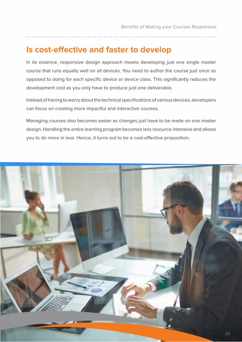
Is cost-effective and faster to developIn its essence, responsive design approach means developing just one single master
course that runs equally well on all devices. You need to author the course just once as
opposed to doing for each specific device or device class. This significantly reduces the
development cost as you only have to produce just one deliverable.
Instead of having to worry about the technical specifications of various devices, developers
can focus on creating more impactful and interactive courses.
Managing courses also becomes easier as changes just have to be made on one master
design. Handling the entire learning program becomes less resource-intensive and allows
you to do more in less. Hence, it turns out to be a cost-effective proposition.
20
21
Makes it easy to manage, maintain, and update
Benefits of Making your Courses Responsive
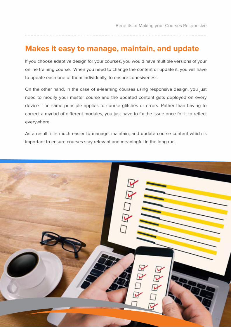
If you choose adaptive design for your courses, you would have multiple versions of your
online training course. When you need to change the content or update it, you will have
to update each one of them individually, to ensure cohesiveness.
On the other hand, in the case of e-learning courses using responsive design, you just
need to modify your master course and the updated content gets deployed on every
device. The same principle applies to course glitches or errors. Rather than having to
correct a myriad of different modules, you just have to fix the issue once for it to reflect
everywhere.
As a result, it is much easier to manage, maintain, and update course content which is
important to ensure courses stay relevant and meaningful in the long run.
21
22
Allows for easy tracking and reporting
Benefits of Making your Courses Responsive
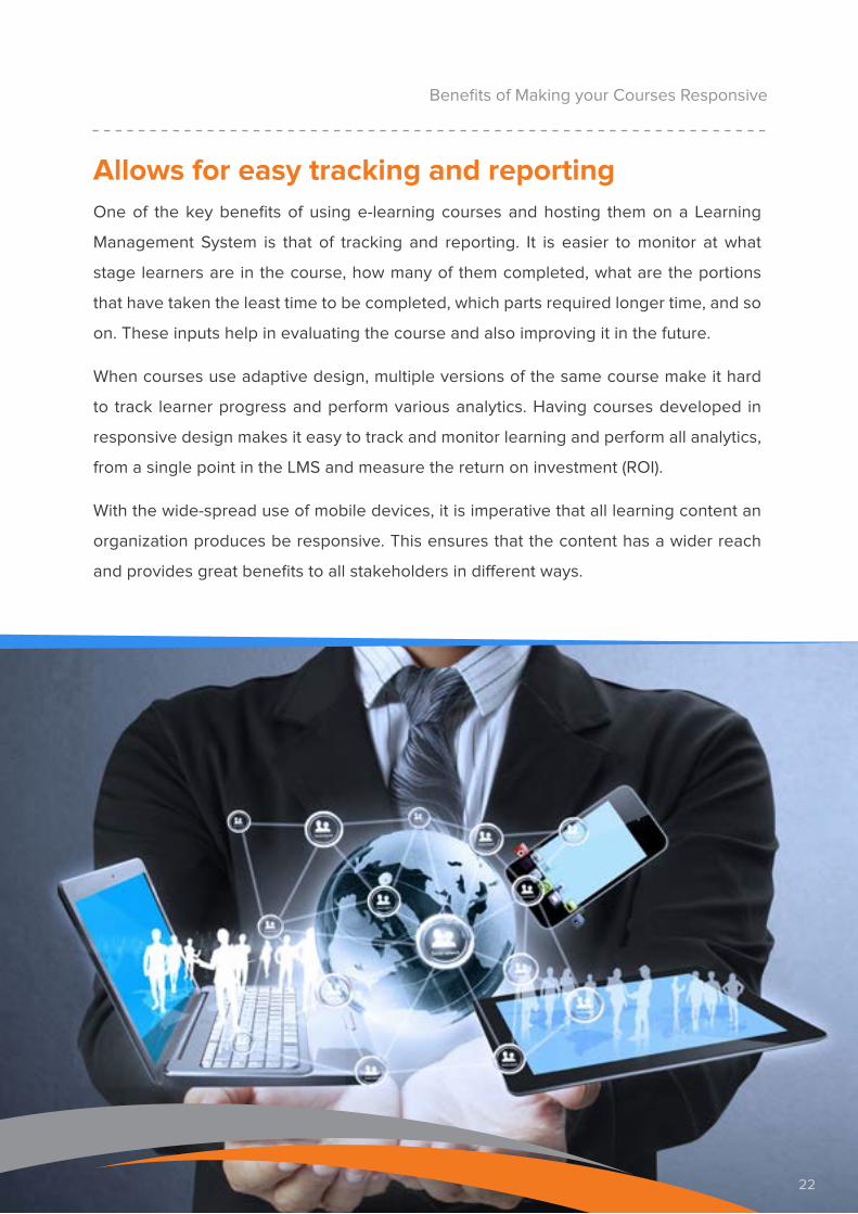
One of the key benefits of using e-learning courses and hosting them on a Learning
Management System is that of tracking and reporting. It is easier to monitor at what
stage learners are in the course, how many of them completed, what are the portions
that have taken the least time to be completed, which parts required longer time, and so
on. These inputs help in evaluating the course and also improving it in the future.
When courses use adaptive design, multiple versions of the same course make it hard
to track learner progress and perform various analytics. Having courses developed in
responsive design makes it easy to track and monitor learning and perform all analytics,
from a single point in the LMS and measure the return on investment (ROI).
With the wide-spread use of mobile devices, it is imperative that all learning content an
organization produces be responsive. This ensures that the content has a wider reach
and provides great benefits to all stakeholders in different ways.
22
23
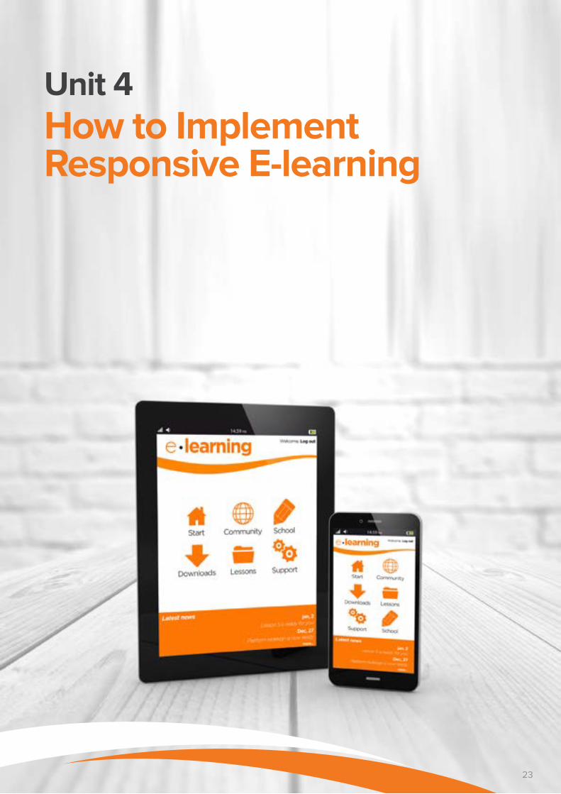
Unit 4 How to Implement Responsive E-learning
23
24
How to Implement Responsive E-learning
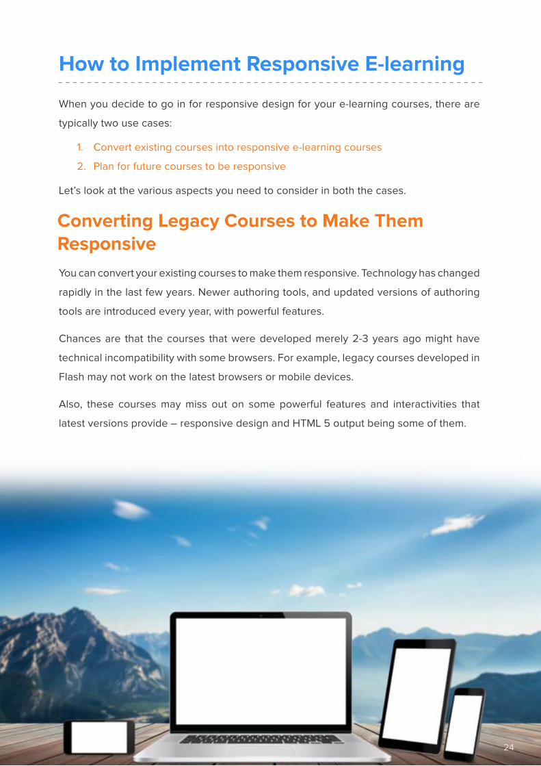
When you decide to go in for responsive design for your e-learning courses, there are
typically two use cases:
1. Convert existing courses into responsive e-learning courses
2. Plan for future courses to be responsive
Let’s look at the various aspects you need to consider in both the cases.
Converting Legacy Courses to Make Them ResponsiveYou can convert your existing courses to make them responsive. Technology has changed
rapidly in the last few years. Newer authoring tools, and updated versions of authoring
tools are introduced every year, with powerful features.
Chances are that the courses that were developed merely 2-3 years ago might have
technical incompatibility with some browsers. For example, legacy courses developed in
Flash may not work on the latest browsers or mobile devices.
Also, these courses may miss out on some powerful features and interactivities that
latest versions provide – responsive design and HTML 5 output being some of them.
24
25
When the course has content that is still relevant and addresses the current
learning needs of employees.
When you have a large number of employees who work remotely and do not have
access to regular desktops or laptops.
When courses were developed in Flash and cannot be accessed via mobile
devices.
When courses were developed in earlier versions of authoring tools such as
Storyline, Captivate, or Lectora which have now come up with templates for
responsive design.
When you do not have the budget or resources to develop new courses but would
like to capitalize on existing ones.
How to Implement Responsive E-learning
If you already have a good number of e-learning courses in your portfolio and would like
to extend their life, you can consider making them responsive. It is a lot easier in terms of
costs and developmental time to make them responsive.
You increase their shelf-life and instead of recreating them from the beginning, all
you need to do is rework on the existing content.
That does not mean that those courses are outdated. They still might have powerful,
engaging, and relevant content that adds value to your employees. All they need is to
be updated to the current version that incorporates the latest features and becomes
compatible with current technology. Responsive design is one of them that can be
successfully incorporated.
Below is a checklist of situations where you can consider converting existing courses or
legacy courses to responsive design:
26
Planning for Future E-learning Courses to be ResponsiveResponsive courses work well on desktops and laptops, but the real challenge it helps
overcome is mobile screen incompatibility. It gives you an opportunity to support
employees on-the-job with just-in-time learning, through mobile devices.
Therefore, when you are planning for responsive courses, it is a good idea to consult an
instructional designer or a learning expert and get them to evaluate your course content
and assess its suitability for responsive design. Here are some broad parameters you
need to check.
How to Implement Responsive E-learning
26
27
How to Implement Responsive E-learning
Step 1: Evaluate your learnersIt is important to know who you are building the course for and where are
they going to access the course from. If they are present in the office most
of their working hours, there is little need for you to create responsive
e-learning for them. However, if they are mostly away from the office, they
would be the ideal audience for responsive e-learning.
It is also a good idea to take stock of the typical devices that they use
and the Internet bandwidth that is available to them while on the field.
This information is crucial because it will guide instructional designers to
choose appropriate media and Graphic User Interface (GUI) elements.
Step 2: Evaluate your courseEvaluate your course to see if the content is suitable for mobile devices. If
the content is text-heavy and cannot be chunked to suit mobile devices,
it may not be a great idea to make it responsive. However, if the content
can be easily chunked and can be adapted for mobile devices, responsive
design is the way forward.
Typically, courses that offer supplemental knowledge and build on the
existing knowledge of employees would work well for responsive learning
as the likelihood of employees accessing this knowledge is higher. Also,
courses or modules that help in decision making on-the-job are another
category that fit responsive design.
The best way to go forward is to evaluate your course and assess the
learning objectives that the course is out to achieve.
28
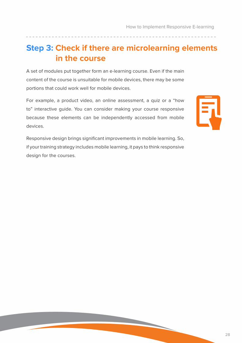
Step 3: Check if there are microlearning elements in the course
A set of modules put together form an e-learning course. Even if the main
content of the course is unsuitable for mobile devices, there may be some
portions that could work well for mobile devices.
For example, a product video, an online assessment, a quiz or a “how
to” interactive guide. You can consider making your course responsive
because these elements can be independently accessed from mobile
devices.
Responsive design brings significant improvements in mobile learning. So,
if your training strategy includes mobile learning, it pays to think responsive
design for the courses.
How to Implement Responsive E-learning

29
Unit 5 Tools Used for Responsive E-learning
29
30
If you are interested in making your courses responsive, you can choose to develop or
get your courses developed using authoring tools with responsive design capabilities.
In this eBook, we will share information about three popular tools that are ideal for
creating responsive e-learning courses.
Tools Used for Responsive E-learning
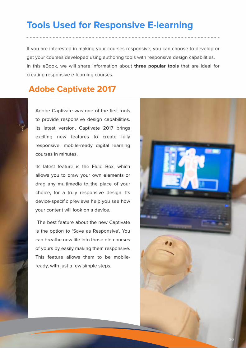
Adobe Captivate 2017
Adobe Captivate was one of the first tools
to provide responsive design capabilities.
Its latest version, Captivate 2017 brings
exciting new features to create fully
responsive, mobile-ready digital learning
courses in minutes.
Its latest feature is the Fluid Box, which
allows you to draw your own elements or
drag any multimedia to the place of your
choice, for a truly responsive design. Its
device-specific previews help you see how
your content will look on a device.
The best feature about the new Captivate
is the option to ‘Save as Responsive’. You
can breathe new life into those old courses
of yours by easily making them responsive.
This feature allows them to be mobile-
ready, with just a few simple steps.
30
31
Articulate 360 and Storyline 3
Articulate 360 consists of a range of tools that
help you create interactive e-learning projects.
You get subscription to Storyline 360, which is a
desktop tool used to build e-learning courses.
As a part of the package you also get access to
many other tools such as Rise and Responsive
Player that would help you create responsive
courses. Rise is a web application that allows
you to create fully responsive courses, quickly.
If you are an existing Articulate user and wish
to upgrade to the new version, you have
discounts on subscription. However, if you
wish you would rather have a perpetual license
to the software, you can go in for Storyline 3
which was released by Articulate in April 2017.
You need to remember that with Storyline 3,
you will get Responsive Player that will allow
you to create a course one and will make
it compatible to multiple devices. However
you will not have the ability to create fluid
responsive design that you can do with Rise.
Also, you don’t get automatic access to new
features that Articulate might introduce from
time to time.
Tools Used for Responsive E-learning
31
32
Lectora Inspire 17
Tools Used for Responsive E-learning
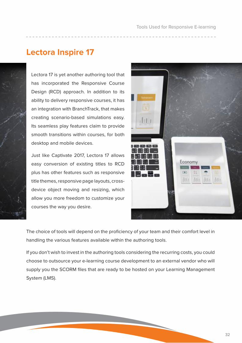
Lectora 17 is yet another authoring tool that
has incorporated the Responsive Course
Design (RCD) approach. In addition to its
ability to delivery responsive courses, it has
an integration with BranchTrack, that makes
creating scenario-based simulations easy.
Its seamless play features claim to provide
smooth transitions within courses, for both
desktop and mobile devices.
Just like Captivate 2017, Lectora 17 allows
easy conversion of existing titles to RCD
plus has other features such as responsive
title themes, responsive page layouts, cross-
device object moving and resizing, which
allow you more freedom to customize your
courses the way you desire.
32
The choice of tools will depend on the proficiency of your team and their comfort level in
handling the various features available within the authoring tools.
If you don’t wish to invest in the authoring tools considering the recurring costs, you could
choose to outsource your e-learning course development to an external vendor who will
supply you the SCORM files that are ready to be hosted on your Learning Management
System (LMS).

33
Conclusion
33
34
Work schedules are no more restricted to the confines of a cubicle. Portable devices
have enabled users to effectively stay on the field and work remotely.
More and more employees are working without a fixed desk space in a bid to keep
up with stringent market or client demands. Responsive design for e-learning learning
helps employees who are on the go, and who may or may not get time to access their
computers.
Responsive design essentially means creating a single course that will run well on
all possible devices. This ‘one size fits all’ approach takes shorter time to develop as
compared to creating individual courses for different devices.
A single design also means that managing and updating the learning program becomes
an easier affair. Responsive design not only saves on development cost but also allows
you to run your learning program with fewer resources.
Responsive design helps future-proof your e-learning courses. By making a single course
layout compatible with all mobile and computer devices, it makes the lives of course
developers easy. It also gives employees a flawless cross-device compatible course that
really gels well with their methods of learning.
Using responsive design, give the best possible mobile learning experience to the
employees who are out there, making a difference for your organization
Conclusion
34
35
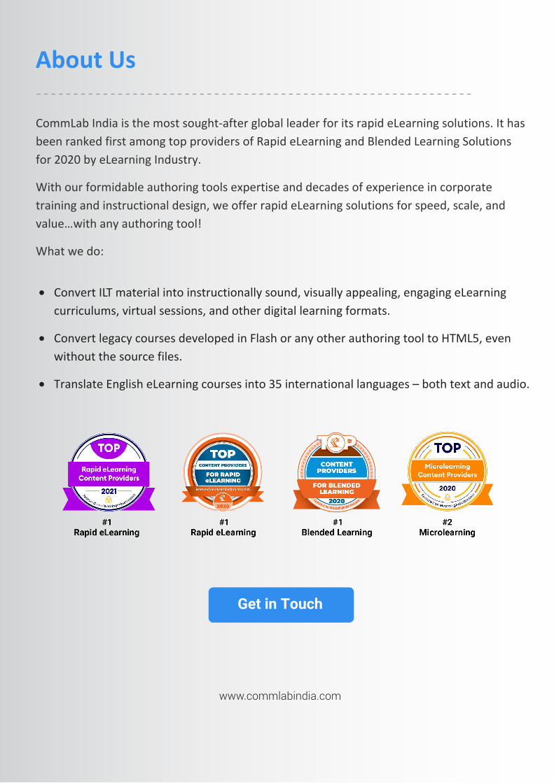
CommLab India is the most sought-after global leader for its rapid eLearning solutions. It has been ranked first among top providers of Rapid eLearning and Blended Learning Solutions for 2020 by eLearning Industry.
With our formidable authoring tools expertise and decades of experience in corporate training and instructional design, we offer rapid eLearning solutions for speed, scale, and value…with any authoring tool!
What we do:
About Us
Get in Touch
• Convert ILT material into instructionally sound, visually appealing, engaging eLearning curriculums, virtual sessions, and other digital learning formats.
• Convert legacy courses developed in Flash or any other authoring tool to HTML5, even without the source files.
• Translate English eLearning courses into 35 international languages – both text and audio.
www.commlabindia.com
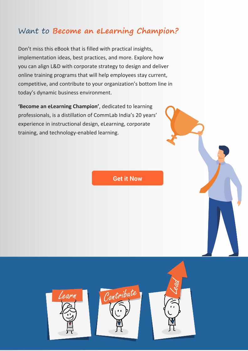
Want to Become an eLearning Champion?
Don’t miss this eBook that is filled with practical insights, implementation ideas, best practices, and more. Explore how you can align L&D with corporate strategy to design and deliver online training programs that will help employees stay current, competitive, and contribute to your organization’s bottom line in today’s dynamic business environment.
‘Become an eLearning Champion’, dedicated to learning professionals, is a distillation of CommLab India’s 20 years’ experience in instructional design, eLearning, corporate training, and technology-enabled learning.
Get it Now