Embed Size (px)
Citation preview

@mlemanchester
My Learning Essentials
The University of Manchester Library
Adding up
Introduction to statistics
CHEAT SHEET
objects/mle/statistics-www.escholar.manchester.ac.uk/learning
Introduction
You don’t need to be a mathematician to have a grip on the basic principles of statistics. We
all encounter stats on a daily basis throughout our personal, academic and professional lives,
and having an understanding of the basics will help you to use data in a more meaningful
way.
This resource will give you a basic introduction to statistical terminology, charts and data
types. It will also give you advice on how to organise your data to make it easier to analyse
and present.

The term “levels of measurement” refers to what type of data we are collecting or analysing.
You will be able to interpret and analyse data more effectively by understanding the measure
being used.
There are three levels of measurement.
Levels of measurement
Nominal Qualitative data with discrete categories that have no order. Nationality,
gender and location are examples of nominal measurements.
Ordinal
Qualitative data with discrete categories that have an order. Examples
include clothing sizes and 5-star rating systems. If you rated a film
using a five star system, a score of 5 stars is better than 3 stars, and
that is better than 1 star. But the difference between 1 and 3 may not
be the same as that between 3 and 5. The values simply express an
order.

Levels of measurement
Scale
Quantitative data in which numeric values lie on a scale. There are two
type of scale measurements:
• Interval - variables in which distance between two values is
meaningful but the ratio is not. For example, temperature is an
interval measurement: you wouldn't say that a day is 1.5 times
hotter than another, but would say 5 degrees hotter.
• Ratio - variables in which the difference and ratio between two
values is meaningful. Examples of ratio measurements include
distance and duration.

Legitimate measures
The value that occurs most often
in the set.
Averages
Mode
Median
Mean
Definition Used for
Mode is valid for all types of data,
although it may not be meaningful for
scale data in small data sets.
The value in the middle of the
set.
Median can be used for scale or
ordinal data.
Mean is the arithmetic average
and considers the whole set.
Mean can be used for scale data
only.
There are a number of descriptive statistics that are used to describe data. These
measures fall into two main categories: averages and spread.
Which measure is used will depend on the level of measurement of the data. Click below to
see which measures are appropriate to use with the different levels of measurement.

Legitimate measures
The gap between the highest and
lowest values.
Spread
Range
Standard deviation
Definition Used for
Range can be used for scale or
ordinal data.
A calculated number to describe
the scatter of data about the
mean.
Standard deviation can be used
for scale data only.

Charts and frequency tables are used to represent data in a format that is clear and easy to understand.
This section will give you an overview of the different types of charts and the types of data they are used to
represent. You will also have a chance to explore frequency tables and the data they can be used to show.
Charts and basic analysis

Bar chart
In this example chart we can see several bars, each representing a
group of monthly commute costs of our survey respondents. The
height of each bar represents the number of responses for each
group.
Key characteristics
The categories on a bar chart can appear in any order. One axis will detail the categories being measured; the second axis displays the measurement scale.
What is it?
This is bar chart. This type of chart can be displayed using either vertical or horizontal bars. Bar charts show specific categories against a set scale. This allows you to compare the different categories values against the scale/value.
Use for
Direct comparison of the differences between categories of ordinal or nominal variables. A bar chart can allow easier comparisons between categories than a pie chart.
Do not use for
This type of chart is not the most suitable for scale variables. A histogram would be better; a histogram has a scale along the bottom axis representing the intervals in order. If a histogram is not available, a bar chart (with the bars pushed together) can be an acceptable alternative, providing that all of the intervals have a value. Bar charts do not show empty bins but histograms do.

Pie chart
In this example chart, the segments of the circle represent the
people who hold a valid driving licence and the people who do not.
The size of each segment represents the proportion of people in
each category.
Key characteristics
Pie charts show data categories relative to each other. Several variations of pie chart exist including doughnut charts and exploded pie charts.
What is it?
This is a pie chart. In this type of chart each category of data is represented as a segment of the circle. The complete circle represents 100% of the data; each segment represents a relative proportion of data.
Use for
Comparing the differences between categories of nominal or ordinal variables. A pie chart can also be more visually attractive and use less space than a bar chart.
Do not use for
This type of chart is not suitable for scale variables or those with a large number of categories.

Histogram
This example chart shows the number of responses for each
duration of commute times, from 0.5 to 2.5 hours.
Key characteristics
They are used to represent scale variables . The height of the bars is a representation of the distribution of data and the scale along the bottom is continuous.
What is it?
This is a histogram; although it looks similar to bar chart they present different data. Histograms allow you to see the distribution of data on a scale measurement.
Use for
Use to see the spread or shape of a scale variable.
Do not use for
This type of chart is not suitable for nominal or ordinal variables. If there are a lot of narrow bars, you may be able to group the responses by “binning” them.
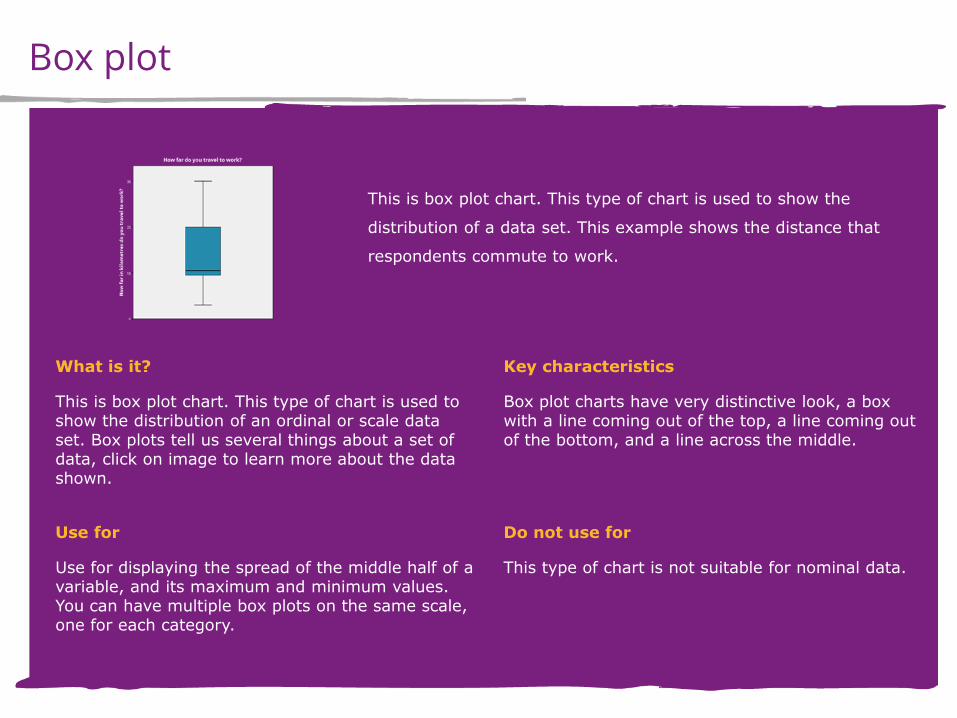
Box plot
This is box plot chart. This type of chart is used to show the
distribution of a data set. This example shows the distance that
respondents commute to work.
Key characteristics
Box plot charts have very distinctive look, a box with a line coming out of the top, a line coming out of the bottom, and a line across the middle.
What is it?
This is box plot chart. This type of chart is used to show the distribution of an ordinal or scale data set. Box plots tell us several things about a set of data, click on image to learn more about the data shown.
Use for
Use for displaying the spread of the middle half of a variable, and its maximum and minimum values. You can have multiple box plots on the same scale, one for each category.
Do not use for
This type of chart is not suitable for nominal data.

Box plot
Highest value This line shows the highest value in the data set not including any outliners, in this case the longest commute.
Upper quartile The value of the 75th percentile, or the median of the upper half of the data .
Interquartile range The area of the box, between the upper and lower quartiles, where the middle half of the data lies.
Median The value of the 50th percentile, or median, of the data.
Lower quartile The value of the 25th percentile, or the median of the lower half of the data.
Lowest value The line shows the lowest value in the data set not including any outliners, in this case the shortest commute.

To make sure your reader interprets your graph correctly, you must label it well!
You should include:
• a sensible title that summaries the variables being described
• a label on every axis with the name of the variable and the units (if appropriate)
• a key (or legend), if the chart has groups of lines or boxes that have different meanings
Remember: a chart without labels is just a picture!
Labelling your charts

Creating a chart will give a visual summary of your data, but you might wish to use
descriptive statistics, or numerical summaries, for further analysis. Examples of descriptive
statistics include the median, mean, mode, range and standard deviation, which we covered
earlier. It can also take the form of a frequency table.
A frequency table presents a breakdown of the data between different categories. It is
basically a summary of the numbers behind bar chart or pie chart; it shows the data in
multiple columns as frequency counts, percentages or both. A simple one-way frequency
table just covers one variable.
Frequency tables

You can use an analysis tool to calculate descriptive statistics, such as the median. We
learned earlier when it is appropriate to do so; it depends on the level of measurement of
your data.
You can also use an analysis tool to create a frequency table. Again, it is not always
appropriate to do so.
Using frequency tables
WHEN CAN I USE A FREQUENCY TABLE?
• If your data is nominal, you can only use the mode as a descriptive statistic, so create a frequency table to look at the distribution between categories.
• If your data is ordinal, you can use the mode, median
and range as descriptive statistics, but you can also create a frequency table to look at the distribution between categories.

Using frequency tables
WHEN SHOULDN’T I USE A FREQUENCY TABLE?
• If your data is scale you have the option of mean, mode, median, range and standard deviation for numerical summary descriptive statistics, which can be really useful for statistical tests. If you were to create a frequency table, the number of rows might be huge, e.g. one for every year if you are collecting ages, so it is usually not useful.

When you have a data set it is important that you use a logical structure so the data can be easily
interpreted and accurately represented.
This section will explore best practices for using and organising your data.
Understanding your data

Data that is easy to understand is easier to analyse. There are several things you must
consider in order to produce consistent and reliable data.
Structure
Spelling
Check your spellings and typing. It will help you to avoid incorrectly
categorised data or creating duplicate categories. Should “small” and
“smll” really be two different categories?
Duplication
Check for duplication. Have the same data values been added in
different ways by the respondents? For example, if your data is
from a survey, have you made sure that “car” and “automobile” are
not two different categories?

Structure
Notes and labels
Use clear notes and labels. Make sure the logic behind your notes
is clear to an outsider; people need to be able to understand your
data! Will you remember what “exp1” and “exp2” meant when you
look at your work in a few months? What about other people who
you work with?
Blanks
Carefully explain the blanks. You should distinguish between
readings that are missing because a respondent refused to answer
and readings that are missing because that question did not apply
to that respondent. For example, use “-1” and “-2” respectively.

When data is recorded formally in a statistical analysis tool, database or programming tool,
you must choose the data type or format for each variable. This affects both how it is stored
and how it is displayed.
Typically, you may choose one of the following data types for each variable.
Data types
123 - Numeric
This is a common number format that may or may not include
decimal places.
£123 - Currency
Monetary formats.

Data types
6.4E-5 - Scientific notation
This is for very large or very small numbers, where aEb means “a
multiplied by 10 to the power of b”.
01/01/2014 - Date
There are usually various date and time formats to choose from;
standards for this vary in different parts of the world.
String abacus
Text format, used for qualitative data that is not categorical and
cannot be represented any other way.

Statistics allow you to organise, analyse and summarise data. Statistics can make your data
more accessible; enabling more people to understand and engage with your data.
When using data and statistics remember to be organised and methodical, take time to
ensure you enter and label your data correctly. Data that isn’t labelled or isn’t labelled clearly
has little value.
Summary

Glossary
Levels of measurement
Type of data we are collecting or analysing. Nominal, ordinal and
scale are examples of levels of measurement.
Value One recording or single piece of data.
Variable
A list of values that all relate to the same question or item being
measured. For example, variables for a survey could be age, date
of birth or gender.
Data set
A structured collection of values, responses or readings which may
be organised by variables. If you conducted a survey and collated
the results, this would be a data set.

Glossary
Analytical software
A piece of software that can provide commands to modify,
summarise and analyse data sets. SPSS is an example of analytical
software you would use to analyse your data.
Binning
Configuring a histogram to display the bars in groups. Having too
few bins can display your data incorrectly, having too many can
make your graphs look overcrowded and cluttered.
Descriptive statistics
Numerical summaries of your data, such as frequency counts and
averages.
Mode The value that occurs most often in the set.

Glossary
Median The value in the middle of the set.
Mean The average considering the whole set.
Range The gap between the highest and lowest values.
Standard deviation
A calculated number to describe the shape of the data either side
of the mean.
Qualitative data
Data that describes or characterises but does not measure a thing.
For example, in a survey, if you entered your name this is
qualitative as it is describing you and has no numeric value.
Quantitative data
Data that measures or defines a thing and can be quantified and
verified. Your income and age are examples of quantitative data.

Keep in touch! [email protected]
@mlemanchester
Related resources
Better safe than sorry: proofreading your
work
SPSS statistics introduction workshop
Getting results: guides to searching databases