Embed Size (px)
Citation preview
Förnamn Efternamn
The relative importance of nonverbal package
attributes
A conjoint study of generic chocolate packages
Smirnova
Elena
Degree Thesis
International Business
2015
2
DEGREE THESIS
Arcada
Degree Programme: International Business
Identification number: 5148
Author: Elena Smirnova
Title:
Supervisor (Arcada): Peter Milden
Commissioned by: Visual Impact Project, Arcada UAS
This thesis is a part of ”Visual Impact” project held at Arcada UAS. The aim of
this study is to determinate the relative importance of nonverbal attributes, such as, shape,
color, font and image on the example of chocolate packages. The study is limited to con-
sumer packages. Literature review was conducted based on journal articles and internet
sources. In order to analyze the relative importance of nonverbal attributes a conjoint
analysis was applied. A questionnaire was created to obtain necessarily information for
the experiment. A sample of 87 participants was used in order to get the reliable results.
For the experiment generic chocolate packages were made. All participants were asked to
both score and rank the packages. Packages were created based on the four levels (shape,
color, font and image) and their sublevels. Sublevels included three shapes (rectangular,
bar and square); four colors (blue, red, brown and white); three fonts (Script, Serif and
San Serif); image (either exist or not). An orthogonal design limited possible outcomes to
16 packages. The obtained results were analyzed from different angels. First, overall data
was analyzed and discussed. Then the data was analyzed based on participant’s gender
and the regular amount of chocolate consumption. During this study it was found out that
an image on the package has the highest relative importance among four attributes. The
least important nonverbal attribute is a shape. Clearly, it could be concluded that packag-
es with an image are more preferable for consumers and attract more attention.
Keywords: Visual Impacts, conjoint analysis, nonverbal attributes,
package
Number of pages: 49
Language: English
Date of acceptance:
3
CONTENTS
1 Introduction .......................................................................................................... 7
1.1 Background of the Study ............................................................................................... 7
1.2 Main aim and Research questions ................................................................................ 8
1.3 Limitation ....................................................................................................................... 9
1.4 Problems in the Field ..................................................................................................... 9
1.5 Literature Review ......................................................................................................... 10
2 Theoretical Framework ...................................................................................... 11
2.1 The impact of the package at the point of purchase ................................................... 11
2.1.1 Brand name ......................................................................................................... 11
2.1.2 Slogan ................................................................................................................. 12
2.1.3 Package size ....................................................................................................... 12
2.1.4 Material ................................................................................................................ 12
2.2 Packages and attention ............................................................................................... 13
2.3 Packages and communication .................................................................................... 13
2.3.1 Packages and message-centered communication ............................................. 14
2.3.2 Package and behavior-centered communication ................................................ 14
2.4 Influence of non-verbal attributes on a consumer’s preferences ................................ 15
2.4.1 Shape .................................................................................................................. 15
2.4.2 Color .................................................................................................................... 16
2.4.3 Font...................................................................................................................... 18
2.4.4 Image ................................................................................................................... 19
2.5 Summary of the literature review ................................................................................. 20
3 Method ................................................................................................................ 21
3.1 Conjoint experiment..................................................................................................... 21
3.2 Experiment procedure ................................................................................................. 24
3.3 Data creation ............................................................................................................... 25
4 Results ............................................................................................................... 27
4.1 Score data ................................................................................................................... 27
4.1.1 Shape .................................................................................................................. 27
4.1.2 Color .................................................................................................................... 27
4.1.3 Font...................................................................................................................... 28
4.1.4 Image ................................................................................................................... 29
4.1.5 Summary of scoring utilities ................................................................................ 29
4.1.6 Gender differences .............................................................................................. 30
4.2 Rank data .................................................................................................................... 32

4
4.2.1 Shape .................................................................................................................. 32
4.2.2 Color .................................................................................................................... 33
4.2.3 Font...................................................................................................................... 34
4.2.4 Image ................................................................................................................... 34
4.2.5 Summary of ranking utilities ................................................................................ 35
4.2.6 Gender differences .............................................................................................. 36
4.3 Chocolate consumption data ....................................................................................... 38
5 Discussion ......................................................................................................... 41
5.1 The most important nonverbal attribute....................................................................... 41
5.2 The importance of shape ............................................................................................. 42
5.3 The importance of color ............................................................................................... 43
5.4 The importance of font ................................................................................................ 43
5.5 The importance of image ............................................................................................. 44
5.6 Gender preferences..................................................................................................... 44
5.7 Nonverbal preferences based on the amount of chocolate consumption ................... 45
6 Conclusion ......................................................................................................... 46
References ................................................................................................................ 47
Appendices ............................................................................................................... 50
Arcada- Visual Impact ................................................................................................ 50
Use of chocolate: ..................................................................................................................... 50
5
Figures
Figure 1 Men’ preferences of color according to Hallock’s studies............................... 18
Figure 2 Women’ preferences of color according to Hallock’s studies ......................... 18
Figure 3 Shapes of created packages .............................................................................. 23
Figure 4 Color of created packages ................................................................................ 23
Figure 5 Font of created packages(scriptina pro avenir black (52 pt) and scriptina pro
avenir black (63pt,50pt)treated as one font in the analysis ............................................ 23
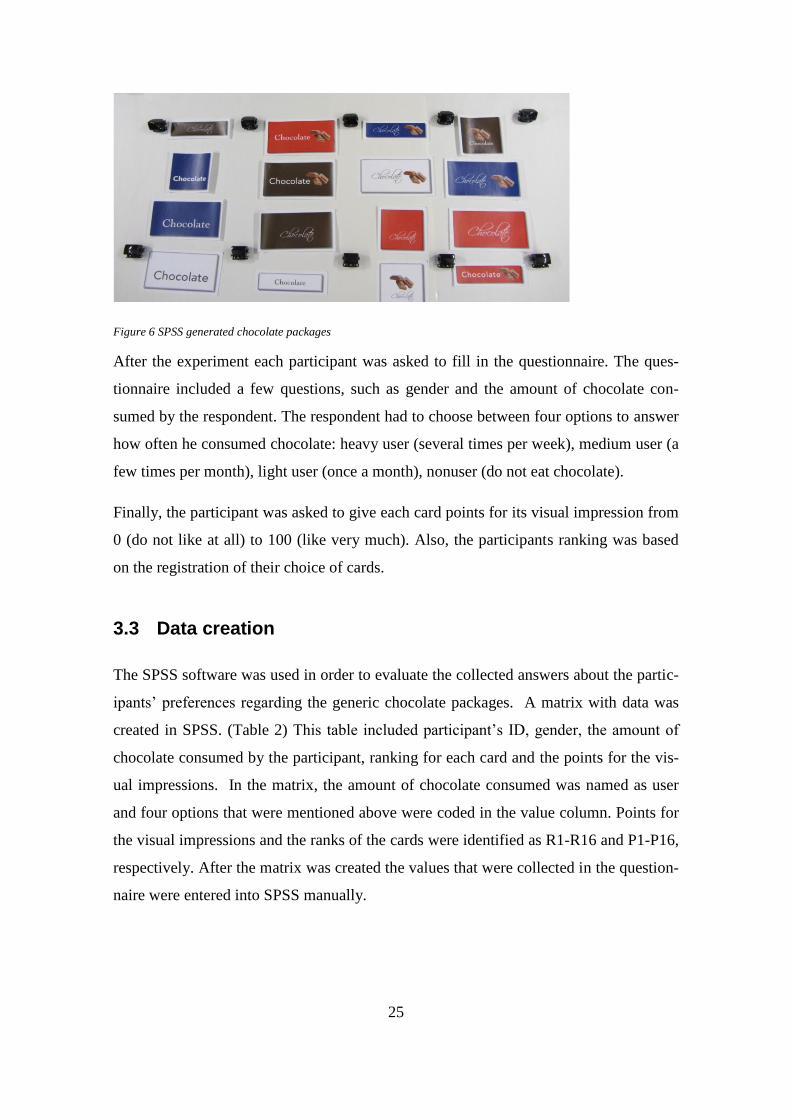
Figure 6 SPSS generated chocolate packages ................................................................ 25
Figure 7 Summary of shape utility total sample (score) ................................................. 27
Figure 8 Summary of color utility total sample (score).................................................. 28
Figure 9 Summary of font utility total sample (score) ................................................... 28
Figure 10 Summary of image utility total sample (score) .............................................. 29
Figure 11 Summary of factor utility total sample (score) .............................................. 30
Figure 12 Summary of shape utility for men (left) and women (right) (score) .............. 30
Figure 13 Summary of color utility for men (left) and women (right) (score) ............... 31
Figure 14 Summary of font utility for men (left) and women (right) (score) ................ 31
Figure 15Summary of image utility for men (left) and women (right) (score) .............. 31
Figure 16 Summary of factor utility for men (left) and women (right) (score).............. 32
Figure 17 Summary of shape utility total sample (rank) ................................................ 33
Figure 18 Summary of color utility total sample (rank) ................................................. 33
Figure 19 Summary of font utility total sample (rank) ................................................... 34
Figure 20 Summary of image utility total sample (rank) ............................................... 35
Figure 21 Summary of factor utility total sample (rank) ................................................ 35
Figure 22 Summary of shape utility for men (left) and women (right) (rank) ............... 36
Figure 23Summary of color utility for men (left) and women (right) (rank) ................. 36
Figure 24 Summary of font utility for men (left) and women (right) (rank) .................. 37
Figure 25 Summary of image utility for men and women (rank) ................................... 37
Figure 26 Summary of factor utility for men (left) and women (right) (rank) ............... 37
Figure 27 Summary of factor utility for heavy users rank (left) and score (right) ......... 38
Figure 28 Summary of factor utility for medium users rank (left) and score (right) ..... 39
Figure 29 Summary of factor utility for light users rank (left) and score (right) ........... 39
Figure 30 Summary of factor utility for nonusers rank (left) and score (right).............. 40

6
Tables
Table 1 Orthogonal design ............................................................................................. 24
Table 2 Data matrix ........................................................................................................ 26
Table 3 Syntax ................................................................................................................ 26

7
1 INTRODUCTION
1.1 Background of the Study
This thesis is a part of the “Visual Impact” project at Arcada. The purpose of the project
is to study the role of visual elements in the consumer’s choice process. The author is
currently working as a research assistant for the project. The topic of this thesis is a part
of a larger project where the consumer’s choice process has been studied with the help
of Eye Tracker glasses. The choice process has already been analyzed from a neuro-
economic point of view. (Von Boguslawski & Milden, 2013)
An experiment where a consumer had to choose between different low involvements
products without time constraints was made. The complete choice process, with product
scanning, the order of each choice and the time for each choice was recorded with Eye
Tracker glasses. In order to be able to determine which factors influenced the choices
generic products with specific predetermined features were constructed using the SPSS
conjoint procedure.
The purpose of this thesis is to especially focus on the package attributes. Nowadays
packages are considered a very important marketing tool. Almost 90 per cent of all new
products fail during the introduction stage because of a wrong or poor package design.
(Kuvykaite, 2009) Packages not only protect the product from physical damage, but also
attract the attention of potential consumers and provide direct communication with the
customers. Both verbal and nonverbal attributes of the package are equally important
for a successful package design.
Earlier experiments, (Kupiainen and Kauppinen-Raisanen, 2012), have proved that
package attributes have an effect on the consumer’s perception of the product quality. In
the experiment by Kupiainen and Kauppinen- Räisänen three strawberry packages were
placed in three different stores (one package of a time). The packages had the same di-
mensions and price, but the material and picture on the packages were different as being
the experimental variables. Two of the packages were carbon cardboard boxes with pic-
tures and the last one was made of transparent plastic without a picture. The result of the
8
experiment showed that consumers assumed that strawberries in the transparent plastic
package had higher quality than strawberries in other non-transparent packages.
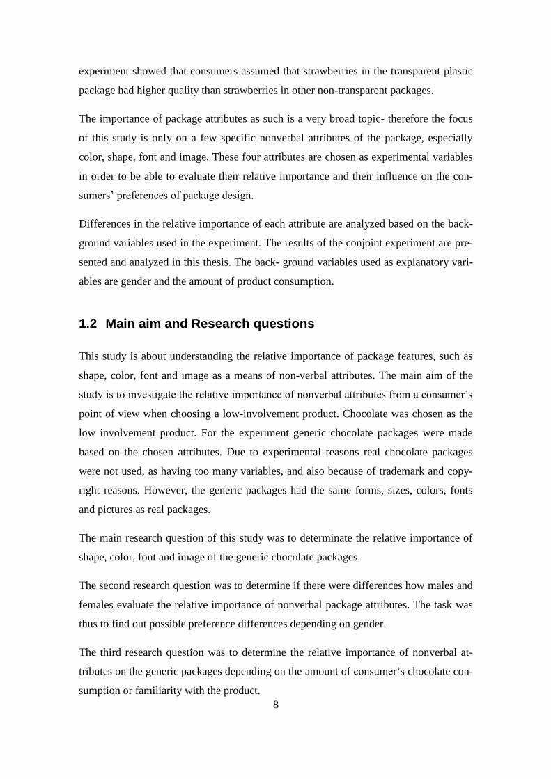
The importance of package attributes as such is a very broad topic- therefore the focus
of this study is only on a few specific nonverbal attributes of the package, especially
color, shape, font and image. These four attributes are chosen as experimental variables
in order to be able to evaluate their relative importance and their influence on the con-
sumers’ preferences of package design.
Differences in the relative importance of each attribute are analyzed based on the back-
ground variables used in the experiment. The results of the conjoint experiment are pre-
sented and analyzed in this thesis. The back- ground variables used as explanatory vari-
ables are gender and the amount of product consumption.
1.2 Main aim and Research questions
This study is about understanding the relative importance of package features, such as
shape, color, font and image as a means of non-verbal attributes. The main aim of the
study is to investigate the relative importance of nonverbal attributes from a consumer’s
point of view when choosing a low-involvement product. Chocolate was chosen as the
low involvement product. For the experiment generic chocolate packages were made
based on the chosen attributes. Due to experimental reasons real chocolate packages
were not used, as having too many variables, and also because of trademark and copy-
right reasons. However, the generic packages had the same forms, sizes, colors, fonts
and pictures as real packages.
The main research question of this study was to determinate the relative importance of
shape, color, font and image of the generic chocolate packages.
The second research question was to determine if there were differences how males and
females evaluate the relative importance of nonverbal package attributes. The task was
thus to find out possible preference differences depending on gender.
The third research question was to determine the relative importance of nonverbal at-
tributes on the generic packages depending on the amount of consumer’s chocolate con-
sumption or familiarity with the product.
9
The study focuses only on nonverbal attributes of different chocolate packages. Among
chocolates brands are important for the perception of different chocolates. Due to
trademark reasons it was not possible to use factual trade- marks such as Fazer, Cloetta,
Mars and Snickers. In order to specify the product a generic brand name was used on all
experimental packages: Chocolate. The name identified the product category but did not
specify any specific brand on sales. However, colors from actual brands were used.
1.3 Limitation
The study focuses on nonverbal attributes of different chocolate packages that have
been created in order to give the answer on the research questions. Chocolate as a prod-
uct was chosen because it is well known and can be analyzed based on different criteria,
such as gender and participants’ product experience. The study does not go beyond con-
sumer packages. The attributes of transportation and store packages are not considered.
1.4 Problems in the Field
Even though package is a very important tool for the differentiation of a product from
its competing products, companies still do not pay enough attention to the package de-
sign. To make a package different and stand out from other packages several design as-
pects should be taken into consideration. It is important for companies to understand the
nature of the core product. The appearance of the package depends on the core product
inside the package. Some of the colors of milk production packages cannot be used in
kitchen equipment packages. But the most important task is to create a package where
all attributes match each other. The package design can easily fail in the introduction
stage if the background color of the package does not suit the product picture. Therefore
it is crucial for companies to understand the importance of each package attribute. The
thesis measures the importance of the above-mentioned four nonverbal attributes and
their influence on consumers’ preferences of the package design.
10
1.5 Literature Review
The experimental method for this study was chosen based on a doctoral thesis by Han-
nele Kauppinen (2004) “Colors as non-verbal signs on packages”. Hannele Kauppinen
found out that non-verbal signs on the package had a big influence on the consumers’
behavior. The main focus of her study was the impact of package colors on consumers’
low-involvement purchase decisions. Also, Hannele Kauppinen used conjoint analysis
to evaluate the relative importance of different colors. This information was used in the
author’s thesis in order to see the impact of nonverbal attributes on consumers ‘prefer-
ences.
The choice of nonverbal attributes for the experiment was based on the several research
papers by authors, such as Underwood and Klein (2002), Gordon (1994), Schoorman
and Robben (1997). The information about the importance of the picture on the package
was taken from a study by Underwood and Klein (2002) who claimed that the image is
the most important attribute on the package, particularly when the consumer is not fa-
miliar with the product. Schoorman and Robben (1997) found that the shape of the
package was one of the most important package attributes, which helped to attract con-
sumer’s attention and had an impact on the consumer’s purchase decisions. Gordon
study (1994) found that package color has a strong effect on the consumer and choice of
a package depends on the consumer’s color preferences.

11
2 THEORETICAL FRAMEWORK
2.1 The impact of the package at the point of purchase
Several different studies have been done about the impact of the package on the pur-
chasing decision and about the functions of packages. It has been recognized that the
right package can increase product sales even more than an advertisement campaign of
that product. The main reason why packages can provide better communication with
consumers and attract more attention is because the core product is exactly inside the
package: whereas advertisement campaign can be placed quite far from the product.
Consumer has to memorize the campaign in order to buy exactly that advertised prod-
uct. (Ehrenberg et al. 1997)
A package consists of several attributes that can influence on the consumer’s choice. It
includes brand name, slogan, size, material, shape, color, font and image. Brand name,
slogan, package size and material are going to be discussed briefly in the following
chapter. A deeper discussion about the four attributes of primary interest (shape, color,
font and image) is presented in the section 2.4.
2.1.1 Brand name
Color and shape of the package are considered as the main components in the creation
of the brand image for a product. According to Underwood (1999) brand has a strong
influence on the consumers’ emotions and, as a result, it effects consumers’ purchasing
decisions. The brand can be considered as a communication channel between consumer
and product. Therefore companies are interested in creating a strong brand image that
brings positive emotions to customers. Several marketing studies suggest that package
design can be a better tool for brand promotion than a traditional advertisement cam-
paign. Consequently companies started to pay more attention to package design in order
to reduce the expenses on media advertisement campaigns.
According to Connolly and Davison (1996) a majority of brands failed to have world-
wide recognition among consumers because of a wrong package design. Brands that

12
have a wrong combination of colors and letters do not attract enough consumers and
finds it hard to get their products recognized worldwide. (Gordon, 1994)
2.1.2 Slogan
“A slogan is a short, unforgettable gasp phrase, which is used as punch line in adver-
tisement to summarize the whole product quality and usage in one or a few words”.
(ukessays.com). It can attract customers’ attention even better than a brand name. It
should be short, easy to memorize and have a strong association with the product. Sev-
eral studies showed that the slogan on the packages can attract more consumers when
words are placed on the right place on the package. (ukessay.com) Also, it has been
found that by changing colors of the slogan the consumer’s attention can be increased or
decreased depending on the matching color of the package and slogan. (Kauppinen,
2004)
2.1.3 Package size
Past studies have shown that the package size has an effect on the consumers’ buying
decision. (Kauppinen, 2004) Consumers’ tend to buy larger sized packages when the
price per unit gets smaller. Also, package size affects the consumers’ volume of con-
sumption. By buying the big size package at a lower price, consumers automatically in-
crease the volume of the consumption of the product. Companies always have to think
about what kind of strategy they want to implement: to increase the size of the produc-
tion by making larger packages or to make smaller packages in order to reduce waste.
Package size attracts the consumer attention in a way where the consumers’ tend to
make a fast judgment about the product based on the size. (Silayoi, 2004)
2.1.4 Material
The material of the package helps to protect the core product from damage, which is the
main function of the package material, especially regarding transport and store packag-
es. The most common types of packaging materials are paper, glass, aluminum, steel,
plastic and mixed material. The main function of the package material to the consumer
is to show consumers the quality of the core product. Though this function is seldom
13
taken into consideration. The safety of the product is also important for the consumer
package. (Kuvykaite, 2009)
2.2 Packages and attention
In order to attract a consumer’s attention the product should be placed on the right shelf
in the store, preferably on eye-level and to the right of well-known brands. Eye Tracker
research has shown that 1/3 of a particular product group on the shelf is not noticed by
consumers. New products have approximately 10 to 15 seconds to attract a consumer’s
attention. Otherwise the consumer will choose a product, which is already well known.
A majority of customers choose a product based on its appearance. Nonverbal attributes
on the package can help the consumer to find a right product on the shelf. It has been
shown that consumer can find the product faster when the product has colorful features,
which can be easily memorized. (Young, 2008)
When a consumer is searching for a certain product, special features on the product’s
package help to attract his attention. This kind of attention is called voluntary attention.
It means, that a consumer is searching for a product based on its distinguished features
on the shelf, such special features can include a certain color or a picture that are used as
the main attributes of the brand. (Kahneman, 1973)
When all brands of a product group are equally relevant to a consumer, then the special
feature can attract his attention. This kind of attention is called involuntary attention.
Bright colors or unexpected pictures on the package can distinguish the product among
others on the shelf. (Kahneman, 1973)
2.3 Packages and communication
Through packages a consumer can get all the information he needs about the core prod-
uct. The information can be written directly on the package such as recommendation
how to use the product; or it could be provided indirectly, through package material and
colors.
Packages are the link between customers, retailers and manufactures. A retailer can
identify what package design consumers prefer and give that information to a manufac-
14
turing company in order to satisfy the consumer and to increase sales. (Kauppinen,
2004)
2.3.1 Packages and message-centered communication
Message-centered communication is responsible for providing persuading information
about the product. This information includes explanations and recommendations how
and where the product can be used. This information is usually placed on the backside
of the package. (Kauppinen, 2004)
Some studies consider a picture on the package as a message-centered communication.
It was found that the picture in itself does not provide the information about the product.
However, the majority of customers thought that a product with a picture on the pack-
age taste better than a similar product without any picture. It means that a picture on the
package has an influence on the consumers’ perception of the product. (Underwood,
2002)
Color provides information about taste and quality of the product. Certain colors are re-
lated to brands. Therefore consumers can choose a product based on the color of similar
brands, assuming that the core product have the same quality and taste. (Gordon, 1994)
According to Rigaux-Bricmont (1981) the consumer can receive the information that he
needs to know about the product from the brand name. A brand name is considered as a
message-centered communication because consumers’ can evaluate the quality of the
product without reading the product descriptions.
The package material can give the consumer enough information to evaluate the core
product. Based only on the package material consumers’ can assume the quality of the
product and give an opinion about its brand. (McDaniel, 1977)
2.3.2 Package and behavior-centered communication
Behavior-centered communication focuses on consumers’ responses to the product. In
other words, it provides the link between consumers’ feedback and the product design.
Companies moderate their packages based on customers’ preferences. It has been no-

15
ticed that the time issue is important in the consumers’ decision-making process. Under
time pressure consumers tend to read less the information on the package and make the
decision based on nonverbal attributes. When a consumer does not have enough time to
make the purchase decision, a picture on the package can have the main influence on the
decision. Also, pictures affect the buying decision when all brands are equally unfamil-
iar for the consumer. (Kauppinen, 2004)
2.4 Influence of non-verbal attributes on a consumer’s prefer-
ences
Non-verbal attributes are widely used in marketing communication. 90 percent of the
information is transmitted to the brain visually. (Fromkin and Rodman, 1993) In order
to have an effective communication with consumers, non-verbal attributes should be
easy to understand and should have a general meaning. An effective communication
means that the consumer understands and remembers the message by the non-verbal
attribute and can associate this attribute with a core product in the future. (Kauppinen,
2004)
2.4.1 Shape
A shape of the package has an influence on the consumer’s perception of the core prod-
uct. It influences a consumer’s emotions, his vision of product and perceptual judgment
of the product. It has a strong effect on the consumer’s buying decision and even small
changes in package shape can lead to big changes in product sales. According to a Nes-
tle study consumers make an assumption about chocolate taste based on the package
shape. It was found that different chocolate flavors are associated with certain shapes of
the chocolate and, as a result, with its package. (Baral, 2013) According to Schoorman
and Robben (1997) the shape of the package influences the consumer’s perception of
product volume. Consumers tend to miscalculate the real product volume when the
package has an unusual shape. At the same time, a product with an unusual shape at-
tracts more attention than a product with a usual shape. An unusual shape of the pack-
age can be considered as a marketing tool to attract involuntary attention. However, at
16
the same time a product with an unusual shape should not give misleading information
about the product’s volume.
The shape of the package affects how people calculate calories based on their perceptual
judgment. For instance, a product with a long and thin shape is considered having fewer
calories and a product with a square shape having more calories. This leads to an over-
estimation of calories for a square shaped product and an underestimation for a bar
shaped product. (Koo, 2012)
According to some studies the bar shape of the product indicated a lower purchase
quantity. It occurred because the bar shape seemed to have less volume and less quanti-
ty of the product inside the package. Also, a perfect rectangular with the golden ratio
1.168 (Φ) is the most popular among angular shapes. It has been proven that people
from different cultures and different geographic areas prefer the perfect rectangular
shape to any other shape. Consumers see the product of rectangular shape as a right
product that they used to see everywhere. (Raghavan, 2010)
2.4.2 Color
The influence of different colors on consumer’s behavior can be analyzed from a psy-
chological point of view. In other words, colors have an effect on the eye and brain
perception and, as a result, on the consumers’ preferences. The main function of color is
to attract the consumers’ attention, especially their involuntary attention. It was found
that a majority of customers first notice the color and then pay attention to the package
and the product. Also, colors can physically attract customers. A potential consumer can
notice a colorful product from the shop window and because of that decide to enter the
store. (Gordon, 1994)
Warm colors, such as yellow and red, have more effect on the brain compared to cold
colors, such as blue and green. Warm colors are usually used in advertisement about a
product’s discount offers in order to attract involuntary attention. This occurs not only
because these kinds of colors are more noticeable but also, because they stimulate a per-
son’s psychological reaction; by increasing the person’s blood pressure and make him to
breathe more frequent. (Grossman, 1999) According to Middlestadt (1990) cold colors
are preferred as background colors. A product with a blue background is considered el-
17
egant and unique from the customer’s prospective and is more attractive for purchase.
Also, it was found that the retail store with a blue design inside has a positive influence
on the customer’s attitude and simultaneously stimulates the customer to buy products
from the store, if compared with to a store with orange interior.
From the psychological point of view, brown color is associated with stability and secu-
rity. From the marketing prospective brown color is used when it is important to show
the quality of the product. It was found that a package with a brown background makes
a person think that the product inside is healthy and natural. Also, brown color makes a
product looks more elegant from a consumer’s perspective. White color is associated
with something fresh and peaceful. It was found that when a consumer does not know
anything about a product, he often prefers a white colored product because it makes the
choice more neutral. (color-meaning.com)
Colors have common associations across different countries and can have specific asso-
ciations inside the country. Some studies showed that a person’s preferences of colors
depend on his cultural background. People from the same culture tend to have common
associations about colors and prefer similar colors. (Gordon, 1994) Other studies con-
cluded that a person’s preferences of a color depend on individual color perception.
Eysneck (1941) suggested a general order of color preferences, which starts from the
blue as the most favorite color, then red, green, purple, orange and yellow. According
to Taft (1997) the study of a general order of color preferences does not have enough
empirical evidence. However, he also agreed that blue color is the most preferable
among colors. Package color also depends on the core product. Some colors that are
very popular in the food industry would not work for the kitchen equipment industry.
Some studies have been done in order to analyze how color preferences depend on gen-
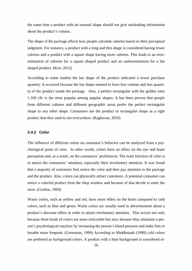
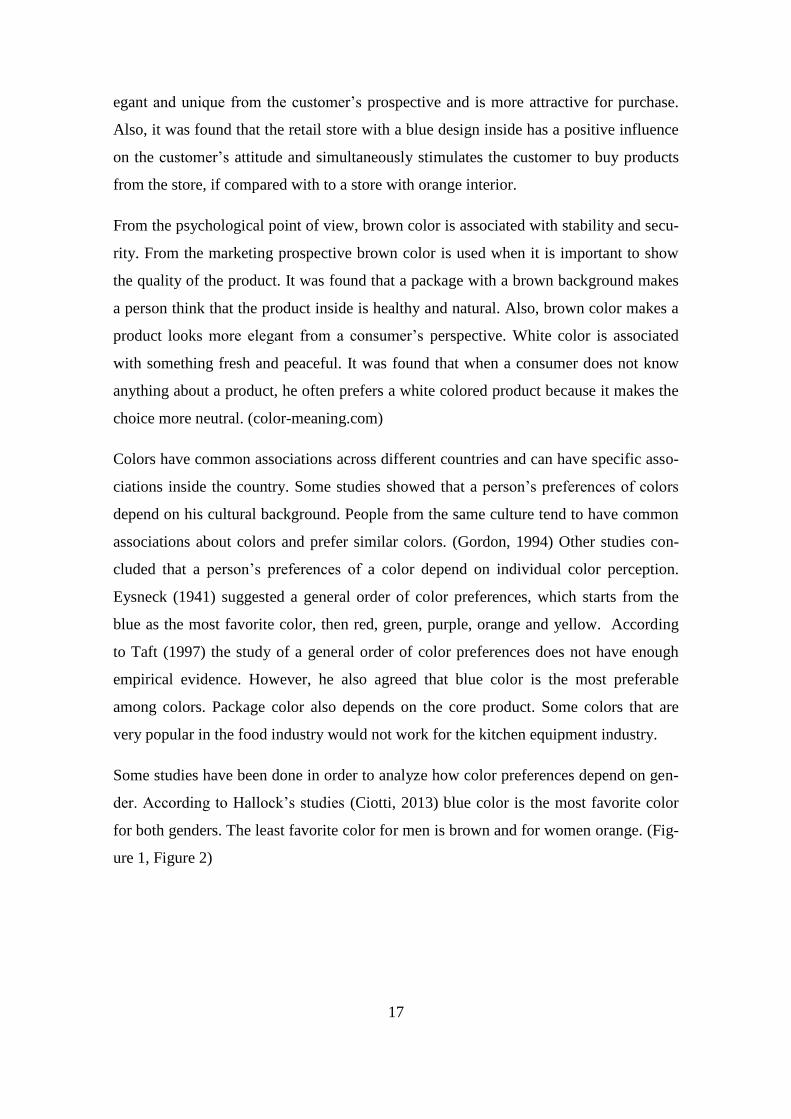
der. According to Hallock’s studies (Ciotti, 2013) blue color is the most favorite color
for both genders. The least favorite color for men is brown and for women orange. (Fig-
ure 1, Figure 2)
18
Figure 1 Men’ preferences of color according to Hallock’s studies
Figure 2 Women’ preferences of color according to Hallock’s studies
2.4.3 Font
A font or letter type has a strong influence on the consumer’s perception of a package.
The main function of the font is to make the text easier to read. Another function is to
attract consumers’ attention, which is more important when creating the package design.
The combination of these two functions makes the choice of font type one of the most
important nonverbal attributes of the package.
Two popular styles, which are used for print and electronic advertisements, are Serif
(Times New Roman) and San Serif (Calibri). The Serif style has edges that project from
the main letter block that makes this style easier to read compared to the San Serif,
which does not have those edges. Serif increases the readability and the reading speed
across long lines. It is easier for the eyes to focus on a long text when the Serif is used.
19
At the same time, the Serif is considered as a decorative style, which is associated with
a sophisticated looking text. San Serif style is usually used in electronic advertisements
and is associated with legible looking text. (Human-Computer Interaction, 2013)
Aesthetics of the text is important while creating an advertisement or a slogan on the
package. Several studies have been done in order to investigate what font style is better
to use. According to those studies the style depends on the situation. For example, it is
easier for children to read San Serif text rather than Serif, mainly because San Serif
style makes letters look simple. (Human-Computer Interaction, 2013)
According to some studies angular shapes of fonts could be associated with aggression
and contradiction. While round shapes of fonts are gentle and associated with harmony.
Script style makes the logo on the package look more elegant. However, this style is not
recommended to use for the description of the core product. Also, it is important to
know how to use the Script style. For example, it is not recommended to use two Script
styles in the same text or use if to write long sentences. Otherwise, the text loses its
readability. (Designmodo.com)
2.4.4 Image
An image is a good nonverbal attribute to attract a consumer’s attention. A majority of
the consumers admit that they pay most attention to the picture on the package. An im-
age on the package can give all necessary information about the core product. It is a
good way for visualization of a core product without involving verbal communication.
It helps to understand the product without reading a description on the package and pro-
vide the appearance of the product inside the package. (Underwood, 2002)
Nearly two-thirds of customers admit that the image on the package is one of the most
important factors when they buy a product. Due to a wide choice of products it is crucial
that customers can easily remember the package. Images on a package are used as a
strategic method of product differentiation and as an eye-catching tool. Without know-
ing the core product consumers can say if they are interested in product or not based on
the image. According to Rettie and Brewer (2000) images on the package are better re-
membered when they are on the left side, while verbal signs should be on the right side.
Images make the consumers believe that the product inside the package has the same
20
appearance as the one on the package. It is very important that the image do not give
misleading information about the core product.
According to Underwood and Klein (2002) the image on the package does not influence
the consumer’s brand evaluation. However, it affects the consumer’s expectations about
the taste of a product. The study found that the package with a picture is assumed to
have a better tasting product than a package without a picture.
2.5 Summary of the literature review
According to the different studies cited above package design is an important marketing
tool for attracting consumers’ attention. One of the aims of a consumer package is to
make the consumer interested in the core product inside the package. Consumers’
should be willing to try a new product and should not have an uncertain feeling about
the product when choosing it. Thus, another aim of a package is to eliminate the factor
of uncertainty and to make a consumer trust the product. In order to try a new product,
consumers’ should believe that a product inside the package responds to his wishes.
Nonverbal attributes of the package help to achieve those aims. The most common at-
tributes of the package that consumer is paying attention to are shape, color, font and
image. These four attributes will determinate if consumer will be interested in a core
product or not. The right combination of those attributes will determinate if the package
is going to succeed in a market. According to the literature review all four attributes are
equally important for a package design. Therefore the author of this thesis is interested
to empirically determinate which of the features is relatively more important than the
other features and to analyze if there are differences according to background variables.
According to the literature review it can be expected that an image on a package will
have the highest relative importance among nonverbal attributes. Blue color will have
the highest utility among colors. The most elegant Script font will have highest utility
among fonts. Participants will give the highest utility to rectangular shaped packages.
There were not enough data to form specific statistical hypothesis concerning the influ-
ence of gender and chocolate on expected utilities.
21
3 METHOD
3.1 Conjoint experiment
Conjoint analysis is widely used in different studies in order to identify individual opin-
ion about a product or an event. It is a statistical technique, which helps to evaluate the
data received by a questionnaire or by observation in an experiment. The main function
of the conjoin analysis is to give the whole result based on the individual and group sta-
tistic. In other words, it analyzes the utilities of giving attributes and their individual
levels for each individual respondent separately. In order to precede the conjoint method
product features and their levels should be determined. Product features and levels vary
among different products. When product features and levels are determined, an orthog-
onal design is made in order to make complete products. Orthogonal design narrows
down the total number of possible products according to an experimental design. Then,
the participants are asked to fill in the questionnaire. The participants should grade the
products or rank them. By using the a form of dummy coding and regression analysis
SPSS calculates for each person the weight that each product feature shall be given in
order to replicate the ranking or grading. The overall statistics is calculated based on the
utilities of different product features. (Rao, 2014)
“Conjoint analysis is decomposition method. The method does not ask the respondent to
evaluate each product feature individually, just to rank different complete products and
then infers the importance of each product feature based on the ranking. In this way the
method resembles a real choice situation where the customer has to choose between dif-
ferent products”. (Rao, 2014)
The conjoint analysis was used in this study in order to estimate the utilities of shape,
color, font and image of chocolate packages for the respondents. The first step in de-
signing the conjoint study was to create the design of the stimuli by specifying the at-
tributes and their levels. The number of attributes and their levels influence on the num-
ber of stimuli. In other words, by decreasing the number of attributes and levels, the
number of stimuli decreases.

22
In this study four attributes were chosen: shape, color, font and image. Each of the at-
tributes had a specific amount of levels: three, four, four and two, respectively. The di-
mensions of attributes were taken from various chocolate packages that exist in real life.
It was decided not to use a brand name as an attribute, because it has a very strong in-
fluence on the consumer’s preferences. Therefore the created chocolate packages had
the generic brand name “Chocolate”, which should not influence on the participants
preferences.
Three different shapes of chocolate packages were considered as levels: rectangular
form 90x170, square form with the dimension 100x100, and bar form 40x150. (Figure
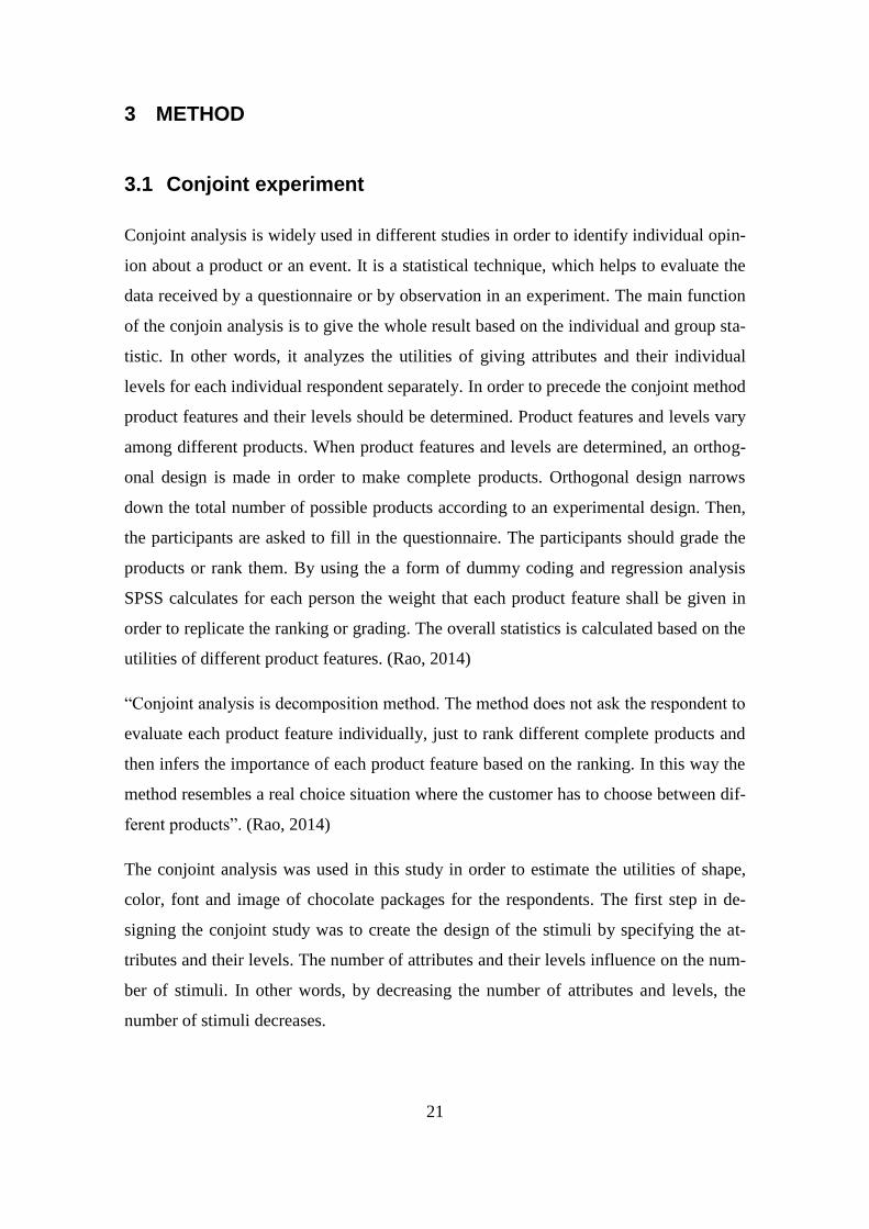
3) Color attribute included four levels: blue, red, brown and white. Figure 4) Font of
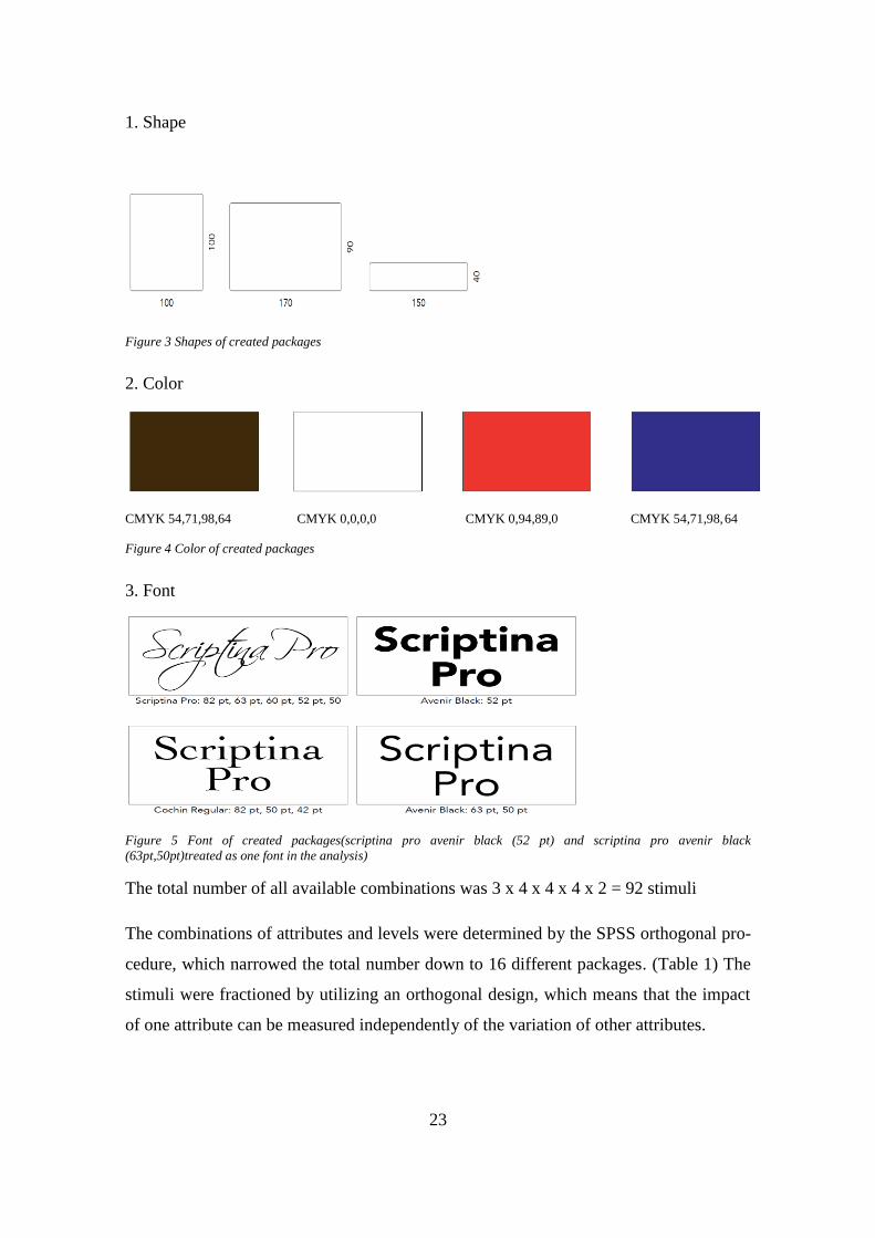
logo text included four levels: Script, Serif and San serif. (Figure 5) The last attribute
was image, which had two levels, either the image existed on the package or not.
23
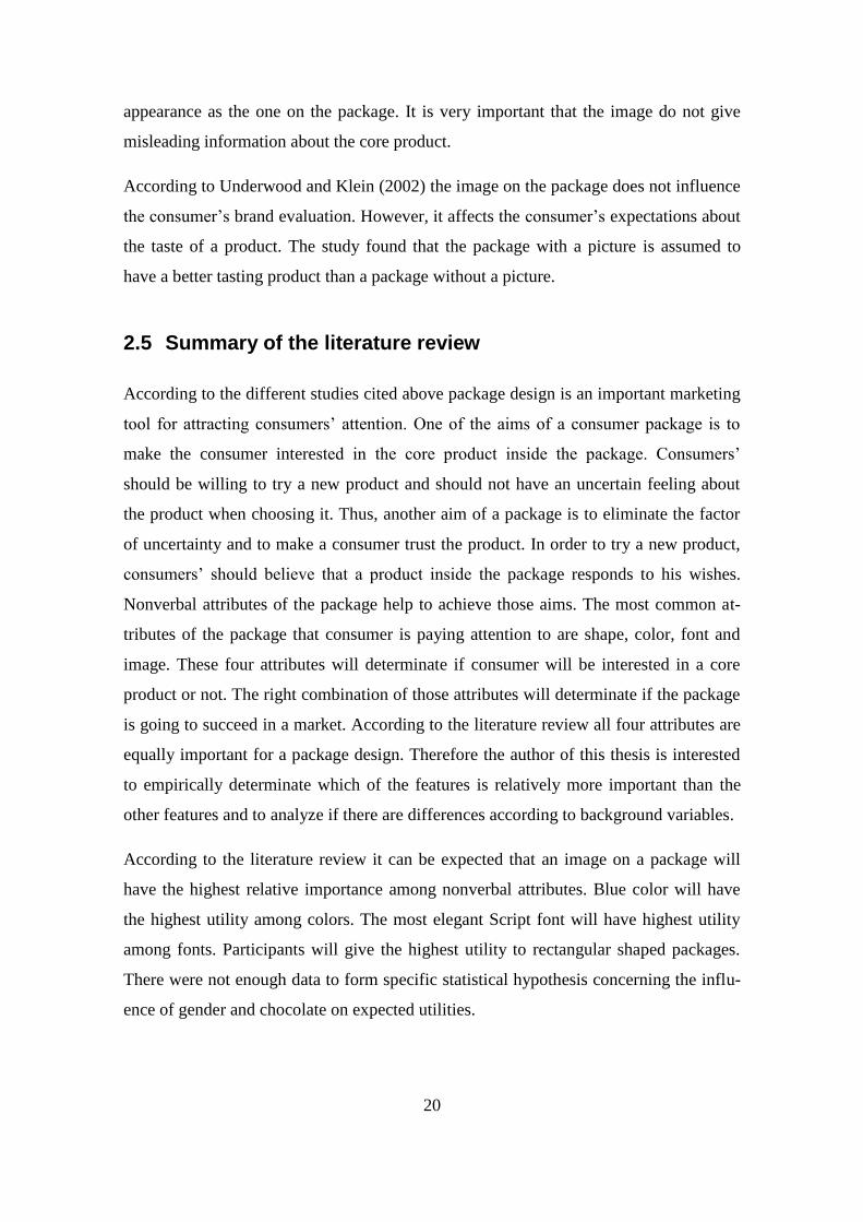
1. Shape
Figure 3 Shapes of created packages
2. Color
CMYK 54,71,98,64 CMYK 0,0,0,0 CMYK 0,94,89,0 CMYK 54,71,98,64
Figure 4 Color of created packages
3. Font
Figure 5 Font of created packages(scriptina pro avenir black (52 pt) and scriptina pro avenir black
(63pt,50pt)treated as one font in the analysis)
The total number of all available combinations was 3 x 4 x 4 x 4 x 2 = 92 stimuli
The combinations of attributes and levels were determined by the SPSS orthogonal pro-
cedure, which narrowed the total number down to 16 different packages. (Table 1) The
stimuli were fractioned by utilizing an orthogonal design, which means that the impact
of one attribute can be measured independently of the variation of other attributes.
24
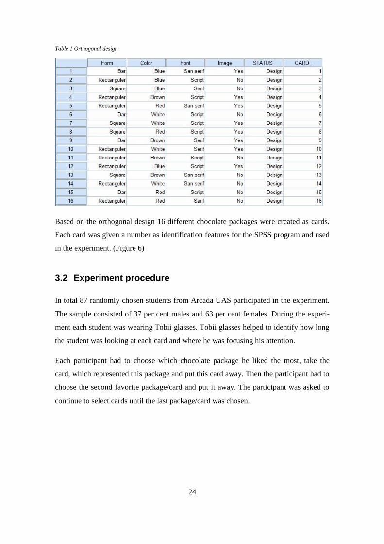
Table 1 Orthogonal design
Based on the orthogonal design 16 different chocolate packages were created as cards.
Each card was given a number as identification features for the SPSS program and used
in the experiment. (Figure 6)
3.2 Experiment procedure
In total 87 randomly chosen students from Arcada UAS participated in the experiment.
The sample consisted of 37 per cent males and 63 per cent females. During the experi-
ment each student was wearing Tobii glasses. Tobii glasses helped to identify how long
the student was looking at each card and where he was focusing his attention.
Each participant had to choose which chocolate package he liked the most, take the
card, which represented this package and put this card away. Then the participant had to
choose the second favorite package/card and put it away. The participant was asked to
continue to select cards until the last package/card was chosen.
25
Figure 6 SPSS generated chocolate packages
After the experiment each participant was asked to fill in the questionnaire. The ques-
tionnaire included a few questions, such as gender and the amount of chocolate con-
sumed by the respondent. The respondent had to choose between four options to answer
how often he consumed chocolate: heavy user (several times per week), medium user (a
few times per month), light user (once a month), nonuser (do not eat chocolate).
Finally, the participant was asked to give each card points for its visual impression from
0 (do not like at all) to 100 (like very much). Also, the participants ranking was based
on the registration of their choice of cards.
3.3 Data creation
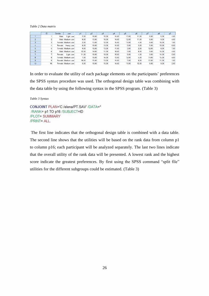
The SPSS software was used in order to evaluate the collected answers about the partic-
ipants’ preferences regarding the generic chocolate packages. A matrix with data was
created in SPSS. (Table 2) This table included participant’s ID, gender, the amount of
chocolate consumed by the participant, ranking for each card and the points for the vis-
ual impressions. In the matrix, the amount of chocolate consumed was named as user
and four options that were mentioned above were coded in the value column. Points for
the visual impressions and the ranks of the cards were identified as R1-R16 and P1-P16,
respectively. After the matrix was created the values that were collected in the question-
naire were entered into SPSS manually.
26
Table 2 Data matrix
In order to evaluate the utility of each package elements on the participants’ preferences
the SPSS syntax procedure was used. The orthogonal design table was combining with
the data table by using the following syntax in the SPSS program. (Table 3)
Table 3 Syntax
The first line indicates that the orthogonal design table is combined with a data table.
The second line shows that the utilities will be based on the rank data from column p1
to column p16; each participant will be analyzed separately. The last two lines indicate
that the overall utility of the rank data will be presented. A lowest rank and the highest
score indicate the greatest preferences. By first using the SPSS command “split file”
utilities for the different subgroups could be estimated. (Table 3)
27
4 RESULTS
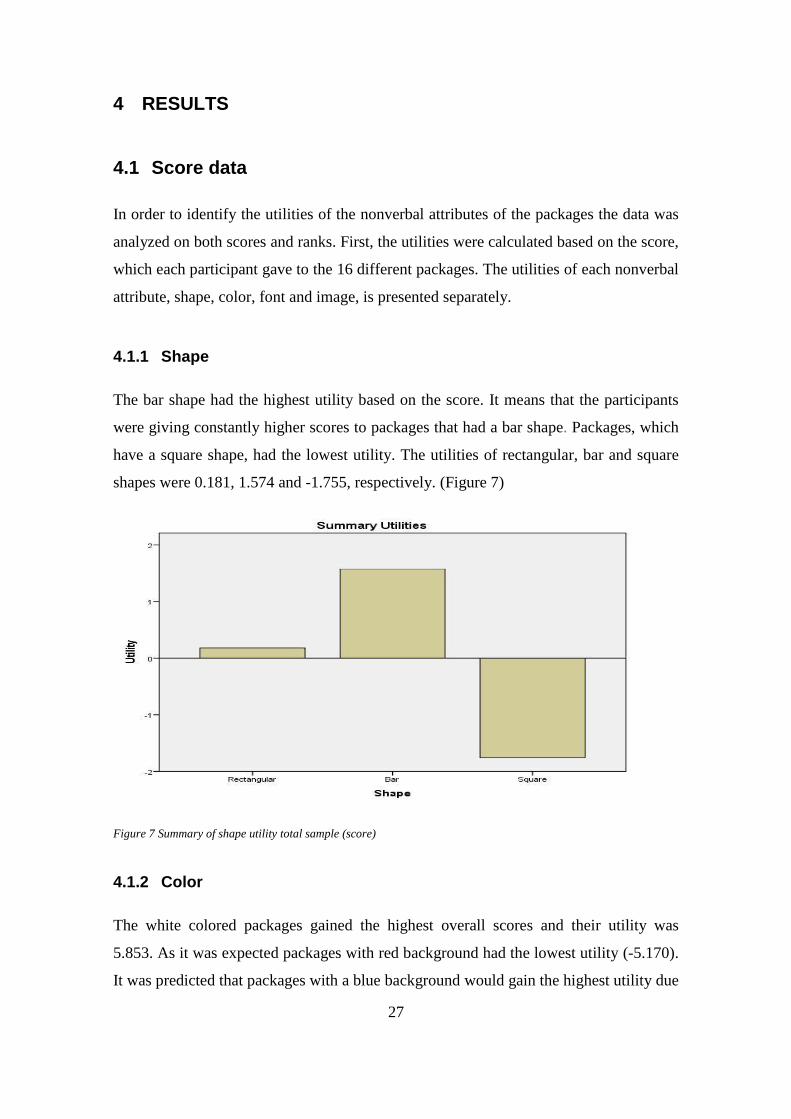
4.1 Score data
In order to identify the utilities of the nonverbal attributes of the packages the data was
analyzed on both scores and ranks. First, the utilities were calculated based on the score,
which each participant gave to the 16 different packages. The utilities of each nonverbal
attribute, shape, color, font and image, is presented separately.
4.1.1 Shape
The bar shape had the highest utility based on the score. It means that the participants
were giving constantly higher scores to packages that had a bar shape. Packages, which
have a square shape, had the lowest utility. The utilities of rectangular, bar and square
shapes were 0.181, 1.574 and -1.755, respectively. (Figure 7)
Figure 7 Summary of shape utility total sample (score)
4.1.2 Color
The white colored packages gained the highest overall scores and their utility was
5.853. As it was expected packages with red background had the lowest utility (-5.170).
It was predicted that packages with a blue background would gain the highest utility due
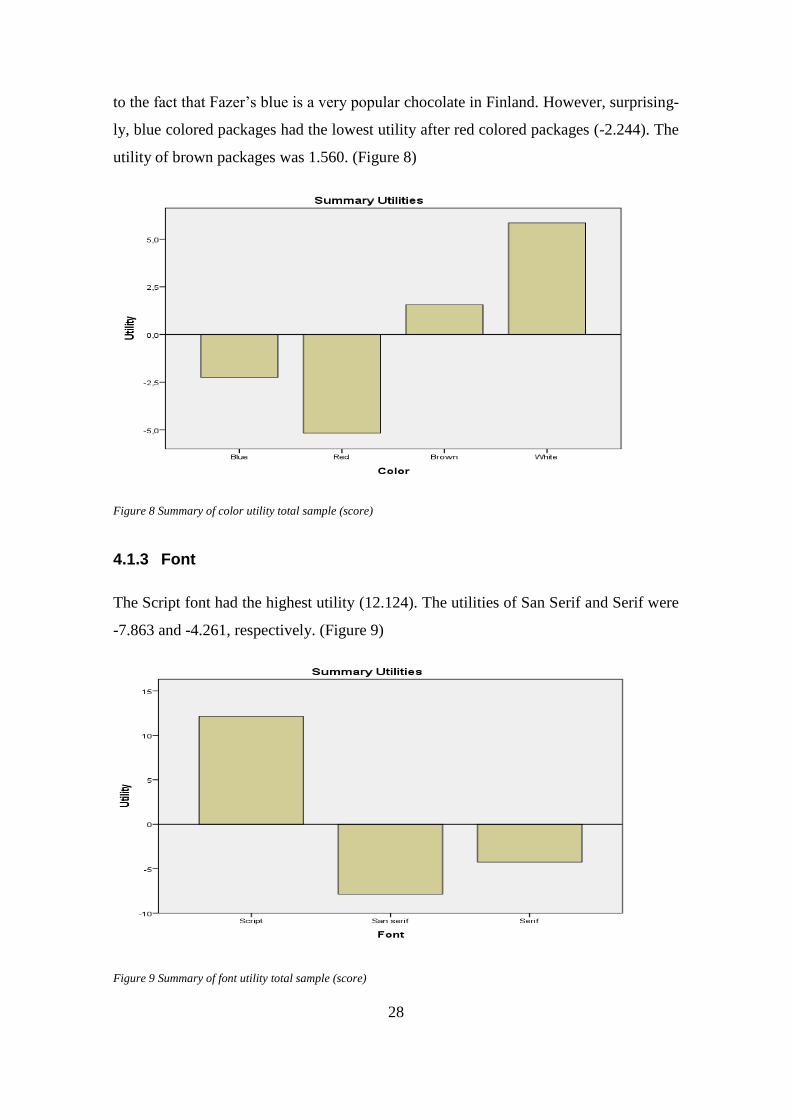
28
to the fact that Fazer’s blue is a very popular chocolate in Finland. However, surprising-
ly, blue colored packages had the lowest utility after red colored packages (-2.244). The
utility of brown packages was 1.560. (Figure 8)
Figure 8 Summary of color utility total sample (score)
4.1.3 Font
The Script font had the highest utility (12.124). The utilities of San Serif and Serif were
-7.863 and -4.261, respectively. (Figure 9)
Figure 9 Summary of font utility total sample (score)

29
4.1.4 Image
Packages with the picture (11.117) had the highest utility. The utility of packages with-
out pictures was -11.117. (Figure 10)
Figure 10 Summary of image utility total sample (score)
4.1.5 Summary of scoring utilities
According to the average importance of utilities the image on the package was the most
important nonverbal feature for the participants when they were giving scores to pack-
ages (29.7). Font and color were almost equally important for participants 28.7 and
28.1, respectively. The shape of the package was the least important nonverbal feature
(13.5). (Figure 11)

30
Figure 11 Summary of factor utility total sample (score)
4.1.6 Gender differences
Next, men and women preferences of nonverbal features were compared and analyzed.
According to this study both men and women were giving the highest overall scores to
the packages that had a bar shape and the utility was 2.060 and 1.305, respectively.
However, men (0.560) compared to women (-0.052) did not give as low a score to rec-
tangular shape packages. Both genders gave the lowest score to square shaped packages
(-2.620 and -1.254). (Figure12)
Figure 12 Summary of shape utility for men (left) and women (right) (score)
Both genders gave the highest utility to white colored packages (4.428 and 6.527), but
the second preferred color was different. Women gave higher utility to brown packages
(3.645), while men gave higher utility to blue color packages (0.436). The men’ utility
of brown color was -1.486 and women’ utility of blue color was -4.127. Both men and
31
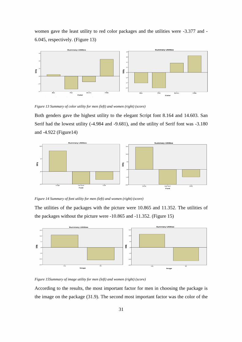
women gave the least utility to red color packages and the utilities were -3.377 and -
6.045, respectively. (Figure 13)
Figure 13 Summary of color utility for men (left) and women (right) (score)
Both genders gave the highest utility to the elegant Script font 8.164 and 14.603. San
Serif had the lowest utility (-4.984 and -9.681), and the utility of Serif font was -3.180
and -4.922 (Figure14)
Figure 14 Summary of font utility for men (left) and women (right) (score)
The utilities of the packages with the picture were 10.865 and 11.352. The utilities of
the packages without the picture were -10.865 and -11.352. (Figure 15)
Figure 15Summary of image utility for men (left) and women (right) (score)
According to the results, the most important factor for men in choosing the package is
the image on the package (31.9). The second most important factor was the color of the

32
package (30). Men did not give a high utility to the font on the packages (24.1). The
shape (14) was least important product feature. The most important product feature for
women was the font on the package (31.7). Image was the second most important crite-
ria (28.5). Color and shape were the third and fourth most important factors (26.4 and
13.3). (Figure 16)
Figure 16 Summary of factor utility for men (left) and women (right) (score)
4.2 Rank data
The utilities were also estimated based on the rankings of the products/cards. The results
were estimated in the same way as for the scoring data. First, each attribute was ana-
lyzed based on participant’s ranking, and then the overall statistics were estimated. Al-
so, the differences in ranking between men and women were compared.
4.2.1 Shape
Each participant was asked to choose the most preferred package one by one. According
to the ranking results, the highest utility had packages that had a rectangular shape
(0.365). The square shape had the lowest utility based on ranking and scoring (-0.236).
The utility of bar shaped packages was -0.128. (Figure 17)
33
Figure 17 Summary of shape utility total sample (rank)
4.2.2 Color
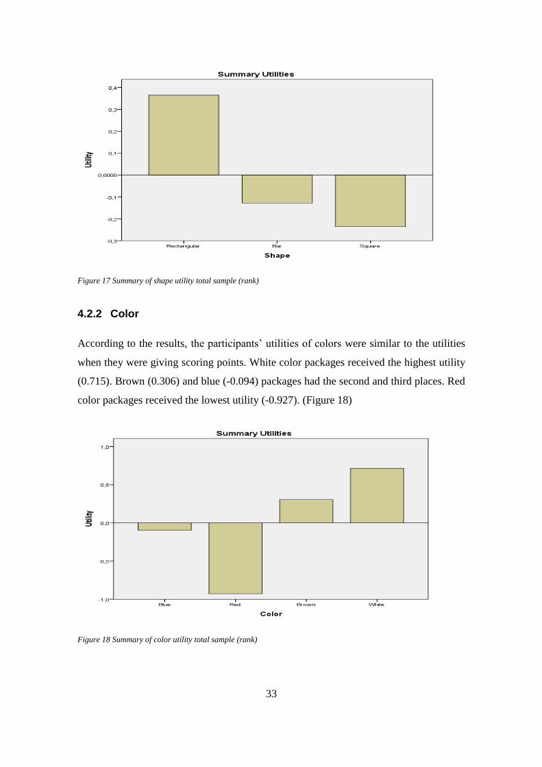
According to the results, the participants’ utilities of colors were similar to the utilities
when they were giving scoring points. White color packages received the highest utility
(0.715). Brown (0.306) and blue (-0.094) packages had the second and third places. Red
color packages received the lowest utility (-0.927). (Figure 18)
Figure 18 Summary of color utility total sample (rank)
34
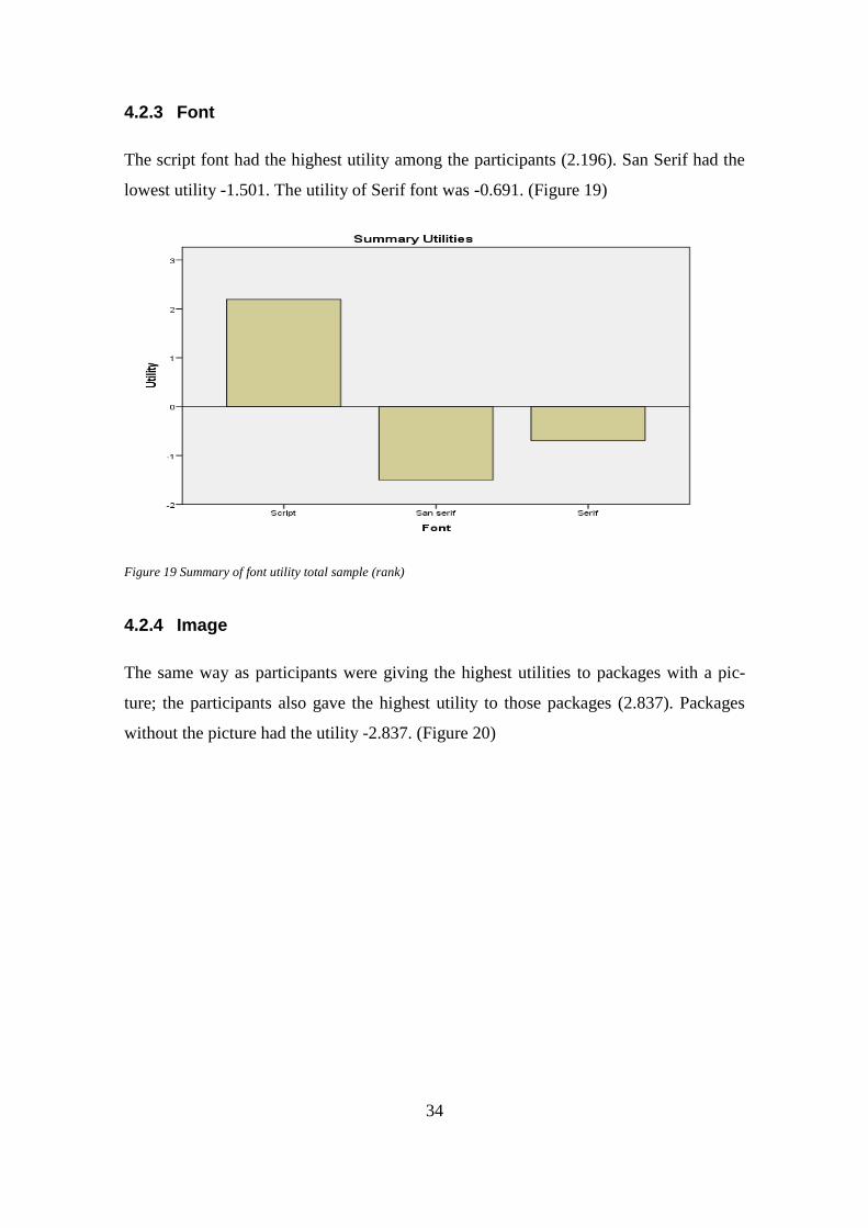
4.2.3 Font
The script font had the highest utility among the participants (2.196). San Serif had the
lowest utility -1.501. The utility of Serif font was -0.691. (Figure 19)
Figure 19 Summary of font utility total sample (rank)
4.2.4 Image
The same way as participants were giving the highest utilities to packages with a pic-
ture; the participants also gave the highest utility to those packages (2.837). Packages
without the picture had the utility -2.837. (Figure 20)
35
Figure 20 Summary of image utility total sample (rank)
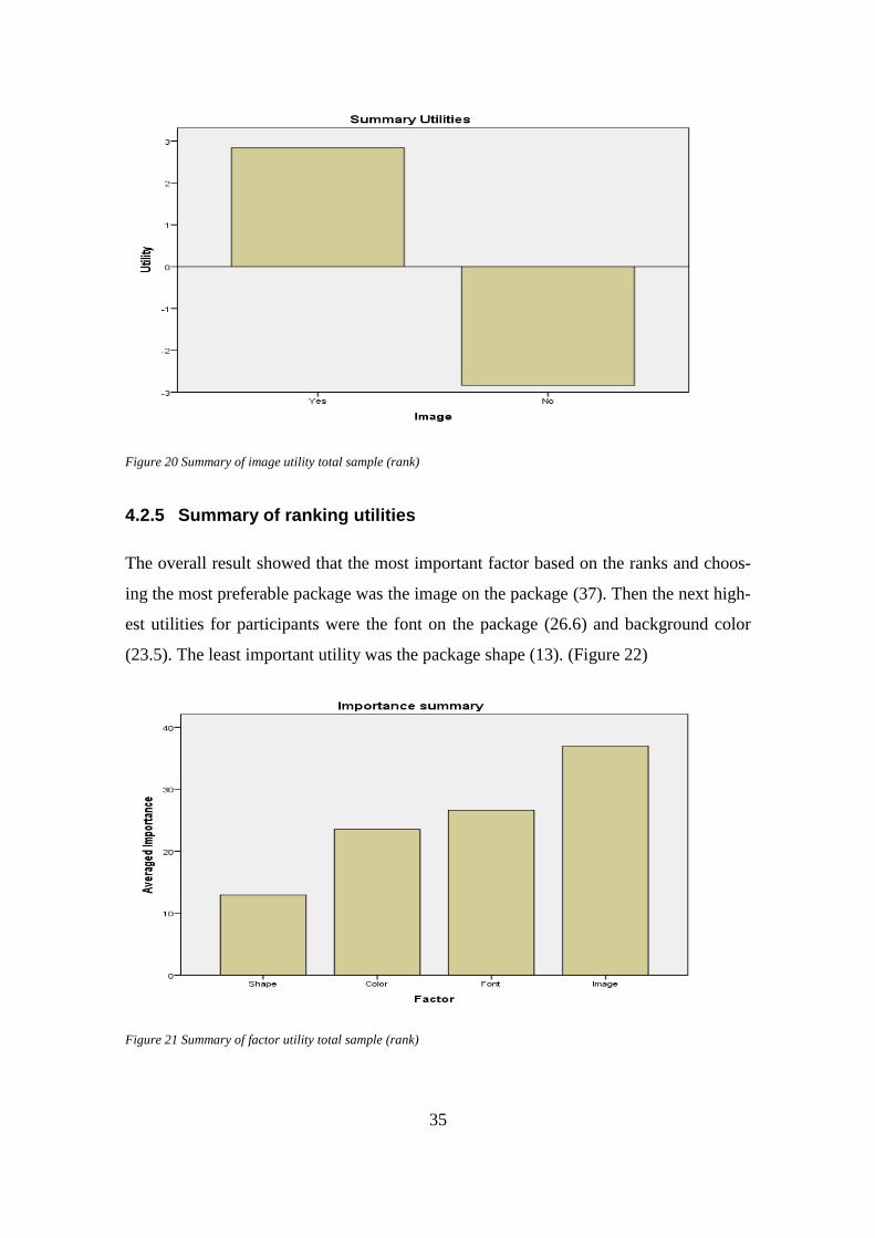
4.2.5 Summary of ranking utilities
The overall result showed that the most important factor based on the ranks and choos-
ing the most preferable package was the image on the package (37). Then the next high-
est utilities for participants were the font on the package (26.6) and background color
(23.5). The least important utility was the package shape (13). (Figure 22)
Figure 21 Summary of factor utility total sample (rank)
36
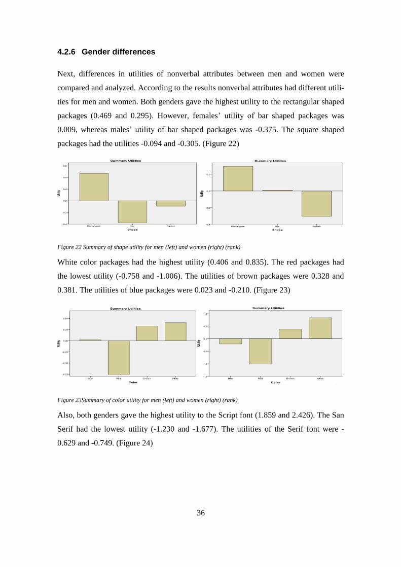
4.2.6 Gender differences
Next, differences in utilities of nonverbal attributes between men and women were
compared and analyzed. According to the results nonverbal attributes had different utili-
ties for men and women. Both genders gave the highest utility to the rectangular shaped
packages (0.469 and 0.295). However, females’ utility of bar shaped packages was
0.009, whereas males’ utility of bar shaped packages was -0.375. The square shaped
packages had the utilities -0.094 and -0.305. (Figure 22)
Figure 22 Summary of shape utility for men (left) and women (right) (rank)
White color packages had the highest utility (0.406 and 0.835). The red packages had
the lowest utility (-0.758 and -1.006). The utilities of brown packages were 0.328 and
0.381. The utilities of blue packages were 0.023 and -0.210. (Figure 23)
Figure 23Summary of color utility for men (left) and women (right) (rank)
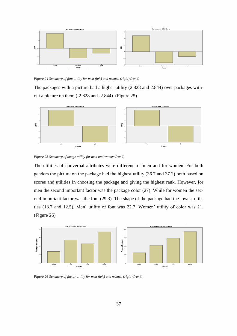
Also, both genders gave the highest utility to the Script font (1.859 and 2.426). The San
Serif had the lowest utility (-1.230 and -1.677). The utilities of the Serif font were -
0.629 and -0.749. (Figure 24)
37
Figure 24 Summary of font utility for men (left) and women (right) (rank)
The packages with a picture had a higher utility (2.828 and 2.844) over packages with-
out a picture on them (-2.828 and -2.844). (Figure 25)
Figure 25 Summary of image utility for men and women (rank)
The utilities of nonverbal attributes were different for men and for women. For both
genders the picture on the package had the highest utility (36.7 and 37.2) both based on
scores and utilities in choosing the package and giving the highest rank. However, for
men the second important factor was the package color (27). While for women the sec-
ond important factor was the font (29.3). The shape of the package had the lowest utili-
ties (13.7 and 12.5). Men’ utility of font was 22.7. Women’ utility of color was 21.
(Figure 26)
Figure 26 Summary of factor utility for men (left) and women (right) (rank)
38
4.3 Chocolate consumption data
Results were also analyzed based on the participants’ answers about the amount of their
chocolate consumption. Each participant had to choose how often he was buying choco-
late. Four categories of chocolate consumption were presented: heavy, medium, light
and nonusers. The aim was to analyze how important each of the nonverbal attributes
for the different categories of users.
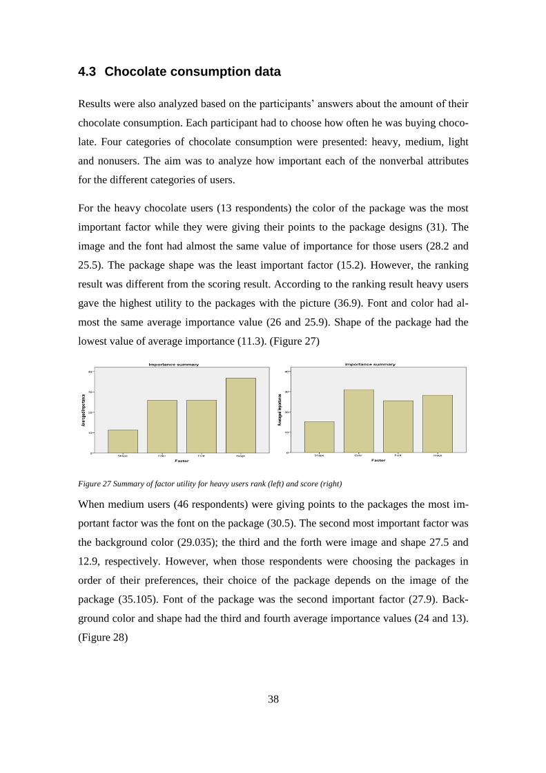
For the heavy chocolate users (13 respondents) the color of the package was the most
important factor while they were giving their points to the package designs (31). The
image and the font had almost the same value of importance for those users (28.2 and
25.5). The package shape was the least important factor (15.2). However, the ranking
result was different from the scoring result. According to the ranking result heavy users
gave the highest utility to the packages with the picture (36.9). Font and color had al-
most the same average importance value (26 and 25.9). Shape of the package had the
lowest value of average importance (11.3). (Figure 27)
Figure 27 Summary of factor utility for heavy users rank (left) and score (right)
When medium users (46 respondents) were giving points to the packages the most im-
portant factor was the font on the package (30.5). The second most important factor was
the background color (29.035); the third and the forth were image and shape 27.5 and
12.9, respectively. However, when those respondents were choosing the packages in
order of their preferences, their choice of the package depends on the image of the
package (35.105). Font of the package was the second important factor (27.9). Back-
ground color and shape had the third and fourth average importance values (24 and 13).
(Figure 28)
39
Figure 28 Summary of factor utility for medium users rank (left) and score (right)
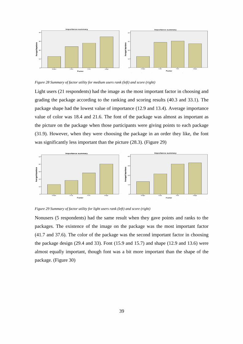
Light users (21 respondents) had the image as the most important factor in choosing and
grading the package according to the ranking and scoring results (40.3 and 33.1). The
package shape had the lowest value of importance (12.9 and 13.4). Average importance
value of color was 18.4 and 21.6. The font of the package was almost as important as
the picture on the package when those participants were giving points to each package
(31.9). However, when they were choosing the package in an order they like, the font
was significantly less important than the picture (28.3). (Figure 29)
Figure 29 Summary of factor utility for light users rank (left) and score (right)
Nonusers (5 respondents) had the same result when they gave points and ranks to the
packages. The existence of the image on the package was the most important factor
(41.7 and 37.6). The color of the package was the second important factor in choosing
the package design (29.4 and 33). Font (15.9 and 15.7) and shape (12.9 and 13.6) were
almost equally important, though font was a bit more important than the shape of the
package. (Figure 30)
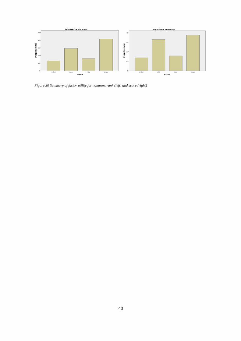
40
Figure 30 Summary of factor utility for nonusers rank (left) and score (right)
41
5 DISCUSSION
This final chapter summarizes the theoretical framework and the empirical results. The
final result of respondents’ preferences is analyzed and discussed. Also, the results of
the conjoint analysis are compared with the literature review.
The obtained results of conjoint analysis showed that students have different prefer-
ences concerning nonverbal attributes when they were asked to choose packages in a
rank order and when they gave points to the same packages.
5.1 The most important nonverbal attribute
According to the empirical results of score and rank data the most important nonverbal
attribute of the package was the image. Underwood (2002) stated that the image on a
package provides more information about the product for consumers. The packages that
were used in the experiment did not exist in real life. The participants had to decide
which package they like based only on nonverbal attributes of the packages. Consumers
are usually unsure, which product they should buy when they do not know the core
product. It can be concluded that the picture on the package helps to eliminate the factor
of uncertainty about the product. Also, the picture helps to attract consumers’ attention.
It is the most noticeable nonverbal attribute on the package. Therefore when participants
were asked to choose the packages in the order of their preferences, they chose the
packages with the picture, because those packages were the most noticeable.
The font was the second most important nonverbal attribute in evaluating the packages
design. Packages that were created for the experiment had a generic brand name
“chocolate” in the middle of the package. As a result, it attracted the attention of the
participants and made the font the second most important nonverbal attribute.
Color was the third most important nonverbal attribute. According to Gordon (1994)
color of the package had the biggest influence on the customers’ preferences. But the
conjoint analysis result showed in this experiment that color was not the most important
factor in choosing and evaluating packages. Even though color is a good tool to attract
consumers’ attention, it probably does not provide that much information to consumers.
42
At least in the case of chocolate packages, the participants did not make their decision
primary on the color of the package.
The shape of the package is the last criteria that participants were paying attention to. In
some cases when the amount of the product has a big influence on the consumer’s deci-
sion, the shape of the package could be the most important criteria. However, in the case
of chocolate package the amount did not have a strong effect on the participants’ deci-
sions.
5.2 The importance of shape
Based on the ranking results, the participants preferred rectangular shaped packages.
According to the literature review, consumers usually prefer rectangular shaped prod-
ucts, especially when they are not familiar with the product. The rectangular shape of
packages is the most common shape and even though consumers are not familiar with
the product they feel secure to choose a package of this shape. The chocolate packages,
which were presented in the experiment, did not exist in a real life. Therefore it can be
concluded that when the participants were asked to choose the packages in the order of
their preferences, they felt more secure to choose a package with the shape they used to
see more often on the chocolate shelf in the store.
The conjoint results of score data showed that participants were choosing the chocolate
packages, which had the bar shape. It means that when the participants had more time to
evaluate the packages they gave higher score to the bar shaped packages.
Both score and rank results showed that the square shape was the least favored shape for
the participants. Schoorman (1997) stated that an unusual shape of a product can catch
the consumer’s attention, but can be seen as ambiguous. The square shape of the choco-
late package is not that popular in the chocolate production, therefore customers can feel
unsecure to choose the product. It could be a reason why the participants did not like the
square shaped packages.
43
5.3 The importance of color
The results of the conjoint analysis for both score data and ranking data were very simi-
lar. In both cases the participants preferred white colored packages to other colored
packages. According to the literature, white color is associated with reliability. It could
be a reason why participants were choosing the white color packages. However, accord-
ing to Hallock’s studies only two per cent of men and one per cent of women prefer
white color to other colors and both genders usually prefer blue color. However, accord-
ing to the empirical results, the blue color was the third favorite color for both genders.
Taft (1997) stated that blue color was the most preferable color for the packages back-
ground. It makes the package look more elegant. But according to the results even the
brown colored packages were more preferred than the blue colored packages. It could
be concluded that the color preferences depend on the core product. Probably blue color
is not associated with chocolate products. Though Fazers’chocolate packages have a
blue color. Clearly, the consumers’ decision to buy a Fazers’ chocolate package is not
based solely on the color of the package, but rather on the brand name. As it was ex-
pected, the red color was the least preferable background color. According to the litera-
ture review warm colors do not usually suit for a package background.
5.4 The importance of font
The score and rank results showed the same pattern for the font preferences. The Script
font was the most preferred font for the chocolate packages. The Script is an elegant
font, which is hard to read if it is in a long sentence. But when only one word “choco-
late” was written on the created chocolate packages the font worked. Therefore the
Script font made the packages look more elegant and preferable for the participants. Ac-
cording to the literature the San Serif is the least preferable type of fonts when it is
printed on the paper. The conjoint analysis supported that statement. The participants
gave the lowest utilities to packages with a San Serif font.

44
5.5 The importance of image
Several studies stated that the image is very important for a package and that customers
prefer packages with a picture because they can evaluate the core product and base their
opinion on the picture. The empirical results showed that all participants preferred
packages with an image on them to the packages without an image. Obviously, a picture
on the package helped the consumers evaluate the core product and eliminate a factor of
uncertainty about the product. In the case of chocolate package it can be concluded that
probably the participants believed that the product in the package with an image on tast-
ed better than a product in a package without an image.
5.6 Gender preferences
The empirical results proved that men and women have different preferences in nonver-
bal signs. The conjoint analysis results of score data showed that female and male par-
ticipants have the same preferences in shape, font and image, except color. Both genders
gave the highest points to the white colored package. Blue was the second favorite color
for men, whereas women preferred the brown color. According to Hallock’s studies
blue color was the most favorite color of both genders. 57 per cent of men and 37 per
cent of women chose blue color as their favorite color. Blue color is often used as a
background color for a lot of packages. Brown color is usually associates with organic
and healthy products. It could be a reason why in the experiment female participants
preferred brown over blue color.
The results based on rank data showed that both genders had the same preferences in
shape, color, font and image. Female and male participants preferred the rectangular
shape of the package to other shapes. Though men’ least favorite shape was the bar
shape and women’ the square shape.
Men’ preferences of nonverbal attributes based on ranks were the same in both cases.
The order of preference was: Image, Color, Font and Shape. Evidently, an image on the
package was the most important nonverbal sign for men. While giving point to packages
women based their opinion on Font, Image, Color and Shape. But when they were
choosing the most favorite packages one by one, the order of the average importance of

45
nonverbal signs was Image, Font, Color and Shape. Clearly, when women were choos-
ing one package over another, the most important factor was the existent of an image on
the package. But when they were evaluating the packages and giving points, they were
paying the most attention to the font of the package.
5.7 Nonverbal preferences based on the amount of chocolate
consumption
The results of the conjoint analysis showed that students with a different amount of
chocolate consumption gave different average importance to nonverbal attributes. For
the heavy users the color of the package was the most important factor in choosing the
packages. For medium users the font of the package had the highest relative importance.
For light and nonusers the image on the package had the highest value of relative im-
portance. All users gave the highest points to packages with an image on them and im-
age was the most important nonverbal attribute in evaluating the appearance of the
packages. Unfortunately the empirical evidence of conjoint analysis cannot be com-
pared to the literature review due to a lack of information about the influence of the
amount of consumption on consumers’ preferences of package attributes.

46
6 CONCLUSION
Package design is an important marketing tool. It helps to attract consumers’ attention
and to make a person interested in the core product inside the package. The package
provides communication with the consumer and has a big impact on the consumer’s
willingness to buy the product or not. Both verbal and nonverbal package attributes are
important for a successful package design. Verbal attributes of the package provide in-
formation, which influence the consumers’ willingness to buy a product. Nonverbal at-
tributes attract consumer attention and make him interested in the product.
The author of this thesis focused on the nonverbal attributes of the package design. Es-
pecially the relative importance of the four attributes: shape, color, font and image. Ac-
cording to the results of the conjoint experiment, which was conducted in the Visual
Impact project, an image on a package is the most important element among those four
attributes. Font is the second most important element. Background color of the package
is the third most important nonverbal attribute and the shape of the package has the
lowest relative importance. The author’s hypothesis about the best package design is
supported with empirical evidences. Though the most preferred background color was
predicted wrong.
Base on the conjoint study one can recommend companies to create white color choco-
late packages of rectangular shape with an image on them and to use a Script font for a
brand name in order to attract consumers’ attention and make them interested in a core
product.
For the further research the author recommends to study more how the consumption in-
tensity of the product influences the consumers’ packaging preferences. According to
the conjoint analysis results the amount of consumption has a certain influence on the
relative importance of packages’ nonverbal attributes. However, due to a lack of infor-
mation about other studies based on consumption data, it is not possible to compare em-
pirical findings of the conjoint analysis to other evidence.
47
REFERENCES
Baral, S. 2013. Does Chocolate Shape Affects Taste, Latin Times, Article, Available:
(http://www.latintimes.com/does-chocolate-shape-affect-taste-scientists-say-yes-find-
out-why-131562 Retrieved: 23.04.2015.
Ciotti, G. 2013. The Psychology of Color in Marketing and Branding, Article, Availa-
ble: http://www.helpscout.net/blog/psychology-of-color/ Retrieved: 26.04.2015.
Color-Meaning.com, White/Brown Color Meaning, Article, Available:
http://www.color-meanings.com/white-color-meaning-the-color-white/Retrieved:
25.04.15.
Connolly, A. and L. Davison 1996. How does Design Affect Decisions at Points of
Scale? The Journal of Brand Management, (2), 100-107.
DesignModo, Script Font: Most Popular Typefaces, Best for WebFonts, Article, Avail-
able at: http://designmodo.com/script-webfonts/ Retrieved: 26.04.2015.
Ehrenberg, A., Barnard, N. and J. Scriven 1997. Differentiation or Salience. Journal of
Advertising Researches, 37 (6), 7-14.
Eysneck, H. J. 1941. A Critical and Experimental Study of Color Preferences. American
Journal of Psychology, 54, 385-394.
Fromkin, V. and R. Rodman 1993. An introduction to Language 5th
ed. Fort Worth
(Tex): Harcourt Brace Jovanovich.
Grossman, R. P. and J. Z. Wisenblit 1999. What We Know About Color Choices: Jour-
nal of Marketing Practice: Applied Marketing Sciences, 5 (3), 78-88.
Gordon, A., Finlay, K., and T. Watts 1994. The Psychological Effects of Colour in Con-
sumer Product Packaging. Canadian Journal of Marketing Research, 13,3-11.
Human-Computer Interaction 2013. Investigating the Effect of Font Styles on Perceived
Visual Aesthetics of Website Interface Design, Article, 549-554, Available:
http://link.springer.com/chapter/10.1007%2F978-3-642-39232-0_59#page-1 Retrieved:
22.04.2015.
48
Kahneman, D. 1973. Attention and Effort. Englewood Cliffs. New Jersey: Prentie-Hall
Inc.
Kauppinen, H 2004. Colors as Non-Verbal Signs on Packages, Doctoral Thesis, 31-32.
Koo, J. and K. Suk 2012. The Effect of Package Shape on Consumer’s Calories Estima-
tion, Advance in Consumer Research, Article, Available:
http://www.acrwebsite.org/volumes/v40/acr_v40_11733.pdf Retrieved: 23.02.2015.
Kupiainen, T., Kauppinen-Raisanen, H. and K. Lehtola, 2012. Package as Means of
Communicating Product Quality. The Case of Strawberry. Available at:
http://www.nhh.no/Files/Filer/institutter/for/conferences/nff/papers/kauppinen-
raisanen.pdf Retrieved: 01.05.2015.
Kuvykaite, R., Dovaliene A. and L. Navickiene 2009. Impact of Package Elements on
Consumer’s Purchase Decision, Journal of economics and management.
McDaniel, C. and R.C. Baker 1977. Convenience Food Packaging and the Perception of
Product Quality. Journal of Marketing, 41 (4), 57-58.
Middlestadt, S.E. 1990. The Effect of Background and Ambient Color on Product Atti-
tudes and Beliefs. In: Goldberg, M., Gorn, G. and R.W. Pollay (eds.). Advances in Con-
sumer Research, New Orleans (UT): Association for Consumer Research, 17. 244-249.
Packaging characteristics and consumer brand preferences, Article, Available:
http://www.ukessays.com/dissertations/design/packaging-characteristics-and-consumer-
brand-preference.php Retrieved: 15.04.2015.
Raghavan, S. 2010. Impact of Rectangular product shapes on purchase intention, Great
Lakes Herald, Article, 4(2), 43-52, Available:
http://www.greatlakes.edu.in/pdf/Herald/Vol4/Impactofrectangularproductshapesonpurc
haseintentions.pdf Retrieved: 20.04.2015.
Rao, V. 2014. Applied Conjoint Analysis”. Springer, New Yourk.
Rettie, R. and C. Brewer 2000. The Verbal and Visual Components of Packages Design.
The Journal of Brand Management, 9 (1), 56-70.
49
Rigaux-Bricmont, B. 1981. Influence of Brand Name and Packaging on Perceived Qual-
ity. In: Mitchell, A. (eds). Advances in Consumer Research, St. Louis: Association for
Consumer Research, 9, 472-477.
Schoorman, J.P.L. and H.S.J. Robben 1997. The Effect of New Package Design on
Product Attention, Categorization and Evaluation. Journal of Economic Psychology, 18
(2-3), 271-287.
Serif vs. Sans for text in Print, Fontology, Article, Available:
http://www.fonts.com/content/learning/fontology/level-1/type-anatomy/serif-vs-sans-
for-text-in-print Retrieved: 20.04.2015.
Silayoi, P. and M. Speece 2004. Packaging and Purchase decision, Journal of British
Food.
Taft, C. 1997. Color Meaning and Context: Comparison of Semantic Ratings of Colors
on Samples and Objects. Color Research and Application, 22 (1), 40-50.
Underwood, R. L. 1999. Construction of Brand Identity Through Packaging: A Qualita-
tive Inquiry. In: Menon A. and A. Sharma (eds.) Marketing Theory and Applications,
Illinois: American Marketing Association. 10 (Winter), 147-148.
Von Boguslawski, M. and P. Milden 2013. Visual Search Patterns and Consistency in
Multi-Alternative Consumer Choice. Arcada Publication 2.
Young, S. 2008. Five Principles for packaging new product, Article, Available:
www.brandpackaging.com/authors/1870-scott-young/articles Retrieved: 20.04.2015.
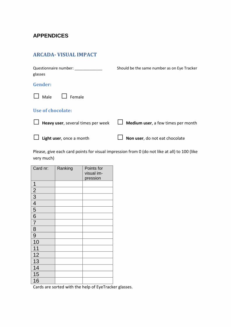
APPENDICES
ARCADA- VISUAL IMPACT
Questionnaire number: _____________ Should be the same number as on Eye Tracker
glasses
Gender:
□ Male □ Female
Use of chocolate:
□ Heavy user, several times per week □ Medium user, a few times per month
□ Light user, once a month □ Non user, do not eat chocolate
Please, give each card points for visual impression from 0 (do not like at all) to 100 (like
very much)
Card nr: Ranking Points for visual im-pression
1
2
3
4
5
6
7
8
9
10
11
12
13
14
15
16 Cards are sorted with the help of EyeTracker glasses.

Utilities Score
Total Sample Men Women
Shape Rectangular 0.181 0.560 -0.052
Bar 1.574 2.060 1.305
Square -1.755 -2.620 -1.254
Color
Blue -2.244 0.436 -4.127
Red -5.17 -3.377 -6.045
Brown 1.56 -1.286 3.645
White 5.853 4.428 6.527
Font
Script 12.124 8.164 14.603
Serif -4.261 -3.180 -4.922
San Serif -7.863 -4.984 -9.681
Image
Yes 11.117 10.865 11.352
Not -11.117 -10.87 -11.35
Utilities Score
Total Sample Men Women
Shape Rectangular 0.365 0.469 0.295
Bar -0.128 -0.375 0.009
Square -0.236 -0.094 -0.305
Color
Blue -0.094 0.023 -0.21
Red -0.927 -0.758 -1.006
Brown 0.306 0.328 0.381
White 0.715 0.406 0.835
Font
Script 2.192 1.859 2.426
Serif -0.691 -0.629 -0.749
San Serif -1.501 -1.23 -1.677
Image
Yes 2.837 2.828 2.844
Not -2.837 -2.828 -2.844