Embed Size (px)
Citation preview

1
The Price Ain’t Right? Hospital Prices and Health Spending on the Privately Insured
Zack Cooper (Yale University)
Stuart V. Craig (University of Pennsylvania)
Martin Gaynor (Carnegie Mellon University and NBER)
John Van Reenen (Massachusetts Institute of Technology, CEP, and NBER)
May 7, 2018
Abstract: We use insurance claims data covering 28 percent of individuals with employer-
sponsored health insurance in the US to study the variation in health spending on the privately
insured, examine the structure of insurer-hospital contracts, and analyze the variation in hospital
prices across the nation. Health spending per privately insured beneficiary differs by a factor of
three across geographic areas and has a very low correlation with Medicare spending. For the
privately insured, half of the spending variation is driven by price variation across regions and
half is driven by quantity variation. Prices vary substantially across regions, across hospitals
within regions, and even within hospitals. For example, even for a near homogenous service such
as lower-limb MRIs, about a fifth of the total case-level price variation occurs within a hospital
in the cross-section. Hospital market structure is strongly associated with price levels and
contract structure. Prices at monopoly hospitals are 12 percent higher than those in markets with
four or more rivals. Monopoly hospitals also have contracts that load more risk on insurers (e.g.
they have more cases with prices set as a share of their charges). In concentrated insurer markets
the opposite occurs – hospitals have lower prices and bear more financial risk. Examining the
366 merger and acquisitions that occurred between 2007 and 2011, we find that prices increased
by over 6 percent when the merging hospitals were geographically close (e.g. 5 miles or less
apart), but not when the hospitals were geographically distant (e.g. over 25 miles apart).
JEL Codes: I11, L10, L11
Keywords: health care, health spending, hospitals, prices, price dispersion, competition, market
structure, mergers.
*Acknowledgements: This paper drew inspiration from the work of Uwe Reinhardt. Professor Reinhardt passed
away in December 2017 and we dedicate this paper to his memory. We are grateful for comments and suggestions
that substantially improved the paper from the editors (Larry Katz and Andrei Shleifer), five anonymous referees,
participants at multiple seminars, and Leemore Dafny, Matthew Fiedler, Joshua Gottlieb, Neale Mahoney, Fiona
Scott Morton, Aviv Nevo, and Jonathan Skinner. This project received financial support from the Commonwealth
Fund, the National Institute for Health Care Management Foundation, the Economic and Social Research Council,
and the National Institute on Aging of the National Institutes of Health under Award Number P30AG012810. We
acknowledge the assistance of the Health Care Cost Institute (HCCI) and its data contributors, Aetna, Humana, and
United Healthcare, in providing the data analyzed in this study. The data used in this paper can be accessed with
permission from HCCI. We thank Jennifer Wu, Nathan Shekita, Charles Gray, Austin Jaspers, Nina Russell, Darien
Lee, Eugene Larsen-Hallock, and Christina Ramsay for outstanding research assistance. The opinions expressed in
this paper and any errors are those of the authors alone. More details on our analysis and downloadable data,
including our roster of hospital mergers, can be found online at www.healthcarepricingproject.org.

2
I. Introduction
Over 61 percent of the US population has private health insurance, which accounts for nearly 34
percent of total health spending (Hartman et al., 2017). In 2017, the average insurance premium
for employer-sponsored health coverage for a family of four was $18,764 and between 2007 and
2017, premiums increased by about 55 percent (Kaiser Family Foundation, 2017). However,
because of data availability, most of our understanding of health care spending comes from the
analysis of the Medicare program, which covers less than 17 percent of the population and
represents 20 percent of total health spending.1 For the most part, Medicare pays hospitals using
prospectively-set reimbursements that are formula-based. By contrast, hospital prices for the
privately insured are set via negotiations between hospitals and insurers. Unfortunately, private
health insurance claims data in general and the results of these hospital/insurer negotiations in
particular – hospitals’ transaction prices – have been treated as commercially sensitive and have
been largely unavailable to researchers. In this study, we use newly accessible claims data from
three of the five largest private insurers in the US to study the variation in health spending on the
privately insured. Notably, the data we use includes hospitals’ transaction prices. As a result, we
are able to study the role that variation in hospitals’ prices plays in influencing health spending
variation for the privately insured; to describe the variation in hospital prices across regions,
within regions, and within hospitals; and to analyze the extent to which hospital and insurer
market structures are associated with hospital price levels and the design of insurer-hospital
payments (henceforth, “contracts”).
The main data we use in this analysis are claims from Aetna, Humana, and UnitedHealth,
which were provided by the Health Care Cost Institute (HCCI). Our data capture the details of
the health care delivered to 27.6 percent of individuals in the US with employer-sponsored
coverage between 2007 and 2011. The data include more than 88 million unique individuals and
capture over $125 billion in health spending per year. The paper proceeds in three stages.
First, we present a national picture of the variation in health spending per privately
insured beneficiary across all 306 hospital referral regions (HRRs) in the US.2 Risk-adjusted
1 Our discussion of Medicare is focused on the traditional, publicly administered Medicare program. See Curtu,
Einav, Finkelstein, Levin and Bhatacharya (2017) for a comparison of the traditional, public Medicare program and
the privately administered Medicare Advantage program. 2 Hospital referral regions are geographic regions created by researchers at the Dartmouth Institute for Health Care
Policy to approximate markets for tertiary medical care in the US. Each HRR generally includes at least one major

3
health spending per privately insured beneficiary age 18 to 64 varies by a factor of more than
three across these regions. The HRR in the 90th percentile of the spending distribution (Grand
Junction, Colorado) spends 47 percent more than the HRR in the 10th percentile of the spending
distribution (Sarasota, Florida). Spending per privately insured beneficiary and spending per
Medicare beneficiary have a correlation of only 0.044 across HRRs. For the Medicare program
(where prices are set administratively), variation in hospital reimbursement rates account for
only 13 percent of the variation in spending across regions, whereas the variation in the quantity
of care delivered across regions accounts for 95 percent of the national variation in spending
(these sum to more than 100 percent because a covariance term accounts for -8 percent). This
fact has motivated research analyzing the factors that drive variation in the amount of care
delivered across regions (e.g. Finkelstein et al. 2016 and Cutler et al. 2017). By contrast, for the
privately insured, about half of the variation in spending is driven by price variation across
regions and half is driven by quantity variation. This motivates us to focus on analyzing the
drivers of hospital price variation.
The second stage of our analysis looks at the variation in hospital prices and the structure
of hospital payment contracts. Hospital care represents nearly 6 percent of GDP (Centers for
Disease Control and Prevention, 2017) and is expensive – the average price of an inpatient case
in 2011 is $14,240 in our data. Hospital prices vary significantly across the country and across
hospitals within HRRs. For example, hospitals with risk-adjusted knee replacement prices in the
90th percentile of the national distribution of hospitals are 2.3 times as expensive as hospitals in
the 10th percentile. Likewise, in one representative HRR (Philadelphia, PA), the hospital in the
90th percentile of prices in the region is over twice as expensive as the hospital in the 10th
percentile. This variation is also present for plausibly undifferentiated services, such as lower-
limb MRIs, which suggests that the dispersion we observe is not simply a function of differences
in hospital quality or patient severity across providers.
Our data allow us to extend beyond previous analysis and identify the variation in prices
for health care services delivered within hospitals.3 We find that the variation in prices within
referral center and the US is divided into 306 HRRs. See
www.dartmouthatlas.org/downloads/methods/geogappdx.pdf for more information. 3 A small number of studies of specific mergers, which involve only a few hospitals in a small geographic area, have
had such data, usually as the result of an antitrust merger investigation. Haas-Wilson and Garmon (2011) have data
from a merger in suburban Chicago, Thompson (2011) utilizes data from a merger in Wilmington, North Carolina,
and Tenn (2011) has data from a merger in the San Francisco Bay area. Gowrisankaran, Nevo, and Town (2015)

4
hospitals for services ranging from joint replacements to lower-limb MRIs is substantial. We find
that over a fifth of the total price variation across cases in the average month-year occurs within
hospitals for the same procedure, after controlling for hospital fixed effects, insurance plan
characteristics, and patient characteristics. That there is such substantial variation in prices for
plausibly undifferentiated procedures such as lower limb MRIs within hospitals suggests that the
relative bargaining power of insurers with hospitals can strongly influence price levels.
We then analyze how hospitals are paid. While there has been recent work looking at
how physicians set their negotiated prices with commercial insurers (Clemens et al. 2017), much
less is known about insurer-hospital contracts. We find that about 23 percent of hospitals’
inpatient cases have prices set as a share of hospitals’ charges - a “cost plus” contract that loads
idiosyncratic patient risk onto the insurers.4 We estimate no more than 57 percent of cases are on
contracts where prices are prospectively set as a percentage of Medicare payment rates. This
implies that hospital prices are less closely linked to the Medicare fee schedule than the 75
percent of cases that Clemens and Gottlieb (2017) observed for physicians’ prices.
In the third stage of our analysis, we look at whether there is a link between market
structure, hospital prices, and contractual form. Hospital prices and contract form are determined
by bargaining between hospitals and insurers. Market structure is related to bargaining power –
hospitals with fewer potential competitors are likely in a stronger negotiating position with
insurers, and vice versa. Further motivating this analysis, as we illustrate in Figure 1, there has
been significant consolidation in the hospital sector between 2001 and 2011. During that period,
based on data we collected, there were, on average, 66 merger and acquisition (M&A)
transactions per year.5 This led the Herfindahl Hirschman index (HHI) in hospital markets where
mergers occurred to increase by 19 percent over this period.6
In our cross-sectional analysis, we find that hospitals in monopoly markets (relative to
hospitals in quadropoly or greater markets) have 12.5 percent higher prices, 10.5 percentage
points more cases paid as a share of charges (over a mean of 18.6 percent), and 11.3 percentage
have data from a merger investigation in northern Virginia, but do not analyze within hospital price differences. Ho
and Lee (2017) analyze data from the California Public Employees’ Retirement System (CalPERS), which has
information on insurer specific prices at hospitals. 4 Hospital charges are the amount hospitals bill for care (i.e. their list prices). Individuals who self-fund their care
are typically the only ones who pay hospitals their charges. 5 We have made our roster of hospital mergers available at www.healthcarepricingproject.org. 6 We measure a HHI for each hospital in our data within a circular area around each hospital defined by a 15-mile
radius. We measure a hospital’s market share as its share of total hospital beds in those areas.

5
points fewer of their prospectively paid cases that have prices set as a share of Medicare payment
rates (over a mean of 48.3 percent).7 By contrast, hospitals located in areas where the three
insurers in our data had a high (collective) market share had significantly lower prices and
participated in contracts that exposed insurers to less financial risk. A 10 percentage point
increase in the insurers’ market share is associated with 7 percent lower prices, 4 percentage
points less cases paid as a share of charges, and 6 percentage points more prospectively paid
cases that have prices set as a percentage of Medicare payments.
To look at events that shifted market structure over time, we use our comprehensive
database of hospital mergers combined with the HCCI panel data to examine how hospital prices
evolve before and after merger events using difference-in-difference analysis. After mergers
occurred, we find that prices increase by over 6 percent if the merging hospitals were close
neighbors (less than or equal to five miles apart). The size of the post-merger price increases
decline as the distance between merging parties increases, and there are no significant merger
coefficients once merging hospitals are located over 25 miles apart. We find no pre-merger
differences in trends in prices between merging and non-merging hospitals and show that our
results are robust when we use various procedures to match treated and control hospitals.
An important caveat to our paper is that it is fundamentally descriptive. While we find
strong links between market structure, prices, and contract form, because market structure will be
correlated with unobserved factors, these relationships should not be assumed to be causal.
Our paper builds on a sizable literature that has used Medicare claims data to document
large variations in health spending per beneficiary across HRRs (Fisher et al. 2003a,b;
Finkelstein et al. 2016). A smaller literature has documented similar variation in spending on
privately insured individuals using limited data samples. Both Chernew et al. (2010) and
Newhouse et al. (2013) have documented that there is a low correlation between Medicare
spending per beneficiary and private spending per beneficiary across HRRs. We add to this
literature by using a much larger and more comprehensive national dataset to analyze health
spending on the privately insured, by analyzing hospitals’ transaction prices, and by addressing
the key question of why prices are so high in some regions, but not in others. Crucially, our data
on hospitals’ transaction prices allow us to probe more deeply the claim in Chernew et al. (2010)
7 We measure hospital market structure by counting competitors within a circular area around each hospital defined
by a radius of 15 miles. In the results section we show that our results are robust to many alternative measures of
hospital market structure and different market definitions.

6
and Philipson et al. (2010) that variation in health spending on the privately insured is driven by
differences in hospital prices across regions.
We also add to an existing literature that has used limited datasets to analyze variation in
hospital transaction prices. Most of this literature has focused on describing differences in prices
across regions (e.g. Government Accountability Office 2005, Ginsburg 2010, Coakley 2011,
White, Reschovsky, and Bond 2014). We add to this literature by using data that cover the
majority of hospitals nationally.8 This allows us to look at national variation in hospitals’ prices
and compare hospital prices across and within geographic areas. Likewise, we risk-adjust prices,
look at narrowly defined procedures (e.g. joint replacements without complications), and focus
on plausibly homogenous services (e.g. lower-limb MRIs). Collectively, this allows us to more
effectively compare prices across hospitals by reducing the potential bias created from
differences in quality and patient characteristics across hospitals. In addition, this is one of the
first papers we are aware of that has described and quantified variation in prices within hospitals.
Analyzing price variation within hospitals for broadly undifferentiated services allows us to hold
quality constant. That we observe significant variation in prices across contracts within the same
hospital provides evidence that the bargaining leverage of insurers influences hospital prices.
Finally, we add to a large literature on hospital competition (see Gaynor, Ho, and Town
2015), which has generally found that hospital prices are higher in more concentrated markets.
However, much of this literature has relied on estimates of transaction prices based on hospitals’
charges (rather than actual data on transaction prices) or has focused on data from limited areas
or single states (often California). Our analysis shows that there is a positive but rather low
correlation (0.314) between hospital charges and hospitals’ transaction prices. Moreover, we go
beyond existing work by looking at the relationship between market structure and transaction
prices using data from across the nation and by analyzing the relationship between market
structure and the design of hospital-insurer contracts. Our findings are broadly consistent with
models of insurer-hospital bargaining, such as Gowrisankaran, Nevo, and Town (2016) and Ho
and Lee (2017). There is also an existing literature that has examined the effects of single
mergers or small groups of mergers (Vita and Sacher 2001, Krishnan 2001, Gaynor and Vogt
8 Our data contain transaction prices for 72 percent of non-critical access hospitals that are registered with the
American Hospital Association (AHA). These 2,358 hospitals in our inpatient sample capture over 88 percent of
total hospital admissions in the US (based on AHA data). Previous studies have generally relied on data from single
states, a single employer, or a small set of urban areas.

7
2003, Capps and Dranove 2004, Dafny 2009, Haas-Wilson and Garmon 2011, Tenn 2011,
Thompson 2011, Gowrisankaran, Nevo, and Town 2015, Garmon and Kmitch 2017).9 We add to
this literature by examining the post-merger price effects of all hospital mergers between 2007
and 2011.
This paper is structured as follows. In Section II we outline our data, describe how we
measure prices, and present descriptive statistics. In Section III we describe the variation in
health spending across HRRs and determine the share of the variation that is a function of price
differences across regions and the share that is a function of quantity differences. In Section IV,
we describe the variation in hospital prices across HRRs, within HRRs, and within hospitals. In
Section V, we describe insurer-hospital contracts. We then analyze the cross-sectional correlates
of hospital price levels and contracts in Section VI, analyze mergers and hospital prices in
Section VII, and make some concluding comments in Section VIII. Our online Appendices give
more details on data (A); how we construct risk-adjusted prices (B); our measures of market
structure (C); how we identified mergers (D); econometric matching methods used in our merger
analysis (E); and the robustness of our analysis in areas where Blue-Cross Blue Shield (BCBS)
insurers had high and low market share (F).
II. Data and Variables
II.A Health Care Cost Institute data
The main data we use are from the Health Care Cost Institute (HCCI).10 We discuss the data in
more detail in Appendix A, but outline some of the main features here. The HCCI database
includes health insurance claims for individuals with coverage from three of the five largest
insurance companies in the US: Aetna, Humana, and UnitedHealth. The data cover all health
services paid for by the insurers from 2007 to 2011. We focus on individuals with employer-
sponsored coverage who are aged between 18 and 64 and for whom an HCCI payer is their
primary insurer. The raw data covers 2.92 billion claims that were delivered to an insured
population in our data of 88.7 million unique individuals (Table 1).11
9 The exception is Dafny (2009), which examines the effect of 97 mergers that occurred between 1989 and 1996. 10 HCCI is a nonprofit organization dedicated to advancing knowledge about US health care costs and utilization.
See http://www.healthcostinstitute.org for more information. 11 The HCCI data are “de-identified” and do not include patient identifiers such as social security numbers, names,
dates of birth, or addresses. Users of HCCI data are not allowed to publish results that identify patients, insurers, or

8
Appendix Figure 1 shows the proportion of privately insured lives that the HCCI data
cover by state.12 The HCCI database offers a significantly more comprehensive picture of private
health spending across the US than other private health insurance claims databases. The most
prominent alternative dataset of private health insurance claims is the MarketScan database.
While MarketScan data includes individuals in 90 percent of HRRs in the US, some HRRs in the
MarketScan data have very thin coverage and include fewer than 200 beneficiaries. By contrast,
the HCCI data include individuals in all 306 HRRs and the smallest HRR in 2011 has 2,932
beneficiaries. Appendix A1 gives a more detailed comparison between the datasets.
Although we describe the most comprehensive picture to date of health spending on the
privately insured, we do not have claims from every insurer and, in particular, from BCBS
insurers. As a result, our analysis does not necessarily generalize to private health insurance
spending in the US as a whole. BCBS plans covered 41 percent of covered lives across the small,
medium, and large group markets in 2011. 13 To address possible concerns about the
generalizability of our results, in Appendix F we reproduce all our main results using data from
areas where BCBS plans have a high share of privately insured lives and areas where BCBS
plans have a low share of privately insured lives.
The HCCI data include a unique hospital identifier, a unique patient identifier, the date
services were provided, hospitals’ charges (for 2010 and 2011), hospitals’ negotiated transaction
prices (broken down by facility and physician fees), and payments to hospitals made by patients
in the form of co-insurance payments, co-payments, and payments made before deductibles were
met. As a result, we know the amounts paid to hospitals for all health care encounters recorded in
our data.14 This allows us to analyze how prices vary within and across hospitals and study how
insurers reimburse hospitals.
hospitals by name. Because our data is de-identified, our project was exempted by the Yale Institutional Review
Board. 12 The data capture more than 30 percent of the privately insured population in Texas, Arizona, Colorado, Florida,
Georgia, Kentucky, Ohio, Wisconsin, New Jersey, and Rhode Island. At the low end, the data capture between 1.9
percent and 10 percent of the privately insured in Vermont, Michigan, Alabama, Wyoming, Montana, South Dakota,
and Hawaii. 13 Blue Cross Blue Shield is an association of 36 for-profit and not-for-profit health insurance companies in the
United States. The BCBS insurance companies are licensees, the largest of which, Anthem, is a for-profit publicly
traded firm that has beneficiaries in fourteen states. For more information on Blue Cross Blue Shield, see
http://www.bcbs.com. We identify BCBS market share using data from HealthLeaders Interstudy, which is
described in more detail in Appendix A. 14 We present a sample hip replacement case constructed from claims data online at
http://healthcarepricingproject.org/sites/default/files/papers/sample_hip_claims.xlsx.

9
We use an encrypted version of hospitals’ National Plan and Provider Identification
System (NPI) code in the HCCI data to link to data on hospital characteristics from the American
Hospital Association (AHA) annual survey, quality scores from Medicare’s Hospital Compare
webpage, Medicare activity data from the 100 percent sample of Medicare claims (accessed via
the American Hospital Directory (AHD)), Medicare reimbursement information from the
Centers for Medicare and Medicaid Services (CMS), and reputational quality scores from U.S.
News & World Report. We use hospitals’ five-digit zip codes to link to local area characteristics
from the Census. We use the system ID from the AHA data to identify multiple hospitals that are
part of the same health system when we calculate our measures of hospital market structure.15
The AHA annual survey sometimes consolidates hospital IDs when two hospitals merge, even
when those two hospitals each remain open. We use various data sources to continue tracking the
original hospitals even after consolidation and to create a consistent longitudinal database of
hospital sites.16
II.B Sample Definitions
To support our analysis, we create three broad sub-samples from the raw HCCI data: the
“spending samples”, the “inpatient price sample” and the “procedure samples”.
The spending samples measure inpatient and overall spending per privately insured
beneficiary. Our measure of total spending per beneficiary captures the sum of spending on
inpatient, outpatient, and physician services, but excludes drug spending (we exclude
prescription drug spending because it is not readily available for Medicare beneficiaries). Our
measure of inpatient spending only captures inpatient hospital spending. We calculate spending
per beneficiary by summing total or inpatient spending for each individual in our data in each
HRR per year. To get the total number of private beneficiaries per HRR, we sum up the member
months of coverage per HRR per year and divide by twelve. We use data from the Dartmouth
Atlas for 2008 through 2011 to analyze variation in spending per Medicare beneficiary. 17
15 Hospitals that are part of the same health system are under common ownership (i.e. they are different
establishments that are part of the same firm). 16 A complete list of data sources is contained in Appendix A1 and our process for identifying hospitals using their
NPI code is outlined in Appendix A2. In Appendix A3, we detail our method for maintaining a consistent hospital-
level panel database in the face of merger activity. 17 Data from the Dartmouth Atlas can be downloaded at: http://www.dartmouthatlas.org/tools/downloads.aspx.
Information on how Medicare spending per beneficiary is calculated is available in their Research Methods
document, accessible at: http://www.dartmouthatlas.org/downloads/methods/research_methods.pdf.

10
Following the approach taken by Dartmouth, we risk-adjust our HCCI spending samples for age
and sex.18 In our decomposition of Medicare spending, we use data from the 100 percent sample
of Medicare claims data that identifies how many cases in each diagnosis related group (DRG)
case were provided by each hospital in the US in 2011. Our spending samples include claims for
services that were delivered at all providers including, for example, care delivered at critical
access hospitals.
The inpatient price sample is derived from hospital claims for all inpatient care provided
to our covered population (age 18 to 64) in AHA registered facilities.19 In total, there are 3,272
non-critical access hospitals that are registered with the AHA during our sample period (see
Appendix Table 1) and we have all but 70 of them in the HCCI data. We focus our analysis on
general medical and surgical hospitals and do not include specialist hospitals (e.g. orthopedic
specialty hospitals). We exclude three hospitals for which we do not have Medicare payment
information and also drop data from 2007 because incomplete data (this leads to a loss of 10
hospitals). We also limit our analysis to providers that delivered 50 or more cases per year, so
that we had sufficient data to calculate our inpatient price index. Although this means losing a
further 831 hospitals, these hospitals only account for 1.5 percent of our inpatient cases. We are
left with 2,358 hospitals in our inpatient sample, which account for 88.4 percent of the total
inpatient cases from the original 3,272 AHA hospitals that were eligible to be included in our
analysis (Appendix A4 gives more detail on our sample restrictions).
We also create seven procedure samples, which capture claims for hospital-based
surgical or diagnostic inpatient and outpatient procedures. We create procedure samples for hip
replacements, knee replacements, cesarean sections, vaginal deliveries, percutaneous
transluminal coronary angioplasties (PTCAs), diagnostic colonoscopies, and magnetic resonance
imaging (MRI) of lower-limb joints without contrast. These procedures occur with sufficient
18 Because we do not have data on race, we risk-adjust using age and sex as opposed to Dartmouth who risk-adjust
using age, sex, and race. Like Dartmouth, we also risk-adjust spending using indirect standardization. For a detailed
discussion of the risk-adjustment methods, see:
http://www.dartmouthatlas.org/downloads/methods/indirect_adjustment.pdf. 19 Our inpatient data in Table 1 includes some incomplete records. We exclude the 0.1 percent of cases that have
missing or negative prices. A further 8 percent of cases are excluded because they are missing a provider identifier
or patient characteristics. We exclude cases that have length of stay in the top 1 percent of the distribution by DRG
(these are cases with a length of stay of over six months in some cases). We then remove cases with prices in the top
1 percent and bottom 1 percent of the price distribution by DRG. Our results are robust to winsorizing these outliers
instead of trimming them.

11
frequency to support empirical analysis and are relatively homogeneous, thereby facilitating
comparison across facilities and areas (Centers for Disease Control and Prevention 2010).
Each observation in the seven procedure samples includes all hospital claims from the
time the patient entered the hospital until s/he exited the facility. We limit the observations
included in our analysis to those without major medical complications and define the seven
procedure samples narrowly using diagnosis and procedure codes to exclude atypical cases (see
Appendix A4). We limit our observations to hospitals that deliver at least ten of a given
procedure per year and applied the same cleaning rules we used to define our inpatient sample.20
In total, from 2008 to 2011, we capture 470 hospitals performing hip replacements, 932
performing knee replacements, 1,163 performing cesarean sections, 1,280 performing vaginal
deliveries, 652 performing PTCAs, 1,237 performing colonoscopies, and 1,628 performing
lower-limb MRIs who meet our sample restrictions.
Table 2 reports summary statistics for our inpatient sample.21 Our sample of hospitals in
the inpatient and procedure samples are generally similar to the universe of AHA-registered
hospitals, but there are some differences (Appendix Table 1). These differences are due in large
part to our requirement that hospitals treat a minimum number of cases in our data annually,
which means we are dropping some smaller hospitals. Relative to the universe of AHA-
registered hospitals, hospitals in our inpatient sample are larger (an average of 270 beds versus
218 among all AHA hospitals), are located in less concentrated markets, and are more likely to
be teaching facilities, non-profit facilities, and facilities ranked by the U.S. News & World
Report as top performers.
II.C Measuring Hospital-level Prices
Hospitals vary in the mix of services they offer and the patients they treat. As a result, a general
concern when analyzing differences in prices across hospitals is that variation in prices could
reflect observed and unobserved differences in the quality of care, mix of care, or the quantity of
care provided per case at different facilities. For example, if patients with a given condition at a
20 For MRI we also require a separate physician claim for the reading of the MRI, which we do not include in our
main analyses of price. We do this so that the facility portion we analyze only captures the taking the MRI as
opposed to the reading of the MRI. We also restrict our lower-limb MRI cases to those for which the MRI itself was
the only intervention occurring during the individual’s visit to the hospital, 21 The descriptive statistics for the sub-samples for each of the seven procedures look qualitatively similar and are
available online at www.healthcarepricingproject.org.

12
hospital were more severely ill, they would require more care, which could potentially show up
in our data as higher prices. Likewise, providing higher quality care could raise costs, so a
hospital that had a higher quality of care could show up in our data as having higher prices.
We work to address these issues in a number of ways. First, we rely on risk-adjusted
price measures, described in detail in Appendix B. Second, we show our results are stable when
we control for hospital quality using a variety of measures. Third, we measure price variation
across plausibly undifferentiated services (like lower-limb MRI) for which there is little variation
in how these services are delivered across hospitals or across patients within a hospital. Since
MRIs are plausibly homogeneous across patients, studying this procedure provides a reasonable
benchmark for price variation that is uncontaminated by unobservable patient heterogeneity.
Fourth, we define our procedures narrowly via our choice of clinical codes and exclude cases
with complications. Finally, we limit the age of patients we analyze by procedure to fairly
narrow age groups (since older patients or atypically young patients may raise costs). For knee
and hip replacements, we limit our analysis to cases involving patients between 45 and 64 years
old. For cesarean and vaginal delivery, we limit our analysis to mothers who are between 25 and
34 years old.
Our hospital price measures are generated from data on the actual payments patients and
insurers make to hospitals. We construct three different measures of hospital prices based on
these allowed amounts (i.e. the sum of the patient and insurer payments to hospitals). The first is
a private payer overall inpatient price index that is adjusted for the mix of care that a hospital
delivers (via DRG fixed effects) and the mix of patients that hospitals treat (we risk-adjust for
patient age and sex). This hospital-level, regression-based measure is similar to those used
previously in the literature (e.g. Gaynor and Vogt 2003 and Gowrisankaran, Nevo, and Town
2015). The second is a set of hospital-level and risk-adjusted price measures for each of our
seven procedures. 22 Third, we focus on contract-level prices within hospitals for the seven
previously identified procedures. We also construct Medicare reimbursement rates for overall
22 For inpatient procedures, the procedure price captures the combined price on all claims associated with services
provided to the patient by hospitals from admission through discharge. For outpatient procedures (colonoscopies and
MRIs), the price is the sum of all claims on the day the patient was in the hospital for the MRI or the colonoscopy.
For colonoscopies and MRIs, we further limit our analysis to observations where no other medical care was
provided to the patient on the day of the MRI or colonoscopy and exclude MRIs and colonoscopies that were
performed within a wider hospital stay. As a robustness check, we also examine the sum of hospital and physician
prices for inpatient and procedure prices.

13
inpatient care and for the seven procedures in our analysis. More details on our price and
Medicare reimbursement measures are in Appendix B.
II.D Descriptive Statistics on Prices
Table 3 presents the means, standard deviations, and within-hospital correlations of the inpatient
hospital price index, the procedure prices, and the Medicare inpatient base payment rates. There
is high correlation in prices within hospitals within service lines like orthopedics (e.g., the
correlation of hip with knee replacements is 0.923) and a weaker (but still substantial) correlation
across service lines (e.g., the correlation of knee replacement with vaginal delivery prices is
0.510). By contrast, there is a low correlation within hospitals between the Medicare base
payment rate and the inpatient price index (0.203) and between Medicare procedure-specific
reimbursements and private payment rates for the procedures we study (these range from -0.040
to 0.360). Medicare attempts to set administered prices to reflect hospitals’ costs and therefore,
the low correlation between Medicare and private prices suggests that private price variation is
driven by more than simply differences in costs across hospitals.
The difference in the amounts that Medicare and private insurers pay for services is
substantial. Figure 2 shows that in 2011, Medicare payments were 45 percent of private rates for
inpatient care, 55 percent of private rates for hip and knee replacement, 62 percent for cesarean
and vaginal delivery, 51 percent for PTCA, 37 percent for colonoscopy, and 25 percent for
MRIs. As an illustration of the magnitude of this difference, we calculate that if private prices
were set at 120 percent of Medicare rates rather than at their current levels, inpatient spending on
the privately insured would drop by 19.7 percent.23
There has also been significant recent interest in hospitals’ charges - the list prices for
hospital services (e.g. Brill 2013; Bai and Anderson 2015 and Hsia and Akosa Antwi 2014).
Indeed, in 2013, the Department of Health and Human Services began releasing hospital charge
information for all inpatient claims billed to Medicare (Department of Health and Human
Services 2013). Figure 2 illustrates that charges are between 170 percent and 242 percent of the
transaction prices. Figure 3 presents a scatterplot showing the relationship between hospital
23 This thought experiment holds the quantities of care constant (i.e., it assumes no behavioral response). We also
find that paying providers for inpatient care at 100 percent of Medicare rates, 110 percent of Medicare rates, 130
percent of Medicare rates, and 140 percent of Medicare rates would lower spending by 33.1 percent, 26.4 percent,
13 percent, and 6.3 percent, respectively.

14
charges and transaction prices for knee replacements in 2011. There is a positive correlation, but
it is only 0.31. The other procedures also have similarly-scaled correlations between charges and
transaction prices (Appendix Figure 2).
In the absence of available data on true transaction prices, a number of research papers
have used transformations of hospital charges to produce proxies for hospitals’ transaction
prices. Unsurprisingly, we observe that transformations of charges are not very highly correlated
with transaction prices. Using data kindly provided by Dafny, Ho, and Lee (2016), we find that
the correlation between our main inpatient price index that is constructed using transaction prices
and their price measure constructed using hospital charge data is 0.45. Although the Dafny et al
(2016) measure contains useful information (Garmon 2017), the low correlation illustrates the
advantage of using transaction prices if such data are available.
III. Health Care Spending Variation
III.A Geographic Variation in Spending Per Privately Insured Beneficiary
In Figure 4, we map total risk-adjusted spending per privately insured beneficiary across HRRs.
In 2011, mean spending per beneficiary was $4,197. Total spending per privately insured
beneficiary in the highest spending HRR (Anchorage, Alaska) was $6,366, more than three times
as much as spending per beneficiary in the lowest spending HRR (Honolulu, Hawaii spent
$2,110 per person). Likewise, the HRR in the 90th percentile of the spending distribution (Grand
Junction, Colorado) spent 47.3 percent more than the HRR in the 10th percentile of the spending
distribution (Sarasota, Florida).24
Previous work has found that risk-adjusted Medicare spending per beneficiary also varies
by a factor of more than three across HRRs (Fisher et al. 2003a,b). In Appendix Figure 4, we
present maps of total and inpatient spending per Medicare beneficiary across HRRs using data
made accessible by the Dartmouth Institute. The correlation between HRR-level total spending
per Medicare beneficiary and spending per privately insured beneficiary is only 0.044 and the
equivalent correlation for inpatient spending is 0.172. The correlation between HRR-level
inpatient spending per privately insured beneficiary age 55 to 64 (i.e. a group with a more similar
24 We also present a map of inpatient spending per privately insured beneficiary in Appendix Figure 3. Inpatient
spending per privately insured beneficiary has a correlation with total spending per beneficiary of 0.774. Total
spending per privately insured beneficiary per HRR has a 0.468 correlation with spending per beneficiary on knee
hip and knee replacements, 0.369 with cesarean sections, 0.335 with vaginal deliveries, and 0.393 with PTCA.

15
demographic profile to the Medicare population) and spending per Medicare beneficiary across
HRRs is still only 0.165.25
III.B The Contributions of Price vs. Quantity to Spending Variation
To what extent is the geographic variation in health spending generated by the variation in the
price of care versus the quantity of care delivered across regions? Because the Medicare
program’s administered hospital prices do not vary significantly across providers, it follows that
most of the variation in Medicare spending is mainly driven by differences in the quantities of
health care across HRRs.26 By contrast, variation in spending on the privately insured is likely to
be a function of both variation in the quantities of care delivered across regions and variation in
the market-determined prices that providers and insurers negotiate.
To analyze the relative contributions of price and quantity to spending variation for the
55 to 64 year old private patients from HCCI and Medicare, we decompose the variance of
ln(inpatient spending per beneficiary) for each DRG d into three components:
(1) Var(ln(prqr)) = Var(ln(pr)) + Var(ln(qr) + 2Cov(ln(pr),ln(qr))
where pr is the average price in HRR r and qr is the number of inpatient visits (quantity) divided
by the number of beneficiaries in each HRR. The component Var(ln(pr
))
Var(ln(prqr))
represents the share of
the variance in spending attributable to differences in price across HRRs; the component
Var(ln(qr))
Var(ln(prqr))
represents the share attributable to differences in quantity and 2Cov( ln(pr
), ln(qr))
Var(ln(prqr))
is the
share attributable to the covariance of price and quantity.27 We obtain each of these components
per DRG.
In Table 4 we report results for the top 25 DRGs in the data individually and the final row
in Table 4 presents the decomposition results for both spending samples averaged across all
DRGs (where each DRG-observation is weighted by spending on that DRG in the private
25 Chernew et al. (2010) find a correlation between private spending per beneficiary measured using MarketScan
data and Medicare spending per beneficiary in 2006 of -0.17. 26 Finkelstein et al. (2016) find that 47 percent of the geographic variation in Medicare utilization is driven by
patient characteristics. The remainder is driven by place-specific factors. 27 We focus on inpatient spending because we do not have reimbursement and quantity measures for Medicare
outpatient services.

16
population in the first three columns and the Medicare population in the last three columns).28
The bottom row of Column (1) shows that averaged across DRGs, just under half of spending
variation on the privately insured is due to price and almost the same is due to quantity in
Column (2) with the covariance term accounting for essentially zero in Column (3).29 Columns
(4) – (6) show that for Medicare spending, quantity differences across HRRs accounts for 95.3
percent of the variation whereas only 12.7 percent is attributable to price variation (the residual is
a -8.1 percent covariance term). These results suggest that variation in health spending on the
privately insured is a function of variation in both the price and quantity of care delivered across
HRRs, while variation in spending on the Medicare population is driven almost exclusively by
differences in the quantity of care delivered across regions.30
Overall, both populations have similar levels of quantity variation across HRRs where
quantity is defined as spending with hospital prices fixed at the mean (we refer to this as “fixed-
price spending”, see Appendix Table 3).31 Further, although Medicare and private prices are only
weakly correlated at the HRR level (recall that in Table 3 this correlation is only 0.203), the
correlation is much stronger for quantities. The correlation of fixed-price spending (quantity) per
private beneficiary and fixed-price spending (quantity) per Medicare beneficiary is 0.427 and
rises to 0.536 when we restrict the private sample to 55 to 64 year olds. Similarly, we observe
that the correlation in hip and knee replacements delivered per Medicare beneficiary and per
privately insured beneficiary per HRR is correlated at 0.570 across HRRs. Finally, we observe
that the correlation in hospitals’ case-mix indexes – a measure of the average DRG weights at
hospitals – across Medicare and privately insured beneficiaries is 0.659. All this suggests,
perhaps unsurprisingly, that the quantities of care delivered to Medicare and privately insured
beneficiaries are much more correlated than the payment rates from the two sets of payers.
28 There were 562 DRGs in the Medicare population and 735 DRGs in the private data. Because some DRGs are
performed very infrequently, we limit our analysis in Table 4 to HRR-DRG pairs where at least one case was
performed. We can extend this restriction and limit our analysis to HRR-DRG pairs where there was at least one
case performed on Medicare beneficiaries and private patients. This did not qualitatively impact our results.
Likewise, we observe qualitatively similar patterns in our decomposition results when we run it for other age bins. 29 Later, we focus on two outpatient procedures (colonoscopy and lower-limb MRI) and five inpatient procedures
(hip replacement, knee replacement, vaginal baby delivery, cesarean baby delivery, and PTCA). Price explains 29
percent of the variation in spending on hip and knee replacements, 42 percent for vaginal delivers, 40 percent on
cesarean sections, and 34 percent on PTCAs. In contrast, price variation explains 12 percent and 10 percent variation
in Medicare spending on hip and knee replacement and for PTCAs, respectively. 30 The results are not driven by the particular weighting scheme used. For example, using the Medicare spending
weights (by DRG) in the private spending decomposition generates an overall contribution of price of 52 percent
instead of 50 percent in the final row of Column (1). 31 Appendix A5 describes how these price-fixed and quantity-fixed measures of spending are constructed.

17
IV. Variation in Hospital Prices
Given the importance of prices for the privately insured, we turn now to describing the overall
variation in hospital prices and then decompose the amount of variation that occurs in the cross-
section (i) across HRRs, (ii) within HRRs across hospitals, and (iii) within hospitals.
IV.A Quantifying How Much Hospital Prices Vary
Previous research has shown substantial geographic variation in hospital prices for sub-national
geographies. For example, the United States Government Accountability Office (2005) analyzed
health care claims data from the Federal Employees Health Benefits Program and found that
hospital prices varied by 259 percent across metropolitan areas. Likewise, the Massachusetts
Attorney General’s Office (Coakley, 2011) found that hospitals’ prices varied by over 300
percent in the state. Ginsburg (2010) used insurance claims data to measure average hospital
prices in six cities. Similarly, White, Reschovsky, and Bond (2014) used claims data from
autoworkers to examine hospital prices in thirteen Midwestern markets. They found that the
highest priced hospitals in a market were typically paid 60 percent more for inpatient care than
the lowest priced hospitals.32 These analyses, while extremely valuable, do not rely on national
data, often do not risk-adjust prices for patient case mix, and do not analyze within hospital price
variation.
In Figure 5 we present the variation in hospital-specific, risk-adjusted private-payer
prices for knee replacements across all hospitals in our sample (Panel A). We also include the
corresponding hospital-specific Medicare reimbursement rates. Hospitals were paid $24,059 on
average for knee replacements in 2011 (Medicare reimbursed these same hospitals $12,986 on
average). Across the nation, the ratio of the commercial price for a knee replacement at hospitals
32 While notable, this sort of variation is not unique to health care. Many other industries exhibit price variation.
Pratt, Wise, and Zeckhauser (1979) find large price variation for a range of services in the Boston area. They find,
for example, that prices in the markets for bicycles, mufflers, dry cleaning, pet cleaning, and vocal lessons have
coefficients of variation of 0.044, 0.174, 0.168, 0.128, and 0.383, respectively. Hortasçu and Syverson (2004)
document extensive variation in mutual fund fees. Eizenberg, Lach, and Yiftach (2016) observe extensive price
variation in retail prices at supermarkets in Jerusalem. Similarly, Kaplan and Menzio (2015) use data from the Kilts-
Nielson Consumer panel data and find that the coefficient of variation for 36 oz. plastic bottles of Heinz ketchup is
0.23 in Minneapolis in 2007. Therefore, while we focus on health care in this study, price dispersion is a common
phenomenon and understanding the determinants of price dispersion is a general problem.

18
in the 90th percentile of the price distribution relative to hospitals in the 10th percentile is 2.29
and the coefficient of variation across hospitals is 0.32.
It is possible that the variation in knee replacement prices across the US reflects
differences in unobserved patient severity or quality across hospitals. Consequently we examine
lower-limb MRIs as a plausibly homogeneous procedure free of any contamination due to
unobserved heterogeneity. In Panel B of Figure 5, we present a histogram of risk-adjusted
hospital transaction prices for lower-limb MRIs and show variation that is on a similar scale to
knee replacements - the coefficient of variation for knee replacements is 0.32 and for lower-limb
MRIs is 0.40. The ratio of the price for a lower-limb MRI at the hospital in the 90th percentile
relative to the hospital in the 10th percentile is 2.93 (similar figures for our other procedures are
reported in Appendix Figure 5).
To determine whether the bulk of the price variation in the cross-section occurs across
HRRs, within HRRs (across hospitals), or within hospitals, we use our case-level data for 2010
and 2011, add various combinations of control variables into a regression, and observe the
subsequent changes in the R2.33 In Table 5 the dependent variable is the price level, pi,p,h,r,t, for a
case (e.g. a knee replacement) delivered to patient i with insurance characteristics p, at hospital
h, located in HRR r, in month-year t. In all columns we include month-year dummies, which
account for only a trivial fraction of the variance (less than 0.001). Column (1) introduces patient
characteristics (sex and age). We then sequentially add in fully interacted insurance plan
characteristics, HRR fixed effects, hospital fixed effects, and controls for the hospital charges for
each case.34 We allow HRR fixed effects and hospital fixed effects to vary by month-year pair.
Table 5 shows that a substantial amount of variation in hospital prices exists across
HRRs, within HRRs, and even within hospitals. In Column (1) we find that controlling for
patient characteristics explains very little of the variation in hospital prices – the R2 falls by less
than 2 percent across all procedures. In Column (2), introducing insurance plan characteristics
explains no more than an additional 3 percent. In Column (3), including HRR fixed effects
substantially increases the R2 to between 0.331 (lower-limb MRI) and 0.502 (hip replacements).
33 We focus on these years as we do not have hospital charge information prior to 2010. Results are very similar for
the first four columns of Table 5 for other years. 34 Insurance plan characteristics include the product type (health maintenance organization (HMO), preferred
provider organization (PPO), point of service (POS), exclusive provider organization (EPO), indemnity plan, and
other), the funding type (administrative services only (ASO) or fully-insured plan), and market segment (large
versus small group).

19
Column (4) includes hospital fixed effects, which increase the R2 to between 0.647 (vaginal
delivery) and 0.774 (lower-limb MRIs). Although this is a large increase, it still leaves between
22 percent and 34.3 percent of price variation unexplained. In Column (5) we include the total
charge for each individual case. This is a further control for the patient-specific amount of care
that was delivered within a case, since hospitals bill for each unit of service they deliver. Even in
this demanding specification, between 18 to 30 percent of the cross-sectional variation still
occurs within hospitals (Column (6)) implying that unobserved differences in the cost of
providing care cannot account for the unexplained spread of within hospital prices in Column
(5).
The sizable variation in prices that we observe within hospitals seems likely to be due to
differential insurer bargaining leverage, but potentially it could also be due to measurement error
or contract re-negotiations that occur within a hospital-month. To address these issues we focus
on MRIs and identify specific hospital/insurer contracts (as described in more detail in Section
IV.C). Limiting our analysis to identified contracts excludes cases that have unusually high or
low prices due to pure measurement error. This lowers the unexplained variance only slightly
(from 21.6 percent to 19.9 percent) which is unsurprising as this is administrative data. 35
Furthermore, since we observe contracts, we also can drop the hospital-month observations when
a contract renegotiation occurred. Doing this reduces the unexplained variation to 15.3 percent.
Thus we conclude that over 70 percent (=15.3/21.6) of the unexplained within hospital MRI
price variation in Column (6) of Table 5 is due to cross-insurer price variation within hospitals,
rather than measurement error or (within month) contract renegotiation. This is suggestive of the
substantial degree to which differential insurer bargaining power affects hospital prices.
IV.B Hospital-level Price Variation Within and Across HRRs
Figure 6 presents a map of private-payer inpatient prices across HRRs. The map demonstrates
that there is substantial variation in prices across geographic areas. Normalizing prices using the
Medicare wage index, which captures local labor costs does not reduce this variation by much
(Appendix Figure 6). To illustrate the extent of the price variation, Salinas, California has the
highest average inpatient private-payer prices – more than four times as high as the least
35 We can classify 97 percent of the 113,914 MRI cases in Table 5 to contracts in this way (a higher fraction than for
the other procedures). Note that this 1.7 percentage points is an upper bound for measurement error as it also
excludes singleton observations for which we cannot find two matching prices (see Appendix B3).

20
expensive HRR (Lake Charles, Louisiana). Likewise, the HRR with average hospital inpatient
prices in the 90th percentile of the national distribution of HRRs (Eugene, Oregon) is 1.84 times
as expensive as the average inpatient prices for the HRR in the 10th percentile (Lafayette,
Louisiana).
Appendix Table 6 presents the mean prices and coefficients of variation in private-payer
prices for our inpatient price index and the seven procedures we analyze for the twenty-five
HRRs with the greatest number of HCCI covered lives. The national averages of the within HRR
coefficients of variation range from 0.162 (hip replacement) to 0.249 (MRI). To illustrate how
large this variation is, consider the following thought experiment. If each patient paying above
the median price in their HRR instead went to the hospital in their HRR with the median price,
total inpatient spending for the privately insured would be reduced by 25.8 percent.36
Figure 7 illustrates the extent of the variation in hospital prices within a single HRR
(Philadelphia, Pennsylvania) for the seven procedures we analyze. The coefficients of variation
across hospital-level prices within Philadelphia for hip replacement, knee replacement, cesarean
section, vaginal delivery, PTCA, colonoscopy, and lower-limb MRI are 0.258, 0.308, 0.265,
0.235, 0.282, 0.383 and 0.482, respectively. There is a substantial amount of variation in prices
for all of these procedures, including lower-limb MRI (note that there is virtually no variation in
Medicare’s administered payments across hospitals within HRRs). We find similar variation in
hospital prices for all procedures within all HRRs and present the figures for every other HRR
online.37
IV.C Within Hospital Variation in Prices
Table 5 showed that the amount of within hospital price variation in the cross-section is
substantial. Column (8) shows the within hospital coefficient of variation by procedure, averaged
across every hospital- month which ranges from 0.157 (lower-limb MRIs) to 0.239 (PTCAs). For
reference, the average within-HRR coefficient of variation in MRI prices across hospitals is
0.249 (Appendix Table 6).
36 We calculated this number in the following way. Using data for 2011, we identified the median price for every
DRG in the data across all HRRs. For any patient who paid a price above the median for that DRG, we substituted
the median price for the actual price and then recalculated average spending per beneficiary. This counterfactual
ignores behavioral responses. 37 Our data use agreement precludes us from publicly reporting information about HRRs with fewer than five
providers in the data. Within market price variation graphs are available for all HRRs with five or more providers
for all procedures at www.healthcarepricingproject.org.

21
The HCCI data do not identify the specific insurer that covers each beneficiary. As a
result, to delve into the patterns of contracts within hospitals, we developed an algorithm to
identify ongoing hospital/insurer contracts (see Appendix B3 for details). To do so, we find
repeated prices at hospitals over time (for a given DRG or procedure) and then pair claims into
larger contracts by grouping those that have similar combinations of insurance product
characteristics (e.g. HMO versus PPO, large group products versus small group products). To
illustrate these matches, in Figure 8 we present within-hospital contracted prices for lower-limb
MRIs from 2008 to 2011 at the two highest volume hospitals in our data. Each point is an exact
price paid for a case; the size of the dots is proportional to the number of patient cases at that
price (exactly to the cent).38 We highlight the three highest volume contracts at each hospital
(these capture 92 percent and 98 percent of all lower-limb MRI cases at these hospitals,
respectively). The figure clearly demonstrates that there is significant variation in MRI prices
within hospitals at single points in time. For example, in January 2011, the ratio of the price of
the highest volume contract (blue circles) to the price of the second highest volume contract
(green triangles) is 1.39 at Hospital A and 1.65 at Hospital B. We also see that the main contract
prices are stable for extended periods (usually one year) before being updated, although the
updates occur at different times across contracts.
The analysis in this section provides the first national evidence that insurers pay
substantially different prices for the same services at the same hospitals. This finding is
consistent with insurer-hospital bargaining models of price determination where stronger insurers
can negotiate lower prices.39
V. Analysis of Insurer-Hospital Contracts
V.A What are the types of insurer-hospital contracts?
When a hospital joins an insurer’s network, the hospital signs a contract that stipulates how and
what they will be paid. Unfortunately, because most of these contracts contain clauses that
prohibit their terms from being released, little is known about precisely how insurers pay each
hospital (Reinhardt, 2006; Gaynor and Town, 2011). However, in addition to analyzing price
38 We present these amounts as dollars from the hospital mean to remain consistent with publishing rules in our data
use agreement. The hospital mean is fixed across all time periods so a flat line reflects an unchanging absolute price. 39 See for example Town and Vistnes 2001; Capps, Dranove, and Satterthwaite 2003; Sorensen 2003; Farrell et al.
2011; Gowrisankaran, Nevo, and Town 2015; Ho and Lee 2017.

22
levels, the richness of the HCCI data also enables us to estimate the types of insurer-hospital
contracts that are being struck.
In general, there are two main ways hospitals are paid for inpatient services (Moody’s
Investors Service 2017). The first is using prospectively set prices that pay a fixed dollar amount
based on the patient’s DRG (or sometimes a more disaggregated coding framework like ICD-9
codes). The second method sets payments as a percent of hospital charges, which we call a
“share of charges” contract. Note that there are also hybrid payments that blend elements of both
payment types. These hybrid payments are prospective payment contracts that include “outlier
adjustments” that allow hospitals to be paid more when costs for a particular case are
significantly higher than average costs. 40 Further, within the class of prospective payment
contracts, some may have their payment levels set as a percentage of Medicare payments, while
others will have payment levels independent of the Medicare fee schedule.
There are two main reasons why hospitals are likely to prefer share of charges contracts
to prospective payments.41 First, hospitals bear less risk with share of charges contracts. With
this type of contract, a hospital gets paid for every service they provide to a patient. As a
consequence, if a patient (in a particular DRG for example) requires more care and is therefore
more expensive, the hospital gets paid more and the insurer bears this additional cost. Of course,
if the patient requires fewer services and is thus cheaper, then the hospital receives less payment.
By contrast, under a prospective payment the amount a hospital will receive is fixed ex ante. As
a consequence, the hospital bears the risk associated with uncertainty over the cost of treatment
(Burns and Pauly 2018). With risk aversion, this uncertainty is unattractive (Ellis and McGuire
1988, Town et al. 2011). A second reason why hospitals prefer share of charge contracts is that it
places them under less pressure to reduce costs, since they get paid for all the services provided
(presuming that the prices at least cover hospitals’ marginal costs of providing services). As a
result, prospective payments give stronger incentives for the hospital to contain costs (Shleifer
1985).
From our discussions with insurers, it seems that when prospective payment contracts
exist, insurers will often offer a simple standardized “boilerplate” contract tied to the Medicare
40 There is another type of contract that has been used historically where some inpatient payments were made on a
per diem basis. However, our data contributors report that virtually none of the cases in our data are paid on a per
diem basis. They also report that they aim to have less than 5 percent of cases subject to outlier adjustments. 41 See Newhouse (1996) for a more general discussion of contract form and trade-offs. Basically, share of charge
contracts are like cost-plus contracts and prospective payments are like fixed price contracts.

23
fee schedule (i.e. prospective payments at a fixed percentage of Medicare payments). This saves
them the costs of negotiating with each hospital. The patient profile in a hospital may mean true
costs depart significantly from Medicare reimbursement. However, it may be difficult for a
hospital to credibly demonstrate this to an insurer due to asymmetric information, even if a
deviation from the boilerplate contract were worthwhile for both parties (net of negotiating
costs). Hence, whereas hospitals with high bargaining power may be able to move away from the
insurer’s standard Medicare related prospective scheme, it will be harder for a weaker hospital to
persuade an insurer to do this.
These considerations suggest that the differential bargaining power of hospitals and
insurers will affect not only the hospital price level, but also the form of the contract. In
particular, we expect that hospitals with greater bargaining power will have more share of charge
contracts and, if they have prospective contracts, a lower share of them will be tied to Medicare
reimbursement. Before examining this hypothesis in the next section, we first turn to how we
identify contract types and provide some basic descriptive statistics.
V.B Estimating the Percentage of Cases Paid as a Share of Hospital Charges
Appendix B3 details exactly how we classify contracts, but we sketch the method here. The
HCCI data do not specify whether cases are paid prospectively, as a share of charges, or using a
hybrid payment. As a result, we developed a strategy to identify how cases were paid. To do this,
we group separate claims within hospitals for a procedure (e.g. knee replacement) into single
contracts if cases are paid at identical dollar amounts (down to the cent) or paid at identical
percentages of hospital charges (down to the hundredth of a percent).42 We categorize hospital
payments as either (i) share of charges (contracts where two or more cases are paid at an
identical percentage of hospital charges), (ii) prospective payments (two or more cases are paid
at identical dollar amounts), or (iii) unclassified cases. Unclassified cases are a mix between
those using one of the hybrid contracts (e.g. those involving outlier payments) and others which
do fall under one of the main two contract classes, but where the data is not rich enough to
identify which one. The latter occurs, for example, when we only observe one case under a
contract so we cannot “price match” it to another case.
42 Our approach to identifying contracts is similar to the bunching analysis that Clemens et al. (2017) use to study
physician pricing. We identify cases that are paid as a repeated percentage of hospitals’ charges or as a repeated
dollar amount. For more discussion of how we identify contracts, see Appendix B3.

24
We find evidence that even within a month a hospital can have prospective payments
with one payer and share of charge contract with another for the same procedure. To illustrate
this consider Figure 9. Here we group cases into contracts for vaginal delivery at a large hospital
using the methods described above. Two insurer contracts are clearly visible - Contract #1 is
shown in blue circles and Contract #2 in red triangles.43 In Panel A, we plot the contracted prices
in dollars from the mean price at that hospital. As can be seen, there is one absolute dollar
amount for Contract #2, but there is significant heterogeneity in the dollar amounts paid for
Contract #1. Contract #2 is paid using a prospective payment set at a fixed payment amount,
where the payment amounts for Contract #1 clearly vary. In Panel B, we plot all of these
payments as a percent of the hospital’s charges. What is clear is that Contract #1 is paid at a
constant percent of charges (60 percent). For Contract #2, the percent of charges varies in this
graph because, while the absolute price is constant, the precise charges vary for each case.
In Figure 10 we show the breakdown of cases for the inpatient sample (first two bars) and
procedure sample (other bars). Among inpatient cases, about a third are on prospective payments
contracts and 17 percent are share of charge contracts. Almost half were unclassified, but when
we restrict our sample to hospital-DRG pairs in higher volumes, we see a big reduction in
unclassified cases. For example, in the second bar, we restrict to DRG-hospital pairs that have at
least 20 admissions and observe that 22 percent of cases are unclassified. That is because the
more cases a hospital treats, the higher the likelihood we correctly identify two cases paid at the
same constant rate. As Appendix Figure 7 details, as we alter count restrictions, we maintain a
robust estimate of about 23 percent of all cases being share of charge payments. There is a little
more uncertainty about the exact proportion of cases on prospective payments, but we know the
upper bound is 77 percent (= 100 - 23), and Appendix B3 suggests that the true fraction is not far
from this level.44
We also observe large variation in the fraction of share of charge contracts across
hospitals and in Figure 11 we show this for vaginal deliveries (our highest volume service with
43 To make it easier to visualize we only show the two highest volume contracts at this hospital. 44 The proportion of cases classified as prospective payments rises (and the proportion unclassified falls) almost
monotonically with the minimum case threshold. For example, the proportion of cases classified as prospective rises
from 55 percent at a threshold of 20 cases to 72 percent at a threshold of 200 cases. Note that for the procedures
(with zero minimum case threshold restrictions), estimates range from 18 percent of cases on a share of charge
contract for PTCA up to 30 percent for colonoscopies. Since nearly all lower-limb MRIs in our data have identical
charges inside facilities, we cannot differentiate between cases paid prospectively and those paid as a share of
hospital charges.

25
the lowest fraction of unclassified cases).45 The hospital in the 90th percentile has 91 percent of
cases paid as a share of charges, whereas the 10th percentile has zero. It may seem surprising that
a single hospital has multiple forms of contracts given their patient mix. The fact that they do so
is consistent with the idea that different insurers have different degrees of bargaining power
within a single hospital.46
There have been, to our knowledge, only two other attempts to identify hospital-insurer
contracts, both trying to reverse engineer contracts from price (as we do here). Baker et al (2016)
estimates that around three-quarters of inpatient payments were paid prospectively (see
Appendix B3 for details). Gift et al. (2002) examined hospital contracts from a single insurer
with hospitals in Washington State in financial year 1994/1995 and found only 41 percent of the
contracts had prospective payment contracts. We are able to extend beyond these papers by
having the ability to differentiate between cases paid prospectively and those paid as a share of
charges and show the existence of different contracts within the same hospital. As we describe in
the next subsection, we are also able to analyze whether prospectively paid cases have payments
set as a percentage of Medicare payments. This allows us to extend work by Clemens et al.
(2017) and Clemens and Gottlieb (2017) on physicians and analyze the relationship between
hospitals’ prices and Medicare payments.
V.C Prospective Payment Contracts and Their Link to Medicare Hospital Payments
To estimate the share of prospective cases tied to Medicare, we calculate each prospective price
as a percentage of the Medicare PPS payment rates. We then identify other private cases with
different DRGs at the same hospital that are paid at the same percentage of Medicare PPS rates.
These cases are then grouped into contracts. We then calculate the share of a hospital’s
prospectively set inpatient cases that have another case of a different DRG that is paid at the
same percentage of Medicare payment rates (down to the hundredth of a percent). We find that
among all inpatient prospective payments, 74 percent are set as a share of Medicare rates. There
45 We show these figures for our other procedures in Appendix Figure 8. 46 In Appendix Figure 9, we plot ln(prices) on the y-axis against ln(charges) on the x-axis for the same DRG for
cases paid as a share of charges at a large hospital in our data. It shows that there tend to be a single share of charge
per contract applied across all DRGs. In other words, an insurer will tend to negotiate the same level of discount off
charges for all DRGs in the same hospital.

26
is significant heterogeneity across hospitals - the unweighted mean is 48 percent with a standard
deviation of 32.
To illustrate this heterogeneity, in Figure 12 we plot ln(prospective payments) on the y-
axis against ln(Medicare payments) on the x-axis for the same DRG at two large hospitals in our
data. Each circle is a unique case that we have classified as being under a prospective payment
contract for a specific DRG. If hospitals were paid a fixed percentage of Medicare payment rates,
the points on the graph would have a slope of one.47 Indeed, we observe that the private payment
rates for the hospital in Panel A, for example, are predominantly set as a percentage of Medicare
rates (they parallel the 45 degree line). By contrast, the payment rates at the hospital in Panel B
are not highly correlated with Medicare rates.
When we look across all inpatient cases in our data, our results suggest the share of
hospitals’ private prospective payments that are linked to Medicare is likely to be lower than the
75 percent estimate Clemens et al. (2017) observed among physicians. First, about 23 percent of
cases are share of charge payments, which are therefore directly not linked to Medicare. Second,
since no more than 77 percent of cases are paid prospectively and 74 percent of prospective cases
are linked to Medicare, this implies that the upper bound for total cases linked to Medicare
payment levels is 57 percent (=77*0.74).
VI. Factors associated with Hospital Prices and Contract Types
VI.A Cross-Sectional Analysis of Hospital Prices and Contracting Type
We have identified substantial differences across hospitals in their prices and contract structures
and we now turn to identifying the factors associated with these differences. Prices and contract
forms are determined by negotiations between hospitals and insurers and a number of factors
may affect the outcomes of these negotiations. These include demand shifters (e.g. hospital
quality), supply shifters (e.g. labor costs), and the respective bargaining leverage of insurers and
hospitals.
We begin by examining the cross-sectional relationship between hospital and insurer
market structure and hospital prices and contracts. To do so, we use the following estimating
equation:
47 To formalize this point, when the price P paid at hospital h, for DRG d, for an admission that occurs at time t, is
set as a percentage of the DRG-specific Medicare rate M, assume it takes the form of a percentage markup Θh,t over
Medicare payments: Ph,d,t = Θh,t * Md,t. Thus, ln(Ph,d,t) is additively separable: ln(Ph,d,t) = ln(Θh,t) + ln(Md,t.).

27
(2) yh,t
= α'Mh,t+γ'xh,t
+ τt+ υh,t
where Mh,t is a vector of measures of hospital and insurer market structure for hospital h in year
t, xh,t is a vector of control variables (described below), τt are year dummies and υh,t is the error
term. The yh,t
outcomes we consider are (i) the inpatient hospital price index (p̂h,t
) described
above and in Appendix B1; (ii) our procedure-level prices described in Appendix B2; (iii) the
percent of cases paid as a share of the hospital’s charges described in Section V.B; and (iv) the
percent of prospective payments that are linked to the Medicare fee schedule described in
Section V.C.
We construct several measures of market structure. Our main measure of hospital market
structure is made by drawing a circular area around each hospital with a radius of 15 miles. We
label hospitals in these areas that do not have competitors as monopolies; those in areas with two
hospitals as duopolies; and those in areas with three hospitals as triopolies. Our omitted base
category is hospitals in areas with four or more hospitals (i.e. quadropolies or greater). We also
show that our main results are robust to a large range of alternatively defined measures of
hospital market structure, such as measures with alternative markets size definitions (e.g. fixed-
distance radii of various distances) and alternative measures of market structure (e.g. counts of
hospitals and Herfindahl-Hirschman indexes (HHIs)). Our main measure of insurer market
structure is the HCCI data contributors’ market share of privately insured lives at the county
level. Further details of how our market structure measures are constructed are contained in
Appendix C. We present correlates of our hospital concentration measures and key covariates in
Appendix Figure 10. These concentration measures are not strongly associated with other
covariates, such as hospital quality or average population characteristics, although we do find
that rural areas have more concentrated hospital markets.
We begin by examining the bivariate correlations between our hospital inpatient price
index and other key variables in Figure 13. Relative to hospitals in markets with four or more
competitors, hospitals in markets with fewer competitors have significantly higher prices. By
contrast, prices are considerably lower at hospitals in counties where HCCI insurers have a
higher market share. Apart from market structure, the other covariates are generally of the
expected signs. Hospitals using more technologies, teaching hospitals, and larger hospitals have
higher prices. Non-profit and government hospitals have slightly lower prices than for-profit

28
hospitals. Hospitals with higher quality measured either by a mention in U.S. News & World
Report or via process scores tend to have higher prices.48 Hospitals with higher Medicare base
payment rates or those located in high-income counties have higher prices, consistent with these
being high cost areas. The higher the share of Medicare patients a hospital treats, the lower its
private prices.49
VI.B Cross-Sectional Analysis of Hospital Prices and Contract Form
In Table 6, we present estimates of Equation (2) and report the coefficients on the market
structure variables where an observation is a hospital-year (full results with coefficients on the
other covariates are reported in Appendix Tables 7 through 9). In Panel A the dependent variable
is the inpatient price index, in Panel B it is the percent of each hospitals’ inpatient cases paid as a
share of charges, and in Panel C it is the percent of prospective payments that are paid as a
percentage of Medicare payments.
Panel A of Table 6 shows that there is a significant and positive association between
hospital price and whether a hospital is located in a monopoly, duopoly, or triopoly market.
Conversely, hospital prices fall as the HCCI insurers’ market share increases. Column (1)
presents the simplest specification, Column (2) adds insurer market share, and Column (3)
further adds HRR fixed effects, so the coefficients are identified from the variation in market
structure within HRRs. Introducing HRR fixed effects reduces all the hospital concentration
coefficients, but with the exception of the triopoly dummy, all coefficients remain significant at
conventional levels. The coefficients in Column (3) indicate that monopoly hospitals are
associated with prices that are 12.5 percent (= 𝑒0.118 − 1) higher than places where there are four
or more hospitals. Duopolies are associated with 7.6 percent higher prices. Further, a ten-
percentage point increase in the market share of the HCCI insurers (e.g. from the mean of 18
percent to 28 percent) is associated with a statistically significant 7 percent fall in hospital prices.
Note that the hospital market structure indicators are quantitatively the most important variables
in our cross-sectional price analysis. Our hospital market structure indicators capture 19.6
48 These are the percentage of AMI patients given aspirin at arrival, the percentage of patients given an antibiotic
before surgery, and the percentage of patients treated to prevent blood clots. The sole exception is hospitals’ 30-day
AMI survival rate, which is negatively correlated with hospital prices. 49 By contrast, the higher the percentage of Medicaid patients a hospital treats, the higher its prices. However, this is
the only coefficient which is significantly reversed in our multivariate regression estimates of Equation (2) - see
Appendix Table 7.

29
percent of the explained variance from estimates presented in Column (2) of Panel A in Table 6
(when we exclude these measures, the R2 drops from 0.170 to 0.137). The market share of the
HCCI insurers captures the second highest share of the explained variance, with an associated
decrease in R2 of 16.1 percent (from 0.170 to 0.143). No other variables in the analysis capture
more that 10 percent of the explained price variance.
The results in Panel A of Table 6 are robust to measuring prices in a multitude of ways
such as (i) risk-adjusting our inpatient price measure with patients’ Charlson score; (ii) risk-
adjusting our inpatient price using International Classification of Disease (ICD-9) diagnosis
codes instead of DRG fixed effects (about 9,235 ICD-9 codes vs. 746 DRG codes), and
measuring price in levels instead of logarithms.50 Our results are consistent with earlier, single
state studies of hospital prices and market structure (mostly using data from California), which
have found strong positive and statistically significant effects of hospital market concentration on
prices (see Vogt and Town, 2006; Gaynor and Town, 2012).
Panel B of Table 6 has the same specification as we used in Panel A, but changes the
dependent variable to the percent of cases paid as a share of hospital charges.51 Since data on
charges are only available in 2010 and 2011, the sample size roughly halves. Across the various
specifications, we consistently find that the share of inpatient cases paid as a share of charges
declines monotonically as the number of potential rival hospitals per market increases. Focusing
on the estimates from Column (3), we find that a monopoly hospital has 10.5 percentage points
more cases paid as a percent of charges than do hospitals in areas with four or more hospitals.
Hospitals in counties where the HCCI insurers have a larger market share have significantly
lower rates of cases paid as a share of charges (a 10 percentage point increase in the HCCI share
is associated with a 4 percent lower share of cases on these contracts).
One might be concerned that the coefficient on monopoly in the price regressions of
Panel A of Table 6 reflects some form of prospective contract where the hospital obtains a higher
price because it is bearing more risk than the insurer. For example, perhaps there are more
patients with unobservable idiosyncratic costs in places with concentrated hospital markets
50 For example, when we use prices in levels as the dependent variable instead of logarithms in Table 6 Panel A, we
obtain a coefficient on the monopoly indicator of 1,605 in the equivalent of Column (3). Since the average inpatient
case is $14,020, this estimate implies an effect of 12 percent, nearly identical to the baseline estimate. This is
reported in Appendix Table 10. 51 The bivariate correlations are illustrated in Appendix Figure 11. Note that the alternative to this payment form is
that cases are paid based on a prospective payments basis as well as the unclassified cases we could not identify. Our
results are robust to dropping these unclassified cases.

30
which (under a prospective pay contract) would leave hospitals bearing more financial risk. The
fact that monopoly hospitals receive both higher prices and have disproportionately more share
of price contracts (where insurers bear more of the risk) is inconsistent with this explanation.52
Panel C of Table 6 uses the share of prospective payments that are tied to Medicare
payment levels as the dependent variable.53 The pattern is a familiar one: hospitals in markets
with fewer potential competitors have significantly fewer cases paid as a percent of the Medicare
payments. In Column (3), monopoly hospitals are associated with having 11.3 percentage points
fewer cases on contracts of this type (over a baseline mean of 48 percent). We also find that
hospitals in areas where the HCCI insurers have bigger market shares have a higher share of their
cases paid based on the Medicare fee schedule (a ten percentage point increase in insurer share is
associated with 6 percent more Medicare-linked contracts).
The results in Table 6 paint a consistent picture of bargaining power. At least
descriptively, when hospital markets are concentrated (and/or insurer markets are fragmented),
hospital prices are higher and hospitals are able to obtain contracts that shift more risk on to
insurers.
VI.C Results for Individual Procedures
A concern with the regressions in Table 6 is that because we aggregate over many different
procedures, we may fail to account for unobserved heterogeneity in hospitals’ care. For example,
prices in monopoly hospitals may be higher because their procedures are more complex and
costly, even after we risk-adjust. Consequently, in Table 7 we re-estimated the models of Table 6
using our seven procedures.54 In Column (1) we reproduce the baseline inpatient estimates in the
final column of Table 6. Looking across the different procedures, it is striking that despite the
smaller sample sizes, the results are qualitatively very consistent with the overall inpatient
results. For all procedures, we find that areas with a monopoly hospital have higher prices than
52 If we control for contract type on the right hand side of the price regressions the coefficient on monopoly falls by
about a tenth which implies that monopolies have higher prices even on the same type of contract. To investigate
this we ran a case-level price regression in 2010 and 2011 data (where we have charge data) analogously to Column
(3) of Table 6 Panel A where we include a dummy reflecting whether the case is paid as a share of charges or not.
Without this control the coefficient on monopoly was 0.137, but with the control the coefficient falls to 0.125. 53 Bivariate correlations are in Appendix Figure 12. 54 See Appendix B2 for construction of these prices. Note that we cannot perform an analysis of the share of
prospective payments tied to Medicare at the procedure level, because the variable is constructed by linking payment
rates across procedures (DRGs), and hence does not exist for any specific procedure.

31
those with four or more hospitals. This positive association is significant at the 5 percent level
for all procedures except hip replacements and PTCA (which have our smallest sample size) and
colonoscopy (significant at the 10 percent level). The coefficients imply that a hospital located in
a monopoly market has prices that are between 5.5 percent (hip replacements in Column (3)) and
23.4 percent (lower-limb MRIs in Column (9)) higher than hospitals in markets with four or
more hospitals. The coefficient on the HCCI insurer market share is less precisely estimated, but
it is negative for all procedures except cesarean sections and hip replacements. Column (2)
summarizes the effects by pooling across all the procedures in Columns (3) through (9) and
adding a dummy variable for each procedure. The pooled results confirm that hospitals facing
fewer potential competitors have significantly higher prices.55
In Panel B of Table 7, we perform the same exercise for each procedure sample, but use
the percent of cases paid as a share of charges as the dependent variable. We again find that
hospitals with fewer potential competitors have a higher proportion of their cases paid as a share
of charges. As with price, we find that hospital concentration is positively associated with the
percentage of cases paid as a share of charges for all procedures and is significant for all
procedures except hip replacements and PTCA (which have the smallest samples). The
coefficient on HCCI insurer share is negative for five of the six procedures. There is almost no
variation in hospital charges for MRIs within a facility, so we cannot estimate the structure of
contracts for this procedure. When we pool our procedures into a single estimate (Column (2)),
we confirm that there is a positive association between hospital market concentration and the
fraction of cases paid as a share of charges. We also find that HCCI insurer market share is
negatively and significantly associated with the fraction of cases paid as a share of charges.
VI.D Robustness of cross sectional analysis
We conducted a large number of robustness tests on the results in Tables 6 and 7, some of which
we describe here. First, the main cross-sectional estimates are robust when we use alternatively
constructed measures of hospital market structure, such as continuous or binned HHIs, allowing
many alternatively sized radii to define markets, and/or allowing differential market definitions
55 As hospitals increasingly purchase physician groups, there may be concerns that some portion of physician fees
show up in facility prices. Consequently, we re-estimate our analysis using prices measured as the sum of hospital
and physician prices in each claim (see Appendix Table 11). The results are qualitatively similar to what we observe
in our main specifications.
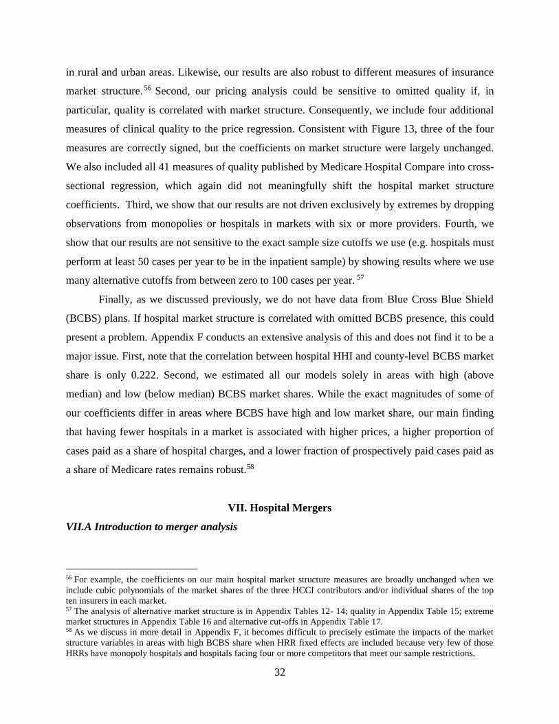
32
in rural and urban areas. Likewise, our results are also robust to different measures of insurance
market structure. 56 Second, our pricing analysis could be sensitive to omitted quality if, in
particular, quality is correlated with market structure. Consequently, we include four additional
measures of clinical quality to the price regression. Consistent with Figure 13, three of the four
measures are correctly signed, but the coefficients on market structure were largely unchanged.
We also included all 41 measures of quality published by Medicare Hospital Compare into cross-
sectional regression, which again did not meaningfully shift the hospital market structure
coefficients. Third, we show that our results are not driven exclusively by extremes by dropping
observations from monopolies or hospitals in markets with six or more providers. Fourth, we
show that our results are not sensitive to the exact sample size cutoffs we use (e.g. hospitals must
perform at least 50 cases per year to be in the inpatient sample) by showing results where we use
many alternative cutoffs from between zero to 100 cases per year. 57
Finally, as we discussed previously, we do not have data from Blue Cross Blue Shield
(BCBS) plans. If hospital market structure is correlated with omitted BCBS presence, this could
present a problem. Appendix F conducts an extensive analysis of this and does not find it to be a
major issue. First, note that the correlation between hospital HHI and county-level BCBS market
share is only 0.222. Second, we estimated all our models solely in areas with high (above
median) and low (below median) BCBS market shares. While the exact magnitudes of some of
our coefficients differ in areas where BCBS have high and low market share, our main finding
that having fewer hospitals in a market is associated with higher prices, a higher proportion of
cases paid as a share of hospital charges, and a lower fraction of prospectively paid cases paid as
a share of Medicare rates remains robust.58
VII. Hospital Mergers
VII.A Introduction to merger analysis
56 For example, the coefficients on our main hospital market structure measures are broadly unchanged when we
include cubic polynomials of the market shares of the three HCCI contributors and/or individual shares of the top
ten insurers in each market. 57 The analysis of alternative market structure is in Appendix Tables 12- 14; quality in Appendix Table 15; extreme
market structures in Appendix Table 16 and alternative cut-offs in Appendix Table 17. 58 As we discuss in more detail in Appendix F, it becomes difficult to precisely estimate the impacts of the market
structure variables in areas with high BCBS share when HRR fixed effects are included because very few of those
HRRs have monopoly hospitals and hospitals facing four or more competitors that meet our sample restrictions.

33
Our cross-sectional regressions in the previous section suggest that hospital market structure is
strongly associated with hospital prices. In this section, we analyze mergers and hospital prices
using the panel aspect of our data. Over the last few decades, there have been hundreds of
mergers between hospitals across the US (recall Figure 1). Economic models of competition in
the hospital sector predict that mergers between hospitals that are close geographic competitors
will lead to price increases making mergers of direct interest (see the Gaynor et al. 2015 review).
Further, examining the impact of mergers on hospital prices provides us with another lens
through which to view the relationship between market structure and prices, and complements
our cross-sectional analysis.
A number of papers have estimated the impacts of specific mergers that were suspected
to be anticompetitive. One strand of this literature uses estimates from structural (or semi-
structural) models and ex ante simulation methods to generate estimates of predicted price
changes from a single or a small number of transactions.59 Although these models allow for a
more sophisticated modeling approach to competition and bargaining between insurers and
hospitals, they would be difficult to estimate for the hundreds of mergers we have in our data.
Instead, we follow a second strand of the literature that uses ex post econometric methodologies
to analyze the effects of consummated mergers.60 This kind of modeling is coarser, but does have
the advantage of looking at what happens after mergers occur. Historically, this strand of the
literature has also focused on analyzing individual mergers or small numbers of mergers. We
extend the literature by examining the impact of hospital mergers that occurred in the US during
the five years covered by our data (which is also a more recent time period than covered in
previous studies).
VII.B Hospital Merger Data
We created a database of nearly all US hospital mergers between 2007 and 2011 (see Appendix
D for details) and found 366 transactions involving over 2,000 hospitals. For example, as
Appendix Table 18 shows, there were 55 transactions involving 84 hospitals where the merging
parties were less than 5 miles apart and 121 transactions involving 260 hospitals within 15 miles
of each other.
59 See Town and Vistnes 2001; Capps et al. 2003; Gaynor and Vogt 2003; Gowrisankaran et al. 2015. 60 See Vita and Sacher 2001; Krishnan 2001; Capps and Dranove 2004; Dafny 2009; Kemp, Kersten, and Severijnen
2012; Haas-Wilson and Garmon 2011; Tenn 2011; Thompson 2011.

34
VII.C Modeling Hospital Mergers
To estimate the effects of mergers on hospital prices, we employ the following specification:
(3) ln(p̂h,t
)= βMERGEh,tD
+ ηh +δt+ υh,t
where p̂h,t
is the usual risk-adjusted hospital inpatient price for hospital h in year t. We include
hospital fixed effects (ηh) and year dummies (δt). The key variable of interest is the binary
indicator, MERGEh,tD
. In our baseline specification this indicator is zero until the year a hospital
becomes involved in a merger, when it then takes a value of one and retains a value of one for
the remainder of our sample period. We categorize mergers based on the physical distance
(superscript D) between the merging entities (e.g. whether the merging parties were separated by
five miles or less, ten miles or less, etc.). Since hospital location is a key factor determining
demand (and hence potential patient substitutability between hospitals), we expect mergers
between hospitals that are geographically closer to result in larger increases in prices than
mergers between hospitals separated by large distances.61 We use a variety of different control
groups, including all hospitals not involved in mergers and matched controls using a number of
different matching methods. In some specifications we also include the same set of control
variables included in our cross-sectional regressions in Table 6.62
There are differences in the characteristics of the merging vs. non-merging hospitals (see
Appendix Table 19). Merging hospitals tend to be located in less concentrated markets (this is
unsurprising due to antitrust scrutiny and a mechanical limit to how concentrated a market can
get), are more likely to be non-profit and teaching hospitals, are larger (more beds), and have
higher reputational average quality (U.S. News & World Report quality rankings). However,
merging and non-merging hospitals look broadly comparable in terms of their share of Medicare
and Medicaid admissions, the technologies they possess, and their area characteristics (county
uninsured and median income). Most of these characteristics vary little over time so the hospital
61 We recognize that mergers between hospitals farther apart may have impacts on prices through more subtle forms
of multi-market conduct behavior. Our specification flexibly allows for mergers to have impacts at any distance,
although we are not testing specifically for cross-market merger effects like those analyzed by Dafny et al. 2016 and
Lewis and Pflum 2017. 62 Because DOJ and FTC occasionally allow failing or “flailing” firms to merge, we want to exclude these firms
from our analysis. To do that, we exclude 53 hospitals that have the largest share of unused capacity defined as the
average daily census divided by the total number of hospital beds (e.g. those in the 99th percentile of unused
capacity). Our results are robust to including these 53 hospitals in our analysis.

35
fixed effects in Equation (3) will largely control for them. More importantly, as we demonstrate
below, we do not find any evidence that merging hospitals have different pre-merger trends in
prices relative to non-merging hospitals.
VII.D Results on Mergers and Hospital Prices
Panel A of Table 8 contains the baseline specifications where we vary the distance between
merging hospitals from 5 to 50 miles. There are positive coefficients on the merger dummies at
every distance and these are almost all significant for mergers between hospitals up to 25 miles
apart. The magnitude of the merger coefficient declines as the distance between the merging
parties increases. Mergers within 5 miles are associated with price increases of 6 percent whereas
the coefficients decline to 2 percent for mergers involving hospitals located up to 25 miles apart.
In Figure 14, we present the estimates of merger effects by one-mile bins for all mergers up to
those 50 miles apart. The estimates are noisy for very close mergers (because there are few such
events) but the coefficient on mergers is broadly monotonically decreasing as the distance
between the merging parties increases.
In Panel B of Table 8, we add the control variables we included in our cross-sectional
analysis, which makes almost no difference to the results. It is also possible that non-merging
neighboring hospitals may be affected by mergers (Dafny 2009). We test for this by adding a
dummy for neighboring hospitals, which switches on after a neighboring hospital is exposed to a
nearby merger (in the relevant distance bin). As we illustrate in Panel C, although the
coefficients on neighboring mergers are usually positive, they are generally statistically
insignificant.
It is possible that our estimates are capturing intertemporal factors other than the mergers
themselves. Given the short time series in our panel, we examine price trends for two years
before and after the merger event in Panel D of Table 8 and in Figure 15. Reassuringly, there
does not appear to be evidence of pre-trends prior to the merger, as prices in the year before the
merger are not significantly different from two years before (or earlier) in any of the columns.
By contrast there are significant post-merger price increases, with higher prices in all columns
two years after mergers occurred. The coefficients seem to generally build up from the year of
the merger, but given the size of the standard errors, it is hard to be certain.

36
The merger coefficients we observe are economically significant.63 A horizontal merger
price effect of five percent is often used as an indicator of (enhanced) market power (U.S.
Department of Justice and Federal Trade Commission 2010). Further, this estimate represents the
average effects of all mergers, not just those thought to be anticompetitive (as in previous ex ante
studies). In addition, since we examine the impacts of consummated mergers, we are looking
only at transactions that passed antitrust scrutiny. Since it is likely that the mergers with the
largest potential effects on price are not attempted due to concerns over antitrust litigation or are
blocked by enforcement authorities, those that we observe should be expected to have a smaller
impact on price.
VII.E Robustness of Merger Results
We subject our merger analysis to a large number of other robustness tests, some of which we
discuss here.64 First, instead of using the simple merger dummy, we estimate the cumulative
merger effects by hospital for all mergers that hospitals were exposed to from 2007 to 2011.65
Our post-merger price coefficients remain similarly scaled. Second, we used various matching
procedures to identify alternative control groups for our analysis (see Appendix E), such as
Mahalanobis distance matching between hospitals, the Dranove and Lindrooth (2003) procedure,
and K-nearest neighbor matching. These tend to show slightly larger price effects for mergers
within five miles than we observe in our baseline estimates. Third, we varied the 50 patients per
year sample cutoff. This does not alter our main results. Fourth, it is possible that the price
increases we observe following a merger could be due to improvements in management (e.g.
hospitals doing a better job at price setting) rather than increased bargaining leverage. To test for
this, we allow the merger coefficient to be different for targets and the acquirers and do not find
statistically significant differences between the two. Finally, we also attempted to estimate
merger effects for the seven procedures used in Table 7. Unfortunately, because those samples
have fewer hospitals, there are fewer treated hospitals, so we cannot estimate merger effects with
precision.
63 We note that our estimates are of the same or similar order of magnitude to the bulk of studies of merger price
effects in other industries (Ashenfelter, Hosken, Weinberg, 2014). 64 The tests discussed here are contained in Appendix Table 20 where Panel A reproduces the baseline results from
Table 8. 65 For example, of the 514 hospitals involved in at least one merger involving hospitals located less than 30 miles
apartment, 47 were involved in more than one merger from 2007 to 2011.

37
VIII. Conclusions
Using insurance claims from three of the five largest commercial insurers in the US, we find that
health spending on the privately insured varies by a factor of three across the nation.
Approximately half of the variation in private spending across HRRs is driven by differences in
hospitals’ prices and half by quantity (Medicare spending variation is almost all accounted for by
quantity variation). Since previous research has focused on understanding the drivers of
differences in the quantity of health care delivered across regions (Cutler et al. 2017, Finkelstein
et al. 2016), we focus on analyzing the variance in hospital prices.
Historically, the prices hospitals negotiate with insurers have been treated as
commercially sensitive and have been largely unavailable to researchers on a national basis. Our
data includes hospitals’ transaction prices and we are able to observe substantial variation in
prices across hospitals, even for plausibly undifferentiated services like lower-limb MRIs.
Moreover, a significant amount of the national variation in prices occurs within hospitals. This
suggests that insurers’ bargaining leverage influences the prices they negotiate with hospitals
We also use our data to characterize insurer-hospital contracts. When prices are set as a
share of charges (rather than prospectively paid), it offers hospitals weak incentives to lower
costs and it transfers the financial risk from idiosyncratically expensive cases to insurers. We
find that approximately 23 percent of inpatient cases are paid as a share of charges and estimate
that no more than 57 percent of inpatient cases are set as a percentage of Medicare rates.
Market structure appears strongly associated with hospitals’ price levels and contract
structure. Monopoly hospitals are associated with 12 percent higher prices, 10 percentage points
more cases paid as a share of charges, and 11 percentage points less of their prospectively paid
cases set as a percentage of Medicare payments compared to hospitals located in quadropoly or
greater markets. In concentrated insurer markets we find the opposite correlations – hospitals
have lower transaction prices and operate under contracts where they bear more risk. We also
analyze the 366 hospital mergers that occurred between 2007 and 2011 and find that after
mergers involving hospitals located less than five miles apart, prices at the merging parties
increased by over 6 percent. As the distance between the merging parties’ increases, the size of
the post-merger price increases is attenuated. This set of results around market structure suggests

38
that bargaining leverage is an important component of the dispersion we see in transaction
prices.
Collectively, our research highlights the importance of studying hospital pricing and
contracts when analyzing health spending on the privately insured. While our analysis is not
causal, it does suggest that policy-makers should continue to analyze whether potential hospital
mergers could harm consumer welfare. Likewise, while we cannot draw strong normative
conclusions, quantifying the scale of the variation in prices is nevertheless important. Given the
variation in prices that we observe (particularly for undifferentiated procedures), our results
suggest that patients and payers could save significant amounts of money if patients attended
lower-priced providers. This suggests that policies aimed at steering patients towards low cost
providers (e.g. reference pricing, incentivizing referring physicians, etc.) could lower spending.
Finally, there is widespread agreement that payment reform (shifting to contracts where
providers bear more risk) is crucial to increasing hospital productivity (McClellan et al. 2017).
Our analysis suggests that providers who have fewer potential competitors will be more able to
resist attempts at such payment reform.
Further research should be focused on understanding the economic forces behind the
patterns and correlations we have identified in the data. Given the growing availability of
insurance claims data, there is scope for a rich and broad variety of research that takes on these
important tasks.
References
Ashenfelter, Orley, Daniel Hosken, and Matthew Weinberg, “Did Robert Bork Understate the
Competitive Impact of Mergers? Evidence from Consummated Mergers,” The Journal of
Law and Economics, 57 (2014), S67-100.
Bai, Ge, and Gerard F. Anderson, “Extreme Markup: The Fifty US Hospitals with the Highest
Charge-To-Cost Ratios,” Health Affairs, 34 (2015), 922-928.
Baker, Laurence, M. Kate Bundorf, Aileen Devlin, and Daniel P. Kessler, “Why Don’t
Commercial Health Plans Use Prospective Payment?” NBER Working Paper Series, No.
22709 (2016).
Bresnahan, Timothy, “Empirical Studies of Industries with Market Power”, in Handbook of
Industrial Organization, Volume 2 (1989): 1011-1057.
Brill, Steven, “Bitter Pill: Why Medical Bills Are Killing Us,” in Time, (New York: Time
Incorporated, 2013).
Burns, Lawton R., Pauly, Mark V., “Transformation of the Health Care Industry: Curb Your
Enthusiasm,” Milbank Quarterly, 96(2018): 57-109.

39
Capps, Cory, and David Dranove, “Hospital Consolidation and Negotiated PPO Prices,” Health
Affairs, 23 (2004), 175-181.
Capps, Cory, David Dranove, and Mark Satterthwaite, “Competition and Market Power in
Option Demand Markets,” The Rand Journal of Economics, 34 (2003), 737-763.
Centers for Disease Control and Prevention, “Number of All-Listed Procedures for Discharges
from Short-Stay Hospitals, by Procedure Category and Age: United States, 2010,”
(2010).
Centers for Disease Control and Prevention, “National Center for Health Statistics – Health
Insurance Coverage,” (2017).
Chernew, Michael E., Lindsay M. Sabik, Amitabh Chandra, Teresa B. Gibson, and Joseph P.
Newhouse, “Geographic Correlation Between Large-Firm Commercial Spending and
Medicare Spending,” The American Journal of Managed Care, 16 (2010), 131-138.
Clemens, Jeffrey, and Joshua D. Gottlieb, “In the Shadow of a Giant: Medicare's Influence on
Private Physician Payments,” Journal of Political Economy, 125 (2017), 1-39.
Clemens, Jeffrey, Joshua D. Gottlieb, and Timea Laura Molnar, “Do Health Insurers Innovate?
Evidence from the Anatomy of Physician Payments,” Journal of Health Economics, 55
(2017), 153-167.
Coakley, Martha, “Examination of Health Care Cost Trends and Cost Drivers - Report for
Annual Public Hearing,” edited by Massachusetts Attorney General's Office. Boston,
Massachusetts (2011).
Curtu, Vilsa, Liran Einav, Amy Finkelstein, Jonathan Levin and Jay Bhatacharya (2017) “Health
Care Spending Utilization in Public and Private Medicare”, NBER Working Paper No.
23090.
Cutler, David, Jonathan Skinner, Ariel Dora Stern, and David Wennberg, “Physician Beliefs and
Patient Preferences: A New Look at Regional Variation in Health Care Spending,”
Harvard Business School Working Paper, No. 15-090 (May 2015). Revised December
2017.
Dafny, Leemore, “Estimation and Identification of Merger Effects: An Application to Hospital
Mergers,” The Journal of Law and Economics, 52 (2009), 523-550.
Dafny, Leemore, Kate Ho, and Robin S. Lee, “The Price Effects of Cross-Market Hospital
Mergers,” NBER Working Paper Series, No. 22106 (2016).
Department of Health and Human Services, “Administration Offers Consumers an
Unprecedented Look at Hospital Charges,” (Centers for Medicare & Medicaid Services,
2013).
Dranove, David, and Richard Lindrooth, “Hospital Consolidation and Costs: Another Look at the
Evidence,” Journal of Health Economics, 22 (2003), 983-997.
Eizenberg, Alon, Saul Lach, and Merav Yiftach, “Retail Prices in a City,” (CEPR Discussion
Papers: 11590, 2016).
Ellis, Randall P., and Thomas G. McGuire, “Insurance Principles and the Design of Prospective
Payment Systems,” Journal of Health Economics, 7 (1988), 215-237.
FastStats - Health Expenditures (https://www.cdc.gov/nchs/fastats/health-expenditures.htm,
Center for Disease Control and Prevention).
Farrell, Joseph, David J. Balan, Keith Brand, and Brett W. Wendling, “Economics at the FTC:
Hospital Mergers, Authorized Generic Drugs, and Consumer Credit Markets,” Review of
Industrial Organization, 39 (2011), 271-296.

40
Finkelstein, Amy, Matthew Gentzkow, and Heidi Williams, “Sources of Geographic Variation in
Health Care: Evidence from Patient Migration,” Quarterly Journal of Economics, 131
(2016), 1681-1726.
Fisher, Elliott S., David E. Wennberg, Therese A. Stukel, Daniel J. Gottlieb, F. L. Lucas, and
Etoile L. Pinder, “The Implications of Regional Variations in Medicare Spending. Part 1:
The Content, Quality, and Accessibility of Care,” Ann Intern Med, 138 (2003a), 273-287.
---, “The Implications of Regional Variations in Medicare Spending. Part 2: Health Outcomes
and Satisfaction with Care,” Ann Internal Medicine, 138 (2003b), 288-298.
Garmon, Christopher, “The Accuracy of Hospital Merger Screening Methods,” The Rand
Journal of Economics, 48 (2017), 1068-1102.
Garmon, Christopher, Kmitch, Laura, “Health Care Competition or Regulation: The Unusual
Case of Albany Georgia,” Mimeo (2017).
Gaynor, Martin, Kate Ho, and Robert J. Town, “The Industrial Organization of Health-Care
Markets,” Journal of Economic Literature, 53 (2015), 235-284.
Gaynor, Martin, and Robert J. Town, “Competition in Health Care Markets,” in Handbook of
Health Economics, Mark V. Pauly, Thomas G. McGuire, and Pedro P. Barros, eds.
(Elsevier, 2011).
---, “The Impact of Hospital Consolidation—Update,” in The Synthesis Project, (Robert Wood
Johnson Foundation, 2012).
Gaynor, Martin, and William B. Vogt, “Competition among Hospitals,” The Rand Journal of
Economics, 34 (2003), 764-785.
Gift, Thomas L., Richard Arnould, and Larry DeBrock, “Is Healthy Competition Healthy? New
Evidence of the Impact of Hospital Competition,” Inquiry, 39 (2002), 45-55.
Ginsburg, Paul B., “Wide Variation in Hospital and Physician Payment Rates Evidence of
Provider Market Power,” in HSC Research Brief No. 16, Center for Studying Health
System Change, ed. (2010).
Government Accountability Office, “Report to the Honorable Paul Ryan, House of
Representatives: Competition and Other Factors Linked to Wide Variation in Health Care
Prices,” United States Government Accountability Office, ed. (Washington, DC, 2005).
Gowrisankaran, Gautam, Aviv Nevo, and Robert Town, "Mergers When Prices Are Negotiated:
Evidence from the Hospital Industry," American Economic Review, 105 (2015), 172-203.
Haas-Wilson, Deborah, and Christopher Garmon, "Hospital Mergers and Competitive Effects:
Two Retrospective Analyses," International Journal of the Economics of Business, 18
(2011), 17-32.
Hartman, Micah, Anne B. Martin, Nathan Espinosa, Aaron, Caitlin, “National Health Care
Spending in 2016,” Health Affairs, 37(2017): 1299 – 1305.
Ho, Kate, and Robin S. Lee, "Insurer Competition in Health Care Markets," Econometrica, 85
(2017), 379-417.
Hortaçsu, Ali, and Chad Syverson, "Product Differentiation, Search Costs, and Competition in
the Mutual Fund Industry: A Case Study of S&P 500 Index Funds," Quarterly Journal of
Economics, 119 (2004), 403-456.
Hsia, R. Y., and Y. Akosa Antwi, "Variation in Charges for Emergency Department Visits
Across California," Ann Emergency Medicine, 64 (2014), 120-126, 126.e121-124.
Kaiser Family Foundation, “2017 Employer Health Benefits Survey,” Kaiser Family Foundation,
Washington, D.C.

41
Kaplan, Greg, and Guido Menzio, "The Morphology of Price Dispersion," International
Economic Review, 56 (2015), 1165-1205.
Kemp, Ron G. M., Nikki Kersten, and Astrid M. Severijnen, "Price Effects of Dutch Hospital
Mergers: An Ex-Post Assessment of Hip Surgery," De Economist, 160 (2012), 237-255.
Krishnan, Ranjani, "Market Restructuring and Pricing in the Hospital Industry," Journal of
Health Economics, 20 (2001), 213-237.
Lewis, Matthew S., and Kevin E. Pflum, "Hospital Systems and Bargaining Power: Evidence
From Out-of-Market Acquisitions," The Rand Journal of Economics, 48 (2017), 579-610.
McClellan, Mark, Feinberg, David, Bach, Peter et al., “Payment Reform for Better Value and
Medical Innovation”, National Academy of Sciences (2017).
Moody’s Investors Service, “Sector In-Depth: Not-For-Profit and Public Healthcare – US,”
Moody’s, New York, NY.
Newhouse, Joseph P., “Reimbursing Health Plans and Health Providers: Efficiency in Production
versus Selection,” Journal of Economic Literature, 34(1996), 1236-63.
Newhouse, Joseph P., Alan M. Garber, Robin P. Graham, Margaret A. McCoy, Michelle
Mancher, and Ashna Kibria, Variation in Health Care Spending: Target Decision
Making, Not Geography (Washington, DC: The National Academies Press, 2013).
Philipson, Tomas J., Seth A. Seabury, Lee M. Lockwood, Dana P. Goldman, and Darius N.
Lakdawalla, "Geographic Variation in Health Care: The Role of Private Markets,"
Brookings Papers on Economic Activity, (2010), 325-355.
Pratt, John, David A. Wise, and Richard Zeckhauser, "Price Differences in Almost Competitive
Markets," Quarterly Journal of Economics, 93 (1979), 189-211.
Reinhardt, Uwe E., "The Pricing of U.S. Hospital Services: Chaos Behind A Veil of Secrecy,"
Health Affairs, 25 (2006), 57-69.
Shleifer, Andrei, “A Theory of Yardstick Competition,” Rand Journal of Economics, 16(1985):
319-327.
Sorensen, Alan T., "Insurer-Hospital Bargaining: Negotiated Discounts in Post-Deregulation
Connecticut," The Journal of Industrial Economics, 51 (2003), 469-490.
Tenn, Steven, "The Price Effects of Hospital Mergers: A Case Study of the Sutter-Summit
Transaction," International Journal of the Economics of Business, 18 (2011), 65-82.
Thompson, Aileen, "The Effect of Hospital Mergers on Inpatient Prices: A Case Study of the
New Hanover-Cape Fear Transaction," International Journal of the Economics of
Business, 18 (2011), 91-101.
Town, Robert, and Gregory Vistnes, "Hospital Competition in HMO Networks," Journal of
Health Economics, 20 (2001), 733-753.
Town, Robert, Roger Feldman, and John Kralewski, “Market Power and Contract Form:
Evidence from Physician Group Practices,” International Journal of Health Care
Finance Economics, 11(2011): 115-132.
United States Department of Justice and the Federal Trade Commission, “Horizontal Merger
Guidelines,” (2010).
United States Government Accountability Office, "Report to the Honorable Paul Ryan, House of
Representatives: Competition and Other Factors Linked to Wide Variation in Health Care
Prices," United States Government Accountability Office, ed. (Washington, DC, 2005).
Vita, Michael G., and Seth Sacher, "The Competitive Effects of Not-for-Profit Hospital Mergers:
A Case Study," The Journal of Industrial Economics, XLIX (2001), 63-84.

42
Vogt, William B, and Robert Town, "How Has Hospital Consolidation Affected the Price and
Quality of Hospital Care?" in The Synthesis Project, (Robert Wood Johnson Foundation,
2006).
White, Chapin, James D. Reschovsky, and Amelia M. Bond, "Understanding Differences
Between High- And Low-Price Hospitals: Implications For Efforts To Rein In Costs,"
Health Affairs, 33 (2014), 324-331.
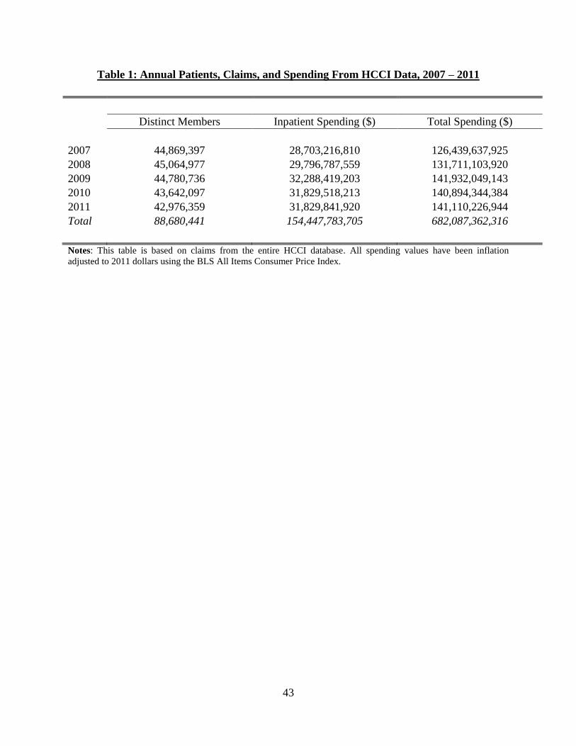
43
Table 1: Annual Patients, Claims, and Spending From HCCI Data, 2007 – 2011
Distinct Members Inpatient Spending ($) Total Spending ($)
2007 44,869,397 28,703,216,810 126,439,637,925
2008 45,064,977 29,796,787,559 131,711,103,920
2009 44,780,736 32,288,419,203 141,932,049,143
2010 43,642,097 31,829,518,213 140,894,344,384
2011 42,976,359 31,829,841,920 141,110,226,944
Total 88,680,441 154,447,783,705 682,087,362,316
Notes: This table is based on claims from the entire HCCI database. All spending values have been inflation
adjusted to 2011 dollars using the BLS All Items Consumer Price Index.

44
Table 2: Hospital and Patient Characteristics
Market Characteristics Mean SD Min Max
Hospital in Monopoly Market, 15 Mile Radius 0.163 0.370 0 1
Hospital in Duopoly Market, 15 Mile Radius 0.194 0.395 0 1
Hospital in Triopoly Market, 15 Mile Radius 0.123 0.328 0 1
Hospital in Quadropoly+ 0.520 0.500 0 1
Hospital HHI Defined by Beds in a 15 Mile Radius 0.461 0.295 0.043 1
HCCI Market Share Measured at the County Level 0.178 0.101 0.017 0.571
Blue Cross Blue Shield Market Share Measured at the County Level 0.403 0.218 0.001 0.958
Hospital Characteristics
Number of Technologies 59 30 0 138
Ranked in US News & World Reports 0.053 0.225 0 1
Beds 270 203 10 2,264
Teaching Hospital 0.380 0.485 0 1
Government Owned 0.122 0.327 0 1
Non-Profit 0.693 0.461 0 1
For-Profit 0.185 0.388 0 1
Local Area Characteristics
Percent of County Uninsured 0.171 0.058 0.031 0.389
Median Income 51,516 13,153 22,255 119,525
Rural 0.162 0.369 0 1
Other Payers
Medicare Payment Rate 6,437 1,288 4,590 14,292
Share Medicare 0.446 0.101 0 0.833
Share Medicaid 0.188 0.096 0 0.777
Quality Scores 30-Day AMI Survival Rate 0.840 0.016 0.751 0.898
% of AMI Patients Given Aspirin at Arrival 0.975 0.049 0.330 1
% of Patients Given Antibiotics Pre Surgery 0.934 0.082 0.140 1
% of Surgery Patients Given Treatment to Prevent Blood Clots 0.881 0.106 0.030 1
Patient Characteristics
Age 18-24 0.074 0.262 0 1
Age 25-35 0.248 0.432 0 1
Age 35-44 0.196 0.397 0 1
Age 45-54 0.219 0.414 0 1
Age 55-64 0.262 0.440 0 1
Female 0.672 0.470 0 1
Charlson Comorbidity Index 0.707 1.442 0 6
Notes: These are descriptive statistics for the Inpatient Pricing sample from the HCCI database. There are 8,772
hospital-year observations representing 2,358 unique hospitals and 4,964,774 unique patients.

45
Table 3: Private Prices and Medicare Base Payment Rate at the Hospital Level, 2011
Summary Statistics Correlation
Mean Standard
Deviation
#
Hospitals
Inpatien
t
Hip
Rep
lacemen
t
Knee R
eplacem
ent
Cesarean
Sectio
n
Vag
inal D
elivery
PT
CA
Colo
nosco
py
Low
er Lim
b M
RI
Med
icare Base
Inpatient 14,020 4,782 2,139
1
Hip Replacement 24,565 7,209 341
0.724 1
Knee Replacement 24,059 7,677 664
0.761 0.923 1
Cesarean Section 8,258 2,758 926
0.794 0.535 0.574 1
Vaginal Delivery 5,465 1,727 1,022
0.693 0.544 0.510 0.879 1
PTCA 25,395 8,577 375
0.678 0.580 0.573 0.440 0.349 1
Colonoscopy 1,834 685 844
0.342 0.285 0.273 0.303 0.322 0.156 1
Lower Limb MRI 1,343 533 1,304
0.350 0.224 0.264 0.276 0.232 0.255 0.252 1
Medicare Base 6,494 1,291 2,139
0.203 0.283 0.203 0.258 0.360 0.093 0.087 -0.040 1
Notes: The private-payer hospital 2011 prices are the risk-adjusted transaction prices as discussed in Appendix B1 and Appendix B2. The inpatient Medicare
payment rate is the Medicare base payment with a DRG weight of 1. Correlation coefficients are pairwise correlations between multiple procedures at the same
hospital. The data are drawn from our pricing samples. All correlations are significant at p<0.01 except for Medicare and PTCA (p<0.1), Medicare and
Colonoscopy (p<0.05), and Medicare and Lower Limb MRI (not significant).

46
Table 4: Price/Quantity Decomposition of Medicare and Private Health Spending, 2011
Private Medicare
(1) (2) (3)
(4) (5) (6)
Share
Price
Share
Quantity
Share
Covariance
Share
Price
Share
Quantity
Share
Covariance
Intracranial hemorrhage or cerebral infarction w CC 0.484 0.466 0.050
0.256 0.662 0.082
Pulmonary edema & respiratory failure 0.594 0.402 0.004
0.213 0.770 0.017
Simple pneumonia & pleurisy w CC 0.475 0.514 0.011
0.221 0.989 -0.210
Respiratory system diagnosis w ventilator support 96+ hours 0.650 0.415 -0.064
0.102 0.771 0.127
Respiratory system diagnosis w ventilator support <96 hours 0.655 0.321 0.024
0.155 0.987 -0.143
Cardiac valve & oth maj cardiothoracic proc w/o card cath w MCC 0.468 0.410 0.122
0.086 0.840 0.074
Cardiac valve & oth maj cardiothoracic proc w/o card cath w CC 0.389 0.498 0.113
0.069 0.846 0.085
Cardiac defibrillator implant w/o cardiac cath w/o MCC 0.713 0.377 -0.090
0.061 0.956 -0.017
Coronary bypass w cardiac cath w/o MCC 0.277 0.746 -0.023
0.074 1.168 -0.242
Coronary bypass w/o cardiac cath w/o MCC 0.381 0.699 -0.079
0.108 1.058 -0.166
Major cardiovasc proc w MCC or thoracic aortic aneurysm repair 0.555 0.308 0.138
0.166 0.871 -0.037
Major cardiovascular proc w/o MCC 0.518 0.547 -0.065
0.163 1.059 -0.222
Perc cardiovasc proc w drug-eluting stent w MCC or 4+ vessels/stents 0.371 0.564 0.065
0.089 1.004 -0.094
Perc cardiovasc proc w drug-eluting stent w/o MCC 0.465 0.681 -0.146
0.153 1.113 -0.265
Circulatory disorders except AMI, w card cath w/o MCC 0.435 0.756 -0.191
0.112 1.110 -0.222
Major small & large bowel proc w MCC 0.676 0.299 0.025
0.213 0.888 -0.101
Major small & large bowel proc w CC 0.474 0.453 0.073
0.193 0.811 -0.005
Esophagitis, gastroent & misc digest disorders w/o MCC 0.387 0.637 -0.024
0.164 1.028 -0.192
Spinal fusion except cervical w/o MCC 0.334 0.512 0.154
0.085 1.067 -0.152
Major joint replacement or reattachment of lower extremity w/o MCC 0.381 0.645 -0.026
0.213 0.973 -0.186
Cellulitis w/o MCC 0.425 0.583 -0.008
0.128 0.923 -0.051
Infectious & parasitic diseases w O.R. proc w MCC 0.701 0.360 -0.061
0.112 0.769 0.119
Septicemia w MV 96+ hours 0.759 0.305 -0.065
0.072 0.860 0.067
Septicemia w/o MV 96+ hours w MCC 0.536 0.365 0.099
0.120 0.815 0.064
Rehabilitation w CC/MCC 0.460 0.430 0.109
0.056 1.164 -0.219
Average Shares (weighted by spending) 0.496 0.495 0.009
0.127 0.953 -0.081
Notes: The decomposition of ln(spending per beneficiary) is carried out on the 2011 Medicare and HCCI inpatient spending samples. The Medicare analysis is
based on the 100% sample of Medicare claims accessed via the AHD. HCCI data includes all inpatient claims from our spending sample for those aged 55-64.
“CC” is short for with “complication or comorbidity”; “MCC” is short for with “major complication or comorbidity”; “proc”=”procedure”; “cath” = “catheter”;
“w”=With”; “w/o”=”without”. Because of space constraints, we show only the top 25 highest spending DRGs in the HCCI data; the “Average Shares” in the
final row are the average decomposition results by DRG (weighted by spending, i.e. first three columns use spending weights for private and last three use
weights based on Medicare) across the 735 DRGs (HCCI) 562 DRGs (Medicare).

47
Table 5: Decomposition of Hospitals’ Transaction Price Variation
(1) (2) (3) (4) (5) (6) (7) (8)
R2
Unexplained
within hospital-
month variance Observations
Within hospital-
month coefficient
of variation
Hip Replacement 0.006 0.017 0.502 0.763 0.776 22.4% 15,122 0.174
Knee Replacement 0.006 0.016 0.416 0.728 0.756 24.4% 37,157 0.206
Cesarean Section 0.011 0.029 0.432 0.726 0.755 24.5% 81,482 0.170
Vaginal Delivery 0.012 0.030 0.381 0.647 0.701 29.9% 108,794 0.192
PTCA 0.005 0.019 0.478 0.724 0.760 24.0% 16,636 0.239
Colonoscopy 0.010 0.024 0.412 0.759 0.820 18.0% 66,017 0.165
Lower Limb MRI 0.001 0.008 0.331 0.774 0.784 21.6% 113,914 0.157
Mean
23.5%
0.186
Patient Characteristics Yes Yes Yes Yes Yes
Plan Characteristics No Yes Yes Yes Yes
HRR Fixed Effects No No Yes — —
Hospital Fixed Effects No No No Yes Yes
Control for Charges No No No No Yes
Notes: Columns (1)-(5) have transaction-level procedure prices (2010-2011) as the dependent variable and display the R2 of a regression that includes and the
relevant right hand side variables indicated in the lower rows. All regressions use case-level data and control for month-year dummies. Patient characteristics
include fixed effects for sex and five age bands (as in Table 2). Plan characteristics include the full interaction of market segment (i.e. large vs. small group), and
product (HMO, PPO, POS, EOP, indemnity plan and other) and funding type (fully insured or ASO). “Hospital fixed effects” indicates a full set of hospital
dummies interacted with month-year dummies. “HRR fixed effects” indicates a full set of HRR dummies interacted with month-year dummies. Column (6) = 1 -
Column (5) and the mean is the unweighted average across the 7 procedures. Column (8) reports the within-hospital-month coefficient of variation, averaged
across hospital-months. The data are drawn from the procedure samples.

48
Table 6: Hospital Concentration, Prices and Contract Form, 2008-2011
(1) (2) (3)
Panel A: ln(Hospital Price), Mean=9.42, Obs=8,772, Number of Hospitals=2,358
Monopoly 0.234*** 0.190*** 0.118***
(0.024) (0.024) (0.024)
Duopoly 0.161*** 0.130*** 0.073***
(0.021) (0.020) (0.024)
Triopoly 0.115*** 0.083*** 0.036
(0.023) (0.023) (0.023)
Hospitals in quadropoly or greater markets are the omitted category
HCCI Market Share
-0.006*** -0.007***
(0.002) (0.002)
Panel B: Percent of Cases Paid as Share of Charges; Mean=18.6%, Obs=4,344, Number of
Hospitals=2,253
Monopoly 17.335*** 15.241*** 10.455***
(1.828) (1.823) (1.778)
Duopoly 9.979*** 8.424*** 5.702***
(1.760) (1.740) (1.596)
Triopoly 7.804*** 6.235** 4.909**
(1.909) (1.938) (1.608)
Hospitals in quadropoly or greater markets are the omitted category
HCCI Market Share
-0.288*** -0.403***
(0.077) (0.120)
Panel C: Percent of Cases of Prospective Payments Tied to Medicare; Mean=48.3%, Obs=3,669,
Number of Hospitals=1,936
Monopoly -16.849*** -11.275*** -11.293***
(2.882) (2.696) (3.160)
Duopoly -8.791*** -4.272* -5.595**
(2.441) (2.443) (2.316)
Triopoly -7.111** -2.422 -5.747**
(2.866) (2.727) (2.790)
Hospitals in quadropoly or greater markets are the omitted category
HCCI Market Share
0.890*** 0.616***
(0.091) (0.174)
HRR Fixed Effects No No Yes
Notes: * p<0.10, ** p<0.05, *** p<0.01. OLS estimates of Equation (2) with standard errors clustered at the HRR-
level in parentheses. Market structure variables described in Appendix C. The dependent variable in Panel A is
ln(Hospital inpatient prices) that are regression risk-adjusted for DRG, age, and sex; in Panel B the dependent
variable is the percent of cases paid as share of charges (i.e. non-prospective payments); in Panel C the dependent
variable is the percent of cases tied to the Medicare reimbursement rate. An observation is a hospital-year. In Panel
A, the data covers 2008 to 2011; Panels B and C it covers 2010 to 2011 because charge data is unavailable for
earlier years. All regressions include controls for the number of technologies, dummy for being ranked in US News
& World Reports, size (number of beds), hospital ownership (government, non-profit or for-profit), whether a
teaching hospital, % of county uninsured, county median income, the Medicare payment rate, share of Medicare,
share of Medicaid, and year dummies. Appendix Tables 7-9 reports full set of results.

49
Table 7: Prices and Contractual Form at the Procedure level
(1) (2) (3) (4) (5) (6) (7) (8) (9)
Sample: Inpatient
Pooled
Procedures
Hip
Replacement
Knee
Replacement
Cesarean
Section
Vaginal
Delivery PTCA Colonoscopy
Lower
Limb
MRI
Panel A: ln(Hospital Price)
Monopoly 0.118*** 0.139*** 0.054 0.152*** 0.140** 0.100** 0.150 0.080* 0.210***
(0.024) (0.026) (0.102) (0.057) (0.059) (0.040) (0.100) (0.043) (0.036)
Duopoly 0.073*** 0.095*** 0.016 0.019 0.092*** 0.072*** 0.153** 0.064 0.141***
(0.024) (0.018) (0.069) (0.046) (0.030) (0.024) (0.071) (0.039) (0.031)
Triopoly 0.036 0.055** 0.068 -0.011 0.040 -0.001 0.086 0.037 0.126***
(0.023) (0.021) (0.084) (0.048) (0.038) (0.031) (0.052) (0.041) (0.035)
HCCI Market Share -0.007*** -0.003 0.001 -0.002 <0.001 -0.001 -0.003 -0.003 -0.004
(0.002) (0.002) (0.004) (0.003) (0.003) (0.002) (0.004) (0.003) (0.002)
Observations 8,772 22,167 1,259 2,660 3,794 4,096 1,764 3,512 5,082
Panel B: (Percent of Cases Paid As a Share of Charges)*100
Monopoly 10.455*** 22.264*** 6.655 19.596*** 22.228*** 24.937*** 10.504 22.628***
(1.778) (3.226) (6.425) (4.832) (5.540) (4.488) (8.583) (4.299)
Duopoly 5.702*** 12.678*** -2.558 13.366** 14.932*** 18.528*** 13.160 8.166*
(1.596) (2.908) (7.533) (4.824) (4.087) (3.683) (6.797) (3.868)
Triopoly 4.909** 7.942** 16.634* 9.208 5.471 10.256** 0.049 9.607*
(1.608) (2.604) (7.943) (5.447) (3.980) (3.576) (3.949) (3.869)
HCCI Market Share -0.403*** -0.579** 0.500 -0.434 -0.510 -0.510 -0.259 -0.801**
(0.120) (0.218) (0.331) (0.327) (0.331) (0.272) (0.314) (0.252)
Observations 4,344 8,463 661 1,362 1,870 2,056 807 1,707
Notes: * p<0.10, ** p<0.05, *** p<0.01. OLS estimates of Equation (2) with standard errors clustered at the HRR-level in parentheses. Column (1) reproduces
the results in Column (3) of Table 6. The dependent variables in Panel A are the ln(Inpatient hospital prices), risk-adjusted for age and sex. In Panel B, they are
the Percent of cases paid as a share of hospital charges. In both panels these are for the specific procedures noted at the head of the column. Charges for MRIs do
not generally vary across cases within hospitals so it is not possible to split into contract type. All regressions include controls for the number of technologies,
dummy for being ranked in US News & World Reports, size as measured by number of beds, hospital ownership (government, non-profit or for-profit), whether
a teaching hospital, percent of county uninsured, county median income, the Medicare payment rate, share of Medicare, share of Medicaid, year dummies and
HRR fixed-effects. The pooled sample reported in Column (2) stacks all the regressions for the specific procedures in the later columns and includes a set of
procedure dummies.

50
Table 8: Hospital Prices and Mergers
Dependent variable: ln(price) (1) (2) (3) (4) (5) (6) (7)
Distance (merger within given number of miles): 5 10 15 20 25 30 50
Panel A: Baseline
Post-Merger 0.060** 0.039** 0.021 0.023* 0.024** 0.014 0.008
(0.025) (0.019) (0.013) (0.013) (0.011) (0.011) (0.009)
Panel B: Add Controls
Post-Merger 0.062** 0.040** 0.021 0.024* 0.024** 0.014 0.008
(0.025) (0.019) (0.013) (0.013) (0.011) (0.010) (0.009)
Panel C: Separately Controlling for Neighbors Post-Merger 0.062** 0.040** 0.021 0.022* 0.024** 0.013 0.008
(0.025) (0.019) (0.013) (0.013) (0.011) (0.011) (0.009)
Merging Neighbor -0.016 0.024* 0.005 0.013 0.003 0.003 -0.005
(0.028) (0.014) (0.010) (0.008) (0.007) (0.007) (0.006)
Panel D: Merger Effects over time (t-2 and before omitted base)
t-1 0.019 0.015 0.015 0.015 0.015 0.012 0.013
(0.03) 0.018) (0.013) (0.012) (0.011) (0.012) (0.010)
t 0.074** 0.035 0.021 0.025 0.028* 0.017 0.011
(0.034) (0.025) (0.017) (0.017) (0.015) (0.015) (0.012)
t+1 0.070** 0.064** 0.041** 0.044** 0.041** 0.028 0.024
(0.035) (0.027) (0.020) (0.019) (0.018) (0.017) (0.015)
t+2 and after 0.056 0.088*** 0.068*** 0.063*** 0.059*** 0.041** 0.036*
(0.040) (0.033) (0.026) (0.024) (0.022) (0.021) (0.019)
Observations 8,655 8,655 8,655 8,655 8,655 8,655 8,655
Notes: * p<0.10, ** p<0.05, *** p<0.01. OLS estimates of Equation (3) with standard errors in parentheses (clustered by hospital and system). All regressions
include hospital fixed effects and year dummies. The dependent variable is our risk-adjusted inpatient price index. Controls: share of the privately insured
covered by the HCCI insurers, number of technologies, dummy for being ranked in US News & World Reports, size as measured by number of beds, hospital
ownership (government, non-profit or for-profit), whether a teaching hospital, percent of county uninsured, county median income, the Medicare payment rate,
share of Medicare, share of Medicaid, year dummies and HRR fixed-effects. Post-merger is dummy equal to 1 in the year a hospital merges and in all years
afterwards and zero otherwise. “Neighbor” = 1 if a hospital was not involved in the merger, but within the distance indicated in the column head of a hospital
where a merger took place (and zero otherwise).

51
Figure 1: Hospital Mergers and Acquisitions by Year
Notes: This figure shows the number of unique hospital merger and acquisition transactions by year. Authors’
calculations based on data from the AHA, Irving-Levin Associates, Factset, and SDC Platinum databases. See
Appendices A and D for details.
52
Figure 2: Average Hospital Facilities Charges, Negotiated Prices, and Medicare
Reimbursements, 2011
Notes: Data drawn from the inpatient and procedures samples. The height of the pale grey bars (top) are the average
hospital charges. The height of the darker red shaded bars (middle) red the transaction prices. Both are risk-adjusted
as described in Appendices B1 and B2. The blue bars (bottom) are the Medicare reimbursements as described in
Appendix B4. Prices are given in 2011 dollar amounts and as a percentage of the transaction prices (in parentheses).

53
Figure 3: Relationship between Charges and Negotiated Prices for Knee Replacements,
2011
Notes: This is a scatter plot of hospital-level, risk-adjusted charges for knee replacements and risk-adjusted
transaction prices. There are 696 unique providers included in this analysis who delivered 10 or more knee
replacements to HCCI funded patients in 2011.

54
Figure 4: Total Private Spending by HRR, 2011
Mean SD Min Max
$4,197 $670 $2,110 $6,366
Notes: This figure captures risk-adjusted spending per beneficiary by HRR using data from 2011. Each bin captures
a quintile of spending per beneficiary. The data are drawn from the spending sample. Spending per beneficiary is
risk-adjusted for age and sex.
2,110 - 3,648
3,649 - 3,956
3,957 - 4,299
4,300 - 4,739
4,740 - 6,366
Spending ($)

55
Figure 5: National Variation in Hospital Prices for Knee Replacement and Lower Limb MRIs, 2011
Notes: Each red bar represents a single hospital’s regression-adjusted transaction price based on 2011 cases. The Medicare
payment (gray) is based on the PPS fee schedule described in Appendix B4. The bars are ordered by private price.
Summary Statistics for Negotiated Prices
$24,059
Mean
$1,343
$6,404 – $52,503
Min - Max
$270 – $3,251
$15,115 – $34,554
p10 - p90
$719 – $2,104
$18,260 – $28,698
Inter Quartile Range (IQR)
$965 – $1,671
2.29
p90/10 ratio
2.93
0.32
Coefficient of Variation
0.40
0.18
Gini Coefficient
0.22
664
Number of Hospitals
1,304
Panel A: Knee Replacement Prices Panel B: Lower Limb MRI Prices

56
Figure 6: Regression Adjusted HRR-Level Inpatient Hospital Prices, 2011
Notes: This figure captures HRR-level average hospital regression-adjusted inpatient prices that are risk-adjusted for
DRG, age, and sex, and weighted by hospital activity. In Appendix Figure A6, we present this map normalized using
the Medicare wage-index in order to control for local wage costs across the US. Gray regions are areas where we do
not have sufficient data to calculate prices.
6,727 - 11,535
11,536 - 13,048
13,049 - 14,496
14,497 - 17,104
17,105 - 29,163
Price ($)

57
Figure 7: Within Market Hospital Price Variation for Philadelphia, PA, 2011
Panel A: Hip Replacement
Panel B: Knee Replacement
Panel C: Cesarean Section
Panel D: Vaginal Delivery
Panel E: PTCA
Panel F: Colonoscopy
Panel G: Lower Limb MRI
Notes: These panels present average hospital-level regression-adjusted private-payer prices
for our seven hospital procedures using data from 2011. Each column captures a hospital in
the Philadelphia, PA HRR. We include similar graphs for all HRRs that include five or
more providers at www.hospitalpricingproject.org

58
Figure 8: Within Hospital Prices for Lower Limb MRI at Two High Volume Hospitals,
2008-2011
Panel A: Hospital 1
Panel B: Hospital 2
Notes: These figures highlight the top three linked contracts (circles, crosses and triangles) within the two highest
volume hospitals in our data in 2008-2011. Each point represents a unique price paid for lower limb MRI in a given
hospital-month, where the size of the point corresponds to the volume of MRIs paid at that price. Repeated prices
are linked across renegotiation events using information on the plan characteristics of the patients whose episodes
were paid at that price. For more information on the methods used to link contracted prices see Appendix B3.

59
Figure 9: Repeated Price and Share of Charge Agreements at a Hospital
for Vaginal Delivery, 2010-2011
Notes: These figures highlight the top two linked contracts within a high volume hospital for 2010-2011. Blue
circles represent Contract #1; red triangles represent Contract #2. The size of the point corresponds to the volume of
cases at that price. Repeated prices and price-to-charge ratios are linked across renegotiation events using
information on the plan characteristics of the patients whose episodes were paid at that price or rate. For more
information on the methods used to link contracted prices see Appendix B3.

60
Figure 10: Contract Classifications overall and by Procedure, 2010-2011
Notes: The bars present the share of the claims by procedure (or inpatient sample) classified into each type of
contract using case-level data from 2010-2011. The numbers of hospitals (cases) underlying each bar are 2,253
(2,288,907) for inpatient sample, 404 (15,122) for Hip Replacement, 809 (37,157) for Knee Replacement, 1,041
(81,482) for Cesarean Section, 1,136 (108,794) for Vaginal Delivery, 501 (16,636) for PTCA, and 1,008 (66,018)
for Colonoscopy. Inpatient* presents a restricted sub-sample of the inpatient cases for hospital-DRG pairs that
represent at least 20 admissions from 2010-2011. This sample represents 1,841 hospitals and 1,078,697 admissions
and eliminates approximately 63.7 percent of spending.

61
Figure 11: The Fraction of Each Hospital’s Vaginal Delivery Cases Paid as a Share of
Charges, 2011
Notes: Each bar represents a hospital ordered by the fraction of vaginal deliveries paid as a share of the charges.

62
Figure 12: Medicare Reimbursements and Negotiated Prices at Four High Volume
Hospitals, 2011 Panel A
Panel B
Notes: The panels represent two large hospitals in the data. Each circle is a unique, privately-paid prospective-
payment amount for a DRG The x-axis is the corresponding logged Medicare reimbursement rates based on 2011
data. The red line is the 450 line.

63
Figure 13: Bivariate Correlations of Hospital Price with Observable Factors, 2008-2011
Notes: The x-axis reflects the level of the bivariate correlations between key variables featured in our regressions and hospitals’ regression-adjusted inpatient
prices that are risk-adjusted for DRG, age, and sex. The bars show the 95% confidence intervals surrounding the correlations. Since these are bivariate
correlations “Duopoly” is duopoly or monopoly and the implicit omitted category is triopoly or greater. “Triopoly” is triopoly, duopoly or monopoly. For
government and non-profit, the omitted category is private for-profit hospital.

64
Figure 14: How merger coefficient changes for mergers between hospitals of different geographical proximity
Notes: These are the regression coefficients from Equation (3) of post-merger effects on the log of regression-adjusted price for the sample of inpatient
admission. These prices are risk-adjusted for DRG, age, and sex. We estimate the model separately for 50 specifications identical to that of Panel A in Table 8.
We allow the merger definition to vary in including merging hospitals within the distances shown on the x-axis. So a value of 10 corresponds to a merger of
hospitals within 10 miles of each other. The shaded area presents the 90 percent confidence interval for each estimate.

65
Figure 15: Merger event studies, 2008-2011
Within 5 miles
Within 10 miles
Within 15 miles
Within 20 miles
Within 30 miles
Within 50 miles
Notes: These are the regression coefficients of price differences across merging and non-merging hospitals estimated separately by year. The dependent variable
is log of our regression adjusted inpatient price that is risk-adjusted for DRG, age, and sex. All regressions include hospital and year fixed effects. 95 percent
confidence intervals shown. The merger year (“0”) is shaded. The omitted category is 2 or more years before the merger.