Embed Size (px)
Citation preview
The Physical Characteristics of Line The physical characteristics of line are many. Lines may be short or long, thin or
thick, straight or curved, direct or meandering, zigzag or serpentine, distinct or
blurred. These characteristics have certain built‐in associations that the artist may
make use of. When we say that a person is a “straight arrow,” we mean that he or
she is straightforward and reliable; a “crooked” person, on the other hand, is
devious and untrustworthy. In most cases, we have adjectives that fit the lines we
see. And, like the word associations just cited, those meanings are part of line’s
subconscious power of suggestion.
Measure
Measure refers to the length and width of line – its measurable properties. A line
may be of any length and breadth. An infinite number of combinations of long, short,
thick, or thin lines can, according to their application, unify, divide, balance, or
unbalance a pictorial area. This emotional dynamic is set up by line’s measure. For
example, thick lines tend to communicate more of a sense of stability than thinner
lines. When applied to the development of typeface, a thick font seems more forceful
than a thinner one and provides a hierarchy for delivering information like titles,
subtitles, and so forth. Thin lines are generally more elegant, gentle, or delicate.
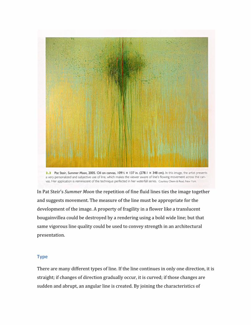
In Pat Steir’s Summer Moon the repetition of fine fluid lines ties the image together
and suggests movement. The measure of the line must be appropriate for the
development of the image. A property of fragility in a flower like a translucent
bougainvillea could be destroyed by a rendering using a bold wide line; but that
same vigorous line quality could be used to convey strength in an architectural
presentation.
Type There are many different types of line. If the line continues in only one direction, it is
straight; if changes of direction gradually occur, it is curved; if those changes are
sudden and abrupt, an angular line is created. By joining the characteristics of
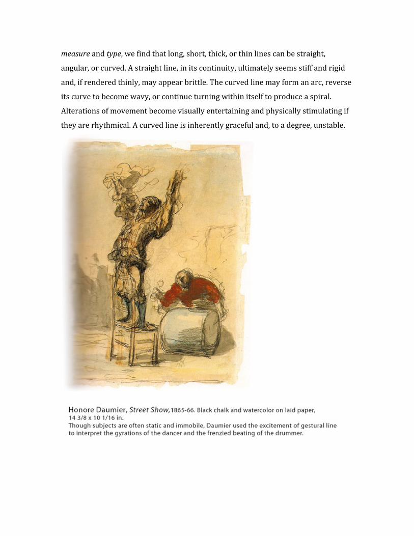
measure and type, we find that long, short, thick, or thin lines can be straight,
angular, or curved. A straight line, in its continuity, ultimately seems stiff and rigid
and, if rendered thinly, may appear brittle. The curved line may form an arc, reverse
its curve to become wavy, or continue turning within itself to produce a spiral.
Alterations of movement become visually entertaining and physically stimulating if
they are rhythmical. A curved line is inherently graceful and, to a degree, unstable.
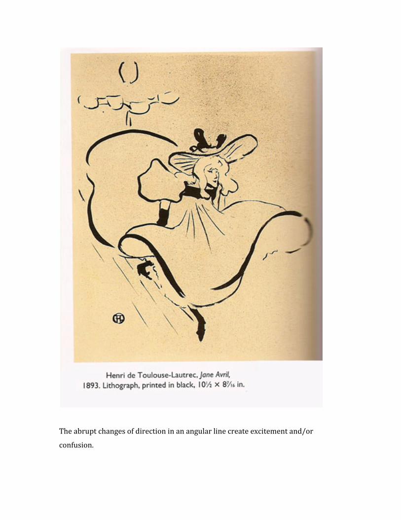
The abrupt changes of direction in an angular line create excitement and/or
confusion.
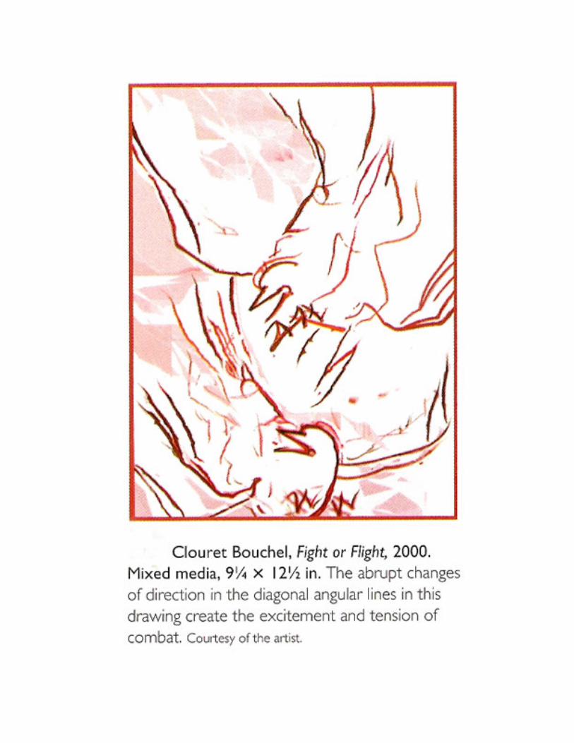
Our eyes frequently have difficulty adapting to an angular line’s unexpected
deviations of direction. Hence, the angular line is full of challenging interest.
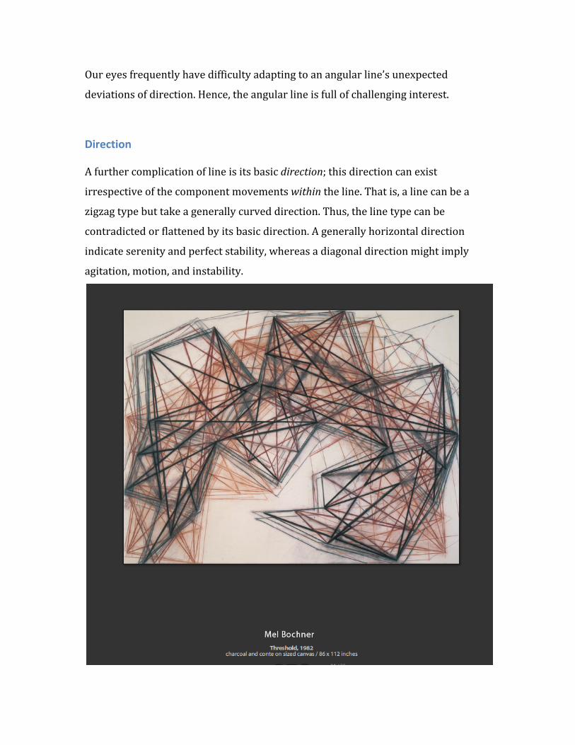
Direction A further complication of line is its basic direction; this direction can exist
irrespective of the component movements within the line. That is, a line can be a
zigzag type but take a generally curved direction. Thus, the line type can be
contradicted or flattened by its basic direction. A generally horizontal direction
indicate serenity and perfect stability, whereas a diagonal direction might imply
agitation, motion, and instability.
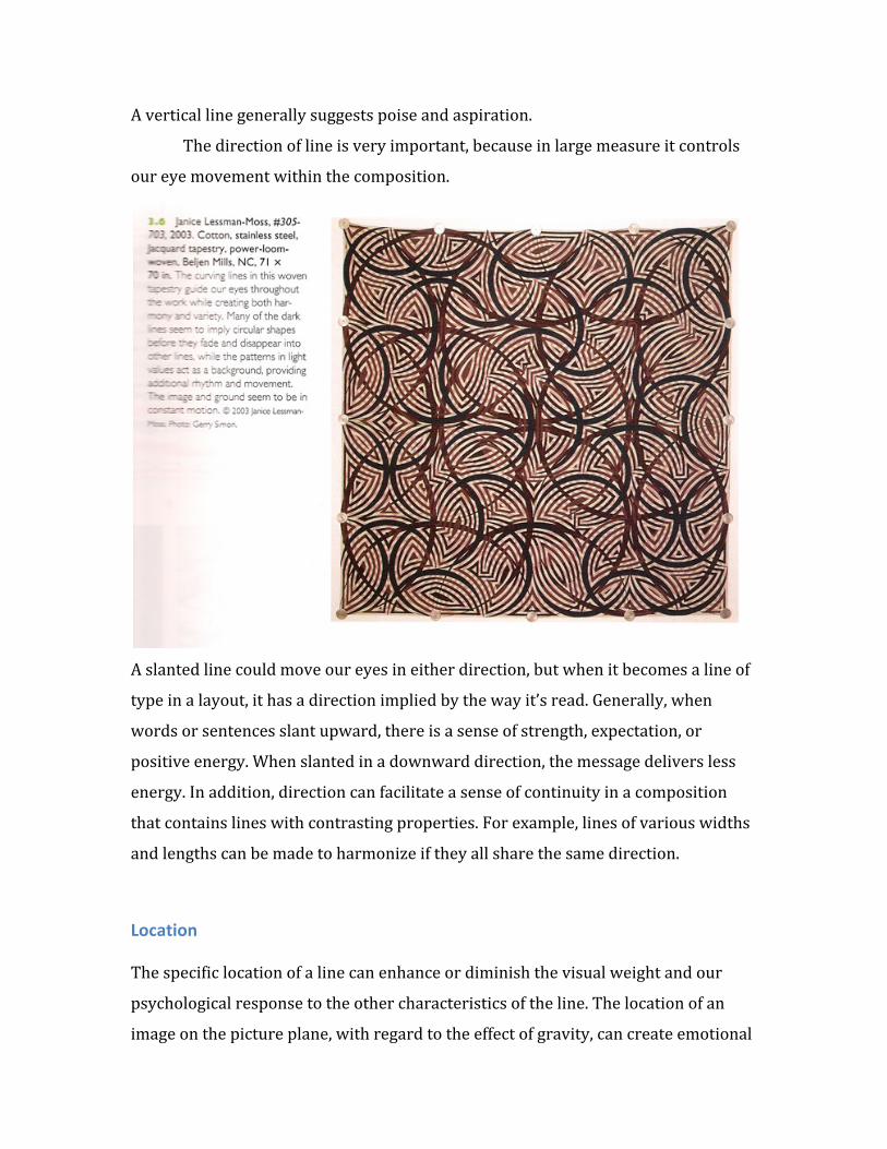
A vertical line generally suggests poise and aspiration.
The direction of line is very important, because in large measure it controls
our eye movement within the composition.
A slanted line could move our eyes in either direction, but when it becomes a line of
type in a layout, it has a direction implied by the way it’s read. Generally, when
words or sentences slant upward, there is a sense of strength, expectation, or
positive energy. When slanted in a downward direction, the message delivers less
energy. In addition, direction can facilitate a sense of continuity in a composition
that contains lines with contrasting properties. For example, lines of various widths
and lengths can be made to harmonize if they all share the same direction.
Location The specific location of a line can enhance or diminish the visual weight and our
psychological response to the other characteristics of the line. The location of an
image on the picture plane, with regard to the effect of gravity, can create emotional
responses ranging from excitement and anticipation to relief and calmness. Line is
affected by its location in the same manner. A diagonal line high in the picture plane
might appear to be soaring, while that same line placed in a low position might
appear to be plunging.
Printmakers know of the importance of location and the development of
line’s visual weight. Having spent many hours developing a composition on a plate
or woodblock with a left‐to‐right orientation, they find the image location reversed
during printing. The feeling of balance within the composition is often so disturbed
by the new location of the linear image that it requires adjustment. The same line in
a new location appears to assume a new visual weight. As with any other
characteristic of line, location should be carefully considered, since a line’s
placement can serve to unify or divide, balance or unbalance a composition.
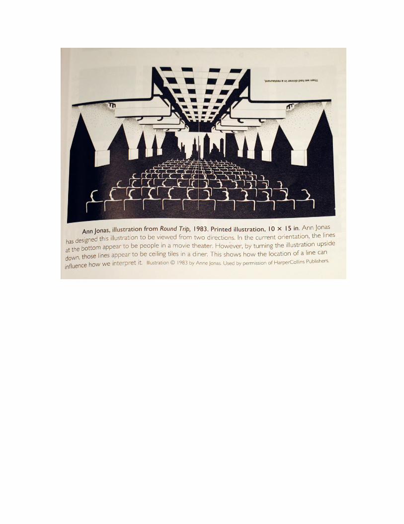
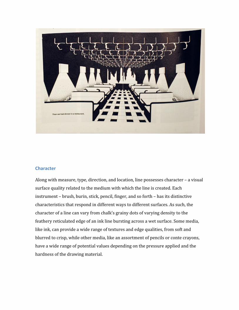
A line’s location is also important because it can affect the way in which we
perceive the line. In the work of Ann Jonak, noted children’s illustrator, the line’s
location has a bearing on the interpretation of what image the line is suggesting. In
the illustration from Round Trip, you will find lines depicting people in a movie
theater. However if the illustration is rotated 180 degrees, the image becomes
something completely different; what we previously saw as people now become
ceiling tiles. The way we interpret the line is greatly influenced by its location on the
picture plane.
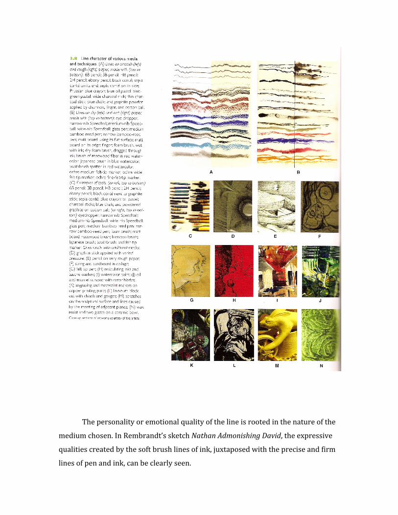
Character Along with measure, type, direction, and location, line possesses character – a visual
surface quality related to the medium with which the line is created. Each
instrument – brush, burin, stick, pencil, finger, and so forth – has its distinctive
characteristics that respond in different ways to different surfaces. As such, the
character of a line can vary from chalk’s grainy dots of varying density to the
feathery reticulated edge of an ink line bursting across a wet surface. Some media,
like ink, can provide a wide range of textures and edge qualities, from soft and
blurred to crisp, while other media, like an assortment of pencils or conte crayons,
have a wide range of potential values depending on the pressure applied and the
hardness of the drawing material.
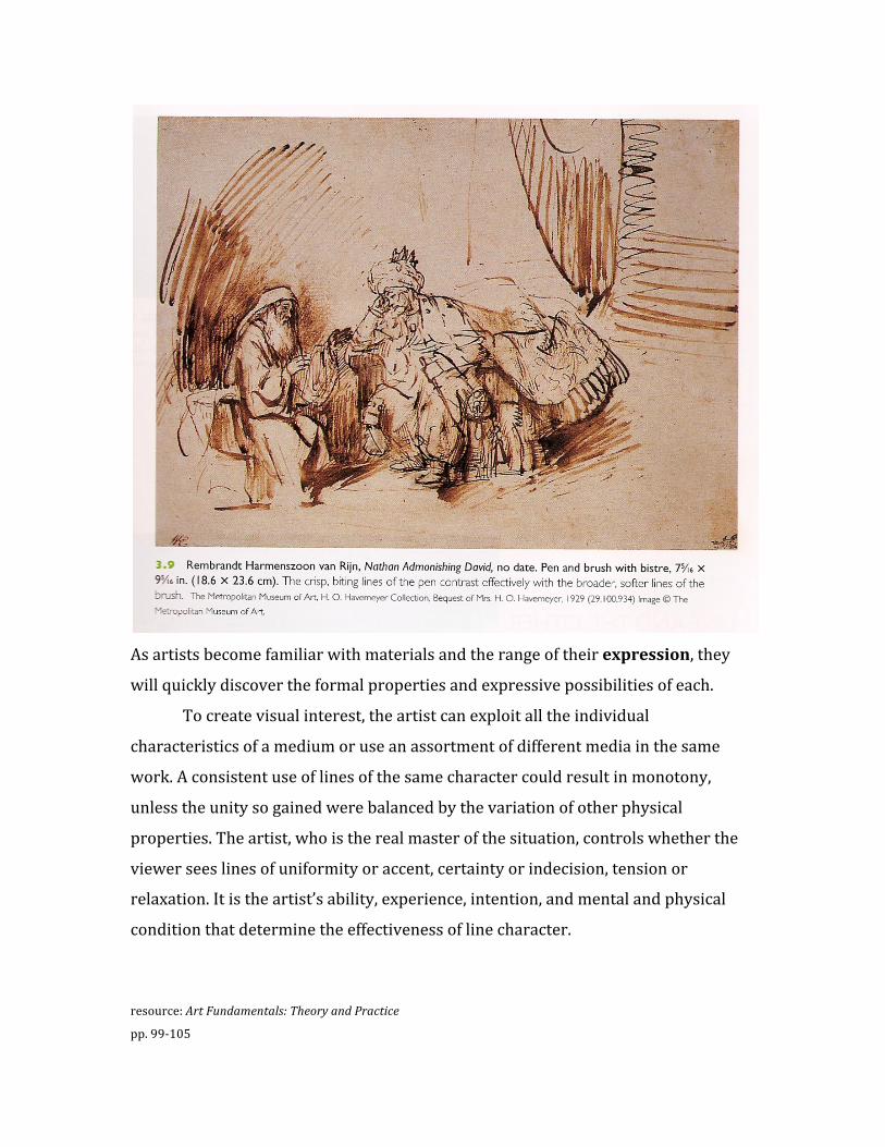
The personality or emotional quality of the line is rooted in the nature of the
medium chosen. In Rembrandt’s sketch Nathan Admonishing David, the expressive
qualities created by the soft brush lines of ink, juxtaposed with the precise and firm
lines of pen and ink, can be clearly seen.
As artists become familiar with materials and the range of their expression, they
will quickly discover the formal properties and expressive possibilities of each.
To create visual interest, the artist can exploit all the individual
characteristics of a medium or use an assortment of different media in the same
work. A consistent use of lines of the same character could result in monotony,
unless the unity so gained were balanced by the variation of other physical
properties. The artist, who is the real master of the situation, controls whether the
viewer sees lines of uniformity or accent, certainty or indecision, tension or
relaxation. It is the artist’s ability, experience, intention, and mental and physical
condition that determine the effectiveness of line character.
resource: Art Fundamentals: Theory and Practice
pp. 99‐105