Embed Size (px)
Citation preview

ORNL/TM-2007/230
The Oak Ridge Competitive Electricity Dispatch (ORCED) Model
June 2008 Prepared by Stanton W. Hadley

DOCUMENT AVAILABILITY
Reports produced after January 1, 1996, are generally available free via the U.S. Department of Energy (DOE) Information Bridge:
Web site: http://www.osti.gov/bridge Reports produced before January 1, 1996, may be purchased by members of the public from the following source:
National Technical Information Service 5285 Port Royal Road Springfield, VA 22161 Telephone: 703-605-6000 (1-800-553-6847) TDD: 703-487-4639 Fax: 703-605-6900 E-mail: [email protected] Web site: http://www.ntis.gov/support/ordernowabout.htm
Reports are available to DOE employees, DOE contractors, Energy Technology Data Exchange (ETDE) representatives, and International Nuclear Information System (INIS) representatives from the following source:
Office of Scientific and Technical Information P.O. Box 62 Oak Ridge, TN 37831 Telephone: 865-576-8401 Fax: 865-576-5728 E-mail: [email protected] Web site: http://www.osti.gov/contact.html
This report was prepared as an account of work sponsored by an agency of the United States Government. Neither the United States government nor any agency thereof, nor any of their employees, makes any warranty, express or implied, or assumes any legal liability or responsibility for the accuracy, completeness, or usefulness of any information, apparatus, product, or process disclosed, or represents that its use would not infringe privately owned rights. Reference herein to any specific commercial product, process, or service by trade name, trademark, manufacturer, or otherwise, does not necessarily constitute or imply its endorsement, recommendation, or favoring by the United States Government or any agency thereof. The views and opinions of authors expressed herein do not necessarily state or reflect those of the United States Government or any agency thereof.

ORNL/TM-2007/230
The Oak Ridge Competitive Electricity Dispatch (ORCED) Model
Stanton W. Hadley
June 2008
OAK RIDGE NATIONAL LABORATORY Oak Ridge, Tennessee 37831
managed by UT-BATTELLE, LLC
for the U.S. DEPARTMENT OF ENERGY
under contract No. DE-AC05-00OR22725

ORCED Documentation ii
ORCED Documentation iii
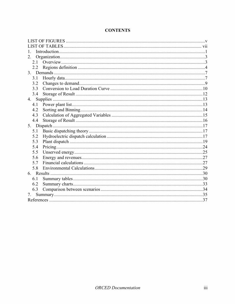
CONTENTS
LIST OF FIGURES ....................................................................................................................v LIST OF TABLES................................................................................................................... vii 1. Introduction..........................................................................................................................1 2. Organization.........................................................................................................................3
2.1 Overview........................................................................................................................3 2.2 Regions definition ..........................................................................................................4
3. Demands ..............................................................................................................................7 3.1 Hourly data.....................................................................................................................7 3.2 Changes to demand.........................................................................................................9 3.3 Conversion to Load Duration Curve .............................................................................10 3.4 Storage of Result ..........................................................................................................12
4. Supplies .............................................................................................................................13 4.1 Power plant list.............................................................................................................13 4.2 Sorting and Binning......................................................................................................14 4.3 Calculation of Aggregated Variables ............................................................................15 4.4 Storage of Result ..........................................................................................................16
5. Dispatch .............................................................................................................................17 5.1 Basic dispatching theory...............................................................................................17 5.2 Hydroelectric dispatch calculation ................................................................................17 5.3 Plant dispatch ...............................................................................................................19 5.4 Pricing..........................................................................................................................24 5.5 Unserved energy...........................................................................................................25 5.6 Energy and revenues.....................................................................................................27 5.7 Financial calculations ...................................................................................................27 5.8 Environmental Calculations..........................................................................................29
6. Results ...............................................................................................................................30 6.1 Summary tables ............................................................................................................30 6.2 Summary charts............................................................................................................33 6.3 Comparison between scenarios .....................................................................................34
7. Summary............................................................................................................................35 References ................................................................................................................................37

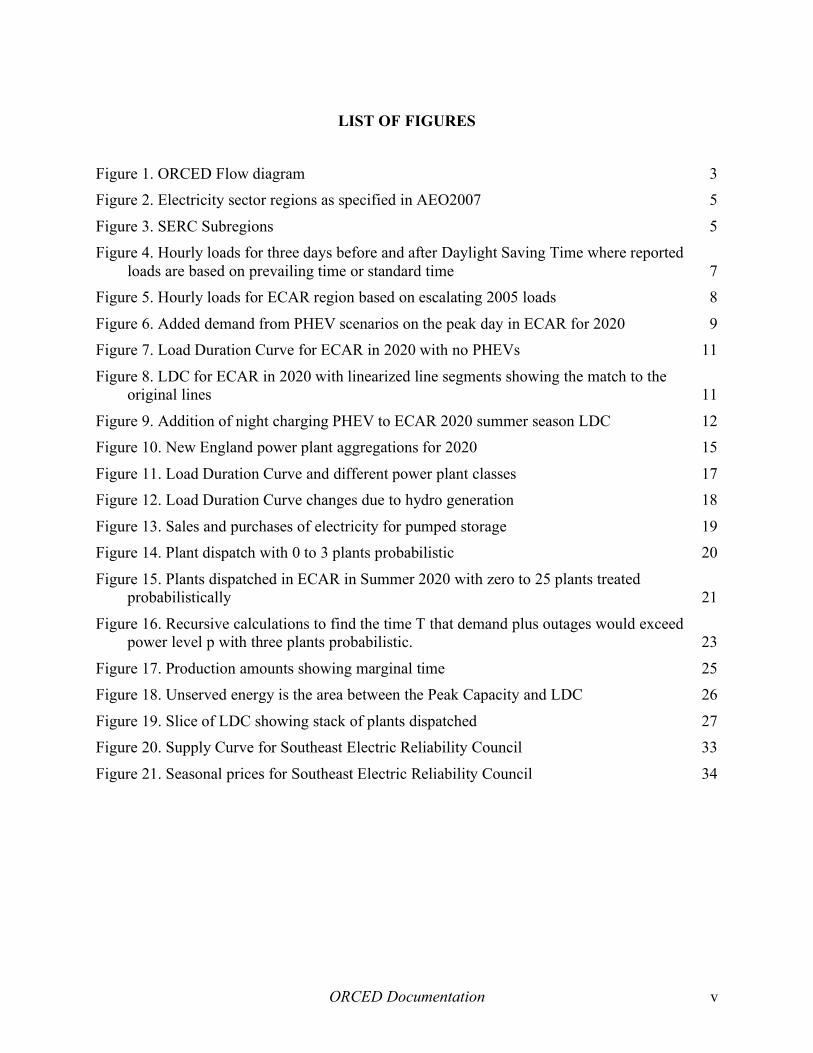
ORCED Documentation v
LIST OF FIGURES Figure 1. ORCED Flow diagram 3 Figure 2. Electricity sector regions as specified in AEO2007 5
Figure 3. SERC Subregions 5 Figure 4. Hourly loads for three days before and after Daylight Saving Time where reported
loads are based on prevailing time or standard time 7 Figure 5. Hourly loads for ECAR region based on escalating 2005 loads 8
Figure 6. Added demand from PHEV scenarios on the peak day in ECAR for 2020 9 Figure 7. Load Duration Curve for ECAR in 2020 with no PHEVs 11
Figure 8. LDC for ECAR in 2020 with linearized line segments showing the match to the original lines 11
Figure 9. Addition of night charging PHEV to ECAR 2020 summer season LDC 12 Figure 10. New England power plant aggregations for 2020 15
Figure 11. Load Duration Curve and different power plant classes 17 Figure 12. Load Duration Curve changes due to hydro generation 18
Figure 13. Sales and purchases of electricity for pumped storage 19 Figure 14. Plant dispatch with 0 to 3 plants probabilistic 20
Figure 15. Plants dispatched in ECAR in Summer 2020 with zero to 25 plants treated probabilistically 21
Figure 16. Recursive calculations to find the time T that demand plus outages would exceed power level p with three plants probabilistic. 23
Figure 17. Production amounts showing marginal time 25 Figure 18. Unserved energy is the area between the Peak Capacity and LDC 26
Figure 19. Slice of LDC showing stack of plants dispatched 27 Figure 20. Supply Curve for Southeast Electric Reliability Council 33
Figure 21. Seasonal prices for Southeast Electric Reliability Council 34


ORCED Documentation vii
LIST OF TABLES Table 1. Variables from NEMS database used for aggregating units 13 Table 2. Aggregation of several combined cycle units into a single plant group 16
Table 3. Calculated key variables for example combined cycle plant group 16 Table 4. Production for Plants 1-4 and unserved energy with varying number of plants
probabilistic 21 Table 5. Time and power levels for Plant #2 22
Table 6: Example Balance Sheet for 122 MW gas-fired steam plant refurbished in 1990, M$ 28 Table 7: Example Income Statement for 122 MW gas-fired steam plant, M$ 28
Table 8: Example carbon emissions rates for fossil fuels 29 Table 9. Production related system-wide results 30
Table 10. System-wide cost results 30 Table 11. ORCED results aggregated by fuel type 31
Table 12. Production results aggregated by fuel and plant technology 31 Table 13. Emissions results aggregated by fuel and plant technology 32
Table 14. Income Statement results aggregated by fuel and plant technology 32 Table 15. Balance Sheet results aggregated by fuel and plant technology 32

ORCED Documentation viii

ORCED Documentation 1
1. Introduction
The Oak Ridge Competitive Electricity Dispatch (ORCED) model dispatches the power plants in a region to meet the electricity demands for any given year up to 2030. It uses public sources of data describing electric power units from the National Energy Modeling System (NEMS) or other sources and hourly demands from utility submittals to FERC that are projected to a future year. The model simulates a single region of the country for a given year, matching generation to demands, assuming no transmission constraints within the region and limited transmission in and out of the region. ORCED can calculate a number of key financial and operating parameters for generating units, including average and marginal prices, air emissions, and generation adequacy. By running the model with and without demand changes such as plug-in hybrids or distributed generation, the marginal impact of these technologies can be found.
In the mid-1990s the electric utility industry was faced with major changes in how they would operate. Restructuring would cause utilities to buy and sell most of their power through the wholesale market, and many utilities would no longer receive their expected return on investment. Instead, prices would be based on the market and not on cost of service. The transition could mean stranded costs on their expensive plants or long-term contracts. To evaluate the impacts, we developed a model called ORFIN (Oak Ridge Financial) model. (Hadley 1996) It calculated a utility’s costs and revenues over a multi-year time period and allowed a financial comparison between a regulated market and market-based pricing. Among its most notable analyses was an examination of the stranded costs for each utility in North Carolina.
While ORFIN could examine a single utility over multiple years, it only roughly modeled the production and sales in a regional wholesale market. The ORCED model was developed to meet that need. Its first big test was analysis of the impact of different technologies and carbon reduction strategies on the nation in what was called the “5-Lab Report” (Interlaboratory Working Group 1996). Since that time, the model has been used in a variety of studies including:
• Impact of restructuring on power prices in California and the Pacific Northwest (Hadley and Hirst 1998) (Hirst and Hadley 1998)
• Effect of carbon taxes on power production in Ohio and the ECAR region (Hadley 1998b)
• Market incentives for adequate generation capacity in a restructured electricity market (Hirst and Hadley 1999)
• Effect of NOX emission control implementation plans on system reliability
• Impacts of hydropower relicensing on carbon emissions in each NERC region (Sale and Hadley 2002)
• Impacts of restructuring on prices and transmission in Oklahoma (Hadley et al 2001a) (Hadley et al 2001b)

ORCED Documentation 2
• Benefits of multiple emission controls strategies
• Benefits of distributed generation to utilities, customers, and society (Hadley and Van Dyke 2003) (Hadley, Van Dyke, Poore and Stovall 2003) (Hadley, Van Dyke, and Stovall 2003)
• Potential for economic biomass cofiring on a state and regional basis (English 2005)
• Air pollutant concentration changes across the Southeast due to demand reductions (O’Neal, Imhoff, Condrey, and Hadley 2006)
• Impact of plug-in hybrid electric vehicles on electric generation in individual regions across the country (Hadley 2006)(Hadley and Tsvetkova 2008)
The model was modified as needed for each of the studies. Modifications included expanding the number of plants analyzed, modeling two neighboring regions simultaneously, modeling three different customer classes simultaneously, calculating cost-based pricing as well as market-based pricing, optimizing additions of new capacity to minimize overall cost, increasing the number of seasons studied, improving demand modeling to include specified hourly loads, and adding a reserves market. Some of these modifications were carried on into future iterations of the model, while others were only used for specific studies.
Most recently, the model was used to analyze the potential impact of plug-in hybrid electric vehicles (PHEVs) in each of the thirteen NERC regions within the U.S. (Hadley and Tsvetkova 2008) Some of the examples used in this paper will be from that analysis.
Several versions of the model are available on the ORNL website. The version of the model used for the most recent PHEV study can be found at:
http://www.ornl.gov/sci/engineering_science_technology/cooling_heating_power/orced/orcedexe.htm
Chapter two describes the overall organization of the model, while chapters three through five describes the modeling of demands, supplies, and dispatch, respectively. Chapter six explains some of the key results from the model and chapter seven summarizes the paper.

ORCED Documentation 3
2. Organization
2.1 Overview The original ORCED model was a single Excel spreadsheet that dispatched 25 power plants against two seasons using simple 3-segment demand curves. The current version pulls power plant data from a database of over 25,000 units plus other data sources, segregates plants by region and aggregates them into 200 plant groups, converts hourly load data from over 100 utilities into three seasons with 11-segment regional demand curves, and calculates market-based and cost-based prices, air emissions, and full financial statements for each power plant.
The overall flow of information is shown in Figure 1. On the left, the demand information is gathered and converted. On the right, the supply information is also gathered and converted for use in the dispatch section. At the bottom, the demand and supply are brought together so that supply is dispatched to meet the demands. Lastly, the results for the scenario are stored for comparison to other scenarios.
Raw data is gathered from independent sources, such as the Federal Energy Regulatory Commission (FERC), Energy Information Administration (EIA), Environmental Protection Agency (EPA), North American Electric Reliability Council (NERC), state utility commissions, independent system operators, non-government organizations, and utilities themselves. Sufficient data to operate the model can be found from open sources, although some studies have used purchased, proprietary information on power plant statistics.
The data is typically collected into spreadsheets for further manipulation. While the model could be developed in another computer language or architecture, spreadsheets offer the flexibility that lends itself well to the varied tasks used for the model. Some of the processes involved, including hydropower capacity allocation and probabilistic dispatch, involve complex calculations that use Visual Basic routines that have also been translated to FORTRAN for
Figure 1. ORCED Flow diagram

ORCED Documentation 4
testing. Other techniques used, such as histogram calculations and Solver optimization for the load duration curves, rely on built-in functions of Microsoft Excel. The formulas within the spreadsheets can be quite intricate, which makes documentation and error-checking more difficult than with other languages.
A set of spreadsheets is used sequentially for the various steps in the process. Data can be either linked between spreadsheets to ensure consistency or manually copied to ease calculation time. Various macros are used to ease the calculations and connections between steps.
2.2 Regions definition For ORCED, an important step is to define a region that is large enough to capture essentially all of the geographical area that could reasonably be served by plants in the domain. ORCED does not account for transmission constraints within a region or dynamic transmission to regions outside of the domain. Many of these constraints result from facilities or engineering constraints that are unique to each system. Such complexity can only be modeled with system details that are often proprietary to the power companies. Because of this lack of transmission constraint, it is important to define a region such that distant plants that would not in reality be responsive to scenario changes are not included. (There is an optional calculation that can adjust the demand curves based on net transmission imports into the region.)
Over the years, several different regions have been used: single states, NERC regions, and NERC sub-regions. The first major ORCED study treated the entire U.S. as a single region. The most common approach has been to use the NERC regions. However, these have recently changed significantly through consolidation and utilities switching to neighboring regions.
A ready source for much of the information used in the model is the results from the National Energy Modeling System (NEMS). This system is developed and used by the Energy Information Administration to conduct long-term analyses of the U.S. energy sector. The most widely used results from the model are from the Annual Energy Outlook for the latest year available, currently 2007 (EIA 2007a). It provides results up to the year 2030 for the each of the NERC regions of the U.S., using the NERC regions as defined around 2004 (Figure 2). The 13 regions are:
1. East Central Area Reliability Coordination Agreement (ECAR); 2. Electric Reliability Council of Texas (ERCOT); 3. Mid-Atlantic Area Council (MAAC); 4. Mid-America Interconnected Network (MAIN); 5. Mid-Continent Area Power Pool (MAPP); 6. Northeast Power Coordinating Council / New York (NPCC –NY); 7. Northeast Power Coordinating Council / New England (NPCC –NE); 8. Florida Reliability Coordinating Council (FRCC); 9. Southeastern Electric Reliability Council (SERC); 10. Southwest Power Pool (SPP); 11. Western Electricity Coordinating Council / Northwest Power Pool Area (WECC-NW); 12. Western Electricity Coordinating Council / Rocky Mountain Power Area and Arizona-
New Mexico-Southern Nevada Power Area (WECC-RMP/ANM); 13. Western Electricity Coordinating Council / California (WECC-CA)

ORCED Documentation 5
Figure 2. Electricity sector regions as specified in AEO2007
The reliability regions have recently changed their names and borders, including the combination of ECAR and MAAC, along with the elimination of MAIN with pieces of it going to other regions. SERC has also expanded into several neighboring regions. However, since the NEMS data was predicated on the regions shown in Figure 2, its definitions are more frequently used. Data for the new NERC regions and subregions are being collected for use in future versions of ORCED.
For one recent study (BAMS 2006), the SERC region (9) was subdivided into its sub-regions because of its size (Figure 3). This allowed studies on the ramifications of modeling the combined region versus each one in isolation. The Southern region included a higher proportion of gas-fired combined cycle plants than the VACAR region. When evaluated in isolation, reductions in demand in the VACAR region reduced coal-fired generation, but when combined, gas-fired generation in Southern declined instead because of its higher cost.
Another study involving multiple regions compared the impacts of creating market-based pricing (restructuring) in the California and Pacific Northwest (Hadley and Hirst 1998a). This used the two-region version of ORCED that explicitly modeled transmission between the two regions, as described in the original ORCED documentation (Hadley and Hirst 1998b). An interesting
Figure 3. SERC Subregions

ORCED Documentation 6
outcome was the heightened impact on prices with a restructured market, especially during times of drought. These results foreshadowed some of the problems with the California market in 2000-2001.
The year of analysis will depend on the nature of the study. Dates have been anywhere from the current year up to 25 years in the future. If future years are to be modeled then projections of supply and demand will be needed; this is one reason for the use of the NEMS model inputs and outputs. However, other sources for projected supply and/or demand are available, or have been left as part of the study itself. One study (Hirst 1999) looked at the capacity needed to provide optimum generation adequacy, while the earliest study (ILG 1996) looked at the amount of capacity and generation that would result from different carbon policies and technologies.
ORCED Documentation 7
3. Demands
Demand manipulations are carried out by collecting data from a variety of sources, selecting the data for a specific region, manipulating it for the different scenarios to be studied, and storing the results for use in the ORCED Dispatch workbook. The data and demand calculations are done in a workbook called “Demand”.
3.1 Hourly data Demands are estimated by first finding the hourly demands for the region of study. Utilities or their regional system operators have to submit their hourly loads to the FERC on a yearly basis on their FERC Form 714 (FERC 2007). Hourly demands for each control area for 2006 and earlier years can be found on the FERC website. While the data for 2005 and earlier is provided in a variety of formats, the 2006 data is incorporated in a table within a standardized pdf form. Spreadsheets have been developed to convert a utility’s data from the various formats into a single column of 8760 hours (8784 hours for leap years). Care has to be taken to identify how each utility handled Daylight Saving Time. Some may place a zero for the missing hour in April and combine two hours values in October, while others report their loads using Standard Time for the entire year; there can be other variations as well. The best method to ensure consistency is to graph the hourly loads for several days before and after the spring and fall shift. The morning rise in demand should look similar and there should be an approximate one hour lag in early evening shapes, even though loads overall may differ due to temperatures (Figure 4).
Figure 4. Hourly loads for three days before and after Daylight Saving Time where reported loads are based on prevailing time or standard time
A number of utilities’ loads must be collected for each region to be studied, the higher the proportion of the total region’s sales, the better. In some cases, the region’s system controller can provide the data for an entire region or its sub-parts, either on their website or by direct contact. Examples include the Independent System Operator for New England (ISO-NE), New York ISO, California ISO, PJM, and ERCOT:
http://www.iso-ne.com/markets/hstdata/znl_info/hourly/index.html http://www.nyiso.com/public/market_data/load_data.jsp http://oasis.caiso.com/ http://www.pjm.com/markets/jsp/loadhryr.jsp http://www.ercot.com/gridinfo/load/load_hist/index.html

ORCED Documentation 8
Once the utility data is retrieved and converted to a consistent format, they can be summed to determine an hourly profile for the region. However, because the utilities may not represent the entire load in the region, the hourly values need to be adjusted based on the ratio of the total demands (sum of the load over the entire year) to the actual net electric load (NEL) for the region. This latter value can be found from NERC’s Electric Supply & Demand database (NERC 2007a) or from EIA’s Electric Power Annual (EIA 2007b).
In the following examples, hourly load data for 2005 from about 100 utilities or control areas was retrieved and aggregated into each of the 13 regions. The resulting hourly loads were then escalated and extrapolated to match the region’s total net electric load in the year being studied as defined in the AEO2007. Net inter-regional imports or exports from the AEO2007 were then added to the demands, with the transfers mainly added during lower demand periods and less at peak demands. As an example, Figure 5 gives the projected hourly loads for 2030 for the ECAR region. The year is separated into three seasons: summer, winter, and off-peak.
Figure 5. Hourly loads for ECAR region based on escalating 2005 loads
In any study, a template year’s set of demands must be selected; the above example uses 2005 data. Data is available for other historical years as well. It is better to use a single year’s values rather than an average of several years. Averages will blur the peaks and valleys; what may be a peak hour one year is not the next, and the resulting demand curves will be different than any actual year’s curves. (Even using the utility’s hourly data involves some averaging of the peaks within each hour.) In any case, the pattern in any future year could very well have demand patterns similar to a selected historical year. A more robust procedure would be to analyze the load shapes from multiple years and pick one that is more typical. For example, 2005 had several hurricanes across the southeast, with consequent impacts on load shapes for those regions. Other years may be more suitable for future projections, unless it turns out that hurricane activity remains high.
ORCED Documentation 9
3.2 Changes to demand The objective of many of the studies done with ORCED has been to understand the impact of changes in demand on production-related parameters such as emissions, energy, or cost. Changes have been additions or reductions, depending on the study. The changes can be for specific quantities in specific hours, or can be simple percentage changes. For example, the studies on benefits from distributed generation (DG) looked at the impact of reducing demand by adding 100 MW of DG, either from 8am to 8pm Monday through Friday or operating the equipment all of the time. The study on air emission reductions in the southeast considered demand reductions of 4%, 6%, and 8% applied to all hours. The plug-in hybrid studies evaluated additions to demand either in the evening or nighttime with a pattern based on the charging characteristics of the vehicles. Figure 6 shows the impact of the added power for each of the scenarios on the peak day for the ECAR region in 2020. All days had similar additions to their hourly demands.
Figure 6. Added demand from PHEV scenarios on the peak day in ECAR for 2020
Worksheets can easily be modified inside the Demand workbook to calculate the hourly changes in demand. Changes can be defined by quantities or percentages, and set based on hour of day, day of week, or month of year. These then get incorporated into the final hourly demand.
A recent addition to the Demand calculations was the capability to add or subtract inter-regional electricity trades. Data on the hourly in-flows or out-flows are not readily available. Instead, the total amount of trading over a year can be estimated. For example, the NEMS model reports both the total net energy load for a region and the total production. The difference is the net trading in or out over the year. In reality, this trading is not a constant amount for every hour, nor is it a constant fraction of overall demand. More often, trading is most heavy when demands are neither at the peak (when lines are already fully loaded to meet local demand) nor at the minimum (when all regions have low-cost baseload plants available.) A simple algorithm was added to Demand that lets the user specify the ratio of the megawatts traded at the demand peak and demand minimum, as compared to the megawatts at the mid-point of demands. A value of 100% for both the peak and minimum will set the trading to be a constant value over all hours, while a value of 0% will reduce trading to zero at the extremes and raise the amount at the mid-point so

ORCED Documentation 10
that total energy traded matches the amount from NEMS. The traded amounts are added to the base hourly demands before changes such as PHEV charging are added. This keeps the scenarios’ amount of change distinct from trading amounts.
3.3 Conversion to Load Duration Curve
3.3.1 Seasons As shown in Figure 5, the year is broken into three seasons for the analysis. While the months assigned to each season can be changed, they are currently set as June-September for Summer, December-February for Winter, and the other five months for Offpeak. The Offpeak season is longer because power plants are treated somewhat differently during this season, having their capacity derated for planned outages. This is discussed more fully in a later section.
3.3.2 Histograms In the Demand workbook, the minimum and maximum demand level in megawatts for each season is found. The difference between them is then separated into 200 equally-spaced bins in order to create a histogram. The number of times the hourly demand is between any of these two points is collected and summed. For example, of the 2,928 hours in the summer season, there may be 22 hours between 76,239 MW and 76,589 MW, and similar amounts between each of the other 200 bins. The peak bin, from 123,197 MW to 123,547 MW will have at least the peak point and maybe a few other hours within it.
A cumulative curve can be calculated by summing the number of hours from highest demand to lowest. The first bin will only have the number of hours within it. The second bin will have the sum of the first and second bin. Each subsequent cumulative bin will increase until the last bin has 2,928 hours (for summer). Dividing the sum for each bin by 2,928 will create the Load Duration Curve (LDC) that shows the percentage of time that demand equaled or exceeded a given power level. Figure 7 shows the curves for each season in the example system. During the summer season, demand exceeded 100 GW 17% of the time, but only 2% of the winter season. Demand exceeded 80 GW roughly 60% of the time in both the summer and winter seasons and 18% of the Offpeak season.
The shape of the load duration curve tells much about the system characteristics. A summer-peaking system will have the highest points during that season, but not all points will be above the other systems. In the example above, the base loads during the winter season are higher than the summer base loads. The steepness of the curve indicates the system’s load factor, the ratio of the average load to the peak load. Flat curves indicate a high load factor, meaning that plant utilization will be relatively even. Steep curves will mean that many plants will be used for only a small fraction of the season.
ORCED Documentation 11
Figure 7. Load Duration Curve for ECAR in 2020 with no PHEVs
3.3.3 Optimization The load duration curve for each season has been defined using 200 points. However, the dispatch module uses a simpler eleven-line segment model to reduce the computation time requirements. The eleven-line segment model is produced using the Excel Solver function to fit points to the lines while minimizing the variance and keeping the total production constant. The result will usually place more of the points where the curve bends more rather than having all equidistant (Figure 8).
Figure 8. LDC for ECAR in 2020 with linearized line segments showing the match to the original lines
The Solver solution may need to be run several times. The objective function to be minimized is the variance between the 200-point curve and the 12-point linearized curve, plus the difference in

ORCED Documentation 12
total load described by each curve. This latter constraint forces the linearized curve to have the same demand as the original 200-point curve. After the Solver runs, the last point on the curve (at 100%) is raised or lower so that the total energy is the same for both. The Solver can get trapped into solving for local optima and does not reach the lowest variance value, so the calculation may need repeating until the user is satisfied.
When demands are added or subtracted, the shape of the curves will change. A constant MW increase or decrease (such as 100 MW of distributed power at all hours) will raise or lower the curve equally at all points. A percentage decrease (such as a 4% efficiency savings) will lower the higher demand levels more, flattening the curve. Demand changes at specified hours will change the shape of the curve depending on if the changes are during peak or offpeak hours. For example, one study examined increasing the power level of PHEVs while still having them charge only at night. In Figure 9, the change in the load duration curve with the addition of PHEVs charging at three different power levels is shown. At the low power levels (1.4kW and 2kW), most demand increases occur during the low power fraction of the season, the right hand side of the curve. The higher power scenario will charge the batteries faster but means more hours will have power levels in the middle portion of the load duration curve. None of the demand occurs during the peak of the season, reflected by the points being zero at the left side of the curve. The curves are somewhat jagged because they show the difference between the curves after being linearized to twelve points. The additional demand is small compared to the overall demand, and optimization can move points somewhat. Taking the difference between curves shows off this difference.
3.4 Storage of Result The result of the linearizing operation is three sets of twelve xy points defining the load duration curves. In addition, descriptive information of the scenario inputs as well as the total demand and variance of the curve can be useful for identification and future use. These are copied to a separate worksheet to be used in the Dispatch workbook. Multiple demand scenarios can be stored.
Figure 9. Addition of night charging PHEV to ECAR 2020 summer season LDC

ORCED Documentation 13
4. Supplies
To get a full picture of a region’s power situation, both supply and demand must be characterized. Supplies must include all of the power plants in the region; plants outside the region are treated as a change in demand (described above). Some studies use a constant set of plants while other studies have focused on the effect of changing power plant types and capacities.
The ORCED model can dispatch up to 200 power plant groups. In order to simulate the actual generation supply in a region, it is necessary to aggregate or “bin” all of the plants available into 200 or fewer bins that capture the representative values of key parameters for the plants. These are then fed to the Dispatch module for analysis. Energy-limited hydro and pumped storage plants are modeled separately from the 200 dispatchable plant groups.
4.1 Power plant list There are several publicly available lists of plants as well as proprietary lists that have been used for different ORCED studies. The most frequently used list for our studies comes from the Energy Information Administration’s National Energy Modeling System (NEMS). Personnel at EIA attempt to keep this list up to date for their numerous studies. Other data sets that have been used include the Environmental Protection Agency’s eGRID and NEEDS databases, as well as proprietary sets from the PowerDat database developed by Platts.
The input file to the NEMS includes a list of 21,000+ generating units in the country. This list contains a large number of parameters for each unit, including nameplate, summer and winter capacity, heat rate, generating technology, fuel type (up to 3), emission rates NOX and SO2, operating costs, and age. A large spreadsheet is created that contains all of the generating units. This list is filtered to find the units that are in the region to be studied and are operating in the year being studied. The data taken from the NEMS data file for sorting and binning are shown in Table 1.
Table 1. Variables from NEMS database used for aggregating units Plant ID Name Plate Capacity Fuel Code (1, 2, 3) Unit ID Summer Capacity Fuel Share (1, 2, 3) Plant Name Winter Capacity Fixed O&M Cost (87$/kW) Company ID Average Heatrate Variable O&M Cost (87$/MWh CCAP Index On-Line Year Percent sold to Grid Ownership Type On-Line Month NOx Emission Rate (lbs/MBtu) Must Run Code Retire Year Nox Controls Flags Region Code for Plant Location Retire Month NOx Ctrls -- Overnight Cost State Abbreviation for Plant Location Status NOx Ctrls -- Fixed O&M Census Region Number Scrubber Efficiency for SO2 NOx Ctrls -- Variable O&M ZIP Code Average Capacity Factor NOx Ctrls -- Reduction Factor Monthly Capacity Factor (1-12)
To supplement the list of generating units, data are needed on forced and planned outage rates, fuel costs, and emission credit prices. Outage rates can be found either from NEMS input files

ORCED Documentation 14
(pltdata.x.txt) or from the annual NERC Generating Availability Report (NERC 2007b). Some of the proprietary datasets such as PowerDAT include plant-specific outage data.
Fuel costs are not specified since it will vary by year and type of fuel. However, fuel cost per million Btu for each region and year is an output of NEMS and can be used to approximate the fuel costs for each plant. Past studies have used plant-specific fuel costs from other sources, but these can sometimes be misleading if a single plant has multiple units that use different fuels. Also, historical prices may be dependent on pre-existing fuel contracts that may not be applicable in future years.
Besides the list of current and planned units, the NEMS model calculates the amount of additional unplanned capacity needed for each region and simulates the construction of this capacity. Output tables show the amount of unplanned capacity added; these amounts can be converted to a set number of generating units based on standard sizes for input into ORCED. The plant parameters of heat rate, emissions, operating cost, etc. for these plants can be found from NEMS input files or the output tables.
Other studies have used ORCED to find the optimum amount of capacity for a region. In these cases, an initial set of plants is input, including generic values for unplanned capacity. The model is then allowed to vary the capacity of the different plants to find an optimum for a given objective function. Existing plants could only go down in capacity (retired) while either more or fewer new plants built.
4.2 Sorting and Binning The list of existing plants and new plants in a region are copied from the Plant Separator workbook to the Supply workbook. In Supply, macros are used to sort the list by a combination of the plant type, fuel, and variable cost.
Variable cost is found by calculating the generation, energy input, and emissions for the unit. The generation is found by multiplying the capacity by the capacity factors found in the NEMS database. Because units can have different capacities in the summer and winter, the monthly capacity factors are applied to the appropriate capacity. Multiplying the generation for a unit by its average heat rate determines the amount of energy used in Mbtus (million btus, sometimes referred as mmbtu). Fuel costs and emissions can be found by applying the appropriate rates to the amount of energy consumed. Similarly, total variable costs, including emissions credits, can be calculated.
The resulting variable cost is converted to ¢/kWh for sorting within a specific plant type and fuel category. In some cases, additional sorting criteria are used. For example, one study needed to keep track of the location of major units, so the state and county code was included in the sorting for plants with large NOX emissions or nuclear plants.
After sorting, the units are assigned one of up to 200 plant groups used in the Dispatch routines. The approximate number of bins for each plant fuel and technology is found by dividing the total capacity for that group by a user selected average size. This value can be raised or lowered to get the total number of plant groups below 200. For example, if there are 3,000 MW of combustion turbines, and the average plant group size is entered as 200 MW, then the model will initially

ORCED Documentation 15
create fifteen bins. The units are then placed in each bin in increasing variable cost. If a single unit is over 200 MW in size, one bin may get completely skipped. Similarly, if two units are at the same plant site, such as a Unit 1 and Unit 2, then both will be put in the same bin. As a result, what began as 15 bins for that fuel type and technology, could end with only 8 or 9 plant groups, with individual plant group sizes ranging from 50 MW to 350 MW, or higher.
The results of such an assignment are shown in Figure 10. First shown are the oil-fired plant groups: steam, then turbine. Next are the gas-fired plant groups: steam, turbine, and combined cycle. Renewable fuels are plant groups 130-150. These are largely biomass and municipal solid waste plants in this region. Coal plant groups follow (not many in New England). The must-run plant groups contain a variety of cogeneration plants that are not dispatchable. Next are four nuclear plants in the region. There are empty slots in plant groups 195-200. Plant group 201 is the hydro capacity of the region, while Plant group 202 is the pumped storage capacity. Every region will follow this line-up of plant groups, but of course will have a different proportion of the various plant types.
Figure 10. New England power plant aggregations for 2020
4.3 Calculation of Aggregated Variables Once the power plant units have been aggregated into the ~200 simulated plant groups, the weighted average key variables can be calculated. For variable factors (fuel, emissions, heat rate, variable O&M) the weighting factor used is the expected amount of generation. For capacity-related factors (fixed O&M, capital cost, age) the nameplate capacity of each individual unit is the weighting factor.
Table 2 shows a simplified example of combining several units into a single plant group. The resulting averaged factors are shown in Table 3. These values are for Plant group #120 in Figure 10.

ORCED Documentation 16
Table 2. Aggregation of several combined cycle units into a single plant group Unit Capacity
MW Generation
GWh Energy TBtu
Fuel Cost M$
Variable Cost M$
Fixed Cost M$
NOX Tons
SO2 Tons
DPA-Gen2 31 158 1.29 7.6 0.4 0.1 162 0.4 Mass-Gen3 80 342 2.81 16.6 0.8 0.4 354 0.8 BGF-CT1 127 865 7.18 42.4 2.0 0.6 662 2.1 Total 238 1364 11.28 66.7 3.2 1.1 1178 3.3
Table 3. Calculated key variables for example combined cycle plant group Plant Capacity MW Heat Rate
Btu/kWh Fuel
¢/kWh Var O&M
¢/kWh Fix O&M $/kWyr
Nox lb/MBtu
SO2 lb/MBtu
Gas CC-49 238 8268 4.89 0.23 4.74 0.209 0.001
The forced and planned outage rates for the plants require some additional calculations and data. The Generating Availability Report (GAR) from NERC (NERC 2007b) provides a variety of national generating statistics by plant type, size, and fuel. These can be converted to provide a forced outage rate (the percentage of time the plant will not be available on a random basis) and planned outage rate (the percentage of time the plant is scheduled to not be available). Some plant types are not available from the GAR; for these, the NEMS data includes forced and planned outage rates for new plants.
The NEMS database includes a monthly capacity factor for each unit. For dispatched units, the factors are likely lower than the availability factor (1 – forced outage rate – planned outage rate), However, for non-dispatchable plants such as must-run and intermittent plants, these values can be used to calculate equivalent forced and planned outage rates. In some cases, such as intermittents with higher availability in the offpeak season, the equivalent planned outage can actually be negative to counteract the higher forced outage rate used for the winter and offpeak seasons.
4.4 Storage of Result The resulting table of plant groups, with key modeling parameters, is passed to the ORCED Dispatch model. There are three main ranges that need to be copied from Supply to Dispatch. One is called ORCEDInput that contains the 202 plant groups. The second range is FuelCost, the average fuel costs for the six different fuels. The last is the SO2 and NOX credit costs for the region being studied.
Depending on the analysis, it is sometimes helpful to store the three ranges in an intermediate file to make replication of results easier. The tables are copied from the Supply workbook to either the Dispatch workbook or intermediate file. Multiple Supply results, either variations for a single region or separate parameters for each region, are then kept in the Dispatch workbook and a flag can be used to select the correct set of data.
Some studies have called for analyzing changes in the amount of supply, either by retiring plants or adding new plants. For example, an early study examined generation adequacy by determining the optimal amount of capacity to reduce overall costs. By setting the number of plant groups less than 200, empty slots are available for adding plant groups as needed during the analysis.
ORCED Documentation 17
5. Dispatch
Once data on supply and demand are made available, the model dispatches plant groups to meet the demand. The steps involved begin with altering the LDCs for hydro and pumped storage production. It then proceeds to dispatch the plants for each season using a modified Balleriaux-Booth procedure. Details on the underlying methodology can be found in Vardi’s textbook (Vardi and Avi-Ithak 1981) Unserved energy calculations follow. The amount of generation by each plant is then calculated. Lastly, time-dependent prices and revenues are calculated. The seasonal results are then combined for a yearly result. Emissions and other financial parameters are last to be calculated. The results are stored so that comparisons between cases can easily be done.
Beyond these basic calculations, some ORCED studies have added capabilities. The 1998 study on California and the Pacific Northwest under a restructured market used a version that modeled each region separately and then trading between them over a limited connection. The 2002 study on Oklahoma restructuring disaggregated demands into residential, commercial, and industrial sectors and calculated regulated and unregulated electricity prices for each. The 2004 study on distributed generation added a calculation on the amount of reserve power needed at each point in time and the consequent reserves price. Early studies on generation adequacy put the model into optimization mode so that plants could be added or retired to minimize avoidable costs depending on the short-term and long-term elasticity of demand.
5.1 Basic dispatching theory Since demand fluctuates over the year, some plants will be called on more often than others and any power system will have a mix of supply types. Figure 11 shows an example of the LDC for a region along with the types of plants that are used to fulfill those demands. Some plants are most effective at providing power essentially all the time, or “baseload” power. They typically have low variable costs but may have high fixed costs. Their low variable costs translate into low bid prices or marginal costs, while the fixed costs are best paid for by being spread over a large amount of sales. Intermediate or “load-following” plants are called on to come on a significant fraction of the year but will still cycle on and off. Peaking plants are called on the least frequently, during high demand times or to meet capacity emergencies. They have the highest marginal costs but typically have low fixed costs, either because of their low-cost technology or because they are old, fully depreciated plants.
5.2 Hydroelectric dispatch calculation Hydro plants are typically energy limited rather than capacity limited. There is only so much water upstream that can be used for generation. As a consequence, dispatch optimizations calls for hydro to be used to the extent possible to replace the production from the highest-cost,
Figure 11. Load Duration Curve and different power plant classes
ORCED Documentation 18
peaking plants. The easiest way to simulate this is to lower the LDC near the top by the capacity of the hydro plants and to extend this reduction to higher percentages of the year until the full energy available from the plant is consumed. This is shown in Figure 12 below. California in 2020 has in the model 10.8 GW of hydropower in the summer, with a capacity factor of 44%. The hydro generation is equal to the area between the blue and pink lines. The LDC between 0% and 20% of the season is reduced by the full capacity of the generation. However, the points at 35% of the season and higher cannot be lowered by the full capacity because of the lack of water for generation. The end result is that hydro displaces the higher cost peaking and intermediate plants. A portion of the hydro capacity can be represented as just another plant group in the list of 200 groups. Its generation and capacity must be subtracted and new capacity factors calculated for the energy limited hydro so that total hydro generation remains the same.
Figure 12. Load Duration Curve changes due to hydro generation
The Dispatch model calculates the new LDC by first dropping the first point by the hydro capacity or to the power level of the second point. It calculates the resulting hydro generation and compares to the total available. If more is available, it will then drop both the first and second points by the capacity or to the level of the third point, recalculate the generation, and compare to the total. The model continues dropping the subsequent points in the LDC until the area between the two curves matches the amount of hydro available.
Pumped storage capacity is calculated similarly, but besides lowering the peak of the LDC, it will also raise the lowest portions to represent the amount of electricity purchased from the grid to supply the peak portion (Figure 13). California in 2020 has 3,700 MW of pumped storage with a 5% capacity factor. The LDC post-hydro generation in Figure 12 above is further lowered by the capacity and generation available (on the left side of the figure.) The amount of electricity needed is determined and the points on right side of the LDC are raised. The amount these points are raised is constrained by the requirement that the LDC must be either flat or declining. An efficiency factor can be used so that more power will be purchased than is sold, to allow for losses in the pumping system. The remaining 200 plants will be dispatched against the post-hydro and pump storage LDC.
ORCED Documentation 19
Figure 13. Sales and purchases of electricity for pumped storage
The result of this operation is that power is purchased at low demand, low cost times and used during high cost times. Since power prices are calculated throughout the season (described later) the revenues and costs of the power can be determined and profitability of the pumped storage measured. Similarly, revenues for the hydro production can be calculated to determine financial factors.
5.3 Plant dispatch For each season, the 200 plants from Supply are sorted in order of increasing variable cost. The order may be different in each season because some costs (e.g., NOX emission credits) might only be added to the summer season, depending on the scenario. The power capacities must be adjusted for planned and forced outages.
There are two ways to treat forced outages: probabilistically or through capacity deratings. Probabilistic treatment provides a more accurate mechanism, but increases the calculation time exponentially as more plants are treated that way. The ORCED model allows the user to specify how many plants can be treated as such, up to 25, but typically 10 to 12 plants.
If the power plant is treated probabilistically then its capacity in the summer and winter seasons are its input summer and winter capacities, respectively. If the plant is derated then the capacity is reduced by the input forced outage rate.
The results of having increasing number of plants treated probabilistically are shown in the series of LDCs in Figure 14. In this example, there are four plants of 150 MW each, with forced outage rates of 10%. A simple LDC is shown in red with maximum demand at 450 MW. In the first graph, all plants are derated to 135 MW. The second graph shows the first plant at 150 MW but the others at 135 MW. The gray color represents that the plant is treated probabilistically. The third and fourth graphs show more of the plants probabilistic.
ORCED Documentation 20
Figure 14. Plant dispatch with 0 to 3 plants probabilistic
Using the graph as an analogy, the total amount of ink inside of the area for a plant is equal to the generation. If the plant is derated, then the maximum capacity is lowered, but the plant has no forced outages and so its area is totally black. On the other hand, if a plant is probabilistically treated, then it has the full capacity available but the ink is diffused and is represented by a level of gray. The total amount of energy is the same, but the relative amount of production from higher cost plants increases. Table 4 shows the production amounts for each of the examples in Figure 14, as well as the case with all plants probabilistic. Plant #1 is always baseloaded (running at 100%), but Plants #2 and #3 see slight reductions as demand is shifted to Plant #4 or not met at all (unserved energy).

ORCED Documentation 21
Table 4. Production for Plants 1-4 and unserved energy with varying number of plants probabilistic
No Probabilistic 1 Probabilistic 2 Probabilistic 3 Probabilistic 4 Probabilistic Plant #1 135.0 135.0 135.0 135.0 135.0 Plant #2 134.9 134.1 132.3 132.4 132.3 Plant #3 63.6 58.2 55.4 52.1 52.0 Plant #4 0.3 6.5 10.3 12.7 11.8
Unserved 0.0 0.0 0.8 1.6 2.8 Total 333.9 333.9 333.9 333.9 333.9
With a high number of plants involved (e.g., 200 versus 4), the changes in production for the plants do not change significantly once the number of probabilistic plants increases past 10 or so (Figure 15). However, the calculation time roughly doubles for each additional plant, so while with 10 plants probabilistic the time to recalculate can be on the order of seconds, with 25 plants it takes overnight for a single run. While the figure shows little change overall, the most significant change is at the peak demand. In this example, with no plants probabilistic the last five plants are never dispatched, but at the higher probabilistic values, the plants may operate a few hours over the season.
Figure 15. Plants dispatched in ECAR in Summer 2020 with zero to 25 plants treated probabilistically
The model calculates up to 231 power levels (points along the y-axis) for which the plants are dispatched. These levels are determined by finding the cumulative capacity level as each plant is added to the loading order (giving 201 points). In addition, the LDC’s twelve points, plus variations on the points by adding probabilistic plant capacities to them, give another 30 points.
The equations used to dispatch plants have the independent value as the power level (the y-axis in the figures) and the dependent value as the fraction of the season that plants are dispatched at that power level. The first plant starts out being dispatched for 100% of the season. For the simplest case where none of the plant groups are treated probabilistically, the dispatch is a simple sum of the derated plant capacities to meet the power required for each point on the LDC.

ORCED Documentation 22
However, when any of the plant groups are treated in a probabilistic manner, the contribution from each other plant group depends on the likelihood of whether the probabilistic plants are on-line or not. Typically, the model selects plants at or near the bottom of the loading order for treating probabilistically in order to maximize the impact. A set of recursive formulas is therefore used to solve for the percent of time that each particular plant group is contributing toward the demand represented by the LDC. The bottom equation in the hierarchy is simply the percentage time on the LDC as a function of the power level and is based on a linear interpolation between the twelve points that define the curve.
Ti(p) = (1 – Fi) * Ti-1(p) + Fi * Ti-1(p – Ci) Ti-1(p) = (1 – Fi-1) * Ti-2(p) + Fi-1 * Ti-2(p – Ci-1) … T0 = LDC(p) Where Ti(p) = Time T (%) that demand plus outages would exceed power level p with i number of plants treated probablilistically i = the number of plants being treated probabilistically up to power level p p = power level Fi = forced outage rate for probabilistic plant i Ci = capacity of probabilistic plant i LDC(p) = the percentage of season that the load duration curve equals power level p Ti(p) is not a function of the plant that is operating at power level p. The parameter i does not represent the specific plant that T is being calculated for, but rather the number of plants that are to be treated probabilistically, up to the power level that is being analyzed. In the above example, if the maximum plants treated probabilistically is two, then for power levels between 0 and 150 MW (within the range of Plant #1), i would equal zero. Between 150 MW and 300 MW, i would equal one; above 300 MW i would equal two. Both plants #3 and #4 would use i equal two since neither is treated probabilistically. For any plant, the only power levels p of interest are those when the plant is the marginal plant, or highest in the loading order. At power levels below the cumulative capacity of plants below it, the plant will not be running. And at power levels above the cumulative capacity including that plant, it would be operating at full power.
For example, for Plant #2 in Figure 14 above, T is calculated for up to five different power levels, depending on whether Plant #1 and #2 are probabilistic or not (Table 5). If Plant #1 is not probabilistic (first two columns), then Plant #2 begins operation at 135 MW, and T0(135) = 100%. Then, P is set to 260 MW, the lowest point on the LDC, and T0(260) = 100%. Finally, P
Table 5. Time and power levels for Plant #2
0 Prob 1 Prob 2 Prob P T P T P T
135 100 150 100 150 100 260 100 260 100 260 100 270 98 270 98.2 270 98.2
280 93.7 280 93.7 285 90.8 300 82
ORCED Documentation 23
is set to 270 MW (full derated capacity for Plants #1 and #2). T0(270) is found by linear interpolation on the LDC line segment to equal 98%.
With the first plant probabilistic (the second set of columns in Table 5), the first P is set to the un-derated capacity of Plant #1, 150 MW, and T1=100%. Likewise, T1(260) = 100%. However, the next point is calculated recursively using the value for T0(270) calculated in the first 2 columns:
T1(270) = (1 – 10%) * T0(270) + 10% * T0(270-150)
= 90% * 98% + 10% * 100% = 98.2%
The values for T1(280) and T1(285) are calculated similarly, giving 93.7% and 90.8%. The last power level, 285 MW, represents the cumulative capacity when Plant #1 is probabilistic (150 MW) and Plant #2 is derated (135 MW.) If Plant #2 is also probabilistic, then the cumulative capacity is 300 MW and T1(300) = 82%. Plant #3 then uses these numbers in the recursive formula as it is dispatched, then Plant #4.
To further explain the exponential growth of the calculations, Figure 16 shows the hierarchical tree to find T3 for any power level of Plant #4. This calculation also applies to any other non-probabilistic plants above Plant #4 if only three plants are probabilistic. Adding a fourth plant as probabilistic doubles this tree, first setting power equal to p and then power equal to p-C4. Some shortcuts can be used when p (or its subordinates p – Ci, p – Ci – Ci-1, etc.) are below the lowest point of the LDC. On those branches, Ti equals 100% and no further calculations further down the branch are needed.
(1-F3)* +F3*
(1-F2)* +F2* (1-F2)* +F2*
(1-F1)*T0(p) +F1*T0(p-C1)
T1(p)
+F1*T0(p-C2-C1)
T1(p-C2)
(1-F1)*T0(p-C2)
T2(p)
(1-F1)*T0(p-C3) +F1*T0(p-C3-C1) (1-F1)*T0(p-C3-C2)
T3(p)
+F1*T0(p-C3-C2-C1)
T1(p-C3) T1(p-C3-C2)
T2(p-C3)
Figure 16. Recursive calculations to find the time T that demand plus outages would exceed power level p with three plants probabilistic.
In order to incorporate planned outages, the capacity available during the offpeak season is derated by an amount so that the total capacity available for the year reflects the reduction from the input annual forced and planned outage rates. In other words, planned outages are modeled to only occur during the offpeak season when demand is low, while the winter and summer seasons have capacity reduced solely by the forced outage rate. Because the POR is based on annual generation, the calculation on the POR derating amount must start on the basis that the planned outages occur throughout the year, thus also accounting for summer and winter capacities that may be different. Total possible generation, Gtot, is found from the following equation:
Gtot = CapS * (1 - FORS - POR) * %S + CapW * (1 - FORW - POR) * (%W + %O)
Gtot = GSummer + GWinter + GOffpeak
ORCED Documentation 24
Where: G = Generation Cap = Capacity FOR = forced outage rate for each season POR = Planned outage rate % = Percent of year for each season
The summer and winter season calculations do not include the planned outage rate; an equivalent CapO can be defined that assigns all the planned outages internally to that season.
GSummer = CapS * (1 - FORS)
GWinter = CapW * (1 – FORW)
GOffpeak = CapO * (1 – FORW)
The Gtot equations can then be rearranged to calculate CapO:
CapO = (CapW*(1-FORW) * %O - POR*(%O + %W)) - CapS * POR * %S)/(1-FORW)/%O
As mentioned above, the POR and FOR are calculated in the Supply worksheet and passed to the Dispatch workbook. The values can either reflect the typical operations of dispatchable plants or reflect the difference in operating capabilities in the offpeak season versus winter and summer seasons.
5.4 Pricing At any point in time, whatever plant is the last plant being dispatched, it is considered as being “on the margin”. In a deregulated market, its variable cost of production would set the wholesale market price for power for itself and all plants lower in the dispatch order. So in the example above, with one plant probabilistic Plant #2 would set the price between the 100% and 90.8% points. It would receive its variable cost for the power it sells. Plant #1 would be infra-marginal; it would earn more than its variable cost during this time. Plant #3 would be on the margin between 10.7% and 90.8% of the season, so Plants #1 and #2 would receive the variable cost price of Plant #3 during this fraction of the year.
As an example, Figure 17 shows the dispatch of the plants in the PJM region from a recent study (Hadley 2004?).

ORCED Documentation 25
Figure 17. Production amounts showing marginal time
ORCED has the capability for a plant to use a price other than its variable cost for its bid price into the market. By default, ORCED sets the price of “must-run” and intermittent plants to zero so that they are always called upon. However, their forced outage rate will lower their production available so that their capacity factors match their defined amounts. As another option, plant revenues can be based on its variable costs, fixed costs, depreciation, taxes, and allowed rate of return. This mimics the revenues received if the plant is regulated.
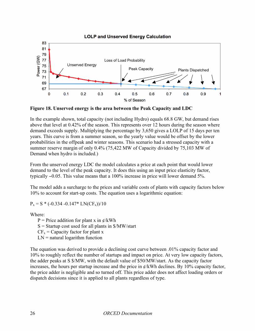
5.5 Unserved energy When there are not enough plants to meet all of the demand, then some power is “unserved”. Even with the last plant at full power, Ti will be greater than zero. This value is the Loss of Load Probability (LOLP). The LDC can be calculated for the additional power points to measure the amount of energy that is unserved (Figure 18). As with the plant dispatching, this curve is dependent on the number of probabilistic plants. The model uses twelve power points for which to calculate Ti. The top point is equal to the peak demand plus the capacity of all of the probabilistic plants and by definition has a Ti of zero. The bottom point is the total capacity available with a Ti equal to the LOLP as mentioned above. Intermediate points are simply fractional values between the top and bottom to define the curve.
ORCED Documentation 26
Figure 18. Unserved energy is the area between the Peak Capacity and LDC
In the example shown, total capacity (not including Hydro) equals 68.8 GW, but demand rises above that level at 0.42% of the season. This represents over 12 hours during the season where demand exceeds supply. Multiplying the percentage by 3,650 gives a LOLP of 15 days per ten years. This curve is from a summer season, so the yearly value would be offset by the lower probabilities in the offpeak and winter seasons. This scenario had a stressed capacity with a summer reserve margin of only 0.4% (75,422 MW of Capacity divided by 75,103 MW of Demand when hydro is included.)
From the unserved energy LDC the model calculates a price at each point that would lower demand to the level of the peak capacity. It does this using an input price elasticity factor, typically −0.05. This value means that a 100% increase in price will lower demand 5%.
The model adds a surcharge to the prices and variable costs of plants with capacity factors below 10% to account for start-up costs. The equation uses a logarithmic equation:
Px = S * (-0.334 -0.147* LN(CFx))/10
Where: P = Price addition for plant x in ¢/kWh S = Startup cost used for all plants in $/MW/start CFx = Capacity factor for plant x LN = natural logarithm function
The equation was derived to provide a declining cost curve between .01% capacity factor and 10% to roughly reflect the number of startups and impact on price. At very low capacity factors, the adder peaks at S $/MW, with the default value of $50/MW/start. As the capacity factor increases, the hours per startup increase and the price in ¢/kWh declines. By 10% capacity factor, the price adder is negligible and so turned off. This price adder does not affect loading orders or dispatch decisions since it is applied to all plants regardless of type.

ORCED Documentation 27
5.6 Energy and revenues Between each point on the plant production curve (Figure 17) the generation from each plant can be calculated from its power level and the difference in time the two points represent. All but the top plant in the stack will be at full power level, while the last one will be at partial load based on its average power level between the two points. (If the plant is probabilistically treated, then the production level is reduced by the plant’s forced outage rate. If the plant is non-probabilistic, then the capacity has already been derated so the forced outage rate is one.) Summing up for all fractions of the season will give the total generation for each plant. Also, since the price is known for each fraction of the season, the generation for each plant during each vertical slice of the curve can be multiplied by the price to determine the plant’s revenues during that period.
Figure 19 shows a slice of an LDC between 52% and 56% of the season’s demand and eight plants dispatched to meet the demand. All but the last plant operate at their full capacity but the top plant operates at 60 MW at the 56% point and 80 MW at the 52% point, an average of 70 MW. In this example, if the “season” is the full year then Plant H would have generated 70 MW * 4% * 8760 hours or 24,528 MWh during this slice. If its variable cost and consequent bid price was 3¢/kWh then it would have earned $736,000 but would have also had to pay the same amount in fuel or other variable costs. The plants below it would have earned 3¢/kWh as well, but their variable costs would be lower and they would have earned some operating income. Sum these same calculations for each slice for each season and each plant’s generation and revenues can be found.
5.7 Financial calculations Although most revenues are calculated from the calculations described above, there can be other revenues added, for example the user can include an uplift charge in ¢/kWh that adds an energy revenue to all plants based on their generation, or a fixed capacity payment can be added based on $/kW. A non-generation charge can be added to prices, but these revenues do not go to plants. These serve rather to represent the transmission, distribution, and other costs that may be included in customer rates.
A user can designate that certain plants are funded based on their expected financial costs rather than through wholesale marginal cost rates. To calculate these costs, as well as to provide a fuller picture of each plant’s finances, the model calculates the depreciation, interest payments, taxes, and expected return on equity. The EIA NEMS database includes the year of construction for each plant. They separately have the capital cost for different technologies in 1987$. The Supply workbook converts these values into nominal $ in the year the unit was built. The costs for the aggregated plants are an average of the units that are combined into the plant. The Dispatch workbook calculates for the study year the amount of depreciation and amount left undepreciated using an input book life. The model will add capital addition as an input percentage of the initial
Figure 19. Slice of LDC showing stack of plants dispatched

ORCED Documentation 28
cost, and these additions are depreciated using the separate input life of the plant. This helps to simulate some book value of plants long after their initial cost has been fully depreciated.
The capital structure of the plant is split between debt and equity based on the selected type of ownership for the plant. A traditional utility may have a split of 50% debt/50% equity, while an independent power producer may be more heavily leveraged with a ratio of 70% debt/30% equity. Because the model calculates accelerated depreciation for tax purposes using the tax life of that type of plant, there can also be some deferred taxes on the books as a liability. Accelerated depreciation for taxes reduces the taxes early in the life of a plant, only to be repaid later once regular depreciation catches up with tax depreciation. In one sense, accelerated tax depreciation creates a “no interest loan” to the plant from taxpayers.
A balance sheet and income statement is generated for each plant so that income taxes can be calculated. In addition, a property tax is charged based on the net asset value of the plant and input property tax rate. From the Oklahoma restructuring analysis in 2001 (Hadley, 2001), Table 6 and Table 7 show values for a single 122 MW unit at a gas-fired steam plant. Note that in this example, the unit makes essentially no profit using market-based prices, while its regulated rate of return would provide it with $712K.
Table 6: Example Balance Sheet for 122 MW gas-fired steam plant refurbished in 1990, M$ Assets Liabilities Initial Construction 19.6 Debt 7.3 Capital Expenditures 3.9
Total Gross 23.5 Accum. Depreciation Deferred Taxes 1.4 Initial Construction 6.2 Capital Expenditures 2.2
Total Deprec. 8.4 Net Undepreciated Equity 6.5 Initial Construction 13.4 Capital Expenditures 1.8
Total 15.1 Total 15.1
Table 7: Example Income Statement for 122 MW gas-fired steam plant, M$ Revenue 8.387 Expenses: Fuel 5.418 Variable O&M 0.143 Fixed O&M 0.895
Net Operating Income 1.930 Depreciation 1.044 Property Taxes 0.303 Interest 0.581
Pre-tax Income 0.002

ORCED Documentation 29
Income Tax 0.001 Net Income 0.001
Allowed Net Income 0.712
5.8 Environmental Calculations Environmental and energy use data are calculated for each plant from the generation amounts and the input energy and emissions factors. Total annual generation is found by summing the results for each of the three seasons. Multiplying this amount by the average heat rate (Btu/kWh) provides the total primary energy used by each plant, be it from coal, natural gas, residual oil, distillate oil, uranium, or other. Each plant’s fuel type and average heat rate have been carried forward from the initial supply calculations.
The fossil fuels have an input amount of carbon content per million Btu, as shown in Table 8. The values are currently entered in the units of kg Carbon/mmBtu, but the resulting calculation gives total CO2 in tons. Earlier studies conducted all calculations in metric tonnes and kilograms of carbon rather than English units and CO2,, but recent studies have shifted to using CO2 instead.
SO2 and NOX are calculated similarly to the CO2 calculation except that the emission rates are plant-specific rather than dependent solely on the fuel. The SO2 emissions are generally only attributed to the coal plants, although oil-burning or biomass plants may also have SO2 releases. NOX emissions can come from any of the plants that burn fuel. The values used are from the EIA or EPA databases and are typically in values of lb/mmbtu. The model applies a cost-based on the input price/ton. The NOX price can either be applied to all NOX emissions or only those that occur during the summer season.
The model does not explicitly have the capability to set a cap on emissions with emissions prices and dispatch decisions changed to maintain the cap. It is possible for the analyst to iterate the analysis to find a new emissions price that will maintain a constant amount of emissions. However, any answer would only be a rough approximation of how a cap and trade market would work. The model only analyzes one region of the country at a time, but many of the cap and trade formulas span multiple regions. Furthermore, the model does not allow individual plants to modify their emissions rates (e.g., scrubbing the coal, using low sulfur coal, operating NOX catalytic reduction equipment more or less).
It is more appropriate to interpret the results by stating that emissions would remain constant but the prices paid would adjust as supply and demand of emission credits would balance. Since the base prices of credits are already included in the financial calculations, the emissions to a large extent have been monetized. Deviations on emissions (due to e.g., distributed generation, energy efficiency, or demands from plug-in hybrids) would result in changes in credit prices rather than emissions changes. The change in prices depends on the regional or national supply and demand for credits, and is generally beyond the capabilities to determine with ORCED.
Table 8: Example carbon emissions rates for fossil fuels
Fuel Type kg C/MBtu Gas 14.47 Coal 25.72
Residual Oil 21.49 Distillate Oil 21.49

ORCED Documentation 30
6. Results
The calculations and results for each of the 200 plants are displayed on worksheets that show the financial and environmental metrics (labeled $Results and EnvResults). In addition, a summary worksheet gives results for the total system and aggregated by fuel type and by plant technology. A series of charts are provided on a separate sheet that show some of the key metrics such as the supply curve, marginal prices, and various load duration curves.
6.1 Summary tables The first system-wide tables shows results on demand, production, and reliability (Table 9). The reserve margin shows the amount of capacity available above the peak customer demand for the season. The annual value uses the nameplate capacity of the plants since summer and winter capacities are often different for each plant. The LOLP is shown in percent of the period, or year for the first column. The Load Factor represents the ratio of average demand to peak demand and gives an indication of how flat or peaky the demand is. The peak demand and total energy are from the input demands, while the generation amount is calculated during the dispatch. The difference represents the unserved energy that could not be provided by the region’s generating plants. In Table 9 below, only the summer season had insufficient capacity, as indicated by a non-zero LOLP, although the unserved amount is less than one GWh.
Table 9. Production related system-wide results Annual Summer Winter Offpeak
Reserve Margin 24.1% 14.4% 35.4% 29.9% LOLP, % of period 0.0014 0.00 0.00 0.00 LOLP, day/10 Year 0.05 0.16 0.00 0.00 Load factor 58.1% 65.5% 58.0% 52.3% Peak Demand, MW 206,855 206,855 181,459 157,465 Energy, GWh 1,053,022 396,861 259,147 397,014 Generation, GWh 1,053,022 396,861 259,147 397,014 Unserved Energy, GWh 0 0 - - The next summary table shows the system-wide price and cost results (Table 10). The average price is the total revenue for all plants divided by total sales. The total w/ unserved energy includes the unserved energy and its imputed cost in the total revenue and sales. These two values will only diverge if there is a large amount of unserved energy due to lack of capacity. The variable costs include the fuel and variable O&M costs of production.
Table 10. System-wide cost results Total ¢/kwh To w/ unserved
Average Price, ¢/kWh 4.50 4.50 Avg. Variable Cost 2.40 2.40 Avg. Vari + Avoid Cost 2.93 2.93 Total Expected Cost/kWh 5.31 5.31 Avoidable Cost, M$ 30,852 Total Expected Cost, M$ 55,906 The avoidable cost figures are used for some studies when certain plants in the forecasted year being analyzed have not been built yet. In these cases, the total cost of these plants is “avoidable” since the plants could be cancelled if not needed. The costs of these plants are annualized so that

ORCED Documentation 31
their costs are put on the same basis as variable costs. This allows for an analysis to look at minimizing avoidable costs instead of just minimizing the costs assuming all plants will be built.
The total expected cost represents the variable and fixed production costs (fuel plus operations and maintenance) plus the capital cost (depreciation and interest) plus the expected pre-tax return on equity if the plants were owned by regulated utilities. This gives an indication of the average price if all plants were regulated and receiving their required return on equity.
The fuel-aggregated table (Table 11) shows some of the key production and emissions metrics aggregated by the type of fuel used by the plants. Capacity shown is the nameplate capacity. Capacity factor is the generation in MW-years divided by the capacity and so represents the proportion of the year that the plant produced compared to full production. The time on the margin indicates what fraction of the year the plants with that type of fuel were the last plant dispatched and so on the margin. It indicates the fraction of the year that each fuel set the wholesale price. Primary energy is reported in trillion Btus (TBtus). The CO2, SO2 and NOX are in thousands of English tons.
Table 11. ORCED results aggregated by fuel type Fuel Type Capacity
MW % Total Generation
MW-yr % Total Capacity Factor
Time on Margin
Energy TBtus
CO2 kTon
SO2 kTon
NOX kTon
Gas 98,219 38% 14,262 12% 15% 58% 1,057 61,833 0 53 Coal 85,283 33% 62,435 52% 73% 41% 5,495 571,374 2,017 504 Residual Oil 2,054 1% 338 0% 16% 0% 30 2,624 11 4 Distillate Oil 5,372 2% 11 0% 0% 0% 2 136 0 0 Uranium 45,225 18% 38,460 32% 85% 0% 3,426 0 0 0 Water 19,632 8% 4,233 4% 22% 0% 375 0 0 0 Other 989 0% 468 0% 47% 1% 60 0 22 2 Total 256,775 100% 120,208 100% 47% 100% 10,445 635,966 2,051 562 The plant technology table in the Summary worksheet includes the information from Table 11 above plus additional details on emissions and finances. It is too wide for this report so is broken into four tables below. Table 12 shows the production-related results; Table 13 shows the emissions-related results; Table 14 shows the income statement, and Table 15 shows the balance sheet.
Table 12. Production results aggregated by fuel and plant technology Capacity Capacity Capacity Generation Capacity Time on
Plant Type MW % Total Summer Winter MWyr TWh % Total Factor Margin Coal_Unscrub 49,616 19% 45,338 45,607 33,480 293.3 28% 67% 39 Coal_Scrub 35,667 14% 34,037 34,602 28,955 253.6 24% 81% 2 Oil St 2,054 1% 1,864 1,881 338 3.0 0% 16% 0 Oil CT 5,270 2% 4,183 5,203 11 0.1 0% 0% 0 Oil CC 102 0% 84 106 0 0.0 0% 0% 0 Gas ST 18,370 7% 16,793 17,246 3,509 30.7 3% 19% 0 Gas CC 45,011 18% 39,979 42,720 10,124 88.7 8% 22% 55 Gas CT 34,779 14% 29,457 33,507 628 5.5 1% 2% 3 Nuclear 45,225 18% 43,350 43,767 38,460 336.9 32% 85% 0 MuniSW 369 0% 298 303 216 1.9 0% 59% 1 Biomass 560 0% 504 510 237 2.1 0% 42% 1 Gas DG 59 0% 59 59 1 0.0 0% 1% 0 Other 60 0% 60 60 15 0.1 0% 25% 0 Geotherm 0 0% - - 0 0.0 0% 0% 0 Fuel Cell 0 0% - - 0 0.0 0% 0% 0

ORCED Documentation 32
Capacity Capacity Capacity Generation Capacity Time on Plant Type MW % Total Summer Winter MWyr TWh % Total Factor Margin
Hydro 12,083 5% 12,592 12,080 4,233 37.1 4% 35% 0 P.Storage 7,549 3% 8,002 7,994 0 0.0 0% 0% 0 Totals 256,775 100% 236,601 245,645 120,208 1,053.0 100% 47% 100
Table 13. Emissions results aggregated by fuel and plant technology Energy CO2 SO2 NOx
Plant Type Tbtu kTon kTon lb/Mbtu lb/MWh kTon lb/Mbtu lb/MWh Coal_Unscrub 3,005 312,463 1,806 1.20 12.31 369 0.25 2.52 Coal_Scrub 2,490 258,911 212 0.17 1.67 135 0.11 1.07 Oil St 30 2,624 11 0.73 7.47 4 0.26 2.65 Oil CT 2 135 0 0.18 2.91 0 0.14 2.21 Oil CC 0 0 0 0.23 2.70 0 0.12 1.37 Gas ST 352 20,570 0 0.00 0.01 39 0.22 2.55 Gas CC 645 37,704 0 0.00 0.00 11 0.03 0.25 Gas CT 61 3,555 0 0.00 0.01 2 0.08 0.88 Nuclear 3,426 0 0 0.00 0.00 0 0.00 0.00 MuniSW 28 0 0 0.00 0.00 0 0.03 0.41 Biomass 30 0 22 1.44 21.18 1 0.09 1.29 Gas DG 0 4 0 0.00 0.01 0 0.02 0.21 Other 1 0 0 0.00 0.00 0 0.00 0.00 Geotherm 0 0 0 0.00 0.00 0 0.00 0.00 Fuel Cell 0 0 0 0.00 0.00 0 0.00 0.00 Hydro 375 0 0 0.00 0.00 0 0.00 0.00 P.Storage 0 0 0 0.00 0.00 0 0.00 0.00 Totals 10,445 635,966 2,051 0.39 3.90 562 0.11 1.07
Table 14. Income Statement results aggregated by fuel and plant technology Revenue Variable Fixed Interest Pre-Tax Income Net Expected
Plant Type Cost O&M + Deprec. Income Taxes Income Net Inc Coal_Unscrub 12,670 9,377 817 887 1,590 572 1,017 167 Coal_Scrub 10,781 6,296 570 2,653 1,262 454 807 881 Oil St 238 218 25 14 (18) (7) (12) 4 Oil CT 28 18 10 25 (25) (9) (16) 5 Oil CC 0 0 0 0 (0) (0) (0) 0 Gas ST 2,539 2,242 187 112 (3) (1) (2) 40 Gas CC 4,454 3,911 148 1,082 (686) (247) (439) 244 Gas CT 645 415 64 508 (343) (123) (219) 139 Nuclear 14,305 1,894 3,475 10,404 (1,469) (529) (940) 4,104 MuniSW 139 70 7 69 (7) (2) (4) 9 Biomass 108 94 9 11 (5) (2) (3) 2 Gas DG 1 1 1 15 (16) (6) (10) 9 Other 5 0 1 4 (0) (0) (0) 1 Geotherm 0 0 0 0 0 0 0 0 Fuel Cell 0 0 0 0 0 0 0 0 Hydro 403 238 165 0 0 0 0 0 P.Storage 1,109 448 150 511 0 0 (0) 0 Totals 47,426 25,222 5,630 16,296 278 100 178 5,605
Table 15. Balance Sheet results aggregated by fuel and plant technology Plant Type Gross Assets Accum Dep Net Assets Debt Def Taxes Equity
Coal_Unscrub 36,672 31,069 5,603 2,676 737 2,190 Coal_Scrub 53,137 24,844 28,294 13,538 3,183 11,573 Oil St 1,009 934 76 30 0 46

ORCED Documentation 33
Plant Type Gross Assets Accum Dep Net Assets Debt Def Taxes Equity Oil CT 1,239 1,106 133 60 13 60 Oil CC 14 13 1 1 0 1 Gas ST 8,347 7,721 626 205 0 422 Gas CC 23,460 13,919 9,541 4,479 1,922 3,140 Gas CT 11,988 7,527 4,461 1,943 831 1,687 Nuclear 199,167 75,724 123,443 59,253 10,159 54,031 MuniSW 1,829 1,510 318 151 56 111 Biomass 605 555 51 22 1 28 Gas DG 240 4 235 113 0 122 Other 73 26 47 22 5 20 Geotherm 0 0 0 0 0 0 Fuel Cell 0 0 0 0 0 0 Hydro 5,035 5,035 0 0 0 0 P.Storage 18,274 10,782 7,493 7,492 0 1 Totals 361,090 180,770 180,321 89,983 16,907 73,430
6.2 Summary charts A few of the key results charts are shown below. Figure 20 shows the supply curve, the cumulative amount of capacity versus the marginal cost for that capacity. This graph is based on summer data; winter and offpeak seasons would have different capacities and potentially different costs for the plants. Normally, the curve should increase from left to right. There can be occasional blips in the curve because the plants have an extra cost for start-ups that influence their calculated price but are only applied after dispatching. Since those costs are influenced by results in the other years, a plant may show a higher marginal cost.
Figure 20. Supply Curve for Southeast Electric Reliability Council
The marginal prices over the course of each season give an indication of when plants at different costs are on the margin (Figure 21). Prices are highest at the left when most or all plants have been dispatched. If there is insufficient capacity, then the price will shoot very high at the point when all capacity is used. As discussed above, a rising unserved energy cost is calculated and prices are set to that cost during the time when all plants are dispatched.

ORCED Documentation 34
Figure 21. Seasonal prices for Southeast Electric Reliability Council
6.3 Comparison between scenarios This summary information can be saved into a separate spreadsheet so that individual scenarios can be compared. Differences between scenarios (production, emissions, costs) can be evaluated to see the impact of the changes in the scenarios, whatever they are. This method has been used in most of the ORCED studies, comparing distributed generation, plug-in hybrids, energy efficiency, new plant technologies, or other variations. Depending on the nature of the study, tables and/or graphs can be created that display the changes in results for easier comprehension.

ORCED Documentation 35
7. Summary
The ORCED model provides a flexible, detailed system to evaluate the impacts of a variety of demands or resources on the electrical grid. The focus of the model is on regional generation markets. We developed the model to examine a variety of issues, including:
• the environmental effects of electricity production in a competitive industry and policies that affect emissions;
• the profitability (and therefore the market acceptance) of different types of generators,
including those that might become available because of more research and development;
• the effects of competition at the bulk-power and retail levels on consumers and producers; and
• the effects of consumer-owned technologies on demands and consequent generation
changes.
Because ORCED is a relatively transparent model, analysts can use it to model a variety of situations. It is sufficiently flexible to permit modification or expansion with little difficulty. Compared to the more accurate, but much more complicated models, ORCED’s simplicity reduces the amount of time and effort required to prepare inputs for the model, run the model, and review and interpret outputs from the model.
Over the years, enhancements to the supply and demand calculations have greatly increased its real-world applicability, but at the expense of initial data collection and set-up. However, these are enhancements and so can be over-ridden if a less detailed analysis is all that is required. The complex connections between workbooks are not necessary for the ultimate operation of the model. Furthermore, after initial set-up of data, variations are relatively easy to examine, allowing hundreds of cases to be run for a single project.
As is true of any mathematical representation of complicated physical and economic systems, ORCED contains many assumptions and limitations.
• It treats only one year at a time. (Although it is feasible to run ORCED for several years, linking the results from one year to the next is not simple.)
• It treats generation only (i.e., it treats transmission in a very simple fashion and ignores
distribution and customer-service costs).
• Its use of load-duration curves to model system demand subsumes the details of hour-to-hour load variations (which eliminates some opportunities for cost-effective trading between regions).

ORCED Documentation 36
• It ignores the detailed operating characteristics of generating units, such as minimum startup and shutdown times and the variation in heat rates as a unit goes from minimum to maximum output.
• It treats at most only two regions at a time, which ignores the opportunities for trading
electricity with other regions.
• Its use of “derating” factors for many power plants, rather than probabilistic treatment of forced outages, may lead to an underestimation of market prices.
Although we developed ORCED as an in-house research tool, we are glad to share it with others. Those interested in using ORCED should contact the lead author [email protected].
In summary, ORCED includes the key features required for analysis of competitive bulk-power markets. Although it lacks the details of large, sophisticated models, it offers important strengths. In particular, after initial set-up the model is easy to use and it can be run very quickly. Thus, analysts can test many different situations in a limited time. Finally, the model’s transparency enhances the ability to glean insights from model runs. As Barker et al. (1997) note, “You cannot be a true believer in competition and remain an agnostic about sector structure.” ORCED, as the multiple studies that used it attest, allows one to analyze bulk-power sector structure, operations, competition, and costs.

ORCED Documentation 37
References
J. Barker, Jr., B. Tenenbaum, and F. Woolf 1997, “Regulation of Power Pools and System Operators: An International Comparison,” Energy Law Journal 18(2), 261å332. EIA (Energy Information Administration) 2007a, Annual Energy Outlook 2007 with Projections to 2030, DOE/EIA-0383(2007), U.S. Department of Energy, Washington, D.C. February. http://www.eia.doe.gov/oiaf/aeo/index.html EIA 2007b, Electric Power Annual, U.S. DOE Energy Information Administration http://www.eia.doe.gov/cneaf/electricity/epa/epa_sum.html English , Burton C., Kim Jensen, R. Jamey Menard, Marie Walsh, Craig Brandt, Jim Van Dyke, and Stanton Hadley, “Economic Impacts Resulting from Co-firing Biomass Feedstocks in Southeastern United States Coal-Fired Plants”, American Journal of Agricultural Economics, February 2005. FERC 2007, FERC eForms – Form 714 Data, Federal Energy Regulatory Commission. http://www.ferc.gov/docs-filing/eforms/form-714/data.asp Hadley, S.W. 1996, ORFIN: An Electric Utility Financial and Production Simulator, ORNL/CON-430, Oak Ridge National Laboratory, Oak Ridge, TN, March. Hadley, Stan, and Eric Hirst 1998a, Possible Effects of Competition on Electricity Consumers in the Pacific Northwest, ORNL/CON-455, Oak Ridge National Laboratory, January. http://www.ornl.gov/sci/btc/apps/Restructuring/con455.pdf Hadley, S. and E. Hirst 1998b, ORCED: A Model to Simulate the Operations and Costs of Bulk Power Markets, ORNL/CON464, Oak Ridge National Laboratory, Oak Ridge, TN, June. http://www.ornl.gov/orced/index.html Hadley, Stanton W. 1998b, The Impact of Carbon Taxes or Allowances on the Electric Generation Market in the Ohio and ECAR Region, ORNL/CON-463, Oak Ridge National Laboratory, July. http://www.ornl.gov/sci/orced/reports/ornlcon463.pdf Hadley, S. W., C. R. Hudson and D. W. Jones 2001a, The Potential Economic Impact of Electricity Restructuring in the State of Oklahoma: Phase I Report, ORNL/CON-482, Oak Ridge National Laboratory, March. http://www.ornl.gov/sci/btc/apps/Restructuring/OKRestructure2.pdf Hadley, S. W., C. R. Hudson, D. W. Jones and D. P. Vogt 2001b, The Potential Economic Impact of Electricity Restructuring in the State of Oklahoma: Phase II Report, ORNL/CON-485, Oak Ridge National Laboratory, October. http://www.ornl.gov/sci/btc/apps/Restructuring/OKPhaseIIforWeb1.pdf

ORCED Documentation 38
Hadley, S.W. and J.W. Van Dyke 2003, Emissions Benefits of Distributed Generation in the Texas Market, ORNL/TM-2003/100, Oak Ridge National Laboratory, April. http://www.ornl.gov/ORNL/BTC/Restructuring/Texas_DG_AnalysisFinal.pdf Hadley, S.W., J.W. Van Dyke, W.P. Poore, and T. K. Stovall 2003, Quantitative Assessment of Distributed Energy Resource Benefits, ORNL/TM-2003/20, Oak Ridge National Laboratory, May. http://www.ornl.gov/~webworks/cppr/y2001/rpt/116227.pdf Hadley, S.W., J.W. Van Dyke, and T. K. Stovall 2003, The Effect of Distributed Energy Resource Competition with Central Generation, ORNL/TM-2003/236, Oak Ridge National Laboratory, October. http://www.ornl.gov/~webworks/cppr/y2001/rpt/118696.pdf Hadley, Stanton W. 2006, Impact of Plug-in Hybrid Vehicles on the Electric Grid, ORNL/TM-2006-554, Oak Ridge National Laboratory, October. http://www.ornl.org/info/ornlreview/v40_2_07/2007_plug-in_paper.pdf Hadley, Stanton W. 2007, Evaluating the Impact of Plug-in Hybrid Electric Vehicles on Regional Electricity Supplies, Paper prepared for the Bulk Power System Dynamics and Control – VII Conference, August 19-24, 2007, Charleston, South Carolina, USA Hadley, Stanton W. and Alexandra Tsvetkova 2008, Potential Impacts of Plug-in Hybrid Vehicles on Regional Power Generation, ORNL/TM-2007/150, Oak Ridge National Laboratory, January. http://www.ornl.gov/info/ornlreview/v41_1_08/regional_phev_analysis.pdf Hirst, Eric, and Stan Hadley, “Will Electricity Competition Benefit Customers in Low-Cost Regions?” NRRI Quarterly Bulletin 19(1),The National Regulatory Research Institute, 71-82, Spring 1998. Hirst, Eric and Stan Hadley, Maintaining Generation Adequacy in a Restructuring U.S. Electricity Industry, ORNL/CON-472, Oak Ridge National Laboratory, October 1999. http://www.ornl.gov/sci/btc/Restructuring/Con472.pdf Interlaboratory Working Group 1997, Scenarios of U.S. Carbon Reductions: Potential Impacts of Energy Technologies by 2010 and Beyond, (Berkeley, CA: Lawrence Berkeley National Laboratory and Oak Ridge, TN: Oak Ridge National Laboratory), LBNL-40533 and ORNL/CON-444, September. http://www.ornl.gov/~webworks/cpr/rpt/95134.pdf NERC 2007a, Electricity Supply and Demand Database, North American Electric Reliability Council, September. http://www.nerc.com/~esd/ NERC 2007b, Generating Availability Reports, North American Electric Reliability Council, November.

ORCED Documentation 39
http://www.nerc.com/~filez/gar.html O’Neal, Jesse, Bob Imhoff, Jerry Condrey, and Stan Hadley, The Effectiveness of Energy Conservation for Reducing 2018 Emissions: An application of the Assessment of Environmental Benefits (AEB) Modeling System undertaken on behalf of VISTAS, Baron Advanced Meteorological Systems, October 2006. Sale, Michael and Stanton W. Hadley, "Estimating Hydropower's Contribution to the Control of Greenhouse Gas Emissions," Hydro Review, HCI Publications, Vol. XXI, No. 7, December 2002. Vardi, J. and B. Avi-Ithak 1981, Electric Energy Generation Economics, Reliability, and Rates, MIT Press, Cambridge, MA.