Embed Size (px)
Citation preview
First Quarter 2021Volume 6, Issue 1
The Graying of Household Debt in the U.S.
Isolating the Effect of State Business Closure Orders on Employment
Banking Trends
Research Update
Q&A
Data in Focus
A publication of the Research Department of the Federal Reserve Bank of Philadelphia
Economic Insights features nontechnical articles on monetary policy, banking, and national, regional, and international economics, all written for a wide audience.
The views expressed by the authors are not necessarily those of the Federal Reserve.
The Federal Reserve Bank of Philadelphia helps formulate and implement monetary policy, supervises banks and bank and savings and loan holding companies, and provides financial services to depository institutions and the federal government. It is one of 12 regional Reserve Banks that, together with the U.S. Federal Reserve Board of Governors, make up the Federal Reserve System. The Philadelphia Fed serves eastern and central Pennsylvania, southern New Jersey, and Delaware.
Connect with UsWe welcome your comments at:[email protected]
E-mail notifications:www.philadelphiafed.org/notifications
Previous articles:https://ideas.repec.org/s/fip/fedpei.html
Twitter:@PhilFedResearch
Facebook:www.facebook.com/philadelphiafed/
LinkedIn:https://www.linkedin.com/company/philadelphiafed/
ContentsFirst Quarter 2021 Volume 6, Issue 1
About the Cover
Bank of North America
Founding a new country means having to create almost everything from scratch, including banks. The first chartered bank in the new United States—the loftily named Bank of North America—opened its doors on Philadelphia's Chestnut Street in 1782. This three-story building was largely indistinguishable from the neighboring tanner and currier. Only its entrance portico, with two columns holding aloft a flat architrave, hints at the coming of the grandiose Federal style in architecture. The Bank of North America's founding stockholders included former Virginia Governor Thomas Jefferson and Alexander Hamilton, former chief staff aide to General George Washington. A decade later, as cabinet secretaries to President Washington, the two men would become bitter adversaries over whether the new federal government needed to replace the struggling Bank of North America with a congressionally chartered First Bank of the United States.
Illustration by Brendan Barry.
2 The Graying of Household Debt in the U.S.Household debt has grayed significantly over the last several decades. As Wenli Li explains, this has important implications for policymakers.
23 Research UpdateAbstracts of the latest working papers produced by the Philadelphia Fed.
29 Data in FocusLivingston Survey.
1 Q&A…with Ryan Michaels.
8 Isolating the Effect of State Business Closure Orders on EmploymentRyan Michaels takes a closer look at the data to see just how much the state- issued essential-business lists increased unemployment during COVID-19.
17 Banking Trends: How and Why Bank Capital Ratios Change Over the Business CyclePost-2007 capital regulation tries to ensure that banks are well-capitalized. PJ Elliott examines whether banks’ capital decisions make them stronger or more fragile when the economy faces a downturn.
Patrick T. HarkerPresident and Chief Executive Officer
Michael DotseyExecutive Vice President and Director of Research
Adam SteinbergManaging Editor, Research Publications
Brendan BarryData Visualization Manager
ISSN 0007–7011

Federal Reserve Bank of PhiladelphiaResearch Department
Q&A2021 Q1 1
Q&A…with Ryan Michaels, an economist and economic advisor here at the Phila-delphia Fed.
Ryan Michaels
Before joining the Federal Reserve Bank of Philadelphia in 2015, economist and economic advisor Ryan Michaels taught macroeconomics at the University of Rochester. He first became interested in his primary areas of research, macro-economics and labor markets, while pursuing his doctorate in economics at the University of Michigan.
Where did you grow up?In Elkhart, Indiana, which had the distinc-tion in the Great Recession of experiencing the largest rise in unemployment of any region in the country. It was heavily manufacturing, although my folks worked in white-collar jobs. I didn’t know how heavily concentrated Elkhart was in man-ufacturing until I was older.
Did learning about manufacturing in Elkhart pique your interest in labor market economics? I got interested in labor markets even before then. You only had to look at the headlines to see how fast manufacturing employment fell everywhere, particularly starting in 2000.
A lot of your work is about layoffs and rehirings. Was anybody in your house-hold growing up laid off or rehired?Fortunately, no, because both of my folks had very long-term relationships with their employers. Then, in grad school, I read about the other side of the market, which experiences a lot more volatility. And a lot of that is layoffs and job destruc-tion. Since our household had experienced job stability, that seemed awfully unset-tling to me. That’s what got me interested.
Your article in this issue evaluates COVID-19 mitigation policies such as essential-business lists. What about vaccines? How would you evaluate their effect as a mitigation policy?There is variation across states in how they have managed the logistics of the rollout and how they have prioritized who gets the vaccine. Should you try to vaccinate peo-ple (like frontline workers) who are more likely to be infected by, and spread, the disease, or should you try to vaccinate those who are most likely to die if infected? My impression is that states at first took different approaches, so you could see how the spread of the disease varied depend-ing on who was vaccinated as well as the total number of vaccinations.
Much of your work addresses the inadequacies of canonical labor market
models. What was the state of labor market modelling when you began graduate school, and how did you come to think these models needed improvement?When I began graduate school, the most popular kind of job search model treated a firm like it was just a single manager who hires one worker. That bothered me, because there was an enormous amount of scholarship that looked at establishment- level microdata and characterized the heterogeneity across firms. You want to integrate plausible models of individual firms into macro models of job search so you can speak to firm dynamics as well as unemployment, vacancies, and layoffs. That led to one of the papers I co-wrote.1 That’s been the direction of a lot of the literature since then, which seems to me a profitable direction.
Your last Economic Insights article was about the long-run decline in men’s labor force participation.2 During the COVID-19 pandemic, there’s also been a decline in women’s labor force participation. What are your thoughts about that?Women’s workforce participation has been much more responsive than it typically is in recessions, and the decline in nonemployment is most pronounced among single mothers. Being out of the labor force is a hit to their human capital production—typically, you learn on the job, developing more skills. However, if as an employer I see someone who hasn’t had a job for a while, I don’t have to guess as to why they didn’t have a job. There’s usually the concern, “Is this person not that committed? Do I really want to hire them?” Well, we’ve had an obvious aggre- gate event, so they might have less trouble reengaging with the labor market.
Notes1 Michael W. L. Elsby and Ryan Michaels.
“Marginal Jobs, Heterogeneous Firms, and Un- employment Flows,” American Economic Journal: Macroeconomics, 4:1 (2013), pp. 1–48.
2 Ryan Michaels. “Why Are Men Working Less These Days?” Economic Insights (Fourth Quarter 2017), pp. 7–16.
2 Federal Reserve Bank of PhiladelphiaResearch Department
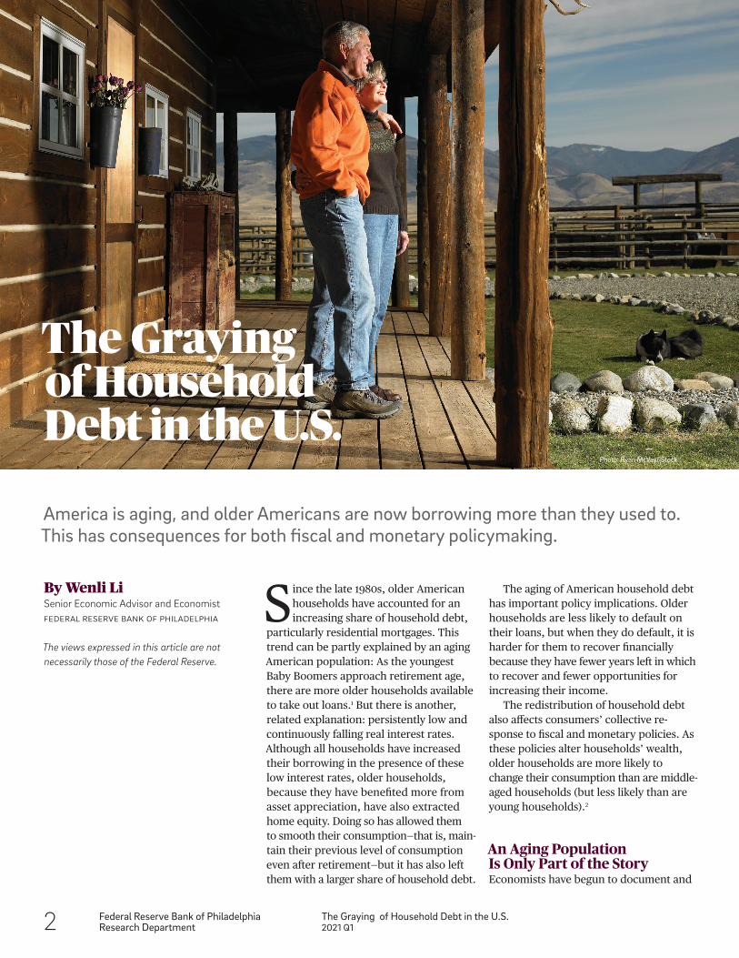
The Graying of Household Debt in the U.S.2021 Q1
Since the late 1980s, older American households have accounted for an increasing share of household debt,
particularly residential mortgages. This trend can be partly explained by an aging American population: As the youngest Baby Boomers approach retirement age, there are more older households available to take out loans.1 But there is another, related explanation: persistently low and continuously falling real interest rates. Although all households have increased their borrowing in the presence of these low interest rates, older households, because they have benefited more from asset appreciation, have also extracted home equity. Doing so has allowed them to smooth their consumption—that is, main- tain their previous level of consumption even after retirement—but it has also left them with a larger share of household debt.
The aging of American household debt has important policy implications. Older households are less likely to default on their loans, but when they do default, it is harder for them to recover financially because they have fewer years left in which to recover and fewer opportunities for increasing their income.
The redistribution of household debt also affects consumers’ collective re-sponse to fiscal and monetary policies. As these policies alter households’ wealth, older households are more likely to change their consumption than are middle- aged households (but less likely than are young households).2
An Aging Population Is Only Part of the StoryEconomists have begun to document and
By Wenli LiSenior Economic Advisor and EconomistFeDeral reSerVe BaNk OF PhIlaDelPhIa
The views expressed in this article are not necessarily those of the Federal Reserve.
The Graying of Household Debt in the U.S.
America is aging, and older Americans are now borrowing more than they used to. This has consequences for both fiscal and monetary policymaking.
Photo: Ryan McVay/iStock
Federal Reserve Bank of PhiladelphiaResearch Department
The Graying of Household Debt in the U.S.2021 Q1 3
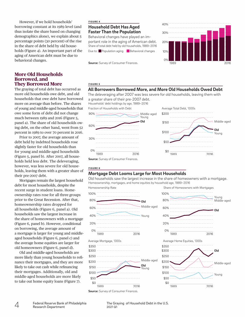
relatively small, but the increase has been significant (Figure 2, panel b). Student loans showed moderate signs of graying. The share of student loans held by old households increased mostly after 2000 (Figure 2, panel c). The share of credit card debt held by old households also grew, rising from 20 percent in 1989 to about 40 percent in 2016 (Figure 2, panel d).
The graying of household debt has coincided with the aging of the American population. The youngest Boomers, born in 1964, are now approaching retirement age. The share of households headed by older people went from 37 percent in 1989 to 46 percent in 2016 (Figure 3).
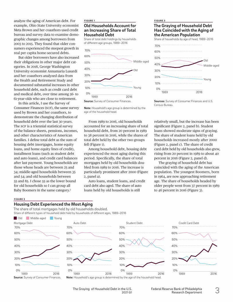
From 1989 to 2016, old households accounted for an increasing share of total household debt, from 20 percent in 1989 to 38 percent in 2016, while the shares of total debt held by the other two groups fell (Figure 1).
Among household debt, housing debt experienced the most aging during this period. Specifically, the share of total mortgages held by old households dou-bled from 1989 to 2016. The increase is particularly prominent after 2000 (Figure 2, panel a).
Auto loans, student loans, and credit card debt also aged. The share of auto loans held by old households is still
analyze the aging of American debt. For example, Ohio State University economist Meta Brown and her coauthors used credit bureau and survey data to examine demo-graphic changes among borrowers from 2003 to 2015. They found that older con- sumers experienced the steepest growth in real per capita home-secured debts.
But older borrowers have also increased their obligations in other major debt cat- egories. In 2018, George Washington University economist Annamaria Lusardi and her coauthors analyzed data from the Health and Retirement Study and documented substantial increases in other household debt, such as credit card debt and medical debt, over time among 56- to 61-year-olds who are close to retirement.
In this article, I use the Survey of Consumer Finances (SCF), the same survey used by Brown and her coauthors, to demonstrate the changing distribution of household debt over the last 30 years. The SCF is a triennial statistical survey of the balance sheets, pensions, incomes, and other characteristics of American families. I define total debt as the sum of housing debt (mortgages, home equity loans, and home equity lines of credit), installment loans (such as student debt and auto loans), and credit card balances after last payment. Young households are those whose heads are between 25 and 34; middle-aged households between 35 and 54; and old households between 55 and 85. I chose 55 as the lower bound for old households so I can group all Baby Boomers in the same category.3
F I G U R E 1
Old Households Account for an Increasing Share of Total Household DebtShare of total debt holdings by households of different age groups, 1989–2016
Source: Survey of Consumer Finances.
Note: Household's age group is determined by the age of the household head.
F I G U R E 2
Housing Debt Experienced the Most AgingThe share of total mortgages held by old households doubled.Share of different types of household debt held by households of different ages, 1989–2016
Source: Survey of Consumer Finances.
F I G U R E 3
The Graying of Household Debt Has Coincided with the Aging of the American PopulationShare of households by age of head, 1989–2016
Sources: Survey of Consumer Finances and U.S. Census Bureau.
Old
Middle-aged
Young
1989 20160%
10%
20%
30%
40%
50%
60%
70%
Old
Middle-aged
Young
1989 20160%
10%
20%
30%
40%
50%
60%
70%
Mortgage Debt Auto Debt Student Debt Credit Card Debt
Old Middle-aged Young
1989 20160%
10%
20%
30%
40%
50%
60%
70%
0%
10%
20%
30%
40%
50%
60%
70%
0%
10%
20%
30%
40%
50%
60%
70%
0%
10%
20%
30%
40%
50%
60%
70%
1989 2016 1989 2016 1989 2016Note: Household's age group is determined by the age of the household head.
4 Federal Reserve Bank of PhiladelphiaResearch Department
The Graying of Household Debt in the U.S.2021 Q1
However, if we hold households’ borrowing constant at its 1989 level (and thus isolate the share based on changing demographics alone), we explain about 5 percentage points (30 percent) of the rise in the share of debt held by old house-holds (Figure 4). An important part of the aging of American debt must be due to behavioral changes.
More Old Households Borrowed, and They Borrowed MoreThe graying of total debt has occurred as more old households owe debt, and old households that owe debt have borrowed more on average than before. The shares of young and middle-aged households that owe some form of debt did not change much between 1989 and 2016 (Figure 5, panel a). The share of old households ow-ing debt, on the other hand, went from 52 percent in 1989 to over 70 percent in 2016.
Prior to 2007, the average amount of debt held by indebted households rose slightly faster for old households than for young and middle-aged households (Figure 5, panel b). After 2007, all house-holds held less debt. The deleveraging, however, was less severe for old house-holds, leaving them with a greater share of their pre-2007 debt.
Mortgages remain the largest household debt for most households, despite the recent surge in student loans. Home- ownership rates rose for all three groups prior to the Great Recession. After that, homeownership rates dropped for all households (Figure 6, panel a). Old households saw the largest increase in the share of homeowners with a mortgage (Figure 6, panel b). However, conditional on borrowing, the average amount of a mortgage is larger for young and middle- aged households (Figure 6, panel c) and the average home equities are larger for old homeowners (Figure 6, panel d).
Old and middle-aged households are more likely than young households to refi-nance their mortgages, and they are more likely to take out cash while refinancing their mortgages. Additionally, old and middle-aged households are more likely to take out home equity loans (Figure 7).
F I G U R E 4
Household Debt Has Aged Faster Than the PopulationBehavioral changes have played an im- portant role in the aging of American debt.Share of total debt held by old households, 1989–2016
Source: Survey of Consumer Finances.
F I G U R E 5
All Borrowers Borrowed More, and More Old Households Owed DebtThe deleveraging after 2007 was less severe for old households, leaving them with a greater share of their pre-2007 debt.Households' debt holdings by age, 1989–2016
Source: Survey of Consumer Finances.
Source: Survey of Consumer Finances.
1989 20160%
10%
20%
30%
40%
Population agingDue to: Behavioral changes
Old
Middle-agedYoung
1989 20160%
30%
60%
90%
Old
Middle-aged
Young
1989 2016$0
$100
$50
$150
$200
Fraction of Households with Debt Average Total Debt, ‘000s
Old
Old
Middle-aged
Middle-aged
Homeownership Rate Share of Homeowners with Mortgages
Average Mortgage, ‘000s Average Home Equities, ‘000s
Young
Young
1989 20160%
20%
40%
60%
100%
80%
Old
Old
Middle-aged
Middle-aged
Young
Young
1989 2016
1989 2016 1989 2016
0%
20%
40%
60%
100%
80%
$0$50
$100
$150
$200
$250
$300$350
$0$50
$100
$150
$200
$250
$300$350
F I G U R E 6
Mortgage Debt Looms Large for Most Households Old households saw the largest increase in the share of homeowners with a mortgage.Homeownership, mortgages, and home equities by household age, 1989–2016
Federal Reserve Bank of PhiladelphiaResearch Department
The Graying of Household Debt in the U.S.2021 Q1 5
To differentiate between existing loans and new originations, Brown and her coauthors used credit bureau data to examine household borrowing by age before and after the Great Recession. They uncovered evidence that old households carried more debt through the Great Recession and had more loan originations after the Great Recession.
Falling Real Interest RatesPersistently falling interest rates over the last 30 years made borrowing cheap (Figure 8), which in turn led to increased demand for houses and subsequently significant appreciation of house prices (Figure 9). All households borrowed more relative to house value and total household income over time. Not surprisingly, the increase is much more evident relative to income than to house value.
For most households, housing remains the single largest asset. As housing is indivisible and it is costly to change houses, one way for households to access housing wealth as they age is to borrow against the value of their home. This is particularly true when house price appreciation is unanticipated.4 Indeed, old households extracted more cash from their houses than did middle-aged and young households, and they held the highest level of home equity loans.
In recent years, an acceleration of mortgage lending—leading to the Great Recession and the subsequent slowdown—has also contributed to more mortgage debt held by older households.5 This is because old households defaulted less and carried more debt after the recession. Additionally, old households on average are more creditworthy and, hence, were less affected by the tightening of lending standards after the Great Recession.
F I G U R E 8
Persistently Falling Interest Rates Over the Last 30 Years Made Borrowing CheapNominal reported mortgage interest rate by household age, compared to Freddie Mac rate, 1989–2016
Sources: Survey of Consumer Finances and Freddie Mac.
F I G U R E 9
Falling Interest Rates Have Led to Increased Demand for Houses and Subsequently Significant Appreciation of House PricesReal mortgage rates and growth rates of real house price index (HPI), adjusted for inflation, 1989–2016
Source: Freddie Mac.
F I G U R E 7
Old and Middle-Aged Households Are More Likely to Refinance, Take Out Cash While Refinancing, and Take Out Home Equity LoansMortgage refinancing and home equity lines of credit (HELOCs), 1989–2016
Source: Survey of Consumer Finances.
Old
Middle-aged
Freddie Mac 30-yr fixed
Young
1989 20160%
2%
4%
6%
8%
10%
12%
1975 2016−15%
−10%
−5%
0%
5%
10%
15%
Real mortgage ratesReal HPI growth rates
% of Refi Cond. on Mortgage % of Cash Refi Cond. on Mortgage % with HELOCs Cond. on Mortgage HELOC Bal. Cond. on Mortgage, ‘000s
1989 2016 1989 2016 1989 2016 1989 20160%
5%
10%
15%
20%
25%
$0
$2
$4
$6
$8
$10
0%5%
10%
15%
20%
25%
30%
35%
40%45%
0%5%
10%
15%
20%
25%
30%
35%
40%45%
Old Middle-aged Young
See Why Interest Rates Have Declined.
6 Federal Reserve Bank of PhiladelphiaResearch Department
The Graying of Household Debt in the U.S.2021 Q1
Policy Implications of Aging Household DebtBoth debt-to-income and debt-to-asset ratios have increased for households of all age groups, but the debt-to-income ratio has increased faster (Figure 10).6 As a result, changes that deflate asset values threaten the financial solvency of all households, and they endanger old households more than young and middle-aged households. Although old households, because of their steady (albeit perhaps smaller) income and the wealth they have built up, are less likely to default, they will have to default if house prices drop significantly, all else being equal.7 Should that happen, old households will have a much harder time recovering financially, due to their shorter remaining life span and limited income potential. Thus, the large increase in home- secured debt carried by middle-aged households into retirement constitutes a new source of financial risk in retirement.8
We may already be seeing the effect of this change. As documented by University of California, San Diego, professor Michelle White and me, the increases in the percentages of bankruptcy filings and foreclosures by old households since 2000 were much larger than the increase in their population.9
Another policy implication of the graying of American debt pertains to the collective house-hold response to monetary and fiscal policies.
To summarize, household debt in the U.S. has grayed significantly over the last several decades, caused by the nation’s aging demographics and by the behavioral responses of households to persistently low real interest rates. This graying of debt creates financial risks for relatively old households. It also has important impli- cations for policymakers as demographics plays a role in households’ varying consumption responses to changes in wealth and income.
F I G U R E 1 0
Debt as a Share of Income Has Usually Increased Faster than Debt as a Share of AssetsAnd because they are typically retired, old households are more vulnerable to changes that deflate asset values.Total debt holdings relative to assets and income by age group, 1989–2016
Source: Survey of Consumer Finances.
Why Interest Rates Have DeclinedSince the 1980s, real interest rates in the U.S. have steadily declined. There are two explanations for this decline: the global savings glut and secular stagnation.
In 2005, Fed Chair Ben Bernanke suggested that a global savings glut, caused by increased capital flows from crisis-prone economies to the relatively safe haven of the U.S., were responsible for the very low longer-term interest rates in the U.S.
In 2014, former U.S. Secretary of the Treasury Larry Summers identified another cause of persistently low interest rates: secular stagnation, which he defined as a persistently low or negative natural rate of interest—the equilibrium real interest
rate consistent with output at potential—leading to a chronically binding zero lower bound. In other words, the economy has a long-term lack of demand.10
Both explanations almost certainly played a role in the decline in real interest rates, and so did an aging population. An aging pop- ulation means a smaller working-age population, which in turn leads to a reduction in the economy’s productive capacity. Hence, a lower real interest rate is needed to support the economy. Furthermore, as life expectancy increases, individuals save more, which increases the supply of loanable funds that banks can lend out and decreases interest rates.11
Old
Old
Middle-aged
Middle-aged
Average Total Debt Over Assets Median Total Debt Over Assets
Average Total Debt Over Income Median Total Debt Over Income
Young
Young
1989 2016
Old
Old
Middle-aged
Middle-aged
Young
Young
1989 2016
1989 2016 1989 20160.0%
1.0%
1.5%
0.5%
2.0%
0.0%
1.0%
1.5%
0.5%
2.0%
0.0%
1.0%
1.5%
0.5%
2.0%
0.0%
1.0%
1.5%
0.5%
2.0%
See The Macro- economic Perspective.
Federal Reserve Bank of PhiladelphiaResearch Department
The Graying of Household Debt in the U.S.2021 Q1 7
9 See Li and White (forthcoming). A higher like- lihood of financial solvency doesn’t necessarily imply lower welfare ex ante or before the realization of house price shocks. It may simply indicate that households are more effectively using all financial options, including default, to smooth their consumption in different eco-nomic situations.
10 This argument was later quantified by Eggerts- son et al. (2019b). Demographic aging in developed economies is one of the reasons be-hind the secular stagnation (Eggertsson 2019a).
11 For more detailed discussion see the article by Carvalho et al. (2017) and papers cited in the article.
12 See research cited in footnote 2.
ReferencesBartscher, Alina K., Moritz Kuhn, Moritz Schularick, and Ulrike I. Steins. “Modigliani Meets Minsky: American Household Debt, 1949–2016,” unpublished manuscript (2018).
Bernanke, Ben. “The Global Saving Glut and the U.S. Current Deficit,” the Sandridge Lecture, Virginia Association of Economists, Richmond, Virginia, April 14, 2005.
Brown, Meta, Donghoon Lee, Joelle Scally, and Wilbert van der Klaauw. “The Graying of
Notes1 Baby Boomers are the demographic cohort born from 1946 to 1964, during the post-World War II spike in the national birth rate.
2 See, among others, Campbell and Cocco (2007) and Li and Yao (2007) for detailed analyses and discussions of the differential life-cycle marginal propensities to consume out of wealth.
3 The empirical observations presented later in the article are largely robust if we define old households as those aged between 65 and 85 instead of 55 and 85. Not surprisingly, the graying of household debt using this latter definition would be less severe.
4 See Bartscher et al. (2018).
5 See Brown et al. (forthcoming).
6 Throughout this article, I follow the SCF def- inition of household assets: the sum of financial assets, such as stocks and bonds, and non-financial assets whose main component is the value of the primary residence.
7 Brown et al. address recent and ongoing trends in borrowing, repayment, and bankruptcy among U.S. households, emphasizing the relative financial stability of older households and their repayment reliability.
8 See Lusardi et al. (2018).
The Macroeconomic PerspectiveOld households are more likely to consume out of both wealth and income than are middle-aged households but less likely than are young households.12 This heterogene-ity in consumption responses across age groups implies that monetary and fiscal policies will have different outcomes as the U.S. population grows older.
For the ease of exposition, let’s compare two hypothetical economies populated en-tirely by homeowners where 30 percent of households are middle-aged. In one econ-omy, 60 percent of households are young and 10 percent are old. In the other, 10 percent are young but 60 percent are old. Using a marginal propensity to consume (MPC) of 10 percent for the young, 3 percent
for the middle-aged, and 6 percent for the old, and assuming that an expansionary monetary policy leads to a 100 percent appreciation of house prices, total con-sumption would increase by 7.5 percent for the first economy but only 5.5 percent for the second. Since some states in the U.S. age faster than others due to migration, this heterogeneity across age groups in policy transmission will translate into heterogene-ity in policy response across geographical regions.
American Debt,” in Olivia S. Mitchell and Annamaria Lusardi, eds., Remaking Retirement: Debt in an Aging Economy. Oxford, UK: Oxford University Press, forthcoming.
Campbell, John Young, and João Cocco. “How Do House Prices Affect Consumption? Evidence from Micro Data,” Journal of Monetary Eco-nomics, 54 (2007), pp. 591–621, https://doi.org/ 10.1016/j.jmoneco.2005.10.016.
Carvalho, Carlos, Andrea Ferrero, and Fernanda Nechio. “Demographic Transition and Low U.S. Interest Rates,” FRBSF Economic Letter (2017), https://www.frbsf.org/economic-research/publications/economic-letter/2017/september/demographic-transition-and-low-us-interest- rates.
Eggertsson, Gauti B., Manuel Lancastre, and Lawrence H. Summers. “Aging, Output Per Capita, and Secular Stagnation,” American Economic Review—Insights, 1:3 (2019a), pp. 325– 342, https://doi.org/10.1257/aeri.20180383.
Eggertsson, Gauti B., Neil R. Mehrotra, and Jacob Robbins. “A Model of Secular Stagnation: Theory and Quantitative Evaluation,” American Economic Journal: Macroeconomics, 11:1 (2019b), pp. 1–48, https://doi.org/10.1257/mac.20170367.
Li, Wenli, and Rui Yao. “The Life-Cycle Effects of House Price Changes,’’ Journal of Money, Credit, and Banking, 39:6 (2007), pp. 1375–1409, https:// doi.org/10.1111/j.1538-4616.2007.00071.x.
Li, Wenli, and Michelle White. “Financial Distress Among the Elderly: Bankruptcy Reform and the Financial Crisis,” in Olivia S. Mitchell and Annamaria Lusardi, eds., Remaking Retire-ment: Debt in an Aging Economy. Oxford, UK: Oxford University Press, 2020.
Lusardi, Annamaria, Olivia S. Mitchell, and Noemi Oggero. “The Changing Face of Debt and Financial Fragility at Older Ages,” in American Economic Association Papers and Proceedings, 108 (2018), pp. 407–411, https://doi.org/10.1257/pandp.20181117.
Summers, Lawrence. “U.S. Economic Prospects: Secular Stagnation, Hysteresis, and the Zero Lower Bound,” Business Economics, 49:2 (2014), pp. 65–73, https://doi.org/10.1057/be.2014.13.
8 Federal Reserve Bank of PhiladelphiaResearch Department
Isolating the Effect of State Business Closure Orders on Employment2021 Q1
Isolating the Effect of State Business Closure Orders on EmploymentA closer look at the data reveals the extent to which state policies in response to COVID-19 may have increased unemployment.
In late 2020, numerous states again imposed restrictions on business activity and personal travel in order to
halt another wave of COVID-19 cases. These policies represented the most significant interventions since March and April of 2020, when almost all state governments substantially restricted, if not outright prohibited, the operation of businesses in several industries. The economic ef- fects of the “shutdowns” last spring can potentially guide how we interpret the effects of more recent policies and how we shape mitigation efforts in future public health crises.
However, the effect of such orders on business activity, and in particular on employment, is unclear. Even before states intervened in March 2020, many fewer consumers were visiting establishments such as movie theaters, restaurants, and salons as anxious households limited their exposure to the coronavirus. Thus, even in the absence of a business closure order, it’s likely that these establishments would have laid off workers. Can we isolate the exact effect of state business closure orders on employment?
By Ryan MichaelsEconomist and Economic AdvisorFeDeral reSerVe BaNk OF PhIlaDelPhIa
The views expressed in this article are not necessarily those of the Federal Reserve.
Photo: Cindy Shebley/iStock
Federal Reserve Bank of PhiladelphiaResearch Department
Isolating the Effect of State Business Closure Orders on Employment2021 Q1 9
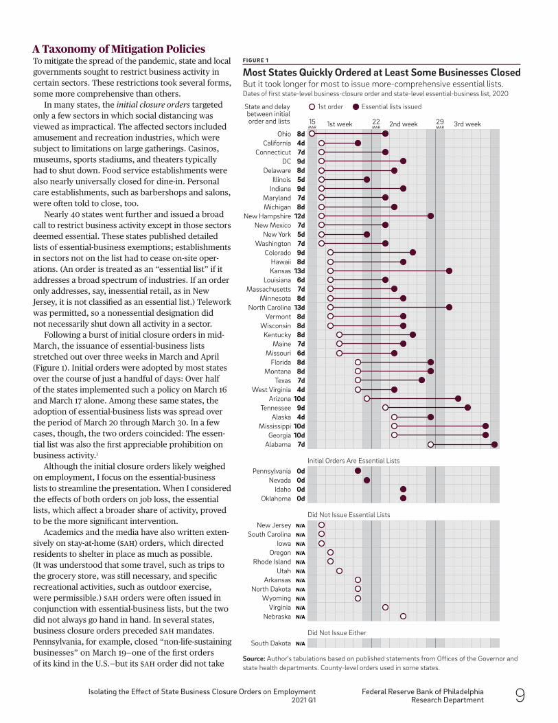
A Taxonomy of Mitigation PoliciesTo mitigate the spread of the pandemic, state and local governments sought to restrict business activity in certain sectors. These restrictions took several forms, some more comprehensive than others.
In many states, the initial closure orders targeted only a few sectors in which social distancing was viewed as impractical. The affected sectors included amusement and recreation industries, which were subject to limitations on large gatherings. Casinos, museums, sports stadiums, and theaters typically had to shut down. Food service establishments were also nearly universally closed for dine-in. Personal care establishments, such as barbershops and salons, were often told to close, too.
Nearly 40 states went further and issued a broad call to restrict business activity except in those sectors deemed essential. These states published detailed lists of essential-business exemptions; establishments in sectors not on the list had to cease on-site oper-ations. (An order is treated as an “essential list” if it addresses a broad spectrum of industries. If an order only addresses, say, inessential retail, as in New Jersey, it is not classified as an essential list.) Telework was permitted, so a nonessential designation did not necessarily shut down all activity in a sector.
Following a burst of initial closure orders in mid- March, the issuance of essential-business lists stretched out over three weeks in March and April (Figure 1). Initial orders were adopted by most states over the course of just a handful of days: Over half of the states implemented such a policy on March 16 and March 17 alone. Among these same states, the adoption of essential-business lists was spread over the period of March 20 through March 30. In a few cases, though, the two orders coincided: The essen-tial list was also the first appreciable prohibition on business activity.1
Although the initial closure orders likely weighed on employment, I focus on the essential-business lists to streamline the presentation. When I considered the effects of both orders on job loss, the essential lists, which affect a broader share of activity, proved to be the more significant intervention.
Academics and the media have also written exten-sively on stay-at-home (SAH) orders, which directed residents to shelter in place as much as possible. (It was understood that some travel, such as trips to the grocery store, was still necessary, and specific recreational activities, such as outdoor exercise, were permissible.) SAH orders were often issued in conjunction with essential-business lists, but the two did not always go hand in hand. In several states, business closure orders preceded SAH mandates. Pennsylvania, for example, closed “non-life-sustaining businesses” on March 19—one of the first orders of its kind in the U.S.—but its SAH order did not take
15MAR
22MAR
29MAR1st week
1st orderState and delay between initial order and lists
Ohio 8d2nd week 3rd week
Essential lists issued
California 4d Connecticut 7d DC 9d Delaware 8d Illinois 5d Indiana 9d Maryland 7d Michigan 8d New Hampshire 12d New Mexico 7d New York 5d Washington 7d Colorado 9d Hawaii 8d Kansas 13d Louisiana 6d Massachusetts 7d Minnesota 8d North Carolina 13d Vermont 8d Wisconsin 8d Kentucky 8d Maine 7d Missouri 6d Florida 8d Montana 8d Texas 7d West Virginia 4d Arizona 10d Tennessee 9d Alaska 4d Mississippi 10d Georgia 10d Alabama 7d
Pennsylvania 0d
Did Not Issue Essential Lists
Initial Orders Are Essential Lists
Nevada 0d Idaho 0d Oklahoma 0d
New Jersey N/A
South Carolina N/A
Iowa N/A
Oregon N/A
Rhode Island N/A
Utah N/A
Arkansas N/A
North Dakota N/A
Wyoming N/A
Virginia N/A
Nebraska N/A
Did Not Issue Either South Dakota N/A
F I G U R E 1
Most States Quickly Ordered at Least Some Businesses Closed But it took longer for most to issue more-comprehensive essential lists.Dates of first state-level business-closure order and state-level essential-business list, 2020
Source: Author’s tabulations based on published statements from Offices of the Governor and state health departments. County-level orders used in some states.
10 Federal Reserve Bank of PhiladelphiaResearch Department
Isolating the Effect of State Business Closure Orders on Employment2021 Q1
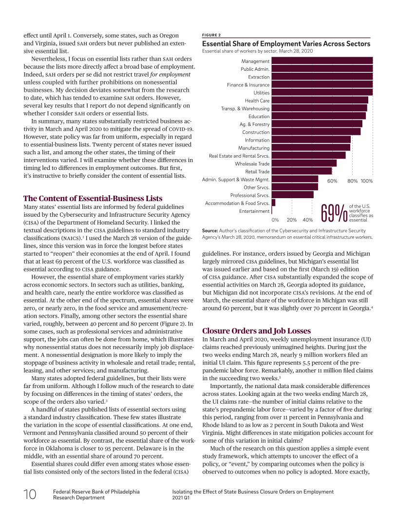
guidelines. For instance, orders issued by Georgia and Michigan largely mirrored CISA guidelines, but Michigan’s essential list was issued earlier and based on the first (March 19) edition of CISA guidance. After CISA substantially expanded the scope of essential activities on March 28, Georgia adopted its guidance, but Michigan did not incorporate CISA’s revisions. At the end of March, the essential share of the workforce in Michigan was still around 60 percent, but it was slightly over 70 percent in Georgia.4
Closure Orders and Job LossesIn March and April 2020, weekly unemployment insurance (UI) claims reached previously unimagined heights. During just the two weeks ending March 28, nearly 9 million workers filed an initial UI claim. This figure represents 5.5 percent of the pre- pandemic labor force. Remarkably, another 11 million filed claims in the succeeding two weeks.5
Importantly, the national data mask considerable differences across states. Looking again at the two weeks ending March 28, the UI claims rate—the number of initial claims relative to the state’s prepandemic labor force—varied by a factor of five during this period, ranging from over 11 percent in Pennsylvania and Rhode Island to as low as 2 percent in South Dakota and West Virginia. Might differences in state mitigation policies account for some of this variation in initial claims?
Much of the research on this question applies a simple event study framework, which attempts to uncover the effect of a policy, or “event,” by comparing outcomes when the policy is observed to outcomes when no policy is adopted. More exactly,
effect until April 1. Conversely, some states, such as Oregon and Virginia, issued SAH orders but never published an exten-sive essential list.
Nevertheless, I focus on essential lists rather than SAH orders because the lists more directly affect a broad base of employment. Indeed, SAH orders per se did not restrict travel for employment unless coupled with further prohibitions on nonessential businesses. My decision deviates somewhat from the research to date, which has tended to examine SAH orders. However, several key results that I report do not depend significantly on whether I consider SAH orders or essential lists.
In summary, many states substantially restricted business ac-tivity in March and April 2020 to mitigate the spread of COVID-19. However, state policy was far from uniform, especially in regard to essential-business lists. Twenty percent of states never issued such a list, and among the other states, the timing of their interventions varied. I will examine whether these differences in timing led to differences in employment outcomes. But first, it’s instructive to briefly consider the content of essential lists.
The Content of Essential-Business ListsMany states’ essential lists are informed by federal guidelines issued by the Cybersecurity and Infrastructure Security Agency (CISA) of the Department of Homeland Security. I linked the textual descriptions in the CISA guidelines to standard industry classifications (NAICS).2 I used the March 28 version of the guide-lines, since this version was in force the longest before states started to “reopen” their economies at the end of April. I found that at least 69 percent of the U.S. workforce was classified as essential according to CISA guidance.
However, the essential share of employment varies starkly across economic sectors. In sectors such as utilities, banking, and health care, nearly the entire workforce was classified as essential. At the other end of the spectrum, essential shares were zero, or nearly zero, in the food service and amusement/recre-ation sectors. Finally, among other sectors the essential share varied, roughly, between 40 percent and 80 percent (Figure 2). In some cases, such as professional services and administrative support, the jobs can often be done from home, which illustrates why nonessential status does not necessarily imply job displace-ment. A nonessential designation is more likely to imply the stoppage of business activity in wholesale and retail trade; rental, leasing, and other services; and manufacturing.
Many states adopted federal guidelines, but their lists were far from uniform. Although I follow much of the research to date by focusing on differences in the timing of states’ orders, the scope of the orders also varied.3
A handful of states published lists of essential sectors using a standard industry classification. These few states illustrate the variation in the scope of essential classifications. At one end, Vermont and Pennsylvania classified around 50 percent of their workforce as essential. By contrast, the essential share of the work- force in Oklahoma is closer to 95 percent. Delaware is in the middle, with an essential share of around 70 percent.
Essential shares could differ even among states whose essen-tial lists consisted only of the sectors listed in the federal (CISA)
0% 20% 40%
60% 80% 100%
Entertainment
Accommodation & Food Srvcs.
Professional Srvcs.
Other Srvcs.
Admin. Support & Waste Mgmt.
Retail Trade
Wholesale Trade
Real Estate and Rental Srvcs.
Manufacturing
Information
Construction
Ag. & Forestry
Education
Transp. & Warehousing
Health Care
Utilities
Finance & Insurance
Extraction
Public Admin.
Management
69%of the U.S. workforce classifies as essential
F I G U R E 2
Essential Share of Employment Varies Across SectorsEssential share of workers by sector, March 28, 2020
Source: Author’s classification of the Cybersecurity and Infrastructure Security Agency’s March 28, 2020, memorandum on essential critical infrastructure workers.
Federal Reserve Bank of PhiladelphiaResearch Department
Isolating the Effect of State Business Closure Orders on Employment2021 Q1 11
the event study is implemented using a barebones statistical (regression) model of, for example, initial UI claims. The model relates the change in a state’s initial claims rate in any given week to (i) the state’s own policy (in that week) as well as (ii) a common “time effect,” which captures the average claims rate across all states (in that week).
If a policy is to have an effect in this framework, it must lead to higher initial claims upon its adoption (i) relative to the state’s own claims rates at other dates and (ii) relative to the typical change in claims observed across all states at that time (as cap- tured by the time effects). In our context, the driving force behind these common time effects is the evolving public health risk posed by COVID-19.
Perhaps surprisingly, this event study model omits any mention of a state’s own recent growth in COVID-19 cases. I con- sidered the role of caseloads but found its effect to be almost negligible, which is consistent with the results found by University of California economists Zhixian Lin and Christopher M. Meissner. Variation in the timing of the orders appears to reflect differ-ences in states’ responses to a given caseload rather than big differences in caseloads themselves. To illustrate this point, consider that when California issued the nation’s first SAH order on March 19, it had registered roughly the same number of cases per 100,000 residents as Arkansas—yet Arkansas never issued an SAH order (or any order like it).
Following recent research, I used this event study framework to examine the effect of a specific policy, essential-business lists, on job loss in March and April 2020. I considered three separate indicators of job loss, starting with initial UI claims.
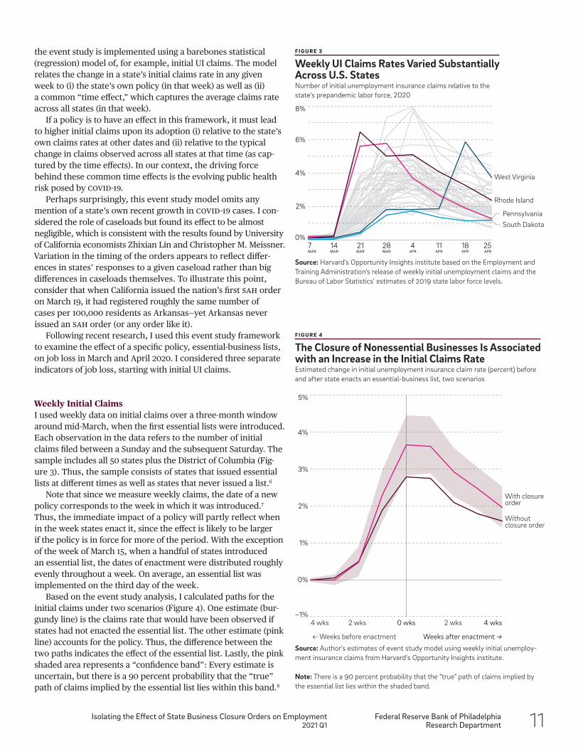
Weekly Initial ClaimsI used weekly data on initial claims over a three-month window around mid-March, when the first essential lists were introduced. Each observation in the data refers to the number of initial claims filed between a Sunday and the subsequent Saturday. The sample includes all 50 states plus the District of Columbia (Fig-ure 3). Thus, the sample consists of states that issued essential lists at different times as well as states that never issued a list.6
Note that since we measure weekly claims, the date of a new policy corresponds to the week in which it was introduced.7 Thus, the immediate impact of a policy will partly reflect when in the week states enact it, since the effect is likely to be larger if the policy is in force for more of the period. With the exception of the week of March 15, when a handful of states introduced an essential list, the dates of enactment were distributed roughly evenly throughout a week. On average, an essential list was implemented on the third day of the week.
Based on the event study analysis, I calculated paths for the initial claims under two scenarios (Figure 4). One estimate (bur-gundy line) is the claims rate that would have been observed if states had not enacted the essential list. The other estimate (pink line) accounts for the policy. Thus, the difference between the two paths indicates the effect of the essential list. Lastly, the pink shaded area represents a “confidence band”: Every estimate is uncertain, but there is a 90 percent probability that the “true” path of claims implied by the essential list lies within this band.8
F I G U R E 3
Weekly UI Claims Rates Varied Substantially Across U.S. StatesNumber of initial unemployment insurance claims relative to the state's prepandemic labor force, 2020
Source: Harvard’s Opportunity Insights institute based on the Employment and Training Administration’s release of weekly initial unemployment claims and the Bureau of Labor Statistics’ estimates of 2019 state labor force levels.
−1%
0%
1%
2%
3%
4%
5%
0 wks
← Weeks before enactment Weeks after enactment →
4 wks 2 wks 2 wks 4 wks
With closure order
Without closure order
F I G U R E 4
The Closure of Nonessential Businesses Is Associated with an Increase in the Initial Claims RateEstimated change in initial unemployment insurance claim rate (percent) before and after state enacts an essential-business list, two scenarios
Source: Author’s estimates of event study model using weekly initial unemploy-ment insurance claims from Harvard‘s Opportunity Insights institute.
Note: There is a 90 percent probability that the “true” path of claims implied by the essential list lies within the shaded band.
7MAR
14MAR
21MAR
28MAR
4APR
11APR
18APR
25APR
0%
2%
4%
6%
8%
Rhode Island
PennsylvaniaSouth Dakota
West Virginia
12 Federal Reserve Bank of PhiladelphiaResearch Department
Isolating the Effect of State Business Closure Orders on Employment2021 Q1
Weekly Private Sector EmploymentAside from initial UI claims, the labor market indicators published by the U.S. government are available, at best, on a monthly basis. Monthly data are even less suitable than weekly data for an event study of the COVID-19 crisis, which evolved rapidly in March and April.
Fortunately, Harvard’s Opportunity Insights institute has made available state-level employment data at a higher frequency. The institute culled the data from payroll-processing firms, time-tracking software, and paycheck deposits. The employment records cover a reasonably representative cross section of the nonfarm private sector.14
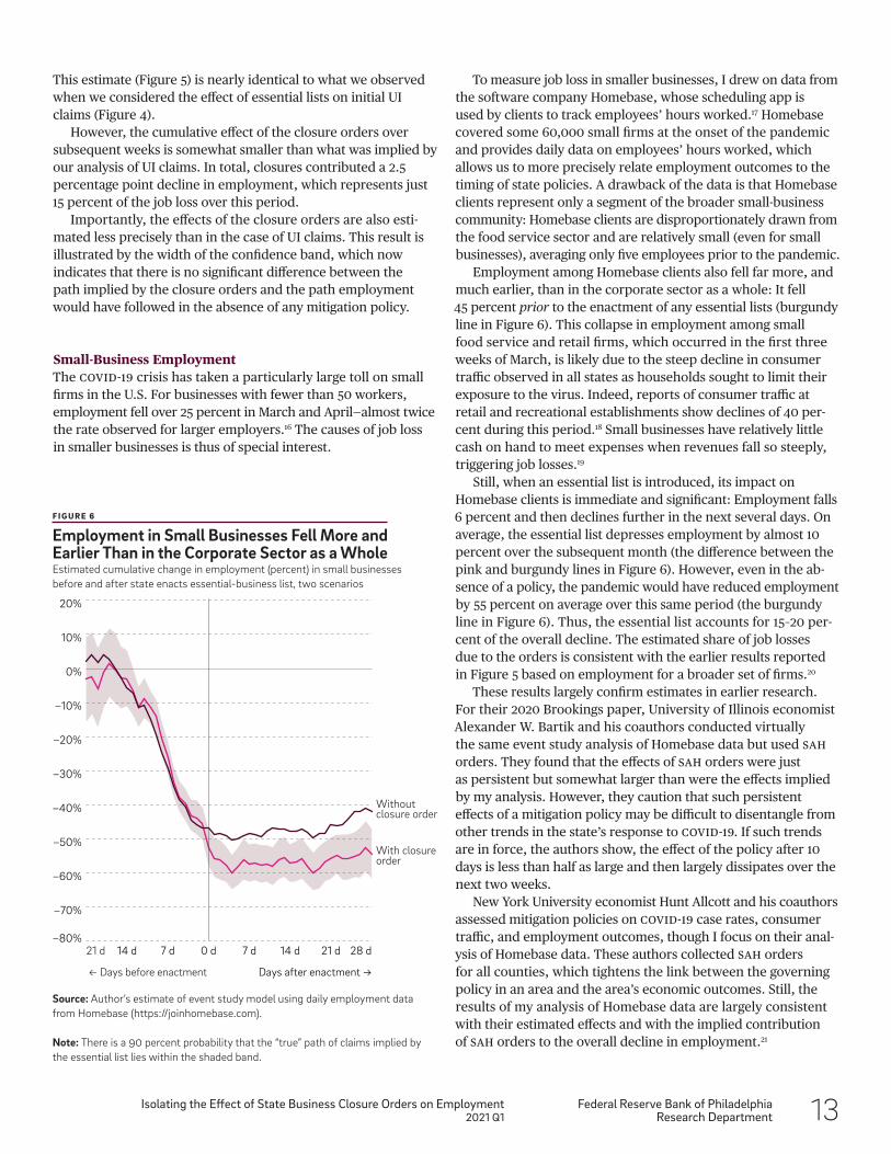
In principle, the employment series is daily. However, the data are reported as a seven-day moving average, making it akin to a weekly series. Indeed, we can extract from the moving average a measure of weekly employment growth between each Sunday and Saturday. This weekly format matches the structure of the initial claims data. Also, the seven-day decline in employment is close in concept to initial claims, which is a measure of the number of newly unemployed.15
An event-study analysis of these employment data indicates that closure orders added about 1 percentage point to the decline in employment in the week they took effect (week 0).
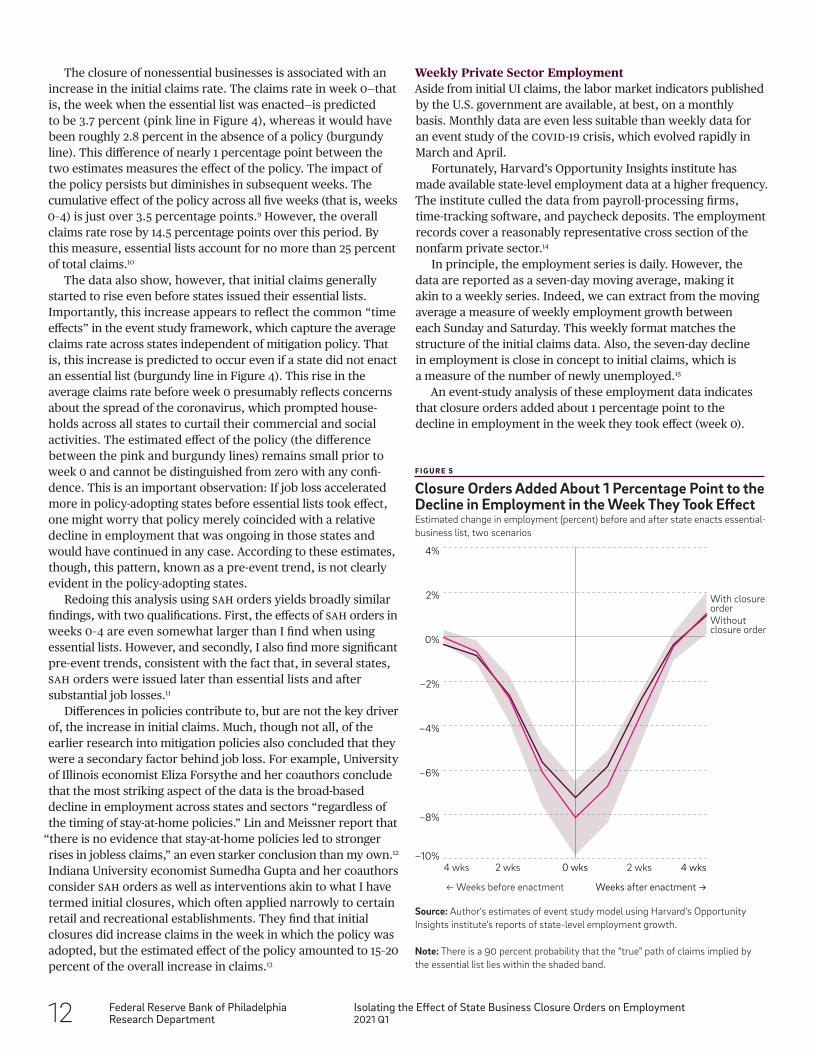
The closure of nonessential businesses is associated with an increase in the initial claims rate. The claims rate in week 0—that is, the week when the essential list was enacted—is predicted to be 3.7 percent (pink line in Figure 4), whereas it would have been roughly 2.8 percent in the absence of a policy (burgundy line). This difference of nearly 1 percentage point between the two estimates measures the effect of the policy. The impact of the policy persists but diminishes in subsequent weeks. The cumulative effect of the policy across all five weeks (that is, weeks 0–4) is just over 3.5 percentage points.9 However, the overall claims rate rose by 14.5 percentage points over this period. By this measure, essential lists account for no more than 25 percent of total claims.10
The data also show, however, that initial claims generally started to rise even before states issued their essential lists. Importantly, this increase appears to reflect the common “time effects” in the event study framework, which capture the average claims rate across states independent of mitigation policy. That is, this increase is predicted to occur even if a state did not enact an essential list (burgundy line in Figure 4). This rise in the average claims rate before week 0 presumably reflects concerns about the spread of the coronavirus, which prompted house-holds across all states to curtail their commercial and social activities. The estimated effect of the policy (the difference between the pink and burgundy lines) remains small prior to week 0 and cannot be distinguished from zero with any confi-dence. This is an important observation: If job loss accelerated more in policy-adopting states before essential lists took effect, one might worry that policy merely coincided with a relative decline in employment that was ongoing in those states and would have continued in any case. According to these estimates, though, this pattern, known as a pre-event trend, is not clearly evident in the policy-adopting states.
Redoing this analysis using SAH orders yields broadly similar findings, with two qualifications. First, the effects of SAH orders in weeks 0–4 are even somewhat larger than I find when using essential lists. However, and secondly, I also find more significant pre-event trends, consistent with the fact that, in several states, SAH orders were issued later than essential lists and after substantial job losses.11
Differences in policies contribute to, but are not the key driver of, the increase in initial claims. Much, though not all, of the earlier research into mitigation policies also concluded that they were a secondary factor behind job loss. For example, University of Illinois economist Eliza Forsythe and her coauthors conclude that the most striking aspect of the data is the broad-based decline in employment across states and sectors “regardless of the timing of stay-at-home policies.” Lin and Meissner report that
“there is no evidence that stay-at-home policies led to stronger rises in jobless claims,” an even starker conclusion than my own.12 Indiana University economist Sumedha Gupta and her coauthors consider SAH orders as well as interventions akin to what I have termed initial closures, which often applied narrowly to certain retail and recreational establishments. They find that initial closures did increase claims in the week in which the policy was adopted, but the estimated effect of the policy amounted to 15–20 percent of the overall increase in claims.13
F I G U R E 5
Closure Orders Added About 1 Percentage Point to the Decline in Employment in the Week They Took EffectEstimated change in employment (percent) before and after state enacts essential- business list, two scenarios
Source: Author’s estimates of event study model using Harvard's Opportunity Insights institute’s reports of state-level employment growth.
Note: There is a 90 percent probability that the “true” path of claims implied by the essential list lies within the shaded band.
−10%
−8%
−6%
−4%
−2%
0%
2%
4%
0 wks
← Weeks before enactment Weeks after enactment →
4 wks 4 wks
With closure orderWithout closure order
2 wks 2 wks
Federal Reserve Bank of PhiladelphiaResearch Department
Isolating the Effect of State Business Closure Orders on Employment2021 Q1 13
This estimate (Figure 5) is nearly identical to what we observed when we considered the effect of essential lists on initial UI claims (Figure 4).
However, the cumulative effect of the closure orders over subsequent weeks is somewhat smaller than what was implied by our analysis of UI claims. In total, closures contributed a 2.5 percentage point decline in employment, which represents just 15 percent of the job loss over this period.
Importantly, the effects of the closure orders are also esti-mated less precisely than in the case of UI claims. This result is illustrated by the width of the confidence band, which now indicates that there is no significant difference between the path implied by the closure orders and the path employment would have followed in the absence of any mitigation policy.
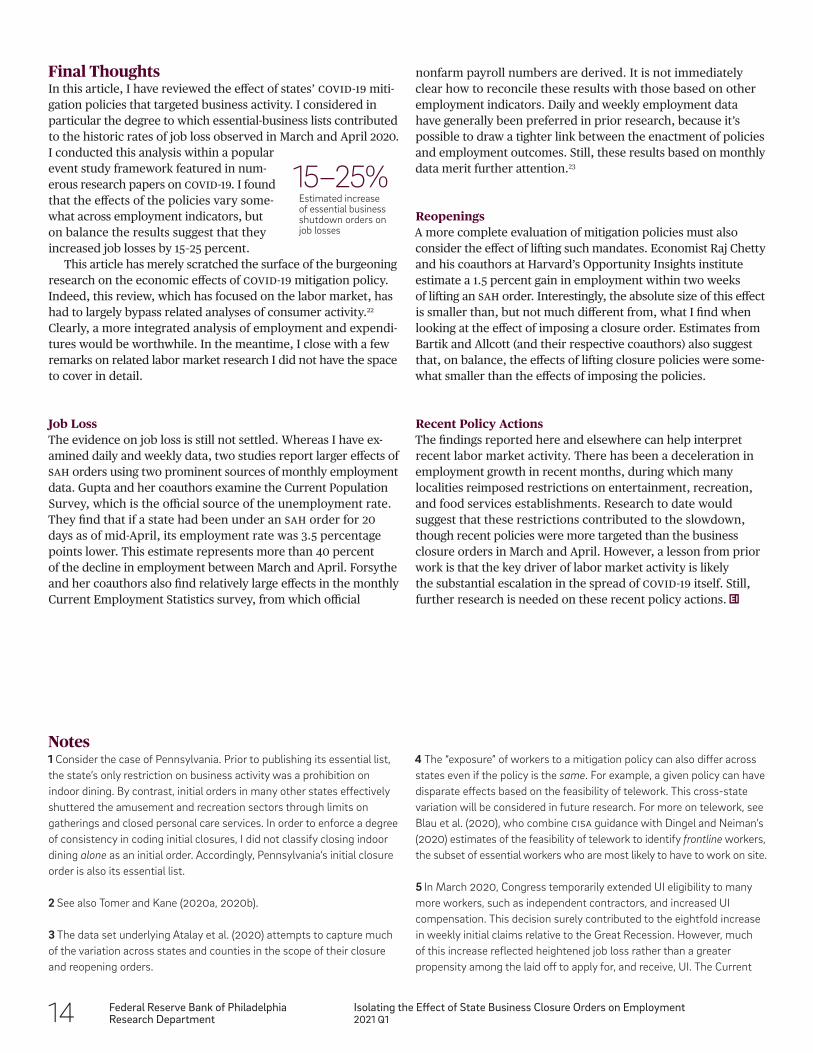
Small-Business EmploymentThe COVID-19 crisis has taken a particularly large toll on small firms in the U.S. For businesses with fewer than 50 workers, employment fell over 25 percent in March and April—almost twice the rate observed for larger employers.16 The causes of job loss in smaller businesses is thus of special interest.
To measure job loss in smaller businesses, I drew on data from the software company Homebase, whose scheduling app is used by clients to track employees’ hours worked.17 Homebase covered some 60,000 small firms at the onset of the pandemic and provides daily data on employees’ hours worked, which allows us to more precisely relate employment outcomes to the timing of state policies. A drawback of the data is that Homebase clients represent only a segment of the broader small-business community: Homebase clients are disproportionately drawn from the food service sector and are relatively small (even for small businesses), averaging only five employees prior to the pandemic.
Employment among Homebase clients also fell far more, and much earlier, than in the corporate sector as a whole: It fell 45 percent prior to the enactment of any essential lists (burgundy line in Figure 6). This collapse in employment among small food service and retail firms, which occurred in the first three weeks of March, is likely due to the steep decline in consumer traffic observed in all states as households sought to limit their exposure to the virus. Indeed, reports of consumer traffic at retail and recreational establishments show declines of 40 per-cent during this period.18 Small businesses have relatively little cash on hand to meet expenses when revenues fall so steeply, triggering job losses.19
Still, when an essential list is introduced, its impact on Homebase clients is immediate and significant: Employment falls 6 percent and then declines further in the next several days. On average, the essential list depresses employment by almost 10 percent over the subsequent month (the difference between the pink and burgundy lines in Figure 6). However, even in the ab- sence of a policy, the pandemic would have reduced employment by 55 percent on average over this same period (the burgundy line in Figure 6). Thus, the essential list accounts for 15–20 per-cent of the overall decline. The estimated share of job losses due to the orders is consistent with the earlier results reported in Figure 5 based on employment for a broader set of firms.20
These results largely confirm estimates in earlier research. For their 2020 Brookings paper, University of Illinois economist Alexander W. Bartik and his coauthors conducted virtually the same event study analysis of Homebase data but used SAH orders. They found that the effects of SAH orders were just as persistent but somewhat larger than were the effects implied by my analysis. However, they caution that such persistent effects of a mitigation policy may be difficult to disentangle from other trends in the state’s response to COVID-19. If such trends are in force, the authors show, the effect of the policy after 10 days is less than half as large and then largely dissipates over the next two weeks.
New York University economist Hunt Allcott and his coauthors assessed mitigation policies on COVID-19 case rates, consumer traffic, and employment outcomes, though I focus on their anal- ysis of Homebase data. These authors collected SAH orders for all counties, which tightens the link between the governing policy in an area and the area’s economic outcomes. Still, the results of my analysis of Homebase data are largely consistent with their estimated effects and with the implied contribution of SAH orders to the overall decline in employment.21
F I G U R E 6
Employment in Small Businesses Fell More and Earlier Than in the Corporate Sector as a WholeEstimated cumulative change in employment (percent) in small businesses before and after state enacts essential-business list, two scenarios
Source: Author’s estimate of event study model using daily employment data from Homebase (https://joinhomebase.com).
Note: There is a 90 percent probability that the “true” path of claims implied by the essential list lies within the shaded band.
−80%
−70%
−60%
−50%
−40%
−30%
−20%
−10%
0%
10%
20%
0 d 7 d7 d14 d 14 d 21 d
← Days before enactment Days after enactment →
21 d 28 d
With closure order
Without closure order
14 Federal Reserve Bank of PhiladelphiaResearch Department
Isolating the Effect of State Business Closure Orders on Employment2021 Q1
nonfarm payroll numbers are derived. It is not immediately clear how to reconcile these results with those based on other employment indicators. Daily and weekly employment data have generally been preferred in prior research, because it’s possible to draw a tighter link between the enactment of policies and employment outcomes. Still, these results based on monthly data merit further attention.23
ReopeningsA more complete evaluation of mitigation policies must also consider the effect of lifting such mandates. Economist Raj Chetty and his coauthors at Harvard’s Opportunity Insights institute estimate a 1.5 percent gain in employment within two weeks of lifting an SAH order. Interestingly, the absolute size of this effect is smaller than, but not much different from, what I find when looking at the effect of imposing a closure order. Estimates from Bartik and Allcott (and their respective coauthors) also suggest that, on balance, the effects of lifting closure policies were some-what smaller than the effects of imposing the policies.
Recent Policy ActionsThe findings reported here and elsewhere can help interpret recent labor market activity. There has been a deceleration in employment growth in recent months, during which many localities reimposed restrictions on entertainment, recreation, and food services establishments. Research to date would suggest that these restrictions contributed to the slowdown, though recent policies were more targeted than the business closure orders in March and April. However, a lesson from prior work is that the key driver of labor market activity is likely the substantial escalation in the spread of COVID-19 itself. Still, further research is needed on these recent policy actions.
Final ThoughtsIn this article, I have reviewed the effect of states’ COVID-19 miti- gation policies that targeted business activity. I considered in particular the degree to which essential-business lists contributed to the historic rates of job loss observed in March and April 2020. I conducted this analysis within a popular event study framework featured in num- erous research papers on COVID-19. I found that the effects of the policies vary some-what across employment indicators, but on balance the results suggest that they increased job losses by 15–25 percent.
This article has merely scratched the surface of the burgeoning research on the economic effects of COVID-19 mitigation policy. Indeed, this review, which has focused on the labor market, has had to largely bypass related analyses of consumer activity.22 Clearly, a more integrated analysis of employment and expendi-tures would be worthwhile. In the meantime, I close with a few remarks on related labor market research I did not have the space to cover in detail.
Job LossThe evidence on job loss is still not settled. Whereas I have ex-amined daily and weekly data, two studies report larger effects of SAH orders using two prominent sources of monthly employment data. Gupta and her coauthors examine the Current Population Survey, which is the official source of the unemployment rate. They find that if a state had been under an SAH order for 20 days as of mid-April, its employment rate was 3.5 percentage points lower. This estimate represents more than 40 percent of the decline in employment between March and April. Forsythe and her coauthors also find relatively large effects in the monthly Current Employment Statistics survey, from which official
15–25%Estimated increase of essential businessshutdown orders on job losses
Notes1 Consider the case of Pennsylvania. Prior to publishing its essential list, the state’s only restriction on business activity was a prohibition on indoor dining. By contrast, initial orders in many other states effectively shuttered the amusement and recreation sectors through limits on gatherings and closed personal care services. In order to enforce a degree of consistency in coding initial closures, I did not classify closing indoor dining alone as an initial order. Accordingly, Pennsylvania’s initial closure order is also its essential list.
2 See also Tomer and Kane (2020a, 2020b).
3 The data set underlying Atalay et al. (2020) attempts to capture much of the variation across states and counties in the scope of their closure and reopening orders.
4 The “exposure” of workers to a mitigation policy can also differ across states even if the policy is the same. For example, a given policy can have disparate effects based on the feasibility of telework. This cross-state variation will be considered in future research. For more on telework, see Blau et al. (2020), who combine CISa guidance with Dingel and Neiman’s (2020) estimates of the feasibility of telework to identify frontline workers, the subset of essential workers who are most likely to have to work on site.
5 In March 2020, Congress temporarily extended UI eligibility to many more workers, such as independent contractors, and increased UI compensation. This decision surely contributed to the eightfold increase in weekly initial claims relative to the Great Recession. However, much of this increase reflected heightened job loss rather than a greater propensity among the laid off to apply for, and receive, UI. The Current
Federal Reserve Bank of PhiladelphiaResearch Department
Isolating the Effect of State Business Closure Orders on Employment2021 Q1 15
and Karger’s results suggest that a broader county-level analysis may be worthwhile.
12 This difference in emphasis likely stems from various dis-crepancies in the statistical models we used. One difference is that Lin and Meissner examine changes in the natural logarithm of initial claims, whereas I consider changes in the claims rate, or claims as a share of the labor force. The natural log function can compress changes in claims relative to the claims rate. For example, the log of claims in North Dakota and Pennsylvania increased equally in the latter half of March even though the change in the claims rate in Pennsylvania was twice as large as in North Dakota. The effect of Pennsylvania’s early business-closure policy is more evident in the claims rate.
13 Both Forsythe et al. and Gupta et al. find larger effects of Sah orders when examining monthly data. I return to this point a little later.
14 See Chetty et al. (2020).
15 Let nt be the number of workers at a firm on day t; the 7-day moving average; and m the
January average. In the data, we see gt ≡ mt /m−1. Dividing gt by gt−1 and making a few manipulations shows that
. We observe the right side of this equation. Recalling the definition of mt , the left side is equivalent to . Multiplying by 7 yields a measure of employment growth between day t−7 and day t.
16 See Cajner et al. (2020). Bartik et al. (2020b) estimate an even faster rate of decline, although entertainment and rec-reation establishments are overrepresented in their survey.
17 In using Homebase (https://joinhomebase.com) data to chart the effect of the pandemic on small businesses, I’m following the example set by other researchers, including Bartik et al. (2020b), Allcott et al. (2020), and Kurman et al. (2020).
18 This estimate is based on the Mobility Reports published by Google and derived from the Location History data of Google users. Analyses of similar data from different vendors (e.g., SafeGraph) have the same basic message. See Goolsbee and Syverson (2020).
19 See Bartik et al. (2020a).
20 The initial closure orders, which typically targeted food service and recreational establishments, do not appear to have had a significant, immediate effect on the employment of Homebase clients. In separate event study estimates, the impact of the initial orders is not clear until seven days or so after their enactment, by which point states had begun to issue essential lists. A clear and immediate effect of the initial orders may be difficult to detect using only differences
Population Survey shows, for instance, that the number of newly unemployed rose sixfold relative to the Great Recession.
6 I determined the timing of an essential list according to county policies for six states where at least half of the population was under county orders by the time the state- wide policy was enacted. The six states were California, Florida, Kansas, Missouri, Texas, and Utah. For detailed analyses of the effects of county and city Sah orders on consumer activity, see Alexander and Karger (2020) and Goolsbee and Syverson (2020).
7 More specifically, I assume an essential list applies to a week as long as it is enacted before the final day of the week (i.e., by Friday). This approach recognizes that essential lists can take effect near the end of a day, so it may be in-feasible to apply for UI that week if the policy is implemented on Saturday. Alternatively, one could assume a policy applies to a given week only if it was introduced nearer to the start of the week, as in Gupta et al. (2020). When I do this, I find that the immediate effect of an essential list is larger, as anticipated. However, the effect of the list is also estimated to be significant even before it is introduced, which makes sense: The list was indeed in effect before the week marked as the date of enactment.
8 Figure 4, and related figures in this article, are computed as follows. I draw a vector of parameter values based on the covariance matrix of the regression estimates, and then calculate a predicted path of the claims rate for each policy-adopting state. The path underlying the burgundy line is computed using only the time effects, whereas the path underlying the pink line also accounts for the policy effects. The calculation of each path (burgundy and pink) takes account of the timing of the state’s order and is then expressed in terms of weeks from the date of the order. I compute an unweighted average of each path across states, draw another parameter vector, and repeat. The figure illustrates the typical path across 500 draws, and the confidence band encompasses 90 percent of the simulated observations.
9 If I extend the horizon beyond four weeks, the sample will overlap with the period of the first “reopening” orders. I wish to focus here on job loss and so avoid any interaction with the reopening period.
10 These results persist, and indeed strengthen somewhat, if I drop from the sample the 10 states that never issued an essential list. Thus, the variation in the timing of orders among essential-list-issuing states is sufficient to identify an effect of the list.
11 Importantly, Alexander and Karger (2020) do not find pretrends when they examine the effect of county-level Sahs on consumer traffic and expenditure. Initial UI claims by county can be collected from each state, and Alexander
16 Federal Reserve Bank of PhiladelphiaResearch Department
Isolating the Effect of State Business Closure Orders on Employment2021 Q1
Cajner, Tomaz, Leland D. Crane, Ryan A. Decker, et al. “The US Labor Market During the Beginning of the Pandemic Recession,” National Bureau of Economic Research Working Paper 27159 (2020), http://doi.org/10.3386/w27159.
Chetty, Raj, John N. Friedman, Nathaniel Hendren, and Michael Stepner. “The Economic Impacts of COVID-19: Evidence From a New Public Database Built from Private Sector Data,” Opportunity Insights (2020).
Coibion, Olivier, Yuriy Gorodnichenko, and Michael Weber. “The Cost of the Covid-19 Crisis: Lockdowns, Macroeconomic Expectations, and Consumer Spending,” National Bureau of Economic Research Working Paper No. 27141 (2020), https:// doi.org/10.3386/w27141.
Dingel, J. I., and Brent Neiman. “How Many Jobs Can Be Done at Home?” Journal of Public Economics, 189 (2020), https://doi.org/10.1016/j.jpubeco.2020.104235.
Forsythe, Eliza, Lisa B. Kahn, Fabian Lange, and David Wiczer. “Labor Demand in the Time of COVID-19: Evidence From Vacancy Postings and UI Claims,” Journal of Public Economics, 189 (2020), https://doi.org/10.1016/j.jpubeco. 2020.104238.
Goolsbee, Austan, and Chad Syverson. “Fear, Lockdown, and Diversion: Comparing Drivers of Pandemic Economic Decline 2020,” National Bureau of Economic Research Working Paper 27432 (2020), https://doi.org/10.3386/w27432.
Gupta, Sumedha, Laura Montenovo, Thuy D. Nguyen, et al. “Effects of Social Distancing Policy on Labor Market Outcomes,” National Bureau of Economic Research Working Paper 27280 (2020), https://doi.org/10.3386/w27280.
Kurmann, Andre, Etienne Lalé, and Lien Ta. “The Impact of COVID-19 on Small Business Employment and Hours: Real-Time Estimates with Homebase Data,” mimeo (2020).
Lin, Zhixian, and Christopher M. Meissner. “Health vs. Wealth? Public Health Policies and the Economy During Covid-19,” National Bureau of Economic Research Working Paper 27099 (2020), https://doi.org/10.3386/w27099.
Tomer, Adie, and Joseph W. Kane. “How to Protect Essential Workers During COVID-19,” Brookings Institution Report (2020a).
Tomer, Adie, and Joseph W. Kane. “To Protect Frontline Workers During and After COVID-19, We Must Define Who They Are,” Brookings Institution Report (2020b).
in the timing of the orders; many states issued such orders on very nearly the same day.
21 These authors also look at closure orders. But again, the closure orders in this case—restrictions on “gathering venues for in-person services”—are probably akin to what I call the initial closures rather than to the broader essential-business lists.
22 See, among others, Alexander and Karger (2020), Baker et al. (2020), Coibion et al. (2020), and Goolsbee and Syverson (2020).
23 See also Coibion et al. (2020), who report relatively large labor market and consumer expenditure effects based on a series of customized surveys.
ReferencesAlexander, Diane, and Ezra Karger. “Do Stay-at-Home Orders Cause People to Stay at Home? Effects of Stay-at-Home Orders on Consumer Behavior,” Federal Reserve Bank of Chicago Working Paper No. 2020-12 (2020), https://doi.org/10.21033/wp-2020-12.
Allcott, Hunt, Levi Boxell, Jacob Conway, et al. “What Explains Temporal and Geographic Variation in the Early US Coronavirus Pandemic?” mimeo (2020).
Atalay, Enghin, Shigeru Fujita, Sreyas Mahadevan, et al. “Reopening the Economy: What Are the Risks, and What Have States Done?” Federal Reserve Bank of Philadelphia Research Brief (July 2020), https://doi.org/10.21799/frbp.rb.2020.jul.
Baker, Scott R., R.A. Farrokhnia, Steffen Meyer, et al. “How Does Household Spending Respond to an Epidemic? Consumption During the 2020 COVID-19 Pandemic,” Review of Asset Pricing Studies, 10:4 (2020), pp. 834–862, https://doi.org/10.1093/rapstu/raaa009.
Bartik, Alexander W., Marianne Bertrand, Zoe Cullen, et al. “The Impact of COVID-19 on Small Business Outcomes and Expectations,” Proceedings of the Natural Academy of Sciences, pp. 117–130 (2020a).
Bartik, Alexander W., Marianne Bertrand, Feng Lin, et al. “Measuring the Labor Market at the Onset of the COVID-19 Crisis,” Brookings Papers on Economic Activity (2020b).
Blau, Francine D., Josefine Koebe, and Pamela A. Meyer- hofer. “Who Are the Essential and Frontline Workers?” National Bureau of Economic Research Working Paper No. 27791 (2020), https://doi.org/10.3386/w27791.
Federal Reserve Bank of PhiladelphiaResearch Department
Banking Trends: How and Why Bank Capital Ratios Change Over the Business Cycle2021 Q1 17
Small-bank and large-bank capital ratios behave quite differently. To under-stand the difference, look at the data.
Banking Trends
How and Why Bank Capital Ratios Change Over the Business Cycle
By PJ Elliott Banking Structure AssociateFeDeral reSerVe BaNk OF PhIlaDelPhIa
The views expressed in this article are not nec-essarily those of the Federal Reserve.
Photo: slobo/iStock
18 Federal Reserve Bank of PhiladelphiaResearch Department
Banking Trends: How and Why Bank Capital Ratios Change Over the Business Cycle2021 Q1
Bank capital is one key measure of a bank’s health. Capital is an indicator of a bank’s value, and in a recession, it can help cover losses and allow the bank to remain viable.
During an economic downturn, undercapitalized banks may have to sell assets, restrict their lending, or worse, fail. These actions can deepen a recession, creating ripple effects through-out the region or even nationally, economically impacting the average bank customer. In a recession, a weak capital position not only can hurt a bank’s own profits but also can pose prob- lems for other banks and for the economy as a whole.1 Do banks’ capital decisions during upturns anticipate such an event, or might they worsen these effects? To shed some light on this question, I closely examine the data and answer the following questions: How do bank capital ratios—their capital divided by assets—change over the business cycle in the U.S.? And what factors drive the changes in bank capital ratios?
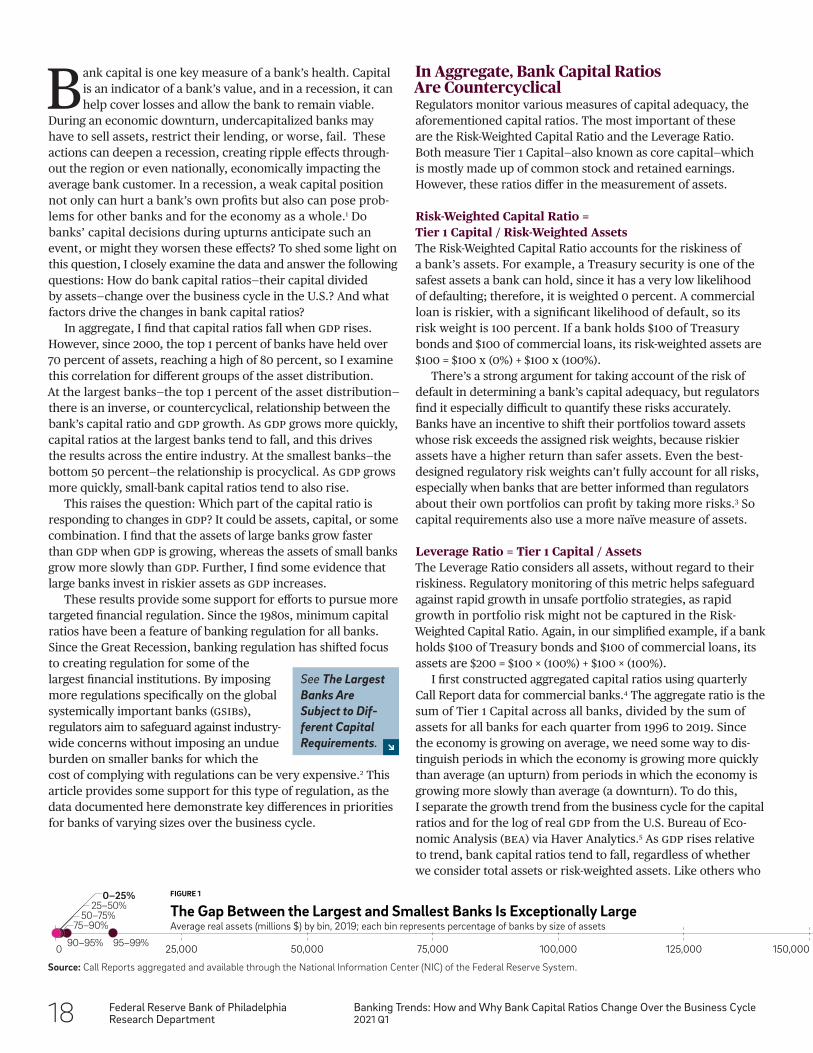
In aggregate, I find that capital ratios fall when GDP rises. However, since 2000, the top 1 percent of banks have held over 70 percent of assets, reaching a high of 80 percent, so I examine this correlation for different groups of the asset distribution. At the largest banks—the top 1 percent of the asset distribution—there is an inverse, or countercyclical, relationship between the bank’s capital ratio and GDP growth. As GDP grows more quickly, capital ratios at the largest banks tend to fall, and this drives the results across the entire industry. At the smallest banks—the bottom 50 percent—the relationship is procyclical. As GDP grows more quickly, small-bank capital ratios tend to also rise.
This raises the question: Which part of the capital ratio is responding to changes in GDP? It could be assets, capital, or some combination. I find that the assets of large banks grow faster than GDP when GDP is growing, whereas the assets of small banks grow more slowly than GDP. Further, I find some evidence that large banks invest in riskier assets as GDP increases.
These results provide some support for efforts to pursue more targeted financial regulation. Since the 1980s, minimum capital ratios have been a feature of banking regulation for all banks. Since the Great Recession, banking regulation has shifted focus to creating regulation for some of the largest financial institutions. By imposing more regulations specifically on the global systemically important banks (GSIBs), regulators aim to safeguard against industry- wide concerns without imposing an undue burden on smaller banks for which the cost of complying with regulations can be very expensive.2 This article provides some support for this type of regulation, as the data documented here demonstrate key differences in priorities for banks of varying sizes over the business cycle.
In Aggregate, Bank Capital Ratios Are CountercyclicalRegulators monitor various measures of capital adequacy, the aforementioned capital ratios. The most important of these are the Risk-Weighted Capital Ratio and the Leverage Ratio. Both measure Tier 1 Capital—also known as core capital—which is mostly made up of common stock and retained earnings. However, these ratios differ in the measurement of assets.
Risk-Weighted Capital Ratio = Tier 1 Capital / Risk-Weighted AssetsThe Risk-Weighted Capital Ratio accounts for the riskiness of a bank’s assets. For example, a Treasury security is one of the safest assets a bank can hold, since it has a very low likelihood of defaulting; therefore, it is weighted 0 percent. A commercial loan is riskier, with a significant likelihood of default, so its risk weight is 100 percent. If a bank holds $100 of Treasury bonds and $100 of commercial loans, its risk-weighted assets are $100 = $100 x (0%) + $100 x (100%).
There’s a strong argument for taking account of the risk of default in determining a bank’s capital adequacy, but regulators find it especially difficult to quantify these risks accurately. Banks have an incentive to shift their portfolios toward assets whose risk exceeds the assigned risk weights, because riskier assets have a higher return than safer assets. Even the best- designed regulatory risk weights can’t fully account for all risks, especially when banks that are better informed than regulators about their own portfolios can profit by taking more risks.3 So capital requirements also use a more naïve measure of assets.
Leverage Ratio = Tier 1 Capital / AssetsThe Leverage Ratio considers all assets, without regard to their riskiness. Regulatory monitoring of this metric helps safeguard against rapid growth in unsafe portfolio strategies, as rapid growth in portfolio risk might not be captured in the Risk- Weighted Capital Ratio. Again, in our simplified example, if a bank holds $100 of Treasury bonds and $100 of commercial loans, its assets are $200 = $100 × (100%) + $100 × (100%).
I first constructed aggregated capital ratios using quarterly Call Report data for commercial banks.4 The aggregate ratio is the sum of Tier 1 Capital across all banks, divided by the sum of assets for all banks for each quarter from 1996 to 2019. Since the economy is growing on average, we need some way to dis-tinguish periods in which the economy is growing more quickly than average (an upturn) from periods in which the economy is growing more slowly than average (a downturn). To do this, I separate the growth trend from the business cycle for the capital ratios and for the log of real GDP from the U.S. Bureau of Eco-nomic Analysis (BEA) via Haver Analytics.5 As GDP rises relative to trend, bank capital ratios tend to fall, regardless of whether we consider total assets or risk-weighted assets. Like others who
0 25,000 50,000 75,000 100,000 125,000 150,000 175,000 200,000 225,000 250,000 275,000 300,00095–99%
Top 1%
90–95%
75–90%50–75%
25–50%0–25% FIGURE 1
The Gap Between the Largest and Smallest Banks Is Exceptionally LargeAverage real assets (millions $) by bin, 2019; each bin represents percentage of banks by size of assets
Source: Call Reports aggregated and available through the National Information Center (NIC) of the Federal Reserve System.
See The Largest Banks Are Subject to Dif-ferent Capital Requirements.
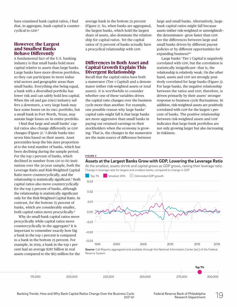
Federal Reserve Bank of PhiladelphiaResearch Department
Banking Trends: How and Why Bank Capital Ratios Change Over the Business Cycle2021 Q1 19
average bank in the bottom 25 percent (Figure 1). So, when banks are aggregated, the largest banks, which hold the largest share of assets, also dominate the relation- ship for capital ratios. Yet the capital ratios of 75 percent of banks actually have a procyclical relationship with GDP.
Differences in Both Asset and Capital Growth Explain This Divergent RelationshipRecall that the capital ratios have both a numerator (Tier 1 Capital) and a denom- inator (either risk-weighted assets or total assets). It is worthwhile to consider whether one of these variables drives the capital ratio changes over the business cycle more than another. For example, one possible reason why large banks’ capital ratio might fall is that large banks are more aggressive than small banks in paying out retained earnings to their stockholders when the economy is grow-ing. That is, the changes in the numerator are the main source of difference between
large and small banks. Alternatively, large-bank capital ratios might fall because assets (either risk-weighted or unweighted)— the denominator—grow faster than GDP. Are the differences between large and small banks driven by different payout policies or by different opportunities for expanding business?10
Large banks’ Tier 1 Capital is negatively correlated with GDP, but the correlation is statistically insignificant—that is, the relationship is relatively weak. On the other hand, assets and GDP are strongly posi-tively correlated for large banks (Figure 3). For large banks, the negative relationship between the ratios and GDP, therefore, is driven primarily by their assets’ stronger response to business cycle fluctuations. In addition, risk-weighted assets are positively correlated with GDP for the largest 1 per-cent of banks. The positive relationship between risk-weighted assets and GDP indicates that large-bank portfolios are not only growing larger but also increasing in riskiness.
have examined bank capital ratios, I find that, in aggregate, bank capital is counter-cyclical to GDP.6
However, the Largest and Smallest Banks Behave DifferentlyA fundamental fact of the U.S. banking industry is that small banks hold more capital relative to assets than large banks. Large banks have more diverse portfolios, so they can participate in more indus- trial sectors and geographic areas than small banks. Everything else being equal, a bank with a diversified portfolio has lower risk and can safely hold less capital. When the oil and gas (O&G) industry suf- fers a downturn, a very large bank may face some losses on its O&G portfolio, but a small bank in Fort Worth, Texas, may sustain huge losses on its entire portfolio.
I find that large and small banks’ cap-ital ratios also change differently as GDP changes (Figure 2).7 I divide banks into seven bins based on their assets. Asset percentiles keep the bin sizes proportion-al to the total number of banks, which has been declining during the sample period. For the top 1 percent of banks, which declined in number from 120 to 60 insti-tutions over the 30-year sample, both the Leverage Ratio and Risk-Weighted Capital Ratio move countercyclically, and the relationship is statistically significant.8 Both capital ratios also move countercyclically for the top 5 percent of banks, although the relationship is statistically significant only for the Risk-Weighted Capital Ratio. In contrast, for the bottom 75 percent of banks, which are considerably smaller, both capital ratios move procyclically.9
Why do small-bank capital ratios move procyclically while capital ratios move countercyclically in the aggregate? It is important to remember exactly how big a bank in the top 1 percent is compared to a bank in the bottom 25 percent. For example, in 2019, a bank in the top 1 per- cent had an average $287 billion in real assets compared to the $63 million for the
0 25,000 50,000 75,000 100,000 125,000 150,000 175,000 200,000 225,000 250,000 275,000 300,00095–99%
Top 1%
90–95%
75–90%50–75%
25–50%0–25% FIGURE 1
The Gap Between the Largest and Smallest Banks Is Exceptionally LargeAverage real assets (millions $) by bin, 2019; each bin represents percentage of banks by size of assets
−0.03
−0.02
−0.01
0.00
0.01
0.02
0.03
1996 20052000 201920152010
Detrended GDP growthTop 1% Smallest 25%
F I G U R E 2
Assets at the Largest Banks Grow with GDP, Lowering the Leverage RatioAt the smallest, assets shrink and capital grows as GDP grows, raising their leverage ratio.Change in leverage ratio for largest and smallest banks, compared to change in GDP
Source: Call Reports aggregated and available through the National Information Center (NIC) of the Federal Reserve System
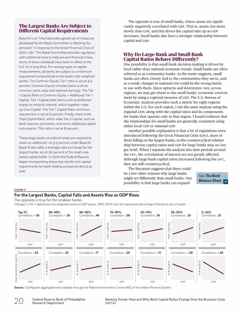
20 Federal Reserve Bank of PhiladelphiaResearch Department
Banking Trends: How and Why Bank Capital Ratios Change Over the Business Cycle2021 Q1
The opposite is true of small banks, where assets are signifi-cantly negatively correlated with GDP. That is, assets rise more slowly than GDP, and this drives the capital ratio up as GDP increases. Small banks also have a stronger relationship between capital and GDP.
Why Do Large-Bank and Small-Bank Capital Ratios Behave Differently?One possibility is that small-bank decision-making is driven by local rather than national economic trends. Small banks are often referred to as community banks. As the name suggests, small banks are often closely tied to the communities they serve, and as a result, changes in national GDP could be the wrong metric to use with them. Since upturns and downturns vary across regions, we may get closer to the small banks’ economic environ- ment by using a regional measure of GDP. The U.S. Bureau of Economic Analysis provides such a metric for eight regions within the U.S. For each region, I ran the same analysis using the regional GDP, along with the capital ratios and its components for banks that operate only in that region. I found evidence that the relationships for small banks are generally consistent using either local GDP or national GDP.
Another possible explanation is that a lot of regulations were introduced following the Great Financial Crisis (GFC), most of them falling on the largest banks, so the countercyclical relation- ship between capital ratios and GDP for large banks may no lon-ger hold. When I separate the analysis into time periods around the GFC, the correlations of interest are not greatly affected. Although large-bank capital ratios increased following the GFC, they are still countercyclical.
The literature suggests that there could be a few other reasons why large banks might act differently than small banks. One possibility is that large banks can expand
TIE
R 1
CA
PIT
AL
GDP
Top 1%Correlation: −.18
TIE
R 1
CA
PIT
AL
GDP
95–99%Correlation: −.18
TIE
R 1
CA
PIT
AL
GDP
90–95%Correlation: .49
TIE
R 1
CA
PIT
AL
GDP
75–90%Correlation: .08
TIE
R 1
CA
PIT
AL
GDP
50–75%Correlation: .19
TIE
R 1
CA
PIT
AL
GDP
25–50%Correlation: .33
TIE
R 1
CA
PIT
AL
GDP
0–25%Correlation: .31
RIS
K-W
EIG
HT
ED
AS
SE
TS
GDP
Correlation: .43
R-W
AS
SE
TS
GDP
Correlation: .23
R-W
AS
SE
TS
GDP
Correlation: .17
R-W
AS
SE
TS
GDP
Correlation: .05
R-W
AS
SE
TS
GDP
Correlation: −.11
R-W
AS
SE
TS
GDP
Correlation: −.39
R-W
AS
SE
TS
GDP
Correlation: −.59
F I G U R E 3
For the Largest Banks, Capital Falls and Assets Rise as GDP RisesThe opposite is true for the smallest banks.Changes in Tier 1 capital and risk-weighted assets as GDP grows, 1990-2019; each bin represents percentage of banks by size of assets
Source: Call Reports aggregated and available through the National Information Center (NIC) of the Federal Reserve System.
See The Bank Balance Sheet.
The Largest Banks Are Subject to Different Capital RequirementsBasel III is an “internationally agreed set of measures developed by the Basel Committee on Banking Su-pervision” in response to the Great Financial Crisis of 2007–09.12 The Basel Committee provides regulators with additional tools to help prevent financial crises. Some of these standards have been in effect in the U.S. for a long time. For varying types of capital measurements, all banks are subject to a minimum requirement proportional to the bank’s risk-weighted assets. The Common Equity Tier 1 ratio is set at 4.5 percent. Common Equity includes items such as common stock value and retained earnings. The Tier 1 Capital Ratio is Common Equity + Additional Tier 1 Capital. Tier 1 Capital adds items such as preferred shares or minority interest, which together make up Core Capital. The Tier 1 Capital Ratio minimum requirement is set at 6 percent. Finally, there is the Total Capital Ratio, which adds Tier 2 Capital, such as bank reserves, provisions, and some additional capital instruments. This ratio is set at 8 percent.
Those large banks considered GSIBs are required to retain an additional 1 to 3.5 percent under Basel III. Basel III also adds a leverage ratio surcharge for the largest banks, set at 50 percent of the GSIB’s risk-based capital buffer. In 2020 the Federal Reserve began incorporating stress test results into capital requirements for bank holding companies (BhCs) as well.
Federal Reserve Bank of PhiladelphiaResearch Department
Banking Trends: How and Why Bank Capital Ratios Change Over the Business Cycle2021 Q1 21
Notes1 For example, troubles at one bank may cause another bank’s depositors and customers to worry about their own bank’s health. In turn, they might withdraw funds or refuse to provide credit to their bank, thereby weakening other banks and deepening the downturn. Economists would say that the bank’s capital decision generates a negative externality for other banks.
2 See Quarles (2018).
3 For example, under the capital requirements in Basel II, lines of credit with a maturity less than one year had a lower risk weight than lines of credit with maturities greater than one year. Banks found it profitable to provide businesses with a 364-day line of credit, which would be rolled over each year, rather than the more typical 3-to-5-year line of credit. Once regulations changed with Basel III, the share of 364-day lines of credit declined dramatically.
4 Unless otherwise noted, all data in this article come from publicly available Call Reports aggregated and available through the National Information Center (NIC) of the Federal Reserve System.
5 This is the Hodrick-Prescott (HP) filter.
6 Previous research focusing on European banks includes Ayuso (2004) studying Spanish banks and Jokipii and Milne (2008) studying European BhCs. Haubrich (2020) has ex-amined the relationship between capital and GDP for the U.S.
7 Joseph Haubrich also finds that large- and small-bank capital ratios have moved in opposite directions since the 1990s. Haubrich’s work examines the cyclicity of bank cap-ital over a long historical period, extending from the 1830s. Furthering this work, I decompose the movements in capital ratios to see whether the differences between large and small banks arise from the changes in capital or the changes in assets as GDP changes.
8 Statistically significant, meaning that p < 0.05.
9 These findings are not due to changes in the number of banks in the various size categories. This is a period in which the number of small banks was decreasing dramatically, mainly due to mergers. To make sure that the correlations were not driven by selection effects, I created a panel of small banks that remained in business from 1990 to 2007. The correlations between capital ratios and GDP also held for the panel, although not all correlations were statistically significant, mainly due to the smaller number of small banks in the panel.
10 In the next section, I discuss some of the economic rea-sons why large- and small-bank capital ratios might move differently.
their balance sheets by accessing sources of funds unavailable to small banks. Large banks have broad access to money markets they can use to expand their assets, whereas small banks are heavily dependent on core deposits.11 Another explanation is that small banks may be more risk averse than large banks. Small banks have fewer equity holders, which means that negative equity shocks impact individual stock-holders more. With individual stockholders bearing more risk, small banks may adopt a more risk-averse approach to their portfolios. These explanations are not mutually exclusive, and understanding the precise reasons for my results is a focus for future research.
ConclusionEverything else being equal, the banking system is more resilient if banks are better capitalized when a recession hits. The evidence presented in this article provides some support for policymakers to pursue regulations based on the size of the institution. I have shown key differences in the behaviors of small- and large-bank capital ratios and provided some explanation for how and why those differences occur. When these differences create risk for individual banks and the industry, regulators can rely on existing tools and identify the need to create new ones to help guard against worsening the effects of an un- expected downturn.
The Bank Balance SheetTA B L E 1
Balance Sheet of All Commercial BanksBalance Sheet Information for FDIC Insured Commercial Banks as of 2019, percentages
Assets (Uses of Funds)*Reserves and Cash 9.1Securities 20.6Loans 55.7Trading Assets 3.8Other 10.8Total 100.0
Liabilities (Sources of Funds)Deposits 77.8Trading Liabilities 1.2Borrowings 5.6Bank Capital 11.4Other 4.0Total 100.0
* In order of decreasing liquidity Source: FDIC via Haver Analytics.
22 Federal Reserve Bank of PhiladelphiaResearch Department
Banking Trends: How and Why Bank Capital Ratios Change Over the Business Cycle2021 Q1
11 Core deposits are deposits insured by the federal government. The largest share of core deposits comes from households, while other banks and financial intermediaries provide uninsured sources of debt finance to large banks.
12 See Bank for International Settlements (n.d.).
References Ayuso, Juan, Daniel Pérez, and Jesús Saurina. “Are Capital Buffers Pro-cyclical?: Evidence From Spanish Panel Data,” Journal of Financial Intermediation, 13:2 (2004), pp. 249–264, https://doi.org/10.1016/S1042-9573(03)00044-5.
Bank for International Settlements. “Basel III: International Regulatory Framework for Banks,” https://www.bis.org/bcbs/basel3.htm?m=3%7C14%7C572.
Brainard, Lael. “Assessing Financial Stability Over the Cycle,” speech given at the Peterson Institute for International Economics, Washington, D.C., December 7, 2018.
D’Erasmo, Pablo. “Are Higher Capital Requirements Worth It?” Economic Insights (Second Quarter 2018), pp. 1–8, https://www.philadelphiafed.org/the-economy/banking-and-financial-markets/are-higher-capital-requirements-worth-it.
Elul, Ronel. “The Promise and Challenges of Bank Capital Reform,” Business Review (Third Quarter 2013), pp. 23–30, https://www.philadelphiafed.org/-/media/frbp/assets/ economy/articles/business-review/2013/q3/brq313_promises-challenges-of-bank- capital-reform.pdf?la=en&hash=5E44BB2DC52236833556E1D0936F0DD3.
Haubrich, Joseph G. “How Cyclical Is Bank Capital?” Journal of Financial Services Research, 58 (2020), pp. 27–38, https://doi.org/10.1007/s10693-019-00331-7.
Jokipii, Terhi, and Alistair Milne. “The Cyclical Behaviour of European Bank Capital Buffers,” Journal of Banking & Finance, 32:8 (2008), pp. 1440–1451, https://doi.org/ 10.1016/j.jbankfin.2007.12.001.
Kashyap, Anil K., and Jeremy C. Stein. “What Do a Million Observations on Banks Say About the Transmission of Monetary Policy?” American Economic Review, 90:3 (2000), pp. 407–428, https://doi.org/10.1257/aer.90.3.407.
Quarles, Randal. “Getting It Right: Factors for Tailoring Supervision and Regulation of Large Financial Institutions,” speech given at American Bankers Association Summer Leadership Meeting, Salt Lake City, July 18, 2018.
Shim, Jeungbo. “Bank Capital Buffer and Portfolio Risk: The Influence of Business Cycle and Revenue Diversification,” Journal of Banking & Finance, 37:3 (2013), pp. 761–772, https://doi.org/10.1016/j.jbankfin.2012.10.002.
Federal Reserve Bank of PhiladelphiaResearch Department
Research Update2021 Q1 23
The views expressed in these papers are solely those of the authors and should not be interpreted as reflecting the views of the Federal Reserve Bank of Philadelphia or Federal Reserve System.
Research UpdateThese papers by Philadelphia Fed economists, analysts, and visiting scholars represent preliminary research that is being circulated for discussion purposes.
Concentration in Mortgage Markets: GSE Exposure and Risk-Taking in Uncertain Times
When home prices threaten to decline, large mortgage investors can benefit from fostering new lending that boosts demand. We ask whether this benefit contributed to the growth in acquisitions of risky mortgages by the government-sponsored enterprises (GSes) in the first half of 2007. We find that it helps explain the variation of this growth across regions, in particular the growth of more discretionary acquisitions. The growth predicted by this benefit is on top of the acquisition growth caused by the exit of private-label securitizers. We conclude that the GSes actively targeted their acquisitions to combat home-price declines.
WP 20-04 Revised. Ronel Elul, Federal Reserve Bank of Philadelphia Research Department; Deeksha Gupta, Carnegie Mellon University; David Musto, University of Pennsylvania and Visiting Scholar, Federal Reserve Bank of Philadelphia Research Department.
What Future for History Dependence in Spatial Economics?
History (sometimes) matters for the location and sizes of cities and neighborhood segregation patterns within cities. Together with evidence on rapid neighborhood change and self-fulfilling expecta-tions, this implies that nature might not completely determine the spatial structure of the economy. Instead, the spatial economy might be characterized by multiple equilibria or multiple steady-state equilibrium paths, where history and expectations can play decisive roles. Better evidence on the conditions under which history matters can help improve theory and policy analysis.
WP 20-47. Jeffrey Lin, Federal Reserve Bank of Philadelphia Research Department; Ferdinand Rauch, Oxford University.
24 Federal Reserve Bank of PhiladelphiaResearch Department
Research Update2021 Q1
The Well-Being of Nations: Estimating Welfare from International Migration
The limitations of GDP as a measure of welfare are well known. We propose a new method of estimating the well-being of nations. Using gross bilateral international migration flows and a discrete choice model in which everyone in the world chooses a country in which to live, we estimate each country’s overall quality of life. Our estimates, by relying on revealed preference, complement previous estimates of well-being that consider only income or a small number of factors, or rely on structural assumptions about how these factors contribute to well-being.
WP 19-33 Revised. Sanghoon Lee, Sauder School of Business, University of British Columbia and Visiting Scholar, Federal Reserve Bank of Philadelphia Research Department; Seung Hoon Lee, School of Economics, Georgia Institute of Technology; Jeffrey Lin, Federal Reserve Bank of Philadelphia Research Department.
Can We Take the “Stress” Out of Stress Testing? Applications of Generalized Structural Equation Modeling to Consumer Finance
Financial firms, and banks in particular, rely heavily on complex suites of interrelated statistical models in their risk management and business reporting infrastructures. Statistical model infrastructures are often developed using a piecemeal approach to model building, in which different components are developed and validated separately. This type of modeling framework has significant limitations at each stage of the model management life cycle, from development and documentation to validation, production, and redevelopment. We pro- pose an empirical framework, spurred by recent developments in the implementation of Generalized Structural Equation Modeling (GSeM), which brings to bear a modular and all-inclusive approach to statistical model building. We illustrate the “game changing” potential of this framework with an application to the stress testing of credit risk for a representative portfolio of mortgages; we also extend it to the analysis of the allowance for credit loss under the novel Current Expected Credit Loss (CeCl) accounting regulation. We illustrate how GSeM techniques can significantly enhance every step of the mod- eling framework life cycle. We also illustrate how GSeM can be used to combine various risk management projects and tasks into a single framework; we specifically illustrate how to seamlessly integrate stress testing and CeCl (or IFrS9) frameworks and champion, and challenger, modeling frameworks. Finally, we identify other areas of model risk management that can benefit from the GSeM framework and highlight other potentially fruitful applications of the methodology.
WP 21-01. José J. Canals-Cerdá, Federal Reserve Bank of Philadelphia.
Federal Reserve Bank of PhiladelphiaResearch Department
Research Update2021 Q1 25
DSGE-SVt: An Econometric Toolkit for High- Dimensional DSGE Models with SV and t Errors
Currently, there is growing interest in dynamic stochastic general equilibrium (DSGe) models that have more parameters, endogenous variables, exogenous shocks, and observables than the Smets and Wouters (2007) model, and substantial additional complexities from non-Gaussian distributions and the incorporation of time-varying volatility. The popular DYNare software package, which has proved useful for small and medium-scale models, is, however, not capable of handling such models, thus inhibiting the formulation and estimation of more realistic DSGe models. A primary goal of this paper is to intro- duce a user-friendly MaTlaB software program designed to reliably estimate high-dimensional DSGe models. It simulates the posterior distribution by the tailored random block Metropolis-Hastings (TarB- Mh) algorithm of Chib and Ramamurthy (2010), calculates the marginal likelihood by the method of Chib (1995) and Chib and Jeliazkov (2001), and includes various post-estimation tools that are important for policy analysis, for example, functions for generating point and density forecasts. Another goal is to provide pointers on the prior, estimation, and comparison of these DSGe models. An extended version of the new Keynesian model of Leeper, Traum, and Walker (2017) that has 51 parameters, 21 endogenous variables, 8 exogenous shocks, 8 observables, and 1,494 non-Gaussian and nonlinear latent variables is considered in detail.
WP 21-02. Siddhartha Chib, Olin Business School; Minchul Shin, Federal Reserve Bank of Philadelphia Research Department; Fei Tan; Saint Louis University.
Measuring Disagreement in Probabilistic and Density Forecasts
In this paper, we introduce and study a class of disagreement measures for probability distribution forecasts based on the Wasserstein metric. We describe a few advantageous properties of this measure of dis- agreement between forecasters. After describing alternatives to our proposal, we use examples to compare these measures to one another in closed form. We provide two empirical illustrations. The first application uses our measure to gauge disagreement among professional forecasters about output growth and the inflation rate in the Eurozone. The second application employs our measure to gauge disagreement among multivariate predictive distributions generated by different forecasting methods.
WP 21-03. Ryan Cumings-Menon, U.S. Census Bureau; Minchul Shin, Federal Reserve Bank of Philadelphia Research Department; Keith Sill, Federal Reserve Bank of Philadelphia Research Department.
Using High-Frequency Evaluations to Estimate Dis-crimination: Evidence from Mortgage Loan Officers
We develop empirical tests for discrimination that use high-frequency evaluations to address the problem of unobserved heterogeneity in a conventional benchmarking test. Our approach to identifying discrimination requires two conditions: (1) The subject pool is time- invariant in a short time horizon; and (2) There is high-frequency variation in the extent to which evaluators can rely on their subjective assessments. We bring our approach to the residential mortgage market, using data on the near-universe of U.S. mortgage applications from 1994 to 2018. Monthly volume quotas reduce how much subjectivity loan officers apply to loans they process at the end of the month. As a result, the volume of new originations increases by 150% at the end of the month, while application volume and applicants’ quality are constant within the month. Owing to within-month variation in loan officers’ subjectivity, we estimate that Black mortgage applicants have 3.5% to 5% lower approval rates, which explains at least half of the observed approval gap for Blacks. When we use this approach to evaluate policies, we find that market concentration and fintech lending have had no effect on lending discrimination, but that shadow banking has reduced discrimination, presumably by having a larger presence in underserved communities.
WP 21-04. Marco Giacoletti, University of Southern California; Rawley Z. Heimer, Boston College; Edison G. Yu, Federal Reserve Bank of Philadelphia Research Department.
26 Federal Reserve Bank of PhiladelphiaResearch Department
Research Update2021 Q1
On the Aggregation of Probability Assessments: Regularized Mixtures of Predictive Densities for Eurozone Inflation and Real Interest Rates
We propose methods for constructing regularized mixtures of density forecasts. We explore a variety of objectives and regularization penalties, and we use them in a substantive exploration of Eurozone inflation and real interest rate density forecasts. All individual inflation forecasters (even the ex post best forecaster) are outperformed by our regularized mixtures. From the Great Recession onward, the optimal regularization tends to move density forecasts’ probability mass from the centers to the tails, correcting for overconfidence.
WP 21-06. Francis X. Diebold, University of Pennsylvania and Visiting Scholar, Federal Reserve Bank of Philadelphia Research Department; Minchul Shin, Federal Reserve Bank of Philadelphia Research Department; Boyuan Zhang, University of Pennsylvania.
PEAD.txt: Post-Earnings-Announcement Drift Using Text
We construct a new numerical measure of earnings announcement surprises, standardized unexpected earnings call text (SUe.txt), that does not explicitly incor-porate the reported earnings value. SUe.txt generates a text-based post-earnings-announcement drift (PeaD.txt) larger than the classic PeaD and can be used to create a profitable trading strategy. Leveraging the prediction model underlying SUe.txt, we propose new tools to study the news content of text: paragraph-level SUe.txt and a paragraph classification scheme based on the business curriculum. With these tools, we document many asymmetries in the distribution of news across content types, demonstrating that earnings calls contain a wide range of news about firms and their environment.
WP 21-07. Vitaly Meursault, Federal Reserve Bank of Philadelphia Research Department; Pierre Jinghong Liang, Carnegie Mellon University; Bryan R. Routledge, Carnegie Mellon University; Madeline Marco Scanlon, University of Pittsburgh.
Eviction Risk of Rental Housing: Does It Matter How Your Landlord Finances the Property?
We show, using a stylized model, how the financing choice of landlords can impact eviction decisions in rental markets. Since multifamily loans rely on timely cash flows from tenants, strict underwriting factors can increase the chances that landlords are able to weather income shocks. Lender-provided relief may create further leeway for landlords to work out a deal with tenants who default on rental payments. Using comprehensive data on nationwide evictions in the U.S. and performance records on multi- family mortgages, we confirm predictions from our model by documenting a negative relation between evictions and the financing activity by government-sponsored enterprises (GSes) that impose strict underwriting criteria but generally offer borrowers relief during unprecedented income shocks. We also quantify the eviction risks induced by the COVID-19 pandemic for 12 U.S. cities using our empirical model.
WP 21-05. Brent W. Ambrose, The Pennsylvania State University; Xudong An, Federal Reserve Bank of Philadel-phia; Luis A. Lopez, University of Illinois at Chicago.
Federal Reserve Bank of PhiladelphiaResearch Department
Research Update2021 Q1 27
Does CFPB Oversight Crimp Credit?
We study how regulatory oversight by the Consumer Financial Protection Bureau (CFPB) affects mortgage credit supply and other aspects of bank behavior. We use a difference-in-differences approach exploiting changes in regulatory intensity and a size cutoff below which banks are exempt from CFPB scrutiny. CFPB oversight leads to a reduction in lending in the Federal Housing Administration (Fha) market, which primarily serves riskier borrowers. However, it is also associated with a lower transition probability from moderate to serious delinquency, suggesting that tighter regulatory oversight may reduce foreclosures. Our results underscore the tradeoff between protecting borrowers and maintaining access to credit.
WP 21-08. Andreas Fuster, Swiss National Bank and CePr; Matthew Plosser, Federal Reserve Bank of New York; James Vickery, Federal Reserve Bank of Philadelphia Research Department.
CLO Performance
We show that collateralized loan obligations (ClOs) add economic value by mitigating regulatory constraints imposed on financial intermediaries and addressing market incompleteness. ClO assets exhibit similar performance to loan mutual funds with nearly identical risk exposures and fees. ClO debt and equity tranches generate after-fee returns that are attractive relative to public benchmarks but commensurate with their systematic risk exposures. Before fees, equity tranches significantly outperform public benchmarks, which shows how managers capture the economic surplus created by ClOs. Temporal variation in equity performance highlights the resilience of ClOs to market volatility due to their long-term funding structure and the erosion of returns as the market has grown.
WP 20-48 Revised. Larry Cordell, Federal Reserve Bank of Philadelphia Supervision, Regulation, and Credit Department; Michael R. Roberts, The Wharton School of the University of Pennsylvania and the National Bureau of Economic Research; Michael Schwert, The Wharton School of the University of Pennsylvania.
Inequality in the Time of COVID-19: Evidence from Mortgage Delinquency and Forbearance
Using a novel database that combines mortgage servicing records, credit-bureau data, and loan application information, we show that lower-income and minority borrowers have significantly higher nonpayment rates during the COVID-19 pandemic, even after controlling for conventional risk factors. A difference-in-differences analysis shows how much the pandemic has exacerbated income and racial inequalities. We then find that govern- ment and private-sector forbearance programs have mitigated these inequalities in the near term, as lower- income and minority borrowers have taken up the short-term debt relief at higher rates. Finally, we examine modification options for an estimated 2.8 million loans in forbearance, most with terms expiring by mid-year 2021.
WP 21-09. Xudong An, Federal Reserve Bank of Philadelphia Supervision, Regulation, and Credit Department; Larry Cordell, Federal Reserve Bank of Philadelphia Supervision, Regulation, and Credit Department; Liang Geng, Federal Reserve Bank of Philadelphia Supervision, Regulation, and Credit Department; Keyoung Lee, Federal Reserve Bank of Philadelphia Supervision, Regulation, and Credit Department.
28 Federal Reserve Bank of PhiladelphiaResearch Department
Research Update2021 Q1
The Future of Labor: Automation and the Labor Share in the Second Machine Age
We study the effect of modern automation on firm-level labor shares using a 2018 survey of 1,618 manufacturing firms in China. We exploit geographic and industry variation built into the design of subsidies for automation paid under a vast government industrialization program,
“Made In China 2025,” to construct an instrument for automation investment. We use a canonical CeS framework of automation and develop a novel methodology to structurally estimate the elasticity of substitution between labor and automation capital among auto- mating firms, which for our preferred specification is 3.8. We calibrate the model and show that the general equilibrium implications of this elasticity are consistent with the aggregate trends during our sample period.
WP 21-11. Hong Cheng, Wuhan University; Lukasz A. Drozd, Federal Reserve Bank of Philadelphia Research Department; Rahul Giri, International Monetary Fund; Mathieu Taschereau-Dumouchel, Cornell University; Junjie Xia, Peking University.
Unexpected Effects of Bank Bailouts: Depositors Need Not Apply and Need Not Run
A key policy issue is whether bank bailouts weaken or strengthen market discipline. We address this by analyzing how bank bailouts influence deposit quantities and prices of recipients versus other banks. Using the Troubled Asset Relief Program (TarP) bailouts, we find both deposit quantities and prices decline, consistent with substantially reduced demand for deposits by bailed-out banks that dominate market discipline supply effects. Main findings are robust to numerous checks and endogeneity tests. However, diving deeper into depositor heterogeneity suggests nuances. Increases in uninsured deposits, transactions deposits, and deposits in banks that repaid bailout funds early suggest some temporary limited support for weakened market discipline.
WP 21-10. Allen N. Berger, University of South Carolina; Martien Lamers, Ghent University; Raluca A. Roman, Federal Reserve Bank of Philadelphia Supervision, Regulation, and Credit Department; Koen Schoors, Ghent University.
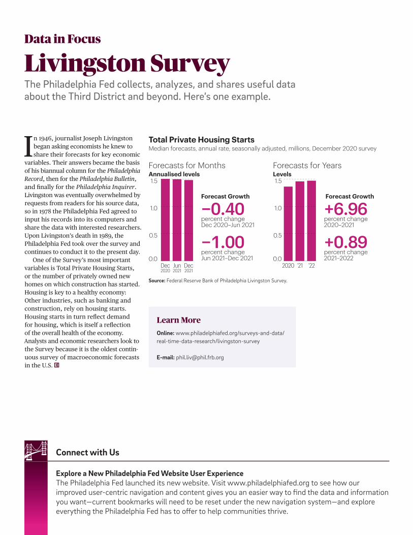
Explore a New Philadelphia Fed Website User ExperienceThe Philadelphia Fed launched its new website. Visit www.philadelphiafed.org to see how our improved user-centric navigation and content gives you an easier way to find the data and information you want—current bookmarks will need to be reset under the new navigation system—and explore everything the Philadelphia Fed has to offer to help communities thrive.
Connect with Us
In 1946, journalist Joseph Livingston began asking economists he knew to share their forecasts for key economic
variables. Their answers became the basis of his biannual column for the Philadelphia Record, then for the Philadelphia Bulletin, and finally for the Philadelphia Inquirer. Livingston was eventually overwhelmed by requests from readers for his source data, so in 1978 the Philadelphia Fed agreed to input his records into its computers and share the data with interested researchers. Upon Livingston’s death in 1989, the Philadelphia Fed took over the survey and continues to conduct it to the present day.
One of the Survey’s most important variables is Total Private Housing Starts, or the number of privately owned new homes on which construction has started. Housing is key to a healthy economy: Other industries, such as banking and construction, rely on housing starts. Housing starts in turn reflect demand for housing, which is itself a reflection of the overall health of the economy. Analysts and economic researchers look to the Survey because it is the oldest contin-uous survey of macroeconomic forecasts in the U.S.
Total Private Housing StartsMedian forecasts, annual rate, seasonally adjusted, millions, December 2020 survey
0.0
0.5
1.0
1.5
0.0
0.5
1.0
1.5
Dec2021
Dec2020
Jun2021
Forecasts for MonthsAnnualised levels
Forecasts for YearsLevels
Forecast Growth
Forecast Growth
−0.40percent changeDec 2020–Jun 2021
−1.00percent changeJun 2021–Dec 2021
+6.96percent change2020–2021
+0.89percent change2021–2022
2020 ‘21 ‘22
Learn MoreOnline: www.philadelphiafed.org/surveys-and-data/ real-time-data-research/livingston-survey
E-mail: [email protected]
Source: Federal Reserve Bank of Philadelphia Livingston Survey.
Data in Focus
Livingston SurveyThe Philadelphia Fed collects, analyzes, and shares useful data about the Third District and beyond. Here’s one example.

ADDRESS SERVICE REQUESTED
PRESORTED STANDARDU.S. POSTAGE
PAID
PHILADELPHIA, PAPERMIT #583
From Philadelphia, Pennsylvania, the birthplace of American finance, comes Economic Insights.
Featuring articles about how Americans work, invest, spend…and so much more.
2016 Q1
2020 Q1
2017 Q2
2020 Q2
2018 Q1
2020 Q3
2019 Q1
2020 Q4
Ten Independence MallPhiladelphia, Pennsylvania 19106-1574