Embed Size (px)
Citation preview
Special Report
This Report is available on scotiabank.com, Bloomberg at SCOT and Reuters at SM1C
Global Economics
Scotiabank Economics
Scotia Plaza 40 King Street West, 63rd Floor
Toronto, Ontario Canada M5H 1H1
Tel: 416.866.6253 Fax: 416.866.2829
Email: [email protected]
This report has been prepared by Scotiabank Economics as a resource for the clients of Scotiabank. Opinions, estimates and projections contained herein are our own as of the date hereof and are subject to change without notice. The information and opinions contained herein have been compiled or arrived at from sources believed reliable but no representation or warranty, express or implied, is made as to their accuracy or completeness. Neither Scotiabank nor its affiliates accepts any liability whatsoever for any loss arising from any use of this report or its contents.
TM Trademark of The Bank of Nova Scotia. Used under license, where applicable.
Derek Holt 416.863.7707 [email protected]
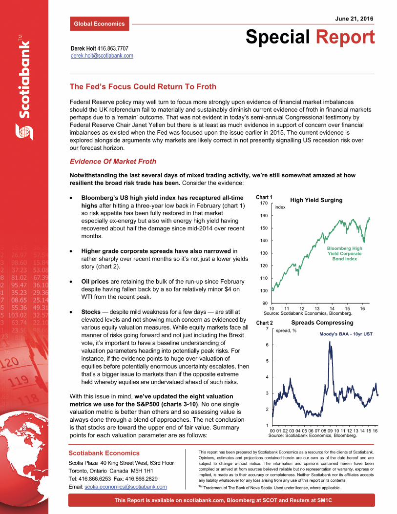
Federal Reserve policy may well turn to focus more strongly upon evidence of financial market imbalances should the UK referendum fail to materially and sustainably diminish current evidence of froth in financial markets perhaps due to a ‘remain’ outcome. That was not evident in today’s semi-annual Congressional testimony by Federal Reserve Chair Janet Yellen but there is at least as much evidence in support of concern over financial imbalances as existed when the Fed was focused upon the issue earlier in 2015. The current evidence is explored alongside arguments why markets are likely correct in not presently signalling US recession risk over our forecast horizon.
Evidence Of Market Froth
Notwithstanding the last several days of mixed trading activity, we’re still somewhat amazed at how resilient the broad risk trade has been. Consider the evidence:
Bloomberg’s US high yield index has recaptured all-time highs after hitting a three-year low back in February (chart 1) so risk appetite has been fully restored in that market especially ex-energy but also with energy high yield having recovered about half the damage since mid-2014 over recent months.
Higher grade corporate spreads have also narrowed in rather sharply over recent months so it’s not just a lower yields story (chart 2).
Oil prices are retaining the bulk of the run-up since February despite having fallen back by a so far relatively minor $4 on WTI from the recent peak.
Stocks — despite mild weakness for a few days — are still at elevated levels and not showing much concern as evidenced by various equity valuation measures. While equity markets face all manner of risks going forward and not just including the Brexit vote, it’s important to have a baseline understanding of valuation parameters heading into potentially peak risks. For instance, if the evidence points to huge over-valuation of equities before potentially enormous uncertainty escalates, then that’s a bigger issue to markets than if the opposite extreme held whereby equities are undervalued ahead of such risks.
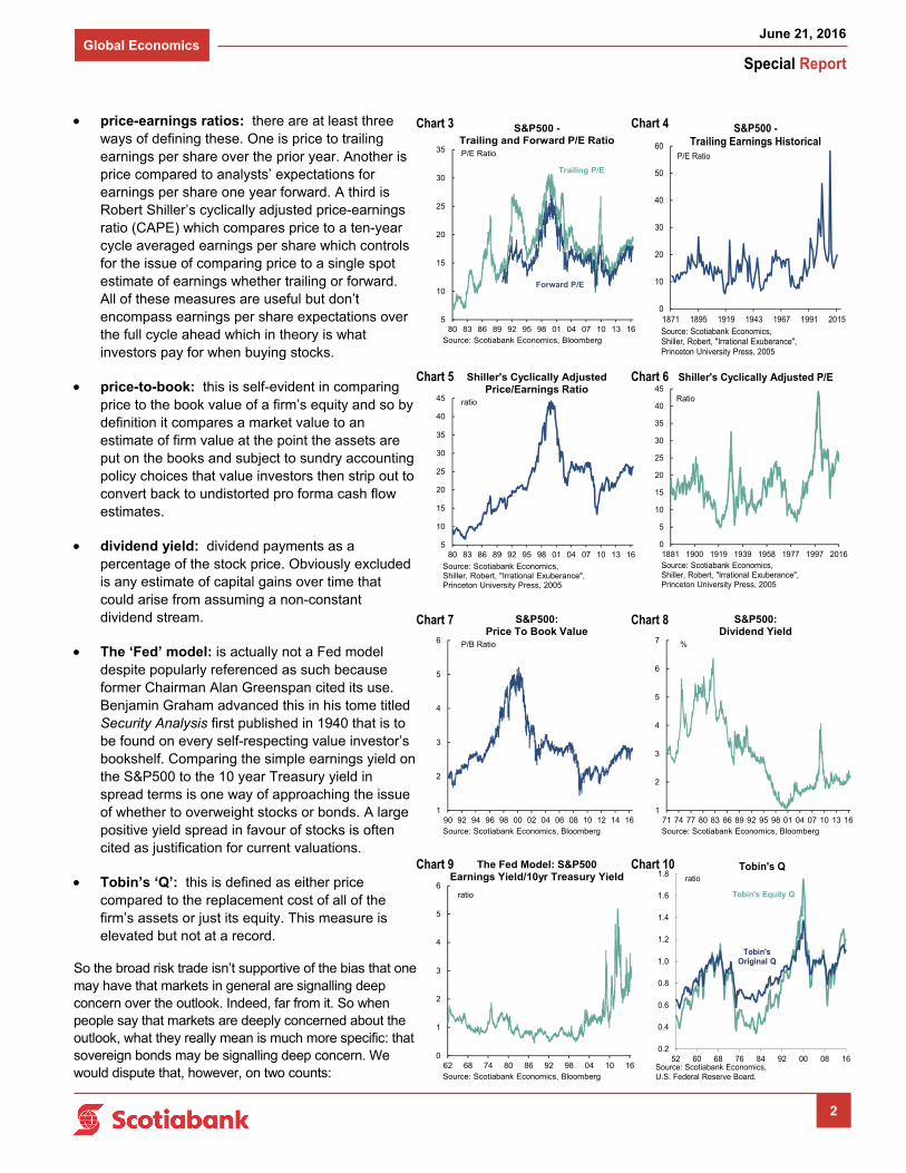
With this issue in mind, we’ve updated the eight valuation metrics we use for the S&P500 (charts 3-10). No one single valuation metric is better than others and so assessing value is always done through a blend of approaches. The net conclusion is that stocks are toward the upper end of fair value. Summary points for each valuation parameter are as follows:
June 21, 2016
The Fed’s Focus Could Return To Froth
90
100
110
120
130
140
150
160
170
10 11 12 13 14 15 16
High Yield Surgingindex
Bloomberg HighYield Corporate
Bond Index
Source: Scotiabank Economics, Bloomberg.
1
2
3
4
5
6
7
00 01 02 03 04 05 06 07 08 09 10 11 12 13 14 15 16
Spreads Compressingspread, %
Moody's BAA - 10yr UST
Source: Scotiabank Economics, Bloomberg.
Chart 1
Chart 2
Special Report
June 21, 2016 Global Economics
2
0.2
0.4
0.6
0.8
1.0
1.2
1.4
1.6
1.8
52 60 68 76 84 92 00 08 16Source: Scotiabank Economics, U.S. Federal Reserve Board.
Tobin's Qratio
Tobin's Equity Q
Tobin's Original Q
0
5
10
15
20
25
30
35
40
45
1881 1900 1919 1939 1958 1977 1997 2016Source: Scotiabank Economics, Shiller, Robert, "Irrational Exuberance", Princeton University Press, 2005
Shiller's Cyclically Adjusted P/E
Ratio
0
10
20
30
40
50
60
1871 1895 1919 1943 1967 1991 2015Source: Scotiabank Economics, Shiller, Robert, "Irrational Exuberance", Princeton University Press, 2005
S&P500 -Trailing Earnings Historical
P/E Ratio
0
1
2
3
4
5
6
62 68 74 80 86 92 98 04 10 16Source: Scotiabank Economics, Bloomberg
The Fed Model: S&P500Earnings Yield/10yr Treasury Yield
ratio
5
10
15
20
25
30
35
40
45
80 83 86 89 92 95 98 01 04 07 10 13 16
Source: Scotiabank Economics, Shiller, Robert, "Irrational Exuberance", Princeton University Press, 2005
Shiller's Cyclically Adjusted Price/Earnings Ratio
ratio
price-earnings ratios: there are at least three ways of defining these. One is price to trailing earnings per share over the prior year. Another is price compared to analysts’ expectations for earnings per share one year forward. A third is Robert Shiller’s cyclically adjusted price-earnings ratio (CAPE) which compares price to a ten-year cycle averaged earnings per share which controls for the issue of comparing price to a single spot estimate of earnings whether trailing or forward. All of these measures are useful but don’t encompass earnings per share expectations over the full cycle ahead which in theory is what investors pay for when buying stocks.
price-to-book: this is self-evident in comparing price to the book value of a firm’s equity and so by definition it compares a market value to an estimate of firm value at the point the assets are put on the books and subject to sundry accounting policy choices that value investors then strip out to convert back to undistorted pro forma cash flow estimates.
dividend yield: dividend payments as a percentage of the stock price. Obviously excluded is any estimate of capital gains over time that could arise from assuming a non-constant dividend stream.
The ‘Fed’ model: is actually not a Fed model despite popularly referenced as such because former Chairman Alan Greenspan cited its use. Benjamin Graham advanced this in his tome titled Security Analysis first published in 1940 that is to be found on every self-respecting value investor’s bookshelf. Comparing the simple earnings yield on the S&P500 to the 10 year Treasury yield in spread terms is one way of approaching the issue of whether to overweight stocks or bonds. A large positive yield spread in favour of stocks is often cited as justification for current valuations.
Tobin’s ‘Q’: this is defined as either price compared to the replacement cost of all of the firm’s assets or just its equity. This measure is elevated but not at a record.
So the broad risk trade isn’t supportive of the bias that one may have that markets in general are signalling deep concern over the outlook. Indeed, far from it. So when people say that markets are deeply concerned about the outlook, what they really mean is much more specific: that sovereign bonds may be signalling deep concern. We would dispute that, however, on two counts:
Chart 5
Chart 9
5
10
15
20
25
30
35
80 83 86 89 92 95 98 01 04 07 10 13 16Source: Scotiabank Economics, Bloomberg
S&P500 -Trailing and Forward P/E RatioP/E Ratio
Forward P/E
Trailing P/E
Chart 4
Chart 6
Chart 10
Chart 3
1
2
3
4
5
6
7
71 74 77 80 83 86 89 92 95 98 01 04 07 10 13 16Source: Scotiabank Economics, Bloomberg
S&P500: Dividend Yield
%
1
2
3
4
5
6
90 92 94 96 98 00 02 04 06 08 10 12 14 16Source: Scotiabank Economics, Bloomberg
S&P500: Price To Book Value
P/B Ratio
Chart 7 Chart 8
Special Report
June 21, 2016 Global Economics
3
First, the Treasury curve is signalling only about a 7% probability of US recession using traditional slope models such as the one run by the NY Fed (here), and even at that they have thrown off false recession signals over time — let alone addressing the usefulness of such an approach in today’s distorted markets.
Second, it’s bordering upon the outright absurd to argue that sovereign bonds are saying anything useful about the fundamentals.
On this latter point, observe the Swiss government 30 year bond yield that has been floating around zero per cent. That’s right, if you hold the bond to maturity then in local currency terms you are guaranteed of at best getting your principal back. Since one valuation approach used to be that longer-term sovereign bond yields should roughly track nominal GDP growth, does this mean the bond market thinks the Swiss economy will achieve some combination of absolutely no long-run real growth and no long-run inflation for the next three decades? Or take German 10s that have also been floating around a zero yield and flirting with negative territory. Does this mean that the bond market thinks that one of the most dynamic, innovative and export-oriented economies in the world will have some combination of zero growth in real GDP and no inflation over the next decade? Even take US 10s in the 1.6% range; we don’t believe the US economy faces some combination of very little real GDP growth and very little inflation over the next decade.
And so therefore the question is: whether the risk trade has the outlook right (which would be encouraging); whether the sovereign bond market has it right (which would be a warning sign); or whether neither is true because bonds are divorced from fundamentals and being inflated by central bank actions to the point to which the curve is a useless forecasting tool and the risk trade may be naively positioned ahead of key risks.
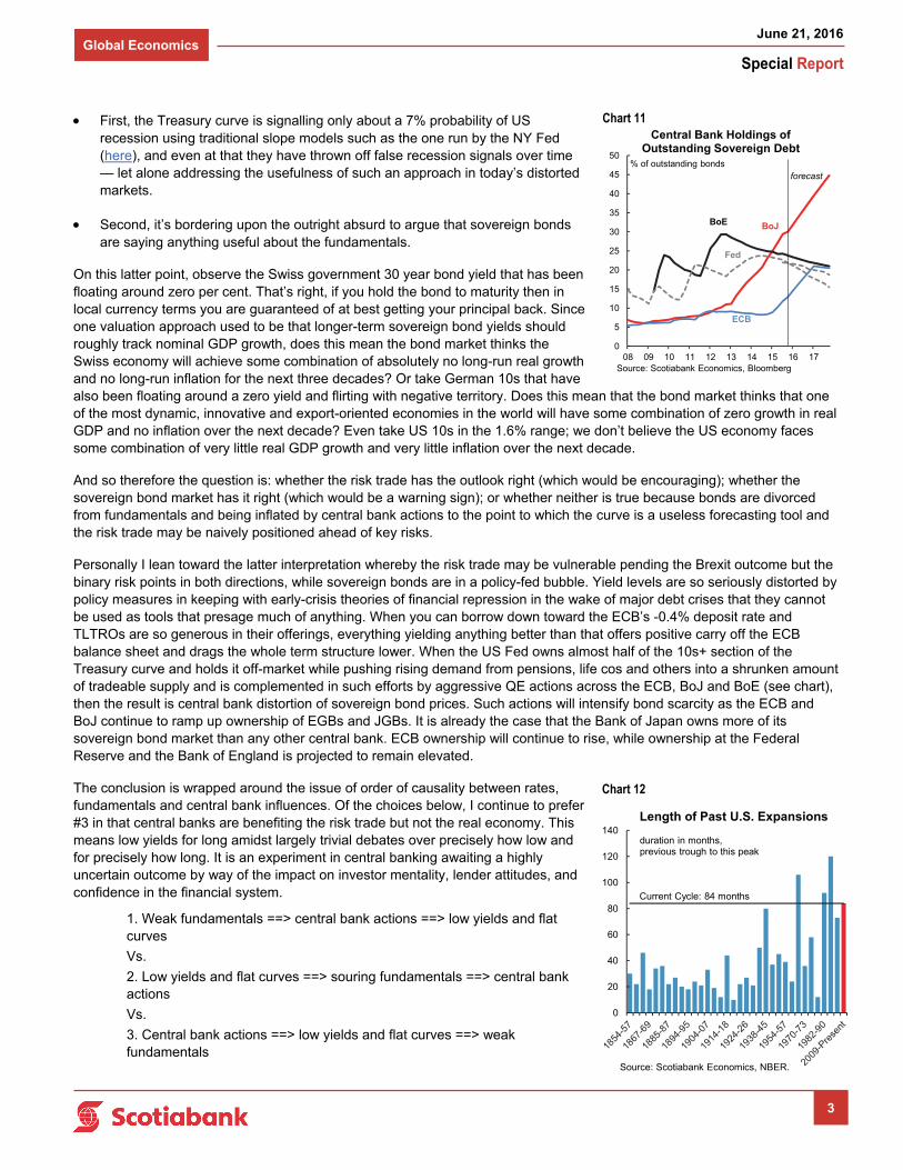
Personally I lean toward the latter interpretation whereby the risk trade may be vulnerable pending the Brexit outcome but the binary risk points in both directions, while sovereign bonds are in a policy-fed bubble. Yield levels are so seriously distorted by policy measures in keeping with early-crisis theories of financial repression in the wake of major debt crises that they cannot be used as tools that presage much of anything. When you can borrow down toward the ECB’s -0.4% deposit rate and TLTROs are so generous in their offerings, everything yielding anything better than that offers positive carry off the ECB balance sheet and drags the whole term structure lower. When the US Fed owns almost half of the 10s+ section of the Treasury curve and holds it off-market while pushing rising demand from pensions, life cos and others into a shrunken amount of tradeable supply and is complemented in such efforts by aggressive QE actions across the ECB, BoJ and BoE (see chart), then the result is central bank distortion of sovereign bond prices. Such actions will intensify bond scarcity as the ECB and BoJ continue to ramp up ownership of EGBs and JGBs. It is already the case that the Bank of Japan owns more of its sovereign bond market than any other central bank. ECB ownership will continue to rise, while ownership at the Federal Reserve and the Bank of England is projected to remain elevated.
The conclusion is wrapped around the issue of order of causality between rates, fundamentals and central bank influences. Of the choices below, I continue to prefer #3 in that central banks are benefiting the risk trade but not the real economy. This means low yields for long amidst largely trivial debates over precisely how low and for precisely how long. It is an experiment in central banking awaiting a highly uncertain outcome by way of the impact on investor mentality, lender attitudes, and confidence in the financial system.
1. Weak fundamentals ==> central bank actions ==> low yields and flat curves
Vs.
2. Low yields and flat curves ==> souring fundamentals ==> central bank actions
Vs.
3. Central bank actions ==> low yields and flat curves ==> weak fundamentals
Chart 11
0
20
40
60
80
100
120
140Length of Past U.S. Expansions
duration in months,previous trough to this peak
Current Cycle: 84 months
Source: Scotiabank Economics, NBER.
Chart 12
0
5
10
15
20
25
30
35
40
45
50
08 09 10 11 12 13 14 15 16 17Source: Scotiabank Economics, Bloomberg
Central Bank Holdings of Outstanding Sovereign Debt
% of outstanding bonds
BoE BoJ
Fed
ECB
forecast
Special Report
June 21, 2016 Global Economics
4
Evidence Of A Looming US Recession Remains Non-Existent
It would nevertheless be naïve to accept the broad financial markets’ verdict that downside risks are to be found more in the heads of central bankers and economists than reality. Instead, we need to explore a number of arguments regarding the maturity of the US business cycle. Overall, we continue to lean against the recessionistas among US economists who think that a long expansion to date must by some law of the heavens end imminently in a bust.
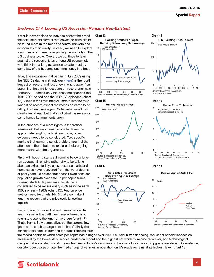
True, this expansion that began in July 2009 using the NBER’s dating methodology (here) is the fourth longest on record and just a few months away from becoming the third longest one on record after next February — behind only the ones that spanned the 1991-2001 period and the 1961-69 episodes (chart 12). When it trips that magical month into the third longest on record expect the recession camp to be hitting the headlines again. Substantial event risk clearly lies ahead, but that’s not what the recession camp hangs its arguments upon.
In the absence of a more rigorous theoretical framework that would enable one to define the appropriate length of a business cycle, other evidence needs to be considered. Two specific markets that garner a considerable amount of the attention in the debate are explored before going more macro with the arguments.
First, with housing starts still running below a long-run average, it remains rather silly to be talking about an exhausted cycle just because starts and home sales have recovered from the worst depths of past years. Of course that doesn’t even consider population growth over time. In per capita terms, housing starts today remain at levels once considered to be recessionary such as in the early 1990s or early 1980s (chart 13). And on price metrics, we offer charts 14-16 that also make it tough to reason that the price cycle is looking toppish.
Second, also consider that auto sales per capita are in a similar boat. All they have achieved is to return to close to the long-run average (chart 17). That’s from a flow perspective, but the current flow ignores the catch-up argument in that it’s likely that considerable pent-up demand for autos remains after the record depths to which sales per capita had plunged over 2008-09. Add in free financing, robust household finances as measured by the lowest debt service burden on record and the highest net worth to income ratio ever, and technological change that is constantly adding new features to today’s vehicles and the overall incentives to upgrade are strong. As evidence, despite robust sales of late, the median age of vehicles in operation on US roads remains at its highest. Ever (chart 18).
Chart 13 Chart 14
Chart 15 Chart 16
10
15
20
25
88 91 94 97 00 03 06 09 12 15
U.S. Housing Price-To-Rent
price-to-rent multiple
Source: Scotiabank Economics, U.S. Census Bureau.
50
60
70
80
90
100
110
75 85 95 05 15
US Real House Prices
index, 2005 = 100
Source: Scotiabank Economics, Federal Reserve Bank of Dallas.
4
5
6
7
8
80 85 90 95 00 05 10 15
House Price To Income
avg. existing home price / personal disposable income
Source: Scotiabank Economics, National Association of Realtors, BEA.
0
2
4
6
8
10
12
58 68 78 88 98 08
Housing Starts per 1000
Long Run Average
Housing Starts Per CapitaRunning Below Long Run Average
Housing Starts per1000 Americans
Source: Scotiabank Economics, Census Bureau.
0
10
20
30
40
50
60
70
80
75 85 95 05
Auto Sales per1000
Auto Sales Per Capita Back at Long Run Average
Auto Sales per1000 Americans
Source: Scotiabank Economics, Wards, Census Bureau.
6
7
8
9
10
11
12
90 95 00 05 10
MedianAge ofAuto Fleet
Median Age of Auto Fleet
Years
Source: Scotiabank Economics, Bloomberg
Chart 17 Chart 18
Special Report
June 21, 2016 Global Economics
5
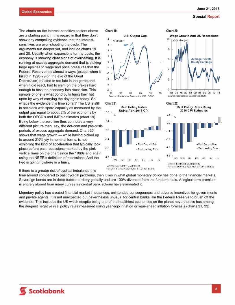
The charts on the interest-sensitive sectors above are a starting point in this regard in that they don’t show any compelling evidence that the interest-sensitives are over-shooting the cycle. The arguments run deeper yet, and include charts 19 and 20. Usually when expansions turn to busts, the economy is showing clear signs of overheating. It is running at excess aggregate demand that is stoking large upsides to wage and price pressures that the Federal Reserve has almost always (except when it hiked in 1928-29 on the eve of the Great Depression) reacted to too late in the game and, when it did react, had to slam on the brakes hard enough to toss the economy into recession. This sample of one is what bond bulls hang their hat upon by way of carrying the day again today. So what’s the evidence this time so far? The US is still in net slack with spare capacity as measured by the output gap equal to about 2% of the economy by both the OECD’s and IMF’s estimates (chart 19). Being below the zero line thus connotes a very different picture than, say, the dot-com and pre-crisis periods of excess aggregate demand. Chart 20 shows that wage growth — while having picked up to around 2½% y/y in nominal terms, is not exhibiting the kind of acceleration that typically took place before past recessions marked by the pink vertical lines on the chart since the 1960s and again using the NBER’s definition of recessions. And the Fed is going nowhere in a hurry.
If there is a greater risk of cyclical imbalance this time around compared to past cyclical problems, then it lies in what global monetary policy has done to the financial markets. Sovereign bonds are in deep bubble territory globally and are 100% divorced from the fundamentals. A logical term premium is entirely absent from many curves as central bank actions have eliminated it.
Monetary policy has created financial market imbalances, unintended consequences and adverse incentives for governments and private agents. It is not unexpected but nevertheless unusual for central banks like the Federal Reserve to brush off the evidence. This includes the US which despite being one of the healthiest economies on the planet nevertheless has among the deepest negative real policy rates measured using year-ago inflation or year-ahead inflation forecasts (charts 21, 22).
Chart 19 Chart 20
0
2
4
6
8
10
65 70 75 80 85 90 95 00 05 10 15
Wage Growth And US Recessions
y/y % change
Average Private Hourly Earnings
Source: Scotiabank Economics, BLS.
-5
-4
-3
-2
-1
0
1
2
3
4
90 95 00 05 10 15
U.S. Output Gap
% of GDP
Source: Scotiabank Economics, IMF, OECD.
IMF
OECD
Chart 21 Chart 22