Embed Size (px)
Citation preview
"THE EYE IS FAVORED FOR SEEING THE WRITING'S FORM": ON THE SENSUAL AND THESENSUOUS IN ISLAMIC CALLIGRAPHYAuthor(s): DAVID J. ROXBURGHSource: Muqarnas, Vol. 25, FRONTIERS OF ISLAMIC ART AND ARCHITECTURE: ESSAYS INCELEBRATION OF OLEG GRABAR'S EIGHTIETH BIRTHDAY (2008), pp. 275-298Published by: BRILLStable URL: http://www.jstor.org/stable/27811125 .
Accessed: 22/09/2014 13:46
Your use of the JSTOR archive indicates your acceptance of the Terms & Conditions of Use, available at .http://www.jstor.org/page/info/about/policies/terms.jsp
.JSTOR is a not-for-profit service that helps scholars, researchers, and students discover, use, and build upon a wide range ofcontent in a trusted digital archive. We use information technology and tools to increase productivity and facilitate new formsof scholarship. For more information about JSTOR, please contact [email protected].
.
BRILL is collaborating with JSTOR to digitize, preserve and extend access to Muqarnas.
http://www.jstor.org
This content downloaded from 128.103.149.52 on Mon, 22 Sep 2014 13:46:23 PMAll use subject to JSTOR Terms and Conditions
DAVID J. ROXBURGH
"THE EYE IS FAVORED FOR SEEING THE WRITING'S FORM": ON THE SENSUAL AND THE SENSUOUS IN ISLAMIC
CALLIGRAPHY
Writing is calliphoric, that is to say a carrier of beauty, and it becomes terpnopoietic by bringing pleasure... Difficulties arise, however, as soon as one tries to under
stand what actually is beauty or even artistic quality in
writing.
Oleg Grabar, The Mediation of Ornament1
The intense screeching noise generated by the writ
ing instrument, whether reed or bamboo, as it flexes across the surface of the paper sheet is an experience of Islamic calligraphy unknown to most of us.2 Equally
surprising is the slow movement of the pen by which
the calligrapher generates individual letter shapes through fastidious, controlled movements, especially when writing at larger sizes: it is then that the size of the writing tool and the properties of materials? such as the viscosity of the ink and the expanse of the
writing surface?place still greater strain on the cal
ligrapher's physical capacities. Traces of the successive movements of applying ink are rarely registered on
the paper support. When these movements are visible to the eye, they appear as a series of graded lines of
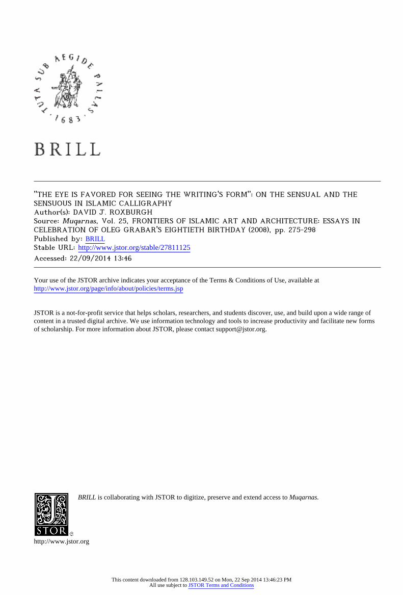
ink akin to the contours made in sand by the physical forces of ebbing water, as one sees in two squared-off blocks denoting their adjacent letter's phonetic values
(fig. 1). A record of physical movement can also be
visible in the long strokes?principally in lengthened or joined letters and ligatures?where the ink becomes
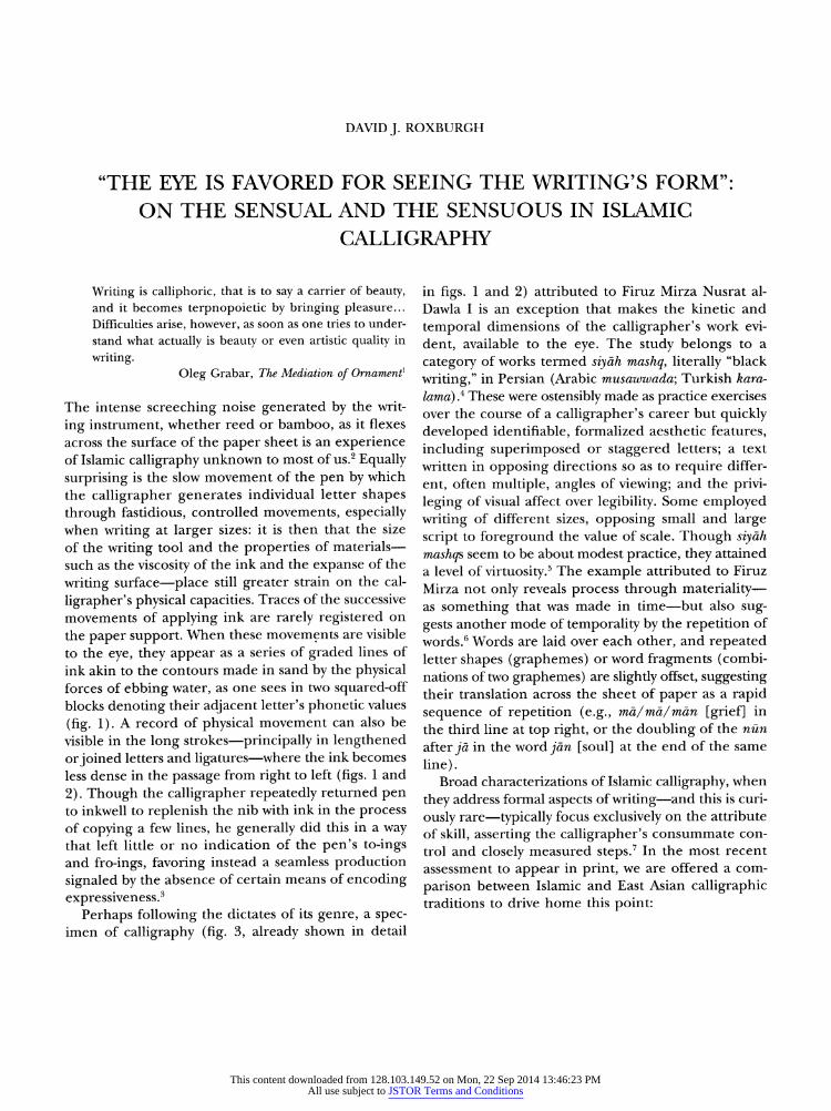
less dense in the passage from right to left (figs. 1 and
2). Though the calligrapher repeatedly returned pen to inkwell to replenish the nib with ink in the process of copying a few lines, he generally did this in a way that left little or no indication of the pen's to-ings and fro-ings, favoring instead a seamless production
signaled by the absence of certain means of encoding
expressiveness.3
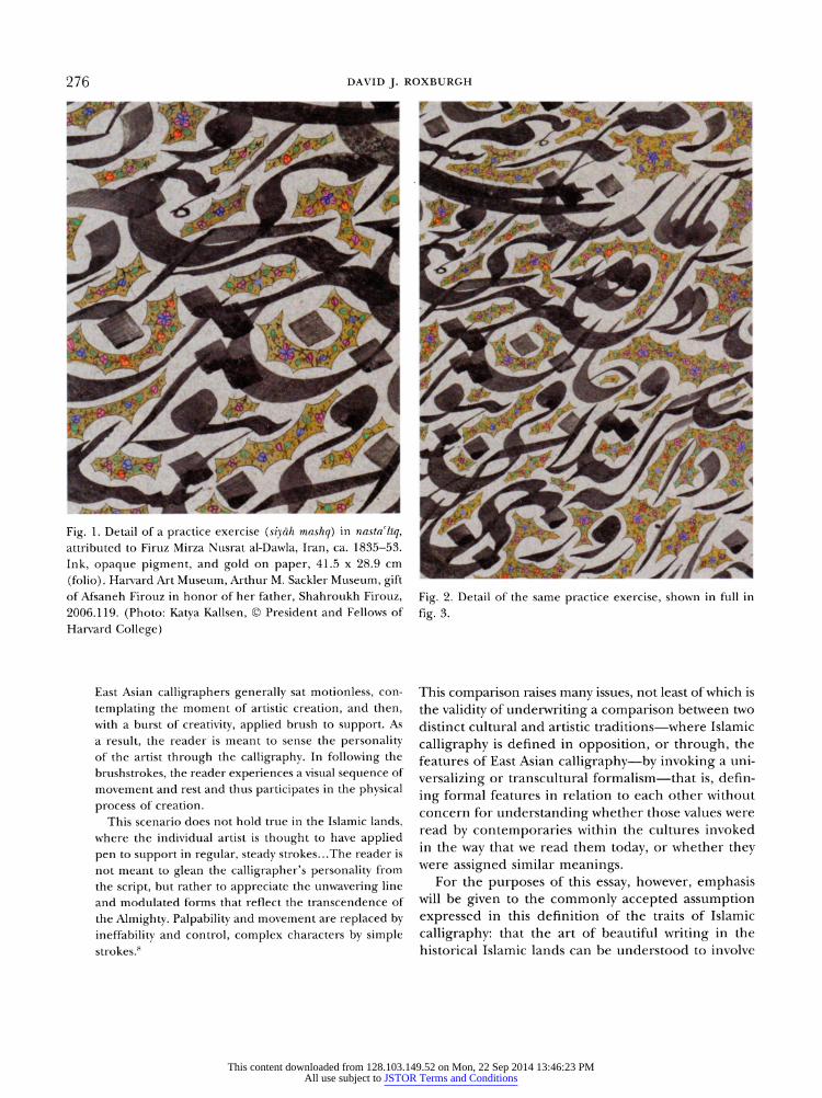
Perhaps following the dictates of its genre, a spec imen of calligraphy (fig. 3, already shown in detail
in figs. 1 and 2) attributed to Firuz Mirza Nusrat al Dawla I is an exception that makes the kinetic and
temporal dimensions of the calligrapher's work evi
dent, available to the eye. The study belongs to a
category of works termed siy?h mashq, literally "black
writing," in Persian (Arabic musawwada; Turkish kara
lama) .4 These were ostensibly made as practice exercises over the course of a calligrapher's career but quickly developed identifiable, formalized aesthetic features,
including superimposed or staggered letters; a text written in opposing directions so as to require differ
ent, often multiple, angles of viewing; and the privi leging of visual affect over legibility. Some employed
writing of different sizes, opposing small and large script to foreground the value of scale. Though siy?h mashqs seem to be about modest practice, they attained a level of virtuosity.5 The example attributed to Firuz Mirza not only reveals process through materiality? as something that was made in time?but also sug
gests another mode of temporality by the repetition of
words.6 Words are laid over each other, and repeated letter shapes (graphemes) or word fragments (combi nations of two graphemes) are slightly offset, suggesting their translation across the sheet of paper as a rapid sequence of repetition (e.g., m?/m?/m?n [grief] in the third line at top right, or the doubling of the nun
after j? in the word j?n [soul] at the end of the same
line). Broad characterizations of Islamic calligraphy, when
they address formal aspects of writing?and this is curi
ously rare?typically focus exclusively on the attribute of skill, asserting the calligrapher's consummate con
trol and closely measured steps.7 In the most recent assessment to appear in print, we are offered a com
parison between Islamic and East Asian calligraphic traditions to drive home this point:
This content downloaded from 128.103.149.52 on Mon, 22 Sep 2014 13:46:23 PMAll use subject to JSTOR Terms and Conditions
276 DAVID J. ROXBURGH
Fig. 1. Detail of a practice exercise (siy?h mashq) in nastallq, attributed to Firuz Mirza Nusrat al-Dawla, Iran, ca. 1835-53.
Ink, opaque pigment, and gold on paper, 41.5 28.9 cm
(folio). Harvard Art Museum, Arthur M. Sackler Museum, gift of Afsaneh Firouz in honor of her father, Shahroukh Firouz,
2006.119. (Photo: Katya Kallsen, ? President and Fellows of
Harvard College)
Fig. 2. Detail of the same practice exercise, shown in full in
fig. 3.
East Asian calligraphers generally sat motionless, con
templating the moment of artistic creation, and then,
with a burst of creativity, applied brush to support. As
a result, the reader is meant to sense the personality of the artist through the calligraphy. In following the
brushstrokes, the reader experiences a visual sequence of
movement and rest and thus participates in the physical
process of creation.
This scenario does not hold true in the Islamic lands,
where the individual artist is thought to have applied
pen to support in regular, steady strokes...The reader is
not meant to glean the calligrapher's personality from
the script, but rather to appreciate the unwavering line
and modulated forms that reflect the transcendence of
the Almighty. Palpability and movement are replaced by
ineffability and control, complex characters by simple strokes.8
This comparison raises many issues, not least of which is the validity of underwriting a comparison between two distinct cultural and artistic traditions?where Islamic
calligraphy is defined in opposition, or through, the features of East Asian calligraphy?by invoking a uni
versalizing or transcultural formalism?that is, defin
ing formal features in relation to each other without concern for understanding whether those values were
read by contemporaries within the cultures invoked in the way that we read them today, or whether they
were assigned similar meanings. For the purposes of this essay, however, emphasis
will be given to the commonly accepted assumption expressed in this definition of the traits of Islamic
calligraphy: that the art of beautiful writing in the historical Islamic lands can be understood to involve
This content downloaded from 128.103.149.52 on Mon, 22 Sep 2014 13:46:23 PMAll use subject to JSTOR Terms and Conditions
"THE EYE IS FAVORED FOR SEEING THE WRITING'S FORM" 277
Fig. 3. Practice exercise (siy?h mashq) in nastaliq, attributed to Firuz Mirza Nusrat al-Dawla, Iran, ca. 1835-53. Ink, opaque
pigment, and gold on paper, 41.5 28.9 cm (folio). Harvard Art Museum, Arthur M. Sackler Museum, gift of Afsaneh Firouz
in honor of her father, Shahroukh Firouz, 2006.119. (Photo: Katya Kallsen, ? President and Fellows of Harvard College)
(perhaps even to require) the radical omission of the
calligrapher's body in favor of technical perfection and conformity to established convention in which ever context of historical occurrence the artwork was
originally made. In this view, Islamic calligraphy is
deprived of any form of indexicality?it cannot be an
autograph?and any access that viewers might have to
apprehending the fact of time passing in the making of the writing is denied in the finished artwork, which
insistently signals its all-at-onceness. In this assessment,
visual pleasure lies solely in an appreciation of skill and the individual calligrapher's abilities at replicat ing preexisting canonical tradition. Visual pleasure does not entail the apprehension of the calligrapher's process?whether through material or time?or the
gauging of individuality as it might become manifest in idiosyncracies of letter shaping or composition.
The perfect antidote to many of these assumptions, one that challenges us to redirect and rephrase
our
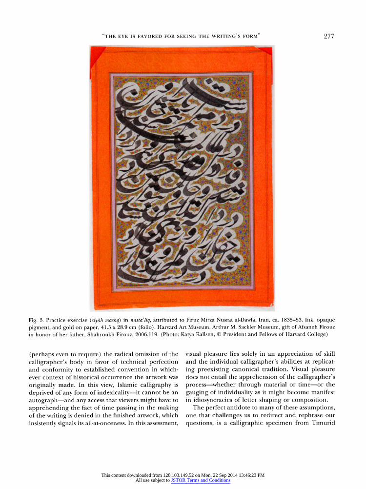
questions, is a calligraphic specimen from Timurid
This content downloaded from 128.103.149.52 on Mon, 22 Sep 2014 13:46:23 PMAll use subject to JSTOR Terms and Conditions
DAVID J. ROXBURGH
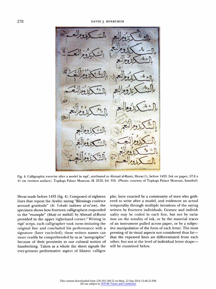
4. Calligraphic exercise after a model in riqa, attributed to Ahmad al-Rumi, Herat (?), before 1433. Ink on paper, 57.8
cm (written surface). Topkapi Palace Museum, H. 2152, fol. 31b. (Photo: courtesy of Topkapi Palace Museum, Istanbul)
Herat made before 1433 (fig. 4). Composed of eighteen lines that repeat the Arabic saying "Blessings coalesce around gratitude" (bi -shukr tad?mu al-niam), the
specimen shows how fourteen calligraphers responded to the "example" (khatt or mith?l) by Ahmad al-Rumi
provided in the upper right-hand corner.9 Writing in
riqa script, each calligrapher took turns imitating the
original line and concluded his performance with a
signature (later encircled); these written names can more readily be comprehended by us as "autographic" because of their proximity to our cultural notion of
handwriting. Taken as a whole the sheet signals the
ever-present performative aspect of Islamic calligra
phy, here enacted by a community of men who gath ered to write after a model, and evidences an actual
temporality through multiple iterations of the saying written by fourteen individuals. Gesture and individ
uality may be coded in each line, but not by varia tion on the tonality of ink, or by the material traces of an instrument pulled across paper, or by a subjec tive manipulation of the form of each letter. The most
pressing of its visual aspects not considered thus far? that the repeated lines are differentiated from each
other, but not at the level of individual letter shape? will be examined below.
This content downloaded from 128.103.149.52 on Mon, 22 Sep 2014 13:46:23 PMAll use subject to JSTOR Terms and Conditions
"THE EYE IS FAVORED FOR SEEING THE WRITING'S FORM" 279
This essay attempts to adjust the common under
standing of the omission of the body in the produc tion of Islamic calligraphy by addressing a paradox; in broad terms this might be described as the gulf divid
ing art-historical writing since the early 1900s from the assessments of contemporary viewers in late Timurid,
Safavid, and Ottoman dynastic settings about the mer its of individual calligraphers and their calligraphies, of how they defined achievement and the criteria of aesthetic value, and of what calligraphy promised to those who made it and those who viewed it. What we will also see, however, is that correlating the formal and material aspects of Islamic calligraphy with what one reads about it in art-historiographic literature
dealing directly with its practice is no simple matter.10
Perhaps that explains why so few art historians have tackled the aesthetic dimensions of Islamic calligra phy, preferring instead to immerse themselves in a taxonomic project seemingly without end.11
This study focuses on the sensual and the sensuous in Islamic calligraphy as a means of thinking about the corporeal dimensions of an artistic practice, of the ways in which the calligrapher's body might be understood as incarnated in the finished work. If we are to think of Islamic calligraphy as the inscription of a human movement, as a deposit left by a kines thetic process, on what grounds can this be compre hended? We are concerned here with the modes of
reception found in written sources that record cul tural attitudes to calligraphy mostly framed through an encounter with specimens seen cold, after their
production, and with selected case studies on the pur suit of calligraphy from the 1500s through the early
modern period that consider issues ranging from the
processes of training and practice to the execution of the fair copy. We will consider both forms of evi dence from the perspective of what they reveal about the effect of the work of art on the human senses? "the sensuous" defined here as aesthetic gratification or "visual pleasure," and "the sensual" as the process
by which the senses are activated.
CALLIGRAPHY AND ITS RECEPTION IN WRITTEN SOURCES
Sixteenth-century Iran was without doubt the richest
provider of written sources on the aesthetic evalua
tion of calligraphy. These texts were mostly written in Persian as introductions to album collections of cal
ligraphy, painting, and drawing, but works of straight history and treatise literature also include references
imparting advice on the techniques of artistic produc tion.12 Throughout this corpus of written sources, the
high status of calligraphy as an art form?a status attained in the early years of Islam?is proclaimed by citing references to writing and the pen from the
Qur'an and the Hadith that provide, for example, metaphors of God's act of creation being akin to that of writing, such as "The first thing God created was the
pen." Joining revelation and the words of the Prophet Muhammad are a number of sayings attributed to historical persons from the early Islamic period, such as cAli b. Abi Talib's "Whoever writes Tn the name of God, the compassionate, the merciful' in beautiful
writing will enter Paradise without account." There are also aphorisms attributed to the Greeks, includ
ing Euclid's "Handwriting is spiritual geometry that
appears by means of a bodily instrument." 13 In writing about calligraphy and calligraphers, authors of the 1500s and later periods had at their disposal a rich and profound literary tradition composed of concepts and images from earlier Arabic sources, which had in turn assimilated the traditions of the Greeks and
pre-Islamic Persians. This corpus of wisdom about
calligraphy?developed in works of belles-lettres?was also perpetuated in calligraphic specimens that took
aphorisms as their subject matter. Examples include the frequently used "Calligraphy is the tongue of the hand and the translator of infinite duration" (Al-khatt lis?n al-yad wa tarjum?n al-khuld), and cAli b. Abi Talib's "I recommend to you the beauty of calligraphy, for it is among the keys to sustenance" ('Alaykum bi-husn al-khatt fa-innahu min maf?tlh al-nzq).
An important concept that was applied to cultural
understandings of calligraphy in the sixteenth century was that of the "trace" (?th?r, pl. ?thar). In its varied uses "trace (s)" had the senses of a relic, a footprint, calligraphies, and memorials or architectural land
marks. A key element of the "trace" as applied to cal
ligraphy was the capacity of writing to preserve ideas. This concept developed an especially rich body of
sayings, including "Handwriting is the tongue of the hand. Style is the tongue of the intellect. The intel lect is the tongue of good actions and qualities. And
good actions and qualities are the perfection of man"
(cAbbas); "Handwriting is the necklace of wisdom. It serves to sort the pearls of wisdom, to bring its dis
persed pieces into good order, to put its stray bits
together, and to fix its setting (?)" (Jacfar b. Yahya
This content downloaded from 128.103.149.52 on Mon, 22 Sep 2014 13:46:23 PMAll use subject to JSTOR Terms and Conditions
280 DAVID J. ROXBURGH
[d. 803] ) ; "The light of handwriting makes wisdom vis
ible, and the skillful handling of the calamus shapes politics" (attributed to an unnamed Greek philoso pher); "The calamus is the nose of the brain. When it bleeds, it divulges the secrets of the brain, shows its ideas, and spreads the information the brain has"
(Sahl b. Harun [d. 830]); and "The stars of wise say
ings [shine] in the darkness of ink" (al-Ma'mun).14 There are many others. One aspect of the beauty of
writing lay in its utility. A fundamental element of the concept of the trace
was the additional notion that writing recorded, by way of a footprint-like impression, the moral makeup of the calligrapher. Thus the Safavid calligrapher Dust
Muhammad, in an album preface dated 1544-45, writes,
"Verily our works point
to us; so gaze after us at our
works" (inna ?tharn? tadullu c alayn? fa-anzur? ba'dan?
ill? al-?th?ri). It is an idea that finds expression in
calligraphy treatises as early as the eleventh century. In his "Ode Rhyming in the Letter R on Calligraphy" (Raiyya fi -khatt), Ibn al-Bawwab (d. 1022) urged his reader to develop good writing precisely because it would be the only thing left to posterity.16 Such ideas maintained their cultural value up to the late 1400s and early 1500s, when they were used by Shihab al Din cAbd Allah Murvarid (d. 1516) and Ghiyath al-Din b. Humam al-Din Muhammad, known as Khvandamir
(d. 1535), the authors of the earliest known album
prefaces. Murvarid and Khvandamir employ meta
phors that liken the pen to an instrument that scatters
pearls (drops of ink). Moreover, in Murvarid's pref ace, a poem dedicated to praising cAli b. Abi Talib
compares every "point" (nuqt) cAli wrote to an unal tered pearl extracted from "the ocean of sanctity." In
his preface, Khvandamir employs an image of callig raphies as pearls brought from a capacious inkwell? he likens it to a "sea" (lujja)?to the "shores of these folios" (bi-s?hil-i In awr?q). Murvarid and Khvandamir use these metaphors to conjure potent mental images of the calligrapher's body.17
The idea that calligraphy constituted not merely a physical remnant of the person but also his moral
imprint?hence that calligraphy also possessed a moral
beauty?was voiced even more forcefully by the callig rapher Sultan cAli Mashhadi (d. 1520), a contempo rary of Murvarid and Khvandamir. In his treatise on
the practice of calligraphy, Sir?t al-sut?r (Way of Lines of Writing), completed in 1514, Sultan cAli Mashhadi
singles out Ali b. Abi Talib as his prime example, not
ing that cAli's goal in writing was the practice of vir
tue, and that his beautiful writing was a sign not only of his acquired virtue but also of his innate virtue.18
In their compositions about art, aesthetics, and art
history, writers active in the later sixteenth century also
addressed the benefits that accrued from contemplat
ing calligraphy. On this subject Khvandamir writes:
The eye is favored for seeing the writing's form
but the heart is ignorant of its meaning. Its form and meaning are praiseworthy;
they brighten the pupil of the eye.19
In an expanded and highly metaphorical poem, Khvan
damir engages the album as a totality in which cal
ligraphies and other works of art are preserved:
Every coveted pearl that is nourished in the ocean of
contentment
is to be found in this sea [i.e., album].
Like beauty, it lights the torch of the eye;
like the meeting of lovers, it seizes every heart.20
One of the more specific writers on the perception of
calligraphy is Shams al-Din Muhammad Vasfi (writing between 1568 and 1577). According to him, "human
nature" (tabai-i insani) acquires "spiritual/contem
plative pleasure" (hazz-i r?h?ni) and "eternal bounty"
(fayz-i j?vid?m) from observing works of art.21 He
remarks that calligraphy is held in high esteem by elite and common people alike, and that even the
illiterate enjoy looking at it. Authors give primacy to sight in the sensory pro
cess of apprehending calligraphy; comparisons of cal
ligraphy to musk, for example, seem to be more about
color than odor. Nevertheless they also invoke olfac
tory sensation, comparing calligraphies to sweet-smell
ing herbs or ambergris. The synesthetic metaphors used by writers of the Persian-language sources give an impression of the activation of the senses?and
invoke an overwhelming experience?even if they do
not supply criteria for the appreciation of calligraphy in specifically formal or technical terms.
Comments about works of art amount to character
izations of their visual properties or attributes. The for
mal elements of artworks are often implied through
analogy. Overall, two modes of response are iden
tifiable: the attributive, which describes an abstract
quality of the artwork, and the metaphorical, which infers relationships between things based on like qual ities (e.g., the perfect materiality of a pearl or ruby and the shape of a letter of the alphabet). These two
responses are entirely consistent with the rhetorical
This content downloaded from 128.103.149.52 on Mon, 22 Sep 2014 13:46:23 PMAll use subject to JSTOR Terms and Conditions
"THE EYE IS FAVORED FOR SEEING THE WRITING'S FORM" 281
protocol of the Persian-language sources, whose vec
tor is the exemplary and always tends toward the abso lute. The generic framework of the written source
controls how the authors write about art and their
experience of it.
In assessing Sultan cAli Mashhadi's calligraphy, another preface author, Malik Daylami (writing in
1560-61), stresses its "purity" (safa) and "sharpness" (t?z?)\ writing on Muhammad Qasim Shadishah's cal
ligraphy, Shams al-Din Muhammad Vasfi notes that it is "at the extremity of sweetness, elegance, and light ness" (bi-gh?yat-i sh?r?n va namak? va n?zuk), and that
Anisi Badakhshi's penmanship is "very pure, sweet, and
light" (bisy?r s?f va sh?r?n va n?zuk) 22 Dust Muhammad
describes Anisi Badakhshi's calligraphy as "delicate"
(n?zuk), "pure" (s?f), and "pleasing" (pasand?da) and Muhammad Qasim Shadishah's as "delicate" (n?zuk), "clean" (p?kiza), and "pleasing" (pasand?da).25 Less
generic descriptors include Dust Muhammad's opin ions that Sultan Muhammad Khandan "wrote with [an] essential quality" (bi-kayfiyat nivishtand) and that Nur al-Din cAbd Allah exhibited an impressive "quickness of copying" (surat-i kit?bat).
Invoked amid such assessments are references to the
calligraphers' personal attributes, evidenced by their conduct in life. It is often difficult to separate these from assessments of their calligraphy per se. In Dust Muhammad's words, Sultan cAli Mashhadi was of "good character" (husn-i akhl?q), and Sultan Muhammad Nur was "accomplished" (sar-anj?m), "pure" (p?k?zag?), "pious" (varac) and "abstemious" (taqva). The language used to praise personal conduct often resembles that used to describe and judge performance in calligra phy: they are not only related by a shared vocabulary but also by the conception of abstract qualities. This
gives further impetus to an indexicai reading of cal
ligraphy, though the index cannot be understood via the formal language of gesture in the way we might conceive of it through East Asian calligraphy.24 In fur ther support of the idea that Islamic calligraphy had an indexicai relation to its maker?that writing embod ied the traits of an individual and operated as a trans
port medium?is a much earlier anecdote, cited by Abu Hayyan al-Tawhidi, relating an encounter of the
seventh century:
When a secretary of c?mr b. al-As came to cUmar, the
latter asked him: Are you not Ibn al-Qayn from Mecca?
When the secretary answered in the affirmative, cUmar
said to him: The calamus does not hesitate to show to
whom it belongs.25
A summary of these written sources in Persian and
Arabic reveals that the body, whether that of the cal
ligraphier inscribed in the calligraphy or of the viewer
engaged in the experience of the work, is very much
present. The senses involved in the appreciation of cal
ligraphy include sight and, by way of metaphor, smell or even taste. Hearing is presumably a given, especially because these visual shapes
are attached to sounds.
The sense of touch is less directly invoked, unless one considers a form of haptic visuality, or seeing linked to touch and movement, as suggested in Shams al-Din
Muhammad Vasfi's poem praising the pen:
Writer of marvels, ruddy-cloaked reed
with two tongues but silent in speech, A resplendent cypress in stature spreading shade
that draws its night-tresses underfoot,
Straight as an arrow, in nature like a bow
that hides the countenance of day with dark night.26
The poem anthropomorphizes the pen?it is dressed in a cloak and is as slender as a cypress (a comparison frequently applied to men and women)?and further more assigns it the capacity to speak, invoking the conventional image of the two tongues of the pen (its split nib). As the pen moves, it spreads shade and
pulls its dark tresses behind it (the ink moving from the pen onto the paper). The last couplet develops this image by discussing the physical properties of the pen and likening the dispersal of ink on paper to the passage from day to night, the pen blackening the light sheet.
THE CALLIGRAPHER'S TRAINING AND PRACTICE
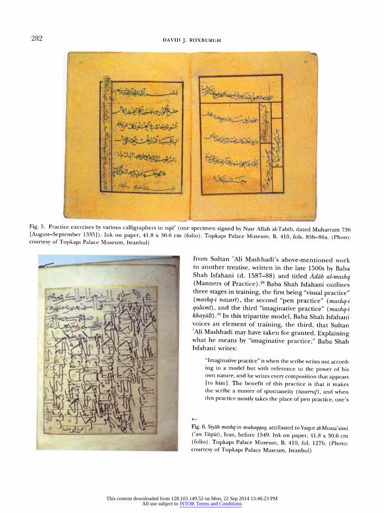
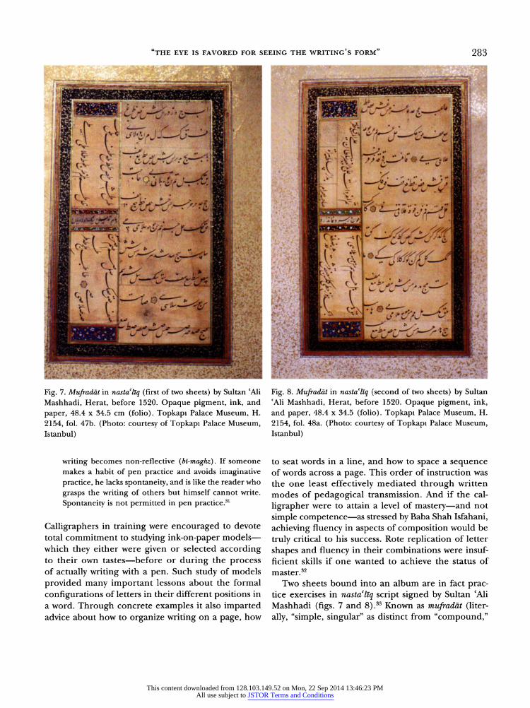
Fine calligraphy was appreciated not only in its post production life, as historical manuscripts of various kinds or album collections that assembled formerly loose calligraphed sheets and made new entities out of them (figs. 5 and 6);27 calligraphers also studied
specimens of accomplished writing as part of their education. This aspect of training and practice is referenced in a variety of primary sources, includ
ing manuals on the practice of calligraphy and even the occasional work of history, Ibn Khaldun's Muqad dima (Prolegomena) being a prime example.28 Prac tice through the "visual" (n?zir?) study of preexisting
models, and not only those made "by the pen" (qalam?), is mentioned in several Persian written sources, ranging
This content downloaded from 128.103.149.52 on Mon, 22 Sep 2014 13:46:23 PMAll use subject to JSTOR Terms and Conditions
282 DAVID J. ROXBURGH
Fig. 5. Practice exercises by various calligraphers in riqa (one specimen signed by Nasr Allah al-Tabib, dated Muharram 736 [August-September 1335]). Ink on paper, 41.8 30.6 cm (folio). Topkapi Palace Museum, B. 410, fols. 85b-86a. (Photo: courtesy of Topkapi Palace Museum, Istanbul)
from Sultan cAli Mashhadi's above-mentioned work to another treatise, written in the late 1500s by Baba Shah Isfahani (d. 1587-88) and titled Adah al-mashq (Manners of Practice).29 Baba Shah Isfahani outlines three stages in training, the first being "visual practice" (mashq-i nazar?), the second "pen practice" (mashq-i qalam?), and the third "imaginative practice" (mashq-i khay?li).50 In this tripartite model, Baba Shah Isfahani voices an element of training, the third, that Sultan cAli Mashhadi may have taken for granted. Explaining
what he means by "imaginative practice," Baba Shah Isfahani writes:
"Imaginative practice" is when the scribe writes not accord
ing to a model but with reference to the power of his own nature, and he writes every composition that appears [to him]. The benefit of this practice is that it makes the scribe a master of spontaneity (tasarruf), and when this practice mostly takes the place of pen practice, one's
Fig. 6. Siy?h mashq in muhaqqaq, attributed to Yaqut al-Mustacsimi
(can Yaqut), Iran, before 1549. Ink on paper, 41.8 30.6 cm
(folio). Topkapi Palace Museum, B. 410, fol. 127b. (Photo:
courtesy of Topkapi Palace Museum, Istanbul)
This content downloaded from 128.103.149.52 on Mon, 22 Sep 2014 13:46:23 PMAll use subject to JSTOR Terms and Conditions
"the eye is favored for seeing the writing's form" 283
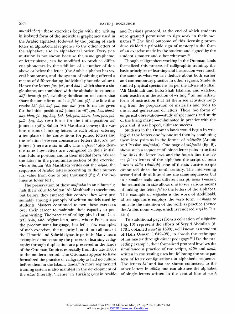
Fig. 7. Mufrad?t in nastal?q (first of two sheets) by Sultan cAli
Mashhadi, Herat, before 1520. Opaque pigment, ink, and
paper, 48.4 34.5 cm (folio). Topkapi Palace Museum, H.
2154, fol. 47b. (Photo: courtesy of Topkapi Palace Museum,
Istanbul)
writing becomes non-reflective (b?-maghz). If someone
makes a habit of pen practice and avoids imaginative
practice, he lacks spontaneity, and is like the reader who
grasps the writing of others but himself cannot write.
Spontaneity is not permitted in pen practice.31
Calligraphers in training were encouraged to devote total commitment to studying ink-on-paper models?
which they either were given or selected according to their own tastes?before or during the process of actually writing with a pen. Such study of models
provided many important lessons about the formal
configurations of letters in their different positions in a word. Through concrete examples it also imparted advice about how to organize writing on a page, how
Fig. 8. Mufrad?t in nastaltq (second of two sheets) by Sultan
?Ali Mashhadi, Herat, before 1520. Opaque pigment, ink,
and paper, 48.4 34.5 (folio). Topkapi Palace Museum, H.
2154, fol. 48a. (Photo: courtesy of Topkapi Palace Museum,
Istanbul)
to seat words in a line, and how to space a sequence of words across a page. This order of instruction was
the one least effectively mediated through written modes of pedagogical transmission. And if the cal
ligrapher were to attain a level of mastery?and not
simple competence?as stressed by Baba Shah Isfahani,
achieving fluency in aspects of composition would be
truly critical to his success. Rote replication of letter
shapes and fluency in their combinations were insuf ficient skills if one wanted to achieve the status of master.32
Two sheets bound into an album are in fact prac tice exercises in nastaliq script signed by Sultan cAli
Mashhadi (figs. 7 and 8).33 Known as mufrad?t (liter
ally, "simple, singular" as distinct from "compound,"
This content downloaded from 128.103.149.52 on Mon, 22 Sep 2014 13:46:23 PMAll use subject to JSTOR Terms and Conditions
284 DAVID J. ROXBURGH
murakkab?t), these exercises begin with the writing in isolated form of the individual graphemes used in the Arabic alphabet, followed by the joining of each letter in alphabetical sequence to the other letters of the alphabet, also in alphabetical order. Every per
mutation is not shown because the same grapheme, or letter shape, can be modified to produce differ ent phonemes by the addition of a number of dots above or below the letter (the Arabic alphabet has sev
eral homonyms, and the system of pointing offered a means of differentiating individual phonetic values). Hence the letters jim, ha, and kha, which share a sin
gle shape, are combined with the alphabetic sequence
alif through ya, avoiding duplication of letters that share the same form, such as fa and q?f The line thus reads: ha, jat, haj, jad, har, har (two forms are given for the initial-position ha joined to ra), jar, has, khash, has, khat, jar, jaf haq, hak, hal, jam, kham, han, jaw, jah, jal?, hay, hay (two forms for the initial-position ha
joined to ya). Sultan cAli Mashhadi conveys the var
ious means of linking letters to each other, offering a template of the conventions for joined letters and the relation between consecutive letters that are not
joined (there are six in all). The mufrad?t also dem onstrates how letters are configured in their initial, stand-alone position and in their medial form. We see
the latter in the penultimate section of the exercise, where Sultan cAli Mashhadi writes out the abjad, the
sequence of Arabic letters according to their numer
ical value from one to one thousand (fig. 8, the two
lines at lower left). The preservation of these mufrad?t in an album sig
nals their value to Sultan cAli Mashhadi as specimens, but before they entered that context they were pre
sumably among a panoply of written models used by students. Masters continued to pen these exercises
over their career to maintain their capacity to per form writing. The practice of calligraphy in Iran, Cen
tral Asia, and Afghanistan, areas where Persian was
the predominant language, has left a few examples of such exercises, the majority bound into albums of
the Timurid and Safavid dynastic periods. Many more
examples demonstrating the process of learning callig
raphy through duplication are preserved in the lands
of the Ottoman Empire, especially from the late 1500s to the modern period. The Ottomans appear to have
formalized the practice of calligraphy as had no culture
before them in the Islamic lands.34 A more regimented
training system is also manifest in the development of
the ic?zet (literally, "license" in Turkish; ij?za in Arabic
and Persian) protocol, at the end of which students were granted permission to sign work in their own
names.35 The final outcome of this licensing proce dure yielded a palpable sign of mastery in the form of an exercise made by the student and signed by the student's master and other witnesses.36
Though calligraphers working in the Ottoman lands formalized this process of calligraphic training, the basic principles of learning and instruction were much the same as what we can deduce about both earlier and contemporary practice in other regions. Students studied physical specimens, as per the advice of Sultan
cAli Mashhadi and Baba Shah Isfahani, and watched
their teachers in the action of writing,37 an immediate form of instruction that let them see activities rang
ing from the preparation of materials and tools to
the actual generation of letters. These two forms of
empirical observation?study of specimens and study of the living master?culminated in practice with the
pen and, it was hoped, ultimate success.
Students in the Ottoman lands would begin by writ
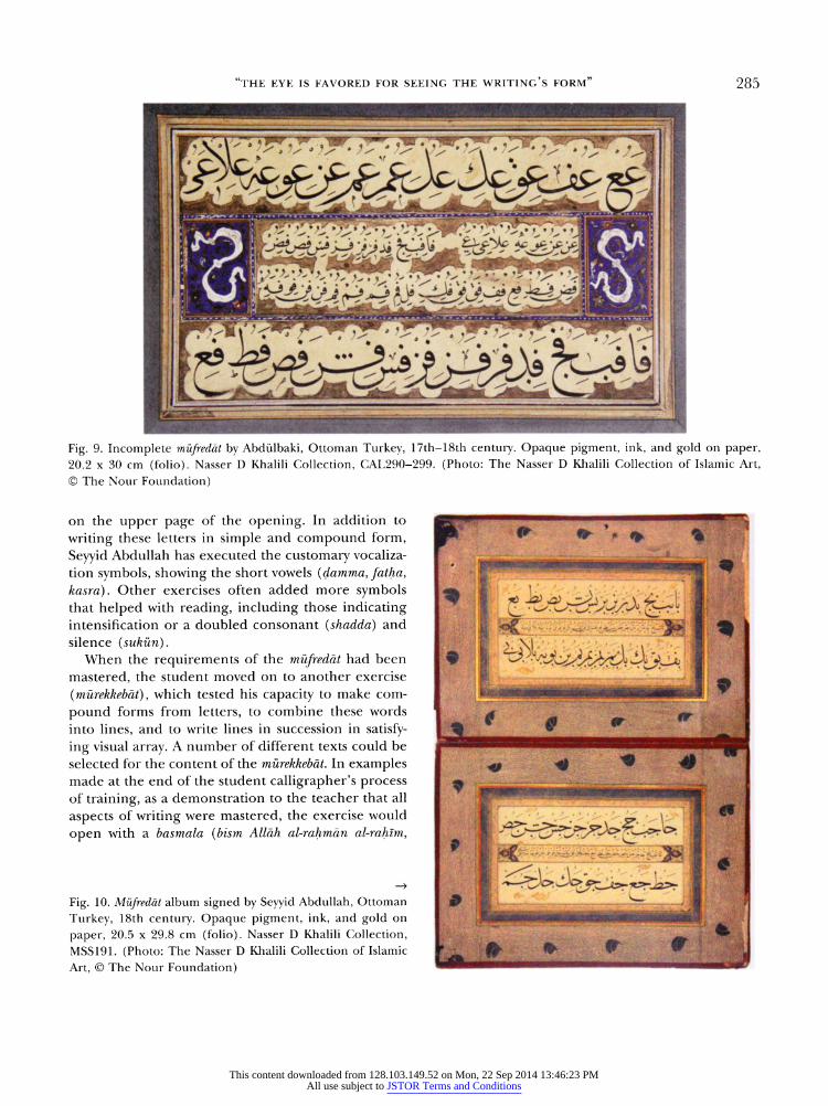
ing out the letters one by one and then by combining them into pairs as in the format of m?fred?t (Arabic and Persian mufrad?t). One page of m?fred?t (fig. 9), shows such a sequence of joined-letter pairs?the first
line links the letter cayn and the fourth line the let
ter fa to letters of the alphabet: the script of both
lines is s?l?s (thuluth), one of the six cursive scripts canonized since the tenth century. The intervening second and third lines show the same sequences but
in a smaller scale and different script, nesih (naskh); the reduction in size allows one to see various means
of linking the letter f?c to the letters of the alphabet. This example of m?fred?t is the work of Abd?lbaki, whose signature employs the verb form mashaqa to
indicate the intention of the work as practice (hence the Arabic noun mashq, which is rendered mesk in Tur
kish). Two additional pages from a collection of m?fred?ts
(fig. 10) represent the efforts of Seyyid Abdullah (d.
1731; obtained ic?zet in 1690), well known as a student
of Hafiz Osman (1642-98), to absorb the technique of his master through direct pedagogy.38 Like the pre
ceding example, their formalized protocol involves the
simultaneous practice of two scripts, s?l?s and nesih, written in contrasting sizes but following the same pat tern of letter configurations in alphabetic sequence. The letters ha and j?m are shown connected to the
other letters in s?l?s; one can also see the alphabet of single letters written in the central line of nesih
This content downloaded from 128.103.149.52 on Mon, 22 Sep 2014 13:46:23 PMAll use subject to JSTOR Terms and Conditions
"the eye is favored for seeing the writing's form" 285
Fig. 9. Incomplete m?fredat by Abd?lbaki, Ottoman Turkey, 17th-18th century. Opaque pigment, ink, and gold on paper,
20.2 30 cm (folio). Nasser D Khalili Collection, CAL290-299. (Photo: The Nasser D Khalili Collection of Islamic Art,
? The Nour Foundation)
on the upper page of the opening. In addition to
writing these letters in simple and compound form,
Seyyid Abdullah has executed the customary vocaliza tion symbols, showing the short vowels (damma, fatha, kasra). Other exercises often added more symbols that helped with reading, including those indicating intensification or a doubled consonant (shadda) and silence (suk?n). When the requirements of the m?fredat had been
mastered, the student moved on to another exercise
(m?rekkeb?t), which tested his capacity to make com
pound forms from letters, to combine these words
into lines, and to write lines in succession in satisfy
ing visual array. A number of different texts could be selected for the content of the m?rekkeb?t. In examples
made at the end of the student calligrapher's process of training, as a demonstration to the teacher that all
aspects of writing were mastered, the exercise would
open with a basmala (bism Allah al-rahm?n al-rahim,
Fig. 10. M?fredat album signed by Seyyid Abdullah, Ottoman
Turkey, 18th century. Opaque pigment, ink, and gold on
paper, 20.5 29.8 cm (folio). Nasser D Khalili Collection,
MSS191. (Photo: The Nasser D Khalili Collection of Islamic
Art, ? The Nour Foundation)
This content downloaded from 128.103.149.52 on Mon, 22 Sep 2014 13:46:23 PMAll use subject to JSTOR Terms and Conditions
286 DAVID J. ROXBURGH
Fig. 11. Opening invocation and prayer in joined letters from
a m?fred?t album, Ottoman Turkey, 17th-18th century, opaque
pigment, ink, and gold on paper, 18.5 27.3 cm (folio). Nasser
D Khalili Collection, MSS297. (Photo: The Nasser D. Khalili
Collection of Islamic Art, ? The Nour Foundation)
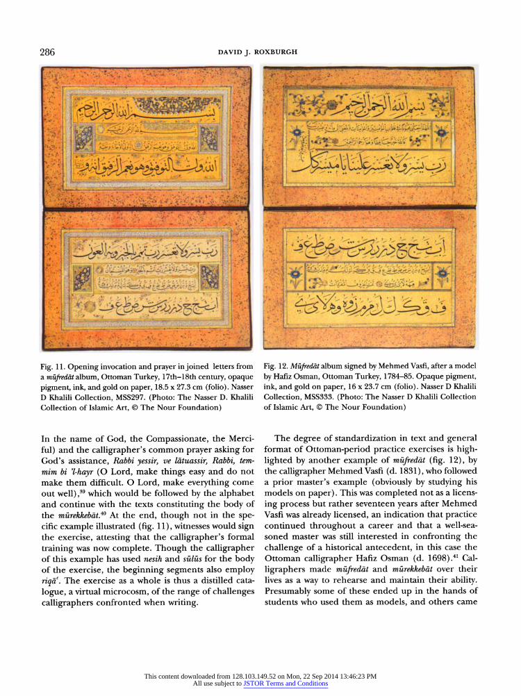
In the name of God, the Compassionate, the Merci
ful) and the calligraphier's common prayer asking for God's assistance, Rabbi yessir, ve l?tuassir, Rabbi, tem
mim hi -hayr (O Lord, make things easy and do not
make them difficult. O Lord, make everything come out well),39 which would be followed by the alphabet and continue with the texts constituting the body of the m?rekkeb?t.40 At the end, though not in the spe cific example illustrated (fig. 11), witnesses would sign the exercise, attesting that the calligrapher's formal
training was now complete. Though the calligrapher of this example has used nesih and s?l?s for the body of the exercise, the beginning segments also employ nqa. The exercise as a whole is thus a distilled cata
logue, a virtual microcosm, of the range of challenges calligraphers confronted when writing.
Fig. 12. M?fred?t album signed by Mehmed Vasfi, after a model
by Hafiz Osman, Ottoman Turkey, 1784-85. Opaque pigment,
ink, and gold on paper, 16 23.7 cm (folio). Nasser D Khalili
Collection, MSS333. (Photo: The Nasser D Khalili Collection
of Islamic Art, ? The Nour Foundation)
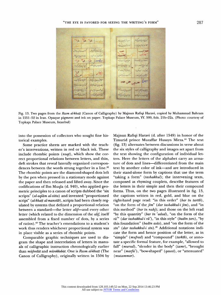
The degree of standardization in text and general format of Ottoman-period practice exercises is high lighted by another example of m?fred?t (fig. 12), by the calligrapher Mehmed Vasfi (d. 1831), who followed a prior master's example (obviously by studying his models on paper). This was completed not as a licens
ing process but rather seventeen years after Mehmed Vasfi was already licensed, an indication that practice continued throughout a career and that a well-sea
soned master was still interested in confronting the
challenge of a historical antecedent, in this case the Ottoman calligrapher Hafiz Osman (d. 1698).41 Cal
ligraphers made m?fred?t and m?rekkeb?t over their lives as a way to rehearse and maintain their ability. Presumably some of these ended up in the hands of students who used them as models, and others came
This content downloaded from 128.103.149.52 on Mon, 22 Sep 2014 13:46:23 PMAll use subject to JSTOR Terms and Conditions
"the eye is favored for seeing the writing's form" 287
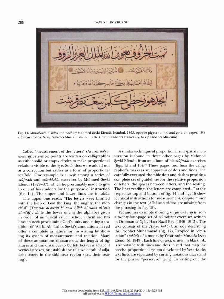
Fig. 13. Two pages from the Rasm al-khatt (Canon of Calligraphy) by Majnun Rafiqi Haravi, copied by Muhammad Bahram
in 1551-52 in Iran. Opaque pigment and ink on paper. Topkapi Palace Museum, YY. 599, fols. 21b-22a. (Photo: courtesy of
Topkapi Palace Museum, Istanbul)
into the possession of collectors who sought fine his torical examples.
Some practice sheets are marked with the teach er's interventions, written in red or black ink. These include rhombic points (nuqt), which show the cor rect proportional relations between letters, and thin, deft strokes that reveal laterally organized correspon dences between the words strung together in a line.42 The rhombic points are the diamond-shaped dots left
by the pen when pressed in a stationary mode against the paper and then released and lifted away. Since the codifications of Ibn Muqla (d. 940), who applied geo
metric principles to a canon of scripts dubbed the "six
scripts" (al-aql?m al-sitta) and invented "proportioned script" (al-khatt al-mans?b), scripts had been closely reg ulated by systems that defined a proportional relation between a standard?the letter alif-?and every other
letter (which related to the dimension of the alif, itself assembled from a fixed number of dots, by a series of ratios).43 The teacher's emendations to a student's
work thus renders whichever proportional system was
in place visible as a series of rhombic points. Comparable graphic techniques are used to dia
gram the shape and interrelation of letters in manu
als of calligraphic instruction chronologically earlier than m?fred?t and m?rekkeb?t. One is Rasm al-khatt (The Canon of Calligraphy), originally written in 1504 by
Majnun Rafiqi Haravi (d. after 1549) in honor of the Timurid prince Muzaffar Husayn Mirza.44 The text
(fig. 13) alternates between discussions in verse about the six styles of calligraphy and images set apart from the text showing the configuration of individual let ters. Here the letters of the alphabet carry an arma
ture of dots and lines?differentiated from the main text by another color of ink?and are introduced in their stand-alone form by captions that use the term
"taking a form" (tashakkul); the intervening texts,
composed as rhyming couplets, describe features of the letters in their simple and then their compound forms. Thus, on the two pages illustrated in fig. 13, the captions written in red, gold, and blue on the
right-hand page read: "in this order" (bar in tart?b), "on the form of the^W (dar tashakkul-i firn), and "in this method" (bar in nahj); and those on the left read
"by this quantity" (bar in cadad), "on the form of the ra" (dar tashakhul-i ra), "in this style" (badin tarz), "by this foundation" (badin as?s), and "on the form of the sm" (dar tashakkul-i sin).45 Additional notations indi cate the form and hence position of the letter, as in
"simple" (mufrad) and "compound" (tarklb), or anno tate a specific formal feature, for example, "allowed to
fall" (mursal), "slender in the body" (zamr), "brought near" (marfu), "bow-shaped" (qawsi),
or "attenuated"
(muzammar).
This content downloaded from 128.103.149.52 on Mon, 22 Sep 2014 13:46:23 PMAll use subject to JSTOR Terms and Conditions
DAVID J. ROXBURGH
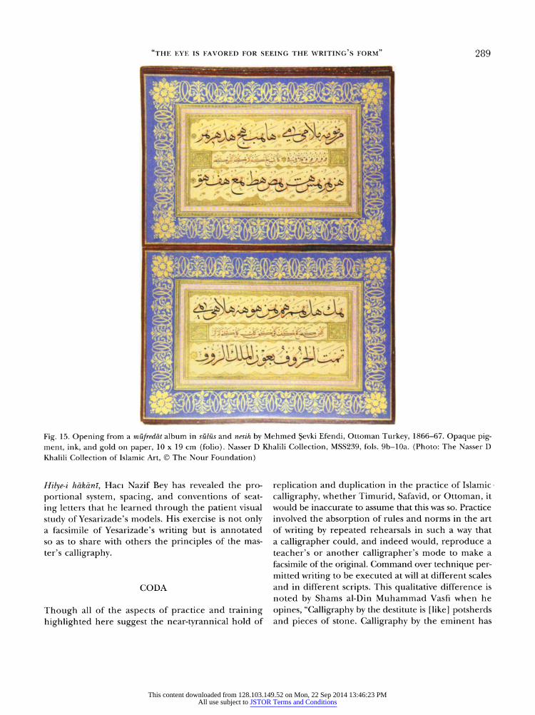
Fig. 14. M?rekkebat in s?l?s and nesih by Mehmed ?evki Efendi, Istanbul, 1863, opaque pigment, ink, and gold on paper, 16.8
26 cm (folio). Sakip Sabanci M?zesi, Istanbul, 216. (Photo: Sabanci University, Sakip Sabanci Museum)
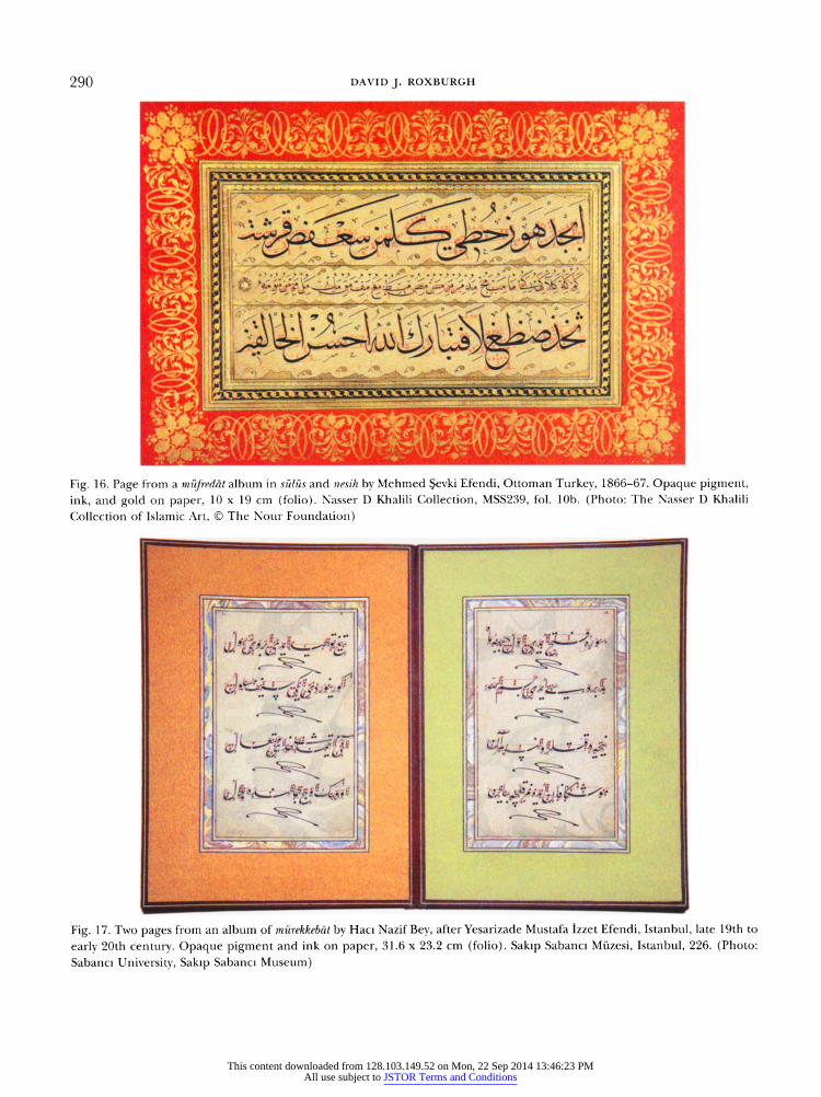
Called "measurement of the letters" (Arabic miy?r al-hur?f), rhombic points are written on calligraphies as either solid or empty circles to make proportional relations visible to the eye. Such dots were added not as a correction but rather as a form of proportional scaffold. One example is a mesk among a series of
m?fred?t and m?rekkeb?t exercises by Mehmed ?evki Efendi (1829-87), which he presumably made to give to one of his students for the purpose of instruction
(fig. 14). The upper and lower lines are in s?l?s. The upper one reads, "The letters were finished
with the help of God the king, the mighty, the mer
ciful" (Tammat al-hur?f bi-awn Allah al-malik al-aziz
al-ra?f), while the lower one is the alphabet given in order of numerical value. Between them are two
lines in nesih proclaiming God's unity and citing a tra
dition of cAli b. Abi Talib. ?evki's annotations in red offer a complete armature for his writing by show
ing its system of measurement and relation. Many of these annotations measure out the length of lig atures and the distances to be left between adjacent vertical strokes, or establish the relative depth of adja cent letters in the sublinear region (i.e., their seat
ing).
A similar technique of proportional and spatial men
suration is found in three other pages by Mehmed
?evki Efendi, from an album of his m?fred?t exercises
(figs. 15 and 16).46 These pages, too, bear the callig rapher's marks as an apparatus of dots and lines. The
carefully executed rhombic dots and dashes provide a
complete set of guidelines for the relative proportion of letters, the spaces between letters, and the seating. The lines reading "the letters are completed..." at the
respective top and bottom of fig. 14 and fig. 15 show identical instructions for measurement, despite minor
changes in the text (Allah and al-azlz are missing from the phrasing in fig. 15).
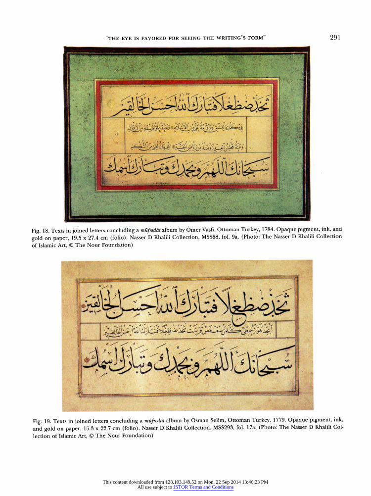
Yet another example showing micy?r al-hur?f is from a twenty-four-page set of m?rekkeb?t exercises written
in Ottoman taliq by Haci Nazif Bey (1846-1913). The text consists of the Hilye-i h?k?ni, an ode describing the Prophet Muhammad (fig. 17),17 copied in "emu lation" (taklid) of a model by Yesarizade Mustafa ?zzet Efendi (d. 1849). Each line of text, written in black ink, is annotated with lines and dots in red that map the
precise proportional system developed by Yesarizade; text lines are separated by curving notations that stand for the phrase "persevere" (sacy). In writing out the
This content downloaded from 128.103.149.52 on Mon, 22 Sep 2014 13:46:23 PMAll use subject to JSTOR Terms and Conditions
"THE EYE IS FAVORED FOR SEEING THE WRITING'S FORM" 289
Fig. 15. Opening from a m?fred?t album in s?l?s and nesih by Mehmed ?evki Efendi, Ottoman Turkey, 1866-67. Opaque pig
ment, ink, and gold on paper, 10 19 cm (folio). Nasser D Khalili Collection, MSS239, fols. 9b-10a. (Photo: The Nasser D
Khalili Collection of Islamic Art, ? The Nour Foundation)
Hilye-i h?k?m, Haci Nazif Bey has revealed the pro portional system, spacing, and conventions of seat
ing letters that he learned through the patient visual
study of Yesarizade's models. His exercise is not only a facsimile of Yesarizade's writing but is annotated so as to share with others the principles of the mas
ter's calligraphy.
CODA
Though all of the aspects of practice and training highlighted here suggest the near-tyrannical hold of
replication and duplication in the practice of Islamic
calligraphy, whether Timurid, Safavid, or Ottoman, it would be inaccurate to assume that this was so. Practice
involved the absorption of rules and norms in the art of writing by repeated rehearsals in such a way that a calligrapher could, and indeed would, reproduce a
teacher's or another calligrapher's mode to make a
facsimile of the original. Command over technique per mitted writing to be executed at will at different scales and in different scripts. This qualitative difference is noted by Shams al-Din Muhammad Vasfi when he
opines, "Calligraphy by the destitute is [like] potsherds and pieces of stone. Calligraphy by the eminent has
This content downloaded from 128.103.149.52 on Mon, 22 Sep 2014 13:46:23 PMAll use subject to JSTOR Terms and Conditions
290 DAVID J. ROXBURGH
Fig. 16. Page from a m?fredat album in s?l?s and nesih by Mehmed ?evki Efendi, Ottoman Turkey, 1866-67. Opaque pigment,
ink, and gold on paper, 10 19 cm (folio). Nasser D Khalili Collection, MSS239, fol. 10b. (Photo: The Nasser D Khalili
Collection of Islamic Art, ? The Nour Foundation)
Fig. 17. Two pages from an album of m?rekkeb?t by Haci Nazif Bey, after Yesarizade Mustafa ?zzet Efendi, Istanbul, late 19th to
early 20th century. Opaque pigment and ink on paper, 31.6 23.2 cm (folio). Sakip Sabanci M?zesi, Istanbul, 226. (Photo:
Sabanci University, Sakip Sabanci Museum)
This content downloaded from 128.103.149.52 on Mon, 22 Sep 2014 13:46:23 PMAll use subject to JSTOR Terms and Conditions
"the eye is favored for seeing the writing's form" 291
Fig. 18. Texts in joined letters concluding a m?fred?t album by Omer Vasf?, Ottoman Turkey, 1784. Opaque pigment, ink, and
gold on paper, 19.5 27.4 cm (folio). Nasser D Khalili Collection, MSS68, fol. 9a. (Photo: The Nasser D Khalili Collection
of Islamic Art, ? The Nour Foundation)
Fig. 19. Texts in joined letters concluding a m?fred?t album by Osman Selim, Ottoman Turkey, 1779. Opaque pigment, ink,
and gold on paper, 15.3 22.7 cm (folio). Nasser D Khalili Collection, MSS293, fol. 17a. (Photo: The Nasser D Khalili Col
lection of Islamic Art, ? The Nour Foundation)
This content downloaded from 128.103.149.52 on Mon, 22 Sep 2014 13:46:23 PMAll use subject to JSTOR Terms and Conditions
292 DAVID J. ROXBURGH
Fig. 20. Practice exercise in Hqa by Baysunghur, Herat (?),
before 1433. Ink on paper, 25 33 cm (sheet). Topkapi Pal
ace Museum, H. 2152, fol. 21b. (Photo: courtesy of Topkapi Palace Museum, Istanbul)
the value of pearls and rubies."48 But technical prow ess did not obviate an individual's inflection?Baba Shah Isfahani's "imaginative practice"?whether in
adjustments made to proportional systems or through other means.
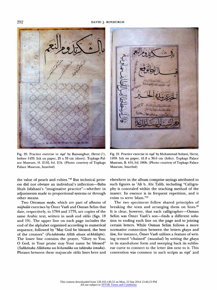
Two Ottoman mesks, which are part of albums of
m?fred?t exercises by Omer Vasti and Osman Selim that
date, respectively, to 1784 and 1779, are copies of the same Arabic text, written in nesih and s?l?s (figs. 18 and 19). The upper line on each page includes the end of the alphabet organized according to numerical
sequence, followed by "May God be blessed, the best of the creators" (Fa-tab?raka Allah ahsan al-kh?liqin). The lower line contains the prayer, "Glory to You, O God, in Your praise may Your name be blessed"
(Subh?naka All?huma wa bi-hamd?ka wa tab?raka ismuka). Phrases between these majuscule s?l?s lines here and
Fig. 21. Practice exercise in r?qa by Muhammad Sultani, Herat,
1459. Ink on paper, 41.8 30.6 cm (folio). Topkapi Palace
Museum, B. 410, fol. 180b. (Photo: courtesy of Topkapi Palace
Museum, Istanbul)
elsewhere in the album comprise sayings attributed to such figures as cAli b. Abi Talib, including "Calligra phy is concealed within the teaching method of the master. Its essence is in frequent repetition, and it exists to serve Islam."49
The two specimens follow shared principles of
breaking the texts and arranging them on lines.50 It is clear, however, that each calligraphier?Osman Selim was Omer Vasfi's son?finds a different solu tion to ending each line on the page and to joining certain letters. While Osman Selim follows a more normative connection between the letters ghayn and
l?m, for instance, Omer Vasfi utilizes a feature of writ
ing termed "chained" (musalsal) by writing the ghayn in its stand-alone form and sweeping back its sublin ear curve to connect to the letter l?m next to it. This
convention was common in such scripts as nq?c and
This content downloaded from 128.103.149.52 on Mon, 22 Sep 2014 13:46:23 PMAll use subject to JSTOR Terms and Conditions
"the eye is favored for seeing the writing's form" 293
tawqi:, used mostly in the chancery for official cor
respondence, but it could also be applied in a vari ant form of s?l?s. Another readily visible distinction between the two mesks is in the spacing at the end of the upper line: where the father evenly spaces the letters of the final word "creators" (al-kh?liqm) and
expands the final letter nun so it tails off and falls
away, the son compresses the letters l?m, q?f, ya and nun and pulls them up above the preceding four let
ters, alif, l?m, kh?\ and alif. The overall effect is of a
word deliberately compacted to contrast with its open ness in the father's specimen. If one were to expand this comparison through a minute, detailed descrip tion, the two lines would in addition reveal subtler differences that are responsible for the overall quite different effect of the two mesks.
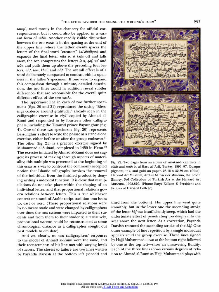
The uppermost line in each of two further speci mens (figs. 20 and 21) reproduces the saying "Bless
ings coalesce around gratitude," already seen in the
calligraphic exercise in riq?c copied by Ahmad al Rumi and responded to by fourteen other calligra phers, including the Timurid prince Baysunghur (fig. 4). One of these two specimens (fig. 20) represents Baysunghur's effort to write the phrase as a stand-alone
exercise, either before or after the group endeavor.51
The other (fig. 21) is a practice exercise signed by Muhammad al-Sultani, completed in 1459 in Herat.52 The exercise initiated by Ahmad al-Rumi does not sug gest its process of making through aspects of materi
ality; this multiple was presented at the beginning of this essay as a way to confront the commonly accepted notion that Islamic calligraphy involves the removal of the individual from the finished product by deny ing writing's indexicai function. It is clear that manip ulations do not take place within the shaping of an
individual letter, and that proportional relations gov ern relations between letters. This is true whichever context or strand of Arabic-script tradition one looks
to, east or west. (These proportional relations were
by no means static and were changed by calligraphers over time; the new systems were imparted to their stu
dents and from them to their students; alternatively, proportional systems could be reconstructed at some
chronological distance as a calligrapher sought out
past models to emulate). And yet, clearly, no two calligraphers' responses
to the model of Ahmad al-Rumi were the same, and their reenactments of his line met with varying levels of success. The closest to failure are two lines written
by Payanda Darvish at the bottom left (second and
^^^^^
Fig. 22. Two pages from an album of m?rekkeb?t exercises in
s?l?s and nesih by al-Hacc al-eArif, Turkey, 1896-97. Opaque
pigment, ink, and gold on paper, 23.18 32.39 cm (folio). Harvard Art Museum, Arthur M. Sackler Museum, the Edwin
Binney, 3rd Collection of Turkish Art at the Harvard Art
Museum, 1995.829. (Photo: Katya Kallsen ? President and
Fellows of Harvard College)
third from the bottom). His upper line went quite smoothly, but in the lower one the ascending stroke of the letter k?f was insufficiently steep, which had the unfortunate effect of penetrating too deeply into the area above the next letter. As a correction, Payanda Darvish retraced the ascending stroke of the k?f. One other example of line repetition by a single individual
appears amid the group exercise. Three lines signed by Hajji Muhammad?two at the bottom right followed
by one at the top left?show an unwavering fluidity. Each of the three lines shows various degrees of rela tion to Ahmad al-Rumi as Hajji Muhammad plays with
This content downloaded from 128.103.149.52 on Mon, 22 Sep 2014 13:46:23 PMAll use subject to JSTOR Terms and Conditions
294 DAVID J. ROXBURGH
the length of ligatures joining letters, the arrangement of dots marking phonetic value, and the presence or
absence of short vowels. One could contend that the lines in ?qa are equally as "autographic" as the "sig natures" adjacent to them. These examples reveal
that a way of inscribing individuality in calligraphy was through the manipulation of ligatures (termed in Arabic and Persian madd, mashq, and kashlda) as well as through the apparatus of dots and dashes supply ing phonetic values and vowels. This was one means of embodying the self and individual movement in an art form of closely regulated norms.
It is also possible to see those daunting rhombic dots in a related way, as satisfying the desire to perceive human movement in writing (fig. 22). While they can
certainly be understood as an armature of measurement
supplied to calligraphy specimens with the intention of revealing or uncovering the master's secrets?two
down, three across, and so forth?they also provide the means of segmenting the calligrapher's physical move
?>
Fig. 24. Pages from an album of specimens in sh?kasta by cAbd
al-Majid, Isfahan, dated between 1767 and 1770. Ink on paper, 20 29.8 (folio). Nasser D Khalili Collection, MSS391, fols,
la and 2a. (Photo: The Nasser D Khalili Collection of Islamic
Art, ? The Nour Foundation)
This content downloaded from 128.103.149.52 on Mon, 22 Sep 2014 13:46:23 PMAll use subject to JSTOR Terms and Conditions
"THE EYE IS FAVORED FOR SEEING THE WRITING'S FORM" 295
ment. Much like the filming of Jackson Pollock's drip
paintings?or any other example from modernism's
history of "mechanical inscriptions of movement"53?
miy?r al-hur?f have the effect of dividing the move
ments of writing into units that can be perceived in
succession. The dots, one after the other, register the
fluid lines of writing against a quantifiable grid akin to a time-motion study. Here, that study slows writing down to provide its viewer with a perspective on prac tice beyond the direct observation of its original maker at work. The system of applied dots and strokes not
only segments the apparently continuous line of the
calligrapher but annotates the intervals between his
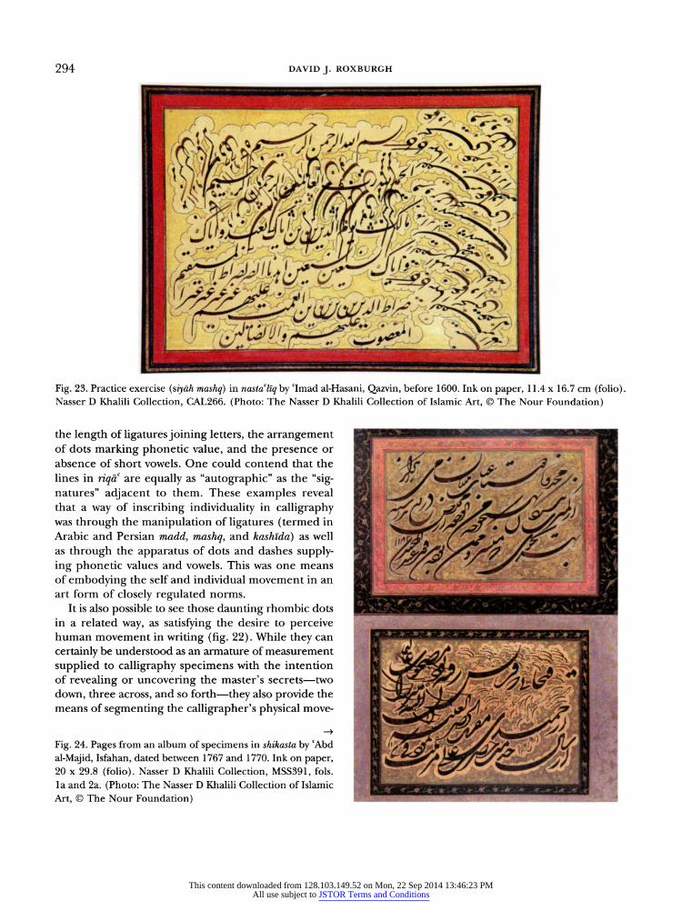
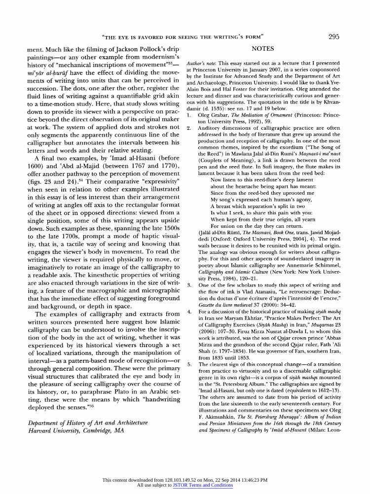
letters and words and their relative seating. A final two examples, by cImad al-Hasani (before
1600) and cAbd al-Majid (between 1767 and 1770), offer another pathway to the perception of movement
(figs. 23 and 24) ,54 Their comparative "expressivity" when seen in relation to other examples illustrated in this essay is of less interest than their arrangement of writing at angles off axis to the rectangular format
of the sheet or in opposed directions: viewed from a
single position, some of this writing appears upside down. Such examples as these, spanning the late 1500s to the late 1700s, prompt a mode of haptic visual
ity, that is, a tactile way of seeing and knowing that
engages the viewer's body in movement. To read the
writing, the viewer is required physically to move, or
imaginatively to rotate an image of the calligraphy to a readable axis. The kinesthetic properties of writing are also enacted through variations in the size of writ
ing, a feature of the macrographic and micrographie that has the immediate effect of suggesting foreground and background, or depth in space.
The examples of calligraphy and extracts from
written sources presented here suggest how Islamic
calligraphy can be understood to involve the inscrip tion of the body in the act of writing, whether it was
experienced by its historical viewers through a set
of localized variations, through the manipulation of
interval?as a pattern-based mode of recognition?or
through general composition. These were the primary visual structures that calibrated the eye and body in the pleasure of seeing calligraphy over the course of its history, or, to paraphrase Plato in an Arabic set
ting, these were the means by which "handwriting
deployed the senses."55
Department of History of Art and Architecture Harvard University, Cambridge, MA
NOTES
Author's note: This essay started out as a lecture that I presented at Princeton University in January 2007, in a series cosponsored
by the Institute for Advanced Study and the Department of Art
and Archaeology, Princeton University. I would like to thank Yve
Alain Bois and Hal Foster for their invitation. Oleg attended the
lecture and dinner and was characteristically curious and gener ous with his suggestions. The quotation in the title is by Khvan
da m ir (d. 1535): see nn. 17 and 19 below.
1. Oleg Grabar, The Mediation of Ornament (Princeton: Prince
ton University Press, 1992), 59.
2. Auditory dimensions of calligraphic practice are often
addressed in the body of literature that grew up around the
production and reception of calligraphy. In one of the most
common themes, inspired by the exordium ("The Song of
the Reed") in Mawlana Jalal al-Din Rumi's Masnav?-i ma'navl
(Couplets of Meaning), a link is drawn between the reed
pen and the reed flute. In Sufi imagery, the flute makes its
lament because it has been taken from the reed bed:
Now listen to this reed-flute's deep lament
about the heartache being apart has meant:
Since from the reed-bed they uprooted me
My song's expressed each human's agony, A breast which separation's split in two
Is what I seek, to share this pain with you: When kept from their true origin, all yearn For union on the day they can return.
(Jal?l al-D?n R?m?, The Masnavi, Book One, trans. Jawid Mojad dedi [Oxford: Oxford University Press, 2004], 4). The reed
wails because it desires to be reunited with its primal origin. The analogy was obvious enough for writers about calligra
phy. For this and other aspects of sound-related imagery in
poetry about Islamic calligraphy see Annemarie Schimmel,
Calligraphy and Islamic Culture (New York: New York Univer
sity Press, 1984), 120-21.
3. One of the few scholars to study this aspect of writing and
the flow of ink is Vlad Atanasiu, "Le retroencrage: Deduc
tion du ductus d'une ?criture d'apr?s l'intensit? de l'encre," Gazette du livre medieval 37 (2000): 34-42.
4. For a discussion of the historical practice of making siy?h mashq in Iran see Maryam Ekhtiar, "Practice Makes Perfect: The Art
of Calligraphy Exercises (Siy?h Mashq) in Iran," Muqarnas 23
(2006) : 107-30. Firuz Mirza Nusrat al-Dawla I, to whom this
work is attributed, was the son of Qajar crown prince 'Abbas
Mirza and the grandson of the second Qajar ruler, Fath cAli
Shah (r. 1797-1834). He was governor of Fars, southern Iran, from 1835 until 1853.
5. The clearest sign of this conceptual change?of a transition
from practice to virtuosity and to a discernable calligraphic
genre in its own right?is a corpus of siy?h mashqs mounted
in the "St. Petersburg Album." The calligraphies are signed by cImad al-Hasani, but only one is dated (equivalent to 1612-13).
The others are assumed to date from his period of activity from the late sixteenth to the early seventeenth century. For
illustrations and commentaries on these specimens see Oleg F. Akimushkin, The St. Petersburg Muraqqa: Album of Indian
and Persian Miniatures from the 16th through the 18th Century and Specimens of Calligraphy by fIm?d al-Hasan? (Milan: Leon
This content downloaded from 128.103.149.52 on Mon, 22 Sep 2014 13:46:23 PMAll use subject to JSTOR Terms and Conditions
296 DAVID J. ROXBURGH
ardo Arte, 1996), esp. pis. 96, 137, 140, 141, 144, 145, 148,
159,162,163,166,167,170,183,186,187,189,192, 200, 221,
225, 233, and 237. Some of clmad al-Hasani's specimens from
this album are illustrated in Ekhtiar, "Practice Makes Perfect"
(figs. 8, 11, and 12), alongside examples by him in other col
lections. Ekhtiar considers the works of clmad al-Hasani to be
"the first extant 'artistic' siy?h mashq pages," which she argues he was inspired to make after visiting Ottoman territories in
1594-95, when he saw Ottoman specimens of karalama. The
primary changes that Ekhtiar identifies as lending the siy?h
mashqs the status of collectible works of art and not simply
practice exercises are an increased incidence of signatures, the presence of dates, and a more "finished look," hence the
addition of illumination and borders ("Practice Makes Per
fect," 112). If the artistic transmission effected by Tmad al
Hasani is correct, it would still have to account for earlier,
though rare, examples of siy?h mashqs from Iranian contexts,
such as a specimen attributed to Yaqut al-Mustacsimi in an
album made for Bahram Mirza before 1549 (see fig. 6 above
and n. 27 below). This siy?h mashq carries no complete sig nature but does include a partial name in the text at lower
left, which may be read: "written by Yahya bin." This ambig uous phrase could be read as a signature but is more likely a segment of the text, hence the possibility of applying the
attribution to Yaqut. 6. Harvard Art Museum, Arthur M. Sackler Museum, Cambridge,
MA, 2006.119.
7. Most studies on Islamic calligraphy present the subject mat
ter through a historical framework constructed around the
development of types of script, features of orthography, and
historical individuals credited with making important changes in calligraphic practice or considered to have possessed a
good hand. A subset of this scholarship explores primary sources on the technical practice of calligraphy, with an even
smaller subset devoted to exploring the various cultural val
ues assigned to calligraphy at different periods in the history of the Islamic lands. Oleg Grabar's chapter on calligraphy as
an intermediary of ornament (in Mediation of Ornament) is
one of those uncommon studies that engage the visual and
aesthetic dimensions of Islamic calligraphy and ask questions that exceed strictly taxonomic problems.
8. Sheila S. Blair, Islamic Calligraphy (Edinburgh: Edinburgh
University Press, 2006), 7.
9. Each line concludes with a signature placed inside a circle,
beginning with the customary formulas katabahu (written by), k?tibuhu (his writing), mashaqahu (copied by), and harrarahu
(penned by) : these seem to be used as synonyms for writing without registering any qualitative differences between the
calligraphy. The line by Ahmad al-Rumi carries an attribu
tive signature "specimen by Mawlana Ahmad al-Rumi" (khatt-i Mawl?n? Ahmad al-R?mi). Further discussion of this specimen and its bibliography may be found in David J. Roxburgh, The
Persian Album 1400-1600: From Dispersal to Collection (New Haven: Yale University Press, 2005), 85-87.
10. For a case study that confronts the same methodological
problem but looks at Chinese calligraphy see John Hay, "The
Human Body as a Microcosmic Source of Macrocosmic Val
ues in Calligraphy," in Theories of the Arts in China, ed. Susan
Bush and Christian Murck (Princeton: Princeton University Press, 1983), 74-102.
11. Blair's recent book (Islamic Calligraphy) is the epitome of these
taxonomic efforts and makes many new contributions while at
the same time clearing up some of the problems and incon
sistencies of earlier scholarship. She identifies taxonomy as
a prime objective, stating her aim to write a book about the
historical development of Islamic calligraphy (ibid., xxviii) and contrasting her approach with the "universalities" (i.e.,
ahistoricism) sought by Seyyed Hossein Nasr and the trans
historical approach taken by Grabar in Mediation of Orna
ment. Identifying her approach as one informed by "the view
point of a historian of Islamic art," she states that it causes
her to "miss much of the passion and fervor that calligraphy evokes both in the practitioner and the believer" (ibid.). These however, are little more than reductive categories of
the human subject and narrow conceptions of art history as
a discipline. 12. For a discussion of these sources and their interpretation see
David J. Roxburgh, Prefacing the Image: The Writing of Art His
tory in Sixteenth-Century Iran (Leiden: Brill, 2001). For critical
editions of several sources and their English translation see
Wheeler M. Thackston, Album Prefaces and Other Documents on
the History of Calligraphers and Painters (Leiden: Brill, 2001). 13. Cited in Abu Hayyan al-Tawhidi's treatise on the practice of
calligraphy, which also contains numerous aphorisms about
its importance and value. See Franz Rosenthal, "Abu Haiy?n al-Tawh?d? on Penmanship," Ars Islamica 13-14 (1947): 15.
Abu Hayyan al-Tawhidi was born ca. 926 and died after
1009-10.
14. The excerpts are from Abu Hayyan al-Tawhidi's treatise. See
Rosenthal, "Abu Haiy?n al-Tawh?d? on Penmanship," 11, 12,
13, and 17. Rosenthal notes that 'Abbas's identity cannot
yet be determined. Other sources attribute the same saying to cUbayd Allah b. al-cAbbas b. al-Hasan al-cAlawi (ibid., 11,
. 88). 15. Pre-I s lamie poets, including Imru -Qays, use khatt "to refer
to the traces in the sand left by abandoned campsites," while
the eleventh-century lexicographer Ibn Faris (d. 1004) defines
khatt as "the extended trace [?th?r] of a thing" (Blair, Islamic
Calligraphy, xxv). 16. Ibn al-Bawwab's poem and its later reception are discussed
by David James, "The Commentaries of Ibn al-Bas?s and Ibn
al-Wah?d on Ibn al-Baww?b's 'Ode on the Art of Calligraphy'
(R?'iyyah fi 1-khatt)," in Back to the Sources: Biblical and Near
Eastern Studies in Honor of Dermot Ryan, ed. Kevin J. Cathcart
and John F. Healey (Dublin: Glendale Press, 1989), 164-91.
For the problems associated with the transmission of knowl
edge about calligraphy and the various means available to
calligraphers see David J. Roxburgh, "On the Transmission
and Reconstruction of Arabic Calligraphy: Ibn al-Bawwab and
History," Studia Islamica 96 (2004): 39-53.
17. Expanded discussion of these sources may be found in Rox
burgh, Prefacing the Image, esp. 89-94.
18. Sultan cAli Mashhadi's treatise was cited verbatim in Qadi Ahmad's biographical history of calligraphers and artists of
other media. The pertinent text reads: "The aim of Mur
tada 'Ali in writing / Was not merely characters and dots / But fundamentals, purity, virtue / And he pointed to this by the beauty of his writing" (Gharaz-i Murtaza CAU az khatt / na
hamin lafz b?d va harf va nuqt / bal usui va saf? va kh?b? bud /
zi ?n ish?n bi-husn-i khatt faram?d). See Qaz? Ahmad, Gulist?n-i
This content downloaded from 128.103.149.52 on Mon, 22 Sep 2014 13:46:23 PMAll use subject to JSTOR Terms and Conditions
"THE EYE IS FAVORED FOR SEEING THE WRITING'S FORM" 297
hunar: tazkira-yi khushniv?s?n va naqq?sh?n, ed. Ahmad Suhayli Khv?ns?ii (Tehran: Intish?r?t-i Buny?d-i Farhang-i Iran, 1352
[1973]), 65; trans, in V. Minorsky, Calligraphers and Painters:
A Treatise by Q?d? Ahmad, Son ofM?r-Munsh? (circa AH. 1015/A.D.
1606) (Washington, DC: Freer Gallery of Art, Smithsonian
Institution, 1959), 108.
19. d?da shud az s?rat-i khatt bahravar / dil b?d az macnl-yi ? b?
khabar / s?rat va macn?yash pasand?da ast / nur-dih-i mardu
mak-i d?da ast (Roxburgh, Prefacing the Image, 92). 20. har gawhar-i mur?d ki dar bahr-i khushdil? / parvarda-and jumla
dar in bahr h?sil ast / hamchun jam?l masKala afr?z-i d?da ast
/ hamchun vassal khurram? and?z-i har dil ast (ibid., 93). 21. Ibid., where the preface is discussed at length, esp. 99-102.
22. Further discussion of Malik Daylami's album preface may be
found in ibid., 33-34 and passim. 23. Ibid., 96-99 and passim. 24. Even the characterization of the somatic properties of East
Asian calligraphy, as characterized by Blair, Islamic Calligra
phy, 7, from studies of Chinese and Japanese calligraphy, is
ripe for reappraisal. East Asian calligraphy was based on a
highly disciplined rhetoric of gesture that automatized cor
poreal movement. On this see Yukio Lippit, "Of Modes and
Manners in Medieval Japanese Ink Painting: Sesshu's Splashed Ink Landscape of 1495," (forthcoming). Also see Thomas
LaMarre, Uncovering Heian Japan: An Archaeology of Sensation
and Inscription (Durham, NC: Duke University Press, 2000). 25. Rosenthal, "Abu Haiy?n al-Tawh?d? on Penmanship," 14.
26. turfa nig?r? qasab-i ?i push / b? du zab?n dar sukhan amm?
khamush / jilva-kun?n sarv-qadi s?ya s?y / gis?-yi shabrang kish?n
z?r-i p?y / t?r-qad? hamchu kam?n t?z push / az shab-i t?rik rukh-i
r?z push (Roxburgh, Prefacing the Image, 100). 27. Istanbul, Topkapi Palace Museum, B. 410, fols. 85b-86a and
127b. For further details about this album collection, assem
bled for Safavid prince Bahram Mirza in Tabriz before 1549, see Roxburgh, The Persian Album, 78-80, and David J. Rox
burgh, "Bahram Mirza and His Collections," in Safavid Art and
Architecture, ed. Sheila R. Canby (London: British Museum,
2002), 31-36.
28. Ibn Khaldun's Muqaddima includes a subsection on calligra
phy where he writes about processes of calligraphy instruc
tion in Cairo. There, he states, the student learns "to draw
and form the letters well, as he learns them by sensual per
ception (al-hiss), becomes skilled in them through practice in writing them, and learns them in the form of scientific
norms" (Ibn Khaldun, The Muqaddimah: An Introduction to
History, trans. Franz Rosenthal, 3 vols. [New York: Pantheon
Books, 1958], 2:388-89). 29. The text presenting Sultan cAli Mashhadi's advice reads:
Collect the writings of the masters, throw a glance at this and that.
For whomsoever you feel a natural attraction, besides his writing you must not look at the others, So that your eye should become saturated with his
writing, and because of his writing each of your letters should
become a pearl.
(Q?z? Ahmad, Gulist?n-i hunar, 73; trans. Minorsky, Calli
graphers and Painters, 117). For Baba Shah Isfahani's ?d?b al
mashq see Carl Ernst, "The Spirit of Islamic Calligraphy: Baba
Shah Isfahani's ?d?b al-Mashq," Journal of the American Oriental
Society 112 (1992): 279-86. For an edition in Persian see Naj?b
M?yil Harav?, ed., Kit?b ?ra? dar tamuddan-i isl?ml (Mashhad: Ast?n-i Quds Razav?, 1372 [1993]), 207-36.
30. The treatise and its terms and implications are discussed by Ekhtiar, "Practice Makes Perfect," 110-11.
31. Trans. Ernst, "Spirit of Islamic Calligraphy," 284.
32. The same distinction between letter shaping and composition was made in the earlier writings of Ibn al-Haytham (965-1039), also referred to as Alhazen. See Ibn al-Haytham, The Optics
of Ibn al-Haytham: Books I-III, On Direct Vision, 2 vols., trans,
with introduction by A. I. Sabra (London: Warburg Insti
tute, University of London, 1989), 1:201. Ibn al-Haytham notes that composition could make calligraphy look beauti
ful even when the letter shapes were not correct, indicating in another way his highly relativist and subjective notion of the perception of beauty.
33. The mufrad?t is bound into an album assembled for Safavid
prince Bahram Mirza in 1544-45 by Dust Muhammad. The second sheet carries a signature, "The practice was completed under the hand of the poor Sultan cAli al-Mashhadi?may his sins be forgiven?in the abode of the sultanate Herat" and an additional notation, "Its owner is Bahram." The paper also bears a seal impression; though it is quite faint, two names?
of Bahram and his father Isma'il?are discernable, as is the date 935 (1528-29).
34. Though there are abundant specimens of calligraphy?many of them practice exercises surviving in albums?made in Iran, Central Asia, and Afghanistan in the period after the mid
1300s continuing through the 1500s, the corpus lacks a con
sistent set of conventions. Though there are similarities in textual content?ranging from the mufrad?t and murakkab?t to selections of Hadith, wisdom sayings, and verses from the
Qur'an?and occasionally in aspects of format, they lack the level of consistency and continuity evident among the Otto
man practice exercises. 35. See M. Ugur Derman, Letters in Gold: Ottoman Calligraphy
from the Sakip Sabanci Collection, Istanbul (New York: Harry N. Abrams, 1998), 42-43; Nabil F. Safwat, The Art of the Pen:
Calligraphy of the 14th to 20th Centuries (London and Oxford: The Nour Foundation in association with Azimuth Editions
and Oxford University Press, 1996), 40-45. Ekhtiar, "Prac tice Makes Perfect," 109, notes the absence of a formalized
production of ij?zas in Iran.
36. Several examples are illustrated in Derman, Letters in Gold, Safwat, Art of the Pen, and Mary McWilliams and David J. Rox
burgh, Traces of the Calligrapher: Islamic Calligraphy in Practice, c. 1600-1900 (Houston and New Haven: Museum of Fine
Arts, Houston, and Yale University Press, 2007). 37. Practice through duplication of a model is seen in earlier
specimens of calligraphy, of the 1300s and 1400s, even if no
written source specifically highlights this procedure. A num
ber of calligraphies either evidence a direct imitation after a model or use language in their colophons that indicates this intention. For examples and further discussion see Rox
burgh, The Persian Album, 57-59. 38. The m?fred?t is published by Safwat, Art of the Pen, cat. 9, with
an extensive biography of Seyyid Abdullah. 39. This is the translation of the prayer rendered by Derman,
Letters in Gold, 126. 40. Published and discussed in Safwat, Art of the Pen, cat. 7. Safwat's
This content downloaded from 128.103.149.52 on Mon, 22 Sep 2014 13:46:23 PMAll use subject to JSTOR Terms and Conditions
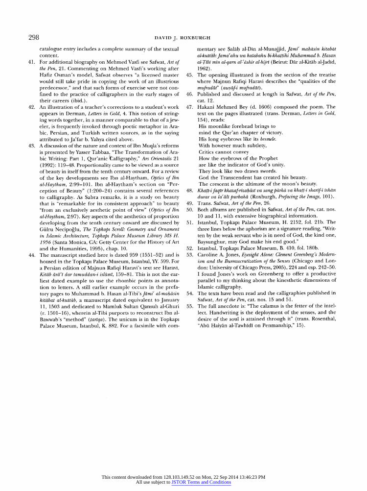
298 DAVID J. ROXBURGH
catalogue entry includes a complete summary of the textual content.
41. For additional biography on Mehmed Vasfi see Safwat, Art of the Pen, 21. Commenting on Mehmed Vasfi's working after
Hafiz Osman's model, Safwat observes "a licensed master
would still take pride in copying the work of an illustrious
predecessor," and that such forms of exercise were not con
fined to the practice of calligraphers in the early stages of
their careers (ibid.). 42. An illustration of a teacher's corrections to a student's work
appears in Derman, Letters in Gold, 4. This notion of string
ing words together, in a manner comparable to that of a jew eler, is frequently invoked through poetic metaphor in Ara
bic, Persian, and Turkish written sources, as in the saying attributed to Jacfar b. Yahya cited above.
43. A discussion of the nature and context of Ibn Muqla's reforms
is presented by Yasser Tabbaa, "The Transformation of Ara
bic Writing: Part 1, Qur'anic Calligraphy," Ars Orientalis 21
(1992): 119-48. Proportionality came to be viewed as a source
of beauty in itself from the tenth century onward. For a review
of the key developments see Ibn al-Haytham, Optics of Ibn
al-Haytham, 2:99-101. Ibn al-Haytham's section on "Per
ception of Beauty" (1:200-24) contains several references
to calligraphy. As Sabra remarks, it is a study on beauty that is "remarkable for its consistent approach" to beauty "from an exclusively aesthetic point of view" (Optics of Ibn
al-Haytham, 2:97). Key aspects of the aesthetics of proportion
developing from the tenth century onward are discussed by G?lru Necipoglu, The Topkapi Scroll: Geometry and Ornament
in Islamic Architecture, Topkapi Palace Museum Library MS H.
1956 (Santa Monica, CA: Getty Center for the History of Art
and the Humanities, 1995), chap. 10.
44. The manuscript studied here is dated 959 (1551-52) and is
housed in the Topkapi Palace Museum, Istanbul, YY. 599. For
a Persian edition of Majnun Rafiqi Haravi's text see Harav?, Kit?b arai dar tamuddan-i isl?m?, 159-81. This is not the ear
liest dated example to use the rhombic points as annota
tion to letters. A still earlier example occurs in the prefa
tory pages to Muhammad b. Hasan al-Tibi's J?m? al-mah?sin
kitabat al-kutt?b, a manuscript dated equivalent to January 11, 1503 and dedicated to Mamluk Sultan Qansuh al-Ghuri
(r. 1501-16), wherein al-Tibi purports to reconstruct Ibn al
Bawwab's "method" (tarlqa). The unicum is in the Topkapi Palace Museum, Istanbul, K. 882. For a facsimile with com
mentary see Sal?h al-D?n al-Munajjid, J?mi mah?sin kitab?t
al-kutt?b: Jama ahu wa katabahu bi-khattihi Muhammad b. Hasan
al-T?b? min al-qarn al-?shir al-hijr? (Beirut: D?r al-Kit?b aljad?d, 1962).
45. The opening illustrated is from the section of the treatise
where Majnun Rafiqi Haravi describes the "qualities of the
mufrad?t" (aws?f-i mufrad?t). 46. Published and discussed at length in Safwat, Art of the Pen,
cat. 12.
47. Hakani Mehmed Bey (d. 1606) composed the poem. The
text on the pages illustrated (trans. Derman, Letters in Gold,
154), reads:
His moonlike forehead brings to
mind the Qur'an chapter of victory. His long eyebrows like its besmele.
With however much subtlety, Critics cannot convey How the eyebrows of the Prophet are like the indicator of God's unity.
They look like two drawn swords.
God the Transcendent has created his beauty. The crescent is the ultimate of the moon's beauty.
48. Khatt-ifaqir khazaf-rizah?st va sangp?rh? va khatt-i shar?fi ?sh?n
durar va la all purbah? (Roxburgh, Prefacing the Image, 101). 49. Trans. Safwat, Art of the Pen, 26.
50. Both albums are published in Safwat, Art of the Pen, cat. nos.
10 and 11, with extensive biographical information.
51. Istanbul, Topkapi Palace Museum, H. 2152, fol. 21b. The
three lines below the aphorism are a signature reading, "Writ
ten by the weak servant who is in need of God, the kind one,
Baysunghur, may God make his end good." 52. Istanbul, Topkapi Palace Museum, B. 410, fol. 180b.
53. Caroline A. Jones, Eyesight Alone: Clement Greenberg's Modern
ism and the Bureaucratization of the Senses (Chicago and Lon
don: University of Chicago Press, 2005), 224 and esp. 242-50.
I found Jones's work on Greenberg to offer a productive
parallel to my thinking about the kinesthetic dimensions of
Islamic calligraphy. 54. The texts have been read and the calligraphies published in
Safwat, Art of the Pen, cat. nos. 15 and 51.
55. The full anecdote is: "The calamus is the fetter of the intel
lect. Handwriting is the deployment of the senses, and the
desire of the soul is attained through it" (trans. Rosenthal, "Abu Haiy?n al-Tawh?d? on Penmanship," 15).
This content downloaded from 128.103.149.52 on Mon, 22 Sep 2014 13:46:23 PMAll use subject to JSTOR Terms and Conditions