Embed Size (px)
Citation preview
The Elements of Design
The elements of design are the basic factors that make up the visual form, whether it be a two-
dimensional shape or a three-dimensional object. The elements of design can also be thought of as
forces that, by changing, can singly dominate a composition and help give the form meaning. The
reason for, or meaning of, any visual form provides the composition with a unity of purpose that is
particularly important in theatre. After all, plays are about ideas. These building blocks include: line,
shape, space, texture, form, and color.
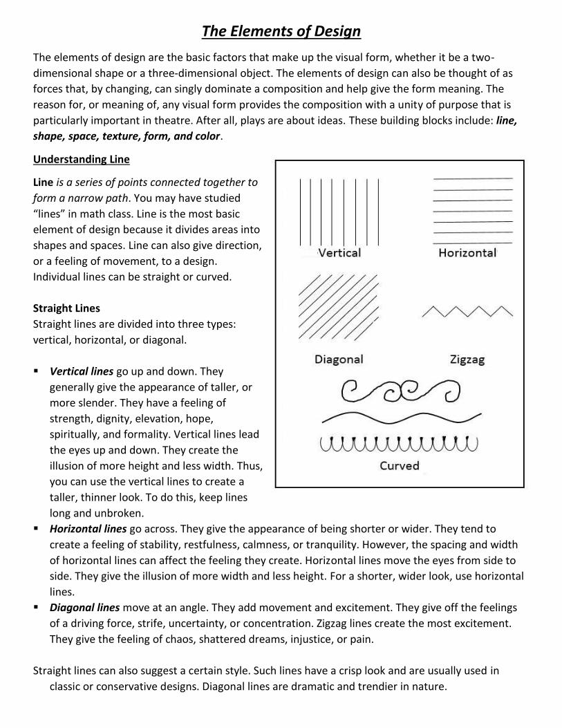
Understanding Line
Line is a series of points connected together to
form a narrow path. You may have studied
“lines” in math class. Line is the most basic
element of design because it divides areas into
shapes and spaces. Line can also give direction,
or a feeling of movement, to a design.
Individual lines can be straight or curved.
Straight Lines
Straight lines are divided into three types:
vertical, horizontal, or diagonal.
Vertical lines go up and down. They
generally give the appearance of taller, or
more slender. They have a feeling of
strength, dignity, elevation, hope,
spiritually, and formality. Vertical lines lead
the eyes up and down. They create the
illusion of more height and less width. Thus,
you can use the vertical lines to create a
taller, thinner look. To do this, keep lines
long and unbroken.
Horizontal lines go across. They give the appearance of being shorter or wider. They tend to
create a feeling of stability, restfulness, calmness, or tranquility. However, the spacing and width
of horizontal lines can affect the feeling they create. Horizontal lines move the eyes from side to
side. They give the illusion of more width and less height. For a shorter, wider look, use horizontal
lines.
Diagonal lines move at an angle. They add movement and excitement. They give off the feelings
of a driving force, strife, uncertainty, or concentration. Zigzag lines create the most excitement.
They give the feeling of chaos, shattered dreams, injustice, or pain.
Straight lines can also suggest a certain style. Such lines have a crisp look and are usually used in
classic or conservative designs. Diagonal lines are dramatic and trendier in nature.
Curved Lines
Curved lines can be circular or gently waved. They can move in a vertical, horizontal, or diagonal
direction. Curved lines add softness and roundness. They give the feeling of ease, comfort, wealth, or
expanse.
Characteristics of lines are:
Width - thick, thin, tapering, uneven
Length – long, short, continuous, broken
Direction – horizontal, vertical, diagonal, curving,
perpendicular, oblique, parallel, radial, zigzag
Focus – sharp, blurry, fuzzy, choppy
Feeling – sharp, jagged, graceful, smooth
Types of Line:
Outlines – lines made by the edge of an object or
it’s silhouette
Contour lines – lines that describe the shape of an
object and the interior detail
Gesture lines – lines that are energetic and catches
the movement and gestures of an active figure
Sketch lines - lines that capture the appearance of
an object or impression of a specific place
Calligraphic lines – Greek word meaning “beautiful writing”. Precise, elegant handwriting or lettering
done by hand. Also, artwork that has flowing lines like an elegant handwriting.
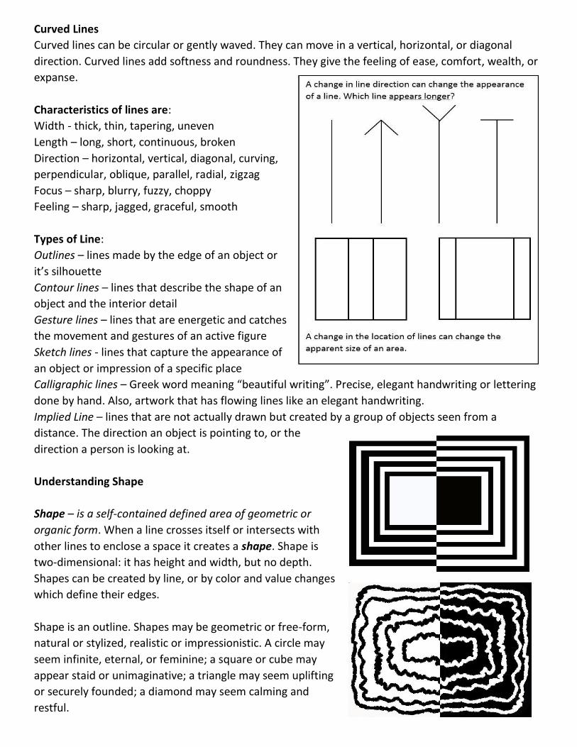
Implied Line – lines that are not actually drawn but created by a group of objects seen from a
distance. The direction an object is pointing to, or the
direction a person is looking at.
Understanding Shape
Shape – is a self-contained defined area of geometric or
organic form. When a line crosses itself or intersects with
other lines to enclose a space it creates a shape. Shape is
two-dimensional: it has height and width, but no depth.
Shapes can be created by line, or by color and value changes
which define their edges.
Shape is an outline. Shapes may be geometric or free-form,
natural or stylized, realistic or impressionistic. A circle may
seem infinite, eternal, or feminine; a square or cube may
appear staid or unimaginative; a triangle may seem uplifting
or securely founded; a diamond may seem calming and
restful.
Categories of Shapes
Geometric Shapes – circles, squares, rectangles, and triangles. We see them in architecture and many
manufactured items.
Organic Shapes – leaves, seashells, flowers, etc. We see them in nature and with characteristics that
are free flowing, informal, and/or irregular.
Static Shapes – shapes that appear stable and resting
Dynamic Shape – shapes that appear moving and active.
Understanding Space
Space takes into consideration the concepts of bulk and weight. Space is the three-dimensionality of a
sculpture. A three-dimensional object will have height, width, and depth. Space in a two-dimensional
drawing or painting refers to the arrangement of objects on the picture plane. The picture plane is the
surface of your drawing paper or canvas. A two-dimensional piece of art had height and width, but no
depth. The illusion of depth can be achieved by using perspective. This is the technique used to have
your picture look like it is moving to the distance like a landscape or cityscape.
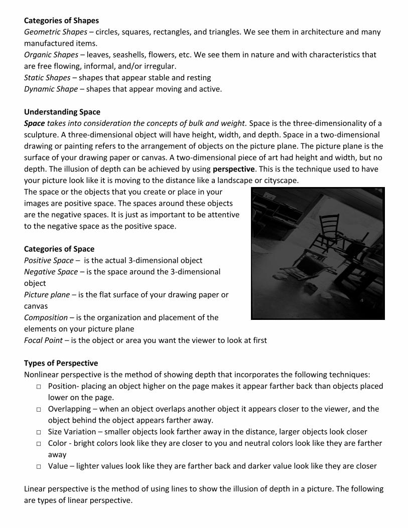
The space or the objects that you create or place in your
images are positive space. The spaces around these objects
are the negative spaces. It is just as important to be attentive
to the negative space as the positive space.
Categories of Space
Positive Space – is the actual 3-dimensional object
Negative Space – is the space around the 3-dimensional
object
Picture plane – is the flat surface of your drawing paper or
canvas
Composition – is the organization and placement of the
elements on your picture plane
Focal Point – is the object or area you want the viewer to look at first
Types of Perspective
Nonlinear perspective is the method of showing depth that incorporates the following techniques:
□ Position- placing an object higher on the page makes it appear farther back than objects placed
lower on the page.
□ Overlapping – when an object overlaps another object it appears closer to the viewer, and the
object behind the object appears farther away.
□ Size Variation – smaller objects look farther away in the distance, larger objects look closer
□ Color - bright colors look like they are closer to you and neutral colors look like they are farther
away
□ Value – lighter values look like they are farther back and darker value look like they are closer
Linear perspective is the method of using lines to show the illusion of depth in a picture. The following
are types of linear perspective.
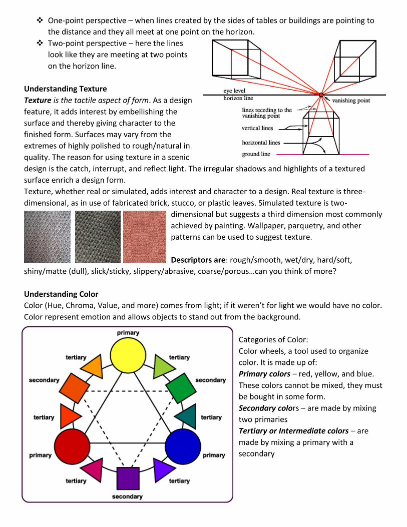
One-point perspective – when lines created by the sides of tables or buildings are pointing to
the distance and they all meet at one point on the horizon.
Two-point perspective – here the lines
look like they are meeting at two points
on the horizon line.
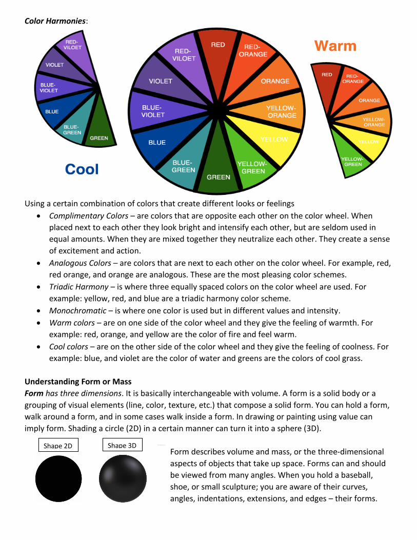
Understanding Texture
Texture is the tactile aspect of form. As a design
feature, it adds interest by embellishing the
surface and thereby giving character to the
finished form. Surfaces may vary from the
extremes of highly polished to rough/natural in
quality. The reason for using texture in a scenic
design is the catch, interrupt, and reflect light. The irregular shadows and highlights of a textured
surface enrich a design form.
Texture, whether real or simulated, adds interest and character to a design. Real texture is three-
dimensional, as in use of fabricated brick, stucco, or plastic leaves. Simulated texture is two-
dimensional but suggests a third dimension most commonly
achieved by painting. Wallpaper, parquetry, and other
patterns can be used to suggest texture.
Descriptors are: rough/smooth, wet/dry, hard/soft,
shiny/matte (dull), slick/sticky, slippery/abrasive, coarse/porous…can you think of more?
Understanding Color
Color (Hue, Chroma, Value, and more) comes from light; if it weren’t for light we would have no color.
Color represent emotion and allows objects to stand out from the background.
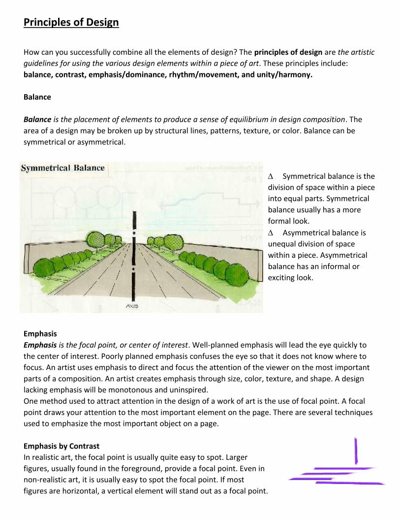
Categories of Color:
Color wheels, a tool used to organize
color. It is made up of:
Primary colors – red, yellow, and blue.
These colors cannot be mixed, they must
be bought in some form.
Secondary colors – are made by mixing
two primaries
Tertiary or Intermediate colors – are
made by mixing a primary with a
secondary
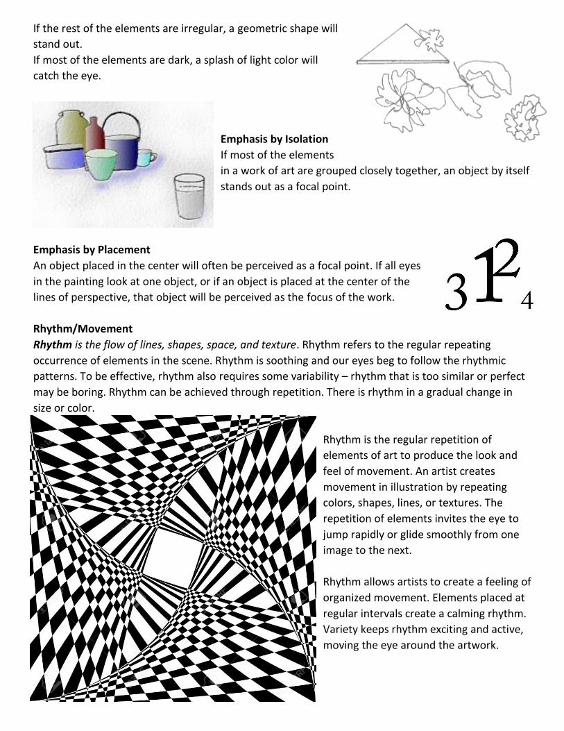
Color Harmonies:
Using a certain combination of colors that create different looks or feelings
Complimentary Colors – are colors that are opposite each other on the color wheel. When
placed next to each other they look bright and intensify each other, but are seldom used in
equal amounts. When they are mixed together they neutralize each other. They create a sense
of excitement and action.
Analogous Colors – are colors that are next to each other on the color wheel. For example, red,
red orange, and orange are analogous. These are the most pleasing color schemes.
Triadic Harmony – is where three equally spaced colors on the color wheel are used. For
example: yellow, red, and blue are a triadic harmony color scheme.
Monochromatic – is where one color is used but in different values and intensity.
Warm colors – are on one side of the color wheel and they give the feeling of warmth. For
example: red, orange, and yellow are the color of fire and feel warm.
Cool colors – are on the other side of the color wheel and they give the feeling of coolness. For
example: blue, and violet are the color of water and greens are the colors of cool grass.
Understanding Form or Mass
Form has three dimensions. It is basically interchangeable with volume. A form is a solid body or a
grouping of visual elements (line, color, texture, etc.) that compose a solid form. You can hold a form,
walk around a form, and in some cases walk inside a form. In drawing or painting using value can
imply form. Shading a circle (2D) in a certain manner can turn it into a sphere (3D).
Form describes volume and mass, or the three-dimensional
aspects of objects that take up space. Forms can and should
be viewed from many angles. When you hold a baseball,
shoe, or small sculpture; you are aware of their curves,
angles, indentations, extensions, and edges – their forms.
Shape 2D Shape 3D
Principles of Design
How can you successfully combine all the elements of design? The principles of design are the artistic
guidelines for using the various design elements within a piece of art. These principles include:
balance, contrast, emphasis/dominance, rhythm/movement, and unity/harmony.
Balance
Balance is the placement of elements to produce a sense of equilibrium in design composition. The
area of a design may be broken up by structural lines, patterns, texture, or color. Balance can be
symmetrical or asymmetrical.
Symmetrical balance is the
division of space within a piece
into equal parts. Symmetrical
balance usually has a more
formal look.
Asymmetrical balance is
unequal division of space
within a piece. Asymmetrical
balance has an informal or
exciting look.
Emphasis
Emphasis is the focal point, or center of interest. Well-planned emphasis will lead the eye quickly to
the center of interest. Poorly planned emphasis confuses the eye so that it does not know where to
focus. An artist uses emphasis to direct and focus the attention of the viewer on the most important
parts of a composition. An artist creates emphasis through size, color, texture, and shape. A design
lacking emphasis will be monotonous and uninspired.
One method used to attract attention in the design of a work of art is the use of focal point. A focal
point draws your attention to the most important element on the page. There are several techniques
used to emphasize the most important object on a page.
Emphasis by Contrast
In realistic art, the focal point is usually quite easy to spot. Larger
figures, usually found in the foreground, provide a focal point. Even in
non-realistic art, it is usually easy to spot the focal point. If most
figures are horizontal, a vertical element will stand out as a focal point.
If the rest of the elements are irregular, a geometric shape will
stand out.
If most of the elements are dark, a splash of light color will
catch the eye.
Emphasis by Isolation
If most of the elements
in a work of art are grouped closely together, an object by itself
stands out as a focal point.
Emphasis by Placement
An object placed in the center will often be perceived as a focal point. If all eyes
in the painting look at one object, or if an object is placed at the center of the
lines of perspective, that object will be perceived as the focus of the work.
Rhythm/Movement
Rhythm is the flow of lines, shapes, space, and texture. Rhythm refers to the regular repeating
occurrence of elements in the scene. Rhythm is soothing and our eyes beg to follow the rhythmic
patterns. To be effective, rhythm also requires some variability – rhythm that is too similar or perfect
may be boring. Rhythm can be achieved through repetition. There is rhythm in a gradual change in
size or color.
Rhythm is the regular repetition of
elements of art to produce the look and
feel of movement. An artist creates
movement in illustration by repeating
colors, shapes, lines, or textures. The
repetition of elements invites the eye to
jump rapidly or glide smoothly from one
image to the next.
Rhythm allows artists to create a feeling of
organized movement. Elements placed at
regular intervals create a calming rhythm.
Variety keeps rhythm exciting and active,
moving the eye around the artwork.
Movement in a composition guides a viewer’s eye through the work, usually to a FOCAL POINT. An
artist arranges parts of an image to create a sense of motion by using lines, shapes, forms, and
textures, or by combining elements of art to produce a look of action. For example, diagonal lines in a
staircase causes the eye to move upwards. Through shape, by scaling the size of shapes, an artist
creates movement.
Ways to create movement:
□ Fuzzy outlines – when figures move past us at very high speeds, we perceive that figure as
somewhat blurry. This experience leads us to interpret blurry or indistinct outlines as motion.
□ Multiple Image – similarly, showing multiple overlapping images gives us the impression of
motion.
□ Optical Illusions – certain optical illusions based on the repetition of geometric forms will cause
your eye to produce motion where none is present.
Unity/Harmonyws`1
Harmony is the pleasing arrangement of all parts. Harmony is achieved when the design elements
work well together. The colors, lines, shapes, spaces, and textures look like they belong together.
Unity is the quality of completeness a composition has. In a unified work of art, all the parts come
together to form a whole; one part of a composition feels like it belongs with the rest. Like taking a
brick from a wall, a piece needs all the components or it might fall apart. An artist achieves unity by
balancing all the aspects of the composition.
One way to achieve unity is repetition through color, shape, and texture. By grouping objects closely
together, you create proximity or object can be used to tie a work together, which unifies a
composition.
A much more subtle method of unifying a work involves the continuation of line,
edge, or direction from one area to another. Continuation is often used in books
and magazines to tie the elements of a page together with the use of rules, and by
lining up edges of copy, headlines, and graphics.
Contrast
Contrast is an abrupt, unexpected change in a visual element. Artists can create contrast through
VALUE, COLOR, TEXTURE, and SHAPE. Color contrast can be achieved through hue, saturation, and
value. Complementary colors (red/green, yellow/purple, blue/orange) seem to vibrate when they are
placed together in a composition. By juxtaposing value (light/dark) an artist can create a sense of
depth. By varying the thickness and thinness of lines or combining horizontal and vertical lines an
artist creates contrast. Contrast can also be created through shape: curved shapes are calming and
jagged shapes create edginess.
Replicated from Erin Davidson, Rocky Mountain High School