Embed Size (px)
Citation preview

The Elements of Art are the “tools” that artists use to make art. There are 7 of them:
Line Value TextureShape Form Space Color

An element of art defined as the path of a moving point.
There are 5 main types of LINE.- Horizontal- Vertical- Diagonal- Zig-Zag- Curved

Horizontal Lines - run parallel to the ground (west to
east)- appear to be at rest
Frank Lloyd Wright's architectural style shows a strong horizontal line which stress the relationship of the structure to the land
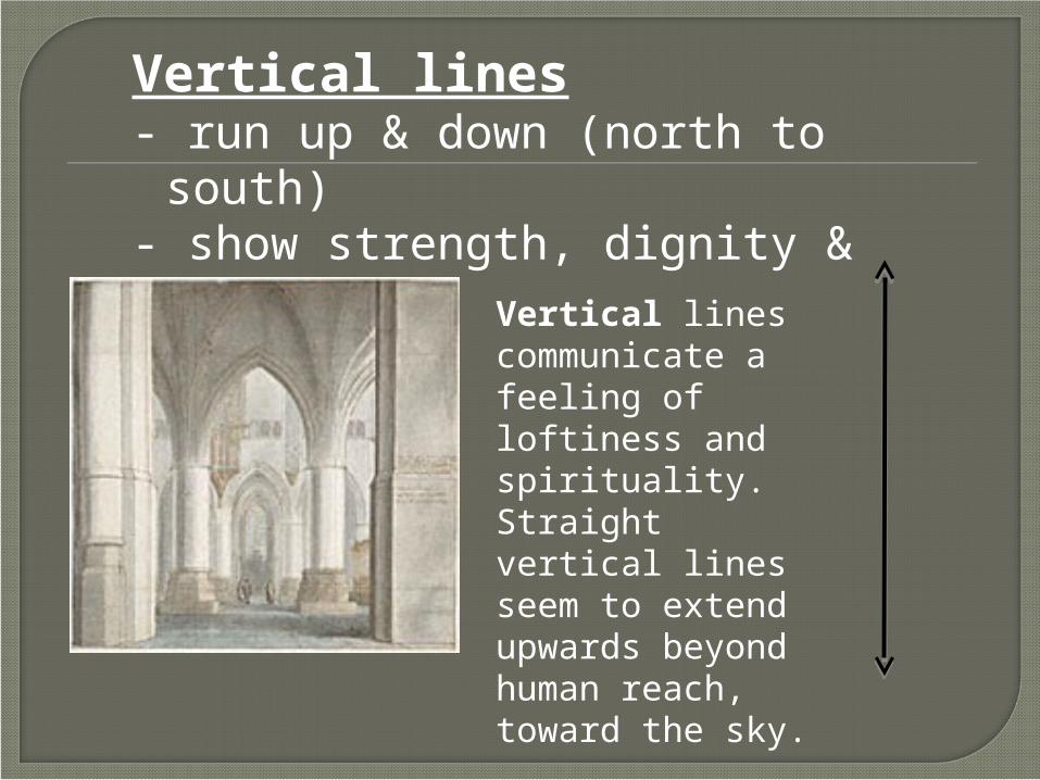
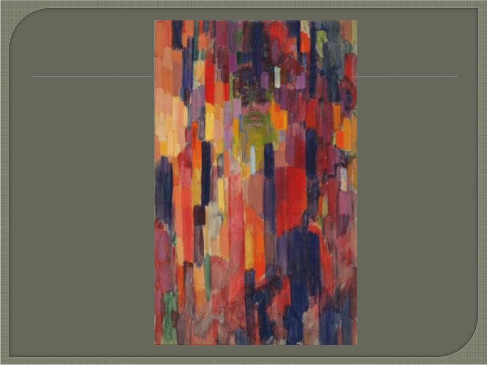
Vertical lines - run up & down (north to south)- show strength, dignity & formality
Vertical lines communicate a feeling of loftiness and spirituality. Straight vertical lines seem to extend upwards beyond human reach, toward the sky.

Diagonal lines - slanted at an angle- signal action or excitement

Zig-Zag lines - are made from combined diagonal
lines- create a feeling of confusion or
suggest action

Curved lines - rounded & have soft edges- express movement in a calm
graceful, flowing way.


An elements of art that refers to an enclosed area or a line that has become connected.
- Shapes have HEIGHT and its WIDTH.- Shapes are 2D (two dimensional)
Geometric shapes
Organic shapes

- have smooth, even edges- are measurable- mathematical shapes
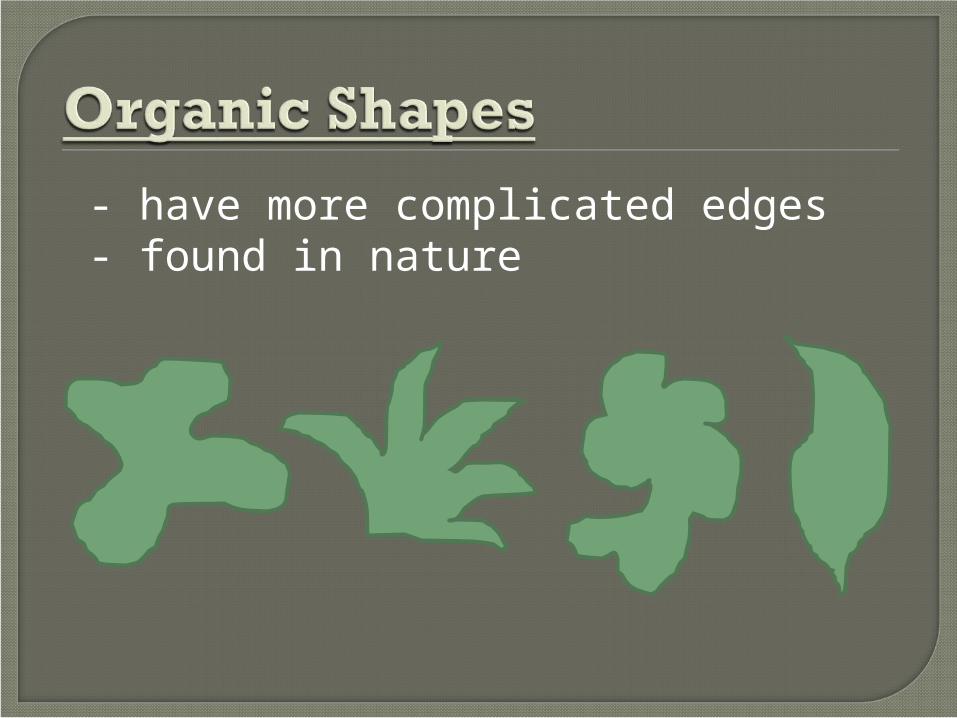
- have more complicated edges - found in nature
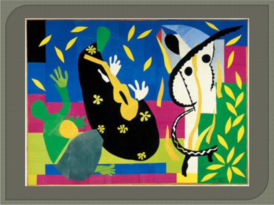

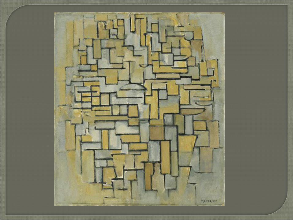
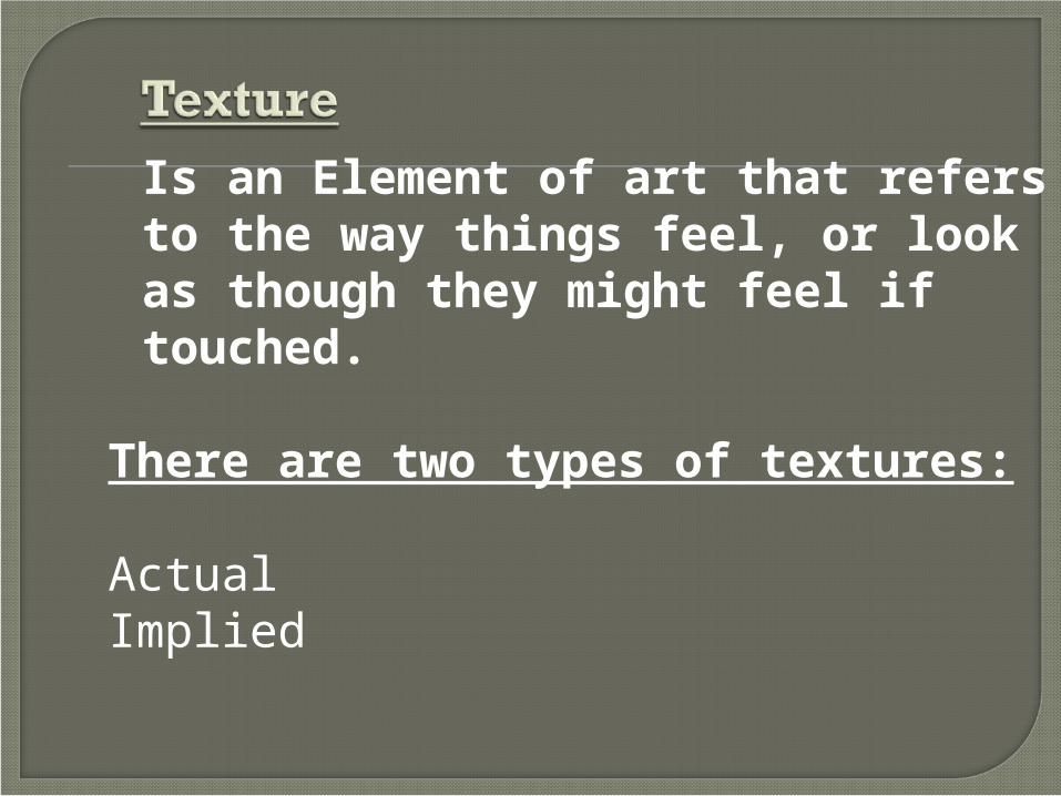
Is an Element of art that refers to the way things feel, or look as though they might feel if touched.
There are two types of textures:
ActualImplied
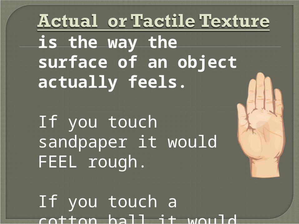
is the way the surface of an object actually feels.
If you touch sandpaper it would FEEL rough.
If you touch a cotton ball it would FEEL soft.

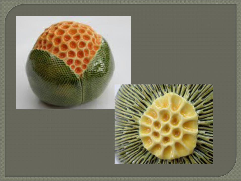
is the way the surface of an object looks like it feels.
This is the type of texture that artists use when they draw and paint.
For example an artist might draw a lot of tiny dots to make something appear to be sandy.
Artists use lines & shapes that create patterns to imply texture.
Artists use thick paint to build up the surface of a painting to make it look rough.
Artists can use tools to scratch the surface of clay or wood.
Artists can use different media- like glossy paint to make something look shiny or smooth.

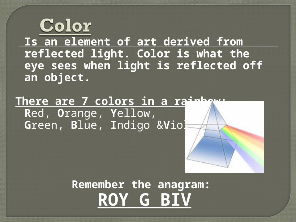
Is an element of art derived from reflected light. Color is what the eye sees when light is reflected off an object.
There are 7 colors in a rainbow: Red, Orange, Yellow, Green, Blue, Indigo &Violet
Remember the anagram:
ROY G BIV

In the 18th century a scientist named Sir Isaac Newton developed this wheel to help organize the colors.

There are 3 primary colors:Red, Yellow and Blue
- They can’t be mixed to be made
- They make all of the other colors on the color wheel

There are 3 secondary colors:Green, Orange, and Violet
-They are made by mixing 2 primary colors.

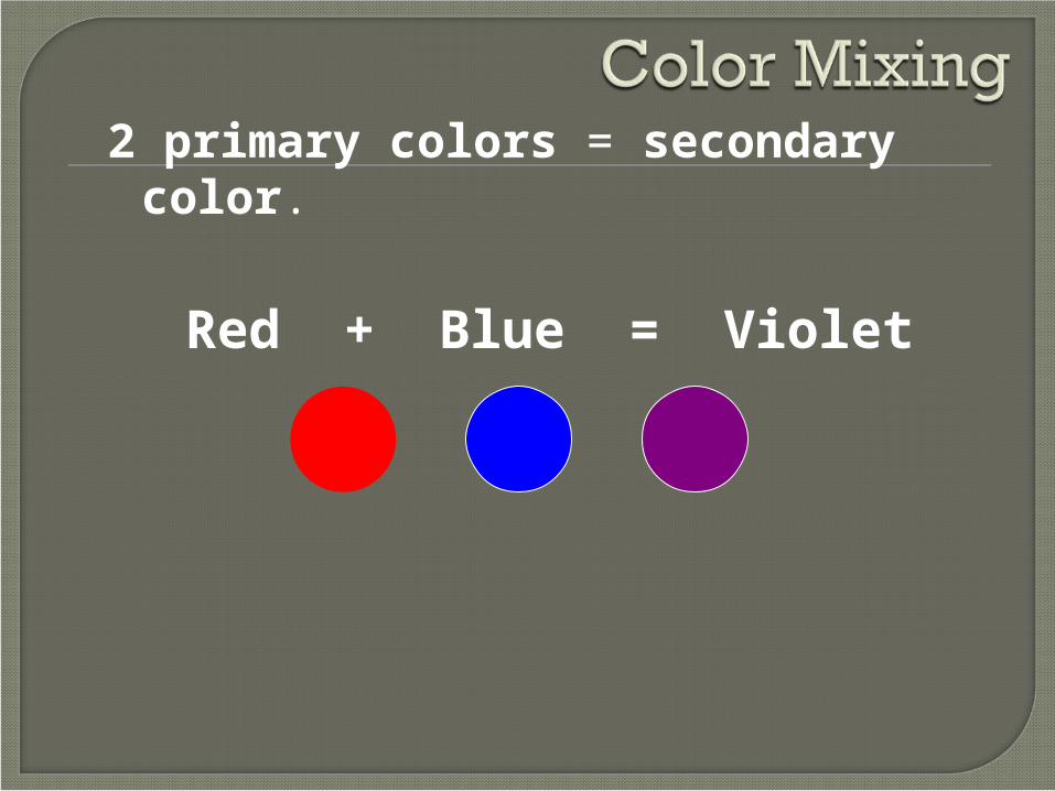
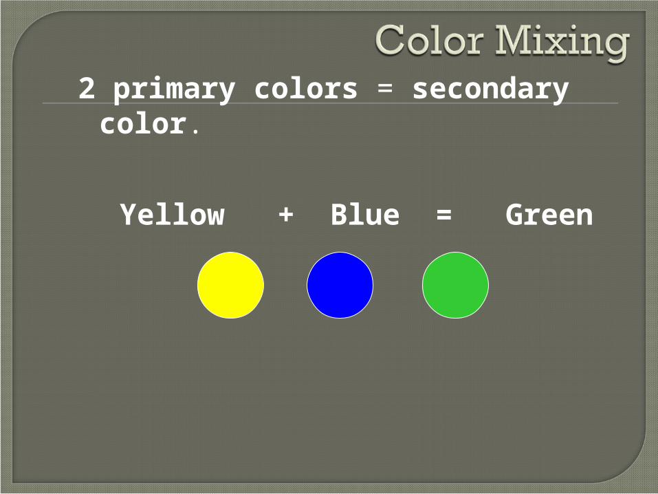
2 primary colors = secondary color.
Red + Yellow = Orange
2 primary colors = secondary color.
Red + Blue = Violet
2 primary colors = secondary color.
Yellow + Blue = Green
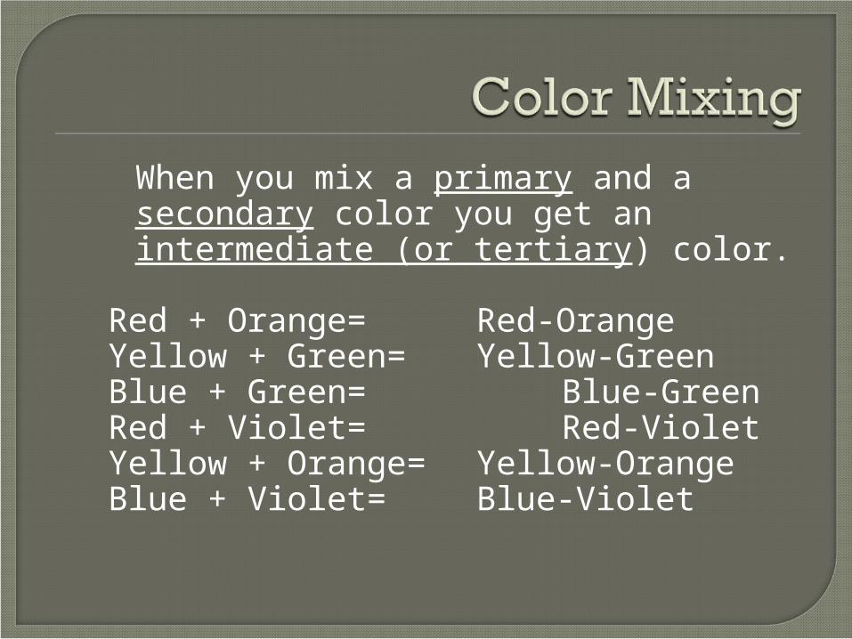
When you mix a primary and a secondary color you get an intermediate (or tertiary) color.
Red + Orange= Red-OrangeYellow + Green= Yellow-GreenBlue + Green= Blue-GreenRed + Violet= Red-VioletYellow + Orange= Yellow-OrangeBlue + Violet= Blue-Violet

(A color plan)
- Artists use colors in certain combinations called color schemes.
- Color Schemes can help set the mood of a painting.

4 colors “next-door-neighbors” to each other creates an analogous color scheme
Notice how they all share the primary color- yellow

2 colors that are directly opposite each other or 6 spaces away creates a complementary color scheme
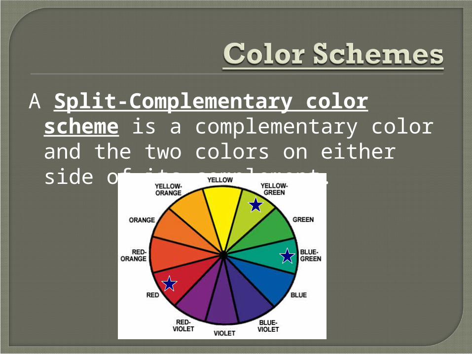
A Split-Complementary color scheme is a complementary color and the two colors on either side of its complement.

A Triadic color scheme uses 3 colors that are equally spaced apart on the color wheel

When you use only one color plus its tints and shades, you are using a monochromatic color scheme
A tint is a color plus whiteA tone is a color plus greyA shade is a color plus black
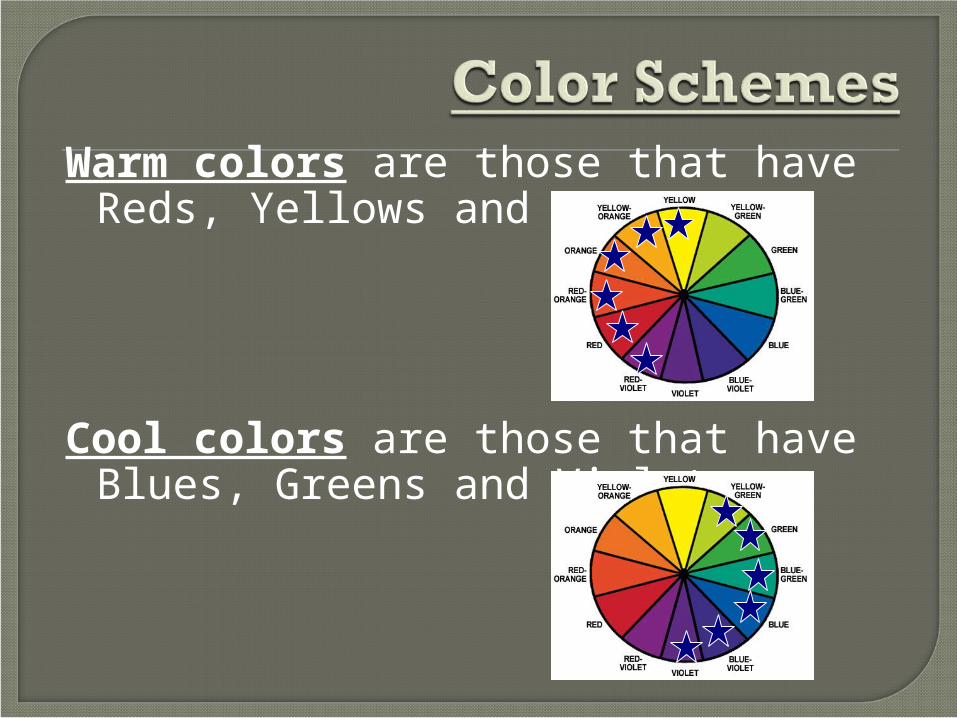
Warm colors are those that have Reds, Yellows and Oranges.
Cool colors are those that have Blues, Greens and Violets.
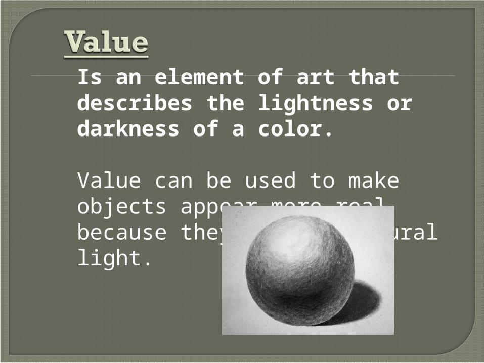
Is an element of art that describes the lightness or darkness of a color.
Value can be used to make objects appear more real because they imitate natural light.

Cross-Hatchingor Hatching
is when you useline to create value.
The closer together the lines are placed, the darker the value.
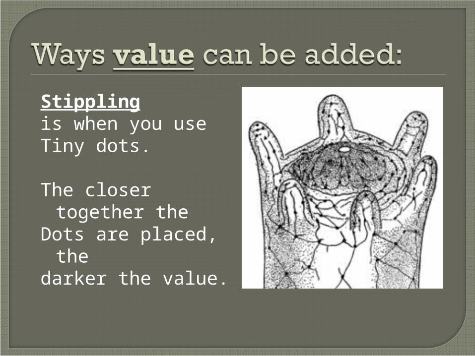
Stippling is when you useTiny dots.
The closer together the
Dots are placed, the darker the value.
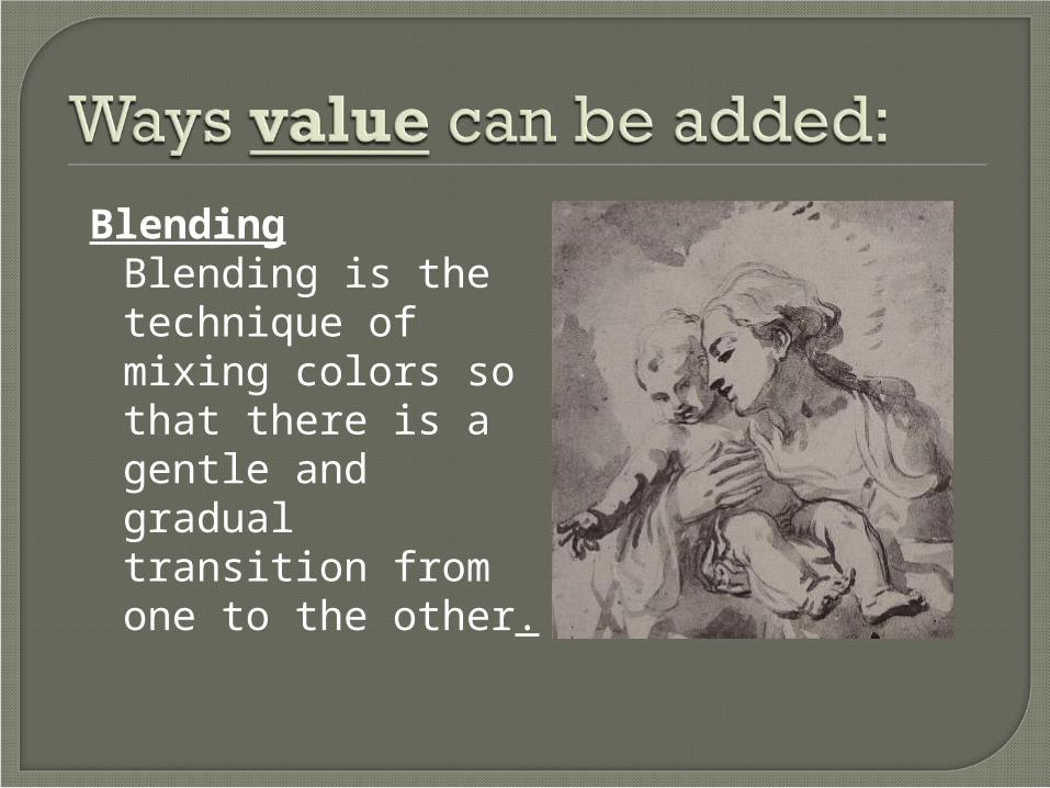
Blending Blending is the
technique of mixing colors so that there is a gentle and gradual transition from one to the other.

Tint = mixing in white Tone= mixing in greyShade= mixing in black

a successful drawing or painting will show a full range of value.
lightsmiddle tonesdarks

Is an element of art that refers to an object with 3 dimensions.
- Forms are 3D
- Forms have HEIGHT, WIDTH & DEPTH.
- Depth shows the thickness of the object.
- Forms are NOT flat like shapes are!

CubePrismConePyramidCylinderSphere
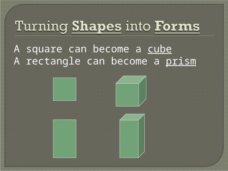
A square can become a cubeA rectangle can become a prism

A triangle becomes a cone or a pyramid

A rectangle can also become a cylinder.
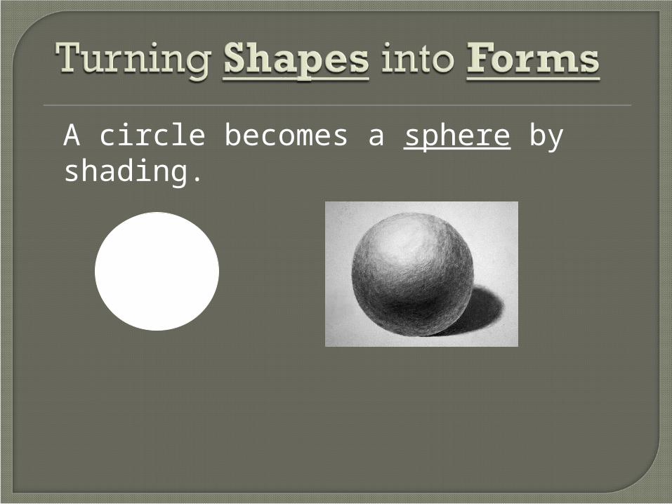
A circle becomes a sphere by shading.


Is an element of art that refers to the distance between, around, above, below & within objects.
Artists use space to help organize a picture.
There are 2 main types of SPACE:
+ POSITIVE - NEGATIVE
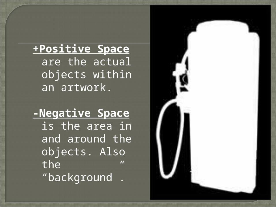
+Positive Space are the actual objects within an artwork.
-Negative Space is the area in and around the objects. Also the “background”.

Artists use perspective to show a sense of SPACE.

Artists will sometimes overlap objects to show a sense of SPACE.

Artists will sometimes use size & scale to show a sense of SPACE.
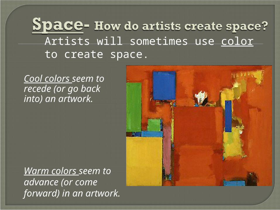
Artists will sometimes use color to create space.
Warm colors seem to advance (or come forward) in an artwork.
Cool colors seem to recede (or go back into) an artwork.

Artists can use object placement to create space.
Background
Mid-ground
Foreground

The Elements of Art are the “tools” that artists use to make art. They are the basic “foundation” of a good composition
Line Value TextureShape Form Space Color